

-
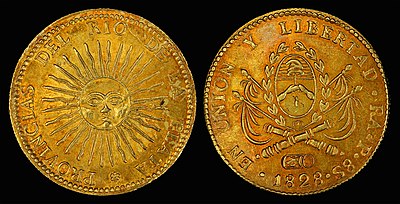
United Provinces of the Rio de la Plata (1828) and depicts the Sun of May and an early version of the Coat of arms of Argentina.
| Featured picture tools |
|---|
Please cut and paste new entries to the bottom of this page, creating a new monthly archive (by closing date) when necessary.
World War I Recruitment Poster
Voting period is over. Please don't add any new votes. Voting period ends on 1 Feb 2016 at 08:57:39 (UTC)
_Britons_(Kitchener)_wants_you_(Briten_Kitchener_braucht_Euch)._1914_(Nachdruck),_74_x_50_cm._(Slg.Nr._552).jpg)

- Reason
- One of those iconic war recruitment posters, this one coming from the London Opinion and making a splash at the commons where it is already featured.
- Articles in which this image appears
- 1914 in the United Kingdom, 38th (Welsh) Infantry Division, Alfred Leete], British Armed Forces, British people, British propaganda during World War I, Hedd Wyn, Herbert Kitchener, History of propaganda, History of public relations, Index finger, King's Regiment (Liverpool), Kitchener's Army, London Opinion, Lord Kitchener Wants You, Military recruitment, Recruitment in the British Army, Recruitment to the British Army during the First World War, World War I in popular culture
- FP category for this image
- Wikipedia:Featured pictures/History/World War I
- Creator
- I think Alfred Leete
- Support as nominator – TomStar81 ( Talk) 08:57, 22 January 2016 (UTC)
- Comment - Classic, but does it have to be this dark? -- Janke | Talk 17:59, 22 January 2016 (UTC)
- Comment Been eyeing this. It's a reprint. It's better by far than what we have, but I'm somewhat waiting for a more original copy, especially given the darker printing. Adam Cuerden ( talk) 21:18, 22 January 2016 (UTC)
- Oppose since it is not an original. The reprinter's tagline is visible on the lower right... -- Janke | Talk 09:17, 23 January 2016 (UTC)
- Oppose Per Janke. There is a huge very high quality TIFF scan of the original London Opinion front page here [1] I might look at getting it converted and uploaded. I think it would have greater EV, be better quality and make a better potential FP than this version - Wolftick ( talk) 18:46, 24 January 2016 (UTC)
- Done:
c:File:Kitchener London Opinion Cover 1914 by Alfred Leete.jpg - It's very good in my opinion, but obviously not to be considered as alt as not yet used in any articles. -
Wolftick (
talk) 20:00, 24 January 2016 (UTC)
- @
Wolftick: You known, it helps immensely when the guy who nominated the image is informed that there be a new version. I've put the alt in an article, so its now an eligible FPC candidate - not that it will be of much use, since we are also out of voting time here.
TomStar81 (
Talk) 02:57, 27 January 2016 (UTC)
- @ TomStar81: Sorry. I considered the availability of a similar but superior (in my opinion) image a reason for my oppose rather than a potential alt. I uploaded it because I had already downloaded and converted it for myself so thought it was worthwhile, but didn't plan on updating the relevant articles myself for the time being so didn't think it was eligible for, or relevant to, nomination other than if people might want to look in order to assess my judgement. In retrospect I realise it may have been useful to ping you to let you know of the existence of the image. - Wolftick ( talk) 04:05, 27 January 2016 (UTC)
- @
Wolftick: You known, it helps immensely when the guy who nominated the image is informed that there be a new version. I've put the alt in an article, so its now an eligible FPC candidate - not that it will be of much use, since we are also out of voting time here.
TomStar81 (
Talk) 02:57, 27 January 2016 (UTC)
- Done:
c:File:Kitchener London Opinion Cover 1914 by Alfred Leete.jpg - It's very good in my opinion, but obviously not to be considered as alt as not yet used in any articles. -
Wolftick (
talk) 20:00, 24 January 2016 (UTC)
Not Promoted -- Armbrust The Homunculus 09:24, 1 February 2016 (UTC)
Johann Strauss II
Voting period is over. Please don't add any new votes. Voting period ends on 1 Feb 2016 at 21:15:39 (UTC)
-
 Original – Johann Strauss II photographed by Fritz Luckhardt
 -
 NOT FOR VOTING: Before restoration
- Reason
- Given the likely size (these tend to be about two to three inches wide) the resolution is decent (an estimated 500 to 800 dpi). Very nice view of Strauss.
- Articles in which this image appears
- Johann Strauss II +3
- FP category for this image
- Wikipedia:Featured pictures/People/Entertainment
- Creator
- Fritz Luckhardt, restored by Adam Cuerden
- Support as nominator – Adam Cuerden ( talk) 21:15, 22 January 2016 (UTC)
- Support — Chris Woodrich ( talk) 00:07, 23 January 2016 (UTC)
- Support - Fairly low resolution, but if the original size is that small, it's not bad. It looks great with the restoration. Mattximus ( talk) 03:42, 23 January 2016 (UTC)
- Support – Bammesk ( talk) 22:33, 23 January 2016 (UTC)
- Comment – Sorry to waltz in here with a critical comment, but I'm a little concerned with the virtual disappearance of Johann's tie.
Sca (
talk) 23:21, 23 January 2016 (UTC)
- @ Sca: I's fairly clearly a very light colour. There's some detail in there. Adam Cuerden ( talk) 00:14, 24 January 2016 (UTC)
- Support – Okay. Sca ( talk) 15:24, 25 January 2016 (UTC)
- Support – Jobas ( talk) 22:08, 28 January 2016 (UTC)
- Support – Yann ( talk) 15:29, 29 January 2016 (UTC)
Promoted File:Johann Strauss II by Fritz Luckhardt.jpg -- Armbrust The Homunculus 21:30, 1 February 2016 (UTC)
Catalytic triad
Voting period is over. Please don't add any new votes. Voting period ends on 2 Feb 2016 at 10:40:07 (UTC)

- Reason
- Relisting of Wikipedia:Featured picture candidates/Catalytic triad - higher resolution image as requested (ping Opabinia regalis, Josh Milburn, Sca, Adam Cuerden).
- Articles in which this image appears
- Catalytic triad, Supramolecular catalysis
- FP category for this image
- Wikipedia:Featured pictures/Sciences/Biology
- Creator
- Evolution and evolvability
- Support as nominator – T.Shafee(Evo﹠Evo) talk 10:40, 23 January 2016 (UTC)
- Support Although I think this would, ideally, be an SVG, the shading probably would be awkward. Adam Cuerden ( talk) 17:00, 23 January 2016 (UTC)
- Support – Jobas ( talk) 22:09, 28 January 2016 (UTC)
Not Promoted -- Armbrust The Homunculus 10:43, 2 February 2016 (UTC)
- Nomination didn't reach the necessary quorum. Armbrust The Homunculus 10:43, 2 February 2016 (UTC)
Aisha Moh’d Kazaure
Voting period is over. Please don't add any new votes. Voting period ends on 13 Feb 2016 at 08:56:07 (UTC)

- Reason
- Under represented person. She has started the first midwifery school in her part of Nigeria. There are other good pictures of her in the category (I'm not "a photographer" and this is my crop). If you can do better then please .... have a go.
- Articles in which this image appears
- Jigawa State School of Midwifery (and an article on her when we have more info)
- FP category for this image
- Wikipedia:Featured pictures/People/Others
- Creator
- Lindsay Mgbor/DFID (cropped from original by Victuallers)
- Support as nominator – Victuallers ( talk) 08:56, 3 February 2016 (UTC)
Not Promoted -- Armbrust The Homunculus 09:50, 3 February 2016 (UTC)
- Speedy close, bellow the size requirements. Armbrust The Homunculus 09:50, 3 February 2016 (UTC)
Flame lily
Voting period is over. Please don't add any new votes. Voting period ends on 4 Feb 2016 at 16:57:08 (UTC)
.JPG)
- Reason
- HD image, EV, black background gives different appearance.
- Articles in which this image appears
- Gloriosa superba
- FP category for this image
- Wikipedia:Featured pictures/Plants/Flowers
- Creator
- AntanO
- Support as nominator – Antan O 16:57, 25 January 2016 (UTC)
- Oppose Blown highlights. -- Janke | Talk 20:50, 25 January 2016 (UTC)
- Oppose – Pretty enough image, but in addition to blown highlights much of the subject is out of focus. Also the lack of natural context, unusual composition and tight crop limits EV quite substantially. - Wolftick ( talk) 19:01, 26 January 2016 (UTC)
- Oppose per Wolftick – Jobas ( talk) 22:16, 28 January 2016 (UTC)
Not Promoted -- Armbrust The Homunculus 20:42, 4 February 2016 (UTC)
Adélie penguin
Voting period is over. Please don't add any new votes. Voting period ends on 4 Feb 2016 at 18:40:46 (UTC)

- Reason
- Good composition, showing them in natural habitat, despite very small noise. We don't have an FP of this species yet.
- Articles in which this image appears
- Adélie penguin, Antarctica, List of birds of Antarctica
- FP category for this image
- Birds
- Creator
- Jason Auch
- Support as nominator – Brandmeister talk 18:40, 25 January 2016 (UTC)
- Support - Really like this one. Wildlife photographs that include a background of their habitat are more appealing to the eye and have a greater EV value as far as I'm concerned. MatGTAM ( talk) 01:52, 27 January 2016 (UTC)
- Comment They look kind of weird at full resolution. Is that accurate? I mean, maybe it's an effect of the oils on their feathers or iridescence or something, but it looks odd. Adam Cuerden ( talk) 04:53, 28 January 2016 (UTC)
- Support – Jobas ( talk) 22:11, 28 January 2016 (UTC)
- Support – Yann ( talk) 15:27, 29 January 2016 (UTC)
- Support - Superb quality for such a far shot. Étienne Dolet ( talk) 23:18, 31 January 2016 (UTC)
Promoted File:Adelie Penguins on iceberg.jpg -- Armbrust The Homunculus 20:44, 4 February 2016 (UTC)
Jackie Robinson
Voting period is over. Please don't add any new votes. Voting period ends on 6 Feb 2016 at 09:19:05 (UTC)

- Reason
- A very nice image of the baseball player who broke the colour barrier.
- Articles in which this image appears
- Jackie Robinson, and I just added it to Baseball color line.
- FP category for this image
- Wikipedia:Featured pictures/People/Sport
- Creator
- Bob Sandberg, restored by Adam Cuerden
- Support as nominator – Adam Cuerden ( talk) 09:19, 27 January 2016 (UTC)
- Support - Brilliant — Chris Woodrich ( talk) 09:23, 27 January 2016 (UTC)
- Weak support – Nice shot, but too bad his left hand and end of the bat are chopped off.
Sca (
talk) 16:54, 27 January 2016 (UTC)
- Given the very limited number of free-to-use images of him, I think that's an acceptable flaw. Adam Cuerden ( talk) 17:05, 27 January 2016 (UTC)
- Support – Jobas ( talk) 22:14, 28 January 2016 (UTC)
- Support – Yann ( talk) 15:25, 29 January 2016 (UTC)
- Support – Yes, yes, Jackie's real gone. Vesuvius Dogg ( talk) 10:11, 3 February 2016 (UTC)
Promoted File:Jackie Robinson, Brooklyn Dodgers, 1954.jpg -- Armbrust The Homunculus 09:37, 6 February 2016 (UTC)
Argentine real – eight escudo gold coins (1828 & 1836
Voting period is over. Please don't add any new votes. Voting period ends on 6 Feb 2016 at 05:04:45 (UTC)
- Reason
- High quality, high EV (two-coin set).
- Original
- An early pair of eight Argentine escudo gold coins issued by the forerunner states that would eventually become Argentina. The first was issued by the United Provinces of the Rio de la Plata (1828) and depicts the Sun of May and an early version of the Coat of arms of Argentina. The second was issued by the Argentine Confederation (1836) and depicts Juan Manuel de Rosas and a mountain with crossed flags. There are reportedly only six of these 1836 coins known.
- Articles in which these images appear
- Argentine real, Coat of arms of Argentina, National symbols of Argentina
- FP category for this image
- Currency/American currency
- Creator
-
United Provinces of the Rio de la Plata and
Argentine Confederation
From the National Numismatic Collection, National Museum of American History
Early gold Argentine eight
escudo coins

-
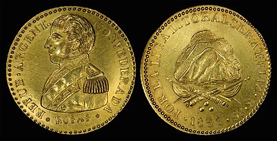
Argentine Confederation (1836) and depicts Juan Manuel de Rosas and a mountain with crossed flags. Extremely rare.

- Support as nominator – Godot13 ( talk) 05:04, 27 January 2016 (UTC)
- Support - Awesome. — Chris Woodrich ( talk) 07:47, 27 January 2016 (UTC)
- Support – Vesuvius Dogg ( talk) 18:43, 28 January 2016 (UTC)
- Support – Jobas ( talk) 22:12, 28 January 2016 (UTC)
- Support – Yann ( talk) 15:26, 29 January 2016 (UTC)
- Support -- Pine ✉ 19:47, 30 January 2016 (UTC)
Promoted File:Argentina 1828 8 Escudos.jpg --
Armbrust
The Homunculus 09:56, 6 February 2016 (UTC)
Promoted File:Argentina 1836 8 Escudos.jpg --
Armbrust
The Homunculus 09:56, 6 February 2016 (UTC)
Billy Strayhorn
Voting period is over. Please don't add any new votes. Voting period ends on 7 Feb 2016 at 18:26:09 (UTC)
.jpg)
- Reason
- You know, I do
n'twant to brag, but: here's a commercially available restoration of this image. I think I did a better job, and I'm not charging for use. (And if you want to over-boost contrast until half the details behind Strayhorn fade into dark... I'm sure you can still do that.) - Articles in which this image appears
- Billy Strayhorn + I just scattered it over a few song articles that lacked images.
- FP category for this image
- Wikipedia:Featured pictures/People/Entertainment
- Creator
- William P. Gottlieb, restored by Adam Cuerden
- Support as nominator – Adam Cuerden ( talk) 18:26, 28 January 2016 (UTC)
- Support – Jobas ( talk) 22:38, 28 January 2016 (UTC)
- Support - A perfect example of what Strayhorn can do. Ikhtiar H ( talk) 04:14, 29 January 2016 (UTC)
- • One has to go to full res to clearly see that that's a cigarette in his mouth.
Sca (
talk) 15:07, 29 January 2016 (UTC)
- Aye, but it's a minor issue at thumbnail that adds to the image at full, and this is easily the best image I can find for him. Adam Cuerden ( talk) 02:21, 30 January 2016 (UTC)
- • One has to go to full res to clearly see that that's a cigarette in his mouth.
Sca (
talk) 15:07, 29 January 2016 (UTC)
- Support – Yann ( talk) 15:25, 29 January 2016 (UTC)
- Support - Wolftick ( talk) 00:37, 31 January 2016 (UTC)
- Support – "And there I'll be while I rot with the rest/ Of those whose lives are lonely, too." – Vesuvius Dogg ( talk) 10:01, 3 February 2016 (UTC)
Promoted File:Billy Strayhorn, New York, N.Y., between 1946 and 1948 (William P. Gottlieb 08211).jpg -- Armbrust The Homunculus 18:33, 7 February 2016 (UTC)
George Washington Carver
Voting period is over. Please don't add any new votes. Voting period ends on 8 Feb 2016 at 17:48:11 (UTC)

- Reason
- The other restoration (of a different image) failed as there was too much shadow; here, every feature is clear.
- Articles in which this image appears
- George Washington Carver
- FP category for this image
- Wikipedia:Featured pictures/People/Science and engineering
- Creator
- Unknown photographer; restored by User:Adam Cuerden
- Support as nominator – Adam Cuerden ( talk) 17:48, 29 January 2016 (UTC)
- Support, though I do think some more contrast would help. — Chris Woodrich ( talk) 10:31, 30 January 2016 (UTC)
- Support – Jobas ( talk) 16:44, 30 January 2016 (UTC)
- Oppose - Lacking in contrast and brightness. Regarding the digital altering of the brightness/contrast from the original scan (@ Adam Cuerden:): A photograph should not only be taken in such a way that it reflects reality, but also to expose useful or interesting detail in the depiction of a subject. The problem with attempting to match a preconceived idea of the skin tone of the subject is that the camera is far inferior to the human eye in exposing detail across a wide dynamic range. There is no absolute value when it comes to exposure or lighting so it is reasonable to vary it according the subject in order to preserve detail and compensate for this deficiency. If it is a picture of someone who has very pale skin or very dark skin I would expect the exposures and lighting to be different in order to preserve detail. I don't think this is unreasonable or in any way insensitive to the subjects race. For this reason I think adjusting the brightness of a photo very substantially from the original photo for this reason is not justified and I will likely oppose where I think this has a significant negative effect on the detail and clarity of the image. - Wolftick ( talk) 00:31, 31 January 2016 (UTC)
- But, Wolftick, this is from c. 1910. Those are rules for modern photography. We know he was dark. looking at pictures of him with other staff at the Institute shows he's by far the darkest skinned, and all other images I find that allow us a chance of seeing him in a context that allows us to judge clearly agree.
Adam Cuerden (
talk) 00:50, 31 January 2016 (UTC)
- The technology and capabilities have changed but I don't think the rules have. An image where the subject is insufficiently lit/exposed such that it makes it difficult to make out detail is a problem however light or dark the subject is. The group photo I think you mean is a better example in my opinon
[2]. The relative darkness of the skin tone is clear but the lighting means that detail and clarity is preserved. -
Wolftick (
talk) 01:55, 31 January 2016 (UTC)
- But the thing is, there's a huge amount of detail and clarit. Every bit of his face is sharp and clear, as is his coat. There was never much detail in the collar and tie; the background has a lot of detail as well. The only thing that might possibly be awkward is that the background is a ssomewhat similar colour to him, but he's clearly distinct from it, even in thumbnail. Adam Cuerden ( talk) 03:48, 31 January 2016 (UTC)
- The technology and capabilities have changed but I don't think the rules have. An image where the subject is insufficiently lit/exposed such that it makes it difficult to make out detail is a problem however light or dark the subject is. The group photo I think you mean is a better example in my opinon
[2]. The relative darkness of the skin tone is clear but the lighting means that detail and clarity is preserved. -
Wolftick (
talk) 01:55, 31 January 2016 (UTC)
- But, Wolftick, this is from c. 1910. Those are rules for modern photography. We know he was dark. looking at pictures of him with other staff at the Institute shows he's by far the darkest skinned, and all other images I find that allow us a chance of seeing him in a context that allows us to judge clearly agree.
Adam Cuerden (
talk) 00:50, 31 January 2016 (UTC)
![[2]](/info/en/?search=File:George_Washington_Carver,_ca._1902.jpg)
- Support Maybe a matter of taste, but I actually love the toning. Vesuvius Dogg ( talk) 10:06, 3 February 2016 (UTC)
Oppose– I just found this: we do have a FP of G.W. Carver [3] in this category Wikipedia:Featured pictures/People/Science and engineering. It was modified and replaced in this edit [4]. The existing FP seems to be a good image. Bammesk ( talk) 18:54, 7 February 2016 (UTC)
![[3]](/info/en/?search=File:George_Washington_Carver2.jpg)
- @
Bammesk: I... disagree. Comprehensively. That was very late in his life, has weird composition (it's all shifted left), strange contrast (everything looks really faded), a large out-of-focus flower, what might be a hand at the bottom of the image, which is a blob - it's terrible. Perhaps you could crop that into something passable, but that shouldn't be an FP, and this should. Further, if the problem is that this one supposedly doesn't have enough contrast between him and the background, that one has exactly the same issue.
Adam Cuerden (
talk) 19:37, 7 February 2016 (UTC)
- I will reconsider post delist of existing FP. About the contrast of this nom, I see merit in both sides. Wouldn't something between
[5] and
[6] work?
Bammesk (
talk) 20:41, 7 February 2016 (UTC)
- @
Bammesk: But, Bammesk, an existing FP is not a reason to oppose an FP, particularly when they're separated by thirty years, so don't overlap.
Adam Cuerden (
talk) 21:28, 7 February 2016 (UTC)
- In my previous edit, I had removed (striked) my oppose. I am ambivalent on supporting this nom. As Vesuvius Dogg noted, in a way it is a matter of taste, I like the image and the restoration quality but I find it a little hard to look at, too dark as a whole or overall.
Bammesk (
talk) 22:41, 7 February 2016 (UTC)
- It's weird that you're saying that. I think I should look at this on a couple other monitors, and compare. Maybe mine's on the light side. @ Bammesk: Adam Cuerden ( talk) 01:16, 8 February 2016 (UTC)
- @ Bammesk: I've made a tweak, a.k.a. jumped it between two screens and tried to find something I liked on both. See if it's fixed it so that you like it. Adam Cuerden ( talk) 01:45, 8 February 2016 (UTC)
- In my previous edit, I had removed (striked) my oppose. I am ambivalent on supporting this nom. As Vesuvius Dogg noted, in a way it is a matter of taste, I like the image and the restoration quality but I find it a little hard to look at, too dark as a whole or overall.
Bammesk (
talk) 22:41, 7 February 2016 (UTC)
- @
Bammesk: But, Bammesk, an existing FP is not a reason to oppose an FP, particularly when they're separated by thirty years, so don't overlap.
Adam Cuerden (
talk) 21:28, 7 February 2016 (UTC)
- I will reconsider post delist of existing FP. About the contrast of this nom, I see merit in both sides. Wouldn't something between
[5] and
[6] work?
Bammesk (
talk) 20:41, 7 February 2016 (UTC)
- @
Bammesk: I... disagree. Comprehensively. That was very late in his life, has weird composition (it's all shifted left), strange contrast (everything looks really faded), a large out-of-focus flower, what might be a hand at the bottom of the image, which is a blob - it's terrible. Perhaps you could crop that into something passable, but that shouldn't be an FP, and this should. Further, if the problem is that this one supposedly doesn't have enough contrast between him and the background, that one has exactly the same issue.
Adam Cuerden (
talk) 19:37, 7 February 2016 (UTC)
![[5]](https://upload.wikimedia.org/wikipedia/commons/archive/d/d0/20160126100036!George_Washington_Carver_c1910_-_Restoration.jpg)
![[6]](https://upload.wikimedia.org/wikipedia/commons/d/d0/George_Washington_Carver_c1910_-_Restoration.jpg)
Not Promoted -- Armbrust The Homunculus 17:57, 8 February 2016 (UTC)
Samuel Coleridge-Taylor
Voting period is over. Please don't add any new votes. Voting period ends on 9 Feb 2016 at 00:45:55 (UTC)

- Reason
- The "Black Mahler", best known for his settings of Hiawatha, Coleridge-Taylor's works were hugely popular in the early 20th century, indeed, only the Second World War stopped The Song of Hiawatha being a major annual event in London after 15 years.
- Articles in which this image appears
- Samuel Coleridge-Taylor+2
- FP category for this image
- Wikipedia:Featured pictures/People/Entertainment
- Creator
- Unknown, restored by Adam Cuerden
- Support as nominator – Adam Cuerden ( talk) 00:45, 30 January 2016 (UTC)
- Support — Chris Woodrich ( talk) 10:30, 30 January 2016 (UTC)
- Support – Jobas ( talk) 16:45, 30 January 2016 (UTC)
- Support - Nice image restoration. -- Godot13 ( talk) 01:51, 2 February 2016 (UTC)
- Weak support – Good image and good restoration. I still cannot get over the backrest extending high above his shoulders, it looks like wings or some kind of armor! sorry. This image:
[7] is better, not sure it is sharp enough though.
Bammesk (
talk) 19:33, 7 February 2016 (UTC)
- @
Bammesk: That one really doesn't have any detail. It's very posterised, or at least grainy. I looked at it and rejected it for that reason.
Adam Cuerden (
talk) 19:52, 7 February 2016 (UTC)
- Agreed.
Bammesk (
talk) 20:08, 7 February 2016 (UTC)
- @
Bammesk: By the way, now I see the chair only that way too...
Adam Cuerden (
talk) 02:48, 8 February 2016 (UTC)
- I can get behind this
[8] or this
[9] composition-wise, but I hear you about the technical problems.
Bammesk (
talk) 03:15, 8 February 2016 (UTC)
- Unfortunately, those will pretty much never be featured quality, and as a Briton, the resources are buried a lot harder than they would be for a country that releases its archives. Adam Cuerden ( talk) 07:46, 8 February 2016 (UTC)
- I can get behind this
[8] or this
[9] composition-wise, but I hear you about the technical problems.
Bammesk (
talk) 03:15, 8 February 2016 (UTC)
- @
Bammesk: By the way, now I see the chair only that way too...
Adam Cuerden (
talk) 02:48, 8 February 2016 (UTC)
- Agreed.
Bammesk (
talk) 20:08, 7 February 2016 (UTC)
- @
Bammesk: That one really doesn't have any detail. It's very posterised, or at least grainy. I looked at it and rejected it for that reason.
Adam Cuerden (
talk) 19:52, 7 February 2016 (UTC)
![[7]](/info/en/?search=File:Samuel_Coleridge-Taylor_c.1893.JPG)
![[8]](/info/en/?search=File:Coleridge-taylor.gif)
Not Promoted -- Armbrust The Homunculus 03:46, 9 February 2016 (UTC)
- Nomination didn't reach the necessary quorum for promotion. Armbrust The Homunculus 03:46, 9 February 2016 (UTC)
Amar Jyoti
Voting period is over. Please don't add any new votes. Voting period ends on 9 Feb 2016 at 16:45:07 (UTC)
- Reason
- complete restored film of 2 h 30 min with English subtitles, cited as a "noteworthy", and in which the lead actress is cited as her most "memorable" role. The film has been cited as a "great film", an "outstanding film", an "adventure classic" and the first Indian film screened at the Venice Film Festival.
- Articles in which this image appears
- Amar Jyoti, Durga Khote
- FP category for this image
- Wikipedia:Featured pictures/Culture, entertainment, and lifestyle/Entertainment
- Creator
- V. Shantaram
- Support as nominator – Yann ( talk) 16:45, 30 January 2016 (UTC)
- Question: Where did
Zhuyifei1999 get the subtitles that are included at
commons:TimedText:Amar Jyoti.webm.en.srt? Are they the user's own translations, or are they a previously published translation? —
Chris Woodrich (
talk) 00:38, 31 January 2016 (UTC)
- Previously published on YouTube. If it has any copyright issues of any sort, please let me know. --
Zhuyifei1999 (
talk) 03:57, 31 January 2016 (UTC)
- Unless the translations were released with a creative commons license, they are not free. Translation attracts its own copyright, above and beyond the copyright of the original work. —
Chris Woodrich (
talk) 04:44, 31 January 2016 (UTC)
- deleted -- Zhuyifei1999 ( talk) 08:18, 31 January 2016 (UTC)
- Unless the translations were released with a creative commons license, they are not free. Translation attracts its own copyright, above and beyond the copyright of the original work. —
Chris Woodrich (
talk) 04:44, 31 January 2016 (UTC)
- Previously published on YouTube. If it has any copyright issues of any sort, please let me know. --
Zhuyifei1999 (
talk) 03:57, 31 January 2016 (UTC)
- Support in principle, though I haven't atually had time to watch all of it yet. Adam Cuerden ( talk) 18:17, 2 February 2016 (UTC)
- Support – Jobas ( talk) 13:20, 4 February 2016 (UTC)
Not Promoted -- Armbrust The Homunculus 18:10, 9 February 2016 (UTC)
Australia Telescope Compact Array
Voting period is over. Please don't add any new votes. Voting period ends on 9 Feb 2016 at 19:59:38 (UTC)


- Reason
- Seems to be the best photo that we have of this subject, and the photo itself has some historic value
- Articles in which this image appears
- Australia Telescope Compact Array
- FP category for this image
- Wikipedia:Featured pictures/Space/Understanding
- Creator
- Original by John Masterson, CSIRO; edited by Thennicke
- Support - Noise is acceptable, given the age. Very well done. —
Chris Woodrich (
talk) 01:01, 31 January 2016 (UTC)
- @
Crisco 1492: Could you check the alt, and update your !vote?
Armbrust
The Homunculus 17:43, 8 February 2016 (UTC)
- Support goes for both. — Chris Woodrich ( talk) 04:40, 9 February 2016 (UTC)
- @
Crisco 1492: Could you check the alt, and update your !vote?
Armbrust
The Homunculus 17:43, 8 February 2016 (UTC)
- Comment – I want to support, but the blue sky has these shades of darker and lighter patches, they are easier to discern by spanning the image across the screen at full resolution. Any thoughts about removing them in software? Bammesk ( talk) 19:47, 31 January 2016 (UTC)
- Question I can see the image has been reverted back to the original by "Colin", advising he will take the discussion to a "talk page", but I cannot find that discussion on his or Bammesk's talk page - any idea why this was reverted? gazhiley 17:55, 1 February 2016 (UTC)
- Discussion is happening on Commons:File talk:CSIRO ScienceImage 3881 Five Antennas at Narrabri.jpg -- Pine ✉ 01:25, 2 February 2016 (UTC)
- Comment – Per the discussion [10] and User:Colin, I uploaded a higher quality alternate (and amended my vote). Bammesk ( talk) 04:39, 2 February 2016 (UTC)
- Support Alt gazhiley 10:51, 2 February 2016 (UTC)
- Support Alt – Jobas ( talk) 13:22, 4 February 2016 (UTC)
Promoted File:CSIRO ScienceImage 3881 Five Antennas at Narrabri - restoration1.jpg -- Armbrust The Homunculus 20:47, 9 February 2016 (UTC)
- Only the alt has enough support for promotion.
Added image to Wikipedia:Featured pictures/Places/Others instead. Armbrust The Homunculus 20:47, 9 February 2016 (UTC)
Cutaway of a Water Turbine Generator
Voting period is over. Please don't add any new votes. Voting period ends on 11 Feb 2016 at 21:28:17 (UTC)

- Reason
- This is an image of a water turbine that caught my eye, and does a good job of explaining the parts in a water turbine that move to generate electrical force from flowing water. Note that this is an .svg file, and therefore while not at the minimum pixel requirement it should not be an issue due to the ability of svg files to be resized as needed without compromising the image quality.
- Articles in which this image appears
- Dam, Hydroelectricity
- FP category for this image
- Wikipedia:Featured pictures/Diagrams, drawings, and maps/Diagrams
- Creator
- Original image by U.S. Army Corps of Engineers, vectorized version courtesy of Gothika
- Support as nominator – TomStar81 ( Talk) 21:28, 1 February 2016 (UTC)
- Support – Jobas ( talk) 13:23, 4 February 2016 (UTC)
- Comment – I would support if the IDs in the caption were part of the image. The image looks incomplete without them.
Bammesk (
talk) 01:47, 5 February 2016 (UTC)
- @ Bammesk: Usually in an image of this nature the image does not incorporate the IDs is so that the IDs for the numbered parts can be translated into different languages (for example, this M4 Sherman tank image). This is usually the case for images of this nature that are based out of the commons repository, although in fairness to your point there really isn't a reason why an English specific version could not be created. We have several images like this one that do include the English subtitles (for example, England Expects, the V2 ballistic missile, and this 16"/50 gun turret). TomStar81 ( Talk) 03:35, 5 February 2016 (UTC)
.svg)
Not Promoted -- Armbrust The Homunculus 21:38, 11 February 2016 (UTC)
Animated video of the 2011 North American Blizzard
Voting period is over. Please don't add any new votes. Voting period ends on 11 Feb 2016 at 21:34:36 (UTC)
- Reason
- This is a satellite video loop from the North American region for an approximately 72-hour period beginning 31 January and ending 2 February, during which time a rather sizable portion of the United States and parts of Canada and Mexico experienced one of the worst Winter Storms/Blizzard in history. This was one of only 16 storms to have earned a Category 5 rating on the Regional Snowfall Index. This image comes to us courtesy of the National Oceanographic and Atmospheric Administration (NOAA), the parent organization of the US National Weather Service, which operates a number of Geostationary Operational Environmental Satellites (GEOS) - include the GOES 13 bird which captured this specific footage - in conjunction with NASA. Given that tomorrow will mark the 5 year anniversary of the event and that the original nomination missed passing by one !vote last time around, I thought it would be a good chance to renominate the image and see if it doesn't have better luck this time.
- Articles in which this image appears
- January 31 – February 2, 2011 North American blizzard
- FP category for this image
- As a guess I'd say either Wikipedia:Featured pictures/Natural phenomena/Weather or Wikipedia:Featured pictures/Space/Looking back
- Creator
- NASA/NOAA
- Support as nominator – TomStar81 ( Talk) 21:34, 1 February 2016 (UTC)
- Support presuming that there's nothing higher-res available, in which case that's preferred. Adam Cuerden ( talk) 02:17, 2 February 2016 (UTC)
- Support – Jobas ( talk) 13:25, 4 February 2016 (UTC)
- Support – Bammesk ( talk) 01:59, 5 February 2016 (UTC)
Not Promoted -- Armbrust The Homunculus 21:40, 11 February 2016 (UTC)
- Nomination didn't reach the necessary quorum for promotion. Armbrust The Homunculus 21:40, 11 February 2016 (UTC)
Shirley Chisholm
Voting period is over. Please don't add any new votes. Voting period ends on 12 Feb 2016 at 01:45:37 (UTC)

- Reason
- A very nice image. One of the best-preserved I've seen in ages.
- Articles in which this image appears
- Shirley Chisholm+13
- FP category for this image
- Wikipedia:Featured pictures/People/Political
- Creator
- Thomas J. O'Halloran, with some light restoration by Adam Cuerden
- Support as nominator – Adam Cuerden ( talk) 01:45, 2 February 2016 (UTC)
- Support – Bammesk ( talk) 04:53, 2 February 2016 (UTC)
- Support – Yann ( talk) 10:29, 2 February 2016 (UTC)
- Support - Actually had my eyes on this one. Never did have the time to work on it. Very good! (BTW, the Nichelle Nichols Star Trek image may be worth a visit). — Chris Woodrich ( talk) 04:02, 3 February 2016 (UTC)
- Support – Vesuvius Dogg ( talk) 09:55, 3 February 2016 (UTC)
- Support – Jobas ( talk) 13:28, 4 February 2016 (UTC)
- Support - as above. Mattximus ( talk) 21:40, 5 February 2016 (UTC)
Promoted File:Shirley Chisholm.jpg -- Armbrust The Homunculus 03:35, 12 February 2016 (UTC)
Big Buck Bunny
Voting period is over. Please don't add any new votes. Voting period ends on 11 Feb 2016 at 23:54:49 (UTC)
- Reason
- very high quality short film, free, and... hilarious
- Articles in which this image appears
- Big Buck Bunny
- FP category for this image
- Wikipedia:Featured pictures/Culture, entertainment, and lifestyle/Entertainment
- Creator
- Blender Foundation
- Support as nominator – Yann ( talk) 23:54, 1 February 2016 (UTC)
- Support. A film is the best image for itself, after all. Adam Cuerden ( talk) 18:16, 2 February 2016 (UTC)
- Support - Very high quality. I downloaded the large original file to make sure and it looks a good as one might expect given the 4k resolution and sufficient bitrate - Wolftick ( talk) 20:46, 2 February 2016 (UTC)
- Support — Chris Woodrich ( talk) 04:03, 3 February 2016 (UTC)
- Support – Jobas ( talk) 13:26, 4 February 2016 (UTC)
- Support Good to have such free CG movies. Brandmeister talk 14:25, 11 February 2016 (UTC)
Promoted File:Big Buck Bunny 4K.webm -- Armbrust The Homunculus 03:39, 12 February 2016 (UTC)
Force India VJM08 / Nico Hülkenberg at 2015 Japanese Grand Prix
Voting period is over. Please don't add any new votes. Voting period ends on 12 Feb 2016 at 11:19:56 (UTC)

- Reason
- As far as I can see, there is so far only one FP for Formula One. Over the past year, I was able to accumulate pictures of almost every Grand Prix, and I believe this is the most beautiful one. I especially enjoy the colors, which stands out very much, particularly how the orange banded tyres work with the color scheme of the rest of the car.
- Articles in which this image appears
- Force India VJM08, 2015 Japanese Grand Prix
- FP category for this image
- Wikipedia:Featured pictures/Culture, entertainment, and lifestyle/Sport
- Creator
- Keisuke Kariya ( Flickr)
- Support as nominator – Zwerg Nase ( talk) 11:19, 2 February 2016 (UTC)
- Support – Not being conversant in F1, I can't judge significance, but pic certainly captures speed, and detail at full res is pretty good, if perhaps not 100 percent. (Tight crop at rear, likely to be noticed by some, is not a prob, IMO.) Sca ( talk) 15:01, 2 February 2016 (UTC)
- @ Sca: It is certainly not a majorly significant car in the history of F1, but considering the current lack of F1 FPs, I'd say it would be a good thing to have another one. I am thinking about then using it as a possible infobox photo for Formula One car. Zwerg Nase ( talk) 15:52, 2 February 2016 (UTC)
- Oppose I want to like it as I am a fan of F1, but what is in focus is grainy, and there are many parts of the machine that are out of focus. I am not saying I can do better, but the bar is high in terms of action shots, and this doesn't quite meet that. FYI the orange banding on the tyres denotes the conditions and therefore tyre choice, rather than matching the car, in case anyone thinks otherwise... gazhiley 16:45, 2 February 2016 (UTC)
- @
Gazhiley: I know, but I feel that it still matches the Force India very well here. It is really hard to find F1 shots that are completely in focus... I chose this one because the other ones from the Grand Prix suffered from this even more so.
Zwerg Nase (
talk) 17:14, 2 February 2016 (UTC)
- While it may be the best of the options, car action shots are able to be better, looking at the selection we have passed through this process. Sorry. gazhiley 12:22, 3 February 2016 (UTC)
- @
Gazhiley: I know, but I feel that it still matches the Force India very well here. It is really hard to find F1 shots that are completely in focus... I chose this one because the other ones from the Grand Prix suffered from this even more so.
Zwerg Nase (
talk) 17:14, 2 February 2016 (UTC)
- Oppose per gazhiley. Also I think it's a little under exposed. As an F1 fan I'm pretty familiar with action shots like this and the bar is pretty high. - Wolftick ( talk) 20:10, 2 February 2016 (UTC)
- Oppose It's a decent photo, indeed, one that I would be extremely proud of. However, it has minimal EV, and it is not as sharp as would be desired. The tight crop is also detrimental to the overall appearance. Harrias talk 22:04, 2 February 2016 (UTC)
- @
Harrias:@
Wolftick: I am no expert in photos, but it seems to me that the extreme high resolution of the photo works against it here. Would I only supply it in the minimal expected resolution of 1500px, the lack of sharpness would probably not be noticeable?
Zwerg Nase (
talk) 23:47, 2 February 2016 (UTC)
- @ Zwerg Nase: I would always prefer the larger image and realise that downsampling images can be superficially beneficial to image quality at the expense of discarding information. I try to take this into account, saving the image then properly resizing/sampling it if I think it would help. It's a very good, valuable image but I just don't think it is quite there overall for FP. As mentioned the bar for actions shots in general is very high. - Wolftick ( talk) 02:28, 3 February 2016 (UTC)
- @
Harrias:@
Wolftick: I am no expert in photos, but it seems to me that the extreme high resolution of the photo works against it here. Would I only supply it in the minimal expected resolution of 1500px, the lack of sharpness would probably not be noticeable?
Zwerg Nase (
talk) 23:47, 2 February 2016 (UTC)
Not Promoted -- Armbrust The Homunculus 14:21, 12 February 2016 (UTC)
Fannie Lou Hamer
Voting period is over. Please don't add any new votes. Voting period ends on 12 Feb 2016 at 23:34:43 (UTC)

- Reason
- A fine image of an important African-American activist and politician doing what she does best: Telling truth to power.
- Articles in which this image appears
- Fannie Lou Hamer +1
- FP category or this image
- Wikipedia:Featured pictures/People/Political
- Creator
- Warren K. Leffler for U.S. News & World Report. Restored by Adam Cuerden
- Support as nominator – Adam Cuerden ( talk) 23:34, 2 February 2016 (UTC)
- Support – Jobas ( talk) 13:30, 4 February 2016 (UTC)
CommentOppose – Well, it is what it is: A 50-year-old hand-held and -focused B&W news shot (probably taken on Tri-X with a strobe) that lacks detail, even by '60s film standards, IMO. (I was around in those days.) Also cuts off her hands. Fine for her article, but ... ?? Sca ( talk) 15:35, 4 February 2016 (UTC)- Well, it is of a significant event in her career. Adam Cuerden ( talk) 02:20, 5 February 2016 (UTC)
- Oppose I just don't think it quite has sufficient the EV to overcome the very substantial quality issues in regard to FP criteria - Wolftick ( talk) 00:52, 7 February 2016 (UTC)
Not Promoted -- Armbrust The Homunculus 06:06, 13 February 2016 (UTC)
Gwendoline Konie
Voting period is over. Please don't add any new votes. Voting period ends on 12 Feb 2016 at 23:47:29 (UTC)
.jpg)
- Reason
- @ Adam Cuerden: told me to try a nomination (I have been requested to add other reasons - she represents poorly represented groups, its black history month, there is a Nigeria writing contest on, I like trying new things .... )
- Articles in which this image appears
- Gwendoline Konie and in German and Norwegian Bokmal
- FP category for this image
- Wikipedia:Featured pictures/People/Political
- Creator
- Rob Bogaerts / Anefo
- Support as nominator – Victuallers ( talk) 23:47, 2 February 2016 (UTC)
- Support While the image isn't absolutely perfect (the nametag intervenes a bit), between the high quality of all other aspects of the image and combined with the underrepresentation of people from pretty much any African country, I think this easily passes the bar. Adam Cuerden ( talk) 00:04, 3 February 2016 (UTC)
- Question Can you please update the reason to something other than "Adam told me to?" Ie the reason you wish to nominate this image, why you think it is FP worthy please? gazhiley 12:42, 4 February 2016 (UTC)
- OK if you need it Victuallers ( talk) 19:03, 4 February 2016 (UTC)
- Support – Jobas ( talk) 13:31, 4 February 2016 (UTC)
- Support – Wolftick ( talk) 00:49, 7 February 2016 (UTC)
Not Promoted -- Armbrust The Homunculus 06:07, 13 February 2016 (UTC)
- Nomination didn't reach the necessary quorum for promotion. Armbrust The Homunculus 06:07, 13 February 2016 (UTC)
Aurat
Voting period is over. Please don't add any new votes. Voting period ends on 13 Feb 2016 at 12:13:51 (UTC)
- Reason
- high resolution (1080p) of a famous movie. This movie was remade as Mother India, "which is considered as one of the biggest hits of all time in Indian Cinema"
- Articles in which this image appears
- Aurat (1940 film)
- FP category for this image
- Wikipedia:Featured pictures/Culture, entertainment, and lifestyle/Entertainment
- Creator
- Mehboob Khan
- Support as nominator – Yann ( talk) 12:13, 3 February 2016 (UTC)
- Support TomStar81 ( Talk) 09:08, 10 February 2016 (UTC)
Not Promoted -- Armbrust The Homunculus 12:54, 13 February 2016 (UTC)
Aisha Moh’d Kazaure
Voting period is over. Please don't add any new votes. Voting period ends on 13 Feb 2016 at 08:56:07 (UTC)

- Reason
- Under represented person. She has started the first midwifery school in her part of Nigeria. There are other good pictures of her in the category (I'm not "a photographer"). If you can do better then please .... have a go.
- Articles in which this image appears
- Jigawa State School of Midwifery (and an article on her when we have more info)
- FP category for this image
- Wikipedia:Featured pictures/People/Others
- Creator
- Lindsay Mgbor/DFID
- Support as nominator – Victuallers ( talk) 08:56, 3 February 2016 (UTC)
- Represented following change of image to one that is bigger Victuallers ( talk) 10:21, 3 February 2016 (UTC)
- Oppose Noisy and out of focus - Wolftick ( talk) 01:17, 4 February 2016 (UTC)
- Oppose Per Wolftick – Jobas ( talk) 13:34, 4 February 2016 (UTC)
- Oppose - Focus issues. Mattximus ( talk) 21:39, 5 February 2016 (UTC)
- Oppose: grainy and distracting blur; ISO 640 is unnecessary. Esquivalience t 22:16, 9 February 2016 (UTC)
Not Promoted -- Armbrust The Homunculus 12:55, 13 February 2016 (UTC)
Ibukun Odusote
Voting period is over. Please don't add any new votes. Voting period ends on 13 Feb 2016 at 18:43:28 (UTC)
.jpg)
- Reason
- "Adam told me to do it".... it appears that my motives fopr nominating this image effects other peoples opinions. So I have been asked to think of other reasons apart from the actual one. So ... I think its good that this person represents two underreprsented groups on Wikipedia. I also thought that I might learn something about the FP process... and I have
- Articles in which this image appears
- Ibukun Odusote
- FP category for this image
- Wikipedia:Featured pictures/People/Science and engineering
- Creator
- icannphotos - Ibukun Odusote Uploaded by russavia
- Support as nominator – Victuallers ( talk) 18:43, 3 February 2016 (UTC)
- Comment – The bright lighting on the right side of her head is distracting. Is there any chance of dimming it a little? may be one stop? Bammesk ( talk) 03:53, 4 February 2016 (UTC)
- Support – but it would be nice if we could reduce the side glare.
Bammesk (
talk) 04:18, 6 February 2016 (UTC)
- I tried to reduce it, but wasn't getting very good results. Also, Support. Adam Cuerden ( talk) 15:32, 6 February 2016 (UTC)
- Support – but it would be nice if we could reduce the side glare.
Bammesk (
talk) 04:18, 6 February 2016 (UTC)
- Question Can you please update the reason to something other than "Adam told me to?" Ie the reason you wish to nominate this image, why you think it is FP worthy please? gazhiley 12:42, 4 February 2016 (UTC)
- OK I have Victuallers ( talk) 21:54, 4 February 2016 (UTC)
- Comment - I'm not sure I see the EV, how does one determine that she is notable? What makes her special and not the hundreds of thousands of other civil servants? One of the references in the page doesn't even mention her, but Nigeria's Akinwumi Adesina instead. Mattximus ( talk) 21:37, 5 February 2016 (UTC)
- Reply She was the person responsible for the .ng domain. Thats a fairly important job. Not sure what EV is. She is also a Permanent Secretary for a ministry.... another top ranking job in (UK style) civil service. Victuallers ( talk) 18:44, 6 February 2016 (UTC)
- Oppose Odd/poor lighting and relatively limited notability - Wolftick ( talk) 00:48, 7 February 2016 (UTC)
- Support - Notability is not part of the criteria; so long as a subject is notable enough for an article, they're notable enough for FP. Image is clear and sharp. Lighting is admittedly stark, but that was a deliberate choice by the photographer that I can get behind in this case. — Chris Woodrich ( talk) 01:05, 7 February 2016 (UTC)
- In regards to portraits of politicians or civil servants I think that notability is an aspect of
WP:FP? #3 "Is among Wikipedia's best work.[?]". Such official professionally shot public domain portraits are fairly common so notability as well as quality are factors when considering a FPC. I believe this has precedent in previous similar nominations, as well as with coats of arms and flags. -
Wolftick (
talk) 02:37, 7 February 2016 (UTC)
- A belief is simply not enough; do you have any actual evidence of precedent? In my 5+ years commenting on FPC nominations, I've seen that official portraits have generally failed and succeeded not on the notability of the individual alone, but on the quality of the image and the whims of the !voters. Yes, there are one or two editors *cough* who will !vote on notability, but they are in the minority. That's why we have (political portraits alone) Teddy Roosevelt just a few rows away from Annkathrin Kammeyer.
- As a side note: I think that it's good that we've got a lot more freely licensed official portraits to choose from. I, for one, am tired of looking at biographies which have no pictures whatsoever. —
Chris Woodrich (
talk) 09:46, 7 February 2016 (UTC)
- Also as a side note, I fully agree.
- I do think though that it is an issue where large numbers of high quality but rather similar fairly generic professional portraits of contemporary politicians etc are available to be nominated for FP. I don't think it would be good to promote all of them en masse so I think there should be some criteria beyond simply the quality of the picture, which is by it's nature likely to be of a high technical standard. I had seen people mentioning notability in this regard previously and did not think this was an unreasonable criteria to use where the portrait itself is not particularly exceptional in my opinion. I suppose in a way it's not how notable the person is, rather how notable or exceptional the portrait is taken as a whole. I think this is a reasonable interpretation of WP:FP? #3 - Wolftick ( talk) 14:56, 7 February 2016 (UTC)
- In regards to portraits of politicians or civil servants I think that notability is an aspect of
WP:FP? #3 "Is among Wikipedia's best work.[?]". Such official professionally shot public domain portraits are fairly common so notability as well as quality are factors when considering a FPC. I believe this has precedent in previous similar nominations, as well as with coats of arms and flags. -
Wolftick (
talk) 02:37, 7 February 2016 (UTC)
Promoted File:Ibukun Odusote (3347121979).jpg -- Armbrust The Homunculus 18:44, 13 February 2016 (UTC)
Vera Songwe
Voting period is over. Please don't add any new votes. Voting period ends on 14 Feb 2016 at 13:04:00 (UTC)
.jpg)
- Reason
- While there's some motion blur on the arm, this is easily one of the best conference photos I've seen. It has a lot of life and personality to it, the microphone is minimally intrusive, and the face is very sharp.
- Articles in which this image appears
- Vera Songwe
- FP category for this image
- It's debatable, but WP:Featured pictures/People/Business seems the best fit.
- Creator
- Chatham House
- Support as nominator – Adam Cuerden ( talk) 13:04, 4 February 2016 (UTC)
- Support – Per nom. Although her article at 300 words is quite brief, pic is a nice 'action' capture of a fairly notable person who seems quite animated at this moment. (Doesn't hurt that subject is black & fem.) Sca ( talk) 15:13, 4 February 2016 (UTC)
- Support – Jobas ( talk) 01:16, 5 February 2016 (UTC)
- Support the pose and motion blur are less than ideal, but good quality conference photos are rarer for Wikipedia then I would like, this person seems to meet the notability requirements, and there is EV in showing this person at a conference in their field. -- Pine ✉ 05:13, 5 February 2016 (UTC)
- Oppose - motion blur makes this look like an amateur snapshot at an event. Sorry. Renata ( talk) 19:21, 9 February 2016 (UTC)
Not Promoted -- Armbrust The Homunculus 13:28, 14 February 2016 (UTC)
Sacra di San Michele
Voting period is over. Please don't add any new votes. Voting period ends on 15 Feb 2016 at 05:08:23 (UTC)

- Reason
- Notable building; photo is 8,000 × 3,733 pixels
- Articles in which this image appears
- Sacra di San Michele, The Name of the Rose
- FP category for this image
- Wikipedia:Featured pictures/Places/Architecture
- Creator
- Elio Pallard
- Support as nominator – Pine ✉ 05:08, 5 February 2016 (UTC)
- Weak Oppose While I like the Evil Villain hideout appearance of this building, there's just too much cloud in front of the building obscuring details. It's actually worse at thumbnail than full res, which is unusual, but is off putting. I appreciate the probable difficulty of taking a clear shot, but this isn't quite good enough sorry. There also seems to be too much space to the right of this picture making it strangely unbalanced. gazhiley 12:11, 5 February 2016 (UTC)
- Comment – Striking scene. The mist in the air doesn't detract, IMO – just makes it more eerie. But is the pic tilted slightly to the right? Or is it just me? Sca ( talk) 14:59, 5 February 2016 (UTC)
- Weak Oppose Per User:gazhiley – Jobas ( talk) 16:07, 6 February 2016 (UTC)
- Support Quite a great picture to me. It gives a nice overview of the place. – Yann ( talk) 17:57, 10 February 2016 (UTC)
Not Promoted -- Armbrust The Homunculus 07:03, 15 February 2016 (UTC)
Police Headquarters (Stanley, Falkland Islands)
Voting period is over. Please don't add any new votes. Voting period ends on 15 Feb 2016 at 20:48:57 (UTC)

- Reason
- High quality, high EV. Only police station in the Falkland Islands. (Replacement of similar image, not in the article for 7 days).
- Articles in which these images appear
- Royal Falkland Islands Police
- FP category for this image
- Other places
- Creator
- Godot13
- Support as nominator – Godot13 ( talk) 20:48, 5 February 2016 (UTC)
- Support – Bammesk ( talk) 04:37, 6 February 2016 (UTC) (no visible doors!)
- Support Looks good... Well, in patches looks a mess, but the picture itself looks good... gazhiley 08:32, 6 February 2016 (UTC)
- Support – Jobas ( talk) 16:05, 6 February 2016 (UTC)
- Comment - It's nice, but I feel as though having a bit more space under the sidewalk and the whole building (right side) would result in a better picture. — Chris Woodrich ( talk) 01:01, 7 February 2016 (UTC)
-
- That's why I keep saying it's worth trying a panorama or two. Another three frames would have given you plenty of room to work with. — Chris Woodrich ( talk) 09:25, 7 February 2016 (UTC)
- Understood... This would have been a difficult trip to bring any extra gear...-- Godot13 ( talk) 08:38, 10 February 2016 (UTC)
- True! But handheld works in the worst circumstances. The Great Mosque of Central Java FP was shot handheld, from atop a chair, through a series of bars. In a cave. With a box of scraps. — Chris Woodrich ( talk) 00:19, 11 February 2016 (UTC)
- Support Looks good, and the relative inaccessibility of the Falklands excuses the fairly minor issues Crisco raises. — Preceding unsigned comment added by Adam Cuerden ( talk • contribs) 20:41, 15 February 2016 (UTC)
Promoted File:FAL-2016-Stanley, Falkland Islands–Stanley Police Station.jpg -- Armbrust The Homunculus 21:34, 15 February 2016 (UTC)
- Added image to Places/Architecture instead. Armbrust The Homunculus 21:34, 15 February 2016 (UTC)
Battle of Borodino
Voting period is over. Please don't add any new votes. Voting period ends on 18 Feb 2016 at 21:38:16 (UTC)

- Reason
- Good EV. Quality looks nice.
- Articles in which this image appears
- Battle of Borodino, Napoleonic Wars
- FP category for this image
- Wikipedia:Featured pictures/Artwork/Paintings
- Creator
- Louis-François, Baron Lejeune
- Support as nominator – Étienne Dolet ( talk) 21:38, 8 February 2016 (UTC)
- @ Sca: Good question. The title of the painting is Battle of Moscow, 7th September 1812 which is the same date as the Battle of Borodino. I guess it wasn't known as the "Battle of Borodino" at the time and instead was known as the Battle of Moscow, or in other words: the Battle for Moscow. Étienne Dolet ( talk) 02:30, 9 February 2016 (UTC)
- Support – Historical EV, good detail. A significant event that ultimately led to the final defeat of Napoleon three years later. The Russians call it the Battle of Borodino (Бородинское сражение) while the French refer to it as the Battle of Moscow (Bataille de la Moskova), but it was fought at Borodino, 60 mi./100 km. west of Moscow. It's a French painting, but in English the event is generally known as the Battle of Borodino. – Sca ( talk)
- Is that the wounded Bagration in the (highlighted) foreground? (He died two weeks later after the wound became infected.) Sca ( talk) 16:48, 9 February 2016 (UTC)
- Support – Jobas ( talk) 19:53, 9 February 2016 (UTC)
- Oppose What's the EV here? While this might be an interesting example of eccentric 18th century military art in which details of events are squished together, it bears little resemblance to the battle. Soldiers are marching in wildly different directions for no reasons, there's a random truce with a cavalry fight imediately behind it, the hospital is oddly bloodless, few of the prisoners seem very worried about the bomb about to explode near them (and where did it come from?), etc. This would have EV in an article on the painting, artist or genre if it was explained in the text, but I don't see any in articles on the battle or war. Nick-D ( talk) 10:27, 10 February 2016 (UTC)
- Oppose Too small for a painting of this size. Yann ( talk) 22:01, 13 February 2016 (UTC)
- Oppose Per Yann. It's over 2.5m across so just above min resolution really isn't sufficient in my opinion. I make it a mere 19dpi - Wolftick ( talk) 02:54, 14 February 2016 (UTC)
- Withdraw as nominator. That'll save us some time and energy. Thanks everyone for your input. Étienne Dolet ( talk) 03:21, 14 February 2016 (UTC)
Not Promoted -- Armbrust The Homunculus 06:17, 16 February 2016 (UTC)
- Withdrawn nomination. Armbrust The Homunculus 06:17, 16 February 2016 (UTC)
Al Grey
Voting period is over. Please don't add any new votes. Voting period ends on 20 Feb 2016 at 02:50:32 (UTC)
.jpg)
- Reason
- Another excellent William P. Gottlieb documentation of jazz greats. Cap proved a little troublesome, but think I brought out some of the detail, at least at full res.
- Articles in which this image appears
- Al Grey
- FP category for this image
- WP:Featured pictures/People/Entertainment
- Creator
- William P. Gottlieb, restored by Adam Cuerden
- Support as nominator – Adam Cuerden ( talk) 02:50, 10 February 2016 (UTC)
- Support This is an excellent portrait - it's very lively, and shows him in the context of what he's best known for. Nick-D ( talk) 07:03, 10 February 2016 (UTC)
- Support - Per Nick, very unique portrait. — Chris Woodrich ( talk) 10:27, 10 February 2016 (UTC)
- Support – Per previous. Sca ( talk) 16:40, 10 February 2016 (UTC)
- Support – Jobas ( talk) 22:57, 10 February 2016 (UTC)
- Support – Yann ( talk) 21:59, 13 February 2016 (UTC)
- Support - captures the man's essence. Atsme 📞 📧 14:25, 15 February 2016 (UTC)
Promoted File:Al Grey (Gottlieb).jpg -- Armbrust The Homunculus 02:50, 20 February 2016 (UTC)
Carbajal Valley, Fuegian Andes (aerial)
Voting period is over. Please don't add any new votes. Voting period ends on 20 Feb 2016 at 08:47:10 (UTC)
%E2%80%93Valle_Carbajal_01.jpg)
- Reason
- High resolution image of an important geographic feature (previously without an article).
- Articles in which this image appears
- Carbajal Valley
- FP category for this image
- Wikipedia:Featured pictures/Natural phenomena/Others
- Creator
- Godot13
- Support as nominator – Godot13 ( talk) 08:47, 10 February 2016 (UTC)
- Support - Beautiful. — Chris Woodrich ( talk) 10:25, 10 February 2016 (UTC)
- Support Danrok ( talk) 12:34, 10 February 2016 (UTC)
- Support - Very clear. Cwmhiraeth ( talk) 13:27, 10 February 2016 (UTC)
- Weak Support Very grainy in the valley itself, mainly on the patches of water. Not opposing as the picture as a whole is really nice, but can't full support as per above... gazhiley 15:23, 10 February 2016 (UTC)
- Support – Jobas ( talk) 23:00, 10 February 2016 (UTC)
- Support – Yann ( talk) 21:58, 13 February 2016 (UTC)
- Support - great shot of the valley. Atsme 📞 📧 14:24, 15 February 2016 (UTC)
Promoted File:ARG-2016-Aerial-Tierra del Fuego (Ushuaia)–Valle Carbajal 01.jpg -- Armbrust The Homunculus 09:41, 20 February 2016 (UTC)
- Added image to Wikipedia:Featured pictures/Places/Landscapes instead. Armbrust The Homunculus 09:41, 20 February 2016 (UTC)
Head of a common earthworm, Lumbricus terrestris
Voting period is over. Please don't add any new votes. Voting period ends on 20 Feb 2016 at 09:31:41 (UTC)

- Reason
- Meets all of the FP criteria for SVG diagrams, including being freely licensed
- Articles in which this image appears
- Earthworm, Lumbricus terrestris
- FP category for this image
- Wikipedia:Featured pictures/Sciences/Biology
- Creator
- KDS4444
- Support as nominator (and my God, it has been a long time coming!) Am taking suggestions for changes/ improvements, if anyone has any. – KDS4444 Talk 09:31, 10 February 2016 (UTC)
- Support - Beautiful. Very useful. — Chris Woodrich ( talk) 15:24, 11 February 2016 (UTC)
- Support – nice work. Bammesk ( talk) 03:44, 12 February 2016 (UTC)
- Support – Jobas ( talk) 17:45, 12 February 2016 (UTC)
- Support Superb, like almost all your diagrams are. Adam Cuerden ( talk) 04:56, 14 February 2016 (UTC)
- Support - Wow! Can't think of a better word. I've only dabbled in the most basic diagraming - a clade or two - but this is off the charts. Excellent contribution. Atsme 📞 📧 14:19, 15 February 2016 (UTC)
- Aw, shucks,
Atsme...! Thank you!! I think my
scallop diagram was technically a better drawing, but I've been working on this one for over a year now and finally decided it was time to bring it to the world. I have a revised limpet that might be done soon, and there's a scaphopod I must finish ere I leave this world (which I hope won't be for a very long time yet, but at the rate I go sometimes, you never know). So keep your eyes peeled, there will be at least two more! (eventually).
KDS4444
Talk 03:12, 16 February 2016 (UTC)
- The George R. R. Martin of diagrams. All we need to do now is convert these diagrams into a hit show on incest, politics, and a little worm with a punchable face killing anyone and everyone. — Chris Woodrich ( talk) 00:13, 19 February 2016 (UTC)
- You realize this kind of flattery is going to make me spend even more of my time making even more diagrams of even more creatures...!
KDS4444
Talk 07:55, 19 February 2016 (UTC)
- A better timesink than TV Tropes. — Chris Woodrich ( talk) 11:01, 19 February 2016 (UTC)
- You realize this kind of flattery is going to make me spend even more of my time making even more diagrams of even more creatures...!
KDS4444
Talk 07:55, 19 February 2016 (UTC)
- Aw, shucks,
Atsme...! Thank you!! I think my
scallop diagram was technically a better drawing, but I've been working on this one for over a year now and finally decided it was time to bring it to the world. I have a revised limpet that might be done soon, and there's a scaphopod I must finish ere I leave this world (which I hope won't be for a very long time yet, but at the rate I go sometimes, you never know). So keep your eyes peeled, there will be at least two more! (eventually).
KDS4444
Talk 03:12, 16 February 2016 (UTC)
- Comment: It's an excellent diagram, but the details are rather tiny. I know it shouldn't be an issue with SVGs, but this still somewhat limits practical use; the nephridia are barely discernible at 1280px. Also, I'm wondering if it would be possible to convey the repeated segmentation without having to draw every single septum, which currently partly obscures much of the detail, covering the organs in swaths of blue overlay. -- Paul_012 ( talk) 12:34, 19 February 2016 (UTC)
- Got your comment, and I've now taken a shot at changing the image per recommendations: I adjusted the septa so that they would be more transparent generally and then less transparent toward their edges and centers with a more transparent ring running between the two (if that makes sense...?). I also tried to make the nephridia more prominent by removing some of their darker outlines, making the bladder brighter, and making the shadow behind each nephridium appear darker. One of the problems with the nephridia is that they just are very thin parts of the worms anatomy, and don't even show up well in most sections. But they are there, and are part a very important body system, so I think they must be included. Let me know if they are any more discernible now. Also note that I have included a number of small details which are just going to be missed by most casual observers (details like the tiny nephrodiopores). I drew these in because I knew they were there— think of them as Easter eggs for those who really take a thorough look at the image! KDS4444 Talk 16:52, 19 February 2016 (UTC)
Promoted File:Earthworm head.svg -- Armbrust The Homunculus 09:48, 20 February 2016 (UTC)
Greater kudu
Voting period is over. Please don't add any new votes. Voting period ends on 21 Feb 2016 at 04:48:44 (UTC)
.jpg)
- Reason
- High quality portrait. Has good EV for showing the horns.
- Articles in which this image appears
- Greater kudu
- FP category for this image
- Wikipedia:Featured pictures/Animals/Mammals
- Creator
- Hans Hillewaert
- Support as nominator – — Chris Woodrich ( talk) 04:48, 11 February 2016 (UTC)
- Support While I would prefer the whole animal, I like this framing. He doesn't seem to be too happy at the photograph though! gazhiley 10:50, 11 February 2016 (UTC)
- Support -- Alchemist-hp ( talk) 10:42, 12 February 2016 (UTC)
- Support – Jobas ( talk) 17:47, 12 February 2016 (UTC)
- Support – Yann ( talk) 21:57, 13 February 2016 (UTC)
- Support - per above, nice framing.-- Godot13 ( talk) 17:30, 14 February 2016 (UTC)
- Support - sharp and very nice framing of the horns - worthy, indeed. Atsme 📞 📧 14:12, 15 February 2016 (UTC)
Promoted File:Tragelaphus strepsiceros ♂ (head).jpg -- Armbrust The Homunculus 08:24, 21 February 2016 (UTC)
Cardiss Collins
Voting period is over. Please don't add any new votes. Voting period ends on 24 Feb 2016 at 04:50:19 (UTC)

- Reason
- While this does show its age in its composition quite a bit, Cardiss Collins was an amazing woman - I don't think all this is in her biography, but - she basically took over a congressional seat on her husband's death, and had to grow into the position, conquering shyness and lack of confidence to rise to powerful positions - President of the Congressional Black Caucus, ranking member of the Government Reform and Oversight Committee, and 24-year Representative for Illinois's 7th district.
- Articles in which this image appears
- Cardiss Collins +4
- FP category for this image
- Wikipedia:Featured pictures/People/Political
- Creator
- Photographer uncredited; restored by Adam Cuerden
- Support as nominator – Adam Cuerden ( talk) 04:50, 14 February 2016 (UTC)
- I'll have to Oppose this one - it looks like it is a second- or third-generation reproduction of the original photo; it has lost much highlight and shadow detail. --
Janke |
Talk 09:12, 14 February 2016 (UTC)
- @ Janke: I'm not sure you're right, but, that said, I'm not sure my explanation - that I think the image was a little over-exposed as most images of darker-skinned people were before colour film came in - will change your mind. There's PLENTY of shadow detail, it's the highlights and, to a lesser extent, the midtones that are a little lacking. Adam Cuerden ( talk) 18:26, 14 February 2016 (UTC)
- Support - Looking at various other images of her during this time frame (1970s), this looks to be among the best. The later pictures of her (1990s/2000s) are a bit better balanced, lighting-wise, but I don't know how many of those are free. — Chris Woodrich ( talk) 00:00, 15 February 2016 (UTC)
- Support - per Crisco - and I thank him for taking the extra step. Atsme 📞 📧 14:09, 15 February 2016 (UTC)
- Support – Jobas ( talk) 14:47, 16 February 2016 (UTC)
- Comment At the provided source link
http://baic.house.gov/member-profiles/profile.html?intID=40 I get "Error connecting to MSSQL server". Perhaps an archived link would work.
Brandmeister
talk 15:20, 17 February 2016 (UTC)
- @ Brandmeister: Sorry, it's basically the same link as the PDF I linked as the proximate source for Barbara Jordan. I've updated the info. Adam Cuerden ( talk) 16:04, 17 February 2016 (UTC)
- Support – Yann ( talk) 21:56, 17 February 2016 (UTC)
Promoted File:Cardiss Collins - Restoration.jpg -- Armbrust The Homunculus 07:25, 24 February 2016 (UTC)
Barbara Jordan
Voting period is over. Please don't add any new votes. Voting period ends on 24 Feb 2016 at 19:42:50 (UTC)

- Reason
- A fascinating woman who had a strong positive influence in Congress, was one of the trailblazing women of the second wave of African Americans in Congress (and the first wave of African-American women), and has a sharp portrait with good lighting and sharpness. I haven't found the exact source (even after contacting the Library of Congress), but the proximate source is https://www.gpo.gov/fdsys/pkg/GPO-CDOC-108hdoc224/pdf/GPO-CDOC-108hdoc224.pdf - page 453 as numbered in the document; 461 as automatically numbered by the PDF.
- Articles in which this image appears
- Barbara Jordan + 7
- FP category for this image
- Wikipedia:Featured pictures/People/Political
- Creator
- Photographer uncredited; Restored by Adam Cuerden
- Support as nominator – Adam Cuerden ( talk) 19:42, 14 February 2016 (UTC)
- Support — Chris Woodrich ( talk) 23:54, 14 February 2016 (UTC)
- Support - EV off the charts, yes. Atsme 📞 📧 14:07, 15 February 2016 (UTC)
- Support – Jobas ( talk) 14:49, 16 February 2016 (UTC)
- Support – Yann ( talk) 21:56, 17 February 2016 (UTC)
Promoted File:Rep. Barbara Jordan - Restoration.jpg -- Armbrust The Homunculus 19:43, 24 February 2016 (UTC)
Singapore National Day Parade, 2011
Voting period is over. Please don't add any new votes. Voting period ends on 25 Feb 2016 at 15:17:57 (UTC)

- Reason
- High quality image showing the fireworks used for the "Preview" to the Singapore National Day Parade, 2011
- Articles in which this image appears
- Singapore National Day Parade, 2011
- FP category for this image
- Wikipedia:Featured pictures/Culture, entertainment, and lifestyle/Entertainment
- Creator
- chensiyuan
- Support as nominator – — Chris Woodrich ( talk) 15:17, 15 February 2016 (UTC)
- Support A lovely night shot. Adam Cuerden ( talk) 20:46, 15 February 2016 (UTC)
- Support per above. Brandmeister talk 22:39, 15 February 2016 (UTC)
- Comment – Where's the 'parade' – ?? Sca ( talk) 00:55, 16 February 2016 (UTC)
- "And accompanying creative show". — Chris Woodrich ( talk) 01:40, 16 February 2016 (UTC)
- Support - Per above.-- Godot13 ( talk) 08:21, 16 February 2016 (UTC)
- Support – high quality. sst✈ (conjugate) 09:17, 16 February 2016 (UTC)
- Support – Jobas ( talk) 14:50, 16 February 2016 (UTC)
- Support – Yann ( talk) 21:55, 17 February 2016 (UTC)
- Comment: The article doesn't actually say what the "preview" is or how it's related to the actual event. -- Paul_012 ( talk) 12:21, 19 February 2016 (UTC)
Promoted File:1 singapore national day parade 2011 fireworks.jpg -- Armbrust The Homunculus 15:18, 25 February 2016 (UTC)
Japanese pygmy woodpecker
Voting period is over. Please don't add any new votes. Voting period ends on 28 Feb 2016 at 00:26:51 (UTC)

- Reason
- High quality image of a bird from a region that (for some reason) isn't very represented.
- Articles in which this image appears
- Japanese pygmy woodpecker
- FP category for this image
- Wikipedia:Featured pictures/Animals/Birds
- Creator
- Laitche
- Support as nominator – — Chris Woodrich ( talk) 00:26, 18 February 2016 (UTC)
- Support Slightly hidden features, but I would say that that is likely the best we will get. What we can see seems to have excellent detail. gazhiley 14:28, 18 February 2016 (UTC)
- Support – Despite our historic oversupply of Asian bird pix, I like this one. Good detail. (Could be cropped a little bit tighter – ??) Sca ( talk) 15:20, 18 February 2016 (UTC)
- Support – Jobas ( talk) 18:46, 18 February 2016 (UTC)
- Support - Looks good to me. Mattximus ( talk) 22:29, 18 February 2016 (UTC)
- Support - and the lil critter stayed put long enough for the shot. Atsme 📞 📧 01:21, 20 February 2016 (UTC)
- Support as creator. Laitche ( talk) 16:42, 20 February 2016 (UTC)
Promoted File:Japanese pygmy woodpecker in Sakai, Osaka, February 2016.jpg -- Armbrust The Homunculus 01:40, 28 February 2016 (UTC)