-
Arena Glacier framed between two mountains with Hope Bay in the foreground. (Open in Commons to see note/detail location regarding the image below).
| Featured picture tools |
|---|
Please cut and paste new entries to the bottom of this page, creating a new monthly archive (by closing date) when necessary.
Teresa Carreño
Voting period is over. Please don't add any new votes. Voting period ends on 4 May 2016 at 00:06:32 (UTC)

- Reason
- A nice photo of a notable pianist, composer, singer, and conductor. May be CSS-cropped, if desired.
- Articles in which this image appears
- Teresa Carreño
- FP category for this image
- WP:Featured pictures/People/Entertainment
- Creator
- Uncredited photographer; restored by Adam Cuerden
- Support as nominator – Adam Cuerden ( talk) 00:06, 24 April 2016 (UTC)
- Support — Chris Woodrich ( talk) 01:10, 24 April 2016 (UTC)
- Support, good composition. Brandmeister talk 07:07, 24 April 2016 (UTC)
- Support – SSTflyer 07:14, 25 April 2016 (UTC)
- Support - Jobas ( talk) 22:30, 25 April 2016 (UTC)
- Support Good picture great pose relevant subject matter. Blue Rasberry (talk) 20:35, 26 April 2016 (UTC)
- comment That busy background that sets behind the right hand side of her face is less than ideal. ©Geni ( talk) 17:46, 27 April 2016 (UTC)
Promoted File:Teresa Carreño at the piano.jpg -- Armbrust The Homunculus 00:08, 4 May 2016 (UTC)
Liberian 25-cent discovery note (1880)
Voting period is over. Please don't add any new votes. Voting period ends on 7 May 2016 at 04:42:49 (UTC)
.jpg)
- ^ Cuhaj, George S. (2010). Standard Catalog of World Paper Money General Issues (1368-1960) (13 ed.). Krause Publications. p. 801. ISBN 978-1-4402-1293-2.
- Reason
- High quality, high EV, unreported denomination. The Liberian dollar has been the official currency of Liberia from 1847 to 1907 and from 1943 to the present.
- Articles in which these images appear
- Liberian dollar, Coat of arms of Liberia
- FP category for this image
- Wikipedia:Featured pictures/Currency/Other
- Creator
-
Republic of Liberia
From the National Numismatic Collection, National Museum of American History
- Support as nominator – Godot13 ( talk) 04:42, 27 April 2016 (UTC)
- Problem This is an unusual case of an image breaching our No original research guidelines. Is anything due to appear in one of the numismatics publications? ©Geni ( talk) 17:42, 27 April 2016 (UTC)
-
©Geni - I'm not sure how this is OR if I'm citing the main reference book on world banknotes as the source of information indicating that the denomination has not been reported to exist? I could change the description so that this image is simply a high-grade example of the Liberian dollar, but that would neglect it's importance...
- The problem is that it introduces unpublished idea. Specifically that the thing exists.
©Geni (
talk) 18:16, 27 April 2016 (UTC)
-
©Geni- That the thing exists seems beyond question, given the image provided (from a reliable source, the
NNC). Not wanting to split hairs, I have amended the description of the image so that its relevant EV for FPC is not based on denomination but rather on being a fairly high quality and very high resolution example of the series.--
Godot13 (
talk) 03:05, 28 April 2016 (UTC)
- Love the image, but I do agree that we need a secondary source reporting this discovery. — Chris Woodrich ( talk) 23:46, 28 April 2016 (UTC)
- Chris- Can it be used as an illustration of the Liberian dollar and not as a discovery note (for the time being)?-- Godot13 ( talk) 23:58, 28 April 2016 (UTC)
- I don't see why not, but this gets its EV from being a discovery note. I don't doubt that's accurate, but to comply with WP:RS I agree that we need a source recognizing its existence. — Chris Woodrich ( talk) 00:01, 29 April 2016 (UTC)
-
- It'd be a primary source. I'd probably accept that for FPC, though if you were to go for FA or FL there'd have to be a secondary source. — Chris Woodrich ( talk) 01:10, 29 April 2016 (UTC)
- Generally yes. There have been past cases where people have had to prod museums to publish blogs mentioning things about their collection. ©Geni ( talk) 19:58, 29 April 2016 (UTC)
-
©Geni- That the thing exists seems beyond question, given the image provided (from a reliable source, the
NNC). Not wanting to split hairs, I have amended the description of the image so that its relevant EV for FPC is not based on denomination but rather on being a fairly high quality and very high resolution example of the series.--
Godot13 (
talk) 03:05, 28 April 2016 (UTC)
- The problem is that it introduces unpublished idea. Specifically that the thing exists.
©Geni (
talk) 18:16, 27 April 2016 (UTC)
-
©Geni - I'm not sure how this is OR if I'm citing the main reference book on world banknotes as the source of information indicating that the denomination has not been reported to exist? I could change the description so that this image is simply a high-grade example of the Liberian dollar, but that would neglect it's importance...
- It also gets its EV from being a high grade example and having a vintage depiction of the coat of arms on the relevant article...-- Godot13 ( talk) 00:10, 29 April 2016 (UTC)
- Support - Great scan and high ev. Spongie555 ( talk) 13:15, 28 April 2016 (UTC)
- I think the best course of action here is for me to request a suspension pending my ability to secure either a primary or secondary source to support the discovery note aspect of this FPC.-- Godot13 ( talk) 02:50, 29 April 2016 (UTC)
- Conditional Support pending verification as noted above. Bammesk ( talk) 04:01, 29 April 2016 (UTC)
- Suspended per the nominators request. Armbrust The Homunculus 20:32, 29 April 2016 (UTC)
- Why use jpg rather than lossless formats like PNG for your scans, by the way? Cf.
commons:Help:Scanning. ImageMagick says "Quality: 96" (from "Photoshop Quality : 11" per exiftool), 99 would in theory be better if you can't go lossless.
Nemo 16:32, 30 April 2016 (UTC)
- Because 1) PNG renders terribly in-wiki, and these images are meant to be used in articles, and 2) there is little, if any, appreciable difference between PS quality 11 and PS quality 12 if you are only saving one time. Godot probably doesn't have the same issue, but when I'm uploading on my very slow Indonesian connection, the extra 10–20 mb PS quality 12 would add is just too much to be offset by the minimal difference. — Chris Woodrich ( talk) 02:18, 1 May 2016 (UTC)
- Withdraw - It will take some time to create the appropriate source for the discovery of this note. I will re-nominate when the time comes. -- Godot13 ( talk) 05:04, 5 May 2016 (UTC)
Not Promoted -- Armbrust The Homunculus 13:09, 5 May 2016 (UTC)
- Withdrawn nomination. Armbrust The Homunculus 13:09, 5 May 2016 (UTC)
Adolphe-Joseph-Louis Alizard from Le Charivari
Voting period is over. Please don't add any new votes. Voting period ends on 5 May 2016 at 23:20:00 (UTC)

- Reason
- A nice caricature, shows a bit about how the opera was perceived (albeit through a lens of extreme satire), and shows the notability of the performer - one who does not appear to have many other images of him available, so the caricature is a bit more vluable than it otherwise might be.
- Articles in which this image appears
- Adolphe-Joseph-Louis Alizard, Jérusalem
- FP category for this image
- Let's go with Wikipedia:Featured pictures/Culture, entertainment, and lifestyle/Theatre
- Creator
- Anonymous (possibly Benjamin Roubaud?); restored by Adam Cuerden
- Support as nominator – Adam Cuerden ( talk) 23:20, 25 April 2016 (UTC)
- Support – Jobas ( talk) 09:24, 28 April 2016 (UTC)
- Support - Spongie555 ( talk) 13:13, 28 April 2016 (UTC)
- Support, piling on. Brandmeister talk 14:40, 28 April 2016 (UTC)
- Support - If only because he reminds me of a local politician or a certain plaid-clad handyman. — Chris Woodrich ( talk) 23:49, 28 April 2016 (UTC)
- The closest thing I found is
this. Not enough.
Bammesk (
talk) 03:53, 29 April 2016 (UTC)
- There was a more prominent politician who borrowed this gesture, commemorated in monuments. Brandmeister talk 10:09, 29 April 2016 (UTC)
- The closest thing I found is
this. Not enough.
Bammesk (
talk) 03:53, 29 April 2016 (UTC)
- Support - Would like to see the article expanded though. Étienne Dolet ( talk) 20:11, 1 May 2016 (UTC)
Promoted File:Adolphe-Joseph-Louis Alizard from Le Charivari.jpg -- Armbrust The Homunculus 23:24, 5 May 2016 (UTC)
George Washington Carver
Voting period is over. Please don't add any new votes. Voting period ends on 6 May 2016 at 00:05:41 (UTC)

- Reason
- Somewhat redone since last time to maximise contrast without misleading. All parts of his face are clear, and if I squint, the face is still distinct from the background. All photographs of Carver have some issues in black and white - he was a dark-skinned man who wore dark suits with light shirts - but that shouldn't mean no image of him is featureable
- Articles in which this image appears
- George Washington Carver
- FP category for this image
- Wikipedia:Featured pictures/People/Science and engineering
- Creator
- uncredited photo; restored by Adam Cuerden
- Support as nominator – Adam Cuerden ( talk) 00:05, 26 April 2016 (UTC)
- Oppose - still too dark, could easily be fixed with photoshop "levels", then I'd support. --
Janke |
Talk 06:24, 26 April 2016 (UTC)
- Racelifting is not happening. If we make him look light-skinned, we are not only denying reality, we are being racist, saying that he' is too dark. Any group picture including him clearly shows he is very, very dark skinned. I realise that's not your intent, but we can't say that someone's too dark-skinned to have a representative FP, or that we should lighten their skin in order to make it look better, without extreme systematic bias. Adam Cuerden ( talk) 11:05, 26 April 2016 (UTC)
- Weak oppose – Per
Janke. Nothing to do with race, racism or skin color – it's about lighting. (Don't see significant difference between this version and the one nominated Feb. 8.) It's a shame – it would be good to have a pic of him in his prime rather than his dotage (hence, my "weak" vote).
Sca (
talk) 14:35, 26 April 2016 (UTC)
- @ Sca: The one in his dotage has exactly the same issues and was delisted because the older ones were obviously better. Adam Cuerden ( talk) 19:48, 26 April 2016 (UTC)
- Eh historically photographers not used to photographing black people didn't always do a very good job of lighting them. Colour film actual managed to make things worse since it tended to be optimised for white and asian skin. ©Geni ( talk) 17:45, 27 April 2016 (UTC)
- Not sure I agree that the face is not clear here. It does seem very dark, like a poorly lit room. I am not sure what I could suggest to improve it, and I would not obligate anyone with a burden to fix this, but this is a difficult picture to see.
Blue Rasberry
(talk) 20:33, 26 April 2016 (UTC)
- @ Janke, Sca, and Bluerasberry: Here is a photo of Carver with others from the Tuskegee Institute. He really looked like that. Adam Cuerden ( talk) 21:52, 26 April 2016 (UTC)
- Comment - is there a way to increase the contrast with the background by altering the background in some way without changing the levels of the subject?-- Godot13 ( talk) 05:57, 27 April 2016 (UTC)

- Is this a suggested alt. nomination? I do think it's more accessible to the reader. Although the shirt is a bit blown, that's true of the orig., too.
Sca (
talk) 14:46, 27 April 2016 (UTC)
- Well, yes, in a way - if people agree, the original could perchance be overwritten with this? At least I support this alt, if nobody wants to lighten it even further... --
Janke |
Talk 15:58, 27 April 2016 (UTC)
- The alt makes me uncomfortable. It's almost cetrtainly too light in the skin, even if it looks better. Systemic bias is a major problem - we don't have a lot of black-and-white photographs of very dark skinned people, and correcting to what we think they should look like is dangerous. I'm going by other photos and group shots; I think that's a better guide than "I think it looks better." Also, do not overwrte this is a featured picture on Commons. Oppose alt on encyclopædic grounds. Adam Cuerden ( talk) 16:38, 27 April 2016 (UTC)
- Well, yes, in a way - if people agree, the original could perchance be overwritten with this? At least I support this alt, if nobody wants to lighten it even further... --
Janke |
Talk 15:58, 27 April 2016 (UTC)
- Is this a suggested alt. nomination? I do think it's more accessible to the reader. Although the shirt is a bit blown, that's true of the orig., too.
Sca (
talk) 14:46, 27 April 2016 (UTC)
- Weak Oppose: if the nominator is uncomfortable changing the original picture to make it lighter, then I oppose because the original is simply too dark. When I had my tablet screen at an almost flat angle so I could draw on it, I simply could not see it. I'm sure people in poor lighting conditions, with dim screens, or in the sun will see even less. Pinguinn (🐧) 16:44, 27 April 2016 (UTC)
| “ | Is my monitor adjusted correctly?

|
” |
That's part of the featured picture criteria. @ Pinguinn, Geni, and Janke: Your monitors are nto in line with the voting criteria, methinks. Adam Cuerden ( talk) 22:00, 27 April 2016 (UTC)
- I can see all of them quite easily with the Surface 3, the same computer that I had mentioned earlier. Even at the angle I was using it at and couldn't see the image, I could see all 4 circles. Additionally, I'll point out, as I said before, some people may truly not have their monitors calibrated, or have poor ones, or be on a phone in the sun, etc. and see it even less well as I did. We deprive these people of knowledge by excluding them. Pinguinn (🐧) 22:06, 27 April 2016 (UTC)
- My monitor is fine. "Brightness" isn't he issue here. So what is the problem? To me it looks like the photographer has used a rather shallow depth of field while focusing on the tip of Mr Carver's nose. Look how out of focus his ears and shoulder are. The result is the lack of firm boarder between his head and the background. The limited contrast between his head and the background results in a problem for some people.
©Geni (
talk) 23:10, 27 April 2016 (UTC)
- We all should bear in mind that this photo was taken more than a century ago. But Adam, I don't see how lightening the photo to make the subject's visage discernible distorts either his race or the historical record. He remains clearly a black or Afro-American person. Sca ( talk) 23:54, 27 April 2016 (UTC)
- The "original" (a JPG) claims to be a "Picasa 300dpi scan vintage 2007", is that a sound base for any kind of restoration? For laptop users, check the angle of your display, I saw nothing on the display test image, with another angle all four circles were perfectly clear (manually calibrated VAIO 2011). The lower image is too bright for me. –
Be..anyone
💩 08:11, 28 April 2016 (UTC)
- OK, then: If you see all four circles clearly, your display is definitely too bright, and so will the photo be. The ideal is to "discern" three circles (but they are all almost black, anyhow!), and the fourth just barely, if at all. If the three rightmost circles are not "almost black", your display is too bright. You can also check your mid-tone calibration here: [1] - if that is off, all bets are lost... ;-) -- Janke | Talk 11:04, 28 April 2016 (UTC)

- I was holding off on voting on this one because I appreciate Adam Cuerden's restorations, but I came across this picture (to the right), which shows that it is really more a matter of poor lighting than skin colour. I believe his features are seen much more clearly in this photo (taken in daylight) than the nominated one. I will regretfully oppose on the grounds of poor lighting. Mattximus ( talk) 14:45, 1 May 2016 (UTC)
Not Promoted -- Armbrust The Homunculus 00:29, 6 May 2016 (UTC)
Wizard Island
Voting period is over. Please don't add any new votes. Voting period ends on 16 May 2016 at 17:27:13 (UTC)

- Reason
- High resolution, high quality scenic photo
- Articles in which this image appears
- Wizard Island, Tourist attractions near Portland, Oregon
- FP category for this image
- Landscapes
- Creator
- Jacopo Werther
Support as nominatorAfter viewing the Crater Lake image and article, I came across this photo and was inspired to nominate it as well. This is my first FP nomination. – 3family6 ( Talk to me | See what I have done) 17:27, 6 May 2016 (UTC) Withdrawing my nomination.-- 3family6 ( Talk to me | See what I have done) 15:17, 9 May 2016 (UTC)- Welcome to FPC! This image has a few issues, some of which could be corrected. I have made notations in the commons file indicating places which would need some cleanup: there is a hair/fiber in the sky, several large dust spots in the water, and a few also in the sky. The two main issues for me is that at full size the landscape details are too soft and the single tree in the foreground is too much of a distraction from the landscape itself. That said, I must regretfully oppose.--
Godot13 (
talk) 20:50, 6 May 2016 (UTC)
- Blues also look oversaturated, to me at least. — Chris Woodrich ( talk) 07:08, 8 May 2016 (UTC)
- Agree with oppose above. -- Janke | Talk 07:03, 8 May 2016 (UTC)
- Comment – Crater Lake must be one of the most-photographed nature scenes in the world. Consequently, the bar is set pretty high for Criterion No. 5. Sca ( talk) 15:22, 8 May 2016 (UTC)
- Oppose - Tree is distracting. Étienne Dolet ( talk) 06:13, 9 May 2016 (UTC)
- I would like to withdraw my nomination, as this seems to be a WP:SNOW case. I appreciate the feedback. This was my first experience at FPC, and I have learned more about the process and the criteria. Thank you.-- 3family6 ( Talk to me | See what I have done) 15:17, 9 May 2016 (UTC)
Not Promoted -- Armbrust The Homunculus 04:36, 10 May 2016 (UTC)
- Withdrawn nomination. Armbrust The Homunculus 04:36, 10 May 2016 (UTC)
Pope Pius VI
Voting period is over. Please don't add any new votes. Voting period ends on 12 May 2016 at 17:46:34 (UTC)
.jpg)
- Reason
- High Ev as lead image, very good scan of the painting
- Articles in which this image appears
- Pope Pius VI, Papal conclave, 1774–75, Pompeo Batoni, Napoleon and the Catholic Church
- FP category for this image
- Wikipedia:Featured pictures/People/Religious figures
- Creator
- Pompeo Batoni
- Support as nominator – Spongie555 ( talk) 17:46, 2 May 2016 (UTC)
- Support – Jobas ( talk) 17:57, 3 May 2016 (UTC)
- Support You aren't getting a better shot than this. Staxringold talk contribs 03:52, 6 May 2016 (UTC)
- Support Adam Cuerden ( talk) 02:05, 8 May 2016 (UTC)
- Support. Ham II ( talk) 15:35, 11 May 2016 (UTC)
Promoted File:Pompeo Batoni - Ritratto di Papa Pio VI (National Gallery of Ireland).jpg -- Armbrust The Homunculus 18:50, 12 May 2016 (UTC)
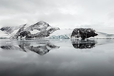
Arena Glacier, Hope Bay, Antarctica
Voting period is over. Please don't add any new votes. Voting period ends on 13 May 2016 at 03:38:10 (UTC)
- Reason
- High quality, high EV (two-image set for perspective).
- Original
- Arena Glacier, first mapped in 1948 and 1955, flows into Hope Bay on the Trinity Peninsula of Antarctica. The first image, shot from a ship at a distance, shows the glacier flowing into Hope Bay. The second image, shot from a moving zodiac approaching the glacial outlet, provides size perspective.
- Articles in which these images appear
- Arena Glacier
- FP category for this image
- Wikipedia:Featured pictures/Natural phenomena/Others
- Creator
- Godot13
Arena glacier size and perspective

-
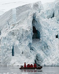
Close-up of zodiac with passengers in front of a section of the glacier for size perspective.

![[2]](/info/en/?search=File:Crater_Lake_Panorama,_Aug_2013.jpg)
- Support as nominator – Godot13 ( talk) 03:38, 3 May 2016 (UTC)
- Support – Jobas ( talk) 17:59, 3 May 2016 (UTC)
- Support – both images
landscape image(undecided about the close-up). Bammesk ( talk) 02:43, 4 May 2016 (UTC)
- The connection between the two images is not obvious, even when the landscape is displayed at say 1200px wide (a typical laptop size). Perhaps the article is the best place to show size perspective. BTW the landscape image is awesome. Bammesk ( talk) 03:42, 6 May 2016 (UTC)
- Support - Prefer the landscape image, though I don't mind the close-up. — Chris Woodrich ( talk) 08:57, 4 May 2016 (UTC)
- Support – Landscape. (Some of us certainly do get around!) Sca ( talk) 13:11, 4 May 2016 (UTC)
- Support Good photos with strong EV. The zodiac photo is particularly good, and useful. Nick-D ( talk) 09:00, 6 May 2016 (UTC)
Promoted File:Hope Bay-2016-Trinity Peninsula–Arena Glacier 01.jpg --
Armbrust
The Homunculus 04:38, 13 May 2016 (UTC)
Promoted File:Hope Bay-2016-Trinity Peninsula–Arena Glacier 03.jpg --
Armbrust
The Homunculus 04:38, 13 May 2016 (UTC)
- Added image to Wikipedia:Featured pictures/Places/Landscapes instead. Armbrust The Homunculus 04:47, 13 May 2016 (UTC)
Violet flower in Lithuania
Voting period is over. Please don't add any new votes. Voting period ends on 12 May 2016 at 11:22:17 (UTC)

- Reason
- Because I want to show that grows beautiful violas.
- Articles in which this image appears
-
Europos Parkas,
Hepatica,
Viola (plant) - FP category for this image
- Natural phenomena
- Creator
- Lhealt
- Support as nominator – ... Lhealt (talk) 11:22, 2 May 2016 (UTC)
- Comment - just transcluded this nomination (the process was never completed). Renata ( talk) 23:59, 9 May 2016 (UTC)
- Oppose – This image is not sharp when viewed at full size (when one image pixel is mapped to one screen pixel). Most likely because of the small camera/lens/sensor. So I must oppose. Bammesk ( talk) 01:58, 10 May 2016 (UTC)
- Comment - I got it. Well I took pictures not very high camera. Specifically from the phone.--... Lhealt (talk) 15:40, 10 May 2016 (UTC)Lhealt
- Oppose Per Bammesk – Jobas ( talk) 19:50, 10 May 2016 (UTC)
Not Promoted -- Armbrust The Homunculus 05:03, 13 May 2016 (UTC)
Ratna Moetoe Manikam
Voting period is over. Please don't add any new votes. Voting period ends on 14 May 2016 at 10:38:07 (UTC)
,_p6.jpg)
- Reason
- High quality magazine advertisement, for the last film produced by Java Industrial Film (production was apparently not finished when the Japanese occupied the Dutch East Indies in March 1942, though we should be careful taking Tan Tjoei Hock at his word)
- Articles in which this image appears
- Ratna Moetoe Manikam
- FP category for this image
- Wikipedia:Featured pictures/Culture, entertainment, and lifestyle/Entertainment
- Creator
- Java Industrial Film, restored by Chris Woodrich
- Support as nominator – — Chris Woodrich ( talk) 10:38, 4 May 2016 (UTC)
- Support – quality meets FP requirements, EV established through standalone article. SSTflyer 11:48, 5 May 2016 (UTC)
- Support – Good quality of an obscure film, but the article is well written. So quality and EV are both there. Mattximus ( talk) 22:31, 5 May 2016 (UTC)
- Support – Jobas ( talk) 21:10, 7 May 2016 (UTC)
- Since we can't expect a historical document to be improved in quality, Support. If Indonesia used a rather cheap half-tone for its movie posters, we get what we get, aye? =)
Adam Cuerden (
talk) 02:30, 8 May 2016 (UTC)
- This and the previous Poesaka Terpendam advertisement were both much better quality than the mid-1950s prints. In 1950 or so Bintang Surabaja used decent halftoning, much different than what ended up being used later. Check out the full resolution at Selamat Berdjuang, Masku!. — Chris Woodrich ( talk) 02:53, 8 May 2016 (UTC)
- Support - Spongie555 ( talk) 19:57, 12 May 2016 (UTC)
Promoted File:Ratna Moetoe Manikam ad, Poestaka Timoer 66 (15 Oct 1941), p6.jpg -- Armbrust The Homunculus 12:49, 14 May 2016 (UTC)
Saint-Étienne-du-Mont
Voting period is over. Please don't add any new votes. Voting period ends on 15 May 2016 at 05:40:13 (UTC)

- Reason
- Diliff does it again. A nice interior of a famous church in Paris. Good EV.
- Articles in which this image appears
- Saint-Étienne-du-Mont
- FP category for this image
- Wikipedia:Featured pictures/Places/Interiors
- Creator
- Diliff
- Support as nominator – Étienne Dolet ( talk) 05:40, 5 May 2016 (UTC)
- Why not nominate as a set? — Chris Woodrich ( talk) 07:56, 5 May 2016 (UTC)
- Don't know how. Plus, I only found two pictures. Is that suffice enough to be conisdered a set? Étienne Dolet ( talk) 08:08, 5 May 2016 (UTC)
- I rather prefer the shot below, looking toward the nave. This one seems sort of visually confusing, tho that may be just me. Sca ( talk) 14:50, 5 May 2016 (UTC)
- The composition of this photo is unfortunately dominated by the chairs to my eye. Nick-D ( talk) 08:58, 6 May 2016 (UTC)
- Support – Jobas ( talk) 21:17, 7 May 2016 (UTC)
- Support Gives a nice idea of the use of space and the complicated structure. Adam Cuerden ( talk) 02:32, 8 May 2016 (UTC)
- Support - per Adam, but should be a set with the other nomination. Spongie555 ( talk) 19:58, 11 May 2016 (UTC)
- Neutral - If the image below gets FP status, I see little additional value of this one since this structure is seen in the other image too. Mikael Häggström ( talk) 12:39, 14 May 2016 (UTC)
Not Promoted -- Armbrust The Homunculus 09:46, 15 May 2016 (UTC)
- Nomination didn't reach the necessary quorum for promotion. Armbrust The Homunculus 09:46, 15 May 2016 (UTC)
Saint-Étienne-du-Mont
Voting period is over. Please don't add any new votes. Voting period ends on 15 May 2016 at 05:41:42 (UTC)

- Reason
- Diliff does it again. A nice interior of a famous church in Paris. Good EV.
- Articles in which this image appears
- Saint-Étienne-du-Mont
- FP category for this image
- Wikipedia:Featured pictures/Places/Interiors
- Creator
- Diliff
- Support as nominator – Étienne Dolet ( talk) 05:41, 5 May 2016 (UTC)
- Support – Fine detail of what must be an unusual architectural style. Sca ( talk) 14:48, 5 May 2016 (UTC)
- Support - Good EV with a wow-factor as well.-- Godot13 ( talk) 04:41, 6 May 2016 (UTC)
- Support - Gorgeous, high-quality photo.-- 3family6 ( Talk to me | See what I have done) 19:38, 6 May 2016 (UTC)
- Support – Jobas ( talk) 21:13, 7 May 2016 (UTC)
- Support - high quality image of high quality architecture. Mikael Häggström ( talk) 12:27, 14 May 2016 (UTC)
Promoted File:St-Etienne-du-Mont Interior 2, Paris, France - Diliff.jpg -- Armbrust The Homunculus 09:52, 15 May 2016 (UTC)
Oleg (dance)
Voting period is over. Please don't add any new votes. Voting period ends on 16 May 2016 at 04:28:27 (UTC)

- Reason
- High quality image of a gorgeous Balinese dance. Article is in decent shape too.
- Articles in which this image appears
- Oleg (dance) +2
- FP category for this image
- Wikipedia:Featured pictures/Culture, entertainment, and lifestyle/Entertainment
- Creator
- Chris Woodrich
- Support as nominator – — Chris Woodrich ( talk) 04:28, 6 May 2016 (UTC)
- Support – Jobas ( talk) 21:20, 7 May 2016 (UTC)
- Support Adam Cuerden ( talk) 02:08, 8 May 2016 (UTC)
- Support - Godot13 ( talk) 08:24, 8 May 2016 (UTC)
- Support - Spongie555 ( talk) 19:56, 11 May 2016 (UTC)
- Support - DreamSparrow Chat 04:29, 16 May 2016 (UTC)
Promoted File:17 Years of Sekar Jepun 2014-11-01 32.jpg -- Armbrust The Homunculus 04:57, 16 May 2016 (UTC)
The Thief of Bagdad
Voting period is over. Please don't add any new votes. Voting period ends on 17 May 2016 at 21:52:14 (UTC)
_-_film_poster.jpg)
- Reason
- One slight crease, but otherwise good. Those were the days of unphotoshopped film posters...
- Articles in which this image appears
- The Thief of Bagdad (1924 film)
- FP category for this image
- Artwork/Others
- Creator
- The H.C. Miner Litho. Co.
- Support as nominator – Brandmeister talk 21:52, 7 May 2016 (UTC)
- Comment - JPG artefacting is problematic. —
Chris Woodrich (
talk) 00:43, 8 May 2016 (UTC)
- At 1.52 MB filesize I didn't expect them. Maybe there's an uncompressed version somewhere... Brandmeister talk 07:32, 8 May 2016 (UTC)
Not Promoted -- Armbrust The Homunculus 21:58, 17 May 2016 (UTC)
Frances Benjamin Johnston
Voting period is over. Please don't add any new votes. Voting period ends on 18 May 2016 at 02:02:38 (UTC)
,_1896.jpg)
- Reason
- One of the most characterful self-portraits I've seen. Interesting background, that you can spend hours looking over (which is good, as this took weeks)
- Articles in which this image appears
- Frances Benjamin Johnston
- FP category for this image
- Wikipedia:Featured pictures/People/Artists and writers
- Creator
- Frances Benjamin Johnston; restored by Adam Cuerden
- Support as nominator – Adam Cuerden ( talk) 02:02, 8 May 2016 (UTC)
- Support - Very nice. — Chris Woodrich ( talk) 07:02, 8 May 2016 (UTC)
- Support, yep. Brandmeister talk 07:17, 8 May 2016 (UTC)
- Support – Zounds, showing leg and smoking a ciggie, too! Interesting pix in her article.
-
Adam, I'm curious: In relation to the George Washington Carver nom. (4/26), how would you evaluate her
photo of Booker T. Washington?
Sca (
talk) 15:16, 8 May 2016 (UTC)
- Well, it's featured here and on Commons. Guessing at your underlying question, I'd ask you to remember that people vary in skin tone. Booker T. Washington is a much lighter-skinned African-American than Carver is, which is pretty readily demonstratable. Booker shouldn't be darkened to look like Carver any more than Carver should be lightened. Adam Cuerden ( talk) 16:52, 8 May 2016 (UTC)
- Support -- PetarM ( talk) 14:06, 9 May 2016 (UTC)
- Support – Jobas ( talk) 19:40, 10 May 2016 (UTC)
- Support - DreamSparrow Chat 04:28, 16 May 2016 (UTC)
Promoted File:Frances Benjamin Johnston, Self-Portrait (as "New Woman"), 1896.jpg -- Armbrust The Homunculus 02:06, 18 May 2016 (UTC)
Alice Roosevelt
Voting period is over. Please don't add any new votes. Voting period ends on 19 May 2016 at 03:18:40 (UTC)

- Reason
- One of the most famous images of her. The hand-tinting isn't perfect, but it's not bad.
- Articles in which this image appears
- Alice Roosevelt, List of children of the Presidents of the United States
- FP category for this image
- She was a writer, so let's go with Wikipedia:Featured_pictures/People/Artists_and_writers, as her other work doesn't classify as well.
- Creator
- Frances Benjamin Johnston; restored by Adam Cuerden
- Support as nominator – Adam Cuerden ( talk) 03:18, 9 May 2016 (UTC)
- Support — Chris Woodrich ( talk) 13:40, 9 May 2016 (UTC)
- Comment – Not sure she makes the grade in terms of notability.
Sca (
talk) 14:44, 9 May 2016 (UTC)
- @ Sca: I think her article makes an excellent case for her notability. She was very politically active, and created plenty of scandals in her day. We have FPs on far less notable people. Adam Cuerden ( talk) 16:31, 9 May 2016 (UTC)
- Well, notability can be debated. My thought was, she was notable then, and is notable now, mainly for being the daughter of Teddy Roosevelt. Other than that, she was known for being a celebrity and sometime political gadfly. (The only president's daughter I can think of offhand who achieved notability on her own is Caroline Kennedy, now ambassador to Japan.)
- I like the soufflé quote at the end of her article, though.
Sca (
talk) 18:59, 9 May 2016 (UTC)
- @
Sca: I'd argue that, given she has her own article, with sufficient sources that show she's been the subject of lengthy coverage in her own right, that's enough for FPC, but we can go well beyond that for her. There's four different book-length biographies cited, after all: J. Brough (1975), H. Teichmann (1979), Carol Felsenthal (1988), and S. A. Cordery (2007) - and you could argue Michael Teague's 1981 book counts as well. And they're all by major publishers. There's also several Time and Salon.com articles.
Adam Cuerden (
talk) 22:05, 9 May 2016 (UTC)
- There is no separate bar of notability for FPC. If she's notable enough for Wikipedia, she's notable enough for FPC. Otherwise we'd have people going "Oppose: I've never heard of Mochtar Lubis. He can't be notable enough for FPC". The only way we can stay objective is not have separate bars. — Chris Woodrich ( talk) 00:45, 10 May 2016 (UTC)
- Famous for being famous – or infamous. Yawn.
Sca (
talk) 01:52, 10 May 2016 (UTC)
- Yes, the implication is that Paris Hilton could have an FP. And? Do you have an argument for having a notability threshhold that doesn't boil down to ... "Yawn"? — Chris Woodrich ( talk) 08:36, 10 May 2016 (UTC)
- Famous for being famous – or infamous. Yawn.
Sca (
talk) 01:52, 10 May 2016 (UTC)
- @
Sca: I'd argue that, given she has her own article, with sufficient sources that show she's been the subject of lengthy coverage in her own right, that's enough for FPC, but we can go well beyond that for her. There's four different book-length biographies cited, after all: J. Brough (1975), H. Teichmann (1979), Carol Felsenthal (1988), and S. A. Cordery (2007) - and you could argue Michael Teague's 1981 book counts as well. And they're all by major publishers. There's also several Time and Salon.com articles.
Adam Cuerden (
talk) 22:05, 9 May 2016 (UTC)
- I outlined my view of the subject above. Yawn means I don't find her story of compelling interest. Your view is that the achievements of a subject are irrelevant to an FP nom. That may be so according to the multifaceted rule book (devised by others), but I don't think that notion serves encyclopedia readers very well.
- There's nothing wrong with the picture. Please note that my post was a comment, not an oppose.
- Are you arguing for an FP of Paris H.? Saints preserve us!
Sca (
talk) 14:30, 10 May 2016 (UTC)
- Re: Paris H. Not with anything in the present article (the lede image is nice at thumbnail size, but falls flat at full resolution, which is under the minimum anyways) but if we were to get something that met the technical criteria, I wouldn't be opposed to it. — Chris Woodrich ( talk) 15:28, 10 May 2016 (UTC)
- Support these 19 years, frozen in time, assuming the eye and hair color are true. Brandmeister talk 14:37, 10 May 2016 (UTC)
- Support – Jobas ( talk) 19:44, 10 May 2016 (UTC)
- Support TomStar81 ( Talk) 02:00, 17 May 2016 (UTC)
Promoted File:Alice Roosevelt by Frances Benjamin Johnston.jpg -- Armbrust The Homunculus 03:26, 19 May 2016 (UTC)
William Birney
Voting period is over. Please don't add any new votes. Voting period ends on 20 May 2016 at 08:13:17 (UTC)

- Reason
- Other than a bit of graininess - acceptable in a photographic print of its era - and the fade that was so popular in images of the era, this is a pretty solid image, and a vast improvement over the previous only image of him we had (see file history).
- Articles in which this image appears
- William Birney +1
- FP category for this image
- Wikipedia:Featured pictures/People/Military
- Creator
- Unknown; restored by Adam Cuerden
- Support as nominator – Adam Cuerden ( talk) 08:13, 10 May 2016 (UTC)
- Support — Chris Woodrich ( talk) 08:35, 10 May 2016 (UTC)
- Support – Jobas ( talk) 19:47, 10 May 2016 (UTC)
- Support - Nice EV, great restoration and cleaning.-- Godot13 ( talk) 06:13, 16 May 2016 (UTC)
- Support — excellent work. Vesuvius Dogg ( talk) 04:02, 18 May 2016 (UTC)
Promoted File:William Birney.jpg -- Armbrust The Homunculus 08:45, 20 May 2016 (UTC)
Battleship Texas' tripod mast
Voting period is over. Please don't add any new votes. Voting period ends on 30 May 2016 at 02:36:19 (UTC)

- Reason
- A nice shot that came out quite well. Focus and lighting were about as good as the camera could do.
- Articles in which this image appears
- Tripod mast
- FP category for this image
- Wikipedia:Featured pictures/Vehicles/Water
- Creator
- Adam Cuerden
- Support as nominator – Adam Cuerden ( talk) 02:36, 20 May 2016 (UTC)
- Oppose – good EV... but there is CA and/or jpeg artifact. Also the composition is not quite right, the base is missing (similar to capturing a tree without capturing the ground at the base of it). Bammesk ( talk) 03:32, 20 May 2016 (UTC)
- Oppose per Bammesk - cut off but mainly the picture quality sorry - just really not clear/sharp enough I'm afraid. gazhiley 10:26, 20 May 2016 (UTC)
- Withdraw While this is the best the camera can do, not quite up there, it seems. Adam Cuerden ( talk) 10:34, 20 May 2016 (UTC)
- Comment – An interesting ship, though, in terms of naval history and marine architecture. Sca ( talk) 15:28, 20 May 2016 (UTC)
- Oppose Per other – Jobas ( talk) 15:56, 20 May 2016 (UTC)
Not Promoted -- Armbrust The Homunculus 12:08, 21 May 2016 (UTC)
- Withdrawn nomination. Armbrust The Homunculus 12:08, 21 May 2016 (UTC)
Château de la Muette,
Voting period is over. Please don't add any new votes. Voting period ends on 22 May 2016 at 04:15:21 (UTC)

- Reason
- Pretty good quality. EV is high.
- Articles in which this image appears
- Château de la Muette
- FP category for this image
- Wikipedia:Featured pictures/Places/Architecture
- Creator
- the creator of the image, where possible using the format Velvet
- Support as nominator – Étienne Dolet ( talk) 04:15, 12 May 2016 (UTC)
- Weak support – The only thing that's a little off-putting is the diffuse lighting due to overcast. That it's used by OCED adds EV. (Some nice interior shots here.) Sca ( talk) 15:40, 12 May 2016 (UTC)
- Support – Jobas ( talk) 17:06, 12 May 2016 (UTC)
- Comment I think the verticals are slightly tilted? Adam Cuerden ( talk) 06:26, 17 May 2016 (UTC)
- Weak Support per Sca - texture caused by cold lighting are a little flat, and building edge is harsh against the near-white sky. Otherwise seems fine to me - can't see much in the way of issues with the verticals. gazhiley 12:50, 18 May 2016 (UTC)
Not Promoted -- Armbrust The Homunculus 11:48, 22 May 2016 (UTC)
- Nomination didn't reach the necessary quorum for promotion. Armbrust The Homunculus 11:48, 22 May 2016 (UTC)
Portrait of Leo X
Voting period is over. Please don't add any new votes. Voting period ends on 22 May 2016 at 19:41:50 (UTC)

- Reason
- High EV as lead image, very good quality scan of the painting (especially compared to the Google Art Project one : File:Raffaello Sanzio - Ritratto di Leone X coi cardinali Giulio de' Medici e Luigi de' Rossi - Google Art Project.jpg)
- Articles in which this image appears
- Portrait of Leo X (Raphael), Pope Leo X, etc.
- FP category for this image
- Wikipedia:Featured pictures/Artwork/Paintings
- Creator
- Raphael
- Support as nominator – Spongie555 ( talk) 19:41, 12 May 2016 (UTC)
- Support - Good quality. EV is good for both the Pope and the painting itself. Étienne Dolet ( talk) 21:26, 12 May 2016 (UTC)
- Support – Jobas ( talk) 17:15, 13 May 2016 (UTC)
- Oppose - No source information. Looks to have been edited digitally for contrast etc. — Chris Woodrich ( talk) 00:44, 15 May 2016 (UTC)
- Oppose per Crisco. The Yorck scans often have issues, so correcting them might be valid - but this version has different dimensions, so... Adam Cuerden ( talk) 06:27, 17 May 2016 (UTC)
Not Promoted -- Armbrust The Homunculus 22:14, 22 May 2016 (UTC)
Nils Olav
Voting period is over. Please don't add any new votes. Voting period ends on 22 May 2016 at 19:52:47 (UTC)

- Reason
- High Ev showing Sir Nils Olav on the day of his knightood reviewing the royal guard wearing his knighthood a rare ocassion, pretty good quality image also
- Articles in which this image appears
- Nils Olav, Hans Majestet Kongens Garde, Colonel-in-chief
- FP category for this image
- I actually don't know which category this would go under, maybe Wikipedia:Featured pictures/History/Others
- Creator
- Mark Owens
- Support as nominator – Spongie555 ( talk) 19:52, 12 May 2016 (UTC)
- Support - Great EV. Étienne Dolet ( talk) 21:24, 12 May 2016 (UTC)
- Comment – I do
n'tunderstand this one. Sca ( talk) 01:30, 13 May 2016 (UTC) - Support – Jobas ( talk) 17:17, 13 May 2016 (UTC)
- Support, he even looks upwards to inspect. Brandmeister talk 13:29, 14 May 2016 (UTC)

* Support – Dad always said "the Norwegians are the finest people in the world," so I vote ja. (As in Ja, vi elsker dette landet.) – Sca ( talk) 22:08, 14 May 2016 (UTC)
- Support Great photo with strong EV for this rather odd topic Nick-D ( talk) 02:01, 15 May 2016 (UTC)
- Support. This would be a great Today's Featured Picture for 1 April next year. Ham II ( talk) 16:54, 15 May 2016 (UTC)
- Support - DreamSparrow Chat 04:25, 16 May 2016 (UTC)
- Support – A wonderful "double take" image ... looking forward to seeing this on The Signpost. Vesuvius Dogg ( talk) 04:05, 18 May 2016 (UTC)
Promoted File:Nils Olav inspects the Kings Guard of Norway after being bestowed with a knighthood at Edinburgh Zoo in Scotland.jpg -- Armbrust The Homunculus 22:24, 22 May 2016 (UTC)
- Added it to Wikipedia:Featured pictures/Animals/Birds instead. Armbrust The Homunculus 22:24, 22 May 2016 (UTC)
En pointe ballet shoes
_bw.jpg)
_bw.jpg&action=edit§ion=T-1)
Voting period is over. Please don't add any new votes. Voting period ends on 23 May 2016 at 06:58:30 (UTC)
_bw.jpg)
- Reason
- Good classical shot
- Articles in which this image appears
- Pointe shoe
- FP category for this image
- Wikipedia:Featured pictures/Culture, entertainment, and lifestyle/Theatre
- Creator
- Petar Milošević
- Support as nominator – PetarM ( talk) 06:58, 13 May 2016 (UTC)
- Oppose. Too black and white to be encyclopedic enough. Mikael Häggström ( talk) 12:16, 14 May 2016 (UTC)
- Oppose Per Mikael Häggström – Jobas ( talk) 13:37, 15 May 2016 (UTC)
- Oppose Strong composition and I don't mind b/w, but the pointe is to be sharply focused, which this isn't. Vesuvius Dogg ( talk) 16:06, 19 May 2016 (UTC)
Not Promoted -- Armbrust The Homunculus 11:55, 23 May 2016 (UTC)
Oliver Cromwell
Voting period is over. Please don't add any new votes. Voting period ends on 24 May 2016 at 00:41:57 (UTC)

- Reason
- Good EV. Nice quality.
- Articles in which this image appears
- Oliver Cromwell
- FP category for this image
- Wikipedia:Featured pictures/Artwork/Paintings
- Creator
- Samuel Cooper
- Support as nominator – Étienne Dolet ( talk) 00:41, 14 May 2016 (UTC)
- Comment Barring evidence to the contrary, I'd rather go itrh the original version, not the colour-adjusted version loaded over it. The original seems quite in keeping with painters of the period. Adam Cuerden ( talk) 06:29, 17 May 2016 (UTC)
Not Promoted -- Armbrust The Homunculus 00:44, 24 May 2016 (UTC)
Aurora Australis
Voting period is over. Please don't add any new votes. Voting period ends on 24 May 2016 at 00:43:21 (UTC)
- Reason
- Found this in a drive by reading of the current International Space Station article; having never heard of an Aurora Australis before I thought I would play the clip. Its an interesting vid, so I thought it may have a shot at an FP star.
- Articles in which this image appears
- Aurora, Chinese large modular space station, Effect of spaceflight on the human body, International Space Station
- FP category for this image
- Wikipedia:Featured pictures/Natural phenomena/Atmospheric optics
- Creator
- Crew Earth Observations team at Johnson Space Center (PD-USGov)
- Support as nominator – TomStar81 ( Talk) 00:43, 14 May 2016 (UTC)
- Support - Unique perspective of a beautiful phenomenon. Mikael Häggström ( talk) 12:32, 14 May 2016 (UTC)
- Support per Mikael, although I hoped for more than 360p. Brandmeister talk 13:31, 14 May 2016 (UTC)
- Support – Jobas ( talk) 13:40, 15 May 2016 (UTC)
- Support – EV. Bammesk ( talk) 15:43, 15 May 2016 (UTC) too bad the camera is bumped at the 2 second mark
- Support - Good EV, too bad there's no real wow factor... ;-) -- Godot13 ( talk) 06:08, 16 May 2016 (UTC)
Promoted File:Aurora Australis.ogv -- Armbrust The Homunculus 00:48, 24 May 2016 (UTC)
Endeavour docked to ISS
Voting period is over. Please don't add any new votes. Voting period ends on 24 May 2016 at 12:09:45 (UTC)


- Reason
- It illustrates two great space programs: the International Space Station and the now retired Space Shuttle program. It also shows them to scale.
- Articles in which this image appears
- International Space Station, Space Shuttle Endeavour and STS-134. Cropped version in Space Shuttle program.
- FP category for this image
- Wikipedia:Featured pictures/Space/Getting there
- Creator
- Paolo Nespoli
- Support as nominator – Mikael Häggström ( talk) 12:09, 14 May 2016 (UTC)
- Support ALT1 - Good EV for ISS. — Chris Woodrich ( talk) 00:45, 15 May 2016 (UTC)
Oppose– there is a ghost image with ~30 pixel offset, visible on the right side of the space station, and easy to see all over at 200%. Perhaps caused by reflections from a viewing window. The ghost can probably be erased in software. Also the highlights are blown (which I am Ok with in this case). Very good EV, great image. Bammesk ( talk) 15:32, 15 May 2016 (UTC)
- I've now added ALT1, where the ghost artifacts have been digitally removed around the structures.
Mikael Häggström (
talk) 21:19, 17 May 2016 (UTC)
- Support ALT1 – Nicely done (i.e. excellent work). There is one inadvertent deletion which needs fixing: around x,y=3285,2740 (relative to upper left corner) where Kepler attaches to the space station. Other minor improvements say at x,y=2490,2630 and x,y=2343,693 are possible, but they are too minor. Bammesk ( talk) 01:45, 18 May 2016 (UTC)
- Thanks for noticing this, so that I could now have it fixed before any people therein were harmed
 Mikael Häggström (
talk) 13:21, 19 May 2016 (UTC)
Mikael Häggström (
talk) 13:21, 19 May 2016 (UTC)
- Thanks for noticing this, so that I could now have it fixed before any people therein were harmed
- I've now added ALT1, where the ghost artifacts have been digitally removed around the structures.
Mikael Häggström (
talk) 21:19, 17 May 2016 (UTC)
Support- stunning image, and willing to overlook small flaws in image quality due to the relatively rarity/challenges of space photos and the high EV. 2607:F6D0:CED:5BA:F510:A79A:A5B5:B9A8 ( talk) 23:23, 16 May 2016 (UTC)- Struck !vote, as IPs can only comment on nominations.
Armbrust
The Homunculus 09:44, 17 May 2016 (UTC)
- @
Armbrust: Really? I highly disagree with this policy (shouldn't we
AGF and take me on my worth that I'm not sockpuppetting - which I'm not - and that I understand FP criteria?)
171.66.209.8 (
talk) 20:46, 17 May 2016 (UTC)
- Doesn't matter, whether you agree with it or not, the lead of
WP:FPC cleary says: "anonymous votes are generally disregarded".
Armbrust
The Homunculus 21:06, 17 May 2016 (UTC)
- Oh, I know, I see that now. I'm commenting on the policy and not on your enforcement of said policy. I don't see why my voice should matter less in building a consensus if there's no evidence of sockpuppetting or lack of understanding of FPC rules.
171.66.209.4 (
talk) 23:18, 17 May 2016 (UTC)
- But wouldn't your willingness to vote even though the requirements are clearly spelled out indicate an unfamiliarity with the FPC rules, in and of itself?
Crisco 1492 mobile (
talk) 06:26, 18 May 2016 (UTC)
- But isn't Wikipedia about
ignoring all rules? :)
128.12.246.6 (
talk) 04:53, 19 May 2016 (UTC)
- Unhuh. That only means there's another page to add to your reading list. — Chris Woodrich ( talk) 23:58, 19 May 2016 (UTC)
- But isn't Wikipedia about
ignoring all rules? :)
128.12.246.6 (
talk) 04:53, 19 May 2016 (UTC)
- But wouldn't your willingness to vote even though the requirements are clearly spelled out indicate an unfamiliarity with the FPC rules, in and of itself?
Crisco 1492 mobile (
talk) 06:26, 18 May 2016 (UTC)
- Oh, I know, I see that now. I'm commenting on the policy and not on your enforcement of said policy. I don't see why my voice should matter less in building a consensus if there's no evidence of sockpuppetting or lack of understanding of FPC rules.
171.66.209.4 (
talk) 23:18, 17 May 2016 (UTC)
- Doesn't matter, whether you agree with it or not, the lead of
WP:FPC cleary says: "anonymous votes are generally disregarded".
Armbrust
The Homunculus 21:06, 17 May 2016 (UTC)
- @
Armbrust: Really? I highly disagree with this policy (shouldn't we
AGF and take me on my worth that I'm not sockpuppetting - which I'm not - and that I understand FP criteria?)
171.66.209.8 (
talk) 20:46, 17 May 2016 (UTC)
- Struck !vote, as IPs can only comment on nominations.
Armbrust
The Homunculus 09:44, 17 May 2016 (UTC)
- Support Per Chris Woodrich – Jobas ( talk) 18:13, 17 May 2016 (UTC)
- Support ALT1 Great capture, and good clean up done. I miss the shuttles...... gazhiley 10:48, 18 May 2016 (UTC)
- Support ALT1 - Spongie555 ( talk) 16:11, 23 May 2016 (UTC)
- Support either Adam Cuerden ( talk) 20:42, 23 May 2016 (UTC)
Promoted File:Endeavour docked to ISS.jpg -- Armbrust The Homunculus 12:11, 24 May 2016 (UTC)
- There is a clear consensus to promote alt1. Armbrust The Homunculus 12:11, 24 May 2016 (UTC)
Esperanza Base, Argentine Antarctic Research Station
Voting period is over. Please don't add any new votes. Voting period ends on 26 May 2016 at 06:04:50 (UTC)

- Reason
- High quality, high EV
- Articles in which this image appears
- Esperanza Base, Hope Bay
- FP category for this image
- Wikipedia:Featured pictures/Places/Architecture (?)
- Creator
- Godot13
- Support as nominator – Godot13 ( talk) 06:04, 16 May 2016 (UTC)
- Support — Chris Woodrich ( talk) 23:51, 16 May 2016 (UTC)
- Support Another great Antarctica shot. Adam Cuerden ( talk) 06:32, 17 May 2016 (UTC)
- Support – Jobas ( talk) 18:16, 17 May 2016 (UTC)
- Support – But only if it's moved to the lead image. I'm not sure why there is a zoomed in image as the lead. Mattximus ( talk) 23:29, 17 May 2016 (UTC)
- Comment – blown highlights, was exposure bracketing possible? (the camera does 5fps) Bammesk ( talk) 00:09, 20 May 2016 (UTC)
Promoted File:Hope Bay-2016-Trinity Peninsula–Esperanza Station 02.jpg -- Armbrust The Homunculus 12:44, 26 May 2016 (UTC)
- Added image to Places/Urban instead, as it's a civilian settlement. Armbrust The Homunculus 12:44, 26 May 2016 (UTC)
Peter Martyr Vermigli
Voting period is over. Please don't add any new votes. Voting period ends on 26 May 2016 at 22:15:46 (UTC)

Florence brought him forth, Now he wanders as a foreigner and pilgrim
That he might forever be a citizen among those above.
This is his likeness; the writings conceal his mind;
Integrity and piety cannot be represented by art.
- Reason
- An excellent lead image from a newly-promoted good article.
- Articles in which this image appears
- Peter Martyr Vermigli, Hans Asper, Thomas Cranmer
- FP category for this image
- People/Religious figures
- Creator
- Hans Asper
- Support as nominator – Josh Milburn ( talk) 22:15, 16 May 2016 (UTC)
- Support, high EV: wearing academic dress, pointing to Bible, poem -- JFH ( talk) 23:33, 16 May 2016 (UTC)
- Support — Chris Woodrich ( talk) 23:52, 16 May 2016 (UTC)
- Support Nice detail, well-reproduced. Wht kind of parent names their kid "Martyr", though?
Adam Cuerden (
talk) 06:33, 17 May 2016 (UTC)
- He chose the name himself (after Peter of Verona, also called Peter Martyr) when he became a monk as a young man; he was born Piero Mariano. Josh Milburn ( talk) 08:19, 17 May 2016 (UTC)
- Support – Jobas ( talk) 18:23, 17 May 2016 (UTC)
Promoted File:Pietro Vermigli by Hans Asper.jpg -- Armbrust The Homunculus 23:22, 26 May 2016 (UTC)
Mattie Edwards Hewitt
Voting period is over. Please don't add any new votes. Voting period ends on 27 May 2016 at 10:12:57 (UTC)

- Reason
- A fine photo of a notable female photographer, by another notable female photographer
- Articles in which this image appears
- Mattie Edwards Hewitt
- FP category for this image
- Wikipedia:Featured pictures/People/Artists and writers
- Creator
- Frances Benjamin Johnston, restored by Adam Cuerden
- Support as nominator – Adam Cuerden ( talk) 10:12, 17 May 2016 (UTC)
- Comment – In contrast to her saucy friend Frances, who's about to be promoted, Mattie looks like she should be making cookies for her grandkids. Sca ( talk) 15:09, 17 May 2016 (UTC)
- Fair enough. Brandmeister talk 20:00, 18 May 2016 (UTC)
- @ Sca and Brandmeister: That appears to be consistent across photographs of the two. Compare the other two photos in c:Category:Mattie Edwards Hewitt. People do have different personalities =) Adam Cuerden ( talk) 04:01, 19 May 2016 (UTC)
- Don't we though? My comment was simply an observation, not a critique of the nom. However, I do think the pic of Johnston is more interesting due to her apparently feisty personality. About this one I'm neutral. Sca ( talk) 13:25, 19 May 2016 (UTC)
- While I certainly like the other picture better, I think it better to judge based on the subject, since I don't want to create a situation where certain subjects get left out of getting restorations and other work put into them because they aren't as exciting as other ones. I mean, we have FPs of fruit, after all, and I think she's more interesting than fruit. =) Adam Cuerden ( talk) 15:30, 19 May 2016 (UTC)
- Support – that hat. Vesuvius Dogg ( talk) 16:08, 19 May 2016 (UTC)
- Support — Chris Woodrich ( talk) 23:57, 19 May 2016 (UTC)
- Support – Jobas ( talk) 14:36, 21 May 2016 (UTC)
- Support -- Ipigott ( talk) 10:43, 22 May 2016 (UTC)
- Support -- PetarM ( talk) 12:00, 23 May 2016 (UTC)
Promoted File:Mattie Edwards Hewitt - half-length photo by Frances Benjamin Johnston.jpg -- Armbrust The Homunculus 11:51, 27 May 2016 (UTC)
Rootabaga Stories frontispiece
Voting period is over. Please don't add any new votes. Voting period ends on 27 May 2016 at 18:37:16 (UTC)
,_Frontispiece.jpg)
- Reason
- I always find the children's books by major authors interesting. They show a lot about what they thought important, and what messages they'd like to pass on. This is the only colour illustration; the rest is black and white, so it's a natural division. Colours should be pretty accurate; I worked off the original, so it should be within the limit of variation caused by different lighting and such.
- Articles in which this image appears
- Rootabaga Stories, Maud and Miska Petersham
- FP category for this image
- Wikipedia:Featured pictures/Artwork/Literary illustrations
- Creator
- Maud and Miska Petersham
- Support as nominator – Adam Cuerden ( talk) 18:37, 17 May 2016 (UTC)
- Support - wonderful composition and restoration. Was the original image embroidered? Vesuvius Dogg ( talk) 04:12, 18 May 2016 (UTC)
- Support - Beautiful — Chris Woodrich ( talk) 04:09, 19 May 2016 (UTC)
- Support Brandmeister talk 07:30, 19 May 2016 (UTC)
- Support – Jobas ( talk) 12:25, 19 May 2016 (UTC)
Promoted File:Carl Sandburg's Rootabaga Stories (1922), Frontispiece.jpg -- Armbrust The Homunculus 21:15, 27 May 2016 (UTC)
Sun bear
Voting period is over. Please don't add any new votes. Voting period ends on 28 May 2016 at 19:11:33 (UTC)

- Reason
- Lead image in its article, high EV, good overall quality and simply adorable.
- Articles in which this image appears
- Sun bear, Bear, others
- FP category for this image
- Animals/Mammals
- Creator
- Tambako The Jaguar
- Support as nominator – Brandmeister talk 19:11, 18 May 2016 (UTC)
Weaksupport -Strikes me as a tad overexposed. — Chris Woodrich ( talk) 04:02, 19 May 2016 (UTC)- Great! Exposure is good now. — Chris Woodrich ( talk) 23:29, 19 May 2016 (UTC)
- Weak support Per Chris Woodrich – Jobas ( talk) 12:28, 19 May 2016 (UTC)
- Support The overexposure is pretty minor. Why haven't we just fixed it yet?
Adam Cuerden (
talk) 12:35, 19 May 2016 (UTC)
- Tweaked and decided to upload over the existing file (
previous version). How it's now?
Brandmeister
talk 14:40, 19 May 2016 (UTC)
- Quite good! Adam Cuerden ( talk) 02:31, 20 May 2016 (UTC)
- Tweaked and decided to upload over the existing file (
previous version). How it's now?
Brandmeister
talk 14:40, 19 May 2016 (UTC)
- Weak Support Quite out of focus, potentially because of the over-exposure of the original which the tweak done will not correct. Otherwise a very likeable picture... gazhiley 10:40, 20 May 2016 (UTC)
- Oppose. This really feels like a zoo photograph (and it is). The composition doesn't really work, for me. Josh Milburn ( talk) 18:21, 22 May 2016 (UTC)
- Oppose – Per Josh. – Sca ( talk) 14:10, 23 May 2016 (UTC)
- Oppose – Per Josh. Samsara 13:23, 24 May 2016 (UTC)
Not Promoted -- Armbrust The Homunculus 20:05, 28 May 2016 (UTC)
Venus and Adonis
Voting period is over. Please don't add any new votes. Voting period ends on 29 May 2016 at 21:00:28 (UTC)
.jpg)
- Reason
- A nice quality painting from my favorite Venetian painter, Paolo Veronese
- Articles in which this image appears
- Venus and Adonis (Veronese, Madrid)
- FP category for this image
- Wikipedia:Featured pictures/Artwork/Paintings
- Creator
- Paolo Veronese
- Support as nominator – Étienne Dolet ( talk) 21:00, 19 May 2016 (UTC)
- Comment - Source website appears to be a dead link.
Mattximus (
talk) 22:39, 19 May 2016 (UTC)
- @ Mattximus: Not too much of an issue; So long as we know where it was, the source is pretty much obvious (Museo del Prado). Support Adam Cuerden ( talk) 12:36, 24 May 2016 (UTC)
- Support. Ham II ( talk) 16:23, 24 May 2016 (UTC)
- Support – Jobas ( talk) 11:54, 26 May 2016 (UTC)
- Support - Spongie555 ( talk) 08:34, 29 May 2016 (UTC)
Promoted File:Venus y Adonis (Veronese).jpg -- Armbrust The Homunculus 21:15, 29 May 2016 (UTC)