| Featured picture tools |
|---|
Please cut and paste new entries to the bottom of this page, creating a new monthly archive (by closing date) when necessary.
Blackbird

Fantastic, engaging image. [[User:Neutrality| Neutrality ( talk)]] 22:40, Sep 18, 2004 (UTC)
- Support. [[User:Neutrality| Neutrality ( talk)]] 22:40, Sep 18, 2004 (UTC)
- Oppose. It's just a bit dull. I don't know how to make a blackbird interesting, but not like this, anyway. Markalexander100 06:44, 19 Sep 2004 (UTC)
- Oppose. A good picture of a Blackbird but not special enough for a Featured Pic - Adrian Pingstone 10:48, 19 Sep 2004 (UTC)
- Oppose. Well, yes, it's a blackbird, but it's a pretty pedestrian shot. Denni ☯ 01:40, 2004 Sep 20 (UTC)
- Oppose - I see nothing to feature here - Gaz 12:53, 20 Sep 2004 (UTC)
- Oppose. Doh, I like the bird, but the setting is just poor. -- Solitude 06:42, 21 Sep 2004 (UTC)
- I actually prefer this one myself. -- sannse (talk) 17:02, 21 Sep 2004 (UTC)
- NOT promoted, +1/-5. -- Solitude 07:47, Oct 1, 2004 (UTC)
Hurricane Ivan from the ISS

Just a simply wonderful NASA picture, and the best picture of a hurricane I've ever seen. Uploaded by me, used on Hurricane Ivan and tropical cyclone. Tom- 09:44, 18 Sep 2004 (UTC)
- Support. Totally Awesome. The RHS solar panels look a bit overexposed. But the hurricane is superb. -- Fir0002 10:22, 18 Sep 2004 (UTC)
- Support. ugen64 22:22, Sep 18, 2004 (UTC)
- Oppose. I have been in doubt here. While being a good picture, this shot takes away the sheer magnitude and power of the hurricane. The lack of coastline references makes it seem like Ivan is 10 meters across. I prefer a hurricane picture that at least got a significant amount of coast line in it. Preferably where you can recognize parts of the earth. So it makes you think: wow this thing is huge. This picture just does not do that. Janderk 11:10, 19 Sep 2004 (UTC)
- Oppose. I think whoever took the pic should have opened the window of the space station first and moved those solar panels out of the way. Seriously they do detract significantly from the image. Also without local scale it's really hard to decide if this is anything important. We know it's important 'cos the caption tells us it's a pic of Ivan, but without the caption I wouldn't have been impressed. And it's the pic that's gotta do the talking. Oska 03:21, Sep 20, 2004 (UTC)
- Oppose - I'm with Janderk and Oska - Gaz 13:00, 20 Sep 2004 (UTC)
- Oppose - similar reasons to above. The lack of scale makes it look like a plughole in the bottom of my washing up bowl. GWO 13:42, 20 Sep 2004 (UTC)
- Oppose, same as above -- Chris 73 Talk 23:12, Sep 20, 2004 (UTC)
- Support. I do miss the scale reference in the picture, but I still love it. -- Solitude 06:44, 21 Sep 2004 (UTC)
- Support. The solar panels look like skyscrapers to a first glance, which makes it seem weird. Then perspective shifts and you're looking down, so it looks huge ( William M. Connolley 17:59, 22 Sep 2004 (UTC))
- Support. [[User:Neutrality| Neutrality ( talk)]] 13:40, Sep 21, 2004 (UTC)
- Oppose. We're only seeing the central part of Ivan, for a Featured Pic I'd want to see all of it (or at least more of it) - Adrian Pingstone 16:21, 23 Sep 2004 (UTC)iva
- support. I like it! Dunc_Harris| ☺ 21:08, 25 Sep 2004 (UTC)
- Support. Fredrik | talk 21:24, 25 Sep 2004 (UTC)
- Oppose, neither a spectacular photo of ISS or Ivan and I see no synergy in the combination as exhibited in this photo - [[User:Bevo| Bevo]] 22:46, 27 Sep 2004 (UTC)
- NOT promoted, +7/-7. -- Solitude 07:46, Oct 1, 2004 (UTC)
Guacamole

- Nice photo. [[User:Neutrality| Neutrality ( talk)]] 00:40, 17 Sep 2004 (UTC)
- Oppose. The photo may be composed well, but to me, the subject is unappetising. I dont think I've ever eaten Guacomole but I dont think I would enjoy it -- Fir0002 10:42, 19 Sep 2004 (UTC)
- Oppose. It is just a snapshot that is descriptive, but not good enough as featured. I love Guacamole, but the messy environment, pieces of tomato on the table, out of focus objects in the corners, just doesn't make me say yummy. Janderk 11:04, 19 Sep 2004 (UTC)
- Oppose. The composition is OK and I don't care that the surrounds are messy (in fact they make it interesting, I think), but IMO the specular reflections caused by the camera flash preclude this from being a featured picture. -- Tlotoxl 11:34, 19 Sep 2004 (UTC)
- Oppose - I see nothing to feature here - Gaz 13:03, 20 Sep 2004 (UTC)
- Oppose - It's a nice enough snapshot, but the best we have to offer? Nah. GWO 13:44, 20 Sep 2004 (UTC)
- Support. Or maybe I'm just too hungry? -- Solitude 06:46, 21 Sep 2004 (UTC)
- Neutral. Food photography is an art and a profession in itself, and considering the difficulty of the task, it is well done. But on an absolute scale, it can't rival with professional cookbook illustrators. Simon A. 14:25, 28 Sep 2004 (UTC)
- NOT promoted, +2/-5. -- Solitude 07:45, Oct 1, 2004 (UTC)
Sunday Afternoon on the Island of La Grande Jatte

Painted by
Georges-Pierre Seurat (December 2, 1859–March 29, 1891) in 1884-1886.
Excellent effort by wikipidian
The lorax to find this quality of image for this signature work of the artist for inclusion in the Wikipedia.
- Nominated by [[User:Bevo| Bevo]] 00:13, 18 Sep 2004 (UTC)
- Support. Lovely art example. Janderk 11:11, 19 Sep 2004 (UTC)
- Oppose. Its just a scan of a piccy. There is nothing of wikipedia in it. The only reason to feature it would be to thumb our noses at the galleries copyright page ( William M. Connolley 21:57, 19 Sep 2004 (UTC)).
- Support. Particularly striking and clear reproduction. Properly credited (not just "pd image from internet" as sadly many images are credited here on wikipedia) and public domain according to Bridgeman Art Library Ltd. v. Corel Corporation. [[User:Gamaliel|Gamaliel File:Watchmensmiley20.gif]] 22:25, 19 Sep 2004 (UTC)
- Support. Great quality - Adrian Pingstone 08:34, 20 Sep 2004 (UTC)
- Oppose - The original work of art is great, but this copy is just a copy. Get me a photo of the artist applying the final brush stroke and I'll reconsider - Gaz 13:09, 20 Sep 2004 (UTC)
- Oppose. Not too pretty if you ask me. --
Solitude 06:48, 21 Sep 2004 (UTC)
- I look at this from the perspective of how an image contributes to the wikipedia. For notable artworks, the wikipedia can serve as the best conservator of images of those artworks in the world. As to whether any particular image of a work of art is especially worthy of featured picture status, we have to decide on a case by case basis on the quality of the image, and to a lessor degree on the quality of the original work of art. The more "famous" a particular work of art is, the less I am concerned about the art itself, and more concerned about the quality of the image for purposes of suitability for
Wikipedia:Featured pictures. - [[User:Bevo|
Bevo]] 18:26, 22 Sep 2004 (UTC)
- Exactly my thoughts. You may or may not like the painting, but it is world famous and one of the best examples of
Pointillism, adding a great amount of value to that article. The picture is perfect too, with perfect lighting, no weird reflections or distracting borders or objects. The image does 100% what it should: Show the painting in it's full greatness. I agree with Gaz that a picture taken of Van Gogh while he's painting his sunflowers in the fields of Arles might be even more interesting, but something tells me that such a picture will not be posted soon on Wikipedia.
Janderk 13:10, 23 Sep 2004 (UTC)
- I agree that the picture is a very worthwile addition to the article, by all means keep it on top of that article, but that is not enough for a featured picture, the photo itself is not brilliant. -- Solitude 07:34, Sep 30, 2004 (UTC)
- Exactly my thoughts. You may or may not like the painting, but it is world famous and one of the best examples of
Pointillism, adding a great amount of value to that article. The picture is perfect too, with perfect lighting, no weird reflections or distracting borders or objects. The image does 100% what it should: Show the painting in it's full greatness. I agree with Gaz that a picture taken of Van Gogh while he's painting his sunflowers in the fields of Arles might be even more interesting, but something tells me that such a picture will not be posted soon on Wikipedia.
Janderk 13:10, 23 Sep 2004 (UTC)
- I look at this from the perspective of how an image contributes to the wikipedia. For notable artworks, the wikipedia can serve as the best conservator of images of those artworks in the world. As to whether any particular image of a work of art is especially worthy of featured picture status, we have to decide on a case by case basis on the quality of the image, and to a lessor degree on the quality of the original work of art. The more "famous" a particular work of art is, the less I am concerned about the art itself, and more concerned about the quality of the image for purposes of suitability for
Wikipedia:Featured pictures. - [[User:Bevo|
Bevo]] 18:26, 22 Sep 2004 (UTC)
Oppose. Composition OK, although the heavily shadowed foreground shadow is too dark. But the main problem is that it is just too grainy for a Featured Picture.Oh wait... Pointilism... Seurat... a dramatically different picture for the image of the day. Support. -- Solipsist 07:32, 27 Sep 2004 (UTC)- Perhaps we can get someone to photoshop out the graininess, and perhaps clone-brush out a few of the figures that are obscuring the river... :) Support -- DrBob 17:23, 29 Sep 2004 (UTC)
- Support. [[User:Neutrality| Neutrality ( talk)]] 23:24, Sep 28, 2004 (UTC)
- Oppose. Bottom of the painting is cropped off -- inadvertantly defacing this masterpiece. See:
[1]
Davodd 01:49, Sep 29, 2004 (UTC)
- Compare that to how it is seen in the
Art Institute of Chicago.:
[2] --
The lorax 05:57, 29 Sep 2004 (UTC)
- Wow, it is interesting that the Art Institute of Chicago currently hides a significant portion of this painting behind that white frame. - [[User:Bevo| Bevo]] 16:49, 29 Sep 2004 (UTC)
- Compare that to how it is seen in the
Art Institute of Chicago.:
[2] --
The lorax 05:57, 29 Sep 2004 (UTC)
- Oppose, because of the chopping and because it's just a scan of a picture. Markalexander100 01:57, 30 Sep 2004 (UTC)
![[1]](http://www.worldartsales.net/sample/seurat/seu02.jpg)
![[2]](http://www-net.cs.umass.edu/~yifeng/photos/Chicago/640x480/DSCF0014.jpg)
- NOT promoted, +6/-5. -- Solitude 07:45, Oct 1, 2004 (UTC)
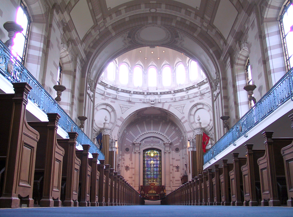


Shameless self-nom and first attempt at a featured picture. Shows the beauty and grandeur of the structure. — Dan | Talk 18:08, 19 Sep 2004 (UTC)
- Support. Beautiful. →Raul654 20:49, Sep 19, 2004 (UTC)
- Oppose. This pic is tilted, why are so many sloping pics put up for Featured Pic? A slope looks amateur (IMHO, others may not agree)) and won't impress WP's readers. It also has bad purple fringing around the windows - Adrian Pingstone 21:37, 19 Sep 2004 (UTC)
- Oppose. Defnintely tilted. But then ... it's the navy, maybe its on a ship ;-) Also agree with Arpingstone on purple fringe -- Chris 73 Talk 00:14, Sep 20, 2004 (UTC)
- Wow! Nice. Support. [[User:Neutrality| Neutrality ( talk)]] 00:16, Sep 20, 2004 (UTC)
- Oppose. Severely unbalanced.
Denni
☯ 01:32, 2004 Sep 20 (UTC)
- I've rotated it half a degree counter-clockwise and cropped it slightly. Due to velvet ropes and a large bouquet of flowers it was impossible to take the picture from the exact center. — Dan | Talk 02:07, 20 Sep 2004 (UTC)
- The rotation was not nearly enough, the original needs 1.2 degrees, not 0.5 degrees, (according to Photoshop) - Adrian Pingstone 08:32, 20 Sep 2004 (UTC)
- Oppose. The lighting in the windows spoils a great picture for me. -- Solitude 07:43, 20 Sep 2004 (UTC)
- Oppose - Agree with Arpingstone, and add that a subject with such obvious symmetry MUST be taken from dead centre - Gaz 12:51, 20 Sep 2004 (UTC)
- Oppose. Janderk 17:34, 20 Sep 2004 (UTC)
- NOT promoted, +2/-6. -- Solitude 16:42, Oct 2, 2004 (UTC)
Frogspawn

a Wikipedia:Featured picture
Self-nomination :) - Tarquin 13:35, 20 Sep 2004 (UTC)
- Support - Cos it makes my eyes go funny ;-) -
Gaz 13:40, 20 Sep 2004 (UTC)
- ...and I love the little green thingy - It gives the eye something to focus upon - Gaz 10:15, 21 Sep 2004 (UTC)
- Oppose - That green thing spoils the picture. [[User:Norm|Nor m]] 14:37, 20 Sep 2004 (UTC)
- Support. [[User:Neutrality| Neutrality ( talk)]] 16:09, Sep 20, 2004 (UTC)
- Support. The picture makes you want to know more. -- Solipsist 16:19, 20 Sep 2004 (UTC)
- Perhaps the green dot could be explained on the picture's page. -- Solipsist 00:39, 22 Sep 2004 (UTC)
- Support. Same here. makes me click the article. Janderk 23:03, 20 Sep 2004 (UTC)
- Support.Definitely -- Chris 73 Talk 23:09, Sep 20, 2004 (UTC)
- Support. Fits in well with the life-cycle photos.-- Fir0002 05:37, 21 Sep 2004 (UTC)
- Support. Great stuff, although the green stuff distracts, it's not a problem. -- Solitude 06:39, 21 Sep 2004 (UTC)
- Support. The green thing reminds of the pond and its vegetation, so it is OK. - Hapsiainen 13:18, Sep 21, 2004 (UTC)
- Support - [[User:Bevo| Bevo]] 14:16, 23 Sep 2004 (UTC)
- Support - almost perfect.-- Eloquence *
- Support. Truely well done. Simon A. 14:22, 28 Sep 2004 (UTC)
- Support. Tremendous. Whosyourjudas (talk) 23:32, 28 Sep 2004 (UTC)
Painted Lady

Self-nomination :) - Tarquin 13:35, 20 Sep 2004 (UTC)
- Oppose - Is that a reflection or some sort of motion blur? -
Gaz 13:41, 20 Sep 2004 (UTC)
- The only way I could get close enough to it was through a window, unfortunately :( -- Tarquin 13:48, 20 Sep 2004 (UTC)
- Oppose. As Gaz said, shame about the reflections - Adrian Pingstone 14:04, 20 Sep 2004 (UTC)
- Oppose. I guess it may seem liking harping on, but that blur does something shocking to the photo. -- Fir0002 05:39, 21 Sep 2004 (UTC)
- Oppose. Good effort, too bad you could only shoot it through glass. -- Solitude 06:40, 21 Sep 2004 (UTC)
Mushroom gills

Self-nomination :) - Tarquin 13:35, 20 Sep 2004 (UTC)
- Oppose - Depth of field has let you down - I would need to see all of the front gills in focus - Gaz 13:43, 20 Sep 2004 (UTC)
- Oppose. Same reason as Gaz - Adrian Pingstone 14:04, 20 Sep 2004 (UTC)
- Oppose. -- Solitude 06:41, 21 Sep 2004 (UTC)
- Support - The DOF objection is OK but we don't care with front gills this just need some cropping. Ericd 22:35, 22 Sep 2004 (UTC)
- Support. [[User:Neutrality| Neutrality ( talk)]] 19:41, Oct 1, 2004 (UTC)
Hansom cab

a Wikipedia:Featured picture
Self-nomination. Added to Hansom cab, but could probably be used elsewhere too. -- Solipsist 13:52, 20 Sep 2004 (UTC)
- Support - Interesting circumstance to grap a photo for the 'pedia - worth about 1000 words - Gaz 14:29, 20 Sep 2004 (UTC)
- Support. Striking pic - Adrian Pingstone 21:18, 20 Sep 2004 (UTC)
- Comment: is there a larger version of that image available for use here? - [[User:Bevo| Bevo]] 21:58, 20 Sep 2004 (UTC)
- Support. Janderk 23:02, 20 Sep 2004 (UTC)
- Support. -- Chris 73 Talk 23:09, Sep 20, 2004 (UTC)
- Support. [[User:Neutrality| Neutrality ( talk)]] 00:38, Sep 21, 2004 (UTC)
- Oppose. Seems pretty bland to me. [[User:Gamaliel|Gamaliel File:Watchmensmiley20.gif]] 03:59, 21 Sep 2004 (UTC)
- Support. Beautiful photo. Always wanted to see a 'hansom cab' and driver. You read about them in books and its good to see the old fashioned method of transportation. -- Fir0002 05:36, 21 Sep 2004 (UTC)
- Support. -- Solitude 06:38, 21 Sep 2004 (UTC)
- Support Lorax 00:30, Sep 22, 2004 (UTC)
- Support - [[User:Bevo| Bevo]] 03:12, 25 Sep 2004 (UTC)
- Promoted, +10/-1. -- Solitude 12:34, Oct 4, 2004 (UTC)
Rope
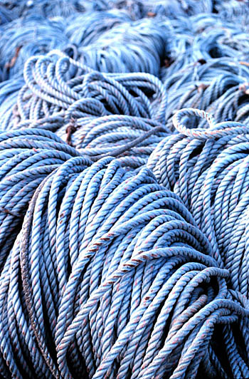

From the NOAA, used in Rope. Graphic and does exactly what it says on the tin - Solipsist 16:18, 20 Sep 2004 (UTC)
- Support - Solipsist 16:18, 20 Sep 2004 (UTC)
- Oppose. I can find litle interest in this photo and I don't find it striking, sorry! - Adrian Pingstone 21:18, 20 Sep 2004 (UTC)
- Oppose. A large part of this picture is blurry due to a bad depth of field making it again look like snapshot. A tripod and smaller aperture or just better light conditions would have made this picture much better. Maybe I am too critical. Janderk 23:01, 20 Sep 2004 (UTC)
- I'm surprised you say that. I rather suspect the photographer went to some effort to control the depth of field in order to blur the distance and create the impression that the coils go on for ever. If Fir0002 think this makes it look like seaweed, even better. Given the source, I would guess this rope is on the back of a trawler so an impression of seaweed is rather good. I also like the monochromatic quality. But I am clearly in the minority here. -- Solipsist 14:05, 21 Sep 2004 (UTC)
- Oppose. Agree with Janderk on the blurry part of the photo - looks kinda like seaweed. -- Fir0002 05:34, 21 Sep 2004 (UTC)
- Oppose. I like the subject, but a better composition is required. -- Solitude 06:37, 21 Sep 2004 (UTC)
- Oppose - Composition is OK, but the final result is not good enough from a technical stance - Gaz 10:20, 21 Sep 2004 (UTC)
- Support. [[User:Neutrality| Neutrality ( talk)]] 13:40, Sep 21, 2004 (UTC)
- Support. The DoF is obviously intentional, and the effect works quite well. Quite laughable that people could think it accidental, really. James F. (talk) 17:10, 21 Sep 2004 (UTC)
- Oppose. DoF is not adequate. And yes, it's quite possible it was accidental - not everyone uses a 35MM SLR. There are still plenty of point-and-clicks out there, which give you whatever DoF they want to give you.
Denni
☯ 00:03, 2004 Sep 22 (UTC)
- The DoF you get from a point-and-click is never that pronounced. As this is clearly a professional photo taken for a government agency - it is highly likely that the photographer knew exactly what he was doing - and did it rather well. The DoF is more than adequate - having the entire rope in focus would be boring. Support. ed g2s • talk 00:22, 24 Sep 2004 (UTC)
- Well I would love to agree with you Ed, although I have to admit that 98% of the pictures in the NOAA library are far from professional. I'd say most of them were by research students with a disposable they bought from the supermarket. This could easily just be a grad-student with an SLR and an interest in photography. In any case as Markalexander100 says, the intentionality is beside the point - the real question is whether people like the end result. -- Solipsist 15:21, 24 Sep 2004 (UTC)
- Support -- I like this one. ✏ Sverdrup 10:53, 22 Sep 2004 (UTC)
- Support. The DoF looks great, and helps draw the viewer's eyes towards the detailed/closer-up parts. Prevents there from being all that distracting detail in the background. It also looks rather nice, IMHO. -- Gregb 02:21, 24 Sep 2004 (UTC)
- Support- what Gregb said. Obviously the intentions of the photographer are irrelevant: even if the picture had been a luck snapshot, it would still be just as good a picture. Markalexander100 02:35, 24 Sep 2004 (UTC)
- Support - ugen64 02:43, Sep 24, 2004 (UTC)
- Oppose. I don't see how it contributes significantly to the article Rope - [[User:Bevo| Bevo]] 03:11, 25 Sep 2004 (UTC)
- NOT promoted, +7/-7. -- Solitude 15:49, Oct 4, 2004 (UTC)
HenryMoore02

a Wikipedia:Featured picture
Used in Henry Moore. Very striking picture, well composed. Could just poss do with the very top cropped. ( William M. Connolley 19:50, 20 Sep 2004 (UTC)). Note ( William M. Connolley 17:57, 22 Sep 2004 (UTC)) someone seems to have cropped the top. BTW, I can't see the jagged edges.
- Support (much better than rope :-) ( William M. Connolley 19:50, 20 Sep 2004 (UTC)).
- Support. Great pic - Adrian Pingstone 21:18, 20 Sep 2004 (UTC)
- Support. [[User:Neutrality| Neutrality ( talk)]] 21:55, Sep 20, 2004 (UTC)
- Support. -- Tarquin 21:57, 20 Sep 2004 (UTC)
- Neutral. The sculpture is very nice. The light is good the shadows are good, but the background is pretty poor for a featured picture.
- Support. -- Chris 73 Talk 23:09, Sep 20, 2004 (UTC)
- Support new de-jagged and nicely cropped version.
Oska 02:16, Oct 1, 2004 (UTC)
Reluctantly oppose. Nice pic of a wonderful sculpture. But the JPEG encoding seems to have been done at too high a compression rate. On the full size pic the sculpture's edges appear quite jagged. This is a critical flaw given the smooth curves of the sculpture being such an important feature. Oska 01:09, Sep 21, 2004 (UTC)
- You've got a good eye, its better without the jaggies. I've a new version which hopefully addresses this and crops the top too, but for some reason I can't upload it - on overwriting, I keep getting an error message saying 'The file you uploaded seems to be empty.' --
Solipsist 13:54, 21 Sep 2004 (UTC)
- OK it looks like the cropped, retouched and de-jaggied version has managed to upload now, although something odd was/is going on with the upload page. -- Solipsist 16:56, 21 Sep 2004 (UTC)
- You've got a good eye, its better without the jaggies. I've a new version which hopefully addresses this and crops the top too, but for some reason I can't upload it - on overwriting, I keep getting an error message saying 'The file you uploaded seems to be empty.' --
Solipsist 13:54, 21 Sep 2004 (UTC)
- Support. [[User:Gamaliel|Gamaliel File:Watchmensmiley20.gif]] 03:59, 21 Sep 2004 (UTC)
- Support. William, maybe you can try contacting the original creator for the original version and re-encode it. -- Solitude 06:35, 21 Sep 2004 (UTC)
NeutralSupport - If someone will crop the jagged edge from the top I'll change to support (I'll do it later if I get time) - Gaz 10:23, 21 Sep 2004 (UTC) - Gaz 08:07, 26 Sep 2004 (UTC)- Support. James F. (talk) 17:10, 21 Sep 2004 (UTC)
- Support. - [[User:Bevo| Bevo]] 11:59, 23 Sep 2004 (UTC)
- Support. Forgetting I could. -- Solipsist 12:56, 23 Sep 2004 (UTC)
- Not a vote, but the copyright status on the pic is wrong. Taking a picture of a copyrighted work (in this case, the statue) causes the picture itself to be a derivative work -- IE, you do not own the copyright on it, thus you cannot release it under the CCL.
→Raul654 19:56, Sep 24, 2004 (UTC)
- Interesting. I've asked on some other talk pages what the copyright status is for 2D images of 3D works, but never received a reply. Copyright on the photo when the 3D work is out of copyright seems clear. When the 3D work is in copyright its more confusing. A 3D copy of a 3D work is clearly a problem. I've seen some people claim that with 2D images of a 3D work, it matters whether the 3D work is in a public space.
This page appears to give good advice and draws that distinction for photos of buildings but not sculptures. (buildings are copyright in the US ?*#$! )
- However, the situation may be different in the UK.
This article suggests that sculptures are not covered by UK copyright law at all. AFIK the sculpture was made in the UK in 1951, the photograph was taken in the UK from a public street, but is effectively being published in Florida. So does UK or US law apply? --
Solipsist 23:47, 24 Sep 2004 (UTC) (Oblig. IANAL)
- If the 3d work was copyrighted, pictures of it are derivative works, meaning that you cannot publish them without permission. However, pictures of public domain works are simply your copyright. If it was PD in the UK, and you took the picture there, then it's your copyright entirely. You can publish it here if you please. →Raul654 18:59, Sep 26, 2004 (UTC)
- However, the situation may be different in the UK.
This article suggests that sculptures are not covered by UK copyright law at all. AFIK the sculpture was made in the UK in 1951, the photograph was taken in the UK from a public street, but is effectively being published in Florida. So does UK or US law apply? --
Solipsist 23:47, 24 Sep 2004 (UTC) (Oblig. IANAL)
- Interesting. I've asked on some other talk pages what the copyright status is for 2D images of 3D works, but never received a reply. Copyright on the photo when the 3D work is out of copyright seems clear. When the 3D work is in copyright its more confusing. A 3D copy of a 3D work is clearly a problem. I've seen some people claim that with 2D images of a 3D work, it matters whether the 3D work is in a public space.
This page appears to give good advice and draws that distinction for photos of buildings but not sculptures. (buildings are copyright in the US ?*#$! )
- Oppose. Nothing spectacular here. Fredrik | talk 21:24, 25 Sep 2004 (UTC)
- Support. Love the contrasting colours. Great sculpture, great photo. The bellman 08:09, 27 Sep 2004 (UTC)
- Promoted, +12/-1. -- Solitude 12:53, Oct 5, 2004 (UTC)
Alitalia Airbus A321
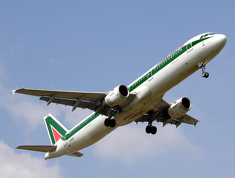

I like the angle, which makes it seem to be taking off although it's actually landing. Photographed by myself and used on the Alitalia article - Adrian Pingstone 17:01, 21 Sep 2004 (UTC)
- Support. (Am I allowed to add a Support for my own pic?) - Adrian Pingstone 20:33, 22 Sep 2004 (UTC)
- Oppose. The clouds give the impression that the aircraft is in some kind of distress (sort of like the old Windows logo which looked like it was going down in flames). Denni ☯ 23:57, 2004 Sep 21 (UTC)
- Support. The clouds look fine to me -- Chris 73 Talk 00:08, Sep 22, 2004 (UTC)
- Support. [[User:Neutrality| Neutrality ( talk)]] 03:20, Sep 22, 2004 (UTC)
- Oppose. A featured, thus brilliant as stated above, picture should have something special. I am afraid I do not see that in this one. This picture is one of the gazillions taken from the ground near the runway. Janderk 08:44, 22 Sep 2004 (UTC)
- Yes indeed, I was on the ground near the runway. I find that's a good way to get a pic of an aeroplane!! Also it's no bar to a pic being Featured if gazillions of other such pics exist. You are being asked to judge this one, not those! - Adrian Pingstone 20:30, 22 Sep 2004 (UTC)
- Support. Some pictures in one gazillion are not that easy to make. BTW I think it's important to feature some picture in a gazillions as long as they are GPDL This week-end I saw a whole street forbidden to cars, one small truck, 3 other utilies vehicles and a 5 persons crowd just to take a photo of a building with a large format 4"x5 camera for advertising purpose... I prefer not to figure what it would be for a 8"x10" cam ;). We aren't boxing in the same category as an airline company... Ericd 21:05, 22 Sep 2004 (UTC)
- Oppose. I don't see anything actually illustrated well in this photo. For example, I can't see clearly the name of the airline, and although it is an interesting angle that shows the underside of a landing aircraft with the wheels extended, that portion on the aircraft is in deep shadow, obscuring the detail. - [[User:Bevo| Bevo]] 11:36, 23 Sep 2004 (UTC)
- Support. Fredrik | talk 21:24, 25 Sep 2004 (UTC)
- Oppose - ditto to Bevo - Gaz 13:47, 26 Sep 2004 (UTC)
- Oppose. The fact that it looks like starting although it's landing is a weakness to me. A photo should show what is out there, not the opposite. Simon A. 14:18, 28 Sep 2004 (UTC)
- Oppose. Suggest renomination at Perfectly adequate picture candidates. GWO 14:20, 28 Sep 2004 (UTC)
- This an offensive remark, please have more thought for my feelings - Adrian Pingstone 19:11, 28 Sep 2004 (UTC)
- NOT promoted, +5/-6. -- Solitude 13:39, Oct 5, 2004 (UTC)
Icelandic sheepdog

- Great photo. [[User:Neutrality| Neutrality ( talk)]] 03:18, Sep 22, 2004 (UTC)
- Oppose. It's just a dog. There's also too much background, and its eyes are dead. Markalexander100 08:53, 22 Sep 2004 (UTC)
- Comment: That's a fine dog! Can you try to get a better photo? My attention is drawn away by the clutter. - Bevo 16:39, 22 Sep 2004 (UTC)
- Oppose -- choose a better one from Wikipedia:List_of_images/Nature/Animals/Dogs Dunc_Harris| ☺ 20:23, 22 Sep 2004 (UTC)
- Please see note at [3] and let me know more about coordination regarding usage of images in Wikipedias in other languages. Gangleri 01:34, 2004 Sep 29 (UTC) (who provided this image)
![[3]](/info/en/?search=Image:Icelandic_sheepdog_vif_vom_schloss_neubronn_01.jpg)
- NOT promoted, +1/-2. -- Solitude 13:41, Oct 5, 2004 (UTC)
Chocolate

Renomination, received a total of 2 votes, I think there's not better illustration for the instant-water-in-mouth effect of chocolate. -- Solitude 08:13, Sep 23, 2004 (UTC)
- Support. -- Solitude 08:13, Sep 23, 2004 (UTC)
- Oppose. The different coloured lighting from opposite sides is uncomfortable. Also it just doesn't much look like chocolate. -- Solipsist 12:51, 23 Sep 2004 (UTC)
- Oppose. The light on the chocolate tower is awkward. --[[User:AllyUnion| AllyUnion (talk)]] 12:57, 23 Sep 2004 (UTC)
- Oppose. Reflections in the window, too dark, and IMHO not very appetizing. -- Chris 73 Talk 14:34, Sep 23, 2004 (UTC)
- Oppose. The background is too chaotic - Adrian Pingstone 16:06, 23 Sep 2004 (UTC)
- Oppose, ditto Adrian. [[User:Neutrality| Neutrality ( talk)]] 21:16, Sep 23, 2004 (UTC)
- Oppose. Agree with Solipsist. I think a photo like what they show on the Cadbury ads would be great to illustrate chocolate. Melted chocolate with more melted chocolate being poured into it. -- Fir0002 03:08, 24 Sep 2004 (UTC)
- Oppose. I think this is a very, very ordinary photo. Sorry Solitude but I think you're wasting our time.
Oska 03:01, Sep 25, 2004 (UTC)
- Well, if I knew beforehand what everyone was thinking, we wouldn't be needing this page now would we? -- Solitude 08:24, Sep 26, 2004 (UTC)
- Oppose - Gaz 06:51, 26 Sep 2004 (UTC)
- Oppose. To quote co-worker, "looks more like a butt plug than chocolate." Davodd 02:29, Oct 1, 2004 (UTC)
- NOT promoted, +1/-9. -- Solitude 13:46, Oct 5, 2004 (UTC)
Dominoes

Renomination, used in
Dominoes, taken by
Gaz. As I feel the attention the Featured Picture Candidates section receives seems to have grown extensively the last two months, I'd like to renominate some pictures from the early days. If you object, feel free to comment/oppose, but I feel some pictures that received little attention nor votes receive a second chance.
About the picture itself, I think it actually succeeds in making dull domino stones interesting and beautiful. --
Solitude 07:28, Sep 23, 2004 (UTC)
No Vote - This is my shot - To answer some of the comments below... The darkness, shallow depth of field and tile placement are all intentional. I wanted a close-up of one dominoe, and have it involved in a game trailing off into the distance. To take a photo of a real game in good lighting would, frankly, be dead boring.
Gaz 08:04, 26 Sep 2004 (UTC)
- Yes exactly, I agree. Well unless the tides turn this picture is not gonna make it (again heh) so I'll just put it up in my personal gallery. -- Solitude 12:27, Oct 4, 2004 (UTC)
- Support. -- Solitude 07:28, Sep 23, 2004 (UTC)
- Support. Although I would prefer the whole of the first dominoe to be in focus, and its face on the right hand side is possibly a little too dark -- Solipsist 12:54, 23 Sep 2004 (UTC)
- Oppose. The entire image is too dark (literally not brilliant) and also the dominoes are placed in a pattern that would be unnatural to an actual game; this picture does not contribute significantly to the article Dominoes. - [[User:Bevo| Bevo]] 13:13, 23 Sep 2004 (UTC)
- Oppose, too dark, which I am not sure if I can change due to the odd license. May support if brighter, possibly also a higher resolution and a regular GFDL license. -- Chris 73 Talk 14:37, Sep 23, 2004 (UTC)
- Oppose. Needs to be a lot lighter, and depth of field is also an issue. Denni ☯ 19:22, 2004 Sep 23 (UTC)
- Oppose. Agree with the issues Denni raised. Also dislike the actual domino's black spots- they seem to be very ragged. -- Fir0002 03:05, 24 Sep 2004 (UTC)
- Oppose. Interesting perspective, poor shot. Oska 02:59, Sep 25, 2004 (UTC)
- NOT promoted, +2/-5. -- Solitude 13:50, Oct 5, 2004 (UTC)
Night view along the front from the Hotel Suisse in Nice

a Wikipedia:Featured picture
- I like this one. Ericd
- Support. A truly superb picture... ermm... OK, yes, I took it (
William M. Connolley 22:30, 22 Sep 2004 (UTC)). BTW it really is the Primotel S., not Hotel S..
- Oppose - I'm jealous (just kidding) - BTW, we don't care if it belongs to the Primotel group for everyone in Nice this is the "Hôtel Suisse" do you want a photo to see what's written on ?
Ericd 22:42, 22 Sep 2004 (UTC)
- Ah... fair enough. Hotel it is ( William M. Connolley 11:57, 23 Sep 2004 (UTC))
- Oppose - I'm jealous (just kidding) - BTW, we don't care if it belongs to the Primotel group for everyone in Nice this is the "Hôtel Suisse" do you want a photo to see what's written on ?
Ericd 22:42, 22 Sep 2004 (UTC)
- Support Janderk 00:22, 23 Sep 2004 (UTC)
- Oppose. Sorry to seem negative but it's not sharp enough for me to enjoy - Adrian Pingstone 07:30, 23 Sep 2004 (UTC)
- Support'. Sharp enough, nice colours for a night shot. ed g2s • talk 16:29, 23 Sep 2004 (UTC)
- Support - my only gripe is that the shutter speed could have been a bit faster, although I suppose that's no fault of the photographer (it being a nighttime landscape and all). Great shot! And yeah, I'm jealous...
ugen64 02:38, Sep 24, 2004 (UTC)
- Thanks. As I recall, the shutter is deliberately slow to blur the car headlights ( William M. Connolley 22:07, 25 Sep 2004 (UTC))
- Support. Schutz 06:29, 24 Sep 2004 (UTC)
- Oppose. I don't like the way the road gets cut off.
Fredrik |
talk 21:24, 25 Sep 2004 (UTC)
- Any more road would be boring ( William M. Connolley 22:07, 25 Sep 2004 (UTC))
- Support. I've been in two minds on this one, but the colours are good and its better than many of the curret FP photos of places. -- Solipsist 10:56, 26 Sep 2004 (UTC)
- Support. beautiful picture. -- Whosyourjudas (talk) 02:32, 28 Sep 2004 (UTC)
- Support, nice photo Lorax 00:02, Sep 29, 2004 (UTC)
- Promoted, +9/-2. -- Solitude 13:48, Oct 5, 2004 (UTC)
Large Bonfire
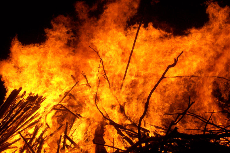
 a Wikipedia:Featured picture |
 |
 |
 |
A very large and fast burning bonfire (unaided by petrol).
- Comment. Only Large_bonfire.jpg is used on a page. I would like to see which of these photos you like best - the best one I'll put on the fire page -- Fir0002 03:16, 24 Sep 2004 (UTC)
- Support. Self Nomination -- Fir0002 12:27, 23 Sep 2004 (UTC)
- Support. Fire.... Good! -- Solipsist 12:49, 23 Sep 2004 (UTC)
- Comment: It is curious that this image is used in Fire but not yet in Bonfire - [[User:Bevo| Bevo]] 13:04, 23 Sep 2004 (UTC)
- Comment: I have a similar series of photos of the same bonfire on the Bonfire page. -- Fir0002 02:50, 24 Sep 2004 (UTC)
- Oppose. It's a fine fire, but not a great picture of a fire. Denni ☯ 19:20, 2004 Sep 23 (UTC)
- Support the pic called "Silhouette of persons Head", shows me the scale - Adrian Pingstone 21:35, 24 Sep 2004 (UTC)
- Comment. Have uploaded several versions with people silhouetted in them. Hope you like one of these better-- Fir0002 03:16, 24 Sep 2004 (UTC)
- Support. [[User:Neutrality| Neutrality ( talk)]] 21:16, Sep 23, 2004 (UTC)
- I like the original best, the scale is given by the twigs. Dunc_Harris| ☺ 14:59, 24 Sep 2004 (UTC)
- Support Large bonfire.jpg, the original image nominated - [[User:Bevo| Bevo]] 23:29, 24 Sep 2004 (UTC)
- Support. I like 02 best, though. Fredrik | talk 21:24, 25 Sep 2004 (UTC)
- Support - the original Large_bonfire.jpg - Gaz 06:50, 26 Sep 2004 (UTC)
- Promoting the original bonfire, +7/-1. -- Solitude 06:44, Oct 7, 2004 (UTC)
Water

Very good photo. [[User:Neutrality| Neutrality ( talk)]] 03:37, Sep 24, 2004 (UTC)
- Support. [[User:Neutrality| Neutrality ( talk)]] 03:37, Sep 24, 2004 (UTC)
- Not a vote yet: Is this available in a larger size, too? (Current: 300 x 450 Pixels) -- Chris 73 Talk 03:42, Sep 24, 2004 (UTC)
- Support, it adds a lot to Water. ✏ Sverdrup 00:29, 25 Sep 2004 (UTC)
- Oppose. I'd like to make a comment about the tendency to post 'geek interest' type photos to this forum. I characterise these as photos that are impressive to certain people simply because of the idea of the photo rather than the visual impact of the photo itself. Examples include this photo - Look! Flowing water frozen by a camera! - and the hurricane Ivan photo - Look! That monster hurricane photographed from space!. Oska 03:09, Sep 25, 2004 (UTC)
- Support. Needs to be bigger though. ed g2s • talk 15:28, 25 Sep 2004 (UTC)
- Oppose - Get a newer tap/faucet - Gaz 06:46, 26 Sep 2004 (UTC)
- Neutral. Quite graphic and helps illustrate the article, but agree with Gaz that the tap/faucet is a let down. -- Solipsist 11:00, 26 Sep 2004 (UTC)
- Support - [[User:Bevo| Bevo]] 00:58, 27 Sep 2004 (UTC)
- Oppose. Another snapshot in an uninspiring environment. Janderk 12:09, 28 Sep 2004 (UTC)
- Oppose. Since water supply has been deregulated in Germany, utility companies have made lots of printed ads showing these kind of pictures -- and my home city's (Munich's) public utilities have found quite good photographers, putting my bar to be awed quite high. Simon A. 14:21, 28 Sep 2004 (UTC)
- Oppose. I agree with the "geek effect" idea. Ive thought that before just never knew how to word it. Wait...who am i kidding, im a huge geek. -- ScottyBoy900Q ∞ 02:31, 08 Oct 2004 (UTC)
- NOT promoted, +5/-5. -- [[User:Bevo| Bevo]] 18:58, 8 Oct 2004 (UTC)
I didn't like the doggy photo below, but I did like this one, very personal. Dunc_Harris| ☺ 14:24, 24 Sep 2004 (UTC)
- Oppose. Pet photographers everywhere are going "Ewwww." GET DOWN TO THE PET'S LEVEL!! Denni ☯ 23:16, 2004 Sep 24 (UTC)
- Oppose. Let's remember this is an encyclopedia and keep the anthropomorphic comments and cute photos to the many, I am sure, dog fan websites out there. Oska 03:23, Sep 25, 2004 (UTC)
- Oppose - I see nothing to feature here - Gaz 14:11, 25 Sep 2004 (UTC)
- Oppose. [[User:Gamaliel|Gamaliel File:Watchmensmiley20.gif]] 23:03, 25 Sep 2004 (UTC)
- This is not a pit bull. It is a boxer. Janderk 10:37, 27 Sep 2004 (UTC)
- Oppose. Bad crop. Foreshortening skews proportions. Lighting is terrible. Davodd 01:30, Sep 29, 2004 (UTC)
- Oppose. Would prefer to see the rest of the dog too. Enochlau 05:42, 3 Oct 2004 (UTC)
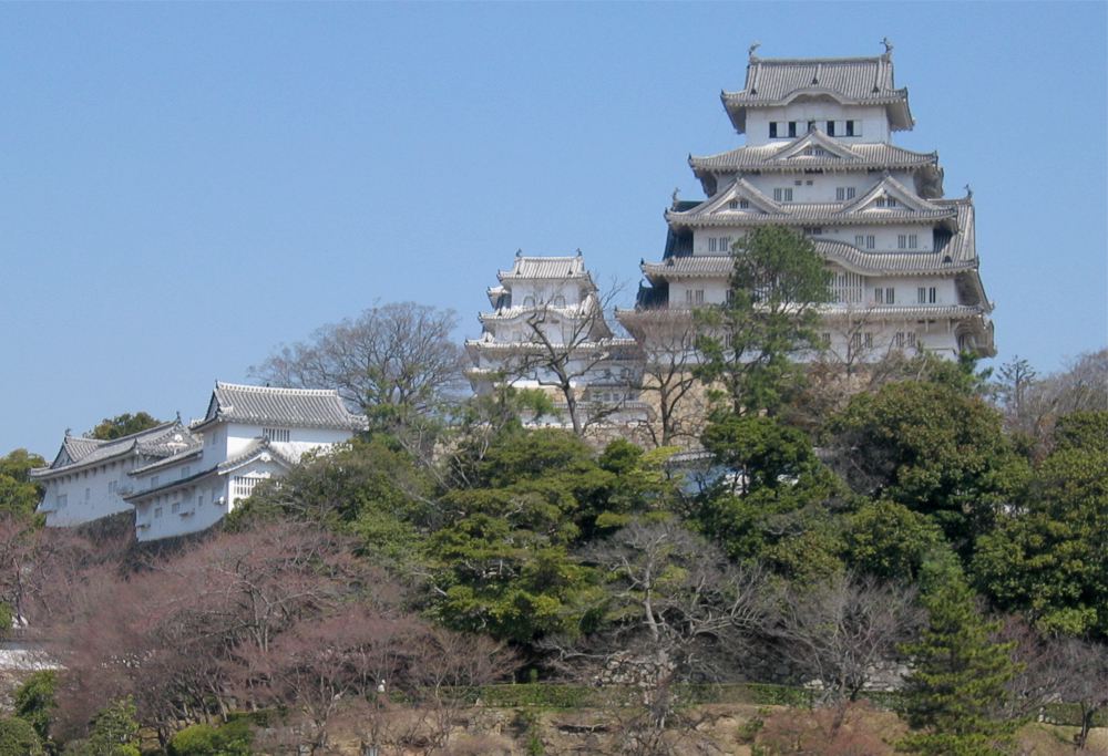
Himeji Castle


Another shameless self-nom. It's a beautiful structure. — Dan | Talk 05:18, 24 Sep 2004 (UTC)
- Support. Great photo. [[User:Neutrality| Neutrality ( talk)]] 05:26, Sep 24, 2004 (UTC)
- Support. Schutz 06:29, 24 Sep 2004 (UTC)
- Oppose, the colours are badly washed out and the sky is blank - Adrian Pingstone 07:14, 24 Sep 2004 (UTC)
- Oppose. Himeji is impressive, but I agree with Adrian P that the colours are washed out and with a grey sky, the photo lacks contrast. -- Tlotoxl 17:59, 24 Sep 2004 (UTC)
- Oppose (as AP) ( William M. Connolley 19:39, 24 Sep 2004 (UTC)).
- Oppose. I added an attempted colour-correction..However, I'm not quite satisfied with it, since the sky got even more plain. I bet a professional Photoshop user would do a better job. — David Remahl 00:09, 25 Sep 2004 (UTC)
- Oppose. It certainly is a beautiful structure but unfortunately this photo does it little justice. Oska 03:12, Sep 25, 2004 (UTC)
- Oppose - ditto all of the above - Gaz 14:26, 25 Sep 2004 (UTC)
- Oppose original because of the grey sky; oppose the modified version because of the Disney/nuclear winter sky. There has to be a middle ground between dull and surreal. Markalexander100 07:53, 26 Sep 2004 (UTC)
- Good composition, but the pink sky is hilarious. I sort of like it, but nooo.. ✏ Sverdrup 20:34, 6 Oct 2004 (UTC)
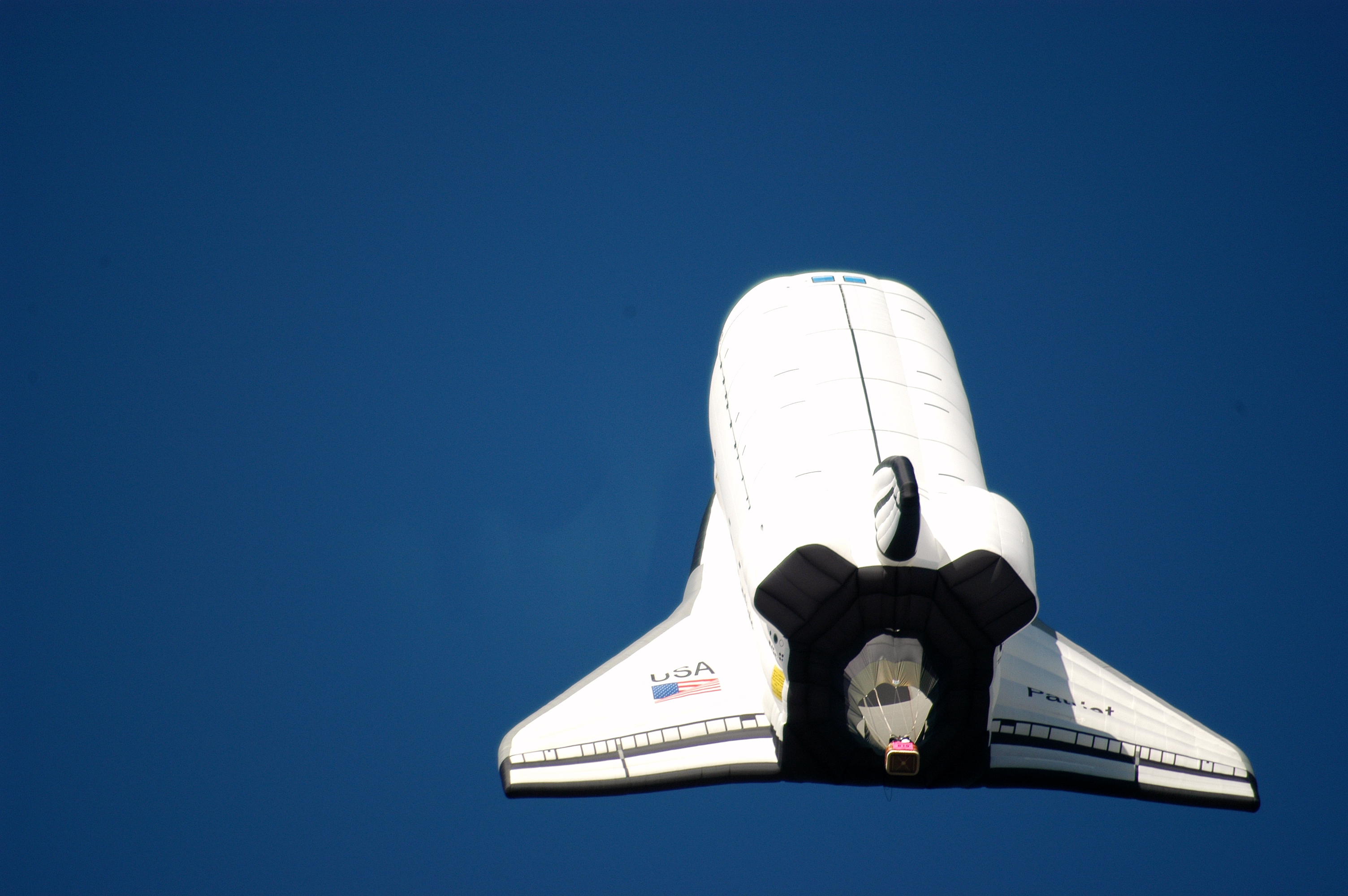
Space Shuttle

a Wikipedia:Featured picture
You just have to say 'Wow!' Shows the Space Shuttle to good effect and the colours are rather nice too. This was on the 'Selected anniversaries' section of the main page last week, and it really caught my eye then. -- Solipsist 06:59, 24 Sep 2004 (UTC)
- Actually I think I am mistaken. It was probably Image:Ap11-KSC-69PC-442.jpg on the current WP:COTW at Space Race that caught my eye. Not that that matters much. -- Solipsist 11:42, 25 Sep 2004 (UTC)
- Support. -- Solipsist 06:59, 24 Sep 2004 (UTC)
- Support. -- Chris 73 Talk 08:02, Sep 24, 2004 (UTC)
- Support. -- [[User:AllyUnion| AllyUnion (talk)]] 08:55, 24 Sep 2004 (UTC)
- Support. -- [[User:Neutrality| Neutrality ( talk)]] 20:26, Sep 24, 2004 (UTC)
- Support. -- Autiger 00:00, 25 Sep 2004 (UTC)
- Support - A PD work has to be damn good to get my vote - Gaz 14:23, 25 Sep 2004 (UTC)
- Support. Fredrik | talk 21:24, 25 Sep 2004 (UTC)
- I like the photo, and I saw Columbia land after this launch, but that brings me to my problem. This is the first launch, and the fuel tank is painted white. Most shuttle launches used tanks painted orange. If we feature a shuttle launch photo, I think it should be more represtative of the "normal" configuration.
Gentgeen 22:48, 25 Sep 2004 (UTC)
- I'm not sure I agree with your point, Gentgeen. We have featured picture that were not "normal" before, haven't we? The London National Gallery photo comes to mind....unless I'm wrong and it wasn't featured. Personally, the fact that the picture isn't representative of a "normal" launch isn't a problem for me -- many photos of non-normal happenings are featurable because they're not normal, as I recall.
Jwrosenzweig 23:40, 27 Sep 2004 (UTC)
- I think there is a valid concern here because the image is used as a straight illustration for the Space Shuttle article, rather than to highlight the difference. It seems a fairly small point though, and the space shuttle looks better colour coordinated in white. The note on the image page seems sufficient. -- Solipsist 05:50, 7 Oct 2004 (UTC)
- I'm not sure I agree with your point, Gentgeen. We have featured picture that were not "normal" before, haven't we? The London National Gallery photo comes to mind....unless I'm wrong and it wasn't featured. Personally, the fact that the picture isn't representative of a "normal" launch isn't a problem for me -- many photos of non-normal happenings are featurable because they're not normal, as I recall.
Jwrosenzweig 23:40, 27 Sep 2004 (UTC)
- Makes me want to go into space... Support JOHN COLLISON | (Ludraman) 23:18, 25 Sep 2004 (UTC)
- Makes me want to stay the hell home. Support GWO 11:08, 27 Sep 2004 (UTC)
- Makes me wish they'd start flying again already Support -- ScottyBoy900Q ∞ 02:34, 08 Oct 2004 (UTC)
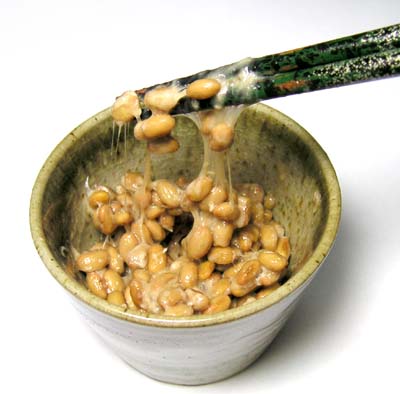
Natto

a Wikipedia:Featured picture
Nice composition, although possibly not quite pin-sharp. Somewhat unappetising to my eyes, however it illustrates the article wonderfully — I wouldn't guess what fermented soybeans would look like otherwise. - Solipsist 07:22, 24 Sep 2004 (UTC)
- Support - Solipsist 07:22, 24 Sep 2004 (UTC)
- Support. And yes, it tastes as bad as it looks -- Chris 73 Talk 08:05, Sep 24, 2004 (UTC)
- Support. Excellent photo of natto, really captures the gooey sliminess. Yum yum yum, I'm getting hungry. -- Tlotoxl 10:31, 24 Sep 2004 (UTC)
- Oppose. Which criterion, beautiful, striking, shocking, impressive, titillating, fascinating, or in short just brilliant, is this picture intended to meet? I agree that it's a fine illustration for an article of the same name, But featured picture - man, you really have to stretch it. Denni ☯ 23:24, 2004 Sep 24 (UTC)
- Support. Nice photo. (disclaimer: natto fan) Oska 03:17, Sep 25, 2004 (UTC)
- Oppose - This scores about 800 on my 1000-words meter - Good, but not quite good enough (focus is off) to get my vote - Sorry -
Gaz
- Somehow I feel the slightly off focus is appropriate for a photo of natto. Oska 02:54, Sep 26, 2004 (UTC)
- Support. The background and the setting with the sticks grabbing are perfect. The focus unfortunately isn't. Still better than many of the other featured images though. Janderk 11:49, 28 Sep 2004 (UTC)
- Support. This is, incidentally, the most disgusting food I have ever eaten, but the picture's good. — Dan | Talk 22:59, 28 Sep 2004 (UTC)
- Comment. I think someone got desperate and ate the natto. The large image is no longer there. -- Fir0002 10:05, 29 Sep 2004 (UTC)
- Oppose. Focus could be better. Enochlau 05:44, 3 Oct 2004 (UTC)
Great Dane & Chihuahua

I requested this one, shows nicely the range of dog sizes. I'd be interested to know how people see it for the first time. Dunc_Harris| ☺ 14:24, 24 Sep 2004 (UTC)
- Support. Now I know why there is no Chihuahua and Great Dane cross-breed ;-) -- Chris 73 Talk 14:29, Sep 24, 2004 (UTC)
- Oppose (too messy) ( William M. Connolley 19:39, 24 Sep 2004 (UTC)).
- Support. Excellent pic - Adrian Pingstone 21:29, 24 Sep 2004 (UTC)
- Neutral -- I think a truly featured worthy picture of this kind would add a human being or something else in the picture to help establish a frame of reference. This picture only provides a relative range of dog sizes...someone not very familiar with the size of a Chihuahua, for example, might assume the Dane is 7 feet tall. A nice concept for a picture, I think, but I'm not sure if this execution of the concept is featurable. Jwrosenzweig 22:32, 24 Sep 2004 (UTC)
- Oppose. A great concept, but poor execution. I have always wondered, though, what a ChihuaXDane might look like. (You'd want the bitch to be a Great Dane, of course...) Denni ☯ 23:20, 2004 Sep 24 (UTC)
- Oppose. Oska 03:19, Sep 25, 2004 (UTC)
- Oppose. I like it and its a good illustration. The problem for me is the tone of the background hill merges with the great dane's coat and the outline of the chihuahua is not so well defined (lost in the grass?). Looking at User:Elf's other dog pics, I notice they work a lot better when the dogs don't have leads and look towards the camera (that can't be easy though). Kudos for avoiding the photographer's shadow. -- Solipsist 11:54, 25 Sep 2004 (UTC)
- Oppose - Gaz 14:12, 25 Sep 2004 (UTC)
- Oppose. The trees seem to grow from the Great Dane's back. - Hapsiainen 23:28, Sep 25, 2004 (UTC)
- Oppose. Picture quality and pose are poor. (SHould be Chihuahua vs. Irish Wolfhound, anyway). Davodd 01:37, Sep 29, 2004 (UTC)
- I have been entertained by the comments here. If you need more entertainment, here's the true story behind trying to get a good photo out of this situation. (Including why no people, why no Irish Wolfhound, what about the photographer's shadow, the ugly background, and so on.) Elf | Talk 01:21, 30 Sep 2004 (UTC)
- Hillarious. Never work with children or animals. -- Solipsist 15:15, 30 Sep 2004 (UTC)
Fire ants


a Wikipedia:Featured picture
Very striking, nicely composed. Used on Ant and attributed to Scott Bauer from the USDA (PD), uploaded by User:Ellmist.
- Nominate. (just too bad it wasn't taken by a wikipedian) -- Tlotoxl 20:30, 27 Sep 2004 (UTC)
- Support. Mr. Bauer has a superb eye. Oh, and ouch! Denni ☯ 23:11, 2004 Sep 27 (UTC)
- Support. I like this photo, but I didn't like the grainyness of the background so I have tried to fix it. --
Fir0002 11:48, 29 Sep 2004 (UTC)
- Great job of smoothing the background! - [[User:Bevo| Bevo]] 13:20, 29 Sep 2004 (UTC)
- Support. Really capures your attention, glad we don't have 'em over here. Nice work on the background Fir. -- Solitude 12:19, Sep 29, 2004 (UTC)
- Support Fire ants02.jpg - [[User:Bevo| Bevo]] 13:20, 29 Sep 2004 (UTC)
- Support. -- Solipsist 15:24, 30 Sep 2004 (UTC)
- Support both pictures. [[User:MacGyverMagic| Mgm| (talk)]] 10:01, Oct 3, 2004 (UTC)
- The wood is boring, the background and setting a bit too flat. ✏ Sverdrup 20:33, 6 Oct 2004 (UTC)
- Oppose. The image is too staged. I prefer a nature shot for a featured picture. Janderk 14:53, 9 Oct 2004 (UTC)
- Support. -- Chris 73 Talk 15:24, Oct 9, 2004 (UTC)
- Sopport -- ScottyBoy900Q ∞ 02:51, 11 Oct 2004 (UTC)
- Promoted retouched, +9/-2. -- Solitude 11:39, Oct 11, 2004 (UTC)
A diversity of clouds


A very large cloud formation with other smaller formations in the background. The 'whipped cream' look is captured pretty well IMO.
- Support. Self Nomination. -- Fir0002 06:40, 26 Sep 2004 (UTC)
- Oppose. I like the photo, but I think it needs some clone tool work to get rid of the dust/specs(sp?), and some color adjusting. Ivan 07:00, 26 Sep 2004 (UTC)
- Comment have tried to fix those problems. I took the original on film, so the scanning detracted from the quality of the image -- Fir0002 09:12, 26 Sep 2004 (UTC)
- Comment: would support if the meteorological conditions were explained. The clouds are very striking. Its odd that the wave cloud is in the foreground - I would expect it to be high. ( William M. Connolley 12:33, 26 Sep 2004 (UTC)).
- Comment. um.. Meteorological conditions? I just pointed the camera and took the photo. It was a warm summer day, hardly any other clouds about, and I didn't think to do much other testing. -- Fir0002 11:04, 29 Sep 2004 (UTC)
- Oppose. Oska 02:29, Oct 1, 2004 (UTC)
- Oppose. A not-bad pic of a modestly interesting cloud formation, but not Featured Pic calibre. Denni ☯ 16:15, 2004 Oct 3 (UTC)
- Oppose. -- ScottyBoy900Q ∞ 02:50, 11 Oct 2004 (UTC)
- NOT promoted, +1/-4. -- Solitude 11:39, Oct 11, 2004 (UTC)
Imperial guardian lions

From Imperial guardian lion and Forbidden City, photo by User:Allentchang. Very striking and definitely enriches the articles, particularly the first one. My only very minor complaint would be the person in the background, but this is hard to avoid in tourist places.-- Eloquence * 04:11, Sep 26, 2004 (UTC)
- Support. Good photo. -- Fir0002 09:44, 26 Sep 2004 (UTC)
- Oppose - distracting elements (man in bg, fence in fg) - this is a good snapshot, lacking the flair to make me gasp the word "brilliant" - Gaz 14:09, 26 Sep 2004 (UTC)
- 1.2 billion people in China, and one of them has the audacity to show up in this photo - we can sort that :-). Not sure I would want to tackle the fence post though. -- Solipsist 14:59, 26 Sep 2004 (UTC)
- Support Forbbiden_City3.JPG - [[User:Bevo| Bevo]] 23:58, 26 Sep 2004 (UTC)
- Oppose any version with a misspelt filename. ;) Markalexander100 08:19, 27 Sep 2004 (UTC)
- Oppose - Poor and cluttered composition. Good for article, bad for featured pic. Filename is misspelled. [[User::WibblyLeMoende|WibblyLeMoende]] 28 Sep 2004
- Oppose - echo WibblyLeMoende's opposition Lorax 00:55, Sep 29, 2004 (UTC)
- NOT promoted, +2/-4. -- Solitude 11:38, Oct 11, 2004 (UTC)
Large White caterpillar

a Wikipedia:Featured picture
Taken by Sannse, used on Large White. Nice symmetry, good focus, excellent perspective.-- Eloquence * 00:32, Sep 26, 2004 (UTC)
- Support. Superb quality, I love it. -- Solitude 01:50, Sep 26, 2004 (UTC)
- Support -- Chris 73 Talk 02:38, Sep 26, 2004 (UTC)
- Support. Looks even more tasty than the natto. -- Oska 03:03, Sep 26, 2004 (UTC)
- Support. A very interesting caterpillar, and a well taken shot -- Fir0002 09:45, 26 Sep 2004 (UTC)
- Support. Excellent in the full view. -- Solipsist 10:23, 26 Sep 2004 (UTC)
- Support - Great DOF work - even has a "munched on" leaf in the shot - Gaz 14:02, 26 Sep 2004 (UTC)
- Support. Very nice. Autiger 00:32, 27 Sep 2004 (UTC)
- Support - [[User:Bevo| Bevo]] 00:48, 27 Sep 2004 (UTC)
- Support Janderk 11:44, 28 Sep 2004 (UTC)
- Support. Simon A. 14:02, 28 Sep 2004 (UTC)
- Support - but too bad the shot angle is of the animal's backside instead of its face. Davodd 01:26, Sep 29, 2004 (UTC)
- Support. -- ScottyBoy900Q ∞ 02:49, 11 Oct 2004 (UTC)
- Promoted, +12/-0. -- Solitude 11:38, Oct 11, 2004 (UTC)
Water after droplet impact
 |
 |
 |
 |
An almost perfect photo of what happnens when a water droplet hits water.
- Comment, have added a series again, only Water_droplet.jpg is linked to a page. The favourite will take the place on the page. -- Fir0002 02:04, 26 Sep 2004 (UTC)
- Support. Self Nomination. -- Fir0002 22:56, 25 Sep 2004 (UTC)
- Oppose -- I think it looks a bit wonky, and a bit grainy Dunc_Harris| ☺ 22:58, 25 Sep 2004 (UTC)
- Oppose all. 2 and 3 are fuzzy, 1 and 4 are tilted and also an odd angle between the surface and the frozen water column -- Chris 73 Talk 02:41, Sep 26, 2004 (UTC)
- Oppose these shots - Go take some more (probably lots more) - I would like to see a level "horizon", clear water (like 2,3 & 4), a vertical water column which is centred and in perfect focus - THAT I would support - (don't ask much do I!) -
Gaz 13:57, 26 Sep 2004 (UTC)
- Agree. And while you're at it, why not take some pictures of the ripples hitting some kind of barrier so that they can be used in boundary condition or wave equation at a later time. That would be handy. -- Tlotoxl 19:03, 27 Sep 2004 (UTC)
- Oppose. -- ScottyBoy900Q ∞ 02:46, 11 Oct 2004 (UTC)
- NOT promoted, +1/-4. -- Solitude 11:37, Oct 11, 2004 (UTC)
Pentakisdodecahedron.gif
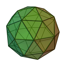


a Wikipedia:Featured picture
This is just one out of the collection of catalan solids created by Cyp. They exist both in animated and unanimated form (unanimated version of this one: Image:Pentakisdodecahedron.jpg). As far as I could see, none of these have been featured. They're excellent work and at least one of them deserves the honors, IMHO.-- Eloquence *
- I like it but I think the animation is a bit fast. Dunc_Harris| ☺ 15:31, 25 Sep 2004 (UTC)
- Support. Fredrik | talk 21:24, 25 Sep 2004 (UTC)
- Support. Brilliant -- Fir0002 22:47, 25 Sep 2004 (UTC)
- Support. Very illustrative. JOHN COLLISON | (Ludraman) 23:22, 25 Sep 2004 (UTC)
- Support -- Chris 73 Talk 02:42, Sep 26, 2004 (UTC)
- Support. Nice nomination. -- Oska 02:57, Sep 26, 2004 (UTC)
- Support - Just slow it down to about half speed - Gaz 06:45, 26 Sep 2004 (UTC)
- Comment Have slowed it down, but this has caused it too be jerky. I dont know whether it is better -- Fir0002 09:40, 26 Sep 2004 (UTC)
- Support either, both render smoothly for me - [[User:Bevo| Bevo]] 00:56, 27 Sep 2004 (UTC)
- Support. Especially the slower version. One of the less regular solids such as Truncated icosidodecahedron might be a little more interesting, but I would support either way. -- Solipsist 10:31, 26 Sep 2004 (UTC)
- Support strongly. [[User:Neutrality| Neutrality ( talk)]] 02:19, Sep 27, 2004 (UTC)
- Support. The slower one. And, BTW, the images on Archimedean solid are better examples than the one on Catalan solids. Simon A. 14:04, 28 Sep 2004 (UTC)
- Support. The faster version.
Nor
m 21:20, 28 Sep 2004 (UTC)
- Abstain. Ugh. Gimme a dramamine. Davodd 07:14, Oct 2, 2004 (UTC)
- Support. There should be more animations in wikipedia. [[User:MacGyverMagic| Mgm| (talk)]] 10:04, Oct 3, 2004 (UTC)
- Support. I like it. -- ScottyBoy900Q ∞ 02:44, 11 Oct 2004 (UTC)
- Promoted slow version, +14/-0. -- Solitude 11:36, Oct 11, 2004 (UTC)
Himeji Castle in the spring

A self-nomination as an alternative to the above photograph of Himeji Castle - colours are less washed out, and the sky is blue. - MykReeve 13:14, 27 Sep 2004 (UTC)
- Support. Excellent picture. MykReeve got better weather than I did! — Dan | Talk 20:09, 27 Sep 2004 (UTC)
- Neutral, leaning towards oppose. It's a pretty snapshot, but somehow I think a featured picture of this structure would either be from a better angle (to get more castle, less tree) or from farther out, to get a better sense of the environment in which the castle is placed. I haven't been there, though, so perhaps I am asking too much. Jwrosenzweig 23:43, 27 Sep 2004 (UTC)
- Support. [[User:Neutrality| Neutrality ( talk)]] 01:31, Sep 28, 2004 (UTC)
- Oppose. Trees obscure the subject and the focus could be much sharper. - [[User:Bevo| Bevo]] 17:13, 28 Sep 2004 (UTC)
- Oppose for same reason. I'm sure there's a clearer shot floating around somewhere. -- ScottyBoy900Q ∞ 02:38, 11 Oct 2004 (UTC)
- NOT promoted, +2/-2. -- Solitude 11:35, Oct 11, 2004 (UTC)
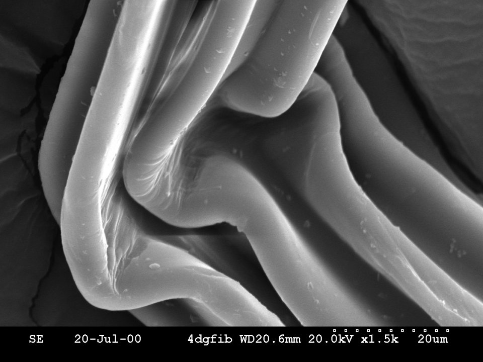
SEM Fiber Image

I find the curves mesmerizing. Used on scanning electron microscope and taken by me for my thesis so this is a self nomination. Pschemp 02:09, 28 Sep 2004 (UTC)
- Support. Very good image. Could you also add more detail about what type of fiber (Ribbed?) and maybe add it to the appropriate "fiber" article if possible --
Chris 73
Talk 02:25, Sep 28, 2004 (UTC)
- Note: I reverted to your earlier, larger version. The pixels you got was the old small image in your cache sized up to the size of the large image. Next time try CTRL + reload for Internet explorer or just reload for Firefox/Mozilla -- Chris 73 Talk 02:28, Sep 28, 2004 (UTC)
- Comment. Oh thanks so much, I was very confused by the pixels. I'll just blame Mozilla :) I added detail too. Pschemp 02:32, 28 Sep 2004 (UTC)
- Support. Again one of those images that makes you curious. Janderk 11:35, 28 Sep 2004 (UTC)
- Oppose. I've seen more striking SEM images. Simon A. 14:03, 28 Sep 2004 (UTC)
- Support - [[User:Bevo| Bevo]] 15:30, 28 Sep 2004 (UTC)
- Support Lorax 00:52, Sep 29, 2004 (UTC)
- Oppose. I'm not too fond of this image, I was going to vote support for being a very useful illustration to a SEM article, but I think
Image:Ant SEM.jpg is doing a better job there already. --
Solitude 12:14, Sep 29, 2004 (UTC)
- Comment - BUT you can see an anthead with the naked eye. You can't see this because its only 40 nanometers across. Pschemp 18:13, 29 Sep 2004 (UTC)
- Support. This image is very striking and has a lot of depth. I also like the fact that it is Black and White. cats_rule Cats rule 20:20, 29 Sep 2004 (UTC)
- Oppose. Just not very interesting in itself William M. Connolley 09:14, 30 Sep 2004 (UTC).
- Oppose. Concept of image ≠ image. This looks like a bottle of poorly-packed tube worms. To the uninformed, it is huhville?. Especially in B&W. Denni ☯ 01:59, 2004 Oct 1 (UTC)
- Oppose. I just don't think it's at all attractive. -- ScottyBoy900Q ∞ 02:52, 11 Oct 2004 (UTC)
- NOT promoted, +5/-5. -- Solitude 11:31, Oct 12, 2004 (UTC)
Halo around the sun at the South Pole
Beautiful photo showing the halo around the sun perfectly. It also is a good photo for the South Pole, demonstrating the exploration, and natural beauty. Only bad thing is that it is PD not GFDL, but you cant have everything.
- Support. -- Fir0002 06:11, 30 Sep 2004 (UTC)
- Support. Cool pic, and I don't mind PD. Slightly rotated and bigger would be even better, but this one is good enough for me to be a featured one. -- Chris 73 Talk 06:19, Sep 30, 2004 (UTC)
- Support William M. Connolley 09:14, 30 Sep 2004 (UTC).
- Support. Markalexander100 09:39, 30 Sep 2004 (UTC)
- Support. Dramatic, and an excellent illustration of all the main features of an ice crystal halo. -- Solipsist 15:22, 30 Sep 2004 (UTC)
- Support - FanFtastic! Not only does it demonstrate the major refractory phenomena, but the composition is Right On!! Denni ☯ 02:02, 2004 Oct 1 (UTC)
- Support. While the orange colors of the man's clothing are not that good, the picture is certainly striking.
Janderk 17:36, 2 Oct 2004 (UTC)
- Support, but really responding to the comment about the blaze-orange hunter's garment - I would want to be wearing such an overall if I were running the risk of being lost in Antarctica. Ancheta Wis 19:23, 2 Oct 2004 (UTC)
- Oppose. Call me crazy. I just don't think it's nice to look at. --
ScottyBoy900Q
∞ 02:56, 11 Oct 2004 (UTC)
- OK, Your'e Crazy. Cavebear42 21:23, 13 Oct 2004 (UTC)
- Support. Good in so many ways. +sj + 07:26, 13 Oct 2004 (UTC)
- Promoted, +8/-1. -- Solitude 15:02, Oct 14, 2004 (UTC)
Free range eggs

Eggs where they are supposed to be, in a nest and not on battery farms. Free range eggs on a farm.
- Support. Self Nomination -- Fir0002 10:19, 29 Sep 2004 (UTC)
- Oppose. While I like the idea and admire the quality, I think the picture is missing the most important subject, the chicken! --
Solitude 12:07, Sep 29, 2004 (UTC)
- Comment. I thought about that, but it was either like the photo is now, or having a chicken sitting in the straw. Being free range chickens, they aren't dopey and they certainly wont stick around to get a photo taken after laying an egg. All three (eggs, box and chicken) was an impossibility. --
Fir0002 23:44, 29 Sep 2004 (UTC)
- Can you take a picture of her on the nest while she's laying and leave an egg near her?
- Comment. I thought about that, but it was either like the photo is now, or having a chicken sitting in the straw. Being free range chickens, they aren't dopey and they certainly wont stick around to get a photo taken after laying an egg. All three (eggs, box and chicken) was an impossibility. --
Fir0002 23:44, 29 Sep 2004 (UTC)
- Support. Looks good to me. Some more info on the image page (e.g. Photographer) would be useful -- Chris 73 Talk 14:25, Sep 29, 2004 (UTC)
- Oppose: the box looks very out of place. Chicken near eggs would be good for me. Markalexander100 01:47, 30 Sep 2004 (UTC)
- Oppose. Its just too boring (sorry) William M. Connolley 09:14, 30 Sep 2004 (UTC).
- Oppose; too staged, and unnatural unless you find me a hen that lays multi-colored eggs. Davodd 02:22, Oct 1, 2004 (UTC)
- Oppose. Janderk 17:40, 2 Oct 2004 (UTC)
- Oppose. Boring -- ScottyBoy900Q[[User
talk:ScottyBoy900Q|∞]] 02:30, 08 Oct 2004 (UTC)
- NOT promoted, +2/-6. -- Solitude 15:04, Oct 14, 2004 (UTC)
Golden Retriever

A better doggy action photo. Dunc_Harris| ☺ 13:22, 29 Sep 2004 (UTC)
- Oppose. Colors feel faded, and the background distracts. Happy dog, though. -- Chris 73 Talk 14:23, Sep 29, 2004 (UTC)
- Oppose ditto) ( William M. Connolley 09:14, 30 Sep 2004 (UTC).
- Oppose. Oska 02:23, Oct 1, 2004 (UTC)
- Oppose. There are way better Golden Retriver pictures out there. -- ScottyBoy900Q ∞ 02:55, 11 Oct 2004 (UTC)
- NOT promoted, +0/-4. -- Solitude 15:08, Oct 14, 2004 (UTC)
Australian Cattle Dogs Diving

OK, now I'm trying to find a dog photo that's excellent photography and not merely an encyclopedic image of a dog. I like this one; shows action with the dogs heading out into the picture for an adventure. Taken by User:jimhutchins and used in Australian Cattle Dog.
- Nominated. Elf | Talk 00:38, 29 Sep 2004 (UTC)
- Oppose. The dogs are only a small section of a rather small image, and there is not enough detail about the dogs. While they are caught nicely in the act, i think it is not quite feature material. -- Chris 73 Talk 01:02, Sep 29, 2004 (UTC)
- Oppose. Too small image, especially for a feature. Also agree with Chris in that the dogs do not make up much of the image. -- Fir0002 10:36, 29 Sep 2004 (UTC)
- Oppose. Too small and not even that great. -- Solitude 12:05, Sep 29, 2004 (UTC)
- Oppose. Ditto William M. Connolley 09:14, 30 Sep 2004 (UTC).
- Oppose. Oska 02:25, Oct 1, 2004 (UTC)
- Oppose. -- ScottyBoy900Q ∞ 02:54, 11 Oct 2004 (UTC)
- NOT promoted, +1/-6. -- Solitude 15:09, Oct 14, 2004 (UTC)
English Cocker Spaniel

If you can handle another dog photo, I also like this used in English Cocker Spaniel; face is alive and happy. - Elf | Talk 00:38, 29 Sep 2004 (UTC)
- Self-nom. Elf | Talk 00:38, 29 Sep 2004 (UTC)
- Support. Good colors, nice background, good posture. Do you have this also in a larger resolution? --
Chris 73
Talk 01:00, Sep 29, 2004 (UTC)
- Done--but I didn't compress at all so its file size is huge.
Elf |
Talk 04:43, 30 Sep 2004 (UTC)
- I compressed it a little bit and uploaded it over the first picture Image:EnglishCockerSpaniel wb.jpg. Maybe we can delete Image:EngCockerSmileBigger.jpg now since we don't need to have two identical photos? -- Chris 73 Talk 09:04, Sep 30, 2004 (UTC)
- Done--but I didn't compress at all so its file size is huge.
Elf |
Talk 04:43, 30 Sep 2004 (UTC)
- Support. Great photo. Cant say that I particularly like the English Cocker Spaniel breed, but I like this photo. -- Fir0002 11:03, 29 Sep 2004 (UTC)
- Oppose. Sorry but I think this is really boring, I'm much more interested in a dog photo with some action, like presented above. -- Solitude 12:09, Sep 29, 2004 (UTC)
- Support. If I'm going to support a doggy photo, this one looks like the best choice. Despite being sharper, it doesn't beat Spot Fetcher, but it's close. -- Solipsist 00:24, 30 Sep 2004 (UTC)
- Support. I love it :) →Raul654 00:29, Sep 30, 2004 (UTC)
- Support - [[User:Bevo| Bevo]] 01:01, 30 Sep 2004 (UTC)
- Support. (But no more dog nominations, please!) Markalexander100 01:49, 30 Sep 2004 (UTC)
- A better job of Getting Down to the Pet's Level, but still not a reined-in-enough photo. This picture ought to have been taken after the commands "sit" and "look pretty". Regrettably, Oppose. Denni ☯ 02:04, 2004 Oct 1 (UTC)
- Oppose. Remember the criteria for a Featured Picture: beautiful, striking, shocking, impressive, titillating, fascinating, or in short just brilliant. This is none of these and there is a better dog picture already posted—sorry. NickP 04:53, Oct 1, 2004 (UTC)
- Support. [[User:Neutrality| Neutrality ( talk)]] 19:40, Oct 1, 2004 (UTC)
- Oppose. It's a nice picture, but then again just another dog picture without the extra required to be featured. Janderk 17:44, 2 Oct 2004 (UTC)
- Sopport. I used to have one so I might be a little biased. -- ScottyBoy900Q ∞ 02:53, 11 Oct 2004 (UTC)
- Oppose. Just a dog. ✏ Sverdrup 10:54, 12 Oct 2004 (UTC)
- NOT promoted, +8/-5. -- Solitude 15:11, Oct 14, 2004 (UTC)
Ladybug on a leaf

a Wikipedia:Featured picture
Scary and cute at the same time, superb colors. The article on the ladybug had two NC pictures which I replaced.
- Support. -- Solitude 12:52, Oct 1, 2004 (UTC)
- Oppose. The larger pic is blurred which is surely not OK for a Featured Pic? - Adrian Pingstone 13:03, 1 Oct 2004 (UTC)
- Support. Deep DoF at this level of magnification is tremendously challenging, and the parts of the ladybug required to be in focus are. Moreover, the photographer has provided an image which is far larger that the minimum pixel width to meet Featured Picture requirements.
Denni
☯ 00:21, 2004 Oct 2 (UTC)
- Comment. Looks like we'll have to agree to disagree, to me no part of this pic is in good enough focus for a Featured Pic (I've had both my sons check it out, they have first class eyes and agree with me (and they don't agree with me very often!)). Yes I know it's a very difficult subject but we do not have to consider that, only what what we see before us on our screen - Adrian Pingstone 09:36, 2 Oct 2004 (UTC)
- Support. [[User:Neutrality| Neutrality ( talk)]] 17:32, Oct 2, 2004 (UTC)
- Oppose. While the setting is nice, the depth of field is just not good enough for a featured picture. A tripod would have helped a lot here. Janderk 17:39, 2 Oct 2004 (UTC)
- Support. I agree with what User:Denni said earlier. [[User:MacGyverMagic| Mgm| (talk)]] 09:57, Oct 3, 2004 (UTC)
- Support. Looks beautiful in the article. ✏ Sverdrup 20:58, 5 Oct 2004 (UTC)
- Support - [[User:Bevo| Bevo]] 21:08, 5 Oct 2004 (UTC)
- Support - although I might prefer the Ladybird eating aphids picture in the article. -- Solipsist 22:31, 6 Oct 2004 (UTC)
- Oppose. A decent picture, though depth of field could be better, but my main problem with it is that I don't think it does a very good job of showing the ladybug, and as such, doesn't add significantly to the article, particularly given the two other pictures the article has. Lorax 00:12, Oct 8, 2004 (UTC)
- Support -- ScottyBoy900Q ∞ 02:29, 08 Oct 2004 (UTC)
- Support -- Chris 73 Talk 14:21, Oct 9, 2004 (UTC)
Orbit state vectors explained
I've used programs for years to show the location of the Mir, the shuttles, and the ISS. This is the best explanation I've seen for what all those orbital parameters mean. GFDL.
- Support - Nominator - Kbh3rd 22:04, 1 Oct 2004 (UTC)
- Oppose. While I like it, I have a number of years of experience with such diagrams and concepts. This is far too technical a diagram to do anything but make most people wonder what it all means. Denni ☯ 00:17, 2004 Oct 2 (UTC)
- Neutral. I can absolutely not agree with Denni that the picture is too technical. Instead, I find it so simple that I begin to wonder if there really isn't something missing! I can't come up with anything specific though. Perhaps it has all it needs. I'm not sure, however, that I would like to announce it a featured picture.. For example, I have some objections to the typesetting of variables and the projection of the velocity on the three axes. Jolson 20:29, 3 Oct 2004 (UTC)
- Oppose. Confusing. Davodd 07:12, Oct 2, 2004 (UTC)
- Support. Excellent diagram that adds very significantly to the article it goes with ( Orbital state vectors). In fact the article would be almost meaningless without it. As an aside, I'm noticing that Oppose or Support responses often don't consider the article and the pic taken together as a whole. Surely we are not supposed to be judging the pic in isolation since it says at the top that the images featured on Wikipedia:Featured pictures should illustrate a Wikipedia article in such a way as to add significantly to that article. Denni says this is far too technical a diagram but given the subject it's bound to be exactly that! Davodd says Confusing Of course it is, if Orbital State Vectors are not a subject you're imterested in. So let's keep to deciding if the pic significantly ADDS TO THE ARTICLE and then this voting system will mean something Sorry to go on about this at length but I wanted to get it off my chest (Disclaimer: I have no connection with the supplier of this diagram)- Adrian Pingstone 09:24, 2 Oct 2004 (UTC)
- Support. Can people please remember Wikipedia is an encyclopeadia not a photo gallery. You're meant to learn stuff from looking at it. Yes, cute photos of lions and dogs and ladybirds are great, but technical diagrams are just as valid, and I'd say more intellectually worthy. --
Prisonblues 09:54, 2 Oct 2004 (UTC)
- Both article and illustration are jargon-filled and confusing. Neither are beautiful, striking, shocking, impressive, titillating, fascinating nor feature-worthy. Davodd 17:20, Oct 2, 2004 (UTC)
- Support. The subject is arcane, but our future will depend on more people visualizing orbital mechanics, which ordinarily takes years to understand, jargon and all. This picture, which has millennia of technology and science behind it, becomes instantly understandable when it is animated, as the vectors then grow and shift as the object moves in its orbit. But if the picture of an orbit were animated, then an aspiring spacecraft commander or aspiring engineer would then demand a frozen frame such as this png, to study the relationships behind the variables of the orbit.
Ancheta Wis 19:12, 2 Oct 2004 (UTC)
- Is "aspiring spacecraft commander" another name for a "space cadet" ?? (too funny!) KeyStroke
- Please remember what Featured Picture is about. It's not a pat on the back for an illustration which goes well with an article, it's for an illustration which is brilliant enough to stand ON ITS OWN as a diagram or photo. I have no difficulty with this diagram as an illustration for the article which it is intended to expand. But do you really think that most people would get this diagram? I think not, and most of us are not "aspiring spacecraft commanders." Denni ☯ 01:05, 2004 Oct 3 (UTC)
- Oppose. I agree with views above about how this doesn't really stand on its own. It's nice, but there's nothing terribly special about it to call it Featured. Enochlau 05:36, 3 Oct 2004 (UTC)
- Oppose. Agree with Denni and Enochlau's comments. I feel the point of a featured picture is to present a visually striking image which will pique the viewer's interest in an accompanying article which it serves well to illustrate. This image may work well in helping illustrate concepts described in the accompanying article but it has little visual impact by itself. If there is an article that is well written and is well supported by explanatory diagrams then I would suggest that it is the article itself which should be nominated and not an accompanying diagram unless that diagram is itself particularly striking. -- Oska 06:56, Oct 3, 2004 (UTC)
- Support. Agree with Adrian Pingstone. I think the "beautiful, striking, shocking, impressive, titillating, fascinating" directive is terrible, myself, because naturally not everything in an encyclopedia can be immediately any of these things, and yet we ideally need good pictures for all sorts of articles, even the technical and (sometimes) frankly tedious. --
Oarih 11:14, 6 Oct 2004 (UTC)
- Comment. I disagree; this diagram could be re-drawn to be more beautiful, impressive, fascinating and/or striking. Right now it is functional and good enough to get the job done. But it is not good enough for Wikipedia to hold up to future diagram makers as a shining example of what they should aspire to create. [[User:Davodd|DAVODD «TALK»]] 22:19, Oct 6, 2004 (UTC)
- oppose Not elegant, excessively intricate, nothing special about the graphics, color choices tend to "clash", not interesting to general public, tries to do too much in one diagram (there is, likely, enough information in this one diagram to make four or five separate ones). It just looks like so much spaghetti. Its something that only someone with two PHDs in orbital mechancs would like. KeyStroke 16:57, 2004 Oct 7 (UTC)
- Oppose. I agree with the idea that featured pictures need to be striking and/or attractive. While I see the merit in this picture, I'm not so sure it represents a beautiful or striking in any sense. -- ScottyBoy900Q ∞ 02:58, 11 Oct 2004 (UTC)
Landing at Normandy

a Wikipedia:Featured picture
Photo taken excellently which I think illustrates the landing very well. Taken by the US government and so is PD. To me this is a good examples of how black and white can be better than colour for some photos. JOHN COLLISON | (Ludraman) 08:51, 2 Oct 2004 (UTC)
- Support. Excellent featured pic for an encyclopedia. We need more of these. Janderk 17:28, 2 Oct 2004 (UTC)
- Support. Good picture, especially since I'm guessing that there aren't many such photos around. -- Fir0002 07:51, 4 Oct 2004 (UTC)
- Support Dunc_Harris| ☺ 10:58, 4 Oct 2004 (UTC)
- Support -- Chris 73 Talk 14:20, Oct 9, 2004 (UTC)
- Support. The feeling is captured pretty well in this one. -- ScottyBoy900Q ∞ 03:00, 11 Oct 2004 (UTC)
- Support. Captures the moment and good to have a historical image. -- Solipsist 07:59, 12 Oct 2004 (UTC)
- Support. Striking. grendel| khan 01:07, 2004 Oct 16 (UTC)
USAF F15E

Courtesy of the United States' Air Force.
- nominated at 09:02, 4 Oct 2004 by Dunc_Harris| ☺
- Support. -- Fir0002 06:30, 5 Oct 2004 (UTC)
- whoops, I nominated it, forgot to sign. I support too. Dunc_Harris| ☺ 19:05, 5 Oct 2004 (UTC)
- Oppose. Nice plane, pedestrian shot. Denni ☯ 01:55, 2004 Oct 6 (UTC)
- Oppose. Nearly excellent and Lakenheath is almost my home turf, but a shot showing the afterburners usually works better and for a professional shot, the fact that the background breaks the outline of the plane is distracting. -- Solipsist 22:23, 6 Oct 2004 (UTC)
- Oppose. Agree with comment about background above. -- Oska 00:24, Oct 7, 2004 (UTC)
- Oppose. I had the same issue with the background; a second later with the plane against the blue sky would have been so much better. Autiger 05:38, 7 Oct 2004 (UTC)
- Oppose (background) - William M. Connolley 20:05, 7 Oct 2004 (UTC)
- Oppose. Background distracts -- Chris 73 Talk 15:21, Oct 9, 2004 (UTC)
- Neutral. In my own defence - many have commented about the background; I chose the image from af.mil TO SHOW THE BACKGROUND FOR the RAF Lakenheath page, not to showcase the F-15E. Mark 01:51, 10 Oct 2004 (UTC)
- Oppose. (background) -- ScottyBoy900Q ∞ 03:03, 11 Oct 2004 (UTC)
- NOT Promoted, +2/-7. - [[User:Bevo| Bevo]] 19:08, 18 Oct 2004 (UTC)
Redback spider

a Wikipedia:Featured picture

The redback article prior to these photos had no pictures, and I think they do justice to the spider and its trademark redback.
- Support. Self Nomination -- Fir0002 09:45, 4 Oct 2004 (UTC)
- Support. Icky. (Would be better, though, in natural setting.) [[User:Davodd|DAVODD
«TALK»]] 22:11, Oct 6, 2004 (UTC)
- In my opinion it wouldn't, but I can upload the original of you really want.-- Fir0002 23:02, 9 Oct 2004 (UTC)
NeutralSupport. Clearly a shot to be proud of. I can't decide whether the editted drop shadow background is a good idea or not. One problem is that it looses scale - not having seen one, I believe these spiders are quite small, as illustrated in the article's picture showing the pipe, but this isn't clear. On the other hand the clean background helps make the image more dramatic, which I like. Either way, I only really like the face shot, even if the name suggests the back should be emphasised. -- Solipsist 23:29, 6 Oct 2004
- Changing to support. Of the images here are the moment, it grabs my eye more than most. -- Solipsist 10:39, 8 Oct 2004 (UTC)
- Support. I think they're adorable, too, and want to start importing them. You will recognise such a spider if you see one easily, which is the most important thing. Smerdis of Tlön 14:50, 7 Oct 2004 (UTC)
- Oppose. I think a picture of this spider on its web on in its natural setting would be much more attractive than on the dull white background. -- ScottyBoy900Q ∞ 03:01, 11 Oct 2004 (UTC)
- Comment. The redback spider has virtually no web. It mainly lives in unattractive and distracting places such as pipes, which are usually full of junk. Look on the Redback spider page to see what I mean (page bottom). I think the white background contrast well with the black spider and leave nothing but it for you to be distracted with. -- Fir0002 05:58, 12 Oct 2004 (UTC)
- Support - [[User:Bevo| Bevo]] 19:27, 15 Oct 2004 (UTC)
Daisy in water

a Wikipedia:Featured picture
This is a fun picture (I put it into surface tension) which I think is both beautiful and striking. But then I took it and remember watching the water rising... William M. Connolley 20:41, 5 Oct 2004 (UTC)
- Support (self nomination) William M. Connolley 20:41, 5 Oct 2004 (UTC)
- Support. I like how the distortion of the surface tension is clearly visible. [[User:Davodd|DAVODD «TALK»]] 22:12, Oct 6, 2004 (UTC)
- Support. Good tension - what happened to the bug? -- Solipsist 22:19, 6 Oct 2004 (UTC)
- Support. Hope the bug floated too. -- Chris 73 Talk 22:54, Oct 6, 2004 (UTC)
- Support. Superb pic. Moriori 00:43, Oct 7, 2004 (UTC)
- Support. Execellent illustration of the topic. -- Solitude 07:14, Oct 7, 2004 (UTC)
- Support. It looks like the caption is improved, also. A very rare shot, very well taken.
KeyStroke 23:11, 2004 Oct 8 (UTC)
- Thanks - William M. Connolley.
- Support. -- ScottyBoy900Q ∞ 03:03, 11 Oct 2004 (UTC)
- Oppose. I don't find the picture visually striking at all , and while it does illustrate surface tension I think this phenomenon could be better demonstrated by other images. -- Oska 23:04, Oct 12, 2004 (UTC)
- Support. Bendy water- fantastic. Markalexander100 07:49, 15 Oct 2004 (UTC)
- Support. The surface tension concept needs several images for illustration, and this is an excellent one. — David Remahl 22:34, 15 Oct 2004 (UTC)
- Promoted, +10/-1 -- [[User:Bevo| Bevo]] 18:28, 19 Oct 2004 (UTC)
Trinity College heraldic shield

The heraldic shield for Trinity College, Cambridge. One of the better diagrams or drawings I've seen here. Actually one of several shields contributed by User:Prisonblues which are not trivial to draw and add quite a bit to the infoboxes which tie the series of articles on Cambridge Colleges together. -- Solipsist 22:14, 6 Oct 2004 (UTC)
- Support. (My only connection is that I added some photos to the Trinity College article) Solipsist 22:14, 6 Oct 2004 (UTC)
- Support - [[User:Bevo| Bevo]] 02:33, 7 Oct 2004 (UTC)
- Oppose. It does the job but its nothing special. I don't think crests/flags can ever be considered featured picture material. ed g2s • talk 13:45, 7 Oct 2004 (UTC)
- Oppose. It's great to have for wikipedia, but is not brilliant, shocking etc; as ed said, this type of material is seldomly featureable. ✏ Sverdrup 16:30, 7 Oct 2004 (UTC)
- Oppose. -- Kaihsu 19:49, 2004 Oct 7 (UTC)
- Oppose - William M. Connolley 20:05, 7 Oct 2004 (UTC)
- Oppose - IMO this is GFLD this is Trinity College Copyright ? The large version of the image makes me believe that it ws originally made for hi-res printing and not for web use. - Ericd 22:02, 7 Oct 2004 (UTC)
- Not sure where you are coming from here. The design of the crest and shield must be over 100 years old and from his comments I would be pretty sure that User:Prisonblues drew this version and several other college crests (well just the shields). There may be some arcane law concerning heraldry that makes a crest similar to a trademark, but I am not aware of one. I doubt there is any cause for concern over the licencing. -- Solipsist 07:20, 8 Oct 2004 (UTC)
- Support. Biased as I made it (as a derivative work of a crest that User:Lupin made. It's definitely not copyright, all elements were made from scratch by me or Lupin. -- Prisonblues 07:17, 8 Oct 2004 (UTC)
- Oppose. -- ScottyBoy900Q ∞ 03:04, 11 Oct 2004 (UTC)
Nomination for removal of Globular Cluster M3

No match to Featured Picture standards criteria.
- Nominated for delisting by [[User:Bevo| Bevo]] 20:59, 6 Oct 2004 (UTC)
- Support for
deletiondelisting (reluctantly). It will be hard for a Wikipedian to trump this shot, but a significantly better Featured Picture Candidate for a globular cluster would be Image:M80.jpg which has much better resolution and gives a stronger idea of the number of stars in a tight GC. -- Solipsist - Support for
deletiondelisting. As astronomy pics go, this one is not so special. -- Chris 73 Talk 22:58, Oct 6, 2004 (UTC) - Support, ditto. -- Solitude 07:01, Oct 7, 2004 (UTC)
- Agree. There are better ones. Janderk 20:27, 7 Oct 2004 (UTC)
- Support. I've seen much clearer images of M3 before. -- ScottyBoy900Q ∞ 02:33, 08 Oct 2004 (UTC)
Retain, on the grounds that it is by a wikipedian -- William M. Connolley 22:05, 15 Oct 2004 (UTC)Reluctantly I have to agree with others & change my vote. Support delisting -- William M. Connolley 22:11, 19 Oct 2004 (UTC).- Support delisting. I agree that i like to see the homegrown photos up there but space is one of the few subjects where wikipedians just can't compeate. Cavebear42 19:27, 18 Oct 2004 (UTC)
- A shame but true. However, we can probably still compete on
aurora images, astro related diagrams and probably some other areas. And hey, surely some Wikipedians work at NASA or some other world class observatory. --
Solipsist 20:44, 18 Oct 2004 (UTC)
- Delisting approved, 8/0 -- [[User:Bevo| Bevo]] 17:55, 20 Oct 2004 (UTC)
Nomination for removal of Parliament Hill, Ottawa
Rather small and we now have much better location shots.
- Nominated for delisting -- Solipsist 21:40, 6 Oct 2004 (UTC)
- Support delisting - [[User:Bevo| Bevo]] 02:31, 7 Oct 2004 (UTC)
- Support, *yuck*. -- Solitude 07:00, Oct 7, 2004 (UTC)
- Agree. Janderk 20:32, 7 Oct 2004 (UTC)
- Re "rather small," there's a larger version available; check parliament3-big.jpg. - Montréalais 23:56, 10 Oct 2004 (UTC)
- support Cavebear42 19:30, 18 Oct 2004 (UTC)
- Delisting approved, 5/0 -- [[User:Bevo| Bevo]] 18:07, 20 Oct 2004 (UTC)
Nomination for removal of Yarra River

a Wikipedia:Featured picture
Technically a well handled difficult shot, but doesn't really show the river or the city.
- Nominated for delisting -- Solipsist 21:40, 6 Oct 2004 (UTC)
- Agree. May be better with Street lamp or Cast iron fence. [[User:Davodd|DAVODD «TALK»]] 22:08, Oct 6, 2004 (UTC)
- Support delisting - [[User:Bevo| Bevo]] 02:32, 7 Oct 2004 (UTC)
- Neutral. It doesn't show much of the river but still an interesting shot, I'm in doubt. -- Solitude 07:11, Oct 7, 2004 (UTC)
- Keep. I kind of like it. -- Chris 73 Talk 14:22, Oct 9, 2004 (UTC)
- Keep. It's a great picture even if not the best one for showing the whole river. Angela . 21:10, Oct 10, 2004 (UTC)
- Keep; looks cool. -- Twinxor 06:04, 13 Oct 2004 (UTC)
- Keep and kudos to the photographer. Cavebear42 19:34, 18 Oct 2004 (UTC)
- Delisting not approved, 3/4 -- [[User:Bevo| Bevo]] 01:35, 21 Oct 2004 (UTC)
Diversity of Maize

a Wikipedia:Featured picture
An eye catching photo by Keith Weller of the US Agricultural Research Service. Best used in illustrating biodiversity. -- Solipsist 06:33, 7 Oct 2004 (UTC)
- Support -- Solipsist 06:33, 7 Oct 2004 (UTC)
- Support. I uploaded a larger version (press CTRL-Reload if you see pixels). Somebody should remove the unused thumbnail Image:GEM corn thumbnail.jpg -- Chris 73 Talk 07:01, Oct 7, 2004 (UTC)
- Support. Simple, elegant, helps article. [[User:Davodd|DAVODD «TALK»]] 07:11, Oct 7, 2004 (UTC)
- Support. Nice Janderk 15:46, 7 Oct 2004 (UTC)
- Support — amaizeing. Dunc_Harris| ☺ 15:57, 7 Oct 2004 (UTC)
- Support. The picture. Question ? What means exotic ? For a French Wikipedian maize is still exotic... It's an American plant, like Tomatoes but it wasn't a serious culture in France before the end of WWII. And it's still mainly animal food (Hmmm... I love Tacos...). I tend to think that exoctic means "South American" or "not commonly used in the USA". Ericd 22:16, 7 Oct 2004 (UTC)
- Well to be honest, I probably put the word 'exotic' into the caption. Ordinarilly I would have used the adjective 'wild' to describe the introduced gene lines, but I got the impression from the information at the images source that these other maize varieties were not necessarily wild varieties, but rather old varieties or varieties grown in South and Latin America. So exotic was the best I could think of. Feel free to improve the caption. -- Solipsist 17:56, 16 Oct 2004 (UTC)
- Support. Great shot. "Exotic" means not commonly eaten in North America. Europeans do not know what they're missing in corn on the cob, though (trying to prepare European corn in such a manner proved a futile task - the cobs are small and the corn is hard). Denni ☯ 01:52, 2004 Oct 8 (UTC)
- Support. Nice photo, good choice of corns as well. I especially like the creamy one in the foreground on the left hand side. -- Fir0002 06:02, 8 Oct 2004 (UTC)
- Support. Nice. -- ScottyBoy900Q ∞ 03:05, 11 Oct 2004 (UTC)
- Support. -- Oska 00:16, Oct 14, 2004 (UTC)
Peacock

a Wikipedia:Featured picture

Dunc_Harris| ☺ 19:54, 7 Oct 2004 (UTC)
- Support - best photo I've seen in quite awhile. [[User:Neutrality| Neutrality ( talk)]] 01:31, Oct 8, 2004 (UTC)
- Support - but I bet there are peacock images of the whole bird (including all of its plumage) that might be just as nice. -- ScottyBoy900Q ∞ 02:37, 08 Oct 2004 (UTC)
- Support - I quite like the focus on the head and neck rather than getting the whole tail. -- Solipsist 07:25, 8 Oct 2004 (UTC)
- Support - I took the pic (can I vote?) - Adrian Pingstone 19:10, 9 Oct 2004 (UTC)
- Yes you can, and I support as well. -- Solitude 06:47, Oct 11, 2004 (UTC)
- Support - William M. Connolley 20:17, 9 Oct 2004 (UTC).
- Comment from the photographer: luckily no-one has mentioned that the pic looks to be leaning but, just in case anyone has been thinking so, it's the peacock that's leaning not the pic! - Adrian Pingstone 10:49, 12 Oct 2004 (UTC)
- Oppose. Compositionally this photo just doesn't work for me. It's hard for me to say why. Perhaps the small patch of grass is distracting, but also I think the amount of the bird shown. Neither the bird with all it's tail or a close-in of mainly the bird's body. For such a visually stunning bird I think we could have a much more striking picture. --
Oska 22:51, Oct 12, 2004 (UTC)
- Your comment made me curious, so I cropped the image without the grass. Not sure if it is better though Janderk 08:22, 21 Oct 2004 (UTC)
Horse Chestnuts

a Wikipedia:Featured picture
A taste of autumn. Used to illustrate the seeds of the horse chestnut tree, but mostly I just like the textures and colours. Taken by me a couple of weeks ago. - Solipsist 17:29, 7 Oct 2004 (UTC)
- Support (self nomination). - Solipsist 17:29, 7 Oct 2004 (UTC)
- Support. Perfect focus, good composition, colors, yups! -- Solitude 17:59, Oct 7, 2004 (UTC)
- Support. As good as it gets. As this is a self-nomination: Would it be possible to change the license to GFDL? Janderk 19:23, 7 Oct 2004 (UTC)
- Support. I see no problem with the licence. Dunc_Harris| ☺ 19:24, 7 Oct 2004 (UTC)
- Support. -- Chris 73 Talk 22:19, Oct 7, 2004 (UTC)
- Support. Very nice picture, adds to the article. I like your attention to detail, showing how they look at different stages and having the background being horse-chestnut leaves. Lorax 00:16, Oct 8, 2004 (UTC)
- Support. Wonderfully composed! Denni ☯ 01:36, 2004 Oct 8 (UTC)
- Support. Exceptional! Great composition and incredibly illustrative. Autiger 05:03, 8 Oct 2004 (UTC)
- Support. Beautiful photo, very nice colors/composition and the lack of jpeg compression is really good. -- Fir0002 06:00, 8 Oct 2004 (UTC)
- Support! Is it available in a higher resolution? I would love to use it as my desktop background. — David Remahl 23:43, 8 Oct 2004 (UTC)
- Support. Like the colors. -- ScottyBoy900Q ∞ 03:08, 11 Oct 2004 (UTC)
- Support. I noticed this image on Solipsist's image page and was going to nominate it myself. It is an excellent photograph, visually striking while also strongly informative of the featured item. -- Oska 22:59, Oct 12, 2004 (UTC)
- Support. One of my favourite WP images, but I'm a sucker for conkers (er...) — Matt 15:24, 20 Oct 2004 (UTC)
The Himalaya Mountains

a Wikipedia:Featured picture

It's large, it's striking, and it is of a scale rarely seen in photography of any kind. The oblique angle is also interesting, and the colors are especially vivid and clear for an image from orbit. A PD NASA image, but impressive no less. - Matthewcieplak 12:25, 7 Oct 2004 (UTC)
- Support -- Matthewcieplak 12:25, 7 Oct 2004 (UTC)
- Support! That is a stunning picture. But could you add the source and the {{PD-USGov-NASA}} tag to the image page? -- Chris 73 Talk 07:37, Oct 7, 2004 (UTC)
- Support alternative 1: I wondered which mountain was where and where people would climb mount everest. Anyway after doing some research I created alternative 1 with annotations, trying to make the image more informative for an encyclopedia. Janderk 15:18, 7 Oct 2004 (UTC)
- Support. As an image I prefer it without annotations. But the labels are useful, so I would support either way. -- Solipsist 17:17, 7 Oct 2004 (UTC)
- support unannotated version (the annotations spoil it as a photo. But I agree its nice to have them identified, so I think the unannotated pic should link to the annotated version) - William M. Connolley 20:05, 7 Oct 2004 (UTC).
- Support Himalayas.jpg - [[User:Bevo| Bevo]] 09:24, 8 Oct 2004 (UTC)
- Support. -- Kaihsu 15:42, 2004 Oct 8 (UTC)
- Support the first, unmarked version. This looks much better blown up than the small thumb version. -- ScottyBoy900Q ∞ 03:07, 11 Oct 2004 (UTC)
Nomination for removal of Lagoon Nebula

No match to Featured Picture standards criteria.
- Nominated for delisting by [[User:Bevo| Bevo]] 20:59, 6 Oct 2004 (UTC)
- Support delisting. As proof that there are better space images I nominated the remnants of Kepler's supernova. Janderk 10:23, 8 Oct 2004 (UTC)
- Support delisting. It might take a professional team, but the Orion Nebula above shows so much more. - Solipsist 16:03, 14 Oct 2004 (UTC)
- Keep - in the "created by wikipedians" section, this is the best Nebula pic there.
Cavebear42 16:02, 19 Oct 2004 (UTC)
- I would agree with you if the Orion and Eagle Nebula images weren't nominated above. Both will probably make it into the featured images soon. I voted for removal because those other two are much more striking. Janderk 20:04, 19 Oct 2004 (UTC)
- Support delisting. Small, not particularly great on its own, let alone compared to the others. ed g2s • talk 02:01, 22 Oct 2004 (UTC)
- Delisting approved, 4/1 -- [[User:Bevo| Bevo]] 13:39, 22 Oct 2004 (UTC)
Kepler's Supernova

a Wikipedia:Featured picture
Beautiful NASA image of the remnant of Kepler's Supernova, SN 1604, the last supernova in the Milky Way observed with certainty by man kind. Janderk 10:18, 8 Oct 2004 (UTC)
- Support Janderk 10:18, 8 Oct 2004 (UTC)
- Strong support. I very nearly nominated it myself when you added it to the Kepler article. Its a false colour image, but that's pretty much required if you are going to incoporate X-ray data. -- Solipsist 10:25, 8 Oct 2004 (UTC)
- support -- Chris 73 Talk 10:48, Oct 8, 2004 (UTC)
- oppose; no wow factor, just a mushed up bunch of colours. Dunc_Harris| ☺ 12:45, 8 Oct 2004 (UTC)
- Support. →Raul654 08:38, Oct 9, 2004 (UTC)
- Support - William M. Connolley 20:17, 9 Oct 2004 (UTC).
- Support WOW Amazing. -- ScottyBoy900Q ∞ 03:10, 11 Oct 2004 (UTC)
- Support. One that made me say "Wow". Markalexander100 00:34, 13 Oct 2004 (UTC)
- Support. James F. (talk) 00:52, 20 Oct 2004 (UTC)
- Support. Looks a bit fuzzy at low res though. Alphax (talk) 08:07, Oct 21, 2004 (UTC)
- Promoted, +9/-1. -- [[User:Bevo| Bevo]] 14:38, 22 Oct 2004 (UTC)
This is a period photograph (1954) of an ex- LMS Jubilee Class Sandwich with a train. It's not making much smoke (which shows its being driven well, but not spectacuarly), but it's all in focus. There is a minor bit of damage on about the fifth/six carriages back. There is lots of other detail in the picture, viz the telegraph poles (since all removed), the jointed track (now replaced by welded) and the bridge girders. The loco is painted green, btw, and has a British Railways early logo on its tender. The carriages are in blood and custard livery. (see http://www.jubilees.co.uk ) Dunc_Harris| ☺ 12:45, 8 Oct 2004 (UTC)
- Support. Maybe this can be worked into the London, Midland and Scottish Railway article? -- Chris 73 Talk 15:19, Oct 9, 2004 (UTC)
- Oppose - just not very striking - William M. Connolley 20:17, 9 Oct 2004 (UTC).
- Oppose. Agree with William M. Connolley. -- ScottyBoy900Q ∞ 03:11, 11 Oct 2004 (UTC)
- Oppose on general quality of image deficits - [[User:Bevo| Bevo]] 15:05, 22 Oct 2004 (UTC)
- NOT Promoted, +2/-3 -- [[User:Bevo| Bevo]] 15:10, 22 Oct 2004 (UTC)
Oh, no, it's a flower picture! However, we don't actually have that many featured flowers, and nothing like this one. Used at Sunflower to show a commercial crop. A USDA photo by Bruce Fritz - Solipsist 13:08, 9 Oct 2004 (UTC)
- Support - Solipsist 13:08, 9 Oct 2004 (UTC)
- Support. I uploaded a larger version of the image, press CTRL reload if you see picels -- Chris 73 Talk 14:17, Oct 9, 2004 (UTC)
- Support. Janderk 15:56, 9 Oct 2004 (UTC)
- Oppose - hackneyed (sp?) - William M. Connolley 20:17, 9 Oct 2004 (UTC).
- Support. -- ScottyBoy900Q ∞ 03:13, 11 Oct 2004 (UTC)
- Support. Very nice. Autiger 01:41, 12 Oct 2004 (UTC)
- Support. Nice. Better than the windows 'bliss' background. Sky looks really good with all the sunflowers. -- Fir0002 05:55, 12 Oct 2004 (UTC)
- Support. Nice. Alphax (talk) 08:04, Oct 21, 2004 (UTC)
- Oppose - hackneyed, exactly right (and yer spelling's fine, WMC!) — Bill 12:51, 21 Oct 2004 (UTC)
- Support - [[User:Bevo| Bevo]] 21:54, 22 Oct 2004 (UTC)
Wind turbines

A USDA-ARS photograph of wind turbines by Scott Bauer. Quite dramatic and also shows the development of wind turbines. -- Solipsist 13:14, 9 Oct 2004 (UTC)
- Support - Solipsist 13:14, 9 Oct 2004 (UTC)
- support Dunc_Harris| ☺ 19:00, 9 Oct 2004 (UTC)
- Support. Great photo. -- Fir0002 22:59, 9 Oct 2004 (UTC)
- Support. -- ScottyBoy900Q ∞ 03:13, 11 Oct 2004 (UTC)
- Oppose. While the sunset makes the shot 'arty' it distracts the viewer's focus from the turbines and it means they only see the structures in silhouette. Too much of the photo is a display of the supporting scaffolding of the turbines, and the two turbines at the front are seen side-on which is not very helpful. -- Oska 22:42, Oct 12, 2004 (UTC)
- Oppose - messy, and none of the turbines are seen clearly - Adrian Pingstone 13:25, 13 Oct 2004 (UTC)
- Oppose, looks dated. Alphax (talk) 07:31, Oct 21, 2004 (UTC)
- Oppose, doesn't add significantly to the article - [[User:Bevo| Bevo]] 22:39, 21 Oct 2004 (UTC)
Zermatt and Matterhorn

a Wikipedia:Featured picture
A very effective shot Zermatt in the Swiss alps, although it is the Matterhorn which makes the picture. Taken by User:Stan Shebs. - Solipsist 13:24, 9 Oct 2004 (UTC)
- Support. - Solipsist 13:24, 9 Oct 2004 (UTC)
- Support -- Chris 73 Talk 14:16, Oct 9, 2004 (UTC)
- Support, with respect to Zermatt. The picture has great composition, and illustrates the location of Zermatt very well, compensating for weak points of the photo. ✏ Sverdrup 14:59, 9 Oct 2004 (UTC)
- Support - I'm all too aware of the weak points, but don't suppose the Foundation will fly me back for a reshoot. :-) This is a scan of a 35mm, if there are suggestions for how to improve, will be happy to rescan/reprocess. Stan 18:31, 9 Oct 2004 (UTC)
- support -- I like it but would like to see a version with the village cropped out for comparison. Dunc_Harris| ☺ 19:02, 9 Oct 2004 (UTC)
- Well then it would be of Zermatt... but User:Stan Shebs also took the closer shot of just the mountain at the top of Matterhorn. I think this one has a better balance and range of interest though. -- Solipsist 19:14, 9 Oct 2004 (UTC)
- Support - William M. Connolley 20:17, 9 Oct 2004 (UTC).
- Support. I'd love to see this in person. -- ScottyBoy900Q ∞ 03:14, 11 Oct 2004 (UTC)
- Support. Simon A. 17:00, 12 Oct 2004 (UTC)
- Support. Great composition; the shocked look on the face of the steeple sealed it for me. +sj + 07:33, 13 Oct 2004 (UTC)
- Support. Very nice setting and light, but it shows that is was scanned with a not too good scanner. A rescan with a better scanner would make this image even better. Janderk 11:41, 21 Oct 2004 (UTC)
Cathedral of Magdeburg

a Wikipedia:Featured picture

(Self-Nomination): Very nice shot of the largest cathedral in east Germany. Used in Magdeburg, Cathedral of Magdeburg, and Clerestory. -- Chris 73 Talk 14:48, Oct 9, 2004 (UTC)
- Supprt. I was thinking of nominating this myself. →Raul654 02:05, Oct 10, 2004 (UTC)
- Support. Looks great. -- ScottyBoy900Q ∞ 03:15, 11 Oct 2004 (UTC)
Oppose. The picture is slightly crooked, which is distracting for me.Neutral. Okay, it isn't leaning. It looks like it's leaning when the image is on the right side of the screen, but when I center the pic, it looks fine. Weird. – Quadell ( talk) ( help)[[]] 04:05, Oct 16, 2004 (UTC)- I disagree. I think the lines are in almost perfect alignment. For checking I created Image:MagdeburgAngles.jpg, where I added a few strictly vertical lines, and e.g. the one in the center is going straight through the end stones of the ceiling, the center window, and the stone at the bottom. To check the distortion and center, I have also flipped the lower half of the image, so the right side is now on the left side. The lines of the columns align almost perfectly, and the only thing I had to do was to move the lower half about 1% to the right, indicating that the image would need to be cropped on one side by about 1%, which i think is negilible. Maybe it's a variation of the Café wall illusion? -- Chris 73 Talk 02:11, Oct 12, 2004 (UTC)
- Support. I'm not sure how that illusion would apply. It does look as if it is leaning very slightly to the right. It might be related to the left hand wall being lighter, or it might be that a horizontal line drawn between the pillars either side of the front row of chairs suggests a very slight rotation of ~0.4° (or perhaps its a skew). Surely that's about as good as it gets and the verticals are more important. -- Solipsist 07:42, 12 Oct 2004 (UTC)
- Neutral - could someone clone out the visitor at the very left? He/she is slightly distracting.-- Eloquence *
- Support. I thought it was leaning myself... drawing a horizontal line from pillar bases it is, a bit, by maybe 5-10 pixels, but this isn't so much -- William M. Connolley 22:13, 15 Oct 2004 (UTC).
- Support. But the image isn't as sharp as architectural photos could be. (Out of focus?) Maybe it's an artifact of being scanned or saved as JPG too many times? -- Menchi 22:47, 15 Oct 2004 (UTC)
- Oppose. Nice but too many details are lacking for a featured picture. It looks like the picture has a haze over it. Janderk 11:38, 21 Oct 2004 (UTC)
Barlach Magdeburger Ehrenmal

a Wikipedia:Featured picture
(Self nomination) Photo of historically significant art, used for Degenerate art, Ernst Barlach, and Cathedral of Magdeburg -- Chris 73 Talk 14:59, Oct 9, 2004 (UTC)
- Support. Very nice shot. -- ScottyBoy900Q ∞ 03:16, 11 Oct 2004 (UTC)
- Support
Neutral for now. It's well lit with bold outlines and internal detail. The story behind the statue is an interesting one too.However, the large view is a little grainy. And for some reason the central figure rather reminds me of Hitler even though there isn't actually a moustache. That can't be helped but completely subverts the intended meaning for me. -- Solipsist 07:26, 12 Oct 2004 (UTC)- I played around with GIMP a bit, trying to reduce the grain (Do CTRL-Reload). "Hitler" is supposed to be a french officer. The sculpture is from 1929, ten years before Hitler came to power. -- Chris 73 Talk 09:15, Oct 12, 2004 (UTC)
- Hitler came to power in 1933, four years after 1929. Nazi Germany invaded Poland in 1939, causing the UK and France to declare war. Dunc_Harris| ☺ 10:27, 12 Oct 2004 (UTC)
Oppose. At least the large version seems to be out of focus. -- Wpopp 09:16, 14 Oct 2004 (UTC)- Still playing around with the
Gimp. Removing grain reduces focus, improving focus increases grain. In the current version I have removed the grain only from the background, which has less features, and the foreground is still in focus. Out of all versions so far, this one is the one i feel most happy with. --
Chris 73
Talk 12:15, Oct 14, 2004 (UTC)
- OK, Chris, opposition withdrawn. -- Wpopp 09:18, 15 Oct 2004 (UTC)
- Still playing around with the
Gimp. Removing grain reduces focus, improving focus increases grain. In the current version I have removed the grain only from the background, which has less features, and the foreground is still in focus. Out of all versions so far, this one is the one i feel most happy with. --
Chris 73
Talk 12:15, Oct 14, 2004 (UTC)
Strelitzia

a Wikipedia:Featured picture
On the subject of the lack of flower photos, this one looks good. Dunc_Harris| ☺ 19:36, 9 Oct 2004 (UTC)
- Support - William M. Connolley 20:17, 9 Oct 2004 (UTC).
- Support. Beautiful. Denni ☯ 03:18, 2004 Oct 10 (UTC)
- Support. -- ScottyBoy900Q ∞ 03:16, 11 Oct 2004 (UTC)
- Support Janderk 11:41, 11 Oct 2004 (UTC)
- Support -- Chris 73 Talk 11:44, Oct 11, 2004 (UTC)
- Support. Autiger 01:42, 12 Oct 2004 (UTC)
- Support. -- Solipsist 07:27, 12 Oct 2004 (UTC)
- Support. Just great. Simon A. 16:56, 12 Oct 2004 (UTC)
- Support. Very clean, nicely contrasted on black background. Sense of motion. Tim McCormack 18:09, 2004 Oct 13 (UTC)
- Support. Nice one. -spencer195 05:48, 16 Oct 2004 (UTC)
- Support. James F. (talk) 00:51, 20 Oct 2004 (UTC)
- Support. Alphax (talk) 07:31, Oct 21, 2004 (UTC)
- Support. I love it--[[User:Plato| Comrade Nick @)---^--]] 10:10, 23 Oct 2004 (UTC)
- Support. [[User:Neutrality| Neutrality ( hopefully!)]] 21:10, Oct 23, 2004 (UTC)
Orion Nebula
This is one of my favorite things to look at with my telescope. I figured I'd nominate this since this is one of my favorite pictures of the nebula.-- ScottyBoy900Q ∞ 03:37, 11 Oct 2004 (UTC)
- Support. [[User:Neutrality| Neutrality ( talk)]] 03:45, Oct 11, 2004 (UTC)
- Support. A beauty. -- Fir0002 07:13, 11 Oct 2004 (UTC)
- Support -- Chris 73 Talk 11:43, Oct 11, 2004 (UTC)
- support -- a 100x better than #Kepler.27s_Supernova Dunc_Harris| ☺ 16:50, 11 Oct 2004 (UTC)
- Support. Brilliant photo. Its hard to imagine such beauty lies in the black sky above us. I mean sure, stars a great, but that is stunning. -- Fir0002 05:56, 12 Oct 2004 (UTC)
- Support. Actually a very different type of animal compared to Kepler's_Supernova, but I might have to reconsider my vote on the Supernova remnant. -- Solipsist 07:32, 12 Oct 2004 (UTC)
- Support. The best pic of the Orion nebula I've seen so far. Simon A. 16:55, 12 Oct 2004 (UTC)
- Strongly support. Great find, ScottyBoy.-- Eloquence *
- Support. James F. (talk) 00:51, 20 Oct 2004 (UTC)
- Support. Alphax (talk) 07:30, Oct 21, 2004 (UTC)
Tomb of the Unknowns

.png)
A little something I took on my last trip to Washington. →Raul654 17:11, Oct 11, 2004 (UTC)
- Oppose. I like it, but think it's kinda boring. No offense. -- ScottyBoy900Q ∞ 18:51, 11 Oct 2004 (UTC)
- Oppose. It's obvious it was an overcast day and unfortunately, the contrast is too low because of it. Also, the sentry should be cropped out entirely since he's chopped off. Autiger 19:34, 11 Oct 2004 (UTC)
- Neutral. Good photo, but the ugly wreath and cropped-off soldier are distracting. It illustrates the article quite nicely, though. [[User:Neutrality| Neutrality ( talk)]] 04:10, Oct 12, 2004 (UTC)
- Oppose. Doesn't strike me. Simon A. 16:54, 12 Oct 2004 (UTC)
- The sky's all wrong, Image:USCasualtiesC130DoverAFB.jpg does a better job given its relevance today and the stupidity of the War, or from an earlier period something like [4] [5] maybe has a certain "oh shit" factor. Dunc_Harris| ☺ 22:50, 12 Oct 2004 (UTC)
- Oppose. Too dark, not a good composition, and the metal thingie holding the flowers looks cheap. -- Chris 73 Talk 09:11, Oct 13, 2004 (UTC)
![[4]](http://www.battlefield-tours.com/Menin%20Gate%20(names).jpg)
![[5]](http://www.battlefield-tours.com/Thiepval%20(names_3).jpg)
Pylon from below
This image, used in the neglected Pylon article, was created by "brokenarts" from http://www.sxc.hu The page declares: "There are no usage restrictions for this photo." Pretty, for an undoctored photo. – Quadell ( talk) ( help)[[]] 21:16, Oct 11, 2004 (UTC)
- Oppose.
Photo is too low resolution, the sky is dull and the angle is off slightly. [[User:Norm|No rm]] 21:47, 11 Oct 2004 (UTC) - Oppose. -- ScottyBoy900Q ∞ 02:43, 12 Oct 2004 (UTC)
- Oppose. Good idea, too low resolution. -- Fir0002 05:53, 12 Oct 2004 (UTC)
- Oppose. I uploaded a larger resolution image (CTRL - reload if you see pixels)), but it still looks to me like a computer game B/W screenshot. There are much better images available on the site (search for Pylon). -- Chris 73 Talk 08:05, Oct 12, 2004 (UTC)
- Oppose - too jagged Twinxor 06:45, 13 Oct 2004 (UTC)
- Oppose - neat picture, but it doesn't really show what a Pylon looks like at all. ~leif 05:50, 14 Oct 2004 (UTC)
Marigold (Calendula officinalis)

- Great GFDL image from the German Wikipedia. [[User:Neutrality| Neutrality ( talk)]] 04:18, Oct 12, 2004 (UTC)
- Oppose - very ordinary and a liitle soft in focus - Adrian Pingstone
- Support. I like. -- ScottyBoy900Q ∞ 19:10, 13 Oct 2004 (UTC)
- oppose, out of focus; like a dodgy movie or something. Dunc_Harris| ☺ 21:04, 13 Oct 2004 (UTC)
- Comment: The image should have some information on attribution or its source. I guess this might be on the German version of this image. -- Solipsist 16:12, 14 Oct 2004 (UTC)
- Oppose. It does not contribute significantly to the article as the rest of the plant is not in focus. - [[User:Bevo| Bevo]] 17:34, 25 Oct 2004 (UTC)
- NOT Promoted, +2/-3 -- [[User:Bevo| Bevo]] 17:28, 26 Oct 2004 (UTC)
SEM image of pollen

a Wikipedia:Featured picture
- A closer view of pollen for anyone who wasn't persuaded by the Scanning Electron Microscope image below - although this one is not taken by a wikipedian. -- Solipsist 07:16, 12 Oct 2004 (UTC)
- Support - Solipsist 07:16, 12 Oct 2004 (UTC)
- Support -- Chris 73 Talk 07:53, Oct 12, 2004 (UTC)
- Support. Yes, this one I do like. -- Solitude 11:29, Oct 12, 2004 (UTC)
- Support. Just added the pic to the SEM page as well. Simon A. 16:53, 12 Oct 2004 (UTC)
- At first glance appears to be golf balls! Support. [[User:Neutrality| Neutrality ( hopefully!)]] 19:47, Oct 12, 2004 (UTC)
- Support. Excellent example of the use of SEMs where identification of pollen in soil samples is very important in paleo-geography research. -- Oska 22:31, Oct 12, 2004 (UTC)
- What a collection! Reason enough to have made those fidgety scopes in the first place. Support. +sj + 07:34, 13 Oct 2004 (UTC)
- Support. Excellent! timo 15:38, 13 Oct 2004 (UTC)
- Support. Awesome. -- ScottyBoy900Q ∞ 19:09, 13 Oct 2004 (UTC)
- Support. Excellent, stunning. -- Wpopp 08:55, 14 Oct 2004 (UTC)
- Strong support. -- Prisonblues 22:51, 15 Oct 2004 (UTC)
- Support -- sannse (talk) 11:15, 23 Oct 2004 (UTC)
- Promoted, +12/-0 -- [[User:Bevo| Bevo]] 17:50, 26 Oct 2004 (UTC)
Wax play on back

Self-nomination. I think it's pretty, I like the composition and I consider it a good illustration for the subject. Also, it's tasteful. - grendel| khan 08:21, 2004 Oct 12 (UTC)
- Support grendel| khan 08:21, 2004 Oct 12 (UTC)
- Support. Simon A. 16:53, 12 Oct 2004 (UTC)
- Oppose. [[User:Neutrality| Neutrality ( hopefully!)]] 22:43, Oct 12, 2004 (UTC)
- Oppose. Good illustrative photo for the article in that it shows well how much wax may be used in this type of activity. I don't see much to recommend it as a feature picture though. It's not visually striking to me at all. -- Oska 22:46, Oct 12, 2004 (UTC)
- Support - nice shot, nice model -- Chris 73 Talk 09:14, Oct 13, 2004 (UTC)
- Support. Yes, pretty AND a little odd... — Matt 10:51, 13 Oct 2004 (UTC)
- Support. But along with Image:BDSM collar back.jpg I have to worry about what might come next. - Solipsist 17:58, 13 Oct 2004 (UTC)
- Oppose. -- ScottyBoy900Q ∞ 19:07, 13 Oct 2004 (UTC)
- Support – Quadell ( talk) ( help)[[]] 20:05, Oct 13, 2004 (UTC)
- Support. - Oarih 05:40, 14 Oct 2004 (UTC)
- Support. ~leif 05:50, 14 Oct 2004 (UTC)
- Oppose. The colours are not visually pleasant. The plastic bag in the front is distracting too. I admire the subject's endurance of hot wax, however. Incidentally, it reminds me of the shower cleanup scene of the 90s remake of Psycho. No, Anne! [joking] -- Menchi 23:08, 15 Oct 2004 (UTC)
- Oppose. Interesting picture, the problem is that the featured images section already contains the BDSM collar picture. One image about this sexual behavior subject seems enough. The Wikipedia featured images section should be an encyclopedia collection covering a broad range of subjects, not a BDSM collection.
Janderk 09:02, 18 Oct 2004 (UTC)
- I think this is an unfair reason for opposition. I suggest that we should simply judge pictures on their own merits (with regard to their article context) and not with the aim of creating a balanced collection of Featured Images. If it's a great image, it should be featured (and if it's not, it shouldn't). — Matt 10:04, 18 Oct 2004 (UTC)
- Another comment: The collar image shows off the B&D (Bondage and Discipline) side, but of course there's no S&M implied. This wax-play shot is clearly S&M, but without the B&D. (She's not tied down, for instance.) So the two shots show off different fetishes. They're as different as, say, amphibians and lizards. No one would object to a good amphibian pic, just because we already had a lizard featured pic. – Quadell ( talk) ( help)[[]] 11:58, Oct 18, 2004 (UTC)
- Oppose. Would be better with a bit more of the body form, and by losing the distracting plastic tarp. -- Netoholic @ 01:46, 2004 Oct 20 (UTC)
- Oppose. Come off it you guys. The only reason you're nominating this photo is because it has a naked women in it. Whats beautiful, striking, shocking, impressive, titillating, fascinating, or in short just brilliant about an ugly combination of waxes. Featured picture! [I oppose this form of expression]. No way. -- Might and power 07:09, 20 Oct 2004 (UTC)
- Your offensive comment has been refactored, without destroying context nor the core of your argument. -- [[User:Solitude| Solitude\ talk]] 12:05, Oct 20, 2004 (UTC)
- I supposed I'd run into this sort of thing sooner or later. The model is naked, yes, but is obscured both by scads of wax and by the framing of the image itself. I thought we were here to be relatively neutral about the merits of the image. I didn't think this was a soapbox for subjects that bother you. Shouldn't you be over on VfD trying to get rid of wax play, if the subject offends you so much? (And I think your hysteria reveals that the image at least fits the 'titillating' criterion). I can understand people opposing the image on artistic grounds (and thank you all for your suggestions, but I didn't expect anti-perv bias here. I suppose I've been living in a bubble. grendel| khan 16:17, 2004 Oct 20 (UTC)
- Note: User has 4 edits, all on this page --
Chris 73
Talk 01:18, Oct 21, 2004 (UTC)
- Comment: User:Might and power is a probable sock puppet and should be ignored. [[User:Davodd|DAVODD «TALK»]] 01:30, Oct 23, 2004 (UTC)
- Note: User has 4 edits, all on this page --
Chris 73
Talk 01:18, Oct 21, 2004 (UTC)
- Support. Picture provokes an emotional reaction from viewer, even if unpleasent. Brilliantly fitting for an article in BDSM. The plastic illustrates the reality of this lifestyle. [[User:Davodd|DAVODD «TALK»]] 01:15, Oct 21, 2004 (UTC)
- Support. I've considered the possible psychological damage to children caused by seeing someone's back, but I think the risk is worth taking. Markalexander100 02:16, 21 Oct 2004 (UTC)
- Support Enochlau 10:22, 25 Oct 2004 (UTC)
- Support. DrGnu 04:16, 26 Oct 2004 (UTC) The picture has both aesthetic and photographic value. As a photograph, it is yet another use of the human form displayed and yet augmented by the multicolored wax. Aethetically, it has erotic value as a nude supporting the multi-color waxes. I support this picture on these levels as well as representative of an art/playform within the BDSM community.
- Oppose - [[User:Bevo| Bevo]] 19:37, 26 Oct 2004 (UTC)
- Oppose. its boring. Pschemp 01:11, 27 Oct 2004 (UTC)
Colorado potato beetle

Another US agriculture one. Dunc_Harris| ☺ 17:02, 12 Oct 2004 (UTC)
- Support. I took the liberty of uploading a larger version of the image and adding a link to the source. -- Chris 73 Talk 09:21, Oct 13, 2004 (UTC)
- Support. -- ScottyBoy900Q ∞ 22:31, 14 Oct 2004 (UTC)
- Oppose. The focus is not sharp enough. - [[User:Bevo| Bevo]] 18:02, 25 Oct 2004 (UTC)
- Oppose. Agree with Bevo. -- [[User:Solitude| Solitude\ talk]] 06:41, Oct 26, 2004 (UTC)
JPEG example flower.jpg

Dramatically illustrates the quality/size tradeoff in JPEG. Illustrating a technical principle so well is rare. GFDL work by David Crawshaw. Twinxor 06:45, 13 Oct 2004 (UTC)
- Support. Twinxor 07:01, 13 Oct 2004 (UTC)
- Oppose. The white background makes it hard to really follow the degrading of the image. Very nice idea, though. -- Chris 73 Talk 09:26, Oct 13, 2004 (UTC)
- Oppose; maybe a better picture to do a similar thing to would be [[:]]? Dunc_Harris| ☺ 09:54, 13 Oct 2004 (UTC)
- Oppose, the changing loss of quality is not well shown - Adrian Pingstone 11:42, 13 Oct 2004 (UTC)
- Oppose. Don't like white background. Pretty flower though. -- ScottyBoy900Q ∞ 19:06, 13 Oct 2004 (UTC)
Splitting log with an axe

Shows the use of an ancient tool. Fits in beautifullly in the axe page
- Support. Self Nom. -- Fir0002 06:58, 13 Oct 2004 (UTC)
- Oppose. It's a nice shot, but there is not much axe in it. Also, the saw cutting the wood left grooves that at first glance looked like the grain of the wood, and I was wondering why the axe was splitting the wood at a 90° angle to the grain. -- Chris 73 Talk 09:17, Oct 13, 2004 (UTC)
- Oppose; it's a very good picture, but it does not illustrate the article axe well enough. ✏ Sverdrup 11:16, 13 Oct 2004 (UTC)
- Oppose, agree with Sverdrup and Chris - Adrian Pingstone 11:42, 13 Oct 2004 (UTC)
- Oppose, ditto chris 73 -- William M. Connolley 18:15, 13 Oct 2004 (UTC)
- Oppose. -- ScottyBoy900Q ∞ 19:06, 13 Oct 2004 (UTC)
- Oppose. How does it illustrate an axe? I thought it was a bench... The blade being some elbow rest or ...something metallic.... It is a very confusing photo. -- Menchi 02:54, 16 Oct 2004 (UTC)
- Oppose. More axe needed! Enochlau 10:18, 25 Oct 2004 (UTC)
North Devon Jackdaw
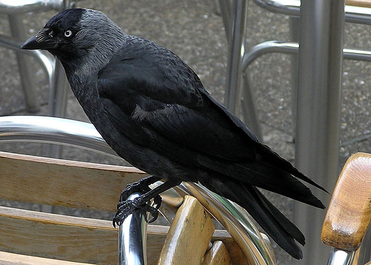

A jackdaw amid some chrome cafe furniture, also photographed by Adrian P (and sharpened). I can't quite put my finger on it, but something about this photo grabs me. Used in jackdaw. +sj + 10:23, 13 Oct 2004 (UTC)
- Oppose -- too messy. Dunc_Harris| ☺ 10:27, 13 Oct 2004 (UTC)
- Oppose (and I took it!) - background is just a little too messy - Adrian Pingstone 11:42, 13 Oct 2004 (UTC)
- Oppose - agree with Dunc and Adrian. The outline of the jackdaw is fairly clean, so if anyone could be bothered you could probably photoshop out the chairs and replace them with a branch and a bit of sky. But even then I doubt it would be a feature candidate. -- Solipsist 17:47, 13 Oct 2004 (UTC)
- Oppose -- ScottyBoy900Q ∞ 19:05, 13 Oct 2004 (UTC)
Bald eagle longshot

a Wikipedia:Featured picture
A Bald Eagle photographed at Combe Martin Wildlife and Dinosaur Park, North Devon, England by Adrian Pingstone. I prefer the pose for the subject's grace, fine coiffure, and dancer's pose; but those who dislike the surroundings might prefer the close-up. Both images have been modified slightly. The latter is used in bird of prey; a wider version of the former is used in bald eagle. +sj + 10:23, 13 Oct 2004 (UTC)
- Support the one on the left; he looks like a clever chap! Dunc_Harris| ☺ 10:29, 13 Oct 2004 (UTC)
- Support the full body picture -- Chris 73 Talk 10:43, Oct 13, 2004 (UTC)
- Nominating two pictures always is a problem. Anyway, my thoughts are: The picture of the head only is brilliant, and I'd support its promotion, while the full body picture is somewhat dull. ✏ Sverdrup 11:13, 13 Oct 2004 (UTC)
- Support - I prefer the closeup - Adrian Pingstone 11:42, 13 Oct 2004 (UTC)
- Support the head shot. I was going to say it was hard to support this Bald Eagle when this one didn't get promoted. However, on a side by side comparison it think I might prefer Adrian's shot, apart from the background. -- Solipsist 17:31, 13 Oct 2004 (UTC)
- Support the headshot. -- ScottyBoy900Q ∞ 19:04, 13 Oct 2004 (UTC)
- Wow! Support both/either. [[User:Neutrality| Neutrality ( hopefully!)]] 20:17, Oct 13, 2004 (UTC)
- Support the closeup. Woa!! It's breathtaking! Unbelievably sharp and detailed. The whole-one is a bit too farway and white. Not really suppporting that. -- Menchi 22:53, 15 Oct 2004 (UTC)
- Oppose. Nice photo, but the unnatural background destroys it. It may as well have been taken at the zoo. Where is the interest in that? --
Might and power 07:05, 20 Oct 2004 (UTC)
- Comment: It is in fact a photo of a captive bird. - [[User:Bevo| Bevo]] 21:05, 26 Oct 2004 (UTC)
- Support either. Nice pics. Alphax (talk) 07:26, Oct 21, 2004 (UTC)
- Support especially the full-length pose: we don't think of birds as having such a shape or stance; the other is just another pretty face. — Bill 13:06, 21 Oct 2004 (UTC)
- Comment: votes seem to fall: 5/4/1 for the full pose, 7.5/1/0? for the headshot, counting only explicit (M&P's 'unnatural background' opposition doesn't seem to apply to that). +sj + 14:10, 25 Oct 2004 (UTC)
Beach Towel (occupied)
.jpg.jpg)
.jpg)
Good but not sleazy pic with a good color composition and a nice model. Used for Sunlight (Sunbathing) and Towel -- Chris 73 Talk 09:56, Oct 13, 2004 (UTC)
- Support (Nominator) -- Chris 73 Talk 09:56, Oct 13, 2004 (UTC)
- Comment -- that's a small beach towel! Imagine trying to lie on it on a sandy beach... +sj +
- Support - perfect illustration for the two articles - Adrian Pingstone 11:42, 13 Oct 2004 (UTC)
- Oppose - Maybe it's just me, but when I visualize a typical beach towel it is more tacky and kitschy than the one in this picture. For the sunbathing article, I would think that a photograph of several individuals with some kind of context (on an apartment roof, front lawn, beach or whatever) would be better. - Oarih 12:12, 13 Oct 2004 (UTC)
- Oppose. A beach towel on a lawn? -- William M. Connolley 18:15, 13 Oct 2004 (UTC)
- Oppose. -- Oska 00:18, Oct 14, 2004 (UTC)
- Oppose (but not totally unpleasant) -- ScottyBoy900Q ∞ 04:03, 14 Oct 2004 (UTC)
- Oppose - what William M. Connolley said. ~leif 05:50, 14 Oct 2004 (UTC)
- Oppose. This is not your typical beach towel, beach towel in general want to "show off", so they'll combine impossible colors and patterns, at least not be boring blue, blue is for your own bathroom (and I mean the international meaning of the word). -- Solitude 06:59, Oct 14, 2004 (UTC)
- Oppose. I agree with William M. Connolley. It's clearly a lawn towel. Cavebear42 22:07, 14 Oct 2004 (UTC)
- Oppose. 1. It's a bath towel; not a beach towel. 2. possibly inappropriate for sunlight.
- BEACH TOWEL (BATH SHEET): approx. 35 x 60 inches
- BATH TOWEL: approx. 27 x 52 to 30 x 58 inches (includes Oversized Towels)
- HAND TOWEL: approx. 16 x 30 inches
- WASH CLOTH: approx. 13 x 13 inches
- FINGERTIP: approx. 11 x 18 inches
- TUBMAT: approx. 22 x 34 inches - [[User:Davodd|DAVODD «TALK»]] 01:26, Oct 23, 2004 (UTC)
- Oppose. Doesn't look like a beach towel (but I might add the girl looks quite nice to look at :)--[[User:Plato| Comrade Nick @)---^--]] 10:09, 23 Oct 2004 (UTC)
- Oppose. Nice green grass, nice blue towel, nice bikini'd girl, but not a fantastic or relevant photo overall. Chameleon 19:47, 24 Oct 2004 (UTC)
- Oppose. OK for an article, maybe. Robin Patterson 05:13, 26 Oct 2004 (UTC)
Horse in field

Nice colors of a typical rural Australian horse. It shows what the field the horse feeds on, as well as the hayshed which makes up part of his diet.
- Support Self Nomination. -- Fir0002 22:24, 13 Oct 2004 (UTC)
- Object to only half a horse, bad lighting, and generally non-spectacular photograph. Denni ☯ 22:49, 2004 Oct 13 (UTC)
- Support. [[User:Neutrality| Neutrality ( hopefully!)]] 03:38, Oct 14, 2004 (UTC)
- Oppose. Don't like the shadows and the fact that it's not the whole horse. -- ScottyBoy900Q ∞ 04:02, 14 Oct 2004 (UTC)
- Oppose. Unfortunately, the eye is in the shadow, so the image looks dull -- Chris 73 Talk 04:03, Oct 14, 2004 (UTC)
- Oppose - it's a bit half-assed. ;-) -- ChrisO 18:56, 19 Oct 2004 (UTC)
American white ibises

a Wikipedia:Featured picture
A trio of white ibises, captured at close range by Dutch wikipedian Jcwf (and slightly cleaned up). Nominated for the clarity and humor of the composition (perhaps I just think ibises are comical?). Used in White ibis. +sj + 10:23, 13 Oct 2004 (UTC)
- Support - very amusing - Adrian Pingstone 11:42, 13 Oct 2004 (UTC)
- Neutral for now - Looks a lot better on the full image, and the composition is excellent. However, I think the picture has been over-sharpened. The original looks a little soft, so halfway between the two might be about right. The trouble is the Ibis on the right doesn't fit against its background. It looks a little fake, as if its been composited into the shot. And the grain on the wood is perhaps too pronounced to be natural. -- Solipsist 17:41, 13 Oct 2004 (UTC)
- Support -- William M. Connolley 18:15, 13 Oct 2004 (UTC)
- Support. Love the background too. Meshes well. -- ScottyBoy900Q ∞ 19:03, 13 Oct 2004 (UTC)
- Support Markalexander100 08:54, 14 Oct 2004 (UTC)
- Support! [[User:Neutrality| Neutrality ( hopefully!)]] 01:43, Oct 20, 2004 (UTC)
- Oppose. I've seen prettier bird photos around. Agree with Solipsist about it being too sharp Enochlau 10:19, 25 Oct 2004 (UTC)
Aurora from Alaska
I was going to nominate Image:Aurora-SpaceShuttle-EO.JPG, but in the process of checking for other Aurora pictures, I came across this one, Image:AuroraAlaska.jpg, which I kind of prefer. -- Solipsist 19:48, 15 Oct 2004 (UTC)
- De-nominating since the image is copyright. -- Solipsist 14:40, 16 Oct 2004 (UTC)
- support. - Solipsist 19:48, 15 Oct 2004 (UTC)
- Support. Is there a larger version to be found though? -- Prisonblues 22:47, 15 Oct 2004 (UTC)
- Oppose. Looks nice, but the image is blurry even though it's small. Also feel it would be better without the house, since it looks like the aurora is somehow coming out of the chimney or something. - Oarih 02:38, 16 Oct 2004 (UTC)
- Oppose sadly. I'm sure there's a better aurora picture out there somewhere. -- ScottyBoy900Q ∞ 03:21, 16 Oct 2004 (UTC)
- This picture is not NASA PD, see http://science.nasa.gov/spaceweather/aurora/gallery_01jan04.htm where it states
"Unless otherwise stated, all images are copyrighted by the photographers.", this picture is then listed 3rd from bottom. As such it its not eligible for FP status. With so many NASA aurora photos around, I doubt if we can even claim fair use. ed g2s • talk 12:48, 16 Oct 2004 (UTC)
- I think you are right. That page also has a link to the photographer's aurora web site at http://www.aurorawebcam.com/ which also states copyright. Better move it to copyvio. -- Solipsist 14:23, 16 Oct 2004 (UTC)
- Not promoted due to copyvio concerns -- Bevo 22:08, 27 Oct 2004 (UTC)
Bored girl
She is so cute! Awwww -_- Used in boredom. — Joseph | Talk 05:54, Oct 14, 2004 (UTC)
- Oppose: not sharp. Markalexander100 05:58, 14 Oct 2004 (UTC)
- Oppose: agreed not sharp. I would like to also see us supporting pictures that are stated free rather than just not stated not free.
Cavebear42 17:39, 14 Oct 2004 (UTC)
- I don't understand. The image is stated free. The site license says "You may use any of the photos in our system free of charge for any commercial or personal design work if you obey the specified restrictions concerning each photo you download" and the individual restrictions are "There are no usage restrictions for this photo."
–
Quadell (
talk) (
help)[[]] 17:51, Oct 14, 2004 (UTC)
- I'll retract my statement about copyright. While I still support original photos and explictly stated free licences, this is clearly public domain. Cavebear42 18:14, 14 Oct 2004 (UTC)
- I don't understand. The image is stated free. The site license says "You may use any of the photos in our system free of charge for any commercial or personal design work if you obey the specified restrictions concerning each photo you download" and the individual restrictions are "There are no usage restrictions for this photo."
–
Quadell (
talk) (
help)[[]] 17:51, Oct 14, 2004 (UTC)
- Support: The very slight haziness increases the bored feel. – Quadell ( talk) ( help)[[]] 17:51, Oct 14, 2004 (UTC)
- Oppose. -- ScottyBoy900Q ∞ 22:30 14 Oct 2004 (UTC)
- Oppose. A very boring (and obviously staged) photo. Denni ☯ 00:03, 2004 Oct 15 (UTC)
- Oppose. -- Prisonblues 22:46, 15 Oct 2004 (UTC)
- Oppose. 1. Smacks of vanity; like somone wants to show off their offspring. 2. Child's look doesn't scream "bored" any more than it looks like it is a "pout," "embarassed" or "irritated" look. [[User:Davodd|DAVODD «TALK»]] 01:19, Oct 23, 2004 (UTC)
- Not Promoted: +2/-6
Biological cell

Very useful diagram. – Quadell ( talk) ( help)[[]] 20:42, Oct 14, 2004 (UTC)
- Oppose. Useful, but unappealing. -- ScottyBoy900Q ∞ 22:25, 14 Oct 2004 (UTC)
- Oppose, I'm finding it difficult to visualise it in 3 dimensions as intended (though I'm a very 2 dimensional person) Dunc| ☺ 22:33, 14 Oct 2004 (UTC)
- Oppose. Good content but ugly diagram, especially at full resolution. -- Prisonblues 22:49, 15 Oct 2004 (UTC)
- Oppose. The picture is marred, in my opinion, by the use of colors that are unnecessarily muddy and idiosyncratic. Denni ☯ 02:21, 2004 Oct 17 (UTC) Denni ☯ 02:21, 2004 Oct 16 (UTC)
- Oppose. Nice pic, but the numbers and jaggy lines are weird. [[User:Davodd|DAVODD «TALK»]] 01:18, Oct 21, 2004 (UTC)
- Oppose and redirect to Banana split. — Bill 12:59, 21 Oct 2004 (UTC)
Enola Gay

Quite an impressive and useful illustrative photo of a historically significant plane - the Enola Gay. Taken by User:Lorax.
- Support - Solipsist 18:40, 14 Oct 2004 (UTC)
- Oppose - background is distracting, not all of the plane is visible. Regrettable. If you got a shot of the plane in the open air, I probably would support. - Ludraman 20:32, 14 Oct 2004
- Oppose. I tried to take this exact same picture at the A&SM but I couldn't find a single shot I wanted to upload. the background there is so cluttered its very hard to get a nice shot of anything. -- ScottyBoy900Q ∞ 22:29, 14 Oct 2004 (UTC)
- Oppose, same reasons as above -- Chris 73 Talk 07:32, Oct 15, 2004 (UTC)
Shadow puzzle

a Wikipedia:Featured picture
I can't believe this is true - but it is!!! Probably the best illustration of this awesome illusion.
- Support. JOHN COLLISON | (Ludraman) 19:32, 14 Oct 2004 (UTC)
- Support. This can't be right. This guy must have found a way to put a measuring bug in every image editing progam. -- Solipsist 19:43, 14 Oct 2004 (UTC)
- Support. – Quadell ( talk) ( help)[[]] 19:44, Oct 14, 2004 (UTC)
- Support. When I put this pic on WP I could not convince myself they were the same grey. So I printed the larger pic, cut out one of the squares, slid it over and, yes, they are identical greys!! - Adrian Pingstone 20:20, 14 Oct 2004 (UTC)
- Support. I have also uploaded a version that I made in POV-Ray if you'd rather have one made for Wikipedia: Paul Stansifer 21:12, 14 Oct 2004 (UTC)

Oppose. Yeah it's cool, but is it really featured picture worthy? I think not.Changed my mind Support. -- ScottyBoy900Q ∞ 22:28, 14 Oct 2004 (UTC)- Oppose. I'm in ScottyBoy's camp. Denni ☯ 00:02, 2004 Oct 15 (UTC)
- Support the first version, which is cleaner. Markalexander100 01:41, 15 Oct 2004 (UTC)
- Support the first one -- Chris 73 Talk 07:30, Oct 15, 2004 (UTC)
- Support strongly. I've seen a forum where the posting of this figure triggered lengthy discussions about optical illusions and the mechanisms of visual perception (along with visual tests such as the one performed by Adrian). If that doesn't make a diagram or figure featured picture-worthy, then I don't know what does. Perhaps it should be paired with the same figure superimposed with a solid bar of the same colour connecting the two squares, though, to reveal the illusion. I guess that would require using the second (imo less attractive) version made by Paul since the original is not GFDL or in the public domain. - Oarih 10:02, 15 Oct 2004 (UTC)
- Although the original isn't under GFDL which would support modification, if you follow the source link you can find the grey bar version exactly as requested, which is also copyright but freely usable. -- Solipsist 10:22, 15 Oct 2004 (UTC)
- I created the POV-Ray version because I thought that that would give it a cleaner look. It would be easy to change if you think that there's something specific that would make it more useful for Wikipedia. (The wood frame, for example, I just put in to look cool.)
Paul
Stansifer 17:15, 15 Oct 2004 (UTC)
- I think it would look better without the wood frame and if the dark side of the blue cylinder were a little lighter. Lorax 23:00, Oct 15, 2004 (UTC)
- I've uploaded a new version, sans frame, and with an adjusted color. I've decreased the amount of perspective, but not eliminated it (I think that a little bit is good here). The letters are still in red, because I think that the original picture's use of opposite colors for "A" and "B" is "cheating" by using a different (albeit related) affect. Paul Stansifer 06:08, 16 Oct 2004 (UTC) (P.S. since I just overwrote the old one, it may take some time before the thumbnail updates)
- Support - [[User:Bevo| Bevo]] 19:30, 15 Oct 2004 (UTC)
- Support, because it is so hard to believe -- William M. Connolley 21:59, 15 Oct 2004 (UTC). Slight preference for the second one. Query: the original of the first image has the authors name on. Is it clear the permission to reproduce includes permission to remove the name?
- Support. I would prefer the second version, if it could be adjusted to use the same isometric projection. — David Remahl 22:36, 15 Oct 2004 (UTC)
- Support the 2nd version. Well, it's an amazing graphic. -- Menchi 02:56, 16 Oct 2004 (UTC)
- The new POV-Ray version is better than the earlier one, but it's still not as effective as the original: both the squares on the POV-Ray version look quite dark to me, while the squares on the original seem to contrast more. Markalexander100 06:34, 16 Oct 2004 (UTC)
- Support original image. I can tell that the squares are of the same brightness in the second if I squint. Actually the same applies for the first, but I have to squint harder there. Fredrik | talk 16:45, 17 Oct 2004 (UTC)
- Support first version - the apparent (though not real) contrast between the squares is greater in the 1st one. (still, I like how in the 2nd one the hex value of the colours is 3D 3D 3D. :-) Evercat 23:33, 17 Oct 2004 (UTC)
- Support. James F. (talk) 00:55, 20 Oct 2004 (UTC)
- Support. Either version, but prefer the 2nd because it comes with pob-ray source. Lorax 22:54, Oct 20, 2004 (UTC)
- Support first version, because the effect is more striking in that one. Janderk 07:53, 21 Oct 2004 (UTC)
- Support. Can't believe my machines color meter. Little Eyedropper must be broken... [[User:Ctrl_build| Ctrl_build talk]] 20:31, Oct 22, 2004 (UTC)
Sponge


This is beautiful, and it's GFDLed by the uploader. – Quadell ( talk) ( help)[[]] 20:42, Oct 14, 2004 (UTC)
- Neutral. I love it, but i think it may be too dark. Great photo though. -- ScottyBoy900Q ∞ 22:26, 14 Oct 2004 (UTC)
- Meets my criteria for FP. If the contributor can lighten it up a bit, that would be great, but I support as is. Denni ☯ 23:58, 2004 Oct 14 (UTC)
- Support the color corrected one. I took the liberty of adjusting the colors. (not much red at 30m, even in the caymans). I was surprised myself what a HUGE difference it makes (Press CTRL Reload if you see the old one). Compare the new image with the old one. -- Chris 73 Talk 07:25, Oct 15, 2004 (UTC)
- Oppose the second version: too artificial. (A picture taken at a depth of 30m should show the colours you see at that depth, not the colours you would see at the surface). Could you put the revised version under a separate filename, so we can choose between them? Markalexander100 07:37, 15 Oct 2004 (UTC)
- Support the first version. The "enhanced" version doesn't look very good. Should we try to just lighten the image a bit? ✏ Sverdrup 07:46, 15 Oct 2004 (UTC)
- Oppose. Good to have a photograph like this from a Wikipedian and I like the resemblance to a glove. Unfortuantely this is the sort of thing that the NOAA can do rather well. I've added a better picture to the sponge article.
Also, are we sure this is a sponge? They look a little more like the casings of a sea worm.Actually there is a similar looking Yellow Tube sponge here -- Solipsist 06:52, 16 Oct 2004 (UTC)
Neutral, I took the picture :-) It is a sponge which measured approx. 3 feet, on a "wall" in Cayman at 100-130 feet. As a rule, I never colour correct my pictures. Even at shallow depths the colours on the sponges were somewhat muted, and nowhere near as bright as those of the corrected version. Dlloyd 10:57, 17 Oct 2004 (UTC)
- I would like to apologize again if you felt that I was stepping on your toes by changing the image. Please do not list all of your image contributions for deletion ( Category:Candidates for speedy deletion and Wikipedia:Images for deletion), they are quite good and we DO appreciate your contributions! -- Chris 73 Talk 04:16, Oct 18, 2004 (UTC)
- Oppose. The sponges are nice, but the light and visibility weren't. Janderk 19:56, 19 Oct 2004 (UTC)
Very Large Array

a Wikipedia:Featured picture
The Very Large Array is still one of the biggest telescopes in the world, illustrated with rather a nice photo from User:Hajor. -- Solipsist 19:41, 15 Oct 2004 (UTC)
- Support. - Solipsist 19:41, 15 Oct 2004 (UTC)
- Support. Looks crisp and interesting. -- ScottyBoy900Q ∞ 03:23, 16 Oct 2004 (UTC)
- Support. Steschke 21:19, 2004 Oct 17 (UTC)
- Support -- Chris 73 Talk 06:29, Oct 18, 2004 (UTC)
- Oppose. 640x480 is too small. Will support if larger version uploaded.
ed g2s •
talk 11:40, 18 Oct 2004 (UTC)
- So you're judging pictures by their size not their quality? -- ScottyBoy900Q ∞ 22:05, 18 Oct 2004 (UTC)
- I'm judging both, hence "support if larger version uploaded". ed g2s • talk 14:49, 28 Oct 2004 (UTC)
- Support, but would be much happier if of a larger size. James F. (talk) 00:58, 20 Oct 2004 (UTC)
- Support. [[User:Neutrality| Neutrality ( hopefully!)]] 21:13, Oct 23, 2004 (UTC)
- Support; will change to big uber support if larger size is found. ugen64 02:54, Oct 27, 2004 (UTC)
Village of Passchendaele

a Wikipedia:Featured picture
On Passchendaele. It illustrates the total devestation of this infamous WWI battle better than words could. (Public domain) - fabiform | talk 17:51, 15 Oct 2004 (UTC)
- oppose, needs explaining, too careful examination. Isn't Polygon Wood already featured? Dunc| ☺ 17:53, 15 Oct 2004 (UTC)
- support – Quadell ( talk) ( help)[[]] 18:10, Oct 15, 2004 (UTC)
- Support. In this case, a picture is worth way more than a thousand words. Denni ☯ 01:56, 2004 Oct 16 (UTC)
- Support strongly as long as it's explained good. -- ScottyBoy900Q ∞ 03:23, 16 Oct 2004 (UTC)
- War is hell. Support. [[User:Neutrality| Neutrality ( hopefully!)]] 04:14, Oct 16, 2004 (UTC)
- Oppose. I judge solely on the picture, which must be striking by itself with out any explanation. In the context of an article this would be a very illustrative addition. As an image that can attract interest it fails. --
Oska 14:45, Oct 16, 2004 (UTC)
- Explain how this image is not striking? I knew what it was before even reading the caption. I think it sends a very striking picture.--
ScottyBoy900Q
∞ 15:35, 17 Oct 2004 (UTC)
- It is not visually striking. The top image is simply a fairly average black and white aerial shot of a village. The bottom image is another low resolution aerial shot of the same area but now with most features removed making it even less visually interesting. I know that conceptually, the idea that a whole village has been wiped out is striking, but what is striking there is the idea, not the picture. Mentally stunning ideas are important but not the province of this forum, in my opinion, unless they are matched with a similarly striking picture. — By the way you display your bias for using images as props when you say that it sends a very striking picture rather than saying that it is a striking picture. --
Oska 06:17, Oct 18, 2004 (UTC)
- I suppose visually striking is in the eyes of the beholder. I believe it to be very visually striking. And in regards to your other comment, you're right, I do see images as props. Is it not you displaying your own bias that they can't be used as such? -- ScottyBoy900Q ∞ 22:12, 18 Oct 2004 (UTC)
- It is not visually striking. The top image is simply a fairly average black and white aerial shot of a village. The bottom image is another low resolution aerial shot of the same area but now with most features removed making it even less visually interesting. I know that conceptually, the idea that a whole village has been wiped out is striking, but what is striking there is the idea, not the picture. Mentally stunning ideas are important but not the province of this forum, in my opinion, unless they are matched with a similarly striking picture. — By the way you display your bias for using images as props when you say that it sends a very striking picture rather than saying that it is a striking picture. --
Oska 06:17, Oct 18, 2004 (UTC)
- Explain how this image is not striking? I knew what it was before even reading the caption. I think it sends a very striking picture.--
ScottyBoy900Q
∞ 15:35, 17 Oct 2004 (UTC)
- Support. I find it very interesting -- Chris 73 Talk 06:29, Oct 18, 2004 (UTC)
- Comment. 1). The photo is Imperial War Museum Q 42918A. 2). For some reason, all the published sources I have rotate the photos so that west is at the top. 3). This photo was one of my first attempts at scanning and is pretty dreadful -- way too dark. Geoff/Gsl 06:44, 18 Oct 2004 (UTC)
- Support. Clearly shows how bad war can get. Janderk 19:54, 19 Oct 2004 (UTC)
- Comment. Are these two images supposed to be approximately the same scale? Are these two images supposed to be oriented approximately the same with respect to axis? I just can't seem to convince myself that they are of the same geography. I know that's basicly the point (that the warfare disrupted the surface to a large extent), but I'm still not convinced they are images of the same area. - [[User:Bevo| Bevo]] 03:28, 21 Oct 2004 (UTC)
- I see now. You have to rotate the top image clockwise by about 10 degrees to get the alignment. - [[User:Bevo| Bevo]] 18:59, 25 Oct 2004 (UTC)
- Suport. Markalexander100 02:47, 26 Oct 2004 (UTC)
Red water

a Wikipedia:Featured picture
Dunc| ☺ 16:43, 15 Oct 2004 (UTC)
- support – Quadell ( talk) ( help)[[]] 18:10, Oct 15, 2004 (UTC)
- Nor shocking or titillating, but otherwise more than worthy. Does, however, require some assistance for strong left-leaning. (No politics here, folks). Support horizon-corrected image. Denni ☯ 02:16, 2004 Oct 16 (UTC)
- Support the original uncropped image. -- ScottyBoy900Q ∞ 03:25, 16 Oct 2004 (UTC)
- Support the horizon-corrected version. -- Steschke 21:05, 2004 Oct 17 (UTC)
- Support either version -- Chris 73 Talk 06:29, Oct 18, 2004 (UTC)
- Support. James F. (talk) 00:56, 20 Oct 2004 (UTC)
- Support rotated version. Alphax (talk) 07:19, Oct 21, 2004 (UTC)
- Support; but I think it needs a bit more rotating. Robin Patterson 05:16, 26 Oct 2004 (UTC)
Midnight sun at Nordkapp, Norway

The beauty of a midnight sun is something anyone should see sometime in their life. This photograph shows the simplicity and splendor of such a setting. - Engmark 14:41, 2004 Oct 15 (UTC)
- Oppose, on the somewhat shaky grounds that I cannot view anything like the whole of this 1600 by 1200 image on my 1024 by 768 screen, so the "simplicity and splendour" remains unseen by me! -
Adrian Pingstone 16:03, 15 Oct 2004 (UTC)
- I certainly don't think this should stop an image for being featured! (My browser is smart enough to fit the image to the screen, maybe more wikipedia readers have this ability. Anyway, larger resolutions are better). --Sv.
- That's the worst objection I've seen here! Surely you've forgotten your smiley. Try making a sandbox at User:Arpingstone/sandbox and add [[Image:Midnight sun.jpg|thumb|1024px|Midnight sun at [[Nordkapp]], [[Norway]]]], then view at liesure. A better objection is that the image page suggests the photograph was taken at 15 minutes past midnight, so it isn't really the midnight sun at all :) -- Solipsist 17:11, 15 Oct 2004 (UTC)
- I certainly don't think this should stop an image for being featured! (My browser is smart enough to fit the image to the screen, maybe more wikipedia readers have this ability. Anyway, larger resolutions are better). --Sv.
- Support. ✏ Sverdrup 16:52, 15 Oct 2004 (UTC)
- Support. - Solipsist 17:11, 15 Oct 2004 (UTC)
- support – Quadell ( talk) ( help)[[]] 18:10, Oct 15, 2004 (UTC)
- Oppose, because unless you watch it not setting, its just a sunset, and thus not particularly striking --
William M. Connolley 22:15, 15 Oct 2004 (UTC).
- Context is what's important in the encyclopaedia. Pictures shouldn't be expected to stand completely on their own. —
David Remahl 22:26, 15 Oct 2004 (UTC)
- Actually that's a good point. I have seen the midnight sun illustrated as a composite of timelapse images taken every hour. - Solipsist 05:07, 16 Oct 2004 (UTC)
- Context is what's important in the encyclopaedia. Pictures shouldn't be expected to stand completely on their own. —
David Remahl 22:26, 15 Oct 2004 (UTC)
- Support. — David Remahl 22:26, 15 Oct 2004 (UTC)
- Support. -- Prisonblues 22:48, 15 Oct 2004 (UTC)
- Oppose. This could be 1600h in the middle of December where I live. No sense of direction in this photo means the real message is not being delivered. Agree with William. Denni ☯ 02:18, 2004 Oct 16 (UTC)
- Oppose. -- ScottyBoy900Q ∞ 03:26, 16 Oct 2004 (UTC)
- Support. →Raul654 21:04, Oct 17, 2004 (UTC)
- Support -- Chris 73 Talk 06:44, Oct 18, 2004 (UTC)
- Support. James F. (talk) 00:55, 20 Oct 2004 (UTC)
- Oppose. It's a nice picture, but just another sunset without knowing the context. The associated midnight sun article is sorely lacking content. -- Netoholic @ 01:40, 2004 Oct 20 (UTC)
- Comment. Is the GFDL status of this photo verifiable? It is asserted seemingly secondhand. - [[User:Bevo| Bevo]] 21:12, 26 Oct 2004 (UTC)
- Oppose - [[User:Bevo| Bevo]] 15:38, 28 Oct 2004 (UTC)
American one-cent coin

Fascinating. [[User:Neutrality| Neutrality ( hopefully!)]]
- Support. Interesting shot. -- ScottyBoy900Q ∞ 04:44, 16 Oct 2004 (UTC)
- Neutral. Although it's nice to see it in such close detail, I think the composition could be better. The scratches on the right of the coin are a little distracting.
-spencer195 05:45, 16 Oct 2004 (UTC)
- The scratches, for me, give the penny a personality. [[User:Neutrality| Neutrality ( hopefully!)]] 18:34, Oct 16, 2004 (UTC)
- Oppose. Should be the whole coin, centered. Even then it might be boring. -- William M. Connolley 09:36, 16 Oct 2004 (UTC)
- Oppose. Steschke 21:03, 2004 Oct 17 (UTC)
- Oppose, agree with William M. Connolley -- Chris 73 Talk 06:42, Oct 18, 2004 (UTC)
- Oppose. Boring. A Euro coin would be better. Alphax (talk) 07:17, Oct 21, 2004 (UTC)
- Support; scratches are characteristic of all coins. A euro coin would clearly be inappropriate if one were illustrating American currency, for which purpose I am sure this picture is intended. Rdsmith4— Dan | Talk 01:20, 24 Oct 2004 (UTC)
- Support, although I'd like to have seen the entire face of the coin. - [[User:Bevo| Bevo]] 19:26, 27 Oct 2004 (UTC)
- Support I like the scratches and the odd camera angle. A straight shot would be boring. [[User:BrokenSegue| BrokenSegue]] 21:53, 27 Oct 2004 (UTC)
- NOT promoted, +5/-4 -- [[User:Bevo| Bevo]] 14:30, 30 Oct 2004 (UTC)
Pillar coral

a Wikipedia:Featured picture
One of the NOAA's better photographs of coral. Rather reminds be of the Eagle Nebula. So good, I had to write a stub for the Pillar coral article to use it, although it could also be used on the general coral page. -- Solipsist 08:29, 16 Oct 2004 (UTC)
- Support. Solipsist 08:29, 16 Oct 2004 (UTC)
- Support. Markalexander100 08:36, 16 Oct 2004 (UTC)
- Support. Denni ☯ 18:46, 2004 Oct 16 (UTC)
- Support. Steschke 21:02, 2004 Oct 17 (UTC)
- Support. Chris 73 Talk 06:30, Oct 18, 2004 (UTC)
- Support. I'm actually gonna go look for a good Eagle Nebula picture now. -- ScottyBoy900Q ∞ 22:03, 18 Oct 2004 (UTC)
- Support. James F. (talk) 00:59, 20 Oct 2004 (UTC)
- Support. Alphax (talk) 07:17, Oct 21, 2004 (UTC)
- Support. [[User:Neutrality| Neutrality ( hopefully!)]] 20:52, Oct 21, 2004 (UTC)
- Certainly Support. ugen64 02:53, Oct 27, 2004 (UTC)
- Support. -- Thomas G Graf 10:47, 29 Oct 2004 (UTC)
- Support - extraordinary photo JoJan 20:11, 29 Oct 2004 (UTC)
- Promoted, +12/-0 -- [[User:Bevo| Bevo]] 14:39, 30 Oct 2004 (UTC)
Pollen and Gerbera
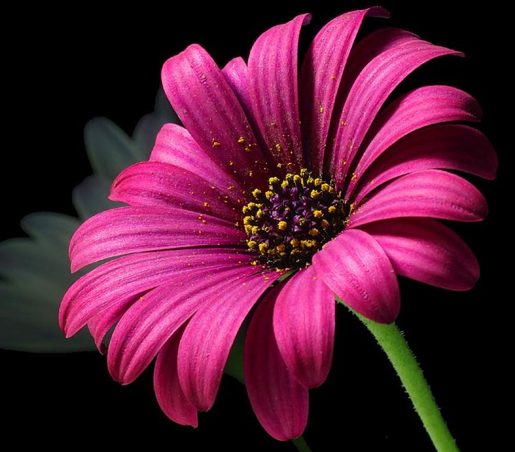

a Wikipedia:Featured picture
Note: This nomination was lost for 5 days due to an edit conflict (see Talk). Please extend voting period for another 5 days if necessary -- Chris 73 Talk 23:30, Oct 25, 2004 (UTC) That would effectively make nominated on 17 Oct 2004, so I have moved it up into that time slot. - [[User:Bevo| Bevo]] 19:21, 26 Oct 2004 (UTC)
- This is not a flower. It is really a picture of pollen, so there is a more interesting article behind it. However, the flower which I think is a Gerbera or Transvaal daisy, is quite attractive too. -- Solipsist 07:16, 12 Oct 2004 (UTC)
- Support - Solipsist 07:16, 12 Oct 2004 (UTC)
- Comment. Why do you say it is not a flower when it so obviously is? Even if you intend to use the photo to illustrate pollen, the image still fully features a flower. I would judge the photo as a whole and not on one particular part which you seem to wish us to focus on. -- Oska 23:08, Oct 12, 2004 (UTC)
- The instructions on WP:FP say There are many beautiful flowers and we don't want too many nominations of the same type. Hence this shot is to illustrate pollen and happens to feature a flower, whilst Field of Sunflowers is more for the field effect. (Alternatively I could say I was going for a surrealist angle with Ceci n'est pas une fleur.) -- Solipsist 09:43, 13 Oct 2004 (UTC)
- Support. It is an Osteospermum - and should be in that article. [[User:Davodd|DAVODD «TALK»]] 23:27, Oct 12, 2004 (UTC)
- Support. A fine illustration of both glorious colour and the primordial urge to reproduce. +sj + 07:23, 13 Oct 2004 (UTC)
- Support -- Chris 73 Talk 09:12, Oct 13, 2004 (UTC)
- Support. -- ScottyBoy900Q ∞ 19:08, 13 Oct 2004 (UTC)
- Brilliant. Support. ugen64 02:52, Oct 27, 2004 (UTC)
- Support without reservation. Pollinator 03:13, Oct 27, 2004 (UTC)
- Promoted, +7/-0 -- [[User:Bevo| Bevo]] 13:57, 31 Oct 2004 (UTC)