| Featured picture tools |
|---|
Please cut and paste new entries to the bottom of this page, creating a new monthly archive (by closing date) when necessary.
Northern Carmine Bee-eater (2nd nom)
Voting period is over. Please don't add any new votes. Voting period ends on 29 Jan 2012 at 16:12:10 (UTC)


- Reason
- Trying to address the concerns in the previous nom, I'm putting the version where green spots have been reduced to minimum (upper image). The lower image (alt crop) appeared in the 1st nom.
- Articles in which this image appears
- Northern Carmine Bee-eater (upper image)
- FP category for this image
- Birds
- Creator
- Lviatour
- Support as nominator -- Brandmeister t 16:12, 20 January 2012 (UTC)
- Comment This is a really beautiful photo, but it looks like the sky is riddled with jpeg artifacts. upstate NYer 17:36, 20 January 2012 (UTC)
- Comment Yeah, something has definately gone wrong in making this crop. The sky has gained some very strong artefacts. - Zephyris Talk 20:15, 20 January 2012 (UTC)
- Comment. Yes. I adressed this in the previous nom too. The file size is obviously too small for such a resolution. O.J. ( talk) 22:01, 20 January 2012 (UTC)
- Both are fixed. The online stuff turned out to be unreliable in this sense. Brandmeister t 00:47, 21 January 2012 (UTC)
- Support Alt crop. O.J. ( talk) 02:13, 22 January 2012 (UTC)
- Oppose I'm bothered by the fact the the head (and to some extent the tail) of the bee-eater on the right is out of focus. God Emperor Talk 13:41, 22 January 2012 (UTC)
- Oppose It's a tad bit grainy on that log. Otherwise I would have nominated this already on Commons. Pteronura brasiliensis 16:07, 22 January 2012 (UTC)
- Support Per original nom -- Fir0002 04:37, 27 January 2012 (UTC)
- Support Alt crop, per previous nom. Kaldari ( talk) 07:40, 28 January 2012 (UTC)
- Support Alt crop My concerns in the previous nom have been addressed. Looks good!
Not promoted --
Extra
999 (
Contact me) 16:27, 30 January 2012 (UTC)
- 5 supports, 2 oppose --
Extra
999 (
Contact me) 16:27, 30 January 2012 (UTC)
- Comment. This one should have been promoted, right?
O.J. (
talk) 22:34, 30 January 2012 (UTC)
- There were 5 supports (including the nominator), which is the minimum criteria, since there was no clear-cut consensus. Apart from that you had 2 opposes, which tilts it to not promoted. Although, I would like to see the thoughts of more experienced editors here. --
Extra
999 (
Contact me) 08:43, 31 January 2012 (UTC)
- 5/7 is more than a two-third majority in support. There's an ongoing discussion about this case at the FPC talk page. O.J. ( talk) 09:18, 31 January 2012 (UTC)
- There were 5 supports (including the nominator), which is the minimum criteria, since there was no clear-cut consensus. Apart from that you had 2 opposes, which tilts it to not promoted. Although, I would like to see the thoughts of more experienced editors here. --
Extra
999 (
Contact me) 08:43, 31 January 2012 (UTC)
- Comment. This one should have been promoted, right?
O.J. (
talk) 22:34, 30 January 2012 (UTC)
Promoted File:Merops nubicus luc viatour-crop.jpg --
J Milburn (
talk) 16:05, 31 January 2012 (UTC)
- Closure overturned as per the consensus at the talk page discussion. Five in support, over a two-thirds majority, clear consensus. J Milburn ( talk) 16:05, 31 January 2012 (UTC)
Dark-eyed Junco
Voting period is over. Please don't add any new votes. Voting period ends on 3 Jan 2012 at 05:27:44 (UTC)

- Reason
- very large photo, already featured on Commons, lead image for two articles
- Articles in which this image appears
- Dark-eyed Junco, Junco
- FP category for this image
- Wikipedia:Featured_pictures/Animals/Birds
- Creator
- Cephas
- Support as nominator -- Pine talk 05:27, 25 December 2011 (UTC)
- Support -- Striking. Crisco 1492 ( talk) 09:32, 25 December 2011 (UTC)
- Weak Support It is a pretty impressive picture, (as Crisco said above, "Striking"). I don't like how, starting right at the top of its wing, it slowly starts to drift out of focus (until it is completely out of focus when it reaches its tail). It takes away from the pictures integrity. Dusty777 ( talk) 22:11, 26 December 2011 (UTC)
- Neutral Lots of the bird is in shadow (fill flash can help with that) and the pose is awkward. Out of focus areas with small birds are almost a fact of life though (the photographer has stopped down a lot as is). It is otherwise technically well executed. JJ Harrison ( talk) 11:25, 27 December 2011 (UTC)
- Weak support per JJ, and I also find the bokeh a little unappealing and distracting. -- jjron ( talk) 12:43, 29 December 2011 (UTC)
- Oppose. Color of background means there is little contrast with subject. Gray on gray. Several images in article have better color contrast of subject and background. TCO ( Reviews needed) 07:14, 1 January 2012 (UTC)
- Support. I don't buy the criticisms made here - shadow issue doesn't seem too strong, and the bird is clearly differentiated from its background at its entire outline. DOF issue has been explained by JJ. I think we'll eventually have to have a set for this species as no single image (taken in nature, at least!) can represent the colour and patterning variation, geographic and otherwise. Papa Lima Whiskey 2 ( talk) 11:34, 2 January 2012 (UTC)
Not Promoted -- Makeemlighter ( talk) 10:48, 3 January 2012 (UTC)
- Support < 5 Makeemlighter ( talk) 10:48, 3 January 2012 (UTC)
Jesus as the Good Shepherd (Stained glass)
Voting period is over. Please don't add any new votes. Voting period ends on 3 Jan 2012 at 13:39:31 (UTC)

- Reason
- Stunning colour, high EV for a modern-day depiction of Jesus
- Articles in which this image appears
- Jesus (lead image), Depiction of Jesus
- FP category for this image
- Wikipedia:Featured pictures/People/Others
- Creator
- Alfred Handel, photographed by Toby Hudson.
- Support as nominator -- Crisco 1492 ( talk) 13:39, 25 December 2011 (UTC)
- Comment A much better picture is this, which is featured on Commons. Unfortunately it is only used in one Wikipedia article. ♫GoP♫ T C N 16:48, 25 December 2011 (UTC)
- Support Thanks for the nomination. I think this full body crop has the higher value for an encyclopedia article (and perhaps a better colour balance). The other has fractionally more detail in the close-up crop, but at 18MPx, this one is way higher than our FP standards, and is easily suitable for any web application. -- 99of9 ( talk) 22:05, 25 December 2011 (UTC)
- Support One of the best depictions of the Good Shepherd, but I don't know whether the blurriness is natural here. Brandmeister t 00:17, 26 December 2011 (UTC)
- Comment I don't really see exceptional EV here. What distinguishes this from the multitude of other depictions of Jesus? I'm not too keen on the shot itself either. The backlighting doesn't work for me. I prefer the front-lit version. Makeemlighter ( talk) 02:48, 26 December 2011 (UTC)
- For the shot itself, I must say I prefer the backlit version. More striking. Crisco 1492 ( talk) 11:43, 26 December 2011 (UTC)
- Oppose decent depiction but it's used in only two articles and this particular window has little historical significance. Pine talk 08:39, 26 December 2011 (UTC)
- Comment. The version featured on Commons is significantly sharper and better detailed (yes, the nommed image is bigger overall, but in terms of the actual section of the window depicted the other one is actually marginally larger, so that certainly doesn't account for the difference). Colour balance is also significantly different; 99of9 mentioned this, and while I don't know which one has truer colours, the colours in the other version appear to be richer. -- jjron ( talk) 12:41, 26 December 2011 (UTC)
- Oppose Badly clipped blacks and blown highlights, and it just isn't as sharp as I'd expect. JJ Harrison ( talk) 11:29, 27 December 2011 (UTC)
- Oppose. Marginally important and marginal photography. Still a "good" pic. but not FP. (I should probably look and see if we have any previous stained glass or religious pictures as that might sway me...). TCO ( Reviews needed) 07:06, 1 January 2012 (UTC)
Not Promoted -- Papa Lima Whiskey 2 ( talk) 14:42, 3 January 2012 (UTC)
Noisy Miner
Voting period is over. Please don't add any new votes. Voting period ends on 3 Jan 2012 at 13:21:03 (UTC)

- Reason
- Nice and sharp, encyclopedic. High resolution, good illustration of the subject. It's a new GA, so I think we should have a chance to show it off.
- Articles in which this image appears
- Noisy Miner
- FP category for this image
- Wikipedia:Featured pictures/Animals/Birds
- Creator
- JJ Harrison
- Support as nominator -- Crisco 1492 ( talk) 13:21, 25 December 2011 (UTC)
- Oppose Its significant tail is out of focus; distracting elements on the ground, not the least of which is that stick emanating from its posterior. Saffron Blaze ( talk) 18:17, 25 December 2011 (UTC)
- Support JJ Harrison ( talk) 11:22, 27 December 2011 (UTC)
- Comment: Off-topic discussion has been moved to the talk page. J Milburn ( talk) 12:57, 28 December 2011 (UTC)
- Oppose Per above comments. Too much distraction in foreground along with focus problems. JFitch (talk) 15:48, 31 December 2011 (UTC)
- Oppose Doesn't seem that much of an advance over the many other pictures in article. TCO ( Reviews needed) 07:11, 1 January 2012 (UTC)
Not Promoted -- Papa Lima Whiskey 2 ( talk) 14:44, 3 January 2012 (UTC)
Christ Pantocrator icon, 6th Century
Voting period is over. Please don't add any new votes. Voting period ends on 3 Jan 2012 at 05:45:44 (UTC)

- Reason
- Used in many articles, this photo shows the oldest known icon of Christ Pantocrator, dating from the 6th century.
- Articles in which this image appears
- Christ, Christ Pantocrator, Saint Catherine's Monastery, Mount Sinai, Depiction of Jesus, Icon, Religious image, History of painting, Western painting
- FP category for this image
- Wikipedia:Featured_pictures/Artwork/Paintings
- Creator
- unknown painter, photo by Testus
- Support as nominator -- Pine talk 05:45, 25 December 2011 (UTC)
Weaksupport -- Seems kinda blurry (at that size, shouldn't it be more than 150 kb?) Crisco 1492 ( talk) 09:30, 25 December 2011 (UTC)
- I've uploaded a version with higher resolution (1,100×2,127). Brandmeister t 23:50, 25 December 2011 (UTC)
- This version looks a little better. Odd how such a small file can still be fairly sharp. Crisco 1492 ( talk) 01:17, 26 December 2011 (UTC)
- Source for the new version? Makeemlighter ( talk) 02:54, 26 December 2011 (UTC)
- [1]. Brandmeister t 11:31, 26 December 2011 (UTC)
- Weak Support The new version is quite low in resolution for this sort of thing. JJ Harrison ( talk) 11:33, 27 December 2011 (UTC)
- Support. I am moved by the original art work itself. Seems notable given the date and also the caption is very well done (yes, captions are part of the presentation!) TCO ( Reviews needed) 07:13, 1 January 2012 (UTC)
- Support -- Swayed by TCO. Saffron Blaze ( talk) 08:25, 1 January 2012 (UTC)
- Oppose I don't see why this has been "slightly cut down" ( full-size version). Also not sure of colors/lighting: this looks a significantly different from the old version. Would prefer a larger version too. Makeemlighter ( talk) 02:18, 3 January 2012 (UTC)
Not Promoted -- Papa Lima Whiskey 2 ( talk) 14:47, 3 January 2012 (UTC)
- Came close, 4.5S vs. 1O. Possible future renom.
Papa Lima Whiskey 2 (
talk) 14:47, 3 January 2012 (UTC)
- It's a reat artwork, just as a painting. Impressed that some dude in the 500s was this good. TCO ( Reviews needed) 14:55, 3 January 2012 (UTC)
Petra tombs
Voting period is over. Please don't add any new votes. Voting period ends on 4 Jan 2012 at 00:34:17 (UTC)

- Reason
- An adequately good photo of one of the Petra features, EV
- Articles in which this image appears
- Rock-cut tombs, Sandstone, Petra
- FP category for this image
- Places/Interiors
- Creator
- Etan J. Tal
- Support as nominator -- Brandmeister t 00:34, 26 December 2011 (UTC)
- Question it's a beautiful photo but where is the rock cut tomb? Pine talk 10:12, 27 December 2011 (UTC)
- Those white and grey protrusions raising from the ground. Brandmeister t 11:28, 27 December 2011 (UTC)
- Oppose I'm not really seeing what it is supposed to illustrate.
JJ Harrison (
talk) 11:31, 27 December 2011 (UTC)
-
File:Painted Cliffs.jpg.
Papa Lima Whiskey 2 (
talk) 09:36, 29 December 2011 (UTC)
- I was referring to Rock-cut tombs and Petra my comment. Yes, it is sandstone, but there are many shots of natural features, architecture or rock samples that can do better than this snapshot. I don't see how the Maria image is relevant, yes, it is sandstone too, but it's EV doesn't belong in sandstone either, though I'd argue it would be no weaker than the nominated image for that article. JJ Harrison ( talk) 10:41, 29 December 2011 (UTC)
-
File:Painted Cliffs.jpg.
Papa Lima Whiskey 2 (
talk) 09:36, 29 December 2011 (UTC)
- Oppose agree with JJ Harrison that I'm not sure what the EV is here. Pine talk 20:54, 29 December 2011 (UTC)
- Oppose. Pretty pic, but the sandstone striations are confusing. Not sure if the emphasis is on that or on the tomb part of it. (think this is same issue as others.) TCO ( Reviews needed) 07:02, 1 January 2012 (UTC)
Not Promoted -- Makeemlighter ( talk) 00:07, 4 January 2012 (UTC)
Gary Johnson
Voting period is over. Please don't add any new votes. Voting period ends on 5 Jan 2012 at 00:10:33 (UTC)


- Reason
- A clear and subtly expressive portrait of the subject. Also without an awful backdrop like so many U.S. politician images.
- Articles in which this image appears
- Gary Johnson, Gary Johnson presidential campaign, 2012, Republican Party presidential candidates, 2012, Our America Initiative, New Mexico gubernatorial election, 1994 (alternative used)
- FP category for this image
- People/Political
- Creator
- Ron Hill Imagery
- Support as nominator -- Sir Richardson ( talk) 00:10, 27 December 2011 (UTC)
- Support original: Good picture, good contrast. Oppose alternative. Crisco 1492 ( talk) 04:08, 27 December 2011 (UTC)
- Comment: This sort of shit pisses me off, especially as I'm the one who uploaded it: Why in hell is Gage's ridiculous modification saved as the "original" (hell, why hasn't that thing been deleted yet?), and the photo that we were sent by the copyright holder uploaded as a "modification"? Oppose until that is sorted out.
J Milburn (
talk) 11:30, 27 December 2011 (UTC)
- Wait, I need some clarification: you reverted Gage's edit, so is the modified one (nominated as the "Original" here) the one that is modified and the original ("alternativ" show now) the original?
Spencer
T♦
C 22:30, 28 December 2011 (UTC)
- I reverted Gage's edit because, with none of the due respect, if he's going to upload shit like that, he can do it elsewhere, not over the top of decent pictures.
J Milburn (
talk) 12:42, 29 December 2011 (UTC)
- Gage has not reverted again. Are either of the edits okay with you, or is it still an oppose? Crisco 1492 ( talk) 16:06, 2 January 2012 (UTC)
- I reverted Gage's edit because, with none of the due respect, if he's going to upload shit like that, he can do it elsewhere, not over the top of decent pictures.
J Milburn (
talk) 12:42, 29 December 2011 (UTC)
- Wait, I need some clarification: you reverted Gage's edit, so is the modified one (nominated as the "Original" here) the one that is modified and the original ("alternativ" show now) the original?
Spencer
T♦
C 22:30, 28 December 2011 (UTC)
- Oppose limited EV as by any staged portrait. Any image of him at a rally or other public event would have higher EV. -- Elekhh ( talk) 02:16, 30 December 2011 (UTC)
- Support original. Until we do a better job on portraits of people I need to support these kinds of pics (when well done). IOW, when every celebrity is getting us a pic this quality, I will stop. TCO ( Reviews needed) 07:00, 1 January 2012 (UTC)
Not Promoted -- Makeemlighter ( talk) 00:08, 5 January 2012 (UTC)
- Not enough support. Makeemlighter ( talk) 00:08, 5 January 2012 (UTC)
Great Crested Grebe
Voting period is over. Please don't add any new votes. Voting period ends on 5 Jan 2012 at 11:49:18 (UTC)

- Reason
- Various subspecies of this bird appear across Asia and Europe. It is certainly Australia's largest and most attractive grebe. Not that many are found in Tasmania. Years ago they used to breed at Lake Dulverton, where this photo was taken, but the lake had been dry for a number of years because of a drought. Fortunately, there is water in the lake again, and a number of these Great Crested Grebe are around. A few trips and considerable patience in a hide has allowed me to get this photo.
- Articles in which this image appears
- Great Crested Grebe
- FP category for this image
- Wikipedia:Featured pictures/Animals/Birds
- Creator
- JJ Harrison
- Support as nominator -- JJ Harrison ( talk) 11:49, 27 December 2011 (UTC)
- Support lovely Grebe -- Cj.samson ( talk) 15:10, 27 December 2011 (UTC)
- Support. Nice! -- George Chernilevsky talk 21:30, 27 December 2011 (UTC)
- Support -- Muhammad (talk) 17:11, 28 December 2011 (UTC)
- Weak support -- A little bit of light being reflected from the neck feathers. Crisco 1492 ( talk) 02:50, 29 December 2011 (UTC)
- Support. -- jjron ( talk) 12:47, 29 December 2011 (UTC)
- Support colorful subject and nice exposure (bright and dark feathers sill retain details). I would just have cropped the left side a bit to apply what I once read in a photography book (to place the eye on that "sweet" spot, 1/3 height from the top border, 1/3 width from left border). Hmm maybe I do need rest. - Blieusong ( talk) 19:43, 29 December 2011 (UTC)
- Support Well captured, good detail, and value that the natural background is still recognisable as not completely blurred. -- Elekhh ( talk) 02:24, 30 December 2011 (UTC)
- Support. Very appealing how the bird is looking at us and has that cowlick on it's head. TCO ( Reviews needed) 14:44, 1 January 2012 (UTC)
Promoted File:Podiceps cristatus 2 - Lake Dulverton.jpg -- Makeemlighter ( talk) 11:00, 5 January 2012 (UTC)
Banded Lapwing Set
Voting period is over. Please don't add any new votes. Voting period ends on 5 Jan 2012 at 11:53:25 (UTC)


- Reason
- This species is much less common, and less aggressive than the other Australian Lapwing species (commonly known as "Plovers"). These image show the important plumage well. I used my car as a movable hide. I'm nominating both as a set (since apparently it makes a difference).
- Articles in which this image appears
- Banded Lapwing
- FP category for this image
- Wikipedia:Featured pictures/Animals/Birds
- Creator
- JJ Harrison
- Support as nominator -- JJ Harrison ( talk) 11:53, 27 December 2011 (UTC)
- Support both -- George Chernilevsky talk 21:29, 27 December 2011 (UTC)
- Support Value in both images. A shame that the article is a stub -- Muhammad (talk) 17:11, 28 December 2011 (UTC)
- Support x2 -- Both are of high quality and have good EV. Support giving the article to a DYKer who likes birds. Crisco 1492 ( talk) 02:47, 29 December 2011 (UTC)
- Weak Support adult only, Oppose juvenile and set. Weak support on adult as the darker colours especially seem a bit noisy (unless that's the natural appearance of the feathers; if it is I could be swayed to full support). And while I inherently oppose sets, do we really think the juvenile would pass on its own? Thus oppose that regardless. -- jjron ( talk) 12:58, 29 December 2011 (UTC)
- Oppose. I actually like the juvenile shot better for illustrative purposes, whatever the technical aspects of the photo are. Not crazy about the aspect ratio and large head room on the adult shot. (in terms of use in an article's text). The very end of the beak seems a little fuzzy as well. Not meant to put down your work with the car hide and all. Really respect that. And I want to send you into the wild to shoot some sports and celebrity photos. TCO ( Reviews needed) 15:00, 1 January 2012 (UTC)
Not Promoted -- Makeemlighter ( talk) 22:42, 5 January 2012 (UTC)
- Only 4.5 support. Might be worth re-nominating. Makeemlighter ( talk) 22:42, 5 January 2012 (UTC)
Sunset at sea
Voting period is over. Please don't add any new votes. Voting period ends on 5 Jan 2012 at 18:37:34 (UTC)

- Reason
- This image has been leading Sunset for almost three years now and was chosen for its encyclopaedic value, among a set of excellent images, after a long discussion ( see here). I believe it finally deserves the FP status.
- Articles in which this image appears
- Sunset, Sunset (color)
- FP category for this image
- Wikipedia:Featured pictures/Natural phenomena/Atmospheric optics
- Creator
- Alvesgaspar ( talk)
- Support as nominator -- Alvesgaspar ( talk) 18:37, 27 December 2011 (UTC)
- Support — Beautiful image. – TropicalAnalystwx13 ( talk) 01:15, 28 December 2011 (UTC)
- Support per nom. JJ Harrison ( talk) 02:39, 29 December 2011 (UTC)
- Support fully deserves a round at WP, after WC. Mercurywoodrose ( talk) 04:35, 1 January 2012 (UTC)
- Support. Decent pic and I agree with showing the actual sun disappearing, (the action) vice the alternates that are after sunset. Hope we do not have a bazillion similar shots featured.
TCO (
Reviews needed) 15:04, 1 January 2012 (UTC)
- We have none as far as I now....
Alvesgaspar (
talk)
- That's because snapping a pretty picture is easy. Saffron Blaze ( talk) 08:28, 2 January 2012 (UTC)
- We have none as far as I now....
Alvesgaspar (
talk)
- Support This is a great sunset pic, not just a sunset. Conditions were good and someone was lucky to be there with a good camera and knowledge of photography ;) -- Paolo Costa 21:43, 2 January 2012 (UTC)
- Support per nom. It's a pretty decent sunset, well photographed. -- jjron ( talk) 14:52, 5 January 2012 (UTC)
Promoted File:Sunset 2007-1.jpg -- Makeemlighter ( talk) 22:42, 5 January 2012 (UTC)
Noble chafer
Voting period is over. Please don't add any new votes. Voting period ends on 11 Jan 2012 at 10:54:13 (UTC)

- Reason
- A very rare, striking British beetle known as the Noble chafer (Gnorimus nobilis), with a bright green back and a metallic sheen. A very mysterious insect.
- Articles in which this image appears
- Noble chafer
- FP category for this image
- Wikipedia:Featured pictures/Animals/Insects
- Creator
- Siga
- Support as nominator -- TrebleSeven ( talk) 10:54, 2 January 2012 (UTC)
- Oppose Nice, but not up to our usual standard: noise, high exposure, elements of motion blur. You should be able to purchase a new camera now with hugely improved image quality from around $99 (and try to go for a well-known photography brand, they're almost all represented in that price range now and should have slightly superior combinations of lens and sensor, while being moderate enough in megapixels to still allow a good image). Papa Lima Whiskey 2 ( talk) 11:48, 2 January 2012 (UTC)
- Yes, but you're supposed to be commenting on the picture, not how it's been took and how to improve it. Asking me to by a very expensive camera which is not even in my currency is a bit ridiculous. And it wasn't even me who took the image. TrebleSeven ( talk) 12:17, 2 January 2012 (UTC)
- But, I have to say, that even though the image may have it's tiny little faults, it is for quite a good cause. This is a very rare British beetle, and it's a once-in-a-lifetime opportunity that you will find the insect anywhere. They're dying out. This image really describes what they do and what they are. The plant it is sitting on is known as common hogweed which it feeds on until the early Autumn, when it departs it's life. TrebleSeven ( talk) 12:26, 2 January 2012 (UTC)
- Oppose. Technical reasons and also does not seem that special an illo. TCO ( Reviews needed) 12:37, 2 January 2012 (UTC)
- Regretful oppose. While we are certainly able to overlook technical flaws for a photograph of a rare species, this photograph really isn't up to standards; I would perhaps be able to support if the beetle was extinct, or if this was literally one of the only pictures of the species. This is the sort of thing that the valued picture project would have been perfect for. J Milburn ( talk) 14:11, 2 January 2012 (UTC)
- Strong Oppose Technical flaws are countless. JFitch (talk) 16:17, 3 January 2012 (UTC)
- Question. If this is a 'British Beetle', why are
all of the Commons photos of it from other European countries, namely Croatia and France?
Ðiliff «»
(Talk) 14:42, 4 January 2012 (UTC)
- Good question, I only thought it was a British beetle because of this source here. TrebleSeven ( talk) 17:42, 4 January 2012 (UTC)
-
 I withdraw my nomination
TrebleSeven (
talk) 11:35, 5 January 2012 (UTC)
I withdraw my nomination
TrebleSeven (
talk) 11:35, 5 January 2012 (UTC)
The Times
Voting period is over. Please don't add any new votes. Voting period ends on 15 Jan 2012 at 09:18:08 (UTC)
- Reason
- Interesting British newspaper, very well known. The front page really shows a striking headline, unmissable.
- Articles in which this image appears
- The Times
- FP category for this image
- Wikipedia:Featured pictures/Other
- Creator
- Crashandspin
- Support as nominator -- TrebleSeven ( talk) 09:18, 6 January 2012 (UTC)
- Oppose -- Too small to be readable, please check FC critera on resolution. Alvesgaspar ( talk) 10:54, 6 January 2012 (UTC)
- Non free image not suitable for FP -- Muhammad (talk) 12:43, 6 January 2012 (UTC)
Not promoted Non-free images are not eligible to become FPs (see WP:WIAFP) and may not be used in any way outside of the article space (see WP:NFC). This is not really negotiable, and so I am closing this discussion. J Milburn ( talk) 12:52, 6 January 2012 (UTC)
Subcomandante Marcos
Voting period is over. Please don't add any new votes. Voting period ends on 6 Jan 2012 at 15:14:13 (UTC)

- Reason
- An exceptional image. Impossible to tell its era or location without context.
- Articles in which this image appears
- Subcomandante Marcos, Zapatista Army of National Liberation
- FP category for this image
- People/Political
- Creator
- Jose Villa
- Support as nominator -- Sir Richardson ( talk) 15:14, 28 December 2011 (UTC)
- Weak support Interesting photo with his mask-transcending pipe, but the black-and-whiteness downplays the EV a bit. Brandmeister t 16:03, 28 December 2011 (UTC)
- Oppose -- Low EV from being black and white, horse is blurry, resolution is on the low side. Crisco 1492 ( talk) 02:42, 29 December 2011 (UTC)
- Weak support. This is actually a pretty good example of propaganda photography. B&W, shallow focus, enhanced contrast, etc. are all designed to give a heroic look. I think the comments above are treating it as a portrait, which it isn't. That said, I kind of agree about the horse. Chick Bowen 04:16, 1 January 2012 (UTC)
- Oppose. Very encyclopedic and probably a hard pic to get, but I actually like the cropped head shot better (see article). TCO ( Reviews needed) 15:18, 1 January 2012 (UTC)
Not Promoted -- Makeemlighter ( talk) 21:39, 6 January 2012 (UTC)
Shivaji Maharaja
Voting period is over. Please don't add any new votes. Voting period ends on 6 Jan 2012 at 16:49:40 (UTC)

- Reason
- Good quality, colors, composition. Brings to life a boring statue
- Articles in which this image appears
- Chhatrapati, Raigad Fort, Shivaji
- Creator
- Cj.samson
- Support as nominator -- Muhammad (talk) 16:49, 28 December 2011 (UTC)
- Oppose The post processing has left a very visible halo in the sky. JJ Harrison ( talk) 02:38, 29 December 2011 (UTC)
- Oppose -- Poor framing, with the statue only in the bottom two thirds of the picture and the base somewhat clipped. Crisco 1492 ( talk) 02:40, 29 December 2011 (UTC)
- Oppose Too tight crop at the bottom. -- Elekhh ( talk) 00:29, 30 December 2011 (UTC)
- Oppose. Maharaj article very well developed and very high view (good), but this photo not used much in the other two and not that crucial to the first. Mostly opposing for photo reasons. Framing. Seems not square? TCO ( Reviews needed) 15:16, 1 January 2012 (UTC)
- Comment: I can't support the image, as above. However, I love the colours and the subject; I think it's a really good picture, of an interesting subject; just not FP material. J Milburn ( talk) 02:16, 4 January 2012 (UTC)
Not Promoted -- Makeemlighter ( talk) 21:40, 6 January 2012 (UTC)
Salman Khurshid
Voting period is over. Please don't add any new votes. Voting period ends on 6 Jan 2012 at 17:09:38 (UTC)

- Reason
- Good quality, light, isolation and EV. The first and only picture of him on wiki. We have few FPs of politicians from countries apart from the US and I doubt any from India.
- Articles in which this image appears
- Salman Khurshid, Jan Lokpal Bill, Cabinet of India
- Creator
- Muhammad Mahdi Karim
- Support as nominator -- Muhammad (talk) 17:09, 28 December 2011 (UTC)
- Weak support -- I'm less than keen on the pose. Is he known for being somewhat stiff? Such a portrait of Barack Obama, for example, would probably have low EV. Crisco 1492 ( talk) 02:38, 29 December 2011 (UTC)
- Support per nom, the glasses reflections have been managed well. JJ Harrison ( talk) 02:39, 29 December 2011 (UTC)
- I wouldn't want to diminish author's merit (the portrait is nice) but as far as I remember, glasses have anti reflection coating, so I don't see what had to be managed here. - Blieusong ( talk) 19:19, 29 December 2011 (UTC)
- They don't in general, though one might expect a politician to own a pair that do. JJ Harrison ( talk) 20:03, 29 December 2011 (UTC)
- Comment Strikingly looks like Jean-Pierre Raffarin (ex French prime minister that most over here won't know I'm pretty sure ;) ). - Blieusong ( talk) 19:19, 29 December 2011 (UTC)
- Support, good portrait. EV of a portrait kinda is what it is, unless it's a continually photographed subject like (per Crisco's comment) Obama. Chick Bowen 04:13, 1 January 2012 (UTC)
- Oppose nice and well, but a simply boring and not featurable centered composition for me. -- Alchemist-hp ( talk) 15:04, 1 January 2012 (UTC)
- Support. Until we have more/better pictures of people, I have to try to push this stuff. I am skeptical, generally, of the argument for en-Wiki to be more multicultural (we cover what our readers care about), but this article gets 7000+ views per month (notable). TCO ( Reviews needed) 15:11, 1 January 2012 (UTC)
- Strong Oppose This is a terrible example of a 'portrait'. It's very snapshotty, (ISO800 should not be needed! and teh DOF is too shallow, focus falloff around the face and no reason to as there is nothing to put out of focus in the background) there has been no real thought put into the image. The disturbing refelections on the glasses should have been dealt with. His glasses aren't even on straight, his tie is crooked, many many issues here.
JFitch
(talk) 16:23, 3 January 2012 (UTC)
- An image should not be judged by its metadata. If discernible noise is present then you may cite high ISO. Regarding the glasses and tie, this was not an official photograph taken in a studio. The minister was to take pictures with some other VIPs and I had just a few seconds from when the minister sat till when the others sat in a somewhat dark area. Regarding your comment on being a terrible portrait, I showed the image to numerous people all of who praised it as one of the best they had seen. The comments from photographers like JJ and Benh strengthen my argument --
Muhammad
(talk) 22:54, 4 January 2012 (UTC)
- Exactly, especially considering the conditions (and that explains his disgruntled look too). Since India has Crown Copyright, his official portrait won't be free until all of us are very old men and women.
Crisco 1492 (
talk) 23:28, 4 January 2012 (UTC)
- And thats fine. I'm judging by featured picture standards here. You may well have the best possible picture for the circumstances, however if those circumstances didn't allow for a good enough portrait then it doesn't matter, and shouldn't be featured. The metadata is clear in what is being seen. It IS noisey, however the effect has been greatly reduced by a large amount of downsampling to make the image smaller. (It's not even a quarter of the size that the taken image would have been at). And The focus issues I noticed instantly. JFitch (talk) 13:27, 6 January 2012 (UTC)
- Exactly, especially considering the conditions (and that explains his disgruntled look too). Since India has Crown Copyright, his official portrait won't be free until all of us are very old men and women.
Crisco 1492 (
talk) 23:28, 4 January 2012 (UTC)
- An image should not be judged by its metadata. If discernible noise is present then you may cite high ISO. Regarding the glasses and tie, this was not an official photograph taken in a studio. The minister was to take pictures with some other VIPs and I had just a few seconds from when the minister sat till when the others sat in a somewhat dark area. Regarding your comment on being a terrible portrait, I showed the image to numerous people all of who praised it as one of the best they had seen. The comments from photographers like JJ and Benh strengthen my argument --
Muhammad
(talk) 22:54, 4 January 2012 (UTC)
- Oppose - by Alchemist. P. S. Burton ( talk) 18:28, 4 January 2012 (UTC)
- Support per nom Ahirwav ( talk) 11:53, 6 January 2012 (UTC)
Promoted File:Salman Khurshid portrait.jpg -- Makeemlighter ( talk) 21:43, 6 January 2012 (UTC)
Boy "holding his head"
Voting period is over. Please don't add any new votes. Voting period ends on 8 Jan 2012 at 02:57:05 (UTC)

- Reason
- A high resolution image that I believe meets the Featured Picture criteria. This image recently became a Featured Picture on Commons [2]. A great candidate for April Fool's Day Featured Picture.
- Articles in which this image appears
- Visual gag
- FP category for this image
- Wikipedia:Featured pictures/People/Others
- Creator
- Böhringer
- Support as nominator -- Royal broil 02:57, 30 December 2011 (UTC)
- Comment I would like to support, but I have trouble supporting an image illustrating an article with zero sources. Can you dig up something? Jujutacular talk 15:41, 30 December 2011 (UTC)
- Support -- The quality of the article is not necessarily a consideration for FP; for POTD, on the other hand... if you want this for April Fools, someone needs to start adding sources. The image is good, I like it. Crisco 1492 ( talk) 03:14, 31 December 2011 (UTC)
- Oppose' Nice concept but not well excecuted given the distracting elements in the background. Saffron Blaze ( talk) 04:15, 31 December 2011 (UTC)
- Oppose. Funny and all, but the sunlight is behind them so the boy's face is completely in the shade, the right foot is a little chopped off, and it's not centered. Also (and I know it's being a bit picky), but you can see the neck by the right hand's middle finger. Matthewedwards : Chat 06:49, 1 January 2012 (UTC)
- Comment I would generally support random fandom, or sundry pundry, but I feel a little more seriousness is required in this case. Papa Lima Whiskey 2 ( talk) 14:28, 1 January 2012 (UTC)
- Oppose. Low encyclopedic benefit. Even just as a photo, seems trivial. TCO ( Reviews needed) 15:06, 1 January 2012 (UTC)
Not Promoted -- Makeemlighter ( talk) 11:12, 8 January 2012 (UTC)
Netherlandish Proverbs
Voting period is over. Please don't add any new votes. Voting period ends on 8 Jan 2012 at 10:37:42 (UTC)

- Reason
- High resolution, striking, immense EV, used throughout the encyclopedia.
- Articles in which this image appears
- Netherlandish Proverbs, Pieter Bruegel the Elder, and 6 more.
- FP category for this image
- Wikipedia:Featured pictures/Artwork/Paintings
- Creator
- Pieter Bruegel the Elder, digitized by the Google Art Project
- Support as nominator -- Crisco 1492 ( talk) 10:37, 30 December 2011 (UTC)
- Support High EV and good quality. -- Elekhh ( talk) 10:59, 30 December 2011 (UTC)
- Support. Perennial curio favourite. Papa Lima Whiskey 2 ( talk) 09:16, 1 January 2012 (UTC)
- Support Supprt, very cool. JJ Harrison ( talk) 11:50, 1 January 2012 (UTC)
- Support. High EV. TCO ( Reviews needed) 16:45, 1 January 2012 (UTC)
Promoted File:Pieter Brueghel the Elder - The Dutch Proverbs - Google Art Project.jpg -- Makeemlighter ( talk) 11:14, 8 January 2012 (UTC)
Two worlds set apart by a line: San Diego–Tijuana
Voting period is over. Please don't add any new votes. Voting period ends on 8 Jan 2012 at 07:55:41 (UTC)

- Reason
- An excellent resolution. This picture is one "worth a thousand words," since it shows two completely different worlds ( Mexico on the right and the United States on the left) set apart by a borderline.
- Articles in which this image appears
- San Diego–Tijuana; Tijuana
- FP category for this image
- Category:San Diego–Tijuana
- Creator
- Sgt. 1st Class Gordon Hyde, upload by user: Wikifreund, Germany
- Support as nominator -- ComputerJA ( talk) 07:55, 30 December 2011 (UTC)
- Weak oppose -- Striking indeed, but the colours seem off. Crisco 1492 ( talk) 03:20, 31 December 2011 (UTC)
- Support Interesting. Caught my eye and made me look into it more. Saffron Blaze ( talk) 04:28, 31 December 2011 (UTC)
- Support this was highly educational. I have never seen this border before, and this reminds me of the Haiti/Dominican Republic border, and others where the political border affects geography. Mercurywoodrose ( talk) 04:33, 1 January 2012 (UTC)
- Support per Saffron Blaze. JJ Harrison ( talk) 11:32, 1 January 2012 (UTC)
- 'Oppose doesnt feel like a natural presentation, description needs some clarity I expected mexico would be on the left as its to the "south". Description doesnt help to improve orientation needs a "looking north/south/east/west" Gnan garra 13:40, 1 January 2012 (UTC)
- Oppose. Good content, but photo just does not seem clear (I think the smoggy day or maybe the angle). Probably better if fence at center of photo also, and just a little wider aspect ratio (since we empahsize left to right, eye wants more sweep in that dimension). The droppoff (and bushes) in foreground is unfortunate as well (think shot without showing that would be better). TCO ( Reviews needed) 16:24, 1 January 2012 (UTC)
- Support Always liked this photo. Never thought to nominate, though. upstate NYer 05:14, 5 January 2012 (UTC)
- Support Striking composition. May be relevant in border control. Already in Mexico–United States border. HereToHelp ( talk to me) 18:44, 5 January 2012 (UTC)
- Support Really good picture. As you mentioned, it really defines what the candidates should aim for--a picture expressing a thousand words. BlackWaterPatrol ( talk) 22:18, 5 January 2012 (UTC)
Promoted File:Border USA Mexico.jpg -- Makeemlighter ( talk) 11:20, 8 January 2012 (UTC)
Saints Cyril and Methodius National Library
Voting period is over. Please don't add any new votes. Voting period ends on 7 Jan 2012 at 07:22:18 (UTC)

- Reason
- Quality dynamic photo which presents the whole front facade of one of the landmarks of Sofia.
- Articles in which this image appears
- SS. Cyril and Methodius National Library, Ivan Vasilyov
- FP category for this image
- Wikipedia:Featured pictures/Places/Architecture
- Creator
- MrPanyGoff
- Support as nominator -- MrPanyGoff ( talk) 07:22, 29 December 2011 (UTC)
- Weak Support. Nicely taken. I can imagine that this is probably the best possible view of the subject (any closer and distortion becomes distracting, any further and the trees become too prevalent, in summer, the leaves would obscure, etc), but it doesn't have much wow-factor at all - the lighting is a bit dull, the grassy area is bare, etc.
Ðiliff «»
(Talk) 09:51, 29 December 2011 (UTC)
- Thanks for the exact explanation of the situation indeed this is the best position and time. As for the lighting, you describe as a dull, this is the moment in the morning when the sun starts touching the front facade. An hour later and the crowd become bigger, an hour earlier there are not so many people but the facade is in darker shadow.-- MrPanyGoff ( talk) 12:54, 29 December 2011 (UTC)
- Support Per Diliff (a nice summary of these annoying little things which architectural shots in busy places). It's a bit cold of a picture and I wish there were more green as well, but this probably would have lower the EV which is more important over here. - Blieusong ( talk) 19:35, 29 December 2011 (UTC)
- Weak Support very good framing and timing of the year and happy to see the human scale well captured as well, but I think a bit more light on the façade would have made it even better. I altered slightly the caption to link to the article about the building and be more encyclopedic in style. Hope you don't mind. -- Elekhh ( talk) 00:23, 30 December 2011 (UTC)
- Weak support per others. Also I'm pretty sure it has a minor clockwise tilt. The verticals also look to bow out a bit - perhaps some correctable lens distortion? -- jjron ( talk) 11:31, 30 December 2011 (UTC)
- I thought it had a clockwise tilt as well... until I checked it with an onscreen straightedge. It's actually quite level. I think there may be an optical illusion going on with the trees and sky. Regarding the tilted out sides... yes, they definitely tilt out. The photo is also taken from slightly off-center. If you're going to take the time for such a nice shot, is it too much trouble to shift a foot or two left or right to get the shot dead on?
JBarta (
talk) 02:51, 31 December 2011 (UTC)
- I did check it against a straight edge (roof and veranda level) and thought it had a very minor tilt, but it was only a quick and rough check so am willing to be corrected if someone has checked more carefully. Hmmm, if it does bow a bit, maybe that explains a perceived tilt... -- jjron ( talk) 02:58, 31 December 2011 (UTC)
- I thought it had a clockwise tilt as well... until I checked it with an onscreen straightedge. It's actually quite level. I think there may be an optical illusion going on with the trees and sky. Regarding the tilted out sides... yes, they definitely tilt out. The photo is also taken from slightly off-center. If you're going to take the time for such a nice shot, is it too much trouble to shift a foot or two left or right to get the shot dead on?
JBarta (
talk) 02:51, 31 December 2011 (UTC)
- Oppose. Nice building and snap, but looking at the articles, they are very skimpy and this shot not really supporting much. (low tie-in to content IOW).
TCO (
Reviews needed) 15:08, 1 January 2012 (UTC)
- That's an invalid reason for oppose, just because the articles are "very skimpy" is not a valid grouns for oppose. Being a picture of the building that
SS. Cyril and Methodius National Library the article is about, makes this about the most relevant picture you can have for the article, which is all that is necessary for that part of the criteria. This oppose probably should be struck since it's simply an oppose on the quality/quantity of the articles it is in and the relevance of the picture for it's main article is pretty clear. In the future TCO, please try to keep your votes within the constrains of established promotion criteria and conventions... If you have any questions on any rule or if you think something should or shouldn't be promoted like this, then start with a comment, ask for others opinions on it first, or use the talk page. The goal of this project is to get quality high value images for our articles, and as been shown time and time again, a stub that has a FP is VERY likely to get improved well beyond a stub. VASTLY better chance of a stub with a FP to be improved then a stub without. —
raeky
t 13:54, 7 January 2012 (UTC)
- That's right, the contributors of good photos are not responsible for the development of the articles and all the problems in the Wikimedia as a whole.-- MrPanyGoff ( talk) 10:50, 8 January 2012 (UTC)
- That's an invalid reason for oppose, just because the articles are "very skimpy" is not a valid grouns for oppose. Being a picture of the building that
SS. Cyril and Methodius National Library the article is about, makes this about the most relevant picture you can have for the article, which is all that is necessary for that part of the criteria. This oppose probably should be struck since it's simply an oppose on the quality/quantity of the articles it is in and the relevance of the picture for it's main article is pretty clear. In the future TCO, please try to keep your votes within the constrains of established promotion criteria and conventions... If you have any questions on any rule or if you think something should or shouldn't be promoted like this, then start with a comment, ask for others opinions on it first, or use the talk page. The goal of this project is to get quality high value images for our articles, and as been shown time and time again, a stub that has a FP is VERY likely to get improved well beyond a stub. VASTLY better chance of a stub with a FP to be improved then a stub without. —
raeky
t 13:54, 7 January 2012 (UTC)
- Support -- Good image, and I understand why it had to be taken this time of year. Crisco 1492 ( talk) 23:24, 2 January 2012 (UTC)
- Weak support per Diliff. Nice job, even if the end-product is a little underwhelming. J Milburn ( talk) 02:13, 4 January 2012 (UTC)
Promoted File:National Library - Sofia.jpg -- Makeemlighter ( talk) 11:23, 8 January 2012 (UTC)
Cathedral of the Immaculate Conception of the Holy Virgin Mary
Voting period is over. Please don't add any new votes. Voting period ends on 12 Jan 2012 at 14:25:04 (UTC)


- Reason
- Meets criteria
- Articles in which this image appears
- Cathedral of the Immaculate Conception of the Holy Virgin Mary
- FP category for this image
- Wikipedia:Featured pictures/Places/Architecture
- Creator
- NVO
- Support as nominator -- ♫GoP♫ T C N 14:25, 3 January 2012 (UTC)
- Support. Article is low view but has had a lot of love and development by GOP (kudos). Church is special in that there are only two Catholic cathedrals in Russia (not just another church). This is the most helpful illustration in the article (which has several helpful ones) and I like the angle and framing. Size, just creeps over our threshold, but image is from 2007 and looks OK to my eye. Definitely illustrates the article well. TCO ( Reviews needed) 14:42, 3 January 2012 (UTC)
- Oppose (sorry). Small image of a big object; overexposed sky, some annoying compositional elements (such as the half-car). Clearly a very useful illustration, but not really up to standards for FPC. J Milburn ( talk) 02:09, 4 January 2012 (UTC)
- Oppose per J Milburn. upstate NYer 04:47, 5 January 2012 (UTC)
- Strong oppose. Poor quality even for 2007. Moreover, excessive cloning has been used to remove cars and floodlights. Compare the current version to the real original. O.J. ( talk) 11:11, 5 January 2012 (UTC)
- Note I reverted to the Schwallex version. I asked User:Fallschirmjäger to retouch the picture. Please don't vote until it is done. Thanks. ♫GoP♫ T C N 14:00, 5 January 2012 (UTC)
- How about we
ignore
the criteria and I instead nominate
this picture as alternative?
♫GoP♫
T
C
N 14:26, 5 January 2012 (UTC)
- Sure, add it as an Alt if you really want to. --
jjron (
talk) 14:46, 5 January 2012 (UTC)
- I'm afraid a retouching doesn't help the resolution. You need more pixels, plain and simple. HereToHelp ( talk to me) 19:52, 6 January 2012 (UTC)
- Sure, add it as an Alt if you really want to. --
jjron (
talk) 14:46, 5 January 2012 (UTC)
- Oppose Alt. Doesn't meet the size criteria and is therefore again a small-image-of-a-large-object. I'd like to be able to see a whole lot more detail than this offers. Nik the stoned 15:52, 5 January 2012 (UTC)
- Oppose I particularly liked the composition and night shot, but the resolution is way too small. HereToHelp ( talk to me) 18:38, 5 January 2012 (UTC)
- Oppose Alt Yes, too small. Also, how can these two buildings be the same? Colors are totally different. upstate NYer 21:02, 6 January 2012 (UTC)
- Withdraw I withdraw it. Thanks for everyone who commented. I don't understand your oppose votes concerning the file size; as our featured picture criteria explains, the picture should be minimum 1000 pixel large in either width or height. But you say it is a large object, but the picture small, thus it fails the criteria. ♫GoP♫ T C N 11:49, 7 January 2012 (UTC)
Not promoted - withdrawn by nominator. -- jjron ( talk) 14:48, 8 January 2012 (UTC)
Large painted locust
Voting period is over. Please don't add any new votes. Voting period ends on 8 Jan 2012 at 15:29:44 (UTC)

- Reason
- High quality and EV, good illustration of the article, striking colours. Former nomination fell just short of the 5 supports necessary.
- Articles in which this image appears
- Schistocerca melanocera
- FP category for this image
- Wikipedia:Featured pictures/Animals/Insects
- Creator
- Benjamint444
- Support as nominator -- Crisco 1492 ( talk) 15:29, 30 December 2011 (UTC)
- Support Same as last time. JJ Harrison ( talk) 11:57, 1 January 2012 (UTC)
- Comment. Just does not seem that special. Total stub of an article. Not really supporting discussion of a detailed description for instance and not that different from many other insect FPs. (I know peeps will hate the rationale, but it's good to have different perspectives...I'm a strong article guy, like seeing a connect to content, not just snaps). TCO ( Reviews needed) 16:37, 1 January 2012 (UTC)
- No offense, but that oppose rationale is not based in the criteria. These things can get fixed, like Marrus orthocanna (article was a stub during the FP process, then was expanded by someone looking for a fairly easy DYK and good picture). If nobody has been bold and expanded it (not always possible, especially with individual species articles), then it will go to Wikipedia:Picture of the day/Unused, similar to File:Brahmaea wallichii insulata (Brahmeid Moth) wb edit.jpg. Crisco 1492 ( talk) 23:32, 1 January 2012 (UTC)
- You can't not support the picture on the grounds of the article being a stub (that is not in the Criteria, (as said above by Crisco).... Does the picture not contribute to the article unless its full length? Is the article not worthy of having a featured picture in it? Just because the article is a stub, that means the picture doesn't give it EV?
Dusty777 (
talk) 01:49, 6 January 2012 (UTC)
- If I wanted to be neener-neener legalistic, I could say that I had given an EV rationale "Not really supporting discussion of a detailed description." But really...I just feel I go more by the spirit of the law than by the letter. It just seems like we are not promoting what is most valuable. Anyhow, changed to comment so as not to make the vote off. And will not leave future comments. Let it go at that. TCO ( Reviews needed) 02:01, 6 January 2012 (UTC)
- Weak support per nom. Lighting is pretty harsh creating a lot of reflections off bug and harsh lighting on tree, but it's quite well controlled. 'Feels' a bit oversharpened (sadly exif has been stripped making it harder to evaluate). Back antenna unfortunately disappears behind that twig. Article needs development, but EV is there. -- jjron ( talk) 02:58, 3 January 2012 (UTC)
- Weak Support The picture is excellent, but it does need some tuning (per jjron). Dusty777 ( talk) 01:49, 6 January 2012 (UTC)
Not Promoted -- Papa Lima Whiskey 2 ( talk) 17:35, 8 January 2012 (UTC)
- Only 3 out of 5 required supports Papa Lima Whiskey 2 ( talk) 17:35, 8 January 2012 (UTC)
Skull of Venezuelan red howler
Voting period is over. Please don't add any new votes. Voting period ends on 8 Jan 2012 at 15:23:25 (UTC)

- Reason
- High quality and EV. Former nomination received little discussion.
- Articles in which this image appears
- Venezuelan red howler
- FP category for this image
- Wikipedia:Featured pictures/Animals/Mammals
- Creator
- Didier Descouens
- Support as nominator -- Crisco 1492 ( talk) 15:23, 30 December 2011 (UTC)
- Support as before. Jujutacular talk 15:31, 30 December 2011 (UTC)
- Oppose. If this was a rare fossil then OK, but for an extant and according to the article fairly common species I'm not sure why we'd feature such a damaged skull (most notably all the missing teeth). -- jjron ( talk) 16:11, 30 December 2011 (UTC)
- Doubt the specimen had access to a dentist... Crisco 1492 ( talk) 16:29, 30 December 2011 (UTC)
-
- Zoo? Argh, good luck. Oh well. Crisco 1492 ( talk) 03:07, 31 December 2011 (UTC)
- Given it was sourced from the Muséum de Toulouse collection it well could have come from a zoo originally. Regardless, I note their baboon skull for example does not suffer from this problem. -- jjron ( talk) 04:56, 31 December 2011 (UTC)
- <supersmall>Cheap zoo. Crisco 1492 ( talk) 06:21, 31 December 2011 (UTC)</supersmall>
- If JJHarrison can shoot all those bird shots, maybe he could just go lop some heads until we get one with better teeth? But seriously, I don't feel the skull is very damaged and dentition is not an emphasis of the article. (for that I think you want separated open jaw, perhaps even detached into two arcs. TCO ( Reviews needed) 16:43, 1 January 2012 (UTC)
- Support. Like the aspect (angled view) and feel you get some good content, not seen from the living head. There is some detailed discussion in the facing text about the large jaw for example. I wish there was a bit less super anatomical term writing, but that is a side issue. TCO ( Reviews needed) 16:43, 1 January 2012 (UTC)
- Support. I discovered by chance that appointment (thank to Crisco 1492). The skull dates from the early 1920s and was taken in the forest. The interest of the image is in the angle of view which is not usual. This is to show the interest of Focus stacking.-- Archaeodontosaurus ( talk) 16:30, 4 January 2012 (UTC)
Not Promoted -- Papa Lima Whiskey 2 ( talk) 18:14, 8 January 2012 (UTC)
- Not enough support (4S, 1O) Papa Lima Whiskey 2 ( talk) 18:14, 8 January 2012 (UTC)
Thomas Cranmer
Voting period is over. Please don't add any new votes. Voting period ends on 8 Jan 2012 at 15:35:06 (UTC)

- Reason
- High EV, attractive, clearly PD despite what the National Gallery claims. Previous nomination failed after not garnishing enough support.
- Articles in which this image appears
- Thomas Cranmer + 5
- FP category for this image
- Wikipedia:Featured pictures/People/Others
- Creator
- Gerlach Flicke
- Support as nominator -- Crisco 1492 ( talk) 15:35, 30 December 2011 (UTC)
- Support. A little on the soft side perhaps, but a fine portrait, and I'll accept your point on the PD. -- jjron ( talk) 16:15, 30 December 2011 (UTC)
- Support per nom. JJ Harrison ( talk) 11:53, 1 January 2012 (UTC)
- Support. Original artwork is good compositionally and in details (good view of the man). Subject is highly notable. TCO ( Reviews needed) 16:33, 1 January 2012 (UTC)
- Support, as per my original nom. Good to see this back here. J Milburn ( talk) 22:33, 1 January 2012 (UTC)
- Support - visually striking, per nom. Royal broil 01:11, 2 January 2012 (UTC)
Promoted File:Thomas Cranmer by Gerlach Flicke.jpg -- Makeemlighter ( talk) 19:41, 8 January 2012 (UTC)
Bedford Lorry
Voting period is over. Please don't add any new votes. Voting period ends on 10 Jan 2012 at 04:22:16 (UTC)

- Reason
- Beautiful image showing a vintage Bedford vehicle, restored, still in use in recent years. shows quality of workmanship, restoration, functionality after many years.
- Articles in which this image appears
- Bedford Vehicles
- FP category for this image
- Wikipedia:Featured pictures/Vehicles/Land
- Creator
- Elsie esq., uploaded by Oxyman
- Support as nominator -- Mercurywoodrose ( talk) 04:22, 1 January 2012 (UTC)
- Oppose -- Distracting background, especially the cars behind it. Crisco 1492 ( talk) 05:31, 1 January 2012 (UTC)
- Oppose per Crisco, specifically the cars and the sign on the fence. Also, if the vehicle is still registered, the registration plate should be pixellated or blanked out. Matthewedwards : Chat 06:29, 1 January 2012 (UTC)
- Oppose per above. Also article has other pictures that are nicer composed. TCO ( Reviews needed) 06:44, 1 January 2012 (UTC)
- Comment i appreciate the comments given here. This was my first featured pic nomination, didnt know the process that well, trusted that any good faith nomination would at least get reasons for opposition. I will be back if and when i find (or upload) a picture that fits the various criteria that are applied. again, thanks, seriously. Mercurywoodrose ( talk) 19:42, 2 January 2012 (UTC)
Not promoted - Withdrawn by nominator and only Oppose votes. -- Nik the stoned 16:37, 9 January 2012 (UTC)
Hurricane Wilma Eye
Voting period is over. Please don't add any new votes. Voting period ends on 10 Jan 2012 at 00:21:45 (UTC)

- Reason
- I submitted this image a few days ago; the nomination ended with one support. Hopefully I can get more votes this time and it will be promoted.
- Articles in which this image appears
- Hurricane Wilma
- FP category for this image
- Wikipedia:Featured pictures/Natural phenomena/Weather
- Creator
- Good kitty
- Support as nominator --– TropicalAnalystwx13 ( talk) 00:21, 1 January 2012 (UTC)
- Oppose. It's nice encyclopedicity and a decent shot. But we have a lot of very similar looking pics of this kind featured already.
TCO (
Reviews needed) 06:46, 1 January 2012 (UTC)
- Don't take this the wrong way, but if it meets the criterion of a Featured Picture, shouldn't it be listed as such even if there are similar ones? –
TropicalAnalystwx13 (
talk) 19:55, 1 January 2012 (UTC)
- It's fine. Some people look at it as pass/fail. I think we are making a series of qualitative judgements (how much is a blemish a blemish), giving weight to pictures that contribute more, etc. that's just the way, I call it. Others can be different. I mean if we had 10 of the same storm, would they all be FPs? (even if technically good?) Similarly, given the actual value of the pic is not that much (it is just "another hurricane) vice a picture of a specific person or building or animal where the visual illustrates detail characteristic of the subject. I mean that storm was changing all the time. And realistically having the photo is not illustrative in the sense of recognition. Anyhow...you don't have to see it that way...but I do.
TCO (
Reviews needed) 20:25, 1 January 2012 (UTC)
- I do give you some credit for it being an important storm at least. Peace. TCO ( Reviews needed) 20:26, 1 January 2012 (UTC)
- It's fine. Some people look at it as pass/fail. I think we are making a series of qualitative judgements (how much is a blemish a blemish), giving weight to pictures that contribute more, etc. that's just the way, I call it. Others can be different. I mean if we had 10 of the same storm, would they all be FPs? (even if technically good?) Similarly, given the actual value of the pic is not that much (it is just "another hurricane) vice a picture of a specific person or building or animal where the visual illustrates detail characteristic of the subject. I mean that storm was changing all the time. And realistically having the photo is not illustrative in the sense of recognition. Anyhow...you don't have to see it that way...but I do.
TCO (
Reviews needed) 20:25, 1 January 2012 (UTC)
- Don't take this the wrong way, but if it meets the criterion of a Featured Picture, shouldn't it be listed as such even if there are similar ones? –
TropicalAnalystwx13 (
talk) 19:55, 1 January 2012 (UTC)
- Comment This has come up time and time again, the ONLY criteria we need to look at is if this image contributes SIGNIFICANTLY to the article(s) it is in not if we have hurricane pictures already as FP. If we have FP's of this specific hurricane already then you have a valid point to oppose on those grounds, but if we don't have FP's of THIS SPECIFIC HURRICANE then it's NOT a valid oppose on those grounds. Otherwise you can equally say, we have to many car FP's so we don't need to promote any new cars, or we have to many birds so no need to promote anymore birds. The policy is we evaluate the picture for it's quality AND how it contributes to the article(s) it is in, not if we already have similar content. We ONLY look at similar FP's if the similar FP's are of the EXACT SAME THING AND used in the EXACT SAME ARTICLE(s). *sigh*. There is absolutely no reason why we couldn't have a featured picture for every single tropical storm that is notable enough to have an article here. Same reason is there is no reason why we can't have a FP for every single bird we have an article for, or every single building we have an article for, or every single person we have an article for... Extended too no reason why we can't have a FP for every single article we have. This isn't a picture gallery we're collecting, so what is already a FP or not has little concern. — raeky t 13:42, 7 January 2012 (UTC)
- Maybe, one thing I wonder thought is that at least a picture of a person or of a species is identifying. A picture of a storm is not. The storm changes all the time. And the storm looks the same from storm to storm. So an illo serves less purpose.
- Also, if all we care about is technical aspects, how do we motivate creation of the most needed pictures? How do we ensure what is put on the front page is interesting to readers? Maybe we could just hand out FPs to any technical well done photo, but reserve the POTD for photos that are not too much the same subject and give preference to the topics of more note?
- Anyhow, I really am sensitive to only being a disruptor and how my votes get sidetracked away from the submission of the photographer. Am thinking about not participating any more.
TCO (
Reviews needed) 14:11, 7 January 2012 (UTC)
- The FP process we're participating now, has nothing to do with the front page. FP is NOT a front page thing. It's a side project to put featured content on the front page, not the purpose of identifying featured content. What does or doesn't go up as the FP of the day isn't something this process decides, and we promote usually far more per day than can be displayed so not all will show up there. You're welcome to participate but learn from the experiences when you derail votes. — raeky t 09:46, 8 January 2012 (UTC)
- Anyhow, I really am sensitive to only being a disruptor and how my votes get sidetracked away from the submission of the photographer. Am thinking about not participating any more.
TCO (
Reviews needed) 14:11, 7 January 2012 (UTC)
- Weak Oppose Without being able to recognize any of the landforms, I don't see how this image adds anything to the article. There are 3 other photographs of the hurricane in the article, 2 of which look very similar to this one. What does this image actually convey to the reader other than what a large hurricane looks like (which they already know from the other images)? Kaldari ( talk) 06:35, 8 January 2012 (UTC)
Not Promoted -- Makeemlighter ( talk) 01:17, 10 January 2012 (UTC)
Membrane cell for NaOH/Cl2 production
Voting period is over. Please don't add any new votes. Voting period ends on 10 Jan 2012 at 06:26:39 (UTC)

- Reason
- Complicated diagram to support a discussion with a lot of chemical equations and mass transfer and charge balance. Huge industry (important article). Support work on chlorine
- Articles in which this image appears
- Chloralkali process, Chlorine, Chlorine production
- FP category for this image
- Wikipedia:Featured pictures/Sciences/Materials science
- Creator
- Jkwchui
- Support as nominator -- TCO ( Reviews needed) 06:26, 1 January 2012 (UTC)
- Support as creator -- Add that the content is scientifically accurate (the guy who made this is a chemist working with membrane processes). I think illustrations and diagrams are generally under-featured in FP, and would be a good change-of-pace from the normal photographic images. Jon C ( talk) 07:45, 1 January 2012 (UTC)
- Comment Needs sources/references on the image page.
JJ Harrison (
talk) 11:51, 1 January 2012 (UTC)
 Done
Jon C (
talk) 13:30, 1 January 2012 (UTC)
Done
Jon C (
talk) 13:30, 1 January 2012 (UTC)
- Comment I think this diagram could be clearer in a couple of scientific aspects:
- It is not clear where the sodium counterion to chlorine on the left side of the cell is deposited/lost to/etc. I assume it is deposited onto the electrode?
- The role of the positive and negative electrodes is not clear either either, i.e. how are electrons involved?
- The drawing quality is certainly FP standard but I think these points need to be cleared up to make this picture have suitable accuracy and EV. -
Zephyris
Talk 23:46, 2 January 2012 (UTC)
- Na ---> NaOH in bottom right corner. 75.41.110.200 ( talk) 16:54, 3 January 2012 (UTC)
- Ah, yeah, didn't spot that. Unfortunately that kinda supports my point; I love the diagram but think it could be just a little bit clearer! -
Zephyris
Talk 12:05, 4 January 2012 (UTC)
- The sodium cation does not participate in the oxidation - it shuffles to the net partner, and in a cascading chain completes the circle on the reduction end. Unfortunately this is not something that a single image can convey without text supplements. Likewise with the electrons - to fully show the providence and end of the electrons, the entire battery would need to be showed explicitly, and I think that would lead to more complication than the articles need at this point. Jon C ( talk) 04:06, 9 January 2012 (UTC)
- Support Seems clear to this engineer that didn't like either chemistry class he had to take in college. Image quality is great; wish there were more like it. upstate NYer 05:05, 5 January 2012 (UTC)
- Support as above. I'm not a scientist, but I appreciate the importance of these kinds of diagrams. They certainly have a place in our FP galleries. J Milburn ( talk) 23:19, 6 January 2012 (UTC)
- Weak Support. Fairly plain, but I guess that's what you want. Assuming it's accurate, and I haven't seen anything to say it isn't, the actual diagram elements seem good - clear, consistent, correct symbols, etc. The only major gripe I have is that the A, B, and C are not defined in the Legend; yes, they are in the file description, but neither the legend nor the caption in the article defines them. If this becomes separated from the image page, or if someone doesn't know to click through, that is potentially confusing. Note that my question above on the sourcing is also yet to be acted on. Switch to full support if these things are adequately addressed. -- jjron ( talk) 03:57, 7 January 2012 (UTC)
- Comment The legend and ion graphics are too small to be deciphered in all of these articles. Either the legend and ion graphics should be made bigger, or the image should be bigger. Otherwise the graphic is not actual useful within the articles. Kaldari ( talk) 06:24, 8 January 2012 (UTC)
- The image is a SVG, and can be scaled to any size as necessary. I embedded them in the article at this size because they read right on my screen -- I can see if that at different resolutions it may not work as well. Speaking of which - is there an option to dynamically scale the graphics within an article to full browser width, so we're not making it too big for device-browsing, and too small for high-resolution displays? Jon C ( talk) 04:06, 9 January 2012 (UTC)
- Comment One thing that isn't made immediately clear to me. There is a H2O input on the right, but presumably water flows through the other input and outputs? If that is the case then surely we ought to put a water molecule or two in those pipes to make it clearer? JJ Harrison ( talk) 23:23, 8 January 2012 (UTC)
- Good point - I'll make that change. Thanks to all of you for thoughtful responses - this exercise, I felt, have made the diagram and associated pieces better in ways that I simply haven't thought of at first place. Apologies for some tardy responses - this isn't one of the pages I frequent on Wiki. Jon C ( talk) 04:06, 9 January 2012 (UTC)
- Might also help to indicate that blue background means liquid, and possibly that white might indicate gas (may pay to change the gas colour to something distinguishable to background) JJ Harrison ( talk) 04:49, 9 January 2012 (UTC)
- Support JJ Harrison ( talk) 21:32, 9 January 2012 (UTC)
Promoted File:Chloralkali membrane.svg -- Papa Lima Whiskey 2 ( talk) 12:48, 10 January 2012 (UTC)
Srinagar
Voting period is over. Please don't add any new votes. Voting period ends on 10 Jan 2012 at 20:52:57 (UTC)

- Reason
- The photo shows a magnifacnt view of the city and the largest city of the Indian state.
- Articles in which this image appears
- Srinagar and Jammu and Kashmir
- FP category for this image
- Jammu and Kashmir
- Creator
- KennyOMG from Wikimedia Commons
Support as nominator -- Katarighe ( Talk · Contributions · E-mail) 20:52, 1 January 2012 (UTC)Vote struck as fake account per Nyttend's comment. -- jjron ( talk) 11:15, 8 January 2012 (UTC)- Support. Looks decent. Covers a pretty notable topic (15K views per month) and shows the whole subject well. Don't understand the comment about underexposed forest though. TCO ( Reviews needed) 22:30, 1 January 2012 (UTC)
- Support It is a well taken picture, of HQ and very illustrative. -- Paolo Costa 04:21, 4 January 2012 (UTC)
- Support I see no issues. upstate NYer 05:02, 5 January 2012 (UTC)
- Support - very nice pano indeed. Nik the stoned 14:13, 6 January 2012 (UTC)
- Comment Please see Wikipedia talk:Featured picture candidates#Nominations by bad-faith users? — the nominator was an imposter, and I've asked for opinions about whether the nominator's bad faith is a sufficient or insufficient reason to close this nomination. If it's decided to keep it open, please don't include this comment when checking to see whether the percentage of supporters is high enough. Nyttend ( talk) 02:14, 8 January 2012 (UTC)
- Support Beautiful and high encyclopedic value. Jujutacular talk 15:51, 10 January 2012 (UTC)
Promoted File:Srinagar pano.jpg -- Makeemlighter ( talk) 22:57, 10 January 2012 (UTC)
Panoramic image of the Rome Colosseum.
Voting period is over. Please don't add any new votes. Voting period ends on 10 Jan 2012 at 23:19:33 (UTC)

- Reason
- Very detailed and illustrative image of one of the most important monuments in Italy.
- Articles in which this image appears
- Rome, Colosseum
- FP category for this image
- Featured pictures/Places/Panorama
- Creator
- Paolo Costa Baldi
- Support as nominator -- Paolo Costa 23:19, 1 January 2012 (UTC)
-
 Support Picture is well displayed in important article. Gives a better perspective than the outside views. However, you are missing a cat...
TCO (
Reviews needed) 00:31, 2 January 2012 (UTC)
Support Picture is well displayed in important article. Gives a better perspective than the outside views. However, you are missing a cat...
TCO (
Reviews needed) 00:31, 2 January 2012 (UTC) - Support I inspected this at a high enough res that I'm satisfied that the quality will stand up to comparison - notify me if anyone finds different. Stitch seems to be fine, composition is canonical for this kind of subject, everything else is well. Saluto morituros. Papa Lima Whiskey 2 ( talk) 11:54, 2 January 2012 (UTC)
- Support per above. JJ Harrison ( talk) 09:55, 3 January 2012 (UTC)
-
Support per above
Dusty777 (
talk) 20:29, 4 January 2012 (UTC)
- Support per JJ Harrison. upstate NYer 05:00, 5 January 2012 (UTC)
- Comment Very interesting, but there is a significant cutoff from left and right.
Brandmeister
t 19:32, 9 January 2012 (UTC)
- Showing more to the left and right would severely detract from the image IMO. It would akin to expanding the area of this image. Jujutacular talk 19:24, 10 January 2012 (UTC)
Promoted File:Colosseo di Roma panoramic.jpg -- Makeemlighter ( talk) 00:50, 11 January 2012 (UTC)
Vasco da Gama tower in Lisbon, Portugal.
Voting period is over. Please don't add any new votes. Voting period ends on 10 Jan 2012 at 23:19:43 (UTC)

- Reason
- Good quality picture, which illustrates an important tower of the capital city in Portugal.
- Articles in which this image appears
- Vasco da Gama Tower
- FP category for this image
- Featured pictures/Places/Architecture
- Creator
- Paolo Costa Baldi
- Support as nominator -- Paolo Costa 23:19, 1 January 2012 (UTC)
- Comment. Tower is not referred to at all in text of Lisbon article and then the other one is a low view stub. TCO ( Reviews needed) 00:29, 2 January 2012 (UTC)
- Oppose: The image actually has higher EV in Vasco da Gama Tower. However, I dislike the perspective, it seems like you are aiming up. Crisco 1492 ( talk) 01:07, 2 January 2012 (UTC)
- Support. I actually don't mind the angle, and I think this has been very well composed. The EV is pretty clear in
Vasco da Gama Tower; if TCO doesn't like it, he's welcome to nominate it for deletion. If not, his comments should be ignored.
J Milburn (
talk) 14:22, 2 January 2012 (UTC)
- I am not trying to hurt any individual here. Am trying to engage with the content and think about service. If you all start throwing out my votes, that is certainly an option and I understand. But then I stop reviewing pictures. I worry you end up with a small clique then, just looking at only a few aspects of photos and doing only a few sorts of images (many very obscure) and it hurts your program more than helps it. No big deal...and I won't be angry if that is how it goes down. Peace. TCO ( Reviews needed) 14:37, 2 January 2012 (UTC)
- The issue that J Milburn is raising is not that your opinion isn't valued, but that !votes need to address the well established Featured picture criteria. At the moment many (most?) of yours don't. You seem to be evaluating the images against a single criterion (5. Adds value to an article and helps readers to understand an article), but then even ignoring most of that and adding your own value judgement on whether you find it to be a worthy enough article. Insufficient EV is a valid oppose reason, but it's pretty hard to argue that when this tower has its own article, especially when it's not just a one or two line stub that was created yesterday (created in 2005 FWIW). If you think the article is unworthy, then as Milburn says you can nom it for deletion. If you think the criteria are wrong then that is fine, but you can't change them just by creating your own criteria for voting, you need to get a consensus, which you could start by initiating a discussion at WT:FPC, and then going from there. In the meantime you need to engage with the actual criteria. -- jjron ( talk) 16:45, 2 January 2012 (UTC)
- Support I am generally in agreement with J Milburn on the angle. upstate NYer 04:58, 5 January 2012 (UTC)
Not Promoted -- Makeemlighter ( talk) 15:40, 11 January 2012 (UTC)
Jeremy Doyle
Voting period is over. Please don't add any new votes. Voting period ends on 11 Jan 2012 at 00:08:55 (UTC)

- Reason
- Striking, high resolution, we don't have enough pictures of Paralympians (and may not have any featured)
- Articles in which this image appears
- Jeremy Doyle
- FP category for this image
- Wikipedia:Featured pictures/People/Sport
- Creator
- Sport the Library
- Support as nominator -- Crisco 1492 ( talk) 00:08, 2 January 2012 (UTC)
- Oppose. Would like a famous paraOlympian. This is a recent stub. Basically, just a guy... TCO ( Reviews needed) 00:23, 2 January 2012 (UTC)
- For a player in a team sport, seems rather unfair to expect him to be individually well known to the general public (especially in a fairly rarely followed sport like wheelchair basketball); he is clearly notable as two teams he was on won gold medals. As an aside, as I said below the state of the article is not part of the criteria. Crisco 1492 ( talk) 00:34, 2 January 2012 (UTC)
- Maybe if you showed him in action or something that shows his disability, it would be more encylopedic. This is just a standard posed portrait for someone that barely creeps over the bar to have a BDP. TCO ( Reviews needed) 00:53, 2 January 2012 (UTC)
- As he died recently, we can't exactly take another one. (I'd scratch the BLP comment up there, btw; how closely did you look at the article?) Crisco 1492 ( talk) 01:01, 2 January 2012 (UTC)
- I looked for length and then checked the page views tool. TCO ( Reviews needed) 01:15, 2 January 2012 (UTC)
- Oppose I also agree with the above comments, but aside from that, i am also opposing on a technical standpoint. This is a very poorly taken studio image. f/5.6 For a studio shot like this is terrible, and it is clearly visible as many parts are out of focus. JFitch (talk) 01:29, 2 January 2012 (UTC)
- What would you regard as appropriate? Portraits are usually shot at low (lower than this) apertures; Salman Khurshid down below for example is done at f/2.5. Yet Indrawati, Sri Mulyani (IMF).jpg, shot at massive f/8, was just promoted without attracting a mumble of criticism from any reviewers. FWIW it's not just about f/stops, as they're done at quite different focal lengths on different cameras so no blanket statements can be be made, but it's a place to start. I'm not necessarily arguing for this, I just wonder sometimes why some photos attract criticisms that others totally avoid. -- jjron ( talk) 07:57, 2 January 2012 (UTC)
- That first image you linked is terrible and had i seen it i would have surely opposed. The second from a technical standpoint is better, as for promotion i haven't looked into it enough to know if i'd support it. As for Apperture yes i am well aware of the effect that focal length makes. However 5.6 is extremely low, and it shows (His ears are a blur, his eyes are on the edge of the focus field, the focus falls off half way around his cheeks, and the Toyota logo on his arm which is closer than his face is in crisp focus). For the sake of numbers which is what you are asking for, I would shoot around f/16 for a studio shot like this. For a more stylised portrait shot i would open up to somewhere between f/11 and f/7.1 depending on the situation and focal length. For an example of this, take a look at the
Barack_Obama lead image.
JFitch
(talk) 12:56, 2 January 2012 (UTC)
- I'd say focus is pretty much right here; yes the Toyota logo is in focus, but it's in the same plane as his face which is correctly focussed. The Obama one I don't find anything special, and they've done a bit of a cheat by moving him well away from the background to get that more blurred, rather than doing it with a shallower DOF; that's not always an option either. Even then it's still heading to the 'problems' you note here with his ears already blurring, but that's due to what I'd regard as the higher than usual focal length for such a portrait. Anyway I regard those type of portraits using high DOFs as a shotgun approach, or as someone said for the Sri Mulyani one (for different reasons), passport photos. They use a high DOF as an error protection mechanism, meaning they don't actually have to get the focus spot-on to have an acceptably focussed image. Get your lighting set-up, provide a stool or spot on the floor, use a highish DOF, then you can do these things en masse, hundreds or thousands at a time, without even having to refocus/recompose. That's one reason I question promoting any of these type of images. I'd personally prefer skilfully taken shots 'in the field' showing some genuine expression. However, as long as the consensus is that these official portraits are acceptable at FPC (and it currently clearly is the consensus, and to be frank, most articles will use them as the lead image if they're available which I guess speaks for their EV), then, as I say below, we at least need to be consistent about them. -- jjron ( talk) 16:21, 2 January 2012 (UTC)
- That first image you linked is terrible and had i seen it i would have surely opposed. The second from a technical standpoint is better, as for promotion i haven't looked into it enough to know if i'd support it. As for Apperture yes i am well aware of the effect that focal length makes. However 5.6 is extremely low, and it shows (His ears are a blur, his eyes are on the edge of the focus field, the focus falls off half way around his cheeks, and the Toyota logo on his arm which is closer than his face is in crisp focus). For the sake of numbers which is what you are asking for, I would shoot around f/16 for a studio shot like this. For a more stylised portrait shot i would open up to somewhere between f/11 and f/7.1 depending on the situation and focal length. For an example of this, take a look at the
Barack_Obama lead image.
JFitch
(talk) 12:56, 2 January 2012 (UTC)
- Support Article notability standards determine FP notability, rather than TCO's whims. Aperture choice is reasonable in my view. JJ Harrison ( talk) 06:05, 2 January 2012 (UTC)
- Weak oppose. Loses significant enc., IMO: If it showed an action shot, with the wheelchair or a basketball, the picture would have much higher enc. Otherwise, there are not identifiable features in the picture besides the subject. Spencer T♦ C 06:08, 2 January 2012 (UTC)
- Support per let's have some consistent standards. This is considerably better quality than the just promoted Sri Mulyani image; sure notability may not be as high, but per JJ notability is determined on having a suitable article, not the whims of individual reviewers at FPC. And while an action shot might be nice, we don't seem to expect photos of politicians for example to show them up in parliament or something, so what's with all the inconsistency? -- jjron ( talk) 08:06, 2 January 2012 (UTC)
- Support. It's a shame there's no wheelchair/ball in shot, but he is in kit. It's also a shame TCO still feels the need to come and derail nominations with his value judgements when, as he pretty clearly admits, he hasn't even read the article. J Milburn ( talk) 14:14, 2 January 2012 (UTC)
- Note I've updated the caption to include that he represented Australia at an international Counter-Strike competition. Crisco 1492 ( talk) 16:02, 2 January 2012 (UTC)
- "In" or "at"? --
jjron (
talk) 16:25, 2 January 2012 (UTC)
- Reworded. Sorry, fairly tired last night. Crisco 1492 ( talk) 23:14, 2 January 2012 (UTC)
- NW. When I first read your comment I thought you were saying they based a character in the game on him. :) --
jjron (
talk) 12:19, 4 January 2012 (UTC)
- LOL... if so, that would just make him even more amazing. Crisco 1492 ( talk) 13:32, 4 January 2012 (UTC)
- "In" or "at"? --
jjron (
talk) 16:25, 2 January 2012 (UTC)
- Support -- Muhammad (talk) 08:58, 3 January 2012 (UTC)
- Oppose - I think it's a decent image but he appears to have a corona... Can this be fixed? (Additionally, some of my pictures exhibit this behaviour, what causes it?!) Nik the stoned 16:10, 5 January 2012 (UTC)
- Around his head? I don't see it. Perhaps display issues from the software / hardware? Crisco 1492 ( talk) 08:05, 6 January 2012 (UTC)
- There's definitely a lightening of the background around him - verified on multiple monitors and in Photoshop...
Nik
the
stoned 08:15, 6 January 2012 (UTC)
- Okay, after tilting my monitor all the way back I see it (good eyes). No idea if could be fixed, and even less idea what causes it. Crisco 1492 ( talk) 08:27, 6 January 2012 (UTC)
- I can see it just fine, now it is mentioned. It is more visible at thumb size and caused by use of the shadow highlights tool. I don't find it objectionable in this case. JJ Harrison ( talk) 23:18, 8 January 2012 (UTC)
- Support With corona or without, this is still a high-quality image. ♫GoP♫ T C N 15:04, 9 January 2012 (UTC)
- Support Excellent quality image, in action shot would be better but this still pretty good EV -- Fir0002 04:19, 11 January 2012 (UTC)
Promoted File:140611 - Jeremy Doyle - 3a - 2012 Team processing.jpg -- Makeemlighter ( talk) 15:53, 11 January 2012 (UTC)
Statue of Sen. Barry Goldwater
Voting period is over. Please don't add any new votes. Voting period ends on 19 Jan 2012 at 08:28:43 (UTC)
- Reason
- Clear photo, acceptable size. Barry Goldwater was a very notable Republican U.S. senator, and the photo contributes EV to the article on him.
- Articles in which this image appears
- Barry Goldwater, Paradise Valley, Arizona
- FP category for this image
- Wikipedia:Featured pictures/Artwork/Sculpture
- Creator
- mwinog2777
- Support as nominator -- Pine talk 08:28, 10 January 2012 (UTC)
- Oppose Too much head room at the expense of cut off base and no background separation (shot at large aperture). Also I'm far from convinced a bronze statute has much EV in illustrating a person. The statute itself would have to be noteworthy of itself for there to be sufficient EV IMO. -- Fir0002 04:24, 11 January 2012 (UTC)
- Oppose per fir. White Balance is off too I think. JJ Harrison ( talk) 09:08, 11 January 2012 (UTC)
- Oppose per fir. Spikebrennan ( talk) 14:59, 11 January 2012 (UTC)
- Oppose Psychedelic colours and glowing head! Aaadddaaammm ( talk) 19:14, 11 January 2012 (UTC)
- I sense consensus against this. I'll speedy close this. Pine talk 21:25, 11 January 2012 (UTC)
Not promoted -- Pine talk 21:30, 11 January 2012 (UTC)
- This already closed, but I should note that this picture is ineligible to become Featured Picture, because under US copyright law, 3-dimensional pieces of art are copyrighted, and thus this photo is a derivative work. In fact, for that reason, it is also ineligible to be moved to Commons. howcheng { chat} 21:38, 11 January 2012 (UTC)
Gougères
Voting period is over. Please don't add any new votes. Voting period ends on 12 Jan 2012 at 14:21:17 (UTC)

- Reason
- Engaging photo of high encyclopedic value
- Articles in which this image appears
- Gougère, List of French dishes
- FP category for this image
- Wikipedia:Featured pictures/Food and drink
- Creator
- Luigi Anzivino
- Oppose. Criteria 3.1, 3.2 and 5.2. Within Gougeres, I find the cut cross section more illustrative and making me want to know about the roll, than the picture of a basket of the rolls. (Also in a basket like that, we can't get a good sense of the dimensions or overall appearance of a single roll. Also, I have to define subject as rolls in general, not just "that roll". Appreciate the submission and oppose is not meant nasty. It is a pretty pic and looks very still life art school. Just not doing it for me in terms of looking like an illo for an article. TCO ( Reviews needed) 14:50, 3 January 2012 (UTC)
- Oppose. Awkward composition with tray not sure if it's meant to be there or not, odd framing part way to image right, and cutoff tea towel poorly set up with labels, etc showing. Lighting is dull, backdrop is quite poor (looks like some creased up fish & chip paper or something). A useful picture, but not FP. -- jjron ( talk) 15:38, 4 January 2012 (UTC)
- Oppose per TCO. I agree that there should be one specimen cut so the inside is visible. However, I disagree with my friend jjron about the artistic style of the photo. I'm a fan of the tray, right-side placing, towel, and paper backdrop. However I do agree that the tags of the towels should have been removed. I have no problem with a little artistic flair being included in our FPs. Even encyclopedic photographs of boring (ordinary) things can be beautiful to look at. I think we're just so used to many of the fruit and other food photos that are usually very simple, on a white background. But that's just my opinion. :) upstate NYer 04:53, 5 January 2012 (UTC)
Not promoted -- J Milburn ( talk) 18:24, 12 January 2012 (UTC)
The Gross Clinic by Eakins
Voting period is over. Please don't add any new votes. Voting period ends on 12 Jan 2012 at 15:35:05 (UTC)

- Reason
- Good quality image of one of Eakins best and most well known work. Good companion to the FP File:The Anatomy Lesson.jpg.
- Articles in which this image appears
- Philadelphia Museum of Art, Portrait painting, Samuel D. Gross, Surgeon, The Gross Clinic, Thomas Eakins, etc.
- FP category for this image
- Wikipedia:Featured pictures/Artwork/Paintings
- Creator
- Thomas Eakins
- Support as nominator -- P. S. Burton ( talk) 15:35, 3 January 2012 (UTC)
- Support. Prominent in Gross article and he was a prominent painter. Shows a particular style of painting (Eakins was an intriguing artist and Gross an intrigueing guy). (When we have photos like this, I don't just rate them on the quality of the photo duplication, but of the artwork itself, since this is really what reader sees.) TCO ( Reviews needed) 16:57, 3 January 2012 (UTC)
- Comment: I want to support, but this is a very large painting; I'm concerned about losing details on this relatively small reproduction. (As an aside, I most certainly do not rate these images on the quality of the artwork. I am not an art critic, and I have no right to declare what is and is not art worthy of note. This is art worthy of note, whether I happen to like it or not. I would hope other reviewers respect our various policies, guidelines and criteria by doing the same.) J Milburn ( talk) 02:06, 4 January 2012 (UTC)
- I have knowledge of the topic and this is an extremely noteworthy painting that you would see in Janson or the like. It is basically "the" painting for this artist and for this school. As such, this makes it a good illustration for an article. Conversely, if we had picked one of his obscure, not appreciated, paintings, it would not be a great illo for the article. TCO ( Reviews needed) 02:11, 4 January 2012 (UTC)
- OK, OK. Famous art critics back me up. Well referenced Wiki article: "He is widely acknowledged to be one of the most important artists in American art history.[3][4]", "At 96 by 78 inches, The Gross Clinic is one of the artist's largest works, and considered by some to be his greatest."
- Plus I like it too. (just kidding. ;-)) TCO ( Reviews needed) 14:06, 6 January 2012 (UTC)
- Support nice reproduction of the painting -- Guerillero | My Talk 01:06, 12 January 2012 (UTC)
Not Promoted --
Makeemlighter (
talk) 21:25, 12 January 2012 (UTC)
Hubble Space Telescope
Voting period is over. Please don't add any new votes. Voting period ends on 13 Jan 2012 at 02:25:19 (UTC)


- Reason
- Good picture, has EV, not a picture that is often found, or often taken.
- Articles in which this image appears
- Hubble Space Telescope List of large optical telescopes + 2 others
- FP category for this image
- Featured pictures/Space/Astronomy
- Creator
- NASA
- Support as nominator -- Dusty777 ( talk) 02:25, 4 January 2012 (UTC)
- Oppose. It's a goo pic, but I like this one better (scale):
 TCO (
Reviews needed) 02:48, 4 January 2012 (UTC)
TCO (
Reviews needed) 02:48, 4 January 2012 (UTC)
- P.s. What is the haze above the upper part of it? I see haze in other space shots too. Is that stars or Milky Way? -TCO
- I've reformatted your vote as having that big picture in the middle of the page was very off-putting and confusing. I've put it as an Alt; not sure if you intended this, if not you can change that, but otherwise we don't just stick big random pics in the middle of the page as it confuses what people are meant to be assessing. --
jjron (
talk) 15:32, 4 January 2012 (UTC)
- Comment. Lots better layout! I was just trying to have discussion, not to disrupt. Srsly. ;-) I wasn't really proposing an alternate, but maybe interesting to let that horse run. I think I (and a common reader, really using the pic or an article writer choosing it) looks much more at framing and content and the like than just the technical aspects. Worry a little that we get so quick to the technical, we lose the step back and think about just how useful it is to illustrate. That said, my pic shows scale, but is a little confusing with the solar cells askew and the boom coming in. But the other one looks a bit like an aluminum foil wrapped trash can. Actually, I know this sounds "wrong", but in some ways the best pic might just be taken on earth (better conditions for shooting and can have scale and the like shown...of course it is not "in action" then). But I'm babbling. Anyhow, those are some thoughts. On the haze, I wonder if that is from "shooting through the window" of the orbiter? Or is there an external camera? I really see this haze a lot on space shots, if you look at the big version and it is strange. TCO ( Reviews needed) 15:49, 4 January 2012 (UTC)
- I've reformatted your vote as having that big picture in the middle of the page was very off-putting and confusing. I've put it as an Alt; not sure if you intended this, if not you can change that, but otherwise we don't just stick big random pics in the middle of the page as it confuses what people are meant to be assessing. --
jjron (
talk) 15:32, 4 January 2012 (UTC)
- Comment I replaced the alt with a newer version (Original alt was from STS-103 in 1999. New alt is from STS-125 in 2009). I prefer the original myself. You can't really see the scale of Hubble to the space shuttle in the alt, as you can't see the full size of the shuttle for a good comparison. Dusty777 ( talk) 17:09, 4 January 2012 (UTC)
- Comment I might be more amenable to supporting the original if it had a better caption. (And captioning IS a formal criteria...and caption text is hugely important text...really helps connect the illo to what we should get out of it usefully in info.) Instead of telling us all this photographic trivia of when and how the photo was taken, tell us about the OBJECT. I assume the cylinder is sort of the barrel of the telescope and the thing that looks like an open mailpost door is like the lens cover...and then mention the solar cell ear looking things. And mention the periscope sticking out thingie (what is that). TCO ( Reviews needed) 17:20, 4 January 2012 (UTC)
- If you can find a place to find content to create a "better caption", feel free. If you will note, its a picture of the Hubble Space Telescope being released from Space Shuttle Atlantis, not a picture of the HST itself (if that makes any sense to you). Dusty777 ( talk) 01:12, 9 January 2012 (UTC)
Not Promoted -- Makeemlighter ( talk) 02:31, 13 January 2012 (UTC)
The fluorine economy
Voting period is over. Please don't add any new votes. Voting period ends on 11 Jan 2012 at 03:38:20 (UTC)
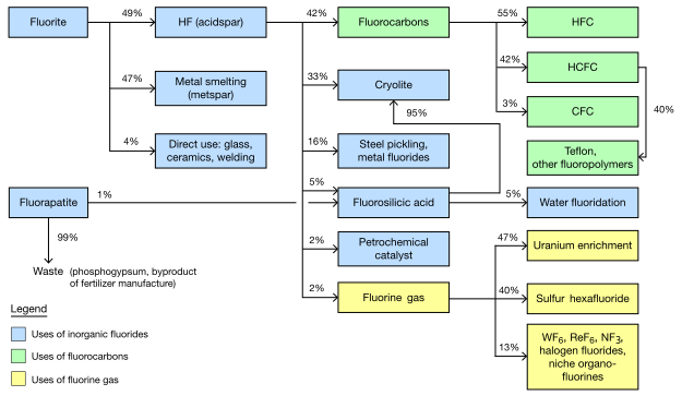
- Reason
- EV (supports major section in notable article headed to FAC). Illustrative value (helpful reference for discussion that would otherwise be confusing in terms of intermediates). Innovation (common in outside world, but I don't see industries shown this way in Wiki much). Collaboration/development (working with graphic helped write content and visa versa: pushed the quality of each as mistakes were found/fixed by the interaction).
- Articles in which this image appears
- Fluorine
- FP category for this image
- Wikipedia:Featured pictures/Diagrams, drawings, and maps/Diagrams
- Creator
- Fallschirmjäger
- Support as nominator -- TCO ( Reviews needed) 03:38, 2 January 2012 (UTC)
- Support with a possible amendment. Really nice summary of an important area of technology that is largely hidden from sight. Suggestion: the scheme defines "major uses" in kilograms, which is not the same as impact. It may be useful to remind readers that 25%? (TCO would know) of all pharmaceuticals contain F (and a lot of herbicides now too). I think that these compounds are made (via reagents) from HF, but the amounts in kg are probably tiny (even though some people seem to consume a lot of Prozac). One of our experts on pharmaceuticals is User:Edgar181. Also the scheme should have a year for which these data apply (2012, I guess). -- Smokefoot ( talk) 04:34, 2 January 2012 (UTC)
- Done. Added year (2003) and volume clarification. I prefer to keep the pharma out of this one diagram since they are small in F volume and since, we treat them in a different section ("Biological aspects"). The diagram is like a header for a section (and drugs are in a different section). I will research that and improve pharma part too, though. P.s. I did follow up with Edgar (thanks)! P.s.s. SF4 is the agent for most pharma fluorinations (gentler fluorinator).
TCO (
Reviews needed) 04:56, 2 January 2012 (UTC)
- Comment Why isn't there a percentage on HCFC to Teflon, ...? JJ Harrison ( talk) 06:07, 2 January 2012 (UTC)
- Done.Added number and new ref.
TCO (
Reviews needed) 14:23, 2 January 2012 (UTC)
- Support While it isn't the most technical diagram, its simplicity and place in the article is invaluable to helping the reader visualize clearly what is being explained in the text. Fallschirmjäger ✉ 11:47, 2 January 2012 (UTC)
- One more thing - I could not divine the meaning of the arrow going down to "waste". The point being that only 1% of the F content of fluoroapatite is discarded? As what? Or is it left in the H3PO4 stream? -- Smokefoot ( talk) 13:57, 2 January 2012 (UTC)
- Done. Added note to help explain this (agree with crit). P.s. It goes into phosphogypsum, but that product is too hazardous (not from F, but other nasties) to use in any gypsum uses so it is a total waste.
TCO (
Reviews needed) 14:23, 2 January 2012 (UTC)
- Comment: Could the default size be a little larger? Perhaps as large as it is here? Also, why "Fluorine Gas" and "Sulfur Hexafluoride"? Also, I'm concerned about the use of an image for what could perhaps using wikimarkup- that's an
accessibility issue, and something about which comments are often made at the likes of FAC and GAC. (The same thing's true with tables, family trees and so on. If there's markup for it, then an image shouldn't be used, ideally.)
J Milburn (
talk) 15:25, 2 January 2012 (UTC)
- Capitalization and default size Done.
TCO (
Reviews needed) 15:41, 2 January 2012 (UTC)
- I do not support changing this to a table. You lose a lot of process flow insight. Also, this is not shown as a table in main reference (they use a similar arrow style diagram in the journal published article, although ours is much better laid out, really it is). Likelihood of changes or updates is very low (have to redo the whole thing really) and I don't want people editing the table values. In terms of access, the colors are discernabley different in black and white mode (although yellow-blue color blindness?) For totally blind people, I could "alt in" a table (I would not want to degrade the experience for sighted viewers so that would be the workaround), but really, I wonder about their reading experience with tables anyhow, since you can't scan by eye, but have to hear it all. (And, dim memory, I think I recall hearing that they hate tables because they hear a lot of syntax notes for all the formatting.) And they are missing details of photographic images also. And there is a fair amount of discussion in text related to the graphic (so they get the gist). That said, there is one blind reader, Johnbod and we could ask him if you want. I really think this is good though. I mean we could cut the whole thing...but then you are really just taking away from the sighted because the blind can't appreciate it.
TCO (
Reviews needed) 15:41, 2 January 2012 (UTC)
- I wouldn't want to change it to a table- I like the current formatting, I was just wondering if flow-charts could be achieved in wikimarkup. I'm not actually sure if they can, now I think about it... If they can't, then I'd be happy to support, provided this is accurate. J Milburn ( talk) 16:07, 2 January 2012 (UTC)
- Capitalization and default size
- Comment: Could we shoehorn the caption (date of sources) into the image. Too often image reusers fail to note these details, leading to badly outdated charts with no way to notice that they aren't current.
Rmhermen (
talk) 23:36, 2 January 2012 (UTC)
- Done.
- Comment: I've added a version with an imagemap and clickable links under the original file.
Fallschirmjäger
✉ 22:13, 3 January 2012 (UTC)
- For what it is worth, for the voters, there was thought put into each link (what the best article or section to send someone to). I don't know if it makes a difference in terms of original/new voting and all that, but the revised version is going into article! It's your only choice. ;) And the imagemap info is going into the commons version (another language would have to change the wikilinks, but at least we give them the coordinates. TCO ( Reviews needed) 22:51, 3 January 2012 (UTC)
- Comment Another minor nitpick - not all of the lines on the box borders are of the same width at the thumbnail size. JJ Harrison ( talk) 20:53, 7 January 2012 (UTC)
- Comment The italic text is difficult to read in the article. I would suggest either increasing the font size or increasing the image size. Kaldari ( talk) 06:19, 8 January 2012 (UTC)
- We'll fix. I'll tighten prose to help the process! TCO ( Reviews needed) 19:41, 8 January 2012 (UTC)
- Fixed. Fallschirmjäger ✉ 17:32, 9 January 2012 (UTC)
- Support I'm happy. This is a good example as to why we prefer svg for this sort of stuff. JJ Harrison ( talk) 23:15, 8 January 2012 (UTC)
- Support. J Milburn ( talk) 23:58, 9 January 2012 (UTC)
- Oppose basically with the all reasonings I had with the Manhattan Project clickable site map nomination. Are we voting for (1) just the diagram, (2) the super-dooper look-at-what-I-can-do image mapping, or (3) both as a single, functional entity? The nomination statement really should be clear about that. Whichever one it is, I'm not sure any are suitable for FP.
- (1) The file is very basic, even though it may be entirely accurate and encyclopedic.
- (2) There's nothing about image mapping that (to borrow wording from FAC/FLC) "exemplifies our very best work". TCO, you replied to me in the Manhattan Project nom that captions are a part of the WP:FP? even though they're not a part of the actual file. And yes, the code for mapping is also written into the article, but captions are a part of the criteria, and mapping isn't. Second, captions are supposed to be descriptive, and informative. That takes a bit of thought, but it's simple to produce an image map (I've done tons for Wikiproject Skyscrapers), especially with the Toolserver app. No special knowledge is needed; it's just a matter of clicking and selecting the correct coordinates, and when those coordinates are for oblongs it's an even easier process. Anyway, since an image map isn't a caption, the mapping has nothing to do with FPC.
- (3) If we're supposed to review it as a functional entity, because of (2) I'm finding it difficult to do that. Also, the clickable links point to articles that are already Wikilinked within the article's prose, so where's the additional EV that the mapping gives the file?
- Definitely we should be looking into using interactive images at Wikipedia, but at the Featured picture level at least, adding text to the article to achieve that isn't the way to go. Additionally, this particular type of mapping is a bit archaic now. Our blind users and their screenreaders come to a screeching halt when they hit the coding. There are newer ways of doing it where this doesn't happen and the folk at WT:ACCESS have more details on them, and it's those ways that, if we ever did include them as part of the FP?, should be highlighted instead. As J Milburn said at the Manhattan Project nom, the coding used here is not appropriate subject matter for FPC. Matthewedwards : Chat 19:03, 10 January 2012 (UTC)
- I'm fine with the oppose. Not trying to sway you. But the links were added as an extra. I think the graphic was featurable before. It contains a huge amount of information and a thoughtful layout of it. And we tried to make it look clean with the lines and all. It's better than similar published diagrams in the line organization. I think of it as providing a lot of function and reference for text that would be "hard" without a graphic to refer to. Kind of different from a pretty picture illustration. But no biggie. I want to try things that are new to help Wiki (haven't seen anything like this in other industry or chemicals articles. TCO ( Reviews needed) 19:11, 10 January 2012 (UTC)
- Belated Oppose Missed the "deadline", but I thought I'd chime in anyway. I partly agree with Matthewedwards. This diagram isn't really our best work. It's pretty bare bones, not at all compelling, and frankly, it's not even particularly clear. It doesn't add much value to the article. There's an unexplained dashed line, and the arrows as a whole aren't really explained. Finally, this just doesn't compare to our current FP diagrams. Makeemlighter ( talk) 15:51, 11 January 2012 (UTC)
- I appreciate what has been said about about the image not being compelling and is basic but it isn't designed to be pretty, that's what Commons FP is for, should be based on it's EV. Fallschirmjäger ✉ 21:02, 11 January 2012 (UTC)
- What's presented in the image is pure text. From a quick read of the article where the image is placed, it doesn't appear that it's really discussed in depth. From a WP:ACCESS perspective, for anyone who is blind or has images turned off this is a real problem because the encyclopedic information isn't available in any other form. It's not like this is a picture of a bird or a building or a piece of fruit where an ACCESS reader can "get by" without it, because the articles about those things should discuss their appearance. Matthewedwards : Chat 21:18, 12 January 2012 (UTC)
- (Still not trying to change your vote). Whole Industry section (and three subsections) is an arrangement of about 15 paragraphs expanding on each box and in a logical order. The amounts are shown, the conversion paths are shown. The relative importance (highes percent higher in drawing) is shown. Yeah...it doesn't have bells or whistles, but emphasis is on structure and on researched content. I did like the upgrades the reviewers made us do (notes, links, some nits, etc.) TCO ( Reviews needed) 02:54, 13 January 2012 (UTC)
- On the dashed line, would you prefer a little arc to show it jumping over the other line?
TCO (
Reviews needed) 16:04, 11 January 2012 (UTC)
- Not sure of the best way to display it. Maybe just note it on the diagram.
Makeemlighter (
talk) 17:17, 11 January 2012 (UTC)
- I will ask for a line break back (how it was originally). That or an arc "jumping" is the norm and pretty intuitive. The dashed line is non-standard in a process flow diagram. Words is way too clunky. See here for an example: (look to bottom right where the two liquids cross).
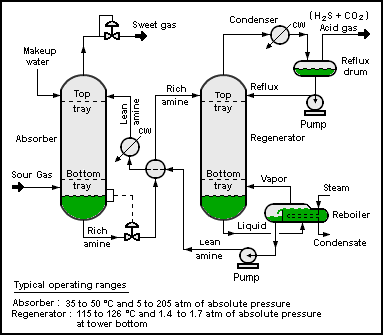 TCO (
Reviews needed) 18:09, 11 January 2012 (UTC)
TCO (
Reviews needed) 18:09, 11 January 2012 (UTC)
- I will ask for a line break back (how it was originally). That or an arc "jumping" is the norm and pretty intuitive. The dashed line is non-standard in a process flow diagram. Words is way too clunky. See here for an example: (look to bottom right where the two liquids cross).
- Not sure of the best way to display it. Maybe just note it on the diagram.
Makeemlighter (
talk) 17:17, 11 January 2012 (UTC)

![[1]](http://shmuelson.files.wordpress.com/2010/01/christpantocratorsinaitp71.jpg)
![[2]](https://commons.wikimedia.org/wiki/Commons:Featured_picture_candidates/File:Kopfloser_B%C3%B6hringer.JPG)
_wb_edit.jpg)
.jpg)
Promoted File:The fluorine economy.svg -- Papa Lima Whiskey 2 ( talk) 11:28, 13 January 2012 (UTC)
- 5 supports, one timely and one late oppose Papa Lima Whiskey 2 ( talk) 11:28, 13 January 2012 (UTC)
King Richard III
Voting period is over. Please don't add any new votes. Voting period ends on 13 Jan 2012 at 11:34:23 (UTC)

- Reason
- High quality, large image, high EV, and very engaging to the subject of Richard III.
- Articles in which this image appears
- 15th century; Cultural depictions of Richard III of England; House of York; List of English monarchs; Wars of the Roses; Yorkshire.
- FP category for this image
- Wikipedia:Featured pictures/People/Royalty
- Creator
- Dcoetzee
- Support as nominator -- TrebleSeven ( talk) 11:34, 4 January 2012 (UTC)
- Question - Should it be this dark?
P. S. Burton (
talk) 11:49, 4 January 2012 (UTC)
- Yes, that's just how it's been painted. TrebleSeven ( talk) 11:53, 4 January 2012 (UTC)
- Comment: The image page calls this a late 15th century picture, yet the article leads with a 1520 image, which is calls the earliest known.
J Milburn (
talk) 12:58, 4 January 2012 (UTC)
- I checked the source for the statement, it says late 16th century, and so does Cultural_depictions_of_Richard_III_of_England, so fixed that. Dcoetzee 13:33, 4 January 2012 (UTC)
- Comment. The other image shown in article was painted from a painting that was an actual portrait (thus closer to a real depiction). This one looks very artistic, but is not in itself a famous work (enough to ahve an article) nor is it the best illustration of the subject. That said, hugely notable subject... TCO ( Reviews needed) 02:22, 5 January 2012 (UTC)
- Comment: It does strike me as rather odd that this picture does not feature on the Richard III article itself. Surely if this portrait were to be promoted, it should also go in the article of the person it is illustrating? Centy – reply • contribs – 23:37, 10 January 2012 (UTC)
- No-one's going to vote for this, are they? TrebleSeven ( talk) 15:32, 12 January 2012 (UTC)
Not Promoted -- Papa Lima Whiskey 2 ( talk) 11:41, 13 January 2012 (UTC)
- Not enough positive interest at this time. Papa Lima Whiskey 2 ( talk) 11:41, 13 January 2012 (UTC)
Ruffe
Voting period is over. Please don't add any new votes. Voting period ends on 14 Jan 2012 at 01:42:43 (UTC)

- Reason
- Understated, but still an excellent picture. Technically very strong, especially for an underwater photograph. This, I believe, would only be our second freshwater fish; the image is far stronger than the other, which was promoted over six years ago.
- Articles in which this image appears
- Ruffe
- FP category for this image
- Wikipedia:Featured pictures/Animals/Fish
- Creator
- Tiit Hunt
- Support as nominator -- J Milburn ( talk) 01:42, 5 January 2012 (UTC)
- Comment Looks very good at full size, but not as much so when smaller (background to fish common color). Wish we had a good similar picture of a trout or the like, but I could not find one. TCO ( Reviews needed) 02:24, 5 January 2012 (UTC)
- Comment. The image page says this isn't used in any articles, but it is in the ruffe article. Having said which it, it only went in there on Jan 5 which isn't our 'rule of thumb' seven days. FWIW it was added with this edit, where the file name used is File:Kiisk.jpg. But when you click the image, this one loads. This is weird. -- jjron ( talk) 08:26, 7 January 2012 (UTC)
- Support Must be seen at full size to appreciate how high quality it is. Clegs ( talk) 05:59, 8 January 2012 (UTC)
- Support per Clegs. Papa Lima Whiskey 2 ( talk) 15:41, 8 January 2012 (UTC)
- Comment Isn't this a bit underexposed as is? JJ Harrison ( talk) 21:44, 9 January 2012 (UTC)
- Support Looks fine to me, although admittedly better at full resolution. Crisco 1492 ( talk) 03:05, 11 January 2012 (UTC)
- Support I'd still like to see a brightened up edit though I think. JJ Harrison ( talk) 00:19, 12 January 2012 (UTC)
- Weak Support Excellent picture, but the caption needs some improvement. Dusty777 ( talk) 15:10, 12 January 2012 (UTC)
Promoted File:Gymnocephalus cernuus Pärnu River Estonia 2010-01-06.jpg -- Makeemlighter ( talk) 01:10, 14 January 2012 (UTC)
Wanderer above the Sea of Fog
Voting period is over. Please don't add any new votes. Voting period ends on 15 Jan 2012 at 19:49:28 (UTC)

- Reason
- This painting was not promoted in 2006 due to some technical problems. Since then, those problems have been fixed. From what I have seen while looking over some art history things, the colors are now true to the original painting. This is one of the great paintings of the romantic era and it the painter's most famous work. (He is an FA.)
- Articles in which this image appears
- Wanderer above the Sea of Fog, Romanticism, Caspar David Friedrich, German art
- FP category for this image
- Wikipedia:Featured pictures/Artwork/Paintings
- Creator
- Caspar David Friedrich uploaded by Commons:User:Cybershot800i
- Support as nominator -- Guerillero | My Talk 19:49, 6 January 2012 (UTC)
-
TCO (
Reviews needed) 02:26, 7 January 2012 (UTC)
- Comment. I'm not particularly happy about having the source listed as "Unknown". Technically this may be out of copyright, but I'd be happier if we had some idea who did the reproduction, especially if it's actually from the
Kunsthalle Hamburg. Would also give a bit more confidence that the colours are right this time. --
jjron (
talk) 08:16, 7 January 2012 (UTC)
- The painting is 100% out of copyright worldwide. Even if you use the strictest copyright I know of (100 PMA), the copyright would have expired in 1940. I asked the uploader if they did the scan. I hope they get back to me. --
Guerillero |
My Talk 08:32, 7 January 2012 (UTC)
- Yes, I realise the painting itself is out of copyright, but the reproduction could be copyrighted, e.g., by the photographer. I'm not sure on the technicalities of that, or whether it varies from country to country. J Milburn may be able to advise. Regardless, knowing the source is good. --
jjron (
talk) 12:20, 7 January 2012 (UTC)
- Wikimedia doesn't follow that convention, if the original 2D art is out of copyright, any faithful reproduction of, according to US law, can't be copyrighted. Wikimedia follows this law, and does NOT accept copyright claims, like in the UK, where they grant copyright to the digitizer. There is PLENTY of examples around to testify to this wiki-wide policy, see
National Portrait Gallery and Wikimedia Foundation copyright dispute and all the relevant pages at Commons for this event. So to put it simply, if the painting is out of copyright, as the case here, then this image is 100% public domain as far as wikipedia and wikimedia is concerned. —
raeky
t 13:31, 7 January 2012 (UTC)
- Exactly. A difference between US and British copyright laws which has lead to issues in the past; however, policy is indeed that this is PD. Crisco 1492 ( talk) 14:52, 7 January 2012 (UTC)
- Wikimedia doesn't follow that convention, if the original 2D art is out of copyright, any faithful reproduction of, according to US law, can't be copyrighted. Wikimedia follows this law, and does NOT accept copyright claims, like in the UK, where they grant copyright to the digitizer. There is PLENTY of examples around to testify to this wiki-wide policy, see
National Portrait Gallery and Wikimedia Foundation copyright dispute and all the relevant pages at Commons for this event. So to put it simply, if the painting is out of copyright, as the case here, then this image is 100% public domain as far as wikipedia and wikimedia is concerned. —
raeky
t 13:31, 7 January 2012 (UTC)
- Yes, I realise the painting itself is out of copyright, but the reproduction could be copyrighted, e.g., by the photographer. I'm not sure on the technicalities of that, or whether it varies from country to country. J Milburn may be able to advise. Regardless, knowing the source is good. --
jjron (
talk) 12:20, 7 January 2012 (UTC)
- The painting is 100% out of copyright worldwide. Even if you use the strictest copyright I know of (100 PMA), the copyright would have expired in 1940. I asked the uploader if they did the scan. I hope they get back to me. --
Guerillero |
My Talk 08:32, 7 January 2012 (UTC)
- Comment: This image most certainly is PD, as far as the Wikimedia Foundation is concerned, but having completely unknown sourcing is not a good thing. I would support as soon as the sourcing issue was resolved.
J Milburn (
talk) 15:13, 8 January 2012 (UTC)
- FWIW, TinEye didn't help find the original source.
JJ Harrison (
talk) 00:18, 12 January 2012 (UTC)
- Done per this diff, the uploader made the reproduction of the painting. -- Guerillero | My Talk 00:55, 12 January 2012 (UTC)
- FWIW, TinEye didn't help find the original source.
JJ Harrison (
talk) 00:18, 12 January 2012 (UTC)
- Support. Good reproduction. Spikebrennan ( talk) 15:06, 11 January 2012 (UTC)
- Support per nom. Crisco 1492 ( talk) 15:40, 12 January 2012 (UTC)
- Support as above. J Milburn ( talk) 17:59, 12 January 2012 (UTC)
- Support per nom. Concerns raised seem to have been dealt with. Colours appear to be right this time. -- jjron ( talk) 16:43, 13 January 2012 (UTC)
- Support high EV. -- Elekhh ( talk) 09:19, 14 January 2012 (UTC)
Promoted File:Caspar David Friedrich 032.jpg -- Makeemlighter ( talk) 22:17, 15 January 2012 (UTC)
Fisherman and his catch in Seychelles
Voting period is over. Please don't add any new votes. Voting period ends on 16 Jan 2012 at 10:58:43 (UTC)

- Reason
- High resolution, valuable illustration of a non-stereotypical fisherman, public domain, an appropriate visual accompaniment to the article Fisherman, no inappropriate manipulation.
Personally I find this image beautifully composed and of sufficient technical quality. Possible gripes could be its boosted saturation or obvious dodging near the legs. I believe that the cultural and historical significance (caught by hand lines) of this image should outweigh these blemishes, which might be easily corrected in Photoshop. Other opinions?
I'm new to this, please point out any technical mistakes in this post :)
- Articles in which this image appears
- Artisan fishing, Fisherman
- FP category for this image
- Wikipedia:Featured_pictures/Culture,_entertainment,_and_lifestyle/Culture_and_lifestyle
- Creator
- Photography by Dino Sassi - Marcel Fayon, Photo Eden LTD; upload by Botev
- Support as nominator -- Memtgs ( talk) 10:58, 7 January 2012 (UTC)
- Oppose -- Noisy, bad quality, not really for an FP. TrebleSeven ( talk) 11:05, 7 January 2012 (UTC)
- Oppose Want to see the fellow's face. TCO ( Reviews needed) 14:27, 7 January 2012 (UTC)
- Regretful Oppose Could be very good if re-shot. As it is, the image was overexposed originally, and Photoshop can't correct more than small mistakes without major quality loss. Very interesting subject, but the lighting/color is too poor. Clegs ( talk) 06:02, 8 January 2012 (UTC)
- Oppose as per above Hariya1234 ( talk) 04:27, 9 January 2012 (UTC)
Not Promoted -- Makeemlighter ( talk) 06:25, 16 January 2012 (UTC)
Mutiny on the Bounty
Voting period is over. Please don't add any new votes. Voting period ends on 16 Jan 2012 at 15:19:52 (UTC)

- Reason
- Well, after the previous successful film poster nomination I decided to look for high quality, inarguably PD movie posters (i.e. American posters from before 1977 with no copyright notice). I've found several, which I will be nominating here. This beauty is from the 1962 film Mutiny on the Bounty, starring Marlon Brando, Richard Harris, and Trevor Howard.
- Articles in which this image appears
- Mutiny on the Bounty (1962 film)
- FP category for this image
- Wikipedia:Featured pictures/Culture, entertainment, and lifestyle/Entertainment
- Creator
- Employee(s) of Metro-Goldwyn-Mayer; restored by PawełMM
- Support as nominator -- Crisco 1492 ( talk) 15:19, 7 January 2012 (UTC)
- Oppose (composition). Not meant to be malicious. I totally support you grabbing film posters...is a big boon to Wiki. And I want people to have lots of stars. I don't begrudge that and appreciate the work to go after them. Just being critical, sorry. That poster is not as useful an illustration because of the very detailed crowd scene at the bottom (I'm not crazy about a two-panel view itself either, but especially the small faces in crowd). In comparison, the previous awarded poster was simpler and clearer. The non-free cover art from the Nordhoff book (see article) is also very well composed. That little boat...being sent away from the big ship. What an image and one that makes us feel the story. TCO ( Reviews needed) 15:40, 7 January 2012 (UTC)
- The EV is not for the story itself, but for the film. The only way you could have higher EV for the film is to have the film itself. An original poster is good enough EV for the film it represents. As for its design, that is their creative choice (like the below nomination). As an aside, I was actually considering this poster for another film as well, but I'd only be able to give it a weak support due to its size; it has a much simpler composition. Crisco 1492 ( talk) 15:48, 7 January 2012 (UTC)
- It is an illo crit more than an EV one. It may not be possible to have an FP for every film if the only artworks produced were poor compositionally. Given this is not a famous artwork on its own, I rate it by how well it illos the film. If one of us had made that poster, I would have the same crits about composition.
TCO (
Reviews needed) 15:53, 7 January 2012 (UTC)
- When it comes to faithful reproductions of movie posters, paintings, or any 2D artwork, as for a FP candidate you shouldn't judge the quality of the painting/poster as much as the restoration/scan of the artwork. If the movie is notable enough to have an article than the poster that promoted that movie, even a poorly done poster, has about the maximum amount of EV possible for the article. For the high technical standards part of the criteria that is where you judge the restoration/scan quality NOT the original artworks quality. This is again one of those exceptions to our normal rules. —
raeky
t 09:55, 8 January 2012 (UTC)
- I second raeky's view. Papa Lima Whiskey 2 ( talk) 14:28, 8 January 2012 (UTC)
- When it comes to faithful reproductions of movie posters, paintings, or any 2D artwork, as for a FP candidate you shouldn't judge the quality of the painting/poster as much as the restoration/scan of the artwork. If the movie is notable enough to have an article than the poster that promoted that movie, even a poorly done poster, has about the maximum amount of EV possible for the article. For the high technical standards part of the criteria that is where you judge the restoration/scan quality NOT the original artworks quality. This is again one of those exceptions to our normal rules. —
raeky
t 09:55, 8 January 2012 (UTC)
- It is an illo crit more than an EV one. It may not be possible to have an FP for every film if the only artworks produced were poor compositionally. Given this is not a famous artwork on its own, I rate it by how well it illos the film. If one of us had made that poster, I would have the same crits about composition.
TCO (
Reviews needed) 15:53, 7 January 2012 (UTC)
- Oppose jpg artifacting around the black text/ Clegs ( talk) 06:04, 8 January 2012 (UTC)
- Oppose (per Clegs, not TCO). Great to see high resolution PD movie posters on wikipedia. This one have a bit to much jpg artefacts though for me to support. P. S. Burton ( talk) 16:42, 8 January 2012 (UTC)
Not Promoted -- Makeemlighter ( talk) 18:19, 16 January 2012 (UTC)
Billy Rose's Jumbo (1962)
Voting period is over. Please don't add any new votes. Voting period ends on 16 Jan 2012 at 15:42:10 (UTC)

- Reason
- Well, after the previous successful film poster nomination I decided to look for high quality, inarguably PD movie posters (i.e. American posters from before 1977 with no copyright notice). I've found several, which I will be nominating here. This one is admittedly my favourite due to its somewhat cartoonish design. It is for the 1962 film Billy Rose's Jumbo, starring Jimmy Durante, Doris Day, Martha Raye, and Stephen Boyd.
- Articles in which this image appears
- Billy Rose's Jumbo (film)
- FP category for this image
- Wikipedia:Featured pictures/Culture, entertainment, and lifestyle/Entertainment
- Creator
- Employee(s) of Metro-Goldwyn-Mayer; restored by PawełMM
- Support as nominator -- Crisco 1492 ( talk) 15:42, 7 January 2012 (UTC)
- Neutral Don't know how to express my rationale, but feels in between the last two if I imagine someone looking at our FPs. TCO ( Reviews needed) 15:50, 7 January 2012 (UTC)
- Weak Support I feel a movie poster should be far larger than this, but the scan appears clean and this is extremely relevant for the article of the film. — raeky t 09:51, 8 January 2012 (UTC)
- Question. Why's the paper so grey? (Same thing applies to the Bounty one two down the page). -- jjron ( talk) 11:03, 8 January 2012 (UTC)
- Could be fading, because that's the colour it was at the source. A white balance adjustment necessary, you think? Crisco 1492 ( talk) 17:19, 8 January 2012 (UTC)
- I'd upload a colour-balance edit, but right now my main internet connection is acting up and the one I'm on compresses the ever loving **** out of files... I just downloaded the file and it came out at 700kb... Crisco 1492 ( talk) 17:24, 8 January 2012 (UTC)
- Keep in mind not all paper is white.... it's possible this is a more accurate color than if you balanced it to make the paper white white... —
raeky
t 23:08, 8 January 2012 (UTC)
- True, true. I wouldn't know what the original looked like though: this movie came out before my mother was born. Crisco 1492 ( talk) 23:17, 8 January 2012 (UTC)
- FWIW the DVD cover is pure-white... Not to say that this is indicative of the original movie poster - just something I thought I'd note! Nik the stoned 15:38, 9 January 2012 (UTC)
- not even related, modern paper is mostly white, but paper from that time, specifically probably cheaper paper used on movie posters at that time, could be far more off-white. Highly white paper at that time I suspect was a lot more expensive than it is now. I would say without better evidence the scan may be more closer to actual color of the original and should be trusted over attempting to try to "fix" it without any knowledge of what the original looks like. — raeky t 17:57, 9 January 2012 (UTC)
- Keep in mind not all paper is white.... it's possible this is a more accurate color than if you balanced it to make the paper white white... —
raeky
t 23:08, 8 January 2012 (UTC)
Not Promoted -- Makeemlighter ( talk) 18:20, 16 January 2012 (UTC)
Mutiny on the Bounty (1935)
Voting period is over. Please don't add any new votes. Voting period ends on 16 Jan 2012 at 15:35:22 (UTC)
.jpg)
- Reason
- Well, after the previous successful film poster nomination I decided to look for high quality, inarguably PD movie posters (i.e. American posters from before 1977 with no copyright notice). I've found several, which I will be nominating here. This gorgeously coloured advertorial poster is for the 1935 film Mutiny on the Bounty, starring Charles Laughton and Clark Gable.
- Articles in which this image appears
- Mutiny on the Bounty (1935 film)
- FP category for this image
- Wikipedia:Featured pictures/Culture, entertainment, and lifestyle/Entertainment
- Creator
- Employee(s) of Metro-Goldwyn-Mayer; restored by PawełMM
- Support as nominator -- Crisco 1492 ( talk) 15:35, 7 January 2012 (UTC)
- Support I like it better for some reason. TCO ( Reviews needed) 15:43, 7 January 2012 (UTC)
- Oppose - The "fixing" of the tears in the original has left some distracting blend lines at the top of the image (above the green-guy hanging out in the rigging)... Additionally, there appear to be some heavy JPG artifacts around the "Amazing Facts" box in the bottom right (which are not present in this cut-down scan). Lastly, the image should be straightened and the black border should be removed. Nik the stoned 15:51, 9 January 2012 (UTC)
- Oppose as is per Nikthestoned. JJ Harrison ( talk) 00:17, 12 January 2012 (UTC)
- Oppose Really bad jpeg artifacting throughout. Clegs ( talk) 10:11, 13 January 2012 (UTC)
Not Promoted -- Makeemlighter ( talk) 18:20, 16 January 2012 (UTC)
Northern Carmine Bee-eater
Voting period is over. Please don't add any new votes. Voting period ends on 17 Jan 2012 at 21:39:48 (UTC)

- Reason
- Strong ev, striking photo
- Articles in which this image appears
- Northern Carmine Bee-eater
- FP category for this image
- Wikipedia:Featured pictures/Animals/Birds
- Creator
- Lviatour
- Support as nominator -- Tomer T ( talk) 21:39, 8 January 2012 (UTC)
- Weak Support Tail OOF and slight visible grains, probably due to processing Hariya1234 ( talk) 04:25, 9 January 2012 (UTC)
- Support It's in focus where it really counts. Surprisingly good quality going through a 2x TC... -- Fir0002 11:59, 9 January 2012 (UTC)
- Comment What are those distracting green spots (not sure how you call this)? ♫GoP♫ T C N 15:01, 9 January 2012 (UTC)
- Support An attractive picture which meets the criteria. I don't think the foliage distracts too much. JJ Harrison ( talk) 10:40, 10 January 2012 (UTC)
- Oppose (regretful) It's a beautiful picture. The composition, the colors, its all very impressive. The log (or branch, or whatever it is) and the foliage is badly out of focus. That destroys the whole left side of the picture because it is too distracting. Dusty777 ( talk) 16:40, 11 January 2012 (UTC)
- Comment Some left crop to get rid of one green spot would help a bit.
Brandmeister
t 15:00, 12 January 2012 (UTC)
- Why did you downsample and compress the picture?
O.J. (
talk) 12:04, 13 January 2012 (UTC)
- Fixed, it occurred unintentionally. Brandmeister t 19:09, 13 January 2012 (UTC)
- Why did you downsample and compress the picture?
O.J. (
talk) 12:04, 13 January 2012 (UTC)
- Support crop. Looks good to me. Kaldari ( talk) 08:46, 14 January 2012 (UTC)
- Regretful Oppose per Dusty; gorgeous picture, but distracting focus: at my first glance, I always think it's a really bad job of selective blurring from Picnik. Clegs ( talk) 11:06, 14 January 2012 (UTC)
- Oppose The painted concrete where the birds are roosting and the mealworm, which does not form part of the bird's standard diet detract from the EV. Lycaon ( talk) 12:43, 16 January 2012 (UTC)
- Support crop Brandmeister t 16:47, 16 January 2012 (UTC)
Not Promoted -- Makeemlighter ( talk) 22:15, 17 January 2012 (UTC)
Fairy Tern
Voting period ends on 20 Jan 2012 at 06:57:09 (UTC)

- Reason
- This is the only image on Wikimedia Commons of this species. The photo was taken hand held in waist-deep salt water as it was the only way I could approach with the sun on the right side. Fairy Terns are classified as Vulnerable in most states of Australia. For those familiar they are about half the size of a Crested Tern.
- Articles in which this image appears
- Fairy Tern
- FP category for this image
- Wikipedia:Featured pictures/Animals/Birds
- Creator
- User:JJ Harrison
- Support as nominator -- JJ Harrison ( talk) 06:57, 10 January 2012 (UTC)
- Conditional support - can you confirm that its eye is meant to be entirely black? Almost looks like a red-eye fix...? --
Fir0002 09:51, 10 January 2012 (UTC)
- I can, it is that way in my field guides and other online photos too and I haven't done anything post processing wise to it. I remember having to take lots of shots so I could get one with the head tilted up enough to get a decent catch light - the eye was very indistinct without it. Crested Tern, Caspian Tern etc have the same issues with black eyes in breeding plumage. JJ Harrison ( talk) 10:36, 10 January 2012 (UTC)
- Support -- George Chernilevsky talk 19:33, 10 January 2012 (UTC)
- Support -- Good for an April Fools pic: Fairy Terns have a dramatic increase in the rate of black eyes during breeding season.
Crisco 1492 (
talk) 02:59, 11 January 2012 (UTC)
- The eyes are always black, but surrounded by black plumage when in breeding plumage - making the eye not stand out so much.
JJ Harrison (
talk) 01:13, 12 January 2012 (UTC)
- Ah, gotcha. Still a support. Crisco 1492 ( talk) 02:59, 12 January 2012 (UTC)
- The eyes are always black, but surrounded by black plumage when in breeding plumage - making the eye not stand out so much.
JJ Harrison (
talk) 01:13, 12 January 2012 (UTC)
- Support beautiful image -- Guerillero | My Talk 01:03, 12 January 2012 (UTC)
- Support well captured. -- Elekhh ( talk) 01:07, 12 January 2012 (UTC)
- Support excellent shot. Clegs ( talk) 10:14, 13 January 2012 (UTC)
- Support -- Brackenheim ( talk) 16:50, 19 January 2012 (UTC)
Promoted File:Sterna nereis - Little Swanport.jpg -- Makeemlighter ( talk) 04:27, 20 January 2012 (UTC)
Hooded Plover
Voting period ends on 20 Jan 2012 at 07:00:49 (UTC)

- Reason
- High quality, good depth of field with great background isolation, geocoded and generally meets criteria.
- Articles in which this image appears
- Hooded Plover
- FP category for this image
- Wikipedia:Featured pictures/Animals/Birds
- Creator
- JJ Harrison
- Support as nominator -- JJ Harrison ( talk) 07:00, 10 January 2012 (UTC)
- Support Per nom -- Fir0002 09:49, 10 January 2012 (UTC)
- Support per nom. Ground seems to have remarkably shallow DOF - is that legit? --
jjron (
talk) 13:57, 10 January 2012 (UTC)
- Yeah, I was just lying with my face in the sand. The bottom of the lens was probably an inch from the ground. JJ Harrison ( talk) 21:47, 10 January 2012 (UTC)
- Support -- George Chernilevsky talk 19:32, 10 January 2012 (UTC)
- Support -- Beautiful. Crisco 1492 ( talk) 02:57, 11 January 2012 (UTC)
- Support - like the eye level shot -- Cj.samson ( talk) 10:59, 11 January 2012 (UTC)
- Support Very impressive. Dusty777 ( talk) 16:34, 11 January 2012 (UTC)
- Comment very nice, but I still like the
current one with the "salad" better. --
Elekhh (
talk) 01:06, 12 January 2012 (UTC)
- Not far off salad - it is sea lettuce after all. I decided to nominate this one since I managed to get closer and there is a significant resolution increase. JJ Harrison ( talk) 01:15, 12 January 2012 (UTC)
- Support Although I would favor a tighter crop. Kaldari ( talk) 05:14, 12 January 2012 (UTC)
- Support Excellent shot; please, don't crop any closer. Clegs ( talk) 10:15, 13 January 2012 (UTC)
- Support -- Brackenheim ( talk) 16:48, 19 January 2012 (UTC)
Promoted File:Thinornis rubricollis - Orford.jpg -- Makeemlighter ( talk) 04:29, 20 January 2012 (UTC)
Official portrait of Pres. Barack Obama
Voting period ends on 20 Jan 2012 at 08:10:33 (UTC)
- Reason
- Photo has high encyclopedic value, is currently the lead image in high profile articles President of the United States and Barack Obama, and is a clear large image. This photo's nomination for Featured Picture is NOT about Barack Obama's performance as president. This nomination is about the encyclopedic value and quality of the photo.
- Articles in which this image appears
- President of the United States, Barack Obama, Time Person of the Year, and others
- FP category for this image
- Wikipedia:Featured pictures/People/Political
- Creator
- Pete Souza
- Support as nominator -- Pine talk 08:10, 10 January 2012 (UTC)
- Oppose while the current FP of Obama still stands; this offers little that the other does not. I would potentially be open to a delist/replace nom, seeing as this one has pride of place, while the other does not. J Milburn ( talk) 11:25, 10 January 2012 (UTC)
- Info Previous failed noms 1, 2 and 3, and existing FP. Papa Lima Whiskey 2 ( talk) 11:47, 10 January 2012 (UTC)
- Weak oppose: I think I see some JPG compression artifacts on his shirt and whatnot. Crisco 1492 ( talk) 03:07, 11 January 2012 (UTC)
- Oppose I am not fan. Compared to the other FP, there is no emotion or pull in the photo. -- Guerillero | My Talk 17:48, 13 January 2012 (UTC)
- Oppose Technically good, but not a fan of the composition--the whole left side of his body is cut off.
Clegs (
talk) 10:42, 14 January 2012 (UTC)
- Comment This appears to be the standard composition for official Presidential portraits (see G. W. Bush, Clinton, G. H. W. Bush, Reagan). Fallingmasonry ( talk) 07:22, 19 January 2012 (UTC)
Not Promoted -- Makeemlighter ( talk) 04:31, 20 January 2012 (UTC)
Musk Duck
Voting period ends on 20 Jan 2012 at 07:04:53 (UTC)


- Reason
- A good match for the female Musk Duck which passed FPC recently. The male has been much more coy, requiring four attempts.
- Articles in which this image appears
- Musk Duck
- FP category for this image
- Wikipedia:Featured pictures/Animals/Birds
- Creator
- User:JJ Harrison
- Support as nominator -- JJ Harrison ( talk) 07:04, 10 January 2012 (UTC)
Conditionalsupport I would prefer a top crop. Brandmeister t 00:12, 11 January 2012 (UTC)- Comment -- I'd support a bit of a crop; right now there's too much background, not enough bird. Crisco 1492 ( talk) 02:55, 11 January 2012 (UTC)
- Comment While the bill lobe is shown nicely in your capture, I'm a little disappointed that neither of your images (male or female) gives as much plumage detail as the Alt by Mdekool (which has other minor problems, but I feel a good overall production for this species should be possible). Papa Lima Whiskey 2 ( talk) 11:54, 11 January 2012 (UTC)
- Weak support -- Agree with PLW2 that detail is lacking on the feathers (didn't consider it before). Crisco 1492 ( talk) 02:57, 12 January 2012 (UTC)
- Support Alt2 Though I don't mind the others. — Preceding unsigned comment added by Pteronura brasiliensis ( talk • contribs) 00:19, 20 January 2012 (UTC)
Not Promoted -- Makeemlighter ( talk) 10:57, 20 January 2012 (UTC)
St Kilda Town Hall
Voting period ends on 20 Jan 2012 at 15:44:00 (UTC)

- Reason
- Good quality, well composed image of a notable Melbourne building, comparable to many similar FPs. Possibly about as good as composition as it's possible to get in order to include as much of the building as possible, and it give a sense of place in the surrounding gardens.
- Articles in which this image appears
- St Kilda Town Hall; William Pitt (architect); St Kilda, Victoria; Australian non-residential architectural styles; City of Port Phillip; City of St Kilda; Scottish place names in Australia
- FP category for this image
- Wikipedia:Featured pictures/Places/Architecture
- Creator
- jjron
- Support as nominator -- jjron ( talk) 15:44, 10 January 2012 (UTC)
- Support Tree on left is a bit distracting, but not much you can do about it. Otherwise, I see no reason not to support. upstate NYer 05:25, 11 January 2012 (UTC)
- Support Maybe a little oversharpened, but otherwise per UpstateNYer. JJ Harrison ( talk) 00:15, 12 January 2012 (UTC)
- Comment Overall pretty good and and a great addition to many articles. I like having some people around providing a sense of scale and the light is good. On the down side there is some minor red CA all over the image (in particular columns, and building edges), and there is a car in the middle, obscuring the entrance. -- Elekhh ( talk) 00:58, 12 January 2012 (UTC).
- Support Jujutacular talk 16:02, 17 January 2012 (UTC)
- Support per UpstateNYer -- Cj.samson ( talk) 08:21, 19 January 2012 (UTC)
- Support Tomer T ( talk) 12:34, 19 January 2012 (UTC)
- Support per above Pteronura brasiliensis 00:16, 20 January 2012 (UTC)
Promoted File:St Kilda Town Hall, jjron, 23.10.2011.jpg -- Makeemlighter ( talk) 10:59, 20 January 2012 (UTC)
Brian Nankervis
Voting period ends on 20 Jan 2012 at 15:41:03 (UTC)


- Reason
- High quality image of an entertainer actually performing. We have very few such images featured, most are posed portraits. Unlike many studio portraits, this shows some genuine personality. Previously unillustrated article.
- Articles in which this image appears
- Brian Nankervis; RocKwiz
- FP category for this image
- Wikipedia:Featured pictures/People/Entertainment
- Creator
- jjron
- Support as nominator -- jjron ( talk) 15:41, 10 January 2012 (UTC)
- Support original only. The one hand in the crop looks awkward. Jujutacular talk 19:28, 10 January 2012 (UTC)
- Question - is that a Roll of Honour behind him? Would seem like an unfortunate background for a comedian... --
Fir0002 03:54, 11 January 2012 (UTC)
- Hey, look who's back! Good to see you editing again!
upstate
NYer 05:23, 11 January 2012 (UTC)
- Look indeed! Thanks for the welcome - hopefully the return will stick ;) --
Fir0002 12:34, 11 January 2012 (UTC)
- Not sure if it's a Roll of Honour or just a regular Honour board. Not really sure why it's unfortunate though regardless. --
jjron (
talk) 16:08, 12 January 2012 (UTC)
- Yea! Welcome back Fir! Miss those pictures of yourn. Pteronura brasiliensis 21:56, 20 January 2012 (UTC)
- Not sure if it's a Roll of Honour or just a regular Honour board. Not really sure why it's unfortunate though regardless. --
jjron (
talk) 16:08, 12 January 2012 (UTC)
- Look indeed! Thanks for the welcome - hopefully the return will stick ;) --
Fir0002 12:34, 11 January 2012 (UTC)
- Hey, look who's back! Good to see you editing again!
upstate
NYer 05:23, 11 January 2012 (UTC)
- Support edit 1 JJ Harrison ( talk) 09:06, 11 January 2012 (UTC)
- Oppose Not really that great of a picture. Its noisy, his hand is out of focus... Its just not that great of a picture of him overall. Dusty777 ( talk) 16:29, 11 January 2012 (UTC)
- Support Well lit, good EV. -- Muhammad (talk) 13:57, 13 January 2012 (UTC)
- Support edit 1 The noise reduction makes the subject "pop" out more. I am not so worried about the slightly blurred hand. -- Guerillero | My Talk 17:43, 13 January 2012 (UTC)
- Support edit 1 ■ MMXX talk 19:52, 13 January 2012 (UTC)
Promoted File:Brian Nankervis 1, 2011, jjron NR.jpg -- Makeemlighter ( talk) 11:01, 20 January 2012 (UTC)
Rembrandt - Joseph and Potiphar's wife
Voting period ends on 22 Jan 2012 at 02:48:54 (UTC)

- Reason
- High quality, notable work by a notable artist
- Articles in which this image appears
- Joseph and Potiphar's Wife (etching), List of etchings by Rembrandt, Potiphar
- FP category for this image
- Wikipedia:Featured pictures/Artwork/Others
- Creator
- Rembrandt, derivative work by Crisco 1492
- Support as nominator -- Crisco 1492 ( talk) 02:48, 12 January 2012 (UTC)
- Weak Oppose. Although it has good EV due to being a Rembrandt, it is not an especially striking artwork. Although the forms are evocative, the execution is little more than a sketch, especially on the right half of the etching. I would rather see something like File:Rembrandt self portrait.jpg featured. Kaldari ( talk) 05:22, 12 January 2012 (UTC)
- This etching is notable enough to have its own article and is a good technical reproduction. Regarding the original image itself, I agree with J Milburn, who argued at Wikipedia:Featured picture candidates/The Gross Clinic by Eakins that "if reputed art critics have discussed the piece in publications, then we should not be declaring it "unworthy", regardless of our own opinions". Crisco 1492 ( talk) 05:30, 12 January 2012 (UTC)
- Comment: I can't add much to what Crisco said above- we're here to judge the quality of the image (in this case, the quality of the reproduction) not the quality of the content. It's the same philosophy that allows any subject to reach FA status;
MissingNo, episodes of The Simpsons, musical albums that did not chart. However, in this case, I'd like to see more info on the image page- one of those boxes which is often added to fine art (detailing the media, artist, dimensions and so on) would be a good start.
J Milburn (
talk) 18:15, 12 January 2012 (UTC)
- The content is actually a consideration for FP, see
FPC #3.
Kaldari (
talk) 18:56, 12 January 2012 (UTC)
- You mean "It is a photograph, diagram, image or animation which is among the best examples of a given subject that the encyclopedia has to offer."? I fail to see how any other image could better represent the main subject here (i.e. Joseph and Potiphar's Wife (etching)) Crisco 1492 ( talk) 23:43, 12 January 2012 (UTC)
- @J Millburn: I've updated the info on the file page. Is that what you were looking for? Crisco 1492 ( talk) 23:55, 12 January 2012 (UTC)
- The content is actually a consideration for FP, see
FPC #3.
Kaldari (
talk) 18:56, 12 January 2012 (UTC)
- Comment: I've updated the size to better match the source. The article seems to have been limited by a template issue. Crisco 1492 ( talk) 00:01, 13 January 2012 (UTC)
- Support, now the info's been added. Sufficiently high resolution to see all the details, clear EV in the article on this piece. Our own opinions on the piece's artistic merit are irrelevant when we have reliable sources discussing it; equally, I wouldn't oppose pictures of supermodels who I happened to consider unattractive or buildings which I happened to consider poorly designed. I don't much care for certain genres of art (I'm generally not interested in the Young British Artists or graffiti) but that doesn't mean that I'm going to oppose nominations of notable pieces used in a way that gives them clear EV. That would be awful. J Milburn ( talk) 10:51, 13 January 2012 (UTC)
- Oppose I'd really like more resolution for this sort of artwork. JJ Harrison ( talk) 10:10, 16 January 2012 (UTC)
- At 91 by 114 millimetres (3.6 in × 4.5 in)? You voted a full support at Wikipedia:Featured picture candidates/Tako to Ama, where the source image was almost twice the size as this but the scan was only one and a half times. Crisco 1492 ( talk) 11:13, 16 January 2012 (UTC)
- That isn't very small, as far as digitisation by scanner or photograph goes. JJ Harrison ( talk) 12:10, 16 January 2012 (UTC)
- Fair enough. Crisco 1492 ( talk) 12:22, 16 January 2012 (UTC)
Not Promoted -- Makeemlighter ( talk) 15:07, 22 January 2012 (UTC)
Rembrandt - Self Portrait
Voting period ends on 22 Jan 2012 at 05:33:48 (UTC)

- Reason
- High technical quality, notable image by a notable artist
- Articles in which this image appears
- Self Portrait with Beret and Turned-Up Collar, Rembrandt, National Gallery of Art, Portrait of Baldassare Castiglione (Raphael)
- FP category for this image
- Wikipedia:Featured pictures/Artwork/Paintings
- Creator
- Rembrandt
- Support as nominator -- Crisco 1492 ( talk) 05:33, 12 January 2012 (UTC)
- Comment: This file seems to be smaller than the original upload, and has slightly different colours. What is "dithering"?
J Milburn (
talk) 18:08, 12 January 2012 (UTC)
- I think they actually mean color
halftoning. Whoever created the new version actually did a pretty good job of removing the halftoning without losing detail, IMO.
Kaldari (
talk) 18:48, 12 January 2012 (UTC)
- Dithering#Examples and half-toning added to glossary. Papa Lima Whiskey 2 ( talk) 16:28, 23 January 2012 (UTC)
- I think they actually mean color
halftoning. Whoever created the new version actually did a pretty good job of removing the halftoning without losing detail, IMO.
Kaldari (
talk) 18:48, 12 January 2012 (UTC)
- Support. High res and very high EV. A compelling portrait. Kaldari ( talk) 18:48, 12 January 2012 (UTC)
- Support per nom. JJ Harrison ( talk) 10:51, 13 January 2012 (UTC)
- Support per nom. -- Guerillero | My Talk 17:39, 13 January 2012 (UTC)
- Support. High resolution/quality and encyclopedic value. - Darwinek ( talk) 13:36, 14 January 2012 (UTC)
- Support: A fine reproduction of the real thing (which I've visited from time to time over the years). - Babel41 ( talk) 20:45, 16 January 2012 (UTC)
- Support. J Milburn ( talk) 11:17, 22 January 2012 (UTC)
Promoted File:Rembrandt self portrait.jpg -- Makeemlighter ( talk) 15:08, 22 January 2012 (UTC)
Panoramic view in Parque del Este
-Venezuela_-_Caracas_-_Parque_del_Este_(72)-4.jpg)
-Venezuela_-_Caracas_-_Parque_del_Este_(72)-4.jpg&action=edit§ion=T-1)
Voting period ends on 23 Jan 2012 at 12:07:56 (UTC)
-Venezuela_-_Caracas_-_Parque_del_Este_(72)-4.jpg)
- Reason
- High quality, very illustrative, nice scenery. Recently featured on Commons.
- Articles in which this image appears
Parque Generalísimo Francisco de Miranda(Spanish wiki),Caracas, Parque del Este, Roberto Burle Marx.
Note: The article appears on the article of Parque del Este, but that page is rather poor in english, so I added the link to the article in spanish too. It also appears in the article of Caracas but don't think it counts since it was added 2 days ago. If I have to renominate later, no problem.
- FP category for this image
- http://en.wikipedia.org/wiki/Wikipedia:Featured_pictures/Places/Panorama
- Creator
- Paolo Costa
- Support as nominator -- Paolo Costa 12:07, 13 January 2012 (UTC)
- Comment I removed the image from
Caracas, as it is over-illustrated already and the image was badly formatted. The best bet for this image is in
Parque del Este, which as you say could use some expansion.
Jujutacular
talk 14:25, 13 January 2012 (UTC)
- Comment No problem. Even though I still think the article of Caracas could really use images like this one, since the ones it has don't have good quality. This park is also a very very important landmark of the city, it is huge. -- Paolo Costa 16:18, 13 January 2012 (UTC)
- Comment I would say it is a problem when a decent picture gets removed and bunch of crap gets left in there.
Saffron Blaze (
talk) 19:08, 13 January 2012 (UTC)
- Indeed lots of crap there, but what really matters is if the park is more significant than the other parts of the city illustrated in the article. I don't know Caracas, but I would imagine that is more important than
this green space. --
Elekhh (
talk) 09:14, 14 January 2012 (UTC)
- Comment Exactly why the image should not have been removed.
Saffron Blaze (
talk) 16:30, 14 January 2012 (UTC)
- I won't stop it from being put back in but at the very least it needs to be formatted correctly. It was covering text. Jujutacular talk 13:15, 23 January 2012 (UTC)
- Comment Exactly why the image should not have been removed.
Saffron Blaze (
talk) 16:30, 14 January 2012 (UTC)
- Indeed lots of crap there, but what really matters is if the park is more significant than the other parts of the city illustrated in the article. I don't know Caracas, but I would imagine that is more important than
this green space. --
Elekhh (
talk) 09:14, 14 January 2012 (UTC)
- Support very good EV for Parque del Este and nice image. Indeed two years ago it was expected that articles are more substantial, but recently I saw many images promoted while illustrating stubs, so it wouldn't be fair to abstain on that ground. -- Elekhh ( talk) 09:14, 14 January 2012 (UTC)
- Comment Added to the article about the landscape architect Roberto Burle Marx, although of limited EV. Also added some good sources to the article. -- Elekhh ( talk) 09:54, 14 January 2012 (UTC)
- Support Meets the criteria. Saffron Blaze ( talk) 16:30, 14 January 2012 (UTC)
- Comment Please fix the magenta white balance tinge. JJ Harrison ( talk) 10:02, 16 January 2012 (UTC)
- Support JJ Harrison ( talk) 06:27, 17 January 2012 (UTC)
- Support -- Alchemist-hp ( talk) 15:42, 21 January 2012 (UTC)
- Support Per above. Impressive picture, has EV, meets criteria, deserves promotion. Dusty777 ( talk) 02:28, 24 January 2012 (UTC)
Promoted File:Venezuela - Caracas - Parque del Este (58)-Venezuela - Caracas - Parque del Este (72)-4.jpg -- Jujutacular talk 13:09, 24 January 2012 (UTC)
A sight of dry, hot and salt-encrusted Etosha pan over the parched savannah in Namibia.
Voting period ends on 23 Jan 2012 at 17:52:24 (UTC)

- Reason
- good and nice composition
- Articles in which this image appears
- Etosha pan
- FP category for this image
- Wikipedia:Featured_pictures/Natural_phenomena/Others
- Creator
- Alchemist-hp
- Support as nominator -- Alchemist-hp ( talk) 17:52, 13 January 2012 (UTC)
- Perhaps a comparison with the
most expensive photo
 --
Alchemist-hp (
talk) 17:56, 13 January 2012 (UTC)
--
Alchemist-hp (
talk) 17:56, 13 January 2012 (UTC) - Comment the photo needs a caption --
Guerillero |
My Talk 18:17, 13 January 2012 (UTC)
- done. -- Alchemist-hp ( talk) 18:29, 13 January 2012 (UTC)
- Oppose Can't tell where the focus is, possibly due to jpeg artifacting or excessive noise reduction? Looks heavily processed at full size. Good EV, but the image quality is pretty poor.
Clegs (
talk) 10:46, 14 January 2012 (UTC)
- Hi Clegs: if you ask me this really: "Can't tell where the focus is" then here my answers: except for the foreground, "simply all"! Do you read my comments? It is a 300mm telephoto shoot in a hot, very shimmering and dusty air! -- Alchemist-hp ( talk) 11:25, 14 January 2012 (UTC)
- Oppose I really love the image, but the EV is really not doing it for me. Sorry!
Aaadddaaammm (
talk) 20:10, 14 January 2012 (UTC)
- Hi Aaadddaaammm, an honest (oppose) opinion is OK for me. You don't need to say "sorry", but think about my image description too. This is a typical view of the Etosha pan: a big dry, hot, and empty area. Take also a look to the geo tag on Google maps. -- Alchemist-hp ( talk) 01:31, 15 January 2012 (UTC)
- Support. I like it. Agree that the image at fullsize possibly looks processed and low DOF, but I've seen this effect myself in these type of conditions so will accept Alchemist's description - this actually portrays it quite well. There does look to be some mild artifacting, mainly in the sky, so not sure if it would be worth reprocessing. The other downer is that at article size it loses a bit of punch, and as fourth image down, it gets a bit lost in there. -- jjron ( talk) 15:37, 15 January 2012 (UTC)
- Support The photo gives a good idea of what it the pan looks like from the ground. I think telephoto lenses are underused in landscape photography. The heat haze is to be expected - I can't get a sharp shot at any distance in many situations once things hit 20 degrees with my 500mm here. JJ Harrison ( talk) 01:14, 16 January 2012 (UTC)
- Support Intriguing and, in my opinion, high EV. Magister Scienta talk 18:29, 16 January 2012 (UTC)
- Weak Oppose Kinda strange that I'm going to completely contradict Clegs but still oppose. I really think it's a good photo, but I can't really tell what it is I'm looking at; the foreground is really all one sees, not the salt pan. Really hurts the EV IMHO. - RunningOnBrains( talk) 08:17, 17 January 2012 (UTC)
- Support -- Brackenheim ( talk) 18:59, 17 January 2012 (UTC)
- Support. I this is indeed probably the best way to represent the subject. It is the contrast between foreground and background that gives the image its effectiveness, so, though the photographer could have stood on higher ground and filled the frame with nothing but salt and sky, this seems better both as a representation of the landscape and as a photograph. As for Alchemist's winking reference to Gursky: print it in full clarity at 11 feet wide and we'll talk. Chick Bowen 03:20, 18 January 2012 (UTC)
- Oppose, per Clegs. Nik the stoned 14:42, 19 January 2012 (UTC)
- Oppose Per above. It's not a direct picture of the salt pan, and yet it is not a direct picture of the foreground? The main subject being in the background and badly out of focus does not seem to me to have much EV. Dusty777 ( talk) 19:20, 19 January 2012 (UTC)
- Oppose The image is not conclusive. One could earnestly mistake if for a cliff and the salt pan to be the clouds. Plus there is the OOF thingie, can't really see where the focus lies. Hariya1234 ( talk) 03:47, 23 January 2012 (UTC)
Not Promoted -- Jujutacular talk 13:17, 24 January 2012 (UTC)
- 6 / 11.5 = ~52% Jujutacular talk 13:17, 24 January 2012 (UTC)
Plan 10
Voting period ends on 24 Jan 2012 at 08:35:14 (UTC)

- Reason
- In a previous nomination, there was an edit introduced that didn't have much time to reach a consensus. As the edit has replaced to formerly nominated image, I think we should have another look at this.
- Articles in which this image appears
- Plan 9 from Outer Space, Z movie, B movie, List of films considered the worst
- FP category for this image
- Wikipedia:Featured pictures/Culture, entertainment, and lifestyle/Entertainment
- Creator
- Tom Jung, restored by Ottojula
- Support as nominator -- Crisco 1492 ( talk) 08:35, 14 January 2012 (UTC)
- Weak oppose The poster isn't particularly arty and eye-catching, as compared to that for Mutiny on Bounty for example. Brandmeister t 02:12, 15 January 2012 (UTC)
- Our personal taste in the art style in something such as a movie poster or artwork should generally not be considered, but the quality of the reproduction. The reason being that the EV is derived from its representation of the subject of an article (in this case, Plan 9... below, an etching by Rembrandt). Posters such as that at Deep Throat have some of the highest EV possible for the film. Crisco 1492 ( talk) 07:03, 15 January 2012 (UTC)
- Support The EV is high, the colors are great, and the size it good. It is a Z movie poster. If it looked artsy it would be expensive. -- Guerillero | My Talk 05:28, 15 January 2012 (UTC)
- Support Again, images should be judged on how well they illustrate the subject, not how much you like them. JJ Harrison ( talk) 10:08, 16 January 2012 (UTC)
- Support. O.J. ( talk) 01:17, 17 January 2012 (UTC)
- Support This film was fantastically awful. Good illustration. Jujutacular talk 16:01, 17 January 2012 (UTC)
- Support, just as I promised. Fallingmasonry ( talk) 07:17, 19 January 2012 (UTC)
- Support Nik the stoned 13:01, 19 January 2012 (UTC)
- Support Nice reproduction and high EV (never heard of the film but this picture sums up without the need for even reading the earticle just jow terrible it must have been). God Emperor Talk 17:43, 22 January 2012 (UTC)
- Support as above. Tells us a lot about the film. J Milburn ( talk) 11:17, 22 January 2012 (UTC)
Promoted File:Plan 9 Alternative poster.jpg -- Makeemlighter ( talk) 01:03, 25 January 2012 (UTC)
Venenciadora serving Sherry
Voting period ends on 25 Jan 2012 at 22:30:03 (UTC)

- Reason
- Technical details first: it's over 1,000 pixels wide, it's not fair use and I don't think it's been photoshopped (2, 4, 8). I would argue that it passes (1) as the lady is in focus and I can't detect any graininess. I feel that it both represents an aspect of Sherry people might not have been aware of otherwise (5) and is striking (3). I think the caption is succinct for (7), but there's more metadata at the original that could be added. I must confess I don't really understand what you mean by (6).
- Articles in which this image appears
- Sherry
- FP category for this image
- Culture and lifestyle
- Creator
- Jesus Solana
- Support as nominator It Is Me Here t / c 22:30, 15 January 2012 (UTC)
- Comment: The image is not currently used in any articles.
J Milburn (
talk) 22:58, 15 January 2012 (UTC)
- Sorry, that was because of a file name move; should be fixed now. It Is Me Here t / c 23:21, 15 January 2012 (UTC)
- Question Is there any reason for the black and white? Have you considered asking the author for a colour copy? (6) is more applicable to diagrams and stuff, which need references. JJ Harrison ( talk) 05:13, 16 January 2012 (UTC)
- Oppose just to get a vote on this. Significant artifacting through overcompression, harsh flash - the unnecessary b&w is indeed 'masking' a number of flaws that would be more apparent in colour. -- jjron ( talk) 03:07, 22 January 2012 (UTC)
- Oppose I concur with the points jjron made. Also, the image lacks the proper context in the article, as we don't have much understanding of what a venenciadora is. A shame about these points though, it is otherwise a nice submission for FP. Jujutacular talk 13:46, 24 January 2012 (UTC)
Not Promoted -- Makeemlighter ( talk) 22:14, 25 January 2012 (UTC)
Tahrir Square on February 9, 2011
Voting period ends on 26 Jan 2012 at 14:29:36 (UTC)

- Reason
- A high resolution, very good quality, freely licensed photograph of Tahrir Square during the early 18 days on the revolution.
- Articles in which this image appears
- Timeline of the 2011 Egyptian revolution under Hosni Mubarak's rule, Tahrir Square and Arab Spring
- FP category for this image
- Wikipedia:Featured pictures/History/Others
- Creator
- Drumzo AKA Jonathan Rashad
- Support as nominator -- The Egyptian Liberal ( talk) 14:29, 16 January 2012 (UTC)
- Oppose Its an alright picture... Kinda looks like someone just pointed a camera and took the picture (Snapshot-ish). Its blurry in spots, and its out of focus. Not the best picture to represent the Egyptian Revolution. Dusty777 ( talk) 16:23, 16 January 2012 (UTC)
- Oppose. Very soft, very titled, inexplicably saved as a PNG. I could be convinced if this had particularly high EV, as I recognise that this is a photo of a unique historical event, but I do suspect that this was a very heavily photographed event. J Milburn ( talk) 21:58, 16 January 2012 (UTC)
- Oppose. The image softness is evident from the thumbnail. Lacking in contrast and not sure about the white balance - looks kind of bluish to me. Did a quick search for images of Tahrir square on wikipedia and saw several better images in my opinion God Emperor Talk 22:26, 20 January 2012 (UTC).
- Weak Oppose Great EV, but lots of quality issues, and I second the idea that there must be a better free photo out there. -
RunningOnBrains(
talk) 08:10, 17 January 2012 (UTC)
- I honestly spent days going through picture of Tahrir Square during the first 18 days of the uprising and this photo in my opinion is the best pgoto we can find on wiki at the moment. If you think or saw a better picture, please feel free so share them with me here. The image has some issues but keep in mind the circumstances that was surrounding the photographers around that time. -- The Egyptian Liberal ( talk) 07:52, 21 January 2012 (UTC)
- Weak support. Rotation necessary, but as sufficient resolution is being provided, the blurriness does not, imo, bar this from being promoted. Possibility of full support after making the appropriate correction. I looked at the alternatives, and this one does stand out on aesthetic grounds, when the information conveyed seems to be about the same. This one also wins on resolution against the half dozen or so others I've seen. Papa Lima Whiskey 2 ( talk) 14:57, 17 January 2012 (UTC)
- Oppose Blurry. Good EV, but not done technically well enough.
Not Promoted -- Makeemlighter ( talk) 22:20, 27 January 2012 (UTC)
Hurricane Emily
Voting period ends on 26 Jan 2012 at 18:49:49 (UTC)
.jpg)
- Reason
- Good quality, high resolution.
- Articles in which this image appears
-
List of storms in the 2005 Atlantic hurricane season,
2005 Atlantic hurricane season,
List of Category 5 Atlantic hurricanes,
Hurricane Emily (2005) - FP category for this image
- Wikipedia:Featured pictures/Natural phenomena/Weather
- Creator
- National Aeronautics and Space Administration (NASA), uploaded by Nilfanion
- Support as nominator -- TropicalAnalystwx13 ( talk) 18:49, 16 January 2012 (UTC)
- Comment: It strikes me as odd that this is not in the article on the storm itself.
J Milburn (
talk) 21:56, 16 January 2012 (UTC)
- Response: Upon checking, it actually IS in the article, the lede image actually. When I initiated this nomination, I used the "File usage" section on the main image page to see what articles the image was used in. This is actually just a cropped and far less blurry image of the one in the lede. TropicalAnalystwx13 ( talk) 22:54, 16 January 2012 (UTC)
Not Promoted -- Makeemlighter ( talk) 22:21, 27 January 2012 (UTC)
Atomic Bombing of Hiroshima
Voting period ends on 27 Jan 2012 at 16:44:07 (UTC)

- Reason
- Has excellent encyclopedic value, high resolution and a good caption. (Not the best as far as quality goes, but how good the quality is doesn't surpass the EV.)
- Articles in which this image appears
- Little Boy, Air Raids on Japan, 1945 in the United States, +5 others.
- FP category for this image
- Featured pictures/History/World War II
- Creator
- Sgt. George R. Caron
- Support as nominator -- Dusty777 ( talk) 16:44, 17 January 2012 (UTC)
- Comment There is a more impressive photo taken 500 m above the city, but I'm not sure whether it satisfies the 10-year requirement of Japanese license tag. Brandmeister t 23:50, 17 January 2012 (UTC)
- We have a
similar but clearer featured picture of the Nagasaki bombing. I don't think that necessarily affects this nomination, however.
Chick Bowen 03:25, 18 January 2012 (UTC)
- That photo is more iconic -- Guerillero | My Talk 04:57, 18 January 2012 (UTC)
- Comment The nominated picture was very widely redistributed, people recognize it and know exactly what it is before without thinking twice. I think it best represents the event over other less recognizable photos no matter how impressive they or iconic they may be (I am not trying to be negative, there is just not another way to word it. No offense intended).
Dusty777 (
talk) 19:10, 19 January 2012 (UTC)
- I have never seen this photo before. All of the books and textbooks that include pictures of atomic explosions use the Nagasaki image. That's what makes the other image so iconic. -- Guerillero | My Talk 01:11, 20 January 2012 (UTC)
- Oppose the photo is grany and of a fairly low quality. The visual concerns have not been eclipsed by arguments that the photo is iconic or well know in its present form -- Guerillero | My Talk 01:11, 20 January 2012 (UTC)
- I will grant you that the picture is grainy and is of a fairly low quality, but you have to remember that you cant judge a picture taken nearly 70 years ago according to today's standards. It is also good to consider the encyclopedic value of the picture. This bomb ushered in the atomic age, and it was the worlds first nuclear bomb used in warfare. It was an important moment in world history. The other picture (most kindly provided by Brandmeister) is impressive.... But it is of no better quality then the current nominated picture, nor is the current FP of the Nagasaki bomb of any better quality (yet it's a featured picture). Dusty777 ( talk) 03:15, 20 January 2012 (UTC)
- Comment I've uploaded a new version. @Dusty777, in the future, please ask for image improvement at WP:GL/PHOTO or commons:COM:GL/PHOTO if needed, before nominating it here. ■ MMXX talk 00:54, 21 January 2012 (UTC)
- Image improvement? If you don't mind my asking, what gave you the impression that i wanted the picture improved? Dusty777 ( talk) 01:49, 21 January 2012 (UTC)
- Oppose for both. A valued image, but a very poor quality. The retouched version is to dark. -- Alchemist-hp ( talk) 15:36, 21 January 2012 (UTC)
Strong support I don't know why this image is not considered for FP. It is one of the most important landmarks in human history and I don't think we can find any better image because at that time photographs couldn't have been any better.Hariya1234 ( talk) 05:13, 24 January 2012 (UTC)- Comment Sorry, didn't see the Nagasaki bomb image. Hariya1234 ( talk) 05:15, 24 January 2012 (UTC)
Not Promoted -- Makeemlighter ( talk) 22:22, 27 January 2012 (UTC)
Buller's Albatross
Voting period ends on 27 Jan 2012 at 02:40:08 (UTC)

- Reason
- This image shows the plumage of the face and underwing well, and the Short-tailed Shearwater just behind gives some sense of scale. Shooting in the swell and dim light conditions was challenging, and I had to endure seasickness for most of this trip, probably exacerbated by 4 hours sleep the night before! I think this is a particularly attractive albatross species, and it is one that I've had my eye on for quite a while.
- Articles in which this image appears
- Buller's Albatross
- FP category for this image
- Wikipedia:Featured pictures/Animals/Birds
- Creator
- JJ Harrison
- Support as nominator -- JJ Harrison ( talk) 02:40, 17 January 2012 (UTC)
- Support Incredible! The colors are amazing! Excellent picture. Dusty777 ( talk) 16:48, 17 January 2012 (UTC)
- Support, very impresive. Chick Bowen 03:27, 18 January 2012 (UTC)
- Support per Dusty. Pteronura brasiliensis 00:24, 20 January 2012 (UTC)
- Support nice composition. -- Alchemist-hp ( talk) 01:57, 20 January 2012 (UTC)
- Support. A better free image would be hard to find. God Emperor Talk 11:32, 21 January 2012 (UTC)
- Support. This one is a bit special- a really stunning photograph. Up there with File:Tarsiger rufilatus - Doi Inthanon.jpg and File:Mycena interrupta.jpg as one of my favourites of yours. J Milburn ( talk) 11:22, 22 January 2012 (UTC)
- Support, nice composition. Can see the full bird and its namesakes small tail in is oceanic environment. Would be nicer if it could be tweaked a bit to give it great contrast and make things stand out a bit more though. -- Discott ( talk) 14:44, 24 January 2012 (UTC)
- Support -- Fir0002 04:38, 27 January 2012 (UTC)
- Support. -- Spurzem ( talk) 13:22, 31 January 2012 (UTC)
Promoted File:Thalassarche bulleri in flight 1 - SE Tasmania.jpg -- Makeemlighter ( talk) 22:25, 27 January 2012 (UTC)
Shy Albatross
Voting period ends on 27 Jan 2012 at 02:48:31 (UTC)

- Reason
- Demonstrates the appearance and habit of this bird when on the water
- Articles in which this image appears
- Shy Albatross
- FP category for this image
- Wikipedia:Featured pictures/Animals/Birds
- Creator
- JJ Harrison
- Support as nominator -- JJ Harrison ( talk) 02:48, 17 January 2012 (UTC)
- Support, but looks a bit oversaturated (color enhancement?). Brandmeister t 23:07, 17 January 2012 (UTC)
- Support -- Brackenheim ( talk) 16:48, 19 January 2012 (UTC)
- Extreme Support! Wow, this may even be better than the Wandering Albatross picture that I nominated over at Commons. Great work! Pteronura brasiliensis 00:22, 20 January 2012 (UTC)
- Support — Maybe a tad oversaturated though?
TropicalAnalystwx13 (
talk) 23:00, 20 January 2012 (UTC)
- I've not fiddled with the saturation or contrast in a significant way, it was just a really bright sunny day. JJ Harrison ( talk) 07:34, 21 January 2012 (UTC)
- Support good colors. -- Alchemist-hp ( talk) 15:39, 21 January 2012 (UTC)
- Support. I'd be happier if a bit was cropped off the right though; the albatross looks a bit off-centre. Also, maybe less saturation increase is necessary, or even none at all if it was already that vibrant. God Emperor Talk 16:31, 22 January 2012 (UTC)
- Support. Excellent photograph! Kaldari ( talk) 06:18, 23 January 2012 (UTC)
- Support I'd wear this around my neck. Daniel Case ( talk) 05:22, 24 January 2012 (UTC)
- Support: love it. -- Discott ( talk) 14:47, 24 January 2012 (UTC)
Promoted File:Thalassarche cauta - SE Tasmania.jpg -- Makeemlighter ( talk) 22:27, 27 January 2012 (UTC)
Red-necked Stint
Voting period ends on 27 Jan 2012 at 02:53:45 (UTC)

- Reason
- I'm still not sure why a big flock (~80) of these stint allowed me to approach so closely whilst feeding without being bothered. They have always been much shyer on other attempts. I guess they were hungry after a long migration. It was a cool experience anyway. This shot has good lighting, great detail and a nice perspective.
- Articles in which this image appears
- Red-necked Stint
- FP category for this image
- Wikipedia:Featured pictures/Animals/Birds
- Creator
- JJ Harrison
- Support as nominator -- JJ Harrison ( talk) 02:53, 17 January 2012 (UTC)
- Support beautiful -- Guerillero | My Talk 03:32, 17 January 2012 (UTC)
- Support per nom; supersedes currently featured image. -- jjron ( talk) 13:12, 17 January 2012 (UTC)
- Oppose This is by now an ancient stickling point, but I prefer to see the whole of the bird for encyclopaedic purposes, and since the existing FP does show the feet, ... Papa Lima Whiskey 2 ( talk) 19:26, 17 January 2012 (UTC)
- Well, to be fair, the existing one shows roughly half of one foot, rather than 'showing the feet'. I didn't see that as much advantage given the other pluses with this one. --
jjron (
talk) 03:24, 18 January 2012 (UTC)
- ...such as?
Papa Lima Whiskey 2 (
talk) 11:45, 19 January 2012 (UTC)
- Sharpness & resolution are better. I'd also suggest that the non-white background makes the bird itself stand out better.
Nik
the
stoned 12:48, 19 January 2012 (UTC)
- And given
you opposed the original for far more detailed reasons, I thought you could have told us anyway (note: I'm assuming you're the same user as
User:Papa Lima Whiskey; if not, my apologies, but on the contrary, if not then you shouldn't be using such a similar username). --
jjron (
talk) 13:03, 19 January 2012 (UTC)
- You've given me "sharpness and resolution", but that doesn't tell me what additional EV you think it confers in the species article.
Papa Lima Whiskey 2 (
talk) 02:05, 20 January 2012 (UTC)
- As far as the feet in water, the first words of the article are: "The Red-necked Stint (Calidris ruficollis) is a small migratory wader.", FWIW.
JJ Harrison (
talk) 08:05, 22 January 2012 (UTC)
- Which doesn't stop us from having a picture where, in the act of wading, one of the feet is visible above the waterline. Papa Lima Whiskey 2 ( talk) 13:59, 23 January 2012 (UTC)
- As far as the feet in water, the first words of the article are: "The Red-necked Stint (Calidris ruficollis) is a small migratory wader.", FWIW.
JJ Harrison (
talk) 08:05, 22 January 2012 (UTC)
- You've given me "sharpness and resolution", but that doesn't tell me what additional EV you think it confers in the species article.
Papa Lima Whiskey 2 (
talk) 02:05, 20 January 2012 (UTC)
- And given
you opposed the original for far more detailed reasons, I thought you could have told us anyway (note: I'm assuming you're the same user as
User:Papa Lima Whiskey; if not, my apologies, but on the contrary, if not then you shouldn't be using such a similar username). --
jjron (
talk) 13:03, 19 January 2012 (UTC)
- Sharpness & resolution are better. I'd also suggest that the non-white background makes the bird itself stand out better.
Nik
the
stoned 12:48, 19 January 2012 (UTC)
- ...such as?
Papa Lima Whiskey 2 (
talk) 11:45, 19 January 2012 (UTC)
- Well, to be fair, the existing one shows roughly half of one foot, rather than 'showing the feet'. I didn't see that as much advantage given the other pluses with this one. --
jjron (
talk) 03:24, 18 January 2012 (UTC)
- Support. As usual, easily good enough for FP. Not bothered at all by the cut off feet (unless it's shown that the feet are important for identification) as it's taken in what appears to be its natural environment. Ðiliff «» (Talk) 13:17, 23 January 2012 (UTC
- Support Very nice. Crisco 1492 ( talk) 08:22, 24 January 2012 (UTC)
- Support -- Fir0002 04:38, 27 January 2012 (UTC)
- Support - yeah, animals very seldom concern themselves with showing the photographer their entire bodies in the wild. The goal should be a high-quality and accurate representation of what the bird actually does. Juliancolton ( talk) 16:37, 27 January 2012 (UTC)
Promoted File:Calidris ruficollis - Marion Bay.jpg -- Makeemlighter ( talk) 22:28, 27 January 2012 (UTC)
Counseling Vietnam War resisters in Toronto 1967
Voting period ends on 26 Jan 2012 at 06:37:31 (UTC)

- Reason
- Good quality, well composed image. Strong encyclopedic value (EV). Meshes perfectly with the draft-dodger sub-sections of the Mark Satin biography on Wikipedia.
- Articles in which this image appears
- Mark Satin
- FP category for this image
- Wikipedia:Featured pictures/History/War
- Creator
- Laura Jones
- Support as nominator - I was there, and this photo beautifully evokes the feel of that place and time - the dank and crowded and bunker-like "inner" counseling room at the anti-draft office in the middle of Toronto, the intense young people trying to be calm and rational but really feeling bewildered and alone. It provides a rare peek into a vastly undereported-upon episode in American military (and civilian) history. - Babel41 ( talk) 06:37, 16 January 2012 (UTC)
- Conditional Support Please make the article caption and image caption reflect which person in the shot is Mark Satin. JJ Harrison ( talk) 10:03, 16 January 2012 (UTC)
- Support Not wonderful technically (the upper edge of the photo seems a bit hazy), but more than made up for by an excellent composition and strong EV. Nick-D ( talk) 10:19, 17 January 2012 (UTC)
- Comment: I question the EV. Is Mark Satin really the subject of this photograph? Spikebrennan ( talk) 19:14, 17 January 2012 (UTC)
- Support. EV is strong, I'd say, in response to Spikebrennan--the tension in the photograph is between Satin and the mustachioed man opposite. This is a good example of documentary photography. Chick Bowen 03:14, 18 January 2012 (UTC)
- Support per Chick Bowen -- Guerillero | My Talk 07:35, 19 January 2012 (UTC)
- Oppose I appreciate the composition, and the mood of the photograph, but technically I don't think it's at a high enough standard, even for 1967. Aaadddaaammm ( talk) 15:41, 22 January 2012 (UTC)
- Support as creator: This was one of the first photos that I took after arriving in Toronto from the Washington, D.C area. John Phillips (just at the edge of the photo) and I were newly married (I was age 19 and John was 21. We were seeking information about immigrating to Canada. Had Cancer not taken John from us, I think he would have liked to have seen the photo used.— Preceding unsigned comment added by Laurawrites ( talk • contribs) 03:06, 24 January 2012 (UTC)}}
- Note from nominator: I e-mailed Laura Jones in Toronto to let her know that I put her photo up here, and she immediately responded with the support statement above. She is not an experienced Wikipedia user - I had to splice her statement from out of the photo caption and move it to this spot. I then spliced in her username from out of this photo's history page. Btw, Laura is a professional photographer - within a year of emigrating to Canada, she and John founded Toronto's Baldwin Street Gallery of photography, which they ran for many decades. - Babel41 ( talk) 04:15, 24 January 2012 (UTC)
- "Support" A powerful image. I feel the intensity of that moment. Trying for safety, for right, for life.— Preceding unsigned comment added by 174.116.140.129 ( talk • contribs) 06:27, 24 January 2012 (UTC)
- Support. This photo is a wonderful time capsule. I wasn't there and yet you feel like that 6th person sitting in the room. Powerful and spontaneous.-- Suzannealesha ( talk) 04:37, 24 January 2012 (UTC)
- Support. EV. I thought I knew about that journey, but wasn't aware of the counseling given to these young men. It certainly shows the tension as they faced making an enormous and painful decision to leave their country - in John's case, and many others, because of their principles or religious beliefs (some draft boards made it very difficult to get conscientious objector status). Lindakp ( talk) 18:26, 24 January 2012 (UTC)
- Support good composition and EV. -- Elekhh ( talk) 19:24, 24 January 2012 (UTC)
- Support per Elekhh. Spongie555 ( talk) 23:21, 26 January 2012 (UTC)
Promoted File:Draft dodgers being counseled 1967.jpg -- Makeemlighter ( talk) 22:31, 27 January 2012 (UTC)
Lina Rafn (Danish artist)
Voting period ends on 26 Jan 2012 at 23:56:56 (UTC)

- Reason
- I believe I got a good shot of the artist. She's in a very relevant situation (she's a singer) and lights are pleasant. Recently nominated but not promoted mainly due to low resolution. High res now uploaded.
- Articles in which this image appears
- Lina_Rafn, Infernal_(band), Infernal_discography
- FP category for this image
- Wikipedia:Featured_pictures/People/Entertainment
- Creator
- Myself Jepsen
- Support as nominator -- Jepsen ( talk) 23:56, 16 January 2012 (UTC)
- Weak Support The plane of focus is through her right breast, rather than her face, but there is enough detail there I think. JJ Harrison ( talk) 02:23, 17 January 2012 (UTC)
- Support Jujutacular talk 04:28, 17 January 2012 (UTC)
- Support Plane of focus is through the important part ;) But seriously, this is one of the best pictures of a singer we have. Not enough good action shots of entertainers, IMHO. - RunningOnBrains( talk) 08:07, 17 January 2012 (UTC)
- Comment Her's one hand is cut out. -- Extra 999 ( Contact me) 09:24, 17 January 2012 (UTC)
- Weak support per Extra 999. Brandmeister t 00:08, 18 January 2012 (UTC)
- Weak support -- I'm not particularly crazy about the lighting, but it looks good to me and (considering it's an action shot) I don't mind the hand. Are we sure it's her? I don't want the Ebony Bones fiasco to happen again. Crisco 1492 ( talk) 08:25, 24 January 2012 (UTC)
- Support Tomer T ( talk) 21:18, 24 January 2012 (UTC)
Promoted File:Lina Rafn at Danish DJ Awards anno 2007.jpg -- Makeemlighter ( talk) 22:35, 27 January 2012 (UTC)
Olds Motor Works
Voting period is over. Please don't add any new votes. Voting period ends on 29 Jan 2012 at 05:12:23 (UTC)

- Reason
- Beautiful old photo (c. 1910). Unusually high detail and resolution for a rather ordinary image.
- Articles in which this image appears
- Lansing Car Assembly
- FP category for this image
- Places/Urban
- Creator
- Detroit Publishing Co., cleaned up by JBarta
- Support as nominator --– JBarta ( talk) 05:12, 20 January 2012 (UTC)
- Support Clean old photo with interesting details and good EV. ■ MMXX talk 01:11, 21 January 2012 (UTC)
- Strong support! At thumbnail this looks pretty av, but at full view this photo is spectacular! Amazingly crisp and detailed. I'm a fan! Aaadddaaammm ( talk) 15:39, 22 January 2012 (UTC)
- Support. An excellent candidate; good find. J Milburn ( talk) 16:26, 22 January 2012 (UTC)
- Support Beautiful old photo. If this photo was taken in 1910, the plant would have been recently acquired by GM. In which case, should it still be referred to as "Olds Motor Works" in the caption? Fallingmasonry ( talk) 01:11, 29 January 2012 (UTC)
- If you look closely in the right half of the image, you'll see a sign... "OLD(S?) MOTOR". There are also a few speed limit signs that say "O. M. Wks." The article suggests it was, and remained the "Olds Motor Works" until some (unspecified) time later when it was know as "Lansing Car Assembly - Chassis Plant". Olds Motor Works works for me. –
JBarta (
talk) 21:04, 29 January 2012 (UTC)
- OK, seems reasonable to me. Fallingmasonry ( talk) 19:48, 30 January 2012 (UTC)
- If you look closely in the right half of the image, you'll see a sign... "OLD(S?) MOTOR". There are also a few speed limit signs that say "O. M. Wks." The article suggests it was, and remained the "Olds Motor Works" until some (unspecified) time later when it was know as "Lansing Car Assembly - Chassis Plant". Olds Motor Works works for me. –
JBarta (
talk) 21:04, 29 January 2012 (UTC)
Promoted File:Olds Motor Works 4a18686r.jpg -- Papa Lima Whiskey 2 ( talk) 14:29, 29 January 2012 (UTC)
Rüppell's Vulture (Gyps rueppellii)
Voting period is over. Please don't add any new votes. Voting period ends on 29 Jan 2012 at 21:59:43 (UTC)

- Reason
- A high resolution image with the vulture in a side-on, no-nonsense pose and illuminated by a narrow area of light, making it stand out against the background.
- Articles in which this image appears
- Rüppell's Vulture
- FP category for this image
- Birds
- Creator
- God Emperor
- Support as nominator -- God Emperor Talk 21:59, 20 January 2012 (UTC)
- Support Pteronura brasiliensis 18:58, 21 January 2012 (UTC)
- Weak support The grass conceals his legs. Brandmeister t 21:53, 22 January 2012 (UTC)
- Oppose The eye is in shadow and the legs are concealed by foliage Hariya1234 ( talk) 03:41, 23 January 2012 (UTC)
- Neutral. I'm not keen on wildlife photos when they're taken in captivity, zoos, safari parks etc. From a read of the article, these birds are prevalent in the African desert. It doesn't look like it's in anything close to its natural habitat here. So it seems false, and the EV goes down for me. Matthewedwards : Chat 03:44, 23 January 2012 (UTC)
- Oppose. Poor lighting mainly, but as above, not a natural environment. Ðiliff «» (Talk) 11:34, 27 January 2012 (UTC)
Not Promoted -- Makeemlighter ( talk) 00:19, 30 January 2012 (UTC)
USS Arizona after attack on Pearl Harbor
Voting period is over. Please don't add any new votes. Voting period ends on 29 Jan 2012 at 00:38:48 (UTC)
_burning_after_the_Japanese_attack_on_Pearl_Harbor_-_NARA_195617_-_Edit.jpg)
Compare with File:USSArizona PearlHarbor 2.jpg

- Reason
- Another version is already an FP, I believe this version has better quality.
- Articles in which this image appears
- Attack on Pearl Harbor, USS Arizona Memorial, Maritime history, Equipment losses in World War II, Infamy Speech, Pacific War
- FP category for this image
- History/World War II
- Creator
- Unknown
- Support as nominator -- ■ MMXX talk 00:38, 20 January 2012 (UTC)
- Comment Since these are the same image, the way to go here is a delist/replace nom. Makeemlighter ( talk) 00:50, 20 January 2012 (UTC)
- Comment this images does not appear in the articles listed, or any other article. -- Guerillero | My Talk 01:02, 20 January 2012 (UTC)
- Comment. This should definitely be a delist/replace nomination. However, I don't to see that much difference between the two versions. The old version has some dust issues but might have more detail. O.J. ( talk) 02:21, 22 January 2012 (UTC)
Keep for now (or Oppose if you like)Neutral now based on new edit. Each has some advantages. However, to me the newly offered edit appears to have undergone either considerable cloning or aggressive noise reduction in the sky (perhaps a bit of both), and significant sharpening and contrast adjustment on the lower part to bring out more details (sorry, the image page does say it's been retouched, but it doesn't say what's been done, so I'm having to make some guesses). While that work has succeeded in bringing out some details better, it has also brought out a lot of extra noise/grain and artifacting in the smoke clouds and importantly on the ship itself (increased artifacting could be a side effect of the saving technique too). The work done on the sky has also been overdone in my opinion, making it look unnatural with too much loss of texture that's there in the other version (especially the smoke plumes in the top left-hand corner, but not just there). I appreciate the work put in, but for now I'd personally say stick with the existing one. -- jjron ( talk) 15:06, 23 January 2012 (UTC)
- Support. I believe this one is an improvement over the original FP. O.J. ( talk) 02:57, 25 January 2012 (UTC)
- Support, does appear to be a whole lot cleaner than the current FP. As an aside, would have thought it should also appear on the USS Arizona page... Nik the stoned 11:04, 26 January 2012 (UTC)
- Support Replace current with this one. Clegs ( talk) 11:38, 26 January 2012 (UTC)
- Delist and replace and someone write me a postcard on why we have to do this twice over. Papa Lima Whiskey 2 ( talk) 20:26, 28 January 2012 (UTC)
Not Promoted -- Makeemlighter ( talk) 01:18, 30 January 2012 (UTC)
- Dealing with this at Wikipedia:Featured picture candidates/delist/USS Arizona after attack on Pearl Harbor. Makeemlighter ( talk) 01:18, 30 January 2012 (UTC)
Girls' Generation ad
Voting period is over. Please don't add any new votes. Voting period ends on 30 Jan 2012 at 04:14:36 (UTC)

- Reason
- EV across several high-visibility articles, great resolution, beautiful composition
- Articles in which this image appears
- South Korea, Girls' Generation, LG Corp, LG Cookie (KP500)
- FP category for this image
- Culture, entertainment, and lifestyle/Entertainment
- Creator
- LGEPR
- Support as nominator --— Eustress talk 04:14, 21 January 2012 (UTC)
- Oppose, the ad is distracting, it would look like Wikipedia endorses it. I would support another photo below instead. Brandmeister t 11:22, 21 January 2012 (UTC)
- Comment: I'm inclined to agree with Brandmeister; an ad for a mobile phone is not an ideal illustration of a girl group. The alternative would surely be preferable. Can I ask why the phone one was chosen over the other? J Milburn ( talk) 12:37, 21 January 2012 (UTC)
- Great comments, and I agree the alternate would be superior, although, since they are really two different pictures (different FP categories, that is), I should probably submit the alternate as a separate FPC. Before I do so, should anything be done regarding the file name? I don't see anything on
Wikipedia:Image file names regarding non-English names; plus, the image originates from Commons. —
Eustress
talk 14:22, 21 January 2012 (UTC)
- I seem to remember something from somewhere about names that at least used the standard keyboard character set being preferred, whether or not that was in English I can't remember, but for uswiki it probably is - the third sentence in your linked page says "It is helpful to other contributors and for maintenance of the encyclopedia if images have descriptive or at least readable file names", which seems to somewhat address that point. I tweaked the file description in the Alt, but it needs more, and I gave up on trying to name the girls after getting a couple; someone who knows them would really have to do it. BTW, I don't really get your argument about the two different FP Categories - why is that so? --
jjron (
talk) 16:13, 21 January 2012 (UTC)
- The alternate pic seems to capture people rather than a culture (advertising phones created in their patria), so wouldn't a more appropriate FP cat for the alt pic be
People/Entertainment? Also, these two pictures are utilized on different articles, so I still think a separate FPC would be appropriate. Please advise. —
Eustress
talk 16:41, 21 January 2012 (UTC)
- FYI, I've submitted a request on Commons for the alternate image to be renamed. I recommend we focus this FPC on the original and am removing the
alternate from view to avoid confusion, but feel free to restore if that is inappropriate. —
Eustress
talk 18:05, 21 January 2012 (UTC)
- Oh, OK, I rather assumed the first one was mainly being used to illustrate the girls/band as well, I didn't quite get that you were nominating as a representation of the 'culture' instead. I guess an advertisement could be considered part of culture; we've got more historical advertising images such as
this, and
this featured I suppose, so yeah, I guess you could argue that way. Perhaps speaking against that is that both in your list of articles, and in terms of article prominence, this is more prominent in the article on the band than the LG articles. OK, it's your nom, so I'm happy for you to decide which way you want it to go. --
jjron (
talk) 01:37, 22 January 2012 (UTC)
- Yeah, I must say that I also misunderstood here. I thought that this was being put forward as an ideal image of the girl band. (And I realise this one was nominated because of its article use, Jjron; I meant to ask why this one was chosen to go in the article!) J Milburn ( talk) 11:04, 22 January 2012 (UTC)
- Oh, OK, I rather assumed the first one was mainly being used to illustrate the girls/band as well, I didn't quite get that you were nominating as a representation of the 'culture' instead. I guess an advertisement could be considered part of culture; we've got more historical advertising images such as
this, and
this featured I suppose, so yeah, I guess you could argue that way. Perhaps speaking against that is that both in your list of articles, and in terms of article prominence, this is more prominent in the article on the band than the LG articles. OK, it's your nom, so I'm happy for you to decide which way you want it to go. --
jjron (
talk) 01:37, 22 January 2012 (UTC)
- FYI, I've submitted a request on Commons for the alternate image to be renamed. I recommend we focus this FPC on the original and am removing the
alternate from view to avoid confusion, but feel free to restore if that is inappropriate. —
Eustress
talk 18:05, 21 January 2012 (UTC)
- The alternate pic seems to capture people rather than a culture (advertising phones created in their patria), so wouldn't a more appropriate FP cat for the alt pic be
People/Entertainment? Also, these two pictures are utilized on different articles, so I still think a separate FPC would be appropriate. Please advise. —
Eustress
talk 16:41, 21 January 2012 (UTC)
- I seem to remember something from somewhere about names that at least used the standard keyboard character set being preferred, whether or not that was in English I can't remember, but for uswiki it probably is - the third sentence in your linked page says "It is helpful to other contributors and for maintenance of the encyclopedia if images have descriptive or at least readable file names", which seems to somewhat address that point. I tweaked the file description in the Alt, but it needs more, and I gave up on trying to name the girls after getting a couple; someone who knows them would really have to do it. BTW, I don't really get your argument about the two different FP Categories - why is that so? --
jjron (
talk) 16:13, 21 January 2012 (UTC)
- Oppose Zero EV on the first and latter two articles. Actually I expected to see a non-advertising picture of that group, like File:LG 시네마 3D TV 새 모델 ‘소녀시대’ 영입.jpg, but as it is not the case, I oppose promotion. -- ♫GoP♫ T C N 09:56, 28 January 2012 (UTC)
Not Promoted -- Makeemlighter ( talk) 04:42, 30 January 2012 (UTC)
Ocean Sunfish
Voting period is over. Please don't add any new votes. Voting period ends on 30 Jan 2012 at 18:52:11 (UTC)

- Reason
- Nice detail, shows features well.
- Articles in which this image appears
- Ocean Sunfish, List of fish of Hawaii
- FP category for this image
- Fish
- Creator
- Per-ola Norman
- Support as nominator -- Pteronura brasiliensis 18:52, 21 January 2012 (UTC)
- Weak Support The resolution is on the low side. Have you asked the creator if they have anything bigger? JJ Harrison ( talk) 08:19, 22 January 2012 (UTC)
- Comment Just thought I'd mention that this picture was denied promotion last time it was nominated because it as an atypical example of the species, having an unhealthy skin discoloration (possibly due to some sort of disease or parasite). God Emperor Talk 10:22, 22 January 2012 (UTC)
- Oppose. It's not a stunning picture (lowish res, tight crop, some noise) and, combined with the fact that this specimen is clearly diseased in some way (and therefore atypical, lowering the EV), leads me to believe that this is not FP material. J Milburn ( talk) 11:00, 22 January 2012 (UTC)
- Weak oppose per above. Aaadddaaammm ( talk) 15:36, 22 January 2012 (UTC)
- Oppose per J Milburn. Nik the stoned 11:09, 23 January 2012 (UTC)
- Oppose Crop is too short. -- Sp33dyphil © hat ontributions 07:01, 29 January 2012 (UTC)
Not Promoted -- Makeemlighter ( talk) 22:32, 30 January 2012 (UTC)
Grey Heron
Voting period is over. Please don't add any new votes. Voting period ends on 30 Jan 2012 at 16:46:35 (UTC)


- Reason
- A sharp image of a healthy specimen that's had an easy life stealing fish from the penguin pool at London Zoo. The close crop shows details in the plumage that would be less visible in a full body shot.
- Articles in which this image appears
- Grey Heron
- FP category for this image
- Birds
- Creator
- User:God Emperor
- Support as nominator -- God Emperor Talk 16:46, 21 January 2012 (UTC)
- Oppose Sorry, but the focus on that head just isn't doing it for me. Pteronura brasiliensis 16:04, 22 January 2012 (UTC)
- Oppose Not enough of the bird is in view Hariya1234 ( talk) 03:39, 23 January 2012 (UTC)
- I thought it would make a good portrait because the plumage detail was indeed nice, but I looked at the article and saw that 1) would be better with erect neck IMO 2) there's much more important plumage detail in wings and features that are not visible in this image. Otherwise good, and eyes are pleasing. ZooFari ( talk) 07:33, 23 January 2012 (UTC)
- Oppose per above and unnatural looking background colouring. Nik the stoned 11:13, 23 January 2012 (UTC)
- Neutral. Very good photo and good quality, but as per Zoofari's comment I was actually a little confused when I went to the article due to the contracted neck; I thought you'd got the bird wrong for a while, suspecting it may have been some type of kingfisher. IMO that compromises EV a little too much. I guess you could argue this is actually good for EV as it shows the bird can have the neck either contracted or extended, but the extended neck seems more typical. So at the moment I'm sitting on the fence, but thought I would at least add a positive comment and give some food for thought. -- jjron ( talk) 04:41, 25 January 2012 (UTC)
- Support. We've promoted portraits of birds before. And as for the neck erect versus contracted, both are typical poses for any heron, and neither is more "encyclopaedic" than the other, in fact herons flying do so with contracted necks (this is a diagnostic feature) so as a rational for opposing it makes no sense. Sabine's Sunbird talk 00:59, 27 January 2012 (UTC)
- Weak Oppose It's pretty good and the neck isn't a problem for me (contracted position has EV and anyway some herons do in fact have "short" necks: eg the Nankeen Night Heron). However compositionally it doesn't quite work for me as it's cropped too tight to the tip of the beak IMO -- Fir0002 04:34, 27 January 2012 (UTC)
- Oppose - composition leaves a bit to be desired. Background makes it look like the bird was shot in front of a green-screen, and I don't like that the beak almost bleeds off-frame. Juliancolton ( talk) 16:39, 27 January 2012 (UTC)
NeutralHigh-quality picture, but the background is distracting.-- ♫GoP♫ T C N 09:53, 28 January 2012 (UTC)- Comment. Added Alt 2. This edit might be quite unorthodox, but I think it's an improvement. O.J. ( talk) 22:54, 28 January 2012 (UTC)
- Support Alt 2 Background is less distracting, the crop makes it much more aesthetically pleasing. Clegs ( talk) 09:48, 29 January 2012 (UTC)
- Suport alt 2 I like this crop better --
Guerillero |
My Talk 15:08, 29 January 2012 (UTC)
- Move to alt 3 -- Guerillero | My Talk 01:47, 30 January 2012 (UTC)
- Support Alt 2 -- ♫GoP♫ T C N 16:30, 29 January 2012 (UTC)
- Comment Added Alt 3. This is similar to the edit that O.J. did, but made to the original RAW file. There was actually space to the right of the beak in the original, but I cropped it out because I was set on making it a standard 16:9 aspect ratio for some reason. I also sharpened it a bit better, which allowed me to reduce the size to 2/3 of the original rather than to 1/2. I did my best to make the colours and saturation right, but working from a laptop with a really reflective screen here and having to bob my head up and down like an owl on speed due to the ridiculous viewing-angle dependence of the colour. God Emperor Talk 23:50, 29 January 2012 (UTC)
- Support Alt 2. Alt 3 is very sharp, but the extended background to the right of the beak looks like sloppy cloning. O.J. ( talk) 15:08, 30 January 2012 (UTC)
Not Promoted -- Makeemlighter ( talk) 22:33, 30 January 2012 (UTC)
MS Polarfront
Voting period is over. Please don't add any new votes. Voting period ends on 31 Jan 2012 at 15:43:17 (UTC)

- Reason
- Nice picture of the English weather ship MS Polarfront, good quality
- Articles in which this image appears
- MS Polarfront, Weather ship, Ship, Weather station
- FP category for this image
- [ Vehicles
- Creator
- Norwegian Meteorological Institute
- Support as nominator -- Pteronura brasiliensis 15:43, 22 January 2012 (UTC)
- Oppose crop is too wide, and you can't see enough of the ship. Would like to see more of what's above deck and a more side-on view. It looks like this was taken from a dinghy. Matthewedwards : Chat 17:17, 22 January 2012 (UTC)
- Oppose As per above Hariya1234 ( talk) 03:38, 23 January 2012 (UTC)
- Oppose - I do quite like the image / composition but as per above the EV is lacking due to angle-of-shot / amount-of-visible-ship... Nik the stoned 11:07, 23 January 2012 (UTC)
- Oppose, really just another ship photo to me. Daniel Case ( talk) 05:20, 24 January 2012 (UTC)
- Oppose - I'm actually a fan of the composition. It differs from the typical eye-level view. My main concerns are the overexposure toward the right third of the frame and the relatively low-resolution... at high-res it does, indeed, look like just another ship. It'd be nice to have more detail of the equipment and recording instruments. Juliancolton ( talk) 16:43, 27 January 2012 (UTC)
- Oppose Would expect to see the whole ship.-- ♫GoP♫ T C N 09:52, 28 January 2012 (UTC)
Not Promoted -- Makeemlighter ( talk) 11:00, 31 January 2012 (UTC)