.jpg)
-original.jpg)


_-_Google_Art_Project.jpg)


_-_Google_Art_Project.jpg)


_-_Google_Art_Project.jpg)


,_koning_der_Nederlanden,_Nicolaas_Pieneman,_1856,_Rijksmuseum.jpg)
,_koning_der_Nederlanden,_Nicolaas_Pieneman,_1856_-_Rijksmuseum.jpg)
-
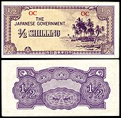
Half Shilling -

One Shilling
| Featured picture tools |
|---|
Please cut and paste new entries to the bottom of this page, creating a new monthly archive (by closing date) when necessary.
Receipt for Federal Reserve Notes (BEP)
Voting period is over. Please don't add any new votes. Voting period ends on 1 Jan 2015 at 04:24:16 (UTC)
Original – A
Bureau of Engraving and Printing receipt for $442,340,000 in
Federal Reserve Notes from
Comptroller
John Skelton Williams, dated 23 July 1915 and signed by
Joseph E. Ralph,
Director of the BEP.
- Reason
- High quality, high EV
- Articles in which this image appears
- Receipt
- FP category for this image
- Currency(?)
- Creator
-
Bureau of Engraving and Printing and the
Office of the Comptroller of the Currency
From the National Numismatic Collection, National Museum of American History, Smithsonian Institution.
Image by Godot13.
- Support as nominator – Godot13 ( talk) 04:24, 19 December 2014 (UTC)
- Oppose - This looks like it was edited to give a perfectly flat colour, using the select colour tool. Receipts are monotone, but not this much. — Crisco 1492 ( talk) 11:58, 19 December 2014 (UTC)
- Comment Check the previous version, before the "bowdlerisation". ;-) Alternative? -- Janke | Talk 18:53, 19 December 2014 (UTC)
- Comment -
Crisco 1492 and
Janke - unedited version offered as ALT--
Godot13 (
talk) 20:37, 19 December 2014 (UTC)
- Still fairly flat, suggesting that the highlights were blown. — Crisco 1492 ( talk) 12:58, 20 December 2014 (UTC)
- Withdraw or Suspend - This needs to be redone from the original object (in January).-- Godot13 ( talk) 19:26, 21 December 2014 (UTC)
Not Promoted -- Armbrust The Homunculus 05:54, 1 January 2015 (UTC)
Merkel-Raute
Voting period is over. Please don't add any new votes. Voting period ends on 1 Jan 2015 at 05:36:19 (UTC)

- Reason
- High EV and reasonable quality
- Articles in which this image appears
- Merkel-Raute, Angela Merkel
- FP category for this image
- Wikipedia:Featured pictures/People/Political
- Creator
- Armin Linnartz on Flickr
- Support as nominator – Nikhil ( talk) 05:36, 19 December 2014 (UTC)
- Weak Oppose. It's an interesting subject but the image itself is a bit lacking. The skin tones are not particularly pleasing and the image is not particularly sharp or high resolution. Not a portrait that stands out for me. Ðiliff «» (Talk) 14:18, 19 December 2014 (UTC)
- Comment — Have we had this one before? Looks familiar. Sca ( talk) 15:54, 19 December 2014 (UTC)
- Comment: White balance seems rather off; likely from over-correction of the original. (I also note the removal of the background line.) I didn't know we had an article on Merkel's hand gesture though. Reminds me of the Merkel superglue meme. -- Paul_012 ( talk) 20:28, 22 December 2014 (UTC)
- Weak support I was leaning oppose considering that the quality wasn't good. But the EV on this is great. I never knew they even had an article on this. Personally, the EV overshadows everything else. Étienne Dolet ( talk) 22:34, 22 December 2014 (UTC)
- Oppose -
Much too cool. — Crisco 1492 ( talk) 13:39, 27 December 2014 (UTC)- Still? Are you seeing the older cached version or the current one? I adjusted the WB so that the background was near enough neutral grey, but it does still look slightly cool. I just guessed that the background was not colour tinted and it seemed to work ok. The white shirt underneath the red cardigan looks fairly correct, as does her buttons. Her skin tones are not ideal, but acceptable for me. In any case, I don't think it's going to pass, but wanted to double check you were looking at the right version.
Ðiliff «»
(Talk) 14:24, 27 December 2014 (UTC)
- Looks like it was the cache, sorry. That being said, it appears that the focus was missed on her face, so my !vote likely won't change. — Crisco 1492 ( talk) 12:34, 29 December 2014 (UTC)
- Still? Are you seeing the older cached version or the current one? I adjusted the WB so that the background was near enough neutral grey, but it does still look slightly cool. I just guessed that the background was not colour tinted and it seemed to work ok. The white shirt underneath the red cardigan looks fairly correct, as does her buttons. Her skin tones are not ideal, but acceptable for me. In any case, I don't think it's going to pass, but wanted to double check you were looking at the right version.
Ðiliff «»
(Talk) 14:24, 27 December 2014 (UTC)
- Oppose for focus. Becky Sayles ( talk) 14:44, 30 December 2014 (UTC)
Not Promoted -- Armbrust The Homunculus 05:54, 1 January 2015 (UTC)
Canterbury Cathedral Set
Voting period is over. Please don't add any new votes. Voting period ends on 1 Jan 2015 at 14:02:20 (UTC)
- Canterbury Cathedral Set
-
 The perpendicular nave
 -
 The choir
 -
 The rood screen
 -
 The stained glass of the Trinity Chapel
 -
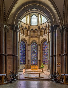 Becket's Crown, the shrine to Thomas Becket
 -
 The cloisters
- Reason
- This is a very notable subject - the gothic cathedral of the Archbishop of Canterbury and the 'mother cathedral' of Anglicanism worldwide. These six images show the major architectural aspects of the cathedral. The perpendicular nave, the choir, the rood screen, the stained glass, the Shrine of Thomas Beckett, and the cloisters.
- Articles in which this image appears
- Canterbury Cathedral
- FP category for this image
- Wikipedia:Featured pictures/Places/Interiors
- Creator
- User:Diliff
- Support as nominator – Ðiliff «» (Talk) 14:02, 19 December 2014 (UTC)
- WooW. Support. Hafspajen ( talk) 14:23, 19 December 2014 (UTC)
- Holy Cr*p on a Cracker a.k.a. Support Fair Play
Ðiliff... Are you on a tour of the Cathedrals of the UK or something?!
gazhiley 14:45, 19 December 2014 (UTC)
- I did this summer actually, I applied for a Wikimedia UK grant which covered the cost of fuel and entry fees.
Covered about 35 cathedrals over two one week trips! Was
pretty
intense, but good fun. :-)
Ðiliff «»
(Talk) 16:05, 19 December 2014 (UTC)
- Ah yeah that'll help! Didn't know stuff like that existed, but well done for getting it! gazhiley 23:29, 19 December 2014 (UTC)
- I did this summer actually, I applied for a Wikimedia UK grant which covered the cost of fuel and entry fees.
Covered about 35 cathedrals over two one week trips! Was
pretty
intense, but good fun. :-)
Ðiliff «»
(Talk) 16:05, 19 December 2014 (UTC)
- Support — Fine work as usual — although I'm just a little bit bothered by the lights in the perpendicular nave.
Sca (
talk) 15:52, 19 December 2014 (UTC)
- Yeah, that was unfortunate, but I can't really ask them to turn off the lights for me. I could have cropped it to avoid the lights but because of the starbursts from them (it's unavoidable with bright lights pointing at the lens), I'd have to completely lose the framing of the arch and that's a somewhat important part of the perpendicular style of architecture... Ðiliff «» (Talk) 16:05, 19 December 2014 (UTC)
- Support Great quality and just a feast to the eyes. Nikhil ( talk) 06:05, 20 December 2014 (UTC)
- Support. Stunning. Money well-spent by Wikimedia UK, though I have always thought it's a travesty that you have to pay to get into churches. (It is, of course, quite reasonable to ask for donations, but the thought that you can't get into a church if you've no coins in your pocket seems a little amiss.)
J Milburn (
talk) 11:45, 20 December 2014 (UTC)
- I'm with you on that. And in addition, some cathedrals charge extra for photography on top of the entry fee - usually about £5-6 which 'buys you the right' to take photos inside. Of course these cathedrals need need funding to remain open, but really? What is so different about someone who wants to take photos as opposed to looking around? Oh well, I guess they decided that they can't easily differentiate between religious visitors and tourists, but a camera firmly identifies you as a tourist. The irony is that in the case of Canterbury Cathedral, I specifically arrived at about 7:30am to attend morning mass so that I would have the whole cathedral to myself (virtually) before it officially opened to the public at 9am, and I managed to avoid the steep £10.50 entry fee in the process. Yes, it was cheeky, but sometimes you have to do what you have to do, and hey, I saved Wikimedia UK some money. ;-) Ðiliff «» (Talk) 12:01, 20 December 2014 (UTC)
- Support I love all of this photographers work but the sets are exceptional. Could use some tips. ;-)-- Mark Miller ( talk) 12:08, 20 December 2014 (UTC)
- Support - So Commons has a Diliff nomination club... are we going for that here too? — Crisco 1492 ( talk) 13:04, 20 December 2014 (UTC)
- Support the first one is the best. ///EuroCar GT 00:42, 21 December 2014 (UTC)
- Support as others. Yann ( talk) 19:21, 26 December 2014 (UTC)
- Support : Bellus Delphina talk 05:23, 30 December 2014 (UTC)
- Support. Becky Sayles ( talk) 14:45, 30 December 2014 (UTC)
- Support - Excellent work. APK whisper in my ear 04:38, 31 December 2014 (UTC)
- Support -- DUCK404 a ( talk) 04:45, 31 December 2014 (UTC)
Promoted File:Canterbury Cathedral Nave 1, Kent, UK - Diliff.jpg --
Armbrust
The Homunculus 14:03, 1 January 2015 (UTC)
Promoted File:Canterbury Cathedral Choir 2, Kent, UK - Diliff.jpg --
Armbrust
The Homunculus 14:03, 1 January 2015 (UTC)
Promoted File:Canterbury Cathedral Rood Screen, Kent, UK - Diliff.jpg --
Armbrust
The Homunculus 14:03, 1 January 2015 (UTC)
Promoted File:Canterbury Cathedral Trinity Chapel Stained Glass, Kent, UK - Diliff.jpg --
Armbrust
The Homunculus 14:03, 1 January 2015 (UTC)
Promoted File:Canterbury Cathedral Becket's Crown, Kent, UK - Diliff.jpg --
Armbrust
The Homunculus 14:03, 1 January 2015 (UTC)
Promoted File:Canterbury Cathedral Cloisters, Kent, UK - Diliff.jpg --
Armbrust
The Homunculus 14:03, 1 January 2015 (UTC)
Michelle Obama
Voting period is over. Please don't add any new votes. Voting period ends on 2 Jan 2015 at 12:01:29 (UTC)

- Reason
- She Has An Lady of The Political Activities
- Articles in which this image appears
- Michelle Obama, List of First Ladies of the United States, +1
- FP category for this image
- Wikipedia:Featured pictures/People/Political
- Creator
- White House (Chuck Kennedy)
- Support as nominator – National Names 2000 ( talk) 12:01, 20 December 2014 (UTC)
- Support — Crisco 1492 ( talk) 13:31, 21 December 2014 (UTC)
- Support Hafspajen ( talk) 06:05, 23 December 2014 (UTC)
- Oppose — Nothing whatever against Michelle Obama — It's just my inveterate opposition to official photos of political figures as FPs (and she is by extension a political figure). I know others disagree with me on this issue. Sca ( talk) 15:21, 23 December 2014 (UTC)
- Comment -High EV for one thing - she is the first black First lady in the White house... kinda exciting, still. Even if her strictly personal merits might not be that outstanding. Hafspajen ( talk) 07:24, 24 December 2014 (UTC)
- I think this is a much more relaxed and candid portrait than we usually see (compare it, for example, with her first official portrait). I think it has EV as a result; there's certain subjects which we might not have quality images of otherwise. One could also argue that there is often a fine line between official images and non-official ones. At what point does a sitting with the express purpose of taking an photograph become official or staged? I think we have to judge the outcome, more than the circumstance. 70.72.190.205 ( talk) 06:32, 25 December 2014 (UTC)
- Support as others. Yann ( talk) 19:20, 26 December 2014 (UTC)
- Comment. My only tiny criticism is that the crop seems fractionally too close to her right elbow. If there is more in an original somewhere then it would be good to redo that. 31.51.2.9 ( talk) 21:24, 27 December 2014 (UTC)
- Support Jim Carter 12:26, 28 December 2014 (UTC)
- Support - Bellus Delphina talk 05:17, 30 December 2014 (UTC)
- Oppose per Sca -- DUCK404 a ( talk) 01:54, 31 December 2014 (UTC)
- Oppose per Sca -- mcshadypl T C 20:59, 31 December 2014 (UTC)
- Support. B E C K Y S A Y L E S 00:14, 2 January 2015 (UTC)
Promoted File:Michelle Obama 2013 official portrait.jpg -- Armbrust The Homunculus 12:02, 2 January 2015 (UTC)
Voting period is over. Please don't add any new votes. Voting period ends on 2 Jan 2015 at 12:18:26 (UTC)

- Reason
- This is a Very Good Resolution To This Photo But (I HAVE 2 Active Nominations (The Michelle Obama And This Nomination) and 1 Suspended Nomination)
- Articles in which this image appears
- Portsmouth Cathedral +1
- FP category for this image
- Wikipedia:Featured pictures/Places/Interiors
- Creator
- Diliff
- Support as nominator – National Names 2000 ( talk) 12:18, 20 December 2014 (UTC)
SupportNot quite what I'd expect for a picture of a Cathedral, in terms of all the artwork on display etc, but accurate representation of what it would have looked at the time. Nice clean and no issues I can see. gazhiley 13:42, 22 December 2014 (UTC)- I agree, it's not very gothic or flamboyant as far as cathedrals go. It is fundamentally a very old building, but it is very sparsely decorated and not very large (as per the article, the nave was left unfinished with temporary brick wall at the end keeping the rain out for over 50 years - the nave was only finalised and consecrated in 1991), so it doesn't quite have the same grandeur of the other English cathedrals. Ðiliff «» (Talk) 16:17, 1 January 2015 (UTC)
- Oppose Nice photo, but I oppose unless the creator can demonstrate he has permission to publish this photo, a significant portion of which contains art with no-photography signs next to them.
Tokugawapants (
talk) 23:24, 22 December 2014 (UTC)
- Good Point - there's a lot of potentially unauthorised art work on display. I've struck my vote until someone can say if this is an issue or not. I will then re-vote accordingly.
gazhiley 10:34, 23 December 2014 (UTC)
- Every single work there is
de minimis, which means this is fine. —
Crisco 1492 (
talk) 13:33, 23 December 2014 (UTC)
- Very well, then once again I will Support... gazhiley 18:39, 24 December 2014 (UTC)
- Every single work there is
de minimis, which means this is fine. —
Crisco 1492 (
talk) 13:33, 23 December 2014 (UTC)
- Good Point - there's a lot of potentially unauthorised art work on display. I've struck my vote until someone can say if this is an issue or not. I will then re-vote accordingly.
gazhiley 10:34, 23 December 2014 (UTC)
- Support - Very interesting. I'd have compressed the edges a bit more, but still acceptable. — Crisco 1492 ( talk) 13:39, 27 December 2014 (UTC)
- Support : Bellus Delphina talk 05:19, 30 December 2014 (UTC)
- Support. I only just noticed that my image was nominated (haven't been very active over the Christmas/New Year period). I would have thought that the image of the choir is a more interesting view though. The fact that art was being exhibited in the nave at the time was a bit unfortunate. Agree with Crisco though, it is de minimis in this case. Ðiliff «» (Talk) 16:09, 1 January 2015 (UTC)
- Support. B E C K Y S A Y L E S 00:16, 2 January 2015 (UTC)
- Support - Bryant2000 ( talk) 02:20, 2 January 2015 (UTC)Bryant2000
Promoted File:Portsmouth Cathedral Nave, Portsmouth, Hampshire, UK - Diliff.jpg -- Armbrust The Homunculus 12:19, 2 January 2015 (UTC)
Bellevue Palace
Voting period is over. Please don't add any new votes. Voting period ends on 3 Jan 2015 at 09:41:14 (UTC)

- Reason
- High quality image of Bellevue Palace, Germany.
- Articles in which this image appears
- Bellevue Palace (Germany)
- FP category for this image
- Wikipedia:Featured pictures/Places/Architecture
- Creator
- Taxiarchos228
- Support as nominator – Jim Carter 09:41, 21 December 2014 (UTC)
- Support Beautiful image. Crisp, clear and no issues I can see. gazhiley 13:39, 22 December 2014 (UTC)
- Support Slightly bothered by the minute haloing around some of the cone-shaped shrubs on the left, but not enough for me to oppose. Tokugawapants ( talk) 23:31, 22 December 2014 (UTC)
- Support - Hafspajen ( talk) 05:37, 23 December 2014 (UTC)
- Comment - Is it just me, or is the fence a bit warped? —
Crisco 1492 (
talk) 03:24, 24 December 2014 (UTC)
- Comment - Not just you; It looks like this photo was taken slightly off-center. Notice how the flag pole at the top of the palace sits in front of the rest of the roof behind it. Compare the fence in this picture to Google maps. Tokugawapants ( talk) 06:38, 24 December 2014 (UTC)
- Support - National Names 2000 ( talk) 05:35, 29 December 2014 (UTC)
- Support - Bryant2000 ( talk) 02:18, 2 January 2015 (UTC)
- Support - B E C K Y S A Y L E S 16:52, 2 January 2015 (UTC)
Promoted File:Berlin - Schloss Bellevue2.jpg -- Armbrust The Homunculus 10:13, 3 January 2015 (UTC)
- Placed image in Wikipedia:Featured pictures/Places/Panorama. Armbrust The Homunculus 10:13, 3 January 2015 (UTC)
Öxarárfoss
Voting period is over. Please don't add any new votes. Voting period ends on 3 Jan 2015 at 09:41:14 (UTC)

- Reason
- High quality image of Öxarárfoss.
- Articles in which this image appears
- Öxarárfoss
- FP category for this image
- Wikipedia:Featured pictures/Places/Landscapes
- Creator
- Diego Delso
- Support as nominator – Jim Carter 09:41, 21 December 2014 (UTC)
- Support - One of Diego's better pictures from Iceland. — Crisco 1492 ( talk) 12:30, 21 December 2014 (UTC)
- Support — Rugged grandeur, great detail. Sca ( talk) 14:12, 21 December 2014 (UTC)
- Support Excellent level of detail throughout, other than a slight part out of focus on the right side vertical rock face - nowhere near enough to oppose though. Lovely scene. gazhiley 12:24, 22 December 2014 (UTC)
- Support. It's a shame the article's so short; I managed to find a source for the most basic information, but most of what's online is not in English. J Milburn ( talk) 20:10, 22 December 2014 (UTC)
- Support, non English sources do fine nowadays. Just put a mark on it like (in Portuguese) or so. (Icelandic ...?) Hafspajen ( talk) 05:32, 23 December 2014 (UTC)
- I have no objection to non-English sources in articles, but I can't read them, so they're no good to me! J Milburn ( talk) 11:54, 23 December 2014 (UTC).
- Yngvadottir reads Icelandic ... rather well... Hafspajen ( talk) 15:20, 23 December 2014 (UTC)
- Support - B E C K Y S A Y L E S 16:54, 2 January 2015 (UTC)
Promoted File:Öxarárfoss, Parque Nacional de Þingvellir, Suðurland, Islandia, 2014-08-16, DD 029.JPG -- Armbrust The Homunculus 10:16, 3 January 2015 (UTC)
Pont des Arts, Paris
Voting period is over. Please don't add any new votes. Voting period ends on 3 Jan 2015 at 09:41:14 (UTC)

- Reason
- High quality image of panorama of Paris.
- Articles in which this image appears
- Landmarks in Paris
- FP category for this image
- Wikipedia:Featured pictures/Places/Panorama
- Creator
- Benh
- Support as nominator – Jim Carter 09:41, 21 December 2014 (UTC)
- Weak support - I like the idea, and I know it can't be avoided, but I'm having trouble with the serious motion blur on the boat. — Crisco 1492 ( talk) 12:31, 21 December 2014 (UTC)
- Weak Oppose. In addition to what Crisco mentioned, its's a visually stimulating image, but I find the composition quite messy and confusing. Not many of the Parisian landmarks actually seem to be well shown. Ðiliff «» (Talk) 20:03, 21 December 2014 (UTC)
- Oppose Once again, darkness is the devil here : motion blur on the boats (both the the right of the bridge, and the one under the second arch from the right); lack of detail around the banking behind the "700 Pont Au Change" sign; The main bridge itself is too dark to see what it is made from. All minor issues, but all together makes me oppose. Nice enough picture, but the lack of light results in a few issues - would love to see this taken during the day. gazhiley 11:04, 22 December 2014 (UTC)
- Support, but then I shamelessly like atmospheric photos. I think it is the light that keeps the composition and everything together, and the details are rather clear, -well, with the exception of the a boat. Here it is
 the cars who move. Doesn't this has to do with the length of exposure in night pics?
Hafspajen (
talk) 05:28, 23 December 2014 (UTC)
the cars who move. Doesn't this has to do with the length of exposure in night pics?
Hafspajen (
talk) 05:28, 23 December 2014 (UTC) - Oppose The cluttered composition (of what's a rather formal and fairly uncluttered cityscape) greatly reduces any EV here. It's a pretty picture, but not much use for illustrating articles IMO. Nick-D ( talk) 23:27, 24 December 2014 (UTC)
- Oppose - There are contrast issues in this picture -- DUCK404 a ( talk) 01:51, 31 December 2014 (UTC)
- Oppose composition is poor, such as with the building on the right suddenly cut off -- mcshadypl T C 20:57, 31 December 2014 (UTC)
- Oppose - B E C K Y S A Y L E S 16:55, 2 January 2015 (UTC)
Not Promoted -- Armbrust The Homunculus 10:17, 3 January 2015 (UTC)
Lüner Lake
Voting period is over. Please don't add any new votes. Voting period ends on 3 Jan 2015 at 09:41:14 (UTC)

- Reason
- High quality image of Lüner Lake.
- Articles in which this image appears
- Lünersee
- FP category for this image
- Wikipedia:Featured pictures/Places/Panorama
- Creator
- Böhringer
- Support as nominator – Jim Carter 09:41, 21 December 2014 (UTC)
- Support — Gorgeous big file. Sca ( talk) 14:06, 21 December 2014 (UTC)
- Oppose The Nom is for the lake, but the lake is cut off by the peak to the left. Taking this picture from on top of that peak would show the full lake. gazhiley 10:32, 22 December 2014 (UTC)
- Support, I like how it shows the mountains surrounding the site. The picture gives the names of mountaintops - The Lüner Lake, seen from Mt. Saulakopf (2,517 m) in Austria. Left is Mt. Schafgafall (2,414 m) and right Mt. Seekopf (2.698 m). Behind the lake are Mt. Kanzelköpfe (2,437 m) and Mt. Girenspitze (2,394 m) in Switzerland. The small yellow squares. Hafspajen ( talk) 05:35, 23 December 2014 (UTC)
- Oppose Lake is obstructed by mountains -- DUCK404 a ( talk) 01:36, 31 December 2014 (UTC)
- Oppose - for composition. B E C K Y S A Y L E S 16:59, 2 January 2015 (UTC)
Not Promoted -- Armbrust The Homunculus 10:17, 3 January 2015 (UTC)
Finnish artillery crew
Voting period is over. Please don't add any new votes. Voting period ends on 3 Jan 2015 at 18:29:50 (UTC)

- Reason
- The picture is a high resolution, colour photograph from the Continuation War.
- Articles in which this image appears
- Bofors
- FP category for this image
- Wikipedia:Featured pictures/History/World War II
- Creator
- Unknown
- Support as nominator – Catlemur ( talk) 18:29, 21 December 2014 (UTC)
- Comment Watermarked.
©Geni (
talk) 02:11, 22 December 2014 (UTC)
- There is a non watermarked version I can upload, the resolution is a bit lower though.--
Catlemur (
talk) 08:11, 22 December 2014 (UTC)
- Lot of grain. A bit less resolution would be okay. — Crisco 1492 ( talk) 13:10, 22 December 2014 (UTC)
- Turns out the non watermarked version's resolution is too low for FP.-- Catlemur ( talk) 15:29, 22 December 2014 (UTC)
- There is a non watermarked version I can upload, the resolution is a bit lower though.--
Catlemur (
talk) 08:11, 22 December 2014 (UTC)
- Comment: I oppose a watermarked version, but maybe someone would be able to digitally remove the watermark without doing any damage to the picture? J Milburn ( talk) 19:34, 22 December 2014 (UTC)
- Comment The sourcing details on the Commons record are currently pretty sparse. It appears that the photo comes from this website, but more details are needed. Nick-D ( talk) 08:02, 23 December 2014 (UTC)
- Comment — Shouldn't be hard to fudge the watermark, and this is fairly clear for a WWII color shot, but I'm not sure about its EV or significance FP-wise. Minor interest in the mix of German- and Soviet (?)-style helmets.
Sca (
talk) 15:13, 30 December 2014 (UTC)
- That ammo looks like 40mm, in which case the gun would be significant since the 40mm was widely considered one of the best AA guns of WWII, and in the pacific accounted for nearly 50% of Imperial Japan's aircraft losses in that theatre at one point. The 40mm is also one of the enduring weapons of war to come out of WWII, as a the gun is still in service in parts of the world. That having been said, a better image of the gun may have greater odds of getting through here, since the EV of a weapon in war is sometimes not as a good as the EV of a photo of the war weapon before or after the battle. 67.10.109.105 ( talk) 08:14, 2 January 2015 (UTC)
- Oppose - for watermark and contrast. B E C K Y S A Y L E S 17:00, 2 January 2015 (UTC)
Not Promoted -- Armbrust The Homunculus 18:38, 3 January 2015 (UTC)
Caravaggio's Francis of Assisi
Voting period is over. Please don't add any new votes. Voting period ends on 4 Dec 2014 at 20:28:15 (UTC)
.jpg)
- Reason
- The painting was the first of Caravaggio's religious paintings, from 1595. Caravaggio is the art history's enfant terrible, unorthodox, striking, innovative and rebellious. He was involved in fights an scandals, but he was a magnificent painter. He had a very special unmistakable style that was his own, and he influenced generations of painters of the Baroque style like Rubens, Jusepe de Ribera, Bernini, and yes, even Rembrandt.
- Articles in which this image appears
- Saint Francis of Assisi in Ecstasy (Caravaggio) (own article), Chronology of works by Caravaggio, Wadsworth Atheneum, 1595 in art; more.
- FP category for this image
- Wikipedia:Featured pictures/Artwork/Paintings or Wikipedia:Featured pictures/Culture, entertainment, and lifestyle/Religion and mythology
- Creator
- Caravaggio
- Support as nominator – Hafspajen ( talk) 20:28, 24 November 2014 (UTC)
- Support terrific picture... Modernist ( talk) 21:14, 24 November 2014 (UTC)
- Question - Where is the scan from? —
Crisco 1492 (
talk) 23:55, 24 November 2014 (UTC)
- :Here it is.
Wadsworth Atheneum’s collection of European art, scroll down to last four paintings, and click on this one. Masur put that to references.
Hafspajen (
talk) 02:01, 25 November 2014 (UTC)
- Except that's considerably darker and not nearly the same resolution. — Crisco 1492 ( talk) 03:33, 25 November 2014 (UTC)
- :Here it is.
Wadsworth Atheneum’s collection of European art, scroll down to last four paintings, and click on this one. Masur put that to references.
Hafspajen (
talk) 02:01, 25 November 2014 (UTC)
- Well, - searched, LACMA, - here is from the New York Times ..?, Art Daily,- Detroit art museum; - all art; - Detroit again, ; - LACMA again- famous-paintings -wadsworth-atheneum - the net is full with this painting - guess have to ask uploader. [1] [2] Hafspajen ( talk) 12:58, 25 November 2014 (UTC)
- Looks like he today, but no answer yet. Hafspajen ( talk) 21:29, 25 November 2014 (UTC)
- This -
is the one, I think.
Hafspajen (
talk) 21:31, 25 November 2014 (UTC)
- Also much less contrast (actually, the colours in that one are much nicer). — Crisco 1492 ( talk) 23:07, 25 November 2014 (UTC)
- Shall we stop this nomination until clarified? Or shall we try an alternative? Hafspajen ( talk) 23:37, 25 November 2014 (UTC)
- - Well, not much I can do, if he doesn't respond. He was editing on commons since I posted on his talk-page - and must have seen my question - and yet he never responded - and he has an user-box where it is stated he can speak English. Hafspajen ( talk) 10:40, 26 November 2014 (UTC)
- Apparently it was a friend of the uploader who messed up the source, and I have been promised he will be asked... here. So far - no further response. -- Hafspajen ( talk) 16:02, 6 December 2014 (UTC)
- @ Hafspajen: Anything new about this? I'm tempted to close this. Armbrust The Homunculus 04:06, 31 December 2014 (UTC)
- Well, no. Nothing, I asked several times. I think the guy is an admin on commons ... but he said he will ask his friend who made a mess of the sources, but so far nothing. Give me three days more (considering time). I leave him a message and if not, we have to close it. Hafspajen ( talk) 08:35, 31 December 2014 (UTC)
- Okay, and even then, you can renominate the image any time, if the actual source is revealed. Armbrust The Homunculus 11:41, 31 December 2014 (UTC)
Not Promoted -- Armbrust The Homunculus 18:42, 3 January 2015 (UTC)
Bones surrounding the eye
Voting period is over. Please don't add any new votes. Voting period ends on 14 January 2015 at 00:01 UTC

- Reason
- Meets criteria 1, 3, 4 and 5. Is a very high quality (#1). Although image is small this is a technically difficult or otherwise unique image (#2), definitely among our best work (#3). It has a free license (#4) and adding it to articles adds significantly to their encyclopedic value (#5)
- Articles in which this image appears
- Orbit (anatomy)
- FP category for this image
- Diagrams, drawings, and maps
- Creator
- Je at uwo
- Support as nominator – Tom (LT) ( talk) 22:45, 1 January 2015 (UTC)
- Oppose - Too small, makes very little sense without labels or whatnot. — Crisco 1492 ( talk) 04:14, 2 January 2015 (UTC)
- The colour-coding is explained in the caption in the article. For me, though, it is still a bit confusing. I don't immediately know which of the four (five?) blue/green colours is "aqua" or "teal", for example, and when I count the different colours in the image there seem to be more than the eight that are explained. The diagram also does not handle depth very clearly, in my opinion.
109.152.146.134 (
talk) 12:03, 2 January 2015 (UTC)
- Hence why labels would work better on the image. It's got few enough things being labeled for that to work. — Crisco 1492 ( talk) 12:14, 2 January 2015 (UTC)
- The colour-coding is explained in the caption in the article. For me, though, it is still a bit confusing. I don't immediately know which of the four (five?) blue/green colours is "aqua" or "teal", for example, and when I count the different colours in the image there seem to be more than the eight that are explained. The diagram also does not handle depth very clearly, in my opinion.
109.152.146.134 (
talk) 12:03, 2 January 2015 (UTC)
- Oppose I agree with Crisco 1492. gazhiley 11:58, 2 January 2015 (UTC)
- Oppose — Per foregoing. Sca ( talk) 13:57, 2 January 2015 (UTC)
- Oppose per Crisco 1492. APK whisper in my ear 01:07, 3 January 2015 (UTC)
- Oppose - EV is reduced because of the confusing colors, and this is definitely not one of the best images on Wikipedia -- DUCK404 a ( talk) 19:03, 3 January 2015 (UTC)
Not Promoted -- Armbrust The Homunculus 23:24, 3 January 2015 (UTC)
- Withdrawn nomination. Armbrust The Homunculus 23:24, 3 January 2015 (UTC)
Elliðaey (Breiðafjörður)
Voting period is over. Please don't add any new votes. Voting period ends on 4 Jan 2015 at 00:05:50 (UTC)
_Iceland_M74A1908.jpg)


- Reason
- good quality, nice atmosphere
- Articles in which this image appears
- Breiðafjörður
- FP category for this image
- Wikipedia:Featured_pictures/Places/Landscapes
- Creator
- Alchemist-hp
- Support as nominator – Alchemist-hp ( talk) 00:05, 22 December 2014 (UTC)
Oppose Whole island has a halo, andthere is a lack of detail at full zoom. Shadow on the front is unfortunate too as loss of detail of the front. gazhiley 10:19, 22 December 2014 (UTC)
- I try to rework it. I think it is easy to eliminate the small halo. -- Alchemist-hp ( talk) 15:53, 22 December 2014 (UTC)
- In view of the new upload, I will change my vote to Weak Support The other points I raised prevent me from a full support... gazhiley 18:36, 24 December 2014 (UTC)
- Comment. Hmm, I feel completely differently about this. I think the lighting is appealing and visually interesting, and the level of detail quite adequate. All in all a fine picture, I would say.
86.152.161.61 (
talk) 14:24, 22 December 2014 (UTC)
- Feel free to login/register and support then - anyone can do it. But each to their own opinion. gazhiley 14:39, 22 December 2014 (UTC)
Conditionalsupportif the halo can be fixed. Otherwise, it's a beautiful picture; personally, I find this amount of shadow aesthetically pleasing. I do see the shadows, but there is still a fair amount of detail in them. I've noticed that people here tend not to like shadows, but the amount of shadow here hardly detracts from a viewer's ability to understand what is being depicted. In fact, the shadows give the subject some depth (figuratively and literally). Tokugawapants ( talk) 01:43, 30 December 2014 (UTC)
- To satisfy my curiosity, could you explain what is this thing you are calling a "halo"? I don't see anything halo-like. 86.152.161.61 ( talk) 01:28, 23 December 2014 (UTC)
- Gladly! The haloing is present where the top of the island meets the sky. This is a common artifact that occurs, for example, when a dark foreground is lightened in post-processing against a light background. I've uploaded a crop (zoomed to 150%) with red arrows indicating the location of the halo and an edited version that amplifies the existing halo effect by using a single, extreme curves adjustment layer across the entire frame. Tokugawapants ( talk) 07:41, 23 December 2014 (UTC)
- Nice examples - I almost like the "negative" effect version! Very arty... gazhiley 10:05, 23 December 2014 (UTC)
- Thanks, I see. I was looking for something much bigger. To be honest, that tiny pixel-level artefact does not spoil the picture at all for me. I do not even notice it in normal viewing. However, I understand that other people may be looking at things from a more technical perspective. 86.152.161.61 ( talk) 12:27, 23 December 2014 (UTC)
- Comment: a new version is uploaded: new processed incl. lens correction. -- Alchemist-hp ( talk) 12:12, 24 December 2014 (UTC)
- Support - Hafspajen ( talk) 18:18, 25 December 2014 (UTC)
- Support -- Brackenheim ( talk) 14:38, 3 January 2015 (UTC)
- Support — A rugged, moody Icelandic image. I like the shadows. (If it weren't for the modern-looking lighthouse, it would look like it just rose out of the depths.) Sca ( talk) 14:49, 3 January 2015 (UTC)
Promoted File:Elliðaey (Breiðafjörður) Iceland M74A1908.jpg -- Armbrust The Homunculus 00:06, 4 January 2015 (UTC)
Skyline of Detroit
Voting period is over. Please don't add any new votes. Voting period ends on 4 Jan 2015 at 13:26:40 (UTC)

- Reason
- High quality image of the current skyline of Detroit. Lighting is the best that can be had, shooting north from across the Detroit River (in the summer, the sun comes from the north, and thus the skyline is in shadow).
- Articles in which this image appears
- Detroit, Detroit International Riverfront
- FP category for this image
- Wikipedia:Featured pictures/Places/Panorama
- Creator
- Chris Woodrich
- Support as nominator – — Crisco 1492 ( talk) 13:26, 22 December 2014 (UTC)
- Support No issues I can see - good representation of the skyline. gazhiley 13:34, 22 December 2014 (UTC)
- Support Hafspajen ( talk) 05:25, 23 December 2014 (UTC)
Comment - There is a stitching error at the very top of the image (in the sky, directly above the building labeled 211 between the steamboat and the tall building with the four American flags on top) Tokugawapants ( talk) 09:14, 23 December 2014 (UTC)- Fix is uploaded. —
Crisco 1492 (
talk) 13:55, 23 December 2014 (UTC)
- Great, thanks! Tokugawapants ( talk) 20:26, 23 December 2014 (UTC)
- Fix is uploaded. —
Crisco 1492 (
talk) 13:55, 23 December 2014 (UTC)
- Support, with comment - So I've never been to Detroit, but I was wondering if the content on the left side of the image (say, to the left of the steamboat) is typically considered part of the "skyline" of Detroit. I understand a lot of work goes into making a panorama, but if I were asked to present/render the "skyline" of Detroit, I (as someone who's never been to Detroit) wouldn't include most of the material to the left of the image. However, looking at the image in the context of the
Detroit article, it makes more sense in that context, but there it's presented as the
Detroit International Riverfront, which makes more sense to me, since everything in the foreground this image is part of the Detroit International Riverfront, according to the article's definition. So I guess I'd like it more if it were labeled/described as it is in the
Detroit article, i.e. as (a segment of) the Detroit International Riverfront. Anyway, this is splitting hairs and I realize my thoughts on skylines are just my personal opinion, but I thought I'd throw it out there.
Tokugawapants (
talk) 20:26, 23 December 2014 (UTC)
- The scale might seem a little wonky, but then the Renaissance Center does dominate much of the skyline. Joe Louis Arena (towards the left of the image) is part of downtown Detroit, as is the RC. As for the riverfront article... I think that's a good idea. I'll include the image there. — Crisco 1492 ( talk) 03:18, 24 December 2014 (UTC)
- Support -- Alchemist-hp ( talk) 04:17, 25 December 2014 (UTC)
- Support - nice work.-- Godot13 ( talk) 04:46, 25 December 2014 (UTC)
- Support good stuff. ///EuroCar GT 01:22, 30 December 2014 (UTC)
- Support -- mcshadypl T C 20:56, 31 December 2014 (UTC)
Promoted File:Skyline of Detroit, Michigan from S 2014-12-07.jpg -- Armbrust The Homunculus 13:27, 4 January 2015 (UTC)
Central Park Manhattan Island New York
Voting period is over. Please don't add any new votes. Voting period ends on 7 Jan 2015 at 14:32:39 (UTC)

- Reason
- Cristal clear shot of the most famous park in the world, Central Park Manhattan Island New York: Central Park is a challenge to shoot for any photographer. This shot, I felt was indicative of the contrast between nature and societies intrusion upon it.
- Articles in which this image appears
- Central Park; History of landscape architecture; Frederick Law Olmsted; Landscape architecture.
- FP category for this image
- Portal:Geography/Featured picture
- Creator
- talk→ WPPilot 14:32, 25 December 2014 (UTC)

- Support as nominator – talk→ WPPilot 14:32, 25 December 2014 (UTC)
- Support any – Hope nobody is going to hit me in the head, but yes, I support. Central Park is the beginning of the modern urban planning landscape architecture, modern city planning and a very-very iconic setting. Also like the idea of a winter picture - it shows the structure better - the leafs would cover it otherwise. Leave any complaints here ->
 .
Hafspajen (
talk) 18:11, 25 December 2014 (UTC)
.
Hafspajen (
talk) 18:11, 25 December 2014 (UTC)
- Oppose Dark with a crowded yet uninteresting composition that doesn't really give viewers a feel for the park. I think that this is actually inferior to the (far from great) lead photo the nominator used this image to replace [3]. Nick-D ( talk) 04:25, 26 December 2014 (UTC)
- Comment I don't really agree. The previous was a pond and some trees, with a few buildings in the background. This one shows the plan of the setting much better. The biggest problem with the park is that one have pictures that don't show the park's disposition, aesthetic and functional design and location - just bits and parts of it - or one have the plans and working drawings of the architect, - that don't shows the park, - this one is just a perfect balance. As a landscape architect I am very pleased with this picture, find it very useful. This one shows many of the park's elements and their combinations: - the buildings, roads, the untouched natural rocks, the trees, the playgrounds ... and the combination of it including the contrast of private and public open spaces. Hafspajen ( talk) 11:45, 26 December 2014 (UTC)
- Oppose All the buildings are tilted towards the centre (especially at the sides of the picture), and overall picture is too dark... Given the ease of taking this again, I know we can do better... gazhiley 13:04, 26 December 2014 (UTC)
-
- The curves that you see are the result of the lens. If you look at the building the photo was centered upon it is square to the photo. As far as ease of getting this shot again, it was not easy at all, frankly speaking. Central park is busy. I had to wait for a half hour to get a clear shot that had no people or moving objects in it. Once the sun comes out the buildings in the background are washed out and the balance IMHO becomes much less in contrast as the sky is just to bright. talk→ WPPilot 17:02, 26 December 2014 (UTC)
- Comment. For me, the lighting is pretty dreary and uninteresting. Sorry. 109.153.232.33 ( talk) 20:15, 26 December 2014 (UTC)
- Oppose- Dark, tilt, flat color, and (IMO) lacks the EV necessary to represent Central Park. The link for article usage also suggests that it is used in "New York City" which may be in error.-- Godot13 ( talk) 20:36, 26 December 2014 (UTC)
- Comment And I say it does not lacks the EV necessary to represent Central Park. In each and every book about the History of landscape architecture there is a picture of this park. Honestly - with he hand on the Bible - never found any picture in any of these books as informative like this one. Do whatever you want with this information (that would be EV)- or go and start borrowing Landscape architecture books, and you will soon notice it. Hafspajen ( talk) 02:16, 27 December 2014 (UTC)
- Comment I wish I could find a landscape architect on this Wiki to pull him here and ask. But unfortunately we don't have landscape architect user-boxes only architect ones. Never mind, if it will not be good enough for the FP, try to withdraw permission, put a copyright on it and sell it for any books putting together a Landscape architecture history book. They will most probably be extremely happy to use it. Hafspajen ( talk) 03:05, 27 December 2014 (UTC)
That is nice of you to suggest;) but I would rather it be made public and the others here be proven wrong. I am not one to withdraw a submission for criticism in exchange for money. You go right ahead and send it to them, on my behalf and any proceeds can be donated to Wiki foundation, every last dime. Cheers! talk→ WPPilot 03:29, 27 December 2014 (UTC)
- BTW: It makes a great desk top background :)
talk→
WPPilot 03:57, 27 December 2014 (UTC)
- Oh, well, just a suggestion. We love to use it too. Added already to History of landscape architecture - just great there - illustrates perfectly what it is about - Landscape architecture and Frederick Law Olmsted. Surely can find a couple more. Hafspajen ( talk) 04:25, 27 December 2014 (UTC)
- BTW: It makes a great desk top background :)
talk→
WPPilot 03:57, 27 December 2014 (UTC)
- Oppose both Quality is very subpar for a FP. The original is underexposed; the alternate is overexposed. Certainly not ideal composition. -- mcshadypl T C 20:52, 31 December 2014 (UTC)
- Oppose Both I think the quality is fine. However, I don't think this one picture should be used to represent a place as varied as Central Park. Perhaps it could be resubmitted as part of a set of pictures of central park? Komvuelta ( talk) 17:00, 2 January 2015 (UTC)
- Oppose and Speedy Close- For the reasons above and for the low EV, I would suggest terminating this nomination - DUCK404 a ( talk) 00:41, 4 January 2015 (UTC)
Not Promoted -- — Crisco 1492 ( talk) 14:09, 4 January 2015 (UTC)
- I'm takiing this as a withdrawal. — Crisco 1492 ( talk) 14:09, 4 January 2015 (UTC)
Supranational Post-Soviet Bodies
Voting period is over. Please don't add any new votes. Voting period ends on 4 Jan 2015 at 22:29:18 (UTC)

- Reason
- I thought it was informative and it lays down the current geopolitical situation of post-USSR states quite well.
- Articles in which this image appears
- Post-Soviet states, Eurasian Economic Community, Eurasian Economic Union, Collective Security Treaty Organization
- FP category for this image
- Wikipedia:Featured pictures/Diagrams, drawings, and maps/Diagrams
- Creator
- Aris Katsaris
- Support as nominator – Étienne Dolet ( talk) 22:29, 22 December 2014 (UTC)
- Comment Needs to be made into an interactive graphic, with a nation label popping up when you point to a flag. Without that feature, it's a slightly frustrating image... PS: Happy Holidays to everyone! -- Janke | Talk 10:13, 23 December 2014 (UTC)
- Janke ( talk · contribs) It actually is interactive. Check out some of the articles its on. You can click on each one of the flags and cooperative agreements and it will direct you to the corresponding article. I just don't get why that isn't the case on the FP nomination though. Étienne Dolet ( talk) 10:19, 23 December 2014 (UTC)
- For the clicky version, see Template:Supranational PostSoviet Bodies. J Milburn ( talk) 11:49, 23 December 2014 (UTC)
- Comment This graph needs to be updated. Armenia will become a member of the Eurasian Union on January 1. On the contrary, Tajikstan is still not a member and it's unknown when it will become one. Furthermore, GUAM is basically a dead union. The last year in the GUAM article is 2007. That's almost 8 years now. -- Երևանցի talk 21:51, 25 December 2014 (UTC)
- Yerevantsi ( talk · contribs) Yes, you're right. But that can always be updated. Étienne Dolet ( talk) 08:37, 26 December 2014 (UTC)
- It would have to be updated before promotion, meaning that this image is unstable. — Crisco 1492 ( talk) 13:34, 26 December 2014 (UTC)
- The last year listed in the GUAM wikipedia article may be 2007, but the official GUAM web page lists meetings and happenings occurring even in December 2014, so I don't think GUAM is as dead as you think. Updates for the January 1 changes had already been planned, and are now uploaded. As for Tajikistan it was never listed in the diagram as part of the Eurasian Economic Union, it was listed as part of the Eurasian Economic **Community**, which it indeed was. Aris Katsaris ( talk) 12:48, 1 January 2015 (UTC)
- Oppose This does not represent the best pictures of Wikipedia -- DUCK404 a ( talk) 01:33, 31 December 2014 (UTC)
- Oppose I don't understand why this is a FP nominee. What is exceptional about this? It has acronyms that are not clarified. It represents countries as flags, which are not identified. -- mcshadypl T C 20:55, 31 December 2014 (UTC)
- Oppose for EV. B E C K Y S A Y L E S 18:32, 4 January 2015 (UTC)
Not Promoted -- Armbrust The Homunculus 22:33, 4 January 2015 (UTC)
Carl Linnaeus
Voting period is over. Please don't add any new votes. Voting period ends on 7 Jan 2015 at 21:46:38 (UTC)

- Reason
- A solid portrait painting of a pretty significant person.
- Articles in which this image appears
- Carl Linnaeus, Species, Sweden
- FP category for this image
- Wikipedia:Featured pictures/People/Science and engineering
- Creator
- Alexander Roslin
- Support as nominator – Երևանցի talk 21:46, 25 December 2014 (UTC)
- Support - Very useful. — Crisco 1492 ( talk) 01:18, 27 December 2014 (UTC)
- Support - Old Linné. The only thing Swedes can be really proud of. Hafspajen ( talk) 02:09, 27 December 2014 (UTC)
- Support EV. I love him very much. Alborzagros ( talk) 07:30, 27 December 2014 (UTC)
- Support Well-shot photo that is helpful in the article on the subject. Jus da fax 04:24, 28 December 2014 (UTC)
- Support. B E C K Y S A Y L E S 21:21, 6 January 2015 (UTC)
Promoted File:Carl von Linné.jpg -- Armbrust The Homunculus 21:47, 7 January 2015 (UTC)
Kuchipudi Performer
Voting period is over. Please don't add any new votes. Voting period ends on 8 Jan 2015 at 12:26:46 (UTC)

- Reason
- Good quality, EV, a beautiful representation of the art form.
- Articles in which this image appears
- Kuchipudi
- FP category for this image
- Wikipedia:Featured pictures/Culture, entertainment, and lifestyle/Entertainment
- Creator
- Augustus Binu
- Support as nominator – Bellus Delphina talk 12:26, 26 December 2014 (UTC)
- Comment - Perhaps a bit less empty space at the top would work better. —
Crisco 1492 (
talk) 13:33, 26 December 2014 (UTC)
- Support - Very beautiful dress, very beautiful dancer. — Crisco 1492 ( talk) 14:29, 26 December 2014 (UTC)
- Crop looks better Cris
 Like :
Bellus Delphina
talk 14:33, 26 December 2014 (UTC)
Like :
Bellus Delphina
talk 14:33, 26 December 2014 (UTC) - Support - though I would like some more info about the dance and the picture. Hafspajen ( talk) 02:07, 27 December 2014 (UTC)
- Support Yann ( talk) 15:05, 29 December 2014 (UTC)
- Support APK whisper in my ear 04:44, 31 December 2014 (UTC)
- Support B E C K Y S A Y L E S 19:04, 7 January 2015 (UTC)
- Support - Nice picture for a beautiful form of dance - DUCK404 a ( talk) 02:01, 8 January 2015 (UTC)
Promoted File:Kuchipudi Performer DS.jpg -- Armbrust The Homunculus 13:34, 8 January 2015 (UTC)
Self-Portrait as the Allegory of Painting
Voting period is over. Please don't add any new votes. Voting period ends on 8 Jan 2015 at 14:36:08 (UTC)
_-_Artemisia_Gentileschi.jpg)
- Reason
- We don't have nearly enough works by women artists. Here's a particularly interesting one, in which Artemisia Gentileschi depicted herself as the “Allegory of Painting” illustrated by Cesare Ripa.
- Articles in which this image appears
- Self-Portrait as the Allegory of Painting +4
- FP category for this image
- Wikipedia:Featured pictures/Artwork/Paintings
- Creator
- Artemisia Gentileschi
- Support as nominator – — Crisco 1492 ( talk) 14:36, 26 December 2014 (UTC)
- Support – a most interesting artist depicted in a most interesting way - ah all those sugar-sweet selfportraits... women artist came up with .. ah, oh my. This one is bold and not flattering but interesting. Hafspajen ( talk) 02:06, 27 December 2014 (UTC)
- Support Interesting indeed, as well as non-conventional pose and angle. Brandmeister talk 10:44, 27 December 2014 (UTC)
- Support Fascinating story behind this artist; good scan, high EV. SagaciousPhil - Chat 12:32, 28 December 2014 (UTC)
- Support as per above, and the article is a little light on references but it's more then a stub so the EV is there. Mattximus ( talk) 02:02, 1 January 2015 (UTC)
- Support B E C K Y S A Y L E S 19:04, 7 January 2015 (UTC)
Promoted File:Self-portrait as the Allegory of Painting (La Pittura) - Artemisia Gentileschi.jpg -- Armbrust The Homunculus 14:37, 8 January 2015 (UTC)
Sailing Yacht "Zapata II"
Voting period is over. Please don't add any new votes. Voting period ends on 9 Jan 2015 at 17:59:54 (UTC)

- Reason
- Great EV, wonderful photo that is clear and well framed
- Articles in which this image appears
- Yacht - Sailing yacht - Ketch - Yacht racing - Newport Beach, California
- FP category for this image
- Wikipedia:Featured pictures/Vehicles/Water
- Creator
- WPPilot
- Support as nominator – talk→ WPPilot 17:59, 27 December 2014 (UTC)
- support high quallity and clear picture. - Diako « Talk » 23:25, 27 December 2014 (UTC)
- Comment - Beautiful photo, but I'm not too sure of the EV here. We already have File:Cabo San Lucas Race Start 2013 photo D Ramey Logan.jpg for yacht racing and Newport Beach, and it works better in both those articles. If there was an article on the boat class or whatever, this would give enough EV for me to support. — Crisco 1492 ( talk) 15:46, 28 December 2014 (UTC)
- Support - Much better now. — Crisco 1492 ( talk) 17:57, 28 December 2014 (UTC)
- Support - Hafspajen ( talk) 22:32, 28 December 2014 (UTC)
- Support For an action shot, high quality. Adam Cuerden ( talk) 09:41, 2 January 2015 (UTC)
- Support Nice Photo And It So To Be National Names 2000 ( talk) 11:46, 8 January 2015 (UTC)
Promoted File:2013 Ahmanson Cup Regatta yacht Zapata II b photo D Ramey Logan.jpg -- Armbrust The Homunculus 18:01, 9 January 2015 (UTC)
Quince Blossom
Voting period is over. Please don't add any new votes. Voting period ends on 9 Jan 2015 at 21:45:56 (UTC)

- Reason
- It has a high quality and shows clearly the magnificent beauty of a quince blossom.
- Articles in which this image appears
- Flower bud, Flower, Pink
- FP category for this image
- Wikipedia:Featured pictures/Plants/Flowers
- Creator
- Diako1971
- Support as nominator – Diako « Talk » 21:45, 27 December 2014 (UTC)
- Oppose per my vote at the Commons FPC for this image. Daniel Case ( talk) 22:33, 27 December 2014 (UTC)
- Oppose, suggest speedy close. Not in use on the English Wikipedia. J Milburn ( talk) 22:44, 27 December 2014 (UTC)
- Comment: It is beautiful and I could certainly use that picture somewhere - but only if the time mark is removed, with that mark 02/04/2013 18:35 - it is not so useful. We never use images with time marks logos or signature on if other better is available. You can notice the discussion Wikipedia:Featured picture candidates/Finnish Bofors crew, ... same problem there. Hafspajen ( talk) 03:11, 28 December 2014 (UTC)
- @ User:Hafspajen I removed the watermark. Diako « Talk » 08:08, 28 December 2014 (UTC)
- Oppose DOF and the overexposed part of the image are insufficient. -- Alchemist-hp ( talk) 09:02, 28 December 2014 (UTC)
- Comment: And we are using it already, in Flower bud. I am not sure if this negative opinion circle can be stopped by now, they tend to go like an avalanche, but anyway thanks for nominating it and contributing with a fine picture that now can be added to more articles. Salaam. Hafspajen ( talk) 10:05, 28 December 2014 (UTC)
- And also thank you for nominating an image for Featured Picture status! If you would like to nominate another image, please do so and don't let you be put of by your first experience. Hafspajen ( talk) 10:17, 28 December 2014 (UTC)
- @ Hafspajen Hej. Thank you for your nice comments. This is the link of the pictures, uploaded by me. I've taken most of them myself. Some of them have watermarks. If you like, you can use them in articles. Some of them have watermarks. I f you want to use a watermarked one in an article, tell me so that I remove the watermark. Diako « Talk » 11:27, 28 December 2014 (UTC)
- Oppose - DOF issues. APK whisper in my ear 04:49, 31 December 2014 (UTC)
- Oppose poor quality -- mcshadypl T C 20:50, 31 December 2014 (UTC)
- Oppose for the reasons as discussed above,
and I also suggest speedy close as this obviously fails to meet FP criteria- DUCK404 a ( talk) 01:07, 4 January 2015 (UTC)
Not Promoted -- Armbrust The Homunculus 22:46, 9 January 2015 (UTC)
The Parisian Life
Voting period is over. Please don't add any new votes. Voting period ends on 20 Jan 2015 at 05:20:28 (UTC)

- Reason
- High Quality and High Resolution
- Articles in which this image appears
- The Parisian Life , Juan Luna +1
- FP category for this image
- Wikipedia:Featured pictures/Artwork/Paintings
- Creator
- Juan Luna
- Support as nominator – National Names 2000 ( talk) 05:20, 10 January 2015 (UTC)
- Speedy close - waaaay to small for FP. -- Janke | Talk 08:49, 10 January 2015 (UTC)
Not Promoted -- — Crisco 1492 ( talk) 13:24, 10 January 2015 (UTC)
- Speedy close; resolution is well below minimum. — Crisco 1492 ( talk) 13:24, 10 January 2015 (UTC)
Neil Gaiman
Voting period is over. Please don't add any new votes. Voting period ends on 10 Jan 2015 at 10:29:28 (UTC)

- Reason
- An excellent photograph of one of the most important living English authors- I've no doubt that there are going to be a number of Gaiman's fans among the FPC regulars who will be as excited as me to see this here. (If this counts for anything, Mr. Gaiman specifically contacted Kyle Cassidy, the photographer, because he was unhappy with the previous portrait on his article.)
- Articles in which this image appears
- Neil Gaiman (though I am sure it will filter into others).
- FP category for this image
- Wikipedia:Featured pictures/People/Artists and writers
- Creator
- Kyle Cassidy
- Support - Very useful. I'd have probably reduced the highlights a little bit (at full size they seem a bit overly bright) but then again I'm not getting paid to take portraits. — Crisco 1492 ( talk) 15:39, 28 December 2014 (UTC)
- Support - Nice one - Bellus Delphina talk 05:21, 30 December 2014 (UTC)
- Support - Nice pic Calleja ( talk) 22:57, 30 December 2014 (UTC)
- Support - Good photograph, that shows the subject as a person in real life at night with a city as background, as well as being strong technically. — Lentower ( talk) 06:33, 31 December 2014 (UTC)
- Support - Two great things that go great together: Neil Gaiman and Kyle Cassidy. I love Kyle's portraits and this is just one of many outstanding photographs of Mr Gaiman he has produced throughout the years. — MaryHerself ( talk) 21:51, 1 January 2015 (UTC)
- Support This is another great portrait by a photographer who has a history of giving great portraits to Wikimedia Commons. Blue Rasberry (talk) 20:45, 5 January 2015 (UTC)
- Support. B E C K Y S A Y L E S 05:47, 10 January 2015 (UTC)
Promoted File:Kyle-cassidy-neil-gaiman-April-2013.jpg -- Armbrust The Homunculus 13:28, 10 January 2015 (UTC)
United States Capitol at dusk
Voting period is over. Please don't add any new votes. Voting period ends on 10 Jan 2015 at 15:04:23 (UTC)

- Reason
- Excellent capture of a highly recognizable building. The image is a Featured Picture on Commons.
- Articles in which this image appears
- United States Capitol
- FP category for this image
- Wikipedia:Featured pictures/Places/Architecture
- Creator
- Martin Falbisoner
- Support as nominator – APK whisper in my ear 15:04, 28 December 2014 (UTC)
- Support as creator Thanks for the nomination, APK -- Martin Falbisoner ( talk) 21:46, 28 December 2014 (UTC)
- Support - Very well done. — Crisco 1492 ( talk) 22:42, 28 December 2014 (UTC)
- Support -- Alchemist-hp ( talk) 23:05, 28 December 2014 (UTC)
- Support I don't like the halo around the building that inevitably comes with the lighting level, but such a small part of such a large and pretty much perfect picture isn't enough in this instance to oppose... gazhiley 16:59, 29 December 2014 (UTC)
- Support ///EuroCar GT 01:17, 30 December 2014 (UTC)
- Comment Seems a bit over-sharpened in areas. Note the aliasing/staircase effect where the curve of the dome meets the sky. Tokugawapants ( talk) 01:46, 30 December 2014 (UTC)
- Support - Bellus Delphina talk 05:22, 30 December 2014 (UTC)
- Support. See some interesting talk. J e e 06:30, 30 December 2014 (UTC)
- Support.Nice photo with great composition and good use of skylight in the background. talk→ WPPilot 03:24, 9 January 2015 (UTC)
- Support. B E C K Y S A Y L E S 05:47, 10 January 2015 (UTC)
Promoted File:Capitol at Dusk 2.jpg -- Armbrust The Homunculus 15:07, 10 January 2015 (UTC)
PlayStation 4
Voting period is over. Please don't add any new votes. Voting period ends on 10 Jan 2015 at 16:11:57 (UTC)

- Reason
- High quality image of a video game console. The previous nomination failed because the author wasn't pleased with it yet, but it appears that the image has stabilized.
- Articles in which this image appears
- PlayStation 4 +8
- FP category for this image
- Wikipedia:Featured pictures/Engineering and technology/Electronics
- Creator
- Evan Amos
- Support as nominator – — Crisco 1492 ( talk) 16:11, 28 December 2014 (UTC)
- Comment The controller obviously clutters the view somewhat, but otherwise nice. Could be retaken with a clear view. Brandmeister talk 20:11, 28 December 2014 (UTC)
- Ping Evan Amos, in case he wants to consider it. — Crisco 1492 ( talk) 20:44, 28 December 2014 (UTC)
- I don't want to vote until Evan Amos comments... Adam Cuerden ( talk) 11:11, 31 December 2014 (UTC)
- Support; while I couldn't care less about the PS4 besides the neat indie titles shown off last E3, the image appears to suitably represent the product. Certainly is a giant image. Tezero ( talk) 01:37, 29 December 2014 (UTC)
- Oppose It bothers me that the controller obstructs the console. It's also not the most ideal angle to show the console. -- mcshadypl T C 23:22, 31 December 2014 (UTC)
- Oppose per above -- DUCK404 a ( talk) 23:38, 31 December 2014 (UTC)
-
- This is not the place to bring this up Hafspajen - please use this part of Wikipedia for comments on pictures only, not on users. Your support looks like it's purely to counterbalance an accusation of sock puppets, which is not a valid reason for a support. I would suggest striking your comments, and either adding a valid reason for support, or have it as a seperate line rather than as a follow on from the line above. gazhiley 15:03, 2 January 2015 (UTC)
- No, not quite. I like the picture, gazhiley. I think it is clear, crisp, good ev. I think it is well composed actually, balanced within the picture with the diagonals and the volumes well matching each other. And about sock-puppets, I think we had our fair share of it lately. Hafspajen ( talk) 15:07, 2 January 2015 (UTC)
- Support The console and controller go together. This photographer has a lot of experiencing photographing hardware of this sort. Nothing significant is obscured with the controller. This is an ideal way to showcase this hardware. The image quality could not be better; the angle of the subject matter seems to be what is being critiqued but I am not persuaded that any complaint like this should prevent the promotion of this picture. Blue Rasberry (talk) 20:49, 5 January 2015 (UTC)
- Support National Names 2000 ( talk) 03:25, 10 January 2015 (UTC)
- Support Bryant2000 ( talk) 03:31, 10 January 2015 (UTC)
Promoted File:PS4-Console-wDS4.jpg -- Armbrust The Homunculus 16:12, 10 January 2015 (UTC)
Darwan Sing[h] Negi
Voting period is over. Please don't add any new votes. Voting period ends on 10 Jan 2015 at 20:45:24 (UTC)

- Reason
- A high-quality scan of what I presume is some sort of photogravure-like reproduction of an image for the Illustrated War News. While not great for identifying his face, I think a candid action shot of a Victoria Cross winner being taken for treatment is still highly encyclopedic. Also, I think that there's a tendency to sanitize war; these sorts of candid images do a lot against that.
- As for whether a higher-resolution copy is available: I showed this to a friend who is part of a group actively researching Darwan Sing[h] Negi (the World War I era spelling and modern transliterations vary), and she said she hadn't seen it before. Indeed, most of the images in the Illustrated War News, outside of the occasional formal portrait of nobility, seem to be very obscure. I'm sure we'll be seeing more. If nothing else, it almost seems my duty to. The number of poorly-illustrated events and personages that I can use it to help with...
- This was scanned at 600 dpi, and has the expected graininess that will produce.
Edited to add: This is apparently only the second known photograph of Negi...
- Articles in which this image appears
- Darwan Singh Negi
- FP category for this image
- Wikipedia:Featured_pictures/People/Military. I suppose you could go with Wikipedia:Featured pictures/History/World War I if you consider it more of an "action shot" featuring Negi.
- Creator
- L.N.C., restored by Adam Cuerden
- Support as nominator – Adam Cuerden ( talk) 20:45, 28 December 2014 (UTC)
- Support - Very useful. Dare I say that the book came in? —
Crisco 1492 (
talk) 22:41, 28 December 2014 (UTC)
- Ayup! There'll be lots of it coming in. If nothing else, my February talk means I should prepare that week in advance. Adam Cuerden ( talk) 01:49, 5 January 2015 (UTC)
- Support Hafspajen ( talk) 20:56, 1 January 2015 (UTC)
- Support- High EV -- DUCK404 a ( talk) 19:00, 3 January 2015 (UTC)
- Support Rreagan007 ( talk) 20:26, 9 January 2015 (UTC)
- Support National Names 2000 ( talk) 03:22, 10 January 2015 (UTC)National Names 2000
- Support. B E C K Y S A Y L E S 05:47, 10 January 2015 (UTC)
- Support -- Jobas ( talk) 16:02, 10 January 2015 (UTC)
Promoted File:Illustrated War News, Dec. 23, 1914, page 38, left side - Darwan Sing Negi.jpg -- Armbrust The Homunculus 20:46, 10 January 2015 (UTC)
Men of the Docks
Voting period is over. Please don't add any new votes. Voting period ends on 11 Jan 2015 at 12:23:30 (UTC)

- Reason
- Very well completed painting which is significant in part for the controversy over its sale (although discussion of a sale began in 2008, it wasn't sold until 2014...). Also, it's the National Gallery's first major American painting.
- Articles in which this image appears
- Men of the Docks, George Bellows, National Gallery
- FP category for this image
- Wikipedia:Featured pictures/Artwork/Paintings
- Creator
- George Bellows
- Support as nominator – — Crisco 1492 ( talk) 12:23, 29 December 2014 (UTC)
- Support Yann ( talk) 15:01, 29 December 2014 (UTC)
- Support — For the stark, gritty atmosphere. Notable that it's the first major American painting purchased by the
National Gallery, London (in February 2014). (Wonder why it's not included in
Ashcan School gallery, altho two others of his are?)
Sca (
talk) 16:09, 29 December 2014 (UTC)
- Added now. — Crisco 1492 ( talk) 22:19, 29 December 2014 (UTC)
- Support Hafspajen ( talk) 20:54, 1 January 2015 (UTC)
- Support ///EuroCar GT 00:50, 3 January 2015 (UTC)
- Support Bryant2000 ( talk) 03:32, 10 January 2015 (UTC)
- Support -- Jobas ( talk) 16:01, 10 January 2015 (UTC)
Promoted File:George Bellows - Men of the Docks - 1912 - The National Gallery.jpg -- Armbrust The Homunculus 12:41, 11 January 2015 (UTC)
The Peasant Wedding
Voting period is over. Please don't add any new votes. Voting period ends on 11 Jan 2015 at 19:58:09 (UTC)

- Reason
- High quality reproduction of a notable painting, and therefore huge EV.
- Articles in which this image appears
- The Peasant Wedding, Pieter Bruegel the Elder
- FP category for this image
- Wikipedia:Featured pictures/Artwork/Paintings
- Creator
- Pieter Bruegel the Elder
- Support as nominator – Armbrust The Homunculus 19:58, 29 December 2014 (UTC)
- Support - Very useful. — Crisco 1492 ( talk) 22:22, 29 December 2014 (UTC)
- Support — A huge file of one of Bruegel's most famous works. Lots of prosaic little touches, such as the 5-o'clock shadow on that piper. These are real people. Sca ( talk) 01:37, 30 December 2014 (UTC)
- Support Saw this previously on Wiki, indeed realistic. Brandmeister talk 08:45, 30 December 2014 (UTC)
- Support Very realistic. Was the canvas at some point torn or cut in two (the horizontal line)?-- Godot13 ( talk) 23:50, 31 December 2014 (UTC)
.jpg)
- Interesting detail: The German article notes that the server in the red shirt seems to have an extra foot, and says the artist evidently overlooked this anomaly. Never noticed it before. Sca ( talk) 16:00, 1 January 2015 (UTC)
- Extra fot?
 Hafspajen (
talk) 19:55, 1 January 2015 (UTC)
Hafspajen (
talk) 19:55, 1 January 2015 (UTC) - Hm. He does have three feet. Hafspajen ( talk) 20:55, 1 January 2015 (UTC)
- Yes, the German article, in its inimitable German way, terms it der überzählige Fuß – "the
supernumerary foot," or literally, the "over-count-ish foot." The scene:
"Hey, this guy has three feet, that's more than the usual count, what should we call it?"
"How about the over-count-ish foot?" Sca (
talk) 22:12, 1 January 2015 (UTC)
Sca (
talk) 22:12, 1 January 2015 (UTC)
- Yes, the German article, in its inimitable German way, terms it der überzählige Fuß – "the
supernumerary foot," or literally, the "over-count-ish foot." The scene:
- Extra fot?
Promoted File:Pieter Bruegel the Elder - Peasant Wedding - Google Art Project 2.jpg -- Adam Cuerden ( talk) 23:56, 11 January 2015 (UTC)
Thomas Müller
Voting period is over. Please don't add any new votes. Voting period ends on 12 Jan 2015 at 13:57:52 (UTC)


- Reason
- High quality and EV
- Articles in which this image appears
- Thomas Müller and List of Germany international footballers
- FP category for this image
- Wikipedia:Featured pictures/People/Sport
- Creator
- Michael Kranewitter
- Support as nominator – Alborzagros ( talk) 13:57, 30 December 2014 (UTC)
- Oppose. I respectfully disagree with the nominator about EV. It only appears to be used in Thomas Müller and a list of footballers. It does not seem to contribute much to either. As a simple snapshot portrait, it is hardly among wikipedia's best work. Even in the Thomas Müller, there are other images that are of higher quality and actually depict the subject in the activity he is notable for. Becky Sayles ( talk) 14:13, 30 December 2014 (UTC)
- Oppose - Just as Becky Sayles stated, this picture does not contribute any significant information about the said footballer -- DUCK404 a ( talk) 01:42, 31 December 2014 (UTC)
- How many articles are needed to be featured picture? I have never heard about a nominee photo the necessity of being glued to several articles. Alborzagros ( talk) 14:22, 30 December 2014 (UTC)
- Oppose per above -- mcshadypl T C 20:48, 31 December 2014 (UTC)
- Support Good quality -- Muhammad (talk) 19:45, 1 January 2015 (UTC)
- Support any but prefer ALT - as per Muhammad and Crisco. Hafspajen ( talk) 20:47, 1 January 2015 (UTC)
- Comment - I'd prefer a bit more head room. Anybody against me trying to clone in some space above him (separate upload, of course)? — Crisco 1492 ( talk) 04:37, 2 January 2015 (UTC)
- ALT ADDED, Support alt 1. — Crisco 1492 ( talk) 12:12, 2 January 2015 (UTC)
- Comment - before any of the many new accounts start objecting, FP rules say: Digital manipulation for the purpose of correcting flaws in a photographic image is generally acceptable provided it is limited, well-done, and not deceptive. Typical acceptable manipulation 'includes cropping', perspective correction, sharpening/blurring, and colour/exposure correction. Hafspajen ( talk) 12:48, 2 January 2015 (UTC)
- You highlighted "includes cropping" as if this were cropping, but it isn't. If creation of cloned content is deemed to be allowed (which I personally disagree with), then I think it should be explicitly included in the "acceptable manipulation" list to avoid doubt. 109.152.146.134 ( talk) 03:45, 3 January 2015 (UTC)
-
- Um, clearly not! 109.152.146.134 ( talk) 11:59, 3 January 2015 (UTC)
- It's been accepted before, like with Whistlejacket — Crisco 1492 ( talk) 04:31, 3 January 2015 (UTC)
- Support either version. It's a good portrait shot used as a lead image in a bio article. That's plenty of EV to be featured. Rreagan007 ( talk) 20:29, 9 January 2015 (UTC)
- Support either. Per Rreagan0007. Adam Cuerden ( talk) 17:43, 10 January 2015 (UTC)
- Support Like The Alternate One National Names 2000 ( talk) 13:55, 11 January 2015 (UTC)
Promoted File:FIFA WC-qualification 2014 - Austria vs. Germany 2012-09-11 - Thomas Müller 01 edit.JPG -- Armbrust The Homunculus 13:58, 12 January 2015 (UTC)
- There is a rough consensus that the Alt should be promoted. Armbrust The Homunculus 13:58, 12 January 2015 (UTC)
Aleksandr Karelin
Voting period is over. Please don't add any new votes. Voting period ends on 12 Jan 2015 at 14:06:04 (UTC)

- Reason
- HQ and EV
- Articles in which this image appears
- Aleksandr Karelin snd Sport in Russia
- FP category for this image
- Wikipedia:Featured pictures/People/Sport
- Creator
- A.Savin
- Support as nominator – Alborzagros ( talk) 14:06, 30 December 2014 (UTC)
- Comment. Odd crop/composition, makes him appear oddly proportioned. 109.157.10.129 ( talk) 21:58, 30 December 2014 (UTC)
- Oppose - -- DUCK404 a ( talk) 01:39, 31 December 2014 (UTC)
- Oppose awkward composition -- mcshadypl T C 20:47, 31 December 2014 (UTC)
- Oppose low EV. The image tells nothing of his role as a notable athlete. B E C K Y S A Y L E S 04:30, 12 January 2015 (UTC)
Not Promoted -- Armbrust The Homunculus 14:07, 12 January 2015 (UTC)
Langlois Bridge at Arles
Voting period is over. Please don't add any new votes. Voting period ends on 12 Jan 2015 at 14:12:19 (UTC)

- Reason
- HQ and EV
- Articles in which this image appears
- Langlois Bridge at Arles
- FP category for this image
- Wikipedia:Featured pictures/Artwork/Paintings
- Creator
- Vincent van Gogh
- Support as nominator – Alborzagros ( talk) 14:12, 30 December 2014 (UTC)
- Oppose - Art book reproduction, halftoning is clearly visible. — Crisco 1492 ( talk) 15:09, 30 December 2014 (UTC)
- Oppose - As per Crisco 1492 Tokugawapants ( talk) 21:35, 30 December 2014 (UTC)
- Support - I personally think that the quality of this picture is very good, and is FP-deserving - DUCK404 a ( talk) 04:55, 7 January 2015 (UTC)
- Oppose low EV, only used in a couple articles, doesn't add much to either.
B E C K Y S A Y L E S 04:33, 12 January 2015 (UTC)
- The image has certainly high EV for the article Langlois Bridge at Arles. – Editør ( talk) 13:00, 12 January 2015 (UTC)
Not Promoted -- Armbrust The Homunculus 14:13, 12 January 2015 (UTC)
The Dance Lesson
Voting period is over. Please don't add any new votes. Voting period ends on 12 Jan 2015 at 15:31:25 (UTC)

- Reason
- Interesting and notable work, good quality scan.
- Articles in which this image appears
- The Dance Lesson
- FP category for this image
- Wikipedia:Featured pictures/Artwork/Paintings
- Creator
- Edgar Degas
- Support as nominator – — Crisco 1492 ( talk) 15:31, 30 December 2014 (UTC)
- Support as article creator, good scan. Thine Antique Pen ( talk) 16:21, 30 December 2014 (UTC)
Oppose -- DUCK404 a ( talk) 01:27, 31 December 2014 (UTC)
- Support - Beautiful, and as already mentioned, good scan. APK whisper in my ear 01:43, 31 December 2014 (UTC)
- Support - Nice scan, love Degas...-- Godot13 ( talk) 23:52, 31 December 2014 (UTC)
- Support – Good scan of interesting painting. SagaciousPhil - Chat 11:09, 1 January 2015 (UTC)
- Support Good quality image. B E C K Y S A Y L E S 04:34, 12 January 2015 (UTC)
- Support - Hafspajen ( talk) 15:33, 12 January 2015 (UTC)
Promoted File:The Dance Lesson by Edgar Degas.jpg -- Armbrust The Homunculus 15:35, 12 January 2015 (UTC)
Katsudō Shashin
Voting period is over. Please don't add any new votes. Voting period ends on 13 Jan 2015 at 11:26:50 (UTC)
- Reason
- I found this while working on an unrelated project for MILHIST, and it struck me as highly encyclopedic. According to the article, Katsudō Shashin (活動写真?, Moving Picture), or the Matsumoto fragment, refers to a Japanese animated film speculated to be the oldest work of animation in Japan. Its creator is unknown; evidence suggests it was made sometime between 1907 and 1911, possibly predating the earliest displays of Western animation in Japan. It was discovered in a home projector in Kyoto in 2005. The three-second film depicts a boy who writes "活動写真", removes his hat, and waves. The frames were stenciled in red and black using a device for making magic lantern slides, and the filmstrip was fastened in a loop for continuous play. Being an anime freak and a devout (fanatical?) Toonami fan I figured I'd place this here and see if anyone else thinks it should be featured.
- Articles in which this image appears
- Katsudō Shashin
- FP category for this image
- Hard to say for sure, Wikipedia:Featured pictures/Photographic techniques, terms, and equipment, Wikipedia:Featured pictures/Diagrams, drawings, and maps, Wikipedia:Featured pictures/Culture, entertainment, and lifestyle, and Wikipedia:Featured pictures/Artwork all have a legit claim to it.
- Creator
- Unknown, unfortunetly :/
- Support as nominator – TomStar81 ( Talk) 11:26, 31 December 2014 (UTC)
- Comment. Is there any way to know what the frame rate was originally intended to be? I wish it was slowed down a bit. 217.44.208.188 ( talk) 14:18, 1 January 2015 (UTC)
- It seems to have a lot of JPEG artefacts. Surely those aren't original? Adam Cuerden ( talk) 21:31, 3 January 2015 (UTC)
- Oppose - Frame rate needs to be slowed down. Also, the image quality is very poor - DUCK404 a ( talk) 18:24, 4 January 2015 (UTC)
Not Promoted -- Armbrust The Homunculus 13:34, 13 January 2015 (UTC)
A Map of Old El Paso
Voting period is over. Please don't add any new votes. Voting period ends on 13 Jan 2015 at 11:37:21 (UTC)

- Reason
- This is a highly detailed map of El Paso, TX, dated 1886, that shows the city as it appeared after the US civil war but before the turn of the century - in short, back when the west really was wild. In particular, the map shows the initial area of concentration for the settlement of El Paso, which has since grown to encompass the entire area shown in this map and then some. It is also interesting to note the name of the streets shown vis-a-vis the time period given: despite the fact that El Paso borders Mexico, all the street names reflect the Anglo-American settlers as opposed to the Southwestern and south of the border names now widely used in the city.
- Articles in which this image appears
- El Paso, Texas, El Paso–Juárez, History of El Paso, Texas
- FP category for this image
- Wikipedia:Featured pictures/Diagrams, drawings, and maps/Maps
- Creator
- Augustus Koch
- Support as nominator – TomStar81 ( Talk) 11:37, 31 December 2014 (UTC)
- Oppose - There's a big yellow stain on this. —
Crisco 1492 (
talk) 14:38, 31 December 2014 (UTC)
- Thats the mark of the Big Yellow Taxi (and out here they may as well charge the people $1.50 to the see the trees) :)) TomStar81 ( Talk) 14:48, 31 December 2014 (UTC)
- Oppose per Crisco 1492. The yellow tint covers much of the image. Definitely not FP quality -- mcshadypl T C 23:24, 31 December 2014 (UTC)
- COMMENT: Aside from the stain, is there any other issue with the image? I'm only asking because I suspect that the image could be digitally cleaned up to remove the stain, but I don't want to put this back in circulation for FP consideration in there are going to be additional objections over unmentioned problems here and now, so please do point out any additional issues.
TomStar81 (
Talk) 01:46, 1 January 2015 (UTC)
- The crop seems tighter than it would have been originally, which has generally had a problem in the past... but yeah, the yellow stain is my biggest objection. It'd be a difficult clean up job, though. —
Crisco 1492 (
talk) 02:31, 1 January 2015 (UTC)
- Frankly, I'd oppose it on crop alone. In its current state, it would be impossible to print it in such a way that it could be used in the same way the original map was, because the edges have been lost left, right, and top.
Adam Cuerden (
talk) 22:02, 1 January 2015 (UTC)
- May I ask how you can tell that it's cropped enough to be unusable? The evidence of a dark line signifying the edge of the picture along at least half of each virtical edge would indicate to me that it isn't cropped, at least not enough to say the map would be impossible that it could be used in same way as the original map... To me, it's missing maybe a millimetre or two off half the edges - I certainly wouldn't oppose for that reason... But I am interested in hearing other opinions... gazhiley 14:58, 2 January 2015 (UTC)
- Frankly, I'd oppose it on crop alone. In its current state, it would be impossible to print it in such a way that it could be used in the same way the original map was, because the edges have been lost left, right, and top.
Adam Cuerden (
talk) 22:02, 1 January 2015 (UTC)
- The crop seems tighter than it would have been originally, which has generally had a problem in the past... but yeah, the yellow stain is my biggest objection. It'd be a difficult clean up job, though. —
Crisco 1492 (
talk) 02:31, 1 January 2015 (UTC)
- The layout of these sorts of maps is generally roughly similar to File:Thaddeus M. Fowler - New Kensington, Westmoreland County, Pennsylvania 1896.jpg - A border all around, not perfectly even but more handdrawn. If you were printing a copy of this map, that's more or less what you'd be looking to reproduce - but that's impossible: Not only is the borders missing, but there's also not enough paper that matches the rest of the image.
- You could make a postcard of this, but as a reproduction of the original, a print of this would be hideous.
Adam Cuerden (
talk) 00:56, 3 January 2015 (UTC)
- Thanks for the explanation... I appreciate the reply... gazhiley 09:25, 3 January 2015 (UTC)
Not Promoted -- Armbrust The Homunculus 13:34, 13 January 2015 (UTC)
Josephine Baker
Voting period is over. Please don't add any new votes. Voting period ends on 22 Jan 2015 at 00:44:02 (UTC)

- Reason
- Good Resolution and High Quality
- Articles in which this image appears
- Josephine Baker , 1975 +4
- FP category for this image
- Wikipedia:Featured pictures/People/Entertainment
- Creator
- Rudolf Suroch
- Support as nominator – National Names 2000 ( talk) 00:44, 12 January 2015 (UTC)
- Oppose and Speedy close - Way, way, way under the minimum resolution. Please acquaint yourself with the featured picture criteria before nominating any further images. — Crisco 1492 ( talk) 04:22, 12 January 2015 (UTC)
- Comment - It's amazing how clear it is considering the low number of pixels. Perhaps that adds a softness to the lines.
User:Crisco 1492 it can't be accepted even if it is a photo of historical value? Does that mean that no old photos can be accepted for Featured picture status?
CorinneSD (
talk) 18:56, 12 January 2015 (UTC)
- The information template says that the National Library of France has this image. They've scanned most of their collection in high quality. The low resolution is certainly fixable. Also, something this low resolution would likely not pass even if it were completely irreplaceable. The nice thing about film images is that, if you scan the negatives, you can get some big and sharp files. (Also, the uploader says that s/he has an 8*10 glossy print... that's easily 2500 px long side when scanned) — Crisco 1492 ( talk) 19:06, 12 January 2015 (UTC)
- O.K. Thanks.
Not Promoted -- The Herald : here I am 15:10, 13 January 2015 (UTC)
- Quick close..Below par resolution The Herald : here I am 15:10, 13 January 2015 (UTC)
Portsmouth Cathedral Set
Voting period is over. Please don't add any new votes. Voting period ends on 14 January 2015 at 00:01:00 UTC
- Portsmouth Cathedral Set
-
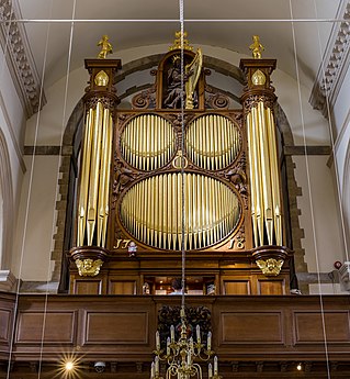 Nicholson Organ
 -
 The chancel and font
 -
 The West Great organ
 -
 The Choir
- Reason
- I Nominate 4 Pictures Expect The Nave
- Articles in which this image appears
- Portsmouth Cathedral +1
- FP category for this image
- Wikipedia:Featured pictures/Places/Interiors
- Creator
- Diliff
- Support as nominator – National Names 2000 ( talk) 01:25, 3 January 2015 (UTC)
- Support Fantastic set as usual... So clear, we can even make out the shadowy reflection of Diliff in the brass bowl of the light about the Chancel... Shame about the motion blur on the Organist(?), but not exactly like you can demand he sits still... gazhiley 09:25, 3 January 2015 (UTC)
- Support - This is a beautiful picture, deserves FP status completely -- DUCK404 a ( talk) 18:53, 3 January 2015 (UTC)
- Support Another wonderful set. Great use in the article. Can't find a single flaw. Mattximus ( talk) 21:33, 3 January 2015 (UTC)
- Support Was just wondering why these weren't included with the other image... Adam Cuerden ( talk) 06:39, 4 January 2015 (UTC)
- Support Very high quality and encyclopedic valuable. Diako « Talk » 09:09, 4 January 2015 (UTC)
- Support nice work! -- Alchemist-hp ( talk) 16:24, 4 January 2015 (UTC)
- Support. Thanks for the nomination. Closer, perhaps it could be combined with the already promoted image of the nave? Obviously it doesn't need to be added to this nomination now, I just mean that assuming this set is promoted, the nave image could be added to the set. Ðiliff «» (Talk) 18:13, 4 January 2015 (UTC)
- @ Diliff: Only if it's added to this nomination. {{ Featured picture set}} needs a links, where it was decided that it's part of the set. See Wikipedia:Featured picture candidates/United States Silver Certificates (complete set) for a similar case, where some images were already featured, but were still included in the set nomination. Armbrust The Homunculus 22:18, 4 January 2015 (UTC)
- OK, thanks Ambrust. @ National Names 2000:, do you want to add the Portsmouth Nave image to this nomination so it can be included in the set? Ðiliff «» (Talk) 08:51, 5 January 2015 (UTC)
- Support ///EuroCar GT 22:57, 5 January 2015 (UTC)
- Support — Fine images. One can even tell that the Bible is open to the Song of Solomon, though one can't read the text. (And that may be a good thing.) Sca ( talk) 22:05, 6 January 2015 (UTC)
- Support - Very nice.-- Jobas ( talk) 16:00, 10 January 2015 (UTC)
Promoted File:Portsmouth Cathedral Nicholson Organ, Portsmouth, Hampshire, UK - Diliff.jpg --
Armbrust
The Homunculus 00:02, 14 January 2015 (UTC)
Promoted File:Portsmouth Cathedral Chancel, Portsmouth, Hampshire, UK - Diliff.jpg --
Armbrust
The Homunculus 00:02, 14 January 2015 (UTC)
Promoted File:Portsmouth Cathedral West Great Organ, Portsmouth, Hampshire, UK - Diliff.jpg --
Armbrust
The Homunculus 00:02, 14 January 2015 (UTC)
Promoted File:Portsmouth Cathedral Choir, Portsmouth, Hampshire, UK - Diliff.jpg --
Armbrust
The Homunculus 00:02, 14 January 2015 (UTC)
Donetsk People's Republic Regional City Hall (Barricades and Balcony)
Voting period is over. Please don't add any new votes. Voting period ends on 14 January 2015 at 00:01:00 UTC
- Reason
- This Is an Historical of Donetsk Oblast in Ukraine
- Articles in which this image appears
- Donetsk People's Republic
- FP category for this image
- Wikipedia:Featured pictures/History/Others or Wikipedia:Featured pictures/Other
- Creator
- Graham Phillips
- Support as nominator – National Names 2000 ( talk) 12:49, 2 January 2015 (UTC)
- Support film – Hafspajen ( talk) 13:34, 2 January 2015 (UTC)
- Oppose — This video may constitute a sort of gonzo journalism vignette. However, technically it's not up to FP standards, IMO. Sca ( talk) 15:26, 2 January 2015 (UTC)
- Oppose for now. We should have the original resolution (will do myself) and (since this is the English Wikipedia) subtitles of what the guy is saying. — Crisco 1492 ( talk) 04:24, 3 January 2015 (UTC)
- Original resolution uploaded. Anyone speak Ukranian(?) — Crisco 1492 ( talk) 04:44, 3 January 2015 (UTC)
- Oppose per Crisco 1492 -- DUCK404 a ( talk) 18:56, 3 January 2015 (UTC)
- Oppose as above. It needs a translation as it's on English Wikipedia, and I'm confused at the opening few seconds, what is that supposed to be? Mattximus ( talk) 21:35, 3 January 2015 (UTC)
- Comment: In addition to lacking English subs/trans: unsteady camera, too much panning of tires & barbed wire. Sca ( talk) 21:51, 3 January 2015 (UTC)
- Comment - it was probably never meant to be filmed. If the officials knew about it this might got destroyed. It is pretty obvious what it is. These are the countries who react to things like Teddybear Airdrop Minsk 2012 and want to delete the article on Jimbo Wales. If he took a real big good quality camera to take the clear pictures you demand, the guy might have ended up in prison. Hafspajen ( talk) 02:58, 4 January 2015 (UTC)
- Yeah, I agree with Haffy. If this is something spur of the moment but important, or something likely to be censored, the jitter is fine. — Crisco 1492 ( talk) 14:03, 4 January 2015 (UTC)
- Those are all valid points by Hafs, and this video is appropriate in the context of the Donetsk People's Republic article, (although a more lucid caption is needed than "The Barricades From Ukraine Have Been Seen After"). But as a stand-alone Main Page feature, it's not sufficiently comprehensible, IMO. It would leave readers scratching their heads. Sca ( talk) 14:23, 4 January 2015 (UTC)
- Hence why we've been saying "we need subtitles", and why I've posted at the reference desk in search of help. — Crisco 1492 ( talk) 16:16, 4 January 2015 (UTC)
- I speak Ukrainian. I might be able to help establish whether it's worth the efforts. Er, what's the url? [EDIT] I've found it. I don't know who decided it was in Ukrainian: it's actually in Russian (which I could translate, but there are an abundance of Russian speakers available at English Wikipedia: the only thing they may have problems with is the regional accent which I do know). -- Iryna Harpy ( talk) 00:21, 5 January 2015 (UTC)
- I will not have a chance to listen to it until the evening, but then I can see what I can do. Obviously, if someone wants to translate/subtitle it before (European) evening, I have no objections.-- Ymblanter ( talk) 07:00, 5 January 2015 (UTC)
- @Iryna: I put "Ukranian(?)" because the city's in Ukraine, though considering the context I'm not surprised this is Russian. — Crisco 1492 ( talk) 13:29, 5 January 2015 (UTC)
0:07 - 0:09 Дорогие земляки
0:09 - 0:14 У меня будет чисто техническая информация, но она может оказаться всем нам очень полезной
0:14 - 0:20 Если вы обратите внимание вон в ту сторону, вы увидите белый флаг с красным крестом
0:20 - 0:26 Там передвижной медицинский пункт нашего первого добровольческого медицинского отряда
0:20 - 0:30 для оказания медицинской помощи тем из вас, дорогие наши и любимые, кто будет в ней нуждаться
0:35 - 0:37 Я буду краток
0:37 - 0:41 Мы, врачи - плоть от плоти своего народа
0:41 - 0:48 Мы едины со своим народом. Мы готовы выполнить наш врачебный долг перед вами до конца и любой ценой
0:48 - 0:50 Мы уверены
0:56 - 1:05 Мы уверены, что каждый из вас так же до конца исполнит свой долг перед нашей родиной и перед своим народом
- Now this is my unprofessional translation:
0:07 - 0:09 Dear compatriots
0:09 - 0:14 I have a purely technical communication for you, but this informacion might be very useful for all of us
0:14 - 0:20 If you look that way, there is a white flag with a red cross
0:20 - 0:26 This is a mobile support hospital run by our first mobile voluntary medical detachment
0:20 - 0:30 to provide medical services to those of you who need it
0:35 - 0:37 I will be very brief
0:37 - 0:41 We, doctors, are part of our people
0:41 - 0:48 We are united with our people. We are ready to render medical services fully and by every means
0:48 - 0:50 We are sure
0:56 - 1:05 We are sure that each of you will fully pay your debt to our fatherland and our people as well
- Doesn't seem to be particularly useful for the article. — Crisco 1492 ( talk) 22:12, 7 January 2015 (UTC)
- I do not care. I was asked to help - I spent one hour of my time (which is btw pretty expensive) to provide the translation. Next time I might politely refuse.-- Ymblanter ( talk) 22:17, 7 January 2015 (UTC)
- That was not intended to reflect on your much-appreciated translation. It was intended to refer to how the file meets (or does not meet) the FP criteria, specifically #5: "Adds significant encyclopedic value to an article and helps readers to understand an article." That this film shows a relatively standard statement and not something particularly significant means that I will not be changing my !vote to support. I will, however, be glad to do the timed text. — Crisco 1492 ( talk) 22:28, 7 January 2015 (UTC)
- And done. The timing is liable to be off on the Russian version; my apologies for that. — Crisco 1492 ( talk) 22:56, 7 January 2015 (UTC)
- Oppose per Sca about the opening seconds. Also, rather than being an undercover footage, which would justify the poor quality, this seems to me to be a poorly done propaganda shot, or at least not undercover. The journalist apparently has worked for Russia Today, so would probably be tolerated by the people there, and judging from what the man in the video is saying, the video could be interpreted as trying to portray the situation not as threatening but as people trying to help. In that case a better quality can be demanded, I think. Yakikaki ( talk) 16:46, 8 January 2015 (UTC)
- I don't speak Russian, but this video struck me at first view as POV, i.e. pro-Russsian-separatists. (Correct me if I got the wrong impression.) Again, it's technically subpar and IMO of scant EV for an English-speaking audience. So they're demonstrating for their POV? That's not news.
I say this even though I understand their point of view. It's similar to that of many other ethnic Russians, in other ex-Soviet so-called republics. (I have personal experience with the phenomenon.) That's not the key issue in Ukraine. The issue in Ukraine is whether geopolitical change should be sought through violence or other extralegal means. I don't see how this video elucidates the topic. The English subs help, but they don't change the essentially chaotic character of the segment. Sca ( talk) 18:36, 8 January 2015 (UTC)
- I don't speak Russian, but this video struck me at first view as POV, i.e. pro-Russsian-separatists. (Correct me if I got the wrong impression.) Again, it's technically subpar and IMO of scant EV for an English-speaking audience. So they're demonstrating for their POV? That's not news.
Not Promoted -- Armbrust The Homunculus 00:20, 14 January 2015 (UTC)
St. John the Baptist (Leonardo)
Voting period is over. Please don't add any new votes. Voting period ends on 14 January 2015 at 00:01 UTC

- Reason
- Very impressive, high-quality scan. Used in a wide variety of articles, including one on the painting itself.
- Articles in which this image appears
- St. John the Baptist (Leonardo) +7
- FP category for this image
- Wikipedia:Featured pictures/Artwork/Paintings
- Creator
- Leonardo da Vinci
- Support as nominator – — Crisco 1492 ( talk) 05:34, 1 January 2015 (UTC)
- Support - Hafspajen ( talk) 20:51, 1 January 2015 (UTC)
- Support - -- DUCK404 a ( talk) 00:48, 4 January 2015 (UTC)
- Support - National Names 2000 ( talk) 08:56, 8 January 2015 (UTC)
- Support - Rreagan007 ( talk) 20:27, 9 January 2015 (UTC)
- Support - Bryant2000 ( talk) 03:34, 10 January 2015 (UTC)
- Support -- Jobas ( talk) 16:01, 10 January 2015 (UTC)
- Comment at full resolution the image is covered in white spots and hairs- I can't find any details on the source, but was this scanned from a dirty slide? Xanthomelanoussprog ( talk) 23:03, 13 January 2015 (UTC)
Promoted File:Leonardo da Vinci - Saint John the Baptist C2RMF retouched.jpg -- Armbrust The Homunculus 00:21, 14 January 2015 (UTC)
Horsehead Nebula
Voting period is over. Please don't add any new votes. Voting period ends on 14 January 2015 at 00:01 UTC

- Reason
- though File:Barnard_33.jpg is a FP, this is a different kind of impresiveness
- Articles in which this image appears
- Horsehead Nebula, Hubble Space Telescope
- FP category for this image
- Wikipedia:Featured pictures/Space/Looking out
- Creator
- NASA
- Support as nominator – Nergaal ( talk) 13:35, 3 January 2015 (UTC)
- Support - DUCK404 a ( talk) 00:45, 4 January 2015 (UTC)
- Support - I'm honestly quite shocked this apparently hasn't been nominated already. I even prefix-searched the Featured picture candidates subpages. Adam Cuerden ( talk) 00:25, 5 January 2015 (UTC)
- Support - Not as impressive as this one (IMHO), but still useful and an incredible image. APK whisper in my ear 04:33, 6 January 2015 (UTC)
- Support -- Useful head. Ken's pic is just WOW..-- The Herald : here I am 15:15, 9 January 2015 (UTC)
- Support - Wonderful image. Rreagan007 ( talk) 20:32, 9 January 2015 (UTC)
- Support - Very nice.-- Jobas ( talk) 16:00, 10 January 2015 (UTC)
Promoted File:Hubble Sees a Horsehead of a Different Color.jpg -- Armbrust The Homunculus 00:22, 14 January 2015 (UTC)
De menagerie
Voting period is over. Please don't add any new votes. Voting period ends on 14 Jan 2015 at 01:18:04 (UTC)

- Reason
- High resolution, representative of the artist's oeuvre
- Articles in which this image appears
- Melchior d'Hondecoeter, +1
- FP category for this image
- Wikipedia:Featured pictures/Artwork/Paintings
- Creator
- Melchior d'Hondecoeter
- Support as nominator – — Crisco 1492 ( talk) 01:18, 4 January 2015 (UTC)
- Support a flashy depiction of exotic animals, very fashionable those times. Hafspajen ( talk) 02:54, 4 January 2015 (UTC)
- Support Adam Cuerden ( talk) 01:46, 5 January 2015 (UTC)
- Support Very Classic & Good Painting National Names 2000 ( talk) 01:02, 9 January 2015 (UTC)
- Support - Very nice image. Rreagan007 ( talk) 20:24, 9 January 2015 (UTC)
- Support - Bryant2000 ( talk) 03:36, 10 January 2015 (UTC)Bryant2000
- Support - Very nice.-- Jobas ( talk) 15:59, 10 January 2015 (UTC)
Promoted File:De menagerie, Melchior d' Hondecoeter, ca. 1690 - Rijksmuseum.jpg -- Armbrust The Homunculus 01:20, 14 January 2015 (UTC)
Evelyn Nisbet
Voting period is over. Please don't add any new votes. Voting period ends on 14 Jan 2015 at 04:57:02 (UTC)

- Reason
- The most well-known photograph of Evelyn Nesbit, considered the world's first supermodel. EV is great.
- Articles in which this image appears
- Evelyn Nesbit
- FP category for this image
- Wikipedia:Featured_pictures/People/Others
- Creator
- Käsebier, Gertrude, 1852-1934, photographer. Trialsanderrors ( talk · contribs), uploader.
- Support as nominator – Étienne Dolet ( talk) 04:57, 4 January 2015 (UTC)
- Comment Think we could do slightly better with the crop at the top - it's such a tight crop anyway, it seems a shame to lose even the few pixels... Adam Cuerden ( talk) 06:42, 4 January 2015 (UTC)
- Oppose Head cut off... Not FP standard sorry...
gazhiley 10:01, 4 January 2015 (UTC)
- For historical images that were widely reproduced, I think we can make an exception, but we ought to include all the pixels that do exist... But she's 15 in this photo, so I'm just not comfortable doing a restoration. Adam Cuerden ( talk) 16:01, 4 January 2015 (UTC)
- Oppose - A better crop would increase the FP worthiness of this image - DUCK404 a ( talk) 18:18, 4 January 2015 (UTC)
- Weak oppose - Lovely photo, but as mentioned above, the crop is an issue. If it was the only photo we had of her, I'd support. APK whisper in my ear 04:27, 6 January 2015 (UTC)
Not Promoted -- Armbrust The Homunculus 13:30, 14 January 2015 (UTC)
Shrovetide Revellers
Voting period is over. Please don't add any new votes. Voting period ends on 14 Jan 2015 at 16:14:39 (UTC)

- Reason
- High quality scan of an interesting work.
- Articles in which this image appears
- Shrovetide Revellers
- FP category for this image
- Wikipedia:Featured pictures/Artwork/Paintings
- Creator
- Frans Hals
- Support as nominator – — Crisco 1492 ( talk) 16:14, 4 January 2015 (UTC)
- Support - nice. What does the f h stand for on the ale thing? Hafspajen ( talk) 16:55, 4 January 2015 (UTC)
- Frans Hals, perhaps? Supported by the Met — Crisco 1492 ( talk) 17:07, 4 January 2015 (UTC)
- Or perhaps Freiherr von Hafspajen? Sca ( talk) 22:24, 4 January 2015 (UTC)
- Support - A bit unusual for Hals; the background revelers are downright caricatures. But it's a gorgeous work.
Adam Cuerden (
talk) 22:09, 4 January 2015 (UTC)
- Apparently they were painted over, so I guess you weren't the only one who felt that way. —
Crisco 1492 (
talk) 23:27, 4 January 2015 (UTC)
- Except I like them. =) Adam Cuerden ( talk) 00:21, 5 January 2015 (UTC)
- Apparently they were painted over, so I guess you weren't the only one who felt that way. —
Crisco 1492 (
talk) 23:27, 4 January 2015 (UTC)
- Comment I never really liked all his pictures, making faces. But he is a great artist. I don't often vote because I personally like an artist - but because he is a good one.
He did have tendency to make funny looking paintings, thoug. (almost caricatures) like most Dutch those time. It was a la mode,
 like this one, by Joos v C. It was called
Tronie, the style...
Hafspajen (
talk) 00:30, 5 January 2015 (UTC)
like this one, by Joos v C. It was called
Tronie, the style...
Hafspajen (
talk) 00:30, 5 January 2015 (UTC)
- Not usually this much of a caricature, though. He tends to exaggerate a bit to give a still painting more life, but doesn't tend to go as far as here... These ones are very modernist, actually, remind me of artworks from the 20s and 30s. Adam Cuerden ( talk) 12:39, 5 January 2015 (UTC)
- Comment I never really liked all his pictures, making faces. But he is a great artist. I don't often vote because I personally like an artist - but because he is a good one.
He did have tendency to make funny looking paintings, thoug. (almost caricatures) like most Dutch those time. It was a la mode,
- Oppose – The painting is interesting enough, but the image is too dark. – Editør (
talk) 19:24, 9 January 2015 (UTC)
- @ Editør: A lot of paintings darken over time. I'd presume that's like that in the original. Adam Cuerden ( talk) 17:39, 10 January 2015 (UTC)
- Possibly, but in my opinion the image needs more brightness and contrast to pass FP criterion #1. Although I'm not nominating this version because it is taken too far, compare File:Frans Hals, Merrymakers at Shrovetide (c. 1616–1617).jpg. – Editør ( talk) 19:10, 11 January 2015 (UTC)
- @ Editør: That - and all images like it - fails criterion 8, inappropriate digital manipulation. That one fails particularly hard, as it doesn't even mention it was modified from the source given. With paintings, we need to show them as they are now; this is a long-standing consensus. We can argue a little bit, since lighting can change how a picture looks, but only a little. "High technical standard" for paintings means "shows what the painting looks like", not "what we might wish it to look like", as the latter tends to kill all value for discussions of the painting. Adam Cuerden ( talk) 00:19, 12 January 2015 (UTC)
- Agree. That one in particular is a lot whiter than the painting is now (compare what appears to be the frame, which is still visible in the lower left corner; do you know any wood that is that bright?) — Crisco 1492 ( talk) 04:21, 12 January 2015 (UTC)
- Of course that images fails a bunch of criteria, but that is not relevant, no-one is nominating it! My point remains that we should not select a dark and unclear image of a painting as FP based on speculation of the state of the painting. A reliable source about the state of the painting would clear things up quickly and would probably convince me to change my vote. – Editør ( talk) 09:57, 12 January 2015 (UTC)
- @ Editør: This isn't mere speculation: This copy is the reproduction by the Metropolitan Museum of Art themselves, directly sourced from the museum who owns it: [4]. Adam Cuerden ( talk) 15:40, 12 January 2015 (UTC)
- Support - Very nice.-- Jobas ( talk) 15:59, 10 January 2015 (UTC)
- Support--High quality image with it's own article.-- Godot13 ( talk) 08:22, 13 January 2015 (UTC)
- Support Nice and gorgeous _ Alborzagros ( talk) 11:30, 14 January 2015 (UTC)
Promoted File:Frans Hals, Merrymakers at Shrovetide, The Metropolitan Museum of Art.jpg -- Armbrust The Homunculus 16:15, 14 January 2015 (UTC)
Johannes van den Bosch
Voting period is over. Please don't add any new votes. Voting period ends on 14 Jan 2015 at 22:03:18 (UTC)

- Reason
- High quality copy of an extremely good painting by a reasonably notable artist; person depicted highly notable
- Articles in which this image appears
- Johannes van den Bosch, Count van den Bosch
- FP category for this image
- He's a little hard to classify exactly, either Wikipedia:Featured_pictures/People/Political or Wikipedia:Featured_pictures/People/Military.
- Creator
- Cornelis Kruseman
- Support as nominator – Adam Cuerden ( talk) 22:03, 4 January 2015 (UTC)
- Support Cruseman facit 829 ... stylish sinature. Hafspajen ( talk) 23:12, 4 January 2015 (UTC)
- Comment - Current version is considerably bluer than the original at the Rijksmuseum website . —
Crisco 1492 (
talk) 23:33, 4 January 2015 (UTC)
- @
Crisco 1492: You uploaded it, Crisco. If you have a better copy, please replace.
Adam Cuerden (
talk) 00:11, 5 January 2015 (UTC)
- I uploaded that after making the comment. Compare the version that was there when you nommed and my recent upload. —
Crisco 1492 (
talk) 00:24, 5 January 2015 (UTC)
- Fair enough. Agree it's an improvement. Adam Cuerden ( talk) 00:26, 5 January 2015 (UTC)
- I uploaded that after making the comment. Compare the version that was there when you nommed and my recent upload. —
Crisco 1492 (
talk) 00:24, 5 January 2015 (UTC)
- @
Crisco 1492: You uploaded it, Crisco. If you have a better copy, please replace.
Adam Cuerden (
talk) 00:11, 5 January 2015 (UTC)
- Support - Useful — Crisco 1492 ( talk) 00:37, 5 January 2015 (UTC)
- Support – Editør ( talk) 09:41, 5 January 2015 (UTC)
- Support - APK whisper in my ear 04:26, 6 January 2015 (UTC)
- Support - Good, useful. Yakikaki ( talk) 16:52, 8 January 2015 (UTC)
- Support - Very nice.-- Jobas ( talk) 15:59, 10 January 2015 (UTC)
Promoted File:Johannes van den Bosch.jpeg -- Armbrust The Homunculus 22:48, 14 January 2015 (UTC)
Claes Duyst van Voorhout
Voting period is over. Please don't add any new votes. Voting period ends on 15 Jan 2015 at 01:43:01 (UTC)

- Reason
- A lovely painting by Frans Hals, with his typical beautiful depiction of fabric. Has its own article.
- Articles in which this image appears
- Claes Duyst van Voorhout, List of paintings by Frans Hals
- FP category for this image
- Wikipedia:Featured pictures/Artwork/Paintings
- Creator
- Frans Hals
- Support as nominator – Adam Cuerden ( talk) 01:43, 5 January 2015 (UTC)
- Support - Lovely work. — Crisco 1492 ( talk) 17:04, 5 January 2015 (UTC)
- Support - huh. Mustache. Hafspajen ( talk) 18:39, 5 January 2015 (UTC)
- Support — He looks like a
brawlerbrewer. Sca ( talk) 22:43, 5 January 2015 (UTC) - Support - Nice and I love the pose. APK whisper in my ear 04:22, 6 January 2015 (UTC)
- Support - Very nice.-- Jobas ( talk) 15:58, 10 January 2015 (UTC)
Promoted File:Frans Hals - Claes Duyst van Voorhout.jpg -- Armbrust The Homunculus 01:44, 15 January 2015 (UTC)
Bassac Abbey
Voting period is over. Please don't add any new votes. Voting period ends on 15 Jan 2015 at 10:02:14 (UTC)

- Reason
- HQ + EV
- Articles in which this image appears
- Bassac Abbey
- FP category for this image
- Wikipedia:Featured pictures/Places/Architecture
- Creator
- JLPC
- Support as nominator – Alborzagros ( talk) 10:02, 5 January 2015 (UTC)
- Support I like this... Seems to scream a mixture of rural and classic... Seems technically ok to me as well... gazhiley 11:19, 5 January 2015 (UTC)
- Support Some stunning detail. Adam Cuerden ( talk) 13:17, 5 January 2015 (UTC)
- Comment - I think the crop is a bit too close to the steeple. — Crisco 1492 ( talk) 14:36, 5 January 2015 (UTC)
OpposeComment - As much as I think this is a nice picture, it lacks an element of uniqueness (there is nothing in this picture, in my opinion, that makes it FP worthy apart from its sharpness)- DUCK404 a ( talk) 04:49, 7 January 2015 (UTC)
- Support - Very nice.-- Jobas ( talk) 15:58, 10 January 2015 (UTC)
- Support ok for me. -- Alchemist-hp ( talk) 23:25, 14 January 2015 (UTC)
Promoted File:Bassac 16 Abbaye vue ESE 2014.jpg -- Armbrust The Homunculus 10:04, 15 January 2015 (UTC)
Shrovetide
Voting period is over. Please don't add any new votes. Voting period ends on 15 Jan 2015 at 12:37:27 (UTC)

- Reason
- A gorgeous painting by an interesting Russian artist. Practically glows. Pretty new in the articles, but given the previous edit was August, and it does an excellent job in illustrating the text about his "colourful paintings and joyful genre pieces", I think it's stable enough.
- Articles in which this image appears
- Boris Kustodiev, Shrovetide
- FP category for this image
- Wikipedia:Featured pictures/Artwork/Paintings
- Creator
- Boris Kustodiev
- Support as nominator – Adam Cuerden ( talk) 12:37, 5 January 2015 (UTC)
- Support - USeful. — Crisco 1492 ( talk) 13:24, 5 January 2015 (UTC)
- Support - nice. Hafspajen ( talk) 18:42, 5 January 2015 (UTC)
- Support — So magically colorful – one of my favorites by Kustodiev (along with this.) Sca ( talk) 19:22, 5 January 2015 (UTC)
- Support ///EuroCar GT 22:56, 5 January 2015 (UTC)
- Support But there's also a thin black line on the right edge of the photograph. Although hardly noticeable from a distance, it indeed catches ones eye upon closer examination. In fact, it looks to be cropped a little too much on the right edge. Just check out the signature. Only half of the date appears "19-". Étienne Dolet ( talk) 00:01, 6 January 2015 (UTC)
- Given the shadow, I believe that's the edge of the frame - frames often cover a small amount of the original artwork, so painters who go right to the edge often find a little bit covered. Could maybe crop the line, though. Adam Cuerden ( talk) 01:19, 6 January 2015 (UTC)
- Support Great color. APK whisper in my ear 04:15, 6 January 2015 (UTC)
- Support Saw it earlier this year on loan in Stockholm at the Royal Academy of Arts. A significant work according to the museum. I remember the colours as more bland, however a second look on the web seams to indicate that the painting is not as dull as I remember. P. S. Burton ( talk) 13:37, 6 January 2015 (UTC)
- Did you mean earlier in 2014? Perhaps it's been cleaned since your visit? Sca ( talk) 16:56, 6 January 2015 (UTC)
- Yes, I forgot that it is now 2015. I do not think it has been cleaned. I just remembered the colours as more bland. But then I was this picture and realised that my memory served me wrong. P. S. Burton ( talk) 19:47, 6 January 2015 (UTC)
- Support Excellent! WordSeventeen ( talk) 00:52, 7 January 2015 (UTC)
- Support - Very nice.-- Jobas ( talk) 15:57, 10 January 2015 (UTC)
Promoted File:Boris Kustodiev - Shrovetide - Google Art Project.jpg -- Armbrust The Homunculus 12:43, 15 January 2015 (UTC)
Voting period is over. Please don't add any new votes. Voting period ends on 16 Jan 2015 at 11:29:49 (UTC)

- Reason
- High-resolution image of a notable German abbey church and a great example of the Beuron Art School
- Articles in which this image appears
- Eibingen Abbey
- FP category for this image
- Wikipedia:Featured pictures/Places/Interiors
- Creator
- DXR
- Support as nominator – DXR ( talk) 11:29, 6 January 2015 (UTC)
- Support - Nice to know Diliff is an inspiration to everyone. Very well done. This is making me very, very, very impatient for the Swiss Arca plate to come in so I can use my new Nodal Ninja. — Crisco 1492 ( talk) 16:44, 6 January 2015 (UTC)
- Oh, yeah he sure is :D. The wait is well worth it! --
DXR (
talk) 19:48, 6 January 2015 (UTC)
- It's in. Fingers crossed that I'll be even half as good at it as y'all. — Crisco 1492 ( talk) 18:30, 8 January 2015 (UTC)
- Oh, yeah he sure is :D. The wait is well worth it! --
DXR (
talk) 19:48, 6 January 2015 (UTC)
- Support — Technically impressive. Sca ( talk) 16:59, 6 January 2015 (UTC)
- Support. Technically excellent as already mentioned. I didn't realise you had started using the same 35mm Sigma that I have. If you're going to use 75 frames, surely 50mm is a better focal length though? 75 frames for this angle of view and a 35mm lens means more overlap than is probably needed. Just a minor technical point though. :-) Ðiliff «» (Talk) 18:59, 6 January 2015 (UTC)
- Thanks. Ha, you probably have a point here, but it isn't so much the overlap as the FOV. Currently, I'm doing -50°,-25°,0°, 25°, 50° on the horizontal and that is probably too much (gives me about 145°, which is of course unusable in practice). I guess doing four shots on that axis would be enough, but that is not giving me very convenient numbers with 25° steps (perhaps I will try it next time). What did you use when you still had the 35mm in use, 30°? I would of course prefer the 50mm, but the reality of most German churches is that the benches are so close that anything beyond 40mm becomes very tricky with DOF. Many churches are dark enough anyway (not this one, though) and I'm not keen on having unsharp parts even at f/16. Of course you have an advantage with those glorious cathedrals --
DXR (
talk) 19:48, 6 January 2015 (UTC)
- is it just me or can anyone else not read the above two comments without thinking tweed jackets and thick rimmed spectacles, and thermos flasks in hand?! haha I wish I knew what you two were talking about!
gazhiley 11:23, 7 January 2015 (UTC)
- Sorry Gaz, I guess for everyone else that simply appreciates the final product, it's not that interesting. But the technicals behind how they are created (interior panoramas) is a little complex. DXR, actually with the 35mm Sigma, I was usually only doing 3 columns by 2 rows (and 5 bracketed exposures) with 24° horizontal rotation, whereas when I got the 50mm, I 'upgraded' to 5 columns by 3 rows and 20° horizontal rotation. Four shots on the horizontal axis would be more than enough but it's a bit annoying when you want to start the panorama with a good centre point. I have my Nodal Ninja attached to an Arca Swiss Z1 DP ball head which has a panoramic rotator on it (as part of the Arca Swiss clamp, rather than at the bottom of the ball head where it attaches to the tripod). So what I do is, I lock the rotation of the Nodal Ninja, get the bubble level correct using the ball head adjustments, then rotate the ball head panoramic rotator using grid lines on the live preview of my camera to determine when the view is completely centred. The benefit of the Arca Swiss ball head rotator is that it rotates on a completely horizontal axis, whereas if you use the regular rotator on the bottom of the ball head and your tripod isn't perfectly vertical, you will not be rotating on the horizontal axis. Does that make any sense? It's a minor advantage, but it actually simplifies the overall process, and certainly makes stitching much easier because all the images are already properly aligned and straight. With 4 columns, it is not so easy to align in this way because you don't have a centre point to work with. Also, you should still be able to get a good DOF with a 50mm lens if you use the correct hyperfocal distance. For me with my 50mm lens, it means focusing on a point about 10 metres away from the camera, and gives you an 'in focus' distance of about 30cm to infinity (from memory) at f/13. I don't know if you do that already. It might be more of a disadvantage to go to f/13 or more on the D800 because diffraction would have more an effect on your camera than mine (because of the additional resolution). When I was using a 35mm and wasn't taking the panoramas as seriously, I used to be lazy and focus on the rear wall of the church but it didn't maximise the DOF. With the 50mm, using the hyperfocal distance is crucial. Anyway, hope that helps.
Ðiliff «»
(Talk) 14:14, 7 January 2015 (UTC)
- Thanks Ðiliff - no need to ever apologise though! I come here to learn more about photography... Just sometimes I get lost! That makes sense tho yes... gazhiley 15:11, 7 January 2015 (UTC)
-
Ðiliff that approach sounds quite logical. I have just started to use a ballhead, even though I mainly use it for leveling at this moment. With regards to the DOF, I'm pretty sure that your maths is off somewhere here. Did you want to write 300 cm? Perhaps I am getting it badly wrong, but I am nearly certain that there is no way to get such a large DOF with a normal prime lens on a full format sensor. For example,
this calculator suggests a hyperfocal distance of about 6.5m for 50mm f/13, leaving 0-3m (and therefore too much for many church benches) unsharp. --
DXR (
talk) 20:33, 7 January 2015 (UTC)
- Sorry, you're right, I meant to say 300cm. Different hyperfocal distance calculators seem to result in slightly different ranges, but on my 5d Mk III, you get acceptable 'in focus' sharpness from 150-200cm onwards from my experience. The thing is, with a small amount of downsampling and the fact that the loss of focus is progressive, it isn't really terribly out of focus until much closer than the theoretical minimum limit of focus. For example this image, where the nearest bench seats were probably about 50cm from the camera and the next row forward were about 150cm away. They aren't completely in focus but are acceptably sharp, I think. By the third row, they are most likely just at the minimum focus distance. As I said, it would be a more obvious effect on the D800 because of the resolution advantage. Having said that, I would rather have more resolution/detail in the majority of my image and a slight loss of focus on the really close foreground objects, than have a lower resolution and everything sharp. But I suppose 50 megapixels isn't too bad already. ;-) As for my ball head, I still mainly use it for levelling, and the panoramic rotator on the clamp is more just handy rather than essential. Ðiliff «» (Talk) 23:39, 7 January 2015 (UTC)
- Sorry Gaz, I guess for everyone else that simply appreciates the final product, it's not that interesting. But the technicals behind how they are created (interior panoramas) is a little complex. DXR, actually with the 35mm Sigma, I was usually only doing 3 columns by 2 rows (and 5 bracketed exposures) with 24° horizontal rotation, whereas when I got the 50mm, I 'upgraded' to 5 columns by 3 rows and 20° horizontal rotation. Four shots on the horizontal axis would be more than enough but it's a bit annoying when you want to start the panorama with a good centre point. I have my Nodal Ninja attached to an Arca Swiss Z1 DP ball head which has a panoramic rotator on it (as part of the Arca Swiss clamp, rather than at the bottom of the ball head where it attaches to the tripod). So what I do is, I lock the rotation of the Nodal Ninja, get the bubble level correct using the ball head adjustments, then rotate the ball head panoramic rotator using grid lines on the live preview of my camera to determine when the view is completely centred. The benefit of the Arca Swiss ball head rotator is that it rotates on a completely horizontal axis, whereas if you use the regular rotator on the bottom of the ball head and your tripod isn't perfectly vertical, you will not be rotating on the horizontal axis. Does that make any sense? It's a minor advantage, but it actually simplifies the overall process, and certainly makes stitching much easier because all the images are already properly aligned and straight. With 4 columns, it is not so easy to align in this way because you don't have a centre point to work with. Also, you should still be able to get a good DOF with a 50mm lens if you use the correct hyperfocal distance. For me with my 50mm lens, it means focusing on a point about 10 metres away from the camera, and gives you an 'in focus' distance of about 30cm to infinity (from memory) at f/13. I don't know if you do that already. It might be more of a disadvantage to go to f/13 or more on the D800 because diffraction would have more an effect on your camera than mine (because of the additional resolution). When I was using a 35mm and wasn't taking the panoramas as seriously, I used to be lazy and focus on the rear wall of the church but it didn't maximise the DOF. With the 50mm, using the hyperfocal distance is crucial. Anyway, hope that helps.
Ðiliff «»
(Talk) 14:14, 7 January 2015 (UTC)
- is it just me or can anyone else not read the above two comments without thinking tweed jackets and thick rimmed spectacles, and thermos flasks in hand?! haha I wish I knew what you two were talking about!
gazhiley 11:23, 7 January 2015 (UTC)
- Thanks. Ha, you probably have a point here, but it isn't so much the overlap as the FOV. Currently, I'm doing -50°,-25°,0°, 25°, 50° on the horizontal and that is probably too much (gives me about 145°, which is of course unusable in practice). I guess doing four shots on that axis would be enough, but that is not giving me very convenient numbers with 25° steps (perhaps I will try it next time). What did you use when you still had the 35mm in use, 30°? I would of course prefer the 50mm, but the reality of most German churches is that the benches are so close that anything beyond 40mm becomes very tricky with DOF. Many churches are dark enough anyway (not this one, though) and I'm not keen on having unsharp parts even at f/16. Of course you have an advantage with those glorious cathedrals --
DXR (
talk) 19:48, 6 January 2015 (UTC)
- Support Great image, crystal clear, and verticles perfect... gazhiley 11:23, 7 January 2015 (UTC)
- Support - Great picture.-- Jobas ( talk) 15:56, 10 January 2015 (UTC)
- Support - good one - Bellus Delphina talk 14:29, 11 January 2015 (UTC)
Promoted File:Abtei St. Hildegard, Rüdesheim, Nave and Sanctuary b 20140922 1.jpg -- Armbrust The Homunculus 11:32, 16 January 2015 (UTC)
The Temptation of St Anthony (Bosch painting)
Voting period is over. Please don't add any new votes. Voting period ends on 16 Jan 2015 at 14:09:43 (UTC)
.jpg)
- Reason
-
St. Anthony the Abbot is portrayed by
Hieronymus Bosch in meditation, in fantastic landscape filled with weird creatures and small demons popping up around him, trying to disturb his peace, while he is sitting under the the trunk of a dry tree. The abbot was renowned for his ability of refusing temptation. Among Hieronymus Bosch most famous works
 is
The Garden of Earthly Delights.
is
The Garden of Earthly Delights. - Articles in which this image appears
- The Temptation of St Anthony (Bosch painting), own article, List of paintings by Hieronymus Bosch
- FP category for this image
- Wikipedia:Featured pictures/Artwork/Paintings
- Creator
- Hieronymus Bosch
- Support as nominator –(Co-nom with Crisco) Hafspajen ( talk) 14:09, 6 January 2015 (UTC)
- Support - Though... is it bad that I don't even remember uploading this? — Crisco 1492 ( talk) 16:42, 6 January 2015 (UTC)
- Support--Credit him Hafs..Hint:Co-nom..
The Herald :
here I am 15:02, 9 January 2015 (UTC)
- Support - DUCK404 a ( talk) 04:46, 7 January 2015 (UTC)
- Support - Very nice.-- Jobas ( talk) 15:56, 10 January 2015 (UTC)
- Support-- Godot13 ( talk) 08:19, 13 January 2015 (UTC)
Promoted File:The Temptation of St Anthony (Bosch).jpg -- Armbrust The Homunculus 14:10, 16 January 2015 (UTC)
Tsarskiy Kurgan
Voting period is over. Please don't add any new votes. Voting period ends on 16 Jan 2015 at 14:52:31 (UTC)

- Reason
- HQ and EV
- Articles in which this image appears
- Royal Kurgan (Kerch)
- FP category for this image
- Wikipedia:Featured pictures/Places/Interiors
- Creator
- Anatoly Shcherbak
- Support as nominator – Alborzagros ( talk) 14:52, 6 January 2015 (UTC)
- Support The other picture in the article also shows the entrance of the tomb, which would increase EV. However: 1. I see some technical difficulty in properly exposing the day-lit surroundings and the shaded/dark part of the corridor (maybe HDR could do the trick); 2. The "wow-effect" in this photo urged me to click the article, which is important; 3. This photo is technically sound (has the sharpness and the depth of field required in this case). -- Ebertakis ( talk) 21:18, 6 January 2015 (UTC)
- Support - It is technically sound. I'm not sure if this is the full tomb, but I'll support on the assumption that it is. — Crisco 1492 ( talk) 01:40, 7 January 2015 (UTC)
- Support - Love it Bellus Delphina talk 09:31, 8 January 2015 (UTC)
- Support J e e 05:46, 9 January 2015 (UTC)
- Support Great sense of depth and composition.-- Godot13 ( talk) 23:36, 9 January 2015 (UTC)
- Support - Great picture.-- Jobas ( talk) 15:55, 10 January 2015 (UTC)
Promoted File:Царський курган 007.jpg -- Armbrust The Homunculus 14:54, 16 January 2015 (UTC)
Christopher Columbus
Voting period is over. Please don't add any new votes. Voting period ends on 16 Jan 2015 at 16:39:16 (UTC)

- Reason
- Considering I named myself after him, I can't really turn this down. High quality scan of a useful image. Note that no contemporary portraits of Columbus are known, allowing this to have high EV in his article.
- Articles in which this image appears
- Christopher Columbus, Catholic Monarchs, History of Puerto Rico, Liguria, The Last Voyage of Columbus.
- FP category for this image
- Wikipedia:Featured pictures/People/Science and engineering, perhaps?
- Creator
- Sebastiano del Piombo
- Support as nominator – — Crisco 1492 ( talk) 16:39, 6 January 2015 (UTC)
- Support Nice picture. By the way -Sebastiano was born 1485 - Colubus died 1506 - Sebastiano was 21 than. And text in Latin say it's Columbus.-- too.
Hafspajen (
talk) 17:08, 6 January 2015 (UTC)
- Yeah, but it could've been added later. Would be interesting to look into. —
Crisco 1492 (
talk) 19:23, 6 January 2015 (UTC)
- The
Met has some information regarding the painting on their website.
P. S. Burton (
talk) 19:43, 6 January 2015 (UTC)
- Indeed. Hence my comment on the writing. — Crisco 1492 ( talk) 19:53, 6 January 2015 (UTC)
- The
Met has some information regarding the painting on their website.
P. S. Burton (
talk) 19:43, 6 January 2015 (UTC)
- Yeah, but it could've been added later. Would be interesting to look into. —
Crisco 1492 (
talk) 19:23, 6 January 2015 (UTC)
- Of course, my addition of the image has been reverted and replaced with something which is a third the size, and in PNG, and artificially lightened. I'm not going to edit war, but if people feel we need to revert, go ahead. — Crisco 1492 ( talk) 13:46, 7 January 2015 (UTC)
- I had a discussion with the user on his page,
User talk:Paine Ellsworth#Colombus. I think he is bothered about the frame and likes the
 other one. I am affraid I didn't convinced him. I imagine that that frame could be cropped, though.
Hafspajen (
talk) 21:16, 7 January 2015 (UTC)
other one. I am affraid I didn't convinced him. I imagine that that frame could be cropped, though.
Hafspajen (
talk) 21:16, 7 January 2015 (UTC)
- Easy to do, but we'd be removing part of painting itself. — Crisco 1492 ( talk) 21:27, 7 January 2015 (UTC)
- I really have no qualms about the frame – in fact, I now feel that the frame adds value to the image. I am really concerned about this image's darker appearance and lower contrast. – Paine Ellsworth CLIMAX! 21:43, 7 January 2015 (UTC)
- I had a discussion with the user on his page,
User talk:Paine Ellsworth#Colombus. I think he is bothered about the frame and likes the
- Comment. ( edit conflict) I would never oppose this type of nomination, although as the one who reverted this file's inclusion in the article on Columbus, I have serious concerns about this image. It is darker and grayer with less contrast than the status quo image in the article. Since most of Wikipedia's readers are non-experts in the worlds of art and professional photography, they probably won't grasp the aesthetic value of the "inner beauty" of this candidate and would opt for the "better appearance" of the existing .png image in the article. I very much appreciate the high values of Crisco 1492 both in terms of this choice of candidate and his distaste for an unproductive edit war. I would welcome that contributor's launch of an RfC on the talk page of the Columbus article. That way we would be better able to determine which of the two images is more appropriate for that encyclopedia article, and perhaps for any other article as well. – Paine Ellsworth CLIMAX! 21:39, 7 January 2015 (UTC)
- RFCs are a bit of overkill for anything like this. The issue with digital manipulation (which the PNG has, for certain) is that it almost always modifies the color of the work to an unrealistic level. There are no pure whites in the real world, certainly not 255/255/255 like Columbus' collar. The loss of detail there is frightening. — Crisco 1492 ( talk) 21:54, 7 January 2015 (UTC)
- I agree with that, and no matter how hard I tried with Corel, and for all the improvement in other areas I made, I could never get the collar detail right. The rest of it looks really good though; here's a gnarly screenshot. – Paine Ellsworth CLIMAX! 00:59, 8 January 2015 (UTC)
- That's... not it. Short of having the actual painting at hand, it would be nigh impossible to get a reasonably accurate edit. — Crisco 1492 ( talk) 03:56, 8 January 2015 (UTC)
- Oops, sorry, I never realized it was you who edited it, Paine. Hafspajen ( talk) 10:20, 8 January 2015 (UTC)
- I started the enhancement from scratch again and uploaded the result here. I felt it necessary to do this because another editor reverted my reversion. Any who would like to compare the three images may do so on my talk page. – Paine Ellsworth CLIMAX! 17:35, 8 January 2015 (UTC)
- Support -- This should not fail..-- The Herald : here I am 11:19, 14 January 2015 (UTC)
- Support--I deserve it as featured picture because that's got undoubtedly much EV and is member of high quality portraits group. __ Alborzagros ( talk) 11:41, 14 January 2015 (UTC) Alborzagros ( talk) 11:39, 14 January 2015 (UTC)
- Comment I think this should pass, but it needs to be used in articles, and in this version. Conditional support on it being lead image in at least one article. Adam Cuerden ( talk) 23:15, 14 January 2015 (UTC)
- But Adam, it is used in plenty of articles, anyway. Hafspajen ( talk) 02:34, 16 January 2015 (UTC)
- Well, of course it is used now as the "lead image" in the Christopher Columbus article because you reverted my inclusion of a better image. Even Chris has stated that the image you reverted "is, IMHO, the right direction...". So I wonder, Adam Cuerden, if you would be so kind as to tell me precisely why you feel that this darker, low-contrast image of this great painting is superior to the image you reverted? – Paine Ellsworth CLIMAX! 03:30, 16 January 2015 (UTC)
- @ Paine Ellsworth: The Google Art Project is a reliable source for information on what paintings look like. It has a reputation for fact-checking and accuracy. We cannot actively mislead readers on the actual appearance of a key early document, any more than we could arbitrarily change the text of an early source while presenting it as the original. It is never, ever an improvement to actively mislead our readers: Paintings are one-off objects; They aren't like photos where different prints can have radically different levels. Where are you seeing Crisco saying you're right? Adam Cuerden ( talk) 07:23, 16 January 2015 (UTC)
- I said "right direction", not right. I much prefer the (presumably accurate) Met scan, but if Paine insists on having an edit, something that doesn't blow out the highlights is indubitably "the right direction". — Crisco 1492 ( talk) 15:58, 16 January 2015 (UTC)
- Yes, the right direction, so you agree that there is a better direction to go. I don't feel we're misleading readers if we highlight with discretion so they can at least get a better view of the subject, in this case a great painted portrait of who is most likely Columbus. I suppose the point is moot, now. Joys to all! – Paine 17:26, 16 January 2015 (UTC)
Promoted File:Portrait of a Man, Said to be Christopher Columbus.jpg -- Armbrust The Homunculus 16:44, 16 January 2015 (UTC)
- The image was (at the time of the closure) used as the lead image in Christopher Columbus, and therefore Adam Cuerden's condition is met. Armbrust The Homunculus 16:44, 16 January 2015 (UTC)
Todi
Voting period is over. Please don't add any new votes. Voting period ends on 17 Jan 2015 at 19:46:51 (UTC)

- Reason
- High quality view of the village
- Articles in which this image appears
- Todi
- FP category for this image
- Wikipedia:Featured pictures/Places/Urban
- Creator
- Livioandronico2013
- Support as nominator – — Crisco 1492 ( talk) 19:46, 7 January 2015 (UTC)
- Support - well, yes, I do support. Hafspajen ( talk) 21:50, 7 January 2015 (UTC)
- Weak Support Well it's hardly got the colourful appeal of Tenby, but it still looks pretty... Slight focus issues and visable halos prevent full support sorry... gazhiley 12:29, 8 January 2015 (UTC)
- Comment - Please help me understand the appeal of these pictures of generic cityscapes (and of buildings such as the Bassac Abbey one below). I can see that these pictures are of high quality, but they lack uniqueness. I don't want to vote on such pictures until I can understand this. -
DUCK404 a (
talk) 02:18, 9 January 2015 (UTC)
- From the description at the top & section 5 of the FP criteria : "Featured pictures are images that add significantly to articles, either by illustrating article content particularly well,...." ergo they don't have to be unique, they can be an FP for just being something that adds SIGNIFICANT value (EV), not neccessarily appealing visually or appealing to every person's unique interest level... Using this picture as an example, it perfectly demonstrates the article about this town, ergo fits that criteria... Does that answer your question DUCK404 a? gazhiley 11:28, 9 January 2015 (UTC)
- Support-- Godot13 ( talk) 08:18, 13 January 2015 (UTC)
- Support--Encyclopedic value and quality is also all right.__ Alborzagros ( talk) 11:34, 14 January 2015 (UTC)
Promoted File:Todi panorama.jpg -- Armbrust The Homunculus 20:02, 17 January 2015 (UTC)
Pillars of Creation
Voting period is over. Please don't add any new votes. Voting period ends on 17 Jan 2015 at 23:55:04 (UTC)


- Reason
- no comment
- Articles in which this image appears
- Eagle Nebula Pillars of Creation
- FP category for this image
- Wikipedia:Featured pictures/Space/Looking out
- Creator
- NASA
- Support as nominator – Nergaal ( talk) 23:55, 7 January 2015 (UTC)
SupportSupport full-res version - There are many NASA pictures that need to be nominated for FP - DUCK404 a ( talk) 01:42, 8 January 2015 (UTC)- Oppose - This version is under the minimum size.
File:Pillars_of_creation_2014_HST_WFC3-UVIS_full-res.jpg is what should be used. I'll denoise it a bit first. —
Crisco 1492 (
talk) 03:58, 8 January 2015 (UTC)\
- Support full res version. — Crisco 1492 ( talk) 21:44, 9 January 2015 (UTC)
Conditional Support -- If that high-res pic is nominated.Go for it Nergaal. Never miss it. Its a once-in-a-lifetime pic...-- The Herald : here I am 15:00, 9 January 2015 (UTC)
- Support --Per above..Yep! its once-in-a-lifetime chance to nominate a PoC pic. Well guys, any idea why they are named so? The nebula isn't creating any stars as it did some 6000 years ago. But surprised that even now, those diffraction spikes still appear in HST images while many other ground based guys don't show it up to a large extent..-- The Herald : here I am 13:38, 10 January 2015 (UTC)
- Support - Very nice.-- Jobas ( talk) 15:54, 10 January 2015 (UTC)
- Support (full res) - Hafspajen ( talk) 18:32, 11 January 2015 (UTC)
- Support (full res)-- Godot13 ( talk) 06:55, 12 January 2015 (UTC)
- Support (full res) Rreagan007 ( talk) 07:14, 13 January 2015 (UTC)
Promoted File:Pillars of creation 2014 HST WFC3-UVIS full-res denoised.jpg -- Armbrust The Homunculus 23:56, 17 January 2015 (UTC)
Nubian ibex
Voting period is over. Please don't add any new votes. Voting period ends on 18 Jan 2015 at 03:13:51 (UTC)

- Reason
- Not the best possible EV, but still a pretty good shot & appropriate for FP.
- Articles in which this image appears
- Nubian ibex
- FP category for this image
- Wikipedia:Featured pictures/Animals/Mammals
- Creator
- Pikiwikisrael
- Support as nominator – Երևանցի talk 03:13, 8 January 2015 (UTC)
- Oppose Sadly, this animal is classified as "vulnerable" and I'd love to promote its photo, but his shot is not very sharp, the light is harsh and the background doesn't help it either. Sorry. -- Ebertakis ( talk) 21:43, 9 January 2015 (UTC)
- Oppose - EV is low and the lighting is too harsh. Nice picture still, but not quite FP quality - DUCK404 a ( talk) 04:51, 16 January 2015 (UTC)
Not Promoted -- - The Herald ( here I am) 09:00, 18 January 2015 (UTC)
- 1 support, 2 oppose..No concensus - The Herald ( here I am) 09:00, 18 January 2015 (UTC)
Dome of S.Peter in the night
Voting period is over. Please don't add any new votes. Voting period ends on 27 Jan 2015 at 20:15:36 (UTC)

- Reason
- A beautiful view of Dome of S.Peter in the night
- Articles in which this image appears
- {{{articles}}}
- FP category for this image
- Wikipedia:Featured pictures/Places
- Creator
- Livioandronico2013 ( talk) 20:15, 17 January 2015 (UTC)
- Support as nominator – Livioandronico2013 ( talk) 20:15, 17 January 2015 (UTC)
- Oppose - Lighting and noise issues. APK whisper in my ear 23:16, 17 January 2015 (UTC)
- Oppose, suggest speedy close. Not in use in any articles. J Milburn ( talk) 13:16, 18 January 2015 (UTC)
Not Promoted -- — Crisco 1492 ( talk) 15:23, 18 January 2015 (UTC)
- Speedy close — Crisco 1492 ( talk) 15:23, 18 January 2015 (UTC)
Gustav III's masquerade outfit
Voting period is over. Please don't add any new votes. Voting period ends on 18 Jan 2015 at 16:36:25 (UTC)

- Reason
- Unusual and with high EV, as well as beautiful in its own right.
- Articles in which this image appears
- Gustav III of Sweden
- FP category for this image
- Other history
- Creator
- Göran Schmidt
- Support as nominator – Yakikaki ( talk) 16:36, 8 January 2015 (UTC)
- Comment - File is a TIF. Great for archiving, not so good for display in articles (or reuse, I'd think). — Crisco 1492 ( talk) 18:16, 10 January 2015 (UTC)
Not Promoted -- Armbrust The Homunculus 16:36, 18 January 2015 (UTC)
Black Nazarene
Voting period is over. Please don't add any new votes. Voting period ends on 19 Jan 2015 at 01:16:27 (UTC)

- Reason
- Good Resolution and High Class Format
- Articles in which this image appears
- Black Nazarene
- FP category for this image
- Wikipedia:Featured pictures/Artwork/Sculpture
- Creator
- Created by : Agustino (in 1600's) Image : Constantine Agustin
- Support as nominator – National Names 2000 ( talk) 01:16, 9 January 2015 (UTC)
- Oppose - Composition is weak (see, for instance, the cut-off stand) — Crisco 1492 ( talk) 02:18, 9 January 2015 (UTC)
- Oppose - Composition, lighting and noise issues. APK whisper in my ear 04:44, 9 January 2015 (UTC)
- Oppose
and Speedy Close- Very substandard composition that is not FP worthy - DUCK404 a ( talk) 03:51, 13 January 2015 (UTC)
Not Promoted -- Armbrust The Homunculus 03:31, 19 January 2015 (UTC)
Goethe in the Roman Campagna
Voting period is over. Please don't add any new votes. Voting period ends on 19 Jan 2015 at 13:03:24 (UTC)

- Reason
- A famous and much inonic depiction, much disputed, significant and appreciated painting of Johann Wolfgang von Goethe. It is described in Goethe's work Italian Journey. It has acquired an important place in the history of art as a German icon of national painting. The painting had an indisputable role in shaping the world’s image of Goethe. The painting is considered as one of the highlights of the museum's collection. goethe-roman-campagna-1787/ staedelmuseum.de Used, Google file.
- Articles in which this image appears
- Goethe in the Roman Campagna, Johann Heinrich Wilhelm Tischbein, Artist, Italian Journey, Occasional poetry, 1829, Culture of Germany, German language, Literature, Johann Wolfgang von Goethe, Städel, German new humanism, Philistinism, List of people from Frankfurt
- FP category for this image
- Wikipedia:Featured pictures/Artwork/Paintings
- Creator
- Johann Heinrich Wilhelm Tischbein
- Support - Absolutely lovely painting. — Crisco 1492 ( talk) 18:05, 9 January 2015 (UTC)
- Support Saw it at the Städel last year. Note the obviously impaired EV due to two left shoes :D -- DXR ( talk) 19:47, 9 January 2015 (UTC)
- Support — Detailed file of a famous painting, said (on English & German WP) to be the most widely known work of this Tischbein — for which he's sometimes known as Goethe-Tischbein. Sca ( talk) 22:13, 9 January 2015 (UTC)
- Support - Very nice.-- Jobas ( talk) 15:53, 10 January 2015 (UTC)
- Support - Very nice painting. I wonder what Goethe was thinking. CorinneSD ( talk) 18:32, 11 January 2015 (UTC)
- Comment - No secret. He wrote it all down. Italian Journey ... Hafspajen ( talk) 18:35, 11 January 2015 (UTC)
NOMINATION WITHDRAWN IN ACCORDANCE WITH DISCUSSION ON Wikipedia:Featured picture candidates/A collection of paintings of that strange wild man who roamed the fields of Provence - I an not paticipating in this low-level project any more. Hafspajen ( talk) 22:11, 18 January 2015 (UTC)
Promoted File:Johann Heinrich Wilhelm Tischbein - Goethe in the Roman Campagna - Google Art Project.jpg -- Armbrust The Homunculus 13:38, 19 January 2015 (UTC)
The Mediterranean
Voting period is over. Please don't add any new votes. Voting period ends on 29 Jan 2015 at 06:40:28 (UTC)

- Reason
- High EV
- Articles in which this image appears
- Eugène Delacroix
- FP category for this image
- Wikipedia:Featured pictures/Artwork/Paintings
- Creator
- Eugène Delacroix
- Support as nominator – National Names 2000 ( talk) 06:40, 19 January 2015 (UTC)
- Strong oppose Low quality. That is unacceptable in the featured pictures realm.__ Alborzagros ( talk) 07:43, 19 January 2015 (UTC)
Not Promoted -- Armbrust The Homunculus 14:17, 19 January 2015 (UTC)
- Speedy close, as file is below the size requirements. Armbrust The Homunculus 14:17, 19 January 2015 (UTC)
Fishing For Frogs
Voting period is over. Please don't add any new votes. Voting period ends on 29 Jan 2015 at 06:25:19 (UTC)

- Reason
- High EV
- Articles in which this image appears
- William Adolphe Bouguereau
- FP category for this image
- Wikipedia:Featured pictures/Artwork/Paintings
- Creator
- William Adolphe Bouguereau
- Support as nominator – National Names 2000 ( talk) 06:25, 19 January 2015 (UTC)
- oppose There is not even a tinge of satisfactory. I assume that's been to picked indiscriminately as FP and needs to be out of evaluation.__ Alborzagros ( talk) 07:55, 19 January 2015 (UTC)
- Oppose. While I do not understand what Alborzagros is saying, the image is currently used only in a gallery; we have a lot of great scans of work by Bouguereau, and we've already featured a couple for their use in his article. I'm not convinced that the EV is there. J Milburn ( talk) 10:35, 19 January 2015 (UTC)
- I mean the painting doesn't satisfy me. I thing it was nominated unprofessionally to qualify label of Feature Picture and has to be get rid of here. Alborzagros ( talk) 11:27, 19 January 2015 (UTC)
- Note The quality of oil-painting is too low to start judging. Alborzagros ( talk) 11:40, 19 January 2015 (UTC)
Not Promoted -- Armbrust The Homunculus 14:19, 19 January 2015 (UTC)
- Speedy close, as file is below the size requirements. Armbrust The Homunculus 14:19, 19 January 2015 (UTC)
Portrait of a Lady
Voting period is over. Please don't add any new votes. Voting period ends on 29 Jan 2015 at 08:38:47 (UTC)

- Reason
- High Resolution and High EV
- Articles in which this image appears
- Portrait of a Lady (van der Weyden) (Own Article) , Rogier van der Weyden 20+
- FP category for this image
- Wikipedia:Featured pictures/Artwork/Paintings
- Creator
- Rogier van der Weyden
- Support as nominator – National Names 2000 ( talk) 08:38, 19 January 2015 (UTC)
Support - Good scan. — Crisco 1492 ( talk) 13:21, 19 January 2015 (UTC)- Oppose - Thought it looked familiar. National Names, please look at what is already featured before you nominate. — Crisco 1492 ( talk) 14:14, 19 January 2015 (UTC)
- Oppose This painting is already featured as File:Rogier van der Weyden - Portrait of a Lady - Google Art Project.jpg. @ Crisco 1492:. Armbrust The Homunculus 14:12, 19 January 2015 (UTC)
Not Promoted -- - The Herald ( here I am) 14:44, 19 January 2015 (UTC)
- Speedy close. Duplicate of a current FP. 1 support, 2 oppose - The Herald ( here I am) 14:44, 19 January 2015 (UTC)
Mr. and Mrs. Atherton
Voting period is over. Please don't add any new votes. Voting period ends on 19 Jan 2015 at 18:11:10 (UTC)

- Reason
- A quality image; an excellent example of one of Arthur Devis's early portraits, which is also a conversation piece.
- Articles in which this image appears
- Arthur Devis (1712–1787)
- FP category for this image
- Wikipedia: Wikipedia:Featured pictures/Artwork/Paintings
- Creator
- Arthur Devis
- Support as nominator – CorinneSD ( talk) 18:11, 9 January 2015 (UTC)
- Support - Clearly representative of his style. — Crisco 1492 ( talk) 18:50, 9 January 2015 (UTC)
- Support a very interesting conversation piece painter, good painting. Real big too. Hafspajen ( talk) 18:52, 9 January 2015 (UTC)
- Support - Very nice.-- Jobas ( talk) 15:52, 10 January 2015 (UTC)
- Support - Beautiful, and as mentioned above, a great representation of Devis' work. APK whisper in my ear 22:53, 10 January 2015 (UTC)
- Support Rreagan007 ( talk) 00:43, 19 January 2015 (UTC)
Promoted File:Arthur Devis - Mr and Mrs Atherton - Google Art Project.jpg -- Armbrust The Homunculus 18:13, 19 January 2015 (UTC)
Bellona (goddess)
Voting period is over. Please don't add any new votes. Voting period ends on 19 Jan 2015 at 18:41:52 (UTC)

- Reason
- High quality painting by a great master; useful illustration, has long been stable in the article. Underrepresented area.
- Articles in which this image appears
- Bellona (goddess), List of paintings by Rembrandt
- FP category for this image
- Wikipedia:Featured pictures/Culture, entertainment, and lifestyle/Religion and mythology
- Creator
- Rembrandt
- Support as nominator – — Crisco 1492 ( talk) 18:41, 9 January 2015 (UTC)
- Support Saw the reproduction before, the shield is epic. Brandmeister talk 12:02, 10 January 2015 (UTC)
- Support - Very nice.-- Jobas ( talk) 15:52, 10 January 2015 (UTC)
- This painting has some proportion- problems again, like some of Rembrandt's paintings and drawings, the shoulders are un-proportionally small compared to the body and head, she looks like laboratory flask - but alas the shield is really great, so having said that, still support. Only wish Rembrandt would have been more serious when taking drawing lessons. Hafspajen ( talk) 11:34, 12 January 2015 (UTC)
- Support – good scan with sufficient overall EV; she's certainly not depicted as the most attractive of models ... SagaciousPhil - Chat 09:16, 15 January 2015 (UTC)
- Support Rreagan007 ( talk) 00:42, 19 January 2015 (UTC)
Promoted File:Bellona, by Rembrandt van Rijn.jpg -- Armbrust The Homunculus 18:44, 19 January 2015 (UTC)
Jan van Eyck
Voting period is over. Please don't add any new votes. Voting period ends on 29 Jan 2015 at 08:15:51 (UTC)
_with_frame.jpg)
- Reason
- Quality good. EV good.
- Articles in which this image appears
- Portrait of a Man (Self Portrait?), Jan van Eyck
- FP category for this image
- Wikipedia:Featured pictures/Artwork/Paintings
- Creator
- Keraunoscopia
- Support as nominator – Étienne Dolet ( talk) 08:15, 19 January 2015 (UTC)
- Comment: File:Portrait of a Man by Jan van Eyck-small.jpg is already featured, and the creator is not Keraunoscopia. — Crisco 1492 ( talk) 13:22, 19 January 2015 (UTC)
- WITHDRAW Yikes! I didn't know. Étienne Dolet ( talk) 20:02, 19 January 2015 (UTC)
Not Promoted -- Armbrust The Homunculus 22:14, 19 January 2015 (UTC)
- Withdrawn nomination. @ Crisco 1492: The image you mention is only used on {{ Jan van Eyck}}. Armbrust The Homunculus 22:14, 19 January 2015 (UTC)
Saudade by José Ferraz de Almeida Júnior
Voting period is over. Please don't add any new votes. Voting period ends on 20 Jan 2015 at 03:12:36 (UTC)
_-_Google_Art_Project.jpg)
- Reason
- Striking illustration of the concept of saudade, which has no direct English translation. This is a high quality image (15,036 × 30,000 pixels, file size 131.82 MB) from the Google Art Project. The word "describes a deep emotional state of nostalgic or profound melancholic longing for an absent something or someone that one loves. Moreover, it often carries a repressed knowledge that the object of longing may never return. A stronger form of saudade may be felt towards people and things whose whereabouts are unknown, such as a lost lover, or a family member who has gone missing, moved away, separated, or died. Saudade was once described as "the love that remains" after someone is gone..."
- Articles in which this image appears
- Saudade, Desire, and just replaced a smaller version of the same image on José Ferraz de Almeida Júnior
- FP category for this image
- Wikipedia:Featured pictures/Artwork/Paintings
- Creator
- José Ferraz de Almeida Júnior
- Support as nominator – Pine ✉ 03:12, 10 January 2015 (UTC)
- Support easily, nice to have this at such resolution. Brandmeister talk 12:12, 10 January 2015 (UTC)
- Support - Very nice. — Crisco 1492 ( talk) 14:28, 10 January 2015 (UTC)

- Support — Très evocative. Interesting that in Brazil there's an official day of Saudade – it's coming up on Jan. 30. (Saudade seems similar to the German Sehnsucht (illus. below right), the article about which mentions Saudade.) Sca ( talk) 15:21, 10 January 2015 (UTC)
- Support Very nice.-- Jobas ( talk) 15:37, 10 January 2015 (UTC)
- Support Hafspajen ( talk) 19:05, 10 January 2015 (UTC)
- Support Great! WordSeventeen ( talk) 14:29, 11 January 2015 (UTC)
- Support Very nice painting. CorinneSD ( talk) 18:26, 11 January 2015 (UTC)
Promoted File:Almeida Júnior - Saudade (Longing) - Google Art Project.jpg -- Armbrust The Homunculus 03:13, 20 January 2015 (UTC)
Crown of Silla
Voting period is over. Please don't add any new votes. Voting period ends on 20 Jan 2015 at 18:08:41 (UTC)

- Reason
- A very good image of a crown of Silla, and a Treasure of South Korea. We don't have any similar images, to the best of my knowledge. Featured on Commons.
- Articles in which this image appears
- Crowns of Silla
- FP category for this image
- Wikipedia:Featured pictures/Culture, entertainment, and lifestyle/Culture and lifestyle
- Creator
- Unknown; photograph by the National Museum of Korea
- Support as nominator – — Crisco 1492 ( talk) 18:08, 10 January 2015 (UTC)
- Support - Beautiful crown. Nicely displayed, with even the luster of the black cloth showing. CorinneSD ( talk) 18:22, 11 January 2015 (UTC)
- Support - did you made something with it? It's not blurry any more.
Hafspajen (
talk) 15:20, 12 January 2015 (UTC)
- No, I haven't edited this one. — Crisco 1492 ( talk) 04:53, 13 January 2015 (UTC)
- I have cropped the image a bit, but nothing else was done. — Revi 16:00, 18 January 2015 (UTC)
- Support - Tokugawapants ( talk) 21:36, 15 January 2015 (UTC)
- Support Rreagan007 ( talk) 17:15, 16 January 2015 (UTC)
- Support Yoohoo! (I found this on GlobalUsage on Commons, and I don't know about enwiki rules, so if uploader cannot vote, strike this one. Thanks,) — Revi 16:00, 18 January 2015 (UTC)
Promoted File:서봉총 금관 금제드리개.jpg -- Armbrust The Homunculus 18:12, 20 January 2015 (UTC)
Portrait of Henry VIII
Voting period is over. Please don't add any new votes. Voting period ends on 20 Jan 2015 at 19:04:26 (UTC)

- Reason
- Portrait of
Henry VIII by Hans Holbein the Younger's workshop, depicting Henry VIII. While the firs one was destroyed by fire in 1698 it is still well known today through the second ex. from the workshop of Hans Holbein the Younger 1497/8. It is one of the most iconic images of Henry and is one of the most famous portraits of any British monarch.
Workshops paintings-> were not less good than originals, ->
 compare
 - Articles in which this image appears
- Portrait of Henry VIII, Henry VIII of England, List of Canadian monarchs, Oriental carpets in Renaissance painting, Walker Art Gallery
- FP category for this image
- Wikipedia:Featured pictures/Artwork/Paintings
- Creator
- Hans Holbein the Younger - Workshop of Hans Holbein the Younger 1497/8
- Support as nominator – Hafspajen ( talk) 19:04, 10 January 2015 (UTC)
- Support as co-nom - Very good. — Crisco 1492 ( talk) 19:24, 10 January 2015 (UTC)
- Support - Highly recognizable image. APK whisper in my ear 22:50, 10 January 2015 (UTC)
- Support - Fantastic painting. Unbelievable, and very ordered, detail. CorinneSD ( talk) 18:19, 11 January 2015 (UTC)
- Support--Methinks this is the year's first co-nom. Don't worry..There are still to come -- The Herald : here I am 13:59, 14 January 2015 (UTC)
- Support - Rreagan007 ( talk) 17:17, 16 January 2015 (UTC)
- Support - National Names 2000 ( talk) 04:05, 19 January 2015 (UTC)
Promoted File:After Hans Holbein the Younger - Portrait of Henry VIII - Google Art Project.jpg -- Armbrust The Homunculus 19:05, 20 January 2015 (UTC)
Luncheon of the Boating Party
Voting period is over. Please don't add any new votes. Voting period ends on 20 Jan 2015 at 22:45:35 (UTC)

- Reason
- A masterpiece by one of the leading impressionist artists, Pierre-Auguste Renoir, Luncheon of the Boating Party is the best known work of art at The Phillips Collection, the United States' first museum of modern art.
- Articles in which this image appears
- Luncheon of the Boating Party, Pierre-Auguste Renoir, The Phillips Collection, Maison Fournaise, Duncan Phillips (art collector), Ernest Procter
- FP category for this image
- Wikipedia:Featured pictures/Artwork/Paintings
- Creator
- Pierre-Auguste Renoir
- Support as nominator – APK whisper in my ear 22:45, 10 January 2015 (UTC)
- Support Who can resist Aline Charigot, playing with her little dog... neither could Renoir, who later married her. Hafspajen ( talk) 12:47, 11 January 2015 (UTC)
- Support This Renoir is one of my favorites. It was excellently done, and also a love story! WordSeventeen ( talk) 14:26, 11 January 2015 (UTC)
- Support - Well done. — Crisco 1492 ( talk) 14:31, 11 January 2015 (UTC)
- Support — Très charmant. Sca ( talk) 15:45, 11 January 2015 (UTC)
- Support - A lovely painting. CorinneSD ( talk) 18:17, 11 January 2015 (UTC)
Promoted File:Pierre-Auguste Renoir - Luncheon of the Boating Party - Google Art Project.jpg -- Armbrust The Homunculus 22:53, 20 January 2015 (UTC)
Haller Madonna
Voting period is over. Please don't add any new votes. Voting period ends on 21 Jan 2015 at 13:32:56 (UTC)
- Haller Madonna and reverse
-

Haller Madonna -

Lot's Flight
- Reason
- An interesting set. The Haller Madonna is actually two paintings, one on the obverse and one on the reverse. The obverse depicts Mary holding the infant Jesus, whereas the reverse depicts Lot's escape from Sodom.
- Articles in which this image appears
- Haller Madonna
- FP category for this image
- Wikipedia:Featured pictures/Artwork/Paintings
- Creator
- Albrecht Dürer
- Support as nominator – — Crisco 1492 ( talk) 13:32, 11 January 2015 (UTC)
- Support - Ah, the Madonna with the yellow eyes. Very well drawn. Come on, this this is great artwork. Hafspajen ( talk) 13:52, 11 January 2015 (UTC)
- Support - Beautiful pair of paintings. Vivid colors, beautiful details. CorinneSD ( talk) 18:14, 11 January 2015 (UTC)
- Support What CorinneSD said. APK whisper in my ear 00:38, 18 January 2015 (UTC)
- Support Rreagan007 ( talk) 00:42, 19 January 2015 (UTC)
- Support SagaciousPhil - Chat 14:13, 19 January 2015 (UTC)
Promoted File:Madonna Haller.jpg --
Armbrust
The Homunculus 13:33, 21 January 2015 (UTC)
Promoted File:Albrecht Dürer - Lot's Flight - National Gallery of Art.jpg --
Armbrust
The Homunculus 13:33, 21 January 2015 (UTC)
Little Boots
Voting period is over. Please don't add any new votes. Voting period ends on 21 Jan 2015 at 14:54:47 (UTC)
.jpg)
- Reason
- A very original high resolution portrait.
- Articles in which this image appears
- Little Boots
- FP category for this image
- People/Entertainment
- Creator
- Mia Margetic
- Support as nominator – JJARichardson ( talk) 14:54, 11 January 2015 (UTC)
- Support - Interesting lighting. Nice detail in the hair. CorinneSD ( talk) 18:16, 11 January 2015 (UTC)
- Oppose - Very Sharp Edge National Names 2000 ( talk) 00:31, 12 January 2015 (UTC)
- I kinda agree, there appears to have been some manipulation in post-processing that leaves a strange pattern around her head (I don't see actual bokeh doing that). That being said, I do love this picture. — Crisco 1492 ( talk) 04:26, 12 January 2015 (UTC)
- Me too. Captivating. 109.151.59.93 ( talk) 20:26, 12 January 2015 (UTC)
- Oppose - Edge is too sharp, and the lighting is extremely distracting - DUCK404 a ( talk) 04:47, 16 January 2015 (UTC)
Not Promoted -- Armbrust The Homunculus 14:55, 21 January 2015 (UTC)
Samuel Beckett by Edmund S. Valtman
Voting period is over. Please don't add any new votes. Voting period ends on 21 Jan 2015 at 16:37:41 (UTC)

- Reason
- Just as good as the Idi Amin portrait by Valtman that is already featured.
- Articles in which this image appears
- Samuel Beckett
- FP category for this image
- People/Artists and writers
- Creator
- Edmund S. Valtman
- Support as nominator – JJARichardson ( talk) 16:37, 11 January 2015 (UTC)
- How exactly is this public domain? — Crisco 1492 ( talk) 04:27, 12 January 2015 (UTC)
- Valtman gifted it to the Library of Congress. Same with his Amin portrait. JJARichardson ( talk) 17:35, 12 January 2015 (UTC)
- The source doesn't say that this is PD though. — Crisco 1492 ( talk) 04:51, 13 January 2015 (UTC)
- Oppose - If you look at the article in which this picture appears, there are other caricatures of Beckett with a greater EV. - DUCK404 a ( talk) 05:06, 16 January 2015 (UTC)
Not Promoted -- Armbrust The Homunculus 16:43, 21 January 2015 (UTC)
Wernher von Braun
Voting period is over. Please don't add any new votes. Voting period ends on 21 Jan 2015 at 20:58:23 (UTC)


- Reason
- This is an illustrative portrait from May 1964 of an immensely important 20th century scientist. The models behind him are of the Saturn rockets.
- Articles in which this image appears
- Wernher von Braun, Jack Parsons (rocket engineer), Space Race
- FP category for this image
- People/Science and engineering
- Creator
- NASA
- Support as nominator – JJARichardson ( talk) 20:58, 11 January 2015 (UTC)
- Comment — Focus not very sharp and colors have that faded Polaroid look. I suspect there are better likenesses of von Braun available, such as the apparently official portrait (albeit B&W), below right. Sca ( talk) 21:56, 11 January 2015 (UTC)
- Oppose - Highlights are blown. — Crisco 1492 ( talk) 04:23, 12 January 2015 (UTC)
- Comment I have added 'Alternative' to the other portrait for those who prefer it. JJARichardson ( talk) 14:42, 12 January 2015 (UTC)
Support alt.— It's a big enough file and at least it clearly shows a face with character. (Both photos dated 1960.) Sca ( talk) 15:25, 12 January 2015 (UTC)- Oppose alt: There is something terribly off about that photo. There's a halo around him; I think it may be the historical equivalent of photoshopped. I'd far rather have some authentically-blown highlights from a period when such was considered a bit artistic. Adam Cuerden ( talk) 17:41, 12 January 2015 (UTC)
- Support alt. Alborzagros ( talk) 10:26, 13 January 2015 (UTC)
- Oppose alt This is obviously fake and looks very strange. Perhaps useful to illustrate early retouching, but as a portrait not acceptable to me. -- DXR ( talk) 12:44, 13 January 2015 (UTC)
- Comment — To be honest, I don't really like either one.
 Sca (
talk) 18:57, 13 January 2015 (UTC)
Sca (
talk) 18:57, 13 January 2015 (UTC) - Comment: I have added a third option which is featured on the Commons. JJARichardson ( talk) 20:56, 13 January 2015 (UTC)
- The third option is already featured here! — Crisco 1492 ( talk) 01:24, 15 January 2015 (UTC)
- Oppose first two but Support the third - The first picture has an annoying halo and the second picture is aesthetically displeasing. The third is the best of them, since it shows von Braun's chief accomplishment - rockets - DUCK404 a ( talk) 04:46, 16 January 2015 (UTC)
- Oppose all I can't support scientist-as-hero type photos of someone who was involved in some of the very worst aspects of the Nazi slave labour program (of which Wernher von Braun#Slave labor only scratches the surface): they fundamentally violate NPOV. Nick-D ( talk) 10:27, 16 January 2015 (UTC)
Not Promoted -- Armbrust The Homunculus 20:59, 21 January 2015 (UTC)
Sumela Monastery
Voting period is over. Please don't add any new votes. Voting period ends on 22 Jan 2015 at 01:20:12 (UTC)

- Reason
- Solid image.
- Articles in which this image appears
- Sumela Monastery
- FP category for this image
- Wikipedia:Featured pictures/Places/Architecture
- Creator
- Uspn
- Support as nominator – Երևանցի talk 01:20, 12 January 2015 (UTC)
- Support Just about clear enough, although not as crisp as I'm sure it could be. Slightly worried about the potential jumper in the 6th window from the left on the top level..... gazhiley 09:48, 12 January 2015 (UTC)
- Support - I agree with gazhiley. How in the world did the monks get there? I don't see any path. Also, can you imagine bringing in groceries? CorinneSD ( talk) 18:50, 12 January 2015 (UTC)
- Comment - I get the feeling that this has been upsampled a little. The textures look strange. — Crisco 1492 ( talk) 04:52, 13 January 2015 (UTC)
- Support WordSeventeen ( talk) 08:34, 15 January 2015 (UTC)
- Support Great work. APK whisper in my ear 23:23, 17 January 2015 (UTC)
Promoted File:Sumela From Across Valley.JPG -- Armbrust The Homunculus 01:23, 22 January 2015 (UTC)
- Added image to Wikipedia:Featured pictures/Places/Panorama. Armbrust The Homunculus 01:23, 22 January 2015 (UTC)
Argiope pulchella
Voting period is over. Please don't add any new votes. Voting period ends on 22 Jan 2015 at 04:58:08 (UTC)

- Reason
- One of the most detailed photograph of a Argiope sp. so far
- Articles in which this image appears
- Argiope pulchella
- FP category for this image
- Arachnids
- Creator
- Jeevan Jose, Kerala, India
- Support as nominator – J e e 04:58, 12 January 2015 (UTC)
- Support - Gosh, it's hairy. Hafspajen ( talk) 15:16, 12 January 2015 (UTC)
- Support - Very clear, nice colorful but unobtrusive background, good color in spider itself. Interesting detail of smaller spider -- offspring or dinner? CorinneSD ( talk) 18:47, 12 January 2015 (UTC)
- Husband. He is signaling desperately not to be mistaken for dinner... , ("shuddering"), vibrating with the webb... and some get eaten too. Hafspajen ( talk) 20:44, 12 January 2015 (UTC)
- Yes; their mating behaviour is complicated. Sometimes, the males are being eaten by the female; otherwise they survive as handicapped to ensure their sperms are used. :) J e e 02:47, 13 January 2015 (UTC)
- Weak oppose - I find the background much too distracting and the photo is not of comparable quality to the other featured pictures of arachnids. Having both sexes in the picture is excellent EV for sexual dimorphism, but I find it a pity that the male is blurry. -- Ebertakis ( talk) 23:06, 14 January 2015 (UTC)
- I wish to withdraw this nomination if any one can show me a more detailed picture of an Argiope sp. here or in Commons. I've on idea how is it possible to focus two subjects if they in two planes, especially one is restless. J e e 02:04, 15 January 2015 (UTC)
- No need for that Jee, it's a fair point that has been raised. However, I'm with you on this. The quality is as good as it gets and while the background is slightly distracting, the EV makes up for it. The male in the background adds context to the image too. Support -- Muhammad (talk) 07:42, 15 January 2015 (UTC)
- The depth of field could be improved by increasing the f-stop. Probably flash would be necessary in that case, which would darken the background, too. But I hate it when "could/would/should" enter the discussion, especially when it comes to a nature shot. Believe me, I've been there and I know that these damn webs move immensely at even the slightest of air motions bringing the spider in and out of focus all the time and that the critters rarely do you the favor of staying put. You have my utmost respect for capturing this shot, but you also have my confidence that you can do better next time. By the way, I think I like this other photo better. The background is somewhat better and the male is much sharper. Add it as an alt? -- Ebertakis ( talk) 23:07, 15 January 2015 (UTC)
- Thanks Ebertakis for the detailed review. This is one of my last work with my old Panasonic FZ28; so had its limitations. More DOF will end up in more busy background without a flash which I don't have. We considered the other version in Commons; but the female is not much sharp in that view. The male is more in focus there only because the focus is in between the male and female. Here, in the current nomination, we can even see the two main eyes of her. Note that Argiope sp. have poor visibility and their eyes are less prominent compared to other spiders. They detect the presence of their prey from the motion on their webs. They are connected by a string to the web even while rest under leaf outside their web. (I will be away in weekend; can't comment before next Tuesday.) J e e 02:23, 16 January 2015 (UTC)
- Support EV was important for my support on Commons and is even more important here on WP. There are trade-offs with increasing f-stop (diffraction, subject isolation, higher ISO noise). Considering the male is actively moving, and in a different plane, I don't see this being improved. -- Colin° Talk 14:31, 16 January 2015 (UTC)
- Support I'm okay with the background, and the EV is very high. Rreagan007 ( talk) 21:38, 20 January 2015 (UTC)
Promoted File:Argiope pulchella at Nayikayam Thattu.jpg -- - The Herald ( here I am) 12:41, 22 January 2015 (UTC)
- 6 supports, 1/2 opposes.. Enough consensus..Promoted... - The Herald ( here I am) 12:41, 22 January 2015 (UTC)
- @ The Herald: Actually it's 6 supports and a half oppose. Armbrust The Homunculus 13:18, 22 January 2015 (UTC)
- Oops, I left Muhammad. But was doubting whether to include that 1/2 or not. Thanks.. - The Herald ( here I am) 13:24, 22 January 2015 (UTC)
- @ The Herald: I have no idea, why someone would count a weak oppose as a half support. Armbrust The Homunculus 13:37, 22 January 2015 (UTC)
- Then?? Only six.. - The Herald ( here I am) 13:38, 22 January 2015 (UTC)
- Actually it's "6 supports, 1/2 opposes". Armbrust The Homunculus 13:40, 22 January 2015 (UTC)
Losang Samten making a mandala
Voting period is over. Please don't add any new votes. Voting period ends on 18 Jan 2015 at 14:17:37 (UTC)
- Reason
- Interesting footage of the artist at work, released under a free license. High quality (HD 720).
- Articles in which this image appears
- Losang Samten
- FP category for this image
- Wikipedia:Featured pictures/Artwork/Others
- Creator
- Steve Osborne
- Support as nominator – — Crisco 1492 ( talk) 14:17, 8 January 2015 (UTC)
- Support, lovely film of a mandala. Hafspajen ( talk) 18:18, 8 January 2015 (UTC)
- Support, Amazing time-lapse, no words to describe - DUCK404 a ( talk) 02:24, 9 January 2015 (UTC)
- Support - This is great! APK whisper in my ear 04:49, 9 January 2015 (UTC)
- Support - Simply amazing. Rreagan007 ( talk) 20:23, 9 January 2015 (UTC)
- Support Wonderful, and educational. Mattximus ( talk) 23:26, 9 January 2015 (UTC)
- Support Very cool, good EV-- Godot13 ( talk) 23:29, 9 January 2015 (UTC)
- Support - Very nice.-- Jobas ( talk) 15:54, 10 January 2015 (UTC)
- Comment. Far too frantic for me. I can hardly watch it. 109.156.50.178 ( talk) 01:28, 11 January 2015 (UTC)
- Comment I agree. You'd think that to portray the making of something that is supposed to promote one's spirituality, the pace of the video could have been slowed down a bit. CorinneSD ( talk) 18:39, 11 January 2015 (UTC)
- Comment - it takes days to build a mandala. Sometimes several weeks. To put all that together and compress in 1 minute and 15 seconds it's not easy. I am affraid that they do look like this. Hafspajen ( talk) 15:08, 12 January 2015 (UTC)
- Comment - Are there any OTRS records for this? Is the music freely licensed? Who composed it? -
hahnch
e
n 17:30, 12 January 2015 (UTC)
- I've asked MRG if she has record of an explicit release. — Crisco 1492 ( talk) 17:41, 12 January 2015 (UTC)
- Request - Can we please suspend this while MRG investigates a bit? — Crisco 1492 ( talk) 04:24, 15 January 2015 (UTC)
- @ Crisco 1492: Shall I suspend? - The Herald ( here I am) 09:01, 16 January 2015 (UTC)
- I would rather postpone closure after voting period expired rather than suspending. Armbrust The Homunculus 12:17, 16 January 2015 (UTC)
- Cest good.. -
The Herald (
here I am) 12:46, 16 January 2015 (UTC)
- ALright. — Crisco 1492 ( talk) 12:56, 16 January 2015 (UTC)
- Cest good.. -
The Herald (
here I am) 12:46, 16 January 2015 (UTC)
- Postpone closure until the copyright status of the underlying music is clarified. (BTW the image was also nominated for speedy deletion due to lack of permission.) Armbrust The Homunculus 14:18, 18 January 2015 (UTC)
Not Promoted -- Armbrust The Homunculus 14:24, 22 January 2015 (UTC)
- Image was deleted on Commons due to lack of permission. Armbrust The Homunculus 14:24, 22 January 2015 (UTC)
The Embarkation for Cythera
Voting period is over. Please don't add any new votes. Voting period ends on 23 Jan 2015 at 07:46:01 (UTC)

- Reason
- High Quality and EV
- Articles in which this image appears
- The Embarkation for Cythera
- Jean-Antoine Watteau
- 1717 in art
- Académie royale de peinture et de sculpture
- Poussinists and Rubenists
- Reception piece
- Rococo
- FP category for this image
- Wikipedia:Featured pictures/Artwork/Paintings
- Creator
- Jean-Antoine Watteau

- Support as nominator – Alborzagros ( talk) 07:46, 13 January 2015 (UTC)
- Support — Crisco 1492 ( talk) 13:40, 13 January 2015 (UTC)
- Support Hafspajen ( talk) 15:25, 13 January 2015 (UTC)
- Support CorinneSD ( talk) 21:10, 13 January 2015 (UTC)
- Support — The Herald : here I am 08:58, 16 January 2015 (UTC)
- Support Rreagan007 ( talk) 00:41, 19 January 2015 (UTC)
Promoted File:L'Embarquement pour Cythère, by Antoine Watteau, from C2RMF retouched.jpg -- Armbrust The Homunculus 07:49, 23 January 2015 (UTC)
The Headless One Throwing his head out...again
Voting period is over. Please don't add any new votes. Voting period ends on 23 Jan 2015 at 12:17:38 (UTC)

,_frontispiece_-_BL.jpg)
- Reason
- This Halloween friendly perfect quality high EV picture says it all. Still doubt why the last nom failed..
- Articles in which this image appears
- The Legend of Sleepy Hollow, The Headless Horseman Pursuing Ichabod Crane
- FP category for this image
- Wikipedia:Featured pictures/Artwork/Literary illustrations or Wikipedia:Featured pictures/Artwork/Paintings (probably the latter)
- Creator
- John Quidor
- Support as nominator Only those voters must turn up for voting who really can tolerate such a shot of head (the pumpkin) which had actually killed(?) Ichabod.. – The Herald : here I am 12:17, 13 January 2015 (UTC)
- Support — Crisco 1492 ( talk) 14:10, 13 January 2015 (UTC)
- Regretful oppose - the shadows are completely black, no structure whatsoever (= lost info). Can it be fixed? (PS: last nom failed because of too few votes...) -- Janke | Talk 16:29, 13 January 2015 (UTC)
- Support (again) — Tells the quintessential (American) Halloween story. Sca ( talk) 17:10, 13 January 2015 (UTC)
- Support - I don't know if the shadows being completely black is a problem, but it is, after all, the middle of the night. It is a moonlit scene deep in the woods. Perhaps some completely black shadows are appropriate? See Legend of Sleepy Hollow#Plot for the story. CorinneSD ( talk) 21:18, 13 January 2015 (UTC)
- Comment: However black the shadows are (and the artist intended them to be), a scan should show some detail. Otherwise it is certain that information has been lost in the scanning process. Ideally, you should see some faint brush-marks or structure even in the darkest parts. Edit: Look at the histogram in Photoshop, Gimp or some other editor, it is clipped at the dark end! -- Janke | Talk 09:19, 14 January 2015 (UTC)
-
 Confused muuch --
The Herald :
here I am 10:54, 14 January 2015 (UTC)
Confused muuch --
The Herald :
here I am 10:54, 14 January 2015 (UTC)
- A side note: I noticed that this image is in the article on John Quidor twice, once at the top and once in the gallery. CorinneSD ( talk) 23:24, 15 January 2015 (UTC)
 ..fixed it..--
The Herald :
here I am 08:36, 16 January 2015 (UTC)
..fixed it..--
The Herald :
here I am 08:36, 16 January 2015 (UTC)
-
- Support: per nom and echoing Sca. Fylbecatulous talk 17:33, 19 January 2015 (UTC)
- Support I don't think there's any substantial lost detail. Adam Cuerden ( talk) 10:56, 20 January 2015 (UTC)
Promoted File:John Quidor - The Headless Horseman Pursuing Ichabod Crane - Google Art Project.jpg -- Armbrust The Homunculus 12:20, 23 January 2015 (UTC)
Dynjandi
Voting period is over. Please don't add any new votes. Voting period ends on 23 Jan 2015 at 13:44:34 (UTC)

- Reason
- High quality image of this waterfall in Iceland.
- Articles in which this image appears
- Dynjandi
- FP category for this image
- Wikipedia:Featured pictures/Places/Landscapes
- Creator
- Diego Delso
- Support as nominator – — Crisco 1492 ( talk) 13:44, 13 January 2015 (UTC)
- Support J e e 15:00, 13 January 2015 (UTC)
- Support Hafspajen ( talk) 15:29, 13 January 2015 (UTC)
- Oppose. The lump of land in front hides the base of the fall and distracts attention. Also, I would prefer a realistic view of the waters, instead of the artificial smooth cotton-wool effect. Obvious EV though. Rwxrwxrwx ( talk) 20:35, 13 January 2015 (UTC)
- Support--Rwxrwxrwx may go through File:Öxarárfoss, Parque Nacional de Þingvellir, Suðurland, Islandia, 2014-08-16, DD 029.JPG, File:ShiFengWaterFall 002.jpg and File:Elakala Waterfalls Swirling Pool Mossy Rocks.jpg for my reasons to support..-- The Herald : here I am 11:24, 14 January 2015 (UTC)
- Oppose I agree with Rwxrwxrwx about the loss of the bottom of the fall - taking the picture from the green grass in the foreground would allow a much fuller view of the falls. gazhiley 15:19, 14 January 2015 (UTC)
- Comment – That green grass in the foreground might be quite slippery, and anyone standing on it might end up in the river below. It is possible that there is no better, and safe, vantage point from which to take the photo. This image has the benefit of showing both the upper and lower sections of the falls. The upper section is unusual.
CorinneSD (
talk) 17:25, 14 January 2015 (UTC)
- It might be yes, but with correct hiking footwear it would be fine... gazhiley 10:00, 15 January 2015 (UTC)
- Comment - Iceland is not like the rest of the world. I was hiking on Iceland, that's not regular terrain, that's just a lot of lavablocks thrown out on the site. Plus it is raining five days a week. Impossible to leave the regular path. Hafspajen ( talk) 12:12, 15 January 2015 (UTC)
- Having been there myself I can tell you "impossible" is a strong word... With heavy duty hiking boots and spikes for tricky terrain, it is possible... gazhiley 13:33, 15 January 2015 (UTC)
- Well, almost inpossible, than. Nobody walks out in that terrain like the above depicted like you could do in other parts of the world, in those parts where it looks like in this picture. It's not flat. With the exception of the plains and where there is sediments most land looks like this and worse. File:Cordonblocs grindavik.JPG. These here are very very small boulders, looks very comfortable here, almost pebbles, compared how it looks in many places. Hafspajen ( talk) 14:44, 15 January 2015 (UTC)
- Support WordSeventeen ( talk) 08:30, 15 January 2015 (UTC)
- Oppose since the land blocks the base of the waterfall. Consequently, the photo loses some of its quality - DUCK404 a ( talk) 05:01, 16 January 2015 (UTC)
- Support - Rreagan007 ( talk) 17:21, 16 January 2015 (UTC)
Promoted File:Cascada Dynjandi, Vestfirðir, Islandia, 2014-08-14, DD 136-138 HDR.JPG -- Armbrust The Homunculus 13:45, 23 January 2015 (UTC)
- The image has a 66% support, which is enough for promotion. Armbrust The Homunculus 13:45, 23 January 2015 (UTC)
The Miracle at the Grave of Elisha
Voting period is over. Please don't add any new votes. Voting period ends on 23 Jan 2015 at 20:37:50 (UTC)
.jpg)
- Reason
- A gorgeous work; illustrates the relevant section of Elisha extremely well. Can't confirm the source, but I'm assuming good faith - probably a past exhibition.
- Articles in which this image appears
- Elisha, Jan Nagel (painter) (latter just added)
- FP category for this image
- Wikipedia:Featured pictures/Artwork/Paintings
- Creator
- Jan Nagel
- Support as nominator – Adam Cuerden ( talk) 20:37, 13 January 2015 (UTC)
- Support as co-nom Hafspajen ( talk) 19:34, 14 January 2015 (UTC)
- Support - pretty good for a Dutch politician. Xanthomelanoussprog ( talk) 23:08, 13 January 2015 (UTC)
- Support — Crisco 1492 ( talk) 13:02, 14 January 2015 (UTC)
- Support - Beautiful painting. CorinneSD ( talk) 17:21, 14 January 2015 (UTC)
- Support - The man with double portion of Elijah..-- The Herald : here I am 13:41, 15 January 2015 (UTC)
- Support – Very nice. Rreagan007 ( talk) 00:41, 19 January 2015 (UTC)
Promoted File:The Miracle at the Grave of Elisha by Jan Nagel (d 1602).jpg -- Armbrust The Homunculus 20:41, 23 January 2015 (UTC)
Luncheon Still Life
Voting period is over. Please don't add any new votes. Voting period ends on 24 Jan 2015 at 00:15:42 (UTC)

- Reason
- Big enough, clear enough, used. John F. Francis (1808 – 1886) was a skilled American still life painter, from Philadelphia. In 2013 a pair of his still lifes was appraised at $100,000. The painting is in the Smithsonian American Art Museum
- Articles in which this image appears
- John F. Francis
- FP category for this image
- Wikipedia:Featured pictures/Artwork/Paintings
- Creator
- John F. Francis
- Support as co-nominator – Hafspajen ( talk) 00:15, 14 January 2015 (UTC)
- Support as co-nominator – CorinneSD ( talk) 01:37, 14 January 2015 (UTC)
- Support. Striking quality. Drmies ( talk) 03:38, 14 January 2015 (UTC)
- Support__ Well-composition and gorgeous. That is a professionally-painted work specially coloring liquids as liquors and water. Alborzagros ( talk) 07:02, 14 January 2015 (UTC)
- Support - Very well done. — Crisco 1492 ( talk) 12:59, 14 January 2015 (UTC)
- Support - Rreagan007 ( talk) 17:24, 16 January 2015 (UTC)
- Support - Lovely. APK whisper in my ear 23:19, 17 January 2015 (UTC)
Promoted File:John F. Francis - Luncheon Still Life - Google Art Project.jpg -- Armbrust The Homunculus 01:22, 24 January 2015 (UTC)
The Fall of the Titans
Voting period is over. Please don't add any new votes. Voting period ends on 24 Jan 2015 at 02:30:19 (UTC)

- Reason
- This image is... mad. Crazy. Bizarre. - and yet gorgeously executed. It's a delightful example of the work of a notable artist, and batshit insane.
- Articles in which this image appears
- Cornelis van Haarlem, Northern Mannerism, The Fall of the Titans
- FP category for this image
- WP:Featured pictures/Artwork/Paintings
- Creator
- Cornelis van Haarlem
- Support as nominator – Adam Cuerden ( talk) 02:30, 14 January 2015 (UTC)
- Support as co-nom Hafspajen ( talk) 03:58, 14 January 2015 (UTC)
- Support CorinneSD ( talk) 02:44, 14 January 2015 (UTC)
- Support That dragonfly looks very creative. J e e 05:53, 14 January 2015 (UTC)
- Support eye-catching and high quality. Alborzagros ( talk) 06:50, 14 January 2015 (UTC)
- Support How odd and beautiful at the same time. APK whisper in my ear 08:24, 14 January 2015 (UTC)
- Support – Editør ( talk) 14:41, 14 January 2015 (UTC)
- Comment — Just out of curiosity, what's with the insects obscuring subjects' genitals? Is that somehow symbolic – or just another variation of the fig-leaf tradition? Sca ( talk) 13:58, 16 January 2015 (UTC)
- Support -Oh, I get it, its raining men by The Weather Girls, and its literally raining men!XD!-- Lerdthenerd wiki defender 12:00, 19 January 2015 (UTC)
Promoted File:Cornelis Cornelisz. van Haarlem - The Fall of the Titans - Google Art Project.jpg -- Armbrust The Homunculus 04:20, 24 January 2015 (UTC)
Lichfield Cathedral Set
Voting period is over. Please don't add any new votes. Voting period ends on 24 Jan 2015 at 02:26:01 (UTC)
- Lichfield Cathedral, Staffordshire
-
 The choir looking west
 -
 The choir looking east
 -
 The high altar from the choir
 -
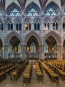 The columns of the nave
 -
 The organ
 -
 The exterior from the north-east
- Reason
- High Quality Image And High EV
- Articles in which this image appears
- Lichfield Cathedral +2
- FP category for this image
- Wikipedia:Featured pictures/Places/Interiors and Wikipedia:Featured pictures/Places/Architecture (last image)
- Creator
- Diliff
- Support as nominator – National Names 2000 ( talk) 02:26, 14 January 2015 (UTC)
- Comment Why are some of the interior images bluish while others are brownish?
CorinneSD (
talk) 02:46, 14 January 2015 (UTC)
-
Diliff are you able to answer this at all? It would appear this is causing a lack of votes as this has been here a while...
gazhiley 11:57, 20 January 2015 (UTC)
- I hadn't even seen this nomination. Oops! The reason why some of the images look brownish and some are blueish is the relationship between the different kinds of light in the image. When photographing interiors (or any other subject), one has to choose a white balance that is suitable for the scene. Often this is done automatically by the camera and the photographer has no idea that it has occurred. The additional difficulty with interiors compared to outdoor photography is that there are usually different and competing light sources. Incandescent light is usually quite warm compared to overcast sunlight. If I select a white balance that is neutral to the cool sunlight, the incandescent light looks too yellow. If I select a white balance that is neutral to the incandescent light, the sunlight looks too blue. All I can do in each situation is try to find a white balance setting that is sympathetic to both light sources, and this sometimes varies from image to image. Sometimes an image has both blue and yellow/brown areas because both light sources are shining on different parts of the same image. I don't think the images are too blueish personally, but some people seem to prefer a warmer colour cast, even if it isn't truly 'neutral'. Ðiliff «» (Talk) 13:30, 20 January 2015 (UTC)
-
Diliff are you able to answer this at all? It would appear this is causing a lack of votes as this has been here a while...
gazhiley 11:57, 20 January 2015 (UTC)
- On the basis of Ðiliff's answer, I Support... Quality is there as usual, and colours explained... gazhiley 14:22, 20 January 2015 (UTC)
- Support -- - The Herald ( here I am) 14:20, 21 January 2015 (UTC)
- Support - Trying to do a set like this has made me even more wowed that Diliff can do it consistently. 'Tis driving me insane! — Crisco 1492 ( talk) 14:26, 21 January 2015 (UTC)
- Support. Well, it may not be my best cathedral set but I suppose it's still above the benchmark. Ðiliff «» (Talk) 11:49, 23 January 2015 (UTC)
- Support This is an excellent set with encyclopaedic quality. Mattximus ( talk) 19:32, 23 January 2015 (UTC)
Promoted File:Lichfield Cathedral Choir 1, Staffordshire, UK - Diliff.jpg --
Armbrust
The Homunculus 04:23, 24 January 2015 (UTC)
Promoted File:Lichfield Cathedral Choir 2, Staffordshire, UK - Diliff.jpg --
Armbrust
The Homunculus 04:23, 24 January 2015 (UTC)
Promoted File:Lichfield Cathedral High Altar from choir, Staffordshire, UK - Diliff.jpg --
Armbrust
The Homunculus 04:23, 24 January 2015 (UTC)
Promoted File:Lichfield Cathedral Nave Columns, Staffordshire, UK - Diliff.jpg --
Armbrust
The Homunculus 04:23, 24 January 2015 (UTC)
Promoted File:Lichfield Cathedral Organ, Staffordshire, UK - Diliff.jpg --
Armbrust
The Homunculus 04:23, 24 January 2015 (UTC)
Promoted File:Lichfield Cathedral Exterior from NE, Staffordshire, UK - Diliff.jpg --
Armbrust
The Homunculus 04:23, 24 January 2015 (UTC)
The Grand Canyon of the Yellowstone
Voting period is over. Please don't add any new votes. Voting period ends on 24 Jan 2015 at 06:38:48 (UTC)

- Reason
- High Quality and EV
- Articles in which this image appears
- Thomas Moran
- FP category for this image
- Wikipedia:Featured pictures/Artwork/Paintings
- Creator
- Thomas Moran
- Support as nominator – Alborzagros ( talk) 06:38, 14 January 2015 (UTC)
- Weak support I'm not sufficiently familiar with this artist to be able to say whether among the many available choices for an FP, this is a particularly good one. I will say though that this seems less flat in colour and details than the later copy. Samsara 18:11, 20 January 2015 (UTC)
Not Promoted -- Armbrust The Homunculus 06:39, 24 January 2015 (UTC)
Interior with Portraits by Thomas Le Clear
Voting period is over. Please don't add any new votes. Voting period ends on 24 Jan 2015 at 06:46:56 (UTC)

- Reason
- HQ and EV
- Articles in which this image appears
- Interior with Portraits and Thomas Le Clear
- FP category for this image
- Wikipedia:Featured pictures/Artwork/Paintings
- Creator
- Thomas Le Clear
- Support as nominator – Alborzagros ( talk) 06:46, 14 January 2015 (UTC)
- Comment - The picture is tilted. Notice the white lines around the edge. APK whisper in my ear 08:22, 14 January 2015 (UTC)
- Here the crookedness and white lines are circumstantial defects. We can relinquish these minor faults. Alborzagros ( talk) 12:57, 17 January 2015 (UTC)
- Support - Very useful. Good reproduction of a work with its own article. — Crisco 1492 ( talk) 13:30, 17 January 2015 (UTC)
- Support - National Names 2000 ( talk) 04:09, 19 January 2015 (UTC)
- Support – interesting painting. SagaciousPhil - Chat 08:51, 20 January 2015 (UTC)
- Support Sometimes, canvases, especially after ageing, are not perfectly rectangular. Samsara 18:02, 20 January 2015 (UTC)
Promoted File:Thomas Le Clear - Interior with Portraits - Smithsonian.jpg -- Armbrust The Homunculus 06:47, 24 January 2015 (UTC)
Barge Haulers on the Volga by Ilya Repin
Voting period is over. Please don't add any new votes. Voting period ends on 24 Jan 2015 at 09:43:33 (UTC)
_-_Volga_Boatmen_(1870-1873).jpg)
- Reason
- HQ and EV
- Articles in which this image appears
- History of painting
- Ilya Repin
- Peredvizhniki
- List of Russian artists
- The Song of the Volga Boatmen
- Burlak
- Steamboats on the Volga River
- Barge Haulers on the Volga
- FP category for this image
- Wikipedia:Featured pictures/Artwork/Paintings
- Creator
- Ilya Repin
- Support as nominator – Alborzagros ( talk) 09:43, 14 January 2015 (UTC)
- Support. Iconic. A Finnish cartoon based on this painting created an international hubbub in 1958: [5]; Nikita Khrushchev, on the barge pulled by Eastern bloc countries, is shouting "Imperialists!" to the US and UK... -- Janke | Talk 10:30, 14 January 2015 (UTC)
- Comment - There's a multitude of colors in the file history. How do we know which version's colors are accurate? — Crisco 1492 ( talk) 14:39, 14 January 2015 (UTC)
- reply about colors I don't know. could the resource help us? Alborzagros ( talk) 14:52, 14 January 2015 (UTC)
- Support — 'Russia Under the Old Regime' (title of a widely known history by Richard Pipes). Can we assume that the Russian State Museum would get the colors right? Sca ( talk) 15:37, 14 January 2015 (UTC)
- Doubtful. — Crisco 1492 ( talk) 04:34, 15 January 2015 (UTC)
- Comment - Now that you point it out, it does look a bit warm(ish) - but, if you take an average of all these: [6], I don't think it is too far off... ;-) There's another, slightly larger version on Commons (obviously from the same transparency photo, but most of the dust and hairs is unretouched), which has somewhat better looking color: [7] However, if the little strip at the bottom is supposed to be a grayscale, then that version has been color corrected far too much toward the blue! -- Janke | Talk 21:21, 14 January 2015 (UTC)
- I agree that it does look like something meant to help with colors. That means this is too warm and the other is a touch too cool... (I wouldn't say far too much...) — Crisco 1492 ( talk) 01:22, 15 January 2015 (UTC)
- Isn't there anyone who can go to the museum and check original? This is a great painting. Hafspajen ( talk) 14:42, 15 January 2015 (UTC)
- This painting appears on quite a few non-English WPs. I looked at several of them and, for what it's worth, the colors appear the same, including on Russian Wiki. Sca ( talk) 15:15, 15 January 2015 (UTC)
- I looked at the next-to last version, before the "border remove", and there, the grayscale strip really looked like a true greyscale. Thus, I fully support the colors of the current version. -- Janke | Talk 17:20, 15 January 2015 (UTC)
- There is a google file on it. https://www.google.com/culturalinstitute/asset-viewer/barge-haulers-on-the-volga/WAG9_bL0sypwYQ?hl=en Hafspajen ( talk) 00:11, 16 January 2015 (UTC)
- Well then. Support , Adam Cuerden use to say, it is a highly reliable source. Trallala Ey, ukhnem! Song Of The Volga Boatman Hafspajen ( talk) 15:49, 16 January 2015 (UTC)
- Support - Rreagan007 ( talk) 17:24, 16 January 2015 (UTC)
Promoted File:Ilia Efimovich Repin (1844-1930) - Volga Boatmen (1870-1873).jpg -- Armbrust The Homunculus 09:47, 24 January 2015 (UTC)
One World Trade Center
Voting period is over. Please don't add any new votes. Voting period ends on 2 Feb 2015 at 23:39:34 (UTC)

- Reason
- I recently finished copy editing One World Trade Center, and I noticed that its lead image is of very good quality. The picture is very clear, I can't detect any obvious signs of artificial processing, and the building itself is a fine piece of architecture.
- Articles in which this image appears
- One World Trade Center, United States, Manhattan, and September 11 attacks
- FP category for this image
- Wikipedia:Featured_pictures/Places/Architecture
- Creator
- Joe Mabel
- Support as nominator – Biblio worm 23:39, 23 January 2015 (UTC)
- Oppose and Suggest Speedy Close Nice picture, but way too small sorry - please refer to Section two of the criteria regarding minimum size. gazhiley 09:43, 24 January 2015 (UTC)
Not Promoted -- — Crisco 1492 ( talk) 10:25, 24 January 2015 (UTC)
- Too small — Crisco 1492 ( talk) 10:25, 24 January 2015 (UTC)
A collection of paintings of that strange wild man who roamed the fields of Provence
Voting period is over. Please don't add any new votes. Voting period ends on 24 Jan 2015 at 10:29:05 (UTC)
-
 Enclosed Field with Ploughman
 -
 Wheatfield
 -
 Harvest in Provence
 -
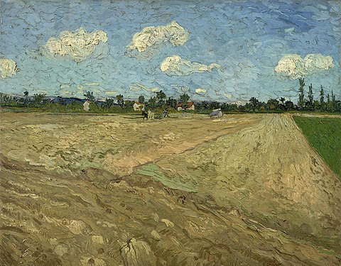 Ploughed fields ('The furrows')
 -
 The harvest
 -
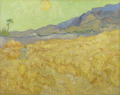 Wheatfield with a reaper
 -
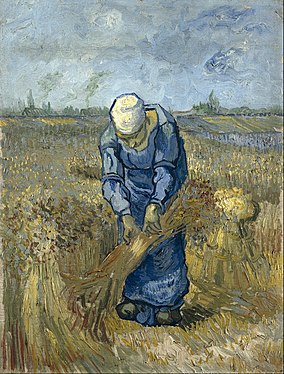 Peasant woman binding sheaves (after Millet)
 -
 Green Field
 -
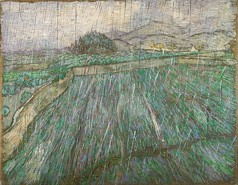 Wheat Field in Rain
 -
 Landscape from Saint-Rémy
 -
 Wheatfield With Cornflowers
 -
 Enclosed Wheat Field with Peasant / Landscape at Saint-Rémy
 -
 Wheatfield with crows
 -
 Wheatfield under thunderclouds
| “ | To my mind that strange wild man who roamed the fields of Provence was not only the world’s greatest artist, but also one of the greatest men who ever lived. | ” |
| — Richard Curtis | ||
- Reason
- Paintings of series of wheat-fields and related topics from in the article in - Wheat Fields (Van Gogh series). All paintings are figuring in the article. A series of 16 paintings from the renowned Dutch painter, van Gogh. Van Gogh's brushstrokes in staccato are especially suited to depict the straws of the wheat field, giving them a special look and life....
- Articles in which this image appears
- Wheat Fields (Van Gogh series)
- FP category for this image
- Wikipedia:Featured pictures/Artwork/Paintings
- Creator
- Vincent van Gogh
- Support as co-nominator – The Herald : here I am 10:29, 14 January 2015 (UTC)
- Support as co-nominator – Hafspajen ( talk) 19:22, 14 January 2015 (UTC)
- Support as co-nominator – Atsme☯ Consult 18:42, 13 January 2015
- Support as co-nominator – CorinneSD ( talk) 23:43, 14 January 2015 (UTC)
- Support This is a lovely grouping of the Van Gogh Wheat Fields. Every painting here is excellent in its own right! WordSeventeen ( talk) 13:14, 14 January 2015 (UTC)
- Support — Why not? Sca ( talk) 15:27, 14 January 2015 (UTC)
- Comment - I have a question. Does the fact that these are being nominated as a group mean that the images can never be used separately? Just curious. CorinneSD ( talk) 17:28, 14 January 2015 (UTC)
- Comment - With it having three nominators, that makes it 3/5th of the way towards promotion. I don't think that's all that fair. GamerPro64 21:41, 14 January 2015 (UTC)
- Why isn't that fair? It was a collaboration, working together to achieve a shared goal. We are sharing it, we would all have supported it anyway. The only difference is that we get credited all. It probably will not be a standard, but it was a lot of messing around to get this nomination together. Hafspajen ( talk) 21:56, 14 January 2015 (UTC)
- Let's get hypothetical then. What if there's a set made and it has five nominators? You might as well promote it on the spot. GamerPro64 23:07, 14 January 2015 (UTC)
- Oh yeh..We had that in our mind. Check this out..-- The Herald : here I am 06:36, 15 January 2015 (UTC)
- With four supporters now aside from the nominators, it's a moot point. — Crisco 1492 ( talk) 13:31, 17 January 2015 (UTC)
- Oppose File:Vincent van Gogh - Wheat Fields with Reaper, Auvers - Google Art Project.jpg (focus was clearly missed; van Gogh was never that flat) and File:Wheat stacks in Provence.jpg (considerable noise and blurriness). Support everything else. — Crisco 1492 ( talk) 00:01, 15 January 2015 (UTC)
- Support - Rreagan007 ( talk) 17:25, 16 January 2015 (UTC)
- Comment per GamerPro64, and I wasn't aware there was an FP star give-a-way.-- Godot13 ( talk) 00:07, 18 January 2015 (UTC)
- Comment: Is this all of the series? If not, why not? Surely, to be promoted as a coherent set, this would need all of them? J Milburn ( talk) 13:14, 18 January 2015 (UTC)
- Then it will take over 30 paintings. - The Herald ( here I am) 13:23, 18 January 2015 (UTC)
- Oppose. This nomination seemingly isn't so much a set as a smattering of pictures from a set. I'm struggling to get my head around the nomination, and the fact we have people supporting some of the pictures and opposing others just adds to the complication. We also have to ask if people are really going to spend the time assessing the EV and quality of each individual image. (I also share some worries about the many nominators.) J Milburn ( talk) 14:00, 18 January 2015 (UTC)
| Common on, guys - you all get on well together at FPC, discussion about co-noms is taking place on the talk page, so I'm hatting this. SagaciousPhil - Chat 12:35, 19 January 2015 (UTC) |
|---|
| The following discussion has been closed. Please do not modify it. |
( edit conflict) I'd like to say a few things. First, it is clear that there were two different objections to this nomination. The first one that User:GamerPro64 raised was that if a group of five editors makes a group nomination, and five votes are needed to promote an image, the promotion is kind of a foregone conclusion. GamerPro64 said that was "not fair". There was a little discussion on that issue, and then the second main objection arose, namely, that this group of Van Gogh images is not a complete set. However, I believe that GamerPro64's statement that a nomination by a group of five is not fair began an emotional reaction that the second issue only fanned. I think it should be understood that the nominators did not have instant promotion in mind when we nominated this group of images. I'm not sure why User:Hafspajen and User:The Herald decided to do a co-nomination, inviting some of their fellow editors to join in, or why they decided to nominate a large group of images. I'm new to this, so I was just glad to join in. (I don't know much about photographic image quality, but I'm glad to learn. By participating in WP FP, I have been learning, and I'd like to learn more. I do, however, have a degree in Fine Arts, so I can say something about the images.)
|
- Note: copying Godot's comment below, which was included in the section I hatted, as a vote was recorded (my apologies for not noticing it). SagaciousPhil - Chat 17:06, 19 January 2015 (UTC)
Also, I don't think it's quite fair that you make this about "sharing" or not sharing. Clearly, based on comments above, the idea was to present this nomination as a done deal with the five+ votes locked up as co-nominators. I don't want to remove anyone, but when you bring that up in the context of how few FP nominations that others have, I think you're missing the point. My background is in academia, where publishing papers with co-authors is a big part of the focus. That is probably why I have a strong reaction to handing out co-nom positions unless they've been earned. Please do not confuse that with not wanting to share. Unrelated to the nominator situation, I'm sorry to say that with all the crap I took last year about sets and what's required, this is not a complete set, so per J Milburn, I have to Oppose. This is based entirely on the set issue, nothing else. — Preceding unsigned comment added by Godot13 ( talk • contribs) 20:32, 18 January 2015
Promoted File:Vincent van Gogh - Enclosed Field with Ploughman - Google Art Project.jpg --
Armbrust
The Homunculus 10:31, 24 January 2015 (UTC)
Promoted File:Vincent van Gogh - Wheatfield - Google Art Project.jpg --
Armbrust
The Homunculus 10:31, 24 January 2015 (UTC)
Promoted File:Vincent Van Gogh - Corn Harvest in Provence - Google Art Project.jpg --
Armbrust
The Homunculus 10:31, 24 January 2015 (UTC)
Promoted File:Vincent van Gogh - Geploegde akkers ('De voren') - Google Art Project.jpg --
Armbrust
The Homunculus 10:31, 24 January 2015 (UTC)
Promoted File:Vincent van Gogh - De oogst - Google Art Project.jpg --
Armbrust
The Homunculus 10:31, 24 January 2015 (UTC)
Promoted File:Vincent van Gogh - Wheatfield with a reaper - Google Art Project.jpg --
Armbrust
The Homunculus 10:31, 24 January 2015 (UTC)
Promoted File:Vincent van Gogh - Peasant woman binding sheaves (after Millet) - Google Art Project.jpg --
Armbrust
The Homunculus 10:31, 24 January 2015 (UTC)
Promoted File:Vincent van Gogh - Green Field - Google Art Project.jpg --
Armbrust
The Homunculus 10:31, 24 January 2015 (UTC)
Promoted File:Vincent Willem van Gogh, Dutch - Rain - Google Art Project.jpg --
Armbrust
The Homunculus 10:31, 24 January 2015 (UTC)
Promoted File:Vincent van Gogh - Landscape from Saint-Rémy - Google Art Project.jpg --
Armbrust
The Homunculus 10:31, 24 January 2015 (UTC)
Promoted File:Vincent Van Gogh - Wheatfield With Cornflowers - Google Art Project.jpg --
Armbrust
The Homunculus 10:31, 24 January 2015 (UTC)
Promoted File:Gogh, Vincent van - Landscape at Saint-Rémy (Enclosed Field with Peasant) - Google Art Project.jpg --
Armbrust
The Homunculus 10:31, 24 January 2015 (UTC)
Promoted File:Vincent van Gogh - Wheatfield with crows - Google Art Project.jpg --
Armbrust
The Homunculus 10:31, 24 January 2015 (UTC)
Promoted File:Vincent van Gogh - Wheatfield under thunderclouds - Google Art Project.jpg --
Armbrust
The Homunculus 10:31, 24 January 2015 (UTC)
illustrations of Laxdæla saga
Voting period is over. Please don't add any new votes. Voting period ends on 24 Jan 2015 at 11:57:10 (UTC)
-
 Kjartan Ólafsson is slain by his foster brother Bolli Þorleiksson. Bolli, filled with regret, holds the dying Kjartan in his arms.
 -
 Kjartan sees Hrefna with the headdress and decides he might as well own "both together, the bonnet and the bonnie lass".
 -
 Guðrún smiles at Helgi Harðbeinsson, right after he killed her third husband Bolli.
 -
 Guðrún encounters a ghost after her fourth and last husband Þorkell Eyjólfsson drowned at sea.
- Reason
- High quality an EV
- Articles in which this image appears
- Laxdæla saga
- FP category for this image
- Wikipedia:Featured pictures/Artwork/Literary illustrations
- Creator
- Andreas Bloch
- Support as nominator – Alborzagros ( talk) 11:57, 14 January 2015 (UTC)
- Comment: Quite nice looking! I presume the link to Google books is a link of convenience, right? Because these are far, far better than you ever get from Google books. I think we could stand to do a tiny amount of cleanup, especially on the borders, but otherwise, leaning strongly towards support. Adam Cuerden ( talk) 23:10, 14 January 2015 (UTC)
- Support - Huge EV for an otherwise-confusing subject - DUCK404 a ( talk) 04:58, 16 January 2015 (UTC)
- Oppose until such time as the actual source is included. — Crisco 1492 ( talk) 13:12, 17 January 2015 (UTC)
Not Promoted -- Armbrust The Homunculus 12:01, 24 January 2015 (UTC)
Map of the Holocaust in Europe
Voting period is over. Please don't add any new votes. Voting period ends on 24 Jan 2015 at 17:06:36 (UTC)

- Reason
- This is a comprehensively detailed map that puts the systematic logistics of the Holocaust, in which 2/3 of European Jews were killed, into perspective.
- Articles in which this image appears
- The Holocaust, Extermination camps, German war crimes, Ghettos in Nazi-occupied Europe
- FP category for this image
- History/World War II
- Creator
- User:Dna-webmaster
- Support as nominator – JJARichardson ( talk) 17:06, 14 January 2015 (UTC)
- Comment — Looks very comprehensive, all right. As a WWII history buff, I'm impressed – but also slightly concerned that some of the locales marked as concentration camps may actually not have been Konzentrationslager per se: Horserød, Denmark, for example (which I'd never heard of). Our entry on Horserød camp states that "it had the same functions" as a concentration camp, but I question that; it seems to have been more a holding camp or transit camp. (I hadn't heard of the three in Norway either.) See also: Royallieu-Compiègne internment camp.
- It's my impression that the "functions" of a typical WWII Nazi concentration camp usually included working, starving or mistreating (at least some of) the prisoners to death. (I've been to Mauthausenm, where an estimated 200,000 died; it was a grim experience indeed.) I raise this issue not because I oppose such a map as an FP – not at all – but because regarding such a huge, horrible topic we must absolutely accurate. If it is accurate (or if the consensus is I'm just splitting semantic hairs), fine. Sca ( talk) 19:42, 14 January 2015 (UTC)
- Updated comment: I now see the fine-print footnote in the legend that says, "includes labor, prison & transit camps." Sorry to have missed that. The footnote does help. (Perhaps it could be in larger type?) Nevertheless, I question whether labor, prison and transit camps usually are classified under the general heading of "concentration camp," with which I believe most people associate the lethal "functions" mentioned above.
(I now notice also that the dotted borders identified in the legend as "present (2007) borders" are incomplete with respect to Germany, Poland, the Czech Republic and most of Eastern Europe.) Sca ( talk) 15:07, 15 January 2015 (UTC)
- Updated comment: I now see the fine-print footnote in the legend that says, "includes labor, prison & transit camps." Sorry to have missed that. The footnote does help. (Perhaps it could be in larger type?) Nevertheless, I question whether labor, prison and transit camps usually are classified under the general heading of "concentration camp," with which I believe most people associate the lethal "functions" mentioned above.
- Support I had stared at this for quite some time, until I realized that this map indeed deserves my support vote. The EV is beyond measure. Étienne Dolet ( talk) 02:42, 21 January 2015 (UTC)
Not Promoted -- Armbrust The Homunculus 18:04, 24 January 2015 (UTC)
Thomas Linley the elder
Voting period is over. Please don't add any new votes. Voting period ends on 25 Jan 2015 at 10:18:21 (UTC)

- Reason
- Good scan of portrait of Thomas Linley senior by Gainsborough
- Articles in which this image appears
- Thomas Linley the elder; The Duenna, a comic opera composed with his son; and William Linley another of his children.
- FP category for this image
- Wikipedia:Featured pictures/Artwork/Paintings
- Creator
- Thomas Gainsborough
- Support as nominator – SagaciousPhil - Chat 10:18, 15 January 2015 (UTC)
- Support as a co-nom. ed.sum Hafspajen ( talk) 12:08, 15 January 2015 (UTC)
- Support - Good painting. — Crisco 1492 ( talk) 12:50, 15 January 2015 (UTC)
- Support - Good scan- looks as if the painting has been wrecked by a restorer, with a scrubbing brush. Xanthomelanoussprog ( talk) 11:32, 16 January 2015 (UTC)
- Support – Nice work. Rreagan007 ( talk) 00:40, 19 January 2015 (UTC)
Promoted File:Gainsborough, Thomas - Thomas Linley the elder - Google Art Project.jpg -- Armbrust The Homunculus 10:23, 25 January 2015 (UTC)
- Added image to Wikipedia:Featured pictures/People/Entertainment, as there is no article about the painting. Armbrust The Homunculus 10:23, 25 January 2015 (UTC)
The Threatened Swan
Voting period is over. Please don't add any new votes. Voting period ends on 25 Jan 2015 at 11:35:44 (UTC)

- Reason
- High quality image of this great painting.
- Articles in which this image appears
- The Threatened Swan, Jan Asselijn, Rijksmuseum, Mute swan
- FP category for this image
- Wikipedia:Featured pictures/Artwork/Paintings
- Creator
-
Jan Asselijn (painter)
Google Art Project (image)
DcoetzeeBot (uploader)
- Support as nominator – Editør ( talk) 11:35, 15 January 2015 (UTC)
- Support - Although when a swan gets this threatened, people die. — Crisco 1492 ( talk) 14:41, 15 January 2015 (UTC)
- Support -
Hafspajen (
talk) 21:38, 15 January 2015 (UTC)
per Godot
- Godot has not responded to this candidate. – Editør ( talk) 10:57, 19 January 2015 (UTC)
- I have removed Hafspajen's striking of their vote and instead scored through the other small comment. Let's give Hafs time to cool down and think about things ... SagaciousPhil - Chat 12:19, 19 January 2015 (UTC)
- Support - Can't find anything bad here. But looks like it is threatening someone, not as threatened...-- The Herald : here I am 08:54, 16 January 2015 (UTC)
- That's kinda what happens when they feel threatened (other examples here)... geese are bad for that too. — Crisco 1492 ( talk) 04:33, 17 January 2015 (UTC)
- MUTE swans?? Huh... - The Herald ( here I am) 15:00, 17 January 2015 (UTC)
- Support – looks good. Rreagan007 ( talk) 00:40, 19 January 2015 (UTC)
Promoted File:De bedreigde zwaan Rijksmuseum SK-A-4.jpeg -- Armbrust The Homunculus 11:47, 25 January 2015 (UTC)
Lady Liberty and Liberty Island
Voting period is over. Please don't add any new votes. Voting period ends on 25 Jan 2015 at 17:30:23 (UTC)

- Reason
- Great perspective of the entire island and base structure
- Articles in which this image appears
- Liberty Island; Upper New York Bay; Statue of Liberty; New York City; Jersey City, New Jersey
- FP category for this image
- Wikipedia:Featured pictures/Places/Urban
- Creator
- ℅ ✰ WPPilot✰ echo
- Support as nominator – talk→ WPPilot 17:30, 15 January 2015 (UTC)
- I really like this one. Would you mind if I denoised a bit, though? (Also, the exposure is a touch too high, methinks) — Crisco 1492 ( talk) 03:41, 16 January 2015 (UTC)
- Support - Very encyclopedic. Very hard to come across. — Crisco 1492 ( talk) 05:08, 16 January 2015 (UTC)
- Comment - You could have zoomed it. I can hardly spot the statue in the article where it is the lead image..--
The Herald :
here I am 08:53, 16 January 2015 (UTC)
- Considering
Liberty Island is about the island itself... —
Crisco 1492 (
talk) 13:18, 16 January 2015 (UTC)
- I do not own a "zoom" len's (well I do have a 100 to 400mm f2.8) but the point is, that I shoot prime for a few reasons. Aerial photography is tough enough. This was in a helicopter that was my first time flying and the motion is a lot different then the planes I normally fly. Vibration is always a consideration so less lens means less vibration. The skyline of Manhattan is a busy place so shooting anything other then the 50mm standard lens here would be a waste of time, as once I turn and head to Manhattan, you can see the complex nature of the area is unreal. Here is the video from the shoot: http://vimeo.com/114738373 Enjoy the ride - -- talk→ WPPilot 15:04, 16 January 2015 (UTC)
- Considering
Liberty Island is about the island itself... —
Crisco 1492 (
talk) 13:18, 16 January 2015 (UTC)
- Its good to have pilot in our FP party. For that Support the nom. But I have concern that this image is not in lead for any related article, save the island. - The Herald ( here I am) 15:29, 16 January 2015 (UTC)
- But isn't that enough? — Crisco 1492 ( talk) 04:30, 17 January 2015 (UTC)
- Support - looks good. Hafspajen ( talk) 14:08, 16 January 2015 (UTC)
- Support. Great EV (specifically in Liberty Island), not the kind of photo you see every day. I'm slightly baffled by Herald's concerns... J Milburn ( talk) 13:25, 18 January 2015 (UTC)
- Support – Nice image. Rreagan007 ( talk) 00:39, 19 January 2015 (UTC)
- Weak oppose It's a terrific picture of the island itself, but I can't say I'm thrilled with how washed out the far background and sky are.-- SarekOfVulcan (talk) 13:20, 22 January 2015 (UTC)
- Oppose I've held off voting for this in case
Crisco 1492 was able to produce the alt he offered - as this has not been forthcoming I will have to oppose sorry - too noisy leading to lack of clarity in the finer details. Image is a tad over exposed as well leading to blown highlights, most noticably in the sky and the midriff of Lady Liberty...
gazhiley 11:13, 23 January 2015 (UTC)
- Look at the upload history. I already uploaded it like a week ago. You may need to clear your cache if you're still getting a ton of noise. —
Crisco 1492 (
talk) 14:31, 23 January 2015 (UTC)
- Oh - I'm used to them being placed as an alt, so was waiting for that... Looking at your upload then I will stick to my vote - still very noisy... Lady Liberty's face is virtually unrecognisable to me with the blur and pixalation of it... gazhiley 15:43, 23 January 2015 (UTC)
- Look at the upload history. I already uploaded it like a week ago. You may need to clear your cache if you're still getting a ton of noise. —
Crisco 1492 (
talk) 14:31, 23 January 2015 (UTC)
- Comment. Though I do not have the technical vocabulary to explain exactly why, there is something about the lighting, colours and/or exposure level of this picture that I find rather unsatisfactory. 217.44.208.182 ( talk) 18:08, 24 January 2015 (UTC
Promoted File:Liberty Island photo Don Ramey Logan.jpg Armbrust The Homunculus 17:34, 25 January 2015
The unlucky Ophiucus Set (3)
Voting period is over. Please don't add any new votes. Voting period ends on 26 Jan 2015 at 08:47:44 (UTC)
-
 Infrared light veiw of Rho Ophiuchimolecular cloud complex (By NASA)
 -
 Rho Ophiuchi, a multiple star system in the constellation (By ESO)
 -
 The Rho Ophiuchi molecular cloud complex (By Rogelio Bernal Andreo)
- Reason
- First nom and second nom failed due to unexplained(?) reasons. So here again are a quality set of astro images used in Ophiucus...
- Articles in which this image appears
- Ophiucus
- FP category for this image
- Wikipedia:Featured pictures/Space/Looking out
- Creators
- Please see file description
- Support as nominator – The Herald : here I am 08:47, 16 January 2015 (UTC)
- Support - Maybe 3rd time's the charm. Rreagan007 ( talk) 17:14, 16 January 2015 (UTC)
- Support Magnificent images! JJARichardson ( talk) 18:02, 16 January 2015 (UTC)
- Support - third time. Hafspajen ( talk) 14:32, 17 January 2015 (UTC)
- Conditional Support Scale down the first (by NASA), because at 10Kx10K pixels, it is very unsharp (possibly upscaled? On the WISE page, it's sharpest at only a bit over 1Kx1K !) 3Kx3K should be more than enough, and won't lose any detail at all - the full-sized is that fuzzy! -- Janke | Talk 21:01, 18 January 2015 (UTC)
- @ Janke: But I am sure to lose some details by scaling down, specially when it comes to astro images. There is a reason why they have high-scaled version. Those stars are too minute to see even to telescopic eyes... - The Herald ( here I am) 13:53, 20 January 2015 (UTC)
- Support Once Again - National Names 2000 ( talk) 04:07, 19 January 2015 (UTC)
Promoted File:Rho Ophiuchi.jpg --
Armbrust
The Homunculus 13:30, 26 January 2015 (UTC)
Promoted File:Guisard - Milky Way.jpg --
Armbrust
The Homunculus 13:30, 26 January 2015 (UTC)
Promoted File:Rho Ophiucus Widefield.jpg --
Armbrust
The Homunculus 13:30, 26 January 2015 (UTC)
William III of the Netherlands
Voting period is over. Please don't add any new votes. Voting period ends on 26 Jan 2015 at 12:08:30 (UTC)
-
 Original – William III of the Netherlands, here portrayed by Nicolaas Pieneman in 1856, was King of the Netherlands and Grand Duke of Luxembourg from 1849 to 1890
 -
 ALT – Source image. Note how the original has a blue overtone.
- Reason
- High quality image of this royal portrait.
- Articles in which this image appears
- William III of the Netherlands, Nicolaas Pieneman, House of Orange-Nassau, List of monarchs of the Netherlands, List of monarchs of Luxembourg, List of Knights and Ladies of the Garter
- FP category for this image
- Wikipedia:Featured pictures/People/Royalty and nobility
- Creator
-
Nicolaas Pieneman (painter)
Rijksmuseum (photographer)
OSeveno (uploader)
- Support as nominator – Editør ( talk) 12:08, 16 January 2015 (UTC)
- Comment - Colors are different than the source (See alt). —
Crisco 1492 (
talk) 17:18, 16 January 2015 (UTC)
- They appear to be quite different. What do you suggest? – Editør ( talk) 18:16, 16 January 2015 (UTC)
- I prefer the alt. Support ALT —
Crisco 1492 (
talk) 03:19, 17 January 2015 (UTC)
- I'm unconvinced that the greenish hue of the ALT is correct. The colors of the Rijksmuseum scans are not always the best possible colors like Hafspajen also mentioned at Wikipedia:Featured picture candidates/Flowers in a Terracotta Vase. – Editør ( talk) 14:18, 25 January 2015 (UTC)
- Support ALT - CorinneSD ( talk) 00:35, 18 January 2015 (UTC)
- Prefer and Support ALT - - The Herald ( here I am) 14:48, 19 January 2015 (UTC)
- Weak support ALT – Editør ( talk) 23:00, 25 January 2015 (UTC)
- Support ALT - National Names 2000 ( talk) 06:40, 26 January 2015 (UTC)
Promoted File:Willem III (1817-90), koning der Nederlanden, Nicolaas Pieneman, 1856 - Rijksmuseum.jpg -- Armbrust The Homunculus 13:40, 26 January 2015 (UTC)
Northeaster
Voting period is over. Please don't add any new votes. Voting period ends on 26 Jan 2015 at 14:00:44 (UTC)

- Reason
- Big enough, sharp enough, own article + spectacular seascape by the talented and famous American painter Winslow Homer
- Articles in which this image appears
- Northeaster by Winslow Homer
- FP category for this image
- Wikipedia:Featured pictures/Artwork/Paintings
- Creator
- Winslow Homer
- Support as nominator – Hafspajen ( talk) 14:00, 16 January 2015 (UTC)
- Support - Good. — Crisco 1492 ( talk) 03:20, 17 January 2015 (UTC)
- Support - CorinneSD ( talk) 00:33, 18 January 2015 (UTC)
- Since I am ignored anyway... Hafspajen ( talk) 15:09, 19 January 2015 (UTC)
- I cannot undo this as there have been other edits since, so I am striking it instead. SagaciousPhil - Chat 11:48, 19 January 2015 (UTC)
- Support – looks good. Rreagan007 ( talk) 00:39, 19 January 2015 (UTC)
- Support – another good maritime painting by this artist providing good EV. SagaciousPhil - Chat 08:42, 20 January 2015 (UTC)
Promoted File:Northeaster by Winslow Homer 1895.jpg -- Armbrust The Homunculus 14:01, 26 January 2015 (UTC)
Verner von Heidenstam : Hans Alienus
Voting period is over. Please don't add any new votes. Voting period ends on 5 Feb 2015 at 06:37:13 (UTC)

- Reason
- Nice Scan to This Painting, But I Really Appreciative Work by Hanna Hirsch-Pauli In This World of Art.
- Articles in which this image appears
- Hanna Hirsch-Pauli
- FP category for this image
- Wikipedia:Featured pictures/Artwork/Paintings
- Creator
- Hanna Hirsch-Pauli
- Support as nominator – National Names 2000 ( talk) 06:37, 26 January 2015 (UTC)
- relinquishment Better to take out of progect page. The size is 608 × 700 pixels and quality is too low to consider as FP. ___ Alborzagros ( talk) 07:10, 26 January 2015 (UTC)
Not Promoted -- Armbrust The Homunculus 14:38, 26 January 2015 (UTC)
- Speedy close, bellow the size requirements. Armbrust The Homunculus 14:38, 26 January 2015 (UTC)
a title for the nomination
Voting period is over. Please don't add any new votes. Voting period ends on 5 Feb 2015 at 07:56:39 (UTC)

- Reason
- High quality, attractive image
- Articles in which this image appears
- Деветашко плато Предбалкан
- FP category for this image
- Category:Osam Category:Aleksandrovo,_Lovech_Province
- Creator
- Veselin Stanev
- Support as nominator – Veselin Stanev ( talk) 07:56, 26 January 2015 (UTC)
- Speedy close, not eligible here, not used on enwiki. -- Janke | Talk 08:21, 26 January 2015 (UTC)
Not Promoted -- - The Herald ( here I am) 16:55, 26 January 2015 (UTC)
- Speedy close as unused image with zero EV - The Herald ( here I am) 16:55, 26 January 2015 (UTC)
Louis Guéymard as Robert le Diable
Voting period is over. Please don't add any new votes. Voting period ends on 26 Jan 2015 at 17:16:21 (UTC)
.jpg)
- Reason
- High quality painting representing a very notable opera.
- Articles in which this image appears
- Robert le diable, Robert the Devil, Louis Guéymard
- FP category for this image
Wikipedia:Featured pictures/Artwork/Literary illustrations- Surely
Wikipedia:Featured_pictures/Culture, entertainment, and lifestyle/Theatre? It's documenting a specific production.
Adam Cuerden (
talk) 20:25, 24 January 2015 (UTC)
- That works too. Just had Literary illustrations because we've put some operas there. — Crisco 1492 ( talk) 20:36, 24 January 2015 (UTC)
- Surely
Wikipedia:Featured_pictures/Culture, entertainment, and lifestyle/Theatre? It's documenting a specific production.
Adam Cuerden (
talk) 20:25, 24 January 2015 (UTC)
- Creator
- Gustave Courbet
- Support as nominator – — Crisco 1492 ( talk) 17:16, 16 January 2015 (UTC)
- Support - CorinneSD ( talk) 00:32, 18 January 2015 (UTC)
- Support - - The Herald ( here I am) 14:46, 19 January 2015 (UTC)
- Support Adam Cuerden ( talk) 06:51, 24 January 2015 (UTC)
- Support Rreagan007 ( talk) 16:07, 24 January 2015 (UTC)
Promoted File:Louis Guéymard as Robert le Diable by Gustave Courbet - The Metropolitan Museum of Art 436015 (cropped).jpg -- Armbrust The Homunculus 17:49, 26 January 2015 (UTC)
Portrait of Henriette Mayer van den Bergh by Jozef Van Lerius
Voting period is over. Please don't add any new votes. Voting period ends on 27 Jan 2015 at 13:10:44 (UTC)

- Reason
- High Quality and EV.
- Articles in which this image appears
- Jozef Van Lerius
- FP category for this image
- Wikipedia:Featured pictures/Artwork/Paintings
- Creator
- Jozef Van Lerius
- Support as nominator – Alborzagros ( talk) 13:10, 17 January 2015 (UTC)
- Support - CorinneSD ( talk) 00:30, 18 January 2015 (UTC)
- Support - Good choice this time.. - The Herald ( here I am) 13:26, 18 January 2015 (UTC)
- Support - Good quality, good source. — Crisco 1492 ( talk) 22:41, 21 January 2015 (UTC)
- Support Rreagan007 ( talk) 16:07, 24 January 2015 (UTC)
- Support Hafspajen ( talk) 23:09, 24 January 2015 (UTC)
Promoted File:Henriette Mayer van den Bergh - Van Lerius.jpg -- Armbrust The Homunculus 13:28, 27 January 2015 (UTC)
Kodiak bear
Voting period is over. Please don't add any new votes. Voting period ends on 27 Jan 2015 at 13:52:39 (UTC)

- Reason
- Kodiak bear, used, big enough. Far enough from the bear.
- Articles in which this image appears
- Kodiak bear
- FP category for this image
- Wikipedia:Featured pictures/Animals/Mammals
- Creator
- Yathin S Krishnappa
- Support as nominator – Hafspajen ( talk) 13:52, 17 January 2015 (UTC)
- Support - Very well done. — Crisco 1492 ( talk) 14:01, 17 January 2015 (UTC)
- Support - Nice focus and a bold shoot too.. - The Herald ( here I am) 14:59, 17 January 2015 (UTC)
- Support - Very nice photo. I'm glad the photographer made it back. CorinneSD ( talk) 16:22, 17 January 2015 (UTC)
- Support - Good shot. -- Ebertakis ( talk) 17:07, 17 January 2015 (UTC)
- Support Pity about the grass in the foreground, but good luck surviving an attempt at re-taking it... gazhiley 17:59, 17 January 2015 (UTC)
- Support___ Alborzagros ( talk) 05:31, 18 January 2015 (UTC)
- Support ... echoing my vote at Commons 2 years ago. — Bruce1ee talk 08:02, 18 January 2015 (UTC)
- Support WordSeventeen ( talk) 18:51, 20 January 2015 (UTC)
- Support Great capture. APK whisper in my ear 07:23, 21 January 2015 (UTC)
- Support Daniel Case ( talk) 19:58, 26 January 2015 (UTC)
Promoted File:2010-kodiak-bear-1.jpg -- Armbrust The Homunculus 13:53, 27 January 2015 (UTC)
The US Army - Loading up
Voting period is over. Please don't add any new votes. Voting period ends on 31 Jan 2015 at 13:56:28 (UTC)

- Reason
- There is EV here, there is quality here, there is nice shot and frame her and there is everything for a FP here. Anything more?
- Articles in which this image appears
- Combined operations, 82nd Airborne Division, Islamic State of Iraq and the Levant
- FP category for this image
- Wikipedia:Featured_pictures/People/Military
- Creator
- The US army
- Support as nominator – - The Herald ( here I am) 13:56, 21 January 2015 (UTC)
- Oppose. Where's the EV? J Milburn ( talk) 17:47, 21 January 2015 (UTC)
- Oppose as per JM. Yann ( talk) 19:05, 21 January 2015 (UTC)
- @ J Milburn: and @ Yann:..Its now lead pic in Combined operations.. - The Herald ( here I am) 04:16, 22 January 2015 (UTC)
- Support - This is part of history. The photo is unusually clear, the composition is good. CorinneSD ( talk) 01:59, 22 January 2015 (UTC)
- Support per
Corinne. Historical EV for Iraq War & long U.S. involvement.
Sca (
talk) 16:57, 22 January 2015 (UTC)
- That's not the case right now. Why this image? Why in these articles?
24.222.214.125 (
talk) 20:58, 22 January 2015 (UTC)
- What do you mean it's not the case right now? That it isn't part of history yet? I'm undecided about how well it illustrates the articles, but as a standalone photo, it's undeniably historically valuable as documenting an event / location / point in time, no matter how recently it was taken.
Ðiliff «»
(Talk) 13:13, 23 January 2015 (UTC)
- I mean as it's used right now it lacks that EV. There's nothing that shows why this place, exercise, unit etc. have the kind of EV that we look for usually; nor is there a broad non-specific EV that this image fulfills (e.g. as an example of combined ooperations). 24.222.214.125 ( talk) 16:11, 23 January 2015 (UTC)
- What do you mean it's not the case right now? That it isn't part of history yet? I'm undecided about how well it illustrates the articles, but as a standalone photo, it's undeniably historically valuable as documenting an event / location / point in time, no matter how recently it was taken.
Ðiliff «»
(Talk) 13:13, 23 January 2015 (UTC)
- That's not the case right now. Why this image? Why in these articles?
24.222.214.125 (
talk) 20:58, 22 January 2015 (UTC)
- Oppose as per JM. -- Alchemist-hp ( talk) 01:52, 23 January 2015 (UTC)
- @ Alchemist-hp:..What more EV can you ask for a lead image. It rightly depicts one of yhe Combined operations by US and Iraq. - The Herald ( here I am) 13:27, 23 January 2015 (UTC)
- Oppose I agree with those above, nice picture but I can't quite see the EV. Is it to illustrate combined operations? If that is the goal there is surely a better picture then the backs of two slightly different coloured uniforms. Mattximus ( talk) 19:13, 23 January 2015 (UTC)
- Oppose per Mattximus - nice enough picture though, even if not an FP level one... gazhiley 10:33, 24 January 2015 (UTC)
- Support EV, focused on historic topic. __ Alborzagros ( talk) 10:47, 24 January 2015 (UTC)
- Comment - To be of encyclopedic value, the photo does not have to illustrate combined operations. It could illustrate "a static loading exercise" during an important period in U.S. and Iraqi history.
CorinneSD (
talk) 19:01, 25 January 2015 (UTC)
- It could, if we had an article on static loading exercise. However, we don't. J Milburn ( talk) 16:51, 26 January 2015 (UTC)
- Military exercise may play role.. - The Herald ( here I am) 16:59, 26 January 2015 (UTC)
Not Promoted -- - The Herald ( here I am) 15:20, 27 January 2015 (UTC)
- Nom withdrawn by (as) nominator - The Herald ( here I am) 15:20, 27 January 2015 (UTC)
Saint George
Voting period is over. Please don't add any new votes. Voting period ends on 27 Jan 2015 at 18:28:27 (UTC)

- Reason
- High quality scan, good EV, very attractive
- Articles in which this image appears
- Saint George +2
- FP category for this image
- Wikipedia:Featured pictures/Culture, entertainment, and lifestyle/Religion and mythology or Wikipedia:Featured pictures/People/Religious figures
- Creator
- Carlo Crivelli
- Support as nominator – — Crisco 1492 ( talk) 18:28, 17 January 2015 (UTC)
- Support Hafspajen ( talk) 21:44, 17 January 2015 (UTC)
- Support - Very nice. CorinneSD ( talk) 00:28, 18 January 2015 (UTC)
- Support - Seemingly great condition for 500+ years old.-- Godot13 ( talk) 08:16, 18 January 2015 (UTC) Dragon doesn't look all that menacing though...
- Support - - The Herald ( here I am) 13:25, 18 January 2015 (UTC)
- Support – Per Godot. He looks too young to be out slaying dragons, though... Sca ( talk) 15:42, 18 January 2015 (UTC)
- Support - An intriguing wood-gold art work with High quality. Alborzagros ( talk) 08:21, 19 January 2015 (UTC)
Promoted File:Saint George - Carlo Crivelli.jpg -- Armbrust The Homunculus 19:04, 27 January 2015 (UTC)
Japanese invasion money (Oceania)
Voting period is over. Please don't add any new votes. Voting period ends on 27 Jan 2015 at 23:32:38 (UTC)
- Reason
- High quality, high EV (presented as a complete set). Japanese invasion money (formally Southern Development Bank notes) was issued during World War II by the Empire of Japan to replace local hard currencies. Japanese invading forces issued these notes in Burma, Malaya and Borneo, the Netherlands Indies, Oceania, and the Philippines. This is the third FPC set nomination of Japanese invasion money, following the Netherlands Indies Gulden and the Philippine Peso.
- Original
- A four-note complete denomination and type set of World War II Japanese government-issued Oceanian Pound (1942).
- Articles in which these images appear
- Japanese government-issued Oceanian Pound
- FP category for this image
- Currency
- Creator
-
Empire of Japan
From the National Numismatic Collection, National Museum of American History, Smithsonian Institution.
Images by Godot13.
Japanese invasion money (Oceania) 1942
.jpg)
.jpg)
-

Ten Shillings -

One Pound
.jpg)
.jpg)
- Support as nominator – Godot13 ( talk) 23:32, 17 January 2015 (UTC)
- Support - I swear Godot, you can scan just about anything. I wonder if any of these were actually issued... — Crisco 1492 ( talk) 13:13, 18 January 2015 (UTC)
- Support, very interesting. J Milburn ( talk) 13:19, 18 January 2015 (UTC)
- Support - - The Herald ( here I am) 13:25, 18 January 2015 (UTC)
- Support — Historical EV. Never before seen currency headed "The Such-and-Such Government." Sca ( talk) 15:37, 18 January 2015 (UTC)
- Support - High EV. Great find! APK whisper in my ear 23:52, 18 January 2015 (UTC)
- Support Replete with quality and steeped with history and encyclopedia. I unmistakably prognosticate those notes are going to be featured pictures. Alborzagros ( talk) 08:13, 19 January 2015 (UTC)
Promoted File:OCE-1a-Oceania-Japanese Occupation-Half Shilling ND (1942).jpg --
Armbrust
The Homunculus 23:33, 27 January 2015 (UTC)
Promoted File:OCE-2a-Oceania-Japanese Occupation-One Shilling ND (1942).jpg --
Armbrust
The Homunculus 23:33, 27 January 2015 (UTC)
Promoted File:OCE-3a-Oceania-Japanese Occupation-10 Shillings ND (1942).jpg --
Armbrust
The Homunculus 23:33, 27 January 2015 (UTC)
Promoted File:OCE-4a-Oceania-Japanese Occupation-One Pound ND (1942).jpg --
Armbrust
The Homunculus 23:33, 27 January 2015 (UTC)
Jabberwocky
Voting period is over. Please don't add any new votes. Voting period ends on 28 Jan 2015 at 02:22:03 (UTC)


- Reason
- Good quality, high resolution, and high EV.
- Articles in which this image appears
- Jabberwocky, Vorpal sword
- FP category for this image
- Wikipedia:Featured pictures/Artwork/Literary_illustrations
- Creator
- John Tenniel, uploaded by Mikhail Ryazanov (PNG original), Aavindraa (JPG convert)
- Support as nominator – FakeShemp ( talk) 02:22, 18 January 2015 (UTC)
- Support I have veracious to type word of 'support' in these sort of illustrations. Alborzagros ( talk) 08:06, 19 January 2015 (UTC)
- Support - useful illustration of the correct way to dispose of these pests. Xanthomelanoussprog ( talk) 09:36, 20 January 2015 (UTC)
- Support This one has character! WordSeventeen ( talk) 18:49, 20 January 2015 (UTC)
- Support -- Drat!! One vote less to such a fine illustration? Never.. Let it go... - The Herald ( here I am) 16:55, 27 January 2015 (UTC)
Promoted File:Jabberwocky.jpg -- Armbrust The Homunculus 03:10, 28 January 2015 (UTC)
Topi
Voting period is over. Please don't add any new votes. Voting period ends on 28 Jan 2015 at 08:50:12 (UTC)

- Reason
- HQ and EV
- Articles in which this image appears
- Topi
- FP category for this image
- Wikipedia:Featured pictures/Animals/Mammals
- Creator
- User:Dreamdan
- Support as nominator – Alborzagros ( talk) 08:50, 18 January 2015 (UTC)
- Support - Fine shot with better sharpness than many other FPs on animals. - The Herald ( here I am) 14:49, 19 January 2015 (UTC)
- Support I think it could be sharper, but I agree with The Herald... gazhiley 16:26, 19 January 2015 (UTC)
- Support nice. -- Alchemist-hp ( talk) 20:02, 19 January 2015 (UTC)
- Support per nom -- Ebertakis ( talk) 20:23, 19 January 2015 (UTC)
- Oppose Absolutely not up to par with current wildlife image standards. Fine details are completely absent, very mushy, possibly due to excessive NR (which should not be needed at this ISO). Samsara 17:55, 20 January 2015 (UTC)
- Oppose per Samsara. - MatGTAM ( talk) 02:47, 22 January 2014 (UTC)
- Oppose per Samsara. - gren グレン 04:35, 25 January 2015 (UTC)
- Oppose Not quite crisp enough for a featured picture, looses fine detail once zoomed in. Mattximus ( talk) 01:08, 28 January 2015 (UTC)
Not Promoted -- Armbrust The Homunculus 13:30, 28 January 2015 (UTC)
Elliðaey
Voting period is over. Please don't add any new votes. Voting period ends on 29 Jan 2015 at 13:49:01 (UTC)

- Reason
- Good quality image showing the entirety of the island. Note that this is a different Elliðaey than the Elliðaey recently featured.
- Articles in which this image appears
- Elliðaey
- FP category for this image
- Wikipedia:Featured pictures/Places/Landscapes
- Creator
- Diego Delso
- Support as nominator – — Crisco 1492 ( talk) 13:49, 19 January 2015 (UTC)
- Support - Love the shot.. - The Herald ( here I am) 14:46, 19 January 2015 (UTC)
- Support Once again I'm afraid a very very slight halo, but as it's nowhere near as obvious as previous noms I am happy to provide full support this time... I would however dispute the claim on the article that the building is a "large" hunting lodge - looks rather small to me... But then I am hardly an officianado on the subject...... gazhiley 14:48, 19 January 2015 (UTC)
- Aficionado, perhaps ?
P. S. Burton (
talk) 15:41, 22 January 2015 (UTC)
- Not sure - I don't have full internet access in work so searched wikipedia for Officianado, and it's used in multiple articles in the context I intended... So if it is Afocianado, then it's been wrongly typed on a fair few articles! gazhiley 16:49, 22 January 2015 (UTC)
- Aficionado, perhaps ?
P. S. Burton (
talk) 15:41, 22 January 2015 (UTC)
- Support in principle, but a question: Is this one of several islands named Elliðaey? (We had
Wikipedia:Featured picture candidates/Elliðaey (Breiðafjörður) last month.)
Sca (
talk) 14:58, 19 January 2015 (UTC)
- As I said in the nomination statement, it's a different island. The previous one was in Breiðafjörður. They are separated by something like 250 km. — Crisco 1492 ( talk) 15:30, 19 January 2015 (UTC)
- Support as the author of the other Elliðaey-island image ;-) -- Alchemist-hp ( talk) 20:01, 19 January 2015 (UTC)
- Support. Very nice. Simple composition, but I can#t think of a better way of showing it except from the air. Ðiliff «» (Talk) 22:40, 19 January 2015 (UTC)
- Support - Nice work. APK whisper in my ear 06:54, 20 January 2015 (UTC)
- Support Hafspajen ( talk) 15:33, 25 January 2015 (UTC)
- Support Tokugawapants ( talk) 08:44, 28 January 2015 (UTC)
Promoted File:Isla Elliðaey, Islas Vestman, Suðurland, Islandia, 2014-08-17, DD 106.JPG -- Armbrust The Homunculus 14:01, 29 January 2015 (UTC)
- Added image to Wikipedia:Featured pictures/Places/Panorama. Armbrust The Homunculus 14:01, 29 January 2015 (UTC)
Hereford Cathedral set 2
Voting period is over. Please don't add any new votes. Voting period ends on 29 Jan 2015 at 23:25:20 (UTC)
-
 The nave looking east
 -
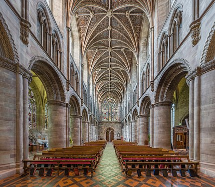 The nave looking west
 -
 The choir
 -
 The lady chapel


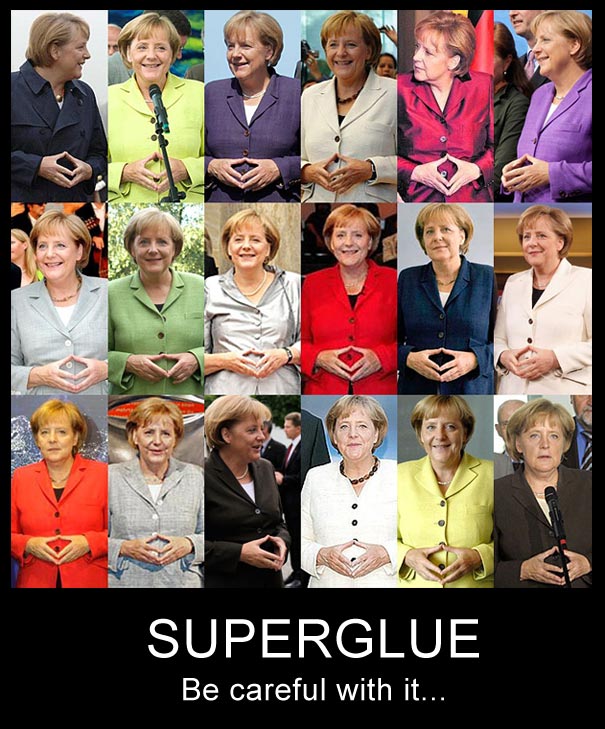
.jpg)
.jpg&action=edit§ion=T-1)
.jpg)
.jpg)
.jpg&action=edit§ion=T-1)
.png&action=edit&redlink=1)
_-_Volga_Boatmen_(1870-1873).jpg)
_-_Volga_Boatmen_(1870-1873).jpg&action=edit§ion=T-1)
![[7]](https://upload.wikimedia.org/wikipedia/commons/7/7a/Ilya_Repin_-_Barge_Haulers_on_the_Volga_-_Google_Art_Project.jpg)
- Reason
- I nominated this set in August last year and it failed not because of any significant opposition (there was one oppose), but because of insufficient votes. I think this set is the equal of many of mine that have already passed, so I'm going to give it one more try. Please do vote, whether it be oppose or support. Original nomination reason is: All four images are interesting and very detailed views of Hereford Cathedral's nave, choir and lady chapel respectively. I think the view of the choir is particularly beautiful.
- Articles in which this image appears
- Hereford Cathedral
- FP category for this image
- Wikipedia:Featured pictures/Places/Interiors
- Creator
- User:Diliff
- Support as nominator – Ðiliff «» (Talk) 23:25, 19 January 2015 (UTC)
- Support Dang! Saffron Blaze ( talk) 00:01, 20 January 2015 (UTC)
- Support DANG! - The Herald ( here I am) 11:16, 20 January 2015 (UTC)
- Support Quality and stacks of EV as ever... gazhiley 11:46, 20 January 2015 (UTC)
- Support Very good. — Crisco 1492 ( talk) 13:45, 20 January 2015 (UTC)
- Support Great! WordSeventeen ( talk) 18:46, 20 January 2015 (UTC)
- Support Great job. APK whisper in my ear 07:16, 21 January 2015 (UTC)
- Support – You all convinced me. Sca ( talk) 13:35, 21 January 2015 (UTC)
- Support -- Hafspajen ( talk) 02:06, 25 January 2015 (UTC)
Promoted File:Hereford Cathedral Nave, Herefordshire, UK - Diliff.jpg --
Armbrust
The Homunculus 03:12, 30 January 2015 (UTC)
Promoted File:Hereford Cathedral Nave West, Herefordshire, UK - Diliff.jpg --
Armbrust
The Homunculus 03:12, 30 January 2015 (UTC)
Promoted File:Hereford Cathedral Choir, Herefordshire, UK - Diliff.jpg --
Armbrust
The Homunculus 03:12, 30 January 2015 (UTC)
Promoted File:Hereford Cathedral Lady Chapel, Herefordshire, UK - Diliff.jpg --
Armbrust
The Homunculus 03:12, 30 January 2015 (UTC)
Whaler's Cove, Point Lobos, California, United States.
Voting period is over. Please don't add any new votes. Voting period ends on 29 Jan 2015 at 23:18:05 (UTC)

- Reason
- It's an interesting and aesthetic vantage point, looking across the cove, showing landscape, the flora and the human interaction of Point Lobos State Natural Reserve.
- Articles in which this image appears
- Point Lobos
- FP category for this image
- Wikipedia:Featured pictures/Places/Landscapes
- Creator
- User:Diliff
- Support as nominator – Ðiliff «» (Talk) 23:18, 19 January 2015 (UTC)
- Support - - The Herald ( here I am) 11:16, 20 January 2015 (UTC)
- Question While this picture is clearly very high quality, what's the relevence of the title "Whaler's Cove"? There's no mention of this name in the Point Lobos article. Is this a local name for the cove? In the article that this is lead for, it isn't captioned which leads me to believe that this cove is actual Point Lobos not Whaler's Cove? However further down the article is a panorama of a cove called Headland Cove which is a different cove to this picture... Please clarify as the EV is potentially dubious if Point Lobos National Park is more than this cove, which the article doesn't clarify...
gazhiley 11:53, 20 January 2015 (UTC)
- Good question. Whaler's cove is simply the largest of many inlets in Point Lobos, which itself is a small peninsula on the Californian coast south of San Fransciso, known as an important habitat for many local marine and bird species. So I would say that Point Lobos is more than just this cove, but this is the largest and is a 'hub' for further exploration the park, and is notable as it is the original location of a whaling operation, prior to the formation of it as a protected area (unfortunately the building used by the whalers is obscured by the hill on the right side of the image). It's not possible for any one photo to really describe the park in its entirety (except an aerial photo, of course), but I think this view is about as good as it gets at ground level for showing the different aspects of the park. As I said, the landscape, the seascape, the flora and the human interaction.
This map might also help you to understand Whaler's Cove's relationship to the park itself.
Ðiliff «»
(Talk) 13:20, 20 January 2015 (UTC)
- Cheers
Ðiliff - should the article be amended then to indicate that the lead image is just one small part of it? Or am I looking at it through overly sceptical eyes?
gazhiley 13:58, 20 January 2015 (UTC)
- Perhaps slightly skeptical. :-) But I see your point. If one knows nothing about Point Lobos, it might not be obvious what Point Lobos actually is or how the image relates to it. This is a common problem with a lot of Wikipedia articles, as they usually are written by people who know the subject and sometimes neglect to summarise what exactly it is. I'll add a caption.
Ðiliff «»
(Talk) 14:19, 20 January 2015 (UTC)
- As caption now added to article I will now Support as I feel the EV is better... Quality image as ever... gazhiley 09:53, 21 January 2015 (UTC)
- Perhaps slightly skeptical. :-) But I see your point. If one knows nothing about Point Lobos, it might not be obvious what Point Lobos actually is or how the image relates to it. This is a common problem with a lot of Wikipedia articles, as they usually are written by people who know the subject and sometimes neglect to summarise what exactly it is. I'll add a caption.
Ðiliff «»
(Talk) 14:19, 20 January 2015 (UTC)
- Cheers
Ðiliff - should the article be amended then to indicate that the lead image is just one small part of it? Or am I looking at it through overly sceptical eyes?
gazhiley 13:58, 20 January 2015 (UTC)
- Good question. Whaler's cove is simply the largest of many inlets in Point Lobos, which itself is a small peninsula on the Californian coast south of San Fransciso, known as an important habitat for many local marine and bird species. So I would say that Point Lobos is more than just this cove, but this is the largest and is a 'hub' for further exploration the park, and is notable as it is the original location of a whaling operation, prior to the formation of it as a protected area (unfortunately the building used by the whalers is obscured by the hill on the right side of the image). It's not possible for any one photo to really describe the park in its entirety (except an aerial photo, of course), but I think this view is about as good as it gets at ground level for showing the different aspects of the park. As I said, the landscape, the seascape, the flora and the human interaction.
This map might also help you to understand Whaler's Cove's relationship to the park itself.
Ðiliff «»
(Talk) 13:20, 20 January 2015 (UTC)
- Support - Good and useful. — Crisco 1492 ( talk) 19:16, 20 January 2015 (UTC)
- Support Super image quality, as always from Diliff. I've actually driven past this location several times on HWY1, but alas, never got to see the shore... --
Janke |
Talk 07:38, 22 January 2015 (UTC)
- If you have the chance again, it's definitely worth stopping for at least a half day. It's quite a compact little peninsula with a lot of wildlife calling it home. If you're feeling cheap like I was, don't pay the exorbitant entry/parking fees (around $10 from memory), park for free on the main road directly outside the park entrance and walk in (no charge for pedestrians). ;-) Ðiliff «» (Talk) 14:40, 22 January 2015 (UTC)
- Support. Hafspajen ( talk) 02:59, 25 January 2015 (UTC)
Promoted File:Whaler's Cove, Point Lobos, CA, US - May 2013.jpg -- Armbrust The Homunculus 03:23, 30 January 2015 (UTC)
- Added image to Wikipedia:Featured pictures/Places/Panorama. Armbrust The Homunculus 03:23, 30 January 2015 (UTC)
Conus marmoreus
Voting period is over. Please don't add any new votes. Voting period ends on 30 Jan 2015 at 06:37:48 (UTC)

- Reason
- HQ and EV
- Articles in which this image appears
- Conus marmoreus
- FP category for this image
- Wikipedia:Featured pictures/Animals/Molluscs
- Creator
- Llez
- Support as nominator – Alborzagros ( talk) 06:37, 20 January 2015 (UTC)
- Oppose – there's colour fringing and colour casts visible at full size. Xanthomelanoussprog ( talk) 09:27, 20 January 2015 (UTC)
- If the picture was sort of painting User:Xanthomelanoussprog would be right but the colors of snail are naturally imprinted. Alborzagros ( talk) 09:57, 20 January 2015 (UTC)
- To quote from the article "the shell color can range from black with white dots, to orange with white reticulations, so arranged as to expose the white in rounded triangular large spots. The aperture is white or light pink." The colour casts are magenta and green, neither of which appear to be naturally imprinted. Xanthomelanoussprog ( talk) 21:17, 20 January 2015 (UTC)
Not Promoted -- - The Herald ( here I am) 07:27, 30 January 2015 (UTC)
- 1 support, 1 oppose, no consensus - The Herald ( here I am) 07:27, 30 January 2015 (UTC)
Almandine
Voting period is over. Please don't add any new votes. Voting period ends on 30 Jan 2015 at 06:30:00 (UTC)

- Reason
- HQ & EV
- Articles in which this image appears
- Almandine
- FP category for this image
- Wikipedia:Featured pictures/Sciences/Geology
- Creator
- Archaeodontosaurus
- Support as nominator – Alborzagros ( talk) 06:30, 20 January 2015 (UTC)
SupportXanthomelanoussprog ( talk) 09:30, 20 January 2015 (UTC)- Comment - I've seen photos of minerals that are clearer than this. See my user page. CorinneSD ( talk) 01:55, 22 January 2015 (UTC)
- Comment Okay, I've done that. In what way could this image be improved? Xanthomelanoussprog ( talk) 23:38, 22 January 2015 (UTC)
- Comment I don't know the finer points of photography, but I don't understand why this was photographed with a black background. I think that if it were photographed on a white background it would give a better indication of the precise shade of brown of the matrix. Also, if the light were shining from one direction, there would be a slight shadow that would give a better idea of the overall shape and three-dimensionality of the mineral. CorinneSD ( talk) 19:14, 25 January 2015 (UTC)
- Comment Thanks! I had a closer look, and I'm pretty sure the black background was added in digital processing- there's a tiny area of white at the bottom, and the border of the black seems to have the characteristic smooth curves and lines generated by a selection process. The matrix might be schist, which would be silvery grey (I just searched for "almandine matrix" and that seems the best match). So I've struck my support. Xanthomelanoussprog ( talk) 09:03, 26 January 2015 (UTC)
Not Promoted -- Armbrust The Homunculus 13:38, 30 January 2015 (UTC)
The last enemy to be vanquished
Voting period is over. Please don't add any new votes. Voting period ends on 30 Jan 2015 at 13:49:39 (UTC)

- Reason
- A quality image and a finalist in Picture of the Year 2010. Featured in Commons and Persian Wikipedia.
- Articles in which this image appears
- Guanajuato, Guanajuato, Death and Mummies of Guanajuato mainly along with Mummy
- FP category for this image
- Wikipedia:Featured pictures/Culture, entertainment, and lifestyle/Culture and lifestyle or Wikipedia:Featured pictures/Culture, entertainment, and lifestyle/Religion and mythology
- Creator
- Tomas Castelazo
- Support as nominator – - The Herald ( here I am) 13:49, 20 January 2015 (UTC)
- Support – Great detail, morbidly interesting. (An occasional B&W FP is desirable.) Sca ( talk) 14:13, 20 January 2015 (UTC)
- Support I have never seen a mummy as much close as this picture shows. Alborzagros ( talk) 14:14, 20 January 2015 (UTC)
- Question Where's the EV with this? — Crisco 1492 ( talk) 14:58, 20 January 2015 (UTC)
- Yeh.. Chris, you are a bit right. I am searching for a perfect EV article for this. - The Herald ( here I am) 15:05, 20 January 2015 (UTC)
- Now used in Guanajuato, Guanajuato - The Herald ( here I am) 15:16, 20 January 2015 (UTC)
- Answer It depends definition of EV. It shows a mummy very close so has much EV._ Alborzagros ( talk) 15:03, 20 January 2015 (UTC)
- Agreed. In this case, the medium is the message, so to speak.
PS: It also appears in Mummification, albeit quite small. Sca ( talk) 16:25, 20 January 2015 (UTC)
- Agreed. In this case, the medium is the message, so to speak.
- Oppose. A very emotive picture, but I'm really not seeing the EV. J Milburn ( talk) 17:27, 20 January 2015 (UTC)
- An affecting and emotional picture can be featured. In Wikipedia:Featured picture criteria, there is no rule refer to being unemotional or sentimental.__ Alborzagros ( talk) 06:27, 21 January 2015 (UTC)
- How do we define EV?__ Alborzagros ( talk) 06:29, 21 January 2015 (UTC)
- Encyclopedic value: what encyclopedic information the image imparts. Since this is a detail, and there is no discussion of the hands in particular in the article, that is rather low here. Oppose. — Crisco 1492 ( talk) 14:15, 21 January 2015 (UTC)
- Oppose Wonderful photograph, but I'm not sure there is any EV to it... Mattximus ( talk) 01:24, 22 January 2015 (UTC)
- Oppose - To be valuable educationally (EV), the image should include more of the body. To be valuable artistically, the image should have more of interest in it. CorinneSD ( talk) 02:04, 22 January 2015 (UTC)
- Support - such detail gives one a sense of detail in the mummification process. Close-ups and macros can do what no full shot can do. Atsme☯ Consult 20:05, 28 January 2015 (UTC)
Not Promoted -- Armbrust The Homunculus 13:50, 30 January 2015 (UTC)
Virgin and Child with Four Angels (David)
Voting period is over. Please don't add any new votes. Voting period ends on 30 Jan 2015 at 15:15:14 (UTC)

- Reason
- Good scan of an absolutely gorgeous early Netherlandish painting. Do we have any paintings by David featured yet?
- Articles in which this image appears
- Virgin and Child with Four Angels (David) +3
- FP category for this image
- Wikipedia:Featured pictures/Artwork/Paintings
- Creator
- Gerard David
- Support as nominator – — Crisco 1492 ( talk) 15:15, 20 January 2015 (UTC)
- Support - Beautiful artwork and a good scan. APK whisper in my ear 07:11, 21 January 2015 (UTC)
- Support – great scan of quality artwork supported by nice articles; high EV. SagaciousPhil - Chat 12:52, 21 January 2015 (UTC)
- Support - CorinneSD ( talk) 02:01, 22 January 2015 (UTC)
- Support Nice to see a featured picture of a painting when the article is also good. Mattximus ( talk) 19:16, 23 January 2015 (UTC)
- Support - Hafspajen ( talk) 23:18, 24 January 2015 (UTC)
- Support - Lovely -- Atsme☯ Consult 04:00, 28 January 2015 (UTC)
Promoted File:Gerard David - Virgin and Child with Four Angels - WGA6036.jpg -- Armbrust The Homunculus 15:16, 30 January 2015 (UTC)
The Old Musician
Voting period is over. Please don't add any new votes. Voting period ends on 31 Jan 2015 at 22:38:31 (UTC)

- Reason
- High quality scan of an interesting and attractive work by a highly notable artist.
- Articles in which this image appears
- The Old Musician +2
- FP category for this image
- Wikipedia:Featured pictures/Artwork/Paintings
- Creator
- Édouard Manet
- Support as nominator – — Crisco 1492 ( talk) 22:38, 21 January 2015 (UTC)
- Support - CorinneSD ( talk) 01:56, 22 January 2015 (UTC)
- Support – great scan of excellent artwork with good EV; DYK that Lagrène, the 'model' for the central figure of the Old Musician, was apparently "the most famous gypsy in Paris"? SagaciousPhil - Chat 14:03, 22 January 2015 (UTC)
- Support APK whisper in my ear 02:06, 23 January 2015 (UTC)
- Support I like scans with quality so high that you can see the texture of the canvas. Mattximus ( talk) 19:10, 23 January 2015 (UTC)
Promoted File:Édouard Manet - Le Vieux Musicien.jpg -- Armbrust The Homunculus 22:39, 31 January 2015 (UTC)