| Featured picture tools |
|---|
Please cut and paste new entries to the bottom of this page, creating a new monthly archive (by closing date) when necessary.
Speedwayriders
Voting period is over. Please don't add any new votes. Voting period ends on 31 Oct 2011 at 13:32:57 (UTC)

- Reason
- Good action shot, EV
- Articles in which this image appears
- Motorcycle speedway, Motorsport
- FP category for this image
- Wikipedia:Featured pictures/Culture, entertainment, and lifestyle/Sport
- Creator
- kallerna
- Support as nominator —kallerna ™ 13:32, 22 October 2011 (UTC)
- Support Nicely done. JJ Harrison ( talk) 22:08, 23 October 2011 (UTC)
- Support. Samsara ( FA • FP) 01:59, 24 October 2011 (UTC)
- Weak oppose good illustration of the subject, but this photo has some blurring that's visible at full size. Pine talk 05:31, 24 October 2011 (UTC)
- Support. A very nice action shot with good composition. Some blurring is present when viewed at full size, but due to the sufficient resolution this isn't really an issue. Otto Jula ( talk) 15:10, 24 October 2011 (UTC)
- Oppose The only guy in full focus, is the guy in the front, the rest are blurry. The guy in the middle right you cant see if you look at the center of the picture, he blends in too much with his motorbike... Looks like he crashed or something. I don't know, it just doesn't seem like the greatest picture.
Dusty777 (
talk) 02:01, 25 October 2011 (UTC)
- Comment Depth of Field is a function of focal length and f-number. At 185mm and f/5 you cant expect very large depth of field. Since the focus is on the guy in the lead. Naturally the guys behind him will get blurred. -- Jovian Eye storm 18:33, 25 October 2011 (UTC)
- Support -- Jovian Eye storm 18:33, 25 October 2011 (UTC)
- Oppose You can't see where each of the two guys on the right start and end. You'd get lots of chances to take a photo like this, one with better separation of the subjects should have been chosen. Aaadddaaammm ( talk) 19:28, 25 October 2011 (UTC)
- Support I actually love this shot. The closeness of the riders in the image is truely representative of how they actually race. To show them more spread out would actualy fall under misrepresentation. As for DOF, the focus of the image is in focus, thats enough for me, and I'm usually one to jump on images for having too shallow a DOF. JFitch (talk) 01:35, 27 October 2011 (UTC)
- Oppose per Aaadddaaammm. Nik the stoned 10:51, 31 October 2011 (UTC)
Not Promoted -- Makeemlighter ( talk) 20:54, 1 November 2011 (UTC)
John Malkovich
Voting period is over. Please don't add any new votes. Voting period ends on 2 Nov 2011 at 20:48:47 (UTC)

- Reason
- Very good high resolution portrait of Malkovich.
- Articles in which this image appears
- John Malkovich
- FP category for this image
- Wikipedia:Featured pictures/People/Entertainment
- Creator
- Che
- Support as nominator -- MrPanyGoff ( talk) 20:48, 24 October 2011 (UTC)
- Oppose - I like the pose, to be honest. Background isn't too distracting. However, it does not appear especially sharp in my opinion, and the lighting is a little uneven. Crisco 1492 ( talk) 10:52, 25 October 2011 (UTC)
- Weak Oppose -- Nice picture, nice pose, nice expression... but too much shadow. Way too much shadow IMO. If the lighting were better, it would be perfect. (I
made an edit just for gits and shiggles trying to reduce the shadow, but the more I looked at it, the more I didn't like it.)
JBarta (
talk) 02:06, 26 October 2011 (UTC)
- I think that this is very good edit. The only problem is the shade of the eyes, imo. Can we put it here as an alternative version?--
MrPanyGoff (
talk) 08:31, 26 October 2011 (UTC)
- Different color eyes... didn't notice that until I uploaded it. I also gave him age spots or a powder burn on his forehead. It's not a good edit. The original, even with its faults is better. No sense in putting it here as an alternative. It will just muddy the water and get shot down faster than an Arab jet. I mentioned it because I didn't want my effort to be completely in vain and it might at least serve as an amusing curiosity. JBarta ( talk) 09:00, 26 October 2011 (UTC)
- I think that this is very good edit. The only problem is the shade of the eyes, imo. Can we put it here as an alternative version?--
MrPanyGoff (
talk) 08:31, 26 October 2011 (UTC)
- Oppose Poor lighting, Both unattractive shadows and overexposure. DOF too shallow a lot of detail lost. Seems exceptionally noisy for only ISO250. Poor crop for original image size. Background distracting however that is less a technical problem and more my personal opinon. Overall the standard is certainly not upto what we hold portraits to here at FPC. JFitch (talk) 01:31, 27 October 2011 (UTC)
- Weak oppose. At thumbnail, I was going to weakly support (weakly for the distracting background) but, at full size, the focus seems off. J Milburn ( talk) 14:40, 27 October 2011 (UTC)
- Oppose per lighting. Also the background letters are a bit distracting. Materialscientist ( talk) 09:38, 31 October 2011 (UTC)
Not Promoted -- Makeemlighter ( talk) 00:55, 3 November 2011 (UTC)
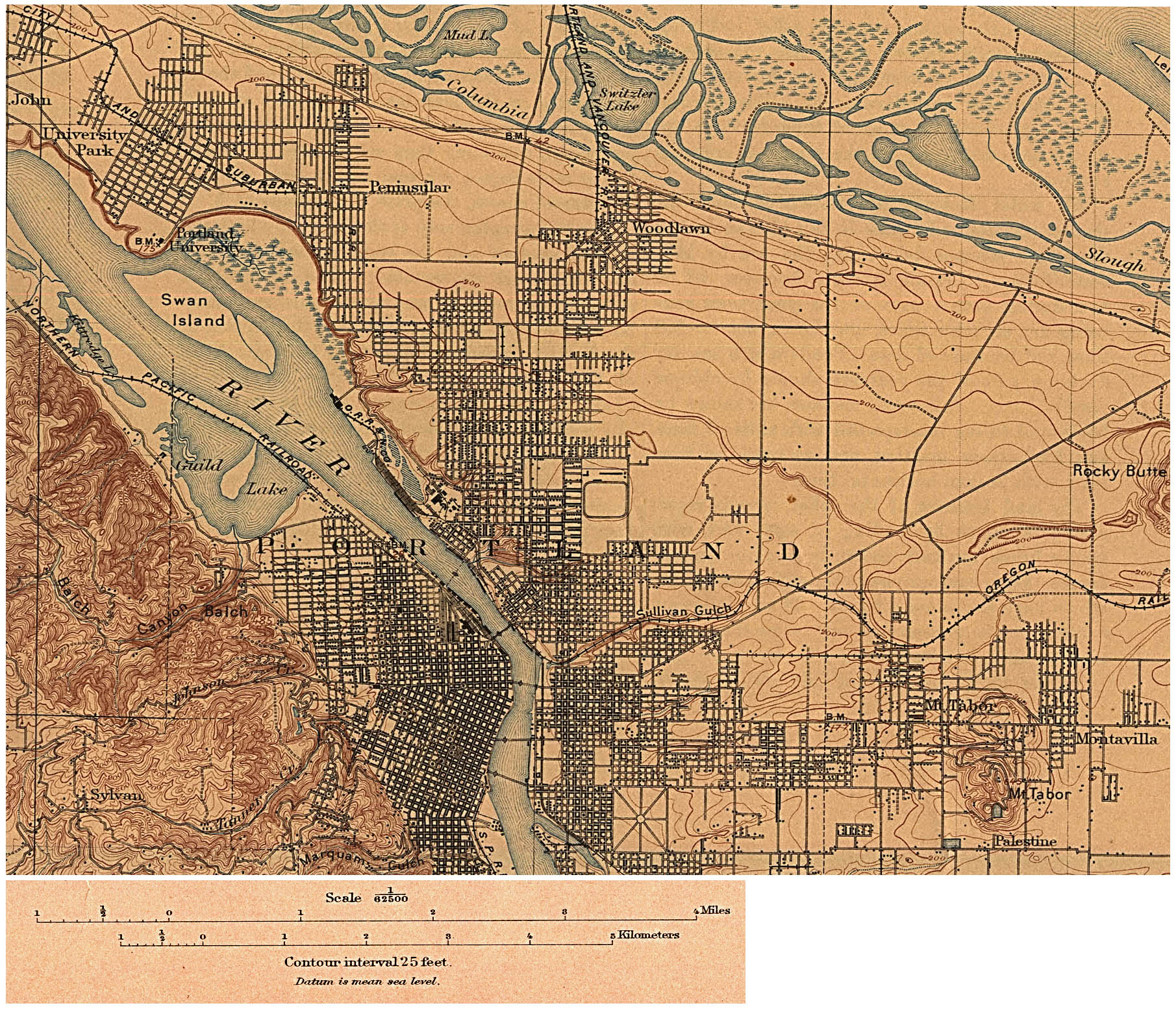
Portland, Oregon in 1897
Voting period is over. Please don't add any new votes. Voting period ends on 3 Nov 2011 at 07:07:35 (UTC)

- Reason
- High quality, map of historic value, interesting colours
- Articles in which this image appears
- Portland, Oregon
- FP category for this image
- Wikipedia:Featured pictures/Diagrams, drawings, and maps/Maps
- Creator
- U.S. Geological Survey, derivative work by EncMstr
- Support as nominator -- Crisco 1492 ( talk) 07:07, 25 October 2011 (UTC)
- Comment Interesting, but it is a pity that the southern part seems cropped. -- Elekhh ( talk) 10:02, 26 October 2011 (UTC)
- Seems to have been in the original digitization. I don't know if there are websites that host the original versions of these kinds of maps. Crisco 1492 ( talk) 22:58, 26 October 2011 (UTC)
- Support per nom. Pine talk 06:57, 28 October 2011 (UTC)
- Weak oppose: Could you rotate the image such that the grid lines are running perfectly horizontally & vertically? They seem slightly off to me... Nik the stoned 10:43, 31 October 2011 (UTC)
Not Promoted -- Makeemlighter ( talk) 09:59, 3 November 2011 (UTC)
Delta formation by Blue Angels
Voting period is over. Please don't add any new votes. Voting period ends on 4 Nov 2011 at 03:12:49 (UTC)

- Reason
- High resolution, high EV, good contrast and framing. Free image.
- Articles in which this image appears
- Blue Angels
- FP category for this image
- Wikipedia:Featured pictures/Vehicles/Air
- Creator
- Dirk Hansen
- Support as nominator -- Crisco 1492 ( talk) 03:12, 26 October 2011 (UTC)
- Oppose the crop is too tight on the top, right, and bottom. Aaadddaaammm ( talk) 18:33, 26 October 2011 (UTC)
- Oppose Personally i'm fine with the crop, however I feel it's lacking in overall detail, and teh blown highlight spush it over the edge for me. JFitch (talk) 01:18, 27 October 2011 (UTC)
- Weak oppose; seems to be a tad too grainy, meaning detail is lacking. Very nice shot though. J Milburn ( talk) 14:38, 27 October 2011 (UTC)
Not Promoted -- Makeemlighter ( talk) 10:05, 4 November 2011 (UTC)
Armoring of SMS Bayern
Voting period is over. Please don't add any new votes. Voting period ends on 4 Nov 2011 at 03:31:14 (UTC)

- Reason
- Educative and good looking. Very high EV, both for the individual ship and the class.
- Articles in which this image appears
- SMS Bayern (1915), Bayern class battleship
- FP category for this image
- Wikipedia:Featured pictures/Diagrams, drawings, and maps/Diagrams
- Creator
- Maxrossomachin
- Support as nominator -- Crisco 1492 ( talk) 03:31, 26 October 2011 (UTC)
- It took me a couple of clicks to find out what the numbers mean (armour thickness in mm), and the lines connecting these numbers to the areas that are too small to include the number are too light. Aaadddaaammm ( talk) 18:35, 26 October 2011 (UTC)
- Oppose I see why it is informative. Yet I see no reason why we should feature this diagram. JFitch (talk) 01:16, 27 October 2011 (UTC)
- Oppose. If nothing else, I'm seeing jagged diagonal lines. This is nice, but nothing awesome. J Milburn ( talk) 14:35, 27 October 2011 (UTC)
Not Promoted -- Makeemlighter ( talk) 10:06, 4 November 2011 (UTC)
Comparison of the largest ships
Voting period is over. Please don't add any new votes. Voting period ends on 4 Nov 2011 at 03:25:48 (UTC)

- Reason
- This is a very illustrative and educational diagram of some of the largest ships of different kinds. It has high EV and even shows the waterline.
- Articles in which this image appears
- List of world's longest ships, Seawise Giant, Emma Mærsk
- FP category for this image
- Wikipedia:Featured pictures/Diagrams, drawings, and maps/Diagrams
- Creator
- Notafish, derivative work by Maxrossomachin
- Support as nominator -- Crisco 1492 ( talk) 03:25, 26 October 2011 (UTC)
- Support, I like it. Aaadddaaammm ( talk) 18:37, 26 October 2011 (UTC)
- Comment could we perhaps have underneath the images of each of the ships, what type of ships they are; oil tanker, cargo ship(?), passenger vessel and military? I think that would make it more informative --Thanks, Hadseys 22:56, 26 October 2011 (UTC)
- I was thinking the very same thing.
JBarta (
talk) 01:04, 27 October 2011 (UTC)
- Requested at the lab. I don't have Corel Draw or a similar SVG editor anymore. Crisco 1492 ( talk) 06:42, 27 October 2011 (UTC)
- Added the ship type to the image. (Type name according to our
List of world's longest ships.)
JBarta (
talk) 19:58, 27 October 2011 (UTC)
- Support thanks for taking my comments onboard. I think it looks a lot better now --Thanks, Hadseys 22:54, 27 October 2011 (UTC)
- Can we have that big enough to be legible at least in a main page sized thumbnail, if not article-sized? Samsara ( FA • FP) 22:03, 28 October 2011 (UTC)
- I think it would look bad with that text large as well. It's not necessary that everything be visible/legible at thumbnail size. That's why it's a thumbnail. I think it's fine as it is.
JBarta (
talk) 22:43, 28 October 2011 (UTC)
- I think "fine" is the last description that applies in its current state. The adage has always been that FPs should stand on their own at main page size, and in that sense, this is definitely below par. There is no possible reason other than laziness that one kind of information should be privileged over the other.
Samsara (
FA •
FP) 15:22, 30 October 2011 (UTC)
- Laziness? I think you're way off base. In a technical image (of which this is a simple one), it's perfectly reasonable to scale the text size to the image... NOT blow up all the text in a clumsy attempt to make everything always legible at thumbnail size. I would argue that's just plain stupid and would make for some silly looking images. The thumbnail version gives a great overview of the image. Viewing in full size offers more detail. And that would be the smart way to do it in my opinion. Laziness or privileged information has nothing to do with it. And while "adages" are all warm and fuzzy in an Uncle Remus sort of way, I would prefer you point to actual FP criteria written in cold hard text so everyone can see it and no one has to guess what the current adages are.
JBarta (
talk) 11:59, 2 November 2011 (UTC)
- You haven't answered the question, which was: why is one kind of information judged worthy of a larger font size than the other?
Samsara (
FA •
FP) 00:05, 3 November 2011 (UTC)
- Again, to repeat what I said above... it has more to do with appearance than one bit of information being more worthy than another. The text is the size it is because it looks best that way. And you're missing an important point... the text is secondary. The main purpose of the image is the visual representation of differing ship sizes. If you removed all text except the names of the ships it would still convey 98% of the information it is meant to convey. JBarta ( talk) 01:24, 3 November 2011 (UTC)
- You haven't answered the question, which was: why is one kind of information judged worthy of a larger font size than the other?
Samsara (
FA •
FP) 00:05, 3 November 2011 (UTC)
- Laziness? I think you're way off base. In a technical image (of which this is a simple one), it's perfectly reasonable to scale the text size to the image... NOT blow up all the text in a clumsy attempt to make everything always legible at thumbnail size. I would argue that's just plain stupid and would make for some silly looking images. The thumbnail version gives a great overview of the image. Viewing in full size offers more detail. And that would be the smart way to do it in my opinion. Laziness or privileged information has nothing to do with it. And while "adages" are all warm and fuzzy in an Uncle Remus sort of way, I would prefer you point to actual FP criteria written in cold hard text so everyone can see it and no one has to guess what the current adages are.
JBarta (
talk) 11:59, 2 November 2011 (UTC)
- I think "fine" is the last description that applies in its current state. The adage has always been that FPs should stand on their own at main page size, and in that sense, this is definitely below par. There is no possible reason other than laziness that one kind of information should be privileged over the other.
Samsara (
FA •
FP) 15:22, 30 October 2011 (UTC)
- I think it would look bad with that text large as well. It's not necessary that everything be visible/legible at thumbnail size. That's why it's a thumbnail. I think it's fine as it is.
JBarta (
talk) 22:43, 28 October 2011 (UTC)
- Added the ship type to the image. (Type name according to our
List of world's longest ships.)
JBarta (
talk) 19:58, 27 October 2011 (UTC)
- I was thinking the very same thing.
JBarta (
talk) 01:04, 27 October 2011 (UTC)
- Comment: Knock Nevis doesn't even seem to be included in the main list. J Milburn ( talk) 14:37, 27 October 2011 (UTC)
- Note that it is another name for Seawise Giant. Crisco 1492 ( talk) 15:18, 27 October 2011 (UTC)
- Maybe it should be mentioned in the caption that Knock Nevis/Seawise Giant/Jahre Viking was scrapped in 2010. Other than that, a very nice and informative diagram. Otto Jula ( talk) 16:25, 27 October 2011 (UTC)
- I noticed that somewhere along the line the photo caption changed from "the largest" to "some of the largest"... that's good and hopefully will carry into the article. The QE2 is case in point... it's not the largest passenger ship by length but it is by weight. I found that a bit confusing at first.
JBarta (
talk) 19:16, 27 October 2011 (UTC)
- Yeah, I changed it to bring it closer to the article wording. I had missed the "some". Crisco 1492 ( talk) 21:52, 27 October 2011 (UTC)
- I noticed that somewhere along the line the photo caption changed from "the largest" to "some of the largest"... that's good and hopefully will carry into the article. The QE2 is case in point... it's not the largest passenger ship by length but it is by weight. I found that a bit confusing at first.
JBarta (
talk) 19:16, 27 October 2011 (UTC)
- Support -- Informative, well put together, very encyclopedic and adds interest to any article its in. Plus it's in SVG format so it can be easily changed, updated, translated, etc. JBarta ( talk) 06:19, 28 October 2011 (UTC)
- Oppose As above I can see why it is informative, but I can't see it as part of wikipedia's best work, and not worthy of FP in my opinion. JFitch (talk) 10:26, 28 October 2011 (UTC)
- At the top of this page in the How to Comment section it says All objections should be accompanied by a specific rationale that, if addressed, would make you support the image. Just to stir the pot a little, what could be addressed to make you support the image? JBarta ( talk) 16:13, 28 October 2011 (UTC)
- Since the colours of the ships don't seem to mean anything in particular, I suggest that the same two colours (one consistently for above waterline, one consistently for below waterline) be used for all ships. Of the listed combinations, red-bottom and grey-top seems sensible, although blue-bottom (not currently used) might add to ease of understanding. Samsara ( FA • FP) 21:51, 28 October 2011 (UTC)
- While I understand the seeking of uniformity, I would suggest the varied colors do not really disrupt the readers' understanding by any significant amount. Actually, I think the colors might even add to the visual appeal... they also emphasize that these are a series of different classes of ship.
JBarta (
talk) 23:02, 28 October 2011 (UTC)
- Oppose for now. I was looking for what the colours mean, and it's frustrating to go looking for information that is not there/relevant, so I believe this simple fix should be executed. If the picture is found to have no appeal with uniform colours, then it also had none with random colours. What we're trying to convey is information, not fuzzy sensations at meaningless multicoloration. Samsara ( FA • FP) 15:15, 30 October 2011 (UTC)
- While I understand the seeking of uniformity, I would suggest the varied colors do not really disrupt the readers' understanding by any significant amount. Actually, I think the colors might even add to the visual appeal... they also emphasize that these are a series of different classes of ship.
JBarta (
talk) 23:02, 28 October 2011 (UTC)
- Oppose - Yes, it is useful and has obvious ev. But I see nothing extraordinary justying the status. In my opinion, it lacks the sophistication of most of our featured illustrations. By the way, the distance scale is awfull! Alvesgaspar ( talk) 23:07, 28 October 2011 (UTC)
- What is meant by "distance scale"?
JBarta (
talk) 23:29, 28 October 2011 (UTC)
- I think s/he means the scale at the bottom. A grid would theoretically be better, but it would make the picture less pleasing to look at, methinks. Crisco 1492 ( talk) 00:00, 29 October 2011 (UTC)
- What is meant by "distance scale"?
JBarta (
talk) 23:29, 28 October 2011 (UTC)
- Question: I understand the purpose of the different colors on individual ships, but why do different ships have different colors?
Spencer
T♦
C 04:42, 29 October 2011 (UTC)
- Well, my question was resolved. Weak Oppose nonetheless. Though it has okay enc. and looks much cleaner than it did at the start, I don't feel that this is one of the "top" images on Wikipedia.
- Updated image in response to some of the comments. Colors are consistent, foot conversion added to lengths, scale bar toned down a little and "Seawise Giant" added to biggest ship to (hopefully) reduce confusion. In addition, all the text bits are now actual text so they can be more easily edited/translated. This image won't achieve FP status, but maybe these changes made it a better image. JBarta ( talk) 10:31, 2 November 2011 (UTC)
Not Promoted -- Makeemlighter ( talk) 10:06, 4 November 2011 (UTC)
Vanessa Amorosi
Voting period is over. Please don't add any new votes. Voting period ends on 5 Nov 2011 at 04:40:58 (UTC)

- Reason
- Striking, well-composed, high-res professional photo. A couple reservations: focus isn't quite right, or there has been a lot of airbrushing that makes it look a bit OOF. Also, what is going on with her breasts? The bulges in her jacket are way too far apart for any normal human. (and maybe a bit high esp considering she's braless? and asymmetrical in height? and large compared to her flat chest where the jacket is open?) So there's been some slightly fishy photoshopping going on here, but I think the image should get a hearing here regardless. I'm on the fence about whether her bizarre breasts are a deal-breaker.
- Articles in which this image appears
- Vanessa Amorosi
- FP category for this image
- Wikipedia:Featured pictures/People/Entertainment
- Creator
- Pierre Baroni / Ralph Carr Management
- Support as nominator -- Calliopejen1 ( talk) 04:40, 27 October 2011 (UTC)
- Oppose - Unless it can be shown that her actual breasts are that far apart, this would be misrepresenting the subject. Great resolution though. Crisco 1492 ( talk) 06:34, 27 October 2011 (UTC)
- Viewing the image while cranking up gamma correction does reveal some funny business going on around that left tweeter (her left, our right). My guess is that the original photo showed her flat chested on that side (probably both sides) and they "fixed" it by giving the poor dear a bad boob job.
JBarta (
talk) 07:36, 27 October 2011 (UTC)
- I looked at our other pictures of her, and it appears that she does have a fairly wide chest... but not enough to explain this. Mind you, the other pix are tiny. Crisco 1492 ( talk) 08:37, 27 October 2011 (UTC)
- It could just be a front opening bra sitting under the leather jacket. The photo has obviously been airbrushed pretty significantly though, and there seems to be weird stuff, possibly from cloning, going on around the zip on the right side in particular. JJ Harrison ( talk) 10:16, 27 October 2011 (UTC)
- Viewing the image while cranking up gamma correction does reveal some funny business going on around that left tweeter (her left, our right). My guess is that the original photo showed her flat chested on that side (probably both sides) and they "fixed" it by giving the poor dear a bad boob job.
JBarta (
talk) 07:36, 27 October 2011 (UTC)
- Oppose Poor image quality, Hair crossing pupil, plastic skin. JFitch (talk) 10:27, 27 October 2011 (UTC)
- Oppose. I was ready to support at thumbnail, but I'm really not keen on the very heavy airbrushing (which, I assume, is what gives her the "flat chest" mentioned in the nom). It's a good photo to have, but I don't think it's FP material. J Milburn ( talk) 14:33, 27 October 2011 (UTC)
- Support. Nice girl, nice artwork. -- Alchemist-hp ( talk) 18:26, 27 October 2011 (UTC)
- Oppose -- Striking, but flawed. Useful, but not FP worthy in my opinion. JBarta ( talk) 20:25, 27 October 2011 (UTC)
- Oppose. Breasts aside, the skin is obviously blurred (see, e.g., by the navel). Given the heavy corrections, it is hard to tell what is true here, and what is the encyclopedic value of this image. Materialscientist ( talk) 09:50, 31 October 2011 (UTC)
- Oppose. Heavy air-brushing and post processing. Would favor a well executed realistic photo rather than a publicity shot. Kaldari ( talk) 02:52, 5 November 2011 (UTC)
Not Promoted -- Makeemlighter ( talk) 12:54, 5 November 2011 (UTC)
Superstition Mountains
Voting period is over. Please don't add any new votes. Voting period ends on 5 Nov 2011 at 02:29:35 (UTC)

- Reason
- This is a very high quality photograph that adds a great deal to its corresponding article.
- Articles in which this image appears
- Superstition Mountains
- FP category for this image
- Wikipedia:Featured pictures/Places
- Creator
- Doug Dolde
- Support as nominator -- LycianFelix ( talk) 02:29, 27 October 2011 (UTC)
- Oppose Honestly, it's not a very high quality image. It's not very high resolution and has relatively poor detail close up. It's full of jpg artifacts and sharpening halos (or as I've recently been told is the sign of a high quality camera... either way take your pick). On top of that, there's the coloring. Things simply look too golden and the sky is a weird blue color. Ruins whatever encyclopedic value the image had. I would even go so far as to say it shouldn't even be in the article, especially not the lead photo, for the coloring reason alone. This would have been a really nice image at higher resolution, with natural colors and before it got saved as a (relatively) highly compressed jpg. JBarta ( talk) 04:17, 27 October 2011 (UTC)
- Oppose All reasons stated above. JFitch (talk) 13:17, 27 October 2011 (UTC)
- Oppose per Jbarta. I'd want a landscape shot like this to be several times the size of this image. J Milburn ( talk) 14:34, 27 October 2011 (UTC)
- Oppose Oversaturated, oversharpened and too small. JJ Harrison ( talk) 21:41, 27 October 2011 (UTC)
Not Promoted -- Makeemlighter ( talk) 12:54, 5 November 2011 (UTC)
An-124 inflight with 2 Su-27s
Voting period is over. Please don't add any new votes. Voting period ends on 4 Nov 2011 at 00:03:35 (UTC)

- Reason
- Is a great visual representation of part of the flyover for the 2010 MVDP, and is of high enough quality that the viewer isn't left wanting for more detail
- Articles in which this image appears
- 2010 Moscow Victory Day Parade, Antonov An-124, Flypast
- FP category for this image
- Wikipedia:Featured pictures/Vehicles/Air
- Creator
- Commons:User:Bushman787
- Support as nominator -- Russavia Let's dialogue 00:03, 26 October 2011 (UTC)
- Support -- Very nice image. JBarta ( talk) 02:10, 26 October 2011 (UTC)
- Support -- Nominator says it all. High resolution, very sharp, and free. Impressive contrast between the jet and the fighters. Crisco 1492 ( talk) 03:08, 26 October 2011 (UTC)
- I'm a little worried about the scale. The jet should be 69 meters long, the little ones 22 meters long, but from this photo the little jets appear smaller than 1/3 the big one. Or is it just me?
Aaadddaaammm (
talk) 18:29, 26 October 2011 (UTC)
- The Su-27s are flying on the starboard side of the Ruslan, so they appear smaller due to being further away from the camera.
Russavia
Let's dialogue 18:58, 26 October 2011 (UTC)
- I share these concerns. And by them both being further away it only makes the effect worse. I feel it's almost, if not entirely accidental misrepresentation.
JFitch
(talk) 01:20, 27 October 2011 (UTC)
- Personally I didn't give that aspect of the photo much thought. To me it was just a nice photo of a few planes in the sky. I feel confident that there are no alterior motives at play here... just a snap of a few planes in the sky... and a nice one at that. Though, if you want to think in terms of relative size, the photo does well capture the "beefy-ness"" of the larger plane. And that adds to the image IMO rather than detracts. JBarta ( talk) 04:26, 27 October 2011 (UTC)
- Just to put this idea of relative size to the test, I made a mockup enlarging the jets to match the scale noted above (69/22). The result is not that much different. So the original photo is perfectly realistic given the jets are at least several meters futher from the camera than the larger plane. JBarta ( talk) 06:50, 27 October 2011 (UTC)
- I share these concerns. And by them both being further away it only makes the effect worse. I feel it's almost, if not entirely accidental misrepresentation.
JFitch
(talk) 01:20, 27 October 2011 (UTC)
- The Su-27s are flying on the starboard side of the Ruslan, so they appear smaller due to being further away from the camera.
Russavia
Let's dialogue 18:58, 26 October 2011 (UTC)
- The image is very crisp, and does a good job presenting the jet. Chris857 ( talk) 03:58, 29 October 2011 (UTC)
- Support nice cropping, good angle (it'll be preferable if the Flankers are on the port side), and the image is really meaningful. -- Sp33dyphil © • © 09:59, 29 October 2011 (UTC)
- Weak support the image isn't prominent in any of the articles, so the EV isn't as strong as it could be. Pine talk 02:18, 3 November 2011 (UTC)
Not Promoted -- Makeemlighter ( talk) 12:55, 5 November 2011 (UTC)
Constantine medallion
Voting period is over. Please don't add any new votes. Voting period ends on 6 Nov 2011 at 21:50:50 (UTC)

- Reason
- A quite elaborate and noble example of Roman medallion craft (although currently without reverse), neutral background.
- Articles in which this image appears
- Constantine the Great, Ticinum, Battle of the Milvian Bridge
- FP category for this image
- History or People
- Creator
- unknown, photographed by Jastrow
- Support as nominator -- Brandmeister t 21:50, 28 October 2011 (UTC)
- Comment I think the cut out job from the background is a bit unconvincing, particularly near the top. JJ Harrison ( talk) 22:08, 30 October 2011 (UTC)
- comment. Hmm blown highlights. How big is the thing?© Geni 21:00, 31 October 2011 (UTC)
- I couldn't figure out the diameter in the internet, but the stuff weighs 39,79 g. Maybe someone can help. Brandmeister t 23:45, 31 October 2011 (UTC)
Not Promoted -- Makeemlighter ( talk) 22:57, 6 November 2011 (UTC)
Airbus A380
Voting period is over. Please don't add any new votes. Voting period ends on 7 Nov 2011 at 23:19:36 (UTC)

- Reason
- Excellent picture of an A380, Good EV, excellent resolution.
- Articles in which this image appears
- Airbus-A380
- FP category for this image
- Wikipedia:Featured_pictures/Vehicles/Air
- Creator
- Qdou
- Support as nominator -- Dusty777 ( talk) 23:19, 29 October 2011 (UTC)
- Oppose. A very sharp and nice shot, but the crop is too tight on the left side and there are some blown highlights. There are some compression artefacts on the underside of the fuselage too. Otto Jula ( talk) 17:40, 2 November 2011 (UTC)
- Weak support I wish the shadows on the underside weren't so strong. This is a larger image than the lead image for the article, so you could consider making this the lead image. Pine talk 02:22, 3 November 2011 (UTC)
- Oppose Too tight crop on the sides, too much (in relative terms) space top and bottom. However, I am willing to support if the crop is balanced. (air)Wolf ( talk) 14:08, 4 November 2011 (UTC)
Not Promoted -- Makeemlighter ( talk) 00:32, 8 November 2011 (UTC)
Manakamana Temple Nepal
Voting period is over. Please don't add any new votes. Voting period ends on 8 Nov 2011 at 13:44:45 (UTC)

- Reason
- This is One of the Religious Place at Nepal. and in the Feature Picture all the Geographical Teritory as well as Cultures and religious should also be included. So this is the best picture to feature.
- Articles in which this image appears
- Manakamana
- FP category for this image
- Wikipedia:Featured pictures/Places/Others
- Creator
- Shiva Kumar Khanal
- Support as nominator -- Shiva Kumar Khanal Talk 13:44, 30 October 2011 (UTC)
- Oppose I absolutely agree that we should try to include images from all cultures, religions, countries, etc. However, this image has some problems as is. Firstly, the image isn't level. Secondly, I don't think the sun is in the best place for the lighting. Thirdly the power line in the foreground is distracting. I wonder if the image should have been taken from the right side of the courtyard. I hope to see more images from Nepal. JJ Harrison ( talk) 22:12, 30 October 2011 (UTC)
- Oppose So many problems with it, Many mentioned above. JFitch (talk) 00:36, 31 October 2011 (UTC)
- Oppose - poor lighting, composition, levels, and power lines crossing the image - these 4 reasons are enough for me to oppose. Materialscientist ( talk) 09:52, 31 October 2011 (UTC)
- Oppose - looks like a holiday snap taken with a point-and-shoot. Nik the stoned 10:45, 31 October 2011 (UTC)
- Oppose as per above. Booksworm Talk? 01:54, 5 November 2011 (UTC)
Not Promoted -- Makeemlighter ( talk) 11:04, 8 November 2011 (UTC)
A shag for FP
Voting period is over. Please don't add any new votes. Voting period ends on 8 Nov 2011 at 13:05:43 (UTC)

- Reason
- High resolution and EV, good colours, lead image in its article
- Articles in which this image appears
- European Shag
- FP category for this image
- Wikipedia:Featured pictures/Animals/Birds
- Creator
- Andreas Trepte
- Support as nominator -- Crisco 1492 ( talk) 13:05, 30 October 2011 (UTC)
- Neutral – I haven't gone to FP in a while, but the rock and the shadow is really distracting compared to the shag itself. HurricaneFan 25 13:46, 30 October 2011 (UTC)
- Comment Are there any other frames of this bird? The Nictitating membrane is mostly shut, which looks a bit strange. JJ Harrison ( talk) 22:06, 30 October 2011 (UTC)
- Doesn't appear so. Ah, that's what the eyelid is called Crisco 1492 ( talk) 03:27, 31 October 2011 (UTC)
Not Promoted -- Makeemlighter ( talk) 11:04, 8 November 2011 (UTC)
LED christmas illumination in Viborg, Denmark
Voting period is over. Please don't add any new votes. Voting period ends on 9 Nov 2011 at 19:18:25 (UTC)

- Reason
- It is a well-composed, high quality photo of a christmas illumination in a Danish town, showing also how far LED illumination has come in producing a pleasant, warm glow, resembling incandescent light bulbs. Well, and its about that season soon...
- Articles in which this image appears
- LED lamp, Christmas lights
- FP category for this image
- Wikipedia:Featured pictures/Places/Urban
- Creator
- Slaunger
- Support as nominator -- Slaunger ( talk) 19:18, 31 October 2011 (UTC)
- Support -- I always liked this picture and think it adds considerable value to Christmas lights. I have replaced the original picture of the article (too small) with this one. Alvesgaspar ( talk) 19:32, 31 October 2011 (UTC)
- Oppose I think we can do much better than this. The overall feel of the picture is very snapshotty. The detail is lacking. The focus is way too shallow, and a lot of the lights, which is what the photo is actually meant to be of, are out of focus. I also don't like the angle and composition. The lights are off centre and the low angle make the floor and the bikes way too much of a prominent part of the picture.
JFitch
(talk) 01:24, 1 November 2011 (UTC)
- Thank you for taking your time to review my image. Composition is much a matter of taste, and I will not argue, whether you like that or not. I have used f/13, and I fail to see how that could give shallow focus. IMO the DOF is excellent and no lights are out of focus. If anything, the aperture is on the high side, but I do not see sign of high aperture diffraction (but maybe that is the effect you seem to be seeing?). Concerning overall image quality I have used ISO 100, and an exposure time of 2.5 s using a tripod placed firmly on the ground in no wind. I am very sure there were no vibrations during the exposure. I was laying on the street, and the photo is far from having a snapshotty composition. I have considered many angles and times of day as for instance this centered composition. I did find the centered composition boring though, and decided the frog angle of view was more eye-catching and interesting. I considered taking the photo in the late shop opening hours, but decided not to, because signs on the street placed durring opening hours gave too much visual clutter in the composition. Concerning the floor and bikes, they add EV. Since the photo was taken last year, the floor has been replaced by another type of granite bricks, and the bikes illustrates a typical means of transportation for going to the shopping mall to that entrance. There is another entrance, which is normally reached by car. Thus, both the floor and bicycles are a deliberate element in the composition. I am happy to see that another reviewer below, sees the point with the bikes (not that you are wrong in not appreciating this element, opinions differ, and I respect that). -- Slaunger ( talk) 11:43, 1 November 2011 (UTC)
- Support The bikes are a nice touch. JJ Harrison ( talk) 05:31, 1 November 2011 (UTC)
- Oppose I had the same first impressions as JFitch, and after clicking through and reading your explanation I'm still not convinced that this is good enough for a FP. My main concern is the composition which doesn't have a clear focal point. Shooting from the gutter drags the whole image down to earth, rather than focusing on the christmas lights above the street. Personally, I much prefer the centred composition, I find it sets the scene better (snow and people) and the higher angle fits the subject more. Aaadddaaammm ( talk) 18:14, 1 November 2011 (UTC)
- Oppose. My overall impression is merely that it's a fine photo technically and does well to illustrate a typically lit city street in Europe at Christmas time, but it doesn't come across as particularly notable or interesting to view, and is bit monochromatic and dull. You're right that it does replicate the warm glow of incandescent lighting quite well, but for photography, I wouldn't necessarily say that's a good thing aesthetically as I find it a bit too reminiscent of cheap sodium lighting. ;-) Ðiliff «» (Talk) 08:45, 3 November 2011 (UTC)
Not Promoted -- Makeemlighter ( talk) 02:00, 10 November 2011 (UTC)
The Eiffel Tower, view from the Trocadéro
Voting period is over. Please don't add any new votes. Voting period ends on 9 Nov 2011 at 13:58:20 (UTC)

- Reason
- High resolution panorama complementing the existing FP with an alternative view of identical quality. Has been in the article for some time now.
- Articles in which this image appears
- Eiffel Tower
- FP category for this image
- Wikipedia:Featured pictures/Places/Architecture
- Creator
- Alvesgaspar ( talk)
- Support as nominator. Second nomination. The first one was withdrawn. -- Alvesgaspar ( talk) 13:58, 31 October 2011 (UTC)
- Comment. I really like this shot. However, we already have a FP from the same angle
here, albeit taken at dawn. The currently featured picture (the one at dawn) lacks in quality and the one presented here surely has more EV. Maybe the old one should be replaced with this one?
Ottojula (
talk) 16:28, 31 October 2011 (UTC)
- Yes we have but the two pictures have different approaches: one artistic and the other illustrative. IMO, the illustrative approach (my picture) is more useful because of its encyclopaedic value. --
Alvesgaspar (
talk) 16:42, 31 October 2011 (UTC)
- Maybe I wasn't clear enough. I think your picture (the one nominated here) is way better than the one from the same angle currently featured. IMO the murky picture could easily be replaced with your picture. I'm just waiting for more input before I give my vote. Ottojula ( talk) 16:58, 31 October 2011 (UTC)
- Yes we have but the two pictures have different approaches: one artistic and the other illustrative. IMO, the illustrative approach (my picture) is more useful because of its encyclopaedic value. --
Alvesgaspar (
talk) 16:42, 31 October 2011 (UTC)
- Weak Support There is enough detail to read the names of the scientists and mathematicians facing this way and all of the people make for an interesting scene. However there seems to be a bit of a bow as a result of the stitch, like the sides are leaning in, and I'd prefer to see that corrected. JJ Harrison ( talk) 05:35, 1 November 2011 (UTC)
- Oppose 2 FP's of this is already plenty, and this doesn't offer anything different that is special in my opinion so fails to add EV. JFitch (talk) 13:56, 2 November 2011 (UTC)
- Oppose. I'm going to oppose, because I think this nomination should take place at the delist and replace section. The nominated picture is far better and more encyclopaedic than the currently featured picture. It makes much more sense to replace this inferior picture than having three FPs of the same subject. Otto Jula ( talk) 17:33, 2 November 2011 (UTC)
- To me that would make little sense. as it is we have 2 very different FP's of this image. A stunning day FP and then also the beautiful night FP. A DL+R would only be appropriate for the most simalar images. So it would be the day image, and this is certainly worse than the day image we have featured. Also it makes more sense to keep a day and a night featured as oppose to 2 day pictures. JFitch (talk) 18:28, 2 November 2011 (UTC)
Not Promoted -- Makeemlighter ( talk) 02:00, 10 November 2011 (UTC)
Colonial anemone redux
Voting period is over. Please don't add any new votes. Voting period ends on 11 Nov 2011 at 13:12:59 (UTC)


- Reason
- Striking image and fairly sharp for an underwater image. The previous nomination was withdrawn after it was revealed that the species was wrong; this has since been fixed.
- Articles in which this image appears
- Amphianthus
- FP category for this image
- Wikipedia:Featured pictures/Animals/Cnidaria
- Creator
- User:Nhobgood
- Support as nominator -- Crisco 1492 ( talk) 13:12, 2 November 2011 (UTC)
- Oppose As when nominated before the colours are a misrepresentation. The Alt is better but in all honesty and it brings a whole load of noise issues and what seem like compression artifacts. I wouldn't support the Alt out of quality issues alone. And the first is misrepresentation due to saturations of colours. The image is lovely to look at however! JFitch (talk) 13:24, 2 November 2011 (UTC)
Not Promoted -- Makeemlighter ( talk) 01:51, 12 November 2011 (UTC)
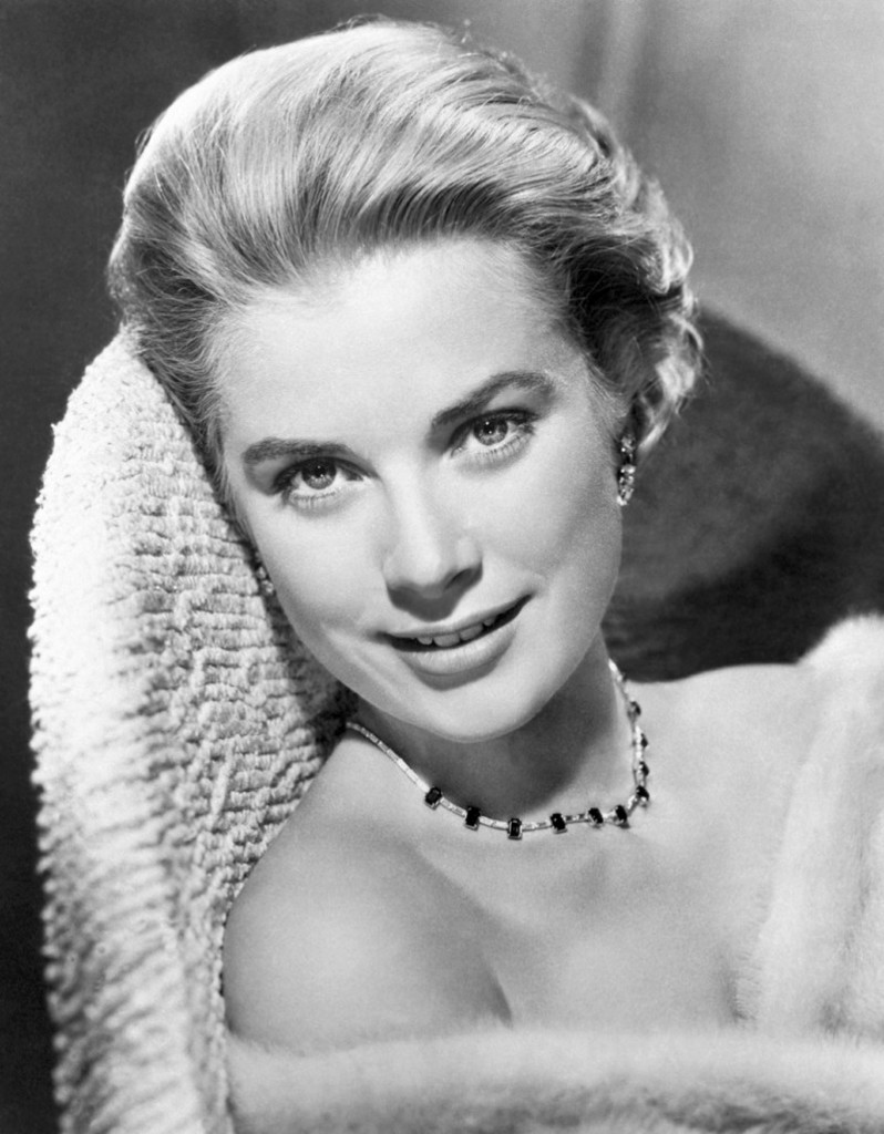
Grace Kelly publicity still
Voting period is over. Please don't add any new votes. Voting period ends on 13 Nov 2011 at 14:29:20 (UTC)
- Reason
- Gorgeous shot, outstandingly posed and composed. And the digitization of this 55-year-old picture appears virtually flawless.
- Articles in which this image appears
- Grace Kelly
- FP category for this image
- Wikipedia:Featured pictures/People/Entertainment or Wikipedia:Featured pictures/People/Royalty
- Creator
- Metro-Goldwyn-Mayer, digitized by http://www.doctormacro.com/
- Support as nominator -- Powers T 14:29, 4 November 2011 (UTC)
- Comment I can't believe that this is a true digitization of the picture without any post work done. It seems to me like it's been run through photoshop since. If someone can show more evidence that this hasn't happened i will reconsider but i couldn't support as i strongly suspect that this is the case. JFitch (talk) 23:48, 4 November 2011 (UTC)
- Weak support. It's a really nice picture (lighting, composition, etc), and I'll AGF on all that copyright explanation. However either through airbrushing of the original image, Photoshopping of the digitised version, or simply loss of detail through excessive downsampling (190 KB is small for that resolution) we seem to be missing something, in particular the skin is far too smooth, lacking almost any texture. -- jjron ( talk) 10:16, 5 November 2011 (UTC)
- Oppose per JFitch - we have another image of Grace Kelly with a far more natural look than this, which would indeed suggest this has been through some processing at some point. Other images online support this. Nik the stoned 11:13, 5 November 2011 (UTC)
- Weak oppose -- I'm somewhat iffy on the copyright explanation. If it needs more references than 40% of the articles here, we're on thin ground. If both this and the image suggested by Nik are PD, why not suggest the other too?
Crisco 1492 (
talk) 12:19, 5 November 2011 (UTC)
- That the uploader chose to include such a detailed explanation doesn't mean it was necessary. The fact that it was a publicity still and the copyright was unrenewed is sufficient. I didn't put the other one up for FPC because this one is used in the article, and I feel it's a better-looking shot, at least in thumbnail. Powers T 14:04, 5 November 2011 (UTC)
- Oppose. I'm not seeing that much EV here, actually. This is a publicity shot for a movie, which means it's essentially in character, not a portrait of Her Future Serene Highness as a person. In addition, I don't really like the picture. It does indeed look heavily airbrushed to me; that was common in this kind of shot, so not out of place in, say, an article about publicity shots, but again I think it detracts from the image as a portrait. Chick Bowen 16:35, 6 November 2011 (UTC)
.jpg&action=edit&redlink=1)
Not Promoted -- Makeemlighter ( talk) 23:01, 13 November 2011 (UTC)
Patrouille de France
Voting period is over. Please don't add any new votes. Voting period ends on 13 Nov 2011 at 14:18:54 (UTC)

- Reason
- This is a high quality picture of the entire Patrouille de France formation (the fact that all the jets are present adds to the EV significantly), showing the splendid precision of the pilots and alignment of the planes, which would not be possible in a picture taken from the side.
- Articles in which this image appears
- Patrouille de France
- FP category for this image
- Vehicles/Air
- Creator
- Łukasz Golowanow
- Support as nominator -- (air)Wolf ( talk) 14:18, 4 November 2011 (UTC)
- Support - great photograph, excellent choice for an FP. Booksworm Talk? 01:53, 5 November 2011 (UTC)
- Support - good clarity and rather impressive how well those planes are lined up. Nik the stoned 11:30, 5 November 2011 (UTC)
- Support -- That would look great centred as my wallpaper. High resolution, EV is acceptable. Crisco 1492 ( talk) 12:23, 5 November 2011 (UTC)
- Support - nicely framed! -- Cj.samson ( talk) 15:02, 5 November 2011 (UTC)
- Support. A great shot indeed. Ottojula ( talk) 17:51, 11 November 2011 (UTC)
Promoted File:Patrouille de France Radom 3 1.JPG -- Makeemlighter ( talk) 23:03, 13 November 2011 (UTC)
Plan 9 From Outer Space
Voting period is over. Please don't add any new votes. Voting period ends on 14 Nov 2011 at 12:12:20 (UTC)


- Reason
- High encyclopedic value, good resolution; image was a Valued picture before VP was disbanded. One of the few film posters that are PD that I've seen. The film itself is quite notable.
- Articles in which this image appears
- Plan 9 from Outer Space, B movie, Z movie, Tom Jung
- FP category for this image
- Wikipedia:Featured pictures/Artwork/Others
- Creator
- Distributors Corporation of America
- Support as nominator -- Crisco 1492 ( talk) 12:12, 5 November 2011 (UTC)
- Weak Support - Resolution is a bit low - a better scan is feasible. This is one of those movies that is almost so bad that it is good. JJ Harrison ( talk) 22:03, 5 November 2011 (UTC)
- I've managed to dig up a higher resolution version. It's about 500px bigger at the larger side. Crisco 1492 ( talk) 22:36, 5 November 2011 (UTC)
- Weak support. Full support if someone can explain what those diagonal lines are. As far as I'm concerned, PD movie posters would make great FPs, and bonus points for the somewhat iconic nature of this film. J Milburn ( talk) 17:54, 9 November 2011 (UTC)
- I was thinking the texture of the paper, but this poster makes me wonder otherwise. Somehow the poster linked above (which I'm trying to upload separately) has different colours. Crisco 1492 ( talk) 00:22, 10 November 2011 (UTC)
- I've added the other as an ALT. It seems to be closer to the original.
Crisco 1492 (
talk) 00:42, 10 November 2011 (UTC)
- The ALT you uploaded doesn't appear to be the same as the version you link to off-site. The coloring is different, and there are creases and artifacts. (If you uploaded the version that you link to, it would receive my strong support.)
Fallingmasonry (
talk) 20:09, 11 November 2011 (UTC)
- That's odd, because I had uploaded it from here... probably my st*pid connection, compresses everything. Crisco 1492 ( talk) 00:55, 12 November 2011 (UTC)
- The ALT you uploaded doesn't appear to be the same as the version you link to off-site. The coloring is different, and there are creases and artifacts. (If you uploaded the version that you link to, it would receive my strong support.)
Fallingmasonry (
talk) 20:09, 11 November 2011 (UTC)
Opposeuntil a better version can be provided. The original version is of higher quality and has better detail. The alternative feels overprocessed to me. Both versions suffer of too high jpg compression. Ottojula ( talk) 17:50, 11 November 2011 (UTC)
Not Promoted -- Makeemlighter ( talk) 01:30, 15 November 2011 (UTC)
Colouring pencils
Voting period is over. Please don't add any new votes. Voting period ends on 15 Nov 2011 at 14:18:56 (UTC)

- Reason
- Eye-catching and high quality depiction of coloring pencils adding value to a series of articles related to color.
- Articles in which this image appears
- Color, Coloring book, List of colors
- FP category for this image
- Wikipedia:Featured pictures/Other
- Creator
- MichaelMaggs
- Support as nominator -- Alvesgaspar ( talk) 14:18, 6 November 2011 (UTC)
- Is use in an infobox placed in an article now considered to have EV? --
Muhammad
(talk) 20:32, 6 November 2011 (UTC)
- Fixed Alvesgaspar ( talk) 20:51, 6 November 2011 (UTC)
- Weak oppose Nice composition but the image is grainy. Pine talk 03:57, 7 November 2011 (UTC)
- Strong Oppose I see no EV here :( Hariya1234 ( talk) 04:20, 11 November 2011 (UTC)
- Neutral EV is not good enough, though it is a attracting and has good composition. -- 117.226.160.45 ( talk) 07:29, 13 November 2011 (UTC)
- Weak oppose Striking picture, low EV. Clegs ( talk) 11:21, 13 November 2011 (UTC)
- Oppose as above -- no EV — Z 17:04, 15 November 2011 (UTC)
Not Promoted -- Makeemlighter ( talk) 00:27, 16 November 2011 (UTC)
Playing in the surf
Voting period is over. Please don't add any new votes. Voting period ends on 15 Nov 2011 at 13:10:27 (UTC)

- Reason
- Rare and high quality depiction of a playing activity common in many beaches around the world
- Articles in which this image appears
- Beach, Play (activity)
- FP category for this image
- Wikipedia:Featured pictures/Culture, entertainment, and lifestyle/Entertainment
- Creator
- Alvesgaspar ( talk)
- Support as nominator -- Alvesgaspar ( talk) 13:10, 6 November 2011 (UTC)
- Weak support decent quality but the EV seems weak. Seems better to have it featured at Commons. Pine talk 03:55, 7 November 2011 (UTC)
- Oppose. Not wild about the EV. J Milburn ( talk) 17:52, 9 November 2011 (UTC)
- Weak Oppose - Striking photo, low EV. Clegs ( talk) 11:24, 13 November 2011 (UTC)
Not Promoted -- Makeemlighter ( talk) 00:27, 16 November 2011 (UTC)
Petalite
Voting period is over. Please don't add any new votes. Voting period ends on 16 Nov 2011 at 07:05:59 (UTC)


- Reason
- Large photo, good quality, good EV for the principal article
- Articles in which this image appears
- Petalite, Alkali metal
- FP category for this image
- Wikipedia:Featured_pictures/Natural_phenomena/Others
- Creator
- Eurico Zimbres ( Zimbres)
- Support as nominator -- Pine talk 07:05, 7 November 2011 (UTC)
Weak oppose-- Great detail, but the background is textured, which detracts from the image. A brushed black background would look better, I think. Crisco 1492 ( talk) 07:30, 7 November 2011 (UTC)
- Support ALT1 -- Looks good Crisco 1492 ( talk) 08:48, 7 November 2011 (UTC)
- Support Edit. Good quality and EV. Ottojula ( talk) 03:46, 12 November 2011 (UTC)
- Oppose. Sorry , don't mean to be harsh, but the encyclopedic information and quality of the image are too low for an FP of a mineral. We've got literally thousands of stunning mineral images, e.g. those of Rob Lavinsky - don't just look at the images, their descriptions often tell great stories within few lines. By my background, I am supposed to see more hidden details than others in this image, but I don't. Sorry. PS. Category:Petalite contains several images, which might be more interesting to represent this mineral, even though they have lower pixel resolution. I would appreciate your opinion here. My choices are File:Petalite-d05-49b.jpg, File:Petalite-243421.jpg, File:Petalite-mrz141a.jpg (white background has its benefits in representing the color), File:Petalite-tuc09104abg.jpg. Materialscientist ( talk) 22:59, 12 November 2011 (UTC)
Not Promoted -- Makeemlighter ( talk) 10:40, 16 November 2011 (UTC)
Dyin' to see a sea lion
Voting period is over. Please don't add any new votes. Voting period ends on 16 Nov 2011 at 13:03:58 (UTC)

- Reason
- High resolution, sharp, and the sea lion stands out against a nice, plain background. Image has been the lead in the article for a while now.
- Articles in which this image appears
- Galápagos Sea Lion
- FP category for this image
- Wikipedia:Featured pictures/Animals/Mammals
- Creator
- Kelly J. Kane
- Support as nominator -- Crisco 1492 ( talk) 13:03, 7 November 2011 (UTC)
- Support Nice subject-matter photograph. Aequo ( talk) 07:18, 10 November 2011 (UTC)
- Nice picture, but I actually like the one here [1] even more. Otto Jula ( talk) 16:14, 10 November 2011 (UTC)
![[1]](/info/en/?search=File:Galapagos_Sea_Lion.jpg)
- I'm not especially keen on that one; the lighting seems off. Crisco 1492 ( talk) 00:07, 11 November 2011 (UTC)
- Oppose Great picture, there however seems to be some parts near the eye that are marginally OOF. Also, the fact that the eye is closed, reduces the EV. Please correct me if I'm being too harsh. — Preceding unsigned comment added by Hariya1234 ( talk • contribs) 04:17, 11 November 2011 (UTC)
- Weak Oppose Eyes closed and tail difficult to see. Clegs ( talk) 11:46, 15 November 2011 (UTC)
Not Promoted -- Makeemlighter ( talk) 02:50, 17 November 2011 (UTC)
Traditional hat toss and flyover at the graduation ceremony at the United States Air Force Academy
Voting period is over. Please don't add any new votes. Voting period ends on 23 Nov 2011 at 01:27:13 (UTC)

- Reason
- large clear photo, used on multiple pages, good EV
- Articles in which this image appears
- United States Air Force Academy Cadet Wing, List of United States Air Force Academy alumni, United States Air Force Academy, Graduation
- FP category for this image
- Wikipedia:Featured_pictures/Culture,_entertainment,_and_lifestyle/Culture_and_lifestyle
- Creator
- Danny Myers
- Support as nominator -- Pine talk 01:27, 14 November 2011 (UTC)
- Strong Oppose Quality issues are horrific!
JFitch
(talk) 01:56, 14 November 2011 (UTC)
- If you're going to oppose, please do so civilly and state your specific reasons. This is an encyclopedia. Pine talk 05:21, 14 November 2011 (UTC)
- Oppose. Lighting is poor, with both under- and overexposure, it's small, there are great amounts of image noise and the focus doesn't seem to be on anything in particular. Add into the mix that it comes across as a little propaganda-y and this really isn't FP material. Sorry. J Milburn ( talk) 10:49, 14 November 2011 (UTC)
- Oppose. Questionable EV and bad technical quality. There are both blown highlights and severe compression artefacts. Ottojula ( talk) 16:43, 14 November 2011 (UTC)
- Oppose The sharpness has been adjusted or something, it looks like the guys faces are bleeding. Dusty777 ( talk) 21:12, 14 November 2011 (UTC)
- Oppose per bleeding faces =/ Nik the stoned 16:58, 15 November 2011 (UTC)
- Oppose. There are obvious jpg compression artifacts (easiest to notice around the hats and on skin and white surfaces). If the image was contrasted/sharpened/gamma adjusted after excessive compression, this could have enhanced the color noise, resulting in that "bleeding". It is rather difficult to fix that without having the original (from the camera). I am also worried by the right glove of the guy to the right - not about his "missing" fingers, but the glove edges look weird. Materialscientist ( talk) 00:01, 16 November 2011 (UTC)
- Speedy closed by me, per the several opposing votes. Pine talk 10:30, 17 November 2011 (UTC)
Not promoted -- Pine talk 22:27, 17 November 2011 (UTC)
Qasr Kharana in Jordan
Voting period is over. Please don't add any new votes. Voting period ends on 16 Nov 2011 at 18:49:48 (UTC)

- Reason
- High encyclopedic value, good resolution image of the desert castle Qasr Kharana in Jordan.
- Articles in which this image appears
- Qasr Kharana
- FP category for this image
- Creator
- High Contrast
- Support as nominator -- High Contrast ( talk) 18:49, 7 November 2011 (UTC)
- Support -- The high EV and great framing/lighting offset the blandness of the building. Crisco 1492 ( talk) 23:09, 7 November 2011 (UTC)
- Support per Crisco. Comment: Photo is already a featured picture on Commons, and a Commons:Quality image: see File:Qasr Kharana in Jordan.jpg -- Pete Tillman ( talk) 01:53, 8 November 2011 (UTC)
- Support. Definitely something I can get behind- genuinely interesting and academic material, and from an underrepresented corner of the world. Great picture. J Milburn ( talk) 12:46, 8 November 2011 (UTC)
- Support per J Milburn. -- Ser Amantio di Nicolao Che dicono a Signa? Lo dicono a Signa. 16:04, 8 November 2011 (UTC)
- Weak Support. Detail/image quality could be better considering this is a very bog-standard composition and very easy to reproduce, but as mentioned, it's underrepresented and sneaks over the line IMO. Ðiliff «» (Talk) 17:11, 8 November 2011 (UTC)
- Comment. The EV of the photo would be improved if there were a way to include a size reference (such as a person or a horse near the wall, so that the viewer can get a sense of the size of the subject). Spikebrennan ( talk) 18:30, 8 November 2011 (UTC)
- Support -- Stunning in a bleak sort of way. Beautiful shot. JBarta ( talk) 08:29, 9 November 2011 (UTC)
- Support Nice photograph. Aequo ( talk) 07:12, 10 November 2011 (UTC)
- Support The quality is pretty solid and it is a great representation. ~ Arjun 14:23, 11 November 2011 (UTC)
- Support Per composition and great encyclopedic quality (remotel historical jewel). Materialscientist ( talk) 08:49, 12 November 2011 (UTC)
- Oppose It's hard to estimate the building's size and the sky is noisy and there's some CA on the edges of the fortress.-- Someone35 17:33, 13 November 2011 (UTC)
- Support - high encyclopaedic value. There are some minor technical issues, but it's a FP on Commons. -- Xijky ( talk) 17:12, 15 November 2011 (UTC)
- Support There's a door for size reference (and FYI the building is 35m x 35m x the WP page doesn't mention the height). Aaadddaaammm ( talk) 08:20, 16 November 2011 (UTC)
Promoted File:Qasr Kharana in Jordan.jpg -- Makeemlighter ( talk) 23:19, 17 November 2011 (UTC)
American flag specifications
Voting period is over. Please don't add any new votes. Voting period ends on 18 Nov 2011 at 03:14:25 (UTC)

- Reason
- Extremely encyclopedic, visually nice to look at. Translation would be easy as all text is only as an index
- Articles in which this image appears
- Flag of the United States, Flag Desecration Amendment
- FP category for this image
- Wikipedia:Featured pictures/Diagrams, drawings, and maps/Diagrams
- Creator
- Possibly US government employee
- Support as nominator -- Crisco 1492 ( talk) 03:14, 9 November 2011 (UTC)
- Oppose -- Useful, but rather ordinary. My biggest objection however is the faded flag colors. Distracting and totally unnecessary. JBarta ( talk) 08:17, 9 November 2011 (UTC)
- Oppose Reason's stated above. Really not FP material. JFitch (talk) 12:46, 9 November 2011 (UTC)
- 0ppose for the reasons already stated. Aequo ( talk) 07:07, 10 November 2011 (UTC)
- Oppose per Aeuqo, and the confusion surrounding the exact measurements on the image talk page. Aaadddaaammm ( talk) 09:52, 12 November 2011 (UTC)
- Suggestion - Could you upload a normal-color version? Clegs ( talk) 11:23, 13 November 2011 (UTC)
- Weak oppose I agree with Clegs, but even that probably wouldn't meet the FP criteria. Pine talk 10:41, 17 November 2011 (UTC)
Not Promoted -- Makeemlighter ( talk) 23:22, 17 November 2011 (UTC)
Oval Office
Voting period is over. Please don't add any new votes. Voting period ends on 17 Nov 2011 at 02:44:50 (UTC)

- Reason
- High resolution, good EV for the article 'Oval Office'.
- Articles in which this image appears
- Oval Office
- FP category for this image
- Wikipedia:Featured pictures/Places/Interiors
- Creator
- Federal Government of the United States
- Support as nominator -- EngineerFromVega T 02:44, 8 November 2011 (UTC)
- Support - Sharp, high resolution, and high EV. It would be even better if the photographer were standing back a bit more so we could see more of the room, but with a high security location like this we cannot control it. Crisco 1492 ( talk) 07:46, 8 November 2011 (UTC)
- Oppose Horrible snapshot photography. At least we can see the photographer is wearing a blue shirt. JFitch (talk) 13:22, 8 November 2011 (UTC)
- Weak Support. I don't think it's that snapshotty. I can think of ways to improve the composition but this is clearly not a studio shot, it's photojournalistic. I'm guessing that that Obama merely tolerated photographer for a short period of time. It would have been better IMO if he'd moved forward slightly (rather than back) to exclude the distracting corner foreground elements (which would have also meant tilting the camera up slightly to maintain the rest of the composition and would then have required some perspective correction), but even an experienced photographer can't always get everything right under pressure. Ðiliff «» (Talk) 17:09, 8 November 2011 (UTC)
- Oppose Whats it a picture of? President Obama or the Oval office? Its obviously not a portrait, and its obviously not the greatest picture of the oval office. Dusty777 ( talk) 21:00, 8 November 2011 (UTC)
- Neutral. I think this is pretty good, actually, though I don't like the photographer appearing in it--it's kind of a cute detail for an otherwise very sober photograph. But EV is a problem--the caption suggests its value actually pertains to Death of Osama bin Laden, but the relevant section of that article contains (appropriately) a video of the speech itself. If we had an article on the speech it would go in it, but it doesn't seem to be important enough as oratory for that. Chick Bowen 22:16, 8 November 2011 (UTC)
- Oppose. Comes across as more Obama fanboying. Dusty's reasoning is solid. J Milburn ( talk) 17:51, 9 November 2011 (UTC)
- Oppose rather an ordinary picture of a president sitting at his desk. Aequo ( talk) 07:10, 10 November 2011 (UTC)
- Oppose - looks bad in a thumb (features too small, don't know which one is essential), and when I zoom to actually see the details which might be of interest, I see too much noise and relatively low sharpness for a still studio-like shot. Materialscientist ( talk) 09:10, 12 November 2011 (UTC)
- Comment You have to really zoom in to identify Obama, this lessens the EV since nor it a great shot of the Oval Office. -- 117.226.160.45 ( talk) 07:34, 13 November 2011 (UTC)
- Oppose per above comments. -- paulcmnt Talk 09:29, 13 November 2011 (UTC)
- Oppose per Dusty and and MaterialScientist. Clegs ( talk) 11:22, 13 November 2011 (UTC)
Not promoted -- Xijky ( talk) 21:53, 17 November 2011 (UTC)
Audrey Hepburn
Voting period is over. Please don't add any new votes. Voting period ends on 18 Nov 2011 at 23:36:42 (UTC)
- Reason
- A striking photo of a striking woman. The perfect lead image.
- Articles in which this image appears
- Audrey Hepburn, a couple of others.
- FP category for this image
- People/Entertainment
- Creator
- Unknown
- Support as nominator -- J Milburn ( talk) 23:36, 9 November 2011 (UTC)
- Support Aequo ( talk) 07:05, 10 November 2011 (UTC)
- Support - wow. -- Ser Amantio di Nicolao Che dicono a Signa? Lo dicono a Signa. 15:00, 10 November 2011 (UTC)
- Support. Remarkable detail at full resolution. And great light. -- Mareklug talk 00:02, 11 November 2011 (UTC)
- Support: Hot darn! Crisco 1492 ( talk) 07:06, 11 November 2011 (UTC)
- Support Per Mareklug Aaadddaaammm ( talk) 09:50, 12 November 2011 (UTC)
- Support. Nicely framed. — Bruce1ee talk 06:58, 14 November 2011 (UTC)
- Support - excellent image. Nik the stoned 15:51, 14 November 2011 (UTC)
- Unfortunate oppose. The image contains stunning facial details (like the iris structure and little droplets in the eyes), but it was oversharpened. Her skin looks like she's been in a desert for a while (especially upon mild zooming). It is a historical image, and thus reality, not beauty, is essential. It can be fixed by editing before promotion, but not after (edits will simply be reverted). Materialscientist ( talk) 05:13, 16 November 2011 (UTC)
- FWIW, I don't see the oversharpening. Her skin looks amazingly life-like to my eye.
Aaadddaaammm (
talk) 08:17, 16 November 2011 (UTC)
- Apparently, it is PC-dependent (not the brightness; perhaps related to video driver or LCD screen, though the screen I used when writing my first comment is Ok), I would invite others to zoom and check. Materialscientist ( talk) 03:33, 17 November 2011 (UTC)
- FWIW, I don't see the oversharpening. Her skin looks amazingly life-like to my eye.
Aaadddaaammm (
talk) 08:17, 16 November 2011 (UTC)
- Oppose Questionable licensing. I'm not ready to accept that any pre-1977 (for no notice) or pre-1963 (for no renewal) promotional photo is PD, even one without a real source, without any proof of publication without a copyright marking, and without proof of non-renewal.
Calliopejen1 (
talk) 16:45, 16 November 2011 (UTC)
- I feel that this oppose is somewhat of a slippery slope. There was considerably less widespread knowledge about copyright when this was originally distributed. There is very little chance that a still such as this was ever given a copyright marking. To find proof that a marking was never applied is all but impossible, making such works (and there are many) unfeaturable. I feel that the extremely thorough breakdown on the file description is more than enough rationale for considering these works public domain. As for finding out whether there is copyright renewal on file, take a stab at this 65MB zip file of records. Jujutacular talk 05:19, 17 November 2011 (UTC)
- Support – (assuming licensing is ok) Meets FPC criteria in my view. Sasata ( talk) 17:49, 17 November 2011 (UTC)
- Support - assuming copyright issues do not exist; the quality is excellent. — Preceding unsigned comment added by Clegs ( talk • contribs) 11:36, 18 November 2011 (UTC)
Promoted File:Hepburn-afternoon.jpg -- Xijky ( talk) 10:32, 19 November 2011 (UTC)
2011 flooding in Ayutthaya, Thailand
Voting period is over. Please don't add any new votes. Voting period ends on 19 Nov 2011 at 09:21:55 (UTC)


- Reason
- This pair of satellite images, when viewed in comparison, strikingly present the wide-spread effects of the 2011 Thailand floods in the area, as well as flooding in general. (Note that this is a double nomination. This is my first time at FPC so apologies if this wasn't done properly.)
- Articles in which this image appears
- 2011 Thailand floods
- FP category for this image
- Natural phenomena/Weather
- Creator
- NASA Earth Observatory image created by Jesse Allen and Robert Simmon, using EO-1 ALI data provided courtesy of the NASA EO-1 team and the United States Geological Survey.

- Comment. Very nice resolution and good EV, but could you consider combining the two photos into one? Otto Jula ( talk) 15:56, 10 November 2011 (UTC)
- Support Edit. Ottojula ( talk) 17:48, 11 November 2011 (UTC)
- Support Edit. The contrast between the two photos is amazing. Fallingmasonry ( talk) 20:12, 11 November 2011 (UTC)
- Support Edit. The comparison gives a good understanding of how massive the flooding was. P. S. Burton ( talk) 21:05, 12 November 2011 (UTC)
- Support I personally prefer the original pair of images - one can flick back and forth between browser tabs to see the difference. JJ Harrison ( talk) 10:08, 13 November 2011 (UTC)
- Support edit. Quite affecting. It should be ensured that if promoted, the edit is the one used in the article and not the two individual files, as it the situation at the moment. Matthewedwards : Chat 23:05, 13 November 2011 (UTC)
Promoted File:2011 flooding in Ayutthaya Province-EO-1 merged.jpg -- Makeemlighter ( talk) 02:14, 20 November 2011 (UTC)
Aldrin saluting American flag.
Voting period is over. Please don't add any new votes. Voting period ends on 17 Nov 2011 at 21:14:09 (UTC)

- Reason
- Good EV, one of a kind picture, very high encyclopaedic value.
- Articles in which this image appears
- Apollo 11, Lunar Flag Assembly, 20th-century events, NASA.
- FP category for this image
- Wikipedia:Featured pictures/Space/Getting there
- Creator
- NASA
- Support as nominator -- Dusty777 ( talk) 21:14, 8 November 2011 (UTC)
- Support - Historical picture, high res, good color ZStoler ( talk) 03:05, 9 November 2011 (UTC)
- Weak support -- Many technical flaws, including lighting and sharpness. Considering the difficulty of the shot, I think it is acceptable... just not stunning. Also, I don't really like the lunar lander there. Crisco 1492 ( talk) 03:08, 9 November 2011 (UTC)
- Support -- Per nom. JBarta ( talk) 08:14, 9 November 2011 (UTC)
- Oppose - Too many technical flaws for what is a photo of a fairly unimportant part of the mission. You can't even see him saluting properly. Mahahahaneapneap ( talk) 14:17, 9 November 2011 (UTC)
- You have to remember this was 1969, technology was not near as advanced as it is now. It doesn't matter whether or not it was an important part of the mission, its historically significant.
Dusty777 (
talk) 17:48, 9 November 2011 (UTC)
- Err the photo was taken with a hasselblad camera. A modern hasselblad camera costs as much as a very nice car. In fact other than a few NASA group shots I'm not aware of any pics on commons taken with a camera of that quality.© Geni 02:53, 10 November 2011 (UTC)
- For reasons of PR/politics/propaganda/call it what you want it was a very important part of the mission. (air)Wolf ( talk) 22:28, 9 November 2011 (UTC)
- You have to remember this was 1969, technology was not near as advanced as it is now. It doesn't matter whether or not it was an important part of the mission, its historically significant.
Dusty777 (
talk) 17:48, 9 November 2011 (UTC)
- Weak support. EV seems slim for Apollo 11, particularly compared to the two images from that article already featured (and I see at least two more that are more compelling than this one). EV is higher for Lunar Flag Assembly. But I have to comment on Dusty777's comment that "technology was not near as advanced" in 1969. Given that even the most expensive digital cameras cannot record as much total information as medium- or large-format film, the best cameras were, in a very real sense, better in the late 60s. Having never tried to shoot on the moon or in a spacesuit I'm happy to give Armstrong a mulligan on his technique, but the camera is top-notch. Chick Bowen 03:12, 10 November 2011 (UTC)
- Support primarily for the historical notability of the moon landings. Aequo ( talk) 07:09, 10 November 2011 (UTC)
- Support Historic image of the moon landings. EngineerFromVega T 19:44, 10 November 2011 (UTC)
- Oppose Poorly framed and doesn't show anything clearly - you can't clearly see Aldrin saluting and it's not a great photo of the flag due to all the other stuff going on in the composition. As such, it's below the technical standards for a FP (even after allowing for the fact that it was taken by a guy standing on the moon wearing a space suit!) and has limited EV. Nick-D ( talk) 10:30, 11 November 2011 (UTC)
- Support while it may have some flaws technically, it is such a historically significant picture. ~ Arjun 14:20, 11 November 2011 (UTC)
- Oppose The many technical and also aesthetic issues here are too significant to be overlooked. It's certainly an important picture, but not an example of Wikipedia's Best Work. JFitch (talk) 21:49, 11 November 2011 (UTC)
- Support Hell yes, but I guess I'd vote support for every photo taken on another world. Aaadddaaammm ( talk) 09:56, 12 November 2011 (UTC)
- Support High image resolution, high EV and historically significant. -- High Contrast ( talk)
- Support per other comments. Pine talk 10:43, 17 November 2011 (UTC)
Promoted File:Buzz salutes the U.S. Flag.jpg -- Xijky ( talk) 09:15, 20 November 2011 (UTC)
The Great Picture
Voting period is over. Please don't add any new votes. Voting period ends on 20 Nov 2011 at 06:19:07 (UTC)

- Reason
- I think the composition, quality and subject pertinence warrants that nomination
- Articles in which this image appears
- The Great Picture
- FP category for this image
- Culture and lifestyle
- Creator
- Rob Johnson
- Support as nominator -- Tinss ( talk) 06:19, 11 November 2011 (UTC)
OpposeI think the picture is excellent in composition and ev with a great sense of scale, but this version is jpeg'd to death... Is there any chance of getting hold of a less compressed version of this image? - Zephyris Talk 11:06, 11 November 2011 (UTC)
- Support Amazing story behind the image too. Are the people any of the artists that made it? Aaadddaaammm ( talk) 09:48, 12 November 2011 (UTC)
- Yes, I believe they are, anyway, Douglas McCulloh did not indicate otherwise when I asked him about the picture. Tinss ( talk) 19:59, 12 November 2011 (UTC)
- Support I had read about this. Very cool. JJ Harrison ( talk) 03:19, 13 November 2011 (UTC)
- Support - nice. -- Xijky ( talk) 17:04, 15 November 2011 (UTC)
- Support there minor blurring problems at the top, but otherwise OK. Pine talk 22:23, 17 November 2011 (UTC)
- Support interesting story here. upstate NYer 13:37, 18 November 2011 (UTC)
Promoted File:GP Hanging In Camera RJ.jpg -- Makeemlighter ( talk) 15:53, 20 November 2011 (UTC)
Peter Oliver
Voting period is over. Please don't add any new votes. Voting period ends on 22 Nov 2011 at 12:02:57 (UTC)

- Reason
- A self-portrait by a noted miniaturist. Please note that the original painting is only 8.8 centimetres (3.5 in) in height. Pieces of fine art make excellent FPs, and this one is a rather curious example.
- Articles in which this image appears
- Peter Oliver (painter)
- FP category for this image
- Following the example of File:Louis-Marie Autissier, Self-portrait edit.jpg, Wikipedia:Featured pictures/Artwork/Paintings
- Creator
- Peter Oliver
- Support as nominator -- J Milburn ( talk) 12:02, 13 November 2011 (UTC)
- Support -- Xijky ( talk) 19:07, 13 November 2011 (UTC)
- Weak Support The amount of dust and hair is unfortunate. JJ Harrison ( talk) 06:45, 14 November 2011 (UTC)
- Support - as I recall, Oliver was something of a big noise, as well. -- Ser Amantio di Nicolao Che dicono a Signa? Lo dicono a Signa. 22:06, 14 November 2011 (UTC)
- Support amazing detail for a small painting. Aaadddaaammm ( talk) 15:44, 15 November 2011 (UTC)
- Support agree with Aaadddaaammm. Pine talk 10:37, 17 November 2011 (UTC)
- Comment - this is a featured picture candidate on Commons too - please see [2] if you would like to vote. -- Xijky ( talk) 12:52, 19 November 2011 (UTC)
- Support -- George Chernilevsky talk 16:44, 20 November 2011 (UTC)
![[2]](https://commons.wikimedia.org/wiki/Commons:Featured_picture_candidates#File:PeterOliver.jpeg)
Promoted File:PeterOliver.jpeg -- Makeemlighter ( talk) 11:10, 22 November 2011 (UTC)
James Earl Jones
Voting period is over. Please don't add any new votes. Voting period ends on 23 Nov 2011 at 01:02:22 (UTC)

- Reason
- Large, clear, and acceptably licensed photo of the famous actor James Earl Jones. As Wikipedia's only large photo of him and the lead image in the article, this photo has strong encyclopedic value.
- Articles in which this image appears
- James Earl Jones, List of people who have won Academy, Emmy, Grammy, and Tony Awards
- FP category for this image
- Wikipedia:Featured_pictures/Culture,_entertainment,_and_lifestyle/Entertainment
- Creator
- Photo by Stuart Crawford, cropped by user:Ubcule
- Support as nominator -- Pine talk 01:02, 14 November 2011 (UTC)
- Oppose, unfortunately. First of all, the crop is not an improvement, as it gives him too little headroom, makes the background harder to identify (it appears to be a blown-up, rather grainy black-and-white photograph), and highlights his belly. The original is better, but I don't think I'd support that either, given the poor lighting and overexposure relative to the lighting, which not only leaves too much white on his forehead but makes him look more decrepit than he does in other recent photographs.
Chick Bowen 01:21, 14 November 2011 (UTC)
- The focus of Featured Pictures is on encyclopedic quality, and I think that you're focusing disproportionately on the artistic quality. I think there's always room for improvement like not having his hand in front of his jaw, but it's still good enough for FP in my view because the EV is high, and the photo is large and clear. Pine talk 05:33, 14 November 2011 (UTC)
- Support The lighting is hardly poor. JJ Harrison ( talk) 06:44, 14 November 2011 (UTC)
- Support quality of the subject is good; EV is sufficient. Clegs ( talk) 09:46, 15 November 2011 (UTC)
- Oppose Hand obscuring face, and complete lack of detail in the clothing. Aaadddaaammm ( talk) 15:43, 15 November 2011 (UTC)
- Neutral - per Adam, hand obscures face and greatly reduces value of the picture. But otherwise, I like it as a portrait. -- Xijky ( talk) 16:02, 15 November 2011 (UTC)
- Oppose. Potentially good, but not this version. (i) Face is the key here (hand adds a gesture, and thus is not a big problem, IMO). The crop shifted it to the corner while I would move it more to the center, cutting the useless bottom-left part. (ii) Background is distracting - the viewer won't know what it is and why it is so grainy and black-and-white (making the color composition rather poor). I would blur or replace with some studio-like neutral screen. Materialscientist ( talk) 06:03, 16 November 2011 (UTC)
- Oppose. The original is better, but even there the over-exposed hand is too intrusive. It's a shame about the unflattering light; he has a lovely smile here. I don't see especially high EV; a shot of him acting would be better in that respect. -- Avenue ( talk) 08:22, 16 November 2011 (UTC)
- Oppose – Blown highlights on top of head and hand; hand partially obscuring face; agree with MS that frame is not optimal. Sasata ( talk) 17:43, 17 November 2011 (UTC)
- Support I have no objections to this. upstate NYer 13:33, 18 November 2011 (UTC)
- OpposeHand disturbing the face, not in a streamlined shaped and partially blown out. -- Extra 999 ( Contact me + contribs) 16:25, 18 November 2011 (UTC)
- Weak oppose I agree, the hand is out of place (especially as its skin is brighter than the head's ;), the background too. The crop is also a little bit too tight. Quality, EV is there.-- ♫GoP♫ T C N 11:24, 20 November 2011 (UTC)
Not Promoted -- Makeemlighter ( talk) 03:07, 23 November 2011 (UTC)
Cheetah portrait
Voting period is over. Please don't add any new votes. Voting period ends on 23 Nov 2011 at 06:53:12 (UTC)

- Reason
- High resolution, good quality portrait of a cheetah; currently a featured picture on Commons.
- Articles in which this image appears
- Cheetah, Whipsnade Zoo
- FP category for this image
- Wikipedia:Featured pictures/Animals/Mammals
- Creator
- William Warby
- Support as nominator --— Bruce1ee talk 06:53, 14 November 2011 (UTC)
- Comment - The picture looks like it has been either up-sampled 2x (to increase resolution) or demosaiced badly; look, for example, along the lines of the whiskers. In general this is a very good image and I like it as a portrait but it would be nice if the original photographer is around/can be contacted to correct this technical issue. - Zephyris Talk 14:14, 14 November 2011 (UTC)
- Support. High quality and not an easy shot, even for a zoo - the cheetah is relaxed and apparently doesn't notice the photographer. Individual whiskers fall into the pixelation limit, and various problems will show up there. Off course it would be better to have the same image with better pixelation, but this is already 6 Mpx. Materialscientist ( talk) 05:33, 16 November 2011 (UTC)
- Oppose, I'm not seeing the EV here. Seems to be just another picture of a cheetah. J Milburn ( talk) 10:33, 16 November 2011 (UTC)
- Support. I agree there are some technical issues (jagged whiskers, strong CA in places), and that the EV could be improved. For instance, despite the difficulty of breeding cheetahs, Whipsnade has had longstanding success in this area, which the caption could mention. But the quality is good enough, and it's clearly the better of the two adult headshots in the article (and the best in commons:Category:Acinonyx jubatus, for that matter). Not just another cheetah pic. -- Avenue ( talk) 00:07, 17 November 2011 (UTC)
- Oppose agree with J Milburn about low EV. Pine talk 10:34, 17 November 2011 (UTC)
- Oppose ---> as per above Hariya1234 ( talk) 05:11, 21 November 2011 (UTC)
Not Promoted -- Makeemlighter ( talk) 16:12, 23 November 2011 (UTC)
Stinking earthfan
Voting period is over. Please don't add any new votes. Voting period ends on 24 Nov 2011 at 21:05:38 (UTC)

- Reason
- Stunning shot of a fungus known for its strong smell- nicely composed, good colours and interesting textures.
- Articles in which this image appears
- Thelephora palmata
- FP category for this image
- Wikipedia:Featured pictures/Fungi
- Creator
- Dr. Holger Krisp
- Support as nominator -- J Milburn ( talk) 21:05, 15 November 2011 (UTC)
- Support. Great shot, very aesthetic and well framed. Ðiliff «» (Talk) 16:40, 16 November 2011 (UTC)
- Support Nice frame -- Cj.samson ( talk) 17:36, 16 November 2011 (UTC)
- Oppose Beautiful photo, but I'm lacking an immediate sense scale. I thought they were trees to start with.
Aaadddaaammm (
talk) 20:13, 16 November 2011 (UTC)
- I strongly disagree. As long as you have some conception of the size of moss, the scale here is pretty clear. It's very similar in this regard to the vast majority of our fungal photographs, and I really struggle to see how it could be done much differently. Furthermore, the article is quite clear as to the size of the fruit bodies. J Milburn ( talk) 21:23, 16 November 2011 (UTC)
- Support - very didactic. -- Xijky ( talk) 21:58, 16 November 2011 (UTC)
- Support- green seems a bit too strong but within acceptable bounds.© Geni 03:07, 17 November 2011 (UTC)
- Support nice work. Pine talk 10:33, 17 November 2011 (UTC)
- Support – I believe this image meets the FP criteria. Sasata ( talk) 17:37, 17 November 2011 (UTC)
- Support per above. I think it needed some fill light at the font though. JJ Harrison ( talk) 21:33, 17 November 2011 (UTC)
- Oppose per Adam, and per the poor crop (not enough headspace, too much side space). Clegs ( talk) 11:28, 18 November 2011 (UTC)
- Support I think the composition is fantastic-- ♫GoP♫ T C N 11:19, 20 November 2011 (UTC)
- Support -- George Chernilevsky talk 16:42, 20 November 2011 (UTC)
- Conditional support if image page can be added to add a size reference. Spikebrennan ( talk) 16:42, 21 November 2011 (UTC)
Promoted File:Stinkende Lederkoralle Thelephora palmata.jpg -- Makeemlighter ( talk) 23:14, 24 November 2011 (UTC)
Royal Coat of Arms of Scotland
Voting period is over. Please don't add any new votes. Voting period ends on 26 Nov 2011 at 10:25:45 (UTC)

- Reason
- good EV, highly detailed SVG, already featured on Commons
- Articles in which this image appears
- Royal coat of arms of Scotland, List of Scottish monarchs, Scottish heraldry, Banner, List of titles and honours of the British Crown, James V of Scotland and others
- FP category for this image
- Wikipedia:Featured pictures/History/Others
- Creator
- User:Sodacan
- Support as nominator -- Pine talk 10:25, 17 November 2011 (UTC)
- Support - high encyclopaedic value. -- Xijky ( talk) 17:50, 17 November 2011 (UTC)
- Oppose Correct me if I'm wrong, I haven't been here regularly in a while, but the consensus used to be that if you FP one coat of arms, you have to FP all coats of arms; therefore we stayed away from all but the most exceptional. Clegs ( talk) 11:26, 18 November 2011 (UTC)
- If only we had the same rule about birds! But seriously, we need to talk about this - see you on the discussion page. Aaadddaaammm ( talk) 15:14, 19 November 2011 (UTC)
- As I said on the talk page, I don't think that this opens the floodgates in any way, because all of the FP criteria apply including that the nomination "is among Wikipedia's best work" and that the image adds good EV. It seems to me that the high level of detail and high EV of this image makes it worthy of FP. Pine talk 08:11, 20 November 2011 (UTC)
- Support, I think Clegs' argument is flawed. Aaadddaaammm ( talk) 09:02, 21 November 2011 (UTC)
Not Promoted -- Makeemlighter ( talk) 13:28, 26 November 2011 (UTC)
- Really sad such a stunning work was rejected due to lack of votes. Please vote next time. Aaadddaaammm ( talk) 14:25, 26 November 2011 (UTC)
Jahangir

High encyclopaedic value and good resolution. The full painting, File:Jahangir - Abu al-Hasan.jpeg is used at Mughal Painting, and also may be a potential FP. This image would be in Wikipedia:Featured pictures/Artwork/Paintings if promoted.
- Articles this image appears in
- Jahangir
- Creator
- Abu al-Hasan (1589-1630)
- Comments
- I can't see any problems with this image, but I'm not sure how people will feel about cropping it from the bigger one. For the article it is in I think that it is fine though personally. JJ Harrison ( talk) 06:51, 14 November 2011 (UTC)
- Would it be preferable to nominate the full painting ? I think the cropped version has a higher encyclopaedic value, because it provides a much better picture of Jahangir in preview. --
Xijky (
talk) 07:53, 14 November 2011 (UTC)
- I'm not sure. What about putting both in the nomination and letting the reviewers pick?
JJ Harrison (
talk) 21:04, 14 November 2011 (UTC)
- Only issue is that I can't upload the full image at full resolution, due to the poor quality of my internet connection/computer. I tried, but my browser crashed. I can try again, but as of now the "full" version of the file isn't at such good resolution. --
Xijky (
talk) 21:35, 14 November 2011 (UTC)
- There is nothing to prevent you just giving this one a go then.
JJ Harrison (
talk) 20:18, 15 November 2011 (UTC)
- I need to wait for someone to second it, surely ? --
Xijky (
talk) 22:22, 15 November 2011 (UTC)
- I don't think you need to wait for a seconder, but I'll put my name down there anyway. I think this has a good chance of success. Apart from a little softness right in the corners, I don't see any quality issues. Personally I prefer the tighter view (not strictly a crop, as it's an independent photo). -- Avenue ( talk) 23:29, 16 November 2011 (UTC)
- I need to wait for someone to second it, surely ? --
Xijky (
talk) 22:22, 15 November 2011 (UTC)
- There is nothing to prevent you just giving this one a go then.
JJ Harrison (
talk) 20:18, 15 November 2011 (UTC)
- Only issue is that I can't upload the full image at full resolution, due to the poor quality of my internet connection/computer. I tried, but my browser crashed. I can try again, but as of now the "full" version of the file isn't at such good resolution. --
Xijky (
talk) 21:35, 14 November 2011 (UTC)
- I'm not sure. What about putting both in the nomination and letting the reviewers pick?
JJ Harrison (
talk) 21:04, 14 November 2011 (UTC)
- Would it be preferable to nominate the full painting ? I think the cropped version has a higher encyclopaedic value, because it provides a much better picture of Jahangir in preview. --
Xijky (
talk) 07:53, 14 November 2011 (UTC)
- Comments
- Support - -- Xijky ( talk) 17:49, 17 November 2011 (UTC)
- Support (seconded) -- Avenue ( talk) 23:29, 16 November 2011 (UTC)
- Support JJ Harrison ( talk) 21:25, 17 November 2011 (UTC)
- Oppose Crop, Supprt Full Version Makes sense to crop it for the article lead, but it would be better to FP the full version. Are you able to take the full-rez version on a thumb drive and upload it somewhere with a high-speed connection? Clegs ( talk) 11:18, 18 November 2011 (UTC)
- I'm afraid not. I think the cropped version is perhaps a more useful image of Jahangir, whereas the full version (which I am afraid I cannot upload in full resolution) is a better image to use in the context of Mughal art. In any case, the full version at the current resolution is still a reasonably good picture. -- Xijky ( talk) 16:43, 18 November 2011 (UTC)
- Support - The crop has higher EV for Jahangir, making it a worthy FP on its own. Crisco 1492 ( talk) 04:55, 19 November 2011 (UTC)
- Question This nomination appears to be using a nonstandard format for FPC. Was this format copied from another page? Pine talk 09:21, 23 November 2011 (UTC)
Not promoted --
Makeemlighter (
talk) 22:37, 26 November 2011 (UTC)
Cliff House from Ocean Beach
Voting period is over. Please don't add any new votes. Voting period ends on 26 Nov 2011 at 18:26:52 (UTC)

- Reason
- Encyclopedic, high quality.
- Articles in which this image appears
- Cliff House, San Francisco and Ocean Beach, San Francisco, California
- FP category for this image
- Wikipedia:Featured pictures/Places/Landscapes
- Creator
- mbz1
- Support as nominator -- Broccolo ( talk) 18:26, 17 November 2011 (UTC)
- Support The image is overloaded with images, but this puts it in context the best. The resolution could be better, but it's sufficient. Aaadddaaammm ( talk) 18:57, 17 November 2011 (UTC)
- Weak support - Wonderful composition, although the resolution is pretty borderline to me. -- Xijky ( talk) 19:21, 17 November 2011 (UTC)
- Support JJ Harrison ( talk) 21:34, 17 November 2011 (UTC)
- Weak Support The center of the picture seems to need a little more contrast. Clegs ( talk) 11:14, 18 November 2011 (UTC)
- Comment -- Is it me, or do the colors seem odd/artificial? And while it's certainly a majestic photo, I think it should be cropped a little tighter to the building. JBarta ( talk) 16:01, 19 November 2011 (UTC)
- It's not just you. This shot, for example, shows that the building is actually pretty darn white. Makeemlighter ( talk) 02:10, 20 November 2011 (UTC)
- Oppose Colors and too small. Makeemlighter ( talk) 02:10, 20 November 2011 (UTC)
- The resolution is 3,193 pixels, and required resolution is only 1,000 pixels. Size is not a reason IMO -- George Chernilevsky talk 16:41, 20 November 2011 (UTC)
- The building itself, the subject of the picture, takes up very few pixels. Makeemlighter ( talk) 17:43, 20 November 2011 (UTC)
- The picture places the subject in context of its enviroment. A picture of just the building would have been boring compared to this dramatic scene. Saffron Blaze ( talk) 07:11, 26 November 2011 (UTC)
- Comment What a strange image to compare. Not only the building itself, but also the sky at the image you compared the nominated one to is "pretty darn white". Why don't you compare to this one http://www.flickr.com/photos/jef/4931903975/#/photos/jef/4931903975/lightbox/ instead? At least this image was taken at sunset time http://www.flickr.com/photos/jef/4931903975/meta/in/photostream/ like the nominated one. Of course the colors of the building and the cliffs depend on the light. The resolution, maybe I am missing on something but isn't it more than three times greater than required? The subject of the picture is Cliff House from Ocean Beach as it is stated in the name of the nomination. The building itself has very little interest. It is its surroundings that make it famous, but even, if only the building and its reflection were cropped out, the image would have been still around 1.4 megapixels. — Preceding unsigned comment added by 76.126.32.88 ( talk) 03:54, 20 November 2011 (UTC)
- Support. Very artistic photo, nice colors and EV. -- George Chernilevsky talk 16:41, 20 November 2011 (UTC)
- Support As per Mr Chernilevsky. Saffron Blaze ( talk) 13:37, 25 November 2011 (UTC)
- Oppose. Per Makeemlighter. Otto Jula ( talk) 03:16, 26 November 2011 (UTC)
- Support clear photo showing the building in its environment. I'm not sure about the colors but maybe this is how the building looks at sunset. Pine talk 08:06, 26 November 2011 (UTC)
- Support. Beautiful colors. -- 128.12.109.227 ( talk) 01:44, 27 November 2011 (UTC)
Promoted File:Cliff House from Ocean Beach.jpg -- Jujutacular talk 01:55, 27 November 2011 (UTC)
Windows of Santa Ana Cathedral
Voting period is over. Please don't add any new votes. Voting period ends on 27 Nov 2011 at 20:36:47 (UTC)

- Reason
- High resolution, encyclopedia value, Featured, Quality and valuable in commons
- Articles in which this image appears
- Las Palmas de Gran Canaria
- FP category for this image
- Wikipedia:Featured pictures/Culture, entertainment, and lifestyle/Religion and mythology
- Creator
- commons:User:Llez
- Support as nominator --
:)Ladsgroup بحث 20:36, 18 November 2011 (UTC) - Comment The image is good, but the current article placement means that it doesn't have much EV as is. JJ Harrison ( talk) 10:04, 19 November 2011 (UTC)
- Support Excellent composition and adequate resolution, but a bit noisy imho. Brandmeister t 13:45, 19 November 2011 (UTC)
- Support Hell yeah! Aaadddaaammm ( talk) 14:50, 19 November 2011 (UTC)
- Weak Oppose -- Wonderful images, highly detailed, very encyclopedic.... however.... I'm not seeing the reason to lump them all together into one huge image. It seems these would be more useful and practical if they were displayed together, yet as separate images. JBarta ( talk) 16:09, 19 November 2011 (UTC)
- Support ..ticks pretty much every box for me Walkabout12 ( talk) 16:21, 19 November 2011 (UTC)
- Oppose - I don't think this image has sufficiently high encyclopaedic value, there are technical issues, and per JBarta, I don't like their display together as one image. -- Xijky ( talk) 17:40, 19 November 2011 (UTC)
- Support Some pictures speak a 1000 encyclopedic words of their own. Saffron Blaze ( talk) 11:06, 20 November 2011 (UTC)
- Oppose (edit conflict) I don't want to oppose, but it has not enough EV at the moment; I expected to see this picture in
Santa Ana Cathedral. You linked the city
Las Palmas de Gran Canaria, but I don't think it is representative; I would think of a picture of a landscape, for example.--
♫GoP♫
T
C
N 11:14, 20 November 2011 (UTC)
- The image can be used at
Christianity at Spain,
Christianity at Canary Island, Articles about glass painting or glass painting at cathedrals, this image can be separated 5 images and be used separately. Using in irrelevant article is not sign of low EV
:)Ladsgroup بحث 13:54, 20 November 2011 (UTC)
- The image can be used at
Christianity at Spain,
Christianity at Canary Island, Articles about glass painting or glass painting at cathedrals, this image can be separated 5 images and be used separately. Using in irrelevant article is not sign of low EV
- Strong support as very nice work -- George Chernilevsky talk 16:35, 20 November 2011 (UTC)
- Oppose per myself. JJ Harrison ( talk) 09:21, 21 November 2011 (UTC)
- Conditional Support if the photo can be placed in an appropriate article where it adds EV. Spikebrennan ( talk) 16:40, 21 November 2011 (UTC)
- Oppose due to the limited EV. J Milburn ( talk) 21:06, 21 November 2011 (UTC)
- Support. Nice picture, but I agree that a link should be added to a more meaningful article. DCI2026 ( talk) 00:19, 23 November 2011 (UTC)
Not Promoted -- Julia\ talk 22:56, 27 November 2011 (UTC)
Alben W. Barkley at the Buchenwald concentration camp
Voting period is over. Please don't add any new votes. Voting period ends on 29 Nov 2011 at 16:31:27 (UTC)

- Reason
- Undoubtedly graphic, like James E. Myers's image, but astounding and historically important.
- Articles in which this image appears
- Alben W. Barkley, Buchenwald concentration camp, Harry S. Truman, Nazi Germany
- FP category for this image
- History/World War II
- Creator
- Support as nominator -- Sir Richardson ( talk) 16:31, 20 November 2011 (UTC)
- Support - historically important photograph, high EV, and also IMO very well took. -- Xijky ( talk) 17:55, 20 November 2011 (UTC)
- Oppose -- I understand the importance of such photos, but on a philisophical and moral level I cannot help but oppose the elevation of such a photo, depicting the dark and shameful underbelly of humanity, to any sort of featured status here. Imagine being the relative of one of those bodies and seeing them plastered on the front of Wikipedia as a "Featured Picture of the Day". Out of respect for these dead, I will not support it. JBarta ( talk) 01:28, 21 November 2011 (UTC)
- Being pictured doesn't imply picture of the day. Read the criteria and vote accordingly. Within what is legal, philosophy nor morality have no place in selecting featured pictures (nor choosing what we write wikipedia articles about).
JJ Harrison (
talk) 09:20, 21 November 2011 (UTC)
- I make a deliberate choice not to surrender my sense of decency at the door when I edit Wikipedia.
JBarta (
talk) 09:49, 21 November 2011 (UTC)
- See
WP:NOTCENSORED. Display of this image would only be indecent if it was used for (say) antisemitism for example. It isn't here. This image and others like it are of tremendous historical importance. Any scholarly text on this subject could be expected to include such imagery. It is fine if you or others can't handle graphic images, but that doesn't mean we shouldn't cover it.
JJ Harrison (
talk) 10:50, 21 November 2011 (UTC)
- If you look more closely at what I wrote, I'm not suggesting the photo not be used, nor am I suggesting it's not of historical importance. I'm just suggesting we make a choice not to use it in a certain way (elevating it in any way "above" any other image). And you may lose the condescending statement about not being able to "handle graphic images".
JBarta (
talk) 11:08, 21 November 2011 (UTC)
- And I am just suggesting that you start voting according to the
Wikipedia:Featured picture criteria.
JJ Harrison (
talk) 22:02, 22 November 2011 (UTC)
- Please have some respect for other editor's opinions. There is certainly a moral (and editorial) argument that an image such as this should not be presented outside of appropriate contexts (an article on the holocaust for example). You are entitled to disagree with that, but please stop hounding Jbarta. He is entitled to express his opinion here. Kaldari ( talk) 21:31, 28 November 2011 (UTC)
- And I am just suggesting that you start voting according to the
Wikipedia:Featured picture criteria.
JJ Harrison (
talk) 22:02, 22 November 2011 (UTC)
- If you look more closely at what I wrote, I'm not suggesting the photo not be used, nor am I suggesting it's not of historical importance. I'm just suggesting we make a choice not to use it in a certain way (elevating it in any way "above" any other image). And you may lose the condescending statement about not being able to "handle graphic images".
JBarta (
talk) 11:08, 21 November 2011 (UTC)
- See
WP:NOTCENSORED. Display of this image would only be indecent if it was used for (say) antisemitism for example. It isn't here. This image and others like it are of tremendous historical importance. Any scholarly text on this subject could be expected to include such imagery. It is fine if you or others can't handle graphic images, but that doesn't mean we shouldn't cover it.
JJ Harrison (
talk) 10:50, 21 November 2011 (UTC)
- I make a deliberate choice not to surrender my sense of decency at the door when I edit Wikipedia.
JBarta (
talk) 09:49, 21 November 2011 (UTC)
- If it does get promoted maybe put under
Wikipedia:Picture of the day/Unused?
Spongie555 (
talk) 05:56, 21 November 2011 (UTC)
- I agree strongly with JJ and Spongie. This should be kept away from the main page- this is a harrowing and graphic image; even though it's one that everyone can respect that this topic has genuine historical and academic significance (as opposed to some of them that we keep off the main page), I think most of us will be able to see that this is not something we should be forcing on any and all. However, whether or not we want something on the main page has no bearing on whether it should be featured- instead, we must ask whether this meets the criteria. J Milburn ( talk) 11:13, 21 November 2011 (UTC)
- If it does get promoted maybe put under
Wikipedia:Picture of the day/Unused?
Spongie555 (
talk) 05:56, 21 November 2011 (UTC)
- Strong Support ---> We can't shy away from our past. It is important that people in the future read about it so that such things do not happen in the future. I was actually neutral to the photo, but the above comment made me change my mind. No offense. Hariya1234 ( talk) 05:08, 21 November 2011 (UTC)
- I'll respond to your comment only by saying this... such things will continue to happen whether people read about things like this or not. Humans are not evil to each other because they don't know about past evils. They are evil to each other because it is in our nature to be evil to each other. It is also in our nature to love each other. Such is the duality of man. The primary thrust of my opinion was to avoid elevating our evil side to the level of our good side. JBarta ( talk) 08:47, 21 November 2011 (UTC)
- Support A dust/hair cleanup would be desirable though. JJ Harrison ( talk) 10:50, 21 November 2011 (UTC)
- I think you should do that yourself. Zoom in up close and edit out those bits of dust and hair. If it starts bothering you in the least, just remind yourself that you're above all that pesky morality & decency business and you're doing a valuable service by making this image a proper featured picture. JBarta ( talk) 20:17, 22 November 2011 (UTC)
- Comment: I would typically oppose based on the watermarks, but that feels somehow puerile. J Milburn ( talk) 11:13, 21 November 2011 (UTC)
- Strong Support You can write all you want about the inhumanity during the holocaust but this picture would do more to drive the point home than any prose. Saffron Blaze ( talk) 11:32, 21 November 2011 (UTC)
- Oppose Watermarks aside, a comprehensive restoration is required here for thumb prints, scratch marks, etc. I see no reason to waive this requirement. Papa Lima Whiskey 2 ( talk) 19:48, 24 November 2011 (UTC)
- Support I feel that the historic value of the photo outweighs the minor blemishes. Although I believe that this photo meets the FP Criteria, I don't want this to be a Picture of the Day. Pine talk 08:14, 26 November 2011 (UTC)
- Oppose, mostly per PLW, but I do think the watermarks are far from ideal. If we're going to promote something like this, I think we should make sure we get it right. J Milburn ( talk) 16:32, 27 November 2011 (UTC)
- Oppose: I don't think we should be voiding the usual practice of restoration on a sentimental or emotional point. Julia\ talk 22:43, 28 November 2011 (UTC)
- Oppose till restoration is done. Clegs ( talk) 09:50, 29 November 2011 (UTC)
Not Promoted -- Makeemlighter ( talk) 00:01, 30 November 2011 (UTC)
Commodore 64
Voting period is over. Please don't add any new votes. Voting period ends on 29 Nov 2011 at 03:14:32 (UTC)

- Reason
- This is my first time nominating my own work and so I figured that I'd give it a shot. I think that this photo could fit the featured photo criteria as the Commodore 64 is an iconic piece of computer history.
- Articles in which this image appears
- png version:
Commodore 64
jpg version: History of video games, History of personal computers, Microcomputer - FP category for this image
- Eletronics
- Creator
- Evan-Amos
- Support as nominator -- Evan-Amos ( talk) 03:14, 20 November 2011 (UTC)
- Support quality, EV-- ♫GoP♫ T C N 11:17, 20 November 2011 (UTC)
- Comment The jpg version would be a better candidate. Brandmeister t 23:17, 20 November 2011 (UTC)
- Why?
JBarta (
talk) 03:11, 21 November 2011 (UTC)
- Png is generally reserved for drawings and illustrations, like coats of arms, but that isn't a big problem. Brandmeister t 18:47, 21 November 2011 (UTC)
- Why?
JBarta (
talk) 03:11, 21 November 2011 (UTC)
- Support either jpg or png. JJ Harrison ( talk) 09:41, 21 November 2011 (UTC)
Oppose - it's a photograph, should be in JPEG format. -- Xijky ( talk) 16:55, 21 November 2011 (UTC)- Comment - I changed it to the JPG version. The photos that I take for infoboxes are transparent background PNGs, since that was the requested format for video game consoles photos after a while. I've made it habit to have both a JPG and PNG available, since the JPGs look better at different sizes than the PNG files. Evan-Amos ( talk) 19:57, 21 November 2011 (UTC)
- Support large and clear photo. Pine talk 08:10, 26 November 2011 (UTC)
- Support. A perfect FP. I encourage you to upload and nominate more images! Aaadddaaammm ( talk) 20:17, 28 November 2011 (UTC)
- Support: Excellently sharp throughout, good lighting, great resolution, EV is obvious. Julia\ talk 22:30, 28 November 2011 (UTC)
Promoted File:Commodore-64-Computer-FL.jpg -- Makeemlighter ( talk) 00:02, 30 November 2011 (UTC)
Ljudski vrt stadium at night
Voting period is over. Please don't add any new votes. Voting period ends on 30 Nov 2011 at 02:48:25 (UTC)
- Reason
- Stunning shot of the Ljudski vrt stadium at night (high quality, resolution etc.) showing its beatuy and architecture design. Being the best picture of this stadium it also has strong encyclopedic value.
- Articles in which this image appears
- NK Maribor, Ljudski vrt, OFIS Architects
- FP category for this image
- Wikipedia:Featured pictures/Places/Architecture or Wikipedia:Featured pictures/Culture, entertainment, and lifestyle/Sport
- Creator
- Tomaz Gregoric
- Support as nominator -- Ratipok ( talk) 02:48, 21 November 2011 (UTC)
- Oppose Too grainy on full resolution. EV is low as the picture could've been better framed Hariya1234 ( talk) 05:05, 21 November 2011 (UTC)
- Oppose per Hariya1234, plus there is lots of wierd distortion because of the panorama stitch. JJ Harrison ( talk) 09:38, 21 November 2011 (UTC)
- Oppose not very clear in the sides, I'm afraid. Broccolo ( talk) 02:26, 27 November 2011 (UTC)
Not Promoted -- Makeemlighter ( talk) 01:13, 30 November 2011 (UTC)
Haj Amin al-Husseini
Voting period is over. Please don't add any new votes. Voting period ends on 30 Nov 2011 at 05:53:08 (UTC)

- Reason
- High ev as lead image. Good quality for its time
- Articles in which this image appears
- Haj Amin al-Husseini
- FP category for this image
- Wikipedia:Featured pictures/People/Others
- Creator
- American Colony (Jerusalem), Photo Dept., photographer
- Support as nominator -- Spongie555 ( talk) 05:53, 21 November 2011 (UTC)
- Oppose The EV is good, but this badly needs some kind of restoration - when you zoom in on the full image it's covered in scratches and odd markings. Nick-D ( talk) 09:29, 21 November 2011 (UTC)
- Comment - I've restored it using GIMP. -- Xijky ( talk) 16:51, 21 November 2011 (UTC)
Weak opposethis photo is blurry when viewed at full size, and it's difficult to tell the subject's height from this photo. Also, it would be better to have a color photo if one could be found. Pine talk 08:18, 26 November 2011 (UTC)- Why would it better to have a color photo? Most likely, a color photo would show him as a much older man. Chick Bowen 21:04, 26 November 2011 (UTC)
- Oppose The background is to much unclear, even for historic photo. I also don't see what's so special in this photo. Broccolo ( talk) 02:27, 27 November 2011 (UTC)
Not Promoted -- Makeemlighter ( talk) 03:46, 30 November 2011 (UTC)
Orange-bellied Parrot male
Voting period is over. Please don't add any new votes. Voting period ends on 30 Nov 2011 at 09:28:48 (UTC)

- Reason
- This wild Orange-bellied Parrot is one of the rarest wild birds on earth. The current known wild population during my visit was about 25 (pre-breeding season, so it should go up a bit again). I travelled to Melaleuca, Tasmania, by light aircraft largely to get this photograph (and the female below).
- Articles in which this image appears
- Orange-bellied Parrot, Neophema, Hunter Island (Tasmania), Birchs Inlet
- FP category for this image
- Wikipedia:Featured pictures/Animals/Birds
- Creator
- User:JJ Harrison
- Support as nominator -- JJ Harrison ( talk) 09:28, 21 November 2011 (UTC)
- Support Well done Saffron Blaze ( talk) 11:29, 21 November 2011 (UTC)
- Support nice details of this endemic bird -- Cj.samson ( talk) 12:58, 21 November 2011 (UTC)
- Support Excellent. TehGrauniad ( talk) 20:07, 24 November 2011 (UTC)
- Support very high encyclopaedic value for a picture in the wild of this very rare bird. -- Elekhh ( talk) 05:16, 25 November 2011 (UTC)
- Support as above. J Milburn ( talk) 11:31, 25 November 2011 (UTC)
- Support nice work. Pine talk 08:23, 26 November 2011 (UTC)
- Support Good and rare photo. Broccolo ( talk) 02:24, 27 November 2011 (UTC)
Promoted File:Neophema chrysogaster male - Melaleuca.jpg -- Makeemlighter ( talk) 10:56, 30 November 2011 (UTC)
Orange-bellied Parrot female
Voting period is over. Please don't add any new votes. Voting period ends on 30 Nov 2011 at 09:30:57 (UTC)

- Reason
- Per above, this wild Orange-bellied Parrot is one of the rarest wild birds on earth. The female is a duller green with a paler blue frontal band.
- Articles in which this image appears
- Orange-bellied Parrot, Neophema, Hunter Island (Tasmania), Birchs Inlet
- FP category for this image
- Wikipedia:Featured pictures/Animals/Birds
- Creator
- User:JJ Harrison
- Support as nominator -- JJ Harrison ( talk) 09:30, 21 November 2011 (UTC)
- Comment She was playing coy in refusing to show her tail?
Saffron Blaze (
talk) 11:35, 21 November 2011 (UTC)
- Pretty much. This is the best female I have after a few days of shooting. JJ Harrison ( talk) 22:00, 22 November 2011 (UTC)
- Support I can tell a lot of time and effort has gone into these pictures. It's paid off. TehGrauniad ( talk) 20:10, 24 November 2011 (UTC)
- Support. My girlfriend demanded that I "promote the mango bird at once". Interpret that how you will. J Milburn ( talk) 11:31, 25 November 2011 (UTC)
- Support: Somewhat less stunning than your usual pictures, but certainly encyclopedic and of good technical quality. Crisco 1492 ( talk) 00:36, 26 November 2011 (UTC)
- Oppose a little blurry on the feet and tail, and the bird's shape is a bit difficult to see from this angle. I strongly prefer your other photo of this bird. Pine talk 08:22, 26 November 2011 (UTC)
- One's a male, one's female. Separate nominations due to sexual differentiation (different markings and whatnot) Crisco 1492 ( talk) 07:41, 27 November 2011 (UTC)
- Oppose this one as a separate nom; I would support both being combined into a set.
Clegs (
talk) 09:46, 29 November 2011 (UTC)
- I don't understand the difference? Chances are they would appear together at POTD anyway, and there are people that will oppose because it is a set. JJ Harrison ( talk) 10:52, 29 November 2011 (UTC)
Promoted File:Neophema chrysogaster female - Melaleuca.jpg -- Makeemlighter ( talk) 10:58, 30 November 2011 (UTC)
- Promotion decision reversed Per this linked discussion on the FPC talk page, I have removed the Featured Picture tag from this image and removed the image from the Featured Pictures gallery. Pine talk 22:08, 14 December 2011 (UTC)
Beautiful Firetail male
Voting period is over. Please don't add any new votes. Voting period ends on 30 Nov 2011 at 09:35:28 (UTC)

- Reason
- This and the image below make a very nice matching pair, with great quality and nice lighting. I've only ever got glimpses of this attractive native finch at home.
- Articles in which this image appears
- Beautiful Firetail, Stagonopleura
- FP category for this image
- Wikipedia:Featured pictures/Animals/Birds
- Creator
- JJ Harrison
- Support as nominator -- JJ Harrison ( talk) 09:35, 21 November 2011 (UTC)
- Support Excellent work. Saffron Blaze ( talk) 11:29, 21 November 2011 (UTC)
- Support well executed and informative. - Fcb981( talk: contribs) 18:25, 21 November 2011 (UTC)
- Support - attractive and high EV. -- Xijky ( talk) 19:32, 22 November 2011 (UTC)
- Support TehGrauniad ( talk) 20:09, 24 November 2011 (UTC)
- Support as above. J Milburn ( talk) 11:28, 25 November 2011 (UTC)
- Support Good and rare photo. Broccolo ( talk) 02:24, 27 November 2011 (UTC)
- Weak oppose if the main difference between the male and the female is the belly, then I'd like to see the belly of this one. Pine talk 09:33, 28 November 2011 (UTC)
- Support - attractive and high EV. Brookie :) - he's in the building somewhere! (Whisper...) 14:05, 29 November 2011 (UTC)
Promoted File:Stagonopleura bella male - Melaleuca.jpg -- Makeemlighter ( talk) 11:00, 30 November 2011 (UTC)
Beautiful Firetail female
Voting period is over. Please don't add any new votes. Voting period ends on 30 Nov 2011 at 09:36:32 (UTC)

- Reason
- This and the image above make a very nice matching pair. The female has a banded belly, whereas the male has a black belly.
- Articles in which this image appears
- Beautiful Firetail
- FP category for this image
- Wikipedia:Featured pictures/Animals/Birds
- Creator
- JJ Harrison
- Support as nominator -- JJ Harrison ( talk) 09:36, 21 November 2011 (UTC)
- Support Excellent. TehGrauniad ( talk) 20:04, 24 November 2011 (UTC)
- Comment If the difference is the bellies, there doesn't seem much point featuring (or even showing) both a male and a female if we can't see their bellies. Or have I missed something? --
99of9 (
talk) 23:50, 24 November 2011 (UTC)
- One can see the black patch on the male with these photos, but the difference is subtle. JJ Harrison ( talk) 05:23, 25 November 2011 (UTC)
- Support. We can also see the slight different in size and shape. These two pictures will serve as a very valuable means of differentiating male and female for anyone who wants to know. J Milburn ( talk) 11:29, 25 November 2011 (UTC)
- Support Good and rare photo. Broccolo ( talk) 02:24, 27 November 2011 (UTC)
- Support this one. I'd like to see the belly of the male. Pine talk 09:32, 28 November 2011 (UTC)
- Oppose per 99of9. There's no difference between the two pictures, why feature both?
Clegs (
talk) 09:44, 29 November 2011 (UTC)
- Because there is a difference. JJ Harrison ( talk) 22:17, 29 November 2011 (UTC)
- One's female and one's male. Due to sexual differentiation, each provides a different aspect of the species and thus has separate EV. Crisco 1492 ( talk) 23:14, 29 November 2011 (UTC)
- Comment after the fact: I realize they are different sexes, however, there is nothing to visually distinguish one from the other that is visible in these pictures. The article states the coloring of the "abdomen" (aka belly) is the distinguishing mark between sexes. Neither picture shows that. They're both great pictures, but they are essentially duplicates, right down to the angle the bird is shown at. If there was something in the pictures to visually distinguish between the male and female, then I could support both. Unfortunately, there's not. Clegs ( talk) 13:20, 2 December 2011 (UTC)
Promoted File:Stagonopleura bella female - Melaleuca.jpg -- Makeemlighter ( talk) 11:02, 30 November 2011 (UTC)