| Featured picture tools |
|---|
Please cut and paste new entries to the bottom of this page, creating a new monthly archive (by closing date) when necessary.
Cypripedium acaule
Voting period is over. Please don't add any new votes. Voting period ends on 30 Jun 2010 at 21:51:05 (UTC)


- Reason
- Clear image of two neighboring specimens in nice shape; bland background contrasts well with the colors of the plant; resolution high enough to print as a poster.
- Articles in which this image appears
- Cypripedium acaule
- FP category for this image
- Wikipedia:Featured pictures/Plants
- Creator
- Sasata
- Support as nominator -- Sasata ( talk) 21:51, 21 June 2010 (UTC)
- Support. Seems to tick the boxes. A single plant would maybe be preferable as it would remove the slight overlap, but this is OK. Slightly narrow DOF, but the main stuff is in focus. -- jjron ( talk) 10:00, 22 June 2010 (UTC) Preference to new Edit 1. -- jjron ( talk) 09:14, 24 June 2010 (UTC)
- Support Edit 1 Very pretty flower, and a nice neutral background that does not distract. — raeky ( talk | edits) 19:54, 22 June 2010 (UTC)
- Weak oppose I think there's not enough light. -- Desiderius82 ( talk) 05:48, 23 June 2010 (UTC)
- Support Edit 1 Lighting is good and the background is clear. I uploaded the edit since it seemed to be about 2/3rds of a stop underexposed. You might want to do it yourself if you have a RAW or something, but the loss of precision shouldn't be too bad here. A focus stack might have gotten more in focus, assuming it wasn't windy etc. Noodle snacks ( talk) 09:30, 23 June 2010 (UTC)
- Support, prefer edit. A nice shot, and the lighting twitch brings it out that little bit more. J Milburn ( talk) 12:09, 23 June 2010 (UTC)
Promoted File:Cypripedium acaule - Sasata edit1.jpg -- Jujutacular T · C 04:08, 1 July 2010 (UTC)
Killdeer Nesting
Voting period is over. Please don't add any new votes. Voting period ends on 10 Jul 2010 at 18:35:06 (UTC)

- Reason
- High resolution, dynamic coloring, and "rare" by capturing both eyes of a bird.
- Articles in which this image appears
- Killdeer
- FP category for this image
- Bird
- Creator
- User: Gut Monk
- Support as nominator -- Gut Monk ( talk) 18:35, 1 July 2010 (UTC)
- Oppose. I have removed this image from the article. As was said, the other image is far superior; the main thing stopping that one from being of FP quality is its small size. There are a number of issues with this one, but, in short, I do not think the camera you used to take this is going to be up to scratch for FP-quality pictures most of the time. To top it all off, your edit warring is completely unacceptable. If you disagree with another editor's actions, discuss it with them on a talk page- the least you can do is explain your actions in an edit summary. J Milburn ( talk) 18:48, 1 July 2010 (UTC)
- Oppose (ec) If this image was being used in Camouflage, it would work better. But in Killdeer, the background makes it far too hard to discern the bird. Too bad the bird isn’t standing on the grass. Not even close to an FP. Also not cropped tight enough. Shortcomings not fixable. Greg L ( talk) 18:51, 1 July 2010 (UTC)
- Comment Since the nominator insists that this nomination be considered (he/she reverted J Milburn), rather than deal with the nominator, I suggest we just WP:SNOWBALL this one since it isn’t even close to FP. Greg L ( talk) 18:55, 1 July 2010 (UTC)
- Comment I support the Snow Ball. I'm new here and still learning. Thanks for the guidance. Also, could either of you talk to me about how you include your name and time stamp with these replies? User:Gut Monk
- Comment Cute bird, but not one of WP greatest images and birds are more easily identifiable from one side. Haha oh, you guys are so mean. -- I′d※<3※Ɵɲɛ ( talk) 19:37, 1 July 2010 (UTC)
- Animals with an eye on both side of their head have that as a defense from predators, bigger field of view. Predators tend to have eyes on the front of their face so they have better focus, I think. -- I′d※<3※Ɵɲɛ ( talk) 03:04, 2 July 2010 (UTC)
Not promoted -- Jujutacular T · C 03:17, 2 July 2010 (UTC)
- Withdrawn by nominator. Jujutacular T · C 03:17, 2 July 2010 (UTC)
Olduvai Gorge or Oldupai Gorge
Voting period is over. Please don't add any new votes. Voting period ends on 2 Jul 2010 at 16:54:58 (UTC)


- Reason
- I saw this on WP:PPR and thought it was too good not to be nominated here. To me, it fits all the criteria and has definite EV because it adds a lot to the "big picture" of the area. I have also made an edit addressing some of the concerns mentioned in the WP:PPR page.
- Articles in which this image appears
- Olduvai Gorge
- FP category for this image
- Wikipedia:Featured_pictures/Places/Landscapes
- Creator
- Flickr user Noel Feans
- Support both as nominator -- Aiyizo ( talk) 16:54, 23 June 2010 (UTC)
- Weak Oppose Great job on the edit, however there's a halo on whole of the near horizon, if that makes sense... Hard to see for the most part, but obvious on the parts with further land behind (above) it...
Gazhiley (
talk) 17:40, 23 June 2010 (UTC)
- Yeah, I saw that too. That was in the original, and looks like an unsharp mask was applied a bit too strongly. I hoped my denoising would help it out but it really didn't all that much. Perhaps someone with more Photoshop/GIMP-fu can fix it up a little. -- Aiyizo ( talk) 18:25, 23 June 2010 (UTC)
- Oppose Too dark. Even if lighter, I doubt it is FP material. Greg L ( talk) 20:53, 23 June 2010 (UTC)
- Oppose Original, the edit is better, but I can't conclusively support or oppose at this time.
- above vote is by User:Iankap99. Spencer T♦ Nominate! 19:10, 30 June 2010 (UTC)
- Oppose There's also what looks like a stitching error on the horizon at about (5700,1370). Time3000 ( talk) 19:20, 30 June 2010 (UTC)
Not promoted -- Makeemlighter ( talk) 07:01, 2 July 2010 (UTC)
Michael Jordan, 2006
Voting period is over. Please don't add any new votes. Voting period ends on 11 Jul 2010 at 04:38:03 (UTC)

- Reason
- This is a very high EV image that is fairly sharp. Any advice on GL assistance requests would of course be appreciated.
- Articles in which this image appears
-
Michael Jordan
List of National Basketball Association season scoring leaders
African American
Charlotte Bobcats
Washington Wizards
Award share
Atlantic Coast Conference Men's Basketball Player of the Year
NBA Defensive Player of the Year Award
Bill Russell NBA Finals Most Valuable Player Award
50 Greatest Players in NBA History
Oscar Robertson Trophy
All-NBA Team
NBA All-Star Game Most Valuable Player Award
UPI College Basketball Player of the Year
List of players in the Basketball Hall of Fame
List of Omega Psi Phi brothers
Chicago bid for the 2016 Summer Olympics - FP category for this image
- Wikipedia:Featured pictures/People/Entertainment
- Creator
- Joshua Massel. Cropped by en:User:Quadzilla99
- Support as nominator -- TonyTheTiger ( T/ C/ BIO/ WP:CHICAGO/ WP:FOUR) 04:38, 2 July 2010 (UTC)
- Strong Oppose Unremarkable, over-used, over-compressed, noisy, poor composition, and did I say over-used? —
raeky (
talk |
edits) 04:55, 2 July 2010 (UTC)
- Without drawing a line between overused and high EV I am going to assume that overused is not a valid reason to oppose and will be ignored. WHat is over-compressed and what is meant by poor composition in this case?-- TonyTheTiger ( T/ C/ BIO/ WP:CHICAGO/ WP:FOUR) 06:42, 2 July 2010 (UTC)
- Strong Oppose and Speedy Close Fails criterion 1 on several accounts: artifacts, poor composition, bad lighting. It would probably be a good idea to start nominating at WP:PPR first. Many of your noms lately have pretty clearly failed the FPC criteria. Makeemlighter ( talk) 06:55, 2 July 2010 (UTC)
Comment His eyes look great! -- I′d※<3※Ɵɲɛ ( talk) 08:06, 2 July 2010 (UTC)
Not promoted -- J Milburn ( talk) 11:40, 2 July 2010 (UTC)
Jesse Jackson, 2009
Voting period is over. Please don't add any new votes. Voting period ends on 3 Jul 2010 at 00:05:52 (UTC)


- Reason
- This is a very high quality expressive photo that has high EV as the main image in his biography.
- Articles in which this image appears
-
Jesse Jackson
Karin Stanford
Terri Schiavo case
2002 white supremacist terror plot - FP category for this image
- Wikipedia:Featured pictures/People/Political
- Creator
- Eric Guo; cropped by Beyond My Ken
- Support as nominator -- TonyTheTiger ( T/ C/ BIO/ WP:CHICAGO/ WP:FOUR) 00:05, 24 June 2010 (UTC)
- Strong Oppose The color is WAY wrong, whoever cropped it from what I presume was the original (
File:Jesse_Jackson_at_Max_Palevsky_Cinema.jpg) did something to vastly oversaturate the image, way to much yellow. His real skin color (
[1]) doesn't look like hes about to die of
jaundice. Plus this isn't a very flattering portrait and didn't we just promote a picture of him? —
raeky (
talk |
edits) 00:11, 24 June 2010 (UTC)
- Question Can the color be corrected by recropping from the original or other Graphics Lab techniques?-- TonyTheTiger ( T/ C/ BIO/ WP:CHICAGO/ WP:FOUR) 01:08, 24 June 2010 (UTC)
- Comment Regarding the 1983 FA. The 2009 image is used in very different contexts. This one is the main image in his bio.--
TonyTheTiger (
T/
C/
BIO/
WP:CHICAGO/
WP:FOUR) 01:08, 24 June 2010 (UTC)
- I'm doubtful one of the graphic artists could correct the color sufficiently, but that still doesn't solve the other issues: that hes all sweaty and shiny, thus unflattering, and that hes already been recognized recently with a FPC. —
raeky (
talk |
edits) 01:27, 24 June 2010 (UTC)
- We can easily add more issues, JPG artifacts and small file size. Considering this is a modern photograph of him, and as far as I know isn't dead yet, it's reproducible, so our technical standards would be very high for a portrait of a modern person. —
raeky (
talk |
edits) 01:28, 24 June 2010 (UTC)
- And how is this picture improving this stub?
Karin Stanford? —
raeky (
talk |
edits) 01:29, 24 June 2010 (UTC)
- As far as Karin Stanford goes, I could speak to you left hand guys at FPC as the right hand, but I have shown you a bunch of examples of what they want at places like FAC and FLC and you guys seem to fail to understand what the right hand is doing even when I explain it to you. An image deprived article like this is considered improved by an image like this at all quality review processes (PR, GAC, FAC, FLC) except FPC.--
TonyTheTiger (
T/
C/
BIO/
WP:CHICAGO/
WP:FOUR) 01:41, 24 June 2010 (UTC)
- I would think a picture of her would be more relevent for the article then someone she had an affair with,
this image was taken in the oval office, therefore likely PD, if you find the source and crop it, you got a picture of her. —
raeky (
talk |
edits) 01:48, 24 June 2010 (UTC)
- You seem to have missed the point. Even now this is not presented as a main image. It is a supporting image and clearly illustrative in its current use. She is only notable because of him. If she was any regular person's baby's momma, she would not have a WP page.--
TonyTheTiger (
T/
C/
BIO/
WP:CHICAGO/
WP:FOUR) 13:45, 24 June 2010 (UTC)
- I'm befuddled as to how you can keep claiming we're all a bunch of clueless gits who don't know how to edit articles and you're trying to show us how to do it properly, when your article edits keep making fundamental errors such as misspelling the
key people's names and shoving images onto the
left side of pages for no conceivable reason. Surely the honourable right hand (?) people at FAC & GAC, etc, don't think the only image in an article should be clumsily placed onto the left side of the article? I've said it before - can you please spend more time getting this basic stuff right and less time telling everyone else why they're wrong and you're right; that will do much more to improve Wikipedia. --
jjron (
talk) 14:56, 24 June 2010 (UTC)
- The image was on the left to leave room for an infobox and/or main image of the subject.-- TonyTheTiger ( T/ C/ BIO/ WP:CHICAGO/ WP:FOUR) 20:43, 24 June 2010 (UTC)
- I'm befuddled as to how you can keep claiming we're all a bunch of clueless gits who don't know how to edit articles and you're trying to show us how to do it properly, when your article edits keep making fundamental errors such as misspelling the
key people's names and shoving images onto the
left side of pages for no conceivable reason. Surely the honourable right hand (?) people at FAC & GAC, etc, don't think the only image in an article should be clumsily placed onto the left side of the article? I've said it before - can you please spend more time getting this basic stuff right and less time telling everyone else why they're wrong and you're right; that will do much more to improve Wikipedia. --
jjron (
talk) 14:56, 24 June 2010 (UTC)
- You seem to have missed the point. Even now this is not presented as a main image. It is a supporting image and clearly illustrative in its current use. She is only notable because of him. If she was any regular person's baby's momma, she would not have a WP page.--
TonyTheTiger (
T/
C/
BIO/
WP:CHICAGO/
WP:FOUR) 13:45, 24 June 2010 (UTC)
- Have to agree, the white balance was pretty out of wack, though the edit doesn't feel perfect (the shadows seem a bit green around the hairline in particular).The amount of noise is much higher than I would have expected from a 40D at iso 1000. I'm guessing it was underexposed at the time then pushed later in post processing. I did a noise reduction, but I'm not sure something this small and noisy would ordinarily pass. Noodle snacks ( talk) 11:38, 24 June 2010 (UTC)
- I would think a picture of her would be more relevent for the article then someone she had an affair with,
this image was taken in the oval office, therefore likely PD, if you find the source and crop it, you got a picture of her. —
raeky (
talk |
edits) 01:48, 24 June 2010 (UTC)
- As far as Karin Stanford goes, I could speak to you left hand guys at FPC as the right hand, but I have shown you a bunch of examples of what they want at places like FAC and FLC and you guys seem to fail to understand what the right hand is doing even when I explain it to you. An image deprived article like this is considered improved by an image like this at all quality review processes (PR, GAC, FAC, FLC) except FPC.--
TonyTheTiger (
T/
C/
BIO/
WP:CHICAGO/
WP:FOUR) 01:41, 24 June 2010 (UTC)
- And how is this picture improving this stub?
Karin Stanford? —
raeky (
talk |
edits) 01:29, 24 June 2010 (UTC)
- We can easily add more issues, JPG artifacts and small file size. Considering this is a modern photograph of him, and as far as I know isn't dead yet, it's reproducible, so our technical standards would be very high for a portrait of a modern person. —
raeky (
talk |
edits) 01:28, 24 June 2010 (UTC)
- I'm doubtful one of the graphic artists could correct the color sufficiently, but that still doesn't solve the other issues: that hes all sweaty and shiny, thus unflattering, and that hes already been recognized recently with a FPC. —
raeky (
talk |
edits) 01:27, 24 June 2010 (UTC)
Oppose If the quality ain’t there, don’t despair. Greg L ( talk) 01:43, 24 June 2010 (UTC)- Comment I’m really looking for some reason to think this on-the-fly photo of an individual is head & shoulders above other such images. It just sort of looks similar to your generic shot when an AP photographer took a picture as Jesse was gesturing; that’s not remarkable. Greg L ( talk) 20:42, 24 June 2010 (UTC)
- Weak support edit. I can get behind this, but I have no strong feelings. Not a bad portrait, but it is a little snap-shotty. J Milburn ( talk) 22:18, 30 June 2010 (UTC)
- Oppose J Milburn’s observation mirrors my own: “a little snap-shotty.” When deciding whether a picture deserves FP status, I can draw an analogy to a chef’s contest: “Tastes a bit like Campbell’s Chicken Noodle soup” isn’t what I would call a ‘big endorsement’ for handing out four or five stars in a French cooking contest. Greg L ( talk) 22:47, 30 June 2010 (UTC)
- Oppose The edit has a high technical standard, but I agree with J Milburn and Greg L. It tastes like sanp-shot chicken noodle. Gut Monk ( talk) 20:44, 2 July 2010 (UTC)
Not promoted -- Adam Cuerden ( talk) 00:35, 3 July 2010 (UTC)
Fireworks over USS North Carolina (BB-55)
Voting period is over. Please don't add any new votes. Voting period ends on 3 Jul 2010 at 22:41:42 (UTC)

- Reason
- I just like this image. Figured I'd put it up for FPC just so that the pages that use this image field would include an FPC nom.
- Articles in which this image appears
- North Carolina class battleship, National Register of Historic Places listings in New Hanover County, North Carolina
- FP category for this image
- Wikipedia:Featured pictures/History/USA History
- Creator
- Mass Communication Specialist 2ND Class Roadell Hickman (USN)
- Support as nominator -- TomStar81 ( Talk) 22:41, 24 June 2010 (UTC)
- Oppose. The quality is lacking, and I'm really not seeing any real encyclopedic value. J Milburn ( talk) 23:30, 24 June 2010 (UTC)
- Comment Gee, I like the image, and clicked on it to look at the full zoom. It is certainly very *nice* and I don’t think the quality is lacking. But like J Milburn, I’m not seeing the EV.
Greg L (
talk) 02:11, 25 June 2010 (UTC)
- How about patriotism? That's encyclopedic, right? From an anthropological perspective, it could also be considered a study into the significance placed in the honor of a commissioning ceremony for a naval ship.
TomStar81 (
Talk) 06:39, 25 June 2010 (UTC)
- This doesn't really illustrate patriotism, and though there is some of the other, the ceremony itself is hardly wildly important, and this doesn't actually illustrate the ceremony that well. We just have some blurry fireworks behind a blurry, dark ship. Sorry. J Milburn ( talk) 10:28, 25 June 2010 (UTC)
- How about patriotism? That's encyclopedic, right? From an anthropological perspective, it could also be considered a study into the significance placed in the honor of a commissioning ceremony for a naval ship.
TomStar81 (
Talk) 06:39, 25 June 2010 (UTC)
- Oppose the fireworks aren't sharp, they are cut off, as is the ship... There is also no way of knowing from this picture what type of ship it is - it's just a ship with guns, so is not a good example of North Carolina class Battleship sorry. Nice enough picture, but nowhere near FP... And may I also say that nom'ing a picture purely so a page has an FP nom on it is a very poor reason to create the nom... You should be creating nom's based on quality pictures, not just to make an article look better... Gazhiley ( talk) 09:55, 25 June 2010 (UTC)
- Oppose. Interesting composition, but minimal encyclopedic value. Spikebrennan ( talk) 15:36, 25 June 2010 (UTC)
- Oppose - EV isn't there. There was a reason I nominated it for FP at Commons and not here when I uploaded it... :/ — Ed (talk • majestic titan) 17:34, 26 June 2010 (UTC)
Not promoted -- Makeemlighter ( talk) 00:40, 4 July 2010 (UTC)
Eastern Great Egret
Voting period is over. Please don't add any new votes. Voting period ends on 5 Jul 2010 at 08:53:28 (UTC)

- Reason
- This bird has been over-wintering fairly close to my home for the last few years. It is difficult to approach though, typically spooking within 50 meters or so. With some luck it landed on a nesting box near my position at the time.
- Articles in which this image appears
- Eastern Great Egret, Egret, Ardea (genus)
- FP category for this image
- Wikipedia:Featured pictures/Animals/Birds
- Creator
- User:Noodle snacks
- Support as nominator -- Noodle snacks ( talk) 08:53, 26 June 2010 (UTC)
- Support very nice. Smooth bokeh. Jujutacular T · C 14:45, 26 June 2010 (UTC)
- Support. Nice depth of field, very clean and high quality image. XeroJavelin ( talk) 00:35, 27 June 2010 (UTC)
- Support the DOF really makes the bird pop. — raeky ( talk | edits) 03:52, 28 June 2010 (UTC)
- Support The bird is in such great resolution and the emphasis is definitely on the bird and the thing it's standing on. I look forward to the dissenting views of someone more particular than myself. -- I′d※<3※Ɵɲɛ ( talk) 19:43, 30 June 2010 (UTC)
- Support. J Milburn ( talk) 11:31, 2 July 2010 (UTC)
- Support. What a great photo Shii (tock) 03:32, 5 July 2010 (UTC)
Promoted File:Ardea modesta.jpg -- Makeemlighter ( talk) 04:51, 5 July 2010 (UTC)
Donald Rumsfeld
Voting period is over. Please don't add any new votes. Voting period ends on 6 Jul 2010 at 00:03:55 (UTC)

- Reason
- Yes this is another official portrait. This is a high EV image. I am unsure if it is considered an exemplary official portrait and await your feedback.
- Articles in which this image appears
-
Donald Rumsfeld
United States Secretary of Defense
List of Eagle Scouts (Boy Scouts of America)
List of New Trier High School alumni
Republican Party (United States) presidential primaries, 1988
List of White House Chiefs of Staff - FP category for this image
- Wikipedia:Featured pictures/People/Political
- Creator
- U.S. Military
- Support as nominator -- TonyTheTiger ( T/ C/ BIO/ WP:CHICAGO/ WP:FOUR) 00:03, 27 June 2010 (UTC)
- Weak oppose. Looking at the image at 100% magnification, there is noticeable noise/compression artifacts in the background - it looks like it was very slightly digitally enlarged. XeroJavelin ( talk) 00:33, 27 June 2010 (UTC)
- Oppose For a scan of a silver-based photograph, the quality seems quite good. The contrast—I think—is a little low. But I keep wrestling with how these generic U.S. Gov. portraits can be considered as FP material; they really should be remarkable in some way that makes them truly stand out in their genre. Greg L ( talk) 01:57, 27 June 2010 (UTC)
- Support. I am rare in that I actually like these- the quality is there, the EV is there. I'm happy to see this as an FP. J Milburn ( talk) 15:01, 27 June 2010 (UTC)
- Oppose To many compression artifacts. — raeky ( talk | edits) 03:51, 28 June 2010 (UTC)
- Oppose per Raeky, XeroJavelin -- Banzoo ( talk) 15:40, 28 June 2010 (UTC)
- Comment. Seems to have a red cast, although this is probably due in part to
bug 19960.
Kaldari (
talk) 01:28, 29 June 2010 (UTC)
- What are compression artifacts and can the graphics lab make any sort of correction?--
TonyTheTiger (
T/
C/
BIO/
WP:CHICAGO/
WP:FOUR) 01:40, 29 June 2010 (UTC)
- JPEG compression is a lossy compression, i.e. it looses image data in an intelligent way to reduce file size. The more compressed it is the more it looses. If you look at the full res file, you'll see blocky squarish compression artifacts. There is nothing that can be done to recover the lost image data. Either find a far less compressed source file or accept the image data is forever lost. — raeky ( talk | edits) 01:50, 29 June 2010 (UTC)
- See compression artifact ( WHAAOE, you know...) Matt Deres ( talk) 15:28, 1 July 2010 (UTC)
- What are compression artifacts and can the graphics lab make any sort of correction?--
TonyTheTiger (
T/
C/
BIO/
WP:CHICAGO/
WP:FOUR) 01:40, 29 June 2010 (UTC)
- Very Weak Oppose The picture is uneven, there is much more room on the left above the torso, and he is leaning to the side in a very obvious matter, however, high EV. -- Iankap99 ( talk) 05:46, 29 June 2010 (UTC)
- how is that a problem? This is not the Vitruvian Man. Thoraeton ( talk) 13:13, 29 June 2010 (UTC)
- Weak Oppose due to compression artifacts. Matt Deres ( talk) 15:28, 1 July 2010 (UTC)
- Support This image is crisp. Gut Monk ( talk) 00:11, 2 July 2010 (UTC)
- Comment I'm unfamiliar with the WP language. What does "EV" stand for? Gut Monk ( talk) 00:11, 2 July 2010 (UTC)
Not promoted -- Adam Cuerden ( talk) 00:27, 6 July 2010 (UTC)
Podoserpula pusio
Voting period is over. Please don't add any new votes. Voting period ends on 13 Jul 2010 at 09:05:58 (UTC)

- Reason
- Quite an interesting looking thing.
- Articles in which this image appears
- Podoserpula, Amylocorticiaceae
- FP category for this image
- Wikipedia:Featured pictures/Fungi
- Creator
- Noodle snacks
- Support as nominator -- Noodle snacks ( talk) 09:05, 4 July 2010 (UTC)
- Question I see haloes. Any fix for this?
Papa Lima Whiskey (
talk) 11:33, 4 July 2010 (UTC)
- Yeah, I think they'd be from the stack. They could be cloned out but it is significant work. Noodle snacks ( talk) 11:36, 4 July 2010 (UTC)
- Support That's one good-lookin' piece of fungus with a side of moss. I see the halos around the caps, too. -- I′d※<3※Ɵɲɛ ( talk) 20:29, 4 July 2010 (UTC)
- Oppose The fungus is struggling. Where is the clarity, on it?
Gut Monk (
talk) 23:08, 4 July 2010 (UTC)
- Could you elaborate, are you referring to sharpness or something else? Noodle snacks ( talk) 01:47, 5 July 2010 (UTC)
- Conditional Oppose The halos are way to obvious and would need fixed to get my support, sorry. — raeky ( talk | edits) 15:19, 5 July 2010 (UTC)
- Question "The halos": is it a focus stacking software problem? --
Alchemist-hp (
talk) 20:24, 5 July 2010 (UTC)
- Yep. Noodle snacks ( talk)
- Withdraw because of the halos - might fix them sometime but not atm. Noodle snacks ( talk) 00:39, 6 July 2010 (UTC)
Not promoted -- Papa Lima Whiskey ( talk) 00:59, 6 July 2010 (UTC)
Withdrawn by nominator. Papa Lima Whiskey ( talk) 00:59, 6 July 2010 (UTC)
Lynx in National Park
Voting period is over. Please don't add any new votes. Voting period ends on 14 Jul 2010 at 23:45:32 (UTC)

- Reason
- Provides a great amount of EV
- Articles in which this image appears
- Eurasian Lynx List of mammals of Croatia
- FP category for this image
- Wikipedia:Featured pictures/Animals/Mammals
- Creator
- Aconcagua
- Support as nominator -- Iankap99 ( talk) 23:45, 5 July 2010 (UTC)
- Speedy close Underexposed, blurry, focus is on foreground twig. Could be VP if population in Bavaria is very small. Papa Lima Whiskey ( talk) 00:14, 6 July 2010 (UTC)
- Comment I know this was a lucky shot to snag, but as Papa Lima Whiskey says there are some technical and quality problems with it. The cat looks beautiful and you got it looking right at you (and hopefully it didn't attack anybody!), but the lighting is dark and an arguably irresolvable number of twigs and branches in the way and in the pic. -- I′d※<3※Ɵɲɛ ( talk) 00:21, 6 July 2010 (UTC)
- Speedy Close I mirror the above responses, distracting foreground and background objects, levels would need adjusted (to dark), and other technical problems that couldn't be fixed. — raeky ( talk | edits) 00:37, 6 July 2010 (UTC)
- Oppose Give this picture a shot of the “pink stuff” in the paw. Just for kicks, I took it into Photoshop to see what might be done with it. Hopeless. Greg L ( talk) 01:06, 6 July 2010 (UTC)
Not promoted -- J Milburn ( talk) 11:11, 6 July 2010 (UTC)
evaporated tungsten crystals
Voting period is over. Please don't add any new votes. Voting period ends on 6 Jul 2010 at 22:25:24 (UTC)

- Reason
- and again, I think an another good and EV element photo.
- Articles in which this image appears
- Tungsten, Group 6 element
- FP category for this image
- Wikipedia:Featured pictures/Sciences/Materials science
- Creator
- Alchemist-hp
- Support as nominator --
Alchemist-hp (
talk) 22:25, 27 June 2010 (UTC)
- Info the tungsten cube isn't dirty. It shows simply the grain boundary on the surface. -- Alchemist-hp ( talk) 22:42, 27 June 2010 (UTC)
- Support As always for this type of work of yours. Greg L ( talk) 23:12, 27 June 2010 (UTC)
- Support As always. — raeky ( talk | edits) 23:25, 27 June 2010 (UTC)
- Support- this is a particularly cool one. J Milburn ( talk) 10:36, 28 June 2010 (UTC)
- Support Noodle snacks ( talk) 13:35, 28 June 2010 (UTC)
- Support Gut Monk ( talk) 19:29, 1 July 2010 (UTC)
- Support - almost perfect depiction of an element. Ephemeronium ( talk) 21:33, 4 July 2010 (UTC)
Promoted File:Wolfram_evaporated_crystals_and_1cm3_cube.jpg -- Makeemlighter ( talk) 22:40, 6 July 2010 (UTC)
a tantalum single crystal
Voting period is over. Please don't add any new votes. Voting period ends on 6 Jul 2010 at 22:16:53 (UTC)

- Reason
- I think an another good and EV element photo.
- Articles in which this image appears
- Tantalum, Group 5 element
- FP category for this image
- Wikipedia:Featured pictures/Sciences/Materials science
- Creator
- Alchemist-hp
- Support as nominator -- Alchemist-hp ( talk) 22:16, 27 June 2010 (UTC)
- Support Greg L ( talk) 23:12, 27 June 2010 (UTC)
- Support — raeky ( talk | edits) 03:49, 28 June 2010 (UTC)
- Support. J Milburn ( talk) 10:57, 28 June 2010 (UTC)
- Support Invaluable work as always Noodle snacks ( talk) 13:33, 28 June 2010 (UTC)
- Support - element shown in the best way possible. Ephemeronium ( talk) 21:34, 4 July 2010 (UTC)
Promoted File:Tantalum_single_crystal_and_1cm3_cube.jpg -- Makeemlighter ( talk) 22:35, 6 July 2010 (UTC)
San Diego, California
Voting period is over. Please don't add any new votes. Voting period ends on 15 Jul 2010 at 04:41:47 (UTC)

- Reason
- Its a cool picture of San Diego at night. It meets the criterea
- Articles in which this image appears
- San Diego
- FP category for this image
- places/panorama
- Creator
- Rufustelestrat
- Support as nominator -- Spongie555 ( talk) 04:41, 6 July 2010 (UTC)
- Oppose not sharp enough, and for the most part not large enough for such a large panorama. Compare to other FP's we have in this category to see how this one really lacks the quality we look for: File:Cologne_-_Panoramic_Image_of_the_old_town_at_dusk.jpg and File:London_Thames_Sunset_panorama_-_Feb_2008.jpg as two panoramas with about the same height as this one (~1000px high). — raeky ( talk | edits) 04:49, 6 July 2010 (UTC)
- Oppose The colour barcoding is completely over the top and distracting. Suggests that it's overexposed - if I went looking for blown highlights, I bet I'd find plenty. Papa Lima Whiskey ( talk) 13:37, 6 July 2010 (UTC)
- Oppose And that’s too bad, because I like this image and its color a great deal in thumbnail size. But when zoomed on its file page, it lacks sufficient sharpness to merit FP. Greg L ( talk) 17:15, 6 July 2010 (UTC)
- Comment I withdraw my picture again. You guys where right its blury its just i thought it looked good when it was smaller Spongie555 ( talk) 05:01, 7 July 2010 (UTC)
Not promoted -- Makeemlighter ( talk) 06:16, 7 July 2010 (UTC)
- Withdrawn by nominator. Makeemlighter ( talk) 06:16, 7 July 2010 (UTC)
Southern Red Bishop
Voting period is over. Please don't add any new votes. Voting period ends on 7 Jul 2010 at 13:00:34 (UTC)


- Reason
- I was reminded that I had this floating about when I saw the nomination of a related species below.
- Articles in which this image appears
- Southern Red Bishop
- FP category for this image
- Wikipedia:Featured pictures/Animals/Birds
- Creator
- Noodle snacks
- Support as nominator -- Noodle snacks ( talk) 13:00, 28 June 2010 (UTC)
- Oppose I rarely chime in first on these taxonomic images, but I have two composition problems. First a perch where the feet are not so hard to identify would be better. Also, there seems to be general discord in the image with the bird looking alarmed and the light feathers looking sort of ruffled.--
TonyTheTiger (
T/
C/
BIO/
WP:CHICAGO/
WP:FOUR) 14:23, 28 June 2010 (UTC)
- You want us to identify a stick? That's completely irrelevant and never required for a FP, likewise where is this "general discord" about birds looking alarmed... —
raeky (
talk |
edits) 15:36, 28 June 2010 (UTC)
- No, I believe he's saying the feet don't stand out enough from the perch due to the angles and colours, not that he wants the stick identified. --
jjron (
talk) 17:03, 28 June 2010 (UTC)
- I'd suggest its calling rather than being alarmed. Excluding perhaps colour I'm not sure the feet are that important for EV purposes - they might put you in the Passerines, but I'm not sure they'd give you much more than that. Noodle snacks ( talk) 21:30, 28 June 2010 (UTC)
- No, I believe he's saying the feet don't stand out enough from the perch due to the angles and colours, not that he wants the stick identified. --
jjron (
talk) 17:03, 28 June 2010 (UTC)
- You want us to identify a stick? That's completely irrelevant and never required for a FP, likewise where is this "general discord" about birds looking alarmed... —
raeky (
talk |
edits) 15:36, 28 June 2010 (UTC)
Support. Nice plumage, but some right crop could be good. Even if the bird is alarmed, that makes it quite funny. Twilightchill t 20:16, 28 June 2010 (UTC)- Support crop 2. Twilightchill t 20:32, 29 June 2010 (UTC)
- Support, lovely. J Milburn ( talk) 22:18, 28 June 2010 (UTC)
- Support Original Only — raeky ( talk | edits) 22:26, 28 June 2010 (UTC)
- Support (especially Crop 2) Greg L ( talk) 01:10, 29 June 2010 (UTC)
I hold my voteUntil the right side is cropped. -- Iankap99 ( talk) 05:35, 29 June 2010 (UTC)- You mean you want a crop that will violate the rule of thirds? explain please. — raeky ( talk | edits) 05:36, 29 June 2010 (UTC)
- Possibly, after all, many photographs are better with the image centered even with a violation of the rule of thirds. --
Iankap99 (
talk) 05:50, 29 June 2010 (UTC)
- This doesn't follow the rule of thirds, nor should one blindly follow it all the time. The reason for a little space is more to do with Lead room. I've provided a crop, but I really wouldn't go any for the previous reason. Noodle snacks ( talk) 06:27, 29 June 2010 (UTC)
- Possibly, after all, many photographs are better with the image centered even with a violation of the rule of thirds. --
Iankap99 (
talk) 05:50, 29 June 2010 (UTC)
- Support' both edit 1 and crop 2. Thanks noodle snacks.-- Iankap99 ( talk) 20:57, 29 June 2010 (UTC)
- crop 2 is the one.
Thoraeton (
talk) 13:11, 29 June 2010 (UTC)
- Crop 2 was by PLW I think. Agree it doesn't look too bad. Noodle snacks ( talk) 06:15, 30 June 2010 (UTC)
- Support only for the original. The crops ... you can forget it. -- Alchemist-hp ( talk) 17:57, 2 July 2010 (UTC)
- What can be forgotten, your level of idiocy or of petulance?
Thoraeton (
talk) 20:28, 2 July 2010 (UTC)
- Your comment too. -- Alchemist-hp ( talk) 22:06, 2 July 2010 (UTC)
- What can be forgotten, your level of idiocy or of petulance?
Thoraeton (
talk) 20:28, 2 July 2010 (UTC)
- Support crop 2 first, original second, and oppose crop 1: Nice. Shame the bird doesn't appear smaller, but apart from the scale, I suppose he's fluffing up his feathers for a mating display. I think it's worth mentioning on the image description page that this is breeding plumage. Almost hard to believe that they're otherwise a non-descript brown like the female; this shows the difference very well. Maedin\ talk 06:45, 5 July 2010 (UTC)
- Support original or Crop 2. Adam Cuerden ( talk) 03:09, 7 July 2010 (UTC)
Promoted File:Euplectes sp PLW crop.jpg -- Jujutacular T · C 13:20, 7 July 2010 (UTC)
- Summary:
- 1 general oppose !vote
- Nominator supports all
- Support only for original / preference for original: Raeky, Alchemist-hp, J Milburn
- Preference for crop 1: None
- Preference for crop 2: Twilightchill, Greg L, Thoraeton, Maedin
- No preference stated: Adam Cuerden (between original and crop 2), Iankap99
- ∴ Promote Crop 2. Jujutacular T · C 13:20, 7 July 2010 (UTC)
Clavaria zollingeri


- Reason
- I said "wow" when I first saw this image just a few hours ago, and immediately created the species article (will be expanding it soon). I think it's a beautiful, clear shot of a bizarre fungus.
- Articles in which this image appears
- Clavaria zollingeri, Clavaria
- FP category for this image
- Wikipedia:Featured_pictures/Other_lifeforms/Fungi
- Creator
- Dan Molter of Mushroom Observer
- Support as nominator -- Sasata ( talk) 00:16, 26 June 2010 (UTC)
- Support I love Dan's photography, I upload more of his work than anyone elses. I think this image could possibly benefit from some mild denoise filtering, but even with that flaw it's very eye catching, looks almost like undersea coral instead of a fungus. I think it would make a fine addition to our FP collection. — raeky ( talk | edits) 00:23, 26 June 2010 (UTC)
- Support, simply wow. -- Alchemist-hp ( talk) 00:36, 26 June 2010 (UTC)
- Support composition great - purple fungus great against yellow leaf litter - obeys rule of 3rds etc. but just 'wow' Casliber ( talk · contribs) 01:26, 26 June 2010 (UTC)
- Support Well, when my eyebrows arch upwards upon first sight, I suppose it’s a “support”. Greg L ( talk) 01:36, 26 June 2010 (UTC)
- Comment The white balance is really green.
Noodle snacks (
talk) 08:54, 26 June 2010 (UTC)
- I cannot reproduce your finding. The histogram looks like the white balance has been corrected.
Papa Lima Whiskey (
talk) 09:35, 26 June 2010 (UTC)
- Yeah, it looks like someone has pressed auto levels. The large amount of purple would throw that off. The leaves in the foreground look quite green to me. I'll post an edit tonight. Noodle snacks ( talk) 23:44, 26 June 2010 (UTC)
- I cannot reproduce your finding. The histogram looks like the white balance has been corrected.
Papa Lima Whiskey (
talk) 09:35, 26 June 2010 (UTC)
- Support. J Milburn ( talk) 09:29, 26 June 2010 (UTC)
- Comment The edit is REALLY pink, is this how pink the fungus really is? —
raeky (
talk |
edits) 03:53, 28 June 2010 (UTC)
- I can't answer that question, but I'd suggest using the leaves as a colour reference - they are quite green in the original and (hopefully) neutral in the edit. Noodle snacks ( talk) 05:00, 28 June 2010 (UTC)
Weak opposeNeutral I like the image and the colors, but it's a bit fuzzy. I think the original is the better one. -- I′d※<3※Ɵɲɛ ( talk) 20:16, 30 June 2010 (UTC)- You oppose both? A little fuzzy, yes, but it is a very high resolution. Downsize it a little and then take another look.
J Milburn (
talk) 22:01, 30 June 2010 (UTC)
- Yes, the smaller images are like candy to the eyes, but at full size it's like music with muffled static in the background. Is there any hope of a sharper version? I'll support it if you shrink it's proportions by half, it looks good at 1235 x 1104 (1/2 its current dimensions and 1/4 its size but still allowably large enough). --
I′d※<3※Ɵɲɛ (
talk) 05:16, 1 July 2010 (UTC)
- That just isn't done. All shrinking it would do is lose information.
J Milburn (
talk) 07:13, 1 July 2010 (UTC)
- Fine, then I withdraw my opposition altogether. I guess it is otherwise pretty feature-worthy. -- I′d※<3※Ɵɲɛ ( talk) 19:51, 1 July 2010 (UTC)
- That just isn't done. All shrinking it would do is lose information.
J Milburn (
talk) 07:13, 1 July 2010 (UTC)
- Yes, the smaller images are like candy to the eyes, but at full size it's like music with muffled static in the background. Is there any hope of a sharper version? I'll support it if you shrink it's proportions by half, it looks good at 1235 x 1104 (1/2 its current dimensions and 1/4 its size but still allowably large enough). --
I′d※<3※Ɵɲɛ (
talk) 05:16, 1 July 2010 (UTC)
- You oppose both? A little fuzzy, yes, but it is a very high resolution. Downsize it a little and then take another look.
J Milburn (
talk) 22:01, 30 June 2010 (UTC)
An unedited version of this photo is available at MushrooomObserver.org: http://mushroomobserver.org/47508
I like the top photo best. The mushroom is already in your face; the yellow leaves and bright green background give much needed distraction. 184.57.122.217 ( talk) 06:18, 2 July 2010 (UTC)
- Yeah, but the point is that the yellow leaves and bright green background are very unnatural. We're trying to document the weirdness of nature here, not lessen it. J Milburn ( talk) 11:30, 2 July 2010 (UTC)
- Support original, oppose edit: Accuracy of colours is more important than looking good for EV. The original also has the wow effect. --
Redtigerxyz
Talk 14:27, 2 July 2010 (UTC)
- So far as we can tell, the edit has more natural colours... Compare to the background.
J Milburn (
talk) 11:45, 3 July 2010 (UTC)
- The original (from MushrooomObserver) may reflect the true nature and the edit has very different colours. Can someone validate/prove that the edit reflects the true colour and the original is digitally manipulated? May be the creator can be contacted to answer this question. --
Redtigerxyz
Talk 17:05, 3 July 2010 (UTC)
- Dan put up an unedited version
here (bottom image).
Sasata (
talk) 17:25, 3 July 2010 (UTC)
- The unedited one has colours similar to the original, not the edit. That's means the original documents the true colours with yellow-green leaves. I have seen similar yellow-green leaves in nature, not all dry leaves are brown. -- Redtigerxyz Talk 06:52, 6 July 2010 (UTC)
- Dan put up an unedited version
here (bottom image).
Sasata (
talk) 17:25, 3 July 2010 (UTC)
- The original (from MushrooomObserver) may reflect the true nature and the edit has very different colours. Can someone validate/prove that the edit reflects the true colour and the original is digitally manipulated? May be the creator can be contacted to answer this question. --
Redtigerxyz
Talk 17:05, 3 July 2010 (UTC)
- So far as we can tell, the edit has more natural colours... Compare to the background.
J Milburn (
talk) 11:45, 3 July 2010 (UTC)
- Support any. Very good EV, just was used for DYK.-- Mbz1 ( talk) 21:54, 3 July 2010 (UTC)
- Color and Light If the question is about accuracy of color, then I encourage you to look at the natural light photo of the same specimen posted at MO along with this image. In natural light, the fungus appears dull pink. But what is natural light? I found this mushroom while running back to my car to escape an approaching lightning storm. It was booming and cracking and the sky was all green and dark. On a sunny day, the natural light photo would look a lot different. Vibrant colors in the top photo were achieved by using artificial light sources along with flash (edit: meta-data says flash did not fire) and the spooky natural light of a brewing thunderstorm. This photo is a representation of a fungus that can look way different depending on lighting conditions. I think I have shown it in a good light. Shroomydan ( talk) 14:21, 4 July 2010 (UTC)
Comments on the edit, please. Which do we prefer? Makeemlighter ( talk) 04:48, 5 July 2010 (UTC)
- Prefer edit. Surroundings of the fungus seem more natural - so this seems to be a more accurate depiction. Jujutacular T · C 06:03, 5 July 2010 (UTC)
Prefer edit Agree that the colors seem more natural. Sasata ( talk) 06:08, 5 July 2010 (UTC)- Prefer original as it mirrors the colours of the unedited version uploaded by Dan. -- Redtigerxyz Talk 06:52, 6 July 2010 (UTC)
Prefer edit, for now, colours seem far more real. Compare to the background. You will note that some arguments in support of the original are completely and utterly misguided. However, if Dan reckons the original is more representative (and, as above, I ask him to look at the surrounding leaves- were they really that green? The "unedited" suggests so, but I can't help but think that it doesn't look natural.) J Milburn ( talk) 11:03, 6 July 2010 (UTC)- Prefer original I don't think it is naturally that bright of pink as the edit shows it, see [2]. I trust the photographer's color choice. — raeky ( talk | edits) 14:05, 6 July 2010 (UTC)
- Prefer original - I'd rather have the choice of the person who was there. Adam Cuerden ( talk) 02:21, 7 July 2010 (UTC)
Prefer original The edit looks unrealistically saturated. I wish I saw the real thing so I could know. I’m just going on impressions. Greg L ( talk) 03:49, 7 July 2010 (UTC)- Prefer edit - The leaves shouldn't be green, regardless of lighting method and they have the same lighting as the fungi itself. Noodle snacks ( talk) 04:09, 7 July 2010 (UTC)
- Prefer edit Per Noodle snacks. Greg L ( talk) 15:06, 7 July 2010 (UTC)
- Prefer top image on aesthetic grounds only. I think it is a prettier picture. I took about fifteen shots of this specimen using a mixture of natural light, blue spectrum diode flood lights, and built in flash. The color is different on each photo depending on placement of lights, f-stop, white balance, etc. This image was my favorite of the lot. As someone mentioned, I did hit the auto-levels button and it brightened the image.
- Oppose bottom photo on technical grounds. The bottom image is a color edit of a color-edited photo. I'm not adverse to edits, but a better edit could probably be produced from the original image, which is available at mushroomobserver. Shroomydan ( talk) 21:41, 7 July 2010 (UTC)
- Support original, as per Dan's reasoning above. However, I would certainly support a delist/replace if someone was to create an edit based on the actual original. J Milburn ( talk) 21:56, 7 July 2010 (UTC)
- Prefer original Good point about the color edit of a color edit, didn't think about it that way before. I'm changing preference to the original as well, and agree with JMilburn's delist/replace option above.
Sasata (
talk) 22:56, 7 July 2010 (UTC)
- Here's the unedited version, File:Clavaria zollingeri 91235.jpg, maybe NS will want to have a second crack at it? — raeky ( talk | edits) 23:28, 7 July 2010 (UTC)
Promoted File:Clavaria zollingeri 90973.jpg -- Makeemlighter ( talk) 23:28, 7 July 2010 (UTC)
- Original looks to have it. Makeemlighter ( talk) 23:28, 7 July 2010 (UTC)
French Man In the Streets
Voting period is over. Please don't add any new votes. Voting period ends on 8 Jul 2010 at 06:10:44 (UTC)

- Reason
- The 2nd place POTY on the commons for 2006
- Articles in which this image appears
- Homelessness, Homelessness in popular culture, Poverty in France, Marginalization
- FP category for this image
- Wikipedia:Featured pictures/People/Others
- Creator
- Eric Pouhier
- Support as nominator -- Iankap99 ( talk) 06:10, 29 June 2010 (UTC)
- Previous nomination: Wikipedia:Featured picture candidates/Homeless man in Paris. -- jjron ( talk) 07:45, 29 June 2010 (UTC)
- Oppose; over-processed, small. Artistic and emotive, as are a lot of high placing POTY candidates, but not really FP material, to my eyes. J Milburn ( talk) 11:11, 29 June 2010 (UTC)
- Oppose Good but too small. Try for WP:VPC. Can the creator upload a bigger version? -- Redtigerxyz Talk 13:36, 29 June 2010 (UTC)
- To both Greg and Reditigerxyz, the image itself is 804×604, i don't know why it is resized to 300x300 here, can someone assist please?--
Iankap99 (
talk) 20:30, 29 June 2010 (UTC)
- Sure, I can help. I really like this image. But
Featured picture criteria #2 requires that that image resolution be a “a minimum of 1000 pixels in width or height.” Here, the thumbnail is only 300 pixels across and no one is holding that against it. But
the full-size native file is only 804 pixels across. And that’s too bad, because I think this image is truly striking. It seems to have plenty of “encyclopedic value” (EV) as used in
Poverty in France.
Greg L (
talk) 20:52, 29 June 2010 (UTC)
- Sorry, I understand now. While the resolution is regrettable, images under that criteria have been passed and anything is wave-able, --
Iankap99 (
talk) 02:31, 30 June 2010 (UTC)
- My oppose is only due to #2. The creator of the photo has uploaded bigger images on wikimedia. May be the creator can be approached to upload a bigger version. -- Redtigerxyz Talk 06:42, 30 June 2010 (UTC)
- Sorry, I understand now. While the resolution is regrettable, images under that criteria have been passed and anything is wave-able, --
Iankap99 (
talk) 02:31, 30 June 2010 (UTC)
- Sure, I can help. I really like this image. But
Featured picture criteria #2 requires that that image resolution be a “a minimum of 1000 pixels in width or height.” Here, the thumbnail is only 300 pixels across and no one is holding that against it. But
the full-size native file is only 804 pixels across. And that’s too bad, because I think this image is truly striking. It seems to have plenty of “encyclopedic value” (EV) as used in
Poverty in France.
Greg L (
talk) 20:52, 29 June 2010 (UTC)
- To both Greg and Reditigerxyz, the image itself is 804×604, i don't know why it is resized to 300x300 here, can someone assist please?--
Iankap99 (
talk) 20:30, 29 June 2010 (UTC)
Oppose I like the Cibachrome / SX-70 look. The image captures the eye. But the FP criteria require higher res than this. I suggest Speedy Close as “Not promoted”; that is, unless others here want to wave the resolution requirement based on its other virtues. Is ‘minimum resolution’ waveable or inviolate? When I click on the full-size native file, I’m impressed. Greg L ( talk) 18:50, 29 June 2010 (UTC)- It's been a while since a picture below the minimum was passed, but anything is waveable. Jujutacular T · C 21:38, 29 June 2010 (UTC)
- Is it your opinion that this picture is worthy? --
Iankap99 (
talk) 02:05, 30 June 2010 (UTC)
- It's an emotive picture to be sure, but I would only consider supporting if we were to obtain a version with less artistic effects, per Papa Lima Whiskey's comment below. Jujutacular T · C 15:13, 1 July 2010 (UTC)
- Is it your opinion that this picture is worthy? --
Iankap99 (
talk) 02:05, 30 June 2010 (UTC)
- Support I’ll vote my conscience (even though it is likely others won’t see it my way). Yes… “worthy.” WP:Ignore All Rules is properly used whenever Wikipedia can be improved when a square peg of a circumstance can’t be pounded into a round hole of a policy. This image, overall, is very impressive. Not being able to zoom in to the point that we can see moles on this guy’s neck isn’t required to appreciate it. The full-size image is very striking and made me stop and stare. I love the Cibachrome / SX-70 look. For the attention-deficit crowd that so prone to sailing past Wikipedia’s main page, that is a good thing. Greg L ( talk) 03:12, 30 June 2010 (UTC)
- Weak Oppose I'm not keen on the very dark edges myself (whaever the technical term is), but my main reason is that there is no way of knowing by looking at this picture that this has anything to do with France... This is just a random homeless guy... Yes, it therefore has EV in Homelessness but as for Poverty in France it's just a nice picture - has no direct EV as not definately France... Gazhiley ( talk) 09:48, 30 June 2010 (UTC)
- Comment I'd prefer not to let this nomination pass without having said something about WP:NPOV. If it is the case that this image has been intensively post-processed (e.g. add vignette, reduce saturation) to achieve this particular "look", then it cannot be said to be free of the artist's own point of view, and as such, would fail one of Wikipedia's core policies (linked above). I think the unedited photograph could be just as effective. Apparently, an attempt to contact the author is being made for the first time. Papa Lima Whiskey ( talk) 10:26, 30 June 2010 (UTC)
- Comment Sure. That is a very legitimate take with as much merit as anyone else’s. The FPC criteria requires that “Any manipulation which causes the main subject to be misrepresented is unacceptable.” Clearly, the vignetting is artistic flourish beyond the simple sharpening and color-correction the FPC criteria explicitly says is OK. But the criteria also states that “More extensive manipulation should be clearly described in the image text”; such disclosure was not provided on the image-description page. But then, the vignetting, extreme contrast, and attenuated color saturation—all of which lead to a gloomy effect—are readily apparent anyway. I would argue that these edits don’t “misrepresent” the nature of the image but I understand that others will think it pushes the bounds of POV-pushing too far—like Time Magazine’s treatment of OJ Simpson. My view was that the stylized nature would be fine for a FP because the effect isn’t dehumanizing nor does it backhand France; it is simply a very eye-catching image. I fully well expect others won’t see it that way. It’s been stylized—but not to the point of misrepresenting the image, IMHO—and the image size is below the minimum: two strikes against it. Nevertheless, I voted my conscience since I can easily imagine this image being on the front of Time, Newsweek, or Life magazines. Greg L ( talk) 18:10, 30 June 2010 (UTC)
- Oppose as last time: Small, the vignetting and desaturation aren't realistic. Spencer T♦ Nominate! 19:09, 30 June 2010 (UTC)
- Strong oppose Over processed and I have real concerns about personality rights issues - given the massive stigma associated with having ever been homeless, it seems totally unethical to use photos of a homeless person who a) is clearly identified in the photo and b) doesn't appear to have given explicit consent to be either photographed or have the photo published on one of the world's most popular websites. Nick-D ( talk) 10:25, 2 July 2010 (UTC)
- Strong Oppose there isn't enough EV here, not even remotely enough, to justify the very very low (And below our very low standards) resolution. — raeky ( talk | edits) 12:55, 2 July 2010 (UTC)
- Suggest speedy close- we have a large number of nominations active at the moment, and this one is not going to pass. J Milburn ( talk) 01:51, 8 July 2010 (UTC)
Not promoted -- Makeemlighter ( talk) 02:44, 8 July 2010 (UTC)
M3 GT
Voting period is over. Please don't add any new votes. Voting period ends on 8 Jul 2010 at 20:25:11 (UTC)

- Reason
- a high quality, high resolution, striking, dynamic picture of a limited edition motor vehicle being used for the purposes for which it was developed. This picture is used in a large number of wikipedia pages in many countries.
- Articles in which this image appears
- FP category for this image
- Engineering and technology/Machinery
- Creator
- ultegra
- Support as nominator -- Ultegra ( talk) 20:25, 29 June 2010 (UTC)
- Oppose With only the very front of the car in focus, it is quite inferior for this sort of subject matter. It’s not a depth-of-field issue; the sweet spot of the focus was simply in front of the car and the license plate is about the only part of the car that is remotely in the focus zone. The widespread usage in the other-language versions of Wikipedia suggests only that a better image is not available or not generally known. Greg L ( talk) 20:43, 29 June 2010 (UTC)
- Oppose Out of focus. In addition, as general precedent, license plates should be blurred. Spencer T♦ Nominate! 21:33, 29 June 2010 (UTC)
- Oppose- the image quality just isn't there, not to mention the fact that the license plate should probably be blurred. J Milburn ( talk) 21:34, 29 June 2010 (UTC)
- Support- it appears that some here don't understand how to photograph a rapidly moving subject that is coming towards the camera. The area of focus (the front of the vehicle) is perfectly captured whilst still maintaining the desired motion blur that creates a dynamic image. It would have been simple to have just set the camera to 1/2000th of a second exposure and have had all of the car in sharp focus. Of course, the downside of this is that the car would look completely stationary, merely leaning to one side as if its offside dampers had collapsed. That's what makes this such a standout photo from a technical perspective, something which seems to have escaped some other commentators. bad_roo ( talk) 08:05, 30 June 2010 (UTC)
- Comment: This is user's first edits at FPC, and first edits in over a year. Spencer T♦ Nominate! 19:01, 30 June 2010 (UTC)
- That's a little insulting to the other editors bad_roo - I'm sure they are well aware of how to do what you say, but that doesn't mean it's FP quality... They are saying that this is too out of focus for an FP, not that the photographer didn't know what they were doing...
Gazhiley (
talk) 08:59, 30 June 2010 (UTC)
- Compare another current car FP: File:Mazda RX-8 on freeway.jpg. Focus with the appearance of car motion is possible even at high speeds. Spencer T♦ Nominate! 19:07, 30 June 2010 (UTC)
- Oppose per focus issues Gazhiley ( talk) 08:59, 30 June 2010 (UTC)
- Oppose Whatever you want to say about focus issues, it's still a bad crop as well. Papa Lima Whiskey ( talk) 09:57, 30 June 2010 (UTC)
- Suggest speedy close- we have a large number of nominations active at the moment, and this one is clearly going to fail. J Milburn ( talk) 01:50, 8 July 2010 (UTC)
Not promoted -- Makeemlighter ( talk) 02:43, 8 July 2010 (UTC)
Richard Cordray
Voting period is over. Please don't add any new votes. Voting period ends on 11 Jul 2010 at 19:09:04 (UTC)

- Reason
- This is a high quality and high EV image.
- Articles in which this image appears
-
Richard Cordray
Ohio Attorney General
Solicitor General of Ohio
Ohio State Treasurer
Jeopardy! Tournament of Champions
University of Chicago Law Review
Valedictorian - FP category for this image
- Wikipedia:Featured pictures/People/Political
- Creator
- See OTRS ticket #2008061510000901
- Support as nominator -- TonyTheTiger ( T/ C/ BIO/ WP:CHICAGO/ WP:FOUR) 19:09, 2 July 2010 (UTC)
- Comment Either he has a pointy ear lobe or there is some fairly serious flaw in the retouching of the photograph... — raeky ( talk | edits) 20:12, 2 July 2010 (UTC)
- Comment I know that there can be major differences in peoples' thumbs, like hitch hiker's thumb. I've heard something similar for ears, too. Gut Monk ( talk) 22:27, 2 July 2010 (UTC)
- It's a flaw in the editing of the photograph, clearly, I was being slightly facetious about it being a flaw with his actual ear. Whatever went wrong with the picture digitally won't be easily correctable and at best will make that part of the picture look a little awkward, since it extends further down around his collar and shoulder. But it's fairly irrelevant at this point since Greg L makes a strong argument of this being a very unoriginal common government portrait, we have no history of promoting these types of pictures. — raeky ( talk | edits) 00:47, 3 July 2010 (UTC)
- Oppose Every single U.S. senator and house representative has one of these and they are all identical (except for the head atop the shoulders). Nothing special here. Greg L ( talk) 20:17, 2 July 2010 (UTC)
- Oppose The lighting is a little goofy. The right side of the suit is darker than the left. Gut Monk ( talk) 22:20, 2 July 2010 (UTC)
- Question for Tony Do you get bonus points for the wiki cup for the most articles a FP/VP is used in that you get promoted? Because the use of the pictures you put in
Valedictorian is very suspect, and I'm 100% sure theres far more notable Valedictorians that we have pictures of that would provide more EV to that article then those two. —
raeky (
talk |
edits) 00:51, 3 July 2010 (UTC)
- Articles need images. I chanced on an article with no images. I had two guys from
WP:CHICAGO that represent college and high school valedictorians. Yes there are dozens of valedictorians with WP bios and with free images, but no one was doing the work to put them in the article. Feel free to add more or replace, but makes sure to leave at least one high school and one college valedictorian for the sake of the article. Obviously, I am glad to have Chicago images, but if there are reasons to replace the images go ahead. Don't just delete them however.--
TonyTheTiger (
T/
C/
BIO/
WP:CHICAGO/
WP:FOUR) 00:58, 3 July 2010 (UTC)
- A reasonable response. —
raeky (
talk |
edits) 01:00, 3 July 2010 (UTC)
- Quoting Raeky: Do you get bonus points for the wiki cup for the most articles a FP/VP is used in that you get promoted? God you two crack me up so much I’m getting a stomach ache; probably because I was wondering the same thing! (too funny).
Greg L (
talk) 04:51, 3 July 2010 (UTC)
- As a WikiCup judge, I can assure you he doesn't. Restorers and photographers get points, people uploading from other sites or just nominating what they find do not. J Milburn ( talk) 11:06, 3 July 2010 (UTC)
- Quoting Raeky: Do you get bonus points for the wiki cup for the most articles a FP/VP is used in that you get promoted? God you two crack me up so much I’m getting a stomach ache; probably because I was wondering the same thing! (too funny).
Greg L (
talk) 04:51, 3 July 2010 (UTC)
- A reasonable response. —
raeky (
talk |
edits) 01:00, 3 July 2010 (UTC)
- Articles need images. I chanced on an article with no images. I had two guys from
WP:CHICAGO that represent college and high school valedictorians. Yes there are dozens of valedictorians with WP bios and with free images, but no one was doing the work to put them in the article. Feel free to add more or replace, but makes sure to leave at least one high school and one college valedictorian for the sake of the article. Obviously, I am glad to have Chicago images, but if there are reasons to replace the images go ahead. Don't just delete them however.--
TonyTheTiger (
T/
C/
BIO/
WP:CHICAGO/
WP:FOUR) 00:58, 3 July 2010 (UTC)
- Oppose Very good quality, but not FP IMO.-- Mbz1 ( talk) 21:27, 3 July 2010 (UTC)
- Oppose Don't mean to pile on but I have to agree with the above. I'm sure it's a great shot for the article and it does definitely have EV but not something I can really support for featured status, these shots are a dime a dozen. Cat-five - talk 18:54, 5 July 2010 (UTC)
- Suggest speedy close- this is not going to pass, and we have a large number of nominations active at the moment. J Milburn ( talk) 01:49, 8 July 2010 (UTC)
Not promoted -- Makeemlighter ( talk) 02:43, 8 July 2010 (UTC)
Alfred Caldwell Lily Pool
Voting period is over. Please don't add any new votes. Voting period ends on 9 Jul 2010 at 01:23:38 (UTC)

- Reason
- This is a high EV image
- Articles in which this image appears
-
Alfred Caldwell Lily Pool
Alfred Caldwell
Lincoln Park, Chicago
National Register of Historic Places listings in Chicago
List of National Historic Landmarks in Illinois - FP category for this image
- Wikipedia:Featured pictures/Places/Others
- Creator
- flickr user Digitalley
- Support as nominator -- TonyTheTiger ( T/ C/ BIO/ WP:CHICAGO/ WP:FOUR) 01:23, 30 June 2010 (UTC)
- Oppose Regrettably it's a good photograph but the image is quite dramatically out of focus and there isn't enough resolution to downsample it to correct for that and keep it within FP guidelines. Interesting building and setting though, so I would of supported if it wasn't so out of focus. — raeky ( talk | edits) 01:29, 30 June 2010 (UTC)
- Oppose Per raeky. Interesting subject, nice angle, too dark, way too out of focus. Shortcomings not fixable. Greg L ( talk) 01:33, 30 June 2010 (UTC)
- Weak Oppose The EV is very high, but the focus isn't there and the reflection of the shrubs in the background draws the attention of the viewer, this could have been avoided by photographing the subject from a different angle (standing slightly more to the left)-- Iankap99 ( talk) 02:28, 30 June 2010 (UTC)
- Strong Oppose as per all above, out of focus... Gazhiley ( talk) 08:56, 30 June 2010 (UTC)
- Comment I also love this image, but as others have said when viewed at full size the BG looks distorted and even the foreground. If you can sharpen it up a bit you've definitely got my support. --
I′d※<3※Ɵɲɛ (
talk) 20:05, 30 June 2010 (UTC)
- I was under the impression that the problems are not repairable. Should I take this to the WP:GL?-- TonyTheTiger ( T/ C/ BIO/ WP:CHICAGO/ WP:FOUR) 20:29, 30 June 2010 (UTC)
- Comment Downsampled to 800x533 would this stand a chance at VPC?-- TonyTheTiger ( T/ C/ BIO/ WP:CHICAGO/ WP:FOUR) 04:08, 1 July 2010 (UTC)
- 1000px by height or width is the minimum I think. -- I′d※<3※Ɵɲɛ ( talk) 05:11, 1 July 2010 (UTC)
- That is the minimum here at FPC, I am asking about WP:VPC.-- TonyTheTiger ( T/ C/ BIO/ WP:CHICAGO/ WP:FOUR) 05:48, 1 July 2010 (UTC)
- Oops, I didn't answer that question, at WP:VPC there is no minimum, 800x533 COULD pass, but then again down-sampling just to make it look a bit sharper would be looked down upon there as much as it is here. And at VPC we weight MUCH more on EV, and the EV concerns I listed below would come into play. — raeky ( talk | edits) 01:23, 3 July 2010 (UTC)
- Unmodified would be my preferred vote on VPC, since we're not worried much about technical issues but more EV issues and slightly blurry doesn't dramatically hurt the EV. The only issue I would have there is that the image focuses mostly on the structure and not the pond, and I would consider an image showing more of the pond higher EV since although the structure is a main feature of the lily pool, it is afterall the lily pool the article is about. Not sure the image contributes alot of EV to the other articles though. — raeky ( talk | edits) 15:04, 1 July 2010 (UTC)
- I doubt it'd be hard to retake this with better camera settings (higher DOF, better lighting) and improved composition. If you're only thinking VP, is this something you could go down and do yourself Tony? -- jjron ( talk) 14:46, 2 July 2010 (UTC)
- I use a point and shoot Canon PowerShot TX1. To date, I have not gotten a VP credit with this camera.-- TonyTheTiger ( T/ C/ BIO/ WP:CHICAGO/ WP:FOUR) 16:37, 2 July 2010 (UTC)
- Oppose. Stinks because the photograph has fantastic EV, but enlarged it's really too out of focus to be an FP. Amphy ( talk)
- Comment I don't want to oppose since that would just be piling on but I'd also like to comment on how sad it is that this does not meet the standards since it has such great EV. Cat-five - talk 19:36, 5 July 2010 (UTC)
- Suggest speedy close to free up space, clearly won't pass from here. -- jjron ( talk) 05:09, 8 July 2010 (UTC)
Not promoted -- Makeemlighter ( talk) 05:16, 8 July 2010 (UTC)
Villain caricature
Voting period is over. Please don't add any new votes. Voting period ends on 8 Jul 2010 at 12:06:22 (UTC)

- Reason
- I think the image actually fits all criterias, perhaps except the caption part. The image was FP before, but was delisted during time of crisis.
- Articles in which this image appears
- Villain
- FP category for this image
- Wikipedia:Featured pictures/Culture, entertainment, and lifestyle/Culture
- Creator
- User:J.J.
- Support as nominator --→ Aza Toth 12:06, 29 June 2010 (UTC)
- If the image is all that stereotypical, why don't we have a depiction similar from film/literature or something? This just reeks of original research to me, and is alarmingly clip-arty. J Milburn ( talk) 12:37, 29 June 2010 (UTC)
- Oppose Not convinced of its EV. On what basis can this be called a stereotypical caricature of a villain? Not all villains look like this or wear similar clothes. To call it a stereotypical caricature borders WP:OR. -- Redtigerxyz Talk 13:33, 29 June 2010 (UTC)
- Was delisted in 2007: Wikipedia:Featured picture candidates/delist/Cartoon Villain Papa Lima Whiskey ( talk) 14:04, 29 June 2010 (UTC)
- Oppose. For the reasons given during its delist. And stay out... -- jjron ( talk) 14:38, 29 June 2010 (UTC)
Support I suppose my vote might well prove to be an “outlier” vote since this image was delisted by a clear consensus, but I *get* what the nominator is trying to do here. This is a very whimsical image that would especially appeal to the over-50 crowd. The quality of the drawing, with that shadow around the eye, is very good. It’s interesting that I recently used the term “Snidely Whiplash” in an e-mail as a metaphor for psychopathic villainy. I think the image of this character certainly has EV value for the subject of “villain.” Not every aspect of the treatment of this topic (villains) must be deadly serious, as if the rod up Wikipedia’s butt has to have a rod up it’s butt. (I mean that in a nice way). Greg L ( talk) 18:46, 29 June 2010 (UTC)- Oppose. EV concerns, and "clip art"-type artistic complexity is a detracting factor. Spencer T♦ Nominate! 21:35, 29 June 2010 (UTC)
- Oppose as per Redtigerxyz... Gazhiley ( talk) 09:25, 30 June 2010 (UTC)
- Moderate support Gotta love an SVG that keeps good quality at all sizes. Not a very complex "masterpiece" of art, but I think it does meet the quality standards. If the decision is that it's not breathtakingly or astoundingly interesting or original enough I guess I can live with that. -- I′d※<3※Ɵɲɛ ( talk) 20:11, 30 June 2010 (UTC)
- Oppose. I'm still not seeing this at all; this really isn't FP material for a great number of reasons. I'm just not seeing the EV. J Milburn ( talk) 21:54, 30 June 2010 (UTC)
- Oppose. Rip-off of
Snidely Whiplash.
Kaldari (
talk) 01:01, 1 July 2010 (UTC)
- I thought it was Snidely Whiplash and was going to suggest adding it to the article. Antagonist could use an image though.-- TonyTheTiger ( T/ C/ BIO/ WP:CHICAGO/ WP:FOUR) 04:30, 1 July 2010 (UTC)
- Yeah; for the over-50 crowd, the fact that this is Snidely Whiplash is *a given*. For younger readers, it should apparently be explicitly stated. Regardless, there seems to be plenty of other reasons this one is going down in flames.
Greg L (
talk) 18:08, 1 July 2010 (UTC)
- As one of those younger readers, I didn't get it. My mind went to The Childcatcher and Dick Dastardly (that said, they're hardly current characters...). If this is a direct rip-off from Snidely, then there are copyright issues- we do not allow fan art. If this isn't, then what we have is essentially original research.
J Milburn (
talk) 23:04, 1 July 2010 (UTC)
- Still more reasons for this nomination to go rather poorly. I struck my “support” vote. I didn’t realize that this wasn’t supposed to explicitly be Snidely Whiplash and thought the caption here was just poor. Looking now at the file description, it is being passed off as “A stereotypical caricature of a villain.” No kidding; total rip off. It needs a fair-use rationale etc. etc. or I doubt it can pass a rigorous wikipedian white-glove treatment and needs to be deleted. Greg L ( talk) 03:08, 2 July 2010 (UTC)
- As one of those younger readers, I didn't get it. My mind went to The Childcatcher and Dick Dastardly (that said, they're hardly current characters...). If this is a direct rip-off from Snidely, then there are copyright issues- we do not allow fan art. If this isn't, then what we have is essentially original research.
J Milburn (
talk) 23:04, 1 July 2010 (UTC)
- Oppose Now I see what others were saying, above. This isn’t a ‘stereotypical villain’; it is Snidely Whiplash being passed off as such. The file page needs a proper description and a proper fair-use rationale. And that seems to be only possible if the image is properly being used in just one article (Snidely Whiplash). This is like a Rolex at a pawn shop: burns my fingers, man.
Greg L (
talk) 03:08, 2 July 2010 (UTC)
- Please take this as a compliment Greg, but your comments do make me giggle. You have such a lovely style of writing.
J Milburn (
talk) 11:24, 2 July 2010 (UTC)
- You are most welcome. Thanks. I’m here to help; particularly on a Friday. Greg L ( talk) 18:38, 2 July 2010 (UTC)
- Please take this as a compliment Greg, but your comments do make me giggle. You have such a lovely style of writing.
J Milburn (
talk) 11:24, 2 July 2010 (UTC)
- Honestly, I don't think it's Snidely Whiplash: I think it's more that, like Snidely, it copies the very early film clichés. If you're not familiar with those clichés, it will seem very similar. Adam Cuerden ( talk) 00:45, 3 July 2010 (UTC)
- Here is the official Mr. Whiplash. The nose in this one has a loop-back and his top hat is curved here and there is a cleft in the chin. Other than that, two depictions have an uncanny and remarkable similarity. Interestingly, in this depiction of Snidely Whiplash, the nose has the loop-back curve and the hat is curved. This character—a product of Hanna-Barbera—was also used in another character of theirs called Dick Dastardly. The only question now is whether a depiction of what is clearly Snidely Whiplash / Dick Dastardly (what I will refer to as Snidely Whiplash) now represents generic villainy in the public’s consciousness. According to PubLaw, here:
One of the more difficult problems of applying copyright law analysis and protection to graphic characters is ascertaining how such protection will be extended to protect a particular character once that character has taken on a life of its own and the character is no longer existing in the original context in which it first appeared.
- The article also speaks to how the courts have adopted the “the total ‘look and feel’ approach;” in this case, it doesn’t seem to be a close call. The above-quoted theory of “took on a life of its own” is the principle of copyright law *appears* to underlie taking this image and declaring it to be a “stereotypical caricature of a villain.” I’m not in the least bit convinced User:J.J., who created this image, fully appreciates the extent to which Snidely Whiplash’s image had “taken on a life of its own” and how the character was “no longer existing in the original context in which it first appeared” in American pop-culture before making his image as he did.
- Also take a look at a Google search of "Snidely Whiplash". Either J.J. *reproduced* a very similar image, or his image—which through Wikipedia’s actions has now been put out into the public domain ostensibly as a ‘generic villain’—has now spread into pop culture where it is now discoverable for what it clearly is: Snidely Whiplash. It seems to be a case where WP:OR is the nicest way to characterize what may simply be “copyright violation,” or as Kaldari wrote above, “rip-off.” It could well be the case here that Wikipedia is in a position where it is in the position of changing the way the world works rather than simply reflecting the way the world really works. Regardless, Wikipedia can not be a party to copyright violations and given the uncanny resemblance (total look & feel), I don’t understand why this hasn’t been addressed before now.
- I’ve
alerted J.J. on his talk page and invited him to weigh in. Perhaps he can replace some conjecture here with facts. One thing we absolutely can not do is find ourselves debating primary legal opinions as to whether Snidely Whiplash’s image now represents generic villainy in the pop culture; if that is the case, we must find a
reliable source that states as much. As for the underlying premiss here (that this image is Snidely Whiplash), we can use
WP:COMMONSENSE on that bit—it’s not even a close call, IMO, for those of us who grew up on these cartoons, this depiction is clearly the work product of Hanna-Barbera.
Greg L (
talk) 19:59, 3 July 2010 (UTC)
P.S. BTW, start scrolling down from here on J.J.’s talk page. It appears that this editor is prolific in placing “unsourced images” on Wikipedia and having them deleted over copyright concerns. The one here seems to be just another one to add to the list. I note also that J.J. doesn’t seem to respond to all those posts on his talk page—at least not on his talk page he doesn’t respond much. Greg L ( talk) 20:24, 3 July 2010 (UTC)
- I’ve
alerted J.J. on his talk page and invited him to weigh in. Perhaps he can replace some conjecture here with facts. One thing we absolutely can not do is find ourselves debating primary legal opinions as to whether Snidely Whiplash’s image now represents generic villainy in the pop culture; if that is the case, we must find a
reliable source that states as much. As for the underlying premiss here (that this image is Snidely Whiplash), we can use
WP:COMMONSENSE on that bit—it’s not even a close call, IMO, for those of us who grew up on these cartoons, this depiction is clearly the work product of Hanna-Barbera.
Greg L (
talk) 19:59, 3 July 2010 (UTC)
- 1. I grew up on cartoons. It's obvious that there are substantial similarities between this drawing and the design of Snidely Whiplash. You claim that this is a drawing of Snidely Whiplash (and that this is a matter of common sense and "not even a close call"), and I strongly disagree. Clearly, there are significant differences between the two (particularly in the skin tone, chin, nose, ears and hair). It's reasonable to argue that the degree of similarity is strong enough to constitute copyright infringement (an assertion with which I do not agree), but that's very different from the statement that "this image is Snidely Whiplash."
- 2. You're mistaken in your belief that the Snidely Whiplash character is a "product of Hanna-Barbera"; he appeared in cartoons from Jay Ward Productions. You're correct, however, that Dick Dastardly is a Hanna-Barbera character, so by your logic, Hanna-Barbera committed copyright infringement too.
- 3. Are you aware that the concept of a top hat-wearing, mustache-twirling villain long predates the cartoons in question? Please compare this image (from the 1913 silent film Barney Oldfield's Race for a Life) and this image (from the 1914 silent film serial The Perils of Pauline) to this image of Snidely Whiplash before arguing that the latter was the original depiction of such a character (as opposed to a familiar stereotype independently utilized by Jay Ward Productions, Hanna-Barbera and J.J. when a clichéd villain was called for). — David Levy 06:49, 4 July 2010 (UTC)
- We don't need to argue about this. The Foundation has, through its publications, admitted that this is Snidely Whiplash (yes, the Foundation has ultimate editorial responsibility, which is why WP:OFFICE actions exist). This and the fact that the revision history of the Snidely Whiplash article is just a series of insertions and removals of the image, also explain the Google search results. Papa Lima Whiskey ( talk) 11:27, 4 July 2010 (UTC)
- Since when does User:Solipsist = "the Foundation"? — David Levy 16:15, 4 July 2010 (UTC)
- I already answered that. Papa Lima Whiskey ( talk) 18:04, 4 July 2010 (UTC)
- You can assign responsibility (and blame) to whomever you please, but the Foundation's failure to correct an erroneous claim not even brought to its attention (inaction) ≠ an endorsement of said claim (action). — David Levy 18:17, 4 July 2010 (UTC)
- Indeed, we don’t need to “argue.” But as this picture was nominated for FPC, potential copyright violation is a germane issue so this does need to be discussed and the proper action taken. This picture had no business ever being used to illustrate our Snidely Whiplash article. It is WP:OR to make something that is so strikingly close to the Snidely Whiplash character that it is passed off as such by Wikipedia and as a result gets used throughout the internet as such (and even used to illustrate the Snidely Whiplash article). The proper illustrations for Snidely Whiplash are those like what is there now: an actual vidgrab from the actual cartoon. Kaldari hit the nail right on the head when he opined simply “Rip-off of Snidely Whiplash.” Greg L ( talk) 16:30, 4 July 2010 (UTC)
- 1. You're correct, of course, that attempts to use this image to illustrate our Snidely Whiplash article are entirely inappropriate. And yes, Solipsist should not have described the image as such.
- 2. You state above that the image is "strikingly close to the Snidely Whiplash character." Do you care to address the numerous differences that I've noted? (J.J.'s character doesn't even have green skin.) And how are these characters (including Snidely Whiplash) not "strikingly close" to the silent film villains that I cited? — David Levy 17:08, 4 July 2010 (UTC)
- In court cases like this, the complainant often use surveys of public opinion— (*show someone a picture*) “Who is this?”.
It is WP:OR to make something that is so strikingly close to the Snidely Whiplash character that it was passed off as such by Wikipedia (and was even used at times to illustrate the Snidely Whiplash article). As a direct result of these actions, this image is now being used throughout the internet to depict Snidely Whiplash. All these other people on the Internet aren’t retarded; they know this caricature looks like Snidely Whiplash and they use Wikipedia’s image because it is a high-quality closeup without severe TV-resolution limitations (we even offer a 2000-pixel version of this image). That’s pretty much a “Well… DUH!” thing. The proper illustrations for our Snidely Whiplash article are those like the one there now: an actual vid-grab from the actual cartoon.
Kaldari hit the nail right on the head when he opined simply “Rip-off of Snidely Whiplash.” He applied WP:COMMONSENSE (*ouch*). I’m still waiting for an argument that successfully explains away how this picture isn’t a copyright violation (rip off) without asking us—and everyone else on the internet now using this image as representing Snidely—to “pay no attention to that striking resemblance behind the curtain.” Greg L ( talk) 17:27, 4 July 2010 (UTC)
- In court cases like this, the complainant often use surveys of public opinion— (*show someone a picture*) “Who is this?”.
- You're repeating yourself, in large part via copy-and-paste (indiscriminately including statements with which I've expressed agreement), while ignoring my above responses. Until you're willing to engage in actual discussion (in which you directly address other people's arguments), this back-and-forth will fail to be constructive. — David Levy 17:57, 4 July 2010 (UTC)
- I did address your question (or tried to). So, to guide you along on this, I’ll point directly to your question: “Do you care to address the numerous differences that I've noted?” And my answer is “there is no need to quibble over such details—the proof is first and persistent impressions of the common person on the street.”
Pointing to details like that are what the defendants’ lawyers always resort to in copyright lawsuits over just these sort of things. Trivial difference were used once in a Big Bird lawsuit. One side was saying “Look, our version of this big yellow thing with a long neck has 2D stripes on its legs whereas Big Bird has 3D magenta bands that protrude and ours has blue eyeshadow whereas Big Bird has magenta eye shaddow.” There were many differences in the details like this. But when one just looked at it, one thought “Big Bird.” And that’s what the defendants were trying to do and they just got caught trying to circumvent “overall look & feel” by purposely trying to engineer some differences.
My point above is that pointing to silly little differences doesn’t matter on twit; in the end, all that matters is what the overall effect on first impressions before the lawyers go to work trying to show how the viewer is such a fool. Thus, the proof in the pudding is that this very image is now being used throughout the internet to depict Snidely Whiplash because that’s what it looks like to them. There’s the proof that this looks like Snidely Whiplash. Period. Full stop.
So our arguing over what we think here is WP:OR. Neither you nor I can act like copyright attorneys; we must point the real world. The impressions of all these sources all over the Internet that have picked up on this image as representing Snidely Whiplash is A) real and B) is clearly justified; they aren’t out of their minds—nor was User:Solipsist when he had a hand in declaring here on Wikipedia that this is Snidely Whiplash. Neither were the editors on Snidely Whiplash when they alternately used this very image to illustrate that article. Nor was User:Kaldari, above, when he opined that it is a “Rip-off of Snidely Whiplash.”
So methinks thee doth protest too much, Counsel, and are grasping at straws when you point to trivial details like how Snidely Whiplash is really green and this one is not.
So, seeing that this is all the argument you’ve got, I’ll get onto the task of having this image deleted from Commons tomorrow. Greg L ( talk) 18:38, 4 July 2010 (UTC)
- I did address your question (or tried to). So, to guide you along on this, I’ll point directly to your question: “Do you care to address the numerous differences that I've noted?” And my answer is “there is no need to quibble over such details—the proof is first and persistent impressions of the common person on the street.”
- I'm not quibbling. There are numerous non-trivial differences between this design and that of Snidley Whiplash. Here's a chart:
Traits Snidley Whiplash J.J.'s villain character Skin color green gray Nose thin/pointed straight out fat/pointed down Chin large/pointed down/smooth relatively small/pointed straight out/cleft Ears small/non-detailed large/detailed Mustache normal size extremely large Sideburns yes no Clothing cloak suit and necktie Behavior antagonizes damsels/ Mounties unspecified
- That last trait ("behavior") is important, as a character's use can constitute (or contribute to) copyright infringement, even when its design is largely dissimilar. (A notable example is the Munchkin video game, which was deemed an unlawful copy of Pac-Man despite the titular characters' non-resemblance to each other.) If J.J.'s character were used in a specific context similar to that of Snidely Whiplash (beyond merely being labeled a "villain"), that would change matters, but this is not so.
- You've repeatedly stressed that Wikipedia has inappropriately used the image (both as "picture of the day" and in the Snidely Whiplash article) to illustrate Snidely Whiplash. This is not disputed. It has occurred repeatedly, and it's a significant problem with legal ramifications. You also are correct that this likely led to the image's widespread use to depict Snidely Whiplash on various websites.
- None of this, however, pertains to the image's intrinsic properties or its copyright holder's intent. That intent, in my view, was not to create a Snidely Whiplash lookalike (and purposely insert differences to hide this), but to create a villain exhibiting characteristics widely associated with stock villains of stage and screen (just as Snidely Whiplash's creator did).
- And that's what we're left with. The extent of the similarity is that both characters are villainous, scowling men with top hats, dark hair and handlebar mustaches. Apart from being drawn, J.J.'s character bears as much resemblance to this 1913 character and this 1914 character as he does to Snidely Whiplash. And like Snidely Whiplash, those silent film characters actually fought heroes and tied women to train tracks. (J.J.'s villain character, conversely, has no known behavioral traits beyond his pose.)
- That both Snidely Whiplash and J.J.'s villain character are drawn is a major reason why the latter would be mistaken for the former. I'm aware of no similar cartoon character with wider recognition than Snidely Whiplash, so it's likely that any drawing of a villainous, scowling man with a top hat, dark hair and handlebar mustache would be mistaken by some for Snidely Whiplash (simply because no other cartoon character springs to mind). This doesn't mean that any drawing of a villainous, scowling man with a top hat, dark hair and handlebar mustache constitutes copyright infringement. This is a stereotypical depiction that long predates Snidely Whiplash.
- Before you nominate the image for deletion at Commons, please note that such a debate (based on the same arguments) already has occurred. — David Levy 23:20, 4 July 2010 (UTC)
- I’m not sure what I will do now. It seems if I am to pursue this at all, the wisest approach is to contact Warner Bros. Entertainment Group. If they “gotta problem with it,” that will probably be the end of this image on Commons. If W-B doesn’t have a problem, then neither do I. Greg L ( talk) 03:47, 5 July 2010 (UTC)
- Again, Snidely Whiplash is not a Hanna-Barbera character, so Warner Bros. (which absorbed Hanna-Barbera) is not the rights holder.
- As noted above, Snidely Whiplash is a character of Jay Ward Productions. That catalog now belongs to Classic Media, whose website displays the contact information that you would need.
- Please be sure to also bring to their attention
Dick Dastardly, the Hanna-Barbera (now Warner Bros.) character that you describe above as one and the same. Surely, Classic Media will want to seek compensation for the forty years of egregious copyright infringement that you apparently believe has occurred (assuming that it now is clear to you that Snidely Whiplash is not a Hanna-Barbera character). —
David Levy 05:43, 5 July 2010 (UTC)
- Right you are. Jay Ward productions was absorbed by Classic Media, yes? If they don’t have a problem, then neither do I. Greg L ( talk) 18:07, 5 July 2010 (UTC)
- [Unindent] Honestly, given the amount of copyfraud I've seen, I don't see how them objecting would necessarily prove anything. Adam Cuerden ( talk) 22:11, 5 July 2010 (UTC)
- Suggest speedy close. Can't see this going much further, and this is taking up lots of room. -- jjron ( talk) 05:14, 8 July 2010 (UTC)
Not promoted -- Makeemlighter ( talk) 05:15, 8 July 2010 (UTC)
Lost-titled painting of the Battle of Trafalgar
Voting period is over. Please don't add any new votes. Voting period ends on 11 Jul 2010 at 01:42:29 (UTC)


- Reason
- Auguste Mayer was apparently a talented painter and this piece meets the qualifications, is noteworthy and eye catching, looks great small and large, was digitally transfered exceptionally well and I think is a great artistic depiction of a historic event and in that way has EV. I've seen perhaps four or so other paintings about this battle including two linked on this image, but I think this one is probably the highest quality.
- Articles in which this image appears
- Oil painting
- Ship
- History of the United Kingdom
- Battle of Trafalgar
- Painting
- FP category for this image
- Artwork/Paintings
- Creator
- Painted by Auguste Mayer, uploaded by Rama
- Support as nominator -- I′d※<3※Ɵɲɛ ( talk) 01:42, 2 July 2010 (UTC)
- Oppose Too dark sorry - can hardly tell without squinting any details of the ships below the sails... Will change if edit done to adjust levels...
Gazhiley (
talk) 08:45, 2 July 2010 (UTC)
- I have no problem with the darks and shadows in this pic, all clear and well detailed. Must be a case of different screen settings (I'm on a calibrated IPS LCD). Perhaps if the majority of users are viewing wikipedia on monitors that tend to reduce shadows to "can hardly tell" then there's a need for instructions how to handle it, say, a viewer that presents normal pics "a-la plain LCD". East of Borschov 03:48, 3 July 2010 (UTC)
- Oppose: I have reverted your addition to painting and oil painting- those articles are already very over-illustrated, and, having worked with editors on articles very like them (if not them, I don't remember) concerning images, I can assure you that every image is carefully chosen. Additionally, I am not wild about the EV in any of the uses. It's used nicely in history of the United Kingdom, but it is very much used decoratively. In Battle of Trafalgar and ship, it's just another picture. I would be inclined to say it could help out in the artist's article, where it shows a very different style of artwork to the one already there, but, though that would solve the EV issue for me, the fact remains that this reproduction is significantly smaller than the original. I would like to see more fine art FPs, but I don't think this one's "the one", sorry. J Milburn ( talk) 11:51, 2 July 2010 (UTC)
- Ok, you got me, I did try to pad the number of articles this image is on, but for obvious reasons it's not hard to see why I would put it there. Might or might not withdraw my nomination of this, I mostly added it to test my FP-worthy-picking ability. Went through like 40 other VERY good pics, one was turned down before, and another already had been promoted. -- I′d※<3※Ɵɲɛ ( talk) 21:55, 2 July 2010 (UTC)
- Oppose Better suited to illustrate Macular degeneration. Greg L ( talk) 18:14, 2 July 2010 (UTC)
- Too bad for you then, the image has so many nice details, almost looks like a photograph, but can we be serious? What specifically is your problem? -- I′d※<3※Ɵɲɛ ( talk) 22:11, 2 July 2010 (UTC)
- Quoting you: Too bad for you then. Please try to not take these things personally and react in that vein. Your post seems inappropriately combative and we don’t need that here. Greg L ( talk) 22:14, 2 July 2010 (UTC)
- I meant what's your problem with the image, which you could just have said in the first place, that's my problem - everyone else here has explained what there concerns are, but you're the only one who hasn't and is now apparently trying to draw me into a dispute, we don't need that here, so please stay to the topic at hand. -- I′d※<3※Ɵɲɛ ( talk) 22:18, 2 July 2010 (UTC)
- And I meant quoting you: Too bad for you then. We don’t need combative language like that here over FPC nominations. There are two topics at hand here: 1) your combative post, and 2) the picture. Instead of striking that part of your combative post, you whip out the ol’ Bat Mirror®©™ of righteous indignation over my rightfully and politely asked you to not personalize this (which you clearly did). As Gazhiley wrote above, it’s too dark. I find your “1st Alternate” (are more to come?) doesn’t solve the issue; there isn’t enough dark detail in the scan. Consequently the lightening done for “1st Alternate”, while bringing out some additional detail, also simply turns fields of murky black to fields of murky very-dark gray. Goodbye to you, sir; I don’t appreciate your conduct here and will have nothing more to do with you on this nomination. Greg L ( talk) 22:29, 2 July 2010 (UTC)
- Rather than rudely and trollishly hijacking my topic for a bunch of personal attacks on me, I'd suggest you bring your problems up with me HERE. Secondly, thanks for explanation about the image and please don't come back. -- I′d※<3※Ɵɲɛ ( talk) 22:41, 2 July 2010 (UTC)
- Heh… A Wikiquette alert and then an ANI. Uhmm… I don’t think you got any of this from Dale Carnegie’s How to Win Friends and Influence People. It would be nice if you could explain yourself so others could understand your game plan on Wikipedia. I’m sorry, but there is nothing “rude” about politely pointing out that you ought not take things so personally and should refrain from using combative language here. That’s all. Greg L ( talk) 23:15, 2 July 2010 (UTC)
- The painting is 174 years old, the colors in the original look so grey because over time they've faded lost their luster and I only retouched this to give Gazhiley a nicer version, though I'm not too sure of my own refurbishing abilities and don't really feel I should. So it's greyed up a little, big deal, it's an old piece of art, it's stood the test of time and still deserves featuring. I didn't scan this, I did modified Rama's version on Paint.NET. I don't know if you've ever seen the ocean, for all I know you could've spent your whole life in northern Utah, but that murky gray is what deep ocean water looks like. I'm also not the only one to attempt to revive this image: [3] [4] [5] [6]. People have different methods for making friends, but I'd prefer to friends with someone who is polite, not someone who raises anger. -- I′d※<3※Ɵɲɛ ( talk) 00:59, 3 July 2010 (UTC)
- You're working from a bad source image, the painting's quality isn't at question, it's the photograph of it. It's poor resolution. The whole phrase you can't polish a turd, comes into play here. I think your perceiving negative views on the picture as negative views of the painting, when that's not the case. If there was a better photograph to work with I'm sure it could be restored or even promoted. But with this source, it's not going to happen. — raeky ( talk | edits) 01:10, 3 July 2010 (UTC)
- OPPOSE and starting an ANI on a regular respected contributor here is NOT a good way to make a good impression. — raeky ( talk | edits) 00:39, 3 July 2010 (UTC)
- That does not concern you, Raeky, and you better get used to me, too. -- I′d※<3※Ɵɲɛ ( talk) 00:59, 3 July 2010 (UTC)
- Sure it concerns me, you can't bully people to promote your pictures by trying to get opposers banned if they rub you the wrong way. Keep up that approach and you'll likely be the one on the wrong end of the ban stick. Tongue-in-cheek opposes like Greg L's or even far more harsh opposes are run of the mill here, if you want to keep participating in FPC/VPC you need to learn to take criticism and rejection of your ideas/promotions. The whole purpose of this part of Wikipedia is to judge the merits of pictures on both fairly strict technical grounds and educational grounds. I mean look at some of TonyTheTiger's nominations, hes not resorted to ANI's and trying to get us banned, and I'm sure he's wanted to ring my neck on many occasions for my comments. He's a respectable well trusted member of the WP community and knows where the limits are. I'm happy to work with him but I'm not going to withhold my opinion on his nominations. — raeky ( talk | edits) 01:06, 3 July 2010 (UTC)
- No, if it did concern you I wouldn't listed you along with him. I don't care what kind of "social hierarchy" you imagine here, but no users are higher than anyone else and neither I nor my vote is worth less than anyone else's, there is no caste system here! Just because someone has more listings of feature-picture candidate edits under their contributions doesn't mean I'm not allowed to disagree with them, and that is not going to get me a banning. I don't mind someone disagreeing, but, call me crazy, I follow WP's behavior guidelines. I've disliked images, but like Gazhiley and Elen I can keep my objections to the facts and let them speak for themselves. If they don't like people disagreeing with them than they should probably avoid me. Anyway, this is a whole major policy/philosophy discussion that's robbing the image of attention, doesn't belong here and we're not going to agree anyway. -- I′d※<3※Ɵɲɛ ( talk) 01:24, 3 July 2010 (UTC)
- Comment You're not going to be able to fix this by photoshopping it. My guess is that the original picture fills an end wall somewhere (paintings of sea battles tend to the outsize) - to get the image sharp enough to see it has to be much bigger than the average screen (and larger than 135k). And the painting itself may benefit from a clean.-- Elen of the Roads ( talk) 00:42, 3 July 2010 (UTC)
- WithdrawnYou might be right and also THANK YOU for a good example of an oppose, some people here could learn a thing or two from you. I still feel like the image isn't getting fair consideration, but it's clearly not gonna get its due. It might not be featurable but it deserves a heck of a lot more respect than it's gotten here. -- I′d※<3※Ɵɲɛ ( talk) 01:24, 3 July 2010 (UTC)
- Support: Frankly, I think the opposes are a bit mad: This seems entirely in line to how naval battals appear in art, with a lot of dark tones. The edit is completely out of line with artistic convention or natural colouring. Further, many of the opposes appear to be based solely on the thumbnail: at even a slight zoom in, the details people are complaining they cannot see are perfectly visible. Adam Cuerden ( talk) 01:38, 3 July 2010 (UTC)
- Yes, there is still detail to be seen in the dark areas. I can’t speak for the others, but I certainly zoomed all the way in before voting. The image is still far too dark for me and there clearly isn’t enough dark information to work with in Photoshop. IMO, this image comes up well short of what I would consider “a high technical standard” required of FPCs. I strongly suspect the others here who found the picture too dark also fully zoomed in as well; it’s only too easy to zoom and that much effort is pretty much expected of anyone who is going to be weighing in with an opinion here. Besides, most anyone with much experience here feels that voting and expressing the underlying reasoning for their vote is an exercise akin to writing in a peer-reviewed paper: no one likes being odd-man-out just because they didn’t bother to actually inspect what is under consideration and instead based their decision off of a 250-pixel thumbnail.
Oh… I also can not speak authoritatively to the issue of whether raeky, J Milburn, and Gazhiley are “a bit mad” and whether that shortcoming underlies their opinions that are somehow at odds with yours, but according to my 26 other personalities, “I’m” certainly not mad, and my multiple personalities are in the best position to know! So you and I might just have to agree to disagree and it might be best that you didn’t openly posit that those who disagree with you didn’t take the time to inspect the zoomed image like you did, or how others here might be a bit… uhmm… ‘off.’ Of course, if, by “mad,” you meant “angry,” then I again can’t vouch for all the others, but my tongue-in-cheek comment was certainly posted without malice towards anyone and I note that Gazhiley’s (“Too dark sorry”) doesn’t read as angry either. In fact, I suggest that all those who opined that this image does not rise to the level required of FPC candidates deserve a presumption that their opinions were based on the merits of the image and were not based on a lack of due diligence and anger and/or ‘nuttyness.’ Either way, (mad=nuts or mad=angry), I don’t think that’s the case. Greg L ( talk) 03:58, 3 July 2010 (UTC)
- Yes, there is still detail to be seen in the dark areas. I can’t speak for the others, but I certainly zoomed all the way in before voting. The image is still far too dark for me and there clearly isn’t enough dark information to work with in Photoshop. IMO, this image comes up well short of what I would consider “a high technical standard” required of FPCs. I strongly suspect the others here who found the picture too dark also fully zoomed in as well; it’s only too easy to zoom and that much effort is pretty much expected of anyone who is going to be weighing in with an opinion here. Besides, most anyone with much experience here feels that voting and expressing the underlying reasoning for their vote is an exercise akin to writing in a peer-reviewed paper: no one likes being odd-man-out just because they didn’t bother to actually inspect what is under consideration and instead based their decision off of a 250-pixel thumbnail.
- Just to add, I zoomed, and I fiddled around with the settings on my monitor to see what I could bring out, before I made my comment (I know I didn't actually !vote, but I wouldn't have said it was good enough for featured picture, because that depends on both the subject and the image quality)
Elen of the Roads (
talk) 09:32, 3 July 2010 (UTC)
- My oppose was not based on the colours- not being an expert in art history, I wouldn't want to guess whether the colours were right. I wasn't convinced about EV in the placements, and, even more so, I am concerned that this is nowhere near the size/quality of the original. J Milburn ( talk) 11:43, 3 July 2010 (UTC)
- Just to add, I zoomed, and I fiddled around with the settings on my monitor to see what I could bring out, before I made my comment (I know I didn't actually !vote, but I wouldn't have said it was good enough for featured picture, because that depends on both the subject and the image quality)
Elen of the Roads (
talk) 09:32, 3 July 2010 (UTC)
- Comment I have been informed that my name is being used in vain here. Not so sure this image belong in Painting, but I like the spirit.-- TonyTheTiger ( T/ C/ BIO/ WP:CHICAGO/ WP:FOUR) 05:37, 3 July 2010 (UTC)
- Support per Adam-- Mbz1 ( talk) 21:28, 3 July 2010 (UTC)
- Support to Original version, Beautiful illustration, good representation of a naval battle nice detail Sebastian 21:44, 4 July 2010 (UTC) —Preceding unsigned comment added by Tian2992 ( talk • contribs)
- Oppose. For me, the main problem is that the quality of the photograph itself isn't up to par. The painting is fantastic and a detailed representation of naval warfare, but the scan has lines driving down the center and both far sides (perhaps tape from a slide in a book?) that cause some colour change, which bothers me. If a better scan--or bigger scan, for those who have a problem with the water detail--can be found, the image's quality and use would benefit greatly.
Amphy (
talk) 04:52, 5 July 2010 (UTC)
- Those lines are the join between sheets of canvas (or possibly the wooden frame beneath the canvas creating a lump). Such lines aren't uncommon in large works. Adam Cuerden ( talk) 21:35, 5 July 2010 (UTC)
- Comment: Can I just draw people back to the EV here? In which article are people feeling there is high enough EV?
J Milburn (
talk) 11:29, 6 July 2010 (UTC)
- Battle of Trafalgar, ad it would bevery good int he Artist's bio, in which we appear to only have an engraving of one of his works. Adam Cuerden ( talk) 20:35, 6 July 2010 (UTC)
Not promoted -- Makeemlighter ( talk) 05:18, 8 July 2010 (UTC)
- Withdrawn by nominator. Makeemlighter ( talk) 05:18, 8 July 2010 (UTC)
Apollo Bay
Voting period is over. Please don't add any new votes. Voting period ends on 12 Jul 2010 at 16:41:53 (UTC)

- Reason
- Nicely illustrates the key features of the town in good detail showing how they link together and fit into the surroundings; the significant number of people in action throughout the picture add a bit of further interest. Good quality, and despite only being in one article, provides good EV.
- Articles in which this image appears
- Apollo Bay, Victoria
- FP category for this image
- Wikipedia:Featured pictures/Places/Panorama
- Creator
- jjron
- Support as nominator -- jjron ( talk) 16:41, 3 July 2010 (UTC)
- Oppose I find myself reflexively tilting my head, trying to see more off the bottom of the panorama. Also, the overcast day lends to a gloomy feel. Also, the scene appears to be a bunch of grass with some trees and just isn’t terribly interesting looking. These things aren’t fixable in Photoshop. I can certainly see that this image has excellent EV in illustrating the subject
Apollo Bay; we should have more of these panoramas to illustrate places on Wikipedia. It’s just that this particular panorama doesn’t rise to FP-status in its genre.
Greg L (
talk) 20:33, 3 July 2010 (UTC)
- Nothing more to see at the bottom but more grass. I actually cropped some of it off as those fence posts etc you can see the tops of started looking messy. Neither here nor there anyway really cos you complain that there's too much grass as well, so would obviously oppose no matter what was there. -- jjron ( talk) 13:12, 4 July 2010 (UTC)
- Oppose. I had the same initial impression as Greg L. I think panoramas like this need more height - it feels particularly tight at the bottom. My main concern, though, is just that so much of the town is obscured and it doesn't illustrate the town very well. The infobox image in the article, if composed better and with more detail, would be better suited to a FP in my opinion. Still, it's a good image but just doesn't quite stand out for me.
Ðiliff «»
(Talk) 20:42, 3 July 2010 (UTC)
- Per above, more height would add nothing. Re second concern, unfortunately I was limited by the physics of light. --
jjron (
talk) 13:12, 4 July 2010 (UTC)
- Per above, it would be an improvement to the composition though IMO, even if not to the EV. I don't think you were limited by the physics of light so much as by can't-be-bothered-cycling-to-the-top-of-the-lookout-to-take-a-panorama-with-a-better-view-of-the-town. ;-)
Ðiliff «»
(Talk) 06:47, 6 July 2010 (UTC)
- Actually cycled by a lookout with a great view coming into town (looks to be on the opposite side of town to that other one), but after about 95km in the saddle and whizzing past it at about 40km at the time I couldn't be fagged stopping. :-) Seriously though, I don't think it's a good precedent to be suggesting that these panos of towns should be 'aerial' shots, as we'll have a lot of delisting to do... --
jjron (
talk) 16:23, 6 July 2010 (UTC)
- Yep, don't get me wrong, I can sympathise with being on the saddle all day. :-) But I don't think any precedents were in question. I wasn't, as you alluded to, expecting that all existing panoramas be replaced by aerial shots in order to be FP quality. Plenty of subjects are perfectly well illustrated at ground level - it's just that this one isn't (IMO). It's about making the most of your environment. In this case, there is a perfectly located hill providing a good vantage point to better encapsulate the town - sure, it wouldn't have as good detail 'at street level', but I think you'd gain EV more from it.
Ðiliff «»
(Talk) 16:36, 6 July 2010 (UTC)
- My point being you're always going to see more of a place from the air, and you could oppose any ground-level pano for that reason. In some cases being higher up may give better EV, but for most pano shots I'd say it's more a case of different EV, not necessarily better EV. For example here, this image and the taxobox image show quite different things, so you're really comparing apples and oranges. -- jjron ( talk) 08:38, 8 July 2010 (UTC)
- Yep, don't get me wrong, I can sympathise with being on the saddle all day. :-) But I don't think any precedents were in question. I wasn't, as you alluded to, expecting that all existing panoramas be replaced by aerial shots in order to be FP quality. Plenty of subjects are perfectly well illustrated at ground level - it's just that this one isn't (IMO). It's about making the most of your environment. In this case, there is a perfectly located hill providing a good vantage point to better encapsulate the town - sure, it wouldn't have as good detail 'at street level', but I think you'd gain EV more from it.
Ðiliff «»
(Talk) 16:36, 6 July 2010 (UTC)
- Actually cycled by a lookout with a great view coming into town (looks to be on the opposite side of town to that other one), but after about 95km in the saddle and whizzing past it at about 40km at the time I couldn't be fagged stopping. :-) Seriously though, I don't think it's a good precedent to be suggesting that these panos of towns should be 'aerial' shots, as we'll have a lot of delisting to do... --
jjron (
talk) 16:23, 6 July 2010 (UTC)
- Per above, it would be an improvement to the composition though IMO, even if not to the EV. I don't think you were limited by the physics of light so much as by can't-be-bothered-cycling-to-the-top-of-the-lookout-to-take-a-panorama-with-a-better-view-of-the-town. ;-)
Ðiliff «»
(Talk) 06:47, 6 July 2010 (UTC)
- Per above, more height would add nothing. Re second concern, unfortunately I was limited by the physics of light. --
jjron (
talk) 13:12, 4 July 2010 (UTC)
- Support I like it.-- Mbz1 ( talk) 21:25, 3 July 2010 (UTC)
- Comment Should this be in the
Great Ocean Road article?--
TonyTheTiger (
T/
C/
BIO/
WP:CHICAGO/
WP:FOUR) 20:52, 5 July 2010 (UTC)
- No, IMO. Sure, the town is on the Great Ocean Road, but there's virtually no sign of it in this image - it illustrates thw town, not the road. I think particularly with panoramas given their awkward proportions, there really has to be high EV to justify inclusion in an article. Ðiliff «» (Talk) 06:49, 6 July 2010 (UTC)
- Oppose mostly per Greg L and Diliff. I don't think it illustrates either the town or the bay (the water probably takes up less than 2% of the image), and the low visibility probably meant that no (scenery) panorama shot on that day was going to come out great. Papa Lima Whiskey ( talk) 00:31, 6 July 2010 (UTC)
- Oppose- this is a little gloomy looking, because of the weather, and it's not really crystal clear what's being illustrated. The bar's been set high with panoramas. J Milburn ( talk) 10:08, 6 July 2010 (UTC)
- Oppose. I hate to pile on here. It's a good image, overall, but I don't think it gives enough of a sense of the town - I've been there recently and didn't feel like this works to illusrate it. The other end of the park, by the sign, is where I would have taken an image. Featuring the Great Ocean Road and the town's orientation towards it is important.
Mostlyharmless (
talk) 12:46, 6 July 2010 (UTC)
- I disagree, as you're just talking about a photo of the shopping strip; you see that and more here. I specifically for example wanted to include some of the golf course, which is rather iconic for the town, and a glimpse of how the town and golf course integrates with the bay. Photos from the other end of town show none of that. -- jjron ( talk) 16:32, 6 July 2010 (UTC)
- Withdrawn to move things along and free up space - obviously not going to swing back from here. BTW, I'm disappointed guys. Five days, five opposes, and yet nobody picked up the pair of 'twins' to use in their vote. :-) -- jjron ( talk) 08:30, 8 July 2010 (UTC)
Not promoted -- J Milburn ( talk) 09:19, 8 July 2010 (UTC)
Eastern Rosella
-
 Original
 -
 Male replacement
 -
 Female replacement


- Reason
- Per the talk page:
I've managed to take two photographs of the Eastern Rosella, one male and one female. They have consistent lighting, backgrounds and so on. Being taken at nearly the same time I'm of sure the sex of each animal. I feel that either of these individually is superior to File:Platycercus eximius diemenensis.jpg. The backgrounds are less distracting and there is more visible detail. A male/female pair in the taxobox would also have greater EV in my view. I wish to replace the first image with the other two, placing the new ones in the taxobox.
- Articles this image appears in
- Eastern Rosella, List of birds of Australia
- Previous nomination/s
- Wikipedia:Featured picture candidates/Platycercus eximius diemenensis.jpg
- Nominator
- Noodle snacks ( talk)
- Delist and Replace — Noodle snacks ( talk) 13:05, 29 June 2010 (UTC)
- Delist and replace environment looks more natural. Spencer T♦ Nominate! 21:39, 29 June 2010 (UTC)
- Delist and replace obviously better. -- Elekhh ( talk) 23:40, 29 June 2010 (UTC)
- Delist and replace good work. — raeky ( talk | edits) 00:31, 30 June 2010 (UTC)
- Delist and replace. J Milburn ( talk) 11:29, 2 July 2010 (UTC)
Replaced with File:Platycercus eximius diemenensis male.jpg and File:Platycercus eximius diemenensis female.jpg. -- Adam Cuerden ( talk) 21:12, 8 July 2010 (UTC)
White-faced heron
-
 Delist (breeding plumage)
 -
 Replace (non-breeding plumage)
 -
 Not in article (FP, breeding plumage), plan to reinstate
 -
 Taxobox (FP, juvenile)


- Reason
- There are Juvenile and Breeding Plumage FPs for this species. I propose to delist this one in favour of the new one so that there can be a featured picture of each in the article. No single image could give the same EV.
- Articles this image appears in
- White-faced Heron
- Nominator
- Noodle snacks ( talk)
- Delist and Replace — Noodle snacks ( talk) 13:11, 29 June 2010 (UTC)
- Delist and replace If I understand you correctly,
 is being delisted, and your proposing replace with
 .. the other two images (
 and
and
 ) are not part of the nomination and are just to illustrate how the new FP if passes will fit with the other 2? Slightly confusing I must say. —
raeky (
talk |
edits) 00:30, 30 June 2010 (UTC)
) are not part of the nomination and are just to illustrate how the new FP if passes will fit with the other 2? Slightly confusing I must say. —
raeky (
talk |
edits) 00:30, 30 June 2010 (UTC) - Yep, that is the proposal. Noodle snacks ( talk) 00:36, 30 June 2010 (UTC)
- Delist and replace. This seems sound- clearly, there is room for the three different images. Which do you intend to use in the taxobox?
J Milburn (
talk) 11:28, 2 July 2010 (UTC)
- I'm open to suggestions. Perhaps 2 and 3. The juvenile should probably go in the body of the article. Noodle snacks ( talk) 13:04, 2 July 2010 (UTC)
- Delist and replace: Agree with reasoning. Maedin\ talk 08:56, 4 July 2010 (UTC)
- Delist and replace. Yeah, makes sense, but to be honest this is a case where I don't really think this should have been a D&R. If you were replacing the breeding plumage with a better breeding plumage one, then sure, but you're replacing a breeding plumage with non-breeding, then just reinstating a different breeding plumage that's already featured to the article. Confusing for sure. Lighting on the delist nom isn't optimal, the replacement is good but should probably have been a regular nom. -- jjron ( talk) 01:34, 9 July 2010 (UTC)
- Promoted Image:Egretta novaehollandiae Tasmania 1.jpg
- Delisted Image:Egretta novaehollandiae Tasmania 3.jpg
This will be treated as two separate nominations, a promotion and a delist. Adam Cuerden ( talk) 00:21, 10 July 2010 (UTC)
1910 Houston Pano
Voting period is over. Please don't add any new votes. Voting period ends on 10 Jul 2010 at 04:52:35 (UTC)

- Reason
- A very decent set of photos for the time period, valuable to show the state of the city then. Restored / stitched version of File:1910 Houston pano - original.jpg
- Articles in which this image appears
- History of Houston
- FP category for this image
- Wikipedia:Featured pictures/Places/Panorama
- Creator
- Unknown / Haines Photo Co. Restored by Jujutacular
- Support as nominator -- Jujutacular T · C 04:52, 1 July 2010 (UTC)
- Support Looks fine to me, and a great historical record of the city at the time... Gazhiley ( talk) 10:52, 1 July 2010 (UTC)
- Weak oppose The resolution seems pretty low with height = 636 !! Is there a way to obtain a higher quality scan? It should be noted that the stitching lines are clearly visible at full resolution. --
Banzoo (
talk) 14:24, 1 July 2010 (UTC)
- We gotta cut older photographs some slack.
The first photograph was way too grainy (which springs from the “rubber stamp” action of shrunken pitch being used to imprint ink on paper). I think we can forgive these things in images that were taken when guys who fought in the Civil War were still around. My problem with this one is it is framed too high. As it loaded in, I found myself reflexively tilting my head (where’s the rest?).
Greg L (
talk) 19:38, 1 July 2010 (UTC)
- I am not questioning the technical issue when the photograph was taken, I understand that this is an old photo. But this shouldn't influence today's modern scanning and stitching methods to digitize the old photos. For instance, try comparing to
this panorama which is few decades older than this one. --
Banzoo (
talk) 21:16, 1 July 2010 (UTC)
- I can't debate, a higher quality scan is certainly possible, but it's certainly better than
LOC's first scan. As for stitching though, I honestly don't see any lines. Could you annotate them on Commons perhaps?
Jujutacular
T ·
C 21:41, 1 July 2010 (UTC)
- I have added 2 annotations on where the stitching are visible (difference in sharpness, and/or lightness), you might need to adjust the levels in order to match the colors between intersecting pictures. --
Banzoo (
talk) 16:17, 2 July 2010 (UTC)
- I've made some adjustments which have hopefully addressed this issue. Jujutacular T · C 00:21, 7 July 2010 (UTC)
- I have added 2 annotations on where the stitching are visible (difference in sharpness, and/or lightness), you might need to adjust the levels in order to match the colors between intersecting pictures. --
Banzoo (
talk) 16:17, 2 July 2010 (UTC)
I don’t believe this is a digital stitching. Why would someone take a series of photographs in 1910 like this? I think it is abundantly clear that this panorama was made as such back in 1910 and this is just a single-piece scan of the original. What one got for seams back then is what we get today. I was doing stuff like this in 1969: photographers actually had to use scissors. Greg L ( talk) 22:12, 1 July 2010 (UTC)- Someone put the pictures together by hand in the original: seen
here, with clear lines between the photos. I digitally stitched those seams.
Jujutacular
T ·
C 03:35, 2 July 2010 (UTC)
- I see. I struck my above post. It was “scissors and white space between them (way too easy). Although it might be *nice*, I wouldn’t expect someone to tackle the task of making the seams disappear after deleting the whitespace. I might add though, that the far-right frame could be lightened to make that junction look less noticeable; that’s the only one that jumps out at me. Greg L ( talk) 03:55, 2 July 2010 (UTC)
- Someone put the pictures together by hand in the original: seen
here, with clear lines between the photos. I digitally stitched those seams.
Jujutacular
T ·
C 03:35, 2 July 2010 (UTC)
- I can't debate, a higher quality scan is certainly possible, but it's certainly better than
LOC's first scan. As for stitching though, I honestly don't see any lines. Could you annotate them on Commons perhaps?
Jujutacular
T ·
C 21:41, 1 July 2010 (UTC)
- I am not questioning the technical issue when the photograph was taken, I understand that this is an old photo. But this shouldn't influence today's modern scanning and stitching methods to digitize the old photos. For instance, try comparing to
this panorama which is few decades older than this one. --
Banzoo (
talk) 21:16, 1 July 2010 (UTC)
- We gotta cut older photographs some slack.
The first photograph was way too grainy (which springs from the “rubber stamp” action of shrunken pitch being used to imprint ink on paper). I think we can forgive these things in images that were taken when guys who fought in the Civil War were still around. My problem with this one is it is framed too high. As it loaded in, I found myself reflexively tilting my head (where’s the rest?).
Greg L (
talk) 19:38, 1 July 2010 (UTC)
- Weak Oppose. Has potential, but it has some visible and distracting colour banding in the sky along the stitch lines. Since this is B&W, does anyone have a problem with applying complete desaturation? Ðiliff «» (Talk) 08:50, 8 July 2010 (UTC)
Not promoted -- Makeemlighter ( talk) 04:21, 10 July 2010 (UTC)
Sebastiano Venier
Voting period is over. Please don't add any new votes. Voting period ends on 18 Jul 2010 at 13:05:03 (UTC)

- Reason
- This fine art reproduction is large enough to make out most of the brush strokes, which I think is probably sufficient resolution, though I'd ideally wish for a little more. I don't think I need to defend this image beyond that. As you may have noticed, I'm trying to seek out a variety of historic artworks to add to the FPC variety while I work on my current projects. [E.T.A. ...I was uploading one of those other projects, and forgot I was long enough to nominate this. God, this cold is making me absolutely loopy.]
- Articles in which this image appears
- Sebastiano Venier, House of Venier. It has been in those articles for some time. If promoted - hence indicating others agree with my appreciation of this - I'd suggest adding it to the article on the artist.
- FP category for this image
- Wikipedia:Featured pictures/Artwork/Paintings
- Creator
- Jacopo Tintoretto
- Support as nominator -- Adam Cuerden ( talk) 13:05, 9 July 2010 (UTC)
- Support. I've seen the image before. Looks like a decent scan, but would be nicer at the resolution higher than the current one. Twilightchill t 16:04, 9 July 2010 (UTC)
- Comment: The crop looks a little severe. The dimensions given on the image page are 125 x 105.3 cm, which would suggest it shouldn't be much taller than it is wide.
J Milburn (
talk) 09:14, 10 July 2010 (UTC)
- That's a fair point. Withdraw. Adam Cuerden ( talk) 09:53, 10 July 2010 (UTC)
Not promoted -- J Milburn ( talk) 14:53, 10 July 2010 (UTC)
Temple Grandin
Voting period is over. Please don't add any new votes. Voting period ends on 19 Jul 2010 at 02:02:24 (UTC)

- Reason
- Encyclopedic Value. Temple Grandin was born an autistic person who couldn't "speak before the age of 4," yet went on to be awarded a "Ph.D. in animal science." In addition to her economic importance—developing a standard for humanly processing cattle—she also is a fire cracker with quips like this from her TED talk.
- Chris Anderson: You once wrote, [and] I like this quote, "If by some magic, autism had been eradicated from the face of the Earth, then men would still be socializing in front of a wood fire at the entrance to a cave." [Why did you write that?]
- Temple Grandin Response: "Because who do you think made the first stone spears? The Asperger guy. And if you were to get rid of all the autism genetics there would be no more Silicon Valley, and the energy crisis would not be solved."
- Temple Grandin is worth FP because she's of EV.
- Articles in which this image appears
- http://en.wikipedia.org/wiki/Temple_Grandin
- Creator
- Steve Jurvetson
- Support as nominator -- Gut Monk ( talk) 02:02, 9 July 2010 (UTC)
- Oppose While I agree she deserves an FP, this image has her face badly out of focus. =/ Adam Cuerden ( talk) 02:16, 9 July 2010 (UTC)
- Oppose Badly out of focus. — raeky ( talk | edits) 02:23, 9 July 2010 (UTC)
- Oppose Like raeky said, it is seriously out of focus. Bad crop too (though that is fixable, but there’s no point). Greg L ( talk) 04:21, 9 July 2010 (UTC)
- Oppose. A featured picture of Grandin would be a good thing; however, this one is not up to scatch technically by a long shot due to focus issues. Suggest speedy close. J Milburn ( talk) 10:05, 9 July 2010 (UTC)
- Info Premature closing overturned. Closers should not be "involved", and two speedy close votes are currently required as a minimum. Hence this minimum could not have been met.
Papa Lima Whiskey (
talk) 15:14, 10 July 2010 (UTC)
- Pointless bureaucracy. What do you hope to achieve by doing this? Would you like someone else to speedy close it instead? How about you do it?
J Milburn (
talk) 16:03, 10 July 2010 (UTC)
- As well as being dead wrong: "two speedy close votes are currently required as a minimum" - so when did you make up that rule for us? And you're now also trying to tell us that anyone that closes can no longer vote - "Closers should not be "involved"". Add to the fact that the nominator has basically withdrawn this, saying he's found better photos, which will need to run as a new nom anyway. I would overturn your overturn if I had time atm. --
jjron (
talk) 16:59, 10 July 2010 (UTC)
- Actually, you did. It was made up, was it? ;) Papa Lima Whiskey ( talk) 18:02, 10 July 2010 (UTC)
- I also support reverting the overturn- not only are these guidelines not written anywhere, but they are clearly contrary to what has been happening recently, and, in any case, this would be a fairly clear case when the guidelines should be ignored for the sake of ease.
J Milburn (
talk) 17:16, 10 July 2010 (UTC)
- As clear a case of
WP:IAR that can be. —
raeky (
talk |
edits) 17:19, 10 July 2010 (UTC)
- Ok, so me, jjron and raeky all seem pretty convinced this was a solid close. Are we three enough? Or are we too involved? Not involved enough? Or do we need more? Perhaps the fact the nominator
began looking for images to replace this, or
has said he's perfectly happy with it being closed?
J Milburn (
talk) 17:24, 10 July 2010 (UTC)
- I think raeky is just pointing out that
WP:IAR exists, which I could invoke just as well. :)
Papa Lima Whiskey (
talk) 18:02, 10 July 2010 (UTC)
- The trouble is that, if we're ignoring rules, it has to be justified. I'm really not seeing why you've brought this back, apart from the sake of the rules/process.
J Milburn (
talk) 18:08, 10 July 2010 (UTC)
- So your little meditation about IAR did not reveal to you that we need to avoid any semblance of bias in our actions, which is what we've set up our rules and processes to do?
Papa Lima Whiskey (
talk) 18:11, 10 July 2010 (UTC)
- Nope. I'm not trying to impress anyone and show off how unbiased Wikipedia is, I'm trying to clear out some noms that are clearly going to fail.
J Milburn (
talk) 18:59, 10 July 2010 (UTC)
- You're still the only one that's specifically said that they want this speedy closed, so the basis for a speedy has not been established according to what Jjron expounded. It's up to voters to open their (virtual) mouths and actually say what they want - if indeed they do! So please use the key phrase, don't expect closers to guess what you really meant! Papa Lima Whiskey ( talk) 19:33, 10 July 2010 (UTC)
- Nope. I'm not trying to impress anyone and show off how unbiased Wikipedia is, I'm trying to clear out some noms that are clearly going to fail.
J Milburn (
talk) 18:59, 10 July 2010 (UTC)
- So your little meditation about IAR did not reveal to you that we need to avoid any semblance of bias in our actions, which is what we've set up our rules and processes to do?
Papa Lima Whiskey (
talk) 18:11, 10 July 2010 (UTC)
- The trouble is that, if we're ignoring rules, it has to be justified. I'm really not seeing why you've brought this back, apart from the sake of the rules/process.
J Milburn (
talk) 18:08, 10 July 2010 (UTC)
- I think raeky is just pointing out that
WP:IAR exists, which I could invoke just as well. :)
Papa Lima Whiskey (
talk) 18:02, 10 July 2010 (UTC)
- Ok, so me, jjron and raeky all seem pretty convinced this was a solid close. Are we three enough? Or are we too involved? Not involved enough? Or do we need more? Perhaps the fact the nominator
began looking for images to replace this, or
has said he's perfectly happy with it being closed?
J Milburn (
talk) 17:24, 10 July 2010 (UTC)
- As clear a case of
WP:IAR that can be. —
raeky (
talk |
edits) 17:19, 10 July 2010 (UTC)
- As well as being dead wrong: "two speedy close votes are currently required as a minimum" - so when did you make up that rule for us? And you're now also trying to tell us that anyone that closes can no longer vote - "Closers should not be "involved"". Add to the fact that the nominator has basically withdrawn this, saying he's found better photos, which will need to run as a new nom anyway. I would overturn your overturn if I had time atm. --
jjron (
talk) 16:59, 10 July 2010 (UTC)
- Pointless bureaucracy. What do you hope to achieve by doing this? Would you like someone else to speedy close it instead? How about you do it?
J Milburn (
talk) 16:03, 10 July 2010 (UTC)
- Withdrawn by nominator The nominated picture is of high EV, but it is of low technical standard (TS.) Would an Admin please close this nomination because I, the nominator, withdraw my nomination because I am seeking the copyrights to a higher TS photograph. (hint, the link to the higher TS picture I'm seeking is found at the following link.) Gut Monk ( talk) 01:42, 11 July 2010 (UTC)
Not promoted -- Makeemlighter ( talk) 02:28, 11 July 2010 (UTC)
Upland Sandpiper
Voting period is over. Please don't add any new votes. Voting period ends on 12 Jul 2010 at 12:32:22 (UTC)


- Reason
- All the obvious checkmarks are there - high resolution, not overly manipulated shot in sharp focus under a free license. I think it's encyclopedic, and adds significantly to its article since the only other shot was a very low res pic where the bird was crowded out by grass. I also think he's rather an attractive little bird, and well captured.
- Articles in which this image appears
- Upland sandpiper
- FP category for this image
- Animals
- Creator
- johnath
- Support as nominator -- Johnath ( talk) 12:32, 3 July 2010 (UTC)
- Support, nicely done. It may benefit from a crop (I'll leave that to people better at that sort of thing than me) but the focus is good, the pose/composition is nice, and this adds well to the article. At first I thought this may be a young one, but after looking at some other pictures, they all seem to have that petite look. J Milburn ( talk) 13:13, 3 July 2010 (UTC)
- Support Nice work. Noodle snacks ( talk) 00:18, 4 July 2010 (UTC)
- Support I like it, but I think some cropping around the sides and top wouldn't hurt, the background is blurred and not very important to the image other than just being nice green colors. -- I′d※<3※Ɵɲɛ ( talk) 00:32, 4 July 2010 (UTC)
- I see J Milburn already beat me to that thought. -- I′d※<3※Ɵɲɛ ( talk) 00:34, 4 July 2010 (UTC)
- Yep, cropping makes sense - I've added a cropped version and replaced the version in the article since, to my eye, this is unambiguously better. -- Johnath ( talk) 01:36, 4 July 2010 (UTC)
- I'm with you, I'm supporting the revised version more now, I love how bold the bird now looks and how the eye is drawn to it. -- I′d※<3※Ɵɲɛ ( talk) 03:03, 4 July 2010 (UTC)
- Support crop — raeky ( talk | edits) 03:31, 4 July 2010 (UTC)
- Support crop. Twilightchill t 07:44, 4 July 2010 (UTC)
- Support crop Gut Monk ( talk) 22:44, 4 July 2010 (UTC)
- Support crop. —Preceding unsigned comment added by 71.63.109.92 ( talk) 16:38, 4 July 2010 (UTC)
- Support crop. Love the background colour and how it compliments the bird without overwhelming. Amphy ( talk) 04:32, 5 July 2010 (UTC)
- Comment Why isn't this in the
William Bartram article?--
TonyTheTiger (
T/
C/
BIO/
WP:CHICAGO/
WP:FOUR) 20:50, 5 July 2010 (UTC)
- I expect that with time, since Bartram was a noted illustrator, illustrations will be judged to be more relevant than photographs, even if this particular bird was effectively dedicated to him by
Alexander Wilson (
René Primevère Lesson is given credit for the actual genus name, so it seems the reference to Bartram was in non-canonical usage until 1831; note though that Wilson's death (1813) precedes Bartram's (1823) - assuming the latter was still lucid, he would seem to have been appreciative of the gesture). If you do add the image to the article, make sure you spell out why it's relevant.
Papa Lima Whiskey (
talk) 21:19, 5 July 2010 (UTC)
- I assume your instructions on adding the imagee are to the nominator and not me.--
TonyTheTiger (
T/
C/
BIO/
WP:CHICAGO/
WP:FOUR) 04:44, 6 July 2010 (UTC)
- Be bold. Papa Lima Whiskey ( talk) 11:46, 6 July 2010 (UTC)
- I assume your instructions on adding the imagee are to the nominator and not me.--
TonyTheTiger (
T/
C/
BIO/
WP:CHICAGO/
WP:FOUR) 04:44, 6 July 2010 (UTC)
- I expect that with time, since Bartram was a noted illustrator, illustrations will be judged to be more relevant than photographs, even if this particular bird was effectively dedicated to him by
Alexander Wilson (
René Primevère Lesson is given credit for the actual genus name, so it seems the reference to Bartram was in non-canonical usage until 1831; note though that Wilson's death (1813) precedes Bartram's (1823) - assuming the latter was still lucid, he would seem to have been appreciative of the gesture). If you do add the image to the article, make sure you spell out why it's relevant.
Papa Lima Whiskey (
talk) 21:19, 5 July 2010 (UTC)
Promoted File:UplandSandpiperOntarioCropped.jpg -- Jujutacular T · C 13:10, 12 July 2010 (UTC)
BP Bridge parapets
Voting period is over. Please don't add any new votes. Voting period ends on 19 Jul 2010 at 08:00:12 (UTC)
.jpg)
- Reason
- This is a unique feature that is well documented with this photo.
- Articles in which this image appears
-
Parapet
BP Pedestrian Bridge - FP category for this image
- maybe Wikipedia:Featured pictures/Places/Architecture
- Creator
- flickr user laffy4k
- Support as nominator -- TonyTheTiger ( T/ C/ BIO/ WP:CHICAGO/ WP:FOUR) 08:00, 10 July 2010 (UTC)
- Oppose; I wasn't really sure what I was looking at at first, and the EV is practically nonexistent. It's just tacked on to the bottom of both articles. J Milburn ( talk) 09:05, 10 July 2010 (UTC)
- Strong Oppose Where's the bridge? Gazhiley ( talk) 22:07, 10 July 2010 (UTC)
- I think the nomination is about the parapets, not the
bridge, you might be opposing too quickly. --
I′d※<3※Ɵɲɛ (
talk) 00:56, 11 July 2010 (UTC)
- I can oppose as quickly as I like thank you... The pic has been nom'd for the article
BP Pedestrian Bridge yet there is no way of knowing in this picture that this is a bridge...
Parapet - ok but only ok... the other pictures in that article demonstrate
Parapet's better IMO... This picture is unnecessary for the article as it is sufficiently imaged... And tbh the more I look at this picture the more it seems over-exposed to me - very washed almost, especially on the buildings behind... That better IdLoveOne? Still a very strong Oppose
Gazhiley (
talk) 14:00, 11 July 2010 (UTC)
- And I could've said your original reason sounded bogus, irrelevant to the issue and like something some totally unexperienced newbie to WP:FPC would say as quickly as I wanted to, but no, unlike you I was more patient as stayed to the topic at hand, that's all. --
I′d※<3※Ɵɲɛ (
talk) 20:39, 11 July 2010 (UTC)
- Really? Are you really saying my comment was away from the topic at hand?!! If a picture is nominated as representing the
BP Pedestrian Bridge then my comment of "where's the bridge" is ENTIRELY relevant to the topic at hand... And speed of opposing has nothing to do with whether you're a newbie or not - it was obvious to me within a few seconds that this was terrible EV-wise for the bridge, so I made the comment...
Grow up...Gazhiley ( talk) 21:58, 11 July 2010 (UTC)- If the nomination was called "BP Bridge" that would be a different story, but it's not, it's "BP bridge parapets," meaning just that. This particular aspect of the bridge is what we should focus on and whether or not it's feature-worthy for what it is. Your argument that you're opposed to this just because you can't see the whole bridge is half moot, and the fact that you're so crabby about this issue means that you're the one that needs to grow up. --
I′d※<3※Ɵɲɛ (
talk) 00:33, 12 July 2010 (UTC)
- I'm striking my last comment - I apologise I was (and still am) very ill and therefore grouchy when I wrote the above comment... I am however sticking to my stance that while this picture is being used in the bridge article, it is therefore irrelevant what the nom name is - I strong oppose as the bridge is not in shot... Gazhiley ( talk) 18:04, 12 July 2010 (UTC)
- (supplement) NBD, I actually did agree with you and didn't really think it stood much chance, maybe if it was from a higher angle and we could see more than just a few feet of its outer shell... Maybe even SOME of the bridge.. Get healthy soon. =) -- I′d※<3※Ɵɲɛ ( talk) 01:56, 14 July 2010 (UTC)
- If the nomination was called "BP Bridge" that would be a different story, but it's not, it's "BP bridge parapets," meaning just that. This particular aspect of the bridge is what we should focus on and whether or not it's feature-worthy for what it is. Your argument that you're opposed to this just because you can't see the whole bridge is half moot, and the fact that you're so crabby about this issue means that you're the one that needs to grow up. --
I′d※<3※Ɵɲɛ (
talk) 00:33, 12 July 2010 (UTC)
- Really? Are you really saying my comment was away from the topic at hand?!! If a picture is nominated as representing the
BP Pedestrian Bridge then my comment of "where's the bridge" is ENTIRELY relevant to the topic at hand... And speed of opposing has nothing to do with whether you're a newbie or not - it was obvious to me within a few seconds that this was terrible EV-wise for the bridge, so I made the comment...
- And I could've said your original reason sounded bogus, irrelevant to the issue and like something some totally unexperienced newbie to WP:FPC would say as quickly as I wanted to, but no, unlike you I was more patient as stayed to the topic at hand, that's all. --
I′d※<3※Ɵɲɛ (
talk) 20:39, 11 July 2010 (UTC)
- I can oppose as quickly as I like thank you... The pic has been nom'd for the article
BP Pedestrian Bridge yet there is no way of knowing in this picture that this is a bridge...
Parapet - ok but only ok... the other pictures in that article demonstrate
Parapet's better IMO... This picture is unnecessary for the article as it is sufficiently imaged... And tbh the more I look at this picture the more it seems over-exposed to me - very washed almost, especially on the buildings behind... That better IdLoveOne? Still a very strong Oppose
Gazhiley (
talk) 14:00, 11 July 2010 (UTC)
- I think the nomination is about the parapets, not the
bridge, you might be opposing too quickly. --
I′d※<3※Ɵɲɛ (
talk) 00:56, 11 July 2010 (UTC)
- Comment Since the bridge loops back around, I think it works in parapet, but it is too small and tilted to meet the criteria.
Noodle snacks (
talk) 01:44, 11 July 2010 (UTC)
- 1280x960 is within the acceptable dimensions. I am not sure what you mean by tilted?-- TonyTheTiger ( T/ C/ BIO/ WP:CHICAGO/ WP:FOUR) 01:50, 11 July 2010 (UTC)
- Oppose small, bad crop, tilted.-- Mbz1 ( talk) 03:09, 11 July 2010 (UTC)
- Oppose. My reasons for opposing are covered completely by the other opposes before me. -- Jack ?! 15:50, 11 July 2010 (UTC)
- Comment. I do not think this can pass- suggest speedy close? J Milburn ( talk) 18:13, 11 July 2010 (UTC)
- Oppose Composition really not FP quality. Agree with speedy close. -- Elekhh ( talk) 04:33, 12 July 2010 (UTC)
- Oppose also agree with speedy. — raeky ( talk | edits) 05:17, 12 July 2010 (UTC)
Not promoted -- Makeemlighter ( talk) 20:40, 12 July 2010 (UTC)
Aurora australis


- Reason
- A fantastic image from an unusual angle. The low light explains the graininess, and it would be hard to get a better camera into this position.
- Articles in which this image appears
- Aurora (astronomy)
- FP category for this image
- Wikipedia:Featured_pictures/Sciences/Astronomy
- Creator
- NASA/ISS Expedition 23 crew
- Support as nominator -- Adam Cuerden ( talk) 15:22, 28 June 2010 (UTC)
- Whoa. Support, the amazing EV and the difficulty of recreating make up for any technical shortcomings. -- Golbez ( talk) 15:26, 28 June 2010 (UTC)
- Support Pretty crazy shot of the aurora from space, very good EV. Technical issues should be less of an issue, it's difficult to get equipment into space and we have to take what we can get. If in the future something vastly better is produced from space like this then we can look at a delist-replace, but for now this is pretty amazing. — raeky ( talk | edits) 15:33, 28 June 2010 (UTC)
Weak OpposeSupport edit great ev, but poor resolution (less than 2MPixels): the upload history shows an earlier version with higher resolution (12 MPix). I suggest to suspend the nomination until someone uploads the original picture and checks the relevant license information.-- Banzoo ( talk) 15:44, 28 June 2010 (UTC)- Support the edited version. I did previously express disapproval of this picture, but given the noise removal and larger resolution found, I can support. A very different view of the aurora - most people probably haven't seen this angle. Jujutacular T · C 17:15, 28 June 2010 (UTC)
- Support. I do like this image, spectacular and good EV. At ISO 6400 and 1/6s I'd say light was pretty low, so some technical 'issues' are expected and excused for a unique opportunity. Could do with more prominent placement in the article. Neutral on the version at this stage. -- jjron ( talk) 17:41, 28 June 2010 (UTC)
- Support edit. Good God from Goldsboro, as my granddaddy would say. -- Ser Amantio di Nicolao Che dicono a Signa? Lo dicono a Signa. 19:56, 28 June 2010 (UTC)
- Support Stunning. upstate NYer 21:52, 28 June 2010 (UTC)
- Support (either) Now millions more will have a chance to see something wondrous. Greg L ( talk) 01:09, 29 June 2010 (UTC)
- Support Edit, the edit made a big difference -- Iankap99 ( talk) 05:34, 29 June 2010 (UTC)
- Support original, oppose edit. Edit looks heavily artefacted and is three times the file size.
Papa Lima Whiskey (
talk) 08:02, 29 June 2010 (UTC)
- They're the same size? What you looking at? —
raeky (
talk |
edits) 08:03, 29 June 2010 (UTC)
- File size, as I said: 2.14MB for the original, 5.76MB for the edit.
Papa Lima Whiskey (
talk) 08:20, 29 June 2010 (UTC)
- He probably saved it at like JPEG quality 11 or so, which is prudent since everytime you save a JPEG it looses quality, so it's best to save edits of JPEG's at high jpeg settings to prevent anymore loss. —
raeky (
talk |
edits) 08:23, 29 June 2010 (UTC)
- Raeky is correct, though I use GIMP, which numbers it a little differently. The apparent artifacting is actually the remaining parts of the graininess - while you can conceal it more than that, you do lose a bit in the process, and I decided to go very minimal.
Adam Cuerden (
talk) 11:45, 29 June 2010 (UTC)
- Nothing stops the fact that you're losing information, and I'm not convinced that the despeckle filter is the correct one to use in this case. When you've got glowing ions in the "air", how can you determine what's noise? Papa Lima Whiskey ( talk) 09:48, 30 June 2010 (UTC)
- Raeky is correct, though I use GIMP, which numbers it a little differently. The apparent artifacting is actually the remaining parts of the graininess - while you can conceal it more than that, you do lose a bit in the process, and I decided to go very minimal.
Adam Cuerden (
talk) 11:45, 29 June 2010 (UTC)
- He probably saved it at like JPEG quality 11 or so, which is prudent since everytime you save a JPEG it looses quality, so it's best to save edits of JPEG's at high jpeg settings to prevent anymore loss. —
raeky (
talk |
edits) 08:23, 29 June 2010 (UTC)
- File size, as I said: 2.14MB for the original, 5.76MB for the edit.
Papa Lima Whiskey (
talk) 08:20, 29 June 2010 (UTC)
- They're the same size? What you looking at? —
raeky (
talk |
edits) 08:03, 29 June 2010 (UTC)
- Support Superb. -- Redtigerxyz Talk 13:39, 29 June 2010 (UTC)
- Weak support original Very strong EV, but pervasive grain (yes, I do understand the conditions) detracts some from the overall quality. Spencer T♦ Nominate! 21:37, 29 June 2010 (UTC)
- Comment. Since Wikipedia is a place of learning, I thought many who voted “support” on this one would like to know about the
Solar storm of 1859, also known as the “Richard Carrington flare.” It was a coronal mass ejection that was a once-in-a-thousand-year event. Notwithstanding the rarity of such an event, Richard Carrington, a solar astronomer, happen to be mapping the very sunspot that produced the flare. He was making measurements using an 11-inch projected image on a white-topped mapping table when the white-light eruption burst forth with blinding intensity. According to our own Wikipedia article, the next day, “Aurorae were seen around the world, most notably over the Caribbean; also noteworthy were those over the Rocky Mountains that were so bright, the glow awoke gold miners, who began preparing breakfast because they thought it was morning.” More about Carrington’s Sept. 1, 1859 super-flare is available here at NASA’s
A Super Solar Flare. That article speaks of how “Just before dawn the next day, skies all over planet Earth erupted in red, green, and purple auroras so brilliant that newspapers could be read as easily as in daylight.” It also tells of how “telegraph systems worldwide went haywire. Spark discharges shocked telegraph operators and set the telegraph paper on fire. Even when telegraphers disconnected the batteries powering the lines, aurora-induced electric currents in the wires still allowed messages to be transmitted.”
Greg L (
talk) 02:38, 30 June 2010 (UTC)
P.S. Oh, BTW, my 88-year-old mother was born in 1922. She lived in an old mining town that had wooden sidewalks and a single, dirt road through town. Mail in the winter came by horse-drawn sleigh once a week. When she was six years old, there were several old men in their early 80s who lived in cabins on the edge of town. They had come to north Idaho to escape being drafted into the Civil War. My own mother met men who might well have witnessed the Solar Storm Of 1859. Greg L ( talk) 02:43, 30 June 2010 (UTC)
- Comment. Since Wikipedia is a place of learning, I thought many who voted “support” on this one would like to know about the
Solar storm of 1859, also known as the “Richard Carrington flare.” It was a coronal mass ejection that was a once-in-a-thousand-year event. Notwithstanding the rarity of such an event, Richard Carrington, a solar astronomer, happen to be mapping the very sunspot that produced the flare. He was making measurements using an 11-inch projected image on a white-topped mapping table when the white-light eruption burst forth with blinding intensity. According to our own Wikipedia article, the next day, “Aurorae were seen around the world, most notably over the Caribbean; also noteworthy were those over the Rocky Mountains that were so bright, the glow awoke gold miners, who began preparing breakfast because they thought it was morning.” More about Carrington’s Sept. 1, 1859 super-flare is available here at NASA’s
A Super Solar Flare. That article speaks of how “Just before dawn the next day, skies all over planet Earth erupted in red, green, and purple auroras so brilliant that newspapers could be read as easily as in daylight.” It also tells of how “telegraph systems worldwide went haywire. Spark discharges shocked telegraph operators and set the telegraph paper on fire. Even when telegraphers disconnected the batteries powering the lines, aurora-induced electric currents in the wires still allowed messages to be transmitted.”
Greg L (
talk) 02:38, 30 June 2010 (UTC)
- Support original upstateNYer says it best - stunning Gazhiley ( talk) 10:47, 30 June 2010 (UTC)
OpposeNeutral Important image for sure, but not very good quality at full scale. All versions are too fuzzy, maybe just reduced size image instead? Nice, but irrelevant, story Greg. -- I′d※<3※Ɵɲɛ ( talk) 20:30, 30 June 2010 (UTC)
- Sure. That’s because it was supposed to be a nice but irrelevant (off on a related tangent irrespective of voting) story. ;-) Greg L ( talk) 22:13, 30 June 2010 (UTC)
- IdLoveOne, you've said that elsewhere as well. That's simply not a valid argument- we do not downsample simply so something looks higher quality. J Milburn ( talk) 00:12, 1 July 2010 (UTC)
- It's just a suggestion because I do want to support this, but with the graininess as it is I just don't feel this is one of the best images on Wikipedia. We've got plenty of images as astounding as this that were even harder to get and make and in higher quality, therefore I don't support these candidate images - As is, but that's my minor opinion and everyone else sees it differently than I do anyhow. This is a great image, so I guess it'll still be nice to see one of these get FP. -- I′d※<3※Ɵɲɛ ( talk) 03:46, 1 July 2010 (UTC)
- Comment WTF. How is the 12 image of a fully illustrated article great EV and images that are the main image of multiple articles not high EV?--
TonyTheTiger (
T/
C/
BIO/
WP:CHICAGO/
WP:FOUR) 04:42, 1 July 2010 (UTC)
- This is maybe why you are having issues with FPC editors - EV isn't just based on whether it is the main or indeed only picture in an article. it's whether that picture tells you what you need to know about the subject... This is a great and pretty much unique angle of the Aurora Australis and as such has high EV in an article that as you pointed out has 12 other images... Having the other images there does not reduce this picture's EV... The pictures you spam across multiple articles have low EV for their placements as the pictures usually have no bearing to the article other than co-incidence or "say so"... For example your sports centre picture the other day... Saying it should go in
Counterweight is not right, as it does not show a counterweight in the picture, and therefore the picture has low EV. there may be counterweights in the building, but you cannot see that from the picture, and thus the picture is a bad example of counterweights... So irrespective of how many pictures are in the
Aurora (astronomy) article, this picture has high EV as it actually shows the topic of the article...
Gazhiley (
talk) 11:05, 1 July 2010 (UTC)
- I agree 100%. We’ve all seen a gazillion pictures of the aurora from ground. Seeing one from this vantage point (like the ISS was going to fly right over the top of it) is an exceedingly rare privilege. This is a truly amazing image that provides insight into the large-scale structure of aurora that one can only imagine from an earth-bound point of view. Greg L ( talk) 18:14, 1 July 2010 (UTC)
- This is maybe why you are having issues with FPC editors - EV isn't just based on whether it is the main or indeed only picture in an article. it's whether that picture tells you what you need to know about the subject... This is a great and pretty much unique angle of the Aurora Australis and as such has high EV in an article that as you pointed out has 12 other images... Having the other images there does not reduce this picture's EV... The pictures you spam across multiple articles have low EV for their placements as the pictures usually have no bearing to the article other than co-incidence or "say so"... For example your sports centre picture the other day... Saying it should go in
Counterweight is not right, as it does not show a counterweight in the picture, and therefore the picture has low EV. there may be counterweights in the building, but you cannot see that from the picture, and thus the picture is a bad example of counterweights... So irrespective of how many pictures are in the
Aurora (astronomy) article, this picture has high EV as it actually shows the topic of the article...
Gazhiley (
talk) 11:05, 1 July 2010 (UTC)
- Support original - the noise only adds to the amazing piece of art that this picture is. - Negative Twoth —Preceding undated comment added 01:41, 2 July 2010 (UTC).
- Support per above. Noodle snacks ( talk) 13:18, 2 July 2010 (UTC)
- Oppose I know that there is a really big snow ball above me, but I don't find this image inspiring. While naturally wondrous, it lacking in clarity. Gut Monk ( talk) 00:25, 3 July 2010 (UTC)
- Support Very good EV.-- Mbz1 ( talk) 21:34, 3 July 2010 (UTC)
- Support. I get that the quality isn't omg!brilliant, but this is an incredibly rare image and the fact we have it at all makes the EV very, very high. I prefer the original for the colour quality, but either works. Amphy ( talk) 05:05, 5 July 2010 (UTC)
Comments on the edit vs. the original, please. Which do we prefer? Makeemlighter ( talk) 02:49, 8 July 2010 (UTC)
- Original Adam Cuerden ( talk) 08:45, 8 July 2010 (UTC)
- Either, with a preference for the noise-cleaned one. I think it actually makes it easier to recognize cloud features. It certainly doesn’t make anything worse. Greg L ( talk) 04:19, 9 July 2010 (UTC)
- Support original, oppose edit I'll repeat my arguments from earlier: Edit looks heavily artefacted and obscures the fact that these are glowing ions hopping about.
Same camera, same ISO convinces me that the "noise" is in fact the phenomenon for which EV is being claimed.
another sample from an independent source
Papa Lima Whiskey (
talk) 09:37, 10 July 2010 (UTC)
- And the same exposure time? And the same lighting conditions? No. Both are factor in producing noise.
Jujutacular
T ·
C 21:02, 10 July 2010 (UTC)
- Beyond the ISO rating, it's mostly heat through incident light that causes noise; arguably, if the exposure is the same for two images, exposure time shouldn't matter much. I haven't heard any proper reply to my hypothesis that the scatter is caused by uneven distribution of the actual ions that cause the aurora. I think that's the main point here in terms of EV.
Papa Lima Whiskey (
talk) 21:29, 10 July 2010 (UTC)
- The noise appears to be uniformly distributed across the image and it was dark enough that the camera had to be set at ISO 6400. So, in my opinion, the noise is just from the usual sources, Shot noise, Thermal noise etc. The exposure time is also sufficient to blur cloud movement, so supposing that there was some uneven distribution, then I don't think you could see it here. I don't feel that I know enough about atmospheric physics to really comment on the plausibility of uneven ion distribution, but I don't think you'd see any such distribution in this photo. Noodle snacks ( talk) 08:02, 12 July 2010 (UTC)
- Beyond the ISO rating, it's mostly heat through incident light that causes noise; arguably, if the exposure is the same for two images, exposure time shouldn't matter much. I haven't heard any proper reply to my hypothesis that the scatter is caused by uneven distribution of the actual ions that cause the aurora. I think that's the main point here in terms of EV.
Papa Lima Whiskey (
talk) 21:29, 10 July 2010 (UTC)
- And the same exposure time? And the same lighting conditions? No. Both are factor in producing noise.
Jujutacular
T ·
C 21:02, 10 July 2010 (UTC)
- Original I would support the original over the edit, since the edit does loose some image detail. — raeky ( talk | edits) 05:20, 12 July 2010 (UTC)
- Original over edit. Color quality's better IMO. Amphy ( talk) 07:10, 12 July 2010 (UTC)
Promoted File:Aurora Australis From ISS.JPG -- Makeemlighter ( talk) 21:05, 12 July 2010 (UTC)
- Close, but the original has it. Makeemlighter ( talk) 21:05, 12 July 2010 (UTC)
Brown Bear Running
Voting period is over. Please don't add any new votes. Voting period ends on 10 Jul 2010 at 06:02:56 (UTC)
_running.jpg)
- Reason
- The criteria seems to be met and EV is certainly there.
- Articles in which this image appears
- Eurasian Brown Bear List of mammals of Croatia
- FP category for this image
- Wikipedia:Featured pictures/Animals/Mammals
- Creator
- Malene
- Support as nominator -- Iankap99 ( talk) 06:02, 1 July 2010 (UTC)
- Reluctant Oppose as largely out of focus... Shame though, as it's an otherwise well captured shot... Gazhiley ( talk) 10:50, 1 July 2010 (UTC)
- Oppose (also reluctantly) as per Gazhiley. It appears to be a depth of field issue; some parts are in decent focus (droplets, much of the front of the animal) but too much of the picture is too far out of focus (front legs, foreground). Still a nice shot, though. Matt Deres ( talk) 15:15, 1 July 2010 (UTC)
- Comment Although *blur* is the outcome, the reason underlying it doesn’t appear to be depth of field and instead appears to be motion blur (1/320th of a second). The bear’s hindquarters appear to be shaking off water. Also, since the camera was panning to track the bear, no part of the grass (either behind the bear or in front of it) is sharp. I don’t see any of this as being a deal breaker (much like a photo of a Formula racing car); the bear’s head has been captured tack sharp. Greg L ( talk) 18:05, 1 July 2010 (UTC)
- Looks to me like it's got both issues: DOF (back of the bear is out of focus, but front is decently sharp), and motion blur (front paws blurry, as they were probably moving faster than the camera was panning). Jujutacular T · C 18:47, 1 July 2010 (UTC)
- Comment I agree the above two opposes, but I have feeling this has a good chance of pulling through, maybe because the image is so likable. -- I′d※<3※Ɵɲɛ ( talk) 20:47, 1 July 2010 (UTC)
- Support Greg L gives all the reason why I support. A better camera would have helped this shot, but it's still good enough.— Preceding unsigned comment added by Gut Monk ( talk • contribs)
- Support I really like the expression on the bear’s face; that’s one happy camper. Greg L ( talk) 19:02, 1 July 2010 (UTC)
- Support The focus/blur problems aren't too distracting in my opinion, and the shot by itself is quite impressive. XeroJavelin ( talk) 20:45, 1 July 2010 (UTC)
- Weak support. This isn't the perfect shot, but it captures the motion and shows what the bear looks like very nicely. I have no problem with this being a featured picture. J Milburn ( talk) 11:59, 2 July 2010 (UTC)
- Support. I especially like the expression on the bear's face. Kind of reminds me of a dog. The Utahraptor Talk 15:19, 2 July 2010 (UTC)
- Oppose Not really close to the current standard we have for animal pictures (see the
mammals page, for instance). The subject is mostly out of focus, and the composition isn't particularly good. From an EV standpoint, a head shot should be something like
 or
or
 and a side shot more like
 or
or
 . Those images, while mostly lousy, give a much clearer sense of what the bear actually looks like.
Makeemlighter (
talk) 19:19, 2 July 2010 (UTC)
. Those images, while mostly lousy, give a much clearer sense of what the bear actually looks like.
Makeemlighter (
talk) 19:19, 2 July 2010 (UTC)
- Comment Of these four, only one is a brown bear, but it has insufficient resolution to meet the minimum criteria for FPC. The others are for other types of bears. Is there a superior picture of a brown bear that at least meets the FPC minimums? Greg L ( talk) 20:20, 2 July 2010 (UTC)
- That wasn't the point. Those are examples of what a good shot would look like. Yeah, they stink, but they were taken from better angles and have higher EV because they do a better job showing what a bear looks like.
Makeemlighter (
talk) 22:11, 2 July 2010 (UTC)
- Just chiming in briefly here to say Makeemlighter's interpretation of the criteria is correct. There need not be a better image available to justify not promoting this one. Finding that an image falls short of the criteria is enough. Papa Lima Whiskey ( talk) 22:22, 2 July 2010 (UTC)
- Support Along the same lines previously explored by Greg L, Jujutacular, J Milburn. You can't technically improve this shot much. I expect it won't stay in the taxobox forever for reasons pointed out by Makeemlighter, but it has a definite place in the article as an illustration of a *running* bear (we'd also feature a bird in flight and at rest, or any animal once resting and once feeding). And if any more comparison is needed, this bear FP is one I'm not so sure about. Papa Lima Whiskey ( talk) 22:47, 2 July 2010 (UTC)
- Weak support I'm not sure the flaws are entirely forgivable, this isn't an extinct animal, so it's highly reproducible, we tend to have high quality standards for these types of photographs. Although I do appreciate the artistic side that the blur representing motion to emphasize that it was a moving dynamic animal and a faster shutter speed although freezing the motion would loose that detail. Similar how we prefer long exposures for water movement.. but also my technical side seems to think that the focus wasn't perfect, his face isn't entirely in focus, seems the focal point was a bit behind his head, the puff of fir on his shoulder looks to be about the focal point, so that is a fairly big technical flaw. — raeky ( talk | edits) 00:57, 3 July 2010 (UTC)
- Oppose It is back focussed, with the focus point being on the shoulder rather than the head. I also believe that it would not be that difficult to reproduce. Noodle snacks ( talk) 11:02, 3 July 2010 (UTC)
- Oppose I dont mind the motion blur but the lack of focus on the head is a bummer -- Muhammad (talk) 11:29, 3 July 2010 (UTC)
- weak support It looks like an image taken in a wild, but it probably is not-- Mbz1 ( talk) 21:30, 3 July 2010 (UTC)
- Support Adam Cuerden ( talk) 21:31, 8 July 2010 (UTC)
Not promoted — Maedin\ talk 12:01, 13 July 2010 (UTC)
Edward Teller, 1958 (2)
Voting period is over. Please don't add any new votes. Voting period ends on 13 Jul 2010 at 00:40:34 (UTC)

.jpg)

- Reason
- This is a high EV image. I am not sure if I should crop out the picture that is cut off above the subject
- Articles in which this image appears
-
Edward Teller
History of the Teller–Ulam design
History of nuclear weapons
List of George Washington University faculty
Hungary - FP category for this image
- Wikipedia:Featured pictures/People/Others
- Creator
- U.S. Government
- Support as nominator -- TonyTheTiger ( T/ C/ BIO/ WP:CHICAGO/ WP:FOUR) 00:40, 4 July 2010 (UTC)
Conditional support There is a lot of dust and hair that needs to be cleaned. The original crop seems odd, but the photographer clearly wanted to include the pictures of the calutron and the A-bomb test. The subject is interesting, the contrast and brightness are great, and it is of enormous historical significance. If others are in agreement, I’ll volunteer to clean this. Greg L ( talk) 00:48, 4 July 2010 (UTC)- P.S. (a little bit of nice but “irrelevant” info):
Here’s Jumbo, 214 tons of a steel containment vessel. In event that Gadget during the Trinity test didn’t do it’s “nuclear thing,” they were thinking they’d set it off inside Jumbo so the precious plutonium could be recovered. They delivered Jumbo to the test site but decided not to use it because A) they figured the odds of Gadget not working were slim, and B), they feared that when Gadget went nuclear, it might blow pieces of Jumbo all over the desert. So they set Jumbo 800 yards away from the shot tower. It suffered hardly a scratch from the explosion. We need an article on Jumbo—I’m not seeing it in the disambiguation.
Greg L (
talk) 01:07, 4 July 2010 (UTC)
- Make a stub (i.e. create a minimal article) and link it from the disambiguation page, and it will grow. Papa Lima Whiskey ( talk) 11:38, 4 July 2010 (UTC)
- P.S. (a little bit of nice but “irrelevant” info):
Here’s Jumbo, 214 tons of a steel containment vessel. In event that Gadget during the Trinity test didn’t do it’s “nuclear thing,” they were thinking they’d set it off inside Jumbo so the precious plutonium could be recovered. They delivered Jumbo to the test site but decided not to use it because A) they figured the odds of Gadget not working were slim, and B), they feared that when Gadget went nuclear, it might blow pieces of Jumbo all over the desert. So they set Jumbo 800 yards away from the shot tower. It suffered hardly a scratch from the explosion. We need an article on Jumbo—I’m not seeing it in the disambiguation.
Greg L (
talk) 01:07, 4 July 2010 (UTC)
Opposeuntil cleaned. Easy to do, even with free software such as GIMP. Papa Lima Whiskey ( talk) 11:38, 4 July 2010 (UTC)- Mildly support I don't like supporting this nomination because of its technical standard, but he is really really important. Gut Monk ( talk) 22:37, 4 July 2010 (UTC)
Comment His eyes look goofy. Do you know why? He has one blue eye and one hazel eye. He is a bichromate. Gut Monk ( talk) 22:37, 4 July 2010 (UTC)
- NOTE Seeing that there is support for this if it is cleaned up, I’ll do so now… Greg L ( talk) 16:24, 5 July 2010 (UTC)
- Support
“Dust & scratches”“Dust & scratches and fewer smudges” The crop seems odd, but the photographer clearly wanted to include the pictures of the calutron and the A-bomb test. The subject is interesting, the contrast and brightness are great, and it is of enormous historical significance. Greg L ( talk) 18:01, 5 July 2010 (UTC) - Support "Dust & scratches and fewer smudges". Looks like a reasonably clean photo now. Papa Lima Whiskey ( talk) 22:02, 5 July 2010 (UTC)
- Comment: Sorry to be the boring one, but do we know the copyright status of the photos in the background? I do not feel comfortable featuring a picture that prominently includes copyrighted work; it's not great from a philosophical standpoint, but I think these may be too big for
de minimis, meaning, if they aren't PD, we may not be legit legally.
J Milburn (
talk) 10:13, 6 July 2010 (UTC)
- It's highly likely that those images are government works, and since they've been named, it should be possible to find out if that is the case. I have my doubts that Teller would have gone to an outside source to decorate his office, but in any case - let's check!
Papa Lima Whiskey (
talk) 12:33, 6 July 2010 (UTC)
- In fact, the nuke photo is very similar to
this exposure of the same event.
Papa Lima Whiskey (
talk) 12:36, 6 July 2010 (UTC)
- I can find no non-US-gvmt images of the Calutron racetrack, and similarly for Upshot/Badger. I don't see why we should have to censor where the LLNL does not. As far as I can tell, we're simply following their lead in good faith. Papa Lima Whiskey ( talk) 13:28, 6 July 2010 (UTC)
- I’m not sure about the caultron image, but there isn’t enough of that one showing so this would clearly be a fair-use for that one. As for the a-bomb test, all those Trinity shots are DOE photos. I know because back in the early 80's I actually spoke with
Harold Edgerton over the phone—I called him at his house—because I wanted to get the top-most
Rapatronic image here (which is of a test after Trinity). He told me to contact DOE. Besides, both those images are roughly 680 pixels across but are blurry as all get out. The fuzziness doesn’t remotely diminish until they are only 200 pixels across—and they’re both image fragments.
BTW, in that Raptatronic image, the bomb hasn’t really quite begun exploding (in the classical sense where the casing is flying apart) yet. The core exploded and gamma rays instantly flashed through the bomb’s casing and ionized the air surrounding the bomb. That’s the millisecond-long flash seen at the beginning of all atom-bomb explosions. In that topmost Rapatronic image, the ionized air is cooling off and is once again becoming transparent to light. Wicked. In the Rapatronic photo below it, hot gas from the actual exploded bomb is visible. That’s why you get millisecond flash, millisecond dark, and then long-persisistence bright: the signature of an A-bomb explosion.
You get this effect where the air surrounding the bomb “explodes” before the bomb casing does because the plutonium pit at the heart of an atom bomb fully fissions very, very quickly. It takes roughly 82 fission generations (fissioning nucleus to cause two others to fission), or “shakes” for a plutonium pit to finish fissioning. Each shake averages only 10 nanoseconds. Some 94% of the energy released by an A-bomb is generated in the last four shakes; that is, 94% of an A-bomb’s yield is generated in only 0.04 millionth of a second. Quick stuff. Greg L ( talk) 17:30, 6 July 2010 (UTC)
- In fact, the nuke photo is very similar to
this exposure of the same event.
Papa Lima Whiskey (
talk) 12:36, 6 July 2010 (UTC)
- It's highly likely that those images are government works, and since they've been named, it should be possible to find out if that is the case. I have my doubts that Teller would have gone to an outside source to decorate his office, but in any case - let's check!
Papa Lima Whiskey (
talk) 12:33, 6 July 2010 (UTC)
- Support "Dust & scratches and fewer smudges" - Mostly as above. Adam Cuerden ( talk) 18:02, 7 July 2010 (UTC)
- Oppose Just not a great shot, IMO. Awkward composition with cut off pictures at the top and too tight crop on the sides (particularly the left). The picture is pretty much completely unappealing too - the wall is horrid and Teller looks rather displeased with the whole situation. I'm not a big fan of portraits, in general, since they typically do nothing more than show us what a person looks like. So I'd say this has decent EV but not enough to be a FP. Makeemlighter ( talk) 22:55, 8 July 2010 (UTC)
- Weak Support Teller is known for the bomb, and the photographer by including the two images, although making the picture awkwardly composed, accomplishes in a single picture to get the essence of what the man is known for. I think it could of been executed better, and yes the wall is horrid looking, hes not making the best face, and it's just strangely composed. So it gets a week support for me. — raeky ( talk | edits) 23:23, 8 July 2010 (UTC)
- Vote below came after voting closed.--
TonyTheTiger (
T/
C/
BIO/
WP:CHICAGO/
WP:FOUR) 02:52, 13 July 2010 (UTC)
- It certainly came after the red text popped up, but I'm not sure we've ever decided what that means. Probably something for discussion...
Makeemlighter (
talk) 05:26, 13 July 2010 (UTC)
- Consensus was established as "no late votes accepted". The red text marks the deadline. Papa Lima Whiskey ( talk) 10:59, 13 July 2010 (UTC)
- It certainly came after the red text popped up, but I'm not sure we've ever decided what that means. Probably something for discussion...
Makeemlighter (
talk) 05:26, 13 July 2010 (UTC)
- Oppose. I'm just not seeing it, sorry. Concerned about the copyright issue I raised above, and the composition is weak... We allow lower technical standards for older FPs, but I can't see why we should be forgiving of poor composition. J Milburn ( talk) 01:54, 13 July 2010 (UTC)
Promoted File:EdwardTeller1958 fewer smudges.jpg — Maedin\ talk 12:09, 13 July 2010 (UTC)
Chicago River at night
Voting period is over. Please don't add any new votes. Voting period ends on 21 Jul 2010 at 16:39:34 (UTC)

- Reason
- I’ve been on one of the many boat tours of the Chicago River during the day. That section of Chicago is a bit like Venice, where the river is like a canal. I had no idea the river could be beautiful at night. I mention this because I suspect this nomination will live or die based on EV. I think it does have EV to illustrate what “Chicago River” looks like (at night). Clearly, it is gorgeous. I’m certain very many of our regular I.P. readership, when they are at Wikipedia’s main page, will stop on this one and click the link. Simply stunning.
- Articles in which this image appears
- Chicago River
- FP category for this image
- Chicago River
- Creator
- Mike Boehmer
- Support as nominator -- Greg L ( talk) 16:39, 12 July 2010 (UTC)
- Support For a night image, this seems pretty good. I'm not a photography expert, but it does look to have quality. Adam Cuerden ( talk) 17:15, 12 July 2010 (UTC)
- Comment This image should be added to
Merchandise Mart and
Kinzie Street railroad bridge (the raised bridge I believe) and maybe
Franklin Street Bridge (which I think is the bridge to the right). If I could recall the name of the Holiday Inn building or the building to the left, I would suggest them also if they have articles. I was at that Holiday Inn last spring when
Toni Preckwinkle made her speach following her primary win.--
TonyTheTiger (
T/
C/
BIO/
WP:CHICAGO/
WP:FOUR) 17:57, 12 July 2010 (UTC)
- Greg, you are the nominator. Can you respond to this comment.--
TonyTheTiger (
T/
C/
BIO/
WP:CHICAGO/
WP:FOUR) 22:43, 12 July 2010 (UTC)
- P.S. also relevant to show the surroundings for 333 Wacker Drive.-- TonyTheTiger ( T/ C/ BIO/ WP:CHICAGO/ WP:FOUR) 22:45, 12 July 2010 (UTC)
- Greg, you are the nominator. Can you respond to this comment.--
TonyTheTiger (
T/
C/
BIO/
WP:CHICAGO/
WP:FOUR) 22:43, 12 July 2010 (UTC)
- It has quite a load of artifacts in the bottom left part. My guess the come from using JPG files as the base for HDR-tonemapping. The operator that was used increases local contrast, which in flat dark areas leads to enhancement of noise/artifacts. Overall sharpness could be better, and while doing exposure bracketing the range should have been extended to shorter exposures. Almost al highlights are blown. For my taste the image is too flickr'ish gimmicky, puting an emphasis on making the scene look as colored and saturated as possible, rather than using the increased dynamic range to create an authentic rendition of the scene. --
Dschwen 18:28, 12 July 2010 (UTC)
- Yes, I now see the jpeg-aggravated, dark-area noise at the very bottom-left in the water, Dschwen. I can easily fix that if it is an important deal-breaker for anyone here. As for the exposure chosen and the resultant brightness of the image and its color saturation: indeed, artsy flourish (“gimmicky,” as you put it) is an issue we often wrestle with here on pictures. Artsy flourish should be mostly verboten on daylight pictures. But pretty much any time exposure or time-lapse video are the sort of things the camera sees that the eye does not. What appeared at first to be defective pixels above the buildings proved to be some of the brighter stars visible at night. Given that some stars are visible in this picture—but not too many—this time exposure doesn’t seem to have strayed into *outlandish* territory for a night-adapted eye. Clearly, the picture “Avoids inappropriate digital manipulation.” I would hope that it passes because “at the end of the day” (my wife hates that expression), if this gets onto the Main Page for 24 hours, I think very many visitors will be truly captivated by the beauty of the image and will click on the article and will learn about how Chicago has a canal-like river. It sure is gorgeous.
Greg L (
talk) 19:13, 12 July 2010 (UTC)
- While I'm nit-picking. The image appears tilted, and the verticals do not look well adjusted. There also are dark spots in the water that look like clipped and blackend highlights. All in all there are too many technical problems with this image. On top of that I do not like the style and I do not like the compositional decisions the photographer made. Everything is either very crammed almost touching the edge of the frame or is cut off. Chicago is not running away. This image should be re-shot, and not promoted in this state. Oppose. -- Dschwen 20:58, 12 July 2010 (UTC)
- Yes, I now see the jpeg-aggravated, dark-area noise at the very bottom-left in the water, Dschwen. I can easily fix that if it is an important deal-breaker for anyone here. As for the exposure chosen and the resultant brightness of the image and its color saturation: indeed, artsy flourish (“gimmicky,” as you put it) is an issue we often wrestle with here on pictures. Artsy flourish should be mostly verboten on daylight pictures. But pretty much any time exposure or time-lapse video are the sort of things the camera sees that the eye does not. What appeared at first to be defective pixels above the buildings proved to be some of the brighter stars visible at night. Given that some stars are visible in this picture—but not too many—this time exposure doesn’t seem to have strayed into *outlandish* territory for a night-adapted eye. Clearly, the picture “Avoids inappropriate digital manipulation.” I would hope that it passes because “at the end of the day” (my wife hates that expression), if this gets onto the Main Page for 24 hours, I think very many visitors will be truly captivated by the beauty of the image and will click on the article and will learn about how Chicago has a canal-like river. It sure is gorgeous.
Greg L (
talk) 19:13, 12 July 2010 (UTC)
- Oppose, per Dschwen, flickr kitsch. -- Alchemist-hp ( talk) 20:14, 12 July 2010 (UTC)
- Oppose. You were right about the EV thing. This is just another image in an image-heavy article, as far as I can see. Doesn't seem to be illustrating anything in particular.
J Milburn (
talk) 02:19, 13 July 2010 (UTC)
- Awwwe shucks. I see the voting
ain’t goin’ well (and it’s so puurdy). Oh well…
Greg L (
talk) 03:13, 13 July 2010 (UTC)
- Greg, you should consider the half a dozen articles this image should be in. It is pretty foolish to seek EV approval based on the aritcle it is in. It would have more EV in some of the articles I mentioned above. However, if you are just clowning around with this nom as indicated by your post above, category choice and ignoring my advice, there is nothing I can say.-- TonyTheTiger ( T/ C/ BIO/ WP:CHICAGO/ WP:FOUR) 03:48, 13 July 2010 (UTC)
- Awwwe shucks. I see the voting
ain’t goin’ well (and it’s so puurdy). Oh well…
Greg L (
talk) 03:13, 13 July 2010 (UTC)
- Suspension request This nomination should be suspended while I create
350 West Mart Center, for which it has a substantial EV.--
TonyTheTiger (
T/
C/
BIO/
WP:CHICAGO/
WP:FOUR) 04:22, 13 July 2010 (UTC)
- Tony may I just point out that "It is pretty foolish" and "if you are just clowning around with this nom" isn't a very nice way of speaking to someone fella, just because Greg doesn't agree with pushing this into half a dozen pages...
Gazhiley (
talk) 10:07, 13 July 2010 (UTC)
- We have been down this road before. I understand FPC EV is an odd bug, but by DYK, GAC, FPC, FLC, PR standards, this would be a good addition to a half-dozen articles. Which of the following articles would this be malplaced in:
- 350 West Mart Center
- Merchandise Mart
- Kinzie Street railroad bridge
- Franklin Street Bridge
- 333 Wacker Drive
- The tall building across the North Branch from 350 West Mart Center ( 333 North Canal Street)
- The tall building to the east of Merchandise Mart ( 300 North LaSalle)
- We have been down this road before. I understand FPC EV is an odd bug, but by DYK, GAC, FPC, FLC, PR standards, this would be a good addition to a half-dozen articles. Which of the following articles would this be malplaced in:
- I'll also say that nominations are not generally suspended to develop articles. Suspension is normally used to address technical problems with a picture.
Jujutacular
T ·
C 13:25, 13 July 2010 (UTC)
- In this case the article for which it has the most EV was discovered to be a redlink, which is probably not normal for an FPC nom and which might make this and exception.--
TonyTheTiger (
T/
C/
BIO/
WP:CHICAGO/
WP:FOUR) 14:10, 13 July 2010 (UTC)
- I don't see how the picture's EV will increase in that article beyond what it is right now. It's a very decent stub. Jujutacular T · C 15:56, 13 July 2010 (UTC)
- In this case the article for which it has the most EV was discovered to be a redlink, which is probably not normal for an FPC nom and which might make this and exception.--
TonyTheTiger (
T/
C/
BIO/
WP:CHICAGO/
WP:FOUR) 14:10, 13 July 2010 (UTC)
- Tony, I am for suspending this nomination. Some editors, like Alchemist, think the picture is too stylized and it will no-doubt get opposition votes next time around on that. But another set of editors feel the image has lack of EV. If you know of an article (or several) in which this picture adds EV, then… great. I retract my nomination of this image. If this picture is nominated again, I’ll let you do so; you can count on my vote. Greg L ( talk) 16:19, 13 July 2010 (UTC)
- Tony may I just point out that "It is pretty foolish" and "if you are just clowning around with this nom" isn't a very nice way of speaking to someone fella, just because Greg doesn't agree with pushing this into half a dozen pages...
Gazhiley (
talk) 10:07, 13 July 2010 (UTC)
Not promoted -- Makeemlighter ( talk) 22:49, 13 July 2010 (UTC)
- Withdrawn by nominator. Makeemlighter ( talk) 22:49, 13 July 2010 (UTC)
Eastern Spinebill
Voting period is over. Please don't add any new votes. Voting period ends on 13 Jul 2010 at 09:12:09 (UTC)

- Reason
- I quite like the acrobatic pose, heath and pollen on the beak.
- Articles in which this image appears
- Eastern Spinebill
- FP category for this image
- Wikipedia:Featured pictures/Animals/Birds
- Creator
- Noodle snacks
- Support as nominator -- Noodle snacks ( talk) 09:12, 4 July 2010 (UTC)
- Comment This is a nice bird picture. But there seems to be a developing lack of FP diversity. Pretty much every photo of the chemical elements gets approved. And we seem to have a very accomplished and prolific bird photographer (or several). What with all our bird and chemical-element photos, it makes me wonder if Wikipedia’s FP section on the front page has its variety diminished a bit.
Greg L (
talk) 15:46, 4 July 2010 (UTC)
- I don't think variety is a good reason to oppose: It's more a reason to sort through all the images on Commons/the LoC/etc to try and add variety =)
Adam Cuerden (
talk) 19:56, 4 July 2010 (UTC)
- He wasn't opposing... Hence the Comment bit at the start... However Greg, I'll love to try and add variety but my camera is shocking! Let alone my skills...
Gazhiley (
talk) 21:02, 4 July 2010 (UTC)
- Oh, understood. But I'm just pointing out how to fix the problem. =) Adam Cuerden ( talk) 21:16, 4 July 2010 (UTC)
- He wasn't opposing... Hence the Comment bit at the start... However Greg, I'll love to try and add variety but my camera is shocking! Let alone my skills...
Gazhiley (
talk) 21:02, 4 July 2010 (UTC)
- I don't think variety is a good reason to oppose: It's more a reason to sort through all the images on Commons/the LoC/etc to try and add variety =)
Adam Cuerden (
talk) 19:56, 4 July 2010 (UTC)
- Support What a lucky shot, would be better if more of the branch and tips of the beak and tail were in focus, but I still like the quality this came out in. -- I′d※<3※Ɵɲɛ ( talk) 20:19, 4 July 2010 (UTC)
- Support - Pretty much per IdLoveOne. Adam Cuerden ( talk) 21:09, 4 July 2010 (UTC)
- Support The way the light reflects off this bird really well. Greg L ( talk) 21:58, 4 July 2010 (UTC)
- Support The bird is the target of the image. And it is very clear. Gut Monk ( talk) 22:55, 4 July 2010 (UTC)
- Support Wonderful shot. — raeky ( talk | edits) 15:17, 5 July 2010 (UTC)
- Support, beautiful. I get the impression this one could be good for an illustration of the specific behaviour- it's a shame
nectarivore is not the best of articles. Though this doesn't show the distinctive breast so well, the distinctive behaviour (as well as the beak being put to its proper use!) make up for that. It would fit nicely into
honeyeater, to illustrate "Unlike the hummingbirds of America, honeyeaters do not have extensive adaptations for hovering flight, though smaller members of the family do hover hummingbird-style to collect nectar from time to time. In general, honeyeaters prefer to flit quickly from perch to perch in the outer foliage, stretching up or sideways or hanging upside down at need."- it could perhaps replace your wattlebird image. I'd be inclined to say its EV there could actually be higher than the EV in the species article. What do you reckon?
J Milburn (
talk) 10:32, 6 July 2010 (UTC)
- I swapped the images in the article around a little. It now has two of yours, as it happens. J Milburn ( talk) 10:13, 12 July 2010 (UTC)
- Seems reasonable to me. Noodle snacks ( talk) 11:30, 10 July 2010 (UTC)
- Support Just added this image to Epacris impressa after seeing it here to illustrate the section "Interaction with honeyeaters". Nice image with excellent EV. Melburnian ( talk) 06:50, 8 July 2010 (UTC)
- Support. Very sharp and snapped at a perfect time, really captures the bird perfectly. -- Jack ?! 15:17, 11 July 2010 (UTC)
Promoted File:Acanthorhynchus tenuirostris female.jpg -- Makeemlighter ( talk) 22:51, 13 July 2010 (UTC)
Crescent Honeyeater Male
Voting period is over. Please don't add any new votes. Voting period ends on 13 Jul 2010 at 08:36:45 (UTC)


Crop 1: Top and right cropped, my personal favorite because it's all about the bird in this one.


- Reason
- One can see the crescents for which this species is named. The species is sexually dimorphic
- Articles in which this image appears
- Crescent Honeyeater, Phylidonyris
- FP category for this image
- Wikipedia:Featured pictures/Animals/Birds
- Creator
- Noodle snacks
- Support as nominator -- Noodle snacks ( talk) 08:36, 4 July 2010 (UTC)
CommentWeak opposeSupport Crop 1 Only This is a good, nice image, but... I don't know, it's lacking something special in the full view for me. -- I′d※<3※Ɵɲɛ ( talk) 20:23, 4 July 2010 (UTC)
- I only (and foolishly) made the crops 2 and 3 based on other suggestions I read here, real smart to add more possible versions for people to quarrel over, huh? Having thought about it the only one I will support is crop 1 because it has more bird, less dreary background, unless perhaps Noodle Snacks can make a version that will appease us all. -- I′d※<3※Ɵɲɛ ( talk) 09:15, 6 July 2010 (UTC)
- I suspect that I'd only add to the confusion. Noodle snacks ( talk) 05:47, 8 July 2010 (UTC)
- Oppose It isn't dynamic enough. While it has a high technical standard, it also appearers, well, to be a good random shot. I'd still append it to the page, however.
Gut Monk (
talk) 22:21, 4 July 2010 (UTC)
- I wouldn't call it a random shot - it took considerable effort. I spent about six hours over a number of days in order to get it. Noodle snacks ( talk) 01:58, 5 July 2010 (UTC)
- Support Nice quality, good EV. @IdLoveOne and Gut Monk: could you expand your comments please? Right now they don't seem to address the featured picture criteria. Jujutacular T · C 03:19, 5 July 2010 (UTC)
- That's why I'm not outright opposing it. It does seem to be technically correct, but it's boring, the preview image looks great, but it's the full-shot I have an issue with. Something about the focus, maybe it's that there's too much bland and unnecessary green and grey around the bird. Maybe a crop would look nicer? -- I′d※<3※Ɵɲɛ ( talk) 21:35, 5 July 2010 (UTC)
- I respect that it was just a comment, and the thanks for expanding. To me though, the crop is about as ideal as I could imagine. It has lead room. Jujutacular T · C 03:24, 6 July 2010 (UTC)
- Comment on crops: prefer original, oppose crops. I really do not see the need to crop differently here. Crop 2 is especially unappealing, as the above space feels so dead with the line of sight of the bird cut off on the right. In the original - the above space is necessary to follow the diagonal line given by the birds position. Jujutacular T · C 18:49, 6 July 2010 (UTC)
- Support Shots like this are very difficult to take; if you don't believe me, try it yourself for an hour or two. This one is especially good because the eye gravitates towards the subject. It may be helpful to crop a little off the right hand side. Shii (tock) 03:33, 5 July 2010 (UTC)
- Support original, oppose crops: I'm baffled by Gut Monk's comment regarding dynamics. It's precisely the opposite of what I was thinking. The bird looks alert and active, as if he has either just alighted or is about to take off. Good angle, as it addresses the main colourings given in the article: dark grey plumage, yellow wing patch, paler underparts. (P.S. No to a crop—it seems just right how it is.) Maedin\ talk 06:29, 5 July 2010 (UTC)
- I hope you're not just basing that opinion on the scaled-down preview. -- I′d※<3※Ɵɲɛ ( talk) 22:14, 5 July 2010 (UTC)
-
- I don't see what your talking about, I can't find a single flaw? This image is about as ideal as you can get for a bird illustration. — raeky ( talk | edits) 23:16, 5 July 2010 (UTC)
- See my comment to Jujutacular above. -- I′d※<3※Ɵɲɛ ( talk) 00:15, 6 July 2010 (UTC)
- I do not agree, my background of nearly 10 years in graphic arts, and 15 years in photography tells me it's a sound photograph. — raeky ( talk | edits) 00:19, 6 July 2010 (UTC)
- Your credentials are not the problem, too of a much bland, unimportant backdrop is. -- I′d※<3※Ɵɲɛ ( talk) 00:26, 6 July 2010 (UTC)
- Actually my feeling for this image is similar to that one, except that I feel the background in that one isn't as hard to look at because it's smoother, not lumps of green and grey from some pine tree, and I did prefer the cropped version to the original where we weren't drowned in a sea of green, as did you. What's so wrong for suggesting a minor edit like a crop? Many candidate images are tweaked and improved in-candidacy. The whole of the bird itself is in good quality and I appreciate his dedication to photography, but I feel that Noodle Snacks can do better than this, I also see that Shii agrees. -- I′d※<3※Ɵɲɛ ( talk) 01:01, 6 July 2010 (UTC)
- Nothing wrong with suggesting a crop, and if you'd like to crop it and add it to the nomination for voting, feel free to do so. That's certainly preferable to implying that experienced users have supported an image without even viewing it at full size first. Maedin\ talk 06:31, 6 July 2010 (UTC)
- phew Kind of wanted to so I could show what I had in mind but didn't want to be presumptuous. NS did crop it a bit, but I really wanted to see more of the bird he worked so hard to photograph - don't be afraid to crop! I hope you guys can see these before they're deleted, Noodle did license that the image could be remixed. -- I′d※<3※Ɵɲɛ ( talk) 08:15, 6 July 2010 (UTC)
- Support Original Only Keep up the great work, we do really appreciate the time you put into taking these photographs! — raeky ( talk | edits) 15:20, 5 July 2010 (UTC)
- Support original, another wonderful shot. I'm not wild about the crops, and have contacted IdLoveOne concerning their licensing, which I don't think is legit... (Also, damn you for making me read the full text of a CC license :P) J Milburn ( talk) 10:25, 6 July 2010 (UTC)
- To the above: I didn't want to be "bitey," but I think your views are biased. I think your discernment is clouded out of loyalty to Noodle snacks and that you are completely ignoring the fact that the original is mostly background color that adds nothing of value to the image and fails to give the subject its rightful glory. That's unfair, that's not procedure and that's not what makes a good image or critic. You don't just vote for the incumbent because you know his name. -- I′d※<3※Ɵɲɛ ( talk) 17:55, 6 July 2010 (UTC)
- We've given you our reasons, we prefer lead room and proper photographic composition as opposed to a quick artistically bland crop. — raeky ( talk | edits) 17:59, 6 July 2010 (UTC)
- BIAS - In this you opted for LESS quote-unquote "lead room," here's another with virtually no "lead room" and not a single critical word from you, how stupid do you think I am? If you want to just pic favorite users to support, fine, but I still hold my opposition to the bland, empty original. -- I′d※<3※Ɵɲɛ ( talk) 18:08, 6 July 2010 (UTC)
- IdLoveOne, constant accusations are hardly very becoming. It's NS's image regardless of who did the crop, so I can't really see where loyalty would come into it. J Milburn ( talk) 18:09, 6 July 2010 (UTC)
- In any case, there is lead room in both of those images (PLW reverses the lead room to show off the movement- I don't personally think it was the best choice, but lead room is still there). Further, compositionally, they are very different images, so it's hardly fair to compare them. We're not all out to get you, I promise. J Milburn ( talk) 18:11, 6 July 2010 (UTC)
- I wouldn't have said that if it didn't appear that Raeky votes for everything Noodle snacks uploads. I'm not saying out to get me, not that paranoid, I just don't like seeing unfair behavior and unfair advantages given to others. -- I′d※<3※Ɵɲɛ ( talk) 18:14, 6 July 2010 (UTC)
- I vote in favour of most of the images NS nominates as well- that's nothing to do with the fact that it's NS, it's the fact that the images he nominates are great! I can assure you Raeky does not support everything NS nominates- for instance, just yesterday he opposed this nomination. J Milburn ( talk) 18:27, 6 July 2010 (UTC)
- Support original Perhaps in a taxobox crop 1 would be preferred, but as a photograph, I think the original is best. 99of9 ( talk) 05:33, 8 July 2010 (UTC)
- Support - I'll probably annoy a few people with this, but I really rather like crop 3 - the focus is drawn to the bird as a whole, yet there's enough space to the right so that it doesn't feel cramped. I respect the point about keeping the diagonal with the space above the bird, but there my focus is drawn straight to the eye, rather than the bird as a whole. Which is generally good, but in this case I prefer the other option. Plus I generally prefer the ratio on crop three, as it is interesting in itself. That said, I'm not opposed to the original, so if that's the way consensus goes I'm happy with that - but crop 3 does it best for me. :) - Bilby ( talk) 07:05, 13 July 2010 (UTC)
Promoted File:Phylidonyris pyrrhopterus male.jpg -- Makeemlighter ( talk) 22:52, 13 July 2010 (UTC)
Charles XIV John of Sweden
Voting period is over. Please don't add any new votes. Voting period ends on 14 Jul 2010 at 09:42:40 (UTC)
.jpg)
- Reason
- A high-quality reproduction, easily the best image we have for this king.
- Articles in which this image appears
- Charles XIV John of Sweden, Union between Sweden and Norway, Monarchy of Norway
- FP category for this image
- Wikipedia:Featured pictures/People/Royalty and/or Wikipedia:Featured pictures/People/Military
- Creator
- Joseph Nicolas Jouy, after François Joseph Kinson. Photo by Gérard Blot.
- Support as nominator -- Adam Cuerden ( talk) 09:42, 5 July 2010 (UTC)
- Comment Should this be included at
King_of_Norway#Union_with_Sweden?--
TonyTheTiger (
T/
C/
BIO/
WP:CHICAGO/
WP:FOUR) 21:07, 5 July 2010 (UTC)
- Sure, why not? Done.
Adam Cuerden (
talk) 21:33, 5 July 2010 (UTC)
- Great picture, but isn't it misplaced in an article about the Norwegian monarchy, since he's wearing the uniform of a Marshal of France?
Favonian (
talk) 21:56, 5 July 2010 (UTC)
- He was actually selected to be King because of his success as a Marshal. See Union between Sweden and Norway#Consequences of the Napoleonic Wars Adam Cuerden ( talk) 22:05, 5 July 2010 (UTC)
- Great picture, but isn't it misplaced in an article about the Norwegian monarchy, since he's wearing the uniform of a Marshal of France?
Favonian (
talk) 21:56, 5 July 2010 (UTC)
- Sure, why not? Done.
Adam Cuerden (
talk) 21:33, 5 July 2010 (UTC)
- Info:
[8].
Papa Lima Whiskey (
talk) 21:24, 5 July 2010 (UTC)
- Well, yes. I did think this image was clearly better. It's not common to point out when you add an image. Adam Cuerden ( talk) 21:33, 5 July 2010 (UTC)
- Support -- P. S. Burton ( talk) 22:10, 5 July 2010 (UTC)
- Note It's not in
Charles XIV John of Sweden at all anymore and holds little EV I think for
Union between Sweden and Norway#Consequences of the Napoleonic Wars. —
raeky (
talk |
edits) 00:40, 6 July 2010 (UTC)
- It was removed with a request to place it elsewhere in the article. I have done so. =) Adam Cuerden ( talk) 01:23, 6 July 2010 (UTC)
- Support for digital quality and size, haven't boned up on European history so you guys can discuss the EV amongst yourselves. --
I′d※<3※Ɵɲɛ (
talk) 01:21, 6 July 2010 (UTC)
- He played an important role in shaping modern Sweden, especially Swedish foreign policy. Born in an small French village. He rose to the rank of Mareshal in the army of Napoleon. When the Swedish King had no heir, Jean-Baptiste was chosen for his connections to Napoleon. As Charles XIV John, he became the first Bernadotte King of Sweden. In the
Napoleonic Wars he changed Swedish foreign policy, and turned against France and Napoleon, thus ending up on the wining side at the end of the war. He accepted that Sweden could no longer be a big player in European politics, and he had to accepted (against domestic opinion) that Finland, which had been a part of Sweden for 700 years, could not be recaptured from the Russians. Instead he invaded the more easily defendable Norway, which remained Swedish for almost 100 years. This painting shows him while still a French Marshal, and I think it has a high EV, because of the importance of his French background and his
relationconnection to Napoleon. -- P. S. Burton ( talk) 07:59, 6 July 2010 (UTC)- In that case I must support it even more and agree with you on the EV. -- I′d※<3※Ɵɲɛ ( talk) 01:43, 7 July 2010 (UTC)
- He played an important role in shaping modern Sweden, especially Swedish foreign policy. Born in an small French village. He rose to the rank of Mareshal in the army of Napoleon. When the Swedish King had no heir, Jean-Baptiste was chosen for his connections to Napoleon. As Charles XIV John, he became the first Bernadotte King of Sweden. In the
Napoleonic Wars he changed Swedish foreign policy, and turned against France and Napoleon, thus ending up on the wining side at the end of the war. He accepted that Sweden could no longer be a big player in European politics, and he had to accepted (against domestic opinion) that Finland, which had been a part of Sweden for 700 years, could not be recaptured from the Russians. Instead he invaded the more easily defendable Norway, which remained Swedish for almost 100 years. This painting shows him while still a French Marshal, and I think it has a high EV, because of the importance of his French background and his
- Support seems like a good image.-- TonyTheTiger ( T/ C/ BIO/ WP:CHICAGO/ WP:FOUR) 04:46, 6 July 2010 (UTC)
- Support -- George Chernilevsky talk 09:30, 6 July 2010 (UTC)
- Comment: I'm not sure this belongs in the paintings category- it isn't being used to illustrate a painting (as, for instance,
the image in this nom is) but the person within the image in one of his specific guises. As such, I think it would fit far better within
Wikipedia:Featured pictures/People/Royalty (which already includes some fine-art portraits) or
Wikipedia:Featured pictures/People/Military (as he is portrayed here as a military man, rather than king, and, at this point, I believe I am right in saying he was not king?).
J Milburn (
talk) 10:44, 6 July 2010 (UTC)
- Agree. Should be in Royalty. Caption says "recently-crowned", and besides, it's a fair bet he probably wouldn't be on here if he hadn't become king. --
jjron (
talk) 16:03, 6 July 2010 (UTC)
- Royalty is fine with me, but the way I read the image description, the "recently-crowned" refers to the date of the 1818 copy by Jouy. Kinson's original was older and made while Bernadotte was "merely" a marshal.
Favonian (
talk) 16:28, 6 July 2010 (UTC)
- I believe that is correct. When there's ambiguity, we sometimes put it in both categories. That might be a good solution here. I've changed the category suggestion. Adam Cuerden ( talk) 17:33, 6 July 2010 (UTC)
- Royalty is fine with me, but the way I read the image description, the "recently-crowned" refers to the date of the 1818 copy by Jouy. Kinson's original was older and made while Bernadotte was "merely" a marshal.
Favonian (
talk) 16:28, 6 July 2010 (UTC)
- Agree. Should be in Royalty. Caption says "recently-crowned", and besides, it's a fair bet he probably wouldn't be on here if he hadn't become king. --
jjron (
talk) 16:03, 6 July 2010 (UTC)
- Support A magnificent picture, both technically and for its EV. If dual-listing is a bad thing, I have a weak preference for military, but per Adam's argument above, royalty is entirely acceptable. That being said, I think the caption needs to be changed. I located
this description from the Swedish National Museum, and it says among other things that Jouy's copy was made during the Second Empire, and that Kinson's original was created c. 1805 and perished when the Tuileries Palace burned in 1871. Furthermore, the copy belongs to Versailles, though it will be displayed in Stockholm this fall. Thus there is no basis for the "recently crowned". Below is my suggestion, which also uses the correct title for Napoleon's marshals.
Favonian (
talk) 23:23, 8 July 2010 (UTC)
- Jean Baptiste Bernadotte, Marshal of the Empire, later king King of Sweden. Joseph Nicolas Jouy, after François-Joseph Kinson. Painting commissioned by Napoleon for the Hall of the Marshals in the Tuileries Palace.
Promoted File:Jean-Baptiste-Jules Bernadotte, Prince de Ponte-Corvo, roi de Suède, Maréchal de France (1763-1844).jpg -- Papa Lima Whiskey ( talk) 15:23, 14 July 2010 (UTC)
At Breakfast
Voting period is over. Please don't add any new votes. Voting period ends on 14 Jul 2010 at 09:29:31 (UTC)

- Reason
- Finally, another really good reproduction of an artwork! The edges give good evidence of being the edges of the canvas, and, at around 10 megapixels, the resolution is reasonably high, and quality good. =)
- Articles in which this image appears
- L. A. Ring
- FP category for this image
- Wikipedia:Featured pictures/Artwork/Paintings
- Creator
- L. A. Ring
- Support as nominator -- Adam Cuerden ( talk) 09:29, 5 July 2010 (UTC)
- Support I find it interesting that this looks like an almost overlookable slice-of-life snapshot until you full view it, but I'm scared some people here will demand a stringent EV case for this. -- I′d※<3※Ɵɲɛ ( talk) 11:29, 5 July 2010 (UTC)
- Comment I think the article needs to explain how this is an example of
Symbolism (arts), as it's not obvious to me, and it deviates strongly from examples in that other article.
Papa Lima Whiskey (
talk) 15:24, 5 July 2010 (UTC)
- I've added a note pointing out some of the symbolism.
Adam Cuerden (
talk) 16:23, 5 July 2010 (UTC)
- Thank you. Papa Lima Whiskey ( talk) 21:06, 5 July 2010 (UTC)
- I've added a note pointing out some of the symbolism.
Adam Cuerden (
talk) 16:23, 5 July 2010 (UTC)
- Re:Symbolism not being obvious: That's the point. ;-) -- I′d※<3※Ɵɲɛ ( talk) 21:03, 5 July 2010 (UTC)
- Support Very impressive light & shadow. And it ain’t anther bird. Greg L ( talk) 18:08, 5 July 2010 (UTC)
- Support (I recently nominated this painting myself at commons) -- P. S. Burton ( talk) 22:11, 5 July 2010 (UTC)
- Support I love the painting, and quality is there, so it has my support. — raeky ( talk | edits) 00:41, 6 July 2010 (UTC)
- Support -- George Chernilevsky talk 09:31, 6 July 2010 (UTC)
- Support. Ew, call me a philistine, but I hate the painting. Still, it's a great reproduction, a good size (compared to the original, too- I can see brushstrokes) and, naturally, has massive EV as an example of the artist's work. More fine art FPs are a Good Thing (even if this one's ugly :P). J Milburn ( talk) 10:37, 6 July 2010 (UTC)
Promoted File:Laurits Andersen Ring - Ved frokostbordet og morgenaviserne.jpg -- Papa Lima Whiskey ( talk) 15:23, 14 July 2010 (UTC)
Willis Tower2
Voting period is over. Please don't add any new votes. Voting period ends on 15 Jul 2010 at 04:36:22 (UTC)


- Reason
- This is one of the most photographed buildings in the world from a great angle. It has high EV on WP.
- Articles in which this image appears
-
Chicago
Willis Tower
List of architects of supertall buildings - FP category for this image
- Wikipedia:Featured pictures/Places/Architecture
- Creator
- Daniel Schwen ( User:Dschwen)
- Support as nominator -- TonyTheTiger ( T/ C/ BIO/ WP:CHICAGO/ WP:FOUR) 04:36, 6 July 2010 (UTC)
- Comment Good angles, shine and shadow. -- I′d※<3※Ɵɲɛ ( talk) 06:17, 6 July 2010 (UTC)
- Oppose edit1 I see the reason for the adjustment, but it completely distorted the photo to the point where it no longer looks like the Sears/Willis Tower. --
mcshadypl
T
C 15:54, 6 July 2010 (UTC)
- I could change the aspect ratio to make the building more slender.-- TonyTheTiger ( T/ C/ BIO/ WP:CHICAGO/ WP:FOUR) 17:52, 6 July 2010 (UTC)
- Oppose edit1. -- Dschwen 17:44, 6 July 2010 (UTC)
- Comment: Yeah, really not seeing the edit, and I oppose further manipulation to bring it back. If anything, cut the losses and consider the original.
J Milburn (
talk) 18:07, 6 July 2010 (UTC)
- I would not have nominated the original. I will rescale the edit and if it fails it fails.-- TonyTheTiger ( T/ C/ BIO/ WP:CHICAGO/ WP:FOUR) 18:39, 6 July 2010 (UTC)
- Support original, strongly oppose edits. The original is incredibly crisp and features a dramatic and interesting angle; I like how it includes the large arched lobby as well as the river. Most pictures I ever see of the tower are from a distance and straight on the side; I don't mind at all seeing some perspective distortion here. That's the nature of the 110-story beast. The edits not only distort the tower, but distort and cut off 311 S Wacker even more severely, to the point of damaging the rest of the picture. --
Golbez (
talk) 20:02, 6 July 2010 (UTC)
- Comment I don't think
311 South Wacker is important subject matter for this composition and any of its uses.--
TonyTheTiger (
T/
C/
BIO/
WP:CHICAGO/
WP:FOUR) 22:08, 6 July 2010 (UTC)
- 311 S Wacker isn't the subject, but its composition is still relevant to the photo. In the original, it's a prominent feature of the photograph, mildly clipped, and doesn't detract from Sears at all. In the edits, it's clipped so severely that it detracts from the overall photograph. (along with the severe perspective correction) -- Golbez ( talk) 23:06, 6 July 2010 (UTC)
- Comment I don't think
311 South Wacker is important subject matter for this composition and any of its uses.--
TonyTheTiger (
T/
C/
BIO/
WP:CHICAGO/
WP:FOUR) 22:08, 6 July 2010 (UTC)
- Well it seems that there is only one current FP that suffers from perspective distortion. Since the ratio is over 100:1 in favor of eliminating perspective distortion, I thought I would give it a shot.--
TonyTheTiger (
T/
C/
BIO/
WP:CHICAGO/
WP:FOUR) 01:11, 7 July 2010 (UTC)
- FWIW, while the edits may 'fix' the perspective distortion of the central building, they make the buildings beside it lean out to the sides, so aren't really beneficial - you'd have to get it all straight for it to work. --
jjron (
talk) 04:21, 7 July 2010 (UTC)
- Yes, I have been having some problems with hugin. This is the best I can do in the face of my difficulties. Make your decisions based on what you see unless someone wants to attempt to improve upon my work. I am not so satisfied with the bowing of 311 South Wacker, but not upset about the rest of the result.-- TonyTheTiger ( T/ C/ BIO/ WP:CHICAGO/ WP:FOUR) 04:27, 7 July 2010 (UTC)
- FWIW, while the edits may 'fix' the perspective distortion of the central building, they make the buildings beside it lean out to the sides, so aren't really beneficial - you'd have to get it all straight for it to work. --
jjron (
talk) 04:21, 7 July 2010 (UTC)
Weak support original, strong oppose edits. You say this is one of the most photographed buildings in the world, so I reckon there will be better shots out there, as this isn't mindblowing. However, I like it more than I thought I would; the composition's good, the angle's interesting and it's technically sound.J Milburn ( talk) 10:08, 7 July 2010 (UTC)- Support original only Adam Cuerden ( talk) 18:03, 7 July 2010 (UTC)
- Oppose all. Sorry, while I don't mind this type of photo for 'artistic' shots of buildings, I don't think they're so good for 'encyclopaedic' uses, so tend to go against them here. FWIW I may be less likely to oppose if the building on the right wasn't quarter chopped off. -- jjron ( talk) 09:34, 8 July 2010 (UTC)
- Support original. Well, I guess I'll support the original. This was more than a snapshot (too significant time in postprocessing to get rid of chromatic aberrations), the angle was not chosen for artistic purposes (that is pretty much never what I shoot for, my one and only motivation is making encyclopedic documentary pictures for wikipedia). There are not many locations around the Tower that allow for an unobstructed shot and still give a sense of the surroundings. I do not think the cut off buildings matter here, they are not the main subject. -- Dschwen 12:39, 8 July 2010 (UTC)
- Oppose All Willis Tower is 1451 feet tall and the building to the right, I think is 311 South Wacker, which is 961 feet tall. The image's prospective makes it appear as if they're equal heights, but they're clearly not.
File:Sears_Tower_and_311_South_Wacker.jpg that image you can clearly see the difference in the height, same
File:Sears Tower ss.jpg there. I think this vantage of the building is less EV because of that. Likewise this image isn't the infobox image, so it's clearly not the best image we have for Willis Tower,
File:Sears Tower ss.jpg is, and I agree that that image should be in the infobox over this one. —
raeky (
talk |
edits) 02:11, 9 July 2010 (UTC)
- You can not obtain that height difference without being a long distance away or at an angle where parts of the building are obscured or in the case of both images that you point out both of these are true.-- TonyTheTiger ( T/ C/ BIO/ WP:CHICAGO/ WP:FOUR) 14:33, 9 July 2010 (UTC)
- Well, there are pro and contra arguments for either perspective. If they don't like this image it is their business. The image raeky mentions would be nice if it weren't such a tiny stamp. --
Dschwen 15:02, 9 July 2010 (UTC)
- Of course they can say they like any perspective. They can say that all of a sudden perspective corrections are not warranted for architecture as soon as I begin to learn hugin. They can say the sky is purple or whatever.--
TonyTheTiger (
T/
C/
BIO/
WP:CHICAGO/
WP:FOUR) 08:05, 10 July 2010 (UTC)
- Where do you get Hugin, by the way? And does it come with
Munin?
Adam Cuerden (
talk) 08:21, 10 July 2010 (UTC)
- Google hugin. If you are using windows, you will be a bit behind on the version, however. Don't know about munin.-- TonyTheTiger ( T/ C/ BIO/ WP:CHICAGO/ WP:FOUR) 13:40, 10 July 2010 (UTC)
- Where do you get Hugin, by the way? And does it come with
Munin?
Adam Cuerden (
talk) 08:21, 10 July 2010 (UTC)
- Of course they can say they like any perspective. They can say that all of a sudden perspective corrections are not warranted for architecture as soon as I begin to learn hugin. They can say the sky is purple or whatever.--
TonyTheTiger (
T/
C/
BIO/
WP:CHICAGO/
WP:FOUR) 08:05, 10 July 2010 (UTC)
Not promoted -- Makeemlighter ( talk) 04:37, 15 July 2010 (UTC)
- Good timing :D Makeemlighter ( talk) 04:37, 15 July 2010 (UTC)
Xantho poressa, female at spawning time
Voting period is over. Please don't add any new votes. Voting period ends on 15 Jul 2010 at 09:25:52 (UTC)

- Reason
- Good quality and EV, rare photo in Web. Featured on Commons Wikimedia, used in other national Wikis.
- Articles in which this image appears
- Xantho poressa
- FP category for this image
- Wikipedia:Featured pictures/Animals/Others
- Creator
- George Chernilevsky
- Info: After very fast photographing (1-2 sec) this crab has returned to usual pose. I wouldn't like to do it harm. It is tiny animal, like $1 coin by size.
- Support as nominator -- George Chernilevsky talk 09:25, 6 July 2010 (UTC)
- Oppose. For me, the eggs don't pop out crisply enough - the plane of focus seems to run through the pincers. EV high, technical quality not up to par. Papa Lima Whiskey ( talk) 13:32, 6 July 2010 (UTC)
- Oppose Very snapshotty. Not FPC. Greg L ( talk) 17:32, 6 July 2010 (UTC)
- Oppose. Sorry, you know I've liked your work in the past, but I agree with PLW here. Additionally, I'm not sure about the idea of featuring a picture of a crab you've put on it's back. I'm not coming from an animal rights perspective (I'm sure you looked after it) I just don't think it's the best setup. J Milburn ( talk) 18:49, 6 July 2010 (UTC)
- Support Given the size of the animal, and as it illustrates an interesting behaviour that couldn't easily be illustrated any other way. Adam Cuerden ( talk) 02:32, 7 July 2010 (UTC)
Not promoted -- Jujutacular T · C 13:28, 15 July 2010 (UTC)
Kalākaua
Voting period is over. Please don't add any new votes. Voting period ends on 15 Jul 2010 at 15:31:04 (UTC)
.jpg)

- Reason
- Photo, showing the last Hawaiian monarch in the official attire with good resolution
- Articles in which this image appears
- Kalākaua, Hawaii and many others
- FP category for this image
- People
- Creator
- Uncredited, kept in the Hawai'i State Archives
- Support as nominator -- Twilightchill t 15:31, 6 July 2010 (UTC)
- Comment: The EV is clear; this has a real chance. However, the image is scratched, dirty and noisy. It would really benefit from some restoration.
J Milburn (
talk) 15:40, 6 July 2010 (UTC)
- So far I have little time for restoration. Could someone else please? Twilightchill t 16:49, 6 July 2010 (UTC)
- Comment The contrast and brightness is so far off, it isn’t close to being ready for consideration. And these things are very easy to fix. I’m just gonna fix it and replace this one with the new one. I’ll keep a copy of the old one just in case someone has a coronary. Greg L ( talk) 18:01, 6 July 2010 (UTC)
- Comment Done. Only the contrast, range, and brightness. Optimized for well-adjusted monitors. I didn’t horse around with dust & scratches. Let’s see what others think of this picture’s potential before anyone addresses that.
Greg L (
talk) 18:08, 6 July 2010 (UTC)
- It's a good start, but I don't feel it's quite enough, yet. It just needs some of the dust and scratches cleaning out.
J Milburn (
talk) 23:49, 7 July 2010 (UTC)
- Let’s see if we can get one or two more editors who think this is FP material if the dust & scratches are fixed. It took me only 7 minutes to fix the contrast and brightness, re-upload the image, and come here and post that I did so. Dust & scratches typically takes much longer—for me, anyway. I’ll volunteer if no one else steps up to the plate first. Greg L ( talk) 02:10, 8 July 2010 (UTC)
- It's a good start, but I don't feel it's quite enough, yet. It just needs some of the dust and scratches cleaning out.
J Milburn (
talk) 23:49, 7 July 2010 (UTC)
- Support Considering it is a historical shot I think the scratches and the dust while not strictly necessary do not entirely degrade from the piece and it has very high EV. I would not object to it being suspended for restoration though. Cat-five - talk 04:53, 8 July 2010 (UTC)
- Support That took only 25 minutes to digitally clean the image of dust. Plus 15 minutes horsing around on Commons because the template-based content generator didn’t work for me for some reason.
Greg L (
talk) 05:22, 8 July 2010 (UTC)
- Template-based content generator?
Gut Monk (
talk) 16:56, 8 July 2010 (UTC)
- On Commons, one is stepped through a process where you are eventually taken to a template that makes the violet-colored (“Description”, “Date” biz). One is supposed to fill in some blanks with one’s username, etc. I probably wasn’t careful and accidentally made two fields into a single, nonsense thing the template couldn’t parse. Instead of getting nice tabular colored fields, I had a data-ralph that looked like this. Greg L ( talk) 04:15, 9 July 2010 (UTC)
- Template-based content generator?
Gut Monk (
talk) 16:56, 8 July 2010 (UTC)
- Support cleaned. Adam Cuerden ( talk) 20:35, 8 July 2010 (UTC)
- Support although I was the one who uploaded from the Hawaii archives last week. And looking at the original original, its contrast was not so bad. So something I did in my upload must have made it worse. Maybe my monitor was badly adjusted. Why not just put the dust cleared version into the old name, so the articles pick that one up? Anyone who wants the old media can still get back the older version. Right now the articles are using the dusty variant. But to be clear, he was not the last monarch; that was Queen Lili'uokalani, his sister. He was the last ruling King. W Nowicki ( talk) 18:41, 10 July 2010 (UTC)
- Yep, forgot that, but the caption is correct anyway, that's more important. Twilightchill t 21:59, 10 July 2010 (UTC)
- Yes, and the diacritic is corect in the caption too (long "a"). Looks like someone changed all the references to add the "dust" suffix to the articles? Is that the usual policy? Anyway, maybe this will motivate someone to improve the article too, it needs some work. W Nowicki ( talk) 21:40, 15 July 2010 (UTC)
Promoted File:Kingdavidkalakaua dust.jpg -- Papa Lima Whiskey ( talk) 15:48, 15 July 2010 (UTC)
Eidsvoll riksraad 1814
Voting period is over. Please don't add any new votes. Voting period ends on 15 Jul 2010 at 10:56:33 (UTC)


- Reason
- High resolution and high quality image of one of Norway's most famous paintings. Illustrating a major turning point in Norwegian history.
- Articles in which this image appears
- Constitution of Norway
Union between Sweden and Norway Treaty of Kiel Norway in 1814 Monarchy of Norway Norwegian Constituent Assembly Oscar Wergeland Norway Template:Norwegian-people
- FP category for this image
- Wikipedia:Featured pictures/History/Others
Wikipedia:Featured pictures/Artwork/Paintings
- Creator
- Oscar Wergeland
- Support as nominator -- P. S. Burton ( talk) 10:56, 6 July 2010 (UTC)
- Comment Is the original that light? It looks a little washed-out, but that doesn't mean it actually is, given the bright light from the window. Edit uploaded for comparison.
Adam Cuerden (
talk) 23:57, 6 July 2010 (UTC)
- Info This is were I found the picture; Flickr stream of the Archives of the Storting -- P. S. Burton ( talk) 12:59, 7 July 2010 (UTC)
- Support whichever is determined to be most accurate. Adam Cuerden ( talk) 00:10, 7 July 2010 (UTC)
- Question Can we identify some of the people in it?
Papa Lima Whiskey (
talk) 16:09, 9 July 2010 (UTC)
- Comment According to the Norwegian article about the event, the man standing in the front is supposed to be Christian Magnus Falsen and the man sitting next to him is Wilhelm Frimann Koren Christie. Katalysator ( talk) 23:41, 9 July 2010 (UTC)
- Comment The painter is very talented, the faces look photographic, but this intimidates me because I know so little about its subject matter->EV. The color quality, going off the one guy in red, is best in Edit1, but everything looks kind of blurred in this, like it was scanned out of a glossy magazine. -- I′d※<3※Ɵɲɛ ( talk) 04:56, 11 July 2010 (UTC)
- Comment: Again, I do not feel the paintings category is appropriate. This is not being used as a painting.
J Milburn (
talk) 09:16, 11 July 2010 (UTC)
- Would you mind elaborating on that? I think I know what you mean but I'm not totally sure.
Amphy (
talk) 07:05, 12 July 2010 (UTC)
- I do not support it being added to Wikipedia:Featured pictures/Artwork/Paintings, as the fact it is a painting is incidental. On Wikipedia, it is being used to illustrate the subject of the painting. In the same way, Lizzy takes rank among other royal figures, because we're looking at her, not the painting. J Milburn ( talk) 10:11, 12 July 2010 (UTC)
- Would you mind elaborating on that? I think I know what you mean but I'm not totally sure.
Amphy (
talk) 07:05, 12 July 2010 (UTC)
- Is anyone going to actually vote on this? Adam Cuerden ( talk) 11:55, 12 July 2010 (UTC)
- Support to get the ball rolling. It clearly has plenty of EV. Prefer edit 2. Papa Lima Whiskey ( talk) 15:35, 14 July 2010 (UTC)
Oppose. I'm not convinced this is a great reproduction. If this was a photo, we would be saying it wasn't sharp enough. Now, correct me if this is the painting style... Additionally, we don't have the dimensions of the actual work, so it's hard to judge what this is like size-wise in comparison. J Milburn ( talk) 11:14, 15 July 2010 (UTC)Sorry, voting period was over. I stand by what I said, but I leave it to the closer to judge whether to take it into account.
Not promoted -- Makeemlighter ( talk) 19:46, 15 July 2010 (UTC)
Yttrium
Voting period is over. Please don't add any new votes. Voting period ends on 15 Jul 2010 at 23:54:30 (UTC)

- Reason
- Another fine example of Alchemist-hp's work; I like this one's interesting growth patterns.
- Articles in which this image appears
- Yttrium, Group 3 element
- FP category for this image
- Wikipedia:Featured pictures/Sciences/Materials science
- Creator
- Alchemist-hp
- Support as nominator -- Adam Cuerden ( talk) 23:54, 6 July 2010 (UTC)
- Support, fantastic. J Milburn ( talk) 00:29, 7 July 2010 (UTC)
- Support (*sigh*) Another one from Alchemist. Why don’t we give this guy a perpetual-FP license? Good work, Mr. Alchemist. Greg L ( talk) 00:30, 7 July 2010 (UTC)
- Support I can't even imagine how much all these samples cost, your access to them and willingness to photograph them for us is such an invaluable service I can't even express in words how grateful we are. —
raeky (
talk |
edits) 01:24, 7 July 2010 (UTC)
- There's probably at most 85 elements that one could practically photograph (Francium and higher are very reactive and/or radioactive, and Technetium is very, very rare. We have 14 featured pictures of elements under Materials science, and Platinum under Geology (as the nugget happens to be natural). Alchemist-hp has created all of these. That's amazing, and I'm eyeing several more, like
Scandium which are up to the same quality. He is probably one of the most important creators of scientific content on Wikipedia. [Not to deny other good work - Noodle snacks, for example, has a lot of amazing mineral photos; however, Alchemist-hp completely dominates this particular niche - over 1/6th of all photographable elements have featured pictures by him, and the number is set to increase. Noone else even has one.]
Adam Cuerden (
talk) 01:47, 7 July 2010 (UTC)
- I'm sure his samples are extraordinarily expensive, they're all very high purity and some of these rare earths, like this one, is very hard to purify. I hope we eventually get all 85 of those as FP's. Would be invaluable to the encyclopedia. Would be nice if some of the radioactives are featured too, but that could be difficult to do. And of the naturally occurring elements, we'll never get a nice lump of Astatine, any picture showing a quantity of Astatine would be FP worthy for sure, regardless of quality. —
raeky (
talk |
edits) 01:53, 7 July 2010 (UTC)
- Forgot Astatine, and Polonium is probably highly restricted. Plus, I thought we had one of Radon, but we don't (just a photoshopped speculative image)... so reduce my count to 82. We might get one or two of the radioactives on top of that, but if we ever had those 82 featured, it would be an incredible achievement =) Adam Cuerden ( talk) 05:26, 7 July 2010 (UTC)
- I'm sure his samples are extraordinarily expensive, they're all very high purity and some of these rare earths, like this one, is very hard to purify. I hope we eventually get all 85 of those as FP's. Would be invaluable to the encyclopedia. Would be nice if some of the radioactives are featured too, but that could be difficult to do. And of the naturally occurring elements, we'll never get a nice lump of Astatine, any picture showing a quantity of Astatine would be FP worthy for sure, regardless of quality. —
raeky (
talk |
edits) 01:53, 7 July 2010 (UTC)
- There's probably at most 85 elements that one could practically photograph (Francium and higher are very reactive and/or radioactive, and Technetium is very, very rare. We have 14 featured pictures of elements under Materials science, and Platinum under Geology (as the nugget happens to be natural). Alchemist-hp has created all of these. That's amazing, and I'm eyeing several more, like
Scandium which are up to the same quality. He is probably one of the most important creators of scientific content on Wikipedia. [Not to deny other good work - Noodle snacks, for example, has a lot of amazing mineral photos; however, Alchemist-hp completely dominates this particular niche - over 1/6th of all photographable elements have featured pictures by him, and the number is set to increase. Noone else even has one.]
Adam Cuerden (
talk) 01:47, 7 July 2010 (UTC)
- Support Really love the coiling crystal tendrils on the bottom left. -- I′d※<3※Ɵɲɛ ( talk) 01:45, 7 July 2010 (UTC)
- Support -- George Chernilevsky talk 05:48, 7 July 2010 (UTC)
- Support. I love the growth pattern (or whatever it's called) on the left sample. Quite neat, & of course great quality/EV. Amphy ( talk) 07:02, 12 July 2010 (UTC)
- Support - Beautiful - Peripitus (Talk) 09:14, 13 July 2010 (UTC)
- Support—extraordinary shapes and textures, lovely against the background and in relation to each other. Tony (talk) 15:56, 13 July 2010 (UTC)
Promoted File:Yttrium sublimed dendritic and 1cm3 cube.jpg -- Papa Lima Whiskey ( talk) 00:02, 16 July 2010 (UTC)
Lasiodora parahybana (Brazilian salmon pink birdeater)
Voting period is over. Please don't add any new votes. Voting period ends on 16 Jul 2010 at 07:07:10 (UTC)

- Reason
- Good quality and EV, featured on Commons. Used in some national Wikis
- Articles in which this image appears
- Lasiodora parahybana
- FP category for this image
- Wikipedia:Featured pictures/Animals/Arachnids
- Creator
- George Chernilevsky
- Support as nominator -- George Chernilevsky talk 07:07, 7 July 2010 (UTC)
- Comment. Do they normally live on sand? J Milburn ( talk) 11:29, 7 July 2010 (UTC)
- I'm wondering if there's any pictures of one of these eating a bird. IMO too bad about the colors, the brown of its hair doesn't stand out well against the sand, but this is a pretty good photo. -- I′d※<3※Ɵɲɛ ( talk) 14:17, 7 July 2010 (UTC)
- I leased this spider and other poisonous tarantulas from a private zoo collection. It is really dangerous "pet". Abandoned beach of the Black sea was used as similar photostudio. -- George Chernilevsky talk 08:21, 8 July 2010 (UTC)
- FWIW thanks for the work and taking this picture, keep it up. -- I′d※<3※Ɵɲɛ ( talk) 04:46, 15 July 2010 (UTC)
- :) -- George Chernilevsky talk 05:20, 15 July 2010 (UTC)
- Oppose I think the vantage point of above the animal isn't the most attractive, a closer to ground vantage point would of been better, and I think the sand backdrop isn't very natural for Brazilian spider... — raeky ( talk | edits) 02:21, 9 July 2010 (UTC)
- Oppose. I already commented on this picture at COM:QIC, the lighting is not ideal at all. The dark shadows blend in with the spider and make its contours hard to see. -- Dschwen 20:09, 9 July 2010 (UTC)
- Oppose, I'm sorry, I'm not wild about this. The angle isn't right for me, and the fact it's on sand is a little... Odd. J Milburn ( talk) 23:50, 15 July 2010 (UTC)
Not promoted -- Makeemlighter ( talk) 05:25, 16 July 2010 (UTC)
Australian Magpie, Cracticus tibicen tyrannica
Voting period is over. Please don't add any new votes. Voting period ends on 16 Jul 2010 at 05:17:27 (UTC)


- Reason
- High quality illustration of the Australian Magpie. While we already have an FP of this species, File:Cracticus tibicen tibicen juvinile ANBG.jpg, that is a different subspecies and a juvenile, so I don't think that's an issue, plus this one shows other details, such as the full legs and feet.
- Articles in which this image appears
- Australian Magpie
- FP category for this image
- Wikipedia:Featured pictures/Animals/Birds
- Creator
- jjron
- Support as nominator -- jjron ( talk) 05:17, 7 July 2010 (UTC)
- Comment Is that artefacting under the wing, or is that just texture? I'm not sure. Adam Cuerden ( talk) 06:12, 7 July 2010 (UTC)
- It looks like it's lifting its wings a little bit and revealing its tail. -- I′d※<3※Ɵɲɛ ( talk) 11:41, 7 July 2010 (UTC)
- Weak support, we have enough description of this subspecies specifically to warrant a featured picture. Accurately illustrates that it is "a very large white-backed form", but only a weak support as the "broad black tail band" is not visible. A pose as with the lead image would probably have been more effective. J Milburn ( talk) 10:01, 7 July 2010 (UTC)
- Support EDIT:(preferably the alt) Looks great and in better than decent resolution. Not sure if we're restricted to one FP per species, but I support this on its technical qualifications and my own tastes. This one also doesn't have the blurring or the extra background seen in the other ones. --
I′d※<3※Ɵɲɛ (
talk) 11:41, 7 July 2010 (UTC)
- We're not restricted to one FP per species, but each FP does have to have high encyclopedic value- as such, it would have to be specifically used to show something that the other FP does not. This one is being used to illustrate the subspecies, which certainly warrants illustration.
J Milburn (
talk) 12:13, 7 July 2010 (UTC)
- And as I say in the reason, this an adult vs the other being a juvenile. --
jjron (
talk) 00:54, 8 July 2010 (UTC)
- I like that more of the color variations are shown in the alternate as well as the glimmer in the eye and that the quality is still high. I think the opposes are a bit unfair, not the bird's fault it's black (and white, you guys do see that, right?). Looks like it was a bit overcast, but I can make out the slight lightshine on the alt, maybe the opposers are giving their computers/monitors too much credit. -- I′d※<3※Ɵɲɛ ( talk) 22:54, 8 July 2010 (UTC)
- And as I say in the reason, this an adult vs the other being a juvenile. --
jjron (
talk) 00:54, 8 July 2010 (UTC)
- We're not restricted to one FP per species, but each FP does have to have high encyclopedic value- as such, it would have to be specifically used to show something that the other FP does not. This one is being used to illustrate the subspecies, which certainly warrants illustration.
J Milburn (
talk) 12:13, 7 July 2010 (UTC)
- Comment Shadows are strongly posterised and cover much of the central subject. Redevelop from RAW, lifting shadows? Papa Lima Whiskey ( talk) 16:31, 7 July 2010 (UTC)
- Oppose Nice framing and cropping; nice pose; standing on the fence post is cool. But the lighting is quite short of what I would consider FP material. I have a nice well-adjusted 27-inch iMac monitor and a really well-adjusted Sony Trinitron 21-inch external monitor. And both show this bird’s body like it’s almost a black hole: very little discernible detail. I understand black is hard to light, but I can imagine catching a bird like this with light from a setting sun. If this exact image had that sort of lighting, that would indeed be FP material (IMHO).
Greg L (
talk) 02:07, 8 July 2010 (UTC)
- I did this edit:
File:Australian Magpie 1, jjron, 5.07 highlight.jpg, but accidentally did it to the wrong image. I don't know if that is worth doing to this. Fairly strong fill flash can help reduce dynamic range with light backgrounds and dark coloured birds. I've got
File:Cracticus tibicen hypoleuca male domain.jpg, but was kind of waiting around for a female.
Noodle snacks (
talk) 05:52, 8 July 2010 (UTC)
- Thanks. Give it a go if you like, it looks good at image page size, but for mine I think it brings up too much - something, not even sure what to call it - in the blacks. I tried lifting some shadows too but found the same thing, which is why I settled on this as the best compromise. Looks like this has been voted down by now anyway. Yeah, agree, I would have used fill flash in ideal circumstances but was actually taking some scenery so didn't have the flash on, when this cheeky chap came and landed beside me, so just snapped off these couple of shots in the 10 secs I had available before he took off. -- jjron ( talk) 09:23, 8 July 2010 (UTC)
- Oh, btw, just as an independent viewpoint, which one do you think is better for the article? I wasn't sure. Actually, if you don't mind I'll dump up your edit here and see if we can get some feedback. Cheers, --
jjron (
talk) 09:26, 8 July 2010 (UTC)
- I'd actually probably go for 1 - you can see a little more on the head. I think ideally speaking to differentiate subspecies for the Aust. Magpie one should be able to see the back of the bird - but that isn't a factor as there aren't any Adult FPs at the moment. Noodle snacks ( talk) 11:01, 8 July 2010 (UTC)
- I did this edit:
File:Australian Magpie 1, jjron, 5.07 highlight.jpg, but accidentally did it to the wrong image. I don't know if that is worth doing to this. Fairly strong fill flash can help reduce dynamic range with light backgrounds and dark coloured birds. I've got
File:Cracticus tibicen hypoleuca male domain.jpg, but was kind of waiting around for a female.
Noodle snacks (
talk) 05:52, 8 July 2010 (UTC)
- Oppose per Greg L (except without the fancy monitors!) -- 99of9 ( talk) 05:34, 8 July 2010 (UTC)
- Oppose original and edit. On the edit: I did that, too (but on the original picture) and concluded that nothing will save this except going back to RAW. Papa Lima Whiskey ( talk) 13:53, 8 July 2010 (UTC)
- Comment Per the above concerns on lighting, get two pictures—one with a flash, one with out—whenever you can. You can see the flash of the camera in the eye of the bird of
other FP's, and that seems to help their FP nomination.
Gut Monk (
talk) 16:54, 8 July 2010 (UTC)
- That's not a bad idea, but as I said I had about 10secs here between the bird landing and taking off, so not much time for planning! I know many bird FPs use flash, in fact a number are overflashed, but you're correct that that often seems to help rather than hinder their noms. -- jjron ( talk) 18:13, 8 July 2010 (UTC)
- Have you ever seen that photo of the baby ducks with a butterfly? Yeah, 100% luck. Gut Monk ( talk) 01:36, 9 July 2010 (UTC)
Not promoted -- Makeemlighter ( talk) 05:24, 16 July 2010 (UTC)
Five Noble Gases and Hydrogen
Voting period is over. Please don't add any new votes. Voting period ends on 16 Jul 2010 at 05:47:50 (UTC) Colors produced by electric discharge in hydrogen and the stable noble gases. Glass tubes, with a wire wound over each (which directs the plasma flow).


- Reason
- Very encyclopedic. As all these gases are transparent in their unexcited state, this is the best way to get an image for them. Given the subject, the resolution is ample.
- Articles in which this image appears
- Noble gas [All but Hydrogen]; Individually used in Hydrogen, Helium, Neon, Argon, Krypton, Xenon.
- FP category for this image
- Wikipedia:Featured pictures/Sciences/Materials science
- Creator
- All by commons:User:Jurii
- NOTE Nominated together as all are similar images, of similar quality. It is, however, proposed that they be treated as individual FPs after promotion, not a set. That said, for main page purposes only, I'd suggest using the combined image File:Glowing noble gases.jpg plus File:Hydrogenglow.jpg at a later date. Adam Cuerden ( talk) 05:56, 7 July 2010 (UTC)
- Support as nominator -- Adam Cuerden ( talk) 05:47, 7 July 2010 (UTC)
- Support I love the consistency for these noble gas illustrations and hydrogen. The quality is there, could be higher resolution, but it's acceptable. Great EV. To bad we don't have one for
Radon but with it's cost ($6,000 per 15 picograms) I don't think we'll ever see a tube of it glowing... —
raeky (
talk |
edits) 07:11, 7 July 2010 (UTC)
- Also because the most table isotope only lasts 18 days. It's not really a long-term investment. Adam Cuerden ( talk) 07:43, 7 July 2010 (UTC)
- Support -- George Chernilevsky talk 09:16, 7 July 2010 (UTC)
- Support- these do not work as a set, as we are clearly missing one (and hydrogen wouldn't be part of the Nobel set anyway). However, I do happily support each of these images being a separate FP. In the same way every species in a genus can easily have a very similar FP, every element in a group can. I think these all warrant a day on the main page separately.
J Milburn (
talk) 09:56, 7 July 2010 (UTC)
- Well, we'll never have a set since we'll never get Radon... sadly. —
raeky (
talk |
edits) 13:24, 7 July 2010 (UTC)
- I'm offering the combined image as a courtesy to Howcheng, mainly. If he has trouble fitting them all into the schedule, then it'd be good to have the option of the combined image. Adam Cuerden ( talk) 18:11, 7 July 2010 (UTC)
- Well, we'll never have a set since we'll never get Radon... sadly. —
raeky (
talk |
edits) 13:24, 7 July 2010 (UTC)
- Strained Support Interesting, I don't think I've ever even heard of so many images suggested at once. I'd rather just vote for one image like a merger of the two you mentioned in your supplemental note. Obviously each has EV and I guess it would be good to click each image on its respected article and see each is starred as featured, so I guess I reluctantly support this. -- I′d※<3※Ɵɲɛ ( talk) 13:03, 7 July 2010 (UTC)

- Crap, I missed we also had one for Nitrogen. Well, Feel free to additionally support it, or I'll nominate it later if it's too late to get it added at this time. =) Also Support Nitrogen. Adam Cuerden ( talk) 18:30, 7 July 2010 (UTC)
- Comment: In the Xenon one, there seems to be a single, strange white pixel to the left of the tube. Can it be eliminated? Spencer T♦ Nominate! 01:44, 8 July 2010 (UTC)
- Could you mark it with Commons' Image notation tool? I can't spot it. Adam Cuerden ( talk) 02:41, 8 July 2010 (UTC)
- Support noble gasses and N2 N2 is also a relatively unreactive gas, so it falls within the same general category. Hence, I support the noble gas photos as well as nitrogen. --
mcshadypl
T
C 03:26, 8 July 2010 (UTC)
- Though it would be ideal to merge all of these images into one. --
mcshadypl
T
C 03:28, 8 July 2010 (UTC)
- However, if you did, what article would you use it in? The divided ones would still have to go into the element articles, and it'd ruin the way they're laid out in Noble gas (as well as it being inappropriate to include non-noble gases there). Since Featured pictures must appear in an article... Adam Cuerden ( talk) 05:23, 8 July 2010 (UTC)
- Do you also support hydrogen, which is not a noble gas? Papa Lima Whiskey ( talk) 15:35, 9 July 2010 (UTC)
- Though it would be ideal to merge all of these images into one. --
mcshadypl
T
C 03:28, 8 July 2010 (UTC)
- Support High technical standard. High EV. Gut Monk ( talk) 16:49, 8 July 2010 (UTC)
- Suggestion Maybe combine them into a single image and name them?
User A1 (
talk) 21:57, 14 July 2010 (UTC)
- Not possible, or desirable. A combined image has far less EV, and only Helium, Neon, Argon, Krypton and Xenon are Noble Gases but Hydrogen and Nitrogen are not and not logically grouped. That and Radon is a noble gas we do not have an image of, and never will, so a combined image minus Radon is lacking the complete Noble Gas picture. This is just a bulk nomination for all these images separately to save time, they're all equal on technical, quality and EV grounds. — raeky ( talk | edits) 22:33, 14 July 2010 (UTC)
Promoted
File:Hydrogenglow.jpg
Promoted
File:Helium-glow.jpg
Promoted
File:Neon-glow.jpg
Promoted
File:Argon-glow.jpg
Promoted
File:Krypton-glow.jpg
Promoted
File:Xenon-glow.jpg
Promoted
File:Nitrogen-glow.jpg On nitrogen: Supported by Adam, Milburn, raeky, mcshadypl, Gut Monk
That's all of them, promoted. Main page scheduler should note the combined image,
File:Glowing noble gases.jpg for possible use (noble gases only).
Papa Lima Whiskey (
talk) 10:33, 16 July 2010 (UTC)
Atelopus certus
Voting period is over. Please don't add any new votes. Voting period ends on 16 Jul 2010 at 11:40:38 (UTC)


- Reason
- Very nice image of a pretty little creature in its natural environment, exhibiting typical behaviour.
Already a featured picture on Commons. - Articles in which this image appears
- Atelopus certus, Atelopus
- FP category for this image
- Amphibians
- Creator
- Brian Gratwicke = User:Brian.gratwicke
- Support as nominator -- J Milburn ( talk) 11:40, 7 July 2010 (UTC)
- Comment Someone else might mention lead room, but I'd support this more if it were cropped so more focus was put on the frog. -- I′d※<3※Ɵɲɛ ( talk) 13:05, 7 July 2010 (UTC)
- I think a crop would be an improvement because less out of focus rock would be included. I would do this cropping myself, but am sure it would cause people to vote against it.--
TonyTheTiger (
T/
C/
BIO/
WP:CHICAGO/
WP:FOUR) 22:41, 7 July 2010 (UTC)
- Seriously, no way of telling when a crop will be supported or not, some people just don't know what they want. I suppose as-is this has a poster-esque quality to it, the extra area in the right tells you that the frog is calling out to the distance, but on the bottom there's a bit of foreground blurring on the image's left and to the frog's left and rear, kind of reminds me of
this photo I thought about nominating or bringing to peer review. I just tend to think a pictures that's all about its subject, especially when it's in really good quality is better; If the blackness around the frog didn't help to suggest something about the frog I wouldn't see a point for it. --
I′d※<3※Ɵɲɛ (
talk) 22:45, 7 July 2010 (UTC)
- There is always the 1 in 115 or so chance they may like something unusual.-- TonyTheTiger ( T/ C/ BIO/ WP:CHICAGO/ WP:FOUR) 03:35, 8 July 2010 (UTC)
- Seriously, no way of telling when a crop will be supported or not, some people just don't know what they want. I suppose as-is this has a poster-esque quality to it, the extra area in the right tells you that the frog is calling out to the distance, but on the bottom there's a bit of foreground blurring on the image's left and to the frog's left and rear, kind of reminds me of
this photo I thought about nominating or bringing to peer review. I just tend to think a pictures that's all about its subject, especially when it's in really good quality is better; If the blackness around the frog didn't help to suggest something about the frog I wouldn't see a point for it. --
I′d※<3※Ɵɲɛ (
talk) 22:45, 7 July 2010 (UTC)
- Support as is. I think the composition works better this way with room in front of the subject. -- 99of9 ( talk) 00:45, 8 July 2010 (UTC)
- Edit1 added. The extra room at bottom and right doesn't work so well given that it's so tight at the top, IMO, thus offering cropped version. --
jjron (
talk) 01:11, 8 July 2010 (UTC)
- Note: not that being featured on Commons or not matters a damn, and shouldn't really be included in these reasons either way, but FWIW this image has no suggestion that it's a Commons FP. -- jjron ( talk) 01:16, 8 July 2010 (UTC) Have found a Commons nom but it appears to still be well and truly open, so isn't really right to claim that it's featured. -- jjron ( talk) 01:19, 8 July 2010 (UTC)
- Support edit I am officially giving your edit the kiss of death by supporting it as better without the abundance of blurred rock on the right and in the foreground.-- TonyTheTiger ( T/ C/ BIO/ WP:CHICAGO/ WP:FOUR) 03:35, 8 July 2010 (UTC)
- Support edit Gut Monk ( talk) 16:45, 8 July 2010 (UTC)
- Question Why so dark?
Makeemlighter (
talk) 03:48, 9 July 2010 (UTC)
- Do you mean the background? I'd say it was fairly dark, and that the flash was close to the subject (i.e., probably camera mounted, with the camera quite near the frog) - those conditions can basically make the background black. Even though I did the edit, I'm still a little undecided due to the rather harsh flash reflections. --
jjron (
talk) 09:09, 9 July 2010 (UTC)
- I'm gonna say the obvious; I'm not trying to be a dick, so please don't take it like that. Because it's nighttime?
J Milburn (
talk) 10:16, 9 July 2010 (UTC)
- Hahaha! xD Funny, but according to
Atelopus they're diurnal. --
I′d※<3※Ɵɲɛ (
talk) 10:40, 9 July 2010 (UTC)
- Looking at other photos in the set, it was clearly coming on nighttime by the time this was taken. Alternatively, this could be just because of the gloom in the woodland. (That said, from my experience, though you'll see frogs and toads during the day, if they're mating [which is what I interpret by "calling male"] they come out at night and make a hell of a noise- I'm not an expert, I'm just going by what I've seen/heard.)
J Milburn (
talk) 10:58, 9 July 2010 (UTC)
- You might be onto something, it does look like it's might be sounding its croak call. -- I′d※<3※Ɵɲɛ ( talk) 18:51, 14 July 2010 (UTC)
- Looking at other photos in the set, it was clearly coming on nighttime by the time this was taken. Alternatively, this could be just because of the gloom in the woodland. (That said, from my experience, though you'll see frogs and toads during the day, if they're mating [which is what I interpret by "calling male"] they come out at night and make a hell of a noise- I'm not an expert, I'm just going by what I've seen/heard.)
J Milburn (
talk) 10:58, 9 July 2010 (UTC)
- Hahaha! xD Funny, but according to
Atelopus they're diurnal. --
I′d※<3※Ɵɲɛ (
talk) 10:40, 9 July 2010 (UTC)
- I'm gonna say the obvious; I'm not trying to be a dick, so please don't take it like that. Because it's nighttime?
J Milburn (
talk) 10:16, 9 July 2010 (UTC)
- Do you mean the background? I'd say it was fairly dark, and that the flash was close to the subject (i.e., probably camera mounted, with the camera quite near the frog) - those conditions can basically make the background black. Even though I did the edit, I'm still a little undecided due to the rather harsh flash reflections. --
jjron (
talk) 09:09, 9 July 2010 (UTC)
Not promoted -- Makeemlighter ( talk) 18:05, 16 July 2010 (UTC)
- Only 4 total supports. Makeemlighter ( talk) 18:05, 16 July 2010 (UTC)
Scandium
Voting period is over. Please don't add any new votes. Voting period ends on 16 Jul 2010 at 22:22:51 (UTC)

- Reason
- an another fine chemical element image
- Articles in which this image appears
- Scandium, Group 3 element
- FP category for this image
- Wikipedia:Featured pictures/Sciences/Materials science
- Creator
- Alchemist-hp
- Support as nominator and creator -- Alchemist-hp ( talk) 22:22, 7 July 2010 (UTC)
- Support, as ever. Wonderful work. J Milburn ( talk) 22:39, 7 July 2010 (UTC)
- Support but wish the cube was somewhere else or the image where taken from a different angle, it's casting a shadow on the left crystal structure. --
I′d※<3※Ɵɲɛ (
talk) 22:54, 7 July 2010 (UTC)
- it is important for the 3D effect ;-) -- Alchemist-hp ( talk) 23:13, 7 July 2010 (UTC)
- Support - was eyeing this to nominate myself. =) Adam Cuerden ( talk) 23:57, 7 July 2010 (UTC)
- Support Pile on.
Greg L (
talk) 01:56, 8 July 2010 (UTC)
- Comment Are we going to have every single element from hereon featured on the Main Page? How many more do we have to go? These “element” pictures are coming through rather frequently. Perhaps we should consider having these be FP status and being on the relevant FP gallery pages, but limit their being featured on the Main Page to no more than once per week. If we send a pack of these through over the course of a week or two, are those responsible for choosing what goes onto the Main Page trying to spread these things out(?); or do they go into a queue and appear in the order they win FP status?
Greg L (
talk) 02:01, 8 July 2010 (UTC)
- They are generally in order, but
Howcheng (
talk ·
contribs) does spread them out. If you have concern about repetative images hitting the main page, he's the man to talk to. Our job here is just to judge what's worthy of FP status.
J Milburn (
talk) 02:09, 8 July 2010 (UTC)
- Good. As long as someone is using an editorial eye for excessive Main Page repetition, we can promote all of Alchemist’s fabulous contributions as a volunteer Wikipedian. He does professional work that belongs on those Alfa Aesar posters hanging in half the wet labs in the nation.
Greg L (
talk) 02:14, 8 July 2010 (UTC)
- Howcheng works very hard to make sure the PotD is varied and similar images are spaced out. Thanks to him, that's not an issue. =) Adam Cuerden ( talk) 06:01, 8 July 2010 (UTC)
- Good. As long as someone is using an editorial eye for excessive Main Page repetition, we can promote all of Alchemist’s fabulous contributions as a volunteer Wikipedian. He does professional work that belongs on those Alfa Aesar posters hanging in half the wet labs in the nation.
Greg L (
talk) 02:14, 8 July 2010 (UTC)
- They are generally in order, but
Howcheng (
talk ·
contribs) does spread them out. If you have concern about repetative images hitting the main page, he's the man to talk to. Our job here is just to judge what's worthy of FP status.
J Milburn (
talk) 02:09, 8 July 2010 (UTC)
- Comment Are we going to have every single element from hereon featured on the Main Page? How many more do we have to go? These “element” pictures are coming through rather frequently. Perhaps we should consider having these be FP status and being on the relevant FP gallery pages, but limit their being featured on the Main Page to no more than once per week. If we send a pack of these through over the course of a week or two, are those responsible for choosing what goes onto the Main Page trying to spread these things out(?); or do they go into a queue and appear in the order they win FP status?
Greg L (
talk) 02:01, 8 July 2010 (UTC)
- Support -- George Chernilevsky talk 12:56, 8 July 2010 (UTC)
- Support — raeky ( talk | edits) 02:30, 9 July 2010 (UTC)
- Support. Very nice. -- Jack ?! 15:02, 11 July 2010 (UTC)
- Support. Excellent detail. Amphy ( talk) 06:56, 12 July 2010 (UTC)
Promoted File:Scandium sublimed dendritic and 1cm3 cube.jpg -- Jujutacular T · C 22:53, 16 July 2010 (UTC)
Kyndra Miller Rotunda
Voting period is over. Please don't add any new votes. Voting period ends on 10 Jul 2010 at 13:14:49 (UTC)
- Reason
- A professionally produced photo of a notable individual received through our photo submission system. The original is File:Kyndra Miller Rotunda.jpg, if anyone wants to try to recrop. (Concerning the watermark, Rotunda assured me that the rights had transferred to her upon her payment, a simple work-for-hire- I'd be inclined to believe her. Not only is this likely, but she is a law professor...) Plenty of emotion, this shot really helps the article by adding a face to the name in a way that some formal portraits do not.
- Articles in which this image appears
- Kyndra Miller Rotunda
- FP category for this image
- Wikipedia:Featured pictures/People/Others
- Creator
- Glamour Photography. Property of Kyndra Miller Rotunda.
- Support as nominator -- J Milburn ( talk) 13:14, 1 July 2010 (UTC)
- Comment Finally, a really excellent portrait. Moreover some of the subject matter (an Army JAG officer) is interesting. Too bad so much of the article has to be devoted to a sexual harassment lawsuit. That makes me wonder if Ms. Rotunda would enjoy being the subject of so much public interest for a day.
Greg L (
talk) 17:58, 1 July 2010 (UTC)
- It was her who sent it to me- she implied she'd read the article, and seemed happy enough with it. She was certainly happy enough to donate the image! J Milburn 18:31, 1 July 2010 (UTC)
- Support Greg L ( talk) 18:57, 1 July 2010 (UTC)
- Support I support her getting attention for a day.-- TonyTheTiger ( T/ C/ BIO/ WP:CHICAGO/ WP:FOUR) 19:13, 1 July 2010 (UTC)
- (*smile*) That was my take too. But we finally have a portrait that is pretty much flawless in every respect. Though I voted “support,” I still have a latent concern about notability. Is that a legitimate issue here? Greg L ( talk) 19:26, 1 July 2010 (UTC)
- If she's notable enough to have an article, she's notable enough to have a featured picture. She seems to pretty clearly pass our notability guidelines. J Milburn ( talk) 19:42, 1 July 2010 (UTC)
- Question The source does say Glamour Shots, does the OTRS include full permission from Glamour Shots for copyright release? Since it's a professional studio they hold the copyright of the image, see [9]? — raeky ( talk | edits) 04:58, 2 July 2010 (UTC)
- Please suspend the nomination while I look into this.
J Milburn (
talk) 11:11, 2 July 2010 (UTC)
- Email sent to Glamour Shots. Fingers crossed.
J Milburn (
talk) 11:19, 2 July 2010 (UTC)
- Might be worth asking if this has been airbrushed too - it certainly gives me that impression.
Noodle snacks (
talk) 13:17, 2 July 2010 (UTC)
- Incidentally, the crop's a bit awkward - if the copyright is OK, is there a possibility the watermark could be cloned out rather than cropped (or assuming it's legit, they may even be able to provide one without the watermark). --
jjron (
talk) 14:14, 2 July 2010 (UTC)
- I'm going to suspect that the copyright release from them requires the watermark to remain. This is a professional studio, they make their $ by selling you copies of the pictures, not by letting you make your own. I also suspect it's rather difficult to get them to part with the copyright. As for airbrushing, I do think that's a standard technique for this studio, they sorta specialize in it. —
raeky (
talk |
edits) 17:06, 2 July 2010 (UTC)
- Absolutely true. When I buy commercial photography services, I pay extra to buy ownership of license rights, otherwise you end up inevitably going back to the photographer and get killed for reproductions in brochures and media. Photography is a competitive business and many commercial photographers are hungry enough to take you up on the offer. BTW, for killer portraits, Quicksilver Studios across the border in Idaho does some stunning work. At their home page, navigate to “Seniors” → “Featured Galleries” → “Raves.” Greg L ( talk) 18:26, 2 July 2010 (UTC)
- I'm going to suspect that the copyright release from them requires the watermark to remain. This is a professional studio, they make their $ by selling you copies of the pictures, not by letting you make your own. I also suspect it's rather difficult to get them to part with the copyright. As for airbrushing, I do think that's a standard technique for this studio, they sorta specialize in it. —
raeky (
talk |
edits) 17:06, 2 July 2010 (UTC)
- Incidentally, the crop's a bit awkward - if the copyright is OK, is there a possibility the watermark could be cloned out rather than cropped (or assuming it's legit, they may even be able to provide one without the watermark). --
jjron (
talk) 14:14, 2 July 2010 (UTC)
- Might be worth asking if this has been airbrushed too - it certainly gives me that impression.
Noodle snacks (
talk) 13:17, 2 July 2010 (UTC)
- Email sent to Glamour Shots. Fingers crossed.
J Milburn (
talk) 11:19, 2 July 2010 (UTC)
Suspended per nom's request pending licensing check. -- jjron ( talk) 14:06, 2 July 2010 (UTC)
Not Promoted - I'm going to presume from the image's disappearance that this failed the licensing check. Pity. Adam Cuerden ( talk) 17:49, 17 July 2010 (UTC)
Florida Burrowing Owl
Voting period is over. Please don't add any new votes. Voting period ends on 17 Jul 2010 at 13:10:30 (UTC)

- Reason
- Lovely shot used in the taxobox. High EV, meets the technical criteria.
- Articles in which this image appears
- Burrowing Owl
- FP category for this image
- Birds
- Creator
- Dori
- Support as nominator -- J Milburn ( talk) 13:10, 8 July 2010 (UTC)
- Support Very good photo, also featured on Commons -- George Chernilevsky talk 14:03, 8 July 2010 (UTC)
- Support The background makes for a nice contrast of the owl. Gut Monk ( talk) 16:41, 8 July 2010 (UTC)
- Support For good resolution. I love how stern the owl looks. There's a lot of needless background in this, but I don't mind it because my standard-size monitor gets a good piece of owl from any point I look at. -- I′d※<3※Ɵɲɛ ( talk) 20:47, 8 July 2010 (UTC)
- Oppose Not really very sharp. Definitely reproducible, so I think it's fair to insist upon better quality. Makeemlighter ( talk) 23:02, 8 July 2010 (UTC)
- Oppose Per Makeemlighter, also the Commons vote was pretty close with several opposes on sharpness as well. I think we can do better. — raeky ( talk | edits) 23:28, 8 July 2010 (UTC)
- To the above: I don't understand, the owl looks fairly sharp on my computer. -- I′d※<3※Ɵɲɛ ( talk) 00:52, 9 July 2010 (UTC)
- We have a fairly high standard for bird shots, there is no detail on the feathers, it's not sharp focus. Likewise this is a common bird, so it's highly reproducible. — raeky ( talk | edits) 02:25, 9 July 2010 (UTC)
- I can see the tips of barbs fanned apart. -- I′d※<3※Ɵɲɛ ( talk) 02:31, 9 July 2010 (UTC)
- That doesn't mean it's adequately sharp. Compare with, say this fella. Jujutacular T · C 03:56, 9 July 2010 (UTC)
- Oppose due to sharpness Gazhiley ( talk) 12:24, 9 July 2010 (UTC)
- Oppose. I have to agree, the picture isn't as sharp as other featured pictures of birds that I've seen. -- Jack ?! 14:52, 11 July 2010 (UTC)
- Weak support. The image could be a bit sharper, but overall it is still a nice image. The Utahraptor Talk/ My mistakes; I mean, er, contributions 00:55, 12 July 2010 (UTC)
Not promoted -- Adam Cuerden ( talk) 21:08, 17 July 2010 (UTC)
Calocoris affinis
Voting period is over. Please don't add any new votes. Voting period ends on 17 Jul 2010 at 09:47:11 (UTC)

- Reason
- High quality image of an insect identified to species level, used well in the genus article.
- Articles in which this image appears
- Calocoris
- FP category for this image
- Insects
- Creator
- Darius Bauzys
- Support as nominator -- J Milburn ( talk) 09:47, 8 July 2010 (UTC)
- Support Perfect photo -- George Chernilevsky talk 14:01, 8 July 2010 (UTC)
- Oppose I think the green background was a poor idea here. It detracts sufficiently from the image to not merit FP status, IMO. Greg L ( talk) 16:46, 8 July 2010 (UTC)
- Support I think the background is just green because this photo was taken in a field =\ Other than that the insect and the bud are in very good resolution. -- I′d※<3※Ɵɲɛ ( talk) 20:18, 8 July 2010 (UTC)
- Support -- One the best macro shots in the last times. Excellent quality and detail, nice composition. -- Alvesgaspar ( talk) 16:35, 14 July 2010 (UTC)
- Oppose There's too much reflection on the back of the front wing (covering the abdomen). It's not completely blown, but I wasn't able to salvage it to any meaningful extent. It's a fairly common bug, so I'd suggest a retake. The article about the plant already has a high quality image showing the flower as its taxobox image, and it's a short article, but once expanded, this might find a place in it, as I don't (yet) see another image that shows the bud.
Papa Lima Whiskey (
talk) 13:21, 15 July 2010 (UTC)
- Interesting you should say that- I'd call this little creature a shield bug if I were to find it myself, and the thing I always noticed about shield bugs was how shiny they are. I actually considered the shine before my nomination, but decided that, for that reason, it wasn't necessarily a negative. (Also, can I ask what makes you think it's a common species? We don't have an article on the species, and didn't have one on the genus until I wrote it.) J Milburn ( talk) 23:55, 15 July 2010 (UTC)
Not promoted -- Adam Cuerden ( talk) 21:08, 17 July 2010 (UTC)
Marbled rock crab male
Voting period is over. Please don't add any new votes. Voting period ends on 17 Jul 2010 at 12:54:35 (UTC)

- Reason
- Featured on Commons, used in other national Wikis
- Articles in which this image appears
- Pachygrapsus marmoratus
- FP category for this image
- Wikipedia:Featured pictures/Animals/Others
- Creator
- George Chernilevsky
- Support as nominator -- George Chernilevsky talk 12:54, 8 July 2010 (UTC)
- Support, I do like this. J Milburn ( talk) 13:04, 8 July 2010 (UTC)
- Question for George. It seems to be consistent with these images so I assume you're intentionally choosing to do so, but I'm wondering if it's possible to take them anything other than from directly overhead? I never particularly like that as a composition, it's sort of like taking a mammal from directly side-on. -- jjron ( talk) 17:25, 8 July 2010 (UTC)
- It is small and fast animal. For successful photo there is only fraction of a second. I did series of photos, then chose one best. Concerning composition: i have photos of the big Warty crab ( Eriphia verrucosa). I did them macro by the plan en claws and face. As a result i have been attacked by really strong claws. The camera has fallen to sand, and i have received blood-stained fingers. The crab hasn't suffered :) -- George Chernilevsky talk 19:27, 8 July 2010 (UTC)
SupportMost crabs are physically kind of 2-dimensional, the top is generally the best side to look at. This image is very clear and smooth, but I wish the crab stood out more from its surroundings, maybe were in a different angle. -- I′d※<3※Ɵɲɛ ( talk) 20:43, 8 July 2010 (UTC)- I'm changing my vote on this one. I know it's technically a good image and is of the crab in its natural habitat, but it's not visually amazing. -- I′d※<3※Ɵɲɛ ( talk) 00:53, 12 July 2010 (UTC)
- Support I think on the biology side this is the most common way (that and probably an underside shot with it on it's back) is the way books photograph crabs for identification. I think the way this sucker is camouflaged on sand any bio camouflage page if it's not overtly illustrated might benefit from this too. — raeky ( talk | edits) 23:32, 8 July 2010 (UTC)
- Oppose On that background, it’s like trying to find Waldo. Greg L ( talk) 04:23, 9 July 2010 (UTC)
- Raeky has told correctly. It is natural background (surf zone) and natural camouflage of crab -- George Chernilevsky talk 05:22, 9 July 2010 (UTC)
- Support Good EV, great value.-- Mbz1 ( talk) 03:06, 11 July 2010 (UTC)
- Support sharp, natural habitate. -- Jack ?! 14:58, 11 July 2010 (UTC)
Promoted File:Pachygrapsus_marmoratus_2008_G1.jpg-- Adam Cuerden ( talk) 21:47, 17 July 2010 (UTC)
Ivy Mike nuclear weapon test
Voting period is over. Please don't add any new votes. Voting period ends on 17 Jul 2010 at 05:06:31 (UTC)

- Reason
- Image was previously nominated here
This is a historical image that has incredibly encyclopedic value and is of relatively high quality and of good size considering when the photograph was taken and the subject matter.
- Articles in which this image appears
- Ivy Mike, Operation Ivy, Nuclear Fusion, Nuclear weapon design, Timeline of nuclear fusion
- FP category for this image
- Engineering_and_technology
- Creator
- United States Department of Energy
- Support as nominator -- Cat-five - talk 05:06, 8 July 2010 (UTC)
- Comment I've corrected what I assume was a typo in the captions - you had "not appropriate for us Ivas a weapon"... Gazhiley ( talk) 08:12, 8 July 2010 (UTC)
- Support purely for EV and the fact that there will be no way of reproducing this... Gazhiley ( talk) 08:12, 8 July 2010 (UTC)
- Comment: Why the darkness around the outside? Has this been manipulated? Additionally, when/where was this taken (I mean, how long after detonation, from what distance? Boat? Plane? Helicopter?) I would definitely like to support this, but I do have a few questions. J Milburn ( talk) 09:34, 8 July 2010 (UTC)
- The URL listed in the original upload is no longer valid but I found a new location at
[10]. Our version doesn't seem to have been altered from the original. There are other photos in the same collection that don't have the darkness issue.--
RDBury (
talk) 12:46, 8 July 2010 (UTC)
- According to the article, the detonation was fairly early in the morning. Sunrise may not have taken full effect yet, and the light pulse from the blast may account for the contrast. The other photos of this particular detonation do show similar ambient darkness. bahamut0013 words deeds 20:50, 8 July 2010 (UTC)
- The URL listed in the original upload is no longer valid but I found a new location at
[10]. Our version doesn't seem to have been altered from the original. There are other photos in the same collection that don't have the darkness issue.--
RDBury (
talk) 12:46, 8 July 2010 (UTC)
- Support Wow.-- TonyTheTiger ( T/ C/ BIO/ WP:CHICAGO/ WP:FOUR) 05:18, 9 July 2010 (UTC)
- Support Nice image. -- Extra 999 ( Contact me + contribs) 09:32, 10 July 2010 (UTC)
- Support Has the big wow factor and super strong EV. — raeky ( talk | edits) 05:22, 12 July 2010 (UTC)
- Support. This definitely fits the criteria for FP, & I'm kind of surprised this wasn't nominated (again) earlier. Amphy ( talk) 06:51, 12 July 2010 (UTC)
- Support Clearly. Doug ( talk) 23:58, 14 July 2010 (UTC)
Promoted File:IvyMike2.jpg -- Adam Cuerden ( talk) 21:45, 17 July 2010 (UTC)
Signal Hill 1923
Voting period is over. Please don't add any new votes. Voting period ends on 17 Jul 2010 at 04:59:22 (UTC)

- Reason
- Decent quality for the time period, and a very appalling picture. Over 200 derricks are visible. Restored version of File:Signal Hill California Panorama.jpg
- Articles in which this image appears
- Signal Hill, California, Long Beach Oil Field
- FP category for this image
- Wikipedia:Featured pictures/Places/Panorama
- Creator
- The Aerograph Co., restored by Jujutacular
- Support as nominator -- Jujutacular T · C 04:59, 8 July 2010 (UTC)
- Support That’s a lot of oil being pumped. Very interesting. Greg L ( talk) 05:26, 8 July 2010 (UTC)
- Support Wow... Human safety?! Obviously not a concern at this time... Just imagine of of those going up in flames! Gazhiley ( talk) 08:37, 8 July 2010 (UTC)
- Support, very interesting. Happy to overlook the fairly low resolution for historical reasons. Some of the derricks just to the left of the hillock look to be a little slanted, but I may be wrong. J Milburn ( talk) 09:39, 8 July 2010 (UTC)
- Support The absurdity of it just makes me laugh, it's hard to imagine a time when we would consider building oil wells in someone's backyard and in such density. — raeky ( talk | edits) 02:29, 9 July 2010 (UTC)
- Support Very interesting. -- Jack ?! 15:00, 11 July 2010 (UTC)
- Support. Drill baby drill! I love how when I scroll across the panorama I actually feel like I'm standing at Signal Hill and turning my head from left to right. It's generally a good sign when a picture makes you feel like you're there. Amphy ( talk) 06:54, 12 July 2010 (UTC)
Promoted File:Signal Hill California 1923.jpg -- Adam Cuerden ( talk) 21:42, 17 July 2010 (UTC)
Eisenhower Expressway
Voting period is over. Please don't add any new votes. Voting period ends on 18 Jul 2010 at 01:44:04 (UTC)


- Reason
- This contributes to several articles.
- Articles in which this image appears
-
Interstate 290 (Illinois)
Blue Line (Chicago Transit Authority)
Roads and freeways in Chicago
Chicago metropolitan area - FP category for this image
- Wikipedia:Featured pictures/Engineering and technology/Others
- Creator
- Daniel Schwen ( User:Dschwen)
- Support as nominator -- TonyTheTiger ( T/ C/ BIO/ WP:CHICAGO/ WP:FOUR) 01:44, 9 July 2010 (UTC)
- Comment The buildings in the background look a bit wavy. --
I′d※<3※Ɵɲɛ (
talk) 02:32, 9 July 2010 (UTC)
- First, I am not a photo guy and do not know the meaning of the term wavy. Second, the buildings are only there for context, IMO. The are not the subject, AFIAK.--
TonyTheTiger (
T/
C/
BIO/
WP:CHICAGO/
WP:FOUR) 02:57, 9 July 2010 (UTC)
- By '
wavy' I mean look at the buildings beyond that overpass, it looks like the
refraction you see on a hot day. --
I′d※<3※Ɵɲɛ (
talk) 03:22, 9 July 2010 (UTC)
- I don't notice the effect and it would probably be noticeable on the asphault in the foreground if it were really a problem of "heat waves".-- TonyTheTiger ( T/ C/ BIO/ WP:CHICAGO/ WP:FOUR) 03:42, 9 July 2010 (UTC)
- By '
wavy' I mean look at the buildings beyond that overpass, it looks like the
refraction you see on a hot day. --
I′d※<3※Ɵɲɛ (
talk) 03:22, 9 July 2010 (UTC)
- First, I am not a photo guy and do not know the meaning of the term wavy. Second, the buildings are only there for context, IMO. The are not the subject, AFIAK.--
TonyTheTiger (
T/
C/
BIO/
WP:CHICAGO/
WP:FOUR) 02:57, 9 July 2010 (UTC)
- Support - An unusal subject, but well-photographed. Adam Cuerden ( talk) 03:55, 9 July 2010 (UTC)
- Oppose It just sorta looks like a snapshot of a freeway from a pedestrian bridge. Ho-hum. I can’t imagine I.P. readers stopping to click this thing on the Main Page. Greg L ( talk) 04:22, 9 July 2010 (UTC)
- Comment: We're gonna need those numberplates blurred, for a start.
J Milburn (
talk) 10:14, 9 July 2010 (UTC)
- I see that a bit. What is the actual protocol for that? Certainly in Australia there's absolutely no legal requirement to remove/blur number plates on vehicles. --
jjron (
talk) 10:22, 9 July 2010 (UTC)
- Here in the UK, knowing a number plate tied to a certain car in another part of the country can be very useful for criminals. Again, I don't know about legal requirements, but I really think they should be removed...
J Milburn (
talk) 11:18, 9 July 2010 (UTC)
- Could be the case, sure, but do they like blur out number plates in newspapers and on TV? Doesn't really worry me either way, but just wondering if it's necessary. --
jjron (
talk) 13:33, 9 July 2010 (UTC)
- Obscured foreground license plates.-- TonyTheTiger ( T/ C/ BIO/ WP:CHICAGO/ WP:FOUR) 13:50, 9 July 2010 (UTC)
- Could be the case, sure, but do they like blur out number plates in newspapers and on TV? Doesn't really worry me either way, but just wondering if it's necessary. --
jjron (
talk) 13:33, 9 July 2010 (UTC)
- Here in the UK, knowing a number plate tied to a certain car in another part of the country can be very useful for criminals. Again, I don't know about legal requirements, but I really think they should be removed...
J Milburn (
talk) 11:18, 9 July 2010 (UTC)
- I see that a bit. What is the actual protocol for that? Certainly in Australia there's absolutely no legal requirement to remove/blur number plates on vehicles. --
jjron (
talk) 10:22, 9 July 2010 (UTC)
- Strong Oppose Giving a reason of "This contributes to several articles." is a terrible reason to give for nominating an image - I could place a really poor image in 20 articles - doesn't mean it's worth of a nom! Please firstly provide a particular reason why you think this is worthy of being nominated... Secondly as Greg L said it looks like a snapshot from a pedestrian bridge, not FP quality at all... Thirdly as per IdLoveOne it's hazy like there's heat affecting the shot... Fourthly if this is a picture of an expressway it should be of the expressway, not a picture of Chicago with a random road in the bottom of the picture - it should be the main focus... Finally, to quote Greg L "I can’t imagine I.P. readers stopping to click this thing on the Main Page." it's just plain and uninteresting sorry...
Gazhiley (
talk) 11:13, 9 July 2010 (UTC)
- Just noticing this nomination now. A perfectly sharp 13MP image is not FP quality at all. What? I guess people are just being fed up with Tony nominating so many Chicago images. Just say it. Please stay honest. Your so called snapshot is actually a composite panoramic image, which proved difficult due to the many moving cars. Also the pedestrian bridges in the vicinity all have several feet of meshed wire fencing. I had to contort myself, climb up, stick my arm and camera through a hole, and avoid getting part of a tree on the right in the frame. I personally am pretty pleased how the composition with the diagonally running road, multiple level road and "L" crossing, and the notable skyline turned out. --
Dschwen 16:11, 9 July 2010 (UTC)
- I agree - FP isn't just for the usual. Sometimes, we need to appreciate a really good photo of an unusual choice of subject. Adam Cuerden ( talk) 05:01, 10 July 2010 (UTC)
- Sharpness and megapixels are just minimums and aren’t a defining criteria for what constitutes an interesting, attractive photo that has EV and deserves Featured Picture status. I’ve got a 6.5-megapixel image of
a manhole cover. I can go take a four-frame, 48-megapixel, monster version of that cover; that wouldn’t make it FP material.
Greg L (
talk) 17:57, 10 July 2010 (UTC)
- And yet we have zillions of pictures of all kinds of fruits, chunks of metal on white backgrounds. A manhole cover would fit in perfectly. Please note that Gazhiley was talking about quality. -- Dschwen 18:38, 10 July 2010 (UTC)
- If you are going to quote me please note that I also talked about the picture's lack of EV for the chosen nom due to the road being a small part at the bottom of the picture, and certainly not the focus of it - also the haze from the heat making things looked blurred, the "snapshot-esque" style of picture (although I agree this isn't actually a snapshot)... Not just just the quality... And may I echo Greg L in that the amount of megapixels and sharpness doesn't neccessarily mean the picture is of fantastic quality... It just means the blur is even clearer if that makes sense! Oh and my Oppose and comments have nothing to do with the nom and his attitude towards FPC - I rarely look at the nom first what with the pictures being what this page is about... Strangely enough they are the first things that catch my eye and where I get my judgement from...
Gazhiley (
talk) 22:13, 10 July 2010 (UTC)
- Ok, you have your mind set, that's fine. No need to make up arguments about the blur. You can think what you want about the subject matter, just don't unfairly slam the technical quality, that's all I'm asking for. --
Dschwen 01:04, 11 July 2010 (UTC)
- Make up arguments?!! The buildings behind (which are kinda the main draw of the picture as opposed to the random road below) are blurred... The heat refractions are obvious and create a very hazy effect on the buildings at full zoom... Not making anything up...
Gazhiley (
talk) 14:05, 11 July 2010 (UTC)
- Ok, I don't get it, we are arguing about something completely obvious to me. Are you looking at a different image? You can see fine antenna details on the Willis Tower, you can count loops on the mesh wire fencing, you can count rivets on the L tracks. And yet you are fixated on atmospherical speckling in a small part of the image (far away and close to the ground). It is not even blur! And even those parts of the image do not contain significantly less information that a much lower resolution would be justified. What is your problem here?! --
Dschwen 16:06, 11 July 2010 (UTC)
- What I'm talking about (as I mentioned above in the mini-thread above this one) is the top half of the picture... The buildings behind at full zoom look like the edges were cut with a crinkle-cut chip cutter... They maybe far away but when I look at this picture my eye is drawn to them (as the road in the bottom 3rd is pretty dull and un-interesting), so to me they are the main focus of the picture... I haven't at one point said the foreground is blurred...
Gazhiley (
talk) 22:03, 11 July 2010 (UTC)
- Ok, dude, whatever you say, it is just a blurry snapsot of some boring road. Moving on. -- Dschwen 00:36, 12 July 2010 (UTC)
- What I'm talking about (as I mentioned above in the mini-thread above this one) is the top half of the picture... The buildings behind at full zoom look like the edges were cut with a crinkle-cut chip cutter... They maybe far away but when I look at this picture my eye is drawn to them (as the road in the bottom 3rd is pretty dull and un-interesting), so to me they are the main focus of the picture... I haven't at one point said the foreground is blurred...
Gazhiley (
talk) 22:03, 11 July 2010 (UTC)
- Ok, I don't get it, we are arguing about something completely obvious to me. Are you looking at a different image? You can see fine antenna details on the Willis Tower, you can count loops on the mesh wire fencing, you can count rivets on the L tracks. And yet you are fixated on atmospherical speckling in a small part of the image (far away and close to the ground). It is not even blur! And even those parts of the image do not contain significantly less information that a much lower resolution would be justified. What is your problem here?! --
Dschwen 16:06, 11 July 2010 (UTC)
- Make up arguments?!! The buildings behind (which are kinda the main draw of the picture as opposed to the random road below) are blurred... The heat refractions are obvious and create a very hazy effect on the buildings at full zoom... Not making anything up...
Gazhiley (
talk) 14:05, 11 July 2010 (UTC)
- I strongly agree- anything that benefits from illustration, no matter how unwelcome the topic would be in a traditional encyclopedia, is worthy of featured pictures. J Milburn ( talk) 21:06, 10 July 2010 (UTC)
- Ok, you have your mind set, that's fine. No need to make up arguments about the blur. You can think what you want about the subject matter, just don't unfairly slam the technical quality, that's all I'm asking for. --
Dschwen 01:04, 11 July 2010 (UTC)
- Just noticing this nomination now. A perfectly sharp 13MP image is not FP quality at all. What? I guess people are just being fed up with Tony nominating so many Chicago images. Just say it. Please stay honest. Your so called snapshot is actually a composite panoramic image, which proved difficult due to the many moving cars. Also the pedestrian bridges in the vicinity all have several feet of meshed wire fencing. I had to contort myself, climb up, stick my arm and camera through a hole, and avoid getting part of a tree on the right in the frame. I personally am pretty pleased how the composition with the diagonally running road, multiple level road and "L" crossing, and the notable skyline turned out. --
Dschwen 16:11, 9 July 2010 (UTC)
- Support either It is a good-quality image and illustrates its subject well- both the expressway and the rail line. -- mcshadypl T C 03:43, 14 July 2010 (UTC)
- Support This checks the boxes for me. Cowtowner ( talk) 17:38, 17 July 2010 (UTC)
Not promoted -- Makeemlighter ( talk) 01:59, 18 July 2010 (UTC)
The Wave (La Vague)
Voting period is over. Please don't add any new votes. Voting period ends on 18 Jul 2010 at 04:47:54 (UTC)
_-_The_Wave_(1896).jpg)
- Reason
- I think most people like William-Adolphe Bouguereau. This is a high-quality image of one of his works, and shows off his style very well.
- Articles in which this image appears
- William-Adolphe Bouguereau, Art nude
- FP category for this image
- Wikipedia:Featured pictures/Artwork/Paintings
- Creator
- William-Adolphe Bouguereau (1825-1905)
- Support as nominator -- Adam Cuerden ( talk) 04:47, 9 July 2010 (UTC)
- Support A beautiful painting from a truly wonderful painter, would be a great addition as a FP. — raeky ( talk | edits) 05:03, 9 July 2010 (UTC)
- Support beautiful painting -- George Chernilevsky talk 05:32, 9 July 2010 (UTC)
- Support, this is exactly what I mean when I say we need more fine art FPs. J Milburn ( talk) 09:55, 9 July 2010 (UTC)
- Info Another of Bougereau's works is an FP on en-wp:
File:Bouguereau-Linnocence.jpg.
Papa Lima Whiskey (
talk) 10:28, 9 July 2010 (UTC)
- There's also File:William-Adolphe Bouguereau (1825-1905) - Dante And Virgil In Hell (1850).jpg. But this does a good job at showing a recurring theme in his work - his portrayal of the female form - as well as showing his expertise in anatomy, and we've never limited ourselves to just one image by what is a fairly major artist. There's probably a case for spreading the FP paintings by him a bit more widely, but that's true for far more FPs than just the Bouguereau ones. Adam Cuerden ( talk) 12:41, 9 July 2010 (UTC)
- Support -- I like Bouguereau very much though he has been considered as a lesser artist. As for this picture, I can't help feeling it is somehow kitschy. Support anyway as we need good reproductions of fine art. --
Alvesgaspar (
talk) 10:40, 9 July 2010 (UTC)
- Comment Has anyone seen the original to know what color it really has? Bouguereau’s other works suggest he wasn’t adverse to warm tones. Most images retrieved from a Google image search—but not all—have this blue cast. But, as if often the case, all it takes is one high-res image to get on the Internet and if it isn’t copyrighted, it is multiplied a thousand fold. I note that some versions of this painting, like this one, are more color balanced whereas still others, like this one, are even slightly bluer. I can see that the sky is partially cloudy and the way he has no direct sunlight reflecting off the waves and the diffuse shadows beneath the lady makes it quite clear that a cloud is partially blocking the sun here. The eye working the way it does, it tends to quickly balance the RGB so everything takes on an overall white balance. On a purely subjective, artistic note, I have a healthy dose of skepticism that Bouguereau would have depicted a nude bather using a color palette reminiscent of the arctic. Of course, that may have been precisely his intent so as to give her nudity an even-more vulnerable look (in addition to her virginal, cherub-like body and milky complexion). It would nevertheless be quite nice to find someone expert on this painting who could attest for certain what it *really* looks like before slapping it up on the Main Page for the world to see. Greg L ( talk) 21:51, 9 July 2010 (UTC)
- I'm afraid we won't be able to know what the 'real' colours are unless a digital copy of the image taken with one of those calibration targets is made available. Even in that case, we have to trust that the picture was made with a calibrated lighting. Maybe the bluish touch is purposeful and the lady is an arctic mermaid... -- Alvesgaspar ( talk) 22:23, 9 July 2010 (UTC)
- Support She must skinny dip a lot, look how pale and obviously cold and clammy her skin must be, yet she's smiling like she just found $20. Not sure the detail or size is what it could be, I was hoping to be able to see canvass fibers. -- I′d※<3※Ɵɲɛ ( talk) 01:00, 11 July 2010 (UTC)
- Mildly support Gut Monk ( talk) 01:23, 11 July 2010 (UTC)
- Support Beautiful!-- Mbz1 ( talk) 03:07, 11 July 2010 (UTC)
- Support, though I agree with
Greg L that it would be good to know if these are the true colours or not. It's very indicative of the artist's later work. I dig it.
Amphy (
talk) 06:45, 12 July 2010 (UTC)
- Note about color I contacted
Epic Stitch (Fine Arts Collection). They sell prints of this for $40. As you can see, their Web-based depiction of The Wave is in warmer colors than shown here. If they respond, I’ll let you all know.
Greg L (
talk) 02:14, 14 July 2010 (UTC)
- Not sure that's the best palace to ask, they sell a
cross stitch interpretation of the painting... hardly an art expert. —
raeky (
talk |
edits) 02:27, 14 July 2010 (UTC)
- <disappointed cluelessness>Oh… (darn).</disappointed cluelessness> I didn’t realize what “cross stitch” was. I’ll see if I can find someone else. Greg L ( talk) 02:41, 14 July 2010 (UTC)
- After looking at what sellers of lithographic reproductions have, it seems quite clear that Bouguereau made the image with an icy-blue cast. The differences between the various reproductions of “ice”—that I can see on the Web, anyway—show that ours is probably close enough. I note cqout.com. When I scroll down to the bottom of that page, though the sand colors are more saturated, there is clearly bluish cast for the overall scene and the nude. This isn’t the first time I’ve gone to litho-reproduction-selling houses and seen the sand with more saturated colors than here. I can’t see how these questions over quibbling color details are at all provable one way or another. So I’m done on this point. As the saying goes… “close enough for government work.” Greg L ( talk) 02:58, 14 July 2010 (UTC)
- Not sure that's the best palace to ask, they sell a
cross stitch interpretation of the painting... hardly an art expert. —
raeky (
talk |
edits) 02:27, 14 July 2010 (UTC)
- Note about color I contacted
Epic Stitch (Fine Arts Collection). They sell prints of this for $40. As you can see, their Web-based depiction of The Wave is in warmer colors than shown here. If they respond, I’ll let you all know.
Greg L (
talk) 02:14, 14 July 2010 (UTC)
- Support Wonderful painting Old Al ( Talk) 03:31, 14 July 2010 (UTC)
Promoted File:William-Adolphe Bouguereau (1825-1905) - The Wave (1896).jpg -- Jujutacular T · C 06:36, 18 July 2010 (UTC)
Ira Aldridge in Titus Andronicus
Voting period is over. Please don't add any new votes. Voting period ends on 18 Jul 2010 at 13:31:25 (UTC)


- Reason
- Illustrates both a very notable African-American actor, and one of Shakespeare's plays which is very hard to find high-quality illustrations for. I actually had to contact the LoC, and beg them to release the files to get this one, hence why I've done it immediately. =)
- Articles in which this image appears
- Ira Aldridge, Titus Andronicus
- FP category for this image
- Either Wikipedia:Featured_pictures/Culture,_entertainment,_and_lifestyle/Theatre or Wikipedia:Featured pictures/People/Entertainment. Probably the latter: It's slightly more important in Ira Aldridge.
- Creator
- From a daguerreotype by Paine of Islington. Printed by The London Printing and Publishing Company.
- Support as nominator -- Adam Cuerden ( talk) 13:31, 9 July 2010 (UTC)
- Info If you're wondering about the crop, it's because there's a little bit of text shoved right down at the bottom of the page, and I needed to put enough space on the other sides to balance. File:Ira_Aldridge_as_Aaron_in_Titus_Andronicus - detail.jpg crops this text, but I think you'll agree that it had to stay in in at least one copy. Adam Cuerden ( talk) 13:31, 9 July 2010 (UTC)
- Support, very nice. Love the costume. Agreed the EV is higher in the actor's article. J Milburn ( talk) 09:12, 10 July 2010 (UTC)
- Support High technical standard (TS,) with high EV. Gut Monk ( talk) 01:11, 11 July 2010 (UTC)
- Support for quality, but I need to catch up on my Shakespeare, and Ira seems to be an interesting person, a black man becoming a famous actor decades before the USA even thought about freeing its slaves. --
I′d※<3※Ɵɲɛ (
talk) 01:35, 11 July 2010 (UTC)
- Titus Andronicus is basically a revenge tragedy. It contains rape, cannibalism, murder, and... ya name it, it's probably in there. Ira Aldridge was really an incredible person: He started his career in America; when he had gone as high as he could in America, he left for Britain, to have more opportunity - and was so good that he's one of only 33 actors memorialized in the Shakespeare Memorial Theatre in Shakespeare's birthplace of Stratford-upon-Avon. Long before the idea of race-blind casting, he played Hamlet, Romeo, Richard III, and (of course) Othello, all to rave reviews. He also had two interracial marriages (his first wife predeceased him), which really annoyed the pro-slavery contingent (though that he did marry interracially was probably mainly for reasons of propiniquity: Victorian Shakespearian actors in Britain were probably unlikely to even meet very many people who weren't white. Still, I'm kind of proud of his wives for ignoring the prevalent racism, which, while largely of a passive sort due to ignorance (racism due to not knowing the other group is much easier to get people to drop, as opposed to active racism, as in the American South of the time), it was still very common.) Adam Cuerden ( talk) 05:04, 11 July 2010 (UTC)
- Support. Fantastic job on the restoration, and equally fantastic EV. Amphy ( talk) 06:38, 12 July 2010 (UTC)
- Support. — raeky ( talk | edits) 00:21, 18 July 2010 (UTC)
Promoted File:Ira Aldridge as Aaron in Titus Andronicus.jpg -- I′d※<3※Ɵɲɛ ( talk) 16:30, 18 July 2010 (UTC)
Velodona togata
Voting period is over. Please don't add any new votes. Voting period ends on 18 Jul 2010 at 10:39:43 (UTC)

- Reason
- A strong illustration from a reliable source, gently restored.
- Articles in which this image appears
- Velodona
- FP category for this image
- Molluscs
- Creator
- Rübsamen, cleaned by Citron
- Support as nominator -- J Milburn ( talk) 10:39, 9 July 2010 (UTC)
- Question Creator probably Ewald Rübsamen? Papa Lima Whiskey ( talk) 16:22, 9 July 2010 (UTC)
- Support
OpposeA high technical standard, but a low encyclopedic value.Gut Monk Commentmild support I'm not too happy with this, it has image noise, but I do think it has EV and not just to mollusks or that particular type of octopus. Sadly it seems a rightful topic is missing, Wikipedia doesn't seem to have an article about scientific illustration or general biological illustrations, we only have botanical, medical and technical. I think if both the noise in this were removed and an article started for this subject that then it should be supported for possible nomination. I've requested those articles and might work on them later myself. -- I′d※<3※Ɵɲɛ ( talk) 02:47, 11 July 2010 (UTC)- Is the article on the genus not enough?
J Milburn (
talk) 09:12, 11 July 2010 (UTC)
- Apparently not for Gut Monk =\ but I still do think we should get those articles on Wikipedia, and we have featured other biological illustrations, that one I don't believe was ever the lead photo of any page, even pages with whole galleries, but I guess that's another issue. My only real problem with this image is the slight fuzziness, but other than that I must disagree that it shouldn't be considered for feature. -- I′d※<3※Ɵɲɛ ( talk) 21:33, 11 July 2010 (UTC)
- Is the article on the genus not enough?
J Milburn (
talk) 09:12, 11 July 2010 (UTC)
- Support as cleaner-- Citron ( talk) 17:23, 11 July 2010 (UTC)
- Support. It does not have image noise: This is a lithograph, and lithographs are created by using acid to etch plates, the etching creating pits in which the ink can gather. These pits are randomly placed, but the amount of them in an area is determined by the length of time you etch. Adam Cuerden ( talk) 17:37, 12 July 2010 (UTC)
- You made me do this: This reveals poor scan quality, I'll admit it's probably better than what I could do, but it seems it was scanned in too small of a resolution for its size. -- I′d※<3※Ɵɲɛ ( talk) 17:15, 13 July 2010 (UTC)
- Support -- George Chernilevsky talk 17:06, 17 July 2010 (UTC)
Promoted File:Velodona togata.jpg -- I′d※<3※Ɵɲɛ ( talk) 16:31, 18 July 2010 (UTC)
Black-headed Bunting
Voting period is over. Please don't add any new votes. Voting period ends on 19 Jul 2010 at 09:25:56 (UTC)


- Reason
- Interesting bird, good resolution and focus, nice composition. Used well in our species article, featured on Commons and the Spanish Wikipedia.
- Articles in which this image appears
- Black-headed Bunting
- FP category for this image
- Birds
- Creator
- Mjobling
- Support as nominator -- J Milburn ( talk) 09:25, 10 July 2010 (UTC)
- Weak Support If we’re gonna have yet another bird photo on the main page, let it be one that is head & shoulders better than the typical one here. But I think it could be a bit brighter. I just tried brightening up a version I dragged onto my computer it and it looked really nice. Greg L ( talk) 17:46, 10 July 2010 (UTC)
- Weak support Per Greg, it could be a bit brighter.
Gut Monk (
talk) 01:09, 11 July 2010 (UTC)
- Off topic Greg nailed it. I, too, have seen A LOT of bird pictures in the recent history. (Are we a lot of ornithologists?) But I want Wiki help. Has someone seen the high-resolution picture of the baby duck and butteryfly picture? Would they please cite it if you have? Gut Monk ( talk) 01:09, 11 July 2010 (UTC)
OpposeOppose Both The bird looks great, the head, the feathers, though the tail's a bit OOF, even the feet and branches under it look good, but the background is so drab, it subtracts from eye-appeal and makes an adorable little song bird seem tragic, and I doubt there's anything that can be done to fix it and keep it realistic. It looks like night is falling, maybe if the night sky was in the background in this it would be better, sorry, J. -- I′d※<3※Ɵɲɛ ( talk) 01:15, 11 July 2010 (UTC)- The well-intentioned alternate's not much better, and I still think we can do better as far as featuring bird images. In Edit1 it looks like the bird formally had its picture taken complete with reflectors. I could maybe think about supporting one of these as a valued image and Mjobling has potential, but let's be real: Does any of you really think this is one of the best bird images we have? -- I′d※<3※Ɵɲɛ ( talk) 18:45, 14 July 2010 (UTC)
- Support Prior to the last two weeks or so (my Holidays), only a handful of birds were promoted from March or so. As a corollary - the long term rate isn't actually that high. Since my holidays conclude today, I won't be nominating any more for some time most probably. Regardless, the argument that we have had a lot of bird pictures in the last two weeks doesn't really hold any water. I am sure that User:Howcheng will spread them out on the main page and that argument isn't included in the FP criteria. Moving to the picture itself, it is perhaps a little dark, but this is probably needed to avoid blown highlights, and overall it meets the criteria. I'm sure an edit with the curves tool would be an improvement. Noodle snacks ( talk) 01:40, 11 July 2010 (UTC)
- Note I tried to improve this by brightening the image and cropping it a bit tighter. Wikipedia’s servers seem to have a bug in the way they convert thumbnails because the thumbnails here seem to be darker and more saturated than the full-size originals on Commons, which tend to look less saturated and lighter. In doing so, I necessarily had to blow out detail in the bird’s neck, so now I see why the original was made the way it was. I contribute it to see if others think it an improvement still. Greg L ( talk) 02:17, 12 July 2010 (UTC)
- Support Original Oppose Color Edit I think the colors, lighting, and crop of the original is just fine. — raeky ( talk | edits) 05:17, 12 July 2010 (UTC)
- Support Original Oppose Edit1 per Raeky -- George Chernilevsky talk 10:19, 12 July 2010 (UTC)
- Support Benjamint 12:38, 13 July 2010 (UTC)
Promoted File:28-090504-black-headed-bunting-at-first-layby.jpg -- Jujutacular T · C 18:28, 19 July 2010 (UTC)
Léon Georget
Voting period is over. Please don't add any new votes. Voting period ends on 19 Jul 2010 at 20:10:47 (UTC)


- Reason
- I'd gotten some enjoyment from this image previously, and I feel it is topical given the Tour de France. The large rake, fixed gear and toe clips are all interesting artefacts of history.
- Articles in which this image appears
- Léon Georget, Cycling
- FP category for this image
- Wikipedia:Featured pictures/Culture, entertainment, and lifestyle/Sport
- Creator
- Unknown
- Support as nominator -- Noodle snacks ( talk) 13:17, 7 July 2010 (UTC)
- Comment: This would benefit from some restoration, including scrath and mark removal.
Spencer
T♦
Nominate! 21:27, 7 July 2010 (UTC)
- Strongly agree, but it is a lovely shot. J Milburn ( talk) 23:24, 7 July 2010 (UTC)
- Suspend, and I'll clean it up. I should be able to finish it by next week.
Jujutacular
T ·
C 03:53, 8 July 2010 (UTC)
- Fine by me Noodle snacks ( talk)
Suspended pending cleanup. --
jjron (
talk) 08:16, 8 July 2010 (UTC)
- Alt supplied. Also updated the voting period timer. Jujutacular T · C 20:10, 10 July 2010 (UTC)
- Support, I like it. EV is very high, quality is great. Could probably still benefit from some more cleanup (still some muddy flecks) but I'm willing to overlook that in this case. J Milburn ( talk) 21:03, 10 July 2010 (UTC)
- Support Alt That is an eye-catching photo. Gut Monk ( talk) 00:52, 11 July 2010 (UTC)
- Comment The alt is much better, but, if I may, why should we care about this photograph? What is it's historical significance? I want to know. --
I′d※<3※Ɵɲɛ (
talk) 01:07, 11 July 2010 (UTC)
- Modern racing bikes generally have a smaller fork rake, a handlebar configuration which is only superficially similar, and gears. The frame itself appears to be made from tubular steel, instead of the aluminium or carbon fiber common today. As far as cyclist goes, a modern day racing cyclist would use Clipless Pedals instead of spiky pedals, heavy leather shoes and being strapped in. Instead of being covered in thick wool, tight fitting and aerodynamic lyrca would be the norm. There is also EV for the cyclist himself.
- Above comment by Noodle snacks ( talk). Spencer T♦ Nominate! 17:50, 11 July 2010 (UTC)
- This photo was taken on a track - track bicycles are still in this form, e.g., fixed gear, no brakes. -- jjron ( talk) 17:52, 17 July 2010 (UTC)
- Support restored Good enc., nice action shot. Spencer T♦ C 17:51, 11 July 2010 (UTC)
- Support restored with a mustache like that, how can you not support?! — raeky ( talk | edits) 05:15, 12 July 2010 (UTC)
- Support alt Good shot, love the mustache, and there's fascinating historical value. - Bilby ( talk) 05:52, 13 July 2010 (UTC)
- Support alt After being restored it definitely exceeds FP guidelines. Cat-five - talk 01:50, 16 July 2010 (UTC)
- Weak support alt. Good, but my grumble is that this doesn't strike me as typical 'professional' cycling attire, even for 1909. I can't imagine anyone wearing a heavy skivvy for track cycling, no matter when. Checked this with some archival TDF footage I have, and it backs up this interpretation. My guess is this was just staged for the photographer when he happened to show up; the dude holding up the pedaller peering at the camera would also back this interpretation, and is a little distracting from the subject. -- jjron ( talk) 17:52, 17 July 2010 (UTC)
Promoted File:Leon Georget 1909.jpg -- Makeemlighter ( talk) 01:36, 20 July 2010 (UTC)
Topographical map of the Antipodes Islands
Voting period is over. Please don't add any new votes. Voting period ends on 20 Jul 2010 at 04:32:48 (UTC)

- Reason
- Highly EV vector map, created from public domain sources using purely open source software
- Articles in which this image appears
- Antipodes Islands, Bollons Island, New Zealand outlying islands, List of islands of New Zealand
- FP category for this image
- Maps
- Creator
- Matthewedwards : Chat
- Support as nominator -- Matthewedwards : Chat 04:32, 11 July 2010 (UTC)
- Comment: It is difficult to tell where the separation is between Hut Cove and Anchorage Bay is on the existing map. One of the references,
here, makes the separation clearer. Would it be possible to make this separation more visible?
Spencer
T♦
Nominate! 17:46, 11 July 2010 (UTC)
- And I don't know if it's possible to rotate the "South Bay" label so that it is level. The other bay labels are all straight, and use lines in cases where there may be confusion.
Spencer
T♦
C 17:53, 11 July 2010 (UTC)
- No problem, done both. Matthewedwards : Chat 19:13, 11 July 2010 (UTC)
- And I don't know if it's possible to rotate the "South Bay" label so that it is level. The other bay labels are all straight, and use lines in cases where there may be confusion.
Spencer
T♦
C 17:53, 11 July 2010 (UTC)
SupportOppose per J Milburn. Nicely done, and (thank god) labelled. I hate Wikipedia maps a lot of the time, because you go and look at, say, a map of Africa, and if you don't have every country memorized already, not one map on Wikipedia will bother to tell you - you'll have to look at every damn country page to see which one is highlighted. Ugh! Anyway, enough off-topic ranting. Adam Cuerden ( talk) 13:36, 12 July 2010 (UTC)- Support Excellent work: clear color scheme, good use of labels and a legend, good sourcing on the description page, and the global locater is a useful touch. Jujutacular T · C 19:45, 12 July 2010 (UTC)
- Strong oppose. I hate to do this, but this just isn't up to the standard of the source maps- not nearly. The coastlines are far, far too smooth, and the level of detail is pretty minimal. Take, for example, the left side of South Bay (I've forgotten technical terms here, sorry). Even when viewed at low-res on the source maps, this is clearly a peninsula with only a narrow landbride across when compared to the size of the main bulk of the islet, as opposed to the lump on the bottom of the svg map. Also take a look at Bollons Island- two pointy outcrops clearly visible on the other maps stop this being the idealised crescent shape on the svg map. Further comparisons of the coastline reveal severe shape problems, without even going in to the more technical issues (I haven't looked in-depth for problems with the mountains themselves), or addressing the lack of detail when compared to the others, especially this one. Compare this nom, perhaps, to a current svg topographic map of FP status- File:Falkland Islands topographic map-en.svg. It's in a different league. J Milburn ( talk) 00:52, 13 July 2010 (UTC)
- I don't want to sound facetious, but perhaps you don't completely understand all the ins-and-outs of cartography. Firstly, I only used the LINZ map as a source for accurate heights of hills and mountains. Their help page tells us that their maps are at a scale of 1:25,000 (it's 1:50,000 for NZ, and 1:25,000 for the outlying islands). My map's scale is 1:372,000. All maps are scaled, and there is always some degree of "incorrectness". As LINZ says, "To show as much information as possible, maps at this scale are "generalised" (meaning that small twists and turns of features like roads and rivers are smoothed out). The best you can achieve from a map is the ability to calculate the length of the mapped (generalised) river. Different maps are likely to have different degrees of generalisation, so you may get different results for the same feature."
- When most people talk about the scale of a map, and "scale: 1: xxx xxx" what they mean is that one centimeter on paper corresponds to xxx xxx cm on the ground; however, when a map creator talks about the scale, especially with digitally created maps, it can refer more to the accuracy of the spatial positioning of objects, and less about the linear scale. They are still tied together, though, and even though the accuracy is rarely shown on commercially available maps, each cartography institute or private cartographer will still operate by it.
- As an example, the USGS's standards, set in 1947, on a map with a scale of 1:50 000, 90% of points tested must fall within a maximum of 0.508mm on the map in relation to their true positions, or 25.4m. [11] According to one Wikipedian who is a cartographer for the Portuguese Navy, the maximum error allowed there is 0.25 mm, which means that for a map scaled at 1:50 000 must be correct to within 12.5m. France is even more strict. Their maximum is 0.1mm, so a map at 1:50 000 must be true to within 5m on the ground. [12] I don't know what New Zealand's error margin is. They don't tell us on their website. Either way, both the Falklands Island map and this Atipodes Island map, and most other similar maps created by Wikipedians, are drawn with a maximum error level of 0.25mm. Both maps are created using NASA's Shuttle Radar Topography Mission [[digital elevation model], and the NGA's SRTM Water Body Data. The resolution for the data is three arc seconds, which works out to 93m. When a new map is created by copying a map or interpreting data published by another source, as in this case, cartographers often work under the rule that their map must be accurate to no less than three times that of the original data. So if you draw such a coastline from Landsat Enhanced Thematic Mapper Plus, which has a resolution of 14.25 m the accuracy of our map can be calculated as . The scale can then be calculated as so the scale is 1:171,000.
- Anyway, I preserved the original resolution of the DEMs, which is 93m. So I calculate and my scale is 1:372,000.
- You're asking me to change the resolution of the source material (the DEMs). I can't do that. This is the one of the best resolutions that we can work with at Wikipedia. The LINZ maps are protected by crown copyright, so we can't use them here. I would love to make them more accurate, but we can only work with the material that is available to us. You said that the Falklands Island map is in a different league - it was created in exactly the same way. Yes, the path of the coastline was simplified, and nodes were deleted, but the same shape remains. There are so many nodes in the original path that the coastline looks just as smooth. The path is only simplified to provide a significant reduction in the number of nodes to produce a file small enough for accessibility on the Internet, but it still preserves the original path of the coastline. I downloaded the material from NASA last night, and projected one of the segments. There were 20,904 nodes in the original vectorized coastline. In the exact same area of the promoted image, there are only 678 nodes. The number of nodes has been significantly reduced, but what remains is still true to the original lines. In this map, there are 542 nodes in the original, unmodified coastline. There are 90 in the finalized version, and they are still true to the original lines. The level of detail is no more minimal than for the Falklands map. The area and natural topography of the Antipodes is less than the Falklands', which is why it may appear to someone who doesn't work with maps that this is minimal and in a lesser league to the map of the Falklands. There are no "problems" with the coastline, or with the topography of the land. And by the way, if you overlaid a 1:50,000 or 1:25,000 map with a precision of 0.25mm of the Falklands over our map, you will see that our map's coastline is significantly different.
- I don't point out technical faults with photographs because I don't understand them. Matthewedwards : Chat 19:07, 14 July 2010 (UTC)


- Oppose per J Milburn, the coastline definitely needs to be more detailed, this shows us it is more detailed. — raeky ( talk | edits) 01:57, 14 July 2010 (UTC)
- Oppose -- It is a good work, but not featurable imo. As noted above, the coastline lacks detail (the technical jargon is too generalized). I don't like the triangular black symbols to mark the elevation points; why not white and equilateral? Why is the longitude of the central meridian between brackets? Finally, this is not a topographical map but a hypsographical map, since only the relief is represented (with hypsometric tints). -- Alvesgaspar ( talk) 16:11, 14 July 2010 (UTC)
- The black triangles were taken from File:Maps template-en.svg, which is based off File:Maps template-fr.svg. Both use the same triangles, and maps featured here and at Commons use the same triangles. I removed the parentheses. I'm not sure why they were there but I think it was to do with when I was making them all fonts I put them in there to forget not to change the style. And yeah, you could call it hypsographical, but all our other maps on Wikipedia are called "topographical", I added the streams but it's an uninhabitable island with no other distinguishable features such as roads, tracks, etc, and so calling it hypsographical didn't seem entirely correct to me either. And frankly, I'm sick of being accused of putting incorrect information into images. It's the same as being told I'm putting incorrect text information into articles: Vandalism. Matthewedwards : Chat 19:27, 14 July 2010 (UTC)
- Strong oppose A low technical standard. To be FP, it needs more gradient lines, and something flashy. Something like a unique, artistic presentation of the concept.
Gut Monk (
talk) 00:16, 15 July 2010 (UTC)
- I would agree here, using publicly available GIS Shape files that are low-res, is definitely not "high technical standard" that would warrant a FP status. Although I highly admire your work and effort to provide nice maps for articles, and don't want to discredit your work, because, trust me, we greatly appreciate it. But try to see it from our point of view, there is a pretty significant detail loss in the coast line with that dataset. — raeky ( talk | edits) 00:23, 15 July 2010 (UTC)
- Oh, I get it.. you mean something like
this.. I think that a ladybird and a robin-red-breast should be flashy enough. ;)
Matthewedwards :
Chat 23:46, 15 July 2010 (UTC)
- I love it.
J Milburn (
talk) 23:48, 15 July 2010 (UTC)
- Well, at least the bird and bug folk will support it! :p Matthewedwards : Chat 23:35, 16 July 2010 (UTC)
- I love it.
J Milburn (
talk) 23:48, 15 July 2010 (UTC)
- This reasoning is absolutely bogus for a map. Cartographers should and do strive for consistency. It makes the maps easier to read and more accurate. Asking for originality for the sake of originality undermines EV and likely degrades the IQ. Cowtowner ( talk) 07:41, 18 July 2010 (UTC)
- Support I find the nominators arguments to be convincing and in line with the logic (which is sometimes used here at FPC): larger subjects require more resolution, while smaller ones may have less. Cowtowner ( talk) 17:28, 17 July 2010 (UTC)
Not promoted -- Makeemlighter ( talk) 23:22, 20 July 2010 (UTC)
Biden & Obama
Voting period is over. Please don't add any new votes. Voting period ends on 21 Jul 2010 at 00:36:06 (UTC)

- Reason
- This is one of the better images of Barack Obama and Joe Biden together on the campaign trail.
- Articles in which this image appears
-
Democratic Party (United States) vice presidential candidates, 2008
Barack Obama presidential campaign, 2008
Syracuse University - FP category for this image
- Wikipedia:Featured pictures/People/Political
- Creator
- Daniel Schwen ( User:Dschwen)
- Support as nominator -- TonyTheTiger ( T/ C/ BIO/ WP:CHICAGO/ WP:FOUR) 00:36, 12 July 2010 (UTC)
- Oppose It looks like too much of a snapshot. Gut Monk ( talk) 01:22, 12 July 2010 (UTC)
- Oppose Per Monk. ‘Nuf said. Greg L ( talk) 02:31, 12 July 2010 (UTC)
- Oppose. Per Monk. Nothing special. -- Jack ?! 04:19, 12 July 2010 (UTC)
- Oppose per everyone else. Would make a great Facebook picture for Joe Biden though. Amphy ( talk) 06:31, 12 July 2010 (UTC)
- Oppose as above. Far too snapshotty. This isn't going to pass, suggest speedy close. J Milburn ( talk) 09:47, 12 July 2010 (UTC)
- I echo J Milburn Gazhiley ( talk) 10:27, 12 July 2010 (UTC)
- Oppose also suggest speedy. — raeky ( talk | edits) 13:57, 12 July 2010 (UTC)
- Uhhhh, another "snapshot". Maybe "blurry" too? -- Dschwen 14:44, 12 July 2010 (UTC)
- I second (“third” actually, after J Milburn and raeky) Speedy Close This image can’t possibly win on any count. As an illustration of “Biden & Obama”, the president is partially obscured and way out of focus. So it doesn’t have a prayer in that regard. In the context of illustrating just “Biden”, we can come up with one that doesn’t have him eclipsing his president. Besides,
WP:SNOWBALL tells us that it would take an army of socks to reverse this vote ratio.
Greg L (
talk) 18:05, 12 July 2010 (UTC)
- I don't get it. This is most likely the best Biden picture taken by a Wikimedian that we have (correct me if I'm wrong), plus it shows him with his running mate at the day he was announced as the vice presidential candidate. And it gets slammed as a "snapshot". I wouldn't know how to do right by this crowd. No point in even trying. Anybody maybe wanting to compare Biden's face to a manhole cover? That would just be the final missing comment. Geez, I can only facepalm when reading these "expert-opinions". Brings back "fond" memories of this
candidate. --
Dschwen 18:22, 12 July 2010 (UTC)
- It is fabulous that in an all-volunteer electronic encyclopedia that we have pictures like yours, Dschwen, that add enormous encyclopedic value (EV) to our articles. Thank you. I am a big, big advocate of adding pictures to articles since they save a thousand words each and make our articles much more attractive and professional. However, being an important illustration of the subject in question and adding EV does not mean a picture is amongst our best works. I have gobs of illustrations I created for use in articles and few make it to FPC although all are exceedingly important to the articles.
In this particular case, this picture is being used to illustrate both men, such as here at Democratic Party. That caption there states “Biden and Obama in Springfield, Illinois after Biden's formal introduction as the running mate.” Notwithstanding that Obama is co-featured in the image, he is way out of focus (and rather significantly eclipsed by Biden). Our Featured Picture Criteria requires that pictures be of “High technical standard” and that “Its main subject is in focus.” Focus is a serious flaw if one is going to be deciding whether it should be on the Main Page for a day, don’t you think? Again, none of this detracts from the fine contribution your picture makes to the articles it is in.
Nevertheless, I’ll withdraw my seconding of the nomination for “speedy close.” There is no harm is giving this image a full and fair hearing to give others an opportunity to weigh in. Greg L ( talk) 19:35, 12 July 2010 (UTC)
- It's unfortunate it doesn't have
lead room and the subjects are dead center... thats probably where the "snapshot" feel to it comes from. —
raeky (
talk |
edits) 19:41, 12 July 2010 (UTC)
- Holy smokes. That “ Lead room” article could benefit from some photos. Greg L ( talk) 19:44, 12 July 2010 (UTC)
- Well it is not quite dead center. I considered a crop on the right which would instantly give it all the lead room you need, but it would cut of Obama's hand, which I thought was a nice "touch" (pun intended). -- Dschwen 21:01, 12 July 2010 (UTC) P.S.: I, however, sincerely appreciate the constructive comment, Raeky. Helps me way more than hearing "snapshot" again and again. -- Dschwen 21:03, 12 July 2010 (UTC)
- It's unfortunate it doesn't have
lead room and the subjects are dead center... thats probably where the "snapshot" feel to it comes from. —
raeky (
talk |
edits) 19:41, 12 July 2010 (UTC)
- It is fabulous that in an all-volunteer electronic encyclopedia that we have pictures like yours, Dschwen, that add enormous encyclopedic value (EV) to our articles. Thank you. I am a big, big advocate of adding pictures to articles since they save a thousand words each and make our articles much more attractive and professional. However, being an important illustration of the subject in question and adding EV does not mean a picture is amongst our best works. I have gobs of illustrations I created for use in articles and few make it to FPC although all are exceedingly important to the articles.
- I don't get it. This is most likely the best Biden picture taken by a Wikimedian that we have (correct me if I'm wrong), plus it shows him with his running mate at the day he was announced as the vice presidential candidate. And it gets slammed as a "snapshot". I wouldn't know how to do right by this crowd. No point in even trying. Anybody maybe wanting to compare Biden's face to a manhole cover? That would just be the final missing comment. Geez, I can only facepalm when reading these "expert-opinions". Brings back "fond" memories of this
candidate. --
Dschwen 18:22, 12 July 2010 (UTC)
- Weak Oppose It's sharp, but I found the legs in the background distracting, as well as the large, floating white square that they are standing on. Fletcher ( talk) 01:52, 14 July 2010 (UTC)
- Second Speedy Close Per Well… Duh! Greg L ( talk) 16:39, 16 July 2010 (UTC)
- Oppose The hair is obviously photoshopped. (Kidding!) Seriously though, it doesn't "pop" and doesn't make me go "wow" as most featured pictures do.-- φ OnePt618 Talk φ 03:14, 17 July 2010 (UTC)
- Weak support I know there is a large and irreversible consensus above me, however, I view the image as follows: a quality and effective demonstration of campaigning and reasonable illustration of the two candidates together. Though the image lacks "lead room", I don't think that the composistion is as bad as some here would indicate. Just my two cents. Cowtowner ( talk) 07:39, 18 July 2010 (UTC)
Not promoted -- Jujutacular T · C 03:01, 21 July 2010 (UTC)
Miley Cyrus
Voting period is over. Please don't add any new votes. Voting period ends on 21 Jul 2010 at 00:36:26 (UTC)


- Reason
- This is the first FP nomination of several celebrity images I have received OTRS permission for in the last few years. It is a quality headshot of the actress/singer and an edited alternate created by Jjron has also been included if a landscape or portrait is preferred.
- Articles in which this image appears
-
Miley Cyrus
Hannah Montana: The Movie - FP category for this image
- People - Entertainment
- Creator
- Angela George
- Support as nominator --Happy editing! Nehrams2020 ( talk • contrib) 00:36, 12 July 2010 (UTC)
- Oppose
both images. Both cut off at the top, plus one cuts off at the sides. The Utahraptor Talk/ My mistakes; I mean, er, contributions 00:41, 12 July 2010 (UTC)Neutral. That comment made me change my mind. I'm about 50-50 on this now, so I'll just vote neutral. The Utahraptor Talk/ My mistakes; I mean, er, contributions 00:51, 12 July 2010 (UTC)
- Comment I considered that before nominating but saw the passing of File:MARTAKIS1.jpg which has a similar pose and crop. --Happy editing! Nehrams2020 ( talk • contrib) 00:43, 12 July 2010 (UTC)
- Conditionally Oppose A very popular person with high technical standard photographs, most likely with more to come.
- I don't want Wikipedia to become a news chat. Can we put a date on when she is important, and feature her on that day?
Gut Monk (
talk) 01:20, 12 July 2010 (UTC)
- Perhaps on February 30, 2011. Greg L ( talk) 02:42, 12 July 2010 (UTC)
- I don't want Wikipedia to become a news chat. Can we put a date on when she is important, and feature her on that day?
Gut Monk (
talk) 01:20, 12 July 2010 (UTC)
- Oppose The lighting here doesn’t remotely look like the best available portraiture lighting. The shadow across her forehead is clearly from a direct-on strobe rather than an umbrella light, which would always be used for any high quality portrait, like this one of Kyndra Miller Rotunda. This image of Miley Cyrus is the stuff one would expect of a Nickelodeon red-carpet photo-op where paparazzi shout out her name (“Ms. Girl On School Backpack… Ms. Girl On School Backpack!”) Greg L ( talk) 01:37, 12 July 2010 (UTC)
- Comment That would be an effective way to get her to face the camera. As this image was taken at a red-carpet premiere, we wouldn't expect to see the same lighting as in the studio setting for the Martakis or Rotunda images. For similar comparisons on lighting it seems to compare to
File:George Clooney 66ème Festival de Venise (Mostra) 3Alt1.jpg or
File:Peter Levy BBC.jpg. --Happy editing!
Nehrams2020 (
talk •
contrib) 03:07, 12 July 2010 (UTC)
- Understood. But, clearly, runway photos are a dime a dozen.
The George Clooney runway shot looks like a runway shot (IMHO). And, as runway shots go (“George! Over here! Over here!”), his is pretty good. And the man’s face is a study in “distinguished character” (good thing I’m straight). But I would argue that if one is going to have a picture packed edge to edge and stem to stern with face, as was done here, then it takes on a portrait-like nature. In such a genre, it ought to act the part and look really, really nice if it is to purportedly represent our best work. We shouldn’t have to say “This was actually a runway shot, so… ‘pretty good’… right?”
BTW, I think the Peter Levy picture is crap-poor, was framed to catch overlying UFOs (or to add EV to our “ Forehead” article), and never should have garnered FP-status in the first place. With five “supports”, one “oppose”, one “Weak oppose”, and one “neutral”, it sorta squeaked through. That this picture “sucks less” than Peter Levy’s is not a reason I would vote for it. Greg L ( talk) 04:11, 12 July 2010 (UTC)
- Understood. But, clearly, runway photos are a dime a dozen.
The George Clooney runway shot looks like a runway shot (IMHO). And, as runway shots go (“George! Over here! Over here!”), his is pretty good. And the man’s face is a study in “distinguished character” (good thing I’m straight). But I would argue that if one is going to have a picture packed edge to edge and stem to stern with face, as was done here, then it takes on a portrait-like nature. In such a genre, it ought to act the part and look really, really nice if it is to purportedly represent our best work. We shouldn’t have to say “This was actually a runway shot, so… ‘pretty good’… right?”
- Oppose Do not like the lighting. — raeky ( talk | edits) 05:18, 12 July 2010 (UTC)
- Neutral on original, oppose crop. The lighting's pretty blah but the quality is good. It's rare to get a picture of Miley Cyrus looking squarely at the camera, but it's bound to happen again. Considering how many pictures of people are in this world, we should have the best of the best. Amphy ( talk) 06:29, 12 July 2010 (UTC)
- Weak support (and that's very weak) original, but strongly oppose crop. I think it's just there, shame about the cut off forhead. The lighting isn't ideal, but it isn't terrible. J Milburn ( talk) 10:05, 12 July 2010 (UTC)
- Weak support due to cutoff forehead, but otherwise good photo of notable subject. Spikebrennan ( talk) 16:39, 13 July 2010 (UTC)
- Oppose Framing is too tight. Good portraits do sometimes cut off a body part, but this is too much IMO. Fletcher ( talk) 00:13, 14 July 2010 (UTC)
- Support disagree, the framing is absolutely fine. Light is good too. The crop on the alternate is crap though. -- Dschwen 16:13, 14 July 2010 (UTC)
- Oppose Crappy crop -- Muhammad (talk) 18:30, 15 July 2010 (UTC)
- Weak Support alt only. -- jjron ( talk) 10:33, 17 July 2010 (UTC)
- Support Original only, per above. Cowtowner ( talk) 17:31, 17 July 2010 (UTC)
- Oppose Sorry, but cutting off the top of her head just looks awkward. The Martakis one has a hair style that makes such a crop look much better; here, it just looks like the photographer aimed too low. Pity: It's otherwise a very good image.
Adam Cuerden (
talk) 22:14, 18 July 2010 (UTC)
- Looks like a textbook rule-of-thirds composition to me. -- Dschwen 16:00, 19 July 2010 (UTC)
- Weak Oppose Poor lighting on original. I actually think the framing is fine for this type of shot, although her bad posture doesn't help the shot composition. With this subject far better pictures will be available. The crop is very poor though. Jfitch ( talk) 15:13, 20 July 2010 (UTC)
Not promoted -- Makeemlighter ( talk) 03:06, 21 July 2010 (UTC)
Brandenburg an der Havel
Voting period is over. Please don't add any new votes. Voting period ends on 22 Jul 2010 at 10:52:34 (UTC)
.jpg)
- Reason
- Beautiful panorama, gives a real feel for the town and surrounding area.
- Articles in which this image appears
- Brandenburg an der Havel
- FP category for this image
- Wikipedia:Featured pictures/Places/Panorama
- Creator
- Leviathan1983
- Support as nominator -- J Milburn ( talk) 10:52, 13 July 2010 (UTC)
- Strong support Wow... Lovely pano... High enough detail to see that it's 13:10 that at least the clock tower part was taken... and loving the trams! I want trams where I live!!! Nice find... Gazhiley ( talk) 23:12, 13 July 2010 (UTC)
- Support Great angle of view and detail, though it will be troublesome for those with slow connections. Could be some slight distortion at the sides, cresting in the middle, but there's also some hilly terrain there so it's not very noticeable.
Fletcher (
talk) 00:54, 14 July 2010 (UTC)
- Slow connections are irrelevant, the Mediawiki software downsamples for you, and there is
this. --
Dschwen 16:11, 14 July 2010 (UTC)
- You are supposed to review noms at full size (not downsampled) and a few times I have had firefox crap out on me with these larger panos. Not a reason to oppose, of course.
Fletcher (
talk) 02:02, 15 July 2010 (UTC)
- In principle I agree, it will be troublesome for those with slow connections just didn't sound like you were talking about FPC reviewers. Also pixel peeping at 100% can be a bad thing too. If resolution is not taken into account when judging the sharpness of an image this could lead to unfaily favouring downsampled images over native camera resolution images, even if the latter ones contain more detail. -- Dschwen 14:18, 16 July 2010 (UTC)
- You are supposed to review noms at full size (not downsampled) and a few times I have had firefox crap out on me with these larger panos. Not a reason to oppose, of course.
Fletcher (
talk) 02:02, 15 July 2010 (UTC)
- Slow connections are irrelevant, the Mediawiki software downsamples for you, and there is
this. --
Dschwen 16:11, 14 July 2010 (UTC)
- Support as creator Thanks for nominating this one! -- Leviathan1983 ( talk) 16:17, 14 July 2010 (UTC)
- Support. Beautiful panorama. One of the best panos I have ever seen. Raptor Let's talk/ My mistakes; I mean, er, contributions 22:13, 14 July 2010 (UTC)
- Support Superb. I searched and searched, and was unable to find any stitching errors. Lighting is a tad harsh, but not not enough to make me oppose. Jujutacular T · C 15:19, 15 July 2010 (UTC)
- To nit pick: The horizon is slightly curved. -- Dschwen 14:15, 16 July 2010 (UTC)
- Support. Nice! -- KFP ( contact | edits) 18:46, 16 July 2010 (UTC)
Promoted File:Brandenburg Pano 02 (MK).jpg-- Papa Lima Whiskey ( talk) 11:12, 22 July 2010 (UTC)
Common Blue Damselfly
Voting period is over. Please don't add any new votes. Voting period ends on 23 Jul 2010 at 11:58:48 (UTC)
.jpg)
- Reason
- Perhaps the perfect taxobox image- shows both male and female, in a natural yet interesting pose (I'd imagine there are plenty of people who wouldn't actually realise that they are mating, or at least would learn something from seeing this) in their natural environment. Already featured on Commons and the German Wikipedia.
- Articles in which this image appears
- Common Blue Damselfly
- FP category for this image
- Insects
- Creator
- L. B. Tettenborn
- Support as nominator -- J Milburn ( talk) 11:58, 14 July 2010 (UTC)
- Support. Interesting subject and good quality image. -- Dschwen 16:10, 14 July 2010 (UTC)
- Support Good quality and interesting natural shot that's probably rare to find. I wasn't sure if it was two that were mating or just one that was shedding, though. Still, this is good. -- I′d※<3※Ɵɲɛ ( talk) 16:20, 14 July 2010 (UTC)
- Support. Completely agree with the nominator's reasons. Very interesting image, as well as being very sharp and clear. -- Jack ?! 20:31, 14 July 2010 (UTC)
- Support, per reasons above. Raptor Let's talk/ My mistakes; I mean, er, contributions 22:14, 14 July 2010 (UTC)
- Support Benjamint 23:39, 14 July 2010 (UTC)
- Support Gut Monk ( talk) 00:36, 15 July 2010 (UTC)
- Support Need more insect nominations! —
raeky (
talk |
edits) 15:03, 15 July 2010 (UTC)
- Wow, am I pleased to hear that :-) --
Muhammad
(talk) 18:29, 15 July 2010 (UTC)
- Heh, never thought I'd hear that either. Noodle snacks ( talk) 09:13, 16 July 2010 (UTC)
- Wow, am I pleased to hear that :-) --
Muhammad
(talk) 18:29, 15 July 2010 (UTC)
- Support Noodle snacks ( talk) 09:13, 16 July 2010 (UTC)
Promoted File:Enallagma cyathigerum 1(loz).jpg -- Makeemlighter ( talk) 09:02, 23 July 2010 (UTC)
Eastern Spinebill
Voting period is over. Please don't add any new votes. Voting period ends on 23 Jul 2010 at 12:54:12 (UTC)


- Articles in which this image appears
- Eastern Spinebill
- Creator
- Benjamint 12:54, 14 July 2010 (UTC)
- Support as nominator -- Benjamint 12:54, 14 July 2010 (UTC)
- I'd appreciate it if the nominator made up his mind instead of presenting two images. To make it easier: the alt is motion blurred and in no way FP. Might as well remove it now. The other one is an ok picture, but the DOF is somewhat low and the resolution on the subject is not up to current standards. Oppose both. -- Dschwen 16:08, 14 July 2010 (UTC)
- Support either/both, I don't understand the above comment. The original is beautiful, you were lucky to photograph this bird in such nice weather, particularly in the case of the original where the background matches the bird's plumage (better quality in this one) very well! And it looks so alert. I have a little preference for the alt though because a side image is better to identify a bird, and that is of course the subject of the image. -- I′d※<3※Ɵɲɛ ( talk) 16:28, 14 July 2010 (UTC)
- Support original only. The alt is a little blurry; if it were sharper it would get my support. -- Jack ?! 20:28, 14 July 2010 (UTC)
- Support original Gut Monk ( talk) 02:15, 15 July 2010 (UTC)
- Weak support either. I prefer the composition and lighting on the second, but the focus is better on the first. J Milburn ( talk) 11:17, 15 July 2010 (UTC)
- Comment why are the colours so different? Is one more accurate?
Adam Cuerden (
talk) 14:12, 15 July 2010 (UTC)
- Probably has to do with the angle of the light, bird feathers are iridescent and stuff and color/intensity is very dependent on your viewing angle. — raeky ( talk | edits) 15:01, 15 July 2010 (UTC)
- The bird in the alt is illuminated by direct sunlight, while in the original the light is coming from behind and we look on the shadow side of the bird. Wouldn't surprise me if there was some editing to lighten the shadows. But what does surprise me is the amount of support such a low resolution picture gets. -- Dschwen 15:41, 15 July 2010 (UTC)
- Support original prefer that angle and pose of the bird. — raeky ( talk | edits) 15:01, 15 July 2010 (UTC)
- Especially in light of
this poll promoting this image would be quite a joke. --
Dschwen 15:57, 15 July 2010 (UTC)
- The top image is 1.82mp... don't see what
WP:POINT your trying to make? —
raeky (
talk |
edits) 16:02, 15 July 2010 (UTC)
- I'm not making a
WP:POINT, this allegation is just rude of you. A POINT would involve disturbing the process, i.e. by spamming the page with more undersized nominations. Expressing an opinion or actually pointing out the community opinion expressed in the linked review should not be considered a disturbance, don't you agree? The simple fact is that clearly a majority of people argued in favor of higher resolutions, and people here are either unaware of that or ignoring it. I find that inappropriate. Nuff said. --
Dschwen 16:32, 15 July 2010 (UTC)
- The !vote was to increase it to 2mp, this image is 9% short of 2mp, to derail the !vote process of this image to clearly make a point, thus the
wp:point, is disruptive and not accomplishing anything. On top of that, after we
revisited the issue to actually vote on making 1.9mp, there wasn't consensus to do that change. And this image is only 4.2% short of the 1.9 proposal. —
raeky (
talk |
edits) 16:39, 15 July 2010 (UTC)
- Well, I'm not derailing anything and you accusations are nothing but an audacity. And short of is short of. The proposals were to determine minimal sizes. This image does not even meet those minima. -- Dschwen 17:29, 15 July 2010 (UTC)
- The !vote was to increase it to 2mp, this image is 9% short of 2mp, to derail the !vote process of this image to clearly make a point, thus the
wp:point, is disruptive and not accomplishing anything. On top of that, after we
revisited the issue to actually vote on making 1.9mp, there wasn't consensus to do that change. And this image is only 4.2% short of the 1.9 proposal. —
raeky (
talk |
edits) 16:39, 15 July 2010 (UTC)
- I'm not making a
WP:POINT, this allegation is just rude of you. A POINT would involve disturbing the process, i.e. by spamming the page with more undersized nominations. Expressing an opinion or actually pointing out the community opinion expressed in the linked review should not be considered a disturbance, don't you agree? The simple fact is that clearly a majority of people argued in favor of higher resolutions, and people here are either unaware of that or ignoring it. I find that inappropriate. Nuff said. --
Dschwen 16:32, 15 July 2010 (UTC)
-
This proposal (appears to have) failed. The minimum requirement was never increase.
Makeemlighter (
talk) 05:21, 16 July 2010 (UTC)
- I'm opposed to that proposal anyway. We don't all have giant HDTVs that double as computers. 1000px is fine. --
I′d※<3※Ɵɲɛ (
talk) 05:08, 18 July 2010 (UTC)
- The increase in size isn't for better viewing on a computer monitor, it's for printably, i.e. printing the picture in say a magazine, in which case our minimum is grossly inadequate. —
raeky (
talk |
edits) 05:11, 18 July 2010 (UTC)
- Ok, I'll have to try to get more information on that aspect of the debate, but I don't see what the affairs of magazines have to do with Wikipedia or its affairs. -- I′d※<3※Ɵɲɛ ( talk) 23:27, 20 July 2010 (UTC)
- The increase in size isn't for better viewing on a computer monitor, it's for printably, i.e. printing the picture in say a magazine, in which case our minimum is grossly inadequate. —
raeky (
talk |
edits) 05:11, 18 July 2010 (UTC)
- I'm opposed to that proposal anyway. We don't all have giant HDTVs that double as computers. 1000px is fine. --
I′d※<3※Ɵɲɛ (
talk) 05:08, 18 July 2010 (UTC)
- The top image is 1.82mp... don't see what
WP:POINT your trying to make? —
raeky (
talk |
edits) 16:02, 15 July 2010 (UTC)
- Oppose I am with Dschwen on this one. There was a clear consensus to increase the minimum size. If we choose to discard the new rules, why did we spend so much time deciding them? --
Muhammad
(talk) 18:29, 15 July 2010 (UTC)
- It was never changed, check the,
check the criteria, due to
this consensus so this image is still well within our guidelines... —
raeky (
talk |
edits) 18:34, 15 July 2010 (UTC)
- If it was changed, why are we not rushing around delisting smaller FPs?
J Milburn (
talk) 18:56, 15 July 2010 (UTC)
- Read the page please. That was discussed and not deemed necessary. One thing does not imply the other. However if you'd like to rush around and delist old low res pictures, be my guest. I don't think it should be a top priority though. --
Dschwen 20:15, 15 July 2010 (UTC)
- My God, I'd forgotten about that "reasoning"... If we are to change the guidelines, let's at least be sensible...
J Milburn (
talk) 00:03, 16 July 2010 (UTC)
- As I said above: "I'm opposed to that proposal anyway. We don't all have giant HDTVs that double as computers. 1000px is fine." -- I′d※<3※Ɵɲɛ ( talk) 05:10, 18 July 2010 (UTC)
- My God, I'd forgotten about that "reasoning"... If we are to change the guidelines, let's at least be sensible...
J Milburn (
talk) 00:03, 16 July 2010 (UTC)
- Read the page please. That was discussed and not deemed necessary. One thing does not imply the other. However if you'd like to rush around and delist old low res pictures, be my guest. I don't think it should be a top priority though. --
Dschwen 20:15, 15 July 2010 (UTC)
- If it was changed, why are we not rushing around delisting smaller FPs?
J Milburn (
talk) 18:56, 15 July 2010 (UTC)
- It was never changed, check the,
check the criteria, due to
this consensus so this image is still well within our guidelines... —
raeky (
talk |
edits) 18:34, 15 July 2010 (UTC)
- Per Raeky, the requirements never changed so these are both fine. I think it's pretty obvious by the quality that they haven't been downsampled either, so I'm surprised at your vehemency Dschwen and, I feel that although one image has higher IQ the alt definitely has it's merits and the opinions of the community often surprise me. Sometimes what looks like a dud will get promoted and other times what looks to me like a clear FP will attract a whole load of opposes. FPC is about the opinions and choice of the community, not just one person, whether that be you Dschwen or the nominator. Benjamint 00:48, 16 July 2010 (UTC)
- Oppose Beautiful, but both are below the level of sharpness/detail usually accepted in my view. Noodle snacks ( talk) 06:26, 16 July 2010 (UTC)]
- support Original only, more or less per above: well composed, satisfactory technicals (in my interpretation of the standards) Cowtowner ( talk) 17:35, 17 July 2010 (UTC)
- Weak support original only. Nice composition, but narrow DOF and focus back on the body compromise head detail a bit. -- jjron ( talk) 18:12, 17 July 2010 (UTC) (UTC)
- Comment I wonder why the three editors were not screaming bloody murder about the resolution of the recent noble gas nominations. Those were considerably smaller in resolution: ~1MP each. Cowtowner ( talk) 07:49, 18 July 2010 (UTC)
- Weak Oppose both per Noodle snacks. Original is slightly better but the angle and pose are too awkward for me. Makeemlighter ( talk) 12:17, 23 July 2010 (UTC)
Not promoted -- Jujutacular T · C 17:15, 23 July 2010 (UTC)
- Summary for original:
- Support: IdLoveOne, Jack, Gut Monk, J Milburn (weak), Raeky, Cowtowner, jjron (weak)
- Oppose: Dschwen, Muhammad, Noodle snacks, Makeemlighter (weak)
- ~63% support => not promoted
- I'd suggest this may need a recount. Muhammad's vote was based solely on him thinking the minimum size requirements had been increased, when that's not the case. Since he gave no other reason, and this fits well within the current guidelines and is similar in size to many recently featured bird images, I'd politely suggest his !vote probably should not be counted. Correct me if I'm wrong. -- jjron ( talk) 18:12, 23 July 2010 (UTC)
- Perhaps we should see what Muhammad says. Noodle snacks ( talk) 08:03, 24 July 2010 (UTC)
Human Embryogenesis
Voting period is over. Please don't add any new votes. Voting period ends on 24 Jul 2010 at 13:01:24 (UTC)

- Reason
- Highly encyclopedic and illustrative, clearly showing the important stages in the first three weeks of formation of the human embryo. High quality SVG on a par with many current FPs.
- Articles in which this image appears
- Human embryogenesis, Prenatal development + others
- FP category for this image
- Wikipedia:Featured pictures/Sciences/Biology
- Creator
- Jrockley, Zephyris
- Support as nominator -- Anxietycello ( talk) 13:01, 15 July 2010 (UTC)
- Comment Fixed your title as it read "a title for this nomination" Gazhiley ( talk) 13:23, 15 July 2010 (UTC)
- Oppose The early stages are somewhat messy - these are very precise divisions, and I've never seen them be shown like this. Further, it's frankly somewhat hard to follow - even though I studied reproductive biology last year. There's missing steps all over the place.
Adam Cuerden (
talk) 14:09, 15 July 2010 (UTC)
- What steps are missing? If you mean the two-cell and four-cell steps, I don't really feel that needs illustrating... Anxietycello ( talk) 14:38, 16 July 2010 (UTC)
- Okay. Let's start at Compaction. The next image moves the cells around, whereas if I remember my stages at all, I'm pretty sure it's an interior/exterior cleave, and so the positions should be the same between both views, just with a new division. The formation of the Blastocoel could use another illustration to clarify the elongation of the outer cells; The formation of the epiblast is somewhat abrupt; The move from Day 9 to Day 12 much more so. The spreading of mesoderm between days 12 and 18 needs an intermediary image to be clear; It would be nice to at least point out the trophectoderm formation, etc.
Adam Cuerden (
talk) 20:28, 17 July 2010 (UTC)
- Oh, also, if you're going to have the label fertilization, you should actually show the sperm and egg combining. As it is, it's rather a virgin birth. More seriously, it varies between species, and I can't recall for certain if this is true of humans, but I think that the point where the sperm implants is important in axis formation. Adam Cuerden ( talk) 20:32, 17 July 2010 (UTC)
- Oppose Day 7 it implants but the next image, Day 9, it doesn't look implanted but is floating above the red uterine cells? I don't neccesarly agree with Adam though about the messy early stages, looks good to me, and I can follow it quite well I think, but then again I'm a bio major so maybe it's easier for me? —
raeky (
talk |
edits) 14:59, 15 July 2010 (UTC)
- Comment Remember I am available to fix any issues... How should the Day 9 interaction with the epithelium be illustrated? -
Zephyris
Talk 19:16, 15 July 2010 (UTC)
- Just move the red uterine cells in Day 9 to the top and tie them the cells together like they are on day 7. As for missing steps that Adam is talking about, I'd have to check on that. —
raeky (
talk |
edits) 19:43, 15 July 2010 (UTC)
-
Heres a breakdown of the first 2 week's stages.
Heres another diagram of the first few days.. —
raeky (
talk |
edits) 19:54, 15 July 2010 (UTC)
- As far as I am aware, the diagram is correct - the embryo at this stage develops within the connective tissue beneath the endometrium, which it digests to acquire nutrients. See here -- Anxietycello ( talk) 14:38, 16 July 2010 (UTC)
-
Heres a breakdown of the first 2 week's stages.
Heres another diagram of the first few days.. —
raeky (
talk |
edits) 19:54, 15 July 2010 (UTC)
- Just move the red uterine cells in Day 9 to the top and tie them the cells together like they are on day 7. As for missing steps that Adam is talking about, I'd have to check on that. —
raeky (
talk |
edits) 19:43, 15 July 2010 (UTC)
- Comment Remember I am available to fix any issues... How should the Day 9 interaction with the epithelium be illustrated? -
Zephyris
Talk 19:16, 15 July 2010 (UTC)
- Comment. You should use
Wikimedia-friendly fonts. Verdana doesn't render correctly on Wikimedia's servers.
Matthewedwards :
Chat 00:05, 16 July 2010 (UTC)
- Comment I have updated the font to Dejavu Sans to fix this issue. -
Zephyris
Talk 19:41, 18 July 2010 (UTC)
- That's really great, thanks. I'm not prepared to support at this time, but only because I don't know enough about the subject to know if it's correct yet. Regards, Matthewedwards : Chat 22:35, 18 July 2010 (UTC)
- Comment I have updated the font to Dejavu Sans to fix this issue. -
Zephyris
Talk 19:41, 18 July 2010 (UTC)
- Comment: Day 9, "cell" should be capitalised? J Milburn ( talk) 18:18, 23 July 2010 (UTC)
Not promoted -- Jujutacular T · C 20:13, 24 July 2010 (UTC)
An odd-eyed cat
Voting period is over. Please don't add any new votes. Voting period ends on 24 Jul 2010 at 14:04:42 (UTC)

- Reason
- High technical standard. Also, high encyclopedic value.
- Articles in which this image appears
- Heterochromia, Odd-eyed cat
- FP category for this image
- Wikipedia:Featured_pictures/Animals/Mammals
- Creator
- Keith Kissel
- Support as nominator -- Gut Monk ( talk) 14:04, 15 July 2010 (UTC)
- Support Love the picture (my cat has both blue eyes and is stone deaf), but I don't like the caption, it shouldn't say "rumored to be" since that is mostly WP:OR. — raeky ( talk | edits) 14:55, 15 July 2010 (UTC)
- Didn't think I'd ever be supporting a cat-image. But this one is absolutely marvelous. Love the composition, overall colors of the scene which accentuate and support the eyes. Light is very good, depth of field is well chosen. Good resolution. Nice candidate. -- Dschwen 16:00, 15 July 2010 (UTC)
- Support per Dschwen... Never thought there's be an article on odd-eyed cats - you learn something new every day! Gazhiley ( talk) 17:26, 15 July 2010 (UTC)
- Support - Amazing! Very interesting subject and a fantastic picture to match. Strong support. -- Jack ?! 03:17, 17 July 2010 (UTC)
Support. I wasn't wild about the setting (on a bed? Blankets?) but I do feel this is a suitable picture for the subject matter. The quality is very high. J Milburn ( talk) 10:05, 17 July 2010 (UTC)- The background may only be a bed with blankets, but that's the usual location of a house cat. I see no problem with the background, it's not distracting or anything. -- Jack ?! 21:39, 17 July 2010 (UTC) (I've moved this down as I assume it was meant as a response to J Milburn as didn't make sense in it's original placing below your above comment Gazhiley ( talk) 00:07, 20 July 2010 (UTC)
- Support - Nice and rare, very good -- George Chernilevsky talk 15:22, 17 July 2010 (UTC)
- Oppose. I might be a shag on a rock here, and the photo as such is OK, but I'm not liking the homely background for an encyclopaedia. Also technicals aren't particularly great - quite heavy noise and a fair bit of artifacting, not so much on the face, but everywhere else. Only in a gallery in the key article
Heterochromia, and I can't help but wonder whether the
Odd-eyed cat article should be merged into that one (and
seems I'm not the only one). --
jjron (
talk) 17:25, 17 July 2010 (UTC)
- Comment First, a public apology to anyone I offened. I sleep walk, and its becoming problem. If I offend you, then I'm sorry. It's because I've spent too much time on Wikipedia and I"m dreaming about it. However, if you need your car door opened, or your slices of bread torn into tiny pieces, then please let me know—I'm an expert on the matter.
- Jjron, I disagree. The creator has, I presume, put blue and green blankets behind the cat for a reason. You call it a homely a background, but I'm with Dschwen on this subject—it is part of the composition.
- Speaking to topic of FP, I'm wholly opposed. Did you know that heterochromia could happen? If so, how old were you? I have complete heterochromia, and my classmates were amazed by it.
- We can agree to disagree perhaps. I'm certainly not opposing an FP on this topic, if you think I'm suggesting that, just that I don't think this is it. In reply to your question, yes I did know heterochromia existed, and have seen it in real life, including on neighbourhood cats. I don't believe it's that rare, and the number of images in Commons:Category:Odd-eyed cats would seem to testify to that. How old was I? Well I can't remember sorry, I'm an old man... -- jjron ( talk) 06:38, 18 July 2010 (UTC)
- Oppose - I'm with Jjron on this one. Cute picture but nothing extraordinary justifying FP status. -- Alvesgaspar ( talk) 19:22, 17 July 2010 (UTC)
- Support I see no way for this phenomenon to be better illustated. Cowtowner ( talk) 07:35, 18 July 2010 (UTC)
- Oppose Messy composition, lousy lighting, just average technicals in general, very snapshot-y. A good shot, sure, but given the ease of re-shooting this, it's fair to set a higher standard.
Makeemlighter (
talk) 02:02, 19 July 2010 (UTC)
- How is the lighting "lousy"? --
Dschwen 02:13, 19 July 2010 (UTC)
- Okay, "lousy" was the wrong word, but the lighting definitely is inadequate. The two sides of the cat's face are unevenly lit. Not a huge problem but, along with the others, it contributes to the image falling short of being FP quality.
Makeemlighter (
talk) 07:33, 19 July 2010 (UTC)
- I still don't get how flat lighting is supposed to be better on a white cat. The directional light sculpts the head and helps to give it a sense of depth (just look at the ridge between the brows). The shadows are nicely filled with ambient light. The composition does not look messy to me at all, the depth of field separated the cat from the background, whose color palette could not be chosen better. The focus is spot-on on the eyes, and the small amount of noise in the background is neither distracting nor obscuring any details. As for another reviewer disliking the homely background... those cats are domesticated! This is their natural habitat. -- Dschwen 14:48, 19 July 2010 (UTC)
- Okay, "lousy" was the wrong word, but the lighting definitely is inadequate. The two sides of the cat's face are unevenly lit. Not a huge problem but, along with the others, it contributes to the image falling short of being FP quality.
Makeemlighter (
talk) 07:33, 19 July 2010 (UTC)
- How is the lighting "lousy"? --
Dschwen 02:13, 19 July 2010 (UTC)
- Support Weakly, the EV is pretty good and even though the composition isn't amazing in my opinion I still think this meets the criteria. Cat-five - talk 03:38, 19 July 2010 (UTC)
- Support - great picture, and we need all the cat-related featured content we can get. The main page is notoriously biased against cats.
Ceiling Cat (
talk) 05:12, 19 July 2010 (UTC)
- Ah yes, the old systemic bias against cats. ;-) -- jjron ( talk) 08:26, 19 July 2010 (UTC)
- Support - Good quality and nice resolution. Good picture. BINOY Talk 14:40, 19 July 2010 (UTC)
Promoted File:June_odd-eyed-cat.jpg — Maedin\ talk 22:52, 24 July 2010 (UTC)
Dendropsophus microcephalus calling
Voting period is over. Please don't add any new votes. Voting period ends on 25 Jul 2010 at 00:20:07 (UTC)
.jpg)
- Reason
- The image has extremely high EV in both articles- in the species article, the EV is clear, while in the frog, it serves to illustrate the call; something obviously very important in that article. I'm not sure which has higher EV, to be honest. The quality and size are both sky-high, and the composition is very compelling. The dark background is because the image was taken at night, and this is a wild specimen. Already featured on Commons.
- Articles in which this image appears
- Frog, Dendropsophus microcephalus.
- FP category for this image
- Amphibians
- Creator
- Brian Gratwicke/ User:Brian.gratwicke
- Support as nominator -- J Milburn ( talk) 00:20, 16 July 2010 (UTC)
- Support Firstly, this is adorable. Secondly the quality and resolution is definitely there. -- I′d※<3※Ɵɲɛ ( talk) 04:34, 16 July 2010 (UTC)
- Support As uploader. Brian's work is fantastic. 99of9 ( talk) 13:34, 16 July 2010 (UTC)
- Support. Excellent capture, extra EV for the vocal sac. Ðiliff «» (Talk) 14:02, 16 July 2010 (UTC)
- Support Excellent. — raeky ( talk | edits) 02:35, 17 July 2010 (UTC)
- Support. Flash reflections seem reasonably well controlled, good quality, slightly narrow DOF, but focus is in the right place. -- jjron ( talk) 18:04, 17 July 2010 (UTC)
- Support per above Noodle snacks ( talk) 10:46, 18 July 2010 (UTC)
- Support-- Avala ( talk) 21:01, 24 July 2010 (UTC)
Promoted File:Dendropsophus microcephalus - calling male (Cope, 1886).jpg -- Makeemlighter ( talk) 02:21, 25 July 2010 (UTC)
Wikipedia:Featured picture candidates/File:Lesser Tasmanian Darner Austroaeschna hardyi female.jpg
Metallic Ringtail
Voting period is over. Please don't add any new votes. Voting period ends on 25 Jul 2010 at 10:04:47 (UTC)

- Reason
- One can see the metallic lustre and ringtail well.
- Articles in which this image appears
- Metallic Ringtail
- FP category for this image
- Wikipedia:Featured pictures/Animals/Insects
- Creator
- User:Noodle snacks
- Support as nominator -- Noodle snacks ( talk) 10:04, 16 July 2010 (UTC)
- Support Beautiful colours Gazhiley ( talk) 10:58, 16 July 2010 (UTC)
- Support Nice. — raeky ( talk | edits) 02:33, 17 July 2010 (UTC)
- Support. J Milburn ( talk) 19:00, 18 July 2010 (UTC)
- Support. -- ragesoss ( talk) 01:08, 19 July 2010 (UTC)
- Support, how did you identify this one? I was recently photographing what I think was the same species but found that there are a dozen or so damselflies that look extremely similar
Benjamint 07:12, 20 July 2010 (UTC)
- I used this book. It is pretty good actually, generally having both pictures, a detailed identification key and geographical distribution for each species. I'm confident that the ID is unambiguous taking into account geographical restrictions. Noodle snacks ( talk) 10:41, 20 July 2010 (UTC)
Promoted File:Austrolestes cingulatus male.jpg -- Jujutacular T · C 12:37, 25 July 2010 (UTC)
Blackstone Hotel
Voting period is over. Please don't add any new votes. Voting period ends on 3 Aug 2010 at 06:54:43 (UTC)

- Reason
- This is a high EV image
- Articles in which this image appears
-
Blackstone Hotel
Historic Michigan Boulevard District
National Register of Historic Places listings in Chicago - FP category for this image
- Wikipedia:Featured pictures/Places/Architecture
- Creator
- User:Jcrocker
- Support as nominator -- TonyTheTiger ( T/ C/ BIO/ WP:CHICAGO/ WP:FOUR) 06:54, 25 July 2010 (UTC)
- Speedy Close Out of focus, low quality, unremarkable snapshot. — raeky T 12:52, 25 July 2010 (UTC)
- Oppose due to focus issues. The composition is a little off, as well- the tree draws the eye. Compositional problems are hard to remedy, but the fact it is out of focus is not. J Milburn ( talk) 12:55, 25 July 2010 (UTC)
- Withdrawn A little more OOF than I had realized.-- TonyTheTiger ( T/ C/ BIO/ WP:CHICAGO/ WP:FOUR) 13:27, 25 July 2010 (UTC)
Not promoted -- J Milburn ( talk) 14:25, 25 July 2010 (UTC)
Common Brushtail Possum
Voting period is over. Please don't add any new votes. Voting period ends on 25 Jul 2010 at 14:00:42 (UTC)

- Reason
- The direct flash isn't perfect, and using off camera flash might have been a bit better (eg File:Trichosurus vulpecula brown form.jpg), but flash is needed for photography of nocturnal mammals, and the very high EV outweighs the hard and direct light source in this case imo. I intend to try and get some sugar glider and qoull photos in the future. Brushtail possums apparently come in four different colours.
- Articles in which this image appears
- FP category for this image
- Wikipedia:Featured pictures/Animals/Mammals
- Creator
- Noodle snacks
- Support as nominator -- Noodle snacks ( talk) 14:00, 16 July 2010 (UTC)
- Question What is the detail below the branch? I can't quite work out if it's a tail, or something behind the tree? It looks aodd, and seems to fade near the top making me think it isn't a tail... Also just noticed the tree seems to have a piercing - level with the baby Possum's eyes... Looks odd not necc an issue...
Gazhiley (
talk) 14:15, 16 July 2010 (UTC)
- Its a tail.
Noodle snacks (
talk) 14:25, 16 July 2010 (UTC)
- Then regretably I'll
Opposeas I really don't like that part of it... It looks like a far away galaxy more than a tail... And the crop around it showing the stars behind just emphasises that it's a manipulated picture, and I am not keen on obvious manipulation... At a glance it looks like a huge out of proportion tail as well, just lighter at the edges of the tail... Sorry, as it's otherwise a great picture, if maybe a tiny bit bright around the stomach... Gazhiley ( talk) 00:05, 20 July 2010 (UTC)- The area "showing the stars behind" that you mention is the flash-reflecting grey flecks amongst the dark hairs of the brushy part of the possums tail.
Melburnian (
talk) 04:00, 20 July 2010 (UTC)
- Are you saying a Possum's tail is thicker than the branch it is sitting on? and that it has a almost scaley centre part with a pointy end that almost looks at a glance like an elephant trunk?
Gazhiley (
talk) 10:41, 20 July 2010 (UTC)
-
This image seems to indicate the tail as much thinner, more like the central part of the "star-like" bit hanging down, rather than the whole thing...
Gazhiley (
talk) 10:44, 20 July 2010 (UTC)
- There's quite a bit of variation of these across Australia. The one pictured has a "brushier" tail more like
this one.
Melburnian (
talk) 11:21, 20 July 2010 (UTC)
- Fair enough.... I'll change my vote to Support then as I am happy that it's all tail and not manipulation of the photograph... Thanks for finding that Melburnian
Gazhiley (
talk) 23:28, 20 July 2010 (UTC)
- Heh, just stumbling across this discussion. Being familiar with these animals I hadn't even considered that the tail was anything but normal. Just speaking without looking at any refs, but if I remember correctly the 'scaly centre part' lacks hair in order to provide the prehensile tail with better grip. I have no doubt that the brush-tail as depicted is entirely natural. -- jjron ( talk) 13:21, 21 July 2010 (UTC)
- Fair enough.... I'll change my vote to Support then as I am happy that it's all tail and not manipulation of the photograph... Thanks for finding that Melburnian
Gazhiley (
talk) 23:28, 20 July 2010 (UTC)
- There's quite a bit of variation of these across Australia. The one pictured has a "brushier" tail more like
this one.
Melburnian (
talk) 11:21, 20 July 2010 (UTC)
-
This image seems to indicate the tail as much thinner, more like the central part of the "star-like" bit hanging down, rather than the whole thing...
Gazhiley (
talk) 10:44, 20 July 2010 (UTC)
- Are you saying a Possum's tail is thicker than the branch it is sitting on? and that it has a almost scaley centre part with a pointy end that almost looks at a glance like an elephant trunk?
Gazhiley (
talk) 10:41, 20 July 2010 (UTC)
- The area "showing the stars behind" that you mention is the flash-reflecting grey flecks amongst the dark hairs of the brushy part of the possums tail.
Melburnian (
talk) 04:00, 20 July 2010 (UTC)
- Then regretably I'll
- Its a tail.
Noodle snacks (
talk) 14:25, 16 July 2010 (UTC)
- Comment - Do you think this image would benefit from a bit of a touch up, such as contrast etc? --
Jack
?! 03:14, 17 July 2010 (UTC)
- I adjusted levels to taste, so I suspect not, but you are welcome to have a go. Noodle snacks ( talk) 07:22, 17 July 2010 (UTC)
- Weak support. I appreciate that it is difficult to get these being nocturnal, but the flash really is quite harsh. These things are pretty common, so I would oppose except that the presence of the cute little joey is not so common and is well captured, so that just tips me towards support. -- jjron ( talk) 10:43, 17 July 2010 (UTC)
- Support I assume that a relatively harsh flash is going to be more or less inevitable in these kinds of situations. I think this is well composed, too. Cowtowner ( talk) 17:32, 17 July 2010 (UTC)
- Comment As you mentioned above there is colour variation within this species across its range. It would enhance EV to add the location to the image description page, as you have done for the distinctly darker
File:Trichosurus vulpecula brown form.jpg.
Melburnian (
talk) 04:54, 18 July 2010 (UTC)
- Done, but I thought the colour variation wasn't generally geographically dependant.
Noodle snacks (
talk) 06:34, 18 July 2010 (UTC)
- Thanks. The ones where I am invariably look like this picture, we don't have the darker ones seen in Tasmania. It's interesting how your two photos demonstrate the degree of variation in one particular location. Support.
Melburnian (
talk) 07:06, 18 July 2010 (UTC)
- Indeed. According to this there are four main colour variations. I've seen a gold one before, but I don't recall seeing a black one (never been looking in wet forest areas, where that page suggests to look). Noodle snacks ( talk) 10:34, 18 July 2010 (UTC)
- Thanks. The ones where I am invariably look like this picture, we don't have the darker ones seen in Tasmania. It's interesting how your two photos demonstrate the degree of variation in one particular location. Support.
Melburnian (
talk) 07:06, 18 July 2010 (UTC)
- Done, but I thought the colour variation wasn't generally geographically dependant.
Noodle snacks (
talk) 06:34, 18 July 2010 (UTC)
- Support per nom -- Muhammad (talk) 04:48, 19 July 2010 (UTC)
- Comment Kind of creepy, their almost dead-looking eyes staring straight into the camera, and the strength of the flash in the preview looks like something from "
The Blair Witch Project," not that it's Noodle Snacks's fault. I wish the mama would've been looking to the right, that would've been cuter to just have the pup (if that's the right word) looking at the camera. --
I′d※<3※Ɵɲɛ (
talk) 15:52, 21 July 2010 (UTC)
-
Joey (as I said in my vote) in common terminology. --
jjron (
talk) 16:13, 21 July 2010 (UTC)
- Of course, I almost forgot that it's a marsupial. -- I′d※<3※Ɵɲɛ ( talk) 22:21, 21 July 2010 (UTC)
-
Joey (as I said in my vote) in common terminology. --
jjron (
talk) 16:13, 21 July 2010 (UTC)
- Weak support per Jjron, the flash is harsh but the joey adds EV. -- Elekhh ( talk) 22:18, 22 July 2010 (UTC)
Promoted File:Trichosurus vulpecula 1.jpg -- J Milburn ( talk) 15:24, 25 July 2010 (UTC)
Emu Portrait
Voting period is over. Please don't add any new votes. Voting period ends on 25 Jul 2010 at 19:28:19 (UTC)

- Reason
- Good quality, EV. Already featured at commons and has been stable in the articles for quite some time.
- Articles in which this image appears
- Emu, Casuariidae
- Creator
- Muhammad Mahdi Karim
- Support as nominator -- Muhammad (talk) 19:28, 16 July 2010 (UTC)
- Oppose Going to have to oppose here, on EV grounds. A full shot of the bird would be much better EV then a headshot, and as for angles of a headshot, something like
 is a bit more striking. —
raeky (
talk |
edits) 02:30, 17 July 2010 (UTC)
is a bit more striking. —
raeky (
talk |
edits) 02:30, 17 July 2010 (UTC) - Support Good lighting and it’s nice and sharp. The background is (thankfully) out of focus and isn’t competing for attention. The Emu article already has full-body images. This photo is being used to discuss eye color. Ergo, it has EV to illustrate the intended issue. Greg L ( talk) 02:58, 17 July 2010 (UTC)
- Oppose. Sorry, nice IQ, but I'm not liking the composition. I'm not against animal 'portraits' per se, but for mine, for an emu, this is cut-off too high up; I feel a portrait orientation would have worked a lot better. I'm also not a big fan of these direct side-on photos that give the subject a two-dimensional feel. --
jjron (
talk) 18:34, 17 July 2010 (UTC)
- These and ostriches scare the crap out of me anyway, a picture of one getting ready to peck you in the face (
) would be more dramatic. —
raeky (
talk |
edits) 18:50, 17 July 2010 (UTC)
- A picture from that angle wil have large ares out of focus due to DOF limitations as is evident in the example image you showed where the beak is OOF. --
Muhammad
(talk) 04:53, 19 July 2010 (UTC)
- Depends on how close to the beast of doom you actually are, if your within striking distance your already dead, but if your smart and using a telephoto lens it should keep the whole head in focus. —
raeky (
talk |
edits) 04:57, 19 July 2010 (UTC)
- Beast of doom - hehe. Emus actually aren't too scary, it's cassowaries you want to be worried about... -- jjron ( talk) 14:08, 19 July 2010 (UTC)
- Depends on how close to the beast of doom you actually are, if your within striking distance your already dead, but if your smart and using a telephoto lens it should keep the whole head in focus. —
raeky (
talk |
edits) 04:57, 19 July 2010 (UTC)
- A picture from that angle wil have large ares out of focus due to DOF limitations as is evident in the example image you showed where the beak is OOF. --
Muhammad
(talk) 04:53, 19 July 2010 (UTC)
- These and ostriches scare the crap out of me anyway, a picture of one getting ready to peck you in the face (
- Support This strikes me as a quality example of a valuable profile-portrait shot of the animal. I'm not seeing valuable arguments as to how this is not a quality demonstration of the beast. Cowtowner ( talk) 06:09, 18 July 2010 (UTC)
- Comment It has such ugly skin, shown off by very good photo capture quality. Also a bit blurry around the eye, you must have snapped this as it was blinking. I'm not sure though that this is dynamically feature-worthy though, I would expect to see this in Valued Pictures but it seems Commons disagrees with me... How is an image selected for Picture of the day a week in advance? -- I′d※<3※Ɵɲɛ ( talk) 22:28, 21 July 2010 (UTC)
Not promoted -- Makeemlighter ( talk) 22:16, 25 July 2010 (UTC)
Wolf Point, Chicago
Voting period is over. Please don't add any new votes. Voting period ends on 25 Jul 2010 at 22:20:41 (UTC)
- Reason
- This is a high EV image that was suspended (see Wikipedia:Featured picture candidates/Chicago River at night) when it was realized that its highest EV uses were redlinks.
- Articles in which this image appears
-
Wolf Point, Chicago
350 West Mart Center
Chicago River
Merchandise Mart
300 North LaSalle
333 Wacker Drive
Kinzie Street railroad bridge - FP category for this image
- Wikipedia:Featured pictures/Places/Urban
- Creator
- Flickr user Mike Boehmer
- Support as nominator -- TonyTheTiger ( T/[[Special:Contributions
/TonyTheTiger|C]]/ BIO/ WP:CHICAGO/ WP:FOUR) 22:20, 16 July 2010 (UTC)
- My oppose reasons were technical, so nothing has changed for me since a few days ago when to image was last nominated. Sorry. -- Dschwen 00:56, 17 July 2010 (UTC)
- Oppose as flickr Kitsch and on EV grounds, marginal EV on any individual article since it's a night shot and not of any specific building. —
raeky (
talk |
edits) 02:26, 17 July 2010 (UTC)
- O.K., I am going to continue to pretend to not see what is going on and ask a foolish question. Has there ever been an argument on FP that night broad Panos of important subjects have less EV because they do not highlight a specific subject or is that an argument you just create for my noms. (assuming this is considered an important subject).-- TonyTheTiger ( T/ C/ BIO/ WP:CHICAGO/ WP:FOUR) 15:42, 17 July 2010 (UTC)
- Support While it has a little bit of digital noise in the lower left-hand corner of the water (which can be fixed) it is clearly a truly stunning image. It illustrates a multi-bulding area ( Wolf Point) in a way I had not imagined (having taken a boat tour there during the day). Being a time exposure, one can even see some of the brighter stars above the sky, like one might be able to do with the naked, night-adapted eye. I can’t see any stitching seams—even in the water (which is a neat trick). I’m sure very many of our I.P. visitors (who we’re all creating content for) will really stop and stare at this one. I can’t wait to see the traffic stats on Wolf Point the day after this appears on the Main Page. Greg L ( talk) 02:52, 17 July 2010 (UTC)
- Oppose - stunning image, but oppose per Raeky. -- Jack ?! 03:10, 17 July 2010 (UTC)
- Oppose poss strong oppose... I hate glare from lights in night shots... Over-exposure I think it is but not 100% sure... but the blue lights at Left top and left centre, and the orange lights along centre line to far right centre are all very distracting due to their glare... And the top of the buildings at far left and 3rd in from right (inc cut off building) are lacking in detail due to light levels... It's a great picture, just not worthy of an FP for me sorry... Oh and while I'm here can I just say the EV is useless for the named buildings in this shot... as a non-chicagoean this picture doesn't give me any clue about the buildings you have placed this into... Each listed building could be any of about a dozen in this shot, so saying this pic is high in EV for each article is not right in my opinion... For example if I wanted to find a picture of for example 300 North LaSalle this picture would not help me in the slightest, and that's kinda against the idea of an encyclopedia for me...
Gazhiley (
talk) 23:57, 19 July 2010 (UTC)
- No one said it was high EV in each article. It is only high EV in the first two. It is like any pano of a variety of encyclopedic subjects. It not high EV for all of them.--
TonyTheTiger (
T/
C/
BIO/
WP:CHICAGO/
WP:FOUR) 00:17, 20 July 2010 (UTC)
- It's quoted in the introduction as a "high EV image" and listed as in 7 articles... So therefore one would naturally assume it was high EV for all... If it has only got EV for two, then why nom it for 7? Just nom it for the two it has EV for... And my point still remains... if I wanted to see what the
Wolf Point, Chicago or the
350 West Mart Center (the first two in the list that you says it has high EV for) looked like this image is useless as it could be any part of this picture... How do I know from this which building
350 West Mart Center is?! Plus I still don't like the glare from the lights...
Gazhiley (
talk) 10:39, 20 July 2010 (UTC)
- 7 articles are listed in "Articles in which this image apppears" not "Articles in which this is a high EV image".--
TonyTheTiger (
T/
C/
BIO/
WP:CHICAGO/
WP:FOUR) 13:19, 20 July 2010 (UTC)
- But this is my point - it shouldn't be listed in those articles as it has no EV for them... Matthewedwards has re-iterated this below as well...
Gazhiley (
talk) 10:46, 23 July 2010 (UTC)
- Dear right hand, I have fixed the
WP:CAPTIONs. Get off it. signed the left hand.--
TonyTheTiger (
T/
C/
BIO/
WP:CHICAGO/
WP:FOUR) 13:19, 23 July 2010 (UTC)
- That's very innapropriate and inflamatory language Tony and I'd appreciate it if you didn't use such a tone. I'm merely pointing out my objections. Personally I don't care what you have done to
WP:CAPTIONs I still don't agree that this picture belongs on most of the articles due to lack of EV. I'm allowed to voice my opinions without receiving such attitude in return as far as I'm aware...
Gazhiley (
talk) 13:46, 23 July 2010 (UTC)
- I have said time and time again that you picture guys (The left hand) are the only reviewers who prefer not to have medium and low EV images added to the articles. All other review processes (The right hand, i.e, FAC, GAC, FLC, PR, etc.) prefer images of this type to be added. Which articles do you feel would be improved by its removal?--
TonyTheTiger (
T/
C/
BIO/
WP:CHICAGO/
WP:FOUR) 14:25, 23 July 2010 (UTC)
- All of them except
Wolf Point, Chicago and
Chicago River. It has no EV in articles on individual buildings because the image doesn't help identify the individual buildings or bridge, even with the best written captions. I can only identify the buildings and bridge because the articles have other images of them, and for that reason, this image is useless in those articles. I think you've misunderstood both hands. I think the "left hand" does appreciate medium and low EV images in articles, because they still offer some EV; they just don't nominate them at FPC because they're not high EV. When images provide high EV in one article but little in another, the "left hand" simply doesn't list it under "Articles in which this image appears". What that sentence really means, and there could be an argument to change the wording, is, "Articles in which this image appears [and provides high EV]". The "right hand" appreciates medium and low EV images in articles, too, as long as they provide some EV. I've written plenty of FAs and FLs and reviewed many more, and I was the FL director for over a year. If you nominated any of the articles you've listed this image in at FAC or FLC, I would question the image's EV. You got
Inauguration of Barack Obama listed at FA. Miley Cyrus sang at the Kid's Ball, and George Lopez did some standup, but you wouldn't slap image of them in there just because we happen to have pictures of them available. FA, FL and GA require the article stays on topic and is relevant, and this applies equally to the pictures used as well as prose.
Matthewedwards :
Chat 15:07, 23 July 2010 (UTC)
- Couldn't have put it better myself Matthewedwards... Oh and btw Tony it was more the "Get off it" rather than the hand bit I objected to...
Gazhiley (
talk) 15:24, 23 July 2010 (UTC)
- I shouldn't have to say, that I have done enough
WP:GAs to know what reviewers want since I may have the most on WP. An article like
Inauguration of Barack Obama has an abundance of exactly on point images so we don't need tangential images. That is not what most of the articles we are discussing here are like. Look at my next
WP:GAC (
1997 Michigan Wolverines football team). I am not going to find a bunch of images of that team playing. I am going to have to put in a bunch of low EV images. A bunch of images you pictures you guys would say have no relevance. Stuff like pictures of the stadium and players a decade later will be pretty much the only choices I have. Reviewers will be happy to see these images because we have nothing else. Lets look at an article like
Kinzie Street railroad bridge that you think would be better off without the image. The main author of the article who
has nominated it at
WP:GAC has deciced to
move the image it into the main text. Obviously, people who know the GAC process understand how less than perfect images help an article. Removing it from
350 West Mart Center would border on idiotic. It is not the best we can hope for, but it is not degrading the article. In many of its other placements, it is sort of decorative, but does not have a negative impact on any of the articles.--
TonyTheTiger (
T/
C/
BIO/
WP:CHICAGO/
WP:FOUR) 18:33, 23 July 2010 (UTC)
- I know the GAC process perfectly and have experienced it many times. I do not understand how images that don't help the reader, help the article. Removing it from the West Mart Center makes perfect sense because the image does not help a reader identify that building. Only an idiot wouldn't be able to see that. And on that point, I think I'll stop. There's just no helping you.
Matthewedwards :
Chat 20:03, 23 July 2010 (UTC)
- I am going to assume for a second that you can see by the picture that anyone familiar with the neighborhood would know what building we are talking about by having this image at
350 West Mart Center. If you are going to pretend it would not help the reader know the location of the building, I might as well ignore you. Sure the reader can not look and see if the building is limestone, granite or brick, but the reader can see "Oh it is that building at
Wolf Point." That helps many readers who know what they are looking at. Night images are not uncommon on WP.
this is one that is in a lot of Chicago articles.
This recent FA is another. There are a bunch of others. Clearly, you can not see many of the architectural features, but purging WP of night images is not really that sensible. If we get a good daytime image, we can move this down in the article. Without a good replacement, I see no reason not to have an image that clearly represents the location of a building.--
TonyTheTiger (
T/
C/
BIO/
WP:CHICAGO/
WP:FOUR) 21:41, 23 July 2010 (UTC)
- What about the readers who aren't familiar with the neighbourhood. There are far more readers of Wikipedia who are not, than readers who are. Of course the reader needs to know the location of the building, I just don't think this image achieves that in the best way possible, or even in one of the best ways. I like night images, I like this image. I could see it blown up to poster size and hung on a white wall of some yuppie's studio apartment, I just don't think it's good for some of the articles it's in. I haven't said to delete night images from Wikipedia. I'm really not going to continue this any longer. Clearly we're just going around in circles when there are plenty of other things on the site that need doing. :) Best, Matthewedwards : Chat 14:54, 24 July 2010 (UTC)
- I am going to assume for a second that you can see by the picture that anyone familiar with the neighborhood would know what building we are talking about by having this image at
350 West Mart Center. If you are going to pretend it would not help the reader know the location of the building, I might as well ignore you. Sure the reader can not look and see if the building is limestone, granite or brick, but the reader can see "Oh it is that building at
Wolf Point." That helps many readers who know what they are looking at. Night images are not uncommon on WP.
this is one that is in a lot of Chicago articles.
This recent FA is another. There are a bunch of others. Clearly, you can not see many of the architectural features, but purging WP of night images is not really that sensible. If we get a good daytime image, we can move this down in the article. Without a good replacement, I see no reason not to have an image that clearly represents the location of a building.--
TonyTheTiger (
T/
C/
BIO/
WP:CHICAGO/
WP:FOUR) 21:41, 23 July 2010 (UTC)
- I know the GAC process perfectly and have experienced it many times. I do not understand how images that don't help the reader, help the article. Removing it from the West Mart Center makes perfect sense because the image does not help a reader identify that building. Only an idiot wouldn't be able to see that. And on that point, I think I'll stop. There's just no helping you.
Matthewedwards :
Chat 20:03, 23 July 2010 (UTC)
- I shouldn't have to say, that I have done enough
WP:GAs to know what reviewers want since I may have the most on WP. An article like
Inauguration of Barack Obama has an abundance of exactly on point images so we don't need tangential images. That is not what most of the articles we are discussing here are like. Look at my next
WP:GAC (
1997 Michigan Wolverines football team). I am not going to find a bunch of images of that team playing. I am going to have to put in a bunch of low EV images. A bunch of images you pictures you guys would say have no relevance. Stuff like pictures of the stadium and players a decade later will be pretty much the only choices I have. Reviewers will be happy to see these images because we have nothing else. Lets look at an article like
Kinzie Street railroad bridge that you think would be better off without the image. The main author of the article who
has nominated it at
WP:GAC has deciced to
move the image it into the main text. Obviously, people who know the GAC process understand how less than perfect images help an article. Removing it from
350 West Mart Center would border on idiotic. It is not the best we can hope for, but it is not degrading the article. In many of its other placements, it is sort of decorative, but does not have a negative impact on any of the articles.--
TonyTheTiger (
T/
C/
BIO/
WP:CHICAGO/
WP:FOUR) 18:33, 23 July 2010 (UTC)
- Couldn't have put it better myself Matthewedwards... Oh and btw Tony it was more the "Get off it" rather than the hand bit I objected to...
Gazhiley (
talk) 15:24, 23 July 2010 (UTC)
- All of them except
Wolf Point, Chicago and
Chicago River. It has no EV in articles on individual buildings because the image doesn't help identify the individual buildings or bridge, even with the best written captions. I can only identify the buildings and bridge because the articles have other images of them, and for that reason, this image is useless in those articles. I think you've misunderstood both hands. I think the "left hand" does appreciate medium and low EV images in articles, because they still offer some EV; they just don't nominate them at FPC because they're not high EV. When images provide high EV in one article but little in another, the "left hand" simply doesn't list it under "Articles in which this image appears". What that sentence really means, and there could be an argument to change the wording, is, "Articles in which this image appears [and provides high EV]". The "right hand" appreciates medium and low EV images in articles, too, as long as they provide some EV. I've written plenty of FAs and FLs and reviewed many more, and I was the FL director for over a year. If you nominated any of the articles you've listed this image in at FAC or FLC, I would question the image's EV. You got
Inauguration of Barack Obama listed at FA. Miley Cyrus sang at the Kid's Ball, and George Lopez did some standup, but you wouldn't slap image of them in there just because we happen to have pictures of them available. FA, FL and GA require the article stays on topic and is relevant, and this applies equally to the pictures used as well as prose.
Matthewedwards :
Chat 15:07, 23 July 2010 (UTC)
- I have said time and time again that you picture guys (The left hand) are the only reviewers who prefer not to have medium and low EV images added to the articles. All other review processes (The right hand, i.e, FAC, GAC, FLC, PR, etc.) prefer images of this type to be added. Which articles do you feel would be improved by its removal?--
TonyTheTiger (
T/
C/
BIO/
WP:CHICAGO/
WP:FOUR) 14:25, 23 July 2010 (UTC)
- That's very innapropriate and inflamatory language Tony and I'd appreciate it if you didn't use such a tone. I'm merely pointing out my objections. Personally I don't care what you have done to
WP:CAPTIONs I still don't agree that this picture belongs on most of the articles due to lack of EV. I'm allowed to voice my opinions without receiving such attitude in return as far as I'm aware...
Gazhiley (
talk) 13:46, 23 July 2010 (UTC)
- Dear right hand, I have fixed the
WP:CAPTIONs. Get off it. signed the left hand.--
TonyTheTiger (
T/
C/
BIO/
WP:CHICAGO/
WP:FOUR) 13:19, 23 July 2010 (UTC)
- But this is my point - it shouldn't be listed in those articles as it has no EV for them... Matthewedwards has re-iterated this below as well...
Gazhiley (
talk) 10:46, 23 July 2010 (UTC)
- 7 articles are listed in "Articles in which this image apppears" not "Articles in which this is a high EV image".--
TonyTheTiger (
T/
C/
BIO/
WP:CHICAGO/
WP:FOUR) 13:19, 20 July 2010 (UTC)
- It's quoted in the introduction as a "high EV image" and listed as in 7 articles... So therefore one would naturally assume it was high EV for all... If it has only got EV for two, then why nom it for 7? Just nom it for the two it has EV for... And my point still remains... if I wanted to see what the
Wolf Point, Chicago or the
350 West Mart Center (the first two in the list that you says it has high EV for) looked like this image is useless as it could be any part of this picture... How do I know from this which building
350 West Mart Center is?! Plus I still don't like the glare from the lights...
Gazhiley (
talk) 10:39, 20 July 2010 (UTC)
- No one said it was high EV in each article. It is only high EV in the first two. It is like any pano of a variety of encyclopedic subjects. It not high EV for all of them.--
TonyTheTiger (
T/
C/
BIO/
WP:CHICAGO/
WP:FOUR) 00:17, 20 July 2010 (UTC)
- oppose I agree with Greg that this is visually attractive and would entice readers to any articles it's attatched to in a blurb if it appeared on the main page. For that it gets 2 thumbs up. But I also agree that it is completely useless in the articles listed because there is no way for the person to properly identify each building, and the captions at the articles don't help any either. At
Wolf Point, Chicago, the caption says "Night view of Wolf point [sic] (located between 350 West Mart Center and the Chicago River" Well, I don't know what 350 West Mart Center is, so it doesn't help me locate Wolf Point. It doesn't highlight what
350 West Mart Center is in that article either, because that caption says "Apparel Center sits at a juncture in the Chicago River." Great. So do a bunch of other buildings in that picture. It's a poor illustration of the
Chicago River, because it's nighttime, so the river is black and just reflects all the lights, and doesn't show any detail of the actual river (take look at our
FP of the River Thames). It's nice decoration for the articles it's in, but it's crap at illustrating the subjects.
Matthewedwards :
Chat 22:14, 22 July 2010 (UTC)
- I can fix the captions and appreciate the feedback.-- TonyTheTiger ( T/ C/ BIO/ WP:CHICAGO/ WP:FOUR) 23:20, 22 July 2010 (UTC)
- Comment Featured Pictures are defined as follows:
| “ | Featured pictures are images that add significantly to articles, either by illustrating article content particularly well, or being eye-catching to the point where users will want to read its accompanying article. | ” |
- I would have thought it clear that this image is eye-catching and would make our visiting readership stop and want to click that article. I’m surprised others don’t feel that way.
Greg L (
talk) 00:49, 24 July 2010 (UTC)
- Greg it is not you. It is me. There is
WP:GANG of people derailing my
WP:CUP picture points by pretending every image I post has no EV. If I wanted to win the CUP I would not be spending my time here. I could put up about 3000 points in the final round by doing DYKs if I wanted to win. I will mostly just go about my business here on WP and whatever score I get I get. Fortunately, for all of Sasatas fans here in the Mushroom fan club there are not enough DYKs that I am interested in doing for the CUP to win. I could have been a contender if not judged by people trying incessantly to pick fights with me, but don't try to make any sense of the logic they use to shoot down my noms. You will go crazy if you believe that they believe what they are saying.--
TonyTheTiger (
T/
C/
BIO/
WP:CHICAGO/
WP:FOUR) 04:34, 24 July 2010 (UTC)
- I had no idea you were in the Cup, and I don't think I've ever voted on a mushroom photo.
Matthewedwards :
Chat 14:54, 24 July 2010 (UTC)
- Tony, this has got nothing to do with the Cup- you can't even claim points for these, as you and everyone involved with the Cup knows. Your random attacks on Sasata (who is one of our best content writers and a capable photographer) just make you look sour. There's no conspiracy, there's no attempt from anyone to derail your nominations, and there's no unfair advantage that Sasata has over you. If you have a genuine complaint about the Cup, make it in the correct venue, and I will of course hear you out; please don't drag it up here.
J Milburn (
talk) 19:04, 24 July 2010 (UTC)
- First of all, I have a lot of respect for Sasata, who is most likely the most productive wikipedian in the world right now (There was a time when I was and there was a then Mitchezania was). I actually made sure to recognize Sasata personally when he surpassed me at
WP:FOUR. I would put my money on him to win the CUP. I don't have the time to be as productive as him. I understand that I could not get credit for this image. My point is that there is a
WP:GANG saying crazy stuff to derail any FPC or VPC for which I could earn CUP points. I don't have enough of an interest or belief in the process to pursue it any further than to say it exists.--
TonyTheTiger (
T/
C/
BIO/
WP:CHICAGO/
WP:FOUR) 19:37, 24 July 2010 (UTC)
- I can assure you that I am not in any such gang, so far as I am aware. I don't remember you nominating any which could have gained you Cup points.
J Milburn (
talk) 02:25, 25 July 2010 (UTC)
- I am not naming names, but a lot of the shenanigans is in suddenly preferring no perspective correction now that I have learned hugin. Every architecture work I have nomed and corrected has either failed or been passed uncorrected. The other stuff is just pretending not to understand why everywhere else on WP except the picture world would consider the pictures relevant.--
TonyTheTiger (
T/
C/
BIO/
WP:CHICAGO/
WP:FOUR) 02:30, 25 July 2010 (UTC)
- For transparency, I just thought I let everybody know that I also have been put in relation with this "gang". For my part I know is absurd, but anybody should judge for him/her-self. -- Elekhh ( talk) 10:36, 25 July 2010 (UTC)
- I am not naming names, but a lot of the shenanigans is in suddenly preferring no perspective correction now that I have learned hugin. Every architecture work I have nomed and corrected has either failed or been passed uncorrected. The other stuff is just pretending not to understand why everywhere else on WP except the picture world would consider the pictures relevant.--
TonyTheTiger (
T/
C/
BIO/
WP:CHICAGO/
WP:FOUR) 02:30, 25 July 2010 (UTC)
- I can assure you that I am not in any such gang, so far as I am aware. I don't remember you nominating any which could have gained you Cup points.
J Milburn (
talk) 02:25, 25 July 2010 (UTC)
- First of all, I have a lot of respect for Sasata, who is most likely the most productive wikipedian in the world right now (There was a time when I was and there was a then Mitchezania was). I actually made sure to recognize Sasata personally when he surpassed me at
WP:FOUR. I would put my money on him to win the CUP. I don't have the time to be as productive as him. I understand that I could not get credit for this image. My point is that there is a
WP:GANG saying crazy stuff to derail any FPC or VPC for which I could earn CUP points. I don't have enough of an interest or belief in the process to pursue it any further than to say it exists.--
TonyTheTiger (
T/
C/
BIO/
WP:CHICAGO/
WP:FOUR) 19:37, 24 July 2010 (UTC)
- Tony, this has got nothing to do with the Cup- you can't even claim points for these, as you and everyone involved with the Cup knows. Your random attacks on Sasata (who is one of our best content writers and a capable photographer) just make you look sour. There's no conspiracy, there's no attempt from anyone to derail your nominations, and there's no unfair advantage that Sasata has over you. If you have a genuine complaint about the Cup, make it in the correct venue, and I will of course hear you out; please don't drag it up here.
J Milburn (
talk) 19:04, 24 July 2010 (UTC)
- I had no idea you were in the Cup, and I don't think I've ever voted on a mushroom photo.
Matthewedwards :
Chat 14:54, 24 July 2010 (UTC)
- Greg it is not you. It is me. There is
WP:GANG of people derailing my
WP:CUP picture points by pretending every image I post has no EV. If I wanted to win the CUP I would not be spending my time here. I could put up about 3000 points in the final round by doing DYKs if I wanted to win. I will mostly just go about my business here on WP and whatever score I get I get. Fortunately, for all of Sasatas fans here in the Mushroom fan club there are not enough DYKs that I am interested in doing for the CUP to win. I could have been a contender if not judged by people trying incessantly to pick fights with me, but don't try to make any sense of the logic they use to shoot down my noms. You will go crazy if you believe that they believe what they are saying.--
TonyTheTiger (
T/
C/
BIO/
WP:CHICAGO/
WP:FOUR) 04:34, 24 July 2010 (UTC)
Not promoted -- Makeemlighter ( talk) 22:18, 25 July 2010 (UTC)
Tramp
Voting period is over. Please don't add any new votes. Voting period ends on 25 Jul 2010 at 15:27:17 (UTC)

- Reason
- High quality image that has been gently cleaned. The image shows the sterotypical tramp from the middle of the period when, according to the article, the term was most popular in the US- on that note, I found the difference between the American use of the term and the way it is used in British English rather interesting. As an aside, I love the style; I think it's a wonderful picture regardless of any EV.
- Articles in which this image appears
- Tramp
- FP category for this image
- Wikipedia:Featured pictures/Culture, entertainment, and lifestyle/Lifestyle
- Creator
- A Russell-Morgan Print. The U.S. Printing Co., Cin., U.S.A. Cleanup/restoration ("color level (pick white & black points), cropped, and converted to JPEG (quality level 88) with the GIMP 2.6.1") by Eubulides
| Discussion of original, which led to an edit |
|---|
| The following discussion has been closed. Please do not modify it. |
Oh, crap! I forgot about this! Will start work now. Adam Cuerden ( talk) 13:10, 16 July 2010 (UTC) |

Edit uploaded, Support edit - also, I removed the little notice about when it closes, because I have no idea how that works for suspended noms. Someone may readd it, if they know the time to have it close. =) Adam Cuerden ( talk) 14:19, 16 July 2010 (UTC)
- Just added the timer. The nom will close precisely 9 days from now. Jujutacular T · C 15:27, 16 July 2010 (UTC)
- Support Edit Wonderful EV and illustration for the article. — raeky ( talk | edits)
- Support edit, per above. I like these easy decisions. Cowtowner ( talk) 18:44, 18 July 2010 (UTC)
- Support edit. Nice find, and nice edit.-- ragesoss ( talk) 01:05, 19 July 2010 (UTC)
- Support edit. P. S. Burton ( talk) 20:14, 20 July 2010 (UTC)
Promoted File:Tramp_smoking_cigar_with_cane_over_arm_-_restoration.jpg -- Makeemlighter ( talk) 22:19, 25 July 2010 (UTC)
A half of a pure, electron-beam remelted ruthenium bar
Voting period is over. Please don't add any new votes. Voting period ends on 26 Jul 2010 at 00:58:57 (UTC)

- Reason
- an another fine chemical element image
- Articles in which this image appears
- Ruthenium, Group 8 element
- FP category for this image
- Wikipedia:Featured pictures/Sciences/Materials science
- Creator
- Alchemist-hp
- Support as nominator -- Alchemist-hp ( talk) 00:58, 17 July 2010 (UTC)
- Support :D — raeky ( talk | edits) 01:09, 17 July 2010 (UTC)
- Support As always. Why no centimeter cube this time?
Greg L (
talk) 02:54, 17 July 2010 (UTC)
- Judging by the break on that bar I assume because this metal is very brittle and probably not really able to make a cube out of it. —
raeky (
talk |
edits) 02:55, 17 July 2010 (UTC)
- I suspect we’re looking at a
boule. If that’s the case, the fact that it is a single crystal may explain what appears to be a brittle-looking fracture—indeed, single-crystals don’t have jack for ductility. Platinum-group metals are generally notable for being exceedingly hard. And, indeed, hard metals aren’t exactly a joy to machine. But I should think one could grind one easily enough (assuming one had access to a grinder).
Greg L (
talk) 03:06, 17 July 2010 (UTC)
- I'm still working for and to have a 1cm3 ruthenium cube. It isn't ready yet. I hope to get one in the near future. -- Alchemist-hp ( talk) 11:43, 17 July 2010 (UTC)
- I suspect we’re looking at a
boule. If that’s the case, the fact that it is a single crystal may explain what appears to be a brittle-looking fracture—indeed, single-crystals don’t have jack for ductility. Platinum-group metals are generally notable for being exceedingly hard. And, indeed, hard metals aren’t exactly a joy to machine. But I should think one could grind one easily enough (assuming one had access to a grinder).
Greg L (
talk) 03:06, 17 July 2010 (UTC)
- Judging by the break on that bar I assume because this metal is very brittle and probably not really able to make a cube out of it. —
raeky (
talk |
edits) 02:55, 17 July 2010 (UTC)
- Support - nice. -- Jack ?! 03:06, 17 July 2010 (UTC)
- Comment: I'm less sure about this one. It's not the lead image; specifically what is this adding to the article? I'm not doubting that it adds to the article, I'm just curious.
J Milburn (
talk) 09:57, 17 July 2010 (UTC)
- The image shows the second step of a metal processing and the brittleness of this material. The first step is: metal powder production. -- Alchemist-hp ( talk) 11:43, 17 July 2010 (UTC)
- Question. What's the white colouration on top? Looks like the reflection of a fluorescent tube perhaps, but I couldn't really say. I'm not too sure about this one either (given the regularity of these contributions I'm guessing Alchemist-hp has pretty free access to these samples, so a reshoot is easily possible?). --
jjron (
talk) 10:50, 17 July 2010 (UTC)
- It is simply a reflection of the sky. This ruthenium sample is a mirror. You can only see what the metal reflects. -- Alchemist-hp ( talk) 11:43, 17 July 2010 (UTC)
- Support -- George Chernilevsky talk 06:11, 18 July 2010 (UTC)
- Support Very high EV. -- Elekhh ( talk) 22:05, 22 July 2010 (UTC)
Promoted File:Ruthenium_a_half_bar.jpg -- Makeemlighter ( talk) 01:30, 26 July 2010 (UTC)
Uluguru Mountain Ranges


- Reason
- Good quality, EV and res. Better in temrs of composition and EV compared to this Valued Picture. Already featured at commons
- Articles in which this image appears
- Uluguru Mountains
- Creator
- Muhammad Mahdi Karim
- Support as nominator -- Muhammad (talk) 19:35, 16 July 2010 (UTC)
- Support Seems better than its replacement. Noodle snacks ( talk) 00:58, 17 July 2010 (UTC)
- Support Much better then the replacement image, clear good shot of the mountains, could of been less cloudy but that isn't enough of a flaw to oppose on. — raeky ( talk | edits) 02:28, 17 July 2010 (UTC)
- Support great panorama, really captures the range. -- Jack ?! 03:10, 17 July 2010 (UTC)
- Support Excellent photo with lots of EV Nick-D ( talk) 08:41, 17 July 2010 (UTC)
- Hmmm, so what now becomes of the VP that is no longer in an article? This is undoubtedly an improvement, but is that an auto-delist? -- jjron ( talk) 18:42, 17 July 2010 (UTC)
- Support very nice shot, appears to have good encyclopedic value. Cat-five - talk 03:35, 19 July 2010 (UTC)
- Support per all... Gazhiley ( talk) 00:00, 20 July 2010 (UTC)
- Comment: I recolored the image for a little more contrast and saturation. What does everyone think? — mono 04:02, 25 July 2010 (UTC)
Comments on the edit, please. Which do we prefer? Makeemlighter ( talk) 22:28, 25 July 2010 (UTC)
- Original Edit's lighting looks fake, to warm imho. — raeky T 22:30, 25 July 2010 (UTC)
- I agree the edit's colors are a bit too warm. I prefer the original. Jujutacular T · C 23:19, 25 July 2010 (UTC)
Promoted File:Uluguru_Mountain_Ranges.jpg -- I'ḏ ♥ One 02:20, 27 July 2010 (UTC)
Flounder, Bothus mancus
Voting period is over. Please don't add any new votes. Voting period ends on 27 Jul 2010 at 02:02:44 (UTC)

- Reason
- Great EV; very good quality; Not nearly enough FP of underwater images taken in the wild
- Articles in which this image appears
- Underwater camouflage and mimicry ; Peacock flounder
- FP category for this image
- Wikipedia:Featured pictures/Animals/Fish
- Creator
- Mbz1
- Support as nominator -- Mbz1 ( talk) 02:02, 18 July 2010 (UTC)
- Support Highly educational and very well photographed. I think it is a paradigm of how we have talented and hard-working volunteers responsible for making Wikipedia what it is. Greg L ( talk) 05:20, 18 July 2010 (UTC)
- Support Amazing set of photos! -- George Chernilevsky talk 06:10, 18 July 2010 (UTC)
- Support per nom, it's good enough for me. Well done. -- jjron ( talk) 06:24, 18 July 2010 (UTC)
- Support Looks great, excellent example of where combining images works. Cowtowner ( talk) 13:02, 19 July 2010 (UTC)
- Support Interesting and educational -- Muhammad (talk) 11:07, 21 July 2010 (UTC)
- Support Great looking pictures. Jfitch ( talk) 11:28, 22 July 2010 (UTC)
- Support High EV and nice colours. -- Elekhh ( talk) 22:11, 22 July 2010 (UTC)
Promoted File:Peacock Flounder Bothus mancus in Kona.jpg -- I'ḏ ♥ One 06:15, 27 July 2010 (UTC)
Ernest Borgnine
Voting period is over. Please don't add any new votes. Voting period ends on 27 Jul 2010 at 04:25:45 (UTC)

- Reason
- I stumbled upon this picture a few weeks ago while adding another image to his article. The interesting pose and smile creates interest for the reader.
- Articles in which this image appears
-
Ernest Borgnine
Boy-Scoutz 'n the Hood - FP category for this image
- People - Entertainment
- Creator
- Mark D. Faram of the U.S. Navy
- Support as nominator --Happy editing! Nehrams2020 ( talk • contrib) 04:25, 18 July 2010 (UTC)
- Support Saaay, that’s some portrait. It really shows the character of the individual. Greg L ( talk) 05:18, 18 July 2010 (UTC)
- Support Emotionally nice -- George Chernilevsky talk 06:08, 18 July 2010 (UTC)
- Strong support, brilliant. J Milburn ( talk) 14:19, 18 July 2010 (UTC)
- Support per Greg and George. He looks like one of those perfect grandpa's! :) Matthewedwards : Chat 22:42, 18 July 2010 (UTC)
- Strong Support I'm usually critical of any portrait being featured because it's so hard to make them unique and interesting but yes... just yes.... this is unique, original, it has great quality and great EV. Cat-five - talk 03:31, 19 July 2010 (UTC)
- Support Wonderful on multiple levels. — raeky ( talk | edits) 05:21, 19 July 2010 (UTC)
- Support Very nice BINOY Talk 14:35, 19 July 2010 (UTC)
- Support Pile on... Gazhiley ( talk) 23:50, 19 July 2010 (UTC)
- Support. This has fantastic EV and is adorable and makes me want to hug him. Amphy ( talk) 04:58, 20 July 2010 (UTC)
- Support Just Wonderful. Jfitch ( talk) 09:17, 20 July 2010 (UTC)
- Support - very, very fine. -- Ser Amantio di Nicolao Che dicono a Signa? Lo dicono a Signa. 15:25, 20 July 2010 (UTC)
Promoted File:Ernest-Borgnine 2004.JPEG -- I'ḏ ♥ One 06:48, 27 July 2010 (UTC)
Plutonium pellet
Voting period is over. Please don't add any new votes. Voting period ends on 28 Jul 2010 at 05:08:24 (UTC)


- Reason
- Access to Plutonium is virtually non-existent, it's so radioactive a pellet as shown gets red hot under it's own energy. The technical limitations, danger and impossible to access samples of this element would mean we could probably forgive some of the technical flaws, namely quite a bit of noise. This provides extensive EV for the articles it is in. We do have another photo of these pellets, but it's under the minimum size and has a DOF issue. This image is unique since it clearly illustrates the heat and light the element emits on its own being a dark shot.
- Articles in which this image appears
- Plutonium-238, Plutonium, Plutonium(IV) oxide, Isotopes of plutonium
- FP category for this image
- Wikipedia:Featured pictures/Sciences/Materials science
- Creator
- United States Department of Energy
- Support as nominator --— raeky ( talk | edits) 05:08, 19 July 2010 (UTC)
- Support It might benefit from some mild editing to denoise, but this is an astounding image of something which it's very unlikely any of the readers will ever see in person. Remember, kids: When a substance literally glowing from radioactivity, that glow means "danger!" Adam Cuerden ( talk) 11:35, 19 July 2010 (UTC)
- Uploaded Edit: Attempted the mild editing mentioned above. It was hard to decide exactly how much noise to remove, so I purposely left some noise, so that it still seems real. Too much denoising, and the texture gets wiped out. I've also removed an insane amount of dust spots and one smudge. The edit is also a bit brighter and a bit blurry, but that was a side effect of the denoiser. I couldn't really sharpen it decently, so I left it alone. -- Aiyizo ( talk) 19:52, 19 July 2010 (UTC)
- Support Either -- Aiyizo ( talk) 19:52, 19 July 2010 (UTC)
Support Edit 1 I don’t get to see plutonium 238 every day. I saw a picture like this a long time ago and always thought it fascinating. Very nice find. Greg L ( talk) 21:02, 19 July 2010 (UTC)- Question How big is this pellet? The light makes it somewhat difficult to tell. Spencer T♦ C 23:49, 19 July 2010 (UTC)
- Oppose and Comment I retracted my “support” vote. Just because
the DOE provides a über-oversampled image (3200 pixels across) is no reason for it to magically circumvent our minimum resolution requirement, IMO. There is a much sharper image on Wikipedia, shown at right. And, though sharper, it too has out-of-focus areas because of DOF issues. Moreover, at 609 pixels wide, it doesn’t have enough resolution to meet our minimums. This particular nomination doesn’t meet FPC minimums because it is fuzzy at any size larger than this 260-pixel thumbnail. One should be able to fill a 1000-pixel-width window (at minimum) with sharpnes. The only possible exception are for technological brick walls like photos of auroras from space, or some scanning electron microscope images of really small things (or an
amazing picture of a light wave). But these images are simple, earth-bound, shirt-sleeve environment shots, so the only excuse is they were shot with something like a
Sony Mavica that wrote to a floppy disk.
Greg L (
talk) 00:37, 20 July 2010 (UTC)
P.S. I was going to volunteer to add a legend-like scale (the sort you see on maps). Of course, that would have required knowledge of this thing’s size. That’s when I went to the DOE site and that, in turn, sensitized me to the focus and oversampling issues. Greg L ( talk) 02:05, 20 July 2010 (UTC)
- I think your misunderstanding the nature of this material, it's DEFINITELY NOT "shirt sleeve" environment, it's radiation suit, and glove box only environment. These pellets are not mass produced or readily available, they're EXTREMELY expensive and outside of very tightly controlled government facilities would never exist. The nominated photograph is shot in the dark under it's own light, i.e. it's glowing red hot from it's own radiation decay energy. Any element that gets so hot it causes it's self to glow (or in the case of it's metal form actually catch fire) isn't something one can find pictures of every day. Getting a better image of this element could be considered virtually impossible, i.e. like getting better pictures of the surface of the moon. Thus it should be treated differently then other images. —
raeky (
talk |
edits) 02:22, 20 July 2010 (UTC)
- I think you would be surprised by what I know about my fissile materials and other radioisotopes from U-235 on up. Pu-238 is an alpha emitter (so too is the bomb-grade Pu-239). Alpha particles can be stopped by paper. Indeed, you don’t want to inhale the stuff. But when they brought the 5 kg Pu-239 core to New Mexico for the
Trinity shot, one of the physicists held it in his hand. It was even slightly warm because of the slight alpha radiation it was emitting. He blanched. If this Pu-238 cylinder wasn’t so hot, it too could be held in one’s hand after it was cleaned of loose particles. It being hot and being an alpha emitter is not the same sort of fundamental limitation I am talking about (like
an aurora from space) where we must make exceptions for resolution and sharpness. As for your statement Any element that gets so hot it causes it's self to glow (or in the case of it's metal form actually catch fire) isn't something one can find pictures of every day: Well, that’s exactly my feelings and is almost exactly what I wrote when I first voted “support”. But I later struck that vote because of this really bad lack of sharpness. Even though it is way-cool, it is simply not, IMO, of “high technical standard”, as required of FP pictures. The rarity of a government-supplied thing like this and the difficulty of getting pictures like this is really more of a non-free, fair-use argument if there happen to have been a copyright issue than it is a basis for excusing poor focus. Sorry; that’s my reasoning. Let’s see how others feel.
Greg L (
talk) 05:03, 20 July 2010 (UTC)
- A little side note. The first pure-fission bombs needed “tamper”, which was a dense metal surrounding the plutonium pit to keep it inertially confined for a millionth of a second. The tamper comprised two hemispheres that created a ball about as big as a bowling ball, with a soft ball-size pocket in the center where the plutonium pit goes. One of the first tampers they had fabricated for Trinity was a gold one. Then they changed to a depleted uranium one. The scientists worked in wooden shacks at that time. Oppenheimer used one of the two hemispheres of the gold tamper as a door stop for the remainder of the project. Greg L ( talk) 05:21, 20 July 2010 (UTC)
- I think you would be surprised by what I know about my fissile materials and other radioisotopes from U-235 on up. Pu-238 is an alpha emitter (so too is the bomb-grade Pu-239). Alpha particles can be stopped by paper. Indeed, you don’t want to inhale the stuff. But when they brought the 5 kg Pu-239 core to New Mexico for the
Trinity shot, one of the physicists held it in his hand. It was even slightly warm because of the slight alpha radiation it was emitting. He blanched. If this Pu-238 cylinder wasn’t so hot, it too could be held in one’s hand after it was cleaned of loose particles. It being hot and being an alpha emitter is not the same sort of fundamental limitation I am talking about (like
an aurora from space) where we must make exceptions for resolution and sharpness. As for your statement Any element that gets so hot it causes it's self to glow (or in the case of it's metal form actually catch fire) isn't something one can find pictures of every day: Well, that’s exactly my feelings and is almost exactly what I wrote when I first voted “support”. But I later struck that vote because of this really bad lack of sharpness. Even though it is way-cool, it is simply not, IMO, of “high technical standard”, as required of FP pictures. The rarity of a government-supplied thing like this and the difficulty of getting pictures like this is really more of a non-free, fair-use argument if there happen to have been a copyright issue than it is a basis for excusing poor focus. Sorry; that’s my reasoning. Let’s see how others feel.
Greg L (
talk) 05:03, 20 July 2010 (UTC)
- I think your misunderstanding the nature of this material, it's DEFINITELY NOT "shirt sleeve" environment, it's radiation suit, and glove box only environment. These pellets are not mass produced or readily available, they're EXTREMELY expensive and outside of very tightly controlled government facilities would never exist. The nominated photograph is shot in the dark under it's own light, i.e. it's glowing red hot from it's own radiation decay energy. Any element that gets so hot it causes it's self to glow (or in the case of it's metal form actually catch fire) isn't something one can find pictures of every day. Getting a better image of this element could be considered virtually impossible, i.e. like getting better pictures of the surface of the moon. Thus it should be treated differently then other images. —
raeky (
talk |
edits) 02:22, 20 July 2010 (UTC)
- Oppose. I'm feeling what Greg is saying here. This may be the best we have, and it may be very difficult to reproduce, but that does not mean that we should feature it. J Milburn ( talk) 11:10, 21 July 2010 (UTC)
- Oppose. Same reasons as above. Jfitch ( talk) 08:08, 22 July 2010 (UTC)
- Oppose - This is one of those many subjects/articles where a FP is just not feasible. Cacophony ( talk) 07:20, 23 July 2010 (UTC)
Not promoted -- Makeemlighter ( talk) 04:44, 28 July 2010 (UTC)
Face-off
Voting period is over. Please don't add any new votes. Voting period ends on 28 Jul 2010 at 04:27:39 (UTC)


![[1]](http://graphics8.nytimes.com/images/promos/politics/blog/28obama-jackson533.jpg)
![[6]](https://commons.wikimedia.org/wiki/File:Trafalgar-Mayer_mg_0587.jpg)
.jpg)
.jpg)
.jpg&action=edit§ion=T-1)
_-_Dante_And_Virgil_In_Hell_(1850).jpg)
_3Alt1.jpg)
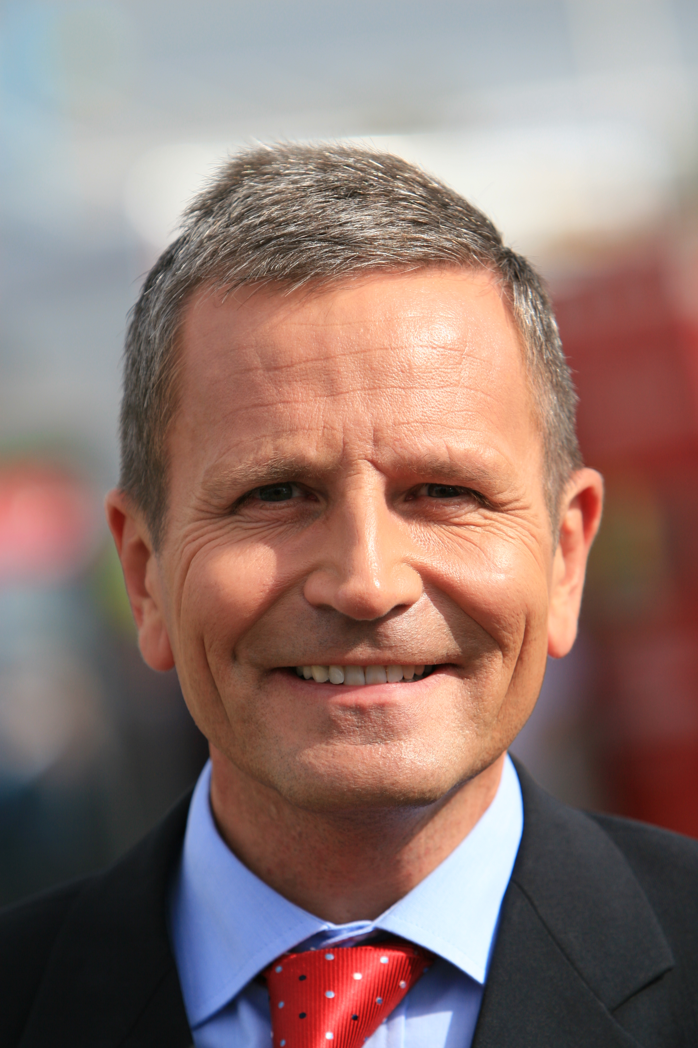
.jpg)
- Reason
- This is about as high EV as a set of action sports images can get in their primary use
- Articles in which this image appears
-
face-off
Louie Caporusso (only 1 of set) - FP category for this image
- Wikipedia:Featured pictures/People/Entertainment
- Creator
- Greg Sommers (flickr user Greg-ography)
- Support as nominator -- TonyTheTiger ( T/ C/ BIO/ WP:CHICAGO/ WP:FOUR) 04:27, 19 July 2010 (UTC)
- Oppose this angle is not successful.
see here
Thoraeton (
talk) 05:06, 19 July 2010 (UTC)
- Are you complaining that the angle chosen fails to give a headon view of an arse?-- TonyTheTiger ( T/ C/ BIO/ WP:CHICAGO/ WP:FOUR) 05:14, 19 July 2010 (UTC)
- Oppose The composition is lacking IMO. The image Thoraeton links is a superior angle. Also, I don't feel like the multiple images really add anything. There is no clear progression from one to the next for me.
Jujutacular
T ·
C 05:19, 19 July 2010 (UTC)
- Why do you prefer an angle looking straight at an arse of a main subject?--
TonyTheTiger (
T/
C/
BIO/
WP:CHICAGO/
WP:FOUR) 05:23, 19 July 2010 (UTC)
- If the main subject is the face-off then it cannot have an arse... Gazhiley ( talk) 23:49, 19 July 2010 (UTC)
- I'll note that in the nominated images we're looking straight at the ref's arse as well ;) But seriously, I just get a much better sense of the situation in the other image. In the nominated images, the ref's back is covering up too much. Jujutacular T · C 11:26, 19 July 2010 (UTC)
- Why do you prefer an angle looking straight at an arse of a main subject?--
TonyTheTiger (
T/
C/
BIO/
WP:CHICAGO/
WP:FOUR) 05:23, 19 July 2010 (UTC)
- Oppose Unimpressive snapshots. — raeky ( talk | edits) 05:20, 19 July 2010 (UTC)
- Ooh! Oooh! (*covering my mouth*) You said the “S” word. I got jumped for that recently. British-accented voice over the PA: “John Spartan, you are fined 20 credits for your violation.” Greg L ( talk) 21:11, 19 July 2010 (UTC)
- Support I think the strength of this set is the action sequence: 1-The puck is dropped, 2-Caporusso wins the puck, 3-He passes it under his opponent, whose move fails to steal the puck. While you could argue that the individual images might not have an optimal composition, I think action is the most important thing here. --
Orionist ★
talk 19:49, 19 July 2010 (UTC)
- To someone who doesn't know a thing about the sport the series of images is near useless. —
raeky (
talk |
edits) 20:03, 19 July 2010 (UTC)
- I thought we were suppose to assume the reader knows what he is looking for when he chances on a page.--
TonyTheTiger (
T/
C/
BIO/
WP:CHICAGO/
WP:FOUR) 20:26, 19 July 2010 (UTC)
- We assume are readers are experts about everything they read and are not visiting it to learn something about it? News to me. —
raeky (
talk |
edits) 20:33, 19 July 2010 (UTC)
- Not experts. Page naming conventions and hatnote conventions are based on assuming people know what they are looking for and can spell it correctly.--
TonyTheTiger (
T/
C/
BIO/
WP:CHICAGO/
WP:FOUR) 21:06, 19 July 2010 (UTC)
- Sure, I accept they know what they're looking for and are not just random mindless robots randomly looking at random stuff for no meaning. But that doesn't mean someone wanting to know about face-offs visiting
face-off will be able to understand and follow whats going on in these three images. It would need explanation, probably arrows and drawings over the picture to indicate the flow of the puck, it would also be FAR more valuable to have a video of this exchange, so they can actually see the action of whats going on. Trying to condense something as dynamic as this into 3 shots is not easy, and I don't feel this does it well. It's just too hard to follow the action, to much time has gone between the shots to follow the movement and know what took place. Without being told whats going on you couldn't pick up on it from the pictures, imho. —
raeky (
talk |
edits) 21:11, 19 July 2010 (UTC)
- Look man. You know I am a soul brother. We don't even know nothing about hockey or any of those other sports that have faceoffs like lacrosse or field hockey. I halfway understand the image. I am pretty sure I put them in the proper order.-- TonyTheTiger ( T/ C/ BIO/ WP:CHICAGO/ WP:FOUR) 21:51, 19 July 2010 (UTC)
- P.S. Hockey would be better off if they had some kind of jump ball.-- TonyTheTiger ( T/ C/ BIO/ WP:CHICAGO/ WP:FOUR) 21:52, 19 July 2010 (UTC)
- Sure, I accept they know what they're looking for and are not just random mindless robots randomly looking at random stuff for no meaning. But that doesn't mean someone wanting to know about face-offs visiting
face-off will be able to understand and follow whats going on in these three images. It would need explanation, probably arrows and drawings over the picture to indicate the flow of the puck, it would also be FAR more valuable to have a video of this exchange, so they can actually see the action of whats going on. Trying to condense something as dynamic as this into 3 shots is not easy, and I don't feel this does it well. It's just too hard to follow the action, to much time has gone between the shots to follow the movement and know what took place. Without being told whats going on you couldn't pick up on it from the pictures, imho. —
raeky (
talk |
edits) 21:11, 19 July 2010 (UTC)
- (ec)To be fair, we do feature some highly technical images. Scientific diagrams, for instance, some of which presume considerable understanding from readers when shown on independently of the article in which they appear (and even the articles are sometimes very technical). I don't think that quite applies here; the image is hardly featured in the most technical of articles. J Milburn ( talk) 21:14, 19 July 2010 (UTC)
- Not experts. Page naming conventions and hatnote conventions are based on assuming people know what they are looking for and can spell it correctly.--
TonyTheTiger (
T/
C/
BIO/
WP:CHICAGO/
WP:FOUR) 21:06, 19 July 2010 (UTC)
- We assume are readers are experts about everything they read and are not visiting it to learn something about it? News to me. —
raeky (
talk |
edits) 20:33, 19 July 2010 (UTC)
- I thought we were suppose to assume the reader knows what he is looking for when he chances on a page.--
TonyTheTiger (
T/
C/
BIO/
WP:CHICAGO/
WP:FOUR) 20:26, 19 July 2010 (UTC)
- To someone who doesn't know a thing about the sport the series of images is near useless. —
raeky (
talk |
edits) 20:03, 19 July 2010 (UTC)
- Oppose Sports photos are exceedingly ubiquitous and this composition and its lighting simply looks unremarkable. This is going to be a tough one to shoot without lots of flash fill because the players are too dark and there is no obvious fix without blowing out the ice. Greg L ( talk) 21:05, 19 July 2010 (UTC)
- Comment: I would suggest that this belongs in sport if it is determined to have more EV in face-off (or other people if it is determined to have more EV in the other). J Milburn ( talk) 21:14, 19 July 2010 (UTC)
- Oppose per Greg L and Raeky (video suggestion)... Gazhiley ( talk) 23:49, 19 July 2010 (UTC)
- Oppose It would be ideal if the picture was taken from the opposite side such that the referee isn't in the way. Also, the few number of pictures prevents one from really understanding what actions are occurring.-- mcshadypl T C 00:28, 20 July 2010 (UTC)
- Oppose I don't like the composition on this shot, nor the angle, it doesn't seem anything special, certainly not too difficult to reproduce and get a better shot. Jfitch ( talk) 11:23, 22 July 2010 (UTC)
Not promoted -- Makeemlighter ( talk) 04:43, 28 July 2010 (UTC)
Uranium
Voting period is over. Please don't add any new votes. Voting period ends on 28 Jul 2010 at 05:16:51 (UTC)

- Reason
- Another very unlikely element anyone outside of a controlled government facility would have access too, Uranium-235, meets technical standards, provides excellent value to multiple articles.
- Articles in which this image appears
- Uranium-235, Uranium, 2000s commodities boom
- FP category for this image
- Wikipedia:Featured pictures/Sciences/Materials science
- Creator
- United States Department of Energy
- Support as nominator --— raeky ( talk | edits) 05:16, 19 July 2010 (UTC)
- Support It has only such flaws that are practically necessary in such an image of something illegal for the general public to own. Adam Cuerden ( talk) 11:32, 19 July 2010 (UTC)
- Support per above. -- Jack ?! 16:54, 19 July 2010 (UTC)
- Comment Needs to be brighter. Greg L ( talk) 21:00, 19 July 2010 (UTC)
- Support -- mcshadypl T C 00:26, 20 July 2010 (UTC)
- Comment: Uranium-235 is an isotope of the element uranium. Individuals can own pure uranium at least in the United States, even this isotope (but only in very low purity.) A picture of metallic uranium would not necessarily be hard to obtain but an image of the important isotope would be, although any difference in appearance would likely be psychological, not genuine.
Rmhermen (
talk) 05:41, 20 July 2010 (UTC)
- Uranium has different control regulations in different countries, buying the ore would be legal in most places, but buying the metal might not be. And buying highly enriched definitely wouldn't be legal anywhere. And yes, the visual difference between Uranium-238 and Uranium-235, would be, well, there is no difference as far as I'm aware. In the The Periodic Table of Videos video for Uranium they talk about the strict government controls and regulations they have to abide by to use it, but I'm not familiar with the details of the UK's law on it. — raeky ( talk | edits) 06:02, 20 July 2010 (UTC)
- Comment: What's 2068? J Milburn ( talk) 10:58, 26 July 2010 (UTC)
Opposefor me a high EV VI, but not FP. -- Alchemist-hp ( talk) 00:00, 27 July 2010 (UTC) --> why not: weak support. -- Alchemist-hp ( talk) 15:43, 27 July 2010 (UTC)
Not promoted -- Makeemlighter ( talk) 06:23, 28 July 2010 (UTC)
- Only 4.5 of 5 required supports. Makeemlighter ( talk) 06:23, 28 July 2010 (UTC)
Close up of the Leucanthemum Vulgare
Voting period is over. Please don't add any new votes. Voting period ends on 28 Jul 2010 at 13:23:04 (UTC)

- Reason
- It's sharp, well composed and shows the distinct characteristics og this family of plants
- Articles in which this image appears
- Leucanthemum
- FP category for this image
- Plants
- Creator
- User:TobiasKierk (CC) / TobiasK @ WP
- Support as nominator -- TobiasKierk ( talk) 23:13, 18 July 2010 (UTC)
- Oppose -- Poor lighting, subject out of focus. A weird exposure choice for this subject! -- Alvesgaspar ( talk) 14:19, 19 July 2010 (UTC)
- Oppose Uneven lighting, significant colour fringing, overexposure (particularly in the bottom right)... - Zephyris Talk 15:07, 19 July 2010 (UTC)
- Oppose Blown highlights. — raeky ( talk | edits) 15:29, 19 July 2010 (UTC)
- Comment I hear you guys - and I actually agree when I see the picture again. Thanks for the feedback. TobiasKierk ( talk) 16:35, 19 July 2010 (UTC)
- Oppose - poor lighting, not in focus and patchy exposure. -- Jack ?! 16:51, 19 July 2010 (UTC)
- Oppose; by no means a bad effort, and I suspect you may well be up to offering FPs in the future, but this one's not there, as above. J Milburn ( talk) 16:53, 19 July 2010 (UTC)
- Comment. This is certainly not a bad picture, and looks to be a considerable improvement on the one it replaced in the article; however standards for flowers tend to be very high in general at FPC, and as stated above this is unlikely to make it. If you'd like to get feedback before nominating in future can I point you to Wikipedia:Picture peer review, in case you don't know about it. And now let's all sit around watching this for the next eight days. -- jjron ( talk) 17:00, 19 July 2010 (UTC)
- Try again, FPC loves nature stuff like this when the quality is there, and has pretty high standards because a lot come through here. We might as well suggest speedy close unless the problems can be fixed or a nicer edited version is offered. -- I′d※<3※Ɵɲɛ ( talk) 17:42, 19 July 2010 (UTC)
- Oppose and Comment Irrespective of focus issues, and notwithstanding that others don’t like the uneven lighting, I find this lighting to be truly beautiful; a tranquility about it. I thought I’d add those 2¢ (possibly, I suppose, because an old “personanalysis” test said I am “Immune to social pressure”). I wouldn’t mind a picture with much, much sharper focus but with lighting along these lines. I can see however, that there would be a tight tradeoff between achieving an overall bright-ish image and not blowing out highlights, so perhaps a little more shadow fill than this would be better.
Greg L (
talk) 20:59, 19 July 2010 (UTC)
- Provided you had a tripod and the flower wasn't blowing in the wind, you could do a HDR-esque combination to keep all the areas from blowing out or being too dark/light. Even-still it's possible to get the exposure right to keep the highlights from blowing and if the darker areas are too dark thats what Photoshop is for. ;-) — raeky ( talk | edits) 21:06, 19 July 2010 (UTC)
- Comment An object (say a coat) hung between the sun and the subject of your photo would have probably fixed your problems here, evening out the light. Noodle snacks ( talk) 12:00, 20 July 2010 (UTC)
- The flower itself is still not as sharp as most of the flower images that are passed through FPC, the creator/nominator even agrees that it's not the best quality. --
I′d※<3※Ɵɲɛ (
talk) 14:56, 20 July 2010 (UTC)
- Well, the center of the flower is probably as sharp as it gets with an EOS 7D and the 50mm f1.4. I should have used some more f-stops to get the edge sharper (used f2.2) - agree on that one. ;) TobiasKierk ( talk) 17:57, 21 July 2010 (UTC)
- Firstly I will assert that it is sharp enough. However it isn't that sharp, but not because of your excellent camera/lens. I'm guessing the focus plane is behind or in front of where it should be, probably as a result of using One Shot AF and hand-holding. Personally I'd be going to F4 or so just for the depth of field (this is for an encyclopaedia, not a portfolio). Noodle snacks ( talk) 10:48, 22 July 2010 (UTC)
- You just linked a smaller version, that doesn't mean the full size is sharper than it seems. -- I'ḏ ♥ One 07:34, 24 July 2010 (UTC)
- My point is that the right question is really "How much detail is present?" rather than "How sharp is it at 100%?" Noodle snacks ( talk) 07:59, 24 July 2010 (UTC)
- The flower itself is still not as sharp as most of the flower images that are passed through FPC, the creator/nominator even agrees that it's not the best quality. --
I′d※<3※Ɵɲɛ (
talk) 14:56, 20 July 2010 (UTC)
Not promoted -- Makeemlighter ( talk) 14:17, 28 July 2010 (UTC)
Common collared lizard
Voting period is over. Please don't add any new votes. Voting period ends on 28 Jul 2010 at 23:46:58 (UTC)

- Reason
- This looks better at full size than it does as a thumbnail. A technically fantastic shot used well within the article- this angle is perfect to show off the pattern on the body, and especially on the neck, from which the lizard takes its name- altogether a very well executed shot. Already featured on Commons.
- Articles in which this image appears
- Common collared lizard, Crotaphytidae
- FP category for this image
- Reptiles
- Creator
- Dschwen
- Support as nominator -- J Milburn ( talk) 23:46, 19 July 2010 (UTC)
- Conditional support This is a really well done photograph. It is very sharp, the focus is perfect, and the fine detail on the lizard looks neat at full zoom (besides being colorful). However, I think trying to get the entire lizard in the frame (close to the very tip of its tail) is not only unnecessary, but detracts from it. I just cropped a 2573 × 1810 section and thought it much improved. 00:09, 20 July 2010 (UTC)
- Why would you do that?! There is another shot of the same lizard linked on the image page where I was closer to it. No need to shoehorn the full view into an artificial close-up if there is an actual close-up. --
Dschwen 01:10, 20 July 2010 (UTC)
- ‘Cause… this one is better than
those? And would look even better (IMHO) if cropped closer? Some two-thirds of the image area here is devoted to giving room for that tail. If cropped closer, I think it would be really, really good and would be solid FPC material. I don’t need to see the
dust mites on the tip of its tail; that gorgeous, fine detail on the lizard’s body combined with the depth of field-control (and many other variables) are what sets this apart from others.
Greg L (
talk) 01:32, 20 July 2010 (UTC)
- Uhm... I was talking about
this one. --
Dschwen 02:17, 20 July 2010 (UTC)
- That’s a pretty nice picture too. You just barely squeaked by with the focus zone, didn’t you? But I’m judging this picture in the context of it adding EV for the two articles you linked to. For me, I thinking it is unfortunate and undesirable to have so much photo area dedicated to the proposition of framing a highway that stretches from Washington state to Kansas. It ought to be cropped tighter and then it would be very, very good indeed.
Greg L (
talk) 04:44, 20 July 2010 (UTC)
- What do you mean by barely squeaked by with the focus zone? In the picture I linked to the entire lizzard minus the tail (which you apparently don't care about) is in perfect focus. There is no barely and certainly no squeaking. *shakes head* -- Dschwen 13:07, 22 July 2010 (UTC)
- That’s a pretty nice picture too. You just barely squeaked by with the focus zone, didn’t you? But I’m judging this picture in the context of it adding EV for the two articles you linked to. For me, I thinking it is unfortunate and undesirable to have so much photo area dedicated to the proposition of framing a highway that stretches from Washington state to Kansas. It ought to be cropped tighter and then it would be very, very good indeed.
Greg L (
talk) 04:44, 20 July 2010 (UTC)
- Uhm... I was talking about
this one. --
Dschwen 02:17, 20 July 2010 (UTC)
- ‘Cause… this one is better than
those? And would look even better (IMHO) if cropped closer? Some two-thirds of the image area here is devoted to giving room for that tail. If cropped closer, I think it would be really, really good and would be solid FPC material. I don’t need to see the
dust mites on the tip of its tail; that gorgeous, fine detail on the lizard’s body combined with the depth of field-control (and many other variables) are what sets this apart from others.
Greg L (
talk) 01:32, 20 July 2010 (UTC)
- Why would you do that?! There is another shot of the same lizard linked on the image page where I was closer to it. No need to shoehorn the full view into an artificial close-up if there is an actual close-up. --
Dschwen 01:10, 20 July 2010 (UTC)
- Support in current form. I disagree with the above and feel the space added by the inclusion of the tail adds to the composition of the shot, and also accurately illustrating it's long tail that may not be clear in other shots, which is important as it a significant feature of this lizard. Jfitch ( talk) 09:06, 20 July 2010 (UTC)
- Support. Nice use of DOF, everything in focus that needs to be with pleasing bokeh. Ðiliff «» (Talk) 11:05, 20 July 2010 (UTC)
- Support - As above although the camera position is not the best. -- Alvesgaspar ( talk) 15:21, 20 July 2010 (UTC)
- Support. Nice photo -- George Chernilevsky talk 06:47, 21 July 2010 (UTC)
- Support I'm liking it... — raeky T 00:55, 22 July 2010 (UTC)
- Support Wonderful! -- Mbz1 ( talk) 04:28, 22 July 2010 (UTC)
- Support Noodle snacks ( talk) 07:02, 23 July 2010 (UTC)
- Support-- Avala ( talk) 20:58, 24 July 2010 (UTC)
Promoted File:Collared Lizard 2.jpg -- Makeemlighter ( talk) 01:22, 29 July 2010 (UTC)
Central Heterochromia
Voting period is over. Please don't add any new votes. Voting period ends on 28 Jul 2010 at 17:44:53 (UTC)

- Reason
- Sometimes, yourself is the best illustration. I have central heterochromia; The camera I got for Christmas is fairly good, I thought, why not?
- Articles in which this image appears
- Heterochromia (replaced a similar, but much lower-resolution image)
- FP category for this image
- I'd probably say Wikipedia:Featured_pictures/Sciences/Biology
- Creator
- Adam Cuerden


- Support as nominator -- Adam Cuerden ( talk) 17:44, 19 July 2010 (UTC)
- Comment I would suggest a little brighter and cropped a little closer. Greg L ( talk) 20:51, 19 July 2010 (UTC)
- Support Edit 2 (or Edit 1) Though I would prefer a bit brighter yet, I can support this. I am certainly impressed with the sharpness. And the choice of the eye to use looks like it is a median example (rather than the über exaggerations one might see in medical books). Greg L ( talk) 18:44, 20 July 2010 (UTC)
- I suspect brighter would be unrealistic - eyeballs aren't pure white, after all. =) I have to admit, getting it this sharp was interesting - I took about a hundred photos, then selected the best. Getting the lighting right was the hard part - I wanted minimal reflections, but there had to be enough light to illuminate the eye clearly. Finally ended up using the flash, but with my finger over part of the flash. On the image page, I describe my [failed] battle with my nose, which you can see a bit of a reflection of, but which, short of matte black facial paint, I think is unavoidable. =)
Adam Cuerden (
talk) 19:14, 20 July 2010 (UTC)
- Indeed, there wasn’t all that much room for brightening it. Still, I pushed & spread the histogram out to use the available space without blowing out any highlights. It’s another one to consider. I support either Edit 1 or Edit 2, with a preference for the latter. And, BTW, all that effort (a hundred shots) to get the focus certainly explains why it’s so darn sharp. Nice, nice work. It certainly deserves FP status, IMO.
Greg L (
talk) 22:18, 20 July 2010 (UTC)
- They were fairly quick - I wasn't really paying attention to the time, but I think it took an hour or two, all told, mostly in futzing about to try and figure out what worked and what didn't. It was quicker than most of my restoration work, though, of course, I had excellent control of the subject, which was also readily at hand, neither of which I believe is normally the case with photographic FPs. =) More on topic, Support Edit 2, although I still Support original or Edit 1. I prefer the wider crop, but can also see how the tighter one may be more useful for the articles it's in. Adam Cuerden ( talk) 22:40, 20 July 2010 (UTC)
- Indeed, there wasn’t all that much room for brightening it. Still, I pushed & spread the histogram out to use the available space without blowing out any highlights. It’s another one to consider. I support either Edit 1 or Edit 2, with a preference for the latter. And, BTW, all that effort (a hundred shots) to get the focus certainly explains why it’s so darn sharp. Nice, nice work. It certainly deserves FP status, IMO.
Greg L (
talk) 22:18, 20 July 2010 (UTC)
- Support Edit 2 Stands out from the ubiquitous eye photos around here, and very nicely illustrates the concept. I have this in my own eyes and had no clue what it was called until 2 minutes ago. I like it when Wikipedia does that. -- Aiyizo ( talk) 23:20, 20 July 2010 (UTC)
- Support Edit 2 Going to throw my support in here, looks a little freaky a big eye, but as eyes goes, it's a nice picture of one. —
raeky
T 00:56, 22 July 2010 (UTC)
- I think it's partially freaky because the eye is so wide open: That's rarely seen except in moments of anger or fear. Unfortunately, it's kind of necessary for a picture like this =) Adam Cuerden ( talk) 20:21, 22 July 2010 (UTC)
- Support any, pref edit 2. Good work. I'll also note that I have this same condition, unbeknownst to me until this nom :) Jujutacular T · C 04:29, 22 July 2010 (UTC)
- Support prefer edit 2. Well captured, good EV -- Muhammad (talk) 16:45, 22 July 2010 (UTC)
- Oppose: I'm sorry, but I find this picture rather unpleasant. The prominent blood vessels are not typical of many eyes, and the wide-open look is unnecessary and uncomfortable to look at. I like eyes and have absorbed time with Flickr browsing in the past, and have witnessed many, many, many eye shots superior to this. We have a sectoral heterochromia photo here on WP that shows the eye does not need to be wide open: File:Sectoral_heterochromia.jpg. Though not freely licensed, here's an example of heterochromia looking gorgeous, not frightening: [13]. I don't argue the image's value (and the central heterochromia is great), but this is not FP to me. I also think the crop is too cramped and the eyebrow hair makes both versions appear "messy" and cluttered. Maedin\ talk 18:58, 26 July 2010 (UTC)
Promoted File:Eye Central Heterochromia crop and lighter.jpg -- Makeemlighter ( talk) 01:29, 29 July 2010 (UTC)
Nepalese Rupee coin
Voting period is over. Please don't add any new votes. Voting period ends on 29 Jul 2010 at 08:16:53 (UTC)
- Articles in which this image appears
- Nepalese rupee, Economy of Nepal, Rupee
- Creator
- Benjamint 08:16, 20 July 2010 (UTC)
- Support as nominator -- Benjamint 08:16, 20 July 2010 (UTC)
- Comment: Before we start judging the image itself, we're going to have to ascertain the copyright of the coin's design. We typically tag coins with {{ Non-free currency}}. J Milburn ( talk) 11:51, 20 July 2010 (UTC)
- I just had a look at some photos of Nepalese banknotes and only one was tagged, thats not to say that whoever uploaded them was correct though. I'll have to leave it to somebody more knowledgeable in this area to determine Benjamint 00:23, 21 July 2010 (UTC)
- The Nepalese Copyright Act. How old is that design? Adam Cuerden ( talk) 04:40, 21 July 2010 (UTC)
- Also, "
Any reproduction of banknotes, coins, checks, securities or payment cards, denominated in Rupee, and the creation of any objects that by their design imitate any such banknote, coin, check, security or payment card, shall require the prior written authorization of the Bank." - think this image is on shaky ground, at best. That said, it'd probably be worth contacting the bank about it.
Adam Cuerden (
talk) 04:47, 21 July 2010 (UTC)
- That's not a copyright concern; regardless of that issue, if the design is public domain, we're good.
J Milburn (
talk) 10:43, 21 July 2010 (UTC)
- I agree, but it does stand as a sort of assertion of copyright. Adam Cuerden ( talk) 01:20, 22 July 2010 (UTC)
- That's not a copyright concern; regardless of that issue, if the design is public domain, we're good.
J Milburn (
talk) 10:43, 21 July 2010 (UTC)
- Support If you find out all legal matters are in order. -- I′d※<3※Ɵɲɛ ( talk) 13:17, 21 July 2010 (UTC)
- Oppose. Sorry, but I really see nothing special here. No technical merit that would make this an exceptional picture. It is a medium quality reproduction of a coin. Easy to reproduce, and does not stick out in any way. --
Dschwen 17:21, 21 July 2010 (UTC)
- By your logic then Dschwen no coin should ever be featured because by definition a good shot of a coin will be just of the coin which by your words is "uninteresting", that strikes me as fairly bad logic especially if it removes an entire subject from possibly being FPCable, flags, maps, and most diagrams are already impossible to get nominated so nice to know that we can now add coins to the list.
Cat-five -
talk 04:26, 23 July 2010 (UTC)
- Do not put stuff in my mouth, and do not throw out reason just because you are agitated. Basically your entire blurb is nonsense. My verdict is not based on the image being just of the coin, the technical quality contributes to my oppose. Geez, wipe the foam of your mouth and clam down. -- Dschwen 15:10, 23 July 2010 (UTC)
- By your logic then Dschwen no coin should ever be featured because by definition a good shot of a coin will be just of the coin which by your words is "uninteresting", that strikes me as fairly bad logic especially if it removes an entire subject from possibly being FPCable, flags, maps, and most diagrams are already impossible to get nominated so nice to know that we can now add coins to the list.
Cat-five -
talk 04:26, 23 July 2010 (UTC)
- Oppose. I don't think this is among the best pictures here on Wikipedia, as Dschwen said, no technical merit. Only medium quality. --
Jack
?! 18:40, 21 July 2010 (UTC)
- Comment - upon reviewing this, I still see something strange with the coin on the left. Is there a band of reflection going across the middle or is this how the coin is? -- Jack ?! 22:47, 21 July 2010 (UTC)
- I don't understand the above opposes. In the full view I think you get a pretty good view of the coins, you can even inspect the metal quality. A different color background might be an improvement, though, but that's just a thought. --
I′d※<3※Ɵɲɛ (
talk) 23:52, 21 July 2010 (UTC)
- Only medium quality, perhaps, but consider that at full size the coin is depicted at 14x it's native size.. whilst a much larger image is possible I find it hard to see how such an image would offer more EV; I think this image shows all the detail the coins have with sufficient magnification. Having said that, I'll take all suggestions for improvement into account and photograph the other denominations soon. Black bg next time perhaps? Benjamint 00:17, 22 July 2010 (UTC)
Support Good shot, good encyclopedic value. Cat-five - talk 04:26, 23 July 2010 (UTC)Changing to Neutral pending copyright being cleared up. Cat-five - talk 01:54, 24 July 2010 (UTC)- For the record, I'd support if the copyright status were confirmed.
Adam Cuerden (
talk) 05:58, 23 July 2010 (UTC)
- I think I would too, but someone's going to need to do some serious legwork to work out whether it is PD. Note that if this is closed with copyright unconfirmed, I am going to nominate it for deletion at Commons.
J Milburn (
talk) 13:49, 23 July 2010 (UTC)
- That may actually be the best option: Commons is usually very good at finding this sort of thing out, and, if it gets cleared there, it could be renominated here.
Adam Cuerden (
talk) 02:25, 24 July 2010 (UTC)
- I have gone ahead and nominated it now. I suggest this is closed and renominated if the design is determined to be PD.
J Milburn (
talk) 14:37, 24 July 2010 (UTC)
- Thanks Benjamint 01:21, 25 July 2010 (UTC)
- When was that coin issued? Is it the new brass-plated steel version? Description could use some love. There is also this design (also no year of issue, but at least it shows there are different designs on different coin generations). -- Dschwen 03:02, 25 July 2010 (UTC)
- I have gone ahead and nominated it now. I suggest this is closed and renominated if the design is determined to be PD.
J Milburn (
talk) 14:37, 24 July 2010 (UTC)
- That may actually be the best option: Commons is usually very good at finding this sort of thing out, and, if it gets cleared there, it could be renominated here.
Adam Cuerden (
talk) 02:25, 24 July 2010 (UTC)
- I think I would too, but someone's going to need to do some serious legwork to work out whether it is PD. Note that if this is closed with copyright unconfirmed, I am going to nominate it for deletion at Commons.
J Milburn (
talk) 13:49, 23 July 2010 (UTC)
- Support-- Avala ( talk) 20:57, 24 July 2010 (UTC)
Not promoted -- Makeemlighter ( talk) 09:12, 29 July 2010 (UTC)
Mourner and burning ghat in Pashupatinath Temple
Voting period is over. Please don't add any new votes. Voting period ends on 29 Jul 2010 at 07:28:21 (UTC)

- Articles in which this image appears
- Pashupatinath Temple, Cremation
- Creator
- Benjamint 07:28, 20 July 2010 (UTC)
- Support as nominator -- Benjamint 07:28, 20 July 2010 (UTC)
- These ceremonies are quite public and photography is accepted. Nevertheless I chose an angle from which the mourner is unrecognizable due to the heat-distortion Benjamint 07:33, 20 July 2010 (UTC)
- Support. Nice shot. Good EV in both articles and the image quality is excellent, albeit low res. Ðiliff «» (Talk) 08:20, 20 July 2010 (UTC)
- Comment: I think that, if this was to pass, it may warrant a place here- it's potentially a rather disturbing image. J Milburn ( talk) 19:42, 20 July 2010 (UTC)
- Support per Diliff. I can only imagine that squeamishness is preventing others from participating. Question though: the
article says "Non-Hindu visitors are allowed to have a look at the temple from the other bank of Bagmati river" and "Along the shores of the Bagmati river near the temple lies "Arya Ghat", the most widely used place of cremation in Nepal", while this other image of yours
 which looks like a zoom of this location
 , and your use of the 400mm lens would indicate that this possibly was taken from across the river and is possibly Arya Ghat rather than the temple. Phew - to get to my point, if I am correct, the caption, image page, and location in the article all should be improved to reflect this, as it would all be misleading atm (btw a geocode would be nice too :-) ). If I'm wrong, please correct me. -
jjron (
talk) 13:54, 21 July 2010 (UTC)
, and your use of the 400mm lens would indicate that this possibly was taken from across the river and is possibly Arya Ghat rather than the temple. Phew - to get to my point, if I am correct, the caption, image page, and location in the article all should be improved to reflect this, as it would all be misleading atm (btw a geocode would be nice too :-) ). If I'm wrong, please correct me. -
jjron (
talk) 13:54, 21 July 2010 (UTC)
- You're right, I didn't realize that the cremation area, Arya Ghat, was separate to the temple. Will make a few changes. Benjamint 23:52, 21 July 2010 (UTC)
- Oppose. I would like to support this, but I have given it some thought, and I have some issues. Firstly, the background is rather distracting- the mourner and corrugated iron draw the eye. Secondly, the image isn't massive- yeah, it's above our minimum, but I do get the impression that a slightly larger image would be better. Thirdly, I'm concerned about EV. It's very much just another shot of a cremation in
cremation (on a loosely related note, the fact we don't have an article on cremation in Hinduism specifically is shocking...) while I can't really see what it's adding to the other article. All round, I don't think this one is quite there, sorry.
J Milburn (
talk) 16:16, 21 July 2010 (UTC)
- I can't say I agree that the corrugated iron draws the eye. It's hard not to be drawn to the burning cadaver in the foreground, surely? And I don't think it's just another shot - it's one of only two images that actually shows a cremation complete with cadaver up close. All the others show the scene or building in which cremations occur without really showing the cremation itself in any detail. It's a little disturbing, sure, but it's got loads of EV for that reason IMO. Ðiliff «» (Talk) 16:47, 21 July 2010 (UTC)
- Oppose This is nothing special. It actually is snap shotty. However, it might make FP with the following advice.
- Do you see the guy in the background? POSITION HIM. Walk up to people, and
talk to them.
Gut Monk (
talk) 00:00, 22 July 2010 (UTC)
- Perhaps you were sleep-editing again since while you're linked image is a beautifull portrait it doesn't have any relevance or EV to this subject, and neither would any similar image that I could have taken. I doubt that the mourner's hoodie would have quite the same impression as the girl's more traditional garb, leaving him out of context and looking more like a grumpy adolescent missing his skate-board. Furthermore, having read the article and above comments you would of course have noted that non-hindus may not enter that area.. and seriously, would you feel comfortable walking up to a grieving man asking for a photo shoot and to kindly sign some model release papers? Benjamint 01:27, 22 July 2010 (UTC)
- Don't you know that photo is world famous and even lead to a recent investigation long after the war that picture was taken during to find out who she is? I think his point is that the person might've been more interesting than just him being at a cremation, a slice of life sort of thing. It's also stupid to make assumptions and jump to conclusions about people just off their clothes, you don't know what either of the people you mentioned might be going through or who they really are. -- I′d※<3※Ɵɲɛ ( talk) 03:30, 22 July 2010 (UTC)
- I think you may have missed Benjamint's point, but anyway... Re the green hoodie fella, I'm not even sure he is a mourner. This more distant image indicates that apart from being a cremation site, this appears to be a general thoroughfare and possibly just a bit of a 'hangout spot' as well. Therefore he may be nothing to do with this cremation, but just hanging out there - talk about a slice of life! -- jjron ( talk) 08:58, 22 July 2010 (UTC)
- I think Benjamint's photo has a legitimate photojournalistic method and style and he makes a legitimate point about the Afghan girl's portrait being completely different. A photojournalist documents and observes, there's certainly no obligation to interact. In fact, sometimes interaction affects the ability to observe impartially. And I would have taken issue with Gut Monk's response too. Rather than merely expressing an opinion about the photo, he seemed to imply that he was the foremost expert on photojournalistic composition and it could only make FP if his advice was followed. Comes across as a bit arrogant and condescending... Ðiliff «» (Talk) 09:01, 22 July 2010 (UTC)
- Do you see the guy in the background? POSITION HIM. Walk up to people, and
talk to them.
Gut Monk (
talk) 00:00, 22 July 2010 (UTC)
- Oppose looks more like the result of a riot then a religious cremation. The background does not look attractive. Also this would have to be excluded from the front page I think, burning bodies probably isn't something we should put on the front page. — raeky T 00:44, 22 July 2010 (UTC)
- I know what you mean, but I'm sure there would be some people who
would have something to say about that.
WackyWace
you talkin' to me? 19:22, 22 July 2010 (UTC)
- We without a doubt censor the front page, theres an active blacklist of articles for FA and some images like this won't be featured as a POD. —
raeky
T 19:38, 22 July 2010 (UTC)
- Agreed, we do censor the main page, although that's an aside really. It shouldn't affect whether it becomes a FP or not. And I don't see how it could be mistaken for the result of a riot with after any real consideration. A rioter likely wouldn't place a body on a bed of wood and set it alight. Besides, even if it could be mistaken for something else, that's probably the nature of the event, and not the fault of the photo.
Ðiliff «»
(Talk) 20:41, 22 July 2010 (UTC)
- It's not the fault of the photo but the background, it just doesn't look good.. Theres a lot better ways to photograph a religious cremation.. — raeky T 20:52, 22 July 2010 (UTC)
- Agreed, we do censor the main page, although that's an aside really. It shouldn't affect whether it becomes a FP or not. And I don't see how it could be mistaken for the result of a riot with after any real consideration. A rioter likely wouldn't place a body on a bed of wood and set it alight. Besides, even if it could be mistaken for something else, that's probably the nature of the event, and not the fault of the photo.
Ðiliff «»
(Talk) 20:41, 22 July 2010 (UTC)
- We without a doubt censor the front page, theres an active blacklist of articles for FA and some images like this won't be featured as a POD. —
raeky
T 19:38, 22 July 2010 (UTC)
- Strong Support Good quality and rare image.-- Mbz1 ( talk) 04:26, 22 July 2010 (UTC)
- Support Per those that do. Noodle snacks ( talk) 06:11, 23 July 2010 (UTC)
- Question What is it that's burning? Is it an animal?
Gazhiley (
talk) 10:37, 23 July 2010 (UTC)
- It's a cadaver - a dead person. No, ghat is not a typo of goat. ;-)
Ðiliff «»
(Talk) 11:22, 23 July 2010 (UTC)
- No ;-) required - I assumed it was something like a goat... but an actual human is burning? eeewwwwwwww!!! This better not go near the front page... I've just had lunch too! This sort of thing should stay inside buildings not be out on the street... Disgusting...
Gazhiley (
talk) 13:28, 23 July 2010 (UTC)
- In all seriousness, that is a little culturally insensitive. This is common practice within Indian/Hindu culture.
J Milburn (
talk) 14:06, 23 July 2010 (UTC)
- Unfortunately this is probably a pervasive feeling amount the western cultures. I personally wouldn't want to see or worse smell this IRL. If this was the Indian wiki, then it would probably without question be allowed on the front page, but this isn't and discretion should probably be followed and exclude this from the POD. —
raeky
T 14:12, 23 July 2010 (UTC)
- Personally I see no reason this shouldn't go on the mainpage and find nothing offensive about it myself, but meh, I don't think POTD is the main point of FPC. But just looking at the !votes and comments on this, is there something about Aussies that makes them impervious to the type of squeamishness that many others seem to be showing? :-) --
jjron (
talk) 14:18, 23 July 2010 (UTC)
- Aussies are strange blokes, it's scientifically proven I think. —
raeky
T 14:24, 23 July 2010 (UTC)
- It's just my opinion... nothing more... maybe I was a little rash saying this shouldn't go near the front page... it was kinda meant in a playful way tho, honest! But either way, I don't agree with something like this being so public and in such a "slapdash" way ie chucked on top of a load of wood and set fire... Something as significant as a cremation should be kept private and not in the open... But that's just my opinion... Not saying I'm right or wrong - just that this is my opinion...
Gazhiley (
talk) 15:18, 23 July 2010 (UTC)
- As I said above, I agree that this probably should not go on the main page, as there are plenty who would find the image a little disturbing. I was referring specifically to some of Gaz's other comments (also, sorry, I wasn't meaning to "tell you off" or anything). J Milburn ( talk) 18:24, 23 July 2010 (UTC)
- It's just my opinion... nothing more... maybe I was a little rash saying this shouldn't go near the front page... it was kinda meant in a playful way tho, honest! But either way, I don't agree with something like this being so public and in such a "slapdash" way ie chucked on top of a load of wood and set fire... Something as significant as a cremation should be kept private and not in the open... But that's just my opinion... Not saying I'm right or wrong - just that this is my opinion...
Gazhiley (
talk) 15:18, 23 July 2010 (UTC)
- Aussies are strange blokes, it's scientifically proven I think. —
raeky
T 14:24, 23 July 2010 (UTC)
- Personally I see no reason this shouldn't go on the mainpage and find nothing offensive about it myself, but meh, I don't think POTD is the main point of FPC. But just looking at the !votes and comments on this, is there something about Aussies that makes them impervious to the type of squeamishness that many others seem to be showing? :-) --
jjron (
talk) 14:18, 23 July 2010 (UTC)
- Unfortunately this is probably a pervasive feeling amount the western cultures. I personally wouldn't want to see or worse smell this IRL. If this was the Indian wiki, then it would probably without question be allowed on the front page, but this isn't and discretion should probably be followed and exclude this from the POD. —
raeky
T 14:12, 23 July 2010 (UTC)
- In all seriousness, that is a little culturally insensitive. This is common practice within Indian/Hindu culture.
J Milburn (
talk) 14:06, 23 July 2010 (UTC)
- No ;-) required - I assumed it was something like a goat... but an actual human is burning? eeewwwwwwww!!! This better not go near the front page... I've just had lunch too! This sort of thing should stay inside buildings not be out on the street... Disgusting...
Gazhiley (
talk) 13:28, 23 July 2010 (UTC)
- It's a cadaver - a dead person. No, ghat is not a typo of goat. ;-)
Ðiliff «»
(Talk) 11:22, 23 July 2010 (UTC)
- Oppose The background is too distracting. File:Pashupatinath Cremation.jpg and File:Ghat nepal.JPG IMO capture the atmosphere better. The fact it is a ghat is manifested in both pics. The proximity to the temple is seen in the former. Both these elements are critical to the importance of Arya Ghat. A better photo of an open public cremation can be captured on this ghat or on Nigambodh Ghat or on Manikarnika Ghat at Varanasi. -- Redtigerxyz Talk 17:00, 27 July 2010 (UTC)
- Support Very good composition. The background is not distracting to me. -- Elekhh ( talk) 15:30, 28 July 2010 (UTC)
Not promoted -- Makeemlighter ( talk) 09:19, 29 July 2010 (UTC)
Southwest Airlines Boeing 737
Voting period is over. Please don't add any new votes. Voting period ends on 29 Jul 2010 at 21:00:56 (UTC)

- Reason
- This image has a large resolution and is of the entire aircraft. Another FPC of a Southwest Airlines Boeing 737 took place a little under a year ago. That image wasn't promoted since it didn't show the entire aircraft. This image also shows blended winglets.
- Articles in which this image appears
- Boeing 737 - infobox
- FP category for this image
- Aeronautics and aviation
- Creator
- Dylan Ashe
- Support as nominator --~ NerdyScienceDude ( ✉ • ✐ • ✍) 21:00, 20 July 2010 (UTC)
- Comment This is certainly a *properly done* photograph; it has no motion blur that I can see. So I suppose it is “of a high technical standard”. As I’m not *feeling* it (sorry), I’m open to suggestions as to how this “Is among Wikipedia's best work”. It just seems to have a “sterile” affect about it. Greg L ( talk) 21:08, 20 July 2010 (UTC)
- I am of the feeling that the monotone pale sky provides a less than optimal backtground. I would like a brighter blue and maybe some bright white clouds in the background, but none of that really takes away from the photograph's main subject. I don't think there is a real good reason to oppose, although it is not a mushroom, which might be a good reason.--
TonyTheTiger (
T/
C/
BIO/
WP:CHICAGO/
WP:FOUR) 22:46, 20 July 2010 (UTC)
- That’s what was in the back of my mind as a possibility: clouds, like seen in this TAROM 737-700 shot on Wikipedia. Greg L ( talk) 23:34, 20 July 2010 (UTC)
- Comment: This isn't a bad picture- however, what I'm feeling right now is that the crop is perhaps a little tight. J Milburn ( talk) 23:23, 20 July 2010 (UTC)
- Comment No motion blur, but the color's not too sharp, that's noticeable over the red and blue areas, though that might be because it seems by the brightness and angle of shadows that this was taken in noon, and on a clear and probably hot day, so maybe it's glare. and it might've looked nicer with more space left to the sides of the wings' tips. Because of these two things the image is actually a little boring, but it is technically good I guess. -- I′d※<3※Ɵɲɛ ( talk) 23:36, 20 July 2010 (UTC)
- Oppose Gut Monk ( talk) 23:46, 21 July 2010 (UTC)
- Oppose per TonyTheTiger, bland sky and not a mushroom. — raeky T 00:52, 22 July 2010 (UTC)
- Oppose The aircraft has a colourful livery, but the uninteresting sky ruins the image. It doesn't have that special 'pizzazz'. WackyWace you talkin' to me? 19:19, 22 July 2010 (UTC)
- Neutral. As I said above, I think the crop's a little tight, and I hear what people are saying about the boring background, but this is a high-quality, high EV image, with pride of place in an article. I don't think this would be a poor addition to our FPs, but, at the same time, I don't think it would be the best addition. I'm open to persuasion either way. J Milburn ( talk) 18:27, 23 July 2010 (UTC)
- Oppose Per reasons cited in my comment, above. Greg L ( talk) 23:44, 23 July 2010 (UTC)
- Comment Unsure about this one, all the technicals are there, besides maybe a nice crop, yet I see what people are saying about the bland background as it was my initial thought. I thought I'd go in search and see what has happened to similar images and we have a very similar photo that passed to FP status here: [ [14]]. JFitch (talk) 00:52, 29 July 2010 (UTC)
![[14]](/info/en/?search=File:LAPD_Bell_206_Jetranger.jpg)
Not promoted -- Makeemlighter ( talk) 23:04, 29 July 2010 (UTC)