-

1 centavo (1942) -

5 centavos (1942) -

10 centavos (1942) -

50 centavos (1942)
| Featured picture tools |
|---|
Please cut and paste new entries to the bottom of this page, creating a new monthly archive (by closing date) when necessary.
Alhambra from Mirador San Nicolás
Voting period is over. Please don't add any new votes. Voting period ends on 30 Sep 2014 at 22:19:56 (UTC)

- Reason
- An evening panorama of Alhambra taken from the classic viewpoint Mirador de San Nicolás with very good light. It shows the Alhambra in its entirety from the Generalife to the left to the Alcazaba at the right.
- Articles in which this image appears
- Alhambra, Granada, Spain
- FP category for this image
- Wikipedia:Featured pictures/Places/Panorama
- Creator
- Slaunger
- Support as nominator – Slaunger ( talk) 22:19, 20 September 2014 (UTC)
- Support JJ Harrison ( talk) 07:22, 22 September 2014 (UTC)
- Support -- DXR ( talk) 22:25, 22 September 2014 (UTC)
- Support Good lighting and EV -- Muhammad (talk) 13:37, 23 September 2014 (UTC)
- Support J e e 15:52, 23 September 2014 (UTC)
- Support Coat of Many Colours ( talk) 08:49, 24 September 2014 (UTC)
- Support -- Alchemist-hp ( talk) 22:20, 24 September 2014 (UTC)
- Support -- JLPC ( talk) 14:33, 26 September 2014 (UTC)
- Support -- ///EuroCar GT 04:14, 27 September 2014 (UTC)
Promoted File:Alhambra evening panorama Mirador San Nicolas sRGB-1.jpg -- Armbrust The Homunculus 02:30, 1 October 2014 (UTC)
Jean Cocteau
Voting period is over. Please don't add any new votes. Voting period ends on 1 Oct 2014 at 02:54:57 (UTC)

- Reason
- Already a Valued Image at Commons, this picture of French jack of all trades Jean Cocteau has strong EV to its respected article and an overall fine looking image.
- Articles in which this image appears
- Jean Cocteau, 1953 Cannes Film Festival, 1954 Cannes Film Festival, List of Cannes Film Festival jury presidents
- FP category for this image
- Wikipedia:Featured pictures/People/Entertainment
- Creator
- Uploaded and restored by JLPC
- Support as nominator – GamerPro64 02:54, 21 September 2014 (UTC)
- I guess I'll jump in first. It has a somewhat unusual pattern - my instinct says half-toning, but it's actually not quite right for halftoning, so it may be one of the obscurer photographic printing techniques. In any case, it's decent resolution despite whatever that is; we've certainly had things where the film grain made the effective resolution substantially less. It does appear to be out of copyright, which, frankly, seems to be a major problem with photographs of Cocteau. I'm happy enough Supporting. Adam Cuerden ( talk) 12:46, 21 September 2014 (UTC)
- Support Valuable portrait with good expression and good technical quality. -- Slaunger ( talk) 16:45, 21 September 2014 (UTC)
- Support per Adam. Reminds me of that Frenchman we had a few months ago... forget his name. Same pattern. — Crisco 1492 ( talk) 04:45, 22 September 2014 (UTC)
- Support also per Adam. Startling image and well shot overall. Jus da fax 19:49, 23 September 2014 (UTC)
- Support - Coat of Many Colours ( talk) 21:24, 25 September 2014 (UTC)
- Support -- per Adam -- Bellus Delphina talk 05:50, 28 September 2014 (UTC)
Promoted File:Jean Cocteau b Meurisse 1923.jpg -- Armbrust The Homunculus 02:55, 1 October 2014 (UTC)
Henri Frenay 2
Voting period is over. Please don't add any new votes. Voting period ends on 1 Oct 2014 at 12:44:29 (UTC)

- Reason
- There was a nomination of this a while ago, but I've looked up Frink, and he appears to be an American photographer working for the army at the time, so the issues from that nomination can safely be ignored. I think it's a fine restoration, probably as good as I could do, and thus certainly worth a nomination.
- Articles in which this image appears
- Henri Frenay
- FP category for this image
- Probably WP:Featured pictures/People/Military
- Creator
- Maurice Frink, restoration by Christoph Braun Please note: NOT one of my restorations for once, I'm just nominating.
- Support as nominator – Adam Cuerden ( talk) 12:44, 21 September 2014 (UTC)
- Support Stunning and valuable portrait. Good restoration. When comparing with the original I am impressed how even quite large damages have been repaired. -- Slaunger ( talk) 16:43, 21 September 2014 (UTC)
- Support - My copyright concerns appear to have been addressed. — Crisco 1492 ( talk) 04:48, 22 September 2014 (UTC)
- Support This is an excellent portrait Nick-D ( talk) 10:22, 22 September 2014 (UTC)
- Support - Good image of interesting character. SagaciousPhil - Chat 10:06, 26 September 2014 (UTC)
- Support - Hafspajen ( talk) 11:49, 26 September 2014 (UTC)
- Support -- JLPC ( talk) 14:32, 26 September 2014 (UTC)
- Support -- Bellus Delphina talk 05:48, 28 September 2014 (UTC)
Promoted File:Portrait of Henri Frenay, head and shoulders ppmsca.13371 edit.jpg -- Armbrust The Homunculus 12:45, 1 October 2014 (UTC)
The Evening Air
Voting period is over. Please don't add any new votes. Voting period ends on 1 Oct 2014 at 20:21:00 (UTC)

- Reason
- Good quality image; a stylized landscape; a good example of pointillism and divisionism from the artist's middle period.
- Articles in which this image appears
- Henri-Edmond Cross
- FP category for this image
- Artwork/Paintings
- Creator
- Henri-Edmond Cross
- Support as nominator – CorinneSD ( talk) 20:21, 21 September 2014 (UTC)
- Support - lovely scan — Crisco 1492 ( talk) 00:11, 22 September 2014 (UTC)
- Support. Brilliant. Fylbecatulous talk 01:25, 22 September 2014 (UTC)
- Support. Indeed, a very high quality reproduction. It comes across as lacking in contrast as a thumbnail but looks great at full size. Ðiliff «» (Talk) 08:31, 22 September 2014 (UTC)
- Support, yes, the bigger the better. Rothorpe ( talk) 15:34, 22 September 2014 (UTC)
- Support, looks amazing at full size, like Lozenge camouflage. Xanthomelanoussprog ( talk) 19:30, 22 September 2014 (UTC)
- Support, great artwork. Hafspajen ( talk) 19:34, 24 September 2014 (UTC)
Promoted File:Henri-Edmond Cross - The Evening Air - Google Art Project.jpg -- Armbrust The Homunculus 20:27, 1 October 2014 (UTC)
Deception I - Jim the Penman (Emanuel Ninger)
Voting period is over. Please don't add any new votes. Voting period ends on 1 Oct 2014 at 21:55:30 (UTC)
.jpg)
.jpg)
- Reason
- High quality image, high EV. Very high quality example of Ninger’s hand-drawn counterfeit banknotes. Possession of such “banknotes” is illegal, regardless of whether they are in circulation or not. Select U.S. federal agencies are exempt (including the Smithsonian).
- Articles in which this image appears
- Emanuel Ninger
- FP category for this image
- Currency (or Wikipedia:Featured pictures/Artwork/Others)
- Creator
-
Emanuel Ninger
From the National Numismatic Collection, National Museum of American History, Smithsonian Institution.
Image by Godot13.
- Support as nominator – Godot13 ( talk) 21:55, 21 September 2014 (UTC)
- Support - very useful for his biography — Crisco 1492 ( talk) 00:12, 22 September 2014 (UTC)
- Comment Back side is needed. Brandmeister talk 09:37, 22 September 2014 (UTC)
- It would be useful to include the obverse of the genuine bill in the article, especially given that Godot scanned both at the same resolution making direct comparison quite easy (currently there is a scan of it with the reverse included available).
24.222.214.125 (
talk) 19:04, 22 September 2014 (UTC)
- I agree. I was trying to find an image of a note in the same basic condition, but barring that, i'll put something in the article today...-
Godot13 (
talk) 20:23, 22 September 2014 (UTC)
- Genuine note added to the article and inserted above. Matched for seal type and signature combination. NOT part of the nomination.--
Godot13 (
talk) 05:57, 23 September 2014 (UTC)
- Much improved. Kudos for going the extra mile in matching the seal and signature. 24.222.214.125 ( talk) 06:53, 24 September 2014 (UTC)
- Genuine note added to the article and inserted above. Matched for seal type and signature combination. NOT part of the nomination.--
Godot13 (
talk) 05:57, 23 September 2014 (UTC)
- I agree. I was trying to find an image of a note in the same basic condition, but barring that, i'll put something in the article today...-
Godot13 (
talk) 20:23, 22 September 2014 (UTC)
- Support I have not been commenting on any of the other bank note images but this one intrigued me -- Muhammad (talk) 05:49, 26 September 2014 (UTC)
Not Promoted -- Armbrust The Homunculus 02:37, 2 October 2014 (UTC)
Dindigul Rock Fort
Voting period is over. Please don't add any new votes. Voting period ends on 2 Oct 2014 at 12:10:05 (UTC)

- Reason
- A reasonable quality image.
- Articles in which this image appears
- Dindigul Fort
- FP category for this image
- Dindigul Fort
- Creator
- Drajay1976
- Support as nominator – Drajay1976 ( talk) 12:10, 22 September 2014 (UTC)
- Comment. Seems an awful lot of sky. Also, it's a shame that the picture is dominated by that ugly white modern thing and associated clutter. 86.190.237.83 ( talk) 19:29, 22 September 2014 (UTC)
- Oppose It is a still image less than 1500 pixels high - a no go as far as I understand the criteria. Moreover, the composition is unconvincing. Way to much space is used on sky with no information. -- Slaunger ( talk) 21:10, 22 September 2014 (UTC)
Not Promoted -- Armbrust The Homunculus 12:43, 2 October 2014 (UTC)
Piero di Cosimo's Portrait of Simonetta Vespucci
Voting period is over. Please don't add any new votes. Voting period ends on 2 Oct 2014 at 19:21:58 (UTC)

- Reason
- It is a well known symbolic painting Piero di Cosimo. According to art historian Norbert Schneider's book The Art of the Portrait, 2002, capter: Piero di Cosimo:Sinonetta Vespucci: Her contemporaries would not have been offended by her naked breasts. As in Titian's Venus at her Mirror, this motif may be seen as an allusion to the "Venus pudica" [2], or "chaste" Venus.
- Articles in which this image appears
- Portrait of Simonetta Vespucci (Piero di Cosimo), Simonetta Vespucci
- FP category for this image
- Artwork/Paintings
- Creator
- Piero di Cosimo
- Support as nominator – Hafspajen ( talk) 19:21, 22 September 2014 (UTC)
- Support Samsara ( FA • FP) 23:20, 22 September 2014 (UTC)
- Support-- Drajay1976 ( talk) 03:54, 23 September 2014 (UTC)
- Support-- Godot13 ( talk) 05:06, 23 September 2014 (UTC)
- Support - Very useful. — Crisco 1492 ( talk) 02:50, 28 September 2014 (UTC)
Promoted File:Piero di Cosimo - Portrait de femme dit de Simonetta Vespucci - Google Art Project.jpg -- Armbrust The Homunculus 19:22, 2 October 2014 (UTC)
Giorgione - Young bride - Laura
Voting period is over. Please don't add any new votes. Voting period ends on 2 Oct 2014 at 20:14:33 (UTC)
_-_Google_Art_Project.jpg)
- Reason
- An interesting Italian bridal portrait from the sixteenth century. According to art historian Norbert Schneider's book The Art of the Portrait, 2002, capter. Giorgione: Portrait of a Young Lady ("Laura"): ... it is only from the prudish perspective of the nineteenth or early twentieth century that the baring of a breast would be viewed as debauched or meretricious. In the sixteenth century, nudity did not provoke disapproval, but was shown publicly and uninhibitedly. This painting, too, was publicly shown, probably by a proud noble who wished to celebrate his bride's attractiveness - ... - as well as her virtue and chastity. The laurel was considered a symbol of virtue... The veil wound about her shoulders and upper body is a bridal veil, and her bared right breast alludes to the proverbial chastity of the Amazons... [3]
- Articles in which this image appears
- Laura (Giorgione)
- FP category for this image
- Artwork/Paintings
- Creator
- Giorgione
- Support as nominator – Hafspajen ( talk) 20:14, 22 September 2014 (UTC)
- Support Samsara ( FA • FP) 23:19, 22 September 2014 (UTC)
- Support - Another very useful painting. — Crisco 1492 ( talk) 00:16, 23 September 2014 (UTC)
- Support-- Drajay1976 ( talk) 03:55, 23 September 2014 (UTC)
- Support - interesting piece of artwork. SagaciousPhil - Chat 08:12, 23 September 2014 (UTC)
Promoted File:Giorgione - Young Woman (“Laura”) - Google Art Project.jpg -- Armbrust The Homunculus 20:15, 2 October 2014 (UTC)
Mandala
Voting period is over. Please don't add any new votes. Voting period ends on 3 Oct 2014 at 00:10:14 (UTC)

- Reason
- High quality scan of an interesting mandala design. Far as I can tell, it shows the important points.
- Articles in which this image appears
- Mandala
- FP category for this image
- Wikipedia:Featured pictures/Artwork/East Asian art or Wikipedia:Featured pictures/Artwork/Others
- Creator
- Unknown
- Support as nominator – — Crisco 1492 ( talk) 00:10, 23 September 2014 (UTC)
- Support - 43 deities, Tibet, Mandalas, the colour red. Perfect. Fylbecatulous talk 02:42, 23 September 2014 (UTC)
- Support Very nice, high detail image. Good illustration for the article.-- Godot13 ( talk) 05:05, 23 September 2014 (UTC)
- Support - Good stuff. Excellent subject, well framed, reasonably sharp. Jus da fax 07:49, 23 September 2014 (UTC)
- Support - Good stuff, as Jusdafax said. Hafspajen ( talk) 19:33, 24 September 2014 (UTC)
Promoted File:Manjuvajramandala con 43 divinità - Unknown - Google Cultural Institute.jpg -- Armbrust The Homunculus 02:30, 3 October 2014 (UTC)
- Placed it in Wikipedia:Featured pictures/Culture, entertainment, and lifestyle/Religion and mythology. Armbrust The Homunculus 02:30, 3 October 2014 (UTC)
Mahabalipuram lighthouse
Voting period is over. Please don't add any new votes. Voting period ends on 3 Oct 2014 at 04:15:04 (UTC)

- Reason
- One of the best available pictures of Mahabalipuram lighthouse.
- Articles in which this image appears
- Mahabalipuram lighthouse, List of lighthouses in India
- FP category for this image
- Wikipedia:Featured pictures/Places/Architecture
- Creator
- Drajay1976
- Support as nominator – Drajay1976 ( talk) 04:15, 23 September 2014 (UTC)
- Oppose I find the light is dull on the lighthouse and I do not fancy the rather strong perpective distortions caused by being so close to the subject (I am not asking to make a post-processing "correction", it would not look right). Simply not eye-catching enough for me for such a relatively easy to photograph subject. Sorry. -- Slaunger ( talk) 20:50, 24 September 2014 (UTC)
- Oppose unsharp, tilted and unfavorable light. -- Alchemist-hp ( talk) 22:18, 24 September 2014 (UTC)
Not Promoted -- — Crisco 1492 ( talk) 10:10, 3 October 2014 (UTC)
Chehel Sotoun
Voting period is over. Please don't add any new votes. Voting period ends on 3 Oct 2014 at 14:29:49 (UTC)


- Reason
- One of the most taxing images I have taken. I was shooting handheld and the inside light was not ideal. Add to that the people moving around, and the almost 180 degree view, led to some frustrating moments and tired hands. I'll admit the image is probably not perfect AKA Diliff standard ;), but the view and the fact that we have few images from Iran are all positive points IMO.
- Articles in which this image appears
- Chehel Sotoun
- FP category for this image
- Wikipedia:Featured pictures/Places/Interiors
- Creator
- Muhammad Mahdi Karim
- Support as nominator – Muhammad (talk) 14:29, 23 September 2014 (UTC)
- Weak support original, support alt - This is an absolutely beautiful image, and I understand your pain taking it. However, there are several parallax errors (mostly quite minor) which make me unable to give a full support. —
Crisco 1492 (
talk) 15:16, 23 September 2014 (UTC)
- Please see edit 1 --
Muhammad
(talk) 00:35, 25 September 2014 (UTC)
- Much better. There's still one small one, but it's barely visible. — Crisco 1492 ( talk) 04:56, 25 September 2014 (UTC)
- Please see edit 1 --
Muhammad
(talk) 00:35, 25 September 2014 (UTC)
- Comment. The walls all appear to be slightly warped and off true. Is that an artefact of the photography process, or are they really like that? I gather it is a very old building, so maybe they are ...
86.190.50.118 (
talk) 01:50, 24 September 2014 (UTC)
- I suspect that it's a matter of using the cylindrical perspective. — Crisco 1492 ( talk) 08:32, 24 September 2014 (UTC)
- My opinion is that photos that distort their subject in a misleading way are not suitable as encyclopedic content. I don't know what it is with these stitched-together post-processed images -- whether the software is not up to the job, or whether it is misused -- but in so many of them the end result just looks wrong to the eye. 81.157.14.203 ( talk) 19:53, 24 September 2014 (UTC)
- Support both - Coat of Many Colours ( talk) 08:47, 24 September 2014 (UTC)
- Support both - Bellus Delphina talk 10:02, 25 September 2014 (UTC)
- Support original -- Alchemist-hp ( talk) 06:22, 29 September 2014 (UTC)
- Support both I have been there a couple of years ago. You need to be there to feel the architecture and wonderful paintings. Much EV and HQ. Alborzagros ( talk) 14:40, 29 September 2014 (UTC)
- I would support the ALT as the image is very pretty (which is my FP criterion), but were there identical twins in the same clothes or did the same person get in two of the stitched images? (also what has the woman standing in front of the desk told the woman sitting behind it? Bad news by the look of it.)
Belle (
talk) 02:09, 1 October 2014 (UTC)
- Can't say I see it. Could you tag that on Commons? —
Crisco 1492 (
talk) 09:59, 1 October 2014 (UTC)
- The woman receiving bad news? The identical twins/doubles are at the rear of the hall; girl(s) with white cap, white top, jeans, mules, either side of the guy with the black bag. I don't know how to tag anything on Commons (what a dimbo). Belle ( talk) 11:10, 1 October 2014 (UTC)
- Not a dimbo, just not used to that feature. Under the image is an "add a note" button, which you can click, then click and drag on the image to create a box. This lets you insert a note regarding what is in that box or an issue you've spotted. — Crisco 1492 ( talk) 00:00, 2 October 2014 (UTC)
- Can't say I see it. Could you tag that on Commons? —
Crisco 1492 (
talk) 09:59, 1 October 2014 (UTC)
- Comment: I just noticed that the image isn't perfectly symmetrical. (Camera's slightly off-centre to the right.) Any reason in particular? -- Paul_012 ( talk) 14:33, 1 October 2014 (UTC)
- Support Edit 1 — Perfect and high quality image from a very important place. -- Bkouhi ( talk) 12:51, 3 October 2014 (UTC)
Promoted File:Chehel Sotoun Inside, Isfahan Edit1.jpg -- Armbrust The Homunculus 15:15, 3 October 2014 (UTC)
- Edit 1 has a 1/2 more supports. Armbrust The Homunculus 15:15, 3 October 2014 (UTC)
Deepwater Horizon fire
Voting period is over. Please don't add any new votes. Voting period ends on 4 Oct 2014 at 01:52:31 (UTC)

- Reason
- Photo is used in several articles, high EV, has adequate size and quality, and is eye catching.
- Articles in which this image appears
- Deepwater Horizion explosion, Deepwater Horizon, Corporate litigation in the United Kingdom, Blowout (well drilling), BP, and others
- FP category for this image
- Wikipedia:Featured pictures/Engineering and technology/Others
- Creator
- United States Coast Guard

- Support as nominator – Pine ✉ 01:52, 24 September 2014 (UTC)
- Comment - Wouldn't this work better straightened? —
Crisco 1492 (
talk) 08:32, 24 September 2014 (UTC)
- You'd have to do a lot of cloning to keep both the lower left corner boat and flame/plume fully within the frame. Not sure we should consider this acceptable, given the other perspective mentioned below.
Samsara (
FA •
FP) 16:23, 24 September 2014 (UTC)
- Didn't really take all that much.-- Mark Miller ( talk) 21:05, 2 October 2014 (UTC)
- I'd have gone with some cloning, some cropping. — Crisco 1492 ( talk) 00:11, 25 September 2014 (UTC)
- You'd have to do a lot of cloning to keep both the lower left corner boat and flame/plume fully within the frame. Not sure we should consider this acceptable, given the other perspective mentioned below.
Samsara (
FA •
FP) 16:23, 24 September 2014 (UTC)
- This might be a better option. 24.222.214.125 ( talk) 15:18, 24 September 2014 (UTC)
-
- Inserted a straightened, cropped and cloned alternative to the original.-- Mark Miller ( talk) 21:01, 2 October 2014 (UTC)
The lower left hand corner has some obvious cloning issues to clean up, but at the moment I am unable to override the file at commons. Just got a new account there to be inline with my account name here. it's probably just an edit count or upload issue that straightens out after some time, edits and uploads.-- Mark Miller ( talk) 23:28, 2 October 2014 (UTC)- Support Alt 2 Its has been cleaned up further. I think its good to go. What do you think
Pine,
Crisco 1492 and
Samsara.--
Mark Miller (
talk) 19:22, 3 October 2014 (UTC)
-
Mark Miller that looks ok to me. This nomination is about to expire so it likely will need a new nomination, which I will do now. --
Pine
✉ 19:30, 3 October 2014 (UTC)
 Like--
Mark Miller (
talk) 19:32, 3 October 2014 (UTC)
Like--
Mark Miller (
talk) 19:32, 3 October 2014 (UTC)
-
Mark Miller that looks ok to me. This nomination is about to expire so it likely will need a new nomination, which I will do now. --
Pine
✉ 19:30, 3 October 2014 (UTC)
- Support Alt 2 Its has been cleaned up further. I think its good to go. What do you think
Pine,
Crisco 1492 and
Samsara.--
Mark Miller (
talk) 19:22, 3 October 2014 (UTC)
Not Promoted -- The herald 04:30, 4 October 2014 (UTC)
- Nomination withdrawn The herald 04:30, 4 October 2014 (UTC)
Monroe Street Bridge
Voting period is over. Please don't add any new votes. Voting period ends on 5 Oct 2014 at 01:09:58 (UTC)

- Reason
- High historic and encyclopedic value; the image was taken in 1911 of what would become the largest concrete deck arch bridge in the US and third longest in the world. Quality of the image, high resolution (3617 × 735 = 2,658,495) and very clean for a pic over 100 years old.
- Articles in which this image appears
- Monroe Street Bridge, arch bridge, falsework, Spokane, Washington
- FP category for this image
- Wikipedia:Featured pictures/Places/Panorama
- Creator
- W. O. Reed
- Support as nominator – G755648 ( talk) 01:09, 25 September 2014 (UTC)
- Support - Yes, the resolution on one side is under 1500 pixels, but that's the biggest the source has, and this image is impossible to retake. — Crisco 1492 ( talk) 02:15, 25 September 2014 (UTC)
- Support- Per Crisco, the image falls below the generally required size but it has high EV and cannot be redone.- Godot13 ( talk) 04:00, 25 September 2014 (UTC)
- Support - Coat of Many Colours ( talk) 06:18, 25 September 2014 (UTC)
- Oppose A version 780 pixels high is available (the one with the black square around it), and, while the photo can't be redone, the scan could be.
Adam Cuerden (
talk) 22:39, 25 September 2014 (UTC)
- I looked at that, despite my slow connection, and I'm not too sure the extra 50 pixels is worth the effort, or that it would be an extra 50 pixels after restoration work. — Crisco 1492 ( talk) 23:43, 25 September 2014 (UTC)
- In all honesty, I think that settling is often a good way to prevent us from ever getting a better copy. People won't go the extra mile if we're so ready to accept "good enough".
Adam Cuerden (
talk) 01:09, 26 September 2014 (UTC)
- If we were talking, say, 1250px I'd be all for it. But it's 50px. Even that would technically be "good enough" and well under the current minimum. — Crisco 1492 ( talk) 05:14, 26 September 2014 (UTC)
- I don't think we should settle for either. The LoC do offer to make higher-resolution scans. They might charge for it, but I don't think "I'm not willing to pay" is a particularly good defense. Adam Cuerden ( talk) 08:07, 26 September 2014 (UTC)
- I think Fae is doing work with the LOC, actually. If that's still true, maybe we won't have to pay. — Crisco 1492 ( talk) 14:37, 26 September 2014 (UTC)
- In all honesty, I think that settling is often a good way to prevent us from ever getting a better copy. People won't go the extra mile if we're so ready to accept "good enough".
Adam Cuerden (
talk) 01:09, 26 September 2014 (UTC)
- support since I was asked to comment, I am inclined to side with Crisco's view - - Muhammad (talk) 02:55, 30 September 2014 (UTC)
Promoted File:MonroeStreetBridgea.jpg -- Armbrust The Homunculus 02:14, 5 October 2014 (UTC)
Acalypha Hispida
Voting period is over. Please don't add any new votes. Voting period ends on 5 Oct 2014 at 18:38:55 (UTC)

- Reason
- Good quality and EV
- Articles in which this image appears
- Acalypha hispida
- FP category for this image
- Wikipedia:Featured pictures/Plants/Flowers
- Creator
- Augustus Binu
- Support as nominator – Bellus Delphina talk 18:38, 25 September 2014 (UTC)
Not Promoted -- Armbrust The Homunculus 19:07, 5 October 2014 (UTC)
Adour Mk 811
Voting period is over. Please don't add any new votes. Voting period ends on 5 Oct 2014 at 18:46:38 (UTC)

- Reason
- Good quality photograph with high EV. Thought to remove the picture in the background but, it is not effecting the subject I feel.
- Articles in which this image appears
- Rolls-Royce Turbomeca Adour
- FP category for this image
- Wikipedia:Featured pictures/Engineering and technology/Machinery
- Creator
- Augustus Binu
- Support as nominator – Bellus Delphina talk 18:46, 25 September 2014 (UTC)
Not Promoted -- Armbrust The Homunculus 19:08, 5 October 2014 (UTC)
Odissi Perfomance
Voting period is over. Please don't add any new votes. Voting period ends on 5 Oct 2014 at 18:57:42 (UTC)

- Reason
- Good quality, EV and lighting.
- Articles in which this image appears
- Odissi
- FP category for this image
- Wikipedia:Featured pictures/Culture, entertainment, and lifestyle/Entertainment
- Creator
- Augustus Binu
- Support as nominator – Bellus Delphina talk 18:57, 25 September 2014 (UTC)
- Support - Coat of Many Colours ( talk) 21:26, 25 September 2014 (UTC)
- Support - Very good shot. I did a quick edit to remove a red tinge or whatever that was at the right side of the image (as well as a few specks on the floor etc.). —
Crisco 1492 (
talk) 23:52, 25 September 2014 (UTC)
- Thanks for the edit
Crisco :
Bellus Delphina
talk 01:51, 26 September 2014 (UTC)
- Always glad to help. — Crisco 1492 ( talk) 05:11, 26 September 2014 (UTC)
- Thanks for the edit
Crisco :
Bellus Delphina
talk 01:51, 26 September 2014 (UTC)
- Support per nom, much better than the previous one.-- Muhammad (talk) 04:42, 26 September 2014 (UTC)
- Support. An engaging and interesting lead image for the article. Ðiliff «» (Talk) 08:38, 26 September 2014 (UTC)
Promoted File:Odissi Perfomance DS.jpg -- Armbrust The Homunculus 19:11, 5 October 2014 (UTC)
Dendrogramma enigmatica
Voting period is over. Please don't add any new votes. Voting period ends on 5 Oct 2014 at 19:12:16 (UTC)

- Reason
- Image meets size and technical criteria and has high encyclopedic value. We are unlikely to get any better photos of the species since no one appears to have found any more of them. The image comes from the original open access paper so is pretty much the definitive image at this point. I'd like to get it to featured status so we have something to run on the main page for Open Access Week.
- Articles in which this image appears
- Dendrogramma
- FP category for this image
- Wikipedia:Featured pictures/Animals/Others
- Creator
- Jean Just, Reinhardt Møbjerg Kristensen and Jørgen Olesen
- Support as nominator – ©Geni ( talk) 19:12, 25 September 2014 (UTC)
- Support Wow, I'm so thankful that open access papers exist. And more thankful that it's been confirmed that this image is indeed in public domain. I would say it's a perfect image of this tiny bizarre creature. Mattximus ( talk) 20:31, 25 September 2014 (UTC)
- Comment - There's at least one hot pixel. Also, the specimen appears a little noisy, as if this was shot at a high ISO. — Crisco 1492 ( talk) 23:46, 25 September 2014 (UTC)
- Support It's not perfect but the rarity makes me support. In case they are found and photographed again, a replacement can be done -- Muhammad (talk) 05:47, 26 September 2014 (UTC)
- Weak support - What the hey, it is a rare image, and I've taken care of the hot pixel. — Crisco 1492 ( talk) 09:45, 1 October 2014 (UTC)
- Support Very high EV, good diagram labeling, and high resolution. Kaldari ( talk) 06:32, 2 October 2014 (UTC)
- Support per Muhammad Mahdi Karim. Adam Cuerden ( talk) 07:02, 4 October 2014 (UTC)
Promoted File:Dendrogramma enigmatica sp. nov., holotype.png -- Armbrust The Homunculus 19:27, 5 October 2014 (UTC)
Fatima Masuma Qum Dome
Voting period is over. Please don't add any new votes. Voting period ends on 6 Oct 2014 at 05:36:23 (UTC)

- Reason
- I'd like to think it's a different kind of image to what is usually seen here. We have few Persian images and I think this is one of the finest in terms of quality. Gives a nice view of what an Islamic dome looks like.
- Articles in which this image appears
- Fatima Masumeh Shrine, Dome
- FP category for this image
- Wikipedia:Featured pictures/Places/Architecture
- Creator
- Muhammad Mahdi Karim
- Support as nominator – Muhammad (talk) 05:36, 26 September 2014 (UTC)
- Support -- Coat of Many Colours ( talk) 08:28, 26 September 2014 (UTC)
- Support - Bellus Delphina talk 17:41, 26 September 2014 (UTC)
- Support - Very nice image, both EV and artistic at the same time.-- Godot13 ( talk) 03:16, 27 September 2014 (UTC)
- Weak support--Worried by blown lights which is unavoidable.. The herald 08:37, 27 September 2014 (UTC)
- Support nice picture. Nikhil ( talk) 02:18, 30 September 2014 (UTC)
- Support - Great picture. Good lighting and color with a nice view of the façade and minaret. Foreground gives the picture a nice equilibrium. G755648 ( talk) 03:53, 30 September 2014 (UTC)
- Oppose – Apart from the technical issue with the reflection, I don't think the composition with the minaret half behind the dome is particularly good. Also, the image doesn't have the most encyclopedic value for Fatima Masumeh Shrine, which is a large building with four minarets and a colorful facade. – Editør ( talk) 12:43, 3 October 2014 (UTC)
Promoted File:Fatima Masuma Qum Dome.jpg -- Armbrust The Homunculus 12:32, 6 October 2014 (UTC)
Les Invalides
Voting period is over. Please don't add any new votes. Voting period ends on 6 Oct 2014 at 11:44:44 (UTC)

- Reason
- High EV and good quality
- Articles in which this image appears
- Les Invalides
- FP category for this image
- Wikipedia:Featured pictures/Places/Architecture
- Creator
- DXR
- Support as nominator – Tomer T ( talk) 11:44, 26 September 2014 (UTC)
- Support - Nice colours, rather like the twilight look. — Crisco 1492 ( talk) 15:58, 26 September 2014 (UTC)
- Support - Wonderful image Bellus Delphina talk 17:40, 26 September 2014 (UTC)
- Support Great image, but I'm wondering if it should replace the lead image? This one is superior IMO. Mattximus ( talk) 21:22, 26 September 2014 (UTC)
- Support Great wide shot by DXR! -- ///EuroCar GT 04:12, 27 September 2014 (UTC)
- Support I don't want to even think about the number of people DXR had to shoot to get a human and vehicle-free photo here, but at least their grieving families can be consoled by the excellence of the resulting image. Nick-D ( talk) 02:19, 29 September 2014 (UTC)
Promoted File:Hôtel des Invalides, North View, Paris 7e 140402 1.jpg -- Armbrust The Homunculus 12:33, 6 October 2014 (UTC)
- Placed it in Places/Panorama. Armbrust The Homunculus 12:33, 6 October 2014 (UTC)
Milky Way 3
Voting period is over. Please don't add any new votes. Voting period ends on 6 Oct 2014 at 14:34:07 (UTC)


- Reason
- Stunning, and beautiful. Encyclopedic as well as perfect. Failed twice due to the tag artist's concept but I think which would definitely fail File:Magnificent CME Erupts on the Sun - August 31.jpg if cosidered so.
- Articles in which this image appears
-
Milky Way, and possibly more.
Also used as a stub template for the galaxy.Copied from 2nd nomination. - FP category for this image
- Wikipedia:Featured pictures/Space/Looking out or Wikipedia:Featured pictures/Space/Looking back May fit in either.
- Creator
- NASA
- Support either or both (preferably Alt.1 due to current talks) as nominator – The herald 14:34, 26 September 2014 (UTC)
- Oppose - Not only is the version nominated below the 1500 threshold, it remains an artist's concept. File:Magnificent CME Erupts on the Sun - August 31.jpg, on the other hand, is from the Solar Dynamics Observatory and does not appear to have been drawn by people. — Crisco 1492 ( talk) 15:55, 26 September 2014 (UTC)
- I don't think that being an "artist's impression/conception" is on it's own grounds for opposing this. We're never going to have an actual image of our galaxy. There will always be the need to draw/render it. For it to have value it needs to be drawn for credible, recent and accepted information. These images do exist. I'd say the best one is
this which does all of the above, and comes from a reputable source.
24.222.214.125 (
talk) 16:47, 26 September 2014 (UTC)
- I could probably get behind that annotated version, as it serves as a diagram and not just "this is the Milky Way". — Crisco 1492 ( talk) 00:55, 27 September 2014 (UTC)
- Oppose per Crisco above. File:Magnificent CME Erupts on the Sun - August 31.jpg is from the Solar Dynamics Observatory (see for example this APOD image). Coat of Many Colours ( talk) 19:07, 26 September 2014 (UTC)
- @ Coat of Many Colours:,@ Crisco 1492:..How's now...?!!!!
- Support Alt 1 -- Happy to support that. Are images of our Galaxy that scarce? I understand that necessarily they are either images of the Milky Way or synthesis. Away most of today but I'll look through the APOD archives when I get back and if I see anything as good as Alt comment here. Cheers.
Coat of Many Colours (
talk) 11:25, 27 September 2014 (UTC)
- Yeh, sure I'll try through APOD. You'll get more images (from outside) till either you take them from outside (may be some Voyager 3 or like that) or some aliens may take a selfie with ours...:-)
The herald 11:55, 27 September 2014 (UTC)
- Or we can call a drawing a drawing, mark it as a diagram, and nominate that. Should work much better. — Crisco 1492 ( talk) 14:26, 27 September 2014 (UTC)
- Yeh, sure I'll try through APOD. You'll get more images (from outside) till either you take them from outside (may be some Voyager 3 or like that) or some aliens may take a selfie with ours...:-)
The herald 11:55, 27 September 2014 (UTC)
Not Promoted -- Armbrust The Homunculus 14:35, 6 October 2014 (UTC)
The Gleaners
Voting period is over. Please don't add any new votes. Voting period ends on 6 Oct 2014 at 15:50:25 (UTC)

- Reason
- High quality scan of a notable painting
- Articles in which this image appears
- The Gleaners, Jean-François Millet
- FP category for this image
- Wikipedia:Featured pictures/Artwork/Paintings
- Creator
- Jean-François Millet
- Support as nominator – — Crisco 1492 ( talk) 15:50, 26 September 2014 (UTC)
- Support — Well-known work from the period of late-19th C. Realism in art and lit. Sca ( talk) 17:31, 26 September 2014 (UTC)
- Support — Well-known work indeed. Hafspajen ( talk) 19:18, 26 September 2014 (UTC)
- Support: Notable. Fylbecatulous talk 00:26, 27 September 2014 (UTC)
- Support - Well-known, quality image to illustrate both its own article and that of the artist.-- Godot13 ( talk) 03:10, 27 September 2014 (UTC)
- Support - Good, but do you think to have some quality increased till it makes up to
this level? I say about the color, forget the resolution
The herald 11:09, 27 September 2014 (UTC)
- Are you sure you think that's an improvement? Looks like someone threw it in Photoshop and cranked up the saturation by 15 or so. — Crisco 1492 ( talk) 11:35, 27 September 2014 (UTC)
- Its not the saturation am talkin' about buddy. Its the quality and color. May be above par in your eyes, but better in mine.Think about it.
The herald 13:57, 27 September 2014 (UTC)
- You mean the discolorations along the bottom that look like a cheap art book scan? No. — Crisco 1492 ( talk) 14:12, 27 September 2014 (UTC)
- Millet was like this - he wanted to paint with "boring" colours. He called that realism. [4] Hafspajen ( talk) 14:33, 27 September 2014 (UTC)
- Yep, Hafspajen got it right. I'm not criticising Crisco, but as a human, I feel the colored one better. Hate realism... The herald 07:31, 28 September 2014 (UTC)
- Its not the saturation am talkin' about buddy. Its the quality and color. May be above par in your eyes, but better in mine.Think about it.
The herald 13:57, 27 September 2014 (UTC)
- Support Iconic. My granny had a reproduction on her wall, colors looked just as "muddy" as this. -- Janke | Talk 20:25, 27 September 2014 (UTC)
- Support -- the original looks pretty nice to me. I am not a fan of colors but I do color paintings ;) Bellus Delphina talk 09:06, 28 September 2014 (UTC)
- Support Actually surprised this isn't Feature status already.-- Mark Miller ( talk) 20:29, 2 October 2014 (UTC)
Promoted File:Jean-François Millet - Gleaners - Google Art Project 2.jpg -- Armbrust The Homunculus 16:03, 6 October 2014 (UTC)
The Balcony by Edouard Manet
Voting period is over. Please don't add any new votes. Voting period ends on 6 Oct 2014 at 22:33:45 (UTC)

- Reason
- It is an important and well known painting made 1868 by
Édouard Manet. It was one of the paintings that together with Manet's
The Luncheon on the Grass (Le Déjeuner sur l’herbe), painted 1863 marked the beginning of the impressionism. It is considered inovative and iconic and it went against the conventions. When exhibited at the Paris Salon of 1869, it was considered unusual. It depicts among others
Berthe Morisot, Manet's favourite model '
for the first time. She was a painter herself, and Édouard Manet's syster in law.
The Museé d'Orsay describes the painting:
The contrast of colors with the background completely black, the white faces and clothes, the blue tie of the man, and the green railings bold green drew much attention, at the time when the public was used to the dull academic paintings and their style.The painting tells no story or anecdote; the protagonists are frozen, as if isolated in an interior dream, evidence that Manet was freeing himself from academic constraints, despite the obvious reference to Goya's Majas at the Balcony. At its presentation at the 1869 Salon, this enigmatic group portrait was overwhelmingly misunderstood. [5]
- Articles in which this image appears
- The Balcony (painting), (own article) Western painting, (lead picture) Luncheon in the Studio, Édouard Manet and List of paintings by Édouard Manet
- FP category for this image
- Wikipedia:Featured pictures/Artwork/Paintings
- Creator
- Édouard Manet
- Support as nominator – Hafspajen ( talk) 22:33, 26 September 2014 (UTC)
- Support: Notable for its history alone and this is indeed a fine painting. Fylbecatulous talk 00:20, 27 September 2014 (UTC)
- Support - Good scan, interesting work. — Crisco 1492 ( talk) 00:56, 27 September 2014 (UTC)
- Support - Historical work.-- Godot13 ( talk) 00:12, 1 October 2014 (UTC)
- Support - Very nice (I particular like the shadowy figure of Leon Leenhoff making cocktails in the background. Absinthe Daiquiri anyone?) Belle ( talk) 12:37, 2 October 2014 (UTC)
Promoted File:Edouard Manet - The Balcony - Google Art Project.jpg -- Armbrust The Homunculus 02:30, 7 October 2014 (UTC)
Gilbert Stuart miniature
Voting period is over. Please don't add any new votes. Voting period ends on 7 Oct 2014 at 07:35:57 (UTC)

- Reason
- High resolution, useful as our current FP depicts the artist as a young man, whereas this shows him as he was towards the end of his life (he died three years after this was completed).
- Articles in which this image appears
- Gilbert Stuart, List of people from Rhode Island
- FP category for this image
- Wikipedia:Featured pictures/People/Artists and writers
- Creator
- Sarah Goodridge
- Support as nominator – — Crisco 1492 ( talk) 07:35, 27 September 2014 (UTC)
- Support and as a minature it is well made, it is very difficult painting so well on a tiny size like this. Hafspajen ( talk) 09:21, 27 September 2014 (UTC)
- Support - Extraordinary quality given the size.-- Godot13 ( talk) 06:18, 28 September 2014 (UTC)
- Comment The cropping of the frame is a bit strange; it's not cropped for the most part so you can see the background at the rounding of the corners but is cropped inside the edge of the frame as it approaches the top righthand corner and bottom lefthand corner. I don't think it should be enough to disqualify it, but if the frame isn't important enough to show completely it might be better not to show it at all ([sound of framers weeping] Ignore them, it's their own fault, they should have checked the frame was square). Belle ( talk) 11:25, 1 October 2014 (UTC)
Not Promoted -- Armbrust The Homunculus 12:33, 7 October 2014 (UTC)
Carnation, Lily, Lily, Rose
Voting period is over. Please don't add any new votes. Voting period ends on 7 Oct 2014 at 11:48:56 (UTC)

- Reason
- A good quality, eye catching, high resolution image painted in 1885 when the artist John Singer Sargent was attempting move away from the scandal he caused the previous year with his Portrait of Madame X. Only a few moments each day gave the lighting effect he wanted to capture of the purple tinge of evening light.
- Articles in which this image appears
- Carnation, Lily, Lily, Rose, John Singer Sargent and List of works by John Singer Sargent
- FP category for this image
- Wikipedia:Featured pictures/Artwork/Paintings
- Creator
- John Singer Sargent
- Support as nominator – SagaciousPhil - Chat 11:48, 27 September 2014 (UTC)
- Support - Lovely image. — Crisco 1492 ( talk) 12:09, 27 September 2014 (UTC)
- Support - as Crisco said. Hafspajen ( talk) 12:29, 27 September 2014 (UTC)
- Support — Per Crisco, Hafs. (The models' hair doesn't look all that blond to me, though.) Sca ( talk) 14:15, 27 September 2014 (UTC)
- Support: Lovely lighting and use of colours. Fylbecatulous talk 15:56, 27 September 2014 (UTC)
- Support Agree on the lighting, particularly with the childhood theme. Brandmeister talk 08:53, 5 October 2014 (UTC)
Promoted File:John Singer Sargent - Carnation, Lily, Lily, Rose - Google Art Project.jpg -- Armbrust The Homunculus 12:33, 7 October 2014 (UTC)
Girl at Sewing Machine
Voting period is over. Please don't add any new votes. Voting period ends on 7 Oct 2014 at 15:27:50 (UTC)
- Reason
- High quality image about a notable painting = high EV.
- Articles in which this image appears
- Girl at Sewing Machine
- FP category for this image
- Wikipedia:Featured pictures/Artwork/Paintings
- Creator
- Edward Hopper
- Support as nominator – Armbrust The Homunculus 15:27, 27 September 2014 (UTC)
- Support - Useful. — Crisco 1492 ( talk) 02:08, 28 September 2014 (UTC)
- Support SagaciousPhil - Chat 06:04, 28 September 2014 (UTC)
- Support Hafspajen ( talk) 15:56, 28 September 2014 (UTC)
- Support: per nom. Notable and an attractive painting. Fylbecatulous talk 03:01, 2 October 2014 (UTC)
- Support per nominator.-- Mark Miller ( talk) 20:28, 2 October 2014 (UTC)
Promoted File:Edward Hopper - Girl at a Sewing Machine (1921).jpg -- Adam Cuerden ( talk) 15:35, 7 October 2014 (UTC)
Winslow Homer - The Fog Warning
Voting period is over. Please don't add any new votes. Voting period ends on 7 Oct 2014 at 19:31:44 (UTC)

- Reason
- Winslow Homer (1836 – 1910) was an original and interesting American painter, best known for his paintings with marine subjects. He is considered one of the foremost painters in 19th-century America and a preeminent figure in American art.
- Articles in which this image appears
- The Fog Warning, Winslow Homer, Museum of Fine Arts, Boston, Frank Weston Benson, Dory
- FP category for this image
- Wikipedia:Featured pictures/Artwork/Paintings
- Creator
- Winslow Homer
- Support as nominator – Hafspajen ( talk) 19:31, 27 September 2014 (UTC)
- Support - Very useful, and will be even more so once the article is finished. — Crisco 1492 ( talk) 02:06, 28 September 2014 (UTC)
- Support - excellent image. SagaciousPhil - Chat 06:08, 28 September 2014 (UTC)
- Support — Tells a story very well, though we don't know how it ends. Sca ( talk) 15:52, 28 September 2014 (UTC)
- Support: The article has now been published and is flourishing. Very nice work on article and description here. Distinctive painting. Fylbecatulous talk 20:47, 28 September 2014 (UTC)
- Support - Very nice with the new article.-- Godot13 ( talk) 16:45, 29 September 2014 (UTC)
- Support -- ///EuroCar GT 02:36, 30 September 2014 (UTC)
- Support - Great painting. Nice to see that we now have an article about it. P. S. Burton ( talk) 12:14, 2 October 2014 (UTC)
- Support Just fantastic!-- Mark Miller ( talk) 20:24, 2 October 2014 (UTC)
Promoted File:Winslow Homer - The Fog Warning - Google Art Project.jpg -- Armbrust The Homunculus 19:32, 7 October 2014 (UTC)
Abolish child labour
Voting period is over. Please don't add any new votes. Voting period ends on 8 Oct 2014 at 00:28:33 (UTC)

- Reason
- Iconic. Multiply linked in English Wikipedia. Featured Turkish and Hebrew Wikipedias.
- Articles in which this image appears
- Labour law, Child labour, History of the Jews in the United States, Children's rights movement, Demographics of New York City, George Grantham Bain, Jewish views on slavery, Timeline of young people's rights in the United States, Jewish views and involvement in US politics
- FP category for this image
- Wikipedia:Featured pictures/History/USA History
- Creator
- Bain News Service
- Support as nominator – Chill ... Coat of Many Colours ( talk) 00:28, 28 September 2014 (UTC)
- Oppose - It does look like an important picture. But I can't help but get distracted by the flare at the top right corner. Pretty much ruins its for me. GamerPro64 15:53, 28 September 2014 (UTC)
- Oppose Overexposed and shallow depth of field. Flare in top right corner. Does not really provide much information about a specific topic, as such has limit encyclopedic value. Chillum 18:17, 4 October 2014 (UTC)
- Oppose Per GamerPro64 and Chillum. Romtam TalkToMe 00:52, 6 October 2014 (UTC)
Not Promoted -- Armbrust The Homunculus 02:30, 8 October 2014 (UTC)
The Submission of Prince Dipo Negoro to General De Kock
Voting period is over. Please don't add any new votes. Voting period ends on 8 Oct 2014 at 02:17:44 (UTC)

- Reason
- High quality scan of a work showing an important part of Indonesian history
- Articles in which this image appears
- Diponegoro, Hendrik Merkus de Kock, Java War, Dutch East Indies, Netherlands, Colonialism (newly created: The Submission of Prince Dipo Negoro to General De Kock and The Arrest of Pangeran Diponegoro)
- FP category for this image
- Wikipedia:Featured pictures/History/War
- Creator
- Nicolaas Pieneman
- Support as nominator – — Crisco 1492 ( talk) 02:17, 28 September 2014 (UTC)
- Support It has cracs. Hafspajen ( talk) 12:50, 28 September 2014 (UTC)
- Support – interesting image and articles. SagaciousPhil - Chat 13:41, 28 September 2014 (UTC)
- Support - great EV. ///EuroCar GT 02:35, 30 September 2014 (UTC)
- Support - Interesting and historic. (Five years after the event is a relatively short period I would think...) --
Godot13 (
talk) 00:17, 1 October 2014 (UTC)
- Indeed, but a little OR-y. ;) — Crisco 1492 ( talk) 09:38, 1 October 2014 (UTC)
- Support. How did I miss this? Very nice image.-- Mark Miller ( talk) 21:31, 3 October 2014 (UTC)
- Support Diponegoro is an important figure in Indonesia, as well as in Southeast Asia. It gives his campaign a better visual. Arius1998 ( talk) 04:13, 4 October 2014 (UTC)
Promoted File:Nicolaas Pieneman - The Submission of Prince Dipo Negoro to General De Kock.jpg -- Armbrust The Homunculus 02:36, 8 October 2014 (UTC)
- Placed it in Wikipedia:Featured pictures/Artwork/Paintings, as there is an article about the painting. Armbrust The Homunculus 02:36, 8 October 2014 (UTC)
Las Médulas
Voting period is over. Please don't add any new votes. Voting period ends on 8 Oct 2014 at 07:25:30 (UTC)

- Reason
- Good quality image with very high ev ( Roman empire) and one of the rarest shots.
- Articles in which this image appears
- Roman Empire, Las Médulas, List of World Heritage Sites in Spain, Badlands and some more
- FP category for this image
- Wikipedia:Featured pictures/Places/Landscapes
- Creator
- Rayet
- Support as nominator – The herald 07:25, 28 September 2014 (UTC)
- Comment - Just an observation, but I think Las Médulas has the highest EV and the rest really don't. The image is buried in Roman empire.-- Godot13 ( talk) 07:34, 28 September 2014 (UTC)
- May be the burial is due to the length of the article. But still, the section related (mining and metallurgy) is an important one. The herald 07:54, 28 September 2014 (UTC)
Not Promoted -- The herald 07:38, 8 October 2014 (UTC)
- Not enough consensus The herald 07:38, 8 October 2014 (UTC)
Wedding island, Rosarium Uetersen
Voting period is over. Please don't add any new votes. Voting period ends on 8 Oct 2014 at 12:07:31 (UTC)

- Reason
- a nice view and good quality image
- Articles in which this image appears
- Rosarium Uetersen
- FP category for this image
- Wikipedia:Featured_pictures/Places/Urban
- Creator
- Alchemist-hp
- Support as nominator – Alchemist-hp ( talk) 12:07, 28 September 2014 (UTC)
- Comment - Looks considerably warm. —
Crisco 1492 (
talk) 14:18, 28 September 2014 (UTC)
- Mmoderate corrected. Better now? --
Alchemist-hp (
talk) 15:43, 28 September 2014 (UTC)
- The colour of the sky doesn't look quite right
Nick-D (
talk) 08:23, 29 September 2014 (UTC)
- And again slightly corrected. Thanks for your opinions. -- Alchemist-hp ( talk) 22:57, 1 October 2014 (UTC)
- The colour of the sky doesn't look quite right
Nick-D (
talk) 08:23, 29 September 2014 (UTC)
- Mmoderate corrected. Better now? --
Alchemist-hp (
talk) 15:43, 28 September 2014 (UTC)
Not Promoted -- Armbrust The Homunculus 12:32, 8 October 2014 (UTC)
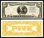
Japanese occupation currency (Philippines)
Voting period is over. Please don't add any new votes. Voting period ends on 8 Oct 2014 at 06:13:58 (UTC)
- Reason
- High quality, high EV (presented as a complete set). During World War II, the Japanese Military issued invasion currency for Netherlands Indian roepiah, Burmese rupee, and Singapore, Malaya, North Borneo, Sarawak and Brunei. The Japanese occupation of the Philippines (1942–45) was no different. This is a complete set of Japanese government-issued Philippine peso. The effect of wartime hyperinflation can be seen in the rapid increase of denomination value put into circulation. Pencil notations on the obverse of the notes beginning with "CM" indicate these notes were part of the Chase Manhattan Money Museum before being donated to the Smithsonian in 1979.
- Original
- A 13-note complete denomination and type set of World War II Japanese government-issued Philippine peso (1942–45).
- Articles in which these images appear
- Japanese government-issued Philippine peso (and some singles in other articles)
- FP category for this image
- Currency
- Creator
-
Empire of Japan
From the National Numismatic Collection, National Museum of American History, Smithsonian Institution.
Images by Godot13.
Japanese invasion money (Philippines) 1942
-1_Centavo_(1942).jpg)
-5_Centavos_(1942).jpg)
-10_Centavos_(1942).jpg)
-50_Centavos_(1942).jpg)
-

1 peso (1942) -
5 pesos (1942) -

10 pesos (1942)
-1_Peso_(1942).jpg)
-5_Pesos_(1942).jpg)
-10_Pesos_(1942).jpg)
Japanese invasion money (Philippines) 1943
-

1 peso (1943) -

5 pesos (1943) -

10 pesos (1943)
-1_Peso_(1943).jpg)
-5_Pesos_(1943).jpg)
-10_Pesos_(1943).jpg)
Japanese invasion money (Philippines) 1944–45
-

100 pesos (1944) -

500 pesos (1944) -

1,000 pesos (1945)
-100_Pesos_(1944).jpg)
-500_Pesos_(1944).jpg)
-1000_Pesos_(1945).jpg)
- Support as nominator – Godot13 ( talk) 06:13, 28 September 2014 (UTC)
- Support - Solid scans of rarely seen notes. — Crisco 1492 ( talk) 07:06, 28 September 2014 (UTC)
- Strong support- Unique notes of excellent quality with high EV and a fascinating history as well. Bzweebl ( talk • contribs) 01:07, 1 October 2014 (UTC)
- Support Nikhil ( talk) 02:32, 1 October 2014 (UTC)
- Support - we are aiming for a complete collection
 ...
Hafspajen (
talk) 11:53, 1 October 2014 (UTC)
...
Hafspajen (
talk) 11:53, 1 October 2014 (UTC) - Support I really love the way money looks as art sometimes!-- Mark Miller ( talk) 21:26, 3 October 2014 (UTC)
- Support Philippine money during the Japanese occupation is a rare find nowadays, each one costing tens of thousands of pesos today. To see a complete set for the benefit of millions of Filipino readers is worthy of being featured by Wikipedia. Arius1998 ( talk) 04:08, 4 October 2014 (UTC)
Promoted File:PHI-102b-Japanese Government (Philippines)-1 Centavo (1942).jpg
Armbrust
The Homunculus 12:39, 8 October 2014 (UTC)
Promoted File:PHI-103b-Japanese Government (Philippines)-5 Centavos (1942).jpg
Armbrust
The Homunculus 12:39, 8 October 2014 (UTC)
Promoted File:PHI-104b-Japanese Government (Philippines)-10 Centavos (1942).jpg
Armbrust
The Homunculus 12:39, 8 October 2014 (UTC)
Promoted File:PHI-105b-Japanese Government (Philippines)-50 Centavos (1942).jpg
Armbrust
The Homunculus 12:39, 8 October 2014 (UTC)
Promoted File:PHI-106-Japanese Government (Philippines)-1 Peso (1942).jpg
Armbrust
The Homunculus 12:39, 8 October 2014 (UTC)
Promoted File:PHI-107A-Japanese Government (Philippines)-5 Pesos (1942).jpg
Armbrust
The Homunculus 12:39, 8 October 2014 (UTC)
Promoted File:PHI-108-Japanese Government (Philippines)-10 Pesos (1942).jpg
Armbrust
The Homunculus 12:39, 8 October 2014 (UTC)
Promoted File:PHI-109-Japanese Government (Philippines)-1 Peso (1943).jpg
Armbrust
The Homunculus 12:39, 8 October 2014 (UTC)
Promoted File:PHI-110-Japanese Government (Philippines)-5 Pesos (1943).jpg
Armbrust
The Homunculus 12:39, 8 October 2014 (UTC)
Promoted File:PHI-111-Japanese Government (Philippines)-10 Pesos (1943).jpg
Armbrust
The Homunculus 12:39, 8 October 2014 (UTC)
Promoted File:PHI-112-Japanese Government (Philippines)-100 Pesos (1944).jpg
Armbrust
The Homunculus 12:39, 8 October 2014 (UTC)
Promoted File:PHI-114-Japanese Government (Philippines)-500 Pesos (1944).jpg
Armbrust
The Homunculus 12:39, 8 October 2014 (UTC)
Promoted File:PHI-115-Japanese Government (Philippines)-1000 Pesos (1945).jpg
Armbrust
The Homunculus 12:39, 8 October 2014 (UTC)
Frozen fog
Voting period is over. Please don't add any new votes. Voting period ends on 8 Oct 2014 at 13:42:00 (UTC)

- Reason
- Quality image with high EV
- Articles in which this image appears
- Fog
- FP category for this image
- Wikipedia:Featured pictures/Natural phenomena/Weather and/or Wikipedia:Featured pictures/Places/Landscapes
- Creator
- Ian Furst
- Support as nominator – The herald 13:42, 28 September 2014 (UTC)
Not Promoted -- Armbrust The Homunculus 13:43, 8 October 2014 (UTC)
Frozen fog 2
Voting period is over. Please don't add any new votes. Voting period ends on 8 Oct 2014 at 13:47:44 (UTC)

- Reason
- High EV + super quality = the nom
- Articles in which this image appears
- Fog
- FP category for this image
- Wikipedia:Featured pictures/Natural phenomena/Weather and/or Wikipedia:Featured pictures/Places/Landscapes
- Creator
- Jrmichae
- Support as nominator – The herald 13:47, 28 September 2014 (UTC)
Not Promoted -- Armbrust The Homunculus 13:48, 8 October 2014 (UTC)
Fez gameplay
Voting period is over. Please don't add any new votes. Voting period ends on 8 Oct 2014 at 22:18:21 (UTC)
- Reason
- A rare free use release of extended gameplay from a high-profile video game. It illustrates the notoriously-difficult-to-describe rotation mechanic from the game, and has potential to illustrate many other gameplay concept articles if it were to be split into smaller clips. This video is the best release of unedited gameplay that I have seen in my time with the project.
- Articles in which this image appears
- Fez (video game), Puzzle platformer
- FP category for this image
- Culture, entertainment, and lifestyle/Entertainment
- Creator
- Polytron Corporation, acquired and uploaded by nominator
- Support as nominator – czar ♔ 22:18, 28 September 2014 (UTC)
- Support - Good video. — Crisco 1492 ( talk) 02:38, 29 September 2014 (UTC)
- Support: Very illustrative of Fez's gameplay, graphical style and music. Great resolution, too. Pacing is excellent aside from a small drag when Gomez falls in the water around 3 minutes in. JimmyBlackwing ( talk) 04:32, 29 September 2014 (UTC)
- Support. Having played this game myself, I agree that it's almost impossible to explain the rotation mechanics without an actual gameplay example. Ðiliff «» (Talk) 00:11, 8 October 2014 (UTC)
- Support --Let it go.. The herald 07:42, 8 October 2014 (UTC)
Promoted File:FEZ trial gameplay HD.webm -- Armbrust The Homunculus 02:30, 9 October 2014 (UTC)
Mount Greylock State Reservation
Voting period is over. Please don't add any new votes. Voting period ends on 10 Oct 2014 at 16:13:31 (UTC)

- Reason
- It is the only image in Wikimedia to offer a complete view of the eponymous reservation, it is of high technical quality, and it is taken from a difficult-to-hike-to destination that required lugging 40lbs of camera gear uphill 6 miles through the woods.
- Articles in which this image appears
- /info/en/?search=Mount_Greylock
- FP category for this image
- State Parks
- Creator
- protophobic
- Support as nominator – Protophobic ( talk) 16:13, 30 September 2014 (UTC)
- Comment Seems titled clockwise (see the tower at the far right in pic) Nikhil ( talk) 02:37, 1 October 2014 (UTC)
- Comment Gorgeous. Think the tilted tower is maybe a result of barrel distortion from the panoramic lens? Six faint or very faint circular patches in the sky area, and that dark blur that looks like a UFO.
- Comment from nominator Hey thanks for the feedback everyone. I think both the dark artifacts and the distortion mentioned above are results of the composite process as I had to stitch this from a few different frames on my 35mm. I am going back there this weekend to try with a wider lens. I will work hard and hopefully back with a better picture! ---------- Protophobic ( talk) 13:40, 10 October 2014 (UTC)
- Think we're mainly just waiting on replies on this one. Adam Cuerden ( talk) 01:16, 10 October 2014 (UTC)
Not Promoted -- Armbrust The Homunculus 18:28, 10 October 2014 (UTC)
Labrador Retriever Puppy
Voting period is over. Please don't add any new votes. Voting period ends on 10 Oct 2014 at 17:56:08 (UTC)

- Reason
- Picture with good quality and EV. Composition is also fine. Only thing is tail is not in focus and I think, that is not seriously effecting the photograph. No other pictures are featured in this particular article.
- Articles in which this image appears
- Labrador Retriever
- FP category for this image
- Wikipedia:Featured pictures/Animals/Mammals
- Creator
- Augustus Binu
- Support as nominator – Bellus Delphina talk 17:56, 30 September 2014 (UTC)
- Everything except the dog's face is out of focus... 24.222.214.125 ( talk) 01:19, 1 October 2014 (UTC)
- Oppose. Puppies are pretty heavily photographed... I'd want to see something pretty special to support at FPC. This is a very good picture, but I wouldn't call it a great picture. J Milburn ( talk) 16:47, 5 October 2014 (UTC)
- Oppose A touch underexposed. May also need higher dynamic range to bring shadows into play. Samsara ( FA • FP) 11:17, 10 October 2014 (UTC)
Not Promoted -- Armbrust The Homunculus 18:29, 10 October 2014 (UTC)
Bothriechis schlegelii
Voting period is over. Please don't add any new votes. Voting period ends on 11 Oct 2014 at 14:10:37 (UTC)
.jpg)
- Reason
- High EV, good quality, striking image
- Articles in which this image appears
- Bothriechis, Bothriechis schlegelii, La Selva Biological Station, List of reptiles of Guatemala
- FP category for this image
- Wikipedia:Featured pictures/Animals/Reptiles
- Creator
- Geoff Gallice
- Support as nominator – Tomer T ( talk) 14:10, 1 October 2014 (UTC)
- Support Eye-catching and important parts seem to be in focus. Brandmeister talk 17:03, 2 October 2014 (UTC)
- Support - I'd have preferred to have the whole reptile in focus, but considering how rare it is to have good snake shots here, and the fact that the face is absolutely sharp, this is good enough for me. — Crisco 1492 ( talk) 05:47, 6 October 2014 (UTC)
- Support Nikhil ( talk) 05:18, 7 October 2014 (UTC)
- Support. An interesting composition and good detail. Ðiliff «» (Talk) 00:07, 8 October 2014 (UTC)
Promoted File:Bothriechis schlegelii (La Selva Biological Station).jpg -- Armbrust The Homunculus 14:11, 11 October 2014 (UTC)
Herman Willem Daendels
Voting period is over. Please don't add any new votes. Voting period ends on 12 Oct 2014 at 06:27:42 (UTC)

- Reason
- High quality painting of an important figure in the colonial history of Indonesia.
- Articles in which this image appears
- Herman Willem Daendels, Raden Saleh, Dutch Gold Coast, History of Bali
- FP category for this image
- Wikipedia:Featured pictures/People/Political
- Creator
- Raden Saleh
- Support as nominator – — Crisco 1492 ( talk) 06:27, 2 October 2014 (UTC)
- Support - a bit scuffed round the edges (the painting, not him; he's very dapper and bit louche) but I suppose that is to be expected. Belle ( talk) 17:30, 2 October 2014 (UTC)
- Support - per
Belle,but I had to look up "louche" first...-
Godot13 (
talk) 20:42, 2 October 2014 (UTC)
- So did I. Belle, you're speaking above our level! Anyways, I'd have gone with Dandy Daendels, like some Horrible Histories book. — Crisco 1492 ( talk) 08:30, 3 October 2014 (UTC)
- Support ...and I want that coat.-- Mark Miller ( talk) 21:24, 3 October 2014 (UTC)
- Support ...
, Mark you are funny.
Hafspajen (
talk) 23:21, 3 October 2014 (UTC)
Promoted File:Posthumous Portrait of Herman Willem Daendels, Governor-General of the Dutch East Indies - Rd Saleh.jpg -- Armbrust The Homunculus 06:28, 12 October 2014 (UTC)
Return of the Inuit Woman
Voting period is over. Please don't add any new votes. Voting period ends on 12 Oct 2014 at 10:33:13 (UTC)

- Reason
- This was nominated before some time ago by Crisco 1492, but didn't get much of a shot. All the previous reasons for making it FP still apply and she has a lovely parka which wasn't mentioned in the last nomination (I'm sure WikiProject Parka members could sweep this through FPC if only we were allowed to canvass them). My two previous FP nominations have sailed through with plenty of support and no opposition, so don't make me cry by rejecting this one (also think of poor Crisco 1492 and his sad puppy eyes and how bad he will feel if it gets rejected twice).
- Articles in which this image appears
- Inuit women, Inuit culture, Inuit, and 5 more
- FP category for this image
- Wikipedia:Featured pictures/People/Traditional
- Creator
- Created by Lomen Bros., restored by Crisco 1492, nominated shamelessly with very little effort required on her part by Belle
- Support as nominator – Belle ( talk) 10:33, 2 October 2014 (UTC)
- Support per last time. — Crisco 1492 ( talk) 12:19, 2 October 2014 (UTC)
- Support per above. Hafspajen ( talk) 16:57, 2 October 2014 (UTC)
- Support per nominator.-- Mark Miller ( talk) 21:23, 3 October 2014 (UTC)
- Support -- Need it go.. The herald 15:56, 5 October 2014 (UTC)
Promoted File:Inuit Woman 1907 Crisco edit 2.jpg -- Armbrust The Homunculus 10:40, 12 October 2014 (UTC)
- @ Belle:@ Crisco 1492: BTW the image wasn't in any articles at the time of promotion. Armbrust The Homunculus 10:40, 12 October 2014 (UTC)
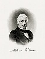
Presidents of the United States (1789–1909)
Voting period is over. Please don't add any new votes. Voting period ends on 12 Oct 2014 at 22:42:38 (UTC)
- Reason
- High quality, high EV (presented as a set), from the same
BEP presentation album as the featured set of
U.S. Treasury Secretaries.
This set of Bureau of Engraving and Printing (BEP) engraved portraits depicts the first 26 Presidents of the United States [n 1] from George Washington (1789–95) through Theodore Roosevelt (1901–09) spanning 120 years. Several of these portraits have appeared on United States paper currency and bonds.
All of the images appear in the US Treasury specimen book article and 24 of 25 appear in their respective individual articles, generally in the presidency section. [n 2] - Original
- A 25-image set of high resolution BEP engraved portraits depicting the Presidents of the United States for the first 120 years of the office. From a BEP presentation album reportedly given to Treasury Secretary Lyman Gage (c. 1902).
- Articles in which these images appear
- US Treasury specimen book (all), Art and engraving on United States banknotes (9), List of Presidents of the United States (11), and one each in Presidency of George Washington, John Adams, Thomas Jefferson, James Madison, James Monroe, John Quincy Adams, Martin Van Buren, William Henry Harrison, John Tyler, James K. Polk, Zachary Taylor, Millard Fillmore, Franklin Pierce, James Buchanan, Abraham Lincoln, Andrew Johnson, Ulysses S. Grant, Rutherford B. Hayes, James A. Garfield, Chester A. Arthur, Grover Cleveland, Benjamin Harrison, William McKinley, and Theodore Roosevelt.
- FP category for this image
- Wikipedia:Featured pictures/People/Political
- Creator
-
Bureau of Engraving and Printing
Restoration by Godot13.
Presidents of the United States (1789–1909)
-

1789–97 -
1797–1801 -

1801–09
.jpg)
.jpg)
.jpg)
-

1809–17 -

1817–25 -
1825–29
.jpg)
.jpg)
.jpg)
-

1829–37 -
1837–41 -

.jpg)
.jpg)
.jpg)
-

1841–45 -

1845–49 -

1849–50
.jpg)
.jpg)
.jpg)
-
1850–53 -

1853–57 -

1857–61
.jpg)
.jpg)
.jpg)
-

1861–65 -

1865–69 -

1869–77
.jpg)
.jpg)
.jpg)
-
1877–81 -

1881 -

1881–85
.jpg)
.jpg)
.jpg)
-

1885–89, 93–97 -

1889–93
.jpg)
.jpg)
-

1897–1901 -

1901–09
.jpg)
.jpg)
- Support as nominator – Godot13 ( talk) 22:42, 2 October 2014 (UTC)
- Support - Very useful. — Crisco 1492 ( talk) 00:32, 3 October 2014 (UTC)
- Comment - On my monitor and to my untrained eye, the background on some of the images is striped at thumbnail size, though this is not apparent when looking at a larger version. This particularly applies to Tyler, Polk, Lincoln, McKinley and Roosevelt, but to a lesser extent some of the others. Cwmhiraeth ( talk) 05:59, 3 October 2014 (UTC)
- Hi Cwmhiraeth- I've enlarged and re-spaced the thumbnail images to reduce the effect somewhat. However (and someone please correct me if I'm wrong), thumbnail images are a means to open the files themselves and aren't part of evaluating a nomination.-- Godot13 ( talk) 07:24, 3 October 2014 (UTC)
- My thumbnails aren't showing up like that, oddly enough. Usually the striping effect is from halftoning or similar printing processes, though I don't think I've ever seen engravings get striped. What browser are you on? That might affect it. — Crisco 1492 ( talk) 08:24, 3 October 2014 (UTC)
- I think Cwmhiraeth's referring to the moiré patterns which are quite visible at some sizes e.g. McKingley at 226px. -- Paul_012 ( talk) 10:27, 3 October 2014 (UTC)
- That makes sense. I believe that's an artefact of MediaWiki's downsampling of JPEGs, rather than something wrong with the file itself (any engraving has the possibility of creating a moire pattern). Since FPs are judged according to full size only, that's fortunately not too big of an issue. — Crisco 1492 ( talk) 10:34, 3 October 2014 (UTC)
- Moiré patterns seem a good explanation for the phenomenon. Happy to support this nomination. Cwmhiraeth ( talk) 15:05, 3 October 2014 (UTC)
- Support - Spent some time looking at Arthur at full size, trying to puzzle out exactly how the engraver(s) went about their work- for example the edge of his collar is roughly drawn, with maybe three lines, which contrasts oddly with the precision of the shading lines. yes, I have got a life Xanthomelanoussprog ( talk) 11:24, 3 October 2014 (UTC)
- Support - Superb quality, historically invaluable, and an asset to Wikipedia as an Encyclopedia. -- (Aside comment: Engravers almost always use a model for their engravings. For example, the engraving here of Washington was modeled after a painting by Gilbert Stuart. This is the same portrait used for the engraving on the one dollar bill and on a number of postage stamps. ( Example). It would be nice to add such notes in the file summaries of these images in the future, per available information.) -- Gwillhickers ( talk) 01:56, 4 October 2014 (UTC).
- Thanks Gwillhickers, definitely on my list of things to do. I started here for the vignettes. Thanks.-- Godot13 ( talk) 03:21, 4 October 2014 (UTC)
Promoted File:WASHINGTON, George-President (BEP engraved portrait).jpg --
Armbrust
The Homunculus 00:14, 13 October 2014 (UTC)
Promoted File:ADAMS,John-President (BEP engraved portrait).jpg --
Armbrust
The Homunculus 00:14, 13 October 2014 (UTC)
Promoted File:JEFFERSON, Thomas-President (BEP engraved portrait).jpg --
Armbrust
The Homunculus 00:14, 13 October 2014 (UTC)
Promoted File:MADISON, James-President (BEP engraved portrait).jpg --
Armbrust
The Homunculus 00:14, 13 October 2014 (UTC)
Promoted File:MONROE, James-President (BEP engraved portrait).jpg --
Armbrust
The Homunculus 00:14, 13 October 2014 (UTC)
Promoted File:ADAMS, John Q-President (BEP engraved portrait).jpg --
Armbrust
The Homunculus 00:14, 13 October 2014 (UTC)
Promoted File:JACKSON, Andrew-President (BEP engraved portrait).jpg --
Armbrust
The Homunculus 00:14, 13 October 2014 (UTC)
Promoted File:VAN BUREN, Martin-President (BEP engraved portrait).jpg --
Armbrust
The Homunculus 00:14, 13 October 2014 (UTC)
Promoted File:HARRISON, William H-President (BEP engraved portrait).jpg --
Armbrust
The Homunculus 00:14, 13 October 2014 (UTC)
Promoted File:TYLER, John-President (BEP engraved portrait).jpg --
Armbrust
The Homunculus 00:14, 13 October 2014 (UTC)
Promoted File:POLK, James-President (BEP engraved portrait).jpg --
Armbrust
The Homunculus 00:14, 13 October 2014 (UTC)
Promoted File:TAYLOR, Zachary-President (BEP engraved portrait).jpg --
Armbrust
The Homunculus 00:14, 13 October 2014 (UTC)
Promoted File:FILLMORE, Millard-President (BEP engraved portrait).jpg --
Armbrust
The Homunculus 00:14, 13 October 2014 (UTC)
Promoted File:PIERCE, Franklin-President (BEP engraved portrait).jpg --
Armbrust
The Homunculus 00:14, 13 October 2014 (UTC)
Promoted File:BUCHANAN, James-President (BEP engraved portrait).jpg --
Armbrust
The Homunculus 00:14, 13 October 2014 (UTC)
Promoted File:LINCOLN, Abraham-President (BEP engraved portrait).jpg --
Armbrust
The Homunculus 00:14, 13 October 2014 (UTC)
Promoted File:JOHNSON, Andrew-President (BEP engraved portrait).jpg --
Armbrust
The Homunculus 00:14, 13 October 2014 (UTC)
Promoted File:GRANT, Ulysses S-President (BEP engraved portrait).jpg --
Armbrust
The Homunculus 00:14, 13 October 2014 (UTC)
Promoted File:HAYES, Rutherford B-President (BEP engraved portrait).jpg --
Armbrust
The Homunculus 00:14, 13 October 2014 (UTC)
Promoted File:GARFIELD, James A-President (BEP engraved portrait).jpg --
Armbrust
The Homunculus 00:14, 13 October 2014 (UTC)
Promoted File:ARTHUR, Chester A-President (BEP engraved portrait).jpg --
Armbrust
The Homunculus 00:14, 13 October 2014 (UTC)
Promoted File:CLEVELAND, Grover-President (BEP engraved portrait).jpg --
Armbrust
The Homunculus 00:14, 13 October 2014 (UTC)
Promoted File:HARRISON, Benjamin-President (BEP engraved portrait).jpg --
Armbrust
The Homunculus 00:14, 13 October 2014 (UTC)
Promoted File:McKINLEY, William-President (BEP engraved portrait).jpg --
Armbrust
The Homunculus 00:14, 13 October 2014 (UTC)
Promoted File:ROOSEVELT, Theodore-President (BEP engraved portrait).jpg --
Armbrust
The Homunculus 00:14, 13 October 2014 (UTC)
3DO-FZ1-Console-Set
Voting period is over. Please don't add any new votes. Voting period ends on 13 Oct 2014 at 18:35:01 (UTC)

- Reason
- Very Nice quality and EV
- Articles in which this image appears
- The 3DO Company, List of video game consoles, History of video game consoles (fifth generation)
- FP category for this image
- Wikipedia:Featured pictures/Engineering and technology/Electronics
- Creator
- Evan-Amos
- Support as nominator – Bellus Delphina talk 18:35, 3 October 2014 (UTC)
- Comment: A
png version of the image (with transparent background) is the lead image in
3DO Interactive Multiplayer, where it would have most EV. Is this standard practice? --
101.109.224.151 (
talk) 19:53, 3 October 2014 (UTC)
- The VG project has recently taken to using JPGs, but the PNGs were standard up through early 2013 AFAIK. — Crisco 1492 ( talk) 00:26, 4 October 2014 (UTC)
- Support though I think this should be put in the article on the system too. — Crisco 1492 ( talk) 00:32, 4 October 2014 (UTC)
- Support - Clear image and a good display of the subject (therefore good for articles) - NickGibson3900 Talk 09:30, 4 October 2014 (UTC)
- Support Though it's a little on the small side for my taste - but, then, the console's fairly rare. Adam Cuerden ( talk) 12:44, 9 October 2014 (UTC)
- Comment Something unhappy about the way that the edges of that top plate are rendered - any chance of lighting/exposing it so those don't slink away into darkness? Samsara ( FA • FP) 11:22, 10 October 2014 (UTC)
- Support Tokugawapants ( talk) 06:04, 12 October 2014 (UTC)
Promoted File:3DO-FZ1-Console-Set.jpg -- Armbrust The Homunculus 18:36, 13 October 2014 (UTC)
Deepwater Horizon fire 2
Voting period is over. Please don't add any new votes. Voting period ends on 13 Oct 2014 at 19:33:58 (UTC)
- Reason
- Newly edited photo from previous nomination. The photo is used in several articles, high EV, has adequate size and quality, and is eye catching.
- Articles in which this image appears
- Deepwater Horizion explosion, Deepwater Horizon, Corporate litigation in the United Kingdom, Blowout (well drilling), BP, and others
- FP category for this image
- Wikipedia:Featured pictures/Engineering and technology/Others
- Creator
- Original by United States Coast Guard, edits by Mark Miller and Ottojula
- Support as nominator – Pine ✉ 19:33, 3 October 2014 (UTC)
- Support as uploader of the latest version.-- Mark Miller ( talk) 20:09, 3 October 2014 (UTC)
- Comment - You don't seem to have nominated the straightened version (i.e. you nominated File:Deepwater Horizon offshore drilling unit on fire 2010.jpg and not File:Deepwater Horizon offshore drilling unit on fire 2010 straightened.jpg). — Crisco 1492 ( talk) 02:18, 4 October 2014 (UTC)
- Hit refresh Crisco 1492. I have overridden the main image so that it can be in all the articles without having to change every one of them to put in the new version. I created the other version for the FPN as to be able to show both. Since the OP decided to re-nominate the corrected version, I went ahead and did the override and put the other up for deletion because it is now redundant.-- Mark Miller ( talk) 04:44, 4 October 2014 (UTC)
- Alright, I've got it. Support - Solid image. — Crisco 1492 ( talk) 05:19, 4 October 2014 (UTC)
- Support - striking image. The red reflection is very interesting. Hafspajen ( talk) 22:18, 4 October 2014 (UTC)
- Support very good EV! ///EuroCar GT 01:55, 5 October 2014 (UTC)
- Support - intense...-- Godot13 ( talk) 01:11, 6 October 2014 (UTC)
Promoted File:Deepwater Horizon offshore drilling unit on fire 2010.jpg -- Armbrust The Homunculus 19:47, 13 October 2014 (UTC)
Joseph and the Child
Voting period is over. Please don't add any new votes. Voting period ends on 13 Oct 2014 at 22:07:13 (UTC)

- Reason
- Guido Reni was an Italian painter of high-Baroque style, highly estimated while he lived, one of the important painters in the art history. This picture is one of the most intimate and warm depictions of a father figure, a person who has a key role in a child's life. Joseph, a typical father figure, is often lost and forgotten in art history. There are plenty of pictures of the Madonna and Child, but not so many made of Joseph and Child. This one is particulary nice, kept together by the warm colors and a good composition, using Joseph cloak as a frame. It could depict any child and father, the feelings are universal.
- Articles in which this image appears
- Guido Reni
- FP category for this image
- Wikipedia:Featured pictures/Artwork/Paintings
- Creator
- Guido Reni
- Support as nominator – Hafspajen ( talk) 22:07, 3 October 2014 (UTC)
- Support per nom. — Crisco 1492 ( talk) 00:32, 4 October 2014 (UTC)
- Support -- Bellus Delphina talk 08:05, 4 October 2014 (UTC)
- Support — Interesting for rarity of subject matter, as Hafs says, and also for its depiction of Joseph as an old man, in keeping with a certain theological tradition (which later fell out of favor, if I'm not mistaken). Sca ( talk) 15:45, 4 October 2014 (UTC)
- Support ///EuroCar GT 01:55, 5 October 2014 (UTC)
- Support: per nom and agree with Sca's comment. Fylbecatulous talk 13:41, 5 October 2014 (UTC)
Promoted File:Guido Reni - Saint Joseph and the Christ Child - Google Art Project.jpg -- Armbrust The Homunculus 02:16, 14 October 2014 (UTC)
A Bengal Tigress in Jim Corbett National Park
Voting period is over. Please don't add any new votes. Voting period ends on 23 Oct 2014 at 11:29:23 (UTC)

- Reason
- Original image is 3,123 × 4,888 pixels, high technical standard, Is among Wikipedia's best work and the main infobox image of article Tiger, Has a free license, helps readers to understand Tiger article, facts are supported by sources.
- Articles in which this image appears
- Tiger, Jim Corbett National Park (GA class article)
- FP category for this image
- Wikipedia:Featured pictures/Animals/Mammals
- Creator
- Sumeet Moghe
- Support as nominator – Jim Carter 11:29, 13 October 2014 (UTC)
- Oppose this version. Insane level of JPG artefacting. — Crisco 1492 ( talk) 11:45, 13 October 2014 (UTC)
- @ Crisco 1492: Can you please clarify? There are three versions available of this image, will reverting to an older version can fix the problem? Thanks, Jim Carter (from public cyber) 11:53, 13 October 2014 (UTC)
- The one which was current at the time of my post. The one which is now current is a bit better, but I'm still not sure it's featured quality. — Crisco 1492 ( talk) 12:23, 13 October 2014 (UTC)
- @ Crisco 1492: Please reconsider. I have checked the criteria before nominating it. And I didn't found anything of a trouble. And honestly there are not many Bengal tiger's picture exist here of even this quality. Can you please clarify your !vote with reference to the criteria? Jim Carter (from public cyber) 13:13, 13 October 2014 (UTC)
- Oppose, Great shot, and rare and surely a good asset for the article in all possible ways. However to be a Featured picture, it is not centered. The animal is to the left. Hafspajen ( talk) 13:16, 13 October 2014 (UTC)
- Withdraw Thanks @ Hafspajen:, now I understood the problem. Jim Carter (from public cyber) 13:25, 13 October 2014 (UTC)
- Please try to find other pictures to us, you are on the right way. You can always ask Crisco for example if you are not sure about it, I do that often. In this way you can be more sure about it. If I am in doubt (and that happens often) I always ask others before nominate a picture, as a second oppinion, you know. You have a talent in finding great shots, don't give up! This is a striking picture too, certainly. Hafspajen ( talk) 14:23, 13 October 2014 (UTC)
- Thanks, Hafspajen. This is a totally different field and I should admit that this was my first time here (I don't really work with files). I will go ahead and find some more pics and before nominating them I will ask you and Crisco. Thanks again, it was good experience for me. And I think this discussion can be closed speedily per WP:SNOW. Jim Carter (from public cyber) 15:49, 13 October 2014 (UTC)
Not Promoted -- Armbrust The Homunculus 02:51, 14 October 2014 (UTC)
- Withdrawn nomination. Armbrust The Homunculus 02:51, 14 October 2014 (UTC)
Beauty Revealed
Voting period is over. Please don't add any new votes. Voting period ends on 14 Oct 2014 at 02:55:39 (UTC)

- Reason
- A very interesting self-portrait. Very personal, powerful. Yes, this may also require an RFC before going on the main page, but I think we can all recognize that this is a good digitization of the miniature (only 6.7 cm × 8 cm (2.6 in × 3.1 in)). Watercolor on ivory, which has to be one of the more unique mediums I've seen.
- Articles in which this image appears
- Beauty Revealed, Sarah Goodridge
- FP category for this image
- Wikipedia:Featured pictures/Artwork/Paintings
- Creator
- Sarah Goodridge
- Support as nominator – — Crisco 1492 ( talk) 02:55, 4 October 2014 (UTC)
- Support - The painting is fantastic (I'll leave it at that) and well-done on expanding the article.--
Godot13 (
talk) 03:34, 4 October 2014 (UTC)
- Thanks! Much simpler than that last painting article I wrote. — Crisco 1492 ( talk) 05:12, 4 October 2014 (UTC)
- Support Ąnd interestingly, this isn't generic breasts by a male artist, but a self-portrait by a female artist. Brandmeister talk 07:58, 4 October 2014 (UTC)
- Support well said, Brandmeister. Hafspajen ( talk) 08:48, 4 October 2014 (UTC)
- Support — Interesting — almost mesmerizing. As Shakespeare put it.... Sca ( talk) 15:35, 4 October 2014 (UTC)
- Support — she should get the mole checked out though. Xanthomelanoussprog ( talk) 23:20, 10 October 2014 (UTC)
- Support - Very interesting. Chillum 05:16, 12 October 2014 (UTC)
- Support -- Lewis Hulbert ( talk) 11:31, 12 October 2014 (UTC)
- Support -- Bellus Delphina talk 12:54, 13 October 2014 (UTC)
Promoted File:Sarah Goodridge Beauty Revealed The Metropolitan Museum of Art.jpg -- Armbrust The Homunculus 02:56, 14 October 2014 (UTC)
Samuel Peploe - Still life with Apples and Jar
Voting period is over. Please don't add any new votes. Voting period ends on 15 Oct 2014 at 13:22:35 (UTC)

- Reason
- Samuel Peploe (1871 – 1935) - was a a Scottish Post-Impressionist painter, noted for his still life works and for being one of the group of four painters that became known as the Scottish Colourists. Peploe's 1905 painting Still Life with Coffee Pot, sold on 26 May 2011 at Christie's in London for £937,250, is one of the most expensive Scottish painting sold at auction. The previous record for a work by Peploe was £623,650 for Tulips, sold in 2010.
- Articles in which this image appears
- Samuel Peploe, Art Gallery of New South Wales, Art of the United Kingdom
- FP category for this image
- Wikipedia:Featured pictures/Artwork/Paintings,
- Creator
- Samuel Peploe
- Support as nominator – Hafspajen ( talk) 13:22, 5 October 2014 (UTC)
- Support - Always glad to have less-known artists coming through here. — Crisco 1492 ( talk) 05:45, 6 October 2014 (UTC)
- Support - I saw cracks like that on a French abstract expressionist painting from the 1960s. In that example, large areas had fallen off. Xanthomelanoussprog ( talk) 07:24, 6 October 2014 (UTC)
-
- Peploe's paintings seem to be unvarnished as well. Xanthomelanoussprog ( talk) 13:17, 6 October 2014 (UTC)
- Varnish was not used by the impressionist, they thought it was bad style old fashioned, dark and just stupidity. Some had problems later with deteriorating colurs because of that. Hafspajen ( talk) 14:04, 6 October 2014 (UTC)
- But nothing has fallen of from this one, this is good quality. Hafspajen ( talk) 21:02, 8 October 2014 (UTC)
- Support: Another very good instructive narrative, Hafs. Notable and of good quality. Fylbecatulous talk 01:33, 9 October 2014 (UTC)
- Support: A nice reproduction of notable art. Not my favourite art by the Colourists, but... Adam Cuerden ( talk) 12:40, 9 October 2014 (UTC)
Promoted File:Samuel Peploe - Still life- apples and jar - Google Art Project.jpg -- Armbrust The Homunculus 13:23, 15 October 2014 (UTC)
The Discovery Moment
Voting period is over. Please don't add any new votes. Voting period ends on 15 Oct 2014 at 15:37:54 (UTC)

.jpg)
- Reason
- Fine quality image with high ev.
- Articles in which this image appears
- Space Shuttle Discovery
- FP category for this image
- Wikipedia:Featured pictures/Space/Getting there
- Creator
- NASA
- Note
- For original, there is a similar image File:STS120LaunchHiRes-edit1.jpg which is a FP of Discovery but in STS-120 mission
- Support any or all as nominator – The herald 15:37, 5 October 2014 (UTC)
- Oppose. Not a useful nomination. These are not a coherent set- each adds something different to the article and they really should be judged separately. We don't nominate FAs or FLs by just throwing as many articles/lists at the nomination process as possible, so we shouldn't do the same thing with FPs. J Milburn ( talk) 16:45, 5 October 2014 (UTC)
- Comment It is not a set, there are ALTs.
Hafspajen (
talk) 18:29, 5 October 2014 (UTC)
- I don't think ALTs work that way.
GamerPro64 21:57, 5 October 2014 (UTC)
- Maybe not. Split?
Hafspajen (
talk) 22:32, 5 October 2014 (UTC)
- Probably.
GamerPro64 01:58, 6 October 2014 (UTC)
- Definitely split. None of these make a coherent set, and the technical quality varies greatly. — Crisco 1492 ( talk) 02:30, 6 October 2014 (UTC)
- @
Crisco 1492:,@
J Milburn:,@
GamerPro64: & @
Hafspajen: Looks fine now???
The herald 07:07, 6 October 2014 (UTC)
- I would argue no. The purpose of alts is to determine which is the best of very similar images, generally with the same EV. These alts have little in common in their usage or their value. If it's a matter of which image should be used on the article mainspace, then that is usually an issue for that articles talk page -- not the FP project. As for the images themselves, as a rule images which are used in galleries are out, and these because of their incoherence lack a solid argument for EV. Picking a single image, explaining why it adds to the article and letting it stand on its own technical merits is almost always a better way to pass a nomination and improve the project. 24.222.214.125 ( talk) 23:34, 6 October 2014 (UTC)
- Probably.
GamerPro64 01:58, 6 October 2014 (UTC)
- Maybe not. Split?
Hafspajen (
talk) 22:32, 5 October 2014 (UTC)
- I don't think ALTs work that way.
GamerPro64 21:57, 5 October 2014 (UTC)
- Comment It is not a set, there are ALTs.
Hafspajen (
talk) 18:29, 5 October 2014 (UTC)
- Oppose both The first image is nothing special and is potentially misleading (the space shuttles didn't go anywhere near the moon), and the second photo appears to be tilted and doesn't have great EV either (it also isn't currently in any articles on this Wikipedia). Nick-D ( talk) 03:07, 7 October 2014 (UTC)
Not Promoted -- Armbrust The Homunculus 15:42, 15 October 2014 (UTC)
Grace Hopper portrait
Voting period is over. Please don't add any new votes. Voting period ends on 15 Oct 2014 at 18:32:49 (UTC)
.jpg)
- Reason
- Notable person, and this seems to be the best quality photo that we have.
- Articles in which this image appears
- Grace Hopper
- FP category for this image
- Wikipedia:Featured pictures/People/Science and engineering
- Creator
- James S. Davis
- Support as nominator – Pine ✉ 18:32, 5 October 2014 (UTC)
- Support - Though I may not be crazy about the DOF here, this is a striking image (the contrast of her small body and the flag) and an important pioneer in computer technology. — Crisco 1492 ( talk) 05:38, 6 October 2014 (UTC)
- Support for the 80s, it's quite good. Adam Cuerden ( talk) 15:37, 7 October 2014 (UTC)
- Support. Good EV, nice lighting and composition, high resolution. Kaldari ( talk) 23:44, 9 October 2014 (UTC)
- Support - A good photograph that does what a FP should: it made me curious (I read an article I otherwise wouldn't, and I learned something new).-- Godot13 ( talk) 08:14, 10 October 2014 (UTC)
- Support - Nominator's reasons. Alborzagros ( talk) 12:01, 11 October 2014 (UTC)
- Support -- Bellus Delphina talk 12:54, 13 October 2014 (UTC)
Promoted File:Commodore Grace M. Hopper, USN (covered).jpg -- Armbrust The Homunculus 18:37, 15 October 2014 (UTC)
Series 1880 United States Notes
Voting period is over. Please don't add any new votes. Voting period ends on 15 Oct 2014 at 18:51:06 (UTC)
- Reason
- High quality, high EV (presented as a set). Complete denomination set ($1 to $1,000) of Series 1880 U.S. Notes (aka Legal Tender). From the U.S. Treasury Department collection transferred to the National Numismatic Collection in 1978.
- Original
- An nine-note complete denomination set of Series 1880 United States Notes $1 through $1,000.
- Articles in which these images appear
- United States Note (all), Large denominations of United States currency (2), and one in each United States one-dollar bill, United States two-dollar bill, United States five-dollar bill, United States ten-dollar bill, United States twenty-dollar bill, United States fifty-dollar bill, and United States one hundred-dollar bill.
- FP category for this image
- Currency
- Creator
-
Bureau of Engraving and Printing
From the National Numismatic Collection, National Museum of American History, Smithsonian Institution.
Images by Godot13
Series 1880 United States Notes (complete denomination set)


-

$10 Daniel Webster -

-


-
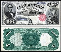
$100 Abraham Lincoln -

$500 Joseph K. Mansfield -
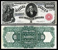
$1,000 DeWitt Clinton


- Support as nominator – Godot13 ( talk) 18:51, 5 October 2014 (UTC)
- Comment: What's with the horizontal line on the 1 and 2 dollar bills (and maybe others)? Also, I think the EV would work better if we made the table in the article sortable (say, by denomination, year of issue, and maybe person depicted). — Crisco 1492 ( talk) 05:36, 6 October 2014 (UTC)
- Excellent. Support — Crisco 1492 ( talk) 12:43, 6 October 2014 (UTC)
- Support, a wonderful set! Hafspajen ( talk) 19:08, 9 October 2014 (UTC)
- Support Very nice. Think it's just big sets take some time to review. Adam Cuerden ( talk) 07:30, 14 October 2014 (UTC)
- Support SagaciousPhil - Chat 20:12, 14 October 2014 (UTC)
- Support: worthy of being featured. Fylbecatulous talk 22:01, 14 October 2014 (UTC)
Promoted File:US-$1-LT-1880-Fr-29.jpg --
Armbrust
The Homunculus 18:52, 15 October 2014 (UTC)
Promoted File:US-$2-LT-1880-Fr-52.jpg --
Armbrust
The Homunculus 18:52, 15 October 2014 (UTC)
Promoted File:US-$5-LT-1880-Fr-72.jpg --
Armbrust
The Homunculus 18:52, 15 October 2014 (UTC)
Promoted File:US-$10-LT-1880-Fr-102.jpg --
Armbrust
The Homunculus 18:52, 15 October 2014 (UTC)
Promoted File:US-$20-LT-1880-Fr-145.jpg --
Armbrust
The Homunculus 18:52, 15 October 2014 (UTC)
Promoted File:US-$50-LT-1880-Fr.164.jpg --
Armbrust
The Homunculus 18:52, 15 October 2014 (UTC)
Promoted File:US-$100-LT-1880-Fr-181.jpg --
Armbrust
The Homunculus 18:52, 15 October 2014 (UTC)
Promoted File:US-$500-LT-1880-Fr-185l.jpg --
Armbrust
The Homunculus 18:52, 15 October 2014 (UTC)
Promoted File:US-$1000-LT-1880-Fr-187k.jpg --
Armbrust
The Homunculus 18:52, 15 October 2014 (UTC)
Charles Hodge
Voting period is over. Please don't add any new votes. Voting period ends on 16 Oct 2014 at 05:54:57 (UTC)

- Reason
- High quality portrait by a notable artist, of a notable person. Good EV
- Articles in which this image appears
- Charles Hodge
- FP category for this image
- Wikipedia:Featured pictures/People/Religious figures, perhaps
- Creator
- Rembrandt Peale
- Support as nominator – — Crisco 1492 ( talk) 05:54, 6 October 2014 (UTC)
- Support A well done portrait, showing the unique characteristics of the subject. And by Rembrandt Peale!! Very nice. Hafspajen ( talk) 10:57, 6 October 2014 (UTC)
- Support I like the other Peale portrait better, but this is still very good, and great for the Charles Hodge article. Adam Cuerden ( talk) 20:04, 9 October 2014 (UTC)
- Support Sure, why not? Samsara ( FA • FP) 11:19, 10 October 2014 (UTC)
- Support - A solid portrait for the Hodge article by a highly notable artist.-- Godot13 ( talk) 04:40, 12 October 2014 (UTC)
Promoted File:PORTRAIT OF CHARLES HODGE, Rembrandt Peale.jpg -- Armbrust The Homunculus 12:31, 16 October 2014 (UTC)
Anatomical diagram of a scallop
Voting period is over. Please don't add any new votes. Voting period ends on 16 Oct 2014 at 13:02:24 (UTC)

- Reason
- This is a renomination of this file from a year and a half ago, with much improvement/ adjustment. Image is freely licensed, is of high technical quality and biological accuracy, and has strong visual appeal. I also consider this a work in progress for the moment, and welcome any suggestions for changes or improvements to it, even minor things. This is likely to be my last FP nomination for awhile— too much time spent drawing!
- Articles in which this image appears
- Pectinidae
- FP category for this image
- wp:Featured pictures/Sciences/Biology
- Creator
- KDS4444
- Support as nominator – KDS4444 Talk 13:02, 4 October 2014 (UTC)
- After generating this page, I forgot to transclude it onto the list of candidates— so it is now a day or two behind schedule! Can this be taken into account when the voted are tallied? Am hoping so. It was a careless mistake on my part, and am hoping it won't end up counting against me.
KDS4444
Talk 09:39, 7 October 2014 (UTC)
- I've fixed it. Adam Cuerden ( talk) 13:34, 7 October 2014 (UTC)
- Support - Barely recognized it! Very nice. —
Crisco 1492 (
talk) 11:35, 7 October 2014 (UTC)
- Though it would be best if the whole background was white, rather than just a block. You still have transparency — Crisco 1492 ( talk) 11:37, 7 October 2014 (UTC)
- Comment I can't quite figure out what the left branch of the Intestines label is pointing to. There's a tube on the right side, but... Maybe add a cutaway so that anatomy interior of the gonad is a little easier to see? Adam Cuerden ( talk) 13:34, 7 October 2014 (UTC)
- Support Hafspajen ( talk) 13:45, 7 October 2014 (UTC)
- What is the label for the digestive gland pointing to? It seem to either be pointing to two lines or spanning an area where there doesn't seem to be anything disernable as a "gland" (I'm such a gland expert; that came out wrong, but you'd expect to see something). Also (nothing to do with the picture really), do we only normally eat female scallops? Scallops I've been server/prepared all seem to have orange "coral" (which I now know is the gonad; thanks for that!) which would suggest they are female.
Belle (
talk) 14:46, 7 October 2014 (UTC)
- There's a bit of a yellow-brown thing just sticking out from under the stomach at the top. I think that's the gland. Adam Cuerden ( talk) 15:02, 7 October 2014 (UTC)
- Support -- Fauzan ✆ talk ✉ mail 20:43, 7 October 2014 (UTC)
- Support - Well done.-- Godot13 ( talk) 05:46, 8 October 2014 (UTC)
- Author's comment-- There seems to be some confusion regarding my annotation lines, and I definitely need to find a better way to show what is what here. The digestive gland is supposed to be the entire black mass at the top of the image, enveloping the stomach— the thing sticking out behind it is a loop of the intestine which does not pass through it but rather behind it. I think I may be able to move the intestinal loop lower, however, and clear up the confusion here and elsewhere with a different style to some of my annotation lines. Gimme just a coupla minutes to see if I can wrangle it into place! And thank you all for the commentary! KDS4444 Talk 13:24, 8 October 2014 (UTC)
- Small comments. The "Anterior" arrow is not exactly horizontal. There is a border of transparency around the white background which seems unnecessary. It is not very clear to me what "Adductor muscle" is pointing to. Is it the whole of the whitish mass in the middle of the creature or something around its edge? 86.160.86.63 ( talk) 13:34, 8 October 2014 (UTC)
- Oh, also, I'm not quite clear if the gill is the bright orange semi-circle or the yellow section just above it - the pointer points directly between them. If it's both, it'd be better to put the pointer on both; if not, one of them is unlabelled. Adam Cuerden ( talk) 13:48, 8 October 2014 (UTC)
- Author's follow-up I believe I have fixed these lingering ambiguities. I have used annotation lines with circles at the ends to indicate whole organs (please let me know if there are any which still seem ambiguous or confusing) and have added some text to make the locations of some overlapping organs more explicit.
KDS4444
Talk 14:15, 10 October 2014 (UTC)
- Very, very nice. Your images always start good, and end fantastic. Support. Adam Cuerden ( talk) 15:30, 10 October 2014 (UTC)
- I have one further cosmetic suggestion: It would be nice if the "Anterior" and "Posterior" labels and arrows looked more symmetrical, i.e. had the same vertical positioning and had more similar (mirror image) spatial relationships between text and arrow. 81.152.70.161 ( talk) 17:56, 15 October 2014 (UTC)
Promoted File:Scallop Diagram2.svg -- Armbrust The Homunculus 13:10, 16 October 2014 (UTC)
Main slab of Darwinius masillae
Voting period is over. Please don't add any new votes. Voting period ends on 16 Oct 2014 at 14:21:56 (UTC)

- Reason
- High Quality and EV.
- Articles in which this image appears
- Darwinius masillae, Cercamoniinae, Darwinius, Messel pit
- FP category for this image
- Wikipedia:Featured pictures/Animals/Mammals
- Creator
- Jens L. Franzen, Philip D. Gingerich, Jörg Habersetzer1, Jørn H. Hurum, Wighart von Koenigswald, B. Holly Smith
- Support as nominator – Alborzagros ( talk) 14:21, 6 October 2014 (UTC)
- Support - Below minimum resolution, and Darwinius masillae is a redirect (and thus should not be counted as an "article in which this image appears"). That being said, this appears to be an image of the fossil in situ and is thus very useful and rare. — Crisco 1492 ( talk) 16:15, 6 October 2014 (UTC)
- IAR Support - Agree with Crisco. Adam Cuerden ( talk) 17:55, 10 October 2014 (UTC)
- Support - Tokugawapants ( talk) 06:10, 12 October 2014 (UTC)
- Support Samsara ( FA • FP) 03:23, 14 October 2014 (UTC)
Promoted File:Darwinius masillae PMO 214.214.jpg -- Armbrust The Homunculus 14:24, 16 October 2014 (UTC)
Banquet Still Life, Adriaen van Utrecht
Voting period is over. Please don't add any new votes. Voting period ends on 16 Oct 2014 at 15:32:42 (UTC)


- Reason
- Adriaen van Utrecht (1599–1652) was a celebrated Flemish Baroque still life painter of the Antwerp school. He painted mainly still lifes, paintings of hunting scenes and was also know as a skilled animal painter.
- Articles in which this image appears
- Adriaen van Utrecht, Pronkstilleven, Dutch Golden Age painting
- FP category for this image
- Wikipedia:Featured pictures/Artwork/Paintings
- Creator
- Adriaen van Utrecht
- Support as nominator – Hafspajen ( talk) 15:32, 6 October 2014 (UTC)
- Support - Useful. Going on a still-life binge, Haffy? — Crisco 1492 ( talk) 16:13, 6 October 2014 (UTC)
- Support Stunning, never seen this before. Brandmeister talk 22:35, 6 October 2014 (UTC)
- Support - Fantastic detail.-- Godot13 ( talk) 05:43, 8 October 2014 (UTC)
- Support It's a lovely painting. Lighting could have been slightly better - cracks are hard to minimize the view of, though, and it is otherwise, excellent. Adam Cuerden ( talk) 19:03, 9 October 2014 (UTC)
- Support An excellent painting -- ȸ ( talk) 20:35, 12 October 2014 (UTC)
Promoted File:Banquet Still Life, Adriaen van Utrecht, 1644 - Rijksmuseum.jpg -- The herald 15:29, 16 October 2014 (UTC)
- 6 support, 0 oppose...
The herald 15:29, 16 October 2014 (UTC)
- @ The Herald: In the future please don't close nominations until the voting period didn't ended. Thanks. Armbrust The Homunculus 15:34, 16 October 2014 (UTC)
Rubens Peale with a Geranium by Rembrandt Peale
Voting period is over. Please don't add any new votes. Voting period ends on 16 Oct 2014 at 16:24:53 (UTC)

- Reason
- A good picture of botanist Rubens Peale from the famous Peale family, with his geranium, said to be the first American geranium. The Peales were famous for establishing the first museums, see Peale Museum. Charles Willson Peale christened most of his seventeen children after famous artists and scientists; ... While Rembrandt Peale did become a painter and the portraitist of this work, Rubens Peale, who sat for this likeness at the age of seventeen, was a botanist. The geranium depicted is said to be the first specimen ever grown in the New World.
- Articles in which this image appears
- Rubens Peale and Rembrandt Peale
- FP category for this image
- Wikipedia:Featured pictures/People/Science and engineering or ... Wikipedia:Featured pictures/Artwork/Paintings
- Creator
- Rembrandt Peale
- Support as nominator – Hafspajen ( talk) 16:24, 6 October 2014 (UTC)
- Support - Lovely painting. — Crisco 1492 ( talk) 00:03, 7 October 2014 (UTC)
- Support Interesting composition (the geranium seems to be stroking his hair while he caresses its roots; "oooooo, caress my roots"). Belle ( talk) 14:57, 7 October 2014 (UTC)
- Support. A quality reproduction and an interesting portrait. And what Belle said. Although I think he's too innocent and pure looking to be complicit in the geranium's kinky games... ;-) Ðiliff «» (Talk) 23:38, 7 October 2014 (UTC)
- Support Lovely; both a highly notable subject and artist. Adam Cuerden ( talk) 14:40, 8 October 2014 (UTC)
Promoted File:Rembrandt Peale - Rubens Peale with a Geranium - Google Art Project.jpg -- Armbrust The Homunculus 16:25, 16 October 2014 (UTC)
- Placed it in People/Artists and writers, because according to the article he "was an American artist and museum director". Armbrust The Homunculus 16:25, 16 October 2014 (UTC)
Kufic script
Voting period is over. Please don't add any new votes. Voting period ends on 16 Oct 2014 at 19:38:04 (UTC)


- Reason
- Image is of high quality and resolution, subject is in focus. It illustrates the kufic script in detail.
- Articles in which this image appears
- Kufic, Quran
- FP category for this image
- WP:Featured pictures/Artwork/Others, WP:Featured pictures/Culture, entertainment, and lifestyle/Religion and mythology
- Creator
- Akif Sahin
- Support as nominator – Fauzan ✆ talk ✉ mail 19:38, 6 October 2014 (UTC)
- Comment - If this is meant to illustrate Kufic script, wouldn't a written example have more value? —
Crisco 1492 (
talk) 04:42, 7 October 2014 (UTC)
- I assume that you are meaning handwritten, yes it is. If you are referring to a scanned image, I have including an Alt. -- Fauzan ✆ talk ✉ mail 14:15, 7 October 2014 (UTC)
- I don't understand what Crisco 1492 is talking about either (not dissing him; I just don't understand), but the original is much the better of the two pictures. Unfortunately the bleed-through from the reverse of the page makes it a bit indistinct.
Belle (
talk) 14:54, 7 October 2014 (UTC)
- Bleed through might be expected on a handwritten manuscript. Anyway, the contrast is high enough to outweigh the bleed somewhat. --
Fauzan
✆ talk
✉ mail 19:50, 7 October 2014 (UTC)
- Fauzan appears to have understood just fine. Since the source says handschrift, I guess you're right about it being hand-written. Support. — Crisco 1492 ( talk) 23:35, 7 October 2014 (UTC)
- Bleed through might be expected on a handwritten manuscript. Anyway, the contrast is high enough to outweigh the bleed somewhat. --
Fauzan
✆ talk
✉ mail 19:50, 7 October 2014 (UTC)
- Support A fine image for illustrating the script. Adam Cuerden ( talk) 20:45, 7 October 2014 (UTC)
- Support A fine handmade image illustrating the Quran, one of the most important religious scripts. Hafspajen ( talk) 21:02, 7 October 2014 (UTC)
- Oppose original, weak support alt 1 I don't like the angle and unsharp focus throughout the image. It's better to present the entire page, which alt 1 does, but it's slightly below the minimum size requirements. Brandmeister talk 08:58, 8 October 2014 (UTC)
- Comment - re: Original, beautiful script for sure, but it would be great if we could get a photo of an original rather than a photo of a print/book reproduction of an original -
Tokugawapants (
talk) 06:16, 12 October 2014 (UTC)
- @
Tokugawapants: Isn't the original image a photograph of an original? That gold leaf doesn't look like something that's printed.
Adam Cuerden (
talk) 20:40, 14 October 2014 (UTC)
- @ Adam Cuerden: Thank you for your comment. Just to clarify, I'm referring to the original as in [[:]], not File:4.8-17-1990-Guld-koranside-recto-og-verso.jpg. The gold leaf from File:4.8-17-1990-Guld-koranside-recto-og-verso.jpg looks authentic. Anyway, I'll concede that I'm not 100% sure that [[:]] is a photo of a reprint/reproduction, but I strongly suspect it. If you zoom in 100% (or see File:Quran_Kufic_script-closeup.jpg), you see a pattern that strongly resembles the pattern seen in offset printing ( example). It's possible that the pattern is actually the texture of the paper, but the resemblance to the pattern (shape- and color-wise) is uncanny, and although I don't know much about the material that this kind of calligraphy would appear on, I have a feeling that it wouldn't have a coarse, canvas-like texture like this. The source of the image is a Flickr page, and that page doesn't give any information about the actual source. I anyone else could weigh in on this it would be greatly appreciated. Thanks! Tokugawapants ( talk) 04:08, 15 October 2014 (UTC)
- @
Tokugawapants: Isn't the original image a photograph of an original? That gold leaf doesn't look like something that's printed.
Adam Cuerden (
talk) 20:40, 14 October 2014 (UTC)
- Comment Image description of alt contradicts the article about whether Kufic could have originated in Kufa or not (image description says, "erroneously believed to have originated", but article has a reference from the British Museum - reliable source?). I think this should be resolved. Samsara ( FA • FP) 19:06, 15 October 2014 (UTC)
Not Promoted -- Armbrust The Homunculus 19:39, 16 October 2014 (UTC)
- Not enough support for promotion. Armbrust The Homunculus 19:39, 16 October 2014 (UTC)
Albert Einstein
Voting period is over. Please don't add any new votes. Voting period ends on 17 Oct 2014 at 13:28:41 (UTC)

- Reason
- All the copyright issues seem to have been cleared up now, so I think this is safe enough nominating at last
- Articles in which this image appears
- Albert Einstein + 11
- FP category for this image
- Wikipedia:Featured pictures/People/Science and engineering
- Creator
- Ferdinand Schmutzer; restoration by Adam Cuerden
- Support as nominator – Adam Cuerden ( talk) 13:28, 7 October 2014 (UTC)
- Support — The amazing Einstein at 42; nowadays audiences probably are more accustomed to seeing shots of him in later life, when he lived in the U.S. Sca ( talk) 13:43, 7 October 2014 (UTC)
- Support Nice. I'm not sure why he has a tube connecting his head to his shoulder though; perhaps it is a connection to a backup brain, or maybe a handle to make him easier to manage if you are carrying a lot of theoretical physicists (that's probably it; Enrico Fermi had wheels and Richard Feynman had a hook that allowed you to attach him to shopping trolley). Belle ( talk) 14:38, 7 October 2014 (UTC)
- Support - 3rd time's the charm? — Crisco 1492 ( talk) 01:57, 8 October 2014 (UTC)
- Support - per Crisco...-- Godot13 ( talk) 05:12, 8 October 2014 (UTC)
- Support -- Hey, that's my nom!!.. :-) The herald 14:45, 8 October 2014 (UTC)
- Support - Interesting! -- Good afternoon ( talk) 07:39, 12 October 2014 (UTC)
- Support. Very nice. — Bruce1ee talk 06:16, 15 October 2014 (UTC)
- Support Wow. Jim Carter 10:18, 16 October 2014 (UTC)
Promoted File:Einstein 1921 by F Schmutzer - restoration.jpg -- Armbrust The Homunculus 13:29, 17 October 2014 (UTC)
Franklin Pierce redux
Voting period is over. Please don't add any new votes. Voting period ends on 17 Oct 2014 at 14:42:08 (UTC)

- Reason
- Cleaned it up a bit more after Wikipedia:Featured picture candidates/Franklin Pierce, think it's a very useful historical document, even if the quality of photography from that time - this is a Victorian photographic reproduction of a daguerreotype - isn't fantastic.
- Articles in which this image appears
- Franklin Pierce, many others
- FP category for this image
- Wikipedia:Featured_pictures/People/Political
- Creator
- Mathew Brady, restoration by Adam Cuerden
- Support as nominator – Adam Cuerden ( talk) 14:42, 7 October 2014 (UTC)
- Support - Best in scope — Crisco 1492 ( talk) 01:56, 8 October 2014 (UTC)
- Support - SagaciousPhil - Chat 13:04, 9 October 2014 (UTC)
- Support -
Hafspajen (
talk) 19:11, 9 October 2014 (UTC)(but keep why hands like Napoleon...?)
- Honestly, probably just a way of keeping it still. Remember, there were ridiculously long development times for early photographs. They had to have hidden neckbraces. Adam Cuerden ( talk) 19:57, 9 October 2014 (UTC)
- Support - fine historical photo. Jus da fax 20:36, 9 October 2014 (UTC)
Promoted File:Mathew Brady - Franklin Pierce.jpg -- Armbrust The Homunculus 14:43, 17 October 2014 (UTC)
Frederic Edwin Church - Niagara Falls
Voting period is over. Please don't add any new votes. Voting period ends on 17 Oct 2014 at 16:37:18 (UTC)

- Reason
- Niagara Falls, from the American Side is a painting by the American artist Frederic Edwin Church (1826-1900) from 1867. Church is noted as one of the most outstanding Romantic landscape painters from the United States. He was part of the American art movement called Hudson River School, a group of landscape painters whose aesthetic vision was influenced by the romanticism. Frederic Edwin Church made a series of paintings on the falls. The most famous of them - "Niagara Falls, from the American Side" was painted in 1867 and is currently located in the collection of the National Gallery of Scotland.
- Articles in which this image appears
- Niagara Falls, from the American Side, Frederic Edwin Church, Marine art
- FP category for this image
- Wikipedia:Featured pictures/Artwork/Paintings
- Creator
- Frederic Edwin Church
- Support as nominator – Hafspajen ( talk) 16:37, 7 October 2014 (UTC)
- Support - Notable painting, good scan — Crisco 1492 ( talk) 01:58, 8 October 2014 (UTC)
- Support - Very nice. SagaciousPhil - Chat 13:06, 9 October 2014 (UTC)
- Oppose - beautiful painting and this seems like a detailed scan but there are terribly abundant JPEG artifacts along the top (in the sky) and along the left towards the top (in the trees) - Tokugawapants ( talk) 06:07, 12 October 2014 (UTC)
- Support - I can see some marks, but it looks like defects in the painting (maybe creating unofocused artefacts in the scan)- vertical dark lines above the trees. Xanthomelanoussprog ( talk) 11:54, 13 October 2014 (UTC)
- Support Great painting, and great scan. PointsofNoReturn ( talk) 21:20, 13 October 2014 (UTC)
Promoted File:Frederic Edwin Church - Niagara Falls, from the American Side - Google Art Project.jpg -- Armbrust The Homunculus 16:38, 17 October 2014 (UTC)
Oedipus and the Sphinx
Voting period is over. Please don't add any new votes. Voting period ends on 18 Oct 2014 at 01:54:05 (UTC)

- Reason
- High quality scan, interesting image. Don't think we have any Moreaus featured.
- Articles in which this image appears
- Oedipus and the Sphinx, Gustave Moreau
- FP category for this image
- Wikipedia:Featured pictures/Artwork/Paintings
- Creator
- Gustave Moreau
- Support as nominator – — Crisco 1492 ( talk) 01:54, 8 October 2014 (UTC)
- Support Hafspajen ( talk) 04:45, 8 October 2014 (UTC) (nasty creature)
- Support - The hand and foot at the bottom are a nice touch...-- Godot13 ( talk) 05:08, 8 October 2014 (UTC)
- Support – Lovely painting on a mythological subject; a combination pretty well guaranteed to get my vote! ;-) SagaciousPhil - Chat 10:56, 8 October 2014 (UTC)
- Support: A remarkable painting and this Sphinx is one fine creature. Fylbecatulous talk 01:49, 9 October 2014 (UTC)
Promoted File:Oedipus and the Sphinx 1864.jpg -- Armbrust The Homunculus 02:18, 18 October 2014 (UTC)
Cacique of Poyais (Gregor MacGregor)
Voting period is over. Please don't add any new votes. Voting period ends on 18 Oct 2014 at 05:20:51 (UTC)
_SCAM.jpg)
- Reason
- High quality image, high EV. One dollar, Bank of Poyais, Republic of Poyais (1820s). After fighting in South and Central America, Scottish soldier Gregor MacGregor created an elaborate con claiming to have been made a Cacique of the entirely fictitious Cazique of Poyais, all in an effort to defraud land investors. Nearly 200 died in 1822–23 in connection with MacGregor’s deception. An unissued “banknote” designed and printed by MacGregor as part of his con.
- Articles in which this image appears
- Gregor MacGregor
- FP category for this image
- Currency
- Creator
-
Gregor MacGregor and
W.H. Lizars (engraver).
From the National Numismatic Collection, National Museum of American History, Smithsonian Institution.
Image by Godot13.
- Support as nominator – Godot13 ( talk) 05:20, 8 October 2014 (UTC)
- Support Like this - elegant fine lines. Hafspajen ( talk) 07:16, 8 October 2014 (UTC)
- Support Fascinating but sad story associated with it (I may try it myself if I run short of funds). It isn't "unissued" or "hard" though; it seems he did issue them in exchange for real currencies, and this note is a promise for a "hard" dollar.
Belle (
talk) 10:24, 8 October 2014 (UTC)
- Belle-unissued is referring to this particular piece (e.g., lack of a serial number, date, and signatures).
- Support - Interesting backstory to this note. Good enough EV for his Cazique of Poyais. — Crisco 1492 ( talk) 11:46, 8 October 2014 (UTC)
- Support — Interesting story indeed — shades of Evelyn Waugh's Ishmaelia in Scoop. Sca ( talk) 15:21, 8 October 2014 (UTC)
Promoted File:Bank of Poyais-1 Hard Dollar (1820s) SCAM.jpg -- Armbrust The Homunculus 12:28, 18 October 2014 (UTC)
The God's Eye
Voting period is over. Please don't add any new votes. Voting period ends on 18 Oct 2014 at 14:59:53 (UTC)
.jpg)
.jpg)
- Reason
- A quality NASA image of NGC 7293, which was a POTYC of 2007 and a featured image on Commons
- Articles in which this image appears
- Helix Nebula, Spitzer Space Telescope and List of planetary nebulae
- FP category for this image
- Wikipedia:Featured pictures/Space/Looking out
- Creator
- NASA and ESA
- Support as nominator – The herald 14:59, 8 October 2014 (UTC)
- Question - What does this illustrate that the current FP doesn't? — Crisco 1492 ( talk) 16:09, 8 October 2014 (UTC)
- @ Crisco 1492: Good question. This nom is in infrared but the FP is in filters like [O III] and (Ha), thus the image showing different compositions and quality. This is the way in which many astro FPs differ from each other, though the subject (sometimes, even perspective) being the same. Plus, you can't see the eye in the current FP. The herald 08:30, 9 October 2014 (UTC)
- Support it can complement each other. This one is almost better too, clearer. Hafspajen ( talk) 23:18, 8 October 2014 (UTC)
- Support I don't think we always use these images as well as we should in articles, but this is a very useful image in astronomy. We just need to do a better job explainig what each type of image shows. Adam Cuerden ( talk) 15:38, 10 October 2014 (UTC)
- Support -- Pine ✉ 01:21, 11 October 2014 (UTC)
- Support --The eye does seem more vivid in the current nom.-- Godot13 ( talk) 05:21, 11 October 2014 (UTC)
- Yeh, a vivid and wild one...But it's of God..you know..? The herald 06:51, 12 October 2014 (UTC)
- There may be some value in rotating one of these images 90 degrees to match the orientation. 24.222.214.125 ( talk) 00:40, 15 October 2014 (UTC)
- Good suggestion, but I am not sure that'll cause any change in the quality of the pic.
The herald 16:32, 15 October 2014 (UTC)
- I don't think it would change the quality of the image. But it would increase the EV for comparing the two. 24.222.214.125 ( talk) 18:32, 16 October 2014 (UTC)
- Good suggestion, but I am not sure that'll cause any change in the quality of the pic.
The herald 16:32, 15 October 2014 (UTC)
Promoted File:Comets Kick up Dust in Helix Nebula (PIA09178).jpg -- Armbrust The Homunculus 15:14, 18 October 2014 (UTC)
Cymon and Iphigenia
Voting period is over. Please don't add any new votes. Voting period ends on 18 Oct 2014 at 21:04:57 (UTC)

- Reason
- Interesting quality image, high EV
- Articles in which this image appears
- Cymon and Iphigenia (painting) (new article); Sir Frederic Leighton, the artist; Dorothy Dene, the model; Iphigenia; Art Gallery of New South Wales who own it; and Saffron (color).
- FP category for this image
- WP:Featured pictures/Artwork/Paintings
- Creator
- Sir Frederic Leighton
- Support as nominator – SagaciousPhil - Chat 21:04, 8 October 2014 (UTC)
- Support well balanced diagonal composition, lovely colour scale, a voluptuous and sensual painting. Like the rising sun and the copper echo the colour of the robe. And a nice new article too. Hafspajen ( talk) 23:32, 8 October 2014 (UTC)
- Support per Haffy. — Crisco 1492 ( talk) 00:13, 9 October 2014 (UTC)
- Support: per all above. I love that this image is decorating the Saffron (color) article. EV for the colours alone. Fylbecatulous talk 01:57, 9 October 2014 (UTC)
- Support Per Hafspajen and amid sleeping Iphigenia. Brandmeister talk 14:00, 9 October 2014 (UTC)
Promoted File:Lord Frederic Leighton - Cymon and Iphigenia - Google Art Project.jpg -- Armbrust The Homunculus 21:05, 18 October 2014 (UTC)
F7F Tigercat N747MX La Patrona 2014 Reno Air Races
Voting period is over. Please don't add any new votes. Voting period ends on 19 Oct 2014 at 05:37:04 (UTC)

- Reason
- Great close up photo of a racing plane in action
- Articles in which this image appears
- Grumman F7F Tigercat
- FP category for this image
- Wikipedia:Featured pictures/Vehicles
- Creator
- WPPilot


- Support as nominator – talk→ WPPilot 05:37, 9 October 2014 (UTC)
- Support Nikhil ( talk) 05:53, 9 October 2014 (UTC)
- Oppose - I can't see the cockpit, plus the shadow is distracting the fin. Though the shadow do not pose any trouble, but the cockpit must be of more representative like File:Air-to-air photo of a Sukhoi Superjet 100 (RA-97004) over Italy.jpg. Have you got any pic from any other angle? The herald
- Oppose Sharpness is lacking in original and alt. Samsara ( FA • FP) 04:01, 15 October 2014 (UTC)
Not Promoted -- Armbrust The Homunculus 06:57, 19 October 2014 (UTC)
King Vulture Portrait
Voting period is over. Please don't add any new votes. Voting period ends on 19 Oct 2014 at 05:52:30 (UTC)
_-_Weltvogelpark_Walsrode_2013-01.jpg)
- Reason
- Great colors and EV for description section
- Articles in which this image appears
- King Vulture
- FP category for this image
- Wikipedia:Featured pictures/Animals/Birds
- Creator
- Olaf Oliviero Riemer
- Support as nominator – Nikhil ( talk) 05:52, 9 October 2014 (UTC)
- Support Certainly WOW, good choice. Brandmeister talk 13:57, 9 October 2014 (UTC)
- Support - that's one crazy animal.
Hafspajen (
talk) 15:09, 9 October 2014 (UTC)
- Support: Yes. I don't even like birds. This is a breathtaking image. Fylbecatulous talk 04:53, 10 October 2014 (UTC)
- Support - Good detail, brilliant colors.-- Godot13 ( talk) 08:01, 10 October 2014 (UTC)
- Support Cool looking bird -- Muhammad (talk) 07:20, 11 October 2014 (UTC)
Promoted File:Sarcoramphus papa (Königsgeier - King Vulture) - Weltvogelpark Walsrode 2013-01.jpg -- Armbrust The Homunculus 06:57, 19 October 2014 (UTC)
Aiding a Comrade
Voting period is over. Please don't add any new votes. Voting period ends on 19 Oct 2014 at 23:26:21 (UTC)

- Reason
- I've liked Remington a long time - hell, I have a restoration of one of his lithographs as an FP. It's about time we went back to one of the people who defined the look of the Old West.
- Articles in which this image appears
- Frederic Remington
- FP category for this image
- WP:Featured pictures/Artwork/Paintings
- Creator
- Frederic Remington
- Support as nominator – Adam Cuerden ( talk) 23:26, 9 October 2014 (UTC)
- Support - Important in the creation of the six-gun mystique. — Crisco 1492 ( talk) 23:47, 9 October 2014 (UTC)
- Support Hafspajen ( talk) 12:38, 10 October 2014 (UTC)
- Support -- Muhammad (talk) 07:19, 11 October 2014 (UTC)
- Support SagaciousPhil - Chat 20:16, 14 October 2014 (UTC)
Promoted File:Frederic Remington - Aiding a Comrade - Google Art Project.jpg -- Armbrust The Homunculus 00:20, 20 October 2014 (UTC)
Columbus Breaking the Egg
Voting period is over. Please don't add any new votes. Voting period ends on 20 Oct 2014 at 02:03:57 (UTC)
_by_William_Hogarth.jpg)
- Reason
- High quality scan of a notable engraving. Illustrates an interesting tale.
- Articles in which this image appears
- Columbus Breaking the Egg, Egg of Columbus
- FP category for this image
- Wikipedia:Featured pictures/Artwork/Others
- Creator
- William Hogarth
- Support as nominator – — Crisco 1492 ( talk) 02:03, 10 October 2014 (UTC)
- I have never seen a Hogarth print before that lacked edges. I think this has had scissors taken to it, and the article confirms there should be text below it - and thus a border around it. Oppose barring contrary arguments. Adam Cuerden ( talk) 03:18, 10 October 2014 (UTC)
- That's the one from the ticket then? It looks like an etching (shaky lines that remain at constant width) with maybe some engraving in parts. Xanthomelanoussprog ( talk) 19:54, 10 October 2014 (UTC)
- Question - While this artist's work does usually come with margins, is it possible that this impression represents something prior to the final state printing? I have seen engravers' personal albums in which half of the impressions are without margins (though that seemed to be the case more often for the landscapes).-- Godot13 ( talk) 20:04, 10 October 2014 (UTC)
- From Hogarth and His Times: Serious Comedy, David Bindman. p 169- it's an etching. Bindman illustrates the whole ticket here. He suggests that Hogarth issued the ticket to raise funds for the final print. Xanthomelanoussprog ( talk) 22:39, 10 October 2014 (UTC)
- Comment Perhaps we should obtain a featurable version of this painting, as I'm not that attracted to this candidate. Plus, there's a pretty girl alongside Columbus on that painting, where he is impressing her as well... Brandmeister talk 15:11, 11 October 2014 (UTC)
Not Promoted -- Armbrust The Homunculus 02:30, 20 October 2014 (UTC)
Mohiniyattam
Voting period is over. Please don't add any new votes. Voting period ends on 20 Oct 2014 at 10:31:40 (UTC)

- Reason
- Good composition, lighting pose and very high EV. In this too, am a bit worried about the sharpness.
- Articles in which this image appears
- Mohiniyattam, Rekha Raju
- FP category for this image
- Wikipedia:Featured pictures/Culture, entertainment, and lifestyle/Entertainment
- Creator
- Augustus Binu
- Support as nominator – Bellus Delphina talk 10:31, 10 October 2014 (UTC)
- Support - Useful and visually impressive. I've applied some local sharpening. —
Crisco 1492 (
talk) 10:55, 10 October 2014 (UTC)
- Thank you so much for the correction Crisco -- Bellus Delphina talk 11:45, 10 October 2014 (UTC)
- Support - very expressive. Hafspajen ( talk) 12:40, 10 October 2014 (UTC)
- Support - Best in the article, and per Hafs.-- Godot13 ( talk) 05:17, 11 October 2014 (UTC)
- Support Sharpness looks alright to me. A little bit of motion blur on some part but not a big deal -- Muhammad (talk) 07:14, 11 October 2014 (UTC)
- Support Impressive, but the size is a little bit of a shame. -- Lewis Hulbert ( talk) 17:33, 11 October 2014 (UTC)
Promoted File:Rekha Raju DS 2.jpg -- Armbrust The Homunculus 12:31, 20 October 2014 (UTC)
Filming The King's Speech
Voting period is over. Please don't add any new votes. Voting period ends on 21 Oct 2014 at 01:12:25 (UTC)
.jpg)
- Reason
- Informative photo showing the actors in costume, used in multiple articles. For their performances, Firth won an Oscar and Carter won a BAFTA.
- Articles in which this image appears
- The King's Speech, List of accolades received by The King's Speech, Colin Firth, Helena Bonham Carter
- FP category for this image
- Wikipedia:Featured pictures/Artwork/Others or create a new category Wikipedia:Featured pictures/Artwork/Film
- Creator
- www.lancashire.gov.uk
- Support as nominator – Pine ✉ 01:12, 11 October 2014 (UTC)
- Comment - I won't make it be the basis of an opposition, but I cannot help but be distracted by the hat Colin Firth is wearing gets cut off at the top. The rest of the image is just fine. But that one part really has it be the part my eyes get fixed on when looking at the picture. GamerPro64 04:14, 11 October 2014 (UTC)
- Comment I far prefer The uncropped version for illustrating anything to do with the film: Showing the set is equally as important as the actors. Also, the crop seems really tight. Adam Cuerden ( talk) 04:25, 11 October 2014 (UTC)
- Oppose This image (and the uncropped version) clearly has significant EV, but are let down greatly as the top of the film's main character's head is not in frame Nick-D ( talk) 06:18, 11 October 2014 (UTC)
Not Promoted -- Armbrust The Homunculus 02:30, 21 October 2014 (UTC)
Airline Food
Voting period is over. Please don't add any new votes. Voting period ends on 21 Oct 2014 at 14:56:28 (UTC)

- Reason
- Definitely high EV for the article its on. As well as looking amazing. A real contrast from those "What's the deal with airline food?" jokes. Would be a great addition to the Food and Drink section of FP.
- Articles in which this image appears
- Airline meal
- FP category for this image
- Wikipedia:Featured pictures/Food and drink
- Creator
- Austrian Airlines
- Support as nominator – GamerPro64 14:56, 11 October 2014 (UTC)
- Support Now that's what our food & drink FP category is missing. The description, however, should list those yummies, as I can't identify them all. Brandmeister talk 15:18, 11 October 2014 (UTC)
- Comment First class or coach? It probably makes a difference.
Adam Cuerden (
talk) 15:50, 11 October 2014 (UTC)
- It seems to be extra for people traveling Economy Class. source. GamerPro64 16:02, 11 October 2014 (UTC)
- Comment the description list: "© Austrian Airlines Group", not sure if that's a problem. I know that the file was uploaded to Flickr using a CC compatible licence, however it's a bit odd that it states copyrighted in the description. ///EuroCar GT 02:42, 12 October 2014 (UTC)
- Support - Useful, very useful. Yes, this is certainly not economy class. The copyright symbol is not inherently incompatible with a CC license; CC license are also copyright licenses, and some people mark their copyright with the (c) symbol. — Crisco 1492 ( talk) 06:57, 12 October 2014 (UTC)
- Thanks for the clarification. ///EuroCar GT 15:47, 12 October 2014 (UTC)
- Support - Eh, With strawberries and chocolate sauce? No, not economy class. Description should go something like this: Parma ham and hard cheese, cold cuts, salami, olive, pickled herring, tomato sallad (?), grilled vegetables (paprika, zuccini and fennel), buns, jam, strawberries and chocolate sauce and mineral water. Yummie.
Hafspajen (
talk) 10:20, 12 October 2014 (UTC)
- I think the tomato salad is
pico de gallo.
GamerPro64 14:42, 12 October 2014 (UTC)
- Actually, are we positive that the stuff at the top is jam? It is rather disappointing that what is shown wasn't originally explained. GamerPro64 00:46, 13 October 2014 (UTC)
- I think the tomato salad is
pico de gallo.
GamerPro64 14:42, 12 October 2014 (UTC)
- Use to be jam in all kinds of Airline Food. Chili can't be.
Hafspajen (
talk) 13:18, 13 October 2014 (UTC)
- Where is the jam? I don't see any ...
86.160.83.143 (
talk) 02:40, 13 October 2014 (UTC)
- The menu is: boquerones, olive tapenade, sun-ripened tomatoes and fresh basil in olive oil, jamon, manchego, fuet, chorizo, grilled vegetables, chocolate mousse, fresh strawberries, and freshly baked bread basket according to the Tapas menu
here (so no jam apart from the jam-on; hilarious bi-lingual pun; ten cuidado you don't laugh your cabeza off).
Belle (
talk) 23:13, 20 October 2014 (UTC)
- Added the menu into the description. Thank you Belle for finding that out. GamerPro64 00:19, 21 October 2014 (UTC)
- The menu is: boquerones, olive tapenade, sun-ripened tomatoes and fresh basil in olive oil, jamon, manchego, fuet, chorizo, grilled vegetables, chocolate mousse, fresh strawberries, and freshly baked bread basket according to the Tapas menu
here (so no jam apart from the jam-on; hilarious bi-lingual pun; ten cuidado you don't laugh your cabeza off).
Belle (
talk) 23:13, 20 October 2014 (UTC)
- Where is the jam? I don't see any ...
86.160.83.143 (
talk) 02:40, 13 October 2014 (UTC)
- Use to be jam in all kinds of Airline Food. Chili can't be.
Hafspajen (
talk) 13:18, 13 October 2014 (UTC)
- Support I should start flying Austrian Airlines... -- ///EuroCar GT 15:47, 12 October 2014 (UTC)
- Support - per EuroCarGT-- Godot13 ( talk) 05:24, 13 October 2014 (UTC)
- Comment I'm somewhat worried about the illustrations at Airline meal - they're all on the high end, higher-fare meals, from smaller carriers, save the one. It's not a particularly representative sampling. Adam Cuerden ( talk) 10:08, 14 October 2014 (UTC)
- If security doesn't jump me for packing a canon in my carry-on (*ouch that hurt*), I'll try and get something when I fly back to Canada in December. But yeah, it's not going to be FP quality. — Crisco 1492 ( talk) 16:11, 14 October 2014 (UTC)
- I'd have to agree with that sentiment. After the uproar over the Big Mac a month ago, this seems to confirm the reviewer bias. It is a rather commercial shot, which functions as a plug for the airline ("I should start flying Austrian Airlines..."). It looks very little like the fare most travelers will see. 24.222.214.125 ( talk) 00:38, 15 October 2014 (UTC)
- You have a point. The food was made by Do & Co, a catering company that provides the food for the airline. But you can also say that this image can be a plug for Do & Co, which, according to its article, provides "services through its restaurants, bars, lounges, and hotels." GamerPro64 00:42, 15 October 2014 (UTC)
- One problem is that essentially anything can be seen as a "plug" for something. Mona Lisa? Plug for the Louvre. The God's Eye? Plug for NASA and its telescopes. This one has a bit more commercial value than the two (admittedly extreme) examples I brought up, but so did the jet engine we let fly through a couple years ago. — Crisco 1492 ( talk) 10:18, 15 October 2014 (UTC)
- I think this is different from those cases: this was produced by Austrian Airlines not a neutral party, and is a product that can be accessed much more easily than a jet engine. The quote I used was directly from one of the reviewers here - it seemed poignant. 24.222.214.125 ( talk) 14:32, 15 October 2014 (UTC)
I like it, and discussion is long enough now. Recently we blocked an editor because it turned nominations into articles. Keep discussion to essential. Also if that same editor would be using IPs (as before) to comment that would be socking. Not helpful.Hafspajen ( talk) 11:32, 15 October 2014 (UTC)
- I assure you Hafspajen that I am not a sock. And that I have been involved with this project on and off, with and without an account for longer than most (5 years now). The discussion doesn't have a character limit, I think you should apologize for implying my comments were unessential or unhelpful - or at the very least provide some evidence. Otherwise, welcome to the encyclopedia that anyone can edit. 24.222.214.125 ( talk) 14:32, 15 October 2014 (UTC)
Promoted File:DO & CO Catering - 8968355090.jpg -- Armbrust The Homunculus 14:59, 21 October 2014 (UTC)
The Painter - Alexander Roslin, his wife and his friend
Voting period is over. Please don't add any new votes. Voting period ends on 21 Oct 2014 at 18:17:40 (UTC)

- Reason
-
Alexander Roslin (1718-1793) was one of the leading portraitists of his time, who mixed classicist elements in his paintings with the Rococo style in its elegance and charm.
Roslin's own wife, Marie-Suzanne Giroust was also a painter and artist. Roslin painted in 1767 a double portrait of them both; she is depicted working in pastels on a portrait. The painting in the painting depicts a third person, Henrik Wilhelm Peill, the couples friend. Roslin points in the painting at a gold box he received from Peill as a present. On the frame of the painting (not visible here) is inscribed Loin et près (Far away and yet close), showing that the portrait was a token of friendship. The painting was purchased by Henrik Wilhelm Peill and remained in his family for many generations.
- Articles in which this image appears
- Alexander Roslin
- FP category for this image
- WP:Featured pictures/Artwork/Paintings
- Creator
- Alexander Roslin
- Support as nominator – Hafspajen ( talk) 18:17, 11 October 2014 (UTC)
- Support - that black bit on the right is a bit obstructive, but nothing wrong bout it. ///EuroCar GT 02:38, 12 October 2014 (UTC)
- Question - What's the size of this painting? — Crisco 1492 ( talk) 06:59, 12 October 2014 (UTC)
- TINY!! It is in fact a miniature! HM, it doesn't say. Might need to call the museum. Holy smoke, the museum bought it for 19,5 miljon Swedish crowns! Ahem, uhem, that's a lot money. You can buy ten houses or 19 apparments, luxurious ones, with that kind of money. Hafspajen ( talk) 09:55, 12 October 2014 (UTC)
- Crisco 1492 - It is 131 x 98,5 cm. Or 51x 38 inches. [6]. Hafspajen ( talk) 22:15, 12 October 2014 (UTC)
- Support - Useful. — Crisco 1492 ( talk) 00:19, 13 October 2014 (UTC)
- Support Just under 100dpi seems pretty damn good. I believe that's big enough to print it full-size at decent quality. Adam Cuerden ( talk) 01:03, 13 October 2014 (UTC)
- Support - Swedish houses must be cheap, I could swap that painting for ten small bungalows in need of full renovation in UK. Xanthomelanoussprog ( talk) 16:39, 14 October 2014 (UTC)
Promoted File:Alexander Roslin Konstnaren och hans hustru Marie S.jpg -- Armbrust The Homunculus 18:31, 21 October 2014 (UTC)
The Artist's Wife - Marie-Suzanne Giroust Roslin
Voting period is over. Please don't add any new votes. Voting period ends on 21 Oct 2014 at 19:08:43 (UTC)
_-_Google_Art_Project.jpg)
- Reason
- Marie-Suzanne Giroust was a French painter, miniaturist and pastellist. She was a member of the Académie de peinture et de sculpture. She was married to the Swedish painter Alexander Roslin. She was an artist of her own right, as you can see on the nomination above. One of the most famous portraits made by his husband Alexander Roslin is The Lady with the Veil : (citation) Ironically, Roslin’s best-known portrait by far, The Lady with the Veil, is not of a member of the high society, but of his own wife, Marie-Suzanne Giroust. Roslin depicted her as a Bolognese lady dressed up for the carnival. Her mischievous smile, the veil and the fan in her hand have strong amorous connotations. The seductive quality was not lost on the famous philosopher and critic Denis Diderot, who, when he saw the painting on show at the Parisian Salon, characterized it as ‘très piquante’.
- Articles in which this image appears
- Marie-Suzanne Giroust, Alexander Roslin
- FP category for this image
- WP:Featured pictures/People/Artists and writers or WP:Featured pictures/Artwork/Paintings
- Creator
- Alexander Roslin
- Support as nominator – Hafspajen ( talk) 19:08, 11 October 2014 (UTC)
- Support - very nice. — Crisco 1492 ( talk) 06:56, 12 October 2014 (UTC)
- Support — Très charmant. Sca ( talk) 14:42, 12 October 2014 (UTC)
- Support -- Bellus Delphina talk 12:52, 13 October 2014 (UTC)
- Support. Stunning. Fantastic nomination. J Milburn ( talk) 17:47, 13 October 2014 (UTC)
- Support. Wonderful. The lady is bewitching. I like the EV just as a period piece with her fan and the glove, ruffles and costume of the time. Fylbecatulous talk 22:16, 14 October 2014 (UTC)
- Support - Playful (mischievous) and seductive...-- Godot13 ( talk) 03:16, 20 October 2014 (UTC)
Promoted File:Alexander Roslin - The Lady with the Veil (the Artist's Wife) - Google Art Project.jpg -- Armbrust The Homunculus 20:29, 21 October 2014 (UTC)
- Added to the People/Artists and writers category, because there is no article about the painting. Armbrust The Homunculus 20:29, 21 October 2014 (UTC)
A School in Urmia (1910)
Voting period is over. Please don't add any new votes. Voting period ends on 22 Oct 2014 at 02:34:24 (UTC)

- Reason
- Historical,Definitely high EV for the article its on
- Articles in which this image appears
- Urmia
- FP category for this image
- Wikipedia:Featured pictures/People/Others
- Creator
- User:Nevit
- Support as nominator – شاه بابل ( talk) 02:34, 12 October 2014 (UTC)
- Oppose It needs to be cropped from the top part. Étienne Dolet ( talk) 03:46, 12 October 2014 (UTC)
- Oppose The article doesn't mention modern schools in this city, much less schools existent in 1910, so it has little EV. The image quality also isn't particularly great. Nick-D ( talk) 07:50, 13 October 2014 (UTC)

Not Promoted -- Armbrust The Homunculus 02:35, 22 October 2014 (UTC)
John C. Calhoun
Voting period is over. Please don't add any new votes. Voting period ends on 22 Oct 2014 at 09:19:49 (UTC)

- Reason
- High quality scan of a nice painting of an important person.
- Articles in which this image appears
- John C. Calhoun, George Peter Alexander Healy, List of Vice Presidents of the United States
- FP category for this image
- Wikipedia:Featured pictures/People/Political
- Creator
- George Peter Alexander Healy
- Support as nominator – — Crisco 1492 ( talk) 09:19, 12 October 2014 (UTC)
- Support - a very original painting capturing the psychological essence of the of the depicted man. The energy and personality is well captured and not there in the same way in the photos. It is about the painting not his political views or what kind of personality he has. Hafspajen ( talk) 09:23, 12 October 2014 (UTC)
- Support -- Bellus Delphina talk 12:53, 13 October 2014 (UTC)
- Support SagaciousPhil - Chat 20:14, 14 October 2014 (UTC)
- Support - per Hafs, this portrait captures something extra (whether it comes from the subject or painter, or both).-- Godot13 ( talk) 03:05, 18 October 2014 (UTC)
Promoted File:George Peter Alexander Healy - John C. Calhoun - Google Art Project.jpg -- Armbrust The Homunculus 12:37, 22 October 2014 (UTC)
Paul Fildes
Voting period is over. Please don't add any new votes. Voting period ends on 23 Oct 2014 at 00:10:18 (UTC)
_Luke_Fildes.jpg)
- Reason
- Paul Fildes, until just now, had no illustration. That's changed now, and with a painting by his highly notable artist father. Since there was no illustration, and thus changes are highly unlikely, I have... not waited a week.
- Articles in which this image appears
- Paul Fildes +1
- FP category for this image
- Wikipedia:Featured pictures/People/Science and engineering
- Creator
- Luke Fildes
- Support as nominator – Adam Cuerden ( talk) 00:10, 13 October 2014 (UTC)
- Support - Yes, please. — Crisco 1492 ( talk) 00:18, 13 October 2014 (UTC)
- Support -- Bellus Delphina talk 12:53, 13 October 2014 (UTC)
- Support, provided this is definitely PD in the US.
J Milburn (
talk) 17:42, 13 October 2014 (UTC)
- 1919. Adam Cuerden ( talk) 18:59, 13 October 2014 (UTC)
- Support -- Muhammad (talk) 05:41, 22 October 2014 (UTC)
Promoted File:Sir Paul Fildes by Sir (Samuel) Luke Fildes.jpg -- Armbrust The Homunculus 03:35, 23 October 2014 (UTC)
Garde Church, Gotland (Sweden)
Voting period is over. Please don't add any new votes. Voting period ends on 23 Oct 2014 at 15:54:16 (UTC)


- Reason
- I nominate this because I think it's a beautiful, well-composed and well-lighted photo of an interesting building. Garde Church is good representative for the unique church building tradition on Gotland, and therefore has an interesting encyclopaedic value. The license is free and the image verifiable (via a link to the Swedish National Heritage Board). (PS. This is my first FP nom, let me know if I missed anything!)
- Articles in which this image appears
- Garde Church, Churches on Gotland
- FP category for this image
- Architecture
- Creator
- Håkan Svensson (Xauxa)
- Support as nominator – Yakikaki ( talk) 15:54, 13 October 2014 (UTC)
- Oppose as there is colour fringing (green and magenta on the edges between the dark and light areas), and the tower and spire are leaning over backwards- this is from the photographer pointing the camera slightly upwards. The mass of leaves on the right, although filling in the area nicely is perhaps a bit too dark. Xanthomelanoussprog ( talk) 17:05, 13 October 2014 (UTC)
- Withdraw Points taken, I will try to find some better candidate, if I can. Yakikaki ( talk) 16:59, 15 October 2014 (UTC)
- The faults are fixable- the colour fringing would take a bit of time though.
Xanthomelanoussprog (
talk) 18:28, 15 October 2014 (UTC)
- Thanks for your comments! That sounds encouraging in principle, but I'm afraid I personally don't know if I have either the software or the skills to do it. -
Yakikaki (
talk) 19:54, 15 October 2014 (UTC)
- If there was a less tight crop to work with, I could probably do something. — Crisco 1492 ( talk) 05:19, 16 October 2014 (UTC)
- The alt is what I meant. I could probably straighten it a bit better if I had the original file. —
Crisco 1492 (
talk) 05:46, 16 October 2014 (UTC)
- Slightly too far
If you've got a spare six months, there's about 200,000 other photos with the same problem…
Xanthomelanoussprog (
talk) 06:34, 16 October 2014 (UTC)
- Yeah, I recognized that. I can play with it further, later, but even then I think the crop is too tight to really be worth being featured. This ALT's just a proof of concept. — Crisco 1492 ( talk) 08:11, 16 October 2014 (UTC)
- Hey, sorry for my long silence - I'm having a hectic time IRL. Thanks for this very kind attempt to save the picture, I'm actually quite touched, and feel all the more sorry for not being able to provide a really good solution, myself. Such kind helpfulness is always much appreciated. :) Yakikaki ( talk) 18:53, 20 October 2014 (UTC)
- Slightly too far
- Thanks for your comments! That sounds encouraging in principle, but I'm afraid I personally don't know if I have either the software or the skills to do it. -
Yakikaki (
talk) 19:54, 15 October 2014 (UTC)
Not Promoted -- Armbrust The Homunculus 16:22, 23 October 2014 (UTC)
William H. Seward
Voting period is over. Please don't add any new votes. Voting period ends on 24 Oct 2014 at 04:21:34 (UTC)


- Reason
- Part of my Operations Brothers at War / Signpost work; this is the lead image for a featured article that passed last week, which I agreed to restore. It took a while.
- Articles in which this image appears
- William H. Seward. Could probably go elsewhere, but this image was found in the peer review before the FA, and restored and all that quite recently, so it'll probably take a while to get everywhere.
- FP category for this image
- Wikipedia:Featured_pictures/People/Political
- Creator
- Photographer unknown; restoration by Adam Cuerden
- Support as nominator – Adam Cuerden ( talk) 04:21, 14 October 2014 (UTC)
- Support – good and painstaking cleanup, which has removed the dirt but left the dandruff on his coat.
Xanthomelanoussprog (
talk) 06:33, 14 October 2014 (UTC)
- Is THAT what the hell it is? It was obviously part of the original photo, but I couldn't figure out what it was.
Adam Cuerden (
talk) 06:54, 14 October 2014 (UTC)
- Think so, looks like there's a hair there as well… Xanthomelanoussprog ( talk) 07:28, 14 October 2014 (UTC)
- Is THAT what the hell it is? It was obviously part of the original photo, but I couldn't figure out what it was.
Adam Cuerden (
talk) 06:54, 14 October 2014 (UTC)
- Support — Historically significant & interesting. (Hadn't they invented combs yet?)
Sca (
talk) 13:33, 14 October 2014 (UTC)
- Combs yes. Shampoo? Maybe not. — Crisco 1492 ( talk) 16:08, 14 October 2014 (UTC)
- Support -- Pine ✉ 20:14, 14 October 2014 (UTC)
- Support SagaciousPhil - Chat 20:17, 14 October 2014 (UTC)
Promoted File:William H. Seward portrait - restoration.jpg -- Armbrust The Homunculus 04:22, 24 October 2014 (UTC)
Peter Kuper
Voting period is over. Please don't add any new votes. Voting period ends on 1 Nov 2014 at 15:41:57 (UTC)

- Reason
- Let me start by stating how difficult it is to get a good picture at comic con. There are just so many people and getting the subject isolated is quite the challenge. I feel this is a dynamic view of the person albeit a little color bland. The best picture we have of him.
- Articles in which this image appears
- Peter Kuper
- FP category for this image
- Wikipedia:Featured pictures/People/Entertainment
- Creator
- Muhammad Mahdi Karim
- Support as nominator – Muhammad (talk) 15:41, 22 October 2014 (UTC)
- Question - Were you perhaps a bit over-agressive on the denoising? I don't see much skin texture at all. — Crisco 1492 ( talk) 16:08, 22 October 2014 (UTC)
- Withdraw I will reedit the RAW and nominate later -- Muhammad (talk) 18:03, 22 October 2014 (UTC)
Not Promoted -- Armbrust The Homunculus 06:31, 24 October 2014 (UTC)
- Withdrawn nomination. Armbrust The Homunculus 06:31, 24 October 2014 (UTC)
Tripedalia cystophora
Voting period is over. Please don't add any new votes. Voting period ends on 24 Oct 2014 at 19:02:39 (UTC)

- Reason
- I'm pretty excited about this one- a high-resolution image of a tiny jellyfish from an open access journal article. We have a lot of fantastic images from open access journals (see Commons:Commons:Open Access File of the Day for more), but, sadly, they're mostly too low in resolution terms for FP nominations. Just so we're clear, there has been a little bit of cropping and cloning in this case to "undo" the modifications made by the article authors. See the image page for details.
- Articles in which this image appears
- Tripedalia cystophora
- FP category for this image
- Wikipedia:Featured pictures/Animals/Cnidaria
- Creator
- Taken from an article by Jan Bielecki, Alexander K. Zaharoff, Nicole Y. Leung, Anders Garm and Todd H. Oakley.
- Support as nominator – J Milburn ( talk) 19:02, 14 October 2014 (UTC)
- Support -- Pine ✉ 20:16, 14 October 2014 (UTC)
- Support - That is an impressive specimen to look at. GamerPro64 20:20, 14 October 2014 (UTC)
- Support: I presume you mean to remove the red box? That seems reasonable. Adam Cuerden ( talk) 20:44, 14 October 2014 (UTC)
- Underwater macro photography? Sign me up! But I think, for display in articles, this should be a JPG. — Crisco 1492 ( talk) 00:19, 15 October 2014 (UTC)
- Support. A JPG file would certainly by smaller. PNGs are only really suitable for diagrams and similar and even then, vector SVGs are usually preferable. Ðiliff «» (Talk) 17:48, 16 October 2014 (UTC)
- Support As above, great find! Mattximus ( talk) 00:04, 20 October 2014 (UTC)
Promoted File:Tripedalia-cystophora.png -- Armbrust The Homunculus 19:20, 24 October 2014 (UTC)
Bicolor parrotfish
Voting period is over. Please don't add any new votes. Voting period ends on 24 Oct 2014 at 20:21:22 (UTC)


- Reason
- Good EV, used in multiple articles, and good quality for an underwater photograph.
- Articles in which this image appears
- Cetoscarus bicolor, Parrotfish, The Structure and Distribution of Coral Reefs, List of marine aquarium fish species
- FP category for this image
- link to category (listed on the WP:FP page) that best describes the image
- Creator
- Rling, white balance modifications by IdLoveOne
- Support either as nominator – Pine ✉ 20:21, 14 October 2014 (UTC)
- Comment - Below minimum resolution. — Crisco 1492 ( talk) 00:18, 15 October 2014 (UTC)
Not Promoted -- Armbrust The Homunculus 20:22, 24 October 2014 (UTC)
Our English Coasts, 1852
Voting period is over. Please don't add any new votes. Voting period ends on 24 Oct 2014 at 20:34:40 (UTC)
_-_Google_Art_Project.jpg)
- Reason
- William Holman Hunt was a British painter, who co-founded the Pre-Raphaelite Brotherhood (1848), along with Dante Gabriel Rossetti and John Everett Millais, who advocated a return to spirituality and sincerity of the arts, despising academic painting, which they considered a mere repetition of clichés. Under the long period called Victorian era (1837-1901) the conservative academic aspect was represented by the Royal Academy. Among the more radical options was the movement Arts and Crafts, led by William Morris. William Holman Hunt was somewhere in the middle. Although he studied at the Royal Academy of Arts, he rejected the style imposed by its founder Sir Joshua Reynolds.
- Articles in which this image appears
- William Holman Hunt
- FP category for this image
- WP:Featured pictures/Artwork/Paintings
- Creator
- William Holman Hunt
- Support as nominator – Hafspajen ( talk) 20:34, 14 October 2014 (UTC)
- Support: Thanks again, Hafspajen, for the description. I suppose it is becoming obvious that I adore vivid brilliant colours. Nothing drab here. This landscape just glows! Fylbecatulous talk 22:08, 14 October 2014 (UTC)
Oppose - This is an absolutely massive work, 432 cm by 584 cm. The resolution of the scan isn't nearly up to the threshold established by most of our other painting FPs.— Crisco 1492 ( talk) 00:22, 15 October 2014 (UTC)
- Sigh, somebody made a mistake, Crisco 1492 source say 432 x 584 mm this is the source. - here, click on left upper corner details - and it say mm not cm ->. Hafspajen ( talk) 00:32, 15 October 2014 (UTC)
- Another reason to make sure the file description page is accurate. Support. This resolution for a 43 * 58 cm painting is acceptable. — Crisco 1492 ( talk) 00:46, 15 October 2014 (UTC)
- As one would expect for a pre-Raphælite, a gorgeous use of colour and form. Support Adam Cuerden ( talk) 02:41, 15 October 2014 (UTC)
- Support- although this is a lot brighter than the Tate's image of the same painting here. The location's on cliffs near Hastings ( Covehurst Bay)- two massive landslips of different ages can be seen. Xanthomelanoussprog ( talk) 07:12, 16 October 2014 (UTC)
- Yes, the Tate is darker. But this is a picture that is renowned for its very bright colours, VIDEO and this is a Google art project scan. Some people even say it is too bright, depending on taste and preferences. Hafspajen ( talk) 11:55, 16 October 2014 (UTC)
- Yes, this image does seem the right brightness now. It is a very strange painting. Xanthomelanoussprog ( talk) 20:52, 16 October 2014 (UTC)
Promoted File:William Holman Hunt - Our English Coasts, 1852 (`Strayed Sheep') - Google Art Project.jpg -- Armbrust The Homunculus 20:35, 24 October 2014 (UTC)
Precious Metal P 51XR Mustang, Racing at the 2014 Reno Air Races
Voting period is over. Please don't add any new votes. Voting period ends on 24 Oct 2014 at 21:35:28 (UTC)

- Reason
- One of a kind P 51XR Mustang N6WJ Precious Metal Reno Air Races 2014. This is the ONLY P 51 in the world that runs a Rolls-Royce Griffon engine originally produced for the British Spitfire, this plane also features Contra-rotating propellers as you can see in the photo. The pilot is Thom Richard.
- Articles in which this image appears
- Precious Metal (aircraft) - Reno Air Races - Contra-rotating propellers - Rolls-Royce Griffon - North American P-51 variants
- FP category for this image
- Wikipedia:Featured pictures/Vehicles/Air
- Creator
- WPPilot
- Support as nominator – talk→ WPPilot 21:35, 14 October 2014 (UTC)
- Support - striking picture - (hope nobody comes with some technicality I never discovered) Hey, it's like the Swedish flag...
 Hafspajen (
talk) 21:57, 14 October 2014 (UTC)
Hafspajen (
talk) 21:57, 14 October 2014 (UTC)
- Weak support - A fair bit of motion blur, but the text is mostly sharp, so that's not an oppose for me. Perhaps next time you can increase your ISO to 320 to get down to 1/1600 or so... might help cut back on motion blur. — Crisco 1492 ( talk) 00:18, 15 October 2014 (UTC)
- Support Adam Cuerden ( talk) 02:39, 15 October 2014 (UTC)
OpposeI dont think its a blur thing, to me it looks like the focus has been slightly missed -- Muhammad (talk) 04:53, 15 October 2014 (UTC)
- Muhammad, you have contributed some wonderful photos to Wikipedia and I wanted to address your comment. This plane is about 200 feet away, traveling at 450mph, fifty feet off the ground. I am stationary, on the ground (about 200 feet away), so the slight blur that you mention is the sheer speed of the subject. Cheers! talk→ WPPilot 17:53, 15 October 2014 (UTC)
- Support Great mid-flight shot that captures important features of the plane, such as the contra-rotating propellers mentioned in the description. I, JethroBT drop me a line 19:06, 21 October 2014 (UTC)
- Weak support Have been thinking a lot about this one. I still dont like the blur/OOF but it is the best image we have of the aircraft -- Muhammad (talk) 18:15, 22 October 2014 (UTC)
Promoted File:25 P 51XR Mustang N6WJ Precious Metal Reno Air Race 2014 photo D Ramey Logan.jpg -- Armbrust The Homunculus 21:39, 24 October 2014 (UTC)
Telamonia dimidiata female
Voting period is over. Please don't add any new votes. Voting period ends on 25 Oct 2014 at 00:36:55 (UTC)

- Reason
- Good quality, EV. In my opinion, jumping spiders are difficult to get and I feel this one is a good capture.
- Articles in which this image appears
- Telamonia dimidiata, Telamonia, Jumping spider
- FP category for this image
- Wikipedia:Featured pictures/Animals/Arachnids
- Creator
- Muhammad Mahdi Karim
- Support as nominator – Muhammad (talk) 00:36, 15 October 2014 (UTC)
- Support - Is this a juvenile? She seems so strange, hairless like that. — Crisco 1492 ( talk) 02:37, 15 October 2014 (UTC)
- Weak Support - The reflection on the leaf is too bright, I'm afraid. Also, a photo from the front would have been much more interesting, although this one captures the pattern on the back rather nicely.-- Ebertakis ( talk) 22:53, 16 October 2014 (UTC)
- Support Not that worried about the reflections. Some leaves are shiny. For identification purposes, this angle is far better; we could do a front view as well, but I don't think that's a good argument against this one, as we'd need both.
Adam Cuerden (
talk) 07:41, 19 October 2014 (UTC)
- Not going to bash Omama ysouskari to bits with books? — Crisco 1492 ( talk) 08:38, 19 October 2014 (UTC)
- ...It's kinda cute. My relationship with spiders is weird.
Adam Cuerden (
talk) 08:51, 19 October 2014 (UTC)
- Adam likes them with no hair... -- Muhammad (talk) 11:31, 19 October 2014 (UTC)
- And, apparently, Crisco likes them with long, sharp spikes.
Adam Cuerden (
talk) 00:50, 20 October 2014 (UTC)
- All the better to take over the world with. — Crisco 1492 ( talk) 02:04, 20 October 2014 (UTC)
Reluctant oppose- Love the photo but I don't consider GFDL 1.2-only to be a legitimate free license for images, and I don't think we should be providing free advertising for commercial photography. Kaldari ( talk) 03:45, 20 October 2014 (UTC)- While I dont agree with your vote reasoning, I was under the impression I had uploaded it with FAL. Now it's dual licensed --
Muhammad
(talk) 04:31, 20 October 2014 (UTC)
- Support - @ Muhammad Mahdi Karim: It's difficult to get overhead shots of spiders on leaves without highlights (I have lots of practice with this). The technique I use is to take the flash off the camera and hold it at an angle. Cheers! Kaldari ( talk) 18:01, 21 October 2014 (UTC)
- While I dont agree with your vote reasoning, I was under the impression I had uploaded it with FAL. Now it's dual licensed --
Muhammad
(talk) 04:31, 20 October 2014 (UTC)
- Support now as it is more free to reuse now. A good, detailed view, describing the subject. But not happy with the lights which affects the artistic beauty. You need to diffuse the light, if flash is necessary! J e e 07:09, 20 October 2014 (UTC)
- Support -- Alchemist-hp ( talk) 18:55, 21 October 2014 (UTC)
Promoted File:Telamonia dimidiata female.jpg -- Armbrust The Homunculus 01:10, 25 October 2014 (UTC)
Voodoo the 2014 Unlimited Air Race Champion, pilot Steve Hinton Jr.
Voting period is over. Please don't add any new votes. Voting period ends on 25 Oct 2014 at 01:53:41 (UTC)

- Reason
- Fantastic image of the worlds fastest P 51 Mustang piloted by the 27 year old Steve Hinton Jr. at the worlds only remaining Unlimited Air Races, at the Reno Air Races.
- Articles in which this image appears
- Voodoo (aircraft) - Reno Air Races
- FP category for this image
- Wikipedia:Featured pictures/Vehicles
- Creator
- WPPilot
- Support as nominator – talk→ WPPilot 01:53, 15 October 2014 (UTC)
- Oppose original, OOF. Focus is a bit better on the ALT, but still not at FP quality. — Crisco 1492 ( talk) 02:36, 15 October 2014 (UTC)

- Oppose -- Per Crisco. Not just FP quality. @ WPPilot: As I said in your earlier nomination, its better if the perspective is from front. I advise you to go thorough the images of other FPs of the category and keep their quality in mind while going for another nomination.-- The herald 12:58, 23 October 2014 (UTC)
Not Promoted -- Armbrust The Homunculus 01:58, 25 October 2014 (UTC)
Venetia James
Voting period is over. Please don't add any new votes. Voting period ends on 25 Oct 2014 at 02:29:21 (UTC)

- Reason
- How about a little more Luke Fildes? We have three good copies of paintings by him; this is the only of the three with a detailed background (compare the stark simplicity of the Paul Fildes image below).
- Articles in which this image appears
- Venetia James, Luke Fildes, Arthur James (racehorse owner)
- FP category for this image
- Wikipedia:Featured pictures/People/Royalty and nobility
- Creator
- Luke Fildes
- Support as nominator – Adam Cuerden ( talk) 02:29, 15 October 2014 (UTC)
- Support - Lovely. — Crisco 1492 ( talk) 02:36, 15 October 2014 (UTC)
- Support Hafspajen ( talk) 22:58, 15 October 2014 (UTC)
- Support Piling on... on Venetia :) Brandmeister talk 11:14, 17 October 2014 (UTC)
- Support: Lovely period piece. Fylbecatulous talk 13:57, 19 October 2014 (UTC)
Promoted File:Mrs Mary Venetia James, née Cavendish-Bentinck, by Samuel Luke Fildes.jpg -- Armbrust The Homunculus 02:30, 25 October 2014 (UTC)
Pembroke College
Voting period is over. Please don't add any new votes. Voting period ends on 24 Oct 2014 at 21:01:37 (UTC)

- Reason
- High quality image about a notable college = high EV.
- Articles in which this image appears
- Pembroke College, Oxford
- FP category for this image
- Wikipedia:Featured pictures/Places/Architecture
- Creator
- Godot13
- Support as nominator – Armbrust The Homunculus 21:01, 14 October 2014 (UTC)
- Support Hafspajen ( talk) 23:13, 14 October 2014 (UTC)
- Support - Many thanks for the nomination!-- Godot13 ( talk) 23:50, 14 October 2014 (UTC)
- Support - Good. — Crisco 1492 ( talk) 00:32, 15 October 2014 (UTC)
- Support Adam Cuerden ( talk) 02:44, 15 October 2014 (UTC)
- How do the English mow to obtain those gorgious checkered grass loans? Hafspajen ( talk) 11:30, 15 October 2014 (UTC)
- I think that's rollers. Adam Cuerden ( talk) 20:04, 15 October 2014 (UTC)
- The old joke goes like this - American tourists: "How do you get your lawns looking so great?" College gardener: "Just water and cut them twice a week for 500 years..." Bencherlite Talk 18:35, 20 October 2014 (UTC)
- Support *sheep and masking tape Xanthomelanoussprog ( talk) 11:39, 16 October 2014 (UTC)
- Support. You certainly managed great weather for your series of Oxford images. Ðiliff «» (Talk) 17:46, 16 October 2014 (UTC)
- Support: Indeed a good image. *support as well 'sheep and masking tape'. we can have image, yes? Fylbecatulous talk 14:58, 17 October 2014 (UTC)
Promoted File:UK-2014-Oxford-Pembroke College 04.jpg ---- Mdann 52 talk to me! 05:40, 25 October 2014 (UTC)
Family Computer Disk System
Voting period is over. Please don't add any new votes. Voting period ends on 25 Oct 2014 at 10:29:04 (UTC)

- Reason
- A great image of a rare sight for westerners.
- Articles in which this image appears
- Family Computer Disk System, Nintendo Entertainment System, The Legend of Zelda, The Legend of Zelda (video game)
- FP category for this image
- Wikipedia:Featured pictures/Engineering and technology/Electronics
- Creator
- Evan Amos
- Support as nominator – — Crisco 1492 ( talk) 10:29, 15 October 2014 (UTC)
- Support Hafspajen ( talk) 22:58, 15 October 2014 (UTC)
- Comment. If there is any opportunity to retake this, I feel it would be better if some kind of neutral (but discernible) background features were visible. As it is, it seems rather "disembodied", like it's floating in space.
81.152.70.161 (
talk) 23:53, 15 October 2014 (UTC)
- I suspect there isn't going to be an opportunity to re-take it. If I understand it correctly, Evan borrows these often-obscure items from collectors for the purpose of photographing them. A white background is a fairly common (and admittedly slightly boring) setting for product images such as this. It isn't to everyone's tastes, but it does isolate the subject and is usable in more circumstances than other backdrops. Ðiliff «» (Talk) 17:44, 16 October 2014 (UTC)
- Aesthetically, perhaps a good idea, and if this were Commons almost certainly expected. For use in depicting a video game system itself, however, that would just add distractions; a plain white background is common for product photography, although admittedly a little visually boring. The WikiProject Video games people would also be unlikely to use it, as they already have something (this) that suits their purpose. — Crisco 1492 ( talk) 00:09, 16 October 2014 (UTC)
- Support Xanthomelanoussprog ( talk) 06:59, 16 October 2014 (UTC)
- Support. Until 2003???
Ðiliff «»
(Talk) 17:44, 16 October 2014 (UTC)
- This says support ended in 2003, though they stopped production in 1994. — Crisco 1492 ( talk) 01:02, 17 October 2014 (UTC)
- Support A good photograph of the Famicom. Adam Cuerden ( talk) 07:43, 19 October 2014 (UTC)
- Support This picture of an old plastic box with electronics inside is good for illustrating the article on this old plastic box with electronics inside and comparing to other old plastic boxes with electronics inside. Belle ( talk) 10:56, 20 October 2014 (UTC)
Promoted File:Nintendo-Famicom-Disk-System.jpg -- Armbrust The Homunculus 10:41, 25 October 2014 (UTC)
Jan van Eyck Portrait of a Man with Red Turban
Voting period is over. Please don't add any new votes. Voting period ends on 25 Oct 2014 at 15:44:03 (UTC)

- Reason
- Portrait made by
Jan van Eyck (1390-1441), Flemish early Netherlandish Renaissance painter. Van Eyck's portraits are characterized by a meticulous attention to detail and for the naturalness of his depictions, and - (art history) - remember (!) this (1390-1441) was long before
Michelangelo (1475 – 1564) and
Raphael (1483 –1520).
Check out the Italians of his time how they painted, Fra Angelico (1395 – 1455), Masaccio (1401 – 1428), Andrea Mantegna (1431 – 1506) - and you will see the differnce, come on - this was huge then! You may think 50 yeas here or there around Renaissance it doesn't matter - but it DOES. This was fantastic then.
Van Eyck was highly regarded as a portrait painter of his time, painting even everyday people when portrait painting was no longer only for the royalty or the high aristocracy. The merchant middle class, influenced by the humanist ideas of individual identity, wanted now to be depicted as well. - Articles in which this image appears
-
Portrait of a Man (Self Portrait?),
Jan van Eyck;
Early Netherlandish painting,
Western painting;
History of painting; Self-portrait; 15th century + many more - FP category for this image
- WP:Featured pictures/Artwork/Paintings
- Creator
- Jan van Eyck
- Support as nominator – Hafspajen ( talk) 15:44, 15 October 2014 (UTC)
- Support - Very useful. — Crisco 1492 ( talk) 00:12, 16 October 2014 (UTC)
- Support: The really early portraiture doesn't move me that much, but it's certainly notable. And it is a good painting. Adam Cuerden ( talk) 07:36, 19 October 2014 (UTC)
- Support - Notable artist, notable painting, high EV.-- Godot13 ( talk) 18:12, 19 October 2014 (UTC)
- Support: echoing Adam Cuerden's comment. Fylbecatulous talk 08:45, 20 October 2014 (UTC)
Promoted File:Portrait of a Man by Jan van Eyck-small.jpg -- Armbrust The Homunculus 15:45, 25 October 2014 (UTC)
Orion Head to Toe 3
Voting period is over. Please don't add any new votes. Voting period ends on 25 Oct 2014 at 16:29:39 (UTC)

- Reason
- High quality non-NASA image. First nomination failed because of low resolution problems, second nomination failed because of the lines above Bellatrix, both which are now solved.
- Articles in which this image appears
- Betelgeuse, Orion's Belt, Orion (constellation), Orion Molecular Cloud Complex, Rogelio Bernal Andreo
- FP category for this image
- Wikipedia:Featured pictures/Space/Looking out
- Creator
- Rogelio Bernal Andreo
- Support as nominator – The herald 16:29, 15 October 2014 (UTC)
- Support This is a very good image. There's always been cycles in the popularity of different types of images at FPC, but this image is good enough that we need to break out of the cycle for it.. Adam Cuerden ( talk) 02:27, 17 October 2014 (UTC)
- Support I agree, it is a wonderful image. talk→ WPPilot 02:50, 23 October 2014 (UTC)
- Support Tokugawapants ( talk) 10:20, 23 October 2014 (UTC)
- Support per above. Samsara ( FA • FP) 08:13, 24 October 2014 (UTC)
Promoted File:Orion Head to Toe.jpg -- Armbrust The Homunculus 16:30, 25 October 2014 (UTC)
Mõdriku manor, Estonia
Voting period is over. Please don't add any new votes. Voting period ends on 25 Oct 2014 at 17:44:19 (UTC)

- Reason
- a very good picture of an interesting place
- Articles in which this image appears
- Mõdriku, Alexander Kaulbars, Lääne-Viru County, List of palaces and manor houses in Estonia
- FP category for this image
- Wikipedia:Featured pictures/Places/Architecture
- Creator
- Iifar
- Support as nominator – Yakikaki ( talk) 17:44, 15 October 2014 (UTC)
- Comment considering that this is a giant file, would it be possible to just crop off a little to the right, that car at the right side? I think the picture would gain on it, it would became cleaner. Hafspajen ( talk) 19:09, 15 October 2014 (UTC)

- Support original. Not the most interesting building, but it has good EV nonetheless. Ðiliff «» (Talk) 17:33, 16 October 2014 (UTC)
- Support any - but this crop was not quite how I meant, I only meant removing the car to right, nothing else. Hafspajen ( talk) 18:08, 16 October 2014 (UTC)
- Weak support original (a straight head-on shot may be more useful), oppose alt: too tight. — Crisco 1492 ( talk) 01:09, 17 October 2014 (UTC)
- Support original — The left side of the image could be cropped if necessary, but the tree at left provides framing, and the car at right is too close to the building to be cropped out (one wouldn't want to show part of it). Sca ( talk) 14:06, 19 October 2014 (UTC)
- Support Adam Cuerden ( talk) 00:28, 20 October 2014 (UTC)
- Support original - Fylbecatulous talk 08:52, 20 October 2014 (UTC)
Promoted File:Mõdriku mõisa peahoone.jpg -- Armbrust The Homunculus 17:45, 25 October 2014 (UTC)
- Only the original has enough support for promotion. Armbrust The Homunculus 17:45, 25 October 2014 (UTC)
Training in the waters
Voting period is over. Please don't add any new votes. Voting period ends on 26 Oct 2014 at 00:27:28 (UTC)

- Reason
- Good quality image
- Articles in which this image appears
- Canadian Coast Guard, possibly still looking for space in Royal Canadian Air Force
- FP category for this image
- Wikipedia:Featured pictures/Vehicles/Air, Wikipedia:Featured pictures/Vehicles/Water
- Creator
- Letartean
- Support as nominator – ///EuroCar GT 00:27, 16 October 2014 (UTC)
- Support Although there's blur below the helicopter, this is just the exhaust fumes being blown downwards. Was initially a little put off by this, but can see it's unavoidable. Otherwise, perfectly clear... gazhiley 12:26, 16 October 2014 (UTC)
- Support. Composition and sharpness is good and shows quite a dynamic scene. Resolution is relatively low but enough. Ðiliff «» (Talk) 17:40, 16 October 2014 (UTC)
- Support per Dillif, hurray for Canada Coast Guard! Hafspajen ( talk) 00:11, 17 October 2014 (UTC)
- Support - Exciting and dynamic; useful. — Crisco 1492 ( talk) 23:39, 17 October 2014 (UTC)
Promoted File:Rescue exercise RCA 2012.jpg -- Armbrust The Homunculus 00:37, 26 October 2014 (UTC)
Series 1928 Gold certificates
Voting period is over. Please don't add any new votes. Voting period ends on 26 Oct 2014 at 01:14:57 (UTC)
- Reason
- High quality, high EV (presented as a set). Complete set of serial #1
Series 1928 U.S.
Gold certificates. While lower denomination Series 1928 Gold certificates ($10, $20, $50) are obtainable, $100 notes are rare in uncirculated condition but obtainable in lower grades. $500 and $1,000 are seldom seen in high grade and are rare in any condition. The $5,000 and $10,000 notes pictured below are the only examples known to exist. In addition, each note is the first printed for its denomination and therefore the very first small size Gold certificates made.
From the U.S. Treasury Department collection transferred to the National Numismatic Collection in 1978. - Original
- An eight-note complete Serial #1 set of U.S. Series 1928 Gold certificates.
- Articles in which these images appear
- Gold certificate (all), Series of 1928 (United States Currency) (all), Large denominations of United States currency (4)
- FP category for this image
- Currency
- Creator
-
Bureau of Engraving and Printing
From the National Numismatic Collection, National Museum of American History, Smithsonian Institution.
Images by Godot13.
Series 1928 Gold Certificates (complete denomination set, serial #1)
-

-
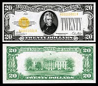 $20 Gold Certificate
Andrew Jackson -
 $50 Gold Certificate
Ulysses S. Grant


-
 $100 Gold Certificate
Benjamin Franklin -
 $500 Gold Certificate
William McKinley -
 $1,000 Gold Certificate
Grover Cleveland


-
 $5,000 Gold Certificate
James Madison -
 $10,000 Gold Certificate
Salmon P. Chase


- Support as nominator – Godot13 ( talk) 01:14, 16 October 2014 (UTC)
- Support 10k dollars? For me? Oh, you shouldn't have. — Crisco 1492 ( talk) 05:18, 16 October 2014 (UTC)
- Support — Never knew Salmon Chase (who?) was so important. Sca ( talk) 14:08, 16 October 2014 (UTC)
- Support J e e 04:56, 17 October 2014 (UTC)
- Support — per all above. Hafspajen ( talk) 12:30, 17 October 2014 (UTC)
Promoted File:US-$10-GC-1928-Fr-2400.jpg
Armbrust
The Homunculus 01:16, 26 October 2014 (UTC)
Promoted File:US-$20-GC-1928-Fr-2402.jpg
Armbrust
The Homunculus 01:16, 26 October 2014 (UTC)
Promoted File:US-$50-GC-1928-Fr-2404.jpg
Armbrust
The Homunculus 01:16, 26 October 2014 (UTC)
Promoted File:US-$100-GC-1928-Fr-2405.jpg
Armbrust
The Homunculus 01:16, 26 October 2014 (UTC)
Promoted File:US-$500-GC-1928-Fr-2407.jpg
Armbrust
The Homunculus 01:16, 26 October 2014 (UTC)
Promoted File:US-$1000-GC-1928-Fr-2408.jpg
Armbrust
The Homunculus 01:16, 26 October 2014 (UTC)
Promoted File:US-$5000-GC-1928-Fr-2410.jpg
Armbrust
The Homunculus 01:16, 26 October 2014 (UTC)
Promoted File:US-$10000-GC-1928-Fr-2411.jpg
Armbrust
The Homunculus 01:16, 26 October 2014 (UTC)
Midsummer Eve Bonfire on Skagen Beach
Voting period is over. Please don't add any new votes. Voting period ends on 26 Oct 2014 at 08:47:19 (UTC)

- Reason
- High quality scan of a notable artwork, useful for illustrating the people and styles of the movement as well.
- Articles in which this image appears
- Midsummer Eve Bonfire on Skagen Beach, Skagen Painters, List of paintings by Peder Severin Krøyer, Marie Krøyer, P.S. Krøyer's paintings of Marie, Peder Severin Krøyer
- FP category for this image
- Wikipedia:Featured pictures/Artwork/Paintings
- Creator
- P.S. Krøyer
- Support as nominator – — Crisco 1492 ( talk) 08:47, 16 October 2014 (UTC)
- Support High quality scan. Looks good to me. Jim Carter 09:45, 16 October 2014 (UTC)
- Support Looks good to me too. Hafspajen ( talk) 11:51, 16 October 2014 (UTC)
- Support — Nicely done, could/should be added to Midsummer. (But ... no witch-burning?) Sca ( talk) 14:04, 16 October 2014 (UTC)
- Support — Don't know if they're witches, but those two standing downwind are going to get plenty of holes in their clothes. Xanthomelanoussprog ( talk) 08:57, 17 October 2014 (UTC)
- Alfvén's standing by the boat, looking very pensive- she's got a (quite attractive) self-satisfied smirk. Don't know who the other two are. There's some great character painting in this.
Xanthomelanoussprog (
talk) 22:47, 20 October 2014 (UTC)
- Did you mean the guy with the beard and the hat? That's Holger Drachmann with his wife Soffi. Krøyer probably wanted to singe him a bit too (beard envy).
Belle (
talk) 22:54, 20 October 2014 (UTC)
- Yes, that's him, with his weird right hand (assuming it is his hand!). Xanthomelanoussprog ( talk) 23:14, 20 October 2014 (UTC)
- Did you mean the guy with the beard and the hat? That's Holger Drachmann with his wife Soffi. Krøyer probably wanted to singe him a bit too (beard envy).
Belle (
talk) 22:54, 20 October 2014 (UTC)
- Alfvén's standing by the boat, looking very pensive- she's got a (quite attractive) self-satisfied smirk. Don't know who the other two are. There's some great character painting in this.
Xanthomelanoussprog (
talk) 22:47, 20 October 2014 (UTC)
Promoted File:Midsummer Eve bonfire on Skagen's beach - P.S. Krøyer - Google Cultural Institute.jpg -- Armbrust The Homunculus 08:48, 26 October 2014 (UTC)
Yellow-billed shrike
Voting period is over. Please don't add any new votes. Voting period ends on 26 Oct 2014 at 09:41:02 (UTC)

- Reason
- File is 3,248 × 4,880 pixels, High quality, very unique, file is free, used as the main picture of the article Yellow-billed shrike, No image of similar quality exists.
- Articles in which this image appears
- Yellow-billed shrike
- FP category for this image
- Wikipedia:Featured pictures/Animals/Birds
- Creator
- Summet Moghe
- Support as nominator – Jim Carter 09:41, 16 October 2014 (UTC)
- Support - very nice. Xanthomelanoussprog ( talk) 11:35, 16 October 2014 (UTC)
- Support - awesome -- Ebertakis ( talk) 22:25, 16 October 2014 (UTC)
- Support - well, it is interesting that small - snake ? he/she caught. Hafspajen ( talk) 23:38, 16 October 2014 (UTC)
- Yeah, it would be interesting if the thing it's eating could be identified.
86.130.66.135 (
talk) 22:01, 18 October 2014 (UTC)
- As far I know, @86.130 it is a huge
Earthworm.
Jim Carter (from public cyber) 05:34, 19 October 2014 (UTC)
- I thought that when I first looked at the small-scale picture. However, when you zoom right in close, the animal's skin texture and pattern does not look like that of an earthworm, at least not any earthworm that I'm familiar with, and it does not appear to be segmented, which I believe all earthworms are. It does look more reptilian to me, although I'm not sure at all.
81.152.70.154 (
talk) 19:55, 19 October 2014 (UTC)
- The skin texture and pattern are similar to those of legless lizards. My best bet so far is
this species, but I'm no expert either. --
Ebertakis (
talk) 20:45, 20 October 2014 (UTC)
- Hmm. Good search!
Ebertakis but
Eastern worm snakes are found mainly in the US but Yellow billed shrike is an African/South east Asian bird. :-/
Jim Carter (from public cyber) 03:09, 21 October 2014 (UTC)
- Darn! I don't suppose the yellow billed shrike migrates, does it? -- Ebertakis ( talk) 20:57, 21 October 2014 (UTC)
- I am fairly certain that this is a snake in the family Typhlopidae or Leptotyphlopidae. Shyamal ( talk) 06:26, 27 October 2014 (UTC)
- Hmm. Good search!
Ebertakis but
Eastern worm snakes are found mainly in the US but Yellow billed shrike is an African/South east Asian bird. :-/
Jim Carter (from public cyber) 03:09, 21 October 2014 (UTC)
- The skin texture and pattern are similar to those of legless lizards. My best bet so far is
this species, but I'm no expert either. --
Ebertakis (
talk) 20:45, 20 October 2014 (UTC)
- I thought that when I first looked at the small-scale picture. However, when you zoom right in close, the animal's skin texture and pattern does not look like that of an earthworm, at least not any earthworm that I'm familiar with, and it does not appear to be segmented, which I believe all earthworms are. It does look more reptilian to me, although I'm not sure at all.
81.152.70.154 (
talk) 19:55, 19 October 2014 (UTC)
- As far I know, @86.130 it is a huge
Earthworm.
Jim Carter (from public cyber) 05:34, 19 October 2014 (UTC)
- Yeah, it would be interesting if the thing it's eating could be identified.
86.130.66.135 (
talk) 22:01, 18 October 2014 (UTC)
- Support Great shot. — Crisco 1492 ( talk) 01:05, 17 October 2014 (UTC)
Promoted File:Yellow billed shrike with prey.jpg -- Armbrust The Homunculus 09:42, 26 October 2014 (UTC)
Franz Lehár
Voting period is over. Please don't add any new votes. Voting period ends on 27 Oct 2014 at 02:22:38 (UTC)

- Reason
- There was, unfortunately, a period between the long exposure cameras and the faster cameras that allowed a bit less freezing in place when images were fast - but very grainy. As far as I can tell, this comes from that period. However, it's an expressive image, it's good for the period, and, frankly, there don't seem to be many photographs of him that are particularly good. This is probably the best.
- Articles in which this image appears
- Franz Lehár + his operas [the latter as part of a template at the start of each]
- FP category for this image
- Wikipedia:Featured pictures/People/Entertainment, I believe
- Creator
- Bain News Service; restoration by Adam Cuerden
- Support as nominator – Adam Cuerden ( talk) 02:22, 17 October 2014 (UTC)
- Support - Useful, and I agree that it's better than most images of him. — Crisco 1492 ( talk) 05:47, 17 October 2014 (UTC)
- Support Platinum print (thought it was a lithograph at first, but the dark areas appear to be integrated into the paper grain). Xanthomelanoussprog ( talk) 07:08, 17 October 2014 (UTC)
- Support - Oh, not Lehár of all people, how did you found him? The operette King. Hafspajen ( talk) 12:27, 17 October 2014 (UTC)
- @ Hafspajen: I just saw Der Graf von Luxemburg a few days ago - a joy from start to finish - and searched around to see if there was anything good for him. This was hiding on the Library of Congress. =) Adam Cuerden ( talk) 12:39, 17 October 2014 (UTC)
- Support — May be grainy but the expression is good, and Lehár is an interesting figure historically. Sca ( talk) 15:36, 17 October 2014 (UTC)
- If it is a Platinum print then the grain is the paper base. Xanthomelanoussprog ( talk) 18:46, 17 October 2014 (UTC)
Promoted File:Bain News Service - Franz Lehár.jpg -- Armbrust The Homunculus 02:39, 27 October 2014 (UTC)
Timeline of the universe
Voting period is over. Please don't add any new votes. Voting period ends on 27 Oct 2014 at 06:19:28 (UTC)

- Reason
- Interesting and informative image
- Articles in which this image appears
- Chronology of the universe, Metric expansion of space, Time, and others
- FP category for this image
- Wikipedia:Featured pictures/Space/Understanding
- Creator
- NASA/ Wilkinson Microwave Anisotropy Probe team, modified by Kaldari
- Support as nominator – Pine ✉ 06:19, 17 October 2014 (UTC)
- Comment If I understand the Big Bang expansion correctly, it should be presented rather as an expanding sphere, not as a one-direction tube-shaped pattern. Also, the letters after the first word in labels like "Quantum Fluctuations", "Development of Galaxies...", "Dark Energy Accelerated Expansion", etc should be decapitalized.
Brandmeister
talk 11:05, 17 October 2014 (UTC)
- It's pretty standard to reduce the three spacial dimensions to a simplified two when trying to show time or another scalar value over them. Think of the rubber sheet model of gravity - it loses Z-axis to use it for something else. Likely, most depictions of the light cone either reduce distance in space to one signed value, or show two-dimensional space. It's standard. While you could show this as a series of spheres or spheres inside each other, you'd probably end up showing less information, as you'd lose the smoothness of the time axis, as well as making it harder to see what's happening. Adam Cuerden ( talk) 22:54, 17 October 2014 (UTC)
- Support Pretty sure I saw this on a book cover recently. The cup shape is because inflation makes the bottom thick, then expansion slowed. Time progresses left to right. I don't think we should decapitalize the titles - if it were designed by a Wikipedian, yes, but it's a valid convention. Adam Cuerden ( talk) 12:44, 17 October 2014 (UTC)
- Support--Brandmeister had it wrong to say about the shape. You can't show the acceleration of dark matter in a sphere. Plus there isn't any alternative way to represent the theory (though I don't believe it). -- The herald 15:27, 17 October 2014 (UTC)
- Support -- Fauzan ✆ talk ✉ mail 14:29, 19 October 2014 (UTC)
Support -- Marinka van Dam ( talk) 17:02, 19 October 2014 (UTC)- Vote from sock puppet violating a block has been removed. — Crisco 1492 ( talk) 01:14, 25 October 2014 (UTC)
- Question What's the "lens flare" at the beginning represent? Or is it just inspired by J.J. Abrams? Presumably quantum fluctuations don't emit anything backwards into the nothingness of nothing. Belle ( talk) 10:41, 20 October 2014 (UTC)
- I've got no idea either- what does it (and the orange ring) represent?
Xanthomelanoussprog (
talk) 07:46, 21 October 2014 (UTC)
- As from this file, I think its the big bang (and the associated bursts) and the space shows (IMO) the lag between inflation and the bang. But still doubt about the orange thermal rings. -- The herald 13:07, 23 October 2014 (UTC)
- I've got no idea either- what does it (and the orange ring) represent?
Xanthomelanoussprog (
talk) 07:46, 21 October 2014 (UTC)
- Support - Thanks for the explanation. Xanthomelanoussprog ( talk) 17:28, 23 October 2014 (UTC)
Promoted File:CMB Timeline300 no WMAP.jpg -- Armbrust The Homunculus 13:27, 27 October 2014 (UTC)
St. Peter and St. Paul's Church, Vilnius (set)
Voting period is over. Please don't add any new votes. Voting period ends on 27 Oct 2014 at 15:34:37 (UTC)
- St Peter and St Paul's Church, Vilnius
-
 Looking east towards the altar
 -
 Looking west towards the entrance
 -
 The altar
 -
 The ceiling


- Reason
- If this set doesn't get the required support, I promise, I'll never nominate another set again. ;-) I think this set could be the strongest candidate of mine so far. It's a series of four images taken inside the St. Peter and St. Paul's Church in Vilnius and each image features a different view of the intricate stucco reliefs in this amazing Baroque church. All four are very high resolution, architecturally correct images of the interior.
- Articles in which this image appears
- St. Peter and St. Paul's Church, Vilnius (also one of the images is used in Baroque architecture)
- FP category for this image
- Wikipedia:Featured pictures/Places/Interiors
- Creator
- User:Diliff
- Support as nominator – Ðiliff «» (Talk) 15:34, 17 October 2014 (UTC)
- Support -- Safedi tujhe salam (from Hindi- Whiteness, I salute thee) Damnn white..--- The herald 15:54, 17 October 2014 (UTC)
- Support - Absolutely solid set. — Crisco 1492 ( talk) 16:08, 17 October 2014 (UTC)
- Support Pure white galore and, behold, the immaculate conception of a featurable set :) Brandmeister talk 17:19, 17 October 2014 (UTC)
- Support Hafspajen ( talk) 18:33, 17 October 2014 (UTC)
- Support — Excllnt views — I've been there and the effect is indeed breathtaking. Sca ( talk) 23:58, 17 October 2014 (UTC)
- Support Xanthomelanoussprog ( talk) 07:51, 18 October 2014 (UTC)
- Support: Thank you. Fylbecatulous talk 13:54, 18 October 2014 (UTC)
- Support White gold. Saffron Blaze ( talk) 00:17, 19 October 2014 (UTC)
- Support I thought I was looking at snow. ///EuroCar GT 15:11, 19 October 2014 (UTC)
- Support - Stunning... -- Godot13 ( talk) 18:20, 19 October 2014 (UTC)
- Support Lovely, but please go back when they've finished colouring it in and get another shot (assuming they haven't gone over the lines with the crayons). Belle ( talk) 10:29, 20 October 2014 (UTC)
- Support. As I did at Commons. Daniel Case ( talk) 19:26, 21 October 2014 (UTC)
- Support - OK...wow.-- Mark Miller ( talk) 20:49, 25 October 2014 (UTC)
Promoted File:St. Peter and St. Paul's Church 1, Vilnius, Lithuania - Diliff.jpg
Armbrust
The Homunculus 15:35, 27 October 2014 (UTC)
Promoted File:St. Peter and St. Paul's Church 2, Vilnius, Lithuania - Diliff.jpg
Armbrust
The Homunculus 15:35, 27 October 2014 (UTC)
Promoted File:St. Peter and St. Paul's Church 3, Vilnius, Lithuania - Diliff.jpg
Armbrust
The Homunculus 15:35, 27 October 2014 (UTC)
Promoted File:St. Peter and St. Paul's Church Ceiling, Vilnius, Lithuania - Diliff.jpg
Armbrust
The Homunculus 15:35, 27 October 2014 (UTC)
Bonaparte devant le Sphinx
Voting period is over. Please don't add any new votes. Voting period ends on 27 Oct 2014 at 15:50:40 (UTC)

- Reason
- High ev and quality image from Jean-Léon Gérôme. I first thought it was a photograph!!!!
- Articles in which this image appears
- Napoleon, Great Sphinx of Giza, mainly
- FP category for this image
- Wikipedia:Featured pictures/Artwork/Paintings and/or Wikipedia:Featured pictures/People/Royalty and nobility
- Creator
- Jean-Léon Gérôme
- Support as nominator – The herald 15:50, 17 October 2014 (UTC)
- Oppose - Wayyyyyyyyyyyyyyyyyyyyyyyyyyyyyyyyyyyyyyyyyy too many compression artefacts. One does not simply put 2000*1500px in a 150kb file and expect it to be good. — Crisco 1492 ( talk) 16:07, 17 October 2014 (UTC)
- Oppose- The stripy shadow in the lower left corner is probably an example. Xanthomelanoussprog ( talk) 21:43, 18 October 2014 (UTC)
Not Promoted -- Armbrust The Homunculus 15:51, 27 October 2014 (UTC)
Madonna with the Blue Diadem
Voting period is over. Please don't add any new votes. Voting period ends on 28 Oct 2014 at 00:04:47 (UTC)

- Reason
- Very high quality scan, notable painting and artist.
- Articles in which this image appears
- Madonna with the Blue Diadem, Gianfrancesco Penni
- FP category for this image
- Wikipedia:Featured pictures/Artwork/Paintings
- Creator
- Raphael and Gianfrancesco Penni
- Support as nominator – — Crisco 1492 ( talk) 00:04, 18 October 2014 (UTC)
- Support – Gorgious and notable painting, high quality giant scan, one can see the surface of the painting and each and every little crack and brushwork. The blue colour is holdig together the sky, the garments and the textile under the Child. And before somebody starts arguing, paintings in the Renaissance were often painted by several old masters, that cooperated in workshops - that is not an issue. Not here not anywhere, that's usual standard procedure throug the Renaissance and also art history, see at Atelier. Hafspajen ( talk) 12:43, 18 October 2014 (UTC)
- Support - Did not expect the image to be so detailed.... Tokugawapants ( talk) 10:19, 23 October 2014 (UTC)
- Support – That's lovely. SagaciousPhil - Chat 15:50, 23 October 2014 (UTC)
- Support per above. Samsara ( FA • FP) 08:11, 24 October 2014 (UTC)
Promoted File:La Vierge au voile, by Raffaello Sanzio, from C2RMF retouched.jpg -- Armbrust The Homunculus 02:24, 28 October 2014 (UTC)
Exchequer note, 5 pounds, Kingdom of England (1697)
Voting period is over. Please don't add any new votes. Voting period ends on 28 Oct 2014 at 03:23:31 (UTC)
.jpg)
- Reason
- High EV and Quality
- Articles in which this image appears
- Exchequer, History of the English fiscal system
- FP category for this image
- Currency
- Creator
- By Act of the
Parliament of England.
From the National Numismatic Collection, National Museum of American History, Smithsonian Institution.
Image by Godot13.
- Support as nominator – Godot13 ( talk) 03:23, 18 October 2014 (UTC)
- Support - 300-year-old exchequer notes don't come up every day. Very useful (I was snooping your contributions and had half a mind to nominate this myself, but now I see you got to it first) — Crisco 1492 ( talk) 03:39, 18 October 2014 (UTC)
- Support Exceptional quality image and useful as a historical reference. Good encyclopedic value. -- Gwillhickers ( talk) 05:31, 18 October 2014 (UTC)
- Support — Historical EV, quality image. Sca ( talk) 14:47, 18 October 2014 (UTC)
- Support — per Sca, Hafspajen ( talk) 21:56, 18 October 2014 (UTC)
- Support Xanthomelanoussprog ( talk) 22:00, 21 October 2014 (UTC)
Promoted File:Kingdom of England Exchequer note-5 Pounds (1697).jpg -- Armbrust The Homunculus 03:24, 28 October 2014 (UTC)
Registration card, Japanese occupation of the Dutch East Indies
Voting period is over. Please don't add any new votes. Voting period ends on 28 Oct 2014 at 03:37:55 (UTC)

- Reason
- High resolution scan of a historical registration card, for a notable person, with great encyclopedic value
- Articles in which this image appears
- Japanese occupation of the Dutch East Indies, Pah Wongso
- FP category for this image
- Wikipedia:Featured pictures/History/World War II
- Creator
- Japanese occupation government; scan by the National Archives of the Netherlands
- Support as nominator – — Crisco 1492 ( talk) 03:37, 18 October 2014 (UTC)
- Support Original records such as this (e.g., connected to the subject of an article and illustrative of an important process in the history of the Dutch East Indies) are important.-- Godot13 ( talk) 14:04, 18 October 2014 (UTC)
- Support, per Godot13 -- such documents have invaluable historical and encyclopedic application. Nice image btw. -- Gwillhickers ( talk) 17:56, 20 October 2014 (UTC)
- Support J e e 02:46, 22 October 2014 (UTC)
- Support: exceptional value per nom. Fylbecatulous talk 16:34, 22 October 2014 (UTC)
Promoted File:Pah Wongso's Japanese occupation registration card.jpg -- Armbrust The Homunculus 03:38, 28 October 2014 (UTC)
Tuterei Karewa
Voting period is over. Please don't add any new votes. Voting period ends on 28 Oct 2014 at 03:57:09 (UTC)

- Reason
- High res image from the Google Art Project. High EV for own bio and example of these Maori face markings in a photographic setting.
- Articles in which this image appears
- Tuterei Karewa, Tā moko
- FP category for this image
- Wikipedia:Featured_pictures/People/Traditional_dress, Wikipedia:Featured pictures/Culture, entertainment, and lifestyle
- Creator
- Arthur James Iles (1870—1943), photographer. Scan provided by Google Cultural Institute.
- Support as nominator – I, JethroBT drop me a line 03:57, 18 October 2014 (UTC)
- Comment - Could use restoration. What are the Maori views on photographs of deceased ancestors? I understand that the Australian Aborigines are highly against it. — Crisco 1492 ( talk) 11:58, 18 October 2014 (UTC)
- @
Crisco 1492: Good question. I've checked a couple of sources that might have discussed issues regarding deceased ancestors such as
this law commission paper on Maori custom and law, and
this guide on funerals from the Maori Language Commission, but they do not mention any prohibitions. I do know that this particular photo is on display at the
Museum Victoria.
I, JethroBT
drop me a line 18:52, 18 October 2014 (UTC)
- Alright, thanks. Restoration would still be nice. — Crisco 1492 ( talk) 01:03, 19 October 2014 (UTC)
- @
Crisco 1492: Good question. I've checked a couple of sources that might have discussed issues regarding deceased ancestors such as
this law commission paper on Maori custom and law, and
this guide on funerals from the Maori Language Commission, but they do not mention any prohibitions. I do know that this particular photo is on display at the
Museum Victoria.
I, JethroBT
drop me a line 18:52, 18 October 2014 (UTC)
- @ Crisco 1492: I don't have any experience in photo restoration, but I agree with you, and so I decided to learn the basics and apply them here. It's not perfect, but I figured it's a start. I tried to remove some of the most prominent scratches, stray marks, and some folding marks on the photograph. I also considered cropping a bit off the top, but I was on the fence about it. Is there too much space at the top? I, JethroBT drop me a line 22:07, 20 October 2014 (UTC)
Support-- Marinka van Dam ( talk) 12:45, 20 October 2014 (UTC)- Weak oppose since the image has been altered by the original photographer how can we be sure his touch up work is accurate? Seems less than encyclopedic. Nice image though. I gave a weak oppose as I could be talked into it if another had a good argument.-- Mark Miller ( talk) 07:14, 24 October 2014 (UTC)
- @
Mark Miller: The description on
this source says:
The moko appears to have been enhanced by the photographer for aesthetic emphasis, a common practice in studio portraiture of this type.
- So, whatever process he used appears to have been fairly standard.
I, JethroBT
drop me a line 07:33, 24 October 2014 (UTC)
- I understand that. I have a number of these old images myself (not of Maori) and am also an old school photographer, taught how to use film cameras, develop the film, print the photos using light processing in a dark room and how to touch up the photos. From my experience with these touch up products, the image can be altered drastically. In looking closely at the touch up work here, it becomes difficult to tell where the originating line of the tattoos end and the touch up begins....but you can clearly see the brush strokes. I suppose if there were at least one other image of the subject without the touch up work to see that tattoos that might help. --
Mark Miller (
talk) 18:46, 24 October 2014 (UTC)
- OK, looking at other images and looking closer at this one, it appears the tattoos on the chin have been altered
and simplified.-- Mark Miller ( talk) 18:49, 24 October 2014 (UTC)- @
Mark Miller:What other images did you look at?
This is another photograph of the subject, taken from the front.
I, JethroBT
drop me a line 19:45, 24 October 2014 (UTC)
- It appears that the photographer of the FPC altered the chin tattoo drastically from the additional image you provided. The original image is large enough to see a good portion of the tattoo in the photo nominated has indeed been touched up a great deal and is no longer an accurate depiction of the subject. Sad, because the photo is excellent.--
Mark Miller (
talk) 19:56, 24 October 2014 (UTC)
- @
Mark Miller: Curses, I didn't notice the chin while cleaning it up. I'll let others decide on whether this kind of manipulation is acceptable or not; that said, it's very frustrating to me that Iles would change the markings on the chin in this manner.
I, JethroBT
drop me a line 20:29, 24 October 2014 (UTC)
- I assume that the photographer developed the photograph itself once he returned to his lab and was nowhere near the subject and just did what he thought would be good enough. And yeah...curses indeed! It is truly frustrating to see such fantastic and historic images manipulated in this manner today. it takes away so much.-- Mark Miller ( talk) 23:00, 24 October 2014 (UTC)
- @
Mark Miller: Curses, I didn't notice the chin while cleaning it up. I'll let others decide on whether this kind of manipulation is acceptable or not; that said, it's very frustrating to me that Iles would change the markings on the chin in this manner.
I, JethroBT
drop me a line 20:29, 24 October 2014 (UTC)
- It appears that the photographer of the FPC altered the chin tattoo drastically from the additional image you provided. The original image is large enough to see a good portion of the tattoo in the photo nominated has indeed been touched up a great deal and is no longer an accurate depiction of the subject. Sad, because the photo is excellent.--
Mark Miller (
talk) 19:56, 24 October 2014 (UTC)
- @
Mark Miller:What other images did you look at?
This is another photograph of the subject, taken from the front.
I, JethroBT
drop me a line 19:45, 24 October 2014 (UTC)
- OK, looking at other images and looking closer at this one, it appears the tattoos on the chin have been altered
- I understand that. I have a number of these old images myself (not of Maori) and am also an old school photographer, taught how to use film cameras, develop the film, print the photos using light processing in a dark room and how to touch up the photos. From my experience with these touch up products, the image can be altered drastically. In looking closely at the touch up work here, it becomes difficult to tell where the originating line of the tattoos end and the touch up begins....but you can clearly see the brush strokes. I suppose if there were at least one other image of the subject without the touch up work to see that tattoos that might help. --
Mark Miller (
talk) 18:46, 24 October 2014 (UTC)
- @
Mark Miller: The description on
this source says:
Not Promoted -- Armbrust The Homunculus 03:58, 28 October 2014 (UTC)
Gulf fritillary feeding on passion flower
Voting period is over. Please don't add any new votes. Voting period ends on 28 Oct 2014 at 05:25:45 (UTC)


- Reason
- Image clearly displays detail of Fritillary anatomy, what it feeds on (nectar from passion flowers), and how it feeds
- Articles in which this image appears
- Gulf fritillary
- FP category for this image
- Wikipedia:Featured pictures/Animals/Insects
- Creator
- Gwillhickers
- Support as nominator – Gwillhickers ( talk) 05:25, 18 October 2014 (UTC)
- Oppose – The light is too harsh and the flower patterns "pop" too much (perhaps most importantly, the stamens), thus distracting the viewer from the butterfly. I tried cropping it tight to get rid of the flower on the right, but that didn't help much. -- Ebertakis ( talk) 20:29, 20 October 2014 (UTC)
- The name of the file and the title here is Fritillary feeding on passion flower. Passion flowers are the mainstay for the Fritillary. The passion flower is almost as much part of the subject as is the butterfly and is what distinguishes this image from most other images of the Fritillary as was intended, so I would say "distracting" is somewhat a subjective claim, as the color of the Fritillary easily distinguishes it from the flowers. However I could subdue the color a bit as it is perhaps a little on the 'rich' side. -- Gwillhickers ( talk) 15:42, 21 October 2014 (UTC) -- (Done)
- Added note : The color of the Fritillary in real life is practically a florescent orange, esp in sunlight, and the Passion Flowers are white, which are also in the sunlight. I could further subdue the 'harsh' light, but doing so would detract from the real life appearance. --
Gwillhickers (
talk) 17:51, 21 October 2014 (UTC)
- I'm afraid the light quality cannot be improved by changing the colors. Think of the light "harshness" in terms of contrast: in this image, the camera sensor was overwhelmed by the brightness of the white flower petals and the darkness of the shadows, thus resulting in a high-contrast picture where all forms/patterns dominate the image. This is bad because taking the picture from above made the butterfly form overlap with the flower patterns, and the only thing that your eye has to go with is color. I tried to lighten up the shadows in the picture to make the light look more "even", but due to the high depth of field all I did was to bring up more patterns from the background (plant leaves) thus actually making the problem worse. You could get away with harsh light in a butterfly pic if you had a rather smooth background ( example) or (my preferred alternative) if you took the picture from the side. Usually this brings background distractions far away (and out-of-focus) while keeping the butterfly and the flower both sharp. Also, you then get a round or flat flower next to the roughly triangular form of a butterfly and you therefore get two distinct and separated shapes in the photo with no overlap. Having said all that I would welcome any feedback from the more experienced photographers that frequent this page both on the picture and on my comments! -- Ebertakis ( talk) 20:02, 21 October 2014 (UTC)
- Thanks for your insights and your willingness to be open to other comments. While what you've articulated is indeed food for thought I would only say that it is perhaps over emphasized in regards to this picture, which still has good composition and looks beautiful imo, while offering excellent detail of both Fritillary and Passion Flowers and also offers good scientific value, as it portrays butterfly anatomy, what it feeds on and how this is accomplished. I'm only hoping that any consideration of 'harsh' or less than perfect lighting isn't anything that will upstage all of these qualities. -- Gwillhickers ( talk) 21:23, 21 October 2014 (UTC)
Not Promoted -- Armbrust The Homunculus 13:31, 28 October 2014 (UTC)
Rebirth of Gulf Fritillary
Voting period is over. Please don't add any new votes. Voting period ends on 28 Oct 2014 at 06:32:36 (UTC)

- Reason
- Image shows clear detail of Gulf fritillary and its Chrysalis. Useful and educational
- Articles in which this image appears
- Gulf fritillary
- FP category for this image
- Wikipedia:Featured pictures/Animals/Insects
- Creator
- Gwillhickers
- Support as nominator – Gwillhickers ( talk) 06:32, 18 October 2014 (UTC)
- Oppose - Difficult shot, but this has a distracting background and what appears to be posterization. — Crisco 1492 ( talk) 10:30, 18 October 2014 (UTC)
- Re:Posterization. The underside of the wings of the Fritillary are very opaque, blotch-like and almost reflective in appearance, in real life. Is this what you're referring to? Re:Background. I could crop some of the background, esp the big leaf to the left. Would this help? --
Gwillhickers (
talk) 16:16, 18 October 2014 (UTC)
- That would help, but there is still too much DOF for the butterfly and chrysalis to really pop. — Crisco 1492 ( talk) 05:31, 19 October 2014 (UTC)
- Re:Posterization. The underside of the wings of the Fritillary are very opaque, blotch-like and almost reflective in appearance, in real life. Is this what you're referring to? Re:Background. I could crop some of the background, esp the big leaf to the left. Would this help? --
Gwillhickers (
talk) 16:16, 18 October 2014 (UTC)
- Comment - I like the photo, but the leaf is occupying nearly a third of the image, makes it a bit distracting... ///EuroCar GT 23:54, 18 October 2014 (UTC)
- @
EuroCarGT: The leaf is a bit much I suppose. I could crop the leaf and upgrade the image, if this is permissible.
Here is the upgraded image-- Would using this image involve a renomination? - @ Crisco 1492: Not sure what you mean by 'DOF', I'm assuming you're referring to the background, which overall is not nearly as bright as the butterfly at center. I don't quite see the dim background, leaves, as anything distracting -- ie. just leaves and a faded piece of wood. See the cropped version. -- Gwillhickers ( talk) 10:01, 19 October 2014 (UTC)
- DOF = depth of field. If you compare this with, say, Jkadavoor's shots ( another), the background is out of focus, allowing the butterfly to be in focus and the center of attention. — Crisco 1492 ( talk) 10:19, 19 October 2014 (UTC)
- Ah, there's your problem. You'd want a camera that can adjust the depth of field, rather than trying to get everything sharp. I used a Canon PowerShot for 5 years before upgrading, and let me tell you, it's a lot easier to get better shots when you go with even an entry-level DSLR. — Crisco 1492 ( talk) 14:23, 19 October 2014 (UTC)
- When my budget allows I'll have to buy a more capable photo-box. The Fuji was my first camera years ago, it was dropped one too many times and now it's history. -- I just upgraded the nominated photo with a cropped version of this same image, assuming there are no policy or other issues here. Will revert and renominate if required. -- Gwillhickers ( talk) 17:11, 19 October 2014 (UTC)
- No problems with changing with an alt, AFAIK. — Crisco 1492 ( talk) 02:02, 20 October 2014 (UTC)
- @
EuroCarGT: The leaf is a bit much I suppose. I could crop the leaf and upgrade the image, if this is permissible.
- Oppose - I hate to oppose this one because I like the moment, but the photo has noise and separation problems. The sharpness is not perfect either. -- Ebertakis ( talk) 20:14, 20 October 2014 (UTC)
Not Promoted -- Armbrust The Homunculus 13:31, 28 October 2014 (UTC)
Gulf Fritillaries mating
Voting period is over. Please don't add any new votes. Voting period ends on 28 Oct 2014 at 05:40:27 (UTC)

- Reason
- Scene very difficult to come by, much less capture on 'film'. Image is useful for its scientific and educational value
- Articles in which this image appears
- Gulf fritillary
- FP category for this image
- Wikipedia:Featured pictures/Animals/Insects
- Creator
- Umbris
- Support as nominator – Gwillhickers ( talk) 05:40, 18 October 2014 (UTC)
- Support. A fine image. Bit blurry thoug in the foreground. Hafspajen ( talk) 00:32, 19 October 2014 (UTC)
- Thanks. Bearing in mind that the butterflies are in focus, yes, the branch in the foreground is slightly out of focus, then comes into focus where the butterflies are lighting, and then continues on slightly out of focus again and exists the picture at right, which imo gives the image depth and adds to the overall composition. -- Gwillhickers ( talk) 09:10, 19 October 2014 (UTC)
- Support Nice but the BG needs a NR --
Muhammad
(talk) 11:27, 19 October 2014 (UTC)
- I can help, Gwillhickers, if you don't know how to do a noise reduction. — Crisco 1492 ( talk) 14:16, 19 October 2014 (UTC)
- In that case I turn into plain support.
Hafspajen (
talk) 14:28, 19 October 2014 (UTC)
- @ Crisco 1492 and Hafspajen: -- That would be great! Just so you know, I'm not using any special editing software on my end. i.e.I use Windows' Paint and also use XnView to handle sharpness, color saturation and hue when needed. -- Gwillhickers ( talk) 16:59, 19 October 2014 (UTC)
- Crisco is the man. Hafspajen ( talk) 18:56, 19 October 2014 (UTC)
- In that case I turn into plain support.
Hafspajen (
talk) 14:28, 19 October 2014 (UTC)
- Denoise supplied. Weak support as the DOF is a bit shallow, and the lower butterfly is somewhat OOF. — Crisco 1492 ( talk) 00:07, 20 October 2014 (UTC)
- Support The lower butterfly is not entirely in focus, but the pair stands at an angle to the camera, which makes the shot very difficult to get 100% right. The, uh, intimate moment capture makes up for the unfortunate OOF problem, IMHO. -- Ebertakis ( talk) 20:09, 20 October 2014 (UTC)
- Weak support - per Crisco.-- Godot13 ( talk) 04:52, 23 October 2014 (UTC)
- Support. Very interesting and useful image. Rreagan007 ( talk) 18:49, 25 October 2014 (UTC)
Promoted File:Gulf Fritillaries Mating 0019.jpg -- Armbrust The Homunculus 13:32, 28 October 2014 (UTC)
First Czechoslovakian banknote issue, 10 korun (1919, provisional)
Voting period is over. Please don't add any new votes. Voting period ends on 29 Oct 2014 at 04:19:15 (UTC)
.jpg)
- Reason
- High EV, High quality, rare.
The brief 1919 provisional issue of Czechoslovakian banknotes (less than five months) used a 1915 Austro-Hungarian Bank issue as its base. Affixing an adhesive stamp equal to 1/100 the value of the note (i.e., 1 koruna = 100 haleru) to the left front side served as validation of legal tender status in the Republic of Czechoslovakia. Following currency reform, the first regular issue banknotes were printed with a date of 15 April 1919. - Articles in which this image appears
- Banknotes of the Czechoslovak koruna (1919), Czechoslovak koruna (recent addition to both, low traffic articles, only image in each)
- FP category for this image
- Currency
- Creator
- Austro-Hungarian Bank and the Republic of Czechoslovakia
From the National Numismatic Collection, National Museum of American History, Smithsonian Institution.
Image by Godot13.
- Support as nominator – Godot13 ( talk) 04:19, 19 October 2014 (UTC)
- Support - Ooh, I like this one. — Crisco 1492 ( talk) 05:31, 19 October 2014 (UTC)
- Comment The uneven black space between the two notes is irritating my OCD ;) -- Muhammad (talk) 11:28, 19 October 2014 (UTC)
- Support — Historically intriguing, partly for the language/minority issues that plagued this part of Europe for so long. Sca ( talk) 14:00, 19 October 2014 (UTC)
- Support - why is the upper banknote written in Hungarian while the lower is in German? I know Hungarians say korona to Swedish kronas. Hafspajen ( talk) 14:46, 19 October 2014 (UTC)
- German and Hungarian were the two official languages of Austria-Hungary, which originally issued this banknote — and where seven or eight other languages were spoken. This is a temporary adaptation of an old A-H note by the newly formed Czechoslovak Republic (where Czech/Slovak and German were the main languages at the time). Sca ( talk) 15:15, 19 October 2014 (UTC)
- Support - I too noticed the uneven black lines but the historical importance and overall quality of the image have mooted that concern, especially with the explanation about the uneven cut. A fascinating photo of an era of transition. Jus da fax 21:40, 19 October 2014 (UTC)
- Support - per Haf's question the note has the denomination in ten languages (2 main and 8 subsidiary)- Czech, Polish, Russian, Italian, Croat?, Slovene?, Bulgarian and Romanian. But not Serbian… Xanthomelanoussprog ( talk) 07:25, 20 October 2014 (UTC)
Promoted File:CZE-1-Republika Ceskoslovenska-10 Korun (1919, Provisional issue).jpg -- Armbrust The Homunculus 13:27, 29 October 2014 (UTC)
First Netherlands Indies gulden
Voting period is over. Please don't add any new votes. Voting period ends on 29 Oct 2014 at 12:16:33 (UTC)
-1-Dutch_Administration-1_Gulden_(1815).jpg)
- Reason
- Another lovely scan of an old banknote from the Smithsonian, by our very own Godot13. This note, with a face value of one gulden, was issued in 1815. The text is in both Dutch and Jawi, for both the Dutch and indigene inhabitants of the Indies. Note that the obverse is blank, and is thus not included.
- Articles in which this image appears
- Netherlands Indies gulden
- FP category for this image
- Wikipedia:Featured pictures/Culture, entertainment, and lifestyle/Currency
- Creator
- Kingdom of the Netherlands, scanned by Godot13 from the National Numismatic Collection at the Smithsonian Institution
- Support as nominator – — Crisco 1492 ( talk) 12:16, 19 October 2014 (UTC)
- Support - insanely rare (particularly as an issued, circulated note)...-- Godot13 ( talk) 01:31, 20 October 2014 (UTC)
- Support per nom -- Muhammad (talk) 06:55, 20 October 2014 (UTC)
- Support J e e 02:44, 22 October 2014 (UTC)
- Support Hafspajen ( talk) 11:10, 24 October 2014 (UTC)
Promoted File:IND-(NethEastInd)-1-Dutch Administration-1 Gulden (1815).jpg -- Armbrust The Homunculus 13:27, 29 October 2014 (UTC)
Ravished Armenia Full Length Film
Voting period is over. Please don't add any new votes. Voting period ends on 29 Oct 2014 at 19:27:16 (UTC)
- Reason
- The quality may not be perfect since it's a movie of about 100 years old but it is exceptionally high in terms of EV. Ravished Armenia, also known as Auction of Souls, is an American film based on the autobiographical book Ravished Armenia by Aurora Mardiganian, who also played the lead role in the film. The movie has been digitally remastered and provides a historical pretext to the Armenian Genocide and of the movie itself. This is a full length movie and is of great historical significance. Also, it appears the the movie is of better quality when played directly from commons. If there's a way we can align it with commons that'll be great.
- Articles in which this image appears
- Ravished Armenia (film), Armenian Genocide
- FP category for this image
- Wikipedia:Featured pictures/Culture, entertainment, and lifestyle/Entertainment
- Creator
- American Committee for Armenian and Syrian Relief
- Support as nominator – Étienne Dolet ( talk) 19:27, 19 October 2014 (UTC)
Support -- Marinka van Dam ( talk) 22:08, 19 October 2014 (UTC)- Vote from sock puppet violating a block has been removed. Armbrust The Homunculus 01:32, 25 October 2014 (UTC)
- Comment - I believe Archive.org has a higher resolution version of this film. — Crisco 1492 ( talk) 00:42, 20 October 2014 (UTC)
- Comment
Crisco 1492 (
talk ·
contribs) I think it's the best format available. There are other formats available, however we need to keep in mind the 100 mb limit in Wikimedia Commons. Unless you can a good idea on picking out a better quality version. I'd love to here it.
Étienne Dolet (
talk) 04:47, 20 October 2014 (UTC)
- There have been ways around the 100mb limit for more than two years. The current limit is 1 gig, if you're using batched uploads. I've nominated several files of more than 100mb already. —
Crisco 1492 (
talk) 05:19, 20 October 2014 (UTC)
- Looking at this, I don't see how this can be PD. The captions are clearly not original to the film, and the score can't be either. The first two minutes is an explanatory crawl clearly written for the 2009 restoration. All of these can be copyrighted by the restorationist. — Crisco 1492 ( talk) 00:35, 21 October 2014 (UTC)
- There have been ways around the 100mb limit for more than two years. The current limit is 1 gig, if you're using batched uploads. I've nominated several files of more than 100mb already. —
Crisco 1492 (
talk) 05:19, 20 October 2014 (UTC)
- I disagree and this topic discussion must take place at commons.
Étienne Dolet (
talk) 01:01, 21 October 2014 (UTC)
- I never said it shouldn't, but the voters here have the right to know that there may be copyright issues. — Crisco 1492 ( talk) 02:16, 21 October 2014 (UTC)
- I disagree and this topic discussion must take place at commons.
Étienne Dolet (
talk) 01:01, 21 October 2014 (UTC)
- Oppose as a likely (though inadvertent) copyright violation. — Crisco 1492 ( talk) 02:16, 21 October 2014 (UTC)
Not Promoted -- Armbrust The Homunculus 19:30, 29 October 2014 (UTC)
Léal Souvenir
Voting period is over. Please don't add any new votes. Voting period ends on 30 Oct 2014 at 01:49:06 (UTC)

- Reason
- High resolution, good scan, article is in good shape.
- Articles in which this image appears
- Léal Souvenir
- FP category for this image
- Wikipedia:Featured pictures/Artwork/Paintings
- Creator
- Jan van Eyck
- Support as nominator – — Crisco 1492 ( talk) 01:49, 20 October 2014 (UTC)
- Comment It's a Yorck Project image, which puts me in "highly doubtful" territory to start: I haven't seen a Yorck Project scan yet that had decent colours.
Adam Cuerden (
talk) 03:11, 20 October 2014 (UTC)
- Where does it say that this version is a Yorck scan? Their travesty is at
File:Jan van Eyck 092.jpg. This looks very similar, if not the same as, the NG's scan (see full resolution there), and the metadata includes the NG's copyright information. —
Crisco 1492 (
talk) 05:22, 20 October 2014 (UTC)
- My apologies. Support. Adam Cuerden ( talk) 07:15, 20 October 2014 (UTC)
- Where does it say that this version is a Yorck scan? Their travesty is at
File:Jan van Eyck 092.jpg. This looks very similar, if not the same as, the NG's scan (see full resolution there), and the metadata includes the NG's copyright information. —
Crisco 1492 (
talk) 05:22, 20 October 2014 (UTC)
Support -- Marinka van Dam ( talk) 12:43, 20 October 2014 (UTC)- Vote from sock puppet violating a block has been removed. Armbrust The Homunculus 01:33, 25 October 2014 (UTC)
- Support-- Godot13 ( talk) 04:57, 23 October 2014 (UTC)
- Support- Hafspajen ( talk) 23:17, 23 October 2014 (UTC)
- Support Quite realistic for the 15th century. Brandmeister talk 08:47, 25 October 2014 (UTC)
- Support Nice image. Rreagan007 ( talk) 18:51, 25 October 2014 (UTC)
Promoted File:Jan van Eyck - Léal Souvenir - National Gallery, London.jpg -- Armbrust The Homunculus 03:12, 30 October 2014 (UTC)
Cuban banknotes (made in the USA)
Voting period is over. Please don't add any new votes. Voting period ends on 30 Oct 2014 at 20:14:01 (UTC)
- Reason
- High quality, high EV.
Cuban silver certificates were designed, engraved, and printed by the US Treasury’s Bureau of Engraving and Printing from 1934 to 1949. Illustrated below are the major design and approval points in the BEP production of Series 1936 Cuban paper currency. First produced and approved as artwork (see Series 1934), the design evolves into progress proofs with the addition of overprints (in this case the use of denomination-specific tints). When the certified proof (and any other overprints) are approved, the banknote moves into production. The Series 1936 progress proof is paired with the original artist proof reverse, as the back design remained the same for the duration of the printing. There has been no restoration whatsoever (other than cropping and adjusting color) as these are part of the BEP archive housed in the National Numismatic Collection.
Each front and back image are separate, as all of these objects are uniface. - Original
- A complete set of mixed artist proofs, progress proofs, and certified proofs for the Series 1936 Cuban silver certificate, designed, engraved, and produced by the US Bureau of Engraving and Printing (24 items).
- Articles in which this image appears
- Silver certificate (Cuba) (all), Máximo Gómez, Carlos Manuel de Céspedes y Quesada, Antonio Maceo Grajales, Calixto García, Francisco Vicente Aguilera, Coat of arms of Cuba
- FP category for this image
- Currency
- Creator
-
Bureau of Engraving and Printing
From the National Numismatic Collection, NMAH, Smithsonian Institution.
Images by Godot13.
| Value | Artist/progress proofs | Certified proofs | Portrait [n 2] |
|---|---|---|---|
| 1 peso |
_one_silver_peso,_1936_(CUB-69b).jpg)
|
José Martí Engraved by William Ford | |
_one_silver_peso,_1930s_(CUB-69-reverse).jpg)
| |||
| 5 pesos |
_five_silver_pesos,_1936_(CUB-70b).jpg)
|
Máximo Gómez Engraved by William Ford | |
_five_silver_pesos,_1930s_(CUB-70-reverse).jpg)
| |||
| 10 pesos |
_10_silver_pesos,_1936_(CUB-71b).jpg)
|
Carlos Manuel de Céspedes Engraved by Sydney Smith | |
_10_silver_pesos,_1930s_(CUB-71-reverse).jpg)
| |||
| 20 pesos |
_20_silver_pesos,_1936_(CUB-72b).jpg)
|
Antonio Maceo Grajales Engraved by Elie Loizeaux | |
_20_silver_pesos,_1930s_(CUB-72-reverse).jpg)
| |||
| 50 pesos |
_50_silver_pesos,_1936_(CUB-73b).jpg)
|
Calixto García Engraved by Leo Kauffmann | |
_50_silver_pesos,_1930s_(CUB-73-reverse).jpg)
| |||
| 100 pesos |
_100_silver_pesos,_1936_(CUB-74b).jpg)
|
Francisco Vicente Aguilera Engraved by William Ford | |
_100_silver_pesos,_1930s_(CUB-74-reverse).jpg)
|
_one_silver_peso,_1936_(CUB-69b).jpg)
_one_silver_peso,_1930s_(CUB-69-reverse).jpg)
_five_silver_pesos,_1936_(CUB-70b).jpg)
_five_silver_pesos,_1930s_(CUB-70-reverse).jpg)
_10_silver_pesos,_1936_(CUB-71b).jpg)
_10_silver_pesos,_1930s_(CUB-71-reverse).jpg)
_20_silver_pesos,_1936_(CUB-72b).jpg)
_20_silver_pesos,_1930s_(CUB-72-reverse).jpg)
_50_silver_pesos,_1936_(CUB-73b).jpg)
_50_silver_pesos,_1930s_(CUB-73-reverse).jpg)
_100_silver_pesos,_1936_(CUB-74b).jpg)
_100_silver_pesos,_1930s_(CUB-74-reverse).jpg)
_-_Google_Art_Project.jpg)
_-_Google_Art_Project.jpg&action=edit§ion=T-1)
_-_The_Gleaners_-_WGA15691.jpg)
.jpg)
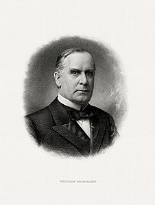
_over_Italy.jpg)
_-_Google_Art_Project.jpg)
_-_Google_Art_Project.jpg&action=edit§ion=T-1)
_-_Google_Art_Project.jpg)
_-_Google_Art_Project.jpg&action=edit§ion=T-1)
.jpg)
.jpg)
- ^ The bottom selvage of BEP certified proofs contain the date of the proof impression and the necessary approval signatures to begin production of the basic plate printing (prior to the addition of any overprints containing color tints or seals and serial numbers).
- ^ There were no changes in portraits or backs during the Silver certificate issue.
- Support as nominator -- Godot13 ( talk) 20:14, 20 October 2014 (UTC) ...and last set nomination for the WikiCup...
- Support - Strong set, interesting to have a Cuban import on the MP one day. — Crisco 1492 ( talk) 20:52, 20 October 2014 (UTC)
- Support: These are beautiful and valuable. Thank you. Fylbecatulous talk 14:26, 21 October 2014 (UTC)
- Support Hafspajen ( talk) 23:32, 21 October 2014 (UTC)
- Support J e e 09:21, 23 October 2014 (UTC)
- Support Thoroughly impressed. Even when you zoom in multiple times the images maintain their integrity. Great EV as usual. -- Gwillhickers ( talk) 17:17, 25 October 2014 (UTC)
Promoted File:US-BEP-República de Cuba (progress proof) one silver peso, 1936 (CUB-69b).jpg --
Armbrust
The Homunculus 20:16, 30 October 2014 (UTC)
Promoted File:US-BEP-República de Cuba (progress proof) one silver peso, 1930s (CUB-69-reverse).jpg --
Armbrust
The Homunculus 20:16, 30 October 2014 (UTC)
Promoted File:US-BEP-República de Cuba (progress proof) five silver pesos, 1936 (CUB-70b).jpg --
Armbrust
The Homunculus 20:16, 30 October 2014 (UTC)
Promoted File:US-BEP-República de Cuba (progress proof) five silver pesos, 1930s (CUB-70-reverse).jpg --
Armbrust
The Homunculus 20:16, 30 October 2014 (UTC)
Promoted File:US-BEP-República de Cuba (progress proof) 10 silver pesos, 1936 (CUB-71b).jpg --
Armbrust
The Homunculus 20:16, 30 October 2014 (UTC)
Promoted File:US-BEP-República de Cuba (progress proof) 10 silver pesos, 1930s (CUB-71-reverse).jpg --
Armbrust
The Homunculus 20:16, 30 October 2014 (UTC)
Promoted File:US-BEP-República de Cuba (progress proof) 20 silver pesos, 1936 (CUB-72b).jpg --
Armbrust
The Homunculus 20:16, 30 October 2014 (UTC)
Promoted File:US-BEP-República de Cuba (progress proof) 20 silver pesos, 1930s (CUB-72-reverse).jpg --
Armbrust
The Homunculus 20:16, 30 October 2014 (UTC)
Promoted File:US-BEP-República de Cuba (progress proof) 50 silver pesos, 1936 (CUB-73b).jpg --
Armbrust
The Homunculus 20:16, 30 October 2014 (UTC)
Promoted File:US-BEP-República de Cuba (progress proof) 50 silver pesos, 1930s (CUB-73-reverse).jpg --
Armbrust
The Homunculus 20:16, 30 October 2014 (UTC)
Promoted File:US-BEP-República de Cuba (progress proof) 100 silver pesos, 1936 (CUB-74b).jpg --
Armbrust
The Homunculus 20:16, 30 October 2014 (UTC)
Promoted File:US-BEP-República de Cuba (progress proof) 100 silver pesos, 1930s (CUB-74-reverse).jpg --
Armbrust
The Homunculus 20:16, 30 October 2014 (UTC)
Promoted File:US-BEP-República de Cuba (certified proof) one silver peso, 1936 (CUB-69b).jpg --
Armbrust
The Homunculus 20:16, 30 October 2014 (UTC)
Promoted File:US-BEP-República de Cuba (color certified proof) one silver peso, 1930s (CUB-69-reverse).jpg --
Armbrust
The Homunculus 20:16, 30 October 2014 (UTC)
Promoted File:US-BEP-República de Cuba (certified proof) five silver pesos, 1936 (CUB-70b).jpg --
Armbrust
The Homunculus 20:16, 30 October 2014 (UTC)
Promoted File:US-BEP-República de Cuba (color certified proof) five silver pesos, 1930s (CUB-70-reverse).jpg --
Armbrust
The Homunculus 20:16, 30 October 2014 (UTC)
Promoted File:US-BEP-República de Cuba (certified proof) 10 silver pesos, 1936 (CUB-71b).jpg --
Armbrust
The Homunculus 20:16, 30 October 2014 (UTC)
Promoted File:US-BEP-República de Cuba (color certified proof) 10 silver pesos, 1930s (CUB-71-reverse).jpg --
Armbrust
The Homunculus 20:16, 30 October 2014 (UTC)
Promoted File:US-BEP-República de Cuba (certified proof) 20 silver pesos, 1936 (CUB-72b).jpg --
Armbrust
The Homunculus 20:16, 30 October 2014 (UTC)
Promoted File:US-BEP-República de Cuba (color certified proof) 20 silver pesos, 1930s (CUB-72-reverse).jpg --
Armbrust
The Homunculus 20:16, 30 October 2014 (UTC)
Promoted File:US-BEP-República de Cuba (certified proof) 50 silver pesos, 1936 (CUB-73b).jpg --
Armbrust
The Homunculus 20:16, 30 October 2014 (UTC)
Promoted File:US-BEP-República de Cuba (color certified proof) 50 silver pesos, 1930s (CUB-73-reverse).jpg --
Armbrust
The Homunculus 20:16, 30 October 2014 (UTC)
Promoted File:US-BEP-República de Cuba (certified proof) 100 silver pesos, 1936 (CUB-74b).jpg --
Armbrust
The Homunculus 20:16, 30 October 2014 (UTC)
Promoted File:US-BEP-República de Cuba (color certified proof) 100 silver pesos, 1930s (CUB-74-reverse).jpg --
Armbrust
The Homunculus 20:16, 30 October 2014 (UTC)
Black Rabbit
Voting period is over. Please don't add any new votes. Voting period ends on 7 Nov 2014 at 13:36:10 (UTC)
,_Tierpark_Hellabrunn,_M%C3%BAnich,_Alemania,_2012-06-17,_DD_01.JPG)
- Reason
- High quality; Very unique; Passes critera.
- Articles in which this image appears
- Rabbit
- FP category for this image
- Wikipedia:Featured pictures/Animals/Mammals
- Creator
- Poco a poco
- Support as nominator – Jim Carter 13:36, 28 October 2014 (UTC)
- Comment: File:Oryctolagus cuniculus Tasmania 2.jpg is already featured, and it is the same species. — Crisco 1492 ( talk) 16:15, 28 October 2014 (UTC)
- Well, this black - so I think it is a house rabbit or
Domestic rabbit (black rabbits are not usual in the wild... - or possibly a
melanistic varierty ...? but still interesting than ) -
Oryctolagus cuniculus is Latin for European rabbit - the one in FP the picture is wild. The only rabbit to be widely domesticated is the European rabbit, which has been extensively domesticated for food or as a pet. It was first widely kept in ancient Rome and was refined into a wider variety of breeds during the Middle Ages Hafspajen ( talk) 16:40, 28 October 2014 (UTC)
- Well, this black - so I think it is a house rabbit or
Domestic rabbit (black rabbits are not usual in the wild... - or possibly a
melanistic varierty ...? but still interesting than ) -


- Diego's identified it as O. cuniculus, which is a species name. Being domesticated or not does not affect that. — Crisco 1492 ( talk) 01:39, 29 October 2014 (UTC)
- Same species is not a problem as far as the use in article is different. For domesticated animals, we can expect more sub divisions (See the categorization in Commons). I agree, Rabbit is a too wide scope. Wonder why an Australian rabbit is used at European rabbit too. J e e 08:09, 29 October 2014 (UTC)
- Blast this rabbit, because it is same species - the Australians never had a rabbit before the Europeans took them there. Hafspajen ( talk) 13:17, 29 October 2014 (UTC)
- Still my biology-lesson say to me that oryctolagus-cuniculus-forma-domestica is very different from Oryctolagus cuniculus - out in the wild -wild ones are grey-brownish - while domestic ones are black, white, blue, cinnamon - and so on. Hafspajen ( talk) 14:13, 29 October 2014 (UTC)
- Comment. Nice picture, but I feel that the lighting lets it down just slightly. 109.145.182.239 ( talk) 18:42, 28 October 2014 (UTC)
- @ Crisco 1492, Hafspajen, and Jkadavoor: The image quality of this image is better than the one Crisco mentioned. For example this image is 3115×2920 pixels whereas the one Crisco mentioned is 1367×1709 pixels. The light and focus is more sharp in this image than the one Crisco mentioned. Thanks! Jim Carter 09:51, 29 October 2014 (UTC)
- Withdraw: Can be closed speedily per WP:SNOW. Jim Carter 19:08, 31 October 2014 (UTC)
Not Promoted -- Armbrust The Homunculus 20:37, 31 October 2014 (UTC)
- Withdrawn nomination. Armbrust The Homunculus 20:37, 31 October 2014 (UTC)
Nash, Paul - Sunrise, Inverness Copse
Voting period is over. Please don't add any new votes. Voting period ends on 31 Oct 2014 at 23:23:33 (UTC)

"I am no longer an artist interested and curious, I am a messenger who will bring back word from the men who are fighting to those who want the war to go on for ever. Feeble, inarticulate, will be my message, but it will have a bitter truth, and may it burn their lousy souls." Paul Nash [1]
References
- ^ Paul Nash (1949). Outline : an autobiography and other writings. Faber and Faber, London. pp. 1–271, p.211.
- Reason
- Paul Nash artwork from the World War One are among the most iconic images of the conflict. After the war Nash continued to focus on landscape painting, originally in a formalized, decorative style but, throughout the 1930s, in an increasingly abstract and surreal manner.

- Articles in which this image appears
- Paul Nash (artist)
- FP category for this image
- Wikipedia:Featured pictures/Artwork/Others
- Creator
- Paul Nash
- Support as nominator (or both) – Hafspajen ( talk) 23:23, 21 October 2014 (UTC)
- Support - Useful. Might be worth noting that this will be PD in the source country in 2017. — Crisco 1492 ( talk) 00:54, 22 October 2014 (UTC)
- Support – Xanthomelanoussprog ( talk) 02:12, 22 October 2014 (UTC)
- Support Made me read about him -- Muhammad (talk) 15:34, 22 October 2014 (UTC)
- Support both Adam Cuerden ( talk) 02:04, 25 October 2014 (UTC)
Promoted File:Nash, Paul - Sunrise, Inverness Copse - Google Art Project.jpg -- Armbrust The Homunculus 23:24, 31 October 2014 (UTC)