Support as nominator –
Godot13 (
talk) 20:01, 21 August 2015 (UTC)reply
Support – Historically and aesthetically interesting. Re the artwork on the obverse, I wonder what the ring or hoop held by the lady symbolizes.
Sca (
talk) 21:09, 21 August 2015 (UTC)reply
Support —
Jobas (
talk) 09:39, 27 August 2015 (UTC)reply
Support I'd like some day-glo colours in the next lot of money; these greens and browns are getting boring.
Belle (
talk) 14:06, 28 August 2015 (UTC)reply
Neutral Nice composition, but too short to crop at top/right, left bottle also deflection on right side.
Exploringlife (
talk) 18:56, 24 August 2015 (UTC)reply
Comment Perhaps reducing the blue cast would be better. This seems to be daylight from the window.
Brandmeistertalk 08:26, 22 August 2015 (UTC)reply
I've already reduced it quite heavily. Any more and it was artefacting everywhere. I don't believe you're correct, however, if that is daylight, it's coming in through blue-tinted glass. Adam Cuerden(
talk) 18:22, 22 August 2015 (UTC)reply
@
SkywalkerPL: I'm going to object to your statement there. There is no high-quality colour image besides this one. The only other decent-quality colour image is
File:Oscar Niemeyer.jpg, but he is over 100 years old in that image, and it hardly reflects what he looked like during his career. And, of the black-and-white images of him, the largest is 686 × 974 pixels. Further, the copyright status of said black-and-white images, upon checking, is almost certainly a copyright violation. The very description says they weren't taken in Italy. Your statement is simply false. Adam Cuerden(
talk) 17:10, 23 August 2015 (UTC)reply
Fair enough about suspected copyvio. Still though I really doubt that such a poor quality photograph is the only one that could possibly be obtained for wikipedia out of his long career, especially considering that some of the photographs of him very likely fall under public domain in Italy. I really doubt if this is one of these cases where we got hold on irreplaceable photograph that therefore would be satisfying enough for featured picture. I still would say that it doesn't fulfil the criteria of Is of a high technical standard, so I'll uphold my vote. I understand your nomination, in my humble opinion it's in this gray area between FP and not an FP. But for me it's just too low quality with too much potential of obtaining higher quality image to pass as a FP.
Oppose. The highly tilted composition is unfortunate, and the presence of color does not compensate for this.
Sorry for bringing this up here, but this is a relevant place. Adam, trying to clear the field for this nomination you have submitted at least three groundless deletion requests for other Oscar Niemeyer images. Please don't rush with DRs and at least read the copyright templates.
Materialscientist (
talk) 03:53, 24 August 2015 (UTC)reply
They are by no means groundless. There's a ton of copyvio in that folder, and when I looked, I found it. You're basiclaly aqrguing that a photograph definitely taken in Brazil by an unknown photographer, must be presumed to have been taken by an Italian who travelled to Brazil for the purpose of photographing him. With no evidence. Do you see why, when I spotted that, I thought, "this is a major problem"? I'm not going to not nominate copyvio, lad. Adam Cuerden(
talk) 04:07, 24 August 2015 (UTC)reply
Get some rest, you are mixing up different deletion requests.
Materialscientist (
talk) 05:04, 24 August 2015 (UTC)reply
Oppose Insufficient contrast: arm and body seem inseparable. --
Tremonist (
talk) 12:59, 25 August 2015 (UTC)reply
Voting period is over. Please don't add any new votes. Voting period ends on 1 Sep 2015 at 19:49:39 (UTC)
Original – 1,000
German ostmarks from Lithuania issued in 1918 and showing
Hermes with his
caduceus on the obverse (top), a symbol of trade and commerce.ALT
Reason
We don't have this particular oldschool currency featured yet, so picking this for the debut.
Support ALT – Ah, the convoluted history of northeastern Europe!
Sca (
talk) 01:11, 23 August 2015 (UTC)reply
QuestionGodot13, what are the chance of getting a higher grade note of this series/denomination? —
Chris Woodrich (
talk) 23:31, 23 August 2015 (UTC)reply
Comment - I've added an ALT version. The back is slightly toned, but the condition (edges, lack of folds) is better.
Chris- It's a beautiful note, and fortunately fairly easy to find in uncirculated condition.--
Godot13 (
talk) 01:24, 24 August 2015 (UTC)reply
Support ALT - Presentation is better, quality of the specimen is better. —
Chris Woodrich (
talk) 01:27, 24 August 2015 (UTC)reply
BTW,
Ostmark also has various historical meanings not associated with currency. (And, written as Остмарқ, it happens to be a brand of beer made in
Kaliningrad. Valuable info, no?)
Sca (
talk) 13:57, 24 August 2015 (UTC)reply
Voting period is over. Please don't add any new votes. Voting period ends on 2 Sep 2015 at 00:01:29 (UTC)
Original – Taraxacum officinale, the common dandelion, is a flowering herbaceous perennial plant. It can be found growing in temperate regions of the world. Though considered a weed, it is sometimes used as a medical herb and in food preparation.
Support - Close up flowers are good.
Hafspajen (
talk) 23:07, 23 August 2015 (UTC)reply
Support – Very nice image supported by reasonable article so good EV.
SagaciousPhil -
Chat 09:22, 24 August 2015 (UTC)reply
Support Good composition and focus.
Exploringlife (
talk) 18:36, 24 August 2015 (UTC)reply
Support - Something about the lighting feels just a bit off (or different), but the detail is great and good EV.--
Godot13 (
talk) 20:33, 24 August 2015 (UTC)reply
Voting period is over. Please don't add any new votes. Voting period ends on 2 Sep 2015 at 23:38:16 (UTC)
Original – From the article: "The idea of
using several exposures to fix a too-extreme range of luminance was pioneered as early as the 1850s by
Gustave Le Gray to render seascapes showing both the sky and the sea. Such rendering was impossible at the time using standard methods, the luminosity range being too extreme. Le Gray used one negative for the sky, and another one with a longer exposure for the sea, and combined the two into one picture in positive"
Reason
High quality scan of a 160-year-old example of a popular technique
Support. Nice to see the HDR article include historical examples and techniques. Perhaps I'm mistaken but I don't recall seeing them last time I viewed the article. I do think that perhaps it deserves a slightly better modern tone mapping example too. The one provided is fine, but the overall image quality and tone mapping is not as good as it could be IMO. Perhaps that's one for me to work on!
Ðiliff«»(Talk) 00:04, 24 August 2015 (UTC)reply
You are one of our better HDRers. I'd include a version with original frames as well, to make it more encyclopedic.
Like here —
Chris Woodrich (
talk) 01:02, 24 August 2015 (UTC)reply
Support, interesting, didn't even know it existed back then.
Brandmeistertalk 09:06, 24 August 2015 (UTC)reply
It didn't exist back then in the same way it exists now. The photo was simply two seprate exposures superimposed in a fairly crude way - the horizon was the dividing line. There was no tone mapping or any complex blending. That still makes it HDR in the sense that it creates an image with greater dynamic range than is normally possible, of course, but not as we know it now. It's more analogous to a graduated
Neutral density filter in the way it creates the final image, but it uses two exposures combined into one during the deveopment process, instead of a filter.
Ðiliff«»(Talk) 10:40, 24 August 2015 (UTC)reply
Support – Wow, that took some doing in 1856! Good EV for history of photography – and BTW a neat comp.
Sca (
talk) 13:44, 24 August 2015 (UTC)reply
It might not have actually been as difficult or complex as you might think. When you're developing a negative using an englarger, it's theoretically trivial to just block the part of the projection that you don't want to expose on the paper.
Ðiliff«»(Talk) 23:54, 24 August 2015 (UTC)reply
Now you mention it, I remember the ol' fotogs doing that in the newspaper dark room.
Sca (
talk) 21:36, 25 August 2015 (UTC)reply
That's where the Photoshop terms 'dodging' and 'burning' come from - the physical interventions in the enlarger during the photographic development.
This video is a good demonstration.
Ðiliff«»(Talk) 22:36, 25 August 2015 (UTC)reply
Yup, I remember them sorta waving their hands in the light of the enlarger. If results weren't up to snuff, they could always do it over. (Those were the days of Tri-X, the all-purpose B&W film – used by newspapers for decades.)
Sca (
talk) 14:19, 26 August 2015 (UTC)reply
Support - Great image and EV.--
Godot13 (
talk) 20:30, 24 August 2015 (UTC)reply
Support Gustave Le Gray also invented the selfie and photobombing, but I don't think any examples of these survive.
Belle (
talk) 08:36, 25 August 2015 (UTC)reply
I bet Leonardo da Vinci would have invented Photoshop in the 1850s, since he envisioned parachute already in the 16th century to say the least.
Brandmeistertalk 09:55, 25 August 2015 (UTC)reply
bravo Mr
Brandmeister, bravo... a hat-tip in your direction...
gazhiley 08:59, 26 August 2015 (UTC)reply
Voting period is over. Please don't add any new votes. Voting period ends on 3 Sep 2015 at 00:05:51 (UTC)
Original – The Pool of Bethesda by Robert Bateman, 1877. In the fifth chapter of the Gospel of John the text is mentioning a pool in Jerusalem, near the Sheep Gate, that was associated with healing. According John, an angel come by and touched the water and the first man who was bathing in the pool became free from all illnesses. Until the 19th century, there was no evidence outside of John’s Gospel for the existence of this pool; but archaeologists discovered the remains of a pool fitting the description
Reason
English artist
Robert Bateman's " key painting", as the article states, exhibited at the Royal Academy 1878. Bateman was architect and painter and also a horticultural designer.
Now there is in Jerusalem by the sheep market a pool, which is called in the Hebrew tongue Bethesda, having five porches. In these lay a great multitude of invalid folk — blind, halt, withered — waiting for the moving of the water. For an angel went down at a certain season into the pool and troubled the water. Whosoever then first stepped in, after the troubling of the water, was made whole of whatsoever disease he had.
Support – Very nice; good EV. Seems to be an artist that there wasn't an awful lot known about.
SagaciousPhil -
Chat 10:55, 24 August 2015 (UTC)reply
Weak Support A bit cracks, but not much influence to the whole.
Exploringlife (
talk) 20:13, 24 August 2015 (UTC)reply
Neutral The cracks full of the sky inside the doorframe when checking carefully.
Exploringlife (
talk) 20:38, 24 August 2015 (UTC)reply
If a 125+ year-old oil painting on canvas had no cracks, I would be suspicious of its authenticity, IMO.--
Godot13 (
talk) 21:37, 24 August 2015 (UTC) reply
Exploringlife- If you restore the image of a unique art work, then the image is no longer an accurate (encyclopedic) representation of that work... Cracks, chips, even damage are all important to document in well-known works of art, in my opinion.--
Godot13 (
talk) 23:01, 24 August 2015 (UTC) reply
Support Good EV, nice image.--
Godot13 (
talk) 20:29, 24 August 2015 (UTC)reply
Voting period is over. Please don't add any new votes. Voting period ends on 2 Sep 2015 at 19:14:25 (UTC)
Reason
High quality, high EV (presented as a complete set). Since the beginning of
human spaceflight, astronauts have taken mementos with them in space. Coins and paper currency, small and lightweight, were often favorites during
Project Mercury as space-flown souvenirs. Beginning with the
Gemini program, astronauts took an active role in designing and producing commemorative medallions to be taken into space. Since the
Apollo program, NASA has coordinated with the Robbins Company to produce medallions for every space mission since Apollo 7. All of the medallions pictured are space-flown, and either come from the collection of a NASA astronaut or were given as a gift by the astronaut who carried it. (See
tables for more detailed provenance links).
Designed by NASA astronauts and/or civilian personnel, struck by "Fliteline" (Gemini) and the Robbins Company (Apollo) for NASA Images by
Heritage Auctions (Edited by
Godot13)
How do we know they were all flown? Not that I particularly care, because they are interesting themselves, but it seems they should be marked with an "F" if they are flown and only some of them have that; one I looked at on the auction site had a separate certificate. but
this one for example, has no provenance and apparently no "F". Can I make
Godot13 sweat again or is this an easy one?
Belle (
talk) 08:53, 25 August 2015 (UTC)reply
Hi
Belle – No sweating on this one... Each of the Apollo Robbins medallions was serial numbered and there are records (see table in article) of how many were produced and (for later flights) how many (i.e., beginning with serial number 1) were space-flown versus unflown. There is very little documentation about the production of the Gemini Fliteline medallions, but it is suspected that there were roughly 100 struck and flown on each mission. The F (for flown) in the Apollo serial number was only added beginning with Apollo 17, but continued through Skylab, Shuttle, and ISS missions. Serial numbers for Apollo 14–17 are on the rim of the medallion. Hope this helps.--
Godot13 (
talk) 16:30, 25 August 2015 (UTC)reply
I must try harder (you are in a cave that is slowly filling with water; you have a plank of wood, a teapot, and an owl; how do you escape?) Support A pity some of them are a bit crooked, but putting together the whole set is a feat.
Belle (
talk) 16:42, 25 August 2015 (UTC)reply
You tear your shirt, attach one end of the cloth to the owl's leg, hold the other, stand on the plank, and then pour the tea on the owl. The terrified bird flies towards whatever opening there is, with you in tow. So you waterski out of the cave in style (this, of course, assuming you have a monocle). —
Chris Woodrich (
talk) 01:37, 26 August 2015 (UTC)reply
Voting period is over. Please don't add any new votes. Voting period ends on 3 Sep 2015 at 17:08:40 (UTC)
Original – Ruth is the faithful figure in the Bible who never leaves her mother-in-law
Naomi, after her husbands death. Ruth follows her back to her hometown. The painting illustrates when she goes gleaning in the fields that belongs to a man named
Boaz, who happens to be a relative (see
goel, this is complicated) to Naomi. Boaz is kind to her because he has heard of her loyalty and; who knows, maybe liked her too, probably. Ruth tells to Naomi of Boaz's kindness, she counsels her to ... well, seduce him. Everything goes well, and Ruth and Boaz marry, and Naomi lives with them. One of the few happy endings in the Bible. Boaz through this marriage became the great-grandfater of
King David.
Reason
Good scan, EV, charming story and a beautiful painting, dated 1828, in the National Gallery, London.
Julius Schnorr von Carolsfeld, (1794 – 1872) was a German painter was a leading figure in a group of artists called the Nazarenes, who painted biblical themes. Julius lived in Italy for a decade. The painting was inspired by Renaissance art following the clear colours and " the purity of form and spiritual values" of the period. He painted it in Munich, based on drawings he made in Italy.
Articles in which this image appears
Ruth (biblical figure),
Goel - (A
goel in the rabbinical tradition denotes a person who as the nearest relative, and who is charged with the duty of taking care of him/her) + c. 5 more
Support as nominator –
Hafspajen (
talk) 17:08, 24 August 2015 (UTC)reply
Neutral Colourful but cracks are obvious.
Exploringlife (
talk) 20:10, 24 August 2015 (UTC)reply
Pst. That's a good sign. But I think you know that, no? Hafspajen (
talk) 20:53, 24 August 2015 (UTC)reply
Support - I'm cracking up here...--
Godot13 (
talk) 20:26, 24 August 2015 (UTC)reply
Conditional SupportOppose Isn't the description a bit non descriptive of the picture itself? It's definitely full of detail... But the picture itself doesn't convey that big of a story. It's like reading an article. Shorten it up, have it describe the picture better, has my vote.
Dusty777 21:38, 24 August 2015 (UTC)reply
OK,
Dusty777, how about this? Julius was a German painter was a leading figure in a group of artists called the Nazarenes, who painted biblical themes. Julius lived in Italy for a decade. The painting was inspired by Renaissance art following the clear colours and " the purity of form and spiritual values" of the period. Otherwise, in old times the religious paintings were painted in the churches to illustrate the Bible stories, for those who couldn't read, and certain themes became a standard. In those times most people went to church regularly and knew exactly what the scene was showing. Woman in the field,
gleaning + Bible story = bingo, that's Ruth. Nowadays, in this secularized times, most people never heard of the those old stories, so it's good to remind them of it sometimes.
Hafspajen (
talk) 03:06, 27 August 2015 (UTC)reply
Yes, I agree. However, it fails to note when it was painted, where it was painted... Who was Julius? When did he live and die? Where is the painting now? While it's definitely worthy to post a brief synopsis of the story of Ruth, I would recommend keeping it short.
A link to the full story is always readily available.Dusty777 21:54, 27 August 2015 (UTC)reply
Sorry
Dusty777, Julius is ... the creator. When it comes to a painting, the creator is always the painter, and it was linked. Not a very exiting guy, though. I usually link the painter in the intro too, anyway; but I had bit of a computer trouble, so I hoped the nom will make it like this, too. But then you dicovered it, of course... :) Link it now, add date.
Hafspajen (
talk) 18:56, 31 August 2015 (UTC)reply
Yes, of course Julius is the creator. My point (One of of many, but let's not repeat it all for the sake of time and space) is that he is not mentioned in the description... Not at all. I'm afraid I can't support it.
Dusty777 03:26, 3 September 2015 (UTC)reply
Support Of course, it all goes wrong in Bible 2: Ruth's Revenge but that's another story.
Belle (
talk) 08:31, 25 August 2015 (UTC)reply
Support Is that sitting on an LED table, or does it just have nice lighting from above?
RO(talk) 23:47, 24 August 2015 (UTC)reply
You'd have to ask
Evan Amos. He is very consistent in providing even lighting like this. I use a light tent with halogen lighting for my shots, but there are still areas with brighter lighting than others. —
Chris Woodrich (
talk) 00:13, 25 August 2015 (UTC)reply
Support I love plastic boxes containing electronics, especially when they are white; this is the best picture of the Segatendo Gamedrive Advance Boy I've seen. Nothing to fault it on.
Belle (
talk) 08:24, 25 August 2015 (UTC)reply
Support. Kind of on the small side, but a good picture of a hard-to-find-today gaming system (not least because it's one of Apple's biggest failures).
Daniel Case (
talk) 17:24, 26 August 2015 (UTC)reply
"30,000 systems sold"... Yep, that's up there alright. —
Chris Woodrich (
talk) 09:04, 27 August 2015 (UTC)reply
Oppose Really horrible background colour, but mainly because most of his head is out of focus... The main features of his face are ok, but nothing else...
gazhiley 07:50, 25 August 2015 (UTC)reply
Oppose he also looks like he's halfway through saying "Don't take it yet".
Belle (
talk) 08:18, 25 August 2015 (UTC)reply
Voting period is over. Please don't add any new votes. Voting period ends on 4 Sep 2015 at 10:58:02 (UTC)
Original – "I am half sick of shadows," said the Lady of Shalott, 1915. "TBH, I'm totally sick of them but that doesn't scan". Waterhouse's image of the Lady of Shalott moping around just before Lancelot rides into view for the coup de foudre. Spoiler: it doesn't end well for her, though Lancelot does admire her lovely face when she's dead.
Reason
High EV, all the usual blah-blah; you can never have too much Waterhouse or PRB; romantic; sensuous;
Diliff can imagine her whipping up a decadently rich and scrumptious chocolate mousse. Edge of the canvas is still in the image; what do we think of that? I don't mind it.
Support - Great stuff.
Hafspajen (
talk) 03:25, 27 August 2015 (UTC)reply
Support --
Jobas (
talk) 09:32, 27 August 2015 (UTC)reply
Support - I'm sure this is a mediaeval Belle. The aimless lolling,bosom thrusting upwards,the gazing out of the window waiting for some monkeyman to go flying by,things lying about the floor because...ooh pretty...
Lemon martini (
talk) 14:41, 27 August 2015 (UTC)reply
Comment - It's a pity you are intent on Featuring this unsourced image of Waterhouse's last version of this theme, painted towards the end of his life and past his prime, when you passed over a Google Art image of the
much more famous version in the London Tate.
216.166.10.125 (
talk) 00:15, 28 August 2015 (UTC)reply
Support --
Yann (
talk) 22:34, 29 August 2015 (UTC)reply
Support Good painting technique.
Exploringlife (
talk) 05:32, 1 September 2015 (UTC)reply
Promoted File:John William Waterhouse - I am half-sick of shadows, said the lady of shalott.JPG --
ArmbrustTheHomunculus 11:00, 4 September 2015 (UTC)reply
Support – Considering that's Goya, it's pretty ..pretty.
Hafspajen (
talk) 03:24, 27 August 2015 (UTC)reply
Support The article is a translation of the Spanish WP article from 2007 though and a lot of the analysis isn't in the sources. Maybe Goya-mad
Ceoil can update it; go on, Ceoil, you know you love it.
Belle (
talk) 09:04, 27 August 2015 (UTC)reply
Support –
Jobas (
talk) 09:32, 27 August 2015 (UTC)reply
Voting period is over. Please don't add any new votes. Voting period ends on 5 Sep 2015 at 07:05:51 (UTC)
Original –
Kingdom of Sweden,
Sveriges Riksbank, 1000
kronor (1909), specimen. The allegory of
Svea is on the front, and
Gustav Vasa on the back. Also on the reverse is a handwritten notation approving the specimen for production, dated 15 July 1909.
Reason
High quality image, high EV. A series 1909 serial number 00000 specimen note, hand-signed and approved on the reverse
Support as nominator –
Godot13 (
talk) 07:05, 26 August 2015 (UTC)reply
Can you not clean up (or get somebody to clean up) the back? It looks like it has been run over by a car in a barber's shop.
Belle (
talk) 07:35, 26 August 2015 (UTC)reply
I'm not sure there is anything to be cleaned- The wavy lines are the natural watermarking in the the paper (they appear slightly dark when scanned against a black background) and the fibers on the left side are silk threads embedded in the paper as an anti-counterfeiting measure. About cleaning up, I can't do that with museum objects, the image no longer serves an archival purpose.--
Godot13 (
talk) 07:45, 26 August 2015 (UTC)reply
Support Lovely view of the anti-counterfeiting measures on the rear in the classic "run over in a barber's shop" design of the Swedish Mint. Seamless back-pedalling, Belle, seamless.
Belle (
talk) 07:57, 26 August 2015 (UTC)reply
Comment – As old currency goes, rather bland-looking, IMO.
Sca (
talk) 14:11, 26 August 2015 (UTC)reply
Sca- Certainly not as ornate as some others, but vintage Swedish krona are not readily illustrated. More importantly (to me), of the hundreds of specimen notes I've seen from scores of countries, this is the first I've come across with an approval comment written on the note.--
Godot13 (
talk) 17:02, 26 August 2015 (UTC) reply
Missed that detail. Interesting to numismatists, but....
Sca (
talk) 21:31, 26 August 2015 (UTC)reply
The white appears too white somehow. No structures visible. --
Tremonist (
talk) 12:24, 26 August 2015 (UTC)reply
Comment – Article is basically a stub, lacking info about the subject's import. This this (5-year-old) pic added two years ago.
Sca (
talk) 14:08, 26 August 2015 (UTC)reply
I think the article pretty clearly establishes the subject's notability (I would go out on a limb and say that being a
Marja' is, alone, enough to confer notability, in the same way we assume that a bishop is notable), and I don't think the fact that the picture is from 2010 is a negative, given that the subject died in 2011.
Josh Milburn (
talk)
Comment: Charismatic portrait; both Islamic clergy and Persian people strike me as underrepresented topics. I'd love to support, but my one worry is that the uploader's userpage and talk page on the Persian Wikipedia have been deleted. This is a tiny niggling worry; other than that, I'm inclined to trust that there is no issue here.
Josh Milburn (
talk) 18:59, 26 August 2015 (UTC)reply
If one is not a Muslim, and not familiar with Islamic clerical organization, one gains almost no knowledge from the article, the text of which totals 78 words.
Sca (
talk) 21:36, 26 August 2015 (UTC)reply
Support - Article clean up is easy. Getting another free image of this individual, however... yes, the whites are blown, and there is some CA at the top, but quality is still acceptable. —
Chris Woodrich (
talk) 23:28, 26 August 2015 (UTC)reply
Support --
Jobas (
talk) 09:29, 27 August 2015 (UTC)reply
Support per Chris - this is a successful portrait photo. If a better photo comes along (which seems unlikely) we can delist and replace.
Nick-D (
talk) 11:22, 27 August 2015 (UTC)reply
Support --
Yann (
talk) 22:28, 29 August 2015 (UTC)reply
Support. I think I was getting worried about nothing in my comment above.
Josh Milburn (
talk) 15:27, 30 August 2015 (UTC)reply
Oppose Background a bit distracting, also his eyes looking something out of the picture.
Exploringlife (
talk) 05:14, 1 September 2015 (UTC)reply
Voting period is over. Please don't add any new votes. Voting period ends on 5 Sep 2015 at 08:30:30 (UTC)
"
Māda" (Median) herald leading a delegation on the famous tribute bearers bas-relief decorating the southern panel of the eastern stairway of the Apadana, Darius the Great’s audience hall at
Persepolis, one of the capital of the Achaemenian Persian Empire (515 BCE).
Voting period is over. Please don't add any new votes. Voting period ends on 5 Sep 2015 at 20:31:47 (UTC)
The Savage State
The Arcadian or Pastoral State
The Consummation of Empire
Destruction
Desolation
Original
The Course of Empire is a series of five paintings by American artist
Thomas Cole made in 1833–36. It shows five historical stages of
Ancient Rome, from humble beginnings to collapse and desolation.
Reason
The ultimate versions have been finally retrieved. Although their extraction crashed and froze mine and others' browsers, user Hunsu was able to help me.
Support Though I don't think there would have been a problem if the uploaders had only taken the image at 80% size; there is a bit of softness here. —
Chris Woodrich (
talk) 23:24, 26 August 2015 (UTC)reply
Support I did a jigsaw puzzle of Consummation when I broke my leg (after I broke my leg; it wasn't so dangerous a jigsaw that it caused me to break my leg); it was flipping (you know what I mean by flipping) hard. Some Belle backstory; you didn't ask for it or want it? I don't believe that.
Belle (
talk) 07:58, 27 August 2015 (UTC)reply
Flipping out?
Sca (
talk) 14:57, 27 August 2015 (UTC)reply
We want more stories! ;o)
Yann (
talk) 22:23, 29 August 2015 (UTC)reply
Be careful what you wish for or I might post the X-rays.
Belle (
talk) 22:48, 29 August 2015 (UTC)reply
I don't think it is Rome though; just some imaginary Romanesque civ.
Belle (
talk) 08:01, 27 August 2015 (UTC)reply
Support --
Jobas (
talk) 09:27, 27 August 2015 (UTC)reply
Weak oppose – There does seem to be something rather indistinct about these scans. I gather the series was intended as a sort of pictorial cautionary tale?
Sca (
talk) 14:57, 27 August 2015 (UTC)reply
Support --
Yann (
talk) 22:23, 29 August 2015 (UTC)reply
Oppose Per Sca - these are scans from rather dusty transparencies, they all need fixing. --
Janke |
Talk 07:56, 3 September 2015 (UTC)reply
Promoted File:Cole Thomas The Course of Empire The Savage State 1836.jpg --
ArmbrustTheHomunculus 20:57, 5 September 2015 (UTC)reply Promoted File:Cole Thomas The Course of Empire The Arcadian or Pastoral State 1836.jpg --
ArmbrustTheHomunculus 20:57, 5 September 2015 (UTC)reply Promoted File:Cole Thomas The Consummation The Course of the Empire 1836.jpg --
ArmbrustTheHomunculus 20:57, 5 September 2015 (UTC)reply Promoted File:Cole Thomas The Course of Empire Destruction 1836.jpg --
ArmbrustTheHomunculus 20:57, 5 September 2015 (UTC)reply Promoted File:Cole Thomas The Course of Empire Desolation 1836.jpg --
ArmbrustTheHomunculus 20:57, 5 September 2015 (UTC)reply
Voting period is over. Please don't add any new votes. Voting period ends on 5 Sep 2015 at 23:35:36 (UTC)
Original – The
I-35W Mississippi River bridge was an eight-lane, steel truss arch bridge that carried Interstate 35W across the Saint Anthony Falls of the Mississippi River in Minneapolis, Minnesota. It suddenly collapsed on August 1, 2007, killing 13 and injuring 145
Support Truly unique. I'm rather surprised the bridge collapse doesn't have it's own article... Figured it would have.
Dusty777 02:53, 27 August 2015 (UTC)reply
Support Tbh
Dusty the article this is in is pretty much entirely about the colapse - quite interesting reading... Especially the part that at least 70,000 other bridges in the US had the same safety rating as this bridge at the time it collapsed......
gazhiley 07:53, 27 August 2015 (UTC)reply
Support --
Jobas (
talk) 09:26, 27 August 2015 (UTC)reply
Support though I prefer some of the wider shots that show it is a bridge.
Belle (
talk) 09:29, 27 August 2015 (UTC)reply
Yeah I agree
Belle - the couple I had a look at though were quite poor pictures quality/res wise... Tis a shame...
gazhiley 10:41, 27 August 2015 (UTC)reply
Comment: This really feels like propaganda. It's a great photograph, but it looks like it's straight out of a booklet trying to show how AWESOME a career in the military is.
Josh Milburn (
talk) 21:29, 30 August 2015 (UTC)reply
Voting period is over. Please don't add any new votes. Voting period ends on 6 Sep 2015 at 23:33:09 (UTC)
Original –
Steven Chu is an American physicist whose research in cooling and trapping atoms with laser light won him the Nobel Prize in Physics in 1997. He also served as the 12th United States Secretary of Energy from 2009 to 2013.
Support I'm not a big fan of the semi-candid look of these RS portraits, but that's just me.
Belle (
talk) 08:30, 28 August 2015 (UTC)reply
If I can take a candid shot of a man or woman with a Nobel lapel pin, I will die a happy shortening. —
Chris Woodrich (
talk) 11:07, 28 August 2015 (UTC)reply
They always look like they've just lurched into shot and are about to say something;
Marian Dawkins was the same; actually I think that is the only other RS portrait we've had, but I'm calling it statistically significant.
Belle (
talk) 11:22, 28 August 2015 (UTC)reply
I kind of agree, although I think this is a much better portrait than Marian Dawkins. He looks much more natural and the composition is better.
Ðiliff«»(Talk) 12:23, 28 August 2015 (UTC)reply
Support. Nice portrait. A bit stiff, but pretty good really.
Ðiliff«»(Talk) 12:23, 28 August 2015 (UTC)reply
Support --
Yann (
talk) 22:12, 29 August 2015 (UTC)reply
Support as above. A great candidate.
Josh Milburn (
talk) 21:25, 30 August 2015 (UTC)reply
Oppose Different brightness on right/left face, right face too bright and left face too dark.
Exploringlife (
talk) 05:09, 1 September 2015 (UTC)reply
Support I find the lighting difference no more distraction than the blue shirt with a while collar, I mean really.
HereToHelp(
talk to me) 19:29, 5 September 2015 (UTC)reply
Promoted File:Professor Steven Chu ForMemRS headshot.jpg --
ArmbrustTheHomunculus 23:35, 6 September 2015 (UTC)reply
Voting period is over. Please don't add any new votes. Voting period ends on 7 Sep 2015 at 00:31:03 (UTC)
Original – The Long Room of Trinity College, Dublin
Reason
It's an incredibly interesting, aesthetically pleasing and historically valuable image of the interior of the Long Room. This image didn't come easy. I had to sweet talk the security guards into letting me use a tripod and also to allow me to stay back once all the visitors had left. I had literally no more than a minute or two to shoot this as they didn't have any patience for not closing up on time! The Long Room an authentic early 18th century university library, but these days is more of a tourist attraction than a working library. It looks nice and empty here, but it's usually
heaving with people and because no tripods are (usually) allowed, the quality of the photography of the room is usually very poor. This image is by some margin the best image of the room on Commons, and as best I can tell, probably the best image in existence of the room anywhere online.
Support as nominator –
Ðiliff«»(Talk) 00:31, 28 August 2015 (UTC)reply
Support - Um, wow... --
Godot13 (
talk) 03:23, 28 August 2015 (UTC)reply
Support Could tell this was a
Ðiliff as I was scrolling down, before I even got to the nomination text... Superb quality, detail and nice back story... Nice work!
gazhiley 07:45, 28 August 2015 (UTC)reply
Support – I'm impressed – no, overawed.
Sca (
talk) 13:45, 28 August 2015 (UTC)reply
Thanks, I personally think this is one of the best interiors that I've ever taken. The subject, the framing and the image quality. I actually waited until now to upload it so I could enter it into
Wiki Loves Monuments Ireland 2015. ;-) I was the one of the judges of WLM UK 2013 and 2014 and sadly couldn't enter it, but this year I'm free!
Ðiliff«»(Talk) 14:42, 28 August 2015 (UTC)reply
Support - an excellent photograph in every way.
SkywalkerPL (
talk) 21:21, 29 August 2015 (UTC)reply
Support Absolutely great! --
Yann (
talk) 22:09, 29 August 2015 (UTC)reply
Support. I would be very, very surprised if this is not a finalist in the POTY competition.
Josh Milburn (
talk) 21:06, 30 August 2015 (UTC)reply
with luck you may be right, although my church interiors didn't do so well last year as they tend to be less interesting in thumbnail view than a detailed view.
Ðiliff«»(Talk) 15:05, 31 August 2015 (UTC)reply
Support -- Sigh, wonderful...
Hafspajen (
talk) 18:44, 31 August 2015 (UTC)reply
Support Excellent image with high EV. Would be nice to get rid of those vivid green ropes though: don't fit the aesthetics nor the purpose of a library. --
ELEKHHT 09:13, 4 September 2015 (UTC)reply
Support – I don't generally vote if something is already going to pass with a significant margin but this photo is just so exceptionally "double wow"; superb quality with tremendous EV.
SagaciousPhil -
Chat 14:14, 4 September 2015 (UTC)reply
Pierre-Auguste Lamy (? seems highly likely, given we know he signed his works A. Lamy - see his
category on Commons and the A's and Y's in a couple of his known signatures are very similar. Just slightly different enough to leave doubt); restored by
Adam Cuerden
Support Does the time on the clock (five to seven) give any clue if it is the prologue or epilogue?
Belle (
talk) 08:19, 28 August 2015 (UTC)reply
As I understand it, the clock gives some evidence for it being prologue, but it's not definite. I'm going with what I was told at
WT:OPERA#Les contes d'HoffmannAdam Cuerden(
talk) 09:20, 28 August 2015 (UTC)reply
Support --
Yann (
talk) 22:05, 29 August 2015 (UTC)reply
Promoted File:Pierre-Auguste Lamy (?) - Les contes d'Hoffmann by Jacques Offenbach, prologue.jpg --
ArmbrustTheHomunculus 05:18, 7 September 2015 (UTC)reply
Voting period is over. Please don't add any new votes. Voting period ends on 7 Sep 2015 at 13:41:16 (UTC)
Original – In Les contes d'Hoffmann, the firstsecondOlympia act [the numbering is complicated] has Hoffmann meet a singing clockwork doll, Olympia, who sings a charming song in between being wound up. Hoffmann and Olympia can be seen near the centre of the image; not quite sure of who's who beyond that, though I could guess.
Reason
Similar to the previous, a high-quality early artwork of the opera. Probably should have done this as a set of three, but too late now, I think. Sorry!
Support nobody else cares about the seven-day rule any more, so I'm not holding out.
Belle (
talk) 14:57, 28 August 2015 (UTC)reply
@
Belle: Well, it's not like this article is edited much, and I'd discussed the plans beforehand. =) Adam Cuerden(
talk) 20:05, 28 August 2015 (UTC)reply
Not a problem; I think we should ditch the seven-day rule (not a rule, I know, a strong suggestion) anyway.
Belle (
talk) 01:16, 29 August 2015 (UTC)reply
@
Belle: Honestly, it seems to be more to deal with issues where someone puts an image into a high-traffic article, and it's gone by the second day of the nomination. There's certainly better ways to phrase a rule to avoid that, though. Adam Cuerden(
talk) 02:52, 29 August 2015 (UTC)reply
Promoted File:Pierre-Auguste Lamy (?) - Les contes d'Hoffmann by Jacques Offenbach, Olympia act.jpg --
ArmbrustTheHomunculus 14:28, 7 September 2015 (UTC)reply
Support as nominator –
Nergaal (
talk) 18:50, 28 August 2015 (UTC)reply
Comment Very unfortunate that the X-ray part of the image is incomplete - otherwise, it would get immediate thumbs up from me... --
Janke |
Talk 12:57, 29 August 2015 (UTC)reply
Oppose Reason for nomination is that the image was visually striking? Not really. It's below mediocre and sadly:incomplete with a rather weird way stripes were taken.
SkywalkerPL (
talk) 21:17, 29 August 2015 (UTC)reply
Neutral per others. --
Tremonist (
talk) 14:39, 1 September 2015 (UTC)reply
Voting period is over. Please don't add any new votes. Voting period ends on 7 Sep 2015 at 20:37:02 (UTC)
Original – "
North–South Lake is an 1,100-acre (4.4 km²) state campground in the Catskill Forest Preserve near Palenville, New York operated by the New York State Department of Environmental Conservation near the site of the historic Catskill Mountain House overlooking the Hudson River...The campground now plays host to 219 sites and thousands of visitors, both day and overnight, annually. It is the most popular state property in the Catskill Park."
Reason
Encyclopedic and aesthetic photo of a notable location
Support as nominator – Pine✉ 20:37, 28 August 2015 (UTC)reply
Comment Is it just me, or is just a hair noisy?
Dusty777
Question Also is it just a huge drop in height, or is the horizon to the right a lot higher than the left? I agree it does seem a little noisy/blurred too...
gazhiley 16:31, 29 August 2015 (UTC)reply
Comment It's just a huge drop in height. Read more
here — Preceding
unsigned comment added by
143.229.246.250 (
talk) 03:11, 1 September 2015 (UTC)reply
Thanks for the info...
gazhiley 11:23, 1 September 2015 (UTC)reply
Support It's a really nice view. --
Tremonist (
talk) 14:40, 1 September 2015 (UTC)reply
Voting period is over. Please don't add any new votes. Voting period ends on 8 Sep 2015 at 01:07:55 (UTC)
Original –
Pullman porters were men—all Black until the 1960s—hired by
George Pullman to work on the railroads as porters on sleeping cars starting shortly after the American Civil War. They are widely credited with contributing to the development of the Black middle class in America.
Reason
High quality advertisement, bit of American history
Comment Lots of specks still. Can't do anything until the LoC comes back up - no point editing from a JPEG. Adam Cuerden(
talk) 05:54, 29 August 2015 (UTC)reply
Comment – Cool 19th C. commercial detail: Mosler Safe Co., Wing Shot shotgun shells, Aurora Beer, Cook Carriage Co., Cabinet Whisky [sic], Peebles Perfectos – and the
Cincinnati, Hamilton and Dayton Railway.
Sca (
talk) 13:32, 29 August 2015 (UTC)reply
Voting period is over. Please don't add any new votes. Voting period ends on 8 Sep 2015 at 01:09:42 (UTC)
Original – Native to southwestern and central Asia, Perovskia atriplicifolia is one of the most popular landscaping and gardening plants of the last 20 years.
Reason
Meets the criteria: is high-resolution, technically sound, and imparts strong EV.
Support as nominator –
RO(talk) 01:09, 29 August 2015 (UTC)reply
Oppose Although it is a new picture, it still suffers from the same issues as your
previous nomination for the same plant... Most of the centre of the plant is out of focus, and the bar is quite high for pictures of plants -
This for example is a similar looking plant (structure wise) and the difference in focus is massive...
Similarly with this one too...
gazhiley 16:23, 29 August 2015 (UTC)reply
Well, Crisco 1492 said "the composition is almost perfect":(
[1]), and
Gerda Arendt liked it so much she put it on
her talk page.
RO(talk) 16:34, 29 August 2015 (UTC)reply
Well ultimately everyone is entitled to their own opinion, so I won't say anything against their's... But almost perfect composition doesn't necessarily mean it's at a quality level required for Featured Pictures... It is a nice picture, I grant you that, and at thumbnail it is really pretty... But at full zoom it is mostly blurred...
gazhiley 16:53, 29 August 2015 (UTC)reply
That first example is an incredibly small portion of that plant, and it's resolution (1,800 by 1,300) does not meet the current minimum standard for FP, so the comparison is unfair, and the second has blurriness to my eyes, or at least the focus isn't perfect, is it?
RO(talk) 18:44, 29 August 2015 (UTC)reply
It led DYK Aug. 29.
Sca (
talk) 20:24, 29 August 2015 (UTC)reply
Oppose Because of depth of field. I wouldn't even promote it as a quality image. Should be re-taken with a greater depth of field (preferably focus stacking, or at least more closed down aperture)
SkywalkerPL (
talk) 21:12, 29 August 2015 (UTC)reply
Oppose Cropped out of the lower part of the plant.
Exploringlife (
talk) 05:22, 1 September 2015 (UTC)reply
Exploringlife, I'm not sure what you mean. This is the top part of the plant.
RO(talk) 15:40, 1 September 2015 (UTC)reply
Limited angle, obviously must have more flowers below bottom boundary of the picture.
Exploringlife (
talk) 16:10, 1 September 2015 (UTC)reply
It's a macro shot, Exploringlife, so it's impossible to get the plant from top to bottom in one shot. This holds true for all the other macro FPs on Wikipedia.
RO(talk) 16:14, 1 September 2015 (UTC)reply
Neutral Nice photo, but per others. --
Tremonist (
talk) 15:14, 1 September 2015 (UTC)reply
Support This looks like a lovely place! I love stuff like this - "I want to live on that rock!" "So do I!" "And us too!" "Ok ok let's cram as many buildings onto this tiny outcrop of rock as we can then..." Excellent clarity and the colours are good too...
gazhiley 16:26, 29 August 2015 (UTC)reply
Support --
Yann (
talk) 22:02, 29 August 2015 (UTC)reply
Support - Good image, good EV.--
Godot13 (
talk) 03:38, 30 August 2015 (UTC)reply
Support -- Would love to purchase, if available for sale. DreamSparrowChat 18:09, 31 August 2015 (UTC)reply
Voting period is over. Please don't add any new votes. Voting period ends on 8 Sep 2015 at 13:22:49 (UTC)
Original – Les contes d'Hoffmann, Giulietta act in the 1881 première. The Giulietta act didn't appear in the original performance, but was added later in the long, long run.
Reason
The last of the three images by Lamy that I should have nominated as a set (sorry!), and probably one of my favourites after the prologue.
Support I don't know why you didn't do these as a set (so much typing required to support the separate noms; I'm quite run down).
Belle (
talk) 14:51, 1 September 2015 (UTC)reply
@
Belle: I realised after I finished the second one I should have, but by that point, the first was passing, and I thought it would be weird to withdraw a passing nomination. Adam Cuerden(
talk) 14:59, 1 September 2015 (UTC)reply
I'll let you off then (unless any of my cogs break when I'm wound up again).
Belle (
talk) 15:06, 1 September 2015 (UTC)reply
Promoted File:Pierre-Auguste Lamy (?) - Les contes d'Hoffmann by Jacques Offenbach, Giulietta act.jpg --
ArmbrustTheHomunculus 14:29, 8 September 2015 (UTC)reply
Voting period is over. Please don't add any new votes. Voting period ends on 8 Sep 2015 at 19:45:52 (UTC)
Original –
Finland, 20
markkaa note (1862), from the first issue of Markka (1860–62), and the first year of issue for this denomination. Reverse text printed in both Finnish and Russian. Hand-signed by the bank’s director and cashier.
Reason
High quality image, high EV. The first issue of
Finnish markka (1860–62) was introduced to replace the
Russian ruble. A scarce note in fairly high grade for the issue.
Support as nominator –
Godot13 (
talk) 19:45, 29 August 2015 (UTC)reply
Support --
Yann (
talk) 21:59, 29 August 2015 (UTC)reply
Comment Can something be done about the lines from the creases in the paper? Those ones in the middle are particularly distracting.
Dusty777 23:56, 29 August 2015 (UTC)reply
Support You don't see many uncirculated ones these days... ;-) Interesting to note that the obverse only has Swedish text - we
Finland-Swedes have dwindled to only 5% by now. --
Janke |
Talk 06:27, 30 August 2015 (UTC)reply
Support Minus points for the mess of languages, but plus points for the orange ink and terrible layout.
Belle (
talk) 14:44, 1 September 2015 (UTC)reply
Support All the underground stations I saw when I visited Cologne were dank holes in the ground filled with drunks. It's good to know at least one of them is mildly attractive. I'm not wild about the blur from the train on the right, but this is a well composed and interesting image with strong EV.
Nick-D (
talk) 06:48, 30 August 2015 (UTC)reply
Support I like the whizzy train; neeeeeeyoooooooow. Light bulbs need replacing though; maintenance to Platform 1.
Belle (
talk) 23:05, 30 August 2015 (UTC)reply
Support - Fine composition and color. The trains, one stationary and one moving, make a nice contrast.
Jusdafax 06:01, 31 August 2015 (UTC)reply
Oppose I can forgive a blurred train due to the speed they travel, but the passengers on the platform are all blurred - the ones on the right (as we look) platform especially seem to be duplicated due to ghosting... Spoils it for me...
gazhiley 12:58, 1 September 2015 (UTC)reply
Yes, the blurred passengers are a pity... they are difficult to avoid though, as I intentionally took a long exposure of the incoming train, hoping to get a nice blur there... I often do that when taking pictures of stations, it helps create a certain dynamic element, imo. --
Martin Falbisoner (
talk) 17:09, 1 September 2015 (UTC)reply
Thank you for taking the time to explain
Martin Falbisoner... Just doesn't sit well with me sorry...
gazhiley 08:11, 2 September 2015 (UTC)reply
Voting period is over. Please don't add any new votes. Voting period ends on 9 Sep 2015 at 09:21:31 (UTC)
Original – Standard form of the periodic table
Reason
Ok, not the world's most fascinating image, but for encyclopedic value this one has to be in the top tier. Note that this is an SVG image, and therefore while not at the minimum pixel number, it should not be an issue since images of this type can be resized at will.
Articles in which this image appears
There are a lot - and I do mean a lot - of articles that use image, so consult the image page if you want an exhaustive list. The article
Periodic Table is the flagship article, so start with that one.
Actually "inspired by" (=forked from) an earlier similar version. Unfortunately Commons Upload does not have an option to note this. I've adjusted the source notion. -
DePiep (
talk) 08:50, 2 September 2015 (UTC)reply
Support as nominator –
TomStar81 (
Talk) 09:21, 30 August 2015 (UTC)reply
Has the PT ever been featured before? Top EV of course, but even better would be an interactive version; click on an element, and you get a pop-up or something... So, weak oppose for the moment. --
Janke |
Talk 10:09, 30 August 2015 (UTC)reply
Comment It's possible to do that using image mapping. —
Chris Woodrich (
talk) 23:40, 30 August 2015 (UTC)reply
I know. Waiting for it... ;-) --
Janke |
Talk 07:53, 31 August 2015 (UTC)reply
Oppose. There's of course no questioning the EV of the periodic table, but as an image, the presentation could be much better. The tables in most standard chemistry textbooks are much more visually appealing, IMO. The numbers here are too large relative to the elemental symbols, and the thickness of most lines result in much visual clutter. The legend is also missing from the image description page. --
Paul_012 (
talk) 10:19, 1 September 2015 (UTC)reply
Also, for the info to be complete, we'd need the atomic weight etc. in each cell, like this, but not as "gory":
[2].--
Janke |
Talk 14:51, 1 September 2015 (UTC)reply
Atomic weight (introducing neutrons and isotopes) is quite unrelated to the system of the periodic table. Additional, more related info better be like name, valences and electron configuration. That said, this particular image was created with in mind the main introductional placement (top-right of the PT article), stressing the castle-like table structure, increasing atomic numbers, and metal-nonmetal trends (colors) as main PT features. As long as we don't/can't use zooming options, any PT with more detailed info would make us leave those design considerations. -
DePiep (
talk) 21:15, 1 September 2015 (UTC)reply
This detail-vs-overview design choice may be illustrated by
this alternative version. -
DePiep (
talk) 08:54, 2 September 2015 (UTC)reply
That one I would support on EV alone - provided it would be in English... --
Janke |
Talk 12:01, 2 September 2015 (UTC)reply
Whatever,
Janke. You did not consume any of my points, did you. Or even read them. -
DePiep (
talk) 23:48, 3 September 2015 (UTC)reply
So you set it large, as above, and image map it. It's a matter of presentation. Nobody would really try and show the periodic table at 220px. —
Chris Woodrich (
talk) 14:48, 3 September 2015 (UTC)reply
Very convincing argument. Mi jealous. -
DePiep (
talk) 23:50, 3 September 2015 (UTC)reply
Oppose The periodic table as a systematic concept is vitally important, of course, but this particular image is not exceptional in any way. Go to google images, type in "periodic table", find the most boring image that shows up, and it will likely be this one. Now I'll assume that some well-meaning person will reply to me by writing "so what do you suggest to make it better?" DePiep's comment that this particular image was created with the introduction to the periodic table article in mind is a good reason why atomic weights and navigational doodads should not be included. The reader is served by this particular image remaining simple and boring and unexceptional. So I don't have a suggestion to make it better. It does its job just the way it is. If we're going to start featuring boring images at Wikipedia that do their job then let's also feature the geometric figures in the introduction to the
Circle and
Triangle articles. Those are is some good looking images that can't really get much better. But they certainly don't reflect the best that Wikipedia can do with imagery, so they would not be featured by an encyclopedia that cared about featuring exceptional imagery. Focus on the reader instead of putting stars next to things.
Flying Jazz (
talk) 20:30, 6 September 2015 (UTC)reply
I clearly get the "boring" part from your view on this. Thank you. -
DePiep (
talk) 22:12, 6 September 2015 (UTC)reply
Voting period is over. Please don't add any new votes. Voting period ends on 9 Sep 2015 at 14:31:35 (UTC)
Original – The Summer Battle of Osaka Castle, a 17th century Japanese panel screen depicting the
summer stage of the Siege of Osaka in 1615. The panel was painted by several artists commissioned by
Kuroda Nagamasa.
Reason
Simply put: 5,071 people and 21 generals depicted on an 8-m long panel screen. The 17th-century painters were taken to the battle site and made this from actual visual experience.
Support - Impressive work, good EV. However your numbers are off, I only counted 5,043 people, 20 generals, and an admiral...--
Godot13 (
talk) 02:17, 1 September 2015 (UTC)reply
Support though they aren't going to meet their emission targets by burning all those lights.
Belle (
talk) 01:20, 1 September 2015 (UTC)reply
With the way Hungary's government is acting at the moment, I think they're quite content to play the villains!
Ðiliff«»(Talk) 16:11, 9 September 2015 (UTC)reply
Support Quality set, technically sound.
gazhiley 12:55, 1 September 2015 (UTC)reply
Support. I wonder if the pair could be used to illustrate the effect of time of day in photography?
HereToHelp(
talk to me) 19:21, 5 September 2015 (UTC)reply
Support. Very nice as a set.
Ðiliff«»(Talk) 16:11, 9 September 2015 (UTC)reply
Support as nominator – Pine✉ 05:48, 31 August 2015 (UTC)reply
Comment – It's hard to capture feathery detail when the species is black. Posterior portion of bird thus appears jet black.
Sca (
talk) 13:45, 31 August 2015 (UTC)reply
Re-processed from the raw. –
Laitche (
talk) 18:37, 31 August 2015 (UTC)reply
Not too sharp but still far better. No doubt I Support for this. DreamSparrowChat 18:03, 31 August 2015 (UTC)reply
Support Are we sure this is not a hybrid though ;P? We don't want a repeat of "
Starlinggate"; the scandal, the scandal!
Belle (
talk) 00:10, 1 September 2015 (UTC)reply
That's very pretty; go and shout at some in the street until they fly off and you can get a photograph like that.;P
Belle (
talk) 14:38, 1 September 2015 (UTC)reply
Ok, I will try but that shot which you are expecting is very difficult unless I get lucky :) --
Laitche (
talk) 16:07, 1 September 2015 (UTC)reply
Oppose Low resolution, background too dark/a bit noisy and not attractive, the bird deflected on right side.
Exploringlife (
talk) 04:42, 1 September 2015 (UTC)reply
Voting period is over. Please don't add any new votes. Voting period ends on 10 Sep 2015 at 21:34:49 (UTC)
Original – Poster is depicting Madam
Ada Castello from the The Ringling brothers circus, The brothers were the founders of the circus, ca. 1899, shown up in the upper left corner
Reason
A poster for
Ringling Brothers, nice old poster. Hope for no dust that needs removing. Borrowed this from the file description: "Ringling Bros. World's Greatest Shows: Madam Ada Castello. Daring Madam Castello's amazing exploits on the equine marvel "Jupiter". Promotional poster for Ringling Brothers by the Coach Lithographic Co., Buffalo, New York, ca. 1899."
Support as nominator –
Hafspajen (
talk) 21:34, 31 August 2015 (UTC)reply
Question - What's with the ghosting around the text "Daring..."? —
Chris Woodrich (
talk) 23:33, 31 August 2015 (UTC)reply
Don't know. :
Lithography looks like that sometimes, or when several colours were applied on each other, or old print techniques, this can be actually both at the same time. –
Hafspajen (
talk) 23:54, 31 August 2015 (UTC)reply
Simple mismatch between partial color impressions. Can be noticed elsewhere on the poster, too. It's actually minute, I have seen much worse. Very common, even today. --
Janke |
Talk 14:46, 1 September 2015 (UTC)reply
Support A great poster. --
Tremonist (
talk) 14:50, 1 September 2015 (UTC)reply
Support I like that she's thinking about five moustachioed men while she's performing one of her amazing exploits.
Belle (
talk) 00:16, 2 September 2015 (UTC)reply
Support - Great image, good EV...--
Godot13 (
talk) 16:03, 2 September 2015 (UTC)reply
No change in support post-restoration.--
Godot13 (
talk) 04:17, 4 September 2015 (UTC)reply
Weak support Would like to see the minor damage around the edges fixed, e.g A bit below the C of Madame Castello in the lower right; the bright dot below the horse's front hooves, the damage just left of the tail, and similar damage on the left of the printed area a bit up from that, which appears to create a faint brighter line going right from it. I really, really hate editing JPEGs, though. Maybe I should make an exception. Adam Cuerden(
talk) 18:44, 3 September 2015 (UTC)reply
Support I did a pass over it (bit more extensive than just the above, but including that), and fixed up the remaining issues. Will notify everyone. Adam Cuerden(
talk) 19:20, 3 September 2015 (UTC)reply
Promoted File:Flickr - …trialsanderrors - Madam Ada Castello and Jupiter, poster for Ringling Brothers, ca. 1899.jpg --
ArmbrustTheHomunculus 22:16, 10 September 2015 (UTC)reply
Voting period is over. Please don't add any new votes. Voting period ends on 10 Sep 2015 at 23:37:46 (UTC)
Original – Lovers Beneath an Umbrella in the Snow c. 1767 signed by Suzuki Harunobu. Would you like to come back to my place to look at my nishiki-e?
Reason
Harunobu is a bit of a star in Japanese woodblock painting, and he has lots of other prints we could also feature if anybody knows why the tone references sometimes mysteriously appear in the larger sizes (I was going to nominate
this one; mostly because of the decorated cat and the fact it appears in the surprisingly full Commons category of "Harnessed cats"; but I kept occasionally getting a monochrome reference strip top and bottom when looking at the different sizes). He also has some racy prints that shouldn't be viewed in front of prudish cats. Anyway this one is cute and nicely executed; it's a bit grubby in places; I think that adds to the authenticity but I won't pout if somebody wants to clean it up.
Support as nominator –
Belle (
talk) 23:37, 31 August 2015 (UTC)reply
Actually I'm not sure about the colours here. Compare
these; I suspect the Museum of Fine Arts Boston copy is closer to the original colours; pity, because I like this muted palette. Opinions?
Belle (
talk) 23:51, 31 August 2015 (UTC)reply
The ukiyo-e.org version has noticeable differences like falling snow on blue background, while this one doesn't. Either Harunobu made more than one such artwork or they are copies.
Brandmeistertalk 22:10, 1 September 2015 (UTC)reply
That's true; they are woodblock prints so he could have made any number of variations; I withdraw my objections to my own nomination; thanks, Belle; you're very welcome, Belle.
Belle (
talk) 08:30, 3 September 2015 (UTC)reply
Support A very fine Japanese piece of artwork, even with these colours. --
Tremonist (
talk) 14:46, 1 September 2015 (UTC)reply
Support I do believe that the pale colors of the woman blend into the background and detract from drawing one into the image but I believe that if a little bigger on the main page, it wont be much of an issue and the artwork is worthy anyway. Thanks
Tortle (
talk) 02:17, 8 September 2015 (UTC)reply
Voting period is over. Please don't add any new votes. Voting period ends on 10 Sep 2015 at 23:39:20 (UTC)
Original – How a Mosquito Operates is a silent animated film showing a mosquito tormenting a sleeping man. It was made by American cartoonist and animator
Winsor McCay and released in 1912.
Reason
Highest quality digitization available of this historical film.
Last nomination failed for a lack of interest.
Support What an odd little film. Pity about the fluff, but what can you do?
Belle (
talk) 01:03, 1 September 2015 (UTC)reply
Support - of course. One of the better prints I've seen. Do we have a good one of
Gertie the Dinosaur, too? --
Janke |
Talk 07:03, 1 September 2015 (UTC)reply
Yes, apparently we do... But it was not promoted in May this year. Waiting for an even better one... ;-) --
Janke |
Talk 07:06, 1 September 2015 (UTC)reply
Voting period is over. Please don't add any new votes. Voting period ends on 11 Sep 2015 at 01:16:12 (UTC)
Original – Futamigaura in Ise Province, 1858. Sun, sea, sand, sex; not sex, rocks; all the ingredients of a perfect summer vacation; apart from the rocks of course.
Reason
View of Futamigaura by Hiroshige; interesting rock formation; famous print; would join a couple of other of his prints; colours are good; you'd make me happy if you vote for it.
Comment. Resolution is too small (see
FP criteria). I don't know if an exception can be made here due to its historical significance. —
Bruce1eetalk 08:30, 1 September 2015 (UTC)reply
Comment I'd be surprised if there wasn't a better PD photo of this iconic event, and the recent insertions of the photo have ill-informed captions - this wasn't "the victory parade", it was a parade conducted for political purposes a few days after Paris was liberated (to remind the French of the US Army's important role in liberating and securing the city).
Nick-D (
talk) 10:22, 1 September 2015 (UTC)reply
ALT I already found a better version.
Alborzagros (
talk) 10:41, 1 September 2015 (UTC)reply
Support as nominator –
Godot13 (
talk) 09:57, 1 September 2015 (UTC)reply
Support Can't object to a coin featuring a bird in a comedy wig.
Belle (
talk) 15:11, 1 September 2015 (UTC)reply
Support -- Crop is a bit tight or what ? -- DreamSparrowChat 18:08, 1 September 2015 (UTC)reply
DreamSparrow- You are correct. I have overwritten the file with the identical image, and a slight bit more margin...--
Godot13 (
talk) 22:20, 1 September 2015 (UTC)reply
Support Excellent quality image, with lots of EV. It's interesting to see that even the colonial German administration was using the
bird of paradise as a symbol of New Guinea.
Nick-D (
talk) 10:26, 2 September 2015 (UTC)reply
Support I like the inclusion of a trip hazard in the foreground (Health and Safety!) and her drippy pointing at El Prado; her article is a terrible state though.
Belle (
talk) 00:03, 2 September 2015 (UTC)reply
Promoted File:Maria Isabel of Portugal in front of the Prado in 1829 by Bernardo López y piquer.jpg --
ArmbrustTheHomunculus 23:33, 11 September 2015 (UTC)reply
Support as nominator –
PetarM (
talk) 07:09, 2 September 2015 (UTC)reply
Oppose sorry - it's a nice enough picture, but the EV isn't there... There's no indication that a) this is in night traffic (it could easily just be parked up) or b) is even on a taxi (it could easily just be a taxi sign - as you can't see anything BUT the sign there's nothing to say this is actually attached to a taxi)... Furthermore there is no mention of the sign in the article linked, it's just a randomly inserted picture... It's well taken, but really doesn't show anything educationally valuable...
gazhiley 08:04, 2 September 2015 (UTC)reply
Oppose Definitely high quality however. Kind of cool with the out of focus lights in the background... But sadly, it contributes very little in comparison with the 40+ other pictures in the article.
Dusty777 16:21, 4 September 2015 (UTC)reply
Voting period is over. Please don't add any new votes. Voting period ends on 12 Sep 2015 at 23:18:37 (UTC)
Original – Mammillaria spinosissima var. 'rubrispina' ('Super Red'), also known as spiny pincushion cactus, is a type of
cactus that is
endemic to the central Mexican states of
Guerrero and
Morelos, where they grow at elevations of approximately 1,600 to 1,900 meters (5,200 to 6,200 ft).
Reason
The image is technically sound, with high resolution and strong EV.
Support - per above.
Mattximus (
talk) 12:44, 3 September 2015 (UTC)reply
Support Absolutely love it, great image RO! Can I use it to drop on the heads of a-hole admins from time to time? ;-)♦
Dr. Blofeld 16:29, 3 September 2015 (UTC)reply
Support - Nice work!--
Godot13 (
talk) 04:14, 4 September 2015 (UTC)reply
Comment: I like it a lot, but given that this is clearly a domestic plant, could we have some indication of the cultivar?Josh Milburn (
talk) 10:27, 4 September 2015 (UTC)reply
I've added the name of this variety (Mammillaria spinosissima var. 'rubrispina' ('Super Red')) to the article and image description on commons.
RO(talk) 16:11, 4 September 2015 (UTC
Voting period is over. Please don't add any new votes. Voting period ends on 13 Sep 2015 at 01:46:28 (UTC)
Original –
Russian Empire,
Catherine the Great, Sestroretsk
Rouble (1771). This one-rouble coin was designed to be kept in the treasury as metallic backing for the country’s paper rouble issue. Solid copper, weighing just over 1.022 kg (2.25 lb), the Sestroretsk rouble has a diameter of 77 millimetres (3+3⁄100 in) and is 26 millimetres (1+1⁄50 in) thick. For
size perspective, it is essentially the same (+1mm) as a standard
hockey puck.
Reason
High quality image, high EV, good condition, extremely rare, reportedly the largest copper coin ever issued.
Support – For EV – very unusual type of 'coinage,' if that's the word for it. Never heard of copper backing for paper
currency.Sca (
talk) 14:23, 3 September 2015 (UTC)reply
First paragraph in the
history section refers to it, no? Info came to me via the Smithsonian. I'll try to find some refs...--
Godot13 (
talk) 02:36, 4 September 2015 (UTC)reply
Voting period is over. Please don't add any new votes. Voting period ends on 13 Sep 2015 at 08:56:23 (UTC)
Original – Portrait de Félix Fénéon by
Paul Signac 1890. Fénéon apparently wasn't happy that Signac hadn't painted him full face; anarchists, so hard to please.
Reason
Look at it; what's going on? Undoubtedly fabulous; I'm sure all the hippy swirls mean something; maybe; perhaps he was just experimenting with Divisionism.
Support as nominator –
Mhhossein (
talk) 12:29, 3 September 2015 (UTC)reply
My main question is about the contrasts, especially on the right hand side, where the black pearls meet a dark shadow underneath. --
Tremonist (
talk) 12:50, 3 September 2015 (UTC)reply
Oppose - Vignetting is non-encyclopedic. Focus was missed on the beads themselves. Also, for some reason, there is a white sliver in the top-left corner. Very nice, artistic shot, but not FP material. Once my studio room is restored, I can easily do a product shot of a tasbih/misbahah, which would be more useful in the prayer beads article. This image should be in the
tasbih article proper. —
Chris Woodrich (
talk) 14:45, 3 September 2015 (UTC)reply
Chris Woodrich:
Tasbih (Arabic: تسبيح) is a form of dhikr that involves the repetitive utterances of short sentences glorifying Allah, in Islam. Thsi picture is showing an item using wich Tasbih is done. This item is called
Prayer beads.
Mhhossein (
talk) 17:59, 3 September 2015 (UTC)reply
In Arabic, that is correct. In Persian (and
in Indonesian; I wouldn't go to a religious items store here and ask to buy a
misbaha; people wouldn't know what I was talking about, similar to how when I first arrived I had to refer to the veil as
jilbab and not
hijab because the latter word sounded too much like ijab kabul) the item itself is also known as a tasbih. Hence why I said "a product shot of a tasbih/misbahah", in recognition of the various names for the object. As for "This image should be in the
tasbih article proper", obviously a picture of the act of tasbih would have good EV in an article on the act itself. —
Chris Woodrich (
talk) 22:51, 3 September 2015 (UTC)reply
Oppose - I usually avoid opposing pictures but this one I should. Over contrast, level high, not at all reaching the genuineness of the situation but as Chris said, in artistic sense, its a good job but not for FP. SORRY! : DreamSparrowChat 17:14, 3 September 2015 (UTC)reply
Comment –
Sandakan is in Malaysia.
Sca (
talk) 13:17, 4 September 2015 (UTC)reply
And Sabah is the state in Malaysia in which Sandakan is located. —
Chris Woodrich (
talk) 04:31, 6 September 2015 (UTC)reply
I'm not sure it has much EV; it's deserted (though it looks the sort of place where you'd find at least one zombie in the store when you went in looking for supplies; maybe for one of the 24 jams it has on offer ATM); it's not really showing the purpose of a filling station when nobody is filling anything; it's dark; there's no real context, just some half-finished or derelict buildings in the background (definitely walking dead territory); I much prefer
this one.
Belle (
talk) 23:00, 4 September 2015 (UTC)reply
Yeah, not much going on here. Quite a lot of concrete. No people. Perhaps a little EV re the jumbo-size gas stations they evidently build over there?
Sca (
talk) 14:34, 5 September 2015 (UTC)reply
24 jam = 24 hours [a day] Sca, this isn't all that much bigger than the
Pertamina stations I usually use. Especially on the inter-provincial roads; those stations can get big. —
Chris Woodrich (
talk) 04:31, 6 September 2015 (UTC)reply
Except for the pumps, sorta reminds me of a '60s or '70s U.S. Volkswagen dealership.
Sca (
talk) 15:01, 6 September 2015 (UTC)reply
Comment I'm not seeing much in the way of EV, due to
Filling station already being fairly well stocked in that area... Some EV in
Royal Dutch Shell though. Good quality image (they don't put the price per gallon on the sign by the road? Interesting.)
Dusty777 18:33, 7 September 2015 (UTC)reply
Oppose - Not a lot of EV and I don't think the photograph is among the best work on Wikipedia. It's a decent photograph, but the lighting and composition are pretty lackluster. The cropping on the left side feels a little tight and the sky looks a bit dark on the left side as well. I think there's room for improvement, especially for such a common subject.
Kaldari (
talk) 18:50, 8 September 2015 (UTC)reply
Weak Oppose Per
Kaldari - I am inclined to agree... It's technically fine, but I don't get any sort of 'wow' about this - probably more due to the subject rather than the level of photography... I do agree taking this again on a nicer day would make it sparkle a bit more... Plus agree that the crop is tight, especially compared to the other side of the picture where there is quite a lot of space between the edge of the sign and the edge of the picture...
gazhiley 11:54, 9 September 2015 (UTC)reply
Support --
Yann (
talk) 13:07, 13 September 2015 (UTC)reply
Support per DXR.--
Godot13 (
talk) 22:54, 13 September 2015 (UTC)reply
Promoted File:Sandakan Sabah Shell-Station-Labuk Road-01.jpg --
ArmbrustTheHomunculus 02:43, 14 September 2015 (UTC)reply
Support as nominator –
DXR (
talk) 11:21, 4 September 2015 (UTC)reply
Support Looks really impressive. --
Tremonist (
talk) 12:54, 4 September 2015 (UTC)reply
Support No problems here. Awesome church.
Dusty777 18:35, 7 September 2015 (UTC)reply
Support just make sure they close the hatch before they dive. Cathedral?!? Are you sure? Norwegians, eh.
Belle (
talk) 14:45, 8 September 2015 (UTC)reply
Support Random looking church, but happy to support...
gazhiley 11:51, 9 September 2015 (UTC)reply
Support --
Yann (
talk) 13:04, 13 September 2015 (UTC)reply
Support - Very interesting design, good EV.--
Godot13 (
talk) 22:51, 13 September 2015 (UTC)reply
Oppose - I'm very sorry, but the copyright issue is not yet cleared up. There was a lot of confusion in the deletion discussion as many people seemed to assume that this image is the same as the image used in the Billboard ad, which is, as it turns out, public domain. Feel free to nominate the Billboard ad for featured image, but this particular image needs to go through deletion request again. I asked the discussion closer to reconsider the close, but he suggested that I open a new discussion instead (now that all the facts are established).
Kaldari (
talk) 21:02, 8 July 2015 (UTC)reply
Oppose. I'm sorry to be such a pain, but I think there are still enough questions about the copyright status that I'm not comfortable supporting this. I want to support, but I'm not sure I should.
Josh Milburn (
talk) 13:34, 12 July 2015 (UTC)reply
Support --
Yann (
talk) 14:28, 15 July 2015 (UTC)reply
Support -If it will make it on commons. --
Hafspajen (
talk) 00:06, 17 July 2015 (UTC)reply
Voting period is over. Please don't add any new votes. Voting period ends on 14 Sep 2015 at 22:00:59 (UTC)
Original – Valhalla in flames, in an 1894 depiction by Max Brückner, one of the original set designers for the opera Götterdämmerung, which ends with this scene.
Reason
A nice picture with good provenance - painting by one of the original set designers for the opera - that illustrates the key final scene. Available in cropped and full information versions, but as the full information is in German written in a particularly unreadable
Fraktur font, it's probably less important here.
I like the full version; I'm just not keen on detaching images from their original context.
Belle (
talk) 00:38, 5 September 2015 (UTC)reply
@
Belle: Nor am I, generally, but as the colour image is obviously just pasted onto the card, I don't think it's as big of a deal as it might be normally. Considered a CSS crop, but thought it would be hard to get the precise crop necessary, since the border has so much contrast with the rest of the image. Was getting some very awkward thumbnails. Adam Cuerden(
talk) 01:18, 5 September 2015 (UTC)reply
It is ugly with the board admittedly, and looking at it again I think it could be non-contemporary, so I'll support.
Belle (
talk) 01:47, 5 September 2015 (UTC)reply
@
Belle and
Crisco 1492: Well, with
Godot's help, we managed to get a working crop. I had to rewrite a template to make it work, but... that's okay. It's cropped in the article, but shows the full image when clicked on, to provide all context. I'll leave up the cropped option as a courtesy to wikis without CSS image crop. Adam Cuerden(
talk) 10:31, 5 September 2015 (UTC)reply
That's the best solution all round; my support stands even though the original is now the alt; or the alt is the original; whatever; I support this new version, but I'm not going to bold it as that would look like I was supporting twice; what a support formatting can of worms you've opened, Adam.
Belle (
talk) 00:23, 6 September 2015 (UTC)reply
Support - Better with the soft crop (though it is more work), good EV in the article.--
Godot13 (
talk) 20:32, 6 September 2015 (UTC)reply
Support --
Yann (
talk) 13:03, 13 September 2015 (UTC)reply
Promoted File:Max Brückner - Otto Henning - Richard Wagner - Final scene of Götterdämmerung.jpg --
ArmbrustTheHomunculus 22:01, 14 September 2015 (UTC)reply
Voting period is over. Please don't add any new votes. Voting period ends on 14 Sep 2015 at 22:34:39 (UTC)
Original – "Castle ruins of Aggstein, Wachau, Lower Austria"
Reason
Lede article for the image. Already featured on Commons, and was a finalist for POTY 2014. The technical quality is average, but the beautiful perspective makes up for it.
Support as nominator – Pine✉ 22:34, 4 September 2015 (UTC)reply
Support - Nice perspective. Soft, but acceptable. —
Chris Woodrich (
talk) 23:53, 4 September 2015 (UTC)reply
Support The photographer is really tall.
Belle (
talk) 00:26, 5 September 2015 (UTC)reply
Comment – Schöne Komposition, but the softness does bother me. Maybe it's due to the mist in the air?
Sca (
talk) 14:24, 5 September 2015 (UTC)reply
Support Nice angle and framing too revealing the landscape.
Brandmeistertalk 09:16, 6 September 2015 (UTC)reply
Support Almost opposed because the tree in the background on the third hill isn't quite in focus. But, I can't stand in the way of this one ;)
Dusty777 18:37, 7 September 2015 (UTC)reply
Voting period is over. Please don't add any new votes. Voting period ends on 14 Sep 2015 at 23:57:58 (UTC)
Original – A c. 1900 view of
Mulberry Street. It is a principal thoroughfare in
Manhattan in
New York City. It is heavily associated with
Italian-American culture and history and is often considered the heart of Manhattan's
Little Italy.CURRENTLY FEATURED VERSION (not used)
D&R - Old featured version has size and tilt issues. —
Chris Woodrich (
talk) 01:59, 7 September 2015 (UTC)reply
Support What a fantastic image. I will support it. Ask your friends in the neighborhood about me. They'll tell you I know how to return a favor.
Belle (
talk) 00:05, 5 September 2015 (UTC)reply
Belle, Why not support a delist and replace? Why is it every time I go out, I always seem to get in trouble. I guess I made an impression on somebody, north of Hester and South of grand...Ðiliff«»(Talk) 15:44, 7 September 2015 (UTC)reply
D&R It wasn't a delist and replace when I stuck my support, that's all; afterwards I was so so busy pinging everybody else I forgot to change my vote.
Belle (
talk) 21:31, 7 September 2015 (UTC)reply
Support - Doesn't quite look like that anymore. Great historical image.--
Godot13 (
talk) 07:44, 5 September 2015 (UTC)reply
Comment The retouching probably went a bit too far compared to
LoC's original where colors are more vibrant (since it's a color film I assume the colors are the real ones). The faces, for example, are pale and whitened akin to geishas.
Brandmeistertalk 13:18, 5 September 2015 (UTC)reply
It isn't colour film, is it? I was sure this was a hand-coloured black-and-white image which is why the palette and grading is so limited and half the people and objects are still in monochrome. Admittedly the LOC seem to be claiming that this is colour film but surely they have their heads up a place their heads shouldn't be. Whether the colours need adjusting is another question; I'd say probably not as stupid unrealistic colours are part of the glory of hand-colouring.
Belle (
talk) 23:14, 5 September 2015 (UTC)reply
@
Belle and
Brandmeister: The LoC often uses high-quality colour film as a proxy towards certain scans - take a photo of the object, scan the photo. Adam Cuerden(
talk) 12:00, 6 September 2015 (UTC)reply
That could be the case... but it's a slightly confusing file description in that case. It's more important to know the original format than that of the reproduction. Furthermore, it's rather silly to photograph a photograph, if you have any interest whatsoever in keeping maximum fidelity.
Ðiliff«»(Talk) 15:44, 7 September 2015 (UTC)reply
* Support – For historical EV, human detail. History may seem dry to some, but it's good to remember that real people went before us. (I like the lineup of eight kids near the vegetable cart. And who's that dude in the vest on the balcony?)
Sca (
talk) 14:16, 5 September 2015 (UTC)reply
Oppose I'm uncomfortable with the colours. I've done a few of these, and have generally gotten better results than this... Adam Cuerden(
talk) 19:33, 5 September 2015 (UTC)reply
Resummoning @
Godot13,
Brandmeister,
Sca, and
Adam Cuerden: now this has become a D&R. (who do I send the FPC clerking bill to? What??? Voluntary!?!?)
Belle (
talk) 13:01, 7 September 2015 (UTC)reply
What is called "original" here also looks retouched. I think it should be overwritten with cropped and straightened LoC version linked above, that would be the true original.
Brandmeistertalk 13:06, 7 September 2015 (UTC)reply
Should be, if properly used. I may well have a go, but am getting over a cold. Adam Cuerden(
talk) 15:24, 7 September 2015 (UTC)reply
Comment – No opinion re D&R.
Sca (
talk) 13:20, 7 September 2015 (UTC)reply
Delist and replace. The colours are obviously not 'realistic' in the sense that they've been coloured in a fairly average way, but it's historically valuable all the same IMO if we can take on board the fact that they are not the original colours (as with any Photochrom).
Ðiliff«»(Talk) 15:44, 7 September 2015 (UTC)reply
Delist and Replace Per Nominator. I love the conversation above. I don't see the need for a huge discussion on this one. :)
Dusty777 18:15, 7 September 2015 (UTC)reply
Extended irrelevant discussion is usually necessary to maintain sufficient interest in otherwise staid nominations. ;-)
Ðiliff«»(Talk) 19:24, 7 September 2015 (UTC)reply
Or monkeys in hats (What? I don't mention them in a couple of weeks and everybody thinks it is OK to forget about this important part of the FP criteria? Shame on you.)
Belle (
talk) 21:31, 7 September 2015 (UTC)reply
Do not replace - Seriously?! The currently featured one surely has better colours. Quite garish in the proposed version. Fix the other issues, but this mess of a nom is likely to cause an awful version of the image to be promoted. Adam Cuerden(
talk) 22:25, 7 September 2015 (UTC)reply
Neutral There are good reasons for both ways, so everyone should better think twice. --
Tremonist (
talk) 14:12, 8 September 2015 (UTC)reply
The original photo seems to be a b&w, only colored later. --
Tremonist (
talk) 14:14, 8 September 2015 (UTC)reply
@
Tremonist: But, compared even to the LoC original, the suggested version has significant degredation and has lost a huge amount of detail due to overprocessing. Adam Cuerden(
talk) 14:27, 8 September 2015 (UTC)reply
Oh yes, thank you, Adam. It's clearly overprocessed, I agree. I'm wondering why this hasn't been pointed out earlier... No, the new version can't be accepted in its current form. No replacement until the suggested version has undergone significant changes. --
Tremonist (
talk) 14:41, 8 September 2015 (UTC)reply
Hold on... You need to be more specific than that it needs 'significant changes'. You need to say what changes it needs. Also, can you explain what you mean @
Adam Cuerden:? Could you be specific about which image you're referring to when you say 'compared to the LoC original'? I haven't looked into it deeply as there are simply too many versions floating around here and on the LoC site. I've only directly compared the two versions thumbnailed here, and there's not a significant difference in colour between them. The only major difference I see is the tilt, resolution and contrast. Other than that they seem largely identical. What I would say, if I was being picky, is that there seems to be some interesting artefacts in the 'original' nominated image that I generally only see when an image has been upsampled using algorithms that attempt to preserve details (ie the Photoshop CC 'preserve details' resampling and a number of others). The telltale signs of this are areas that have unnaturally smooth and sharp lines and seem a bit 'hollow' and lacking texture (the algorithm attempts to guess the path of object edges and lines but doesn't have the necessary information to preserve texture while upscaling and leaves it overly smooth). Some examples of it in this image is the rear of the second-from-right horse and cart, the belt of the man just below and to the left of it with the red cloth over his shoulder, and the green shutters just above the lamp post on the right side of the image. But anyway, that's beside the point as I'm pretty sure it's unrelated to the issue you mention above. I'm curious about what is so wrong about the colours in this proposed image compared to the current featured version. I suspect it's just the higher contrast that makes some of the colours appear more saturated than they actually are. They otherwise look pretty similar to me.
Ðiliff«»(Talk) 15:58, 8 September 2015 (UTC)reply
This is a common issue with Trialsanderrors, I fear - their colour adjustments can what is otherwise excellent work, and sometimes can't be recovered from. Once detail's lost, there's no way to put it back. Adam Cuerden(
talk) 17:51, 8 September 2015 (UTC)reply
OK, agreed. I suppose at the very least I think we should suspend the nomination. I think we all agree that there's potential in the LoC original file to replace the current FP - whether we promote the file now and someone (Adam?) volunteers to give it a better restoration without the loss of fidelity to improve it further, or we close the nomination as a fail and renominate a new image later, I think it's fairly clear that we should be able to delist and replace the current FP and the question that remains is what process do we follow to get the best result?
Ðiliff«»(Talk) 17:59, 8 September 2015 (UTC)reply
Oh dear.... When looking the pictures over, I was under the impression the over saturated one was the current FP, and the other was the new... I think a speedy close should be in order. It's obvious the nomination is just a mess at this point.
Dusty777 00:03, 9 September 2015 (UTC)reply
Adam makes a good case against the proposed replacement; I think we should probably retire this nom as it is quite a muddle now.
Belle (
talk) 08:10, 9 September 2015 (UTC)reply
I agree. Good work, Adam. --
Tremonist (
talk) 12:56, 9 September 2015 (UTC)reply
I'll do a restoration. It's just... not a quick one if you're doing it right. Lots of specks. Adam Cuerden(
talk) 00:48, 10 September 2015 (UTC)reply
Voting period is over. Please don't add any new votes. Voting period ends on 15 Sep 2015 at 12:16:11 (UTC)
Original – The rear of the
Vienna State Opera in Vienna, Austria. Its history goes back to the
Habsburg era and is known by its present name since 1920. The members of the
Vienna Philharmonic are recruited from its orchestra.
Reason
Good and nice photo of the Vienna State Opera, one of the most important opera houses of the world. I know the margins are a bit narrow but considering the urban environment, I think in this case it's not a bad thing as it would probably seem more cluttered with wider margins.
Support as nominator –
Yakikaki (
talk) 12:16, 5 September 2015 (UTC)reply
Support Good EV, level of detail, and such. As mentioned in nom, the margins are tight but not a deal breaker.
HereToHelp(
talk to me)
Comment – Is there a wider crop possible/available? – Editør (
talk) 09:07, 7 September 2015 (UTC)reply
Not keen on the light trails on the roads or the lorry parked up at the side.
Belle (
talk) 12:56, 7 September 2015 (UTC)reply
Oppose. Looks good at thumbnail level (albeit too tightly cropped) but I don't think the image quality stands up at full size enough to make up for its other shortcomings. It needs to be downsampled to 50% to be properly sharp IMO, and by then it's significantly undersized.
Ðiliff«»(Talk) 15:33, 7 September 2015 (UTC)reply
Oppose Per Diliff. Left and right sides of the building are severely out of focus at full size.
Dusty777 18:04, 7 September 2015 (UTC)reply
Oppose per others. --
Tremonist (
talk) 14:08, 8 September 2015 (UTC)reply
Oppose Same old issue for me - night pictures need to be technically superb to hold detail (for example the bridge picture
Ðiliff provided recently) and this just doesn't I'm afraid... Very soft, parts of the roof lost to the night sky, and the ghostly lights from invisible cars...
gazhiley 11:41, 9 September 2015 (UTC)reply
Oppose per above. Perhaps this is unavoidable, photography isn't my area of expertise; I don't care for how the streetlamp lights show up in the picture.—
Godsy(
TALKCONT) 12:15, 9 September 2015 (UTC)reply
It is pretty difficult to avoid the star burst effect that I assume you're referring to (
a similar photo of mine has the same effect, although I think the quality of the photography is significantly better). It's the result of the imperfectly circular aperture caused by the aperture blades inside the lens. But that's not the main issue with the photo IMO.
Ðiliff«»(Talk) 13:40, 9 September 2015 (UTC)reply
Yes, "the star burst effect" is what I was referring to. I agree that it isn't the main issue, hence the per above, I just found it visually displeasing. Thanks for the explanation on why it occurs.—
Godsy(
TALKCONT) 19:45, 9 September 2015 (UTC)reply
Voting period is over. Please don't add any new votes. Voting period ends on 16 Sep 2015 at 00:25:47 (UTC)
Original – Ian Gillan is an English rock vocalist and songwriter who originally found commercial success as the lead singer and lyricist for
Deep Purple.
Oppose Constipated expression; mic hand hiding most of his face; seems to have partially missed the spotlight; distracting shadows; dazzle camouflage top; unfortunate trouser wrinkling around the groinal region; leg configuration/termination uncertain; it seems Deep Purple's heyday was in the 1970s (apologies to any Deep Purple fans who know otherwise) so a pic from that time would have more EV.
Belle (
talk) 01:36, 6 September 2015 (UTC)reply
I can see most of the points, but I fail to see how a picture of a currently performing solo artist has to be from when he was part of a band. —
Chris Woodrich (
talk) 01:43, 6 September 2015 (UTC)reply
It doesn't have to be; I'd just be more inclined to give it some leeway.
Belle (
talk) 01:48, 6 September 2015 (UTC)reply
There'd be room for two pictures, especially if they were that far apart. Honestly, the hair he had deserves main page space :D —
Chris Woodrich (
talk) 04:28, 6 September 2015 (UTC)reply
Weak Support I have to say that the picture is obviously the best available for the time being... I don't care for the mic blocking his face, but not a HUGE deal (enough of one to not give full support.)
Dusty777 18:01, 7 September 2015 (UTC)reply
Voting period is over. Please don't add any new votes. Voting period ends on 16 Sep 2015 at 07:26:32 (UTC)
Reason
High quality, high EV (presented as a set). In 1640
Louis XIII of France issued a new type of gold coin, the
Louis d'or. For roughly the next 150 years these coins circulated during the reign of Louis XIII,
Louis XIV,
Louis XV, and
Louis XVI. This set contains four Louis d'or, each depicting one of the Louis mentioned above.
Support great hair from all them; sometimes I wish my hair could be as full-bodied and lustrous as that of a King Louis; that's why I take Marie Antoinette's Head & Shoulders into the shower.
Belle (
talk) 00:07, 7 September 2015 (UTC)reply
Has anybody seen it at the NG recently enough to remember which of this one or
this are closest to the "real" colours?
Belle (
talk) 00:56, 7 September 2015 (UTC)reply
I would trust a kindergartner's hand reproduction more than a Yorck scan. —
Chris Woodrich (
talk) 01:53, 7 September 2015 (UTC)reply
Stop holding back and tell us what you really think, Chris.
Belle (
talk) 12:49, 7 September 2015 (UTC)reply
Support on the basis that Chris has comprehensively dissed the Yorck scan and I don't know any different.
Belle (
talk) 13:14, 11 September 2015 (UTC)reply
Support per nom. Scan looks good for me, and good EV.
Mattximus (
talk) 13:42, 7 September 2015 (UTC)reply
Support Looks ok. --
Tremonist (
talk) 14:01, 8 September 2015 (UTC)reply
Voting period is over. Please don't add any new votes. Voting period ends on 17 Sep 2015 at 07:02:11 (UTC)
Original – The Nembrotha cristata is a species of sea slug or nudibranch of the family Polyceridae. This black creature, covered in green pustules can deliver a painful sting due to its absorbtion of the cells of the jellyfish that it eats. It resides in the tropical Indo-West Pacific Ocean on reefs and can grow to be up to two inches.
Reason
The Nembrotha cristata is a rare species of nudibranch and is an interesting, unique subject matter to be used as the featured picture. This is a good quality picture, is attractive and pulls one into it, and seems to meet most of the criteria.
Support as nominator –
Tortle (
talk) 07:02, 7 September 2015 (UTC)reply
The head (is that the head? Could be its bum as far as I know; I'd sit facing that way if I was a tiny mermaid, so let's hope it is the head or tiny mermaid me is going to look pretty silly) is out of focus; I imagine there are technical challenges with getting everything in focus underwater, so I'll wait to see what the techy experts think.
Belle (
talk) 12:48, 7 September 2015 (UTC)reply
Support I had a little think and decided so what if the head is a little bit out of focus? It's still a better view than you'd get of it if you were in the water with it yourself (unless you were a tiny mermaid of course, in which case you'd get a good view of it when you were saddling it up in the courtyard of your coral castle; don't worry, I've had this mermaid dreamworld all mapped out since the age of four.)
Belle (
talk) 21:45, 7 September 2015 (UTC)reply
Is
this your idea of nirvana?
Sca (
talk) 14:46, 9 September 2015 (UTC)reply
Haha it is its head
Belle. I do feel however that the picture is good enough and the encyclopedic value is what matters and that is there. There are very few pictures out there of this creature so I think that it is one of the best pictures out there.
Tortle (
talk) 19:03, 7 September 2015 (UTC)reply
Comment – The head is fuzzy.
Sca (
talk) 14:46, 9 September 2015 (UTC)reply
Only if you zoom in a lot, at featured picture size, it would look fine and there almost no pictures out there that are of better quality.
Tortle (
talk) 21:24, 9 September 2015 (UTC)reply
Oppose - It's a nice picture, but we already have a featured picture of this exact species and it doesn't have a blurry head. I'm not sure how much more EV we get from a side view, if the only thing that is different is tzhe head (which is blurry).
Mattximus (
talk) 21:57, 9 September 2015 (UTC)reply
Comment – The nominated pic obviously is much more instructive than the one cited by
Mattximus, but the detail isn't quite there.
Sca (
talk) 23:57, 9 September 2015 (UTC)reply
Well its over the 1500px criteria by a good amount and it really isnt too blurry unless you zoom in by a bit. It has more ev than the other since it blends in. I dont think theres a problem with having two featured pictures of the same subject as ive seen that already in the list/gallery of FPs. Thanks
Tortle (
talk) 01:33, 10 September 2015 (UTC)reply
An interesting creature visually, but alas the tail is blurry too. I admit to knowing zilch about underwater photography, but as an observer I would like to see more sharpness.
Sca (
talk) 15:46, 10 September 2015 (UTC)reply
Voting period is over. Please don't add any new votes. Voting period ends on 26 Sep 2015 at 12:44:58 (UTC)
Original – The Imām 'Alī Holy Shrine, also known as Masjid Ali or the Mosque of 'Alī, located in
Najaf,
Iraq, is the third holiest site for some of the estimated 200 million followers of the
Shia branch of
Islam.
'Alī ibn Abī Tālib, the cousin of
Muhammad, the first
Imam (Shia belief) is buried here, and the fourth
caliph. According to
Shi'a belief[1] buried next to Ali within this mosque are the remains of
Adam and
Noah. Each year millions of pilgrims visit the Shrine and pay tribute to
Imam Ali.
^al-Qummi, Ja'far ibn Qūlawayh (2008). Kāmil al-Ziyārāt. trans. Sayyid Mohsen al-Husaini al-Mīlāni. Shiabooks.ca Press. pp. 66–67.
Support as nominator –
Mbazri (
talk) 12:44, 16 September 2015 (UTC)reply
Comment – Detail isn't great, and there appears to be some perspective distortion in the minarets. (Based on the target article, the interior appears to be more visually interesting – in my inexpert opinion).
If you subtilize you can see that in the other sides of the picture(left, right and buttom) the details is good. I think the photographer has tried to take a homolographic picture but the top of the picture seems a little asymmetric and maybe it's because of the asymmetry of the minarates themselves and not a mistake by the photographer.
Mbazri (
talk) 17:53, 16 September 2015 (UTC)reply
Comment- I have to agree with
Sca above about the lack of detail and the perspective distortion.--
Godot13 (
talk) 21:14, 16 September 2015 (UTC)reply
Oppose under the minimum resolution for a featured picture (1500px x 1500px) — Preceding
unsigned comment added by
Mattximus (
talk •
contribs) 02:01, 17 September 2015 UTC
Oppose Too small, perspective distortion. —
Yann (
talk) 08:39, 17 September 2015 (UTC)reply
Oppose, Suggest Speedy Close as below min res.
gazhiley 09:40, 17 September 2015 (UTC)reply
Voting period is over. Please don't add any new votes. Voting period ends on 17 Sep 2015 at 22:48:28 (UTC)
Original – Red-banded fruiteater Pipreola whitelyi illustrated by
John Gerrard Keulemans in 1886. It gets its name from the...well, work it out. The female is not so colourful, but it isn't all about flashy crowd-pleasing plumage, she's on a higher branch.
Reason
Nice illustration which will hold its EV even if we get a live action non-CGI photo. Pretty bird which, at least from this illustration, beats the handsome fruiteater to the title. Might need straightening up a smidge and there are a couple of marks which some nice image wizard could take care of in two shakes of a fruiteater's tail. Go on, make me swoon over your seemingly effortless editing skills.
Comment I'm uncomfortable supporting a heavily modified image without the original being up as well, though it does look like the work was done quite well in this case (save the speck under the tail), though it has more extreme paper removal than normally done. That can be a good thing, though, for some forms of reuse. Adam Cuerden(
talk) 15:10, 13 September 2015 (UTC)reply
@
Adam Cuerden: I've uploaded a scanned copy from the only place I could find the original scanned online
[4]; I don't know if that's the scan of the plate that was used originally; it probably was given the closeness in size and the rust spot; is that what you were looking for or have I missed the point?
Belle (
talk) 00:21, 14 September 2015 (UTC)reply
That's perfect, thanks. Would be nice to have that as a separate file as well, but SupportAdam Cuerden(
talk) 04:41, 16 September 2015 (UTC)reply
Support A lovely rendering.I see the female is a Slytherin,whilst the male veers towards Gryffindor.A shame we don't see them eating the fruit,since that's the talent they're billed as having
Lemon martini (
talk) 22:47, 17 September 2015 (UTC)reply
Promoted File:PipreolaWhitelyiKeulemans.jpg --
ArmbrustTheHomunculus 22:50, 17 September 2015 (UTC)reply
Support It's a bit dark, but that's the tooth of time. --
Tremonist (
talk) 13:58, 8 September 2015 (UTC)reply
Support It is a bit dark; it looks like a lizard has had his finger off and fled the scene at the smaller sizes; but it wouldn't be Caravaggio without a bit of darkness and light.
Belle (
talk)
Support And this is why you beware when you go for a tasty grape,something might just whip out and chomp off a digit...
Lemon martini (
talk) 22:49, 17 September 2015 (UTC)reply
Promoted File:Caravaggio - Boy Bitten by a Lizard.jpg --
ArmbrustTheHomunculus 02:34, 18 September 2015 (UTC)reply
Voting period is over. Please don't add any new votes. Voting period ends on 18 Sep 2015 at 05:56:06 (UTC)
Original – Missile Milestone - First Polaris Firing By Submerged U-Boat, Universal International Newsreel, 21 July 1960. Polaris missile loaded from truck to sub at Cape Canaveral, missile hatches opened on USS George Washington, missile fired on 20 July 1960, 1100 miles to its target, then 2nd missile fired.
Reason
On 20 July 1960 the United States Navy made history by demonstrating the first dedicated ballistic missile designed to be fired while submerged from the world's first dedicated ballistic missile submarine. The missile in question, designated the UGM-27 Polaris, proved to be a success, and would usher in the age of the ballistic missile submarine as part of the nuclear triad used by both of the superpowers during the Cold War in accordance with the mutually assured destruction policy.
Support as nominator –
TomStar81 (
Talk) 05:56, 8 September 2015 (UTC)reply
Oppose This is not a picture...
Tortle (
talk) 06:10, 8 September 2015 (UTC)reply
@
Tortle: This is the venue through which video clips such as this one obtain featured status. As such, I do not understand your opposition here. Can you clarify please?
TomStar81 (
Talk) 06:17, 8 September 2015 (UTC)reply
@
TomStar81: At the top of the page, it says featured pictures, I looked through the criteria and the already featured pictures and there are no video clips or references to them. At the top of the page, it says featured pictures as well.
Tortle (
talk) 06:19, 8 September 2015 (UTC)reply
Hi
Tortle- Video clips (i.e., moving pictures) are permitted here in FPC. Please see
1,
2,
3 as a few basic examples. All are Featured Pictures. Thanks.--
Godot13 (
talk) 06:39, 8 September 2015 (UTC)reply
Ok then I didnt know that. I dant play the clip though anyway so Ill just redact my vote. Thanks
Tortle (
talk) 06:55, 8 September 2015 (UTC)reply
Support Looks good, I got it playing.
Tortle (
talk) 21:29, 9 September 2015 (UTC)reply
Support - While I don't have a great deal of knowledge about the technical side of video clips, this has great EV in both articles. There is an identical version
here which is nearly twice the file size, but watching them side by side there was very little difference.--
Godot13 (
talk) 08:00, 8 September 2015 (UTC)reply
Support I love the narration; imagine him at home commenting on everyday domestic tasks.
Belle (
talk) 14:27, 8 September 2015 (UTC)reply
Comment – Why are we / they calling it a U-boat? This is a U.S. submarine, not a German one.
Sca (
talk) 14:36, 9 September 2015 (UTC)reply
That is an outstanding question, and the honest answer is that I have no idea why the company titled the ballistic missile submarine as a U-boat. I suppose it doesn't effect the video any, but it is an interesting observation.
TomStar81 (
Talk) 04:31, 11 September 2015 (UTC)reply
Oppose - There is no reason we should be featuring a
Theora encoded video when we can re-encode the source as
WebM. Either it will be the same quality at a smaller size, or the same size at higher quality. -
hahnchen 10:09, 12 September 2015 (UTC)reply
@
Hahnchen: I'm a little confused here sine the video says WebM in the lower left hand corner and the page over at the commons says it was uploaded as a WebM video as well. Is this not a WebM video, or did I miss something that needs to be present for it to play as a WebM video?
TomStar81 (
Talk) 20:05, 12 September 2015 (UTC)reply
It is a Theora file. Commons automatically transcodes video into lower quality WebM/Theora versions for lower bandwidth and thumbnail usage. -
hahnchen 22:17, 12 September 2015 (UTC)reply
Oh. And here I went through the trouble of actually looking to make sure it read WebM before nominating since I thought that would solve the problem. Don't I look foolish? :) Anyway, thanks for the reply, I appreciate it.
TomStar81 (
Talk) 01:19, 13 September 2015 (UTC)reply
Promoted File:1960-07-21 First Polaris Firing By Submerged U-Boat.ogv --
ArmbrustTheHomunculus 06:30, 18 September 2015 (UTC)reply
Support as nominator –
PetarM (
talk) 15:53, 8 September 2015 (UTC)reply
Weak support - I'd much rather get a side view of an individual, but this does have EV. Shame it's hidden in a gallery. —
Chris Woodrich (
talk) 23:38, 8 September 2015 (UTC)reply
Weak support Insect porn is under represented but the angle isn't perfecta and the shadows are a bit distracting; I don't know how difficult it would be to get a better image though; presumably insects are at it all the time as there doesn't seem to be a shortage of them, but I suppose it could be a "mate once, produce a billion eggs" deal; TBH, I've not done a lot of research into the sex lives of bugs and it's not top of my bucket list.
Belle (
talk) 08:20, 9 September 2015 (UTC)reply
Just because they're at it all the time doesn't mean they want someone hovering over them photographing it for all posterity...
Lemon martini (
talk) 22:51, 17 September 2015 (UTC)reply
Weak support per others. --
Tremonist (
talk) 13:05, 9 September 2015 (UTC)reply
Oppose – Bleve we've seen plenty of entomological copulation pix before.
Sca (
talk) 14:32, 9 September 2015 (UTC)reply
That's
Sca's fancy way of saying "Bugs doing it".
Belle (
talk) 16:08, 9 September 2015 (UTC)reply
And he drives a Bug, too!
Sca (
talk) 21:12, 9 September 2015 (UTC)reply
Weak oppose - While I'm sure this is a difficult photo to take, it seems a great deal is hidden in the shadows, and the DoF is a bit shallow.--
Godot13 (
talk) 00:18, 10 September 2015 (UTC)reply
Voting period is over. Please don't add any new votes. Voting period ends on 18 Sep 2015 at 16:47:02 (UTC)
Reason
High quality, high EV (presented as a complete set).
ColonialGerman East Africa (1890–1919) issued both coins (beginning in 1890) and paper currency (from 1905 to 1917). Regular issue banknotes from the series of 1905 and 1912 were produced by German security paper printing specialists
Giesecke & Devrient. During
World War I production of the
German East African rupie was relocated to
Dar es Salaam, and produced using the presses of a local daily newspaper Deutsch-Ostafrikanische Zeitung. When regular paper supplies were exhausted, notes were printed on
linen, commercial wrapping paper, later on paper made from
jute, and in at least one case from
wallpaper.
Original
A complete denomination typeset of six
German East African rupie provisional banknotes in circulation from 1915 to 1917 during
World War I. Payment obligation (reverse) is printed in both
German and
Swahili, with a
counterfeit warning in German.
Support but when are you going to provide some banknotes we can print out and use? There's some really nice stuff I want and it's not going to buy itself.
Belle (
talk) 16:11, 9 September 2015 (UTC)reply
Belle- Well, if I uploaded notes currently in circulation at the resolution I generally use, I’m fairly sure that there is a particular
service that would be paying me a visit. You could attempt to spend one of
these, but then I’m absolutely certain that same service (or your own local version) would
insist on
hosting you for an extended
all expenses paid vacation…--
Godot13 (
talk) 17:12, 9 September 2015 (UTC)reply
We could go on the lam. Venezuela? I have contacts there that could sort out the necessary documentation and would wait while we printed the money off to pay them with.
Belle (
talk) 01:50, 10 September 2015 (UTC)reply
Support --
Yann (
talk) 12:53, 13 September 2015 (UTC)reply
Voting period is over. Please don't add any new votes. Voting period ends on 19 Sep 2015 at 16:04:54 (UTC)
Looking west along the original medieval section to the Selden End
Looking north in the Arts End
Looking east in the medieval section to the Arts End
Looking north in the Arts End
Looking south in the Arts End
Reason
This collection of images of the Bodleian Library in Oxford, while not of the most impressive library interior (certainly not as aesthetic as my photo of the Long Room at Trinity College Dublin), are actually extremely rare, and most likely the best images of the interior available anywhere online. Photography of this library, which dates as far back as 1487 during the Medieval period, is usually completely prohibited as it contains many priceless original books, including manuscripts of the gospels of the Bible from the 3rd century, a Shakespeare
First Folio and a copy of the
Gutenberg Bible (one of 42 left in the world). I was only allowed to publish these images on the condition that they be limited to 4 megapixels in resolution so unfortunately this is as detailed as they get. Although I do have 40 megapixel images on my hard drive, that's where they will have to remain.
Support - Holy (censored)! Fairly amazing EV (oh, and pretty too). I was wondering about the size, but you take any deal they offer to shoot inside the Bodleian. Impressive.--
Godot13 (
talk) 23:39, 9 September 2015 (UTC)reply
Oppose It's just a load of old books and brown furniture; brown furniture is sooo out of fashion, darling;
Belle (
talk) 00:59, 10 September 2015 (UTC)reply
Support I think it is just as impressive as the Long Room; maybe not so imposing, but more interesting. Are there any more shots? I don't seem to be able to build this up in my imagination just from these; satnav generation problem, no visiospatial skills.
Belle (
talk) 00:59, 10 September 2015 (UTC)reply
I know what you mean, I'd have trouble visualising the layout myself if I hadn't been there. I suppose I could give the images captions, although a diagram would probably be useful for the article. I don't have any maps or online information to refer to though, so I'm not sure if I'm in a position to create one without possibly violating policies (eg
Wikipedia:No original research). In short though, the library is shaped like the letter H. The original medieval section (1487) is in the middle of the library (shown in the first and third image). Running perpendicular are two wings at each end of the medieval section: the Arts End (1612), and the Selden End (1637). The second, fourth and fifth images show the Arts End from various angles. In the fourth image, you can see the entrance of the medieval section half way down the corridor on the left and in the first image, you are looking from the Seldon End towards the Arts End. I didn't take any photos of the Selden End as there were some changes going on in the library and many of the shelves were empty. It also has a few desks with computers (modern intrusions!) so I figured it spoiled the aesthetic a bit.
Ðiliff«»(Talk) 08:50, 10 September 2015 (UTC)reply
Support --
Yann (
talk) 12:49, 13 September 2015 (UTC)reply
Support Impressive. Magnificently impressive... How did you get the pics with nobody there?
Dusty777 02:42, 15 September 2015 (UTC)reply
I organised special permission to shoot it at 8am before it opened to public. Actually it's never really open to the public - it's a very specialised library and only (I think) post-grads with a specific reason to access the books are allowed in.
Ðiliff«»(Talk) 11:40, 15 September 2015 (UTC)reply
Support Stunning photographs,especially given the restrictions on photography there.Behind one of these cupboards lurks a ghostly caretaker and his terrifying cat...
Lemon martini (
talk) 22:58, 17 September 2015 (UTC)reply
Promoted File:Duke Humfrey's Library Interior 6, Bodleian Library, Oxford, UK - Diliff.jpg --
ArmbrustTheHomunculus 16:13, 19 September 2015 (UTC)reply Promoted File:Duke Humfrey's Library Interior 2, Bodleian Library, Oxford, UK - Diliff.jpg --
ArmbrustTheHomunculus 16:13, 19 September 2015 (UTC)reply Promoted File:Duke Humfrey's Library Interior 1, Bodleian Library, Oxford, UK - Diliff.jpg --
ArmbrustTheHomunculus 16:13, 19 September 2015 (UTC)reply Promoted File:Duke Humfrey's Library Interior 3, Bodleian Library, Oxford, UK - Diliff.jpg --
ArmbrustTheHomunculus 16:13, 19 September 2015 (UTC)reply Promoted File:Duke Humfrey's Library Interior 5, Bodleian Library, Oxford, UK - Diliff.jpg --
ArmbrustTheHomunculus 16:13, 19 September 2015 (UTC)reply
Pretty illustration of high technical standard. Size is 1835x2728 so large enough. In the absence of a photograph of the bird provides a very useful depiction of the article topic hence EV. In public domain. First FPC nomination.
Oppose - Sorry to do this. There are a number of sizable dirt specks in the background and the lower right corner looks like it has an unnatural light purplish-pink haze which extends up the back of the bird and in the bottom center lettering.--
Godot13 (
talk) 18:30, 10 September 2015 (UTC)reply
No need to be sorry, if there are problems with the image than they have to be pointed out. I have no experience in editing just thought it looked good. Can the problems be edited out by our experienced photo editors without manipulating the image too much?
Cowlibob (
talk) 19:39, 10 September 2015 (UTC)reply
I would think that the spots could be removed and the haze evened out. Even though the JPG image file meets size criteria, it would be helpful (not necessarily a requirement) to work from a larger raw (TIF) file if possible...--
Godot13 (
talk) 22:37, 13 September 2015 (UTC)reply
It seems the original uploaded image was a smaller jpg [
[5]] that was edited into this one. User who worked on it is away till September 17 according to their userpage.
Cowlibob (
talk) 14:47, 14 September 2015 (UTC)reply
Voting period is over. Please don't add any new votes. Voting period ends on 20 Sep 2015 at 01:50:03 (UTC)
Original – Chromodoris lochiis a colorful dorid
nudibranch that feeds on sponges and lives in the Indo-Pacific.
Reason
I believe that this species has the encyclopedic value and will introduce people to the lesser known type of creature. And also the image is of great quality
Support as nominator –
Tortle (
talk) 01:50, 10 September 2015 (UTC)reply
Oppose. The out-of-focus slug on the left is too distracting for me. I actually prefer
this image, also by the same photographer. —
Bruce1eetalk 05:00, 10 September 2015 (UTC)reply
I feel like that one doesnt give as much as an accurate representation as it is twisted and the head looks a little out of focus
Bruce1ee. I actually like the blurry one in the background because its silhouette shows the way they stand up off of the coral. I can crop it out though of course. Tomorrow Ill probably provide a cropped version you can take a look at. Thanks
Tortle (
talk) 05:17, 10 September 2015 (UTC)reply
A crop may work, but another issue is that the top- and bottom-crop of the main subject is a little on the tight side, compared to
this image. —
Bruce1eetalk 05:23, 10 September 2015 (UTC)reply
I prefer the image
Bruce1ee has linked as well; do you want to add it as an ALT,
Tortle?
Belle (
talk) 13:12, 11 September 2015 (UTC)reply
Support The contrast sharp/unsharp is very appealing. Gives it an artistic look. --
Tremonist (
talk) 12:17, 11 September 2015 (UTC)reply
Oppose, for an encyclopaedia, I don't think the image should be half completely out of focus. In addition, the in focus section is less than 750px, which is below our minimum.
Mattximus (
talk) 03:19, 12 September 2015 (UTC)reply
After Dante had decided to place
Francesca da Rimini and
Paolo Malatesta in hell, Ary Scheffer commemorated them in at least three paintings. I think actually neither is in devil's domain.
Support Certainly a good reproduction. --
Tremonist (
talk) 12:15, 11 September 2015 (UTC)reply
Support I think it would be quite nice for a few minutes but I wouldn't necessarily want to be superglued in that position for eternity. "Hell is [having your cheek stuck to the nipples of] other people" as Sartre said in the unexpurgated version of No Exit.
Belle (
talk) 12:52, 11 September 2015 (UTC)reply
Support - Very interesting lighting effects.--
Godot13 (
talk) 22:28, 13 September 2015 (UTC)reply
Promoted File:1855 Ary Scheffer - The Ghosts of Paolo and Francesca Appear to Dante and Virgil.jpg --
ArmbrustTheHomunculus 19:21, 20 September 2015 (UTC)reply
A trio of United States
Gold dollars, representing the three main designs by
James B. Longacre in circulation from 1854 to 1889. Each coin is smaller than a current U.S.
dime.
Support as nominator –
Godot13 (
talk) 00:43, 11 September 2015 (UTC)reply
Support is that a scuff across the Type III or mark in the casting? Phone a friend? 50/50?
Belle (
talk) 11:19, 11 September 2015 (UTC)reply
I'd be happy to answer... if I wasn't rotting away in a Venezuelan prison after you flew the coop... It probably occurred during the striking. For the most part, the NNC gold coins (mainly proofs) went directly from the Treasury reference collection to the Smithsonian. While anything could happen during transport and handling, it seems to be as made.--
Godot13 (
talk) 16:15, 11 September 2015 (UTC)reply
Sorry about that; weather here in Cuba is lovely though, thinking about you while I sip a mojito. One more question: Indian Head Gold dollar (Type III) (1859–89) shows 1856 on the coin, I guess the caption is supposed to be 1856–89 or you are left with three years with no coins.
Belle (
talk) 13:38, 16 September 2015 (UTC)reply
Oops... Thanks for pointing that out...--
Godot13 (
talk) 19:45, 16 September 2015 (UTC)reply
Voting period is over. Please don't add any new votes. Voting period ends on 21 Sep 2015 at 10:41:33 (UTC)
Original – Young Man with a Skull (1626) by
Frans Hals; previously considered to be
Hamlet holding the skull of
Yorick, this is now thought to be a
vanitas, a study on the transience of life and the certainty of death. Vanitas was a popular topic with Dutch artists, and the tradition of portraying skulls being held by young boys dates back to the early 16th century.
Support as nominator (
Second nom of this picture, which had no real reason not to pass last time.) –
SchroCat (
talk) 10:41, 11 September 2015 (UTC)reply
Support He looks a bit pasty though; perhaps he's feeling a bit sick after removing a skeleton's head; poor skeelingten.
Belle (
talk) 11:09, 11 September 2015 (UTC)reply
Voting period is over. Please don't add any new votes. Voting period ends on 21 Sep 2015 at 12:19:07 (UTC)
Original – Breton girl looking after plants in a hothouse (
Danish: Bretagne-pige ordner planter i et drivhus), 1884. Don't even attempt the Danish title unless you've had a few drinks (or you are Danish). Petersen took a subject that was traditionally thought appropriate for women to paint, horticulture, and used it as the setting for her real subject, the Breton girl (described as "looking like a bit of a psycho" by non-reliable sources, and "with a inner life of great strength" by more reliable ones)
Reason
Interesting painting by a underknown (yes, I made that word up; so what?) Danish female artist (nominating a work by a Danish female artist, Belle? You are so unpredictable.), demonstrating in its choice of subject matter the growing confidence of Danish women painters around Petersen's time.
Support as nominator –
Belle (
talk) 12:19, 11 September 2015 (UTC)reply
Support – For aesthetics, and EV for a relatively little-known artist. Odd that this is the only painting of
hers on Commons.
Sca (
talk) 14:19, 11 September 2015 (UTC)reply
Support - per Sca (and high quality image).--
Godot13 (
talk) 22:22, 13 September 2015 (UTC)reply
Support as nominator –
باسم (
talk) 12:54, 11 September 2015 (UTC)reply
Oppose it has little EV in the Alexandria article (to which it was added only two minutes before this nomination) and it is devoid of context; there's nothing in the photo to suggest he is selling them or that he's in Alexandria.
Belle (
talk) 13:08, 11 September 2015 (UTC)reply
Support as owner, @
Belle: as i'm the owner and i took this photo 5 days ago while i was in Alexandria and i saw this boy selling those rubber toys. Normally in Egypt in the coastal cities in summer, boys sell those products to gain money.--
لا روسا (
talk) 13:17, 11 September 2015 (UTC)reply
لا روسا, I don't doubt he was in Alexandria or that he was selling the toys, but we can't tell that from the photo alone (there are no customers or potential customers visible; he could have been on the beach by himself as far as we can tell). Because there is no connection in the photo to Alexandria it can't have much EV in that article. If we had an article on
beach vendor it might have some EV there.
Belle (
talk) 13:28, 11 September 2015 (UTC)reply
Oppose – It's a nice composition but, sorry
لا روسا, I agree with
Belle re lack of EV. (Nit: Bet those toys are plastic, not rubber.)
Sca (
talk) 14:12, 11 September 2015 (UTC)reply
Voting period is over. Please don't add any new votes. Voting period ends on 21 Sep 2015 at 22:44:40 (UTC)
Original – The Areni-1 shoe is a 5,500-year-old leather shoe that was found in 2008 in excellent condition in the Areni-1 cave complex located in the Vayots Dzor province of Armenia. It is believe to be the oldest piece of leather footwear in the world known to contemporary researchers.
Reason
The EV is great. Quality is as good as it gets. It has nice indicators to clarify its size.
Support it is a bit below the minimum resolution horizontally; the creator is not Sandstein; and it is no Louboutin, but it is a very clear and useful image.
Belle (
talk) 23:12, 11 September 2015 (UTC)reply
Support as nominator –
RO(talk) 23:33, 11 September 2015 (UTC)reply
Comment: Same as last time- could you identify the subspecies/variety/cultivar?
Josh Milburn (
talk) 13:17, 12 September 2015 (UTC)reply
Added to the article and description at commons.
RO(talk) 15:42, 12 September 2015 (UTC)reply
Thanks- I'm leaning support at this time, but I would like to hear the opinions of some people who know a bit more about photography than me.
Josh Milburn (
talk) 16:45, 12 September 2015 (UTC)reply
The rim of the pot looks a bit weird; is this some side effect of the focus stacking? Or my eyesight? Also the background looks like something out of a horror movie. The cactus itself looks great though.
Belle (
talk) 01:11, 13 September 2015 (UTC)reply
Boy. I'm not sure what you mean. The rim and background look good to me.
RO(talk) 18:04, 14 September 2015 (UTC)reply
No, girl ;) The rim looks a bit like it has been added by CGI later; the shadows look like a computer's idea of how shadows would appear (there's probably some photographic technical term for what is going on but I have to make do without, so sorry if it comes off sounding like a stoned wolf-child seeing her first photo) and the background looks like it is green rock or the Swamp-Thing. Maybe it looks odd to me because normally the focus stacked images we see here are very tight shots or have the subject isolated against a neutral background. I'm not opposing anyway, the cactus itself is spot on.
Belle (
talk) 22:04, 14 September 2015 (UTC)reply
The shadows are even because the lighting is even, and they show up in the same spots in the pre-stacked images. I spent several hours getting as much focus in the pot as I could, but I could easily blurr it, or crop the image tighter if need be, but I thought it was nice to see more context. The background is blurry leaves, BTW.
RO(talk) 22:20, 14 September 2015 (UTC)reply
I could also make a stack where only the plant and rocks are in focus, but that probably wouldn't resolve your concern about the background, because it would still be blurry leaves, but I might be able to make a much darker background.
RO(talk) 22:51, 14 September 2015 (UTC)reply
No, ignore me if everybody else thinks it is OK; as much as I like having my whims pandered to, I'm only going to insist if there is chocolate involved.
Belle (
talk) 11:01, 15 September 2015 (UTC)reply
I agree with you
Belle. I suspect it is a (minor) issue with the focus stacking. You can see there are areas of the rim where the focus stacking has failed to apply properly. The most obvious is the foreground of the rim nearest the camera at the bottom of the frame. The blurriness of the rim actually 'bleeds' onto the rocks behind it, which should be sharp. The rocks themselves have the same problem, where there are patches of blurriness in an otherwise sharp area.
Rationalobserver, this suggests to me that there are gaps of focus in the stacked set. You've perhaps shifted focus too much between frames. It's hard to be certain though, it could also be a problem with the focus stacking algorithm instead. Either way, it's a relatively minor problem but one that is visible and obvious if you look carefully.
Ðiliff«»(Talk) 10:30, 18 September 2015 (UTC)reply
Oppose A bit undersize, but, more importantly, there's some weird aspects: the restoration is oddly done, so that damage to the photograph remains where it's over Victoria, but not over the background, for instance. Does have significant value, but the image itself is not at FP level. Adam Cuerden(
talk) 09:22, 12 September 2015 (UTC)reply
Oppose Well under the minimum resolution.
Mattximus (
talk) 20:51, 12 September 2015 (UTC)reply
Oppose per others. --
Tremonist (
talk) 12:50, 15 September 2015 (UTC)reply
Support as nominator –
PetarM (
talk) 11:38, 13 September 2015 (UTC)reply
Ineligible, has not yet been 7 days on the page. Nice image though, is it focus stacked? --
Janke |
Talk 12:58, 13 September 2015 (UTC)reply
One more rule to be changed here (beside that for image size which doesn't take in aspect very wide objects, so thing in big resolution fall short because limit is put in size, not in megapixles as it should be), I didn't know it must be 7 days on page. Yes stacking, all in description. 17 photos.--
PetarM (
talk) 20:45, 13 September 2015 (UTC)reply
Support the 7-day rule is more honoured in the breach than the observance; the shadows would normally curse it for me, but I think they are quite attractive here, and the structure of the flower is nicely illustrated from this angle.
Belle (
talk) 16:11, 14 September 2015 (UTC)reply
Support Excellent photo of a striking flower. Presumably the closing admin will verify that it is still in the article before promoting?
HereToHelp(
talk to me) 22:08, 17 September 2015 (UTC)reply
Voting period is over. Please don't add any new votes. Voting period ends on 23 Sep 2015 at 17:37:52 (UTC)
Original – "Video of the
night sky created with a
DSLR camera's time exposure/time-lapse feature. The photographer added in camera movement (
motion control) by mounting the camera on a computerized telescope mount tracking in a random direction off the normal equatorial axis."
Reason
1920x1080 video relevant to multiple articles, with nice aesthetic quality.
Support as nominator – Pine✉ 17:37, 13 September 2015 (UTC)reply
Comment - Beautiful, but not really encyclopedic, IMO. If the credits and soundtrack were removed and we just took the middle part with the night sky, I think it would seem more appropriate for an encyclopedia. I have no doubt it could get featured status on Commons though.
Kaldari (
talk) 05:00, 14 September 2015 (UTC)reply
Comment – Nice, but agree with
Kaldari – video becomes repetitive after a bit.
Sca (
talk) 15:21, 14 September 2015 (UTC)reply
Support Really nice, even for this project. --
Tremonist (
talk) 13:21, 15 September 2015 (UTC)reply
Voting period is over. Please don't add any new votes. Voting period ends on 23 Sep 2015 at 23:18:22 (UTC)
Reason
High quality, high EV (presented as a complete set). The U.S.
Quarter eagle (a $2.50 gold coin) was struck from 1796 to 1929. Over the 133 year minting of the quarter eagle, eight different types were executed by five different designers/engravers.
Original
A complete typeset of eight
Quarter eagle gold $2.50 coins from 1796 to 1929. Size range (diameter) 20mm to 18mm, slightly smaller than a current issue U.S.
Jefferson nickel.
The reverse (or eagle side as I would say if I wasn't trying to guess at the correct numissimologologistical terms) of the Classic Head Quarter eagle (1934–39) is a bit bashed about.
Belle (
talk) 16:33, 14 September 2015 (UTC)reply
Belle- "numissimologologistical" is my favorite new word of the day. The coin is a proof strike (frosty reflective surfaces) and almost certainly never saw a second of circulation. The marks are likely (but I can not say with absolute certainty) from the actual production process.--
Godot13 (
talk) 17:58, 14 September 2015 (UTC)reply
Support then (if I have your word you didn't get it out of the kitchen drawer where you keep the mystery keys, dead batteries and expired coupons from 1996).
Belle (
talk) 22:10, 14 September 2015 (UTC)reply
Support –
Yann (
talk) 08:52, 17 September 2015 (UTC)reply
The Classic Head Quarter is described as 1934-39. I'll assume a typo rather than a time traveller.Otherwise support as a nice selection of coins
Lemon martini (
talk) 23:10, 17 September 2015 (UTC)reply
Promoted File:NNC-US-1796-G$2½-Turban Head (no stars).jpg --
ArmbrustTheHomunculus 04:35, 24 September 2015 (UTC)reply Promoted File:NNC-US-1796-G$2½-Turban Head (stars).jpg --
ArmbrustTheHomunculus 04:35, 24 September 2015 (UTC)reply Promoted File:NNC-US-1808-G$2½-Capped Bust (left).jpg --
ArmbrustTheHomunculus 04:35, 24 September 2015 (UTC)reply Promoted File:NNC-US-1821-G$2½-Capped Head.jpg --
ArmbrustTheHomunculus 04:35, 24 September 2015 (UTC)reply Promoted File:NNC-US-1834-G$2½-Capped Head (reduced).jpg --
ArmbrustTheHomunculus 04:35, 24 September 2015 (UTC)reply Promoted File:NNC-US-1835-G$2½-Classic Head.jpg --
ArmbrustTheHomunculus 04:35, 24 September 2015 (UTC)reply Promoted File:NNC-US-1848-G$2½-Liberty Head (CAL).jpg --
ArmbrustTheHomunculus 04:35, 24 September 2015 (UTC)reply Promoted File:NNC-US-1908-G$2½-Indian Head.jpg --
ArmbrustTheHomunculus 04:35, 24 September 2015 (UTC)reply
Voting period is over. Please don't add any new votes. Voting period ends on 24 Sep 2015 at 10:56:56 (UTC)
Original –
John B. Bachelder's isometric map of the Battle of GettysburgAlternate – Color-corrected version of the original LOC image for better clarity
Reason
Spectacular representation of the entire Battle of Gettysburg made shortly after the battle and endorsed (with signatures) from participating commanders, including George Meade and Robert E. Lee.
Support as nominator –
Veggies (talk) 10:56, 14 September 2015 (UTC)reply
I can't view the mahoosive version because my internet connection is delivered via two tin cans with a piece of string stretched between them, but of the smaller versions I find the original clearer; the colour-corrected version seems to have enhanced the grubby bits.
Belle (
talk) 16:19, 14 September 2015 (UTC)reply
Well that's what you get when you're hiding out in some gangster's beachtop villa,and are spending your illgotten gains on endless alcohol instead of a decent broadband service...
Lemon martini (
talk) 23:17, 17 September 2015 (UTC)reply
Spying on me for the feds? You'll never catch me (unless I run out of paper for the printer).
Belle (
talk) 01:18, 18 September 2015 (UTC)reply
I think both leave a lot to be desired colour-wise. Even the adjusted one is very red-tinted. Plus, cleanup would help it. It's a bit big for me to take on just now, thoough. Adam Cuerden(
talk) 10:08, 21 September 2015 (UTC)reply
Voting period is over. Please don't add any new votes. Voting period ends on 24 Sep 2015 at 12:52:40 (UTC)
Original – The Courtyard of a House in Delft is a 1658 oil on canvas painting by the Dutch artist
Pieter de Hooch. This is probably the second version of the painting—a similar work is held in a private collection, while this is held by the
National Gallery in London.
Support as nominator –
SchroCat (
talk) 12:52, 14 September 2015 (UTC)reply
Support – Love these Dutch / Flemish
slice of life paintings.
Sca (
talk) 15:18, 14 September 2015 (UTC)reply
SupportChris Woodrich might have something unrepeatable to say on the subject of it being a Yorck scan but it looks OK to me.
Belle (
talk) 16:06, 14 September 2015 (UTC)reply
Conditional support - Assuming the source is updated to match the actual source; the current image is actually the National Gallery scan. —
Chris Woodrich (
talk) 23:12, 14 September 2015 (UTC)reply
Now updated. Cheers -
SchroCat (
talk) 09:56, 15 September 2015 (UTC)reply
Voting period is over. Please don't add any new votes. Voting period ends on 24 Sep 2015 at 15:56:58 (UTC)
Original – Jane Russell in a publicity shot for The Outlaw, 1943. Popular with US serviceman in WWII but not so much with the censors.
Reason
Iconic publicity shot that launched a thousand ships (maybe that was Helen of Troy) and some bra-related rumours (not Helen of Troy). The image of Jane Russell. Imagine somebody trying to take a shot like this of an actress today; we've really moved on. Apparently copyright has not been renewed.
Support as nominator –
Belle (
talk) 15:56, 14 September 2015 (UTC)reply
Support – Iconic. Note how pistol is positioned to align with the line of her leg. Artsy.
Sca (
talk) 16:35, 14 September 2015 (UTC)reply
Support - High quality, very clean image. Adam Cuerden(
talk) 17:11, 14 September 2015 (UTC)reply
Probably shot on 120 film with a
TLR, I would guess.
Sca (
talk) 17:34, 14 September 2015 (UTC)reply
Oppose for now. Author field needs to be filled, and there needs to be something to show why exactly this was PD. What steps were taken to see whether or not there was a renewal made? —
Chris Woodrich (
talk) 23:18, 14 September 2015 (UTC)reply
Chris, hopefully that's done now; what a way to spend an hour! I suppose I did find the photographer details, so it wasn't a complete washout; though if you tell me I've done it wrong I will punch you with my very very very long internet arm.
Belle (
talk) 10:57, 15 September 2015 (UTC)reply
(Avoids punch) Looks very good. But if this picture is on LoC, that scan may be of higher quality. Can you check, Adam? —
Chris Woodrich (
talk) 13:00, 15 September 2015 (UTC)reply
The LOC states its copy is signed in pen, that's why I didn't bother investigating that version any further.
Belle (
talk) 13:26, 15 September 2015 (UTC)reply
That image is bigger and Jane gains about half a foot (the right one) but it isn't as sharp. What do we think? I prefer the original; though the cropped foot bothers me, there's nothing to say that it wasn't cropped like that for the shot issued for publicity.
Belle (
talk) 16:29, 15 September 2015 (UTC)reply
Inclined to agree. The hay behind her also looks a lot better in the original; suspect there's some secondary editing. Plus, a lot of the bottom's cropped in the LoC version, which damages composition. Adam Cuerden(
talk) 17:25, 15 September 2015 (UTC)reply
Me too. There's a bit of a gradient that doesn't look very good, too. Support —
Chris Woodrich (
talk) 23:12, 15 September 2015 (UTC)reply
Support, assuming the copyright discussion above is satisfactorily resolved. I've added the image to the photographer's page; given that it is the sole example shown and that he "was a photographer who made a significant contribution to the image of glamour presented by Hollywood during the 1930s and 1940s", I'd say that this had incredibly high EV for that article- perhaps more so than any other.
Josh Milburn (
talk) 16:41, 15 September 2015 (UTC)reply
Support Having uploaded this, I hesitated to nominate due to possible compression as 745 KB looked suspicious to me. But since green light was given above, looks like it's ok.
Brandmeistertalk 20:53, 15 September 2015 (UTC)reply
Support - Iconic image of Russell.--
Godot13 (
talk) 07:06, 16 September 2015 (UTC)reply
Support Iconic. —
Yann (
talk) 08:45, 17 September 2015 (UTC)reply
Voting period is over. Please don't add any new votes. Voting period ends on 24 Sep 2015 at 17:20:16 (UTC)
Original –
Pillar coral (Dendrogyra cylindrus) in the Telephone Pole Reef, Fernandez Bay near
The Bahamas
Reason
Nicely shot, colourful, and well done. In
this delist nom we agreed this was much, much better than what was then a featured image, but also that it was best done as a new nom instead of a delist and replace when they're this different.
Abstain It's a pity most of these underwater images have weird focus and chromatic aberration issues. With proper (albeit probably very expensive) underwater gear it is possible to get tack sharp, undistorted images... --
Janke |
Talk 20:58, 14 September 2015 (UTC)reply
Really? Is it possible to get images under water that aren't blurred a bit? Could you provide an example, pls? --
Tremonist (
talk) 12:41, 15 September 2015 (UTC)reply
AFAIK, you need a camera housing with a spherical glass port, not a flat one. The center of the sphere should be at the
nodal point of the camera lens. Thus, the light rays are not
refracted in the port (as it is in a flat one) since they are all perpendicular to the spherical port surface, while a flat port always bends and diffracts some of the rays, more at the edges of the image.--
Janke |
Talk 20:10, 15 September 2015 (UTC)reply
PS: From Wikipedia itself, just found it: There are optical issues with using cameras inside a watertight housing. Because of refraction, the image coming through the glass port will be distorted, in particular when using wide-angle lenses. The solution is to use a dome-shaped or fish-eye port, which corrects this distortion. Most manufacturers make these dome ports for their housings, often designing them to be used with specific lenses to maximize their effectiveness. The Nikonos series allowed the use of water contact optics: i.e., lenses designed to be used whilst submerged, without the ability to focus correctly when used in air. --
Janke |
Talk 20:25, 15 September 2015 (UTC)reply
Perhaps
Godot13, who's a scuba diver, could offer some insight?
Sca (
talk) 15:04, 15 September 2015 (UTC)reply
Comment-I think (this is just my own opinion) FP-quality underwater photography is very difficult, more so than above-water. Is it possible to take nearly perfect photos, sure.
David Doubilet is one of the best underwater photographers in the field.
1,
2,
3 (and the
video of the shoot),
4,
5. But there are other stunning UW photographers too
6,
7,
8,
9. As far as the CA, if the raw file is available I think that could be fixable, but the focus (of the main object of the photo) is a bit off. I agree with
Janke's comment about the Nikonos series cameras (I've tried one once), you can not effectively use them out of the water and they take fantastic UW photos (though none of mine gave me any incentive to continue)...--
Godot13 (
talk) 21:02, 15 September 2015 (UTC)reply
Support – Long & short, this is a pretty good (and certainly colorful) photo, though not a perfect one. The blurriness doesn't seem too pronounced this time, and the larger fish (species?) makes for a nice composition. Allowing for the difficulties of UW photography, I'm inclined to support.
Sca (
talk) 22:17, 15 September 2015 (UTC)reply
Blue tang according to the notes on the image (dried and ground commercially it is used to make
this).
Belle (
talk) 09:02, 17 September 2015 (UTC)reply
Support I'd like to thank everyone for all the insightful explanations about underwater photography. Concerning the current photo candidate, I tend to agree with Sca. This photo is so much better than the previously delisted one. In case we might find any more useful ones here on Commons, we still could make up our minds anew. --
Tremonist (
talk) 14:27, 16 September 2015 (UTC)reply
Comment - Hi all - this is James St. John. if you read the caption of the photo (it's ultimately from my flickr pages), the photo was not taken by me, but a friend of mine - Mark Peter. Please keep that in mind when commenting on the picture. Biologic identifications are also given in the original caption. — Preceding
unsigned comment added by
Jsj1771 (
talk •
contribs) 06:20, 18 September 2015
Voting period is over. Please don't add any new votes. Voting period ends on 25 Sep 2015 at 23:43:50 (UTC)
Original – United States gold 1854
Three-dollar piece in circulation from 1854–89. Design (Liberty as an Indian Princess) by
James B. Longacre, Chief Engraver of the U.S. Mint from 1844–69.
Reason
High quality, high EV. Extremely high resolution/detail example of a U.S. gold three-dollar coin from the first year of issue.
Support - per Sca--
Godot13 (
talk) 07:32, 16 September 2015 (UTC)reply
Support Wish I had one! --
Janke |
Talk 11:58, 16 September 2015 (UTC)reply
Support though I can't understand how you can take a picture of the camera if the camera is in the picture. Is it by using complicated mirrors? More than one camera?!?! Is that even possible???
Belle (
talk) 13:55, 16 September 2015 (UTC)reply
Support —
Yann (
talk) 08:41, 17 September 2015 (UTC)reply
Support I would probably have supported this at Commons had it been nominated by itself ... I didn't have time to review the whole set.
Daniel Case (
talk) 20:10, 19 September 2015 (UTC)reply
Support -–
Jobas (
talk) 15:18, 24 September 2015 (UTC)reply
Voting period is over. Please don't add any new votes. Voting period ends on 26 Sep 2015 at 20:42:22 (UTC)
Original –
Portugal Imperial Treasury, 2400
réis (1798–99), fully issued. Semi-circular cut in the left margin scrollwork design is a counterfoil (early anti-counterfeiting measure), the left severed portion was retained by the issuing authority and could be compared to the note when presented for payment if necessary. Second issue of Portuguese banknotes, extremely rare.
Reason
High quality, high EV. Very early example of Portuguese paper currency.
Support as nominator –
Godot13 (
talk) 20:42, 16 September 2015 (UTC)reply
The image date on commons says 1798, but the note says 1799 (twice; once in numerals at the top and once handwritten at the end).
Belle (
talk) 22:01, 16 September 2015 (UTC)reply
It's actually series of 1798-1799 (per numismatic reference books). The original printed date of 1798 has had the last digit (8) overwritten by a 9 and the specific vignettes are attributed to the 98-99 series.--
Godot13 (
talk) 22:42, 16 September 2015 (UTC)reply
I guess that means printed in 1798 and issued in 1799? SupportBelle (
talk) 22:48, 16 September 2015 (UTC)reply
They probably started issuing the specific design in 1798 and instead of changing it for 1799, the reused the prior year and overwrote the date.--
Godot13 (
talk) 16:24, 17 September 2015 (UTC)reply
Curiousity rears its head: Why is there a semicircular cut at the edge? Any significance should be mentioned in the caption.... --
Janke |
Talk 06:32, 17 September 2015 (UTC)reply
Janke - my oversight, information added.--
Godot13 (
talk) 07:17, 17 September 2015 (UTC)reply
Support —
Yann (
talk) 08:38, 17 September 2015 (UTC)reply
Voting period is over. Please don't add any new votes. Voting period ends on 28 Sep 2015 at 01:30:10 (UTC)
Original – Jaroslava Muchová by Alphonse Mucha, paint and pencil, probably from 1920s as she was born in 1909; it obviously wasn't too bad sitting for her dad as there are numerous paintings of her by him.
Reason
Mucha's known for his commercial art, perilous women with big hair and the epic Slav Epic (I said it was epic already), but this is a nice intimate sketch of his daughter who is obviously fed up with sitting for him, judging by the finger tapping.
Support - Good EV, nice detail.--
Godot13 (
talk) 21:20, 19 September 2015 (UTC)reply
Comment - Sadly there is a good chance this is still copyrighted in the US due to the
URAA (and the fact that the US doesn't follow the rule of the shorter term). The copyright term in the Czech Republic in 1996 was 70 years pma and Alfons Mucha died in 1939. If someone can show that this painting was first published or exhibited before 1923, that will ensure it is PD in the US. Currently, we only have a vague guess for when it was created.
Kaldari (
talk) 04:52, 24 September 2015 (UTC)reply
Almost certainly it wasn't published before 1923 and even claiming it was drawn before 1923 is dodgy. [Pouts] [Sulks]. I withdraw it here, but I think it should be deleted from Commons too, no? Commons is a bit of a mystery to me; if it is on there I assume it is free to use.
Belle (
talk) 08:26, 24 September 2015 (UTC)reply
@
Kaldari: can you explain this before I withdraw it? All the legal nonsense slides between the cracks in my brain; my removal of it from the
Alphonse Mucha article was
reverted and
Chris Woodrich is normally a devil for copyright stuff, so I'm surprised he missed it if what you say is correct (not getting at you, Chris; that's actually a compliment if you think about it).
Belle (
talk) 01:17, 25 September 2015 (UTC)reply
@
Belle: It's a borderline case. Commons does not typically pursue URAA copyright issues because they are such a mess to deal with and are very unlikely to result in take-down requests (since the works are generally public domain in the source country). I would probably leave it in the articles for now, but personally, I wouldn't support it to be a featured image due to the shaky copyright status. What is your estimate for when the drawing was actually created?
Kaldari (
talk) 01:27, 25 September 2015 (UTC)reply
It's hard to say; she was born in 1909 but she could be any age between about 12 (1921) and 25 (1934); even if we could pin it down I doubt it was published until after Mucha's death. I can't really understand how the URAA rules work; it looks like things that were out of copyright in the US before 1978 got put back in for a stupid length of time, and things copyrighted after 1978 got the "normal" rules, but it doesn't seem to mention things that were in copyright before 1978. That burning smell is my brain.
Belle (
talk) 01:59, 25 September 2015 (UTC)reply
Yes, the URAA is completely stupid and convoluted. And it doesn't even achieve its purported goal, which was to bring the US in line with the Berne Convention, as the Berne Convention specifies that signatories should adopt the
rule of the shorter term.
Kaldari (
talk) 06:41, 26 September 2015 (UTC)reply
I'm going to leave the nomination running; if it brings to to the attention of the URAA-Enforcement Bureau (yes, I made that up, but it's cool; Freeze, URAAEB!; or should that be Frieze, URAAEB!) by being an FP, so much the better.
Belle (
talk) 23:56, 26 September 2015 (UTC)reply
Support -–
Jobas (
talk) 15:16, 24 September 2015 (UTC)reply
Support! - nasty lady, you took that one right in front of my nose. Revenge will follow.
Hafspajen (
talk) 16:46, 24 September 2015 (UTC)reply
Support - quite an interesting facial expression. — Cirt (
talk) 20:22, 24 September 2015 (UTC)reply
Promoted File:Jaroslava Mucha by Alfons Mucha.jpg --
ArmbrustTheHomunculus 01:52, 28 September 2015 (UTC)reply
A very well-composed high resolution portrait of the subject. Original photo was slanted but the crop is a vast improvement. Also uniquely captures him wearing iconic
newsboy cap.
Note On further inspection of the image I noticed some unfortunate artifacts that I've cropped out. Now I think the image is flawless.
JJARichardson (
talk) 19:42, 18 September 2015 (UTC)reply
Support - a fine image. And an excellent likeness. He actually looks well turned-out, but not predictably smart, i.e. shows some personality.
Martinevans123 (
talk) 21:14, 18 September 2015 (UTC)reply
Oppose - Crop is far too tight. —
Chris Woodrich (
talk) 03:19, 19 September 2015 (UTC)reply
Uploaded an alternative crop with less tightness.
JJARichardson (
talk) 11:48, 19 September 2015 (UTC)reply
I've tried again and managed to produce a much less tighter crop in the alt. I trust that this is an acceptable standard.
JJARichardson (
talk) 16:51, 20 September 2015 (UTC)reply
Oppose; tight crop, awkward side-view. Surely a very useful photograph for us to have, but not a FP-level portrait.
Josh Milburn (
talk) 17:02, 20 September 2015 (UTC)reply
You're saying all side view portraits are "awkward", or just this one? Why is that? Thanks.
Martinevans123 (
talk) 17:05, 20 September 2015 (UTC)reply
I am saying that this one is awkward. His eyes are not visible, and neither is one side of his face. The pose (in my very-much amateur opinion) is actually quite dynamic, and so if the photograph was taken from a different angle, my opinion may be different. Featured pictures are meant to be of "professional" quality- this does not strike me as a paradigm example of professional-level portraiture or photo-journalism (but, to stress, no disrespect is meant to the photographer- this is a very valuable photo for us to have, and is of good quality- it's just not of that "next level" of quality. (There is a degree of judgement in this, meaning that reasonable people could disagree.)
Josh Milburn (
talk) 17:16, 20 September 2015 (UTC)reply
Yes, they could. Thanks for expanding.
Martinevans123 (
talk) 17:18, 20 September 2015 (UTC)reply
Just a second opinion here. I wouldn't say it's a clear-cut "'all side view portraits are awkward", but they do often have the appearance of being snapshotty. Good portraits generally fall into two categories: Firstly, the formal portrait with the subject making eye contact with the camera, and secondly, the 'photojournalist style' action portrait. This is clearly the latter, but IMO the the tight crop takes away some of the context that is often important for this style of portrait.
Ðiliff«»(Talk) 17:23, 20 September 2015 (UTC)reply
There is no context deleted by the crops. The original version was
this and the logic of cropping it was to level out the subject and remove the awkward tilt. Unless the tilt would be acceptable in the first place? Personally I think the photo is a uniquely good capture of Corbyn's appearance: especially the natural facial expression.
JJARichardson (
talk) 17:51, 20 September 2015 (UTC)reply
You miss the point I was making though (perhaps I wasn't entirely clear though). I don't mean that this particular crop compared to the original uploaded file removed context. I mean that the wider framing and composition of a 'photojournalist style portrait' normally benefits from context to be be a useful and interesting photo. If all you want is a head shot like the above, then a side on shot like this is unlikely to be as good as a more formal portrait where the subject's eyes are visible. Viewers want to see the person's character - either by seeing them 'in action' with context that supports it, or they want to see that persons eyes as a window to their soul. This photo has neither and I think that's what is missing here. I don't mean to speak for Josh but I suspect it was along the lines of his reasoning too.
Ðiliff«»(Talk) 21:40, 20 September 2015 (UTC)reply
Voting period is over. Please don't add any new votes. Voting period ends on 28 Sep 2015 at 19:22:40 (UTC)
Reason
High quality, high EV (complete design set). The gold Stella (a four-dollar coin), struck for only two years (1879–80), was intended to be used internationally as a trade coin. It was struck as a
pattern coin, and never really intended for circulation. The Flowing Hair obverse was designed by
Charles E. Barber and the Coiled Hair by
George T. Morgan. While the 1879 Flowing Hair stella is more “common” (roughly 400 to 500 may have been struck), the 1880 Coiled Hair is one of eight known to exist. The third coin is a quintuple stella ($20) of which only five are known in gold. The specimen below was once in the collection of
King Farouk of Egypt
Original
A trio of United States gold Stellas: Two Four-dollar Flowing and Coiled Hair types, and a twenty-dollar quintuple Stella.
Support There's a lot of variations of these US gold dollar coins, isn't there? I know a monkey in a hat pattern coin must be coming soon. Is it? Is it?
Belle (
talk) 00:19, 24 September 2015 (UTC)reply
Support. I would say that it's somewhat lacking in wow, but it's a fine image and is nicely composed (you did well to move the camera forward compared to the previous image, where the powerlines were a bit too distracting). I will have to assume this view is somewhat representative of the highway.
Ðiliff«»(Talk) 17:01, 20 September 2015 (UTC)reply
Weak Support It's up there quality wise, but a 100 yard stretch of tarmac that could be anywhere in the world realistically just doesn't really do much for me "wow" wise... Can't Oppose as it meets the criteria and is technically fine, but don't feel this will add much to the front page of Wikipedia when it's turn comes around...
gazhiley 15:20, 21 September 2015 (UTC)reply
True. That was my feeling too. It could easily be almost anywhere in the UK except for the yellow strip down the middle... But for those from Africa, Southern Europe, Australia, Asia... It could be a view they've never seen before. I try to think outside my own bubble - it helps me to see EV in otherwise ordinary views.
Ðiliff«»(Talk) 13:47, 22 September 2015 (UTC)reply
Funny you should mention it as seeming to be "almost anywhere in the UK." I've always thought that area of Dutchess County looks a lot like England—and I suspect I wasn't alone, since there's an awful lot of English expats who live around
Millbrook. Or so it seems to me.
Daniel Case (
talk) 16:00, 23 September 2015 (UTC)reply
With a name like Dutchess County, you'd think so. Then again the British had a habit of being generous with their naming. My home city of Melbourne is literally full of English town references, and I'm pretty sure the East Coast of the US is much the same. In fact, my favourite English comedy duo,
Mitchell & Webb did an
amusing skit on just that subject. ;-)
Ðiliff«»(Talk) 18:31, 23 September 2015 (UTC)reply
Comment – It's a pleasant composition but as others have noted EV seems lacking. The target article seems thorough but doesn't really offer a rationale for considering this particular highway significant – though I imagine the scenery is pretty in the fall. Inclined to oppose.
Sca (
talk) 14:37, 22 September 2015 (UTC)reply
The significance of the road shouldn't really matter for FPC purposes- if the subject is notable enough an article, there's no reason to think it couldn't be the subject of a FP.
Josh Milburn (
talk) 16:49, 23 September 2015 (UTC)reply
I agree with you but it's inevitable that part of what gives an image wow is the significance of the subject. A well taken photo of a more mundane subject/scene is going to struggle more. Still, I like this shot. There's beauty in its simplicity, and the EV is good as Daniel attends.
Ðiliff«»(Talk) 18:31, 23 September 2015 (UTC)reply
Weak support as above. I'll take your word for it that this is fairly typical; I like the photograph a lot, but I think it could probably be better used in the article.
Josh Milburn (
talk) 21:20, 23 September 2015 (UTC)reply
Support though it would be better if it had a road sign indicating what road it was; even better if it was next to some of those US-style mailboxes; and it had shotgun pellet marks; and there should be an American flag flying in the field; and a bald eagle roosting in the tree; and a mother seeing her children onto a yellow school bus and handing them an apple pie and a burger and a Twinkie; and Captain America; and lots of guns; and astronauts. On second thought, it's fine.
Belle (
talk) 12:51, 24 September 2015 (UTC)reply
Almost the best picture in history. Almost.
Belle (
talk) 00:43, 25 September 2015 (UTC)reply
I second that... Just missing the white cloaks and burning crosses... Other than that I'd say that's so amazing I might nab it as a desktop background....... All the lol's and then some... :D
gazhiley 09:39, 25 September 2015 (UTC) reply
To be fair to Daniel, he's from New York and they don't do so many burning crosses there. ;-) I updated the image with a Jesus billboard though, because what road in America doesn't have one of those?!
Ðiliff«»(Talk) 12:35, 25 September 2015 (UTC)reply
Oppose – Sorry
Danielet al., but I don't think it "adds significant encyclopedic value to an article and helps readers to understand an article." Seems I'll be the lone dissenter. (I've long contended that significance ought play a role in this selection process (as it does at
WP:ITNC.)
Sca (
talk) 14:47, 24 September 2015 (UTC)reply
Don't worry, I don't take it personally (I do think the article could be more in-depth, though ... perhaps I will have to improve it myself; the other editors at
the U.S. Roads project do not always make this sort of thing their priority.
Daniel Case (
talk) 14:51, 24 September 2015 (UTC)reply
Support -–
Jobas (
talk) 15:15, 24 September 2015 (UTC)reply
Support - quite high quality highway with high encyclopedic value at probably not too high elevation hopefully not taken while high. — Cirt (
talk) 20:25, 24 September 2015 (UTC)reply
Promoted File:NY 199 E of Hammertown 2014.jpg --
ArmbrustTheHomunculus 19:53, 29 September 2015 (UTC)reply
Voting period is over. Please don't add any new votes. Voting period ends on 29 Sep 2015 at 01:39:55 (UTC)
Original – The Arrival of the Hungarians is a large cyclorama by Hungarian painter Árpád Feszty and his assistants, depicting the arrival of the Hungarians to the Carpathian Basin in 895.
Reason
Extremely high quality image of a notable cyclorama, and therefore high EV.
Weak support - Some of the highlights strike me as blown. —
Chris Woodrich (
talk) 03:21, 19 September 2015 (UTC)reply
Could be correctable, unless there is no image-editing program capable to handle such a resolution.
Brandmeistertalk 07:44, 19 September 2015 (UTC)reply
Comment – Impressive in its way, but I don't think such a hugely extended panorama will be very accessible to readers in the WP format.
Sca (
talk) 14:14, 19 September 2015 (UTC)reply
Comment It's fascinating, but needs some repairs. Perhaps accessibility can be enhanced technically by certain tools? --
Tremonist (
talk) 13:37, 22 September 2015 (UTC)reply
I love the railing that stops the viewer falling into the painting; I would definitely support it if it was fixed up (the painting, not the railing).
Belle (
talk) 00:22, 24 September 2015 (UTC)reply
Support - no panorama so far.
Hafspajen (
talk) 16:44, 24 September 2015 (UTC)reply
Voting period is over. Please don't add any new votes. Voting period ends on 30 Sep 2015 at 01:02:55 (UTC)
Reason
High quality, high EV (denomination set). Between 1920 and 1924, the Treasury of the
Weimar Republic issued
German papiermark. Sixty-six different main designs (not including varieties) were issued (69 were created, but 3 were not put into circulation). Portraits by
Albrecht Dürer,
Hans Holbein the Younger,
Hans Memling,
Barthel Beham, and
Barthel Bruyn the Elder (among others) are used on some of the papiermark notes. Severe war time and post-
World War I inflation spiraled into
hyperinflation necessitating larger and larger denominations of banknotes. The four-year Weimar Republic papiermark issue spans 35 denominations ranging from 10 mark to 100 trillion mark. In October 1923 Germany suffered the fourth highest inflation rate in modern history (29,500% for the month, approximately 21% interest daily). For the sake of accuracy, it is important to note that one denomination is missing from the current set. The 50 trillion (billionen) mark note is arguably the rarest in the denomination set. Several museum-housed numismatic collections contain the 100 trillion (billionen) mark note while lacking an example of the 50 billionen (e.g.,
National Numismatic Collection,
Münzkabinett of the
Staatliche Museen zu Berlin). Attempts made over the past six months to obtain a high quality/high resolution image of the note from the numismatic community (i.e., world paper money dealers and auction houses) have been fruitless.
An example does exist on commons, but it is a low quality image that does not fit with the image size, quality, and detail of the remaining notes in the set. The search will continue until a suitable example is found. Thanks in advance to reviewers of this longer than usual set nomination.
Original
A 34-note (nearly) complete denomination set of
German Papiermark reflecting the magnitude of Germany’s post-
World War I inflation. Denominations (lowest and highest) rose from 10 and 100 mark in 1920 to 10 trillion and 100 trillion mark in 1924. Notes without a reverse side were only printed on one side and note dimensions can be found in the article
table. The images are presented using a
css image crop of the front (click on the thumbnail for the entire nominated image) in a tabular format, as typical FPC gallery formatting does not support css image crop. A note regarding the translation of denominations from German to English – Million (Millionen, plural) is Million, Milliarde (Milliarden) is Billion, and Billion (Billionen) is Trillion.
Support as nominator –
Godot13 (
talk) 01:02, 20 September 2015 (UTC)reply
Support – Two hundred billion marks – I'm rich! Time to by me a Murr' Cedes-Benz... (Historical EV.)
Sca (
talk) 02:21, 20 September 2015 (UTC)reply
Support - Shows the hyperinflation during this period too. —
Chris Woodrich (
talk) 06:57, 20 September 2015 (UTC)reply
Support, even though the record holder is mind-blowing
100 quintillion Hungarian pengo. Btw, I bought the book Beauty and the Banknote: Images of Women on Paper Money by Virginia Hewitt, if anyone is interested in scans, will do.
Brandmeistertalk 21:15, 20 September 2015 (UTC)reply
My 'brary doesn't have it – sounds interesting. Does it have
this one?
Sca (
talk) 23:27, 20 September 2015 (UTC)reply
Support though I'm not sure I like the naming of them in "modern" numbering, you are screwed whatever you do there.
Belle (
talk) 13:03, 24 September 2015 (UTC)reply
Support - quite interesting bit of history, I wonder how it compares with inflation in
Zimbabwe. — Cirt (
talk) 20:26, 24 September 2015 (UTC)reply
Cirt-Germany was the fourth most severe single month hyperinflation in history. Zimbabwe was number two- 79.6 billion% (98% per day, November 2008)...--
Godot13 (
talk) 23:01, 24 September 2015 (UTC)reply
Wow, a cautionary tale. Thank you! — Cirt (
talk) 23:03, 24 September 2015 (UTC)reply
Support --
Jobas (
talk) 20:36, 24 September 2015 (UTC)reply
Promoted File:GER-67-Reichsbanknote-10 Mark (1920).jpg --
ArmbrustTheHomunculus 06:53, 30 September 2015 (UTC)reply Promoted File:GER-68-Reichsbanknote-50 Mark (1920).jpg --
ArmbrustTheHomunculus 06:53, 30 September 2015 (UTC)reply Promoted File:GER-69b-Reichsbanknote-100 Mark (1920).jpg --
ArmbrustTheHomunculus 06:53, 30 September 2015 (UTC)reply Promoted File:GER-73-Reichsbanknote-500 Mark (1922).jpg --
ArmbrustTheHomunculus 06:53, 30 September 2015 (UTC)reply Promoted File:GER-76-Reichsbanknote-1000 Mark (1922).jpg --
ArmbrustTheHomunculus 06:53, 30 September 2015 (UTC)reply Promoted File:GER-81-Reichsbanknote-5000 Mark (1922).jpg --
ArmbrustTheHomunculus 06:53, 30 September 2015 (UTC)reply Promoted File:GER-71-Reichsbanknote-10000 Mark (1922).jpg --
ArmbrustTheHomunculus 06:53, 30 September 2015 (UTC)reply Promoted File:GER-85-Reichsbanknote-20000 Mark (1923).jpg --
ArmbrustTheHomunculus 06:53, 30 September 2015 (UTC)reply Promoted File:GER-80-Reichsbanknote-50000 Mark (1922).jpg --
ArmbrustTheHomunculus 06:53, 30 September 2015 (UTC)reply Promoted File:GER-83-Reichsbanknote-100000 Mark (1923).jpg --
ArmbrustTheHomunculus 06:53, 30 September 2015 (UTC)reply Promoted File:GER-100-Reichsbanknote-200000 Mark (1923).jpg --
ArmbrustTheHomunculus 06:53, 30 September 2015 (UTC)reply Promoted File:GER-88-Reichsbanknote-500000 Mark (1923).jpg --
ArmbrustTheHomunculus 06:53, 30 September 2015 (UTC)reply Promoted File:GER-93-Reichsbanknote-1 Million Mark (1923).jpg --
ArmbrustTheHomunculus 06:53, 30 September 2015 (UTC)reply Promoted File:GER-89-Reichsbanknote-2 Million Mark (1923).jpg --
ArmbrustTheHomunculus 06:53, 30 September 2015 (UTC)reply Promoted File:GER-90-Reichsbanknote-5 Million Mark (1923).jpg --
ArmbrustTheHomunculus 06:53, 30 September 2015 (UTC)reply Promoted File:GER-96-Reichsbanknote-10 Million Mark (1923).jpg --
ArmbrustTheHomunculus 06:53, 30 September 2015 (UTC)reply Promoted File:GER-97b-Reichsbanknote-20 Million Mark (1923).jpg --
ArmbrustTheHomunculus 06:53, 30 September 2015 (UTC)reply Promoted File:GER-98a-Reichsbanknote-50 Million Mark (1923).jpg --
ArmbrustTheHomunculus 06:53, 30 September 2015 (UTC)reply Promoted File:GER-107-Reichsbanknote-100 Million Mark (1923).jpg --
ArmbrustTheHomunculus 06:53, 30 September 2015 (UTC)reply Promoted File:GER-110-Reichsbanknote-500 Million Mark (1923).jpg --
ArmbrustTheHomunculus 06:53, 30 September 2015 (UTC)reply Promoted File:GER-113-Reichsbanknote-1 Billion Mark (1923).jpg --
ArmbrustTheHomunculus 06:53, 30 September 2015 (UTC)reply Promoted File:GER-115-Reichsbanknote-5 Billion Mark (1923).jpg --
ArmbrustTheHomunculus 06:53, 30 September 2015 (UTC)reply Promoted File:GER-116-Reichsbanknote-10 Billion Mark (1923).jpg --
ArmbrustTheHomunculus 06:53, 30 September 2015 (UTC)reply Promoted File:GER-118-Reichsbanknote-20 Billion Mark (1923).jpg --
ArmbrustTheHomunculus 06:53, 30 September 2015 (UTC)reply Promoted File:GER-119c-Reichsbanknote-50 Billion Mark (1923).jpg --
ArmbrustTheHomunculus 06:53, 30 September 2015 (UTC)reply Promoted File:GER-126-Reichsbanknote-100 Billion Mark (1923).jpg --
ArmbrustTheHomunculus 06:53, 30 September 2015 (UTC)reply Promoted File:GER-121-Reichsbanknote-200 Billion Mark (1923).jpg --
ArmbrustTheHomunculus 06:53, 30 September 2015 (UTC)reply Promoted File:GER-124a-Reichsbanknote-500 Billion Mark (1923).jpg --
ArmbrustTheHomunculus 06:53, 30 September 2015 (UTC)reply Promoted File:GER-134-Reichsbanknote-1 Trillion Mark (1923).jpg --
ArmbrustTheHomunculus 06:53, 30 September 2015 (UTC)reply Promoted File:GER-135-Reichsbanknote-2 Trillion Mark (1923).jpg --
ArmbrustTheHomunculus 06:53, 30 September 2015 (UTC)reply Promoted File:GER-130-Reichsbanknote-5 Trillion Mark (1923).jpg --
ArmbrustTheHomunculus 06:53, 30 September 2015 (UTC)reply Promoted File:GER-137-Reichsbanknote-10 Trillion Mark (1924).jpg --
ArmbrustTheHomunculus 06:53, 30 September 2015 (UTC)reply Promoted File:GER-138-Reichsbanknote-20 Trillion Mark (1924).jpg --
ArmbrustTheHomunculus 06:53, 30 September 2015 (UTC)reply Promoted File:GER-140-Reichsbanknote-100 Trillion Mark (1924).jpg --
ArmbrustTheHomunculus 06:53, 30 September 2015 (UTC)reply
The image is below 1500 x 1500 resolution, but I think it should be an exception to the rule. This portrait is simply too iconic and superb to not be included as a featured picture. There are higher resolutions of it available, such as
this one, but they are all larger sizes at the expense of quality. This is the best version currently available.
Oppose - Sadly I will oppose on resolution ground, because it is much, much below the minimum resolution on both axes. And as long as the painting itself hasn't been destroyed, it means a better scan can and probably will come along in the future.
Mattximus (
talk) 18:42, 20 September 2015 (UTC)reply
If a better one comes along then this could be delisted and replaced with the better one, of course. For now this is definitely the best around.
JJARichardson (
talk) 19:18, 20 September 2015 (UTC)reply
I have uploaded an alternative version with higher resolution but different colouration, which is the best higher resolution version I could find.
JJARichardson (
talk) 19:31, 20 September 2015 (UTC)reply
Support - quite nicely, but for the 2nd with the higher resolution image. — Cirt (
talk) 20:28, 24 September 2015 (UTC)reply
Support --
Jobas (
talk) 20:35, 24 September 2015 (UTC)reply
Oppose it is still well below the minimum; I don't think the reasoning for an exception holds up but it is making me question the whole point of FP; excuse me while I have a crisis.
Belle (
talk) 11:17, 25 September 2015 (UTC)reply


.jpg)


.jpg)
.jpg)


.jpg)
.jpg)


.jpg)
.jpg)


.jpg)
.jpg)


.jpg)
.jpg)


.jpg)
.jpg)


.jpg)


.jpg)
.jpg)


 The Savage State
 The Arcadian or Pastoral State
 The Consummation of Empire
 Destruction
 Desolation


_edit.jpg)


_-_Les_contes_d%27Hoffmann_by_Jacques_Offenbach,_prologue.jpg)
_-_Les_contes_d%27Hoffmann_by_Jacques_Offenbach,_Olympia_act.jpg)


.jpg)
_-_Les_contes_d%27Hoffmann_by_Jacques_Offenbach,_Giulietta_act.jpg)
.jpg)

.svg)


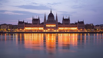
_2015-01.jpg)
_2015-02.jpg)
.jpg)


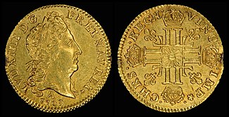


.jpg)
.jpg)


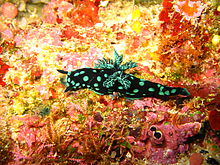

.jpg)


.jpg)
.jpg)
.jpg)


.jpg)
.jpg)
.jpg)

 please.
Hafspajen (
talk) 15:08, 9 September 2015 (UTC)
please.
Hafspajen (
talk) 15:08, 9 September 2015 (UTC) Looking west along the original medieval section to the Selden End
 Looking north in the Arts End
 Looking east in the medieval section to the Arts End
 Looking north in the Arts End
 Looking south in the Arts End


.jpg)


.jpg)
.jpg)

.jpg)


.jpg)
.jpg)

 Turban Head Quarter eagle (stars) (1796–1807)
.jpg)
.jpg)
 Capped Bust Quarter eagle (1808)
 Capped Head Quarter eagle (large, 1821–1827)
.jpg)

 Capped Head Quarter eagle (reduced size, 1829–34)
 Classic Head Quarter eagle (1834–39)
.jpg)

 Liberty Head Quarter eagle (CAL) (1840–1907)
.jpg)


_(San_Salvador_Island,_Bahamas)_1_(15513345363).jpg)


.jpg)


.jpg)
.jpg)


 Daniel Case (
talk) 14:39, 24 September 2015 (UTC)
Daniel Case (
talk) 14:39, 24 September 2015 (UTC)

.jpg)
.jpg)
.jpg)
.jpg)
.jpg)
.jpg)
.jpg)
.jpg)
.jpg)
.jpg)
.jpg)
.jpg)
.jpg)
.jpg)
.jpg)
.jpg)
.jpg)
.jpg)
.jpg)
.jpg)
.jpg)
.jpg)
.jpg)
.jpg)
.jpg)
.jpg)
.jpg)
.jpg)
.jpg)
.jpg)
.jpg)
.jpg)
.jpg)
.jpg)
.jpg)
.jpg&action=edit§ion=T-1)
![[2]](http://www.google.fi/imgres?imgurl=http://sciencenotes.org/wp-content/uploads/2014/11/periodic-table-printable.png&imgrefurl=http://sciencenotes.org/periodic-table-wallpaper-2/&h=1080&w=1920&tbnid=TcBEsccJRIeL_M:&docid=6bIHh28XjucOxM&ei=4rrlVZ2YDsaGywPvtYfQDQ&tbm=isch&ved=0CDwQMygJMAlqFQoTCJ2R-raK1scCFUbDcgod79oB2g)
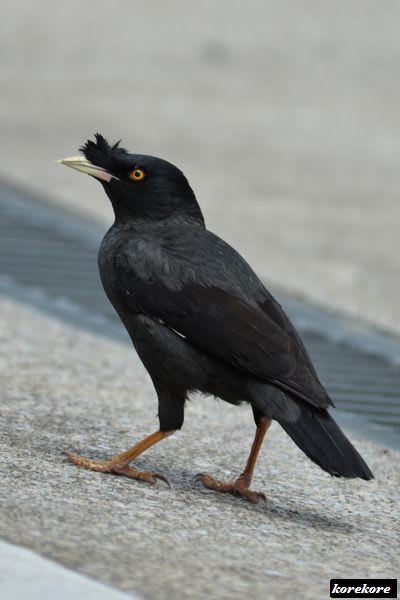
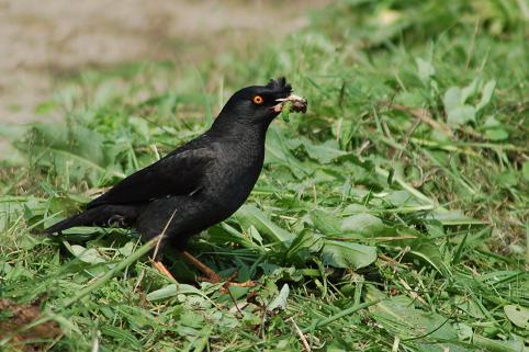
.jpg)
.jpg)
.jpg&action=edit§ion=T-1)
![[5]](https://upload.wikimedia.org/wikipedia/commons/archive/3/3b/20110823161312!Lathriastreptophora.JPG)
.jpg)
.jpg)
.jpg&action=edit§ion=T-1)
.jpg&diff=172573761&oldid=172571988)
.jpg)
_-_Burgomaster_Arnold_von_Brauweiler_-_WGA03660.jpg)
.jpg)

