| Featured picture tools |
|---|
Please cut and paste new entries to the bottom of this page, creating a new monthly archive (by closing date) when necessary.
Budgerigar diagram

- Reason
- Good SVG, which we rarely have for nominations, so I thought this budgerigar diagram would be a good nom.
- Articles this image appears in
- Budgerigar
- Creator
- ZooFari
- Support as nominator -- Zoo Fari 02:43, 23 September 2009 (UTC)
- Comment The text is pretty small in the thumbnail version present in the article. Can you increase the size a bit? Makeemlighter ( talk) 02:53, 23 September 2009 (UTC)
*Support. Illustrates the subject in a way that provides oodles of encyclopedic value.
Mostlyharmless (
talk) 03:43, 23 September 2009 (UTC)
- Neutral, pending clarification. I'm no longer convinced that this has been labeled properly. Mostlyharmless ( talk) 10:10, 24 September 2009 (UTC)
- Comment Spelling should be "cheek" with a double e. Generally a bit low on useful information, e.g. sexual parts not labelled (cloaca). Papa Lima Whiskey ( talk) 08:12, 23 September 2009 (UTC)
- Spelling fixed. I've added it as "Vent" based on other sources, but it's the same thing as a cloaca. Zoo Fari 00:35, 24 September 2009 (UTC)
- Comment Unless there is a separate size given for captive individuals then I think the scale is off. The article says: "Budgerigars in their natural-habitats of Australia average 18 cm (7 in) long". This is 8.5in vertically implying 9.5in or so along the body. Noodle snacks ( talk) 10:47, 23 September 2009 (UTC)
- Oppose Quite low on encyclopedic value IMO. Nothing is labeled that I wouldn't be able to figure out for myself easily enough. I also don't see the need for a labeled illustration, a labeled photograph would be more informative (not that I'm saying we need a labeled anything). Finally, the illustration is merely decent and lack "wow" power to be featured.-- Remurmur ( talk) 11:26, 23 September 2009 (UTC)
- Comment. The label line for the ear coverlets seems to be thicker than the other lines. Also, we probably shouldn't be using inches on an anatomy diagram. Otherwise looks great. Kaldari ( talk) 15:07, 23 September 2009 (UTC)
Oppose for now, given the large number of unresolved concerns above. Papa Lima Whiskey ( talk) 21:29, 23 September 2009 (UTC)Struck because immediate problems have been addressed, more EV added. Papa Lima Whiskey ( talk) 09:04, 24 September 2009 (UTC)- Note more labels added. Zoo Fari 00:58, 24 September 2009 (UTC)
- Erm Wing pigments? That's not an anatomical feature. I can only guess that maybe you abbreviated too much? A pigment is colored chemical. I'm not even sure that the wing pigments would be any different from pigments anywhere else on the body - it implies that the color would also be different. If that's what you meant to say, I'd like to see a reference, as my experience says that the colors of the wing are the same as the back of the head and neck. Papa Lima Whiskey ( talk) 01:45, 24 September 2009 (UTC)
- Oppose, not loving this at all. Don't like the diagram itself, and I'm not seeing much value in the annotations. Compared to
another anatomy diagram or
another parrot, this is severely lacking.
J Milburn (
talk) 14:45, 25 September 2009 (UTC)
-
Bird anatomy diagram.
Papa Lima Whiskey (
talk) 14:54, 25 September 2009 (UTC)
- @ Milburn: A snail tends to have more exotic features especially since your example includes the interior as well. I don't understand your point in the second example of the lorikeet, but I suppose this diagram could have more. @ Papa Lima Whiskey: Thanks for sharing the diagram. It's unsourced though but I would definitely include some of those labels. Some are redundant though (like the belly) so that's why my image seems to lack more features than the bird anatomy one.
Zoo
Fari 22:13, 25 September 2009 (UTC)
- I would prefer "abdomen" over "belly", although I agree it's not an absolutely necessary label - neither so is "flank", probably, but I think there's some artistic freedom in those kinds of things. What I do wonder, though, is whether "visible" is redundant. Papa Lima Whiskey ( talk) 12:21, 26 September 2009 (UTC)
- @ Milburn: A snail tends to have more exotic features especially since your example includes the interior as well. I don't understand your point in the second example of the lorikeet, but I suppose this diagram could have more. @ Papa Lima Whiskey: Thanks for sharing the diagram. It's unsourced though but I would definitely include some of those labels. Some are redundant though (like the belly) so that's why my image seems to lack more features than the bird anatomy one.
Zoo
Fari 22:13, 25 September 2009 (UTC)
-
Bird anatomy diagram.
Papa Lima Whiskey (
talk) 14:54, 25 September 2009 (UTC)
Not promoted -- Makeemlighter ( talk) 01:40, 1 October 2009 (UTC)
Micrantheum serpentinum

- Reason
- Quite a rare plant. Only found in a few places on the West Coast of Tasmania (and the botanical gardens). Not many images of this genus or family.
- Articles this image appears in
- Micrantheum serpentinum, Micrantheum, Caletieae
- Creator
- Noodle snacks
- Support as nominator -- Noodle snacks ( talk) 07:22, 22 September 2009 (UTC)
- Comment A scale would help. Thanks (also for the comment on my talk page). Papa Lima Whiskey ( talk) 00:52, 23 September 2009 (UTC)
- Support. Illustrates the subject well. Mostlyharmless ( talk) 22:01, 24 September 2009 (UTC)
- Support Quite nice work! Shoemaker's Holiday Over 208 FCs served 09:22, 27 September 2009 (UTC)
- Support. Not much wow perhaps, but good enough. -- jjron ( talk) 13:07, 27 September 2009 (UTC)
Promoted File:Micrantheum serpentinum.jpg -- Makeemlighter ( talk) 01:47, 1 October 2009 (UTC)
Westertoren, Amsterdam

- Reason
- The quality is there. I'm not certain, if you'll agree with me on the EV. The picture doesn't fully depicts the tower, as the base is missing. This somewhat limits the EV. The reason for not depicting the whole tower is, because otherwise the base would be obscured by trees and other sorts of objects. This would only reduce the esthetics of the image, without adding valuable information to it. I personally also think, that the tower look better isolated against the sky. To compensate this loss, I've made a close-up with a whole lot of detail. As for you who think: "Why didn't he just made a shot of the tower and the church?" It is impossible to get them both in one picture and a FP of the church itself is impossible (no good viewing point available). The tower is tilted and this image accurately depicts this tilt. I was somewhat surprised to find, that this tower doesn't has its own article. Over here the tower is often seen as an entity of its own, because it's among others made famous through songs, paintings, etc..
- Articles this image appears in
- Amsterdam and Westerkerk
- Creator
- Massimo Catarinella
- Support as nominator -- Massimo Catarinella ( talk) 22:12, 23 September 2009 (UTC)
- Comment. Any reason you chose not to center the tower in the frame? Kaldari ( talk) 23:14, 23 September 2009 (UTC)
- I personally think it improves the composition. --
Massimo Catarinella (
talk) 23:29, 23 September 2009 (UTC)
- Looks kinda awkward. --
Muhammad
(talk) 02:47, 24 September 2009 (UTC)
- I have to agree. I think it would look much better centered.
Kaldari (
talk) 18:57, 24 September 2009 (UTC)
- I've uploaded a different crop. The tower is now centered in the frame. -- Massimo Catarinella ( talk) 20:54, 24 September 2009 (UTC)
- I have to agree. I think it would look much better centered.
Kaldari (
talk) 18:57, 24 September 2009 (UTC)
- Looks kinda awkward. --
Muhammad
(talk) 02:47, 24 September 2009 (UTC)
Oppose until the tilt is removed (or is that tower leaning IRL?),and the awkward (I second Muhammad here) composition is changed. Some subjects just work better centered (like symmetric ones for example). -- Dschwen 21:09, 24 September 2009 (UTC)
- I uploaded a new version with the tower centered ten minutes ago.... As for the tilt..as I said in the above text, it is accurate. How do I know this: 1. I've made this picture with a tripod containing a water bubble from a flat surface. 2. After making the picture, I compared the image on my DSLR with the real tower. 3. After processing it through Photoshop, I compared it with images of the tower available on Google. I know it's an awkward tilt, but it's as it is. --
Massimo Catarinella (
talk) 21:16, 24 September 2009 (UTC)
- Support now. Beautiful colors, acceptable resolution (a bit too much downsampling though). A bubble hardly has a precision of more than one degree (has it?). But you are right, on second look it is pretty straight. The perspective (slight side view) threw me off. --
Dschwen 21:29, 24 September 2009 (UTC)
- Actually, on third look, it is crooked. And what's worse it seems to be bent (the top is leaning further than the bottom part). Stitching goof? --
Dschwen 21:35, 24 September 2009 (UTC)
- Yep, you're right, it is bent. And this is not a stitching error. I also noticed it when photographing the tower (forgot to mention it in the above section). Seriously, the only explanation I can think of is, that every part of the tower is tilted in its own manner (which I have encountered before in other towers, see Dom Tower of Utrecht) Use the word 'Westertoren' with Google and take a look at the images. The second one is of a decent resolution and also shows this bend. Another way of inspecting the tower is by inserting 'Westertoren' in YouTube and click on the second link. This is a movie from 1934, which also shows the bend (only from a different viewing point). An even better movie is 'Brian & Graham, Amsterdam 2009 (Westertoren)' a few clicks down. Anyhow, I think you get my point ;). -- Massimo Catarinella ( talk) 23:01, 24 September 2009 (UTC)
- Actually, on third look, it is crooked. And what's worse it seems to be bent (the top is leaning further than the bottom part). Stitching goof? --
Dschwen 21:35, 24 September 2009 (UTC)
- Support now. Beautiful colors, acceptable resolution (a bit too much downsampling though). A bubble hardly has a precision of more than one degree (has it?). But you are right, on second look it is pretty straight. The perspective (slight side view) threw me off. --
Dschwen 21:29, 24 September 2009 (UTC)
- Support-- Avala ( talk) 10:17, 25 September 2009 (UTC)
- Comment Behind the crown appears to be a large line sticking out-is this part of the tower or(as I believe it to be)a handily placed plane trail? Lemon martini ( talk) 11:24, 26 September 2009 (UTC)
- That's a flagpole. -- Massimo Catarinella ( talk) 13:38, 26 September 2009 (UTC)
- Support. An interesting and well presented view of the tower, bends and leans and all. :-) Diliff | (Talk) (Contribs) 10:00, 27 September 2009 (UTC)
Promoted File:WestertorenAmsterdam.jpg -- Makeemlighter ( talk) 02:01, 1 October 2009 (UTC)
Barn Owl in flight Tyto alba.

- Reason
- rare moment and encyclopedic value
- Articles this image appears in
- Barn Owl
- Creator
- Luc Viatour ( talk)
- Support as nominator -- Luc Viatour ( talk) 08:51, 24 September 2009 (UTC)
- Oppose. While the image is of a reasonable size, the owl only makes up a small part of it, and since the EV for this image is based on its illustration of the Barn Owl, that's a reasonable requirement. Even with a generous crop it would push size boundaries, and the owl is rather blurry. I do appreciate the difficulties in capturing a bird in motion, and it's a good photo, but unfortunately not FP worthy in my opinion. Mostlyharmless ( talk) 09:51, 24 September 2009 (UTC)
Not promoted -- Makeemlighter ( talk) 04:46, 1 October 2009 (UTC)
Esplanade Avenue in New Orleans, 1900

- Reason
- It is an excellent image depicting one of the most famous avenues in New Orleans during the very early 20th century. There are many interesting things about this photo. First, the trees are painted white for reasons that are greatly debated amongst historians. The two prevailing arguments are either that they were painted white for better vision during night, or that it is actually some sort of insect repellent to keep the bottoms of trees from becoming rotted. Secondly, a streetcar is seen coming in the distance, with the four people in the foreground obviously waiting for it. This encompasses and epitomizes all that is New Orleans, even 110 years ago. Third, the buildings in the photo still stand today ( http://maps.google.com/maps?cbp=12,304.77,,0,-5.2&cbll=29.965140,-90.062643&ll=29.965140,-90.062643&layer=c) and the image serves as an excellent comparison to how the city looked then and now.
- Articles this image appears in
- New Orleans
- Creator
- Detroit Publishing Company photo via Library of Congress website
- Support as nominator -- Gonk ( talk) 15:56, 24 September 2009 (UTC)
- Oppose for now, the image is used to illustrate a section of the article titled
Twentieth century but apparently was taken in and depicts the
19th century (the last day of which was December 31st 1900). Wouldn't the image have greater value if some of the above information were included in an article or at least the at the image description page?
Guest9999 (
talk) 22:36, 24 September 2009 (UTC)
- Isn't the last day of the century Dec 31st 1899? I'm sure I celebrated the first day of the 21st Century on Jan 1st 2000, and thus Jan 1st 1900 would be the start of the 20th Century?! Or was I celebrating a year too early?! Gazhiley ( talk) 07:36, 25 September 2009 (UTC)
- Although I agree with you that the definitive turn of the century didn't come until January 1st 1901, I feel that the common belief (especially amongst people who don't know the exact science behind) is that most consider the beginning of the 20th century to be January 1st, 1900. It is this reason why I don't believe having the photo in the 20th century section is wholly inappropriate or unreasonable. I think there are definitely more people who'd be confused having the 1900 photo in the 19th century section as opposed to the 20th century.
Gonk (
talk) 16:15, 25 September 2009 (UTC)
- As an encyclopedia, we strive for accuracy. So I find it inappropriate to follow a misconception, even if it is a popular one. On the contrary, Wikipedia should help debunking this myth. This is a small mistake, easily corrected, but you could justify many bad ideas by saying "people often think this is right". I wouldn't want Wikpedia to go down that slope. Ksempac ( talk) 11:14, 28 September 2009 (UTC)
- Oppose Per criteria, the copyright notices have to be removed. This should have been done (or arranged for, if you will) before nominating. Papa Lima Whiskey ( talk) 21:16, 26 September 2009 (UTC)
- Oppose for compositional reasons. Yet the assertion about copyright notices is a misreading of FP criteria. Wikipedia has historic featured pictures whose copyright notices appear, and it would be somewhat strange and dogmatic to insist upon their removal. All that we require is that an image not actually be in full copyright, which is necessary for legal reasons.
Durova
320 19:33, 27 September 2009 (UTC)
- Could you explain the compositional issues? No one is really addressing why the image itself isn't up to par enough to be a featured image. The only two real issues here that have been talked about are the placement within the New Orleans article (which I feel is debatable), and the copyright on the image, which plenty of other featured images have and should not be held as reason for opposition against the image. Please, judge the image on its merits as a photo, please. Gonk ( talk) 23:34, 1 October 2009 (UTC)
Not promoted -- Makeemlighter ( talk) 01:07, 2 October 2009 (UTC)
File:Trafalgar Square 360 Panorama Cropped Sky, London - Jun 2009.jpg

- Reason
- It's about as complete a view of the square as possible, short of a nice angled aerial shot from a passing helicopter. ;-) The resolution is good, there are no (major) stitching errors AFAIK which was surprisingly difficult to achieve with so many people moving around, and although the lighting is a little dull due to the cloudy sky, it does keep the lighting consistent across the 360 degree view - something that would not possible in sunny conditions.
- Articles this image appears in
- Trafalgar Square
- Creator
- User:Diliff
- Support as nominator -- Diliff | (Talk) (Contribs) 13:15, 24 September 2009 (UTC)
- Support. Looks a bit over-sharpened at full res, but I can't find anything else to complain about. The lighting is nice and even, the resolution is impressive, and there are no stitching errors, halos, etc. Kaldari ( talk) 19:06, 24 September 2009 (UTC)
- Comment Pretty well stitched image. I see some issues around Nelson's Column: the whole thing looks to have a halo, there is a minor stitching flaw at the left side of the columns base, and there is a ghost of a girl at the left side of the columbs pedestal. Was any HDR used on this (I ask because of the haloing and noise in the darker areas of the image such as the entrance to the National Gallery) Cowtowner 23:44, 24 September 2009 (UTC)
- I was wondering that myself, although I assumed it was from oversharpening with a large radius.
Kaldari (
talk) 15:40, 25 September 2009 (UTC)
- I don't think it's oversharpening, although it's probably essentially the same thing - local contrast enhancement via the 'clarity' slider in Lightroom. I'm at work at the moment (as per below comments!) so I can't check the settings used or how much juice it was given, but it wouldn't surprise me if the (slight, surely!) halo around the column is due to this. Jeez, it must be 'pick on Diliff for niggly processing issues' week. ;-) Diliff | (Talk) (Contribs) 15:48, 25 September 2009 (UTC)
- I was wondering that myself, although I assumed it was from oversharpening with a large radius.
Kaldari (
talk) 15:40, 25 September 2009 (UTC)
- Support Nicely done panorama. I was also wondering, why that girls left of Nelson' Column is fading into the background. A little bit too much shadow reduction for my taste, but that's something minor and a personal taste. Btw, I like the fact that it's an overcast sky (since this isn't always ugly as shown here). -- Massimo Catarinella ( talk) 23:51, 24 September 2009 (UTC)
- Support Fantastic image... Though me thinks Diliff should spend a little more time working, and a little less time out of his office taking photgraphs myself... ;-) hehe Gazhiley ( talk) 07:49, 25 September 2009 (UTC)
- Support, per Kaldari. Mostlyharmless ( talk) 05:05, 26 September 2009 (UTC)
Promoted File:Trafalgar Square 360 Panorama Cropped Sky, London - Jun 2009.jpg -- Makeemlighter ( talk) 01:09, 2 October 2009 (UTC)
Diagram of the New York City Subway


- Reason
- illustrates the New York City Subway concisely and in orderly fashion. A previous version of this map was featured on French Wikipedia.
- Articles this image appears in
- New York City Subway, Transit map, List of New York City Subway stations
- Creator
- countZ
- Support as nominator -- CountZ ( talk) 17:37, 24 September 2009 (UTC)
- Very nice. I'm a big fan of metro and transit maps, and this is very neat. My only quibble is that some of the numbered streets (149 St, 67 Av) say "St" and "Av", but others do not, and many people unfamiliar with NYC might not understand these are actually street names.
Also, "Ave", rather than "Av" is the correct abbreviation of "Avenue".If this can be addressed, I'll support. Matthewedwards : Chat 04:41, 25 September 2009 (UTC)- "Av" is correct in New York.
New York street sign; see also
the official subway map. I can explain the naming rationale in depth-- but the gist of it is that it's common practice to omit "street" in New York subway maps.
See, for instance, this 1939 example, where all "st" markers are omitted, except for those required for clarity's sake.
CountZ (
talk) 05:54, 25 September 2009 (UTC)
- OK, I'm sold on the "Av"/"Ave" thing, but not regarding the omission of "St" "Av". We're (Wikipedia) not trying to replicate, duplicate or repeat stuff from the MTA's terrible map, and I would say that includes their naming quirks. Ours is here to serve as an additional piece of information for the reader of the articles it appears in. These readers may be from anywhere in the world who may never ride the subway or even visit New York. The numbers alone mean nothing to them, especially as "65" is not the street name, "65 St" is.
With regard to the font discussed below with ZooFari, I read web safe font to try to get an idea of what you are discussing, but it's badly written and I couldn't make much of it. Anyway, for me in FF and IE7, Edit 1 looks like a black smudge both at thumbnail and on the file page, where as the Original looks neat. Also, the type in Edit 1 overlaps with the lines and sometimes itself, making it difficult to read. In this respect, the Original is much better than Edit 1.
Regarding the actual design of the map, I can clearly see the influences from Vignelli's topological map, as well as Goldstein's earlier map for station connections and X markers for stops, although I think it is an improvement on both. I also prefer it for usability over the Kick map and Brennan's version, and especially over MTA's official geographical design. Your use of keeping the general geographical locations intact also works well for the majority, but it has resulted in a few odd angles such as by Coney Island, where routes D, M and R are at 30-degrees, but N, F, S and Q are at 45-degrees -- couldn't they all be 45? Similar regards for route G between Greenpoint and Willoughby, where I count 5 deviations from what could be a straight line, and route L between Lorimer and Jefferson. For your website and a true passenger alternative, they are better as they are shown now, but for Wikipedia purposes, I think these lines could be straightened out. Also, for Wikipedia purposes only, I feel it might be better to lose the "Late Night Service" box and the many different types of station markers for peak, weekday, nights, weekends, etc, leaving just complete white circles and the grey boxes for connections, because the articles do not go into this much detail.
As I said, as an alternative to the official map, I would use this map as it is, but with regards to Wikipedia, the more I think about it the more I think there are a couple of improvements that could be made. Matthewedwards : Chat 15:54, 26 September 2009 (UTC)- PS, just for clarity, I currently oppose Edit 1 unless someone can explain what improvements the blurry text has made, and my above comments are levelled towards only the Original. Matthewedwards : Chat 15:54, 26 September 2009 (UTC)
- Edit 2 is up. Re: angles. I've tried to stick to 90 and 45 degree angles where possible, but sometimes the geography is such that it's not possible to use 90 and 45 without losing useful detail. New Utrecht (D M) and 4th Avenue (R) run parallel to each other, but not to the rest of the street grid in that part of Brooklyn. The same goes for the L train between Montrose and Jefferson and the entirety of the G train, where it's useful to know the avenue it runs under. Compare with the Kick, Vignelli and MTA maps.
- Re: station markers. The subway is a complex bird. While the main NYC subway article doesn't have a separate section on service patterns, the individual line articles, like the article on the 2 Train, do.
- Re: station labels. Edit 2 has the street names fully written out. CountZ ( talk) 20:46, 26 September 2009 (UTC)
- OK, I'm sold on the "Av"/"Ave" thing, but not regarding the omission of "St" "Av". We're (Wikipedia) not trying to replicate, duplicate or repeat stuff from the MTA's terrible map, and I would say that includes their naming quirks. Ours is here to serve as an additional piece of information for the reader of the articles it appears in. These readers may be from anywhere in the world who may never ride the subway or even visit New York. The numbers alone mean nothing to them, especially as "65" is not the street name, "65 St" is.
- "Av" is correct in New York.
New York street sign; see also
the official subway map. I can explain the naming rationale in depth-- but the gist of it is that it's common practice to omit "street" in New York subway maps.
See, for instance, this 1939 example, where all "st" markers are omitted, except for those required for clarity's sake.
CountZ (
talk) 05:54, 25 September 2009 (UTC)
- I've just noticed something about the licensing, too. On your website (I'm assuming it's yours and you haven't just uploaded it from there), the same image is licensed cc-by-nc-3.0, but here it is cc-by-sa-3.0.
Matthewedwards :
Chat 17:19, 26 September 2009 (UTC)
- License is cc-by-sa 3.0. The map on my website is old.
CountZ (
talk) 20:59, 26 September 2009 (UTC)
- Great stuff. Support Edit 2 Matthewedwards : Chat 02:55, 27 September 2009 (UTC)
- License is cc-by-sa 3.0. The map on my website is old.
CountZ (
talk) 20:59, 26 September 2009 (UTC)
- I would normally oppose because no text is websafe and the map is unsourced, but since FPC hasn't established good SVG critiques, my vote is going to be neutral.
Zoo
Fari 22:49, 25 September 2009 (UTC)
- Source information has been updated. A version using Arial instead of Helvetica has been uploaded, though I think it's inappropriate to use the edited version, for two reasons. First, browsers don't handle SVG text particularly well. The diagram breaks when the fonts are displayed incorrectly, since the map is so complicated and at times crowded. My copy of Opera shows all of the text from Edit 1 in oversized Times Roman, while Safari renders everything just fine. Second, Helvetica is strongly associated with the subway in New Yorkers' minds, much as Johnston (typeface) is for the Tube. CountZ ( talk) 23:45, 25 September 2009 (UTC)
- Support original. Informative and eyecatching. Mostlyharmless ( talk) 01:10, 27 September 2009 (UTC)
- Support edit 2 Fantastic. The street names give it much greater EV, IMO. -- mcshadypl T C 17:46, 27 September 2009 (UTC)
- Support edit 2 Perfect subject for a transit FP; I was wondering whether this was PD. Durova 320 19:10, 27 September 2009 (UTC)
- Support Edit 2 Very nice. The font looks much better now. Extremely related to the topic. -- Tangerine!(also known as ashpotter) ( talk) 23:04, 27 September 2009 (UTC)
- Support Edit 2 - excellent map - info looks correct - the NY subway system is extremely complex, yet this map makes it looks simple and clear— Chris! c/ t 00:13, 28 September 2009 (UTC)
- Oppose while there are still in-image credits (bottom right). Sorry, I appreciate how much work has gone in to this, but when the photographers can't have in-photo credits, I don't think it's fair that the cartographers can.
J Milburn (
talk) 14:20, 28 September 2009 (UTC)
- Also, there are some symbols not explained on the key- not certain if it's a major issue, as they are clearly labelled, but the pathways, ferryway, airport, greenspace, water, non-station labels, airport bus, grey areas (it's not immediately obvious what they represent) and the little lines crossing the lines (see brown line around Hewes St, for instance) are not explained on the key. Also, the numbers and letters on the line are meaningless to me- what do they mean? J Milburn ( talk) 14:26, 28 September 2009 (UTC)
- We may have a precedent set by the Madrid Metro Map, it too has a credit on it. 68.147.59.209 ( talk) 03:03, 29 September 2009 (UTC)
- New York subway services are categorized by color and letter. The color denotes the Manhattan main line: thus, 6th Av is orange, Nassau St brown, etc. Each subway service has its own letter which represents a specific service pattern. Services are referred to by letter, never by color, because of the system's complexity and the wide variety of destinations. So: "Take the N-Q-R-W," never "take the yellow line." When lines share a main line and service pattern, they share a line on the map. So, for the Broadway line in Manhattan, there are three changes. From south to north: Below Canal the R W run local through Lower Manhattan while the N Q go straight to Brooklyn. between Canal and 42nd the line splits into three service patterns: Q (express all times) N (express weekdays, local other times) and R W (local). Above 42nd, the N merges with the R W, as all three lines go to Queens and make the same stops while the Q ends at 57th. This is intended to be a middle ground between
Vignelli's "ignore the geography and show every service as its own line" approach and
the modern MTA map's geography at all costs approach that ignores how the trains themselves operate.
CountZ (
talk) 13:12, 29 September 2009 (UTC)
- If you feel an explanation of that kind of thing is not needed in the image, I will trust your judgement, but I am still strongly opposed to the inclusion of the in-image credit. Surely, it would be better without it, and as it can easily be removed, we should not be promoting it at this time. J Milburn ( talk) 13:29, 29 September 2009 (UTC)
- Support edit 2 Out of curiosity, what is the procedure for altering an existing FA like this if, say, the Subway lines change? Staxringold talk contribs 18:02, 1 October 2009 (UTC)
Promoted File:NYC_subway-4D.svg -- Makeemlighter ( talk) 01:21, 2 October 2009 (UTC)
Tulip Stamen Tip

- Reason
- Quite a valuable image in my view. You can see the individual grains of pollen.
- Articles this image appears in
- Pollen, Pollination, Flower, Tulip
- Creator
- Noodle snacks
- Support as nominator -- Noodle snacks ( talk) 07:15, 22 September 2009 (UTC)
- Weak oppose This existing FP is a more detailed resource about pollen. As for the stamen, this image doesn't tell me anything about the structure of the stamen, or how pollen grains develop. It just shows what a big mess it is at the end of the day, which is not a whole lot of EV. Papa Lima Whiskey ( talk) 01:00, 23 September 2009 (UTC)
- Oppose Per PLW's reasons, nifty macro shot, but it isn't really giving any EV on the structure of the flower, because it's so macro. The FW picture PLW linked too is great to illustrate the structure of pollen, and this image doesn't illustrate that way, nor can it illustrate the structure of the stamen. — raeky ( talk | edits) 04:22, 23 September 2009 (UTC)
- Comment, File:Misc pollen.jpg is not even marginally similar to this in my opinion. – Juliancolton | Talk 16:28, 24 September 2009 (UTC)
- Questions At what magnification was this taken at? Compared to your other flower pics, why isn't the whole thing in focus? --
Muhammad
(talk) 10:28, 27 September 2009 (UTC)
- 5x. Didn't think it was needed. It is already a moderate stack. Noodle snacks ( talk) 10:33, 27 September 2009 (UTC)
"Support This is an astounding image. I have never seen a better llustration of pollen in its natural state, as opposed to removed from the stamen and put under an electon microscope, losing all colour detail. Shoemaker's Holiday Over 209 FCs served 10:04, 29 September 2009 (UTC)
- Support Fantastic image per Shoemaker's Holiday. mgiganteus1 ( talk) 15:26, 30 September 2009 (UTC)
- Oppose - Per shallow DoF. -
☩
Damërung
☩
. -- 05:20, 1 October 2009 (UTC)
- What difference does it make in the articles? It is already a 17 image stack. Noodle snacks ( talk) 06:35, 1 October 2009 (UTC)
- Comment Pollen can take any color. Papa Lima Whiskey ( talk) 19:11, 1 October 2009 (UTC)
Not promoted -- Makeemlighter ( talk) 04:44, 2 October 2009 (UTC)
Lactarius indigo gills

- Reason
- There simply isn't a better picture of the gills of this unique species to be found on the internet. Not the "traditional" mushroom pose, but it would be difficult to see the gills otherwise. Meets size requirements, nice composition, "wow" factor, and as a bonus one can see "milk" (latex) exuding from the broken stem. Also visible is the hollowness of the stem (mentioned in the species article), further adding to EV.
- Articles this image appears in
- Lactarius indigo, List of Lactarius species, blue
- Creator
- Dan Molter at Mushroom Observer
- Support as nominator -- Sasata ( talk) 17:04, 24 September 2009 (UTC)
- Weak Support. Atypical pose, slight purple fringing on edges. Otherwise a very striking image and good illustration. Kaldari ( talk) 21:29, 24 September 2009 (UTC)
- Comment I thought it was a satellite dish at first. Heh. How big is this thing? My main concern from the pic is that the scale is really hard to judge. It looks huge, from the article, the cap is only 5-15cm across. Also given the poor lighting, like the overexposed edges, and distracting highlights in background, would probably oppose. Very nice, interesting pic though. Stevage 21:58, 24 September 2009 (UTC)
- I'm not sure exactly what the size is, but I would have thought the leaves and moss would help give a good perspective. Of course, I'm rather used to looking at leaves and moss, so maybe it's just me...
Sasata (
talk) 22:22, 24 September 2009 (UTC)
- Oppose - agonised over this a bit, but to me it has too many defects, the worst of which is probably the huge shadow. And I really just can't get the sense of scale no matter how many times I stare at the neighbouring leaves. Also the out-of-focus broken stem is a pity. Stevage 06:37, 30 September 2009 (UTC)
- I'm not sure exactly what the size is, but I would have thought the leaves and moss would help give a good perspective. Of course, I'm rather used to looking at leaves and moss, so maybe it's just me...
Sasata (
talk) 22:22, 24 September 2009 (UTC)
- Comment if this is not the natural pose then is it appropriate to use the natural environment? Guest9999 ( talk) 22:51, 24 September 2009 (UTC)
- Support-- Avala ( talk) 10:16, 25 September 2009 (UTC)
- Support, love this image, I feel it is very striking and informative. Lactarius species are known as "milkcaps", so being able to see the gills and milk is extremely useful- especially on such a weird species. It's also currently my desktop wallpaper. J Milburn ( talk) 14:39, 25 September 2009 (UTC)
- Support Maxis ftw ( talk) 00:09, 26 September 2009 (UTC)
- Comment The over-exposed bits (leaves?) are a shame. —
Darxus (
talk) 21:21, 28 September 2009 (UTC)
- I can only assume the picture was taken in woodland, probably in dappled light. The high exposure would be needed to stop the subject becoming dark. If I'm honest, I'd never noticed them, and this is my desktop wallpaper :) I don't think they detract from the image, and, if anything, give it a little character. J Milburn ( talk) 09:45, 29 September 2009 (UTC)
- Support - Excellent resolution and originality. - ☩ Damërung ☩ . -- 05:20, 1 October 2009 (UTC)
- Comment Is it just me or does this have fairly serious jpeg artifacting?
Makeemlighter (
talk) 04:41, 2 October 2009 (UTC)
- I don't see any obvious compression artifacts? I think you may be seeing what I would consider a less then professional quality CCD in the camera visible if you zoom in, but at this high of resolution a reduction in size of the image will make all that vanish and I don't think it's enough of an issue to prevent it from being a FP. —
raeky (
talk |
edits) 06:51, 2 October 2009 (UTC)
- Fair enough. I just thought I'd check before I closed it. Makeemlighter ( talk) 22:02, 2 October 2009 (UTC)
- I don't see any obvious compression artifacts? I think you may be seeing what I would consider a less then professional quality CCD in the camera visible if you zoom in, but at this high of resolution a reduction in size of the image will make all that vanish and I don't think it's enough of an issue to prevent it from being a FP. —
raeky (
talk |
edits) 06:51, 2 October 2009 (UTC)
- Support Great eye popping example of a rare color for mushrooms. — raeky ( talk | edits) 06:46, 2 October 2009 (UTC)
Promoted File:Lactarius indigo 48568.jpg -- Makeemlighter ( talk) 22:02, 2 October 2009 (UTC)
An image with scale

- Reason
- This image provides scale, which is the most important criteria for any Featured Picture ;P
- Articles this image appears in
- yard
- Creator
- Bggoldie
- Support as nominator -- Kaldari ( talk) 22:36, 25 September 2009 (UTC)
- Oppose Obvious technical flaws; useless in terms of scale given the perspective and the fact that the image compares various measurements against each other, something that could be accomplished in a diagram with greater accuracy than rusting metal provides. 68.147.59.209 ( talk) 22:50, 25 September 2009 (UTC)
- Weak Oppose - No metric equivalents given. 166.77.6.4 ( talk) 23:14, 25 September 2009 (UTC)
- Oppose Bad crop and composition. And I agree with the 68.147.59.209 that this could be better illustrated by a diagram. -- Muhammad (talk) 00:00, 26 September 2009 (UTC)
- Oppose because of the angle it was taken from.-- Otterathome ( talk)
- Oppose Scale not in metric units. Noodle snacks ( talk) 07:01, 27 September 2009 (UTC)
- Weak Support Would be improved by adding scale bar though. Flying Freddy ( talk) 14:26, 27 September 2009 (UTC)
- Oppose as per all above. The composition just isn't there, and the lighting is poor. J Milburn ( talk) 10:46, 28 September 2009 (UTC)
Not promoted -- Makeemlighter ( talk) 22:15, 2 October 2009 (UTC)
Kostas Martakis

- Reason
- Sorry if people are getting sick of these nominations, but I love images submitted by representatives of the subject. After this (viewable only by OTRS volunteers) rather exciting email, we may now be getting a large number of high quality images from Universal Music Greece, which is great news. See also this great image, also of Martakis. The nominated image is a professional quality headshot, very typical of a publicity shot in terms of composition, that shows the subject in a very compelling way. Note that it is also the basis of an album cover. Technically sound, and certainly makes the viewer want to know more!
- Articles this image appears in
- Kostas Martakis, Head_shot#Entertainment_industry
- Creator
- Universal Music Greece
- Support as nominator -- J Milburn ( talk) 15:00, 25 September 2009 (UTC)
- Strong oppose Excessive digital manipulation.
Papa Lima Whiskey (
talk) 15:05, 25 September 2009 (UTC)
- I thought that at first, but after some Googling, it seems his eyes are actually that colour.
J Milburn (
talk) 15:06, 25 September 2009 (UTC)
- His eye color is completely different in the other image, and I think I can see traces of cloning, but the artificial eyes are enough for me to oppose. Papa Lima Whiskey ( talk) 16:44, 25 September 2009 (UTC)
- They aren't fake. I think the eye colour is also perfectly natural, going on
[1]. It is just a question of lighting. Look closely at the reflections in his eyes. There is one
softbox top and slightly right (top square) and another smaller one below and a bit right too. The net effect is a fairly shadowless image, it reminds me of a ring light. I can't speak for cloning, but the light source is very soft, and he probably has makeup on.
Noodle snacks (
talk) 21:14, 25 September 2009 (UTC)
- I really can't say with certainty, but if I had to make a call, I would say it is extremely soft and warm (yellow spectrum) lighting being used which creates enhanced bluishness. Just look at his ears, which are not made up, and there is no reason to digitally manipulate. But I can't rule it out, and I am no expert on these matters. On the basis of the other photos in the article, his eyes are a slightly greener shade than this. I looked at other images on the internet and they seem to bear this out (although most were not such close ups, excepting thisWhat makes his eyes look more fake is that his entire face is heavily made up. Take a close look at the image, and you'll see tonnes of foundation. It hides a nice character scar under his eye, unfortunately.For a pop entertainer like Martakis, makeup is not really a problem as far as I'm concerned. But deliberate manipulation to create an unrealistic effect is. I have too many concerns to support this image. Mostlyharmless ( talk) 05:02, 26 September 2009 (UTC)
- I thought that at first, but after some Googling, it seems his eyes are actually that colour.
J Milburn (
talk) 15:06, 25 September 2009 (UTC)
OpposeNeutral I love celeb shots as much as the next guy, but I'm pretty sure those eyes are fake. Google-ing him all the advertisements with him and such have him with those eyes, but more casual shots like this show something more normal. I would guess he gets them made up to make better man-candy for ads/promotions. And yes, I would say that's the first time anyone has ever written "man-candy" in an FPC vote. Staxringold talk contribs 19:37, 25 September 2009 (UTC)
- Changed to neutral because I respect Durova's opinion. Staxringold talk contribs 14:03, 28 September 2009 (UTC)
- Oppose per Staxringold. And I know 14 year old boys that can grow a better beard. Cacophony ( talk) 06:04, 26 September 2009 (UTC)
- Support The amount of digital manipulation is appropriate for the genre. Quite a good example of its type. If we ever manage to get a
George Hurrell in the public domain I'd promote it in a heartbeat; Hurrell's portraits were heavily and masterfully retouched. Let's exercise appropriate discretion per the subject matter in our application of FP criteria.
Durova
320 05:09, 27 September 2009 (UTC)
- Have added the portrait to Head_shot#Entertainment_industry, which (amazingly) was an article that had no illustration at all. One would expect that aspiring entertainers would be elbowing each other for space on that page. Kudos to Mr. Martakis for understanding free culture. Durova 320 22:54, 27 September 2009 (UTC)
- Support per Noodle snacks about the lighting and Durova -- Muhammad (talk) 07:21, 27 September 2009 (UTC)
- Support: I have to agree with Durova. This is his image, this is what he sells. This is what is plastered on the front of thousands of his albums. In that context, this is the encyclopaedic image, not a candid shot of him showing his eyes are much darker or greener. For the genre and for his Greek music star persona, it's an excellent example. Maedin\ talk 08:40, 27 September 2009 (UTC)
- Support. Durova and Maedin have convinced me of the encyclopedic value of this image. Mostlyharmless ( talk) 09:07, 27 September 2009 (UTC)
- Support per Durova and Maedin. -- Ser Amantio di Nicolao Che dicono a Signa? Lo dicono a Signa. 15:06, 27 September 2009 (UTC)
- Comment All that the supporters here have said is frankly rubbish as long as the manipulation of the photograph is not acknowledged in image captions, which it currently isn't. Newspapers voluntarily adopted a standard to not let image manipulation go uncommented, and the more serious ones do, in fact, largely exclude it from their reporting. I really feel we'd be falling well short of widely adopted standards of honesty in featuring an image without giving the reader the opportunity to understand that what he or she is looking at is an illusion created by a designer - it's on the same level as the recent debate about how using photoshopped (usually female) models in advertising encourages eating disorders and may yet come to be outlawed in some countries. Relevant recent and not-so-recent news coverage:
[2]
[3]
[4] Our own criteria here at FPC explicitly include the phrase "not deceptive". The criteria allow for "color correction" but not augmentation. For me, there's never been a clearer case that an image should be rejected. And if you're worried that the Universal Music Greece stream of images will come to a halt if this doesn't get promoted, you should never have nominated it. In my opinion, such political motives should never affect the rationality of our decisions: Have we become so un-free as to start pandering to commercial interests? Are we so quick to abandon the free content mission? Wake-up call, over and out.
Papa Lima Whiskey (
talk) 10:36, 29 September 2009 (UTC)
- What the Hell are you talking about? You do speak some crap. First of all, we aren't unanimous about whether this has been modified, and, secondly, no one is allowing "political motives ... affect the rationality of our decisions". I'm not even sure if the uploader or the person who contacted me from Universal Music Greece are aware of this discussion- I didn't tell them. I nominated this because I think it is a high quality image, of a type underrepresented on Wikipedia. J Milburn ( talk) 13:27, 29 September 2009 (UTC)
- I agree that if this is accepted, and if this has been modified, the caption needs to say so. —
Darxus (
talk) 21:15, 29 September 2009 (UTC)
- The only political motives that appear to be visible here are those of the individual who makes accusations of "pandering to commercial interests". If the business community perceives advantages to free licenses, why shouldn't their submissions merit an equal footing with everything else? When US Government public domain material gets nominated we don't "pander" to a federal bureaucracy; we review content.
Durova
320 22:24, 30 September 2009 (UTC)
- We have criteria ( link), which remain as clear as before on the matter of color-manipulated images. Papa Lima Whiskey ( talk) 19:45, 1 October 2009 (UTC)
- The only political motives that appear to be visible here are those of the individual who makes accusations of "pandering to commercial interests". If the business community perceives advantages to free licenses, why shouldn't their submissions merit an equal footing with everything else? When US Government public domain material gets nominated we don't "pander" to a federal bureaucracy; we review content.
Durova
320 22:24, 30 September 2009 (UTC)
- Weak Support. Mainly for its use in Head shot. Not a fan of heavily photoshopped images for biography articles. Kaldari ( talk) 15:54, 30 September 2009 (UTC)
Promoted File:MARTAKIS1.jpg -- Makeemlighter ( talk) 00:56, 3 October 2009 (UTC)
Extermination of Evil Tenkeisei

- Reason
- This is a high resolution image of a National Treasure of Japan.
- Articles this image appears in
- List of National Treasures of Japan (paintings)
- Creator
- unknown (uploaded by Bamse)
- Support as nominator -- bamse ( talk) 20:14, 25 September 2009 (UTC)
- Support per nom. I've expanded the caption to enhance EV. Brand t] 17:43, 27 September 2009 (UTC)
- Support Very striking artwork. — raeky ( talk | edits) 22:11, 1 October 2009 (UTC)
- Support Shoemaker's Holiday Over 210 FCs served 22:48, 2 October 2009 (UTC)
Promoted File:Extermination_of_Evil_Tenkeisei.jpg -- Makeemlighter ( talk) 00:26, 4 October 2009 (UTC)
Bengalia sp. in Bangalore

- Reason
- Good quality, EV, lighting.
- Articles this image appears in
- Bengalia. Could also be used in Calliphorinae since it shows a living specie.
- Creator
- Muhammad Mahdi Karim
- Support as nominator -- Muhammad (talk) 15:17, 27 September 2009 (UTC)
- Support. In spite of depth of focus issues I love the color and composition. Good enough for identification purposes. Durova 320 15:48, 27 September 2009 (UTC)
- Support The focus issue isn't very big, the parts that would logically be out of focus are and the important parts are in focus. It wasn't focus stacked (or at least not much?) but at least the proper part of the fly was in focus. Not really an issue I don't think. — raeky ( talk | edits) 16:05, 27 September 2009 (UTC)
- Support, as above. Not your best, but still a great picture. J Milburn ( talk) 10:44, 28 September 2009 (UTC)
- Weak oppose Why not add a scale bar to the image?
Papa Lima Whiskey (
talk) 13:19, 28 September 2009 (UTC)
- Unless the lens is set to 1:1 it is hard to do so without dubious accuracy. My guess is this one is bigger than that. Noodle snacks ( talk) 22:12, 28 September 2009 (UTC)
- And what's your take, Muhammad? Papa Lima Whiskey ( talk) 10:03, 29 September 2009 (UTC)
- Support, per Durova. Mostlyharmless ( talk) 03:27, 29 September 2009 (UTC)
- Support Noodle snacks ( talk) 08:03, 30 September 2009 (UTC)
- Support - Excellent detail and set of colors. - ☩ Damërung ☩ . -- 05:20, 1 October 2009 (UTC)
Promoted File:Bengalia sp.jpg-- Shoemaker's Holiday Over 210 FCs served 23:37, 3 October 2009 (UTC)
Connie Mack

- Reason
- Connie Mack managed the Philadelphia Athletics baseball team for 50 seasons and was the only Major League Baseball manager to win consecutive World Series championships on separate occasions (1910-1911 and 1929-1930). This happens to have been taken between the 1910 and 1911 championships. Restored version of File:Connie Mack.jpg.
- Articles this image appears in
- Connie Mack (baseball), History_of_the_Oakland_Athletics#The_First_Dynasty_and_aftermath, Oakland Athletics managers and ownership
- Creator
- Paul Thompson
- Support as nominator -- Durova 320 05:27, 27 September 2009 (UTC)
- Weak Oppose Has a focus issue with his face, half of his face (Front half) is out of focus. Likewise the very weak contrast in his eyes makes this picture creep me out to a very high degree. — raeky ( talk | edits) 16:03, 27 September 2009 (UTC)
- Weak Oppose I also immediately noticed that the center of his face is out-of-focus. -- mcshadypl T C 17:42, 27 September 2009 (UTC)
- Weak Support Though the center of the face is slightly out of focus, I like the look of him not just staring into the camera, and instead looking past it (presumably to the field). The restoration is quite good, and the EV is certainly very high. NW ( Talk) 21:08, 27 September 2009 (UTC)
- Support Despite his face being out of focus, the restoration is good, when not viewed at full resolution the focus is excusable. Considering that we are unlikely to find a superior image of the subject I would be willing to overlook the flaws. Cowtowner 21:22, 27 September 2009 (UTC)
- Support, per Cowtowner. Non reproducible, still of high quality (in everywhere except the nose), very high EV, and draws the reader in to the page. Mostlyharmless ( talk) 23:28, 27 September 2009 (UTC)
- Support per nom. (unrelated to nom: Mack has the most untouchable record in all of sport. A manager would have to lose 100 games a year for 40 years to pass his loss total) Cacophony ( talk) 06:15, 28 September 2009 (UTC)
- Support per Cowtowner. Nice to see you took this one up, Durova! Staxringold talk contribs 13:56, 28 September 2009 (UTC)
- Also, added to Oakland Athletics managers and ownership.
Promoted File:Connie Mack3.jpg-- Shoemaker's Holiday Over 210 FCs served 00:31, 4 October 2009 (UTC)
Mount Rushmore
-2_new.jpg)
-3_new.jpg)
- Reason
- EV is high for both articles, image has been improved since its previous nomination. Original image is here, previously nominated image is here.
- Articles this image appears in
- Mount Rushmore
- Creator
- Dean Franklin
- Support as nominator --Cowtowner 00:19, 25 September 2009 (UTC)
- Support Awesome image. Staxringold talk contribs 01:26, 25 September 2009 (UTC)
- Support edit Good enough until a better one comes by. Also a nice touch to feature the lead image in a featured article (not that that affects my !vote). upstate NYer 03:24, 25 September 2009 (UTC)
- Comment I'm really not sure about this one. Noise in the sky and blurry foreground; we have an
existing FP of the subject, and probably several in the past. In terms of TFP, I'm sure this has been featured before, promoting this image may offer little value to the encyclopedia as a whole. Given that it's not really amazing, as UpstateNYer has also acknowledged, I see no strong reason to feature this.
Papa Lima Whiskey (
talk) 15:13, 25 September 2009 (UTC) (in fact, just check
Talk:Mount Rushmore to confirm that it's had oodles of exposure on the front page)
- Taking it from the top; admittedly, the foreground is not as sharp as the rest of the image, it is also not of the same importance. Noise in the sky, again, same deal for me. Though I'm not sure what TFP is, the fact that it has been perhaps shown on the front page and previous versions have appeared prominitely in project before doesn't strike me as a reason not to feature it. On the topic of the other featured picture, I think it's quite safe to say that the two are distinct images (the currently featured image seems to have it's EV primarily vested in
Air Force One). This is especially true in light of the multitude of featured bird and insect pictures which have truly striking similarities
68.147.59.209 (
talk) 22:48, 25 September 2009 (UTC).
- As a clarification, I am the IP who posted the above, my apologies. Cowtowner 17:39, 26 September 2009 (UTC)
- Taking it from the top; admittedly, the foreground is not as sharp as the rest of the image, it is also not of the same importance. Noise in the sky, again, same deal for me. Though I'm not sure what TFP is, the fact that it has been perhaps shown on the front page and previous versions have appeared prominitely in project before doesn't strike me as a reason not to feature it. On the topic of the other featured picture, I think it's quite safe to say that the two are distinct images (the currently featured image seems to have it's EV primarily vested in
Air Force One). This is especially true in light of the multitude of featured bird and insect pictures which have truly striking similarities
68.147.59.209 (
talk) 22:48, 25 September 2009 (UTC).
- Weak support - nice and sharp, great lighting - but would prefer a tighter crop. The rocky outcrop on the very right is particularly distracting because it looks like another face (or am I the only one). I'd take a bit off all four sides Stevage 06:33, 30 September 2009 (UTC)
- Oppose The saturation of the sky in the nominated version is 176 - an increase of 25% over the original's 140 - without good reason, since the original saturation looks quite good at the same exposure bump - see uploaded alt. Papa Lima Whiskey ( talk) 11:11, 30 September 2009 (UTC)
- Oppose original: Based on PLW's comments. The oversaturation of the sky is unreasonable, unnecessary, and looks very poor. Maedin\ talk 12:04, 30 September 2009 (UTC)
- Weak support edit, oppose original I definitely prefer this edit. The first picture had a strong overall contrast that made the monument appear dark, namely throughout Lincoln's face. The edit corrects this nicely. -- mcshadypl T C 17:18, 1 October 2009 (UTC)
- More comments on the edit, please. Makeemlighter ( talk) 04:47, 2 October 2009 (UTC)
- I'd take the alt over the original. Staxringold talk contribs 02:31, 3 October 2009 (UTC)
Promoted File:Dean_Franklin_-_06.04.03_Mount_Rushmore_Monument_(by-sa)-3_new.jpg-- Shoemaker's Holiday Over 210 FCs served 23:33, 3 October 2009 (UTC)
Cross-country mountain bike race

- Reason
- A good close-up of the future of men's cross-country mountain biking, focusing on the riders rather than just the bikes. EV is enhanced by the fact the numbers on the bikes reflect the riders' world ranking at the start of the race (#1 wasn't competing for some reason), and the eventual winner (#2) appears to be the main subject. I have also identified all riders on the front row, several of which would probably pass notability requirements. The dominance of Switzerland in this event is clear. Aesthetically, I like the nice bright colours - the blue background complements some of the white uniforms and helmets well. On the downside, the shadows are quite heavy, and perhaps I shouldn't have left half a rider on the right hand side. (I can upload an uncropped version if needed.) And an open (rather than U23) event would have had higher EV - but I wasn't there on the right day for that.
- Articles this image appears in
- Cross-country mountain biking, UCI Mountain Bike & Trials World Championships
- Creator
- Stevage
- Support as nominator -- Stevage 01:48, 28 September 2009 (UTC)
- Oppose - this image had potential, but unfortunately the lighting didn't work out. On a different day or a different time of day it might have turned out great, but having the sun at their back and their faces shaded reduces it to below FP quality IMO. Cacophony ( talk) 06:03, 28 September 2009 (UTC)
- Oppose. Agree about the lighting. The framing isn't great either, unfortunately. Mostlyharmless ( talk) 01:54, 29 September 2009 (UTC)
Not promoted -- Makeemlighter ( talk) 23:36, 4 October 2009 (UTC)
Blood values (change to the combined)

- Reason
- The image File:Reference ranges for blood tests - by mass.png (thumb below), showing reference ranges for blood tests sorted by mass has been a FP for almost a year now.

However, since then I've also made a combined image of mass and molar concentration (the molar one was considered too similar to, in itself, also be featured). Still, in my point of view, they should be viewed together, not only to get the whole picture, but also because mass values can more easily be translated to molar ones and vice versa by knowing their molar mass. Therefore, I suggest that the combined image should be FP instead of just the mass one.
- Articles this image appears in
- Potentially any article where en:File:Reference ranges for blood tests - by mass.png currently is on display.
- Creator
- Mikael Häggström
- Support as nominator -- Mikael Häggström ( talk) 15:01, 28 September 2009 (UTC)
- Support. Not quite as fun as your CT scans, but still encyclopedic and wonderful. Thank you for your dedication to the project. Durova 320 15:47, 28 September 2009 (UTC)
- Support. High encyclopedic value, "eye-catching to the point where users will want to read its accompanying article". For sections of articles about blood molar values, that's an achievement. Mostlyharmless ( talk) 01:51, 29 September 2009 (UTC)
- Support Wildly complicated image, but loaded with info. Staxringold talk contribs 17:59, 1 October 2009 (UTC)
- Support I believe I supported both (I can't find the molarity nom, though,?). Very clear, accurate based on several sources I own, and detailed. Spencer T♦ Nominate! 01:42, 3 October 2009 (UTC)
- Support An impressively informative illustration. Sam Barsoom 04:36, 3 October 2009 (UTC)
Promoted File:Blood values sorted by mass and molar concentration.png -- Makeemlighter ( talk) 22:29, 5 October 2009 (UTC)
- Please note that this nomination only results in a promotion of the mass/molar concentration picture. If you think that this picture makes the other one unnecessary, please nominate it to be delisted. Thanks :) Makeemlighter ( talk) 22:29, 5 October 2009 (UTC)
- Great! I'll nominate the mass-only picture for delisting. Mikael Häggström ( talk) 04:55, 6 October 2009 (UTC)
Messier 5 globular star cluster captured by Hubble space telescope

- Reason
- Wikipedia already features the Hubble's ultra deep field with 10,000 galaxies. How about a star cluster with 100,000 stars?
- Articles this image appears in
- Messier 5, List of Messier objects
- Creator
- NASA, STScI, WikiSky
- Support as nominator -- friendlystar ( talk) 20:02, 28 September 2009 (UTC)
- Comment. It would be facetious to oppose for 'lens artifacts and blown highlights' I suppose, but it doesn't have the great colour and variety that the Hubble ultra deep field has. Also, there seems to be a blue streak near the bottom. Any idea what that is?
Diliff |
(Talk)
(Contribs) 08:21, 29 September 2009 (UTC)
- My guess would be something closer in our solar system moving across the camera's field of vision during the exposure, hubble does use long exposures. I also don't think it is up to par with what we're accustomed to seeing with hubble. It does provide EV for a star cluster, but beyond that it isn't going to win votes for being hubble's best work. —
raeky (
talk |
edits) 17:39, 30 September 2009 (UTC)
- Considering how incredibly small the field of view likely is in this shot I would guess it is not something closer passing in front of the camera. I don't know what it is though. There is also an orange streak near the top. Sam Barsoom 01:13, 3 October 2009 (UTC)
- My guess would be something closer in our solar system moving across the camera's field of vision during the exposure, hubble does use long exposures. I also don't think it is up to par with what we're accustomed to seeing with hubble. It does provide EV for a star cluster, but beyond that it isn't going to win votes for being hubble's best work. —
raeky (
talk |
edits) 17:39, 30 September 2009 (UTC)
- Weak oppose I have seen higher quality images from this very telescope/camera, I believe this to be a reasonable standard to hold such shots too. Beyond the rays and overexposure you would expect from almost any astronomical shot of this distance scale there is also a graininess that is not seen in other shots of this type. Sam Barsoom 01:16, 3 October 2009 (UTC)
Not promoted -- Shoemaker's Holiday Over 210 FCs served 00:03, 6 October 2009 (UTC)
Che Guevara

.
- Reason
- Currently a valued picture. Meets featured article criteria as historically and culturally significant. Described as the "most famous photograph in the world"
- Articles this image appears in
- Che Guevara, Che Guevara (photo), Che Guevara in popular culture
- Creator
- Alberto Korda
- Support as nominator -- Jakeb ( talk) 16:32, 1 October 2009 (UTC)
- Comment This has been nominated recently, although unsuccessfully. This version looks a little small, and it would definitely be preferable to remove the outside remnants of the film since it is distracting. -- mcshadypl T C 17:13, 1 October 2009 (UTC)
- Oppose per mcshady. Far too small (despite the historical value), and I don't really understand the need for the film edges. Staxringold talk contribs 17:56, 1 October 2009 (UTC)
- Oppose far to small of an image when there is larger versions that exist that can be obtained and the film border needs cropped does not add to the EV. A good high quality scan of this image MAY pass FP standards, but not this version. — raeky ( talk | edits) 22:08, 1 October 2009 (UTC)
- Oppose. Needs crop, size issues. Also not convinced that licensing/ownership is completely sorted (although this is not an oppose reason for me). Mostlyharmless ( talk) 02:39, 2 October 2009 (UTC)
- Let me start saying that I also Oppose. I wish someone finds a larger version. It is quite true that the licensing issues of this picture are quite controversial. But since all over the world people use this image I think wikipedia can make an exception with this. Now, about the crop. I do think that leaving this image as it is in this sense adds a high EV to it. The thing is that what it is widely reproduced everywhere is the latter crop showing only Che' without completely showing the shoulders and the rest of the elements. Even the part of the film gives some historical information. For a long time I thought that the picture was just what is everywhere printed. Seen the picture and then the crop enhances the felling that Korda got really lucky that day. Franklin.vp 16:28, 2 October 2009 (UTC)
- Oppose. Che_Guevara_(photo)#Current_legal_status. Spikebrennan ( talk) 14:31, 5 October 2009 (UTC)
Not promoted -- jjron ( talk) 06:01, 7 October 2009 (UTC)
Zhou Maoshu Appreciating Lotuses

- Reason
- This is a high resolution image of an important work of art.
- Articles this image appears in
- Kanō Masanobu, List of National Treasures of Japan (paintings)
- Creator
bamseKanō Masanobu
- Support as nominator -- bamse ( talk) 21:35, 30 September 2009 (UTC)
- Weak oppose Gorgeous image (are you/others working on a National Treasures of Japan topic, BTW? I remember seeing some other NToJ list over at FLC somewhat recently), but there are various problems including clear scratches (repairable, but there) in the sky, a generally dark tone (I'd be hesitant to 'fix' this too much for fear of changing the artist's intent), and a crop that includes the distracting edges of whatever this was scanned on. I'm always hesitant to do much editing to artwork for fear of altering the art, but the scratches and cropping are clear things that need fixing. Staxringold talk contribs 17:54, 1 October 2009 (UTC)
- Yes, see here. The dark tone might be age as well so I would not want to fix it. The featured File:Shoki2.jpg is similar in tone btw. The stuff it was scanned on is the part to which the hanging scroll is attached. All hanging scrolls have such, it is their natural environment (see Kakemono). The scratches are natural for a paper scroll of such age. It might have been rolled up a couple of times for storage in the last 500 years. bamse ( talk) 22:01, 1 October 2009 (UTC)
- Support This is a 15th century artwork, any retouching of it I think would lower it's EV. It's remarkably well perserved and striking for such an old peice of art. — raeky ( talk | edits) 22:10, 1 October 2009 (UTC)
- Support Not every FP needs restoration. Shoemaker's Holiday Over 210 FCs served 22:51, 2 October 2009 (UTC)
- Support Good quality and resolution. Spencer T♦ Nominate! 01:36, 3 October 2009 (UTC)
- Support, per Shoemaker's Holiday. Mostlyharmless ( talk) 04:45, 4 October 2009 (UTC)
Promoted File:Zhou Maoshu Appreciating Lotuses.jpg -- jjron ( talk) 06:06, 7 October 2009 (UTC)
File:La Giralda, Seville, Spain - Sep 2009.jpg

- Reason
- Well, it makes a bit of a departure from the usual ultra high res, perspective-corrected architectural photos that I tend to take, but I found that it was not possible to find any other pleasing position to take this photo from. This is a deceptively tall tower (almost 100m tall, and the tallest in the world at the time it was built), and the small square surrounding it simply wasn't big enough to allow you to step back far enough. This image shows the sort of distortion you'd get if you tried, and the tower would only look worse (more distorted) when viewed in detail. So although it is a somewhat awkward angle, the image has grown on me and I think it is probably one the most aesthetic views of the tower possible given geographical constraints. Other images seem to suggest that this is the case too.
- Articles this image appears in
- Giralda
- Creator
- User:Diliff
- Support as nominator -- Diliff | (Talk) (Contribs) 11:53, 30 September 2009 (UTC)
- Weak oppose - Medium quality (perhaps due the lighting). - ☩ Damërung ☩ . -- 05:20, 1 October 2009 (UTC)
- Weak Oppose I want to support this one, I really do, but the colours from the lighting give it an un-natural look - would be better in day light IMO. And although there's not a lot that can be done about it, I really find the angle that everything else in the picture seems to be leaning at off-putting... I know its perspective, not acutal tilt, but it annoys me... Sorry... Gazhiley ( talk) 10:32, 1 October 2009 (UTC)
- Weak Support Lighting is pretty good IMO but I find the perspective distracting. Probably one of those subjects of which FPs are almost impossible to create. -- Muhammad (talk) 15:01, 1 October 2009 (UTC)
Neutral for now. Weak Support A picture of the tower alone is justified since it is an entity of its own. The quality is not as good as your other pictures, but is sufficient compared with other FP's. The sky is really beautiful. Whether the tower is illuminated or not doesn't affect the EV imo. I don't really like the perspective however and wonder if it is necessary. You're right about the fact that it's impossible to take a decent photograph from the tower up close. But couldn't you have climbed a rooftop of a restaurant for example in a 500 meter radius around the tower (since you have a zoomlens)? Also this view reduces the EV a little since the detail from the top segment of the tower is a little obscured because the tower gets smaller towards the top. -- Massimo Catarinella ( talk) 21:17, 2 October 2009 (UTC)- True, a rooftop view might have been better, but I didn't have access to a rooftop - I was only there for one night and didn't ask around which had the best view of the tower, or ask whether I could set up my tripod in their restaurant. :-)
Ðiliff «»
(Talk) 21:45, 2 October 2009 (UTC)
- I always use Google Earth and Maps to determine in advance from which spot I'm going to take the picture. The fact that you were in Seville for only one day, shouldn't count in assessing your picture ;-). --
Massimo Catarinella (
talk) 22:49, 2 October 2009 (UTC)
- Oh, I definitely agree, but having access to a private building in order to get the best possible view shouldn't necessarily be required for a FP either!
Ðiliff «»
(Talk) 18:04, 4 October 2009 (UTC)
- I changed my vote. This picture does grow on you and the 'WoW' is undeniable. -- Massimo Catarinella ( talk) 00:01, 5 October 2009 (UTC)
- Oh, I definitely agree, but having access to a private building in order to get the best possible view shouldn't necessarily be required for a FP either!
Ðiliff «»
(Talk) 18:04, 4 October 2009 (UTC)
- I always use Google Earth and Maps to determine in advance from which spot I'm going to take the picture. The fact that you were in Seville for only one day, shouldn't count in assessing your picture ;-). --
Massimo Catarinella (
talk) 22:49, 2 October 2009 (UTC)
- True, a rooftop view might have been better, but I didn't have access to a rooftop - I was only there for one night and didn't ask around which had the best view of the tower, or ask whether I could set up my tripod in their restaurant. :-)
Ðiliff «»
(Talk) 21:45, 2 October 2009 (UTC)
- Support I looked at this and thought to myself "That's the kind of wow/brilliance within a photo that I enjoy seeing on the Main Page". upstate NYer 17:30, 4 October 2009 (UTC)
- Support: If perspective is well-judged and well-captured to make an aesthetic photograph, it can also sometimes hold a lot of EV. Here is a perfect, and pleasing example, of the perspective of the building, that shows just how tall the tower is, in the position from which most people would be viewing it. Quality and colours seem okay to me. Maedin\ talk 18:57, 5 October 2009 (UTC)
Promoted File:La Giralda, Seville, Spain - Sep 2009.jpg -- jjron ( talk) 06:04, 7 October 2009 (UTC)
Dusky Leaf Monkey

- Reason
- Pulled from PPR while archiving. See Wikipedia:Picture peer review/Dusky Leaf Monkey. I think it's worth a nomination here. Not sure what's up with the creator, but I've left him a note.
- Articles this image appears in
- Dusky Leaf Monkey, Lutung
- Creator
- Robertpollai
- Support as nominator -- jjron ( talk) 13:29, 30 September 2009 (UTC)
- Weak Oppose Cut off - would be better with full shot of animal... It's damned cute though... Gazhiley ( talk) 13:49, 30 September 2009 (UTC)
- Weak support Expecting a full length shot of animals can be too much sometimes since it can lead to an awkward picture and poor composition. That said, the photos is a bit soft, but I still like it and it works well in the articles. upstate NYer 02:17, 1 October 2009 (UTC)
- Oppose I like it but unfortunately it's full of artifacts and motion blur. Zoo Fari 02:21, 1 October 2009 (UTC)
- Weak support Would I prefer a full shot? Yes, but this image is still loaded with EV. I don't see any of the motion blur ZooFari mentions, and the artefacting is minimal IMO. Staxringold talk contribs 17:58, 1 October 2009 (UTC)
- Support. High Enc Value. The cutoff is unfortunate, but this still illustrates enough of the animal to be highly useful. Mostlyharmless ( talk) 22:51, 5 October 2009 (UTC)
Not promoted – Juliancolton | Talk 15:29, 7 October 2009 (UTC)
F-22 Raptor

- Reason
- Apt photo of air superiority fighter with nice vapor trails
- Articles this image appears in
- F-22 Raptor, United States Air Force, Fearswoop, Negative index metamaterials
- Creator
- Rob Shenk
- Support as nominator -- Brand t] 17:02, 1 October 2009 (UTC)
- Weak support - It has a very strong EV, fine resolution and very atractive. Does it has a little image noise, or is it just my imagination? - ☩ Damërung ☩ . -- 19:38, 1 October 2009 (UTC)
- Personally I did not notice, may be just slight softness but it's fixable. Brand t] 21:08, 1 October 2009 (UTC)
- Comment There is something unnatural about it, either it's been oversmoothed or something. Specifically if you look at the edge of the wings to the sky there is something not right going on there. — raeky ( talk | edits) 22:04, 1 October 2009 (UTC)
- Support I suspect the smoothness of the aircraft is the actual smoothness of the aircraft. The background does have some noise, but short of using smoothing tools which would damage the detail in the subject that is to be expected in blue sky. The encyclopedic value seems high and much detail of the aircraft can be seen. I think it adds much to the article.
Sam Barsoom 01:20, 3 October 2009 (UTC)
- Upon closer inspection there does seem to be some over-masking at the top and some under-masking at the bottom. See the thin blue edge on the bottom that is not on the top? That is likely what the sky looked like before being adjusted. The over masking at the top looks to have blurred the edge between jet and sky. Just a theory I could be wrong, I am no expert. I still support it. Sam Barsoom 01:22, 3 October 2009 (UTC)
- Comment. Looks oversharpened, although not in the typical way. Any insights into the post-processing? Kaldari ( talk) 23:00, 5 October 2009 (UTC)
Not promoted -- jjron ( talk) 07:24, 8 October 2009 (UTC)
Masked Lapwing

- Reason
- Commonly known as a "Plover". Many people don't realise that this bird belongs to a genus of waders. The water and clear look at the long legs is important imo.
- Articles this image appears in
- Vanellus miles, Vanellus, Charadriidae
- Creator
- Noodle snacks
- Support as nominator -- Noodle snacks ( talk) 01:18, 3 October 2009 (UTC)
- support suffers from being a little offcentre but otherwise very clear pic.© Geni 12:09, 3 October 2009 (UTC)
- Support. Great picture. -- Carioca ( talk) 22:08, 3 October 2009 (UTC)
- Support. Easy. Staxringold talk contribs 06:43, 4 October 2009 (UTC)
- Support -- Alchemist-hp ( talk) 11:33, 4 October 2009 (UTC)
- Support per nom upstate NYer 17:18, 4 October 2009 (UTC)
- Comment is there no easy and definitive way of determining the gender of this bird? Having it as 'possibly female' isn't too helpful-it has to be one or the other :)
Lemon martini (
talk) 12:13, 6 October 2009 (UTC)
- Whoops. The possibly female was intended for the lizard floating about. Noodle snacks ( talk) 00:46, 7 October 2009 (UTC)
Promoted File:Vanellus miles novaehollandiae.jpg -- Makeemlighter ( talk) 22:01, 9 October 2009 (UTC)
Lower Fort Mason and Downtown San Francisco


- Reason
- High quality and good EV
- Articles this image appears in
- Fort Mason
- Creator
- mbz1
- Support as nominator -- Mbz1 ( talk) 02:43, 3 October 2009 (UTC)
- Comment Sorry to be late to the party, but it has a fairly substantial tilt. Hopefully you can fix it. Love the person front left righting the boat. Noodle snacks ( talk) 10:25, 4 October 2009 (UTC)
- Thank you for your comment. I've just re-checked the image with the grid, and all verticla look very much vertical. Maybe it's looking being tilted is an illusion?-- Mbz1 ( talk) 10:46, 4 October 2009 (UTC)
- Support either. I'd actually probably go a bit in these between in terms of the crop, but either way it's probably about as good a shot of this as you'd get. -- jjron ( talk) 05:59, 7 October 2009 (UTC)
- Support original Context is good, and that stunning wave on the far right really makes the image. The alt is nice too, but not as nice. Shoemaker's Holiday Over 210 FCs served 10:17, 8 October 2009 (UTC)
- Support original as it has a more extended view than the alternative. Zoo Fari 01:59, 10 October 2009 (UTC)
Promoted File:Lower Fort Mason abd Downtown San Francisco.jpg -- Makeemlighter ( talk) 02:27, 10 October 2009 (UTC)
A Bell 212 with Bambi bucket


- Support both as nominator -- Mbz1 ( talk) 03:13, 3 October 2009 (UTC)
- Support either, prefer original. Why does the caption say "...could be carrying a helicopter bucket, a specialised bucket suspended..." and not is carrying? -- Muhammad (talk) 13:27, 4 October 2009 (UTC)
- Thank you for your question (it is much easier than explaining about 2+2=4 :) ). I'm never sure how to write a caption in English, but because the image was nominated as an image of a helicopter that might or might not carry the bucket I've decided to write it like this. Please feel free to correct it as you belive is right.-- Mbz1 ( talk) 14:47, 4 October 2009 (UTC)
- Weak support alt. Angle and context are far better in alt for mine. However focus looks to be on the bucket and seems to leave the front of the helicopter slightly OOF, which is a little off-putting. Also a shame it wasn't a little higher up to have sky behind the chopper with the rest of the image context, as at thumbnail the chopper gets a little lost in the trees, although it's OK once you go to image page size. -- jjron ( talk) 07:45, 5 October 2009 (UTC)
- Support Alt Better EV as it shows the type of situation this would be used in, especially with the smoke rising from the trees behind... And where there's smoke there must be fire, and thus this image suits it better... Otherwise it's just a random helicopter with a bucket... Gazhiley ( talk) 14:04, 7 October 2009 (UTC)
- Support both - the original has a better view of the helicopter, the alt is useful for Helitack. We could easily feature both. Shoemaker's Holiday Over 210 FCs served 10:13, 8 October 2009 (UTC)
Promoted File:A fire helicopter with helicopter bucket.jpg -- Makeemlighter ( talk) 03:42, 10 October 2009 (UTC)
VERTREP Composite Pano.jpg

- Reason
- A pretty striking composite picture of a vertical replenishment.
- Articles this image appears in
- VERTREP
- Creator
- U.S. Navy photo by Photographer's Mate 2nd Class John L. Beeman
- Support as nominator --— raeky ( talk | edits) 05:32, 3 October 2009 (UTC)
- Comment. Impressive and dynamic, but apart from just 958 px of height, the ship has an unnatural bend and the three helicopters are cut off. Could be submitted to valued pictures instead. Brand t] 18:42, 3 October 2009 (UTC)
- Suppport Oh, go canvass for your pet ghetto program from the archives. Leave the active candidacies alone. Durova 320 19:33, 3 October 2009 (UTC)
- Support Huge amounts of Wow and EV. Why canvass for VP when the nomination hasn't even run a day? Shoemaker's Holiday Over 210 FCs served 19:37, 3 October 2009 (UTC)
- Support. "illustrating article content particularly well... eye-catching to the point where users will want to read its accompanying article". Plus, it's over 4000px across; the quality is there. Mostlyharmless ( talk) 04:51, 4 October 2009 (UTC)
- Oppose I'm under the impression that this is getting support just because it got canvassed for VPC. Anyway, this is as wonky as it gets panorama wise and the helicopter is cut off for most of the stitched frames. Frankly I think that something like File:Verticalreplen 20061120.jpg has more enc, if less wow. Noodle snacks ( talk) 10:12, 4 October 2009 (UTC)
- That other image isn't nearly as high EV, it doesn't show both ships, a VERTREP is ship-to-ship, this proposed image clearly shows the processes in a single image. Having a couple of the shots cutting off the helicopter at it's apex isn't that big of a deal imho since the helicopter is still clearly visible throughout the others. And how is the panaorma "wonky". — raeky ( talk | edits) 05:51, 5 October 2009 (UTC)
- Perhaps it would be better to request clarification rather than leaping to conclusions. I am a former US Navy Photographer's Mate, after all. The operation being documented here is an underway replenishment--which is one of the most dangerous evolutions two ships can perform. Getting a good shot of a helicopter during vertrep is not easy (I've tried it); but to get as much of the operation as this within a single pano is incredible. Obviously there's distortion; there has to be. I've never seen a composite like this attempted before. Highly encyclopedic, and within the physical constraints of the setting it's quite a photographic accomplishment. Durova 321 18:59, 5 October 2009 (UTC)
- I fully intend to renominate this in a month if it doesn't pass now. This is an astounding image, and, if I mentioned VPC, it's because Brandt acted in a completely inappropriate manner by attempting to shut down an imaghe with a high chance of passing, rather effectively since it led to you opposing over a false controversy.
Shoemaker's Holiday Over
210 FCs served 05:15, 7 October 2009 (UTC)
- I was planning to oppose before his comment. I've seen plenty composites of this type, but for birds in flight. I gather it isn't difficult at all provided you have a fairly steady pan, and a camera capable of a high frame rate.
Noodle snacks (
talk) 21:55, 7 October 2009 (UTC)
- And FWIW Brand did not attempt to 'shut it down', nor did he create the 'controversy'. He could have omitted his second attempted helpful sentence re VP completely, and had a perfectly valid Oppose vote rather than a Comment if he had wanted to. I find the comments directed at him here by both users quite offensive. -- jjron ( talk) 07:46, 8 October 2009 (UTC)
- I was planning to oppose before his comment. I've seen plenty composites of this type, but for birds in flight. I gather it isn't difficult at all provided you have a fairly steady pan, and a camera capable of a high frame rate.
Noodle snacks (
talk) 21:55, 7 October 2009 (UTC)
- I fully intend to renominate this in a month if it doesn't pass now. This is an astounding image, and, if I mentioned VPC, it's because Brandt acted in a completely inappropriate manner by attempting to shut down an imaghe with a high chance of passing, rather effectively since it led to you opposing over a false controversy.
Shoemaker's Holiday Over
210 FCs served 05:15, 7 October 2009 (UTC)
Opposeper Noodle. -- Muhammad (talk) 13:24, 4 October 2009 (UTC)- Oppose per Noodle. upstate NYer 17:19, 4 October 2009 (UTC)
- Opppose Franklin.vp 19:22, 4 October 2009 (UTC)
- Support Mostlyharmless hit the nail on the head for me - the minute i saw this i immediately started reading the article... Great picture, and the flaws mentioned are massively outweighed by the difficulty in capturing this process effectively as per Durova. Gazhiley ( talk) 12:59, 7 October 2009 (UTC)
- Support - the wow factor is incredible on this one for me. -- Ser Amantio di Nicolao Che dicono a Signa? Lo dicono a Signa. 16:17, 7 October 2009 (UTC)
Not promoted -- Makeemlighter ( talk) 05:23, 10 October 2009 (UTC)
Let L-410 Turbolet


- Reason
- Clearly and attractively shows the subject in flight. Good quality. As a bonus, we have very few featured civilian aircraft photographs.
- Articles this image appears in
- Let L-410 Turbolet, Let Kunovice
- Creators
- Łukasz Golowanow and Maciej Hypś
- Support as nominator: — Maedin\ talk 20:17, 1 October 2009 (UTC)
- Comment hmm, the cockpit window has a similarity to a certain movie Stevage 12:18, 2 October 2009 (UTC)
Weak opposeSupport editSupport Edit2 Nice picture, clear and interesting,if a little dark. Weak oppose though is due to the hand... Once you see it it is very distracting... Can this be edited out in any way?as hand has now been removed, changed to support... Colours much better too, so definate support... Edit 2 much better as must admit didn't notice halo - now you mention it though very obvious! Doh! Gazhiley ( talk) 12:38, 2 October 2009 (UTC)- Weak Oppose The lighting doesn't do it for me. upstate NYer 17:28, 4 October 2009 (UTC)
- Edit 1 Uploaded. -- Muhammad (talk) 17:14, 6 October 2009 (UTC)
- Support prefer edit -- Muhammad (talk) 17:15, 6 October 2009 (UTC)
- Support edit - it looks good, and is of something we don't have enough FPs of. -- Ser Amantio di Nicolao Che dicono a Signa? Lo dicono a Signa. 19:19, 7 October 2009 (UTC)
- Oppose edit 1 Strong halos in the edit, presumably from large-radius unsharp masking. Can you undo whatever step created them? Curves or levels would be a better way to approach this one, IMO.
Thegreenj 21:31, 7 October 2009 (UTC)
- Weak support edit 2 Much better, although I'd prefer frontal lighting to the plane being in shadow. Thegreenj 20:36, 8 October 2009 (UTC)
- Edit 2 uploaded Can we give this a couple days?
Shoemaker's Holiday Over
210 FCs served 02:38, 8 October 2009 (UTC)
- Oh yes, Support Edit 2. Shoemaker's Holiday Over 210 FCs served 02:49, 8 October 2009 (UTC)
- Comment: This is getting messy, :-) For what it's worth, I support edit 2 as a definite improvement on the original. I don't mind whether the hand is there or not there, which edit 1 removed, but the halos were too strong for me to support. Maedin\ talk 06:49, 8 October 2009 (UTC)
- Comment Do we really want to edit out the hand? It seems misleading. Shoemaker's Holiday Over 213 FCs served 17:49, 9 October 2009 (UTC)
Another edit added. Please specify preference. Thanks. Makeemlighter ( talk) 22:11, 9 October 2009 (UTC)
- @Shoemaker: I didn't mean to advocate the removal of the hand. It just looked like a neat challenge. @Makeemlighter/Shoemaker/other closer: As far as I'm concerned, you can just promote edit 2, which seems promotable based on the current !votes. Papa Lima Whiskey ( talk) 09:18, 10 October 2009 (UTC)
Promoted File:Let L410UVP-E16 Góraszka 2008 edit2.JPG --
Noodle snacks (
talk) 09:52, 10 October 2009 (UTC)
Sandals for men

- Reason
- Good quality and EV. We have too few FP of human lifestyle and culture.
- Articles this image appears in
- Sandal, Bata Shoes
- Creator
- Muhammad Mahdi Karim
- Support as nominator -- Muhammad (talk) 16:42, 3 October 2009 (UTC)
- Support why not? Zoo Fari 17:18, 3 October 2009 (UTC)
- Question Are there any copyright issues we need to look out for?
Shoemaker's Holiday Over
210 FCs served
- IIRC shoe designs don't have much in the way of copyright protection. The logo could be a different matter.
Noodle snacks (
talk) 00:01, 4 October 2009 (UTC)
- I think the logo would fall under de minis or something. --
Muhammad
(talk) 00:20, 4 October 2009 (UTC)
- Right. Sorry, but we do need to think these through. Unless someone comes up with a counterpoint, I'm happy to support, but the issue needs raised. Shoemaker's Holiday Over 210 FCs served 00:25, 4 October 2009 (UTC)
- Copyright on clothing is kinda messy. In so far as the sandals are useful articles they are not protected by copyright. Highly ornate sandles might be but these ones probably not since their more decorative features cannont be said to exist independently from what makes them a useful article.©
Geni 00:46, 4 October 2009 (UTC)
- They're a brand name, not sure commercial use of this image would be legal. —
raeky (
talk |
edits) 04:21, 4 October 2009 (UTC)
- This image was featured under similar circumstances -- Muhammad (talk) 08:31, 4 October 2009 (UTC)
- Brand name isn't significant. The test is 1)are they a useful article (yes) and 2)Do they have decorative features that exist independent of what makes them a useful article? (very probably not). Thus not a copyvio.© Geni 09:22, 4 October 2009 (UTC)
- Also, size ten under which scale?
Noodle snacks (
talk) 05:14, 4 October 2009 (UTC)
- Indian scale? I bought them in India--
Muhammad
(talk) 08:31, 4 October 2009 (UTC)
- My guess is that they use the UK scale. Most of the shoes here have four different sizes written on the label.
Noodle snacks (
talk) 09:53, 4 October 2009 (UTC)
- I measured the sandal's length with a ruler, came up to app 11.5 inches. According to
this, that comes to a size 13.5 UK, 14 US and 13.5 Australia. --
Muhammad
(talk) 18:02, 4 October 2009 (UTC)
- I'd agree with NS. The shoes I'm currently wearing, if I remember correctly are 9.5 and I just measured them at 30cm. The lengths on that site may be incorrect, but I'd say more likely they're using 'internal' lengths or basically the length of the foot they're designed for, not the length of the shoe itself (although if we believe that site there's no such thing as men's size 9 or 9.5 in Aust or UK, which is news to me...). -- jjron ( talk) 06:54, 5 October 2009 (UTC)
- I measured the sandal's length with a ruler, came up to app 11.5 inches. According to
this, that comes to a size 13.5 UK, 14 US and 13.5 Australia. --
Muhammad
(talk) 18:02, 4 October 2009 (UTC)
- My guess is that they use the UK scale. Most of the shoes here have four different sizes written on the label.
Noodle snacks (
talk) 09:53, 4 October 2009 (UTC)
- Indian scale? I bought them in India--
Muhammad
(talk) 08:31, 4 October 2009 (UTC)
- They're a brand name, not sure commercial use of this image would be legal. —
raeky (
talk |
edits) 04:21, 4 October 2009 (UTC)
- I think the logo would fall under de minis or something. --
Muhammad
(talk) 00:20, 4 October 2009 (UTC)
- IIRC shoe designs don't have much in the way of copyright protection. The logo could be a different matter.
Noodle snacks (
talk) 00:01, 4 October 2009 (UTC)
- comment should probably be renamed to something less generic.© Geni 00:46, 4 October 2009 (UTC)
- Done. – Juliancolton | Talk 02:25, 4 October 2009 (UTC)
- Support Should possibly run it through a deletion to be on the safe side though. Noodle snacks ( talk) 09:52, 4 October 2009 (UTC)
- Comment. There are no copyright issues with this- see
this Commons policy page.
J Milburn (
talk) 22:52, 5 October 2009 (UTC)
- Support then. Shoemaker's Holiday Over 210 FCs served 00:01, 6 October 2009 (UTC)
- Support - Nice picture. I think we have very few pictures in this category -- Natrajdr ( talk) 09:28, 7 October 2009 (UTC)
- Oppose - nothing special and the image has low EV.-- Avala ( talk) 14:44, 7 October 2009 (UTC)
- Support A good quality studio shot with decent lighting of a subject that (judging by the article) doesn't have many good photos. I'd say that was special and had good EV. Time3000 ( talk) 15:01, 7 October 2009 (UTC)
Promoted File:Men's size 10 Sandals.jpg -- Makeemlighter ( talk) 00:37, 11 October 2009 (UTC)
Satchmo

- Reason
- Jazz trumpeter Louis Armstrong in 1953. Restored version of File:Louis Armstrong.jpg. WP already has one FP of Armstrong File:Louis Armstrong restored.jpg, but we have been known to feature more than one image of an individual when the poses are sufficiently different ( File:Queen Wilhelmina & Juliana.jpg and File:Queen Wilhelmina2.jpg, File:Elizabeth I Steven Van Der Meulen.jpg and File:Darnley stage 3.jpg). So this backstage view Armstrong has a substantially different character from the mid-performance shot.
- Articles this image appears in
- Louis_Armstrong#The_All_Stars, Jazz#Dixieland_revival
- Creator
- Herman Hiller
- Support as nominator -- Durova 320 16:59, 4 October 2009 (UTC)
- Oppose A nice restoration, but I don't see the EV in this, especially at Jazz#Dixieland_revival. The current FP was also taken in 1953 and is much more representative of Satchmo than this image, and IMO should replace this image there. Adding to that, the composition of this image is odd given the facial expression and him wiping his face (actually at quick glance it looks like he's slapping himself, an odd image to see in an article IMO). This doesn't really represent him, in the same way a photo of someone giving a speech with their mouth wide open and eyes almost closed due to blinking doesn't represent well. upstate NYer 17:25, 4 October 2009 (UTC)
- Strong Support I find the reasons above do add EV. That diaper was his trade mark. The expression, although not the one people want to have in a picture for their living room, is very eloquent. Eloquent of the hardship of playing among other things that can also be inferred. Also it is the only picture in the article that shows the lacerations on his lips due to playing.
Franklin.vp 18:40, 4 October 2009 (UTC)
- I just noticed that it also shows the David star that he used to wear!! How much can we ask for encyclopedic value? Franklin.vp 19:36, 4 October 2009 (UTC)
- Oh, wow! is that the masonic ring? Can an expert say? If it is, can I double vote for s-u-p-p-o-r-t? I haven't seen so many things said about a person in a single photography! Franklin.vp 19:36, 4 October 2009 (UTC)
- Support. I had to go watch a few 1950s Satchmo videos on Youtube to be sure, but this candid shot captures what is a fairly characteristic expression from Armstrong, and the diaper (to wipe away the screeds of sweat he produced) is indeed a trademark of his. Mostlyharmless ( talk) 22:46, 5 October 2009 (UTC)
- Support Great image. Staxringold talk contribs 05:44, 7 October 2009 (UTC)
- Support As per above Shoemaker's Holiday Over 213 FCs served 05:35, 10 October 2009 (UTC)
- Support I was going to go with weak support, I wasn't sure that it added enough EV to make it a second FP on the target, but I also agree with the previous comments above that the hidden details in this photo give it enough extra credit that it's worthy of FP status. SirFozzie ( talk) 05:40, 10 October 2009 (UTC)
Promoted File:Louis Armstrong2.jpg -- Makeemlighter ( talk) 21:00, 11 October 2009 (UTC)
Eastern Spinebill

- Reason
- I like this photo so thought i'd give it a go. The grevillea it was feeding on in the foreground adds enc. Unfortunately I only had a few hours at the national botanic gardens.
- Articles this image appears in
- Eastern Spinebill, Spinebill
- Creator
- Noodle snacks
- Support as nominator -- Noodle snacks ( talk) 02:03, 5 October 2009 (UTC)
- Oppose Not enough res on subject, detail missing. Also, I would have tried to make the eye stand out more in the thumbnail - at the moment the bird could easily be blind. Papa Lima Whiskey ( talk) 08:30, 5 October 2009 (UTC)
- Oppose Not crisp enough; also agree with Papa Lima Whiskey. Zoo Fari 22:10, 5 October 2009 (UTC)
- Oppose Per ZooFari. Pmlineditor ∞ 12:29, 6 October 2009 (UTC)
Not promoted -- Makeemlighter ( talk) 02:37, 12 October 2009 (UTC)
Siege of Sevastopol (1854–1855)

- Reason
- An unusually large infobox nudges this image down several paragraphs below the relevant text. Specifically this illustration corresponds to "Toward the end of November, the weather broke and winter brought a storm which ruined the Allies' camps and supply lines. Men and horses became sick and starved in the poor conditions." Lithograph of wartime conditions published early 1855 shows soldiers transporting construction supplies on their own backs, with a dead horse partially buried in snow by the roadside. Restored version of File:Dead horse.jpg.
- Articles this image appears in
- Siege of Sevastopol (1854–1855)
- Creator
- William Simpson (artist)
- Support as nominator -- Durova 320 01:03, 5 October 2009 (UTC)
- Comment Placement might need a rethink. It looks like
http://img40.imageshack.us/img40/9383/86467894.jpg for me.
Noodle snacks (
talk) 01:24, 5 October 2009 (UTC)
- Wow, that's much worse than on my browser. Realigned right. Does that solve it for you?
Durova
321 02:14, 5 October 2009 (UTC)
- It does, but someone has since set it to the gallery. Noodle snacks ( talk) 08:05, 10 October 2009 (UTC)
- Wow, that's much worse than on my browser. Realigned right. Does that solve it for you?
Durova
321 02:14, 5 October 2009 (UTC)
- Support. Highly encyclopedic. Now works in my browser (FF3.5). Mostlyharmless ( talk) 22:38, 5 October 2009 (UTC)
- Question: Can it be left-aligned and actually included in the article text, or is that what was causing all the trouble above? Currently it looks like a spammed image that is not in the gallery only because it's being nom'ed for FP (i.e. for formatting reasons, it would work better in the gallery). upstate NYer 02:19, 6 October 2009 (UTC)
- Support In the long run, the article will increase in length and fix the formatting issues. This is a fine illustration. Shoemaker's Holiday Over 210 FCs served 17:34, 6 October 2009 (UTC)
- Support: Generally pretty and exceptionally encyclopedic, almost makes me want to know what this war was all about. - Ben pcc ( talk) 18:57, 6 October 2009 (UTC)
- Support As long as the issue was with the infobox and not the photo. SirFozzie ( talk) 05:44, 10 October 2009 (UTC)
Promoted File:Dead horse 2.jpg -- Makeemlighter ( talk) 02:37, 12 October 2009 (UTC)
Blotched Blue-tongued Lizard.


- Reason
- Managed to get the blue tongue in the frame, which was fairly difficult as it was only jabbed out for a split second at a time. About 40cm long. I moved it from the undergrowth to some sandstone in order to get the photograph. I often see them where it was placed so enc isn't compromised. Due to the length to width ratio depth of field is a tad thin, despite being stopped down. Nothing important is missing.
- Articles this image appears in
- Blotched Blue-tongued Lizard, Blue-tongued skink
- Creator
- User:Noodle snacks
- Support as nominator -- Noodle snacks ( talk) 10:44, 4 October 2009 (UTC)
- Support upstate NYer 17:18, 4 October 2009 (UTC)
- Oppose DOF compares unfavourably to
this congener.
Papa Lima Whiskey (
talk) 08:53, 5 October 2009 (UTC)
- That "congener" does not have the head in focus, or the tongue visible and is unsharp (then oversharpened) across the frame, plus it isn't the same species.
Noodle snacks (
talk) 10:49, 5 October 2009 (UTC)
- The blue tongue is not enough of a redeeming feature for me, as it's exposed in over 1/3 of the images on Google, as well as congener
File:Blue tongued skink NSW Australia.JPG, and the brilliant although not large enough
File:BlueTonguedLizard 2005 SeanMcClean.jpg. I think it has to be more than a fleeting blurred flick, and, like I said, the other pictures have higher EV for the blue tongue.
Papa Lima Whiskey (
talk) 13:34, 5 October 2009 (UTC)
- Those images are not comparable, that is obvious. There is not much point arguing though. As you seem to be incapable of objectivity. You have opposed 85% ± 5% of my nominations in the last few months. Noodle snacks ( talk) 01:31, 6 October 2009 (UTC)
- The blue tongue is not enough of a redeeming feature for me, as it's exposed in over 1/3 of the images on Google, as well as congener
File:Blue tongued skink NSW Australia.JPG, and the brilliant although not large enough
File:BlueTonguedLizard 2005 SeanMcClean.jpg. I think it has to be more than a fleeting blurred flick, and, like I said, the other pictures have higher EV for the blue tongue.
Papa Lima Whiskey (
talk) 13:34, 5 October 2009 (UTC)
- That "congener" does not have the head in focus, or the tongue visible and is unsharp (then oversharpened) across the frame, plus it isn't the same species.
Noodle snacks (
talk) 10:49, 5 October 2009 (UTC)
- Support Was going to weak support, then realised that capturing the tongue is in itself enough to prevent the tail being in focus, unless you focus stack and get really lucky. Shoemaker's Holiday Over 210 FCs served 10:23, 8 October 2009 (UTC)
- Oppose Sorry I know it must have been difficult but IMO DOF is way too shallow. I would prefer a sideview of the species to get better DOF -- Muhammad (talk) 13:44, 8 October 2009 (UTC)
- Comment. The image seems to have been removed from the
Eastern Blue-tongued Lizard article based on the premise that it was not the right species...? Looks like the right one to me, and based on your ID.
Ðiliff «»
(Talk) 10:14, 9 October 2009 (UTC)
- The person didn't remove it outright, rather moved the image to
Blotched blue-tongued lizard and changed the caption in the
Blue-tongued skink caption. I'll ask the person that moved it what the rationale for the ID change is.
Noodle snacks (
talk) 10:22, 9 October 2009 (UTC)
- See User_talk:Ozraptor4#File:Tiliqua scincoides scincoides.jpg, had the wrong ID, though I'm wondering about the other image in that article. [5] says that it is the only Tiliqua species here. Noodle snacks ( talk) 21:05, 11 October 2009 (UTC)
- The person didn't remove it outright, rather moved the image to
Blotched blue-tongued lizard and changed the caption in the
Blue-tongued skink caption. I'll ask the person that moved it what the rationale for the ID change is.
Noodle snacks (
talk) 10:22, 9 October 2009 (UTC)
- Support I think the fact that the tongue is shown in the original helps show the namesake of the lizard. Tails should not be as important (in this case). Marx01 Tell me about it 00:07, 12 October 2009 (UTC)
Comments on the alt, please. Makeemlighter ( talk) 02:47, 12 October 2009 (UTC)
- Oppose alt Has no composition. The best attribute of the original is its contribution. upstate NYer 03:23, 12 October 2009 (UTC)
Not promoted -- jjron ( talk) 07:23, 12 October 2009 (UTC)
Effects of Hurricane Charley

- Reason
- I believe this is one of the best available illustrations of the destruction resulting from tropical cyclones. Despite its relatively small size, it was recently promoted to FP over at Commons, where it received unanimous support.
- Articles this image appears in
- Effects of tropical cyclones, Hurricane Charley
- Creator
- FEMA, Andrea Booher
- Support as nominator --– Juliancolton | Talk 15:26, 7 October 2009 (UTC)
- Support Meets the criteria. Pmlineditor ∞ 16:23, 7 October 2009 (UTC)
- Support Very good image with both specific and general value. I dunno if I could see having one of these as FPCs for every storm, but at least one (with both EVs) is definitely FP quality. Staxringold talk contribs 17:12, 7 October 2009 (UTC)
- SupportAlthough how general is it? looks very much like a photo of peak damage.© Geni 21:28, 7 October 2009 (UTC)
- I more meant general as it has EV in the overall storm damage article. Staxringold talk contribs 21:56, 7 October 2009 (UTC)
- Support - High EV, and very original. Not to mention the good quality. - ☩ Damërung ☩ . -- 03:17, 8 October 2009 (UTC)
- Support, not your typical FP, but a good picture. J Milburn ( talk) 10:52, 8 October 2009 (UTC)
- Support Great quality, and captures the impact of this storm. Marx01 Tell me about it 23:56, 11 October 2009 (UTC)
- Support Not to be picky, but maybe the phone number on the one building should be removed? upstate NYer 03:17, 12 October 2009 (UTC)
- Support. A good example of an all too typical scene. Mostlyharmless ( talk) 07:50, 12 October 2009 (UTC)
Promoted File:Effects of Hurricane Charley from FEMA Photo Library 7.jpg -- jjron ( talk) 06:44, 13 October 2009 (UTC)
Historical panorama of Beirut

- Reason
- This demonstrates an era where panoramic photography debuted, and emphasis on the history of the city.
- Articles this image appears in
- Beirut
- Creator
- Maison Bonfils

- Support as nominator -- Banzoo ( talk) 23:50, 6 October 2009 (UTC)
- Neutral for now. This is a tough choice. Such a panoramic image taken during the 1860s is difficult to find, thus the picture's EV is very high. I think that technically the restoration is just not there yet as most parts appear more over-exposed than they should be. Also, perhaps using English titles may be preferable over Arabic to make it identifiable for most people. I'll think about this more. --
mcshadypl
T
C 07:35, 7 October 2009 (UTC)
- As I am not an expert on how to evaluate old photography, I used as a reference for comparison this featured picture (around the same age), yet the resolution is less comparable to this one, and with higher exposure problems (I think). I should note too that after further examination, one may notice the significant time interval between each shot (via shadows), which may explain the difference between exposures of each frame. As of Arabic filename, originally it was meant to be used for Arabic Wikipedia, and commons has no official single language. But after finding the other frames, I thought it would be interesting for other Wikipedias too, while the names remain unchanged, but this is of a minor importance, and not part of the evaluation criteria.-- Banzoo ( talk) 10:32, 7 October 2009 (UTC)
- Support. Very high encyclopedic value. Mostlyharmless ( talk) 23:58, 7 October 2009 (UTC)
- Comment I have to say that i prefer the not for voting version in this case. There is more visible and the rest of my preference is subjective.
Noodle snacks (
talk) 01:39, 8 October 2009 (UTC)
- In fact, I thought about the same thing 5 months ago (with the panorama composed of only 3 frames, if you revise the file history, before getting the hi-res version of the 4th). Anyway, I removed the not for voting label. -- Banzoo ( talk) 17:40, 8 October 2009 (UTC)
- Strong support even with the original stain the picture is of great value Eli + 19:29, 9 October 2009 (UTC)
- Support. GerardM ( talk) 19:43, 11 October 2009 (UTC) Nice to have old images of important cities... it gives historic perspective
Promoted File:بيروت القرن 19 أسود أبيض.jpg -- jjron ( talk) 06:44, 13 October 2009 (UTC)
The burning of Columbia, South Carolina, February 17, 1865

- Reason
- Currently a VP. Looks great to me and seems to meet the criteria.
- Articles this image appears in
- Columbia, South Carolina, William Tecumseh Sherman, Columbia, South Carolina, in the American Civil War
- Creator
- William Waud
- Support as nominator -- Pmlineditor ∞ 09:28, 6 October 2009 (UTC)
- Comment Changed creator. Makeemlighter ( talk) 05:34, 7 October 2009 (UTC)
- Support The creator may have been Mr Waud, it is a good idea to cherish the people who do our restorations.. GerardM ( talk) 19:46, 11 October 2009 (UTC)
OpposeLots of spots missing ink, etc. Shoemaker's Holiday nom'ed this at VP for a reason, I presume. I might reconsider my vote if he comments here. upstate NYer 03:21, 12 October 2009 (UTC)- If I understand you right, those "spots missing ink" are the sparks from the fire, and temoving them would destroy the image's intent. Now, I'll admit this is a bit smaller than I prefer, which was the main reason I nominated it for VP. I have a large personal collection of engravings, and you may have noticed that my scans from there are all very large. A bit more would be possible if this were the super-high resolution of the scans I make myself, but, for the more-than-ample size this is, I think this is reasonable. Frankly, I do not have the access to American materials that I do for Britain, since a good amount of what I do is direct scans, by me, from originals. Hence, barring the Library of Congress partnering with Wikipedia, I don't think it's reasonable to expect all featured historic material from America to match what I can do with British stuff using my access to material from multiple British sources. Of course, in the unlikely event that someone finds a better scan, this should be demoted immediately in its favour, but unless that happens, I'm quite happy to Support this. Shoemaker's Holiday Over 213 FCs served 08:34, 12 October 2009 (UTC)
- Support per nomination. Regarding the oppose comment, Shoemaker's Holiday has an excellent knowledge of period printing techniques and part of his restoration esthetic is to preserve the appearance per the technology as it existed at the time: he corrects post-publication damage but preserves flaws that were inherent to the limitations of the printer's press. This is an intrinsically valid approach and is one of the ways in which our styles differ. Durova 322 06:53, 12 October 2009 (UTC)
- Support per Durova. Mostlyharmless ( talk) 08:26, 12 October 2009 (UTC)
- Support Sounds like a reasonable argument for inclusion. And an important part of history to spotlight.. Outback the koala ( talk) 05:57, 13 October 2009 (UTC)
Promoted File:The burning of Columbia, South Carolina, February 17, 1865.jpg -- jjron ( talk) 06:44, 13 October 2009 (UTC)
Amanita caesarea

- Reason
- Attractive picture, good resolution. Compare, if you like, to the valued picture version of the same species.
- Articles this image appears in
- Amanita caesarea, List of Amanita species
- Creator
- Dan Molter at Mushroom Observer
- Support as nominator -- Sasata ( talk) 05:30, 6 October 2009 (UTC)
- Support Good EV -- Muhammad (talk) 12:56, 7 October 2009 (UTC)
- Support. If I'm honest, I prefer the one currently valued, but this is of a higher quality and is equally informative. J Milburn ( talk) 11:18, 9 October 2009 (UTC)
- Support-- Avala ( talk) 23:08, 10 October 2009 (UTC)
- Weak support - Unusual picture. - ☩ Damërung ☩ . -- 15:38, 12 October 2009 (UTC)
Promoted File:Amanita caesarea 54730.jpg -- jjron ( talk) 06:43, 13 October 2009 (UTC)
Cantharellus lateritius

- Reason
- Body shot of an edible chanterelle mushroom. Meets the criteria that I can see, and is high res.
- Articles this image appears in
- Cantharellus lateritius, Cantharellus
- Creator
- Dan Molter at Mushroom Observer
- Support as nominator -- Sasata ( talk) 03:54, 6 October 2009 (UTC)
- Weak support: Not a particularly interesting picture compared to some other fungal FPs, but the composition is great and the quality is high. J Milburn ( talk) 11:21, 9 October 2009 (UTC)
- Support. High encyclopedic value. Mostlyharmless ( talk) 07:48, 12 October 2009 (UTC)
Not promoted - no quorum. -- jjron ( talk) 06:31, 13 October 2009 (UTC)
Phallus ravenelii
- Reason
- Nice image of an unusual stinkhorn mushroom. Shows the important distinguishing characteristics, including the spongy stem, the volva at the base of the stem, and a clear view of the cap.
- Articles this image appears in
- Phallus ravenelii, Phallaceae
- Creator
- John Carl Jacobs at Mushroom Observer
- Support as nominator -- Sasata ( talk) 01:44, 6 October 2009 (UTC)
- Question I'm a fan, but what is the E-W streak along the bottom of the tip? upstate NYer 02:14, 6 October 2009 (UTC)
- Oppose. Sorry, it's an interesting mushroom, and I can certainly see where the family name comes from! But I'm not a big fan of the composition. It seems cropped a bit too tight and there is some strong chromatic abberation. My guess is that the 'streak' is a cobweb lit up by the light. Ðiliff «» (Talk) 09:57, 9 October 2009 (UTC)
- Weak oppose: I just don't think this one is up to the same standards as our other FPs. I don't like the crop or the composition, and the colour doesn't look perfect either. J Milburn ( talk) 11:22, 9 October 2009 (UTC)
- Weak oppose, per J Milburn. Mostlyharmless ( talk) 08:27, 12 October 2009 (UTC)
- Oppose - Not too bad, but nothing outstanding, not something that deserves to be a featured picture in my opinion. - ☩ Damërung ☩ . -- 15:38, 12 October 2009 (UTC)
Not promoted -- jjron ( talk) 06:32, 13 October 2009 (UTC)
Childe Harold's Pilgrimage

Lo! where the Giant on the mountain stands,
His blood-red tresses deep'ning in the sun,
With death-shot glowing in his fiery hands,
And eye that scorcheth all it glares upon;
Restless it rolls, now fixed, and now anon
Flashing a far,—and at his iron feet
Destruction cowers to mark what deeds are done.
For on this morn three potent nations meet,
To shed before his shrine the blood he deems most sweet.
- Reason
- High-quality scan of an early edition of Lord Byron's first major work. This was nominated before, but failed to achieve quorum (for unclear reasons).
- Articles this image appears in
- Childe Harold's Pilgrimage, George Gordon Byron, 6th Baron Byron
- Creator
- I. H. Jones
- Previous nomiation
- Wikipedia:Featured picture candidates/Childe Harold's Pilgrimage (Dugdale edition)
- Support as nominator -- Shoemaker's Holiday Over 210 FCs served 21:21, 5 October 2009 (UTC)
- Support. High quality and good enc. Spencer T♦ Nominate! 02:36, 6 October 2009 (UTC)
- Support Neat. Staxringold talk contribs 14:36, 6 October 2009 (UTC)
- Support - we barely owes Byron that much, after all... -- Ser Amantio di Nicolao Che dicono a Signa? Lo dicono a Signa. 16:36, 6 October 2009 (UTC)
- Support Oh my, this is quite nice. I have yet to see a scan that good of something that old. Well done. Nezzadar 18:28, 8 October 2009 (UTC)
- Support Great scan. SirFozzie ( talk) 05:45, 10 October 2009 (UTC)
- Support per Spencer. Mostlyharmless ( talk) 07:58, 12 October 2009 (UTC)
Promoted File:Lord Byron - Childe_Harold's Pilgimage_-_Dugdale_edition.jpg -- jjron ( talk) 06:43, 13 October 2009 (UTC)
All Nippon Airways Boeing 747-400
_in_Pok%C3%A9mon_livery.jpg)
- Reason
- Good quality and great photo.
- Articles this image appears in
- Pokémon, All Nippon Airways, Cuteness in Japanese culture, Pikachu, Boeing 747-400
- Creator
- Denniss
- Support as nominator -- Secret Saturdays ( talk) 18:51, 11 October 2009 (UTC)
- Oppose. Unfortunately 750 × 518 pixels, file size: 62 KB is far below minimum FP requirements. Durova 325 23:22, 12 October 2009 (UTC)
- Comment. See Wikipedia:What is a featured picture? for information about what Wikipedia's community considers to be a featured picture. 04:31, 13 October 2009 (UTC)
- Oppose per size requirements and possible copyright issues. J Milburn ( talk) 12:02, 13 October 2009 (UTC)
Not promoted -- Makeemlighter ( talk) 04:10, 14 October 2009 (UTC)
- Speedy close. Obviously fails criteria. Makeemlighter ( talk) 04:10, 14 October 2009 (UTC)
Gabonese Chancery building

- Reason
- It may be small, but t;s beautifully detailed and flawless.
- Articles this image appears in
- Gabon, Libreville, List of diplomatic missions of the United States , 1964 Gabon coup d'état, 1964 United States Embassy in Libreville bombings, Libreville Hospital, Template:Gabon-struct-stub.
- Creator
- Maksim
- Support as nominator -- Secret Saturdays ( talk) 03:46, 13 October 2009 (UTC)
- Oppose. Unfortunately 385 × 288 pixels, file size: 27 KB, is even further below the minimum size requirements. See Wikipedia:What is a featured picture? for information about what Wikipedia's community considers to be a featured picture. Mostlyharmless ( talk) 04:28, 13 October 2009 (UTC)
- Oppose per size issues. J Milburn ( talk) 12:00, 13 October 2009 (UTC)
- Oppose per low technical quality. The image is flooded with light, making it seem blurry and of a generally poor quality. As per Mostlyharmless, I encourage you to read up on FPs. Nezzadar ( speak) 19:25, 13 October 2009 (UTC)
Not promoted -- Makeemlighter ( talk) 04:09, 14 October 2009 (UTC)
- Speedy close. Obviously fails criteria. Makeemlighter ( talk) 04:09, 14 October 2009 (UTC)
Willis Towers


- Reason
- A picture that left me in awe, with great hues and angle also it was chosen as a featured picture by WikiProject:Architecture in 2007.
- Articles this image appears in
- Willis Tower, Skyscraper, Skidmore, Owings & Merrill, Tower, Chicago school (architecture), List of tallest buildings in the United States, List of tallest buildings in Chicago, List of tallest buildings by U.S. state, America's Favorite Architecture, Tube (structure), Western culture.
- Creator
- Soakologist
- Support as nominator -- Secret Saturdays ( talk) 04:07, 13 October 2009 (UTC)
- Oppose. Unfortunately, 500 × 643 pixels, file size: 80 KB, is far below the minimum size requirements. See Wikipedia:What is a featured picture? for information about what Wikipedia's community considers to be a featured picture. Mostlyharmless ( talk) 04:29, 13 October 2009 (UTC)
- Oppose: A fairly nice picture, certainly, but, as above, much too small. J Milburn ( talk) 11:59, 13 October 2009 (UTC)
- Oppose Small, a bit crooked, and a bit blurry. Other than the small part, a lot like Chicago... Nezzadar ( speak) 18:25, 13 October 2009 (UTC)
Not promoted -- Makeemlighter ( talk) 04:10, 14 October 2009 (UTC)
- Speedy close. Obviously fails criteria. Makeemlighter ( talk) 04:10, 14 October 2009 (UTC)
Sixth Generation consoles

- Reason
- It's a great prensentation of the Sixth Generation video games history
- Articles this image appears in
- History of video game consoles (sixth generation) and Template:Sixth generation game consoles
- Creator
- Sega3dmm
- Support as nominator -- Secret Saturdays ( talk) 22:56, 13 October 2009 (UTC)
- Oppose and suggest speedy close I'm sorry but this picture is much too blurry to have any chance at FPC. I kindly suggest you review our FP criteria, and maybe come up with a better picture. Ksempac ( talk) 23:17, 13 October 2009 (UTC)
- Oppose - far too blurry and cluttered background. Your old jeans is not an appropriate image to include in an encyclopaedia article on games consoles. — Vanderdecken∴ ∫ ξ φ 01:40, 14 October 2009 (UTC)
- Oppose - per
Vanderdecken's reasoning. --
ZeWrestler
Talk 04:00, 14 October 2009 (UTC)
- As much as I'd like to support gamming image similar to this, the current one doesn't meet the criteria. Sorry -- ZeWrestler Talk 04:01, 14 October 2009 (UTC)
Not promoted -- Makeemlighter ( talk) 04:09, 14 October 2009 (UTC)
- Speedy close. Obviously fails criteria. Makeemlighter ( talk) 04:09, 14 October 2009 (UTC)
Sakura and Moss Pink
%E3%81%A8%E8%8A%9D%E6%A1%9C(%E3%81%97%E3%81%B0%E3%81%96%E3%81%8F%E3%82%89).jpg)
- Reason
- Extremely striking image of Phlox subulata around a Sakura tree in flower. — raeky ( talk | edits) 02:24, 8 October 2009 (UTC)
- Articles this image appears in
- Cherry blossom, Phlox subulata
- Creator
- TANAKA Juuyoh
- Support as nominator --— raeky ( talk | edits) 02:24, 8 October 2009 (UTC)
- Support - Very beautiful. - ☩ Damërung ☩ . -- 03:17, 8 October 2009 (UTC)
- Oppose. Pretty, but tree is cut off. Dubious EV. I don't like the lighting, particularly on the ground in front of the tree (the shadow is distracting). Spikebrennan ( talk) 12:56, 8 October 2009 (UTC)
- Oppose As with previous, image is cut off. I am not as opposed to the lighting, but I will note that the Japanese Cherry Tree is common enough that other pictures of it could easily be taken. Sorry. Nezzadar 01:14, 9 October 2009 (UTC)
- Oppose. A beautiful photo, but I am really not seeing the EV. J Milburn ( talk) 11:17, 9 October 2009 (UTC)
Not promoted -- Nezzadar ( speak) 20:25, 14 October 2009 (UTC) Clear consensus after 7 days for oppose.
The Holocaust Memorial at the California Palace of the Legion of Honor, San Francisco
- Reason
- High resolutin, high EV, great symbolism.
- Articles this image appears in
- Holocaust Memorial at California Palace of the Legion of Honor; California Palace of the Legion of Honor; George Segal (artist); List of Holocaust memorials and museums
- Creator
- mbz1
- Support as nominator -- Mbz1 ( talk) 13:02, 13 October 2009 (UTC)
- Oppose Sadly due to Freedom of panorama issues - this statue was dedicated/unveiled post 1978 in the US and therefore it is not covered by freedom of panorama, even if installed in a public place. As such this image must be considered a derivative work. Surprised it wasn't picked up on during its commons FP nomination. Mfield ( Oi!) 15:49, 13 October 2009 (UTC)
-
You are wrong. Please also see
here--
Mbz1 (
talk) 16:00, 13 October 2009 (UTC)
- It's a bold claim to say I am wrong so definitely. That discussion is about a different image, and concerns the text on a plaque not this image of the statues themselves. Someone else in that discussion also mentions FOP on the statues themselves. I do not believe I am wrong at all, I regularly tag a lot of US statues on commons and have a good understanding of FOP in the US. Please read
Commons:Freedom_of_panorama#United_States which covers artwork. Please point me to a discussion about the image we are actually discussing if there has been one.
Mfield (
Oi!) 16:24, 13 October 2009 (UTC)
-
here As you could see this particular Memorial was not found in the registry.--
Mbz1 (
talk) 16:28, 13 October 2009 (UTC)
- Mbz1, have we an equivilent of {{
PD-US-1978-89}} on the English Wikipedia? I've done a lot of image work here and a considerable amount on Commons, and I believe I have never come across that...
J Milburn (
talk) 16:30, 13 October 2009 (UTC)
- I am afraid, I am not the right person to respond your question. The nominated image was the first one I've ever taken of any statue at all. I had no idea that it could be copyrighed, before the other image from the same Memorial was nominated to get deleted. Sorry.-- Mbz1 ( talk) 16:37, 13 October 2009 (UTC)
- Once again, that discussion is about the other image of the plaque of text. Text is not copyrightable in the US. This image we are discussing is of the statues themselves. That is a completely different issue.
Mfield (
Oi!) 16:35, 13 October 2009 (UTC)
- Have you read the link I provided? Have you seen that statement :
":::I checked the registry. There are 17 titles "Holocaust Memorial", but this one in California was not one of them, so this should be free. Probably even the sculpture that Bastique had linked to. / Pieter Kuiper ( talk) 19:48, 1 October 2009 (UTC)" ?
(highlighted by me)-- Mbz1 ( talk) 16:41, 13 October 2009 (UTC)- However that doesn't rule out the posibility that the thing was published with a copyright notice. If it was then it's still under copyright even if not registered.©
Geni 20:30, 13 October 2009 (UTC)
- More than a months ago I contacted San Francisco art commission (the owner of the Memorial) to find out, if the Memorial is copyrighted, and who is the copyright holder. Up to know they were not able to figure that out. I'm 100% sure that, if the artist were alive, he would have not minded the image kept, and I am 100 % sure that whoever( if anybody) holds the copyrights for that memorial will not mind it either.-- Mbz1 ( talk) 20:46, 13 October 2009 (UTC)
- However that doesn't rule out the posibility that the thing was published with a copyright notice. If it was then it's still under copyright even if not registered.©
Geni 20:30, 13 October 2009 (UTC)
- Have you read the link I provided? Have you seen that statement :
- Mbz1, have we an equivilent of {{
PD-US-1978-89}} on the English Wikipedia? I've done a lot of image work here and a considerable amount on Commons, and I believe I have never come across that...
J Milburn (
talk) 16:30, 13 October 2009 (UTC)
-
here As you could see this particular Memorial was not found in the registry.--
Mbz1 (
talk) 16:28, 13 October 2009 (UTC)
- It's a bold claim to say I am wrong so definitely. That discussion is about a different image, and concerns the text on a plaque not this image of the statues themselves. Someone else in that discussion also mentions FOP on the statues themselves. I do not believe I am wrong at all, I regularly tag a lot of US statues on commons and have a good understanding of FOP in the US. Please read
Commons:Freedom_of_panorama#United_States which covers artwork. Please point me to a discussion about the image we are actually discussing if there has been one.
Mfield (
Oi!) 16:24, 13 October 2009 (UTC)
-
You are wrong. Please also see
here--
Mbz1 (
talk) 16:00, 13 October 2009 (UTC)
- Support Not even getting into the mess above, I support the nomination on it's technical merits, although I caution about the sunburst, as it is not professional and would not fit in most situations. Here though, it works well. Nezzadar ( speak) 19:14, 13 October 2009 (UTC)
- Oppose because of the suburst, regardless of copyright. It doesn't seem particularly encyclopedic, even if it is aesthetically pleasing. J Milburn ( talk) 22:34, 13 October 2009 (UTC)
- It is not a sunburst. It calls crepuscular rays and those rays are very much encyclopedic on their own. There is also solar coronae that is slightly overexposed. It is not reflection from my lens. It is all natural phenomenon. IMO in that particular image the rays and coronae add greatly to the symbolism of the place. The only standing man is in the light, the bodies are in the shadow. The standing man still has some hope. The rays gently touching the bodies picking up the souls of innocent victims. I could have taken a "normal" good quality image of the Memorial, but IMO the place is so special that the image should be somehow special too. Thanks.-- Mbz1 ( talk) 23:26, 13 October 2009 (UTC)
- Oppose. FOP issues aside, I don't think this is a good picture at all. The subject is not well framed. The lighting is uneven. The crepuscular rays distract heavily from the subject. Mbz1's interpretation that they give hope reminds me of this recent nomination. Mostlyharmless ( talk) 01:49, 14 October 2009 (UTC)
- I've never said the rays are giving hope, and I do not think your edit summary was polite. IMO it would have been much better to simply say "oppose". Thanks-- Mbz1 ( talk) 02:29, 14 October 2009 (UTC)
- Oppose too much sun. In the picture the sun is the main character. The memorial just seems to be there incidentally. also it is hard to know if relevant parts of the memorial are being cut off the photo. What is at the right of it? I mean, I am not asking, it is the picture the one that should say. Franklin.vp 14:14, 14 October 2009 (UTC)
- Do you really belive I would have cut off the relevant parts of the Memorial? There's nothing to the right.-- Mbz1 ( talk) 14:29, 14 October 2009 (UTC)
I wihdraw my nomination-- Mbz1 ( talk) 14:22, 14 October 2009 (UTC) Not promoted -- Makeemlighter ( talk) 22:09, 14 October 2009 (UTC)
- Withdrawn by nominator. Makeemlighter ( talk) 22:09, 14 October 2009 (UTC)
Pentatoma rufipes

- Reason
- a high resolution photo, good DOF and a good composition without focus stacking from a living bug.
- Articles this image appears in
- Pentatoma_rufipes, de:Pentatoma_rufipes, ...
- Creator
- Alchemist-hp
- Support as nominator -- Alchemist-hp ( talk) 19:54, 12 October 2009 (UTC)
- Oppose Picture is whitewashed by the bright light. Also, only one page, so low EV (pages in other languages don't count because this is FP for English WP. Nezzadar ( speak) 20:14, 14 October 2009 (UTC)
![]() I withdraw my nomination --
Alchemist-hp (
talk) 22:35, 14 October 2009 (UTC)
I withdraw my nomination --
Alchemist-hp (
talk) 22:35, 14 October 2009 (UTC)
Not promoted -- Makeemlighter ( talk) 00:23, 15 October 2009 (UTC)
- Withdrawn by nominator. Makeemlighter ( talk) 00:23, 15 October 2009 (UTC)
Arilus cristatus


- Reason
- High res, good DOF, good EV, decent lighting and composition. This is a hand-masked focus stack of two images. The alternate is a non focus-stacked image (I had to sacrifice composition to get it all in the focus plane though).
- Articles this image appears in
- Wheel bug
- Creator
- Kaldari
- Support as nominator -- Kaldari ( talk) 03:33, 8 October 2009 (UTC)
- Oppose Harsh lighting on both. Taking ISO upto 800 is usually good if you dont have a complex flash setup. --
Muhammad
(talk) 12:42, 8 October 2009 (UTC)
- The first picture is only natural light. Probably should have used a flash to offset the direct sunlight, but I have a harder time stacking images with flash (the lighting never seems to be exactly the same). The second image used a flash which helped some with the lighting, but the ivy leaves were just too glossy I'm afraid.
Kaldari (
talk) 15:47, 8 October 2009 (UTC)
- It's never a good idea to shoot in direct sunlight without flash. You can manually adjust the lighting in PS. Done it numerous times. --
Muhammad
(talk) 19:08, 8 October 2009 (UTC)
- Personally I'd shade it, then do what I wanted with the lighting. Some insects dislike that though. Noodle snacks ( talk) 07:06, 9 October 2009 (UTC)
- It's never a good idea to shoot in direct sunlight without flash. You can manually adjust the lighting in PS. Done it numerous times. --
Muhammad
(talk) 19:08, 8 October 2009 (UTC)
- The first picture is only natural light. Probably should have used a flash to offset the direct sunlight, but I have a harder time stacking images with flash (the lighting never seems to be exactly the same). The second image used a flash which helped some with the lighting, but the ivy leaves were just too glossy I'm afraid.
Kaldari (
talk) 15:47, 8 October 2009 (UTC)
- Oppose Alt1 I agree with the light. Alt1 is terrible in that respect. Neutral on original. Nezzadar 18:25, 8 October 2009 (UTC)
- Support original, Weak support for Alt (if needed). Our standards for insect pictures are going ever upwards, and that's a good thing. Nevertheless, I think that the original here is a featured picture, in both encyclopedic value and in quality. The lighting is a little harsh, but nevertheless the insect is still extremely clear. The encyclopedic value is undeniable. Mostlyharmless ( talk) 07:55, 12 October 2009 (UTC)
Not promoted -- Makeemlighter ( talk) 05:43, 15 October 2009 (UTC)
San Francisco Fog

- Reason
- High quality, good EV
- Articles this image appears in
- San Francisco fog; San Francisco; Fog
- Creator
- mbz1
- Comment I will appreciate, if somebody corrects my English in the caption. Thanks.-- Mbz1 ( talk) 20:49, 9 October 2009 (UTC)
- Support as nominator -- Mbz1 ( talk) 20:46, 9 October 2009 (UTC)
- Support- good EV and quality. Zoo Fari 23:22, 9 October 2009 (UTC)
- Support I'd prefer the panorama though - more clue that it is San Francisco. Noodle snacks ( talk) 03:02, 11 October 2009 (UTC)
- Support per ZooFari. -- DsMurat talk 20:09, 11 October 2009 (UTC)
- Support Great example of fog. And the GG Bridge is a hint at it's San-Fran-ocity. Staxringold talk contribs 01:55, 12 October 2009 (UTC)
- Support - Excellent angle and lighting. - ☩ Damërung ☩ . -- 15:42, 12 October 2009 (UTC)
Promoted File:San francisco in fog with rays.jpg -- jjron ( talk) 12:51, 15 October 2009 (UTC)
Tazawako

- Reason
- Gorgeous image showing nature and a traditional style of Japanese housing.
Note: Creator is recently deceased so will not be able to respond to questions or requests.
- Articles this image appears in
- Lake Tazawa, Akita Prefecture
- Creator
- Fg2
- Support as nominator -- Shoemaker's Holiday Over 210 FCs served 18:36, 8 October 2009 (UTC)
- Question: Could the image description be updated? I believe the picture shows the Kansaku Shrine, but I am not sure. bamse ( talk) 19:13, 8 October 2009 (UTC)
- Oppose, to me the focus of the image is on the shrine rather than the lake and the shrine isn't discussed - or even mentioned as far as I can tell - in any of the articles the image is in. Guest9999 ( talk) 23:02, 8 October 2009 (UTC)
- Oppose Image has poor focus on full zoom, contrast issues (too bright), main focus is crooked (although that may be the alignment in reality.) There are many better pictures of Japan. Nezzadar 01:12, 9 October 2009 (UTC)
- Oppose. Poor sharpness for such a low res print. Not loving the composition either... Might have been nice to see more on either side of the house. Ðiliff «» (Talk) 11:53, 9 October 2009 (UTC)
- Oppose Meh sharpness. Papa Lima Whiskey ( talk) 15:36, 9 October 2009 (UTC)
- Weak support - A little blurry. - ☩ Damërung ☩ . -- 15:41, 12 October 2009 (UTC)
Not promoted -- jjron ( talk) 12:43, 15 October 2009 (UTC)
Morning glory

- Reason
- Beautiful picture, good EV, good DOF, great composition. Sadly,
the original was heavily compressed. It also suffered from being noisy and over-sharpened. I've done my best to eliminate the noise and compression artifacts. While not technically perfect, I think it's still among our best photos and should be featured.
Note: Creator is recently deceased so will not be able to respond to questions or requests. - Articles this image appears in
- Morning glory
- Creator
- Fg2
- Support as nominator -- Kaldari ( talk) 18:17, 8 October 2009 (UTC)
- Support I do enjoy a nice picture. Where is this, other than the obvious page Morning Glory? If it is only on one page though, how much EV does it have. Nezzadar 18:22, 8 October 2009 (UTC)
- Support I think the beautiful image deserves FP.-- Caspian blue 18:27, 8 October 2009 (UTC)
- Comment: This is a nice shot, but do we not have a better idea of the species? Could we narrow it down to a genus? J Milburn ( talk) 11:15, 9 October 2009 (UTC)
- Weak support. Very nice photography, but I'm again not liking the composition. Too tight on the sides and too much space at the top - it feels cramped. Also, the noise reduction seems to have killed a lot of the petal detail which is a shame... Ðiliff «» (Talk) 14:35, 9 October 2009 (UTC)
- Support I'm impartial to close-up or fractional flowering plant shots, but this one grasps my attention.
Although I must agree with J Milburn and ask for a better ID.Very nice though. Marx01 Tell me about it 00:18, 12 October 2009 (UTC) - Support - For the resolution and colors detail. - ☩ Damërung ☩ . -- 15:39, 12 October 2009 (UTC)
- Support Very nice picture (and also for Frank Gualtieri aka Fg2 : in memoriam). -- Wikinade ( talk) 08:47, 14 October 2009 (UTC)
Promoted Morning-glory-C6295b.jpg -- jjron ( talk) 12:51, 15 October 2009 (UTC)
Hall of Dreams


- Reason
- Beautiful picture of a National Treasure of Japan.
Note: Creator is recently deceased so will not be able to respond to questions or requests. - Articles this image appears in
- Hōryū-ji, List of National Treasures of Japan (temples)
- Creator
- Fg2
- Support as nominator -- Kaldari ( talk) 17:01, 8 October 2009 (UTC)
- Support. Slightly low on wow, and I think it might've been improved with a more symmetrical angle, but detail is pretty good. Ðiliff «» (Talk) 12:18, 9 October 2009 (UTC)
- Support original or edit 4 Exposure is exactly spot-on. Papa Lima Whiskey ( talk) 15:35, 9 October 2009 (UTC)
- Added Edit1 The color balance seemed very green on the original and to disagree with PLW it feels overexposed, I added Edit 1 which corrects the color balance and makes a curve adjustment. Also there was some pretty heavy chromatic abberation noticable on the roof on the left, this edit attempts to address that as well.
Mfield (
Oi!) 04:49, 10 October 2009 (UTC)
- Agree regarding original. I think edit is now too red/purple now. Noodle snacks ( talk) 05:29, 10 October 2009 (UTC)
- I don't see how taking down the highlights is disagreeing with the original exposure. That detail in the roof that you just about managed to preserve, wouldn't even have been there at a lower exposure.
Papa Lima Whiskey (
talk) 11:20, 10 October 2009 (UTC)
- Few stranger things have happened, but I agree with you... The foreground is ever so slightly overexposed IMO, but it seems like a necessary compromise as detail in the shadows is more important to the scene. One solution is to lower contrast, perhaps... Ðiliff «» (Talk) 13:51, 10 October 2009 (UTC)
- "just about managed to preserve" - you do know that people are allowed to disgree with your opinion and it doesn't mean that you then need to try and fit in a snarky comment. Saying I disagree with your assessment is not some personal affront, we are discussing an image. The scene as a whole looks overexposed here, if you don't think so then it may be a Mac/PC monitor gamma difference but i rather suspect it feels overexposed because it has been shot at a bad time of day, in too strong sunlight. In order for the detail to be retained in the strong shadows, the large areas of fully lit wall and ground have come out overexposed.
Mfield (
Oi!) 17:26, 10 October 2009 (UTC)
- Agree with Noodle snacks; a bit too heavy on the magenta. Otherwise beautiful.
Durova
322 07:23, 11 October 2009 (UTC)
- I have had another play with it and reuploaded.
Mfield (
Oi!) 07:42, 11 October 2009 (UTC)
- Balance looks much better (better than mine). Think the shadow/highlight is a good idea?
Durova
322 07:46, 11 October 2009 (UTC)
- Edit 2 looks too blue to me, edit 4 seems to have some unnatural lighting changes (some of the shadows have disappeared). I like edit 1, but it's so dark. If edit 1 were lightened up a little, I think it would be perfect.
Kaldari (
talk) 15:29, 13 October 2009 (UTC)
- There have been no value changes at all (if that's what you mean by "lighting"). The original image has simply been set as the saturation channel over the top of edit 2. Absolutely no other changes, but please do go and try it for yourself if you have any doubts. Papa Lima Whiskey ( talk) 19:52, 13 October 2009 (UTC)
- Edit 2 looks too blue to me, edit 4 seems to have some unnatural lighting changes (some of the shadows have disappeared). I like edit 1, but it's so dark. If edit 1 were lightened up a little, I think it would be perfect.
Kaldari (
talk) 15:29, 13 October 2009 (UTC)
- Balance looks much better (better than mine). Think the shadow/highlight is a good idea?
Durova
322 07:46, 11 October 2009 (UTC)
- I have had another play with it and reuploaded.
Mfield (
Oi!) 07:42, 11 October 2009 (UTC)
- Agree with Noodle snacks; a bit too heavy on the magenta. Otherwise beautiful.
Durova
322 07:23, 11 October 2009 (UTC)
- Took a stab at this and uploaded edit 2. Seemed like a good candidate for the shadow/highlight tool, which brings out more detail in the eaves and gives the masonry bench a more natural appearance. Minor tweaks to color balance. Durova 322 07:38, 11 October 2009 (UTC)
- Support Edit 2 Original and edit 1 now look green. Edit 2 looks neutral to me. Noodle snacks ( talk) 08:29, 11 October 2009 (UTC)
- Comment I'd like to talk for a moment about saturation. I noticed that edit 1 is oversaturated relative to the original, something I find unnecessary when editing images (see version with saturation restored). Since the first upload of the original ( [6]) is even less saturated, I tried to find some other sources that give a clue to how intensely colored this wood really is. It turns out that the color really is quite intense ( [7], [8], [9]). All I've done in edit 4 (as on a previous occasion) is to use an existing edit and bring back the original saturation. In my subjective opinion, an added benefit in this case is that the central subject pops out more. Papa Lima Whiskey ( talk) 11:58, 11 October 2009 (UTC)
- Support for either Edit 2 or Edit 4 (slight preference to 2). Mostlyharmless ( talk) 08:22, 12 October 2009 (UTC)
- Support for either Edit 2 or Edit 4 (slight preference to 2). -- Torsodog Talk 14:55, 12 October 2009 (UTC)
- Oppose edit 1 for my reasons above. Papa Lima Whiskey ( talk) 20:01, 13 October 2009 (UTC)
- Support edit 4 upstate NYer 04:43, 15 October 2009 (UTC)
Promoted File:HoryujiYumedono0363edit4.jpg -- jjron ( talk) 12:50, 15 October 2009 (UTC)
I Did Not Raise My Girl To Be A Voter


- Reason
- Two of the leading political debates of the United States in 1915 were whether to grant women the right to vote and whether to enter World War I. The song " I Didn't Raise My Boy To Be A Soldier" linked the two issues by suggesting that war could be ended if mothers on both sides of the front gained political power. The song's popularity inspired numerous imitators and parodies including this example. Restored version of File:I did not raise my girl to be a voter.jpg.
- Articles this image appears in
- I Didn't Raise My Boy To Be A Soldier, Parody#Social_and_political_uses, Women's_suffrage_in_the_United_States#World_War_I, Progressivism in the United States
- Creator
- Author not named in bibliographic data, indecipherable signature
- Support as nominator -- Durova 320 17:18, 4 October 2009 (UTC)
- Weak Support Nice restoration; seems soft at full rez though, which keeps me from fully supporting. upstate NYer 17:27, 4 October 2009 (UTC)
- Support. Sufficient quality, high enc. value. Mostlyharmless ( talk) 00:35, 6 October 2009 (UTC)
- I also support the edit. Mostlyharmless ( talk) 07:57, 12 October 2009 (UTC)
Weak OpposeReally blurry when you zoom in, so no, despite EV. Nezzadar 18:35, 8 October 2009 (UTC)- Oppose. Poor scan/photo and as a result the detail is not what it should be. Ðiliff «» (Talk) 10:00, 9 October 2009 (UTC)
Weak SupportShoemaker's Holiday Over 213 FCs served 05:37, 10 October 2009 (UTC)
Very Weak Oppose I really wish it would be sharper zoomed in. Not the fault of nom, we can only work with what we got, but it just doesn't "Got" enough to be credited. SirFozzie ( talk) 05:43, 10 October 2009 (UTC)- Support. GerardM ( talk) 19:48, 11 October 2009 (UTC) nice early feminist reaction ...
Not promoted - no consensus. --
jjron (
talk) 07:23, 12 October 2009 (UTC)
- Reopened on special request pending new edit - give it two more days for feedback? -- jjron ( talk) 07:45, 12 October 2009 (UTC)
- Edit 1 uploaded, Full support Edit 1. There's a few tricks for editing engravings and related line art media. The most important is to make sure your black lines really are black: Grey lines look blurry, no matter if they are blurry or not, and the black point was a decent ways left of the darkest point in the image. Fixing this, and a little extra love to the text (which never comes out right even on the original prints) can really improve images of this sort. I believe this is a
photogravure,
lithograph or some related process - the grey washes on the image are likely require one of those, though there's a couple other less likely possibilities, such as very high quality half-toning - so this should be pretty much what it would look like in person. The text at the bottom still looks a little blurry, but I believe that's due to the resolution: anything that has elements thinner than the pixels that make it up will appear blurry. Comic books generally print text at much higher resolution than the art, and I believe this demonstrates why: The thick-lined art looks fine, but there is no way to sharpen the text more than is seen here at this resolution.
Shoemaker's Holiday Over
213 FCs served 07:53, 12 October 2009 (UTC)
- Could you strike previous vote please. -- jjron ( talk) 12:18, 12 October 2009 (UTC)
- I'm not sure if it's enough to change my vote. It's a big improvement to perceived sharpness, and I don't see any significant drawbacks to the edit, but it's still not a great reproduction - resolution is still fairly low, detail still isn't particularly sharp. I do think the edit should replace the original in the article(s) though.
Ðiliff «»
(Talk) 13:41, 12 October 2009 (UTC)
- The problem is that I've been able to raise the bar quite a bit on British works, but we have noone able and/or willing to do the same in America, nor, indeed, in most other countries. As it is, we can only work with what the only major American group providing high-quality scanned works (the LoC) provides, and very little beyond that. This means we're losing out on some major topics.
Shoemaker's Holiday Over
213 FCs served 14:22, 12 October 2009 (UTC)
- But this particular image is from the LoC, so what's their excuse for the poor scan? ;-)
Ðiliff «»
(Talk) 14:24, 12 October 2009 (UTC)
- The LoC has over 14 million images in their collection. They've been digitizing material for about 15 years, but the work is far from complete. So the older material reflects historic digital technologies. Durova 325 23:27, 12 October 2009 (UTC)
- And, given the amount they have, they probably aren't going to get to any individual image again soon. Shoemaker's Holiday Over 213 FCs served 00:07, 13 October 2009 (UTC)
- But this particular image is from the LoC, so what's their excuse for the poor scan? ;-)
Ðiliff «»
(Talk) 14:24, 12 October 2009 (UTC)
- The problem is that I've been able to raise the bar quite a bit on British works, but we have noone able and/or willing to do the same in America, nor, indeed, in most other countries. As it is, we can only work with what the only major American group providing high-quality scanned works (the LoC) provides, and very little beyond that. This means we're losing out on some major topics.
Shoemaker's Holiday Over
213 FCs served 14:22, 12 October 2009 (UTC)
- If I understand this rightly, me changing to full support tips the balance. That said, I'd rather have some more comments, if they're forthcoming.
Shoemaker's Holiday Over
213 FCs served 07:06, 13 October 2009 (UTC)
- I don't even know how closers judge nominations anymore, given all the confusion over the last 6 months or so! But I have heard it mentioned a couple of times the closers often disregard strong and weak votes as being worth more or less than a normal vote. Ðiliff «» (Talk) 09:13, 13 October 2009 (UTC)
- I did try to propose some guidelines, but the FPC community has been pretty adamant in saying closers should not even have guidelines to work from, so god knows what anyone does. Shoemaker's Holiday Over 213 FCs served 09:45, 13 October 2009 (UTC)
- Support either - both look fine to me. -- Ser Amantio di Nicolao Che dicono a Signa? Lo dicono a Signa. 14:12, 13 October 2009 (UTC)
- No preference really. Weak support both. Still soft, even in the edit which is, of course, not the fault of the editor. But I do have to agree with Diliff, too. upstate NYer 14:36, 13 October 2009 (UTC)
- Changing above vote to Neutral. High EV, still not that great on crispness. I won't mind either decision, but won't get behind either as well. Nezzadar ( speak) 14:56, 13 October 2009 (UTC)
- Really wishing the source file had been a better reproduction. Still an excellent illustration of the political context that linked first wave feminism to WWI era pacifism and the progressive movement. Adding to Progressivism in the United States, which had no illustration. Supporting the edit with thanks to Shoemaker for the assistance. Durova 325 15:48, 13 October 2009 (UTC)
Promoted File:I did not raise my girl to be a voter3.jpg -- jjron ( talk) 12:50, 15 October 2009 (UTC)
I'll Miss You Dad by Cecilio M. Ricardo Jr. (second nomination)

- Reason
- Meets all the criteria. Was previously shot down because of all things, the name of the image. Well, okay, change it. Image is highly illustrative of a key part of a Military Brat's life, technically sound (the focus is the girl, so really, losing a centimeter of the man's boots is nothing.) Emotional, definitely some of Wikipedia's finest work.
- Articles this image appears in
- Military brat (U.S. subculture)
- Creator
- Technical Sergeant Cecilio M. Ricardo Jr., USAF
- Support as nominator -- Nezzadar ( speak) 18:14, 13 October 2009 (UTC)
- Weak support. Heartfelt photo, but unfortunately there is a serious cut off, so the soldier's look is unknown. Brand t] 19:48, 13 October 2009 (UTC)
- Support the soldier's look is irrelevent, the focus is on the child's emotions/response to a parent's departure. The fact that the parent is unseen is part of the power in this picture as anybody can then relate to the child.--- Balloonman NO! I'm Spartacus! 20:42, 13 October 2009 (UTC)
- Oppose. The cutting off of the shoe is an issue for me. It's not an important part of the subject, but cutting it off is distracting. I dislike the background, particularly the green stuff on the left hand side and the woman, who is badly cut off and interferes with the subject, the girl. Also, there are blown highlights on the left hand side of the man's left leg, on the edge of the girl's dress, and the entire bottom of the image. Mahahahaneapneap ( talk) 21:18, 13 October 2009 (UTC)
- Strong oppose; not only is the random women in the background somewhat distracting, but the whole thing bothers me. It reeks of something I don't like. If that doesn't count as an oppose, so be it, but I don't like this picture at all. In any case, what does it really add to the article? J Milburn ( talk) 22:24, 13 October 2009 (UTC)
- Oppose This shot is artistic, with a lot of emotions showing, but i find the EV highly dubious. I fail to see how we could possibly describe a "military brat" in a single picture. If the soldier was in civilian clothes, we wouldn't be able to tell he is a soldier, and that the girl qualifies as a "military brat". My point is that this is a picture of a girl hanging to what we may suppose is her father's leg...Again a great artistic shot but very low EV and use in Wikipedia (imagine the article without the picture, you don't loose any information). Ksempac ( talk) 23:25, 13 October 2009 (UTC)
- Oppose per reasons given last time. And FWIW, no it wasn't "shot down because of...the name of the image" - it doesn't sound like you got much past the first oppose. The main objections were low EV, combined with other issues such as being cutoff. -- jjron ( talk) 05:28, 14 October 2009 (UTC)
- Weak Oppose. Cute, but a bit too emotive, with not enough EV. I don't think this is a subject that is easily illustrated by an image. Ðiliff «» (Talk) 13:48, 14 October 2009 (UTC)
- Oppose just like the last time. Cacophony ( talk) 03:21, 15 October 2009 (UTC)
- Strong Support per nominator.-- Mbz1 ( talk) 03:38, 15 October 2009 (UTC)
- Strong Oppose propaganda – Wladyslaw ( talk) 12:45, 15 October 2009 (UTC)
- Can you please expand on this? — Jake Wartenberg
- Oppose Distracting background, bad cut off & not balance.-- Stavenn ( talk) 15:01, 15 October 2009 (UTC)
- Weak Support per my reasoning last time. Spikebrennan ( talk) 16:12, 15 October 2009 (UTC)
- Weak support IMO it has Ev and it is eye-catching that one would feel like reading the accompanying article. -- Muhammad (talk) 17:24, 15 October 2009 (UTC)
- OpposeBadly framed. Biased or very limited representation of the topic focusing in a narrow point of the subject of military brat. Franklin.vp 13:34, 16 October 2009 (UTC)
Withdrawn Ah well, worth a shot. Still a good photo. _ Nezzadar_ ☎_ 05:35, 17 October 2009 (UTC)
Note: First nomination failed.
It's here
Not promoted --_
Nezzadar_
☎_ 05:36, 17 October 2009 (UTC) -- Reason: nom withdraw
Michael Doucet

- Reason
- It depicts the person in question performing what he is known for. It is high quality, and it adds significance to its article.
- Articles this image appears in
- Michael Doucet
- Creator
- David Simpson
- Support as nominator -- Michael miceli ( talk) 00:35, 10 October 2009 (UTC)
- Support - there's a certain amount of JPEG artefacting, but it's minor, and the image is amply sized to make up for it. Shoemaker's Holiday Over 213 FCs served 06:04, 10 October 2009 (UTC)
- Oppose - the crop is too tight for me. I'm not bothered about the bow being cut off, but the end of the violin is also out of the frame, which is very distracting, not to mention detracting from EV. Time3000 ( talk) 18:39, 10 October 2009 (UTC)
- Support - Good shot, also how a tight crop cutting out the violin can damage EV of the person is beyond me, its not illustrating fiddling --
Childzy ¤
Talk 21:44, 10 October 2009 (UTC)
- He's a fiddler, and therefore his fingering is pretty important - I know he's only going to be doing the same as every other violinist, but it would still be useful to show the whole of him and his fiddle. But my main reason for opposing was that it's so distracting.
Time3000 (
talk) 08:37, 11 October 2009 (UTC)
- I think that the shot would be too wide with the full fiddle in view. The shot is focusing on who Michael Doucet is and how intense his playing is. Michael miceli ( talk) 15:47, 11 October 2009 (UTC)
- He's a fiddler, and therefore his fingering is pretty important - I know he's only going to be doing the same as every other violinist, but it would still be useful to show the whole of him and his fiddle. But my main reason for opposing was that it's so distracting.
Time3000 (
talk) 08:37, 11 October 2009 (UTC)
- Oppose not a fp material in my opinion -- Avala ( talk) 23:06, 10 October 2009 (UTC)
- Weak support per Childzy. The crop bothers me, but the emotion on his face is a big piece of the EV. Staxringold talk contribs 01:57, 12 October 2009 (UTC)
- Oppose per Time3000. upstate NYer 03:14, 12 October 2009 (UTC)
- Not appropriately framed. Franklin.vp 02:48, 13 October 2009 (UTC)
- Oppose dark and dreary, with distraction in the lower right, and yes, the crop. Nezzadar ( speak) 20:23, 14 October 2009 (UTC)
- Support per Chidsy. I don't understand the opposes here. His arm and instrument generate a very nice dynamic, drawing the eye to the centered face which is the whole point of the nomination. Exposure and lighting are lovely. A fine portrait that looks good as a thumb and rewards closer inspection. -- mikaul talk 22:07, 14 October 2009 (UTC)
- Support contributes to the the article by showing emotional characteristic while performing. The attention is on the performing and not the fiddle, so the crop does not bother me. -- Chrismiceli ( talk) 23:25, 15 October 2009 (UTC)
Not promoted -- Makeemlighter ( talk) 06:20, 17 October 2009 (UTC)
Jumping spider with prey

- Reason
- Nominated some time ago, it did not get the minimum voted to pass probably because of a flood of nominations and because it was not sufficiently identified. Since then, its genus has been identified and it has been stable in all the articles for over a month now. Good quality and EV and also featured on wiki commons and the German wikipedia where users are more picky.
- Articles this image appears in
- Ant, Camouflage, Jumping spider, Crypsis, Menemerus, Animal colouration
- Creator
- Muhammad Mahdi Karim
- Support as nominator -- Muhammad (talk) 17:04, 10 October 2009 (UTC)
- Support Great scene, great sharpness, great EV. *chomp* Papa Lima Whiskey ( talk) 23:13, 10 October 2009 (UTC)
- Support Per the omnomnom criteria. Noodle snacks ( talk) 03:01, 11 October 2009 (UTC)
- Support per Papa Lima Whiskey.-- Banzoo ( talk) 16:56, 11 October 2009 (UTC)
- Support per Papa and nominator. -- DsMurat talk 20:09, 11 October 2009 (UTC)
- Support, lovely job. J Milburn ( talk) 22:38, 11 October 2009 (UTC)
- Support. A great image. Mostlyharmless ( talk) 23:18, 12 October 2009 (UTC)
- Question. Any info on how it was IDed? Kaldari ( talk) 17:39, 13 October 2009 (UTC)
- Weak Support "The wild 5cm ruler stalks its prey, silently. BAM! It strikes, using it's destinctive markings to lure another innocent photo to it's death. The ruler, perhaps out of the knowledge it's being watched, lets the prey go, but not before placing an ugly mark in the lower left corner of the photo."
Nezzadar (
speak) 18:21, 13 October 2009 (UTC)
- <sigh>There's no pleasing everybody. Without scale, PLW opposes with scale... </sigh> -- Muhammad (talk) 10:50, 14 October 2009 (UTC)
- Support - wherever it is in there. :-) -- Ser Amantio di Nicolao Che dicono a Signa? Lo dicono a Signa. 19:31, 16 October 2009 (UTC)
Promoted File:Jumping spider with prey.jpg -- Makeemlighter ( talk) 00:25, 18 October 2009 (UTC)
File:Wakehurst Place Mansion 1, West Sussex - Aug 2009.jpg

- Reason
- Very detailed, perspective-corrected frontal view of Wakehurst Place Mansion
- Articles this image appears in
- Wakehurst Place Garden
- Creator
- User:Diliff
- Support as nominator -- Ðiliff «» (Talk) 18:56, 10 October 2009 (UTC)
- Support-- Avala ( talk) 23:05, 10 October 2009 (UTC)
- Support There are some lines on the LHS grass, I think a pram was just rolled over it though.
Noodle snacks (
talk) 23:25, 10 October 2009 (UTC)
- Sloppy sloppy work Diliff... Coulda at least got that sorted first... Next you'll be telling us you couldn't be bothered to rearrange the clouds to frame it better... ;-) hehe
Gazhiley (
talk) 15:26, 11 October 2009 (UTC)
- Apologies for my insolence. For the record, I think it was probably an electric wheelchair that caused the lines. Those things were everywhere the day I visited. As per the other nomination of the Admiralty Building, it took patience to avoid too many people in shot. I waited until the moment that everyone moved out of the frame, but gave up waiting for those sitting down to move - they were going nowhere fast. :-)
Ðiliff «»
(Talk) 21:15, 11 October 2009 (UTC)
- For what it's worth, I think this image is greatly improved by having a few people in it; after all, it is a tourist attraction. The symmetry of the building is nicely reflected by the two groups of people, especially since the woman on the left and the man on the right mirror each other's posture. Plus you've really caught the 'decisive moment' with the man on the right :) NotFromUtrecht ( talk) 08:27, 12 October 2009 (UTC)
- Apologies for my insolence. For the record, I think it was probably an electric wheelchair that caused the lines. Those things were everywhere the day I visited. As per the other nomination of the Admiralty Building, it took patience to avoid too many people in shot. I waited until the moment that everyone moved out of the frame, but gave up waiting for those sitting down to move - they were going nowhere fast. :-)
Ðiliff «»
(Talk) 21:15, 11 October 2009 (UTC)
- Sloppy sloppy work Diliff... Coulda at least got that sorted first... Next you'll be telling us you couldn't be bothered to rearrange the clouds to frame it better... ;-) hehe
Gazhiley (
talk) 15:26, 11 October 2009 (UTC)
- Support: fantastic. I'm assuming the odd distorted appearance of the two people sitting under the furthest-left umbrella is because they're showing through a gap in the hedge, not because of a stitching error?
NotFromUtrecht (
talk) 09:17, 11 October 2009 (UTC)
- Yes, it's just because they're behind the hedge. It does look a bit bizarre, but I confirmed that the original RAW files are the same.
Ðiliff «»
(Talk) 10:38, 11 October 2009 (UTC)
- Great, thanks: cool spooky effect! NotFromUtrecht ( talk) 10:50, 11 October 2009 (UTC)
- Yes, it's just because they're behind the hedge. It does look a bit bizarre, but I confirmed that the original RAW files are the same.
Ðiliff «»
(Talk) 10:38, 11 October 2009 (UTC)
- Support nuff said Gazhiley ( talk) 15:26, 11 October 2009 (UTC)
- Support Secret Saturdays ( talk) 17:19, 11 October 2009 (UTC)
- Support Good quality. -- DsMurat talk 20:08, 11 October 2009 (UTC)
- Support; shame about the tourists, but I suppose that can't be helped. Lovely shot. J Milburn ( talk) 22:35, 11 October 2009 (UTC)
- Support Basically a perfect landscape/building shot. Staxringold talk contribs 01:59, 12 October 2009 (UTC)
- Support. Enc. value, beautifully illustrated. Mostlyharmless ( talk) 07:46, 12 October 2009 (UTC)
- Support - Per above. - ☩ Damërung ☩ . -- 15:46, 12 October 2009 (UTC)
- Support -- Alchemist-hp ( talk) 19:33, 12 October 2009 (UTC)
- Support per everyone else. -- Ser Amantio di Nicolao Che dicono a Signa? Lo dicono a Signa. 20:15, 12 October 2009 (UTC)
Promoted File:Wakehurst Place Mansion 1, West Sussex - Aug 2009.jpg -- Makeemlighter ( talk) 00:33, 18 October 2009 (UTC)
File:Admiralty Extension from Horse Guards Parade - Sept 2006.jpg

- Reason
- Very detailed, high resolution image of an interesting and historical building in London.
- Articles this image appears in
- Admiralty
- Creator
- User:Diliff
- Support as nominator -- Ðiliff «» (Talk) 19:09, 10 October 2009 (UTC)
- Support-- Avala ( talk) 23:05, 10 October 2009 (UTC)
- Support The subject of this picture could just about be split into it's own article imo. Noodle snacks ( talk) 00:29, 11 October 2009 (UTC)
- Support How das frick do you manage to get a building as public and grand as this, with not ONE person in shot?!! nicely done... Gazhiley ( talk) 15:22, 11 October 2009 (UTC)
- Support: outstanding image. NotFromUtrecht ( talk) 18:44, 11 October 2009 (UTC)
- Support I agree with nominator. -- DsMurat talk 20:08, 11 October 2009 (UTC)
- Strong support; fantastic. J Milburn ( talk) 22:34, 11 October 2009 (UTC)
- Support As per below. Great couple shots. Staxringold talk contribs 01:59, 12 October 2009 (UTC)
- Support per users above. Beautiful, EV. Mostlyharmless ( talk) 08:21, 12 October 2009 (UTC)
- Support stunning image. -- Ser Amantio di Nicolao Che dicono a Signa? Lo dicono a Signa. 20:15, 12 October 2009 (UTC)
- Support Cacophony ( talk) 03:25, 15 October 2009 (UTC)
- Support - Excellent detail and lens aperture
Promoted File:Admiralty Extension from Horse Guards Parade - Sept 2006.jpg -- Makeemlighter ( talk) 00:41, 18 October 2009 (UTC)
Australia from space

- Reason
- This image illustrates the articles in a way that is attractive and highly encyclopedic. Compares equally in quality to other such Featured Pictures, of which Sahara satellite is the most comparable.
- Articles this image appears in
- Australia, Geography of Australia
- Creator
- NASA Goddard Space Flight Center
- Support as nominator -- Mostlyharmless ( talk) 07:43, 12 October 2009 (UTC)
- Support Yep, that's Australia. Staxringold talk contribs 15:46, 12 October 2009 (UTC)
- Support per nom. Beautiful and thoroughly encyclopedic. Durova 324 16:48, 12 October 2009 (UTC)
- Support Ronseal... Gazhiley ( talk) 22:14, 12 October 2009 (UTC)
- Support Norfolk island is missing...
Noodle snacks (
talk) 11:41, 14 October 2009 (UTC)
- Hmmmmm. A picture that included all the outlying territories (recognised and defacto) would cover much of the Indian, Pacific, and Southern Oceans, as well as a very large slice of Antarctica. We could try that! Mostlyharmless ( talk) 04:30, 15 October 2009 (UTC)
- Support. Though I'm not convinced of its EV in the article about Australia...sorry. -- Ser Amantio di Nicolao Che dicono a Signa? Lo dicono a Signa. 15:12, 15 October 2009 (UTC)
- Support even though it's merely a sloppy rendering of a classic Usenet signature: [10] Spikebrennan ( talk) 16:19, 15 October 2009 (UTC)
Promoted File:Australia satellite plane.jpg -- jjron ( talk) 12:15, 18 October 2009 (UTC)
Hamatsa shaman

- Reason
- Member of a Canadian First Nations secret society. The expression really catches one's attention, enough so to be worth working on a file a bit smaller than the usual fare (but still enough to meet FP criteria). Restored version of File:Hamatsa shaman.jpg.
- Articles this image appears in
- Shamanism#North_America, Hamatsa
- Creator
- Edward S. Curtis
- Support as nominator -- Durova 322 05:03, 12 October 2009 (UTC)
- Support. Illustrates the articles well. Mostlyharmless ( talk) 08:17, 12 October 2009 (UTC)
- Support Certainly catches one's attention :) -- Muhammad (talk) 12:51, 12 October 2009 (UTC)
- Support, nice one. J Milburn ( talk) 14:26, 12 October 2009 (UTC)
- Support Very unique image. Staxringold talk contribs 15:47, 12 October 2009 (UTC)
- Support - quite interesting, to say the least. -- Ser Amantio di Nicolao Che dicono a Signa? Lo dicono a Signa. 16:40, 12 October 2009 (UTC)
- Support Noodle snacks ( talk) 09:20, 13 October 2009 (UTC)
- Support per nom -- Banzoo ( talk) 00:44, 14 October 2009 (UTC)
- Support & Comment Can I safely assume this does not exist in color anywhere? _
Nezzadar_
☎_ 16:45, 15 October 2009 (UTC)
- Considering the technology of 1914, yes.
Durova
326 18:06, 16 October 2009 (UTC)
- Witty. Considering that I was unclear I'll rephrase. Any recent photos. Those would be in color. I'm sure the society still exists. _
Nezzadar_
☎_ 05:42, 17 October 2009 (UTC)
- Oh dear, misunderstood you. There probably are more recent photographs. For historic ethnographic material, though, there's a value to working with historic photography. Even if it's staged, as here, it still gives clues about historic practices which may have changed in a century. Durova 327 14:51, 17 October 2009 (UTC)
- Witty. Considering that I was unclear I'll rephrase. Any recent photos. Those would be in color. I'm sure the society still exists. _
Nezzadar_
☎_ 05:42, 17 October 2009 (UTC)
- Considering the technology of 1914, yes.
Durova
326 18:06, 16 October 2009 (UTC)
Promoted File:Hamatsa shaman2.jpg -- jjron ( talk) 12:17, 18 October 2009 (UTC)
A poilu on leave

- Reason
- A World War I poster by a notable artist. Restored version of File:Alone at last.jpg.
- Articles this image appears in
- Poilu, Adolphe Willette
- Creator
- Adolphe Willette
- Support as conominator -- Durova 322 06:08, 11 October 2009 (UTC)
- Support as conominator — Jake Wartenberg 01:34, 12 October 2009 (UTC)
- Support - Sure. Awesome work. ceran thor 03:41, 12 October 2009 (UTC)
- Support. Even today, I can support this image. Mostlyharmless ( talk) 10:11, 12 October 2009 (UTC)
- Support, surprisingly high EV, nice restoration. J Milburn ( talk) 14:29, 12 October 2009 (UTC)
- Support. Excellent work, excellent image. -- Ser Amantio di Nicolao Che dicono a Signa? Lo dicono a Signa. 14:10, 13 October 2009 (UTC)
Promoted File:Alone at last2.jpg -- jjron ( talk) 12:17, 18 October 2009 (UTC)
Indian Palm Squirrel

- Reason
- Another renomination. First time was short by half a support from promotion. It has been stable in the Indian Palm Squirrel article for over a month now. Good quality and EV.
- Articles this image appears in
- Funambulus, Indian Palm Squirrel
- Creator
- Muhammad Mahdi Karim
- Support as nominator -- Muhammad (talk) 00:27, 12 October 2009 (UTC)
- Support Not surprisingly (I'm sure by evolutionary design) the little bugger blends into his background, but not overly IMO. Staxringold talk contribs 02:06, 12 October 2009 (UTC)
- Support per Staxringold. Durova 322 06:38, 12 October 2009 (UTC)
- Support. Illustrates the article well. Mostlyharmless ( talk) 08:18, 12 October 2009 (UTC)
- Weak support; not loving the crop, and the bright area behind the head is a little distracting, but generally a very nice picture. J Milburn ( talk) 14:31, 12 October 2009 (UTC)
- Support nice picture! could you try alternate crop which avoid the bright area in the foreground -- Cj.samson ( talk) 11:07, 14 October 2009 (UTC)
- Support Only minor qualm is the patchy lighting per J Milburn Noodle snacks ( talk) 10:51, 16 October 2009 (UTC)
- Support on cuteness value alone (and 'cause it's good, but that's beside the point.) -- Ser Amantio di Nicolao Che dicono a Signa? Lo dicono a Signa. 16:03, 16 October 2009 (UTC)
Promoted File:Indian Palm Squirrel Bangalore 2009.jpg -- jjron ( talk) 12:18, 18 October 2009 (UTC)
Gama

- Reason
- After months of searching for material to balance the Japanese predominance of our East Asian artwork FPs, have located a very high resolution illustration (26MB) of a Korean sedan chair, or gama. Watercolor, late nineteenth century. Restored version of File:Gama.jpg.
- Articles this image appears in
- Litter (vehicle)
- Creator
- unknown: not signed, no information in record
- Support as nominator -- Durova 322 23:14, 11 October 2009 (UTC)
- Support Good clear illustration -- Muhammad (talk) 00:31, 12 October 2009 (UTC)
- Comment I put notes to the picture on Commons ( Commons:File:Gama2_crop.jpg) regarding the type of gama, and what the porters wear. The memos could not be seen on English Wikipedia, so please visit Commons.-- Caspian blue 01:40, 12 October 2009 (UTC)
- Support Though once I get through some real world stuff and back to proper Wiki editing I'll likely contribute to that Japanese bias with more of those Torajiro images. Staxringold talk contribs 02:05, 12 October 2009 (UTC)
- Support nice job with the notes, Caspian. upstate NYer 03:15, 12 October 2009 (UTC)
- Support Shoemaker's Holiday Over 213 FCs served 08:21, 12 October 2009 (UTC)
- Support. A worthy image. Mostlyharmless ( talk) 11:00, 12 October 2009 (UTC)
- Support Wonderful. -- DsMurat talk 15:19, 12 October 2009 (UTC)
- Support - excellent image. -- Ser Amantio di Nicolao Che dicono a Signa? Lo dicono a Signa. 16:41, 12 October 2009 (UTC)
Weak opposeNot fully restored; I see quite a few scratches that don't benefit EV. I don't think they are part of the drawing, but if you can get those removed I'll fully support. Zoo Fari 23:51, 12 October 2009 (UTC)- There were very few actual scratches on this image. The textured paper contains fibers which might be mistaken for scratches. Could that be what you refer to?
Durova
325 00:09, 13 October 2009 (UTC)
- There are scratches that seem to be above the document (as if the scanner were scratched). I may be mistaken with the textured paper but I think it's an unrestored scratch. Zoo Fari 00:27, 13 October 2009 (UTC)
- There were very few actual scratches on this image. The textured paper contains fibers which might be mistaken for scratches. Could that be what you refer to?
Durova
325 00:09, 13 October 2009 (UTC)
- Support I would like one of these. Noodle snacks ( talk) 10:44, 16 October 2009 (UTC)
Promoted File:Gama2 crop.jpg -- jjron ( talk) 12:20, 18 October 2009 (UTC)
Carla Bruni
.jpg)
- Reason
- High res and high quality shot of the "First Lady of France". It is Featured Picture on Commons and German Wikipedia.
- Articles this image appears in
-
Carla Bruni
Your Songs - Creator
- Remi Jouan
- Support as nominator -- DsMurat talk 20:00, 11 October 2009 (UTC)
- Oppose I'd prefer if she would be looking more in the direction of the camera. upstate NYer 20:26, 11 October 2009 (UTC)
- Weak oppose. Nice shot and technically sound, but just a little too candid for me. It doesn't portray how she looks as well as another image could, though I admit that, as someone known for her looks, her appearance is of high importance to the article. The single hair across her face is also a little distracting. J Milburn ( talk) 22:10, 11 October 2009 (UTC)
- Weak oppose A little off center, I don't like how the hair is cut out. Nezzadar ( speak) 18:26, 13 October 2009 (UTC)
Not promoted -- jjron ( talk) 12:14, 18 October 2009 (UTC)
Synagogue on D-Day (redux)

- Reason
- An earlier restoration of this photograph garnered 7 supports, 1 weak support, 1 neutral, and 4 opposes: Wikipedia:Featured picture candidates/Synagogue on D-Day. Since that time the name of the congregation and its location have been identified, and this new edit reflects substantial improvement upon the previous version. Note the contrast on the faces and texture on the doors and masonry. Restored version of File:Synagogue D-Day.jpg.
- Articles this image appears in
- History of the Jews in the United States#World War II and the Holocaust, United States home front during World War II#Civilian support for war effort
- Creator
- United States Farm Security Administration
- Support as nominator -- Durova 322 07:21, 11 October 2009 (UTC)
- Support yeah I like it... Nicely done... Gazhiley ( talk) 15:16, 11 October 2009 (UTC)
- Oppose Composition is somewhat weak, nothing special in the picture, maybe worth a VP, but not a FP. -- Banzoo ( talk) 16:54, 11 October 2009 (UTC)
- Support GerardM ( talk) 19:37, 11 October 2009 (UTC) In war there is a "home front" this is a great picture to illustrate the anxiety that exists on the home front.
- Strong support per nominator and GerardM.-- Mbz1 ( talk) 20:40, 11 October 2009 (UTC)
- Support; beautiful image, very educational. Great restoration. J Milburn ( talk) 22:14, 11 October 2009 (UTC)
- Support Really nice, good restoration. Marx01 Tell me about it 23:50, 11 October 2009 (UTC)
- Support for the varied EV. Staxringold talk contribs 02:03, 12 October 2009 (UTC)
- Support. Good image, good restoration. Jayjg (talk) 05:16, 12 October 2009 (UTC)
- Support - excellent image. -- Ser Amantio di Nicolao Che dicono a Signa? Lo dicono a Signa. 07:07, 12 October 2009 (UTC)
Promoted File:Synagogue D-Day3.jpg -- jjron ( talk) 12:23, 18 October 2009 (UTC)
Entoloma austroprunicolor

- Reason
- This species was only formally described about two years ago, which is interesting. Good quality focus stack. The introduced oxalis gives scale :P.
- Articles this image appears in
- Entoloma austroprunicolor, Entoloma,
- Creator
- Noodle snacks
- Support as nominator -- Noodle snacks ( talk) 03:46, 11 October 2009 (UTC)
- Oppose It pains me to vote oppose to a fungus picture, but the quality isn't there... cap is a bit blurry, and Noodle, you gotta move the plants/forest debris away from the stem! We won't know you did it, and it improves the EV so much.
Sasata (
talk) 03:53, 11 October 2009 (UTC)
- comment The cap looks a bit as though there's been another image overlayed but slightly out of line with the original, or is that just me?
- You could be right. I'll have a look in a day or two. Noodle snacks ( talk) 09:15, 11 October 2009 (UTC)
- comment The cap looks a bit as though there's been another image overlayed but slightly out of line with the original, or is that just me?
- Oppose. Agree with Sasata... I don't think the focus stack is great as there is some artifacting going on in the cap detail. Ðiliff «» (Talk) 22:03, 11 October 2009 (UTC)
- Oppose for now- I'm with Sasata that I can't stand to oppose a mushroom, but this just isn't hitting it. Perhaps you could redo the focus stack? J Milburn ( talk) 22:15, 11 October 2009 (UTC)
- Comment I've restacked it. Seems to be fixed.
Noodle snacks (
talk) 07:51, 13 October 2009 (UTC)
- The artifacting has been fixed, but there are some distinct patches on either edge of the mushroom that are significantly OOF. I've never tried focus stacking so I have no idea how difficult it is to get exactly right, but it's not quite there IMO.
Ðiliff «»
(Talk) 09:42, 13 October 2009 (UTC)
- Its true. Basically where there isn't a frame. I could omit the back frame, leaving it blurred from there back. Depth of field is still pretty deep relatively speaking. Noodle snacks ( talk) 09:48, 13 October 2009 (UTC)
- The artifacting has been fixed, but there are some distinct patches on either edge of the mushroom that are significantly OOF. I've never tried focus stacking so I have no idea how difficult it is to get exactly right, but it's not quite there IMO.
Ðiliff «»
(Talk) 09:42, 13 October 2009 (UTC)
- Comment. There's a double-edge on one of the clover leaves.
Kaldari (
talk) 20:26, 14 October 2009 (UTC)
- It is like that in the original also. Noodle snacks ( talk) 22:56, 14 October 2009 (UTC)
Not promoted -- jjron ( talk) 12:14, 18 October 2009 (UTC)
Marasmius elegans

- Reason
- A personal favourite. Can see all above ground parts clearly, including the orange colouring and hairs around the base, which were important for the id.
- Articles this image appears in
- Marasmius elegans, Marasmius
- Creator
- Noodle snacks
- Support as nominator -- Noodle snacks ( talk) 03:42, 11 October 2009 (UTC)
- Weak support because stems are not in focus, and because a little bit of leaf adjustment prior to the shoot would have exposed more of the hairs. Sasata ( talk) 03:56, 11 October 2009 (UTC)
- Support Interesting object and good photo. -- DsMurat talk 20:04, 11 October 2009 (UTC)
- Support. Good quality, only minor focus issues IMO, and gives a good understanding of how and where they grow. Ðiliff «» (Talk) 22:10, 11 October 2009 (UTC)
- Support, nice one, but it's a shame more of the hairs aren't showing. J Milburn ( talk) 22:17, 11 October 2009 (UTC)
- Support shrooms. Staxringold talk contribs 02:02, 12 October 2009 (UTC)
Promoted File:Marasmius elegans.jpg -- jjron ( talk) 12:24, 18 October 2009 (UTC)
Tremella mesenterica

- Reason
- Good quality, good enc (can see the rotting wood). Focus stack improves depth of field.
- Articles this image appears in
- Tremella, Tremellales, Tremellaceae, Tremellomycetes, Tremella mesenterica
- Creator
- Noodle snacks
- Support as nominator -- Noodle snacks ( talk) 03:27, 11 October 2009 (UTC)
- Support Clear shot of a small fungus. Sasata ( talk) 04:00, 11 October 2009 (UTC)
- Support Clear image, good quality. Dog poster 16:47, 11 October 2009 (UTC)
- Support Nice shot. -- DsMurat talk 20:05, 11 October 2009 (UTC)
- Support, fantastic job. J Milburn ( talk) 22:18, 11 October 2009 (UTC)
- Support What a whacky and vividly colored thing. Staxringold talk contribs 02:00, 12 October 2009 (UTC)
- Support Apart from the EV, the lighting is also very good. -- Muhammad (talk) 12:41, 12 October 2009 (UTC)
- Support - Very original, good EV. - ☩ Damërung ☩ . -- 00:19, 16 October 2009 (UTC)
- Support best fungi shot I've seen to date. _ Nezzadar_ ☎_ 05:21, 17 October 2009 (UTC)
Promoted File:Tremella mesenterica.jpg -- jjron ( talk) 12:25, 18 October 2009 (UTC)
Pholiota malicola

- Reason
- Good enc, fairly clean background which isn't often the case for fungi.
- Articles this image appears in
- Pholiota, Strophariaceae, Pholiota malicola
- Creator
- Noodle snacks
- Support as nominator -- Noodle snacks ( talk) 03:24, 11 October 2009 (UTC)
- Support What's not to like (except for the twig slightly in the way...) Sasata ( talk) 04:02, 11 October 2009 (UTC)
- Strong support- my favourite of the batch. Absolutely love it. J Milburn ( talk) 22:20, 11 October 2009 (UTC)
- Support Bugs and mushrooms may get repetitive to see sometimes, but doesn't remove the quality of the image.
Staxringold
talk
contribs 02:01, 12 October 2009 (UTC)
- Mushrooms never get repetative- there are so many different types, all with their own little curiosities...
J Milburn (
talk) 10:00, 12 October 2009 (UTC)
- There are ~190 bug FPs and 22 fungi ones, so I'd so I'd say that there are hardly any in the scheme of things. Noodle snacks ( talk) 10:25, 12 October 2009 (UTC)
- Mushrooms never get repetative- there are so many different types, all with their own little curiosities...
J Milburn (
talk) 10:00, 12 October 2009 (UTC)
- Support per Staxringold. Mostlyharmless ( talk) 08:20, 12 October 2009 (UTC)
- Support -- Alchemist-hp ( talk) 19:28, 12 October 2009 (UTC)
- Support Crisp, well centered, well lit, well sized, well everything else. Nezzadar ( speak) 18:30, 13 October 2009 (UTC)
- Weak oppose - Distracting foreground. - ☩ Damërung ☩ . -- 00:16, 16 October 2009 (UTC)
Promoted File:Pholiota malicola.jpg -- jjron ( talk) 12:25, 18 October 2009 (UTC)
Carpenter Bee head and compound eyes

- Reason
- Another renomination, it hardly received any attention during its first run. Good quality, EV and wow. Also, been stable in article for 3 months now.
- Articles this image appears in
- Eye, Carpenter bee
- Creator
- Muhammad Mahdi Karim
- Support as nominator -- Muhammad (talk) 12:49, 12 October 2009 (UTC)
Oppose It's a good image, but I think it is too blurry. Dog poster 19:48, 12 October 2009 (UTC)- Weak Support I guess the blur doesn't interfere too much with the main idea of the image. Dog poster 19:50, 12 October 2009 (UTC)
- Comment Perhaps a cropping of the edges would make it seem less blurry? Nezzadar ( speak) 20:18, 14 October 2009 (UTC)
- Weak support It's interesting and informative, good-enough quality and considering the extreme macro a lack of depth of focus is inevitable, even desirable to distinguish salient parts of the beastie from the rest of it. I'd say a little too much effort has gone into sharpening that which wasn't sharp and not enough into lighting and composition, which has introduced harsh highlights and cropped the antennae, respectively. -- mikaul talk 22:02, 14 October 2009 (UTC)
- Weak oppose. I've left off because I'm kinda neutral, tending oppose. For illustrating eye, I would like more of the image focused on the eye. This FP does a much better job in that respect. It might be hard to do with this particular species... It's a reasonably good closeup, but the cutoff antenna make me feel it isn't FP quality for an illustration of the front parts of Carpenter Bee. It's a good image, which does have some "wow", just not quite there in either article, unfortunately. Mostlyharmless ( talk) 23:38, 14 October 2009 (UTC)
- Oppose - Shallow DoF. - ☩ Damërung ☩ . -- 00:19, 16 October 2009 (UTC)
Not promoted -- Makeemlighter ( talk) 11:46, 19 October 2009 (UTC)
St. Simeon Stylites

For that the evil ones come here, and say,
'Fall down, O Simeon; thou hast suffered long
For ages and for ages!'"
- Reason
- An excellent photogravure, very illustrative of both the many strengths and occasional flaws of the process. Illustrates a major poem.
- Articles this image appears in
- Simeon Stylites, Photogravure, Stylites, St. Simeon Stylites (poem), W. E. F. Britten
- Creator
- W. E. F. Britten
- Support as nominator -- Shoemaker's Holiday Over 213 FCs served 08:18, 12 October 2009 (UTC)
- Comment. My apologies for doing this, as this was the case with some of your earlier nominations, but I have a question or comment. The image is of unquestionable encyclopedic value, but I feel difficulty in evaluating it as an example of photogravure. A reviewer
describes his work as having "power of graceful composition and sympathey with his subject". Having looked at other examples of photogravure on the internet, I'm not sure what makes this an "excellent" one, and how it 'illustrates the many strengths and weaknesses of the process'. This isn't a criticism, or an !oppose, rather a call for further comment from someone unfamiliar with this type of artwork. I'm sure many here are equally unfamiliar.
Mostlyharmless (
talk) 10:00, 12 October 2009 (UTC)
- It's an opinion, of course, but I think it does a good job of showing the delicate tones the process allows, and uses them to very good effect. Remember that the only practical alternatives to phottogravure are engravings - which would have a very different character, half-toning, which would have notably less resolution, or a lithograph, which would likely rob this image of a lot of the spontaneity and vitality since lithographs have to be meticulously planned out at the start. It also shows what does appear to be the characteristic graininess of photogravures, although, unlike
this previous (annd perhaps more typical) photogravure FP, W.E.F Britten uses this to his advantage with charcoal-sketch-like art, making the reproduction believable as an original. See also
the Canterville Ghost photogravure FP, and
my next planned FPC nomination, also by Britten.
Shoemaker's Holiday Over
213 FCs served 10:44, 12 October 2009 (UTC)
- And, yes, I'm afraid all those examples are also my stuff, but at least they show three different artists. Note that the image for An Ideal Husband, File:Oscar_Wilde_-_An_Ideal_Husband_-_You_brute!_You_coward!.jpg was promoted on illustrative and encycopedic grounds more than artistic: The play in question has no grand spectacle, limiting what can be done with illustration, and, perhaps unsurprisingly given that, has very rarely been illustrated. From my experience, I'd probably consider it a fairly typical photogravure, which may make it a useful baseline. Shoemaker's Holiday Over 213 FCs served 11:17, 12 October 2009 (UTC)
- It's an opinion, of course, but I think it does a good job of showing the delicate tones the process allows, and uses them to very good effect. Remember that the only practical alternatives to phottogravure are engravings - which would have a very different character, half-toning, which would have notably less resolution, or a lithograph, which would likely rob this image of a lot of the spontaneity and vitality since lithographs have to be meticulously planned out at the start. It also shows what does appear to be the characteristic graininess of photogravures, although, unlike
this previous (annd perhaps more typical) photogravure FP, W.E.F Britten uses this to his advantage with charcoal-sketch-like art, making the reproduction believable as an original. See also
the Canterville Ghost photogravure FP, and
my next planned FPC nomination, also by Britten.
Shoemaker's Holiday Over
213 FCs served 10:44, 12 October 2009 (UTC)
- Support. Those are certainly full answers. I was tending towards supporting on EV, but I'll take your opinion on technical merit as well. On the basis of your last comment SH, I wonder if the EV of the image in photogravure would be increased by the insertion of other images which show different applications of the technique.
Mostlyharmless (
talk) 12:10, 12 October 2009 (UTC)
- It probably could be, but I'm a little worried about original research if I try to discuss them. I have some Gilbert Holiday photogravures, I should try and get them prepared, and add one of them and the Canterville Ghost ones to the article (the Holiday are in a similar style to the Ideal Husband, but on a grander scale, with a better subject and art, and are by a notable artist). Trouble is I have to use the university scanners, and they can be hard to get good results out of. Shoemaker's Holiday Over 213 FCs served 14:32, 12 October 2009 (UTC)
- Oppose I really wasn't inspired to review this at first, but seeing as it was solicited at talkpage, I kind of see it as a below-par illustration by a fairly minor artist. Sorry! -- mikaul talk 09:46, 16 October 2009 (UTC)
- Support mainly for ev at the photogravure article. Durova 327 05:02, 17 October 2009 (UTC)
Not promoted -- Makeemlighter ( talk) 11:46, 19 October 2009 (UTC)
Lord Kitchener Wants You
- Reason
- An often imitated image of high cultural and historical significance.
- Articles this image appears in
- Herbert Kitchener, 1st Earl Kitchener, Lord Kitchener Wants You, Big Brother (Nineteen Eighty-Four)
- Creator
- Alfred Leete
- Support as nominator -- Jakeb ( talk) 17:15, 17 October 2009 (UTC)
- Weak Support Nice quality and high EV, the rip at the top of the page is distracting but fixing it would hurt the historical accuracy. Cat-five - talk 23:53, 17 October 2009 (UTC)
- FAILS CRITERIA See FP criteria on size. This image is too small, and the possibility of finding images of the subject that meet all of the FP criteria is too high to override this. Sorry. _ Nezzadar_ ☎_ 00:10, 18 October 2009 (UTC)
- See featured images below to compare size and quality.
Jakeb (
talk) 00:21, 18 October 2009 (UTC)
- What now? I don't see what you mean. All the other pics are 1000+ x 1000+. The size they are on this page means nothing, its the size of the actual photo. Go here:
Wikipedia:What is a featured picture?/Image size. Note that the image you nominated is 532 x 735. _
Nezzadar_
☎_ 03:58, 18 October 2009 (UTC)
- Oh, and I removed the photos for formatting reasons. They are
- What now? I don't see what you mean. All the other pics are 1000+ x 1000+. The size they are on this page means nothing, its the size of the actual photo. Go here:
Wikipedia:What is a featured picture?/Image size. Note that the image you nominated is 532 x 735. _
Nezzadar_
☎_ 03:58, 18 October 2009 (UTC)
- File:I did not raise my girl to be a voter3.jpg
- File:Lord Byron - Childe Harold's Pilgimage - Dugdale edition.jpg
- The reason that these two passes is that the second is clearly the right size and the first is just under it, but it is seemingly impossible to get a hold of a larger version. _
Nezzadar_
☎_ 04:03, 18 October 2009 (UTC)
- Actually the criterion is that an image is at least 1000px on at least one dimension, not both dimensions. Thus both images meet the criteria. Exceptions can still be made in rare cases. (BTW Nezzadar, do you really need such a complex sig? It makes it hard to edit after you and follow discussions as your sig takes up at least 5 lines in the edit window for every edit you do.) -- jjron ( talk) 11:53, 18 October 2009 (UTC)
- The reason that these two passes is that the second is clearly the right size and the first is just under it, but it is seemingly impossible to get a hold of a larger version. _
Nezzadar_
☎_ 04:03, 18 October 2009 (UTC)
- Comment It might be possible to replace this with another war poster that depicts Lord Kitchener. [11] [12] The latter of those two is a pretty good 56MB source file. Would it steal your thunder if I had a go at restoring it? Durova 327 05:44, 18 October 2009 (UTC)
- Comment I'm sure it wouldn't for anybody. Go ahead. Jakeb ( talk) 20:19, 18 October 2009 (UTC)
Not promoted Speedy Close. Fails criteria. Per Durova's suggestion, another nomination has been put up on the same topic. -- Nezzadar ☎ 21:53, 19 October 2009 (UTC)
- Note: have posted user about closing noms in which he's been involved. -- jjron ( talk) 07:19, 20 October 2009 (UTC)
PSP Slim & Lite

- Reason
- Like the color and design. Also, it was chosen as the selected picture for Portal:Sony twice. See: Portal:Sony PlayStation/Selected picture/3 and Portal:Sony PlayStation/Selected article/9.
- Articles this image appears in
- PlayStation Portable , Comparison of handheld game consoles, History of video game consoles (seventh generation), PlayStation Portable Slim & Lite series, and Template:List of PSP Models .
- Creator
- FredStrauss
- Support as nominator -- Secret Saturdays ( talk) 23:25, 13 October 2009 (UTC)
- Oppose - issues (possible cut out badly) with the top of the image, generally bland composition too -- Childzy ¤ Talk 14:38, 14 October 2009 (UTC)
- Oppose - extremely flat lighting. Kaldari ( talk) 20:18, 14 October 2009 (UTC)
- Oppose per reasons above, especially Childzy's. Nezzadar ( speak) 20:20, 14 October 2009 (UTC)
- Oppose; looks like it's been edited in MS Paint, and the screen's dirty, among other things... J Milburn ( talk) 23:51, 14 October 2009 (UTC)
- Oppose - Bad crop and dirtness in blank spaces. - ☩ Damërung ☩ . -- 00:20, 16 October 2009 (UTC)
- Oppose per J Milburn. - FASTILY (TALK) 05:09, 18 October 2009 (UTC)
Not promoted -- Makeemlighter ( talk) 00:38, 20 October 2009 (UTC)
Jens Stoltenberg


- Reason
- A strong illustration of the subject. The hair and shoulders are just slightly overexposed, but for an outdoor shot in direct sunlight this is pretty good. It's fairly candid and apparently unposed. Works well as the lead illustration in Jens Stoltenberg, obvious value in Norway and List of heads of government of Norway as well.
- Articles this image appears in
- Jens Stoltenberg, Norway, List of heads of government of Norway.
- Creator
- User:Kjetil_r
- Support as nominator -- Mostlyharmless ( talk) 03:22, 13 October 2009 (UTC)
- Comment. Image page needs work for en:FPC - it's all in Norwegian (?), complete with a link to the Norwegian article. FWIW it doesn't appear that
no:wiki is even using this image. --
jjron (
talk) 05:43, 14 October 2009 (UTC)
- Thanks for pointing that out, I failed to even notice that the description was in Norwegian, but I've placed an English language description on the file page as well.
Norsk Bokmal isn't using the image, but their Wikipedia page is shorter than the English one, so there isn't really room, short of replacing the lead image. The
Norsk Nynorsk page is even shorter again.
Mostlyharmless (
talk) 07:26, 14 October 2009 (UTC)
- Yes, I wondered about how short their article on their PM was - as you say not much room, but then again our article doesn't use their taxobox image at all either (whose image page caption is only in English!). I'm not sure how active Norwegian Wikipedia is, but given that it's not a particularly popular language outside Norway, I guess it's only drawing on a fairly small pool of contributors. --
jjron (
talk) 12:30, 14 October 2009 (UTC)
- Well, Wikipedia in Bokmål is the
13th biggest Wikipedia (despite Norwegian being a relatively minor language) - why the article on JS is so short I really don't know ;) That aside, I don't suppose inclusion in other language projects is really relevant for en:FPC (it would have been for
Valued Image at Commons). Not being familiar with the FP-standards at this project I will not give any opinion on whether or not this image should be Featured here. Best regards,
Finn Rindahl (
talk) 16:49, 14 October 2009 (UTC)
- You're right - it's not relevant at all. The only reason I saw it was because that's where the image page linked and commented because I thought it was interesting. --
jjron (
talk) 04:18, 15 October 2009 (UTC)
- Not relevant, but someone has expanded the article in Norwegian :) Positive, if unintended, sideeffect of this nomination perhaps... Finn Rindahl ( talk) 13:02, 17 October 2009 (UTC)
- You're right - it's not relevant at all. The only reason I saw it was because that's where the image page linked and commented because I thought it was interesting. --
jjron (
talk) 04:18, 15 October 2009 (UTC)
- Well, Wikipedia in Bokmål is the
13th biggest Wikipedia (despite Norwegian being a relatively minor language) - why the article on JS is so short I really don't know ;) That aside, I don't suppose inclusion in other language projects is really relevant for en:FPC (it would have been for
Valued Image at Commons). Not being familiar with the FP-standards at this project I will not give any opinion on whether or not this image should be Featured here. Best regards,
Finn Rindahl (
talk) 16:49, 14 October 2009 (UTC)
- Yes, I wondered about how short their article on their PM was - as you say not much room, but then again our article doesn't use their taxobox image at all either (whose image page caption is only in English!). I'm not sure how active Norwegian Wikipedia is, but given that it's not a particularly popular language outside Norway, I guess it's only drawing on a fairly small pool of contributors. --
jjron (
talk) 12:30, 14 October 2009 (UTC)
- Thanks for pointing that out, I failed to even notice that the description was in Norwegian, but I've placed an English language description on the file page as well.
Norsk Bokmal isn't using the image, but their Wikipedia page is shorter than the English one, so there isn't really room, short of replacing the lead image. The
Norsk Nynorsk page is even shorter again.
Mostlyharmless (
talk) 07:26, 14 October 2009 (UTC)
- Support per nominator.-- Mbz1 ( talk) 21:30, 15 October 2009 (UTC)
- Comment Important subject, good shot. Seemed a bit contrasty and the color balance slightly off. Tried edit 1. Durova 331 04:05, 19 October 2009 (UTC)
- Comment. Thanks Durova. That edit is an improvement over the original. The contrast was just a little (but not overly, in my opinion) on the high side. Mostlyharmless ( talk) 04:36, 19 October 2009 (UTC)
- Oppose Upon being prompted to vote, I have decided that the picture is simply bad. Aside from the light balance, no one wants to be known by a picture of himself flinching in bright light. Sorry but the face is just a major turn off. Something better has to be out there. Nezzadar ☎ 17:45, 19 October 2009 (UTC)
Not promoted -- Makeemlighter ( talk) 04:45, 20 October 2009 (UTC)
Battle of Kennesaw Mountain

- Reason
- Alfred Waud was a war correspondent for the New York Illustrated News during the American Civil War. This is digitized from an original sketch of the Battle of Kennesaw Mountain during the Atlanta Campaign. A conservative restoration of File:Kennesaw bombardment.jpg mainly removed dirt specks and corrected for irregular paper fade. Also removed a librarian's note and supporting capital punishment for sloppy librarians.
- Articles this image appears in
- Battle of Kennesaw Mountain, Alfred Waud
- Creator
- Alfred Waud
- Support as nominator -- Durova 325 16:29, 13 October 2009 (UTC)
- Weak oppose (for now, open to persuasion). Interesting one. Artistically, I'd say that this holds absolutely no merit. In fact, I'd go so far as to say it's not really adding to the article on the battle. Of course, the guy's a famous artist, so what I think of his artwork counts for nothing. However, judging from the Commons gallery, this does not seem to be a stunning example of his work. For instance, what are the pencil marks in the sky meant to represent? J Milburn ( talk) 22:31, 13 October 2009 (UTC)
- Comment. What are the lines in the sky representing? I'd like to support this (I think it has EV in both articles, artistic merit), but these don't make sense to me.
Mostlyharmless (
talk) 02:28, 14 October 2009 (UTC)
- You know as much as I do; the bibliographic notes don't explain those lines. He was a war correspondent who sketched while battles were ongoing, so it's conceivable he may have begun from a different location and withdrawn for safety reasons after making a few lines, then completed this sketch from a different part of the battle. This was a piece of graphic journalism intended for duplication and reproduction, rather than a static artwork created for independent display.
Durova
325 02:36, 14 October 2009 (UTC)
- Comment If I had to guess, I would say those are framing lines. They are usually temporary guides so that the artist can keep a momentary image (say a cloud of cannon smoke) in the proper place after the moment has passed. I use them and then erase them, but they leave marks in the paper and show up in scans. These appear not to have even been erased. Nezzadar ☎ 18:58, 20 October 2009 (UTC)
- You know as much as I do; the bibliographic notes don't explain those lines. He was a war correspondent who sketched while battles were ongoing, so it's conceivable he may have begun from a different location and withdrawn for safety reasons after making a few lines, then completed this sketch from a different part of the battle. This was a piece of graphic journalism intended for duplication and reproduction, rather than a static artwork created for independent display.
Durova
325 02:36, 14 October 2009 (UTC)
- Support. Thanks Durova, that's what I thought, but I don't like to make assumptions. This has encyclopedic value as a representation of Waud's artistic style, and reasonably good EV for representing the battle, particularly as an "on the spot" representation in the era before battle-lines war photography. I've seen civil war era cannons in action, and on that basis it isn't hard at all to imagine a scene like this, with clouds of smoke obscuring and creating the "fog of war". Mostlyharmless ( talk) 04:24, 14 October 2009 (UTC)
- Support I'm a fan of these pre-photojournalism sketches and this is a nice one, with very good EV for a notable artist. -- mikaul talk 21:49, 14 October 2009 (UTC)
- Support. High EV for Alfred Waud. Spikebrennan ( talk) 16:13, 15 October 2009 (UTC)
- Support. For the Vaud article certainly. -- Ser Amantio di Nicolao Che dicono a Signa? Lo dicono a Signa. 13:46, 16 October 2009 (UTC)
Promoted File:Kennesaw bombardment2.jpg -- Nezzadar ☎ 19:01, 20 October 2009 (UTC)
Western Gray Squirrel
- Reason
- high technical standard, high resolution, free license, avoids unnecessary digital alteration.
- Articles this image appears in
- Squirrel (ineligible: gallery), Western Gray Squirrel
- Creator
- Fastily
Support CroppedSquirrel!!! Yay!!! ... but really, high quality photo,good but not great EV, makes the cut. Uncropped version, not so much, but hey, cropped one works. Nezzadar ☎ 05:05, 18 October 2009 (UTC)
- Hold the phones.
Weak Opposeper its exceedingly low EV on the one article it is placed on. Oops. If a subspecies specific page comes about and that photo is used, come again. Nezzadar ☎ 05:07, 18 October 2009 (UTC)- Oops, sorry, I meant to add it to Western Gray Squirrel originally. - FASTILY (TALK) 05:17, 18 October 2009 (UTC)
- Hold the phones.
- Comment I changed the nomination details above to reflect that the image is only in a gallery at the very end of the squirrel article. Papa Lima Whiskey ( talk) 11:41, 18 October 2009 (UTC)
ConditionalFull Support Yours is the better gray squirrel, so if you switch yours in for the lead on the page Western Gray Squirrel then I'll support. If not, too low EV for my taste. Nezzadar ☎ 17:35, 18 October 2009 (UTC)- Better quality perhaps, but the 'whole animal' image is more suitable for the taxobox. A number of your votes on recent noms are based on how prominent the image is in the article. While I can sympathise with your reasoning, and agree that an image should be suitably placed for sufficient EV, please be aware that article positioning can be short term - for example if this went into the taxobox and in two weeks someone switched it back out would you put it up for delisting? What we are evaluating is whether the image contributes sufficient EV to an article, not how prominently it is displayed. -- jjron ( talk) 11:16, 19 October 2009 (UTC)
- Comment I really think this might be a young California Ground Squirrel. Note the ear tips, the incomplete eye ring and the mottling on the body. – droll [chat] 18:58, 20 October 2009 (UTC)
- Withdraw Nomination. Droll brings up an excellent point. I'd like an opportunity to verify the species of the squirrel lest it should be erroneously displayed on the main page. - FASTILY (TALK) 02:26, 21 October 2009 (UTC)
Not promoted -- Makeemlighter ( talk) 06:21, 21 October 2009 (UTC)
- Withdrawn by nominator. Makeemlighter ( talk) 06:21, 21 October 2009 (UTC)
Campaign button


- Close-up for those who are interested
-
-


- Alts 1 (supplied for voting)
-

-


- Reason
- The United States presidential election of 1860 saw the earliest use of candidate portraits on campaign buttons. This example is a two sided button with a tintype portrait of Abraham Lincoln on one side and a corresponding portrait of his running mate on the reverse. These images have not been restored due to use at the tintype article which compares the durability of this process to other photographic media of the period.
- Articles this image appears in
- United States presidential election, 1860, Political campaign, Tintype, Campaign button, Hannibal Hamlin
- Creator
- Matthew Brady, photographer
- Support as nominator --
Durova
322 18:44, 7 October 2009 (UTC)
Oppose crop: too tight; loses context. crops out substantial portions of the campaign button. Durova 322 18:36, 10 October 2009 (UTC)- Not even being nominated. Papa Lima Whiskey ( talk) 00:21, 11 October 2009 (UTC)
- Support Alt 1 For excellent quality and its obvious historic value. I have a couple questions though:
- How is this a button? Buttons that I know are one sided and have a clip on the back. And if this is what buttons were like then, can it be described in the caption how exactly it was displayed?
- What is the possibility of combining these two photos into one image?
- Is there a possibility of rephotographing the Lincoln one so that it is centered and straightened?
- (1) - Historically, campaign buttons were originally buttons that were sewn into clothing. (2) and (3) - Negligible.
Durova
322 02:15, 8 October 2009 (UTC)
- But that's not the case for this one. It has an obverse and a reverse, meaning it was meant to be flipped at will, something clothing buttons can't do. It almost looks like it's to be worn around the neck like a medallion. Also, who took the photos? That credit isn't mentioned.
upstate
NYer 04:11, 8 October 2009 (UTC)
- Comment Agree with UpstateNYer-- Brady may have taken the tintype, but the tintype only takes up a small percentage of the nominated photo. I'd be concerned about the license of the nominated photo. Spikebrennan ( talk) 12:58, 8 October 2009 (UTC)
- But that's not the case for this one. It has an obverse and a reverse, meaning it was meant to be flipped at will, something clothing buttons can't do. It almost looks like it's to be worn around the neck like a medallion. Also, who took the photos? That credit isn't mentioned.
upstate
NYer 04:11, 8 October 2009 (UTC)
- (1) - Historically, campaign buttons were originally buttons that were sewn into clothing. (2) and (3) - Negligible.
Durova
322 02:15, 8 October 2009 (UTC)
- Comment, how much does the string (and large grey area around it) really aid the understanding of the reader? A closer crop around the button would definitely look better in the various article and be more focused on the topic it's illuminating (the person being depicted, the photography method, etc). The reduced pixel-count and file size of a crop would also help with loading times and make the image more accessible. Guest9999 ( talk) 14:28, 8 October 2009 (UTC)
- Comment. I agree they need to be cropped. The string adds nothing to the images, IMO. Kaldari ( talk) 19:50, 8 October 2009 (UTC)
- Response to comments The two-sided button and the manner of attachment were elements which I presumed would be understood without need for specific background, but apparently I erred when making that estimate. Here's a quote that gives the basics:
- "From the earliest days of the nation, political trinkets such as clothing buttons...were used during each campaign cycle. Inaugural clothing buttons were produced for George Washington. Campaign medals, often about the size of a quarter, could be drilled or 'holed,' attached to a string, and worn on a man’s lapel. With the expansion of photography in the mid-nineteenth century, ferrotype (an early type of photography) buttons were used. These were followed by cheaper, round, pin-backed buttons or shirt studs that had small photographs of candidates glued onto them. In the 1860 presidential race, this type of “button” was produced for Lincoln, Douglas, Bell, and Breckenridge, the major candidates of that pivotal election." [13]
- This was the oldest photographic button I was able to locate. There were also two photo buttons from the 1864 election which were historically interesting: one was a two sided button with a fragment of antique ribbon through the hole and another was an early stick pin button (which suffered from substantial corrosion). On balance, the encyclopedic value of the Lincoln/Hamlin button seemed greater because 1860 appears to have been the first year in which photographic campaign buttons were used.
- Per the bibliographic notes, these photographs were taken by Library of Congress staff and are US Government public domain. The button manufacturer is not named in the record but obviously passes PD-1923 by a wide margin. It would confuse viewers to composite these photographs, because that would create a misleading impression of two items rather than one. The string provides a visual suggestion of the way the item was worn. If someone really wants to crop and rotate I won't object, but it seems that a two-sided political button makes more sense with the context that the string provides--since people wear political buttons so differently now. Durova 322 20:38, 8 October 2009 (UTC)
- Comment I think it would be good to complement each image with a version that shows the portrait portion in greater contrast, i.e. eliminate the dark beige cast on the original print/type. Could potentially be done with a crop, to help loading times. (And yes, I read your comment about the string - note that I'm suggesting an addition, not a replacement.)
Papa Lima Whiskey (
talk) 15:46, 9 October 2009 (UTC)
- "These images have not been restored due to use at the tintype article which compares the durability of this process to other photographic media of the period."
Durova
322 06:19, 10 October 2009 (UTC)
- So nothing speaks against providing an alternate version for those that might be interested in it? That's great news, Durova! Thank you. Papa Lima Whiskey ( talk) 09:33, 10 October 2009 (UTC)
- "These images have not been restored due to use at the tintype article which compares the durability of this process to other photographic media of the period."
Durova
322 06:19, 10 October 2009 (UTC)
- Support Original or a less-tight crop than any yet provided only for EV and illustrative merits. They aren't great art, but they are the first or very early in a notable trend, and are ephemera from one of the United States' most important elections. Shoemaker's Holiday Over 213 FCs served 05:17, 10 October 2009 (UTC) [ETA: Crop's too tight. A bit of the string gives context. Weak Oppose Alt 1 Shoemaker's Holiday Over 213 FCs served 06:06, 16 October 2009 (UTC)]
- Support. High encyclopedic value in the articles they are used in.
Mostlyharmless (
talk) 07:45, 12 October 2009 (UTC)
- Comment. I support the originals. The string is not incidental to these items, and is part of their EV. Only weak support for the crops. Mostlyharmless ( talk) 04:33, 15 October 2009 (UTC)
- Oppose I don't doubt the considerable EV but this needs to be presented better. The string is not relevant enough to require so much space and has created a very unbalanced composition in both cases, looking too cropped at the bottom. I'd also suggest the Lincoln side be selected for FP with the reverse (less well-defined, inferior image, etc) kept as a thumb on the description page for ref purposes. edit: I had this in mind. Better, I'd prefer the reverse to be inset into the shot of the front, obscuring some of the string; unusual, sure, but possibly a good solution to some of the concerns above. -- mikaul talk 22:16, 14 October 2009 (UTC)
- Comment I'd like to see two alts. One is brightened, the other brightened and cropped. Nezzadar ( speak) 01:57, 15 October 2009 (UTC)
- Okay, I've been working as hard as possible on Vauxhall Gardens (see thread below) but will interrupt that per request for an edit to these photos. Durova 326 02:15, 15 October 2009 (UTC)
- Oppose per mikaul. Cacophony ( talk) 03:23, 15 October 2009 (UTC)
- Weak Support Alts Ahh,I may never be happy. Crop might be a bit too tight, however I support the Alt. Nezzadar ( speak) 04:02, 15 October 2009 (UTC)
- Support original. I think the string is important; if we're going to discuss a campaign button we should discuss everything about it, including its manner of being worn or attached to things. The string provides that context. -- Ser Amantio di Nicolao Che dicono a Signa? Lo dicono a Signa. 20:12, 15 October 2009 (UTC)
- Comment Appreciating the cropped versions, but still not convinced we have good reason to promote both of these; I don't think we have a precedent for promoting the reverse side of any subject as a separate FP. The closest I can think of is the
US Constitution FP which has the first page featured and the other pages (not featured) thumbnailed on its image description page. --
mikaul
talk 21:12, 15 October 2009 (UTC)
- That's ridiculous. Where there's a completely different photograph on each side, and seeing both sides is necessary to understand the object, it would be highly misleading to show only one side. furthermore, the other pages of the constitution are featured:
File:Constitution_Pg2of4_AC.jpg
File:Constitution_Pg3of4_AC.jpg
File:Constitution_Pg4of4_AC.jpg. It's just Dustybot doesn't copy over the featured set announcement.
Shoemaker's Holiday Over
213 FCs served 06:06, 16 October 2009 (UTC)
- What's ridiculous? Im clearly not arguing that the reverse be hidden, just questioning whether it need be promoted in order to feature the front. Also I don't see any mention of promotion of the other pages of the constitution document in the
nomination; where was the featured set discussed if not there?
mikaul
talk 01:25, 17 October 2009 (UTC)
- If you look at the bottom of a file page, it'll list where it's linked. Wikipedia:Featured_picture_candidates/Original_Pages_of_U.S._Constitution is the correct nomination page. Shoemaker's Holiday Over 213 FCs served 02:06, 17 October 2009 (UTC)
- What's ridiculous? Im clearly not arguing that the reverse be hidden, just questioning whether it need be promoted in order to feature the front. Also I don't see any mention of promotion of the other pages of the constitution document in the
nomination; where was the featured set discussed if not there?
mikaul
talk 01:25, 17 October 2009 (UTC)
- That's ridiculous. Where there's a completely different photograph on each side, and seeing both sides is necessary to understand the object, it would be highly misleading to show only one side. furthermore, the other pages of the constitution are featured:
File:Constitution_Pg2of4_AC.jpg
File:Constitution_Pg3of4_AC.jpg
File:Constitution_Pg4of4_AC.jpg. It's just Dustybot doesn't copy over the featured set announcement.
Shoemaker's Holiday Over
213 FCs served 06:06, 16 October 2009 (UTC)
Not promoted -- Makeemlighter ( talk) 06:29, 21 October 2009 (UTC)
- No consensus. +4 -2 for original, +2 -2.5 for alts. Makeemlighter ( talk) 06:29, 21 October 2009 (UTC)
Seal of New Netherlands

- Reason
- high quality SVG with wide usage (89 pages) and high EV. It is part of the New Netherlands series infobox.
- Articles this image appears in
- all of the New Netherlands series pages, including Wall Street, Harlem, Jamaica, Queens and 85 other pages.
- Creator
- Our good friend ZooFari
- Support as nominator -- Nezzadar ☎ 18:33, 21 October 2009 (UTC)
- Comment: As this was originally used in the 1600s, it is public domain. Digitising it does not suddenly give you the copyright. This should not be promoted until the licensing is accurate.
J Milburn (
talk) 18:41, 21 October 2009 (UTC)
- Comment Since copyright is not my strong suit, I nominate you to pursue this. If not, I see no reason why a digital illustration can't be owned. If I wanted to draw the Eiffel Tower, I could protect the image, so why not with a seal. I am not trying to dump my responsibilities on you, I just don't understand copyright.
Nezzadar
☎ 18:52, 21 October 2009 (UTC)
- I've corrected the license info. Kaldari ( talk) 19:02, 21 October 2009 (UTC)
- (ec)This is a derivative work. In the US, the copyright of a derivative work is with the original copyright holder- if I take a photo of a photo you have taken, the photo I take is owned by you. An exact copy of a work in the public domain is also in the public domain, as there is no artistic input from the copier. (This is not true elsewhere, such as in the UK, where the law recognises the "sweat of the brow"- the effort people put in to creating a reproduction). J Milburn ( talk) 19:04, 21 October 2009 (UTC)
- Comment Since copyright is not my strong suit, I nominate you to pursue this. If not, I see no reason why a digital illustration can't be owned. If I wanted to draw the Eiffel Tower, I could protect the image, so why not with a seal. I am not trying to dump my responsibilities on you, I just don't understand copyright.
Nezzadar
☎ 18:52, 21 October 2009 (UTC)
- Weak Oppose. The vectorization is flawless, but the original artwork is not especially compelling. Nor does it have a high degree of encyclopedic value (I don't feel like I understand much more about New Netherlands from seeing its seal). If there were an article on the seal itself, I might support. Also, I agree that the license is bogus. "Sweat of the brow" is not valid in the United States. A slavish reproduction of a public domain drawing cannot be copyrighted in the US. Kaldari ( talk) 18:57, 21 October 2009 (UTC)
- Comment: I think this nomination raises an interesting question. If we accept that this seal is a perfect reproduction, and has inherent value simply for being the seal, does this mean that every PD seal, logo, flag and such can also be considered a potential FP? This seal is used alongside the rather simple flag of the New Netherlands; should we also be nominating that? J Milburn ( talk) 19:08, 21 October 2009 (UTC)
Not promoted ~Withdrawn -- Nezzadar ☎ 20:50, 21 October 2009 (UTC)
Vauxhall Gardens


- Reason
- Something I've been sitting on far too long. Might play with levels and a couple minor things tomorrow, but on the whole, I think it's time to put this forwards.
- Articles this image appears in
- Vauxhall Gardens, Thomas Rowlandson, and Elizabeth Billington
- Creator
- Thomas Rowlandson
- Support as nominator, prefer edit -- Shoemaker's Holiday Over 208 FCs served 19:47, 23 September 2009 (UTC)
- Support - I really like this one. Christopher Smart, one of my projects, spent quite a bit of time there and it is good to have images like this as it helps give quite a bit of context. Ottava Rima ( talk) 22:51, 23 September 2009 (UTC)
- Support. Excellent illustration.
Mostlyharmless (
talk) 00:58, 27 September 2009 (UTC)
- Clarify, support for . Even more value as an image. Mostlyharmless ( talk) 02:40, 17 October 2009 (UTC)
- Support Edit 1 -- Massimo Catarinella ( talk) 14:27, 29 September 2009 (UTC)
- Support - absolutely. Fine image. -- Ser Amantio di Nicolao Che dicono a Signa? Lo dicono a Signa. 20:41, 30 September 2009 (UTC)
- Support -- GerardM ( talk) 22:47, 16 October 2009 (UTC)
NOTE: Please leave this open a little longer. I've asked Durova to do an edit Shoemaker's Holiday Over 209 FCs served 00:04, 30 September 2009 (UTC)
Suspended per request of Shoemaker's Holiday. Makeemlighter ( talk) 01:59, 1 October 2009 (UTC)
- Time to move it on...? These edits rarely seem to be forthcoming once it ends up suspended. -- jjron ( talk) 12:43, 12 October 2009 (UTC)
Unsuspended. Please comment on the edit. Makeemlighter ( talk) 21:09, 16 October 2009 (UTC)
- Weak Support It clearly has EV, but the color thing just bothers me, why gray it out like that? Also, this clearly has support consensus, so might as well promote the sucker. I won't, as I really dislike the 12 step program. _ Nezzadar_ ☎_ 04:12, 18 October 2009 (UTC)
- Support. Great image. - FASTILY (TALK) 05:04, 18 October 2009 (UTC)
- Support edit 1: Durova's edit fixes a tilt and I prefer the tone. Maedin\ talk 16:45, 21 October 2009 (UTC)
Promoted File:03193u Vauxhall Johnson, Mary Robinson, and so on 6.jpg -- Makeemlighter ( talk) 01:29, 22 October 2009 (UTC)
Celadon Incense Burner from the Goryeo Dynasty (918-1392)


- Reason
- Recently promoted as Quality Image meeting Featured Picture Criteria and is a significant cultural object in Korean history. This rare Celadon Incense Burner museum piece is designated National Treasure of South Korea #95 and is one of the finest examples of Korean Celadon ceramics.
- Articles this image appears in
- History of Korea#Goryeo, Culture_of_Korea#Ceramics, Korean pottery and porcelain, National Treasures of South Korea, Celadon, Goryeo ware
- Creator
- Steve46814
- Support as nominator -- Steve46814 ( talk) 01:44, 15 October 2009 (UTC)
- Support per the tiny bunnies. Actually, per the high quality and EV and the tiny bunnies. I love bunnies. Nezzadar ( speak) 01:54, 15 October 2009 (UTC)
- Support high quality and education value.-- Caspian blue 02:13, 15 October 2009 (UTC)
- Oppose Terrible lighting. Whilst i am sure it looks very dramatic in a museum display case, it doesn't work for a illustrative photograph. The result being that we only see about 30% of the object and none of the texture. Mfield ( Oi!) 06:49, 15 October 2009 (UTC)
- Oppose, again per the lighting. While most of it is in complete darkness, there are areas that are actually approaching overexposed. J Milburn ( talk) 11:06, 15 October 2009 (UTC)
- Comment This is a national treasure, as such, it's going to be behind glass and likely will have photography restrictions. This might be the best we can get. Thoughts? _ Nezzadar_ ☎_ 16:24, 15 October 2009 (UTC)
- Indeed, unless photographers hired by the National Museum of Korea release their photos under CC-BY or CC-BY-SA regardless of their contract to the museum, I think this is a best photograph that we can get. Just compare this one File:Korea-Goryeo celadon-Incense burner-01.jpg. Moreover, the museum strictly prohibits to use tripods and flash, so lighting is also a unmanageable option for the photographer.-- Caspian blue 16:31, 15 October 2009 (UTC)
- Oppose Even if this is the best executed shot possible, why simply settle? The lighting is just too dark. --
mcshadypl
T
C 20:12, 15 October 2009 (UTC)
- Although you're entitled to your comment, my right above comment to inform of "the fact" has no indication of any "simple settle". I find the image high quality with educational values.-- Caspian blue 04:08, 16 October 2009 (UTC)
- Oppose On a lighting basis. I'm surprised that a museum would use such high key lighting in the first place. Noodle snacks ( talk) 10:55, 16 October 2009 (UTC)
- Tried a crop and an edit. Although the lighting is very high key, it does bring out textures that would otherwise be quite hard to capture. Durova 326 17:03, 16 October 2009 (UTC)
- Might as well come out and support edit 1. Directional lighting serves a useful purpose here by emphasizing contours which would otherwise be difficult to discern. As a technical matter of ceramic construction, the successive layering of the petals and the openwork bulb at top are virtuoso workmanship. A bit of shadow/highlight adjustment tones down the highlights to reveal beautiful glazework, and shows more of the object's features such as the lower half of the bulb. Durova 326 20:14, 16 October 2009 (UTC)
- Comment Ahhh! Someone who recognizes the high artistic value of the subject and understands the objective of the style of lighting employed here. And this edit does improve this image noticeably. Thanks for the time editing and commenting on this effort.
Steve46814 (
talk) 19:59, 17 October 2009 (UTC)
- There's a big difference between correctly employed (directional) lighting for the human eye and for a camera, that is part of the problem. The kind of dynamic range required to catch the highlights and still retain some shadow detail is not yet achievable with a single shot (and HDR is going to be tricky without a tripod at this light level). The human eye at the museum is not going to be seeing what this single shot is displaying. I know it is of no concern to the museum as they are not lighting it for cameras but the upshot is that it is not a good lighting setup for photographing this object. Maybe it's one of those subjects that it may be impossible to get an FP of. The shadow lift has unfortunately brought up some fairly nasty color noise which suggests that there is simply not enough captured information in the extreme shadows to be worked with as they are as black as the floor of the case itself.
Mfield (
Oi!) 01:30, 18 October 2009 (UTC)
- Understood. The human eye responds much better to this sort of lighting than cameras do. And agreed regarding your criticism of the shadow lift. One problem with museum shots is that people often review them at FPC as if the photographer had full control over the conditions, when often they don't. Do we exercise greater flexibility when the artwork is really major and not theoretically replaceable with a better lit shot of a similar piece? Durova 327 05:56, 18 October 2009 (UTC)
- There's a big difference between correctly employed (directional) lighting for the human eye and for a camera, that is part of the problem. The kind of dynamic range required to catch the highlights and still retain some shadow detail is not yet achievable with a single shot (and HDR is going to be tricky without a tripod at this light level). The human eye at the museum is not going to be seeing what this single shot is displaying. I know it is of no concern to the museum as they are not lighting it for cameras but the upshot is that it is not a good lighting setup for photographing this object. Maybe it's one of those subjects that it may be impossible to get an FP of. The shadow lift has unfortunately brought up some fairly nasty color noise which suggests that there is simply not enough captured information in the extreme shadows to be worked with as they are as black as the floor of the case itself.
Mfield (
Oi!) 01:30, 18 October 2009 (UTC)
- Comment Ahhh! Someone who recognizes the high artistic value of the subject and understands the objective of the style of lighting employed here. And this edit does improve this image noticeably. Thanks for the time editing and commenting on this effort.
Steve46814 (
talk) 19:59, 17 October 2009 (UTC)
It's four days in with a four-four deadlock. In the end, this nomination is going to get killed unless additional voices are brought it. Where are the regulars. I see Durova, noodle and Caspian, where are Shoebox, jjron, and makeemlighter? Come on people. This is too important of an image to die because of lack of consensus. Nezzadar ☎ 02:20, 20 October 2009 (UTC)
- Shoebox lol. Four-four's not exactly a deadlock, and besides someone's got to be around to close it... -- jjron ( talk) 06:58, 20 October 2009 (UTC)
- I think you need to temper your enthusiasm with a realistic look at who are the regulars here, as there are surely more that the 6 that you mention.
Mfield (
Oi!) 00:07, 21 October 2009 (UTC)
- Oy vey! This is why I don't usually list. I didn't say "the be all, end all, holy exclusive list of people that matter," I merely listed the people active in the last week. In case you didn't notice, those are the people active in the last week. I didn't mean to offend you or anyone else. Sheesh. Nezzadar ☎ 04:35, 21 October 2009 (UTC)
Not promoted -- Makeemlighter ( talk) 01:49, 22 October 2009 (UTC)
Carpenter ant


- Reason
- Yet another renom. Good quality and EV, showing an interesting behaviour. Could be added to other articles as well. Countering bias against ant images. Previous Nom
- Articles this image appears in
- Carpenter ant, Formicinae
- Creator
- Muhammad Mahdi Karim
- Support as nominator -- Muhammad (talk) 18:22, 15 October 2009 (UTC)
- Comment: The "interesting behaviour" is not discussed, and this isn't even used as a lead image- I'm not certain about the EV here. J Milburn ( talk) 22:24, 15 October 2009 (UTC)
Weak oppose - It shouldn´t have shallow DoF. The leg of the front of the image is blurry as well as the antenas.- ☩ Damërung ☩ . -- 00:23, 16 October 2009 (UTC)- You've been looking at too many focus stacks :) It's probably impossible to photograph an ant at anything smaller than f/11 without significant diffraction softening. They're just too small. So yes, he could get more depth of field, but he would rapidly lose sharpness. I imagine it's already down-sampled due to some diffraction softening at f/11. At f/13 it would probably have to be down-sampled to 1000px or less (to keep the same sharpness), thus barely meeting the resolution requirement. There really is a huge different between photographing a 10mm bug and a 4mm bug. We can't use the same standards for both. Kaldari ( talk) 21:28, 16 October 2009 (UTC)
- Support per Kaldari. Focus stacked images can't become the minimum standard. There are regularly cases where it isn't possible. Noodle snacks ( talk) 04:19, 17 October 2009 (UTC)
- Comment Not centered properly. Consider removing the rightmost eighth or so of the shot so the ant is dead center. That eighth ads little to the shot. _ Nezzadar_ ☎_ 05:33, 17 October 2009 (UTC)
ConditionalSupport for Edit Yeah, it is better cropped, however I am worried about the EV. The lead shot for carpenter ant could be switched out for yours, upping the EV. Not so for the shot in Formicinae, which I think is a better pic and is already an FP. If you can get this ant in as the lead for carpenter ant I'll support that edit. _ Nezzadar_ ☎_ 17:31, 18 October 2009 (UTC)- Replaced my older image with this one as the lead in Carpenter ant -- Muhammad (talk) 00:31, 19 October 2009 (UTC)
- Support for Edit 1 per Noodle Snacks.-- Banzoo ( talk) 19:14, 18 October 2009 (UTC)
- Support. Does a good job of illustrating the animal and its behaviour. Mostlyharmless ( talk) 02:44, 20 October 2009 (UTC)
- Support. Good detail and subject isolation. No idea why it failed to get a single vote previously. Ðiliff «» (Talk) 09:22, 21 October 2009 (UTC)
Promoted File:Carpenter ant Tanzania crop.jpg -- Shoemaker's Holiday Over 213 FCs served 10:08, 22 October 2009 (UTC)
Marken, the Netherlands

- Reason
- Quality+EV
- Articles this image appears in
- Marken and Tourism in the Netherlands
- Creator
- Massimo Catarinella
- Support as nominator -- Massimo Catarinella ( talk) 16:04, 15 October 2009 (UTC)
- Oppose EV seems a bit low, and while picture is high quality, it is a big picture with very little focus. _ Nezzadar_ ☎_ 16:39, 15 October 2009 (UTC)
- Why is the EV low? It is a postcard shot of a famous tourist attraction. This would be the same as stating that a shot of the Big Ben would have a low EV. Also, what do you mean by that last phrase about the focus? --
Massimo Catarinella (
talk) 16:43, 15 October 2009 (UTC)
- I meant by that that the bottom half of the picture is grass and nothing but grass. I was trying to be polite about it. Also, there is a big difference between Big Ben and a few houses and a cow or three. Your picture is one of at least three on both pages, and offers little to the page
Tourism in the Netherlands. Therefore it only has EV on
Marken. I say that makes it rather low. Sorry. _
Nezzadar_
☎_ 18:29, 15 October 2009 (UTC)
- Millions come from around the world annually to see 'these few houses and this typical Dutch landscape'. Truckloads of Americans and Japanese are dropped off there to take pictures. The difference between the Big Ben and Marken isn't that big if you know this (although there still is a difference but you catch my drift hopefully). The fact that you haven't heard of it, isn't a valet reason imo to oppose. It is also mentioned in the article Tourism in the Netherlands explicitly so it definitely belongs there. The landscape is a critical part of the site so cutting out the grass would only diminish its EV. It's the same of taking a picture of the Empire State Building and cutting out the rest of Manhattan. I could make a crop of only the houses if you would like me to. -- Massimo Catarinella ( talk) 20:42, 15 October 2009 (UTC)
- I meant by that that the bottom half of the picture is grass and nothing but grass. I was trying to be polite about it. Also, there is a big difference between Big Ben and a few houses and a cow or three. Your picture is one of at least three on both pages, and offers little to the page
Tourism in the Netherlands. Therefore it only has EV on
Marken. I say that makes it rather low. Sorry. _
Nezzadar_
☎_ 18:29, 15 October 2009 (UTC)
- Support 00:09, 16 October 2009 (UTC) (vote by GerardM)
- Weak support - Very good detail and resolution, but I think it should have more EV. - ☩ Damërung ☩ . -- 00:26, 16 October 2009 (UTC)
- Support. On the basis of a Google image search this shot seems very typical of Marken, showing its wooden houses and green farmland. It doesn't seem to have much else, apart from quaint villagers and a small tourist industry. I wonder if a slightly tighter crop of the grass would improve it as an image though. Mostlyharmless ( talk) 01:03, 16 October 2009 (UTC)
- Thank you, I couldn't have said it any better ;). That's exactly what Marken is like. --
Massimo Catarinella (
talk) 17:13, 16 October 2009 (UTC)
- I should clarify my wondering out loud; I think the image is fine as it is, and a crop may or may not improve it. I tend towards leaving as is. Mostlyharmless ( talk) 02:42, 17 October 2009 (UTC)
- Support. It's a well composed and interesting scene, and I agree that it's representative of Dutch farmland. I'm not sure that it's uniquely Dutch though, but it doesn't have to be to have good EV. Ðiliff «» (Talk) 08:34, 19 October 2009 (UTC)
- Support. Fantastic image: I've looked at it three or four times now, and have spotted something new each time! The quality is excellent, which means the most encyclopedically-interesting subjects -- the buildings in the background -- can be seen in detail. A crop would remove a lot of the valuable contextual detail. NotFromUtrecht ( talk) 08:04, 21 October 2009 (UTC)
Promoted File:GroteWerfMarkenNederland.jpg -- Shoemaker's Holiday Over 213 FCs served 10:04, 22 October 2009 (UTC)
Common Blackbird


- Reason
- Demonstrates nesting behaviour and construction. You can just see a newly born chick poking it's head out. I put the camera on a tripod when the mother was getting food and used a long remote release to take this picture without
distributingdisturbing the subject. - Articles this image appears in
- Common Blackbird, Bird nest
- Creator
- Noodle snacks
- Support as nominator -- Noodle snacks ( talk) 07:02, 15 October 2009 (UTC)
- Support You mean disturbing the subject? New camera? --
Muhammad
(talk) 08:51, 15 October 2009 (UTC)
- I do. Sort of, but the camera is not mine, been having a few problems with the shutter button on my 400D atm. Hilarious typo. Noodle snacks ( talk) 09:01, 15 October 2009 (UTC)
- Support. Lovely EV for the nest article, as it shows a mother bird sitting on the nest- the only image that does so. I think there's a real mine of FPs
with bird's nests- just as there is at least one FP for every species, there's at least one FP for every nest full of eggs. Very few reference works contain pictures of the eggs, which means that identifying birds from their eggs is annoyingly difficult. J Milburn ( talk) 11:05, 15 October 2009 (UTC)
- Support This is a great photo! upstate NYer 11:22, 15 October 2009 (UTC)
- Comment. Colour balance is perhaps a little yellow? --
jjron (
talk) 12:38, 15 October 2009 (UTC)
- Gave it a tweak. Better? Noodle snacks ( talk) 21:23, 15 October 2009 (UTC)
- Question - Can I vote too? -
189.216.137.0 (
talk) 15:03, 15 October 2009 (UTC)
- Answer Heck yeah! Feel free to join in. Keep in mind that it's not who is voting but the reasoning behind the vote, so there is nothing preventing you. _
Nezzadar_
☎_ 16:28, 15 October 2009 (UTC)
- iirc !votes of IPs are disregarded, though comments aren't. You might want to create an account first. Noodle snacks ( talk) 21:18, 15 October 2009 (UTC)
- Answer Heck yeah! Feel free to join in. Keep in mind that it's not who is voting but the reasoning behind the vote, so there is nothing preventing you. _
Nezzadar_
☎_ 16:28, 15 October 2009 (UTC)
Weak OpposeNeutral It seems a little bit too crowded, especially in the corners. While photographing a bird in a nest is hard, finding a little less crowded of a photo would be nice. _ Nezzadar_ ☎_ 16:32, 15 October 2009 (UTC)- In this case the tips of leaves add enc in my view - it is clear that the nest has been placed in the middle of a bush, rather than out in the open. Noodle snacks ( talk) 21:18, 15 October 2009 (UTC)
- Weak oppose - The nest is not well shown in the image, giving it perhaps not enough EV. It should be wider to show more of the nest. - ☩ Damërung ☩ . -- 00:20, 16 October 2009 (UTC)
- Support Nest are very rarely out in the open, so foliage around the nest is to be expected, and thus i have no issues with this picture - full of EV... Gazhiley ( talk) 08:16, 16 October 2009 (UTC)
- Update The chicks left the nest to become fledglings today. Noodle snacks ( talk) 03:40, 17 October 2009 (UTC)
- Support, per nominator. Mostlyharmless ( talk) 01:27, 21 October 2009 (UTC)
- Support per nominator. Also, good EV because it's a really interesting illustration of the physicality of nesting: where the bird sits, its size relative to the nest, where the young sit, where nests are located, etc, are all represented. NotFromUtrecht ( talk) 08:08, 21 October 2009 (UTC)
- Support either, preference for edit. Slightly messy composition has EV in this case. Ðiliff «» (Talk) 09:28, 21 October 2009 (UTC)
Promoted File:Turdus merula Nesting.jpg -- Shoemaker's Holiday Over 213 FCs served 09:59, 22 October 2009 (UTC)
Rosa Parks with Martin Luther King Jr. in Background

- Reason
- Picture of historic value. The nicest picture of Rosa Parks as she looked at the time of the incident. Does not meet size requirements, but historical value and lack of other available photos of her at the time should make up for that. If not, I'll withdraw it.
- Articles this image appears in
- Rosa Parksheadliner image, Civil disobedience, African American, 2005, List of Congressional Gold Medal recipients, United States in the 1950s, others.
- Creator
- National Archives and Records Administration Records of the U.S. Information Agency Record Group 306
- Support as nominator -- Nezzadar ☎ 20:20, 22 October 2009 (UTC)
- Oppose. I don't look at this picture and think "wow, this is amazing, I learn so much" so I'm not really seeing why we should ignore the size requirements. Not of particularly high quality, composition is a little ordinary/snapshotty... I just don't think this is FP material. J Milburn ( talk) 22:09, 22 October 2009 (UTC)
- Oppose. Does not meet size or quality requirements, and there is insufficient evidence that this photograph is historically unique, given that she was a reasonably high profile public figure for half a century and we have a large number of photographs of her. Mostlyharmless ( talk) 22:26, 22 October 2009 (UTC)
Ah well. Never mind then. Withdrawn. Nezzadar ☎ 22:29, 22 October 2009 (UTC)
Not promoted Withdrawn-- Nezzadar ☎ 22:30, 22 October 2009 (UTC)
Lotus flower close up

- Reason
- deserving, high detail photo of a flower with tremendous religious significance. This particular lotus has been picked up as the image for the Buddhism in China and the Mahayama Buddhism link templates, giving it massive exposure.
- Articles this image appears in
- Tibetan Buddhism, Buddhism in China, Pure Land Buddhism, at least 50 others.
- Creator
- Ram-Man
- Support as nominator -- Nezzadar ☎ 04:31, 23 October 2009 (UTC)
- Oppose This image is not used on the species page for it, the lead image File:Nelumno nucifera open flower - botanic garden adelaide2.jpg is a technically better photograph and already a FP. This image is only used as part of a template, thats why it's on those pages. — raeky ( talk | edits) 04:40, 23 October 2009 (UTC)
- Oppose. No specific EV in any article it is in (ie not there other than in the template). Mostlyharmless ( talk) 05:46, 23 October 2009 (UTC)
- Oppose. Limited EV as per above, and the crop is too tight on the left side. Ðiliff «» (Talk) 08:26, 23 October 2009 (UTC)
I think I am getting the hang of this. Thanks for the feedback. Withdrawn.
Not promoted --
Nezzadar
☎ 14:06, 23 October 2009 (UTC)
Magnolia virginiana

- Reason
- Large close up shot of the flower of the plant Magnolia. High EV, High quality, shows entire flower cluster.
- Articles this image appears in
- flowering plant, Magnolia virginiana
- Creator
- Ram-Man
- Support as nominator -- Nezzadar ☎ 04:12, 23 October 2009 (UTC)
- Oppose Dead petals under the flower and the white of the flower looks like it's headed into the browning stage (old flower). Getting a better image retaken of a Magnolia flower isn't a difficult task, so this one is an oppose. —
raeky (
talk |
edits) 04:37, 23 October 2009 (UTC)
- Indeed. I have File:Unidentified Flower 1707.jpg, which is a Magnolia. Haven't tried to determine the species yet however. Top down angle is useful too, but it isn't really how you see them in person. File:Magnolia_Watsoni.JPG is better than this from a similar angle (small size and possibly blown highlights though). Noodle snacks ( talk) 09:20, 23 October 2009 (UTC)
- Oppose. As above, this is a long way from the perfect specimen. J Milburn ( talk) 11:25, 23 October 2009 (UTC)
I think I am getting the hang of this. Thanks for the feedback. Withdrawn. Not promoted -- Nezzadar ☎ 14:06, 23 October 2009 (UTC)
House crow


- Reason
- Good quality, composition, DOF and EV. Much better than the other images in the articles
- Articles this image appears in
- House Crow, Corvus (genus), List of birds of Oman
- Creator
- Muhammad Mahdi Karim
- Support as nominator -- Muhammad (talk) 15:48, 16 October 2009 (UTC)
- Weak Support Damn that's one ugly bird. It meets the criteria so I support. One thing bugs me though, the angle seems off, although I think that might be the wood, looks a bit, umm... distorted. Or is it me? _ Nezzadar_ ☎_ 05:26, 17 October 2009 (UTC)
- Question You got me. What is the difference between the two versions?
Nezzadar
☎ 21:49, 19 October 2009 (UTC)
- Auto white balance on the edit; adjusted caption. Papa Lima Whiskey ( talk) 15:38, 20 October 2009 (UTC)
- Neutral. This one doesn't quite have "it" for me- the composition is a little ordinary, and the head looks a little out of focus- for such a common subject, I feel a better image could be produced. Doesn't quite match up to our other bird FPs. I don't dislike it enough to oppose, and I don't feel it would be a bad thing if this was promoted. J Milburn ( talk) 00:09, 20 October 2009 (UTC)
- Oppose per J Milburn's reasons. Also, I would have preferred a tighter crop, possibly with the image in portrait orientation. NotFromUtrecht ( talk) 10:57, 22 October 2009 (UTC)
- Weak Oppose. The pole in the background is really disturbing the reading of the bird's silhouette. Crop on the left might help the composition a bit.
Elekhh (
talk) 14:08, 22 October 2009 (UTC)
- If the pole really is the issue here, I'm sure nothing speaks against removing it from the image. Papa Lima Whiskey ( talk) 22:41, 22 October 2009 (UTC)
Not promoted --
Nezzadar
☎ 14:12, 23 October 2009 (UTC)
Consensus is for oppose, image ignored by the community at large.
- Nezzadar, I stated on a previous occasion and also commented on your talkpage NOT to close nominations with which you've been involved (voting, nominating, etc). Please refrain from doing so again. -- jjron ( talk) 13:11, 24 October 2009 (UTC)
"The Raven", Édouard Manet's illustrations


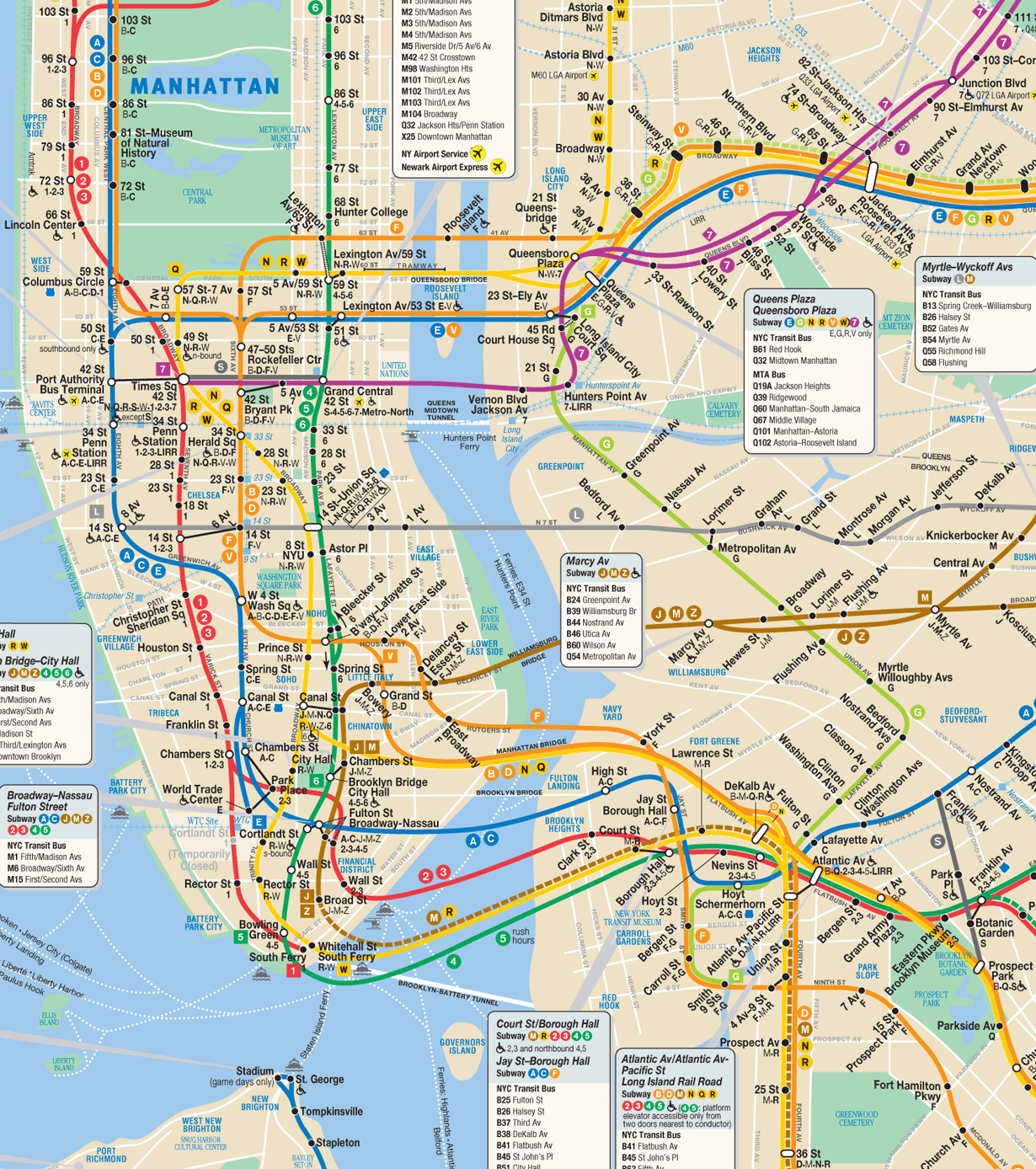
-2_new.jpg)
-2_new.jpg&action=edit§ion=T-1)
_-_original.jpg)
_-_original.jpg)
.jpg)
_in_Pok%C3%A9mon_livery.jpg&action=edit&redlink=1)
![[6]](https://upload.wikimedia.org/wikipedia/commons/archive/6/65/20080531105052!HoryujiYumedono0363.jpg)
![[7]](http://www.univie.ac.at/rel_jap/bilder2/horyuji_yumedono.jpg)
![[8]](http://static.panoramio.com/photos/original/12605932.jpg)
![[9]](http://www.danhagerman.com/images/Horyjuji%20Yumedono%20%27Dream%20Pavilion%27%20constructed%20%20739.jpg)
- Reason
- It is really special to locate a complete set of illustrations by a major artist for a famous piece of literature. In 1875 Édouard Manet, a leading French impressionist, made a series of lithographs for a translation of Edgar Allan Poe's " The Raven". The Library of Congress owns a first edition in excellent condition and has scanned at high resolution. Restored from File:Raven Manet B.jpg, File:Raven Manet C.jpg, File:Raven Manet D.jpg, and File:Raven Manet E.jpg.
- Articles this image appears in
- " The Raven", Édouard Manet, Edgar Allan Poe
- Creator
- Édouard Manet
- Support as nominator -- Durova 327 04:01, 17 October 2009 (UTC)
- Comment ...Isn't the last one upsidedown? Shoemaker's Holiday Over 213 FCs served 05:17, 17 October 2009 (UTC)
- Comment Yeah, based on the signature. I can see how the mistake was made though. _ Nezzadar_ ☎_ 05:23, 17 October 2009 (UTC)
- See the upload notes and the original publication, which is linked from the hosting file. The printer ran it that way. If you find a source that says the printer did so without Manet's consent, then would gladly rotate. It would be original research to surmise that this was accidental: for all we know it was an intentional piece of artist's wit. Durova 327 13:39, 17 October 2009 (UTC)
ConditionalNormal Support Yeah, when the upside down one is fixed, I'll support fully. _ Nezzadar_ ☎_ 05:23, 17 October 2009 (UTC)- Support Manet's lithographs and its first edition with fine restoration, high educational values, so what else could make me hesitated for promoting the fine illustrations? :-) As for the upside down signature in question, I don't think we should apply a sort of "political correctness" to the print without knowing what was the artist and publisher's intention at that time. As we know, Manet explored various artistic adventures that shook the convention at that time. Even if we can get "second" or other editions" of the book, or analysis that shows the original print could be en error, I don't think the original images should be corrected. I see no problem as it is.-- Caspian blue 14:52, 17 October 2009 (UTC)
- Support High EV. All evidence points to the current orientation of the last image. —
Jake
Wartenberg 21:43, 17 October 2009 (UTC)
- Comment What "evidence" is this. Clearly the raven is in the shadow of the figure standing near the chair. It's basic symbolism, in that the raven has become part of the narrators persona due to his damaged mental state. Besides, why draw a chair upside down. It doesn't add up. _
Nezzadar_
☎_ 00:03, 18 October 2009 (UTC)
- Just read the response above by Durova. Man Poe was f--ked up. Ah well. Per
WP:SNOW I'll withdraw the request for rotation, but I still can't fathom why it would be placed upsided down, because it is upside down... _
Nezzadar_
☎_ 00:07, 18 October 2009 (UTC)
- The narrator of the poem is grieving the death of the woman he wanted to marry, and the bird's presence brings him close to nervous collapse. It's possible that the artist and/or printer wished to suggest vertigo with the final image. If any source states that the orientation was a printer error then of course we can correct that immediately. But without a source to say whether this was accidental or deliberate, the NOR choice is to use the book's orientation and note it in the caption and file hosting page. Durova 327 05:37, 18 October 2009 (UTC)
- Just read the response above by Durova. Man Poe was f--ked up. Ah well. Per
WP:SNOW I'll withdraw the request for rotation, but I still can't fathom why it would be placed upsided down, because it is upside down... _
Nezzadar_
☎_ 00:07, 18 October 2009 (UTC)
- Comment What "evidence" is this. Clearly the raven is in the shadow of the figure standing near the chair. It's basic symbolism, in that the raven has become part of the narrators persona due to his damaged mental state. Besides, why draw a chair upside down. It doesn't add up. _
Nezzadar_
☎_ 00:03, 18 October 2009 (UTC)
- Support per nominator. Mostlyharmless ( talk) 08:16, 19 October 2009 (UTC)
- Comment As per
Occam's razor, I think a decision to display the image upside down, in the absence of any proof that this was anyone's intention, is at least as flawed as a decision to revert the image to the orientation indicated by the signature. While I have no particular interest in this nomination, I feel compelled not to let this become a precedent for a misapplication of
WP:NOR. The most
parsimonious explanation here is that it's a simple mistake - anything else requires invoking more complicated properties, intentions, or circumstances that cannot be substantiated one way or the other.
Papa Lima Whiskey (
talk) 17:18, 19 October 2009 (UTC)
- It's a question of whether to cross the
WP:NOR line. We know how it appeared but not why. So what we can do without original research is to display the image as it appeared in publication and note the discrepancy. If anyone locates a secondary source that comments upon the orientation then we could treat that as definitive.
Durova
331 21:03, 19 October 2009 (UTC)
- If we are going to start quoting razors, I call upon Hanlon's razor to explain why the image was placed upside down in the book in first place. Nezzadar ☎ 22:09, 19 October 2009 (UTC)
- It's a question of whether to cross the
WP:NOR line. We know how it appeared but not why. So what we can do without original research is to display the image as it appeared in publication and note the discrepancy. If anyone locates a secondary source that comments upon the orientation then we could treat that as definitive.
Durova
331 21:03, 19 October 2009 (UTC)
- Support, these images seem to be adding a lot to the article as a set. In some ways, I would prefer to see the original illustrations rather than a later set. I am strongly inclined to agree with Durova as to the upside-down-yness of the last image- it's not our place to make normative judgements about what images should have looked like. J Milburn ( talk) 00:03, 20 October 2009 (UTC)
- Support, per J Milburn. Mostlyharmless ( talk) 04:37, 20 October 2009 (UTC)
- Support; they all look good. NW ( Talk) 03:18, 24 October 2009 (UTC)
Promoted set --
Staxringold
talk
contribs 20:20, 24 October 2009 (UTC)
Helen Keller

- Reason
- Author and social activist Helen Keller was the first deafblind person to earn a Bachelor of Arts degree. Restored version of File:Helen Keller1.jpg.
- Articles this image appears in
- Helen Keller, Deafblind
- Creator
- unknown
- Support as nominator -- Durova 327 19:38, 17 October 2009 (UTC)
- Support - I remember when this was uploaded. Not the most encyclopedic photo we have, but the best quality. ceran thor 19:44, 17 October 2009 (UTC)
ObjectIt's way too white. Also, I'm sure better pictures of her are out there. _ Nezzadar_ ☎_ 22:46, 17 October 2009 (UTC)- During this era, white had symbolic associations of purity and innocence in connection to young unmarried women. If you find a better portrait of her, do propose it. This had the best composition of the Library of Congress material that was high enough resolution. Durova 327 23:10, 17 October 2009 (UTC)
- Support If this were a modern photo I'd have serious objections about the color and the soft focus but since it's over a hundred years old I think it's definitely historical and should be treated as such. Cat-five - talk 23:51, 17 October 2009 (UTC)
- I think it was the style of that time. Airplaneman talk 02:32, 18 October 2009 (UTC)
- Support A gorgeous, subtle, poignant, quality portrait, one of our very best, IMO. Can I just point out that the lighter tone around the edges would have been an intentional printing method? See vignette. The restoration has opened up the shadows very nicely and while it might not look as "punchy" as the original, the contrast level here looks to me to be about right for this sort of work. mikaul talk 01:34, 18 October 2009 (UTC)
- Support - A beautiful old photo. Also, per the other supporters. Airplaneman talk 02:32, 18 October 2009 (UTC)
- Support. Great image, has intrinsic value. Why not? - FASTILY (TALK) 05:05, 18 October 2009 (UTC)
- Support - There no denying; this is is beautiful for camera's of that day. Secret Saturdays ( talk) 03:08, 23 October 2009 (UTC)
Promoted File:Helen KellerA.jpg -- Staxringold talk contribs 20:37, 24 October 2009 (UTC)
Oranges and Orange juice

- Reason
- Great lighting and portrait
- Articles this image appears in
- Drink, Orange (fruit), and Drink mixer
- Creator
- Jurema Oliveira
- Support as nominator -- Secret Saturdays ( talk) 20:44, 19 October 2009 (UTC)
- Weak Oppose The pitcher being cut out disturbs me. I know it's for artistic composition, but it looks too much like a bad crop and not enough like a good image. Nezzadar ☎ 21:38, 19 October 2009 (UTC)
- Oppose; the colour balance doesn't look at all right to me, and the image is dirty. What's the deal with all the flecks?! J Milburn ( talk) 22:27, 19 October 2009 (UTC)
- Oppose, per above. Bad composition, dirty. Mostlyharmless ( talk) 23:35, 19 October 2009 (UTC)
- Oppose. Sorry, but this feels too...I hesitate to say it...80's. The crop is slightly annoying but it does, as J Milburn mentions, look dirty. 217.33.127.162 ( talk) 23:35, 21 October 2009 (UTC)
- Oppose crop and dirt. Papa Lima Whiskey ( talk) 22:53, 22 October 2009 (UTC)
Not promoted -- jjron ( talk) 02:56, 25 October 2009 (UTC)
Peruvian Andes

- Reason
- The United States Exploring Expedition of 1838-1842 was a global scientific exploration mission conducted by the United States Navy that collected over 60,000 specimens for the newly established Smithsonian Institution. This illustration by a notable artist documents part of the Peruvian portion of the journey. Restored version of File:Peruvian Andes.jpg.
- Articles this image appears in
- United States Exploring Expedition, Alfred Agate.
- Creator
- Alfred Agate
- Support as nominator -- Durova 326 18:04, 16 October 2009 (UTC)
- Suppport Illustrates both articles aptly. Mostlyharmless ( talk) 03:34, 17 October 2009 (UTC)
- Support Dunno if it'd have the EV to stand alone displaying the Andes, but with the artist EV clear support for me. Staxringold talk contribs 04:05, 17 October 2009 (UTC)
- Support. EV and per nom. - FASTILY (TALK) 05:07, 18 October 2009 (UTC)
- Support, nice cleanup. Another picture that holds no real interest for me, but that's no reason to oppose. Could the border possibly be filled in just below the signature? That would seem consistent with restoration. J Milburn ( talk) 00:07, 20 October 2009 (UTC)
I could promote this right now with the support quorum, but J Milburn brings up an important point. Anyone want to fix that border? Nezzadar ☎ 16:34, 24 October 2009 (UTC)
Promoted File:Peruvian Andes2.jpg -- jjron ( talk) 02:59, 25 October 2009 (UTC)
Concretions on Bowling Balls Beach


- Reason
- high EV, resolution and quality
- Articles this image appears in
- Concretions
- Creator
- Mbz1
- Support as nominator -- Mbz1 ( talk) 21:26, 15 October 2009 (UTC)
- Comment Given that this appears to be a sunny day, any chance of bumping up the exposure so it isn't so dark? If the swell ever got high enough there it'd be an awesome place for a long exposure shot. Noodle snacks ( talk) 10:48, 16 October 2009 (UTC)
- You are right about a long exposure, it would have been a great image, except the trail to the beach is clossed due to safety conserns. It was way too weathered for me to carry a tripod there, and then come back after dark. I did not feel it was safe enough to go there at all, but I did anyway. Probabably some young men could have done it with a tripod and after dark, me not. :( Also one should remember that here in California we have lots of wild animals even in the city itself. The other day I took a short trail in San Francisco for a long exposure shot. When I was coming back to the parking lot I met a coyote and pack of
w:Raccoon. They usually do not touch people, but
one never knows :(--
Mbz1 (
talk) 12:24, 16 October 2009 (UTC)
- I posted an edit to the original. The alt is much better in brightness stakes but the sky is magenta for some reason. I've posted an edit of the original, I hope you don't mind. On the topic of the racoon attack, they were provoked: "when she tried to shoo them away from her central Florida home". I'm not sure that one would have trouble if you keep your distance. According to Coyote#Attacks on humans it is highly unlikely. The number of fatalities due to car accidents in your state is 100 times higher. I could worry about sharks whilst swimming or snakes whilst walking, but both are very unlikely. Noodle snacks ( talk) 21:59, 16 October 2009 (UTC)
- You are right about a long exposure, it would have been a great image, except the trail to the beach is clossed due to safety conserns. It was way too weathered for me to carry a tripod there, and then come back after dark. I did not feel it was safe enough to go there at all, but I did anyway. Probabably some young men could have done it with a tripod and after dark, me not. :( Also one should remember that here in California we have lots of wild animals even in the city itself. The other day I took a short trail in San Francisco for a long exposure shot. When I was coming back to the parking lot I met a coyote and pack of
w:Raccoon. They usually do not touch people, but
one never knows :(--
Mbz1 (
talk) 12:24, 16 October 2009 (UTC)
- Support Alt1 As per Noodle the orig is too dark for me - this is much better... One question though, those redish stick in the foreground - on my monitor they look almost as if they are neon in appearance... Or is it just my eyes?!! Gazhiley ( talk) 14:15, 16 October 2009 (UTC)
- Support Edit 1 Prefer the composition etc. I think the white balance might still need a tweak. If possible could you geocode the images? Noodle snacks ( talk) 21:59, 16 October 2009 (UTC)
- Thank you for working on the image, Noodle snacks, and reasuring me about raccoons and cayote :) Of course I do not mind you editing my image. Yoa have added Commons FP template to it. With such a template please go ahead and edit each and every one of my images :) Geolocation is added.-- Mbz1 ( talk) 00:49, 17 October 2009 (UTC)
- Support prefer edit1 per NS -- Muhammad (talk) 16:25, 17 October 2009 (UTC)
- Support Alt 1 I prefer its composition. upstate NYer 06:10, 19 October 2009 (UTC)
- Support edit 1. Illustrates the article well. Mostlyharmless ( talk) 22:08, 19 October 2009 (UTC)
- Support Alt 1 – Wladyslaw ( talk) 10:28, 21 October 2009 (UTC)
Right now. This is interesting. It's clear this is getting promoted, as there is a clear consensus for support, except it's a dead split between the alt and the edit. Advice? Nezzadar ☎ 03:28, 22 October 2009 (UTC)
- Support Edit 1 There ya go. Shoemaker's Holiday Over 213 FCs served 10:45, 22 October 2009 (UTC)
- Oppose Alt 1 The sky is purple. Noodle snacks ( talk) 10:51, 22 October 2009 (UTC)
Promoted File:Bowling Balls Beach 2 edit.jpg -- jjron ( talk) 03:00, 25 October 2009 (UTC)
Mignon Nevada

- Reason
- Mignon Nevada was a successful opera soprano from the early twentieth century who performed internationally. She appears here in a Bain News Service photograph circa 1910 dressed for her role as Ophelia in an operatic adaptation of Hamlet. Restored version of File:Mignon Nevada Ophelia.jpg
- Articles this image appears in
- Mignon Nevada, Ophelia
- Creator
- Bain News Service
- Support as nominator -- Durova 327 03:21, 17 October 2009 (UTC)
- Suppport. Illustrates both articles well. Particular value in Mignon Nevada, obviously. Mostlyharmless ( talk) 03:37, 17 October 2009 (UTC)
- Support Haha, finally got her article done! Staxringold talk contribs 04:03, 17 October 2009 (UTC)
- Support per nom Noodle snacks ( talk) 04:17, 17 October 2009 (UTC)
- Support I doubt any other pictures of comparable quality exist. High EV. _ Nezzadar_ ☎_ 05:15, 17 October 2009 (UTC)
- Support love any historic image representing Ophelia. It would be interesting set if we have a FP set of Ophelian since the character has been a favorite inspiration to artists such as John William Waterhouse's one.-- Caspian blue 14:59, 17 October 2009 (UTC)
- Support nice outfit and background, certainly one of the best Ophelia role pics. Brand t] 20:56, 17 October 2009 (UTC)
- Support. per nom - FASTILY (TALK) 05:06, 18 October 2009 (UTC)
- Support - always happy to support an opera-related FP. -- Ser Amantio di Nicolao Che dicono a Signa? Lo dicono a Signa. 07:58, 18 October 2009 (UTC)
- Comment--correcting caption. Chick Bowen 15:52, 18 October 2009 (UTC)
- Support, very valuable in both articles. J Milburn ( talk) 00:04, 20 October 2009 (UTC)
Promoted File:Mignon Nevada Ophelia2.jpg -- Makeemlighter ( talk) 20:38, 25 October 2009 (UTC)
Delaware Bay 1639

- Reason
- Nautical chart of seventeenth century Delaware Bay during its time as part of the New Netherland colony. Very high resolution; see also compressed courtesy copy at File:Delaware Bay Vinckeboons 14 courtesy copy.jpg. Restored version of File:Delaware_Bay_Vinckeboons.jpg.
- Articles this image appears in
New Netherland, Delaware Bay, History of Delaware, Zwaanendael Colony, Charter of Freedoms and Exemptions- Creator
- Johannes Vingboons
- Support as conominator -- Durova 331 16:11, 18 October 2009 (UTC)
- Support as conominator -- NW ( Talk) 16:17, 18 October 2009 (UTC)
- Support as conominator Shoemaker's Holiday Over 213 FCs served 17:27, 18 October 2009 (UTC)
- Support. High quality, high encyclopedic value in the three articles. I know this isn't a formal FPC requirement, but since the image text is in Dutch, and presumably it adds significant value to the image, I'd like to see a translation on the image page. For the close reader of an image, the text is integral to its meaning and interpretation, particularly where the text forms such a large and important part of the image, as here. I know this text is in old Dutch, in cursive, so it probably needs a native speaker. I'm contacting some User_nl Wikipedians, and on the presumption that the text can be translated, this can be considered a full support. Without the translation I'll switch down to a weak support. [Edit - As I indicated, if it turns out this is an unreasonable request, or one that will not be fulfilled I will drop it, and my support is not predicated on it. This is an highly important image with or without the translation] Mostlyharmless ( talk) 03:19, 19 October 2009 (UTC)
Supportper nom. My house is in the map! 71.59.123.169 ( talk) 04:01, 19 October 2009 (UTC)- Please sign in to vote, and ensure you address the criteria. --
jjron (
talk) 10:57, 19 October 2009 (UTC)
- , Sorry, this was me. Support per nom. Spikebrennan ( talk) 22:32, 20 October 2009 (UTC)
- Please sign in to vote, and ensure you address the criteria. --
jjron (
talk) 10:57, 19 October 2009 (UTC)
NeutralMy my now, quite the nomination team. Here's the thing. It's only real exposeure is on the page History of Delaware. The others have higher placed, larger images. At least up the size in the Delaware Bay page. Good image though. Fix this then click on the golden phone to get my vote. Nezzadar ☎ 04:17, 19 October 2009 (UTC)- Comment. Prominence in an article is not a requirement. What is is that the image adds to the section it is placed in, and relates well to the text it illustrates. Mostlyharmless ( talk) 04:39, 19 October 2009 (UTC)
- Added to more appropriate articles (i.e. now it's in its home article); this should fill your need for better use. upstate NYer 05:52, 19 October 2009 (UTC)
- Conditional Support upon a reasonably effort to find a translation (and only then). I'm also updating the caption, having done some work on New Netherland related topics.
upstate
NYer 05:32, 19 October 2009 (UTC)
- Note: Removed from New Netherland as it was essentially spamming the article. Only "home" location in the article is at New Netherland#South River and New Sweden, which already has an image that does a better job than this would. upstate NYer 06:02, 19 October 2009 (UTC)
- Support This is a great restoration of "a map of the "Svydt" river in "niew nederland".
GerardM (
talk) 06:13, 19 October 2009 (UTC) The language is seventeenth century Dutch and it is essentially a foreign language to contemporary Dutch. The characters are different, the spelling is different.. The notion of "spamming" is disrespectful for the massive amount of work in here. Given support by demanding a translation is also very much of a similar disrespect for important historic material om this subject.
GerardM (
talk) 06:13, 19 October 2009 (UTC)
- I'm sorry that I removed it one from article it added almost nothing to, but added to two articles that required it?
upstate
NYer 06:15, 19 October 2009 (UTC)
- The language used is what is at issue. This is important material, even important historic material with or without translations and it deserves respect.
GerardM (
talk) 06:22, 19 October 2009 (UTC)
- (ec) Wadester, Gerard is a native Dutch speaker. Two previous maps by this same artist have been promoted to FP without translation. Translation is not an FPC criterion; the proposal to require it was
rejected; the inability of modern native speakers to read historic manuscripts in certain languages was one of the reasons, and Gerard's attempts to decipher Vinckeboons were specifically discussed. The Vinckeboons restorations are the most time consuming and difficult we have ever produced at this project; these take 80 hours of labor. Please evaluate according to agreed criteria and discuss in a collaborative spirit.
Durova
331 06:30, 19 October 2009 (UTC)
- I'd like to hear what
Mostlyharmless comes back with. After such pessimism regarding 19th century Japanese translations, I have a feeling a translation will be found here. I'll even settle for a "it most likely says...based on the current language". Not convinced there isn't at least some content that any native Dutch speaker can decipher. It has a lot of EV, and even more now after my edits, but the translation is key to EV. Translations may not be in criteria, but EV is subjective, and IMO, translations are essential for enough EV.
upstate
NYer 06:49, 19 October 2009 (UTC)
- I like to think that I would like (but not require) translations of image texts where the request is both; reasonable: there are Wikipedians who can read it, doing so is not particularly time consuming (the text is limited), and is integral to the image and provides important information about what it is we are actually looking at. I am certain that the latter of these is true here, I am unsure of the former. Previous Vinckeboons images have not included such text, and have merely denoted placenames (which are themselves somewhat congruent with other maps, and useful as historical information in themselves). If I don't find anyone in the next few days, I'm going to get an old (18th C) Dutch dictionary and have a go at doing it myself - I'm in a history department where we do this kind of thing all the time.
Mostlyharmless (
talk) 07:56, 19 October 2009 (UTC)
- Thank you, Mostly.
Durova
331 14:59, 19 October 2009 (UTC)
- As a native speaker of Dutch, I would like to give it a try. I've tried to read it and could easily make out some words. My problem though is that I can't make out the handwriting. If someone could write it down for me, I'll try to translate it for you. The sentence "vrouwen als sij bevrucht sijn in kinderen" (which I can make out) means women who are pregnant or literally: women who are fertilized with children. --
Massimo Catarinella (
talk) 18:36, 19 October 2009 (UTC)
- Thats a very interesting sentence to have on a nautical chart, makes me want to know what the whole block of text says even more! —
raeky (
talk |
edits) 19:02, 19 October 2009 (UTC)
- Precisely why a translation can be so helpful! Anyway, I did my best on interpreting the the text. You can see it at Massimo Catarinella's talk page.
upstate
NYer 21:24, 19 October 2009 (UTC)
- I have some experience in paleography, but my knowledge of obsolete Dutch is nonexistent. Nevertheless, I'll say that the first half of the text on the left seems to deal with the native inhabitants of the area; the two-column list there is clearly a list of the names of Indian tribes or settlements (as they sounded to the Dutch). Deor ( talk) 15:23, 20 October 2009 (UTC)
- Precisely why a translation can be so helpful! Anyway, I did my best on interpreting the the text. You can see it at Massimo Catarinella's talk page.
upstate
NYer 21:24, 19 October 2009 (UTC)
- Thats a very interesting sentence to have on a nautical chart, makes me want to know what the whole block of text says even more! —
raeky (
talk |
edits) 19:02, 19 October 2009 (UTC)
- As a native speaker of Dutch, I would like to give it a try. I've tried to read it and could easily make out some words. My problem though is that I can't make out the handwriting. If someone could write it down for me, I'll try to translate it for you. The sentence "vrouwen als sij bevrucht sijn in kinderen" (which I can make out) means women who are pregnant or literally: women who are fertilized with children. --
Massimo Catarinella (
talk) 18:36, 19 October 2009 (UTC)
- Thank you, Mostly.
Durova
331 14:59, 19 October 2009 (UTC)
- I like to think that I would like (but not require) translations of image texts where the request is both; reasonable: there are Wikipedians who can read it, doing so is not particularly time consuming (the text is limited), and is integral to the image and provides important information about what it is we are actually looking at. I am certain that the latter of these is true here, I am unsure of the former. Previous Vinckeboons images have not included such text, and have merely denoted placenames (which are themselves somewhat congruent with other maps, and useful as historical information in themselves). If I don't find anyone in the next few days, I'm going to get an old (18th C) Dutch dictionary and have a go at doing it myself - I'm in a history department where we do this kind of thing all the time.
Mostlyharmless (
talk) 07:56, 19 October 2009 (UTC)
- For the record, I don't know if the proposal to make translations part of the FPC criteria was outright rejected. Looking back at it, it seems like there was more discussion than any actual conclusions, and some of the actual 'votes' of opposition were based on incorrect assumptions (like the fact that it would be required on all documents with any non-English text, which isn't true - there would be common sense exceptions). IMO, it would be worth asking the question again after summarising in more detail exactly what would be expected, and what would be excepted. Eg, when it is possible to translate but hasn't been, why shouldn't we be able to oppose on the basis that the EV could be improved by a translation (even if just approximate)? This happens all the time - people oppose images because there is room for improvement in the composition/colour balance, sharpness, etc, so why not EV too?
Ðiliff «»
(Talk) 10:23, 20 October 2009 (UTC)
- I think you've hit the nail on the head. Regardless of the outcome of that previous discussion or a further one, a reasonably argued oppose based on insufficient EV would be acceptable, as are other EV related opposes (note: I'm not making a specific comment on this image). --
jjron (
talk) 12:26, 22 October 2009 (UTC)
- Surprised to see that notion gaining any traction at all--particularly with long time regulars. This cartographer's work was specifically discussed in advance when the proposal was put forward. Two native speakers have been unable to translate the caption. Certainly translation would be useful; no one disputes that. But everyone already knows in a general sense that this was Delaware Bay under Dutch colonial rule: does that factor really merit outright opposition after similar maps by the same cartographer have been promoted? Do individual reviewers get to impose new criteria by personal fiat after consensus discussion fails to implement them? Gentlemen, this is an excellent way to drive off contributors. NuclearWarfare spent many long hours working on this restoration; it's his first nominee. I hope this doesn't become the norm because it is not easy to recruit and train people for this work.
Durova
333 19:42, 22 October 2009 (UTC)
- I'm sorry, did someone oppose because of this reason? I know NuclearWarfare, and know that he is better than to be significantly wounded by reasonable requests for more information. Apparently you doubt him? upstate NYer 20:00, 22 October 2009 (UTC)
- Unreasonable requests are a different matter.
Durova
333 20:18, 22 October 2009 (UTC)
- Are you implying this is an unreasonable request? This image has a block of text more than 150 words long. An effort to get a translation only helps the encyclopedia. What does your preference do to help the encyclopedia? Why are we
WP:HERE again?
upstate
NYer 02:37, 23 October 2009 (UTC)
- It is in old Dutch, and to that extent it's difficult. Still we now know that it talks about female cannibalism, which increases the EV.
Mostlyharmless (
talk) 03:55, 23 October 2009 (UTC)
- Exactly. See what a reasonable effort toward translation will do for you? Precisely why I conditionally supported. The effort here has been reasonable and even though the language is old, we still got a rough idea of its content, even if the first translation "effort" wasn't even worth a try. I'm glad another Dutch speaker gave it a shot. The content turned out to be very interesting.
upstate
NYer 04:45, 23 October 2009 (UTC)
- I don't think there's any need to make a point of it; it's hard work, and I'd like to thank Massimo Cantarinella for having a go. I've put the partial translation on the image page, with appropriate caveats. Mostlyharmless ( talk) 05:26, 23 October 2009 (UTC)
- Exactly. See what a reasonable effort toward translation will do for you? Precisely why I conditionally supported. The effort here has been reasonable and even though the language is old, we still got a rough idea of its content, even if the first translation "effort" wasn't even worth a try. I'm glad another Dutch speaker gave it a shot. The content turned out to be very interesting.
upstate
NYer 04:45, 23 October 2009 (UTC)
- It is in old Dutch, and to that extent it's difficult. Still we now know that it talks about female cannibalism, which increases the EV.
Mostlyharmless (
talk) 03:55, 23 October 2009 (UTC)
- Are you implying this is an unreasonable request? This image has a block of text more than 150 words long. An effort to get a translation only helps the encyclopedia. What does your preference do to help the encyclopedia? Why are we
WP:HERE again?
upstate
NYer 02:37, 23 October 2009 (UTC)
- Surprised to see that notion gaining any traction at all--particularly with long time regulars. This cartographer's work was specifically discussed in advance when the proposal was put forward. Two native speakers have been unable to translate the caption. Certainly translation would be useful; no one disputes that. But everyone already knows in a general sense that this was Delaware Bay under Dutch colonial rule: does that factor really merit outright opposition after similar maps by the same cartographer have been promoted? Do individual reviewers get to impose new criteria by personal fiat after consensus discussion fails to implement them? Gentlemen, this is an excellent way to drive off contributors. NuclearWarfare spent many long hours working on this restoration; it's his first nominee. I hope this doesn't become the norm because it is not easy to recruit and train people for this work.
Durova
333 19:42, 22 October 2009 (UTC)
- I think you've hit the nail on the head. Regardless of the outcome of that previous discussion or a further one, a reasonably argued oppose based on insufficient EV would be acceptable, as are other EV related opposes (note: I'm not making a specific comment on this image). --
jjron (
talk) 12:26, 22 October 2009 (UTC)
- I'd like to hear what
Mostlyharmless comes back with. After such pessimism regarding 19th century Japanese translations, I have a feeling a translation will be found here. I'll even settle for a "it most likely says...based on the current language". Not convinced there isn't at least some content that any native Dutch speaker can decipher. It has a lot of EV, and even more now after my edits, but the translation is key to EV. Translations may not be in criteria, but EV is subjective, and IMO, translations are essential for enough EV.
upstate
NYer 06:49, 19 October 2009 (UTC)
- The language used is what is at issue. This is important material, even important historic material with or without translations and it deserves respect.
GerardM (
talk) 06:22, 19 October 2009 (UTC)
- I'm sorry that I removed it one from article it added almost nothing to, but added to two articles that required it?
upstate
NYer 06:15, 19 October 2009 (UTC)
- Comment: I strongly agree that a translation would be nice, even if only for the image page. J Milburn ( talk) 10:24, 19 October 2009 (UTC)
- Support First rate restoration. I also agree a translation would add to it's EV, it already has good EV but a translation would be better. — raeky ( talk | edits) 16:30, 19 October 2009 (UTC)
- Support It now has quite prominent placement. I also really want to know what the chart says. I have a friend who specializes in translating ancient languages, except that friend is currently in Iceland on a sabbatical. For some reason, he left his phone in a box on his desk in America when he left. So, if you can wait three months, I might be able to help, if not, well, here's to hoping that the rest of you can tell me what this means. Nezzadar ☎ 21:47, 19 October 2009 (UTC)
Promoted File:Delaware Bay Vinckeboons 14.jpg -- Makeemlighter ( talk) 20:49, 25 October 2009 (UTC)
Lord Kitchener

- Reason
- Per the other day's nomination, this is a subject that does deserve a featured picture. Not quite the same iconic value as the original poster, but much higher technical specs and still pretty good encyclopedic value. Restored version of File:Lord Kitchener duty.jpg.
- Articles this image appears in
- Herbert_Kitchener,_1st_Earl_Kitchener#Death
- Creator
- Bassano, Bond St. W. ; Printed by Johnson, Riddle & Co., Ltd., London, S.E.


- Support as nominator -- Durova 331 23:55, 18 October 2009 (UTC)
- Support Yes, I will do my duties :P Zoo Fari 01:34, 19 October 2009 (UTC)
Weak SupportLooks a little weak in page exposure, despite EV. You all sure this only appears on one page? Get it on some more pages! Nezzadar ☎ 03:57, 19 October 2009 (UTC)
- Weak Oppose Hold the phones again... This has so very little exposure that I cannot support it. It's a nice image, sure, but it appears near the bottom of one artile, and nowhere else. Sorry. Message me on the golden phone when you think you've spread the poster around enough, I'd say you need at least one highly prominent placement, or a half dozen of these lowly ones. Nezzadar ☎ 04:13, 19 October 2009 (UTC)
- Prominent placement is not an FP requirement; encyclopedic relevance is. This image is relevant to the section about his death.
Durova
331 04:23, 19 October 2009 (UTC)
- From FP Criteria "A picture's encyclopedic value is given priority over its artistic value." I see prominence as a component to encyclopedic value. It's pretty, but not prominent at all. Respectfully, My decision stands.
Nezzadar
☎ 04:38, 19 October 2009 (UTC)
- Why is prominence more important than context for encyclopaedic value? The images are there to support the text after all.
Noodle snacks (
talk) 06:15, 19 October 2009 (UTC)
- Perhaps Nezzadar wants FPs to be easier to find on a page. Trouble is, once the FP gets supersized everything else does too. Articles end up looking like this with 60K thumbnails fighting for the same attention as 39MB FPs. Have proposed an alternative at FPC talk to display a featured star in the caption space; that would signal readers more discreetly and effectively. Durova 331 06:41, 19 October 2009 (UTC)
- Why is prominence more important than context for encyclopaedic value? The images are there to support the text after all.
Noodle snacks (
talk) 06:15, 19 October 2009 (UTC)
- From FP Criteria "A picture's encyclopedic value is given priority over its artistic value." I see prominence as a component to encyclopedic value. It's pretty, but not prominent at all. Respectfully, My decision stands.
Nezzadar
☎ 04:38, 19 October 2009 (UTC)
- Prominent placement is not an FP requirement; encyclopedic relevance is. This image is relevant to the section about his death.
Durova
331 04:23, 19 October 2009 (UTC)
OpposeI think you over did the "Extensive brightness and color corrections" the original has color bars, so to color calibrate to the original wouldn't be very difficult. I loaded the original in Photoshop and sampled the black & white on the color calibration bars for a levels and it looks far more natural. Whatever color corrections you did went over-and-beyond restoring it to how the paper actually looks and has lost all color details in his face. — raeky ( talk | edits) 06:48, 19 October 2009 (UTC)- Color bars in this sort of restoration are useless. Sometime after 1916 a curator photographed it using color film. That probably happened after 1940 (due to the technology) but the date was not recorded. Lighting was uneven and the document did not lie flat.
Durova
331 07:01, 19 October 2009 (UTC)
- Sure they are, provided the original color bars was accurate black & white and 50% gray, you can produce a very accurate color calibration from it regardless of lighting or film quality. Thats what they're for. —
raeky (
talk |
edits) 08:43, 19 October 2009 (UTC)
- I linked a version that is just color corrected from the gray bar, should be pretty accurate to how the original looked when it was photographed. Paper is of course discolored from age, but I think there is more detail in the face. Your version is of course probably closer to how it originally looked when it was produced with white paper. —
raeky (
talk |
edits) 09:12, 19 October 2009 (UTC)
- The bottom half is more deficient in blue than the top half, with substantial localized problems such as the yellow band at far left, because chromolithography of this age often loses color in uneven ways. It needs a perspective crop and then half the caption has to be separately rotated because it doesn't lie flat. It needs substantial brightness gradient masking because the edges had dried out and darkened. If it were the goal of restoration to recapture the decomposition as it existed at some unknown moment possibly in the third quarter of the twentieth century then yes those particular color bars would be useful, but the poster already had serious decomposition by that point.
Those color bars could have been set there in 1966, but for all we know those markers were placed in 1946 or 1986.What it doesn't tell you is how this looked in 1916. Durova 331 14:49, 19 October 2009 (UTC)- Kodak's copyright imprint on the gray scale and color control patches is 1977.
Durova
331 15:12, 19 October 2009 (UTC)
- Like I said your version probably is more accurate to how it looked in 1916, I just did mine to see what detail was lost if any in areas like the face since whiting the paper beyond how it was when the picture was taken likely will loose detail. I also didn't put nearly as much restoration work in it as you did to correct some weird issues you listed, since my goal wasn't to create something to be voted on (thus the not for voting tag). — raeky ( talk | edits) 15:51, 19 October 2009 (UTC)
- Neutral After comparing yours to my version my original reservation that detail was lost in the face doesn't appear to be true. I think it's POSSIBLE the colors are wrong now on your version due to the heavy tweaking to get the paper looking whiter, but detail wasn't noticeably lost. Changing to neutral. — raeky ( talk | edits) 15:59, 19 October 2009 (UTC)
- Kodak's copyright imprint on the gray scale and color control patches is 1977.
Durova
331 15:12, 19 October 2009 (UTC)
- The bottom half is more deficient in blue than the top half, with substantial localized problems such as the yellow band at far left, because chromolithography of this age often loses color in uneven ways. It needs a perspective crop and then half the caption has to be separately rotated because it doesn't lie flat. It needs substantial brightness gradient masking because the edges had dried out and darkened. If it were the goal of restoration to recapture the decomposition as it existed at some unknown moment possibly in the third quarter of the twentieth century then yes those particular color bars would be useful, but the poster already had serious decomposition by that point.
- I linked a version that is just color corrected from the gray bar, should be pretty accurate to how the original looked when it was photographed. Paper is of course discolored from age, but I think there is more detail in the face. Your version is of course probably closer to how it originally looked when it was produced with white paper. —
raeky (
talk |
edits) 09:12, 19 October 2009 (UTC)
- Sure they are, provided the original color bars was accurate black & white and 50% gray, you can produce a very accurate color calibration from it regardless of lighting or film quality. Thats what they're for. —
raeky (
talk |
edits) 08:43, 19 October 2009 (UTC)
- Color bars in this sort of restoration are useless. Sometime after 1916 a curator photographed it using color film. That probably happened after 1940 (due to the technology) but the date was not recorded. Lighting was uneven and the document did not lie flat.
Durova
331 07:01, 19 October 2009 (UTC)
Oppose It's actually highly unlikely white paper was used: You don't use white paper with white ink, and the colourboxed version pretty clearly shows white ink was used. There were a limited number of cheap inks, so they'd often use some form of unbleached or tinted paper and white ink to get an extra colour. Shoemaker's Holiday Over 213 FCs served 12:46, 19 October 2009 (UTC)- Actually it appears that white ink was not used: there was a mild printer error in blue and red across the flag; the flag's white was the same color as the paper.
Durova
331 15:19, 19 October 2009 (UTC)
- It might have been grey paper, like on the Ulysses S. Grant one, but I find the contrast a bit high to believe no white ink was used.
Shoemaker's Holiday Over
213 FCs served 16:00, 19 October 2009 (UTC)
- Look in close for yourself. What they did was add a small amount of blue ink to suggest shadowing, but the "white" itself is negative space.
Durova
331 16:10, 19 October 2009 (UTC)
- Hmm. Poking at it, it does appear you're right, or at least could be, given rather severe vignetting. The image looks underexposed, though, so I'm going to upload an edit. Shoemaker's Holiday Over 213 FCs served 16:15, 19 October 2009 (UTC)
- Look in close for yourself. What they did was add a small amount of blue ink to suggest shadowing, but the "white" itself is negative space.
Durova
331 16:10, 19 October 2009 (UTC)
- It might have been grey paper, like on the Ulysses S. Grant one, but I find the contrast a bit high to believe no white ink was used.
Shoemaker's Holiday Over
213 FCs served 16:00, 19 October 2009 (UTC)
- Actually it appears that white ink was not used: there was a mild printer error in blue and red across the flag; the flag's white was the same color as the paper.
Durova
331 15:19, 19 October 2009 (UTC)
Support edit1,weak oppose original Shoemaker's Holiday Over 213 FCs served 16:28, 19 October 2009 (UTC)- Comment I like edit1. Why isn't this at Military recruitment? Staxringold talk contribs 14:40, 19 October 2009 (UTC)
- Support Shoemaker's edit. Good job. :) Durova 331 16:56, 19 October 2009 (UTC)
- Oppose edit 1 Colors are better but it's blown out some of the lighter areas loosing finer details. —
raeky (
talk |
edits) 16:59, 19 October 2009 (UTC)
- I used a curve, so nothing's blown. Some parts may be a little more subtle (mainly in thumbnail), but I don't think anything that represents artistic intent is hidden.
Shoemaker's Holiday Over
213 FCs served 17:58, 19 October 2009 (UTC)
- If you look closely (zoomed) on the face of your version from other two versions the finer detail in the face is missing and has gone to all white. —
raeky (
talk |
edits) 18:11, 19 October 2009 (UTC)
- I agree; compare for instance the wrinkles on his brow.
TotientDragooned (
talk) 15:35, 20 October 2009 (UTC)
- Well, I can still see them, but I'll do a second edit with the face masked, so I can treat it a little differently. I'll just upload over mine. Give me a couple hours. Shoemaker's Holiday Over 213 FCs served 12:39, 21 October 2009 (UTC)
- I agree; compare for instance the wrinkles on his brow.
TotientDragooned (
talk) 15:35, 20 October 2009 (UTC)
- If you look closely (zoomed) on the face of your version from other two versions the finer detail in the face is missing and has gone to all white. —
raeky (
talk |
edits) 18:11, 19 October 2009 (UTC)
- I used a curve, so nothing's blown. Some parts may be a little more subtle (mainly in thumbnail), but I don't think anything that represents artistic intent is hidden.
Shoemaker's Holiday Over
213 FCs served 17:58, 19 October 2009 (UTC)
- Question. Since there appears to be no reliable source for the original ink and paper colors or the effects of aging on the different combinations of inks and paper, how does "restoration" beyond removal of obvious digitization artefacts constitute anything other than original research? 82.251.140.156 ( talk) 09:42, 21 October 2009 (UTC)
- Support
edit 1edit 2 Excellent image with lots of EV Nick-D ( talk) 10:35, 21 October 2009 (UTC) - Edit 2 uploaded, shift support to Edit 2. I've dealt with the face issues.
Shoemaker's Holiday Over
213 FCs served 13:24, 21 October 2009 (UTC)
- For the record, the upload glitched the first time. Got it now. Shoemaker's Holiday Over 213 FCs served 15:51, 21 October 2009 (UTC)
- Support Edit 2 I think Edit 2 resolves my concerns, still think the colors a little funny in the face (yellows with the whites) but it's likely the original colors. — raeky ( talk | edits) 16:53, 21 October 2009 (UTC)
- Support edit 2. TotientDragooned ( talk) 05:00, 23 October 2009 (UTC)
- Support GerardM ( talk) 07:37, 23 October 2009 (UTC)
- Support — Jake Wartenberg 03:27, 24 October 2009 (UTC)
Promoted File:Lord_Kitchener_duty5.jpg -- Makeemlighter ( talk) 00:22, 27 October 2009 (UTC)
Post Nomination Update
It has been determined that this is Frederick Roberts, 1st Earl Roberts, not Lord Kitchener, on December 2nd, 2009. Nezzadar [SPEAK] 05:21, 3 November 2009 (UTC)
Endomembrane system diagram

- Reason
- Another LadyofHats special, this SVG is of high quality, exceedingly high prominence and EV, and meets technical requirements. It is a Quality Image and a Featured Picture on Commons.
- Articles this image appears in
- Endomembrane system, Eukaryote
- Creator
- who else but LadyofHats
- Support as nominator -- Nezzadar ☎ 00:51, 20 October 2009 (UTC)
- Support Quality diagram. — raeky ( talk | edits) 00:58, 20 October 2009 (UTC)
- Comment. Capitalisation on Secretory Vesicle needs to be brought into line with rest of labelling. -- jjron ( talk) 12:15, 20 October 2009 (UTC)
- These recent nominations alone have convinced me that I need to learn simple SVG editing. In the mean time, for something this simple, a quick edit by someone more familiar with the programs is really all that's needed. Oh, and I think the underlying problem here is that LadyofHats speaks Spanish as a first language and, considering the number of translations, doesn't do all of them herself. Lets get an editor. Nezzadar ☎ 14:19, 20 October 2009 (UTC)
- Edit has been posted, per the Graphic Lab. See the caption for changes. Zoo Fari 01:47, 21 October 2009 (UTC)
Not promoted -- Makeemlighter ( talk) 00:35, 27 October 2009 (UTC)
Hate it when a good image fails by lack of quorum, if anyone has actual issues with it, please raise them soon so I can fix it for resubmission at a later date (i.e. when LadyofHats gets back from her Wikibreak.) Nezzadar ☎ 03:05, 27 October 2009 (UTC)
American and Bridal Falls

- Reason
- Awe-inspring picture and a great view
- Articles this image appears in
- Niagra Falls.
- Creator
- Ujjwalkumar
- Support as nominator -- Secret Saturdays ( talk) 00:11, 20 October 2009 (UTC)
- Oppose Definitely not sharp. — raeky ( talk | edits) 00:34, 20 October 2009 (UTC)
- Oppose per raeky. Also, too much sky and land. Nezzadar ☎ 00:37, 20 October 2009 (UTC)
- Oppose as above. A better picture could be taken from this location, and I suspect there are better locations for a picture anyway. A nice picture, but not really FP material. J Milburn ( talk) 00:47, 20 October 2009 (UTC)
- Oppose poor quality – Wladyslaw ( talk) 13:56, 20 October 2009 (UTC)
Not promoted -- Makeemlighter ( talk) 00:35, 27 October 2009 (UTC)
Randolph Caldecott illustration

- Reason
- Randolph Caldecott was a British artist who exhibited at the Royal Academy and other galleries, but whose greatest influence was as a pioneering illustrator of children's literature. Since 1937 the Association for Library Service to Children has awarded the Caldecott Medal for the year's outstanding picture book. Restored version of File:Randolph Caldecott illustration.jpg.
- Articles this image appears in
- Randolph Caldecott, laid paper
- Creator
- Randolph Caldecott
- Support as nominator -- Durova 331 05:58, 19 October 2009 (UTC)
- Comment: What are the white lines running vertically down the image?
J Milburn (
talk) 10:18, 19 October 2009 (UTC)
- Paper texture.
Durova
331 14:56, 19 October 2009 (UTC)
- I'd probably say printing errors like that are acceptable to fix. It's a distraction from the main subject. Shoemaker's Holiday Over 213 FCs served 21:19, 19 October 2009 (UTC)
- Paper texture.
Durova
331 14:56, 19 October 2009 (UTC)
- They're not printing errors; they're
chain lines that are part and parcel of the paper-manufacturing process (similar to watermarks). The closely spaced horizontal lines are called laid lines. Someone might even want to use this image in the
Laid paper article.
Deor (
talk) 21:25, 19 October 2009 (UTC)
- Well, I consider any archive of the printing process not intended by the artist a printing error, but if it's being used to illustrate the papermaking process, that causes it, I'm fine. Shoemaker's Holiday Over 213 FCs served 12:37, 21 October 2009 (UTC)
- Good idea, Deor. Added to the laid paper article. Durova 331 21:34, 19 October 2009 (UTC)
- They're not printing errors; they're
chain lines that are part and parcel of the paper-manufacturing process (similar to watermarks). The closely spaced horizontal lines are called laid lines. Someone might even want to use this image in the
Laid paper article.
Deor (
talk) 21:25, 19 October 2009 (UTC)
- Support beautiful! The lines don't bother me, in fact I would advise against removing them, as it is part of the image. This might also be used in the article John Gilpin. Nezzadar ☎ 21:33, 19 October 2009 (UTC)
- Support. Still not certain about those lines, but you know more about the subject than me, so I'm happy to defer. Otherwise, an interesting, useful and pleasant picture. J Milburn ( talk) 23:56, 19 October 2009 (UTC)
- Support per nom.-- Caspian blue 12:16, 21 October 2009 (UTC)
- Support per nom. NW ( Talk) 01:10, 25 October 2009 (UTC)
Promoted File:Randolph Caldecott illustration2.jpg -- Makeemlighter ( talk) 00:37, 27 October 2009 (UTC)
Lucy Merriam

- Reason
- I'm not certain what makes a good portrait of a child (is it any different from a good portrait of an adult?) but this one looks pretty good, and I believe we have no featured images of child celebrities. Another nice image submitted by the copyright holder (in this case, the subject's mother, which also deals with any potential privacy issues- if her mother's happy for us to have it, I don't think anyone's going to object on those grounds...)
- Articles this image appears in
- Lucy Merriam
- Creator
- Work for hire created by a family photographer, owned by Lisa Merriam
- Support as nominator -- J Milburn ( talk) 12:42, 20 October 2009 (UTC)
Very weak opposeGood composition but IMO the DOF is way too shallow and thus not much is sharp -- Muhammad (talk) 14:21, 20 October 2009 (UTC)Weak Support with DismayIt's a beautiful photo, but I really pity the poor girl. Statisticly, as a child actor, she doesn't have the slightest chance for ever having a normal life. I mean look at the pose, it's normally used for female adult actresses to arouse viewers. No i'm not a pervert. I am not convinced as to how appropriate this photo is. Nezzadar ☎ 14:24, 20 October 2009 (UTC)- It's a pose that has been used sexually, yes, but I certainly wouldn't call it a sexual pose. I have no real opinion on the whole ethics of child stars (in fact, check my contributions list) but I don't think that's something that should affect our judgement of this picture.
J Milburn (
talk) 15:23, 20 October 2009 (UTC)
- Perhaps, but everything everyone does is based on some combination of the subjective and objective, with neither ever being 100% dominant. This happens to be a case where the subjective pops up and screams "WTF!" Usually, when my mind screams at me, I listen.
Nezzadar
☎ 15:34, 20 October 2009 (UTC)
- I also disagree that it's an inherently sexual pose. But you're right, everyone's opinion is subjective, and prior associations and experiences affect our judgements. It's fine to listen to your 'intuition', but when you recognise that you're letting it make decisions regarding objective criteria, then it's probably time to take a step backwards and re-think. Ðiliff «» (Talk) 18:03, 20 October 2009 (UTC)
- Perhaps, but everything everyone does is based on some combination of the subjective and objective, with neither ever being 100% dominant. This happens to be a case where the subjective pops up and screams "WTF!" Usually, when my mind screams at me, I listen.
Nezzadar
☎ 15:34, 20 October 2009 (UTC)
- It's a pose that has been used sexually, yes, but I certainly wouldn't call it a sexual pose. I have no real opinion on the whole ethics of child stars (in fact, check my contributions list) but I don't think that's something that should affect our judgement of this picture.
J Milburn (
talk) 15:23, 20 October 2009 (UTC)
- Support. Apart from a compositional faux pas (IMO) with slightly too much space on the left side of the frame, I think it's a pretty good portrait. Ðiliff «» (Talk) 18:05, 20 October 2009 (UTC)
- Weak oppose - makeup:age ratio is more than a little disturbing.
Xavexgoem (
talk) 20:40, 20 October 2009 (UTC)
- Firstly, I'm not convinced there is any makeup- there's no mascara, eyeshadow or eyeliner, and any foundation is very light- there may be a little blush/glitter, but I'm not convinced. Secondly, I'm really not seeing that as a valid reason to oppose. On publicity shots like this, almost everyone wears makeup, even if it's just a little foundation. Further, she's a model/actress- at that age, I can imagine that most of the impetus to hire will be based on how the child looks- if a dash of makeup (it's not a lot, at all- if there is any, it's very natural-looking and light) adds to that, so be it. Again, to echo what I said above, we should not be sitting here making judgements about how we don't like the fact that child stars exist, we should be sitting here judging whether this image meets our FP guidelines. J Milburn ( talk) 21:12, 20 October 2009 (UTC)
- Support I'll support although I see the blur in her right arm. I don't know how difficult is to get a better picture of the subject released to wikipedia. My main purpose is to compensate for those oppositions sustained in age-sexual elements. I want to say that that pose isn't sexual at all. It is just the classical S-shaped pose that makes female figure pleasant (very subtle in this case). I would like to say also (although it shouldn't be a topic of discussion for this FP candidacy) that sexual awareness is developed in childhood at early ages (just let us remember our own games with the pretty neighbor of the next house) and this girl, for sure, must have some precocity (which I don't think it is implied by the picture at all) if we see the type of activities in which is involved. Let's not be ashamed of sexuality if we see it, it is part of human nature. Let's not be prejudiced (or at least not in a so trivial way). I don't think it should be the point in which it should be analyzed this picture. Franklin.vp 21:27, 20 October 2009 (UTC)
- Support, per Franklin VP. I want to say that I really don't think that the oppose votes hold any weight at all. For a child actor, we would expect to see light make-up, and this increases, rather than decreases the EV. Mostlyharmless ( talk) 01:25, 21 October 2009 (UTC) Edit - Support withdrawn until licensing concerns are resolved. Edit 2. Remove strike, sourcing issues appear to have been resolved. Mostlyharmless ( talk) 23:05, 22 October 2009 (UTC)
LicensingSourcing concern. The licensing/authorship here is the same as on a couple of other recent celeb noms, and those raised some I believe unresolved issues - see here and here, as well as this discussion on the talkpage. Fortunately on those two previous noms, one was resolved with the actual photographer before being promoted, the second failed two noms so effectively avoided the problem. I believe the issue is potentially even more serious here, given that at least in the other two noms they were adults. On this one, essentially the image page is saying that this 7yo child owns the photo and has granted us permission to use it. I doubt that is legal, and it's probably not correct. As I commented on the talkpage discussion, the OTRS seems to be "perhaps doing a less than outstanding job." As is and until things improve in this area (with no comment on this actual image itself) I have a feeling we should not be nominating/promoting images with this licensing/sourcing. -- jjron ( talk) 06:40, 21 October 2009 (UTC)- As far as I can see, the image page says that the mother (Lisa) owns the image, not Lucy, the 7 year old girl. Also, I'm not sure whether the first two links you provided show any unresolved issues. The
first one refers to an issue relating to 'work for hire' photography as it stands in the UK (where Mick implies such arrangements are uncommon), not the US. The
second one doesn't seem to contain any licensing issue discussion at all - only compositional issues. I understand the need to be comfortable that it's all legal and above board, but are we going to question every commercial image that passes through FPC? What happened to AGF in this situation? ;-) You might as well question that I'm the original photographer/owner of my images too! I'm not saying we should accept everything at people's word, but surely we have to have good reason to suspect something wrong before we pursue it? I just don't see anything obviously wrong with the licensing at face value.
Ðiliff «»
(Talk) 08:58, 21 October 2009 (UTC)
- As the image page says (and I would go so far as to say that those reading otherwise are doing significantly "less than an outstanding job" themselves (and how difficult is it to read the difference between "Lisa Merriam" and "Lucy Merriam", compared with dealing with a lot of people who are genuinely upset, geniunely confused and genuinely and legitimately clueless about how our encyclopedia works, but who, frequently, genuinely want to help out? We already force them to jump through hoops, and every day I'm forced to request more information on photographs where I know no more information will be forthcoming- I've lost many potential FPC noms in that way. But I digress).) the image belongs to Lisa, not Lucy. I mentioned this in my nomination statement. The exact wording of the email is this- "I own the copyright to the photograph of Lucy Merriam attached. This photograph was taken by our family photography as work for hire. I am offering it under the Creative Commons Attribution-ShareAlike 3.0 license. I am offering it for use with the entry for Lucy Merriam". A link was provided to the article, and it was signed by Lisa, and sent from her commercial address (upon checking the article on Lucy, we already discuss her mother's career- everything adds up). Word for word, this was an almost perfect submission email- a rare beast. What else do you want?
J Milburn (
talk) 10:11, 21 October 2009 (UTC)
- If you cared to read the talkpage discussion I linked to I feel Mick's main concern (and really my concern here) is that the photographer is correctly attributed (and that is also where the second image was discussed FWIW). The comments there are really far more pertinent than what appeared in the noms themselves. I find it amusing (?) that people that get up in arms about having their own images attributed to them correctly have no qualms that other people's aren't :-). Lucy/Lisa, my apologies for not being up on this kid's family tree, but not really relevant to attributing the creator of the image. I should have better titled my comment as Sourcing concern or even Author concern, but expect that would be more likely to be overlooked (have now changed it since it's garnered some feedback). --
jjron (
talk) 13:10, 21 October 2009 (UTC)
- Fair enough, I see your point now. I did read the talk page discussion too, but I think the problem was that you didn't actually state what you felt the problem was with this image. You gave two example noms as if they were the primary discussions and that confused things because I found little discussion of the issues in them, and you certainly made no mention of attribution of the photographer. Anyway, I see your point, I actually missed the fact that the photographer was not credited. However, I think this is an interesting scenario. The photographer did not release the image under CC-BY-SA but he did (according to the source) hand over the rights to the image as a 'work-for-hire'. Then the owner of the image released the image under CC-BY-SA. So I'm not sure that the photographer needs to be attributed in this instance. The CC-BY-SA 3.0 license says "Attribution — You must attribute the work in the manner specified by the author or licensor" - The key words being or licensor. In this case, it is the mother, not the author. It might even be part of the agreement with the mother that he remain anonymous. Who knows? The point is, my understanding is that it is licensed and sourced correctly. Ðiliff «» (Talk) 13:30, 21 October 2009 (UTC)
- And for the record, I don't get up in arms about correct attribution (and I particularly wouldn't if I sold my rights as a work-for-hire) as I'm not that vain and I don't get any work by word of mouth, but I do get a bit up in arms over commercial re-use of my images - commercial entities profit from my photos without any compensation, basically. That's a completely different kettle of fish. What I'd be really happy with is non-commercial licensing on Wikipedia. I'd have no qualms then.
Ðiliff «»
(Talk) 13:36, 21 October 2009 (UTC)
- Thought I had seen you comment on your talkpage that you didn't mind people using various images as long as they attributed you... However I think there's others that take it more seriously than you. Just to try to clarify and state my opinions here simply per a request on my talkpage. The actual licensing and legality of these images may be fine – I’ve noted before that that is really not an area of knowledge or interest of mine; I don’t know for sure and it may vary depending on country of origin, but I’ll let others determine that. The beauty of the Wynter nom was that Mick did contact the photographer and he agreed with the licensing; for these others it's more grey. However what concerns me more are the morals of these cases (and that's where the other two fit into the same category, regardless of where they're from). Morally I have a problem with someone claiming authorship for something that is not their own work, or someone else claiming it as such for them. That is the case with these images, where the subject (or the subject’s mother) is listed in the author field when we know it’s not true, and for some there's even less clarification than here. Of course different people have different moral values and evidently many don't object to this regardless. Others need to decide for themselves, but they should be aware of the issue. However personally I am unlikely to ever support an image with a known inaccurate author. I'd actually be happier if it was sourced using the current author information, and the author put in as 'unknown', although I'd obviously be happier still if we could actually credit the creators. :-) -- jjron ( talk) 06:20, 22 October 2009 (UTC)
- If you cared to read the talkpage discussion I linked to I feel Mick's main concern (and really my concern here) is that the photographer is correctly attributed (and that is also where the second image was discussed FWIW). The comments there are really far more pertinent than what appeared in the noms themselves. I find it amusing (?) that people that get up in arms about having their own images attributed to them correctly have no qualms that other people's aren't :-). Lucy/Lisa, my apologies for not being up on this kid's family tree, but not really relevant to attributing the creator of the image. I should have better titled my comment as Sourcing concern or even Author concern, but expect that would be more likely to be overlooked (have now changed it since it's garnered some feedback). --
jjron (
talk) 13:10, 21 October 2009 (UTC)
- As the image page says (and I would go so far as to say that those reading otherwise are doing significantly "less than an outstanding job" themselves (and how difficult is it to read the difference between "Lisa Merriam" and "Lucy Merriam", compared with dealing with a lot of people who are genuinely upset, geniunely confused and genuinely and legitimately clueless about how our encyclopedia works, but who, frequently, genuinely want to help out? We already force them to jump through hoops, and every day I'm forced to request more information on photographs where I know no more information will be forthcoming- I've lost many potential FPC noms in that way. But I digress).) the image belongs to Lisa, not Lucy. I mentioned this in my nomination statement. The exact wording of the email is this- "I own the copyright to the photograph of Lucy Merriam attached. This photograph was taken by our family photography as work for hire. I am offering it under the Creative Commons Attribution-ShareAlike 3.0 license. I am offering it for use with the entry for Lucy Merriam". A link was provided to the article, and it was signed by Lisa, and sent from her commercial address (upon checking the article on Lucy, we already discuss her mother's career- everything adds up). Word for word, this was an almost perfect submission email- a rare beast. What else do you want?
J Milburn (
talk) 10:11, 21 October 2009 (UTC)
- As far as I can see, the image page says that the mother (Lisa) owns the image, not Lucy, the 7 year old girl. Also, I'm not sure whether the first two links you provided show any unresolved issues. The
first one refers to an issue relating to 'work for hire' photography as it stands in the UK (where Mick implies such arrangements are uncommon), not the US. The
second one doesn't seem to contain any licensing issue discussion at all - only compositional issues. I understand the need to be comfortable that it's all legal and above board, but are we going to question every commercial image that passes through FPC? What happened to AGF in this situation? ;-) You might as well question that I'm the original photographer/owner of my images too! I'm not saying we should accept everything at people's word, but surely we have to have good reason to suspect something wrong before we pursue it? I just don't see anything obviously wrong with the licensing at face value.
Ðiliff «»
(Talk) 08:58, 21 October 2009 (UTC)
- How are you protecting this child by opposing? She's already on TV for god's sake! Besides which, there is a big difference between assaulting a child and looking at a clothed photo of a child (even if with evil thoughts). We live in such a sad world where people think that a photo like this is creating victims of paedophiles. *Sigh*.
Ðiliff «»
(Talk) 12:20, 21 October 2009 (UTC)
- The purposes of our "Featured pictures" are to appreciate fine images and to generate more attention to them. So I believe opposing opinions here would decrease the said possibility. Unfortunately, we live in such the sad world.--
Caspian blue 14:14, 21 October 2009 (UTC)
- As I said, no harm will come to the girl if there were to be more attention given to the image, because viewing an image with intent is not the same thing as assaulting the girl in the image. And I don't want it to appear to be a personal attack, because it isn't, but it is people with your mindset that go some way to perpetuating the myth that there is a paedophile waiting to steal kiddies around every corner. There are kids in playgrounds in virtually every city and town in the world and the vast majority have no untoward contact from paedophiles, so how is displaying a child on the front page of Wikipedia going to cause paedophiles to assault her? It's a ridiculously paranoid idea IMO. In any case, as you already stated, Wikipedia is not censored and it is not our moral responsibility to protect people (beyond our legal responsibility, of course). It is the parent's responsibility, and we should simply trust that they are doing that in their own way.
Ðiliff «»
(Talk) 14:31, 21 October 2009 (UTC)
- Yes, you're making personal attacks by your own admission which is surely unpleasant. I don't appreciate your mindset like "I'm always right and should be right" and your persistence for people with different views to yield to your view. The photo of the subject does not depict kids in playgrounds and we're talking about the photo. Please do not exaggerate for your POV.--
Caspian blue 14:39, 21 October 2009 (UTC)
- No, I made it clear that it was not a personal attack on yourself, just the ideas that are perpetuated by a myth, which you happen to be buying into. Yes, you're right, the photo doesn't depict kids in playgrounds but I never claimed it did. You have completely ignored the main point and concentrated on irrelevant things like kids in playgrounds. The child in this photo will not be adversely affected by paedophiles as a result of being featured here. Fact. That is not exaggerated POV. Believing that you're somehow protecting a child by opposing the photo is exaggerated POV.
Ðiliff «»
(Talk) 14:50, 21 October 2009 (UTC)
- Why I am wasting my time talking with you, ha? You are the one coming up irrelevant examples to compare with the photo in question and forgetting the main point. You attacked me with the "one of perpetuaters of the myth, so I take offense. No excuse necessary for what you said.-- Caspian blue 14:59, 21 October 2009 (UTC)
- No, I made it clear that it was not a personal attack on yourself, just the ideas that are perpetuated by a myth, which you happen to be buying into. Yes, you're right, the photo doesn't depict kids in playgrounds but I never claimed it did. You have completely ignored the main point and concentrated on irrelevant things like kids in playgrounds. The child in this photo will not be adversely affected by paedophiles as a result of being featured here. Fact. That is not exaggerated POV. Believing that you're somehow protecting a child by opposing the photo is exaggerated POV.
Ðiliff «»
(Talk) 14:50, 21 October 2009 (UTC)
- Yes, you're making personal attacks by your own admission which is surely unpleasant. I don't appreciate your mindset like "I'm always right and should be right" and your persistence for people with different views to yield to your view. The photo of the subject does not depict kids in playgrounds and we're talking about the photo. Please do not exaggerate for your POV.--
Caspian blue 14:39, 21 October 2009 (UTC)
- As I said, no harm will come to the girl if there were to be more attention given to the image, because viewing an image with intent is not the same thing as assaulting the girl in the image. And I don't want it to appear to be a personal attack, because it isn't, but it is people with your mindset that go some way to perpetuating the myth that there is a paedophile waiting to steal kiddies around every corner. There are kids in playgrounds in virtually every city and town in the world and the vast majority have no untoward contact from paedophiles, so how is displaying a child on the front page of Wikipedia going to cause paedophiles to assault her? It's a ridiculously paranoid idea IMO. In any case, as you already stated, Wikipedia is not censored and it is not our moral responsibility to protect people (beyond our legal responsibility, of course). It is the parent's responsibility, and we should simply trust that they are doing that in their own way.
Ðiliff «»
(Talk) 14:31, 21 October 2009 (UTC)
- The purposes of our "Featured pictures" are to appreciate fine images and to generate more attention to them. So I believe opposing opinions here would decrease the said possibility. Unfortunately, we live in such the sad world.--
Caspian blue 14:14, 21 October 2009 (UTC)
- WHAT!!! Luis Carrole's child photography?? I thought I was a pervert for imagining the naked shape of my girlfriend while totally dressed. What is it what people are seeing in this picture? That fold on her dress is not her breast. I am probably getting old and my libido is not as sharp as before. I don't know what is more pitiful, a child that already have a well defined plan in life, a work, parents that care about her or people worrying if this is a bad thing and getting nervous because a little girl is looking straight at them. I am sorry but I get too envious when I see people with a better sexual imagination than me.
Franklin.vp 13:51, 21 October 2009 (UTC)
- Should I say "Good morning/afternoon/evening" (depending on where you're) to your manhood or what...? :-p Caspian blue 14:02, 21 October 2009 (UTC)
- How are you protecting this child by opposing? She's already on TV for god's sake! Besides which, there is a big difference between assaulting a child and looking at a clothed photo of a child (even if with evil thoughts). We live in such a sad world where people think that a photo like this is creating victims of paedophiles. *Sigh*.
Ðiliff «»
(Talk) 12:20, 21 October 2009 (UTC)
- Comment As much as I enjoy starting horrible monsters and setting them loose on the unsuspecting populous, I think this is getting a bit nasty. Let's not jump down each others' throats. Please? Nezzadar ☎ 14:18, 21 October 2009 (UTC)
- You have to understand that it is a common portraiture technique to use a shallow depth of field to accentuate the features. As long as the eyes are in focus, it's not usually as important that everything else is in perfect focus. A portrait is also not intended to be viewed as closely either, as we take in the overall scene rather than scan the image for detail. We can't apply our standards for landscape photography to portraiture IMO, just as we don't expect everything to be in perfect focus for macro photography (If that were the case, Muhammad would have a lot less FPs!).
Ðiliff «»
(Talk) 14:43, 21 October 2009 (UTC)
- Agreed that shallow DOF may be used and eyes shud be in focus but the focus in this image missed the eyes and instead, part of the right(her left) portion of the hair is sharper. --
Muhammad
(talk) 15:41, 21 October 2009 (UTC)
- I think her left eye is in focus though. Downsample it to the resolution you upload your images to and you would probably struggle to find any part of her face significantly out of focus. Sorry, I'm not singling your photos out, I'm just pointing out that it's easy to find slight focus issues when viewing the photo at the original high res, and as I said above, I think composition and expression is of more importance to portraiture than perfect focus because we typically view portraits as a whole at a suitable viewing distance, and don't scan for detail at 100% size as we often do for macro or landscape photography. Ðiliff «» (Talk) 17:50, 21 October 2009 (UTC)
- Agreed that shallow DOF may be used and eyes shud be in focus but the focus in this image missed the eyes and instead, part of the right(her left) portion of the hair is sharper. --
Muhammad
(talk) 15:41, 21 October 2009 (UTC)
- Comment: I think we're getting off-topic here. The "OMG PROTECT THE CHILDREN" rubbish is irrelevent (go and nomination
some
of
my articles for deletion if you're so concerned...) as, whether we like it or not, the kid's notable, and we have a perfectly legitimate image that has even been endorsed by her mother. The concerns about the licensing are legitimate, but, as has been explained by myself and others, misplaced. The real debate here is about the quality of the image- I feel my position is well summed up by Diliff directly above. So, can we please get back on topic?
J Milburn (
talk) 15:12, 21 October 2009 (UTC)
- Regretful to see that you disparage the concerns over how the image is conveyed as "rubbish". (I think the assessment and whole personal attacks suit for the label) Even as excluding the factor, the image does not meet the quality to become FP as pointed out by many. The notability is not questioned, so please don't bring in the non-existent dispute.--
Caspian blue 15:19, 21 October 2009 (UTC)
- The notability of the subject is extremely important. Do we cover her? Yes. Then a picture of her that meets our criteria should be promoted. Would you also oppose the article reaching FA status for the same reasons? We "must protect her"? Again, you may want to take your preaching to
one of my FAs. If you wouldn't oppose a FAC on those grounds, why oppose a FPC on those grounds?
J Milburn (
talk) 17:53, 21 October 2009 (UTC)
- So did I question about the notability of the child actor? You're not only missing the point but also distorting my comments. You rather seems to try to take a free ride over the notability of the child actor. My oppose comment is combined with unsatisfaction with the quality of the picture, so please be reminded of it. Here is not the place for bragging your FA which are totally irrelevant of tthe picture. Please show me some logical and mature attitude.--
Caspian blue 18:27, 21 October 2009 (UTC)
- Wow. You're actually quite an interesting person, it would seem. If you want to oppose based on technical details, so be it, but please shut up about (and, preferably, strike) the paedophile nonsense.
J Milburn (
talk) 18:29, 21 October 2009 (UTC)
- Er, not as much as you. I enjoyed your nonsensical bragging over your FA and the unfit comparison though. I should've been reminded that you've been overzealous over any celebrity images obtained by OTRS to FPC in the past. I would highly appreciate if "you shut up for now" and the intimidation. My comment is not the first one over the concern as Nezzadar and Xavexgoem's expressed their uneasiness over the very young child's pose and makeup.-- Caspian blue 18:42, 21 October 2009 (UTC)
- Wow. You're actually quite an interesting person, it would seem. If you want to oppose based on technical details, so be it, but please shut up about (and, preferably, strike) the paedophile nonsense.
J Milburn (
talk) 18:29, 21 October 2009 (UTC)
- So did I question about the notability of the child actor? You're not only missing the point but also distorting my comments. You rather seems to try to take a free ride over the notability of the child actor. My oppose comment is combined with unsatisfaction with the quality of the picture, so please be reminded of it. Here is not the place for bragging your FA which are totally irrelevant of tthe picture. Please show me some logical and mature attitude.--
Caspian blue 18:27, 21 October 2009 (UTC)
- The notability of the subject is extremely important. Do we cover her? Yes. Then a picture of her that meets our criteria should be promoted. Would you also oppose the article reaching FA status for the same reasons? We "must protect her"? Again, you may want to take your preaching to
one of my FAs. If you wouldn't oppose a FAC on those grounds, why oppose a FPC on those grounds?
J Milburn (
talk) 17:53, 21 October 2009 (UTC)
- Regretful to see that you disparage the concerns over how the image is conveyed as "rubbish". (I think the assessment and whole personal attacks suit for the label) Even as excluding the factor, the image does not meet the quality to become FP as pointed out by many. The notability is not questioned, so please don't bring in the non-existent dispute.--
Caspian blue 15:19, 21 October 2009 (UTC)
- This nomination, and the lengthy, hot air discussion in it, is a prime example of why I left FPC quite some time ago, and only occasionally visit anymore. GET TO THE POINT, people! (To be more precise: I'm mostly addressing this to Caspian...) Does this have the EV, does it have the technical quality to be a FP? Greetings from lurkerland, -- Janke
- While the article exists, I think it's pretty safe to assume that a portrait of the subject automatically has EV.
J Milburn (
talk) 22:03, 22 October 2009 (UTC)
- There may be a strong case for taking the article to AfD, per the arguments you've given Kaldari. I don't agree about a lack of EV, however. Mostlyharmless ( talk) 22:32, 22 October 2009 (UTC)
If the article us put up for AfD, closing of this nomination will be delayed until the outcome. Continue voting, ignoring article issues (as it can't pass without being in an article anyway). Shoemaker's Holiday Over 213 FCs served 14:16, 23 October 2009 (UTC)
- Perhaps that should be rephrased as "If there is anyone here today who knows of any reason why this article, and this image, should not be joined in holy matrimony, speak now or forever hold your peace."... I don't see why it's productive to wait indefinitely for someone to decide to put it up for AfD... Ðiliff «» (Talk) 14:32, 23 October 2009 (UTC)
- They have until such time as the image is due to close. If the article's not up for AfD by then, then it can be presumed notable. Shoemaker's Holiday Over 214 FCs served 20:41, 24 October 2009 (UTC)

- Weak support per nom. Fine expression, middling composition (per example at right). Looking over this discussion today, it's interesting to compare the time stamps versus the nomination that immediately followed. Could it be possible that running a female nude shortly afterward might have thrown this discussion off kilter? If so, any disruption was entirely unintentional. Durova 339 04:17, 25 October 2009 (UTC)
- Oh My... I actually had not made that association. Besides, I stirred the hornet's nest (completely unintentionally) with my comment before you posted that image. I think I am going to have to take a look at those arguments again with this in mind. You filthy perverts! LOL... Nezzadar ☎ 06:42, 25 October 2009 (UTC)
Promoted File:Lucy Merriam.jpg -- jjron ( talk) 12:50, 27 October 2009 (UTC)
Whig Primary, 1848


- Reason
- A compelling illustration of national level politics in the United States at the close of the Mexican-American War. Political cartoon depicts a man in military uniform sitting atop a pile of skulls, which could represent either Zachary Taylor or Winfield Scott during the presidential primary race of 1848. Published by Nathaniel Currier of Currier & Ives fame, before the partnership. Restored version of File:Whig primary 1848.jpg.
- Articles this image appears in
- Whig Party (United States)#A_brief_golden_age, Nathaniel Currier
- Creator
- N. Currier
- Support as nominator -- Durova 331 04:26, 20 October 2009 (UTC)
- Comment The larger the image, the less crisp it gets. Can you do anything about that or was the image that way originally. It might help to redo the contrast, as there is no true black in the image. Nezzadar ☎ 04:32, 20 October 2009 (UTC)
- Support a picture can always be downsized in order to get this "effect". Another great thing about the way Durova works is that if you want to, you can. GerardM ( talk) 05:36, 20 October 2009 (UTC)
- Comment: Could we possibly see this one with a higher contrast? J Milburn ( talk) 11:23, 20 October 2009 (UTC)
- Support edit,
on the condition it is swapped into the articles (obviously).Valuable and high quality image. J Milburn ( talk) 22:16, 20 October 2009 (UTC) Support edit upstate NYer 03:09, 21 October 2009 (UTC)- Support edit Great crisp, quality useful image. ~ Arjun 23:15, 21 October 2009 (UTC)
- Support edit Interesting. Staxringold talk contribs 01:59, 22 October 2009 (UTC)
- I really have no preference between Edits 1 and 2. Staxringold talk contribs 17:22, 25 October 2009 (UTC)
- Oppose Original and Edit 1: Surely it's not necessary to have a blue cast at the top and bottom of the picture, and pink in the middle? Photoshop has filters for that, and even without them some desaturation followed by a curves adjustment should fix it. Desaturation would alo get rid of the technicolour artefacting viewable at full res. Shoemaker's Holiday Over 213 FCs served 14:23, 23 October 2009 (UTC)
- Edit 2 uploaded, Support Edit 2. Shoemaker's Holiday Over 213 FCs served 15:15, 23 October 2009 (UTC)
- Support edit 2 The removal of the blue space was a nice addition. ~ Arjun 19:15, 25 October 2009 (UTC)
- GF Support of Edit 2 assuming SH is right about the colors, which I think he is. upstate NYer 20:41, 25 October 2009 (UTC)
- Weak Support Edit 2 Honestly, the poster looks whitewashed in its origional form. Blasphemy as it is, a little color seems to help the image. Nezzadar ☎ 05:22, 26 October 2009 (UTC)
Promoted File:Whig primary 1848d.jpg -- jjron ( talk) 12:49, 27 October 2009 (UTC)
Cell Cross Section

(2) nucleus
(3) ribosomes (little dots)
(4) vesicle
(5) rough endoplasmic reticulum (ER)
(6) Golgi apparatus
(7) Cytoskeleton
(8) smooth ER
(9) mitochondria
(10) vacuole
(11) cytoplasm
(12) lysosome
(13) centrioles within centrosome
- Reason
- Extremely high EV, possibly highest use I've ever seen, well done image, meets criteria. I can't believe no one found this gem for FP yet.
- Articles this image appears in
- over 100, including Cytoplasm, Lysosome, Organelle, Cell nucleus, pick any part of a cell and this is there, prominently.
- Creator
- MesserWoland and Szczepan1990
- Support as nominator -- Nezzadar ☎ 02:35, 20 October 2009 (UTC)
- Oppose, per criteria one, three, and lack of reliable sourcing. We have more technical illustrations of cells available. – blurpeace (talk) 23:53, 21 October 2009 (UTC)
- I strongly disagree with that statement. The guidelines are a minimum for FPs, and this image clearly meets those guidelines. I won't even address criteria one, its obvious that the image passes there. As for criteria three, the only possible reason to object is that the organelles are not labeled. This is addressed in the individual articles. Finally, I urge you to look at criteria number five. "A picture's encyclopedic value is given priority over its artistic value." I challenge you to find an image that has higher EV on more pages than this. Go ahead, spend six hours and find two images.
Nezzadar
☎ 05:12, 20 October 2009 (UTC)
- Also, your arguement goes dangerously close to the fungi rationale. I.e. "we don't need another FP of a mushroom." This rationale has no weight here. If it meets FP requirements, it meets FP requirements, regardless of how many other similar images exist.
Nezzadar
☎ 05:17, 20 October 2009 (UTC)
- The image lacks reliable sources. The ribosomes are entirely too simple, and since when are the contents of mitochondria shaped in the form of bundled shoelaces? Allow me to give you an illustration that is of featurable quality,
File:Complete neuron cell diagram en.svg. The nomination pales in comparison.
Switching to strong oppose.– blurpeace (talk) 23:53, 21 October 2009 (UTC)- There we go, some arguments I can work with. First off, show me any image that has ribosomes as something other than dots. Umm really? Second, the mitochondria are not perfect, but the size, shape, and placement are. This is not nearly as technical as the neuron cell, it's designed to show size and placement in an easy to understand way. As for the sources, not much I can do to help you with that, except for the fact that the diagram looks like every diagram in every biology textbook short of med-school, so it can be seen as common knowledge to middle school graduates. Nezzadar ☎ 03:35, 22 October 2009 (UTC)
- The image lacks reliable sources. The ribosomes are entirely too simple, and since when are the contents of mitochondria shaped in the form of bundled shoelaces? Allow me to give you an illustration that is of featurable quality,
File:Complete neuron cell diagram en.svg. The nomination pales in comparison.
- Also, your arguement goes dangerously close to the fungi rationale. I.e. "we don't need another FP of a mushroom." This rationale has no weight here. If it meets FP requirements, it meets FP requirements, regardless of how many other similar images exist.
Nezzadar
☎ 05:17, 20 October 2009 (UTC)
- Comment: Could we please have a key in the image caption? Is currently pretty meaningless without it.
J Milburn (
talk) 11:24, 20 October 2009 (UTC)
- It is numbered in a number of articles. I copy pasta'd it. Noodle snacks ( talk) 11:41, 20 October 2009 (UTC)
- Weak Support Seems widely used enough that mistakes have probably been ironed out. The use of numbers allows corrections etc. I'd like to see the diagram referenced for a full support. Noodle snacks ( talk) 11:41, 20 October 2009 (UTC)
- How does high visibility absolve the illustration's errors? – blurpeace (talk) 23:56, 21 October 2009 (UTC)
- Simple, the points are numbered. Therefore any editor could correct mistakes. The high visibility makes the probability of such mistakes going unnoticed lower. Noodle snacks ( talk) 04:13, 22 October 2009 (UTC)
- You'd have to wonder why most of our articles aren't up to GA yet. – blurpeace (talk) 18:20, 22 October 2009 (UTC)
- True, but this image does appear in a GA, and a FA for that matter. Noodle snacks ( talk) 22:51, 22 October 2009 (UTC)
Update Tried labeling image in inkscape, failed, don't have time to learn the program. Nezzadar ☎ 16:36, 20 October 2009 (UTC)
- Comment Numbers don't cut it for me. Everything should be identified within the picture. Makeemlighter ( talk) 03:38, 22 October 2009 (UTC)
- Weak oppose I can't imagine that this is the best way to label the organelles. I would have liked to see the names on the image itself. -- mcshadypl T C 04:21, 22 October 2009 (UTC)
- This is true. I tried editing it myself, but wound up losing the image when I redid the text. The redeeming value to this, however, is that the articles themselves will mention which number is relevant. In all likelyhood, this will be changed eventually though. Nezzadar ☎ 05:03, 22 October 2009 (UTC)
- Oppose, the picture is too simple. Comparing against Campbell's Biology (1995) shows it is lacking several important features of cells. First is the lack of 'free-roaming' ribosomes which strikes me as odd omission. Then is the lack of microtubules, microfilaments and other microstructures. The image also lacks peroxysomes, and the nucleus could have chromatine and nuclear pores depicted. The cell membrane is not identified. Lysosomes are not mere bubbles as this image implies, but rather have some inner structure. Also several animal cells have flagellums, which could be depicted. Headbomb { ταλκ κοντριβς – WP Physics} 19:16, 22 October 2009 (UTC)
- Oppose Numbering is done for the purpose of allowing internationalisation, but is misguided imo since the use of SVGs makes it easy to translate such documents. The use of numbers rather than text labels leads to a lack of clarity and facilitates mistakes being made in the number-to-feature mapping. Papa Lima Whiskey ( talk) 22:36, 22 October 2009 (UTC)
Not promoted -- jjron ( talk) 12:46, 27 October 2009 (UTC)
Guide at Little Norway, Wisconsin

- Reason
- An amazing portrait by any standard, but especially for 1943. The subject is a guide to a Norwegian heritage site in Wisconsin which has since been named to the U.S. National Register of Historic Places. Encyclopedic for the history section of the article about the site and for the photographer's biography. Restored version of File:Little Norway Guide.jpg.
- Articles this image appears in
- Arthur Rothstein, Little Norway, Wisconsin
- Creator
- Arthur Rothstein
- Support as nominator -- Durova 331 01:13, 20 October 2009 (UTC)
- Weak Support It's very good, but the suspender on the right is blurry. Now its a damn old photo, so I support it, but if someone could figure out a way to sharpen that suspender I'd be much happier. Nezzadar ☎ 01:24, 20 October 2009 (UTC)
- Support for the dark-souled elf! Xavexgoem ( talk) 21:06, 20 October 2009 (UTC)
- Support. Good EV, interesting subject, very high technical quality. NotFromUtrecht ( talk) 07:54, 21 October 2009 (UTC)
- Weak support as an example of the artist's work (not convinced about the other use, in terms of EV). However, I'd say the real value of this image would be in showing such high quality photography from such a long time ago- would it not fit somewhere like colour photography or a specific article about whatever photographic method this is? I think I'd be willing to give a full support if the image was used in that sort of context usefully. J Milburn ( talk) 18:45, 21 October 2009 (UTC)
- Weak oppose Color photography wasn't that new in 1943. The photograph is nice in and of itself, but its encyclopedic value in the articles is marginal at best. Thegreenj 21:49, 21 October 2009 (UTC)
- Support High EV. Color photography was in fact very new. — Jake Wartenberg 03:25, 24 October 2009 (UTC)
- Support per NotFromUtrecht. Also, according to Color_photography#History, there was a great deal of expansion in the field of photography at this time, so it is safe to say that this is one of the first high quality color photographs. In any case though, good EV all around. NW ( Talk) 03:28, 24 October 2009 (UTC)
Promoted File:Little Norway Guide2.jpg -- jjron ( talk) 12:46, 27 October 2009 (UTC)
Jellyfish Cross Section

- Reason
- another excellent SVG by master illustrator LadyofHats. High EV, will become more and more important as the jellyfish sections of Wikipedia get fixed. (it's a mess there now)
- Articles this image appears in
- Jellyfish, Flower hat jelly gallery, ineligible
- Creator
- LadyofHats
- Support as nominator -- Nezzadar ☎ 23:15, 19 October 2009 (UTC)
- Support per nom. Durova 331 23:33, 19 October 2009 (UTC)
- Support- excellent and fascinating diagram, though it's not a topic I know as much about as I would like. Despite the fact it is only used in a gallery on the species page, there would obviously be a place for it in an expanded article. The EV in the main jellyfish article is undeniable. J Milburn ( talk) 23:53, 19 October 2009 (UTC)
- Support I likes. — raeky ( talk | edits) 00:58, 20 October 2009 (UTC)
- Background needs to go and web-safe fonts need to be used. I'll edit if anyone agrees. Zoo Fari 02:12, 21 October 2009 (UTC)
- Sure, have at it!
Nezzadar
☎ 03:06, 21 October 2009 (UTC)
 Done.
Zoo
Fari 03:46, 21 October 2009 (UTC)
Done.
Zoo
Fari 03:46, 21 October 2009 (UTC)
- Sorry, what's the difference? It doesn't look so nice in thumb format, now...
J Milburn (
talk) 18:46, 21 October 2009 (UTC)
- Background is now transparent. As for the font I agree. However there haven't been any particular cries to swap out the edit, so if we don't like it, we can use the perfectly fine original.
Nezzadar
☎ 18:57, 21 October 2009 (UTC)
- Could we possibly transparent-atise the original, without swapping the fonts?
J Milburn (
talk) 19:23, 21 October 2009 (UTC)
- The font was the main issue. It was converted to web-safe ("editable"). Whether it became attractive or not, it is still readable in thumbnail. I think web-safe is much more important then attractiveness, but of coarse, I should leave that up to the rest of the community.
Zoo
Fari 23:07, 21 October 2009 (UTC)
- For the record, it the pages where this image appears, the gallery image is too small to be readable regardless of the font, and the jellyfish article is big enough that the font dosen't matter. It's a non-issue for this particular image.
Nezzadar
☎ 23:22, 21 October 2009 (UTC)
- Correct. There are some images, however, with exceptional non-websafe fonts due to large file dimensions (if web-safe were to be used, they would appear completely messy in thumbnails). This one is much clean compared to others, so it's something we should be happy about. Zoo Fari 23:44, 21 October 2009 (UTC)
- For the record, it the pages where this image appears, the gallery image is too small to be readable regardless of the font, and the jellyfish article is big enough that the font dosen't matter. It's a non-issue for this particular image.
Nezzadar
☎ 23:22, 21 October 2009 (UTC)
- The font was the main issue. It was converted to web-safe ("editable"). Whether it became attractive or not, it is still readable in thumbnail. I think web-safe is much more important then attractiveness, but of coarse, I should leave that up to the rest of the community.
Zoo
Fari 23:07, 21 October 2009 (UTC)
- Could we possibly transparent-atise the original, without swapping the fonts?
J Milburn (
talk) 19:23, 21 October 2009 (UTC)
- Background is now transparent. As for the font I agree. However there haven't been any particular cries to swap out the edit, so if we don't like it, we can use the perfectly fine original.
Nezzadar
☎ 18:57, 21 October 2009 (UTC)
- Sorry, what's the difference? It doesn't look so nice in thumb format, now...
J Milburn (
talk) 18:46, 21 October 2009 (UTC)
Promoted File:Cross section jellyfish en (edit).svg -- jjron ( talk) 12:41, 27 October 2009 (UTC)
Circulatory System

- Reason
- Excellent image, high EV, illustrates concept in the best way possible, note that it is an SVG so it can be enlarged and meets the size requirement. Already a valued picture, deserves more though.
- Articles this image appears in
- Blood vessel, Circulatory system
- Creator
- LadyofHats
- Support as nominator -- Nezzadar ☎ 22:35, 19 October 2009 (UTC)
- Support, technically excellent and very clear. However, I would like confirmation from someone a little more familiar with the subject that nothing major has been missed, and nothing has been mislabelled. J Milburn ( talk) 23:55, 19 October 2009 (UTC)
- Comment I think that that was discussed in the VP nomination. At least I remember that. I'll go check.
Nezzadar
☎ 00:32, 20 October 2009 (UTC)
- Comment Nope, just a spelling error in the VP. I can ask around, maybe Wikipedia it, oh wait, never mind, that won't work... Umm.
Nezzadar
☎ 00:34, 20 October 2009 (UTC)
- Confirmed One of the many benefits of a pre-med roommate is that I can ask him these things. Everything looks good. The one thing he said was that the pulmonary vein and pulmonary arteries are reversed in color from the rest of the system, which the diagram reflects, so LadyofHats nailed it 100%. Nezzadar ☎ 01:33, 20 October 2009 (UTC)
- Comment Nope, just a spelling error in the VP. I can ask around, maybe Wikipedia it, oh wait, never mind, that won't work... Umm.
Nezzadar
☎ 00:34, 20 October 2009 (UTC)
OpposeProblems:
- the testicularis vein and artery should be called gonadal vein and artery to maintain gender neutrality, otherwise label the diagram as male
- the hepatic vein label in the picture is too ambiguous; it's pointing to an area where there's two other unlabeled veins; if the label were to instead point to all three veins, then it could correctly be called "hepatic veins"
- the current label vena cava should be the inferior vena cava, and the superior vena cava should be labeled
- why not label the brachiocephalic veins? They are the last two branches before the superior vena cava
- if the median antebranchial vein is gonna be labeled, ya might as well label the cephalic vein (the major vein in the lower arm, and prominent on the diagram, but unlabeled), and also the ulnar vein, especially since the ulnar artery is labeled
- the medial plantar vein is shown but unlabeled
- is it just me or is the subjects left side between armpit and hip bumpy? Sasata ( talk) 02:27, 20 October 2009 (UTC)
Suspending Nomination until someone else can fix this.
Aye. I see. Well now you are the expert. I however am not an SVG editor, so I cannot change this. If you can find someone to fix these issues, I would be really happy. LadyofHats seems to be unavailable right now though.
Nezzadar
☎ 02:41, 20 October 2009 (UTC) P.S. My roommate is going down for this. Grrr.
- I can't really take credit, I asked my wife, who's a physician :)
Sasata (
talk) 02:44, 20 October 2009 (UTC)
- Is your wife, by chance, also an SVG image editor? Becuase we need one now. He eh.
Nezzadar
☎ 03:54, 20 October 2009 (UTC)
- Are you requesting this be suspended, or are you withdrawing it? If you want it suspended I suggest you have some idea of who is going to edit it first... There's no point indefinitely suspending things. --
jjron (
talk) 07:38, 20 October 2009 (UTC)
-
Changing some text can't be that difficult, surely?
J Milburn (
talk) 11:28, 20 October 2009 (UTC)
On it. I'll get to this after I fix some of the above submissions. In the mean time, I am really having trouble updating other user's photos. See below. Nezzadar ☎ 14:34, 20 October 2009 (UTC)- Apparently, it can be that difficult. Can someone else fix this, I tried and couldn't even open the damn images correctly. LadyofHats uses Adobe Illustrator, so it isn't easy at all for me.
Nezzadar
☎ 15:08, 20 October 2009 (UTC)
- I've fixed most of the above mentioned issues with the SVG plus a few more:
- Fixed the disfigured right side of the body; don't know what the original maker was doing there.
- Added Decending aorta label and moved Aorta above the heart
- Added Superior vena cava label
- Moved hepatic vein label to address Sasata's issue
- Removed Median antebranchial vein label and added Cephalic vein label on forearm in addtion to the one at shoulder. I don't think the Radial and Ulnar veins are necessary as one can infer their position from their respective arteries
- Added the Brachiocephalic vein. -- Jinman11 ( talk) 01:32, 21 October 2009 (UTC)
- I've fixed most of the above mentioned issues with the SVG plus a few more:
-
Changing some text can't be that difficult, surely?
J Milburn (
talk) 11:28, 20 October 2009 (UTC)
- Are you requesting this be suspended, or are you withdrawing it? If you want it suspended I suggest you have some idea of who is going to edit it first... There's no point indefinitely suspending things. --
jjron (
talk) 07:38, 20 October 2009 (UTC)
- Is your wife, by chance, also an SVG image editor? Becuase we need one now. He eh.
Nezzadar
☎ 03:54, 20 October 2009 (UTC)
- Support Strong work! The heart label line is thicker then the rest, not sure if that was intentional or not, but either way it gets my vote. Sasata ( talk) 06:51, 21 October 2009 (UTC) (p.s. just noticed that one of the Vena's is erroneously capitalized, please fix, thanks Sasata ( talk) 06:53, 21 October 2009 (UTC))
- Support Definitely better than a VP. upstate NYer 11:53, 21 October 2009 (UTC)
- Comment: As per Sasata above, one of the "vena"s is capitalised, while the other isn't. Also, should the "aorta" in "Descending Aorta" be capitalised? J Milburn ( talk) 18:54, 21 October 2009 (UTC)
- Fixed both. And the double thick line for the heart is because it deals with both oxygenated (red) and deoxygenated (blue) blood. -- Jinman11 ( talk) 19:35, 21 October 2009 (UTC)
Promoted File:Circulatory System en.svg -- jjron ( talk) 12:43, 27 October 2009 (UTC)
Dan'l Druce, Blacksmith

- Reason
- An important, if now rarely performed, play by a major playwright, W. S. Gilbert, which has been heavily commented on for its notable place in his literary development. Was reminded of it by some mild vandalism to its old nomination, Wikipedia:Featured picture candidates/Dan'l Druce, Blacksmith, which fell just short of quorum.
- Articles this image appears in
- Silas Marner, Hermann Vezin, Dan'l Druce, Blacksmith
- Creator
- Francis Sylvestre Walker (1848-1916) - Engraved by the Dalziel Brothers.
- Support as nominator -- Shoemaker's Holiday Over 213 FCs served 16:41, 19 October 2009 (UTC)
- Support per nom. Would it be possible to trim the caption, though? Durova 331 16:59, 19 October 2009 (UTC)
- Support though agree w/ Durova. A trimmed caption that maybe just says the actor, the play, and generally what's happening in this scene would be good.
Staxringold
talk
contribs 18:05, 19 October 2009 (UTC)
- I trimmed out the plot summary, though it'd probably have been useful to Howcheng.
Shoemaker's Holiday Over
213 FCs served 21:13, 19 October 2009 (UTC)
- You call that trimmed, it's three times longer than normal. Only my signature can get away with that.
Nezzadar
☎ 21:35, 19 October 2009 (UTC)
- Have a look at the old nomination for the caption I copied over originally. It was three times longer than what's up now. Shoemaker's Holiday Over 213 FCs served 08:14, 20 October 2009 (UTC)
- You call that trimmed, it's three times longer than normal. Only my signature can get away with that.
Nezzadar
☎ 21:35, 19 October 2009 (UTC)
- I trimmed out the plot summary, though it'd probably have been useful to Howcheng.
Shoemaker's Holiday Over
213 FCs served 21:13, 19 October 2009 (UTC)
- Support Works for me. Good find. Nezzadar ☎ 21:35, 19 October 2009 (UTC)
- Support, though I'm still seeing a couple of flecks on his shirt (both the breast and the sleeves) which I'm not certain should be there. J Milburn ( talk) 22:31, 19 October 2009 (UTC)
- Note Okay, so I know that the file name is messed up, but when I loaded the touched up version to commons, it spit out the original dirty version. Someone want to help? Nezzadar ☎ 00:29, 20 October 2009 (UTC)
- Support, per nominator. Mostlyharmless ( talk) 01:30, 21 October 2009 (UTC)
Promoted File:Dan'l Druce, Blacksmith - Illustrated London News, November 18, 1876.png -- jjron ( talk) 12:45, 27 October 2009 (UTC)
Animal Mitochondrion

.svg)
- Reason
- Another excellent illustration. I'm not afraid to say that I am partial to illustrations, especially well made, high EV ones such as this. Look at the articles this is in, and prominently in for that.
- Articles this image appears in
- Intermembrane space of mitochondria, Intermembrane space, Mitochondrial myopathy, Molecular anthropology, and Mitochondrion
- Creator
- LadyofHats
- Support as nominator -- Nezzadar ☎ 02:27, 20 October 2009 (UTC)
- Oppose original. Irregular capitalisation, no references for diagram (and some of those terms look dubious - inter membrane space is more likely
Intermembrane space), image page needs English description for en:wiki. --
jjron (
talk) 07:36, 20 October 2009 (UTC)
- Sorry, there does appear to be references (missed them before - they were hiding down in the 'source'). Other reasons still stand. FWIW, I also find it too cramped at the edges - could do with some margins. --
jjron (
talk) 12:18, 20 October 2009 (UTC)
- Translated. I think I've covered everything.
Zoo
Fari 03:26, 21 October 2009 (UTC)
- Neutral on edit. Still too cramped at the edges for me and doesn't really sell me as an FP, but as long as the errors are fixed. --
jjron (
talk) 13:15, 21 October 2009 (UTC)
- For the purpose it serves, the cropping isn't as much of an issue. It is a diagram to aid in the study and understanding of an extremely small object. It dosen't have to be pretty, just functional.
Nezzadar
☎ 14:24, 21 October 2009 (UTC)
- These diagrams can be difficult to judge for FPC IMO. 'It is accurate' can't be good enough, or pretty much any SVG could be run through as an FP once accuracy was clarified, which defeats the purpose of FPC. No, it needs something more in line with the technical merits other images need to achieve. My 'rule of thumb' is "Would I be satisfied if I saw this diagram in a textbook on the subject?". The answer here is 'no' unfortunately, I would expect something better. -- jjron ( talk) 06:57, 22 October 2009 (UTC)
- For the purpose it serves, the cropping isn't as much of an issue. It is a diagram to aid in the study and understanding of an extremely small object. It dosen't have to be pretty, just functional.
Nezzadar
☎ 14:24, 21 October 2009 (UTC)
- Neutral on edit. Still too cramped at the edges for me and doesn't really sell me as an FP, but as long as the errors are fixed. --
jjron (
talk) 13:15, 21 October 2009 (UTC)
- Translated. I think I've covered everything.
Zoo
Fari 03:26, 21 October 2009 (UTC)
- Sorry, there does appear to be references (missed them before - they were hiding down in the 'source'). Other reasons still stand. FWIW, I also find it too cramped at the edges - could do with some margins. --
jjron (
talk) 12:18, 20 October 2009 (UTC)
- Comment Again, LadyofHats is not a native english speaker. If someone wants to edit this, it would be nice. I however, have decided after using Inkscape, not to use inkscape. I could edit it, but it wouldn't be an SVG. Nezzadar ☎ 16:38, 20 October 2009 (UTC)
- Edit posted. See caption for changes. Zoo Fari 02:15, 21 October 2009 (UTC)
- Comment - First, shouldn't "cristae" be capitalized? And for the sake of EV, DNA should be spelled out. If anyone agrees, I'll make the changes. Zoo Fari 02:14, 21 October 2009 (UTC)
Update I have asked for help in the Wikipedia image labs, and specifically ZooFari. I am awaiting an answer from them. Nezzadar ☎ 02:55, 21 October 2009 (UTC)
- Who apparently already did it. Wow. I should have read that closer first. As I said, I need to stop editing late at night... Nezzadar ☎ 02:57, 21 October 2009 (UTC)
- Done - Spelled out DNA and capitalized "Cristae".
Zoo
Fari 03:21, 21 October 2009 (UTC)
- Support - Ironed the wrinkles and everything appears to be in shape. Zoo Fari 03:26, 21 October 2009 (UTC)
- Update The edited image has been swapped out in the articles. Nezzadar ☎ 04:18, 21 October 2009 (UTC)
- Comment What are those free-floating enormous ATP synthases? Doesn't seem right. Narayanese ( talk) 05:51, 22 October 2009 (UTC)
Not promoted -- Makeemlighter ( talk) 15:54, 27 October 2009 (UTC)
Battle of Port Arthur


- Reason
- High quality and vividly colored image that displays the subject. Trust me, it's not off-kilter, the image is just not perfectly squared (not surprising as a handmade piece). You'll notice the boxes of text on either side do not perfectly align with the image itself, giving it the impression of a tilt. Have a translation request out at Wikiproject Japan to expand the image description page.
- Articles this image appears in
- Battle of Port Arthur
- Creator
- Torajirō Kasai, edited by Staxringold
- Support as nominator -- Staxringold talk contribs 20:01, 24 October 2009 (UTC)
- Support Ha ha ha, clearly a victor's depiction of events, as I have a hard time seeing two lines of perfectly aligned ships surrounding an enemy fleet like that. Good art though. High enough EV, although not really high. Nezzadar ☎ 22:29, 24 October 2009 (UTC)
- Comment Not a good restoration per the three smeared corners which can not be perceived as the artist's intention. Translations of the captions should be provided as well.-- Caspian blue 01:46, 25 October 2009 (UTC)
- Like I said, I have a translation request out. A quick reply says the top is the title (as seen in English on the bottom), the left and right are the Russian and Japanese ship rosters, and the bottom left is the printing info. Uploaded an edit fixing those corners. Staxringold talk contribs 01:59, 27 October 2009 (UTC)
- Thank you for the effort. I don't want to be picky, but the stamping marks are clearly shown, so would you smooth them? I think Durova could be an excellent teacher for you.-- Caspian blue 00:13, 28 October 2009 (UTC)
- Durova has already taught me. Where do you see these stamps? Staxringold talk contribs 00:16, 28 October 2009 (UTC)
- For example, on the far left side, spaces beside the third and fourth text boxes have clearly bright and round stamping marks.-- Caspian blue 00:24, 28 October 2009 (UTC)
- Kk, I sent Durova a PM on Skype, waiting for a reply. Staxringold talk contribs 00:47, 28 October 2009 (UTC)
- Comment Caption (on image page too) doesn't even indicate what war this is. Had to go to the article to figure it out (should be simpler). upstate NYer 02:33, 25 October 2009 (UTC)
- Done. Staxringold talk contribs 02:40, 25 October 2009 (UTC)
- WITHDRAWN NOMINATION Many image problems, I overwrote the older TIF file, just too many problems. Staxringold talk contribs 17:22, 28 October 2009 (UTC)
Not promoted -- Makeemlighter ( talk) 22:11, 28 October 2009 (UTC)
- Withdrawn by nominator. Makeemlighter ( talk) 22:11, 28 October 2009 (UTC)
Confederate Dead at Devil's Den Gettysburg

- Reason
- This is a historic picture that is depicting a small portion of the bloodiest battle in the American Civil War. It meets the size requirement by more than triple. Furthermore, the image is the object of some doubt because of the fact that some scholars believe it to be staged. The image shows great details of the fallen solider and the location he died. I initially put the picture up for peer review here and per the feedback, I performed some restoration edits to the photo. (As a note, the restored image shown here has not been placed into the articles yet. The original version is still there)
- Articles this image appears in
- Devil's Den, Alexander Gardner (photographer)
- Creator
- Creator:Picture taken by Alexander Gardner. Originally uploaded by Edmund Ferman.
- Support as nominator -- ZeWrestler Talk 03:45, 22 October 2009 (UTC)
- Strong Neutral Really bad at close range, but that's old photos for you. Won't support or oppose, although it might be possible for someone to work their magic on this and make it better. Ask Durova.
Nezzadar
☎ 05:14, 22 October 2009 (UTC)
- Strong neutral?! Lol. That's like multiplying zero by a million. It's still zero. ;-)
Ðiliff «»
(Talk) 11:31, 22 October 2009 (UTC)
- Umm, excuse me, but it's perfectly fine for me to have a strong neutral position.
Nezzadar
☎ 13:43, 22 October 2009 (UTC)
- It is perfectly fine, but it doesn't really mean anything. 'Strong' or 'Weak' prefixes to votes are there to lend strength to a voting conviction, but if you are neutral, you don't actually have a conviction as it relates to whether you think the nomination should succeed or fail. Therefore, if you make it strong or weak, you're not actually adding anything to your vote, because you haven't, in fact, voted! In fact, you could replace the word 'Neutral' with 'Comment', because that's essentially what you're doing - just commenting, not voting. Ðiliff «» (Talk) 11:20, 24 October 2009 (UTC)
- Umm, excuse me, but it's perfectly fine for me to have a strong neutral position.
Nezzadar
☎ 13:43, 22 October 2009 (UTC)
- I left Durova a message about the image.-- ZeWrestler Talk 00:11, 23 October 2009 (UTC)
- Strong neutral?! Lol. That's like multiplying zero by a million. It's still zero. ;-)
Ðiliff «»
(Talk) 11:31, 22 October 2009 (UTC)
Not promoted -- Makeemlighter ( talk) 01:32, 29 October 2009 (UTC)
Dubai airport DXB terminal 1
- Reason
- Good quality and EV. Taken handheld at night at ISO-800 but I think it turned out pretty good. The best quality image at the airport article.
- Articles this image appears in
- List of tourist attractions in Dubai, Dubai International Airport
- Creator
- Muhammad Mahdi Karim
- Support as nominator -- Muhammad (talk) 15:34, 26 October 2009 (UTC)
- Oppose Off center and not crisp enough. Subject can be rephotographed easily, so I have to oppose here. Nezzadar ☎ 16:10, 26 October 2009 (UTC)
- Oppose Per Nezzadar, and it's too busy. 158.158.240.230 ( talk) 19:17, 26 October 2009 (UTC)
- Oppose edit - the guy on the escalator on the left is kind of creepy without a face.
Guest9999 (
talk) 04:37, 27 October 2009 (UTC)
- Some may find it more creepy that he could appear on Wikipedia's front page without having given his consent. But I'll stop discussing this at this point, the legal aspects of it have been looked into, and more legislation will presumably follow at some point.
Papa Lima Whiskey (
talk) 10:44, 27 October 2009 (UTC)
- Not every
featured picture has to appear on the
main page, in fact there's a list of those that likely never will at
Wikipedia:Picture of the day/Unused.
Guest9999 (
talk) 12:17, 27 October 2009 (UTC)
- Regardless, the dude is in a public location with no expectation of privacy. See Commons:Commons:Photographs of identifiable people. Whether you want to make an ethical argument, however, is a different story, but there is no legal restriction to this AFAIK. howcheng { chat} 17:32, 27 October 2009 (UTC)
- Not every
featured picture has to appear on the
main page, in fact there's a list of those that likely never will at
Wikipedia:Picture of the day/Unused.
Guest9999 (
talk) 12:17, 27 October 2009 (UTC)
- Some may find it more creepy that he could appear on Wikipedia's front page without having given his consent. But I'll stop discussing this at this point, the legal aspects of it have been looked into, and more legislation will presumably follow at some point.
Papa Lima Whiskey (
talk) 10:44, 27 October 2009 (UTC)
- Oppose - The man on the escalator is very much a focal point of this image, and he's poorly lit. Dilemma is you can't really lighten him without making him the actual focal point. Xavexgoem ( talk) 00:12, 28 October 2009 (UTC)
- Suggestion Miami International Airport is also one of the busiest airports in the world, but at 7:30 P.M. it's empty of most everyone but the employees, and everything is fully lit. Try going back at an off peak time. Nezzadar [SPEAK] 22:53, 28 October 2009 (UTC)
- I may be going crazy but is this really what FPC has become? A couple of new guys shooting down an image? I put this image up at a professional stock image website and it was reviewed as being of the top 5% of images submitted there. So thanks for the comments guys, but withdraw -- Muhammad (talk) 00:41, 29 October 2009 (UTC)
Not promoted -- Nezzadar [SPEAK] 04:23, 29 October 2009 (UTC)
- I did this because the nominator withdrew the nomination. If someone sees this as controversial, feel free to rubber stamp the decision or tell me to back off at my talk page. Nezzadar [SPEAK] 04:23, 29 October 2009 (UTC)
Kenyon Cox nude study


- Reason
- Kenyon Cox was an outspoken opponent of abstract art; his artistic theory emphasized drawing from life, allegory, and classical themes. This study for a mural at the Library of Congress is a good example of his priorities and style. Restored version of File:Kenyon Cox nude study.jpg.
- Articles this image appears in
- Kenyon Cox, Figurative art
- Creator
- Kenyon Cox
- Support as nominator -- Durova 332 22:21, 20 October 2009 (UTC)
- Support GerardM ( talk) 22:25, 20 October 2009 (UTC)
- Support Per EV to the article Figurative art. Nezzadar ☎ 23:13, 20 October 2009 (UTC)
- Support; a solid restoration and seems to be a good example piece in both articles (though I'm no expert). J Milburn ( talk) 23:39, 20 October 2009 (UTC)
- Question. I raised this question below, but it seems appropriate to the majority of the restorations I've been seeing so I'll raise it again here: since there appears to be no reliable source for the original image and paper colors or the effects of aging on the different combinations of image and paper, how do these "restorations" beyond removal of obvious digitization artefacts constitute anything other than original research?
82.251.140.156 (
talk) 10:31, 21 October 2009 (UTC)
- Umm, okay I'll try this. Original research is me going to China, watching the government for five years, then writing a Wikipedia page about it. This isn't research, its restoration. It's based on the skill Durova and the others have developed over hundreds of edits. It's designed to make things more viewable by adjusting the contrast, adjusting out red-yellow color damage, and resetting the black balance. If you look at the edits, you will see that these aren't dramatic changes, and last I checked, the Library of Congress itself has thanked us a few times for this.
Nezzadar
☎ 13:55, 21 October 2009 (UTC)
- Adjust contrast by how much? Adjusting out red-yellow color damage towards which color? resetting the black balance to what? A significant part of the work of restoration is to precisely determine the original appearance, often by chemical analysis of the remaining pigments or reference to historical documents detailing their fabrication. When the substrate's average color changes from #f0efee to #fefcfd as part of the restoration, the question is "why?" And if the answer is "because that's the color I think it was originally", then the follow up is "do you have source for that?" otherwise the modification cleary is original research.
82.251.140.156 (
talk) 15:27, 21 October 2009 (UTC)
- Normally, questions of a general nature regarding FPC standards and policies would be discussed at Wikipedia talk:Featured picture candidates rather than at several individual nominations. Durova 332 15:49, 21 October 2009 (UTC)
- Adjust contrast by how much? Adjusting out red-yellow color damage towards which color? resetting the black balance to what? A significant part of the work of restoration is to precisely determine the original appearance, often by chemical analysis of the remaining pigments or reference to historical documents detailing their fabrication. When the substrate's average color changes from #f0efee to #fefcfd as part of the restoration, the question is "why?" And if the answer is "because that's the color I think it was originally", then the follow up is "do you have source for that?" otherwise the modification cleary is original research.
82.251.140.156 (
talk) 15:27, 21 October 2009 (UTC)
- Umm, okay I'll try this. Original research is me going to China, watching the government for five years, then writing a Wikipedia page about it. This isn't research, its restoration. It's based on the skill Durova and the others have developed over hundreds of edits. It's designed to make things more viewable by adjusting the contrast, adjusting out red-yellow color damage, and resetting the black balance. If you look at the edits, you will see that these aren't dramatic changes, and last I checked, the Library of Congress itself has thanked us a few times for this.
Nezzadar
☎ 13:55, 21 October 2009 (UTC)
- Support to get things on topic. Staxringold talk contribs 01:56, 22 October 2009 (UTC)
- Support, per nominator. Mostlyharmless ( talk) 05:35, 23 October 2009 (UTC)
- Edit 1 uploaded, Oppose original, Support Edit 1 Shoemaker's Holiday Over 214 FCs served 16:45, 25 October 2009 (UTC)
- Weak Oppose Original and Edit After seeing the edit I think that neither of these are right. Shoe's is too light and line detail seems to be lost. The original, however, now seems too dark. Nezzadar ☎ 05:17, 26 October 2009 (UTC)
- Support either - slight preference for the edit. Xavexgoem ( talk) 00:03, 28 October 2009 (UTC)
- Comment Do remember this is a graphite drawing. The paper should look somewhat grimy/pencil-y as in Durova's original. Staxringold talk contribs 04:13, 28 October 2009 (UTC)
Promoted File:Kenyon Cox nude study2.jpg -- Makeemlighter ( talk) 22:48, 29 October 2009 (UTC)
Times Square
- Reason
- Nighttime photo of the northern section of Times Square featuring billboard ads for various Broadway shows. Technically sound, though distortion correction was neglected purposefully (it will have too much of a negative impact on the photo, which looks fine without it anyway). Shows off the lighting, advertising, and people watching that Times Square offers and even includes a NYC Taxicab. Exposure time offers a bit of an aesthetic flare as well.
- Articles this image appears in
- Times Square, New York City, United States, Seventh Avenue (Manhattan), 47th Street (Manhattan)
- Creator
- upstate NYer
- Support as nominator -- upstate NYer 03:06, 21 October 2009 (UTC)
- Support It's nice to see all the clean up happening in Peer Review. I am going to have to remember that nice little corner of Wikipedia from now on. Good work all around. Nezzadar ☎ 04:21, 21 October 2009 (UTC)
- Support per myself in PPR. Noodle snacks ( talk) 05:39, 21 October 2009 (UTC)
- Support. High EV in the 7th, 47th Ave and Times Square articles. Nice splash of colour. Mostlyharmless ( talk) 06:49, 21 October 2009 (UTC)
- Support per Mostlyharmless. I've just added the image to the Billboard article. NotFromUtrecht ( talk) 07:52, 21 October 2009 (UTC)
- Support. It certainly has plenty of EV given the article's it is being used in, and the quality is actually pretty good. Sharp from corner to corner, detailed, and although it's a shame that the top of the 'South Pacific' billboard is out of the frame, I think this is a good photo. Times Square is pretty difficult to shoot well. Ðiliff «» (Talk) 09:14, 21 October 2009 (UTC)
- Oppose Sorry, but I think the colors look too artificial to me and the composition is not so great due to the cut of the cab.--
Caspian blue 12:13, 21 October 2009 (UTC)
- I'm not convinced that the colours are artificial looking. You seem very sensitive to colours (I recall you opposing an image or two of mine for similar reasons). What you might need to consider is that there are so many different light sources interacting in the scene that it is not possible to correct the white balance for any one of them locally. Just a thought, anyway, but colour is such a complex and subjective thing that I don't think it is fair to oppose for that reason.
Ðiliff «»
(Talk) 12:57, 21 October 2009 (UTC)
- Allow me to explain the problem in three words: "It's New York." A higher concentration of colors and lights exists in few other places. Nezzadar ☎ 13:45, 21 October 2009 (UTC)
- (To, Diliff) Likewise, I'm not convinced of your analysis. Perhaps, you're very sensitive to my past oppose votes to your images which has nothing to do with my opinion here. I appreciate any efforts made by contributors here, but I don't think this is a best shot that we could get for Time square. Time square images are published zillion times, and I'm well aware of the lighting differing to places. However, as you see, the color of the Phantom of the Opera's billboard is not correct and overall the level of the image is a bit overexposed. The color looks artificial because of the blue and violet tones. I stand by my opinion so do you.--
Caspian blue 13:54, 21 October 2009 (UTC)
- No, I am not sensitive to your past oppose votes, just aware of them. As I said before, you cannot completely correct the colour in a scene as complex as this. If you correct the balance for one light source, you will make other light sources incorrect. All you can do is set the colour balance for the entire scene that is roughtly correct with deviations from this for warm and cool light sources (incandescent downlighting, and fluorescent/neon lighting respectively). In fact, as an aside, not all light sources should be corrected for. As I've mentioned in past discussions on this topic, it is not usually a good idea to correct for the warm light of a sunset because warm colours are what your eyes see. You're being far too simplistic about the issue of colour. There are arguments where it is more than just one opinion vs another and I think this is one of them: There are fundamentals to colour analysis and correction that you seem to be overlooking.
Ðiliff «»
(Talk) 14:20, 21 October 2009 (UTC)
- There are arguments where it is more than just one opinion vs another, don't you think this assertion is too early to the FPC that just been here less 12 hours? Still, I'm not convinced of your "so-called" analysis. Color can be changed by moderating levels, and giving or reducing specific tones. --
Caspian blue 14:32, 21 October 2009 (UTC)
- The objectivity and validity of an argument has nothing to do with how long a nomination has been running. Colour can be changed by altering specific tones locally, but then you are not just changing the colour balance, you are actually altering the interrelatedness of the colour in the scene. Anyway, if it is trivial to do what you've described, then perhaps you could offer an edit with improved colour balance.
Ðiliff «»
(Talk) 14:39, 21 October 2009 (UTC)
- Anticipation is subjective, and you're resorting to fallacies in believing that your opinions are superior, objective and valid while I'm not. Please do not continue such unpleasant behaviors crossing over ad hominem. You also totally forget about my other opposing reason due to the composition, and I don't feel obliged to edit the picture for your satisfaction.--
Caspian blue 14:47, 21 October 2009 (UTC)
- It wouldn't be for my satisfaction since I think the image is perfectly fine as it is. It's easy to throw criticism of an image around, after all, but since you felt the colour was 'artificial' or incorrect, I thought you might want to try to improve it? I didn't forget about your other reason for opposing, I accepted it as valid which is why I didn't comment on it.
Ðiliff «»
(Talk) 15:00, 21 October 2009 (UTC)
- I corrected colors of some pictures that nominated for FP on Commons, but heard of complaints like "stealing thunder". The composition is not good, so I don't think even if I correct the color, I would not support for the reason.--
Caspian blue 15:06, 21 October 2009 (UTC)
- Your support for it is beside the point. If you think you could improve it, you should try. It will be up to the voters to decide which version they prefer. I don't think anyone has ever complained about stealing thunder here and it is quite common to upload edits with potential improvements.
Ðiliff «»
(Talk) 15:18, 21 October 2009 (UTC)
- My possible support for the nom is a motivation or discouragement whether I may or may not edit the image. You're really persistent. Whether you don't like my opinion or not, I don' care given that your persistence can't stop you badgering me.-- Caspian blue 15:33, 21 October 2009 (UTC)
- Your support for it is beside the point. If you think you could improve it, you should try. It will be up to the voters to decide which version they prefer. I don't think anyone has ever complained about stealing thunder here and it is quite common to upload edits with potential improvements.
Ðiliff «»
(Talk) 15:18, 21 October 2009 (UTC)
- I corrected colors of some pictures that nominated for FP on Commons, but heard of complaints like "stealing thunder". The composition is not good, so I don't think even if I correct the color, I would not support for the reason.--
Caspian blue 15:06, 21 October 2009 (UTC)
- It wouldn't be for my satisfaction since I think the image is perfectly fine as it is. It's easy to throw criticism of an image around, after all, but since you felt the colour was 'artificial' or incorrect, I thought you might want to try to improve it? I didn't forget about your other reason for opposing, I accepted it as valid which is why I didn't comment on it.
Ðiliff «»
(Talk) 15:00, 21 October 2009 (UTC)
- Anticipation is subjective, and you're resorting to fallacies in believing that your opinions are superior, objective and valid while I'm not. Please do not continue such unpleasant behaviors crossing over ad hominem. You also totally forget about my other opposing reason due to the composition, and I don't feel obliged to edit the picture for your satisfaction.--
Caspian blue 14:47, 21 October 2009 (UTC)
- The objectivity and validity of an argument has nothing to do with how long a nomination has been running. Colour can be changed by altering specific tones locally, but then you are not just changing the colour balance, you are actually altering the interrelatedness of the colour in the scene. Anyway, if it is trivial to do what you've described, then perhaps you could offer an edit with improved colour balance.
Ðiliff «»
(Talk) 14:39, 21 October 2009 (UTC)
- There are arguments where it is more than just one opinion vs another, don't you think this assertion is too early to the FPC that just been here less 12 hours? Still, I'm not convinced of your "so-called" analysis. Color can be changed by moderating levels, and giving or reducing specific tones. --
Caspian blue 14:32, 21 October 2009 (UTC)
- No, I am not sensitive to your past oppose votes, just aware of them. As I said before, you cannot completely correct the colour in a scene as complex as this. If you correct the balance for one light source, you will make other light sources incorrect. All you can do is set the colour balance for the entire scene that is roughtly correct with deviations from this for warm and cool light sources (incandescent downlighting, and fluorescent/neon lighting respectively). In fact, as an aside, not all light sources should be corrected for. As I've mentioned in past discussions on this topic, it is not usually a good idea to correct for the warm light of a sunset because warm colours are what your eyes see. You're being far too simplistic about the issue of colour. There are arguments where it is more than just one opinion vs another and I think this is one of them: There are fundamentals to colour analysis and correction that you seem to be overlooking.
Ðiliff «»
(Talk) 14:20, 21 October 2009 (UTC)
- I'm not convinced that the colours are artificial looking. You seem very sensitive to colours (I recall you opposing an image or two of mine for similar reasons). What you might need to consider is that there are so many different light sources interacting in the scene that it is not possible to correct the white balance for any one of them locally. Just a thought, anyway, but colour is such a complex and subjective thing that I don't think it is fair to oppose for that reason.
Ðiliff «»
(Talk) 12:57, 21 October 2009 (UTC)
- Support as PPR -- Muhammad (talk) 14:30, 21 October 2009 (UTC)
- Support: Great capture of NYC, good picture quality, and good EV in the articles. And pretty, :-) Maedin\ talk 17:24, 21 October 2009 (UTC)
- Comment: I love this picture, and I do want to support, but am I the only one feeling a little concerned about copyright issues? What we basically have here is several high resolution shots of broadway posters, a distorted street below...
J Milburn (
talk) 18:37, 21 October 2009 (UTC)
- Since no single billboard is the focus of the image, I think we're OK per De minimis requirements.
Kaldari (
talk) 19:06, 21 October 2009 (UTC)
- So we're ok to use the billboards in context, but we wouldn't be ok to crop it down? Perhaps I need to learn more about de minimis...
J Milburn (
talk) 19:10, 21 October 2009 (UTC)
- Agree with Kaldari, definitely De minimis, they are a vital part of the scene as a collection, but incidental to the scene as individual billboards. And yes, cropping too much might make one billboard a significant part of the scene and cross the line. Also, distortion is to be expected in this case given the scene. Better to have a wide angle view with some distortion than a random sliver of the scene with minimal distortion IMO. Ðiliff «» (Talk) 19:14, 21 October 2009 (UTC)
- So we're ok to use the billboards in context, but we wouldn't be ok to crop it down? Perhaps I need to learn more about de minimis...
J Milburn (
talk) 19:10, 21 October 2009 (UTC)
- Since no single billboard is the focus of the image, I think we're OK per De minimis requirements.
Kaldari (
talk) 19:06, 21 October 2009 (UTC)
- Weak Oppose. Composition could be better (e.g. cut off taxi in the corner). Kaldari ( talk) 19:06, 21 October 2009 (UTC)
- Support. I'm happy to accept that this is legit copyright-wise unless someone else wants to try to convince me otherwise. Love the composition and general makeup, and it certainly told me a lot about what Times Square looks like. I think the taxi adds to it significantly, as does the distortion caused by the time-lapse.
J Milburn (
talk) 19:18, 21 October 2009 (UTC)
- I won't try to convince you otherwise, but to elaborate on why it's de minimis, let me show you a
similar image of mine. This one had it's share of critics with licensing concerns on FPC, since the entire frame is filled with individual artworks that would very much likely be copyrighted (even if the intent was clearly for anonymous public display). However, it was nominated for deletion on Commons and the conclusion was
de minimis, because no single artwork was integral - they were all independent and incidentical as individual works to the scene. As such, the same idea would apply to this image too IMO.
Ðiliff «»
(Talk) 20:00, 21 October 2009 (UTC)
- Yes, I thought of that image when I saw this too, and I remember opposing that one (though, if I remember correctly, it was on philosophical, rather than legal grounds). This is something I'm going to need to become a little more familiar with, I think. I'll take a read of the Commons policy. J Milburn ( talk) 20:17, 21 October 2009 (UTC)
- I won't try to convince you otherwise, but to elaborate on why it's de minimis, let me show you a
similar image of mine. This one had it's share of critics with licensing concerns on FPC, since the entire frame is filled with individual artworks that would very much likely be copyrighted (even if the intent was clearly for anonymous public display). However, it was nominated for deletion on Commons and the conclusion was
de minimis, because no single artwork was integral - they were all independent and incidentical as individual works to the scene. As such, the same idea would apply to this image too IMO.
Ðiliff «»
(Talk) 20:00, 21 October 2009 (UTC)
- Support. Great picture. Interesting angle and it covers quite a wide variety of aspects of times square activity without breaking copyright. Bravo! 217.33.127.162 ( talk) 23:32, 21 October 2009 (UTC)
- Support Great image! Staxringold talk contribs 01:52, 22 October 2009 (UTC)
- About EV I have never been there but my first feeling about this shot is that of missing something. How people that know Times Square feel about this? I looked at the wikipedia article and it says Times Square is a "major intersection" while in the intersection in the picture only one of the streets goes through it and therefore only one of the streets catches all the attention while the other is not even clear if it is a street or the entrance of some building. I saw some other pictures about Times Square in and outside wikipedia and in some I saw that more information can be offered taking the shot from a different position. For instance in other picture I saw that there is a funny shape in that intersection (in Spanish we call it "a knife"), a street that becomes two streets at some point. This is not shown here. (Maybe it is not important, I dont know) I can not draw an opinion or even less a vote from this since I don't know the subject. But I would like to see how those who can feel about this. Is this picture under-representing the subject, not giving all the information about it that can be easily achieved using a different angle?
Franklin.vp 04:29, 22 October 2009 (UTC)
- You're absolutely right that this image doesn't give a complete understanding of Times Square, but no single image could and this one doesn't try to. Sure, you could do a better job of showing that it is an intersection, but then you'd miss other aspects of the square and it might be an awkward composition. The only real way of showing the entire square would be to take a panorama, and I know from experience how hard it is to take a good panorama of it. It's very messy compositionally, and a lot of the more central locations for the panorama are obscured by lots of things (and from memory, would require you to stand in the middle of the road). This one doesn't do a bad job, but it's hardly FP material and it's only about 180 degrees AOV.
Ðiliff «» (Talk) 08:50, 22 October 2009 (UTC)
- Support. To answer Franklin's question - yes, I think this captures some of the energy of the square, at least as I've always seen it. Here's the thing: Times Square is a major intersection, but it doesn't feel like one; whenever you're there, your eye is taken up with so many other aspects of the place that you don't stop to remember that there are roads intersecting there. It's all about the sense of place, which I think this captures well. -- Ser Amantio di Nicolao Che dicono a Signa? Lo dicono a Signa. 14:00, 28 October 2009 (UTC)
Promoted -- Makeemlighter ( talk) 22:55, 29 October 2009 (UTC)
Eastern Rosella

- Reason
- Meets requirements. Can see all parts of bird.
- Articles this image appears in
- Eastern Rosella, Rosella
- Creator
- Noodle snacks
- Support as nominator -- Noodle snacks ( talk) 10:47, 22 October 2009 (UTC)
- Support. Although it would be nice to see it in a more natural environment. Is that a juvenile by the way?, or just a different variant to what we get up in Victoria? I've never seen that colouring before.
Ðiliff «»
(Talk) 11:28, 22 October 2009 (UTC)
- It is the tasmanian subspecies, which is a tad fatter, and the white cheek patches are bigger, among other things. File:Platycercus eximius diemenensis juvinile.jpg is a P. e. diemenensis juvenile. Main difference is lighter plumage and smaller. Noodle snacks ( talk) 22:11, 22 October 2009 (UTC)
-
Gone from Rosella article. --
jjron (
talk) 12:43, 22 October 2009 (UTC)
- Rationale in the edit summary was image aspect ratio, rather than something wrong with the image. Noodle snacks ( talk) 22:11, 22 October 2009 (UTC)
Weak SupportCute, but not the highest EV, and not the best background. Nezzadar ☎ 13:59, 22 October 2009 (UTC)
- Support per nom. Durova 333 20:57, 22 October 2009 (UTC)
- Support: Meets the criteria, and bonus points for the motion and capturing of "personality". Maedin\ talk 06:53, 23 October 2009 (UTC)
- Support per nom. meets criteria. ~ Arjun 20:21, 24 October 2009 (UTC)
Promoted File:Platycercus eximius diemenensis.jpg -- Makeemlighter ( talk) 23:02, 29 October 2009 (UTC)
Noisy Miner


- Reason
- Meets requirements hopefully.
- Articles this image appears in
- Noisy Miner, Manorina
- Creator
- Noodle snacks
- Support as nominator -- Noodle snacks ( talk) 10:52, 22 October 2009 (UTC)
- Support. Excellent. Everything important is in sharp focus. Ðiliff «» (Talk) 11:26, 22 October 2009 (UTC)
- Oppose. Sorry, but don't like the composition on this one. Unnatural background, especially since it produces the 'grey on grey' effect with the bird's feathers, and IMO the head positioning gives the bird an awkward pose. -- jjron ( talk) 13:19, 22 October 2009 (UTC)
- Weak Oppose Well now, jjron said it better than I ever could. Nezzadar ☎ 13:48, 22 October 2009 (UTC)
- Oppose. As per comments above, the background is unfortunate. Elekhh ( talk) 13:54, 22 October 2009 (UTC)
- Weak support original Bird's not here for a beauty pageant (@jjron), and overall this is a pretty good shot. Papa Lima Whiskey ( talk) 23:01, 22 October 2009 (UTC)
- There's no question about the sharp focus, but I do think that natural beauty is relevant to the topic, after all you wouldn't want to see a bird in a cage. Context is also important, and if you look to the image carefully you'll see that the bird is standing on a concrete slab (or similar), eating something which appears to be bread (I wouldn't suggest that this was provided by the photographer)... while the article states: Its typical diet consists of nectar, fruit and insects, and occasionally it feeds on small reptiles or amphibians. Elekhh ( talk) 08:35, 23 October 2009 (UTC)
- But you have to also understand that many birds have adapted to urban environments, and the Miner bird is one of them. I'm not claiming to be an expert, but we can't always expect to have only photos of birds in their natural, pre-urbanised environment. Of course we'd like to pretend that nature exists without any influence from humans, but that's unrealistic. If we provide them with easy pickings such as bread scraps(the article says that they are opportunistic), it's going to provide them with a new, non-natural habitat. But that doesn't make the photo any less truthful and representative. Ðiliff «» (Talk) 09:05, 23 October 2009 (UTC)
- Noisy Miners have adapted better than other species to the point that they are considered pests: [14]. They are particularly dominant in parks etc because there is no dense foliage to harbour smaller birds (just trees and grass). I see them eat food found on the ground on a regular basis. I've added an alt, though the image quality is weaker. Noodle snacks ( talk) 09:15, 23 October 2009 (UTC)
- Sure they did, and so they are the third most common species in Sydney ocurring in 60% of gardens [15]. While they sometimes walk on the pedestrian footpath, most of the time you see them in parks and gardens. So I would have imagined that is possible to capture a picture with a better background, and a more representative context, which the Alt just demonstrates. I find Alt much better. Elekhh ( talk) 09:37, 23 October 2009 (UTC)
- As discussed though, this isn't necessarily more representative. Just a different aspect of the same bird's behaviour. Birds don't share your prejudice of unaesthetic locations for photography. ;-) I do agree that aesthetically, the alt is a little better, but the detail isn't quite as good. Ðiliff «» (Talk) 10:03, 23 October 2009 (UTC)
- I think we can agree on that: an FA would present both a good pose (showing details) and be aesthetic (have a nice natural or urban background). Elekhh ( talk) 11:34, 23 October 2009 (UTC)
- Without wanting to start on OT debate, it's my observation that FPC has been erring recently towards "good technicals + sufficient EV = support" without much consideration to composition or setting, and TBH really only passing consideration to EV. As I indicate in my vote, a grey bird on asphalt isn't ideal. I agree with Elekhh that for a common bird we can probably expect something better for an FP, and given NS also suggests they are common where lives he will probably be providing that before long. I think his butterfly just above is an opportune example of this, where a poor sample (i.e., specimen, not photo) was promoted six months ago, and now he's provided something far superior, leaving a quite minor article with (what will be) two FPs + one former FP. This level of evaluation is one area I think standards have slipped at FPC in the last year or two. I ask you to look at this image without consideration of sharpness or other technicals and honestly ask yourself 'is this one of the best of the best bird images on WP?' The obsession with 'technical quality' at the expense of all else has understandably left various outsiders (and I'm sure some insiders) scratching their heads about much of the process. -- jjron ( talk) 12:38, 23 October 2009 (UTC)
- To an extent I think you're right, but I think the question that should be asked is "Is this an image that I can learn a lot from?", not "is it the best bird image on WP?". With bird images, a high level of detail is important, as is behaviour and environment, but I don't think aesthetics are quite as important as those. It certainly helps, but (IMO) we're here to identify photos that add a lot of value to articles. I think they can do that without being 'pretty', sometimes. Ðiliff «» (Talk) 12:48, 23 October 2009 (UTC)
- I already learned that the Noisy Miner eats bread and walks on footpaths. I also know now that it hides well in a grey environment, although I read that's not characateristic. Further I learned that it cannot wash its back, hence it's covered all over with white dots (was it mining in bread again?) ... Now imagine one navigates on Wiki and sees Alt (or similar), wow what a nice bird! let's read.... Elekhh ( talk) 14:51, 23 October 2009 (UTC)
- Jjron, after all the resistance to including scales in images, you're going to suggest that we err on the side of EV? I don't see it. Papa Lima Whiskey ( talk) 20:05, 23 October 2009 (UTC)
- Also oppose ALT for the tail feather being obscured by the unidentified yellow object. Nezzadar ☎ 21:02, 23 October 2009 (UTC)
- Oppose original, weak support ALT Has some composition issues as mentioned above, but its still a good illustration. ~ Arjun 20:19, 24 October 2009 (UTC)
- Support Alt. Quality of the image makes up for the slight obscuring of tail feathers IMO. Kaldari ( talk) 19:25, 26 October 2009 (UTC)
Not promoted -- Makeemlighter ( talk) 23:09, 29 October 2009 (UTC)
Meadow Argus

- Reason
- Good quality focus stack. Compliments wings closed FP.
- Articles this image appears in
- Junonia, Meadow Argus
- Creator
- Noodle snacks
- Support as nominator -- Noodle snacks ( talk) 10:56, 22 October 2009 (UTC)
- Support. Very impressive focus stack. I have enough trouble shooting butterflies as it is, how did you manage to focus stack it before it flew off (or even moved it's wings slightly)?
Ðiliff «»
(Talk) 11:25, 22 October 2009 (UTC)
- The stack was taken in burst mode, so only needed about 2 seconds. If a full burst is not successful you can still partially stack to enhance. This one was on the move, but it is helpful to shoot on colder days, you get a bit more time. It was raining at the time of this shot. Noodle snacks ( talk) 22:20, 22 October 2009 (UTC)
- Support. Nice. Much better than the
other one with the tattered wings, may be worth a delist. (Possibly OT, but just a query on your positioning of the licensing template on these image pages?) --
jjron (
talk) 13:28, 22 October 2009 (UTC)
- Licensing position is because of
commons:Commons:Tools/Commonist putting it there. It will put some licences where they should go, but anything else and you need to put it in the description :(. Consequently, it ruins the image page format a bit, but I can upload lots of files with very little effort.
Noodle snacks (
talk) 22:20, 22 October 2009 (UTC)
- Eh, maybe I'll look into that myself. Recently uploaded about 60 images and it took me forever. --
jjron (
talk) 07:08, 23 October 2009 (UTC)
- On the subject of delist, this doesn't say anything about wings closed, and the other still gives a better look at the head. I could swap the other for File:Junonia villida 3.jpg though (which has better lighting). Noodle snacks ( talk) 05:55, 24 October 2009 (UTC)
- Eh, maybe I'll look into that myself. Recently uploaded about 60 images and it took me forever. --
jjron (
talk) 07:08, 23 October 2009 (UTC)
- Licensing position is because of
commons:Commons:Tools/Commonist putting it there. It will put some licences where they should go, but anything else and you need to put it in the description :(. Consequently, it ruins the image page format a bit, but I can upload lots of files with very little effort.
Noodle snacks (
talk) 22:20, 22 October 2009 (UTC)
- Support. very good focus, nice composition and pleasant colour scheme, while enough contrast. Elekhh ( talk) 13:50, 22 October 2009 (UTC)
- Support~ per Elekhh. Nezzadar ☎ 14:14, 22 October 2009 (UTC)
- Support, stunning. Even the bark looks lovely. J Milburn ( talk) 16:33, 22 October 2009 (UTC)
- Support nice. How many image stack? --
Muhammad
(talk) 17:03, 22 October 2009 (UTC)
- Only five (relatively big subject) Noodle snacks ( talk) 22:20, 22 October 2009 (UTC)
- Support Great image, great focus, good EV. — raeky ( talk | edits) 04:47, 23 October 2009 (UTC)
- Support. Quality, EV. Mostlyharmless ( talk) 05:32, 23 October 2009 (UTC)
- Strong Support per Elekhh. ~ Arjun 20:16, 24 October 2009 (UTC)
Promoted File:Junonia villida 2.jpg -- Makeemlighter ( talk) 23:12, 29 October 2009 (UTC)
Dundasite and Crocoite

- Reason
- "Dundasite commonly overgrows crocoite", so the mixed minerals are justified. The type locality is best known for Crocoite.
- Articles this image appears in
- Dundasite, Dundas, Tasmania
- Creator
- Noodle snacks
- Support as nominator -- Noodle snacks ( talk) 11:00, 22 October 2009 (UTC)
- Support. But as a side issue, the article doesn't actually seem to make it clear which is the Dundasite and which is the Crocoite! I had to visit the Crocoite article page to see that the red crystals were the Crocoite! A casual viewer would probably assume that it is the other way around, due to the prominence of the Crocoite. Would be worth making it more clear both here and in the article.
Ðiliff «»
(Talk) 11:12, 22 October 2009 (UTC)
- Done. Noodle snacks ( talk) 22:15, 22 October 2009 (UTC)
- Support: very nice image, good EV. It would also be good if you updated the Commons image description page so that the words 'Dunasite' and 'Crocoite' linked to the relevant articles on Wikipedia. You could also wikify 'Dundas, Tasmania' while you're at it. (I'd be happy to do this myself, but I get the impression that politeness dictates that it's best to suggest that you do it.) NotFromUtrecht ( talk) 12:46, 22 October 2009 (UTC)
- No, you first! No I insist, please, you first! ;-) Something as simple as that probably won't be stepping on anyone's toes. Well, not mine anyway.
Ðiliff «»
(Talk) 13:01, 22 October 2009 (UTC)
- I've done it now :-)
NotFromUtrecht (
talk) 13:26, 22 October 2009 (UTC)
- WP:BOLD applies to stuff like that imo. Noodle snacks ( talk) 22:15, 22 October 2009 (UTC)
- I've done it now :-)
NotFromUtrecht (
talk) 13:26, 22 October 2009 (UTC)
- Support I strongly suggest that the caption indicate which mineral is which. I.E. "The XXXX is the orange crystals, the YYYY is the white fuzzy stuff."
Nezzadar
☎ 13:57, 22 October 2009 (UTC)
- Done. Noodle snacks ( talk) 22:55, 22 October 2009 (UTC)
- Support. Lovely image, useful illustration. J Milburn ( talk) 16:32, 22 October 2009 (UTC)
- Support also wiki linked the relevant terms in the FP description, not sure why they wasn't already. — raeky ( talk | edits) 04:53, 23 October 2009 (UTC)
- Support Great image. ~ Arjun 20:15, 24 October 2009 (UTC)
- Support Interesting subject looking like candies.-- Caspian blue 17:56, 25 October 2009 (UTC)
- Support Good image. It looks like a delicious sugary treat... :P bahamut0013 words deeds 07:58, 26 October 2009 (UTC)
- Support Per above. I sell a treat like that in my European-style children's playland and candy emporium. Or I would if I owned a children's playland and emporium. Wii Willie Wiki 19:32, 26 October 2009 (UTC)
- Support - Per nom. Also good focus and quality. - ☩ Damërung ☩ . -- 09:16, 29 October 2009 (UTC)
- Support per nom. Durova 349 23:26, 30 October 2009 (UTC)
Promoted File:Dundasite and Crocoite.jpg --
Staxringold
talk
contribs 23:28, 30 October 2009 (UTC)
Battle of Churubusco

- Reason
- Period illustration of the Battle of Churubusco, where the Mexican attempted to halt the U.S. Army advance 5 miles (8 km) from Mexico City. Restored version of File:Battle of Churubusco.jpg.

- Articles this image appears in
- Battle of Churubusco, Mexican-American War
- Creator
- J. Cameron, published by Nathaniel Currier
- Support as nominator -- Durova 333 05:09, 24 October 2009 (UTC)
- Support - high quality illustration with high EV. NW ( Talk) 16:21, 24 October 2009 (UTC)
- Support Pretty, illustrates that "war sucks" quite well, so I have no moral objections. EV seems high enough, and I doubt that another version of this of higher quality exists. Nezzadar ☎ 16:26, 24 October 2009 (UTC)
- Support quality illustration. ~ Arjun 20:09, 24 October 2009 (UTC)
- Support per high EV, and quality (except the texts which look soft)--
Caspian blue 01:52, 25 October 2009 (UTC)
- Oppose the Edit 1 because the overprocessed image erases many subtle neural tones.-- Caspian blue 17:47, 25 October 2009 (UTC)
- Support, very nice. J Milburn ( talk) 15:20, 25 October 2009 (UTC)
- Edit 1 uploaded, Support either. This is one of those cases where there are multiple possibilites. Shoemaker's Holiday Over 214 FCs served 17:23, 25 October 2009 (UTC)
- Oppose Edit It seems like the colors in the edit are not an accurate representation of what they should be. The uniforms are brighter at the cost of the color of the background. This detracts from the overall image in my opinion. In fact, it looks like the top was bleached, in an are where it would seem unreasonable to be so devoid of color. Nezzadar ☎ 05:43, 26 October 2009 (UTC)
Promoted File:Battle of Churubusco2.jpg -- Staxringold talk contribs 20:52, 31 October 2009 (UTC)
File:Keswick Panorama - Oct 2009.jpg

- Reason
- It's a detailed and aesthetic view of an important area in the Lake District.
- Articles this image appears in
- Lake District and Walla Crag
- Creator
- User:Diliff
- Support as nominator -- Ðiliff «» (Talk) 11:20, 22 October 2009 (UTC)
- Support. You really capture the spirit of the Lake District (apart from the weather- who's ever heard of sun in the Lake District?) and everything looks crisp and perfect. This is a worthy candidate for our first Cumbrian FP :)
J Milburn (
talk) 11:51, 22 October 2009 (UTC)
- Thanks. :-) After all the silly discussion yesterday I did notice that you were from Cumbria. I'm jealous. I'd love to live up there, but unfortunately all the jobs are in London! For the record though, it's
not
the
first
Cumbrian
FP!
Ðiliff «»
(Talk) 12:01, 22 October 2009 (UTC)
- Gosh, I don't know how I missed all them. Right, if there are that many, it looks like it's time for Portal:Cumbria to get a reshaking... So much to do, so little time... J Milburn ( talk) 12:09, 22 October 2009 (UTC)
- Thanks. :-) After all the silly discussion yesterday I did notice that you were from Cumbria. I'm jealous. I'd love to live up there, but unfortunately all the jobs are in London! For the record though, it's
not
the
first
Cumbrian
FP!
Ðiliff «»
(Talk) 12:01, 22 October 2009 (UTC)
- Support. Good. Would actually like to see it more prominent (bigger) in
Lake District and less prominent in
Walla Crag (as I've said before I find images of views from a location of lowish EV in an article about the place they were taken from). Not worth adding to
Keswick, Cumbria (guessing that's the right town)? --
jjron (
talk) 13:32, 22 October 2009 (UTC)
- I did actually increase the size in the Lake District article but someone changed it back to 300px. Oh well, there will always be those who dislike large thumbnails, or have a ridiculously small screen. ;-) I would add it to Keswick, Cumbria, although there is already a somewhat similar image (taken from the hills visible in this photo) which shows the village better/more prominently, although I much prefer the lighting/conditions in this shot. I agree with you about 'views from', but there was an article describing the summit and views, so I figured it was an appropriate place to put it. Lake District is where it has the most EV IMO. Ðiliff «» (Talk) 14:31, 22 October 2009 (UTC)
- Support Beautiful. I disagree with the show more water thing. Nezzadar ☎ 13:54, 22 October 2009 (UTC)
- Comment Very nice, but everything appears a bit blotchy on my monitor. Did you use the sharpening tool a bit too much (sharpening artifacts)? --
Massimo Catarinella (
talk) 20:12, 22 October 2009 (UTC)
- I didn't touch the sharpening, and I didn't downsample either. This is straight out of the camera (apart from level adjustments and stitching etc obviously). I think it's slightly noisy though (eg in the sky), is that what you mean by blotchy? I also think the trees on the hillside are perhaps a bit blotchy too - a little like a watercolour painting. ;-) I don't know why, but my camera seems to output detail in trees like that sometimes. You don't notice it so much when it's downsampled, but at 100% it can look a bit blotchy. I don't know what else to tell you. It's just how the camera saved it - the 5D isn't perfect, I guess. :-) I don't think it's too bad given the resolution and detail visible though.
Ðiliff «»
(Talk) 21:17, 22 October 2009 (UTC)
- Support It's a bit noisy but given this resolution, it still is FP worthy imo. -- Massimo Catarinella ( talk) 21:47, 22 October 2009 (UTC)
- I didn't touch the sharpening, and I didn't downsample either. This is straight out of the camera (apart from level adjustments and stitching etc obviously). I think it's slightly noisy though (eg in the sky), is that what you mean by blotchy? I also think the trees on the hillside are perhaps a bit blotchy too - a little like a watercolour painting. ;-) I don't know why, but my camera seems to output detail in trees like that sometimes. You don't notice it so much when it's downsampled, but at 100% it can look a bit blotchy. I don't know what else to tell you. It's just how the camera saved it - the 5D isn't perfect, I guess. :-) I don't think it's too bad given the resolution and detail visible though.
Ðiliff «»
(Talk) 21:17, 22 October 2009 (UTC)
- Support Amazing -- Anh ami rak 20:16, 22 October 2009 (UTC)
- Support. Well done. Mostlyharmless ( talk) 00:52, 23 October 2009 (UTC)
- Support Very well done. — raeky ( talk | edits) 04:46, 23 October 2009 (UTC)
- Support per nom. Noodle snacks ( talk) 05:15, 23 October 2009 (UTC)
- Support per nom. NotFromUtrecht ( talk) 08:23, 23 October 2009 (UTC)
- Support — Jake Wartenberg 03:28, 24 October 2009 (UTC)
- Support: Beautiful. Elekhh ( talk) 14:37, 24 October 2009 (UTC)
- Support -- Avala ( talk) 18:12, 24 October 2009 (UTC)
- Support beautiful quality image. ~ Arjun 20:14, 24 October 2009 (UTC)
- Support Just beutiful 93gregsonl2 ( talk) 22:37, 25 October 2009 (UTC)
- Support - Excellent detail and resolution. - ☩ Damërung ☩ . -- 09:21, 29 October 2009 (UTC)
Promoted File:Keswick Panorama - Oct 2009.jpg – blurpeace (talk) 23:39, 31 October 2009 (UTC)
- ^ a b NPS Red Book