A high quality and resolution image of SEVEN Hall of Famers on a single All-Star roster. And that's not even counting
Rick Ferrell,
Earl Averill, and
Lefty Grove (another 3 AL HoFs on that team not pictured). And another eight on the National League team. This was a really good All-Star Game, talent wise.
Oppose Composition issues, notably the person walking in the field to the right and the fact that the players seem to be focusing on something else. My vote could be colored by my view that baseball is pathetic, but the image still has issues. Nezzadar☎ 16:39, 24 October 2009 (UTC)reply
Edit 1.
Support edit 1. Put about eight hours of work into that tweak. Most of which probably doesn't show up unless you view it at 200% resolution. ;) And Nezzadar, it's impossible to reshoot this so small flaws in composition aren't such a big deal as they'd be in a shot of this year's all star team. Durova340 05:32, 25 October 2009 (UTC)reply
Support as nominator --
Banzoo (
talk) 20:27, 24 October 2009 (UTC)reply
Strong Oppose This, aside from being insulting to the disabled, his just about no EV on the one article it appears on. If you were to remove the image, the article might actually improve, as the image is distracting. The image also suffers from compostition issues, such as the fact that it is exceedingly blurry, and has no clear focal point at all. Is it the face of the paralyzed man, because that seems the crispest part, but it has blur too. Nezzadar☎ 22:14, 24 October 2009 (UTC)reply
I think when you assert that by showing a picture of a disabled is "insulting to the disabled" people can be understood as an insulting suggestion by itself. It's somewhat surprising to see the article about disability avoiding to show any disabled person in photos. About the blur you are referring to, it's an albumen print, whose quality degrades over time. So I suppose for albumen prints that old, you would not expect better quality if not preserved correctly. --
Banzoo (
talk) 23:22, 24 October 2009 (UTC)reply
You don't get it do you? This image was designed to humiliate the disabled. Why else would they be in those poses, which are entirely un-normal. Much like the concept of "midget tossing" people tend to ignore the cruelty of something if it can be precieved as "funny." Want a picture of the disabled, get an image from the special olymics, they tend to be high quality, free licence, and depict people in normal pursuits, not this. To imply that I am being insensitive is, for lack of a better term, shallow and stupid. You offend me by both submitting this and questioning my intentions. I don't stand idle when people are being attacked, and I see this image as a blatant attack on the disabled. Nezzadar☎ 04:52, 25 October 2009 (UTC)reply
Here is a photo that can be put on
disabled that isn't morally wrong.
I didn't expect to be offended that many times in one discussion, for this reason, I would prefer to continue a less aggressive discussion in a more civilized way. Thank you for calling me "shallow and stupid", this shows clearly how you "don't stand when people are being attacked" excluding when you are the one attacking people! You think it's all right for you to question my intentions, while showing your one sided intentions as the only ones that can hold? Anyway, the paralympics is a good picture, yet it doesn't provide a complete picture behind the life of the disabled, throughout history and different cultures. I don't think you understand the photo, they were not just posing for the photo, rather they live and take care of each other this way. I do not believe that anyone with clear mind would perceive such photo as "funny". Thank you. --
Banzoo (
talk) 07:39, 25 October 2009 (UTC)reply
See my posting below in "update." Nezzadar☎ 07:52, 25 October 2009 (UTC)reply
Not for voting - an example of a photo of the disabled that is not insensitive, insulting, degrading, or otherwise inappropriate for modern society. --Nezzadar☎
Would you include your signature in the caption of the photo you posted, so that it wont be understood as it is being submitted by the nominator.--
Banzoo (
talk) 08:16, 25 October 2009 (UTC)reply
No need, I said it was not for voting, and said that I posted the image. That is all that is required. Nezzadar☎ 16:24, 25 October 2009 (UTC)reply
I think a signature should be present (I added it manually), especially when you are including judgments and your own personal opinion in the caption.--
Banzoo (
talk) 21:02, 25 October 2009 (UTC)reply
Oppose, encyclopedic value concerns. –
blurpeace(talk) 01:32, 25 October 2009 (UTC)reply
Would it be possible if you elaborate more those concerns?--
Banzoo (
talk) 07:50, 25 October 2009 (UTC)reply
The file is only used in one article, with no direct relevance to the text. –
blurpeace(talk) 22:45, 25 October 2009 (UTC)reply
I agree with this. The image is very disconnected from the article. On the other hand I want to make some observations that should not be taken into account because I am not an expert. I will say them with the hope of catching an expert's attention willing to do/say something. I think that the potential of the picture is very underused. Clearly it shows an interesting symbiotic colaboration between a blind (so they say) person and a paralytic (they say so) person. There are other things that I believe I can see there too. The one that is blind has also polydactyly (although not well shown) some of the fingers are clearly over grown and for sure that has some technical name and hopefully an article in wikipedia. The guy that is paralytic has the facial features of a person with William's syndrome (here the expert has to say if it is really true). Of course, if the picture is going to be added to the William's syndrome article (which needs images) it better be a crop showing only the face of the guy that is paralytic. If it is going to show polydactyly it better be a crop of the hand of the guy that is blind. All of this only if a person really knowing does it. For the moment I support the oppose since I also think the article in which it is right now doesn't need this image right now. Of course, some editing of the article can solve that. ;) Franklin.vp 23:23, 25 October 2009 (UTC)reply
Question Why was the albumen print grayscaled? Also, the edit notes are insufficient.
It's not a color photograph, there is no relevant reason to keep the original tone. How much details should be included in the edit notes? Including the original photo is not enough for comparison? I would value your comments, as I am not an expert like you in restoring old photographs.--
Banzoo (
talk) 07:39, 25 October 2009 (UTC)reply
An Argentine gaucho, 1868. Albumen print with colors hand-balanced and partial desaturation.
Tancrède Dumas worked in albumen; another medium that was in popular use during the same time was glass plate photography. The latter is naturally grayscaled so absolutely desaturating a Dumas could mislead casual viewers about which medium this is. I've had better results hand-adjusting the colors and supplementing that with partial desaturation. Viewers usually react better when a little warmth remains in the tone--more humanizing--even if on pure technicals your decision holds together. If you've saved an intermediate edit before the grayscaling and histogram changes then I'd be glad to give it a look. And regarding edit notes, the following is an example. Durova340 18:14, 25 October 2009 (UTC)reply
Fully restored version of File:Kenyon Cox nude study.jpg. Cropped. Dirt, stains, and smudges removed. Variances in brightness and saturation corrected. Histogram adjusted and colors balanced. See also File:Kenyon Cox nude study1.tif (partial restoration) and File:Kenyon Cox nude study2.tif (full restoration, uncompressed).
Oops! I didn't know that, I'm pretty much a beginner apparently, I started the restoration after grayscaling the image :-(. Is there no way to recapture the original tone from the actual restored image? Do you have some wiki-page with some guidelines on restoring old photographs, that would help beginners like me.--
Banzoo (
talk) 21:02, 25 October 2009 (UTC)reply
I did a little starter guide at Wikiversity a while ago. If you'd like coaching email me for my Skype ID. It's a good client for collaborative media editing. Durova342 02:51, 26 October 2009 (UTC)reply
Update This image is no longer in any articles. An image of the Paralympics has been installed in its place as it adds more EV to the article. Nezzadar☎ 05:03, 25 October 2009 (UTC)reply
I believe the article can have place for both photos. Or is it irrelevant to show anything in the era before the paralymics.--
Banzoo (
talk) 07:39, 25 October 2009 (UTC)reply
The only place this could possibly have a legitimate contribution would be an article on the historic abuse of the disabled. This image shows nothing else. An image like this has no place outside of /b/. Yes I said it. It is of that low caliber of useless crud. I wasn't going to be that explicit, but since you keep pushing, I might as well speak my mind. Nezzadar☎ 07:50, 25 October 2009 (UTC)reply
Also there is nothing natural about the photo. It is clear from the composition that the photo is staged. This raises serious concerns about what actually occurs off camera. Nezzadar☎ 07:56, 25 October 2009 (UTC)reply
This is not good manners in the middle of a nomination.
Noodle snacks (
talk) 08:10, 25 October 2009 (UTC)reply
On Nezzadar's Behavior I have to say I am strongly against Nezzadar's behavior here. Why should it be introduced so much prejudice in the evaluation of a picture? Is it possible avoid involving subjective perceptions in such a strong manner? In my opinion this picture is not offensive in the least of the ways. It shows disable men helping each other. I don't see much difference between this an a picture of a blind man and a Lazarillo dog. I am not claiming on the other hand the picture having value. I simply don't have opinion about this. For eons disable people have used aides in many ingenious ways, dogs, walking sticks, wheel chairs, Lazarillos... It is actually nice that in this case what is happening is collaboration between two human beings. Somethings that is needing this discussion. I encourage the next reviewers to try to avoid seeing the picture in the eyes of the previous discussion. Franklin.vp 13:36, 25 October 2009 (UTC)reply
I completely agree with you. It's a historical image. There are many articles and images with offensive subjects to modern society, but that should have absolutely no bearing on featuring them (or not) for their historic value, because we recognise that standards have changed. It's like not allowing education about the Holocaust because genocide is offensive, or Apartheid becuse racism is offensive. It happened, it was documented, and we can learn from it.
Ðiliff«»(Talk) 16:13, 25 October 2009 (UTC)reply
If you want to put the image back in, that's fine, that's what consensus is for, but at least address my comment that it should be put in context, i.e. in a section on the history of the quality of life of disabled people. I might have acted harshly, but it is out of a genuine belief that this image is staged and is in bad taste. Nezzadar☎ 16:22, 25 October 2009 (UTC)reply
It looks like it already is back in. I completely agree that it should in better context in the article though, but I don't think that anyone is going to assume that it's how disabled people are typically treated in this age. Having said that, I don't know for sure if that isn't realistic in many other parts of the world, where there are no social services and families can't or won't look after their disabled. Remember that Wiki should encompass a world-view, not just disability as it relates to prosperous western countries. What makes you so certain that it was staged? It might be a posed portrait, but there's nothing to suggest that they took two different disabled people and pretended it was their reality... It's possible, but you're making a pretty rash assumption without any basis IMO. The fact that the person on the right is held in position by a strap suggests that he was carried in that way, whether by the blind man, or someone else. It's not a stretch of the imagination to say that perhaps the blind person was directed by the physically disabled but alert and well-sighted person. That doesn't sound offensive to me, it sounds like a cooperation.
Ðiliff«»(Talk) 16:37, 25 October 2009 (UTC)reply
Historic depictions of difficult subjects are often ambiguous. We don't really know whether Dumas's intention was exploitive or sympathetic and the intentions of the subjects are also unknown. The actual attitudes could be surprising to twenty-first century sensibilities, but parallel examples would be digressive. It might possibly be that Banzoo's decision to grayscale the image--which is technically valid but conveys emotional connotations of coldness--inadvertently touched off a strong reaction in one reviewer. Let's chalk that up to the power of photography in the hands of a master artist. Restoration is a difficult task and the learning curve can be bumpy. as I well know Durova342 18:24, 26 October 2009 (UTC)reply
Oppose. I just don't see any EV here. What exactly is it illustrating? If it's just illustrating disabled people, we have plenty of images on Commons that would work better (i.e. are more up to date). There's nothing in the article discussing life for disabled people in the 1800s, or anything related to this image specifically. Without better context, the use of the image in this article is also a bit shocking. It would be like using an image of concentration camp victims as a generic illustration for the article
Jewish people. Yes, they are Jewish, but we should use more generic images to illustrate generic topics, not the most extreme images available.
Kaldari (
talk) 19:09, 26 October 2009 (UTC)reply
I agree with the poor use of the image in the article. Now (and please read my first post above not to have to repeat it here) there are reasons why this image is quite interesting. And just removing it is a loss. It would be better to expand the article instead and also use the image in more places, if valid. The point in which I disagree with you is in the unhappy example of the concentration camp. In this picture these two men are not morally, or physically degraded (at least not beyond their own medical conditions). Well, I am wrong. There is one exception. They are wearing rags but well, the image is old and they are from Lebanon (I guess, or some other poor country), although even this kind of misfortune (poverty) can be seen even in richer countries. My goal is not to make you change the nature of your vote, which I think it is essentially correct, but to change a little the reasons for more constructive ones. Franklin.vp 19:52, 26 October 2009 (UTC)reply
If a section on "history" or "disability and poverty" were added to the article, I would probably change my vote, but as it stands, I just don't think the image is appropriate in the article.
Kaldari (
talk) 20:36, 26 October 2009 (UTC)reply
Strong oppose Just...no. Per Nezzadar. --
mcshadyplTC 21:03, 26 October 2009 (UTC)reply
Comment I don't think it's fair for me to place this vote. I am offended by the picture and the fact that this is being used to represent disabled individuals, so I can't give this a just vote in regards to its EV and quality. I just wish that the article did not use such a crude picture. --
mcshadyplTC 06:22, 27 October 2009 (UTC)reply
For the record, I am glad that you are voting (or not voting as the case may be) with your head and not your heart. The argument that there is insufficient EV as it stands in the
disability article is certainly very fair, but whether you take offence should have no bearing on the nomination. IMO.
Ðiliff«»(Talk) 10:42, 27 October 2009 (UTC)reply
Comment A shame we don't have an appropriate article for this; the photographer's article is just a stub. The
elephant in the room here is our
systemic bias failing to provide the proper context for images like these. The sort of collaboration depicted here was far from uncommon and certainly not "staged", as some here have suggested. Anyone who has travelled in north Africa or the Middle East will be familiar with the very different cultural attitudes to disability there. This is an important image with huge value, just not of any value to en:wikipedia :-( --
mikaultalk 22:29, 26 October 2009 (UTC)reply
Comment I'm also rather surprised to see arguments that this photo lacks EV. To my eye, this photo illustrates the utter marginalisation of disabled people in the past.
Nick-D (
talk) 10:26, 28 October 2009 (UTC)reply
I think few people are arguing that the photo itself lacks EV, it's more that it lacks EV because it isn't integrated into the article particularly well and therefore lacks the context that it needs to add to the article.
Ðiliff«»(Talk) 12:07, 28 October 2009 (UTC)reply
Yes, I agree with Diliff also, but then the question is 'why is this image being singled out for this offence, when so many others with the same issue pass unnoticed?' Or if it is noticed we see things like 'will have sufficient EV when the article is expanded'. --
jjron (
talk) 07:09, 29 October 2009 (UTC)reply
Comment Not to add fuel to the fire, but this time an admin removed the image. I guess that the two options are to level the same comments placed on me onto an admin or declare the nomination moot until such a time as the image gains a place in an article. Nezzadar[SPEAK] 04:33, 29 October 2009 (UTC)reply
Well I would tend to suggest that the reason given in the
edit summary speaks again of a personal value judgement on this image, to quote: "removing image - it has no context in the article". While this may be true, in short, how does the wheelchair basketball photo have any more context than this? It doesn't, yet that one was left there. --
jjron (
talk) 11:58, 29 October 2009 (UTC)reply
Actually the wheelchair basketball image does have more context, it was just posted at the wrong section (now fixed) and that's not the case for this one. The proper place might be a history section, except it has a quite localised social/cultural context possibly beyond the reach of the article; the only historical thing here is the fact that it's an old photo. It's a tough one to place, basically, in an article drawn from an explicitly modern western perspective. OTOH the subtext of your question provokes the response, because some people are disturbed and/or offended by graphic depictions of human deformity. How/if/whether this should be looked at from a
WP:CENSORED angle is probably a bit much to debate (even) here, but there are similarities. --
mikaultalk 19:29, 29 October 2009 (UTC)reply
Yeah, has more context where you've moved it now, but not where it was left. FWIW I have actually seen other images similar to this in the past, and suspect, at least in a historical context, it's not as unusual or staged as many seem to think. Yes, that answer would seem to be correct - my question was somewhat rhetorical (in view of comments already posted here) - but my basic point was that in terms of an FPC candidacy this has hardly had an unbiased run. --
jjron (
talk) 11:47, 30 October 2009 (UTC)reply
An admin is just a Wikipedian with access to restricted technical features, which means that his/her edits are not necessarily more or less valuable than the contributions of others.--
Banzoo (
talk) 12:17, 29 October 2009 (UTC)reply
Request suspension until the article is improved with a history section.--
Banzoo (
talk) 10:23, 29 October 2009 (UTC)reply
If you intend to do so in the next few days that would probably be worthwhile. If you mean suspend until someone just happens to come along and improve it, then not. --
jjron (
talk) 11:47, 29 October 2009 (UTC)reply
IMO it probably makes more sense to close this with no consensus for now, especially since there were no support votes other than the nominator. A new nomination will clean the slate once the EV is improved, unless, as Jjron says, you intend to do it immediately. It might take some collaboration and time to bring it up to speed though.
Ðiliff«»(Talk) 11:54, 29 October 2009 (UTC)reply
I am not an expert, so I'm not sure how long will it take to do a relevant research on this subject. I also agree with Diliff that this task requires collaboration. Are there any rules on how long a suspension would last?--
Banzoo (
talk) 12:17, 29 October 2009 (UTC)reply
There aren't really any rules AFAIK. Nominations have been left suspended for months in the past, although I don't really see any good reason why. Unless you want to keep the existing votes (there are no supporting votes other than the nominator, most of the opposition was a bit irrational, leaving few genuine relevant votes), it just seems far cleaner to create a new nom once the EV is improved. You can link to the previous nomination to provide background.
Ðiliff«»(Talk) 12:36, 29 October 2009 (UTC)reply
What are the other options if we wont suspend the nomination? Should we simply wait until voting period is over?--
Banzoo (
talk) 16:46, 29 October 2009 (UTC)reply
You could just let it expire as per normal and it would not be promoted. Then you are free to re-nominate it when circumstances change (normally we discourage re-nomination shortly after, but for this one, it probably has a good case for re-nomination with more EV.
Ðiliff«»(Talk) 17:44, 29 October 2009 (UTC)reply
I'd advise against diving in and creating an appropriate section at
disability. AFAICS this will require a good deal of research, possibly an entirely new article, as there's no obvious place for it in current article mainspace. I'd suggest
Social model of disability might be a better place to start. Certainly the right way to go about this is to find collaborative editors there by posting the image on the talk page, per
WP:PRESERVE. Good luck! --
mikaultalk 19:42, 29 October 2009 (UTC)reply
Just put a bold 'Withdrawn' with your sig if you want to pull it early. --
jjron (
talk) 11:42, 30 October 2009 (UTC)reply
FYI - I found a book that apparently discusses these pictures by Dumas through some internet searching. (See Focus East: early photography in the Near East (1839-1885) - Page 107 - Nissan Perez - Photography - 1988 - 256 pages -
ISBN0810909243, 9780810909243 -
Link to book) Unfortunately the snippet view from Google books provides only a hint about the (perhaps explotative) history of these pictures ("A second image by Dumas, which he titled Aveugl Portent un Paralitique (sic) (fig. 90), is a straight studio photograph featuring freaks and circus-type..."). If someone could check this book out, they may be able to find out the history of this picture and related pictures.
Remember (
talk) 22:38, 30 October 2009 (UTC)reply
The rest of the paragraph: "In this Dumas illustrates the cliche of the time that equated the Orient with all sorts of degenerations, both mental and physical. The photograph reinforced the European notion that the Orient was a zoo; how superior a Westerner could feel confronting such a scene." I question this opinion of the author especially when French poet
Jean-Pierre Claris de Florian had a fable with a story of a blind and a paralyzed helping each others, or
this drawing by
Auguste-Barthélemy Glaize. No "degeneration" nor a "superiority" in this fable, but only a moral. I wonder if the book's author is familiar with the work of these French artists before giving this assumption.--
Banzoo (
talk) 23:42, 30 October 2009 (UTC)reply
Yes, yes. If I had the time or the will to do so I could find you a dozen wonderful academic papers with my access to JSTOR. However I have an academic paper of my own due tuesday, and as such you are on your own. Jjron's comment still stands though. Unless you can get the context in quickly, I suggest that for now you move this to suspended nominations or withdraw it. Nezzadar[SPEAK] 00:31, 31 October 2009 (UTC)reply
Well at least he is doing something productive. Even if the nomination is withdrawn or suspended. Editors can find here some references. Why you can't behave nicely. A good number of wikipedians are also academics themselves and even having to do research take some time to edit wikipedia. If you have to write a paper do so and come back afterward to illuminate wikipedia with what becomes known of your results. But even when you are busy you find some time to come and fill every single nomination with nothing (scroll dawn and you will see that the number is not small). If you have nothing to say listen, and listening you always learn something. You are trying too hard showing us all your ignorant side and if you keep doing it we are going to get convinced that is your true nature. Wikipedia is a place of learning. Look how many interesting things we have learned with this unsuccessful nomination: About a photographer, about a poet, about medicine, about costumes. Let us all wake up next day willing to listen and to learn from the other. It won't make us less. Franklin.vp 01:59, 31 October 2009 (UTC)Sorry. moving to the appropriate talk page. Franklin.vp 03:19, 31 October 2009 (UTC)reply
Well if the comment is going to stand, I might as well respond to it in the clearest way possible. Shut up. If you took the time to read my comments, you would realize that I don't contribute "nothing." I see that as a personal slight, and have made it clear that I do not respond kindly to those. Your comment is summarily discounted, and I see no need to ever communicate with you again. Please, for both our sakes, do not ever try to speak to me again. It will not end pleasantly.Nezzadar[SPEAK] 23:09, 31 October 2009 (UTC)reply
I encourage you to refrain from further discussions when angered. –
blurpeace(talk) 23:29, 31 October 2009 (UTC)reply
Comment Where did you get the text for that description, the article makes no mention that it "has no resemblance to corn." It clearly
does. Is this
WP:OR? — raeky(
talk |
edits) 08:17, 1 November 2009 (UTC)reply
Apology I'm sorry. I was trying to be jovial for the holiday. It seemed like common knowledge to me. Removed. :( Nezzadar[SPEAK] 08:22, 1 November 2009 (UTC)reply
Weak OpposeThis is a trick I use with my pictures to detect blown out lights. I take the burn tool in GIMP (or Photoshop) and burn over the zones I suspect are blown out. If I never get detail in an area then I assume the light are blown out there. Probably professionals can correct me if what I am doing is wrong or if there is a better way. In this picture some (at least 3) of the tips of the candies have blown out lights. Franklin.vp 08:53, 1 November 2009 (UTC)reply
There is no need to 'guess' if the highlights are blown out, there is an eye dropper tool that will tell you. There are lots of sites explaining how to use it, but
here's one.
Ðiliff«»(Talk) 12:04, 1 November 2009 (UTC)reply
Oppose: Personally, I think this kind of shot works best when there is only the candy corn (or whatever) visible- in this, some of the surface on which it is lying is visible. I've never seen this stuff before- what does it taste like?
J Milburn (
talk) 10:22, 1 November 2009 (UTC)reply
A little goes a long way. Candy corn has some magical ability to grab the attention of a passerby, to which the passerby goes, "Oh, candy corn!", then eats it, then realizes that in the past 364 days, they forgot how bad candy corn is. Or maybe that's just me... upstateNYer 17:17, 1 November 2009 (UTC)reply
No, that's me too.
WITHDRAWN It seemed like a good idea, but it's November and the image is crap. Ah well. Nezzadar[SPEAK] 17:28, 1 November 2009 (UTC)reply
Another professional quality publicity shot released freely through the image submission system. This is an adult releasing an image of himself, and I contacted the subject to get some explicit details on the author, as this was raised as a potential problem in my last nomination of this sort. As such, I hope that all discussion will be kept to a discussion of the technical merits of the portrait. Furthermore, this is a slightly more well known actor, which is another concern that has been raised in conjunction with these images before.
Photograph produced by Michael Calas in his studio in LA listed under Michael Calas Photography. Work owned by John Shea, who has released it.
Support as nominator --
J Milburn (
talk) 14:42, 22 October 2009 (UTC)reply
Oppose Original, Weak Oppose Crop and Edit He fades out of focus way to quickly. It's one thing if the background is blurry, but the person himself falls out of focus as well, such as at the neck and the jacket. Nezzadar☎ 15:58, 22 October 2009 (UTC)reply
Support. Fulfills the criteria well.
Mostlyharmless (
talk) 22:21, 22 October 2009 (UTC)reply
Oppose Edit 1, Weak Support Original I like the original composition better in the original, it's not a standard portriat composition, so it stands out, looks nice in my opinion. After closer inspection the flash has washed out the normal skin tone on his face and he could of used a lint brush on his black shirt before the shoot, so weakly supporting due to some technical issues. — raeky(
talk |
edits) 04:43, 23 October 2009 (UTC)reply
Added Edit2. --
jjron (
talk) 07:28, 23 October 2009 (UTC) Note: redid my edit off the original to try to get better quality and gave slightly different crop. --
jjron (
talk) 07:41, 23 October 2009 (UTC)reply
Weak Oppose atm. The crops work better in the article, so did an edit based on that. However while doing the edit to try to bring back some skin tone (looks too flashed in others) I noted quality issues due to excessive downsampling. In particular there's quite bad artifacting (look at his shirt, especially the shadow areas). If it's possible to get a higher quality original to work from I would probably weak support a version equivalent to Edit2, but we would not accept the current quality from a Wikipedian, so why have different standards? --
jjron (
talk) 07:34, 23 October 2009 (UTC) Switch to full oppose on further consideration - in for a penny in for a pound...there's a few issues on quality, but as noted above would reconsider a less degraded version. --
jjron (
talk) 11:50, 23 October 2009 (UTC)reply
Support original, oppose both edits Centering isn't necessarily a good idea. Or to be more specific, the seam in the concrete wall balances the composition and gives a gritty feel to the setting. Without that element, the background behind the subject's right cheek becomes distracting. Durova333 16:02, 23 October 2009 (UTC)reply
Support original, weak support edit1, oppose edit2. Maybe it is just me, but edit1 has lost some of the neat background that adds something to the image. However, the skin tones in edit2 make it seem a bit too different from how Mr. Shea usually looks.
NW(
Talk) 16:29, 24 October 2009 (UTC)reply
Admittedly Edit 2 is overdone. I originally edited off the first crop, but then redid it off the original with the same settings. Looking at the original and crop it seems his skin is further washed out in the crop, thus my re-edit off the original went too far. Didn't bother redoing it as none of them meet technical expectations, but would redo off a better quality original. --
jjron (
talk) 02:42, 25 October 2009 (UTC)reply
I've no idea why it's more washed out on the crop, all I did was crop it...
J Milburn (
talk) 10:42, 25 October 2009 (UTC)reply
Possibly lost quality in the jpg saving - for a similar res mine is almost twice the filesize, and I didn't use the highest setting. I've seen that type of result before. --
jjron (
talk) 12:02, 25 October 2009 (UTC)reply
Support Edit or Crop Meets criteria limo.
Noodle snacks (
talk) 21:22, 28 October 2009 (UTC)reply
Support as nominator --ceranthor 00:05, 25 October 2009 (UTC)reply
Support but it could be added to more pertinent articles such as
Volcanic ash,
Tarvurvur,
Stratovolcano and
Dune to increase the educational value? The only one article that has the article is very short in length, so even with the very nice image, the EV does not look high at this status.--
Caspian blue 01:36, 25 October 2009 (UTC)reply
Agree that it's not well-used in the article and that it could be spread across other articles. upstateNYer 02:30, 25 October 2009 (UTC)reply
Support per nom. Wow.
Durova340 05:48, 25 October 2009 (UTC)reply
Comment - I added it to stratovolcano and volcanic ash. ceranthor 11:41, 25 October 2009 (UTC)reply
Support. This is not technically perfect, but I think it is easily worthy of FP status. A stunning photo.
J Milburn (
talk) 15:17, 25 October 2009 (UTC)reply
Support beautiful image, meets FP criteria. ~
Arjun 20:35, 25 October 2009 (UTC)reply
Regretful oppose When looked at this with a lower res and speaking as a geologist, it looked amazing, a truely fantastic image. But when you look at full res the technical quality is just way, way, way too low to support this as an fp. Sorry dude. Seddontalk|WikimediaUK 21:20, 25 October 2009 (UTC)reply
I don't see what you're mentioning. I see some minuscule areas where its not sharp, but they're not the focus. ceranthor 21:35, 25 October 2009 (UTC)reply
Oppose. I agree with Seddon. This is overblown all over the place, and none of the image is sharp.
Mostlyharmless (
talk) 22:18, 25 October 2009 (UTC)reply
Neutral Too interesting to oppose, but yes, blurry. Much of the loss of sharpness comes from the bright light and reflective surfaces, although the smoke is horribly out of focus. Nezzadar☎ 05:39, 26 October 2009 (UTC)reply
Oppose. Quite nice but significant technical problems, chiefly that large area of blown sky is unappealing at anything above thumbnail and going on the horizon it has a significant tilt. I would suggest there's more impressive images of this already
on Commons so wouldn't say that aesthetics or EV are enough to compensate. --
jjron (
talk) 06:49, 26 October 2009 (UTC)reply
Note: I voted neutral on this, which should not disqualify me for COI reasons since neutral is essentially the same as commenting. If my assumption is incorrect, please contact me at my userpage.
Original - A panorama of the Erasmus Bridge and the River Meuse in the Dutch city of Rotterdam.
Reason
Major bridge, iconic for Rotterdam; important 20th century architectural design. Good representation of context. Good composition and lighting. Meets all FPC criteria.
Support as nominator --
Elekhh (
talk) 12:28, 27 October 2009 (UTC)reply
Oppose Not a fan of the composition at all. I'd say too much water. but it's a bridge, so that would be silly. What I will say is that the bridge isn't prominant enough in the image. First off, the building with the odd outward angled wall caught my eye too soon, second the main support, which has the highest EV, is small compared to the photo. Taking good pictures of long objects is hard, yes, but it can be done. If you live in the area or know someone who does, I suggest attempting it from the other side of the river, near the luxor building. This will enlarge the support beam and cut out the weird building. Nezzadar☎ 05:37, 28 October 2009 (UTC)reply
Comment: The picture illustrates four articles, not only the one on Erasmus Bridge and its architect but also the articles on Rotterdam and its indeed wide river.
Elekhh (
talk) 12:03, 28 October 2009 (UTC)reply
Oppose Level problems, it is bowed upwards in the centre.
Noodle snacks (
talk) 07:47, 28 October 2009 (UTC)reply
Do you think this is a valid reason to oppose? The only "problem" there is concerning the levels, is that the image could be made brighter. This induces more noise though. --
Massimo Catarinella (
talk) 17:51, 28 October 2009 (UTC)reply
I'm talking about geometry, rather than brightness. Distorted straight lines are a misrepresentation of the scene and therefore not encyclopaedic. A restitch should be able to fix it with vertical control points.
Noodle snacks (
talk) 21:18, 28 October 2009 (UTC)reply
@ Elekh: I feel honored that you nominated a picture of mine. Thank you :) .
@ Nezzadar: This is an encyclopedia. If a building is part of the scenery you shouldn't exclude it just to make a picture look prettier. Taking this panorama from the other side of the river....good look with that. The bridge tower is very high...that high you couldn't even make a vertical panorama from there. The only alternative location to take a photograph from of this bridge is the top of the
Euromast. --
Massimo Catarinella (
talk) 11:53, 28 October 2009 (UTC)reply
Or perhaps from a boat.
J Milburn (
talk) 16:49, 28 October 2009 (UTC)reply
Yeah, that would work. You see, with all due respect to your photography, when taking shots of objects with non-standard geometry, all reasonable effort must be made to get an accurate shot. This would mean capturing the shot from an angle that minimizes angle distortion. In simpler terms, it doesn't look like is should, so consider taking a shot from dead center on the river. It will look better. Also, I still say the building in the left is distracting and does not contribute to the articles the image is on, especially the bridge and the architect pages. Nezzadar[SPEAK] 22:42, 28 October 2009 (UTC) P.S. New sig!reply
Support at first it looks like the image is tilted but it's only the crazy architecture.--
Avala (
talk) 16:21, 30 October 2009 (UTC)reply
I realized that, but to correctly capture said craziness, it needs a better angle and ideally would be closet to the subject. Nezzadar[SPEAK] 21:34, 30 October 2009 (UTC)reply
Oppose Composition and distortion of the view.--
Caspian blue 13:00, 31 October 2009 (UTC)reply
Oppose The bridge isn't done quite enough justice in this photo. --
SilversmithHewwo 08:50, 2 November 2009 (UTC)reply
Not promoted --
jjron (
talk) 11:58, 2 November 2009 (UTC)reply
Original - A rescue helicopter type Agusta A109K2 leaves mount Pilatus after having recovered a patient
Reason
I like this one because of three reasons: 1st the image looks dynamic because the rotor's movement is visible and the helicopter is strongly leaning to the front and to the side (accelerating in a curve). 2nd you see the mountains where Swiss SAR helicopters operate. 3rd I had the chance to take the picture on a viewpoint which is about the same hight than the helicopter so you see plenty of details. --
Ikiwaner (
talk) 20:02, 26 October 2009 (UTC)reply
Comment It is wonderful for you to be able to capture the subject. However, the "dynamic" composition makes the picture look unstable, so give uneasy feelings to me (looking like falling down). --
Caspian blue 00:20, 28 October 2009 (UTC)reply
Your considerations are perfectly true. The helicopter landed on the moutain top where the image is taken. The destination was a hospital in the flat country. Thus it did not matter that the vehicle lost hight while accelerating. I always have this uneasy feeling when I see those pilots in the alps. In
this picture you see him a few seconds before. The co pilot on the left was holding the door open and looking backward so the pilot could turn the machine without touching the wall with his tail rotor! -
Ikiwaner (
talk) 19:07, 28 October 2009 (UTC)reply
Support: technically good, and a great composition. A brilliant shot.
J Milburn (
talk) 16:51, 28 October 2009 (UTC)reply
Support Not a scene you see every day
Noodle snacks (
talk) 21:20, 28 October 2009 (UTC)reply
Support per nom, brilliantly captured image. I remember visiting Mount Pilatus last year, that can NOT have been an easy place to land!
the wub"?!" 23:45, 30 October 2009 (UTC)reply
Comment Please feel free to corect my English and my caption :)--
Mbz1 (
talk) 16:18, 26 October 2009 (UTC)reply
Support as nominator --
Mbz1 (
talk) 16:17, 26 October 2009 (UTC)reply
Comment We should take this to the image shop and have the black background changed to transparency. Nezzadar☎ 16:40, 26 October 2009 (UTC)reply
Comment Great to see you nominating at en:wiki, Mbz1! Feel free to contact me in the future if you want assistance with English captioning, etc. I'm not fussed about the background, but--please correct if this is mistaken--there appears to be slight chromatic fringeing on this image? Durova342 17:08, 26 October 2009 (UTC)reply
Thank you for your kind offer, Durova! I did my best with removing CA. If it is still not good, maybe somebody else would like to give it a try.--
Mbz1 (
talk) 00:11, 27 October 2009 (UTC)reply
Weak support. Okay, but mild focus issues hold this back from full support. Durova342 01:37, 27 October 2009 (UTC)reply
The black helps to easily see the... how do you call it in English.... the teeth of the stamp. The spacing of them is an useful information for collectors. Maybe it would be good to add some size reference so that they can measure this. Franklin.vp 00:43, 27 October 2009 (UTC)reply
Question: Are we sure about the copyright status of this?
Commons:Template:PD-China states that "all non-photographic works enter the public domain fifty years after the death of the creator". It says nothing about state-created images (I would assume the PRC owns the copyright on the stamp). howcheng {
chat} 17:02, 27 October 2009 (UTC)reply
According to
this should be OK. Now it is 2009, the stamp was made in 1950 that is more than 50 years back.--
Mbz1 (
talk) 18:30, 27 October 2009 (UTC)reply
Well, you're linking to the same thing I am: Commons:Template:PD-China, which says nothing about state-owned works. howcheng {
chat} 18:53, 27 October 2009 (UTC)reply
I've nothing to add about copyright of the image.--
Mbz1 (
talk) 23:45, 27 October 2009 (UTC)reply
Weak Supportmaybe some tweaks are necessary with the blur and the CA. But not everyday you see Mao and Stalin together. IMO iconic representative of totalitarianism.
AlexanderMegarrido (
talk) 09:26, 1 November 2009 (UTC)reply
Not promoted --
jjron (
talk) 11:59, 2 November 2009 (UTC)reply
Original - A diagram showing the process of
Antigenic shift, the mutation process leading to H1N1, our current friend.
Reason
High EV and high quality illustration. Failed
first nomination due to what appears to be a lack of a quorum. It appears that the accuracy of the diagram has been verified.
National Institute of Allergy and Infectious Diseases (NIAID)
Support as nominator --Nezzadar☎ 16:08, 26 October 2009 (UTC)reply
Comment: Could this not be in svg format? I'm not sure I'd be happy to support images of this sort unless they were.
J Milburn (
talk) 17:29, 26 October 2009 (UTC)reply
Ask the CDC, they are the ones that control how they publish their work. I think it is plenty big enough, and looks good enough as a thumb. But that's me. Nezzadar☎ 17:43, 26 October 2009 (UTC)reply
I'm also not loving the big blocky lines around the person and the duck.
J Milburn (
talk) 23:42, 26 October 2009 (UTC)reply
Oops. I had that link on my clipboard but forgot to put it in. (Debating where and got distracted...) Thanks. Nezzadar☎ 03:03, 27 October 2009 (UTC)reply
Weak Oppose It is good for a FP but that means that is big and you have to open that big picture to access the information because, at least I, can not read much of the text in the thumbnail. Now, when you read it, you notice that what is said is not more than what is said in the first 3 lines of the article (at least to two types of viruses in the same host combine and you get a new one with the antigens of the original ones). The picture makes the article being an-article-with-a-colorful-picture (that is good, I like books with pictures) but only that because the information given has accessibility problems and is redundant (with the article). So, after having to open the picture and going around the diagram (a graph with 5 vertexes and seven edges. It takes a while) you realize that they are telling you the same you read in the first few lines of the article. Franklin.vp 21:06, 27 October 2009 (UTC)reply
I see your point but just looking at the cells with the arrows has high EV without the text. It is taking an abstract concept (genetic recombination) and putting it into picture form so that anyone could understand it. Considering how most Wikipedians are not geneticists or microbiologists, this is hugely useful in explaining cross-species transmission. Nezzadar☎ 05:43, 28 October 2009 (UTC)reply
Support, as previous nominator. Illustrates a concept as clearly and attractively as I could imagine.
Mostlyharmless (
talk) 23:15, 28 October 2009 (UTC)reply
Support Highly educational illustration. I'm fine with the png file format unless somebody makes an effort for svg things.--
Caspian blue 03:17, 30 October 2009 (UTC)reply
Original - "Daniel O'Connell: The Champion of Liberty" poster published in Pennsylvania, 1847.
Reason
Daniel O'Connell was a major figure in the history of nineteenth century Ireland. Restored version of
File:Daniel O'Connell.jpg. Very high resolution; will supply a compressed courtesy copy upon request.
Support; a gorgeous picture that is telling me a lot about the subject, and a great restoration. How was this picture produced? Is it a pencil drawing? I'm assuming this is restoration of the original, rather than just a print?
J Milburn (
talk) 12:52, 27 October 2009 (UTC)reply
The bibliographic notes don't state, but it looks for all the world like lithography. Only question in my mind is whether it was chromolithography or hand painted lithography. A print, though. To get the original would be extraordinary (once in a rare while we get that lucky). Durova345 15:12, 27 October 2009 (UTC)reply
I was surprised to see no proper quality propaganda posters. This displays the racism (Japanese as snakes, the buck-tooth thing, etc, etc) and artistic style (the heavily stylized eagle) of American propaganda in WWII.
Support as co-nominator. Durova342 04:19, 26 October 2009 (UTC)reply
Support This actually has some quality issues, but I think that that is from the printing and there is little that can be done about it. The colors are not uniform, and as such, it looks like a bad scan, even though I am sure it isn't. Nezzadar☎ 05:19, 26 October 2009 (UTC)reply
This type of lithography often loses uniformity in its colors as it ages. Durova342 15:41, 26 October 2009 (UTC)reply
Except it's not a lithograph; lithographs don't age that way anyway. Might I suggest what you meant to say was Early
serigraphy often produced slightly textured, non-uniform colour, of which this is a particularly fine example? --
mikaultalk 10:54, 28 October 2009 (UTC)reply
Support it looks like a cartoon showing the streotype characters.--
Caspian blue 12:20, 26 October 2009 (UTC)reply
Support for historic and encyclopedic value.
Xavexgoem (
talk) 00:09, 28 October 2009 (UTC)reply
Support Now that is funny. upstateNYer 01:48, 28 October 2009 (UTC)reply
Supprt--
Avala (
talk) 16:22, 30 October 2009 (UTC)reply
@Avala. I donate one free "O" to you. If you need more vowels, I sell them. Now you can support properly. Nezzadar[SPEAK] 01:17, 2 November 2009 (UTC) (I hope you know I am joking with you, not insulting you)reply
Original - Portrait of
Tuskegee airman Edward M. Thomas by photographer
Toni Frissell, March 1945.WITHDRAWN - Crop - Removed much of the metal plate.
Reason
"The
Tuskegee Airmen were the first African-American pilots in United States military history; they flew with distinction during
World War II. Portrait of one of the airmen by notable photographer
Toni Frissell, the official photographer of the
Women's Army Corps. Restored version of
File:Tuskegee airman.jpg."
[1] The image was nominated in early January 2009, but was not promoted due to a lack of votes.
Support. Interestingly enough, I somehow found this image without even talking to Durova or knowing that she had restore it. It seemed to just catch my eye as I browsed the article on
Toni Frissell, which I found from our
featured picture on
Jacqueline Kennedy. Maybe this is a good sign; featured pictures might be penetrating the encyclopedia a bit more now, to the point that you can find some without even trying. Great! --
NW(
Talk) 01:26, 25 October 2009 (UTC)reply
Support. One of the harder restorations technically, but a moving portrait. A very pleasant surprise to see it caught Nuke's eye. Durova339 03:40, 25 October 2009 (UTC)reply
Weak Oppose The composition bothers me. The subject is detracted from by the giant, uniform, metal wall on the left. Also what the heck is in his hand on the right? Nezzadar☎ 16:52, 25 October 2009 (UTC)reply
Strong Support - not withstanding "distracting metal walls" or whatever the subject is holding his his right hand (seriously...? I mean, seriously?)
Xavexgoem (
talk) 20:27, 25 October 2009 (UTC) For crying out loud, it's a cigarette!reply
Hmm, I'm sorry if my opinion does not coincide with yours, but I see having a metal slab cover a third of the image as poor composition. Nezzadar☎ 05:24, 26 October 2009 (UTC)reply
Also I said "his hand on the right" not "his right hand." On closer examination it appears that the thing it his hand on the right is his other glove. The odd shape of the thumb made it look more like a grenade than a glove, so I was confused. He eh. Nezzadar☎ 05:26, 26 October 2009 (UTC)reply
Ah, I see :-) Sorry for lashing out like that.
Xavexgoem (
talk) 23:59, 27 October 2009 (UTC)reply
Weak support Good image, I think the highlight on the wall is somewhat distracting...but nevertheless this is still a quality image. ~
Arjun 20:38, 25 October 2009 (UTC)reply
Uploaded Crop, Support Crop Alright, does this solve the problem? Nezzadar☎ 05:37, 26 October 2009 (UTC)reply
Support original Quality shot, as you'd expect from such an accomplished photographer. I can kind of see the urge to crop but apart from ruining the composition it robs the image of value. There's undeniable EV on the other pages but value to the Frissell article is significant enough that I'd want to see the whole frame, as shot, per EV accorded to images on all photographers' pages. In case anyone's interested, you can see more of her work
here, including (I believe) the camera she used to take this shot... also, that's clearly a wooden door, not a "metal wall", and the thing in his hand is his other glove... he's smoking a fag, fer chrissakes... --
mikaultalk 11:17, 26 October 2009 (UTC)reply
Support original and against the crop. Not every historical pictures are worthy of Feature pictures, but altering the original significantly for reviewer's taste is not what FP defines FP. I'm not distracted by the walls, but rather feel less satisfaction with the tight crop of the bottom. --
Caspian blue 12:23, 26 October 2009 (UTC)reply
Support original Artisticlly there is nothing wrong with the composition.
Toni Frissell is a more than competent photographer, STRONGLY oppose modifiying any of her compositions. — raeky(
talk |
edits) 12:37, 26 October 2009 (UTC)reply
Comment The wall at left is plywood rather than metal. It took quite a bit of work to restore its wood grain (the original print was probably deficient in fixative). To my eye that wall gives a sense of place to the shot: a hastily constructed wartime outpost. The context helps to communicate that this is a tired war hero. His name was Lieutenant (later Captain) Edward M. Thomas. Wasn't able to find quite enough information about him to start a biography, but republished the full text of his award for the Distinguished Flying Cross.
[2]Durova342 16:17, 26 October 2009 (UTC)reply
Support original, oppose crop. The artistic composition of the shot shouldn't be modified. —
JakeWartenberg 19:56, 26 October 2009 (UTC)reply
Support I regret to say that I agree with Nezzadar but still support the original. That dark wall in the original is for me an ugly choice. On the other hand I was looking to some other photos by Toni Frissell and in many there are those wide dark spaces usually used successfully in the composition, while in this one it makes the photo (I my humble opinion) unbalanced. It is just a possibly-hastily-madē-but-poorly-donē-historically-important photo by Toni Frissell. Franklin.vp 21:26, 27 October 2009 (UTC)reply
Yes the top is more artistic but if you are choosing to illusrate an article, I would choose the bottom one. A thumb of the same size with the focus larger, and distracting elements removed has higher EV (IMO). Nezzadar☎ 05:46, 28 October 2009 (UTC)reply
Not if your illustrating the photographer's article, which it is. — raeky(
talk |
edits) 08:20, 28 October 2009 (UTC)reply
Support original. If this were illustrating the subject, I'd say use the crop,
rule of thirds be damned, but I still wouldn't Feature it. However, the image is included as an example of the work of the photographer, and as such alterations such as cropping or, god forbid, flipping to face into the article, detract from the encyclopedic value as opposed to adding to it.
GeeJo(t)⁄(c) • 17:57, 28 October 2009 (UTC)reply
Support Original this is a great photo which meets the criteria, and there's no need to mess with the composition.
Nick-D (
talk) 07:29, 30 October 2009 (UTC)reply
Support this picture is relevant.. I do prefer to keep the pictures as original as possible. Cropping is imho not a good idea.
GerardM (
talk) 20:24, 30 October 2009 (UTC)reply
Support original per GerardM. --
Banzoo (
talk) 23:57, 30 October 2009 (UTC)reply
~Withdraw Crop~ More a formality than anything else. Pwned by the community (but I'm okay with that.) Nezzadar[SPEAK] 16:32, 31 October 2009 (UTC)reply
Support Durova, have you seen the picture by the same photographer in which there are two afroamerican pilots loking up with the wing of a plane in the background? Can you find a good copy of that one? Although this one is already going to be promoted, if I counted right, in that one you can see better that they are african american (I had to be told in this one) and that they are pilots (also had to be told, although if it is clear the hat is of a pilot and not a tank driver).
AlexanderMegarrido (
talk) 09:34, 1 November 2009 (UTC)reply
The Gribler Bank Note Co. from photo by Bakers Art Gallery
What is this?Edit 1Edit 2 Attempt at eye restoration
Support as nominator --Durova333 15:04, 23 October 2009 (UTC)reply
Comment Those are kind of odd skin tones. I'll have a poke at the colour adjustment - learned a bit when I did the Grant nom. Shoemaker's HolidayOver
213 FCs served 15:24, 23 October 2009 (UTC)reply
Support Amazing to learn how the notion of what is fat has changed over time.. I would not be surprised when this is to be seen in the light of malnourishment existing at that time.
GerardM (
talk) 16:20, 23 October 2009 (UTC)reply
Weak Support See below... Well now, that's the ugliest eye ever. I agree that the colors need some work, unless it is the poster itself that looks that bad. Seriously, that eye disturbs me. Is that a wink or a horrible mutation. Nezzadar☎ 19:11, 23 October 2009 (UTC)reply
It's a conspiratorial wink; the implication is that she's sharing her beauty secret. And--erm--could we have a little more decorum with edit notes and captions, please? Durova333 20:14, 23 October 2009 (UTC)reply
Changed the caption. Also, regarding the wink, that is about the most messed up wink I have ever seen. During a wink, the eye is closed and the eyebrow dips. This looks like a figure three eyelid, an excruciatingly painful birth defect which renders the eye unusable. People frequently zoom in on FPs, so I'm a bit worried about scaring people. I know WP isn't censored, but still. That eye is disturbing. Nezzadar☎ 20:56, 23 October 2009 (UTC)reply
Well, if it were used at the
wink article it would probably have low encyclopedic value. Its encyclopedic use is as an illustration of how body mass index ideals have changed in a century, and as an example of historic advertising. Particularly in terms of the former, it would be difficult to obtain a better example. Durova333 00:00, 24 October 2009 (UTC)reply
True, but I never said it had no EV, just that it was hideous... Nezzadar☎ 16:28, 24 October 2009 (UTC)reply
Comment: Why is the colour so varied behind the text? It distracts from the text itself...
J Milburn (
talk) 15:24, 25 October 2009 (UTC)reply
Strong oppose: Skin tones completely off and greyed out, the eye under discussion has some damage in the original, which more careful repair could provide an improved result for. Text block shows signs of uneven fading which are completely uncorrected. Durova's work since she announced she was going to make a final push for the Wikicup has been fairly slipshod and well below her previous work, but I have attempted to provide fixes in order to protect the restorationist causes. Now that she is actively objecting to this, on top of an incident I will post to
WT:FPC, I think it's time to just oppose. Shoemaker's HolidayOver
214 FCs served 18:08, 25 October 2009 (UTC)reply
This was uploaded in May...
Xavexgoem (
talk) 20:42, 25 October 2009 (UTC)reply
Comment Interesting image, but I have the same question on the color beneath the texts which do not look like a gradation by the artist's intention even though the image has a slight pick touch all over the image. The left black part beside her neck has some dusts that should be clean out. However, I don't agree with the the skin tone is greyed out or any damage is done. The original image has an once "white" back sheet (faded out through times), so fixing the white balance seems to be based on that. Restoration works should carefully be done to enhance the quality without dramatically altering the original for editors or viewers' taste.--
Caspian blue 18:51, 25 October 2009 (UTC)reply
Weak support Edit 1 per the improvement of the uneven colors beneath the texts.--
Caspian blue 03:24, 30 October 2009 (UTC)reply
Weak support Edit 1, on the right, the blue area underneath her elbow, there are a few dust and scratch marks. Also, the colors have been dampened since the original nomination. –
blurpeace(talk) 02:05, 30 October 2009 (UTC)reply
Support pretty darn high EV. —
JakeWartenberg 05:31, 30 October 2009 (UTC)reply
I'm sure you're aware that there is more to featured picture candidacies than encyclopedic value. Do you have any comment on the problematic sections I've found? –
blurpeace(talk) 17:39, 30 October 2009 (UTC)reply
The poster is over a hundred years old. Durova is likely the single best restorer we have. If she says she has done all she could, I believe her. The colors were off in the original, look at the bottom of the poster, behind the text. I doubt it will ever be perfect, but it's better here than anywhere else. Nezzadar[SPEAK] 21:38, 30 October 2009 (UTC)reply
Support edit, weak support original The edit deals with the glow-y text nicely.
Staxringoldtalkcontribs 23:41, 30 October 2009 (UTC)reply
Oppose original, weak oppose edit The whole color thing is getting to me. The edit didn't fix it well, and the original is just bad in that respect. We might need another source if we are ever to get that text area uniform. Sad, but I have to oppose here. Nezzadar[SPEAK] 16:45, 31 October 2009 (UTC)reply
Support edit1 - No major issues with the restoration that I can see, and the EV is high.
NW(
Talk) 17:09, 31 October 2009 (UTC)reply
Comment edit 2 added, with some eye restoration, based on edit 1. Maybe shoemaker can comment on whether it's going in the right direction.
Papa Lima Whiskey (
talk) 20:06, 31 October 2009 (UTC)reply
Restorative procedures aren't meant to distort the original work. –
blurpeace(talk) 22:31, 31 October 2009 (UTC)reply
Considering that a normal human eyelid cannot assume that shape, I would go with that he is fixing a distortion in the image. It is likely that such a bend was due to poor scanning or a damaged poster, rather than artist intent, although this may me WP:NOR territory. Nezzadar[SPEAK] 23:27, 31 October 2009 (UTC)reply
Support Edit 1The problem with the color behind the text looks mostly solved. The skin color is a more subjective question. I prefer not to base my vote in this. About the eye, if the original were not like that it would be a major problem. If we only knew the image will never be used in something beside the two articles in which it is now and not also in one in which the original add is the subject then I would see well the restoration of the eye. But it is hard for me to make statements about the future that easily. Therefore I prefer the edits with the original (mis)shape. My reason is that these kind of mistakes in printed items are very important for collectors. And there are collectionists of advertisements, collectionists of posters as it is supposed to be expected. Although these conllectionists are probably a small minority it is good if the encyclopedia also take their interests into account. Franklin.vp 05:35, 1 November 2009 (UTC)reply
Comment Corbis has a version with presumably undamaged eye:
[3]Papa Lima Whiskey (
talk) 22:37, 1 November 2009 (UTC)reply
Too small to tell. Let's get off the eye folks, alright? –
blurpeace(talk) 23:37, 1 November 2009 (UTC)reply
Oppose Fails size criteria, background is outright blurry where it does not have to be. Main subject is also somewhat blurry. Finally, I dislike the lighting, especially on the jacket. Nezzadar[SPEAK] 03:22, 2 November 2009 (UTC)reply
Oppose. Too stylised and as a result, poor EV. Also fails size requirement, especially since he takes up such a small part of the frame.
Ðiliff«»(Talk) 11:54, 2 November 2009 (UTC)reply
Oppose per other opposes. Durova352 15:29, 2 November 2009 (UTC)reply
Withdraw I withdraw this nomination, per opposes.
Sir Richardson (
talk) 16:56, 2 November 2009 (UTC)reply
Original - The New York State Capitol viewed from the southwest
Reason
It is an important building in Albany, the picture has a very good detail, very well focused and illustrates the subject apropriately. In my opinion, it deserves to be a featured picture
Support as nominator --
☩Damërung☩. -- 20:10, 1 November 2009 (UTC)reply
Comment. Is it just me, or does it look not quite centered? Also seems a tad on the
dark side.
Kaldari (
talk) 20:16, 1 November 2009 (UTC)reply
Comment Needs counterclockwise rotation. Durova351 20:31, 1 November 2009 (UTC)reply
Neutral Not that crisp, but that is a standard concern for me. Leaning towards weak oppose, but holding out for inevitable edit to fix angle issue. Nezzadar[SPEAK] 01:23, 2 November 2009 (UTC)reply
Oppose and request closure Thanks Damërung, but this one's admittedly not up to scratch. There's some stitching errors and projection errors that came about when I stitched this. This was one of my first stitchings and I haven't gone back to fix it (btw, it's not tilted, it actually has a bad projection). May require a completely new set of photos to stitch correctly, but for the time being, it does its job in the articles. upstateNYer 04:09, 2 November 2009 (UTC)reply
It definitely deserves a re-shoot. It reminds me a lot of
this one of mine actually, which I always wanted to reshoot in better light, but I've revisited it a few times and always found something wrong (unappealing shadows, too many people hanging around, construction etc).
Ðiliff«»(Talk) 11:59, 2 November 2009 (UTC)reply
The
Medal of Honor is the highest award of the United States armed forces. Henry Breault was a submariner who earned it when his vessel had a collision in the Panama Canal. The small submarine took less than a minute to sink. Breault reached a hatch and could have escaped, but a fellow sailor was trapped and could not have escaped with him. So Breault saved his shipmate by closing the hatch and remaining inside, waiting 31 hours inside the sunken vessel until a salvage operation arrived. This photograph was taken when President
Calvin Coolidge bestowed the medal. Restored version of
File:Henry Breault.jpg.
Support as nominator --Durova333 23:51, 23 October 2009 (UTC)reply
Support Obvious EV in Breault's article, and useful EV in "Awarding the medal," surprised we didn't have such a pic.
Staxringoldtalkcontribs 23:56, 23 October 2009 (UTC)reply
Weak oppose - I'm not convinced with the uneven tones. ZooFari 01:00, 24 October 2009 (UTC)reply
How do you mean particularly? Perhaps I could give it another tweak. Durova333 01:39, 24 October 2009 (UTC)reply
It looks okay on the right portion, but the shades from the left do not look even with the ones on the right. Any chance this can be fixed? It looks like someone put their greasy hands all over the left portion. ZooFari 01:44, 24 October 2009 (UTC)reply
Support Very high EV. I can't see the issue ZooFari mentioned. —
JakeWartenberg 03:19, 24 October 2009 (UTC)reply
What do you mean by Very high EV? the medal is covered by the hand. All the faces are in strong shadow.
Elekhh (
talk) 22:22, 30 October 2009 (UTC)reply
Weak oppose per ZooFari. And I don't think the photo does capture well of the moment of awarding the medal to the recipient.--
Caspian blue 01:55, 25 October 2009 (UTC)reply
Okay, getting to this one. Spent a lot of time today on the 1937 all stars so please be patient. But fwiw the Mignon Nevada portrait has basically the same technical flaws as this image and in this one they're much less severe. She's sailing through on unanimous support, so the reaction here is surprising. Will do another edit. Durova339 04:03, 25 October 2009 (UTC)reply
Uploaded edit 1. Durova342 04:55, 26 October 2009 (UTC)reply
Sorry, still I can't support the nom because the raised concern is not rectified.--
Caspian blue 21:45, 4 November 2009 (UTC)reply
Oppose Can't see what the medal is, blur on the hand, weak crispness is several places, shadow issues. Overall, cannot support this. Sorry. Nezzadar[SPEAK] 16:41, 31 October 2009 (UTC)reply
Weak support nomination, Support Edit 1, prefer the contrast adjustments made in the latter. Restorations restore original works. There are inherent limitations to what modifications are possible. –
blurpeace(talk) 17:49, 31 October 2009 (UTC)reply
True, but some images, no matter how modified, will not make the cut for FP. This may be an example of this. It has unfixable issues. Nezzadar[SPEAK] 21:02, 31 October 2009 (UTC)reply
FPC criteria allow for a balance of esthetic value versus encyclopedic value, particularly with shots that can never be retaken and for which no improved version is likely to become available. The glass plate photography medium gave photographers one chance to shoot a particular scene, unlike roll film. And early photography was not good at handling motion, hence the slight blur in President Coolidge's forearm. This is currently WMF's only illustration of a Medal of Honor bestowal ceremony. Durova351 21:53, 31 October 2009 (UTC)reply
Support edit1 - The small flaws can be overlooked, as it is highly unlikely that we are going to get a better picture of this.
NW(
Talk) 16:05, 1 November 2009 (UTC)reply
Can opposers please clarify whether the edit addresses their concerns? --
jjron (
talk) 12:43, 2 November 2009 (UTC)reply
Oppose because it should be a SVG and it isn't. I also don't like the colours. --
SilversmithHewwo 06:44, 5 November 2009 (UTC)reply
Oppose looks messy but is unclear whether is for graphic reasons, or was the battle a mess, or both... Quite unpleasing colours.
Elekhh (
talk) 10:53, 5 November 2009 (UTC)reply
Oppose. No legend to explain the brown splotches (which presumably indicate high elevation, but nothing in the image explains this. Also, if the rivers are important enough to be shown on the map, why aren't they labeled? Pennsylvania-Maryland borderline follows a longitude line in real life; why is it a crooked line on this map? Dotted and colored lines over or under text labels makes the text labels difficult to read. The B&O railroad, but not the other railroad lines, are labeled.
This seems like a good opportunity to canvass the folks over at
Wikipedia:WikiProject Maps to come up with some suggestions for general principles that ought to be given consideration when a map is submitted for FPC.
Spikebrennan (
talk) 23:05, 5 November 2009 (UTC)reply
Important cultural building, symbol of Santa Cruz de Tenerife and example of design by Santiago Calatrava. Good EV given eye level frontal perspective, good light-shadow and sky conditions, human scale provided without distracting from the architecture of the building.
Support as nominator --
Elekhh (
talk) 02:35, 1 November 2009 (UTC)reply
Weak Oppose Focus issues, specifically the staircase on the left and the tip of the point at the top. Also to a lesser degree the man on the right. Nezzadar[SPEAK] 08:09, 1 November 2009 (UTC)reply
I thought lack of sharpness beyond the 1000px zoom cannot be an exclusive criteria. Otherwise
FPC would need to be amended to mandate higher minimum resolution, and consequently delist many current FPs, such as , , , , , and more. Sharpness of "man on the right" seems irrelevant.
Elekhh (
talk) 11:30, 1 November 2009 (UTC)reply
Weak support - Very original, good EV but little special. -
☩Damërung☩. -- 10:17, 1 November 2009 (UTC)reply
Oppose Lighting needs to be absolutely right for a structure like this. It should
reveal architectural features rather than cast shadows from elevated parts that obscure them or make them appear a different shape. There's also a fairly obvious stitching error around the mid-point. High resolution makes up some ground lost with lack of sharpness and the sky is good, but doesn't mitigate these main problems. --
mikaultalk 18:37, 1 November 2009 (UTC)reply
When you say fairly obvious what stitching error are you refering to? I cannot see a stiching error myself... Sorry to ask but I'm trying to learn about these sorts of things...
Gazhiley (
talk) 13:45, 6 November 2009 (UTC)reply
Oppose The subject is good, the photo doesn't do it justice.--
SilversmithHewwo 07:45, 2 November 2009 (UTC)reply
Not promoted --
jjron (
talk) 11:15, 7 November 2009 (UTC)reply
Oppose The damage to the wing is to obvious, hate to oppose it because of that but I feel I need too. Pretty insect though. — raeky(
talk |
edits) 08:04, 1 November 2009 (UTC)reply
I dont see any damage but even if is is present, we have FPs of damaged species as well including one of a butterfly with damaged wings. FWIW, this is not a very common moth (I have never seen another one) and these 2 are the only pics of it on wikipedia. --
Muhammad(talk) 12:28, 2 November 2009 (UTC)reply
OpposeWeak Oppose As per Raeky. --
SilversmithHewwo 07:47, 2 November 2009 (UTC)reply
Support flowers are a bit distracting IMO but nice species. Never seen one before. --
Muhammad(talk) 15:16, 31 October 2009 (UTC)reply
Weak Oppose It's beautiful and has high enough EV, but the flowers are too distracting. I can barely see the insect, especially before reading the caption and realizing that the flowers are not the focus of the photo. Nezzadar[SPEAK] 16:25, 31 October 2009 (UTC)reply
Support Lovely composition, demonstrates the natural camouflage of translucent wings.
Durova349 20:07, 31 October 2009 (UTC)reply
Weak Support. The flowers are very distracting, per above. I actually first thougt Chrysopa is the flower. I know it isn't possible to crop much because of the antennae, but maybe even a small crop would help.
Elekhh (
talk) 02:19, 1 November 2009 (UTC)reply
Weak Support Too many things going on in the photo, but I agree with Durova's opinion that the translucent wings on flower petals make the picture interesting.--
Caspian blue 02:30, 1 November 2009 (UTC)reply
Weak oppose, reluctantly. It's beautiful, but I think that too much of this is flowers, unfortunately. It's like taking a portrait in front of the Notre Dame - you're unsure which to look at. Something like
File:Chrysopa oculata.jpg would do a much better job of illustrating, and should really be the lead image in that article. I feel awful opposing an image as beautiful and as skillfully shot as this one... I would suggest trying a tighter crop on the right, which would do more to make the insect the focus of the image.
Mostlyharmless (
talk) 03:21, 1 November 2009 (UTC)reply
Can only really crop slightly before one starts cutting off antennae. iirc I have shots that are framed more tightly, but it looked odd with the antennae out of the frame.
Noodle snacks (
talk) 11:00, 1 November 2009 (UTC)reply
Oh you definitely need the antennae there, or I'd be saying it's a pity they're cut off! I do think it's possible to just take a little off to bring the Chrysopa closer to the centre of the frame, without cutting into the antennae. There is nothing wrong with off-centred photos normally, but in this case the background is so strong.
Mostlyharmless (
talk) 13:19, 1 November 2009 (UTC)reply
Oppose per above, but if you can identify the flowers and add it to the article, I'll change to support. ZooFariBoo! 06:43, 1 November 2009 (UTC)reply
Would be hard.
Asteraceae is already a little heavy with photos, as you might expect.
Mostlyharmless (
talk) 13:22, 1 November 2009 (UTC)reply
I'd agree with Raeky and the genus. I don't think I could narrow it down further without playing guessing games.
Noodle snacks (
talk) 09:29, 1 November 2009 (UTC)reply
Support The flower is clearly in the Asteraceae family and likely in the Aster genus. Although the flowers are a strong element of the photograph the insect is clearly visible and I support it. — raeky(
talk |
edits) 08:00, 1 November 2009 (UTC)reply
Support, lovely picture. The flowers add to it, excellent focus on the lacewing.
J Milburn (
talk) 10:01, 1 November 2009 (UTC)reply
Oppose - It should be focused on the insect. -
☩Damërung☩. -- 10:15, 1 November 2009 (UTC)reply
Weak support I'd love to fully support such a striking image but I'm not sure it makes for a good lead image at
Chrysopidae, ironically enough due to its good camouflage. That and unfortunate lack of space at
Asteraceae conspire to reduce value as it stands. Also, any idea why this displays with boosted saturation as a preview/fullsize image? I prefer the more subtle thumbnail... --
mikaultalk 18:50, 1 November 2009 (UTC)reply
Weak Oppose per Mostlyharmless.
Kaldari (
talk) 20:08, 1 November 2009 (UTC)reply
Lovely image (love bunny!), but did you make the grass and the furs blurred by photoshop?--
Caspian blue 14:30, 31 October 2009 (UTC)reply
Nope. I was located fairly close to the ground. As a result the grass was almost perpendicular to the plane of focus. The lighter part of the background is actually across the river, about a kilometre away. For
File:Microcarbo melanoleucos Austins Ferry 3.jpg I was higher up on the river bank, hence the background was relatively close.
Noodle snacks (
talk) 22:45, 31 October 2009 (UTC)reply
Thank you for the explanation. Then, support.
Caspian blue 02:25, 1 November 2009 (UTC)reply
Nice photo. Probably a very close-up shot, focused specifically on the rabbit, so anything closer to or farther away from the camera would be out of focus. That kind of problem can be remedied by using a pinhole camera. But in this particular case, it works, as it keeps the focus on da bunny. :) ←
Baseball BugsWhat's up, Doc?carrots→ 14:44, 31 October 2009 (UTC)reply
Support Some areas OOF, but overall good composition and quality. --
Muhammad(talk) 15:15, 31 October 2009 (UTC)reply
Whether it was accidental or on purpose, the tight focus on the rabbit makes the bunny be the center of attention in the photo. Although I might have cropped the foreground at the bottom of the photo, as it appears to also be a distraction, at least to some of those commenting here. ←
Baseball BugsWhat's up, Doc?carrots→ 15:23, 31 October 2009 (UTC)reply
Admittedly Bias Strong Support I had considered nominating this image before, but decided against it because of the blur. However, since it is nominated, I'll throw in my support. Why? I love rabbits. Love them. So damn cute. (oh, and the EV is a reason too)Nezzadar[SPEAK] 16:13, 31 October 2009 (UTC)reply
As NS's first
article link will tell you, there's nothing to love about rabbits in Australia. Damn
varmints! --
jjron (
talk) 06:49, 1 November 2009 (UTC)reply
Haha, Jjron also lives in Australia. Well, a herd of bunnies are still much cuter than squirrels which are an invasive mammal to many countries. --
Caspian blue 07:29, 1 November 2009 (UTC)reply
I know about the rabbit situation in Australia, and I will never forgive the terrorists that created
Myxomatosis. If I ever wanted to become a terrorist, I would steal the vaccine from Spain and save the rabbits of Australia. Not kidding. It just so happens that I like rabbits more than people. Nezzadar[SPEAK] 08:12, 1 November 2009 (UTC)reply
Do you like this invasive species more than all the native species they're driving to extinction as well? --
jjron (
talk) 13:59, 1 November 2009 (UTC)reply
Yes. It goes: rabbits, squirrels, all other non-human creatures, humans, and humans from my high school. Misanthrope to the max! Seriously though, if there was a way to save the rabbits and Australia, I would take it. Nezzadar[SPEAK] 17:43, 1 November 2009 (UTC)reply
Outdent. Could we keep on-topic, please. I'd hate to have to use the trout.
Mostlyharmless (
talk) 17:51, 1 November 2009 (UTC)reply
Support Good picture. Selective focus is a perfectly legitimate technique, and it's used here to good advantage. We already know what grass looks like.
PhGustaf (
talk) 23:52, 31 October 2009 (UTC)reply
Support. Good focus and good pose. Slight imperfection of background: light grey against light grey in the head area and could reveal more about the habitat, however still satisfactory. Suggest addition to
Invasive species in Australia article as well. The
European Rabbit article should have a caption specifying that this is an "expat" individual - I cant's believe so much emphaisis is given in Wiki infoboxes on nationality, citizenship and ethnicity of humans and than we ignore these things by rabbits. Suggest next FP candidate on this topic to be illustrating the other characterisic posture of rabbits... :-)
Elekhh (
talk) 02:05, 1 November 2009 (UTC)reply
Disagree that this would be a particularly good addition to Invasive species article, and perhaps also a little prominent in Rabbits in Aus, the reason being that a wee rabbit on a nice bit of green turf isn't really representative of the main point of these articles, which is the damage
these things do to the environment. --
jjron (
talk) 11:56, 2 November 2009 (UTC)reply
Support. Good quality, high EV. Perhaps just a very slight crop (50px or so) would reduce the OOF foreground while not affecting the composition?
Mostlyharmless (
talk) 03:13, 1 November 2009 (UTC)reply
Support - Per nom. -
☩Damërung☩. -- 10:14, 1 November 2009 (UTC)reply
Weak Oppose due to blur along the bottom and in general the colours are all very similar. And I don't like the staring eye.--
SilversmithHewwo 07:59, 2 November 2009 (UTC)reply
The eye is a feature of the rabbit, which has eyes positioned to look at its sides rather than the front. Since this is a side shot, the eye has to be like this.
Nezzadar[SPEAK] 19:00, 2 November 2009 (UTC)reply
The eye was the least of my problems with the image, but it would be nice to have a photo where the subject wasn't so obviously aware of the photographer. It looks rather terrified.--
SilversmithHewwo 22:09, 2 November 2009 (UTC)reply
Trust me on this, a terrified rabbit would not be posing for the camera like that, the little bugger would be gone fast.
Nezzadar[SPEAK] 23:40, 2 November 2009 (UTC)reply
FWIW I have about half a dozen frames that are nearly identical.
Noodle snacks (
talk) 00:20, 3 November 2009 (UTC)reply
Can I see them? I love rabbits. He eh.
Nezzadar[SPEAK] 00:59, 3 November 2009 (UTC)reply
[undent] Ahh, I see. Lots of identical bunnies. Ah well, if you get any other bunnies, please post them on my user talk page. As I said, I love bunnies. (Which I have been told is odd for an adult male, but hey...)
Nezzadar[SPEAK] 02:36, 3 November 2009 (UTC)reply
Support - Very good image of an admittedly common subject. The short DOF works well, longer would give more grass without adding to the subject -
Peripitus(Talk) 11:28, 3 November 2009 (UTC)reply
Oppose: EV questionable - nobody would guess this is a municipal building, and where or what it is. No indication of its public character (public entrance, symbols). Light focus not on the subject. Christmastree-style lighting detracts from the building's architecture. Adjacent elements (tree, continuation of the building) look croped rather than form part of the composition. How about a daylight image from the axis of the main entrance?
Elekhh (
talk) 22:45, 30 October 2009 (UTC)reply
Oppose - I too, question the EV. However, it is not my primary reason to oppose: The light source coming from the left caught the lens and caused self-illumination, which could have been prevented by using some sort of lens hood. ZooFariBoo! 00:48, 31 October 2009 (UTC)reply
Oppose Glad I am not the only one to oppose this, I waited until someone else started the process. I agree with both previous opposes, and add that the image isn't very crisp at all. Part of FPC is that is should be able to be reprinted. That means high pixel count, but also crispness, which this image does not have. Nezzadar[SPEAK] 01:40, 31 October 2009 (UTC)reply
Looking at the photo again, I feel I should elaborate. As with most photos of tall objects, the bottom is crisper than the top. The bottom is fine, however the block windows and the dome both lose focus. Nezzadar[SPEAK] 03:59, 31 October 2009 (UTC)reply
Oppose. Unfortunately I don't think the dim incandescent lighting helps this scene. It's a nice scene, but wouldn't it be better during the day? I know there would be a lot more distractions, but at least it wouldn't be monochromatic.
Ðiliff«»(Talk) 12:47, 2 November 2009 (UTC)reply
Oppose per Diliff. upstateNYer 01:53, 3 November 2009 (UTC)reply
Weak oppose - It should have a stronger EV. --
Woglinde 02 (
talk) 23:09, 3 November 2009 (UTC)reply
Not promoted --
jjron (
talk) 11:17, 7 November 2009 (UTC)reply
Support Are you sure it isn't eight wings though? It looks like there are four attached to the torso at the center. Nezzadar[SPEAK] 21:31, 30 October 2009 (UTC)reply
Actually I don't know any eight-winged angel, so was in doubt. Changed the related issues to avoid ambiguity.
Brandt] 22:19, 30 October 2009 (UTC)reply
Received a request for a Winter Olympics FP from an editor who is working on articles for the upcoming 2010 Winter Olympics. It actually turns out to be quite hard to find historic material in high resolution. Fortunately there is a public domain poster for the bobsled run at
Lake Placid, New York where the 1932 and 1980 Winter Olympics took place. Restored version of
File:Olympic Bobsled Run Lake Placid.jpg.
Support as nominator --Durova349 07:28, 30 October 2009 (UTC)reply
Note: Thanks to Durova for taking a stab at a winter olympics picture, and to the FP reviewers for taking a look. There's no hurry on this, but it would be great to have on the main page on February 12, the opening day of the
2010 Winter Olympics, if it meets FP criteria.
Geraldk (
talk) 14:14, 30 October 2009 (UTC)reply
Support sweet! I didn't know you'd get this badboy I linked you to done so quick, looked like a fair bit of work.
Staxringoldtalkcontribs 16:41, 30 October 2009 (UTC)reply
Support extra nice is the
blog detailing the technical issues..
GerardM (
talk) 20:15, 30 October 2009 (UTC)reply
Comment The image still should be tweaked for color, if possible, and as with most restorations, true black needs to be reestablished to boost up the clarity. Nezzadar[SPEAK] 22:01, 30 October 2009 (UTC) P.S. I wish I had a tenth of the skill with editing that Durova has.reply
Per the upload notes, the histogram and color balance were adjusted in the final edits. That included resetting the black point. If one goes too far with that, texture gets lost. Durova349 22:16, 30 October 2009 (UTC)reply
Neutral Considering how bad this looks when zoomed in, I am on the cusp of opposing, however if this is the best that can be done, I'll go neutral for now. Nezzadar[SPEAK] 00:37, 31 October 2009 (UTC)reply
Support. Meets all FPC. Nice graphic design.
Elekhh (
talk) 22:30, 30 October 2009 (UTC)reply
Support. High enc value in the Olympic related sections of the articles.
Mostlyharmless (
talk) 02:13, 31 October 2009 (UTC)reply
Thoughtful portrait of a Black Panther activist with the statue of Abraham Lincoln over his right shoulder. Has been donated to the public domain. Restored version of
File:Black Panther convention.jpg.
Support as nominator --Durova349 03:38, 30 October 2009 (UTC)reply
Question Why the ambiguity in the creator section? Also what is that pin? Nezzadar[SPEAK] 04:48, 30 October 2009 (UTC)reply
Some of the images from the US News and World Report donation name more than one of their staff photographers in the credit line. The political button is too small to read per this film grain. Durova349 05:10, 30 October 2009 (UTC)reply
Another Question Seeing as I am not in the consensus on cropping, should I take out the top about 1/7th of the image, the empty space? Nezzadar[SPEAK] 05:15, 30 October 2009 (UTC)reply
The pin reads "Political Prisoners of USA Fascism" and shows
Huey Newton and
Bobby Seale, Black Panthers accused of murdering a police officer in Oakland. See
this poster from the same campaign.
169.236.73.160 (
talk) 00:40, 4 November 2009 (UTC)reply
Comment An interesting image, but I'm somewhat unclear on the EV.
Staxringoldtalkcontribs 16:44, 30 October 2009 (UTC)reply
Support, per nominator. The comment Durova makes is almost undoubtedly the photographer's intent here.
Mostlyharmless (
talk) 03:25, 1 November 2009 (UTC)reply
Support as long as it is not cropped.
GerardM (
talk) 22:53, 30 October 2009 (UTC)reply
Oppose provisionally. What exactly is this meant to be showing? The caption says it's a convention but the image is of a single person.
Guest9999 (
talk) 03:31, 31 October 2009 (UTC)reply
The symbolism of this brilliant composition speaks for what the Black Panther party was trying to achieve: the promise of real liberty in Lincoln's legacy. Durova349 03:33, 31 October 2009 (UTC)reply
Support, brilliant composition. –
blurpeace(talk) 17:55, 31 October 2009 (UTC)reply
Comment, conditional support against crop. –
blurpeace(talk) 17:58, 31 October 2009 (UTC)reply
Comment At least from me, there won't be a crop. I got the message. Thank you. Nezzadar[SPEAK] 21:04, 31 October 2009 (UTC)reply
Oppose The artistic value Durova describes might have EV for the artist, but does very little to display the Black Panther Party, the current home of the image.
Staxringoldtalkcontribs 15:39, 1 November 2009 (UTC)reply
Support mainly due to composition. I like the way Abe is looking at him.--
SilversmithHewwo 08:09, 2 November 2009 (UTC)reply
Comment, I think this caption could benefit from improvement. Seeing that this is from the Black Panther convention at the memorial is very different from the artistic choice to take a picture of a panther in front of the memorial for contrast. If some comment is made in the caption about the selection of the memorial for the convention I think some users might be more inclined to support.
grenグレン 14:35, 2 November 2009 (UTC)reply
Oppose EV? Black Panther convention? I really can't see too much value in this since it's merely a person holding a flag in front of the Lincoln Memorial. --
mcshadyplTC 06:44, 6 November 2009 (UTC)reply
Not promoted --
jjron (
talk) 11:17, 7 November 2009 (UTC)reply
After the Fact: Thought I cast my support before, apparently did not. If it changes anything, I support this nomination. Nezzadar[SPEAK] 00:18, 8 November 2009 (UTC)reply
Original - 1883 advertisement for a greeting card company's
Valentine's Day cards.
Reason
Getting a bit of lead time in for the 2010 Valentine's Day POTD, to avoid the hilarious chaos of 2008.
[4] ;) Restored version of
File:Prang's Valentine Cards.jpg.
Support as nominator --Durova348 03:41, 29 October 2009 (UTC)reply
Comment Words cannot describe how much this image creeps me out. The strangest thing is that I have no idea why. Nezzadar[SPEAK] 04:15, 29 October 2009 (UTC)reply
Support A good image, still creeping me out, but with decent EV and of high caliber. Nezzadar[SPEAK] 04:50, 29 October 2009 (UTC)reply
Comment: I understand your feeling - the image is quite surreal. Is that the way
Valentine's Day is described in the article?
Elekhh (
talk) 06:52, 29 October 2009 (UTC)reply
Comment: Nothing makes me want to buy flowers and have sex like babies on string. Do we not have an article on the company? Is it
Louis Prang? If so, this would drastically includeimprove his article...
J Milburn (
talk) 11:31, 29 October 2009 (UTC)reply
Possibly; will double check. :) Durova348 14:57, 29 October 2009 (UTC)reply
You appear to be quite right.
[5] Think it would be on the safe side of NOR to attribute this to his firm and use at his article? Durova348 16:18, 29 October 2009 (UTC)reply
Why not, spread the creepy babies around! Nezzadar[SPEAK] 19:16, 29 October 2009 (UTC)reply
Support The old advertising could be used in present for campaigns like "make a love, more children" :-) I thought the flying babies with wigs are angels or a sort of Cupid. --
Caspian blue 00:30, 30 October 2009 (UTC)reply
I missed every one of those references. All I could think of were the Fruit of the Loom costume live actors from the commercials when you said fruit mutants. Links please? Nezzadar[SPEAK] 21:32, 30 October 2009 (UTC)reply
Original - mushroom morphology chart, used for identifying different species of mushroom
Reason
A great illustration of the many variables that allow people to identify mushrooms. High EV, contributes well to the articles in which it appears, and overall interesting image.
Allow me to address the inevitable requests for this to become an SVG. If someone wants to convert the text to web safe format, I would endorse that wholeheartedly, however it is likely impossible to, without a complete redo, SVGify the other parts. Edits are welcome. Nezzadar[SPEAK] 06:04, 7 November 2009 (UTC)reply
Comment. Currently a VP. Refer the
the VP nom for why it was originally nominated there rather than here. --
jjron (
talk) 11:03, 7 November 2009 (UTC)reply
Oppose Needs a makeover; there are several missing terms that if included would make the image too busy. Would prefer a different arrangement where gill structure terms are on one diagram, and cap morphology terms on another. Coming to an FPC near you in 2010.
Sasata (
talk) 15:09, 7 November 2009 (UTC)reply
Withdrawn No need to waste the community's time. I will add this to the list of images that should be SVG'd for FP. Nezzadar[SPEAK] 18:15, 7 November 2009 (UTC)reply
Original - Dead acacia trees in
Dead Vlei, Namibia. According to Wikipedia the trees are around 900 years old.
Reason
Besides being technically OK it gives the viewer a good impression how Dead Vlei looks like. You see the ground with its pattern, several trees and the dunes.
Support as nominator --
Ikiwaner (
talk) 22:33, 2 November 2009 (UTC)reply
Would you mind providing a caption for the image? Thanks, SpencerT♦Nominate! 00:42, 3 November 2009 (UTC)reply
And translating the image page into English (which I was going to use to make a caption) - kind of necessary for en:wiki. --
jjron (
talk) 11:50, 3 November 2009 (UTC)reply
Support I love it, but I actually prefer
this one.--
SilversmithHewwo 08:41, 3 November 2009 (UTC)reply
Support Reminded of
Georgia O'Keeffe (yeah, Africa and America are quite different places, but this picturesque image reminds me of her paintings).--
Caspian blue 06:02, 4 November 2009 (UTC)reply
Support. High value in Dead Vlei, and decent encyclopedic value in Namib-Naukluft National Park.
Mostlyharmless (
talk) 03:22, 6 November 2009 (UTC)reply
Support. per nom.
Elekhh (
talk) 02:24, 7 November 2009 (UTC)reply
Question and comment. Does anyone really consider Wikipedia to be a viable first source? Do you have an outside source for the age of the trees?
158.158.240.230 (
talk) 16:22, 7 November 2009 (UTC)reply
Umm, this is not the place to bring up the reliability of Wikipedia. Sorry. As for the trees, I am sure that if it really bothered you, you could go there, cut one down, and count the rings... Nezzadar[SPEAK] 07:08, 8 November 2009 (UTC)reply
Come on, Nezz. Its a legitimate concern brought up and your snide reply is not helpful. --
Muhammad(talk) 14:08, 8 November 2009 (UTC)reply
FWIW, counting the rings won't help as the trees have been purported to be dead for 900 years, not dead when 900. --
Muhammad(talk) 14:11, 8 November 2009 (UTC)reply
Muhammad is absolutely right - you've been counseled to be
civil before Nezzadar. A search of Google scholar reveals that 900-700bp is the accepted date range. We can't be sure the figure is right, but we can't be sure that it's wrong either.
Mostlyharmless (
talk) 01:58, 9 November 2009 (UTC)reply
Agree that caption shouldn't use self-quotation. Support age of trees with independent source in the article, or remove age from caption, i.e. replace with "Dead acacia trees in
Dead Vlei,
Namib-Naukluft National Park, Namibia." or similar.
Elekhh (
talk) 02:41, 9 November 2009 (UTC)reply
Original - A panoramic view of the Berlin Olympic Stadium during the 12th IAAF World Championships in Athletics in August 2009.Edit 1 by Diliff. Downsampled from 7149x3920 (28mp) to 3647x2000 (7mp). To illustrate that it looks much better at 100% size while still maintaining good resolution and detail. This is still more than twice the minimum resolution needed
Reason
It's a great image of the Berlin Olympic Stadium during the 2009 World Athletics Championships. It may not be perfect at 100% resolution, but it is more than good enough with reasonable downsampling IMO. The exposure and lighting is great too.
Support as nominator --
Ðiliff«»(Talk) 11:51, 2 November 2009 (UTC)reply
Support Not perfect but good enough IMO. Eye-catching colours --
Muhammad(talk) 13:26, 2 November 2009 (UTC)reply
Weak oppose Dang I want to support this. But noisy, unsharp, JPEG artifacting.
Durova352 15:10, 2 November 2009 (UTC)reply
But downsample it to just above the minimum requirements and suddenly it looks pretty good. See, this is the dilemma we face. On the one hand we want the highest possible resolution, and if certain members of the 'voting panel' find out that it has been downsampled, they sometimes oppose on the basis that a higher resolution version should be made available. But on the other hand, if it really were captured at low resolution, would you oppose it for being undersized, even if it exceeded the minimum 1000px wide? It seems like the only way to please everyone on FPC is to downsample an image to hide it's flaws and then deny deny deny. ;-) But in the end, it's the project that suffers because the image with the most information is not made available...
Ðiliff«»(Talk) 15:52, 2 November 2009 (UTC)reply
Comment. I have a hard time believing those are natural saturation levels.
Kaldari (
talk) 15:26, 2 November 2009 (UTC)reply
You have a hard time believing a lot of things though. ;-) I don't think the colours look at all unnatural. The colours of the flags look about right, and it doesn't seem unrealistic to expect a brand new track and grass built and laid specifically for the event and lit by hundreds of powerful downlights, to be bright and lush.
This image taken a few months earlier by a different photographer shows a very similar saturation. It's good to be cynical (I am too), but I'm not sure that you're always fair in your evaluation of realism.
Ðiliff«»(Talk) 15:52, 2 November 2009 (UTC)reply
Support For the same reasons I nominated it at Commons --
Ikiwaner (
talk) 22:35, 2 November 2009 (UTC)reply
Thanks - it was your nomination that prompted me to nominate it here, as it wasn't used anywhere on the English Wiki and clearly deserved to.
Ðiliff«»(Talk) 22:51, 2 November 2009 (UTC)reply
Support- a compelling shot even for a non-sports fan like myself. I was also dubious about the colours, but Diliff's explanation has convinced me.
J Milburn (
talk) 22:54, 2 November 2009 (UTC)reply
Support per Diliff; nothing wrong with downsampling to "fix" the quality. upstateNYer 01:47, 3 November 2009 (UTC)reply
Support - Edit 1 only. -
☩Damërung☩. -- 02:04, 3 November 2009 (UTC)reply
Support The greens and blues are definitely vibrant, but that's not really a bad thing.
Staxringoldtalkcontribs 04:47, 3 November 2009 (UTC)reply
Support original, support downsampled only if necessary. If something looks good at comfortably over the minimum requirements (eg 2500x1500), and isn't fine at larger ones, it should still pass - the more information the better. I don't mind having 'courtesy copies' which look sharp put alongside (as here) though.
Mostlyharmless (
talk) 05:56, 5 November 2009 (UTC)reply
Support highest res available.
Cacophony (
talk) 07:03, 5 November 2009 (UTC)reply
Support Edit 1 High quality, very interesting and extremely vibrant colours...
Gazhiley (
talk) 13:26, 6 November 2009 (UTC)reply
Support But if this gets close to passing I'm re-noming the Obama picture which mysteriously failed because he "has a weird look on his face" and things like that.
Staxringoldtalkcontribs 09:41, 2 November 2009 (UTC)reply
I prefer the Reagan picture to the Gates and Obama pictures (assuming you mean
this one?. Even so, the are both of exceptional quality and therefore feature worthy unless pictures with better backgrounds come along. :p--
SilversmithHewwo 09:59, 2 November 2009 (UTC)reply
Failedtwice, to be exact, and the first nom has a lot more detailed comments than you make it seem here. It doesn't really seem that consensus changed between the two nominations, but anyway, if you have gripes about it, this is not the place to discuss them.
Papa Lima Whiskey (
talk) 01:41, 4 November 2009 (UTC)reply
Support This is the original composition that was so crudely pastiched for the
Obama portrait. Such are the subtleties of fine portraiture that, despite their apparent similarity, this one is a deserving FP while the Obama one manages to be an aesthetic and compositional disaster... despite the grainy film scan vs Obama's smooth digital image, this shot has much greater integrity. It was a surprise to discover it wasn't already featured. --
mikaultalk 10:20, 2 November 2009 (UTC) Having done some trawling about, I'm fairly certain the creator here is the late
Mike Evans, but i can only find anecdotal evidence. This
write-up following his death, for example, would appear to make him a strong candidate. --
mikaultalk 11:14, 2 November 2009 (UTC)reply
Support per nom. Durova352 15:12, 2 November 2009 (UTC)reply
Oppose I dislike the point lighting, so I happen to take issue with the composition. Nezzadar[SPEAK] 18:35, 2 November 2009 (UTC)reply
Support Well illustrative of Reagan and his profession. Good composition and a natural smile.
Sir Richardson (
talk) 20:48, 2 November 2009 (UTC)reply
Comment: What's that above his left eye?
J Milburn (
talk) 22:56, 2 November 2009 (UTC)reply
That would be the
eyebrow, important for facial expressions. Hehe, just kidding, don't know what it is :P ZooFari 23:53, 2 November 2009 (UTC)reply
Opposes should come with a reason, otherwise they don't weight nearly as much in the final consensus tally. upstateNYer 03:13, 5 November 2009 (UTC)reply
So you want me to say that he used to be an actor and it shows ? To me the smile is a phony. 18:06, 6 November 2009 (UTC)
Tentative Oppose Like the image and the face expression, but the color tone should be fixed, especially the skin tone.--
Caspian blue 06:12, 4 November 2009 (UTC)reply
Support --
Avala (
talk) 11:12, 4 November 2009 (UTC)reply
Oppose The colours seem a bit wrong; Reagan's skin does have an odd tone to it.
Nick-D (
talk) 10:03, 5 November 2009 (UTC)reply
Support per nominator --
mcshadyplTC 22:41, 5 November 2009 (UTC)reply
Original - Pararescuemen from the 38th Rescue Squadron and the 58th Rescue Squadron, Nellis Air Force Base, Nev., jump from a HC-130P/N for a High Altitude Low Opening free fall drop from 12,999 feet in support of Operation Enduring Freedom.
Reason
Great dynamics of what would be for most a harrowing experience. Meets the technicals pretty effectively (look at how these guys are flying around, it's not surprise it's not perfectly crisp) and definitely makes you want to know more about the image.
Oppose per previous nom. Not a fan of the composition (too much space at the top and bottom jumper almost cropped out of the frame) and it's way too dark. It's a great idea but poorly executed.
Ðiliff«»(Talk) 12:09, 2 November 2009 (UTC)reply
Oppose per Diliff and per the blur. Nezzadar[SPEAK] 18:33, 2 November 2009 (UTC)reply
Oppose- not loving the composition here. The fact that the forground is made up of feet and someone's backside isn't quite what I'd want from a shot like this.
J Milburn (
talk) 23:08, 2 November 2009 (UTC)reply
Support per nominator.--
Mbz1 (
talk) 16:53, 5 November 2009 (UTC)reply
Weak Support. I like the composition. I wonder how this was photographed- did the photographer take the shot from the aircraft, or did the photographer jump too?
Spikebrennan (
talk) 23:21, 5 November 2009 (UTC)reply
Impossible. It would be extremely dangerous, too dangerous, if the jumper tripped, falling on his head upon landing.
Sir Wolf (
talk) 22:39, 6 November 2009 (UTC)reply
Comment: Does this image distincly represent a HALO jump, or could represent a HAHO jump as well?
Elekhh (
talk) 09:32, 9 November 2009 (UTC)reply
Not promoted --
jjron (
talk) 11:45, 9 November 2009 (UTC)reply
Self-portrait in profile from Songs of Innocence and Experience, published 1794. Retained the slightly out of frame coloration of the original; Blake reputedly did such work by hand himself. Restored version of
File:William Blake.jpg. Note that the pencil note on the unedited file is dated 1863, hence not by Blake himself.
Support as nominator --Durova351 19:25, 1 November 2009 (UTC)reply
Oppose current use Support. The
Thomas Phillips portrait is much more appropriate for the lead infobox. Why can't this image be used elsewhere in the article instead of replacing the Thomas Phillips portrait?
Kaldari (
talk) 20:03, 1 November 2009 (UTC)reply
The
edit summary provided a detailed rationale. If you disagree, feel free to move to a location you consider more appropriate. Durova351 20:33, 1 November 2009 (UTC)reply
The copyright issue is non-existent. The photograph isn't even from the NPG site (although it incorrectly stated that it was). I've moved your image further down the article (to illustrate a section that mentions the book).
Kaldari (
talk) 21:21, 1 November 2009 (UTC)reply
Thanks, sounds fine then. Durova351 23:35, 1 November 2009 (UTC)reply
Oppose Sorry, but fails size criteria, and that is before a possible cropping of the useless white border. Also, IMO no amount of restoration could help bring out the illustration, which as faded severely. Too many issues. Nezzadar[SPEAK] 01:21, 2 November 2009 (UTC)reply
Actually our size criteria require only one axis to be 1000px or larger. So this is a valid nomination. Not sure what you mean by the claim of severe fade; this is actually in good condition. Durova352 01:35, 2 November 2009 (UTC)reply
Okay, so you are right about size, but I say get rid of the white border, and that would then drop the size anyways. As for the drawing, it seems like his head, specifically the top and the hair, are heavily faded. Nezzadar[SPEAK] 05:05, 2 November 2009 (UTC)reply
Perhaps the confusion stems from the medium. This isn't a drawing but a
relief etching--a printing method Blake invented. The border crop is dictated by Blake's brush strokes. Actually that raises a good second use for this image; added to the
etching article. Durova352 05:38, 2 November 2009 (UTC)reply
Oppose due to size and border and, while it might be a good example of a technique, I don't feel it is Feature worthy. --
SilversmithHewwo 07:43, 2 November 2009 (UTC)reply
Support this is important encyclopaedic material, it is painstakingly restored, it is not a photo and this whole file size thing is a drama that makes perhaps sense for digital photography but I think it is even there vastly overrated.
GerardM (
talk) 11:43, 3 November 2009 (UTC)reply
Support As said before, this is pain-stakingly restored (by a wikipedian no less, Wikipedia's best work!). A greater resolution than this is wholly redundant. We often forget in the digital age the nature of scale; this was produced on a small scale, meant to be displayed on a small scale and really would gain very little if more resolution was expected.
Cowtowner (
talk) 23:43, 3 November 2009 (UTC)reply
Neutral--note on EV: this is not generally considered the most significant of Blake's self-portraits, from what I've read. There's much more discussion of
this one, which we don't seem to have a version of on commons (at least I can't find one). A high-res scan of that would be very welcome.
Chick Bowen 22:13, 4 November 2009 (UTC)reply
Not promoted - no consensus. --
jjron (
talk) 11:49, 9 November 2009 (UTC)reply
Original - Wongudan as it appeared in 1925. The fountain was subsequently removed. Photograph by
Burton Holmes.
Reason
An official historic site of South Korea, photographed in 1925 by a pioneer of documentary travel lectures. Although the tower itself still stands, extensive modifications have removed the fountain and altered the entrance steps.
[6]
Support as nominator --Durova348 18:43, 29 October 2009 (UTC)reply
Support this is the kind of material that instills the notion that what is considered historic is much less so. For this reason material like this is extremely valuable, it negates the notion that a modern picture is better.
GerardM (
talk) 22:55, 30 October 2009 (UTC)reply
Support Was holding out on voting on this one, but I would hate to see it die for lack of a quorum. Has high EV, good looking for a 90 year old image, so okay. Nezzadar[SPEAK] 01:45, 31 October 2009 (UTC)reply
Comment Is it possible to add the year in which the fountain was removed to the caption? I'll support if it is done ;)
AlexanderMegarrido (
talk) 09:16, 1 November 2009 (UTC)reply
Oppose If I was to support this, it would only be due to its age, and I don't think that's a good enough reason to support something.--
SilversmithHewwo 08:15, 2 November 2009 (UTC)reply
For what reason do you oppose, though?
PC78 (
talk) 15:07, 7 November 2009 (UTC)reply
Dark, blurry, distracting right-angled wooden thing, doesn't do a good job of showing the temple (partly because it is a black and white photo). Has some historical interest, but not enough to counter the negatives. --
SilversmithHewwo 00:41, 9 November 2009 (UTC)reply
Support. Historical photograph, high res, high EV, looks good and meets the criteria so far as I can see.
PC78 (
talk) 15:07, 7 November 2009 (UTC)reply
Promoted File:Temple of Heaven Seoul2.jpg --
jjron (
talk) 11:46, 9 November 2009 (UTC)reply
Weak support ordinary composition, good EV, disgustingly sharp --
Muhammad(talk) 12:33, 2 November 2009 (UTC)reply
I'll assume "disgustingly sharp" is a technical term, then? upstateNYer 01:51, 3 November 2009 (UTC)reply
Weak Support per what Muhammad said. Nezzadar[SPEAK] 14:59, 2 November 2009 (UTC)reply
Oppose You know what, it's time to take a stand. FPs really should have WOW. I believe that Silversmith said it best. I think it's even a good idea to thing out the ranks of FPs a bit. Put the WOW back in the majority, even make it a formal requirement. Who's with me? Nezzadar[SPEAK] 16:10, 4 November 2009 (UTC)reply
Weak support Oppose not pleased with the lighting, which makes the subject's skin look like he sat down to pose after a three martini lunch. Without regard to political overtones, Reagan's pose is cordial and disarming. The pursed lips and dead-on gaze here comes across as guarded. Otherwise superb technicals. Durova352 15:22, 2 November 2009 (UTC)reply
Changed per Mikaul, who makes a convincing argument. And I should have had the courage to post this opinion in the first place: portrait photography entails its own unique challenges, two of the most important of which are lighting and engagement with the subject. Neither is done well here, which goes to show why a great camera is not a substitute for a good photographer. How hard would it have been to have provided the subject with a disposable razor and shaving cream for the jawline whiskers he missed that morning? Monica King ought to have known the camera would pick that up, and there was no shortage of White House pages to run to the corner market. The photographer of Reagan's portrait above had the advantage of working with a subject who had decades of experience with photographers as a successful actor; a shot like this one with a less experienced subject reveals more of the photographer's own talents, and Ms. King obviously failed to put her subject at ease. Bringing out a good expression in an amateur model is a special photography skill. When a portrait such as this one can be mistaken for a simple matter of sit, place flag in background, and shoot then it hasn't been done right. Durova355 03:37, 4 November 2009 (UTC)reply
Comment. Looks like the make-up person had the day off.
Kaldari (
talk) 15:28, 2 November 2009 (UTC)reply
Comment Maybe he didn't want makeup. I know plenty of military men who don't want that. Nezzadar[SPEAK] 17:09, 2 November 2009 (UTC)reply
Yeah, I often find they draw the line at frocks and nail polish, but I wear them anyway.
mikaultalk 20:56, 2 November 2009 (UTC)reply
Neutral leaning to oppose, but it's so goddam wishy-washy I'm finding it hard to generate the necessary emotions.Oppose Here's a classic on two fronts: high resolution and tack sharp says volumes about the camera, and little to nothing about the photograph; lots of weak supports means it'll eventually get promoted despite no-one really getting excited about it. This is why I hate vote counting on the one hand and think FPs should always arrest the viewer in some respect, on the other. Either the subject itself or the lighting, technique, concept or whatever really should provoke more than a passing glance. Come the revolution, this one will be first against the wall.
mikaultalk 20:54, 2 November 2009 (UTC)reply
There is no denying that this is not an artistically outstanding composition. That's more or less born of the official nature of the portrait. The compositions have been standardized over a period of time, the DoD flag is on the right, the American flag is on the left, the Secretary is in the middle. Check the official portraits for the past 6 SoDs (there's a nice acronym), you may find more FP material there but you'll see that they're all effectively the same.
[[Cowtowner]] (
talk) 02:11, 3 November 2009 (UTC)reply
Well a bit of artistry is always nice, but that's not really what I was getting at. No, quite apart from being incredibly dull, wooden and lifeless, it simply fails to tell me anything about the character of the subject, which (among other things) means it is seriously lacking in EV. This is in stark contrast to the Reagan portait (above) that speaks volumes about its subject; if that's not obvious enough, a similar contrast can be drawn between
this successful Obama nomination and
this recently failed one. High resolution public domain official portraits abound on US government servers of which a very small minority manage to be marginally more interesting than passport photographs, and a couple of that small minority might even be worth featuring. Surely we aren't going to promote every stiff, expressionless mugshot on the DoD website on the basis that it's big and sharp and "standardised"? No pun intended, but I had rather hoped those Obama nominations had set a good, rational precedent. --
mikaultalk 11:04, 3 November 2009 (UTC)reply
What does it tell us? He's opted for no makeup. He's opted not to show his teeth. He's opted for a dark suit, a small knot in his tie. He has a very precise parting, and a serious look on his face. As I said below, I don't know who this is, but I feel I could guess a lot about him.
J Milburn (
talk) 12:07, 3 November 2009 (UTC)reply
Re Mick, I suspect that is largely the way FPC is going. --
jjron (
talk) 12:35, 3 November 2009 (UTC)reply
Unless I'm misunderstanding what Mick is saying (which seems entirely possible) that sounds like a pretty good way for FPC to be going.
J Milburn (
talk) 12:56, 3 November 2009 (UTC)reply
A pack of bland interchangeable images whose FP 'qualities' are more about the equipment used to make them than about their subject. Yep, that's what we're after... --
jjron (
talk) 13:30, 3 November 2009 (UTC)reply
This is a featured picture first and formost because it illustrates our article on the subject. Put me in the same suit in front of the same camera and you don't have a featured picture; you have a disturbingly high resolution picture of some bloke.
J Milburn (
talk) 13:32, 3 November 2009 (UTC)reply
Artistry of a shot does not make something an FP. Technical standards is WP:FP? criteria #1. I suppose you could read artistry into the part of criteria three calling for it to be "compelling", but right below that it reads "A featured picture is not always required to be aesthetically pleasing." Van Gogh's
The Starry Night has giant EV for Van Gogh and for illustrating the painting, but if it was an otherwise NN painting and painter it wouldn't be an FP quality pic for the stars. This is why, despite probably supporting 90% of Durova's work, I opposed Durova's Black Panther nom. It does basically nothing to display the Black Panther party, it's just a picture of a black guy in front of the Lincoln Memorial. There is artistic value, for sure, but other than an unreadable button (which looks like a BP button) there is absolutely no display of the Panthers in the image. This image is the inverse of that, absolutely no artistry, but the crispest and clearest EV to the article at hand.
Staxringoldtalkcontribs 16:39, 3 November 2009 (UTC)reply
Once again, this isn't a concern about aesthetics vs EV, it's an appeal for greater appreciation of what people here used to call the "wow" factor. I'm concerned not only that FPC is becoming a rubber-stamping process for every high-resolution image we can find, but that people are no longer looking for this important compelling factor in our featured images. Are we really still wowed by sharp focus and high resolution? Are our readers? Will our readers be even remotely inclined to click on this image to appreciate those qualities? I very much doubt it. The Panther image, on the other hand, is a poignant illustration of the legacy of the 13th Amendment; you assessment of it as "just a picture" has me baffled, and even more concerned than I was before. Maybe we need an instructive essay on how to "read" an image, which might help people appreciate the fact than some images, like the one at this nomination, really don't speak of anything beyond their face value.
mikaultalk 19:21, 3 November 2009 (UTC)reply
Let me just elaborate a bit too. I have no problem with this being used to illustrate the article and it is useful in that regard (sure, we can see what the guy looks like in a big clear photo), but simply doing that doesn't make it an FP, and nor does just being big and sharp make it FP worthy. In terms of the capture it's not too hard to do these - you set up the background, the lighting, the camera on a tripod, put an X where people have to stand or a stool for them, fix the focus right, and then move the people through wholesale; you could knock out a thousand of these images in a day with perfect focus and lighting, and it takes no particular skills to do the actual photography (see it all the time with school photos). Now if that was the case, but they weren't easily available and we had just somehow managed to get one freely licensed, or if they were a rarity, then there could be a reason to tag this as an FP, but it has already been pointed out that these things are plentiful and freely available. So what possible purpose is it serving anyone to tag them all as FPs? Just because they meet the technical criteria? Come on! As Mick points out it just becomes a pointless rubber-stamping process with no evaluation of the actual image required. --
jjron (
talk) 05:49, 4 November 2009 (UTC)reply
Support. Technically excellent portrait, obviously adding a lot to the article. At this point I'd like to note that some portraits I've nominated have been opposed because the subjects are wearing a little makeup. I can see no reason to oppose this at all, and plenty of reasons to support. I disagree with MIckStephenson, and I feel there is definitely a place for documentary photographs like this. Yeah, I wouldn't want this on a poster, but we're an encyclopedia here... (On an unrelated note, I don't actually know who this is, so if I've made some political statement, it wasn't intentional...)
J Milburn (
talk) 23:03, 2 November 2009 (UTC)reply
Oppose. I straight away supported Reagan and not this because, while it looks technically great, there are lots of aesthetic things I don't like about it. Like the eagle and the lighting. I was still leaning towards support until I saw
this.FP's have to meet a certain quality level, but if they don't have some wow factor, or OMG isn't that amazing or poignant or something, then people aren't going to be interested any more, and we might as well stop voting and pick a couple of people qualified to look at an image and see if it ticks a couple of boxes.--
SilversmithHewwo 22:22, 3 November 2009 (UTC)reply
Oppose: Nothing special here. Just another portrait of another secretary, and not a particularly good or engaging portrait, at that.
Maedin\talk 08:18, 4 November 2009 (UTC)reply
Oppose - absolutely nothing exceptional about this.--
Avala (
talk) 11:13, 4 November 2009 (UTC)reply
Oppose per above (even if he is ultimately responsible for my paycheck). upstateNYer 03:12, 5 November 2009 (UTC)reply
Original - First graders, some of Japanese ancestry pledging allegiance to the American flag in 1942, shortly before the internment of Japanese Americans.Edit Removed dust spots, blown correction; decreased smudge on top of left girl
Reason
High quality historic image by famed photographer Dorothea Lange. Has good EV on the articles it is in.
Support. Great image by a great photographer. No doubts. I feel it would add value to the
Pledge of Allegiance article as well.
Elekhh (
talk) 06:45, 29 October 2009 (UTC)reply
Comment.Dorothea Lange article already has 2 FPs, one purportedly as an illustration of her work. Is this really such an excellent example of her work? Also caption here seems highly dubious compared to source notes on image page and caption in article; original info gives it questionable EV in the other article. --
jjron (
talk) 06:47, 29 October 2009 (UTC)reply
Oppose on further consideration. Poor image/scan quality, poor framing, dubious EV per above. Sorry. --
jjron (
talk) 12:25, 29 October 2009 (UTC)reply
as per my comments above I added the image to the
Pledge of Allegiance article, Criticism section. Please consider EV in this context. Also note that Lange did document the Pledge of Allegiance by childern on multiple occasions
[7],
[8].
Elekhh (
talk) 23:21, 29 October 2009 (UTC)reply
Compositionally I'd say one of the weaker images in the pledge article - and the caption is incorrect. FWIW that first 'alt' you link to is a far better photo if it was available (shame about the clipped flag, but in general...). --
jjron (
talk) 11:55, 30 October 2009 (UTC)reply
I changed the caption to be more accurate. I agree that the image is not creating a visually balanced composition, however I think we are dealing here exactly with one of those exceptional cases where aesthetics was deliberately set aside. Lange is certainly not concerned of composition here. The picture provides a deeply humane insight into the mid-20th century society, and questions one of its key doctrines. The author doesn't try to aesthetize the captured moment. The value of the image lies in the tension between the facial expresion of the children, and the topic of the image. No other image in the article provides such an insight.
Elekhh (
talk) 13:18, 30 October 2009 (UTC)reply
Methinks you are seeing a bit
too much. :-) --
jjron (
talk) 12:37, 31 October 2009 (UTC)reply
Haha funny... I wouldn't disagree that my perception is a post-infant one :-)
Elekhh (
talk) 21:57, 31 October 2009 (UTC)reply
Weak support Not Lange's best, and not the best scan of a Lange, but even a so-so Lange is pretty good. And ev at
Japanese American Internment...poignant. Durova348 20:02, 29 October 2009 (UTC)reply
Weak oppose. I agree with Durova's criticisms, but the ev at the internment article is actually doubtful since (according to the caption) this photo was taken before the interment started.
Spikebrennan (
talk) 19:23, 30 October 2009 (UTC)reply
Weak oppose for now. Too much obvious, easily fixable dust to raise to FP status.
Staxringoldtalkcontribs 20:09, 29 October 2009 (UTC)reply
Can someone fix the easily fixable dust then, I can't. Nezzadar[SPEAK] 02:17, 30 October 2009 (UTC)reply
Upload over the original? ZooFariBoo! 00:52, 31 October 2009 (UTC)reply
Edit posted. Please see the portion above the girl on the left. I didn't do a very good job with a small portion of the smudge correction, maybe someone could fix it. ZooFari 19:50, 2 November 2009 (UTC)reply
Comment I like the image even though it has many technical problems, but the size does not meet the FP criteria. Is there any way for you to upload a bigger version of the image? (e.g scanning from books)--
Caspian blue 23:58, 7 November 2009 (UTC)reply
Oppose A host of technical issues, combined with the size, lead me to oppose this nomination. Also, it has lower EV in Leon Trotsky than the others, however that was not a factor in my vote. Nezzadar[SPEAK] 00:26, 8 November 2009 (UTC)reply
Regretful oppose per Caspian Blue. Would like to consider a Trotsky portrait with better technicals. Durova360 07:55, 8 November 2009 (UTC)reply
Oppose Looked promising as a thumbnail here, disappointed up close. One of those where you just want to see another frame shot from a step to the left, to reveal the face and back of the head against the background. Aggressive printing and/or digital processing has only exacerbated these problems.
this one, apparently shot at the same time, gives an idea of what it might have been, tonally. Real shame, it's a nice pic.
mikaultalk 19:41, 8 November 2009 (UTC)reply
Oppose. Agree with other comments. --
SilversmithHewwo 22:49, 8 November 2009 (UTC)reply
Withdraw I withdraw this nomination per all comments. Its a shame about the quality of the image, because its such a great picture.
Sir Richardson (
talk) 22:34, 9 November 2009 (UTC)reply
File:Su-35MAKS.jpgOriginal - Sukhoi Su-35BM in flight during the MAKS Airshow 2009
Reason
This image is the only close-up shot of a Russian SU-35BM in flight. The image is of outstanding quality and is used in the article
Sukhoi Su-35BM and in articles in other wikimedia projects.
Weak Oppose When you zoom it, it loses its crispness quickly. I also want to know how the permission works for this. It's an awfully close, staged looking picture for own work for an unknown submitter to have access to. Nezzadar☎ 13:58, 21 October 2009 (UTC)reply
I doubt there is a problem with the licence. With a zoom lens and 300mm or more, you should be able to capture something like this at an airshow, and this picture is possibly cropped. Just doing a quick search,
this website has information on photography at airshows, and we have
dozens and dozens of pictures of aircraft in flight. I don't find the picture unsharp, but if most of your weak oppose is based on possible permission issues, you might wish to reconsider.
Maedin\talk 16:25, 21 October 2009 (UTC)reply
Having said that, it has just been nominated for deletion at Commons, but I wouldn't say it's conclusive.
Maedin\talk 16:50, 21 October 2009 (UTC)reply
Judging by the cloud cover BELOW the craft, this image was not shot from the ground, ergo the likelihood of Self credits is very remote. Also if you note, the pilot is LOOKING at the photographer, so it makes the likelihood of a staged shot even higher from a plane flying next to it. — raeky(
talk |
edits) 17:02, 21 October 2009 (UTC)reply
Good point. I bow to your superior skills of observation, :-)
Maedin\talk 17:06, 21 October 2009 (UTC)reply
I noticed the pilot staring at the lens, but as for the cloud cover, I though it was the smoke streams from other jets flying in formation, not clouds. Either way, not easy to get from the ground. Also, there are only two ways to get that angle of the jet. One is to shoot it from above and the other is to shoot an image of the plane from the ground while it is upside down, then reverse it. Nezzadar☎ 18:10, 21 October 2009 (UTC)reply
How do you figure that? As long as the shot is into the sky it could look like that, and the jet could be oriented in any way relative to the photographer.
Flying Freddy (
talk) 05:50, 22 October 2009 (UTC)reply
Comment. The picture's nice, but this is looking like it's going to be deleted. Perhaps suspend the FPC until after the Commons DR has closed?
J Milburn (
talk) 18:34, 21 October 2009 (UTC)reply
Comment Second the suspend, there is an attempt to get OTRS for the image, it comes from the manufacture of the plane's website and the wording for their site seems to indicate the possibility of freely licensed images, but clarification and explicit license is needed, thus the OTRS. — raeky(
talk |
edits) 04:55, 23 October 2009 (UTC)reply
Suspended pending result of commons deletion request.
Makeemlighter (
talk) 11:42, 23 October 2009 (UTC)reply
Question How long are we going to wait. It's been about a week with no movement on the commons front. Nezzadar[SPEAK] 02:04, 30 October 2009 (UTC)reply
Generally when it's up for deletion we wait for the outcome of the deletion. — raeky(
talk |
edits) 03:46, 30 October 2009 (UTC)reply
Commons is notoriously slow when it comes to deletion - unclosed VFDs and no license/source images hang around for months. Be patient (stares at Durova).
MER-C 07:56, 10 November 2009 (UTC)reply
The person trying to get OTRS says he still hasn't got a response and has asked for it to be deleted if they haven't e-mailed the OTRS e-mail by now. So I assume that OTRS isn't going to happen. — raeky(
talk |
edits) 08:13, 10 November 2009 (UTC)reply
Image no longer exists. Speedy Close.Not promoted --Nezzadar[SPEAK] 15:44, 10 November 2009 (UTC)reply
Original - President Johnson meets with Civil Rights leader Martin Luther King in the White House Cabinet Room in 1966.
Reason
First off the image was previously nominated
here on the basis of historical significance. I would concur with this reason but go on to expand on it in light of the criticisms raised. Firstly, the composition: this image is valuable just for its 'unorthodox' composition. No, it does not portray the two close together, there is visible tension--but it is all the more valuable for it. One would be rather naive to believe the Civil Rights Movement was all rainbows and leprechauns. This image has greater EV as a result of this. The second issue was on the basis of technical quality. It is admittedly grainy, but grain is part of the film medium especially when shooting indoors at higher ISOs. For the time, and situation this is more than excusable. Regarding posterization, I think it is forgivable to have some degree of it considering the shooting situation outlined above.
Articles this image appears in
Lyndon B. Johnson, I daresay there is a place for it in other articles, too.
Creator
Yoichi R. Okamoto, US Government employee
Support as nominator --
Cowtowner (
talk) 04:32, 4 November 2009 (UTC)reply
I believe he has already attempted to explain that in his reason. --
jjron (
talk) 05:21, 4 November 2009 (UTC)reply
Oppose The detailed nomination rationale addresses several potential objections which were not actually raised in the prior candidacy. Our current featured pictures regarding that aspect of history do not depict "all rainbows and leprechauns", so there isn't a pressing need to stretch quality standards that far. The substantive technical problem is compositional: both men's bodies are so far to the edge of the frame that there isn't any possibility of correcting for significant camera tilt. Nominator appears unwilling to discuss, so opposing. Durova357 04:09, 5 November 2009 (UTC)reply
That's a pretty big leap to make, considering you haven't tried to discuss anything yet.
Cowtowner (
talk) 15:01, 5 November 2009 (UTC)reply
Did you read my comments at the prior nomination? Anyway, if the main intent is to illustrate the tensions of the civil rights era other Trikosko photographs would be better suited, such as
the bombing of the Gaston Motel,
H. Rap Brown, or
integration at Ole Miss. We already have
this FP of her work which is a remarkable display of a different sort of bigotry. I've done a bit of work with her photographs as well as the others from the US News and World Report donation. It's a fine idea you have, this just isn't the best iteration on it. Durova357 16:44, 5 November 2009 (UTC)reply
Correction: that wasn't Marion Trikosko. Should've checked first. But the basic idea remains the same: when you broaden the options beyond a single photographer the options become even better. Durova357 16:46, 5 November 2009 (UTC)reply
Oppose The fact that Johnson's elbow is cut out actually detracts from this aspect. Having a wide angle shot would be better to illustrate the tension. However this photograph is irreplaceable. I recommend a VP, it is an ill used venue for good images with minor, but critical, issues. Nezzadar[SPEAK] 16:04, 4 November 2009 (UTC)reply
Comment. Funny how the article doesn't mention how Johnson turned against MLK after MLK denounced the Vietnam war. This photo seems almost prescient of that.
Kaldari (
talk) 19:11, 4 November 2009 (UTC)reply
Support per nominator. Sufficient quality, high encyclopedic value in illustrating that section of LBJ article. And of course, it's interesting. It's subjective, but I think it could do a better job than
File:Martin Luther King, Jr. and Lyndon Johnson.jpg in Martin Luther King, where it illustrates their meeting - comments?
Mostlyharmless (
talk) 06:30, 5 November 2009 (UTC)reply
It's just too grainy for me to support anymore - given that other illustrations of their meeting exist.
Mostlyharmless (
talk) 06:30, 5 November 2009 (UTC)reply
I like that one so much more. It has that WOW that we have been looking for. I give you the honor of submitting it if you want. Nezzadar[SPEAK] 06:17, 5 November 2009 (UTC)reply
I saw that image as well, and considered nominating it instead. My rationale for choosing to nominate this one is it depicts their relationship, while the other merely depicts both of them.
Cowtowner (
talk) 15:01, 5 November 2009 (UTC)reply
Support this one and not the other. In this one Martin is expressing something to the president with a lot of conviction whilst the President looks like he's thinking "seriously?" In the other, they both just look bored, and you can barely make out the President he's so blurry. Also there is almost too much cropping in the other one, whilst I think the slight cutting off of the President's elbow in this one helps to emphasise how he's leaning away from Martin. This picture tells a story with a number of artistic elements like the flag behind Martin (assuming that is a flag) and his clasped hands which is a pleading gesture. --
SilversmithHewwo 07:42, 5 November 2009 (UTC)reply
Oppose. This is a pretty powerful picture, but it is simply not FP material.
J Milburn (
talk) 10:58, 5 November 2009 (UTC)reply
Support It's an evocative image - reminds me of photos in Life. I understand that quality and technical issues are important, but I don't believe the crop or the amount of grain detracts from the image in this case. I much prefer this one to the other photo of Johnson and King linked above. --Kateshortforbobtalk 16:57, 6 November 2009 (UTC)reply
Support Very eloquent picture. Lucky photographer. Franklin.vp 00:00, 7 November 2009 (UTC)reply
Original - Dymaxion map as an unfolded icosahedron.
Reason
This is an excellent spacial representation that takes the net of a dymaxion map and transforms it into a globe. For a number geometrically challenged readers (I think most people would struggle with the mental folding of polyhedrons, but I may be wrong) this is invaluable. The animation is technically on par with other FPs; personally, it reminds me of
this
Support as nominator --
Cowtowner (
talk) 04:45, 6 November 2009 (UTC)reply
Oppose Yes, yes, it looks interesting, but it is poorly timed (not slowing down for stages) and has little EV on the one article it appears in. Nezzadar[SPEAK] 07:43, 6 November 2009 (UTC)reply
Support. This image has high encyclopedic value in illustrating how a
Dymaxion Map is an unfolded polyhedron. Being in one article does not count against encyclopedic value, and often increases it, because it is illustrating one thing very well.
Mostlyharmless (
talk) 02:34, 7 November 2009 (UTC)reply
Support Adds enormous value to the article.
Noodle snacks (
talk) 03:21, 7 November 2009 (UTC)reply
Support per the good reasons above. upstateNYer 03:30, 7 November 2009 (UTC)reply
Support per nom. Durova357 04:23, 7 November 2009 (UTC)reply
Comment If this is going to pass, can someone edit it so that it pauses for a second when fully unfolded? Nezzadar[SPEAK] 06:02, 7 November 2009 (UTC)reply
Another Comment This should be added to the list discussed in the previous nom. Nezzadar[SPEAK] 00:46, 8 November 2009 (UTC)reply
If you're referring to the projections set, I disagree. Those images are unified in format and purpose. This was, and remains, distinct in my opinion. Adding a slight pause at the beginning and end of the animation may not be a bad idea; anyone a gif editor?
Cowtowner (
talk) 03:13, 8 November 2009 (UTC)reply
Now there are 100ms instead of 10ms in the initial and final stages. franklin.vp 23:33, 8 November 2009 (UTC)reply
Thanks Franklin, it makes a world of difference to me.
Cowtowner (
talk) 03:59, 9 November 2009 (UTC)reply
*Oppose. Quite interesting, but moves too fast. I'd have more use from a still image of it lying flat. I'm not saying I would therefore support it for FP if it was though. --
SilversmithHewwo 23:39, 8 November 2009 (UTC)reply
Weak Support. The pausing at beginning and end helps.--
SilversmithHewwo 07:37, 10 November 2009 (UTC)reply
Notice that the purpose of this image is to show the way the projection is done and not the projection itself. Now, taking this into account, is it too fast that it doesn't allow you to understand the way the projection is formed? (I am not being ironic. If you really can't see it I can slow it down. Now it seems to me that you took the animation as one showing the projection while what it is supposed to show is the way it is constructed). Please, consider changing your vote or asking us to slow it so that everyone can understand the development of the plane figure. franklin.vp 00:10, 9 November 2009 (UTC)reply
I guess I just find it a bit frustrating as I want it to stop and it doesn't. And agreeing with Elekhh, it makes me feel a bit sick. I agree it is clever and informative, and looks pretty good. Maybe if you didn't just pause at the beginning and end, but made the whole thing slower?--
SilversmithHewwo 12:40, 9 November 2009 (UTC)reply
Well, I tried. But right now it lasts for c. 17 sec. When I slowed it down (the whole sequence taking care there are no faster parts than others, except the beginning and end) it was too long. I tried making a stop in the frame in which the polygon is completely formed but I found it not very pleasing. I guess we will have to afford your opposes or wait to see if someone else puts in practice other idea. franklin.vp 01:04, 10 November 2009 (UTC)reply
Support Very informative and an example of our best work.
Sam Barsoom 03:19, 9 November 2009 (UTC)reply
Comment. The extra time does improve this image. It was good before, but even better now.
Mostlyharmless (
talk) 03:24, 9 November 2009 (UTC)reply
Weak Oppose. Nice, except timing which is very poor: makes me very dizzy. It should make a pause after each fold-out.
Elekhh (
talk) 09:20, 9 November 2009 (UTC)reply
Weak Support I agree with the criticisms above about the timing not being great but I think overall it is worth featuring.
Cat-five -
talk 06:00, 11 November 2009 (UTC)reply
Original - A portable folding reflector positioned to "bounce" sunlight onto a modelAlt 1 - A portable folding reflector positioned to "bounce" sunlight onto a model
Oppose This is not the best angle to depict how this reflector functions. One can't even tell that the device is reflecting sunlight to illuminate the woman. --
mcshadyplTC 22:34, 5 November 2009 (UTC)reply
Then how she got illuminated in your opinion?--
Mbz1 (
talk) 23:17, 5 November 2009 (UTC)reply
Ah, I see. I usually put ":)", when I am joking :). The thing is that it was the very first time I saw such reflector, and because I am not a pro, and have no idea how that thing works, I thought you were serious :) --
Mbz1 (
talk) 05:48, 7 November 2009 (UTC)reply
Support Encyclopedic photo. --
.dsm. 21:55, 5 November 2009 (UTC)reply
Support Original Only per nominator, alt doesn't offer the same EV. —Preceding
unsigned comment added by
68.147.59.209 (
talk) 00:10, 6 November 2009 (UTC)reply
This was me forgetting to sign in.
Cowtowner (
talk) 04:11, 6 November 2009 (UTC)reply
Support (original) - the original works well, as it makes it clear that only one person is lit from that angle, and that person is the one in front of the reflector. So I prefer the EV there. I'm not in love with the composition, I'm afraid, but a tighter crop wouldn't help, as what it really needs to me is a bit more space on the left. Still, I think the EV overcomes that. :) -
Bilby (
talk) 02:12, 6 November 2009 (UTC)reply
I agree with the opinion that the model is too much to the left in the frame. Now, I disagree with not being possible to solve with a crop. Actually you can solve it (making the photo comfortable) but even more you can do it while also putting the heads of the model and the photographer almost in the main diagonal (and we make it even more comfortable too look at). Now, this is my humble opinion and that is why I didn't dare to do the edit. Mila, would you like to do it yourself? or maybe even re-do the picture completely. The thing is that a picture on this topic can be easily re-made. Then, I think, it can be asked extreme perfection this time. Franklin.vp 03:05, 6 November 2009 (UTC)reply
What do you mean under "re-do" the image?--
Mbz1 (
talk) 03:18, 6 November 2009 (UTC)reply
The problem with cropping was just that the crop becomes very tight, while I generally prefer a bit more space around the subject - if people are happy with that, though, all is good. :) One could also remove some of the sky, which changes the composition so that it is still weighted to the left, but not the bottom left as it is now. I wouldn't recommend that latter, given the subject, if the sun was present in the sky, but as it isn't this might also be viable. -
Bilby (
talk)
I really should try things before speaking. :) You're right - square crop, focused on the three figures, works fine. The image is big enough that there's enough space on the left side. Long crop, roughly 2:3 ratio, works ok, but needs to be a bit higher, as you definitely want to keep as much sky as possible without leaving it off balance. As an aside, there's what looks like a spot of dust from the sensor on the reflector, and a small mark on her swimsuit (which may have been there in real life) - not that either are particularly important, and both are only visible for pixel-peepers. -
Bilby (
talk) 03:26, 6 November 2009 (UTC)reply
Hahahaha! I got an Edit conflict for you posting this. Look at what I was telling you (and the others). I like very much you idea of cropping sky from above. The thing is that when you crop a big chunk from the sky the image becomes a landscape (a lying rectangle) that is half dark and half lighten. The gaze of the viewer is not then captured completely by the model (which could be seen as a mistake) but also by the light on the right. Then the spectator's eye is forced to move from the light to the model, to do the movement that is precisely that of the light that is being reflected and is the main topic of the photo. I find it very nice (or I am getting too excited) in my very humble opinion. Franklin.vp 03:40, 6 November 2009 (UTC)reply
What do you mean under "re-do the picture completely"? No I would not like to crop it myself. The image all yours please do as you wish :) Thank you.--
Mbz1 (
talk) 03:58, 6 November 2009 (UTC)reply
Sorry I didn't see your question before. I meant that those that have the will and the tools necessary can take the topic, can take even your approach and make a new picture. If you don't like the idea of cropping I think it should be based in something. You look like you are a pro and I got my first camera less than a year ago. I don't dare. Franklin.vp 04:27, 6 November 2009 (UTC)reply
I am not a pro. The image was taken by a pure acident. I do not know the people from the image. I just happened to be in the right place at the right time :) I did not mean I am against the crop, not at all. I only meant, that I am not sure what crop to make, that's why I asked you to do it for me, or maybe you could add a note to the image with the crop you have in mind, and I will crop it myself :) Thank you.--
Mbz1 (
talk) 04:37, 6 November 2009 (UTC)reply
Support original. More dynamic and IMO better composition. Also the dark clouds show how portraits are taken on overcast days --
Muhammad(talk) 03:00, 6 November 2009 (UTC)reply
I would like to hear the reasons. I am hoping to learn something from it. Especially in the case of Alt2 which has, IMO, all the features of the original and is addressing the problem with the little space to the left. Also say something, please, about Alt3. Is not that I am terribly interested in it to be featured it is that I liked the result very much and I would do that again with pictures of my own and if something is wrong I would like to not stay in my ignorance. Franklin.vp 13:57, 6 November 2009 (UTC)reply
The alt3(actually edit 3 and like wise for alt2) is missing the feet and alt 2 has lost out on some clouds which IMO add to the EV and aesthetics of the picture. Nothing wrong, just a difference of taste :-) --
Muhammad(talk) 06:39, 7 November 2009 (UTC)reply
Don't mind alt 2 per below. Still oppose alts 1 and 3 --
Muhammad(talk) 15:56, 8 November 2009 (UTC)reply
Oppose Not liking the lack of crispness in the original, although it illustrates the technique. The alt has no merit at all, and I strongly oppose it.
Nezzadar[SPEAK] 03:16, 6 November 2009 (UTC)reply
What crispness are you talking about?
Elekhh (
talk) 22:23, 6 November 2009 (UTC)reply
OK here are the two. Alt2Alt3 The first one is the crop I was saying in the beginning, plain use of the rule of thirds. The second is the idea that Bilby gave me of cropping sky. It is also an application of the rule of thirds but this time only in the vertical direction, aiming to give attention to the reflector. That's the one I like the most (this is also very personal, I tend to do these
[9] things, these butchering of heads and limbs when my subject is something else. I read from Pascal Baetens that that is sometimes OK but let's see if people think it is OK this time). Notice how the center of attention is the reflector with the gaze having to take sporadic tours to the light on the right. Franklin.vp 05:50, 6 November 2009 (UTC)reply
Weak Oppose Edit 2, Oppose Edit 3 Three misses the mark entirely. Pretty, but fails to have the reflector as the focus of the image. Two is okay, but not properly centered or composed as well as I would like.
Nezzadar[SPEAK] 07:46, 6 November 2009 (UTC)reply
Weak support (original). The value of the image is in the contrast between the dark sky and the effect of the reflector, therefore Oppose Alts. Have to agree that composition is not ideal.
Elekhh (
talk) 22:23, 6 November 2009 (UTC)reply
Oppose Alt3 . Neutral Alt2. Would weak support Alt 2 if it included more sky. By composition not ideal I meant that reflector is seen from back and partialy hidden behind human body - compared to Alt 1 which shows the reflector, however does not demonstrate its effect.
Elekhh (
talk) 12:42, 10 November 2009 (UTC)reply
but in all the others you see that it is an overcast day too, that everyone is dark, the rocks are dark and the only one lighted is the model. And in addition the issue of the composition is addressed. I do not understand. Isn't it the purpose of this forum to get as output the finest pictures of Wikipedia? I am just waiting to see if Muhammad found a technical mistake in Alt2. If that is that case I'll shut-up. But that one is the same as Milas' picture with the girl closer to the first third as it should be according to the book. Franklin.vp 23:33, 6 November 2009 (UTC)reply
another thing is that the crop in Alt2 allows some little more space from above if what people want is more clouds that can be done. What definitely is needed in the original is some horizontal crop that's it. To make it perfect or closer to perfect. Of course the crop from the right begs some crop from above too, but there is plenty of clouds there to allow taking a little. Franklin.vp 23:41, 6 November 2009 (UTC)reply
Support original per nom. I don't get the controversy-- very high EV, and this is an attractive and well-composed picture.
Spikebrennan (
talk) 23:22, 7 November 2009 (UTC)reply
I will Support the original nom but I do much prefer Alt 2, for composition but also simply because the background is totally irrelevant to EV. Mila might well correct me if wrong, but the upper half of the original isn't cloud or sky, it's a cliff face or hillside in the distance; there's no point in showing it. Otherwise I agree with Spike, it's a very valuable image indeed, waay better than
the one it replaced if only because it explains the technique, the effect and the application all in one shot.
mikaultalk 09:27, 8 November 2009 (UTC)reply
It sure is a cliff.--
Mbz1 (
talk) 14:02, 8 November 2009 (UTC)reply
Support Original or alt2. Oppose alt3 (reflections off the rocks give information about the light direction).
Noodle snacks (
talk) 12:28, 10 November 2009 (UTC)reply
Promoted File:Photographing a model.jpg --
jjron (
talk) 12:53, 12 November 2009 (UTC)reply
Original - Seen from 6 billion kilometres (3.7 billion miles), Earth appears as a tiny dot (the blueish-white speck approximately halfway down the brown band to the right). This narrow-angle color image of the Earth, dubbed ‘Pale Blue Dot’, is a part of the first ever ‘portrait’ of the solar system taken by Voyager 1. From Voyager's great distance Earth is a mere point of light, less than the size of a picture element even in the narrow-angle camera. Earth was a crescent only 0.12 pixel in size.The image "
was taken through three color filters -- violet, blue and green -- and recombined to produce the color image". The image has been blown up to make Earth visible, and
The background features in the image are artifacts resulting from the magnification. The bands of colour across the image are scattered rays from the sun. This is the most distant image of the Earth ever recorded.
Reason
This image is of the most distant image of the Earth ever recorded. A large part of its encyclopedic value is in illustrating just how small the Earth is in space - this image is taken from just outside the Solar System. It is essentially non-reproducible. While quality is much lower than would normally be accepted, WP:FPC makes exceptions for images that are "historical or otherwise unique images". The low resolution is a feature inherent in its creation, due to the imaging device used and distance - from a distance of 6 billion kilometres the Earth appears as a tiny speck, visible only at low resolution. The image itself is actually a blown up version of a much smaller image in which the earth is essentially invisible, and the graininess that appears is a function of that increase in size. It appears as NASA created and distributed it - no larger versions are available. It has very high encyclopedic value in illustrating Pale Blue Dot, and signficant encyclopedic value as iconic image of the Voyager Program. Finally, while this is subjective, I believe that the image has "wow", something that has resulted in it being widely recognised as iconic.
I really don't know how to feel. On one hand I have this sentimentalism that irradiates from the tiny speck that we turn out to be. On the other, after reading the article, I feel deceived. They say the band over the earth is an artifact produced by the sun light, I assume that the other two bands are artifacts too. They say that the earth was 0.12 of a pixel. I can see Carl Sagan taking Paint and painting blue a pixel that only had a tiny component of blue. Something like taking a (100,119,104) pixel in RGB and making it (149, 179, 158). This is a prank of Carl Sagan, but it works on me. I weak support it. Franklin.vp 11:38, 5 November 2009 (UTC)reply
Sorry, I could have been a lot clearer in the caption and description - this is a unique image that takes a bit of background knowledge to understand fully (although none is required to appreciate it). Carl Sagan campaigned within NASA to have the images taken and was a major promoted of them after their creation, but it is not his work, and it is not a false colour image (unlike a number of the NASA featured pictures we have): the image "
was taken through three color filters -- violet, blue and green -- and recombined to produce the color image" . The image has not been modified, except to make it larger - "
The background features in the image are artifacts resulting from the magnification", but NASA resisted artistic adaptation that would have removed this graininess. The entire image was increased in size, so the earth still retains its proportions in the original, and it remains its integrity. The band of light is indeed scattered rays from the sun.
Mostlyharmless (
talk) 01:11, 6 November 2009 (UTC)reply
I was aware of these details when I posted my comment. Actually it was that what made me think that way :). These are the kind of things that NASA do that are mostly useless but can make us drop a tear. After all, not every day you see such a close-up ;) of the earth. My support would be complete for a picture like the one Voyager took of Neptune. Franklin.vp 23:55, 6 November 2009 (UTC)reply
Comment Are those colored lines simply byproducts of the picture? It may be worth noting how the distance of 3.7 billion miles measures up with the solar system. Is this distance past the furthest extent of Pluto's orbit? --
mcshadyplTC 22:39, 5 November 2009 (UTC)reply
Those lines are indeed scattered rays from the sun on the lens (similar to lens flare as I understand it). See comments above.
Mostlyharmless (
talk) 01:11, 6 November 2009 (UTC)reply
The photograph was taken somewhere
here, outside the solar system. 3.7 billion km is approximately 25
AU - 25 times the distance between the earth and the sun.
Mostlyharmless (
talk) 01:19, 6 November 2009 (UTC)reply
Comment: Are we certain that this is the largest resolution shot available? Is this the original resolution?
J Milburn (
talk) 00:00, 6 November 2009 (UTC)reply
The actual image taken by NASA was significantly smaller than this (I'm not sure just how small), and this image, blown up in all dimensions is the one that NASA has distributed and has become canonical. See above for comments on the process of increasing the size. (If only they'd taken the image in SVG format ;)
Mostlyharmless (
talk) 01:11, 6 November 2009 (UTC)reply
Oppose Okay, I understand the importance of this photo, but it is terrible to look at. Nezzadar[SPEAK] 03:08, 6 November 2009 (UTC)reply
Terrible to look at, or with other words not being able to face reality, is not a reason to oppose FP.
Elekhh (
talk) 11:36, 10 November 2009 (UTC)reply
Response Okay dude, WTF. I know damn well that in the greater cosmic order, Earth is a dinky little P.O.S. planet. I'm a blatant misantrope too, so I have no reason to love earth. Thing is, despite the illustration of Earth in the galaxy, the image still isn't that aesthetic, and its EV isn't that great. Whatever though. You are just reinforcing my deep love for the always rational and intelligent human race. Nezzadar[SPEAK] 18:29, 10 November 2009 (UTC)reply
Support Paradoxically, my biggest gripe with this is that the subject of the image is of such a small size, but it is valuable for precisely that reason.
Cowtowner (
talk) 04:13, 6 November 2009 (UTC)reply
Oppose It's an interesting picture, and I do like sciency stuff, but the subject is just too darn small, and there's nothing really to look at, otherwise.
Takeiuchi (
talk) 18:41, 6 November 2009 (UTC)reply
Note: Most of my (Mostlyharmless) notes are rather useless, and very biased. They also have no importance.
Mostlyharmless (
talk) 22:33, 7 November 2009 (UTC)reply
Strong Support This is a HIGHLY irreplaceable and HIGHLY educational image from the far edges of our solar system. Obviously there is some issues with "not much to look at" but that is the entire point of the photograph, that at those distances our earth is nothing more than a partial pixel, lost in the blackness of space. The opposes on that ground are opposing the very educational value of the image and purpose of it. — raeky(
talk |
edits) 17:26, 7 November 2009 (UTC)reply
Support despite the nominator's admitted
WP:POINTyness. Irreplaceable, unless a larger crop of the same shot were substituted. Durova359 00:50, 8 November 2009 (UTC)reply
Yes, my comments on FPC Talk were admittedly pointy. I do consider that this stands on its merits - I've been thinking about this image for a while. I considered waiting until the Bison delist nom had been closed before nominating this, but I'm procrastinating on a thesis chapter... so I thought I might as well.
Mostlyharmless (
talk) 01:05, 8 November 2009 (UTC)reply
Comment I'm certain I saw a mosaic of several of these showing the Earth, Mars and a few other planets mostly within the same frame. Does anyone know if those extra shots were taken? It would dramatically increase the EV and make it more interesting to have a 'panorama' of several planets.
Time3000 (
talk) 18:35, 8 November 2009 (UTC)reply
Yes, on second thoughts I agree. I'll support this one though.
Time3000 (
talk) 08:26, 9 November 2009 (UTC)reply
Oppose. Too darn ugly. And the beam of light falling over the earth which isn't really there isn't good.--
SilversmithHewwo 00:07, 9 November 2009 (UTC)reply
Weak support. Good wow factor, irreplacability erases the quality concerns, but it's a weak one because of the size. I know this is likely the largest version, but I'm just a tad let down by the size. SpencerT♦Nominate! 23:24, 9 November 2009 (UTC)reply
You have to keep in mind this image was made by a video camera that was made in the mid 1970's and has been in space operating for over 30 years. — raeky(
talk |
edits) 07:13, 10 November 2009 (UTC)reply
I did. That's why I supported for ev (not counting quality), it's just the sheer size I'm disappointed with, hence the weak. SpencerT♦Nominate! 00:09, 11 November 2009 (UTC)reply
Weak Support. This image cannot be judged within the usual framework, since it questions the relevance of our human civilization in the Universe. However there will be a better shot one day - I hope.
Elekhh (
talk) 11:36, 10 November 2009 (UTC)reply
Promoted File:Pale Blue Dot.png --
jjron (
talk) 12:54, 12 November 2009 (UTC)reply
Original - Detail drawing of a
relief from a Mayan ruin at
Palenque sketched at the time of its original excavation in 1787 by
Ricardo Almendáriz.Not for voting: the same bas relief in a 2008 photograph. Note extensive damage in the 221 year interim.
Reason
The Mayan ruins at
Palenque are a UNESCO World Heritage Site. This image comes from a collection of drawings made in 1787 when the site was first excavated. The report which this image formed part of was the first significant archaeological study in the Americas. The Ricardo Almendáriz remain scientifically useful because they document details of the site which have since been destroyed by exposure to the elements. Restored version of
File:PalenqueA.jpg.
Support as nominator --Durova357 03:57, 5 November 2009 (UTC)reply
Support. High encyclopedic value at
Ricardo Almendáriz, slightly less in the others. Illustrates the subjects well.
Mostlyharmless (
talk) 06:04, 5 November 2009 (UTC)reply
Comment I don't understand how this is a "detail of a Mayan ruin". All of the description here refers to an archeological dig, but this is a drawing of people. Was this a statue that was unearthed that has since been destroyed? More detail in the caption (both here and at the image page) is essential. upstateNYer 21:54, 5 November 2009 (UTC)reply
I know that Mayan ruins tend to have images like these on them, but that shouldn't be assumed. Perhaps the caption and description should be updated to make this clear.
Mostlyharmless (
talk) 01:14, 6 November 2009 (UTC)reply
The caption does state that, or is some unintentional lack of clarity in the syntax open to misinterpretation? Have provided a modern photograph for comparison. Durova357 03:33, 6 November 2009 (UTC)reply
Having slept on it, added a clarification to the caption. Durova357 17:25, 6 November 2009 (UTC)reply
Glad you slept on it. upstateNYer 02:09, 7 November 2009 (UTC)reply
Oppose (struck, see below) EV is questionable in all but
Ricardo Almendáriz because the photo you've provided actually illustrates the object better and, IMO, would be a prime substitute for the nominated image for use in the articles. Maybe it could be possible to place them in articles together using {{
Multiple image}} because I definitely see the drawing as secondary to the actual thing (especially since the photo isn't used anywhere, but definitely should be). Additionally, I don't think it's good practice to include "digitally restored" in any caption, which you seem to do on a regular basis. I'm open to hearing why you may think it's good practice, but I think it's equivalent to crediting a photographer, which is against our MOS and trivial for an illustrative image (i.e. it illustrates the text content, it's not there to promote digital restoration or the restorationist); all the necessary information is on the image page. Only situation where it's warranted would be in an article about the image at hand, I would think. upstateNYer 02:09, 7 November 2009 (UTC)reply
I think it is crucial to indicate that the image was digitally restored. Readers should be made aware that the image was altered from its original state. This is not analogous to giving the name of the photographer (if the caption said "digitally restored by
Durova", perhaps you would have more of an argument, but it does not say that). Giving this information is not necessarily promoting digital restoration - it is giving information to the viewer that they would have to click on the image to see otherwise (and most people do not do that clicking). If an image were cropped, flipped, or had color added to it, for example, I would also expect this to be mentioned in the caption. We must not mislead viewers!
Awadewit (
talk) 02:29, 7 November 2009 (UTC)reply
Now that you mention it, including digital restoration in the caption is analogous to stating (in the caption) that an image was cropped or digitally manipulated. And that's a very bad idea. Do you really want every image on Wikipedia that was cropped, or had levels adjusted, etc., have a mention in the caption? Captions could literally become dozens of words long, offering all-out unnecessary, trivial information (in addition to slowing down the reader, and taking up more space in articles, which can be a problem in the bigger ones;
United States comes to mind). That's what
Template:Retouched at Commons is for! Whether or not someone clicks on the image is their own problem, but anyone that's interested will, because they will want to see a larger version; that's just human nature. upstateNYer 02:43, 7 November 2009 (UTC)reply
Yes, I do want that. Words such as "Detail", "Retouched", etc. are commonplace in academic works about art and certainly don't take up unusual amounts of space for the crucial information they provide.
Awadewit (
talk) 02:48, 7 November 2009 (UTC)reply
A reasonable request, and one that Durova and Shoemakers Holiday (and others) normally comply with. I think this is probably an oversight rather than anything else. Durova is a prolific restorer, and usually makes clear that the image has been restored from an original, and if there are significant changes or interpretations made - what these are.
Mostlyharmless (
talk) 03:10, 7 November 2009 (UTC)reply
(ec) Actually, what I suggested were words such as "retouched" or "cleaned" or "cropped". Interestingly, reliable paper reference works do include this type of information, so we should, too. I'm not going to keep repeating my argument - we have both stated our points of view and there is nothing further to be said. Other people can decide what their own views are. There is no reason for us to keep rehashing this.
Awadewit (
talk) 03:15, 7 November 2009 (UTC)reply
That information is available in full at the image page though, I assume you're asking for it here as well? (Not arguing with you at all - the information is absolutely necessary in a high quality reference work, which is what we aspire to).
Mostlyharmless (
talk) 03:21, 7 November 2009 (UTC)reply
(e/c) Fair enough, but to note, when you say "If an image were cropped, flipped, or had color added to it, for example, I would also expect this to be mentioned in the caption," it leads one to think that you include many more descriptive words, and if you are to include a trivial word like crop (i.e.
this to
this), then it's fair to assume you'd want to know everything... within an article caption. That's how I interpreted your statement. And I have yet to see such descriptions mentioned in text books and paper encyclopedias (comparable works to this project); these usually are added to a notes section at the end of the work (similar in concept to the Retouched template, but saved for the end for those few interested parties). upstateNYer 03:27, 7 November 2009 (UTC)reply
Really not understanding this oppose. The reviewer appears to be saying it detracts from encyclopedic value to use an accurate historic drawing that records information which has since decomposed from the actual World Heritage Site. Reviewer also has criticisms of a more general nature which might be better for FPC talk since they would apply to more than one image. Durova357 04:27, 7 November 2009 (UTC)reply
I think his oppose saying that the picture illustrates the subject better would be changed if the caption of the image said (Drawing of a detail...). I kind of agree with his point in that respect. But I see the ( high ) value of the nomination as being not the bas relief it self but the drawing that preserves the original content of the bas relief. franklin.vp 09:58, 7 November 2009 (UTC)reply
Okay, revised the caption a bit to make that clearer. And yes, agreeing the historic and more complete nature of the drawing adds to its ev. Also encyclopedic for the article about the site and the Mexican state of Chiapas, since this image was part of an archaeological report that was pivotal to both their history. The Mayan city had been abandoned for a thousand years, and this was the first scientific excavation of any Mayan site. Durova357 17:03, 7 November 2009 (UTC)reply
Not for voting: Comparison of the relief today and sketch showing significant differences between the two; this is a combination of loss of detail and addition of detail, causing the sketch to be idealized by the artist, arguably OR on his part. upstateNYer 20:02, 7 November 2009 (UTC)reply
Comment My understanding is that a lot of these expeditionary drawings from that time wasn't very accurate and had a lot of issues with the artist unable to grasp what they was drawing and trying to humanize or whatever the term is the art, thus making many of them quite inaccurate from actual photographic documentation. That combined with I believe the tendency to recreate missing parts of the sculpture in the drawing based on what they thought would go there. From the modern photo of the same artwork and the drawing there is at least some support that parts of the artwork was recreated from the drawing. Unless a photograph of the artwork can be produced that shows all that damage in the modern photograph was done in modern times and wasn't there 1787 then I think the EV for anything but the
Ricardo Almendáriz is extremely low or shouldn't be included at all. At least thats my take on these drawings of Aztec art from that time frame. — raeky(
talk |
edits) 17:31, 7 November 2009 (UTC)reply
Cited text from the biography: "Almendáriz's drawings of Palenque are 'remarkably accurate for the era' and depict features of Palenque that have since been destroyed from exposure. For this reason they remain scientifically useful."
[10] If you have a source that contradicts this then please expand the article using that source. Otherwise it would cross the
WP:NOR line. Durova357 17:48, 7 November 2009 (UTC)reply
Support Thats why it was a comment, if the cites back up that they're accurate and useful then thats sufficient. — raeky(
talk |
edits) 19:10, 7 November 2009 (UTC)reply
You're right, it's not accurate. After comparing the two, it seems "remarkably accurate for the era" is a nice way of saying "we'll live with what we were given, even if it's really not that close". See uploaded image at right. Almendáriz lost a lot of the detail from the carving in his transcription, but ironically, added a lot of detail that, on paper, is easy to do, but in rock, is not. So he lost a lot of detail and at the same time added a lot of idealized details of his own. Original research on his own part. If the guy's an artist, these details were not trivial to him; he did them on purpose, making his representation misleading to viewers (like us, 200+ years later). So this makes the EV in the articles even less, save for Almendariz, in which it might be good to point out his shortcomings. Switch to strong oppose as the nominated image does not represent the subject well. The photograph should be the image in the articles, not the idealized sketch. And before it's called out, comparing differences between two material things is not original research. upstateNYer 20:02, 7 November 2009 (UTC)reply
The stone surface underwent two centuries of exposure and deterioration between excavation and the 2008 photograph. The natural climate of Chiapas is tropical rainforest. See
water erosion. It steps out on very shaky ground to attempt to assess the accuracy of the original based upon a single photograph whose details could have been affected by centuries of rill erosion. It takes an expert to make that sort of assessment; requesting the strong oppose be disqualified as a
WP:NOR violation in light of the reliable source cited in the biography article and in discussion above. Durova359 20:13, 7 November 2009 (UTC)reply
I agree with the request. It is not a trivial claim that of the differences. Actually IMO some of those differences are somehow exaggerated. franklin.vp 21:04, 7 November 2009 (UTC)reply
If you actually look at my comparison you will see that every one of the details that I point out is independent of corrosion or wear; they've actually survived the elements. Today, the relief has medallions hanging off the lower outerwear of the figure in the bottom left, but these are not shown in the sketch; today the feathers in the headdress have pointed ends and veins all the way to the ends of the feathers, while the sketch misses these details; today the relief shows that the standing figure has no smile, but the sketch does; today the relief clearly shows the bosom of the figure in the bottom left, while the sketch hides it under the figure's arms; today the scepter's end has sharp, distinguished angles which have survived the elements, while the sketch shows something more European. All of these details have survived your 2 centuries of erosion and prove that the sketch is not that accurate. Did you even open the image? I mean, really. It comes down to the fact that this is not an accurate representation of the actual thing, it misleads its viewers, and is an idealized, indeed Europeanized, interpretation of a Mayan ruin, which still has enough detail on it today to show such an issue. This is not OR nor does it take an expert to distinguish. It takes an inquisitive pair of eyes and 5 minutes' time. My strong oppose comes with a vast amount of logical rationale. It best not be ignored. upstateNYer 22:09, 7 November 2009 (UTC)reply
Well, I don't know Durova but, I did look at the image closely. An it is clear, as you point, that there are differences. There is one difference even more striking and important, one is a bas relief and the other is a drawing. Perhaps Durova's strategic mistake was not to title the nomination Drawing of Mayan bas relief... or something like that. Actually, this is what, IMO, it should be. Now the caption of the drawing have this wording. Now the differences you point, even if they were a gross misinterpretation by Almendáriz, they won't matter since it is his drawing, as a historic document... etc, what is in question. franklin.vp 23:02, 7 November 2009 (UTC)reply
The difficulty was purely syntactical. It's a bit tricky to convey that this was a historic 1787 drawing by Almendáriz of a much older Mayan bas relief, of one feature upon one building within a larger site. Was wondering whether the reviewers here at en:wiki had misread, since everybody at the concurrent Commons nomination has been comprehending it with unanimous support. Durova359 23:56, 7 November 2009 (UTC)reply
Because rubber stamping is proof of quality, and everything... upstateNYer 06:38, 8 November 2009 (UTC)reply
Support Historic material that shows how artefacts deteriorate over time... We know what things were like exactly because of material like this.. It is also yet another fine restoration with documents the bag of tricks needed to create something that approaches the original image.
GerardM (
talk) 17:55, 7 November 2009 (UTC)reply
Do tell how the sketch shows how artifacts degrade over time. Only the photo combined with sketch can show that, and the photo is used nowhere but on this page. And we don't know what things were like exactly, because the sketch is idealized. See comment and image above. upstateNYer 20:02, 7 November 2009 (UTC)reply
Comment. I think the discussion here has become sidetracked. The encyclopedic value of the image is in its illustration of the illustration of
Palenque by
Ricardo Almendáriz, in both those articles. For that reason it does not matter that there are a small number of inaccuracies. In fact, in
Ricardo Almendáriz, it is explicitly noted that they are not entirely accurate, just that they are "remarkably" accurate compared to contemporaneous artwork. If anybody on this page wants to tell the Mayanist scholar George Stuart he is wrong in thinking that the images of Almendariz are useful (despite their limitations), that is their prerogative. But they shouldn't do so here. I want to thank Durova for creating useful and encyclopedic content.
Mostlyharmless (
talk) 23:07, 7 November 2009 (UTC)reply
comment. I believe the panel and its supporting structure were standing in situ when del Rio & Almendariz visited, i.e. not buried, so "excavation" is probably not the right word. In del Rio's account he describes the panel and structure thus (p.9 of the 1822 Henry Berthould edn):
"The entrance is on the eastern side, by a portico or corridor thirty-six varas or yards in length and three in breadth, supported by plain rectangular pillars, without either bases or pedestals, upon which there are square smooth stones of more than a foot in thickness forming an architrave, while on the exterior superficies are species of stucco shields, the designs of some of them accompanying this report, are numbered 1, 2, 3,..[where 1 is this illustration]".
Also, it'd be better to provide much more detailed information on the image description page, about what the drawing depicts (at a bare minimum identifying the specific relief and structure is needed), the context in which the drawing was made, and outlining its impact, publication history and use. That should assist in assessing EV qualities. For example, the following could be used to flesh out the img's description page, & enhance the caption:
The drawing depicts the stucco relief on the eastern exterior of a pier (Pier E) on the building called House A, part of the Eastern Court of the Palace complex at Palenque (here's a
reconstuction drawing showing House A's location and probable sequence in the Palace's construction). House A and its stuccos were most probably constructed during the famous
K'inich Janaab' Pakal's reign and the bldg dedicated a little after 668 CE, most probably in 670 CE. There is some evidence that it may have been later, during the reign of his son
K'inich K'an Joy Chitam II.
The figures in the relief are not specifically identified/identifiable, AFAIK. This and similar ones on other piers also lacking glyphic inscriptions are thought likely to be ancestor rulers, and their parents. The standing figure holds a mannikin sceptre in the left hand, and in the right instead of the usual incense bag, a length of material. The seated figures adopt a posture of submission or deference, with hands placed on opposite shoulder.
The drawing itself, done in brown
ink-and-wash on paper, is a copy of Almendariz's original engravings (now all lost). It is bound in a collection with 29 others he made ("Colección de Estampas Copiadas..."). There are slight differences discernable between this and its earliest known copy, held in Madrid. The drawings in this collection were meant to be published with del Rio's text, but they never were. When del Rio's account was finally published (in 1822 by Henri Berthould of London), the drawings accompanying it were copies re-engraved (with considerable 'artistic license') by
Jean-Frédéric Waldeck. It is interesting to compare this drawing, presumably faithful to Almendariz's original, with the version (see
here) made by Waldeck. Easy to see why accusations of wild fancy and Europeanisation leveled at Waldeck ring true. Other copies of Almendariz's drawing circulated in the early 19thC and were reproduced and used, mostly without attribution. One copy found its way to
Alexander von Humboldt where it was reproduced in his Vue des Cordillères (1810), but was mis-captioned as a bas relief from Oaxaca.
Almendariz is not credited as the illustrator in del Rio's text or in the collection of his drawings and as an artist is poorly documented; according to Heinrich Berlin his given name was probably Ignacio, not Ricardo.
Re EV, in the context of Palenque's iconography this particular stucco relief is not among the most significant. Even within House A there are others like pier C with its six-fingered figure that have attracted greater study. In the context of Almendariz's works it's probably not his most interesting drawing (see the full set in the Kislak collection at the LoC's website), but maybe it's been reproduced slightly more than the others (maybe 'cos it's the first figure in the set). Although Almendariz's work may have been reasonable for the time, others like R. Tripp Evans (in Romancing the Maya, 2004) describe them, particularly his architectural drawings, as "often inaccurate", over-simplified and "dissapointingly banal" (pp.20-22). Del Rio and Almendariz were not the first to investigate and record Palenque, tho' theirs was probably the best-done study to that time. It could be argued that Almendariz's renderings had initially a slight adverse impact on early Maya studies, as they encouraged a number of 19thC theories of connections with Phoenicians, Romans, Egyptians, etc that were popular (particularly through the more widely seen bastardised versions produced by Waldeck). Compared to other drawings by Almendariz or later drawings of Palenque by others, it would be hard to say this is among the images with the highest EV; but on the other hand it's had an interesting history nonetheless and could be argued perhaps on that score.--
cjllwʘTALK 02:26, 8 November 2009 (UTC)reply
Thank you very much for the thoughtful commentary. Selected this image principally as the first from
this publication and partly because its perspective distortion challenges were less severe than others form the same group. See
this blog post regarding the technical issues. Had an eye toward perhaps restoring the entire set if this were well received (which, as you can see, is not the case here). Would you suggest a different image from that group as being more suitable than this one? Durova359 02:41, 8 November 2009 (UTC)reply
Thanks for that; I wish we could get such extensive history like that in all our noms (and captions - many of our FP captions lack in oh-so-many ways); too many times we voters just don't know enough about an image to question it, when questioning is precisely what's needed. upstateNYer 06:38, 8 November 2009 (UTC)reply
Comment Fascinating stuff. This nom is an extremely pertinent example of the inherent dangers in reinterpreting historical works. I don't want to sideline it any more than it has been, so I'll take it to the
talk page.
mikaultalk
Don't get me wrong, I like the img and readily appreciate the evident technical skill of Durova's digital restoration. I'd have no issues with that, and would be glad if Durova had the time or inclination to attend to other drawings in Almendariz's set.
Also agree with Awadewit that it is desirable practice to note in the caption, even briefly, that it is digitally restored. Particularly for drawings like this one that illustrate actual artefacts and sculptured/drawn iconography. In such cases analyses and interpretations of the item depicted depend not only on the original item's form, but also on an assessment of the illustrator's techniques and their choices about what to display and how, and even upon the condition of the drawing itself. Iconographic or textual information may or may not coincide with blotches, marks or other deficiencies in the drawing medium or its reproduction, and sometimes the addition or removal of a single line, curve or cross-hatch can change the epigraphic interpretation of a glyph, or the identification of an iconographic element (not that I'm saying Durova's careful alterations have had such an impact, but it's as well to note alteration has occurred). Sometimes it takes only a slight change to alter the reading of a glyph or element, and mistaken readings based on unclear reproductions or artist error certainly happen from time to time.
These artefacts and reliefs are often damaged and how, or whether, the illustrator shows these broken or missing elements is an important consideration to know. Art historians & epigraphers can sometimes interpolate a reading from such broken or missing elements, but of course the rendered drawing needs to show the elements were once there. Modern archaeological artists are usually careful and follow conventions in depicting these elements; with earlier artists it is much more hit and miss. Almendariz's drawing is executed as if the relief was fully intact when he saw it—but was it? It would be unlikely that it was in pristine condition, possibly there are elements just filled in or guessed at.
But that said, his rendition is a reasonable one considering the period, regarded as such as indicated by comments like George Stuart's. His architectural drawings were way off the mark, but for the most part his reliefs have analysis value. Any artist rendering in 2D a 3D stucco has to make choices about what's significant to display, and no two independently made drawings would be exact matches whatever the degree of care taken by the artist.
As mentioned other Palenque reliefs drawn by Almendariz (eg the Palace Oval Tablet, fig.XV) are much more 'significant' to Mayanists and are better studied reliefs than this one (House A Pier E, Almendariz fig.I). However, after doing some more digging around into the background and reproduction history of this drawing, I don't think that detracts from any EV that could be attached to it. There have been a dozen or more versions derived from it published, while others in his set have been reproduced as well this one seems to be the most widely copied. In particular the version published by Humboldt in 1810 brought it to a wide 19thC audience, mislabelled even as it was (a correction was published in a note).
As the genesis of many copies, as a representative image—whatever its faults—of Maya art as known to early Americanist scholars, and as an item with an interesting, convoluted and documented history of its own, I can see there's a reasonable case for EV to be made, and would be fine to support FPC. My main concern was that I thought the description needed to specify the relief's identification and some of the history behind it and the drawing, to be more complete and informative. A lot can go in the article of course, but that'd be a longer-term exercise, my time is limited right now but when I get a chance will add some sources and work to expand it. There are plenty of good sources on this out there, one of the most interesting and comprehensive is
this 1994 article in the Anales del Museo de América. Check out in particular pp.105-107, where the author reproduces nine different versions of or derived from this drawing for comparision, together with the modern archaeological drawing of the relief by
Merle Greene Robertson. --
cjllwʘTALK 01:24, 11 November 2009 (UTC)reply
Thank you again, and feel free to make any alterations to the captions that you consider appropriate. Durova362 01:39, 11 November 2009 (UTC)reply
Very cool; seems example 10 is the closest to the real thing. upstateNYer 03:50, 11 November 2009 (UTC)reply
These 5 images are visceral, technically excellent (for the time period and condition), demonstrations of a rather complicated event. If a spectacular fireball doesn't inspire you to read more about this, nothing will. I think these are viable as a set as they take place in a time frame of a few seconds; that said, they are all distinct images. If one preferred, they could be potentially merged into a single image. My preference would be to have them left as is.
Practice approach, a possible 6th image in the set.Six pics resized, cropped, white balanced, and arranged.
Support as nominator --
Cowtowner (
talk) 05:16, 3 November 2009 (UTC)reply
Do you have one more picture? Franklin.vp 07:24, 3 November 2009 (UTC)reply
I'm seeing 5 in the gallery; are they not appearing for you? Or, did you mean something else?
Cowtowner (
talk) 13:51, 3 November 2009 (UTC)reply
Yes but with one more we would have 6 and could be arranged nicely ;)... or maybe delete one?.. nah. I guess it is better to display them in a row, I guess. Franklin.vp 14:13, 3 November 2009 (UTC)reply
There is a practice approach image that would address that issue.
Cowtowner (
talk) 23:10, 3 November 2009 (UTC)reply
Oppose Original I am sorry, but the images simply are not good enough. The first one particularly is incredibly blurry. The others are not much better. Considering the cameras NASA has, I cannot support such low quality images. Nezzadar[SPEAK] 20:13, 3 November 2009 (UTC)reply
Like I said in the nom, we need to consider the circumstances: fast moving plane, harsh desert lighting, 1984 image quality which, while respectable, is always going to have issues with relatively high ISOs needed to get reasonably sharp images of this kind of event. Considering FP criteria states that exceptions can be made, and this wouldn't be a huge stretch, if there is no reasonable chance of an alternative being found (anyone else want to crash a Boeing 720? Retail price is only about $30,000,000 in today's money)
Cowtowner (
talk) 23:10, 3 November 2009 (UTC)reply
Poor circumstances does not excuse a poor image every time. I'm sorry, but I am still opposing. Nezzadar[SPEAK] 05:05, 4 November 2009 (UTC)reply
Support array, I arranged them in an array, the individual images aren't sufficient but I think the array despite being unconventional is. Still has issues but this sequence is one of the most encyclopedic things I've seen, you don't see something like this often outside of the fakeness of film. I've worked with NASA and am aware of how retarded they can be, so I'm extremely disappointed but not extremely surprised that they didn't do a good job of recording this. "It's from 1984" is no excuse. I also would rather have individual images but as said they're not sharp until resized to oblivion. They indeed do some things right I'll admit, I'm very fond of Earth Observatory Image of the Day on my Google homepage for example. —
Ben pcc (
talk) 16:31, 5 November 2009 (UTC)reply
Please be
civil and don't call people "asshats." Besides, anyone who has ever seen "The Blue Marble" knows that NASA has really good cameras. Thanks for the array, but I am also opposing it. Same problems as the individuals. Also, the first of the six in the array does not go well with the others in the array. Nezzadar[SPEAK] 00:30, 5 November 2009 (UTC)reply
EDIT CONFLICT He removed the "asshats" while I was typing this. Nezzadar[SPEAK] 00:30, 5 November 2009 (UTC)reply
Oh sorry, I hadn't seen civility, only no personal attacks. To clarify: asshat means someone who has his/her head in his/her ass, thus can't see well and is not aware and thus might miss something obvious, such as decent photography of the purposeful spectacular demolition of a large jet aircraft. Sorry about that. They do do some things right I'll admit, I' quite fond of for example Earth Observatory Image of the Day on my Google homepage. —
Ben pcc (
talk) 16:31, 5 November 2009 (UTC)reply
You are digging quite the hole... Nezzadar[SPEAK] 07:36, 6 November 2009 (UTC)reply
Pfft, this is nothing. Before living in the city I dug holes all the time. One of my most memorable holes was for a llama, it took me the better half of a day and I was so proud I asked my then 7 year old sister to pose in it for a photo. —
Ben pcc (
talk) 19:19, 11 November 2009 (UTC)reply
Support Array Grainy at full size, yes, but immediate wow factor. We have plenty of FPs in array style, some of which (if I remember right) only make the size requirement because of the array. I have no issues with this being promoted. A better (i.e. more complete) caption on the image page is requested though. upstateNYer 03:10, 5 November 2009 (UTC)reply
Support either. They both work for me, actually. They'd have to be seen as a set in either case though (I see no risk of that not being the case at the article any time in the future).
Mostlyharmless (
talk) 03:45, 5 November 2009 (UTC)reply
Support Array Better when smaller. One thing though, if this passes, the other version should be delisted. Nezzadar[SPEAK] 05:36, 5 November 2009 (UTC)reply
Oppose. Array of five is simply awkward. Images don't fit together (3rd and 5th image do not align horizontally with the other ones).
Elekhh (
talk) 11:36, 5 November 2009 (UTC)reply
Also oppose array of six: first image does not fit in the sequence.
Elekhh (
talk) 11:41, 5 November 2009 (UTC)reply
Comment on the right side of the bottom left picture in the array there is a white/light colored vertical line next to the black border. Why is that there?
grenグレン 05:08, 6 November 2009 (UTC)reply
I do see a very fine line on all of them which must be JPG compression (90% as with all of my images), the TGAs I worked with don't have it. —
Ben pcc (
talk) 19:19, 11 November 2009 (UTC)reply
Support Array Immediate wow factor. The argument that NASA has better cameras is
WP:BULLSHIT. — raeky(
talk |
edits) 08:11, 10 November 2009 (UTC)reply
Your claim of bullshit is itself bullshit. Nezzadar[SPEAK] 06:53, 11 November 2009 (UTC)reply
Dude. Chill :->. —
Ben pcc (
talk) 19:19, 11 November 2009 (UTC)reply
Right, the person who called me an asshat is going to tell me how to behave. I have struck out my the worst of my comments to raeky, but methinks you will and I are going to have issues, seeing as how I don't tolerate stupidity, and your comment about the holes was, well, stupid. Nezzadar[SPEAK] 00:16, 12 November 2009 (UTC)reply
Not you, NASA. That's why I used the plural form. Like I said, I hadn't seen Civility (new rule? I could swear I read over the five pillars thoroughly a couple years ago) but am aware and enthusiastic about No Personal Attacks. Sorry for not being clear. And I'm still firm on that despite occasional gems, NASA isn't (I'll be civil this time) very smart. I'm the most serious guy I know so I try to make up for it by being as stupid as possible when I remember. Did you know that the average person isn't strong enough to drag a llama, an
emaciated one even? Not me, anyway. —
Ben pcc (
talk) 04:16, 12 November 2009 (UTC)reply
Original - Big wave is breaking in Santa Cruz, CaliforniaAlt 1 - Big wave is breaking in Santa Cruz, Californianot for voting Crop illustrating both surfers at full resolution.
Reason
Nice wave with a bonus (surfer) who provides a scale.
Support as nominator --
Mbz1 (
talk) 22:52, 10 November 2009 (UTC)reply
As a result of reflexions arising from an ongoing discussion in the talk page
images: do we care enough to draw up guidelines?. i find that it will be hard to proof verifiability of the statement that the scene is happening in Santa Cruz, California. Does the image lose some value if that is removed? I guess it doesn't. franklin.vp 23:13, 10 November 2009 (UTC)reply
I think the main point of that discussion revolves around old images because of their historical value. Our guidelines here are to assume good faith for user-generated content. upstateNYer 23:45, 10 November 2009 (UTC)reply
Oh, I see. If that is the case then I find that a (solvable) weakness of Wikipedia (or the guidelines). franklin.vp 00:07, 11 November 2009 (UTC)reply
That discussion has absolutely nothing to do with this image...
J Milburn (
talk) 23:48, 10 November 2009 (UTC)reply
Quite a big statement! (absolutely?) Did you read it? franklin.vp 00:07, 11 November 2009 (UTC)reply
I provided the info about the location because IMO it is one of the best places in Bay Area to see big waves and surfers together. Some readers, who live nearby, might be interested to go there and to see the scene themselves.--
Mbz1 (
talk) 00:12, 11 November 2009 (UTC)reply
My apologies. User mikaul pointed me to the corresponding WP
[11]. I am still studying it but it seems to be that you are allowed to do that. Please continue with the review of the nomination disregarding the above. franklin.vp 01:36, 11 November 2009 (UTC)reply
I am sorry if I am causing problems but I just want to get this right in my mind. Also, I think, it is not going to harm the nomination in any way. I read in the WPolicy, above, this (Without a secondary source, a primary source may be used only to make descriptive claims, the accuracy of which is verifiable by a reasonable, educated person without specialist knowledge. For example, an article about a novel may cite passages from the novel to describe the plot, but any interpretation of those passages needs a secondary source. Do not make analytic, synthetic, interpretive, explanatory, or evaluative claims about information found in a primary source.) The caption of the image claims that it is a picture in Santa Cruz, California, which is a non-descriptive one. As I understand from the text in the link above, that claim would be an unpublished eyewitness account and they explicitly say it shouldn't be added to articles. franklin.vp 01:54, 11 November 2009 (UTC)reply
Then adding a geolocation to the images are also "unpublished eyewitness accounts"?--
Mbz1 (
talk) 02:07, 11 November 2009 (UTC)reply
I withdraw the nomination because I believe it is not the right place to discuss such things--
Mbz1 (
talk) 02:07, 11 November 2009 (UTC)reply
No please, Mila, don't do that. I got convinced. Follow the link to the talk page to see how. So sorry for giving you troubles. We can put here one of those fancy boxes that hides a side discussion. franklin.vp 04:02, 11 November 2009 (UTC)reply
Okay, sorry I overreacted as usually :) Let's proceed.--
Mbz1 (
talk) 04:35, 11 November 2009 (UTC)reply
Support Alt1, Oppose original - Alt1 has more drama going for it. The original is a good shot, it just doesn't draw me in nearly as much as the Alt1 image.
Cacophony (
talk) 04:39, 12 November 2009 (UTC)reply
Oppose bothSupport - I don't think the quality is there, size and sharpness is below average for a highly replaceable image such as this. — raeky(
talk |
edits) 08:21, 12 November 2009 (UTC)reply
You are mistaken. The images are not highly replaceable. The waves like these are rare, the waves with surfers even more so. If they are "highly replaceable" please offer to our attention a high resolution, high quality and a free license replacement, and I will be the first one to support it. Besides the quality of the nominated images is well above the average. Of course surfer is small, but the image is of a wave, not of a surfer. --
Mbz1 (
talk) 09:39, 12 November 2009 (UTC)reply
By highly replaceable I mean that, although rouge waves and other abnormal wave conditions may not be a daily thing, images like this are not impossible to obtain. Another issue is that the size, isn't the size for that camera 3,888 x 2,592, why are they scaled down so much? — raeky(
talk |
edits) 14:48, 12 November 2009 (UTC)reply
Does it fail on size criteria? The first one is in fact double the minimum requirements, the other even bigger. --
jjron (
talk) 15:00, 12 November 2009 (UTC)reply
@Raeky. I consider your mention about the size highly unfair. Haven't you supported
this nomination? About the rarety of the waves. I live 10 minutes walk from the ocean. I see the ocean from my bedroom window. The last time I saw the waves like these ones were about two years ago.--
Mbz1 (
talk) 15:22, 12 November 2009 (UTC)reply
I can accept the waves might be rare, but your pictures focus isn't just the wave but the little guy riding the wave as well, and at the lower resolution hes not very identifiable as more than a blur. Thats where my size/focus issue comes into play, the little guy. — raeky(
talk |
edits) 15:30, 12 November 2009 (UTC)reply
The surfer provides a great scale for the waves. It is all but impossible to show details of the surfer together with huge waves. I believe that, if one could count fingers on a surfer's hand and see his mouth open, to call him "a blur" is not fair, but that's OK. I have no more questions about your vote. Everything is clear.--
Mbz1 (
talk) 16:14, 12 November 2009 (UTC)reply
Changing to Support since it's just used in
Wind wave, and as such is very good picture to illustrate a breaking large wave, I just have issues with it's EV for surfing due to the size of the surfer. — raeky(
talk |
edits) 20:54, 12 November 2009 (UTC)reply
Weak Oppose both Reaky has a point about repeatability, I see these waves every year several times a year when idiotic surfers go to catch giant waves in Miami during hurricanes. Now those are action shots. Trying to get permission to publish alt from that. As for the surfer, he is a blur because he is wet, likely because of the fact he is surrounded by water. Nezzadar[SPEAK] 17:36, 12 November 2009 (UTC)reply
Have you taken any pictures so far? May I see them please? Could you please link me to other people's high resolution, free images of the same kind of the waves? Abd BTW your mention about "idiotic surfers " show that you have no idea what you're talking about. There was a
competition that day there, so the surfers were not "idiotic". At least as much is certain :)--
Mbz1 (
talk) 17:46, 12 November 2009 (UTC)reply
Sorry about the wording there. I meant the people surfing during hurricanes in Miami were the idiots. A few get killed every bad season or so. Also, "hurricane parties" tend to kill a few people off once and a while. As for my pictures, I have a few good ones, yes, but I don't publish them, just blow them up to full size, print them, and mount them on my wall. And for the record, 90% of the images I take I delete because they aren't crisp enough. Nezzadar[SPEAK] 19:04, 12 November 2009 (UTC)reply
(
edit conflict)I would accept the size, maybe, for the wave, but when you throw a sufer on it the focus goes not just to the wave, but also the surfer. This particular guy/gal is wearing all black, which isn't that stand-out and hes small in the frame and there isn't much resolution to fix that. I included a crop of both surfers at the same resolution they are in the bigger file, as you can see both are small, no detail and one is even blown out. Thats why I'm opposing. — raeky(
talk |
edits) 19:12, 12 November 2009 (UTC)reply
You both told me that the images are easy to replace. I asked you few times to link me to a high resolution, free image that could replace the nominated image. So far I saw no samples of that. I withdraw my nomination not because the images are bad, and not because they are easy to replace, but because I've got enough of unfair opposes for the time being.--
Mbz1 (
talk) 20:42, 12 November 2009 (UTC)reply
They're great pictures of the waves, I'm just not convinced the size of the image and composition works great with the surfer. All *I* mean that it's replaceable is that these waves are not one-time events or it's not a historic image, it _could_ be replaced. Sure it may only happen a few times a year or more rarer, but it's not impossible to replace. That's all I mean. I'll change my support to Support for use in
Wind wave, since thats where it's at and it's an excellent picture of a wave. I would not support it for use in any surfing article though due to the already mentioned size reasons of the guy. — raeky(
talk |
edits) 20:54, 12 November 2009 (UTC)reply
Of course English my second language, but I believed I was telling all the time the nominated pictures are of the waves and not of the surfers, and the surfers are the bonus, who provide the scale for the waves.--
Mbz1 (
talk) 21:13, 12 November 2009 (UTC)reply
Comment Just want to reiterate here that uploading original photographs or graphics is not a condition for participation here (for anybody that might read this and is unfamiliar with FPC). Thank you.
Papa Lima Whiskey (
talk) 01:50, 13 November 2009 (UTC)reply
Just because it's not part of the FP rules, due to convention questioning why it's not the full resolution, specifically when a detail of the photograph would benefit from larger resolution (the little guy in this one) is perfectly in line with a FP review process. Just because a picture meets the minimum size requirements doesn't mean there can be no discussion on the size of the image. — raeky(
talk |
edits) 06:00, 13 November 2009 (UTC)reply
Not sure what your comment has to do with mine - maybe you didn't mean to indent?
Papa Lima Whiskey (
talk) 08:54, 13 November 2009 (UTC)reply
@Raeky. That's a discussion on the detail contained in the image, not the size of the image per se. As stated above there is no issue on the size of these images, but depending on what they're illustrating you could question the detail on the subject (e.g., if it was a photo of the surfer). However your original comment earlier was specifically questioning why the image size was not the same as the max image size produced by the camera. An entirely different point as I hope you can appreciate, and not relevant. --
jjron (
talk) 10:47, 13 November 2009 (UTC)reply
I'm aware of the guidelines for FP, but if you read above I was asking why not upload a larger version when in this instance it would help the value of the image due to the surfer. — raeky(
talk |
edits) 15:26, 13 November 2009 (UTC)reply
Support as nominator --
Mbz1 (
talk) 04:17, 7 November 2009 (UTC)reply
Support Original, neutral on alt per nom. Also pretty. Drink up, Nezzadar[SPEAK] 06:06, 7 November 2009 (UTC)reply
There is some issue here with the approach to address this subject. The topic is the valley, which is notable for its vineyard. Now, I don't think these shots are capturing the plurality of the subject. Oh, this plural versus singular is being hard to explain for me. Let me give a comparison. Look at
this or at
this. You can see that either the aerial view or the sign let us make a mental circle around the wines that make us realize that the subject is them taking as a set, while with the composition of the nominations you are focused at the wines but as elements. Also, abstracting from this idea, the composition of the original is rather messy and, just by bad luck, placed next to the Alt make us realize the pretty colors are pushed too much, IMO. But don't take this last as a strong point since seen independently can make this feeling disappear. The composition of Alt1 is better, IMO. More emphasis in the repetitive patterns of the vineyard put some order in the arrangement. Now the prominent vertical pole is conspiring against you. It is a little tilted to the left and that breaks that rhythm of the composition again. I should Opposeboth then Original and Alt1. franklin.vp 09:41, 7 November 2009 (UTC)reply
You samples are both way too low resolution, but anyway...--
Mbz1 (
talk) 19:19, 7 November 2009 (UTC)reply
Oh indeed. I didn't want to imply that they are a replacement as FP. I used them as an example of how the composition can be used to convey the idea that the subject is the valley and not the vines. franklin.vp 01:06, 8 November 2009 (UTC)reply
Oppose per Franklin VP. Low EV, primarily.
Mostlyharmless (
talk) 11:35, 7 November 2009 (UTC)reply
The images show two major features of Napa Valley, which are vineyards and Vaca Mountains. Besides that they also show climate by showing seasonal changes and a bright cloudless blue sky, which is a rarity in most regions of the Northern Hemisphere in November, but so common in Napa Valley. That's why IMO it is not excatly fair to oppose the images because of low EV.--
Mbz1 (
talk) 15:19, 7 November 2009 (UTC)reply
Oppose If the subject is the valley, then there is bound to be better illustrative examples of the valley than a closeup of a grape vine, if the subject is the vineyard then a shot when the vines are at their peak and harvesting would be more ideal then their dieing throws of fall. The photograph doesn't illustrate either subjects well due to those issues. — raeky(
talk |
edits) 17:16, 7 November 2009 (UTC)reply
Alt 2 added here by Mbz1. --
jjron (
talk) 04:18, 8 November 2009 (UTC)reply
Support You definitely got it now. This shot even give you the felling of a Valley since the landscape looks depressed in the center of the image (although the valley is probably much bigger). You know, I have to apologize since I was telling you that the first two shots didn't represent Napa valley appropriately but now I noticed that always the captions said vineyards and ... mountains in Napa Valley. The title of the nomination confused me. In any case, neither the original nor the Alt1 compares with the much better choices in Alt2 in showing a vineyard. franklin.vp 04:35, 8 November 2009 (UTC)reply
Comment on alt2 the quality of this image seems a bit low, grainy, low resolution, not sharp focus, etc... This is a highly reproducible shot, so I hardly think alt2 is FP material on those grounds. — raeky(
talk |
edits) 05:29, 8 November 2009 (UTC)reply
If you want to illustrate the valley then an aerial shot like
this would be ideal, if you want to illustrate a vineyard then a shot that's not as closeup as the original images but maybe something in the same composition of alt 2 would be ideal. But sadly the quality lacking of alt 2 prevents me from supporting it as a FP, there just isn't the level of quality I would expect for a FP nom of a highly reproducible image. With napa valley being such a massive tourism draw there is BOUND to be plenty of better illustrative examples FP quality then these images, after all flickr has over 4,300 free images that come up under "napa valley" as the keywords. — raeky(
talk |
edits) 05:40, 8 November 2009 (UTC)reply
Oppose Alt2 Pretty leaves, but where are the grapes? Nezzadar[SPEAK] 07:05, 8 November 2009 (UTC)reply
Oppose the first 2, Weak Oppose the 3rd. It would be nice to have a shot without a line of power pylons ruining the view.--
SilversmithHewwo 23:16, 8 November 2009 (UTC)reply
Support as nominator --
Mkooiman (
talk) 22:10, 3 November 2009 (UTC)reply
Oppose 640 × 426 pixels, file size: 55 KB. Well below minimum size criteria, unfortunately.Durova357 16:56, 7 November 2009 (UTC)reply
Thank you for the improved upload. Why was the figure cut off at the forehead? Durova357 17:44, 7 November 2009 (UTC)reply
I think it was an aesthetical decision, notice how the eyes fall in the first third of the vertical direction and the mouth falls in the second third. franklin.vp 01:22, 8 November 2009 (UTC)reply
There are times to ignore the rule of thirds and this may be one of them. The difference between great photography and proficient photography is something like the difference between Duke Ellington and a player piano. The player piano will get every note and time signature spot-on correct; one of the reasons Ellington is a legend is because he knew when to ignore sheet music. Durova362 18:49, 10 November 2009 (UTC)reply
Well, it is just a matter of opinion if this is a nice picture or not. On the other hand, it is more like what Wikipedia needs. If you take recording of Duke Ellington of the Toccata e Fuga in B minor in which he starts improvising then, although it would make a good entry for his article it wouldn't fit for Bach's article's main example of his work. This picture looks well the way it is. An saying this I am not only expresing my opinion but also trying to not discourage the nominator-creator to make more (looking for the needs of Wikipedia if he/she wants to donate them). franklin.vp 19:03, 10 November 2009 (UTC)reply
Comment Problem corrected. Resolution is now 2000 x 3000.
Oppose on EV grounds, no identification of the subject, presumably the museum has a plaque about this work, and that should be in the caption/article, likewise the bust is cropped, is this a statue or just a head? you can't really tell from the photograph and that lowers the EV. — raeky(
talk |
edits) 17:12, 7 November 2009 (UTC)reply
It is a very nice image IMO. The framing of the face was very well done. Unfortunately the needs of Wikipedia have some particularities as you are seeing. Your images have to give the most complete information of the subject. Any apparent misrepresentation will be a problem. franklin.vp 19:35, 7 November 2009 (UTC)reply
Original - Frontispiece to the 1791 edition of Original Stories from Real Life, scanned from the initial sketch by William Blake.
Reason
Frontispiece for the only complete work of children's literature by
Mary Wollstonecraft, illustrated by a major artist and scanned from the original artist's sketch. The illustrations for this work (including this illustration in particular) are discussed in depth at the featured article about the book. Restored version of
File:Blake Wollstonecraft sketch.jpg.
Comment Good to see you back Juliancolton. We knew you couldn't stay away from the WP. As for the image, is its lack of crispness because of the medium (I am assuming watercolor) or some other (fixable) reason? Nezzadar[SPEAK] 03:10, 6 November 2009 (UTC)reply
"Wash drawings for illustrations of Mary Wollstonecraft's Original stories from real life."
[12]Durova357 03:24, 6 November 2009 (UTC)reply
Support for encyclopedic value, and as per reasons given by nominator.
Mostlyharmless (
talk) 22:29, 7 November 2009 (UTC)reply
Support great work and a great gift.
GerardM (
talk) 07:55, 9 November 2009 (UTC)reply
Comment Massive color difference between the two moths. Which is correct? Nezzadar[SPEAK] 15:40, 10 November 2009 (UTC)reply
Both - turns out a lot of hair was missing from the older one.
Noodle snacks (
talk) 23:07, 10 November 2009 (UTC)reply
Keep the old picture shows a bit of the inside of the moth.. the colour is different because of the angle of the light.. I hate the delist process.. it is a travesty.
GerardM (
talk) 16:31, 10 November 2009 (UTC)reply
What is it a travesty of? Surely improvements are a good thing? Also, it is a butterfly, and not quite as far as colour.
Noodle snacks (
talk) 23:07, 10 November 2009 (UTC)reply
Oppose Replacement. In several aspects not better: flowers more distracting, closed eye, flat (less feet and antennae visible).
Elekhh (
talk) 20:47, 10 November 2009 (UTC); eye details.
Elekhh (
talk) 01:28, 11 November 2009 (UTC)reply
Um, I don't think butterflies are physically capable of closing their eyes...
Noodle snacks (
talk) 23:07, 10 November 2009 (UTC)reply
Keep for now I like the lighting and composition of the current FP. --
Muhammad(talk) 02:18, 11 November 2009 (UTC)reply
Oppose replacing' The lighting on the proposed replacement makes the colors look blown out and the flower is distracting, the original seems to be the better shot.
Cat-five -
talk 06:12, 11 November 2009 (UTC)reply
The lighter colour of the alt is because the hairs aren't missing.
Noodle snacks (
talk) 07:10, 11 November 2009 (UTC)reply
Delist, replace: I prefer the composition of the alternative, and specimen seems much healthier. As well as the damaged wing, the original little fellow is missing quite a lot of hair.
Maedin\talk 09:22, 19 November 2009 (UTC)reply
Rather cut and dry, this one is. Still, I yet again would like to mention that the regular closers seem to have simultaneously disappeared.
Original - The Great Seal of the United States, reverse side
Reason
The freemasons contacted me about this one... just kidding. High EV as it is an important symbol for the United States. High quality SVG file. Commons Picture of the Day for November 8th, 2009.
They are licenses. PD is public domain and all US government works are released pd. --
Muhammad(talk) 15:38, 8 November 2009 (UTC)reply
Yes, it should be PD-USGov. Unfortunately I can't edit it because it's protected. Once it's open again, someone should go in and fix that. upstateNYer 17:27, 8 November 2009 (UTC)reply
Comment For reference, and perhaps its own nomination the obverse of the Great Seal.
Cowtowner (
talk) 16:12, 8 November 2009 (UTC)reply
The obverse side of the great seal
The reverse has, what I see as, a subtle detail that can be improved. In the page About the Great Seal, they mention the
rule of tincture and how the colors of the shield in the obverse were chosen to agree with it. In the obverse and most of the reverse you find the elements of the design distinguished by their contours. This is not the case of the pyramid and the eye... Oh, now I was trying to edit this, but It seems to be that much of the image is an ordinary image embedded in the SVG. This is very different in the obverse in which there are more than 1000 objects in the image. People with experience in vector graphics would be needed to check if this is true and if it is a problem at all. franklin.vp 22:15, 8 November 2009 (UTC)reply
Question: Are the mountains in the background and the plants in front of the pyramid really part of the official description of the seal, or are these fanciful additions? Also, I thought that we had a general disinclination to promote flags, emblems and heraldry.
Spikebrennan (
talk) 15:28, 9 November 2009 (UTC)reply
According to this
[13] the great seal design is more like a description than an image. In the reference there is no mention of the mountains but in most pictures there is. (A Pyramid unfinished. In the Zenith an Eye in a triangle surrounded with a glory proper. Over the Eye these words "Annuit Coeptis". On the base of the pyramid the numerical letters MDCCLXXVI & underneath the following motto. "novus ordo seclorum") I tried to do the editing I required to fix the problem mentioned in my previous comment but couldn't manage to make contour lines for the pyramid to pass in front of the grey mountains in the left. I don't have (enough) experience with SVG. franklin.vp 15:41, 9 November 2009 (UTC)reply
Oppose Pretty sure this is not EXACT artwork of the official seals, therefore it's not EV but quite far from EV. These are the offical seals of a government, and must be exact, close won't cut it here in my book. — raeky(
talk |
edits) 07:05, 10 November 2009 (UTC)reply
In what way it is not exact? It satisfies the official heraldic description and the extra features are present in all the modern depictions.
This is a document of the government. franklin.vp 11:54, 10 November 2009 (UTC)reply
Theres a pretty significant differences between
File:USSeal.png that file and the SVG nominted here. Sure it may meet the critera of the text description of it, but it's not something I'd consider official. — raeky(
talk |
edits) 16:23, 10 November 2009 (UTC)reply
Well, it is not the obverse the one that is being nominated. In any case, I am also inclined for an oppose but definitely not for not being official. With all due respect, remember that it is not what you consider official but what we find in references as official. The page of the government (above) probably is the place to check that. franklin.vp 16:28, 10 November 2009 (UTC)reply
We seem to have lost all our closers, so I am shutting this one down. If anyone thinks this is controversial, I suppose I could withdraw it, but I don't see that as being necessary.
Original - European Goldfinch (Carduelis carduelis), Male, Breeding conditionAlt
Reason
I'd like the branch to be a bit thinner, but all important plumage is present. Meets quality standards. Don't seem to be any high quality images of the species about.
Support. Looks nearly perfect. If this is promoted, I think it should replace the bizarre cut-out images current used in the
European Goldfinch infobox.
Kaldari (
talk) 16:52, 11 November 2009 (UTC)reply
Weak Oppose. Aesthetically, I'm not a fan of photos of birds looking at or nearly at the camera and the beak shape/size is hard to see clearly. Also, it looks like there is some motion blur on the head (diagonal - top-left <-> bottom right) but I'm not sure if my mind is playing tricks on me as the shutter speed of 1/800th probably should have been enough (unless it was a pretty fast head movement).
Ðiliff«»(Talk) 21:01, 11 November 2009 (UTC)reply
There is an alt, though I prefer the green background personally.
Noodle snacks (
talk) 22:16, 11 November 2009 (UTC)reply
Weak Support Original. As per Kaldari, nearly perfect, only the strong midday shadow somewhat disturbing. Original better for composition, pose revealing wing colours, background, and more horizontal view angle rather than from below.
Elekhh (
talk) 12:01, 12 November 2009 (UTC)reply
Weak support either. Original has slight motion blur noticeable at full res and alt is missing the wing colours --
Muhammad(talk) 11:21, 14 November 2009 (UTC)reply
A tiny bit of yellow is visible on the alt (though agreed not much)
Noodle snacks (
talk) 12:26, 14 November 2009 (UTC)reply
Oppose both. The broad branch is too prominent and is obscuring too much of the bird. It is a good picture showing some the details of the front of the bird (behind the branch), but I would also like to see a bit more of the plumage on its side or back. I think it needs explaining why the backgrounds are completely different on the two pictures shown. Are the backgrounds processed?
Snowman (
talk) 13:59, 14 November 2009 (UTC)reply
I moved quite a bit between the first shot and later, when the second was taken. One is a mulberry tree, the other is the sky.
Noodle snacks (
talk) 22:53, 14 November 2009 (UTC)reply
Support: original or alt, with preference for original.
Maedin\talk 09:06, 19 November 2009 (UTC)reply
No consensus, due to two opposes and recent change in numerical policy.
Original - Old Beach and the Meehan Range, including Mt Direction and Gunner's Qouin
Reason
Sent a similar panorama through some time ago. It had some concerns. They have been addressed in this version. It is also big. Field of view is ~170 degrees.
Support, because just about everything seems to be in good detail. --
I′d※<3※Ɵɲɛ (
talk) 17:29, 10 November 2009 (UTC)reply
Comment I am a bit worried that due to it's length the height defaults to 49px in the articles. Is there a crop you could provide for details in those articles? (not for voting of course). As for my support, I need to think about how the size effects my views of EV on the pages first. Nezzadar[SPEAK] 20:22, 10 November 2009 (UTC)reply
I could use the {{wide image}} template. Chief complaint was stuff missing on the left last time though.
Noodle snacks (
talk) 23:03, 10 November 2009 (UTC)reply
Hold the Phones! Last time? Shouldn't you link to previous failed submissions of the image? I would like to see them. Won't vote until this is clarified. Nezzadar[SPEAK] 06:42, 11 November 2009 (UTC)reply
Despite the number of Aussies that seem to contribute images and the popularity of
Australian rules football, there is a shortage of good images of this sport on Wikipedia, with many articles lacking images completely. I went and took a batch of photos just before the
2009 AFL Grand Final to try to help address this, and this is probably the best overall. Nearly all our sports based FPs currently seem to be of USA athletes and/or sports. Would help address this, technicals are in line with other sports images, good capture (e.g., facial expression, body positioning, composition), good action, etc.
Support as nominator --
jjron (
talk) 13:30, 9 November 2009 (UTC)reply
Comment There is a considerable amount of blur on the player such that not much is sharp. Not decided which way to vote yet as the EV is good. --
Muhammad(talk) 15:03, 9 November 2009 (UTC)reply
Weak support original He looks funny in the edit. --
Muhammad(talk) 18:57, 10 November 2009 (UTC)reply
Question why his palms look red?--
Mbz1 (
talk) 15:42, 9 November 2009 (UTC)reply
Probably the red dye from the leather ball.
Ðiliff«»(Talk) 18:33, 9 November 2009 (UTC)reply
As mentioned this is a training session. They had been doing quite a bit of ball handling work, which if you're familiar with these ball sports, especially in cooler weather, will cause your hands to go red. --
jjron (
talk) 12:42, 11 November 2009 (UTC)reply
Oppose. Firstly, it has great composition and very high EV in Robert Eddy, and high EV in Mark. Thanks for making the effort to go and get this photo and the others you took. I really don't think this has it, unfortunately. None of the image is sharp, fooballers are moving obviously, but they're not going that fast when they take a mark like this. The overblown arm and bits of grass are a pain, not a killer if the image was sharp, but they compound things. I had a look on Commons and this does appear to be the best AFL picture we have. I disagree that it's up with the rest of the sports FPs -
File:U20-WorldCup2007-Okotie-Onka edit2.jpg would be more along the lines of what I expect as a sports FP. And lastly, I couldn't support a St Kilda FP... Carna
Pies!
Mostlyharmless (
talk) 20:16, 9 November 2009 (UTC)reply
That's a bit biased. I go for the Tiges, but I figured what's the odds of them ever making a GF anytime soon. ;-) --
jjron (
talk) 12:48, 11 November 2009 (UTC)reply
Weak support Decent enough shot that shows up nothing but the lack of professional privilege... a 2.8 lens would look cracking wide-open, where this looks a little soft and lacking definition, while the shooting angle not being pitch-side means you get a load of boring grass as a background instead of crowds and stands. Shame to mark a wikipedian shot down for that but that's life, I guess. Weakness of my support reflects only that of my convictions.
mikaultalk 22:19, 9 November 2009 (UTC)reply
This was taken at a practice session. A Grand Final shot would be wonderful.
Mostlyharmless (
talk) 22:54, 9 November 2009 (UTC)reply
Get me on-field access at the Grannie and I'll happily comply :-). Re Mick, I was vaguely considering if I could get something decent here I might contact some clubs and see if I could get some better access to illustrate their Wiki articles (this would have been taken from an embankment 30 - 50m away), but them's the breaks. --
jjron (
talk) 13:23, 11 November 2009 (UTC)reply
Weak support Has appropriate EV. Technicals are a bit weak though, and the light is coming from the wrong direction in my view.
Noodle snacks (
talk) 12:31, 10 November 2009 (UTC)reply
Yeah, would have preferred to be on the other side, but there were 10,000 people at this session and the gate was unfortunately on my preferred side of the ground for lighting, so couldn't get decent positioning over there as of course that filled first and quickly
1,
2,
3 because of all the other people that didn't want to walk. --
jjron (
talk) 13:23, 11 November 2009 (UTC)reply
Support either Excellent capture and composition. It's a continual surprise how frequently good sports photography gets underrated at this process because of confusion over the desirability of motion blur. For still photography, good use of motion blur is an advantage because it conveys a sense of movement. If anything, the sports images put up for consideration at this process usually have too little of it. Added an alternate edit with shadow/highlight adjustment to show more detail in the shadowed areas. Durova362 17:56, 10 November 2009 (UTC)reply
Weak oppose - I'm not convinced with the RGB artifacts, blown highlights, and CA-looking edges (especially around right hand and left arm, which is difficult to distinguish from one another due to the over exposure). There's something about the grass that bothers me as well (maybe excessive cloning?). Durova's edit doesn't look well-contrasted. But on the good side, it has great EV hence the weak vote. ZooFari 03:37, 11 November 2009 (UTC)reply
Oppose — Regretfully. Would love to see more sports FP's but I just don't think this makes the cut. Composition for example, sport images taken from spectators area (which I believe this one is) are never optimal IMO. Exposure is not good, you got motion blur and over exposure. This image would be some much better with correct exposure, 1/500 could easily have been 1/1600 or faster to freeze the frame correctly. —
Krm500(
Communicate!) 05:25, 11 November 2009 (UTC)reply
Oppose I really think that this is a poor shot. This is not because of the technical qualities, which are fine, but because this is not representitive of rugby. I want to see the whole lateral, not just one person with a ball floating in front of them. Nezzadar[SPEAK] 17:45, 12 November 2009 (UTC)reply
You're probably thinking of
another code. It's a pretty representative shot of Robert Eddy though, and a pretty good illustration of this kind of mark.
Mostlyharmless (
talk) 00:39, 13 November 2009 (UTC)reply
This is Australian Football, which is quite different to rugby.
Noodle snacks (
talk) 09:59, 13 November 2009 (UTC)reply
A few more votes please. These are getting more and more insightful. --
jjron (
talk) 12:23, 13 November 2009 (UTC)reply
Support per Noodle Snacks. The lighting is not optimal, but EV is high. (I don't know anything about Australian Football, but this shot helps illustrate several features of the game such as the size and shape of the ball, and the manner in which a player catches it.)
Spikebrennan (
talk) 16:53, 13 November 2009 (UTC)reply
Weak support nice image, but reminds of a shot published in a fashion magazine.--
Caspian blue 09:15, 14 November 2009 (UTC)reply
Oppose; At the moment of the photograph he appears to have an awkward stance or gait. Hands are a bit fuzzy. Would the sports manoeuvre be better illustrated by a video clip?
Snowman (
talk) 13:40, 14 November 2009 (UTC)reply
It may look awkward (indeed, much of the game looks awkward to the uninitiated), but this is a fairly typical move in Australian Football.
Mostlyharmless (
talk) 22:27, 14 November 2009 (UTC)reply
Yes, I know I voted, however I struck out my vote due to it having a false premise. There is not COI, and the closers are all away this week. Someone needs to close the backlog.
Hard to find a more encyclopedic image of
Islam than this. This may not be the highest resolution image, but it's strongly encyclopedic, evidenced by it's use in 10 articles. I feel it's a great composition and artistically nice. Shame it isn't higher resolution, but baring that shortfall I think it deserves another shot at a FP status here. (Note this was nominated before
in 2006and
in 2007)not for vote in 2007
Support as nominator --— raeky(
talk |
edits) 00:16, 8 November 2009 (UTC)reply
Oppose Per the many good reasons given in 2006. Blurry, person blocks the shot, etc.
Nezzadar[SPEAK] 00:43, 8 November 2009 (UTC)reply
Mostly Support I'm pretty sure the person is supposed to be the subject of the image, you know, religious reverence etc. --
I′d※<3※Ɵɲɛ (
talk) 07:10, 10 November 2009 (UTC)reply
Oppose per Nezz. Definitely a subject that could feature some excellent pics, but this is blurry in several areas.
Staxringoldtalkcontribs 02:23, 8 November 2009 (UTC)reply
Regretful oppose IMO
this picture of mine does a better job. --
Muhammad(talk) 08:27, 8 November 2009 (UTC)reply
I think either of them would be fine if the quality were better. Are you allowed to take a DSLR in with you, or is that considered disrespectful?
Ðiliff«»(Talk) 13:48, 8 November 2009 (UTC)reply
I'm guessing you can't, the best images I've seen from inside are from tiny point-and-shoot, the MAJORITY is cell phone cameras. I'm going to bet you can't take a SLR camera in. If thats the case that would explain why ALL these images suffer in quality. The linked image is good for illustrating the Kaaba, but the proposed image illustrates far more of the Islamic faith and prayer and thats why it's used on 10 pages. If you was allowed to take SLR's in then I would image there would be PLENTY of great images of this. This is of course one of the most visited places on earth. Because the overwhelming vast majority of images of this are from tiny easly consealable cameras and cell phones I'm betting no large SLR's allowed, see below. — raeky(
talk |
edits) 14:16, 8 November 2009 (UTC)reply
This image says it was taken with a D70, so maybe SLR's are allowed in, but I'm not sure where in the temple that was taken, clearly a high vantage point and theres some high rise hotels around the temple, so a good zoom lens could make that image from one of the hotels probably. An image like
This would be great, it illustrates the circum-ambulation quite well with the timelapse, but this is clearly taken from one of the high-rise hotels. Every
image I see from inside the temple is cell phones or tiny point and shoot cameras... According to a comment
here, "btw....nt a single camera is allowed in ...the mecca premisis" and
here it says not even the king has "permission to carry a camera inside the kaaba", and "As we all know, Cameras are not allowed in most holy places". Then
this image is clearly within the temple complex with a SLR, but the top comment is asking "How did you get access to this place that is usually a no-no even for Ahl al-Kitab?", so I don't know. — raeky(
talk |
edits) 14:33, 8 November 2009 (UTC)reply
Cameras are strictly prohibited inside the mosque (not temple Raeky :)). According to their understanding of Islam, taking pictures is not allowed according to
sharia. If you are caught, the security confiscates your camera and in some cases breaks it right before you (at least it was so a few yrs ago). When I was there, the security used to check our possessions before we entered so sneaking in a compact was difficult, let alone an SLR. And one may risk a cheap compact but imagine if an SLR is confiscated. --
Muhammad(talk) 15:51, 8 November 2009 (UTC)reply
Sorry on the Mosque and Temple thing. ;-) Thats my understanding from reading various comments and such about it. So that explains why almost every image of the Kaaba is on cell phones or cheap POS cameras. So we should really be ignoring the technical issues of a bad camera here, if this is about the best we can expect quality wise. — raeky(
talk |
edits) 00:18, 9 November 2009 (UTC)reply
Support Encyclopedic and nice work. FP at Turkish Wikipedia. --
.dsm. 17:11, 8 November 2009 (UTC)reply
Oppose. I don't like the composition, and the colours are bland. --
SilversmithHewwo 22:46, 8 November 2009 (UTC)reply
Colors are going to be an issue of the poor quality of camera due to rules of the mosque. Composition wise this image isn't meant to illustrate the Kaaba. — raeky(
talk |
edits) 00:24, 9 November 2009 (UTC)reply
No, colors are going to be an issue because of the dress code. There won't be any photos that are not white on white. As for composition, this image is the worst of those shown so far. Half of the image isn't even mosque, it's Mecca skyline, and it's more white on white, Half of the gathering area is cut out and there is a man (with no indications as to who the man is, blocking off a significat portion of the shot. I ask, what is the shot's focus? For all I know, it could be the man, as that is the only thing that looks remotely in focus or of contrast in the shot.
Nezzadar[SPEAK] 00:47, 9 November 2009 (UTC)reply
The title is "Supplicating Pilgrim at Masjid Al Haram", one of the I'm sure someone who is Islamic could explain it better but going to this particular place is one of the things that all able bodied Islams are required to do if they can afford it, the man in the foreground is doing what people do when they go there, pray. And your faulting the image's colors based on the dress these pilgrims wear at the mosque, not colorful enough for you? — raeky(
talk |
edits) 00:54, 9 November 2009 (UTC)reply
I would raise the same objection if the people were all wearing hot pink, the buildings in the foreground were hot pink, and the skyscrapers in the background were hot pink. It's not a matter of colorfulness, but that the large number of white objects, combined with the poor clarity, make this image one giant white blob at anything less than fullscreen view.
Nezzadar[SPEAK] 04:27, 9 November 2009 (UTC)reply
Reaffirm Oppose after
Request to Reconsider by Raeky I am well aware of the issues, but that is the Mosque's fault, and with all due respect to the faith, if they ban cameras, they aren't going to get good photos, its their own fault. The photo has a host of problems, the blurriness being the least of them, and as I said, all of them are listed in the failed 2006 nomination. My vote stands.
Nezzadar[SPEAK] 00:26, 9 November 2009 (UTC)reply
Wow, I don't know how to respond to that, it's not the mosque but the faith that dictates the no cameras. So your saying "sorry Islam, you don't deserve featured status of some of the most visited holy relics in the world because your faith isn't in congruent with western values on cameras?" — raeky(
talk |
edits)
Well when you word it that way, sure, I guess that is what I said. So much for AGF. I am saying that just because something has religious importance, that does not allow it to circumvent the same criteria that other things have to go through. I don't care what it is or how many people like it, this isn't an Islam thing, it's a human thing. Feel free to believe what you want, but that doesn't make things special. This is a terrible picture and as such, I oppose it. For the record, I have updated my talk page to address FPC concerns. It now says that I no longer entertain direct requests for vote changes, only requests to reveiw alternate images. I made my decision, and I will change it when I feel the need to.
Nezzadar[SPEAK] 04:24, 9 November 2009 (UTC)reply
You're becoming more and more stubborn, it seems... That is not the sort of attitude that is particularly welcome here. We should all be capable of changing out mind when a legitimate and persuasive argument is presented. That's the purpose of discussion.
Ðiliff«»(Talk) 08:15, 9 November 2009 (UTC)reply
My banner specifically says that I do reconsider my opinions, but I do it myself. I was rather annoyed to get a message that essentially said reconsider this because I told you to. Normally I get along fine with Raeky, but everything he said was already presented at the page, and I can read, so I felt a bit insulted.
Nezzadar[SPEAK] 15:03, 9 November 2009 (UTC)reply
But my problem with that is that you are so damn easy to offend. As for all of your 'rules' on you talk page, I find them a little ridiculous. Just because you state them on your talk page, it doesn't mean people should be obliged to follow them to the letter. They make it pretty difficult to engage with you and to be honest, they also make it a little unpleasant. I don't see why the world should change in order to interact with you in the matter that you demand and apparently enforce. Instead, perhaps you could just be a little more flexible and easy-going? Anyway, I apologise for bringing this up in a nomination instead of your talk page, but your own rules would have it promptly removed as an apparent insult intended to goad you... ;-)
Ðiliff«»(Talk) 16:00, 9 November 2009 (UTC)reply
[undent] How dare you use evidence and my own words against me, that insults me... LOL... right. I'll go over the list soon, it does need redoing.
Nezzadar[SPEAK] 16:53, 9 November 2009 (UTC)reply
Fixed it. Thanks for showing me how harsh I was being.
Nezzadar[SPEAK] 17:10, 9 November 2009 (UTC)reply
Oppose. It looks nice as a thumbnail, but at even preview resolution it's overblown all over the place, unfortunately. The composition is okay, although I'm not sure if the focus is of the man in
supplication, the
Masjid al-Haram, or the
Kaaba; it captures both moderately well, but not exceptionally so - there are better pictures for illustrating these at all those articles.
Mostlyharmless (
talk) 01:48, 9 November 2009 (UTC)reply
Oppose, needs to be higher quality. This can be retaken any hajj. We need a good hajj picture but this one isn't it.
grenグレン 22:26, 9 November 2009 (UTC)reply
That we have been waiting for for a
a couple of years now. Isnt the purpose of FPC to honour the best that wikipedia has? Sure if a better version comes by, we can always delist the old one. --
Muhammad(talk) 02:10, 10 November 2009 (UTC)reply
Yes, this may be our best picture that combines all these elements, but is it "Wikipedia's best work"? That contention is obviously disputed.
Mostlyharmless (
talk) 02:14, 10 November 2009 (UTC)reply
This is very possibly the best work for this particular subject we have, the camera limitations of these mosques will greatly limit the mega sharp high pixel DSLR quality images we've come to expect from modern photography. The FP rules make allowances for this, when there simply isn't better out there. Sure someone could get special permission maybe to shoot the Kaaba or the mosque from this angle or whatever, but until that day comes that we can get better, we have to accept there will be quality issues of this particular subject. Objecting on quality grounds in this case I think is a bit against the spirit of this project since quality is going to be an issue here based on already explained reasons. There are other pictures we have that better illustrate say the Kaaba, or any one element in that photograph, but they can't be used in as many different topics as this one. I think that this image has been placed over the years in 10 solid articles by many different editors and has never been replaced with anything better is evidence that it has solid EV for the subject and that we probably won't get anything better anytime soon. — raeky(
talk |
edits) 06:47, 10 November 2009 (UTC)reply
Insha'allah we get one, until then I'm opposing.
Mostlyharmless (
talk) 07:15, 10 November 2009 (UTC)reply
I never guessed anyone would dredge that up :D I understand your point, and it might take some waiting but I do think we need a better quality photo but we really are lucky that we have that.
grenグレン 03:23, 11 November 2009 (UTC)reply
Note Please review the difference between a Featured Picture and a Commons Valued Picture. WP:FPs are the best there is on Wikipedia, regardless of subject. WC:VPs are the best image within the scope of a field. This might be the best shot of Masjid Al Haram, in which case it deserves VP status, however if it is not the best picture overall, it is not a WP:FP.
Nezzadar[SPEAK] 15:20, 10 November 2009 (UTC)reply
Rule 1 & 2 are excusable due to limitations of cameras in mosques. It meets #3 under "It illustrates the subject in a compelling way, making the viewer want to know more.", it meets 4, 5, 6, 7, & 8. I'm not sure what rules your looking at but this image falls clearly within the guidelines of the FP criteria. #3 is the only one your arguing against I think, and if you don't feel this image is compelling causing a viewer to stop and read the article if they see that image, then thats your opinion, mine is it does. — raeky(
talk |
edits) 16:13, 10 November 2009 (UTC)reply
Rude and abusive comments removed by
Mostlyharmless (
talk) 00:56, 11 November 2009 (UTC)reply
Rest of the conversation expunged for same reason by
Nezzadar[SPEAK] 01:04, 11 November 2009 (UTC)reply
Many historic images with far worse quality than this have and are being featured. Sometimes exception can be made with quality. --
Muhammad(talk) 00:31, 11 November 2009 (UTC)reply
Not promoted --ZooFari 22:41, 19 November 2009 (UTC)reply
Support Very nice. Unless some expert claims there is some mistake with it I do support. franklin.vp 19:28, 7 November 2009 (UTC)reply
Comment- I'm confused. Why are the two labeled grapes different and why are some of the text red? The labels "Inner" and "Outer" are ambiguous (inner what?). And the background grape is transparent... ZooFari 22:13, 7 November 2009 (UTC)reply
I think the red labels are categories and the black labels that follow are items in that category. For example: There is the category Flesh and then, signaled in the diagram, septal flesh, inner flesh and outer flesh. Also the two grapes are pictured differently because they are showing the structural elements and the other the chemical contents appearing in different zones. franklin.vp 22:36, 7 November 2009 (UTC)reply
maybe some indentation of the black labels will help with the red-black labels issue. franklin.vp 22:38, 7 November 2009 (UTC)reply
@ZooFari: Franklin.vp is correct about the labeling. As for the transparent grape, can you fix it? If so it would help. You can also make the labeling clearer if you wish, although I thought it was fine. Nezzadar[SPEAK] 00:21, 8 November 2009 (UTC)reply
Comment forgot to say that the transparent grape is no longer transparent. I tried moving the labels but, I didn't like the results. I preffer the way it is than what I did. franklin.vp 19:59, 8 November 2009 (UTC)reply
Support. I like the colours, the composition, the information seems quite clear, it's not cluttered or disorganised and it's a SVG. --
SilversmithHewwo 22:53, 8 November 2009 (UTC)reply
Support. I presume on the basis of its stability in the articles that it is accurate, and thus that it illustrates the subject well. (If I get time I'll ask a winemaker I know who knows a lot about grape biology to review it for accuracy). Clear and useful.
Mostlyharmless (
talk) 23:06, 9 November 2009 (UTC)reply
Comment: Can the space on the left be expanded several pixels so "locule" isn't so close to the edge? On all the other borders, there is more space. SpencerT♦Nominate! 23:27, 9 November 2009 (UTC)reply
I moved your comment; presumably it's directed at me. It's good now. SpencerT♦Nominate! 00:01, 11 November 2009 (UTC)reply
Support Seems well sourced enough.
Noodle snacks (
talk) 12:30, 10 November 2009 (UTC)reply
Conditional oppose. Sourcing concerns. It's a bit worrisome when the first source link goes to Blogspot. Use only reliable sources, please. Durova362 18:02, 10 November 2009 (UTC)reply
Hey Durova, I think that was a source because it had an image of an actual cut open grape in it. All of the actual nameing data seems to be in later sources (#3 particularly). I think that seeing an actual grape is a prerequisite to drawing one. Nezzadar[SPEAK] 18:34, 10 November 2009 (UTC)reply
Surely Blogspot is not the only available source for an image of a sliced grape? Durova362 18:45, 10 November 2009 (UTC)reply
Surely the other six sources are more than enough to demonstrate that the information is legitimate. Besides, I=if Blogspot is unreliable, what does that say about your blog there? Nezzadar[SPEAK] 20:19, 10 November 2009 (UTC)reply
I would never use Durova's blog as a cited source, not even for an article on image restoration! If it's good enough to use, it should be published. There are rare exceptions, of course.
Mostlyharmless (
talk) 00:06, 11 November 2009 (UTC)reply
I am saying that if I need an image of a cut open grape, I would use the clearest one I could find, regardless of where it is, it's a g-d damned picture of a grape! I don't see the problem, considering that the other sources are good. Nezzadar[SPEAK] 19:11, 12 November 2009 (UTC)reply
Support - Great illustration. We need more featured diagrams.
Kaldari (
talk) 17:44, 16 November 2009 (UTC)reply
This is a graphic, shocking, unique and impressive image that is the best and only example of Predation by a Python in Wikipedia. See the deer's hoof for scale. It has good technical standard and resolution with no manipulation (990 × 695 pixels, file size: 907 KB, MIME type: image/jpeg), accurate and succinct caption and a Creative Commons Attribution 2.0 license. It adds value and understanding to each article it illustrates.
Oppose Per what Noodle snacks said of the image at
WP:PPR, copied and pasted below; Nezzadar[SPEAK] 00:09, 12 November 2009 (UTC)reply
I don't think it'd pass on the basis of borderline resolution and image quality. Also there is a lot of stuff in the way and we can't see most of the python or the deer. Noodle snacks (talk) 08:30, 7 November 2009 (UTC)
Oppose Per Nezzadar's copy-pasta of myself.
Noodle snacks (
talk) 01:20, 12 November 2009 (UTC)reply
Twenty awesome points for Noodle snacks for gratuitous use of pasta... Nezzadar[SPEAK] 17:21, 12 November 2009 (UTC)reply
Oppose. Not for the 10 pixels missed by NYer, but for the obstruction of the subject(s) by the branches. However I understand the photographer did not dare to get closer, or take the obstructions away! I think it would have a good chance to meet
WP:VPICS.
Elekhh (
talk) 20:45, 14 November 2009 (UTC)reply
Oppose You have to spend too much time looking at the image to actually figure out what is going on. It is indeed shocking. But, it's confusing, and I do not feel it adds value to the article.
NoFlyingCars (
talk) 21:41, 16 November 2009 (UTC)reply
Oppose Does not meet size requirements and doesn't show the subject well --
ZeWrestlerTalk 01:17, 18 November 2009 (UTC)reply
Not promoted --ZooFari 06:22, 21 November 2009 (UTC)reply
I know nominations like this are controversial, so I will say little and leave it to the community to decide. A high resolution, high quality image received through the image submission system of a notable figure in the U.S. military. It was sent to us by the Public Affairs office at United States Special Operations Command, which I am assuming means that the subject requested the office do something about the fact his article was illustrated with a low resolution shot.
Department of Defense for United States Special Operations Command Public Affairs
Support as nominator --
J Milburn (
talk) 16:45, 13 November 2009 (UTC)reply
Oppose: probably an orchestrated photograph.
Snowman (
talk) 17:40, 13 November 2009 (UTC)reply
Well, yeah. What's so bad about that?
J Milburn (
talk) 18:33, 13 November 2009 (UTC)reply
Was it photographed for an occasion?
Snowman (
talk) 19:02, 13 November 2009 (UTC)reply
As far as I know, no- it was photographed to illustrate his official biography. What's your point? It seems to illustrate him and his character very well.
J Milburn (
talk) 01:07, 14 November 2009 (UTC)reply
Support it is great when we get pictures in this way.. featuring is also signalling our pleasure with such contributions
GerardM (
talk) 21:33, 13 November 2009 (UTC)reply
With respect, that's a poor reason to support an FP candidacy. Featuring is awarded entirely on merit, not gratitude.
mikaultalk 21:17, 18 November 2009 (UTC)reply
Weak Oppose per the (good and persuasive) reasons given at the Gates nomination. Though technically good, it tells us very little about his character beyond that he has blue eyes, is a four-star general and wears military fatigues.
Cowtowner (
talk) 23:00, 13 November 2009 (UTC)reply
This tells us an awful lot. He's opted for his uniform over a suit (and a very soldiery uniform at that- he doesn't even look like an officer to me- note the caption here) and has clearly opted for a photograph without makeup. He's chosen not to smile, and has chosen to have his hair somewhat scruffy and unmodified. I think it's quite clear the kind of man Olsen is.
J Milburn (
talk) 01:05, 14 November 2009 (UTC)reply
All of that is possibly true, but wholly speculative. The same arguments were raised about the Gates nom (small not, no makeup, tight lipped) but they apparently did not stand. I am voting primarily on precedence here.
Cowtowner (
talk) 02:30, 14 November 2009 (UTC)reply
Of course it's wholly speculative. What do you actually want? One of the reasons I struggle with the opposition to this sort of photograph is that it's not clear what you're looking for- what do you want as an alternative?
J Milburn (
talk) 00:51, 15 November 2009 (UTC)reply
I suppose the most commonly cited example was the Obama featured picture versus the Obama official image . The featured one offers much greater insight to the character than the posed one. The same argument could be made here. Personally, I am torn. In many ways I agree with the point you are making, but I'm not convinced that is in line with with FP criteria.
Cowtowner (
talk) 01:56, 15 November 2009 (UTC)reply
What does the candid shot show that is not also "wholly speculative"? There seems to be no relevant differences between the two shots...
J Milburn (
talk) 21:44, 16 November 2009 (UTC)reply
Candid shots, by their unposted nature, express the nature of a person more clearly. I don't think there is any mistaking Obama's intensity in the candid shot; this doesn't show through in the other image.
Cowtowner (
talk) 23:56, 16 November 2009 (UTC)reply
So we have some wholly speculative intensity... Any guesses we make about the nature of a person from their portrait are going to be wholly speculative. I'm still really not seeing it.
J Milburn (
talk) 00:35, 17 November 2009 (UTC)reply
I don't think there is anything speculative about the intensity seen in Obama here; we are humans, we instinctively recognize emotion and expression.
Cowtowner (
talk) 02:53, 19 November 2009 (UTC)reply
How do you work that out? The emotion in one portrait isn't speculative because we can instinctively recognise emotion, but the emotion in another is speculative? What you're saying is somewhat inconsistent...
J Milburn (
talk) 12:29, 19 November 2009 (UTC)reply
Support - High quality of a soldier (yes I know his rank) looking properly soldierly. The gates photo is, I think, different in that it's just a bloke in a suit.....could be an insurance salesman. I can't see how we could get a more appropriate photo of him. -
Peripitus(Talk) 03:37, 14 November 2009 (UTC)reply
Oppose per Mikaul's comments the the Gate nomination. Thank you for linking it Silversmith --
H92110 (
talk) 07:17, 14 November 2009 (UTC)reply
Support I wish we had more portraits of this quality. The quality is much better than the image of Gates. --
Ikiwaner (
talk) 13:06, 14 November 2009 (UTC)reply
Weak Oppose Gates aside, I really dislike the lighting, which is harsh. Nezzadar[SPEAK] 07:13, 15 November 2009 (UTC)\reply
Support. This is a high quality portrait.
Mostlyharmless (
talk) 02:34, 16 November 2009 (UTC)reply
Support. Satisfies all FP criteria, and highly encyclopedic.
Spikebrennan (
talk) 15:21, 16 November 2009 (UTC)reply
Strong Oppose: I don't think portraits should be considered as a FP. Furthermore, the expression on his face shows a lot of stress and tension, even though he's squeezing a smile in it - it's not a refreshing quality picture. Though, the article is pretty good.
NoFlyingCars (
talk) 21:38, 16 November 2009 (UTC)reply
Why on Earth should portraits not be FPs? We have an awful lot of portraits as FPs...
J Milburn (
talk) 21:40, 16 November 2009 (UTC)reply
Support - technically, it's a fine portrait, and I think we should recognize that it was submitted via the image submission system; hopefully we can encourage more such quality submissions in future. --
Ser Amantio di NicolaoChe dicono a Signa?Lo dicono a Signa. 15:09, 17 November 2009 (UTC)reply
Oppose I see the Gates nom has already been cited a couple of times. As I said at the
Draper nom above, it can tick all the criterion boxes and still fall well short of representing outstanding content. I don't understand what this portrait offers us that the Gates one didn't, to make it seem to be a worthy candidate. I'm sorry, but neither of them are any more compelling or interesting than a passport photo.
mikaultalk 21:04, 18 November 2009 (UTC)reply
Oppose: Nothing special here. I don't see any engagement in the portrait nor much notability in the subject.
Maedin\talk 23:17, 18 November 2009 (UTC)reply
Respectfully, I don't think that disputing the notability of the subject is a legitimate objection, when Wikipedia has an article about the subject.
Spikebrennan (
talk) 15:10, 19 November 2009 (UTC)reply
I'm sorry, my wording was at fault. Instead of notability, I was referring to EV, I suppose. My intended meaning was that this stiff and formal portrait doesn't tell me much about the subject, and is not engaging enough for FP (in my opinion, of course, I don't expect agreement from all). I see this as a technically proficient photograph with little else on offer. Apologies for not being clear, it was past my bed time! :-)
Maedin\talk 15:27, 19 November 2009 (UTC)reply
Not promoted --ZooFari 06:26, 21 November 2009 (UTC)reply
Early color photograph from 1940 of a
dugout home inhabited by a New Mexico homesteader. Restored version of
File:Dugout home.jpg. A compressed courtesy copy available upon request.
Support I love the colors in older photos like this. That blue just looks bluer (and not in an electric blue sort of way).
Staxringoldtalkcontribs 05:04, 14 November 2009 (UTC)reply
Support It has the wow missing
here + the good value --
H92110 (
talk) 07:20, 14 November 2009 (UTC)reply
Comment I know this is a 1940 color picture, but the level and color do not look right. Could you give alternatives?
Caspian blue 08:12, 14 November 2009 (UTC)reply
There actually wasn't any repositioning of the end points on the histogram: just a very mild tweak of the midrange in curves. Did a 2% radial gradient brightness mask to reduce the vignetting and brought down the yellow slightly in dark and midtones to take the green cast out of the sky. Compare balance to the unrestored version. If you'd like a separate go at the final edits would be glad to send you the interim restoration, but am unable to upload that version because it exceeds the 100MB upload limit as a TIFF file. Durova366 23:58, 14 November 2009 (UTC)reply
You're welcome to tweak it too. And if you want I'll send the interim restoration. Couldn't upload because it's over 100MB. Durova366 02:35, 17 November 2009 (UTC)reply
Hi, thank you for the detailed explanation. What if you just test the histogram with the picture in a much smaller size like 1200x800 pixels? Or just adjusting the sky color a bit? --
Caspian blue 01:42, 17 November 2009 (UTC)reply
Support nice to see such old old colour pictures...
GerardM (
talk) 11:55, 14 November 2009 (UTC)reply
Support Definitely screams EV and draws the viewer in to want to know more about this. — raeky(
talk |
edits) 09:22, 19 November 2009 (UTC)reply
Promoted File:Dugout home2.jpg --ZooFari 06:30, 21 November 2009 (UTC)reply
The
heliograph was a wireless communication method with significant military applications from ancient times until the late twentieth century. Photograph depicts a Turkish WWI military heliograph crew during World War I. Restored version of
File:Turkish heliograph at Huj.jpg.
Weak support The picture has good educational value but it is not very attractive. --
H92110 (
talk) 07:18, 14 November 2009 (UTC)reply
What do you mean by "not very attractive"? I find this image very interesting not just for the main subject, but also the soldiers' poses and military clothing, and facial expression, composition etc. However, you would have different views though.--
Caspian blue 08:39, 14 November 2009 (UTC)reply
Monochrome pictures are not veru attractive to my eyes. Thank you for respecting my views :-) --
H92110 (
talk) 11:25, 16 November 2009 (UTC)reply
Support Good EV, can see what the roll of each person is.
Noodle snacks (
talk) 22:50, 14 November 2009 (UTC)reply
Comment There seems to be no 100% black in the image, can it be redone to up the contrast? Nezzadar[SPEAK] 07:15, 15 November 2009 (UTC)reply
Double checked the histogram; there's data at the dark end, although the histogram doesn't pick up very much until about 6. Durova366 07:45, 15 November 2009 (UTC)reply
Support per nom.
Elekhh (
talk) 13:23, 15 November 2009 (UTC)reply
Support as nominator --
Snowman (
talk) 12:23, 13 November 2009 (UTC)reply
Support I saw this in PPR, liked it. A bit worried about it only being in one article though. Nezzadar[SPEAK] 15:55, 13 November 2009 (UTC)reply
It contributes to one article strongly. Multi-article use is not a requirement. --
H92110 (
talk) 07:27, 14 November 2009 (UTC)reply
Yes, but if it ever were to be replaced, it would become an orphan. Nezzadar[SPEAK] 06:58, 15 November 2009 (UTC)reply
Support, lovely shot. I can't see how it being in only one article is a problem- it illustrates that article damn well.
J Milburn (
talk) 16:05, 13 November 2009 (UTC)reply
Support per J Milburn. Durova364 22:53, 13 November 2009 (UTC)reply
Support. Nothing distracting, good quality and colours. --
SilversmithHewwo 00:54, 14 November 2009 (UTC)reply
Support - great shot, meets the criteria -
Peripitus(Talk) 03:39, 14 November 2009 (UTC)reply
Support Edit 1 --
Kaldari (
talk) 23:38, 11 November 2009 (UTC)reply
Oppose - Beautiful, but unfortunately the lighting is harsh and the surroundings aren't ideal. ZooFari 00:54, 12 November 2009 (UTC)reply
Support. This is currently up for FP on Commons. As I nominated it there, I guess I should support it here. --
SilversmithHewwo 07:26, 12 November 2009 (UTC)reply
Weak oppose For a single plane image, I would expect the DOF to be greater. No way f/4 can be used for macro without stacking.--
Muhammad(talk) 17:31, 12 November 2009 (UTC)reply
Support edit 1 Sharpness concern is overruled by 10MP resolution.
Papa Lima Whiskey (
talk) 21:00, 12 November 2009 (UTC)reply
I don't agree. Providing more pixels does not mean the image can be sub-par. I downsampled the image and still half of the body is OOF --
Muhammad(talk) 21:09, 12 November 2009 (UTC)reply
I downsampled to minimum eligible size, and everything is wonderfully crisp. I rather suspect though, that both of us are conducting original research, and therefore both comments have to be disregarded...
Papa Lima Whiskey (
talk) 21:21, 12 November 2009 (UTC)reply
Weak support edit 1. Don't love the harsh lighting, but it's generally a nice shot.
J Milburn (
talk) 16:11, 13 November 2009 (UTC)reply
I also cropped edit 1 so that the moth is centered in the frame.
Kaldari (
talk) 21:01, 13 November 2009 (UTC)reply
Support edit1 Good sharp and proper wb --
H92110 (
talk) 07:46, 14 November 2009 (UTC)reply
Oppose original. Edit 1 is better, but I find lighting and background still disturbing. I would support Edit 1 as
Valued picture.
Elekhh (
talk) 20:36, 14 November 2009 (UTC)reply
Support edit 1.
Brandt] 16:17, 16 November 2009 (UTC)reply
Gave it time, but in the end, didn't have enough support.
IMO, Edit1 is a clear promote. --
Muhammad(talk) 11:59, 22 November 2009 (UTC)reply
Agree, Edit 1 should definitely be promoted. upstateNYer 17:37, 22 November 2009 (UTC)reply
I agree as well, 7 supports for edit 1, an oppose, a weak oppose and VP advertisment.
Cowtowner (
talk) 22:02, 22 November 2009 (UTC)reply
I only count 6 supports, not 7. Also, one of the opposes was only for the original and an implied neutral for the edit 1 version, so while my count seems to be different, it still looks like a promote to me.
Ðiliff«»(Talk) 10:27, 23 November 2009 (UTC)reply
Well now, umm "oops" there. Miscounted Edit 1 as 5.5 - 1, or 4.5, which does not meet the threshold. On reexamination, it seems that there were 6.5 - 1, or 5.5, which does meet the threshold. Someone can promote this. Nezzadar[SPEAK] 16:23, 23 November 2009 (UTC)reply
Promoted File:Brahmaea wallichii insulata (Brahmeid Moth) wb edit.jpg --
Papa Lima Whiskey (
talk) 18:24, 23 November 2009 (UTC)reply
Original - The animation shows the progression of how the majority of continental North American land was partitioned after European colonization
Reason
This image,
one of several, which are also good, seems to meet all of the
criteria: The creator has released it to the public, high res., the subject is very clear, obviously adds value to articles about North America and is definitely one of the best works on Wikipedia IMO because it's such a detailed animation of more than 250 years of North American history, and the page itself is loaded with historical information. I didn't create this image and don't know if Esemono will be willing or able to tweak its graphics, so as far as my part in nominating this it's 'take it or leave it'. WARNING: It has a very BIG filesize, so be careful when viewing it.
Support as nominator --
I′d※<3※Ɵɲɛ (
talk) 06:48, 10 November 2009 (UTC)reply
OpposeNeutral Gif animations are great for small stuff or if you live in 1995, but in the modern world of the internet, something like this as a static liner gif does not work, It takes way to long to progress, huge file. This is something that should be a Flash file, and this is why Wikipedia needs to allow flash for illustrations like this. — raeky(
talk |
edits) 06:59, 10 November 2009 (UTC)reply
The file is only 500KB. The lapse between stages allows you to look at the detail (there are many in some). About flash, if Wikipedia does not use it (even if it should) how can we use it as an evaluation criteria? What is the policy of FPC about this? Is there any? franklin.vp 11:20, 10 November 2009 (UTC)reply
Don't ask me where, but there are ongoing discussions on that issue. Wiki support for flash seems to be weak because it isn't an open standard. Imo it is a defacto standard like GIF though and consequently should be supported.
Noodle snacks (
talk) 12:33, 10 November 2009 (UTC)reply
Well GIF isn't a free file format either, and for the most part so isn't JPEG. But the bigger issue is there isn't any free programs that I know of that creates flash files? If there is then there wouldn't be any reason to not allow flash. As far as browser support, pretty sure the vast overwhelming majority of browsers now support flash. — raeky(
talk |
edits) 16:17, 10 November 2009 (UTC)reply
In the modern world of of fast internet, huge files should not be a problem :-) --
Muhammad(talk) 16:48, 10 November 2009 (UTC)reply
To some extent yes, but just such a large animated gif being scaled actually lagged my computer when it first displayed, that combined with the server doesn't create a thumbnail, so anyone who is not on a broadband connection, which is still a pretty significant % of the US population, 500k image is _huge_ for these people. Specifically when this exact same thing could be done as a flash file, giving you control to pause,rewind,speed up,slow down, and be 1:10th or 1:20th the size. I'm sure wikipedia is the only mega-visited website still in existence that uses animated gif's. — raeky(
talk |
edits) 17:05, 10 November 2009 (UTC)reply
changing to Neutral now that it's speeded up, and it may become support if Durova's concerns can be addressed, my Oppose wasn't on file format but on speed mostly (and some on the actual file-size, because animated gif's are not thumbnailed and display full size in the article.) The file format argument was just to illustrate how we still use such an antiquated file format. It is clearly holding much EV if it's properly sourced. — raeky(
talk |
edits) 18:02, 10 November 2009 (UTC)reply
Comment The arrows at the bottom are two big as to be distracting, heck entire bottom bar is poorly done, also too slow. Waiting on vote until format issue is resolved, but as it stands, would be an oppose. Nezzadar[SPEAK] 15:04, 10 November 2009 (UTC)reply
OpposeSupportI have no problem with the gif format but this is way to slow.Staxringoldtalkcontribs 16:30, 10 November 2009 (UTC)reply
Changed to support now that the speed is more reasonable.
Staxringoldtalkcontribs 20:11, 10 November 2009 (UTC)reply
Conditional support This detailed and meticulously annotated animation is hugely informative, and exactly the sort of subject we ought to be featuring if we can. It's more than a little bit
WP:BITEy to focus solely on the file format and neglect to review the content itself. Would love to give this strong support except for one missing criterion: the animation is currently sourced to Wikipedia articles. Please provide reliable sources (either online or book sources) for the information. If that takes a little while we could suspend the nomination during research. Durova362 17:31, 10 November 2009 (UTC)reply
Reliable sources (either online or book sources) have been provided for each slide of the animation on the Animation article page at,
Territorial evolution of North America --
Esemono (
talk) 15:25, 14 November 2009 (UTC)reply
Faster Faster! Now it is faster. Each frame lasts 1 sec. franklin.vp 17:38, 10 November 2009 (UTC)reply
Thank you! Thanks for making it faster. I definitely understand Raeky and Staxringold's issues with it, it would be much better if it was flash and could move at different speeds and you could go back to different frames (I definitely am for adding flash as a Wiki filetype), however I didn't see anything in the criteria about images being too big/slow or what have you. --
I′d※<3※Ɵɲɛ (
talk) 18:35, 10 November 2009 (UTC)reply
My interpretation is that if it moves at a pace nonconstructive to viewing, it detracts from Encyclopedic Value (EV). Nezzadar[SPEAK] 20:24, 10 November 2009 (UTC)reply
Comment. It has a particularly misleading title. It does not show non-Native control over North America, but non-Native territorial claims. The distinction is very important, as many of the early claims were not turned into de-facto control until the late 19th Century - as Native Americans were exercising sovereignty over their lands. Few would dispute this point. If an appropriate title and image label can be found, I'll support. Non-Native American Nations Territorial Claims over N America 1750-2008?
Mostlyharmless (
talk) 23:46, 10 November 2009 (UTC)reply
Thought: Well, if it would be ok we could simply move the image to a differently titled URL. --
I′d※<3※Ɵɲɛ (
talk) 04:32, 11 November 2009 (UTC)reply
Non-Native American Nations Control over N America 1750-2008 is a terrible title. Since when are Russia, UK, France and Spain "American Nations". It is obvious that they are "Non-Native" since they are not on "N America".
75.41.110.200 (
talk) 06:05, 11 November 2009 (UTC)reply
Conditional Support having not read the above discussion much. I do agree with Durova though; I will accept Wikipedia as a source - for the US and Canada - if the current FPs are cited. That means someone needs to compare, because there can be no anomalies. Great file though; extremely informative. upstateNYer 23:51, 10 November 2009 (UTC)reply
Canada animation
US by state animation
Southwestern US and Mexico animation
Confederate States animation
Comment: Can the bottom two arrows be changed to a bar (preferably) or a single arrow? The two arrows look awful, to be frank. SpencerT♦Nominate! 23:59, 10 November 2009 (UTC)reply
The arrows seem to be a pretty big issue for some people. I personally don't mind them, they kind of match other colors so I don't really care about them, but... --
I′d※<3※Ɵɲɛ (
talk) 04:23, 11 November 2009 (UTC)reply
Oppose For several reasons:
The legend is extremely difficult to read.
The timescale bar at the bottom is unnecessary and redundant. It takes up valuable space and detracts and distracts from the animation.
There is no way to pause the animation and so any sort of information (as opposed to broad brushstrokes) is lost as we quickly move to the next slide.
Interesting in a catch-my-eye sort of way, but not a Featured Picture.
MapMaster (
talk) 02:46, 11 November 2009 (UTC)reply
I disagree. What's wrong with the legend? It simply shows the "official" governing nation that the land was governed under and a scale of 258 years. "Extreme" is a very strong word. Also, I'm not just talking about image, the page the image is on has so much information on it; The criteria just said the image should have a nice caption, that page almost is a whole encyclopedic page, seems pretty feature-worthy to me. --
I′d※<3※Ɵɲɛ (
talk) 04:32, 11 November 2009 (UTC)reply
I agree with what's said above that the arrows should become a bar and the legend should be enlarged. As for pausing, it's a gif, they don't pause. Nor do the other four FPs we have, which are shown above. upstateNYer 03:43, 11 November 2009 (UTC)reply
Two islands (
St. Pierre and Miquelon) appear in only one frame of the animation (in the 1700s) despite the fact that they remain French possessions today. Also the legend doesn't mention that lighter shades indicate territories while darker shades indicate states/provinces.
75.41.110.200 (
talk) 03:48, 11 November 2009 (UTC)reply
Support very well done and high quality and very encyclopedic.
Cat-five -
talk 06:05, 11 November 2009 (UTC)reply
Oppose Per concerns raised by 75.41.110.200, UpstateNYer, and others. Main concern is the poor legend/no indication of what the cross-shaded regions indicate. Nezzadar[SPEAK] 06:47, 11 November 2009 (UTC)reply
Creator comment - as the creator of this image I believe I can answer some of the issues involving this image.
Why isn't this a Flash file - Contrary to popular belief I didn't snub technology and create a dated .gif file. Nothing pains me more than watching this gif and not being able to pause the image, or rewind, or find out more information on a particular border change, and I made it! I would love to do this as a flash file but wikipedia doesn't support flash, them da breaks.
Arrows at the bottom - The godfather of animated gifs on wikipedia,
Mr "Let's Animage" Golbez sets the standards on Animated gifs and the protocol, he created, is to have a time line bar on the bottom of the image. He uses the bar but when the image is thumbnailed like the ones in the Gallery you can't see the bar. That is why I increased the size of the, "slider".
Ooh, a title. :) Personally I did that because it's clean, and I don't care how thumbnails look for these large animated gifs; no matter what you do, they'll be inferior to a full view. --
Golbez (
talk) 11:21, 16 November 2009 (UTC)reply
Reliable sources - I based the image on
User:Golbez's Animated images of Canada, Mexico and America. His animations are sourced on reliable sources and the articles based on those images have since become featured articles:
Reliable sources (either online or book sources) have been provided for each slide of the animation on the Animation article page at,
Territorial evolution of North America --
Esemono (
talk) 15:25, 14 November 2009 (UTC)reply
I'll have to take a look at your new sources; I know for a fact at least two of the articles you linked of mine are out of date/downright incorrect, and the third is heading that way. :P --
Golbez (
talk) 11:21, 16 November 2009 (UTC)reply
Title - The title is clumsy I agree but best I could think of. Russia, UK, France and Spain were are Non-native powers that at one time controlled part of North America.
Legend - I contemplated just erasing a Nation from the legend when it ceased to exist in North America but then I thought that a list of all former nations would be useful information. So to distinguish former nations from current nations I used a grey font. To keep the image as uncluttered as possible I didn't add what the grey meant as I thought it would be common sense. But you know what they say about assuming...
St. Pierre and Miquelon - Are so small that to scale they wouldn't appear on the map. That is why they only appear in one image. — Preceding
unsigned comment added by
Esemono (
talk •
contribs)
The title is okay. How about Territorial evolution of North America 1750-2008. It's impossible to put all information into the image title, that's what caption is for, of course.
Mostlyharmless (
talk) 03:04, 12 November 2009 (UTC)reply
I agree that this is a problem - these independent nations are not recognised on this map, it erases them.
Mostlyharmless (
talk) 01:18, 14 November 2009 (UTC)reply
Oppose - Where's the rest of North America?
Kaldari (
talk) 05:02, 12 November 2009 (UTC)reply
What part is missing?! — raeky(
talk |
edits) 08:06, 12 November 2009 (UTC)reply
Presumable the part between Mexico and Colombia.
75.41.110.200 (
talk) 02:59, 13 November 2009 (UTC)reply
If only part of North America is shown in both of these animations, why is one titled "North America" and the other isn't? Neither of them show
North America.
Kaldari (
talk) 16:20, 15 November 2009 (UTC)reply
Because central America isn't part of North America? --
Esemono (
talk) 04:07, 16 November 2009 (UTC)reply
See the link to North America above. Which continent do you think Central America is on?
75.41.110.200 (
talk) 05:38, 16 November 2009 (UTC)reply
You mean the part where it says, "The term North America may mean different things to different people in the world according to the context" When I did the animation I was thinking of terms of North America as the North America article says North America may be used to refer to the United States and Canada together often including Mexico (as in the
North American Free Trade Agreement). --
Esemono (
talk) 07:09, 16 November 2009 (UTC)reply
Support per nom, and accord with Durova.
Spikebrennan (
talk) 16:50, 13 November 2009 (UTC)reply
Oppose, on the grounds that it does not recognise indigenous nations who made claims to territory and were de-facto independent from the colonial powers. Including them would be a lot of work (and mean research); something I cannot demand of any user and would not try to, but their omission is too problematic.
Mostlyharmless (
talk) 01:18, 14 November 2009 (UTC)reply
There is nothing wrong with creating a map of say
Cantons of Switzerland without naming every surrounding nation. Just like there is nothing wrong with creating a map that charts non-indigenous nations in North America. What is a problem is if you name said map nations of North America instead of non-native nations of North America. --
Esemono (
talk) 07:02, 14 November 2009 (UTC)reply
I wonder if the same issue would be raised over a map for native populations that did not include colonial powers. In my opinion this image fulfills its purpose. Having an image addressing MH's concerns would be of great value but as I understand it because there were not formal "borders" between first nations, likely of dubious veracity. Support per above.
Cowtowner (
talk) 02:04, 15 November 2009 (UTC)reply
The map currently implies that control over North America was maintained by the nations illustrated, in the way that is illustrated. This is completely incorrect. If it were changed to make explicitly clear that it was a map of territorial claims by European nations and their successor states, and made clear that it only examines their claims to territory and is only useful for this purpose but does not show their control or any countervailing control or claims by indigenous nations, it would be correct. Otherwise, it would have to be edited to show other claims and control.
Mostlyharmless (
talk) 04:50, 15 November 2009 (UTC)reply
The file name is now Non-Native American Nations Control over N America 1750-2008 as in only European nations and their successor states. The file name as it is presently makes it pretty clear that indigenous nations aren't included. --
Esemono (
talk) 07:32, 15 November 2009 (UTC)reply
And the file name is wrong. Non-Native American Nations Control over N America was not established in the way the map shows. Various powers claimed from sea to shining sea well before they took the land off the indigenous inhabitants.
Mostlyharmless (
talk) 08:47, 15 November 2009 (UTC)reply
OK. Hm. As the one who made the territorial evolution maps that part of this is based on, some comments...
I'm not sure we need to know the names and colors of former countries. They can be removed from the list.
I'm personally not sure that we need to delineate internal borders. That adds a lot of complexity that doesn't add to the focus of the picture, which is the national evolution of North America. If people want to see how the states of the US, or provinces of Canada, etc. evolved, they can go to those specific articles/GIFs. It seems cluttery to include them here. That said, it's kind of neat.
Which brings me to a further point: It's a nice tool for illustrating how the borders - all of them - moved across the continent, but I'm not sure it's entirely useful as a learning tool.
Needs dates. All that is given is years; are the changes in a year being combined?
St. Pierre and Miquelon changed hands several times between 1713 and 1814.
"United Kingdom" and "Great Britain" seem to be used interchangeably; in particular, the term "United Kingdom" is being used from the first map, where it didn't become that until 1801. Also, in one frame somewhere around the 1840s, the United Kingdom tag jumps a half inch right.
You seem to be marking things as *part* of France, the UK, etc., when they were colonies/possessions. I'm not sure Russian America was ever considered *part* of Russia, or St. Pierre and Miquelon considered part of the UK. Personally, I would have labelled each colony independently.
When I envisioned doing these kind of things (and started some prototypes), it would include neighboring continents, but greyed out so they weren't involved, but that would allow for expansion of things like the Fed. Rep. of Central America.
I strongly suggest this go to peer review, because while FLC is happy to deal with my nitpicking, that kind of stuff doesn't belong in an FPC; I would love to help get this better, but that has to be done in a PR environment.
Based on the above, and at minimum the factual issues concerting St. Pierre and Miquelon, I must vote oppose at this time, but look forward to helping improve it. --
Golbez (
talk) 00:23, 17 November 2009 (UTC)reply
Comment I agree more fixes are needed, in addition to the points made by Golbez I don't think the Spanish claims on the early frames are right - the straight line northern border of Mexico didn't exist until 1819, Spain claimed the whole coast, and there probably should be some internal boundaries in there if you're going to show internal boundaries. Regarding the title issue I think you could just change "control" to "claim" and you'd be fine. I'd be willing to help nitpick on this one further as it's a really cool map and I'd like to see it polished.
Kmusser (
talk) 15:26, 18 November 2009 (UTC)reply
Not promoted --ZooFari 02:55, 22 November 2009 (UTC)reply
Original - A
Muslim raises his hands to say the
takbir to mark the beginning of his
prayers. Muslims usually wear white clothes and a cap whilst praying.
Reason
The recent supplicating pilgrim nomination prompted me to nominate this image. Image is of good quality and EV of an unrepresented subject. Lighting is also good.
Comments First off, I really dislike the white on white, but there is nothing we can do about that, as places of worship usually don't paint their walls vibrant colors. What worries me is that there is no personality rights tag on the image, there is something purple on the hands, and the lower half of his body is cut out. Is he standing, kneeling, what? I want to hear your resonses before I vote. Nezzadar[SPEAK] 18:58, 12 November 2009 (UTC)reply
The lighting control is such that a smooth gray background is achieved so IMO not much of a problem. You're quite right about the dull colours in places of worship though so not much that can be done there. Personality tag can be added by anybody, I will do it now. FWIW, I have the model permission as this was originally taken for a commercial purpose. --
Muhammad(talk) 19:48, 12 November 2009 (UTC)reply
Also, a lot of links on the picute page, including your name, are broken. Nezzadar[SPEAK] 19:00, 12 November 2009 (UTC)reply
Broken links are a fault with wikis servers probably. --
Muhammad(talk) 19:48, 12 November 2009 (UTC)reply
Oppose addressed
Papa Lima Whiskey (
talk) 22:46, 16 November 2009 (UTC) Not sure what the mechanism on WP is for
model release, but this needs one, and I see no evidence of it in the image description. Oppose until one can be shown or filed through whatever appropriate channels may exist.
Papa Lima Whiskey (
talk) 19:58, 12 November 2009 (UTC)reply
Model releases are generally not required for use on Commons or Wikimedia. The relevant page though is:
commons:Commons:Photographs_of_identifiable_people. I added the personality rights template the second I saw the picture before even reading Nezzadar's comments, and he is right that it needed it. — raeky(
talk |
edits) 20:20, 12 November 2009 (UTC)reply
Oppose. I would like to at least have a full body, and preferably more than one person in an environment that isn't just a blank wall. This picture gives too little information. --
SilversmithHewwo 06:39, 13 November 2009 (UTC)reply
See below why a full body shot would not be appropriate --
Muhammad(talk) 10:46, 13 November 2009 (UTC)reply
I would like to see an image like this: as opposed to this: which is what this image is. It's bland and unemotional and has no wow factor.--
SilversmithHewwo 23:59, 15 November 2009 (UTC)reply
No offense but this shows a picture of a person peacefully praying. Sure I could add a bit of wow by strapping a few grenades around him but it wouldn't be very encyclopedic :) You are comparing two different types of images. --
Muhammad(talk) 00:34, 16 November 2009 (UTC)reply
Comment So is the takbīr just the bit said in this pose or the entire prayer?
Noodle snacks (
talk) 09:55, 13 November 2009 (UTC)reply
The prayer is made up of numerous takbirs at different positions, some while sitting some while standing etc. Between these takbirs there are verses of quran and other acts. --
Muhammad(talk) 10:43, 13 November 2009 (UTC)reply
How difficult would it be to come up with something like
[14] then? I think the enc could be improved doing so.
Noodle snacks (
talk) 08:16, 14 November 2009 (UTC)reply
I was thinking of doing something like that but a problem arises. Unfortunately, different sects have some differences in the other positions hence the image would not be accurate. Also lighting control would be much more difficult for someone who is working without the luxury of a studio. --
Muhammad(talk) 10:37, 14 November 2009 (UTC)reply
Weak support, I do like this image and I agree that having a full body shot isn't important since it can be done kneeling or standing. I think it is important to represent this and this is a pretty decent way but I'm not sure it makes clear the steps in the process... but I doubt any image can do that.
grenグレン 17:03, 13 November 2009 (UTC)reply
Question Is there a name for the _gesture_ as distinct from the takbir (which I understand is the utterance of the phrase, rather than the gesture or posture assumed by the person doing the praying).
Spikebrennan (
talk) 19:15, 13 November 2009 (UTC)reply
There is reciting the takbir and performing it. This shows one performance --
Muhammad(talk) 00:22, 14 November 2009 (UTC)reply
Oppose per above --
mcshadyplTC 06:33, 15 November 2009 (UTC)reply
Which above would that now be? --
Muhammad(talk) 08:41, 15 November 2009 (UTC)reply
Support. A good image with high encyclopedic value.
Mostlyharmless (
talk) 06:39, 15 November 2009 (UTC)reply
Support As it doesn't matter if subject is kneeling or standing.
Noodle snacks (
talk) 00:05, 16 November 2009 (UTC)reply
Support This offers a nice demonstration; excellent EV for me.
Cowtowner (
talk) 03:37, 16 November 2009 (UTC)reply
Oppose per Silversmith, and also because the face is so dark compared to the rest of the photo -- and the face is the most interesting part.
Madman (
talk) 03:56, 16 November 2009 (UTC)reply
Conditional Support Wonderful contribution but I would like to see the model permission before supporting. I know it is not a requirement but if a guy is going to have his face on the main page, I want to know it is fine with him --
H92110 (
talk) 11:22, 16 November 2009 (UTC)reply
Model ReleaseHere it is. Sorry for taking time but busy IRL, exams going on. --
Muhammad(talk) 14:23, 16 November 2009 (UTC)reply
Support per nom (now that the model release is here).
Spikebrennan (
talk) 15:17, 16 November 2009 (UTC)reply
Support as nominator --
Ikiwaner (
talk) 13:00, 14 November 2009 (UTC)reply
Oppose. It does not show much of the fields. It shows the back of a lorry. It shows about 100 to 200 yards of the road on the brow of a hill.
Snowman (
talk) 14:25, 14 November 2009 (UTC)reply
Oppose It is a nice looking picture, but I don't think it has sufficient EV.
Noodle snacks (
talk) 22:48, 14 November 2009 (UTC)reply
Oppose per low EV concerns. And that would be a truck.
Cowtowner (
talk) 01:40, 15 November 2009 (UTC)reply
In bad British accent:Ay, mate. Wikipedia doesn't mandate American English. If he wants to call it a lorry, he can. Nezzadar[SPEAK] 08:12, 15 November 2009 (UTC)reply
It was a joke buddy. =)
Cowtowner (
talk) 19:54, 15 November 2009 (UTC)reply
Oppose Per Snowmanradio and Noodle snacks. Nezzadar[SPEAK] 08:12, 15 November 2009 (UTC)reply
Comment: In all seriousness, how would a road be better illustrated?
J Milburn (
talk) 11:35, 15 November 2009 (UTC)reply
The actual features of the surface of the road and the line markings on the road are very visible, but this discussion is entitled "Wheat fields and truck in Eastern Washington".
Snowman (
talk) 12:54, 15 November 2009 (UTC)reply
It doesn't matter what the title is. The image appears in
U.S. Route 2 in Washington and if you agree that it has EV, then that is it. --
H92110 (
talk) 15:30, 15 November 2009 (UTC)reply
It may be difficult to illustrate a road, I would perfer an elevated image showing a longer stretch of the road or maybe an area that's particularly notable along it's route. It's also possible there may not be any good way to make a FP quality illustrative picture of a road. Just because you can't think of a better way doesn't mean there isn't a better way or location. This image has no "wow factor" for me, and therefore I Oppose it. — raeky(
talk |
edits) 18:41, 15 November 2009 (UTC)reply
While the title doesn't matter, the way it illustrates the road and where it appears in the article do. The area of road shown is very limited, and it appears in the references section of the article.
Cowtowner (
talk) 19:54, 15 November 2009 (UTC)reply
I don't think it illustrates the road particularly well as the photo could have been taken anywhere. Need either identifiable landmarks or a shot from higher up.
Noodle snacks (
talk) 00:26, 16 November 2009 (UTC)reply
Support. EV is particularly high in illustrating Route 2. I've moved it up in that article from the references section. It also illustrates the geography articles by showing the relatively dry wheatfields of that part of the country, and the importance of road-transport and the large high quality roads that span Washington. Its use in the transport article is well placed. As far as quality goes, it's a great image.
Mostlyharmless (
talk) 00:31, 16 November 2009 (UTC)reply
Oppose The EV towards Transportation in the US, or the geographic area are quite low, IMO. And as for the route... I dunno. Seems a bit flimsy to me.
Staxringoldtalkcontribs 01:42, 17 November 2009 (UTC)reply
Oppose. Nice image, low EV though.
Ðiliff«»(Talk) 14:22, 18 November 2009 (UTC)reply
Regretful oppose per low EV for the cited articles. Could have better EV for a "tandem trailer" article, but oddly enough, such an article does not exist.
Spikebrennan (
talk) 15:08, 19 November 2009 (UTC)reply
Not promoted --ZooFari 19:28, 22 November 2009 (UTC)reply
Weak support I like it, but the cut off legs is a detriment (see my past baseball FPCs, even a slightly trimmed toe drew some ire).
Staxringoldtalkcontribs 09:43, 11 November 2009 (UTC)reply
I knew that this would most likely be brought up, which I find quite funny since
no other portrait except for depictions of athletes are often required to be full body shots here at FPC (not even the picture of a model with cut off legs got any comments about it). Personally I believe that this is the best composition. When I go to an article about an athlete on Wikipedia I want to see an image of the person so I can identify him. Now what type of image best identifies and athlete? Compare
this and
this image of Wayne Gretzky; Quite identical images, similar stance only the angle and colour of the jersey is different. One image is up close and detailed, the other is a full body shot—Which one identifies the person best? What value does the cut off parts from the close up image give to the full body shot image that makes up for the lack of detail? —
Krm500(
Communicate!) 15:11, 11 November 2009 (UTC)reply
I completely agree, just saying. Although there is at least some EV (particularly for baseball pitchers, for example) in their legs as a part of their action. I assume skating is reasonably uniform, though.
Staxringoldtalkcontribs 21:18, 11 November 2009 (UTC)reply
Composition for a specific individual can depend on what a person is known for. An actor for example will be famous basically for their face, and thus a portrait will be generally preferable, with their body usually less important (some notable exceptions could be made). An athlete is typically known for their activities and their body, while their facial details are generally less important (except perhaps for some really famous examples, who could be deserving of both portrait and action images). The other possible issue of course is that these shots cutting off just part of the legs are sort of in between - they're neither full body, nor portrait. --
jjron (
talk) 14:28, 12 November 2009 (UTC)reply
Weak Oppose The image is framed poorly. For one, there is no space between the helmet and the top of the shot, same with the hockey stick and the left border. Combine this with the legs missing, and it tips me in the oppose direction. Nezzadar[SPEAK] 17:27, 12 November 2009 (UTC)reply
I prefer the tight crop so that the image is clear when viewed at thumbnail size in articles and infobox. But if you like I could redo the the crop with a little more space around. —
Krm500(
Communicate!) 04:54, 14 November 2009 (UTC)reply
Support. High quality, encyclopedic, and attractive. The cut-off feet are only a minor detriment to this image.
Mostlyharmless (
talk) 22:44, 12 November 2009 (UTC)reply
Oppose. It is good and it does look like it is taken during a real game, but I think is should include the feet on the ice.
Snowman (
talk) 14:16, 14 November 2009 (UTC)reply
Oppose. As per
Snowman, plus composition: red shirt on red background.
Elekhh (
talk) 23:45, 19 November 2009 (UTC)reply
Support I don't find the missing leg to be an issue as this is an image of only 1 athlete, not hockey players as a whole. While his legs are certainly part of him, I don't see that we are losing anything of great value here.
Cowtowner (
talk) 18:51, 21 November 2009 (UTC)reply
Support even if he does have a really dumb look on his face. upstateNYer 04:44, 22 November 2009 (UTC)reply
Promoted File:Fredrik Pettersson.jpg --ZooFari 03:00, 23 November 2009 (UTC)reply
Original - A female
Alpine Ibex, in
Slovenia. A vulnerable species, which tends to be found on steep, rough terrain at elevations of 2,000–4,600 m (6,500–15,000 feet).
Reason
Encyclopedic value, composition, natural habitat, good technicals.
Support as nominator --
Elekhh (
talk) 08:22, 15 November 2009 (UTC)reply
Weak oppose. I would expect FP-level photo to be more like
this - a more aesthetic angle and a bit more detail. For the record though, I had the same trouble capturing sheep, as they tended to keep turning their bodies away from me as an instinctual safety mechanism, so I understand this this wild animal would be difficult to photograph.
Ðiliff«»(Talk) 11:09, 15 November 2009 (UTC)reply
Oppose I do share Diliff's concerns about it, specificly for me it's missing it's legs in the high grass. Also this is a very young specimen I would prefer a FP showing the majesty of a alpha male like
this for example. There is a very stark difference in it's horns from the young and aged adult. — raeky(
talk |
edits) 18:32, 15 November 2009 (UTC)reply
Correction, it's a female specimen. My opinion still stands that I think an adult male would make a better FP, and with the cut-off legs I don't think I can support it. — raeky(
talk |
edits) 19:22, 15 November 2009 (UTC)reply
I don't see a reason why an article couldn't have both a female and a male FP. More importantly, and I know this could become a broader debate, for me a photo of a wild animal in its natural
ecosystem tends to have higher EV than one in the
zoo, even if at the cost of some details of its fur or bottom part of its feet. Guess is just my way of seeing the world.
Elekhh (
talk) 20:15, 15 November 2009 (UTC)reply
theres no reason why you couldn't take a picture of it in the natural world that did include it's legs not hidden in high grass. — raeky(
talk |
edits) 20:28, 15 November 2009 (UTC)reply
I wouldn't hold that against it, personally. Shots with this sort of context are worth many times the value of zoo shots and IMO a good deal of leeway should be allowed for obstructions like grass, branches, etc. It's a great shame that this one has been butchered (digitally, I mean..) with aggressive sharpening and "unclean" conversion to jpeg, as it used up all its brownie points mitigating that.
mikaultalk 20:49, 18 November 2009 (UTC)reply
So, per the earlier comment by Papa Lima Whiskey, basically? ;)
Papa Lima Whiskey (
talk) 20:30, 20 November 2009 (UTC)reply
Support. I think it's a beautiful image that captures the animal very well. And it's great to see one that isn't in a zoo. --
SilversmithHewwo 23:26, 15 November 2009 (UTC)reply
Support, per Silversmith. High EV in illustrating an animal in its natural habitat.
Mostlyharmless (
talk) 00:33, 16 November 2009 (UTC)reply
Support The background gives a good idea of the environment, and the grass doesn't subtract in my view.
Noodle snacks (
talk) 03:30, 16 November 2009 (UTC)reply
Weak support as Noodle snacks, the background is good. The missing foot/hoof is a bother. --
H92110 (
talk) 11:23, 16 November 2009 (UTC)reply
Oppose Hidden lower legs, chromatic aberration, and artefacts from use of a bad resizing algorithm, or possibly sharpening (onboard?).
Papa Lima Whiskey (
talk) 13:36, 18 November 2009 (UTC)reply
Oppose Legs do not bother me nearly as much as posture, which I find to be a poor choice. Also, is the eye really that color or is this some sort of redeye? Nezzadar[SPEAK] 19:34, 19 November 2009 (UTC)reply
I agree that you wouldn't choose that posture for a Homo Sapiens, for the Ibex however it well reaveals its whole body including tail.
Elekhh (
talk) 19:45, 19 November 2009 (UTC)reply
The angle is as such as that it throws off the proportions of the body. I dislike that for side view shots. Nezzadar[SPEAK] 22:10, 19 November 2009 (UTC)reply
Weak oppose. The missing foot; otherwise good. --JN466 22:21, 20 November 2009 (UTC)reply
Comment. This is a
grazing animal. Its natural behaviour is standing in grass and eating it. This is not a studio shot. In the past it has been practice to accept that animals in the wild often have small parts of their bodies obscured by their natural environments, and for grazing animals to have received no objections based on grass around their hooves.
Mostlyharmless (
talk) 23:07, 20 November 2009 (UTC)reply
You might want to take a look at for comparison. It avoids most of the flaws of the nominated image.
Papa Lima Whiskey (
talk) 00:20, 21 November 2009 (UTC)reply
I do hear what you're saying. Such an image is possible. We could hold out and oppose this on the assumption that one day we will have it. The composition of that image isn't great, and the direct sunlight on rock and shadow makes for a mix of harsh over and under-exposure. The overexposed rock is in turn distracting from the subject of the image. That's a lot to sacrifice just for some hooves, which in this case aren't all that visible anyway. —Preceding
unsigned comment added by
Mostlyharmless (
talk •
contribs) 01:29, 21 November 2009
It's not the grass; it is that the hindfeet would be out of shot even if the animal were standing on rock. It's a (minor) compositional issue rather than the animal being obscured. --JN466 01:35, 21 November 2009 (UTC)reply
That's pretty much irrelevant, isn't it? Had the feet been visible, the composition would have been adjusted, but, as they are not visible there's no real reason to complain in my opinion.
Cowtowner (
talk) 01:40, 21 November 2009 (UTC)reply
You don't get a useful sense from the picture of how long the animal's hindlegs are. This would be different if you could see the part of the meadow its hindlegs were standing on. --JN466 17:10, 21 November 2009 (UTC)reply
Support Given that this is how the animal would most often be seen, I see no reason to oppose it for the reasons given above. They are products of the environment, in a way we should be thankful that they remain undisturbed.
Cowtowner (
talk) 01:39, 21 November 2009 (UTC)reply
Oppose: Composition and artefacts.
Maedin\talk 17:16, 21 November 2009 (UTC)reply
Original - A photograph of the sea after sunset with an exposure time of 15 seconds. The swell from the waves appears as fog. The white balance has been adjusted towards the warm side for creative effect.
Reason
Typical style for seascape photography. Clearly illustrative in appropriate photography articles. Doesn't appear at
Clifton Beach, Tasmania for obvious reasons.
This is my wallpaper now. Out of curiosity, what are those obvious reasons why is not in the beach's article? franklin.vp 13:09, 9 November 2009 (UTC)reply
Probably cos where's da beach ? --
jjron (
talk) 13:37, 9 November 2009 (UTC)reply
Support, per nominator. Encyclopedic value in both the articles it illustrates.
Mostlyharmless (
talk) 22:58, 9 November 2009 (UTC)reply
Support. The captions in the respective articles make a good case for ev, imo. Good quality, too. SpencerT♦Nominate! 23:21, 9 November 2009 (UTC)reply
Support In the context of creative photography, it has EV, in the context of an illustration of the location, it does not (due to the very creative long exposure). — raeky(
talk |
edits) 07:03, 10 November 2009 (UTC)reply
Support. A solid and eye-catching example of a photographic technique.
J Milburn (
talk) 17:46, 10 November 2009 (UTC)reply
Support per nom. Durova362 17:59, 10 November 2009 (UTC)reply
Support Very well done and very nice.
Cat-five -
talk 06:07, 11 November 2009 (UTC)reply
Support - This makes a great wallpaper. ZooFari 00:58, 12 November 2009 (UTC)reply
Oppose So this picture has EV only as a technical shot.
I argued before that theses are "easily" reproducibles ("easily" meaning "a good photographer could use the technique for another shot anytime"...Obviously a random guy like me wouldn't be able to do one of theses shots). Therefore I think they shouldn't be promoted if they have no EV elsewhere. However, I admit there was no clear decision about it (as a matter of fact there wasn't much of a discussion) so I would understand if someone argued that my vote is invalid...
Ksempac (
talk) 09:25, 12 November 2009 (UTC)reply
This photograph has great EV in the photography field hence the three photography-related articles. It could be better by adding the image to the most relevant article, but that article is too short and the image is demonstrating photography techniques and not the subject itself. ZooFari 22:54, 12 November 2009 (UTC)reply
Someone other than myself did actually place it in
Clifton Beach, Tasmania, but the white balance and "fog" are exactly what prevent it from having a place there in my view (so I removed it).
Noodle snacks (
talk) 00:15, 13 November 2009 (UTC)reply
Support--
Mbz1 (
talk) 15:24, 12 November 2009 (UTC)reply
Comment. I think a lot of detail has been lost by the smudged effect on the waves due to the time lapse, which is probably the point of the photograph. I doubt if it is usable to illustrate an article except one on photography effects. There are categories for featured images on birds, animals, landscapes and so on. What category will this one go in? I might support it as an example of a photography effect, because it would be puzzling if shown in a landscape or beach category.
Snowman (
talk) 13:28, 14 November 2009 (UTC)reply
See the articles it is in. I completely agree that it isn't usable for illustrating Clifton beach and so on.
Noodle snacks (
talk) 23:03, 14 November 2009 (UTC)reply
Original - Mayer and Bettle explain what Creative Commons is and how it works. A short promotional animation created for Creative Commons Australia and the Queensland University of Technology
Video = Motion pictures --
H92110 (
talk) 18:56, 15 November 2009 (UTC)reply
Ok, didn't know it was possible. — raeky(
talk |
edits) 18:58, 15 November 2009 (UTC)reply
Oppose. It's very cute, and well done. But I'm not sure about the encyclopedic value: content should illustrate articles and concepts in a way that allows the viewer to get the idea quickly. In this case, it takes a long time (about 1:20) before CC is discussed, and the manic diva isn't to everyone's taste and thus might drive people away - if this wasn't a FP nomination I doubt I would have put up with her for more than about 30 seconds.
Mostlyharmless (
talk) 00:25, 16 November 2009 (UTC)reply
Oppose Voices are irritating. Takes too long to get the point across and doesn't do so as concisely as text does imo.
Noodle snacks (
talk) 03:27, 16 November 2009 (UTC)reply
Oppose Mostlyharmless said it best. Nezzadar[SPEAK] 15:16, 16 November 2009 (UTC)reply
I am sure the following will seem overwhelming to most (myself included), so allow me to put this rationale first. The following 20, yes 20 images are all illustrations of various ways we depict our Earth as a whole. They both individually and collectively illustrate these projections often as the only image in their article. Their presence (I address them as a collective for the sake of my sanity) allows for the understanding of concepts which would otherwise only be represented mathematically. Truly, a picture is worth a thousand words in their case. In each image latitude and longitudinal lines are provided (no matter the distortion) to provide a sense of scale. As a set they are useful in side to side comparison where distictions in the projections would be otherwise difficult to describe. Their technical qualities are superb in my opinion--universally high resolution, consitent colouring and sharpness at least comparable to other FPs.
This list is by no means final, I am sure the panorama makers out there know of more projections. I am also open to the removal of some of these images, they are admittedly similar in some cases, though we have precedents for promoting similar images (bugs, anyone?) and I consider their EV to be distinct from each other.
On a logistical note, they are organized alphabetically.
Most of these images (particularly the less common projections) appear only in their namesake articles. Others, like Mollweide appear in further articles where they have generally good EV.
Support as nominator --
Cowtowner (
talk) 04:54, 6 November 2009 (UTC)reply
Comment I think that consolidating the most notable or recognizable ones into a single image would be a major improvement. You should definitely consider merging these images rather than leaving individually as such. --
mcshadyplTC 06:38, 6 November 2009 (UTC)reply
Strong Oppose Too many images, so very little EV, especially as a set. Nezzadar[SPEAK] 07:39, 6 November 2009 (UTC)reply
Allow me to clarify. You cannot ask to have us consider each image in a set individually for EV. I won't do it, especially since you did not link to any pages where these images appear, or any articles where the set appears. I don't see much EV in this in general. Some of these fail at WOW for being plain, some are so ill used as to be unneeded. Overall, this is a bad nomination. Nezzadar[SPEAK] 07:41, 6 November 2009 (UTC)reply
WOW is not a criteria. There is
commons:Commons:FPC if you are more interested in that. Educational value is the goal. Please keep this in mind when reviewing images.
Noodle snacks (
talk) 09:14, 6 November 2009 (UTC)reply
WOW is too a criteria, all be it an informal one. It is taken from the FP description where it states FPs should be "eye catching". Look at the Gates portrait comments. Nezzadar[SPEAK] 21:54, 6 November 2009 (UTC)reply
WOW is most definitely not a formal criterion, but the following is "A featured picture is not always required to be aesthetically pleasing; it might be shocking, impressive, or just highly informative." As for your opposition it appears to be born out of sloth and a lack of willingness to evaluate them individually; this is not, in my opinion, a valid reason to oppose (or to support). Also, there is no article where all of these images appear together (I explained this in the nomination), this should, however, be forthcoming. Just for you, the images are now linked to their articles.
Cowtowner (
talk) 23:56, 6 November 2009 (UTC)reply
Since you are new here let me explain something to you. If there is anyone that hangs around FPC that you don't want to insult, it would be me. I am notorious for responding poorly to such things. I would, if I were you, choose your words carefully. I reserve the right to judge a submission as a whole instead of individual items. In doing that, your submission fails. No apologies, not even further explanations, it fails. And congratulations, you pissed me off. Have a nice day. Nezzadar[SPEAK] 00:18, 7 November 2009 (UTC)reply
Nezzadar, in the interest of fact, Cowtowner has been here (FPC) roughly three times as long as you have. To all, please remain
WP:CIVIL.
Noodle snacks (
talk) 00:33, 7 November 2009 (UTC)reply
Thanks Noodle, I'm resigning myself from this aspect of the discussion; if someone wishes to continue it, take it up on my talk page please. I hope I haven't appeared out of line; I still stand by my reasoning.
Cowtowner (
talk) 00:45, 7 November 2009 (UTC)reply
I was refering to the comment "your opposition it appears born out of sloth and a lack of willingness to evaluate them individually" and warning cow that I take attacks seriously and will not hesitate to respond in kind. I made no mention of time. I will disengage here for the benefit of FPC, although I believe that this is nothing more than nomination spam. Nezzadar[SPEAK] 06:10, 7 November 2009 (UTC)reply
Comment - This collection of images is really begging for a
List of Map Projections (or something similar) article. If the list had specific properties and grouped the images into broad types it would be quite a valuable article in my view. I'd argue that if this was promoted as a set that it should be shaved down to a small number of key examples for different projection types. I don't think they should be merged into one image personally. There is a pretty easy DYK for anyone interested in producing such a list in my opinion.
Noodle snacks (
talk) 09:14, 6 November 2009 (UTC)reply
I was thinking the same thing, when I have time (tomorrow, maybe) I intend to attempt to create an article as such.
Cowtowner (
talk) 23:44, 6 November 2009 (UTC)reply
Oppose Too many images. Maybe one good Earth map would be nice, but here's a bunch of half decent images. Plus, the white lines are highly distracting to me. In addition, not all the images are equal. What I mean, is that some of them have white backgrounds, others have black backgrounds. Some of the images are pixelated when viewed at full resolution (Craig Retroazimuthal for example).
Takeiuchi (
talk) 18:51, 6 November 2009 (UTC)reply
That was bias and irrelevant MH. Unless you think this is a sockpuppet, there is no place for that...
Let me get this straight. I need to have a multitude of edits and additions to say if a picture is nice or not? Not going for it. My oppose vote still stands.
Takeiuchi (
talk) 19:44, 10 November 2009 (UTC)reply
It is standard practice to note when a new user appears and tends to focus their attention here quickly. Any 'vote' will still stand and be taken on its merits unless there's an indication of impropriety. No personal offence is intended. --
jjron (
talk) 13:58, 12 November 2009 (UTC)reply
I agree that MH's comment should be disregarded for the vote count. Now, if Wikipedia have the mechanisms sockpuppetry should be investigated in this case. Takeiuchi likes video games. franklin.vp 23:11, 9 November 2009 (UTC)reply
It's only really sockpuppetry if they were using both of their accounts for the same purposes, e.g. multiple voting on FP noms. If you want the user investigated, you'll have to give evidence pointing to a particular puppetmaster, which it doesn't seem you have. In any case, this shouldn't be discussed on an open nom, and I suggest hiding MH's comment and the replies (including this one).
Papa Lima Whiskey (
talk) 00:53, 10 November 2009 (UTC)reply
I have not edited my user page all that much, since I haven't had the time. I am not a sock puppet, and I hardly know anyone on here, other than that harmless thinks my photo critique is rather poor. I do like Video Games, but I am also taking a photography class, and doing rather well in it.
Takeiuchi (
talk) 19:44, 10 November 2009 (UTC)reply
I think you may have misinterpreted their purpose. The fact that there are so many is in part tied to the monumental nature of their task and perhaps the impossibility of it; their quantity is also a dubious reason for opposition in my opinion. Using "one good Earth map" would be firstly unencylcopedic in their articles and is in opposition of the aforementioned reason for their quantity. As for them being "half decent" they each sport quality resolution and excellent sharpness, but feel free to elaborate on this point.
Cowtowner (
talk) 23:44, 6 November 2009 (UTC)reply
I also think you are misunderstanding something. I don't think they are terrible pictures at all. But Wikipedia lists Featured Pictures as; "The best pictures Wikipedia can offer." These pictures are good, but not the best. We can't use all of them, and we can't just use a handful of them, because yes, that would be "unencyclopedic". As such, I still oppose it.
Takeiuchi (
talk) 00:29, 7 November 2009 (UTC
Could you explain to me your rationale for not being able to use them all? Thanks,
Cowtowner (
talk) 00:31, 7 November 2009 (UTC)reply
OH!!! This is spectacular! I definitely SUPPORT (and all of them). I also agree there should be an article about the projections in general. I don't know about possible technicalities of Wikipedia but, if possible, they should be featured individually. I guess that was the intention of the nominator. It is easy to evaluate each of them, in terms of quality of the images because if one of them is sharp and have enough detail and color quality the others will have since they are computed (produced) out of the same set of images. The set it self is quite a collection. The big number is just showing the impossibility of making a plane of the earth and the attempts of many many men. Put there bright minds as Euler and Gauss. With this collection a man of the 15th century would probably become instantly rich. To produce and devise some of these took centuries. The thing is that some are good because they are angle preserving, some are area preserving, some are none of these. This is a monument to several hundreds of years of human history. The man trying to understand the shape of the earth. The attempts to create the perfect projection is linked to the creation of modern geometry, to the discovery of America, to Politics, even to Einstein's relativity. Some of them look like a bad picture of the earth but in fact it is just an illusion an illusion created by us being used to see only few of these in our school Atlases but the truth is that all at bad pictures of the earth and all are useful or were in a way or another. Franklin.vp 23:20, 6 November 2009 (UTC)reply
Strong Support. Very high encyclopedic value, for the articles they are placed in. Attractive and accurate.
Mostlyharmless (
talk) 01:27, 7 November 2009 (UTC)reply
Comment. I consider the opposes of Nezzadar and Takeuichi to be outside the Featured Picture Criteria.
Mostlyharmless (
talk) 01:27, 7 November 2009 (UTC)reply
Okay, however recent opinion is that FP has lost it's wow and is in danger of losing it's purpose as a consequence of that. See the comments at the Gates photo nom. Nezzadar[SPEAK] 06:11, 7 November 2009 (UTC)reply
Support per nom. All encyclopedic cartographic projections, and excellent as a set to show the distortions each generate upon a flat plane. Durova357 04:21, 7 November 2009 (UTC)reply
Comment While the potential EV is unquestionable, the images do not currently contribute as well to the article. Perhaps nomination should be suspended till the article or list that NS refers to is created. --
Muhammad(talk) 15:01, 7 November 2009 (UTC)reply
To which article are you referring to? In their own articles, I believe the contribute nicely. As I mentioned before, I will try to make the aforementioned list; this will be a new experience for me so it may take some time though.
Cowtowner (
talk) 18:50, 7 November 2009 (UTC)reply
Comment These images are tagged as "Own work" for the upload, but the nomination claims
NASA as the creator, whats wrong with that picture? — raeky(
talk |
edits) 17:20, 7 November 2009 (UTC)reply
This was my error, I misread the upload, the source images were from NASA; a wiki user did make these, however. I've corrected the nomination, good catch.
Cowtowner (
talk) 18:50, 7 November 2009 (UTC)reply
Article created the framework for a list article has been created at
List of map projections. This increases the overall EV and addresses many of the requests made above. Currently, the article only includes the images proposed here, but should eventually be expanded (either by myself or others).
Cowtowner (
talk) 20:05, 7 November 2009 (UTC)reply
Note: this should not be taken to mean that the images have no or little encyclopedic value in the articles they are already in - their EV in illustrating these concepts is high.
Mostlyharmless (
talk) 22:37, 7 November 2009 (UTC)reply
I completely agree, the purpose of me making this article is merely for the sake of having one where all of the set can be seen together,
Cowtowner (
talk) 23:22, 7 November 2009 (UTC)reply
Neutral Changing to neutral because of the list. I still think this should be a featured set, but we don't have those now, and we can always double back and change it later. The list needs some fine tuning, but I like it a lot. Nezzadar[SPEAK] 00:33, 8 November 2009 (UTC)reply
P.S. 1) Should we make the backgrounds to the projections transparent instead of black. 2) Moved some comments so everything was above the line for voting. Please be careful people. Nezzadar[SPEAK] 00:36, 8 November 2009 (UTC)reply
Comment I've expanded on the list. We have an example in this set for each category, with the exception of gnomic and perhaps equidistant (can't find an example). Can we add two more images to ensure completeness? Can probably afford to drop a few in the cylindrical and azimuthal categories (4 images each).
Noodle snacks (
talk) 01:24, 8 November 2009 (UTC)reply
Support Want to see Gnomonic and Equidistant examples in there though.
Noodle snacks (
talk) 01:27, 8 November 2009 (UTC)reply
Thanks for the work on the article Noodle. I, too, would like to see a Gnomic example. We have a potential one
here but I don't think it compares with the others. Regarding equidistant projections, we have a few examples
listed here, of which 4 are nominated here. Personally, I would prefer that all the nominated images of azimuthal and cylindrical categories remained; especially in the azimuthal ones they are distinct and offer EV to their respective articles pretty much equally.
Cowtowner (
talk) 02:10, 8 November 2009 (UTC)reply
As a follow up, some potential additions I stumbled across are the
two-point equidistant and the
Aitoff projection. The former would address your concern with equidistant projections, the later is of equal quality as the other images.
Cowtowner (
talk) 02:13, 8 November 2009 (UTC)reply
Suggest either and/or for equidistant are added. I haven't seen User:Mdf around for some time, so I don't know if he'd be able to create a consistent Gnomonic image or not.
Noodle snacks (
talk) 02:44, 8 November 2009 (UTC)reply
Added both, now the gallery looks bad though, a necessary evil I'm afraid.
Cowtowner (
talk) 03:11, 8 November 2009 (UTC)reply
Oppose. I find them boring and I don't like the white spotty lines. I appreciate it's necessary to show the lines of long. and lat. but they stand out too much (when viewed at full size) and the images are very dark.--
SilversmithHewwo 23:28, 8 November 2009 (UTC)reply
As discussed boring is not an official criterion, in fact it is noted that the images may not always be interesting. As for dark, see
this,
this and
this. This colouration is more or less standard for this type of image. Also, the EV is greatly enhanced by longitude and latitude lines.
Cowtowner (
talk) 00:24, 9 November 2009 (UTC)reply
You managed to show me 3 images I also wouldn't have supported if I'd been around at the time of their noms. Yes, there is official criteria, but individuals also have individual criteria, otherwise we'd all just agree on the ones that tick the official boxes.--
SilversmithHewwo 12:35, 9 November 2009 (UTC)reply
That's generally the point of having the official boxes - so we can tick them off and avoid ticking users off instead. We may apply our interpretations to those boxes, but ultimately our opinions are just that: interpretation. I still think the precedent stands.
Cowtowner (
talk) 01:34, 10 November 2009 (UTC)reply
Comment You missed a few Cowtower. Was that on purpose? Nezzadar[SPEAK] 05:11, 9 November 2009 (UTC)reply
No, it wasn't. There were quite a few but it's understandable that some got overlooked. I've added the Cassini one to the nomination, thanks. Have you found any others? Also, would you consider changing your vote to support?
Cowtowner (
talk) 05:24, 9 November 2009 (UTC)reply
another version of the Van der grinten projection
Cassini projection
Gall-Peters projection
Sorry about that. Forgot to hit save page. Yes, found others. Nezzadar[SPEAK] 06:51, 9 November 2009 (UTC)reply
Conditional Support of all but one with the condition that these are promoted as a set, not as 21 individual independant nominations. I oppose the Two Point Equidistant projection of Asia, as it has significantly less EV (it is tailored to look good for the region of asia and bears no resemblance to the projection if it were done of the Earth as a whole.) Also, I pity the promoter here, this is going to be a bit of work. Meanwhile I am working on that list. Go for FL baby, ooh! Nezzadar[SPEAK] 07:07, 9 November 2009 (UTC)reply
Thanks for finding those other images, but they're currently orphans. If you'd like to add them to their articles I'd probably add them to the set (except for the Van de Grinten, I think we have one already). With the two-point one, part of the idea is that it does not cover the whole world. It is more akin to what you would see from a very high altitude looking down.
Cowtowner (
talk) 14:45, 9 November 2009 (UTC)reply
Following from the discussion between Cowtowner and Nezzadar, I suggest suspending this nomination until the whole set has found its place in article space, should be easy enough to achieve.
Papa Lima Whiskey (
talk) 21:55, 9 November 2009 (UTC)reply
I've added the Gall-Peters projection to its article and added it to the nomination, I also checked on the Cassini projection and it is included as well. The second van der Grinten projection is more or less superfluous as I can't find the appropriate article for it (other than the one we already have an illustration for). I'd say the suspension is more or less unnecessary at this point (I have done a comprehensive search of commons, wikipedia and mdf's page and come up with no more, so I doubt that any others will surface).
Cowtowner (
talk) 01:16, 10 November 2009 (UTC)reply
Comment. Can someone please clarify. 1. How did we determine Mdf to be the creator rather than NASA? (An uploader is not a creator). 2. If these were created by a user then that would seem to qualify as
Original Research, especially as there is no suitable referencing, and thus preclude these images. --
jjron (
talk) 14:14, 12 November 2009 (UTC)reply
Closers: Please do not close this until Jjron's concern is addressed This is serious, and Kudos for finding this. Nezzadar[SPEAK] 17:29, 12 November 2009 (UTC)reply
Comment More details on image creation would be desirable (particularly, naming the program used). Cries of "foul, OR" are not yet warranted imo. Criterion 8.
Papa Lima Whiskey (
talk) 21:17, 12 November 2009 (UTC)reply
If mdf did create them: All of the projections have mathematical definitions (see
Aitoff projection for an example). Let us assume that MDF started from a NASA map with some 2d projection. First, you'd convert the pixels of that projection back to spherical coordinates (you can do this from the formulas). Then you'd go from spherical to your new projection using the mathematical definition. If mdf was able to get the data already in a spherical format then you can remove a step. I guess we need to decide if the article references are sufficient. We could send mdf a message but he is only active periodically.
Noodle snacks (
talk) 10:14, 13 November 2009 (UTC)reply
Comment It was determined that mdf created these based on the license which was a self release. What Noodle proposes as a method for creating these appears most plausible to me and in my opinion would not be original research. I've gone back and reviewed the sources of the 24 articles and they appear to be solid. For some of the stubs Flattening The Earth - 2000 Years of Map Projections is the only source, but it appears to be a fine reference. The rest of the articles (constituting the majority) have multiple reliable sources (e.g. universities, books etc.).
Cowtowner (
talk) 23:13, 13 November 2009 (UTC)reply
Agree with Noodle Snacks: straightforward mathematical transformations from known formulas does not constitute original research. There might be a question regarding referencing of the formulas, but the transformations themselves would be verifiable and involve no original thought. Suggest suspending the nomination pending sources. Durova364 03:30, 14 November 2009 (UTC)reply
This seems premature, current it is +5 Support, -2 Oppose. In most other noms that would be a pass, this should be suspended instead of closed pending the result of the formula references.
Cowtowner (
talk) 03:31, 23 November 2009 (UTC)reply
Numericly, this is valid. Also, this got a lot more time then most noms because the closers took a few days off. Honestly, the problem was that no one actually voted on individual images either. With a new threashold of five votes, this wasn't even really close. Be happy that this spawned a good list article. Work on that, you might just get it up to FL status. Nezzadar[SPEAK] 18:42, 24 November 2009 (UTC)reply
What do you mean? The votes were for the images as a set. This set has a consensus for promotion.
Mostlyharmless (
talk) 02:48, 26 November 2009 (UTC)reply
It looks to me like we already have a consensus to promote all but the Two-Point Equidistant Projection of Asia. However, if we could just address Silversmith's concern about the overly prominent white dotted lat/long delineators (should be possible as a batch process?), we could indeed promote the whole set.
Papa Lima Whiskey (
talk) 13:51, 26 November 2009 (UTC)reply
Oppose Tiny resolution, terrible white balance. Extreme clipping of highlights and shadows could have been avoided by using
HDR (not
Tone mapping) - exposure bracket, merge images in HDR software, reduce contrast to fit back in a (typical
sRGB color space) jpeg.—
Darxus (
talk) 19:44, 25 August 2009 (UTC)reply
Not promoted (copyvio)
MER-C 05:21, 23 November 2009 (UTC)reply
The image is a great look at one of the most famed Australian animals that has been made famous by the Warner Brother's character,
Taz. This image has sharp detail with great focus on the subject. Meets the minimal size requirement and has a free license.
Oppose, it is a good image... but I find the background somewhat distracting, the angle of the animal is not ideal, and I think the depth of field could be a little better on the shot. It's a great image though I just don't see any feature that pushes it to FP.
grenグレン 03:13, 18 November 2009 (UTC)reply
Oppose per Gren. This shot is very repeatable at many wildlife parks here. In the wild you only ever really see them at night, commonly on the road eating something.
Noodle snacks (
talk) 10:01, 18 November 2009 (UTC)reply
Oppose: It would be better if the caption and image description include where the photograph was taken. Without location details I think that people will wonder if it is a zoo animal or if it is a wild animal, and I think that a featured image should not have this sort of a doubt. I think the caption should be rewritten.
Snowman (
talk) 11:23, 18 November 2009 (UTC)reply
Oppose: I agree that this one just isn't quite there.
J Milburn (
talk) 20:55, 18 November 2009 (UTC)reply
Another nice high-res shot from the photo submissions queue, provided by the subject. High quality, plenty of character (remember that this is someone who is famous for appearing on a kids' show), has all author and copyright info and is a good size.
Oppose. EV = Quality of image x Rarity of image x Notability of subject. 10 x 10 x 0 = 0.
Kaldari (
talk) 18:34, 17 November 2009 (UTC)reply
I disagree with your equation. The final term has to be a 0 or 1. Since there is an article devoted to the subject of hte image, that term has to be 1. Now, were that article to be deleted as non-notable...
75.41.110.200 (
talk) 18:40, 17 November 2009 (UTC)reply
Completely flawed. Would you be opposing photographs of rare plants and animals because less has been written about them than other plants and animals? If the subject is notable enough to be covered on Wikipedia, they are notable enough to have a featured picture. We frequently get complaints about the fact that FAs are on minor topics, and people are always told that articles are chosen on their merits, not on the merits of their subject- the belief that FAs and other featured content should be based on the subject rather than the content shows a complete misunderstanding of how Wikipedia works.
J Milburn (
talk) 18:55, 17 November 2009 (UTC)reply
Further, in response to 75.41..., this article won't be deleted- a quick Google News search shows there is coverage out there, and major roles on all those films is worth something too, according to
our guidelines.
J Milburn (
talk) 19:01, 17 November 2009 (UTC)reply
I think that was his point, that barring deletion (which won't happen), the subject is notable.
Staxringoldtalkcontribs 02:23, 18 November 2009 (UTC)reply
I read it as suggesting that deletion was a viable option, but yes, I think we're agreed on the basic point here.
J Milburn (
talk) 12:33, 18 November 2009 (UTC)reply
Support, per nom. WP:FPC works on the assumption that if something is notable enough to have an article, it is notable enough to be illustrated.
Mostlyharmless (
talk) 22:09, 17 November 2009 (UTC)reply
Support per nom. Not crazy about the white background, but this may be customary for this kind of publicity shot. The subject has an article so notability is not an issue.
Spikebrennan (
talk) 22:14, 17 November 2009 (UTC)reply
It isn't. White background on a human is a rare technique for reasons demonstrated below. It messes with visual color and light perception too much. Nezzadar[SPEAK] 01:24, 22 November 2009 (UTC)reply
Comment: I would be happier about this being a FA, if there were more inline references in the article to establish the notability beyond doubt. At the present time all of the "Personal life" section should be deleted promptly, because there is no obvious verification.
Snowman (
talk) 11:32, 18 November 2009 (UTC)reply
The article's not perfect, but I don't have time to work on it right now- I'll see what I can do about it if there are concerns.
J Milburn (
talk) 12:32, 18 November 2009 (UTC)reply
Oppose I don't like, among other things, the harsh lighting on the left side, the white background, and the blurriness of that thing on her headband. Nezzadar[SPEAK] 15:24, 18 November 2009 (UTC)reply
Oppose I can get behind
otherpersonalityphotos but this one isn't in the same league. There's nothing compelling here, lighting is amateurish and the pose is wooden, there's no expression in the eyes and technically it looks like a hobbyist studio shot (f14?) with the concomitant nowhere-focussing and lame hand-on-hip stance. No matter how many boxes it ticks, it simply doesn't represent outstanding content.
mikaultalk 20:37, 18 November 2009 (UTC)reply
Support per the nominators rationale. This looks like a quality "character" image to me.
Cowtowner (
talk) 02:17, 19 November 2009 (UTC)reply
Oppose There is no real value to this picture. Don't get me wrong, it's a great shot of a TV personality. But I feel She is not a notable one.
Tim1337 (
talk) 07:46, 19 November 2009 (UTC)reply
While we have an article, she is to be considered notable enough. We're judging the picture, not the person.
J Milburn (
talk) 12:32, 19 November 2009 (UTC)reply
Support - per others --Childzy ¤ Talk 16:11, 19 November 2009 (UTC)reply
Oppose This is a boring, posed publicity shot and the white background and what seems to be bright light on her right elbow mean its not of a good technical standard.
Nick-D (
talk) 09:55, 20 November 2009 (UTC)reply
Oppose Too twee and too ... pink, given that there is no background colour. It just isn't an outstanding image of her. --JN466 22:16, 20 November 2009 (UTC)reply
Original - Gibraltar Airport, as seen from the
Rock of Gibraltar. The image pictures a
Monarch Airlines aircraft at various stages of its take off into the Bay of Gibraltar. The airport terminal is in the centre of the image.
Reason
great image, already featured on commons for its technical quality but I think it also has a significant EV
Support as nominator --
Avala (
talk) 22:19, 11 November 2009 (UTC)reply
Support Not much to say except that I love this. Out of curiosity I wish there was some info in the image page on how it was made. —
Ben pcc (
talk) 22:33, 11 November 2009 (UTC)reply
Comment. Needs an image caption. It's an FPC requirement, but there are practical reasons for having it. Parts of the image should be described, especially the movement of the plane.
Mostlyharmless (
talk) 23:37, 11 November 2009 (UTC)reply
It says "Composite Image: Monarch Jet taking of from Gibraltar Airport (GIB/LXGB)". Caption is supposed to be a summary and this is the one. I can't think of much else to write, like "The plane is moving on the runaway towards the other end where it takes off" which doesn't sound like a necessary explanation.--
Avala (
talk) 23:40, 11 November 2009 (UTC)reply
Caption as it stands now (see time stamp on my post) says the airplane is taking off into the Bay, which I hope isn't true, but over the Bay???
Auntieruth55 (
talk) 01:33, 25 November 2009 (UTC)reply
Support Fantastic picture, great composition. I agree with Ben about getting more info about how it was created. --
SquidSK(1MC•log) 15:06, 12 November 2009 (UTC)reply
Oppose The quality isn't very good (Lack of sharpness/blurry and artifacts present). The same goes for the composition (lack of horizon and perspective distortion). --
Massimo Catarinella (
talk) 15:30, 12 November 2009 (UTC)reply
Image actually has a very high resolution, yes there is atmospheric haze, sea fog that is, but that has got nothing to do with image quality, rather geographic conditions. This is a very wide panorama, taken under extraordinary circumstances catching the plane that is about to take off in several positions and that is what makes it special, not macro detail that would add nothing to the image. The same goes for horizon, it's not the subject of this photo, if it was there I would suggest a crop.--
Avala (
talk) 21:55, 12 November 2009 (UTC)reply
The perspective distortion makes it less of an encyclopedic image. And I disagree on the fog. Even if there is some that doesn't explain the lack in quality totally. --
Massimo Catarinella (
talk) 22:13, 12 November 2009 (UTC)reply
Support Excellent image, is that the same plane on the runway or different ones?
Staxringoldtalkcontribs 16:13, 12 November 2009 (UTC)reply
It is the same plane.--
Avala (
talk) 21:55, 12 November 2009 (UTC)reply
Oppose Oh how I want to support this, but Massimo is correct in the lack of sharpness. Nezzadar[SPEAK] 17:23, 12 November 2009 (UTC)reply
Support Given the high resolution, I see no legitimacy for the sharpness complaint.
Papa Lima Whiskey (
talk) 20:44, 12 November 2009 (UTC)reply
Compare the quality with the current FP's of a similar resolution and you'll find out it is clearly lacking. This is FPC, it should be the best of the best. --
Massimo Catarinella (
talk) 22:13, 12 November 2009 (UTC)reply
"Compare with" is not the criterion. WP:WIAFP is very specific on what resolution is required.
Papa Lima Whiskey (
talk) 01:43, 13 November 2009 (UTC)reply
Support Beautiful interesting picture
IJA (
talk) 11:25, 13 November 2009 (UTC)reply
Comment. I'd suggest referencing
Winston Churchill Avenue in the caption. (The runway stretches across the entire isthmus that separates Gibraltar proper from Spain; consequently, road access to Gibraltar proper is by means of Winston Churchill Avenue (which is shown in the photo), which intersects the runway and has to be closed whenever a plane is taking off or landing.
Spikebrennan (
talk) 16:47, 13 November 2009 (UTC)reply
Oppose. I find the perspective disorientating. I think this is partly due to some of the verticals on buildings not being vertical by about 20 to 30 degrees, the horizon not being level, and the photograph being too long. It goes right off the screen. I think it might be better if there was more height.
Snowman (
talk) 18:50, 13 November 2009 (UTC)reply
The image is not too long, it is a panorama. As for the extra height, like I already said it is not part of the subject.--
Avala (
talk) 19:53, 13 November 2009 (UTC)reply
Have you done any manipulations to the image?
Snowman (
talk) 20:06, 13 November 2009 (UTC)reply
Support. Very interesting with WOW factor and good detail. --
SilversmithHewwo 00:49, 14 November 2009 (UTC)reply
Support Very much WOW. — raeky(
talk |
edits) 01:16, 14 November 2009 (UTC)reply
Oppose The multi-location aircraft is a rather obvious artifact of combining pictures, and I find it distracting. And at a glance it makes it look like the airport schedule the flights much too tightly.
Narayanese (
talk) 13:17, 14 November 2009 (UTC)reply
Showing the airplane in several stages of take off is not an "artifact of combining pictures" but the whole point of this panorama. And no, it doesn't look like 5 planes are taking off at the same time as that is impossible.--
Avala (
talk) 20:23, 14 November 2009 (UTC)reply
This concern could be completely eliminated with just a better caption on the image that explains it shows the plane in multiple stages of it's takeoff. — raeky(
talk |
edits) 20:42, 14 November 2009 (UTC)reply
Ok, the caption is now updated.--
Avala (
talk) 22:39, 14 November 2009 (UTC)reply
Support Though a projection along the run way and not the horizon is unorthodox and mildly disorienting, I like it.
Cowtowner (
talk) 02:00, 15 November 2009 (UTC)reply
Oppose per Massimo's initial comment --
mcshadyplTC 06:35, 15 November 2009 (UTC)reply
Support - Outstanding, strange, and wonderful.
Madman (
talk) 03:58, 16 November 2009 (UTC)reply
Support - Wow.. my heart almost skipped a beat from viewing this picture... this'd be a superb A+ featured picture!
NoFlyingCars (
talk) 21:23, 16 November 2009 (UTC)reply
Support. There is a dust spot to the left of the front-left leg. Also, the background seems very patchy, but otherwise a pretty damn good capture there.
Ðiliff«»(Talk) 11:31, 19 November 2009 (UTC)reply
Support After seeing the image in your gallery, I was going to nominate it here but you beat me to it :). Best mosquito picture I have seen. 2x? --
Muhammad(talk) 11:39, 19 November 2009 (UTC)reply
Your camera date is messed up --
Muhammad(talk) 11:40, 19 November 2009 (UTC)reply
Yes, probably, The usb port is broken. The onboard flash is broken, I wonder what will go next. Roughly 2x yes.
Noodle snacks (
talk) 22:25, 19 November 2009 (UTC)reply
Support. Noodle snacks, thank you. —
Ben pcc (
talk) —Preceding
undated comment added 19:23, 19 November 2009 (UTC).reply
Neutral. Is sharp and has a nice colour composition, but I would preffer a female human arm as the base, for various reasons, but mostly because I find the hair somewhat distracting. I also think is more characteristic for mozzies to bite where is less hair.
Elekhh (
talk) 22:58, 19 November 2009 (UTC)reply
There is one advantage - a sense of scale. I usually get bitten on my legs, so I wouldn't call it characteristic to bite where there is less hair.
Noodle snacks (
talk) 00:16, 20 November 2009 (UTC)reply
The texture of the skin also provides scale, as long we know is human, not dinosaur. Following the issue I just raised on the
talk page, I wouldn't hesitate to support it as
Valued picture.
Elekhh (
talk) 00:26, 20 November 2009 (UTC)reply
Voting oppose and then soliciting that same image for VP is considered bad form. It doesn't bother me greatly, but I know that some people really dislike it and see it as harmful to the FPC process. There are plenty of closed nominations, and tens of thousands of images that don't make it here (which was the rationale for VP after all)
Mostlyharmless (
talk) 04:47, 20 November 2009 (UTC)reply
I wasn't voting oppose as you can see above.
Elekhh (
talk) 04:58, 20 November 2009 (UTC)reply
The last time I checked, females have hair on their arms, too. I'm afraid I don't understand how a female arm could be relevant in the slightest?
Maedin\talk 06:51, 20 November 2009 (UTC)reply
Aaah..., but females don't let 'em grow ;-) --
Muhammad(talk) 09:11, 20 November 2009 (UTC)reply
LOL.. But unless this is a regional cultural ritual that I was not aware of, I don't think that females usually shave their arms. ;-)
Ðiliff«»(Talk) 10:22, 20 November 2009 (UTC)reply
Support crop. In face of such overwhelming enthusiasm, I can't stay neutral.
Elekhh (
talk) 02:00, 21 November 2009 (UTC)reply
Support. I salute your bravery! :p --
SilversmithHewwo 07:20, 20 November 2009 (UTC)reply
Comment. I am wondering what sort of leaves it has. I think it could be cropped slightly from the left and right to reduce featureless areas.
Snowman (
talk) 15:12, 19 November 2009 (UTC)reply
I guess that the lack of leaves will make it more difficult to corroborate identification.
Snowman (
talk) 22:16, 20 November 2009 (UTC)reply
It wouldn't make a difference within Cymbidium. It might be helpful outside cymbidium, but I don't think it is a genus that you'd try and identify via the leaves instead of the flower.
Noodle snacks (
talk) 23:29, 20 November 2009 (UTC)reply
Comment: There are two images of this flower in the Cymbidium article. Once as Cymbidium Clarisse Austin 'Best Pink cultivar' and once as Cymbidium Clarisse Best Pink. Neither of these is a binomial species name and no species on the article's list includes the word clarisse or austin. I suppose this is some kind of hybrid? What is its correct designation?
75.41.110.200 (
talk) 18:08, 19 November 2009 (UTC)reply
I can only go by what was written on the label.
Noodle snacks (
talk) 22:39, 19 November 2009 (UTC)reply
I don't think I'd be willing to support unless this issue is resolved.
J Milburn (
talk) 16:12, 20 November 2009 (UTC)reply
Oppose. Until name is resolved.
Kaldari (
talk) 00:57, 23 November 2009 (UTC)reply
No consensus. It looks to me like it will be easiest to renominate when the taxonomy has been confirmed. However, at your option (you didn't say when you would be back), I'm willing to suspend it instead.
Papa Lima Whiskey (
talk) 14:17, 26 November 2009 (UTC)reply
Original - Machu Picchu at sunsetAlt 1 Neutral look
Reason
Of high technical standard, high resolution (near 100 mpx) and represents well Machu Picchu. If you have problems viewing at full resolution, downsampled versions are available
here
Support as nominator --
S23678 (
talk) 07:20, 14 November 2009 (UTC)reply
Comment Wow, this is a impressively large version of
Machu Picchu. I'm not sure the colors are right, might need better white balancing (Although I assume it was taken during the
golden hour.) So long as there is no major stitching errors, which would require some time to examine, very big image, I'm definitely leaning towards support here. ;-)
Support edit 1 After going over it in Photoshop I can't see anything that would qualify as a stitching error, so it has my support. — raeky(
talk |
edits) 07:48, 14 November 2009 (UTC)reply
I also think it's probably a bit too warm - even the shadows look warm, which wouldn't normally be the case). Clearly it was taken near sunset, but IMO it looks a bit more balanced with a WB correction - just doing an auto colour correction in Photoshop looks more balanced to me. Still, the photographer is experienced, so I guess I will just take their word for it.
Ðiliff«»(Talk) 15:16, 14 November 2009 (UTC)reply
I've uploaded a new version, were the levels were set to offer a more neutral look. Less pleasing to the eye, but closer to reality. --
S23678 (
talk) 16:04, 14 November 2009 (UTC)reply
Thanks, I'm glad you agree that it is more realistic in Alt 1. I would even argue that it is also more pleasing to the eye as I found the first one a little 'washed out' in terms of colour.
Ðiliff«»(Talk) 19:44, 14 November 2009 (UTC)reply
Changing my support for Edit 1. — raeky(
talk |
edits) 21:50, 14 November 2009 (UTC)reply
Support magnificent picture.--
Caspian blue 08:15, 14 November 2009 (UTC)reply
Support - Edit 1 only. -
☩Damërung☩. -- 18:09, 14 November 2009 (UTC)reply
Support Edit 1 only.
Ðiliff«»(Talk) 19:44, 14 November 2009 (UTC)reply
Support Edit 1, per above.
Cowtowner (
talk) 01:42, 15 November 2009 (UTC)reply
Support Edit 1, Oppose Original Blurry, but absurdly large to the point that it can be downsampled and look good as a full standard size poster (approx 4000 x 3000 px). Nezzadar[SPEAK] 07:02, 15 November 2009 (UTC)reply
Support Edit 1, per above.
Elekhh (
talk) 13:21, 15 November 2009 (UTC)reply
Support Edit 1. I've replaced the original in the article with the edit.
Mostlyharmless (
talk) 04:22, 16 November 2009 (UTC)reply
Comment. An interesting comparison with the
last Maccu Picchu nom, put up by
Janke back in April 2006, which failed due to lack of consensus on a version to promote. This a considerably superior image to that one, in my opinion, in both quality and EV.
Mostlyharmless (
talk) 04:29, 16 November 2009 (UTC)reply
Agree. this is a poster quality image that I would expect to see in a magazine or something, the resolution is great, you can zoom in and see all the people walking around in sufficient detail. — raeky(
talk |
edits) 16:10, 17 November 2009 (UTC)reply
Support alt 1. It looks sharper and lightens up the atmosphere.
Tim1337 (
talk) 07:45, 19 November 2009 (UTC)reply
Support alt 1. Also think it should be downsampled a bit. —
Krm500(
Communicate!) 23:04, 19 November 2009 (UTC)reply
Support. Rather amazing. --JN466 23:23, 20 November 2009 (UTC)reply
ALT - The commander of the Apollo 17 mission, Eugene Cernan (note: the original has been deleted on the commons)
Reason
A breathtaking picture. I know that the size is under 1000px, and there are some oddities, but details such as the reflection in Eugene's (the subject's) visor, and the stark color of the American flag make this picture truly wonderful.
Support as nominator --
Ontello (
talk) 23:44, 14 November 2009 (UTC)reply
Support per nom. Durova366 00:04, 15 November 2009 (UTC)reply
Prefer alt. Durova366 16:40, 15 November 2009 (UTC)reply
Support. You would have thought they could get a higher quality shot in their studio, but this will do.
J Milburn (
talk) 00:48, 15 November 2009 (UTC)reply
Comment I'm not entirely convinced that this is the best quality we can find for this image. It's wonderful for all the reasons that the nominator put forth, but we have other feature pictures from the moon (say Apollo 11, which also includes other images of high resolution not yet nominated or featured) that are of a much high technical quality.
Cowtowner (
talk) 01:39, 15 November 2009 (UTC)reply
Was not logged in, sorry. Did I mentioned I love the composition?
I tend to agree with you on that point - the cameras they took on the later Apollo missions were of a high quality and have produced for us some wonderful featured material, all of which has been of a higher resolution.
Mostlyharmless (
talk) 10:48, 15 November 2009 (UTC)reply
Oppose Read
WP:HOAX! Just kidding. I support the nom per nom. Nezzadar[SPEAK] 08:14, 15 November 2009 (UTC)reply
Comment Tracked down a higher resolution version of the image (ALT1), but the colors are slightly different and I prefer the original colors. Maybe this could be fixed? JujutacularT ·
C 08:48, 15 November 2009 (UTC)reply
Support alt. Higher resolution, colour doesn't bother me - I assume that it is true to the original (if it is not, then I'll reconsider).
Mostlyharmless (
talk) 10:50, 15 November 2009 (UTC)reply
Support Alt Only. The resolution and colors are much better in the alt, IMO.
Kaldari (
talk) 16:24, 15 November 2009 (UTC)reply
Support Alt That's more like it!
Cowtowner (
talk) 18:25, 15 November 2009 (UTC)reply
Support Alt Good job sourcing that! I was going to go look for it today myself since I _know_ larger than 950x950 image has to exist. — raeky(
talk |
edits) 18:38, 15 November 2009 (UTC)reply
Support Alt Well alright then! One cool thing to note: In the alt, Earth is visible in the reflection of the helmet (which for whatever reason was removed in the low res version that was uploaded).
71.113.239.202 (
talk) 18:46, 15 November 2009 (UTC)reply
Probably the little dot just disappeared at the lower resolution. — raeky(
talk |
edits)
Support Alt Very nice image. It's a bit grainy at full, but it's a very good image otherwise. I really like how well the suit got captured, and how you can see the Earth and the photographer.
Takeiuchi (
talk) 18:47, 16 November 2009 (UTC)reply
Support alt High quality, good resolution and enc. SpencerT♦Nominate! 20:06, 16 November 2009 (UTC)reply
Support Alt. Great image, very good compositition. Might be considered for includion in
Exploration of the Moon as well.
Elekhh (
talk) 17:31, 17 November 2009 (UTC)reply
Support Alt without reservation for the historical moment of the historical event.--
Caspian blue 15:41, 18 November 2009 (UTC)reply
NOTE Removing ALT, a bot has replaced all instances of the first version and an admin deleted it as a duplicate. — raeky(
talk |
edits) 19:00, 18 November 2009 (UTC)reply
Is the alt not gonna be back to the page? Most of people have support for the image....--
Caspian blue 10:21, 19 November 2009 (UTC)reply
The original has been completely replaced by the alt, as it was apparently an exact replica, so there is no need for keeping the alt on here as it would just be exactly the same image as the first. I disagree however that it should have been replaced, the (original) original had slightly different colours which IMHO made for a better shot.
Ontello (
talk) 10:46, 19 November 2009 (UTC)reply
To avoid confusion: the original file was deleted on the commons - so I renamed the caption "ALT" instead of original. JujutacularT ·
C 19:14, 19 November 2009 (UTC)reply
Support Not bad for a studio shot either...
Gazhiley (
talk) 08:46, 19 November 2009 (UTC)reply
Enthusiastic Support As I said in
WP:PPR, if Juju didn't nominate this, I would. Wonderful document. Nezzadar[SPEAK] 17:19, 12 November 2009 (UTC)reply
Comment: Can the slight tilt (the right side is lower than the left by a shade) be fixed? SpencerT♦Nominate! 22:58, 12 November 2009 (UTC)reply
It's actually going to need some slight distortion. If you look closely: the equator is perfectly level, the top line slopes down, and the bottom line slopes up (going from left to right). I'll see what I can do, thanks for bringing it to my attention. JujutacularT ·
C 04:09, 13 November 2009 (UTC)reply
Actually it isn't done. Perhaps the equator is straight, but the image needs perspective correction. Did you save a version prior to working on the histogram? If so, and if it doesn't step on your toes, I'd like to lend a hand. There are substantial brightness differences across different regions of this image and the librarian's notes haven't been removed. Other assorted issues (large low level smuddges etc.) could be addressed. Highly encyclopedic, would like to collaborate and make this restoration all it could be. Best regards, Durova364 22:30, 13 November 2009 (UTC)reply
Unfortunately no, I didn't save a version prior to working on the histogram... If you want, I could go back to the original and redo most of my restoration work without messing with the histogram or perspective, then send it over? I'd be glad to let you help. JujutacularT ·
C 03:15, 14 November 2009 (UTC)reply
Support per nom. Excellent EV for both cited articles.
Spikebrennan (
talk) 22:19, 17 November 2009 (UTC)reply
Oppose I expect more image quality of a featured map.
GerardM (
talk) 13:07, 19 November 2009 (UTC)reply
It's important to keep in mind that based on the articles in which this image is cited as appearing, this image is _not_ being offered for the encyclopedic value of the depiction of information in the image as a map; but rather for
Timeline of meteorology (where it illustrates a moment in the history of the science of meteorology), and
Alexander von Humboldt (the map cites Humboldt as the source of its data, which helps illustrate how the scientific community held Humboldt's research in high regard).
Spikebrennan (
talk) 15:01, 19 November 2009 (UTC)reply
Support edit. Could we possibly re-run this nomination since the new edit has just been completed today? Durova366 23:06, 20 November 2009 (UTC)reply
I think a rerun is in order. I'm moving this back to the top of the nominations, with the edit now complete. SpencerT♦Nominate! 23:10, 20 November 2009 (UTC)reply
Support All the previous issues I found are rectified. Good quality and enc. SpencerT♦Nominate! 23:13, 20 November 2009 (UTC)reply
Support Happy to support the restored version :)
GerardM (
talk) 19:56, 21 November 2009 (UTC)reply
Comment Umm, the southern tip of Frorida never has, nor ever will be, 74 degrees. What is the illustrator thinking, or am I missing something? Nezzadar[SPEAK] 19:23, 22 November 2009 (UTC)reply
Are you talking about latitude lines? The numbers along the side of the map show the southern tip of Florida to be at approximately 25° north of the equator. The '77' that is near Florida I believe refers to the average temperature in Fahrenheit of the region. Take a look at the right side of the map above 'Explanations' - it says: "New Holland, Latitude 25° South, Longitude 134° East of London, Temperature 67°". JujutacularT ·
C 19:43, 22 November 2009 (UTC)reply
Support Edit, excellent job of addressing the concerns raised.
Cowtowner (
talk) 22:04, 22 November 2009 (UTC)reply
Support Edit, great job on the restoration.
Kaldari (
talk) 00:52, 23 November 2009 (UTC)reply
Promoted File:Woodbridge isothermal chart3.jpg --
Papa Lima Whiskey (
talk) 10:51, 28 November 2009 (UTC)reply
Original - South Cape Bay, Southwest National Park, TasmaniaEdit - Warmer and brighter.Edit 2 - Mostly just brighter.
Reason
I think it stitched pretty well given the surf. This is taken from pretty much the bottom of Tasmania. It was quite windy. The rock in the distance is called lion rock. I annotated it at commons, but the feature hasn't been turned on at enwiki yet. The beach is part of the last (or first) day of the South Coast track.
Comment At this colour temperature and exposure, I feel like I can't see a barking thing. (I know, I know... the white foam... but still.) Any remedy?
Papa Lima Whiskey (
talk) 13:25, 19 November 2009 (UTC)reply
Perhaps, do you want it warmer and brighter?
Noodle snacks (
talk) 22:34, 19 November 2009 (UTC)reply
Thanks. It turns out the colder colors do work better. Added an edit. Did you take a separate shot of the trees in the background?
Papa Lima Whiskey (
talk) 01:08, 21 November 2009 (UTC)reply
Oppose: To me there is a sizeable area of rather ordinary rocky ground in the foreground that spoils the photograph by obscuring the bay, which I presume is the main object of the photograph. However, I feel it was wise to stand some distance from the edge of the cliff top when taking the photograph.
Snowman (
talk) 14:53, 19 November 2009 (UTC)reply
I figured there is an advantage to having it there - the geology. That is, as soon as I figure out the rock type. I don't usually mind standing close to the edges of cliffs, but this rock was quite like
shale and there were warning signs about edges collapsing.
Noodle snacks (
talk) 22:34, 19 November 2009 (UTC)reply
Support. I don't mind that the picture shows the rocks and cliffs that surround the bay.
Mostlyharmless (
talk) 01:00, 20 November 2009 (UTC)reply
Support The quality and the composition are there for me. While I wonder if it would have been possible to take the image from the beach itself, this image adequately displays the landscape.
Cowtowner (
talk) 23:07, 22 November 2009 (UTC)reply
Support: any of the current three options, with a preference for Edit 2.
Maedin\talk 07:46, 23 November 2009 (UTC)reply
Original - Macleay's Swallowtail (Graphium macleayanus), Franklin - Gordon Wild Rivers National Park, Tasmania, AustraliaCrop
Reason
It took a lot of effort to get this shot (hours driving and hours to get the shot), so I hope it passes. I believe it meets the criteria. I'd say its the best looking butterfly found here.
Comment: Is the amorphous zone that takes up much of the left of the picture needed? Would it be better cropped to a square?
Snowman (
talk) 15:06, 19 November 2009 (UTC)reply
Cropped. It is worth noting that the crop is still 2mpix or so.
Noodle snacks (
talk) 00:18, 20 November 2009 (UTC)reply
I think I would have cropped it to an exact square.
Snowman (
talk) 01:47, 20 November 2009 (UTC)reply
Oppose Very eye-catching at thumbnail but shallow DOF. --
Muhammad(talk) 15:44, 19 November 2009 (UTC)reply
As they hang around the tree tops, then drop down for a quick bite to eat and disappear again it was difficult enough to get them in focus. There was simply not enough time to fiddle around with focus stacking and the like.
Noodle snacks (
talk) 00:21, 20 November 2009 (UTC)reply
Weak Support. It has very high EV as it provides a lot of detail and presents all parts of the Swallowtail. Is true that the subject only occupies 20% of the image, however the background is not distracting but focused on the subject, and thus the composition is very good. White (flash?) flowers are slightly distracting. Technical quality meets FP criteria. Would be worth trying the crop though.
Elekhh (
talk) 19:22, 19 November 2009 (UTC)reply
Oppose crop. I don't think trading space for composition does it any favors.
Papa Lima Whiskey (
talk) 00:46, 21 November 2009 (UTC)reply
Support original, weak oppose crop: High EV, nicely captured. The composition of the original is superior to the crop.
Maedin\talk 08:10, 23 November 2009 (UTC)reply
Support either. Looks good to me. The pseudo-requirement that insects be completely in the focus plane has left us with very limited possibilities for butterfly photography. I think DOF is over-emphasized in this area and we should be willing to exercise more creativity in our insect photography. This photograph is a good example of that, IMO.
Kaldari (
talk) 17:38, 25 November 2009 (UTC)reply
Support either, preference to original. EV, composition, quality. DOF doesn't bother me.
Mostlyharmless (
talk) 23:27, 27 November 2009 (UTC)reply
Promoted File:Graphium macleayanus.jpg --
Caspian blue 18:26, 28 November 2009 (UTC)reply
Original - One Laptop per Child, mission and core principles
Reason
Describes quickly OLPCs mission, encyclopedic. Information about OLPC (to avoid misunderstandings when assessing this candidate): The One Laptop Per Child Association, Inc. (OLPC) is a U.S. non-profit organization set up to oversee the creation of an affordable educational device for use in the developing world. Its mission is "To create educational opportunities for the world's poorest children by providing each child with a rugged, low-cost, low-power, connected laptop with content and software designed for collaborative, joyful, self-empowered learning."
Support as nominator --
Kozuch (
talk) 17:33, 21 November 2009 (UTC)reply
Comment:. Well, this video is an advertisement. Of course we do have some historical ad and propaganda images featured but... --
KFP (
talk |
contribs) 18:13, 21 November 2009 (UTC)reply
Well, I would not call it advertisement. The organization is a non-profit. We do have a featured
OLPC XO-1 image already, so I dont think this should be a problem, right? A problem could be people not knowing OLPC and thinking it is a bad advert, but this really is not true. I added some info about OLPC at the top.--
Kozuch (
talk) 19:45, 21 November 2009 (UTC)reply
I think that is a different issue entirely. That's an image of a product; it's not trying to sell you on an idea like this is. That is also a FP on Commons.
Cowtowner (
talk) 18:48, 21 November 2009 (UTC)reply
Well the video is not trying to sell us anything, it is just informing purely about OLPCs mission. It is not intended to be watched by the kids who should receive these laptops. It think it is just highly informative really.--
Kozuch (
talk) 19:47, 21 November 2009 (UTC)reply
I can't see how this isn't selling an idea; it uses the first person plural, talks about how the kids are "our mission, not our market", very much an NPOV issue. I oppose over this issue.
Cowtowner (
talk) 04:50, 22 November 2009 (UTC)reply
Oppose This sort of video really doesn't offer anything over written article text and a few images.
Noodle snacks (
talk) 22:40, 21 November 2009 (UTC)reply
Oppose Low quality for starters. Also too much like a commercial (was that it's original intent?) Nezzadar[SPEAK] 01:21, 22 November 2009 (UTC)reply
Oppose - No encyclopedic value and not of a particularly high-quality. –Juliancolton |
Talk 17:42, 22 November 2009 (UTC)reply
Not promoted File:OLPC Mission Video.ogv --
Caspian blue 03:16, 29 November 2009 (UTC)reply


 ,
,
 ,
,
 ,
,
 ,
,
 , and more. Sharpness of "man on the right" seems irrelevant.
Elekhh (
talk) 11:30, 1 November 2009 (UTC)
, and more. Sharpness of "man on the right" seems irrelevant.
Elekhh (
talk) 11:30, 1 November 2009 (UTC)


 Slapdown
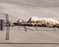 Pre-impact
 Post-impact 1
 Post-impact 2
 Post-impact 3


.svg)
.svg)


 versus the Obama official image
 . The featured one offers much greater insight to the character than the posed one. The same argument could be made here. Personally, I am torn. In many ways I agree with the point you are making, but I'm not convinced that is in line with with FP criteria.
Cowtowner (
talk) 01:56, 15 November 2009 (UTC)
. The featured one offers much greater insight to the character than the posed one. The same argument could be made here. Personally, I am torn. In many ways I agree with the point you are making, but I'm not convinced that is in line with with FP criteria.
Cowtowner (
talk) 01:56, 15 November 2009 (UTC)


.jpg)
_wb_edit.jpg)

 Canada animation
 US by state animation
 Southwestern US and Mexico animation
 Confederate States animation


 for comparison. It avoids most of the flaws of the nominated image.
Papa Lima Whiskey (
talk) 00:20, 21 November 2009 (UTC)
for comparison. It avoids most of the flaws of the nominated image.
Papa Lima Whiskey (
talk) 00:20, 21 November 2009 (UTC)


 ? --
jjron (
talk) 13:37, 9 November 2009 (UTC)
? --
jjron (
talk) 13:37, 9 November 2009 (UTC)


 --
--


![[3]](http://www.corbisimages.com/images/IH165342.jpg?size=67&uid=F31381BD-2C42-4A95-B4A6-83B6374DE089)
![[7]](http://images.google.com.au/imgres?imgurl=http://userwww.sfsu.edu/~lgarrett/pledgephotos.jpg&imgrefurl=http://userwww.sfsu.edu/~lgarrett/&usg=__POzJbzMNa66HQM0zVXZMUJOZ5_8=&h=356&w=450&sz=25&hl=en&start=3&sig2=S3F0BKwCfEzzukYLdVFYew&tbnid=BqlyRoHBoqlWhM:&tbnh=100&tbnw=127&prev=/images%3Fq%3Ddorothea%2Blange%2Bphot%2Bpledge%26gbv%3D2%26hl%3Den%26sa%3DG&ei=nR_qSof1FoSA7QP687DyCw)
![[8]](http://images.google.com.au/imgres?imgurl=http://www.getty.edu/education/for_teachers/curricula/historical_witness/images/13665301_menu.jpg&imgrefurl=http://www.getty.edu/education/for_teachers/curricula/historical_witness/lesson11.html&usg=__qaO7DQvYdyPRw-tNOuIcesI43qk=&h=253&w=190&sz=41&hl=en&start=28&sig2=lwblk6NQglJxMoccn_GIsQ&tbnid=8O_NQGwPaG44zM:&tbnh=111&tbnw=83&prev=/images%3Fq%3Ddorothea%2Blange%2Bphot%2Bpledge%26gbv%3D2%26ndsp%3D21%26hl%3Den%26sa%3DN%26start%3D21&ei=AiLqSpjnLYag6wPX8cnnCw)
.png)
![[14]](http://www.moneduloides.com/images/salat2.jpg)


