


-

One Dollar -

Two Dollars
| Featured picture tools |
|---|
Please cut and paste new entries to the bottom of this page, creating a new monthly archive (by closing date) when necessary.
Centaurea jacea
Voting period is over. Please don't add any new votes. Voting period ends on 1 Mar 2015 at 00:43:39 (UTC)

- Reason
- Always time for flowers.
- Articles in which this image appears
- Centaurea jacea
- FP category for this image
- Wikipedia:Featured pictures/Plants/Flowers
- Creator
- Uoaei1
- Support as nominator – — Crisco 1492 ( talk) 00:43, 19 February 2015 (UTC)
- Support - Very nice photo. The flower itself is very clear. Does it matter that the background has no detail? Or is it better that way? It clearly makes the flower stand out more. - CorinneSD ( talk) 00:53, 19 February 2015 (UTC)
- Support - Sharp sharp sharp - Bellus Delphina talk 06:43, 19 February 2015 (UTC)
- Support - Cooool pink.. Ṫ Ḧ the fury of the nature given flesh 14:58, 19 February 2015 (UTC)
- Weak support I notice a trend in this featured picture nomination process. Plant nominations only show the flower, which limits the EV as you are missing the bulk of the plant, and showing it at only a short time of the year. There is some bias, animal pictures showing only the head will get opposition, but it's ok for a plant. Nevertheless, a nice photograph.
Mattximus (
talk) 01:08, 20 February 2015 (UTC)
- That's why we have three FP sections: flowers, fruits, and " other". It is damn hard to get a good picture of a whole plant, in my experience. — Crisco 1492 ( talk) 01:40, 20 February 2015 (UTC)
- Support - one can't see the flower well, when a picture shows the whole plant. These pictures with a close up flower are very necessary when studying botanic, witch I did, I can only say they are vital in illustrating any plant. The students even had an own name on this, they called this
bloom-porn.
 Hafspajen (
talk) 09:19, 20 February 2015 (UTC)
Hafspajen (
talk) 09:19, 20 February 2015 (UTC) - Support good contrast. -- Alchemist-hp ( talk) 09:31, 20 February 2015 (UTC)
- Support Rreagan007 ( talk) 18:57, 21 February 2015 (UTC)
- Support - Jobas ( talk) 16:42, 23 February 2015 (UTC)
Promoted File:Centaurea jacea 01.JPG -- Armbrust The Homunculus 01:56, 1 March 2015 (UTC)
La Nymphe Surprise (The surprised nymph)
Voting period is over. Please don't add any new votes. Voting period ends on 1 Mar 2015 at 11:10:17 (UTC)

- Reason
- Good Scan of That Painting by Édouard Manet Plus EV.
- Articles in which this image appears
- La Nymphe surprise, Suzanne Manet , Édouard Manet +3
- FP category for this image
- Wikipedia:Featured pictures/Artwork/Paintings
- Creator
- Édouard Manet
- Support as nominator – National Names 2000 ( talk) 11:10, 19 February 2015 (UTC)
- Support - great artist, very cute girl. Hafspajen ( talk) 13:42, 19 February 2015 (UTC)
- Support - Nice painting -- My Core Competency is Competency ( talk) 14:55, 19 February 2015 (UTC)
Oppose, limited EV. Only used in galleries. If this image had an article of its own, or was particularly important to illustrate something in an article, maybe- as is, no. J Milburn ( talk) 23:25, 19 February 2015 (UTC)OpposeAs per J Milburn. With a few special cases (artist only has 1 famous painting for example), I think there should be an article dedicated to the painting itself to be considered of EV. Change to Support due to creation of article Mattximus ( talk) 01:04, 20 February 2015 (UTC)Opposeper J. For Manet, we've got dozens of images to choose from. EV needs to be there. — Crisco 1492 ( talk) 01:45, 20 February 2015 (UTC)
- 'Oh wow. **No** problem wringing an article on this. This is a charming little painting, an truly important work of the artist, a big painter's love and later wife, a lovely love story behind it and she just looks like a little nymph, come on now. Hafspajen ( talk) 06:16, 20 February 2015 (UTC)
- Article ready -- see link above. And as for the record, I don't think there should be an article dedicated to the each and every painting itself to be considered of EV. That is just going too far. A limited EV. Only used in galleries, as Milburn said, that's correct here. But there are plenty good paintings that are used in significant ways in many articles, and it should be quite enough. This one, with only in galleries, well, OK. But when a painting is used and adds to an article that IS EV. An own article as a standard requirement - no . We don't require that it should be an own article on photographs either. Hafspajen ( talk) 08:50, 20 February 2015 (UTC)
- Coment - this painting is an important painting of the artist's production. He himself thought to be one of the most important of his works. Why it not as equally well known as his other paintings is because he never sold it but keept it his entire life, and thus it was not as much potographed and published. It is depicting his wife. Hafspajen ( talk) 11:53, 20 February 2015 (UTC)
- Support Now that there is an article on the painting, EV is guaranteed. — Crisco 1492 ( talk) 15:05, 20 February 2015 (UTC)
- Support Rreagan007 ( talk) 18:58, 21 February 2015 (UTC)
- Support - Jobas ( talk) 16:41, 23 February 2015 (UTC)
Promoted File:Édouard MANET - La Nymphe surprise - Google Art Project.jpg -- Armbrust The Homunculus 11:25, 1 March 2015 (UTC)
Set:Four Times of the Day by Joseph Vernet
Voting period is over. Please don't add any new votes. Voting period ends on 1 Mar 2015 at 13:04:02 (UTC)
- The Four Times of the Day
-
 The four times of day: Morning
 -
 The four times of day: Midday
 -
 The four times of day: Evening
 -
 The four times of day: Night
- Reason
- A high quality set of the painting series by Vernet
- Articles in which this image appears
- Four Times of the Day (Joseph Vernet)
- FP category for this image
- Wikipedia:Featured pictures/Artwork/Paintings
- Creator
- Claude Joseph Vernet
- Support as nominator – Ṫ Ḧ the fury of the nature given flesh 13:04, 19 February 2015 (UTC)
- Support Hafspajen ( talk) 13:39, 19 February 2015 (UTC)
- Support — Crisco 1492 ( talk) 08:02, 20 February 2015 (UTC)
- Support Oh the French have done it again. Étienne Dolet ( talk) 19:52, 20 February 2015 (UTC)
- Support Yes. Brandmeister talk 08:42, 22 February 2015 (UTC)
- Support - Jobas ( talk) 16:41, 23 February 2015 (UTC)
Promoted File:Claude-Joseph Vernet - The four times of day- Morning - Google Art Project.jpg --
Armbrust
The Homunculus 13:05, 1 March 2015 (UTC)
Promoted File:Claude-Joseph Vernet - The four times of day- Midday - Google Art Project.jpg --
Armbrust
The Homunculus 13:05, 1 March 2015 (UTC)
Promoted File:Claude-Joseph Vernet - The four times of day- Evening - Google Art Project.jpg --
Armbrust
The Homunculus 13:05, 1 March 2015 (UTC)
Promoted File:Claude-Joseph Vernet - The four times of day- Night - Google Art Project.jpg --
Armbrust
The Homunculus 13:05, 1 March 2015 (UTC)
Johannes's little street
Voting period is over. Please don't add any new votes. Voting period ends on 1 Mar 2015 at 14:29:35 (UTC)

- Reason
- An excellent image of a superb Vermeer
- Articles in which this image appears
- The Little Street, Johannes Vermeer + 2 others
- FP category for this image
- Wikipedia:Featured pictures/Artwork/Paintings
- Creator
- Johannes Vermeer
- Support as nominator – SchroCat ( talk) 14:29, 19 February 2015 (UTC)
- Support - does anyone realize that there are 70 FP nominations currently? And almost all are great. What a FP list this going to be, Adam Cuerden. Hafspajen ( talk) 17:02, 19 February 2015 (UTC)
- Support Love this painting. Quality is exceptional. Étienne Dolet ( talk) 23:25, 19 February 2015 (UTC)
- Weak support Very minimal EV, the article is only a stub, but I suppose it may grow in the future. Mattximus ( talk) 01:05, 20 February 2015 (UTC)
- Support - FPC looks at the image and the image's use, not the article(s) themselves. The image is better than fine. — Crisco 1492 ( talk) 01:43, 20 February 2015 (UTC)
- Just out of curiosity, I see that if a scan of a painting is relegated to a large gallery at the bottom of a page, it's considered having low EV. What you are saying, is that the nominator can just create a stub with 1 sentence, post the image, and suddenly the EV is there? If so, I'll go with it, I'm just wondering for clarification purposes.
Mattximus (
talk) 14:42, 21 February 2015 (UTC)
- Just a minor correction: the image isn't in a gallery at the bottom, it's placed to the right at the top of the "Career" section. In relation to the article, it has to pass the
WP:GNG threshold to have an article, which is part of the measure. -
SchroCat (
talk) 15:37, 21 February 2015 (UTC)
- If you think someone is trying to game the system by doing so, then please AFD. That's why we have such processes. If a painting supports its own article (i.e. an article that would survive AFD), then it has EV. Period. — Crisco 1492 ( talk) 00:13, 22 February 2015 (UTC)
- Just a minor correction: the image isn't in a gallery at the bottom, it's placed to the right at the top of the "Career" section. In relation to the article, it has to pass the
WP:GNG threshold to have an article, which is part of the measure. -
SchroCat (
talk) 15:37, 21 February 2015 (UTC)
- Comment -- The painting has it's own article The Little Street AND it is a famous painting too. That should be an EV itself. The Little Street is a well known painting. Can't really understand this discussion above. Hafspajen ( talk) 20:18, 21 February 2015 (UTC)
- Just out of curiosity, I see that if a scan of a painting is relegated to a large gallery at the bottom of a page, it's considered having low EV. What you are saying, is that the nominator can just create a stub with 1 sentence, post the image, and suddenly the EV is there? If so, I'll go with it, I'm just wondering for clarification purposes.
Mattximus (
talk) 14:42, 21 February 2015 (UTC)
- Comment - expanded the article a little so those who are unfamiliar about the importance of this artist's work can read about it. Though, mind - it was all in the refs already... It is the only known painting made by Johannes Vermeer outdoors and the only one that is correctly attributed to Vermeer . Hafspajen ( talk) 14:26, 22 February 2015 (UTC).
- Support - Jobas ( talk) 16:40, 23 February 2015 (UTC)
Promoted File:Johannes Vermeer - Gezicht op huizen in Delft, bekend als 'Het straatje' - Google Art Project.jpg -- Armbrust The Homunculus 14:30, 1 March 2015 (UTC)
David Garrick as Richard III
Voting period is over. Please don't add any new votes. Voting period ends on 10 Mar 2015 at 20:03:41 (UTC)

- Reason
- High resolution file, very EVish, Garrick as Richard III (1745) by William Hogarth. Have mercy, Jesu! Soft! I did but dream. O coward conscience, how dost thou afflict me! – The scene is Shakespeare's Richard III Act V, Sc. 3. David Garrick, the superstar of the Shakespearean drama - plays Richard III just before the Battle of Bosworth, where he will shout: A horse, a horse! My kingdom for a horse!
- Articles in which this image appears
- David Garrick as Richard III, David Garrick, William Hogarth, Augustan drama, 1745 in art, Battle of Bosworth Field, Boydell Shakespeare Gallery, Cultural depictions of Richard III of England, Richard III (play), Shakespeare in performance, Theatre Royal, Drury Lane, Walker Art Gallery
- FP category for this image
- link to category (listed on the WP:FP page) that best describes the image
- Creator
- User:William Hogarthjoke - hm, no account, only article...joke , OK it is English painter William Hogarth
- Support as nominator – Hafspajen ( talk) 20:03, 28 February 2015 (UTC)
- Weak oppose - Shame, but they used too much compression here too (also, is it just me, or does that one tassel look like it was digitally "restored"?). — Crisco 1492 ( talk) 01:34, 1 March 2015 (UTC)
- Sigh - can't one trust Google files any more? Hafspajen ( talk) 02:06, 1 March 2015 (UTC)
- Shall I Whitdraw
Hafspajen (
talk) 02:07, 1 March 2015 (UTC)
- Can't trust them automatically, no, but mostly they do okay. Don't know why this was saved with so much compression. — Crisco 1492 ( talk) 04:50, 1 March 2015 (UTC)
Not Promoted -- Armbrust The Homunculus 14:38, 1 March 2015 (UTC)
- Withdrawn nomination. Armbrust The Homunculus 14:38, 1 March 2015 (UTC)
Scott Thwaites
Voting period is over. Please don't add any new votes. Voting period ends on 1 Mar 2015 at 16:08:37 (UTC)

- Reason
- Good quality photo of the cyclist in action.
- Articles in which this image appears
- Scott Thwaites
- FP category for this image
- Wikipedia:Featured pictures/People/Sport
- Creator
- KTC
- Support as nominator – KTC ( talk) 16:08, 19 February 2015 (UTC)
- Comment. I find the backgound quite distracting. 109.147.191.118 ( talk) 22:05, 19 February 2015 (UTC)
- Support - A busy background is par for the course for urban cycling. I'd have upped the ISO to 200 (or even 400; the noise is still manageable with a 60D) and frozen the action a bit more, but I can see why you chose not to. — Crisco 1492 ( talk) 01:48, 20 February 2015 (UTC)
- I think there are "good" busy backgrounds and bad ones, and that this one is particularly bad because of the guy in the bright orange vest who is so very unfortunately positioned right behind the cyclist's head, as well as the tube that seems to be coming out of his helmet. Personally I think the composition is awful (no offence to anyone) but I see that others do not agree. 86.136.150.74 ( talk) 21:20, 22 February 2015 (UTC)
- Support - Hafspajen ( talk) 06:46, 20 February 2015 (UTC)
- Support - The background is a bit busy, but the facial expression makes up for it. A good action shot.-- Godot13 ( talk) 09:34, 21 February 2015 (UTC)
- Support. Thryduulf ( talk) 17:29, 21 February 2015 (UTC)
- Support - Nice capture. APK whisper in my ear 09:08, 22 February 2015 (UTC)
- Support - Jobas ( talk) 16:40, 23 February 2015 (UTC)
- Support. Agree with Crisco that a busy background is unavoidable in these situations. You're never going to avoid it in a city race. I took some similar images during the cycling at the 2012 Olympics and I know how difficult it is to get an image that is sharp, capturing the action well, and with perfect composition. These guys fly past at 40+ km/h and you are lucky if you can keep them in the frame consistently. I do agree with Crisco also that it might have been preferable to bump up the ISO to get a slightly sharper image instead of going for the panning motion blur, as that usually only works well when there's more blur than this. Ðiliff «» (Talk) 09:01, 25 February 2015 (UTC)
Promoted File:ToB 2014 stage 8a - Scott Thwaites 03.jpg -- Armbrust The Homunculus 16:12, 1 March 2015 (UTC)
Trinidad and Tobago, First issue banknotes (1905)
Voting period is over. Please don't add any new votes. Voting period ends on 2 Mar 2015 at 03:13:50 (UTC)
- Reason
- High quality image, high EV. The first government issue of Trinidad and Tobago banknotes consisted of a one and two dollar denomination dated 1905.
- Original
- Trinidad and Tobago first government-issued series of banknotes. A one-dollar and two-dollar bill of 1905. Of the two varieties of $2 bill (solid red, and red with green overprint), the pictured type is prohibitively scarce.
- Articles in which this image appears
- Trinidad and Tobago dollar
- FP category for this image
- Currency
- Creator
-
Thomas de la Rue for
Trinidad and Tobago.
From the National Numismatic Collection, National Museum of American History, Smithsonian Institution.
Image by Godot13.
The first series of Trinidad and Tobago government-issued banknotes (1905)
.jpg)
.jpg)
- Support as nominator – Godot13 ( talk) 03:13, 20 February 2015 (UTC)
- Why not include both here? — Crisco 1492 ( talk) 08:06, 20 February 2015 (UTC)
- Support - The folds are a bit strong, but we have to think realistically: what are the chances we're going to get two more high quality scans of such hundred-year-old notes? — Crisco 1492 ( talk) 23:45, 20 February 2015 (UTC)
- Support - Jobas ( talk) 16:40, 23 February 2015 (UTC)
- Support – interesting scans with good EV. SagaciousPhil - Chat 11:58, 25 February 2015 (UTC)
- Support – HQ + EV - Alborzagros ( talk) 12:36, 25 February 2015 (UTC)
Promoted File:TRI&TOB-1b-Trinidad & Tobago-1 Dollar (1905).jpg --
Armbrust
The Homunculus 03:14, 2 March 2015 (UTC)
Promoted File:TRI&TOB-2b-Trinidad & Tobago-2 Dollars (1905).jpg --
Armbrust
The Homunculus 03:14, 2 March 2015 (UTC)
A van Gogh selfie
Voting period is over. Please don't add any new votes. Voting period ends on 2 Mar 2015 at 08:39:03 (UTC)

- Reason
- A great copy of a very well-known work
- Articles in which this image appears
- Van Gogh self-portrait (1889), Portraits of Vincent van Gogh, Vincent van Gogh
- FP category for this image
- Wikipedia:Featured pictures/Artwork/Paintings
- Creator
- Vincent van Gogh
- Support as nominator – SchroCat ( talk) 08:39, 20 February 2015 (UTC)
- Support But of course. Étienne Dolet ( talk) 19:51, 20 February 2015 (UTC)
- Comment – I'm beginning to wonder if it's wise to select so many works of famous late 19th century Impressionists and Post-Impressionists as FPs. Of course one is a fan of Van Gogh and many others from the era, but I'm thinking it might be more interesting (and educational) to feature more obscure artists. Just a thought. (There are four Van Goghs in the FPC queue right now.) Sca ( talk) 15:37, 21 February 2015 (UTC)
- But does that affect the inherent notability of the works or images themselves? There may be an embarassment of riches for the late C19th at the moment, but other eras or movements will have their moments in the spotlight. - SchroCat ( talk) 15:43, 21 February 2015 (UTC)
- No, they remain what they are. My thinking is, they're familiar to many people, whereas less-well-known artists would be a learning experience – and perhaps intriguing as something new to viewers/readers.
- In this instance, Van Gogh is arguably the most famous personality in Western art of the Modern Era (though others could be argued as well), and his late style, while often entrancing, is familiar to most culturally literate people. I'm not suggesting his works should never be FPs, only that it would be refreshing to vary the mix with talented but often ignored artists (not from France or the Low Countries), such as Baluschek, Liebermann, Corinth and various Scandinavian and Russian painters.
Sca (
talk) 17:15, 21 February 2015 (UTC)
- I agree entirely that there should also be lesser-known artists work here, but my original point still stands: that does not affect the inherent notability of the works or images themselves. -
SchroCat (
talk) 17:20, 21 February 2015 (UTC)
- It doesn't matter how many works from a single artist we feature, so long as they all have the proper EV. Being featured per se does not affect how interesting or educational an image is; it actually has very little effect on readers. The POTD process is what draws attention, and I or whoever is in charge at the time can handle that when it comes time for it. We have 43 FPs of map projections, but no complaints yet (even after 10 or so have already been run). — Crisco 1492 ( talk) 00:12, 22 February 2015 (UTC)
- I agree entirely that there should also be lesser-known artists work here, but my original point still stands: that does not affect the inherent notability of the works or images themselves. -
SchroCat (
talk) 17:20, 21 February 2015 (UTC)
- In this instance, Van Gogh is arguably the most famous personality in Western art of the Modern Era (though others could be argued as well), and his late style, while often entrancing, is familiar to most culturally literate people. I'm not suggesting his works should never be FPs, only that it would be refreshing to vary the mix with talented but often ignored artists (not from France or the Low Countries), such as Baluschek, Liebermann, Corinth and various Scandinavian and Russian painters.
Sca (
talk) 17:15, 21 February 2015 (UTC)
Oppose- With so many self-portraits by van Gogh to choose from, the EV in Portraits of Vincent van Gogh and Vincent van Gogh isn't really that high. Enough to feature one self-portrait (which we have), but not enough for a group of them. — Crisco 1492 ( talk) 00:18, 22 February 2015 (UTC)Oppose– Per Crisco. Sca ( talk) 15:57, 22 February 2015 (UTC)- Comment – The painting merits its own article, instead of only a spot in an image gallery, and this would solve the issue of the EV. – Editør ( talk) 17:43, 22 February 2015 (UTC)
- Crisco 1492, Sca, Editør, an article now exists at Van Gogh self-portrait (1889). - SchroCat ( talk) 20:22, 22 February 2015 (UTC)
- Support – Editør ( talk) 21:57, 22 February 2015 (UTC)
- Support – well done Schro. So you discovered that it was his last, eh? Because it was - and that's heavy EV. Hafspajen ( talk) 22:01, 22 February 2015 (UTC)
- Support – Nice, quick work, Schro. Interesting. Sca ( talk) 22:10, 22 February 2015 (UTC)
- Support - Jobas ( talk) 16:38, 23 February 2015 (UTC)
- Support - Godot13 ( talk) 03:56, 25 February 2015 (UTC)
Promoted File:Vincent van Gogh - Self-Portrait - Google Art Project.jpg -- Armbrust The Homunculus 08:47, 2 March 2015 (UTC)
Hurva Synagogue
Voting period is over. Please don't add any new votes. Voting period ends on 2 Mar 2015 at 13:38:22 (UTC)

- Reason
- High EV and good quality
- Articles in which this image appears
- Hurva Synagogue
- FP category for this image
- Wikipedia:Featured pictures/Places/Interiors
- Creator
- Yakov613
- Support as nominator – Tomer T ( talk) 13:38, 20 February 2015 (UTC)
- Oppose - Composition feels snapshotty. — Crisco 1492 ( talk) 15:04, 20 February 2015 (UTC)
- Oppose - It almost doesn't feel centered enough. Étienne Dolet ( talk) 19:59, 20 February 2015 (UTC)
- Oppose - Per Crisco and EtienneDolet, does not come close to Ðiliff's interiors for example. Mattximus ( talk) 14:57, 21 February 2015 (UTC)
- Oppose - Odd composition. APK whisper in my ear 09:06, 22 February 2015 (UTC)
Not Promoted -- Armbrust The Homunculus 14:01, 2 March 2015 (UTC)
Caroline Webster Schermerhorn Astor
Voting period is over. Please don't add any new votes. Voting period ends on 3 Mar 2015 at 01:18:58 (UTC)
.jpg)
- Reason
- High quality depiction of a notable socialite; apparently, she would always stand in front of the portrait when receiving guests.
- Articles in which this image appears
- Caroline Webster Schermerhorn Astor +1
- FP category for this image
- She'd probably want to be in Wikipedia:Featured pictures/People/Royalty and nobility, but I think Wikipedia:Featured pictures/People/Others works better
- Creator
- Carolus-Duran
- Support as nominator – — Crisco 1492 ( talk) 01:18, 21 February 2015 (UTC)
- Support - Crisco, why does the painting have so little color, just black, yellow and brown hues? Was that the style for portraits then, or have the colors faded? Or could she have been standing under a yellowish lamp? -
CorinneSD (
talk) 01:53, 21 February 2015 (UTC)
- Not sure. Mind, the Met says that Duran was influenced by Velazquez, who (AFAIK) used a lot of earthy hues in his works/portraits (
Portrait of Pablo de Valladolid, for instance). —
Crisco 1492 (
talk) 03:48, 21 February 2015 (UTC)
- And, in theory, that effect could easily be increased by a layer of yellowed varnish. Will review properly in a bit. Adam Cuerden ( talk) 05:56, 21 February 2015 (UTC)
- Not sure. Mind, the Met says that Duran was influenced by Velazquez, who (AFAIK) used a lot of earthy hues in his works/portraits (
Portrait of Pablo de Valladolid, for instance). —
Crisco 1492 (
talk) 03:48, 21 February 2015 (UTC)
- Support - Jobas ( talk) 16:38, 23 February 2015 (UTC)
- Support - He had several works in this monocromatic style. - Hafspajen ( talk) 09:52, 24 February 2015 (UTC)
- Support – nice artwork of an interesting socialite with good EV. SagaciousPhil - Chat 12:03, 25 February 2015 (UTC)
- Support – the yellowy-brown tint stops at the paint-line at the edge of the painting. The edges of the canvas are off-white. Around the edges of the canvas damage from a frame can be seen, and the yellow tint doesn't change in character where the canvas was covered by the frame, which suggests that whatever's causing the tint was applied at the time of painting. Carolus-Duran's French, so maybe he "French-polished" it, like a violin
.
Xanthomelanoussprog (
talk) 23:29, 28 February 2015 (UTC)
Promoted File:Carolus-Duran 001.jpg -- Armbrust The Homunculus 01:20, 3 March 2015 (UTC)
Jay Gould
Voting period is over. Please don't add any new votes. Voting period ends on 3 Mar 2015 at 05:53:45 (UTC)

- Reason
- Prints from the late 19th/early 20th century often aren't perfect, but this print... is no exception. Still! It's a very nice portrait of a major Victorian-era financier, and it's certainly not that bad. Took a fair bit of restoration, as the print was rather heavily damaged at the edges, but I think the results are worth it.
- Articles in which this image appears
- Jay Gould +2
- FP category for this image
- An excellent candidate for the very underpopulated Wikipedia:Featured_pictures/People/Business
- Creator
- Uncredited photographer; restoration by Adam Cuerden
- Support as nominator – Adam Cuerden ( talk) 05:53, 21 February 2015 (UTC)
- Support - Wow, what a lovely lead to that article. So positive! — Crisco 1492 ( talk) 07:08, 21 February 2015 (UTC)
- Support - Very nice clean-up from the original.-- Godot13 ( talk) 09:25, 21 February 2015 (UTC)
- Support Looks like the best possible from the source material, very nice! Mattximus ( talk) 14:51, 21 February 2015 (UTC)
- Support – Interesting (and infamous) figure in late 19th century U.S. history. Sca ( talk) 15:07, 21 February 2015 (UTC)
- Support - EV ________ Alborzagros ( talk) 13:29, 22 February 2015 (UTC)_______
- Support - Hafspajen ( talk) 13:30, 22 February 2015 (UTC)
- Support - Jobas ( talk) 16:37, 23 February 2015 (UTC)
Promoted File:Jay Gould - Bain News Service.jpg -- Armbrust The Homunculus 06:02, 3 March 2015 (UTC)
The Yellow House (Das Gelbe Haus)
Voting period is over. Please don't add any new votes. Voting period ends on 3 Mar 2015 at 07:25:00 (UTC)
2.jpeg)
_-_Google_Art_Project.jpg)
.jpg)
- Reason
- A Good Scan of a very well-known work
- Articles in which this image appears
- Décoration for the Yellow House (Own Article) Vincent van Gogh +2
- FP category for this image
- Wikipedia:Featured pictures/Artwork/Paintings
- Creator
- Vincent van Gogh
- Support as nominator – National Names 2000 ( talk) 07:25, 21 February 2015 (UTC)
- Oppose original – The printing dots are visible at full size. I much prefer this version: [1]. – Editør ( talk) 09:18, 21 February 2015 (UTC)
- Oppose (original). Scanned from a book. J Milburn ( talk) 13:44, 21 February 2015 (UTC)
- Oppose as above, you can see it's from a book. Mattximus ( talk) 14:48, 21 February 2015 (UTC)
- Support - ALT1 or 2 -It is an interesting painting, a less well know painting, and thus - a learning experience.
Hafspajen (
talk) 20:14, 21 February 2015 (UTC)
- Alt (1) is much better than the original, but not as detailed as the version on the website of the Van Gogh Museum mentioned above. – Editør ( talk) 11:29, 22 February 2015 (UTC)
- Support Alt. 2 – Per Haffy, Crisco. Sca ( talk) 15:54, 22 February 2015 (UTC)
- Support - Jobas ( talk) 16:37, 23 February 2015 (UTC)
- Support ALT2 - Larger, more detailed. — Crisco 1492 ( talk) 01:03, 25 February 2015 (UTC)
- Support Alt 2 – Editør ( talk) 07:16, 25 February 2015 (UTC)
Promoted File:Vincent van Gogh - The yellow house ('The street').jpg -- Armbrust The Homunculus 07:28, 3 March 2015 (UTC)
- Only alt 2 has enough support for promotion. -- Armbrust The Homunculus 07:28, 3 March 2015 (UTC)
Le Quai Saint-Michel et Notre-Dame
Voting period is over. Please don't add any new votes. Voting period ends on 3 Mar 2015 at 13:50:21 (UTC)

- Reason
- Excellent scan of a great painting
- Articles in which this image appears
- The Quai Saint-Michel and Notre-Dame, Maximilien Luce, Timeline of Paris
- FP category for this image
- Wikipedia:Featured pictures/Artwork/Paintings
- Creator
- Maximilien Luce
- Support as nominator – SchroCat ( talk) 13:50, 21 February 2015 (UTC)
- Question - Is there EV for this painting? There is no article for the painting itself, and it's simply the 8th out of the 9 paintings by the painter on that page. I'm not sure it's the best way of showing the timeline of Paris either (the other article that it appears). Mattximus ( talk) 14:46, 21 February 2015 (UTC)
- I'm not sure that the number of paintings that precede it in the article makes any difference, as long as the image is suitable for the article and isn't tucked into a gallery. - SchroCat ( talk) 15:27, 21 February 2015 (UTC)
- The painting now has its own article too. A stub for now, but I'll be in Paris in a few weeks and will pick up some further info there. - SchroCat ( talk) 22:09, 21 February 2015 (UTC)
- Support — Crisco 1492 ( talk) 00:48, 23 February 2015 (UTC)
- Support Hafspajen ( talk) 09:47, 23 February 2015 (UTC)
- Support - Jobas ( talk) 16:37, 23 February 2015 (UTC)
- Support Nice example of what I presume still counts as pointillism. Adam Cuerden ( talk) 09:16, 3 March 2015 (UTC)
Promoted File:Maximilien Luce - The Quai Saint-Michel and Notre-Dame - Google Art Project.jpg -- Armbrust The Homunculus 13:51, 3 March 2015 (UTC)
Airport crash tender
Voting period is over. Please don't add any new votes. Voting period ends on 3 Mar 2015 at 20:30:52 (UTC)

- Reason
- One of the toys for big boys. The vehicle's internal equipment is shown, sharp enough, decent EV.
- Articles in which this image appears
- Rosenbauer Panther
- FP category for this image
- Vehicles/Land
- Creator
- DR
- Support as nominator – Brandmeister talk 20:30, 21 February 2015 (UTC)
- Oppose Parts of the sky are blown, and the background is distracting. — Crisco 1492 ( talk) 00:09, 22 February 2015 (UTC)
- Comment - What do you mean about the sky is blown?
Hafspajen (
talk) 13:40, 22 February 2015 (UTC)
- He means
this. I've now reduced highlights and uploaded that version over the existing one.
Brandmeister
talk 15:05, 22 February 2015 (UTC)
- I think you'd need to go back to the raws to get the proper amount of detail... — Crisco 1492 ( talk) 00:48, 23 February 2015 (UTC)
- He means
this. I've now reduced highlights and uploaded that version over the existing one.
Brandmeister
talk 15:05, 22 February 2015 (UTC)
- Support - Well, I don't know about that sky, but I like this pic. Hafspajen ( talk) 23:36, 22 February 2015 (UTC)
- Oppose - The newly uploaded version's sky is way over-processed ( posterization?) and I think wrong in colour. There's also chromatic aberration all over the image I'm afraid. -- KTC ( talk) 14:05, 23 February 2015 (UTC)
Not Promoted -- Armbrust The Homunculus 21:43, 3 March 2015 (UTC)
FM Towns Marty
Voting period is over. Please don't add any new votes. Voting period ends on 3 Mar 2015 at 23:12:04 (UTC)

- Reason
- High EV. Great quality picture of uncommon hardware. It's extra nice that you can see the FDD slot on it (as well as its cheesy slogan.)
- Articles in which this image appears
- FM Towns Marty, History of video game consoles (fifth generation)
- FP category for this image
- Wikipedia:Featured pictures/Engineering and technology/Electronics
- Creator
- Evan-Amos
- Support as nominator – FakeShemp ( talk) 23:12, 21 February 2015 (UTC)
- Weak support. I like these shots, but I worry that they'll fail to inspire. Is the console slightly damaged? A little ding by the Fujitsu logo? J Milburn ( talk) 23:57, 24 February 2015 (UTC)
- Support - another of Evan-Amos's great work. I'm also curious about the possible ding- @ Evan-Amos:? Do you remember what that's about? -- Pres N 19:33, 27 February 2015 (UTC)
- Support Adam Cuerden ( talk) 11:58, 3 March 2015 (UTC)
- Support Rreagan007 ( talk) 19:52, 3 March 2015 (UTC)
Not Promoted -- Armbrust The Homunculus 23:14, 3 March 2015 (UTC)
- Not enough support for promotion. Armbrust The Homunculus 23:14, 3 March 2015 (UTC)
Colonnades of and sky of The Basilica of Saint Paul
Voting period is over. Please don't add any new votes. Voting period ends on 4 Mar 2015 at 04:03:14 (UTC)
.JPG)
- Reason
- Higher Resolution plus EV
- Articles in which this image appears
- Basilica of Saint Paul Outside the Walls (Own Article)
- FP category for this image
- Wikipedia:Featured pictures/Places/Others
- Creator
- Livioandronico2013
- Support as nominator – National Names 2000 ( talk) 04:03, 22 February 2015 (UTC)
- Oppose - Wonky composition. Artsy, maybe, but not encyclopedic. — Crisco 1492 ( talk) 07:14, 22 February 2015 (UTC)
- Oppose - Per Crisco. I don't see the EV. APK whisper in my ear 09:03, 22 February 2015 (UTC)
- Oppose per Crisco, I'm not sure what exactly is the EV for this photograph?
Mattximus (
talk) 14:57, 22 February 2015 (UTC)
- Comment Eh? What? I Add The EV For Sure. -
National Names 2000 (
talk) 01:00, 23 February 2015 (UTC)
- I guess we are wondering what exactly the photograph is supposed to illustrate in an encyclopedia? It doesn't really show a good representation of the Basilica of Saint Paul Outside the Walls, only a tiny fraction of it, and that's the only article it is used. Mattximus ( talk) 01:15, 24 February 2015 (UTC)
- Comment Eh? What? I Add The EV For Sure. -
National Names 2000 (
talk) 01:00, 23 February 2015 (UTC)
- Oppose artistically but not ev for me. -- Alchemist-hp ( talk) 17:33, 24 February 2015 (UTC)
Not Promoted -- Armbrust The Homunculus 04:04, 4 March 2015 (UTC)
Jane Digby
Voting period is over. Please don't add any new votes. Voting period ends on 4 Mar 2015 at 06:27:16 (UTC)

- Reason
- High Resolution
- Articles in which this image appears
- Jane Digby
- FP category for this image
- Wikipedia:Featured pictures/People/Artists and writers or Wikipedia:Featured pictures/Artwork/Others sometimes Wikipedia:Featured pictures/People/Others
- Creator
- Artist:
William Charles Ross
Uploader: Jan Arkesteijn
- Support as nominator – National Names 2000 ( talk) 06:27, 22 February 2015 (UTC)
- Support – Interesting face. Links to an interesting article. Sca ( talk) 14:29, 22 February 2015 (UTC)
- Support – EV + HQ - Alborzagros ( talk) 14:51, 22 February 2015 (UTC)
- Support – I say, had four husbands and many lovers, including King Ludwig I of Bavaria, .. + long list ... Last husband, twenty years her junior, they married under Muslim law and she took the name Jane Elizabeth Digby el Mezrab. Their marriage was a happy one and lasted until her death 28 years later. There is still hope in this world. Hafspajen ( talk) 23:12, 22 February 2015 (UTC)
- "Hope is definitely not the same thing as optimism. It is not the conviction that something will turn out well, but the certainty that something makes sense, regardless of how it turns out." – Václav Havel – Sca ( talk) 17:48, 24 February 2015 (UTC)
- Yeah, Vaclav did't had many resons to be an optimist, poor man. Hafspajen ( talk) 16:06, 25 February 2015 (UTC)
- Hafs, recently I read a long biography of Havel, and I must disagree. He led the Velvet Revolution, was twice elected president of his country (or countries), and was by and large acclaimed by the Czech people and many throughout the world. This, for a man who believed in the "power of the powerless." Sca ( talk) 22:10, 25 February 2015 (UTC)
- Support - Jobas ( talk) 16:36, 23 February 2015 (UTC)
- Support - Nice details and colors. - CorinneSD ( talk) 18:48, 25 February 2015 (UTC)
Promoted File:Jane Digby, Lady Ellenborough, by William Charles Ross.jpg -- Armbrust The Homunculus 06:40, 4 March 2015 (UTC)
- Added image to Wikipedia:Featured pictures/People/Royalty and nobility instead, as Digby was an English aristocrat. 06:40, 4 March 2015 (UTC)
St Sophia's Greek Orthodox Cathedral Set
Voting period is over. Please don't add any new votes. Voting period ends on 4 Mar 2015 at 06:06:13 (UTC)
- Reason
- High Resolution and EV
- St Sophia's Greek Orthodox Cathedral
-
 Looking diagonally across to the north-west
 -
 Looking across to the altar
 -
 Looking diagonally across to the north-west
 -
 Looking across to the altar


- Articles in which this image appears
- St Sophia's Cathedral, London
- FP category for this image
- Wikipedia:Featured pictures/Places/Interiors
- Creator
- Diliff
- Support as nominator – National Names 2000 ( talk) 06:06, 22 February 2015 (UTC)
- Comment. Thanks National Names 2000, but only 2 of the 4 images you've nominated are used in the article. Also, I'm not sure that they offer enough of a variety of views (other sets nominated have shown different parts of the interiors, not the same interior from slightly different angles). Perhaps just one frontal view and one diagonal view would be enough? Just some thoughts anyway. Ðiliff «» (Talk) 10:01, 22 February 2015 (UTC)
- Agree with Diliff. — Crisco 1492 ( talk) 12:13, 22 February 2015 (UTC)
- Support - Jobas ( talk) 16:36, 23 February 2015 (UTC)
- Support nice view of the set. -- Alchemist-hp ( talk) 17:31, 24 February 2015 (UTC)
- Comment - Diliff I Also Added Two More Photos To That Article In That Case Will You Support? National Names 2000 ( talk) 03:17, 1 March 2015 (UTC)
- Support Nice set. Rreagan007 ( talk) 19:56, 3 March 2015 (UTC)
Not Promoted -- Armbrust The Homunculus 06:41, 4 March 2015 (UTC)
- Not enough support for promotion. Armbrust The Homunculus 06:41, 4 March 2015 (UTC)
Charles Catton, by Charles Catton
Voting period is over. Please don't add any new votes. Voting period ends on 4 Mar 2015 at 10:27:51 (UTC)
.jpg)
- Reason
- HQ + EV
- Articles in which this image appears
- Charles Catton
- FP category for this image
- Wikipedia:Featured pictures/People/Artists and writers
- Creator
- Charles Catton
- Support as nominator – Alborzagros ( talk) 10:27, 22 February 2015 (UTC)
- Support - — Crisco 1492 ( talk) 12:13, 22 February 2015 (UTC)
- Support - hey, aren't these real good noms, eh? Hafspajen ( talk) 12:32, 22 February 2015 (UTC)
- Support - Jobas ( talk) 16:35, 23 February 2015 (UTC)
- Support – very nice. SagaciousPhil - Chat 12:13, 25 February 2015 (UTC)
- Support - A great self-portrait. CorinneSD ( talk) 18:46, 25 February 2015 (UTC)
Promoted File:Charles Catton, by Charles Catton (1728-1798).jpg -- Armbrust The Homunculus 10:28, 4 March 2015 (UTC)
Boys Bathing on the River Wensum, Norwich
Voting period is over. Please don't add any new votes. Voting period ends on 4 Mar 2015 at 10:33:58 (UTC)

- Reason
- HQ + EV
- Articles in which this image appears
- John Crome + River Wensum (recently added)
- FP category for this image
- Wikipedia:Featured pictures/Artwork/Paintings
- Creator
- John Crome
- Support as nominator – Alborzagros ( talk) 10:33, 22 February 2015 (UTC)
- Support .-- Hafspajen ( talk) 13:06, 22 February 2015 (UTC)
- Support - Jobas ( talk) 16:34, 23 February 2015 (UTC)
- Support - CorinneSD ( talk) 17:50, 25 February 2015 (UTC)
- Support - Appears representative of this artist's oeuvre. — Crisco 1492 ( talk) 14:08, 26 February 2015 (UTC)
Promoted File:John Crome - Boys Bathing on the River Wensum, Norwich - Google Art Project.jpg -- Armbrust The Homunculus 10:35, 4 March 2015 (UTC)
Poster by Bissill commissioned for the Ministry of Information
Voting period is over. Please don't add any new votes. Voting period ends on 4 Mar 2015 at 10:47:12 (UTC)

- Reason
- HQ + EV
- Articles in which this image appears
- George Bissill
- FP category for this image
- Wikipedia:Featured pictures/History/World War II
- Creator
- George Bissill
- Support as nominator – Alborzagros ( talk) 10:47, 22 February 2015 (UTC)
- Oppose - Blurry. — Crisco 1492 ( talk) 12:12, 22 February 2015 (UTC)
- I can't perceive what blurred means here! The painting is so clear and distinct. please take look at it in zoom-in state.-
Alborzagros (
talk) 12:35, 22 February 2015 (UTC)
- I was. At this resolution, it should be crisper. — Crisco 1492 ( talk) 14:06, 22 February 2015 (UTC)
- I can't perceive what blurred means here! The painting is so clear and distinct. please take look at it in zoom-in state.-
Alborzagros (
talk) 12:35, 22 February 2015 (UTC)
Not Promoted -- Armbrust The Homunculus 10:50, 4 March 2015 (UTC)
Sir Francis Bourgeois by Sir William Beechey
Voting period is over. Please don't add any new votes. Voting period ends on 4 Mar 2015 at 13:04:40 (UTC)

- Reason
- HQ + EV
- Articles in which this image appears
- Francis Bourgeois
- FP category for this image
- Wikipedia:Featured pictures/People/Artists and writers
- Creator
- William Beechey
- Support as nominator – Alborzagros ( talk) 13:04, 22 February 2015 (UTC)
- Support - Jobas ( talk) 16:34, 23 February 2015 (UTC)
- Support - Very nice portrait. - CorinneSD ( talk) 18:43, 25 February 2015 (UTC)
- Support - Useful. — Crisco 1492 ( talk) 04:56, 1 March 2015 (UTC)
- Support - looks like I missed this one! Hafspajen ( talk) 16:36, 1 March 2015 (UTC)
Promoted File:Sir Peter Francis Bourgeois by Sir William Beechey.jpg -- Ṫ Ḧ the joy of the LORD my strength 13:16, 4 March 2015 (UTC)
- 5 support, 0 oppose Ṫ Ḧ the joy of the LORD my strength 13:16, 4 March 2015 (UTC)
Thomas Browne with his wife Dorothy, by Joan Carlile
Voting period is over. Please don't add any new votes. Voting period ends on 4 Mar 2015 at 13:24:04 (UTC)
;_Sir_Thomas_Browne_by_Joan_Carlile.jpg)
- Reason
- HQ + EV
- Articles in which this image appears
- Thomas Browne and Joan Carlile
- FP category for this image
- Wikipedia:Featured pictures/People/Artists and writers
- Creator
- Joan Carlile
- Support as nominator – Alborzagros ( talk) 13:24, 22 February 2015 (UTC)
- Support - this is almost a miniature, (18,4 cm x 22,9 cm) by one of the the very first woman English painters and woman portrait painters, that practiced painting professionally. Wish we could have more works from her. [2] And hope the sources are not a mess. Hafspajen ( talk) 19:18, 22 February 2015 (UTC)
- Support - Jobas ( talk) 16:33, 23 February 2015 (UTC)
- Support - SchroCat ( talk) 12:21, 24 February 2015 (UTC)
- Support - CorinneSD ( talk) 18:44, 25 February 2015 (UTC)
Promoted File:Lady Dorothy Browne (née Mileham); Sir Thomas Browne by Joan Carlile.jpg -- Armbrust The Homunculus 13:28, 4 March 2015 (UTC)
Profile Portrait of a Lady
Voting period is over. Please don't add any new votes. Voting period ends on 4 Mar 2015 at 16:07:42 (UTC)

- Reason
- Those were the blessed days without botox and artificial eyelashes... Speculated to be Lucrezia Landriani, but I couldn't find a reliable source for that.
- Articles in which this image appears
- Profile Portrait of a Young Lady, three more
- FP category for this image
- Artwork/Paintings
- Creator
- Antonio del Pollaiuolo (presumably)
- Support as nominator – Brandmeister talk 16:07, 22 February 2015 (UTC)
- Support - wonderful portrait. Hafspajen ( talk) 18:13, 22 February 2015 (UTC)
- Support - Glad to have some more paintings of this age. — Crisco 1492 ( talk) 00:46, 23 February 2015 (UTC)
- Support - As good as a wonderful day! + EV Alborzagros ( talk) 05:45, 23 February 2015 (UTC)
- Support - Jobas ( talk) 16:33, 23 February 2015 (UTC)
- Support - SchroCat ( talk) 12:21, 24 February 2015 (UTC)
Promoted File:Piero del Pollaiuolo - Profile Portrait of a Young Lady - Gemäldegalerie Berlin - Google Art Project.jpg -- Armbrust The Homunculus 16:12, 4 March 2015 (UTC)
Elisabeth-Louise Vigée-Lebrun
Voting period is over. Please don't add any new votes. Voting period ends on 4 Mar 2015 at 20:34:49 (UTC)

- Reason
- Superb scan of an excellent picture
- Articles in which this image appears
- Louise Élisabeth Vigée Le Brun + 5 others
- FP category for this image
- Wikipedia:Featured pictures/Artwork/Paintings
- Creator
- Louise Élisabeth Vigée Le Brun
- Support as nominator – SchroCat ( talk) 20:34, 22 February 2015 (UTC)
- Support - A very nice painting. CorinneSD ( talk) 23:12, 22 February 2015 (UTC)
- Support — Crisco 1492 ( talk) 00:45, 23 February 2015 (UTC)
- Support — Nice lady and ace painting - Alborzagros ( talk) 05:44, 23 February 2015 (UTC)
- Support - Jobas ( talk) 16:33, 23 February 2015 (UTC)
- Support Improves coverage of female artists. Btw, she was 27 at that time - a youth frozen in a painting... Brandmeister talk 22:07, 24 February 2015 (UTC)
Promoted File:Self-portrait in a Straw Hat by Elisabeth-Louise Vigée-Lebrun.jpg -- Armbrust The Homunculus 20:35, 4 March 2015 (UTC)
- Added image to Wikipedia:Featured pictures/People/Artists and writers, as there is no article about the painting. Armbrust The Homunculus 20:35, 4 March 2015 (UTC)
Jupiter and Io from Google Art Project
Voting period is over. Please don't add any new votes. Voting period ends on 4 Mar 2015 at 22:54:06 (UTC)

- Reason
- Used, own article, Google file. The scene is depicting Jupiter seducing Io, a mytological tale... The scene is is inspired by Ovid's classic Metamorphoses. Jupiter was often tempted by other women and took on various disguises in order to cover his various escapades, one time taking the form of a swan, another time of a bull, rain, and in this story a cloud.
- A copy of this painting is seen here
 - on the wall...
 - Articles in which this image appears
- Jupiter and Io, Antonio da Correggio, Orleans Collection, The Io Passion
- FP category for this image
- Wikipedia:Featured pictures/Artwork/Paintings
- Creator
- Antonio da Correggio

- Support as nominator – Hafspajen ( talk) 22:54, 22 February 2015 (UTC)
- Support - CorinneSD ( talk) 23:14, 22 February 2015 (UTC)
- Support — Crisco 1492 ( talk) 00:45, 23 February 2015 (UTC)
- Support — Gorgeous painting. Alborzagros ( talk) 05:41, 23 February 2015 (UTC)
- Question: Why is the information painting in red? -
Alborzagros (
talk) 05:43, 23 February 2015 (UTC)
- Because the nominator put the whole sentences in wikilinks. —
Crisco 1492 (
talk) 06:10, 23 February 2015 (UTC)
- My question didn't deal with technical issue. I mean why should it be? The text can be edited because of featured picture rules. - Alborzagros ( talk) 07:39, 23 February 2015 (UTC)
- Because the nominator put the whole sentences in wikilinks. —
Crisco 1492 (
talk) 06:10, 23 February 2015 (UTC)
- Just a joke,
Alborzagros - or maybe a future article
 ?These Roman gods were really hopeless...
Hafspajen (
talk) 09:18, 23 February 2015 (UTC)
?These Roman gods were really hopeless...
Hafspajen (
talk) 09:18, 23 February 2015 (UTC)
- Just a joke,
Alborzagros - or maybe a future article
- Support - Jobas ( talk) 16:32, 23 February 2015 (UTC)
- Support Yes, please. Brandmeister talk 19:39, 23 February 2015 (UTC)
Promoted File:Antonio Allegri, called Correggio - Jupiter and Io - Google Art Project.jpg -- Armbrust The Homunculus 22:55, 4 March 2015 (UTC)
Saint Basil's Cathedral
Voting period is over. Please don't add any new votes. Voting period ends on 5 Mar 2015 at 00:44:08 (UTC)

- Reason
- High resolution and quality. Currently a finalist for POTY
- Articles in which this image appears
- Saint Basil's Cathedral
- FP category for this image
- Wikipedia:Featured pictures/Places/Architecture
- Creator
- Petar Milošević
- Support as nominator – — Crisco 1492 ( talk) 00:44, 23 February 2015 (UTC)
- Support Very encyclopedic. Alborzagros ( talk) 05:40, 23 February 2015 (UTC)
- Support - And a very funny saint to go with too...the crazy-wise mystic St Basil... Who used to walk around naked, break in to wealthy peoples shops and steal food and give it the poor, who was quarreling with Ivan the Terrible (who build this cathedral), for being bloody cruel (and so he was). Not exactly a life insurance those times. The tsar would probably kill any other man criticizing him, but he left Basil alone; because he was seen as an extremely holy man. Hafspajen ( talk) 09:21, 23 February 2015 (UTC)
- Support - Jobas ( talk) 16:32, 23 February 2015 (UTC)
- Oppose – Rather glare-ish. Detail lost to dazzling nighttime lighting. Sca ( talk) 17:15, 24 February 2015 (UTC)
- Comment -Some say the colour scheme of the cathedral is best seen by night. Hafspajen ( talk) 20:24, 24 February 2015 (UTC)
- Oppose I compared this side by side with the daylight picture at the top of the article and to be honest the colours are a lot better in the day pic... Maybe it's better at night when actually visiting it, but in this picture the colours seem pale and washed... gazhiley 23:03, 24 February 2015 (UTC)
- Comment - aw, I don't know, it does glow somehow ... and there are more
Onion domes visible in the night pic.
Hafspajen (
talk) 13:44, 25 February 2015 (UTC)
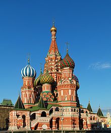
NOT AN ALT -Just for comparison - Hafspajen ( talk) 13:44, 25 February 2015 (UTC)
- Comment - aw, I don't know, it does glow somehow ... and there are more
Onion domes visible in the night pic.
Hafspajen (
talk) 13:44, 25 February 2015 (UTC)

- Support - The colors are bright because they are lighted with bright lights, but I don't think they are distorted by the lights. Also, supporting this image does not mean negating all the images of the cathedral taken during the daytime. It's just a different image, so it's a good one to have. - CorinneSD ( talk) 18:38, 25 February 2015 (UTC)
- Support It's a nice night shot. Rreagan007 ( talk) 19:53, 3 March 2015 (UTC)
Promoted File:Sant Vasily cathedral in Moscow.JPG -- Armbrust The Homunculus 00:46, 5 March 2015 (UTC)
Skyline de Chicago desde el centro, Illinois, Estados Unidos, 2012-10-20, DD 06
Voting period is over. Please don't add any new votes. Voting period ends on 5 Mar 2015 at 05:04:07 (UTC)

- Reason
- This image adds strong support to the main image by giving additional perspective to the reader. This is also an FP on commons.
- Articles in which this image appears
- Petrillo Music Shell and Legacy Tower
- FP category for this image
- Wikipedia:Featured pictures/Places/Panorama
- Creator
- Poco a poco
- Support as nominator – TonyTheTiger ( T / C / WP:FOUR / WP:CHICAGO / WP:WAWARD) 05:04, 23 February 2015 (UTC)
- note - It'd to better to rewrite the picture information as mentioned in article. «Petrillo Music Shell in front of the Chicago Skyline (Including CNA Center, Willis Tower and Legacy Tower)» - Alborzagros ( talk) 05:38, 23 February 2015 (UTC)
- Oppose. Lighting is not really conducive to the scene. The sunset is nice, but everything else is in a strong shadow as a result. Sunsets can enhance scenes like this, but I think it would have been better perhaps to take this at sunrise with the facing the buildings, rather than backlighting them. Ðiliff «» (Talk) 16:29, 23 February 2015 (UTC)
- Oppose – Per Diliff. Sca ( talk) 17:08, 24 February 2015 (UTC)
- Oppose - Per Diliff. Interesting view though. APK whisper in my ear 22:31, 24 February 2015 (UTC)
- Weak Oppose per Diliff - although only weak as unusually there's lots of detail in this picture... Just would prefer it lighter to be able to bring out the colours gazhiley 22:53, 24 February 2015 (UTC)
Not Promoted -- Armbrust The Homunculus 13:31, 5 March 2015 (UTC)
The Diverting History of John Gilpin (Part I)
Voting period is over. Please don't add any new votes. Voting period ends on 5 Mar 2015 at 08:03:22 (UTC)
.jpg)
.jpg)
- Reason
- Caldecott is really notable, William Cowper, while a bit out-of-fashion, possibly for good reasons (he pads a bit) is highly notable, and even Edmund Evans, the publisher is notable. This is the first two images from the set, provided to allow initial comments before I finish it. I intend to finish the colour illustrations next, then the black and white. The article discusses the illustrations.
- Question: Aren't they a bit pale? It's more the other images on that page are too dark and over-saturated. I have the book. There's a strong tendency for people to do that sort of edit if they don't work against the originals.
- Articles in which this image appears
- The Diverting History of John Gilpin
- FP category for this image
- Wikipedia:Featured pictures/Artwork/Literary illustrations
- Creator
- Randolph Caldecott and Edmund Evans; restoration by Adam Cuerden
- Support as nominator – Adam Cuerden ( talk) 08:03, 23 February 2015 (UTC)
- Question - Why just part 1? —
Crisco 1492 (
talk) 15:57, 23 February 2015 (UTC)
- As I said, figured checking everything was alright so far wouldn't hurt before finishing the set.
Adam Cuerden (
talk) 18:40, 23 February 2015 (UTC)
- Yeah the quality's certainly there... — Crisco 1492 ( talk) 23:50, 23 February 2015 (UTC)
- As I said, figured checking everything was alright so far wouldn't hurt before finishing the set.
Adam Cuerden (
talk) 18:40, 23 February 2015 (UTC)
- Support - Great illustrations. - CorinneSD ( talk) 18:31, 25 February 2015 (UTC)
- Comment - perhaps just nominate the first one solo? With two images it is an incomplete set. I don't see any reason you couldn't nominate the entire set later (or defined subsets) including a single that may already be featured, IMO...-- Godot13 ( talk) 08:58, 1 March 2015 (UTC)
Not Promoted -- Armbrust The Homunculus 13:31, 5 March 2015 (UTC)
The Wilton Diptych in a series of two
Voting period is over. Please don't add any new votes. Voting period ends on 5 Mar 2015 at 14:57:21 (UTC)
- The Wilton diptych
-
 The Wilton diptych; left-hand panel
 -
 The Wilton diptych; right-hand panel


- Caption
- The Wilton Diptych (c. 1395-99); a small egg on oak portable diptych depicting Richard II of England kneeling before the Virgin and Child. The painting is described by the art historian Andrew Graham-Dixon as "the most beautiful dream of heaven to survive in all British art".
- Reason
- This is the finest British work of the International Gothic style
- Articles in which this image appears
- Wilton Diptych
- FP category for this image
- Wikipedia:Featured pictures/Artwork/Paintings or Wikipedia:Featured pictures/Culture, entertainment, and lifestyle/Religion and mythology
- Creator
- Unknown English or French painter from the 1390s
- Support as nominator – SchroCat ( talk) 14:57, 23 February 2015 (UTC)
- Support - Jobas ( talk) 16:31, 23 February 2015 (UTC)
- Support Amazing quality. The tempera practically glitters. Étienne Dolet ( talk) 23:44, 23 February 2015 (UTC)
- Support - Lapis lazuli, no? Hafspajen ( talk) 13:31, 24 February 2015 (UTC)
- Support - Fantastic paintings. Great color, textural details, and composition. CorinneSD ( talk) 18:28, 25 February 2015 (UTC)
Promoted File:Wilton diptych; left-hand panel.jpg --
Armbrust
The Homunculus 14:58, 5 March 2015 (UTC)
Promoted File:Wilton diptych; right-hand panel.jpg --
Armbrust
The Homunculus 14:58, 5 March 2015 (UTC)
- Added images to the Artwork category, as there is an article about the painting. Armbrust The Homunculus 14:58, 5 March 2015 (UTC)
Allegory of Fortune
Voting period is over. Please don't add any new votes. Voting period ends on 5 Mar 2015 at 15:52:21 (UTC)
_-_Allegory_of_Fortune_-_Google_Art_Project.jpg)
- Reason
- Excellent scan of terrific painting; high EV
- Articles in which this image appears
- Allegory of Fortune, a new article on the painting; Salvator Rosa, the artist; Allegory; and two others.
- FP category for this image
- Wikipedia:Featured pictures/Artwork/Paintings
- Creator
- Salvator Rosa
- Support as nominator – SagaciousPhil - Chat 15:52, 23 February 2015 (UTC)
- Support - Lovely. — Crisco 1492 ( talk) 15:58, 23 February 2015 (UTC)
- Support - Jobas ( talk) 16:31, 23 February 2015 (UTC)
- Support - accept, no refunds. Hafspajen ( talk) 19:19, 23 February 2015 (UTC)
- Support and nice to have an article on this, too Brandmeister talk 19:45, 23 February 2015 (UTC)
- Support - Very nice! - SchroCat ( talk) 21:13, 23 February 2015 (UTC)
- Support - Interesting painting. CorinneSD ( talk) 18:25, 25 February 2015 (UTC)
Promoted File:Salvator Rosa (Italian) - Allegory of Fortune - Google Art Project.jpg -- Armbrust The Homunculus 15:53, 5 March 2015 (UTC)
Chinese Shuttlecock
Voting period is over. Please don't add any new votes. Voting period ends on 12 Mar 2015 at 23:40:15 (UTC)

- Reason
- It is an actual shuttlecock that they use in China when they actually play games with it.
- Articles in which this image appears
- Jianzi
- FP category for this image
- Wikipedia:Featured pictures/Culture, entertainment, and lifestyle/Sport
- Creator
- Yoshi24517
- Support as nominator Let me know your comments. – Yoshi24517 Chat Online 23:40, 2 March 2015 (UTC)
- Oppose and suggest withdrawal. Background is distracting, subject is in shadows. Not properly aligned horizontally and vertically. — Crisco 1492 ( talk) 06:10, 4 March 2015 (UTC)
- Oppose A picture of a shuttlecock is fine, but it needs to be an exceptional picture of one in order to become a Featured Picture. I am not certain I understand why the nominator thinks this image is remarkable. KDS4444 Talk 23:22, 4 March 2015 (UTC)
Not Promoted -- Ṫ Ḧ the joy of the LORD my strength 15:56, 5 March 2015 (UTC)
- Quick close, 1 support, 2 oppose Ṫ Ḧ the joy of the LORD my strength 15:56, 5 March 2015 (UTC)
Great Court of the British Museum
Voting period is over. Please don't add any new votes. Voting period ends on 5 Mar 2015 at 17:35:46 (UTC)

- Reason
- It's an interesting view (albeit oft repeated) of the Great Court of the British Museum, the main interior space in which all the galleries and rooms emanate from. It's high resolution, taken during the blue hour which allows the tessellated roof to contrast against the warmer tones of the interior. It's EV is wide ranging as it illustrates a wide variety of articles relating to the the architectural style and the museum itself.
- Articles in which this image appears
- British Museum, British Museum Reading Room, Museum architecture, Queen Elizabeth II Great Court and Tessellated roof
- FP category for this image
- Wikipedia:Featured pictures/Places/Interiors
- Creator
- User:Diliff
- Support as nominator – Ðiliff «» (Talk) 17:35, 23 February 2015 (UTC)
- Support Another form of cathedral, eh?
—
Crisco 1492 (
talk) 23:51, 23 February 2015 (UTC)
- If by 'cathedral', you mean any impressive interior space, then yeah I guess so. ;-)
Ðiliff «»
(Talk) 00:35, 24 February 2015 (UTC)
- More of a "place where people go to find answers, built with impressive architecture". But yes. Very impressive :D. — Crisco 1492 ( talk) 02:37, 24 February 2015 (UTC)
- If by 'cathedral', you mean any impressive interior space, then yeah I guess so. ;-)
Ðiliff «»
(Talk) 00:35, 24 February 2015 (UTC)
- Support - very good architecture. Hafspajen ( talk) 09:37, 24 February 2015 (UTC)
- Support thanks a lot for your good work!!! -- Alchemist-hp ( talk) 17:29, 24 February 2015 (UTC)
- Support - Excellent work. APK whisper in my ear 22:29, 24 February 2015 (UTC)
- Support Excellent quality and EV as ever... gazhiley 22:49, 24 February 2015 (UTC)
- Support - Excellent photo of an interesting space. CorinneSD ( talk) 18:23, 25 February 2015 (UTC)
- Support - Great shot.-- Godot13 ( talk) 01:14, 1 March 2015 (UTC)
- Support - Jobas ( talk) 15:05, 2 March 2015 (UTC)
Promoted File:British Museum Great Court, London, UK - Diliff.jpg -- Armbrust The Homunculus 17:57, 5 March 2015 (UTC)
Hygin-Auguste Cavé
Voting period is over. Please don't add any new votes. Voting period ends on 5 Mar 2015 at 23:55:08 (UTC)

- Reason
- High quality scan of a good portrait of a notable individual by a notable artist.
- Articles in which this image appears
- Hygin-Auguste Cavé
- FP category for this image
- Wikipedia:Featured pictures/People/Political
- Creator
- Jean-Auguste-Dominique Ingres
- Support as nominator – — Crisco 1492 ( talk) 23:55, 23 February 2015 (UTC)
- Support - looks good to me. Mattximus ( talk) 01:16, 24 February 2015 (UTC)
- Comment I wonder why Ingres added "à Madame" to the signature in the bottom right corner.
Brandmeister
talk 13:33, 24 February 2015 (UTC)
- According to the article, "Through his wife, Cavé became acquainted with [her] former teacher Ingres, as well as Delacroix and Gigoux. In 1844 [Cavé] commissioned Ingres to paint his portrait, which was apparently intended to be a companion piece to Ingres's earlier portrait of Mme Cavé". — Crisco 1492 ( talk) 13:59, 24 February 2015 (UTC)
- Comment – It's not on the
Jean-Auguste-Dominique Ingres page.
Sca (
talk) 16:55, 24 February 2015 (UTC)
- Does it have to be? This image is being nominated for showing Cave, not for illustrating Ingres' style. — Crisco 1492 ( talk) 23:31, 24 February 2015 (UTC)
- Support- that article is not well illustrated, I say. Was thinking about having a go at it some day. Hafspajen ( talk) 20:13, 24 February 2015 (UTC)
- Support - I think probably this is a very good likeness of Cavé. It shows his individuality. CorinneSD ( talk) 18:21, 25 February 2015 (UTC)
- Support HQ and much EV. -- Alborzagros ( talk) 13:33, 1 March 2015 (UTC)--
- Comment-2 – EV? According to his article, he's famous nowadays mainly for having been painted by Ingres. Sca ( talk) 14:05, 1 March 2015 (UTC)
- Comment - That statement in the lede of the article on Hygin-Auguste Cavé, "He is perhaps best known as the subject of a portrait by the French artist Ingres, which is on display at New York's Metropolitan Museum of Art" may be mainly true in the U.S., but I would suspect that in France he is remembered also for his many other accomplishments. CorinneSD ( talk) 20:25, 1 March 2015 (UTC)
Promoted File:Edmond Cavé 1844 Ingres - NY Met Museum of Art.jpg -- Armbrust The Homunculus 23:57, 5 March 2015 (UTC)
Mugger crocodile
Voting period is over. Please don't add any new votes. Voting period ends on 13 Mar 2015 at 09:42:10 (UTC)
_in_Chabahar,_Iran-_by_Hadi_Karimi.jpg)
- Reason
- HQ + EV
- Articles in which this image appears
- Mugger crocodile
- FP category for this image
- Wikipedia:Featured pictures/Animals/Reptiles
- Creator
- User:HaDi
- Support as nominator – Alborzagros ( talk) 09:42, 3 March 2015 (UTC)
- Comment Technically too small, and not very sharp either. Samsara 12:02, 4 March 2015 (UTC)
- Suggest Speedy Close due to not meeting size requirements... gazhiley 13:24, 5 March 2015 (UTC)
Not Promoted -- — Crisco 1492 ( talk) 06:05, 6 March 2015 (UTC)
- Speedy close, per Gaz — Crisco 1492 ( talk) 06:05, 6 March 2015 (UTC)
Škoda Superb
Voting period is over. Please don't add any new votes. Voting period ends on 6 Mar 2015 at 15:36:49 (UTC)

- Reason
- Very high quality image with good EV for many of the articles.
- Articles in which this image appears
- Škoda Superb, Automotive industry in Ukraine, Škoda Auto, Czech Republic + 4 more
- FP category for this image
- Wikipedia:Featured pictures/Vehicles/Land
- Creator
- Michel de Vries
- Support as nominator – FakeShemp ( talk) 15:36, 24 February 2015 (UTC)
- Oppose – As in the case of the Porsche, this strikes me as a product-type shot of a more or less contemporary model from a particular manufacturer. Sca ( talk) 17:06, 24 February 2015 (UTC)
- Support a very good product photo for free! -- Alchemist-hp ( talk) 17:28, 24 February 2015 (UTC)
- Oppose I didn't mind the Porsche picture, but the lights on this are distracting and leave lines over the bodywork where there aren't lines... gazhiley 22:48, 24 February 2015 (UTC)
- Weak support. I can't say I share Sca's concern, though I don't think it's unreasonable. Gaz raises a good point, though, which is why this is "weak". J Milburn ( talk) 12:42, 26 February 2015 (UTC)
Not Promoted -- Armbrust The Homunculus 15:40, 6 March 2015 (UTC)
Taractrocera ceramas
Voting period is over. Please don't add any new votes. Voting period ends on 7 Mar 2015 at 00:00:00 (UTC)

- Reason
- A very nice picture of a butterfly. We don't have enough of them!
- Articles in which this image appears
- Taractrocera ceramas
- FP category for this image
- Wikipedia:Featured pictures/Animals/Insects
- Creator
- Jkadavoor
- Support as nominator – — Crisco 1492 ( talk) 00:00, 25 February 2015 (UTC)
- Support -- Ṫ Ḧ the joy of the LORD my strength 02:50, 25 February 2015 (UTC)
- Support - pretty little butterfly come to the flower ... Hafspajen ( talk) 11:20, 25 February 2015 (UTC)
- Support - Very clear photo. Very nice. CorinneSD ( talk) 18:17, 25 February 2015 (UTC)
- Support Very good macro shot. -- Ebertakis ( talk) 22:02, 25 February 2015 (UTC)
- Support - Excellent work. APK whisper in my ear 09:41, 27 February 2015 (UTC)
- Comment Thanks all. Hope I can back to photography and make better results, soon. J e e 01:57, 28 February 2015 (UTC)
- Support - Nice shot.- Godot13 ( talk) 01:09, 1 March 2015 (UTC)
- Support - Jobas ( talk) 15:04, 2 March 2015 (UTC)
Promoted File:Taractrocera ceramas Tamil Grass Dart by Jkadavoor.jpg -- Armbrust The Homunculus 00:01, 7 March 2015 (UTC)
Monks' cellarium, Fountains Abbey
Voting period is over. Please don't add any new votes. Voting period ends on 7 Mar 2015 at 00:18:19 (UTC)

- Reason
- Nice colour interior image of a World Heritage Site.
- Articles in which this image appears
- Cellarium, Fountains Abbey
- FP category for this image
- Wikipedia:Featured pictures/Places/Interiors
- Creator
- KTC
- Support as nominator – KTC ( talk) 00:18, 25 February 2015 (UTC)
- Oppose because of the colors. Ain't natural, it didn't look like that originally. -- Janke | Talk 07:15, 25 February 2015 (UTC)
- It might be better if there was some explanation of why it is lit in this way.
31.49.120.201 (
talk)
- It depends what one mean by "originally". If you mean what it looked like a few hundred years ago when the monastery was in use, then no of course not. If you mean that's what it look like today (or rather, when I went there in December), then it does look like that originally. The lighting was put in place by the people running the site itself (i.e. National Trust). I didn't set up any special lighting to take the picture. --
KTC (public) (
talk) 16:23, 25 February 2015 (UTC)
- Lightning that it's an
art installation made with light. I have done something similar myself.
Hafspajen (
talk) 18:27, 25 February 2015 (UTC)
- Perhaps it would be more featurable if it illustrated Art installation then. 109.151.39.1 ( talk) 12:30, 28 February 2015 (UTC)
- Lightning that it's an
art installation made with light. I have done something similar myself.
Hafspajen (
talk) 18:27, 25 February 2015 (UTC)
- It depends what one mean by "originally". If you mean what it looked like a few hundred years ago when the monastery was in use, then no of course not. If you mean that's what it look like today (or rather, when I went there in December), then it does look like that originally. The lighting was put in place by the people running the site itself (i.e. National Trust). I didn't set up any special lighting to take the picture. --
KTC (public) (
talk) 16:23, 25 February 2015 (UTC)
- It might be better if there was some explanation of why it is lit in this way.
31.49.120.201 (
talk)
- Oppose – It may be very well to manipulate colored lights for effect, but in this setting it just looks gimmicky, IMO. Sca ( talk) 14:00, 27 February 2015 (UTC)
Not Promoted -- Armbrust The Homunculus 00:19, 7 March 2015 (UTC)
Maureen O'Hara
Voting period is over. Please don't add any new votes. Voting period ends on 7 Mar 2015 at 03:26:18 (UTC)
- Reason
- Has recently won an Honorary Academy Award; typical glamour portrait for its day. I believe that last aspect was missed at its previous nomination - cf. Frances Farmer, Gene Tierney ( 1, 2), Leslie Howard for further examples of the style
- Articles in which this image appears
- Maureen O'Hara, Irish people (in collage)
- FP category for this image
- People/Entertainment
- Creator
- Unknown (studio publicity still)
- Support as nominator – Samsara 03:26, 25 February 2015 (UTC)
- Oppose for now. Publicity stills such as this usually had the copyright notice on the reverse (if they had one at all). We cannot be certain that there was no notice without being able to check the reverse, and... sadly... Doctor Macro never uploads those. (Also, this strikes me as having had a pure white background added digitally) — Crisco 1492 ( talk) 13:26, 25 February 2015 (UTC)
- But FPC is not the place to address copyright concerns.
Samsara 20:42, 25 February 2015 (UTC)
- I don't get where people came up with that idea. For an image to be featured, it must be free. WP:FP? #4 on Wikipedia. If it is not free, then it does not meet the criteria. — Crisco 1492 ( talk) 23:46, 25 February 2015 (UTC)
- If you're not willing to nominate it for deletion, then you haven't finished the job and you just make it look like you're actually trying to sabotage the nom for reasons that have nothing to do with the copyright status. If you really have concerns, I dare you to nominate it for deletion so we can do this job properly.
Samsara 03:42, 26 February 2015 (UTC)
- Wow, ABF much? Particularly ironic considering your own replies to Hafs in other nominations. I wrote a quick oppose, based on previous experiences with Doctor Macro stills (not posters; posters had their copyright notices on the front), about 2 minutes before stepping out to handle paperwork related to me registering for the doctorate program. I've barely been home for more than to sleep since 48 hours ago. Yes, I am perfectly fine with XFDing this. No need to dare me. — Crisco 1492 ( talk) 05:14, 26 February 2015 (UTC)
- And are you saying you want the Hepburn case to be repeated?
Commons:Deletion requests/File:Hepburn-afternoon.jpg ended with the deletion of an English-Wikipedia featured picture of the actress. If we'd looked at copyright more carefully during
the nomination (at the time I was not as versed in copyright issues, hence my support there; you yourself appeared to consider the license within FPC's purview as well...), we'd have avoided such an embarrassment. I've learned my lesson. Has FPC? —
Crisco 1492 (
talk) 05:21, 26 February 2015 (UTC)
- I would simply like you to raise addressable issues, not throw around wild suspicions that you apparently cannot substantiate either way.
Samsara 05:52, 26 February 2015 (UTC)
- Samsara, I think you are being unreasonable. Copyright concerns certainly are something that should be addressed here when they exist, and it is right and fair that we ask for a high level of certainty concerning the copyright status of images nominated at FPC.
J Milburn (
talk) 12:26, 26 February 2015 (UTC)
- My concern was, and remains, addressable: we either delete this image (under the precautionary principle on Commons) or we confirm that the image was indeed published without a copyright notice. EBay is usually pretty good for that, though matching up the exact images is a sometimes thing. BTW, I'd have raised (and I believe I have raised) the same concern whenever I've seen these images come through FAC. — Crisco 1492 ( talk) 13:41, 26 February 2015 (UTC)
- Samsara, I think you are being unreasonable. Copyright concerns certainly are something that should be addressed here when they exist, and it is right and fair that we ask for a high level of certainty concerning the copyright status of images nominated at FPC.
J Milburn (
talk) 12:26, 26 February 2015 (UTC)
- I would simply like you to raise addressable issues, not throw around wild suspicions that you apparently cannot substantiate either way.
Samsara 05:52, 26 February 2015 (UTC)
- If you're not willing to nominate it for deletion, then you haven't finished the job and you just make it look like you're actually trying to sabotage the nom for reasons that have nothing to do with the copyright status. If you really have concerns, I dare you to nominate it for deletion so we can do this job properly.
Samsara 03:42, 26 February 2015 (UTC)
- But FPC is not the place to address copyright concerns.
Samsara 20:42, 25 February 2015 (UTC)
Not Promoted -- Armbrust The Homunculus 06:06, 7 March 2015 (UTC)
Cézanne's glorious Mount Saint Victoire
Voting period is over. Please don't add any new votes. Voting period ends on 7 Mar 2015 at 08:55:14 (UTC)
.jpg)
- Reason
- Great EV. One of the paintings that sparked a revolution in art.
- Articles in which this image appears
- Mont Sainte-Victoire and the Viaduct of the Arc River Valley, Paul Cézanne, Mont_Sainte-Victoire_(Cézanne)
- FP category for this image
- Wikipedia:Featured pictures/Artwork/Paintings
- Creator
- Paul Cézanne
- Support as nominator – Étienne Dolet ( talk) 08:55, 25 February 2015 (UTC)
- Support - CorinneSD ( talk) 18:04, 25 February 2015 (UTC)
- Support - Hafspajen ( talk) 19:09, 25 February 2015 (UTC)
- Comment - The original resolution can be uploaded. — Crisco 1492 ( talk) 10:51, 26 February 2015 (UTC)
- Support now that the original res is up. — Crisco 1492 ( talk) 11:48, 26 February 2015 (UTC)
- Support - Jobas ( talk) 15:04, 2 March 2015 (UTC)
Promoted File:Paul Cézanne - Mont Sainte-Victoire and the Viaduct of the Arc River Valley (Metropolitan Museum of Art).jpg -- Armbrust The Homunculus 09:00, 7 March 2015 (UTC)
Masaccio's Madonna and Child
Voting period is over. Please don't add any new votes. Voting period ends on 7 Mar 2015 at 10:12:20 (UTC)

- Reason
- Fantastic scan of superb Renaissance altarpiece
- Articles in which this image appears
- Madonna and Child (Masaccio)
- FP category for this image
- Wikipedia:Featured pictures/Culture, entertainment, and lifestyle/Religion and mythology
- Creator
- Masaccio
- Support as nominator – SchroCat ( talk) 10:12, 25 February 2015 (UTC)
- Comment The source should be fixed, currently it simply states "scan", but may be directly sourced to the London National Gallery. Brandmeister talk 10:27, 25 February 2015 (UTC)
- Support - CorinneSD ( talk) 18:03, 25 February 2015 (UTC)
- Support Great image yup!♦ Dr. Blofeld 09:50, 28 February 2015 (UTC)
- Support - Jobas ( talk) 15:03, 2 March 2015 (UTC)
- Support An over-represented art genre, but this at least brings something new to the table. Adam Cuerden ( talk) 12:01, 3 March 2015 (UTC)
Promoted File:Masaccio. Madonna and Child. 1426. National Gallery, London.jpg -- Armbrust The Homunculus 10:21, 7 March 2015 (UTC)
- Added image to Wikipedia:Featured pictures/Artwork/Paintings, as there is an article about the painting. Armbrust The Homunculus 10:21, 7 March 2015 (UTC)
Fall of Man (van der Goes)
Voting period is over. Please don't add any new votes. Voting period ends on 7 Mar 2015 at 10:44:47 (UTC)

- Reason
- This particular Fall of Man is interesting because of salamander-like bipedal tempting Serpent, which in later depictions would become the ordinary snake we got used to. I haven't spotted a good digitization of the right panel, though.
- Articles in which this image appears
- Vienna Diptych
- FP category for this image
- Artwork/Paintings
- Creator
- Hugo van der Goes
- Support as nominator – Brandmeister talk 10:44, 25 February 2015 (UTC)
- Support - One of the most famous artworks in art history. (can't we fix a better scan of the Vienna Diptych right side?) Hafspajen ( talk) 11:03, 25 February 2015 (UTC)
- Support - CorinneSD ( talk) 18:02, 25 February 2015 (UTC)
- Support - The northern Renaissance was way ahead of its time. Étienne Dolet ( talk) 23:20, 25 February 2015 (UTC)
- Support - per nom.-- Godot13 ( talk) 01:07, 1 March 2015 (UTC)
- Support - Jobas ( talk) 15:02, 2 March 2015 (UTC)
- Support But is Eve supposed to be pregnant or just chubby? Rreagan007 ( talk) 19:55, 3 March 2015 (UTC)
Promoted File:Hugo van der Goes - The Fall of Man and The Lamentation - Google Art Project.jpg -- Armbrust The Homunculus 10:45, 7 March 2015 (UTC)
Terry Plank
Voting period is over. Please don't add any new votes. Voting period ends on 7 Mar 2015 at 12:26:35 (UTC)
- Reason
- HQ + EV
- Articles in which this image appears
- Terry Plank
- FP category for this image
- Wikipedia:Featured pictures/People/Science and engineering
- Creator
- John D. and Catherine T. MacArthur Foundation
- Support as nominator – Alborzagros ( talk) 12:26, 25 February 2015 (UTC)
- Comment - The apparent lean is a little distracting. — Crisco 1492 ( talk) 13:34, 26 February 2015 (UTC)
- Support - Jobas ( talk) 15:02, 2 March 2015 (UTC)
- Support Nice photo. Adam Cuerden ( talk) 12:02, 3 March 2015 (UTC)
- Support - SchroCat ( talk) 19:37, 4 March 2015 (UTC)
- Support - National Names 2000 ( talk) 03:14, 6 March 2015 (UTC)
Promoted -- Armbrust The Homunculus 12:36, 7 March 2015 (UTC)
Persian carpet made by artist Ghyas el Din Jami Wool, cotton and silk, from 1542 - 1543
Voting period is over. Please don't add any new votes. Voting period ends on 7 Mar 2015 at 12:32:09 (UTC)
_-_Google_Art_Project.jpg)
- Reason
- why you think it meets the FPC criteria and should be featured (check criteria first)
- Articles in which this image appears
- Persian carpet
- FP category for this image
- Wikipedia:Featured pictures/Artwork/Others
- Creator
- Ghyas el Din Jami
- Support as nominator – Alborzagros ( talk) 12:32, 25 February 2015 (UTC)
Support- Hafspajen ( talk) 12:35, 25 February 2015 (UTC)Support-Oppose per comments below.Very good image ofan excellent example of a Persian carpet. CorinneSD ( talk) 17:54, 25 February 2015 (UTC) CorinneSD ( talk) 00:17, 26 February 2015 (UTC)
- Oppose looks very blurry at full resolution. Can't make out details. Renata ( talk) 18:58, 25 February 2015 (UTC)
- Oppose The image has been tampered with. A digital patch was applied (badly) on top of a (damaged?) portion of the carpet on the upper right corner. Also, although the pixel count is not bad, the image is indeed quite blurry. And, BTW, are we sure that we got the size right? 0.3x0.7 meters is more like a doormat than a carpet. -- Ebertakis ( talk) 21:58, 25 February 2015 (UTC)
- Comment- The file is a Google file, https://www.google.com/culturalinstitute/asset-viewer/tabriz/CgFkUW6YyFkczw source say 682 cm X 322 cm, that's giant. It's added - |pretty_dimensions = w682 x h335 cm, no idea why it is comming up as milimeter. Hafspajen ( talk) 23:08, 25 February 2015 (UTC)
- Oppose per Ebertakis. Really bad digital manipulation in the top right in terms of resolutions, brightness, and alignment mismatch. -- KTC ( talk) 23:53, 25 February 2015 (UTC)
- Oppose - I hope Google didn't pay too much for that photograph. — Crisco 1492 ( talk) 02:36, 26 February 2015 (UTC)
Not Promoted -- Armbrust The Homunculus 12:37, 7 March 2015 (UTC)
Mount Etna eruption
Voting period is over. Please don't add any new votes. Voting period ends on 7 Mar 2015 at 23:28:21 (UTC)
00:00 Piano Vetore (upper southwest flank of Etna)
00:16 Piano del Vescovo (upper southeast flank of Etna)
03:03 Zafferana Etnea (southeast flank of Etna)
03:33 Santa Venerina (southeast flank of Etna)
03:58 Milo (east flank of Etna)
04:20 Mareneve road near Fornazzo (east flank of Etna)
05:06 Mareneve road near Monte Fontane (ENE flank of Etna)
05:43 Mareneve road near Fornazzo (east flank of Etna)
07:03 Fornazzo (east flank of Etna)
07:16 Tremestieri Etneo (south flank of Etna)
- Reason
- I find the quality of this video to be outstanding. Also, the EV is great. It's probably the most famous volcano in the world. Having footage of its eruption is almost a blessing. Also, have fun clicking on the times I've indicated in the caption to hear the detonations one after the other, and you'll discover that they sound very different.
- Articles in which this image appears
- Mount Etna
- FP category for this image
- Wikipedia:Featured pictures/Natural phenomena/Others
- Creator
- Boris Behncke
- Support as nominator – Étienne Dolet ( talk) 23:28, 25 February 2015 (UTC)
- Comment - The white noise is distracting. — Crisco 1492 ( talk) 23:49, 25 February 2015 (UTC)
- Support - Jobas ( talk) 15:01, 2 March 2015 (UTC)
- Support Amazing! Yann ( talk) 22:13, 2 March 2015 (UTC)
- Support Very dramatic. Rreagan007 ( talk) 19:57, 3 March 2015 (UTC)
- Support Adam Cuerden ( talk) 14:43, 4 March 2015 (UTC)
Promoted File:Paroxysm at Etna, 16-17 November 2013.webm -- Armbrust The Homunculus 23:29, 7 March 2015 (UTC)
The Crucifixion with the Virgin and St John (Hendrick ter Brugghen)
Voting period is over. Please don't add any new votes. Voting period ends on 7 Mar 2015 at 23:59:29 (UTC)

- Reason
- High quality painting, unknown for over three centuries, and discovered in a bombed out church. The stories this work could tell...
- Articles in which this image appears
- The Crucifixion with the Virgin and St John +2
- FP category for this image
- Wikipedia:Featured pictures/Artwork/Paintings
- Creator
- Hendrick ter Brugghen
- Support as nominator – — Crisco 1492 ( talk) 23:59, 25 February 2015 (UTC)
- Support- A powerful painting. CorinneSD ( talk) 00:21, 26 February 2015 (UTC)
- Support- Hafspajen ( talk) 00:25, 26 February 2015 (UTC)
- Support per Corinne. Brandmeister talk 10:26, 26 February 2015 (UTC)
- Support - Jobas ( talk) 15:01, 2 March 2015 (UTC)
Promoted File:Hendrick ter Brugghen The Crucifixion with the Virgin and Saint John.jpg -- Armbrust The Homunculus 00:00, 8 March 2015 (UTC)
Parable of the Good Samaritan
Voting period is over. Please don't add any new votes. Voting period ends on 8 Mar 2015 at 07:48:43 (UTC)

- Reason
- I believe this image meets app the featured article criteria. Used on multiple articles, high quality and technical standard, etc. It's gorgeous really, and has an incredible visual effect on the reader. It is Jan Wijnants's Parable of the Good Samaritan, depicting the the parable as told by Jesus in response to a question posed to him by a Mosaic scholar.
- Articles in which this image appears
- Parable of the Good Samaritan, Parable, Luke 10, Jan Wijnants. Used on other wikis as well.
- FP category for this image
- Wikipedia:Featured pictures/Culture, entertainment, and lifestyle/Religion and mythology
- Creator
- Jan Wijnants
- Support as nominator – ceradon ( talk • contribs) 07:48, 26 February 2015 (UTC)
- Comment - a lovely painting. Wonder if the source isn't higher resolution?
http://www.hermitagemuseum.org/wps/portal/hermitage/digital-collection/01.+Paintings/46144
Hafspajen (
talk) 14:17, 26 February 2015 (UTC)
- I looked into that earlier. No idea how to check the original source's image. — Crisco 1492 ( talk) 23:38, 26 February 2015 (UTC)
- Support - Jobas ( talk) 15:00, 2 March 2015 (UTC)
- Conditional Support - if the source problem can be fixed. The source given is not the same as the pic, and I know how Crisco feels about that. Hafspajen ( talk) 14:22, 6 March 2015 (UTC)
Not Promoted -- Armbrust The Homunculus 07:51, 8 March 2015 (UTC)
Stephan's Quintet
Voting period is over. Please don't add any new votes. Voting period ends on 8 Mar 2015 at 15:17:20 (UTC)


- Reason
- A super quality pic with good EV
- Articles in which this image appears
- NGC 7317 and Stephan's Quintet
- FP category for this image
- Wikipedia:Featured pictures/Space/Looking out
- Creator
- NASA, ESA, and the Hubble SM4 ERO Team
- Support either as nominator – Ṫ Ḧ the joy of the LORD my strength 15:17, 26 February 2015 (UTC)
- Support ALT. — Crisco 1492 ( talk) 01:24, 27 February 2015 (UTC)
- Support ALT.- per Crisco. Hafspajen ( talk) 10:46, 28 February 2015 (UTC)
- Support - Jobas ( talk) 15:00, 2 March 2015 (UTC)
- Support either Rreagan007 ( talk) 19:58, 3 March 2015 (UTC)
- @
Crisco 1492: Doesn't a denoise remove stars? The commons viewers are down...
Adam Cuerden (
talk) 07:49, 4 March 2015 (UTC)
- Wouldn't you be able to download the image and view it in Gimp? —
Crisco 1492 (
talk) 08:00, 4 March 2015 (UTC)
- I could, but it takes a while to do so, so I thought I'd ask first. Adam Cuerden ( talk) 13:19, 4 March 2015 (UTC)
- Wouldn't you be able to download the image and view it in Gimp? —
Crisco 1492 (
talk) 08:00, 4 March 2015 (UTC)
- Support either, prefer original Adam Cuerden ( talk) 05:53, 8 March 2015 (UTC)
Promoted File:Stephan's Quintet Hubble 2009.full denoise.jpg -- Armbrust The Homunculus 15:31, 8 March 2015 (UTC)
- Only the alt has enogh support for promotion. Armbrust The Homunculus 15:31, 8 March 2015 (UTC)
Mr and Mrs Andrews
Voting period is over. Please don't add any new votes. Voting period ends on 8 Mar 2015 at 23:48:32 (UTC)

- Reason
- High quality scan of a notable painting
- Articles in which this image appears
- Mr and Mrs Andrews +2
- FP category for this image
- Wikipedia:Featured pictures/Artwork/Paintings
- Creator
- Thomas Gainsborough
- Support as nominator – — Crisco 1492 ( talk) 23:48, 26 February 2015 (UTC)
- Support - great painting, very well known Hafspajen ( talk) 02:10, 27 February 2015 (UTC)
- Support - Lovely. APK whisper in my ear 09:38, 27 February 2015 (UTC)
- Support – nice. SagaciousPhil - Chat 11:53, 1 March 2015 (UTC)
- Support -Very nice! - SchroCat ( talk) 12:15, 2 March 2015 (UTC)
- Support - Jobas ( talk) 14:59, 2 March 2015 (UTC)
Promoted File:Thomas Gainsborough - Mr and Mrs Andrews.jpg -- Armbrust The Homunculus 23:50, 8 March 2015 (UTC)
The Duke of Buckingham
Voting period is over. Please don't add any new votes. Voting period ends on 9 Mar 2015 at 01:48:26 (UTC)

- Reason
- Rather striking, very detailed painting of a historical person, George Villiers, the first Duke of Buckingham; the favourite of King James I of England - here shrouded in pearls
- Articles in which this image appears
- George Villiers, 1st Duke of Buckingham, Michiel Jansz. van Mierevelt
- FP category for this image
- Wikipedia:Featured pictures/People/Royalty and nobility
- Creator
- Michiel Jansz. van Mierevelt
- Support as nominator – Hafspajen ( talk) 01:48, 27 February 2015 (UTC)
- Support — Crisco 1492 ( talk) 01:01, 28 February 2015 (UTC)
- Support - Nice! - SchroCat ( talk) 12:15, 2 March 2015 (UTC)
- Support - Jobas ( talk) 14:59, 2 March 2015 (UTC)
- Support - Rreagan007 ( talk) 20:01, 3 March 2015 (UTC)
- Support – Nifty outfit. Sca ( talk) 14:07, 5 March 2015 (UTC)
Promoted File:Michiel J. van Miereveld - George Villiers, Duke of Buckingham - Google Art Project.jpg -- Armbrust The Homunculus 01:51, 9 March 2015 (UTC)
Huacachina Dunes Oasis
Voting period is over. Please don't add any new votes. Voting period ends on 9 Mar 2015 at 14:05:44 (UTC)

- Reason
- Interesting subject , meets size requirements,
- Articles in which this image appears
- Huacachina Ica, Peru
- FP category for this image
- Wikipedia:Featured pictures/Places/Panorama
- Creator
- Ingo Mehling
- Support as nominator Nice image (looks like something out of a fantasy setting) although a crop of the first 100px on the left might be beneficial – ©Geni ( talk) 14:05, 27 February 2015 (UTC)
- Support Eye Catching place to have a town. Looks like a fun place to live, if a little difficult to live without sand invading your entire life and home! Quality seems fine to me, although agree that a crop from the left would cut out some of the repetative scenery - but then this also shows perfectly the setting this place is in... Would support either at this stage... gazhiley 15:16, 27 February 2015 (UTC)
Support -- KTC ( talk) 19:06, 27 February 2015 (UTC)- Oppose - What's that strange shadow creeping in from the (viewer's) left? — Crisco 1492 ( talk) 01:00, 28 February 2015 (UTC)
- I see it too now you mention it - the crop I've suggested would fix that... gazhiley 10:01, 28 February 2015 (UTC)
- Either of you mind adding an image note to show what you meant? -- KTC ( talk) 10:08, 28 February 2015 (UTC)
- marked. Looking the image over, I'm also concerned by the blown highlights in the sky and the fact that the village is in shadows — Crisco 1492 ( talk) 04:51, 1 March 2015 (UTC)
- Geni, gazhiley, and Crisco 1492 how about a crop of much of the sand on the left, which will also take out much of the blown sky? -- KTC ( talk) 13:22, 2 March 2015 (UTC)
- Oppose. There's an issue that nobody has commented on yet... There seems to be a significant bowing of the panorama. The left side is bowing outwards to the left, and the right side is bowing outwards to the right. There's also a minor stitching error above and below the left hand oasis. And the sky is a bit blown and the town itself is too dark. I think the image has a lot of potential and wow but I'd love to get my hands on the original images and process it better. Ðiliff «» (Talk) 14:01, 2 March 2015 (UTC)
- Support - Jobas ( talk) 14:58, 2 March 2015 (UTC)
Not Promoted -- Armbrust The Homunculus 14:06, 9 March 2015 (UTC)
della Francesca's Baptism of Christ
Voting period is over. Please don't add any new votes. Voting period ends on 10 Mar 2015 at 00:11:05 (UTC)

- Reason
- Superb image of a major work
- Articles in which this image appears
- The Baptism of Christ (Piero della Francesca)
- FP category for this image
- Wikipedia:Featured pictures/Artwork/Paintings
- Creator
- Piero della Francesca
- Support as nominator – SchroCat ( talk) 00:11, 28 February 2015 (UTC)
- Support -AW!! My favourite, Schro! One of the most wonderful picture in the whole world. Just excellent. Hafspajen ( talk) 01:50, 28 February 2015 (UTC)
- Support — Crisco 1492 ( talk) 05:34, 28 February 2015 (UTC)
- Support - Jobas ( talk) 14:58, 2 March 2015 (UTC)
- Support I can certainly see the appeal, even if the emotional reaction isn't that strong for me. Gorgeous work. Adam Cuerden ( talk) 05:36, 8 March 2015 (UTC)
- Eh. This is a painting where the painter have calculated everything, even the smallest details to that they should fit the according to the golden ratio. It is a masterpiece of the very first divison. Hafspajen ( talk) 21:39, 8 March 2015 (UTC)
Promoted File:Piero, battesimo di cristo 04.jpg -- Armbrust The Homunculus 00:13, 10 March 2015 (UTC)
Alessandro Vittoria
Voting period is over. Please don't add any new votes. Voting period ends on 10 Mar 2015 at 01:09:53 (UTC)

- Reason
- High quality scan, good painting of a notable sculptor (an underrepresented group)
- Articles in which this image appears
- Alessandro Vittoria
- FP category for this image
- Wikipedia:Featured pictures/People/Artists and writers
- Creator
- Paolo Veronese
- Support as nominator – — Crisco 1492 ( talk) 01:09, 28 February 2015 (UTC)
- Support - great artwork. Paolo Veronese is a wonderful artist. Hafspajen ( talk) 01:34, 28 February 2015 (UTC)
- Support - SchroCat ( talk) 12:19, 2 March 2015 (UTC)
- Support - Jobas ( talk) 14:57, 2 March 2015 (UTC)
- Support Adam Cuerden ( talk) 05:50, 8 March 2015 (UTC)
Promoted File:Alessandro Vittoria - Paolo Veronese.jpg -- Armbrust The Homunculus 01:10, 10 March 2015 (UTC)
Bouts's The Entombment
Voting period is over. Please don't add any new votes. Voting period ends on 10 Mar 2015 at 18:54:25 (UTC)

- Reason
- Excellent scan of high EV piece (FA on the painting)
- Articles in which this image appears
- The Entombment (Bouts)
- FP category for this image
- Wikipedia:Featured pictures/Artwork/Paintings
- Creator
- Dieric Bouts
- Support as nominator – SchroCat ( talk) 18:54, 28 February 2015 (UTC)
- Support — Crisco 1492 ( talk) 01:36, 1 March 2015 (UTC)
- Support - Jobas ( talk) 14:57, 2 March 2015 (UTC)
- Support - National Names 2000 ( talk) 07:10, 8 March 2015 (UTC)
- Support -- PetarM ( talk) 08:58, 8 March 2015 (UTC)
Promoted File:Dieric Bouts - The Entombment - Artron.jpg -- Armbrust The Homunculus 18:55, 10 March 2015 (UTC)
Mealybugs
Voting period is over. Please don't add any new votes. Voting period ends on 11 Mar 2015 at 01:41:43 (UTC)

- Reason
- As can be seen from the file history, this was a tough shot to get right. Mealybugs are tiny little "bug-cows" (herded by ants) which feed on plant matter. These were found in our garden (the pinkish background is the wall). I ended up focus stacking 5 images to get all three of these tiny insects in focus (not an easy task, if you look at the rest of the Commons category). I think it's rather nice, even if they terrorize plants.
- Articles in which this image appears
- Mealybug
- FP category for this image
- Wikipedia:Featured pictures/Animals/Insects
- Creator
- Chris Woodrich
- Support as nominator – — Crisco 1492 ( talk) 01:41, 1 March 2015 (UTC)
- Comment: I appreciate how big an ask this is, but do we have any clearer identification? We have nearly 300 listed genera, nevermind species, so "a mealybug" is actually a very vague ID.
J Milburn (
talk) 10:33, 1 March 2015 (UTC)
- I can try to ask, but
some of the identification methods (poking a female, for instance) are not applicable to pictures. My wife's also gotten rid of the mealybugs - as soon as I told her they eat plants, she didn't want them in the garden. —
Crisco 1492 (
talk) 23:59, 1 March 2015 (UTC)
- To quote
User:Shyamal from elsewhere: "Unfortunately most mealybugs can only be identified under a microscope and identifying to species would require the specialist (i.e. not me) to examine a specimen, dissect the genitalia and compare with literature (often scattered in journals)." I'm still looking for a genus-level ID, but not hoping for much. —
Crisco 1492 (
talk) 06:12, 2 March 2015 (UTC)
- Alright, I've received a response from an entomologist Jee recommended. As with Shyamal, he stated that a certain identification from a photograph would be impossible. He did note, however, that there is a species (Phenacoccus parvus) which feeds on Lantana (as here). — Crisco 1492 ( talk) 23:45, 2 March 2015 (UTC)
- To quote
User:Shyamal from elsewhere: "Unfortunately most mealybugs can only be identified under a microscope and identifying to species would require the specialist (i.e. not me) to examine a specimen, dissect the genitalia and compare with literature (often scattered in journals)." I'm still looking for a genus-level ID, but not hoping for much. —
Crisco 1492 (
talk) 06:12, 2 March 2015 (UTC)
- Can we get it down to a genus or other subgrouping?
Adam Cuerden (
talk) 11:51, 3 March 2015 (UTC)
- No, "identification" as above included identification to the genus as well. Sorry I wasn't clearer about that —
Crisco 1492 (
talk) 00:07, 4 March 2015 (UTC)
- I'm sorry, but I'm not sure I'm comfortable supporting this without clearer ID. We used to pass a lot of images with only genus level ID, but even that strikes me as less than ideal, now. A lack of clear ID, for my money, reduces EV; the best and most useful images in professional works (such as reputable guidebooks or scientific papers [didn't we used to have something about this in the criteria?]) are going to have a subject which is identified with some accuracy.
Josh Milburn (
talk) 09:18, 5 March 2015 (UTC)
- Oh, I understand completely. There are a lot of unidentified insects I've taken images of which haven't been anywhere near FPC or QIC (on Commons); they may be technically there, but the ID needs to be done. For the mealybugs, I thought that the extreme difficulty of proper identification (and the technical shot) would be a mitigating factor, so I tried nominating anyways. No worries if that's not the case. — Crisco 1492 ( talk) 10:32, 5 March 2015 (UTC)
- I'm sorry, but I'm not sure I'm comfortable supporting this without clearer ID. We used to pass a lot of images with only genus level ID, but even that strikes me as less than ideal, now. A lack of clear ID, for my money, reduces EV; the best and most useful images in professional works (such as reputable guidebooks or scientific papers [didn't we used to have something about this in the criteria?]) are going to have a subject which is identified with some accuracy.
Josh Milburn (
talk) 09:18, 5 March 2015 (UTC)
- No, "identification" as above included identification to the genus as well. Sorry I wasn't clearer about that —
Crisco 1492 (
talk) 00:07, 4 March 2015 (UTC)
- I can try to ask, but
some of the identification methods (poking a female, for instance) are not applicable to pictures. My wife's also gotten rid of the mealybugs - as soon as I told her they eat plants, she didn't want them in the garden. —
Crisco 1492 (
talk) 23:59, 1 March 2015 (UTC)
Not Promoted -- Armbrust The Homunculus 03:16, 11 March 2015 (UTC)
In the memory of the the scuttled, the blocked, banned, and those who have just given up
Voting period is over. Please don't add any new votes. Voting period ends on 11 Mar 2015 at 11:19:25 (UTC)

- Reason
- It is an iconic painting by an important Russian painter.
Ivan Kramskoy was a significant figure in the Russian art history - both painter and art theoretician, the intellectual leader of the
Russian democratic art movement in 1860-1880, together with
 Russian artists like
Ilya Repin and
Ivan Shishkin.
Russian artists like
Ilya Repin and
Ivan Shishkin. - Articles in which this image appears
- Christ in the Desert, Ivan Kramskoi, List of Russian artists, Mark 1, Matthew 4:2
- FP category for this image
- Wikipedia:Featured pictures/Artwork/Paintings
- Creator
- Ivan Kramskoy
- Support as nominator – Hafspajen ( talk) 11:19, 1 March 2015 (UTC)
- Support — Crisco 1492 ( talk) 00:00, 2 March 2015 (UTC)
- Support I've not seen this before: good choice! - SchroCat ( talk) 12:27, 2 March 2015 (UTC)
- Support - Jobas ( talk) 14:56, 2 March 2015 (UTC)
- Support Nice to finally have this in featurable resolution, well done. Brandmeister talk 21:42, 2 March 2015 (UTC)
- Support -- PetarM ( talk) 08:04, 5 March 2015 (UTC)
Promoted File:Christ in the Wilderness - Ivan Kramskoy - Google Cultural Institute.jpg -- Ṫ Ḧ the joy of the LORD my strength 11:19, 11 March 2015 (UTC)
- 6 support, 0 oppose Ṫ Ḧ the joy of the LORD my strength 11:19, 11 March 2015 (UTC)
Echo and Narcissus
Voting period is over. Please don't add any new votes. Voting period ends on 11 Mar 2015 at 11:34:31 (UTC)

- Reason
- Lovely scan from Google Art Project of charming painting by John William Waterhouse; good EV with it's own article that I hope to expand a little bit more soon.
- Articles in which this image appears
- Echo and Narcissus (Waterhouse painting) a presently stubby article on the painting; John William Waterhouse the artist; Echo and Narcissus, the article about the poem; Walker Art Gallery, where it is held; and Narcissus (plant).
- FP category for this image
- Wikipedia:Featured pictures/Artwork/Paintings
- Creator
- John William Waterhouse
- Support as nominator – SagaciousPhil - Chat 11:34, 1 March 2015 (UTC)
- Support - bit baffled that we don't have more of his works... he is a great artist with a huge production . Hafspajen ( talk) 11:57, 1 March 2015 (UTC)

Who loved a very melancholy Dane
Whose affection of the heart, so it is said,
Preceded his affection of the brain.
Heir apparent to the Crown,
He thought lightly of her passion.
Having wandered up and down
In an incoherent fashion
When she found he wouldn't wed her,
In a river, in a medder,
Took a header, and a deader
Was Ophelia.
Ophelia to her sex was a disgrace,
Whom nobody could feel compassion for.
Ophelia should have gone to Ely Place
To consult an eminent solicitor.
When such promises as these
Breaks a suitor, rich and regal,
Why, substantial damages
Is the panacea legal -
From a jury - sons of Adam,
Though as stony as Macadam,
Maid or madam, she'd have had 'em
Would Ophelia
- The Mountebanks
- Support - anything by Waterhouse is good, and this looks fine. Nathanielfirst ( talk) 10:53, 3 March 2015 (UTC)
- Support - SchroCat ( talk) 12:50, 2 March 2015 (UTC)
- Support – Intriguing work from a very intriguing artist, with whom I had not been familiar. Like his Ophelia paintings, too. (Oops!) Sca ( talk) 19:03, 2 March 2015 (UTC)
- Support Echo is wondering why he isn't looking at her :) Brandmeister talk 21:35, 2 March 2015 (UTC)
- Because he is a pompous ass. She should have realized that she would be better of without him, Brad.
 Just look at him, he can't get out of that blasted water....
Hafspajen (
talk) 09:42, 3 March 2015 (UTC)
Just look at him, he can't get out of that blasted water....
Hafspajen (
talk) 09:42, 3 March 2015 (UTC)
-
-
-
-
- What did you say??
What did you say??
What did you say??
What did you say??
What did you say??
What did you say?? Adam Cuerden ( talk) 12:05, 6 March 2015 (UTC)
- What did you say??
-
-
-
- Because he is a pompous ass. She should have realized that she would be better of without him, Brad.
Promoted File:John William Waterhouse - Echo and Narcissus - Google Art Project.jpg -- Armbrust The Homunculus 11:35, 11 March 2015 (UTC)
Portrait of a Man, possibly Marsilio Ficino, Metropolitan Museum of Art by Domenico Ghirlandaio
Voting period is over. Please don't add any new votes. Voting period ends on 11 Mar 2015 at 13:20:36 (UTC)

- Reason
- HQ + EV
- Articles in which this image appears
- Portrait of a Man (Domenico Ghirlandaio) and Domenico Ghirlandaio
- FP category for this image
- Wikipedia:Featured pictures/Artwork/Paintings
- Creator
- Domenico Ghirlandaio
- Support as nominator – Alborzagros ( talk) 13:20, 1 March 2015 (UTC)
- Support - Hafspajen ( talk) 14:36, 1 March 2015 (UTC)
- Support now that the original resolution has been uploaded. — Crisco 1492 ( talk) 07:35, 2 March 2015 (UTC)
- Support - nice painting- SchroCat ( talk) 12:26, 2 March 2015 (UTC)
- Support - Jobas ( talk) 14:56, 2 March 2015 (UTC)
Promoted File:Domenico Ghirlandaio - Portrait of a Man.jpg -- Armbrust The Homunculus 13:21, 11 March 2015 (UTC)
An Old Man and his Grandson, by Domenico Ghirlandaio.
Voting period is over. Please don't add any new votes. Voting period ends on 11 Mar 2015 at 13:27:57 (UTC)

- Reason
- EV + HQ
- Articles in which this image appears
- An Old Man and his Grandson + Domenico Ghirlandaio + Rhinophyma + Rosacea
- FP category for this image
- Wikipedia:Featured pictures/Artwork/Paintings
- Creator
- Domenico Ghirlandaio
- Support as nominator – Alborzagros ( talk) 13:27, 1 March 2015 (UTC)
- Comment - We should be careful with the Web gallery of art. Best I can tell, they take scans from random places and compile them. No way to guarantee accuracy. — Crisco 1492 ( talk) 23:55, 1 March 2015 (UTC)
- Support - Jobas ( talk) 14:55, 2 March 2015 (UTC)
- Support Its good. -- PetarM ( talk) 09:00, 8 March 2015 (UTC)
- Support That's Great! - National Names 2000 ( talk) 09:41, 8 March 2015 (UTC)
- Support - Let it be.. Ṫ Ḧ the joy of the LORD my strength 11:51, 8 March 2015 (UTC)
Promoted File:Domenico ghirlandaio, ritratto di nonno con nipote.jpg -- Armbrust The Homunculus 13:28, 11 March 2015 (UTC)
Battle of Vercellae
Voting period is over. Please don't add any new votes. Voting period ends on 11 Mar 2015 at 23:54:17 (UTC)

- Reason
- High quality painting; though not contemporary or near contemporary, considering the age of the battle expecting such would be too much.
- Articles in which this image appears
- Battle of Vercellae
- FP category for this image
- Wikipedia:Featured pictures/History/War
- Creator
- Giovanni Battista Tiepolo
- Support as nominator – — Crisco 1492 ( talk) 23:54, 1 March 2015 (UTC)
- Support - SchroCat ( talk) 12:25, 2 March 2015 (UTC)
- Support - Jobas ( talk) 14:55, 2 March 2015 (UTC)
- Support - Hafspajen ( talk) 18:16, 2 March 2015 (UTC)
- Support Left side is noticeably less sharp than the rest, but given the large size and that it's barely noticeable, I can live with that. Adam Cuerden ( talk) 11:48, 3 March 2015 (UTC)
Promoted File:Tiepolo Vercellae.jpg -- Armbrust The Homunculus 23:56, 11 March 2015 (UTC)
Tobacco Mosaic Virus diagram
Voting period is over. Please don't add any new votes. Voting period ends on 12 Mar 2015 at 04:13:22 (UTC)

- Reason
- A clear, concise, informative figure depicting the organisation of components of the virus
- Articles in which this image appears
- Tobacco mosaic virus
- FP category for this image
- Sciences
- Creator
- Splette
- Support as nominator – T.Shafee(Evo﹠Evo) talk 04:13, 2 March 2015 (UTC)
- Comment While it's certainly good to have a numbered version on Commons for other languages, wouldn't it simplify its use here to put well-sized labels directly on it? Adam Cuerden ( talk) 12:01, 6 March 2015 (UTC)
- I see your point. I will upload an alternative version with English labels instead of numbers. SPLETTE :] How's my driving? 15:35, 7 March 2015 (UTC)
- Support -- Jobas ( talk) 13:15, 6 March 2015 (UTC)
- Comment - It's not clear to me how the thin, straight, blue-green "stick" becomes incorporated into the capsomer protein. I see the straight lines with a circle around it, but that doesn't make it clear enough to a non-expert. CorinneSD ( talk) 18:46, 6 March 2015 (UTC)
- I don't think it's "incorporated"; I think the left-hand diagram is a blow-up of a small section of the "stick". I didn't find it clear at first that the four sticks are all equivalent, just randomly oriented, and that the label "3" applies equally to all of them. I saw it in two halves, with the right-hand three sticks part of a different (related) diagram showing some new structure. — Preceding
unsigned comment added by
31.51.2.19 (
talk) 00:32, 7 March 2015 (UTC)
- That's true - the three viral capsids on the right are superfluous. Label three would be better applied to the capsid with the circled section. (Additionally @
Splette: I forgot to ping you earlier)
T.Shafee(Evo﹠Evo)
talk 01:52, 7 March 2015 (UTC)
- Oh.... Would it be asking too much to show some connection to the tobacco plant? Perhaps if the sticks on the right are removed, there would be room to add something. CorinneSD ( talk) 01:58, 7 March 2015 (UTC) We're a demanding bunch. ;) CorinneSD ( talk) 01:59, 7 March 2015 (UTC)
- Hi all. I made the image, thanks for nominating it! I'll happily edit the image if there's a consensus to modify it in order to improve it further. But let's discuss first. I've slightly edited the image to change the orientation of the full virus capsid ('stick') that's being magnified more upright. Now it better matches the orientation of the close-up view, so I hope this will make it a bit clearer that what we see on the left is a magnified view of the entire virus capsid. As for removing the three sticks on the right, I think we should keep them because in the actual EM images of the virus
like the one used in the article there are also a whole bunch of sticks, not just a single one. Therefore I believe that showing several sticks in the diagram will make it easier for the viewer to grasp that those sticks are in fact the same thing we see in the EM pic. The other thing is that we need at least one horizontal stick for the 300nm scale bar. Another suggestion raised was to add a photo of a tobacco plant. That would be easy to add. I just wonder if it's necessary. The scope of this illustration as far as I see it is to explain the structure and scale of the virus capsid. I'm not sure how a photo of the host plant would help with that. Adding a pic of a spotty tobacco plat leaf is nice to show the effects the virus has on the plant but I think that's not the purpose of this diagram. There is a separate section about that in the article (including photos).
SPLETTE :]
How's my driving? 15:33, 7 March 2015 (UTC)
- Is it possible to somehow have the "3" label all of the "sticks" rather than just two of them? I know you could say it is obvious, but I think the placement of the "3" contributes to the impression that the right three sticks are showing a different structure. Also, perhaps the placement of some of the sticks could be adjusted to make the left-most one seem more a part of the group.
217.44.208.185 (
talk) 20:33, 7 March 2015 (UTC)
- Yes, that's certainly possible. I prepared such a version here. Not sure though, if that's really making a difference for the better... SPLETTE :] How's my driving? 00:58, 9 March 2015 (UTC)
- Is it possible to somehow have the "3" label all of the "sticks" rather than just two of them? I know you could say it is obvious, but I think the placement of the "3" contributes to the impression that the right three sticks are showing a different structure. Also, perhaps the placement of some of the sticks could be adjusted to make the left-most one seem more a part of the group.
217.44.208.185 (
talk) 20:33, 7 March 2015 (UTC)
- That's true - the three viral capsids on the right are superfluous. Label three would be better applied to the capsid with the circled section. (Additionally @
Splette: I forgot to ping you earlier)
T.Shafee(Evo﹠Evo)
talk 01:52, 7 March 2015 (UTC)
- I don't think it's "incorporated"; I think the left-hand diagram is a blow-up of a small section of the "stick". I didn't find it clear at first that the four sticks are all equivalent, just randomly oriented, and that the label "3" applies equally to all of them. I saw it in two halves, with the right-hand three sticks part of a different (related) diagram showing some new structure. — Preceding
unsigned comment added by
31.51.2.19 (
talk) 00:32, 7 March 2015 (UTC)
- Oppose Having 4 of the sticks suggests there is a significance to that number, if there is a reason there are 4 drawn then it's not clear why. Also it's missing information, what does the light blue and dark blue represent. Do those proteins have names? I think this diagram needs a rethink, and have a much more sensible layout. Mattximus ( talk) 23:42, 7 March 2015 (UTC)
- Comment I agree with User:Mattximus that the light and dark blue need to be labeled and that more thought needs to be given to this diagram. Regarding the sticks on the right, I believe it doesn't matter how many there are. In reality, there are probably quite a few on a plant leaf. Perhaps there should be a few more, and, except for one showing the length, they could all be arranged in a more random order, with some even smaller showing they're slightly more distant. Also, since it looks like the light and dark blue image at the left represents the top few millimeters, or micro-millimeters (whatever they are) of the stick, the thin lines should be pointing to a point just below the top of the stick, not two-thirds of the way down. Either that or have a clearer indication that this is a section of the stick, perhaps with a cut-out. CorinneSD ( talk) 04:18, 8 March 2015 (UTC)
- Concerning the top of the capsid: here is a version that makes it clear that the close-up on the left is a magnification of the top-end of the capsid. Is that an improvement= Then again, the image on the left only shows the RNA coming out of the capsid to make it clear to the viewer, that the RNA lies within the capsid and is attached to the capsomeres, thus following the same corkskew pattern. However, in reality it does not actually extend outside the top of the capsid. SPLETTE :] How's my driving? 00:53, 9 March 2015 (UTC)
Not Promoted -- — Crisco 1492 ( talk) 05:53, 12 March 2015 (UTC)
Self-portrait of Sofonisba Anguissola - 1554
Voting period is over. Please don't add any new votes. Voting period ends on 12 Mar 2015 at 09:46:19 (UTC)

- Reason
- HQ + EV
- Articles in which this image appears
- Sofonisba Anguissola, 1554 in art
- FP category for this image
- Creator
- Sofonisba Anguissola
- Support as nominator – Alborzagros ( talk) 09:46, 2 March 2015 (UTC)
- Support - Jobas ( talk) 14:55, 2 March 2015 (UTC)
Support— Crisco 1492 ( talk) 23:56, 2 March 2015 (UTC)
- Oppose per Editor's concerns. — Crisco 1492 ( talk) 06:27, 4 March 2015 (UTC)
- Support -- ceradon ( talk • contribs) 01:27, 3 March 2015 (UTC)
- Oppose – If you compare the (supposed) source of the file, you can immediately see that the colors have been manipulated unnecessarily. – Editør ( talk) 07:59, 3 March 2015 (UTC)
- Oppose until we're clearer on the sourcing- like Editør, I am unclear on where this image has come from. Josh Milburn ( talk) 22:07, 3 March 2015 (UTC)
- Support - National Names 2000 ( talk) 02:11, 4 March 2015 (UTC)
- Comment - I agree, I was looking a bit at that issue too, but I couldn't figure it out. Hafspajen ( talk) 08:25, 4 March 2015 (UTC)
- Comment Source has never been updated. Colours may be accurate. You can ask uploader Jan Arkesteijn for details. Samsara 07:17, 7 March 2015 (UTC)
- Support - Hafspajen ( talk) 11:20, 7 March 2015 (UTC)
Not Promoted -- Armbrust The Homunculus 12:00, 12 March 2015 (UTC)
- There is only a 62.5% support for promotion, which isn't enough for the image to become featured. -- Armbrust The Homunculus 12:00, 12 March 2015 (UTC)
Christ Crowned with Thorns – Bosch
Voting period is over. Please don't add any new votes. Voting period ends on 12 Mar 2015 at 11:44:45 (UTC)
_-_Google_Art_Project.jpg)
- Reason
- Excellent scan of a late C15th masterpiece
- Articles in which this image appears
- Christ Crowned with Thorns (Bosch, London)
- FP category for this image
- Wikipedia:Featured pictures/Artwork/Paintings
- Creator
- Hieronymus Bosch
- Support as nominator – SchroCat ( talk) 11:44, 2 March 2015 (UTC)
- Support - Jobas ( talk) 14:54, 2 March 2015 (UTC)
- Support - Hafspajen ( talk) 18:13, 2 March 2015 (UTC)
- Support - nice find. -- ceradon ( talk • contribs) 01:24, 3 March 2015 (UTC)
- Support - great detail.-- Godot13 ( talk) 01:34, 3 March 2015 (UTC)
- Support — Crisco 1492 ( talk) 08:48, 10 March 2015 (UTC)
Promoted File:Hieronymus Bosch - Christ Mocked (The Crowning with Thorns) - Google Art Project.jpg -- Armbrust The Homunculus 12:01, 12 March 2015 (UTC)
Lwowska Galeria Sztuki by Jacek Malczewski
Voting period is over. Please don't add any new votes. Voting period ends on 20 Mar 2015 at 11:24:36 (UTC)

- Reason
- HQ + EV
- Articles in which this image appears
- Jacek Malczewski
- FP category for this image
- Wikipedia:Featured pictures/Artwork/Paintings
- Creator
- Jacek Malczewski
- Support as nominator – Alborzagros ( talk) 11:24, 10 March 2015 (UTC)
- Support – Striking, different. Sca ( talk) 13:55, 10 March 2015 (UTC)
- Note: Lwowska Galeria Sztuki translates as " Lwów Art Gallery." The title of this work appears to be Pithia – evidently an allusion to Pythia. Sca ( talk)
- Oppose - Below 1500px minimum. With the number of artworks available online in high resolution, there's no reason for this to be promoted without meeting that requirement. — Crisco 1492 ( talk) 15:18, 10 March 2015 (UTC)
- Oppose per Crisco. I also note that the image is only in use in a gallery on Maria Bal- not in the artist's article as was claimed in the nom. Josh Milburn ( talk) 18:25, 10 March 2015 (UTC)
- Oppose below minimum resolution standard. Mattximus ( talk) 23:42, 10 March 2015 (UTC)
Not Promoted -- Armbrust The Homunculus 14:00, 12 March 2015 (UTC)
- Speedy close, bellow the size requirements. Armbrust The Homunculus 14:00, 12 March 2015 (UTC)
Nautilus anatomy
Voting period is over. Please don't add any new votes. Voting period ends on 12 Mar 2015 at 14:55:36 (UTC)

- Reason
- Freely licensed, meets all other criteria. This image has been almost two years in the making— please offer any comments for suggestions or improvements, I am still taking all of them (really! I need suggestions to improve!). Thanks! This image has been cleaned of raster components and has passed W3C validation; it contains no HTML code and has been managed for size. I have chosen not to depict the animal's tentacles (beyond the shadow shown here) as this would make the image more difficult to interpret than it already may be. Likewise I have curtailed the depiction of the neural system, the circulatory system, and the musculoskeletal system, as each of these would require its own complete diagram to be correctly understood. From this illustration the viewer should be able to understand that the nautilus has an archaic metamerism visible in the number of its lungs, a typical molluscan nerve ring around its oesophagus, and a simple locomotive system via its hyponome. KDS4444 Talk 14:55, 2 March 2015 (UTC)
- Articles in which this image appears
- Nautilus
- FP category for this image
- Wikipedia:Featured pictures/Sciences/Biology
- Creator
- KDS444
- Support as nominator – KDS4444 Talk 14:55, 2 March 2015 (UTC)
- Support - I've been waiting for you to come back. And you don't disappoint! — Crisco 1492 ( talk) 01:04, 3 March 2015 (UTC)
- Support - Hafspajen ( talk) 09:37, 3 March 2015 (UTC)
- Support nice work. Rreagan007 ( talk) 20:00, 3 March 2015 (UTC)
- Comment. In the bitmap renditions (are these created by Wikipedia itself?) the joining of the text labels to the lead lines is messy and inconsistent (overlaps, different spacings). The SVG display in Chrome has some messiness (less) in this respect, but the font is completely different (changes to a slightly weedy serif font). The SVG display in IE breaks completely (tiny unreadable text). 109.152.149.255 ( talk) 01:16, 4 March 2015 (UTC)
- Support -- Jobas ( talk) 01:06, 5 March 2015 (UTC)
Promoted File:Nautilus diagram-en.svg -- Armbrust The Homunculus 14:56, 12 March 2015 (UTC)
Sandow returns!
Voting period is over. Please don't add any new votes. Voting period ends on 12 Mar 2015 at 17:55:26 (UTC)

- Reason
- I was looking over the rearranged article after the Eugen Sandow photograph passed, and saw this. Colours looked slightly off, so I jumped through and had a look. It turned out to be small and made from an early Library of Congress scan, and those could have poor colour fidelity, so I was willing to leave it be...
...Except that it also turned out that the LoC had since made a good version available, and it wasn't too big of a task to fix it. Useful to have an advertising poster. Adds some information to the article - he toured, he was popular, he did the act advertised, he was promoted by Florenz Ziegfeld, Jr. - in a simple, attractive way.
- Articles in which this image appears
- Eugen Sandow, Florenz Ziegfeld, Jr. (the latter just now, replacing a deleted image)
- FP category for this image
- Wikipedia:Featured_pictures/Culture,_entertainment,_and_lifestyle/Entertainment
- Creator
- Strobridge Lithographic Co.; restoration by Adam Cuerden
- Support as nominator – Adam Cuerden ( talk) 17:55, 2 March 2015 (UTC)
- Support - Sandow's club. Hafspajen ( talk) 15:25, 4 March 2015 (UTC)
- Support -- Jobas ( talk) 01:06, 5 March 2015 (UTC)
- Support - Excellent work on the restoration; good EV. SagaciousPhil - Chat 20:03, 6 March 2015 (UTC)
- Weak Oppose. No doubt a good restoration, but I don't find the image itself to be special enough to be featured. The resolution is okay, but sharpness is fairly poor. We have much better posters.
Ðiliff «»
(Talk) 21:35, 6 March 2015 (UTC)
- @ Diliff: That's more a critique of the original lithograph, done on the cheap, though: A lot of these ephemeral posters look about like this, but I don't think there's a better one for the Ziegfeld promotion of the Trocadero club, or for this phase of Sandow's career. Adam Cuerden ( talk) 21:56, 6 March 2015 (UTC)
- Support - Oh, what the heck. I saw the same problems Diliff pointed out (hence my late !vote), but what can I say... I've got a soft spot for corniness. — Crisco 1492 ( talk) 04:09, 7 March 2015 (UTC)
Promoted File:The Sandow Trocadero Vaudevilles, Sandow lifting the human dumbell, 1894.jpg -- Armbrust The Homunculus 18:08, 12 March 2015 (UTC)
Guillaume Budé
Voting period is over. Please don't add any new votes. Voting period ends on 13 Mar 2015 at 01:12:12 (UTC)

- Reason
- High quality scan of a notable scholar/philosopher.
- Articles in which this image appears
- Guillaume Budé +1
- FP category for this image
- Wikipedia:Featured pictures/People/Artists and writers
- Creator
- Jean Clouet
- Support as nominator – — Crisco 1492 ( talk) 01:12, 3 March 2015 (UTC)
- Support - I like the blue background. He looks like such a serious man. I had never heard of him. CorinneSD ( talk) 01:29, 3 March 2015 (UTC)
- Support - Yep he is serious, When about twenty-four years of age he was seized with a sudden passion for study, and made rapid progressfrom article, -indeed- -just like me. Except I am not serious. ... Hafspajen ( talk) 09:36, 3 March 2015 (UTC)
- Support - would have been nicer if he'd have smiled, but I suppose the stress of being French... - SchroCat ( talk) 19:39, 4 March 2015 (UTC)
- I was reading the article on Guillaume Budé. In the section on "Family", it says, "Gillaume was the son of Jean III Budé." I couldn't figure out if it was "Jean the third Budé" or "Jean I-l-l Budé". Now, in edit mode, I see it is "Jean the third Budé". I had never seen a name like that, with "the third" before the family name. Any thoughts about this? - CorinneSD ( talk) 00:52, 5 March 2015 (UTC)
Promoted File:Guillaume Budé, by Jean Clouet.jpg -- Armbrust The Homunculus 01:14, 13 March 2015 (UTC)
1804 dollar – "the king of coins"
Voting period is over. Please don't add any new votes. Voting period ends on 13 Mar 2015 at 01:19:08 (UTC)
.jpg)
- Reason
- High quality image, high EV, very rare. Dubbed “the king of coins” in 1885, the 1804 dollar has reportedly garnered more numismatic attention than any other US coin.
- Articles in which these images appear
- 1804 dollar
- FP category for this image
- Currency
- Creator
- United States Mint (coin), Heritage Auctions (image).
- Support as nominator – Godot13 ( talk) 01:19, 3 March 2015 (UTC)
- Support I'm the author of the article in which this image is used, and I can attest to its excellent illustrative quality and aesthetic value.- RHM22 ( talk) 01:34, 3 March 2015 (UTC)
- Support — Crisco 1492 ( talk) 06:21, 3 March 2015 (UTC)
- Support -- Jobas ( talk) 01:05, 5 March 2015 (UTC)
- Support Hafspajen ( talk) 09:33, 3 March 2015 (UTC)
- Support, but couldn't they have cleaned and polished the coin first? (p.s. I'm joking.) Rreagan007 ( talk) 19:50, 3 March 2015 (UTC)
- Support – Historical EV. Had heard of the 1804 dollar but didn't know it was struck years after the date it carries. Sca ( talk) 22:41, 3 March 2015 (UTC)
Promoted File:1804 Silver Dollar (Class III).jpg -- Armbrust The Homunculus 02:04, 13 March 2015 (UTC)
Sacrifice of Isaac
Voting period is over. Please don't add any new votes. Voting period ends on 13 Mar 2015 at 04:18:22 (UTC)
.jpg)
- Reason
- It should be self-evident that oil-on-canvas paintings of Biblical events are always gorgeous and high-quality. (No really, I checked it against the featured picture criteria. All checks out, in my opinion)
- Articles in which this image appears
- Binding of Isaac, Sacrifice of Isaac (Caravaggio), Abraham
- FP category for this image
- Artwork
- Creator
- Caravaggio
- Support as nominator – ceradon ( talk • contribs) 04:18, 3 March 2015 (UTC)
- Question - Where's this digitization from? This looks like there's a bit of halftoning. — Crisco 1492 ( talk) 06:21, 3 March 2015 (UTC)
- Yeah, wonderful painting, very expressive and very good. Not exactly a blessing, this friend of ours, who uploaded lots of Caravaggios only filling in for source = scan. Wish he wouldn't do that. My own nomination of a Caravaggio went down in the drain too, because of it ( Wikipedia:Featured picture candidates/File:Saint Francis of Assisi in Ecstasy-Caravaggio (c.1595).jpg). All picture has to have a correct source given to be accepted as FP. This guy doesn't exactly making us any favor with his scan-source-uploads.-- Hafspajen ( talk) 09:29, 3 March 2015 (UTC)
- Actually I think somebody should start looking into this matter on commons. Or start uploading new Caravaggios with a source. They are too many that are unsourced. It is rather irritating. -- Hafspajen ( talk) 09:32, 3 March 2015 (UTC)
- Also, Abraham, not Moses. Adam Cuerden ( talk) 07:37, 4 March 2015 (UTC)
- Support -- Jobas ( talk) 01:04, 5 March 2015 (UTC)
- Conditional Support - if the source problem can be fixed. Hafspajen ( talk) 14:22, 6 March 2015 (UTC)
- Comment- Source=scan, not acceptable. Scanned from where?? KDS4444 Talk 02:03, 10 March 2015 (UTC)
- Oppose - Source problems don't look like they'll be fixed. — Crisco 1492 ( talk) 08:48, 10 March 2015 (UTC)
- I have notified the original uploader of the image of the problem with the image's source. It appears he/ she is Polish— I hope my English will be translatable. How or if the problem will be addressed, though, we shall have to wait and see. I also came across Hafspajen's previous request for clarification of an image's source information from this user, and saw that it was ignored. Very disappointing. What is worse, he/ she appears to be an administrator at Commons! Double-weird. KDS4444 Talk 13:12, 10 March 2015 (UTC)
- Thank you, User:KDS4444. I agree, it is very disappointing, there was no solution. But he did responded, not that it was much of a help... Hafspajen ( talk) 16:11, 12 March 2015 (UTC)
- This was the response, I copy it over here: Sorry. The situation is, that as I'm more into tehcnicalities, I mass uploaded all these scans on behalf of my friend (user:Staszek99), who took care for descriptions and so on. Therefore, I really don't know their source and clearly see now the problem, that they aren't fully described. I contacted him yesterday about the issue you've raised, and he promised to come back to me soon. Masur (A) (talk) 13:21, 26 November 2014 (UTC)
- Sorry for not replying. Staszek99 confirmed, that unfortunately he doesn't remember now. So pity - but it's how it's :/ Masur (A) (talk) 14:01, 1 January 2015 (UTC)
Not Promoted -- Armbrust The Homunculus 04:25, 13 March 2015 (UTC)
Portrait of Rosa Bonheur
Voting period is over. Please don't add any new votes. Voting period ends on 13 Mar 2015 at 10:16:43 (UTC)
.jpg)
- Reason
- A fine painting of a highly notable female artist, which is one of the most famous paintings of another notable female artist.
- Articles in which this image appears
- Anna Elizabeth Klumpke, Rosa Bonheur
- FP category for this image
- There's a really good photo of her as well which I shall restore, so how about Wikipedia:Featured_pictures/Artwork/Paintings, focusing on the Klumpke side of things?
- Creator
- Anna Elizabeth Klumpke
- Support as nominator – Adam Cuerden ( talk) 10:16, 3 March 2015 (UTC)
- Support - a fine painting of a fine woman, indeed! Coldcreation ( talk) 12:31, 3 March 2015 (UTC)
- Support - Now that the full resolution has been uploaded. — Crisco 1492 ( talk) 00:44, 4 March 2015 (UTC)
- Support - Ah, good. Hafspajen ( talk) 08:19, 4 March 2015 (UTC)
- Support – Excellent portrait and very good EV. SagaciousPhil - Chat 12:46, 4 March 2015 (UTC)
- Support - SchroCat ( talk) 19:37, 4 March 2015 (UTC)
- Support -- Jobas ( talk) 01:04, 5 March 2015 (UTC)
- Support - Alborzagros ( talk) 09:04, 5 March 2015 (UTC)
- Support — Love it, Adam. KDS4444 Talk 01:58, 10 March 2015 (UTC)
Promoted File:Anna Klumpke - Portrait of Rosa Bonheur (1898).jpg -- Armbrust The Homunculus 10:34, 13 March 2015 (UTC)
The man with the big sleeve
Voting period is over. Please don't add any new votes. Voting period ends on 13 Mar 2015 at 10:55:21 (UTC)

- Reason
- Excellent scan of a fantastic renaissance masterpiece
- Articles in which this image appears
- A Man with a Quilted Sleeve
- FP category for this image
- Wikipedia:Featured pictures/Artwork/Paintings
- Creator
- Titian + 5 others
- Support as nominator – SchroCat ( talk) 10:55, 3 March 2015 (UTC)
- Comment - Tag re: Yorck project should be removed. — Crisco 1492 ( talk) 23:59, 3 March 2015 (UTC)
- Support - my favourite. Schro, you got to this first... was thinking about this one now for a while. Hafspajen ( talk) 15:17, 4 March 2015 (UTC)
- Support -- Jobas ( talk) 01:03, 5 March 2015 (UTC)
- Support - Alborzagros ( talk) 09:04, 5 March 2015 (UTC)
- Support — Crisco 1492 ( talk) 04:06, 7 March 2015 (UTC)
Promoted File:Titian - Portrait of a man with a quilted sleeve.jpg -- Armbrust The Homunculus 12:50, 13 March 2015 (UTC)
C/2014 Q2 (Lovejoy)
Voting period is over. Please don't add any new votes. Voting period ends on 13 Mar 2015 at 04:52:29 (UTC)

- Reason
- A quality image of the very recent comet.
- Articles in which this image appears
- C/2014 Q2 (Lovejoy)
- FP category for this image
- Wikipedia:Featured pictures/Space/Looking out
- Creator
- John Vermette
- Support as nominator – Ṫ Ḧ the joy of the LORD my strength 04:52, 3 March 2015 (UTC)
- Support It is tricky to get good photos of celestial objects, especially ones that do not show the zig-zags of the astroguide. This image appears to have minimal such zig-zags. And the tail is amazing! But can I get an explanation for the blue color? Was this the actual color of the comet? Why? KDS4444 Talk 23:34, 4 March 2015 (UTC)
- Yes, it is.. Ṫ Ḧ the joy of the LORD my strength 15:34, 5 March 2015 (UTC)
- Support -- Jobas ( talk) 01:04, 5 March 2015 (UTC)
- Support - National Names 2000 ( talk) 03:07, 9 March 2015 (UTC)
- Support: excellent! Fylbecatulous talk 16:31, 9 March 2015 (UTC)
Promoted File:C2014 Q2.jpg -- Armbrust The Homunculus 13:41, 13 March 2015 (UTC)
The London Royal Mail
Voting period is over. Please don't add any new votes. Voting period ends on 13 Mar 2015 at 14:31:06 (UTC)

- Reason
- Charles Cooper Henderson was British painter of horses and coaches. The painting depicts a Mail coach on the road- the Louth-London Royal Mail. A team of men in top hats driving the mail coach on the road with whips in their hands. 32,4 cm (12.76 in) x Width: 52,7 cm (20.75 in); between 1820 and 1830, oil on canvas. In the Yale Center for British Art. It is all Sca's fault, by the way. He started this with:what was there before the Fed-ex thing.
- Articles in which this image appears
- Charles Cooper Henderson
- FP category for this image
- Wikipedia:Featured pictures/Culture, entertainment, and lifestyle/Culture and lifestyle perhaps
- Creator
- Charles Cooper Henderson
- Support as nominator – Hafspajen ( talk) 14:31, 3 March 2015 (UTC)
- Support - though I'm curious as to what the pattern in the sky is. — Crisco 1492 ( talk) 23:33, 3 March 2015 (UTC)
- We call them clouds, the usual sky pattern over London. Is it different elsewhere? ;) SchroCat ( talk) 23:47, 3 March 2015 (UTC)
- Take a closer look. Some have almost diagonal lines, some have vertical lines... — Crisco 1492 ( talk) 23:58, 3 March 2015 (UTC)
- Brushwork? Hafspajen ( talk) 00:15, 4 March 2015 (UTC)
- Or the texture of the canvas, perhaps? If the darker clouds have more paint applied to them, that would make sense... just I've seen something similar with a photograph I took before. Nobody ever brought it up at FPC, but... — Crisco 1492 ( talk) 00:42, 4 March 2015 (UTC)
- Support - SchroCat ( talk) 23:47, 3 March 2015 (UTC)
- Support – Very nice, sufficient EV. SagaciousPhil - Chat 12:53, 4 March 2015 (UTC)
- Support -- Jobas ( talk) 01:03, 5 March 2015 (UTC)
- Support -- PetarM ( talk) 16:20, 5 March 2015 (UTC)
Promoted File:Charles Cooper Henderson - Mail Coaches on the Road- the Louth-London Royal Mail progressing at Speed - Google Art Project.jpg -- Armbrust The Homunculus 14:38, 13 March 2015 (UTC)
Ho Chi Minh City
Voting period is over. Please don't add any new votes. Voting period ends on 14 Mar 2015 at 00:40:17 (UTC)

- Reason
- High quality night view of the largest city in Vietnam. We don't get much out of this area, so it's nice to have a good photograph
- Articles in which this image appears
- Ho Chi Minh City
- FP category for this image
- Wikipedia:Featured pictures/Places/Urban
- Creator
- Diego Delso
- Support as nominator – — Crisco 1492 ( talk) 00:40, 4 March 2015 (UTC)
- Support - Hafspajen ( talk) 08:11, 4 March 2015 (UTC)
- Support -- Fauzan ✆ talk ✉ mail 11:01, 4 March 2015 (UTC)
- Support - Bellus Delphina talk 19:44, 4 March 2015 (UTC)
- Support -- Jobas ( talk) 01:02, 5 March 2015 (UTC)
- Support - Alborzagros ( talk) 09:03, 5 March 2015 (UTC)
- Support Lovely colours, and good clarity... Few glare spots from lights, most likely from taking this picture through glass, but not enough to distract or spoil it... gazhiley 17:57, 5 March 2015 (UTC)
Promoted File:Vista de Ciudad Ho Chi Minh desde Bitexco Financial Tower, Vietnam, 2013-08-14, DD 13.JPG -- Armbrust The Homunculus 02:27, 14 March 2015 (UTC)
Abies pinsapo
Voting period is over. Please don't add any new votes. Voting period ends on 14 Mar 2015 at 06:40:43 (UTC)

- Reason
- HQ + EV
- Articles in which this image appears
- Abies pinsapo
- FP category for this image
- Wikipedia:Featured pictures/Plants/Others
- Creator
- Diliff
- Support as nominator – Alborzagros ( talk) 06:40, 4 March 2015 (UTC)
- Oppose Distracting background, as the trees behind make it difficult (not impossible just harder than it should/could be) to see the exact shape of the tree... gazhiley 17:55, 5 March 2015 (UTC)
- Oppose agree about the background and photo taken too close which distorts shape -- Charlesjsharp ( talk) 20:49, 9 March 2015 (UTC)
Not Promoted -- Armbrust The Homunculus 07:51, 14 March 2015 (UTC)
Christ by Titian - oil on canvas, Prado Museum Madrid - 1553
Voting period is over. Please don't add any new votes. Voting period ends on 14 Mar 2015 at 07:22:12 (UTC)

- Reason
- EV + HQ
- Articles in which this image appears
- Son of man + Titian (Recently added)
- FP category for this image
- Wikipedia:Featured pictures/Culture, entertainment, and lifestyle/Religion and mythology
- Creator
- Titian
- Support as nominator – Alborzagros ( talk) 07:22, 4 March 2015 (UTC)
- Oppose - Really, there are a million pictures of Christ which could probably be used in the article "son of man". Furthermore, isn't this just a detail? — Crisco 1492 ( talk) 09:02, 4 March 2015 (UTC)
- The word __million__ is sort of exaggeration. It'd better to adduce from Wikipedia:Featured picture criteria than other things. ___ Alborzagros ( talk) 09:58, 4 March 2015 (UTC)____
- Commons - Probably meant a million of pictures of Christ on commons, not in the article. The idea is not bad. Hafspajen ( talk) 10:26, 4 March 2015 (UTC)
- Could be used, not are used. With 2,000 years of people trying to depict Christ, a million is not an exaggeration. — Crisco 1492 ( talk) 10:30, 4 March 2015 (UTC)
- I believe 4 factors are needed to make a picture as FP not any other things are included. you consider that is Christ's portrait not any other subject like Son of man and etc. plz check the painting with the subject of Christ. Alborzagros ( talk) 10:54, 4 March 2015 (UTC)
- High quality
- encyclopedic value
- righteous framing
- using in articles
- And there are probably a good thousand or so depictions of Christ on Commons that meet the first three criteria. That this is used instead of the others is not necessarily an indication that it is worthy of being FP (especially since it is a detail) — Crisco 1492 ( talk) 00:04, 5 March 2015 (UTC)
- Comment - Alborzagros, Crisco. Jesus actually did called himself So of Man. True. Because of this, it should be illustrated from those parts of the script, were he mentions this fact. I am on the case. If I find a good picture we can go co-nom, Alborzagros, OK? Hafspajen ( talk) 11:51, 4 March 2015 (UTC)
- Also, this - Christ, a gardener - it is a bit confusing. I don't know of any specifical history there as Christ was acting as a gardener or mentioned himself as one. Could be however the part when Maria Magdalena is confusing him with the garderner... (?) at the tomb. Hafspajen ( talk) 11:54, 4 March 2015 (UTC)
- Yes, that was the part: here and here. Hafspajen ( talk) 11:59, 4 March 2015 (UTC)
- Aha! found a picture. A Rembrandt. But is a bad
 file. But here we could maybe get
a bigger file?
christ_mary_magdalene_huge
Hafspajen (
talk) 12:03, 4 March 2015 (UTC)
file. But here we could maybe get
a bigger file?
christ_mary_magdalene_huge
Hafspajen (
talk) 12:03, 4 March 2015 (UTC) - Found an other one, that's good.
 .
Hafspajen (
talk) 12:07, 4 March 2015 (UTC)
.
Hafspajen (
talk) 12:07, 4 March 2015 (UTC)
- Support Subtly and recognisably in the typical style of Titian's religious works. Samsara 05:54, 5 March 2015 (UTC)
- Oppose; were it not for the slightly surprising support above, I'd suggest a speedy close. I am not seeing how it is particularly valuable in son of man, and it certainly is not FP-level valuable in Titian- it was recently added to a gallery, and is a detail of a larger painting. Josh Milburn ( talk) 09:04, 5 March 2015 (UTC)
- Was not supporting. Just was trying to find an other picture maybe. Details are generaly not nominated. But I think the theme is very interesting. Christ as gardener could be an interesting article, and from there an other pic could be nominated instead of this. This is a detail. Waiting for Alborzagros to tell meif he is interested in an other pic of Christ, the gardener.... and an article. I like the idea. Hafspajen ( talk) 00:01, 6 March 2015 (UTC)
- The support I was referring to was Samsara's. Josh Milburn ( talk) 16:50, 7 March 2015 (UTC)
- Comment - Hm, it is actually not a detail, it is a fragment ... that's a bit different. It is all what is left of the painting. Hafspajen ( talk) 14:52, 6 March 2015 (UTC)
- That's odd... where did I see "Detail" then? — Crisco 1492 ( talk) 23:49, 6 March 2015 (UTC)
- Confusing, this one. But either way, it should have an own article. And it has no EV in Son of man. Hafspajen ( talk) 00:54, 7 March 2015 (UTC)
- There are two ways to go: one, write article on Christ as gardener, or Christ as gardener (Titian) - or proceed with the Son of man, if Alborzagros prefers that theme - and I think he might, because in the muslim faith they see Jesus as a great prophet, Issa. However not the same way as Christians. More like the Son of man approach. I can do any of them. Hafspajen ( talk) 13:09, 7 March 2015 (UTC)
Not Promoted -- Armbrust The Homunculus 07:56, 14 March 2015 (UTC)
Sacred and Profane Love by Titian - 1514
Voting period is over. Please don't add any new votes. Voting period ends on 14 Mar 2015 at 07:33:32 (UTC)
.jpg)
- Reason
- HQ + EV + very gorgeous
- Articles in which this image appears
- Renaissance art
- Galleria Borghese
- Italian art
- Borghese Collection
- Sacred and Profane Love
- List of works by Titian
- The Sacred and Profane Love Machine
- FP category for this image
- Wikipedia:Featured pictures/Artwork/Paintings
- Creator
- Titian

- Support as nominator – Alborzagros ( talk) 07:33, 4 March 2015 (UTC)
- Oppose until the source is cleaned up. Where's this file from? — Crisco 1492 ( talk) 09:40, 4 March 2015 (UTC)
- I just added sources.___ Alborzagros ( talk) 09:50, 4 March 2015 (UTC)
- And not one of them are the source of this scan. — Crisco 1492 ( talk) 10:19, 4 March 2015 (UTC)
Not Promoted -- Armbrust The Homunculus 08:00, 14 March 2015 (UTC)
Cygnus Wall
Voting period is over. Please don't add any new votes. Voting period ends on 14 Mar 2015 at 13:42:49 (UTC)

- Reason
- A high quality image of the North American Nebula
- Articles in which this image appears
- Cygnus (constellation) and North America Nebula
- FP category for this image
- Wikipedia:Featured pictures/Space/Looking out
- Creator
- Ken Crawford
- Support as nominator – Ṫ Ḧ the joy of the LORD my strength 13:42, 4 March 2015 (UTC)
- Support — Crisco 1492 ( talk) 04:05, 7 March 2015 (UTC)
- Support Impressive. Brandmeister talk 16:49, 8 March 2015 (UTC)
- Support - Hafspajen ( talk) 21:35, 8 March 2015 (UTC)
- Support - National Names 2000 ( talk) 02:57, 9 March 2015 (UTC)
Promoted File:Cygnus Wall.jpg -- Armbrust The Homunculus 13:53, 14 March 2015 (UTC)
- Added image to Wikipedia:Featured pictures/Space/Panorama instead. Armbrust The Homunculus 13:53, 14 March 2015 (UTC)
Waiting (Degas)
Voting period is over. Please don't add any new votes. Voting period ends on 15 Mar 2015 at 00:24:33 (UTC)

- Reason
- Very high quality and high resolution scan of a notable painting by a notable artist
- Articles in which this image appears
- Waiting (Degas) +2
- FP category for this image
- Wikipedia:Featured pictures/Artwork/Paintings
- Creator
- Edgar Degas
- Support as nominator – — Crisco 1492 ( talk) 00:24, 5 March 2015 (UTC)
- Support -- Jobas ( talk) 01:02, 5 March 2015 (UTC)
- Support -- Hafspajen ( talk) 01:12, 5 March 2015 (UTC)
- Support The stark contrast between black and white is what's so appealing about this particular work. Étienne Dolet ( talk) 01:24, 5 March 2015 (UTC)
- Support – Famous work, captures the moment. (A bit shy on pixels?) Sca ( talk) 14:02, 5 March 2015 (UTC)
- Support - 11,297 × 8,872 pixels ..shy ? Hafspajen ( talk) 20:36, 5 March 2015 (UTC)
-
- Sarcasm doesn't come across well on the internet. — Crisco 1492 ( talk) 02:15, 6 March 2015 (UTC)
- Crisco, is that aimed at me? I wasn't being sarcastic – I just misread the sizes of the pic. on Commons. Simply a mistake. Sorry. Sca ( talk) 15:18, 6 March 2015 (UTC)
- Ah. Some people end up going for "ironic" with pix this size, saying "too small". No worries. — Crisco 1492 ( talk) 16:12, 6 March 2015 (UTC)
- Support - National Names 2000 ( talk) 02:56, 10 March 2015 (UTC)
Promoted File:Edgar Degas - Waiting - Google Art Project.jpg -- Armbrust The Homunculus 03:19, 15 March 2015 (UTC)
Serbian Christmas Meal
Voting period is over. Please don't add any new votes. Voting period ends on 15 Mar 2015 at 13:34:19 (UTC)

- Reason
- Good Resolution + EV
- Articles in which this image appears
- Serbian cuisine, Serbian Christmas traditions +2
- FP category for this image
- Wikipedia:Featured pictures/Food and drink
- Creator
- Petar Milošević
- Support as nominator – National Names 2000 ( talk) 13:34, 5 March 2015 (UTC)
- Support Did put some work on Gastronomy, it is not presented as it should be. -- PetarM ( talk) 16:19, 5 March 2015 (UTC)
- Support - Looks good. Could use a bit of denoising, but it's not so bad as to be required. —
Crisco 1492 (
talk) 02:18, 6 March 2015 (UTC)
- Also, it seems to me that there were some focus stacking errors on the wine glasses. —
Crisco 1492 (
talk) 02:23, 6 March 2015 (UTC)
-
Crisco 1492 I can answer if you put notation on that spot, but some smudges are in real. --
PetarM (
talk) 18:48, 6 March 2015 (UTC)
- Added two notes. —
Crisco 1492 (
talk) 23:45, 6 March 2015 (UTC)
- Sharp eye you have. I did check on originals. Saw those lines (left cup) in that part also in originals. But really seems like mistake. Somekind refraction-diffraction ligth play, or even lines from white linen. Maybe the Braggs law come to enforce. Here they are, unprocessed.
one and
the other one --
PetarM (
talk) 20:17, 7 March 2015 (UTC)
- The left one seems to be in the original. The right one does appear to be a focus stack error (much sharper in your unprocessed example). Those drove me crazy when I was creating such images as
File:Unidentified rose, Yogyakarta, 2014-11-12.jpg; it required a lot of toying with things in Helicon Focus. —
Crisco 1492 (
talk) 02:31, 8 March 2015 (UTC)
- Some parts migth have minor softnes, like in flower. Its not easy task to go manually. Especially when so many edges are - flower. --
PetarM (
talk) 08:53, 8 March 2015 (UTC)
- Agree. Here, it's barely noticeable, so I don't mind. — Crisco 1492 ( talk) 15:18, 8 March 2015 (UTC)
- Some parts migth have minor softnes, like in flower. Its not easy task to go manually. Especially when so many edges are - flower. --
PetarM (
talk) 08:53, 8 March 2015 (UTC)
- The left one seems to be in the original. The right one does appear to be a focus stack error (much sharper in your unprocessed example). Those drove me crazy when I was creating such images as
File:Unidentified rose, Yogyakarta, 2014-11-12.jpg; it required a lot of toying with things in Helicon Focus. —
Crisco 1492 (
talk) 02:31, 8 March 2015 (UTC)
- Sharp eye you have. I did check on originals. Saw those lines (left cup) in that part also in originals. But really seems like mistake. Somekind refraction-diffraction ligth play, or even lines from white linen. Maybe the Braggs law come to enforce. Here they are, unprocessed.
one and
the other one --
PetarM (
talk) 20:17, 7 March 2015 (UTC)
- Added two notes. —
Crisco 1492 (
talk) 23:45, 6 March 2015 (UTC)
-
Crisco 1492 I can answer if you put notation on that spot, but some smudges are in real. --
PetarM (
talk) 18:48, 6 March 2015 (UTC)
- Also, it seems to me that there were some focus stacking errors on the wine glasses. —
Crisco 1492 (
talk) 02:23, 6 March 2015 (UTC)
- Support - I think I gave this one as make-your own Christmas-Wikilove... Remember thinking this could probably be a FP as well... Hafspajen ( talk) 10:37, 6 March 2015 (UTC)
- Support -- Jobas ( talk) 13:15, 6 March 2015 (UTC)
Promoted File:Serbian Christmas meal.jpg -- Armbrust The Homunculus 13:41, 15 March 2015 (UTC)
Pietro Stanislao Parisi with family (Pietro Stanislao Parisi con la famiglia)
Voting period is over. Please don't add any new votes. Voting period ends on 15 Mar 2015 at 13:48:50 (UTC)

- Reason
- Good Scan of That Beautiful Painting
- Articles in which this image appears
- Giuseppe Tominz
- FP category for this image
- Wikipedia:Featured pictures/Artwork/Paintings
- Creator
- Giuseppe Tominz
- Support as nominator – National Names 2000 ( talk) 13:48, 5 March 2015 (UTC)
- Support - Oh, wow. Nice. What an interesting painter. And 10,218 × 7,733 pixels, too. We don't have many FP painters from the former Austro-Hungarian Empire. Hafspajen ( talk) 20:34, 5 March 2015 (UTC)
- Support -- Jobas ( talk) 13:14, 6 March 2015 (UTC)
- Support - Hi puppy.. Ṫ Ḧ the joy of the LORD my strength 13:30, 6 March 2015 (UTC)
- Support — Crisco 1492 ( talk) 02:16, 8 March 2015 (UTC)
- Support - Miyagawa ( talk) 15:30, 8 March 2015 (UTC)
Promoted File:Jožef Tominc - Pietro Stanislao Parisi z družino.jpg -- Armbrust The Homunculus 13:53, 15 March 2015 (UTC)
Close-up of Russian Cathedral in Siberian city of Omsk
Voting period is over. Please don't add any new votes. Voting period ends on 15 Mar 2015 at 14:48:26 (UTC)

- Reason
- Nice and ilustrative shot of Russian Cathedral in Siberian city of Omsk
- Articles in which this image appears
- Omsk
- FP category for this image
- Wikipedia:Featured pictures/Places/Architecture
- Creator
- Petar Milošević
- Support as nominator – PetarM ( talk) 14:48, 5 March 2015 (UTC)
- Oppose Subject is cut off - would only support a shot showing full Cathedral... gazhiley 17:53, 5 March 2015 (UTC)
- Oppose looks like a very cool building, but this picture only captures part of it... Mattximus ( talk) 21:29, 5 March 2015 (UTC)
Not Promoted --- The Herald the joy of the LORD my strength 14:54, 15 March 2015 (UTC)
- 1 support, 2 oppose, no concensus - The Herald the joy of the LORD my strength 14:54, 15 March 2015 (UTC)
Hafnium ebeam remelted
Voting period is over. Please don't add any new votes. Voting period ends on 15 Mar 2015 at 15:33:12 (UTC)

- Reason
- A super quality photo with considerable EV
- Articles in which this image appears
- Hafnium
- FP category for this image
- Wikipedia:Featured pictures/Sciences/Materials science
- Creator
- Alchemist-hp
- Support as nominator – Ṫ Ḧ the joy of the LORD my strength 15:33, 5 March 2015 (UTC)
- Why is your category "space"? — Crisco 1492 ( talk) 15:35, 5 March 2015 (UTC)
- Drat!! I was used to it..
 Ṫ Ḧ
the joy of the LORD
my strength 15:59, 5 March 2015 (UTC)
Ṫ Ḧ
the joy of the LORD
my strength 15:59, 5 March 2015 (UTC)
- Drat!! I was used to it..
- Support - Good shot, though the rear of the cube seems a bit OOF. Wonder if Alchemist missed a focus stack frame or two. — Crisco 1492 ( talk) 23:32, 5 March 2015 (UTC)
- Support - Hafspajen ( talk) 23:58, 5 March 2015 (UTC)
- Support -- Jobas ( talk) 13:14, 6 March 2015 (UTC)
- Support J e e 02:47, 7 March 2015 (UTC)
- Support from the author too :-) -- Alchemist-hp ( talk) 00:18, 9 March 2015 (UTC)
- Support - The definition of EV right there. -- The one that forgot ( talk) 07:32, 12 March 2015 (UTC)
Promoted File:Hafnium ebeam remelted.jpg -- Armbrust The Homunculus 15:34, 15 March 2015 (UTC)
The Torment of Saint Anthony
Voting period is over. Please don't add any new votes. Voting period ends on 15 Mar 2015 at 21:22:22 (UTC)

- Reason
- Boschian monsters, but attributed to Michelangelo. One of the best depictions of St. Anthony I've seen.
- Articles in which this image appears
- The Torment of Saint Anthony (Michelangelo)
- FP category for this image
- Artwork/Paintings
- Creator
- Michelangelo
- Support as nominator – Brandmeister talk 21:22, 5 March 2015 (UTC)
- Support This is one of the cases where Google got the focus right. Good job. — Crisco 1492 ( talk) 23:35, 5 March 2015 (UTC)
- Support - Looks like one of my days... Hafspajen ( talk) 23:58, 5 March 2015 (UTC)
- Support -- Jobas ( talk) 13:13, 6 March 2015 (UTC)
- Support By the way, since I've just been reading an excellent book on the subject ("The Monstrous Middle Ages") I'd like to point out the monsterisation of femininity in this. The monster's large female genitals accentuate (for the mediaeval viewer) the temptation and torment of the chaste saint. By making them female and aggressive, the artist is mixing in a sexual trial to the physical. Adam Cuerden ( talk) 06:03, 8 March 2015 (UTC)
Promoted File:Michelangelo Buonarroti - The Torment of Saint Anthony - Google Art Project.jpg -- Armbrust The Homunculus 21:23, 15 March 2015 (UTC)
Mike Dirnt
Voting period is over. Please don't add any new votes. Voting period ends on 15 Mar 2015 at 23:42:33 (UTC)

- Reason
- From the same genius who brought us the FP of Hayley Williams, it's Mike Dirnt, bassist of the American punk rock bank Green Day
- Articles in which this image appears
- Mike Dirnt
- FP category for this image
- Wikipedia:Featured pictures/People/Entertainment
- Creator
- Sven0705
- Support as nominator – — Crisco 1492 ( talk) 23:42, 5 March 2015 (UTC)
- Support - Hafspajen ( talk) 23:57, 5 March 2015 (UTC)
- Support -- Jobas ( talk) 13:13, 6 March 2015 (UTC)
- Support - CorinneSD ( talk) 18:42, 6 March 2015 (UTC)
- Support - Ṫ Ḧ the joy of the LORD my strength 11:47, 8 March 2015 (UTC)
Promoted File:RiP2013 GreenDay Mike Dirnt 0002.JPG -- Armbrust The Homunculus 23:43, 15 March 2015 (UTC)
Cheetah portrait
Voting period is over. Please don't add any new votes. Voting period ends on 16 Mar 2015 at 08:17:41 (UTC)

- Reason
- High resolution, good quality portrait of a cheetah with high EV – it shows the black "tear mark" running from the corner of its eye down the side of the nose. Currently a featured picture on Commons. This is the second nomination, the first being here – hopefully the EV issues have been addressed now.
- Articles in which this image appears
- Cheetah, Whipsnade Zoo
- FP category for this image
- Wikipedia:Featured pictures/Animals/Mammals
- Creator
- William Warby
- Support as nominator – — Bruce1ee talk 08:17, 6 March 2015 (UTC)
- Support Whisker issues are still the same, but technically this is already exemplary. — Crisco 1492 ( talk) 16:19, 6 March 2015 (UTC)
- Support - CorinneSD ( talk) 18:41, 6 March 2015 (UTC)
- Support a bit more place in front of the face will be better, but now also OK for me. -- Alchemist-hp ( talk) 22:08, 6 March 2015 (UTC)
- Oppose There is already a featured picture of a cheetah in nearly the exact pose. I can't see the need for another. Perhaps a de-list candidate? -
MatGTAM (
talk) 07:13, 8 March 2015 (UTC)
- I take it you're referring to this picture. I don't see why they can't both be featured. The pose may be similar, but the one is a portrait and the other a head-and-shoulders. — Bruce1ee talk 12:14, 9 March 2015 (UTC)
- Support This image is of much higher quality than this picture. I agree that it would be better with more space in front of the nose. --- Charlesjsharp ( talk) 13:43, 10 March 2015 (UTC)
Promoted File:Cheetah portrait Whipsnade Zoo.jpg -- Armbrust The Homunculus 08:33, 16 March 2015 (UTC)
Unrequited love
Voting period is over. Please don't add any new votes. Voting period ends on 16 Mar 2015 at 09:34:59 (UTC)

- Reason
- Gorgeous Google Art scan with great EV.
- Articles in which this image appears
- Diana and Endymion, brand new little article; Francesco Solimena, the artist; and Walker Art Gallery, part of the Liverpool Museums group.
- FP category for this image
- Wikipedia:Featured pictures/Artwork/Paintings
- Creator
- Francesco Solimena
- Support as nominator – SagaciousPhil - Chat 09:34, 6 March 2015 (UTC)
- Support as co-nominator – heh, feet, Phil? Hafspajen ( talk) 10:26, 6 March 2015 (UTC)
- Support Interesting Painting - National Names 2000 ( talk) 11:51, 6 March 2015 (UTC)
- Support -- Jobas ( talk) 13:13, 6 March 2015 (UTC)
- Support — Crisco 1492 ( talk) 16:17, 6 March 2015 (UTC)
- Support - CorinneSD ( talk) 18:39, 6 March 2015 (UTC)
- Support-- Godot13 ( talk) 05:01, 9 March 2015 (UTC)
- Support - SchroCat ( talk) 09:17, 10 March 2015 (UTC)
Promoted File:Francesco Solimena - Diana and Endymion - Google Art Project.jpg -- Armbrust The Homunculus 09:45, 16 March 2015 (UTC)
Basaltic Prisms of Santa María Regla (Comprehensive View)
Voting period is over. Please don't add any new votes. Voting period ends on 16 Mar 2015 at 11:47:03 (UTC)

- Reason
- High Quality of This Image Taken From Mexico
- Articles in which this image appears
- Basaltic Prisms of Santa María Regla +1
- FP category for this image
- Wikipedia:Featured pictures/Places/Landscapes
- Creator
- Poco a poco
- Support as nominator – National Names 2000 ( talk) 11:47, 6 March 2015 (UTC)
- Support -- Jobas ( talk) 13:13, 6 March 2015 (UTC)
- Oppose Those distracting background and the composition of sky let it down. Ṫ Ḧ the joy of the LORD my strength 13:25, 6 March 2015 (UTC)
- Support - Interesting. Hafspajen ( talk) 14:47, 6 March 2015 (UTC)
- Support - Was preparing to nominate this myself. — Crisco 1492 ( talk) 16:13, 6 March 2015 (UTC)
- Support - nice pic talk→ WPPilot 16:16, 6 March 2015 (UTC)
- Support - Nice photo. - CorinneSD ( talk) 18:37, 6 March 2015 (UTC)
- Support Excellent - really interesting scenery... I for one am not concerned about the sky that Ṫ Ḧ mentioned - it's such a small part of the picture, and not really that bad IMO... gazhiley 12:18, 7 March 2015 (UTC)
- Comment. It's a nice picture, but on close inspection it does to my eye have a slightly bleached-out or over-exposed quality, especially the top part. 217.44.208.185 ( talk) 20:15, 7 March 2015 (UTC)
- Support - Amazing waterfall — ₳aron 10:46, 13 March 2015 (UTC)
Promoted File:Prismas Basálticos, Huasca de Ocampo, Hidalgo, México, 2013-10-10, DD 25.JPG -- Armbrust The Homunculus 13:38, 16 March 2015 (UTC)
Oath of the Horatii
Voting period is over. Please don't add any new votes. Voting period ends on 16 Mar 2015 at 20:09:26 (UTC)

- Reason
- Iconic painting, iconic painter. The scene is depicting a Roman legend. The two Roman cities, Rome and Alba Longa were engaged in war. It was agreed that the settlement of the war would depend on the outcome of a battle between the three Roman brothers from the Horatii and the the three brothers Curiatii from Alba Longa. The painting is about masculine self-sacrifice for one's country and patriotism.
- Articles in which this image appears
- Oath of the Horatii, Horatii, Jacques-Louis David, Anne-Louis Girodet de Roussy-Trioson, Civic virtue, Roman salute, Figurative art, History painting, French art, Military history of Italy, Salute, The Third of May 1808, 1786 in art
- FP category for this image
- Wikipedia:Featured pictures/Artwork/Paintings
- Creator
- Jacques-Louis David and his pupil, Anne-Louis Girodet de Roussy-Trioson
- Support as nominator – Hafspajen ( talk) 20:09, 6 March 2015 (UTC)
- Comment - Wouldn't the original (in the Louvre) have greater EV? — Crisco 1492 ( talk) 23:42, 6 March 2015 (UTC)
- This painting he painted ... two times, this painting
 - five times - and all look the same. Even this has two copies.
 .
Hafspajen (
talk) 23:52, 6 March 2015 (UTC)
.
Hafspajen (
talk) 23:52, 6 March 2015 (UTC)
- Support then. If we ever end up with an article on the painting, I'd expect both images to be included. For history, you make a convincing argument. — Crisco 1492 ( talk) 03:04, 7 March 2015 (UTC)
- Don't we already have an article for it? And it appears that the article has images of both versions. Trout me if I misunderstood your comment, though! -- The one that forgot ( talk) 07:27, 12 March 2015 (UTC)
- This painting he painted ... two times, this painting
- Support - CorinneSD ( talk) 01:47, 7 March 2015 (UTC)
- Support – SagaciousPhil - Chat 11:02, 11 March 2015 (UTC)
- Support -- PetarM ( talk) 19:14, 12 March 2015 (UTC)
Promoted File:Jacques-Louis David - Oath of the Horatii - Google Art Project.jpg -- Armbrust The Homunculus 20:14, 16 March 2015 (UTC)
Graziella
Voting period is over. Please don't add any new votes. Voting period ends on 16 Mar 2015 at 23:40:07 (UTC)

- Reason
- Lovely painting of the title character of this (actually quite enjoyable) novel. Free, detailed, and encyclopedic (Graziella's bare feet are mentioned several times, and her long black hair is central to a rather dramatic part of the novel)
- Articles in which this image appears
- Graziella +1
- FP category for this image
- Despite how Korvello was closed, I still think Wikipedia:Featured pictures/Artwork/Literary illustrations is the most applicable.
- Creator
- Jules Joseph Lefebvre
- Support as nominator – — Crisco 1492 ( talk) 23:40, 6 March 2015 (UTC)
- Support per nom, although I've never read it. Brandmeister talk 23:56, 6 March 2015 (UTC)
- Support -- Hafspajen ( talk) 01:03, 7 March 2015 (UTC)
- Support - CorinneSD ( talk) 01:45, 7 March 2015 (UTC)
- Support – How could I not support this? I love this fabulous painting and the enchanting story; plus it's backed up with a great new article on what was apparently a very popular book. Excellent EV, well done, Crisco!
SagaciousPhil -
Chat 10:29, 7 March 2015 (UTC) I see we're back with the foot fetish!
- Support – The eternal fem. Sca ( talk) 15:43, 7 March 2015 (UTC)
- Comment - needs a crop or a slight rotation (or both). Kaldari ( talk) 07:43, 8 March 2015 (UTC)
- The canvas itself is not perfectly straight. — Crisco 1492 ( talk) 07:53, 8 March 2015 (UTC)
- Comment - No, it's not. But maybe it can be balanced by a slight cropp?
 - something like this?
Hafspajen (
talk) 15:20, 8 March 2015 (UTC)
- something like this?
Hafspajen (
talk) 15:20, 8 March 2015 (UTC)
- I prefer not leaving out any part of the painting. This one is more manageable than most (have you seen some of those ones with non-straight frames?) but still. — Crisco 1492 ( talk) 15:51, 8 March 2015 (UTC)
- Support - Very nice.-- Godot13 ( talk) 04:58, 9 March 2015 (UTC)
- Support Not my personal taste, but still great - SchroCat ( talk) 09:17, 10 March 2015 (UTC)
Promoted File:Jules-Joseph Lefebvre, Graziella, The Metropolitan Museum of Art.jpg -- Armbrust The Homunculus 23:41, 16 March 2015 (UTC)
- Added image to Wikipedia:Featured pictures/Artwork/Paintings, as Lefebvre was a painter and not an illustrator. Armbrust The Homunculus 23:41, 16 March 2015 (UTC)
Queen Marie of France
Voting period is over. Please don't add any new votes. Voting period ends on 17 Mar 2015 at 00:23:49 (UTC)
_-_Google_Art_Project.jpg)

- Reason
- Great painting, wonderful details, depicting Queen Marie of France; used to be in Versailles. It still is.
- Articles in which this image appears
- Queen Marie of France, Carle Van Loo
- FP category for this image
- Wikipedia:Featured pictures/People/Royalty
- Creator
- Carle Van Loo
- Support as nominator – Hafspajen ( talk) 00:23, 7 March 2015 (UTC)
- Support - CorinneSD ( talk) 01:44, 7 March 2015 (UTC)
- Support — Crisco 1492 ( talk) 03:05, 7 March 2015 (UTC)
- Support Je l'adore! Étienne Dolet ( talk) 03:45, 10 March 2015 (UTC)
- Support Just lovely! - SchroCat ( talk) 09:16, 10 March 2015 (UTC)
- Support I love that painting. HullIntegrity\ talk / 14:58, 14 March 2015 (UTC)
Promoted File:Carle Van Loo - Marie Leszczinska, reine de France (1703-1768) - Google Art Project.jpg -- Armbrust The Homunculus 00:53, 17 March 2015 (UTC)
Christiansborg Slot
Voting period is over. Please don't add any new votes. Voting period ends on 17 Mar 2015 at 04:57:33 (UTC)

- Reason
- High quality and high EV
- Articles in which this image appears
- Christiansborg Palace
- FP category for this image
- Wikipedia:Featured pictures/Places/Architecture
- Creator
- Julian Herzog
- Support as nominator – Nikhil ( talk) 04:57, 7 March 2015 (UTC)
- Support Could be a tad sharper, but it's sharp enough for my support... Lines seem perfect to my eye... gazhiley 12:06, 7 March 2015 (UTC)
- Support — Crisco 1492 ( talk) 06:19, 10 March 2015 (UTC)
- There is a dust spot - left notation on photo - after cleaning it should be FP. -- PetarM ( talk) 13:32, 10 March 2015 (UTC)
- Support Good. -- PetarM ( talk) 15:01, 10 March 2015 (UTC)
- Support - Hafspajen ( talk) 18:16, 10 March 2015 (UTC)
- Support -- Hubertl ( talk) 09:06, 11 March 2015 (UTC)
- Support - One of few photos of landmarks that is perfectly centred. The symmetry is dazzling... -- The one that forgot ( talk) 06:03, 12 March 2015 (UTC)
Promoted File:Christiansborg Slot Copenhagen 2014 01.jpg -- Armbrust The Homunculus 05:58, 17 March 2015 (UTC)
Lido Isle, Newport Beach, California
Voting period is over. Please don't add any new votes. Voting period ends on 16 Mar 2015 at 18:30:55 (UTC)

- Reason
- Good quality scan of island; aerial photo taken close enough to show details and its location near the ocean.
- Articles in which this image appears
- Lido Isle, Newport Beach, Newport Beach, California
- FP category for this image
- Wikipedia:Featured pictures/Places
- Creator
- WPPilot

- Support as nominator – CorinneSD ( talk) 18:30, 6 March 2015 (UTC)
- Comment. Oddly skewed buildings, unreal colours, horrible close-up quality. Sorry, I don't think this makes the grade. 31.51.2.19 ( talk) 00:33, 7 March 2015 (UTC)
- Oppose - I still don't see why you need F/16. At that distance, F/8 should provide plenty of DOF, with less diffraction and a faster shutter speed (and thus you can lose some of the ISO; ISO 200 would be useable, or ISO 100. — Crisco 1492 ( talk) 04:04, 7 March 2015 (UTC)
- @
Crisco 1492: I did not bracket this shot, I regret. I have programmed a number of configurations to my "bracketing" program on the Nikon. The real issue is the craft is moving at 100mph away from the subject and IMHO I over saturated the colors in vibrancy in post here. Corinne is new to this process, and lets all try to assist the user in developing the eye needed to make successful nominations, it is in the best interest of everyone to assist new participants, like CorinneSD. Just my 2 cents.
talk→
WPPilot 03:57, 8 March 2015 (UTC)
- Your shutter speed would be a lot easier to manage at a lower F number. F8 would give you much more room to play with, and at that distance (20 miles? 30 miles?) depth of field won't be a problem. — Crisco 1492 ( talk) 06:38, 8 March 2015 (UTC)
- I am at a altitude of 2500 feet, and perhaps 3 miles at most from the subject. This shot is on the inbound leg landing on runway 20 Right at KSNA airport, in addition I would be traveling at a decent rate of about 500 feet per minute and flying at 120 MPH, away from the subject at this time of the flight talk→ WPPilot 06:49, 8 March 2015 (UTC)
- I don't think speed affects aperture. If you need 1/1000 (or 1/2000), something like f/8 would allow you to get it with a lower ISO and thus less noise. — Crisco 1492 ( talk) 12:46, 8 March 2015 (UTC)
- @
Crisco 1492: I did not bracket this shot, I regret. I have programmed a number of configurations to my "bracketing" program on the Nikon. The real issue is the craft is moving at 100mph away from the subject and IMHO I over saturated the colors in vibrancy in post here. Corinne is new to this process, and lets all try to assist the user in developing the eye needed to make successful nominations, it is in the best interest of everyone to assist new participants, like CorinneSD. Just my 2 cents.
talk→
WPPilot 03:57, 8 March 2015 (UTC)
- Oppose Not quite sure where Corinne got the "Good quality scan of island; aerial photo taken close enough to show details..." bit from - as per 31.51 it's badly tilted, really horrible close up, and certainly not able to view any details... Sorry WPPilot, nothing personal, but I've seen a lot better stuff from you - this is not good enough for FP... gazhiley 12:09, 7 March 2015 (UTC)
- Comment I am used to the ramblings here and it is great to hear from the critics. It would be personal if anyone else here had the ability to contribute aerial photos, but retouching paintings that were done centuries ago seems to be more popular in the FP section only features real (dead) artists work as retouched by computer experts so I do not take it personally this process has created a thick skin, so to speak. Why are IP editors voting here btw??? talk→ WPPilot 02:59, 8 March 2015 (UTC)
- Comment - I don't think it is particularly easy to get the ground absolutely level when one is taking a photo from a low-flying airplane and piloting the airplane at the same time. I'm not an expert in photos as a lot of you are, but I don't understand not being able to view any details. One can see individual boats way out on the ocean, many small boats in the little harbor, and individual houses.
CorinneSD (
talk) 03:40, 8 March 2015 (UTC)
- @ CorinneSD: As you see a IP editor has started a thread and others have chimed in, on the IP editors thread. You are entirely correct regarding detail, and once you remove the IP editor (who made a total of 4 contribs) that leaves two respected editors, whom I do have a great deal of respect for and there comments. IMHO, as this was our first nomination it is ok and, as you have seen already, I respond by adding another photo. Corinne, this is a process that changes with the wind really, please continue to nominate photos you like, mine or otherwise as we truly need more photos to be featured in the featured photo section. Thank you for your support. talk→ WPPilot 03:50, 8 March 2015 (UTC)
- Support Original I wanted to abstain for a moment and see what the others had to say. While I did take both of these shots. The saturation/vibrancy could be toned down a bit, but I am supporting the nomination. talk→ WPPilot 06:09, 8 March 2015 (UTC)
- Oppose: Not FP material. I will echo the two respected editors, Crisco 1492 and gazhiley. Fylbecatulous talk 16:18, 9 March 2015 (UTC)
Not Promoted -- Armbrust The Homunculus 13:38, 17 March 2015 (UTC)
Portrait of the Russian Ambassador, Prince Andrey Priklonskiy, Folio from the Davis Album by Aliquli Jabbadar
Voting period is over. Please don't add any new votes. Voting period ends on 26 Mar 2015 at 06:00:34 (UTC)

- Reason
- HQ and EV
- Articles in which this image appears
- Aliquli Jabbadar
- FP category for this image
- Wikipedia:Featured pictures/Artwork/Paintings
- Creator
- Aliquli Jabbadar
- Support as nominator – Alborzagros ( talk) 06:00, 16 March 2015 (UTC)
- Oppose - Below the minimum resolution. — Crisco 1492 ( talk) 10:03, 17 March 2015 (UTC)
- What is your standard of resolution? The resolution is much enough that everybody is able to count number of wrinkles in Russian Ambassador' right eye and scallops of petals in pink flowers, blow the painting are completely diagnostic and well-shown and of course countable.__ Alborzagros ( talk) 11:49, 17 March 2015 (UTC)
Not Promoted -- Armbrust The Homunculus 13:53, 17 March 2015 (UTC)
- Speedy close, bellow the size requirements. Armbrust The Homunculus 13:53, 17 March 2015 (UTC)
vG's Bedroom
Voting period is over. Please don't add any new votes. Voting period ends on 17 Mar 2015 at 14:52:12 (UTC)

- Reason
- Great scan of a well-known work from a master
- Articles in which this image appears
- Bedroom in Arles
- FP category for this image
- Wikipedia:Featured pictures/Artwork/Paintings
- Creator
- Vincent van Gogh
- Support as nominator – SchroCat ( talk) 14:52, 7 March 2015 (UTC)
- Support - CorinneSD ( talk) 16:57, 7 March 2015 (UTC)
- Comment - I believe another scan of this was nominated before. Might be worth checking to see if there are any outstanding concerns there. — Crisco 1492 ( talk) 12:48, 8 March 2015 (UTC)
- This is the other nom: it was of a different picture held by a different gallery and uploaded by a different editor. As the opposes in the other nom were based on the colours, which were deemed to be muted, I'm not sure that applies here, as the colours here are rich and vibrant. - SchroCat ( talk) 13:10, 8 March 2015 (UTC)
- Alright. — Crisco 1492 ( talk) 13:23, 8 March 2015 (UTC)
- Support — Crisco 1492 ( talk) 13:23, 8 March 2015 (UTC)
- Support - nice colors, very sharp image.-- Godot13 ( talk) 04:55, 9 March 2015 (UTC)
- Support: as nominated. Colours fine. Very unique work. Fylbecatulous talk 16:03, 9 March 2015 (UTC)
- Support. Ever uniquer. Rothorpe ( talk) 22:02, 9 March 2015 (UTC)
- *I meant every word of this, every single syllable, every absolute adjective and this vote is valid as written.
Fylbecatulous
talk 00:04, 10 March 2015 (UTC)
- Er, technically, unique is an absolute term and can't be modified. But then, so are destroyed and various others.
Sca (
talk) 14:04, 10 March 2015 (UTC)
- yus, I know. This is why from now on I will be stating "support" with no writing afterwards. Thank you. By the way, 'yus' is spelled incorrectly on purpose. Fylbecatulous talk 20:29, 11 March 2015 (UTC)</sup
- Er, technically, unique is an absolute term and can't be modified. But then, so are destroyed and various others.
Sca (
talk) 14:04, 10 March 2015 (UTC)
- *I meant every word of this, every single syllable, every absolute adjective and this vote is valid as written.
Fylbecatulous
talk 00:04, 10 March 2015 (UTC)
- Support. J e e 11:56, 10 March 2015 (UTC)
- Weak Support – Because it's famous (as is so much of VanG's oeuvre). (According to
Bedroom in Arles, this is the third version, from late September 1889, six months before the artist's death. Colors in the second version look a bit brighter to me.) However, I remain
dubious about the number of Van Goghs promoted here.
Sca (
talk) 14:56, 11 March 2015 (UTC)
- I think it's interesting to note that, of all current FPCs, this is the only van Gogh. Yes, we've got a lot by him, but we've also got a lot by da Vinci and Michelangelo. — Crisco 1492 ( talk) 05:54, 12 March 2015 (UTC)
- Support - Lotje ( talk) 16:27, 11 March 2015 (UTC)
- Thought this was already featured (that's a Support). -- The one that forgot ( talk) 06:02, 12 March 2015 (UTC)
Promoted File:Vincent van Gogh - Van Gogh's Bedroom in Arles - Google Art Project.jpg -- Armbrust The Homunculus 14:53, 17 March 2015 (UTC)
Carolina wren
Voting period is over. Please don't add any new votes. Voting period ends on 17 Mar 2015 at 22:06:12 (UTC)

- Reason
- The resolution of the photograph allows page viewers to see specific details of the Carolina wren described in the article.
- Articles in which this image appears
- Carolina wren
- FP category for this image
- Wikipedia:Featured pictures/Animals/Birds
- Creator
- Dan Pancamo
- Support as nominator – LeftAire ( talk) 22:06, 7 March 2015 (UTC)
- Oppose crop too tight. — Crisco 1492 ( talk) 13:06, 8 March 2015 (UTC)
- Comment The resolution is about 1000 pixels shy, but the picture is otherwise pretty good. Maybe we could get a less cropped version from the photographer? (that would also fix the tight crop issue) -- Ebertakis ( talk) 21:33, 8 March 2015 (UTC)
- Oppose crop too tight and parts over-exposed -- Charlesjsharp ( talk) 20:45, 9 March 2015 (UTC)
Not Promoted -- Armbrust The Homunculus 22:38, 17 March 2015 (UTC)
John Murray, 4th Earl of Dunmore
Voting period is over. Please don't add any new votes. Voting period ends on 18 Mar 2015 at 06:48:53 (UTC)

- Reason
- I don't think we've featured any of William Blake's antagonist, Joshua Reynolds. On 8 October 1779, Blake became a student at the Royal Academy in Old Somerset House, near the Strand. While the terms of his study required no payment, he was expected to supply his own materials throughout the six-year period. There, he rebelled against what he regarded as the unfinished style of fashionable painters such as Rubens, championed by the school's first president, Joshua Reynolds. Over time, Blake came to detest Reynolds' attitude towards art, especially his pursuit of "general truth" and "general beauty". Reynolds wrote in his Discourses that the "disposition to abstractions, to generalising and classification, is the great glory of the human mind"; Blake responded, in marginalia to his personal copy, that "To Generalize is to be an Idiot; To Particularize is the Alone Distinction of Merit" - from
William Blake.
But, that said, Blake was a highly unique artist for his time. Reynolds was the mainstream, and as a representative of the mainstream, quite good. Plus, he shows a lot of important people. Probably idealized a bit, but still...
John Murray is a very interesting person, one of the leaders of the British side in the leadup to the American Revolution. But more about him anon. - Articles in which this image appears
- John Murray, 4th Earl of Dunmore +10 (in the main, all usages are highly relevant.)
- FP category for this image
- Some subset of People. I think he's less important as a noble than as a governor and military leader, so perhaps Wikipedia:Featured pictures/People/Political or Wikipedia:Featured pictures/People/Military? Possibly both, though we don't generally do that much anymore.
- Creator
- Joshua Reynolds
- Support as nominator – Adam Cuerden ( talk) 06:48, 8 March 2015 (UTC)
- Support - BTW, I believe it's no-one. — Crisco 1492 ( talk) 07:21, 8 March 2015 (UTC)
- Support - finally. We need more Scottish people. Phil is for some reason, even if a big Reynolds-enthusiast, too shy on this... Saw wonderful paintings at the SNG. Hafspajen ( talk) 13:01, 8 March 2015 (UTC)
- @ Hafspajen and Sagaciousphil: One problem is that a lot of the Reynolds works are currently being shown in low resolution, even if high-res copies exist; noone's gone through and done the necessary replacements. I'd suspect that at least a third of the images in commons:Category:Google Art Project works by Joshua Reynolds would be featureable if someone put in the work replacing low-resolution copies of them. I had to do that with Dunmore (we were using a mere 540×874px copy that was otherwise near-identical), and when I checked another one, File:Sir Joshua Reynolds - James, 7th Earl of Lauderdale - Google Art Project.jpg, it was exactly the same situation. Even Joshua Reynolds is largely stuffed with low-res copies. Adam Cuerden ( talk) 17:52, 8 March 2015 (UTC)
- Support – SagaciousPhil - Chat 15:11, 8 March 2015 (UTC)
- Support-- Godot13 ( talk) 04:53, 9 March 2015 (UTC)
- Support Very nice - SchroCat ( talk) 09:16, 10 March 2015 (UTC)
- Support Totally digging the colors and textures on the tartans. HullIntegrity\ talk / 13:38, 16 March 2015 (UTC)
Promoted File:Sir Joshua Reynolds - John Murray, 4th Earl of Dunmore - Google Art Project.jpg -- Armbrust The Homunculus 07:32, 18 March 2015 (UTC)
Short-spined crown-of-thorns starfish
Voting period is over. Please don't add any new votes. Voting period ends on 18 Mar 2015 at 07:18:29 (UTC)


- Reason
- High technical quality, rare image
- Articles in which this image appears
- Short-spined crown-of-thorns starfish +1
- FP category for this image
- Wikipedia:Featured pictures/Animals/Others, I believe
- Creator
- Matt Kieffer on Flickr
- Support as nominator – —
Crisco 1492 (
talk) 07:18, 8 March 2015 (UTC)
- Oppose alt added by NN2000. Colors look off. — Crisco 1492 ( talk) 10:03, 8 March 2015 (UTC)
- Support- National Names 2000 ( talk) 09:40, 8 March 2015 (UTC)
- Support original- Ṫ Ḧ the joy of the LORD my strength 15:39, 8 March 2015 (UTC)
- Support original, Oppose alt-- Godot13 ( talk) 04:51, 9 March 2015 (UTC)
- Support original- Hafspajen ( talk) 20:08, 11 March 2015 (UTC)
Promoted File:Crown of Thorns Starfish at Malapascuas Island.jpg -- Armbrust The Homunculus 07:33, 18 March 2015 (UTC)
North Sea Trawler FORGER
Voting period is over. Please don't add any new votes. Voting period ends on 18 Mar 2015 at 03:04:55 (UTC)

- Reason
- Great lighting and wood tones in this beautiful yacht
- Articles in which this image appears
- Recreational trawler
- FP category for this image
- Wikipedia:Featured pictures/Vehicles/Water
- Creator
- WPPilot
- Support as nominator – talk→ WPPilot 03:04, 8 March 2015 (UTC)
- Support - CorinneSD ( talk) 03:42, 8 March 2015 (UTC)
- Oppose Over saturated colours and somewhat confusing composition due to the mast(s?) behind the boat Nick-D ( talk) 03:31, 9 March 2015 (UTC)
- This is at the crack of dawn, hence the colors that are vibrant in the wood tones. Negating the photo as a sailboat is in the rear seems silly to me, any boater can see the first mast (on the right) is on the boat itself, and a sailboat is behind its bow. @ Nick-D:, I am assuming that you have little boating experience, is that correct? talk→ WPPilot 14:22, 9 March 2015 (UTC)
Not Promoted -- Armbrust The Homunculus 18:24, 18 March 2015 (UTC)
Portrait of Pablo de Valladolid
Voting period is over. Please don't add any new votes. Voting period ends on 18 Mar 2015 at 23:44:28 (UTC)
.jpg)
- Reason
- High quality scan of a notable painting. Haven't had much Velazquez in a while.
- Articles in which this image appears
- Portrait of Pablo de Valladolid +2
- FP category for this image
- Wikipedia:Featured pictures/Artwork/Paintings
- Creator
- Diego Velázquez
- Support as nominator – — Crisco 1492 ( talk) 23:44, 8 March 2015 (UTC)
- Support - CorinneSD ( talk) 22:00, 9 March 2015 (UTC)
- Support - Hafspajen ( talk) 18:16, 10 March 2015 (UTC)
- Support - Not as stunning as some other uploads at barely over our minimum, but meets the standard and has its own article. Mattximus ( talk) 23:39, 10 March 2015 (UTC)
- Support - per Mattximus.-- Godot13 ( talk) 02:00, 11 March 2015 (UTC)
Promoted File:Velázquez - Pablo de Valladolid (Museo del Prado, 1636-37).jpg -- Armbrust The Homunculus 03:58, 19 March 2015 (UTC)
First issue of the Yugoslav dinar
Voting period is over. Please don't add any new votes. Voting period ends on 19 Mar 2015 at 05:45:00 (UTC)
.jpg)
- Reason
- High quality image, high EV. Paired with the preceding note, these two notes represent the transition from the Koruna to the Dinar.
- Articles in which these images appear
- Yugoslav dinar
- FP category for this image
- Currency
- Creator
- Robert Savage and the
American Bank Note Company, for the
Kingdom of Serbs, Croats and Slovenes.
From the National Numismatic Collection, National Museum of American History, Smithsonian Institution.
Image by Godot13.
- Support as nominator – Godot13 ( talk) 05:45, 9 March 2015 (UTC)
- Support Old school masterpiece. I remember seeing this in a Soviet numismatic book. Brandmeister talk 10:37, 9 March 2015 (UTC)
- Support — Crisco 1492 ( talk) 13:29, 9 March 2015 (UTC)
- Support – Historical EV, great detail. (Question: If that's an "allegory of progress" on the obverse, do we know what the pile of rocks & mtn. landscape on the reverse depicts?) Sca ( talk) 13:33, 9 March 2015 (UTC)
- Support Should be "dinars". In Serbian they say "10 dinara". Singular dinar, plural dinars rigth ? Good and historic. -- PetarM ( talk) 14:33, 9 March 2015 (UTC)
Promoted File:YUG-21a-National Bank-Kingdom of Serbs, Croats & Slovenes-10 Dinara (1920).jpg -- Armbrust The Homunculus 06:58, 19 March 2015 (UTC)
Dual-denominated Yugoslav krone (1919)
Voting period is over. Please don't add any new votes. Voting period ends on 19 Mar 2015 at 05:44:14 (UTC)
.jpg)
- Reason
- High quality image, high EV. The Kingdom of Serbs, Croats and Slovenes first issued banknotes in 1919. Several series circulated briefly until the 1920 Yugoslav dinar issue.
Paired with the following note, these two notes represent the transition from the Krone to the Dinar.
- Articles in which these images appear
- Yugoslav krone
- FP category for this image
- Currency
- Creator
- A. Cabasson, for the
Kingdom of Serbs, Croats, and Slovenes.
From the National Numismatic Collection, National Museum of American History, Smithsonian Institution.
Image by Godot13.
- Support as nominator – Godot13 ( talk) 05:44, 9 March 2015 (UTC)
- Support — Crisco 1492 ( talk) 13:29, 9 March 2015 (UTC)
- Support Samsara 17:06, 14 March 2015 (UTC)
- Support - National Names 2000 ( talk) 14:34, 15 March 2015 (UTC)
- Support Joshua Garner ( talk) 16:35, 17 March 2015 (UTC)
- Support - Hafspajen ( talk) 15:10, 18 March 2015 (UTC)
Promoted File:YUG-19-Finance Ministry-Kingdom of Serbs, Croats & Slovenes-400 Kronen (1919).jpg -- Armbrust The Homunculus 07:01, 19 March 2015 (UTC)
Tower bridge panorama
Voting period is over. Please don't add any new votes. Voting period ends on 20 Mar 2015 at 00:56:38 (UTC)

- Reason
- High quality image of the bridge itself. We currently have a FP, but it's a night view of somewhat smaller resolution (and sadly not used in the article anymore)
- Articles in which this image appears
- Tower Bridge +1
- FP category for this image
- Wikipedia:Featured_pictures/Places/Architecture
- Creator
- Colin
- Support as nominator – — Crisco 1492 ( talk) 00:56, 10 March 2015 (UTC)
- Comment. I find the positioning of the background buildings right across the middle of the bridge rather awkward and distracting. I wonder whether another angle could be found to avoid this clash. 109.157.12.109 ( talk) 12:30, 10 March 2015 (UTC)
- Support One can't remove the background. Other pictures in article or commons are much worse. Hafspajen ( talk) 18:15, 10 March 2015 (UTC)
- Oppose per 109.157.12.109. Better composition is possible. Samsara 17:03, 14 March 2015 (UTC)
- -
 you mean you are posting it as an allt? Though, the nominated picture is 15,287 × 7,643 pixels, this one is only 5000x3000px.
Hafspajen (
talk) 19:37, 14 March 2015 (UTC)
you mean you are posting it as an allt? Though, the nominated picture is 15,287 × 7,643 pixels, this one is only 5000x3000px.
Hafspajen (
talk) 19:37, 14 March 2015 (UTC)
- I'm happy with the argument that a wider lens or stitch is preferable - my point was that a photographer can position themselves such that the background clutter is reduced, which is where Diego succeeded. I think we can afford to wait for a better shot. Btw, Diliff's night shot also achieves this. I can't say how good that same vantage point would be during the day, but it's worth a thought.
Samsara 22:18, 14 March 2015 (UTC)
- Can I just say that I know from Colin's Commons FPC nomination that he deliberately chose this composition so that the various buildings in the background were framed by the bridge. Whether this was successful or not is up to you to decide, but it wasn't an accident. Anyway, none of my night shots of the bridge are taken from this direction so the problem of buildings was not an issue. Ðiliff «» (Talk) 17:26, 16 March 2015 (UTC)
- I'm happy with the argument that a wider lens or stitch is preferable - my point was that a photographer can position themselves such that the background clutter is reduced, which is where Diego succeeded. I think we can afford to wait for a better shot. Btw, Diliff's night shot also achieves this. I can't say how good that same vantage point would be during the day, but it's worth a thought.
Samsara 22:18, 14 March 2015 (UTC)
- Support I think this is the best daytime picture of the bridge by some margin (well I would say that, wouldn't I :-). The photo it is being compared with was criticised at Commons for cropping the top off the skyscraper (so I don't accept that that image has a better composition), and the image quality of that photo is much lower (the bridge is less than half the vertical/horizontal resolution and the image shows much less of the bridge). Photos from the upstream side of the bridge have little in their background, and the significant drawback of this is that they therefore provide no context -- the bridge could be anywhere in London. Whereas from this side, we have three new well-known City of London skyscrapers: The Cheesegrater, The Walkie Talkie, The Gherkin, as well as the Tower of London all providing location and orientation. As Diliff says, I framed this to ensure these recognisable skyscrapers were completely visible rather than awkwardly cropped. I think this provides an interesting juxtaposition of old and new within a relatively tight frame, and completely locates this bridge next to the financial heart of the city. -- Colin° Talk 18:55, 18 March 2015 (UTC)
Not Promoted -- Armbrust The Homunculus 01:35, 20 March 2015 (UTC)
Parnassus by Andrea Mantegna
Voting period is over. Please don't add any new votes. Voting period ends on 20 Mar 2015 at 07:36:55 (UTC)

- Reason
- HQ + EV
- Articles in which this image appears
- Parnassus
- FP category for this image
- Wikipedia:Featured pictures/Artwork/Paintings
- Creator
- Andrea Mantegna
- Support as nominator – Alborzagros ( talk) 07:36, 10 March 2015 (UTC)
- Support - Wow! — Crisco 1492 ( talk) 08:14, 10 March 2015 (UTC)
- Oppose There is something seriously wrong with this image in full size, 15.5 by 12.8 Kilopix, 96 megabytes (!), did you check? There is good sharpness in some small blotches only (look at her face), while the rest is unsharp. Also takes forever to upload. Reduce to a manageable size where the sharpness difference disappears, and I might support. --
Janke |
Talk 16:48, 10 March 2015 (UTC)
- Yes, I checked, and I suspect yours didn't load correctly. It looks sharp all the way through to me. (Try using the large image viewer). —
Crisco 1492 (
talk) 23:58, 10 March 2015 (UTC)
- Still the same problem with the LIW. Look at her cheek compared with the rest of the face! --
Janke |
Talk 08:45, 11 March 2015 (UTC)
- I see the artefacting, and it's present in the unretouched copy as well. What options do we have? Resolution is huge, but downsampling generally frowned upon... Samsara 09:32, 15 March 2015 (UTC)
- Still the same problem with the LIW. Look at her cheek compared with the rest of the face! --
Janke |
Talk 08:45, 11 March 2015 (UTC)
- Yes, I checked, and I suspect yours didn't load correctly. It looks sharp all the way through to me. (Try using the large image viewer). —
Crisco 1492 (
talk) 23:58, 10 March 2015 (UTC)
- Support/Comment I am for the photo, but am getting some seriously slow-load as well. HullIntegrity\ talk / 17:07, 15 March 2015 (UTC)
- Support - I think it is rather a big painting - and it is reasonably sharp. Hafspajen ( talk) 22:51, 16 March 2015 (UTC)
Not Promoted -- Armbrust The Homunculus 07:39, 20 March 2015 (UTC)
- Not enough support for promotion. Armbrust The Homunculus 07:39, 20 March 2015 (UTC)
Claude Monet 1899
Voting period is over. Please don't add any new votes. Voting period ends on 20 Mar 2015 at 07:55:55 (UTC)

- Reason
- EV + HQ
- Articles in which this image appears
- Claude Monet
- FP category for this image
- Wikipedia:Featured pictures/People/Artists and writers
- Creator
- Nadar
- Support as nominator – Alborzagros ( talk) 07:55, 10 March 2015 (UTC)
- Oppose - Too aggressively blurred, likely as a "restoration" technique. — Crisco 1492 ( talk) 08:14, 10 March 2015 (UTC)
- Oppose - simply not high-quality enough for FP. --
The one that forgot (
talk) 06:00, 12 March 2015 (UTC)
- Preceding comment
added by
Cadillac000. —
Crisco 1492 (
talk) 14:58, 14 March 2015 (UTC)
- Sorry, added my signature. -- The one that forgot ( talk) 21:19, 14 March 2015 (UTC)
- Preceding comment
added by
Cadillac000. —
Crisco 1492 (
talk) 14:58, 14 March 2015 (UTC)
Not Promoted -- Armbrust The Homunculus 07:57, 20 March 2015 (UTC)
George Sand by Nadar, 1864
Voting period is over. Please don't add any new votes. Voting period ends on 20 Mar 2015 at 08:03:28 (UTC)

- Reason
- HQ + EV
- Articles in which this image appears
- George Sand
- FP category for this image
- Wikipedia:Featured pictures/People/Artists and writers
- Creator
- Nadar
- Support as nominator – Alborzagros ( talk) 08:03, 10 March 2015 (UTC)
- Support — Crisco 1492 ( talk) 08:12, 10 March 2015 (UTC)
- Comment: A great candidate, but has there been some restoration work here? Also, an English description on the image page would be nice. Josh Milburn ( talk) 18:31, 10 March 2015 (UTC)
- Support National Names 2000 ( talk) 10:49, 13 March 2015 (UTC)
- Support I would love to see George Sand on the main page. HullIntegrity\ talk / 13:56, 14 March 2015 (UTC)
- Support Samsara 15:28, 14 March 2015 (UTC)
Promoted File:George Sand by Nadar, 1864.jpg -- Armbrust The Homunculus 08:04, 20 March 2015 (UTC)
Franz Liszt by Nadar, March 1886
Voting period is over. Please don't add any new votes. Voting period ends on 20 Mar 2015 at 08:18:11 (UTC)

- Reason
- EV + HQ
- Articles in which this image appears
- Franz Liszt
- FP category for this image
- Wikipedia:Featured pictures/People/Entertainment
- Creator
- Nadar
- Support as nominator – Alborzagros ( talk) 08:18, 10 March 2015 (UTC)
- Oppose - Levels adjusted too heavily, leading to blown highlights on the forehead. Shame, too. — Crisco 1492 ( talk) 08:42, 10 March 2015 (UTC)
- Overly sharpened too, by the looks of it. — Crisco 1492 ( talk) 08:43, 10 March 2015 (UTC)
Not Promoted -- Armbrust The Homunculus 08:19, 20 March 2015 (UTC)
Sarah Bernhardt by Nadar 1864
Voting period is over. Please don't add any new votes. Voting period ends on 20 Mar 2015 at 08:27:09 (UTC)

- Reason
- HQ + EV
- Articles in which this image appears
- Ashkenazi Jews, Legitimacy (family law), Nadar (photographer) and Sarah Bernhardt
- FP category for this image
- Wikipedia:Featured pictures/People/Entertainment
- Creator
- Nadar
- Support as nominator – Alborzagros ( talk) 08:27, 10 March 2015 (UTC)
- Comment - The issues brought up in the last nomination still haven't been dealt with. — Crisco 1492 ( talk) 08:49, 10 March 2015 (UTC)
- No oppose there [3], better to try it again. Alborzagros ( talk) 08:53, 10 March 2015 (UTC)
- Never said there were opposes. I said there were issues brought up which were not fixed. — Crisco 1492 ( talk) 09:05, 10 March 2015 (UTC)
- Thanks dude. Alborzagros ( talk) 09:12, 10 March 2015 (UTC)
- Support - I suppose the "issues" are not around copyright considering the age of the picture. She is one of the most famous actors in history and probably the most famous female actor ever. HullIntegrity\ talk / 13:51, 14 March 2015 (UTC)
- Issues were not copyright related, no, but rather how there were still scratches etc. on the scan. — Crisco 1492 ( talk) 14:58, 14 March 2015 (UTC)
- Wow. Thank you. My learning-curve here on quality of the image is going to be high. But I do like to learn new things. HullIntegrity\ talk / 23:45, 15 March 2015 (UTC)
Not Promoted -- Armbrust The Homunculus 08:28, 20 March 2015 (UTC)
Le Grand Canal by Claude Monet
Voting period is over. Please don't add any new votes. Voting period ends on 20 Mar 2015 at 09:08:18 (UTC)

- Reason
- HQ + EV
- Articles in which this image appears
- Le Grand Canal ; Claude Monet
- FP category for this image
- Wikipedia:Featured pictures/Artwork/Paintings
- Creator
- Claude Monet
- Support as nominator – Alborzagros ( talk) 09:08, 10 March 2015 (UTC)
Oppose- Monet has so many articles about his individual works that a single painting such as this, which doesn't have an article, does not have enough EV to be featured. — Crisco 1492 ( talk) 09:23, 10 March 2015 (UTC)
- Support now that my concern has been addressed. — Crisco 1492 ( talk) 05:47, 12 March 2015 (UTC)
- Oppose Nice painting, but I also don't see the EV. If there was an article dedicated to this painting there would be, but if it's just one among the many on the artist's page, it's not really valuable. Mattximus ( talk) 23:41, 10 March 2015 (UTC)
- Comment Just Think Something This Is an Nice Painting But Will Be Nice? National Names 2000 talk) 02:43, 11 March 2015 (UTC)
- Comment - In creation:
Le Grand Canal by Claude Monet. Comming up. I was always interested in his less known series of paintings, well, actually it is not that unknown either, as I discovered when gathering info. So, done and it is a significant series of works, so no damage done.
By the way, one of the Venetian waterscape from this series by Claude Monet was sold for more than $35 million dollars at Sotheby's auction on 2015 January the 8th. Hafspajen ( talk) 13:30, 11 March 2015 (UTC)
- Support. Fylbecatulous talk 20:32, 11 March 2015 (UTC)
- Light oppose. A fine example of Monet's work, but I'm not sure I would call this piece particularly exceptional or notable. Joshua Garner ( talk) 16:42, 17 March 2015 (UTC)
- Comment JoshuaKGarner It is a series og 5+this paintings, exactly one of these paintings from this series of Venetian waterscape by Claude Monet was sold for more than $35 million at 2015 Sotheby's auction . Rather a hit. Hafspajen ( talk) 18:20, 17 March 2015 (UTC).
- I get that, but the thing about Monet is that he is simply so famous and well-known that even his lesser-celebrated works get that treatment. Also, changed my vote from "Oppose" to "Light oppose". Joshua Garner ( talk) 18:55, 17 March 2015 (UTC)
- Well, I understand your reasoning around this, but this is actually not just one of his individual works, but more, a series of paintings from Venice, and series of paintings are more than just any painting, even if Le Grand Canal series (Monet) is a less known series. Also as our friend Sca stated somewhere - the FP is also a learning experience, so if we feature a are a somewhat less known series of paintings, and that is a learning experience. Hafspajen ( talk) 15:08, 18 March 2015 (UTC)
- Also, the man was 68, even if this is never a hinder for a good artist. He doubted he should paint Venice att all, because he thought it was too well painted and well know. But now he did it, and he did it gloriously. Well done of him. Hafspajen ( talk) 18:26, 18 March 2015 (UTC)
- Support – OK, you convinced me. It is a beautiful composition. Not bad for someone old enough to be my ... brother. Sca ( talk) 22:30, 18 March 2015 (UTC)
Promoted File:Claude Monet, Le Grand Canal.jpg -- Armbrust The Homunculus 09:09, 20 March 2015 (UTC)
Ntozake Shange
Voting period is over. Please don't add any new votes. Voting period ends on 21 Mar 2015 at 00:02:49 (UTC)

- Reason
- Very well-done portrait of an important black feminist and playwright
- Articles in which this image appears
- Ntozake Shange
- FP category for this image
- Wikipedia:Featured pictures/People/Artists and writers
- Creator
- Barnard College; restored by Chris Woodrich
- Support as nominator – — Crisco 1492 ( talk) 00:02, 11 March 2015 (UTC)
- Support – Expressive. Good EV. Sca ( talk) 14:20, 11 March 2015 (UTC)
- Support - CorinneSD ( talk) 22:28, 11 March 2015 (UTC)
- Support - Hafspajen ( talk) 22:50, 11 March 2015 (UTC)
- Support Nicely done, Chris! Adam Cuerden ( talk) 00:27, 13 March 2015 (UTC)
Promoted File:Ntozake Shange, Reid Lecture, Women Issues Luncheon, Women's Center, November 1978 Crisco edit.jpg -- Armbrust The Homunculus 01:55, 21 March 2015 (UTC)
USS Essex (CV-9) - January 1960
Voting period is over. Please don't add any new votes. Voting period ends on 21 Mar 2015 at 00:52:24 (UTC)
_-_January_1960.jpg)
- Reason
- Large, dramatic photo showing USS Essex (CV-9) in heavy seas after its modernization with an angled flight deck
- Articles in which this image appears
- USS Essex (CV-9), Timeline for aircraft carrier service, Essex-class aircraft carrier
- FP category for this image
- Wikipedia:Featured pictures/Vehicles/Water
- Creator
- United States Navy, uploaded by User:Cobatfor, modified by User:Julian Herzog
- Support as nominator – Pine ✉ 00:52, 11 March 2015 (UTC)
- Support Valuable and irreplaceable, as the ship was sold for scrap. — Crisco 1492 ( talk) 08:46, 11 March 2015 (UTC)
- Support – Cool capture, big file for B/W. (Besides, my Uncle Bob was chief electrician on the Essex during WWII. He was also welterweight boxing champion of the Pacific Fleet!) Caption/text should include 1960. Sca ( talk) 14:17, 11 March 2015 (UTC)
- Support - CorinneSD ( talk) 22:27, 11 March 2015 (UTC)
- Support - like said above, an incredibly valuable image. Good quality for the time period, too. -- The one that forgot ( talk) 05:58, 12 March 2015 (UTC)
- Comment Very good, but there's a very obvious hair at the top of the image, a bit right of the mast. Adam Cuerden ( talk) 00:26, 13 March 2015 (UTC)
- Support The last of the battle-carrier classes, the Essex-class ships were outfitted with 5 in 38 caliber gun turrets and a collection of 20 and 40 mm guns for use against the IJN, but these were stripped off the ships during there modernizations. A before and after picture here would be good to illustrate that fact, but this ship does a good job of showing off the new and removed hardware. TomStar81 ( Talk) 21:52, 13 March 2015 (UTC)
- Support This is an arresting photo with good EV, as it clearly depicts the ship and her ability to operate aircraft in bad weather Nick-D ( talk) 23:50, 13 March 2015 (UTC)
Promoted File:USS Essex (CV-9) - January 1960.jpg -- Armbrust The Homunculus 01:56, 21 March 2015 (UTC)
Panorama of Victoria Harbour
Voting period is over. Please don't add any new votes. Voting period ends on 21 Mar 2015 at 02:39:33 (UTC)

- Reason
- HQ
- Articles in which this image appears
- Victoria Peak
- FP category for this image
- Wikipedia:Featured pictures/Places/Panorama
- Creator
- Poco a poco
- Support as nominator – National Names 2000 ( talk) 02:39, 11 March 2015 (UTC)
- Oppose - The view from a mountain does not have EV in describing a mountain. — Crisco 1492 ( talk) 08:47, 11 March 2015 (UTC)
- Just Removed The EV - National Names 2000 ( talk) 09:42, 11 March 2015 (UTC)
- Oppose Its very noisy even downscaled (below 2000 px vertical). Also unsharp, would ask more from FF camera. -- PetarM ( talk) 12:07, 11 March 2015 (UTC)
- Oppose - Does not have EV since you can't see Vicotria peak. Mattximus ( talk) 13:13, 17 March 2015 (UTC)
Not Promoted -- Armbrust The Homunculus 06:20, 21 March 2015 (UTC)
Mary Magdalene and Jesus
Voting period is over. Please don't add any new votes. Voting period ends on 21 Mar 2015 at 21:32:01 (UTC)

- Reason
- Articles in which this image appears
- The Conversion of Mary Magdalene, Paolo Veronese
- FP category for this image
- Wikipedia:Featured pictures/Artwork/Paintings
- Creator
- Paolo Veronese
- Support as co-nominator – Hafspajen ( talk) 21:32, 11 March 2015 (UTC)
- Support as co-nominator – — Crisco 1492 ( talk) 23:50, 11 March 2015 (UTC)
- Support - SchroCat ( talk) 05:23, 12 March 2015 (UTC)
- Support But which other painting does this composition remind me of? Strong deja-vu... something Russian? Samsara 16:49, 14 March 2015 (UTC)
- No, but thanks. Something about the way she's craning her head back. And maybe the way the group is poised around her. Samsara 20:17, 14 March 2015 (UTC)
- Support Interesting painting, good EV. SagaciousPhil - Chat 06:02, 20 March 2015 (UTC)
Promoted File:Paolo Veronese, The Conversion of Mary Magdalene.jpg -- Armbrust The Homunculus 21:33, 21 March 2015 (UTC)
A Rembrandt s-p, based on a Titian, and others
Voting period is over. Please don't add any new votes. Voting period ends on 21 Mar 2015 at 22:13:17 (UTC)

- Reason
- Excellent scan of an true masterpiece
- Articles in which this image appears
- Self-Portrait at the Age of 34
- FP category for this image
- Wikipedia:Featured pictures/Artwork/Paintings
- Creator
- Rembrandt
- Support as nominator – SchroCat ( talk) 22:13, 11 March 2015 (UTC)
- Support — Crisco 1492 ( talk) 23:56, 11 March 2015 (UTC)
- Support - Hafspajen ( talk) 12:28, 12 March 2015 (UTC)
- Support Samsara 16:52, 14 March 2015 (UTC)
- Support Excellent. Yakikaki ( talk) 18:34, 19 March 2015 (UTC)
- Support ♦ Dr. Blofeld 19:39, 19 March 2015 (UTC)
Promoted File:Rembrandt, Self Portrait at the Age of 34.jpg -- Armbrust The Homunculus 22:14, 21 March 2015 (UTC)
Audi e-tron 2
Voting period is over. Please don't add any new votes. Voting period ends on 22 Mar 2015 at 00:15:48 (UTC)
.jpg)
- Reason
- High technical quality, good EV, attractive
- Articles in which this image appears
- Audi e-tron +2
- FP category for this image
- Wikipedia:Featured pictures/Vehicles/Land
- Creator
- Photographed by: Der Wolf im Wald, Retouched by: LiveChocolate
- Support as nominator – — Crisco 1492 ( talk) 00:15, 12 March 2015 (UTC)
- Support - Hafspajen ( talk) 12:27, 12 March 2015 (UTC)
- Note previous nom. Samsara 15:32, 14 March 2015 (UTC)
- Support - National Names 2000 ( talk) 14:33, 15 March 2015 (UTC)
- Support - Love it..- The Herald the joy of the LORD my strength 15:23, 17 March 2015 (UTC)
- Support -- Fauzan ✆ talk ✉ mail 15:58, 17 March 2015 (UTC)
Promoted File:Audi e-tron (Edit1).jpg -- Armbrust The Homunculus 02:40, 22 March 2015 (UTC)
Eight Bells
Voting period is over. Please don't add any new votes. Voting period ends on 23 Mar 2015 at 00:17:00 (UTC)

- Reason
- High quality scan of a notable Homer painting.
- Articles in which this image appears
- Eight Bells +2
- FP category for this image
- Wikipedia:Featured pictures/Artwork/Paintings
- Creator
- Winslow Homer
- Support as nominator – — Crisco 1492 ( talk) 00:17, 13 March 2015 (UTC)
- Support What An Wonderful Painting! - National Names 2000 ( talk) 03:12, 13 March 2015 (UTC)
- Support - Excellent. Hafspajen ( talk) 12:07, 13 March 2015 (UTC)
- Support. Good scan. Samsara 15:30, 14 March 2015 (UTC)
- Support Brandmeister talk 09:33, 15 March 2015 (UTC)
- Support. Very nice. Kaldari ( talk) 06:46, 18 March 2015 (UTC)
Promoted File:WinslowHomer-Eight Bells 1886.jpg -- Armbrust The Homunculus 03:24, 23 March 2015 (UTC)
Osama Bin Laden's Safehouse
Voting period is over. Please don't add any new votes. Voting period ends on 23 Mar 2015 at 20:56:31 (UTC)

- Reason
- An SVG rendering of Osama Bin Laden's safehouse in Pakistan, which was the site of the 2 May 2011 raid that ultimately resulted in his death. The diagram points out areas of interest, and is an interesting piece of history for our time, all the more so since it was bulldozed by the Pakastani government after the US raid. TomStar81 ( Talk) 20:56, 13 March 2015 (UTC)
- Articles in which this image appears
- Abu Ahmed al-Kuwaiti, Allegations of support system in Pakistan for Osama bin Laden, Death of Osama bin Laden, List of operations conducted by SEAL Team Six, Osama bin Laden's compound in Abbottabad, Pakistan–United States relations, War on Terror
- FP category for this image
- This is a coin toss, Wikipedia:Featured pictures/Places/Architecture, Wikipedia:Featured pictures/Diagrams, drawings, and maps/Diagrams, and Wikipedia:Featured pictures/History/War all have a legit claim to the image
- Creator
- Original: United States Department of Defense; SVG rendering Mysid
- Support as nominator – TomStar81 ( Talk) 20:56, 13 March 2015 (UTC)
- Oppose Too Small And Needs To Be Speedy Close -
National Names 2000 (
talk) 02:24, 14 March 2015 (UTC)
- @
National Names 2000: I forgot to mention this, but this an SVG file, and it can be easily resized to any needed dimension. Accordingly then, while not at the 2500 x 2500 px mandatory limit required for photographs, as an SVG image, in this specific case, that is not an issue.
TomStar81 (
Talk) 03:26, 14 March 2015 (UTC)
- That's correct. SVGs are exempt from the 1500px * 1500px minimum because, in theory, they are infinitely rescalable. — Crisco 1492 ( talk) 03:51, 14 March 2015 (UTC)
- @
National Names 2000: I forgot to mention this, but this an SVG file, and it can be easily resized to any needed dimension. Accordingly then, while not at the 2500 x 2500 px mandatory limit required for photographs, as an SVG image, in this specific case, that is not an issue.
TomStar81 (
Talk) 03:26, 14 March 2015 (UTC)
- Support - Godhulii 1985 ( talk) 15:34, 20 March 2015 (UTC)
- Support - No doubt on EV..- The Herald the joy of the LORD my strength 06:44, 21 March 2015 (UTC)
- Support - SchroCat ( talk) 08:05, 23 March 2015 (UTC)
- Oppose - Hate to be a party pooper, but the SVGs which pass are usually a bit more complex. This is a bit... simple... for FPC, I think. — Crisco 1492 ( talk) 14:39, 23 March 2015 (UTC)
Not Promoted -- Armbrust The Homunculus 20:57, 23 March 2015 (UTC)
Garden at Sainte-Adresse
Voting period is over. Please don't add any new votes. Voting period ends on 23 Mar 2015 at 23:47:33 (UTC)

- Reason
- High quality scan of a notable artwork. My friends in the northern hemisphere are probably tiring of snow.
- Articles in which this image appears
- Garden at Sainte-Adresse (Monet) +3
- FP category for this image
- Wikipedia:Featured pictures/Artwork/Paintings
- Creator
- Claude Monet
- Support as nominator – — Crisco 1492 ( talk) 23:47, 13 March 2015 (UTC)
- Support - Nice. A different kind of Monet, early style. Hafspajen ( talk) 02:46, 14 March 2015 (UTC)
- Support Idylic. -- PetarM ( talk) 08:32, 14 March 2015 (UTC)
- Support per Hafs. Good to have one from his earlier, so to speak pre-Impressionistic, period. (Cf Le Grand Canal, from 40 years later, below.) Sca ( talk) 14:22, 14 March 2015 (UTC)
- Support Old favourite of mine. Samsara 15:26, 14 March 2015 (UTC)
- Support Just made it my desktop image. :) HullIntegrity\ talk / 16:21, 14 March 2015 (UTC)
Promoted File:Claude Monet - Jardin à Sainte-Adresse.jpg -- Armbrust The Homunculus 03:21, 24 March 2015 (UTC)
Writing the will and testament of the Mughal king
Voting period is over. Please don't add any new votes. Voting period ends on 24 Mar 2015 at 05:50:31 (UTC)

- Reason
- Its a super quality picture(?) of the Mughal Era. I am still not satisfied about the source of it. May be this page could be useful.
- Articles in which this image appears
- India
- FP category for this image
- Wikipedia:Featured pictures/Artwork/Paintings
- Creator
- Anonymous
- Support as nominator – Ṫ Ḧ the joy of the LORD my strength 05:50, 14 March 2015 (UTC)
- Support High quality and encyclopedic value. Alborzagros ( talk) 06:05, 14 March 2015 (UTC)
- Oppose - What looks to be a non-free frame needs to be removed. — Crisco 1492 ( talk) 07:03, 14 March 2015 (UTC)
- Non-free frame? I didn't get it
Chris..
Ṫ Ḧ
the joy of the LORD
my strength 11:14, 14 March 2015 (UTC)
- PD-art applies only to two-dimensional works. Frames are 3D. — Crisco 1492 ( talk) 12:38, 14 March 2015 (UTC)
- Made it, but trust me, its an unsymmetrical crop.. Ṫ Ḧ the joy of the LORD my strength 13:23, 14 March 2015 (UTC)
- I think you might be wrong. That looks to me like a painted border. The crop may not be necessary. Samsara 16:56, 14 March 2015 (UTC)
- Looking at it again, it seems you're right. However, the border does need some major clean up. — Crisco 1492 ( talk) 08:11, 15 March 2015 (UTC)
- (Just a note that the above is my reason for keeping the oppose up). —
Crisco 1492 (
talk) 10:07, 17 March 2015 (UTC)
- You are stubborn, my Chris...-
The Herald
the joy of the LORD
my strength 10:10, 17 March 2015 (UTC)
- Perhaps, but the nice thing about FPC is that if you've got five supports a single oppose means nothing. — Crisco 1492 ( talk) 10:35, 17 March 2015 (UTC)
- You are stubborn, my Chris...-
The Herald
the joy of the LORD
my strength 10:10, 17 March 2015 (UTC)
- Non-free frame? I didn't get it
Chris..
Ṫ Ḧ
the joy of the LORD
my strength 11:14, 14 March 2015 (UTC)
- Support Certainly intriguing, with what are either spirit/ancestor houses, eccentric decoration, or more likely a peculiar interpretation of perspective specific to this period, "on top" of the building. Samsara 10:25, 16 March 2015 (UTC)
Support - Good calligraphy to show India glory.. Vishnu ( talk) 07:10, 17 March 2015 (UTC)
- Not enough edits in credit to vote on FPC..- The Herald the joy of the LORD my strength 13:32, 17 March 2015 (UTC)
Not Promoted -- Armbrust The Homunculus 13:33, 24 March 2015 (UTC)
- Not enough support for promotion. Armbrust The Homunculus 13:33, 24 March 2015 (UTC)
Clanculus corallinus
Voting period is over. Please don't add any new votes. Voting period ends on 24 Mar 2015 at 12:01:59 (UTC)

- Reason
- High quality image of the shell of a notable sea snail, and therefore high EV.
- Articles in which this image appears
- Clanculus corallinus
- FP category for this image
- Wikipedia:Featured pictures/Animals/Molluscs
- Creator
- Llez
- Support as nominator – Armbrust The Homunculus 12:01, 14 March 2015 (UTC)
- Support Eye-catching, although I'd prefer living snails inside for higher EV. Brandmeister talk 12:12, 14 March 2015 (UTC)
- Support I agree that live-ins would be cooler, but still an excellent photo. HullIntegrity\ talk / 16:20, 14 March 2015 (UTC)
- Support - Hafspajen ( talk) 23:50, 19 March 2015 (UTC)
- Support - could possibly be downsized slightly, but very nice work.-- Godot13 ( talk) 05:57, 22 March 2015 (UTC)
Promoted File:Clanculus corallinus 01.JPG --- The Herald the joy of the LORD my strength 14:16, 24 March 2015 (UTC)
- 5 support, 0 oppose, Promoted - The Herald the joy of the LORD my strength 14:16, 24 March 2015 (UTC)
Embryonic stem cell
Voting period is over. Please don't add any new votes. Voting period ends on 24 Mar 2015 at 15:15:31 (UTC)

- Reason
- A quality image with super EV
- Articles in which this image appears
- Embryonic stem cell +4
- FP category for this image
- Wikipedia:Featured pictures/Sciences/Biology
- Creator
- Ryddragyn
- Support as nominator – Ṫ Ḧ the joy of the LORD my strength 15:15, 14 March 2015 (UTC)
- Support - What a fantastic photo! Imagine the potential in those cells. CorinneSD ( talk) 15:19, 14 March 2015 (UTC)
- Could create an entire you, coz..
Ṫ Ḧ
the joy of the LORD
my strength 15:20, 14 March 2015 (UTC)
-
T.H. What is "coz" -- "cousin" or "because"? -
CorinneSD (
talk) 21:32, 14 March 2015 (UTC)
- None but you.. - The Herald the joy of the LORD my strength 14:14, 15 March 2015 (UTC)
- Could create an entire you, coz..
- Support Totally cool. HullIntegrity\ talk / 16:19, 14 March 2015 (UTC)
- Support, interesting to look at. Not being a biologist, I have to admit I can't vouch for accuracy — Crisco 1492 ( talk) 08:10, 15 March 2015 (UTC)
- Support So this is the stuff that may someday save my life. Interesting, to say the least. TomStar81 ( Talk) 03:53, 17 March 2015 (UTC)
Promoted File:Humanstemcell.JPG -- Armbrust The Homunculus 15:16, 24 March 2015 (UTC)
Alison Bechdel
Voting period is over. Please don't add any new votes. Voting period ends on 25 Mar 2015 at 00:49:34 (UTC)
- Reason
- High quality image of a notable contemporary woman artist. Probably the best of the "Genius Award" images I've seen
- Articles in which this image appears
- Alison Bechdel +1
- FP category for this image
- Wikipedia:Featured pictures/People/Artists and writers
- Creator
- Riccardo De Luca for the MacArthur Foundation
- Support as nominator – — Crisco 1492 ( talk) 00:49, 15 March 2015 (UTC)
- Oppose Not the best angle, which may also give an impression it's a man and not woman.
Brandmeister
talk 09:28, 15 March 2015 (UTC)
- Pardon? I have not had difficulty seeing that she is a woman... that she does not conform with the common ideal of femininity is not really grounds to oppose. —
Crisco 1492 (
talk) 10:21, 15 March 2015 (UTC)
- Yep, but since it's basically a profile, only half of her face is shown and eyes are obscured.
Brandmeister
talk 12:38, 15 March 2015 (UTC)
- But don't judge it like you would judge a lead image. A lead image would be an identifying image, used because it best describes what she looks like. This image is used further down in the article to show her working - an action shot if you will. Given that it's already established what she looks like, it's not as important that we can't see her face well.
Ðiliff «»
(Talk) 12:54, 15 March 2015 (UTC)
- Frankly, I don't think this is the spirit of
WP:WIAFP, particularly point 3, unlike something like
this or
this. A featurable image of a person should also identify her/him and deserves the lead, but as you noted this one is placed somewhere below. Clicking the article in search of another image is not the best option, I think.
Brandmeister
talk 23:00, 15 March 2015 (UTC)
- Not every featured image has to be the lead image, particularly when the lead image is unable to show an important aspect of the subject and actually I think there are plenty of examples of featured pictures that are not lead images. For some subjects, being the lead image is important, for others, it's not. For example, an action shot of a sportsperson would be unlikely to be the lead image because a regular head shot portrait would make a better lead image. It may be that they're not easily identifiable in the action shot too but that doesn't necessarily take away from what the photo is intended to show. Likewise, it would be difficult to get a good regular head portrait that also shows them doing what they are famous for. A 'lead image' and an 'action shot' are very difficult kinds of photos and rarely the two shall meet. I don't think that makes either ineligible. You just need consider the purpose of the image and make allowances for it. Ðiliff «» (Talk) 23:24, 15 March 2015 (UTC)
- Frankly, I don't think this is the spirit of
WP:WIAFP, particularly point 3, unlike something like
this or
this. A featurable image of a person should also identify her/him and deserves the lead, but as you noted this one is placed somewhere below. Clicking the article in search of another image is not the best option, I think.
Brandmeister
talk 23:00, 15 March 2015 (UTC)
- But don't judge it like you would judge a lead image. A lead image would be an identifying image, used because it best describes what she looks like. This image is used further down in the article to show her working - an action shot if you will. Given that it's already established what she looks like, it's not as important that we can't see her face well.
Ðiliff «»
(Talk) 12:54, 15 March 2015 (UTC)
- Yep, but since it's basically a profile, only half of her face is shown and eyes are obscured.
Brandmeister
talk 12:38, 15 March 2015 (UTC)
- Pardon? I have not had difficulty seeing that she is a woman... that she does not conform with the common ideal of femininity is not really grounds to oppose. —
Crisco 1492 (
talk) 10:21, 15 March 2015 (UTC)
- Support. I think Brandmeister's point was that the angle doesn't help with identification, but if we judge the image as it relates to the article (and we should), then it's fairly clear that she's a woman. The nominated image appears some way down the article, by which stage it's obvious. Besides, perhaps the name article's title, "Alison Bechdel" gives it away! ;-) Ðiliff «» (Talk) 12:27, 15 March 2015 (UTC)
- Oppose per
Brandmeister. (And from this vantage point, the subject does appear rather androgynous.)
Sca (
talk) 22:04, 15 March 2015 (UTC)
- Did you read Crisco and my replies to Brandmeister though? I feel like we comprehensively responded to his objection(s) which, if you choose to use 'per Brandmeister', seems to be ignored. In short: I don't think you need to see her face for this to be a valid illustration of her with her work, and yes she appears slightly androgynous but so be it, if that's how she looks then that's how she looks, surely? 22:32, 15 March 2015 (UTC)
- Preceding edit added by Diliff — Crisco 1492 ( talk) 23:31, 15 March 2015 (UTC)
- I have to agree with Diliff; this here is an action shot, showing the cartoonist at work, drawing. To do so, there must be compromises. If she's actually drawing, she needs to face the canvas; otherwise it's very likely that she'd have made errors. If the camera were behind here, we'd get nothing but the back of her head (which would be compositionally poor). If the camera was over the canvas, then we'd get nothing of the work herself. The old self-portrait genre where painters held their brushes and looked forward while dabbing at the canvas just doesn't work in real life. As for the comments on her physical appearance, I'd have thought that we were all above that. — Crisco 1492 ( talk) 00:06, 16 March 2015 (UTC)
- Did you read Crisco and my replies to Brandmeister though? I feel like we comprehensively responded to his objection(s) which, if you choose to use 'per Brandmeister', seems to be ignored. In short: I don't think you need to see her face for this to be a valid illustration of her with her work, and yes she appears slightly androgynous but so be it, if that's how she looks then that's how she looks, surely? 22:32, 15 March 2015 (UTC)
- Androgynous is not a pejorative term.
- As an ex-newspaper ed, I'd have to say that, since this "action shot" illustrates an article about the cartoonist, the subject of the pic should be identifiable. (Just an opinion.)
Sca (
talk) 17:54, 16 March 2015 (UTC)
- Androgynous is in itself not a pejorative term, but one might read a bit further into it when the subject is a lesbian, and somewhat stereotypically so, based on appearances. It's not difficult to interpret it as "for a woman, she doesn't look very feminine". I'm not suggesting that is what you you were saying, I'm just making the point that describing a lesbian as androgynous as part of your reasoning for an oppose could be seen to be a bit inflammatory and give people the impression that you're being judgemental about her appearance and/or her sexuality. The equivalent might be to point out that a gay man happens to look effeminate. Yes, some gay men look effeminate and some gay women look androgynous. Whether we're confused about if they're male or female isn't really the point. The point is, that's how they look. It's not as though this image misrepresents her appearance.
- Also, if you want to compare it to a journalistic piece, I think the article probably more closely resembles a National Geographic or Time feature than a newspaper article. A typical newspaper article would have just a single photo to work with, whereas a Time magazine feature would typically have many images illustrating not just what she looks like (a portrait), but also photos of her in her environment, which gives you scope to go beyond mere identification and into more artistic and expressive photography. Ðiliff «» (Talk) 19:16, 16 March 2015 (UTC)
- David, I understand your rationale re sexual orientation, etc., but would suggest that nowadays we've moved beyond physical stereotypes. (As the sexual orientation entry notes, "an individual homosexual, heterosexual or bisexual person may be masculine, feminine, or androgynous....")
- Indeed I was not attempting to characterize Ms. Bechdel in any adverse manner; I was simply saying that, based on the visual information presented by this photo, the gender of the subject was not readily apparent (as Brandmeister had noted). As a wordsmith by trade, I stoutly maintain that "androgynous" is not pejorative; that some may take it as such merely reflects personal or cultural assumptions about gender-specific physiognomies.
- BTW, many newspaper articles are illustrated by more than one photo. However, if only one photo is to be used in this case, it would be quite simple to pose one adequately depicting both the cartoonist's style and the face of the cartoonist. Faces are of prime importance in conveying visual information about the subjects of feature stories, articles and profiles, regardless of the person's field – or, needless to say, gender.
Sca (
talk) 21:42, 16 March 2015 (UTC)
- Of course any individual person of any sexual orientation could appear masculine, feminine or androgynous. My point was just that a stereotype of male and female homosexuals does exist, rightly or wrongly, and Alison's physical appearance does lean towards androgynous/masculine IMO, which is the 'stereotypical' lesbian. I think we agree that it's irrelevant how masculine or androgynous she looks though, or whether she might be misidentified as a male. If it is indeed the case that she could be misidentified, it's simply because of how she actually looks, not because of how this image portrays her. But again, if we mistake her for a man, so what? Does it change anything? This image exists in an article about her, not in isolation. If, after landing on her article page, reading the title, seeing the female gender pronouns and reading about her life, we still can't identify her as female, that's not a problem with the image, it's a problem with us. ;-)
- And yes, many newspaper articles are illustrated by more than one image, but if they are, do you really think they all have to identify the person equally well?
- Wouldn't it be more common that as long as at least one of the numerous photos identifies the subject, it's increasingly less important that the rest do too?
- There's no point considering a hypothetical of what we would do if only one image is to be used. We have more than one image in the article and we have no restriction on how many we can use. Given that the article already contains an identifying image in the infobox, I would argue that the subsequent images don't share the burden of identifying her. They are free to have more expressive or interesting compositions, such as the one we're discussing now. I still think the analogy of the Time magazine feature is a better way to consider a Wikipedia article on a person than a newspaper article. Obviously the text of a Wikipedia is written very differently to either, but the scope for photography shares a lot in common with Time magazine. Anyway, enough debate. If I still haven't convinced you, I'll stand down. :-) My intention is merely to engage, not to upset. Ðiliff «» (Talk) 22:53, 16 March 2015 (UTC)
*Just echoing Diliff's thoughts on the term "Androgynous". Making comments on an individual's personal appearance in the midst of an oppose !vote suggests that said appearance is part of the basis of an oppose (even if that's not how the writer intended it), and thus comes across as akin to slighting the individual's personal appearance. — Crisco 1492 ( talk) 23:44, 16 March 2015 (UTC)
- No, no, no! Descriptive, not pejorative. (Sorry, but I think it's your perception that makes it pejorative.)
Sca (
talk) 00:02, 17 March 2015 (UTC)
- That being...? — Crisco 1492 ( talk) 00:18, 17 March 2015 (UTC)
- I'm sure our perception does factor into it, but likewise, I think it's impossible to separate a 'descriptive' statement from an intention, perceived or otherwise. Nobody makes random statements about someone's appearance without meaning something by it. Neither of us are assuming bad faith and accusing you of homophobia or anything of that sort, but we are questioning the relevance of mentioning androgyny, given that sexuality and the judgements that tend to come with it can be a bit of a tinderbox issue. Descriptive would be perfectly reasonable if someone asked you how you would describe her appearance, but that isn't really the purpose of the nomination. Oops, I said I was going to stand down. Ðiliff «» (Talk) 00:59, 17 March 2015 (UTC)
- No, no, no! Descriptive, not pejorative. (Sorry, but I think it's your perception that makes it pejorative.)
Sca (
talk) 00:02, 17 March 2015 (UTC)
- Oppose blurred and hazy.-
Alborzagros (
talk) 05:56, 16 March 2015 (UTC)
- Are we looking at the same picture? There is no blur (there is some noise, but no blur), and you couldn't get much more contrast without making the image look overprocessed. — Crisco 1492 ( talk) 06:01, 16 March 2015 (UTC)
- Support Good action shot of the artist at work. The fact that Bechdel is androgynous looking is not a valid reason to object to featured picture status! I find the arguments above to be extremely strange. The purpose of the image is to illustrate the article by showing you Alison Bechdel at work, not to prove to you that Alison Bechdel is a woman. I really can't see how her degree of feminine appearance bears on the status of the image. Kaldari ( talk) 02:42, 17 March 2015 (UTC)
- Support An excellent and unusual photo emphasizing certain similarities between the artist and her life sized subject. The outstretched arms and touching hands, the similarities of hair styles and the overall connotations of the photo bring it to a very high quality level. Cullen328 Let's discuss it 04:33, 17 March 2015 (UTC)
- Support - even if I agree she looks like man, but then we will not have issues with her as a Picture of the Day...Like poor Michelle. And I have an userbox androgynous online, anyway. Hafspajen ( talk) 04:50, 17 March 2015 (UTC)
- Support - I am completely and totally confused as to why her physical presentation is even being discussed. It is a photograph illustrating an artist at work. No where in the guidelines posted Wikipedia:Featured picture criteria does it state that a photograph of a person must be identifiably masculine, feminine, or even of that person. In particular, it says "It illustrates the subject in a compelling way, making the viewer want to know more" and this "A featured picture is not always required to be aesthetically pleasing; it might be shocking, impressive, or just highly informative." As the article is about an artist, she and her work together are what make her a noteworthy person. Thus an image of her work is highly informative and would be whether she was in the picture or not in it at all. Would there be objection if "David" were used as an image to illustrate Michelangelo? Oh Wait! he is Michelangelo. SusunW ( talk) 05:33, 17 March 2015 (UTC)
- Support Great photo, great artist. (And I do have a conflict of interest as an androgynous genderfluid person myself. ;-) Missvain ( talk) 16:06, 17 March 2015 (UTC)
- Comment – My original comment has been misunderstood by many. I apologize for not expressing myself with sufficient clarity. Because I've been criticized here, let me make the following points:
- I was simply agreeing with Brandmeister's observation that, due in part to the angle of the photo, the subject's gender was not readily apparent.
- In saying "rather androgynous," I was not making a pejorative comment about the subject's personal appearance or, by implication, putative sexual orientation.
- Nor was my opposition to the photo based on the subject's supposed personal attributes.
- Rather, my opposition was technical – based on the awkward angle of the photo with regard to the person pictured, particularly her face.
- I myself am not homophobic. I believe widespread oppression of LGBT people is a major failing of U.S. society – and one that should be ameliorated, and hopefully corrected, by legislation to "add the words" to Title VII of the U.S. Civil Rights Act of 1964 and to corresponding state laws, including Idaho Title 67, Chapter 59, Section 67-5909.
- (Disclosure: This user is a former intake officer for the Idaho Human Rights Commission.)
- Sca ( talk) 15:50, 17 March 2015 (UTC)
- Thank you for explaining yourself a bit further. It would have been helpful had we not ventured into the area of physical appearances at all, but too late now. — Crisco 1492 ( talk) 16:32, 17 March 2015 (UTC)
- I repeat, the fact that the face of the artist is not showing is irrelevant. The artist is famous because art is produced. The picture shows an artist creating art. No one is famous because of their gender, they are famous because of something they do. All of the comments regarding gender are off-subject, IMO. Does the picture represent what the subject is famous for. Yes. Is it an interesting photo? Yes. Would seeing the artist's face in any way communicate that the artist is able to produce art? No. Would identifying the gender in any way change the ability to create art? No. Is it necessary to see the artist to know the work of the artist is theirs? No - case in point "David", "Starry Night", "The Scream" -- your mind just said Michelangelo, Van Gogh, Munch. SusunW ( talk) 19:50, 17 March 2015 (UTC)
- Well, I am not sure that I agree with the face of the artist is not showing is irrelevant (what Michelangelo, Van Gogh, Munch?). It is rather relevant, BUT - THIS nomination does shows the face, from side-face, profile. And it is mirroring the face drawn by the artist, also side-face - in a rather delightful ballet of lines and forms, if anyone noticed that one. Also her hand drawing echoes the depicted in the picture, an other finesse. Her left arm is similar to the one depicted, kept in angle. So all this, I think is mostly what makes this picture a good photo. Hafspajen ( talk) 20:19, 18 March 2015 (UTC)
- Support; a big +1 to SusunW's comments, too. Ironholds ( talk) 17:00, 17 March 2015 (UTC)
- Support-- Mssemantics ( talk) 17:16, 17 March 2015 (UTC)
- Support The picture is effective in conveying an impression of the subject, both in clearly showing her as a working artist, and in showing the resemblance between the artist and the figure the artist is drawing. Whether or not the picture shows a conventional gender appearance seems relevant only insofar as it might be different from the subject's usual preferred public presentation. In this case, her appearance in the photo seems to me perfectly in line with her usual public presentation, so should be a point favoring rather than opposing the use of this image. JohnMarkOckerbloom ( talk) 19:57, 17 March 2015 (UTC)
- Support. Why is being able to identify a person conclusively on their Wikipedia page a necessity? This image is composed interestingly and has a compelling creator-composition theme. (In the interest of the Bechdel Test, I note that despite my masculine handle, I am cis female.) Gus andrews ( talk) 23:50, 17 March 2015 (UTC)
- Support per Cullen328. gobonobo + c 04:35, 18 March 2015 (UTC)
Support;I agree with Gus andrews that the image is interesting and has a compelling theme. Also, anyone acquainted with Bechdel's work will recognize her and her distinctive style - those not yet familiar will get a neat intro with this image. Sportlac ( talk) 05:56, 18 March 2015 (UTC)- Just some clarification as to why the !vote above was stricken: it is FPC policy that !votes from editors with fewer than a hundred edits and whose accounts are newer than 25 days cannot be counted. We do welcome, however, all editors to comment on the image. — Crisco 1492 ( talk) 15:23, 18 March 2015 (UTC)
- ...and then we had canvassing.
Samsara 01:10, 20 March 2015 (UTC)
- Has this been advertised somewhere?
Josh Milburn (
talk) 09:00, 22 March 2015 (UTC)
- A few people with a focus on women on Wikipedia have tweeted it, but none of the tweets explicitly said "Vote to support this!" One was more or less "When Alison Bechdel is nominated at FPC" (when both oppose !votes above were the only ones on the page, aside from my nomination support) —
Crisco 1492 (
talk) 10:51, 22 March 2015 (UTC)
- But when you tweet about a controversial nomination to a partisan crowd, it's implicit that you'll be getting partisan visitors to that nomination. There's no need to be explicit to get the desired result...
Ðiliff «»
(Talk) 11:24, 25 March 2015 (UTC)
- Of course. — Crisco 1492 ( talk) 11:37, 25 March 2015 (UTC)
- But when you tweet about a controversial nomination to a partisan crowd, it's implicit that you'll be getting partisan visitors to that nomination. There's no need to be explicit to get the desired result...
Ðiliff «»
(Talk) 11:24, 25 March 2015 (UTC)
- A few people with a focus on women on Wikipedia have tweeted it, but none of the tweets explicitly said "Vote to support this!" One was more or less "When Alison Bechdel is nominated at FPC" (when both oppose !votes above were the only ones on the page, aside from my nomination support) —
Crisco 1492 (
talk) 10:51, 22 March 2015 (UTC)
- Has this been advertised somewhere?
Josh Milburn (
talk) 09:00, 22 March 2015 (UTC)
Promoted -- Armbrust The Homunculus 01:36, 25 March 2015 (UTC)
AfE-Turm Demolishing
Voting period is over. Please don't add any new votes. Voting period ends on 25 Mar 2015 at 14:26:01 (UTC)

- Reason
- The AfE-Turm Was Demolished During The Demolish. And Has An High Quality Image.
- Articles in which this image appears
- AfE-Turm
- FP category for this image
- Wikipedia:Featured pictures/Places/Others
- Creator
- Sven0705
- Support as nominator – National Names 2000 ( talk) 14:26, 15 March 2015 (UTC)
- Comment - Below minimum resolution. Would say a speedy close..- The Herald the joy of the LORD my strength 16:03, 15 March 2015 (UTC)
- It's 1,333 × 2,000 pixels ... we passed lately one that was a rare picture. No idea. Hafspajen ( talk) 18:27, 15 March 2015 (UTC)
- I remember that Haffy, but does this one looks rare? - The Herald the joy of the LORD my strength 08:34, 16 March 2015 (UTC)
- Oppose – Old news, and a long-planned event. Sca ( talk) 21:54, 15 March 2015 (UTC)
- Oppose - Only used in a gallery. — Crisco 1492 ( talk) 00:07, 16 March 2015 (UTC)
- Oppose - Below min res. Mattximus ( talk) 13:08, 17 March 2015 (UTC)
Not Promoted -- Armbrust The Homunculus 14:36, 25 March 2015 (UTC)
There they descent from heaven, into dust
Voting period is over. Please don't add any new votes. Voting period ends on 25 Mar 2015 at 15:32:43 (UTC)
.jpg)
- Reason
- Just good enough for a FP with good EV and quality.
- Articles in which this image appears
- Soyuz TMA-14M
- FP category for this image
- Wikipedia:Featured pictures/Space/Understanding
- Creator
- NASA
- Support as nominator – - The Herald the joy of the LORD my strength 15:32, 15 March 2015 (UTC)
- Support. OK, I'll bite. This is an impressive photo and presumably a difficult to capture event. Shame the parachute isn't a little higher in the sky perhaps, but it's nice as it is. Ðiliff «» (Talk) 02:07, 16 March 2015 (UTC)
- Support. — Bruce1ee talk 04:59, 16 March 2015 (UTC)
- Support - Totally cool. HullIntegrity\ talk / 13:13, 16 March 2015 (UTC)
- Support - Wow and EV all in one.-- Godot13 ( talk) 03:52, 17 March 2015 (UTC)
Support - Vishnu ( talk) 07:07, 17 March 2015 (UTC)
- Sorry Vishnu, you don't have enough edits to vote here..- The Herald the joy of the LORD my strength 13:30, 17 March 2015 (UTC)
- Support -- Fauzan ✆ talk ✉ mail 15:56, 17 March 2015 (UTC)
- Support - Godhulii 1985 ( talk) 15:32, 20 March 2015 (UTC)
- Support - Bammesk ( talk) 16:59, 21 March 2015 (UTC)
- Support oooooooo pretty! Huge EV too... Btw just curious, how many edits needed to be able to vote The Herald ? gazhiley 12:49, 23 March 2015 (UTC)
- @ GazhileyThe rule was not there till January. There was actually a discussion in talk page on the matter. - The Herald the joy of the LORD my strength 02:42, 24 March 2015 (UTC)
- Ah excellent The Herald - I wondered why I hadn't noticed that before... Thank god all my edits were pre that rule coming in - I now meet the criteria, but wouldn't have when I first started editing on this page... gazhiley 16:25, 24 March 2015 (UTC)
Promoted File:Expedition 42 Soyuz TMA-14M Landing (201503120102HQ).jpg -- Armbrust The Homunculus 15:33, 25 March 2015 (UTC)
- Added image to Wikipedia:Featured pictures/Space/Getting there instead. Armbrust The Homunculus 15:33, 25 March 2015 (UTC)
Dishes with Oysters, Fruit, Sugar and Wine
Voting period is over. Please don't add any new votes. Voting period ends on 25 Mar 2015 at 22:45:29 (UTC)

- Reason
- Original file 10,230 × 7,372 pixels, used, good quality scan. One of the rare early depictions of sugar in art. The wealthy Dutch Empire's trade enabled spices, sugar and exotic fruits to be imported to the country. Exotic ingredients such as dates, rice, cinnamon, ginger, nuts, and saffron were used.
- Articles in which this image appears
- Osias Beert, Dutch Golden Age, Still life#Dutch, Flemish, German and French paintings, Antwerp
- FP category for this image
- Wikipedia:Featured pictures/Artwork/Paintings
- Creator
- Osias Beert the Elder
- Support as nominator – Hafspajen ( talk) 22:45, 15 March 2015 (UTC)
- Support - Seems representative of his style. — Crisco 1492 ( talk) 00:00, 16 March 2015 (UTC)
- Support - Nice composition. And really good quality on the image, right? HullIntegrity\ talk / 00:18, 16 March 2015 (UTC)
- Support -- KTC ( talk) 23:29, 16 March 2015 (UTC)
- Support - Nice variety of uses, excellent image.-- Godot13 ( talk) 03:50, 17 March 2015 (UTC)
- Support - Artistic excellence and historical importance. Joshua Garner ( talk) 16:27, 17 March 2015 (UTC)
Promoted File:Osias Beert the Elder - Dishes with Oysters, Fruit, and Wine - Google Art Project.jpg -- Armbrust The Homunculus 22:46, 25 March 2015 (UTC)
Étienne Maurice Gérard
Voting period is over. Please don't add any new votes. Voting period ends on 25 Mar 2015 at 23:47:47 (UTC)

- Reason
- High quality scan of a portrait of an important French soldier politician.
- Articles in which this image appears
- Étienne Maurice Gérard +2
- FP category for this image
- Wikipedia:Featured pictures/People/Military
- Creator
- Jacques-Louis David
- Support as nominator – — Crisco 1492 ( talk) 23:47, 15 March 2015 (UTC)
- Support - Excellent image. HullIntegrity\ talk / 23:58, 15 March 2015 (UTC)
- Support - Excellent image indeed. Hafspajen ( talk) 00:00, 16 March 2015 (UTC)
- Support - High EV, very good image.-- Godot13 ( talk) 03:48, 17 March 2015 (UTC)
- Support per nom. Mattximus ( talk) 13:09, 17 March 2015 (UTC)
Promoted File:David Etienne Maurice Gerard.jpg -- Armbrust The Homunculus 23:49, 25 March 2015 (UTC)
Frida Kahlo
Voting period is over. Please don't add any new votes. Voting period ends on 25 Mar 2015 at 23:57:00 (UTC)

- Reason
- I'm late to Women's History Month, but no matter. I found about 15 excellent photographs of women who are important any time of the year, and intend to work through them all. Starting off with notable Mexican artist Frida Kahlo, photographed by notable photographer Toni Frissell.
- Articles in which this image appears
- Frida Kahlo, Toni Frissell
- FP category for this image
- Wikipedia:Featured_pictures/People/Artists_and_writers
- Creator
- Toni Frissell, restored by Adam Cuerden
- Support as nominator – Adam Cuerden ( talk) 23:57, 15 March 2015 (UTC)
- Support - Excellent image. Hafspajen ( talk) 00:01, 16 March 2015 (UTC)
- Support - Agreed. Excellent. HullIntegrity\ talk / 00:07, 16 March 2015 (UTC)
- Support - Fantastic! — Crisco 1492 ( talk) 00:13, 16 March 2015 (UTC)
- Support – great work. -- Daniel Mietchen ( talk) 02:22, 16 March 2015 (UTC)
- Support - Very nice restoration/cleaning work.-- Godot13 ( talk) 03:47, 17 March 2015 (UTC)
Promoted File:Toni Frissell - Frida Kahlo, seated next to an agave.jpg -- Armbrust The Homunculus 03:20, 26 March 2015 (UTC)
Portrait of Charles Gravier in Turkish attire
Voting period is over. Please don't add any new votes. Voting period ends on 26 Mar 2015 at 01:53:39 (UTC)

- Reason
- Excellent portrait of the diplomat Charles Gravier and a good example of French orientalist art and turquerie. Gravier played an important role in Franco-Ottoman relations, both as ambassador and later as French Minister for Foreign Affairs. He commissioned the work from Antoine de Favray while in Constantinople.
- Articles in which this image appears
- Antoine de Favray, Charles Gravier, comte de Vergennes, Diplomacy, Franco-Ottoman alliance and Pera Museum
- FP category for this image
- Wikipedia:Featured pictures/People/Political
- Creator
- Antoine de Favray
- Support as nominator – P. S. Burton ( talk) 01:53, 16 March 2015 (UTC)
- Support - Very good. — Crisco 1492 ( talk) 05:26, 16 March 2015 (UTC)
- Support - Hafspajen ( talk) 08:38, 16 March 2015 (UTC)
- Support Joshua Garner ( talk) 22:55, 20 March 2015 (UTC)
- Support - it seems that perhaps the highest EV is in Charles Gravier, comte de Vergennes, not Antoine de Favray (where it is in a gallery)... Just thinking out loud.-- Godot13 ( talk) 05:54, 22 March 2015 (UTC)
- I agree. I forgot to list the articles in order highest encyclopedic value when I nominated the painting. Currently the articles are just listed alphabetically. Feel free to change the order. P. S. Burton ( talk) 15:45, 22 March 2015 (UTC)
Promoted File:Antoine de Favray - Portrait of Charles Gravier Count of Vergennes and French Ambassador, in Turkish Attire - Google Art Project.jpg -- Armbrust The Homunculus 03:22, 26 March 2015 (UTC)
You forgot the Wife!
Voting period is over. Please don't add any new votes. Voting period ends on 26 Mar 2015 at 06:38:56 (UTC)

- Reason
- Because my plan was to nominate them both. Both the husband and the wife. I was even having coffee with the husband this Saturday, in my private club just to remember to nominate. This is Charles Gravier's wife.
- Articles in which this image appears
- Antoine de Favray, Charles Gravier, comte de Vergennes
- FP category for this image
- Wikipedia:Featured pictures/People/Others
- Creator
- Antoine de Favray
- Support as nominator – Hafspajen ( talk) 06:38, 16 March 2015 (UTC)
- Support According to English people WoW! and According to Persian people Bah Bah!__ Alborzagros ( talk) 07:31, 16 March 2015 (UTC)
- Support A beautiful painting. HullIntegrity\ talk / 13:10, 16 March 2015 (UTC)
- Support - nice image, very good quality.-- Godot13 ( talk) 03:43, 17 March 2015 (UTC)
- I'm torn. There's EV and a gorgeous image, but we don't really have much discussion of his wife. — Crisco 1492 ( talk) 10:05, 17 March 2015 (UTC)
- Oppose great image, but I don't see the EV since we don't have much info on the painting itself, or the person in the painting. An article on either one would change my mind. Mattximus ( talk) 13:12, 17 March 2015 (UTC)
- OH, Herre varför. (Oh, Lord , Why) - OK, write article, BUT it has to be both husband
 and wife. Not that I don't think it doesn't have EV, because it is used in the significant way, but because it would be fun.
Portrait of Charles Gravier and Mrs Charles Gravier, maybe?
Portrait of Count Charles Gravier and Anette Vivers, Countess Charles Gravier , ... ?
Hafspajen (
talk) 15:33, 17 March 2015 (UTC)
and wife. Not that I don't think it doesn't have EV, because it is used in the significant way, but because it would be fun.
Portrait of Charles Gravier and Mrs Charles Gravier, maybe?
Portrait of Count Charles Gravier and Anette Vivers, Countess Charles Gravier , ... ?
Hafspajen (
talk) 15:33, 17 March 2015 (UTC)
- I would be happy with a section on his wife within Charles Gravier, comte de Vergennes's article. I can't find any discussion on his wife, and so this painting, although nice, does not link to any of the content of wikipedia, which is by definition the EV. Mattximus ( talk) 13:31, 18 March 2015 (UTC)
- Well, then I go for that, as a compromise. Was trying to figure out how the heck to do infoboxes with duble portairs, and failed, so far. Hafspajen ( talk) 14:55, 18 March 2015 (UTC)
- Yeah, more than a sentence in the husband's article would help. Essentially, all we're saying is "This is who he married". — Crisco 1492 ( talk) 15:37, 18 March 2015 (UTC)
- OH, Herre varför. (Oh, Lord , Why) - OK, write article, BUT it has to be both husband
- Support - Better, though a bit of repetition in the article now. — Crisco 1492 ( talk) 05:51, 19 March 2015 (UTC)
- Support - SchroCat ( talk) 07:04, 19 March 2015 (UTC)
Promoted File:Antoine de Favray - Portrait of the Countess of Vergennes in Turkish Attire - Google Art Project.jpg -- Armbrust The Homunculus 07:29, 26 March 2015 (UTC)
Religion saved by Spain by Titian 1572-1575
Voting period is over. Please don't add any new votes. Voting period ends on 26 Mar 2015 at 06:58:10 (UTC)

- Reason
- HQ and EV
- Articles in which this image appears
- Religion saved by Spain (Titian), Titian,
- FP category for this image
- Artwork/Paintings
- Creator
- Titian
- Support as nominator – Alborzagros ( talk) 06:58, 16 March 2015 (UTC)
- Support - It is a late work by Titian, and it is considered as an outstanding piece of the artist's works. article ready, there is a big article in Spanish, left a template (May be translated further from ..xxx) Hafspajen ( talk) 22:07, 16 March 2015 (UTC)
- Support - Gorgeous scan. — Crisco 1492 ( talk) 10:06, 17 March 2015 (UTC)
- Support -- PetarM ( talk) 09:03, 21 March 2015 (UTC)
Support — Crisco 1492 ( talk) 23:57, 22 March 2015 (UTC)- Support Fabulous painting with good EV as it has its own article. No problems supporting this. oh, look ...
Crisco likes it so much, he's voted twice!!
SagaciousPhil -
Chat 22:52, 23 March 2015 (UTC)
- Well crikey, I have. — Crisco 1492 ( talk) 15:52, 24 March 2015 (UTC)
Promoted File:Religion saved by Spain.jpg -- Armbrust The Homunculus 07:31, 26 March 2015 (UTC)
John Everett Millais - Mariana
Voting period is over. Please don't add any new votes. Voting period ends on 26 Mar 2015 at 08:25:42 (UTC)

- Reason
- Google file, used, big enough. A " bed trick" is involved in Shakespeare’s plot. Angelo, who has previously refused to fulfill the betrothal binding him to Mariana, because her dowry had been lost at sea, will be soon framed.
- Articles in which this image appears
- Mariana (Millais), John Everett Millais, Mariana (poem)
- FP category for this image
- Wikipedia:Featured pictures/Artwork/Paintings
- Creator
- John Everett Millais
- Support as nominator – Hafspajen ( talk) 08:25, 16 March 2015 (UTC)
- Support - Grand! — Crisco 1492 ( talk) 08:46, 16 March 2015 (UTC)
- Support - Support. Great Colors. HullIntegrity\ talk / 12:31, 16 March 2015 (UTC)
- Support, yep, lovely. Brandmeister talk 17:17, 16 March 2015 (UTC)
- Comment Slightly unhappy with what looks like peppercorn noise in the skin tones. Any ideas as to what that would be? Samsara 17:41, 17 March 2015 (UTC)
- Support Yes. -- PetarM ( talk) 09:03, 21 March 2015 (UTC)
Promoted File:John Everett Millais - Mariana - Google Art Project.jpg -- Armbrust The Homunculus 08:39, 26 March 2015 (UTC)
Windows of Santa Ana Cathedral 2
Voting period is over. Please don't add any new votes. Voting period ends on 26 Mar 2015 at 10:03:59 (UTC)

- Reason
- High Quality Image Plus Valuable And EV Image Note : Previously Nomination
- Articles in which this image appears
- Las Palmas, Las Palmas Cathedral
- FP category for this image
- Wikipedia:Featured pictures/Culture, entertainment, and lifestyle/Religion and mythology
- Creator
- Lles
- Support as nominator – National Names 2000 ( talk) 10:03, 16 March 2015 (UTC)
- Would people prefer these as a set of five individual images?
Samsara 17:43, 17 March 2015 (UTC)
- Yes Just I Did To An Previous Nomination - National Names 2000 ( talk) 11:59, 20 March 2015 (UTC)
Not Promoted -- Armbrust The Homunculus 13:35, 26 March 2015 (UTC)
Landscape with Shepherds and Flock of Sheep by Jean-Honoré Fragonard 1763-1765
Voting period is over. Please don't add any new votes. Voting period ends on 26 Mar 2015 at 15:03:28 (UTC)

- Reason
- HQ + EV
- Articles in which this image appears
- Jean-Honoré Fragonard
- FP category for this image
- Wikipedia:Featured pictures/Artwork/Paintings
- Creator
- Jean-Honoré Fragonard
- Support as nominator – Alborzagros ( talk) 15:03, 16 March 2015 (UTC)
- Oppose - If you're nominating an image to represent the artist, please choose one which is the most representative. The greater the number of articles nominated/featured, the less EV each individual image has. — Crisco 1492 ( talk) 15:48, 16 March 2015 (UTC)
- Where did you find this rule? please show me and link it. Paintings and photos evaluate here individually not for each painter just one work! Alborzagros ( talk) 15:55, 16 March 2015 (UTC)
- You are nominating several paintings by the same artist which do not have EV in and of themselves, but as representations of the artist's style. One painting is sufficient for that. WP:FP? requires an image to "Add significant encyclopedic value to an article and helps readers to understand an article."; "significant" is negated when there are multiple images showing much the same thing. — Crisco 1492 ( talk) 23:56, 16 March 2015 (UTC)
- Dear Crisco 1492 _ Please show me rule in [4] and type or highlight where is written. Alborzagros ( talk) 06:42, 17 March 2015 (UTC)
- I've already quoted the rule. If you are unable to accept that, that's not my problem. J. Milburn has already explained my position as well. — Crisco 1492 ( talk) 09:56, 17 March 2015 (UTC)
- Thanks I didn't mention the text in quotation mark (above) is from WP:FP. I thought that is your words. any way ... This painting Adds significant encyclopedic value to article, Jean-Honoré Fragonard (painter) and helps readers to understand that article. HOW? Blow the painting in the article we can see this words:«Landscape with Shepherds and Flock of Sheep, c. 1763-65, National Museum of Western Art, Tokyo» then now we can find out that:
- One of Fragonard's painting is about Landscape with Shepherds and Flock of Sheep.
- The painting is drawn in 1763-65.
- It has been maintained in National Museum of Western Art in Tokyo. So reply my question:
- Don't three items above add significant encyclopedic value to painter's article?
- Don't three items above help readers to understand painter's article?
- Alborzagros ( talk) 11:16, 17 March 2015 (UTC)
- Oppose per Crisco, there needs to be some encyclopaedic value for the painting (perhaps an article on the painting) to justify nomination. Mattximus ( talk) 13:14, 17 March 2015 (UTC)
- Oppose, as above. Josh Milburn ( talk) 17:24, 19 March 2015 (UTC)
Not Promoted -- Armbrust The Homunculus 15:04, 26 March 2015 (UTC)
Blind-Man’s Buff by Jean-Honoré Fragonard (1750 - 1752)
Voting period is over. Please don't add any new votes. Voting period ends on 26 Mar 2015 at 15:15:03 (UTC)

- Reason
- HQ + EV
- Articles in which this image appears
- Jean-Honoré Fragonard
- FP category for this image
- Wikipedia:Featured pictures/Artwork/Paintings
- Creator
- Jean-Honoré Fragonard
- Support as nominator – Alborzagros ( talk) 15:15, 16 March 2015 (UTC)
- Oppose - If you're nominating an image to represent the artist, please choose one which is the most representative. The greater the number of articles nominated/featured, the less EV each individual image has. — Crisco 1492 ( talk) 15:48, 16 March 2015 (UTC)
- Where did you find this rule? please show me and link it. Paintings and photos evaluate here individually not for each painter just one work! Alborzagros ( talk) 15:55, 16 March 2015 (UTC)
- Crisco didn't say that each painter can only have one FP. The FP criteria require that a potential FP "[a]dds significant encyclopedic value to an article and helps readers to understand an article". If it's "just another picture" or is not particularly representative of the artist's style (or both) it wouldn't meet this criterion. Josh Milburn ( talk) 18:41, 16 March 2015 (UTC)
- Precisely. Where no article on the painting exists, generally scans of an artist's work do not have EV in and of themselves, but as representations of the artist's style (exceptions are possible, of course, like where a work depicts a historical battle or something, but that doesn't apply here). One painting is sufficient for such a purpose. As J. Milburn says, WP:FP? requires an image to "Add significant encyclopedic value to an article and helps readers to understand an article."; "significant" is negated when there are multiple images showing much the same thing. — Crisco 1492 ( talk) 23:59, 16 March 2015 (UTC)
- Dear Crisco 1492 _ Please show me rule in [5] and type or highlight where is written. Alborzagros ( talk) 06:42, 17 March 2015 (UTC)
- I've already quoted the rule. If you are unable to accept that, that's not my problem. Down below, J. Milburn has already explained my position as well. — Crisco 1492 ( talk) 09:56, 17 March 2015 (UTC)
- Thanks I didn't mention the text in quotation mark (above) is from WP:FP. I thought that is your words. any way ... This painting Adds significant encyclopedic value to article, Jean-Honoré Fragonard (painter) and helps readers to understand that article. HOW? Blow the painting in the article we can see this words:«Blind Man's Bluff, 1760, Toledo Museum of Art, Toledo, Ohio» then now we can find out that:
- One of Fragonard's painting is about Blind Man's Bluff.
- The painting is drawn in 1760.
- It has been maintained in Toledo Museum of Art in Toledo, Ohio. So reply my question:
- Don't three items above add significant encyclopedic value to painter's article?
- Don't three items above help readers to understand painter's article?
- Alborzagros ( talk) 11:16, 17 March 2015 (UTC)
- Oppose per Crisco and per my comment below. Mattximus ( talk) 13:16, 17 March 2015 (UTC)
- Oppose Gallery images are usually thought not to have sufficient EV. Samsara 20:45, 17 March 2015 (UTC)
Not Promoted -- Armbrust The Homunculus 15:16, 26 March 2015 (UTC)
Les Progrès de l'amour : Le rendez-vous by Jean-Honoré Fragonard (from 1771 until 1773)
Voting period is over. Please don't add any new votes. Voting period ends on 26 Mar 2015 at 15:19:27 (UTC)

- Reason
- HQ + EV
- Articles in which this image appears
- Jean-Honoré Fragonard
- FP category for this image
- Wikipedia:Featured pictures/Artwork/Paintings
- Creator
- Jean-Honoré Fragonard
- Support as nominator – Alborzagros ( talk) 15:19, 16 March 2015 (UTC)
- Comment - Alb, slow down ... This a great painting too, hang on I might write an article on this too, if I only catch my breath. Hafspajen ( talk) 18:43, 16 March 2015 (UTC)
- Oppose Not due to HQ but due to EV. I don't see much encyclopaedic value to this painting, there is no article of it's own, and it's not even clear that this is the very best painting by this painter. Mattximus ( talk) 13:07, 17 March 2015 (UTC)
- Actually it is one of his very best... the problem is that they are too many nominations on Fragonard right now. I am kind of pendling between writing an article on it righ now or wait a bit with it. I don't know - because we don't usually go nominarte 5 paintings of the same painter. Hafspajen ( talk) 14:32, 17 March 2015 (UTC)
- Oppose Gallery images are usually thought not to have sufficient EV. Samsara 20:45, 17 March 2015 (UTC)
- Well as I said, it is not impossible to put together an article, but at the moment I promised to write an other on my own nom, and I already wrote four or five more articles already for Alb, . .. so... I might wait. Actually I deserve a co-nom at least one of them. Hafspajen ( talk) 01:12, 18 March 2015 (UTC)
- There's no rush. Samsara 17:53, 19 March 2015 (UTC)
Not Promoted -- Armbrust The Homunculus 15:20, 26 March 2015 (UTC)
Portrait of François-Henri d'Harcourt by Jean Honoré Fragonard - circa 1769
Voting period is over. Please don't add any new votes. Voting period ends on 26 Mar 2015 at 15:22:44 (UTC)

- Reason
- HQ + EV
- Articles in which this image appears
- François-Henri d'Harcourt + Jean Honoré Fragonard
- FP category for this image
- Wikipedia:Featured pictures/People/Political
- Creator
- Jean Honoré Fragonard
- Support as nominator – Alborzagros ( talk) 15:22, 16 March 2015 (UTC)
- Support - Very good. Thank God it has an article, and great bruswork, a true masterful artist, this one. Good scan too. Hafspajen ( talk) 22:28, 16 March 2015 (UTC)
- Support - Can't say I'm a fan of the style, but the EV is really good. — Crisco 1492 ( talk) 05:11, 17 March 2015 (UTC)
- Support Since this has EV independent of the artist. Samsara 19:23, 17 March 2015 (UTC)
- Support. Seems slightly washed-out, but otherwise fantastic. Joshua Garner ( talk) 21:18, 22 March 2015 (UTC)
Promoted File:Fragonard - François-Henri d'Harcourt.jpg -- Armbrust The Homunculus 15:23, 26 March 2015 (UTC)
The stolen kiss by Jean-Honoré Fragonard (late 1780s)
Voting period is over. Please don't add any new votes. Voting period ends on 26 Mar 2015 at 15:27:10 (UTC)

- Reason
- HQ + EV
- Articles in which this image appears
- The Stolen Kiss (Fragonard), Jean-Honoré Fragonard, Affair, Romance (love) and Falling in love
- FP category for this image
- Wikipedia:Featured pictures/Artwork/Paintings
- Creator
- Jean-Honoré Fragonard
- Support as nominator – Alborzagros ( talk) 15:27, 16 March 2015 (UTC)
- Support I love this one. A great image and very sweet and scandalous. HullIntegrity\ talk / 15:46, 16 March 2015 (UTC)
Oppose- If you're nominating an image to represent the artist, please choose one which is the most representative. The greater the number of articles nominated/featured, the less EV each individual image has. — Crisco 1492 ( talk) 15:48, 16 March 2015 (UTC)
- Where did you find this rule? please show me and link it. Paintings and photos evaluate here individually not for each painter just one work! Alborzagros ( talk) 15:55, 16 March 2015 (UTC)
- You are nominating several paintings by the same artist which do not have EV in and of themselves, but as representations of the artist's style. One painting is sufficient for that. WP:FP? requires an image to "Add significant encyclopedic value to an article and helps readers to understand an article."; "significant" is negated when there are multiple images showing much the same thing. — Crisco 1492 ( talk) 23:57, 16 March 2015 (UTC)
- Alb, you make me really work hard. OK, write an article, sigh. It is a notable work. [6] [7] Just wonder where to start, really. Hang on, I go for Tizian first. Hafspajen ( talk) 18:30, 16 March 2015 (UTC)
- Dear Crisco 1492 _ Please show me rule in [8] and type or highlight where is written. Alborzagros ( talk) 06:42, 17 March 2015 (UTC)
- I've already quoted the rule. If you are unable to accept that, that's not my problem. Down below, J. Milburn has already explained my position as well. — Crisco 1492 ( talk) 09:56, 17 March 2015 (UTC)
- Thanks I didn't mention the text in quotation mark (above) is from WP:FP. I thought that is your words. any way ... This painting Adds significant encyclopedic value to article, Jean-Honoré Fragonard (painter) and helps readers to understand that article. HOW? Blow the painting in the article we can see this words:«The Stolen Kiss, late 1780s, Hermitage Museum, Saint Petersburg» then now we can find out that:
- One of Fragonard's painting is about The Stolen Kiss.
- The painting is drawn in late 1780s.
- It has been maintained in Hermitage Museum, Saint Petersburg. So reply my question:
- Don't three items above add significant encyclopedic value to painter's article?
- Don't three items above help readers to understand painter's article?
- Alborzagros ( talk) 11:16, 17 March 2015 (UTC)
- Support (Possible co-nom if User:Alborzagros agrees, no response yet) I love this one too. Article ready, great image and hope article is also sweet and scandalous. Hafspajen ( talk) 03:49, 17 March 2015 (UTC)
- Striking my oppose !vote. EV is there now. — Crisco 1492 ( talk) 09:59, 17 March 2015 (UTC)
- Crisco 1492 - you would't imagine the hits on internet ... Both serious sites, museums, big newspapers and millions of buy a reproduction of this wonderfull painting - stuff. A real famous painting... [User:Hafspajen|Hafspajen]] ( talk) 17:07, 17 March 2015 (UTC)
- Oh, I can imagine. Shame EV can't be measured by potential encyclopedic use, but how the image is used. — Crisco 1492 ( talk) 15:35, 18 March 2015 (UTC)
- Cry ... The Stolen Kiss (Fragonard) added to Romance (love), Affair and Falling in love too... if this painting ever get's featured, I want to be credited too by now. I am having a heck of a time with this nom. Hafspajen ( talk) 17:03, 18 March 2015 (UTC) Alborzagros ,
- Crisco 1492 ? Hafspajen ( talk) 17:17, 18 March 2015 (UTC)
- Support - EV is there and the quality is okay. However, the article still has relatively little on the painting itself, and it would be nice for it to be developed. — Crisco 1492 ( talk) 11:13, 19 March 2015 (UTC)
- Yeah... I developed it a bit more, too, the painting bit. Alborzagros , you didn't answered my question. Do you mind me as co-nom? Feel like I was working more with this like any of my own current ones, wrote article, argued, place them in different other articles to increase EV.... PLEASE? Hafspajen ( talk) 21:04, 19 March 2015 (UTC)
Promoted File:Jean-Honoré Fragonard - The Stolen Kiss.jpg -- Armbrust The Homunculus 15:28, 26 March 2015 (UTC)
Metellus Raising the Siege by Armand-Charles Caraffe
Voting period is over. Please don't add any new votes. Voting period ends on 26 Mar 2015 at 15:30:29 (UTC)

- Reason
- HQ + EV
- Articles in which this image appears
- Armand-Charles Caraffe
- FP category for this image
- Wikipedia:Featured pictures/Artwork/Paintings
- Creator
- Armand-Charles Caraffe
- Support as nominator – Alborzagros ( talk) 15:30, 16 March 2015 (UTC)
- Abstain - Great painting. And I am not sure a "political" reason is useful for images, but I do not feel that a war theme, which may be interpreted in unpredictable ways, is the type art that the world needs more of now . . . from Wikipedia. HullIntegrity\ talk / 15:43, 16 March 2015 (UTC)
- Oppose - If you're nominating an image to represent the artist, please choose one which is the most representative. The greater the number of articles nominated/featured, the less EV each individual image has. — Crisco 1492 ( talk) 15:49, 16 March 2015 (UTC)
- Where did you find this rule? please show me and link it. Paintings and photos evaluate here individually not for each painter just one work! Alborzagros ( talk) 15:55, 16 March 2015 (UTC)
- You are nominating several paintings by the same artist which do not have EV in and of themselves, but as representations of the artist's style. One painting is sufficient for that. WP:FP? requires an image to "Add significant encyclopedic value to an article and helps readers to understand an article."; "significant" is negated when there are multiple images showing much the same thing. — Crisco 1492 ( talk) 23:57, 16 March 2015 (UTC)
- Dear Crisco 1492 _ Please show me rule in [9] and type or highlight where is written. Alborzagros ( talk) 06:42, 17 March 2015 (UTC)
- I've already quoted the rule. If you are unable to accept that, that's not my problem. Down below, J. Milburn has already explained my position as well. — Crisco 1492 ( talk) 09:56, 17 March 2015 (UTC)
- Thanks I didn't mention the text in quotation mark (above) is from WP:FP. I thought that is your words. any way ... This painting Adds significant encyclopedic value to article, Armand-Charles Caraffe (painter) and helps readers to understand that article. HOW? Blow the painting in the article we can see this words:«Metellus raising the siege, now at the Hermitage Museum in St. Petersburg.» then now we can find out that:
- One of Armand-Charles Caraffe's painting is about Metellus raising the siege.
- It has been maintained in Hermitage Museum in St. Petersburg. So reply my question:
- Don't two items above add significant encyclopedic value to painter's article?
- Don't two items above help readers to understand painter's article?
- Alborzagros ( talk) 11:16, 17 March 2015 (UTC)
- Oppose As per two paintings below and Crisco. Mattximus ( talk) 13:18, 17 March 2015 (UTC)
- Question Which Metellus is this, anyway, and by the same token, which battle? Samsara 15:25, 24 March 2015 (UTC)
Not Promoted -- Armbrust The Homunculus 15:31, 26 March 2015 (UTC)
The Mirabita Sisters by Antoine de Favray (1754/1764)
Voting period is over. Please don't add any new votes. Voting period ends on 26 Mar 2015 at 15:33:40 (UTC)

- Reason
- HQ + EV
- Articles in which this image appears
- Antoine de Favray
- FP category for this image
- Wikipedia:Featured pictures/Artwork/Paintings
- Creator
- Antoine de Favray
- Support as nominator – Alborzagros ( talk) 15:33, 16 March 2015 (UTC)
- Support - Very nice. HullIntegrity\ talk / 15:38, 16 March 2015 (UTC)
- Oppose - If you're nominating an image to represent the artist, please choose one which is the most representative. The greater the number of articles nominated/featured, the less EV each individual image has. — Crisco 1492 ( talk) 15:49, 16 March 2015 (UTC)
- Where did you find this rule? please show me and link it. Paintings and photos evaluate here individually not for each painter just one work! Alborzagros ( talk) 15:55, 16 March 2015 (UTC)
- You are nominating several paintings by the same artist which do not have EV in and of themselves, but as representations of the artist's style. One painting is sufficient for that. WP:FP? requires an image to "Add significant encyclopedic value to an article and helps readers to understand an article."; "significant" is negated when there are multiple images showing much the same thing. — Crisco 1492 ( talk) 23:56, 16 March 2015 (UTC)
- Please show me rule in [10] and type or highlight where is written. Alborzagros ( talk) 06:40, 17 March 2015 (UTC)
- I've already quoted the rule. If you are unable to accept that, that's not my problem. Down below, J. Milburn has already explained my position as well. — Crisco 1492 ( talk) 09:56, 17 March 2015 (UTC)
- Thanks I didn't mention the text in quotation mark (above) is from WP:FP. I thought that is your words. any way ... This painting Adds significant encyclopedic value to article, Antoine de Favray (painter) and helps readers to understand that article. HOW? Blow the painting in the article we can see this words:«The Mirabita Sisters, Museum of Fine Arts, Houston.» then now we can find out that:
- One of Antoine de Favray's painting is about Mirabita Sisters.
- The painting is drawn in 1754/1764.
- It has been maintained in Museum of Fine Arts, Houston. So reply my question:
- Don't three items above add significant encyclopedic value to painter's article?
- Don't three items above help readers to understand painter's article?
- Alborzagros ( talk) 11:16, 17 March 2015 (UTC)
- You are clearly not reading my comments. The paintings may individually have the EV necessary. Nominating all three negates that EV, as it says "Look, there are other images that work just as well." ("So why should this one be featured?" we ask) — Crisco 1492 ( talk) 12:25, 17 March 2015 (UTC)
- Sadly can't find much info on it. Love this painting. [11] [12] Maybe it should be nominated on commons instead where they don't ask for to be used. Hafspajen ( talk) 22:23, 16 March 2015 (UTC)
- Maybe the sisters are notable? — Crisco 1492 ( talk) 02:49, 17 March 2015 (UTC)
Not Promoted -- Armbrust The Homunculus 15:34, 26 March 2015 (UTC)
Stitching the Standard
Voting period is over. Please don't add any new votes. Voting period ends on 26 Mar 2015 at 20:16:55 (UTC)

- Reason
- One of the less known paintings. Digitized by Sotheby's before disappearance in another private collection.
- Articles in which this image appears
- Stitching the Standard, Edmund Leighton, Chivalry
- FP category for this image
- Artwork/Paintings
- Creator
- Edmund Leighton
- Support as nominator – Brandmeister talk 20:16, 16 March 2015 (UTC)

- Support – Pretty. Is it a flag of the Holy Roman Empire (below right)?
Sca (
talk) 22:09, 16 March 2015 (UTC)
- Maybe, but I haven't seen a single source about that while creating an article on this painting. Brandmeister talk 22:39, 16 March 2015 (UTC)
- Support – Hafspajen ( talk) 22:59, 16 March 2015 (UTC)
- Support -- KTC ( talk) 23:26, 16 March 2015 (UTC)
- Support - Was considering nominating this a while ago. — Crisco 1492 ( talk) 23:56, 16 March 2015 (UTC)
- Support - cracking and Supercalifragilisticexpialidocious Alborzagros ( talk) 06:33, 17 March 2015 (UTC)
- That comment is right out of a chronosynclastic infundibulum. Sca ( talk) 14:45, 17 March 2015 (UTC)
- Support - Which is probably redundant at this time, but I do so love to vote. I could totally use that image in my Love and Death in Literature class. Am I correct that is a battle standard? It is unclear (to me) in the composition if it square or not.
HullIntegrity\
talk / 15:17, 18 March 2015 (UTC)
- Can be also a castle pennant (for display on castle towers, etc). Since the source at Stitching the Standard mentions various titles, my speculation is that Leighton didn't title this painting himself. Brandmeister talk 17:12, 18 March 2015 (UTC)
Promoted File:Leighton-Stitching the Standard.jpg -- Armbrust The Homunculus 20:27, 26 March 2015 (UTC)
Blue Petrel
Voting period is over. Please don't add any new votes. Voting period ends on 26 Mar 2015 at 23:45:21 (UTC)

- Reason
- Nice shot of something fairly hard to see. I borrowed a 1DX for this trip because my camera was late back from repair.
- Articles in which this image appears
- Blue petrel
- FP category for this image
- Wikipedia:Featured_pictures/Animals/Birds
- Creator
- JJ Harrison
- Support as nominator – JJ Harrison ( talk) 23:45, 16 March 2015 (UTC)
- Support - A bit speckly on the back feathers, but within acceptable limits. — Crisco 1492 ( talk) 00:01, 17 March 2015 (UTC)
- Support - HQ + EV Alborzagros ( talk) 06:24, 17 March 2015 (UTC)
- Support - Hafspajen ( talk) 02:50, 19 March 2015 (UTC)
- Support good shot -- PetarM ( talk) 09:02, 21 March 2015 (UTC)
- Support - I'm jealous. -- Ebertakis ( talk) 21:13, 23 March 2015 (UTC)
Promoted File:Halobaena caerulea in flight - SE Tasmania.jpg -- Armbrust The Homunculus 23:46, 26 March 2015 (UTC)
Papilio machaon
Voting period is over. Please don't add any new votes. Voting period ends on 26 Mar 2015 at 23:51:45 (UTC)

- Reason
- A high quality image of the species, showing the important characteristics of the underside
- Articles in which this image appears
- Papilio machaon
- FP category for this image
- Wikipedia:Featured pictures/Animals/Insects
- Creator
- Zeynel Cebeci
- Support as nominator – — Crisco 1492 ( talk) 23:51, 16 March 2015 (UTC)
- Support - nice detail.-- Godot13 ( talk) 03:39, 17 March 2015 (UTC)
- Support - High resolution. pretty and colorful. __ Alborzagros ( talk) 06:15, 17 March 2015 (UTC) __
- Support - Hafspajen ( talk) 20:20, 23 March 2015 (UTC)
- Support - very nice. -- Ebertakis ( talk) 21:11, 23 March 2015 (UTC)
Promoted File:Papilio machaon - Swallowtail 1.jpg -- Armbrust The Homunculus 23:52, 26 March 2015 (UTC)
La Mort de Marat (The Death of Marat) by Jacques-Louis David (1793)
Voting period is over. Please don't add any new votes. Voting period ends on 27 Mar 2015 at 05:07:00 (UTC)

- Reason
- The Death of Marat is perhaps the most famous image to arise out of the French Revolution, second only to the modern French flag. The painting has been cited time and again by numerous art critics as an illustration of many artistic techniques, such as negative space. The painting appears in practically every textbook that so much as touches on the French Revolution, be it in the fields of history or art. It is, in my mind at least, one of the most iconic paintings depicting a historical event of all-time, right up there with Washington Crossing the Delaware. I'm actually quite shocked it hasn't been nominated before.
- Articles in which this image appears
- The Death of Marat. Note that another (in my opinion, sub-par for most use-cases, and painted by the original artist's pupil) version of this painting is used on Jean-Paul Marat. An uncropped version appears on Jacques-Louis David.
- FP category for this image
- Artwork/Paintings
- Creator
- Jacques-Louis David
- Support as nominator – Joshua Garner ( talk) 05:07, 17 March 2015 (UTC)
- Comment I really thought we had an FP of this. Still, this one is a rather underexposed production. That would need to be fixed in my opinion. Samsara 17:27, 17 March 2015 (UTC)
- Samsara I believed both of those to be true at first as well. Despite my searching, I couldn't find any version that had been nominated. In addition, while the capture appears to be underexposed, I believe closer inspection may tell a different story. Plus, I don't think someone would go through the trouble of making a 0.3 gigapixel capture and not have proper exposure. Of course, I'm not exactly an expert. Joshua Garner ( talk) 19:01, 17 March 2015 (UTC)
- I had a look at the histogram, and at the 796×1024 resolution, the top 2/5 of the histogram are unused. This may change slightly when looking at full res, as there may be additional specular highlights from the paint (as well as the general statistical properties of downscaling), but the essence of the low exposure will remain, and I believe this can be improved on. Samsara 19:20, 17 March 2015 (UTC)
- Support - Hafspajen ( talk) 17:40, 17 March 2015 (UTC)
Support- Google tends to lean on the dark side, but when I look at the full size, the contrast and lighting is reasonable. — Crisco 1492 ( talk) 15:25, 18 March 2015 (UTC)- Why are we nominating a crop? The original should be used. — Crisco 1492 ( talk) 06:18, 19 March 2015 (UTC)
- Crisco 1492 The "uncropped" version just has a minor amount of frayed edging. It took me a moment to realize the difference myself. Joshua Garner ( talk) 06:56, 19 March 2015 (UTC)
- The canvas itself is important - important enough that for this painting Google didn't crop it like they normally do. We lose some details (very slight, but some) with the crop. — Crisco 1492 ( talk) 11:07, 19 March 2015 (UTC)
- Oppose Too dark. Samsara 10:11, 19 March 2015 (UTC)
Not Promoted -- Armbrust The Homunculus 13:36, 27 March 2015 (UTC)
The yacht of the Chamber of Rotterdam for the Dutch East India Company salutes an East-Indiaman and a Dutch man-of-war on the roadstead of Hellevoetsluis. By Jacob van Strij - 1790
Voting period is over. Please don't add any new votes. Voting period ends on 27 Mar 2015 at 12:23:53 (UTC)

- Reason
- HQ + EV
- Articles in which this image appears
- Jacob van Strij
- FP category for this image
- Wikipedia:Featured pictures/Artwork/Paintings
- Creator
- Jacob van Strij
- Support as nominator – Alborzagros ( talk) 12:23, 17 March 2015 (UTC)
Support- A wonderful naval painting. HullIntegrity\ talk / 13:41, 17 March 2015 (UTC)
- Retract - I am not as comfortable with the photo overall following Crisco 1492's concerns. HullIntegrity\ talk / 14:14, 18 March 2015 (UTC)
- Oppose - Not only is the source dead, but Google searches for "van Strij" and "Jacob van" don't give any results on the webpage. Images without proper sources are not "the best" of what Wikipedia has to offer (I'm also concerned about the fidelity of the scan; there are no pure whites [RGB 255, 255, 255] in painting, suggesting that this has been digitally manipulated) — Crisco 1492 ( talk) 16:08, 17 March 2015 (UTC)
- You can search in the collection of the Maritime Museum Rotterdam via an external website about the collections of several maritime museums in the Netherlands. This painting can also be found there: [13]. – Editør ( talk) 18:08, 18 March 2015 (UTC)
- Comment - The artist page is very weak stub, which is troublesome (at least to me). HullIntegrity\ talk / 12:39, 18 March 2015 (UTC)
- Comment The source used to be present when I downloaded it 7 years ago. An alternative description is https://rkd.nl/explore/images/31490. Jan Arkesteijn ( talk) 21:09, 18 March 2015 (UTC)
- Blasted shame that file has watermarks. It does show my concerns about the colors were accurate. — Crisco 1492 ( talk) 23:56, 18 March 2015 (UTC)
- What do you mean with the second part of your comment? Jan Arkesteijn ( talk) 09:31, 19 March 2015 (UTC)
- That digital manipulation was done which blew the highlights on the painting. — Crisco 1492 ( talk) 11:08, 19 March 2015 (UTC)
- If you really would have inspected the image you would have known why this reproduction is not candidate for a featured picture. (And you can't derive that from the copy at RKD.) Jan Arkesteijn ( talk) 11:37, 19 March 2015 (UTC)
- Which image? This one nominated here? I did. Or is "I'm also concerned about the fidelity of the scan; there are no pure whites [RGB 255, 255, 255] in painting, suggesting that this has been digitally manipulated" not clear enough? The link to the RKD just confirmed my suspicions. Or do you mean the source you linked? The watermarks obviously render it inappropriate for FPC. Before you assume bad faith, try reading the discussion. — Crisco 1492 ( talk) 13:23, 19 March 2015 (UTC)
- Of course, if there's another reason for not featuring this, aside from the unnecessary digital manipulation and dead source, feel free to say it. — Crisco 1492 ( talk) 13:28, 19 March 2015 (UTC)
Not Promoted -- Armbrust The Homunculus 13:41, 27 March 2015 (UTC)
A well-lived in face
Voting period is over. Please don't add any new votes. Voting period ends on 27 Mar 2015 at 14:52:55 (UTC)

- Reason
- Great scan of a master's final self-portrait
- Articles in which this image appears
- Self-Portrait at the Age of 63 + 1
- FP category for this image
- Wikipedia:Featured pictures/Artwork/Paintings
- Creator
- Rembrandt
- Support as nominator – SchroCat ( talk) 14:52, 17 March 2015 (UTC)
- Support- Masterful. — Crisco 1492 ( talk) 16:04, 17 March 2015 (UTC)
- Support- Well, we can probably do with one more. Hafspajen ( talk) 16:49, 17 March 2015 (UTC)
- Support ♦ Dr. Blofeld 19:39, 19 March 2015 (UTC)
- Support Joshua Garner ( talk) 16:24, 23 March 2015 (UTC)
Promoted File:Rembrandt, Self Portrait at the Age of 63.jpg -- Armbrust The Homunculus 15:02, 27 March 2015 (UTC)
The Kiss (Klimt)
Voting period is over. Please don't add any new votes. Voting period ends on 28 Mar 2015 at 00:05:18 (UTC)

- Reason
- High quality scan of this interesting (and shiny!) painting. This is a more abstract depiction of kissing, with the same title as an earlier FPC.
- Articles in which this image appears
- The Kiss (Klimt) +8
- FP category for this image
- Wikipedia:Featured pictures/Artwork/Paintings
- Creator
- Gustav Klimt
- Support as nominator – — Crisco 1492 ( talk) 00:05, 18 March 2015 (UTC)
- Support - a good kiss. Hafspajen ( talk) 01:03, 18 March 2015 (UTC)
- Support – One of his best, graphically and otherwise. Sca ( talk) 01:34, 18 March 2015 (UTC)
- Support – As noted here it looks like a bad crop, but of course that's how the painting is. — Bruce1ee talk 04:58, 18 March 2015 (UTC)
- If the artist was painting it like this, than it was meant to be like this. And it is one of the most famous artworks in modern art history, too. Cite: .... but most importantly he began work on the painting The Kiss, which was to take its place as one of the most famous pictures in the history of art. Hafspajen ( talk) 13:38, 18 March 2015 (UTC)
- Support - SchroCat ( talk) 10:08, 18 March 2015 (UTC)
- Support, of course. Josh Milburn ( talk) 17:20, 19 March 2015 (UTC)
- Support - per Josh Milburn.-- Godot13 ( talk) 06:15, 22 March 2015 (UTC)
- Support - Beautiful painting! Isn't there a movie coming out soon about a painting, maybe by Klimt? - CorinneSD ( talk) 22:10, 27 March 2015 (UTC)
Promoted File:The Kiss - Gustav Klimt - Google Cultural Institute.jpg -- Armbrust The Homunculus 00:06, 28 March 2015 (UTC)
Domine, quo vadis
Voting period is over. Please don't add any new votes. Voting period ends on 28 Mar 2015 at 00:28:47 (UTC)

- Reason
- Own article, good scan. A
very rare representation of this subject in art, the
Quo vadis, by
Annibale Carracci (1560 –1609) who was
a notable Italian
Baroque painter, founder of the
Bolognese School. This is one of his best known works. According to legend, this painting depicts a vision of Peter, about a meeting between Peter and Jesus. Also the book
Henryk Sienkiewicz Quo Vadis: was awarded the 1905 Nobel Prize and a film has [
been made]. The painting is in the National Gallery in London.
In Rome, where he moved in 1595, In his Domine, quo vadis? (ca. 1600) Christ appears as a powerful, seminude athlete. With the cross borne lightly on his shoulder, he strides forward past an amazed St. Peter and on toward us as if he were about to break out of the canvas. ... But there is also a preference for strong movement and a new sense of drama that belongs to the new age.
- Articles in which this image appears
- Domine quo vadis? (Annibale Carracci); Quo vadis?; Annibale Carracci; Apostle Peter; Alexander Day (artist)
- FP category for this image
- Wikipedia:Featured pictures/Artwork/Paintings
- Creator
- Annibale Carracci
- Support as nominator – Hafspajen ( talk) 00:28, 18 March 2015 (UTC)
- Support - Lovely. — Crisco 1492 ( talk) 02:23, 18 March 2015 (UTC)
- Support - Very nice scan of interesting artwork; good EV. SagaciousPhil - Chat 14:06, 24 March 2015 (UTC)
- Oppose Too dark. Samsara 17:55, 24 March 2015 (UTC)
- This scan is from National Gallery in London. Also paintings tend to go slightly dark with time, this was painted 400 years ago. Also look at Christ forearm pointing towards you. It has a light on it that is clear and bright. Many Baroque paintings were painted in chiaroscuro. Hafspajen ( talk) 20:39, 24 March 2015 (UTC)
- Brightness is a function of illumination, and therefore arbitrary. We could have an argument about reflectivity, but I don't think it will get us anywhere. Our job is to present the content in an encyclopaedic way, and that means choosing an exposure that will allow most people (i.e. the largest possible number of end devices) to discern reasonable detail of the painting. Increasing exposure does not falsify the painting. It simply turns the lights up (if an analogy is needed). Samsara 15:44, 25 March 2015 (UTC)
- Comment - This is a painting not a photo. It is a masterwork, and scan is good enough if comes directly from the National Gallery in London. Hafspajen ( talk) 04:26, 26 March 2015 (UTC)
- Why does its coming from a museum automatically make it a good scan? Samsara 16:26, 26 March 2015 (UTC)
- And what benchmark do you suggest using? The National Gallery has the painting. They can see it every day. They would presumably know if the scan is too dark or not. Anyways, at full size the painting looks absolutely fine. — Crisco 1492 ( talk) 00:40, 27 March 2015 (UTC)
- Well, pity that this nomination is going unnoticed, in spite of being posted for several days as needing feedback. Because it is a great artwork, and it became to be of great symbolic value. Looks like only we in Europe realize that this motive and the novel [14] Henryk Sienkiewicz Quo Vadis was written as drawing historical parallels between the occupied Poland and the occupied Polish people of his time and Nero's time. This was later applied to the communism. Asking Quo Vadis sometimes in an occupied country meant - whispering Where are we heading in this country? Are we on the right way? Shall we turn and go in the opposite direction? Were people got jailed it they asked these questions loud. All that in a country where this was not allowed. Yes it was symbolic, but a lot was written and said in a symbolic way in those times. It MEANT more than those words Peter said, Quo Vadis - it meant - think, maybe we are going in the wrong direction. And also combined with the fact that in East-Germany and Poland the religion was also playing a certain part in the resistance movement against occupation. But I guess one has to live in Europe to understand it, Americans probably don't get that instantly. Quo Vadis was a symbol of free thinking, free will and the right to question in a time none of this was allowed - just disguised in a religious question... Hafspajen ( talk) 18:48, 27 March 2015 (UTC)
- Support Thank you, Hafspajen, for explaining all that. I had not known about the importance or meaning of the question before. I also agree that the colors of the painting might have gotten darker over the centuries, but some of the colors are quite strong even now. I'm wondering if the painting might have been painted in slightly dark tones because it was a vision, perhaps in a dream, or even a meeting on a road in the evening. CorinneSD ( talk) 22:06, 27 March 2015 (UTC)
Not Promoted --- The Herald the joy of the LORD my strength 01:48, 28 March 2015 (UTC)
- 4 support, 1 oppose.. No consensus - The Herald the joy of the LORD my strength 01:48, 28 March 2015 (UTC)
Caleb Strong (engraved portrait)
Voting period is over. Please don't add any new votes. Voting period ends on 28 Mar 2015 at 01:12:32 (UTC)
.jpg)
.JPG)
.JPG&action=edit§ion=T-1)
.jpg)
.jpg&action=edit§ion=T-1)
;_Sir_Thomas_Browne_by_Joan_Carlile.jpg)
;_Sir_Thomas_Browne_by_Joan_Carlile.jpg&action=edit§ion=T-1)
_in_Chabahar,_Iran-_by_Hadi_Karimi.jpg)
_in_Chabahar,_Iran-_by_Hadi_Karimi.jpg&action=edit§ion=T-1)
_-_Google_Art_Project.jpg)
_-_Google_Art_Project.jpg&action=edit§ion=T-1)
.jpg)
.jpg)
.jpg&action=edit§ion=T-1)
_-_Google_Art_Project.jpg)
_-_Google_Art_Project.jpg&action=edit§ion=T-1)
.jpg)
Original –
American Bank Note Company engraved portrait of
Caleb Strong. Delegate to the
Constitutional Convention, Strong was part of the inaugural class of the
United States Senate (from
Massachusetts, 1789–96), and then
Governor of Massachusetts (1800–07 and 1812–16).
- Reason
- High quality, high EV, prior image was very small and low resolution. Lead image with css image crop used to produce appropriately sized thumbnail in the article.
- Articles in which this image appears
- Caleb Strong
- FP category for this image
- Wikipedia:Featured pictures/People/Political
- Creator
- James Bannister,
American Bank Note Company
Restoration by Godot13
- Support as nominator – Godot13 ( talk) 01:12, 18 March 2015 (UTC)
- Support - Very useful. — Crisco 1492 ( talk) 02:24, 18 March 2015 (UTC)
- Comment - I've added the same type of css crop to the image so it resembles what is visible on the article page.-- Godot13 ( talk) 06:11, 22 March 2015 (UTC)
- Support - spectacular, enlarged. Hafspajen ( talk) 12:58, 22 March 2015 (UTC)
- Support - Beautiful portrait. CorinneSD ( talk) 21:55, 27 March 2015 (UTC)
Not Promoted --- The Herald the joy of the LORD my strength 01:50, 28 March 2015 (UTC)
- 4 support, 0 oppose..No consensus - The Herald the joy of the LORD my strength 01:50, 28 March 2015 (UTC)
A young Lady and a Unicorn
Voting period is over. Please don't add any new votes. Voting period ends on 27 Mar 2015 at 22:20:20 (UTC)

- Reason
- Domenico Zampieri (or Domenichino) (1581 –1641) was an Italian Baroque painter of the Bolognese School, a rather talented one. This school flourished in Bologna, between the 16th and 17th centuries in Italy, and rivalled Florence and Rome as the center of painting in the Italian Baroque era. The painting depicts Giulia Farnese, mistress to Pope Alexander VI. Rodrigo Borgia (Pope Alexander VI) fell in love with Giulia and decided to make her his mistress. ... Well, so much for that Unicorn.
- Articles in which this image appears
- Unicorn, Domenichino, Palazzo Farnese Giulia Farnese, + 3
- FP category for this image
- Wikipedia:Featured pictures/Culture, entertainment, and lifestyle/Religion and mythology
- Creator
- Domenichino and Annibale Carracci
- Support as nominator – Hafspajen ( talk) 22:20, 17 March 2015 (UTC)
- Support, for the EV in unicorns. Not sure it has much value in Quiffin. — Crisco 1492 ( talk) 14:52, 20 March 2015 (UTC)
- Support - charming image, both main articles could do with some work but provide sufficient EV. SagaciousPhil - Chat 19:21, 23 March 2015 (UTC)
- Support - SchroCat ( talk) 10:49, 26 March 2015 (UTC)
- Support - If the photo quality is good with the art experts, I think this one is great. HullIntegrity\ talk / 01:59, 27 March 2015 (UTC)
- Support - Lovely painting. CorinneSD ( talk) 21:37, 27 March 2015 (UTC)
- Support - Lovely painting. Never covered ( talk) 21:04, 30 March 2015 (UTC)
Promoted File:DomenichinounicornPalFarnese.jpg -- Armbrust The Homunculus 07:04, 28 March 2015 (UTC)
Botticelli's Mystical Nativity
Voting period is over. Please don't add any new votes. Voting period ends on 28 Mar 2015 at 09:53:58 (UTC)

- Reason
- Excellent image of a renaissance masterpiece
- Articles in which this image appears
- The Mystical Nativity + 3
- FP category for this image
- Wikipedia:Featured pictures/Artwork/Paintings
- Creator
- Sandro Botticelli
- Support as nominator – SchroCat ( talk) 09:53, 18 March 2015 (UTC)
- Support - Genius. — Crisco 1492 ( talk) 11:45, 18 March 2015 (UTC)
- Support - Wonderful!!! Hafspajen ( talk) 13:26, 18 March 2015 (UTC)
- Support Piling on. Brandmeister talk 09:20, 21 March 2015 (UTC)
- Support - per Crisco.-- Godot13 ( talk) 06:05, 22 March 2015 (UTC)
- Support - CorinneSD ( talk) 21:53, 27 March 2015 (UTC)
Promoted File:Mystic Nativity, Sandro Botticelli.jpg -- Armbrust The Homunculus 09:56, 28 March 2015 (UTC)
From Amer Fort
Voting period is over. Please don't add any new votes. Voting period ends on 28 Mar 2015 at 15:38:38 (UTC)

- Reason
- A quality image with a good EV
- Articles in which this image appears
- Amer Fort
- FP category for this image
- Wikipedia:Featured pictures/Places/Landscapes
- Creator
- Benison
- Support as nominator – - The Herald the joy of the LORD my strength 15:38, 18 March 2015 (UTC)
- Oppose. It's a good view but not a great photo. A misty evening is probably not the best time of day to take a photo. Ðiliff «» (Talk) 00:40, 21 March 2015 (UTC)
- Oppose per Ðiliff. Once again, composition great, EV great, fog not so great. gazhiley 12:44, 23 March 2015 (UTC)
Not Promoted -- Armbrust The Homunculus 15:39, 28 March 2015 (UTC)
Young Spartans Exercising
Voting period is over. Please don't add any new votes. Voting period ends on 7 Apr 2015 at 00:05:04 (UTC)

- Reason
- Interesting work by a notable artist
- Articles in which this image appears
- Young Spartans Exercising +7
- FP category for this image
- Wikipedia:Featured pictures/Artwork/Paintings
- Creator
- Edgar Degas
- Support as nominator – — Crisco 1492 ( talk) 00:05, 28 March 2015 (UTC)
- Oppose Technical problems: Too dark, uneven lighting. Fixable? -- Janke | Talk 11:50, 28 March 2015 (UTC)
- Withdraw - Looking again at Google, it does appear that the National Gallery erred in their scan. Doubt it's fixable. — Crisco 1492 ( talk) 14:02, 28 March 2015 (UTC)
Not Promoted -- Armbrust The Homunculus 19:29, 28 March 2015 (UTC)
- Withdrawn nomination. Armbrust The Homunculus 19:29, 28 March 2015 (UTC)
Dorf in den Berner Alpen
Voting period is over. Please don't add any new votes. Voting period ends on 28 Mar 2015 at 19:50:23 (UTC)

- Reason
- Spectacular view of the Alps, by German painter Adolf Mosengel (1837-1885) - 68 x 50 cm
- Articles in which this image appears
- Adolf Mosengel
- FP category for this image
- Wikipedia:Featured pictures/Artwork/Paintings
- Creator
- Adolf Mosengel
- Support as nominator – Hafspajen ( talk) 19:50, 18 March 2015 (UTC)
- Support - I do believe "Gorgeous" is the scientific term to describe such works. Representative of the artist's work, too. — Crisco 1492 ( talk) 04:27, 19 March 2015 (UTC)
- Support Stunning Godhulii 1985 ( talk) 20:35, 19 March 2015 (UTC)
- Support Joshua Garner ( talk) 16:28, 23 March 2015 (UTC)
- Support - Very nice. SagaciousPhil - Chat 14:17, 24 March 2015 (UTC)
- Support -- PetarM ( talk) 12:30, 25 March 2015 (UTC)
- Support - CorinneSD ( talk) 21:33, 27 March 2015 (UTC)
Promoted File:Adolf Mosengel Dorf in den Berner Alpen.jpg -- Armbrust The Homunculus 19:51, 28 March 2015 (UTC)
Terrance Hayes
Voting period is over. Please don't add any new votes. Voting period ends on 28 Mar 2015 at 23:51:22 (UTC)
- Reason
- Good photograph of a notable poet
- Articles in which this image appears
- Terrance Hayes
- FP category for this image
- Wikipedia:Featured pictures/People/Artists and writers
- Creator
- John D. and Catherine T. MacArthur Foundation
- Support as nominator – — Crisco 1492 ( talk) 23:51, 18 March 2015 (UTC)
- Support - the first moment I saw this guy I said - it was a long time ago I saw anyone smiling so wonderfully, he is just so heartwarming. And a poet too, absolute high score. Hafspajen ( talk) 02:45, 19 March 2015 (UTC)
- Support. Fantastic candidate. Josh Milburn ( talk) 17:17, 19 March 2015 (UTC)
- Support - Bammesk ( talk) 16:59, 21 March 2015 (UTC)
- Support - great detail and very warm.--- Godot13 ( talk) 06:03, 22 March 2015 (UTC)
- Support - I agree with all above. A very nice photo. Such a nice smile! CorinneSD ( talk) 21:35, 27 March 2015 (UTC)
Promoted -- Armbrust The Homunculus 01:53, 29 March 2015 (UTC)
Charlotte Perkins Gilman
Voting period is over. Please don't add any new votes. Voting period ends on 29 Mar 2015 at 05:05:10 (UTC)

- Reason
- A very notable feminist writer and theorist. Probably best known for The Yellow Wallpaper. She was able to portray both the oppression in The Yellow Wallpaper and also propose better in books like Herland or With Her in Ourland. Next: A Nobel Prize winning scientist!
- Articles in which this image appears
- Charlotte Perkins Gilman, The Yellow Wallpaper, +4
- FP category for this image
- Wikipedia:Featured_pictures/People/Artists_and_writers
- Creator
- C.F. Lummis; restoration by Adam Cuerden
- Support as nominator – Adam Cuerden ( talk) 05:05, 19 March 2015 (UTC)
- Support - I'd thought the wavy thing in the top-left corner was wrinkle damage, but it appears to be part of the original. A fern or something, maybe? —
Crisco 1492 (
talk) 05:12, 19 March 2015 (UTC)
- My impression is wrinkling in the backcloth at the time it was taken. Probably for framing reasons. Anyway, if anyone sees anything that can be improved, please let me know; There was a lot of damage around the edges of this, and some big fingerprints on the bottom. Adam Cuerden ( talk) 05:21, 19 March 2015 (UTC)
- Support - high EV. Bammesk ( talk) 02:32, 20 March 2015 (UTC)
- Support Samsara 14:39, 20 March 2015 (UTC)
- Support a very fine job (as usual)...-- Godot13 ( talk) 06:01, 22 March 2015 (UTC)
- Support – I think it's a nice photo. It captures some of her personality. Regarding the "wrinkles" in the upper left, I think it is actual fabric behind her, perhaps on a backdrop specifically set up for the photo. CorinneSD ( talk) 21:32, 27 March 2015 (UTC)
- Support Yann ( talk) 13:47, 28 March 2015 (UTC)
Promoted File:Charlotte Perkins Gilman c. 1900.jpg -- Armbrust The Homunculus 05:06, 29 March 2015 (UTC)
Why the long face?
Voting period is over. Please don't add any new votes. Voting period ends on 29 Mar 2015 at 07:00:30 (UTC)

- Reason
- Great scan of a striking 1514 portrait
- Articles in which this image appears
- Hans Baldung
- FP category for this image
- Wikipedia:Featured pictures/People/Others
- Creator
- Hans Baldung
- Support as nominator – SchroCat ( talk) 07:00, 19 March 2015 (UTC)
- Support - most famous painting by Baldung. Hafspajen ( talk) 07:55, 19 March 2015 (UTC)
- Support — Crisco 1492 ( talk) 10:58, 19 March 2015 (UTC)
- Support - There's something modern about the large, somewhat geometric areas of strong color, isn't there? I love this painting. I think the rich man who is posing is just tired of standing or sitting there. CorinneSD ( talk) 00:07, 23 March 2015 (UTC)
- Support Great image, that beard almost reminds me of somebody. Hmm.♦ Dr. Blofeld 12:25, 26 March 2015 (UTC)
Promoted File:Hans Baldung Grien - Portrait of a Man - Google Art Project.jpg -- Armbrust The Homunculus 08:32, 29 March 2015 (UTC)
- Added image to Wikipedia:Featured pictures/Artwork/Paintings instead. -- Armbrust The Homunculus 08:32, 29 March 2015 (UTC)
Abbey of Saint-Michel-de-Cuxa
Voting period is over. Please don't add any new votes. Voting period ends on 29 Mar 2015 at 18:27:22 (UTC)

- Reason
- I think its a great picture of a noteworthy place.
- Articles in which this image appears
- Abbey of Saint-Michel-de-Cuxa, Pyrénées-Orientales
- FP category for this image
- architecture
- Creator
- Cancre
- Support as nominator – Yakikaki ( talk) 18:27, 19 March 2015 (UTC)
- Support - CorinneSD ( talk) 00:03, 23 March 2015 (UTC)
- Support Not the "crispest" picture I've seen, but sharp enough to not oppose. Lovely scenery... gazhiley 12:43, 23 March 2015 (UTC)
- Support per above. J e e 10:00, 27 March 2015 (UTC)
- Support Hafspajen ( talk) 12:05, 27 March 2015 (UTC)
Promoted File:Saint-Michel de Cuxa.JPG -- Armbrust The Homunculus 18:28, 29 March 2015 (UTC)
King Lear, Act I, Scene I
Voting period is over. Please don't add any new votes. Voting period ends on 29 Mar 2015 at 23:17:30 (UTC)

- Reason
- High quality scan of an interesting and useful work. Gives us a reason to promote more Shakespeare.
- Articles in which this image appears
- King Lear +4
- FP category for this image
- Wikipedia:Featured pictures/Artwork/Paintings
- Creator
- Edwin Austin Abbey
- Support as nominator – — Crisco 1492 ( talk) 23:17, 19 March 2015 (UTC)
- Support - Foolish old man. Hafspajen ( talk) 23:25, 19 March 2015 (UTC)
- Support "Though all my kingdoms turn to sand / And fall into the sea / I'm mad about you, I'm mad about you". Brandmeister talk 09:23, 20 March 2015 (UTC)
- Support – "Love is all there is." – Bob Sca ( talk) 15:19, 20 March 2015 (UTC)
- Support - SchroCat ( talk) 10:49, 26 March 2015 (UTC)
Promoted File:Edwin Austin Abbey King Lear, Act I, Scene I The Metropolitan Museum of Art.jpg -- Armbrust The Homunculus 23:18, 29 March 2015 (UTC)
American Expeditionary Forces
Voting period is over. Please don't add any new votes. Voting period ends on 30 Mar 2015 at 22:56:34 (UTC)
- Reason
- This picture is of high quality, really high resolution, among Wikipedia's best work, has a free license tag, is verifiable, is of encyclopedic value, and has a suitable description, and can avoid inappropriate digital manipulation.
- Articles in which this image appears
- American Expeditionary Forces on the Western Front order of battle
- American Expeditionary Forces
- United States in World War I
- United States campaigns in World War I
- FP category for this image
- Wikipedia:Featured pictures/History/World War I
- Creator
- Don Troiani
- Support as nominator – Tomandjerry211 ( talk) 22:56, 20 March 2015 (UTC)
- Copyright comment – I see that the image is uploaded to Flickr by the National Guard. Is there any indication that they have the right to release Don Troiani's work under a free license. Should the correct licence perhaps be c:Template:PD-USGov-Military-National Guard? P. S. Burton ( talk) 12:52, 21 March 2015 (UTC)
Not Promoted -- Armbrust The Homunculus 23:15, 30 March 2015 (UTC)
George V
Voting period is over. Please don't add any new votes. Voting period ends on 10 Apr 2015 at 06:14:00 (UTC)

- Reason
- A highquality potrait of English king George V
- Articles in which this image appears
- George V
- FP category for this image
- History
- Creator
- N/A
- Support as nominator – RRD13 দেবজ্যোতি ( talk) 06:14, 31 March 2015 (UTC)
- Oppose and Speedy close - Way too small. — Crisco 1492 ( talk) 06:23, 31 March 2015 (UTC)
Not Promoted --- The Herald the joy of the LORD my strength 12:15, 31 March 2015 (UTC)
- Too small for FPC..Speedy close - The Herald the joy of the LORD my strength 12:15, 31 March 2015 (UTC)
Gorakhpur Junction railway station
Voting period is over. Please don't add any new votes. Voting period ends on 31 Mar 2015 at 06:40:48 (UTC)

- Reason
- A quality image with good EV
- Articles in which this image appears
- Gorakhpur Junction railway station
- FP category for this image
- Wikipedia:Featured pictures/Places/Architecture
- Creator
- Benison
- Support as nominator – - The Herald the joy of the LORD my strength 06:40, 21 March 2015 (UTC)
- Oppose Nice composition and good EV, but the glare or fog at the upper left of the photo means that this isn't a great photo Nick-D ( talk) 07:29, 21 March 2015 (UTC)
- So crop it? - The Herald the joy of the LORD my strength 07:56, 21 March 2015 (UTC)
- Oppose and Reject crop proposal - no amount of cropping will remove the fog that is present on the majority of the picture, plus as per Nick-D the composition (minus fog) is really nice. gazhiley 12:25, 23 March 2015 (UTC)
- @ Nick-D & I have reverted back to the original version without any edits. The one first uploaded was edited one. - The Herald the joy of the LORD my strength 13:57, 23 March 2015 (UTC)
Not Promoted -- Armbrust The Homunculus 12:34, 31 March 2015 (UTC)