| Featured picture tools |
|---|
Please cut and paste new entries to the bottom of this page, creating a new monthly archive (by closing date) when necessary.
Heart diagram
Voting period is over. Please don't add any new votes. Voting period ends on 9 Jan 2012 at 07:15:44 (UTC)

- Reason
- This was previously nominated by User:Makeemlighter here and was closed with no quorum. The diagram has evolved a bit and thought might give it another try. Issues raised by Jjron have been fixed if not improved.
- Articles in which this image appears
- Human heart, Heart, Ventricle (heart), Chordae tendineae
- FP category for this image
- Wikipedia:Featured pictures/Sciences/Biology
- Creator
- ZooFari
- Support as nominator ---- Zoo Fari 07:15, 31 December 2011 (UTC)
- Oppose. OK diagram and I like the cross-section approach. However, in the two general hear articles, there are a lot of similar diagrams and such (one has this image dropped down into references and is just way overloaded with same stuff). For the more particular articles on heart string and ventricle, the diagram is somewhat helpful as they lack a diagram. But I think for those articles, this drawing is overkill, labeling every part of the heart, rather than the few relevant to that smaller topic.
TCO (
Reviews needed) 06:53, 1 January 2012 (UTC)
- You say "in the two general hear articles, there are a lot of similar diagrams and such", but there aren't any other cross-sectional diagrams of hearts in either article. There are external labeling diagrams, but you don't get a perspective on the actual shape of the chambers. Spencer T♦ C 06:13, 2 January 2012 (UTC)
- Support per previous nomination; I supported that as well. Spencer T♦ C 06:13, 2 January 2012 (UTC)
- Support, AGF it is accurate to the sources. upstate NYer 05:09, 5 January 2012 (UTC)
- Support It is a beautiful diagram -- Guerillero | My Talk 19:25, 6 January 2012 (UTC)
- Support, although the highlight on the left common carotid artery should be curved to match the shape of the artery. Kaldari ( talk) 07:03, 8 January 2012 (UTC)
- Comment One of the references (second) is a broken link which should be fixed. It is worth putting a webcite ( http://www.webcitation.org/) link in a comment next to references if something is liable to disappear (eg web links). JJ Harrison ( talk) 23:26, 8 January 2012 (UTC)
Suspend until reference fixed. Makeemlighter ( talk) 01:20, 10 January 2012 (UTC)
-
 Fixed Updated sources and fixed gradient errors.
ZooFari (
talk) 05:06, 10 January 2012 (UTC)
Fixed Updated sources and fixed gradient errors.
ZooFari (
talk) 05:06, 10 January 2012 (UTC)
- Comment - updated refs are fine. Needs moving back to voting area...
Nik
the
stoned 16:19, 24 January 2012 (UTC)
- Oops! Makeemlighter ( talk) 01:40, 30 January 2012 (UTC)
Back to voting for a few more days. Makeemlighter ( talk) 01:40, 30 January 2012 (UTC)
- Well, if you just want more support votes, you have another here. Quite nice. Crisco 1492 ( talk) 08:31, 30 January 2012 (UTC)
- Weak Support Though I think we have too many FP diagrams that aren't anything very special. — Preceding unsigned comment added by Pteronura brasiliensis ( talk • contribs) 16:43, 31 January 2012 (UTC)
- Support (Awesome work) and congrats :-) -- The Egyptian Liberal ( talk) 18:19, 31 January 2012 (UTC)
Promoted File:Heart diagram-en.svg -- Makeemlighter ( talk) 04:21, 1 February 2012 (UTC)
Kamal Abbas
Voting period is over. Please don't add any new votes. Voting period ends on 9 Feb 2012 at 17:58:16 (UTC)
.jpg)
- Reason
- A high resolution, very good quality, freely licensed photograph of Kamal Abbas, arguably one of the most important figures of the Egyptian labor movement and a prominent labor rights activist during Hosni Mubarak's reign.
- Articles in which this image appears
- Kamal Abbas
- FP category for this image
- Wikipedia:Featured pictures/People/Political
- Creator
- Hossam el-Hamalawy - Modified/Uploaded by Jbarta
- Support as nominator -- The Egyptian Liberal ( talk) 17:58, 31 January 2012 (UTC)
- Support - Mohamed ElGohary ( talk) 18:37, 31 January 2012 (UTC)
- Note: A previous nomination of an uncropped version of this image was closed with no consensus. Jujutacular ( talk) 19:03, 31 January 2012 (UTC)
- Support - Ahmad E Shahin ( talk) 20:05, 31 January 2012 (UTC)
- Support — Marrante ( talk) 20:56, 31 January 2012 (UTC)
- Support Great photo, better than the un-cropped version. Like the grayscale too. - Al Ameer son ( talk) 21:38, 31 January 2012 (UTC)
- Oppose per reflections on glasses and fact that the image would have higher EV if it were in colour. Crisco 1492 ( talk) 23:46, 31 January 2012 (UTC)
- Comment This has been rather widely canvassed on about fifteen user pages, eg [1], [2], ... , [3], ... , [4]. JJ Harrison ( talk) 01:24, 1 February 2012 (UTC)
- Oppose. Per Crisco. O.J. ( talk) 01:33, 1 February 2012 (UTC)
- Oppose reduced EV in BW. Please do not canvas. -- 99of9 ( talk) 05:00, 1 February 2012 (UTC)
- Comment The canvassing is worse than I thought. Only the supporters from the Commons nomination were approached (on Commons): [5] [6] [7] [8]. In that vote there was also evidence of unusual vote stacking. -- 99of9 ( talk) 06:00, 1 February 2012 (UTC)
- Oppose --Trivial shot, canvassing. Alvesgaspar ( talk) 08:12, 1 February 2012 (UTC)
- Oppose per Alvesgaspar Clegs ( talk) 09:39, 1 February 2012 (UTC)
- Would a FP delegate please close this candidate. There is no possible way to have a fair and balanced discussion about this picture and it's EV with canvasing to this degree. I am appalled. -- Guerillero | My Talk 06:12, 1 February 2012 (UTC)
- Support Speedy close Guerillero makes an excellent point. Clegs ( talk) 09:38, 1 February 2012 (UTC)
Not Promoted -- Papa Lima Whiskey 2 ( talk) 13:27, 1 February 2012 (UTC)
- Closed due to evidence of canvassing.
Papa Lima Whiskey 2 (
talk) 13:27, 1 February 2012 (UTC)
- Additional comment: I considered commenting that this should be left to run its course and canvassed votes discounted, but discounting every new user's vote on the suspicion that they may have been canvassed through unseen means, seemed the wrong thing to do, so it might be better to speedy close this without prejudice, not least because some people are now opposing because of the canvassing rather than giving consideration to the picture's merits. I do, therefore, recommend that this not be re-run in the near future as we may end up in the same situation again. I hope that those who canvassed will consider in earnest that FPC is not a popularity contest, but an objectivity-driven attempt to elect images of particularly high quality and encyclopaedic value. As we all try to uphold the highest standards in avoiding cultural bias (*looks around*), the possibility exists that this would have been promoted in the absence of canvassing. Papa Lima Whiskey 2 ( talk) 13:47, 1 February 2012 (UTC)
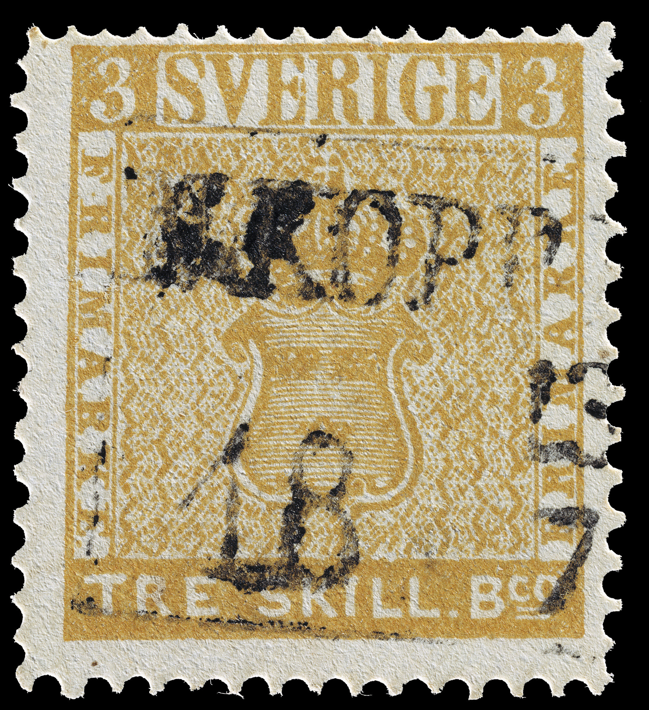
Treskilling Yellow
Voting period ends on 26 Jan 2012 at 03:06:24 (UTC)

- Reason
- High Ev, featured in commons,
- Articles in which this image appears
- Treskilling Yellow, Postage stamps and postal history of Sweden, David Feldman (philatelist), Philipp von Ferrary
- FP category for this image
- Wikipedia:Featured pictures/Culture, entertainment, and lifestyle/Culture and lifestyle
- Creator
- sv:P.A. Sparre
- Support as nominator -- Spongie555 ( talk) 03:06, 16 January 2012 (UTC)
- Support -- High quality digitization. That such a stamp can sell for several thousand dollars... Crisco 1492 ( talk) 08:11, 16 January 2012 (UTC)
- Conditional Support Please make it clear where the digitisation has come from on the image page. JJ Harrison ( talk) 10:06, 16 January 2012 (UTC)
- Support Good EV. ■ MMXX talk 23:51, 21 January 2012 (UTC)
- Support per Crisco 1492 God Emperor Talk 10:33, 22 January 2012 (UTC)
- Comment: I would support straight away, but we do really need to know where this digitisation came from. J Milburn ( talk) 11:16, 22 January 2012 (UTC)
- Support. No question. Aaadddaaammm ( talk) 15:44, 22 January 2012 (UTC)
- Support I would like to see JJ Harrison's concern fulfilled -- Guerillero | My Talk 20:28, 24 January 2012 (UTC)
- Comment: This nom's voting period expired three days ago; why is it still here? Are we suspending it until the source of the digitization is confirmed?
Clegs (
talk) 09:44, 29 January 2012 (UTC)
- Good idea. Makeemlighter ( talk) 01:39, 30 January 2012 (UTC)
Suspended pending clarification on digitization. Makeemlighter ( talk) 01:39, 30 January 2012 (UTC)
- I've asked the uploader where the image came from, but he's blocked/banned right now, so it might take a while. Crisco 1492 ( talk) 08:39, 30 January 2012 (UTC)
- According to Claritas, the image came from here. Crisco 1492 ( talk) 23:04, 1 February 2012 (UTC)
Promoted File:Gul tre skilling banco.jpg -- Makeemlighter ( talk) 23:27, 1 February 2012 (UTC)
Henry II of France and Catherine de' Medici
Voting period is over. Please don't add any new votes. Voting period ends on 2 Feb 2012 at 21:34:18 (UTC)


- Reason
- Trying again, after the last time a half voter was missing
- Articles in which this image appears
- Henry II of France, Basilica of St Denis
- FP category for this image
- Wikipedia:Featured pictures/Artwork/Sculpture
- Creator
- Roi Boshi
- Support as nominator -- Tomer T ( talk) 21:34, 24 January 2012 (UTC)
- Comment. Added Alt 1 with reduced noise levels. O.J. ( talk) 03:20, 25 January 2012 (UTC)
- Oppose. Sorry, I withheld from voting last time, but I guess if it's coming back I may as well comment. I do quite like the composition, but I find this all a bit murky to be honest; I understand that this in difficult lighting conditions and better lighting may be very difficult, but it honestly doesn't quite do it for me. Some of the other images linked on the image page, while possibly done using on-camera flash, show that better lighting may be possible, and would also bring up truer colours. Couple that with the limited extent of the image - we can't see the whole tombs, only the top third or so, Catherine is well and truly out of focus, and even the lower shoulders and 'bed' of poor old Henry are gone, and it doesn't quite make it for me. -- jjron ( talk) 05:57, 25 January 2012 (UTC)
- Oppose also... There's a lot of chromatic aberration (I believe that's the term!) going on throughout the image, such that at 100% much of the image is red and green. I guess this is a result of the high ISO used but is still not ideal. Additionally, I'd prefer an angle something like this to show all of both of the tombs. Nik the stoned 16:53, 25 January 2012 (UTC)
- Support alt 1 I love the angel it adds to the photo. The tomb from above would be boring -- Guerillero | My Talk 22:28, 25 January 2012 (UTC)
- Oppose Would like to see the whole sculpture, not just the bust with the rest cut off. Clegs ( talk) 11:38, 28 January 2012 (UTC)
- Oppose. Both the angle and the crop make the subject a bit difficult to take in. — Eustress talk 18:16, 2 February 2012 (UTC)
Not Promoted -- Makeemlighter ( talk) 22:28, 2 February 2012 (UTC)
IIT Machinery Hall
Voting period is over. Please don't add any new votes. Voting period ends on 2 Feb 2012 at 19:59:59 (UTC)

- Reason
- I saw this was the Commons POTD today and it is a Chicago building. It has been reshot and corrected since Wikipedia:Featured picture candidates/IIT Machinery Hall in 2010.
- Articles in which this image appears
- Illinois Institute of Technology, Douglas, Chicago, Romanesque Revival architecture, Illinois Institute of Technology Academic Campus, List of Illinois Institute of Technology buildings
- FP category for this image
- Wikipedia:Featured pictures/Places/Architecture
- Creator
- Jovianeye
- Support as nominator -- TonyTheTiger ( T/ C/ BIO/ WP:CHICAGO/ WP:FOUR) 19:59, 24 January 2012 (UTC)
- Support -- Good quality. EV is good for the list, but I don't think there's enough for a POTD blurb... new article, perhaps? Crisco 1492 ( talk) 23:22, 24 January 2012 (UTC)
- Support JJ Harrison ( talk) 05:36, 25 January 2012 (UTC)
- Support - looks so clean! Nik the stoned 16:59, 25 January 2012 (UTC)
- Support. It's not the most interesting looking building, but I can't deny that it's well shot. Ðiliff «» (Talk) 11:30, 27 January 2012 (UTC)
- Support. -- Spurzem ( talk) 13:20, 31 January 2012 (UTC)
Promoted File:IIT Machinery Hall.jpg -- Makeemlighter ( talk) 22:31, 2 February 2012 (UTC)
Pachira aquatica
.jpg)
.jpg&action=edit§ion=T-1)
Voting period is over. Please don't add any new votes. Voting period ends on 2 Feb 2012 at 21:24:52 (UTC)
.jpg)
_edit1.jpg)
- Reason
- A very nice image, valuable to the article Pachira aquatica
- Articles in which this image appears
- Pachira aquatica
- FP category for this image
- Wikipedia:Featured pictures/Plants/Fruits
- Creator
- Lycaon
- Support as nominator -- Tomer T ( talk) 21:24, 24 January 2012 (UTC)
- Support Good quality and EV. ■ MMXX talk 23:31, 24 January 2012 (UTC)
- Support edit 1 - the edit looks right to me. JJ Harrison ( talk) 05:37, 25 January 2012 (UTC)
- Support. -- jjron ( talk) 05:50, 25 January 2012 (UTC) Pref to Edit 1. -- jjron ( talk) 10:04, 30 January 2012 (UTC)
- Support. I was going to suggest a more balanced crop (given the nut is slightly to the left of centre) but given the foliage I'd say it's about right as is. Nik the stoned 17:05, 25 January 2012 (UTC) — Prefer Edit 1. Nik the stoned 12:08, 30 January 2012 (UTC)
- Support high EV -- Guerillero | My Talk 22:29, 25 January 2012 (UTC)
- Isn't it a bit too warm? -- Muhammad (talk) 02:47, 26 January 2012 (UTC)
-
- I agree now that I'm back at home with a proper monitor. JJ Harrison ( talk) 22:31, 29 January 2012 (UTC)
- Comment Size reference--even a measurement stated in the image page--would be helpful. Spikebrennan ( talk) 15:49, 27 January 2012 (UTC)
opposeper Muhammad. Aaadddaaammm ( talk) 08:23, 28 January 2012 (UTC)- Please don't oppose because of my reason. Fixing the color is a very simple thing to do --
Muhammad
(talk) 08:37, 28 January 2012 (UTC)
- Well, I made a corresponding minimal edit a few days ago, and it got reverted on Commons with the reasoning that edits of existing QIs/VIs are nuh-uh, but Lycaon previously communicated that he wants edits to be uploaded over the top, so I've asked the reverter what he wants to happen. If anyone wants to express an opinion, feel free to do so on his Commons talk page.
Papa Lima Whiskey 2 (
talk) 10:09, 28 January 2012 (UTC)
- I'm very prepared to change to a support when the colour is fixed, but until then I stick by my oppose.
Aaadddaaammm (
talk) 11:52, 28 January 2012 (UTC)
- Support alt 1 only, looks good.
Aaadddaaammm (
talk) 10:39, 30 January 2012 (UTC)
- Is that exclusively for ALT1?
Crisco 1492 (
talk) 12:39, 30 January 2012 (UTC)
- Clearly he means Edit 1 only. --
jjron (
talk) 14:45, 30 January 2012 (UTC)
- He
clarified after my comment. I had asked to ensure an accurate count by the closer.
Crisco 1492 (
talk) 15:05, 30 January 2012 (UTC)
- Sorry, I futilely didn't want to clog up the nom with too much off topic blah. Aaadddaaammm ( talk) 19:06, 30 January 2012 (UTC)
- He
clarified after my comment. I had asked to ensure an accurate count by the closer.
Crisco 1492 (
talk) 15:05, 30 January 2012 (UTC)
- Clearly he means Edit 1 only. --
jjron (
talk) 14:45, 30 January 2012 (UTC)
- Is that exclusively for ALT1?
Crisco 1492 (
talk) 12:39, 30 January 2012 (UTC)
- Support alt 1 only, looks good.
Aaadddaaammm (
talk) 10:39, 30 January 2012 (UTC)
- I'm very prepared to change to a support when the colour is fixed, but until then I stick by my oppose.
Aaadddaaammm (
talk) 11:52, 28 January 2012 (UTC)
- Well, I made a corresponding minimal edit a few days ago, and it got reverted on Commons with the reasoning that edits of existing QIs/VIs are nuh-uh, but Lycaon previously communicated that he wants edits to be uploaded over the top, so I've asked the reverter what he wants to happen. If anyone wants to express an opinion, feel free to do so on his Commons talk page.
Papa Lima Whiskey 2 (
talk) 10:09, 28 January 2012 (UTC)
- Please don't oppose because of my reason. Fixing the color is a very simple thing to do --
Muhammad
(talk) 08:37, 28 January 2012 (UTC)
- Support The warmness matches the climate on that location.-- ♫GoP♫ T C N 09:51, 28 January 2012 (UTC)
- Edit 1 Uploaded -- Muhammad (talk) 05:53, 30 January 2012 (UTC)
- Support edit 1 -- Muhammad (talk) 05:53, 30 January 2012 (UTC)
- Oppose edit 1 - I think you've taken it a bit too far, appears rather bleached now. Try somewhere in the middle. Papa Lima Whiskey 2 ( talk) 12:39, 30 January 2012 (UTC)
- I agree with PLW, I prefer the original.
■ MMXX
talk 22:55, 30 January 2012 (UTC)
- +1 --
Guerillero |
My Talk 16:21, 31 January 2012 (UTC)
- +2 Pteronura brasiliensis 16:39, 31 January 2012 (UTC)
- +1 --
Guerillero |
My Talk 16:21, 31 January 2012 (UTC)
- Oppose original, Support Edit 1 The color correction has given it enough EV to convince me. Clegs ( talk) 09:08, 1 February 2012 (UTC)
- Support Edit 1. The cooler colours are more natural. I don't think it would strike anyone as bleached unless viewed next to the original, which may be more pleasing but is arguably of lower EV.
- Must remember to sign comments! God Emperor Talk 20:10, 1 February 2012 (UTC)
Promoted File:Pachira aquatica (fruit) edit1.jpg -- Makeemlighter ( talk) 22:36, 2 February 2012 (UTC)
Farmer's Daughters
Voting period is over. Please don't add any new votes. Voting period ends on 2 Feb 2012 at 23:15:37 (UTC)

- Reason
- High quality PD film poster, interesting cover art (great catchline for a porno as well).
- Articles in which this image appears
- The Farmer's Daughters
- FP category for this image
- Wikipedia:Featured pictures/Culture, entertainment, and lifestyle/Entertainment
- Creator
- Employee(s) of Taurus Productions, restoration by PawełMM
- Support as nominator -- Crisco 1492 ( talk) 23:15, 24 January 2012 (UTC)
- Support, but unless the white area is a part of the image, it could be cropped out I think. Brandmeister t 11:43, 25 January 2012 (UTC)
- As with File:Plan 9 Alternative poster.jpg and File:Poster - Island of Lost Men 01.jpg, the blank area is part of the poster. Crisco 1492 ( talk) 12:53, 25 January 2012 (UTC)
- Oppose. Noticeable JPEG artifacts, especially along high-contrast edges (see the pitchfork for example). Also, the cloning out of the creases is a bit sloppy (see pitchfork holder's chin for example). Kaldari ( talk) 09:08, 27 January 2012 (UTC)
- Oppose per Kaldari. Clegs ( talk) 11:39, 28 January 2012 (UTC)
Not Promoted -- Makeemlighter ( talk) 01:12, 3 February 2012 (UTC)
Deep Throat
Voting period is over. Please don't add any new votes. Voting period ends on 2 Feb 2012 at 23:55:37 (UTC)

- Reason
- High quality reproduction of (admittedly fairly simple) film poster for a very notable pornographic film. I prefer the one with a handjob, but one without hands is available too.
- Articles in which this image appears
- Deep Throat (film), Golden Age of Porn
- FP category for this image
- Wikipedia:Featured pictures/Culture, entertainment, and lifestyle/Entertainment
- Creator
- Employee(s) of Bryanston Pictures or a subsidary, restored by Quibik
.png)
- Support as nominator -- Crisco 1492 ( talk) 23:55, 24 January 2012 (UTC)
- Oppose --I think this is a nice image, but too light and washed out. And other than being tied to the most famous porn flick ever, there is nothing special about this image. – JBarta ( talk) 07:12, 25 January 2012 (UTC)
- To quote myself below "Our personal taste in the art style in something such as a movie poster or artwork should generally not be considered, but the quality of the reproduction. The reason being that the EV is derived from its representation of the subject of an article". This is the same reason that a quality reproduction of Campbell's Soup Cans (if it were freely licensed) could be a FP despite having a fairly simple subject matter. Crisco 1492 ( talk) 08:03, 25 January 2012 (UTC)
- It's not quite the same; this image isn't a famous piece of artwork, it's an image that was used to accompany a famous piece of "art" work. The noted work is the film, not the poster. J Milburn ( talk) 08:18, 25 January 2012 (UTC)
- Crisco, by your reasoning, every quality reproduction of any two dimensional work that has encyclopedic value is deserving of featured picture status. Why is this image any more deserving than other similar images? Regarding the image quality, looking at other versions of this image both here and on the web, I believe I'm accurate in making my criticisms about the colors and lightness. If you disagree, please tell me why. – JBarta ( talk) 10:04, 25 January 2012 (UTC)
- @J Milburn: Gotcha. I was considering the one which is essentially lines and squares, but I couldn't remember it's title.
- @Jbarta: Would I support a faithful copy of the cover of The White Album? Probably not... probably. Would go great for April fool's day though. For this, I think it's complicated enough to deserve input. As for the colouring comments, I will upload an alt when I can get to a web cafe. This laptop doesn't have the proper software and my one that does died while I was at RecentChangesCamp in Canberra. Crisco 1492 ( talk) 11:30, 25 January 2012 (UTC)
- Neutral I am not a fan. -- Guerillero | My Talk 22:32, 25 January 2012 (UTC)
- Comment. Subject matter has perfectly suitable EV. My monitor may not be configured correctly, but the black-and-white image at the top looks kind of jpeggy. Spikebrennan ( talk) 15:47, 27 January 2012 (UTC)
- If you look at the original scan/photo you'll see the photo of the woman is blown up halftone. The image quality of the poster itself is is somewhat low (at least by modern standards) and the scan just picked that up. The image was subsequently edited to minimize the halftone effect (among other things). The current image is an improvement, but still suffers from being a mediocre quality poster. Actually, a case could be made that because of the smoothing of the halftone, the current image is not a faithful reproduction of the original poster. – JBarta ( talk) 18:32, 27 January 2012 (UTC)
Not Promoted -- Makeemlighter ( talk) 01:12, 3 February 2012 (UTC)
SU25 diagram
Voting period is over. Please don't add any new votes. Voting period ends on 3 Feb 2012 at 07:58:40 (UTC)

- Reason
- Awesome diagram which complements the schematics well. Currently (25 January) POTD on Commons.
- Articles in which this image appears
- Sukhoi Su-25
- FP category for this image
- Wikipedia:Featured pictures/Vehicles/Air
- Creator
- Altoing
- Support as nominator -- Crisco 1492 ( talk) 07:58, 25 January 2012 (UTC)
- Support --Encyclopedic and interesting to the extreme. Very well done. – JBarta ( talk) 10:15, 25 January 2012 (UTC)
- Support per nom Did you get your laptop going? JJ Harrison ( talk) 10:54, 25 January 2012 (UTC)
- No, not yet. I'm on the Toshiba, which is second rate despite being newer. Usually Mrs. Crisco uses it. Crisco 1492 ( talk) 11:36, 25 January 2012 (UTC)
OpposeThis is an excellent drawing but it needs labelling of the components being shown. The value of a line drawing over a photo is that this kind of annotation is possible. Therefore to me this falls down on EV. - Zephyris Talk 12:10, 25 January 2012 (UTC)
- I had considered that as well. The more I thought about it however, the more I thought labels would simply add unnecessary clutter to an otherwise clean & handsome line drawing. Do you really need labels to tell you things like WING, TAIL, SEAT & ENGINE? I think it's a drawing just meant to be looked over and taken in. Labels would be more useful in more detailed drawings of components or sections rather than the entire plane. At least that's my thought. – JBarta ( talk) 12:40, 25 January 2012 (UTC)
- Comment. Can I suggest this probably could do with better article usage to improve EV? At the moment it's buried a heck of a long way down in its single article, but more concerning is that it doesn't even have a caption (much less a good caption). Re the source, is that English version actually in English? And I've noted the reply above about labelling, but I'm rather concerned that apart from not having a caption, that this contains absolutely no information about it on the image page, other than the name of the plane. All that may be acceptable on Commons, but for the 'pedias, I reckon it should be better. -- jjron ( talk) 15:37, 25 January 2012 (UTC)
Opposeper my comments above. OK, so I just looked this bad boy up on Russian Wikipedia and over there it has fantastic article usage - have a look for yourself. Fully labelled in beautiful detail in its own section, with links directly off the image to related articles; great! I would definitely support that. Here though, it's simply been dumped down the arse-end of the related article, and that I can't support for a B&W line diagram. Sorry. Give me that Russian style EV and I'll happily change to support. -- jjron ( talk) 15:46, 25 January 2012 (UTC)- Support new usage, as long as it sticks. Unfortunately someone has
already halved the size and IMO reduced the EV. I was going to revert, but perhaps worth taking to the article talkpage? --
jjron (
talk) 13:40, 28 January 2012 (UTC)
- I'll ask on the talk page. Crisco 1492 ( talk) 08:28, 30 January 2012 (UTC)
- Support new usage, as long as it sticks. Unfortunately someone has
already halved the size and IMO reduced the EV. I was going to revert, but perhaps worth taking to the article talkpage? --
jjron (
talk) 13:40, 28 January 2012 (UTC)
Opposeper jjron - the usage in that Russian Wikipedia article section is superb, the usage in the English one is... not. Nik the stoned 16:42, 25 January 2012 (UTC)
- Support per updated usage. One point though, I'm pretty sure Protivoblikovochny shield is a mistranslation! Nik the stoned 10:50, 26 January 2012 (UTC)
- Comment: I've added the schematics like in the Russian wikipedia. If it stays... well, that's up to MilHist. Opposing voters, feedback please. Crisco 1492 ( talk) 10:06, 26 January 2012 (UTC)
- Support per above. Aaadddaaammm ( talk) 08:22, 28 January 2012 (UTC)
- Support As description added.-- ♫GoP♫ T C N 09:49, 28 January 2012 (UTC)
Strong supportgreat diagram(!), and potentially useful as I may be working on Sukhoi Su-25 in the near future. -- Sp33dyphil © hat ontributions 06:54, 29 January 2012 (UTC)
- Comment I've noted a lot of similarities between the diagram and that on pages 218–219 from the book Modern Battlefield Warplanes. The one in the book has colours and weapons, but there are detailed similarities between the two. -- Sp33dyphil © hat ontributions 07:18, 3 February 2012 (UTC)
- Support per above -- Extra 999 ( Contact me) 08:44, 31 January 2012 (UTC)
- Support This is a professional-standard cutaway diagram with significant EV Nick-D ( talk) 23:17, 1 February 2012 (UTC)
Promoted File:Sukhoi Su-25 kompo vers2.svg -- Papa Lima Whiskey 2 ( talk) 08:26, 3 February 2012 (UTC)
- Since Sp33dyphil asked for particular comment: As Nick-D's earlier comment hints, it's unlikely to be a straight scan, especially in SVG format, and it would be difficult to create a free derivative such as this and not have it look similar to a textbook version that is trying to do the same thing, with the same model of airplane. So with Altoing citing a different source here than the one Sp33dyphil claims, and with Commons having happily promoted this to FP (plus long-term history of contributions from Altoing), in the absence of further evidence that this was a closer kind of reproduction than we're allowed, I consider the point solved. Let us know if anything new surfaces. Papa Lima Whiskey 2 ( talk) 09:04, 3 February 2012 (UTC)
Running chicken
Voting period is over. Please don't add any new votes. Voting period ends on 3 Feb 2012 at 19:34:11 (UTC)

- Reason
- Illustrates camera panning clearly using an original subject. The motion blur in most of the hen's body and legs adds to the feeling of motion
- Articles in which this image appears
- Panning (camera)
- FP category for this image
- Birds and Photographic techniques, terms, and equipment
- Creator
- Alvesgaspar ( talk)
- Info -- A second try as I wasn't satisfied with the outcome of the first ( here) and believe that the picture deserves the distinction. Not for its cutness (which certainly helps) but mainly because of its ev. Alvesgaspar ( talk) 19:37, 25 January 2012 (UTC)
- Support as nominator -- Alvesgaspar ( talk) 19:34, 25 January 2012 (UTC)
- The image has minimal EV though. It's only in one article and it replaced an image that, in my opinion, better illustrated the concept of panning. There are some things I don't find attractive in this image in particular. The background does not have that horizontal crisp "panning feel" that is appealing in the former image of the article (and lead image) The low shutter speed has made the subject underexposed or less appealing contrast. Since the chicken moves up and down, I'm not sure if it is a good subject to use for illustrating panning. What's the rebuttal to the opinions in the previous nomination? ZooFari ( talk) 03:36, 26 January 2012 (UTC)
- Oppose per all the reasons given in the mentioned previous nom (and above). I feel these are all better illustrations of panning. (and 2 are already FPs...) Nik the stoned 10:32, 26 January 2012 (UTC)
- Oppose and recommend booting it out of the panning article. The previous picture was much better. Clegs ( talk) 11:48, 26 January 2012 (UTC)
- Oppose This picture already represents camera panning as a featured picture. That picture is IMO far better to represent the article. This nominated picture is alright (i guess...), but it doesn't really represent camera panning that well. I can take a picture like this by pointing my camera at my dog (while she is running) and taking a quick picture. Its just not a good representative picture, and i don't feel it is really the best picture Wikipedia has to offer on this subject. Dusty777 ( talk) 21:08, 26 January 2012 (UTC)
- Oppose Per above and my comments in the previous nom (which I think are still valid!). File:2007 swifts creek lawnmower races05.jpg is IMO a far superior example of panning and shouldn't have been replaced by this in the article. -- Fir0002 04:26, 27 January 2012 (UTC)
Not Promoted -- Papa Lima Whiskey 2 ( talk) 21:26, 3 February 2012 (UTC)
Black-faced female impalas at waterhole
Voting period is over. Please don't add any new votes. Voting period ends on 3 Feb 2012 at 21:25:56 (UTC)

- Reason
- why you think it meets the FPC criteria and should be featured (check criteria first)
- Articles in which this image appears
- Impala
- FP category for this image
- Wikipedia:Featured_pictures/Animals/Mammals
- Creator
- Alchemist-hp
- Support as nominator -- Alchemist-hp ( talk) 21:25, 25 January 2012 (UTC)
 Pro . High quality, "WOW"-factor arises by the water droplets from the snout of the specimen in the middle.
Grand-Duc (
talk) 00:35, 26 January 2012 (UTC)
Pro . High quality, "WOW"-factor arises by the water droplets from the snout of the specimen in the middle.
Grand-Duc (
talk) 00:35, 26 January 2012 (UTC)- Question What EV does this have over the other impala pictures? -- Muhammad (talk) 02:45, 26 January 2012 (UTC)
- Comment I echo the concerns above - there are already four impala FPs - kind of hard to justify a fifth. I'd suggest a delist and replace of the current female FP ( File:Female impala.jpg) as this one is higher image quality and has the additional EV of the waterhole (grasslands already being shown in the male impala FP and the oxpecker FP) -- Fir0002 04:23, 27 January 2012 (UTC)
- Comment This is the species: petersi (Aepyceros melampus petersi = black-faced impala) from the north of Namibia. The other FP impala is the species melampus (Aepyceros melampus melampus) from the east of Afrika. -- Alchemist-hp ( talk) 10:22, 27 January 2012 (UTC)
- Support Different subspecies gives enough EV for me, though I agree we probably need to have a impala trim. JJ Harrison ( talk) 04:30, 28 January 2012 (UTC)
- Oppose Again impalas? Imho bad composition, overall too dark and has nothing eyecatching.--
♫GoP♫
T
C
N 09:46, 28 January 2012 (UTC)
- Yes, again an impala, but incl. hooves! And I think you need to calibrate your monitor. The image isn't dark. It is perfect exposed. Take a look to his
histogram. --
Alchemist-hp (
talk) 22:26, 28 January 2012 (UTC)
- My monitor is perfectly fine. File:Serengeti Impala3.jpg has better contrast and composition. Background is out of focus.-- ♫GoP♫ T C N 14:51, 29 January 2012 (UTC)
- Yes, again an impala, but incl. hooves! And I think you need to calibrate your monitor. The image isn't dark. It is perfect exposed. Take a look to his
histogram. --
Alchemist-hp (
talk) 22:26, 28 January 2012 (UTC)
- Oppose Image is executed well technically, but lacks a certain bang. No argument about EV, it just doesn't grab me the way I expect an FP to do. Clegs ( talk) 09:53, 29 January 2012 (UTC)
- Support. -- Spurzem ( talk) 11:45, 31 January 2012 (UTC)
- Not a fan of the harshness and direction of the lighting. It creates annoying shadows that distract form the facial features. -- Dschwen 15:40, 1 February 2012 (UTC)
- Support very nice! -- Brackenheim ( talk) 18:46, 2 February 2012 (UTC)
Promoted File:Aepyceros melampus petersi female 8014.jpg -- Papa Lima Whiskey 2 ( talk) 21:31, 3 February 2012 (UTC)
- A close one, but if dissenters don't make their objections official, there's little a closer can or should do. Grand-Duc, please use "support" in future instead of "Pro". Thank you. Papa Lima Whiskey 2 ( talk) 21:31, 3 February 2012 (UTC)
Saint-Jacques Tower Paris ca. 1867
Voting period is over. Please don't add any new votes. Voting period ends on 3 Feb 2012 at 22:34:42 (UTC)

- Reason
- Very good illustration of the tower, pictured right after the restoration by Théodore Ballu carried out between 1854-58. It provides also an excellent illustration of the square surrounding it and its users.
- Articles in which this image appears
- Saint-Jacques Tower, Théodore Ballu
- FP category for this image
- Architecture
- Creator
- Charles Soulier
- Support as nominator -- Elekhh ( talk) 22:34, 25 January 2012 (UTC)
- Support, very good quality for a 1867 photo. Brandmeister t 23:32, 25 January 2012 (UTC)
- Support Good EV. ■ MMXX talk 01:06, 26 January 2012 (UTC)
- Support. Agreed, amazingly crisp photo considering the age. You can really see just how slow the film was to expose though, judging by the motion blur of the people. Ðiliff «» (Talk) 16:27, 26 January 2012 (UTC)
- Support -- Fir0002 04:24, 27 January 2012 (UTC)
- Support -- Extra 999 ( Contact me) 14:38, 27 January 2012 (UTC)
- Support A very striking photograph, good EV. Kaldari ( talk) 07:37, 28 January 2012 (UTC)
- Support! I love old photos with such amazing quality. Aaadddaaammm ( talk) 08:20, 28 January 2012 (UTC)
- Support Nice, very nice -- Guerillero | My Talk 17:22, 28 January 2012 (UTC)
- Support Pteronura brasiliensis 17:59, 28 January 2012 (UTC)
- Support -- I probably don't need to weigh in here, but... Crisco 1492 ( talk) 01:06, 30 January 2012 (UTC)
Promoted File:La Tour St. Jacques La Boucherie à Paris ca. 1867.jpg -- Makeemlighter ( talk) 00:13, 4 February 2012 (UTC)
Headshot of male Impala
Voting period is over. Please don't add any new votes. Voting period ends on 4 Feb 2012 at 16:47:11 (UTC)

- Reason
- Nice picture of a male Impala. Close up, decent EV.
- Articles in which this image appears
- Impala
- FP category for this image
- Wikipedia:Featured_pictures/Animals/Mammals
- Creator
Joachim HuberMuhammad
- Support as nominator -- Pteronura brasiliensis 16:47, 26 January 2012 (UTC)
- Comment Sorry, the title's off because I don't know how to promote different resolutions than the basic ones. Pteronura brasiliensis 16:56, 26 January 2012 (UTC)
- Weak Support Heavy compression artifacts on its neck and back. Caption needs major improvement also.
Dusty777 (
talk) 20:54, 26 January 2012 (UTC)
- Sorry about that. Caption fixed. Pteronura brasiliensis 17:21, 27 January 2012 (UTC)
- Oppose It appears there is already an overabundance of Impala FPs - the Impala article has no less than four (the impression one gets is they are a relatively easy subject on a safari). This shot adds nothing new to the existing FPs --
Fir0002 04:18, 27 January 2012 (UTC)
- From what I saw, none were close up like this one. Pteronura brasiliensis 17:21, 27 January 2012 (UTC)
- Oppose On
File:Serengeti Impala3.jpg you see the full impala, and here not.--
♫GoP♫
T
C
N 09:44, 28 January 2012 (UTC)
- Info The image File:Serengeti Impala3.jpg don't show the hooves too. -- Alchemist-hp ( talk) 22:22, 28 January 2012 (UTC)
- Oppose per Fir0000000000002 ;-) Clegs ( talk) 10:07, 29 January 2012 (UTC)
- Comment Thanks for nominating this picture taken by me but I don't think it has the sufficient EV for FP. If we ever have something about imapala horns then perhaps we can nominate it. -- Muhammad (talk) 19:07, 30 January 2012 (UTC)
Not Promoted -- Papa Lima Whiskey 2 ( talk) 20:03, 4 February 2012 (UTC)
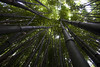
Forest canopy
Voting period is over. Please don't add any new votes. Voting period ends on 6 Feb 2012 at 00:56:19 (UTC)

- Reason
- An image of a forest canopy which illustrates how the treetops pack closely together to capitalise on sunlight.
- Articles in which this image appears
- Canopy (biology)
- FP category for this image
- Wikipedia:Featured pictures/Plants
- Creator
- God_Emperor
- Support as nominator -- God Emperor Talk 00:56, 28 January 2012 (UTC)
- Comment This photo had been in the article canopy for 11 minutes before its nomination here. It's best to wait to see if it's stable in the article before nomination... Aaadddaaammm ( talk) 08:19, 28 January 2012 (UTC)
- I would put this on hold for 5 days. That is often enough time to see if the article writers support or reject the image -- Guerillero | My Talk 17:18, 28 January 2012 (UTC)
- Not counting edits related to the current FP candidate being added, the article has had 2 edits since the beginning of November. It's not an actively written article, so anything you put up will stay for an indefinite amount of time. Clegs ( talk) 10:09, 29 January 2012 (UTC)
- I'd suggest just waiting until the image has been in for a week before nominating - that is what the rules proclaim. JJ Harrison ( talk) 03:29, 30 January 2012 (UTC)
- Oppose. I'm not really a fan of the image regardless of how secure it is in the article. It doesn't really show the canopy very well and is underexposed. Ðiliff «» (Talk) 09:10, 30 January 2012 (UTC)
- Oppose. The image fails to show what the nominator stated in his intro, that it " illustrates how the treetops pack closely together to capitalise on sunlight". The different tree canopies are quite widely spaced. I know the effect he is alluding to, but this isn't it. Sabine's Sunbird talk 18:26, 30 January 2012 (UTC)
- Oppose' I'd want an illustration of canopy to be a little denser than this. This is almost half blue sky. Clegs ( talk) 09:11, 1 February 2012 (UTC)
- Oppose Good picture as it is but no real wow. How do we know this is a forest, for one thing? I know people who could go out and take this sort of image in their back yards. I sort of expect a picture of a forest canopy to look like, well, an actual canopy. Or to show us big, tapering tree trunks. Or needle-like crepuscular rays or slightly occulted sun peeking through. You get the idea. Daniel Case ( talk) 06:47, 2 February 2012 (UTC)
- Oppose agree with Daniel Case. Pine talk 10:36, 5 February 2012 (UTC)
Not Promoted -- Makeemlighter ( talk) 00:30, 6 February 2012 (UTC)
The Starry Night
Voting period is over. Please don't add any new votes. Voting period ends on 6 Feb 2012 at 08:53:46 (UTC)

- Reason
- Easily one of Van Gogh's most recognizable works, this faithful reproduction from the Google Art Project is of high resolution and good quality. EV for both the painting and the artist is through the roof.
- Articles in which this image appears
- The Starry Night, Google Art Project, and several others.
- FP category for this image
- Wikipedia:Featured pictures/Artwork/Paintings
- Creator
- Vincent van Gogh
- Support as nominator -- Crisco 1492 ( talk) 08:53, 28 January 2012 (UTC)
- Support per nom. -- Extra 999 ( Contact me) 10:50, 28 January 2012 (UTC)
- Support requires no questions or thought -- Guerillero | My Talk 15:32, 28 January 2012 (UTC)
- Support. Resolution is a bit borderline though. Really would like to see some of the smaller bacteria as well. God Emperor Talk 16:00, 28 January 2012 (UTC)
- Support Great quality; one of his most definitive works and thus strong EV. Spencer T♦ C 01:42, 29 January 2012 (UTC)
- Support Outstanding quality reproduction of what I think is the greatest painting of all time. Nick-D ( talk) 11:15, 31 January 2012 (UTC)
- Comment. Now fixed in the Zoom Viewer. -- Dschwen 16:25, 31 January 2012 (UTC)
- Comment. I notice this image has evidence of wear on the edges and is pretty dim. The rendition here, however, shows the brush strokes much better and has been cleaned up on the edges. Is the image proposed here somehow preferred to the one I've linked to (perhaps for the sake of historicity?). I much better prefer to enhanced version I've linked to. — Eustress talk 01:03, 1 February 2012 (UTC)
- Unable to open the link (dunno why), I can't know for sure. But since it comes from a wallpaper website, the file there may have been retouched before publication. As for a reason to use this one... it's pretty much guaranteed to be an accurate representation of the painting as it was at the time of digitization, and the resolution is much better. Crisco 1492 ( talk) 04:16, 1 February 2012 (UTC)
- Nope! 1280x800 and it has substantial parts cropped off. You cannot be serious. Sorry, but please keep in mind that we should choose encyclopedic value and authenticity over sexed-up flickerized saturation fests any time. -- Dschwen 14:51, 1 February 2012 (UTC)
- Support Fun fact - my computer used an additional 8.35 GB of ram when I opened this. The quality is amazing. JJ Harrison ( talk) 21:48, 1 February 2012 (UTC)
- Comment. As we discussed previously (see Adam Cuerden's vote and my response), Google has cut off a miniscule sliver of the painting that is visible in its current frame (there's no way to know whether VG intended that sliver to be visible or not). Chick Bowen 01:05, 3 February 2012 (UTC)
- Oppose Sorry, but when I can't view this image, I can't in good conscience vote for it. Wikipedia needs to be accessible for all, not just for geeks who know how to download a huge image.
Aaadddaaammm (
talk) 09:14, 3 February 2012 (UTC)
- Odd, on Firefox 10 on Windows 7 starter edition (and a pretty bad connection), I can still view it using the large image viewer tools. They aren't working for you?
Crisco 1492 (
talk) 09:52, 3 February 2012 (UTC)
- K, the 3rd time looking I found the tiny "Interactive large-image-viewer" link on the image page. Do we think that normal users will see this?
Aaadddaaammm (
talk) 09:42, 4 February 2012 (UTC)
- Although it's been discussed many times before, I agree that we should find a way to make it more intuitive. I asked at WT:FPC if we can apply a fix only on the English Wikipedia or if it must be everywhere, but no reply yet. BTW, is this still an oppose? Crisco 1492 ( talk) 14:33, 4 February 2012 (UTC)
- K, the 3rd time looking I found the tiny "Interactive large-image-viewer" link on the image page. Do we think that normal users will see this?
Aaadddaaammm (
talk) 09:42, 4 February 2012 (UTC)
- Odd, on Firefox 10 on Windows 7 starter edition (and a pretty bad connection), I can still view it using the large image viewer tools. They aren't working for you?
Crisco 1492 (
talk) 09:52, 3 February 2012 (UTC)
- Support Not my favorite "starry night", but still beautiful and of course top notch quality. Soon we won't need attending museums anymore. - Blieusong ( talk) 11:35, 4 February 2012 (UTC)
- Support my favourite Van Gogh. Pernoctator ( talk) 01:23, 5 February 2012 (UTC)
Promoted File:Van Gogh - Starry Night - Google Art Project.jpg -- Papa Lima Whiskey 2 ( talk) 12:43, 6 February 2012 (UTC)
- Adding a small note to this: I raised the resolution to 30,000 pixels wide, and also uploaded the full gigapixel image as a set of four tile images, so any lovers of high resolution should feel free to have another look :-) Dcoetzee 09:24, 1 November 2012 (UTC)
Girls' Generation
Voting period is over. Please don't add any new votes. Voting period ends on 6 Feb 2012 at 10:33:49 (UTC)

- Reason
- High EV (currently lede picture in band's article) and gives fairly equal prominence to each member. Not blatantly advertorial, although admittedly from an advertising campaign. Personally, I like the lighting and the posing is decent.
- Articles in which this image appears
- Girl's Generation, Girl group
- FP category for this image
- Wikipedia:Featured pictures/People/Entertainment
- Creator
- LG (via flickr)
- Support as co-nominator -- Crisco 1492 ( talk) 10:33, 28 January 2012 (UTC)
- Support as co-nominator — Eustress talk 23:38, 30 January 2012 (UTC)
ConditionalsupportIt would be better to identify the members. I found this source, but matching appeared hard for me :)Brandmeister t 11:49, 28 January 2012 (UTC)
- I have a strange feeling that my 11-year-old students could do a better job at that than either of us. On it anyway. Crisco 1492 ( talk) 12:29, 28 January 2012 (UTC)
- Comment. As per my comments at Wikipedia:Featured picture candidates/Girls' Generation I agree the band members need to be identified. I thought that was why the nomination of this was being delayed in the first place. Can we suspend until that happens? -- jjron ( talk) 13:29, 28 January 2012 (UTC)
- I've put requests in at two different places, and am liable to bring this to a lesson on Thursday (I wasn't kidding about my students knowing better than me about this). I've tentatively id'd two.
Crisco 1492 (
talk) 15:05, 28 January 2012 (UTC)
- Surely there should be some pundits out there...
Brandmeister
t 21:28, 28 January 2012 (UTC)
- Tentatively identified using
these
three
pages.
Crisco 1492 (
talk) 00:58, 30 January 2012 (UTC)
- Is it worth just asking two or three of the article regulars on their talkpages? A few have edited multiple times in the last couple of weeks, so are active and perhaps know the band well. A consensus of opinions would also be good. --
jjron (
talk) 14:54, 30 January 2012 (UTC)
- Sent two messages. Crisco 1492 ( talk) 15:35, 30 January 2012 (UTC)
- Is it worth just asking two or three of the article regulars on their talkpages? A few have edited multiple times in the last couple of weeks, so are active and perhaps know the band well. A consensus of opinions would also be good. --
jjron (
talk) 14:54, 30 January 2012 (UTC)
- Tentatively identified using
these
three
pages.
Crisco 1492 (
talk) 00:58, 30 January 2012 (UTC)
- Surely there should be some pundits out there...
Brandmeister
t 21:28, 28 January 2012 (UTC)
- Yes, Crisco jumped the gun. I was assuaging the ID and English-language issues for the file name on Commons -- both of which are now resolved. I've updated the image file name and the image caption. — Eustress talk 23:38, 30 January 2012 (UTC)
- I've put requests in at two different places, and am liable to bring this to a lesson on Thursday (I wasn't kidding about my students knowing better than me about this). I've tentatively id'd two.
Crisco 1492 (
talk) 15:05, 28 January 2012 (UTC)
- What colour issues do you see? On this web-cafe monitor and mine at home, the colours look okay.
Crisco 1492 (
talk) 00:58, 30 January 2012 (UTC)
- I feel it's too red.
■ MMXX
talk 22:51, 30 January 2012 (UTC)
- Does anyone else feel its too red?
Crisco 1492 (
talk) 23:25, 30 January 2012 (UTC)
- I think this effect was made intentionally by the photographer, as the colours become gradually stronger the more your eyes move to the left.-- ♫GoP♫ T C N 18:39, 31 January 2012 (UTC)
- I think it was quite intentional too, and I don't find it too strong or a problem. Product photography has a bit more liberty when it comes to artistic expression. As has been argued before, it's this artistic expression of the 'product' that is actually part of the EV in my opinion. Ðiliff «» (Talk) 15:31, 1 February 2012 (UTC)
- Does anyone else feel its too red?
Crisco 1492 (
talk) 23:25, 30 January 2012 (UTC)
- I feel it's too red.
■ MMXX
talk 22:51, 30 January 2012 (UTC)
- What colour issues do you see? On this web-cafe monitor and mine at home, the colours look okay.
Crisco 1492 (
talk) 00:58, 30 January 2012 (UTC)
- Support per nominators. High-quality and very nice EV as the lead photo. Thanks to Eustress for fixing various word-related issues. Fallingmasonry ( talk) 08:54, 31 January 2012 (UTC)
- Support I like this photograph-- ♫GoP♫ T C N 18:39, 31 January 2012 (UTC)
- Comment Why local file is downsampled?! ■ MMXX talk 22:30, 31 January 2012 (UTC)
- Fixed. Don't know how it ended up like that; perhaps Eutress' internet is like my satellite modem - compresses things of its own accord. Crisco 1492 ( talk) 00:07, 1 February 2012 (UTC)
- Support. It's high quality and a good example of the kitschy Korean pop style. Ðiliff «» (Talk) 15:31, 1 February 2012 (UTC)
- Support ■ MMXX talk 01:20, 2 February 2012 (UTC)
- Support. Great picture, and rare that we get a free image of any contemporary musical artist. Daniel Case ( talk) 06:38, 2 February 2012 (UTC)
Promoted File:Girls Generation 2012.jpg -- Papa Lima Whiskey 2 ( talk) 12:48, 6 February 2012 (UTC)
A MG PA
Voting period is over. Please don't add any new votes. Voting period ends on 6 Feb 2012 at 15:54:29 (UTC)
.jpg)
- Reason
- Beautiful picture of a rare type of car, nice detail.
- Articles in which this image appears
- MG P-type, Düsseldorfer_Automobil-_und_Motorsport-Club_05
- FP category for this image
- Land Vehicles
- Creator
- Spurzem
- Support as nominator -- Pteronura brasiliensis 15:54, 28 January 2012 (UTC)
- Support very sharp, no compression artifacts, and high EV -- Guerillero | My Talk 17:13, 28 January 2012 (UTC)
- Weak support -- There's something I can't put my finger on that's bothering me when I look at the image. Very nice indeed, but something's nagging me... could it be lighting on the door?
Crisco 1492 (
talk) 01:02, 30 January 2012 (UTC)
- The background? And FWIW the description on the image page needs to Englishfied for here. --
jjron (
talk) 14:43, 30 January 2012 (UTC)
- That is part of it, yes. I don't know if these models are taken to outdoor shows though, so I wasn't going to press on that.
Crisco 1492 (
talk) 15:09, 30 January 2012 (UTC)
- This car was a participant of the Oldtimer Festival 2008. Regards -- Pitlane02 talk 09:51, 31 January 2012 (UTC)
- Translation is done. I've tried to translate the description and added the coordination. Regards --
Pitlane02
talk 09:30, 31 January 2012 (UTC)
- Comment This is outside, just on a cloudy day.
Pteronura brasiliensis (
talk •
contribs) 19:28, 30 January 2012 (UTC)
- Ah, cloudy. That might be part of it (as I noted above, it is a little dark on the doors). Not sure whether to go full support or stay partial. I'll consider Crisco 1492 ( talk) 23:24, 30 January 2012 (UTC)
- Cloudy? Those are pretty strong shadows for a cloudy day. (However, on that, perhaps it's the minor backlighting, with the sun being slightly to the rear of the car?) --
jjron (
talk) 12:30, 31 January 2012 (UTC)
- Yes, I think so. However, I don't know how you could get that lighted edge like that unless the whole ceiling was all one big light. Which, you know, it technically couldn't be. Unless you tried very hard.
Pteronura
brasiliensis 15:09, 31 January 2012 (UTC)
- Sorry, I think wires may have been crossed somewhere. As you said earlier this is outside, however it's clearly not cloudy (or not very cloudy) and is lit by the sun from behind; don't know what you're talking about re ceilings and lights. My parenthetical statement above was directed at Crisco and his uncertain problem with the image. -- jjron ( talk) 09:27, 1 February 2012 (UTC)
- Yes, I think so. However, I don't know how you could get that lighted edge like that unless the whole ceiling was all one big light. Which, you know, it technically couldn't be. Unless you tried very hard.
Pteronura
brasiliensis 15:09, 31 January 2012 (UTC)
- Comment This is outside, just on a cloudy day.
Pteronura brasiliensis (
talk •
contribs) 19:28, 30 January 2012 (UTC)
- That is part of it, yes. I don't know if these models are taken to outdoor shows though, so I wasn't going to press on that.
Crisco 1492 (
talk) 15:09, 30 January 2012 (UTC)
- The background? And FWIW the description on the image page needs to Englishfied for here. --
jjron (
talk) 14:43, 30 January 2012 (UTC)
- Support per nom. JJ Harrison ( talk) 03:25, 30 January 2012 (UTC)
- Support I like the silence of this moment in the historic paddock of the Nürburgring. -- Pitlane02 talk 09:01, 31 January 2012 (UTC)
- Support -- Byggxx ( talk) 14:39, 31 January 2012 (UTC)
- Oppose: Decent illustration of the car but not featurable. The very unappealing background is in focus, and if the crop were not so tight and it had better composition, its significance as part of the Nürburgring complex might make it acceptable, but as it is it's just ugly metal. It's clearly possible to get images of these cars during races on the track ( commons:Category:Oldtimer Festival Nürburgring). Julia\ talk 07:39, 1 February 2012 (UTC)
- Support — M 93 ( talk) 07:39, 1 February 2012 (UTC)
- Oppose. Unattractive background is too much of a detraction; nothing places this at the Nürburgring. Not especially sharp or detailed for a car image. Backlighting creating frontal shadows is not ideal as per above discussion. The high number of new voters tipped me off that some somewhat suspicious interwiki canvassing appears to have taken place. -- jjron ( talk) 13:02, 1 February 2012 (UTC)
- Oppose per Julia -- Muhammad (talk) 14:50, 1 February 2012 (UTC)
Support -- 91.67.198.24 ( talk) 14:58, 1 February 2012 (UTC)a not valid voting = anonymous. -- Alchemist-hp ( talk) 22:26, 5 February 2012 (UTC)- Support —I like the picture.-- Genossegerd ( talk) 15:06, 1 February 2012 (UTC)
- Support -- Erika39 ( talk) 17:06, 1 February 2012 (UTC)
- Oppose Unappealing background. Such a small change and it could be so much better. Jujutacular ( talk) 19:12, 1 February 2012 (UTC)
- Oppose per jjron -- Leviathan1983 ( talk) 20:49, 1 February 2012 (UTC)
- Oppose per jjron. Clegs ( talk) 15:58, 2 February 2012 (UTC)
- Oppose. Background is indeed distracting. — Eustress talk 18:05, 2 February 2012 (UTC)
- support. It is a wonderful classic car in front of the historic paddock garages of Nürburgring. Therefore I took this photo. I wonder that the authentic background should be unappealing or distracting. -- Spurzem ( talk) 21:49, 2 February 2012 (UTC)
- support -- Alchemist-hp ( talk) 01:15, 4 February 2012 (UTC)
- support -- Well excuted with just enough pop. Saffron Blaze ( talk) 22:22, 5 February 2012 (UTC)
Not Promoted -- Papa Lima Whiskey 2 ( talk) 19:00, 6 February 2012 (UTC)
- 7 O, 11.5 S -> no 2/3 majority. Papa Lima Whiskey 2 ( talk) 19:00, 6 February 2012 (UTC)
- Ich frage mich, wie sich die englischen Kritiker ein gutes Foto von einem MG vorstellen oder was ihnen an dem “abgeschmetterten” Bild nicht gefällt. Einer meinte “it could be much better”. But what should be much better? (Please excuse me that I can not say all this exactly in English.) -- Spurzem ( talk) 21:46, 6 February 2012 (UTC)
Mooncake
Voting period is over. Please don't add any new votes. Voting period ends on 6 Feb 2012 at 14:12:13 (UTC)


- Reason
- An adequate photo, taken at fortunate angle.
- Articles in which this image appears
- Mooncake
- FP category for this image
- Food and drink
- Creator
- Lybil BER
- Support as nominator -- Brandmeister t 14:12, 28 January 2012 (UTC)
- Oppose -- Technical aspects: Blown highlights on the cake, heavily visible. Aesthetic aspects: Looks poor on a plain white background, a little context would be better. Encyclopedic aspects: I'd prefer something at least hinting at how it is consumed (
those don't quite look like the mooncakes available here, but then Mrs. Crisco bought green ones...) Crisco 1492 ( talk) 15:09, 28 January 2012 (UTC)
- It's nian gao she bought... duh Crisco 1492 ( talk) 15:12, 28 January 2012 (UTC)
- There is an original background, but 5 out of 9 current food and drink FPs have similar neutral background and the cake is not something sophisticated to show how it's consumed :) Brandmeister t 21:20, 28 January 2012 (UTC)
- Support edit 1 Papa Lima Whiskey 2 ( talk) 14:14, 29 January 2012 (UTC)
- Oppose All Limited depth of field. Original per Crisco. PLW's edit has plate marks and the bottom left of the plate still visible. I'd be most happy with the original version over either of these edits. JJ Harrison ( talk) 03:28, 30 January 2012 (UTC)
- Added Brandmeister t 14:16, 31 January 2012 (UTC)
- Oppose per JJ. Pteronura brasiliensis 19:01, 30 January 2012 (UTC)
- Oppose Sorry, food FPC are very hard to pass. The food has to be literally perfect. Any slight imperfection in the food will give an oppose. Here, the background is a bit hazy at the edges, and there are minor blemishes on the mooncake: i.e the creases/cuts/whatever at the lower right of the mooncake-- Nanoman657 ( talk) 18:55, 2 February 2012 (UTC)
Not Promoted -- Makeemlighter ( talk) 21:58, 6 February 2012 (UTC)
Portrait of Baldassare Castiglione
Voting period is over. Please don't add any new votes. Voting period ends on 6 Feb 2012 at 08:56:51 (UTC)

- Reason
- High resolution and EV; notable artist and notable work. Deceptively simple looking, yet quite impressive.
- Articles in which this image appears
- Portrait of Baldassare Castiglione, Baldassare Castiglione, and several others
- FP category for this image
- Wikipedia:Featured pictures/Artwork/Paintings
- Creator
- Raphael
- Support as nominator -- Crisco 1492 ( talk) 08:56, 28 January 2012 (UTC)
- Support although the full res image was broken according to Firefox when I tried to view it. At 1400x1742, it looks great. Papa Lima Whiskey 2 ( talk) 10:13, 28 January 2012 (UTC)
- Support per nom -- Extra 999 ( Contact me) 14:37, 28 January 2012 (UTC)
- Comment the full size was broken for me, too. This should be addressed before we promote it, probably.
Clegs (
talk) 10:10, 29 January 2012 (UTC)
- Viewing works fine in both the flash-based and javascript-based large image viewers, which satisfies me. The resolution and image quality are crazy cool.
Papa Lima Whiskey 2 (
talk) 12:50, 29 January 2012 (UTC)
- Viewing works for me too (Firefox on Windows XP) Crisco 1492 ( talk) 01:00, 30 January 2012 (UTC)
- Viewing works fine in both the flash-based and javascript-based large image viewers, which satisfies me. The resolution and image quality are crazy cool.
Papa Lima Whiskey 2 (
talk) 12:50, 29 January 2012 (UTC)
- Support per nom. JJ Harrison ( talk) 21:54, 1 February 2012 (UTC)
- Support per nom. ● Mehran Debate● 17:22, 2 February 2012 (UTC)
- Support: Wow at resolution and quality. Julia\ talk 13:41, 3 February 2012 (UTC)
- Holy Freaking Snapdragons! aka Support. Don't think I've ever seen an image this high-res on FPC before. Excellent digitisation! Clegs ( talk) 10:45, 4 February 2012 (UTC)
- Support per nom. Kaldari ( talk) 21:21, 4 February 2012 (UTC)
- Support simply for the resolution wowie. Pernoctator ( talk) 01:20, 5 February 2012 (UTC)
- Support. Fantastic resolution and otherwise a classic portrait with high encyclopedic value. - Darwinek ( talk) 12:44, 5 February 2012 (UTC)
Promoted File:Balthazar Castiglione, by Raffaello Sanzio, from C2RMF retouched.jpg -- Makeemlighter ( talk) 22:02, 6 February 2012 (UTC)
Tachara, Persepolis
Voting period is over. Please don't add any new votes. Voting period ends on 7 Feb 2012 at 00:27:58 (UTC)

- Reason
- High resolution, Ancient palace, Featured in Persian Wiki
- Articles in which this image appears
- Persepolis
- FP category for this image
- Wikipedia:Featured pictures/Places/Others
- Creator
- Mamad
- Support as nominator -- Mamad TALK 00:27, 29 January 2012 (UTC)
- Comment: Is it me or does the tilt seem off a little? Spencer T♦ C 01:39, 29 January 2012 (UTC)
- Oppose It's not you. At least I think I know what you are saying. Also, the angle is almost straight-on, but just not quite. Pteronura brasiliensis 02:06, 29 January 2012 (UTC)
- Support; Proper resolution, agreeable angle, and extremely encyclopedic and historical notability. It's a scarce photo of this ancient place and its environment is ideal enough to make it a clear one. I don't know what "tilt" is in your mind! May you explain a little more? ●
Mehran
Debate● 10:45, 29 January 2012 (UTC)
-
Wikipedia:Featured picture candidates/Glossary
Papa Lima Whiskey 2 (
talk) 12:36, 29 January 2012 (UTC)
- I know the meaning of "tilt" my friend, I meant why did you say that? Because I couldn't find it. ●
Mehran
Debate● 13:45, 29 January 2012 (UTC)
- I was thinking the diagonal upwards shooting of the photo and the fact that it is not quite straight on. Pteronura brasiliensis 14:43, 29 January 2012 (UTC)
- I know the meaning of "tilt" my friend, I meant why did you say that? Because I couldn't find it. ●
Mehran
Debate● 13:45, 29 January 2012 (UTC)
-
Wikipedia:Featured picture candidates/Glossary
Papa Lima Whiskey 2 (
talk) 12:36, 29 January 2012 (UTC)
- Strongly Support Good quality, EV-- آرش ( talk) 19:39, 29 January 2012 (UTC)
- Oppose Purple fringing in parts of the right half of the image. In addition, the heavy shadows on the right side obscure the detail. Spencer T♦ C 22:31, 29 January 2012 (UTC)
- Support beautiful image Ram!n ( talk) 00:36, 30 January 2012 (UTC)
- Oppose per above + fishy supports from other users --
Muhammad
(talk) 05:22, 30 January 2012 (UTC)
- I'm a little worry about this matter that the others think that there exists a canvassing because of attendance of some Iranian users. I don't know about the others, but I saw this page quite randomly, anyway you can ignore my vote if you feel it's a kind of Canvass. Regards ● Mehran Debate● 08:39, 31 January 2012 (UTC)
- Support exact frame, historical and ancient photo, beautiful symmetry-like picture, acceptable resolution, nice color and synchronous background, narrator of interior palace of Persepolis, essential and deserving for Wiki Pedia! Alborzagros ( talk) 10:03, 30 January 2012 (UTC)
- Oppose -- Poor framing, geometric distortion, poor image quality. I don't like the national canvassing either. Alvesgaspar ( talk) 11:13, 30 January 2012 (UTC)
- Oppose per above. Are the metal bars on the left side a permanent feature, or did there happen to be restoration work going on at the time the picture happened to be taken? I hasten to point out that we would love, love, love to have a featured-picture-quality picture of this monument, but this picture isn't it. Spikebrennan ( talk) 14:39, 30 January 2012 (UTC)
- Comment:I don't want to persuade, but the top region is in restricted area and taking photo of there is not so easy, at least I didn't see a proper image of this place before, and that's why I said it's scarce! ● Mehran Debate● 18:06, 30 January 2012 (UTC)
- Oppose. a little too tight of a crop and a bit out of whack. -- Dschwen 15:34, 31 January 2012 (UTC)
- Oppose. The upward shooting angle means there's too much sky in the frame and not enough palace. In particular, we can't see the lower bits of the stuff further to the back. God Emperor Talk 20:18, 1 February 2012 (UTC)
- Oppose. Just doesn't grab me the way an FP should. Clegs ( talk) 16:00, 2 February 2012 (UTC)
- Oppose Crop is way too tight. Can't compare the size or the structures relation to the surrounding area. That kills the pictures appeal. Dusty777 ( talk) 17:21, 2 February 2012 (UTC)
Not Promoted -- Makeemlighter ( talk) 00:07, 7 February 2012 (UTC)
USS Arizona (BB-39)
Voting period is over. Please don't add any new votes. Voting period ends on 8 Feb 2012 at 01:15:55 (UTC)
_Port_Bow,_Underway_-_NARA_-_5900075_-_1930.jpg)
- Reason
- High EV and good quality.
- Articles in which this image appears
- USS Arizona (BB-39)
- FP category for this image
- Vehicles/Water
- Creator
- Unknown
- Support as nominator -- ■ MMXX talk 01:15, 30 January 2012 (UTC)
- Support; EV ● Mehran Debate● 15:50, 30 January 2012 (UTC)
- Support High EV, nice and sharp, good illustration of probably the most famous battleship in the world.
Clegs (
talk) 09:22, 1 February 2012 (UTC)
- Surely not? What of the Bismarck, Hood or Yamato? JJ Harrison ( talk) 22:54, 5 February 2012 (UTC)
- Comment: The image caption says the ship is underway, yet I see no bow wave, no wake, etc. Rather, there seems to be a mooring or anchor line from the left bow. Does anyone else concur? Should we change the caption? Clegs ( talk) 10:32, 3 February 2012 (UTC)
- Conditional Support Great picture, but the caption needs some improvement (E.G. Where is the ship going? Where did it come from? Whats it doing?). I agree with Clegs. There is no disturbance in the water in the area around the ship, so it doesn't appear to be moving. Dusty777 ( talk) 16:54, 3 February 2012 (UTC)
- Support the EV is high but I agree with Clegs -- Guerillero | My Talk 17:15, 3 February 2012 (UTC)
- Underway, not making way;
underway should not be confused with
making way,
see this, also
this article explains that a vessel can be underway with no way on (i.e., not moving), this is the original caption provided by
NARA
and I assume it is correct. however, the caption's date is probably wrong as suggested by someone here, the ship was modernised in 1930, but in the image she has cage masts instead of tripod masts, the ones you can see here and here. ■ MMXX talk 00:22, 4 February 2012 (UTC)
- Please see comment by
User:Sturmvogel 66 at
file's talk page.
■ MMXX
talk 01:16, 4 February 2012 (UTC)
- Sturm also concers on the file's talk page that the ship is anchored and not underway.
- I understand the difference, however, she appears to have an anchor line or mooring line coming from her left bow. According to your link, she would then not be considered 'under way'.
Clegs (
talk) 10:31, 4 February 2012 (UTC)
- Sturm is right on that. I don't think there's any way to tell where the photo is taken unless we find a distinguishing feature that was only on the ship for a very short period of time, which we could then link with a place. Also, OOC, what do you people of adding back some of the sky and water that was cropped from the top and bottom? Right now it seems too narrow to me (I was the one who originally cropped it, but now I'm rethinking the crop)
Ed
[talk]
[majestic titan] 03:09, 4 February 2012 (UTC)
- I like the crop the way it is. It's very aesthetically balanced. Clegs ( talk) 10:28, 4 February 2012 (UTC)
- I too prefer this crop, it is better for the article and has better EV than original image. ■ MMXX talk 22:26, 4 February 2012 (UTC)
- Sturm is right on that. I don't think there's any way to tell where the photo is taken unless we find a distinguishing feature that was only on the ship for a very short period of time, which we could then link with a place. Also, OOC, what do you people of adding back some of the sky and water that was cropped from the top and bottom? Right now it seems too narrow to me (I was the one who originally cropped it, but now I'm rethinking the crop)
Ed
[talk]
[majestic titan] 03:09, 4 February 2012 (UTC)
- Underway, not making way;
underway should not be confused with
making way,
see this, also
this article explains that a vessel can be underway with no way on (i.e., not moving), this is the original caption provided by
NARA
_Port_Bow,_Underway_-_NARA_-_5900075_-_1930.jpg)
_Foremast_structure,_conning_tower,_and_top_of_turret_%5E2_-_NARA_-_296937.jpg)
_Port_Bow,_Underway,_1930_-_NARA_5900075_-_Edit.jpg)
- Support Per above. JJ Harrison ( talk) 22:54, 5 February 2012 (UTC)
- Comment I've corrected the file description. should I rename it and remove the date from file name? ■ MMXX talk 00:17, 6 February 2012 (UTC)
Promoted File:Arizona (BB39) Port Bow, Underway - NARA - 5900075 - 1930.jpg -- Makeemlighter ( talk) 02:26, 8 February 2012 (UTC)
M82 galaxy set
Voting period is over. Please don't add any new votes. Voting period ends on 8 Feb 2012 at 10:34:43 (UTC)


- Reason
- Both are of high quality and very striking. The previous nomination was... well, it needs to be read to be understood. Suffice it to say I think a set nomination would work better, although I prefer the true colour image if we must pick only one. This nomination was made after a comment by Extra on my talk page.
- Articles in which this image appears
- Both together on Messier 82. Individually on another 7 articles.
- FP category for this image
- Wikipedia:Featured pictures/Space/Looking out
- Creator
- NASA
- Support both as nominator -- Crisco 1492 ( talk) 10:34, 30 January 2012 (UTC)
- Support as sub-nominator really striking -- Extra 999 ( Contact me) 10:41, 30 January 2012 (UTC)
- Support the alt, as that's the one that is the lead image, and has been for some time. However, nominating the images together was perhaps not the best idea- it was that which led to the clusterfuck last time. J Milburn ( talk) 19:15, 30 January 2012 (UTC)
- Yeah, the old nom was a little FUBAR... I like both. Crisco 1492 ( talk) 23:20, 30 January 2012 (UTC)
- Oppose. Call me ignorant, but in the grand scheme of things this is just another pretty NASA shot like many others we have seen on this page. I'd rather see something new and unique getting the FP badge here. -- Dschwen 15:40, 31 January 2012 (UTC)
- Pardon? But how else would one represent this galaxy? Would you oppose all bird pictures because "we have enough birds"? Crisco 1492 ( talk) 23:34, 31 January 2012 (UTC)
- Really, you won't get across such space pics of such quality anywhere, as you seemed to take it. -- Extra 999 ( Contact me) 09:32, 1 February 2012 (UTC)
- There is certainly an issue here, but the answer would be to encourage alternative kinds of images, not hold back the usual. If it was found, for comparison, that proportionally far fewer women were getting into universities, I'm sure plenty of people would support measures to support and encourage women who are applying; I doubt many would support turning down men who would otherwise have been offered a place. J Milburn ( talk) 16:55, 1 February 2012 (UTC)
- Actually that is exactly what is happening on the job market, if certain quotas have to be met. -- Dschwen 23:15, 1 February 2012 (UTC)
- Dschwen's opposition is poorly informed. Just because objects are in space does not mean they have EV for the same reason. The only FPs that have marginally overlapping EV with this image are the 10-odd galaxy pictures. However, none of these illustrates a starburst galaxy (except the obviously anomalous Antenna galaxies). M82's status as the prototype for this important galaxy class gives it strong and unique EV. As Crisco says, Dschwen is equating eagles and ostriches. Fallingmasonry ( talk) 18:17, 6 February 2012 (UTC)
- Support It should be made more prominent in the caption the bits of the spectrum that these images are from though. JJ Harrison ( talk) 09:36, 1 February 2012 (UTC)
- Support Alt, Neutral on Original
(why are they both labeled "Original"?)For the 1st image, I think the EV would be better if the IR and XRay images weren't composited, but presented as a pair. Fallingmasonry ( talk) 18:00, 6 February 2012 (UTC)
- Changed Original (#2) to ALT Crisco 1492 ( talk) 00:40, 7 February 2012 (UTC)
Promoted File:M82 HST ACS 2006-14-a-large web.jpg -- Papa Lima Whiskey 2 ( talk) 11:56, 8 February 2012 (UTC)
- Only "alt" had enough support. Papa Lima Whiskey 2 ( talk) 11:56, 8 February 2012 (UTC)
Mount Everest from the air
Voting period is over. Please don't add any new votes. Voting period ends on 8 Feb 2012 at 13:52:31 (UTC)


- Reason
- A striking view of Mount Everest and another of the other highest peaks in the world, Lhotse, giving a good idea of the topography around it for extra EV
- Articles in which this image appears
- List of highest mountains, Mount Everest, and one more
- FP category for this image
- Wikipedia:Featured pictures/Places/Landscapes
- Creator
- Shrimpo1967 from Flickr. Edited by Durova
- Support as nominator -- Crisco 1492 ( talk) 13:52, 30 January 2012 (UTC)
- Comment. Which direction are we facing? An indication in the caption (e.g., south face of Mount Everest) or something like that would be helpful. Spikebrennan ( talk) 14:35, 30 January 2012 (UTC)
- South of the mountains, facing north (so south face of Lhotse and Everest, south-east face of Nuptse) [9] Crisco 1492 ( talk) 15:21, 30 January 2012 (UTC)
- Also, the image on Commons is annotated. Crisco 1492 ( talk) 15:22, 30 January 2012 (UTC)
- Support. -- Spurzem ( talk) 11:48, 31 January 2012 (UTC) I prefer Edit 1. -- Spurzem ( talk) 12:02, 2 February 2012 (UTC)
- Support. High value picture. Looks like there is a slight CCW tilt to it (from the cloudline/horizon). -- Dschwen 15:38, 31 January 2012 (UTC)
- Support One of the tilt corrected ones. Per nom. JJ Harrison ( talk) 08:35, 1 February 2012 (UTC
- Comment Can I ask all of you to specify whether you prefer the original original or the fixed version currently uploaded over the top? Commons is complaining again, and the fix may have to be uploaded separately... Papa Lima Whiskey 2 ( talk) 13:52, 1 February 2012 (UTC)
- Probably better to upload separately. They both look okay to me. Crisco 1492 ( talk) 14:15, 1 February 2012 (UTC)
- In-article or in nomination? If in-nomination, fixed. If in-article, soon to be fixed. Crisco 1492 ( talk) 23:18, 1 February 2012 (UTC)
- Support, though agree with Dschwen that it may be slightly tilted. -- jjron ( talk) 10:14, 2 February 2012 (UTC) Support consensus tilt-corrected version. -- jjron ( talk) 05:44, 5 February 2012 (UTC)
- Comment -- Tilt adjusted version added. Crisco 1492 ( talk) 11:51, 2 February 2012 (UTC)
- Support Edit-1 The correction greatly improved the picture. Dschwen made a good call on that. Dusty777 ( talk) 17:15, 2 February 2012 (UTC)
- Support Edit-1. Nice edit. — Eustress talk 18:02, 2 February 2012 (UTC)
- Support either edit Can't tell a difference between the edits, but they are both better than the original. Very good picture. Clegs ( talk) 10:39, 4 February 2012 (UTC)
- Support any edit EV in List of highest mountains.-- Redtigerxyz Talk 16:40, 4 February 2012 (UTC)
- Support any edit. Wonderful picture with high EV. - Darwinek ( talk) 12:40, 5 February 2012 (UTC)
- Comment Buried pretty far down in the article. Makes me wonder if the EV is really exceptional. Makeemlighter ( talk) 00:12, 7 February 2012 (UTC)
- I put its use in List of highest mountains first for EV, as it shows two of the mountains. Crisco 1492 ( talk) 00:38, 7 February 2012 (UTC)
- Yeah, I saw that, but I considered that usage pretty weak. Nobody else minds the EV, though, so forget I said anything. Makeemlighter ( talk) 02:22, 8 February 2012 (UTC)
- Support any edit -- Guerillero | My Talk 16:28, 7 February 2012 (UTC)
- Support edit 2 -- Extra999 ( talk) 09:41, 8 February 2012 (UTC)
- Support any edit prefer edit 2. Jujutacular ( talk) 13:47, 8 February 2012 (UTC)
Promoted File:Mount Everest as seen from Drukair2 PLW edit.jpg -- Julia\ talk 20:14, 9 February 2012 (UTC)
- Preferences (where stated) fell to edit 2 after its addition.
Julia\
talk 20:14, 9 February 2012 (UTC)
- I actually see two supports specifically for Edit 1, one preference for Edit 1, one support for Edit 2, and one preference for Edit 2. Makeemlighter ( talk) 04:42, 10 February 2012 (UTC)
Painting watercolors
Voting period is over. Please don't add any new votes. Voting period ends on 9 Feb 2012 at 11:47:35 (UTC)

- Reason
- It's hard to imagine a more comprehensive and aesthetically pleasing depiction of this subject. It was promoted on Commons as early as 2007 and had rather enthusiastic support.
- Articles in which this image appears
- Watercolor painting
- FP category for this image
- Culture and lifestyle and/or Artwork/Others
- Creator
- Dongio
- Support as nominator -- Papa Lima Whiskey 2 ( talk) 11:47, 31 January 2012 (UTC)
- Support. Beautiful — Eustress talk 15:31, 31 January 2012 (UTC)
- Weak support. I like how the lighting brings out the painting, but the unnecessarily cropped of tip of the canvas bothers me a bit. Would have been even more awesome if the "tools" were shown as well. --
Dschwen 15:36, 31 January 2012 (UTC)
- I agree. This picture is only telling half the story. God Emperor Talk 20:13, 1 February 2012 (UTC)
- Support per nom. Jujutacular ( talk) 16:26, 1 February 2012 (UTC)
- Support per nom. Very nice. Crisco 1492 ( talk) 11:34, 2 February 2012 (UTC)
- Oppose Sorry to ruin the party, but the technicals are pretty poor (particularly blown highlights on the page).
JJ Harrison (
talk) 23:45, 2 February 2012 (UTC)
- The important details are all present in good quality, and without the play of shadow and highlight, you wouldn't get the nice correspondence between subject and depiction that is possible here (subject = the view through the window). Also, white paper is designed for high reflectiveness. Papa Lima Whiskey 2 ( talk) 09:28, 3 February 2012 (UTC)
- Weak oppose Technically a solid image, but for this to have full EV, I think that a set of the watercolor paint ( like this) needs to be included in the image. Spencer T♦ C 02:43, 4 February 2012 (UTC)
- Support: The natural light on the fresh paint makes the water-based nature of the medium conspicuous. I think the EV lies mainly there and a set of paints is superfluous to that and unnecessary. That could well enough be shown in a separate image, such as this one. Julia\ talk 15:30, 4 February 2012 (UTC)
- Support -- Extra999 ( talk) 09:40, 8 February 2012 (UTC)
Promoted File:Dolceacqua43 - Artista locale mentre dipinge un acquarello.jpg -- Makeemlighter ( talk) 23:33, 9 February 2012 (UTC)
Lasseter Highway
Voting period is over. Please don't add any new votes. Voting period ends on 10 Feb 2012 at 05:50:44 (UTC)

- Reason
- Good quality with nice colours. Although minimalist, it has EV as it is representative of large swathes of Australia's Northern Territory. As far as I can tell, our nearest FP is over 1000 km away. Similarly we do not have any FP Landscapes that are anything like this.
- Articles in which this image appears
- Lasseter Highway, Northern Territory, Perspective (visual)
- FP category for this image
- Landscapes
- Creator
- 99of9
- Support as nominator -- 99of9 ( talk) 05:50, 1 February 2012 (UTC)
- Oppose It's an alright picture. But, only the foreground is in focus, it has
very heavy compression artifacts throughout the rest of the picture, and the sharpness needs adjustment. The caption could be improved also Dusty777 ( talk) 16:08, 1 February 2012 (UTC)
- Comment Please can you explain what you mean by very heavy artifacts, and where you see them? Had your download completed? I do not expect any compression artifacts, because both times it was saved from RAW at JPG-100%. Nor can I see any artifacts. Caption improved. I'll consider sharpening once I understand what you meant by "very heavy compression artifacts". -- 99of9 ( talk) 00:00, 2 February 2012 (UTC)
- Oppose Not enough of the scene is in focus God Emperor Talk 20:01, 1 February 2012 (UTC)
- Oppose - Composition leaves much to be desired sadly. I love scenes like this, so I kinda wish this were executed better. Essentially, the image doesn't flow, or carry the eye well. My eye is first drawn to the barren and slightly washed-out horizon, which, in a setting like this, is very disconcerting: it can appear tilted due to the slightest screen distortion, and if the horizon appears tilted, it really taints the shot. As for the highway, it simply enters the frame at an arbitrary vertical point and slices the shot with no apparent deliberateness. The flow that does exist (which is inherent with any road picture) brings the eye to another arbitrary and poorly placed point at the far top-right. Overall, I don't feel like I'm in the setting as I should for an excellent highway photo; instead I'm certain at once that I'm looking at a screen. I'm happy to see it's a QI over at commons, though, as it's definitely interesting and covers a poorly illustrated area. Juliancolton ( talk) 01:30, 3 February 2012 (UTC)
- Oppose Where's the road? I mean, I see it, but it's not prominent enough in a picture supposed to illustrate the road. Opposing on composition grounds. -- Rs chen 7754 03:01, 5 February 2012 (UTC)
- Oppose I actually like the composition as an Abstract image, but it doesn't help the EV - the subject appears to be the tire tracks in the foreground. JJ Harrison ( talk) 22:50, 5 February 2012 (UTC)
- Support. I've read through the opposes, but still think that the picture could be an FP. It's bold and seems at first to convey almost surreal natural beauty, but then it's evident that humankind has left its heavy footprint (or tire tracks) on a road it's built across the plain. I'd actually like to see this on our Main Page. dci | TALK 04:42, 9 February 2012 (UTC)
Not Promoted -- Makeemlighter ( talk) 04:40, 10 February 2012 (UTC)
Commando parachutiste de l'air n°10
Voting period is over. Please don't add any new votes. Voting period ends on 17 Feb 2012 at 10:07:11 (UTC)
- Reason
- Good, clear composition; good contrast; illustrates the subject in a compelling way, making the viewer want to know more.
- Articles in which this image appears
- Special Patrol Insertion/Extraction, Helicopter Rope Suspension Technique, Commandement des Opérations Spéciales
- FP category for this image
- Wikipedia:Featured pictures/People/Military
- Creator
- Commons User:Kajaibai
- Support as nominator -- Mais oui! ( talk) 10:07, 8 February 2012 (UTC)
- Oppose. Poor image quality - small, noisy, highly compressed. But agree with nom that this would indeed be excellent if the image quality was up to scratch. FWIW, given the uploader's edit history, I wonder that this isn't potentially a copyvio anyway. -- jjron ( talk) 12:20, 8 February 2012 (UTC)
- Oppose This is extremely noisy, and it is quite small. It barely fits the size requirements. The underside of the helicopter is also pretty dark. On the positive side, the composition and scene are nice, but that's about it.-- Nanoman657 ( talk) 14:55, 8 February 2012 (UTC)
- Oppose per above Nik the stoned 16:03, 8 February 2012 (UTC)
- I really love the composition and the colours, but the technical qualities really aren't up to scratch. If you see another image that catches your attention, feel free to come back and nominate that! Aaadddaaammm ( talk) 20:14, 8 February 2012 (UTC)
- Speedy close Only a photo of historical value, where a photo of better quality would be unobtainable, would ever get away with such a high amount of noise and low resolution.
God Emperor
Talk 00:56, 9 February 2012 (UTC)
- Comment And also I would argue that this doesn't meet the minimum size requirements. Panoramas must be substantially larger than 1000px on the long edge to ensure sufficient detail can be seen. This is effectively a vertical panorama, so the same logic should apply. God Emperor Talk 12:45, 9 February 2012 (UTC)
Not promoted - image has been deleted as apparent copyvio. -- jjron ( talk) 13:32, 10 February 2012 (UTC)
Murugan by Raja Ravi Varma.jpg
Voting period is over. Please don't add any new votes. Voting period ends on 10 Feb 2012 at 18:29:02 (UTC)


- Reason
- Featured picture at Commons and well illustrates the iconography of Murugan and painting style of Raja Ravi Varma
- Articles in which this image appears
- Murugan, Valli, Deivayanai, Kaumaram, Peafowl, Shashthi, Vahana, Arumuka Navalar
- FP category for this image
- Artwork/paintings
- Creator
- Raja Ravi Varma
- Support as nominator -- Redtigerxyz Talk 18:29, 1 February 2012 (UTC)
- Support - Striking portrayal of a deity, good EV. Crisco 1492 ( talk) 11:58, 2 February 2012 (UTC)
- Support per nom. Perhaps it needs brightening a little. JJ Harrison ( talk) 23:37, 2 February 2012 (UTC)
- Comment Is this an original crop (because the sides appear to be cut-off when it comes to feathers)? Brandmeister t 13:40, 3 February 2012 (UTC)
- Comment well about the crop thingy the painting is like that.between can i support it's nomination since i was the one who uploaded it on commons.also i want to know whether the name can be changed to its proper title which is Shri Shanmukha Subramania Swami I actually uploaded this over an older version of the painting.
Pernoctator (
talk) 15:35, 3 February 2012 (UTC)
- Yes, as an uploader, you can support. As for changing the name, you'd have to request that on Commons. See
commons:Commons:File renaming.
Papa Lima Whiskey 2 (
talk) 17:40, 3 February 2012 (UTC)
- The crop question was also raised on Commons, but the image is like that. As for the name, IMO the current name is descriptive as well as the common name [10] [11]. -- Redtigerxyz Talk 10:16, 4 February 2012 (UTC)
- Is there some rule that prefers the common name over the proper title?.i believe some of varma's paintings were untitled and different people have given different names to it.for example the lady givings alms painting is also known as mandodari.now how would you decide which name is common.
Pernoctator (
talk) 16:19, 4 February 2012 (UTC)
- No. There is no rule. The policy only says "Titles of media files should be meaningful and helpful in the language chosen", which the current title fulfils. -- Redtigerxyz Talk 16:26, 4 February 2012 (UTC)
- Yes, as an uploader, you can support. As for changing the name, you'd have to request that on Commons. See
commons:Commons:File renaming.
Papa Lima Whiskey 2 (
talk) 17:40, 3 February 2012 (UTC)
so whats wrong with Shri Shanmukha Subramania Swami by Raja Ravi Varma.the term murugan is very regional.i think the pan indian term is kartikeya (which is also used by tamils).i had raied this issue on the article of the hindu deity whose painting this is.even western scholars mostly refer to him as kartikeya.some use skanda and kumara too. Pernoctator ( talk) 16:36, 4 February 2012 (UTC)
- Nothing is wrong with "Shri Shanmukha Subramania Swami", but I just saying the current title is correct too.-- Redtigerxyz Talk 16:49, 4 February 2012 (UTC)
say yes or no.otherwise i won't go ahead.also i would like comments on Murugan title being changed to kartikeya.i have raised the issue on the talk page. Pernoctator ( talk) 16:55, 4 February 2012 (UTC)
- Support easily one of varma's best.resolution is good. Pernoctator ( talk) 01:27, 5 February 2012 (UTC)
Oppose - It seems that the image is half. ● Mehran Debate● 12:03, 5 February 2012 (UTC)- If you're trying to say what I think you are - that the image has been cropped, then that has already been explained (no, it has not been cropped, the original composition is just this way).
Papa Lima Whiskey 2 (
talk) 13:57, 5 February 2012 (UTC)
- I read the above comments, but I still think that's not the original composition. All of the paintings which have been showed in the two above links have a similar dimensions and it seems that their dimensions are predefined (both horizontal and vertical). They are a little promotional websites, I will be support if I see a RS coverage which proves that this is the original size. ●
Mehran
Debate● 14:55, 5 February 2012 (UTC)
- More links with same image [12], Christies (a similar lithograph version), The South Asian Times p.34, Davis Museum and Cultural Center, Wellesley College. This is not the first image where Raja Ravi Varma cuts off the bird's sides. His Vishnu File:Raja Ravi Varma, Lord Garuda.jpg is also similar. -- Redtigerxyz Talk 17:03, 5 February 2012 (UTC)
- I read the above comments, but I still think that's not the original composition. All of the paintings which have been showed in the two above links have a similar dimensions and it seems that their dimensions are predefined (both horizontal and vertical). They are a little promotional websites, I will be support if I see a RS coverage which proves that this is the original size. ●
Mehran
Debate● 14:55, 5 February 2012 (UTC)
- If you're trying to say what I think you are - that the image has been cropped, then that has already been explained (no, it has not been cropped, the original composition is just this way).
Papa Lima Whiskey 2 (
talk) 13:57, 5 February 2012 (UTC)
- Support - According to Redtigerxyz's references, if it really is its original size, it's proper to be featured with its quality and EV. Agreed with Harrison, I liked this version which is brighter. ● Mehran Debate● 17:49, 5 February 2012 (UTC)
Promoted File:Murugan by Raja Ravi Varma.jpg -- Papa Lima Whiskey 2 ( talk) 19:37, 10 February 2012 (UTC)
- Nobody expressed any preference for the edit. Papa Lima Whiskey 2 ( talk) 19:37, 10 February 2012 (UTC)
Temple Square
Voting period is over. Please don't add any new votes. Voting period ends on 11 Feb 2012 at 01:16:59 (UTC)

- Reason
- Clean photochrom with good quality and high EV.
- Articles in which this image appears
- Temple Square
- FP category for this image
- Places/Architecture
- Creator
- William Henry Jackson; Retouched by User:Tom dl
- Support as nominator -- ■ MMXX talk 01:16, 2 February 2012 (UTC)
- Comment Broken source link. Makeemlighter ( talk) 01:23, 2 February 2012 (UTC)
- Support -- Wow, I would have thought it was a painting. Crisco 1492 ( talk) 11:46, 2 February 2012 (UTC)
- Note that a photochrom is essentially a manually colored photo, so it's not so dissimilar from a painting. Calliopejen1 ( talk) 06:10, 7 February 2012 (UTC)
- Support As Crisco said, I would have thought it was a painting. Excellent quality! Dusty777 ( talk) 16:48, 2 February 2012 (UTC)
- Support Very nice, def EV too. — Eustress talk 17:58, 2 February 2012 (UTC)
- Support upstate NYer 16:22, 4 February 2012 (UTC)
Weak opposehas compression artifacts, especially visible in the sky. Pine talk 10:40, 5 February 2012 (UTC)- Doubtful given file size. I see a bit of noise, but no artefacts. Papa Lima Whiskey 2 ( talk) 17:24, 5 February 2012 (UTC)
- Support – like it. Nik the stoned 14:18, 10 February 2012 (UTC)
Promoted File:Temple Square, Salt Lake City, 1899 retouched.jpg -- Makeemlighter ( talk) 01:42, 11 February 2012 (UTC)
Mona Lisa
Voting period is over. Please don't add any new votes. Voting period ends on 11 Feb 2012 at 12:07:19 (UTC)

- Reason
- High resolution, EV is through the roof (famous artist and one of the world's most famous paintings)
- Articles in which this image appears
- Mona Lisa and 20 more
- FP category for this image
- Wikipedia:Featured pictures/Artwork/Paintings
- Creator
- Leonardo da Vinci, digitized by Center for Research and Restoration of Museums of France and retouched by Dcoetzee
- Support as nominator -- Crisco 1492 ( talk) 12:07, 2 February 2012 (UTC)
- Support Per reasons mentioned by nom. - Blieusong ( talk) 11:49, 4 February 2012 (UTC)
- Support Resolution and EV. -- Redtigerxyz Talk 16:27, 4 February 2012 (UTC)
- Support per nom. JJ Harrison ( talk) 22:49, 5 February 2012 (UTC)
- Support - Great, the resolution is very remarkable in addition to EV. ● Mehran Debate● 09:25, 6 February 2012 (UTC)
- Another obvious support -- Guerillero | My Talk 16:29, 7 February 2012 (UTC)
- Support -- Extra999 ( talk) 09:40, 8 February 2012 (UTC)
Promoted File:Mona Lisa, by Leonardo da Vinci, from C2RMF retouched.jpg -- Papa Lima Whiskey 2 ( talk) 13:27, 11 February 2012 (UTC)
Deutsche Bank Twin Towers
Voting period is over. Please don't add any new votes. Voting period ends on 12 Feb 2012 at 12:15:47 (UTC)
- Reason
- Compelling view of iconic skyscrapers. Also of good resolution, fair quality, and well-exposed, considering how tricky that highly reflective glass would probably be.
- Articles in which this image appears
- Deutsche Bank Twin Towers, Deutsche Bank, List of tallest buildings in the European Union, 1984 in architecture
- FP category for this image
- Places/Architecture
- Creator
- Jürgen Matern
- Support as nominator —With appropriate thanks to the Turkish WP FPC project for the hint! Julia\ talk 12:15, 3 February 2012 (UTC)
- Support. Could a building be more phallic? ;) Nicely taken though. Ðiliff «» (Talk) 13:16, 3 February 2012 (UTC)
- Support nice reflections. -- Alchemist-hp ( talk) 01:11, 4 February 2012 (UTC)
- Wouldn't it be better to have a shot from the ground? It's difficult to separate the building from the rest of the background -- Muhammad (talk) 02:58, 4 February 2012 (UTC)
- Support per Diliff, Julia. upstate NYer 16:19, 4 February 2012 (UTC)
- Support well done. Kaldari ( talk) 21:18, 4 February 2012 (UTC)
- Support Agree with Julia, nice work and good EV. ■ MMXX talk 22:08, 4 February 2012 (UTC)
- Support clear large image of a notable subject. Pine talk 10:25, 5 February 2012 (UTC)
- Support per nom. ● Mehran Debate● 12:00, 5 February 2012 (UTC)
- Support Very impressive. Dusty777 ( talk) 23:23, 5 February 2012 (UTC)
- Support -- Extra999 ( talk) 09:40, 8 February 2012 (UTC)
Promoted File:Twintowers of Deutsche Bank Headquarter in Frankfurt a.M..jpg -- Papa Lima Whiskey 2 ( talk) 12:49, 12 February 2012 (UTC)
Coriandrum Sativum flowers
Voting period is over. Please don't add any new votes. Voting period ends on 13 Feb 2012 at 19:02:12 (UTC)

- Reason
- The flower has a 'wow' effect. High clarity image of coriander flower. Adds significant value to the below mentioned article
- Articles in which this image appears
- http://en.wikipedia.org/wiki/Coriander and another 15 wiki pages
- FP category for this image
- Plants/Flowers
- Creator
- H. Zell
- Support as nominator -- Balaji ( talk) 19:02, 4 February 2012 (UTC)
- I'm afraid it's a bit low on the resolution, compression artifacts, unsharp, and fringing on the petals. ZooFari ( talk) 19:51, 4 February 2012 (UTC)
- Oppose essentially per ZooFari. Fair amount of noise on central subject, whatever the cause. Papa Lima Whiskey 2 ( talk) 20:57, 4 February 2012 (UTC)
- Oppose per above, and for an over zealous use of the shadow highlight too. JJ Harrison ( talk) 21:08, 4 February 2012 (UTC)
- Oppose quality is just not there. Noise, low res, artifacting. Suggest reshooting using a nicer camera, and then it might have a chance. Clegs ( talk) 12:48, 6 February 2012 (UTC)
Not Promoted -- Makeemlighter ( talk) 22:00, 13 February 2012 (UTC)
Salt Lake Temple, Utah
Voting period is over. Please don't add any new votes. Voting period ends on 14 Feb 2012 at 10:51:33 (UTC)

- Reason
- Large clear image of a notable subject.
- Articles in which this image appears
- Salt Lake Temple, Temple Square, Holy of Holies (LDS Church)
- FP category for this image
- Wikipedia:Featured pictures/Places/Architecture
- Creator
- Diliff

The original is used in Temple Square and Holy of Holies (LDS Church), and Alt 1 is used in the Salt Lake Temple article. Alt 1 is recolored.
- Support either version as nominator -- Pine talk 10:51, 5 February 2012 (UTC)
- Support alt 1 Saffron Blaze ( talk) 22:14, 5 February 2012 (UTC)
- Support alt 1 - EV ● Mehran Debate● 09:23, 6 February 2012 (UTC)
- Comment. Alt 1's colours are a bit unrealistic, and there is banding/posterization as well as blown highlights in the sky. If people prefer the high contrast look, I'm sure a better compromise can be found that doesn't have all of the above faults. I'll process the image from the originals and upload tonight maybe. Ðiliff «» (Talk) 17:07, 6 February 2012 (UTC)
- Oppose The sun is simply at the wrong angle. JJ Harrison ( talk) 23:02, 6 February 2012 (UTC)
- Support alt 1 Tomer T ( talk) 09:15, 8 February 2012 (UTC)
- Oppose Lighting just isn't right. Clegs ( talk) 09:43, 8 February 2012 (UTC)
- Oppose per JJ & Clegs. Nik the stoned 16:23, 8 February 2012 (UTC)
- Oppose. Weird sun spots on temple. — Eustress talk 19:47, 8 February 2012 (UTC)
- Oppose. Photographed with sun in a poor location. Alt 1 over-exposed. Sun spots, but no lens flare. DavidH ( talk) 22:11, 10 February 2012 (UTC)
- Oppose per DavidH. -- 99of9 ( talk) 23:09, 13 February 2012 (UTC)
Not Promoted -- Makeemlighter ( talk) 11:09, 14 February 2012 (UTC)
Maybach Exelero
Voting period is over. Please don't add any new votes. Voting period ends on 14 Feb 2012 at 11:32:59 (UTC)

- Reason
- Nice pic of a nice car. Since each bird species can have a FP, then this car model can.
- Articles in which this image appears
- Maybach Exelero, Maybach
- FP category for this image
- Wikipedia:Featured pictures/Vehicles/Land
- Creator
- Simon Davison
- Support as nominator -- Pine talk 11:32, 5 February 2012 (UTC)
- Comment I really wish we could have that without the people walking behind it. Papa Lima Whiskey 2 ( talk) 17:21, 5 February 2012 (UTC)
- Oppose. Sorry, but the headlights are much too light. Furthermore people without heads are not attractive. -- Spurzem ( talk) 21:22, 5 February 2012 (UTC)
- Oppose. I find this to a rather unflattering image of the car due to the perspective. Saffron Blaze ( talk) 22:09, 5 February 2012 (UTC)
- Oppose The chomped off people and stuff makes this a snapshot rather than a professional looking photo. JJ Harrison ( talk) 08:42, 7 February 2012 (UTC)
Not Promoted -- Makeemlighter ( talk) 11:09, 14 February 2012 (UTC)
The "New" Blue Marble
Voting period is over. Please don't add any new votes. Voting period ends on 14 Feb 2012 at 01:14:22 (UTC)


- Reason
- Excellent quality! Not many pictures of the western hemisphere of this type, high EV, Great picture.
- Articles in which this image appears
- The Blue Marble, Suomi NPP
- FP category for this image
- Featured pictures/Space/Looking back
- Creator
- National Aeronautic and Space Administration (NASA)
- Support as nominator -- Dusty777 ( talk) 01:14, 5 February 2012 (UTC)
- Oppose because of wrong proportions of the continents, as already mentioned on Commons (though I can't find trace of it). Something wrong with mapping/stitching process. -
Blieusong (
talk) 07:29, 5 February 2012 (UTC)
- A lower simulated orbit is what I understood. Papa Lima Whiskey 2 ( talk) 10:17, 5 February 2012 (UTC)
- Blieusong, clarify this for me. You are opposing because of wrong proportions of the continents, yet you don't see this problem in the picture? (That doesn't make sense.) The
Featured Picture Criteria doesn't say anywhere that you can judge your vote just because of something someone else says about the picture. I don't see what the guys over at Commons are referring to. I have never gone to space so I wouldn't know how the continents are proportioned.
Dusty777 (
talk) 18:06, 5 February 2012 (UTC)
- I've never been to space (unlikely to ever happen) but I've already looked at globes and America doesn't look like this wherever I look at them from. I don't follow other judgements recklessly, my reference to Commons was only for information. I also just opened a google earth and tried to find a point of view which would mimick the candidate. I haven't been successful so far, but would be happy to see a proof of the contrary.
Note that I assumed this is view simulating what one would see from space (which I guess is what most would do, and not take it as a result of specific projection). - Blieusong ( talk)
- I've never been to space (unlikely to ever happen) but I've already looked at globes and America doesn't look like this wherever I look at them from. I don't follow other judgements recklessly, my reference to Commons was only for information. I also just opened a google earth and tried to find a point of view which would mimick the candidate. I haven't been successful so far, but would be happy to see a proof of the contrary.
- Blieusong, clarify this for me. You are opposing because of wrong proportions of the continents, yet you don't see this problem in the picture? (That doesn't make sense.) The
Featured Picture Criteria doesn't say anywhere that you can judge your vote just because of something someone else says about the picture. I don't see what the guys over at Commons are referring to. I have never gone to space so I wouldn't know how the continents are proportioned.
Dusty777 (
talk) 18:06, 5 February 2012 (UTC)
- Comment -- There is nothing wrong with mapping, as already explained in Commons (see here: [13]). The cause for the apparent distortion is the small altitude of the camera, making the horizon closer and the field of view shorter. That is why I find this picture interesting and deserving the FP status. But not before an explanation is given both in the picture file and in the caption. -- Alvesgaspar ( talk) 10:28, 5 February 2012 (UTC)
- It should be much more clear that this
isn't a view of the planet but the result of some projectionis a result of a close view of earth with a very large FOV. As it, it's very misleading. - Blieusong ( talk) 19:07, 5 February 2012 (UTC)
- Large FOV? To simulate the distance the Suomi NPP satellite is from earth, hold a ball that is 10 inches (25 centimeters) in diameter about 5/8ths (1 1/2 centimeters) from your face. That is how far Suomi NPP is away from the earth, and that should give a good example how large the FOV that the VIIRS instrument (the instrument that took the picture(s)) has ( Link for verification). According to NASA, the pictures that compose the main picture, were taken over 6 orbits of the satellite going around the earth. There is no "very large FOV" due to the fact that the whole picture wasn't taken at once, but is actually composed of many pictures. Dusty777 ( talk) 23:19, 5 February 2012 (UTC)
- It should be much more clear that this
OpposeNeutralSupport BothSupport Only original per Blieusong and Dusty 777. Took me a little to see what you were talking about, but you'r right, it does make it look like North America takes up over half the earth. Clegs ( talk) 12:51, 6 February 2012 (UTC)
:::Look this over again later, but for now the explanation is enough for me to change to Neutral.
Clegs (
talk) 12:09, 10 February 2012 (UTC)
::::Now that I am actually educated on what's going on, both of them would make good FPs.
Clegs (
talk) 12:28, 13 February 2012 (UTC)
- Comment Re: Perspective. This image is totally accurate in its representation of the size of North America, and you can test it at home:
- Find a globe, shut one eye, and hold it about 6 inches from your face while looking at North America.
- Open Google Earth, zoom in so the globe completely fills the window, spin it to find North America.
- This is the view you would see of the Earth if you were ~7000km up and looking at the planet with the naked eye or a typical normal-zoom camera. -
Zephyris
Talk 14:46, 6 February 2012 (UTC)
- Info The perspective is explained quite clearly on the description page (perhaps some of this information should be included in the caption?): This view results from a height of the satellite which is about 826 km above the surface of the Earth. Because of such a low orbit not whole hemisphere is visible, and horizon is in a distance of only about 3300 km while the radius of our planet is 6371 km. The diameter of horizon seen from such a height is about 125 deg. Fallingmasonry ( talk) 17:48, 6 February 2012 (UTC)
- Support. Image appears to meet all the FP criteria. — Eustress talk 20:05, 8 February 2012 (UTC)
- Support. The notion that the proportions are wrong appear to have been dispelled. The closer view may be a tad Americentric, but I don't believe that disqualifies it from FP status. God Emperor Talk 13:05, 9 February 2012 (UTC)
- Support - The view is explained well enough... the photographic analogy of a mercator projection. Saffron Blaze ( talk) 10:05, 10 February 2012 (UTC)
- Comment I don't see the EV. This image isn't even mentioned in the article.
Makeemlighter (
talk) 01:38, 11 February 2012 (UTC)
- Comment The entire article is about Blue Marbles and this is one of them and arguably the best.
Saffron Blaze (
talk) 02:47, 11 February 2012 (UTC)
- It's mostly about the original Blue Marble. There are also mentions of images released in 2002 and 2005, but other than the caption, there's no mention of Blue Marble 2012. What does this particular Blue Marble add to the article? Maybe something, but I don't think it adds enough for FP.
Makeemlighter (
talk) 13:21, 11 February 2012 (UTC)
- The lead mentions it clearly and explains it in some detail later on. As to FP... this is the latest in the series. Article could use a gallery of each new image though. Saffron Blaze ( talk) 18:29, 11 February 2012 (UTC)
- It's mostly about the original Blue Marble. There are also mentions of images released in 2002 and 2005, but other than the caption, there's no mention of Blue Marble 2012. What does this particular Blue Marble add to the article? Maybe something, but I don't think it adds enough for FP.
Makeemlighter (
talk) 13:21, 11 February 2012 (UTC)
- Comment The entire article is about Blue Marbles and this is one of them and arguably the best.
Saffron Blaze (
talk) 02:47, 11 February 2012 (UTC)
Opposeper my comments above. Makeemlighter ( talk) 13:21, 11 February 2012 (UTC)
- I added a new section in
Blue Marble to provide additional info about the picture, and to increase the EV.
Dusty777 (
talk) 01:40, 12 February 2012 (UTC)
- Change to Weak Oppose because the picture is at least mentioned in the article now. I still think it lacks exceptional EV, though. Makeemlighter ( talk) 01:19, 14 February 2012 (UTC)
- I added a new section in
Blue Marble to provide additional info about the picture, and to increase the EV.
Dusty777 (
talk) 01:40, 12 February 2012 (UTC)
- Oppose I think this particular perspective (from low orbit in combination with wide field of view) is confusing and is of lower EV than any more distant view which represents the relative proportions of continents in a more accurate and comprehensible way (i.e. more similar to the usual projections used in mapping. -- ELEKHH T 21:43, 11 February 2012 (UTC)
- Can you explain in more detail as to why the picture being composed of pictures from a low orbit lessens the EV? Also, how is this picture confusing?
Dusty777 (
talk) 00:24, 12 February 2012 (UTC)
- It lessens the EV because the chosen peculiar perspective provides a less good overall representation, while there is no significant gain in any detail added as result of the low orbit. With the example you give above, there is no point looking at a ball from 10cm/inch, if you can look at it from 1m/3ft, as it does not provide us a better view. That is confusing should be obvious from the comments above. With a normal field of view not all the planet would be visible, but something like File:View of Earth from MESSENGER.jpg. The peculiar effect of the composed image is that viewers perceive it as if it was taken from a greater distance, and than are confused by the unexpected proportions of the landmass. Again, I see no advantage in an image which is unnecessary confusing. Hope now is clearer what I meant. -- ELEKHH T 00:45, 12 February 2012 (UTC)
- Can you explain in more detail as to why the picture being composed of pictures from a low orbit lessens the EV? Also, how is this picture confusing?
Dusty777 (
talk) 00:24, 12 February 2012 (UTC)
- Comment. Feeling less enthusiastic about this image as a picture of the Earth in itself than I was previously, due to reasons reiterated many times above, but I think it might have more value in an article such as
Satellite imagery, say, if the technique were fully described in the article. Failing to see why alt 1 has been added to this nomination as it is essentially a different picture. It has more EV as a picture of the earth, but not as a demonstration of the low-earth orbit mapping technique, the component pictures being take from over 15 times further away, thus giving the more familiar (but neither better or worse) perspective.
God Emperor
Talk 21:44, 12 February 2012 (UTC)
- The nomination is by no way a "demonstration of the low-earth orbit mapping technique". It would be so if for instance the individual frames would be indicated, or a regular mesh/grid showing the peculiar distortion would be overlayed. Also is unclear what would be the purpose of the "technique", as it doesn't appear to be a good base for the production of useful maps. -- ELEKHH T 21:58, 13 February 2012 (UTC)
- Support high EV in The Blue Marble. Tomer T ( talk) 16:46, 13 February 2012 (UTC)
- Comment I find the Alt much better as is taken from 12,000 km (as opposed to the original nom taken from 826 km), thus providing a much better overview. It is also interesting to compare it with the 1972 image File:The Earth seen from Apollo 17.jpg showing a similar perspective (although taken from 29,000 km). Therefore if replaced in the article I would support. -- ELEKHH T 21:58, 13 February 2012 (UTC)
- Oppose Any time you have to go to so much effort to explain the perspective, it's probably not worth featuring IMO. Preventing this kind of perspective issue is why we try to use long lenses on architectural subjects. I particularly dislike the white streaks on the alt, so strong oppose on that (I understand how they came to be there, but that does not make them good). -- 99of9 ( talk) 23:06, 13 February 2012 (UTC)
Not Promoted -- Papa Lima Whiskey 2 ( talk) 00:23, 15 February 2012 (UTC)
- 3.5 opposes, 5 general supports, 1 support original, 1 support alt 1 (we generally assume placement of the winner, btw). Papa Lima Whiskey 2 ( talk) 00:23, 15 February 2012 (UTC)
Church of the Archangel Gabriel, Moscow
Voting period is over. Please don't add any new votes. Voting period ends on 15 Feb 2012 at 16:28:18 (UTC)
.jpg)
- Reason
- High resolution, great composition, high EV, our best picture of this building
- Articles in which this image appears
- Menshikov Tower, Russian architecture, List of churches in Moscow
- FP category for this image
- Creator
- NVO
- Support as nominator -- ♫GoP♫ T C N 16:28, 6 February 2012 (UTC)
- Oppose The crop is extremely tight and cuts off a little at the bottom left. I presume it's because there's other stuff around, such as the lampposts and another building that just start to creep in at the top of the photo on both sides. And it looks very slanty. There isn't a straight vertical line anywhere. Lastly, it looks a bit blurry, but in all fairness that might very well be my failing eyes! Matthewedwards : Chat 02:52, 7 February 2012 (UTC)
- Oppose Distracting elements at top, perspective issues, underexposure, low resolution, ... . JJ Harrison ( talk) 08:41, 7 February 2012 (UTC)
- Oppose per Matthewedwards. -- Nanoman657 ( talk) 14:55, 7 February 2012 (UTC)
- Oppose per above and the tilt -- Guerillero | My Talk 16:26, 7 February 2012 (UTC)
- Oppose too tight framing, distracting elements hanging in. -- ELEKHH T 21:33, 11 February 2012 (UTC)
Not Promoted -- Makeemlighter ( talk) 11:12, 15 February 2012 (UTC)
Studley Royal Park, Ripon
Voting period is over. Please don't add any new votes. Voting period ends on 15 Feb 2012 at 20:28:32 (UTC)

- Reason
- A fairly high resolution image with good exposure displaying an area within an UNESCO World Heritage Site (of which the main point of such site is viewable in the background of the image).
- Articles in which this image appears
- Studley Royal Park, Ripon, Fountains Abbey
- FP category for this image
- Places
- Creator
- silver_doctor on Flickr
- Support as nominator -- Inops ( talk) 20:28, 6 February 2012 (UTC)
- Oppose Either by gratuitous use of an grad ND filter or post processing the sky has been left too dark to be realistic. JJ Harrison ( talk) 00:03, 7 February 2012 (UTC)
- Oppose Off-centre, waterbody cut off on right side. A nice looking place, for sure, and we should be able to get a replacement picture worthy of being featured. Matthewedwards : Chat 02:35, 7 February 2012 (UTC)
- Oppose per previous comments. — Eustress talk 20:08, 8 February 2012 (UTC)
Not Promoted -- Makeemlighter ( talk) 23:02, 15 February 2012 (UTC)
Clustered Bonnet, Mycena inclinata
Voting period is over. Please don't add any new votes. Voting period ends on 15 Feb 2012 at 18:02:19 (UTC)

- Reason
- Fortunate lighting made this cluster of mushrooms an ideal subject for the species. Stem colouring, white hairs and 'scalloped' cap edges are all visible. This photo has high resolution and good EV.
- Articles in which this image appears
- Mycena inclinata, Mycène inclinée, Mycena inclinata
- FP category for this image
- Fungi
- Creator
- Stu Phillips
- Support as nominator --Stu Phillips 18:02, 6 February 2012 (UTC)
- Support. Had my eye on this one for a little while; it's wonderfully composed, striking and an excellent aid to identification. It serves well as a lead image for a decent article. You can see why the species's called a clustered bonnet! J Milburn ( talk) 18:13, 6 February 2012 (UTC)
- Support Seeing as I recommended the edit and suggested it be nominated FP. Saffron Blaze ( talk) 01:24, 7 February 2012 (UTC)
- Support Per myself on commons: Aperture leaves the sharpness lacking a bit, but there is plenty of detail and it is a really nice picture. JJ Harrison ( talk) 08:40, 7 February 2012 (UTC)
- Comment Yes thanks to Saffron Blaze for recommending the edit and FP nomination, and J Milburn for adding to the article -- Stu Phillips ( talk) 20:34, 7 February 2012 (UTC)
- Support - Quite nice. Crisco 1492 ( talk) 00:02, 9 February 2012 (UTC)
- Support Tomer T ( talk) 15:57, 9 February 2012 (UTC)
- Support Very nice pic of mushrooms, and we don't see a lot of those here at FPC. Pine talk 05:52, 13 February 2012 (UTC)
Promoted File:Mycena inclinata, Clustered Bonnet, UK.jpg -- Makeemlighter ( talk) 23:04, 15 February 2012 (UTC)
Looking east from Mt Jerusalem
Voting period is over. Please don't add any new votes. Voting period ends on 15 Feb 2012 at 23:57:55 (UTC)

- Reason
- High EV, annotated at commons, high quality, geocoded. One can see a few peaks in common with File:Pelion Range from Mt Oakleigh.jpg.
- Articles in which this image appears
- Walls of Jerusalem National Park
- FP category for this image
- Wikipedia:Featured pictures/Places/Panorama
- Creator
- JJ Harrison
- Support as nominator -- JJ Harrison ( talk) 23:57, 6 February 2012 (UTC)
- Comment This is a really nice photo but there's some blurring about a third of the way in from the right. Can this be fixed at all, if it's a stitching error? --
Stu Phillips (
talk) 21:36, 7 February 2012 (UTC)
- I don't think I can do anything about it unfortunately. JJ Harrison ( talk) 23:04, 7 February 2012 (UTC)
- Oppose per large OOF section, which I find pretty distracting... Nik the stoned 16:05, 8 February 2012 (UTC)
- Oppose per comments above. Pine talk 05:55, 13 February 2012 (UTC)
- Comment -- Quality issues aside, THIS is what a panorama should be. Beautiful, sweeping, majestic. – JBarta ( talk) 00:21, 14 February 2012 (UTC)
- Support - Wonderful!-- Askalan ( talk) 17:05, 15 February 2012 (UTC)
Not Promoted -- Makeemlighter ( talk) 01:15, 16 February 2012 (UTC)
Samois-sur-Seine
Voting period is over. Please don't add any new votes. Voting period ends on 16 Feb 2012 at 15:32:51 (UTC)

- Reason
- Nice photo of high quality and high EV
- Articles in which this image appears
- Samois-sur-Seine
- FP category for this image
- Wikipedia:Featured pictures/Places/Urban
- Creator
- Myrabella
- Support as nominator -- Tomer T ( talk) 15:32, 7 February 2012 (UTC)
- Oppose - image needs to be straightened... I'd also like to see more to the right, this image feels like it's arbitrarily cut-off. Nik the stoned 16:12, 8 February 2012 (UTC)
- Oppose tilted, cut off, and generally feels like a snapshot. Clegs ( talk) 11:30, 9 February 2012 (UTC)
Not Promoted -- Makeemlighter ( talk) 22:19, 16 February 2012 (UTC)
Église Saint-Girons
Voting period is over. Please don't add any new votes. Voting period ends on 16 Feb 2012 at 15:38:54 (UTC)

- Reason
- A beautiful and useful picture
- Articles in which this image appears
- Église Saint-Girons, Oak, Monein
- FP category for this image
- Wikipedia:Featured pictures/Places/Architecture
- Creator
- Myrabella
- Support as nominator -- Tomer T ( talk) 15:38, 7 February 2012 (UTC)
- Oppose the picture seems dark to me and the Depth of Field seems strange -- Guerillero | My Talk 16:33, 7 February 2012 (UTC)
- Oppose Weird focus issues... and too dark... gazhiley 22:10, 8 February 2012 (UTC)
- Question What are we looking at? The main hall? The attic? The cellar? Need some details. It is kind of an interesting picture, it's very unique. Dusty777 ( talk) 03:04, 11 February 2012 (UTC)
- Comment I agree with Dusty that context would help. Pine talk 05:53, 13 February 2012 (UTC)
Not Promoted -- Makeemlighter ( talk) 22:20, 16 February 2012 (UTC)
Perpetual Motion
Voting period is over. Please don't add any new votes. Voting period ends on 16 Feb 2012 at 16:24:57 (UTC)

- Reason
- Sadly, I can not find a Boy Scout painting by Rockwell that is PD and of a High Quality. I did find this gem. It looks good and is in the style of all early - Mid 1900s magazine covers.
- Articles in which this image appears
- Perpetual motion, Norman Rockwell
- FP category for this image
- Wikipedia:Featured pictures/Artwork/Paintings
- Creator
- Norman Rockwell, Popular Science
- Support as nominator -- Guerillero | My Talk 16:24, 7 February 2012 (UTC)
- Comment. It looks like the cover has been imperfectly scanned - the date and price are partly cutoff at the top which is unlikely to have been how it was made, and there's black borders on the sides and bottom that are unlikely to be part of the original cover. I do like it as a cover pic though. --
jjron (
talk) 10:00, 8 February 2012 (UTC)
- That is what the google books scan looks like. I can't find another source to fix the scan --
Guerillero |
My Talk 17:27, 8 February 2012 (UTC)
-
Other scans do include it though...
Nik
the
stoned 09:30, 9 February 2012 (UTC)
- But none of size. I wonder If there is a collection near me who has a copy and the equipment to make a scan. *goes off to look* -- Guerillero | My Talk 16:26, 9 February 2012 (UTC)
-
Other scans do include it though...
Nik
the
stoned 09:30, 9 February 2012 (UTC)
- That is what the google books scan looks like. I can't find another source to fix the scan --
Guerillero |
My Talk 17:27, 8 February 2012 (UTC)
- Oppose, per jjron's comments regarding the scan. Would also need some slight restoration. I love the subject itself however. Jujutacular ( talk) 13:39, 8 February 2012 (UTC)
- Oppose per scan issues. Nik the stoned 16:04, 8 February 2012 (UTC)
Not Promoted -- Makeemlighter ( talk) 22:20, 16 February 2012 (UTC)
Black-fronted Dotterel
Voting period is over. Please don't add any new votes. Voting period ends on 16 Feb 2012 at 23:07:02 (UTC)

- Reason
- High quality, clear view of plumage, good background separation.
- Articles in which this image appears
- Black-fronted Dotterel
- FP category for this image
- Wikipedia:Featured pictures/Animals/Birds
- Creator
- JJ Harrison
- Support as nominator -- JJ Harrison ( talk) 23:07, 7 February 2012 (UTC)
- Comment Something odd happened with the legs - they aren't entirely visible.
Brandmeister
t 05:23, 8 February 2012 (UTC)
- They have sunk into the mud - you can see quite a lot of mud on the legs if you look at them carefully. JJ Harrison ( talk) 06:09, 8 February 2012 (UTC)
- Support - Very nice. Laura will be (probably pretend) peeved that you still got bird FPs in Canberra but haven't had a basketball player nomination, LOL
Crisco 1492 (
talk) 23:57, 8 February 2012 (UTC)
- Priorities, priorities :)
JJ Harrison (
talk) 00:58, 9 February 2012 (UTC)
- Indeed. Shame my pix all disappeared though (AKA laptop is fixed, but data is gone... s***)
Crisco 1492 (
talk) 02:48, 9 February 2012 (UTC)
- That sucks, I usually protect a few of the best images and leave them on my card until I get home. JJ Harrison ( talk) 22:50, 9 February 2012 (UTC)
- Indeed. Shame my pix all disappeared though (AKA laptop is fixed, but data is gone... s***)
Crisco 1492 (
talk) 02:48, 9 February 2012 (UTC)
- Priorities, priorities :)
JJ Harrison (
talk) 00:58, 9 February 2012 (UTC)
- Support Good shot. Clegs ( talk) 11:31, 9 February 2012 (UTC)
- Comment I can't decide which one I prefer, but I'm inclined towards
File:Elseyornis melanops - Wonga.jpg, which has better contrast, shows more of the habitat and both legs are clean, although the angle from behind is not as good. --
ELEKHH
T 21:21, 11 February 2012 (UTC)
- From that image, one can't see the feature whence the species gets it's name. Frankly, for most people looking at the article, a more complete view of the legs isn't at all important for identification. A complete view of the plumage has more encyclopaedic value. JJ Harrison ( talk) 22:51, 11 February 2012 (UTC)
- Support upon further consideration, given the significance given to front plumage. -- ELEKHH T 23:17, 11 February 2012 (UTC)
- Support -- Muhammad (talk) 10:54, 12 February 2012 (UTC)
- Weak support wonderful colors. I think there might be a slight OOF issue here which is why I'm not voting full support.
Pine
talk 05:58, 13 February 2012 (UTC)
- Out of office issues? ;) 126.109.231.71 ( talk) 01:56, 16 February 2012 (UTC)
- Question I'm a bit intrigued, how do you get such beautiful DOF at an aperture of f/6.3? More relevant to the nomination, I think the photo should be cropped a bit - if you look at how it's used in the Black-fronted Dotterel article, the space surrounding it looks a bit too much. 126.109.231.71 ( talk) 01:56, 16 February 2012 (UTC)
-
- Firstly, the shot was taken lying prone, so the background is about 100 meters behind the bird. This will result in a really blurred background with any telephoto lens and practical aperture. Second is per 99of9, though it is a 500mm lens with a teleconverter rather than a 700mm lens. The entrance pupil at 700mm f6.3 is about 111mm. Compare with say 50mm at f1.2, which gives a 42mm entrance pupil. The result is a fairly shallow depth of field. JJ Harrison ( talk) 06:57, 16 February 2012 (UTC)
Promoted File:Elseyornis melanops - Fyshwick Sewage Treatment Plant.jpg -- Makeemlighter ( talk) 00:49, 17 February 2012 (UTC)
Australian Reed-warbler
Voting period is over. Please don't add any new votes. Voting period ends on 16 Feb 2012 at 23:13:49 (UTC)

- Reason
- This species is quite common in mainland wetlands, but has a tendency to cause a little excitement when found in Tasmania. It is usually found clinging to reeds, and is often partially obscured, making photography more challenging.
- Articles in which this image appears
- Australian Reed-warbler
- FP category for this image
- Wikipedia:Featured pictures/Animals/Birds
- Creator
- JJ Harrison
- Support as nominator -- JJ Harrison ( talk) 23:13, 7 February 2012 (UTC)
- Weak oppose -- The reed looks too bright. Crisco 1492 ( talk) 23:52, 8 February 2012 (UTC)
- Oppose Blown out highlights on the left of the reed the warbler is standing on and maybe on the tail of the bird/nearby reed where the contrast between bird and reed is lost a bit. God Emperor Talk 00:49, 9 February 2012 (UTC)
- Comment: I wasn't there when the pic was taken, so I can't be sure, but to me, the color temp seems a bit too cool. Clegs ( talk) 09:23, 11 February 2012 (UTC)
- Oppose agree with comments above. Pine talk 06:04, 13 February 2012 (UTC)
- Support Captures bird nicely. Perhaps it could be cropped a little to centre the subject. TehGrauniad ( talk) 18:22, 16 February 2012 (UTC)
- Weak support -- Askalan ( talk) 23:45, 16 February 2012 (UTC)
Not Promoted -- Makeemlighter ( talk) 00:50, 17 February 2012 (UTC)
Australasian Grebe
Voting period is over. Please don't add any new votes. Voting period ends on 16 Feb 2012 at 23:10:39 (UTC)

- Reason
- This species is seemingly a bit more common on the mainland than in Tasmania. This image would complete our featured picture collection for the Grebes usually found in Australia.
- Articles in which this image appears
- Australasian Grebe
- FP category for this image
- Wikipedia:Featured pictures/Animals/Birds
- Creator
- JJ Harrison
- Support as nominator -- JJ Harrison ( talk) 23:10, 7 February 2012 (UTC)
- Support - Significantly better than the other images on the page. Additionally, I find the reflection quite aesthetically pleasing. Nik the stoned 16:08, 8 February 2012 (UTC)
- Comment The histogram seems very biased to the bright end, I would suggest a bit of a gamma tweak... -
Zephyris
Talk 22:13, 8 February 2012 (UTC)
- The exposure is correct. The histogram needs to be looked at in context - most of the image in pixel area is the reflection of bright, sunlit trees and grass on the water. JJ Harrison ( talk) 22:53, 8 February 2012 (UTC)
- Support -- Stu Phillips ( talk) 00:38, 9 February 2012 (UTC)
- Support. Very sharp and perfectly exposed, must be viewed at full size to see how good it is. Clegs ( talk) 09:22, 11 February 2012 (UTC)
- Support Nice profile. -- ELEKHH T 20:54, 11 February 2012 (UTC)
- Support Excellent. Would make it slightly darker though by brining up the blacks in the histogram... -- Fir0002 12:41, 12 February 2012 (UTC)
- Oppose something about this angle seems strange when I compare this to the other pics of this bird. Pine talk 06:03, 13 February 2012 (UTC)
- Support Very good. TehGrauniad ( talk) 18:25, 16 February 2012 (UTC)
Promoted File:Tachybaptus novaehollandiae - Mulligan's Flat.jpg -- Makeemlighter ( talk) 00:58, 17 February 2012 (UTC)
Nathan Phillips Square
Voting period is over. Please don't add any new votes. Voting period ends on 17 Feb 2012 at 09:13:21 (UTC)

- Reason
- Strong EV, great shot
- Articles in which this image appears
- Nathan Phillips Square
- FP category for this image
- Wikipedia:Featured pictures/Places/Architecture
- Creator
- Paolostefano1412
- Support as nominator -- Tomer T ( talk) 09:13, 8 February 2012 (UTC)
- Support Good clean quality, interesting mix of architecture... gazhiley 22:07, 8 February 2012 (UTC)
- Support Pretty good quality, well framed for such a busy place. Crisco 1492 ( talk) 23:50, 8 February 2012 (UTC)
- Support. Everything the Commons FPC voters, myself included, said. Daniel Case ( talk) 00:16, 9 February 2012 (UTC)
- Support per nom. JJ Harrison ( talk) 05:30, 10 February 2012 (UTC)
- Oppose. I keep wanting to support this, in terms of effort and quality, but just can't. I find the distortions too disturbing - this is really much too close to the surrounding buildings to take in a 180° panorama (the buildings at image left are on the same straight road as those on image right, yet we're looking face-on at both of them). Old City Hall (Toronto) is very uncomfortably warped, and the Square itself gets a really weird shape (spend a bit of time reconciling it with this 'straight' image of the Square for example; in fact I spent quite some time trying to work out what I was actually looking at using several other articles/images and Google Maps and street view before I really felt sure what was in this and where it had been taken from). I'm also not entirely convinced about the colours. Maybe if you want people spending ages trying to figure out what this place really looks like this is a good prompter, but the distortions kills the EV for me. Something a bit less ambitious in terms of angle of view would IMO come up more pleasant and informative. -- jjron ( talk) 12:32, 10 February 2012 (UTC)
- Support As per my commons statement and the fact it takes quite a bit more than a wide angle persepctive to disturb me. Saffron Blaze ( talk) 13:28, 10 February 2012 (UTC)
- Support per SaffronBlaze. Clegs ( talk) 09:27, 11 February 2012 (UTC)
- Support I like the wide angle perspective. Color and clarity are good. Pine talk 06:08, 13 February 2012 (UTC)
- Support Distortions aren't distracting, at least not when viewed in the larger format. Illustrates the subject in a great way. 126.109.231.71 ( talk) 02:01, 16 February 2012 (UTC)
Promoted File:Nathan Phillips square - Toronto.jpg -- Papa Lima Whiskey 2 ( talk) 09:18, 17 February 2012 (UTC)
- 8S, 2O, anon not counted. Papa Lima Whiskey 2 ( talk) 09:18, 17 February 2012 (UTC)
Fluorescent proteins
Voting period is over. Please don't add any new votes. Voting period ends on 17 Feb 2012 at 14:44:38 (UTC)

- Reason
- This is a good quality picture displaying the colour palette obtained with fluorescent proteins expressed in bacteria. A striking image.
- Articles in which this image appears
- Green_fluorescent_protein
- FP category for this image
- Wikipedia:Featured_pictures/Sciences/Biology
- Creator
- AndrewHires
- Support as nominator -- Jakstat ( talk) 14:44, 8 February 2012 (UTC)
- Comment Very cool but also very small with a max 800 × 800 pixels. Saffron Blaze ( talk) 19:33, 9 February 2012 (UTC)
- Oppose Per Saffron's comment. JJ Harrison ( talk) 05:45, 10 February 2012 (UTC)
- Oppose. Too small, will probably look blurry at higher res. Clegs ( talk) 12:13, 10 February 2012 (UTC)
- Regretful oppose per comments above. Pine talk 06:11, 13 February 2012 (UTC)
Not Promoted -- Makeemlighter ( talk) 20:45, 17 February 2012 (UTC)
Sweet Sweetback poster
Voting period is over. Please don't add any new votes. Voting period ends on 18 Feb 2012 at 00:15:39 (UTC)

- Reason
- High resolution and good quality, good EV for its representation of a notable film (bonus points for being in a GA)
- Articles in which this image appears
- Sweet Sweetback's Baadasssss Song
- FP category for this image
- Wikipedia:Featured pictures/Culture, entertainment, and lifestyle/Entertainment
- Creator
- Employee(s) of Cinemation Industries, restored by PawełMM
- Support as nominator -- Crisco 1492 ( talk) 00:15, 9 February 2012 (UTC)
- Oppose - Firstly, the image isn't straight and has a scan-border which should be cropped. Secondly, there's a fair bit of artifacting going on around throughout, particularly noticeable around the red writing at the bottom. Nik the stoned 10:48, 9 February 2012 (UTC)
- Oppose tilt and artifacting. Clegs ( talk) 11:37, 9 February 2012 (UTC)
- Oppose -- Needs to be perspective corrected, cropped, and the restoration could be a little better. Suffers from excessive jpg compression and it's really not a very high quality photo/scan all the way around. The *only* thing going for it is high resolution, but that doesn't make up for its flaws. – JBarta ( talk) 00:48, 11 February 2012 (UTC)
Not Promoted -- Makeemlighter ( talk) 02:30, 18 February 2012 (UTC)
Sir Thomas More
Voting period is over. Please don't add any new votes. Voting period ends on 18 Feb 2012 at 00:10:33 (UTC)

- Reason
- At a recent delist nomination, this image was suggested as a replacement. I agree that the image is of high quality, so it would be nice to have as a FP. If the delist nominator, P. S. Burton, feels as if s/he should be conominator for this image, s/he should feel free to add her/himself.
- Articles in which this image appears
- Portrait of Sir Thomas More (Holbein), Thomas More, and others.
- FP category for this image
- Wikipedia:Featured pictures/Artwork/Paintings
- Creator
- Hans Holbein the Younger, digitized by Google Art Project
- Support as nominator -- Crisco 1492 ( talk) 00:10, 9 February 2012 (UTC)
- Support. The picture is high-quality, and seems to convey a moody, if not downright gloomy, atmosphere that fits the circumstance surrounding the end of this chap's life. dci | TALK 04:39, 9 February 2012 (UTC)
- Support - I can't comment on the accuracy of colour / tone (as per the concerns in the delist nom) however this seems to be a very high quality repro of a notable work. Nik the stoned 10:55, 9 February 2012 (UTC)
- Support per my comments on D&R nom. Clegs ( talk) 11:36, 9 February 2012 (UTC)
- Support (no need to co-nominate) – P. S. Burton ( talk) 20:42, 9 February 2012 (UTC)
- Support Great. JJ Harrison ( talk) 05:32, 10 February 2012 (UTC)
- Support-- Stu Phillips ( talk) 00:54, 11 February 2012 (UTC)
Question -- It's loaded with prominent white specks. First, are those actually visible if you stand in front of the painting or are they brought out by the camera? Second, wouldn't we want to carefully clean up a few of those spots before making it a featured picture? – JBarta ( talk) 00:56, 11 February 2012 (UTC)
- I've never seen the original, so I can't comment either way on if it has it. The other Google Art images don't have random white specks, that I've seen. Crisco 1492 ( talk) 03:33, 11 February 2012 (UTC)
- I have spent many a happy hour staring at this one at the Frick. I agree that the white specks are too prominent. I think this is caused by the lighting used to make this photograph--what we're seeing is the yellowish bits caused by worn paint, overexposed and thus appearing brighter than they should. Chick Bowen 00:04, 13 February 2012 (UTC)
- Weak Oppose -- While it's a beautiful painting, my suspicions are confirmed by Chick Bowen. Wear marks are one thing and I wouldn't wish to go too far trying to eliminate them, But quite a few of those bright white spots can and should (IMO) be touched up first. – JBarta ( talk) 05:35, 13 February 2012 (UTC)
Promoted File:Hans Holbein, the Younger - Sir Thomas More - Google Art Project.jpg -- Papa Lima Whiskey 2 ( talk) 09:05, 18 February 2012 (UTC)
- Given the length of the PotD queue, I see no harm in promoting this now. Previous iteration has been PotD twice, so maybe this one will be skipped. Nonetheless, please do nominate a cleaned version for D&R in due course. Papa Lima Whiskey 2 ( talk) 09:05, 18 February 2012 (UTC)
Kniphofia uvaria
Voting period is over. Please don't add any new votes. Voting period ends on 18 Feb 2012 at 15:56:21 (UTC)

- Reason
- Strong EV, high quality and good composition
- Articles in which this image appears
- Kniphofia uvaria
- FP category for this image
- Wikipedia:Featured pictures/Plants/Flowers
- Creator
- 99of9
- Oppose unfortunately. I think we could do with some more 'whole plant' images along with our many predominantly flower-only plant FPs, and this is nicely composed and shot. Sadly the main bush at the left, and particularly the flower spikes, are just too soft focus and lacking in detail.
And to add a non-criteria value judgement, I must say that this loses some points with me for being an environmental weed in the location in which it was photographed (sort of like how some people are rather anti photos of animals taken in zoos and the like).Remove this objection since I've now updated the article to reflect this point and added the EV for it; perhaps someone should have done it beforehand. -- jjron ( talk) 11:13, 10 February 2012 (UTC)
- For those following on from this review: When evaluating sharpness, please take into account that my images are not downsampled. Viewing full-res is at 10 MPx, well beyond our requirements, so naturally I could have downsampled to make it appear more sharp (but there is good reason not to do so). -- 99of9 ( talk) 12:37, 10 February 2012 (UTC)
- Support I think the technical aspects are good enough. Clegs ( talk) 12:11, 10 February 2012 (UTC)
- Oppose Strikes me as just a snapshot - the lighting, background and too-wide framing just don't make for a good photo. And I guess the bar is always pretty high with flowers and plants as they are pretty static subjects where you are more or less completely in control... -- Fir0002 12:38, 12 February 2012 (UTC)
- Oppose this has focus issues. Pine talk 06:09, 13 February 2012 (UTC)
- Support. I don't think it's snapshotty. Moving slightly to the right may have given us a view of three different plants instead of two but not sure what other compositional effects that would have had. Ðiliff «» (Talk) 10:49, 13 February 2012 (UTC)
- Weak support. I think people are being a little harsh; photographs which provide a little environment can be useful as well as the macros. This'd make a great postcard. J Milburn ( talk) 21:06, 15 February 2012 (UTC)
- Support This shot was deliberately chosen to capture the whole plant, with reasonable margins, and some environmental context. While I agree it is not perfectly sharp at full resolution (kit lens), the resolution is well above FP standards. IMO there is plenty of detail in the flowers, although in a full-plant shot we should not expect to see everything (just as, say, in a picture of a camel, you would not expect to see detail in its eyes). I would not vote to feature on Commons, because it doesn't have "wow". So it was good to see the nomination here where the emphasis is much more heavily on EV. -- 99of9 ( talk) 01:42, 16 February 2012 (UTC)
- Weak Oppose I would have preferred a deeper DOF in the background to make the plant stand out more and less environmental context. It's a great photo though. Definitely meets quality picture guidelines on Wikimedia commons. 126.109.231.71 ( talk) 02:04, 16 February 2012 (UTC)
- Question Do you mean a shallower DepthOF (to blur the background)? If so, that's usually right, but I wanted to ensure that the entire front clump was in focus (which even as it is, some above have claimed is not the case). -- 99of9 ( talk) 02:57, 16 February 2012 (UTC)
- Yes, that's what I meant. 126.109.231.71 ( talk) 04:48, 16 February 2012 (UTC)
Not Promoted -- Papa Lima Whiskey 2 ( talk) 17:34, 18 February 2012 (UTC)
- Not enough support, and outweighed by opposition (
2.53 O vs 4.5 S). Papa Lima Whiskey 2 ( talk) 17:34, 18 February 2012 (UTC)- If you're omitting someone's !vote, please specify whose and why (and also why you are counting the IP contrary to all historical practice). Thanks, --
jjron (
talk) 04:17, 19 February 2012 (UTC)
- Agree. I count 4.5 to 2; you have to omit the IPs vote. Still probably fails due to no quorum (needs 5 supports, right?).
Clegs (
talk) 11:02, 19 February 2012 (UTC)
- I see no reason to exclude mine, Fir's, or Pine's votes, which makes for 3 straight opposes (excluding the IP's). -- jjron ( talk) 12:49, 19 February 2012 (UTC)
- Corrected, and yes, the result is not affected. Papa Lima Whiskey 2 ( talk) 12:51, 19 February 2012 (UTC)
- Agree. I count 4.5 to 2; you have to omit the IPs vote. Still probably fails due to no quorum (needs 5 supports, right?).
Clegs (
talk) 11:02, 19 February 2012 (UTC)
- If you're omitting someone's !vote, please specify whose and why (and also why you are counting the IP contrary to all historical practice). Thanks, --
jjron (
talk) 04:17, 19 February 2012 (UTC)
Wacht am Rhein
Voting period is over. Please don't add any new votes. Voting period ends on 18 Feb 2012 at 19:40:19 (UTC)
.svg)


- Reason
- FPCR#1: not totally applicable to this SVG, but colour-balance wise I think the neutral, fairly subtle green and supporting colours are suitably clear. #2: SVG, reasonably clear, most important detail readable at thumbnailing size. #3: I hope really informative. Also fairly aesthetically pleasing (more of a "not unpleasing"). #4: yes. #5: Good encyclopedic value, I would hope, in supporting text in primarily those articles below (and a few others which are weaker). The image has only been in place on Battle of the Bulge for two days, but it replaced a very similar raster version, and I sought views at WT:MILHIST (broadly positive, with a few tweaks suggest which have been made). I think this is about whether it will continue to be used in the article, and the two things I mention make me more confident that it will be. #6: US military source for the vast majority of the map (only the inset map is not; I do not think it needs verification). #7: captions, well, used in a variety of ways in the articles, with flexible legend-boxes and the like. #8: N/A.
- Articles in which this image appears
- Battle of the Bulge, Wehrmacht forces for the Ardennes Offensive, Battle of Lanzerath Ridge and Siege of Bastogne
- FP category for this image
- Diagrams, drawings, and maps
- Creator
- User:Grandiose (derivative work).
.svg)
.svg)
- Support as nominator --Grandiose ( me, talk, contribs) 19:40, 9 February 2012 (UTC)
- Questions/comments I think it's mostly a good map, except for a few points. The file page does need sources for your lines, arrows and other squiggly things, otherwise how do we know it's true? The key needs to explain what the Roman Numerals mean. Some lines have more X's than others, while in other places there's stuff like LXXIV. What does all that mean? You've also got some of the blue and red lines dashed but others are solid, with no explanation in the key. What I do absolutely like is that the text is readable at thumbnail level so the reader can look at the map in conjunction with the article without having to navigate to the file page or actually download the file. :) Matthewedwards : Chat 03:19, 10 February 2012 (UTC)
- The American Military map is the source - I've made this clearer on the file page. I should be able to do something about the ROman numerals, only verifiability might be a problem. It's actually that the solid lines (with no arrowheads) are distinct from the dashed movements. Explaining these (they aren't on the original key) would also be difficult to reference, if referencing was important. Grandiose ( me, talk, contribs) 11:45, 10 February 2012 (UTC)
- Added about the Roman numerals/army organisation. Also had a go at XXXX/XXXXX: please indicate if you want some sort of verification for that, or other clarity.
- Also, the key should be incorporated into the file rather than in the caption or file page. And some of the lines don't have arrowheads on them. Matthewedwards : Chat 03:39, 10 February 2012 (UTC)
- I requested the advice of Jarry1250, who informed me that he had previously been told to move out the legend to the file description page for another similar map. I tracked this down, it was by request of EyeSerene ( here). I concur with the internationalisation approach – do you have a guideline or policy that conflicts? Grandiose ( me, talk, contribs) 11:45, 10 February 2012 (UTC)
- And the Allied line for 18 December near Luxembourg's south border needs colouring in. It's black after the X's. Matthewedwards : Chat 04:30, 10 February 2012 (UTC)
-
- There's no guideline that conflicts, but consider a classroom teacher who distributes a printed version of the file to his students. Or an author who wants to use the map in a textbook or history book. A paper version will be incomplete without the key. The reason on Jarry's talk page seems false. Why is translating a key any different, or more difficult, than translating the rest of the words on the map such as place names and "Fifteenth Army"? Also look at our other Featured maps, especially the more recent ones that were drawn by Wikipedians - they all include the key in the file. For verification, just include cite the book like any other reference. Matthewedwards : Chat 20:58, 10 February 2012 (UTC)
- We do have files like File:Painted Turtle Distribution alternate.svg which therefore suggests it is down to preference, and mine is for allowing the file to be used without translation to 90% or so of its educational value. There are still words, admittedly, but they are few; preferably they would be none. There is no book, that's the problem. I know what the lines show etc. because I checked and was told on MILHIST. The main map source is the base map itself, which (unhelpfully) doesn't mention these particular meanings. Grandiose ( me, talk, contribs) 21:18, 10 February 2012 (UTC)
- I've uploaded an alternative version of the map. Mostly the changes are to make it fall inline with WP:WPMAPS's standards, but other stuff is just common map practice. I've changed the hypsometric tints so that white no longer indicates low-lying land (white is usually reserved for the highest mountain peaks); Font face is changed to a sans-serif one; the movement arrows are bigger and the division lines are now dashed so there is more difference between the two; the international border lines are shaded grey and river colours changed slightly, both per WPMAPS; added a key. Matthewedwards : Chat 01:23, 11 February 2012 (UTC)
- Well, as I say I think the legend thing is a bad move, but I accept that's a matter of taste. I think the topographical colourings make the whole thing a lots less clear, but that is what WPMAPS suggests. The arrows part I'm struggling with, though: they seem to have lost out a lot, because some are bigger than others - their thickness depends on their width, which seems wrong. The short attacks weren't necessarily the smallest, and it's not clear where a single attack branches off as in the original. Grandiose ( me, talk, contribs) 10:24, 11 February 2012 (UTC)
- Comment My first impression is that this is too busy and hard to make sense of with so many lines everywhere. Some suggestions which may help:
- Keep the colour for the altitude, but ditch the darker borders where the height changes.
- Use sans-serif fonts rather than serif ones.
- Use smaller text, perhaps like File:Waterloo_Campaign_map-alt3.svg to indicate the names of divisions etc.
- Use solid lines, perhaps semi-transparent to indicate troop movements.
- Use a different colour for front lines. It is too easily confused with country borders at the moment.
- You could use shading of the troop movement lines to indicate progression with respect to time.
- A key in the image in the context box top left would be nice.
- Put the country names in the context box where they are easier to pick out.
- I suggest you take a look at a few of the existing similar FPs too. JJ Harrison ( talk) 05:42, 10 February 2012 (UTC)
- Removed the altitude borders – makes a big difference, I think. I've also changed the colour of the front lines to purple (couldn't think of another). Added a description on the key, albeit a short one. I disagree with moving the country labels to the smaller map, I can't help but think the viewer will be flicking between the two to establish which bits of the big map are which bits of the little map - I don't think the country labels are particularly intrusive on the main image. Would you like me to pursue the other things (as I say, the altitude lines make a big difference)? I so, they need further consideration.
- Can I upload the new version straight over the last? Grandiose ( me, talk, contribs) 11:45, 10 February 2012 (UTC)
- Going to upload it, hope that's OK. Grandiose ( me, talk, contribs) 12:23, 10 February 2012 (UTC)
- Support Edit 1. Looks very nice. Clegs ( talk) 09:30, 11 February 2012 (UTC)
- Support
eitheredit2 (at the time of posting) I'd like to hear arguments for or against either version. The shading is clearer now. The sans-serif fonts are more readable. Edit1's arrow styles are clearer, but there seems to be lost information vs the other version. JJ Harrison ( talk) 11:33, 11 February 2012 (UTC) - If I may possibly drag the conversation to down here, I've merged parts of the edited version into the original (now labelled edit two). There were quite rightly questions of what the numerals meant, etc. which aren't answered in the current key/legend, but I don't think it does too much harm. I've made some other small tweaks - faded the background to considerably improve the contrast (I'm not sure the WPMAPS was built with that in mind); made Luxembourg the city, because to the reader it otherwise looks like a place with no label; removed "0m" because the original map didn't say that the lowest shading was 0-200, merely less than 200; I've also reintroduced the original arrows, enlarging them (and putting them into the new colour scheme) - this should make them easier to follow (the concern) whilst addressing two issues: firstly, that the small-to-large design gave a sense of importance to longer arrows, and did not describe branches very well; I've also realigned 200m and 400m to match each other. I wonder if those commenters above could re-evaluate their position on both. I know it's getting messy, but I wanted to avoid another edit, or editing the edit (the latter for obvious reasons). Grandiose ( me, talk, contribs) 11:38, 11 February 2012 (UTC)
Support Edit 2(see below) I think Edit 2 is a big improvement on both. I didn't consider that people might associate the width of my arrows with the size of the attack. The hypsometry looks good, but they don't match the colours used in the key now (for +200m and -200m) so that needs addressing. I would have just reduced the opacity to 65-70% though, rather than changing the colours, but it's not that important.
- Lastly, You should upload "Edit 2" as a new file though and leave the original for comparison for those that haven't seen it yet. Uploading minor edits over each other like changing title case and fixing typos is fine, but this is a major edit. Matthewedwards : Chat 15:27, 11 February 2012 (UTC)
Support Edit 1 The edit2 looks less slick.
Saffron Blaze (
talk) 18:24, 11 February 2012 (UTC)
- Did you mean
the original or "edit 1"? Grandiose (
me,
talk,
contribs) 19:09, 11 February 2012 (UTC)
- Mia culpa... 1st edit looks good. 2nd edit looks less "smooth" and colours washed out some.
Saffron Blaze (
talk) 21:33, 11 February 2012 (UTC)
- Yes, the colours are washed out and the arrows are less aesthetically pleasing. In my opinion, it was worth it: contrast (i.e. readability) has been improved, and accuracy kept by reversion to the old (though enlarged) arrow style. The value of this image is primarily its educational value, rather than "striking" (etc.) or other aesthetic adjectives more associated with photography, so in my opinion edit2's prioritisation is correct (see also my note about the size of the attack/arrow problem in edit1, above). Do you oppose edit2 or mere prefer edit1? Grandiose (
me,
talk,
contribs) 21:40, 11 February 2012 (UTC)
- I wouldn't have throught aesthetics and EV are mutually exclusive concepts. Perhaps I am missing the point and as such will go neutral on all. Saffron Blaze ( talk) 11:13, 12 February 2012 (UTC)
- Yes, the colours are washed out and the arrows are less aesthetically pleasing. In my opinion, it was worth it: contrast (i.e. readability) has been improved, and accuracy kept by reversion to the old (though enlarged) arrow style. The value of this image is primarily its educational value, rather than "striking" (etc.) or other aesthetic adjectives more associated with photography, so in my opinion edit2's prioritisation is correct (see also my note about the size of the attack/arrow problem in edit1, above). Do you oppose edit2 or mere prefer edit1? Grandiose (
me,
talk,
contribs) 21:40, 11 February 2012 (UTC)
- Mia culpa... 1st edit looks good. 2nd edit looks less "smooth" and colours washed out some.
Saffron Blaze (
talk) 21:33, 11 February 2012 (UTC)
- Clegs, Saffron blaze, and other commenters: would you be prepared to support a merged version of edit 1 and edit 2 that used 2's arrow style (reasons given above, I think this is very important) with edit1's topographical colour scheme? Grandiose (
me,
talk,
contribs) 13:47, 13 February 2012 (UTC)
- The reason I like edit 1 best is the arrow styling; it is much cleaner than the others. Clegs ( talk) 07:56, 14 February 2012 (UTC)
- Further explanation: with the thicker arrows, it is difficult to keep some of the north attacks straight; they seem to merge and divide because lines are overlapping, but that is not what happened in the battle.
Clegs (
talk) 08:03, 14 February 2012 (UTC)
- The issue with the arrows, which I did not consider when I used them, is that the tails are all different widths and the arrow heads different sizes. It gives the impression that some attacks were larger than others when in fact they just covered a greater distance. It's misleading at best even though stylistically they might look better. The arrows in Edits 2-4, while looking a bit more basic, give the information in a neutral fashion' As noted below, there are still minor errors in Edits 1 and 2. Matthewedwards : Chat 14:17, 14 February 2012 (UTC)
- I added two further edits. Edit 3 features Edit 1's shading and Edit 2's arrows. Edit 4 is the same, but the shading is at 75% opacity. Both feature a couple of arrows with fewer nodes and slightly smoother paths, and the fixing of a couple of previously missed Serif-fonted texts. I've stricken my Support of Edit 2 above, and now support either Edit 3 or 4 (apologies to the closing editor!). Matthewedwards : Chat 06:38, 14 February 2012 (UTC)
Not Promoted -- Makeemlighter ( talk) 21:28, 18 February 2012 (UTC)
- Probably worth re-nominating once a final edit it made. Perhaps take it to the Map Workshop or PPR to fine tune it. Makeemlighter ( talk) 21:28, 18 February 2012 (UTC)
Greek Orthodox Church of the Annunciation
Voting period is over. Please don't add any new votes. Voting period ends on 19 Feb 2012 at 23:14:56 (UTC)

- Reason
- Illustrative image of high quality
- Articles in which this image appears
- Greek Orthodox Church of the Annunciation
- FP category for this image
- Wikipedia:Featured pictures/Places/Architecture
- Creator
- Berthold Werner
- Support as nominator -- Tomer T ( talk) 23:14, 10 February 2012 (UTC)
- Weak Support Church façade is well captured (angle, lighting). The plant hanging in on the left is a bit annoying though. -- ELEKHH T 21:04, 11 February 2012 (UTC)
- Weak oppose The rear side is out. Brandmeister t 11:51, 12 February 2012 (UTC)
- Oppose I can't help but feel a more front on angle with a wider lens would have been better. JJ Harrison ( talk) 23:07, 13 February 2012 (UTC)
- Oppose, no wow. Daniel Case ( talk) 19:05, 14 February 2012 (UTC)
- Oppose as JJ. Nik the stoned 11:32, 16 February 2012 (UTC)
Not Promoted -- Makeemlighter ( talk) 21:52, 19 February 2012 (UTC)
Lady with an Ermine
Voting period is over. Please don't add any new votes. Voting period ends on 19 Feb 2012 at 23:52:47 (UTC)

- Reason
- One of the world masterpieces, although not currently in Google Art. The resolution nonetheless allows to inspect every crack. I've edited the image on arbitrary sight and any further corrections are welcome.
- Articles in which this image appears
- Lady with an Ermine, Cecilia Gallerani, List of works by Leonardo da Vinci, Kraków
- FP category for this image
- Paintings
- Creator
- Leonardo da Vinci
- Support as nominator -- Brandmeister t 23:52, 10 February 2012 (UTC)
- Support Good, very detailed image -- Stu Phillips ( talk) 00:59, 11 February 2012 (UTC)
- Support, although it's only in 3 other articles. Crisco 1492 ( talk) 03:27, 11 February 2012 (UTC)
- Support nice work by Leonardo, and the scan provides good detail. -- ELEKHH T 21:08, 11 February 2012 (UTC)
- Support per above. JJ Harrison ( talk) 07:49, 12 February 2012 (UTC)
- Comment - The board showing through at the bottom is distracting. Could we either crop the picture more tightly or clone out the board at the bottom? Kaldari ( talk) 06:58, 14 February 2012 (UTC)
Oppose till the bottom border is fixed. Clegs ( talk) 10:52, 15 February 2012 (UTC)
- Done. Brandmeister t 14:41, 15 February 2012 (UTC)
- It's still there--I'm talking about the same thing as Kaldari--you can see the easel in the background at the bottom of the picture. Clegs ( talk) 10:03, 16 February 2012 (UTC)
- I couldn't crop it out because the border isn't straight. Maybe someone knows how. Brandmeister t 12:57, 16 February 2012 (UTC)
Promoted File:Dama z gronostajem.jpg -- Makeemlighter ( talk) 23:56, 19 February 2012 (UTC)
George Washington
Voting period is over. Please don't add any new votes. Voting period ends on 20 Feb 2012 at 03:55:20 (UTC)
.jpg)
- Reason
- High resolution and EV, good quality. Notable subject.
- Articles in which this image appears
- George Washington
- FP category for this image
- Wikipedia:Featured pictures/People/Political
- Creator
- Gilbert Stuart
- Support as nominator -- Crisco 1492 ( talk) 03:55, 11 February 2012 (UTC)
- Weak Support It seems quite soft and under-detailed. One can't see the brush strokes or cracking present like some of the works below. I guess that is because of the relatively large size of this painting, for the most part. JJ Harrison ( talk) 07:53, 12 February 2012 (UTC)
- Comment/very weak oppose. I agree with JJ: this looks soft to me. I think it's either slightly out of focus or has been digitally blurred. Chick Bowen 00:00, 13 February 2012 (UTC)
- Oppose -- Image quality issues noted above. Considering this is one of the most famous paintings in American history (and is something like six or seven feet tall if I recall), this is the best digital version that can be had? – JBarta ( talk) 00:01, 14 February 2012 (UTC)
Not Promoted -- Makeemlighter ( talk) 16:00, 20 February 2012 (UTC)
Rochussen
Voting period is over. Please don't add any new votes. Voting period ends on 20 Feb 2012 at 03:40:21 (UTC)

- Reason
- High quality and good scan. We don't have any FPs of Governor Generals of the Dutch East Indies.
- Articles in which this image appears
- Jan Jacob Rochussen, List of Prime Ministers of the Netherlands
- FP category for this image
- Wikipedia:Featured pictures/People/Political
- Creator
- Nicolaas Pieneman, digitized by the Rijkmuseum
- Support as nominator -- Crisco 1492 ( talk) 03:40, 11 February 2012 (UTC)
- Support Very nice reproduction. JJ Harrison ( talk) 07:48, 12 February 2012 (UTC)
- Support. High quality scan. Clegs ( talk) 08:08, 14 February 2012 (UTC)
- Comment I think it's a bit greenish. Brandmeister t 13:56, 14 February 2012 (UTC)
- Weak Oppose Very impressive picture, but there is quite a few dust spots visible. Some of these need to get removed before I can support. Dusty777 ( talk) 16:38, 17 February 2012 (UTC)
- Support. Good reproduction, though poor article. Note I'd suggest having also been Prime Minister of the Netherlands was at least worth a mention in terms of EV, though I guess the portrait dates from his time as GG. -- jjron ( talk) 05:25, 19 February 2012 (UTC)
- Right right. Added. Crisco 1492 ( talk) 07:43, 19 February 2012 (UTC)
- Support. Good quality, though the resolution could have been higher. O.J. ( talk) 21:45, 19 February 2012 (UTC)
Promoted File:Rochussen.jpg -- Makeemlighter ( talk) 16:04, 20 February 2012 (UTC)
Main Terminal of Washington Dulles International Airport
Voting period is over. Please don't add any new votes. Voting period ends on 20 Feb 2012 at 13:39:12 (UTC)

- Reason
- High quality photo of a notable building. Already featured at Commons.
- Articles in which this image appears
- Washington Dulles International Airport, Eero Saarinen and six more
- FP category for this image
- Wikipedia:Featured_pictures/Places/Architecture
- Creator
- Joe Ravi
- Support as nominator -- O.J. ( talk) 13:39, 11 February 2012 (UTC)
- Support original version. The tilt in the tower is bit like an optical illusion. I have verified with original shot which includes a concrete pillar providing a good source of reference for tilt. -- Jovian Eye storm 05:10, 13 February 2012 (UTC)
- Support I'm sceptical of the edit, because it appears to be a local warping, rather than a real lens correction.
JJ Harrison (
talk)
- Your vote seems a bit confused JJ. You're skeptical of the edit but support it, and forgot to sign. ;-)
Ðiliff «»
(Talk) 10:20, 13 February 2012 (UTC)
- I fixed it, thanks, you semantics nazi :P. JJ Harrison ( talk) 23:01, 13 February 2012 (UTC)
- Your vote seems a bit confused JJ. You're skeptical of the edit but support it, and forgot to sign. ;-)
Ðiliff «»
(Talk) 10:20, 13 February 2012 (UTC)
Support either. Not really seeing any significant tilt, the difference between the original and edit is quite minute. Ðiliff «» (Talk) 10:20, 13 February 2012 (UTC)- Support original. After comparing the two again, I can't see any real benefit from the edit. There are no obvious vertical lines on the tower to use as a plumb and the edit is ever so slightly less sharp as a result of the warping. Nit-picking and creating unnecessary duplicates just confuses things. Ðiliff «» (Talk) 09:08, 15 February 2012 (UTC)
- Suppport edit 1. Been in and out of this place many times, and it's an excellent representation. Finally, an FP that I have some personal connection to!
Clegs (
talk) 12:39, 13 February 2012 (UTC)
- Which version do you support or is it either? -- Jovian Eye storm 12:48, 13 February 2012 (UTC)
- Support edit 1 I remember my jaw dropping when I first approached Dulles -- Guerillero | My Talk 23:48, 13 February 2012 (UTC)
- Support original Edit looks distorted, I prefer the original. ■ MMXX talk 00:02, 14 February 2012 (UTC)
- Support edit 1, the shadow in the air above the terminal is a little less distracting.
Daniel Case (
talk) 19:08, 14 February 2012 (UTC)
- Shadow in the air? I dont understand. -- Jovian Eye storm 00:38, 15 February 2012 (UTC)
- Comment. I don't understand how lens distortion only could affect the tower. IMO edit 1 looks distorted and due to the corrections made, the tower looks softer than in the original.
O.J. (
talk) 20:23, 14 February 2012 (UTC)
- Edit1 is not a lens correction edit. As JJ Harrison mentioned, it is local warping that has been applied. --
Jovian Eye
storm 00:39, 15 February 2012 (UTC)
- Because after initial investigation, it seemed that there was no consistent lens distortion, but rather, a single bulge on the lens that caused distortion in that part of the image. On the basis of that information, it was correct to assume that, given that I couldn't put the lens in a 3D scanner to learn more about its exact shape, a minimally invasive edit would be the best option, in this case a very minor warping (or "swirl", as it somewhat childishly gets called in the program). However, I have since looked at a number of other photographs of this particular scene and conclude that the workmanship on the buildings and signs is just shoddy - hardly any of the verticals agree. So think what you will, I personally wouldn't trust anything taken of this scene without a horizon indicator (camera feature) after what I've seen.
Papa Lima Whiskey 2 (
talk) 00:21, 16 February 2012 (UTC)
-
Occam's razor might be appropriate here. Perhaps there really is a single 'bulge' in the lens' optics right where the tower is, but more than likely, any perceived tilt of the tower with respect to the scene is your mind playing tricks on you. In any case, in the absence of horizontal/vertical cues and no obvious tilt, it doesn't seem like there is any justification for making guesstimations.
Ðiliff «»
(Talk) 07:40, 16 February 2012 (UTC)
- I think I wrote that my final conclusion was that the verticals in reality don't match up, i.e. stuff is actually leaning in reality. But feel free to read selectively as seems to be a habit of yours. Also, feel free to actually verify any perceived or supposed verticals with a graphics application, and check out alternate images of this same scene, before going on an unsubstantiated rant about how eyes are playing tricks. Cheers.
Papa Lima Whiskey 2 (
talk) 11:31, 16 February 2012 (UTC)
- You did conclude that, but your original thinking was flawed and that was what I was talking about. You went in gung-ho trying to fix it without any explanation of what the problem was or how you believed the edit resolved it. Also, I don't feel I need to 'verify any perceived or supposed verticals with a graphics application' because as I already said, I don't believe there are any valid vertical lines in the image to use.
Ðiliff «»
(Talk) 18:18, 16 February 2012 (UTC)
- You're still ranting. Papa Lima Whiskey 2 ( talk) 18:45, 16 February 2012 (UTC)
- You did conclude that, but your original thinking was flawed and that was what I was talking about. You went in gung-ho trying to fix it without any explanation of what the problem was or how you believed the edit resolved it. Also, I don't feel I need to 'verify any perceived or supposed verticals with a graphics application' because as I already said, I don't believe there are any valid vertical lines in the image to use.
Ðiliff «»
(Talk) 18:18, 16 February 2012 (UTC)
- I think I wrote that my final conclusion was that the verticals in reality don't match up, i.e. stuff is actually leaning in reality. But feel free to read selectively as seems to be a habit of yours. Also, feel free to actually verify any perceived or supposed verticals with a graphics application, and check out alternate images of this same scene, before going on an unsubstantiated rant about how eyes are playing tricks. Cheers.
Papa Lima Whiskey 2 (
talk) 11:31, 16 February 2012 (UTC)
-
Occam's razor might be appropriate here. Perhaps there really is a single 'bulge' in the lens' optics right where the tower is, but more than likely, any perceived tilt of the tower with respect to the scene is your mind playing tricks on you. In any case, in the absence of horizontal/vertical cues and no obvious tilt, it doesn't seem like there is any justification for making guesstimations.
Ðiliff «»
(Talk) 07:40, 16 February 2012 (UTC)
- Because after initial investigation, it seemed that there was no consistent lens distortion, but rather, a single bulge on the lens that caused distortion in that part of the image. On the basis of that information, it was correct to assume that, given that I couldn't put the lens in a 3D scanner to learn more about its exact shape, a minimally invasive edit would be the best option, in this case a very minor warping (or "swirl", as it somewhat childishly gets called in the program). However, I have since looked at a number of other photographs of this particular scene and conclude that the workmanship on the buildings and signs is just shoddy - hardly any of the verticals agree. So think what you will, I personally wouldn't trust anything taken of this scene without a horizon indicator (camera feature) after what I've seen.
Papa Lima Whiskey 2 (
talk) 00:21, 16 February 2012 (UTC)
- Edit1 is not a lens correction edit. As JJ Harrison mentioned, it is local warping that has been applied. --
Jovian Eye
storm 00:39, 15 February 2012 (UTC)
- Support original, there is some noise visible in the sky but I'd say this is about right for a night shot. Nik the stoned 11:25, 16 February 2012 (UTC)
- Support Either I don't think it matters too much. Dusty777 ( talk) 00:11, 20 February 2012 (UTC)
Promoted File:Washington Dulles International Airport at Dusk.jpg -- Makeemlighter ( talk) 16:11, 20 February 2012 (UTC)
- Consensus for original (4-3, etc.). Makeemlighter ( talk) 16:11, 20 February 2012 (UTC)
Brown Bear in Norway
Voting period is over. Please don't add any new votes. Voting period ends on 20 Feb 2012 at 20:49:25 (UTC)

- Reason
- High-quality photo of a brown bear, Ursus arctos. Awaiting filemove to "Bear_in_norway.jpg".
- Articles in which this image appears
- Bear, Brown bear
- FP category for this image
- Wikipedia:Featured_pictures/Animals/Mammals
- Creator
- Noen André/Soldatnytt
- Support as nom. Paolo Napolitano 20:31, 11 February 2012 (UTC)
- Comment I moved it to File:Ursus arctos - Norway.jpg, rather than what you suggested. Firstly, "Bear" doesn't identify the species, secondly, Latin binomials are recommended for species images on commons, mostly to make it easier to find in other languages. Common names can sometimes be ambiguous. For example, different national authorities both had a "Wood Duck" in Australia, and the United States at one point. Many authorities are trying to push "Maned Duck" on the Australians, but most of us use "Australian Wood Duck" now. JJ Harrison ( talk) 23:07, 11 February 2012 (UTC)
- Oppose The fence makes the environment obviously unnatural. The image quality is inexplicably poor, given the expensive equipment used. Shooting through a fence usually results in a loss of contrast rather than sharpness in my experience. It hasn't been in an article for a week either, but one is close. JJ Harrison ( talk) 23:15, 11 February 2012 (UTC)
- Comment does the bear look like a statue to anyone else? -- Guerillero | My Talk 02:26, 12 February 2012 (UTC)
- Oppose. Nothing is in focus except the claws, very noisy. Could be reshot easily seeing the animal is in a zoo. Clegs ( talk) 12:42, 13 February 2012 (UTC)
- Support. Definitely has a lot of wow factor, which I think makes up for the fence and it being slightly slightly out of focus (which you wouldn't notice unless you zoom it up all the way anyway).
126.109.231.71 (
talk) 02:08, 16 February 2012 (UTC)
- Did you view it in full size? The bad quality easily trumps the so-called "wow factor". Regards.--
♫GoP♫
T
C
N 09:53, 16 February 2012 (UTC)
- Yes, I did, and I disagree. 126.109.231.71 ( talk) 03:17, 17 February 2012 (UTC)
- You need to sign in to vote. Anonymous votes are generally disregarded. O.J. ( talk) 15:25, 16 February 2012 (UTC)
- Did you view it in full size? The bad quality easily trumps the so-called "wow factor". Regards.--
♫GoP♫
T
C
N 09:53, 16 February 2012 (UTC)
- Oppose, per bad quality. Nik the stoned 11:19, 16 February 2012 (UTC)
Not Promoted -- Makeemlighter ( talk) 22:34, 20 February 2012 (UTC)
Barrow Offshore Wind Farm
Voting period is over. Please don't add any new votes. Voting period ends on 20 Feb 2012 at 23:59:09 (UTC)


- Reason
- Good depiction of the windfarm, striking a good balance between detail and overview with 10 of the 30 turbines visible. Compelling view making the reader whant to know more.
- Articles in which this image appears
- Barrow Offshore Wind Farm, Irish Sea, Walney Island, List of tallest buildings and structures in Barrow-in-Furness, Barrow-in-Furness
- FP category for this image
- Wikipedia:Featured pictures/Places/Landscapes
- Creator
- Andy Dingley
- Support as nominator -- ELEKHH T 23:59, 11 February 2012 (UTC)
ConditionalSupport edit I'd like to see a noise reduction. JJ Harrison ( talk) 07:55, 12 February 2012 (UTC)- Comment (photographer) This was rejected at Commons Commons:Commons:Quality_images_candidates/Archives_December_2010 as "blurry". It has also been described here as "noisy". Although the camera used (a later Fuji Finepix) was eventually discarded because of its noise problems, amongst other reasons, the "blur" here is atmospheric rather than a camera artefact. At the time (and I have a whole roll of the wind farm) one of the attractive aspects of the scene was the progressive increase in haze with each receding row of turbines. It would be wrong to process this away entirely. Andy Dingley ( talk) 10:55, 13 February 2012 (UTC)
- Support, love it, very atmospheric. The windfarm is something that's generated a lot of discussion locally and further afield. Also, I'm thrilled to see something from Barrow- All previous Cumbria FPs have been of the Lake District. J Milburn ( talk) 20:16, 13 February 2012 (UTC)
- Support Orginal, Oppose Edit The original looks great, not enough noise to be distracting; the edit's colors look funny and unnatural. Clegs ( talk) 08:15, 14 February 2012 (UTC)
- Weak support original only. Have been waiting for a NR on this per JJ, but not for the other significant changes that came with it. So in the meantime I'll sit on a weak support and reconsider if a straight NR is attempted. -- jjron ( talk) 09:47, 14 February 2012 (UTC)
- Comment You have many such wind farm pictures. Ex: File:Middelgrunden wind farm 2009-07-01 edit filtered.jpg, though this is still a comment, it is leaning towards oppose. -- Extra999 ( talk) 05:58, 18 February 2012 (UTC)
- Weak oppose both at this time. Agree with jjron that NR may help. Pine talk 10:29, 19 February 2012 (UTC)
Not Promoted -- Makeemlighter ( talk) 01:25, 21 February 2012 (UTC)
Women's Basketball
Voting period is over. Please don't add any new votes. Voting period ends on 22 Feb 2012 at 07:06:40 (UTC)


- Reason
- Consider this my attempt to deal with sporting systemic bias at FPC. :) The image has been stable in the article for close to two weeks now. It makes a good illustration for Women's Basketball in my view.
- Articles in which this image appears
- Women's basketball
- FP category for this image
- Wikipedia:Featured pictures/Culture, entertainment, and lifestyle/Sport
- Creator
- Noodle snacks
- Support as nominator -- JJ Harrison ( talk) 07:06, 13 February 2012 (UTC)
Weak supportVery nice, but I'm not too keen with the position of the player on the right-hand side (viewer's right). Crisco 1492 ( talk) 07:52, 13 February 2012 (UTC)- Added square crop.
- Support crop, weak support original. Crisco 1492 ( talk) 23:27, 13 February 2012 (UTC)
- Added square crop.
- Comment: is it just me, or does the picture seem to have a slight blue tint? WB correction should fix it.
Clegs (
talk) 12:44, 13 February 2012 (UTC)
- Yeah, I think you were right. JJ Harrison ( talk) 23:03, 13 February 2012 (UTC)
- Support edit. Keep up the good work with trying for WP press passes. Keep us updated, too. I'd love to see if I could get anything using them here in the states. Clegs ( talk) 08:17, 14 February 2012 (UTC)
- Oppose The messy composition makes it look too snap-shotty. Aaadddaaammm ( talk) 08:40, 16 February 2012 (UTC)
- Regretful weak oppose because of the player directly behind the main subject. -- 99of9 ( talk) 01:08, 21 February 2012 (UTC)
Not Promoted -- Makeemlighter ( talk) 13:53, 22 February 2012 (UTC)
Australian House of Representatives
Voting period is over. Please don't add any new votes. Voting period ends on 22 Feb 2012 at 07:13:25 (UTC)

- Reason
- High quality panorama of the Australian House of Representatives. I jumped into the "no public access" area to take this panorama. I rested the camera on the bench there (each exposure was 2.5 seconds) and carefully rotated the camera around a guess at the nodal point of the lens to avoid stitching errors. In the sense of including all of the chairs, this is the only "complete" panorama on commons, and it is certainly the highest quality image.
- Articles in which this image appears
- Australian House of Representatives, Parliament of Australia, Parliament House, Canberra, Parliament, List of Australian Leaders of the Opposition
- FP category for this image
- Wikipedia:Featured pictures/Places/Interiors
- Creator
- JJ Harrison
- Support as nominator -- JJ Harrison ( talk) 07:13, 13 February 2012 (UTC)
- Support Great quality and solid EV. A version with all the MPs there would have been much better, but if you'd tried to take that from the public galleries you would have been kicked out.
Nick-D (
talk) 07:49, 13 February 2012 (UTC)
- Yeah, no photography is allowed whilst the House of Representatives is in session. I did collect the appropriate contact details to get special permission, but it was a moot point - parliament was not sitting at any time during my visit. JJ Harrison ( talk) 07:58, 13 February 2012 (UTC)
- Support Per above. Crisco 1492 ( talk) 07:57, 13 February 2012 (UTC)
- Weak support per Senate one. Doesn't seem as crisp as the Senate one, particularly in some areas, and I assume it's the combination of the shooting angle and stitching that has slightly distorted the chamber (as well as partly cutting off the flag, etc). And I'm still trying to work out why the writing on the clocks and the signs below them looks to have been blurred out. (Mind you, if I wasn't comparing it side-by-side with the one above I may well full support). -- jjron ( talk) 09:01, 13 February 2012 (UTC)
- Support. Way to be sneaky. Clegs ( talk) 08:18, 14 February 2012 (UTC)
- Regretful weak oppose has issues with blur, and seems to have some blown highlights. Pine talk 10:23, 19 February 2012 (UTC)
- Support This is sharp when evaluated at criteria-resolution. Good EV, good composition, nice colours. (negative: A tiny bit of chromatic aberration visible on the lights, even at criteria-resolution.) -- 99of9 ( talk) 01:13, 21 February 2012 (UTC)
- Support I really don't think we are going to get anything much better. It does have some minor blur, and some blown highlights, but I don't think these outweigh the encyclopedic value. Dusty777 ( talk) 17:46, 21 February 2012 (UTC)
Promoted File:Australian House of Representatives - Parliament of Australia.jpg -- Makeemlighter ( talk) 13:56, 22 February 2012 (UTC)
Australian Senate Chamber
Voting period is over. Please don't add any new votes. Voting period ends on 22 Feb 2012 at 07:19:33 (UTC)

- Reason
- Largely per the Australian House of Representatives image below. I jumped into the "no public access" section again and used similar shooting techniques. I used a different angle because the Senate Chamber is smaller, with fewer rows of seats. Again, it is the only "complete" shot of this chamber with all seating, and certainly the highest quality image on commons.
- Articles in which this image appears
- Australian Senate, Parliament of Australia, Parliament House, Canberra
- FP category for this image
- Wikipedia:Featured pictures/Places/Interiors
- Creator
- JJ Harrison
- Support as nominator -- JJ Harrison ( talk) 07:19, 13 February 2012 (UTC)
- Support Great quality and solid EV. A version with all the senators there would have been much better, but if you'd tried to take that from the public galleries you would have been kicked out.
Nick-D (
talk) 07:49, 13 February 2012 (UTC)
- Yeah, no photography is allowed whilst the Senate is in session. I did collect the appropriate contact details to get special permission, but it was a moot point - parliament was not sitting at any time during my visit. JJ Harrison ( talk) 07:58, 13 February 2012 (UTC)
- Support per above. Darn, I wanted to see these buildings too... Crisco 1492 ( talk) 08:01, 13 February 2012 (UTC)
- Support. Good, and not that easy to get. Actually prefer this angle to the Reps one. Unfortunately they don't allow photography while parliament is sitting as JJ says (I've asked before). How did you get into the 'no access' area? They normally police that pretty tightly even when the chamber's empty (I'm just trying to place whether this is from floor level or the bottom of the gallery). Also looks to be a tiny stitching error where the carpet joins the wood almost at front centre. --
jjron (
talk) 08:04, 13 February 2012 (UTC)
- This was the bottom of the gallery. I actually did walk around to the right hand side gallery thing, but the door was locked. I just moved the rope cordons out of the way when no one was looking, and then generally attempted to look like I was doing a job. :)
JJ Harrison (
talk) 08:15, 13 February 2012 (UTC)
- Ah, thought that was probably the case; the galleries do go pretty low. Can you see that possible stitching issue? --
jjron (
talk) 09:04, 13 February 2012 (UTC)
- Yeah, I can actually. I'll clone it out tomorrow.
JJ Harrison (
talk) 09:14, 13 February 2012 (UTC)
- Cool. It's very insignificant, but may as well make it perfect. --
jjron (
talk) 10:08, 13 February 2012 (UTC)
- Done. JJ Harrison ( talk) 23:17, 13 February 2012 (UTC)
- Cool. It's very insignificant, but may as well make it perfect. --
jjron (
talk) 10:08, 13 February 2012 (UTC)
- Yeah, I can actually. I'll clone it out tomorrow.
JJ Harrison (
talk) 09:14, 13 February 2012 (UTC)
- Ah, thought that was probably the case; the galleries do go pretty low. Can you see that possible stitching issue? --
jjron (
talk) 09:04, 13 February 2012 (UTC)
- This was the bottom of the gallery. I actually did walk around to the right hand side gallery thing, but the door was locked. I just moved the rope cordons out of the way when no one was looking, and then generally attempted to look like I was doing a job. :)
JJ Harrison (
talk) 08:15, 13 February 2012 (UTC)
- Comment Wouldn't have a
higher vantage point given a better overview? --
ELEKHH
T 21:41, 13 February 2012 (UTC)
- I tried a few, Couldn't do it without chomping chairs off or having that bench in the foreground. The bench would probably cause stitching errors, and I used it to allow for long exposures (2.5 seconds) at low ISOs. They don't let tripods etc in.
JJ Harrison (
talk) 22:54, 13 February 2012 (UTC)
- I was thinking of something like this, but I understand they restrict non-official photos. My concern is that due to the use of wide-angle and eye level perspective, the chamber looks more elongated than it is. In fact the plan is a square, and the space also has a considerable height, so the volume is closer to a cube which IMO is part of its distinct atmosphere. Nevertheless, it is a very good quality image. -- ELEKHH T 23:33, 13 February 2012 (UTC)
- I tried a few, Couldn't do it without chomping chairs off or having that bench in the foreground. The bench would probably cause stitching errors, and I used it to allow for long exposures (2.5 seconds) at low ISOs. They don't let tripods etc in.
JJ Harrison (
talk) 22:54, 13 February 2012 (UTC)
- Support very nice perspective. -- Alchemist-hp ( talk) 23:10, 13 February 2012 (UTC)
Comment/NeutralOppose -- I'm not really liking what appears to be rather drastic perspective. Lessens EV and steps slightly into "artistic" in my opinion. Beautiful image though. And the colors are awesome. – JBarta ( talk) 23:29, 13 February 2012 (UTC)
- After seeing the image
mentioned above I can see that not only is the perspective issue noticeable, but the result significantly misrepresents the room. Therefore I'm changing my "comment" to an "oppose". –
JBarta (
talk) 23:47, 13 February 2012 (UTC)
- Perhaps that is a better perspective, but I think it is a screenshot from a television camera in the roof. I hardly think the AFP would allow a ladder in to the room either, especially if politicians were sitting.
JJ Harrison (
talk) 07:35, 14 February 2012 (UTC)
- While your image is prettier and more striking, I think this image is a whole lot more encyclopedic. Regardless of your difficulty in getting the shot, the shot you did get rather severely misrepresents the room. And for me that fails it as one of Wikipedia's best. – JBarta ( talk) 08:14, 14 February 2012 (UTC)
- Perhaps that is a better perspective, but I think it is a screenshot from a television camera in the roof. I hardly think the AFP would allow a ladder in to the room either, especially if politicians were sitting.
JJ Harrison (
talk) 07:35, 14 February 2012 (UTC)
- After seeing the image
mentioned above I can see that not only is the perspective issue noticeable, but the result significantly misrepresents the room. Therefore I'm changing my "comment" to an "oppose". –
JBarta (
talk) 23:47, 13 February 2012 (UTC)
- Support. Great quality and EV. O.J. ( talk) 02:00, 14 February 2012 (UTC)
- Support. Ditto. Clegs ( talk) 08:19, 14 February 2012 (UTC)
- Support Has good EV. Cool picture. Dusty777 ( talk) 17:53, 16 February 2012 (UTC)
- Regretful weak oppose due to washed out whites in the upper sides of the image. Pine talk 10:24, 19 February 2012 (UTC)
- Oppose The link from Elekh has better colours and better perspective. -- 99of9 ( talk) 01:23, 21 February 2012 (UTC)
Promoted File:Australian Senate - Parliament of Australia.jpg -- Makeemlighter ( talk) 14:03, 22 February 2012 (UTC)
Wolffia arrhiza
Voting period is over. Please don't add any new votes. Voting period ends on 22 Feb 2012 at 16:42:27 (UTC)

- Reason
- Good illustrarion, high quality
- Articles in which this image appears
- Wolffia, Wolffia arrhiza
- FP category for this image
- Wikipedia:Featured pictures/Plants/Others
- Creator
- Fice
- Support as nominator -- Tomer T ( talk) 16:42, 13 February 2012 (UTC)
- Strong oppose The human finger greatly debases the image. Having it on a plastic slide would've been a better choice.--
Nanoman657 (
talk) 17:54, 13 February 2012 (UTC)
- At least the finger adds scale. -- Dschwen 19:27, 13 February 2012 (UTC)
OpposeWeak oppose. I don't feel as strongly anti-finger as Nanoman, but I am afraid that I don't see this as optimal. A great illustration for the article, but I don't think it's FP-quality. Lots of little dots of overexposure, focus isn't perfect- there must be a better way to photograph this subject. However, I'm interested to see what some of our prolific photographers think. J Milburn ( talk) 20:19, 13 February 2012 (UTC)- Comment' What makes you say the focus isn't perfect?
126.109.231.71 (
talk) 15:23, 15 February 2012 (UTC)
- It's probably the apeture, not the focus.
J Milburn (
talk) 21:03, 15 February 2012 (UTC)
- What do you mean by that, exactly? The aperture controls how much is in focus. The subject at hand (pun?) is perfectly in focus, as far as I can see. The DOF in the background looks nice too. 126.109.231.71 ( talk) 01:46, 16 February 2012 (UTC)
- It's probably the apeture, not the focus.
J Milburn (
talk) 21:03, 15 February 2012 (UTC)
- Comment' What makes you say the focus isn't perfect?
126.109.231.71 (
talk) 15:23, 15 February 2012 (UTC)
- Weak Support I like the finger, it demonstrates what the plant looks like to the human eye. Weak because the image quality isn't great - the aperture is too small. JJ Harrison ( talk) 22:53, 13 February 2012 (UTC)
- Weak Oppose per J Milburn. -- Alchemist-hp ( talk) 23:08, 13 February 2012 (UTC)
- Weak Support per JJ -- Guerillero | My Talk 23:51, 13 February 2012 (UTC)
- Support per JJH. Clegs ( talk) 08:20, 14 February 2012 (UTC)
- Support -- Muhammad (talk) 11:44, 14 February 2012 (UTC)
- Weak oppose pretty much per J Milburn. Aaadddaaammm ( talk) 08:09, 15 February 2012 (UTC)
- Oppose per J Milburn. The lighting is just too harsh. God Emperor Talk 23:29, 14 February 2012 (UTC)
- Support. Looks great, I think the fingers are better than a plastic slide because they provide a much more immediate understanding of just how small they are. I disagree with the complaints of lighting, etc - no big issues as far as I can see. Seems perfectly focused on the matter at hand too.
126.109.231.71 (
talk) 15:23, 15 February 2012 (UTC)
- You are not signed in.
Tomer T (
talk) 16:18, 15 February 2012 (UTC)
- I don't see that listed as a requirement to vote?
126.109.231.71 (
talk) 01:46, 16 February 2012 (UTC)
- Third paragraph at the top of this page "anonymous votes are generally disregarded". Aaadddaaammm ( talk) 07:12, 16 February 2012 (UTC)
- I don't see that listed as a requirement to vote?
126.109.231.71 (
talk) 01:46, 16 February 2012 (UTC)
- You are not signed in.
Tomer T (
talk) 16:18, 15 February 2012 (UTC)
- Oppose per J Milburn. The blown out highlights are painful. For a common subject like this on it is also fairly easy to create a better version of this image. - Zephyris Talk 17:01, 16 February 2012 (UTC)
- Oppose per above. Great photo and addition but not FP quality. gren グレン 04:09, 18 February 2012 (UTC)
Not Promoted -- Makeemlighter ( talk) 17:30, 22 February 2012 (UTC)
G.D. Kennedy
Voting period is over. Please don't add any new votes. Voting period ends on 23 Feb 2012 at 02:41:20 (UTC)

- Reason
- Good EV and acceptable quality.
- Articles in which this image appears
- af Chapman (ship)
- FP category for this image
- Vehicles/Water
- Creator
- Allan C. Green
- Support as nominator -- ■ MMXX talk 02:41, 14 February 2012 (UTC)
- Support - Sharp with high resolution. Acceptable EV Crisco 1492 ( talk) 06:30, 14 February 2012 (UTC)
- Support. Ditto. Clegs ( talk) 08:21, 14 February 2012 (UTC)
- Support. -- jjron ( talk) 09:42, 14 February 2012 (UTC)
- Support Pretty good. Dusty777 ( talk) 15:41, 14 February 2012 (UTC)
- Support I love it! Aaadddaaammm ( talk) 18:32, 14 February 2012 (UTC)
- Weak support has some issues with blur, but has historic value. Pine talk 10:19, 19 February 2012 (UTC)
- I updated the caption to include more than the ship's name. Does it need any other changes? Clegs ( talk) 11:11, 19 February 2012 (UTC)
Promoted File:GD Kennedy SLV AllanGreen.jpg -- Makeemlighter ( talk) 03:07, 23 February 2012 (UTC)
Franz Josef Glacier 2011
Voting period is over. Please don't add any new votes. Voting period ends on 23 Feb 2012 at 06:01:31 (UTC)

- Reason
- Compelling image of the glacier, with high EV in the article illustrating the overall retreat compared to a similar shot from 2001. The visitors of the national park visible in the image provide scale, while not distracting from the main subject.
- Articles in which this image appears
- Franz Josef Glacier, Westland Tai Poutini National Park
- FP category for this image
- Wikipedia:Featured pictures/Places/Landscapes
- Creator
- Jörg Hempel
- Support as nominator -- ELEKHH T 06:01, 14 February 2012 (UTC)
- Comment Not sure which way to vote here. I believe that this derives most of its EV from its pairing with the 2001 picture, so I would prefer a set. However, the 2001 picture is nowhere near large enough for FP, so that would put me against it. As a stand alone picture, I'm not convinced of the EV beyond the images already in the article. Crisco 1492 ( talk) 06:36, 14 February 2012 (UTC)
- Support - A beautiful landscape!-- Askalan ( talk) 17:00, 15 February 2012 (UTC)
- Support JJ Harrison ( talk) 00:11, 16 February 2012 (UTC)
- Support. A sense of scale and angle is missing IMO. At first glance, I thought we were looking downwards into a valley but after looking closer, I can see it was taken from the valley floor. Otherwise, very encyclopaedic, particularly with the 2001 photo as mentioned already. Ðiliff «» (Talk) 07:35, 17 February 2012 (UTC)
- Support. Unfortunate cloud shadow part way up, and tending towards the small size for such an expansive scene, but on the balance it's pretty good. -- jjron ( talk) 04:11, 19 February 2012 (UTC)
- Support particularly because of the comparison to the 2001 image in the article. Pine talk 10:17, 19 February 2012 (UTC)
- Support Detailed and recent. The image has plenty of EV independent of the 2001 photo, since it is the only picture from ground level of the glacier in its current state. Fallingmasonry ( talk) 03:23, 23 February 2012 (UTC)
Promoted File:Franz josef Glacier LC0250.jpg -- Makeemlighter ( talk) 11:06, 23 February 2012 (UTC)
Hadji Ali regurgitating
Voting period is over. Please don't add any new votes. Voting period ends on 23 Feb 2012 at 06:26:59 (UTC)


- Reason
- High quality and good EV, pretty good framing. EV is best in the article for the person, but has good EV for the act as well
- Articles in which this image appears
- Hadji Ali, Professional regurgitator
- FP category for this image
- Wikipedia:Featured pictures/People/Entertainment
- Creator
- National Photo Company Collection, retouched by Centpacrr.
- Support as nominator -- Crisco 1492 ( talk) 06:26, 14 February 2012 (UTC)
*Oppose White and black spots, lines on picture. Needs restoration first.
Clegs (
talk) 08:23, 14 February 2012 (UTC)
*Oppose per Clegs--
Nanoman657 (
talk) 16:27, 14 February 2012 (UTC)
- I would absolutely support a cleaned up version. April fools is coming up...
Aaadddaaammm (
talk) 18:31, 14 February 2012 (UTC)
- Support edit. Looks good! Aaadddaaammm ( talk) 10:39, 16 February 2012 (UTC)
- Support A cleaned up version would be better, but this is a wonderful photograph. One of a kind that is rich in cultural information that enriches an encyclopedia. Beyond all words! MathewTownsend ( talk) 00:32, 15 February 2012 (UTC)
- Support assuming a cleaned up version is made available. It shouldn't take too much work, just a bit of clone brush. Ðiliff «» (Talk) 08:04, 15 February 2012 (UTC)
- What is he regurgitating? Water? Brandmeister t 14:44, 15 February 2012 (UTC)
- According to his article, he spouted all sorts of stuff. In this case it looks like water:
- "The mainstay of Ali's act was "water spouting." After swallowing large amounts of water, 60 to 100 glasses at a time, he spouted the water in a continuous stream for a sustained period of time, sometimes approaching one minute."
- "Ali's most famous stunt, and the highlight of his act, was drinking copious amounts of water followed by kerosene, and then acting by turns as a human flamethrower and fire extinguisher as he expelled the two liquids onto a theatrical prop." MathewTownsend ( talk) 15:00, 15 February 2012 (UTC)
- Edit added with more restoration. Crisco 1492 ( talk) 09:27, 16 February 2012 (UTC)
- Support edit, nice clean-up job. Only thing I'd also like done is the moustache on the gent in the middle. Nik the stoned 11:27, 16 February 2012 (UTC)
- I'll try and get that done tomorrow (my time), as I don't have the software anymore. Crisco 1492 ( talk) 13:56, 16 February 2012 (UTC)
- Support Edit Decent job on restoration!-- Nanoman657 ( talk) 16:40, 16 February 2012 (UTC)
- Could you strike the oppose vote above to make determining consensus easier? Thanks. Crisco 1492 ( talk) 00:47, 17 February 2012 (UTC)
Oppose for now. Needs a better caption. E.G. Where is he? What is he regurgitating? Who are the people there with him?Dusty777 ( talk) 17:58, 16 February 2012 (UTC)
- The LOC information only says that he was performing at the Egyptian Legation on 27 March 1926. This data has been added to the caption above by myself and MathewTownsend. No further information is available although I think he just heard The Aristocrats for the first time</joke> Crisco 1492 ( talk) 07:02, 17 February 2012 (UTC)
- Also, he's regurgitating either kerosene or water, both of which were his specialties. Probably water. We're not sure (and the source doesn't say) so I didn't put it in the caption. Crisco 1492 ( talk) 12:28, 17 February 2012 (UTC)
- Support edit JJ Harrison ( talk) 12:03, 17 February 2012 (UTC)
- Support edit Dusty777 ( talk) 18:26, 17 February 2012 (UTC)
- Support edit ■ MMXX talk 00:18, 18 February 2012 (UTC)
Promoted File:Hadji Ali demonstrating controlled regurgitation Crisco edit.jpg -- Makeemlighter ( talk) 11:12, 23 February 2012 (UTC)
Bananagrams
Voting period is over. Please don't add any new votes. Voting period ends on 24 Feb 2012 at 04:46:38 (UTC)

- Reason
- High resolution and EV. Attractive image that helps readers better understand the game's presentation.
- Articles in which this image appears
- Bananagrams
- FP category for this image
- Wikipedia:Featured pictures/Culture, entertainment, and lifestyle/Culture and lifestyle
- Creator
- Evan-Amos
- Support as nominator -- Crisco 1492 ( talk) 04:46, 15 February 2012 (UTC)
- Support; never played it or heard of it, but this looks like a solid illustration. Some may be critical of the cream tiles on the white background, but other backgrounds would have created problems with other parts of the image, or been distracting. J Milburn ( talk) 21:01, 15 February 2012 (UTC)
- Support; really a lovely photograph.
126.109.231.71 (
talk) 01:58, 16 February 2012 (UTC)
- You need to sign in to vote. Anonymous votes are generally disregarded.
O.J. (
talk) 15:24, 16 February 2012 (UTC)
- 'Generally disregard' it if it pleases you. 126.109.231.71 ( talk) 03:15, 17 February 2012 (UTC)
- You need to sign in to vote. Anonymous votes are generally disregarded.
O.J. (
talk) 15:24, 16 February 2012 (UTC)
- Oppose - image is overexposed... Nik the stoned 09:33, 16 February 2012 (UTC)
- No it's not. When you take a picture of a bright yellow object with a bunch of small light cream objects on a white background, the histogram will necessarily be to the right. But if you were to actually look at the bananas and tiles, you will see there's not even blown highlighting. The exposure is perfect. Clegs ( talk) 10:22, 16 February 2012 (UTC)
- I didn't just look at the histogram but also checked out some of the colour values and found many of the reds to be at or very close to 255; the green as well, for that matter.
Nik
the
stoned 11:17, 16 February 2012 (UTC)
- That's just ridiculous. If the exposure looks great to the naked eye (which it does), what does it matter if some of the reds are or are not close to 255?? The exposure is without a doubt perfect. 126.109.231.71 ( talk) 03:15, 17 February 2012 (UTC)
- I didn't just look at the histogram but also checked out some of the colour values and found many of the reds to be at or very close to 255; the green as well, for that matter.
Nik
the
stoned 11:17, 16 February 2012 (UTC)
- Support. Well done technically, and a very fun subject. Clegs ( talk) 10:22, 16 February 2012 (UTC)
- Support
Oppose Needs a better caption. It's not informative enough.Dusty777 ( talk) 17:49, 16 February 2012 (UTC)
- Why? It's very informative as it appears in the article. The caption sufficiently explains what we're seeing.
126.109.231.71 (
talk) 03:18, 17 February 2012 (UTC)
- Either way, caption expanded on here. Crisco 1492 ( talk) 07:09, 17 February 2012 (UTC)
- Thanks Crisco. IP, if this picture is going to appear on the main page of Wikipedia, it needs an informative caption, so that whoever sees the picture, can get a slight knowledge of what they are looking at, without having to read through the whole article.
Dusty777 (
talk) 16:41, 17 February 2012 (UTC)
- Except the captions for the main page are generally written by HowCheng from the article. The captions here are just for voters. Crisco 1492 ( talk) 02:30, 18 February 2012 (UTC)
- Yeah, caption issue on this page is oversold sometimes. It's more the caption, or rather description (and in fact the whole summary section), on the image page that we should be worried about, as that stays with image wherever it's put and that's what should be providing the full EV for wherever the image goes. The in-article captions can and do change without warning, but the image should link into the article content, which of course can also change before the image ever makes it to the mainpage. I do note the image page here is less informative than this caption. -- jjron ( talk) 02:38, 19 February 2012 (UTC)
- Not anymore. Crisco 1492 ( talk) 09:07, 20 February 2012 (UTC)
- Why? It's very informative as it appears in the article. The caption sufficiently explains what we're seeing.
126.109.231.71 (
talk) 03:18, 17 February 2012 (UTC)
- Comment/leaning weak oppose I think it would make more sense to have the letters in crossword form to show how the game is actually played. Calliopejen1 ( talk) 02:53, 17 February 2012 (UTC)
- Support. It's purpose is to illustrate the game supplies, and it does this perfectly well (although it would be nicer if the 'D' wasn't in the bag shadow). In response to Calliopejen, I would point out that the beginning of the game does involve having your letters spread willy-nilly in front of you :P Fallingmasonry ( talk) 03:15, 23 February 2012 (UTC)
- Support. Photographing white on white is hard and this does it well. I don't think the bag is over-exposed but is very brightly lit. The items have been arranged with care to show the logo and the tiles in and out of the bag. -- Colin° Talk 21:49, 23 February 2012 (UTC)
- Support per Colin. Clegs ( talk) 09:32, 24 February 2012 (UTC)
Promoted File:Bananagrams-game.jpg -- Papa Lima Whiskey 2 ( talk) 10:04, 24 February 2012 (UTC)
- 7 S, 1.5 O Papa Lima Whiskey 2 ( talk) 10:04, 24 February 2012 (UTC)
Optical mouse
Voting period is over. Please don't add any new votes. Voting period ends on 24 Feb 2012 at 04:59:04 (UTC)

- Reason
- High resolution, good EV (shows both the mouse and receiver).
- Articles in which this image appears
- Optical mouse (lead image), Mouse (computing)
- FP category for this image
- Wikipedia:Featured pictures/Engineering and technology/Electronics
- Creator
- Evan-Amos
- Support as nominator -- Crisco 1492 ( talk) 04:59, 15 February 2012 (UTC)
- Comment The only issue for me is the "Microsoft". Seeing the manufacturer's name stamped on it is not an issue when it's a photo of an X-Box or a Nintendo gun controller, but on a mouse that is made by many different companies it is. Matthewedwards : Chat 06:24, 15 February 2012 (UTC)
- Admittedly it would be nice to have something like that, but it seems most manufacturers put their names in big letters on the product. Just looking at my workstation here, the laptop has both Acer and AspireONE on it (with a Microsoft sticker), the mouse has Tecgo on it, and the external harddrive has Trekstor in 4-centimetre (1.6 in) tall letters. Crisco 1492 ( talk) 07:20, 15 February 2012 (UTC)
- Support The Microsoft name on the products doesn't bother me. Almost every manufacturer has its name on its products.-- Nanoman657 ( talk) 17:07, 15 February 2012 (UTC)
- Comment - Not a comment on photo quality, but this is a poor lead image for optical mouse, as it shows nothing of how an optical mouse operates. Without the caption, one would not be able to tell it was an optical mouse. Compare this image to File:Mouse mechanism diagram.svg - hahnch e n 01:19, 16 February 2012 (UTC)
- Looks like nobody has made a diagram for an optical mouse yet. Of the images in the article, personally I think this is the best. As for the lede image being a diagram, I think what they have in Mouse (computing) is better: the diagram is not put in the lede, but in a section on how it works. Crisco 1492 ( talk) 01:30, 16 February 2012 (UTC)
- For EV, I prefer it like this as it emphasizes the buttons. Crisco 1492 ( talk) 07:05, 17 February 2012 (UTC)
- USB optical mouse without logo 1 2 (ignore the watermark on the picture). Papa Lima Whiskey 2 ( talk) 22:56, 17 February 2012 (UTC)
- Support good quality image for its article, although not particularly interesting aesthetically. Pine talk 10:14, 19 February 2012 (UTC)
- Support I have no issue with the M$ logo on the mouse. -- Guerillero | My Talk 18:29, 19 February 2012 (UTC)
- Oppose I see a mouse, yes. But an optical??? This image need to show us (also) the bottom side of the mouse. -- Alchemist-hp ( talk) 09:08, 21 February 2012 (UTC)
- Oppose I don't see the EV. Dusty777 ( talk) 17:15, 22 February 2012 (UTC)
- Oppose It is a good picture but I agree with comments that it is the wrong way round (I want to twist my hand round to hold it) and that it doesn't illustrate an optical mouse (though it is fine for a wireless mouse). -- Colin° Talk 21:55, 23 February 2012 (UTC)
Not Promoted -- Makeemlighter ( talk) 11:09, 24 February 2012 (UTC)
Space Shuttle Endeavour STS-113
Voting period is over. Please don't add any new votes. Voting period ends on 25 Feb 2012 at 17:43:58 (UTC)


- Reason
- Seems like an educational picture, good EV, excellent quality, meets criteria.
- Articles in which this image appears
- STS-113, Space Shuttle Program.
- FP category for this image
- Featured pictures/Space/Getting there
- Creator
- National Aeronautics and Space Administration ( NASA)
- Support as nominator -- Dusty777 ( talk) 17:43, 16 February 2012 (UTC)
- Oppose. Image seems a bit faint, and caption is too wordy. — Eustress talk 23:45, 17 February 2012 (UTC)
- Can you elaborate a little on how the picture is "faint"? Dusty777 ( talk) 01:36, 18 February 2012 (UTC)
- Oppose I don't see how this has particularly strong EV compared to the many other Space Shuttle photos, and this one has some blown highlights and a little blur at full size. Pine talk 10:10, 19 February 2012 (UTC)
- Oppose per the blown highlights and blur. Crisco 1492 ( talk) 09:05, 20 February 2012 (UTC)
Not Promoted -- Makeemlighter ( talk) 21:30, 25 February 2012 (UTC)
Floury Baker cicada
Voting period is over. Please don't add any new votes. Voting period ends on 19 Feb 2012 at 09:27:45 (UTC)

- Reason
- I had enough time setting up for this to achieve optimal quality. The details compare favourably to our only featured adult cicada. The only three images of this species on Commons were uploaded this year, and I think this is the best.
- Articles in which this image appears
- Abricta curvicosta
- FP category for this image
- Wikipedia:Featured pictures/Animals/Insects
- Creator
- 99of9
- Support as nominator -- 99of9 ( talk) 09:27, 10 February 2012 (UTC)
- Support Very well executed. JJ Harrison ( talk) 09:43, 10 February 2012 (UTC)
- Support. Good image. Sharp enough when viewed at a reasonable size. --
jjron (
talk) 11:58, 10 February 2012 (UTC)
- Question. Just had a quick read through the article and note that it says "Adult floury bakers always perch facing downwards". OK, so in this image the cicada is clearly not facing downwards - is this an aberration, not an adult, or has the photo been flipped? Just wondering how this impacts EV. --
jjron (
talk) 12:02, 10 February 2012 (UTC)
- Or has somebody make a fake edit? Clegs ( talk) 12:15, 10 February 2012 (UTC)
- Comment Good spot. I don't have a good answer to this except to say it just was. In fact, after getting a few good shots, I read the wiki article, and went back to the cicada to turn it face downward, but it very deliberately spun back around. There's definitely no photo manipulation (you can tell from the direction the "offshoot" bumps on the stem are pointing). It's clearly also an adult. So... ? --
99of9 (
talk) 12:28, 10 February 2012 (UTC)
- I thought the same thing about the stem; it clearly looked to be facing the right way. Now it's hard to tell if that sentence in the article is actually referenced, as the nearest ref is at the end of the para, and unfortunately it's to a book so we can't check it easily. Hmmm, could be an error perhaps... -- jjron ( talk) 12:40, 10 February 2012 (UTC)
- So, this page confirms the downwards facing thing, but it does just look to be more like a personal blog site than anything scientific; so keep looking. -- jjron ( talk) 12:44, 10 February 2012 (UTC)
- The other question I guess is how certain are you of the species ID? --
jjron (
talk) 12:47, 10 February 2012 (UTC)
- Take a look at the
Flickr pics. Some face up, some face down. The ID also seems consistent with these and the brisbane-insect pics. Maybe it's not-very-adult because it has so much "flour"? (If someone wants to redo the ID,
back view is the same individual.) --
99of9 (
talk) 13:01, 10 February 2012 (UTC)
- How was it ID'd in the first place? Do you think it is worth talking to an entomologist?
JJ Harrison (
talk) 12:03, 11 February 2012 (UTC)
- This is a very common species in Sydney. I was taught the common name of this and about six others as a kid. They all look very different. This UQ site is confirmation in my books: the wing venation matches, as does the overall appearance. The most related genus is out of range in Sydney, has quite a different appearance, and is supposed to sit upside-down too. Note they say "normally sit upside-down" (my emphasis). -- 99of9 ( talk) 12:25, 11 February 2012 (UTC)
- How was it ID'd in the first place? Do you think it is worth talking to an entomologist?
JJ Harrison (
talk) 12:03, 11 February 2012 (UTC)
- Take a look at the
Flickr pics. Some face up, some face down. The ID also seems consistent with these and the brisbane-insect pics. Maybe it's not-very-adult because it has so much "flour"? (If someone wants to redo the ID,
back view is the same individual.) --
99of9 (
talk) 13:01, 10 February 2012 (UTC)
- Question. Just had a quick read through the article and note that it says "Adult floury bakers always perch facing downwards". OK, so in this image the cicada is clearly not facing downwards - is this an aberration, not an adult, or has the photo been flipped? Just wondering how this impacts EV. --
jjron (
talk) 12:02, 10 February 2012 (UTC)
- Support Good shot. Support, unless jjron's concern proves to be true. Clegs ( talk) 12:16, 10 February 2012 (UTC)
- Support Nice - but as per Clegs, my support is conditional on the downwards facing thing not being an absolute characteristic -- Fir0002 12:40, 12 February 2012 (UTC)
Concerns adequately addressed? Makeemlighter ( talk) 21:55, 19 February 2012 (UTC)
- I'm not entirely convinced we've got solid refs either way. The source 99of9 has used says "Representatives of both genera share the unusual habit of sitting upside down on trees" at the top of the page, then "Adults normally sit upside down..." further down the page, which is a bit vague and semi-contradictory. Would like to get a solid ref that confirmed the 'not always' bit, or conversely an expert confirmation of the species (in which case we'd have the proof of the pudding ...). Don't guess anyone's got access to Moulds, M. S. (1990). Australian Cicadas. New South Wales University Press, Kensington as referenced by the above site, to see what that source actually says? On the other hand, don't want to hold this up indefinitely, although there's other conditional votes. --
jjron (
talk) 13:16, 20 February 2012 (UTC)
- I'm not convinced either. It is entirely plausible that the specimen was a one-off mutant, as it seems no second specimen could be found to confirm the observation. Any claim that we could make about it would amount to
original research unless backed up with a good source.
Papa Lima Whiskey 2 (
talk) 01:25, 21 February 2012 (UTC)
- Let me point you to some specific photos to show that it's not a one off mutant: [14] [15] (yes, that is OR, but hopefully convincing to stop talking about mutants). Regarding encyclopedic material, please note that my edit to the page was not OR, it was sourced "normally sit upside-down". I don't think this source is self-contradictory, because it is note-worthy that other cicadas don't normally sit upside-down, so indeed "these genera share an unusual habit of sitting upside-down" (even if only much of the time). -- 99of9 ( talk) 01:35, 21 February 2012 (UTC)
- I'm not convinced either. It is entirely plausible that the specimen was a one-off mutant, as it seems no second specimen could be found to confirm the observation. Any claim that we could make about it would amount to
original research unless backed up with a good source.
Papa Lima Whiskey 2 (
talk) 01:25, 21 February 2012 (UTC)
- Since you lot are so suspicious, I've now got Moulds sitting in front of me. The photographs (plate 5-1 and plate 15-4a) obviously show that this is the correct species. In the species description (pp 119-120), the behaviour section reads "Adults tend to be solitary. Like other Abricta species they normally sit on limbs facing downwards. Their flight is rapid and agile." On the genus description (p 118) it says "Unlike most other cicadas, adults always face downwards when at rest." So it seems that Moulds himself was the source of the contradiction. --
99of9 (
talk) 02:58, 21 February 2012 (UTC)
- I'm satisfied. JJ Harrison ( talk) 23:55, 23 February 2012 (UTC)
- Me to. Put 'er up. Clegs ( talk) 10:00, 25 February 2012 (UTC)
Promoted File:Floury Baker cicada side.JPG -- Makeemlighter ( talk) 21:32, 25 February 2012 (UTC)
Long-tailed Finch
Voting period is over. Please don't add any new votes. Voting period ends on 26 Feb 2012 at 11:41:29 (UTC)

- Reason
- High quality that meets criteria.
- Articles in which this image appears
- Long-tailed Finch
- FP category for this image
- Wikipedia:Featured pictures/Animals/Birds
- Creator
- JJ Harrison
- Support as nominator -- JJ Harrison ( talk) 11:41, 17 February 2012 (UTC)
- Oppose, regretful. The bird isn't entirely in focus, I wish it were better. Brandmeister t 02:04, 18 February 2012 (UTC)
- Oppose per Brandmeister. I think the heavy DOF is a bit distracting too, it's not really readable (as grass, etc), it's just a porridgy blur. 126.109.231.71 ( talk) 06:15, 19 February 2012 (UTC)
- Support The tail being OOF isn't a huge issue for me; I love the colors. The bokeh, rather than being a "porridgy blur" is very well done and what makes the picture.
- Oppose per the IP - DOF is so narrow as to be distracting. Calliopejen1 ( talk) 23:10, 19 February 2012 (UTC)
- Weak oppose - When the bird is named for its tail, it should be in focus. Crisco 1492 ( talk) 09:02, 20 February 2012 (UTC)
- Oppose agree with Crisco 1492 Pine talk 10:02, 22 February 2012 (UTC)
Not Promoted -- Makeemlighter ( talk) 15:53, 26 February 2012 (UTC)
Great Hall - Parliament of Australia.
Voting period is over. Please don't add any new votes. Voting period ends on 26 Feb 2012 at 11:47:25 (UTC)

- Reason
- Beyond the chambers, this room is probably the most important internal feature of parliament house. Central is the tapestry, an enlarged version of Arthur Boyd's painting. Important features in the tapestry are the Sulfur-crested Cockatoo and Halley's Comet (annotated on commons).
- Articles in which this image appears
- Parliament House, Canberra, Arthur Boyd
- FP category for this image
- Wikipedia:Featured pictures/Places/Interiors
- Creator
- JJ Harrison
- Support as nominator -- JJ Harrison ( talk) 11:47, 17 February 2012 (UTC)
- This page may help to flesh out some EV (captions, image page, articles...). -- jjron ( talk) 14:48, 17 February 2012 (UTC)
- Support Was having a hard time figuring out how to reference the size of the room and tapestry, then I saw the piano in the lower right hand corner. Wow. That's a really big room. Clegs ( talk) 10:47, 18 February 2012 (UTC)
- Support - Askalan ( talk) 13:14, 18 February 2012 (UTC)
- Question The reflections from the floor make it difficult for me to figure out what's happening at the doors. Is that a table in front of the doors? Maybe a more explanatory caption would help.
Pine
talk 10:00, 19 February 2012 (UTC)
- Parliament_House,_Canberra#Layout may help. Behind the doors is, IIRC, and to paraphrase, 'the Members' Hall, an area restricted to security-classified occupants of the building, and linking onto the Ministerial Wing, housing the office suites of the Prime Minister and government Ministers'. Therefore it's largely an extra minor security measure I'd think; the public can wander around the Great Hall, but that is a pretty clear indication that it's a no-go zone beyond there. -- jjron ( talk) 12:37, 19 February 2012 (UTC)
- Weak support nice quality but agree that the scale is a bit confusing. The scale becomes more apparent when filled with people. It could be improved if the caption would indicate the dimensions of the room (the tapestry in the back is 20x9m) and that the view is from the upper level. -- ELEKHH T 21:59, 19 February 2012 (UTC)
Weaksupport: Admittedly a huge room and a good shot. However, I agree with Elekhh that the scale is easier to see from a higher angle. Crisco 1492 ( talk) 08:56, 20 February 2012 (UTC)
- On second thought, the piano should be good enough. Crisco 1492 ( talk) 09:59, 26 February 2012 (UTC)
- Weak Support Per above comments. Dusty777 ( talk) 17:04, 22 February 2012 (UTC)
- Comment I expanded article captions, but I can't find any dimensions of the room itself. The tapestry and piano give a sense of scale though. JJ Harrison ( talk) 05:25, 26 February 2012 (UTC)
Promoted File:Great Hall - Parliament of Australia.jpg -- Makeemlighter ( talk) 15:58, 26 February 2012 (UTC)
Hemerocallis lilioasphodelus flower
Voting period is over. Please don't add any new votes. Voting period ends on 26 Feb 2012 at 15:28:53 (UTC)

- Reason
- Nice healthy specimen that I found on a trip to Gran Sabana, with nice colors. The picture is imo pretty detailed with high encyclopaedic value.
- Articles in which this image appears
- Hemerocallis lilioasphodelus
- FP category for this image
- Wikipedia:Featured pictures/Plants/Flowers
- Creator
- Paolo Costa
- Support as nominator -- Paolo Costa 15:28, 17 February 2012 (UTC)
- Support Pretty cool. Its more impressive then other pictures in the article. Dusty777 ( talk) 23:30, 18 February 2012 (UTC)
Weak opposenice pic of the flower, but what about the rest of the plant? Pine talk 09:58, 19 February 2012 (UTC)- Sorry I did not understand your question. You wanted the whole plant to be shown? Because the subject here was the flower... Or is it because you see the rest of the plant in the background and don't like it? --
Paolo
Costa 02:56, 20 February 2012 (UTC)
- More the first. I like the image. I believe that there's been some disagreement here on FPC about how much of a plant needs to be shown for the EV to be adequate. After reading JJ Harrison's comment below, I'll change my vote to weak support. Pine talk 10:00, 22 February 2012 (UTC)
- Sorry I did not understand your question. You wanted the whole plant to be shown? Because the subject here was the flower... Or is it because you see the rest of the plant in the background and don't like it? --
Paolo
Costa 02:56, 20 February 2012 (UTC)
- Weak Support It is a good shot of the flower - something important for identification I'm told. I haven't thought of a way to take whole plant shots and pass FPC, however if possible one should take both a detail shot and a wide shot of any particular specimen. Weak because it is a little noisy and soft. JJ Harrison ( talk) 12:25, 20 February 2012 (UTC)
- Support per JJH. Clegs ( talk) 09:24, 21 February 2012 (UTC)
- Support per JJ -- Guerillero | My Talk 17:58, 22 February 2012 (UTC)
- Support. Illustrates the flower well. O.J. ( talk) 14:44, 26 February 2012 (UTC)
Promoted File:Hemerocallis Lilioasphodelus.jpg -- Makeemlighter ( talk) 16:00, 26 February 2012 (UTC)
Amitabh Bachchan

- Reason
- This image provides a good visual impression of the person being discussed and described as influential actor, and is in high resolution.
- Articles in which this image appears
- Amitabh Bachchan
- FP category for this image
- Wikipedia:Featured pictures/People/Entertainment
- Creator
- Studio Harcourt
- Support as nominator -- Bineet Ojha ( talk) |BINEET| 19:59, 17 February 2012 (UTC)
- Comment We typically require pictures to be at least 1000px in the larger dimension. This one is a bit small. See WP:WIAFP for our criteria. Papa Lima Whiskey 2 ( talk) 20:37, 17 February 2012 (UTC)
- Comment - Also, for contemporary figures, it's generally better to have colour images. Crisco 1492 ( talk) 06:48, 18 February 2012 (UTC)
- Oppose Small, seems a hair fuzzy even at this small size, no reason for B&W. Clegs ( talk) 10:58, 18 February 2012 (UTC)
- Oppose. Really nice photo, but too small, and I'd prefer to see it in colour. J Milburn ( talk) 17:28, 18 February 2012 (UTC)
- Oppose. Interesting and a great example of a Harcourt portrait. That said, there's zero "wow" to this and the lighting is a bit distracting. 126.109.231.71 ( talk) 06:23, 19 February 2012 (UTC)
Not Promoted -- Makeemlighter ( talk) 00:04, 27 February 2012 (UTC)
1929 Belgian banknote
Voting period is over. Please don't add any new votes. Voting period ends on 27 Feb 2012 at 17:26:17 (UTC)

- Reason
- A very arty example of the oldschool banknotes, with inscriptions in several languages, notable designer. The bleed-through of the original scans has been largely fixed.
- Articles in which this image appears
- Belgian franc
- FP category for this image
- Other?
- Creator
- Support as nominator -- Brandmeister t 17:26, 18 February 2012 (UTC)
- Question doesn't this image violate the Bank's stated rule about a digital reproduction being no greater than 72 dpi? Pine talk 09:51, 19 February 2012 (UTC)
- There is no such a requirement in NBB's terms of use. They just say that the dimensions must be either smaller than two thirds or greater than one and a half times those of the original note. I've corrected the license's text. Brandmeister t 13:00, 19 February 2012 (UTC)
- The license says for one type of allowable exception that the signatures must not be reproduced, but this image has them. For the other type of exception, "the reproduction must be in black and white or monochromatic". I don't see how this can meet either exception. Pine talk 09:55, 22 February 2012 (UTC)
- Regarding signatures, here case a of the terms applies, I think, not b. Both images are essentially monochromatic - generally, there are tones of blue and pink. Brandmeister t 16:33, 22 February 2012 (UTC)
- Support I'd like to see some of the obvious marks in the white section cloned out. JJ Harrison ( talk) 10:19, 20 February 2012 (UTC)
- Support after I cloned out the marks on the white section. I tried uploading it as a separate file, but for some reason it didn't work. Crisco 1492 ( talk) 14:30, 25 February 2012 (UTC)
- Support Tomer T ( talk) 15:10, 25 February 2012 (UTC)
Not Promoted -- Makeemlighter ( talk) 18:12, 27 February 2012 (UTC)
- Not enough support. Worth re-nominating at some point. Makeemlighter ( talk) 18:12, 27 February 2012 (UTC)
Sammy Davis, Jr.
Voting period is over. Please don't add any new votes. Voting period ends on 26 Feb 2012 at 19:08:54 (UTC)

- Reason
- I think it's a great portrait with high EV
- Articles in which this image appears
- Sammy Davis, Jr.
- FP category for this image
- Wikipedia:Featured pictures/People/Entertainment
- Creator
- Allan Warren
- Support as nominator -- Tomer T ( talk) 19:08, 17 February 2012 (UTC)
- Support. So nice to have Warren's work licensed for use here. — Eustress talk 23:42, 17 February 2012 (UTC)
- Comment, not a vote, yet. The image seems noisy and to have a pretty shallow DOF. Clegs ( talk) 10:57, 18 February 2012 (UTC)
- Support - Askalan ( talk) 13:11, 18 February 2012 (UTC)
- Support - looks wonderful and there's no reason why this picture should have a deeper DOF, it looks great as it is - it's not as if the background is distracting. 126.109.231.71 ( talk) 06:19, 19 February 2012 (UTC)
- Question Why that facial expression for the lead image of the article? The other images may be smaller but the expressions look more normal for a portrait photo. I need more explanation of how this photo with this expression has strong EV. Pine talk 09:57, 19 February 2012 (UTC)
- Support nice to see a great picture of such a great jazz artist -- Guerillero | My Talk 02:34, 22 February 2012 (UTC)
- Comment Pine put forth a good question. My perception of Sammy Davis Jr is far removed from the sullen looking man in this photo. Saffron Blaze ( talk) 18:33, 22 February 2012 (UTC)
- Support - As his biography shows, he was a complex man; his life was complicated. He had ups but he also had huge downs. It's an expressive portrait. MathewTownsend ( talk) 14:58, 24 February 2012 (UTC)
Promoted File:Sammy Davis Jnr Allan Warren.jpg -- Makeemlighter ( talk) 00:11, 28 February 2012 (UTC)
Husn Banu Ghazanfar
Voting period is over. Please don't add any new votes. Voting period ends on 28 Feb 2012 at 23:07:46 (UTC)

- Reason
- Good-quality portrait, counters systemic bias
- Articles in which this image appears
- Husn Banu Ghazanfar, Ministry of Women's Affairs (Afghanistan)
- FP category for this image
- Wikipedia:Featured pictures/People/Political
- Creator
- US Embassy, Kabul, Afghanistan
- Support as nominator -- Calliopejen1 ( talk) 23:07, 19 February 2012 (UTC)
- Oppose A full face picture would fit the subject better. Kind of out of focus also. Dusty777 ( talk) 00:04, 20 February 2012 (UTC)
- Conditional Weak Support if the white balance is fixed - it is too blue. It isn't out of focus at all, the depth of field is just shallow (which isn't a good thing in this case). JJ Harrison ( talk) 10:22, 20 February 2012 (UTC)
- Oppose per Dusty. Feels like a snapshot. Clegs ( talk) 09:29, 21 February 2012 (UTC)
- Weak support good EV and size but agree that a full face photo would be better. Pine talk 09:48, 22 February 2012 (UTC)
Not Promoted -- Makeemlighter ( talk) 23:12, 28 February 2012 (UTC)
Ferdinand I, Holy Roman Emperor
Voting period is over. Please don't add any new votes. Voting period ends on 28 Feb 2012 at 18:29:10 (UTC)

- Reason
- It is of very high resolution and it helps illustrate the article a bit better. It also has a free license due to its age.
- Articles in which this image appears
- Ferdinand I, Holy Roman Emperor, Joanna of Castile, Philip I of Castile
- FP category for this image
- Wikipedia:Featured pictures/Artwork/Paintings
- Creator
- Originally, it was Gryffindor, but I edited the description with various new details about the picture and uploaded an image of better quality.
- Support as nominator -- Alexcoldcasefan ( talk) 18:29, 19 February 2012 (UTC)
- Support. Great quality. -- KFP ( contact - edits) 18:57, 19 February 2012 (UTC)
- Support JJ Harrison ( talk) 10:26, 20 February 2012 (UTC)
- Comment Since there's no source cited, presumably you've redated it to c. 1514 based on the subject's estimated age, but there's no reason to suspect that the curators at the Kunsthistorisches Museum picked c. 1520 at random. Yomangani talk 10:29, 21 February 2012 (UTC)
- RE:Comment Well, the site I got it from , which I trust totally, gave his estimated age as 10 or 12, which would give the years 1513 and 1515, so the picture should be dated to c. 1514. Also, in 1520, he would have been 17 years old. And he did leave Spain before he was 13, he was, at most, 12 years old when this picture was painted, he was most probably in Spain. Alexcoldcasefan ( talk) 16:39, 21 February 2012 (UTC)
- The Kunsthistorisches Museum also gives his age as ten to twelve, but puts a c. 1520 date on the painting [16]. There is no further information on the date attribution on their site, but since it is also attributed to a southern German anonymous artist, presumably they believe that it was completed at a later date. I don't think you can assign the painting a new date purely on the basis of the estimated age of the sitter. (I removed the "in Spain" from the caption as it is conjecture and isn't really necessary.) Yomangani talk 17:36, 21 February 2012 (UTC)
- I agree with Yomangani; the date should be taken from reliable sources. Most likely this is a copy of another painting, so it wouldn't necessarily be up-to-date at the time it was painted. Chick Bowen 17:44, 22 February 2012 (UTC)
- Support good quality image, good EV. Pine talk 09:51, 22 February 2012 (UTC)
- Question What happened to the margin on the right? There's a margin of uniform paint on every side except the right - it gives the impression of being cut off. What's the story there? Papa Lima Whiskey 2 ( talk) 09:58, 24 February 2012 (UTC)
- Answer There is no story. That's just how the picture is. It's not cut off, check both sources on the info page. Even the Kunsthistorisches Museum has this version. Alexcoldcasefan ( talk) 17:36, 24 February 2012 (UTC)
- Support well captured. -- TehGrauniad ( talk) 13:02, 26 February 2012 (UTC)
Promoted File:Anonym Kaiser Ferdinand I.jpg -- Makeemlighter ( talk) 23:15, 28 February 2012 (UTC)
Experiments in the Revival of Organisms
Voting period is over. Please don't add any new votes. Voting period ends on 28 Feb 2012 at 08:34:03 (UTC)
- Reason
- High EV for the article, fairly high quality considering technical limitations
- Articles in which this image appears
- Experiments in the Revival of Organisms
- FP category for this image
- Wikipedia:Featured pictures/Sciences/Biology or Wikipedia:Featured pictures/Other
- Creator
- Techfilm Studio, Moscow
- Support as nominator -- Crisco 1492 ( talk) 08:34, 19 February 2012 (UTC)
- Support Its kind of impressive. Personally, I would prefer a video about half as long (close to 20 minutes is quite a while, especially if some people are not as particularly interested as others.) Dusty777 ( talk) 17:57, 19 February 2012 (UTC)
- And resolution could be higher at that length. Sadly, a shorter clip would have less EV as it would not show the whole film. As the article is about the film, the entirety easily has the highest EV. Crisco 1492 ( talk) 23:21, 19 February 2012 (UTC)
- Support I wonder if it couldn't slot into Cardiopulmonary bypass and/or something on animal experimentation. I vote having watched the first 15 mins, still watching the rest. JJ Harrison ( talk) 10:41, 20 February 2012 (UTC)
- Support Very interesting, especially the revival of severed dog's head. I agree, however, that the footage deserves a higher resolution. Brandmeister t 23:55, 20 February 2012 (UTC)
- Agreed entirely. Once the software supports it, we could look for a 200 mb file or something similar. Until then... Crisco 1492 ( talk) 01:50, 21 February 2012 (UTC)
Promoted File:Experime1940.ogv -- Makeemlighter ( talk) 23:17, 28 February 2012 (UTC)
Vietnamese boat people waiting rescue
Voting period is over. Please don't add any new votes. Voting period ends on 29 Feb 2012 at 00:28:57 (UTC)

- Reason
- While the image quality can be made better, I think this image is historically significant because it captured a moment in time during the height of the Vietnamese refugee crisis during the 1970s and 1980s. This image succinctly illustrates the plight of the boat people at the time, showing the cramped condition of the boat and showing men, women, and children at the moment they are rescued after being at sea for days.
- Articles in which this image appears
- boat people
- FP category for this image
- Other History
- Creator
- Phil Eggman, United States Navy
- Support as nominator -- DHN ( talk) 00:28, 20 February 2012 (UTC)
- Weak oppose -- Striking but blurry. Crisco 1492 ( talk) 11:32, 20 February 2012 (UTC)
- Regretful oppose good EV but I agree with Crisco 1492 about the image quality. Pine talk 09:47, 22 February 2012 (UTC)
- Weak Support -- I think we can ignore the slight problems with image quality due to historical significance. Could do with a better name than Vietnamese Boat People waiting rescue though. Zibart ( talk) 21:23, 27 February 2012 (UTC)
Not Promoted -- Makeemlighter ( talk) 01:05, 29 February 2012 (UTC)