| Featured picture tools |
|---|
Please cut and paste new entries to the bottom of this page, creating a new monthly archive (by closing date) when necessary.
Maria Sharapova, 2009
Voting period is over. Please don't add any new votes. Voting period ends on 31 May 2010 at 17:36:39 (UTC)


- Reason
- Dynamic and overall fortunate shot, was not nominated previously
- Articles in which this image appears
- Maria Sharapova, 2009 French Open – Women's Singles
- FP category for this image
- People
- Creator
- Misty
- Support as nominator -- Brandmeister t] 17:36, 22 May 2010 (UTC)
- Oppose I don't like the crop, a square? And the advertising is quite distracting... —
raeky (
talk |
edits) 18:02, 22 May 2010 (UTC)
- Made a crop out. Brandmeister t] 18:32, 22 May 2010 (UTC)
- Shadow is cut off, and still an awkward composition. —
raeky (
talk |
edits) 18:37, 22 May 2010 (UTC)
- I think it's not a big deal amid entire figure being captured. Brandmeister t] 18:51, 22 May 2010 (UTC)
- Oppose - The problem with this picture is its narrow width. The athlete is thrusting herself forward, but the picture is cropped right in front of her, making it a very awkward composition. The edited version makes matters even worse. I think a much better similar picture could be found. -- Desiderius82 ( talk) 08:11, 24 May 2010 (UTC)
- Oppose. I'm not actually seeing any real EV, if I'm honest. It's a nice decorative picture, and the technical quality is pretty good, but this really isn't a standout picture in my eyes. J Milburn ( talk) 10:08, 28 May 2010 (UTC)
Not promoted -- Makeemlighter ( talk) 09:30, 1 June 2010 (UTC)
Basal ganglia circuits (2nd nomination)

- Reason
- Vector image explaining the circuits of the basal ganglia in an anatomically precise and almost artistic manner, facilitating the understanding of Parkinson's disease and other basal ganglia diseases. Improvements since first nomination: Imported raster image of brain replaced with a 100% vector one, as well as more clear distinction between the upper and lower brain layer.
- Articles in which this image (or a derived raster of it) appears
- Parkinson's disease
- Basal ganglia disease
- Striatum
- Substantia nigra
- Basal ganglia
- Globus pallidus
- Subthalamic nucleus
- FP category for this image
- Wikipedia:Featured pictures/Sciences/Biology
- Creator
- User:Mikael Häggström, based on images by Andrew Gillies/ User:Anaru and Patrick J. Lynch
- Support as nominator Mikael Häggström ( talk) 05:31, 22 May 2010 (UTC)
CommentSupport: From my POV the image looks great, has a very high potential encyclopedic value and it is of high technical quality. Nevertheless lacks a description, which is not covered by simply giving a reference and a link the basal ganglia article since of the facts lacking are image dependent. I believe that description should at least include 1-the meaning of the color scheme (why some arrows are green, others, blue, and still others red?), 2-comment on the fact that arrows give info on the neurotransmitter used on the connection, wether it is direct or not and wether it is inhibitory or not (it is assumed than a user of the image has to know this). The meaning of the + and - at the point of the arrows should also be given, 3-Info on the difference between inhibitory, des-inhibitory (would not it be excitatory?) and des-des-inhibitory (what does this one mean). 4-The fact that 2 coronal slices have been superimposed (it took me 10 minutes to discover it) to be able to see all needed structures. On the graphic side it is hard to distinguish structure from function. Maybe a different kind of surface, tone, design, (or whatever works) would be better for the arrows. A minor problem are incoherencies in capitalization of neurotransmitters (GABA is understandable that it has to be capitalized but glutamatergic and dopaminergic style should be consistent, and from my POV would be more aesthethic to be in non capitals). A doubt: Is it globus pallidus interna, globus pallidus internus or both are correct? (Second gives more hits on google).-- Garrondo ( talk) 07:53, 22 May 2010 (UTC)
- Thanks for the feedback! A description is now included both in the image page in Commons as well as in the image text in Wikipedia articles. I've bolded and italizized the names of structures - maybe it helps some. Glutamatergic pathways are given in non-capitals and internal globus pallidus is given instead of globus pallidus interna, making interna/internus non-important (vice versa for externa).
Mikael Häggström (
talk) 10:44, 22 May 2010 (UTC)
- It has clearly improved. Nevertheless it is still not clear the meaning of the + and - at the end of each arrow. I would say something like + and - signs at the point of the arrows indicate respectively wether the pathway is excitatory or inhibitory in effect. Green arrows refer to excitatory glutamatergic pathways, red arrows refer to inhibitory GABAergic pathways... Also from my POV it would sound better to say 2 coronal slices that have been superimposed to include the involved basal ganglia structures., but it may be due only to me being spanish. --
Garrondo (
talk) 18:12, 23 May 2010 (UTC)
- Good points. I've expanded the descriptions a bit further.
Mikael Häggström (
talk) 06:49, 26 May 2010 (UTC)
- I have found another inconsistency: why is most text in black but GABAergic, dis-inhibitory an indirect pathway sometimes in black an others red? I would have all in black for consistency. Bests.--
Garrondo (
talk) 07:16, 26 May 2010 (UTC)
- Sometimes it is green as well, related to inhibitory or excitatory effect. However, it can be confusing without further explanation, so I can make those texts just black in the next update.
Mikael Häggström (
talk) 10:34, 26 May 2010 (UTC)
- It would probably be a better idea: it is almost impossible to distinguish black from green, and there are already many colors an info in the drawing.--
Garrondo (
talk) 10:38, 26 May 2010 (UTC)
- Indeed, this latest update of the image now simply has black text in those places.
Mikael Häggström (
talk) 10:35, 29 May 2010 (UTC)
- Nope: I think you forgot some GABAergic and left them in red (although I am not sure due to the only slight difference with black...). In addition it also seems that letters linking striatum to external globus pallidus are darker or bigger than all others.Bests.--
Garrondo (
talk) 06:43, 30 May 2010 (UTC)
- Actually, I thought at least some red should be left to associate with the redness of the arrows. With only a slight difference from black, I doubt it would be confusing. I think the letters in the arrow from striatum to external globus pallidus look bigger mainly in thumbnail versions of the picture, because it is not turned to any degree but completely horizontal. The issue may go away when zooming in to its "natural" size. Mikael Häggström ( talk) 03:59, 1 June 2010 (UTC)
- Nope: I think you forgot some GABAergic and left them in red (although I am not sure due to the only slight difference with black...). In addition it also seems that letters linking striatum to external globus pallidus are darker or bigger than all others.Bests.--
Garrondo (
talk) 06:43, 30 May 2010 (UTC)
- Indeed, this latest update of the image now simply has black text in those places.
Mikael Häggström (
talk) 10:35, 29 May 2010 (UTC)
- It would probably be a better idea: it is almost impossible to distinguish black from green, and there are already many colors an info in the drawing.--
Garrondo (
talk) 10:38, 26 May 2010 (UTC)
- Sometimes it is green as well, related to inhibitory or excitatory effect. However, it can be confusing without further explanation, so I can make those texts just black in the next update.
Mikael Häggström (
talk) 10:34, 26 May 2010 (UTC)
- I have found another inconsistency: why is most text in black but GABAergic, dis-inhibitory an indirect pathway sometimes in black an others red? I would have all in black for consistency. Bests.--
Garrondo (
talk) 07:16, 26 May 2010 (UTC)
- Good points. I've expanded the descriptions a bit further.
Mikael Häggström (
talk) 06:49, 26 May 2010 (UTC)
- It has clearly improved. Nevertheless it is still not clear the meaning of the + and - at the end of each arrow. I would say something like + and - signs at the point of the arrows indicate respectively wether the pathway is excitatory or inhibitory in effect. Green arrows refer to excitatory glutamatergic pathways, red arrows refer to inhibitory GABAergic pathways... Also from my POV it would sound better to say 2 coronal slices that have been superimposed to include the involved basal ganglia structures., but it may be due only to me being spanish. --
Garrondo (
talk) 18:12, 23 May 2010 (UTC)
- Support. Highly encyclopedic. The new caption is very useful, thanks. Nautica Shad es 13:07, 22 May 2010 (UTC)
Weaksupport Good enc., accurate based on given sources, but the black text over the part of the brain that's shaded black is a tad difficult to read. Spencer T♦ Nominate! 22:02, 23 May 2010 (UTC)
- There is a bit of dilemma there. Substantia nigra should be rather blackish to distinguish it from it's rather faded color as seen in
the derived picture of the circuits in Parkinson's disease, as well as in real pictures
[1]. Yet, the text should be consistent with that over the other structures.
Mikael Häggström (
talk) 06:58, 26 May 2010 (UTC)
- Maybe you could duplicate "substantia nigra" and move substantia nigra pars compacta a bit to the left so it is less over black and the opposite with substantia nigra pars reticulata. Nevertheless only a proposal, it may not work.--
Garrondo (
talk) 07:08, 26 May 2010 (UTC)
- I adjusted it some now. The main adjustment, however, was in aligning the borders of the brain slice above so that it covered and brightened up the area below the text. It may make the picture slightly less anatomically correct, but I don't think those few millimeters are of any significance. Mikael Häggström ( talk) 10:33, 29 May 2010 (UTC)
- Maybe you could duplicate "substantia nigra" and move substantia nigra pars compacta a bit to the left so it is less over black and the opposite with substantia nigra pars reticulata. Nevertheless only a proposal, it may not work.--
Garrondo (
talk) 07:08, 26 May 2010 (UTC)
- Support To my eyes, this looks excellent particularly with the new caption. Cowtowner ( talk) 15:21, 24 May 2010 (UTC)
- Comment: Is it just me who sees the text as horrendously wonky? What's going on there? Look at "dopaminergic", for instance- "minergic" seems to be lower than "dopa". J Milburn ( talk) 10:15, 28 May 2010 (UTC)
- It's a little imperfection in the rendering of svg images in MediaWiki. It doesn't look like that in Inkscape. It gets a little better by pressing F5 to update the page. Mikael Häggström ( talk) 14:55, 28 May 2010 (UTC)
Promoted File:Basal ganglia circuits.svg -- Makeemlighter ( talk) 09:32, 1 June 2010 (UTC)
Russian anthem at Victory Day Parade 2010
Voting period is over. Please don't add any new votes. Voting period ends on 2 Jun 2010 at 07:04:13 (UTC)
- Reason
- It is relatively rare to have a freely licenced video of a performance of a national anthem. It's presence in both articles in which it is currently present add significantly to the encyclopaedic value by showing usage of a national anthem for commemorative purposes.
- Articles in which this image appears
- National anthem of Russia, National anthem
- FP category for this image
- Creator
- Presidential Press and Information Office; extracted and uploaded by Russavia
- Support as nominator -- Russavia I'm chanting as we speak 07:04, 24 May 2010 (UTC)
- Support, although I note that for the most part the video doesn't show the performance of the anthem but, rather, participants in the event and landmarks in the Kremlin. The video might also be valuable additions to 2010 Moscow Victory Day Parade and other articles. Spikebrennan ( talk) 18:28, 25 May 2010 (UTC)
Not promoted -- Makeemlighter ( talk) 09:47, 1 June 2010 (UTC)
- No quorum. Makeemlighter ( talk) 09:47, 1 June 2010 (UTC)
Demetri McCamey signals a play
Voting period is over. Please don't add any new votes. Voting period ends on 1 Jun 2010 at 07:59:15 (UTC)


- Reason
- I think this is a rare action sports photo that captures a subject in a way that facilitates encyclopedic usage. I also think catching the classic point guard pose of him signaling a play makes this a great photo.-- TonyTheTiger ( T/ C/ BIO/ WP:CHICAGO/ WP:FOUR) 16:09, 23 May 2010 (UTC)
- Articles in which this image appears
-
Point guard
Assist (basketball)
2009–10 Illinois Fighting Illini men's basketball team
Demetri McCamey
St. Joseph High School (Westchester, Illinois)
2009–10 Big Ten Conference men's basketball season - FP category for this image
- People or Entertainment
- Creator
- Joshua Beckman (flickr user PhotoVandal)
- Support as nominator -- TonyTheTiger ( T/ C/ BIO/ WP:CHICAGO/ WP:FOUR) 07:59, 23 May 2010 (UTC)
- Comment: Can the tilt be fixed?
Spencer
T♦
Nominate! 21:58, 23 May 2010 (UTC)
- Reply I don't see what you are talking about.--
TonyTheTiger (
T/
C/
BIO/
WP:CHICAGO/
WP:FOUR) 22:02, 23 May 2010 (UTC)
- There is a counter-clockwise tilt - see the vertical bars in the background. One of them is near to the right edge of the frame and clearly leaning to the left.
Ðiliff «»
(Talk) 22:07, 23 May 2010 (UTC)
- If a GIMP adjustment is suitable, I will try to install it tonight.-- TonyTheTiger ( T/ C/ BIO/ WP:CHICAGO/ WP:FOUR) 22:13, 23 May 2010 (UTC)
- It looks to me that such a correction would cause McCamey to appear to be leaning over. Also, isn't that bar not just along a line of perspective considering it is a straight line at the edge of an image?--
TonyTheTiger (
T/
C/
BIO/
WP:CHICAGO/
WP:FOUR) 22:16, 23 May 2010 (UTC)
- Still seems to be significantly tilted. The crowd are all leaning as are the railings in the stands. To see where it should be straight look at the horizontal railings near the top of the image - they are sloping down to the left but should be level. With one foot off the ground McCamey really should be leaning slightly to maintain his balance. Just did a quick try straightening it up and it indeed looks more natural. --
jjron (
talk) 15:43, 25 May 2010 (UTC)
- This is a head on photo of the foreground main subject, which is an angular photo of background subjects. Is it really possible to adjust all background elements to be straight although they are taken on an angle? It seems wrong to me to make further adjustments. I will give it a shot though.--
TonyTheTiger (
T/
C/
BIO/
WP:CHICAGO/
WP:FOUR) 16:21, 25 May 2010 (UTC)
- Now although the upper railings are straightened to parallel, the fan section above seems to be diminishing in size going from right to left. Was this the proper adjustment?--
TonyTheTiger (
T/
C/
BIO/
WP:CHICAGO/
WP:FOUR) 17:01, 25 May 2010 (UTC)
- I think I have now tilted to parallel and perpendicular a little better. I saved the revised over old version 2.--
TonyTheTiger (
T/
C/
BIO/
WP:CHICAGO/
WP:FOUR) 23:07, 25 May 2010 (UTC)
- Have you done a tilt adjustment or a perspective correction? Looks like the latter - why not just fix the tilt? --
jjron (
talk) 13:58, 31 May 2010 (UTC)
- I used the GIMP perspective tool twice (once with the picture rotated 90 degrees). What else are you suggesting? A minor rotation and one perspective adjustment?--
TonyTheTiger (
T/
C/
BIO/
WP:CHICAGO/
WP:FOUR) 14:46, 31 May 2010 (UTC)
- How is that?-- TonyTheTiger ( T/ C/ BIO/ WP:CHICAGO/ WP:FOUR) 15:15, 31 May 2010 (UTC)
- I used the GIMP perspective tool twice (once with the picture rotated 90 degrees). What else are you suggesting? A minor rotation and one perspective adjustment?--
TonyTheTiger (
T/
C/
BIO/
WP:CHICAGO/
WP:FOUR) 14:46, 31 May 2010 (UTC)
- Have you done a tilt adjustment or a perspective correction? Looks like the latter - why not just fix the tilt? --
jjron (
talk) 13:58, 31 May 2010 (UTC)
- I think I have now tilted to parallel and perpendicular a little better. I saved the revised over old version 2.--
TonyTheTiger (
T/
C/
BIO/
WP:CHICAGO/
WP:FOUR) 23:07, 25 May 2010 (UTC)
- Now although the upper railings are straightened to parallel, the fan section above seems to be diminishing in size going from right to left. Was this the proper adjustment?--
TonyTheTiger (
T/
C/
BIO/
WP:CHICAGO/
WP:FOUR) 17:01, 25 May 2010 (UTC)
- This is a head on photo of the foreground main subject, which is an angular photo of background subjects. Is it really possible to adjust all background elements to be straight although they are taken on an angle? It seems wrong to me to make further adjustments. I will give it a shot though.--
TonyTheTiger (
T/
C/
BIO/
WP:CHICAGO/
WP:FOUR) 16:21, 25 May 2010 (UTC)
- Still seems to be significantly tilted. The crowd are all leaning as are the railings in the stands. To see where it should be straight look at the horizontal railings near the top of the image - they are sloping down to the left but should be level. With one foot off the ground McCamey really should be leaning slightly to maintain his balance. Just did a quick try straightening it up and it indeed looks more natural. --
jjron (
talk) 15:43, 25 May 2010 (UTC)
- There is a counter-clockwise tilt - see the vertical bars in the background. One of them is near to the right edge of the frame and clearly leaning to the left.
Ðiliff «»
(Talk) 22:07, 23 May 2010 (UTC)
- Reply I don't see what you are talking about.--
TonyTheTiger (
T/
C/
BIO/
WP:CHICAGO/
WP:FOUR) 22:02, 23 May 2010 (UTC)
- Comment what's so rare about it? Not to take away from the quality of the picture, but if you're just talking about a photo showing a point guard signalling, you could get dozens of such photos at any game at any level in any country, on any given day.
Stevage 02:06, 24 May 2010 (UTC)
- Yes, but check the articles for the great point guards (
Magic Johnson,
John Stockton,
Oscar Robertson,
Bob Cousy,
Mark Price,
Steve Nash,
Jason Kidd, etc.) and look for one. Unless we have a bunch of them on commons or in articles we should appreciate this one.--
TonyTheTiger (
T/
C/
BIO/
WP:CHICAGO/
WP:FOUR) 02:21, 24 May 2010 (UTC)
- Ok, but just because we don't have an image doesn't make it rare. Also, he's not really even "signalling".
Stevage 04:51, 25 May 2010 (UTC)
- He may not have an identifiable number of fingers in the air, but he is signaling. (Have you ever watched or played basketball). Sometimes a signal can be something like putting your hand in the air and making a small circle. In terms of rarity on WP, there are very few high caliber sports shots because sports photographers get paid a lot of money by newspapers, magazines, baseball card companies, book publishers, etc. for their good work. There is big bucks in sports photography. Thus, WP has historically had difficulty getting properly licensed high quality athletic photography. In that sense it is rare. Sure during any basketball games there are dozens of times that the point guard signals something on the court. However, WP does not seem to have any images of point guards doing this very thing for which they are identified. Now, we have one quality image of a point guard doing something that makes him look like a point guard. We in fact have an image that we can now put in point guard that looks like a point guard doing a point guard thing instead of one of the best point guards chasing a loose ball like any other basketball player.-- TonyTheTiger ( T/ C/ BIO/ WP:CHICAGO/ WP:FOUR) 05:20, 25 May 2010 (UTC)
- Ok, but just because we don't have an image doesn't make it rare. Also, he's not really even "signalling".
Stevage 04:51, 25 May 2010 (UTC)
- Yes, but check the articles for the great point guards (
Magic Johnson,
John Stockton,
Oscar Robertson,
Bob Cousy,
Mark Price,
Steve Nash,
Jason Kidd, etc.) and look for one. Unless we have a bunch of them on commons or in articles we should appreciate this one.--
TonyTheTiger (
T/
C/
BIO/
WP:CHICAGO/
WP:FOUR) 02:21, 24 May 2010 (UTC)
- Weak Support Edit 2. Questionable enc. in Assist (basketball) (doesn't really show an assist), okay (but not amazing) enc. in all the other articles including of the player himself, because in each, the picture seems to be a part of a gallery showcasing the player (by himself or with others). Point guard is an exception, but enc. is reduced because a picture of any point guard could be used there, making the image replaceable. Nonetheless, it's a decent action shot showing what a point guard does, notwithstanding some small sharpness issues on the player himself. Spencer T♦ Nominate! 02:11, 26 May 2010 (UTC)
- Support Edit
23. Acceptable quality, and extra EV because of the signaling. Nautica Shad es 08:51, 31 May 2010 (UTC)
Not promoted -- Makeemlighter ( talk) 09:47, 1 June 2010 (UTC)
- No quorum. Makeemlighter ( talk) 09:47, 1 June 2010 (UTC)
Elakala Waterfalls
Voting period is over. Please don't add any new votes. Voting period ends on 1 Jun 2010 at 04:20:04 (UTC)


- Reason
- Illustrates the subject in a compelling way, making the viewer want to know more.
- Articles in which this image appears
-
Blackwater Falls State Park,
Long exposure photography - FP category for this image
-
Wikipedia:Featured pictures/Places/Landscapes
and/or Wikipedia:Featured pictures/Other - Creator
- Forest Wander
- Support as nominator -- Elekhh ( talk) 04:20, 23 May 2010 (UTC)
- Support. Fabulous. Brandmeister t] 05:40, 23 May 2010 (UTC)
- Support Since it's a picture I uploaded.. lol. — raeky ( talk | edits) 06:57, 23 May 2010 (UTC)
- Support per Brandmeister. Greg L ( talk) 16:37, 23 May 2010 (UTC)
- Weak Support Beautiful, though I find the composition to be a bit left heavy. Cowtowner ( talk) 19:49, 23 May 2010 (UTC)
- Weak support. The colors look a bit unnatural, but overall well-composed and interesting. -- King of ♥ ♦ ♣ ♠ 23:12, 23 May 2010 (UTC)
Weak supportIt has a wow effect. It is interesting, but looks so unreal. There are no digital tricks, I assumed. -- Redtigerxyz Talk 16:27, 25 May 2010 (UTC)- oppose as the digital trick significantly reduces its EV for
Blackwater Falls State Park. I would go to the extent of removing the img from the article.
Supportfor Long exposure photography (digital trick) as the subject.- I don't see why long exposure would reduce EV that much (it reveals real things you otherwise would not observe so clearly), but I agree with its relevance in
Long exposure photography, so I added this to the nomination. Please consider that this is a single nomination, so is confusing if you both oppose and support. --
Elekhh (
talk) 07:01, 26 May 2010 (UTC)
- It is an oppose then. The alternate pointed by Avenue is better. Have replaced this image with the alt in Long exposure photography, where the effect is much pronounced. -- Redtigerxyz Talk 16:00, 26 May 2010 (UTC)
- I don't see why long exposure would reduce EV that much (it reveals real things you otherwise would not observe so clearly), but I agree with its relevance in
Long exposure photography, so I added this to the nomination. Please consider that this is a single nomination, so is confusing if you both oppose and support. --
Elekhh (
talk) 07:01, 26 May 2010 (UTC)
- oppose as the digital trick significantly reduces its EV for
Blackwater Falls State Park. I would go to the extent of removing the img from the article.
- Weak oppose - too stylized for an encyclopedia photo, IMO. Kaldari ( talk) 22:15, 25 May 2010 (UTC)
- Comment I added this to Long exposure photography. It really punches up that article and adds a lot of EV there. Greg L ( talk) 00:59, 26 May 2010 (UTC)
- Oppose I agree it has plenty of EV in
Long exposure photography at least. But the composition does seem uncomfortably left heavy. I prefer
the photographer's next shot. --
Avenue (
talk) 11:02, 26 May 2010 (UTC)
- Comment The Alt version has a more "classic" composition, but other shortcommings (very dark upper-left corner, tighter framing, strong focus on foreground circle feature) which reduce its EV for the State Park article. Note that I removed Long exposure photography from the nomination as it is still disputed, and distracting from this nomination. Please assess this nomination as is. Currently the above argument reads: "Oppose image A in article B because I would like image C in article D more." --
Elekhh (
talk) 01:58, 27 May 2010 (UTC)
- Yes, it could now be read that way, although I meant "in articles B and D" where you have interpreted it to mean "in article D". Sorry this was unclear. I think the EV of either photo in the State Park article is moderate (not strong, not weak), because the waterfall is somewhat in the background of each. The nominated photo is somewhat better on that front, but not enough to make up for its unbalanced composition IMO. It is also more tightly cropped above the waterfall, and the shelf projecting over the swirling pool from the left intrudes enigmatically without really becoming a feature of the photo. So I still oppose it, sorry. -- Avenue ( talk) 02:22, 27 May 2010 (UTC)
- Comment The Alt version has a more "classic" composition, but other shortcommings (very dark upper-left corner, tighter framing, strong focus on foreground circle feature) which reduce its EV for the State Park article. Note that I removed Long exposure photography from the nomination as it is still disputed, and distracting from this nomination. Please assess this nomination as is. Currently the above argument reads: "Oppose image A in article B because I would like image C in article D more." --
Elekhh (
talk) 01:58, 27 May 2010 (UTC)
- Oppose per Avenue. Would support the alt version mentioned by Avenue. NotFromUtrecht ( talk) 13:27, 26 May 2010 (UTC)
- Oppose I was a bit unsure at first due to the "left heavy" aspect of this picture, but given the alt found by Avenue I definately Oppose this and would prefer the alt to be nom'd as better composition. Gazhiley ( talk) 14:01, 26 May 2010 (UTC)
- Comment / suggestion This picture is my wall paper right now, so seeing some ‘oppose’ votes is unfortunate for the nominator,
who is also the creator of this outstanding photograph. I understand the rationale: 30-second-long exposure adds too much artistic flourish and detracts from its encyclopedic value when illustrating Blackwater Falls State Park; I just think it unfortunate. I would propose then that the nominator do as did User:Floydian with his time exposure ( withdrawn → renomination) based on its use in Long exposure photography. There, this picture perfectly illustrates that particular subsection of the article and does so in a gorgeous way. Greg L ( talk) 14:34, 26 May 2010 (UTC)- The nominator isn't the creator of the photograph as far as I know, the creator is ForestWander and has a west virginia phone number on his website. Elekhh's user page says hes in Europe... — raeky ( talk | edits) 16:48, 26 May 2010 (UTC)
- Comment I agree that the other version is better for Long exposure photography as the circle is more dominant, but for the same reason this version is better for the Blackwater Falls State Park article, as it shows a wider frame. A bit unfortunate these changes during the nomination, but please reconsider your vote. I still believe this version has very good EV for Blackwater Falls State Park. In reality we don't perceive the world in bits of seconds but as a continuum, and we would hear the sound of the water and see the direction of the flow. Short exposure would have recorded a static view (as we are used to) but not closer to reality. I believe the 30sec long exposure chosen here reveals aspects of the waterfall a short exposure wouldn't have, without compromising other aspects. --
Elekhh (
talk) 21:40, 26 May 2010 (UTC)
- Example of waterfall FP with same exposure time . -- Elekhh ( talk) 21:53, 26 May 2010 (UTC)
- EV was an issue in that nomination too. It was helped through by being used in Neutral density filter as well as Hobart Rivulet. -- Avenue ( talk) 02:37, 27 May 2010 (UTC)
- Elekhh, no one is saying that picture isn’t great for use in the Blackwater Falls State Park article. It can stay there. It should stay there. Damn nice picture. The motion being advanced here is that for it to receive FP status, it should also be featured in an article in which it adds more encyclopedic value. As it is now in
Long exposure photography, there, it speaks straight to the heart of that issue and illustrates it very very effectively. So if you A) keep it in both articles, and B) withdraw this nomination, and C) renominate it with a caption and link referencing the Long exposure photography article, it may well achieve FP status based on its aesthetic qualities and its EV to that particular article. Note that I voted “support” already. You can count on another “support” vote in the context of the photography article.
Greg L (
talk) 22:20, 26 May 2010 (UTC)
- Are you implying that both cannot be feautured and therefore it should be decided which one has higher EV? --
Elekhh (
talk) 23:27, 26 May 2010 (UTC)
- Not at all… hey, I’m on your side here. First, I didn’t understand there were two versions of this photo. Nor did I realize User:Redtigerxyz changed the image on
Long exposure photography
(∆ here) to the Alt version. Given that it was my idea in the first place to add your picture there, I got
a bit bold and changed it to the original, more colorful version. I’ve got that one as my wallpaper at this very moment; well done.
This is not complex. In a nutshell: If the present voting trend persists, it is simply a matter that neither of these pictures can win FP status so long as the caption and associated article remains Blackwater Falls State Park; insufficient EV seems to be the common theme to the “oppose” votes. Now, you can do whatever you please. But I suggest you withdraw the nomination and re-nominate it in association with Long exposure photography and with a caption similar to the one shown here. Greg L ( talk) 00:31, 27 May 2010 (UTC)
- I see. Well, I wish to reaffirm my nomination of this version based on EV for Blackwater Falls State Park as detailed above. The candidacy of Alt based on EV in Long exposure photography shall be a separate candidate at a later stage. I would like to ask everybody to focus on this nomination for now. -- Elekhh ( talk) 00:54, 27 May 2010 (UTC)
- Not at all… hey, I’m on your side here. First, I didn’t understand there were two versions of this photo. Nor did I realize User:Redtigerxyz changed the image on
Long exposure photography
(∆ here) to the Alt version. Given that it was my idea in the first place to add your picture there, I got
a bit bold and changed it to the original, more colorful version. I’ve got that one as my wallpaper at this very moment; well done.
- Are you implying that both cannot be feautured and therefore it should be decided which one has higher EV? --
Elekhh (
talk) 23:27, 26 May 2010 (UTC)
- Elekhh, no one is saying that picture isn’t great for use in the Blackwater Falls State Park article. It can stay there. It should stay there. Damn nice picture. The motion being advanced here is that for it to receive FP status, it should also be featured in an article in which it adds more encyclopedic value. As it is now in
Long exposure photography, there, it speaks straight to the heart of that issue and illustrates it very very effectively. So if you A) keep it in both articles, and B) withdraw this nomination, and C) renominate it with a caption and link referencing the Long exposure photography article, it may well achieve FP status based on its aesthetic qualities and its EV to that particular article. Note that I voted “support” already. You can count on another “support” vote in the context of the photography article.
Greg L (
talk) 22:20, 26 May 2010 (UTC)
- Comment There is a good, running precedent for images using long exposure to capture waterfalls. This nomination should not be subjected to special treatment. I think it is also notable that we do not see waterfalls in freeze frames. We instead view them in motion, flowing. A long exposure is a valid way to capture that and does so accurately.
Cowtowner (
talk) 03:17, 27 May 2010 (UTC)
- Good point. I agree. The artistic “flourish” of long exposure for waterfalls is pretty much the norm. However, you may be too late, Cowtowner, since I seldom see so many “oppose” votes reverse this late in the game. Let’s keep our fingers crossed. I think this is a very attractive picture that would cast Wikipedia in a very good light for 24 hours when it is on our main page.
Greg L (
talk) 05:56, 27 May 2010 (UTC)
- May I just point out that the reason my vote will stay as "Oppose" is highlighted by the example pictures you have included... Notice all 5 of the examples the main subject (which is arguably the waterfall even though the topic is
BFSP) is central to the picture, however the nom it is squashed into the top left corner... To me this is bad composition, only highlighted by the alt picture found where the water is central to the picture - the waterfall in the background and the circles in the foreground... When I look at the nom my eyes are immediately diverted to the bright green almost glowing moss, whereas in all the below pictures the incredible effect of the water is my main focus... So I will continue to Oppose this nom, but would happily support the alt if that was nom'd...
Gazhiley (
talk) 10:26, 27 May 2010 (UTC)
- I appreciate that rationale and I mentioned the composition was a concern in my support. That said, I'm not wholly sold on the alt. In that image I feel like the waterfall has been squashed into the top right corner. Considering these compositional shortcomings, I've changed my support to weak. Cowtowner ( talk) 22:12, 27 May 2010 (UTC)
- May I just point out that the reason my vote will stay as "Oppose" is highlighted by the example pictures you have included... Notice all 5 of the examples the main subject (which is arguably the waterfall even though the topic is
BFSP) is central to the picture, however the nom it is squashed into the top left corner... To me this is bad composition, only highlighted by the alt picture found where the water is central to the picture - the waterfall in the background and the circles in the foreground... When I look at the nom my eyes are immediately diverted to the bright green almost glowing moss, whereas in all the below pictures the incredible effect of the water is my main focus... So I will continue to Oppose this nom, but would happily support the alt if that was nom'd...
Gazhiley (
talk) 10:26, 27 May 2010 (UTC)
- Good point. I agree. The artistic “flourish” of long exposure for waterfalls is pretty much the norm. However, you may be too late, Cowtowner, since I seldom see so many “oppose” votes reverse this late in the game. Let’s keep our fingers crossed. I think this is a very attractive picture that would cast Wikipedia in a very good light for 24 hours when it is on our main page.
Greg L (
talk) 05:56, 27 May 2010 (UTC)
-
 Russel Falls
 -
 Lady Barron Falls
 -
 Strickland Falls
 -
 Fulmer Falls
 -
 Hopetoun Falls


Not promoted -- Makeemlighter ( talk) 09:47, 1 June 2010 (UTC)
the chemical element molybdenum
Voting period is over. Please don't add any new votes. Voting period ends on 31 May 2010 at 20:24:36 (UTC)

- Reason
- a high resolution and valued image
- Articles in which this image appears
- Molybdenum, Group 6 element
- FP category for this image
- Wikipedia:Featured pictures/Sciences/Others
- Creator
- Alchemist-hp
- Support as nominator -- Alchemist-hp ( talk) 20:24, 22 May 2010 (UTC)
- Support High EV, nice quality -- George Chernilevsky talk 20:53, 22 May 2010 (UTC)
- Support As always another valuable addition to our chemistry pages, thanks Alchemist-hp! — raeky ( talk | edits) 03:36, 23 May 2010 (UTC)
- Support - clean, crisp image with no irrelevant material (nice
blackblank background). Casliber ( talk · contribs) 04:37, 23 May 2010 (UTC) - Question Am I seeing a different image than what is shown to everyone else? I see a very dull grey background, not a black background referenced above. Cowtowner ( talk) 05:09, 23 May 2010 (UTC)
- Support, very nice. J Milburn ( talk) 10:35, 26 May 2010 (UTC)
- Support -- Avenue ( talk) 12:01, 26 May 2010 (UTC)
- Support -- TheMandarin ( talk) 16:21, 27 May 2010 (UTC)
- Support Very nice shot, almost pops out of my monitor. — Vartan Simonian talk | contribs 06:03, 29 May 2010 (UTC)
- Support per nom. Durova 412 23:44, 31 May 2010 (UTC)
Promoted File:Molybdenum_crystaline_fragment_and_1cm3_cube.jpg -- Makeemlighter ( talk) 17:56, 1 June 2010 (UTC)
CTA red line rerouted
Voting period is over. Please don't add any new votes. Voting period ends on 31 May 2010 at 14:57:52 (UTC)

- Reason
- This is a featured picture at German Wikipedia and a fine example of high quality photography
- Articles in which this image appears
-
Chicago 'L' rolling stock
2600 series (Chicago 'L')
Passenger rail terminology
Red Line (Chicago Transit Authority)
Urban rail transit
Randolph/Wabash (CTA) - FP category for this image
- Engineering and technology
- Creator
- Daniel Schwen ( User:Dschwen)
- Support as nominator -- TonyTheTiger ( T/ C/ BIO/ WP:CHICAGO/ WP:FOUR) 14:57, 22 May 2010 (UTC)
- Oppose. For starters am struggling for EV - in its
identified highest EV article it's way down and doesn't seem particularly irreplaceable there. In many other articles it's just in a gallery. I don't really know the rail system, but the claim to fame seems to be that this train has been rerouted to a line it doesn't usually run on, which would actually seem to speak against its EV. Additionally I think the DOF is far too shallow for this particular subject. The blown sky doesn't really help either, though maybe not necessarily a deal breaker, and that '2' sign in the extreme foreground is maybe unavoidable in this instance, but is quite unfortunately placed. --
jjron (
talk) 17:30, 22 May 2010 (UTC)
- Since
Chicago 'L' rolling stock had no main image, I moved it to the main image position. It is in galleries in two stub articles (
Randolph/Wabash (CTA) &
2600 series (Chicago 'L')) that don't have enough text to support more than the current main image. It could be the main image for the latter quite easily. I just do not know enough about the topic to judge which should be the main image.--
TonyTheTiger (
T/
C/
BIO/
WP:CHICAGO/
WP:FOUR) 17:40, 22 May 2010 (UTC)
- Added to
Urban rail transit.--
TonyTheTiger (
T/
C/
BIO/
WP:CHICAGO/
WP:FOUR) 17:49, 22 May 2010 (UTC)
- It's not so much a matter article spamming in an attempt to increase its EV, but sorting out what its EV is - I don't think that's overly clear, especially with the 'rerouting' business. Regardless, probably my bigger concern is the very narrow DOF for an image of a train. (FWIW could I suggest you consider trying to avoid article spamming -
the station down the page is in 13 articles, of the 5 I checked you'd added it to all of them in the last few days, and there's a bit of a pattern with your other noms too, for example this is now in 6 articles, the basketballer you've just nommed is in 6... - there's probably not a lot of images that need to be in so many articles, and it doesn't (or shouldn't) increase its chances at FPC). --
jjron (
talk) 14:46, 23 May 2010 (UTC)
- At one time either WP:WIAFP or WP:WIAVP use to say something about images needing to be in articles for 30 days to make sure it really belongs in the article. In this case, the image is appropriate in every use, and probably one of the better pictures in every article it is included in. WRT the station, that is an incredible picture (as you can tell by the feedback so far). I would not surprised if it is a finalist at commons PotY. It probably improves every article it is in. As for the basketballer, his image surely belongs in 4 of the 6 articles it is in. There are surely better point guards that could be included in point guard and assist (basketball), but not too many of them have the classic pose of basketball point guard signaling the play. We can discuss the propriety of its use further in its own nom. However, I am merely attempting to add his image in places that could use further visual content.-- TonyTheTiger ( T/ C/ BIO/ WP:CHICAGO/ WP:FOUR) 15:08, 23 May 2010 (UTC)
- It's not so much a matter article spamming in an attempt to increase its EV, but sorting out what its EV is - I don't think that's overly clear, especially with the 'rerouting' business. Regardless, probably my bigger concern is the very narrow DOF for an image of a train. (FWIW could I suggest you consider trying to avoid article spamming -
the station down the page is in 13 articles, of the 5 I checked you'd added it to all of them in the last few days, and there's a bit of a pattern with your other noms too, for example this is now in 6 articles, the basketballer you've just nommed is in 6... - there's probably not a lot of images that need to be in so many articles, and it doesn't (or shouldn't) increase its chances at FPC). --
jjron (
talk) 14:46, 23 May 2010 (UTC)
- Added to
Urban rail transit.--
TonyTheTiger (
T/
C/
BIO/
WP:CHICAGO/
WP:FOUR) 17:49, 22 May 2010 (UTC)
- Since
Chicago 'L' rolling stock had no main image, I moved it to the main image position. It is in galleries in two stub articles (
Randolph/Wabash (CTA) &
2600 series (Chicago 'L')) that don't have enough text to support more than the current main image. It could be the main image for the latter quite easily. I just do not know enough about the topic to judge which should be the main image.--
TonyTheTiger (
T/
C/
BIO/
WP:CHICAGO/
WP:FOUR) 17:40, 22 May 2010 (UTC)
- Support. Good use of DOF to emphasize the subject. -- King of ♥ ♦ ♣ ♠ 23:22, 23 May 2010 (UTC)
- Comment. Doubtful EV: the Red Line normally operates in an underground tunnel in this part of Chicago, not on elevated tracks. (The text of the caption in the nomination admits this). For this reason, the image represents a risk of misleading the viewer.
Spikebrennan (
talk) 16:24, 24 May 2010 (UTC)
- Alternatively, this could be viewed as a rare rerouting where the Red Line was visible above ground during construction.--
TonyTheTiger (
T/
C/
BIO/
WP:CHICAGO/
WP:FOUR) 17:02, 24 May 2010 (UTC)
- I don't see the value of this kind of anomaly in the articles which are generally discussing regular use. If there were an article about this rerouting (and I doubt it would qualify based on notability) it would have much greater value in my eyes. Cowtowner ( talk) 18:38, 24 May 2010 (UTC)
- In terms of misrepresentation, there is only one article ( Randolph/Wabash (CTA)) where that is relevant of the six it is now in. In four of the others ( Passenger rail terminology, Chicago 'L' rolling stock, 2600 series (Chicago 'L'), Urban rail transit) rerouting is irrelevant and in Red Line (Chicago Transit Authority), there should be a section in the history about the major construction that necessitated the rerouting. If desired, I would gladly remove it from the Randolph/Wabash article.-- TonyTheTiger ( T/ C/ BIO/ WP:CHICAGO/ WP:FOUR) 19:04, 24 May 2010 (UTC)
- Alternatively, this could be viewed as a rare rerouting where the Red Line was visible above ground during construction.--
TonyTheTiger (
T/
C/
BIO/
WP:CHICAGO/
WP:FOUR) 17:02, 24 May 2010 (UTC)
- Support. I particularly like how the colors (or lack thereof) came out in the image. The DOF was intentional and I thought worked quite well to emphasize the main subject. Sky is blown, but blends in an looks consistent with lightness levels of the street canyon walls (in particular the last visible house). Ok, enough patting my own shoulder ;-)-- Dschwen 14:24, 26 May 2010 (UTC)
- Support. Yes, I think the DOF was a good choice here. Nautica Shad es 20:23, 26 May 2010 (UTC)
- Support At first I looked at this and thought, "boring". Then I looked closer, and found that it is actually quite beautiful and gave me a "wow" response. I'm a fan. upstate NYer 02:52, 27 May 2010 (UTC)
- Comment (hopefully leading to a support): The technical and artistic quality of the image are right up there, but could someone please explain the EV? As in, when it's on the main page, what will this image be used to illustrate?
J Milburn (
talk) 10:12, 28 May 2010 (UTC)
- Since it is the main image at Chicago 'L' rolling stock, that would be the most illustrative use, IMO. I would ask Howcheng ( talk · contribs) for further specifics. I consider this to be a high quality illustration of the Chicago 'L' rolling stock and among the finest example that wikimedia has to offer.-- TonyTheTiger ( T/ C/ BIO/ WP:CHICAGO/ WP:FOUR) 13:59, 28 May 2010 (UTC)
Promoted File:CTA red line rerouted.jpg -- Makeemlighter ( talk) 18:04, 1 June 2010 (UTC)
Butterfly wing magnification series
Voting period is over. Please don't add any new votes. Voting period ends on 30 May 2010 at 14:34:43 (UTC)
Photographic and light microscopic images 

Zoomed-out view of an Aglais io. Closeup of the scales of the same specimen. High magnification of the coloured scales (probably a different species). Electron microscopic images 


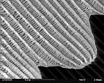
A patch of wing Scales close up A single scale Microstructure of a scale Magnification Approx. ×50 Approx. ×200 ×1000 ×5000


- Original
- The Lepidopteran wing surface is made up of usually coloured scales, shown here at various magnifications. Higher magnifications require scanning electron microscopy to be used, which depicts objects in a greyscale shading.
- Reason
- Illustrates both the structure of a butterfly wing at various scales of magnification, and the relative merits and disadvantages of light vs electron microscopy (for possible later inclusion in microscopy-related articles). All images above current standards. Please review this with fairness towards the contributors rather than the nominator. Thank you.
- Articles in which this image appears
- butterfly, external morphology of Lepidoptera, scale (Lepidoptera)
- FP category for this image
- Wikipedia:Featured pictures/Animals/Insects
- Creators
- Michael Apel (nos. 1 and 2), Shaddack (no. 3), SecretDisc (nos. 4 to 7)
- Support as nominator -- Papa Lima Whiskey ( talk) 14:34, 21 May 2010 (UTC)
- Support wow, high encyclopedic value. -- Alchemist-hp ( talk) 14:56, 21 May 2010 (UTC)
- Enthusiastic support Highly interesting, highly encyclopedic, and access to SEMs doesn’t come cheap and Wikipedia would be better off with more of this sort of thing. Greg L ( talk) 16:17, 21 May 2010 (UTC)
- Oppose The image nominated below Inachis io Lill-Jansskogen.JPG is much better than image one in this set. Image 3 is very fuzzy, noisy, barely meets the size requirements and is most probably not of the same specie. Images 4-7 all have notable blurry lines. Very good EV but the technicals are weak -- Muhammad (talk) 17:13, 21 May 2010 (UTC)
- Strong Support Massive EV in my view; the quality is also excellent for the mediums presented, though a little weaker around image three. I think the third image is, however, forgivable. Cowtowner ( talk) 01:14, 22 May 2010 (UTC)
- Comment I love the idea, but I think some color closeups of the scales that are of the same species and better quality would greatly amplify the series... I do admit those may be quite a difficult task to get unless someone here has access to a good universities biology lab and the desire to get the images (And specimens). The SEM set is wonderful, and I do agree with Muhammad that the nominated image below ( Inachis io Lill-Jansskogen.JPG) would be a better replacement for the first image in the set. I would change to weak support if the first image was changed, support if that was done and the amateur microscopy image was dropped, and strong support if a better microscopy image could be acquired showing the scales in visible light. — raeky ( talk | edits) 18:08, 22 May 2010 (UTC)
- Comment: I'd be inclined to say that just the electron microscope shots would be best- they're quite clearly a "set", while the others are not so much. There are issues with both the first and third shots, and the way you've grouped them in this nomination even shows two distinct subsets.
J Milburn (
talk) 10:47, 25 May 2010 (UTC)
- Numbers 1 and 2 are FPs on Commons. Papa Lima Whiskey ( talk) 14:35, 25 May 2010 (UTC)
- Support: Interesting and High EV. -- Redtigerxyz Talk 16:30, 25 May 2010 (UTC)
Promoted set Nautica Shad es 18:30, 1 June 2010 (UTC)
2008 Chicago skyline
Voting period is over. Please don't add any new votes. Voting period ends on 11 Jun 2010 at 00:06:40 (UTC)


- Reason
- This is a current commons FP that is an update of the classic Chicago Skyline picture from Adler Planetarium. Granting this FP status would enable us to replace the usage of the current FP of this view which dates from 2006.
- Articles in which this image appears
- This is an application to replace the use of the current FP, which is the 2006 Chicago skyline. It would replace usage in the following articles:
Geography of Chicago
List of tallest buildings in Chicago
Historic Michigan Boulevard District
- FP category for this image
- Places
- Creator
- Daniel Schwen ( User:Dschwen)
- Support as nominator -- TonyTheTiger ( T/ C/ BIO/ WP:CHICAGO/ WP:FOUR) 00:06, 2 June 2010 (UTC)
- If I understand correctly, I believe this should be a
delist and replace nomination.
Jujutacular
T ·
C 00:39, 2 June 2010 (UTC)
- I am not sure about protocol, but I am not saying the other image fails to meet FP criteria correctly. I am just saying it is obsolete. I only think that should be delisted if this one is promoted.--
TonyTheTiger (
T/
C/
BIO/
WP:CHICAGO/
WP:FOUR) 01:51, 2 June 2010 (UTC)
- Featured pictures are required to be used in an article. If it's replaced it will no longer meet that criteria.
Jujutacular
T ·
C 04:10, 2 June 2010 (UTC)
- Nomination withdrawn and relisted below-- TonyTheTiger ( T/ C/ BIO/ WP:CHICAGO/ WP:FOUR) 04:49, 2 June 2010 (UTC)
- Featured pictures are required to be used in an article. If it's replaced it will no longer meet that criteria.
Jujutacular
T ·
C 04:10, 2 June 2010 (UTC)
- I am not sure about protocol, but I am not saying the other image fails to meet FP criteria correctly. I am just saying it is obsolete. I only think that should be delisted if this one is promoted.--
TonyTheTiger (
T/
C/
BIO/
WP:CHICAGO/
WP:FOUR) 01:51, 2 June 2010 (UTC)
Not promoted - Withdrawn by nominator. -- jjron ( talk) 13:14, 2 June 2010 (UTC)
Tinder fungus (Fomes fomentarius) in section
Voting period is over. Please don't add any new votes. Voting period ends on 3 Jun 2010 at 07:18:11 (UTC)

- Reason
- Image with EV, featured picture on Wikimedia Commons, featured picture on the Polish language Wikipedia. Used in articles in other national Wikis.
- Articles in which this image appears
- Fomes fomentarius
- FP category for this image
- Wikipedia:Featured pictures/Other lifeforms/Fungi
- Creator
- George Chernilevsky
- Support as nominator -- George Chernilevsky talk 07:18, 25 May 2010 (UTC)
- I sadly have to oppose. The image is only used in a gallery on the English Wikipedia. If the article was expanded and the image was used in a better way, I would certainly be willing to reconsider. J Milburn ( talk) 10:42, 25 May 2010 (UTC)
- It is correct reason by rules? -- George Chernilevsky talk 11:15, 25 May 2010 (UTC)
Not promoted -- Makeemlighter ( talk) 01:30, 3 June 2010 (UTC)
Willis Tower upward pano
Voting period is over. Please don't add any new votes. Voting period ends on 3 Jun 2010 at 00:21:57 (UTC)

- Reason
- This is a featured picture on commons and German Wikipedia. It is also a quality image on commons. Despite being a little light in terms of EV, it represents a masterfully stitched panorama.
- Articles in which this image appears
-
Willis Tower (formerly Sears Tower)
Wacker Drive - FP category for this image
- places
- Creator
- Daniel Schwen User:Dschwen
- Support as nominator -- TonyTheTiger ( T/ C/ BIO/ WP:CHICAGO/ WP:FOUR) 00:21, 25 May 2010 (UTC)
- Oppose: Not so sure about the EV. To me, a photo with the most of Sears Tower, similar to a File:Sears Tower ss.jpg in a vertical fashion has higher EV. An slanting tower with three other buildings does not appeal to me. -- Redtigerxyz Talk 16:23, 25 May 2010 (UTC)
- The idea behind this image was to get the main entrance with the new building name on one picture together with the recognizable three-tiered silhouette of the building. I am personally pretty happy with the result, from an "EV" standpoint (the building remains recognizable even from this view, which is how many pedestrians see it by the way) and from an aesthetic standpoint (the picture has a fairly unique look to it which goes beyond haphazard pretty lighting conditions). But the Arkansas-State-Capitol-incident in mind, I am not surprised to see oppose votes here (not meant to sound bitter, just a personal comment on what I perceive to be the general taste in this forum). -- Dschwen 16:38, 25 May 2010 (UTC)
- Support I think a street level view is equally valuable as one taken from a more conventional (in the FP sense) angle. The image quality is up to par in my view. My one complaint might be the lighting which is somewhat flat but allows for an unadultered view of the subject. Cowtowner ( talk) 02:08, 26 May 2010 (UTC)
- Weak support It's nice that it also shows the new protruding observation decks near the top. -- mcshadypl T C 06:14, 26 May 2010 (UTC)
- Question Is
User:Dschwen considered a supporter of this nom or any of his other images that I nominated without asking him?--
TonyTheTiger (
T/
C/
BIO/
WP:CHICAGO/
WP:FOUR) 07:31, 26 May 2010 (UTC)
- I haven't got the time to read all the rules myself, but I would imagine the creator of the picture would not be able to vote myself...
Gazhiley (
talk) 10:31, 26 May 2010 (UTC)
- The creator of the picture is allowed to vote. Frequently, the creator is also the nominator, and the nominator is considered a voter... However, we can't assume his support. J Milburn ( talk) 10:33, 26 May 2010 (UTC)
- I haven't got the time to read all the rules myself, but I would imagine the creator of the picture would not be able to vote myself...
Gazhiley (
talk) 10:31, 26 May 2010 (UTC)
- Support btw... Though I would rather it on a nicer day as I think a bit more light would help the picture be more appealing, but that's purely asthetic... Gazhiley ( talk) 10:36, 26 May 2010 (UTC)
- Support. Well ok, to make it official ;-). -- Dschwen 13:09, 26 May 2010 (UTC)
- Oppose. I will assume and accept that it isn't really possible to take the photo from further away and that this is probably the best compromise for projection/composition, but the distortion is a bit confusing and it doesn't illustrate the building well enough. Ðiliff «» (Talk) 13:29, 26 May 2010 (UTC)
- Oppose. This picture simply fails to give a genuine idea about what the building is like - unlike other illustrations in the article. It barely looks like a skyscraper, and definitely doesn't show its interesting overall structure - it just looks like a boring relatively tall building. Moreover, the lighting is just bad. -- Desiderius82 ( talk) 18:04, 26 May 2010 (UTC)
- Weak Support It's true the lighting is flat and it doesn't show the bundled tube design of the Sears tower as well as some other images, but it's an eye catching perspective and shows what it's like at the base of this tower, as people would see it in the vicinity. There's no difficulty seeing this building is much taller than the surrounding medium-height high rises. And there's no rule that only one FP is allowed, only that an FP is "among the best examples of a given subject." It's well done for what it's trying to do. Fletcher ( talk) 23:43, 26 May 2010 (UTC)
- Weak Oppose While I agree that the building could deserve a street view FP (rather than the usual skyline shot), and acknowledging that is a smart composition, I find it still too distorted, flat lit and with limited EV, as it does not really provide much information about the street context. The name plaque is not so significant IMO, to justify this. I think a perspective from
further away could be more informative. --
Elekhh (
talk) 00:43, 27 May 2010 (UTC)
- Oh my god, where did you find that amazing picture? ;-P --
Dschwen 01:45, 27 May 2010 (UTC)
- I'm sorry if you find it perverse to use one of your images as evidence for an argument against another of your images... Your overall contribution to the debate is much appreciated :). --
Elekhh (
talk) 02:12, 27 May 2010 (UTC)
- I don't find that perverse at all. I'm happy you noticed that picture. Everyone is certainly entitled to their preferences. If you don't think this particular shot is worth being featured, so be it. I just object to the notion, that this picture would have been better if taken with a different perspective. It would be a completely different shot with different intention. FWIW the distortions are surprisingly small for the large angle that is covered and the end result reproduces my impressions from the scene surprisingly well (3D would be way better though ;-) ). -- Dschwen 03:48, 27 May 2010 (UTC)
- I'm sorry if you find it perverse to use one of your images as evidence for an argument against another of your images... Your overall contribution to the debate is much appreciated :). --
Elekhh (
talk) 02:12, 27 May 2010 (UTC)
- Oh my god, where did you find that amazing picture? ;-P --
Dschwen 01:45, 27 May 2010 (UTC)
- Weak support I'd full support if it were a nice day with a bright blue sky. Call me picky, if you must. Otherwise, I think this is a fine shot. upstate NYer 02:46, 27 May 2010 (UTC)
- Oppose Weak EV - I don't see why a photo of this building looking straight up is needed when you can take a better photo of pretty much the same thing from a few blocks away - and there's no excuse for the poor lighting given that the building isn't going anywhere (I hope!) and can be photographed again on a sunny day. Nick-D ( talk) 08:56, 27 May 2010 (UTC)
Not promoted -- Makeemlighter ( talk) 01:30, 3 June 2010 (UTC)
Long exposure of a freeway
Voting period is over. Please don't add any new votes. Voting period ends on 4 Jun 2010 at 01:04:58 (UTC)

- Reason
- The photo brilliantly illustrates both the nighttime traffic flow on the highway that is the subject, as well as one of the effects of taking a long-term exposure of moving lights.
- Articles in which this image appears
- Long exposure photography, Ontario Highway 401
- FP category for this image
- Wikipedia:Featured pictures/Engineering and technology/Others
- Creator
- Kennymatic (Flickr user, CC-2.0-attribution)
- Support as nominator -- ʄɭoʏɗiaɲ τ ¢ 01:04, 26 May 2010 (UTC)
- Support It beautifully illustrates the concept of night-time, long exposures. Greg L ( talk) 01:21, 26 May 2010 (UTC)
- Support Awesome night shot of Highway 401! The long exposure really enhances the photograph, showing how busy the highway is even well into the night. Haljackey ( talk) 01:24, 26 May 2010 (UTC)
- Support A great example of long exposure photography and is well composed. Jdenm8 ( talk) 02:19, 26 May 2010 (UTC)
- Support As I did before. Cowtowner ( talk) 04:47, 26 May 2010 (UTC)
- Comment I'm confused. Wasn't this just
nominated?
Makeemlighter (
talk) 05:11, 26 May 2010 (UTC)
- Me too. It was withdrawn and nominated here in less than 30 mins? And the votes here look a bit dubious... --
Muhammad
(talk) 06:49, 26 May 2010 (UTC)
- I'd presume that the claim to EV is now in Long exposure photography. Noodle snacks ( talk) 07:23, 26 May 2010 (UTC)
- Really, Muhammad: “dubious”??? It’s just like Noodle snacks wrote, above. Read the concluding threads on
the closed nomination. I wrote there that if this picture was renominated on the basis of supporting
Long exposure photography, I could vote ‘support’ (a change from my original ‘oppose’ vote). The nominator withdrew it, renominated in context of the new article (with the appropriate caption), and I voted as pledged. Seeing the withdrawal, I simply wikistalked Floydian to find this nomination before it got transcluded into FP’s main page. No collusion and no forgeries; just people who were active in the withdrawal & renomination process.
Greg L (
talk) 14:18, 26 May 2010 (UTC)
- Muhammad is probably talking about Jdenm8, who had 7 contributions before supporting here. Jujutacular T · C 14:55, 26 May 2010 (UTC)
- Me too. It was withdrawn and nominated here in less than 30 mins? And the votes here look a bit dubious... --
Muhammad
(talk) 06:49, 26 May 2010 (UTC)
- Support Great EV for LE - not so sure about 401 as the method of photography does not give a full view of how busy it is - it could just be 1 or 2 cars per lane for all we know... Gazhiley ( talk) 10:23, 26 May 2010 (UTC)
- Oppose Still much too noisy. See
this photo for a good nighttime long-exposure (already featured).
Jujutacular
T ·
C 14:48, 26 May 2010 (UTC)
- Say… that is a splendid photograph of architecture. However, its time-smeared elements aren’t nearly as pronounced and notable as in this one. It clearly adds EV at its primary use (
Munich); not so much to
Long exposure photography.
Greg L (
talk) 15:23, 26 May 2010 (UTC)
- I'm not saying it should replace this photo in
long exposure photography, I'm saying it is an example of long exposure nighttime photography that is of much higher quality.
Jujutacular
T ·
C 16:49, 26 May 2010 (UTC)
- Indeed. That photo is an outstanding long exposure nighttime photograph. It was well deserving of its FP status. Greg L ( talk) 17:56, 26 May 2010 (UTC)
- I'm not saying it should replace this photo in
long exposure photography, I'm saying it is an example of long exposure nighttime photography that is of much higher quality.
Jujutacular
T ·
C 16:49, 26 May 2010 (UTC)
- Say… that is a splendid photograph of architecture. However, its time-smeared elements aren’t nearly as pronounced and notable as in this one. It clearly adds EV at its primary use (
Munich); not so much to
Long exposure photography.
Greg L (
talk) 15:23, 26 May 2010 (UTC)
- Support: Good EV for Long exposure photography. Pronounced effect. I would replace this picture in Ontario Highway 401, if a better replacement is available. -- Redtigerxyz Talk 16:02, 26 May 2010 (UTC)
- Oppose Too noisy. If it's going to serve as an example of a type of photography it should be technically very strong, but isn't. And it should not have been renominated as we pointed out this flaw previously.
Fletcher (
talk) 21:42, 26 May 2010 (UTC)
- Gee. Not even an “IMHO” at the end of your post, Fletcher?? I do hope you will forgive those who think the noise more of a gray area than the deal-breaking matter of pure fact your opinion might lead one to believe. I also note your “ Royal ‘we’ ” (as in …“as we pointed out this flaw previously”) in the previous nomination. Looking over that now-closed thread, I’m not seeing anyone else there being concerned about noise, so it appears by “we”, you mean “you.” I guess my willingness to overlook such a minor shortcoming means I may never be Charlie the Tuna material with exceedingly good taste. (* sigh*) Greg L ( talk) 22:07, 26 May 2010 (UTC)
- Oppose per Fletcher and Juju. upstate NYer 02:31, 27 May 2010 (UTC)
- Oppose, don't like the composition. Too tight at the top (or crop off more), cropped lamppost at the bottom.
Also the withdraw/renominate procedure is a bit fishy. -- Dschwen 17:22, 28 May 2010 (UTC)- Nope... just a withdrawl and renomination, but you're welcome to look through the histories and logs and do some sleuth work if you think there is a big coverup here. The initial nomination was far too underway to add something to it, and several editors felt that the picture was worthy, but that its usage did not produce the highest EV. -
ʄɭoʏɗiaɲ
τ
¢ 17:47, 28 May 2010 (UTC)
- Ok, but all that changed since the nomination-reset is the inclusion in Long Exposure Photography. Sorry, I'm just not in love with this pic :-(. -- Dschwen 20:40, 28 May 2010 (UTC)
- Nope... just a withdrawl and renomination, but you're welcome to look through the histories and logs and do some sleuth work if you think there is a big coverup here. The initial nomination was far too underway to add something to it, and several editors felt that the picture was worthy, but that its usage did not produce the highest EV. -
ʄɭoʏɗiaɲ
τ
¢ 17:47, 28 May 2010 (UTC)
- Oppose per Dschwen. The composition is below par for something that's as common as long exposure of motorways. These photos should be of a very high standard for it to be FP as it is easily reproducible. -- antilived T | C | G 02:49, 29 May 2010 (UTC)
- Support Although not a scholar of photography, I consider this an appealing image.-- TonyTheTiger ( T/ C/ BIO/ WP:CHICAGO/ WP:FOUR) 22:54, 2 June 2010 (UTC)
- Oppose - Nice shot, but I´m not comfortable with the image noise. - ☩ Damërung ☩ . -- 00:24, 3 June 2010 (UTC)
Not promoted -- Nautica Shad es 00:20, 5 June 2010 (UTC)
Knight's Tour
Voting period is over. Please don't add any new votes. Voting period ends on 3 Jun 2010 at 18:24:24 (UTC)


- Reason
- An extremely simple (23kb) animation that nevertheless illustrates the chess and mathematics concept of a Knight's tour.
- Articles in which this image appears
- Knight's tour
- FP category for this image
- Wikipedia:Featured pictures/Diagrams, drawings, and maps/Diagrams
- Creator
- Ilmari Karonen
- Support as nominator -- Spikebrennan ( talk) 18:24, 25 May 2010 (UTC) and support alt 1 but not alt 2 (because the checkerboard pattern in alt 2 is more confusing than helpful) Spikebrennan ( talk) 03:58, 3 June 2010 (UTC)
- Comment Very interesting. High encyclopedic value to be sure. I could support if the color of the squares changed when the knight has reached them. As it is, it's not immediately clear when the tour has been completed. Jujutacular T · C 18:38, 25 May 2010 (UTC)
- I was thinking the same while watching it before i read the comments. Also i'd prefer it to go a bit faster. Qwfp ( talk) 21:36, 25 May 2010 (UTC)
OpposeSupport Alt - squares should be color-coded for status and the animation needs to be faster. Kaldari ( talk) 22:12, 25 May 2010 (UTC)- Agreed that this has great potential, but I agree that we need some sort of colouration. For a start, it would be good if there was a white/black divide, and, secondly, it would be nice if there was some way of differentiating between visited squares and squares at which the knight is yet to arrive. J Milburn ( talk) 23:36, 25 May 2010 (UTC)
- Comment. By the end of the tour the board is getting rather crowded. It would be nice if there were some way to more easily determine which steps were new. Here's an idea: Give the path a border. Newer parts of the path should draw over older parts. Then it will be clearer what happened when. (I would also like to echo others' comments on coloration. It would be nice if the chessboard squares traditionally colored white and the chessboard squares traditionally colored black were differentiated, and it would be nice if the squares that have already been visited were colored. And it should be faster.). Ozob ( talk) 02:42, 26 May 2010 (UTC)
- Oppose: The speed and the coloring are issues but even if they were fixed this image wouldn't say FP to me. It illustrates the concept but it's not particularly eye-catching or artistic. Mathematics is often not a very visual subject. When it is you can get stunning images but this doesn't seem to be one of those cases.-- RDBury ( talk) 15:27, 26 May 2010 (UTC)
- Per Spikebrennan's request on my talk page and the comments above, I've prepared an alternative version with shading of visited squares and with twice the speed of the original. Also, now that GIF scaling works again, I've rendered the new version twice as large as the original (which still leaves it under the 12.5Mpx limit). I've also updated the Perl source to match the version used to generate this new version. — Ilmari Karonen ( talk) 17:17, 26 May 2010 (UTC)
- Strong support ALT I knew that adding color would make the animation clearer, but wow, it is extremely revealing of the pattern. Most interesting is the formation achieved precisely halfway through the tour.
Jujutacular
T ·
C 17:39, 26 May 2010 (UTC)
- Support either alts, prefer alt 1. Jujutacular T · C 02:06, 3 June 2010 (UTC)
- Support Alt only. Without question excellent. Cowtowner ( talk) 03:07, 27 May 2010 (UTC) (was not logged in at the time)
- Support Alternative 1, Neutral on Alternative 2. Well executed, informative animation. Nautica Shad es 20:19, 26 May 2010 (UTC)
- Oppose. This is better than the original, but I think it can be made better still.
- The black and white squares should start out colored in their traditional manner; or better yet, colored similarly to File:Knights-Tour-Animation.gif. When a square has been visited, shade it, but preserve the underlying coloring. I think it would look good if you tinted visited squares blue.
- The board still gets crowded by the end. As I said above, I think the solution to this is to put a border around the path so that the order in which the squares were visited is a bit more clear.
- Replace the arrowhead with a picture of a knight. Ozob ( talk) 00:12, 27 May 2010 (UTC)
- It sounds like what you really want is
File:Knights-Tour-Animation.gif, only with a larger board? That would not be hard to do. —
Ilmari Karonen (
talk) 12:10, 27 May 2010 (UTC)
- Almost, but not quite. File:Knights-Tour-Animation.gif does not display the path that the knight took, and I'd rather that the visited squares were tinted instead of having a ×. Ozob ( talk) 02:15, 28 May 2010 (UTC)
- I'm even more pleased with Alt 2, now that it's up. I have some further comments, though:
Several other editors have commented that the picture looks "too busy" or "too confusing". I think I have an exegesis of that idea: When I looked at this picture on my iPhone, I thought that the light squares were pure white and the dark squares were pure black. Where the path crossed the dark squares, it was invisible. When I looked at this picture on a full-sized monitor, I was able to see that the dark squares are actually a deep brown, but they are still very dark. Because the color of the dark squares is so dark and the color of the light squares is so light, there is a tremendous amount of contrast in the picture.
If you do a Google image search for "chessboard", you turn up three different kinds. (1) Computer generated. These are usually pure black on pure white; sometimes they are gray on white or dark gray on light gray. (2) Photos of real chessboards. These are usually dark and light wood. (3) Exotic collectors' sets. Of these, I think the most visually pleasing (for our purposes) would be (2). Alt 2 is a variant of (1), whose colors I think are too visually chaotic to be comfortable with.
As before, I still do not like an unadorned black path, and I would still like it to have a border. With a slight border it would be easier to see it against the squares of the chessboard (no matter what color they are), and it would be possible to tell which moves came first and which last. I also still think it would be good to replace the arrowhead by a knight figure. Ozob ( talk) 22:56, 2 June 2010 (UTC)
- Oppose (for now) Having not read any of the above discussion, my initial reaction is that the colors of the squares should be checkered, black and white. After that, I can see the interesting nature of this concept and can support it, but only if it actually looks like a chess board to the mass public. upstate NYer 02:34, 27 May 2010 (UTC)
- I think a closed tour (i.e. knight returns to starting square) would be more interesting -- 118.139.11.47 ( talk) 23:23, 27 May 2010 (UTC)
- Support alt. Excellent animation of the concept. For the purpose of this illustration, actual square color isn't really significant. It's worthwhile to use white and gray to designate which squares have been visited.
Durova
412 23:43, 31 May 2010 (UTC)
- None of the additional decoration is necessary; not even shading the visited squares is necessary. The question is, how can the information be presented in the most useful and beautiful way possible? For that I think the square color is significant: Not only does it help observers relate the diagram to actual chessboards, but it will help them to see that the knight must switch from a dark square to a light one or vice versa at every step (which is an important fact for the mathematical study of knight's tours). I think that this picture has got a lot of potential, and I hope to see a revised version soon.
Ozob (
talk) 02:56, 2 June 2010 (UTC)
- Every possible move a knight can make will switch from dark to light or vice versa, that's not a specific aspect of the knight's tour. Jujutacular T · C 03:52, 2 June 2010 (UTC)
- None of the additional decoration is necessary; not even shading the visited squares is necessary. The question is, how can the information be presented in the most useful and beautiful way possible? For that I think the square color is significant: Not only does it help observers relate the diagram to actual chessboards, but it will help them to see that the knight must switch from a dark square to a light one or vice versa at every step (which is an important fact for the mathematical study of knight's tours). I think that this picture has got a lot of potential, and I hope to see a revised version soon.
Ozob (
talk) 02:56, 2 June 2010 (UTC)
- Support alternative 1. Alternative 2 shows light/dark squares with a red tint for visited tiles. Personally I find it version too confusing to support - there's just too much information to take in at once. Time3000 ( talk) 18:08, 2 June 2010 (UTC)
- Support alt1, weak support alt2, neutral original. Have fun, closer. J Milburn ( talk) 11:01, 3 June 2010 (UTC)
- Support Alt 1, weak support original - these show the concept well. Oppose Alt 2 - the colour of the squares is unnecessary information, and makes it harder to see what's going on. Ephemeronium ( talk) 12:17, 3 June 2010 (UTC)
Promoted File:Knight's tour anim 2.gif -- Makeemlighter ( talk) 01:46, 5 June 2010 (UTC)
Janne Wirman
Voting period is over. Please don't add any new votes. Voting period ends on 5 Jun 2010 at 11:31:39 (UTC)

- Reason
- Keyboardist with keyboard, on stage, during a show, typically attired. Composition could be better, but resolution and quality are okay. And I like yellow.
- Articles in which this image appears
- Janne Wirman
- FP category for this image
- Wikipedia:Featured pictures/People/Entertainment
- Creator
- Tuomas Vitikainen
- Support as nominator — Maedin\ talk 11:31, 27 May 2010 (UTC)
- Oppose- It looks like the best image of him on Commons but is not an exceptional photo (blurry areas on him, blown highlights, grainy). Also the guy is young other better pictures can appear. Gnemetropos ( talk) 16:58, 27 May 2010 (UTC)
- Oppose: I would love to support a picture like this, but, although this is emotive, I can certainly imagine a better shot of him. J Milburn ( talk) 10:04, 28 May 2010 (UTC)
Not promoted -- Makeemlighter ( talk) 01:57, 5 June 2010 (UTC)
Jesse Jackson 1983
Voting period is over. Please don't add any new votes. Voting period ends on 5 Jun 2010 at 00:00:36 (UTC)


- Reason
- This is an encyclopedic image with high EV throughout the project. The image is used broadly on wikipedia in two versions as depicted herewith. This nomination is about the uncropped version. If it passes or fails, I may still nominate the cropped version as a WP:VPICS.
- Articles in which this image appears
-
Jesse Jackson presidential campaign, 1988
Jesse Jackson presidential campaign, 1984
Jesse Jackson
Rainbow/PUSH
Jesse Jackson, Jr.
Omega Psi Phi
Civil rights movement
Bradley effect
South Side (Chicago)
North Carolina Agricultural and Technical State University
1988 Democratic National Convention
Democratic Party (United States) presidential primaries, 2000 - FP category for this image
- people
- Creator
- Warren K. Leffler, U.S. News & World Report
- Support as nominator -- TonyTheTiger ( T/ C/ BIO/ WP:CHICAGO/ WP:FOUR) 00:00, 27 May 2010 (UTC)
- Question Which image is being nominated? File:Jesse Jackson, half-length portrait of Jackson seated at a table, July 1, 1983.jpg? If so the other image is unnecessary and causing confusion, I recommend deleting the box with two images and links... — raeky ( talk | edits) 02:33, 27 May 2010 (UTC)
- Oppose This probably best belongs being considered at WP:VPC as it clearly “adds significantly to articles” it is in. Here, there is a high standard for excellence as regards technical quality. I think this image has excellent lighting and contrast range. However, I find that this is not “of a high technical standard”. The 3200 pixel width is clearly oversampled as film grain can be seen even at one-quarter that resolution. Though it could be photoshopped very easily, the hair on the original negative doesn’t help. Among gray-scale images, I can’t see how this can be considered as being “among Wikipedia's best work”. Greg L ( talk) 03:03, 27 May 2010 (UTC)
- Conditional Support I think this image easily checks the boxes for indoor no-flash 35mm photography, though it is currently oversampled. Pending a down sample (and hopefully a removal of the hair) I would support this.
Cowtowner (
talk) 04:10, 27 May 2010 (UTC)
- What is a down sample?--
TonyTheTiger (
T/
C/
BIO/
WP:CHICAGO/
WP:FOUR) 04:33, 27 May 2010 (UTC)
- Less digital resolution so it is appropriate given the film grain.
Greg L (
talk) 05:52, 27 May 2010 (UTC)
- As a GIMP newbie, I am not sure if that is within my powers. Plus, I certainly wouldn't know how to remove a hair, even if I could see it.-- TonyTheTiger ( T/ C/ BIO/ WP:CHICAGO/ WP:FOUR) 06:08, 27 May 2010 (UTC)
- Actually, I see the hair now on his open hand, but am powerless to fix it.--
TonyTheTiger (
T/
C/
BIO/
WP:CHICAGO/
WP:FOUR) 06:09, 27 May 2010 (UTC)
- We have
Wikipedia:Graphic_Lab/Photography_workshop... —
raeky (
talk |
edits) 07:45, 27 May 2010 (UTC)
- I personally can't see any hair in his open hand - to me tthe hair cowtowner is refering to is the above his right shoulder above his ear level...
Gazhiley (
talk) 09:25, 27 May 2010 (UTC)
- I guess that was his jacket cuff in the background. I don't see anything at ear level. I see a white scratch or hair near the top of his hairline level. Does this nomination need to be suspended for the graphics lab request?-- TonyTheTiger ( T/ C/ BIO/ WP:CHICAGO/ WP:FOUR) 13:15, 27 May 2010 (UTC)
- I personally can't see any hair in his open hand - to me tthe hair cowtowner is refering to is the above his right shoulder above his ear level...
Gazhiley (
talk) 09:25, 27 May 2010 (UTC)
- We have
Wikipedia:Graphic_Lab/Photography_workshop... —
raeky (
talk |
edits) 07:45, 27 May 2010 (UTC)
- Less digital resolution so it is appropriate given the film grain.
Greg L (
talk) 05:52, 27 May 2010 (UTC)
- What is a down sample?--
TonyTheTiger (
T/
C/
BIO/
WP:CHICAGO/
WP:FOUR) 04:33, 27 May 2010 (UTC)
- Support edit I have submitted an edit removing the scratch or whatever it was. The big problem with the image is actually the motion blur of his hand. You may wish to consider
this FP of Saddam Hussein, where the picture's EV won out over the technical flaw. While Jackson is still alive, unlike Hussein, this picture was taken when he was younger and, I would say, much more relevant than he is now - so it can't be replaced by a more recent image of higher quality. The downsample was to 75%, where it is still grainy, but I thought it better to err on the side of too much resolution than too little. I can provide the edit at full resolution if people find downsampling objectionable.
Fletcher (
talk) 23:35, 27 May 2010 (UTC)
- Thanks for your technical assistance. Did you also correct the other version that is also widely used on WP?-- TonyTheTiger ( T/ C/ BIO/ WP:CHICAGO/ WP:FOUR) 23:59, 27 May 2010 (UTC)
- Support Edit. Good portrait, good EV, and the quality isn't bad. Nautica Shad es 11:23, 28 May 2010 (UTC)
- Support edit This photo really brings out the personality of the subject. I actually like the blurriness of the hand because it indicates motion (or seems to, maybe it's a depth of field issue). Can the graininess of the original photo be smoothed out more? It very noticeable when viewed at full resolution. In general, candid shots should be encouraged here.-- RDBury ( talk) 19:34, 28 May 2010 (UTC)
- Question If the edited version passes, is ther a protocol for replacing the image in articles?-- TonyTheTiger ( T/ C/ BIO/ WP:CHICAGO/ WP:FOUR) 07:40, 30 May 2010 (UTC)
- Support edit Excellent photo which easily meets the criteria Nick-D ( talk) 11:27, 31 May 2010 (UTC)
- Oppose. A 1.35MB edit of a 30MB TIFF? It doesn't happen every day that we get an original resolution that good; no reason to waste it. Also, quite a number of dust marks were missed and nothing was done to correct for fade. Durova 412 23:35, 31 May 2010 (UTC)
- The "original" in this case is photographic film. You can scan it to create whatever size TIFF you want but the film only captured so much information so at a certain point higher resolution gives you nothing but individual grains in the film emulsion. If the photo was a long exposure in bright light of a still subject in perfect focus then there might be 30 megs of information, but in this case there is 1 meg of information and 29 megs of noise. Not that I have any issues with the photographic quality, we don't need Ansel Adams here, but you shouldn't oppose the nomination based on file size.-- RDBury ( talk) 01:23, 2 June 2010 (UTC)
- Oppose While the quality of the original/edit are disputed, the EV is lacking. Considering the subject, the context of the image seems generic. Nothing in the image by itself says much about the subject and the long list of reasons he is worth reading about.
Afrazn Beauti (
talk) 04:14, 1 June 2010 (UTC)
- It's actually an excellent piece of photojournalism: the eyes and hands are very expressive. If the original weren't downsampled so badly I'd support an unedited version for FP.
Durova
412 04:31, 1 June 2010 (UTC)
- Are you saying that the noise is induced by downsampling, rather than being an artifact of high film grain? I might reconsider if you could clarify. Mostlyharmless ( talk) 04:23, 3 June 2010 (UTC)
- It's actually an excellent piece of photojournalism: the eyes and hands are very expressive. If the original weren't downsampled so badly I'd support an unedited version for FP.
Durova
412 04:31, 1 June 2010 (UTC)
- Support edit, per Fletcher. Mostlyharmless ( talk) 05:38, 2 June 2010 (UTC)
Promoted File:Jesse Jackson, half-length portrait of Jackson seated at a table, July 1, 1983 edit.jpg -- Jujutacular T · C 08:23, 5 June 2010 (UTC)
Michelle Obama official portrait headshot
Voting period is over. Please don't add any new votes. Voting period ends on 7 Jun 2010 at 00:19:40 (UTC)

- Reason
- I don't think we should be waiting for a better shot of her. This has high EV and is high quality. This and another full length crop from her official portrait are used throughout WP. I would nominate the uncropped version, but it is not used on WP. The other version is currently a VP nom at Wikipedia:Valued picture candidates/Michelle Obama official portrait crop
- Articles in which this image appears
-
Michelle Obama
List of Alpha Phi Omega members
Family of Barack Obama
List of First Ladies of the United States
List of current United States first spouses - FP category for this image
- People
- Creator
- Joyce N. Boghosian, White House photographer
- Support as nominator -- TonyTheTiger ( T/ C/ BIO/ WP:CHICAGO/ WP:FOUR) 00:19, 29 May 2010 (UTC)
- Strong oppose. Really don't like the composition of this (or any of the others, but particularly the headshot). It's far too front-on, and cropping out both arms just doesn't work IMO. And the resolution is just sub-par in the headshot crop. Yes, it's above the minimum specs, but it's not sharp. Ðiliff «» (Talk) 19:13, 30 May 2010 (UTC)


Center: cropped portrait used in African American, First Lady of the United States, Office of the First Lady of the United States, List of First Ladies of the United States
Right: cropped headshot used in Michelle Obama, List of Alpha Phi Omega members, Family of Barack Obama, List of First Ladies of the United States, List of current United States first spouses
- Oppose The quality isn't very good. Additionally, what's with her eyes and forehead? Her hair is raised too high in my opinion. Haljackey ( talk) 05:05, 31 May 2010 (UTC)
- Reluctant oppose. Fantastic expression. Too bad about the composition: the curtain looks like it's growing out of her head. Durova 412 23:29, 31 May 2010 (UTC)
- Oppose The curtain thing is hilarious with the crop, but I don't see the EV. Afrazn Beauti ( talk) 04:09, 1 June 2010 (UTC)
- Oppose She has helmet hair. I like the curtain growth though. :) Maddie talk 01:08, 3 June 2010 (UTC)
Not promoted -- Makeemlighter ( talk) 07:53, 6 June 2010 (UTC)
Phidippus mystaceus jumping spider
Voting period is over. Please don't add any new votes. Voting period ends on 5 Jun 2010 at 20:25:56 (UTC)

- Reason
- Glorious closeup, makes the spider look like an alien, or a teddy bear. Bright background colour unusual. Reminds me a bit of the Honey Monster.
- Articles in which this image appears
- Phidippus_mystaceus Jumping_spider
- FP category for this image
- Wikipedia:Featured_pictures/Animals/Arachnids
- Creator
- User:Opoterser
- Support as nominator -- Mr badcrumble ( talk) 20:25, 27 May 2010 (UTC)
- Support Love it. Greg L ( talk) 22:13, 27 May 2010 (UTC)
- Support wow! hasa wow factor. Casliber ( talk · contribs) 23:15, 27 May 2010 (UTC)
- Oppose I'm not sold that this image is up to our standards for insect and arachnids. The DOF is shallow and the resolution is limited. The other FP on the jumping spider page is of a considerably higher quality. Cowtowner ( talk) 23:58, 27 May 2010 (UTC)
- Oppose Definitely has wow, but it's too small. -- Avenue ( talk) 05:29, 28 May 2010 (UTC)
- Oppose, I'm afraid I have to agree. I am willing to ignore the size requirements when appropriate, but, despite the rather fascinating subject, this does not come up to the standard we've come to expect from our multitude of (for want of a better term) creepy-crawly pictures. J Milburn ( talk) 10:03, 28 May 2010 (UTC)
- Support As a non-technical photography buff, I like this better than
 , which is overcropped, IMO. I think this has astounding creepy-crawly wow!--
TonyTheTiger (
T/
C/
BIO/
WP:CHICAGO/
WP:FOUR) 14:12, 28 May 2010 (UTC)
, which is overcropped, IMO. I think this has astounding creepy-crawly wow!--
TonyTheTiger (
T/
C/
BIO/
WP:CHICAGO/
WP:FOUR) 14:12, 28 May 2010 (UTC)
-
 Noodle snacks (
talk) 01:58, 29 May 2010 (UTC)
Noodle snacks (
talk) 01:58, 29 May 2010 (UTC)
- Why isn't this picture, which is an FP, even in the article. Is it the same species?-- TonyTheTiger ( T/ C/ BIO/ WP:CHICAGO/ WP:FOUR) 01:05, 30 May 2010 (UTC)
-
- Oppose Images are supposed to illustrate the subject. Unless the subject is "Things that look like aliens from a certain angle" I don't see how this qualifies. I'm not even convinced that it belongs on WP at all.-- RDBury ( talk) 19:15, 28 May 2010 (UTC)
- Support EV definitely there, DOF is good, resolution not an issue yet. Why everybody gets hung up on captions and rationales, I will never understand. Anyway, if some of you would be willing to use or upload the rest of these images, that will be time well spent. Papa Lima Whiskey ( talk) 10:26, 30 May 2010 (UTC)
- Oppose. I don't think it's particularly clear exactly what we're looking at. Noodle Snacks' ultramacro might have very limited DOF, but at least you can see a little more clearly the individual features/limbs etc. This one looks more like a furry Jabba the Hutt to me. :-) Ðiliff «» (Talk) 19:18, 30 May 2010 (UTC)
- Weak Support the picture itself is very good but I have to agree with the comments above. It needs to significantly add to a significant article.
Haljackey (
talk) 05:06, 31 May 2010 (UTC)
- That's not quite correct. It needs to significantly add to *any* article. It's not for FPC to decide whether a subject is notable enough for an article - the process for that is AfD. Papa Lima Whiskey ( talk) 09:31, 31 May 2010 (UTC)
- Comment Can someone explain to me why the featured pictures (
and
) are not in the
Phidippus_mystaceus article and only one is in
Jumping_spider, while this one is in both?--
TonyTheTiger (
T/
C/
BIO/
WP:CHICAGO/
WP:FOUR) 15:37, 31 May 2010 (UTC)
- There are around 5000 *known* species of jumping spider, of which P. mystaceus is one. HTH Papa Lima Whiskey ( talk) 16:48, 31 May 2010 (UTC)
- Oppose - Per Dilif´s comment. - ☩ Damërung ☩ . -- 00:20, 3 June 2010 (UTC)
Not promoted -- Makeemlighter ( talk) 07:53, 6 June 2010 (UTC)
The Drunkard's Progress
Voting period is over. Please don't add any new votes. Voting period ends on 10 Jun 2010 at 23:56:37 (UTC)

- Reason
- This is a lithograph by Nathaniel Currier supporting the temperance movement by showing the stages of alcoholism in the United States. The lithograph was drawn in January 1846 to support the growing anti-alcoholism sentiment which culminated in the United States with the passage of the 18th amendment to the United States Constitution, which outlawed the manufacture, transportation and sale of all alcoholic beverage within the United States. Despite its best intentions, the amendment proved to be a spectacular failure, and was ultimately repealed by the 21st amendment.
- Articles in which this image appears
- Prohibition, Temperance movement, Teetotalism, Prohibition Party, Anti-Saloon League, International Organisation of Good Templars, World League Against Alcoholism, Methodist Board of Temperance, Prohibition, and Public Morals, National Temperance Society and Publishing House, Flying Squadron of America, Prohibition in the United States
- FP category for this image
- link to category from WP:FP that best describes the image (check categories first)
- Creator
- Nathaniel Currier
- Support as nominator -- TomStar81 ( Talk) 23:56, 1 June 2010 (UTC)
- Oppose. I love the image, and have seen it before many times, but unfortunately the scan is just not up to FP standards. Nautica Shad es 10:06, 2 June 2010 (UTC)
- Oppose At the highest resolutions, some of the print hard to read.-- TonyTheTiger ( T/ C/ BIO/ WP:CHICAGO/ WP:FOUR) 22:43, 2 June 2010 (UTC)
- Oppose per TonyTheTiger. The Utahraptor Talk 00:43, 3 June 2010 (UTC)
- Oppose. Detail/image quality is lacking. Ðiliff «» (Talk) 10:01, 3 June 2010 (UTC)
- Oppose, as above. I'd love to support this, but the scan just isn't quite there. J Milburn ( talk) 10:55, 3 June 2010 (UTC)
Not promoted -- Jujutacular T · C 14:11, 7 June 2010 (UTC)
- Closed per WP:SNOW. Jujutacular T · C 14:11, 7 June 2010 (UTC)
Wesley Clark
Voting period is over. Please don't add any new votes. Voting period ends on 9 Jun 2010 at 00:42:38 (UTC)

- Reason
- This is a high quality and high EV image
- Articles in which this image appears
-
Wesley Clark
List of awards and nominations received by Wesley Clark
Oklahoma Democratic primary, 2004
Valedictorian
1999 NATO bombing of Yugoslavia
Kosovo War
Democratic Party (United States) presidential primaries, 2004
United States presidential election, 2004
List of United States Military Academy alumni
Supreme Headquarters Allied Powers Europe
Democratic Party (United States) presidential candidates, 2008
Democratic Party (United States) vice presidential candidates, 2008 - FP category for this image
- People
- Creator
- United States Army
- Support as nominator -- TonyTheTiger ( T/ C/ BIO/ WP:CHICAGO/ WP:FOUR) 00:42, 31 May 2010 (UTC)
- Comment: I'm normally happy to support pictures like this (unlike many) but this one is really, really dusty. What's the deal with that?
J Milburn (
talk) 10:49, 31 May 2010 (UTC)
- Comment Is that something that the graphics lab can correct?--
TonyTheTiger (
T/
C/
BIO/
WP:CHICAGO/
WP:FOUR) 13:15, 31 May 2010 (UTC)
- I would strongly suspect it wouldn't be too difficult a job.
J Milburn (
talk) 13:23, 31 May 2010 (UTC)
- I have made a request.-- TonyTheTiger ( T/ C/ BIO/ WP:CHICAGO/ WP:FOUR) 13:42, 31 May 2010 (UTC)
- I would strongly suspect it wouldn't be too difficult a job.
J Milburn (
talk) 13:23, 31 May 2010 (UTC)
- Comment Is that something that the graphics lab can correct?--
TonyTheTiger (
T/
C/
BIO/
WP:CHICAGO/
WP:FOUR) 13:15, 31 May 2010 (UTC)

- Oppose This is a classic image of a member of the U.S. military. The studio setup is a generic one. There are literally millions of pictures of exactly this same quality and depth of field, etcetera, and it utterly escapes me how this can be regarded as one of Wikipedia’s best works and be set aside for special treatment. In the context of the
Wesley Clark article, I would support this image for
WP:VPC.
Greg L (
talk) 17:12, 31 May 2010 (UTC)
- I don't think there are that many that are in use in WP in support of encyclopedic content as effectively. The EV of this image in its current uses is well above average compared to those millions.--
TonyTheTiger (
T/
C/
BIO/
WP:CHICAGO/
WP:FOUR) 17:35, 31 May 2010 (UTC)
-
You name the modern-day general, and we’ve usually got one of these generic military portraits. It wouldn’t surprise me in the least if there isn’t a written MIL-SPEC-like specification describing how to set up the photo studio for these images. Note that
Wikipedia:Featured picture criteria has a eight-point test; adding encyclopedic value is #5. All I’m saying is it utterly escapes me how one of these exceedingly generic military portraits satisfies point #3 (Is among Wikipedia's best work) and, given that the scan is so dusty I can’t see that it remotely passes #1 (Is of a high technical standard); I also find the contrast a bit flat. If I was 20 years old, I could summarize my response as: “Dude… it’s one of those military portraits and it isn’t even a clean scan.”
Greg L (
talk) 18:32, 31 May 2010 (UTC)
- I understand. I am just putting the better images in WP:CHICAGO FAs and GAs out here for discussion, which will fall how ever it falls. Thanks for taking the time to consider this one.-- TonyTheTiger ( T/ C/ BIO/ WP:CHICAGO/ WP:FOUR) 19:06, 31 May 2010 (UTC)
-
You name the modern-day general, and we’ve usually got one of these generic military portraits. It wouldn’t surprise me in the least if there isn’t a written MIL-SPEC-like specification describing how to set up the photo studio for these images. Note that
Wikipedia:Featured picture criteria has a eight-point test; adding encyclopedic value is #5. All I’m saying is it utterly escapes me how one of these exceedingly generic military portraits satisfies point #3 (Is among Wikipedia's best work) and, given that the scan is so dusty I can’t see that it remotely passes #1 (Is of a high technical standard); I also find the contrast a bit flat. If I was 20 years old, I could summarize my response as: “Dude… it’s one of those military portraits and it isn’t even a clean scan.”
Greg L (
talk) 18:32, 31 May 2010 (UTC)
- I don't think there are that many that are in use in WP in support of encyclopedic content as effectively. The EV of this image in its current uses is well above average compared to those millions.--
TonyTheTiger (
T/
C/
BIO/
WP:CHICAGO/
WP:FOUR) 17:35, 31 May 2010 (UTC)
- Comment: Don't know if it will make much difference now but the dust has been removed and the contrast has been increased slightly. Fallschirmjäger ✉ 20:20, 31 May 2010 (UTC)
- That was one of the dustiest scans I have ever seen. I’ve cleaned Edit2 (at right) some more. If his uniform had that much dust on it real life, he’d be peeling potatoes for two days. I still have to vote ‘oppose’ for one of the reasons stated above. Greg L ( talk) 21:48, 31 May 2010 (UTC)
- Oppose. Certainly a notable subject, but awkward composition and expression. FPC usually expects a higher standard of modern formal portraits. Durova 412 23:27, 31 May 2010 (UTC)
- Oppose It's only an average quality image, and questionable EV. The dust and poor focus are only small issues in comparison to the fact that there are plenty of images of the subject that are better. Afrazn Beauti ( talk) 04:05, 1 June 2010 (UTC)
- Oppose As the author of the Wesley Clark article I love having a high-res image like this to lead things off, but given the clear consensus on generic government portraits (I fought this battle for a while with the Obama portrait) this isn't up to FP standards. Staxringold talk contribs 20:24, 1 June 2010 (UTC)
- Comment. I definitely suggest nominating this at WP:VPC. Nautica Shad es 10:19, 2 June 2010 (UTC)
Not promoted -- Makeemlighter ( talk) 21:05, 7 June 2010 (UTC)
North America's Busiest Highway: Evacuated.
Voting period is over. Please don't add any new votes. Voting period ends on 9 Jun 2010 at 03:50:13 (UTC)


- Reason
- A rare photograph showing King's Highway 401, the busiest highway in North America, with only one vehicle on the road. This high quality, high resolution photograph was taken during the 2008 Toronto Propane Explosion when part of the highway was closed as a safety concern due to the highway's proximity to the main blasts.
This image also does an excellent job displaying the collector / express system used along Highway 401's widest and busiest sections. It's deserted state reminds me of the wide, deserted roads in North Korea. The only difference is that Highway 401 is normally clogged with traffic. This picture is truly an anomaly.
In addition, this is the third picture of Highway 401 to be nominated. Learning from the constructive comments from the other two nominees, perhaps this third time will be a charm!
- Articles in which this image appears
- Ontario Highway 401 and the 2008 Toronto Propane Explosion
- FP category for this image
- Wikipedia:Featured pictures/Engineering and technology/Others
- Creator
- Kenny Louie
- Support as nominator --
Haljackey (
talk) 03:50, 31 May 2010 (UTC)
- Might I suggest asking the author for a coloured shot? Noodle snacks ( talk) 03:58, 31 May 2010 (UTC)
- Support - The picture really is impressive, and I love the photo contrast. It really showed how serious the event was at the time. wishfulanthony ( talk) 04:18, 31 May 2010 (UTC)
- Comment: I'm really not seeing why this should be in greyscale.
J Milburn (
talk) 10:47, 31 May 2010 (UTC)
- I've contacted the author who said he will be searching for a colour photo later today. The grayscale will be replaced by the colour photo if he can find it. Haljackey ( talk) 19:03, 31 May 2010 (UTC)
- Comment Oppose I agree - this photo was taken in 2008 and the greyscale detracts greatly from its EV. Nick-D ( talk) 11:26, 31 May 2010 (UTC)
- Reply Here is an example of the same section in colour from the author, however this was not taken during the propane explosion event. Do you like it better? I have also contacted the author for a colour shot of the B&W one. Haljackey ( talk) 15:04, 31 May 2010 (UTC)
- Support I find this to be an interesting and unusual image of a highway. Greg L ( talk) 17:09, 31 May 2010 (UTC)
- Support I feel the black and white nature of the photo helps further the seriousness of the situation. Keep in mind that nothing with colour exists on the highway (except maybe that one car, but it could be Silver), so there really is no EV lost to the lack of colour. -
ʄɭoʏɗiaɲ
τ
¢ 18:15, 31 May 2010 (UTC)
- We shouldn't be in the business of "furthering the seriousness of the situation"- we're in the business of reporting how things were. We set a dangerous precedent if we start allowing random artistic adjustments to the image. We have no modern greyscale FPs, and I've seen plenty not promoted purely because they're greyscale.
J Milburn (
talk) 18:41, 31 May 2010 (UTC)
-
Wikipedia:Featured picture criteria has point #8 (Avoid inappropriate digital manipulation) that, among other things, states “Any manipulation which causes the main subject to be misrepresented is unacceptable.” It’s safe to say that all digital cameras (this image was shot with a Canon EOS 5D) shoot in color. Are we to ban grayscale images from hereon if the photographer’s or wikipedian’s reasoning for converting to grayscale happened to be nothing more than “ ‘cause I like-ta”? Deciding to use grayscale instead of color is always purely aesthetic choice. If one likes an image in grayscale, great. If not: So sad / too bad and we vote ‘oppose.”
Greg L (
talk) 18:55, 31 May 2010 (UTC)
- Good point. We don't want to make the picture seem too serious, or too heavily edited. I've been in touch with the author and he will be looking for the colour photo later on today. It will replace the grayscale image if he can find it.
Haljackey (
talk) 19:06, 31 May 2010 (UTC)
- Is the community now supposed to poo-poo grayscale in the digital camera-age? Grayscale might not be best for this image. Or maybe it is best. But logic founded on the notion that grayscale is inherently too heavily edited makes no sense and there is no wording in FPC that indicates such (and for good reason). Ansel Adams
always shot in black & white. He did so
freeways too. Your post suggests that artists who shoot with digital cameras (color) and then covert to grayscale should be frowned upon from hereon. Uhmm… I’m not buying that logic. Sorry. If you don’t like this image in grayscale, that’s fine (and your “opinion”). But there is certainly nothing inherently wrong with grayscale images as a class for FPCs.
Greg L (
talk) 19:17, 31 May 2010 (UTC)
- It's fine that certain known photographers shoot in greyscale- they often do all sorts of other things to their pictures (certain lenses, tinting, whatever). That's great- we'll report upon them, their methods and their work as appropriate. However, we aren't here for some kind of mass artistic project, we're here to build an encyclopedia. We should be in the business of documenting things as they are, were and will be, not make random artistic choices. If you want to illustrate the road, show a picture of the road, don't show somebody's artsy view of the road. J Milburn ( talk) 10:35, 1 June 2010 (UTC)
- Is the community now supposed to poo-poo grayscale in the digital camera-age? Grayscale might not be best for this image. Or maybe it is best. But logic founded on the notion that grayscale is inherently too heavily edited makes no sense and there is no wording in FPC that indicates such (and for good reason). Ansel Adams
always shot in black & white. He did so
freeways too. Your post suggests that artists who shoot with digital cameras (color) and then covert to grayscale should be frowned upon from hereon. Uhmm… I’m not buying that logic. Sorry. If you don’t like this image in grayscale, that’s fine (and your “opinion”). But there is certainly nothing inherently wrong with grayscale images as a class for FPCs.
Greg L (
talk) 19:17, 31 May 2010 (UTC)
- Good point. We don't want to make the picture seem too serious, or too heavily edited. I've been in touch with the author and he will be looking for the colour photo later on today. It will replace the grayscale image if he can find it.
Haljackey (
talk) 19:06, 31 May 2010 (UTC)
-
Wikipedia:Featured picture criteria has point #8 (Avoid inappropriate digital manipulation) that, among other things, states “Any manipulation which causes the main subject to be misrepresented is unacceptable.” It’s safe to say that all digital cameras (this image was shot with a Canon EOS 5D) shoot in color. Are we to ban grayscale images from hereon if the photographer’s or wikipedian’s reasoning for converting to grayscale happened to be nothing more than “ ‘cause I like-ta”? Deciding to use grayscale instead of color is always purely aesthetic choice. If one likes an image in grayscale, great. If not: So sad / too bad and we vote ‘oppose.”
Greg L (
talk) 18:55, 31 May 2010 (UTC)
- We shouldn't be in the business of "furthering the seriousness of the situation"- we're in the business of reporting how things were. We set a dangerous precedent if we start allowing random artistic adjustments to the image. We have no modern greyscale FPs, and I've seen plenty not promoted purely because they're greyscale.
J Milburn (
talk) 18:41, 31 May 2010 (UTC)
- Oppose A huge explosion kills people. A highway is evacuated for safety reasons. Does a picture of the empty highway significantly add to the article on the explosion? IMHO, no. A highway is constantly busy. Does a picture of it during evacuation for safety reasons significantly add to the article on the highway? IMHO, no. I admit the picture is impressive, but I'm trying to say I don't see any real EV. [And I also disagree with greyscale (here, not in general): it makes one think the picture was taken in the fifties.] --
Desiderius82 (
talk) 19:57, 31 May 2010 (UTC)
- Out of curiosity, if you don't think this photo significantly adds to the Highway 401 article, may I ask which photos in the article significantly add to it? This highway IS constantly busy (most likely the busiest highway in the world but that claim is unsourced) so seeing it empty is a rare feat indeed. As for the grayscale, I am in the process of getting it changed to a colour image since it seems to be highly demanded here.
Haljackey (
talk) 21:55, 31 May 2010 (UTC)
- By "significantly" I obviously (OK, maybe not that obviously) mean "significantly enough to be granted FP status". --
Desiderius82 (
talk) 06:03, 1 June 2010 (UTC)
- If it's constantly so busy, I can't really see why an empty road is such a great illustration of it. J Milburn ( talk) 10:36, 1 June 2010 (UTC)
- By "significantly" I obviously (OK, maybe not that obviously) mean "significantly enough to be granted FP status". --
Desiderius82 (
talk) 06:03, 1 June 2010 (UTC)
- Out of curiosity, if you don't think this photo significantly adds to the Highway 401 article, may I ask which photos in the article significantly add to it? This highway IS constantly busy (most likely the busiest highway in the world but that claim is unsourced) so seeing it empty is a rare feat indeed. As for the grayscale, I am in the process of getting it changed to a colour image since it seems to be highly demanded here.
Haljackey (
talk) 21:55, 31 May 2010 (UTC)
- Oppose: The gray scale is distracting and gives a first impression that the photo is old, which is not the case. The EV is thus affected. Not convinced of its EV. -- Redtigerxyz Talk 17:00, 1 June 2010 (UTC)
I guess I'll withdraw this submit a colour nomination, unless someone is able to change my mind. It seems many like the photo but oppose the grayscale. Haljackey ( talk) 23:29, 1 June 2010 (UTC)
- New: By the way, here's the colour picture. Does it look good enough to start a new nomination? Let me know. Haljackey ( talk)
- Support Alternative Ok, I've uploaded the color version.
Nautica
Shad
es 13:36, 3 June 2010 (UTC)
- Personally, I would contact all opponents of this nom to make sure they understand the drastic change to the nomination.-- TonyTheTiger ( T/ C/ BIO/ WP:CHICAGO/ WP:FOUR) 13:57, 3 June 2010 (UTC)
- Support Alternative was leaning support of B&W.-- TonyTheTiger ( T/ C/ BIO/ WP:CHICAGO/ WP:FOUR) 13:57, 3 June 2010 (UTC)
- Oppose Alternative for same reasons as for the original. -- Desiderius82 ( talk) 15:00, 3 June 2010 (UTC)
- Weak Oppose Alternative, Oppose orig... Same as per Desiderius... It's great for the second article quoted about the incident, but not about highway 401... Definately prefer colour version, but not enough EV for main article for a support... Gazhiley ( talk) 15:10, 3 June 2010 (UTC)
- I guess the colour version has been uploaded. I don't think it will be withdrawn after all. Still, I think a new nomination could commence for the colour version to give this candiate ample time to get enough support to reach featured picture status. What do you think? If not, am I allowed to strike out all the votes before the colour alternative was uploaded? That would minimize confusion and remind past voters to resupport or reoppose. Haljackey ( talk) 15:19, 3 June 2010 (UTC)
- I am neutral on the colour version at the moment, but I do feel it should replace the greyscale image in the two articles. The greyscale image should not be being used in that way. J Milburn ( talk) 16:01, 3 June 2010 (UTC)
- Support Alternative and Support Color Edit: I found the original color to be too dark and uploaded an edited version. I think this picture clearly passes all requirements for FP status based on its use to illustrate 2008 Toronto propane explosion. An evacuated highway is very interesting looking. To achieve a consensus, my ‘support vote’ may apply to either color picture. Greg L ( talk) 17:32, 6 June 2010 (UTC)
- Support Alternative as I didn't nominate or upload it. This nomination is also starting to become a bit messy. It might need to be organized, having separate sections for the the three photos or have a new nomination submitted entirely. What do you think?
Haljackey (
talk) 16:23, 3 June 2010 (UTC)
- Seperate sections wouldn't be great, although I certainly wouldn't be opposed to a new nomination.
J Milburn (
talk) 00:37, 4 June 2010 (UTC)
- We'll see how this goes. If things fair well for the new colour picture, a new nomination might not even be needed. I tried to organize this a bit, and put a line where the colour version was uploaded. By the way, are you still neutral or do you support the colour alternative now? If so can you put it at the bottom of the votes? This way it stays somewhat organized. Haljackey ( talk) 05:47, 4 June 2010 (UTC)
- Seperate sections wouldn't be great, although I certainly wouldn't be opposed to a new nomination.
J Milburn (
talk) 00:37, 4 June 2010 (UTC)
- Comment - The color edit unfortunately looks overexposed. Juliancolton ( talk) 20:59, 3 June 2010 (UTC)
- Support Alternative (NOT color edit, which has blown out highlights). I think the rarity of this event, the closure of such a major highway, adds significant EV to the 2008 Toronto Propane Explosion article. It's probably not very important of an image though for the highway's own article, but enough it could remain if that article since it does have a section about the explosion and the image does illustrate the seriousness of the explosion to close off such a major artery. — raeky ( talk | edits) 21:39, 3 June 2010 (UTC)
- Support Alternative - the color version looks great, but, it could lose its real impact compared to the original version. The colored picture shows great effort, though, which looks nice. wishfulanthony ( talk) 06:02, 4 June 2010 (UTC) —Preceding unsigned comment added by 99.75.88.174 ( talk)
- Support Alternative (Not edited version) High quality composition and very technical shot illustrating a rare occurrence on (possibly) the world's busiest highway. If all the fugly mugshots like the one below this are worthy (that one aside because its quality was crummy), then I do not see why this is not. Besides the opening picture (of the explosion), this one has the highest EV in 2008 Toronto Propane Explosion. In the article on the highway, it shows the closure of one of its busiest sections in its entirety (the section through Toronto has never been fully closed since it was built in the 1950s), and provides a key illustration to an entire section of the article devoted to it! - ʄɭoʏɗiaɲ τ ¢ 06:47, 4 June 2010 (UTC)
- Support Alternative -- Redtigerxyz Talk 12:38, 4 June 2010 (UTC)
- Support Alternative, but not the edit. — Ed (talk • majestic titan) 02:41, 5 June 2010 (UTC)
- Support Alternative - The alternative is colored nicely, making it more realistic than adding too much brightness. – CG Talk 04:05, 7 June 2010 (UTC)
Promoted File:Evacuated Highway 401 Color.jpg -- Jujutacular T · C 13:37, 8 June 2010 (UTC)
- Awesome, thank you very much! Do you know what day it maight be displayed on the main page? I'm not sure if I have any power to suggest a date, but August 10, 2010 will be the second anniversary of the Toronto Propane Explosion. Displaying it then would be a good contrast to the event, especially if the event appears on the "On this day..." section on the main page. If it is shown on a earlier or later date, I don't really care. I'm just happy that the picture reached featured picture status. Thanks again all your support everyone, you made this happen! Haljackey ( talk) 16:33, 8 June 2010 (UTC)
Archaic view of BP Pedestrian Bridge
Voting period is over. Please don't add any new votes. Voting period ends on 15 Jun 2010 at 00:34:12 (UTC)

- Reason
- The EV of this image is due to its archaic nature. The Chicago skyline photography is defined by three locations. The most classic photography of it comes from the Adler Planetarium (See Wikipedia:Featured picture candidates/Chicago skyline at sunrise where several examples exist) and from observation decks at Willis Tower and Hancock Center. As WP:CHICAGO director who stumbles across a lot of Chicago photography, these are the three iconic views of the city's architecture. This particular 2007 view no longer exists (see File:WillisTowerPanorama01.jpg which shows how Legacy Tower impedes the view). Although the Willoughby Tower seems to impede the view of the rest of Millennium Park, it serves as a reminder that this is a view from within one of the world's most phenomenal skylines. Its highest EV uses a cropped version of this image. Since Willoughby Tower predates the Bridge by several decades, the view was never unimpeded.
- Articles in which this image appears
BP Pedestrian Bridge (cropped version)
Millennium Park
Jay Pritzker Pavilion
Columbus Drive (Chicago)- FP category for this image
- Wikipedia:Featured pictures/Places/Urban
- Creator
- Flickr user KE4SFQ
- Support as nominator -- TonyTheTiger ( T/ C/ BIO/ WP:CHICAGO/ WP:FOUR) 00:34, 6 June 2010 (UTC)
- Oppose Had to read article to find out what this picture was of, as its such a tiny part of this picture... Plus this picture is not in the article for BP Pedestrian Bridge - as admitted a cropped version of it is... This is therefore technically a different picture and thus this nom should not include BP Pedestrian Bridge as a location of this picture... I have taken the liberty of striking this link... Gazhiley ( talk) 01:12, 6 June 2010 (UTC)
- Oppose partially per the above, the subject is not clear and the image is very busy with extraneous elements. Cat-five - talk 05:03, 6 June 2010 (UTC)
- Oppose, I completely agree. I just can't tell what I'm looking at. J Milburn ( talk) 10:58, 6 June 2010 (UTC)
- Oppose It's a great photo, but the quality simply isn't there. Sorry! Haljackey ( talk) 04:39, 7 June 2010 (UTC)
- Oppose Pile on. Per all previous ‘oppose’ vote comments. Greg L ( talk) 16:33, 7 June 2010 (UTC)
- Oppose per all the other oppose comments. The Utahraptor Talk 00:13, 8 June 2010 (UTC)
Not promoted -- Jujutacular T · C 16:30, 9 June 2010 (UTC)
- Closed per WP:SNOW. Jujutacular T · C 16:30, 9 June 2010 (UTC)
South Island after the 2003 blizzard.
Voting period is over. Please don't add any new votes. Voting period ends on 11 Jun 2010 at 12:51:52 (UTC)

- Reason
- Illustrates our Alpine Fault article well
- Articles in which this image appears
- Alpine Fault
- FP category for this image
- Wikipedia:Featured pictures/Views of Earth from space and satellites
- Creator
- Jacques Descloitres, MODIS Rapid Response Team at NASA GSFC
- Support as nominator -- Avenue ( talk) 12:51, 2 June 2010 (UTC)
- Support. Great EV and plenty of 'wow'. Nautica Shad es 13:42, 2 June 2010 (UTC)
- Support, looks good to me. J Milburn ( talk) 16:27, 2 June 2010 (UTC)
- Oppose This image illustrates something geological that is related to the fault, but it does not really illustrate the fault. The second image in the article probably illustrates the fault better and that is the only use of the image. If this were for a storm notable enough to have its own WP article, I might consider the EV sufficient. I just don't really see the EV of this image that does not directly illustrate the only article it is in.--
TonyTheTiger (
T/
C/
BIO/
WP:CHICAGO/
WP:FOUR) 22:48, 2 June 2010 (UTC)
- This image illustrates the strong topographic relief along the fault scarp, along with its course through the South Island. It even shows the transitions into different plate boundary regimes at each end, if you know what to look for, especially its branching into the broad Marlborough Fault System in the north. If by the second image you mean the map of southern Zealandia, I don't see either being redundant. The map illustrates the wider Zealandian and plate tectonic context of the fault, but doesn't show the topography well. (The map also seems to show the Alpine fault extending much further north than it really does.) -- Avenue ( talk) 00:09, 3 June 2010 (UTC)
- Comment. I'm prone to support, but have a comment to make. There are three very similar images illustrating this article, South Island, and Southern Alps. The encyclopedic value of such an image is undoubted, and while I'm not prone to shoehorn images into articles, I wonder if any would be better replaced with another. I don't know enough about the eastern boundaries to comment meaningfully on whether it could illustrate Southern Alps, but think it obscures too much of Banks Peninsular to illustrate South Island. Mostlyharmless ( talk) 04:16, 3 June 2010 (UTC)
- I think the nominated image is not the best illustration for the Southern Alps article, either. Even the current picture there has a bit much snow IMO, especially in the south ( Fiordland) and southeast (e.g. the Remarkables). I do think the nominated picture is by far the best of the three for the Alpine Fault article. But that's no surprise: I added it in 2006, replacing the picture that now graces the Southern Alps article. -- Avenue ( talk) 05:11, 3 June 2010 (UTC)
- I like this better than the other two. However, I don't see the encyclopedic value because the explanation given above for its importance is not even in the article. So it is illustrating something the article does not discuss. I.E., I don't know what a scarp is, the word is not in the article and you are telling me the EV is related to the scarp. The caption in the article and the caption/reason in this nomination need to make very clear why a single-use image has EV. Aren't there non-geopgraphical articles that this would add EV to? I am by no means a reg here, but I am a proponent increasing the use and visibility of nominated articles since these are suppose to be the best we have to offer.-- TonyTheTiger ( T/ C/ BIO/ WP:CHICAGO/ WP:FOUR) 07:56, 3 June 2010 (UTC)
- At least for our purposes here, scarp= escarpment (linked in the caption above). While the article certainly needs work, I believe that the image's main EV (that it shows how the fault forms the sharp western edge of the Southern Alps) is explained clearly enough. -- Avenue ( talk) 10:13, 3 June 2010 (UTC)
- First off, I prefer the image at escarpment ( File:Alpine Fault SRTM (vertical).jpg), which shows us a fourth example of this subject. If any one of this subject should be an FP, it is that one, IMO. I am not a technical judge, but on basic assessment of aesthetics, this image finishes in 2nd of 4 compared to others. However, among those that show the hole island it is first of three. With such an abundance of choices to illustrate this speciific example of this subject, I think I will continue to oppose unless an additional use of the image is found. Would it be appropriate in blizzard, winter storm, snow, climate, meteorology or some such to add a minor bit to its EV even though it would be replaceable in any such uses.-- TonyTheTiger ( T/ C/ BIO/ WP:CHICAGO/ WP:FOUR) 13:22, 3 June 2010 (UTC)
- (edit conflict) Fair enough. As an isolated image, I prefer that one too (although I miss the lakes). I'd support it in the escarpment context, but I think the nominated image has more EV for the Alpine Fault, due to its greater realism and broader view. -- Avenue ( talk) 21:56, 3 June 2010 (UTC)
- After looking at all the images in the related articles more closely, I see that it pretty much depicts the escarpment in a way that someone not familiar with the topic would understand. I am beginning to feel that it does have some EV, but I remain unconvinced that a single use image that could easily be incorporated into several articles has significant EV. It certainly does not have any more EV than the main images at South Island, and Southern Alps and it may have less EV than File:Alpine Fault SRTM (vertical).jpg or File:Alpine Fault SRTM.jpg.-- TonyTheTiger ( T/ C/ BIO/ WP:CHICAGO/ WP:FOUR) 21:47, 3 June 2010 (UTC)
.jpg)
- Support per Avenue's first answer to TonyTheTiger above - you had me at "this"... Plus in this picture it kinda looks a bit like a willy! ;-) hehe Gazhiley ( talk) 15:41, 3 June 2010 (UTC)
- Support almost looks like Scandinavia with the way the cloud cover is. Haljackey ( talk) 16:44, 3 June 2010 (UTC)
- Support. I've edited the caption a little to make clearer the fault in the image, which addresses my concerns about encyclopedic value. Mostlyharmless ( talk) 02:42, 7 June 2010 (UTC)
Promoted File:South Island blizzard 2003.jpg -- Jujutacular T · C 13:06, 10 June 2010 (UTC)
Sul Ross statue
Voting period is over. Please don't add any new votes. Voting period ends on 18 Jun 2010 at 13:18:26 (UTC)

- Reason
- High quality image, good EV for both the Sul Ross and Texas A&M articles.
- Articles in which this image appears
- Lawrence Sullivan Ross, Texas A&M University, Pompeo Coppini
- FP category for this image
- Wikipedia:Featured pictures/Artwork/Sculpture
- Creator
- Sculpted by Pompeo Coppini, photographed by Jujutacular
- Support as nominator -- Jujutacular T · C 13:18, 9 June 2010 (UTC)
- Comment This is a useful image in two FAs, but something seems odd about the lighting.-- TonyTheTiger ( T/ C/ BIO/ WP:CHICAGO/ WP:FOUR) 13:46, 9 June 2010 (UTC)
- Oppose Too dark. It's hard to tell at a glance where statue end and tree to our left begins... Gazhiley ( talk) 13:48, 9 June 2010 (UTC)
- Comment: It would be incredibly useful if we could talk about the copyright status of the statue itself on the image page; especially as there is no freedom of panorama for statues in the United States.
J Milburn (
talk) 14:37, 9 June 2010 (UTC)
- Statue was erected in 1918 -> public domain. Jujutacular T · C 14:58, 9 June 2010 (UTC)
- Oops, I missed "on the image page". I've added this information. Jujutacular T · C 15:09, 9 June 2010 (UTC)
- Oppose Too dark. Since the subject is the statue, the shot is too far away and too busy. The composition is a generic, square-on one that comes up short of having potential for being among Wikipedia’s best works. Greg L ( talk) 23:59, 9 June 2010 (UTC)
- Oppose per Gazhiley; also dubious EV for any of the cited articles. Spikebrennan ( talk) 19:04, 10 June 2010 (UTC)
- Oppose The color balance seems too warm, and the composition is fairly ordinary. I wouldn't say the EV is dubious, just not outstanding. Fletcher ( talk) 02:42, 11 June 2010 (UTC)
Not promoted -- Jujutacular T · C 18:57, 11 June 2010 (UTC)
- Withdrawn. I'll be taking criticism into account and possibly re-shooting another time. Don't want to waste any more of peoples' time however. Jujutacular T · C 18:57, 11 June 2010 (UTC)
Mountain formation in Carbon County, Utah
Voting period is over. Please don't add any new votes. Voting period ends on 12 Jun 2010 at 00:34:43 (UTC)

- Reason
- Good quality photo, focuses on one subject
- Articles in which this image appears
- Mountain; Carbon County, Utah
- FP category for this image
- Places
- Creator
- The Utahraptor
- Support as nominator -- The Utahraptor Talk 00:34, 3 June 2010 (UTC)
- PPR nomination. Makeemlighter ( talk) 01:20, 3 June 2010 (UTC)
- Oppose Sorry, but the rock surface is not very sharp focus-wise at all, and there is a white halo around the top of the rocks... Not quite good enough for me sorry... Plus to call this a mountain to a fell walker is a little rich - it's more of a rocky out-crop of a larger mountain than a mountain in its own right... But might just be the angle it's taken from... Gazhiley ( talk) 08:00, 3 June 2010 (UTC)
- I didn't say it was a mountain, I said it was a mountain formation. An outcrop is a type of formation.
The Utahraptor
Talk 12:31, 3 June 2010 (UTC)
- Oh, and I almost forgot. That "white ring" around the mountain is just clouds.
The Utahraptor
Talk 12:33, 3 June 2010 (UTC)
- Well it is in the article for
Mountain and thus EV is weak there... Plus the ring I'm refering to is definately not cloud - it's a haloing... Although I'm not technically minded enough to know what causes it, I know it when I see it...
Gazhiley (
talk) 14:23, 3 June 2010 (UTC)
- In fact, having looked through the Mountain article, it's really out of place in there as the rest of the pictures are of the alps, himalayas, mount olympus, and other impressive mountains of the world... And then there's a picture of a rocky outcrop on the side of a hill/mountain ( we can't tell from the picture how high the land behind it is to actually know for def if it is even a mountain)... So based on that alone, let alone the haloing I'm sticking with Oppose... Gazhiley ( talk) 09:54, 4 June 2010 (UTC)
- Well it is in the article for
Mountain and thus EV is weak there... Plus the ring I'm refering to is definately not cloud - it's a haloing... Although I'm not technically minded enough to know what causes it, I know it when I see it...
Gazhiley (
talk) 14:23, 3 June 2010 (UTC)
- Oh, and I almost forgot. That "white ring" around the mountain is just clouds.
The Utahraptor
Talk 12:33, 3 June 2010 (UTC)
- Oppose. I have to agree with Gazhiley, I'm afraid. As a "check out this random rock" picture, it's not really there. If we had an article on the specific formation, I'd be more inclined to support. J Milburn ( talk) 10:50, 3 June 2010 (UTC)
- Oppose Nothing special in my opinion, and I guess others above me agree with this statement as well. I'm sure there are some more interesting pics like this. Haljackey ( talk) 05:43, 5 June 2010 (UTC)
Not promoted -- Jujutacular T · C 05:24, 12 June 2010 (UTC)
Liberty Leading the People
Voting period is over. Please don't add any new votes. Voting period ends on 12 Jun 2010 at 10:06:09 (UTC)


—Preceding unsigned comment added by PawełMM ( talk • contribs) 10:24, 12 June 2010 (UTC)
- Reason
- Liberté, egalité, fraternité! A relatively good quality photo of an absolutely iconic painting. The number of articles it is used in is indicative of the amount of symbolism in this painting.
- Articles in which this image appears
- Liberty Leading the People, and many, many, many, others.
- FP category for this image
- Wikipedia:Featured pictures/Artwork/Paintings
- Creator
- Eugène Delacroix
- Support as nominator -- Nautica Shad es 10:06, 3 June 2010 (UTC)
- Comment: I don't think the colours are as good as they could be- compare to
this one. That one also lacks that horrible crack across the middle. We need more fine art FPs, so it would be good if we could get this through, but I'm not convinced right now.
J Milburn (
talk) 10:39, 3 June 2010 (UTC)
- Hmmm, I think the crack is unfortunately part of the canvas itself, so it's just been shopped out of your example. Perhaps someone could saturate this one ever so slighty? The one you linked has nice colors, but it's quite heavily artifacted and is also of a lower resolution. It also loses a lot of shadow detail with such saturation. Nautica Shad es 12:50, 3 June 2010 (UTC)
- Great, ok. New edit: what do you all think?
Nautica
Shad
es 10:10, 7 June 2010 (UTC)
- That goes a bit far, don't you think? Particularly for red. Try somewhere in the middle. Adam Cuerden ( talk) 18:32, 7 June 2010 (UTC)
- Strongly oppose edit. "Digital manipulation" is acceptable when it corrects flaws in the photographs, not in the objects (here:the painting) depicted in the photographs. The edited picture is clearly oversaturated. For the same reason, I would be dead against any edit that would not include the painting's cracks. I think the original is just fine, so I simply support (original). --
Desiderius82 (
talk) 07:54, 8 June 2010 (UTC)
- I could believe the original is a bit undersaturated compared to the original.
Adam Cuerden (
talk) 17:01, 8 June 2010 (UTC) —Preceding
unsigned comment added by
Adam Cuerden (
talk •
contribs)
- Well, this could only be decided for sure by someone with actual access to the painting itself, but I guess he or she would be difficult to find right now. The next best thing is to compare this picture with the picture on the Louvre museum's website, here. Desiderius82 ( talk) 06:48, 9 June 2010 (UTC)
- I could believe the original is a bit undersaturated compared to the original.
Adam Cuerden (
talk) 17:01, 8 June 2010 (UTC) —Preceding
unsigned comment added by
Adam Cuerden (
talk •
contribs)
- Comment. This Louvre image shows that the crease is indeed part of the canvas, and so versions without it have been modified. Nautica Shad es 07:59, 9 June 2010 (UTC)
- Support original, oppose edit: Comparing the original to the version available on the Louvre's website ( [3]), the colours are probably okay. If anything, ours is brightened too much, but without seeing the original it will be impossible to tell and is within reasonable bounds. The edit is way too over-saturated, but even half that boost would be too much, I think. Maedin\ talk 16:15, 10 June 2010 (UTC)
Not promoted -- Makeemlighter ( talk) 14:44, 12 June 2010 (UTC)
- Not enough support. Makeemlighter ( talk) 14:44, 12 June 2010 (UTC)
Banksia lindleyana 2v2
Voting period is over. Please don't add any new votes. Voting period ends on 9 Jun 2010 at 14:28:11 (UTC)

- Reason
- okay let's try this again. This is a less cropped version, showing the striking yellow flowerhead against the vivid blue sky with some ant pollinators trawling though the flowers. Left in this time are part of an old flowerhead and leaves to the left to add to the EV. Previous nomination: Wikipedia:Featured picture candidates/Banksia lindleyana.
- Articles in which this image appears
- Banksia lindleyana
- FP category for this image
- Wikipedia:Featured pictures/Plants/Flowers
- Creator
- Casliber
- Support as nominator -- Casliber ( talk · contribs) 14:28, 31 May 2010 (UTC)
- Comment: This particular file isn't currently used anywhere in the article space.
J Milburn (
talk) 15:05, 31 May 2010 (UTC)
- I replaced the previously nominated image with the image nominated here at Banksia lindleyana. Jujutacular T · C 17:14, 31 May 2010 (UTC)
- Weak Support. Good EV, and passable quality. Nautica Shad es 18:39, 2 June 2010 (UTC)
- Support Passable quality, per Nautica. Ants crawling on it definitely add EV in my opinion. Jujutacular T · C 02:00, 3 June 2010 (UTC)
- Weak support, as above. J Milburn ( talk) 10:57, 3 June 2010 (UTC)
- Support, would like to see at least the Genus of the ants identified though... are these flowers pollinated by these ants and if so is it a specific monotype that does it? — raeky ( talk | edits) 21:31, 3 June 2010 (UTC)
- Comment would it make sense to incorporate this somewhere in Banksia.-- TonyTheTiger ( T/ C/ BIO/ WP:CHICAGO/ WP:FOUR) 21:34, 3 June 2010 (UTC)
- Oppose: Below our current standards, due to shallow DoF, harsh lighting, and vignetting. Room for improvement in the composition, too. Maedin\ talk 15:57, 10 June 2010 (UTC)
Not promoted -- Makeemlighter ( talk) 14:44, 12 June 2010 (UTC)
- Only 4 of 5 required supports. Makeemlighter ( talk) 14:44, 12 June 2010 (UTC)
Würzburg Residence
Voting period is over. Please don't add any new votes. Voting period ends on 11 Jun 2010 at 21:53:28 (UTC)

- Reason
- This is a great panorama of the Würzburg Residence and the beginnings of its Court Gardens, which is a UNESCO World Heritage Site. It really brings out the harmony and elegance of the Baroque architectural style.
- Articles in which this image appears
- Würzburg Residence, Johann Balthasar Neumann, Maximilian von Welsch
- FP category for this image
- Wikipedia:Featured pictures/Places/Architecture
- Creator
- Rainer Lippert
- Support as nominator -- Nautica Shad es 21:53, 2 June 2010 (UTC)
- Weak support. It's a nice panorama with good composition, but the image quality is slightly lacking. It's particularly noticable in the detail on either side of the building, but thankfully not too bad on the subject. Ðiliff «» (Talk) 22:10, 2 June 2010 (UTC)
SupportI find the composition impressive.-- TonyTheTiger ( T/ C/ BIO/ WP:CHICAGO/ WP:FOUR) 22:49, 2 June 2010 (UTC)
Invalid Oppose discussion
|
|---|
|
- Images added to Johann Balthasar Neumann per discussion. Nautica Shad es 10:54, 5 June 2010 (UTC)
- Support - Has a good resolution. - ☩ Damërung ☩ . -- 00:20, 3 June 2010 (UTC)
- Weak support per Diliff. Jujutacular T · C 01:58, 3 June 2010 (UTC)
- Support. Some fun little things going on (burgular? UFOs? Eiffel Tower?) but a wonderfully uncluttered photograph, well taken, that illustrates the building extremely well. I have absolutely no problem supporting this. J Milburn ( talk) 10:54, 3 June 2010 (UTC)
- oooooo this is like Where's Wally! I can see the burglars and the Eiffel Tower, but where's the UFO?! Gazhiley ( talk) 11:27, 3 June 2010 (UTC)
- Support per J Milburn Gazhiley ( talk) 11:03, 3 June 2010 (UTC)
- Support A nice high resolution photograph of an architectural wonder. By the way, what's with the rock in the front? Haljackey ( talk) 16:43, 3 June 2010 (UTC)
- Weak Support per Dilif. The quality of many similar pano FPs is a bit higher, but is still a nice image, an I am happy it features a human to demonstrate the scale of the building. -- Elekhh ( talk) 00:54, 4 June 2010 (UTC)
- Support: Good illustration of the subject. Central to the article. -- Redtigerxyz Talk 18:10, 4 June 2010 (UTC)
??Comment?? Just how in the world does one have shadows on the right-hand end of the building that are caused by the sun coming from the right, while over on the other end of the building, the shadows are coming from the other direction? There can only be one sun. There appears to be too much photoshopping going on here, including in clouds above the center of the building. Greg L ( talk) 01:40, 5 June 2010 (UTC)
- If the sun is comming, let's say, fron the front, and since the building is wide you will manage to see the shadow of the columns on the left to their right and those of the right to their left. Just in the same way, in perspective, you see parallel lines converging. Abisharan ( talk) 10:25, 5 June 2010 (UTC)
Not possible. You are describing parallax across a building. The sun is 93 million miles away; the angle subtended across the width of a building is too small to measure (though it could be calculated). There can not possibly be parallax effects with the sun unless the building were so wide it spanned across multiple time zones. Moreover, the parallax effect you are describing that could be produced with a single, nearby light source would produce shadows heading the opposite direction from what we see here. If a single, nearby light source (not the sun as you described) was located in the courtyard in front of the camera, the shadows would be heading towards the right on the right-hand side of the picture and the opposite would be true on the left-hand side; that’s the opposite of what we see here. Two light sources would be required to produce these shadows.Let’s imagine we’re looking north. On the right-hand side of this picture, the sun is casting shadows as if it is rising in the east, right? Now look at the left-hand side of the picture; the shadows appear like the sun is setting in the west. This is absolutely impossible. I can think of only two ways to explain the shadows in this picture: 1) different photographs were taken at different times of the day, or 2) one photograph was taken but there was mirroring and a pile of retouching done.
After studying this picture very closely, it appears it was #1: photographs taken at entirely different times of the day and stitched together. It clearly appears that the left side building was photographed at a different time of the day. Check it out closely. Start with the right-hand side of the building and work your way to the left. Note how the shadows all look like the morning sun if we’re looking north. Then, as one gets to the center of the building, the shadows suddenly reverse as one works across the four columns. This image is impossible hocus pocus and seems to have gone well over the line with regard to Featured Picture Criteria #8: inappropriate digital manipulation. Greg L ( talk) 13:23, 5 June 2010 (UTC)
- That is not what I am saying. The reason is much more simple than that. Since the sun is so far away the lines passing through the columns and their respective shadows are almost parallel. As are most of the lines in this picture. Nevertheless you see them converging. That is what I am saying could be happening, which is the most common of the illusions, perspective. No parallax or conspiracy needed to explain it. Of course, I have no idea how really the picture was produced. But if so simple explanation is at hand and in WP we assume good faith... Do the experiment. Find a street going East-West, step in the middle of it (carefully) and look at the shadow of the traffic lights in both sidewalks. Abisharan ( talk) 13:45, 5 June 2010 (UTC)
- This building faces East and the file's meta-data says it was generated at 7:56 (I guess it is AM) which agrees with the sun coming right from the front. Abisharan ( talk) 13:53, 5 June 2010 (UTC)
- For the deeper shadows in the circle in the center just search the building in google maps. There are taller trees on that side and again, If the image was taken that early with the sun coming right from behind the photographer you will get them there. Abisharan ( talk) 14:00, 5 June 2010 (UTC)
- Yeah, Abisharan is quite right. If the photographer was centred onto the building it appears the sun was just slightly over their right shoulder. For a similar effect refer to my Australian Parliament House image where a morning sun was coming from behind and a bit to the left. You can see a bit of the effect in the portico where the shadows on the left and right differ, while not actually completely 'changing direction', but the further spread the things are the more you get the effect - look at the cutouts in the roofline and the short posts in the foreground where the shadows do 'change direction'. I can assure you there was no trickery in the production of my image, it was all taken within a matter of a couple of minutes. -- jjron ( talk) 15:57, 5 June 2010 (UTC)
- Comment I am totally confused on the architect. The caption suggests four architects, but the image is included in the article of a fifth architect. What gives?--
TonyTheTiger (
T/
C/
BIO/
WP:CHICAGO/
WP:FOUR) 14:26, 5 June 2010 (UTC)
- The palace took something like 80 years to complete. Many architects, including the four others in the caption, were employed as consultants.
Johann Balthasar Neumann was the main architect, I believe, hence the image in his article. I've fixed the caption to reflect this.
Nautica
Shad
es 14:43, 5 June 2010 (UTC)
- Thanks. Not sure why you did not include it in a couple other architects, but I will leave that to you. I have struck my oppose.--
TonyTheTiger (
T/
C/
BIO/
WP:CHICAGO/
WP:FOUR) 02:18, 6 June 2010 (UTC)
- Well, the other four were just consultants, and three of their articles had images already, so I thought it wasn't necessary. I've since added the image to Maximilian von Welsch, though, since his article lacked any images. Nautica Shad es 10:58, 6 June 2010 (UTC)
- Thanks. Not sure why you did not include it in a couple other architects, but I will leave that to you. I have struck my oppose.--
TonyTheTiger (
T/
C/
BIO/
WP:CHICAGO/
WP:FOUR) 02:18, 6 June 2010 (UTC)
- The palace took something like 80 years to complete. Many architects, including the four others in the caption, were employed as consultants.
Johann Balthasar Neumann was the main architect, I believe, hence the image in his article. I've fixed the caption to reflect this.
Nautica
Shad
es 14:43, 5 June 2010 (UTC)
- Weak Support per Diliff. -- jjron ( talk) 16:05, 5 June 2010 (UTC)
- Support Very interesting building and well executed photograph. — raeky ( talk | edits) 17:48, 5 June 2010 (UTC)
Promoted File:Würzburger Residenz, Gartenfront.jpg -- Makeemlighter ( talk) 14:48, 12 June 2010 (UTC)
Voting period is over. Please don't add any new votes. Voting period ends on 12 Jun 2010 at 10:16:01 (UTC)

- Reason
- Yet another excellent restoration by Durova. The design on this poster is fabulous, and the image very well illustrates the recruitment campaign for the Navy in WWI.
- Articles in which this image appears
- History of the United States Navy, Military recruitment
- FP category for this image
- Wikipedia:Featured pictures/History/World War I
- Creator
- Vojtech Preissig, restored by Durova.
- Support as nominator -- Nautica Shad es 10:16, 3 June 2010 (UTC)
Leaning opposeon general principal as a single-use image. I just don't think single-use images should be considered as FP material. The only thing keeping me from an outright oppose right away is the age of the image. This image should be considered for use in other articles before being proposed here with its minimal EV or sent directly to WP:VPC, IMO.-- TonyTheTiger ( T/ C/ BIO/ WP:CHICAGO/ WP:FOUR) 13:28, 3 June 2010 (UTC)
- Moved long discussion of this !vote to talk page. Jujutacular T · C 00:48, 4 June 2010 (UTC)
- Image added to Military recruitment per discussion. Nautica Shad es 00:54, 4 June 2010 (UTC)
- Support That is a great article for this image. Thanks. That makes me feel a bit better about its EV.-- TonyTheTiger ( T/ C/ BIO/ WP:CHICAGO/ WP:FOUR) 03:06, 4 June 2010 (UTC)
- I am sort of curious about the placement in the Military recruitment article. I would personally prefer if either it were in the gallery or if more of the gallery images were in the text using Template:Multiple image, preferably the latter. However, you could leave this decision to the local editors of that article.-- TonyTheTiger ( T/ C/ BIO/ WP:CHICAGO/ WP:FOUR) 15:00, 4 June 2010 (UTC)
- Oppose: IMO, Its EV is not that great. In Military recruitment, it can be well put in Recruitment posters gallery. It is not as central to the article as the uncle sam poster (a FP). Even in History of the United States Navy, a navy ship or battle scene would be a better replacement.-- Redtigerxyz Talk 18:17, 4 June 2010 (UTC)
- Support Good-quality restoration with strong EV. The choice of a naval anti-aircraft gun to promote the Navy in 1918 is particularly interesting and noteworthy given that this technology was in its infancy at the time. Nick-D ( talk) 00:31, 5 June 2010 (UTC)
- Support Good restoration and very good EV. Cat-five - talk 05:04, 6 June 2010 (UTC)
- Support per Nick-D. Mostlyharmless ( talk) 03:24, 10 June 2010 (UTC)
Promoted File:Find the range of your patriotism2.jpg -- Jujutacular T · C 16:57, 12 June 2010 (UTC)
MODIS Cloud Cover Map
Voting period is over. Please don't add any new votes. Voting period ends on 12 Jun 2010 at 09:41:17 (UTC)

- Reason
- Another superb image from NASA. It illustrates the function of the Moderate-Resolution Imaging Spectroradiometer very well, as well as providing some useful information concerning cloud formation on Earth.
- Articles in which this image appears
- Moderate-Resolution Imaging Spectroradiometer, Cloud cover, Earth
- FP category for this image
- Wikipedia:Featured pictures/Views of Earth from space and satellites
- Creator
- NASA Earth Observatory
- Support as nominator -- Nautica Shad es 09:41, 3 June 2010 (UTC)
- Support, fantastic. I can't help feeling this would be better off in some other places, as well- Cloud cover, for instance. J Milburn ( talk) 10:42, 3 June 2010 (UTC)
- Support per J Milbern Gazhiley ( talk) 11:17, 3 June 2010 (UTC)
OpposeI oppose virtually any single-use image as having sufficient EV to be an FP. I too believe this image could find a home in other articles such as Cloud cover or Earth, but feel that this has been a lazy nomination in terms of evaluating the benefits of this image to wikipedia. I think that while this is a current high-profile image at FPC, its use on wikipedia should be further evaluated and it should be considered for inclusion in other locations before granting it FP status.-- TonyTheTiger ( T/ C/ BIO/ WP:CHICAGO/ WP:FOUR) 13:07, 3 June 2010 (UTC)- No longer single-use, so I don't oppose. Still think it might be appropriate in
Earth.--
TonyTheTiger (
T/
C/
BIO/
WP:CHICAGO/
WP:FOUR) 13:59, 3 June 2010 (UTC)
- EV ≠ Number of articles. Please check the actual
Wikipedia:Featured picture criteria, in particular criterion 5, and then read note 2 closely - to quote "An image has more...[EV]...if it contributes strongly to a single article, rather than contributing weakly to many. Adding an image to numerous articles to gain EV is counterproductive and may antagonize both FPC reviewers and article editors". --
jjron (
talk) 15:07, 3 June 2010 (UTC)
- As I said above, Tony, this kind of reasoning is not at all in line with what our FPC criteria are or should be.
J Milburn (
talk) 15:48, 3 June 2010 (UTC)
- I personally would add this image on the upper right of the
Earth#Weather_and_climate section for starters. I do think the nominator has been lazy in terms of determining how to incorporate this high quality image in WP.--
TonyTheTiger (
T/
C/
BIO/
WP:CHICAGO/
WP:FOUR) 16:10, 3 June 2010 (UTC)
- New discussion
here.
Nautica
Shad
es 16:20, 3 June 2010 (UTC)
- O.K. let's discuss the propriety of adding this image in the upper right of the
Earth#Weather_and_climate section.--
TonyTheTiger (
T/
C/
BIO/
WP:CHICAGO/
WP:FOUR) 00:22, 4 June 2010 (UTC)
-
Earth is an FA put together by careful local consensus. I left a
note on the talk page in case they wanted to use it, but I'm not going to put it in the article, lest I upset some editors. Let's let them make their own decision.
Nautica
Shad
es 10:44, 4 June 2010 (UTC)
- What about using it directly in
weather?--
TonyTheTiger (
T/
C/
BIO/
WP:CHICAGO/
WP:FOUR) 14:19, 5 June 2010 (UTC)
- The main editor of
Earth thinks it is a fine image. Could someone who knows something about this tweak my
WP:CAPTION in the article.--
TonyTheTiger (
T/
C/
BIO/
WP:CHICAGO/
WP:FOUR) 16:01, 5 June 2010 (UTC)
 Done.
Nautica
Shad
es 10:45, 6 June 2010 (UTC)
Done.
Nautica
Shad
es 10:45, 6 June 2010 (UTC)
- Support This contributes effectively to WP and is among its finest works.-- TonyTheTiger ( T/ C/ BIO/ WP:CHICAGO/ WP:FOUR) 14:23, 7 June 2010 (UTC)
- The main editor of
Earth thinks it is a fine image. Could someone who knows something about this tweak my
WP:CAPTION in the article.--
TonyTheTiger (
T/
C/
BIO/
WP:CHICAGO/
WP:FOUR) 16:01, 5 June 2010 (UTC)
- What about using it directly in
weather?--
TonyTheTiger (
T/
C/
BIO/
WP:CHICAGO/
WP:FOUR) 14:19, 5 June 2010 (UTC)
-
Earth is an FA put together by careful local consensus. I left a
note on the talk page in case they wanted to use it, but I'm not going to put it in the article, lest I upset some editors. Let's let them make their own decision.
Nautica
Shad
es 10:44, 4 June 2010 (UTC)
- O.K. let's discuss the propriety of adding this image in the upper right of the
Earth#Weather_and_climate section.--
TonyTheTiger (
T/
C/
BIO/
WP:CHICAGO/
WP:FOUR) 00:22, 4 June 2010 (UTC)
- New discussion
here.
Nautica
Shad
es 16:20, 3 June 2010 (UTC)
- I personally would add this image on the upper right of the
Earth#Weather_and_climate section for starters. I do think the nominator has been lazy in terms of determining how to incorporate this high quality image in WP.--
TonyTheTiger (
T/
C/
BIO/
WP:CHICAGO/
WP:FOUR) 16:10, 3 June 2010 (UTC)
- As I said above, Tony, this kind of reasoning is not at all in line with what our FPC criteria are or should be.
J Milburn (
talk) 15:48, 3 June 2010 (UTC)
- EV ≠ Number of articles. Please check the actual
Wikipedia:Featured picture criteria, in particular criterion 5, and then read note 2 closely - to quote "An image has more...[EV]...if it contributes strongly to a single article, rather than contributing weakly to many. Adding an image to numerous articles to gain EV is counterproductive and may antagonize both FPC reviewers and article editors". --
jjron (
talk) 15:07, 3 June 2010 (UTC)
- No longer single-use, so I don't oppose. Still think it might be appropriate in
Earth.--
TonyTheTiger (
T/
C/
BIO/
WP:CHICAGO/
WP:FOUR) 13:59, 3 June 2010 (UTC)
- Support Very nice map image! You don't usually see it with clouds, which makes it more interesting. Haljackey ( talk) 16:41, 3 June 2010 (UTC)
- Support - Excellent illustration of the world's weather patterns, at least for that particular time of the year. Juliancolton ( talk) 20:52, 3 June 2010 (UTC)
- Oppose - I agree this is a very interesting picture in which its subject is concerned. But the choice of the map projection is all wrong, giving a very distorted image of the geometry of the Earth. A non-cylindrical equal-area projection (or approximately so) would be a much better option. -- Alvesgaspar ( talk) 17:50, 4 June 2010 (UTC)
- Support Odd… I had just researched a couple of days ago what earth’s average cloud coverage was. It is apparently around 70%, but this image shows it was less on this day. At any rate, featuring it on our Main Page for 24 hours would cast Wikipedia in a fine, scientific light. Greg L ( talk) 01:29, 5 June 2010 (UTC)
- Support. Good horizontal resolution and coloration apart from EV. Brandmeister t] 08:57, 5 June 2010 (UTC)
Promoted File:MODIS Map.jpg -- Jujutacular T · C 16:57, 12 June 2010 (UTC)
Heath fritillary
Voting period is over. Please don't add any new votes. Voting period ends on 12 Jun 2010 at 19:19:40 (UTC)

- Reason
- sharp, detailed, decent composition.
- Articles in which this image appears
- Heath fritillary, Melitaea
- FP category for this image
- Wikipedia:Featured pictures/Animals/Insects
- Creator
- Darius Baužys
- Support as nominator: Caption nicked from article's intro. Maedin\ talk 19:19, 3 June 2010 (UTC)
- Support; the quality is high, the EV is acceptable. J Milburn ( talk) 09:15, 4 June 2010 (UTC)
- Support -- George Chernilevsky talk 10:44, 4 June 2010 (UTC)
- Support — raeky ( talk | edits) 21:10, 4 June 2010 (UTC)
- Support. Shoo-in. Nautica Shad es 00:16, 5 June 2010 (UTC)
- Support; particularly if it was cropped a bit off the top. Greg L ( talk) 01:25, 5 June 2010 (UTC)
- Support Excellent picture, but could be cropped and enhanced a bit more to show off more colour. Haljackey ( talk) 05:41, 5 June 2010 (UTC)
- Support -- Well, I would prefer a less tight crop... -- Alvesgaspar ( talk) 12:49, 5 June 2010 (UTC)
- Support excellent EV -- TheMandarin ( talk) 18:03, 5 June 2010 (UTC)
- Support EV isn't the best but a fine image. Fallschirmjäger ✉ 10:04, 9 June 2010 (UTC)
Promoted File:P1160778 Melitaea athalia.jpg -- Jujutacular T · C 05:07, 13 June 2010 (UTC)
Saint Paulin Church
Voting period is over. Please don't add any new votes. Voting period ends on 12 Jun 2010 at 09:26:46 (UTC)

- Reason
- I just saw this in COM:POTD and was very impressed. Great quality 'panorama' of this church fresco. Illustrates the work of Christoph Thomas Scheffler very well.
- Articles in which this image appears
- Christoph Thomas Scheffler, Saint Paulin Church
- FP category for this image
- Wikipedia:Featured pictures/Artwork/Paintings
- Creator
- Berthold Werner
- Support as nominator -- Nautica Shad es 09:26, 3 June 2010 (UTC)
- Support, a strong image. Have we an article on the church? This would be a great addition there.
Translations of the Latin would be cool, too.Scratch that, just seen the image page. J Milburn ( talk) 10:46, 3 June 2010 (UTC) Oppose- I personally feel that a single-use image nomination is just a lazy nomination. This image surely could add further to articles elsewhere on WP. Where is this image currently housed? It should at a minimum be in the gallery at rococo although that does not help its EV much. If it is housed in Trier, this should be in the museum section of that article. If we don't know where it is housed, maybe an article related to its provenance or where it was produced.-- TonyTheTiger ( T/ C/ BIO/ WP:CHICAGO/ WP:FOUR) 13:35, 3 June 2010 (UTC)- Please see the response from
jjron in the could cover article...
Gazhiley (
talk) 15:34, 3 June 2010 (UTC)
- Yes, throwing this reasoning into three places at once really is rather annoying. I implore you to reconsider, or, if not, I implore the closer to ignore Tony's vote...
J Milburn (
talk) 15:53, 3 June 2010 (UTC)
- Four:
Navy,
Clouds,
Wüzburg, and this.
Nautica
Shad
es 16:02, 3 June 2010 (UTC)
- See my responses at both the 1918 Navy Enlistment Poster and the MODIS Cloud Cover Map nominations where I demonstrated that within 30 seconds additional uses for quality images could benefit WP. This is a case where the nominator would have to think a bit and possibly research to do a proper nomination in my mind. However, I personally would find out where the image is currently housed or past owners of the image to figure out how to improve WP by giving this image its full EV.--
TonyTheTiger (
T/
C/
BIO/
WP:CHICAGO/
WP:FOUR) 16:15, 3 June 2010 (UTC)
- New discussion
here.
Nautica
Shad
es 16:21, 3 June 2010 (UTC)
- It is seeming like you are much more concerned about pushing this through FP than considering how it might improve WP. Do you have any thoughts on any articles where it might be added?--
TonyTheTiger (
T/
C/
BIO/
WP:CHICAGO/
WP:FOUR) 00:26, 4 June 2010 (UTC)
- If it seems like people commenting here are concerned with this passing FPC, that may be something to do with the fact that this page is for discussion concerning whether this image should be a featured picture.
J Milburn (
talk) 00:33, 4 June 2010 (UTC)
- Support Since this is today's commons PotD, I feel guilty opposing. Also, I think the best additional uses ( Fresco, Trier and Prince-elector) of this may be a bit crowded. I do think the Fresco article could use some image arrangement with some left side images and some Template:Multiple image. I would hope the nominator would consider how it might be incorporated in some of these locations.-- TonyTheTiger ( T/ C/ BIO/ WP:CHICAGO/ WP:FOUR) 03:14, 4 June 2010 (UTC)
- given use in the Church article, it has sufficient EV.-- TonyTheTiger ( T/ C/ BIO/ WP:CHICAGO/ WP:FOUR) 01:09, 5 June 2010 (UTC)
- If it seems like people commenting here are concerned with this passing FPC, that may be something to do with the fact that this page is for discussion concerning whether this image should be a featured picture.
J Milburn (
talk) 00:33, 4 June 2010 (UTC)
- It is seeming like you are much more concerned about pushing this through FP than considering how it might improve WP. Do you have any thoughts on any articles where it might be added?--
TonyTheTiger (
T/
C/
BIO/
WP:CHICAGO/
WP:FOUR) 00:26, 4 June 2010 (UTC)
- New discussion
here.
Nautica
Shad
es 16:21, 3 June 2010 (UTC)
- See my responses at both the 1918 Navy Enlistment Poster and the MODIS Cloud Cover Map nominations where I demonstrated that within 30 seconds additional uses for quality images could benefit WP. This is a case where the nominator would have to think a bit and possibly research to do a proper nomination in my mind. However, I personally would find out where the image is currently housed or past owners of the image to figure out how to improve WP by giving this image its full EV.--
TonyTheTiger (
T/
C/
BIO/
WP:CHICAGO/
WP:FOUR) 16:15, 3 June 2010 (UTC)
- Four:
Navy,
Clouds,
Wüzburg, and this.
Nautica
Shad
es 16:02, 3 June 2010 (UTC)
- Yes, throwing this reasoning into three places at once really is rather annoying. I implore you to reconsider, or, if not, I implore the closer to ignore Tony's vote...
J Milburn (
talk) 15:53, 3 June 2010 (UTC)
- Please see the response from
jjron in the could cover article...
Gazhiley (
talk) 15:34, 3 June 2010 (UTC)
Oppose: I am not convinced of its EV. It would have significant EV in some Saint Paulin Church article, but as per the current usage in Christoph Thomas Scheffler (artist article): any painting by him has equal EV, unless this painting as important as Mona Lisa is to Leonardo da Vinci. —Preceding unsigned comment added by Redtigerxyz ( talk • contribs) 17:59, 4 June 2010 (UTC)- It's illustrative of the artist's style and paint technique. Plenty of EV.
Nautica
Shad
es 00:08, 5 June 2010 (UTC)
- Weak support for its EV in Saint Paulin Church -- Redtigerxyz Talk 05:11, 5 June 2010 (UTC)
- It's illustrative of the artist's style and paint technique. Plenty of EV.
Nautica
Shad
es 00:08, 5 June 2010 (UTC)
- Saint Paulin Church article in the making. Will move ceiling pic out of infobox once I've put more content in the article. Judging by the de: article, there's lots to say about the church. Maedin\ talk 19:59, 4 June 2010 (UTC)
- Support. Strong artwork, but what is depicted exactly? The Last Judgement? Brandmeister t] 11:00, 6 June 2010 (UTC)
- It's mentioned in the new article—from the sources, I gathered that it mostly depicts the martyrdom of the Theban Legion (the remains of some of the slaughtered soldiers are supposedly in the church's crypt) and also depicts some of the scenes from the life of St Paulinus (not sure it's shown in the picture though, think that might be in a different part of the church). If you can read German, the image description page also gives some insight into each section. Maedin\ talk 13:47, 6 June 2010 (UTC)
- Support Nice, high resolution image. Good stitching job. Adds significant EV to the church article. Jujutacular T · C 18:09, 7 June 2010 (UTC)
Promoted File:Trier Sankt Paulin BW 12.jpg -- Makeemlighter ( talk) 07:41, 13 June 2010 (UTC)
FGM-148 Javelin
Voting period is over. Please don't add any new votes. Voting period ends on 17 Jun 2010 at 04:27:40 (UTC)

- Reason
- Excellent image of this weapon in action. Very good EV.
- Articles in which this image appears
- FGM-148 Javelin, Anti-tank guided missile, Missile, List of currently active missiles of the United States military
- FP category for this image
- Wikipedia:Featured pictures/Engineering and technology/Weaponry
- Creator
- United States Army
- Support as nominator -- Makeemlighter ( talk) 04:27, 8 June 2010 (UTC)
- Why is this image presented at such a small size?-- TonyTheTiger ( T/ C/ BIO/ WP:CHICAGO/ WP:FOUR) 05:06, 8 June 2010 (UTC)
- Comment I have trouble with the flame being cut off.-- TonyTheTiger ( T/ C/ BIO/ WP:CHICAGO/ WP:FOUR) 05:07, 8 June 2010 (UTC)
- Oppose. I like the image quality, but not a fan of the composition. The flame at the back is cutoff - I don't know what it's importance is, but pictorially it looks bad. Possibly more importantly, that dude nearest to camera is obscuring too much of the weapon, in particular he makes it hard to tell that this is a shoulder-fired weapon so compromising EV; until I read the description I had thought this was mounted in place. An image like
this, though of low quality, shows the weapon use much better. --
jjron (
talk) 14:05, 8 June 2010 (UTC)
- The gas coming out the back stops significant recoil from affecting the operator, so it is important in that sense. Noodle snacks ( talk) 02:26, 9 June 2010 (UTC)
- I see what you mean, but I disagree. Even a high-quality shot from that angle wouldn't depict the device as well.
Makeemlighter (
talk) 20:08, 10 June 2010 (UTC)
- Actually, maybe you are right! Check these out:
1 and
2.
Makeemlighter (
talk) 20:13, 10 June 2010 (UTC)
- Or maybe I am! Check out these two:
 and
and
 . The one from the side seems clearly better to me, although the missile hasn't come out yet.
Makeemlighter (
talk) 20:29, 10 June 2010 (UTC)
. The one from the side seems clearly better to me, although the missile hasn't come out yet.
Makeemlighter (
talk) 20:29, 10 June 2010 (UTC)
- I would nominate those two as a set.-- TonyTheTiger ( T/ C/ BIO/ WP:CHICAGO/ WP:FOUR) 01:43, 13 June 2010 (UTC)
- Or maybe I am! Check out these two:
- Actually, maybe you are right! Check these out:
1 and
2.
Makeemlighter (
talk) 20:13, 10 June 2010 (UTC)
- Oppose I too thought it was mounted and as stated above have a problem with the flame being cut off.-- TonyTheTiger ( T/ C/ BIO/ WP:CHICAGO/ WP:FOUR) 17:27, 8 June 2010 (UTC)
- Oppose, I'm afraid to say I agree with the above. This shot just isn't quite there. J Milburn ( talk) 23:27, 8 June 2010 (UTC)
- Oppose as per jjron et all. Gazhiley ( talk) 12:10, 9 June 2010 (UTC)
- Withdrawn Dude obscures too much of the subject. Makeemlighter ( talk) 07:52, 13 June 2010 (UTC)
Not promoted -- Makeemlighter ( talk) 07:52, 13 June 2010 (UTC)
Ernest Hemingway in Milan 1918 retouched
Voting period is over. Please don't add any new votes. Voting period ends on 13 Jun 2010 at 00:07:39 (UTC)


- Reason
- This is a high EV photo that has been masterfully retouched.
- Articles in which this image appears
-
Ernest Hemingway
A Very Short Story
Fossalta di Piave
Silver Medal of Military Valor
International Red Cross and Red Crescent Movement
Italian Campaign (World War I) - FP category for this image
- Not sure exactly but maybe Wikipedia:Featured pictures/People/Others
- Creator
- U.S. Army, edited by Beao
- Support as nominator -- TonyTheTiger ( T/ C/ BIO/ WP:CHICAGO/ WP:FOUR) 00:07, 4 June 2010 (UTC)
- Comment: Could the edits to
File:Ernest Hemingway in Milan 1918 retouched.jpg be stated, as opposed to being summarized as "cleaned up"? I mean something like: "scratches removed, rotated 2 degrees clockwise, levels ajusted, cropped", etc.
Spencer
T♦
Nominate! 03:24, 4 June 2010 (UTC)
- I have contacted the editor.--
TonyTheTiger (
T/
C/
BIO/
WP:CHICAGO/
WP:FOUR) 03:28, 4 June 2010 (UTC)
- Now added, great. Can the thread/white hair on the subject's left elbow be removed as well?
Spencer
T♦
Nominate! 02:58, 5 June 2010 (UTC)
- I have contacted the editor on this issue too. If he does not respond within 48 hours, I will make a request at the photo lab.--
TonyTheTiger (
T/
C/
BIO/
WP:CHICAGO/
WP:FOUR) 14:00, 5 June 2010 (UTC)
- I have made a request at the graphics lab.-- TonyTheTiger ( T/ C/ BIO/ WP:CHICAGO/ WP:FOUR) 04:33, 7 June 2010 (UTC)
- I have contacted the editor on this issue too. If he does not respond within 48 hours, I will make a request at the photo lab.--
TonyTheTiger (
T/
C/
BIO/
WP:CHICAGO/
WP:FOUR) 14:00, 5 June 2010 (UTC)
- Now added, great. Can the thread/white hair on the subject's left elbow be removed as well?
Spencer
T♦
Nominate! 02:58, 5 June 2010 (UTC)
- I have contacted the editor.--
TonyTheTiger (
T/
C/
BIO/
WP:CHICAGO/
WP:FOUR) 03:28, 4 June 2010 (UTC)
- I believe this is an image from the JFK Libra
- This is one of the images from
the JFK Library Hemingway Archives. These must be attributed to the JFK Library. Am looking for the relevant page at the moment and will post as soon as I find it. Thanks.
Truthkeeper88 (
talk) 14:51, 4 June 2010 (UTC)
- The photographs must be
credited to the JFK Library. Thanks.
Truthkeeper88 (
talk) 14:59, 4 June 2010 (UTC)
- That is not a legal requirement- it would, however, be a strong addition to our image page.
J Milburn (
talk) 16:25, 4 June 2010 (UTC)
- Legal requirement or not attributing the image source is always the right thing to do, especially when the source is distinguished enough to add weight to the image.
Cat-five -
talk 22:02, 4 June 2010 (UTC)
- The source was already attributed. As I said, that extra information would be a good addition, but was not necessary by law or even by our guidelines. You're making a mountain out of a molehill here, and, as I'm sure many would readily attest, I'm normally the first to complain about this kind of sourcing/licensing concern. J Milburn ( talk) 22:35, 6 June 2010 (UTC)
- Legal requirement or not attributing the image source is always the right thing to do, especially when the source is distinguished enough to add weight to the image.
Cat-five -
talk 22:02, 4 June 2010 (UTC)
- That is not a legal requirement- it would, however, be a strong addition to our image page.
J Milburn (
talk) 16:25, 4 June 2010 (UTC)
- The photographs must be
credited to the JFK Library. Thanks.
Truthkeeper88 (
talk) 14:59, 4 June 2010 (UTC)
- Support very nice image, good ev. Cat-five - talk 22:02, 4 June 2010 (UTC)
- I was asked for my opinion on attribution. The image need not be attributed, either on the image page or in the article, because it is public domain in the US due to its copyright being expired (and/or being a work of a US Federal Government agent). However, it is of course good practice to do so. Stifle ( talk) 09:03, 5 June 2010 (UTC)
-
- I have contacted the editor on this issue too. If he does not respond within 48 hours, I will make a request at the photo lab.-- TonyTheTiger ( T/ C/ BIO/ WP:CHICAGO/ WP:FOUR) 14:00, 5 June 2010 (UTC)
Hemingway wasn't in the army so the description should be changed as well.Truthkeeper88 ( talk) 13:21, 5 June 2010 (UTC)- The stray white hair has been removed and further reduction of dust and scratches. Fallschirmjäger ✉ 10:43, 7 June 2010 (UTC)
- Support Image has significant EV, good contrast and balanced lighting, ticks all 8 boxes for me. Easily the best depiction of Hemingway. Fallschirmjäger ✉ 14:13, 7 June 2010 (UTC)
- It seems rather underexposed, especially at the bottom. Adam Cuerden ( talk) 19:12, 8 June 2010 (UTC) —Preceding unsigned comment added by Adam Cuerden ( talk • contribs)
- I've uploaded a new version with the bottom part of the image having an increased constrast. Fallschirmjäger ✉ 22:00, 8 June 2010 (UTC)
- Support retouched 2: When I was in school my best friend and I were enamoured with Ernest Hemingway and pasted pictures of him to our textbook covers. Seven years on and my tastes haven't changed, :) Portrait does have some minor issues, but it's been retouched okay and I think its EV, age, and irreplaceability compensate. Maedin\ talk 16:35, 10 June 2010 (UTC)
Promoted File:Ernest Hemingway in Milan 1918 retouched 3.jpg -- Jujutacular T · C 12:49, 13 June 2010 (UTC)
Petit Piton
Voting period is over. Please don't add any new votes. Voting period ends on 13 Jun 2010 at 16:58:20 (UTC)

- Reason
- Good-quality photograph of an iconic mountain, whose shape inspired the design of the flag of Saint Lucia. Currently a featured picture in Commons, and a valued picture in Wikipedia
- Articles in which this image appears
- Petit Piton, Pitons, Saint Lucia, Tourism in Saint Lucia, volcanic plug.
- FP category for this image
- Wikipedia:FP#Places
- Creator
- Jayen466
- Support as nominator -- JN 466 16:58, 4 June 2010 (UTC)
- Support. Good photo of an impressive landform. EV strongest in
Petit Piton, then
Tourism in Saint Lucia; others are in galleries or seem an afterthought.
I think it could also contribute well toI've also added it to the flag of Saint Lucia article. -- Avenue ( talk) 01:50, 5 June 2010 (UTC) - Weak Support It's a nice mountain-sea picture, but nothing special overall. Haljackey ( talk) 05:40, 5 June 2010 (UTC)
- Weak Oppose Just seems really blurred to me, out of focus... Which is a shame as potentially this could be a great picture... The buildings in the bottom left really help with a sense of scale...
Gazhiley (
talk) 10:35, 5 June 2010 (UTC)
- The camera I had with me then was a reasonably nice camera at the time, but today you get much better. The vista was absolutely amazing though. The four grey patches in front of the buildings are tennis courts. --
JN
466 17:57, 5 June 2010 (UTC)
- Yeah I spotted those - what an awesome location for a tennis centre! I assume its a tennis centre as no-one has 4 tennis courts in their back garden! A good picture, but not a FP for me with the blur sorry...
Gazhiley (
talk) 01:15, 6 June 2010 (UTC)
- It's actually part of a hotel. There are dozens of little bungalows sprinkled among the trees; further down is a beach and a pool (the houses you see are a lot further from the sea, and a lot higher up, than it appears in the picture; if you click on the geolocate link, you can see the place in google earth). Last time I was there, they used most of the tennis courts to store flower pots; I never saw anyone play. (It's a tad hot.) I understand your concern about the sharpness; I wish it was less fuzzy at full resolution myself. -- JN 466 01:48, 6 June 2010 (UTC)
- Yeah I spotted those - what an awesome location for a tennis centre! I assume its a tennis centre as no-one has 4 tennis courts in their back garden! A good picture, but not a FP for me with the blur sorry...
Gazhiley (
talk) 01:15, 6 June 2010 (UTC)
- The camera I had with me then was a reasonably nice camera at the time, but today you get much better. The vista was absolutely amazing though. The four grey patches in front of the buildings are tennis courts. --
JN
466 17:57, 5 June 2010 (UTC)
- Weak support per Haljackey. The Utahraptor Talk 00:17, 8 June 2010 (UTC)
- Weak oppose: Quality is lacking; for its resolution I would expect it to not be so fuzzy. Could do with a little more room at the top. Maedin\ talk 16:21, 10 June 2010 (UTC)
Not promoted -- Makeemlighter ( talk) 20:10, 13 June 2010 (UTC)
The Patriotic Song
Voting period is over. Please don't add any new votes. Voting period ends on 14 Jun 2010 at 12:29:40 (UTC)
- Reason
- It is relatively rare to have a freely licenced video of a performance of this former national anthem of Russia. It's presence in both articles in which it is currently present add significantly to the encyclopaedic value by showing usage of the national anthem.
- Articles in which this image appears
- Patrioticheskaya Pesnya, National anthem of Russia
- FP category for this image
- Creator
- Presidential Press and Information Office, extracted, edited and uploaded by User:Russavia
- Support as nominator -- Russavia I'm chanting as we speak 12:29, 5 June 2010 (UTC)
- Comment: you said you edited the video, above. Could you just quickly specify what you did? Thanks, Spencer T♦ Nominate! 17:15, 5 June 2010 (UTC)
- Oppose I can not support a 320×240 pixel video. I'm not sure what minimum FP is for video, but imho it shouldn't be anything smaller then
480p.
I'm also not sure about the copyright here on this image, it appears to be a violation.Maybe not a copyright violation, but the letter isn't explicitly releasing under the CC license as far as I can tell, just that they're "ok" with the license... Not sure what that means. — raeky ( talk | edits) 17:54, 5 June 2010 (UTC)- I raised this issue
years ago, with little response. Currently the
criteria just say "Animations and video may be somewhat smaller." (i.e., than the 1000px of stills). --
jjron (
talk) 18:42, 5 June 2010 (UTC)
- 1000px might be a bit much for video... 720p is probably the best we can hope for, 1080p would be nice. I'd be highly in-favor of making the FP requirement for video 720p. Probably not the best place to discuss it. :P —
raeky (
talk |
edits) 22:09, 5 June 2010 (UTC)
- Not suggesting it should be the same as for stills, but the statement in the criterion is very vague. I'd even say 720p is probably too large for a requirement, but the 320 ones do seem a bit too small. Maybe worth raising at Talk as some point. --
jjron (
talk) 13:39, 7 June 2010 (UTC)
- As I understand it, loading times are a major issue: They aren't actually thumbnailed, just shrunk, so a 720dpi video will be hell for anyone on anything but the fastest possible connection. There's also the upload limit, of course: This video is fairly short, but we can use it to estimate file size. Scaling up to 720 is a little over a 2x width, hence 22 = 4x area, and 1080 about 9x area. It's about a minute long, and is 5 megabytes. That means 720dpi is about 20 megabytes per minute - limiting videos to 5 minutes - and 1080 about 45 megabytes a minute, limiting them to two minutes. You can see that this is going to cause major troubles for any hard limits. Adam Cuerden ( talk) 14:15, 8 June 2010 (UTC)
- Not suggesting it should be the same as for stills, but the statement in the criterion is very vague. I'd even say 720p is probably too large for a requirement, but the 320 ones do seem a bit too small. Maybe worth raising at Talk as some point. --
jjron (
talk) 13:39, 7 June 2010 (UTC)
- 1000px might be a bit much for video... 720p is probably the best we can hope for, 1080p would be nice. I'd be highly in-favor of making the FP requirement for video 720p. Probably not the best place to discuss it. :P —
raeky (
talk |
edits) 22:09, 5 June 2010 (UTC)
- I raised this issue
years ago, with little response. Currently the
criteria just say "Animations and video may be somewhat smaller." (i.e., than the 1000px of stills). --
jjron (
talk) 18:42, 5 June 2010 (UTC)
- Oppose I have to agree with Raeky, there definitely should be a flexibility for videos, especially older videos, but this is just way too small in my opinion. Cat-five - talk 22:53, 6 June 2010 (UTC)
- Oppose; I can kind of see the EV here potentially, but the video itself is small, and, for the anthem itself, a much better video could be produced- focussing on the actual musicians. Would it be worth ripping the soundfile for a FS candidate?
J Milburn (
talk) 14:41, 9 June 2010 (UTC)
- Videos can actually be nominated to be featured sounds as well, and indeed this one is currently nominated: Wikipedia:Featured sound candidates/The Patriotic Song. Jujutacular T · C 19:03, 11 June 2010 (UTC)
- Oppose per raeky Hive001 contact 08:31, 13 June 2010 (UTC)
- Oppose Don't mean to pile on but the quality just isn't there and its too small really. However the sound is excellent. Fallschirmjäger ✉ 18:35, 13 June 2010 (UTC)
Not promoted -- Makeemlighter ( talk) 16:08, 14 June 2010 (UTC)
Corystes cassivelaunus (masked crab)
Voting period is over. Please don't add any new votes. Voting period ends on 15 Jun 2010 at 04:45:46 (UTC)

- Reason
- Does a good job of illustrating the subject, exceeds all size and quality guidelines, has high encyclopedic value.
- Articles in which this image appears
- Corystes cassivelaunus, Corystidae
- FP category for this image
- Animals
- Creator
- commons:User:Lycaon
- Support as nominator -- Cat-five - talk 04:45, 6 June 2010 (UTC)
- Comment: I have mixed feelings about this- firstly, there's no real sense of scale, and secondly, is this thing alive?
J Milburn (
talk) 10:55, 6 June 2010 (UTC)
- The description says that this was shot in a lab setting so that implies no but there's no information to really know for sure. As for the scale that is a slight shortcoming to the image, the image description page says that the carapace width is ~25 mm but there is no other measurement information.
Cat-five -
talk 19:22, 6 June 2010 (UTC)
- The crab was alive. It was shot in the wetlab on board the RV Belgica. Concerning the background, this animal lives buried in the sand and in situ only the top 2/3th of the antennas would be visible forming a tube through which the animal pumps water for breathing. Lycaon ( talk) 15:43, 7 June 2010 (UTC)
- The description says that this was shot in a lab setting so that implies no but there's no information to really know for sure. As for the scale that is a slight shortcoming to the image, the image description page says that the carapace width is ~25 mm but there is no other measurement information.
Cat-five -
talk 19:22, 6 June 2010 (UTC)
- Comment The background ruins it for me. There needs to be something more interesting there. It's too basic right now for me to voice any support. Haljackey ( talk) 04:41, 7 June 2010 (UTC)
- Weak support. I'm not crazy about the background/lack of scale, but I hear what is being said above. I've certainly supported similar shots- the technical quality and EV are both high. J Milburn ( talk) 19:01, 7 June 2010 (UTC)
- Support Perfect technical quality and high EV. The black background is typical for biological scientific books in folio. -- George Chernilevsky talk 06:51, 8 June 2010 (UTC)
- Support Not impressive, but its EV is undeniable. -- Desiderius82 ( talk) 17:42, 14 June 2010 (UTC)
Not promoted -- Makeemlighter ( talk) 07:00, 15 June 2010 (UTC)
- +3.5<5 Makeemlighter ( talk) 07:00, 15 June 2010 (UTC)
Streetlevel view of Chicago elevated rail
Voting period is over. Please don't add any new votes. Voting period ends on 21 Jun 2010 at 00:01:42 (UTC)

- Reason
- This image contributes to many articles
- Articles in which this image appears
-
Chicago Loop
Chicago 'L'
Trump International Hotel and Tower (Chicago)
The Loop (CTA)
35 East Wacker - FP category for this image
- Wikipedia:Featured pictures/Places/Urban
- Creator
- www.flickr.com user John Picken
- Support as nominator -- TonyTheTiger ( T/ C/ BIO/ WP:CHICAGO/ WP:FOUR) 00:01, 12 June 2010 (UTC)
- Oppose Subject not properly portrayed by the choices made in the composition. Abisharan ( talk) 00:49, 12 June 2010 (UTC)
- Oppose the subject of the phtograph is the large building or something else NOT the dark blob along the side that noone knows what it is without directly looking for it and being told what it is. This image is has zero EV for an elevated train track. Therefor I'm removing it from
Chicago Loop,
Chicago 'L' and
The Loop (CTA). —
raeky (
talk |
edits) 01:04, 12 June 2010 (UTC)
- CommentWithout even looking at your user page, I know you did not walk under the L today like I did and maybe never have. If you don't understand the subject stay out of the discussion. Any further removal after I replace it will be considered vandalism.--
TonyTheTiger (
T/
C/
BIO/
WP:CHICAGO/
WP:FOUR) 02:01, 12 June 2010 (UTC)
- Go ahead, clutter up your Chicago pages with irrelevant pictures for the article. Obviously your right and everyone else is wrong. Sorry if us lesser mortals have an opinion. — raeky ( talk | edits) 04:44, 12 June 2010 (UTC)
- There are much, much better pictures of the L in Chicago 'L' and The Loop (CTA). Why must we also include one in which the L is only visible along the side of the picture, in the shadows? (I don't have as much of a problem including the picture in Chicago Loop, since that's about the neighborhood, and not just the transportation infrastructure.) Zagalejo ^^^ 06:24, 12 June 2010 (UTC)
- CommentWithout even looking at your user page, I know you did not walk under the L today like I did and maybe never have. If you don't understand the subject stay out of the discussion. Any further removal after I replace it will be considered vandalism.--
TonyTheTiger (
T/
C/
BIO/
WP:CHICAGO/
WP:FOUR) 02:01, 12 June 2010 (UTC)
- Oppose Pretty picture. But it illustrates “just one of many street views of big, blue monument to Trump’s magnificence”, not Chicago 'L'. Greg L ( talk) 03:00, 12 June 2010 (UTC)
- Oppose It's noisy and unsharp. The L is too dark to make out details. The focal point is the Trump building, not the L. Indeed, on the photographer's
flickr page it did not occur to Picken to title or tag the image with the L. He actually has a few
nicer compositions beneath the L tracks in his gallery, although I'm not convinced a street view has a lot of EV.
Fletcher (
talk) 04:22, 12 June 2010 (UTC)
- Thanks for pointing out the other images. I have added one to Chicago 'L'.-- TonyTheTiger ( T/ C/ BIO/ WP:CHICAGO/ WP:FOUR) 05:18, 12 June 2010 (UTC)
- Oppose This doesn't really do a good job of illustrating the primary subject, as presented in the nomination. I think a perpendicular view of the el (something like this, but not that specific picture) would be more valuable for illustrating the street-level view. You can make out more structural details, and you can actually see a train! Zagalejo ^^^ 06:19, 12 June 2010 (UTC)
- Oppose, too cluttered. None of the several subjects are particularly well illustrated by this image. J Milburn ( talk) 08:27, 12 June 2010 (UTC)
- Oppose Reasons above Hive001 contact 08:25, 13 June 2010 (UTC)
Not promoted -- Makeemlighter ( talk) 07:03, 15 June 2010 (UTC)
- Per WP:SNOW. Makeemlighter ( talk) 07:03, 15 June 2010 (UTC)
IIT Machinery Hall
Voting period is over. Please don't add any new votes. Voting period ends on 25 Jun 2010 at 00:00:27 (UTC)

- Reason
- This is a high EV image in its primary use.
- Articles in which this image appears
-
Illinois Institute of Technology Academic Campus
Douglas, Chicago
Illinois Institute of Technology
List of Illinois Institute of Technology buildings - FP category for this image
- Wikipedia:Featured pictures/Places/Architecture
- Creator
- Joe Ravi ( User:Jovianeye)
- Support as nominator -- TonyTheTiger ( T/ C/ BIO/ WP:CHICAGO/ WP:FOUR) 00:00, 16 June 2010 (UTC)
- Oppose The lighting could be better - much of the building is shadow. this shows that better lighting is quite possible. Noodle snacks ( talk) 00:26, 16 June 2010 (UTC)
- Oppose per Noodles. — raeky ( talk | edits) 00:32, 16 June 2010 (UTC)
- Withdrawn - moved to VPC.-- TonyTheTiger ( T/ C/ BIO/ WP:CHICAGO/ WP:FOUR) 00:51, 16 June 2010 (UTC)
Not promoted -- Makeemlighter ( talk) 01:26, 16 June 2010 (UTC)
- Withdrawn by nominator. Makeemlighter ( talk) 01:26, 16 June 2010 (UTC)
Arizona (play) poster
Voting period is over. Please don't add any new votes. Voting period ends on 16 Jun 2010 at 03:19:43 (UTC)

- Reason
- High quality scan of a poster adverstising the play Arizona. Demonstrates costumes used for the play. Unrestored version: File:Arizona - 1907 poster original.jpg.
- Articles in which this image appears
- Arizona (play), Augustus Thomas
- FP category for this image
- Wikipedia:Featured pictures/Artwork/Literary illustrations
- Creator
- U.S. Lithograph Co, restored by Jujutacular
- Support as nominator -- Jujutacular T · C 03:19, 7 June 2010 (UTC)
- What would you think of adding this image to Augustus Thomas?-- TonyTheTiger ( T/ C/ BIO/ WP:CHICAGO/ WP:FOUR) 03:29, 7 June 2010 (UTC)
- Feel free to, I didn't realize he had an article. Thanks for the note. Jujutacular T · C 03:31, 7 June 2010 (UTC)
- Do we know who the illustrator is?-- TonyTheTiger ( T/ C/ BIO/ WP:CHICAGO/ WP:FOUR) 03:34, 7 June 2010 (UTC)
- The LOC page indicates it was done by U.S. Lithograph Co, but not any individual illustrator. Jujutacular T · C 03:39, 7 June 2010 (UTC)
- I was suggesting that you add it to the Thomas article so that it will be captioned precisely (as you are closer to this topic than I).-- TonyTheTiger ( T/ C/ BIO/ WP:CHICAGO/ WP:FOUR) 03:59, 7 June 2010 (UTC)
- Done. Jujutacular T · C 04:12, 7 June 2010 (UTC)
- Support What it lacks in sharpness is more than compensated for by the subject matter, historical nature, and its unique appearance. It drives home the fact that an encyclopedia is a place of learning. Greg L ( talk) 16:32, 7 June 2010 (UTC)
- Support; not the most exciting of things to my eye, but quality and EV-wise, this deserves to be a FP. J Milburn ( talk) 14:39, 9 June 2010 (UTC)
- Support per Greg L. User:Mostlyharmless ( talk) 01:59, 14 June 2010
- Support. Per J Milburn. Nautica Shad es 18:34, 15 June 2010 (UTC)
Promoted File:Arizona - 1907 poster.jpg -- Adam Cuerden ( talk) 06:13, 16 June 2010 (UTC)
Edward Teller, 1958
Voting period is over. Please don't add any new votes. Voting period ends on 17 Jun 2010 at 00:01:55 (UTC)
-LLNL.jpg)
-LLNL-restored.jpg)
- Reason
- This is a high quality image of the father of the hydrogen bomb that has high EV. In an effort to make full disclosure, in the future I may nominate File:EdwardTeller1958.jpg.
- Articles in which this image appears
-
Edward Teller
Teller–Ulam design
J. Robert Oppenheimer
List of George Washington University people - FP category for this image
- Wikipedia:Featured pictures/People/Others
- Creator
- U.S. Government
- Support as nominator -- TonyTheTiger ( T/ C/ BIO/ WP:CHICAGO/ WP:FOUR) 00:01, 8 June 2010 (UTC)
- Oppose. Good quality photos from that time are hard to come by. This photo's quality isn't terrible, but I don't think it's good enough to become a featured picture.
The Utahraptor
Talk 00:10, 8 June 2010 (UTC)
- It's not that bad, though it could use some light cleaning. Unfortunately, it's rather small.
Adam Cuerden (
talk) 01:51, 8 June 2010 (UTC) —Preceding
unsigned comment added by
Adam Cuerden (
talk •
contribs)
- Are you suggesting sending this to the WP:GL for cleanup?-- TonyTheTiger ( T/ C/ BIO/ WP:CHICAGO/ WP:FOUR) 03:24, 8 June 2010 (UTC)
- I didn't say it was bad. It is a good quality photo, just not good enough in my opinion.
The Utahraptor
Talk 02:35, 8 June 2010 (UTC)
- This is a picture that could benefit from some cleanup.
J Milburn (
talk) 09:38, 8 June 2010 (UTC)
- I have put in a request at the
WP:GL.--
TonyTheTiger (
T/
C/
BIO/
WP:CHICAGO/
WP:FOUR) 13:08, 8 June 2010 (UTC)
- Since no one has responded, I am going to assume that this request for general cleanup is not specific enough. Are there any specifics that I could add to the request?--
TonyTheTiger (
T/
C/
BIO/
WP:CHICAGO/
WP:FOUR) 05:27, 9 June 2010 (UTC)
- I added restored (cleaned up & contrast enhanced) file as requested at the
WP:GL.
PawełMM (
talk) 07:23, 10 June 2010 (UTC)
- The restored file actually looks a bit washed-out to me. Black and white photography tends to have a bit more tonal range than that... Adam Cuerden ( talk) 17:12, 10 June 2010 (UTC)
- I added restored (cleaned up & contrast enhanced) file as requested at the
WP:GL.
PawełMM (
talk) 07:23, 10 June 2010 (UTC)
- Since no one has responded, I am going to assume that this request for general cleanup is not specific enough. Are there any specifics that I could add to the request?--
TonyTheTiger (
T/
C/
BIO/
WP:CHICAGO/
WP:FOUR) 05:27, 9 June 2010 (UTC)
- I have put in a request at the
WP:GL.--
TonyTheTiger (
T/
C/
BIO/
WP:CHICAGO/
WP:FOUR) 13:08, 8 June 2010 (UTC)
- This is a picture that could benefit from some cleanup.
J Milburn (
talk) 09:38, 8 June 2010 (UTC)
- It's not that bad, though it could use some light cleaning. Unfortunately, it's rather small.
Adam Cuerden (
talk) 01:51, 8 June 2010 (UTC) —Preceding
unsigned comment added by
Adam Cuerden (
talk •
contribs)
- Weak Support edit Not thrilled with the image's size, but it's educational and well-restored. Adam Cuerden ( talk) 18:39, 11 June 2010 (UTC)
- Comment: I have to say that the restored version looks a little washed-out.
J Milburn (
talk) 08:36, 12 June 2010 (UTC)
- Per J Milburn, the blacks could definately be pumped up a little bit. Fallschirmjäger ✉ 18:23, 13 June 2010 (UTC)
- Weak support edit. Good EV (in the articles for Teller and Oppenheimer) outweighs my concerns about its marginal size and quality, given that it's a historical photo. -- Avenue ( talk) 10:48, 12 June 2010 (UTC)
Not promoted -- Makeemlighter ( talk) 00:14, 17 June 2010 (UTC)
Periclimenes imperator
Voting period is over. Please don't add any new votes. Voting period ends on 16 Jun 2010 at 23:38:48 (UTC)
_on_Bohadschia_argus_(Sea_cucumber).jpg)
- Reason
- A featured image on Commons, and a finalist for the 2009 picture of the year. Beautiful image of a rather interesting little creature, living atop another weird little creature.
- Articles in which this image appears
- Periclimenes imperator, sea cucumber
- FP category for this image
- Wikipedia:Featured pictures/Animals/Others
- Creator
- Nhobgood (Nick Hobgood)
- Support as nominator -- J Milburn ( talk) 23:38, 7 June 2010 (UTC)
- Support Excellent photo with high EV -- George Chernilevsky talk 06:45, 8 June 2010 (UTC)
- Support per nom. -- Avenue ( talk) 09:56, 8 June 2010 (UTC)
- Support per nom. Time3000 ( talk) 06:44, 9 June 2010 (UTC)
- Support per nom. Colorful too. Mikael Häggström ( talk) 17:43, 10 June 2010 (UTC)
- Support Brilliant Hive001 contact 08:30, 13 June 2010 (UTC)
- Support. The background animal could be viewed either as attractive or a distraction. Since it adds EV and draws you in, I'd say the former. Mostlyharmless ( talk) 02:00, 14 June 2010 (UTC)
Promoted File:Periclimenes imperator (Emperor shrimp) on Bohadschia argus (Sea cucumber).jpg -- Makeemlighter ( talk) 00:22, 17 June 2010 (UTC)
Psalm 23
Voting period is over. Please don't add any new votes. Voting period ends on 16 Jun 2010 at 18:30:59 (UTC)

- Reason
- A fine example of Victorian religious artwork, of the type that might be hung up in a religious home. Also, when I was searching for Psalm 23 online as part of my quest to identify it, I discovered this appears to be the best illustration for the Psalm available pretty much anywhere. Even commercial products are of far less artistic merit.
So... I think this image fills a very valuable niche.
- Articles in which this image appears
- Religious Tract Society (publishers of The Sunday at Home) and, of course, Psalm 23.
- FP category for this image
- link to category from WP:FP that best describes the image (check categories first)
- Creator
- Uncredited, but probably Edmund Evans (1826–1905)
- Support as nominator -- Adam Cuerden ( talk) 18:30, 7 June 2010 (UTC)
- Support. I absolutely love it- incredibly high quality, and great encyclopedic subject matter. It would possibly be a strong addition to the image page to specify which version of the Bible this is from- was there one particular version that the Society used? Presumably KJV?
J Milburn (
talk) 18:55, 7 June 2010 (UTC)
- Sorry, I was raised in a certain type of religious environment so that it seemed too obvious to note. =) Anyway, yes, KJV: that really was almost universal at the time. By the way, this was a charity shop find: 5 quid, and the book has several more useful illustrations of similar quality =)
Adam Cuerden (
talk) 19:07, 7 June 2010 (UTC)
- I'm a religious studies student (which also means I'd love to see more pictures of this sort!), but I guessed it was an interesting point that wouldn't be as obvious to many. And yes, charity shops are utterly wonderful! It's nice to see you back about, by the way- this seems a great picture with which to re-enter the fray :)
J Milburn (
talk) 21:44, 7 June 2010 (UTC)
- Ooh, you'll love this book, then. Everything from Wesley preaching to the Exodus to a Kronheim artwork in a similar style to this; "The Spirit and the Bride say 'Come'." That last only has a couple usages, perhaps, but it'd help out a lot in places like bridal theology. I'll do aother one now! Possibly not the Kronheim - it uses a lot of silve ink, which is not going to scan well... Adam Cuerden ( talk) 21:51, 7 June 2010 (UTC)
- I'm a religious studies student (which also means I'd love to see more pictures of this sort!), but I guessed it was an interesting point that wouldn't be as obvious to many. And yes, charity shops are utterly wonderful! It's nice to see you back about, by the way- this seems a great picture with which to re-enter the fray :)
J Milburn (
talk) 21:44, 7 June 2010 (UTC)
- Sorry, I was raised in a certain type of religious environment so that it seemed too obvious to note. =) Anyway, yes, KJV: that really was almost universal at the time. By the way, this was a charity shop find: 5 quid, and the book has several more useful illustrations of similar quality =)
Adam Cuerden (
talk) 19:07, 7 June 2010 (UTC)
- Support High quality scan and in good shape, nice restoration. Plenty of EV. Jujutacular T · C 17:50, 9 June 2010 (UTC)
- Support: Very nice. Maedin\ talk 16:47, 10 June 2010 (UTC)
- Support -- Avenue ( talk) 10:18, 12 June 2010 (UTC)
- Support. Attractive and encyclopedic. Mostlyharmless ( talk) 02:07, 14 June 2010 (UTC)
Promoted File:The Sunday at Home 1880 - Psalm 23.jpg -- Makeemlighter ( talk) 00:15, 17 June 2010 (UTC)
El Castillo in Chichén Itzá
Voting period is over. Please don't add any new votes. Voting period ends on 17 Jun 2010 at 04:16:46 (UTC)

- Reason
- Good quality picture of a famous landmark.
- Articles in which this image appears
- El Castillo, Chichen Itza, Chichen Itza, List of Mesoamerican pyramids, Yucatán, History of Mexico, Earthquake engineering structures, Civil engineering, Structural engineering, Mexico, List of landmarks
- FP category for this image
- Wikipedia:Featured pictures/Places/Architecture
- Creator
- Daniel Schwen
- Support as nominator -- Makeemlighter ( talk) 04:16, 8 June 2010 (UTC)
- Why is this image presented at such a small size?--
TonyTheTiger (
T/
C/
BIO/
WP:CHICAGO/
WP:FOUR) 05:05, 8 June 2010 (UTC)
- Comment I don't think this compares so favorably to the main image at Chichen Itza.-- TonyTheTiger ( T/ C/ BIO/ WP:CHICAGO/ WP:FOUR) 05:59, 8 June 2010 (UTC)
- Comment -- Small size ... are we talking about the same thing? Dschwen's image is not only much larger then the picture you refer to but is also of a much better quality. --
Alvesgaspar (
talk) 08:37, 8 June 2010 (UTC)
- I'm guessing, since he's said the same thing on the gun nom above where it also doesn't apply, that he's talking about the size of the thumbnail in the nom (which was small until Muhammad changed it). -- jjron ( talk) 14:10, 8 June 2010 (UTC)
- Support Very good quality picture, great EV. Tony, as Alves says, this picture is of significantly higher quality than the main image at
Chichen Itza. I have trouble understanding your view.
Jujutacular
T ·
C 11:28, 8 June 2010 (UTC)
- The clouds contrast with a brighter white and the trees are a brighter green in the other image.--
TonyTheTiger (
T/
C/
BIO/
WP:CHICAGO/
WP:FOUR) 13:06, 8 June 2010 (UTC)
- Possibly, but that's something that can be fixed. The lack of sharpness in the other photo can't be fixed.
Jujutacular
T ·
C 13:25, 8 June 2010 (UTC)
- The color balance looks off in the other image. -- Dschwen 13:56, 8 June 2010 (UTC)
- Possibly, but that's something that can be fixed. The lack of sharpness in the other photo can't be fixed.
Jujutacular
T ·
C 13:25, 8 June 2010 (UTC)
- The clouds contrast with a brighter white and the trees are a brighter green in the other image.--
TonyTheTiger (
T/
C/
BIO/
WP:CHICAGO/
WP:FOUR) 13:06, 8 June 2010 (UTC)
- Support. Thanks for nominating. The image reproduces the sight pretty good. In particular the color balance looks a lot more natural, with clean daylight colors. That is how the pyramid looks like. --
Dschwen 13:58, 8 June 2010 (UTC)
- FWIW you know
you shunted this
existing FP from the Chicken article for your
other pic? --
jjron (
talk) 14:29, 8 June 2010 (UTC)
- I sure did. I gave it the shaft ;-). The new picture has more than twice the resolutuion and does not cut off the subject as much as the old one. Seemed like a no-brainer to me. I don't think an old FP-badge should get in the way of providing a new better image for the article. Or should we stop taking pictures of subjects that already have FPs? ;-) --
Dschwen 15:34, 8 June 2010 (UTC)
- No, but the general etiquette is not to bone existing FPs from their article-space - if people here that have some clues can't respect that, how can we expect folks with their digicam happy-snaps to do so? :-) Why not run it through a D&
LR? -- jjron ( talk) 15:52, 8 June 2010 (UTC)- This is not so much a question of etiquette, but of image quality. FPs should generally stay because they've been identified as highest quality. If a few years later a technically clearly better shot is available I do not see why we should jump through beurocratic hoops before improving the article. --
Dschwen 17:40, 8 June 2010 (UTC) P.S.: what is a D&L? Delist & Laplace ;-) ? --
Dschwen 17:40, 8 June 2010 (UTC)
- Dschwen is correct. No editor should ever hesitate to improve an article because of a featured picture award. If a better image comes along, replace the old one. Featured picture issues are always second priority to building the encyclopedia.
Kaldari (
talk) 04:41, 9 June 2010 (UTC)
- (Are you mocking my French ;-) - it was very late when I was writing that; D&R of course.) Anyway, you seem to be missing the point. FPs have been identified by the community as being high quality and valuable. To replace them in an article with a single editor's judgement that "my new photo is better" is misguided. Sure we want the best images in articles, but that's not just one person's decision, and FP/FPC is one of the few ways that we have of actually getting some sort of community consensus on which images are the best. Of course Dschwen has a clue about photos, but many editors that don't have a clue do the same thing. If your photo really is better than the current FP, why not come and prove it and gain the community support? --
jjron (
talk) 08:22, 9 June 2010 (UTC)
- I think it is a matter of judgment, and in this case it was the proper decision to replace. The objective is to improve the encyclopedia through better photojournalism. This is no different than revising text in an FA. It should be done with prudence but not shackles.-- TonyTheTiger ( T/ C/ BIO/ WP:CHICAGO/ WP:FOUR) 13:39, 9 June 2010 (UTC)
- (Are you mocking my French ;-) - it was very late when I was writing that; D&R of course.) Anyway, you seem to be missing the point. FPs have been identified by the community as being high quality and valuable. To replace them in an article with a single editor's judgement that "my new photo is better" is misguided. Sure we want the best images in articles, but that's not just one person's decision, and FP/FPC is one of the few ways that we have of actually getting some sort of community consensus on which images are the best. Of course Dschwen has a clue about photos, but many editors that don't have a clue do the same thing. If your photo really is better than the current FP, why not come and prove it and gain the community support? --
jjron (
talk) 08:22, 9 June 2010 (UTC)
- Dschwen is correct. No editor should ever hesitate to improve an article because of a featured picture award. If a better image comes along, replace the old one. Featured picture issues are always second priority to building the encyclopedia.
Kaldari (
talk) 04:41, 9 June 2010 (UTC)
- This is not so much a question of etiquette, but of image quality. FPs should generally stay because they've been identified as highest quality. If a few years later a technically clearly better shot is available I do not see why we should jump through beurocratic hoops before improving the article. --
Dschwen 17:40, 8 June 2010 (UTC) P.S.: what is a D&L? Delist & Laplace ;-) ? --
Dschwen 17:40, 8 June 2010 (UTC)
- No, but the general etiquette is not to bone existing FPs from their article-space - if people here that have some clues can't respect that, how can we expect folks with their digicam happy-snaps to do so? :-) Why not run it through a D&
- I sure did. I gave it the shaft ;-). The new picture has more than twice the resolutuion and does not cut off the subject as much as the old one. Seemed like a no-brainer to me. I don't think an old FP-badge should get in the way of providing a new better image for the article. Or should we stop taking pictures of subjects that already have FPs? ;-) --
Dschwen 15:34, 8 June 2010 (UTC)
-
This FP is also orphaned.
Nautica
Shad
es 14:46, 8 June 2010 (UTC)
- Oh yeah, I thought there was one of this pyramid itself, but my quick search turned up the other one, so thought I must have remembered wrong. Wonder when this one went from the articles. -- jjron ( talk) 15:57, 8 June 2010 (UTC)
- So really this nom should be a D&R as well? There's not really any new information provided, although it appears the pyramid may be collapsing under its own weight... -- jjron ( talk) 16:03, 8 June 2010 (UTC)
- FWIW you know
you shunted this
existing FP from the Chicken article for your
other pic? --
jjron (
talk) 14:29, 8 June 2010 (UTC)
- Support simply a good and great EV picture. -- Alchemist-hp ( talk) 17:39, 8 June 2010 (UTC)
- Comment: People participating in this debate may also be interested in Wikipedia:Featured picture candidates/delist/El Castillo Stitch 2008 Edit 2.jpg. J Milburn ( talk) 23:34, 8 June 2010 (UTC)
- Support I like its EV and setting. -- Redtigerxyz Talk 06:01, 12 June 2010 (UTC)
- Support: Technical quality, EV and composition all great. J Milburn ( talk) 08:35, 12 June 2010 (UTC)
Promoted File:Chichen Itza 3.jpg -- Adam Cuerden ( talk) 01:41, 18 June 2010 (UTC)
Metra Locomotive EMD F40PHM
Voting period is over. Please don't add any new votes. Voting period ends on 27 Jun 2010 at 01:29:20 (UTC)


- Reason
- This is a high EV image
- Articles in which this image appears
-
Diesel-electric transmission
EMD F40PH
Locomotive - FP category for this image
- Wikipedia:Featured pictures/Engineering and technology/Machinery
- Creator
- Joe Ravi ( Jovianeye)
- Support as nominator -- TonyTheTiger ( T/ C/ BIO/ WP:CHICAGO/ WP:FOUR) 01:29, 18 June 2010 (UTC)
- Oppose The foreground, grass and wall, are very distracting to the main subject of the image, the train. Surely better angles of this object exists that puts it in focus? —
raeky (
talk |
edits) 03:07, 18 June 2010 (UTC)
- We are working with a 1,813 × 1,360 pixel image. If I crop it to 1200 x 900 or 1400 x 1050 is that still big enough for FPC?--
TonyTheTiger (
T/
C/
BIO/
WP:CHICAGO/
WP:FOUR) 03:53, 18 June 2010 (UTC)
- Current written rules is so long as one of the axises is at least 1000 pixels then it meets FP criteria on size. But considering the camera that took this image was 8MP, it appear to be already excessively cropped down from the original, and it's pretty clear when you look at the full image that it's fuzzy and not well focused. Unfortunately this image does not meet FP criteria in quality IMHO. Your best bet is to crop it (uploading a NEW image, not overwriting this one) and nominating the new one at
WP:VPC. Be sure when you crop you crop along the lines off
rule of thirds to keep it visually appealing composition. —
raeky (
talk |
edits) 04:03, 18 June 2010 (UTC)
- I ignored the rule of thirds and just tried to crop out as much of the offending grass and wall as possible. The 4:3 is pretty close to the rule though.-- TonyTheTiger ( T/ C/ BIO/ WP:CHICAGO/ WP:FOUR) 04:11, 18 June 2010 (UTC)
- Current written rules is so long as one of the axises is at least 1000 pixels then it meets FP criteria on size. But considering the camera that took this image was 8MP, it appear to be already excessively cropped down from the original, and it's pretty clear when you look at the full image that it's fuzzy and not well focused. Unfortunately this image does not meet FP criteria in quality IMHO. Your best bet is to crop it (uploading a NEW image, not overwriting this one) and nominating the new one at
WP:VPC. Be sure when you crop you crop along the lines off
rule of thirds to keep it visually appealing composition. —
raeky (
talk |
edits) 04:03, 18 June 2010 (UTC)
- We are working with a 1,813 × 1,360 pixel image. If I crop it to 1200 x 900 or 1400 x 1050 is that still big enough for FPC?--
TonyTheTiger (
T/
C/
BIO/
WP:CHICAGO/
WP:FOUR) 03:53, 18 June 2010 (UTC)
- Oppose Prefer the 4:3 ratio crop the most, but agree with Raeky in that this doesn't quite meet FP quality.
Jujutacular
T ·
C 04:27, 18 June 2010 (UTC)
- Withdrawn and moved to VPC I did not notice it was a Canon Powershot.-- TonyTheTiger ( T/ C/ BIO/ WP:CHICAGO/ WP:FOUR) 04:57, 18 June 2010 (UTC)
Not promoted -- J Milburn ( talk) 11:41, 18 June 2010 (UTC)
Revelation 22:17
Voting period is over. Please don't add any new votes. Voting period ends on 17 Jun 2010 at 02:08:55 (UTC) [Forgot to actually list this, so I've updated the time]

- Reason
- What can I say? I'm a sucker for requests. It should be noted that it's impossible to reproduce this image perfectly in electronic form: Metallic inks aren't shiny on screen, since they can't reflect light. Nonetheless, it's a fine illustration of Victorian mass-market religious art, and - for those worried I'm about to slowly bring out illustrations for every verse in the Bible - I'll note this is the last of this particular style of illustration that I have access to at the moment.
- Articles in which this image appears
- Bridal theology, Conditional election, Bride of Christ, Book of Revelation, Passion flower (The flowers surrounding the image - it fits in with a discussion of the Victorian love of the flowers). Kronheim is notable enough that he could have an article, but does not at the moment. Also used in George Baxter.
- FP category for this image
- Wikipedia:Featured_pictures/Artwork/Literary_illustrations
- Creator
- Joseph Martin Kronheim
- Support as nominator -- Adam Cuerden ( talk) 02:08, 8 June 2010 (UTC)
- Information: This appears on my screen pretty nearly the same size as the original, or maybe a little bigger. It was scanned at 800 dpi, which is a lot, so it's probably best judged at a bit less than full resolution, say, 2500px wide. Adam Cuerden ( talk) 02:24, 8 June 2010 (UTC)
- Support, love it, as with the other one- high quality, high EV and a lovely candidate for FPC. Not wild about its usage in
Bride of Christ, but the rest are great.
J Milburn (
talk) 23:25, 8 June 2010 (UTC)
- I agree the Bride of Christ usage is borderline, but it does mention the Bride in that sense, and the article has no other illustration. Feel free to remove it there, though, particularly if you have a better image. Adam Cuerden ( talk) 23:54, 8 June 2010 (UTC)
- Support per nom. Jujutacular T · C 17:50, 9 June 2010 (UTC)
- Comment: is the color fidelity good? The paper looks purplish./
Spikebrennan (
talk) 19:06, 10 June 2010 (UTC)
- Sorry, but... purplish?! I just don't see it, I'm afraid. Anyway, I own the original, and got it as near to that as I could get.
Adam Cuerden (
talk) 21:52, 10 June 2010 (UTC)
- You aren't looking at the sky, are you? One of the aspects of the process used is it allowed as many inks as desired to be used, so the sky has ink of a rather delicate pale periwinkle.
Adam Cuerden (
talk) 21:53, 10 June 2010 (UTC)
- I'm looking at the spaces between the letters of the text. Is this rough paper texture, or is the paper not really white? There's also what seems to me to be some purple fringing around the edges of some of the black lettering, especially around the letters of the word "life" in the lower left. Spikebrennan ( talk) 02:58, 11 June 2010 (UTC)
- There's some paper texture, yes. This is scanned at 800 dpi; if you couldn't see that, I'd have messed up the colour adjustments rather badly. As for "life": There are some bits of this that are very slightly unsharp, though: Either because of the reflective ink throwing off my scanner, or the difficulty in ever getting an image in the middle of a book to lie completely flat (though I had thought I worked out how to do that rather well - I slip a stiff bit of board in a few pages further in) - there's a few bits that I couldn't get perfect. Since even a slight downsample to 4000 px wide would eliminate the issues completely, I didn't think it was a huge issue.
Adam Cuerden (
talk) 05:19, 11 June 2010 (UTC)
- They're not a big issue, which is why I didn't oppose. I just didn't know whether these were (1) problems and (2) solvable. Support per nom, since it is a nice image and the EV is good.
Spikebrennan (
talk) 15:20, 11 June 2010 (UTC)
- Understood. =) Adam Cuerden ( talk) 17:09, 11 June 2010 (UTC)
- They're not a big issue, which is why I didn't oppose. I just didn't know whether these were (1) problems and (2) solvable. Support per nom, since it is a nice image and the EV is good.
Spikebrennan (
talk) 15:20, 11 June 2010 (UTC)
- You aren't looking at the sky, are you? One of the aspects of the process used is it allowed as many inks as desired to be used, so the sky has ink of a rather delicate pale periwinkle.
Adam Cuerden (
talk) 21:53, 10 June 2010 (UTC)
- Sorry, but... purplish?! I just don't see it, I'm afraid. Anyway, I own the original, and got it as near to that as I could get.
Adam Cuerden (
talk) 21:52, 10 June 2010 (UTC)
- Support. A fine illustration. Mostlyharmless ( talk) 01:55, 14 June 2010 (UTC)
- Support Noodle snacks ( talk) 06:58, 14 June 2010 (UTC)
- Oppose I'm frankly surprised at the support this picture seems to get. It's obvious that its EV is minimal, and it is barely relevant to all articles it appears in. Moreover, the illustration is completely irrelevant to the text in the page. I could only accept it as an FP of it appeared in an article like "Victorian religious art" or something like that. I cannot deny it's a beautifully illustrated page, but I see nothing else in it. --
Desiderius82 (
talk) 17:39, 14 June 2010 (UTC)
- The illustration is meant to be the water of life. Also, I added it into George Baxter, in the section on his licensees, which includes Kronheim. Adam Cuerden ( talk) 18:10, 14 June 2010 (UTC)
- Support The significance in the Unconditional Election article is a bit weak, but I can't understand how someone could possibly fail to see the significance in the Book of Revelation, Bridal Theology, and Passionflower articles. Image quality is good enough, plus it's visually attractive. A fine specimen. Maadio ( talk) 17:25, 16 June 2010 (UTC)
I suppose I may as well explain my logic:
- Bridal theology - Provides an illustration of the metaphor in use, speeding the understanding of the reader.
- Conditional election - This is a fairly short article, but does mention the verse as one of the evidences used. As it's hard to see any better sort of illustration, and as the article lacked illustration (outside of a generic infobox one), I think it's useful.
- Bride of Christ - Like the Bridal theology article, it does have some use in showing the metaphor in use, but is probably somewhat weaker here. However, I do not see how any illustration for this article could be anything but weak, and there were no other illustrations besides the infobox.
- Book of Revelation - It's been moved upwards a little from where I put it, but it does illustrate the last part of the outline. In addition, including it gives a nice balance to the images in the article: One Catholic illustration, one Protestant illustration, and one Orthodox.
- Passion flower - The section on the Victorian love of the flowers can only really be illustrated by an artwork. In addition, there were no other artistic depictions in the article, only photographic, and it thus gives the article that little bit of extra depth.
- George Baxter - A good example of a Baxter process image, Kronheim is himself discussed.
With any image, usage is subject to change. However, I believe that these placements are defensible, and some are rather strong. The editors of the articles can decide if they agree with my logic, and keep or remove it accordingly. - Adam Cuerden ( talk) 18:47, 16 June 2010 (UTC)
- I think the word "significance" is being a bit overused here. Commentators In this picture I still see only a beautiful illustration and nothing more than that. The Book of Revelation is so rich in apocalyptic imagery that a page with flowers and a simple river/lake landscape just looks insignificant to me. In my opinion, this is a great example of a picture that contributes (very) weakly to many articles but fails to contribute significantly to even one. -- Desiderius82 ( talk) 06:59, 17 June 2010 (UTC)
Promoted File:Joseph_Martin_Kronheim_-_The_Sunday_at_Home_1880_-_Revelation_22-17.jpg -- Makeemlighter ( talk) 15:41, 18 June 2010 (UTC)
Mycena interrupta
Voting period is over. Please don't add any new votes. Voting period ends on 19 Jun 2010 at 10:47:48 (UTC)

- Reason
- Fungi season wasn't that good this year here (
lots ofnot much rainfall), and I've been pretty busy, but this one isn't bad. - Articles in which this image appears
-
Mycena interrupta,
Gondwana, Detritivore - FP category for this image
- Wikipedia:Featured pictures/Other lifeforms/Fungi
- Creator
- Noodle snacks
- Support as nominator -- Noodle snacks ( talk) 10:47, 10 June 2010 (UTC)
Discussion on other places to put picture.
|
|---|
|
- Support, another lovely one. There may be a little overexposure, but I'm certainly happy to overlook that. J Milburn ( talk) 21:33, 10 June 2010 (UTC)
- Support Yeah, it could be brightened a bit, but this has a wonderful, restful effect as is. Very well done. Greg L ( talk) 02:41, 11 June 2010 (UTC)
- Support composition is great. Casliber ( talk · contribs) 06:18, 11 June 2010 (UTC)
- Support nice. -- Alchemist-hp ( talk) 07:52, 11 June 2010 (UTC)
- Support — raeky ( talk | edits) 14:52, 11 June 2010 (UTC)
- Support - I too found it too wet for mushroom photo's this year - this one is very nice - Peripitus (Talk) 23:45, 12 June 2010 (UTC)
- Support Just beautiful Hive001 contact 08:26, 13 June 2010 (UTC)
- Support Excellent. -- Elekhh ( talk) 10:33, 13 June 2010 (UTC)
- Support. Does everything expected of an FP. Mostlyharmless ( talk) 01:56, 14 June 2010 (UTC)
- Support. Per above. Nautica Shad es 18:29, 15 June 2010 (UTC)
- Support Agreed. Maadio ( talk) 17:29, 16 June 2010 (UTC)
Promoted File:Mycena interrupta.jpg -- Makeemlighter ( talk) 23:01, 18 June 2010 (UTC)
Josh Sundquist
Voting period is over. Please don't add any new votes. Voting period ends on 8 Jun 2010 at 23:40:54 (UTC)
- Reason
- The main subject is in focus, is of sufficiently high resolution, impressive, among the best examples of a given subject that the encyclopedia has to offer.
- Articles in which this image appears
-
Josh Sundquist
Paralympic alpine skiing
Alpine skiing at the 2006 Winter Paralympics
United States at the 2006 Winter Paralympics - FP category for this image
- Wikipedia:Featured pictures/People/Entertainment
- Creator
- Josh Sundquist (from the official website)
- Support as nominator -- Bib ( talk) 23:40, 30 May 2010 (UTC)
Oppose. This image is not free for commercial use, I'm afraid. We can't promote it. Nautica Shad es 08:46, 31 May 2010 (UTC)- I think what you mean is it wasn't submitted through OTRS. The license on the file is very permissive (and probably legit - uploader's name matches his marketing manager
[4]; we could still ask for OTRS confirmation, though).
Papa Lima Whiskey (
talk) 09:30, 31 May 2010 (UTC)
- NauticaShades is correct. This licensing is simply not free enough- we would need OTRS permission. I'm tagging the image as lacking permission, if someone wants to follow this up, they can do. J Milburn ( talk) 10:52, 31 May 2010 (UTC)
- The copyright holder of this work allows anyone to use it for any purpose including unrestricted redistribution, commercial use, and modification. Doesn't even require attribution, and you're telling me it's "not free enough"? ^^
Papa Lima Whiskey (
talk) 12:27, 31 May 2010 (UTC)
- No, the problem is that we don't have any evidence that that license applies. If it does, then yes, obviously, it can be considered free. What is said on the source website is very different to that.
J Milburn (
talk) 13:24, 31 May 2010 (UTC)
- So it would need to be proven that the uploader AliceCCurtin, is the same person as the contact person AliceCCurtin on the source website. She/he does not seem to be mentioned at the new version of the website ( contacts). At the Josh Sundquist facebook site, he has written messages only some hours ago. Maybe someone could ask him there? Bib ( talk) 16:07, 31 May 2010 (UTC)
- No, the problem is that we don't have any evidence that that license applies. If it does, then yes, obviously, it can be considered free. What is said on the source website is very different to that.
J Milburn (
talk) 13:24, 31 May 2010 (UTC)
- I think what you mean is it wasn't submitted through OTRS. The license on the file is very permissive (and probably legit - uploader's name matches his marketing manager
[4]; we could still ask for OTRS confirmation, though).
Papa Lima Whiskey (
talk) 09:30, 31 May 2010 (UTC)
- Support (from copyright owner). Greetings, I am Josh Sundquist, both the subject of this photo and its copyright holder. The photo was taken by Ken Watson. I purchased all rights from him for all uses for all time. I would be honored for it to be used for anything associated with Wikipedia. Please forgive my ignorance, but I am not sure what OTRS is. If someone would like to email me instructions on what I can do to assist in getting this photo approved, please contact me at (email removed, this is not a good idea). JoshSundquist ( talk) 3:52, 1 June 2010 (UTC)
- OTRS is how we coordinate responses to the emails sent to Wikipedia regarding often sensitive (e.g. biographical, copyright, legal) matters. See WP:OTRS for some general information. In your case, please email permissions-commons at wikimedia dot org with a link to the image ( http://commons.wikimedia.org/wiki/File:JoshSundquistSkiing.jpg), reasonable proof that you're the copyright holder and that you want to release it under a free license. MER-C 08:25, 1 June 2010 (UTC)
- Conditional support per nom once the rights issues are cleared up. Spikebrennan ( talk) 15:45, 1 June 2010 (UTC)
- Conditional Support. Per Spikebrennan. Nautica Shad es 18:00, 1 June 2010 (UTC)
- Conditional Support per above. Good action sports shot, we can do with more of these. Being in sporting apparel doesn't detract IMO. Slightly soft perhaps given the size, but nothing to really complain about especially considering action and distances involved. -- jjron ( talk) 13:41, 2 June 2010 (UTC)
- Conditional support per above. Nice action shot, with good encyclopedic value in at least the first two articles mentioned. -- Avenue ( talk) 01:36, 3 June 2010 (UTC)
Suspended pending copyright clarification. --
Nautica
Shad
es 10:50, 6 June 2010 (UTC)
- Not promoted . Deleted at Commons for missing permission. -- Nautica Shad es 15:09, 20 June 2010 (UTC)
Hematopoiesis
Voting period is over. Please don't add any new votes. Voting period ends on 20 Jun 2010 at 07:57:05 (UTC)
_diagram.png)
- Reason
- This image has huge educational value, is well researched and very detailed in depicting the characteristics of different kinds of blood cells. A vector version of this image is available, but is rendered incomplete in MediaWiki (but is complete when editing in external programs) making it unsuitable for nomination.
- Articles in which this image appears
- 15 in English Wikipedia, including Haematopoiesis, Erythropoiesis and Hematopoietic stem cell. Complete list found in image page
- FP category for this image
- Wikipedia:Featured pictures/Sciences/Biology
- Creator
- User:A. Rad
_diagram_en.svg)
- Support as nominator -- Mikael Häggström ( talk) 07:57, 11 June 2010 (UTC)
- Oppose The optical scaling is wrong. The placement and relative font size makes it look like this was originally (I know it wasn’t) a cork board-size presentation in the hallway at a university’s science department. Even zoomed way in, the text is too small. I wish I could vote yes, since graphics like this add immeasurably to articles and require a lot of time to make. It just needs to be revised to better exploit the available white space. Greg L ( talk) 15:41, 11 June 2010 (UTC)
- Yes, there is a lot of unused and distracting whitespace, but I'm confused about what text is too small? The image is 4000+px × 2700+px, and when viewed at its full resolution the text is quite readable. Also, when compared directly to the "splodges", it is neither too small nor too large that it distracts from the splodges. How are you viewing the image to judge it? Via the thumbnail, or the 800 × 524 px preview on the file page? I was always under the impression that images should be viewed and judged at full resolution, but reading your comment makes me wonder if I've been wrong. Matthewedwards : Chat 21:44, 12 June 2010 (UTC)
- Note
this CNN page. That is the typical 1024-pixel width of window that modern webmasters design for. It is wise that we follow this practice. Below this 1024-pixel-width, horizontal scroll bars appear (people with 640-pixel monitors will just have to scroll). On my Mac running OS X and using Safari as a browser, the horizontal scroll bar appears if I make the window any narrower than 1018 pixels. Try making a window that is just big enough accommodate CNN with no horizontal scroll bar. And then hit the “back” button to come back here. Go ahead; I’ll wait…
♬♩ (*elevator music*) ♬♩…
Now go to this full-size, closeup of the chart. Look how small the text is. What are those categories on the very far right? I haven’t yet zoomed in far enough to read them, but I can see that one is supposed to be able to read them. Zooming around deep into panoramas with 7:1 aspect ratios is to be expected. But, seriously, graphics like this should be usable without zooming around as if one is looking at the world through a toilet paper tube; particularly when there is so much blank whitespace to expand into. The text is far, far too small. Greg L ( talk) 22:14, 12 June 2010 (UTC)
P.S. Whenever possible, I try to make charts usable in the placed size, like here at Stability of the International Prototype Kilogram, with no need to even click on them. Having to click on them, and then click “Full resolution” and then click the zoom magnifier and scroll around toilet-paper-tube-style, isn’t what I call “Featured Picture” practices. Greg L ( talk) 22:36, 12 June 2010 (UTC)
- Note
this CNN page. That is the typical 1024-pixel width of window that modern webmasters design for. It is wise that we follow this practice. Below this 1024-pixel-width, horizontal scroll bars appear (people with 640-pixel monitors will just have to scroll). On my Mac running OS X and using Safari as a browser, the horizontal scroll bar appears if I make the window any narrower than 1018 pixels. Try making a window that is just big enough accommodate CNN with no horizontal scroll bar. And then hit the “back” button to come back here. Go ahead; I’ll wait…
Comments (Well, questions, mostly for the image creator)
- What do the small numbers with one parenthesis represent. As in "Myeloid dendritic cell 3)" and "snall lymphocite 4)" and the like. There doesn't appear to be information on this in the notes box
- The scale bar in the notes box is a bit odd.. Does 10µm represent the entire scale bar, or is the white bit 10µm and the black bit 10µm?
- Are the "blobs" images you've created out of your own mind, or do they actually have these shapes and colours under the microscope in real life?
- There are some labled "B. myelocyte" and "E. promyelocyte", but others as "B lymphocyte" and "T lymphocyte", without the full stop/period. Should the B and T lymphocytes have the period?
- Also, I'm wondering why a png version has been nominated, when, when done correctly, .svg files for diagrams are often superior. With different layers for text, blobs, etc, it could be easily edited and translated into different languages, and would scale better. (I noticed the current svg version of this file, File:Hematopoiesis (human) diagram en.svg uses shitty fonts, though and has lost some of the artistry of the blobs.)
Best, -- Matthewedwards : Chat 22:10, 12 June 2010 (UTC)
- I'm the nominator of the picture, not the creator, so I'm not familiar with those information issues. As to the nomination of the .png-format, I did it because noticed that the one in .svg is incompletely rendered in MediaWiki. It is fully functional in external programs to make other derivatives, but I think some fixes should be done in MediaWiki before that version can be promoted. Mikael Häggström ( talk) 11:05, 17 June 2010 (UTC)
Not promoted -- Makeemlighter ( talk) 18:08, 20 June 2010 (UTC)
Join, or Die
Voting period is over. Please don't add any new votes. Voting period ends on 20 Jun 2010 at 03:51:01 (UTC)

- Reason
- While not a fantastic artwork, this is one of the key images of the American Revolution. I'm really rather shocked we haven't featured it already - I can only presume the LoC only recently uploaded the large version. This is a fairly conservative restoration: I thought the ink blots and messiness added to the historic value: Franklin couldn't have ever expected this image to ever be as iconic as it was, notable two and a half centuries after he published it. Paper colour is always difficult if you don't have it in front of you, I used the colour cubes and my best educated guess - I have a book from 1732, and paper doesn't yellow as much as you'd think it would, if it's of decent quality. Adam Cuerden ( talk) 03:55, 11 June 2010 (UTC)
- Articles in which this image appears
- Join, or Die, American Revolution, Benjamin Franklin, History of the United States, Albany Congress, Colonial history of the United States, Robert Rogers (soldier), Gadsden flag, American nationalism, History of Albany, New York
- FP category for this image
- Wikipedia:Featured pictures/History/USA History
- Creator
- Benjamin Franklin
- Support as nominator -- Adam Cuerden ( talk) 03:51, 11 June 2010 (UTC)
- There was a previous nomination:
Wikipedia:Featured picture candidates/Join, or Die. Very strangely, your newly restored version is now showing up as the original version there. However, it was most certainly not the same picture when it was nominated, and very strangely, I don't see deletion logs for the file. I did a restoration at the time and was unhappy with it. Yours is clearly superior.
Jujutacular
T ·
C 04:21, 11 June 2010 (UTC)
- Long story short: I used the mass replace tool, because it was used so many places, and it's a little dumb, including some uses it shouldn't really replace. I've fixed it now so it links to the file then being voted on.
Adam Cuerden (
talk) 04:23, 11 June 2010 (UTC)
- Oh! Thanks for making it short :) That makes sense now. Jujutacular T · C 04:49, 11 June 2010 (UTC)
- Long story short: I used the mass replace tool, because it was used so many places, and it's a little dumb, including some uses it shouldn't really replace. I've fixed it now so it links to the file then being voted on.
Adam Cuerden (
talk) 04:23, 11 June 2010 (UTC)
- Support per nom. Jujutacular T · C 04:21, 11 June 2010 (UTC)
WeakSupport. Iconic image. The scan still isn't great (very unsharp), but it'll have to do. Nautica Shad es 09:39, 11 June 2010 (UTC)- The sharpness issues are at least explicable: The original LoC image has text around it (not enough of the text to be worth salvaging - see links on image description page, and even presuming fairly large text, I'd find it hard to believe this was much more than 4" wide in the original. This is zoomed in a LOT, and the type of scanners used by the LoC don't really have that great of zoom: I believe they're effectively digital cameras, mounted above the place you set the image. Adam Cuerden ( talk) 15:50, 11 June 2010 (UTC)
- Comment: Two questions- firstly, how big was this image originally, and, secondly, what do each of the letters stand for? I can guess some, but I don't know others for sure...
J Milburn (
talk) 08:33, 12 June 2010 (UTC)
- I estimate between 3 to 6 inches (~8-16cm), with my best guess being about 4inches (10cm), based on the text visible around it in the LoC scan. Secondly, the letters are basically the colonies, with south on the left, and north on the right, with some oddiities: in order, left to right: South Carolina, North Carolina, Virginia, Maryland, Pennsylvania, New Jersey, New York, and New England. New England was four colonies, and Delaware and Georgia are missing - but then, I don't imagine Franklin ever expected for a moment that this would become as iconic as it did. Adam Cuerden ( talk) 13:32, 12 June 2010 (UTC)
- Support per NauticaShades (I think the EV is good enough for full support). Fletcher ( talk) 13:34, 12 June 2010 (UTC)
- Support Very nice EV on this image... — raeky ( talk | edits) 03:43, 13 June 2010 (UTC)
Weak opposeNeutral I think its historic value does not compensate for the bad quality of the engraving(and perhaps the scanning). -- Desiderius82 ( talk) 09:22, 17 June 2010 (UTC)
- The fact it was handmade in 1754 colonial America probably accounts for the quality of the engraving. And the reason for the "bad scan" isn't because it's a bad scan, it's a high quality scan from the LOC at 1200 dpi. It's because the object is so small. It's only 3in. x 2in engraving scanned at 1200 dpi. The scan is MORE THEN sufficient for a 3x2 original imho. —
raeky (
talk |
edits) 10:01, 17 June 2010 (UTC)
- I hear you, but this doesn't change the core of my opinion.
Desiderius82 (
talk) 14:07, 17 June 2010 (UTC)
- What is your core complaint? The quality of the engraving (handmade woodcut die that was used to press leaflets making many copies, so quality will degrade quickly more prints they make, it was a small add in a newspaper) or of the scan (scan anything at 1200 dpi and I challenge you to get a sharper result. for a 3x2 inch original. —
raeky (
talk |
edits) 15:12, 17 June 2010 (UTC)
- The quality of what I see. I guess that could be called the quality of the engraving-artwork. Did not mean to complain on anyone's scanning abilities; someone else mentioned scanning, that's why I repeated it - preceded by a "perhaps".
Desiderius82 (
talk) 19:51, 17 June 2010 (UTC)
- So in your opinion this is a sub-par hand-carved wood stamp from 256 years ago? Do you have an example of another 256 year old example of this that would be better? —
raeky (
talk |
edits) 20:09, 17 June 2010 (UTC)
- I'd also like to point out this is the example for the
Join or Die political cartoon, the actual scan from the actual 256 year old publication. This is clearly a case where you can not expect the quality to be on par with modern printing, so I don't really get your objection here. —
raeky (
talk |
edits) 20:13, 17 June 2010 (UTC)
- There are more artistic wood engravings from the period, e.g.
my next planned FPC. But they didn't play a major role in the American revolution, don't have entire articles on them in multiple Wikipedias, and aren't by Benjamin Franklin. You couldn't use that one in
Join, or Die.
Adam Cuerden (
talk) 20:35, 17 June 2010 (UTC)
- Thats my point, this isn't a piece of art like that, this is a probably at the time very low budget political cartoon from colonial america, it's not met to be judged on it's technical aspects but it's educational and historical aspects. It's a perfectly acceptable scan and probably very typical to above-average example of that print. I'd imagine the LOC holds probably one of the better examples of that piece. —
raeky (
talk |
edits) 20:41, 17 June 2010 (UTC)
- You do have some points, so I'm changing to neutral. Desiderius82 ( talk) 07:17, 18 June 2010 (UTC)
- Thats my point, this isn't a piece of art like that, this is a probably at the time very low budget political cartoon from colonial america, it's not met to be judged on it's technical aspects but it's educational and historical aspects. It's a perfectly acceptable scan and probably very typical to above-average example of that print. I'd imagine the LOC holds probably one of the better examples of that piece. —
raeky (
talk |
edits) 20:41, 17 June 2010 (UTC)
- There are more artistic wood engravings from the period, e.g.
my next planned FPC. But they didn't play a major role in the American revolution, don't have entire articles on them in multiple Wikipedias, and aren't by Benjamin Franklin. You couldn't use that one in
Join, or Die.
Adam Cuerden (
talk) 20:35, 17 June 2010 (UTC)
- I'd also like to point out this is the example for the
Join or Die political cartoon, the actual scan from the actual 256 year old publication. This is clearly a case where you can not expect the quality to be on par with modern printing, so I don't really get your objection here. —
raeky (
talk |
edits) 20:13, 17 June 2010 (UTC)
- So in your opinion this is a sub-par hand-carved wood stamp from 256 years ago? Do you have an example of another 256 year old example of this that would be better? —
raeky (
talk |
edits) 20:09, 17 June 2010 (UTC)
- The quality of what I see. I guess that could be called the quality of the engraving-artwork. Did not mean to complain on anyone's scanning abilities; someone else mentioned scanning, that's why I repeated it - preceded by a "perhaps".
Desiderius82 (
talk) 19:51, 17 June 2010 (UTC)
- What is your core complaint? The quality of the engraving (handmade woodcut die that was used to press leaflets making many copies, so quality will degrade quickly more prints they make, it was a small add in a newspaper) or of the scan (scan anything at 1200 dpi and I challenge you to get a sharper result. for a 3x2 inch original. —
raeky (
talk |
edits) 15:12, 17 June 2010 (UTC)
- I hear you, but this doesn't change the core of my opinion.
Desiderius82 (
talk) 14:07, 17 June 2010 (UTC)
- Weak Oppose. Obviously the historical value is unquestionable, but that's the only thing this image has going for it. The print is poor quality and not very interesting or compelling by itself. Kaldari ( talk) 00:16, 19 June 2010 (UTC)
- You say that like theres better versions out there, this is the Join or Die print, it is one of the most iconic images of the American Revolution... I don't get the objection on print quality... It was never met to be art, or when he made it, iconic. — raeky ( talk | edits) 00:24, 19 June 2010 (UTC)
Promoted File:Benjamin Franklin - Join or Die.jpg -- Makeemlighter ( talk) 18:35, 20 June 2010 (UTC)
CTA Control Tower 18 and loop junction
Voting period is over. Please don't add any new votes. Voting period ends on 19 Jun 2010 at 00:01:30 (UTC)


- Reason
- Although I added this article to almost every page it is currently at, I feel it truly contributes to each. Although it is not the main image in any article, the image has high illustrative value in its uses. I feel this is the definite EV nominee.
- Articles in which this image appears
-
Grand union
Control tower
Rail transport
Junction (traffic)Junction (rail)
The Loop (CTA)TrafficTrain order operation
Centralized traffic control
Railroad switch
Level junction
Urban rail transit
Chicago 'L'
Chicago Transit Authority
Orange Line (Chicago Transit Authority)
Brown Line (Chicago Transit Authority)
Green Line (Chicago Transit Authority)
Purple Line (Chicago Transit Authority)
Pink Line (Chicago Transit Authority)Transportation planning
Rapid transit
Public transportIntersection (road)
Rail tracks
Infrastructure
Lake Street (Chicago)
Wells Street (Chicago) - FP category for this image
- Wikipedia:Featured pictures/Engineering and technology/Others
- Creator
- Daniel Schwen ( User:Dschwen)
- Support as nominator -- TonyTheTiger ( T/ C/ BIO/ WP:CHICAGO/ WP:FOUR) 00:01, 10 June 2010 (UTC)
Support any version—especially Edit 2 (which is rectilinear and maintains X-Y aspect ratio) The light interplay and reflections off some of those pieces of wood is just gorgeous. The composition is interesting. The image is eye-catching. Greg L ( talk) 00:16, 10 June 2010 (UTC)- Support Edit 2 The light interplay and reflections off some of those pieces of wood is just gorgeous. The composition is interesting. The image is eye-catching. In the Edit 2-version of this wide-angle shot, the buildings don’t appear to be tilting away from a vanishing point. Greg L ( talk) 16:28, 14 June 2010 (UTC)
- Support Great encyclopedic photo -- mcshadypl T C* 04:41, 10 June 2010 (UTC)
- Comment: Again, could we please have a single article in which to judge the EV of this image? Ideally, it should be the first on the list, but it's hardly super-high in
control tower.
J Milburn (
talk) 08:29, 10 June 2010 (UTC)
- Again, I am not sure how to judge EV. This is a picture of a junction at a control tower. The current control tower is very poorly written and almost totally ignores control towers for any form of transportation other than aviation. A properly written article would have a major section on rail transport control towers and movable bridge control towers. It is also likely that high volume shipping docks (e.g., Port of Los Angeles) have control towers, but the article does not really clearly address any of these. If this were say a GA-quality article this would be a valuable image as the only depiction of a non-aviation control tower. You could maybe judge EV by the second use. I am not experienced at assessing relative EV in the way you are requesting, but I honestly did my best. In short, this is a picture of a control tower and the WP article is quite deficient.-- TonyTheTiger ( T/ C/ BIO/ WP:CHICAGO/ WP:FOUR) 12:46, 10 June 2010 (UTC)
- I'm not sure this image adds a whole lot where the other one already is. Nominating a few articles with highest EV would probably make assessments go a bit smoother. Photographically I think I might have gone a little wider. Noodle snacks ( talk) 10:54, 10 June 2010 (UTC)
- Strong Oppose Mainly for the picture quality - everything is leaning in different directions (the building on the far left looks like it's at 45 degrees almost!) though I'm not sure what this is called... Really spoils it for me as is very distracting. The background is also blurred in many places... But secondly including this picture in SO many articles when it is clearly not relevant in most just seems pointless... It may have a slight something in connection with the articles but it doesn't need to be used as a representative of each one... Especially when high quality pictures are already available in them... It's like taking an image of the word "the" and placing it in loads of articles as at some point during the article the word "the" is mentionned...
Gazhiley (
talk) 13:30, 10 June 2010 (UTC)
- I can attempt to adjust perspective for leaning in GIMP (give me a while), but we will lose some of the lower parts of the frame. In terms of overuse of the image, I would gladly consider advice on articles where it is of little value.-- TonyTheTiger ( T/ C/ BIO/ WP:CHICAGO/ WP:FOUR) 14:20, 10 June 2010 (UTC)
- The perspectieve does not warrant an oppose, let alone a strong oppose/ The image is shot at a downward angle. Demanding parallel verticals is plain unreasonable. Noting is leaning in the image, it is called central perspective. --
Dschwen 21:58, 11 June 2010 (UTC)
- I have posted an edited version. The image loses a little EV in the junction type articles based on the loss of the lower left portion of the original. According to google maps this is shot from a parking ramp. A lower perspective may be possible, but I am not sure how much better the shot would be. The original photographer has informed me that he will be in Chicago this weekend, but I am not sure what his shooting schedule is and whether he would want to attempt to retake this given the limited quality lighting and cloud cover expected with this weekend's anticipated weather.--
TonyTheTiger (
T/
C/
BIO/
WP:CHICAGO/
WP:FOUR) 15:07, 10 June 2010 (UTC)
- It's better yes, thank you... I didn't notice the blur earlier though... Seems very out of focus to me... But nice work on the adjustment... oh and as far as EV is concerned I'd say the only articles this needs to be in are
Railroad switch and
Level junction...
Gazhiley (
talk) 20:09, 10 June 2010 (UTC)
- I am trying to determine if you are being serious about uses such as
grand union,
loop (CTA), and many others.--
TonyTheTiger (
T/
C/
BIO/
WP:CHICAGO/
WP:FOUR) 20:16, 10 June 2010 (UTC)
- I am serious, but those were the only articles I had found at that point that it suited... You are fully justified in the
grand union and
loop (CTA) articles, but interesting you didn't state any of the others... Anyway, I have removed the image from
control tower as that article states (in the first paragraph!) "A control tower, or more specifically an air traffic control tower" so thus this image is irrelevant... This is going to be quite tiresome going through them all and removing the images - I wish you wouldn't do this!
Gazhiley (
talk) 10:02, 11 June 2010 (UTC)
- Until WP has articles for control tower (rail), control tower (port), control tower (bridge), etc. the image belongs here.-- TonyTheTiger ( T/ C/ BIO/ WP:CHICAGO/ WP:FOUR) 13:10, 11 June 2010 (UTC)
- That doesn't mean you can include it - it means you need to create a new article... This article is for "A control tower, or more specifically an air traffic control tower" of which this is not one! Otherwise we might as well insert an image of a wasp in a bee article! Gazhiley ( talk) 13:52, 11 June 2010 (UTC)
- I have also removed it from
train order operation as this article refers to an old system that is now very rarely used. And even if this is still used for this particular network, that would need proof before using this image to represent this system
Gazhiley (
talk) 10:48, 11 June 2010 (UTC)
- You are likely correct. I am not an expert.-- TonyTheTiger ( T/ C/ BIO/ WP:CHICAGO/ WP:FOUR) 13:10, 11 June 2010 (UTC)
- I don't believe it should be in
centralized traffic control, but I don't understand the code enough to safely remove it from the article. My reason for removal though : the article is about (and I quote from the opening paragraph) "Centralized traffic control (CTC) is a signalling system used by railroads". This is not an an image of a CTC.
Gazhiley (
talk) 12:35, 11 June 2010 (UTC)
- I have removed it from public transport as this article is about the types of public transport available - this is an image of railroad tracks... Including this image here is akin to taking a picture of some tarmac to represent a taxi... And to represent trains - there are plenty of images of trains in the article already... Gazhiley ( talk) 12:52, 11 June 2010 (UTC)
- I am serious, but those were the only articles I had found at that point that it suited... You are fully justified in the
grand union and
loop (CTA) articles, but interesting you didn't state any of the others... Anyway, I have removed the image from
control tower as that article states (in the first paragraph!) "A control tower, or more specifically an air traffic control tower" so thus this image is irrelevant... This is going to be quite tiresome going through them all and removing the images - I wish you wouldn't do this!
Gazhiley (
talk) 10:02, 11 June 2010 (UTC)
- I am trying to determine if you are being serious about uses such as
grand union,
loop (CTA), and many others.--
TonyTheTiger (
T/
C/
BIO/
WP:CHICAGO/
WP:FOUR) 20:16, 10 June 2010 (UTC)
- It's better yes, thank you... I didn't notice the blur earlier though... Seems very out of focus to me... But nice work on the adjustment... oh and as far as EV is concerned I'd say the only articles this needs to be in are
Railroad switch and
Level junction...
Gazhiley (
talk) 20:09, 10 June 2010 (UTC)
- I have posted an edited version. The image loses a little EV in the junction type articles based on the loss of the lower left portion of the original. According to google maps this is shot from a parking ramp. A lower perspective may be possible, but I am not sure how much better the shot would be. The original photographer has informed me that he will be in Chicago this weekend, but I am not sure what his shooting schedule is and whether he would want to attempt to retake this given the limited quality lighting and cloud cover expected with this weekend's anticipated weather.--
TonyTheTiger (
T/
C/
BIO/
WP:CHICAGO/
WP:FOUR) 15:07, 10 June 2010 (UTC)
More on control towers: At first I didn't look closely at Control tower, but Gazhiley is right, this image doesn't belong there. For railroads, the control tower is called an interlocking tower or signal box, discussed in Signalling control. Furthermore, as railroads have become computerized and centrally controlled, these towers have become historical curiosities, abandoned or relegated to a niche role. That would explain why the Control tower article makes only passing mention to railroad control towers. I believe only a "See also" link to the railroad article is needed. As for Centralized traffic control, if the interlocking tower in the picture is being used, that implies the switches are not under centralized control; if they are under centralized control, that implies the tower is not needed. I'm not an expert but I don't see how it can be both. I suggest it be removed from Control tower and CTC, and while I am quite frustrated with the number of articles this picture has been stuffed into, it's probably appropriate for Signalling control. In fact, this particular tower has a lot of history to it; there is a very extensive discussion about it at http://www.chicago-l.org/operations/towers/tower18.html. Fletcher ( talk) 15:21, 12 June 2010 (UTC)
- I am not an image guy and am here as much for the feedback on image placement as I am for technical issues. I thank you for taking time to consider this matter. This particular tower is in a ton of articles, but it was once the busiest rail control tower in the world and has a rich history. A high caliber photo of it should be in many locations. I appreciate your feedback and now that I understand the terminoligy for rail control towers and the existing article, I understand this suggestion.-- TonyTheTiger ( T/ C/ BIO/ WP:CHICAGO/ WP:FOUR) 00:36, 15 June 2010 (UTC)
Comment I have removed the image from Intersection (road), which is clearly about roadway junctions; Traffic, which is about roadway and pedestrian traffic and does not discuss rail except for at-grade crossings, whereas this image depicts an elevated track; and Transportation planning, in which the the adjacent text had nothing in common with the image. The other image placements may have weak or arguable EV, but I haven't check them all to see if they are objectionable. I do think the image has great EV for Grand union and also Level junction. Fletcher ( talk) 02:19, 11 June 2010 (UTC)
- The problem is that each of these fixes reverted WP back to being more deficient. The fact that an article is incomplete does not mean that an illustration should not be added to the article. A proper illustration could prompt correct movement toward more complete knowledge on WP. For example, this is clearly a picture of a control tower. However, previous to my involvement in the page, the control tower article made no mention of control towers for rail transportation, moveable bridges and what I suspect is an omission of sea ports. I added both the image and a simple sentence that states the obvious "Control towers operate to control the traffic for other forms of transportation such as rail transport or moveable bridges." Rather than say the current deficient article does not have text for this illustration that is relevant to the topic at hand and leaving out the image, I improved the article and added the relevant illustration.-- TonyTheTiger ( T/ C/ BIO/ WP:CHICAGO/ WP:FOUR) 02:44, 11 June 2010 (UTC)
- It is my believe that the crossing of rail transport vehicles form a type of WIKT:traffic (falling under definition 2 "Commercial transportation or exchange of goods, or the movement of passengers or people.") The current article on traffic is deficient in the sense that it ignores air traffic, rail traffic and water traffic. Adding an image depicting rail traffic takes us in the proper direction rather than cleansing the article of non-road traffic content.-- TonyTheTiger ( T/ C/ BIO/ WP:CHICAGO/ WP:FOUR) 02:44, 11 June 2010 (UTC)
- Clearly rail transportation is a type of transportation that needs to be planned and may give rise to complicated traffic flows, such as the one depicted here. Again, the fact that WP is deficient in current content should not prevail to the exclusion of illustrative content.-- TonyTheTiger ( T/ C/ BIO/ WP:CHICAGO/ WP:FOUR) 02:44, 11 June 2010 (UTC)
- Your first point is a red herring, as I did not object to the placement in Control tower, so your defense of that placement draws attention away from what I did criticize, your placement into Intersection (road). That article, as you can tell from the very title, is about roadway intersections; we have a separate articles for various types of railway junctions. So in this case I consider your placement to be very inappropriate.
- As to your second point, Railway signalling, Centralized traffic control, and a number of related articles serve to discuss traffic on railroads; Traffic discusses roadway traffic. If you think Traffic is deficient you should bring that up on the talk page, or expand the text yourself. Placing an image unrelated to the topics discussed in the article is not helpful at all. You need to develop the text to support the image, and if you can't or won't develop the text, you shouldn't place the image.
- As for Transportation planning, you added the image to a section discussing contemporary transportation planning in the United States. The Chicago Loop was apparently built over 100 years ago and thus has no relevance to what was being discussed. An appropriate picture would be of modern light rail, bike paths, or some similar product of " smart growth".
- In sum, your thought process behind these image placements seems cursory in nature, and I'm puzzled why still think your noms should be added to as many articles as possible no matter how tenuously they support the text.
Fletcher (
talk) 04:02, 11 June 2010 (UTC)
- I misplaced the image in Intersection (road) not realizing rail transport uses the term junction as a substitute. This image belongs at junction (rail) which has a low quality image as illustration.
- This image does not belong in Signalling block systems from what I understand as a different type of communication system than what I believe to be in place at this control tower. I think that system has ambulating personel assisting in the communication, which I think is absent here.
- I believe I have placed the image appropriately at
Train order operation although this again may use a slightly different form of communication. I have also placed it at
Centralized traffic control.--
TonyTheTiger (
T/
C/
BIO/
WP:CHICAGO/
WP:FOUR) 05:00, 11 June 2010 (UTC)
- So let me get this straight, your not even bothering to READ the article your slapping an image into? And putting a picture of railroad tracks in an article like
Intersection (road) is completely irresponsible. The article's name clearly indicates it's a ROAD article not a RAIL article. So not only did you not even bother to read the opening lead of the article you didn't even take two seconds to fully read the name of the page. I think in your over-zealous approach to slap an image down in as many articles as possible is doing FAR more harm to Wikipedia than good. —
raeky (
talk |
edits) 01:17, 12 June 2010 (UTC)
- It will not be the first or last time I was wrong about adding content. However, I have added it to
Junction (traffic), where there was no illustration and
Junction (rail), where the prior main image was very low quality.--
TonyTheTiger (
T/
C/
BIO/
WP:CHICAGO/
WP:FOUR) 04:03, 12 June 2010 (UTC)
- But now if you go to
Junction (traffic) and click the link over to railway junctions, you see the same image twice, which reduces its value to the reader and looks tacky. There are many acceptable pictures of railway junctions on Commons - why does this image need to be sprinkled all over the encyclopedia? (Hint: "Because it's the one I nominated" is not a good answer). Further, I doubt the grand union is a good representative image for railway junctions; it seems to be overly complex and expensive, used where space is at a premium. I may replace it with a more common one.
Fletcher (
talk) 14:28, 12 June 2010 (UTC)
- I agree with your railway junction point, but at Grand union it is depicting a rare 3/4 junction, of which there are few in the world.-- TonyTheTiger ( T/ C/ BIO/ WP:CHICAGO/ WP:FOUR) 14:37, 12 June 2010 (UTC)
- But now if you go to
Junction (traffic) and click the link over to railway junctions, you see the same image twice, which reduces its value to the reader and looks tacky. There are many acceptable pictures of railway junctions on Commons - why does this image need to be sprinkled all over the encyclopedia? (Hint: "Because it's the one I nominated" is not a good answer). Further, I doubt the grand union is a good representative image for railway junctions; it seems to be overly complex and expensive, used where space is at a premium. I may replace it with a more common one.
Fletcher (
talk) 14:28, 12 June 2010 (UTC)
- It will not be the first or last time I was wrong about adding content. However, I have added it to
Junction (traffic), where there was no illustration and
Junction (rail), where the prior main image was very low quality.--
TonyTheTiger (
T/
C/
BIO/
WP:CHICAGO/
WP:FOUR) 04:03, 12 June 2010 (UTC)
- So let me get this straight, your not even bothering to READ the article your slapping an image into? And putting a picture of railroad tracks in an article like
Intersection (road) is completely irresponsible. The article's name clearly indicates it's a ROAD article not a RAIL article. So not only did you not even bother to read the opening lead of the article you didn't even take two seconds to fully read the name of the page. I think in your over-zealous approach to slap an image down in as many articles as possible is doing FAR more harm to Wikipedia than good. —
raeky (
talk |
edits) 01:17, 12 June 2010 (UTC)
- I think the image would augment Railway signalling, but am not sure where in the article it actually fits because I do not know the subject. I have left a talk page note.-- TonyTheTiger ( T/ C/ BIO/ WP:CHICAGO/ WP:FOUR) 05:00, 11 June 2010 (UTC)
- Still pondering
Transportation planning and
Traffic. In my mind, anyone pondering transportation planning is considering both rail, bike, pedestrian and road planning simultaneously. I am going to go get my nightly online poker fix. Wont' be online much in the next 12-18 hours although I will peak in while multitasking.--
TonyTheTiger (
T/
C/
BIO/
WP:CHICAGO/
WP:FOUR) 05:07, 11 June 2010 (UTC)
- Finally, had a chance to reconsider Transportation planning and decided to go with a different image.-- TonyTheTiger ( T/ C/ BIO/ WP:CHICAGO/ WP:FOUR) 00:20, 14 June 2010 (UTC)
- I concede that as written Traffic is only for road traffic.-- TonyTheTiger ( T/ C/ BIO/ WP:CHICAGO/ WP:FOUR) 00:31, 14 June 2010 (UTC)
- I will review its placement in public transport, later. I don't have time right now.-- TonyTheTiger ( T/ C/ BIO/ WP:CHICAGO/ WP:FOUR) 13:10, 11 June 2010 (UTC)
Comment I will look at the article placement tonight. However, with respect to the perspective. I have thought about two things. 1. I did the correction by adjusting the top (a squeeze of both sides). I could invert the image and stretch the bottoms, which would probably give us a different result retaining rectangularity. Also, User:Dschwen is visiting Chicago this weekend and he introduced me to Hugin, which might do a totally different perspective correction if I can learn how to use it. Do people want to see either of these corrections attempted?-- TonyTheTiger ( T/ C/ BIO/ WP:CHICAGO/ WP:FOUR) 23:20, 11 June 2010 (UTC) I have taken the time to add it back to control tower a little more correctly.-- TonyTheTiger ( T/ C/ BIO/ WP:CHICAGO/ WP:FOUR) 04:59, 12 June 2010 (UTC)
- I have added a second perspective correction in GIMP and may try hugin tonight.-- TonyTheTiger ( T/ C/ BIO/ WP:CHICAGO/ WP:FOUR) 15:54, 12 June 2010 (UTC)
- Comment please do not try to correct the perspective. The perspective is already correct ;-). The fact that the vertical edges of the buildings are not parallel to the pixel columns on your monitor is not an error, it is how it must look. The image is taken from quite a downward angle. Applying simple blanket rules such as all verticals must always be vertical !!one!!11!!eleven is damaging to photography. --
Dschwen 23:44, 12 June 2010 (UTC)
- I apologize for degrading your fantastic photography, but given the existent opposition, there are concerns to be addressed. I am just giving the voters the options to support what they want. It seems that they like lines of perspective to be vertical rather than converging at FPC, so that is what I am giving them. I have never tried hugin and it gives me something to try to do. Regardless, of whether it is artistically correct, it is sort of what is preferred here at FPC. None of the supporters have switched to any of the edits so it looks like you are in good shape, but so few people have voted, I am thinking that people are on the fence. I am giving those people options.--
TonyTheTiger (
T/
C/
BIO/
WP:CHICAGO/
WP:FOUR) 00:01, 13 June 2010 (UTC)
- I'll give you a hint - it's because you have shoehorned this into so many irrelevant articles and refuse to accept anyone else's opinions when they point out (providing quotes to support) that this image shouldn't be in all the articles, that many people are probably not interested in this nom any more - I may not be 100% right about this but the usual crowd on here seem to be sticking clear of this and most of them have already objected to your edits so far... I myself am considering boycotting any nom you have an involvement in as IMO you are cluttering WP with irresponsible editing...
Gazhiley (
talk) 00:24, 13 June 2010 (UTC)
- Do what you want to do. I am not a picture guy, I am an editor. I am involved from the article improvement perspectiive. I am trying to figure out what high quality images WP:CHICAGO has and am trying to use them to illustrate WP. If you don't want the CHICAGO stuff I nominate and incorporate into articles to be promoted that is your choice. I will continue to view FP as a chance to notice the finest illustrative work on WP and try to encourage including these top images in the encyclopedia as much as possible. I don't really much care whether you like me, like my work, or like the images I nominate. I am here to determine which images are good and to incorporate those in the encyclopedia. I will never look at FPC as a POTD factory where the objective is to determine what will look best on the main page. I am an editor. You are free to debate whether people like me are going to be the downfall of WP or FPC, but I will continue to be here and continue to do what I do.-- TonyTheTiger ( T/ C/ BIO/ WP:CHICAGO/ WP:FOUR) 00:39, 13 June 2010 (UTC)
- I'll give you a hint - it's because you have shoehorned this into so many irrelevant articles and refuse to accept anyone else's opinions when they point out (providing quotes to support) that this image shouldn't be in all the articles, that many people are probably not interested in this nom any more - I may not be 100% right about this but the usual crowd on here seem to be sticking clear of this and most of them have already objected to your edits so far... I myself am considering boycotting any nom you have an involvement in as IMO you are cluttering WP with irresponsible editing...
Gazhiley (
talk) 00:24, 13 June 2010 (UTC)
- I apologize for degrading your fantastic photography, but given the existent opposition, there are concerns to be addressed. I am just giving the voters the options to support what they want. It seems that they like lines of perspective to be vertical rather than converging at FPC, so that is what I am giving them. I have never tried hugin and it gives me something to try to do. Regardless, of whether it is artistically correct, it is sort of what is preferred here at FPC. None of the supporters have switched to any of the edits so it looks like you are in good shape, but so few people have voted, I am thinking that people are on the fence. I am giving those people options.--
TonyTheTiger (
T/
C/
BIO/
WP:CHICAGO/
WP:FOUR) 00:01, 13 June 2010 (UTC)
- P.S. you have not officially supported any one version yet yourself.--
TonyTheTiger (
T/
C/
BIO/
WP:CHICAGO/
WP:FOUR) 00:03, 13 June 2010 (UTC)
- Good job, Sir Tiger, with Edit 2. You have taken a non-rectilinear fisheye shot and made it rectilinear and maintained the X-Y aspect ratio. I love it.
Greg L (
talk) 04:58, 13 June 2010 (UTC)
- Uhm, it is neither a fisheye-shot nor is it non-rectilinear. It is a single shot taken at the 24mm end of the 24-105mm Canon L lens, which is rectilinear. I am a little astonished about the comments on this nomination. --
Dschwen 12:42, 13 June 2010 (UTC)
- Well, just what does one call the effect where one has to put their eyeball some two millimeters in front of the screen to see rectilinear buildings that don’t look like they’re falling over or ballooning out the top?
Greg L (
talk) 18:57, 13 June 2010 (UTC)
- I'd call that extreme myopia. -- Dschwen 20:35, 13 June 2010 (UTC)
- On a more serious note, it seems that you have both a lacking understanding of what rectilinear means (basically that straight lines are mapped to straight lines. no straight lines are bent into curves in the original. so: check. A fish-eye projection would not have this property) and lack an understanding of basic perspective (sorry, I'm aware this sounds arrogant). The image is taken at approximately a 45 Degree downward angle. There is no reason the vertical building edges should be parallel to the pixel columns on your screen. Both edits are a gross distortion of how the thing looks like, and your assessment of having maintained the X-Y aspect ratio is simply a misjudgment. People are more than welcome not to like pictures here, but these arguments are just really bad on a technical level. --
Dschwen 20:43, 13 June 2010 (UTC)
- You are of course right about it not being a fisheye, but I don't get your resistance to perspective correction, which is a common practice. Are you against it in general? The sensor may be at a downward angle rather than upward, but I don't see why that makes a difference. To the naked eye, buildings do not look like they are tilting. The wide angle lens is making them tilt, providing a wider field of view in which you can notice converging lines compared to what you see with your eye. Correcting problems introduced by lenses is not considered cheating. Tony's second edit doesn't look all bad to me, although it has cropped out a valuable piece of train.
Fletcher (
talk) 22:40, 13 June 2010 (UTC)
- No, I'm not against perspective correction in general, but I am absolutely against generally applying "perspective correction" without thinking about it, and I am against knee-jerk strong opposes based on that line of thinking. -- Dschwen 23:23, 13 June 2010 (UTC)
- (ec) Yes, I’ve read the definitions of “rectilinear” and agree with you, Dschwen. When I pulled the word from recollection without looking it up, I had thought it fit this issue. The visual effect here is caused by taking a photo with a very wide field of view and projecting it into a very small field of view (far less than one radian) here on the computer screen on this page. The only way to make this image look undistorted is by enlarging it to full-screen and getting the eye real close so the field of view matches that of the camera lens. I just did it on my 27-inch iMac and the result is stunning, with 3D-like effect and the buildings no longer look like they are tilting. But few, if any, people are going to go to this effort. The image will most commonly span roughly one radian corner to corner after people click on the image. Accordingly, the Edit 2 modification looks more natural for viewing on computers.
Greg L (
talk) 22:50, 13 June 2010 (UTC)
- Ok, do you know the subject? Have you seen it? The image covers a moderate angle of view, certainly much less than the naked eye is capable of seeing. The edits simply cannot retain proper proportions as they must distort the natural image by a great deal to fulfill the unreasonable verticals-parallel-to-pixel-columns requirement. Calling them looking more natural is making my toenails roll up. --
Dschwen 23:23, 13 June 2010 (UTC)
- Oh for God’s sake. Don’t get all wound around the axle. Sheesh. This isn’t all that complex. I am an R&D engineer, have 15 technology-related patents, was taking photographs since the late 60s, and know my way around the simple geometry of photography, which isn’t all that complex, really. Notwithstanding your protestations of how the image covers a moderate angle of view, the picture is right there and its obvious that it is a very wide-angle shot and that accounts for the buildings looking like they’re leaning over like that. Your choice of over-the-top words to respond to what others are saying here (makes your “toenails roll up”) certainly demonstrates that you have exceedingly high self-esteem that unfortunately translates into a crap-pile of arrogance. It makes me realize that arguing on the Internet is quite the buzz-kill and
is—for me—a futile exercise and I want nothing more to do with you. So goodbye to you, sir, and
happy editing. Oh, and by the way, I still vote “support”.
Greg L (
talk) 00:32, 14 June 2010 (UTC)
- I am actually not wound around the axle, which you can see by the absence of emotional outbursts such as Oh for God’s sake. or Sheesh.. Your hobby-psychological analysis is pretty far off as well, apart from being completely inapropriate here. Or is there a need to take this to a personal level? I was actually asking if you are a user from Chicago, as I saw a sentence on your userpage about having met a friend on Navy Pier in Chicago. -- Dschwen 13:21, 14 June 2010 (UTC)
- Oh for God’s sake. Don’t get all wound around the axle. Sheesh. This isn’t all that complex. I am an R&D engineer, have 15 technology-related patents, was taking photographs since the late 60s, and know my way around the simple geometry of photography, which isn’t all that complex, really. Notwithstanding your protestations of how the image covers a moderate angle of view, the picture is right there and its obvious that it is a very wide-angle shot and that accounts for the buildings looking like they’re leaning over like that. Your choice of over-the-top words to respond to what others are saying here (makes your “toenails roll up”) certainly demonstrates that you have exceedingly high self-esteem that unfortunately translates into a crap-pile of arrogance. It makes me realize that arguing on the Internet is quite the buzz-kill and
is—for me—a futile exercise and I want nothing more to do with you. So goodbye to you, sir, and
happy editing. Oh, and by the way, I still vote “support”.
Greg L (
talk) 00:32, 14 June 2010 (UTC)
- Ok, do you know the subject? Have you seen it? The image covers a moderate angle of view, certainly much less than the naked eye is capable of seeing. The edits simply cannot retain proper proportions as they must distort the natural image by a great deal to fulfill the unreasonable verticals-parallel-to-pixel-columns requirement. Calling them looking more natural is making my toenails roll up. --
Dschwen 23:23, 13 June 2010 (UTC)
- You are of course right about it not being a fisheye, but I don't get your resistance to perspective correction, which is a common practice. Are you against it in general? The sensor may be at a downward angle rather than upward, but I don't see why that makes a difference. To the naked eye, buildings do not look like they are tilting. The wide angle lens is making them tilt, providing a wider field of view in which you can notice converging lines compared to what you see with your eye. Correcting problems introduced by lenses is not considered cheating. Tony's second edit doesn't look all bad to me, although it has cropped out a valuable piece of train.
Fletcher (
talk) 22:40, 13 June 2010 (UTC)
- Well, just what does one call the effect where one has to put their eyeball some two millimeters in front of the screen to see rectilinear buildings that don’t look like they’re falling over or ballooning out the top?
Greg L (
talk) 18:57, 13 June 2010 (UTC)
- Uhm, it is neither a fisheye-shot nor is it non-rectilinear. It is a single shot taken at the 24mm end of the 24-105mm Canon L lens, which is rectilinear. I am a little astonished about the comments on this nomination. --
Dschwen 12:42, 13 June 2010 (UTC)
- Good job, Sir Tiger, with Edit 2. You have taken a non-rectilinear fisheye shot and made it rectilinear and maintained the X-Y aspect ratio. I love it.
Greg L (
talk) 04:58, 13 June 2010 (UTC)
- Comment HELP!!!!!!!!. I am trying to use hugin. I have set up 5 lines of perspective to be made perefectly vertical. However, I don't think this image has any lines that should be altered to be horizontal. Thus, I did not select any. The hugin preview is not yielding any results, which I think may be due to having no horizontal lines selected. Anybody know what I am doing wrong.--
TonyTheTiger (
T/
C/
BIO/
WP:CHICAGO/
WP:FOUR) 02:59, 14 June 2010 (UTC)
- No, just selecting vertical lines is perfectly ok. If you email me the .pto file from Hugin I can take a closer look. --
Dschwen 13:22, 14 June 2010 (UTC)
- What is a .pto file and where can I find it.--
TonyTheTiger (
T/
C/
BIO/
WP:CHICAGO/
WP:FOUR) 14:35, 14 June 2010 (UTC)
- In the Hugin main window open the "File" menu and select save. That will save the current project (keypoints, etc., not the finished image). This allows you to work on a panorama in several sessions, and go back and restitch images if you need to. The hugin project-files have the fileextension PTO. --
Dschwen 15:07, 14 June 2010 (UTC)
- I see it. Done.-- TonyTheTiger ( T/ C/ BIO/ WP:CHICAGO/ WP:FOUR) 00:07, 16 June 2010 (UTC)
- In the Hugin main window open the "File" menu and select save. That will save the current project (keypoints, etc., not the finished image). This allows you to work on a panorama in several sessions, and go back and restitch images if you need to. The hugin project-files have the fileextension PTO. --
Dschwen 15:07, 14 June 2010 (UTC)
- What is a .pto file and where can I find it.--
TonyTheTiger (
T/
C/
BIO/
WP:CHICAGO/
WP:FOUR) 14:35, 14 June 2010 (UTC)
- No, just selecting vertical lines is perfectly ok. If you email me the .pto file from Hugin I can take a closer look. --
Dschwen 13:22, 14 June 2010 (UTC)
- Comment Can I suspend this nomination. I am attempting my first Hugin perspective correction. It is taking me a while to get this right and to figure out the software.-- TonyTheTiger ( T/ C/ BIO/ WP:CHICAGO/ WP:FOUR) 14:38, 17 June 2010 (UTC)
Not promoted -- Jujutacular T · C 20:20, 20 June 2010 (UTC)
- See new nomination. Jujutacular T · C 20:20, 20 June 2010 (UTC)
Mike Godwin
Voting period is over. Please don't add any new votes. Voting period ends on 20 Jun 2010 at 14:32:58 (UTC)


- Reason
- This could prove a fairly problematic nomination, but the quality is high, the composition is compelling (a landscape portrait makes you look twice...) and the image is used well. As regulars here will probably know, I'm a big supporter of modern portraits, and I think this one would be a great addition to our gallery.
- Articles in which this image appears
- Mike Godwin, Godwin's law, Cyber Rights
- FP category for this image
- Wikipedia:Featured pictures/People/Others
- Creator
- Lane Hartwell on behalf of the Wikimedia Foundation
Discussion concluding that we should
not feature this on the main page as per
WP:SELF.
|
|---|
|
- Support with proviso that is kept off main page per WP:SELF. Greg L ( talk) 19:41, 11 June 2010 (UTC)
- Weak Support Despite the concerns about WP:SELF, Godwin also has EV for his famous law, and I think many netizens would be pleased to see the picture of its author. He is unevenly lit in this picture so only weak support. Fletcher ( talk) 13:08, 12 June 2010 (UTC)
- Comment. Quality seems OK, but I'm not overly sold on it. Does anyone know what's on the whiteboard or whatever it is behind him? I can't help but be drawn to that, but does it have any relevance to him? -- jjron ( talk) 18:08, 13 June 2010 (UTC)
- Support, with no concerns about use. No preference for or against either version. I don't mind the lighting, I think it adds interest to this fine portrait. Mostlyharmless ( talk) 01:52, 14 June 2010 (UTC)
- Happy to see it kept off the main page, per above; but this is a fine portrait, certainly, so also happy to support. AGK 11:28, 14 June 2010 (UTC)
Not promoted -- Jujutacular T · C 01:02, 21 June 2010 (UTC)
- 4.5 out of the necessary 5 supports. Jujutacular T · C 01:02, 21 June 2010 (UTC)
Red-browed Finch
Voting period is over. Please don't add any new votes. Voting period ends on 21 Jun 2010 at 19:03:17 (UTC)

- Reason
- Previously nominated, but it didn't get the attention it deserved. Charismatic and high quality shot used well within its article. Already a FP on Commons. Note that I have copied the caption almost word-for-word from the article lead.
- Articles in which this image appears
- Red-browed Finch
- FP category for this image
- Wikipedia:Featured pictures/Animals/Birds
- Creator
- Peripitus
- Support as nominator -- J Milburn ( talk) 19:03, 12 June 2010 (UTC)
- Support as Creator - The favourite bird shot of mine - Peripitus (Talk) 23:37, 12 June 2010 (UTC)
- Comment given the amount of room for additional images, why not add this to
Estrildid finch.--
TonyTheTiger (
T/
C/
BIO/
WP:CHICAGO/
WP:FOUR) 00:49, 13 June 2010 (UTC)
- One reason is File:Red browed finch02.jpg is a better image. — raeky ( talk | edits) 03:42, 13 June 2010 (UTC)
- Oppose Don't like the angle, the branch blocks part of the bird, see File:Red browed finch02.jpg for a better angle. — raeky ( talk | edits) 03:42, 13 June 2010 (UTC)
- Support I don't find the angle particularly distracting, and am maybe a little worried that if we standardise angles and poses too much, we'll accidentally hide some types of information, like how it grabs onto the branch.
Adam Cuerden (
talk) 11:26, 21 June 2010 (UTC)
- is the way this bird grabs a branch unique or notable? —
raeky (
talk |
edits) 13:37, 21 June 2010 (UTC)
- No, it is not, so far as I am aware. I also disagree with the standardisation of angles; the question simply has to be whether this angle shows what we want it to show; in this case, to show what the bird typically looks like; this includes, not only appearance, but behaviour, habitat and so on. I feel that this image does show that to the level normally expected of FPs. J Milburn ( talk) 16:15, 21 June 2010 (UTC)
- is the way this bird grabs a branch unique or notable? —
raeky (
talk |
edits) 13:37, 21 June 2010 (UTC)
- Support Obstruction by the branch is not that significant, IMO. Besides that, a very nice photo. Jujutacular T · C 18:40, 21 June 2010 (UTC)
Not promoted -- Makeemlighter ( talk) 01:18, 22 June 2010 (UTC)
- Only 4 of 5 required supports. Makeemlighter ( talk) 01:18, 22 June 2010 (UTC)
Oxalis triangularis photonasty (video)
Voting period is over. Please don't add any new votes. Voting period ends on 21 Jun 2010 at 14:47:34 (UTC)
- Reason
- This is a high quality video example of an unusual natural phenomenon; plant movement (more specifically a nastic movement in response to light called photonasty).
- Articles in which this image appears
- nastic movement
- FP category for this image
- Wikipedia:Featured pictures/Plants/Others
- Creator
- Richard Wheeler ( Zephyris)
- Support as nominator --- Zephyris Talk 14:47, 12 June 2010 (UTC)
- Support Original This I can support, educational and 720p. — raeky ( talk | edits) 16:32, 12 June 2010 (UTC)
- Comment: I've tweaking the caption a little bit, I hope you don't mind. J Milburn ( talk) 18:52, 12 June 2010 (UTC)
- Comment: In some ways, it's a shame that the light levels don't change in the video- we kind of miss the point of the movement. J Milburn ( talk) 18:54, 12 June 2010 (UTC)
- It is a nightmare to try and capture the images allowing a decrease in light levels, there is such a huge intensity change that you will crash very quickly from overexposed to underexposed. The maths to correct image brightness according to f/exposure/speed is fairly simple though and corrected brightness could be back calculated if there is interest... -
Zephyris
Talk 19:20, 12 June 2010 (UTC)
- I'd like to see that, even if it has to be tweaked slightly to make things still visible, it would add value as an alternative, if nothing else.
- Support This is one of the few good videos Hive001 contact 08:14, 13 June 2010 (UTC)
- Weak support. This video doesn't blow me away, but it's got fairly high EV and is of acceptable quality. J Milburn ( talk) 09:37, 13 June 2010 (UTC)
- Support Original. Great EV, and well made. I really think this ought to be moved to Commons, though. Nautica Shad es 18:28, 15 June 2010 (UTC)
- Support either Adam Cuerden ( talk) 04:37, 17 June 2010 (UTC)
- Support either, prefer original Jujutacular T · C 21:30, 17 June 2010 (UTC)
- Support -- Kozuch ( talk) 10:21, 20 June 2010 (UTC)
- Suppport-- TonyTheTiger ( T/ C/ BIO/ WP:CHICAGO/ WP:FOUR) 13:50, 20 June 2010 (UTC)
Promoted File:Oxalis Triangularis Photonasty Timelapse.ogv -- Makeemlighter ( talk) 01:10, 22 June 2010 (UTC)
Cologne Panorama
Voting period is over. Please don't add any new votes. Voting period ends on 21 Jun 2010 at 21:09:08 (UTC)

- Reason
- Already a featured image on Commons, excellent composition.
- Articles in which this image appears
-
Cologne,
Cologne Cathedral,Great St. Martin Church, Hohenzollernbrücke,Portal:North Rhine-Westphalia - FP category for this image
- Wikipedia:Featured pictures/Places/Panorama
- Creator
- Ahgee
- Support as nominator -- Fallschirmjäger ✉ 21:09, 12 June 2010 (UTC)
- Gorgeous look, but the road at the left draws too much the attention. Abisharan ( talk) 21:26, 12 June 2010 (UTC)
- Support Spectacular and truly beautiful. Bravo! Greg L ( talk) 22:00, 12 June 2010 (UTC)
- Comment It would seem to me that some of the notable sites in the image (such as Great St. Martin Church, Cologne Cathedral for starters) should include this panorama. —Preceding unsigned comment added by TonyTheTiger ( talk • contribs) 23:27, 12 June 2010 (UTC)
- The image has now been included in three additional articles where it is relevant.
Fallschirmjäger
✉ 23:54, 12 June 2010 (UTC)
- Dubious value in most of those articles, in fact could be a negative, especially in Cologne Cathedral & Great St. Martin Church. Please avoid pleas to flood articles with these images - this has been discussed somewhat extensively recently, see here for example. Panoramas in particular should be used somewhat sparingly. -- jjron ( talk) 15:35, 13 June 2010 (UTC)
- Support This adds value to WP.-- TonyTheTiger ( T/ C/ BIO/ WP:CHICAGO/ WP:FOUR) 00:52, 13 June 2010 (UTC)
- Oppose Theres some pretty obvious stitching errors in the water and distracting reflections (looks like this was shot through a window, although it looks like from a sidewalk, not sure what the reflections are in the water, purple below the bridge). —
raeky (
talk |
edits) 03:38, 13 June 2010 (UTC)
- I wouldn’t call it “stitching errors” but rather “stitching artifacts”. It’s pretty much impossible to shoot a multi-shot panorama with water in the scene without stitching artifacts in the water. The purple below the bridge seems to be from a purple-lighted building behind the bridge. That’s the part I think makes this picture way-cool. Those purple lights, which peek through the bridgework, also appear to be responsible for a few instances of lens flair in front of the water.
Greg L (
talk) 04:22, 13 June 2010 (UTC)
- I'm sure there is some tweeks one can do to lessen the fairly harsh lines in the water from the individual shots. I'm aware of the technical difficulties of that, since water is dynamic and moving, but I'm sure it can be fixed. If those are lens flairs then maybe it's not a big deal... I just felt that unless the visible lines in the water from the stitching are corrected I think it lacks FP quality. I could support it if those are fixed somehow, or made less obvious.— raeky ( talk | edits) 04:32, 13 June 2010 (UTC)
- I wouldn’t call it “stitching errors” but rather “stitching artifacts”. It’s pretty much impossible to shoot a multi-shot panorama with water in the scene without stitching artifacts in the water. The purple below the bridge seems to be from a purple-lighted building behind the bridge. That’s the part I think makes this picture way-cool. Those purple lights, which peek through the bridgework, also appear to be responsible for a few instances of lens flair in front of the water.
Greg L (
talk) 04:22, 13 June 2010 (UTC)
Comment The colors merit some discussion. They look mostly ok to me, but the Cologne Cathedral looks almost like a 3D rendering, possibly because of still too much DR and a lack of shadows. On a minor note, I see two white dots, one to the left of both the church and the cathedral, that could be cloned out. Don't see other stars in the image so I'm not sure what they are. Fletcher ( talk) 18:41, 13 June 2010 (UTC)
- The two white dots have been removed, they definately weren't stars and weren't present in the earlier version of the image. Fallschirmjäger ✉ 23:08, 13 June 2010 (UTC)
- Support. I hear what's being said above, but... I love this. It adds a lot to the article, is of good quality and easily has that "wow" factor that we're not allowed to talk about. J Milburn ( talk) 15:00, 14 June 2010 (UTC)
- Support Yeah, wow is the word. Casliber ( talk · contribs) 23:45, 16 June 2010 (UTC)
- Oppose per Raeky. -- Desiderius82 ( talk) 07:04, 17 June 2010 (UTC)
ConditionalWeak Support, otherwise Strong Opposeon the condition that this image is removed from all but the Cologne article... If I want to find out more about the Church and Cathedral, this picture will not give me any useful information. It's a nice picture, hence the support, but the EV is far too low for it to be of any more use than a pretty picture in the rest. I notice it has already been deleted from the Portal:North Rhine-Westphalia article! The weak support is because of the over exposure on the lights - the bridge is the best example... The orange/yellow lights look more like Thermal Imaging than lights... Plus the above mentioned purple reflections. Gazhiley ( talk) 10:02, 18 June 2010 (UTC)
- Ok well I see your point and the image has been removed from the Cologne Cathedral and Great St. Martin Church articles. However I think the image does have a place in the Hohenzollernbrücke page as it is currently the only image on the article where the full length of the bridge can be seen from a side view and at night and a significant portion of the panorama is focused on it. Fallschirmjäger ✉ 10:38, 18 June 2010 (UTC)
- Ok, I'll change my vote then to weak support, as per my technical issues with this picture... Thank you...
Gazhiley (
talk) 12:11, 18 June 2010 (UTC)
- BTW have also struck off the Portal link as per my above comments, the picture has already been removed from this article previously...
Gazhiley (
talk) 12:13, 18 June 2010 (UTC)
- Comment (I am not a voter, as I am not looking at the technical aspects of the photo). I am here to comment upon and disagree with the removal of the photograph from the Cologne Cathedral article. Previously the article had a photo of the cathedral from across the river. As a major contributor to the article, I removed that photo when the panorama went in. The option was to remove the panorama as two such was a superfluity. The reason why I preferred the panorama was that the article specifically discusses the role of the cathedral and its two enormous spires as a landscape element. The cathedral is not a stand-alone item. It sits there, with the bridge, the tower, the river and the accompanying buildings. It was left standing, by the allies, probably because of its landmark value. And more recently, this same landmark value has been protected by World Heritage status and a ruling that bans any high-rise building near it. The panoramic view tells the reason why this is the case, better than any words can express. I want it back in the article.
- And, Ghaziley, I think you are out of order, making your support "Conditional" upon the photograph being removed from such and such an article. It is either a good photograph or it is not. The writers of the specific articles either see a use for it or they don't.
Amandajm (
talk) 09:00, 19 June 2010 (UTC)
- Re the above comment directed at Gaziley there has been extensive discussion here recently with one user favouring spreading images very widely, which is not necessarily in line with FPC criteria or general consensus. His comments are based around this. Also you may not appreciate that one of the key criteria at FPC is 'encyclopaedic value', i.e., how useful it is to WP, not just 'whether it's a good photo or not'. And yes the writers of articles should decide whether it's useful, but that's what the discussions have been based on, that these images are being scattered about articles, but not by the regular article writers, and the usage is often questionable. -- jjron ( talk) 13:41, 19 June 2010 (UTC)
- BTW have also struck off the Portal link as per my above comments, the picture has already been removed from this article previously...
Gazhiley (
talk) 12:13, 18 June 2010 (UTC)
Promoted File:Cologne - Panoramic Image of the old town at dusk.jpg -- Jujutacular T · C 15:52, 22 June 2010 (UTC)
- With 5+1 positive and 2 negative votes, why is this promoted? Desiderius82 ( talk) 05:52, 23 June 2010 (UTC)
- 5.5 support and 2 full oppose, 7.5 total votes, 73%, isn't 75% the threshold? — raeky ( talk | edits) 11:54, 23 June 2010 (UTC)
- Technically FPCs are judged on "consensus" according to WP:FPC, and "consensus is generally regarded to be a two-third majority in support". Two-thirds ≈ 66.67% < 73%. Jujutacular T · C 20:40, 23 June 2010 (UTC)
Cyrus McCormick engraving
Voting period is over. Please don't add any new votes. Voting period ends on 22 Jun 2010 at 14:07:33 (UTC)


- Reason
- Earlier today, I had nominated this at VPC because the original image was only 640px. However, a higher resolution version has been found so I am moving the nomination here. For its age this is a quality image and it has high EV. To add some perspective here, I should note the significance of his family name to WP:CHICAGO with McCormick Place, McCormick Tribune Plaza & Ice Rink, McCormick Tribune Freedom Museum, McCormick Theological Seminary, and McCormick Tribune Campus Center. Not all were named after Cyrus specifically because his great nephew Robert R. McCormick was also important to the history of the city.
- Articles in which this image appears
-
Cyrus McCormick
McCormick Theological Seminary
International Harvester
Reaper
Irish American - FP category for this image
- Wikipedia:Featured pictures/People/Others
- Creator
- George Smillie
- Support as nominator -- TonyTheTiger ( T/ C/ BIO/ WP:CHICAGO/ WP:FOUR) 14:07, 13 June 2010 (UTC)
- Comment Adding an alt without all the background border, also made blacks stronger and whites whiter. — raeky ( talk | edits) 15:04, 13 June 2010 (UTC)
- Comment I do not think the retouched contrast is as good as the original.-- TonyTheTiger ( T/ C/ BIO/ WP:CHICAGO/ WP:FOUR) 15:25, 13 June 2010 (UTC)
- Comment Looks better with the background removed. There is an area towards the bottom of the image where the contrast looks a little washed out to me though. Contrast is ok in most places but the adjusted levels have blown out the left of the forehead losing some detail in white compared to the original IMO. If this can be worked on then I'll give my support. Fallschirmjäger ✉ 17:55, 13 June 2010 (UTC)
- Support Alt All my concerns have been addressed. Image has undoubtable EV. Fallschirmjäger ✉ 18:16, 13 June 2010 (UTC)
- Comment On the removed border version, there are a few jagged edges where I presume the 'magic wand' was aggressive in its selection. Could these be softened up a bit? Jujutacular T · C 20:36, 13 June 2010 (UTC)
- Weak oppose original, strong oppose edit - just too small, in my opinion, for a mass-market product like an engraving, of which, by their nature, many, many copies (usually) exist. You can't make out any of the engraving lines, and there's some odd horizontal stripes that maybe are right, maybe are wrong, but which it's impossible to tell because of resolution. The edit has the contrast set much too high, ruining the more delicate greys. I know not everyone can scan from originals like I usually do, but I think we can expect a little more than this: Surely Chicago libraries will have Victorian books about Chicago with similar engravings?
Adam Cuerden (
talk) 04:49, 18 June 2010 (UTC)
- I do agree this is a sub-par scan, and I indicated as such in the original VPC nomination, but I don't agree to much is lost with my edit, it does look better at least IMHO to the original, given what I had to work with. But It's probably NOT FPC quality, I just felt the edit would be more useful to illustrate with getting rid of all that useless background (useless in a encyclopedic sense). I'm neutral for it being a FPC, and would support it as a VPC (the edit). — raeky ( talk | edits) 11:47, 18 June 2010 (UTC)
- Query Does the editor support his own edits?-- TonyTheTiger ( T/ C/ BIO/ WP:CHICAGO/ WP:FOUR) 05:14, 18 June 2010 (UTC)
Not promoted -- Makeemlighter ( talk) 19:11, 22 June 2010 (UTC)
Lake Point Tower
Voting period is over. Please don't add any new votes. Voting period ends on 25 Jun 2010 at 01:00:09 (UTC)

- Reason
- This is a high EV image in its primary usage
- Articles in which this image appears
-
Lake Point Tower
List of tallest buildings in Chicago - FP category for this image
- Wikipedia:Featured pictures/Places/Architecture
- Creator
- Daniel Schwen ( User:Dschwen)
- Support as nominator -- TonyTheTiger ( T/ C/ BIO/ WP:CHICAGO/ WP:FOUR) 01:00, 16 June 2010 (UTC)
- Comment It is a striking building, this is a residential building as opposed to commercial, I think? — raeky ( talk | edits) 01:04, 16 June 2010 (UTC)
- Comment Very interesting building (subject matter). But the sun wasn’t shining on it at that time so the diminished technical quality of the image makes me wonder if the product of “subject × technical quality” equals FP. Greg L ( talk) 04:43, 16 June 2010 (UTC)
- Comment We are looking at the building from the south I believe. Which direction do you believe the sun is. I do not see shadows on this building. With
Navy Pier to the east and
Lake Shore Drive to the west, you can not really get a direct sunlight shot of this building.--
TonyTheTiger (
T/
C/
BIO/
WP:CHICAGO/
WP:FOUR) 05:14, 16 June 2010 (UTC)
- The sky seems to have about 50 percent cloud cover. It appears that a cloud was blocking sunlight to the building in this shot, leading to what Gazhiley, below, characterizes as “dull” and I would characterize as “gloomy.” I wanted to comment and see others’ comments about this ‘lack-of-sun’ issue before voting my conscience. Lighting is, of course, one of the most important issues in photography. Nice, cheery sun from a good direction is important in architectural photography. At Chicago’s latitude of over 40 degrees, there are always times in early summer when the morning and late-afternoon sun is well north of due west or east; one can get even the north-facing portions of buildings well illuminated (as well as the south-facing portions throughout the rest of the day). Given that we are heading towards the longest day of the year here in a matter of days, I’d strike while the iron’s hot.
Greg L (
talk) 18:41, 16 June 2010 (UTC)
- The photographer lives 100 miles away and gets to Chicago once or twice a year.-- TonyTheTiger ( T/ C/ BIO/ WP:CHICAGO/ WP:FOUR) 19:03, 16 June 2010 (UTC)
- The sky seems to have about 50 percent cloud cover. It appears that a cloud was blocking sunlight to the building in this shot, leading to what Gazhiley, below, characterizes as “dull” and I would characterize as “gloomy.” I wanted to comment and see others’ comments about this ‘lack-of-sun’ issue before voting my conscience. Lighting is, of course, one of the most important issues in photography. Nice, cheery sun from a good direction is important in architectural photography. At Chicago’s latitude of over 40 degrees, there are always times in early summer when the morning and late-afternoon sun is well north of due west or east; one can get even the north-facing portions of buildings well illuminated (as well as the south-facing portions throughout the rest of the day). Given that we are heading towards the longest day of the year here in a matter of days, I’d strike while the iron’s hot.
Greg L (
talk) 18:41, 16 June 2010 (UTC)
- Oppose Quite dull as if taken towards end of the day, but more importantly seems out of focus at full resolution...
Gazhiley (
talk) 13:30, 16 June 2010 (UTC)
- Can this dullness be shopped at the Graphics Lab?--
TonyTheTiger (
T/
C/
BIO/
WP:CHICAGO/
WP:FOUR) 14:15, 16 June 2010 (UTC)
- Maybe, but that's the smaller issue...
Gazhiley (
talk) 14:54, 16 June 2010 (UTC)
- What is the larger issue?--
TonyTheTiger (
T/
C/
BIO/
WP:CHICAGO/
WP:FOUR) 19:03, 16 June 2010 (UTC)
- As stated above "but more importantly seems out of focus at full resolution"
Gazhiley (
talk) 19:23, 16 June 2010 (UTC)
- And that would be penalizing me for
alwaysuplaoding full camera resolution (edit: I just noticed that I cropped and corrected perspective and lens distortions in hugin for this image, ending up with only half the size the raw shot had) while at the same time happily supporting severely downsampled images (see mushroom above, which is not even half the size). Do you think that is good for the project? -- Dschwen 14:36, 17 June 2010 (UTC) P.S.: Calling this image out of focus is very strange. Just look at the guardrail on the bottom right. It might not be oversharpened, but it certainly is not oof. And it is particularly unfair not to take the image resolution into account. -- Dschwen 14:43, 17 June 2010 (UTC)- It's not strange... Half the building is blurred... Either that or there's a rather large smudge on your lens... Sorry, but I don't like bluriness on a re-takable picture...
Gazhiley (
talk) 10:51, 18 June 2010 (UTC)
- Yeah, but that is not the point. As I said below, I already retook the picture. It is about not taking resolution into account and unfairly preferring lower quality downsampled pictures, just because they appear sharper at 1:1. Don't you realize that you are getting scammed? --
Dschwen 12:31, 18 June 2010 (UTC)
- OK not seeing what "scam" I'm falling into - all I'm saying is I don't like this picture because the building itself seems blurred. Not talking about any resolution or downsampling or whatever because mainly I haven't a clue what ur talking about... I just don't like this one sorry...
Gazhiley (
talk) 12:54, 18 June 2010 (UTC)
- What he's saying is that you have a choice: A small (low resolution) image with less actual detail but is sharp, or a larger image that has more detail but isn't as sharp at 100%. The latter can be downsampled (which means reducing the resolution - number of pixels - of the image, either by your browser or in an image editing program) to achieve the same sharpness, but the reverse is not possible - if you upsample a downsampled image, you can never get the detail that was lost in the downsampling. Basically, this image is better quality at the highest resolution even if it doesn't look sharp at 100%. Hard to explain verbally, but it's important to evaluating image quality that you do understand the concepts he mentions. ;-) Ðiliff «» (Talk) 14:02, 18 June 2010 (UTC)
- OK not seeing what "scam" I'm falling into - all I'm saying is I don't like this picture because the building itself seems blurred. Not talking about any resolution or downsampling or whatever because mainly I haven't a clue what ur talking about... I just don't like this one sorry...
Gazhiley (
talk) 12:54, 18 June 2010 (UTC)
- Yeah, but that is not the point. As I said below, I already retook the picture. It is about not taking resolution into account and unfairly preferring lower quality downsampled pictures, just because they appear sharper at 1:1. Don't you realize that you are getting scammed? --
Dschwen 12:31, 18 June 2010 (UTC)
- It's not strange... Half the building is blurred... Either that or there's a rather large smudge on your lens... Sorry, but I don't like bluriness on a re-takable picture...
Gazhiley (
talk) 10:51, 18 June 2010 (UTC)
- And that would be penalizing me for
- As stated above "but more importantly seems out of focus at full resolution"
Gazhiley (
talk) 19:23, 16 June 2010 (UTC)
- What is the larger issue?--
TonyTheTiger (
T/
C/
BIO/
WP:CHICAGO/
WP:FOUR) 19:03, 16 June 2010 (UTC)
- It's not underexposed IMO - only dull because the sun wasn't shining on it. However, you can't (easily) photoshop sunlight into an overcast scene, especially one where sunlight would create specular highlights on numerous panes of glass. Besides which, even if it were possible, it would be misrepresenting the scene. Ðiliff «» (Talk) 22:15, 16 June 2010 (UTC)
- Maybe, but that's the smaller issue...
Gazhiley (
talk) 14:54, 16 June 2010 (UTC)
- Can this dullness be shopped at the Graphics Lab?--
TonyTheTiger (
T/
C/
BIO/
WP:CHICAGO/
WP:FOUR) 14:15, 16 June 2010 (UTC)
- Oppose Reluctantly, because the building is very interesting, the multi-level boat in the foreground lends scale without being distracting, and the partially cloudy sky in the background is nice. Unfortunately, the lack of sunlight on the building lends to a dull feeling.
Greg L (
talk) 19:13, 16 June 2010 (UTC)
- O.K., but in term of dull, I think you might be looking for vibrancy in a charcoal grey subject, which is not really going to be that easy to achieve in normal lighting. Focus is something that can not be corrected, but this subject when view from either the north or the south is likely to be photographed from the water and is unlikely to be photographed from the east or west. Google this from the coordinates and notice that this is on somewhat of an isthmus.-- TonyTheTiger ( T/ C/ BIO/ WP:CHICAGO/ WP:FOUR) 20:27, 16 June 2010 (UTC)
- Oppose, sorry. Agree the image looks a bit static and dull. A pity it couldn't have been taken in the early morning or late evening. Commiserations on living 100 miles away. My failed FP nomination is a 4.5 hour plane flight followed by 8 hours in a 4WD, so somwhat difficult for me to return to too.
Casliber (
talk ·
contribs) 23:40, 16 June 2010 (UTC)
- Don't worry. I was in Chicago last weekend again, and reshot the Lake Point Tower from a different angle. I'm somewhat busy right now and will be on vacation for the next two weeks, so uploading will be delayed. Sorry. --
Dschwen 14:36, 17 June 2010 (UTC)
- I've been up at 4am at least a couple of times only to get nothing :) Such is life. Noodle snacks ( talk) 02:55, 18 June 2010 (UTC)
- Don't worry. I was in Chicago last weekend again, and reshot the Lake Point Tower from a different angle. I'm somewhat busy right now and will be on vacation for the next two weeks, so uploading will be delayed. Sorry. --
Dschwen 14:36, 17 June 2010 (UTC)
Not promoted -- Makeemlighter ( talk) 19:10, 22 June 2010 (UTC)
Ratner Athletic Center
Voting period is over. Please don't add any new votes. Voting period ends on 27 Jun 2010 at 05:07:57 (UTC)

- Reason
- Due to the uniqueness of the subject this is a high EV image.
- Articles in which this image appears
-
Architectural engineering
Gerald Ratner Athletics Center
Counterweight
Contemporary architecture - FP category for this image
- Wikipedia:Featured pictures/Places/Architecture
- Creator
- Bryan Chang
- Support as nominator -- TonyTheTiger ( T/ C/ BIO/ WP:CHICAGO/ WP:FOUR) 05:07, 18 June 2010 (UTC)
- Conditional Support otherwise Strong Oppose on the condition that this is removed from
Counterweight and
Contemporary architecture. I would also ask for it to be removed from
Architectural engineering if it wasn't for the fact that there are no pictures in that article and it's as good as any - although it's akin to taking a picture of my house to represent it as well as both are examples of
Architectural engineering... My reasons for the other two though are: for
Counterweight this picture does not show any counterweights... I'm sure there are probably SOME in there somewhere, but this does not show any... And if it does and I'm just not spotting them, then they certainly do not match any already presented in the article so if anything this picture actually confuses things in that article, which has a detrimental effect on WP... For
Contemporary architecture there are already sufficient pictures of a lot more impressive examples in what is a relatively miniscule article... And thus this picture looks incredibly out of place... The description is also irrelevant for that article as well, so would at the very least need to be changed to something more like the other pictures in there already...
Gazhiley (
talk) 11:30, 18 June 2010 (UTC)
- I am glad to have finally gotten someone's attention on image placement. Regarding, counterweight would a caption reading "In some cases underground counterweights are used in architecture as primary elements of the support structure. César Pelli's Ratner Athletic Center uses counterweights in concert with cables and masts as load-bearing devices." be instructive to the reader of this article? I think this would be more intriguing than say the Leaning Tower of Pisa, which was not originally designed with counterweights and does not use visible cables and masts in concert with them.
- Regarding contemporary architecture, I would think an award winning first of its kind architectural design by César Pelli would count as a primary example of contemporary architecture. I don't know architecture and am not sure why a Pelli innovation is any less relevant to this than Auditorio de Tenerife.-- TonyTheTiger ( T/ C/ BIO/ WP:CHICAGO/ WP:FOUR) 13:33, 18 June 2010 (UTC)
- What would you think of this as a more overt example of High-tech architecture than the majority of images in the article. Given the high visibility of cables and masts, I think it is much more relevant. It also seems to be a more overt example of the Second Chicago School of Architecture than what is there.-- TonyTheTiger ( T/ C/ BIO/ WP:CHICAGO/ WP:FOUR) 13:33, 18 June 2010 (UTC)
- Oppose Better angles exist:
[5]
[6]
[7] even maybe
this angle.. but this shot is cluttered and poorly executed. I also agree with Gazhiley, it doesn't belong in those articles. —
raeky (
talk |
edits) 11:59, 18 June 2010 (UTC)
- You are objecting to a picture of the gymnasium with pictures of the pool in
[8] and
[9]. WHy is
this (with more foreground clutter better? You are presenting a view from a private residence (dorm) in
[10]. If I recall correctly, the dorm was under construction at about the same time as the Center giving OWPP access to its infrastructure for picture taking. Can we say better views from private residences count?--
TonyTheTiger (
T/
C/
BIO/
WP:CHICAGO/
WP:FOUR) 13:33, 18 June 2010 (UTC)
- We can take into consideration the fact that it may be incredibly difficult to get a better angle- however, equally, it could be argued that if a decent shot is close to impossible, then it is not really a worthy subject for a featured picture.
J Milburn (
talk) 13:46, 18 June 2010 (UTC)
- Actually, a great shot is possible from the parking structure across the street where File:20100507 Ratner Center gymnasium roof and masts.JPG and File:20100507 Ratner Center pool roof and masts.JPG come from. From this locations a pano using stitching (which I have never done) is possible I think. Is that a better angle?-- TonyTheTiger ( T/ C/ BIO/ WP:CHICAGO/ WP:FOUR) 14:18, 18 June 2010 (UTC)
- We can take into consideration the fact that it may be incredibly difficult to get a better angle- however, equally, it could be argued that if a decent shot is close to impossible, then it is not really a worthy subject for a featured picture.
J Milburn (
talk) 13:46, 18 June 2010 (UTC)
- You are objecting to a picture of the gymnasium with pictures of the pool in
[8] and
[9]. WHy is
this (with more foreground clutter better? You are presenting a view from a private residence (dorm) in
[10]. If I recall correctly, the dorm was under construction at about the same time as the Center giving OWPP access to its infrastructure for picture taking. Can we say better views from private residences count?--
TonyTheTiger (
T/
C/
BIO/
WP:CHICAGO/
WP:FOUR) 13:33, 18 June 2010 (UTC)
- Oppose per raeky, it's a nice picture but not the best view of the building. The spiral wall seen from other angles is a main feature of the strucutre and can't be seen in this shot. Ideally the whole building in its entirety should be represented. Fallschirmjäger ✉ 14:40, 18 June 2010 (UTC)
- Oppose It just doesn’t seem to be an FP-quality composition.
Greg L (
talk) 16:49, 18 June 2010 (UTC)
- Comment Can I get some further feedback from
User:Gazhiley and
User:Raeky on the 4 image placements at issue before withdrawing this and taking it to VPC. I would like to get the matter resolved before doing so.--
TonyTheTiger (
T/
C/
BIO/
WP:CHICAGO/
WP:FOUR) 11:48, 19 June 2010 (UTC)
- Having just had a very quick look at this, I agree with Gaz's initial comments. --
jjron (
talk) 13:49, 19 June 2010 (UTC)
- You've demonstrated time and time again that our opinion on your image placements is irrelevant to you, after-all we're not from Chicago so what do we know? After seeing some of the placements of some of your more recent VPC nominations I've officially given up trying to help you. But I will oppose strictly on image placement grounds for now on like Gazhiley. —
raeky (
talk |
edits) 14:57, 19 June 2010 (UTC)
- This is not true, I have pretty consistently compromised on placements with removal from articles, relocation in articles, and revising captioning. I think you have worked with me on several such instances like
Gondwana,
detrivore,
2009–10 Chicago Blackhawks season, at least a half dozen articles related to trains for the control tower image, etc. and should be more familiar than most with the inaccuracy of your own statement. In this case, in spite of the attempts to pick fights without regard to improving the project by multiple parties, I am attempting to have a cogent discussion (instead of picking fights like you FPC guys seem to be doing here). There is a serious issue with regard to
counterweight. I will elaborate on the talk page. How do you think it will help the project to not give interactive feedback on issues related to improving the encyclopedia when I have a consistent record of compromise based on feedback.--
TonyTheTiger (
T/
C/
BIO/
WP:CHICAGO/
WP:FOUR) 15:47, 19 June 2010 (UTC)
- I compromised with you on
detrivore, but on
Gondwana I found a far better illustrative image, although not FP quality, to illustrate the subject so that really wasn't a compromise. You flat out attacked me
here stating that if I remove anymore of your pictures from articles where it provides questionable values that you'd treat it as vandalism and basically said that my opinion is irrelevant because I don't live there, even though my opinions was validated by several other editors in that nomination. In
this nomination where the image is so overtly used it's borderline comical you've constantly ignored or belittled other editors opinions on it's placement, reversed their removals, and that nomination is probably the biggest collection of nonsense off-topic chatter of any FP nomination I've ever witnessed. Lets not forget how you was quick to
play the racist card, apparently anyone who disagrees with you is racist right? Or lets look at a couple other recent nominations by you,
1 where you saw fit to put it in
Armband,
Football helmet and
Winged football helmet all right before you nominated the picture, all 3 completely useless placements. Or
2 where you saw this image fit to go into
Mask and
2009 Big Ten Conference football season both completely dubious placements,
Michigan – Ohio State football rivalry is probably also a bad placement. Do you need more rationale for my comment, or do you want to make more provocative comments on my talk page? —
raeky (
talk |
edits) 23:56, 19 June 2010 (UTC)
- Accede to your superior illustration was also a compromise. You still have hard feelings about my harshly worded critique of your removal of
File:20090612 Chicago Loop view of the L Tracks, 35 East Wacker, and Trump International Hotel and Tower from Wabash Avenue.jpg. Yes there was lots of consensus that it was not FP and various opinions on what its subject was, but its relevance to
Chicago 'L' and related articles should be judged by those who know the subject. I am not a mushroom guy and do not know why
Pileus (mycology) should not have real images, but am not going to fight with guys armed with mushroom books about whether it should have photos complementing the illustrations. There was even a Chicago guy (Zagalejo) who voted against the image, but I did not interpret his comment that the "I think a perpendicular view of the el . . . would be more valuable for illustrating the street-level view." was a statement that this should be removed from the article. I think the average Chicagoan would say that image does not detract from the article and the article has plenty of room for it. I do not hold the opinion that your removal of any of my images is vandalism. I make lots of edits on articles outside of my expertise. I have asked for your critical opinion of four such considerations on the talk page to this discussion. I do not hold strong opinions against cogent reasoning for images outside of my expertise. In terms of
Wikipedia:Valued_picture_candidates/Kevin_Grady I may have placed his image on one too many related articles, but was not sure. His depiction in
armband is much more visible than the previous image (which remains).
Winged football helmet needed an image of a player wearing one and
Eyeshield would also if it were more than a stub. As far as
Wikipedia:Valued picture candidates/Brandon Graham pressures Terrelle Pryor look very closely at its usage in
Mask. It is actually quite high EV in that use. As season MVP in
2009 Big Ten Conference football season, his image has to be in the article and was requested by the GA reviewer. In terms of whether need more rationale for your comment, there is never a rationale for promising not to attempt to consider how to improve the encyclopedia when another editor is interested in feedback and is willing to consider it. I continue to be interested on your feedback and willing to consider it on this talk page.--
TonyTheTiger (
T/
C/
BIO/
WP:CHICAGO/
WP:FOUR) 02:30, 20 June 2010 (UTC)
- What I meant was I'll be taking Gazhiley's approach of opposing conditionally based on usage. —
raeky (
talk |
edits) 06:23, 20 June 2010 (UTC)
- That approach is meaningless unless you are willing to discuss usage in a cogent manner, which is why I welcome you to the talk page. Obviously, if one person thinks an image should be in and another thinks it should not, it is no different than any other encyclopedic content that should be discussed in order for a greater understanding and better decision. I welcome your opposition based on usage as long as you are willing to attempt to understand what is the best thing for each case. Much like I convinced you that
detrivore should have a fungus illustration there may be reasons that should be discussed and opinions need to be flexible. Although I understand his insistence on the image removal as it is currently presented, I think a reconsideration of the newly proposed presentation is in order. That is why I welcome you to the talk page.--
TonyTheTiger (
T/
C/
BIO/
WP:CHICAGO/
WP:FOUR) 07:15, 20 June 2010 (UTC)
- Discussion has been continued on talkpage: Wikipedia talk:Featured picture candidates/Ratner Athletic Center. Tony, this is really start to waste a lot of people's time. Can you please stop spamming these images about. We don't all have as much time as you appear to have to chase all these images up, comment on or fix all your misuses, and argue about them incessantly. -- jjron ( talk) 14:57, 20 June 2010 (UTC)
- That approach is meaningless unless you are willing to discuss usage in a cogent manner, which is why I welcome you to the talk page. Obviously, if one person thinks an image should be in and another thinks it should not, it is no different than any other encyclopedic content that should be discussed in order for a greater understanding and better decision. I welcome your opposition based on usage as long as you are willing to attempt to understand what is the best thing for each case. Much like I convinced you that
detrivore should have a fungus illustration there may be reasons that should be discussed and opinions need to be flexible. Although I understand his insistence on the image removal as it is currently presented, I think a reconsideration of the newly proposed presentation is in order. That is why I welcome you to the talk page.--
TonyTheTiger (
T/
C/
BIO/
WP:CHICAGO/
WP:FOUR) 07:15, 20 June 2010 (UTC)
- What I meant was I'll be taking Gazhiley's approach of opposing conditionally based on usage. —
raeky (
talk |
edits) 06:23, 20 June 2010 (UTC)
- Accede to your superior illustration was also a compromise. You still have hard feelings about my harshly worded critique of your removal of
File:20090612 Chicago Loop view of the L Tracks, 35 East Wacker, and Trump International Hotel and Tower from Wabash Avenue.jpg. Yes there was lots of consensus that it was not FP and various opinions on what its subject was, but its relevance to
Chicago 'L' and related articles should be judged by those who know the subject. I am not a mushroom guy and do not know why
Pileus (mycology) should not have real images, but am not going to fight with guys armed with mushroom books about whether it should have photos complementing the illustrations. There was even a Chicago guy (Zagalejo) who voted against the image, but I did not interpret his comment that the "I think a perpendicular view of the el . . . would be more valuable for illustrating the street-level view." was a statement that this should be removed from the article. I think the average Chicagoan would say that image does not detract from the article and the article has plenty of room for it. I do not hold the opinion that your removal of any of my images is vandalism. I make lots of edits on articles outside of my expertise. I have asked for your critical opinion of four such considerations on the talk page to this discussion. I do not hold strong opinions against cogent reasoning for images outside of my expertise. In terms of
Wikipedia:Valued_picture_candidates/Kevin_Grady I may have placed his image on one too many related articles, but was not sure. His depiction in
armband is much more visible than the previous image (which remains).
Winged football helmet needed an image of a player wearing one and
Eyeshield would also if it were more than a stub. As far as
Wikipedia:Valued picture candidates/Brandon Graham pressures Terrelle Pryor look very closely at its usage in
Mask. It is actually quite high EV in that use. As season MVP in
2009 Big Ten Conference football season, his image has to be in the article and was requested by the GA reviewer. In terms of whether need more rationale for your comment, there is never a rationale for promising not to attempt to consider how to improve the encyclopedia when another editor is interested in feedback and is willing to consider it. I continue to be interested on your feedback and willing to consider it on this talk page.--
TonyTheTiger (
T/
C/
BIO/
WP:CHICAGO/
WP:FOUR) 02:30, 20 June 2010 (UTC)
- I compromised with you on
detrivore, but on
Gondwana I found a far better illustrative image, although not FP quality, to illustrate the subject so that really wasn't a compromise. You flat out attacked me
here stating that if I remove anymore of your pictures from articles where it provides questionable values that you'd treat it as vandalism and basically said that my opinion is irrelevant because I don't live there, even though my opinions was validated by several other editors in that nomination. In
this nomination where the image is so overtly used it's borderline comical you've constantly ignored or belittled other editors opinions on it's placement, reversed their removals, and that nomination is probably the biggest collection of nonsense off-topic chatter of any FP nomination I've ever witnessed. Lets not forget how you was quick to
play the racist card, apparently anyone who disagrees with you is racist right? Or lets look at a couple other recent nominations by you,
1 where you saw fit to put it in
Armband,
Football helmet and
Winged football helmet all right before you nominated the picture, all 3 completely useless placements. Or
2 where you saw this image fit to go into
Mask and
2009 Big Ten Conference football season both completely dubious placements,
Michigan – Ohio State football rivalry is probably also a bad placement. Do you need more rationale for my comment, or do you want to make more provocative comments on my talk page? —
raeky (
talk |
edits) 23:56, 19 June 2010 (UTC)
- This is not true, I have pretty consistently compromised on placements with removal from articles, relocation in articles, and revising captioning. I think you have worked with me on several such instances like
Gondwana,
detrivore,
2009–10 Chicago Blackhawks season, at least a half dozen articles related to trains for the control tower image, etc. and should be more familiar than most with the inaccuracy of your own statement. In this case, in spite of the attempts to pick fights without regard to improving the project by multiple parties, I am attempting to have a cogent discussion (instead of picking fights like you FPC guys seem to be doing here). There is a serious issue with regard to
counterweight. I will elaborate on the talk page. How do you think it will help the project to not give interactive feedback on issues related to improving the encyclopedia when I have a consistent record of compromise based on feedback.--
TonyTheTiger (
T/
C/
BIO/
WP:CHICAGO/
WP:FOUR) 15:47, 19 June 2010 (UTC)
- You've demonstrated time and time again that our opinion on your image placements is irrelevant to you, after-all we're not from Chicago so what do we know? After seeing some of the placements of some of your more recent VPC nominations I've officially given up trying to help you. But I will oppose strictly on image placement grounds for now on like Gazhiley. —
raeky (
talk |
edits) 14:57, 19 June 2010 (UTC)
- Having just had a very quick look at this, I agree with Gaz's initial comments. --
jjron (
talk) 13:49, 19 June 2010 (UTC)
- Comment Can I get some further feedback from
User:Gazhiley and
User:Raeky on the 4 image placements at issue before withdrawing this and taking it to VPC. I would like to get the matter resolved before doing so.--
TonyTheTiger (
T/
C/
BIO/
WP:CHICAGO/
WP:FOUR) 11:48, 19 June 2010 (UTC)
- Oppose. Average composition, limited EV in most of its articles. Suggest Speedy Close. -- jjron ( talk) 08:51, 22 June 2010 (UTC)
![[5]](http://www.owpp.com/resources/content/1/3/5/9/documents/Ratner_2004JG07_401_ext%20night_p1.jpg)
![[6]](http://www.owpp.com/resources/content/1/3/5/9/documents/Ratner_2004JG07_418_nat%20masts_p.jpg)
![[7]](http://www.esto.com/assignments/2004jg07.418.jpg)
Not promoted -- Makeemlighter ( talk) 19:10, 22 June 2010 (UTC)
Thomas Jefferson by Rembrandt Peale (1800)
Voting period is over. Please don't add any new votes. Voting period ends on 22 Jun 2010 at 21:12:24 (UTC)

- Reason
- The image is highly illustrative of Jefferson, of a high resolution, and is of a high historical value, being painted the year Jefferson became president.
- Articles in which this image appears
- Thomas Jefferson, United States presidential election, 1796, United States presidential election, 1800, United States presidential election, 1804, Mecklenburg Declaration of Independence
- FP category for this image
- Artwork, paintings
- Creator
- Rembrandt Peale
- Support as nominator -- Sir Richardson ( talk) 21:12, 13 June 2010 (UTC)
- Support Striking portrait.
Clean scan. Excellent job of photoshopping for legitimate encyclopedic purpose and aesthetic effect. Greg L ( talk) 16:40, 14 June 2010 (UTC) - Comment File lacks source information. Makeemlighter ( talk) 22:05, 13 June 2010 (UTC)
- Comment: Some more details about the original would be nice- dimensions? Where is it? As a further note, has this been restored in some way? Or are there multiple versions of the same painting? Or what? I'd like to support this, but we appear to be missing some key information. J Milburn ( talk) 10:29, 14 June 2010 (UTC)
- Comment Original now shown, source provided.
Sir Richardson (
talk) 15:33, 14 June 2010 (UTC)
- Still no source on the image page. Additionally, precisely what restoration work was done (and who by) really needs to be specified. J Milburn ( talk) 17:05, 14 June 2010 (UTC)
- Note that "original" is a scan out of a book/magazine, it shows clearly the halftoning, and that is one reason the colors are so off. — raeky ( talk | edits) 17:28, 14 June 2010 (UTC)
- Comment Like J Milburn said, we really need more information. The 'restored' version is not a digital restoration of the 'original'. It's definitely a different scan altogether. Request nominator consult with the uploader to sort this out before proceeding. Note: if digital restoration by a user has taken place, this would need to be documented. Jujutacular T · C 21:40, 14 June 2010 (UTC)
Not promoted -- Makeemlighter ( talk) 22:05, 22 June 2010 (UTC)
The Grapefruit (Citrus × paradisi)
Voting period is over. Please don't add any new votes. Voting period ends on 23 Jun 2010 at 00:29:00 (UTC)
_white_bg.jpg)
- Reason
- Very well executed illustrative shot of Grapefruit. This image has been changed to have the background whitened, the actual fruit's color/contrast/brightness is unchanged from the original File:Citrus_paradisi_(Grapefruit,_pink).jpg.
- Articles in which this image appears
- Grapefruit, Grapefruit juice, List of U.S. state foods, List of drugs affected by grapefruit, List of Texas state symbols
- FP category for this image
- Wikipedia:Featured_pictures/Plants/Fruits
- Creator
- א (Aleph)
.jpg)
- Support as nominator --— raeky ( talk | edits) 00:29, 14 June 2010 (UTC)
- Comment. This looks like a strange colour, shape and possibly even size for a grapefruit. I'm inclined to oppose for it being atypical and a poor representation of a standard grapefruit, or is it just that we have atypical grapefruits where I come from and this is typical elsewhere? -- jjron ( talk) 15:55, 14 June 2010 (UTC)
- I myself have usually seen them this way, although I have also seen them like yellowish/colourless in the inside. Not very sure if it is due to the variety or for being ripe, so I don't know what to say. Abisharan ( talk) 16:04, 14 June 2010 (UTC)
- Well, in the article they mention color variation in varieties. And special mention of the Ruby Red for being the first patented. Abisharan ( talk) 16:08, 14 June 2010 (UTC)
- It's not uncommon for different countries to have different cultivars. I had asparagus in the Netherlands a while ago, and it was a very, very different meal than the asparagus seen in the U.S. or U.K. Adam Cuerden ( talk) 16:27, 14 June 2010 (UTC)
- This is VERY typical of ruby red, which is the really about the only kind you can get in the united states. — raeky ( talk | edits) 16:40, 14 June 2010 (UTC)
- Orly? I'm not a big grapefruit eater, but I don't think I've ever seen a grapefruit like this one. The ones I usually see at the supermarket look like
 .
Makeemlighter (
talk) 20:27, 14 June 2010 (UTC)
.
Makeemlighter (
talk) 20:27, 14 June 2010 (UTC)
- I'm not a BIG grapefruit eater myself, but I dabble. :P I think Ruby Red is more common then the variity you just linked, which looks MUCH more like a lemon imho. —
raeky (
talk |
edits) 21:57, 14 June 2010 (UTC)
- What Makeem links to looks more typical to me, but then again it was taken by Fir so that makes sense. The basic lead-in description in the article article says: "The fruit is yellow-orange skinned and largely an oblate spheroid; it ranges in diameter from 10–15 cm. The flesh...varying in color...include white, pink and red pulps of varying sweetness.", which would seem to better describe what I am thinking of as being standard, but generally covers this as well. (BTW this is only in five articles?) --
jjron (
talk) 08:37, 15 June 2010 (UTC)
- Well it was only in 5 on the english wiki, but the old file was used in A LOT of other wikies I was just lazy about changing it on all those foreign ones... —
raeky (
talk |
edits) 14:31, 15 June 2010 (UTC)
- That's where Commons Delinker's Universal Replace tool comes in very useful. I've set it up, it should finish in a couple hours. Adam Cuerden ( talk) 12:48, 16 June 2010 (UTC)
- Well it was only in 5 on the english wiki, but the old file was used in A LOT of other wikies I was just lazy about changing it on all those foreign ones... —
raeky (
talk |
edits) 14:31, 15 June 2010 (UTC)
- What Makeem links to looks more typical to me, but then again it was taken by Fir so that makes sense. The basic lead-in description in the article article says: "The fruit is yellow-orange skinned and largely an oblate spheroid; it ranges in diameter from 10–15 cm. The flesh...varying in color...include white, pink and red pulps of varying sweetness.", which would seem to better describe what I am thinking of as being standard, but generally covers this as well. (BTW this is only in five articles?) --
jjron (
talk) 08:37, 15 June 2010 (UTC)
- Orly? I'm not a big grapefruit eater, but I don't think I've ever seen a grapefruit like this one. The ones I usually see at the supermarket look like
- I think the discussion about generic color is being a nonsense. This is the picture used as leading image in the article. But even if the red grapefruits were uncommon it is one that is specially mentioned in the text as being the first being patented. Imagine a discussion like this in a picture of a human. I foresee lots of heat and fight in that case. Abisharan ( talk) 14:03, 15 June 2010 (UTC)
- It's only being used as the lead image because someone put it there. In effect this is a discussion about whether it should be the lead image - the point being if it's an aberration then it shouldn't be. -- jjron ( talk) 14:12, 16 June 2010 (UTC)
- According to this reference, red is produced more then white in Florida. That should be enough justification for it's use in the lead? — raeky ( talk | edits) 14:41, 16 June 2010 (UTC)
- Well there's more to the world than Florida, but given the feedback here this is common enough to be prominent in the article, taxobox or not. I'll leave it to the grapefruit experts at the page to make a definitive call at whatever stage... (BTW, this image seems well enough done, but I've never actually supported one of these set-up fruit/vegie shots, I think they basically need to be perfect, and even then they just don't have any 'wow' for me.) -- jjron ( talk) 16:30, 16 June 2010 (UTC)
- Support This is exactly what all of my grapefruits look like. Wonderful specimen and setup, nice photo, and the whitened background was definitely an improvement. Jujutacular T · C 19:47, 14 June 2010 (UTC)
- Oppose This grapefruit is exactly like the ones I'm used to see in France (I actually didn't know about the yellow version), and seems to also be known in Germany, Spain, Italy, Greece and others countries (see the pictures choosen in the respective Wikipedia versions of the Grapefruit article). However, I dislike the composition because we can't see a whole, unopened fruit. While it's probably prettier, it reduces the potentiel EV of this picture. Since this is an easily reproducible shot, small things like this are unacceptable and i oppose this nomination. Ksempac ( talk) 13:31, 15 June 2010 (UTC) P.S : hi to old-timers of WP:FPC ;)
- Support. High quality and encyclopedic. This is indeed the type of grapefruit I am familiar with, but could we identify the cultivar in the image description page and caption? Nautica Shad es 18:21, 15 June 2010 (UTC)
- Support Adam Cuerden ( talk) 12:48, 16 June 2010 (UTC)
- Support. Looks good. High EV. Kaldari ( talk) 17:10, 16 June 2010 (UTC)
- Comment. For the sake of EV, needs a scale or at least a size reference (even text in the image page would be sufficient). Spikebrennan ( talk) 17:15, 16 June 2010 (UTC)
- Comment. I think the quartered slices detract more than they add, and possibly make it a little 'busy'. The classical image of a whole and a half graperfruit side by side would be better. Ruby red graperuit like this are becoming more common all the time - they are sweeter than the all-yellow ones. Casliber ( talk · contribs) 23:37, 16 June 2010 (UTC)
- Support I think this is a good picture of a grapefruit Hive001 contact 11:09, 18 June 2010 (UTC)
- Support. As nice as other shots of that kind. Nightbolt t 15:46, 21 June 2010 (UTC)
Promoted File:Citrus paradisi (Grapefruit, pink) white bg.jpg -- Makeemlighter ( talk) 01:37, 23 June 2010 (UTC)
Chicago Blackhawks Grant Park pano
Voting period is over. Please don't add any new votes. Voting period ends on 23 Jun 2010 at 00:04:45 (UTC)

- Reason
- This is a very unique, high quality, high EV image. It is unfortunate that for some reason only half of the buildings that usually celebrate Chicago franchise playoff success were lit. The Aon Center (Chicago), One Prudential Plaza and Two Prudential Plaza also have a history of using lighting celebrate success, but were not lit the night after the Stanley Cup. (N.B.: I just looked at my Feb 2007 images of the skyline from when the Bears made it to the Super Bowl and neither Prudential Building was lit. However, the Aon Center had the word BEARS in large vertical script. My memory may be wrong about the Pru buildings from the early 2000s.-- TonyTheTiger ( T/ C/ BIO/ WP:CHICAGO/ WP:FOUR) 20:07, 14 June 2010 (UTC))
- Articles in which this image appears
-
2009–10 Chicago Blackhawks season
Smurfit-Stone Building
CNA CenterBlue Cross Blue Shield TowerPetrillo Music Shell
Chicago Blackhawks - FP category for this image
- Wikipedia:Featured pictures/Places/Panorama
- Creator
- Daniel Schwen ( User:Dschwen)
- Support as nominator -- TonyTheTiger ( T/ C/ BIO/ WP:CHICAGO/ WP:FOUR) 00:04, 14 June 2010 (UTC)
- Support Surprise Surprise, something I can support. You should probably link this on Chicago, Illinois, Midwestern United States, Grant Park (Chicago), and every building visible in that picture that has an article, why hold back? — raeky ( talk | edits) 00:32, 14 June 2010 (UTC)
Off-Topic Discussion 1
|
|---|
|
- Green.
Abisharan (
talk) 01:36, 14 June 2010 (UTC)
- Is that a criticism of the color balance? Sorry, I'm not sure I follow. Jujutacular T · C 03:37, 14 June 2010 (UTC)
- Yes. That grass needs some blue. It looks like coming from another planet, one without atmosphere. Abisharan ( talk) 07:31, 14 June 2010 (UTC)
- I don't know how to make tint adjustments. So I will wait for the creator who seems to be watching FPC.-- TonyTheTiger ( T/ C/ BIO/ WP:CHICAGO/ WP:FOUR) 13:43, 14 June 2010 (UTC)
- Weak Oppose. I know it's a night shot, and applaud that. But much of the shot is either slight underexposed or blown out, and there's really too much sky. It's a good shot considering the range of light conditions, but not quite there. It's encyclopedic value is undeniable, and I feel bad opposing despite this. Mostlyharmless ( talk) 02:05, 14 June 2010 (UTC)
- Comment Crop a little bit of the sky out (I think the
rule of thirds would work here), and I could support. Although it's not visible here on enwiki, image notes added to the Commons image description page would be nice for documenting the Blackhawks supporting lights.
Jujutacular
T ·
C 03:37, 14 June 2010 (UTC)
- What exactly do you think should be on the bottom and/or top third lines?-- TonyTheTiger ( T/ C/ BIO/ WP:CHICAGO/ WP:FOUR) 13:52, 14 June 2010 (UTC)
- I fixed the english description. Not able to do the German.--
TonyTheTiger (
T/
C/
BIO/
WP:CHICAGO/
WP:FOUR) 13:52, 14 June 2010 (UTC)
- I meant for you to add these:
Commons:Help:Gadget-ImageAnnotator. As for the bottom third line, no need to be ultra-exact. Somewhere around the tree line.
Jujutacular
T ·
C 14:17, 14 June 2010 (UTC)
- If this is going to be adjusted for blue tint, spots and thirds, wouldn't any of the gadgetry be wasted. Isn't that something you do once you have settled on a final file version? As for the third, I will attempt to wait for the Dschwen. The tree line is not a straight line because the pano is capturing the north-south streewall south of the Smurfit Stone building and the east-west streetwall east of it.-- TonyTheTiger ( T/ C/ BIO/ WP:CHICAGO/ WP:FOUR) 16:17, 14 June 2010 (UTC)
- I meant for you to add these:
Commons:Help:Gadget-ImageAnnotator. As for the bottom third line, no need to be ultra-exact. Somewhere around the tree line.
Jujutacular
T ·
C 14:17, 14 June 2010 (UTC)
- Comment - There is a few red and blue spots of what look like artifacts, particularly on the right end of the image, they certainly aren't stars as they appear on the trees as well. Theres quite a lot on the grass as well, I also thought the white dots in the sky were stars but these must be the same as they too are present on the grass.
Fallschirmjäger
✉ 08:42, 14 June 2010 (UTC)
- Yeah, I noticed these too; can these be cloned out? They are about 4 px square in size, and I'm sure they aren't stars- one of them was purple. Spencer T♦ Nominate! 20:52, 14 June 2010 (UTC)
- I'll definitely remove those, please give me some time. I'll work from the uncompressed original. -- Dschwen 00:10, 15 June 2010 (UTC)
- Support Looks gorgeous. Greg L ( talk) 16:33, 14 June 2010 (UTC)
- Provisionally Neutral. Pending color correction and annotations. Nautica Shad es 18:25, 15 June 2010 (UTC)
- Support Fantastic -- mcshadypl T C 20:41, 15 June 2010 (UTC)
- Support I like the textured sky in this shot. A pity the lights are overexposed but the effect is quite nice really. Casliber ( talk · contribs) 23:42, 16 June 2010 (UTC)
- Oppose Insufficient EV. Agree with Mostlyharmless, as well. Makeemlighter ( talk) 17:45, 17 June 2010 (UTC)
Discussion on placement
|
|---|
II just discovered it this weekend when working on
Wikipedia:Picture peer review/Demetri McCamey signals a play. I asked at
WT:FPC and got some explanation.--
TonyTheTiger (
T/
C/
BIO/
WP:CHICAGO/
WP:FOUR) 01:52, 22 June 2010 (UTC)
|
- Comment Some of the discussion in the box above might be irrelevant to this nomination, but I think it raises important points about the EV of this image. Can we get some more opinions on this one, please?
Makeemlighter (
talk) 01:22, 22 June 2010 (UTC)
- Another user raised this issue at Talk:2009–10 Chicago Blackhawks season#Skyline panorama. He says "...its [sic] a neat picture, it just doesn't add any value to the article." Makeemlighter ( talk) 22:14, 22 June 2010 (UTC)
- Oppose on EV grounds. In less than a week this is down to just three out of the original six articles it was shoved into. Of the three remaining, it stands out like a sore thumb in Chicago Blackhawks and I doubt it will last there long. Editors at 2009–10 Chicago Blackhawks season have already said they don't want it. Given that half the CNA Center is cutoff and that building is just a tiny part of the image, I don't see it having much EV there, and also doubt it will last; the article is now too pano heavy and better images of the lights displaying messages were recently shunted and dumped on the talkpage. -- jjron ( talk) 07:55, 22 June 2010 (UTC)
- Support if I may. Those were pretty difficult mixed lighting conditions. The yellow hue comes from the low color temperature of teh street lighting. -- Dschwen 19:13, 22 June 2010 (UTC)
6 S, 2.5 O -> Promoted File:Chicago Grant Park night pano.jpg -- Papa Lima Whiskey ( talk) 09:53, 24 June 2010 (UTC)
Deepwater Horizon oil spill on May 24, 2010
Voting period is over. Please don't add any new votes. Voting period ends on 24 Jun 2010 at 08:51:54 (UTC)

- Reason
- Powerful image of the worst offshore oil spill in U.S. history.
- Articles in which this image appears
- Deepwater Horizon oil spill, 2010 in the United States
- FP category for this image
- Wikipedia:Featured pictures/Views of Earth from space and satellites
- Creator
- NASA/ GSFC MODIS Rapid Response
- Support as nominator -- APK whisper in my ear 08:51, 15 June 2010 (UTC)
- Support per APK. Incredibly significant and illustrative picture. — Becksguy ( talk) 09:01, 15 June 2010 (UTC)
OpposeWeak oppose - only 369kb for such a large image = massive jpeg artifacts when seen at full resolution. These are especially noticeable around the bottom-left corner. Great image otherwise, so I will support if a less compressed version becomes abailable. -- Ephemeronium ( talk) 14:23, 15 June 2010 (UTC)
- The uncropped original NASA image is seen
here. It's 494KB and 2400x1800 pixels, and is the largest available of four versions on that NASA page. —
Becksguy (
talk) 15:39, 15 June 2010 (UTC)
- I don't see why it needs cropped, I will support the image from NASA's site unmodified. There isn't really BAD jpg artifacts in that image, there is a lot of even color areas that allow for decent jpg compression though, so that could be a lot of it Ephemeronium. —
raeky (
talk |
edits) 00:36, 16 June 2010 (UTC)
- I changed mine to weak oppose, since file size complaints seem to be a fairly minor issue. Looking around, I see quite a lot of our current FPs are only a few hundred kilobytes in size. Still not sure whether I should oppose at all. -- Ephemeronium ( talk) 11:15, 19 June 2010 (UTC)
- I don't see why it needs cropped, I will support the image from NASA's site unmodified. There isn't really BAD jpg artifacts in that image, there is a lot of even color areas that allow for decent jpg compression though, so that could be a lot of it Ephemeronium. —
raeky (
talk |
edits) 00:36, 16 June 2010 (UTC)
- The uncropped original NASA image is seen
here. It's 494KB and 2400x1800 pixels, and is the largest available of four versions on that NASA page. —
Becksguy (
talk) 15:39, 15 June 2010 (UTC)
- Support - I keep seeing arguments based on file size here. There is nothing about preserving every byte of the original source file in the featured picture criteria. Also, JPEG uses variable compression rate, so file size is only loosely correlated to image size. I assume NASA did its own cropping before posting the image on its website, so I'm not sure why we would need to do additional cropping unless there was a need to call out a specific detail; that doesn't seem to be the case here. The NASA image is very high res, so most monitors won't even display the entire image at once. There might be a case for doing a lower res version manually if someone has the skills to do a better job of it than the page loading software. Keep in mind that most people will only see the thumbnail version. A crop/deres version for wallpaper use might be useful, it's a bit too depressing for me to use as wallpaper though. Technical issues aside, the journalistic and explanatory value alone make it FP material for me.-- RDBury ( talk) 04:51, 16 June 2010 (UTC)
- Support I see very few JPEG artifacts, and there's huge EV in both articles. Admittedly it is a version with a locator which is used, but the locator makes it not so suitable for FP in my opinion. Time3000 ( talk) 10:46, 20 June 2010 (UTC)
- Side note - The version with a locator was uploaded after my original nomination. APK whisper in my ear 14:20, 20 June 2010 (UTC)
- Support. Very informative. Yes, the quality isn't great, but it's still acceptable. Nautica Shad es 22:51, 22 June 2010 (UTC)
- Support — raeky ( talk | edits) 23:21, 22 June 2010 (UTC)
Promoted File:Deepwater Horizon oil spill - May 24, 2010.jpg -- Papa Lima Whiskey ( talk) 11:15, 24 June 2010 (UTC)
Michigan Wolverines football team entering Michigan Stadium
Voting period is over. Please don't add any new votes. Voting period ends on 1 Jul 2010 at 00:10:21 (UTC)

- Reason
- This is a high EV image in at least two primary uses. I feel this original version should be given serious consideration. I could do perspective correction, but so much valuable content would be lost, I don't think it is worthwhile. I will do so upon request by voters though.
- Articles in which this image appears
-
Fan club
2009 Michigan Wolverines football team
Michigan Marching Band
Michigan Wolverines
Banner
David Moosman
Zoltan Mesko (American football)
Kevin Grady
Obi Ezeh
Brandon Graham (American football)
Michigan Stadium - FP category for this image
- Wikipedia:Featured pictures/Culture, entertainment, and lifestyle/Sport
- Creator
- flickr user larrysphatpage
- Support as nominator -- TonyTheTiger ( T/ C/ BIO/ WP:CHICAGO/ WP:FOUR) 00:10, 22 June 2010 (UTC)
- Oppose. Colours look washed out to me, nothing particularly notable about the composition (off-centre, cutoff at front of frame, etc). Also, unless many of those article are screaming for images it's far too widely spread, and certainly lacks EV in its claimed highest value article
Fan club (where's the fan club? Is that those three people holding the strings near the banner? (Incidentally quite poor usage in
banner as well.) Should probably be removed from both those articles). --
jjron (
talk) 09:26, 22 June 2010 (UTC)
- Comment I can't argue with whether it is cut off, or uncentered. It is. However, the banner represents the
fan club as an example of how fan clubs show their support. For an article that had no images, this is a fine one.--
TonyTheTiger (
T/
C/
BIO/
WP:CHICAGO/
WP:FOUR) 13:48, 22 June 2010 (UTC)
- It may be different over there but over here fan clubs do not get access to the pitch... The procession like this, including the banner is made by the club itself... No fan is allowed to enter the pitch area unless specifically invited, so a fan club could not possibly create this banner...
Gazhiley (
talk) 21:34, 22 June 2010 (UTC)
- I am not sure I am understanding your point. As I look at the picture and attempt to recall things, there are three possible groups who are actually holding the banner. It could be members of the
Michigan Marching Band, it could be cheerleaders, or it could be the Fan Club. I don't know who it is, but know that they do this at every home game. I have too make a few calls to figure out which group it is. However, the Michigan Fan Club sponsors the banner.--
TonyTheTiger (
T/
C/
BIO/
WP:CHICAGO/
WP:FOUR) 21:48, 22 June 2010 (UTC)
- Maybe it is different then... A Fan Club in the UK would not do this - mainly as I mentioned that it's an offence to go on the pitch over here... But maybe it is different in the US. But your uncertainty as to who has actually arranged this, let alone who is holding it to me means this cannot be used in the Fan Club article... Sponsorship alone cannot be enough - they would actually need to be there holding it, and even then would need to be seen as the fan club not some random people otherwise there is no way of knowing from this picture that it has anything to do with fan clubs... Gazhiley ( talk) 11:31, 23 June 2010 (UTC)
- I am not sure I am understanding your point. As I look at the picture and attempt to recall things, there are three possible groups who are actually holding the banner. It could be members of the
Michigan Marching Band, it could be cheerleaders, or it could be the Fan Club. I don't know who it is, but know that they do this at every home game. I have too make a few calls to figure out which group it is. However, the Michigan Fan Club sponsors the banner.--
TonyTheTiger (
T/
C/
BIO/
WP:CHICAGO/
WP:FOUR) 21:48, 22 June 2010 (UTC)
- Given the article had no images this is probably passable, but it would be an easy replace if someone actually supplies a pic that properly shows a fanclub itself. --
jjron (
talk) 15:39, 22 June 2010 (UTC)
- I can not really envision what type of picture you would be talking about. Do you want to see a meeting in progress, a fan club logo or a screenshot of a webpage?-- TonyTheTiger ( T/ C/ BIO/ WP:CHICAGO/ WP:FOUR) 15:54, 22 June 2010 (UTC)
- It may be different over there but over here fan clubs do not get access to the pitch... The procession like this, including the banner is made by the club itself... No fan is allowed to enter the pitch area unless specifically invited, so a fan club could not possibly create this banner...
Gazhiley (
talk) 21:34, 22 June 2010 (UTC)
- Comment I can't argue with whether it is cut off, or uncentered. It is. However, the banner represents the
fan club as an example of how fan clubs show their support. For an article that had no images, this is a fine one.--
TonyTheTiger (
T/
C/
BIO/
WP:CHICAGO/
WP:FOUR) 13:48, 22 June 2010 (UTC)
- Oppose. I agree that a shot like this has potential, but, as above, this one isn't quite there.
J Milburn (
talk) 10:23, 22 June 2010 (UTC)
- I am contemplating recomposing this by rotating, centering and cropping it above the band leader.-- TonyTheTiger ( T/ C/ BIO/ WP:CHICAGO/ WP:FOUR) 18:22, 22 June 2010 (UTC)
- Oppose Per the reasoning of Noebse. Greg L ( talk) 03:22, 23 June 2010 (UTC)
- Oppose per Jjron, Noebse and my comments above... Gazhiley ( talk) 12:19, 23 June 2010 (UTC)
- Oppose. I disagree with the assertion of high EV: what are the specific articles where high EV is claimed??
Spikebrennan (
talk) 02:39, 24 June 2010 (UTC)
- As an editor speaking to an audience in the illustrations department, I can tell you that although you guys have different standards, this is a high EV image from the editor side in its first two listed uses. This is a higher EV image than a logo of a fan club or a screenshot of a fan club because it shows what a fan club does. It is clearly high EV for the team. If you were to tell an editor to find you a picture of a fan club, this is about the optimal image. I don't understand how you illustrators think, but it is not like the rest of the project.--
TonyTheTiger (
T/
C/
BIO/
WP:CHICAGO/
WP:FOUR) 03:27, 24 June 2010 (UTC)
- Oh please, this is far from "...about the optimal image" of a fan club. Even you have said you're not sure whether there's any representatives of the fan club even in the picture. And the only one that's suggested using "...a logo of a fan club or a screenshot of a fan club..." is you. Now, gee what could be a better picture of a fan club? Oh, I know, a photo that actually clearly shows the fan club! Once again though, despite everyone else telling you this has low EV for fan club, you insist that you're right. --
jjron (
talk) 17:03, 24 June 2010 (UTC)
- Everyone in this case is a bunch of FPC guys who could not recognize a non-mushroom
WP:FT/
WP:GT if it was set as their home page. Any PR, GAC, FAC, or FLC reg would define this image as a fantastic depiction of a fan club. I have been through this before at FAC where someone did not like me for some reason and a bunch of perfectly fine noms where getting rejected for about a year. When you guys have finished having your fun rejecting fine noms for no reason let me know.--
TonyTheTiger (
T/
C/
BIO/
WP:CHICAGO/
WP:FOUR) 20:41, 24 June 2010 (UTC)
- And when you have stopped spamming articles with pictures that have a vague-at-best connection to the article in question and instead start only putting pictures in articles that they are useful in, then let me know... Gazhiley ( talk) 11:19, 25 June 2010 (UTC)
- OK, so a bunch of your "perfectly fine noms" got rejected at FAC for about a year, now a bunch of your "fantastic" noms are getting rejected here "for no reason" (despite the fact that we repeatedly give you copious reasons). Yet despite these coincidences you will not consider that you may, just may, be wrong about this while those telling you otherwise are right? But no, it's just because someone doesn't like you... Right, so to paraphrase your last sentence, 'when we drop our standards to zero, let you know'. We will... :-) (And wtf has featured/good topics got to do with any of this?) -- jjron ( talk) 11:45, 25 June 2010 (UTC)
- Everyone in this case is a bunch of FPC guys who could not recognize a non-mushroom
WP:FT/
WP:GT if it was set as their home page. Any PR, GAC, FAC, or FLC reg would define this image as a fantastic depiction of a fan club. I have been through this before at FAC where someone did not like me for some reason and a bunch of perfectly fine noms where getting rejected for about a year. When you guys have finished having your fun rejecting fine noms for no reason let me know.--
TonyTheTiger (
T/
C/
BIO/
WP:CHICAGO/
WP:FOUR) 20:41, 24 June 2010 (UTC)
- Oh please, this is far from "...about the optimal image" of a fan club. Even you have said you're not sure whether there's any representatives of the fan club even in the picture. And the only one that's suggested using "...a logo of a fan club or a screenshot of a fan club..." is you. Now, gee what could be a better picture of a fan club? Oh, I know, a photo that actually clearly shows the fan club! Once again though, despite everyone else telling you this has low EV for fan club, you insist that you're right. --
jjron (
talk) 17:03, 24 June 2010 (UTC)
- As an editor speaking to an audience in the illustrations department, I can tell you that although you guys have different standards, this is a high EV image from the editor side in its first two listed uses. This is a higher EV image than a logo of a fan club or a screenshot of a fan club because it shows what a fan club does. It is clearly high EV for the team. If you were to tell an editor to find you a picture of a fan club, this is about the optimal image. I don't understand how you illustrators think, but it is not like the rest of the project.--
TonyTheTiger (
T/
C/
BIO/
WP:CHICAGO/
WP:FOUR) 03:27, 24 June 2010 (UTC)
- Oppose Not really anything spectacular about this that moves it apart from a casual image. While the quality might be good, the subject doesn't make the cut for anything special.--
Iankap99 (
talk) 19:31, 24 June 2010 (UTC)
- Can't you pick a better fight than that.
Mycena leaiana 593 page views,
Morcvhella elata 3904,
2009 Michigan Wolverines football team 11560 page views
fan club 14292 page views. Do you define special or spectacular as something no one wants to read?--
TonyTheTiger (
T/
C/
BIO/
WP:CHICAGO/
WP:FOUR) 20:41, 24 June 2010 (UTC)
- I don't believe page views statistics are at all relevant. I believe Iankap was simply discussing the photo and the subject as it is depicted. Jujutacular T · C 21:22, 24 June 2010 (UTC)
- Can't you pick a better fight than that.
Mycena leaiana 593 page views,
Morcvhella elata 3904,
2009 Michigan Wolverines football team 11560 page views
fan club 14292 page views. Do you define special or spectacular as something no one wants to read?--
TonyTheTiger (
T/
C/
BIO/
WP:CHICAGO/
WP:FOUR) 20:41, 24 June 2010 (UTC)
Not promoted -- Makeemlighter ( talk) 07:01, 25 June 2010 (UTC)
- Per WP:SNOW. Makeemlighter ( talk) 07:01, 25 June 2010 (UTC)
Mycena leaiana var. australis
Voting period is over. Please don't add any new votes. Voting period ends on 26 Jun 2010 at 00:05:39 (UTC)

- Reason
- It shows all of the important characteristics for identification apart from the spore print.
- Articles in which this image appears
- Mycena leaiana
- FP category for this image
- Wikipedia:Featured pictures/Other lifeforms/Fungi
- Creator
- Noodle snacks
- Support as nominator -- Noodle snacks ( talk) 00:05, 17 June 2010 (UTC)
- Support As always, wonderful work! — raeky ( talk | edits) 00:35, 17 June 2010 (UTC)
- Support Per Raeky. Greg L ( talk) 03:37, 17 June 2010 (UTC)
- Support - Nice photo -- George Chernilevsky talk 07:24, 17 June 2010 (UTC)
- Support Can't comment on it's EV as I know nothing about this subject, but the picture is pretty much perfect from what I can see... It could do with being inserted randomly into about 20 irrelevant articles though....... Gazhiley ( talk) 09:40, 17 June 2010 (UTC)
- Comment: The picture is fantastic, but there is currently nothing in the article about var. australis. I have found this article, which discusses it at length (for anyone who has access to JSTOR) and so I will add a brief discussion of it later today- I'm in a hurry right now. I will then be happy to support. J Milburn ( talk) 12:01, 17 June 2010 (UTC)
- Sasata probably has access to the article, since he used it here Amanita vaginata. — raeky ( talk | edits) 12:08, 17 June 2010 (UTC)
- Comment Why doesn't
Pileus (mycology) have any real images like this?--
TonyTheTiger (
T/
C/
BIO/
WP:CHICAGO/
WP:FOUR) 17:46, 17 June 2010 (UTC)
- Probably a good question for the editors at
Wikipedia:WikiProject_Fungi, but if I had to venture a guess is the lack of or difficulty of finding good side profiles of all those types. —
raeky (
talk |
edits) 18:10, 17 June 2010 (UTC)
- That is a short article on a technical point which is key for identification; in practice, of course, it's not that simple, meaning photographs are perhaps not overly useful. I don't have access to my mushroom field-guides right now, but I can assure you that in at least two of the three I use, photographs are not used- instead, diagrams similar to ours are the main illustration. In a longer article, there may well be a place, but a longer article would get very technical very quickly; in any case, any photographs used would be of very specific things- macro shots, microscopic shots, artificial shots, shots of specimens in different stages of growth- this is not a picture that could be just casually slipped in in the way you suggest. J Milburn ( talk) 00:25, 18 June 2010 (UTC)
- Probably a good question for the editors at
Wikipedia:WikiProject_Fungi, but if I had to venture a guess is the lack of or difficulty of finding good side profiles of all those types. —
raeky (
talk |
edits) 18:10, 17 June 2010 (UTC)
- Support. I have added mention of the variety in several places in the article, as well as updating the categories. I have also moved this image to share the taxobox, as showing the two different varieties is a great use of multiple taxobox images, in my eyes. J Milburn ( talk) 00:25, 18 June 2010 (UTC)
- Support Nice one Hive001 contact 11:12, 18 June 2010 (UTC)
- Support Definitely. Sasata ( talk) 17:03, 23 June 2010 (UTC)
Promoted File:Mycena leaiana var. australis.jpg per WP:SNOW -- Papa Lima Whiskey ( talk) 12:27, 25 June 2010 (UTC)
The Lady of Shalott
Voting period is over. Please don't add any new votes. Voting period ends on 25 Jun 2010 at 16:25:10 (UTC)

- Reason
- Fine photogravure image. Illustrates the poem well.
- Articles in which this image appears
- The Lady of Shalott, William Britten
- FP category for this image
- Wikipedia:Featured pictures/Artwork/Literary illustrations
- Creator
- W. E. F. Britten
- Support as nominator -- Adam Cuerden ( talk) 16:25, 16 June 2010 (UTC)
- Comment There is a small mark on it that is bugging me - annotated on Commons. Could you remove it?
Jujutacular
T ·
C 20:54, 16 June 2010 (UTC)
- Sure. Give me a little bit, though: It's late. Carry on with the presumption it'll be removed.
Adam Cuerden (
talk) 23:33, 16 June 2010 (UTC)
- Fixed. Papa Lima Whiskey ( talk) 17:31, 25 June 2010 (UTC)
- Sure. Give me a little bit, though: It's late. Carry on with the presumption it'll be removed.
Adam Cuerden (
talk) 23:33, 16 June 2010 (UTC)
- Support Wonderful illustration, superb scan. Accompanies the article well. Assuming blot will be removed (looks simple enough). Jujutacular T · C 03:26, 17 June 2010 (UTC)
- Oppose I think the illustration is just not good enough - it's too grainy and it there's just nothing special about it. -- Desiderius82 ( talk) 09:19, 17 June 2010 (UTC)
- I think the graininess can be attributed to the fact that the image is a Photogravure. It's not from post-processing or a poor scan or anything. Spencer T♦ Nominate! 13:32, 17 June 2010 (UTC)
- Comment Is there a reason this is not in
William Britten, which only has one illustration?--
TonyTheTiger (
T/
C/
BIO/
WP:CHICAGO/
WP:FOUR) 16:11, 17 June 2010 (UTC)
- Not really, no. I've added it. Adam Cuerden ( talk) 19:27, 17 June 2010 (UTC)
- Support good EV.-- TonyTheTiger ( T/ C/ BIO/ WP:CHICAGO/ WP:FOUR) 13:45, 20 June 2010 (UTC)
Not promoted (3 S, 1 O, i.e. minimum number of supports not reached) -- Papa Lima Whiskey ( talk) 17:33, 25 June 2010 (UTC)
Jeremiah Lamenting the Destruction of Jerusalem
Voting period is over. Please don't add any new votes. Voting period ends on 25 Jun 2010 at 23:46:15 (UTC)


- Reason
- While somewhat small in file size, this is a gorgeous painting. I'd love to have a good-sized copy with good production values, but the only copy I can find of any greater size is the Yorck Project one, which is, like most of the reproductions they do, terrible.
- Articles in which this image appears
- Book of Lamentations, Jeremiah, Mishpatim, Bo (parsha), Tzav, Behar, Bechukotai, Balak (parsha), Pinchas (parsha), Matot
- FP category for this image
- Wikipedia:Featured_pictures/Artwork/Paintings
- Creator
- Rembrandt
- Support as nominator -- Adam Cuerden ( talk) 23:46, 16 June 2010 (UTC)
- Oppose. Regrettably, this just isn't up to the standard of our fine art FPs. The detail and brushstrokes of this painting are very difficult to make out, due to low resolution and artifacting. Compare it to this image which, while admittedly not having enough EV to be considered for Featured Picture status, is an exquisite digitization. Nautica Shad es 12:03, 17 June 2010 (UTC)
- Weak support. Gorgeous image with good EV, it catches my eye every time I scroll down the page. I'll take Adam's word that it's a good restoration, but very borderline size does harm it a bit. --
jjron (
talk) 12:00, 19 June 2010 (UTC)
- It's not a restoration. Just a good copy. Adam Cuerden ( talk) 12:26, 19 June 2010 (UTC)
-
This is the version at the website of the Rijksmuseum. It is 1273x1600 px. A lot darker then this version, and probably closer to the original. (As someone already pointed out, the Yorck versions are usually quite bad).
P. S. Burton (
talk) 21:58, 24 June 2010 (UTC)
- I'll admit my experience with originals of Rembrandt is limited, but it's not nonexistant, and the original image shown here looks much more Rembrandt-y to me than that one. Rembrandt has a tendency towards a subtle glow in the lighter parts of the picture. Further, I find it hard to believe that as much detail as seen int he original copy here would be completely invisible in the final version, instead becoming a sea of black. Perhaps a botched restoration job has attacked this, but, at the very least, the original image here seems a lot nearer Rembrandt's intent. (Note the original image proposed here is not the Yorck Project version.)
Adam Cuerden (
talk) 22:21, 24 June 2010 (UTC)
- Yes, I noticed now that it's not the Yorck version. And you are probably right about the palette. What kind of puzzles me tough is that the museum hosts this version. I would think the currators would spot the difference.
P. S. Burton (
talk) 22:38, 24 June 2010 (UTC)
- Oh, it's not uncommon: there's a lot of paintings in the Rijksmuseum, and people tend not to review websites once the pages are set up very much. What probably happened is that someone took the picture then handed it over with a dozen or even a hundred other images, which were then batch uploaded and sorted. Adam Cuerden ( talk) 08:32, 25 June 2010 (UTC)
- Yes, I noticed now that it's not the Yorck version. And you are probably right about the palette. What kind of puzzles me tough is that the museum hosts this version. I would think the currators would spot the difference.
P. S. Burton (
talk) 22:38, 24 June 2010 (UTC)
- I'll admit my experience with originals of Rembrandt is limited, but it's not nonexistant, and the original image shown here looks much more Rembrandt-y to me than that one. Rembrandt has a tendency towards a subtle glow in the lighter parts of the picture. Further, I find it hard to believe that as much detail as seen int he original copy here would be completely invisible in the final version, instead becoming a sea of black. Perhaps a botched restoration job has attacked this, but, at the very least, the original image here seems a lot nearer Rembrandt's intent. (Note the original image proposed here is not the Yorck Project version.)
Adam Cuerden (
talk) 22:21, 24 June 2010 (UTC)
Not promoted -- Jujutacular T · C 03:08, 26 June 2010 (UTC)
- Does not have minimum number of supports. Jujutacular T · C 03:08, 26 June 2010 (UTC)
Elakala Waterfall in Blackwater Falls State Park, West Virginia
Voting period is over. Please don't add any new votes. Voting period ends on 30 Jun 2010 at 13:59:26 (UTC)
- Reason
- Giving this a second try ( first try). Image has received additional accolades ( #2 in 2009 POTY for Commons) also has had a stub created for the specific waterfall increasing it's EV.
- Articles in which this image appears
- Elakala falls, Blackwater Falls State Park, Long exposure photography
- FP category for this image
- Wikipedia:Featured_pictures/Places/Landscapes
- Creator
- Forest Wander from Cross Lanes, WV, USA
- Support as nominator --— raeky ( talk | edits) 13:59, 21 June 2010 (UTC)
- Support As a POTY runner-up this has to be among WPs finest works. EV is much better.-- TonyTheTiger ( T/ C/ BIO/ WP:CHICAGO/ WP:FOUR) 14:58, 21 June 2010 (UTC)
- Support
for its usage in long exposure photography, where it is used well. Oppose otherwise (as in, if it is determined that this is an image of the waterfall first and foremost, I oppose). It is surely the technique (leading to the aesthetics) which got this its place in the POTY, rather than its EV with regards to illustrating the waterfall- of course, Commons cares little for EV. I'd want to see some more sources suggesting the waterfall itself is notable, while I'm not convinced that the image adds much to the article on the park.J Milburn ( talk) 15:59, 21 June 2010 (UTC)- It has it's own article now, and it surely can be improved beyond a stub. Just a quick cursory search brings up a few articles on it [11], [12], [13], it's listed as one of the notable attractions in the area [14], it's an easily accessible trail from the lodge & conference center map, It's listed as the first "breathtaking view" here.. seems fairly notable in the context of the park... obviously not as much as the main falls themselves, but it's still a notable well-visited falls at the park. — raeky ( talk | edits) 16:23, 21 June 2010 (UTC)
- Support Many an I.P. reader will stop and gaze at this when it is on our main page for one day. Greg L ( talk) 16:55, 21 June 2010 (UTC)
- Support: quite a nice image. — mono 17:43, 21 June 2010 (UTC)
- Support, but needs a caption. :) -- Golbez ( talk) 21:51, 21 June 2010 (UTC)
- Support, per my previous nomination -- Elekhh ( talk) 04:28, 22 June 2010 (UTC)
- Support, quite incredible indeed, the water pattern draws the eye -- Iankap99 ( talk) 05:27, 22 June 2010 (UTC)
Conditional SupportSupport. The EV is questionable. I'll support if someone will expand the article beyond just a sentence. Are there really enough sources to create a legit article? Kaldari ( talk) 00:52, 23 June 2010 (UTC)- I strongly agree with this sentiment. Hash a DYK out of it, then I don't think there will be any questions :)
J Milburn (
talk) 12:10, 23 June 2010 (UTC)
- Has strong EV in
Long exposure photography as well, lets not forget. I'll attempt to do my first DYK on it if that will appease the masses, but I'm not sure that will pass before this closes? —
raeky (
talk |
edits) 12:13, 23 June 2010 (UTC)
- Nah, but if it hits the right length...
J Milburn (
talk) 12:59, 23 June 2010 (UTC)
- I'm just a hair shy of the 1500 characters for a DYK nomination, just don't have a lot of experience upgrading an article from near nothing. I asked the Waterfall project guys to maybe lend a hand. — raeky ( talk | edits) 14:01, 23 June 2010 (UTC)
- Nah, but if it hits the right length...
J Milburn (
talk) 12:59, 23 June 2010 (UTC)
- Has strong EV in
Long exposure photography as well, lets not forget. I'll attempt to do my first DYK on it if that will appease the masses, but I'm not sure that will pass before this closes? —
raeky (
talk |
edits) 12:13, 23 June 2010 (UTC)
- I strongly agree with this sentiment. Hash a DYK out of it, then I don't think there will be any questions :)
J Milburn (
talk) 12:10, 23 June 2010 (UTC)
Promoted File:Elakala Waterfalls Swirling Pool Mossy Rocks.jpg per WP:SNOW -- Papa Lima Whiskey ( talk) 08:24, 26 June 2010 (UTC)
Niobium crystals
Voting period is over. Please don't add any new votes. Voting period ends on 30 Jun 2010 at 00:13:21 (UTC)

- Reason
- a high resolution and valued image
- Articles in which this image appears
- Niobium, Group 5 element
- FP category for this image
- Wikipedia:Featured pictures/Sciences/Materials science
- Creator
- Alchemist-hp
- Support as nominator and creator -- Alchemist-hp ( talk) 00:13, 21 June 2010 (UTC)
- Support Yet another invaluable picture to our chemistry pages! — raeky ( talk | edits) 00:56, 21 June 2010 (UTC)
- Support Like Raeky wrote. Greg L ( talk) 01:05, 21 June 2010 (UTC)
- Support, looks good to me. J Milburn ( talk) 16:08, 21 June 2010 (UTC)
- Support. Great work as always, Alchemist. Nautica Shad es 22:43, 22 June 2010 (UTC)
- Support Seriously, you're amazing with these sorts of images: the Materials Science FP category owes its existence primarily because you managed to provide so much good work. Checking your gallery, I see a lot more fine work, so suspect you'll be getting FPs here long into the future. =) Adam Cuerden ( talk) 14:54, 24 June 2010 (UTC)
- Support Noodle snacks ( talk) 00:42, 26 June 2010 (UTC)
- Support. 'nuff said. Casliber ( talk · contribs) 01:29, 26 June 2010 (UTC)
Promoted File:Niobium_crystals_and_1cm3_cube.jpg per WP:SNOW -- Papa Lima Whiskey ( talk) 08:24, 26 June 2010 (UTC)
Morchella elata Fr. (1822)
Voting period is over. Please don't add any new votes. Voting period ends on 27 Jun 2010 at 03:48:58 (UTC)

- Reason
- A technically proficient image of the species providing great illustrative EV to the species article. Would be complementary to File:Morelasci.jpg and another FP to compliment File:Morchella conica 1 beentree.jpg to highlight one of the most popular edible wild mushroom groups.
- Articles in which this image appears
- Morchella elata
- FP category for this image
- Wikipedia:Featured_pictures/Other_lifeforms/Fungi
- Creator
- Dan Molter of Mushroom Observer
- Support as nominator --— raeky ( talk | edits) 03:48, 18 June 2010 (UTC)
- Comment Can you link the others in the caption.-- TonyTheTiger ( T/ C/ BIO/ WP:CHICAGO/ WP:FOUR) 05:16, 18 June 2010 (UTC)
- Support. I don't think the surroundings are the best, but it shows the species very nicely, and is used appropriately in the article. J Milburn ( talk) 11:02, 18 June 2010 (UTC)
- Weak Support The sharpness and EV is sufficient. The lighting leaves a bit to be desired, as the background is more strongly lit than the subject. The lighting problem isn't easy to fix without playing around with flashes and stuff though. Noodle snacks ( talk) 09:44, 21 June 2010 (UTC)
- Weak Support Because of weak right side light, per Noodle. Sasata ( talk) 16:57, 23 June 2010 (UTC)
- Support. I think this is just about good enough to deserve the star. There is a tiny amount of chromatic noise in the area Noodle snacks referred to. Any program with an appropriate filter, such as Lightroom 3 or (I presume) PS CS5 should be able to take care of this, so I don't expect it to be a lasting issue with this image (but yes, please fix it and upload over the top). Papa Lima Whiskey ( talk) 18:11, 25 June 2010 (UTC)
- Weak Support per Noodle snacks. -- Alchemist-hp ( talk) 00:48, 26 June 2010 (UTC)
- Support This is a black morel. It lives in the woods where it was shot. It looks dark against its background; that's why it is called a black morel.
Shroomydan (
talk) 02:10, 26 June 2010 (UTC)
- But the dried leaves on the ground are darker in the foreground too.
Noodle snacks (
talk) 08:57, 26 June 2010 (UTC)
- Their are no dried leaves in the foreground. The dark stuff up front is dirt. I removed the leaves in front to expose the base of the stem. The right side of the mushroom is intentionally left dark. This is not a mistake to be corrected with extra flashes. I used flash on one side to show detail, and I left the other side dark to illustrate the mushroom's true color when experienced in it's native woodland environment. This photo was submitted as part of a collection. Fully illuminated shots of the same specimen can be seen here: http://mushroomobserver.org/44417
- The right side of the mushroom looks black because it is black; it's a black morel. Shroomydan ( talk) 11:49, 26 June 2010 (UTC)
- But the dried leaves on the ground are darker in the foreground too.
Noodle snacks (
talk) 08:57, 26 June 2010 (UTC)
Promoted File:Morchella elata 83497.jpg -- Jujutacular T · C 05:06, 27 June 2010 (UTC)
The Lazarus Effect (film)
Voting period is over. Please don't add any new votes. Voting period ends on 30 Jun 2010 at 05:08:28 (UTC)

- Reason
- high technical standard, high res, "illustrates the subject in a compelling way, making the viewer want to know more", free license (via OTRS), illustrates the article, captioned, not adapted
- Articles in which this image appears
- The Lazarus Effect (film)
- FP category for this image
- Wikipedia:Featured pictures/Culture, entertainment, and lifestyle/Culture (cat may be wrong; feel free to fix)
- Creator
- Jonx Pillemer, The Persuaders, LLC.
- Support as nominator -- Chzz ► 05:08, 21 June 2010 (UTC)
- Comment I would normally straight out oppose a picture of this quality, it has massive jpg artifacts and just isn't visually interesting, that and it appears to be blatant promotion of a film. I do note the statement you left on Jimbo's page, can you give us the reasoning for nominating this picture? Because this image is not of "high technical standard." Also does the OTRS cover the picture she's holding as well? —
raeky (
talk |
edits) 13:42, 21 June 2010 (UTC)
- The person sending the email appears to have had authority to equally release the poster (and was going to do so at first), and so certainly has authority to release a photo containing the poster. They are a representative of the company that owns the film (and, equally, promotional material). I've not read it in-depth, but that's my reading of the ticket.
J Milburn (
talk) 16:07, 21 June 2010 (UTC)
- Understood, now the question on the quality? Is this to be treated like any other regular FPC? It has _heavy_ compression artifacts which would preclude it from being a FP under normal criteria... —
raeky (
talk |
edits) 16:09, 21 June 2010 (UTC)
- Agreed. I would normally be inclined to have slightly lower standards for publicity photos, as we have so few freely released (in fact, I think we only have FPs of two modern ones, and I nominated them both). Also, of course, I have a soft-spot for OTRS acquired images. However, this is not a publicity photo per se, it is a photograph of an actress holding a publicity poster. As such, I think it is more comparable to our portraits. Either way, compared to portraits for actors ( Clooney, Shea, Wynter) or compared to our publicity shots for film/television ( Dustbin Baby, Big & Small) this just isn't good enough, in my eyes. J Milburn ( talk) 16:33, 21 June 2010 (UTC)
- Understood, now the question on the quality? Is this to be treated like any other regular FPC? It has _heavy_ compression artifacts which would preclude it from being a FP under normal criteria... —
raeky (
talk |
edits) 16:09, 21 June 2010 (UTC)
- The person sending the email appears to have had authority to equally release the poster (and was going to do so at first), and so certainly has authority to release a photo containing the poster. They are a representative of the company that owns the film (and, equally, promotional material). I've not read it in-depth, but that's my reading of the ticket.
J Milburn (
talk) 16:07, 21 June 2010 (UTC)
- Oppose Important subject. But I don’t see how this is an FP-quality picture. It looks quite unremarkable. Greg L ( talk) 17:02, 21 June 2010 (UTC)
- Oppose I am not a photography expert, but when I look at this at full res, I am unimpressed by its technical quality.-- TonyTheTiger ( T/ C/ BIO/ WP:CHICAGO/ WP:FOUR) 13:54, 22 June 2010 (UTC)
- Oppose I'm also going to oppose here too, this does not meet our technical standards. — raeky ( talk | edits) 14:02, 22 June 2010 (UTC)
- Oppose per Greg and Raeky... Gazhiley ( talk) 09:56, 25 June 2010 (UTC)
- Weak Oppose Sorry -- Extra 999 ( Contact me + contribs) 07:59, 27 June 2010 (UTC)
_3Alt1.jpg)
Not promoted -- Jujutacular T · C 13:18, 27 June 2010 (UTC)
- Closed per WP:SNOW. Jujutacular T · C 13:18, 27 June 2010 (UTC)
WWII U.S. Infantryman
Voting period is over. Please don't add any new votes. Voting period ends on 27 Jun 2010 at 21:57:44 (UTC)


- Reason
- Already a featured image on Commons, very high quality colour image from 1942 with significant EV, very rare to find for such an old photo.
- Articles in which this image appears
- M1 Garand, United States Army uniforms in World War II, M3 Half-track, Brodie helmet and Fort Knox.
- FP category for this image
- People/Military
- Creator
- Alfred T. Palmer, restored by Scewing.
- Support as nominator -- Fallschirmjäger ✉ 21:57, 18 June 2010 (UTC)
- Comment I think the “Original” (restored) has too much contrast. Greg L ( talk) 22:57, 18 June 2010 (UTC)
- Question/s. The reason says "... significant EV" - could you elaborate on this? I'm not seeing so much; it's claimed highest EV article is
Fort Knox, but the only link to that seems to me that it was apparently taken there (all we see of Fort Knox is a bit of dirt and grass). For the other articles, it's not that good for the truck (too cut off), the other ones maybe a bit better, probably strongest in the uniform article though the body position means we don't see it all. I'm also wondering about the reasoning behind cropping the Palmer original and how people feel about that? Actually strike that, on a closer look, the "Unrestored Original" is not the original at all, it's a different photo... --
jjron (
talk) 17:18, 19 June 2010 (UTC)
- Also the link to the LOC record on the image page is not for this image at all but the slightly different angle... —
raeky (
talk |
edits) 21:51, 19 June 2010 (UTC)
- The 'Unrestored original' is the angle from LOC, its just appears to have its frame trimmed off and cropped down a bit. The 'original' is a restored version of a slightly different angle yes. The articles weren't listed in order of EV, just in order of which the image appeared. I appreciate that some usage of it is questionable, but I think that its usage in
M1 Garand and uniform articles is the most valuable, don't forget this isn't a staged photo, it's an actual colour photograph from 1942 of an U.S. infantryman illustrating how the rifle is held and sighted. Such a colour image of this detail from the WWII era is extremely hard to come by which is why I believe it has significant value. Try and find another colour image of a U.S. infantryman or the rifle and you'll see just how rare this photo is, most of the colour images today are of replica, reproduced guns like the image on in the M1 Garand infobox, there is no way it would be that clean from 70 years ago! The angle and composition of the shot isn't ideal but it's not like the photo could be taken again.
Fallschirmjäger
✉ 08:39, 20 June 2010 (UTC)
- Nomination template says to list highest EV articles first, thus my assumption... BTW it is a staged photo (as have been the other Palmer WWII images we've had through here), but perhaps you mean it's not a modern day re-enactment or something, which is a fair call. Not sure I'm overly happy with the restoration though, and we don't have an actual original to compare it to (which I believe is considered poor form in restoration terms). --
jjron (
talk) 15:11, 20 June 2010 (UTC)
- Yeah that's what I mean, although its a staged pose at Fort Knox, not from an actual WWII theatre, it is from 1942 as you can confirm here. Apologies for the order of articles, I was in a rush at the time but I've sorted them now. I wasn't too sure about the restoration either, hence why I included the 'Unrestored Originial' which I believe is a better candidate and agree with Greg that the contrast of the 'Original' is too high. But even so to have any sort of colour image dating from 1942 is rare. Fallschirmjäger ✉ 17:09, 20 June 2010 (UTC)
- Nomination template says to list highest EV articles first, thus my assumption... BTW it is a staged photo (as have been the other Palmer WWII images we've had through here), but perhaps you mean it's not a modern day re-enactment or something, which is a fair call. Not sure I'm overly happy with the restoration though, and we don't have an actual original to compare it to (which I believe is considered poor form in restoration terms). --
jjron (
talk) 15:11, 20 June 2010 (UTC)
- The 'Unrestored original' is the angle from LOC, its just appears to have its frame trimmed off and cropped down a bit. The 'original' is a restored version of a slightly different angle yes. The articles weren't listed in order of EV, just in order of which the image appeared. I appreciate that some usage of it is questionable, but I think that its usage in
M1 Garand and uniform articles is the most valuable, don't forget this isn't a staged photo, it's an actual colour photograph from 1942 of an U.S. infantryman illustrating how the rifle is held and sighted. Such a colour image of this detail from the WWII era is extremely hard to come by which is why I believe it has significant value. Try and find another colour image of a U.S. infantryman or the rifle and you'll see just how rare this photo is, most of the colour images today are of replica, reproduced guns like the image on in the M1 Garand infobox, there is no way it would be that clean from 70 years ago! The angle and composition of the shot isn't ideal but it's not like the photo could be taken again.
Fallschirmjäger
✉ 08:39, 20 June 2010 (UTC)
- Also the link to the LOC record on the image page is not for this image at all but the slightly different angle... —
raeky (
talk |
edits) 21:51, 19 June 2010 (UTC)
- Support restored version. Unbelievable, looks like a recent photo. Nightbolt t 21:51, 20 June 2010 (UTC)
- Support original I oppose the un-restored original because detail is lost. -- Iankap99 ( talk) 00:31, 21 June 2010 (UTC)
- Oppose the "original" needs work and the restored version appears to be overly restored and lost detail. — raeky ( talk | edits) 13:44, 21 June 2010 (UTC)
Not promoted -- Jujutacular T · C 03:18, 28 June 2010 (UTC)
Baalbek Temple Complex
Voting period is over. Please don't add any new votes. Voting period ends on 28 Jun 2010 at 13:20:22 (UTC)

- Reason
- Panorama that reveals the Great court of Baalbek temple complex with great details.
- Articles in which this image appears
- Baalbek
- FP category for this image
- Wikipedia:Featured pictures/Places/Panorama
- Creator
- Eusebius
- Support as nominator -- Banzoo ( talk) 13:20, 19 June 2010 (UTC)
- Comment Hmm. the foreground wall is a little distracting, because of the (necessary) distortion. It might be better to cut, say, 50-100 px from the bottom, to get rid of the sliver of the middle of the wall. Not sure. However, this really is an astounding image, and deserves my full support. Adam Cuerden ( talk) 13:31, 19 June 2010 (UTC)
- Support and Comment. Wouldn’t this image be more practical if it were down-sampled to half its current resolution? Once I click the magnify button, even on a 2560-pixel monitor, it’s like looking around the world through a soda straw. Too large of an image isn’t enough of a reason to vote ‘oppose’. Greg L ( talk) 13:42, 19 June 2010 (UTC)
- You may use the Large Image Viewer that can be found under the picture in the File page ;-). Wikimedia allows also to get a resized picture by choosing the thumb size you need. -- Banzoo ( talk) 13:48, 19 June 2010 (UTC)
- I didn’t know about that. It’s a very nice tool; (yeah, I know about the pref for the thumb size; that isn’t available to I.P. users is it?) But I doubt one in a hundred I.P. users will avail themselves of the tool if/when this goes to the main page. The current image is 45 MB to download. A 50-percent-per-axis downsample would result in an 11 MB file, which would be much more practical to download and pan around in. Greg L ( talk) 13:56, 19 June 2010 (UTC)
- Support. Outsanding quality and great EV. I'd also support a crop/downsample. Nautica Shad es 13:46, 19 June 2010 (UTC)
- Support I would be strongly opposed to downsampling. The 'warning' sign is quite apparent on the file description page and the link provides easy access to very viewable sizes of the image. It is very high quality at full resolution and so downsampling serves no technical purpose. Oh yeah - and my rationale - beautiful image, very sharp, and plenty of EV. Jujutacular T · C 16:08, 19 June 2010 (UTC)
- Emphatic Support A perfect example of how to use a panorama to great effect to illustrate a historical site. — raeky ( talk | edits) 21:49, 19 June 2010 (UTC)
- Oppose downsampling as the FP - Support offering a courtesy copy and/or link which is downsampled when it's on the mainpage. Adam Cuerden ( talk) 07:14, 20 June 2010 (UTC)
- Adam Cuerden’s idea works for me. Most I.P. editors aren’t going to know about the Large Image Viewer and some 99.9% will simply suffer the 45 MB download and noodle around looking at the image through a soda straw. Greg L ( talk) 17:21, 20 June 2010 (UTC)
- The link to the large image browser thing is in the large image template which is right below the commons link, I've been mulling over an idea of how to make that link more visible and look better, but I haven't found a good icon for it. The tool is very useful and it should probably be made MUCH more accessible to random viewers, imho. It's also very common practice to have a smaller version uploaded and linked in the large image's description page as well for people, so I would support that as well. — raeky ( talk | edits) 17:33, 20 June 2010 (UTC)
6 S -> Promoted File:Pano_Baalbek_1.jpg -- Papa Lima Whiskey ( talk) 16:48, 28 June 2010 (UTC)
Big White Fog
Voting period is over. Please don't add any new votes. Voting period ends on 28 Jun 2010 at 06:26:52 (UTC)

- Reason
- Clean scan of a graphically eye-catching image with very good encyclopedic value. Unrestored version: File:Big White Fog - original.jpg.
- Articles in which this image appears
- Big White Fog, Theodore Ward
- FP category for this image
- Wikipedia:Featured pictures/Culture, entertainment, and lifestyle/Theatre
- Creator
- Works Progress Administration, restored by Jujutacular
- Support as nominator -- Jujutacular T · C 06:26, 19 June 2010 (UTC)
- Support. Excellent restoration, plenty of EV. Nautica Shad es 09:46, 19 June 2010 (UTC)
- Comment: Judging by the black/white border above the "sponsored by", the image seems to need slight tilt correction clockwise. I don't know if that judgement is true or not though, if that is how it is in the original poster. Spencer T♦ Nominate! 03:18, 21 June 2010 (UTC)
- Comment': How did this Chicago theatre group find out about the design of the Sears Tower 30 years before it was built? It might be useful to find out what this building is supposed to be. The article about the play can't even inform us about why it was controversial so I am not too hopeful.
75.41.110.200 (
talk) 17:07, 21 June 2010 (UTC)
- The building does look a bit like the Sears Tower, I agree. I must assume a coincidence though :)
- @Spencer - I believe you're correct - I'll fix it tonight. Jujutacular T · C 18:54, 21 June 2010 (UTC)
opposechanged to neutral Teofilo talk 23:43, 24 June 2010 (UTC)) All keywords written on the poster have not been explained yet. Wikipedia is a project diffusing knowledge. At present much of what Wikipedia is diffusing concerning this poster is ignorance. We ignore who Kay Ewing is. We ignore where this International House Theatre is located. Where is this "Fairfax" ? Fairfax is a disambiguation page and there seem to be so many possibilities. However this poster could be a good featured candidate in the future when the above mysteries have been elucidated. Perhaps it could be interesting to expand in the article why the play was "controversial" (as the above caption is saying). Teofilo talk 06:04, 23 June 2010 (UTC)- International House Theatre-->
Housing_at_the_University_of_Chicago#International_House. Kay Ewing is the director of the play. There is no information about the "Fairfax 8200", but a quick Internet search hints at it being a neighborhood in Chicago, although I am not sure. In addition, I'm not sure how your "oppose" lines up with the
Wikipedia:Featured picture criteria, as actually one of the criteria is "It illustrates the subject in a compelling way, making the viewer want to know more." which seems to be true in this case.
Spencer
T♦
Nominate! 21:09, 23 June 2010 (UTC)
- "Fairfax 8200" is the phone number. Fairfax is 324
[15]
75.41.110.200 (
talk) 01:03, 24 June 2010 (UTC)
- And what is 324 ?
Teofilo
talk 23:21, 24 June 2010 (UTC)
- "Fairfax 8200" is indeed the telephone number. Back in this time period instead of area codes they had exchange names: Telephone exchange names. "Fairfax" is the exchange name for this number. Callers would start by dialing "FA", then 8200. Jujutacular T · C 03:51, 25 June 2010 (UTC)
- And what is 324 ?
Teofilo
talk 23:21, 24 June 2010 (UTC)
- I think it means "Wikipedia has (must have) more to say for people who want to know more" rather than "Readers who want to know more are requested to search for information elswhere". I checked with this link showing that the Chicago University International House is still located "1414 East 59th Street, Chicago". I think checking this kind of things is important. As it belongs to a group that toured the entire United States and even Europe, that poster was not necessarily that of a theatre in Chicago. Until this was checked, it was fair to assume that it could have been a theatre in Fairfax, Virginia, as the word "Chicago" is not written anywhere on the poster. I change my "oppose" into "neutral" or "weak support". Was there a theatre building there which was knocked down later, or is it a multipurpose centre where theatre plays happened to be played ? Is the same venue still used for theatre today ? My google searches don't seem to provide many results for "international house" + "Chicago university" + "theatre". Judging from what I read on this link, their main venue for performing arts today is called "Assembly hall". I wonder if this is the former "Theatre" whose name was changed or an entirely different building. Teofilo talk 23:54, 24 June 2010 (UTC)
- "Fairfax 8200" is the phone number. Fairfax is 324
[15]
75.41.110.200 (
talk) 01:03, 24 June 2010 (UTC)
- International House Theatre-->
Housing_at_the_University_of_Chicago#International_House. Kay Ewing is the director of the play. There is no information about the "Fairfax 8200", but a quick Internet search hints at it being a neighborhood in Chicago, although I am not sure. In addition, I'm not sure how your "oppose" lines up with the
Wikipedia:Featured picture criteria, as actually one of the criteria is "It illustrates the subject in a compelling way, making the viewer want to know more." which seems to be true in this case.
Spencer
T♦
Nominate! 21:09, 23 June 2010 (UTC)
- Support per nom. Superb EV. Spikebrennan ( talk) 15:38, 25 June 2010 (UTC)
- Support Adam Cuerden ( talk) 15:25, 28 June 2010 (UTC)
5 S, 1 N -> Promoted File:Big White Fog.jpg -- Papa Lima Whiskey ( talk) 16:48, 28 June 2010 (UTC)
Mark Rutte
Voting period is over. Please don't add any new votes. Voting period ends on 27 Jun 2010 at 12:07:16 (UTC)

- Reason
- A compelling and very high quality photograph used prominently in three important articles. We have a number of good shots of the subject, but this is the one used on the English Wikipedia. Hopefully this will be a welcome alternative to the usual stuffy studio shots of politicians.
- Articles in which this image appears
- Mark Rutte, People's Party for Freedom and Democracy, Dutch general election, 2010
- FP category for this image
- Wikipedia:Featured pictures/People/Political
- Creator
- Nick van Ormondt
Discussion of license and OTRS.
|
|---|
|
- Support High quality portrait. I'm satisfied with the license issue. Jujutacular T · C 16:37, 19 June 2010 (UTC)
- Support A technically good portrait that is a little different then traditional bland composition. — raeky ( talk | edits) 21:45, 19 June 2010 (UTC)
- Conditional support pending license clarification. Good quality and more interesting than the standard staged pollie photo. --
jjron (
talk) 15:19, 20 June 2010 (UTC)
- I'm really not seeing what needs clarifying.
J Milburn (
talk) 17:26, 20 June 2010 (UTC)
- Refer to above discussion. The metadata of the image also contains a copyright notice which I don't believe was discussed above, but until we get some Dutchy that can translate it, it's not entirely clear what it says (none of the online translators could do a decent job of it). You deal with this stuff more than me, so I'll take your word for it, but it seems the standards for this stuff bend and sway. --
jjron (
talk) 10:20, 21 June 2010 (UTC)
- A Dutch speaker has already translated it. Anyone is free to use it without need for royalties. I can't see how this could be construed as non-free. I'd be inclined to say that anyone arguing against this is just being incredibly paranoid.
J Milburn (
talk) 11:44, 21 June 2010 (UTC)
- Better get me to a medical centre, cos I must be blind as well as paranoid. I can't see where "copie recht bevindt zich te allen tijde bij nick van ormondt tenzij anders afgesroken" has been translated. Anyway, I'm just bemused at why some images such as the
Josh Sundquist one undergo witch-hunts, and others don't. --
jjron (
talk) 15:25, 21 June 2010 (UTC)
- "Human translation: "Deze foto's kunnen rechtenvrij gebruikt worden bij vermelding: Fotograaf Nick van Ormondt" - "These photos can be used free of rights with notice: Fotograaf Nick van Ormondt". --effeietsanders 21:32, 18 June 2010 (UTC)"- from the collapsed box above. Where have you taken your other quote from? The quote translated there is displayed prominently on the page in question. And yes, there's a massive difference between someone uploading a picture found on another website and saying "it's mine, feel free to use it" and us finding pictures on a website where there is already an explicit release...
J Milburn (
talk) 16:11, 21 June 2010 (UTC)
- The image metadata, as I clearly said in my first reply (under Copyright holder). Where has that been translated? I know the other translation was there so didn't need it again. FWIW 'finding' photos on a website that say they're free always strikes me as highly questionable, as who's to say that website hasn't lifted them from elsewhere. It happens regularly with our images that they're improperly reused. That's one of the reasons I mainly only support Wikipedian generated content. It's like WM just close their eyes and go lalala - they believe any random website claiming to own the copyright, but don't believe it when someone quite convincingly posts here claiming to be the subject and copyright holder and gives us free release. Weird... -- jjron ( talk) 07:24, 22 June 2010 (UTC)
- "Human translation: "Deze foto's kunnen rechtenvrij gebruikt worden bij vermelding: Fotograaf Nick van Ormondt" - "These photos can be used free of rights with notice: Fotograaf Nick van Ormondt". --effeietsanders 21:32, 18 June 2010 (UTC)"- from the collapsed box above. Where have you taken your other quote from? The quote translated there is displayed prominently on the page in question. And yes, there's a massive difference between someone uploading a picture found on another website and saying "it's mine, feel free to use it" and us finding pictures on a website where there is already an explicit release...
J Milburn (
talk) 16:11, 21 June 2010 (UTC)
- Better get me to a medical centre, cos I must be blind as well as paranoid. I can't see where "copie recht bevindt zich te allen tijde bij nick van ormondt tenzij anders afgesroken" has been translated. Anyway, I'm just bemused at why some images such as the
Josh Sundquist one undergo witch-hunts, and others don't. --
jjron (
talk) 15:25, 21 June 2010 (UTC)
- A Dutch speaker has already translated it. Anyone is free to use it without need for royalties. I can't see how this could be construed as non-free. I'd be inclined to say that anyone arguing against this is just being incredibly paranoid.
J Milburn (
talk) 11:44, 21 June 2010 (UTC)
- Refer to above discussion. The metadata of the image also contains a copyright notice which I don't believe was discussed above, but until we get some Dutchy that can translate it, it's not entirely clear what it says (none of the online translators could do a decent job of it). You deal with this stuff more than me, so I'll take your word for it, but it seems the standards for this stuff bend and sway. --
jjron (
talk) 10:20, 21 June 2010 (UTC)
- I'm a little surprised by showed extremism (I think the sentence "That's one of the reasons I mainly only support Wikipedian generated content" tells enough) but lets try to recap everything once more. I am not sure where you found the sentence, especially since there are spelling mistakes in it. I have not been able to locate that particular text - although I do not suspect that you just made it up. But ignoring those mistakes, "copie recht bevindt zich te allen tijde bij nick van ormondt tenzij anders afgesroken" just means what is the legal situation: "Copyright lies at all times with Nick van Ormondt unless agreed otherwise". Well, that is just a general provision, and doesn't exclude the plausible explanation that either VVD acquired the copyright (and agreed otherwise) either agreed on a license with the terms as published on their website. The VVD is a major political party, and very well aware of copyright situations. When we trust the judgment of amateur Wikipedians, I must say I would find it striking and shocking that we do not trust the judgment of such a legally supported organization. If there is a risk at all, that lies with the VVD, who has made arrangements with the photographer. I hope this discussion is now finally finished, because imho this is all very sound and clear. So to recap: The photo is found on a website of an organization which most likely owns the rights, the websites states a very clear release statement under an acceptable condition. There is no reason to believe that they would not be allowed to make such a statement. --
effeiets
anders 11:09, 22 June 2010 (UTC)
- It's in the meta data, and the reason we have such "extremism" is because we don't want to get Wikimedia sued if we put this on the front page, likewise we don't want some T-Shirt manufacture who puts this guys face on a t-shirt to get sued if he uses this picture. All of that has to be 100% legally allowed for us to accept it. Thats why we're being careful. —
raeky (
talk |
edits) 12:07, 22 June 2010 (UTC)
- If it is just about being afraid of getting sued, the statement by VVD was sufficient - especially considering how the image is publicized. When someone prints it on a T-shirt, I think personality rights are more of an issue. I have seen much cafefulness, and am careful myself as well, but this is just going over the top - I do not say that in general we should not be careful. --
effeiets
anders 13:29, 22 June 2010 (UTC)
- Heh. Just to note. In this nomination I've been labelled as both
paranoid and
an extremist. A paranoid extremist I suppose... --
jjron (
talk) 18:09, 26 June 2010 (UTC)
- You were labelled neither. Your position was labelled extremist (not you) and I was talking about copyright paranoia, something very specific. For what it's worth, I'm someone who deals with an awful lot of copyright issues, and someone who normally falls on the conservative side of things. No offence was meant by what I said, and I strongly assume no offence was meant by effeietsanders. J Milburn ( talk) 15:59, 27 June 2010 (UTC)
- Heh. Just to note. In this nomination I've been labelled as both
paranoid and
an extremist. A paranoid extremist I suppose... --
jjron (
talk) 18:09, 26 June 2010 (UTC)
- If it is just about being afraid of getting sued, the statement by VVD was sufficient - especially considering how the image is publicized. When someone prints it on a T-shirt, I think personality rights are more of an issue. I have seen much cafefulness, and am careful myself as well, but this is just going over the top - I do not say that in general we should not be careful. --
effeiets
anders 13:29, 22 June 2010 (UTC)
- It's in the meta data, and the reason we have such "extremism" is because we don't want to get Wikimedia sued if we put this on the front page, likewise we don't want some T-Shirt manufacture who puts this guys face on a t-shirt to get sued if he uses this picture. All of that has to be 100% legally allowed for us to accept it. Thats why we're being careful. —
raeky (
talk |
edits) 12:07, 22 June 2010 (UTC)
- I'm really not seeing what needs clarifying.
J Milburn (
talk) 17:26, 20 June 2010 (UTC)
- Support great portrait. Casliber ( talk · contribs) 01:32, 26 June 2010 (UTC)
- Support per above -- Extra 999 ( Contact me + contribs) 08:04, 27 June 2010 (UTC)
5 (6?) S -> Promoted File:Mark Rutte-6.jpg -- Papa Lima Whiskey ( talk) 16:48, 28 June 2010 (UTC)
CTA Control Tower 18 and loop junction
Voting period is over. Please don't add any new votes. Voting period ends on 29 Jun 2010 at 00:37:01 (UTC)

- Reason
- This is a high EV image. This was previously listed at Wikipedia:Featured picture candidates/CTA Control Tower 18 and loop junction where supporters were User:Greg L and User:Mcshadypl, and opposers were User:Gazhiley.
- Articles in which this image appears
-
Grand union
Rail transport
Signalling control
Junction (traffic)
The Loop (CTA)
Centralized traffic control
Railroad switch
Level junction
Urban rail transit
Chicago 'L'
Chicago Transit Authority
Orange Line (Chicago Transit Authority)
Brown Line (Chicago Transit Authority)
Green Line (Chicago Transit Authority)
Purple Line (Chicago Transit Authority)
Pink Line (Chicago Transit Authority)
Rapid transit
Public transport
Rail tracks
Infrastructure
Lake Street (Chicago)
Wells Street (Chicago) - FP category for this image
- Wikipedia:Featured pictures/Engineering and technology/Others
- Creator
- Daniel Schwen ( User:Dschwen)
- Support as nominator --
TonyTheTiger (
T/
C/
BIO/
WP:CHICAGO/
WP:FOUR) 00:37, 20 June 2010 (UTC)
- Heh, you'll probably kill me, but I'm of the opinion that the uncorrected one looks better than the corrected ones. Perspective correction isn't always necessary or desirable.
Noodle snacks (
talk) 03:11, 20 June 2010 (UTC)
- Comment The photographer agrees with you.-- TonyTheTiger ( T/ C/ BIO/ WP:CHICAGO/ WP:FOUR) 03:25, 20 June 2010 (UTC)
- Heh, you'll probably kill me, but I'm of the opinion that the uncorrected one looks better than the corrected ones. Perspective correction isn't always necessary or desirable.
Noodle snacks (
talk) 03:11, 20 June 2010 (UTC)
Support Edit 4 (though Edit 3 *looks* good too notwithstanding technical geometric shortcomings). This image has great lighting and interesting curves and angles. It has high artistic value and sufficient EV to merit use on the Main Page for one day. It will capture readers’ attention and no one can find fault with the work product. I really like the way the sunlight plays with the wood’s surface. Greg L ( talk) 17:18, 20 June 2010 (UTC)- Support original, though I think it would help to add to the caption that this is on the northwest corner of the loop. I agree that the cropping and perspective correction aren't really helping; I like having the wider view of the track and buildings. It also means you can see more of the train on the right, rather than it being cropped to the point of irrelevance. Also cropped into irrelevance is the street below, which removes one of the key visual indicators that this is all happening on an elevated track, which is an important aspect of the picture. -- Golbez ( talk) 21:56, 21 June 2010 (UTC)
- Comment I don’t understand the strategy of presenting five options here. It seems a recipe for not being able to arrive at a consensus. I suggest the nominator chose whichever one seems most promising and advance it as a sole candidate.
Greg L (
talk) 03:26, 23 June 2010 (UTC)
- I am not sure how standard it is, but I would elimate the first three alternates and show the original and alternate 4. I think that there remains viewer preference decision making between those two. How is it with these two choices.-- TonyTheTiger ( T/ C/ BIO/ WP:CHICAGO/ WP:FOUR) 04:07, 23 June 2010 (UTC)
- Support Edit 4 and
Weak support for Originalsupport original. This image has great lighting and interesting curves and angles. It has high artistic value and sufficient EV to merit use on the Main Page for one day. It will capture readers’ attention and no one can find fault with the work product. I really like the way the sunlight plays with the wood’s surface. I prefer the version where straight lines don’t converge towards a vanishing point. Greg L ( talk) 20:51, 23 June 2010 (UTC) - Support original, weak oppose edit. Fumbling with the perspective doesn't really work in this case in my opinion. It is great if it is just a little off of a straight view, but this is perspective should stand as is, giving a better sense of the proportions. -- Dschwen 02:13, 24 June 2010 (UTC)
- Support original Per myself/Dschwen. Noodle snacks ( talk) 21:14, 24 June 2010 (UTC)
- Support original -- Alchemist-hp ( talk) 00:47, 26 June 2010 (UTC)
Promoted File:CTA loop junction.jpg -- Jujutacular T · C 01:08, 29 June 2010 (UTC)
E'Twaun Moore
Voting period is over. Please don't add any new votes. Voting period ends on 5 Jul 2010 at 00:05:59 (UTC)

- Reason
- This is a high EV image
- Articles in which this image appears
-
E'Twaun Moore
Dribbling
2008–09 Purdue Boilermakers men's basketball team
2010 NCAA Men's Basketball All-Americans
2009–10 Big Ten Conference men's basketball season - FP category for this image
- Wikipedia:Featured pictures/Culture, entertainment, and lifestyle/Sport
- Creator
- flickr user conant.brian
- Support as nominator -- TonyTheTiger ( T/ C/ BIO/ WP:CHICAGO/ WP:FOUR) 00:05, 26 June 2010 (UTC)
- Oppose Unremarkable poorly shot and cropped snapshot. — raeky ( talk | edits) 00:08, 26 June 2010 (UTC)
- Oppose What he said. Greg L ( talk) 01:37, 26 June 2010 (UTC)
- Comment The white balance is pretty far off here too. Noodle snacks ( talk) 08:55, 26 June 2010 (UTC)
- Oppose. Quality's way off. J Milburn ( talk) 09:30, 26 June 2010 (UTC)
- OpposeVery poor quality... noise everywhere... Gazhiley ( talk) 22:29, 27 June 2010 (UTC)
- Oppose for quality reasons stated above. -- Iankap99 ( talk) 05:38, 29 June 2010 (UTC)-- Iankap99 ( talk) 05:38, 29 June 2010 (UTC)
Not promoted per WP:SNOW-- Papa Lima Whiskey ( talk) 07:57, 29 June 2010 (UTC)
Kookaburra
Voting period is over. Please don't add any new votes. Voting period ends on 2 Jul 2010 at 09:14:44 (UTC)

- Reason
- I was pretty happy with this, and the lighting is pretty nice
- Articles in which this image appears
- Kookaburra, Laughing Kookaburra
- FP category for this image
- Wikipedia:Featured pictures/Animals/Birds
- Creator
- Noodle snacks
- Support as nominator -- Noodle snacks ( talk) 09:14, 23 June 2010 (UTC)
- Weak Support. Shame that it doesn't stand out better against the background. The tail blends into the tree behind it, especially in the thumbnail, but it's easily the best kookaburra image in the article. I thought we already had one or two FPs of them, though? What happened?
Ðiliff «»
(Talk) 10:50, 23 June 2010 (UTC)
- Personally can't remember ever having seen one as an FP, which is odd once you mention it; woulda thought Fir would have got one - maybe they've been nominated and didn't get through... -- jjron ( talk) 08:59, 24 June 2010 (UTC) OK, strike that, have just read later comments identifying an FP. -- jjron ( talk) 09:00, 24 June 2010 (UTC)
- Support That is one weird bird. Personally I think the color of the tail blending in the background sorta adds EV... — raeky ( talk | edits) 11:57, 23 June 2010 (UTC)
- Comment. I'm not convinced; we already have
an FP of the species; what is this one doing that that one doesn't already do?
J Milburn (
talk) 12:08, 23 June 2010 (UTC)
- I think this is a superior image, larger file, better angle showing the coloration of the bird & a branch isn't blocking a portion of the bird, natural background that demonstrates it's camouflage. I think it would be safe to delist the old FP if this one passes. —
raeky (
talk |
edits) 12:11, 23 June 2010 (UTC)
- In that case, should this one no be used in the article's infobox? Surely, an image used far down the article, unless showing something in particular, will be redundant to the infobox image?
J Milburn (
talk) 14:33, 23 June 2010 (UTC)
- I would put it in the infobox for the reasons I listed above... —
raeky (
talk |
edits) 14:39, 23 June 2010 (UTC)
- If this replaced the infobox image and the other was nominated for delisting, we would be in a very different position. At the moment, I am simply not convinced of the EV.
J Milburn (
talk) 16:50, 23 June 2010 (UTC)
- This photo shows more plumage in my view (particularly on the back of the bird). As an aside on a matter of curiosity, does anyone know why the two birds have different coloured feet?
Noodle snacks (
talk) 02:02, 24 June 2010 (UTC)
- Might indicate a color problem with the other picture... —
raeky (
talk |
edits) 02:12, 24 June 2010 (UTC)
- I did some further investigation. This should be the same subspecies as Fir's shot. Kookaburras were introduced from the mainland to Tasmania, I believe because people thought that they would reduce snake numbers. The juveniles in my books have pink feet. I'm guessing its just natural variation given that I can't find any information in the literature available to me. Noodle snacks ( talk) 11:17, 24 June 2010 (UTC)
- Might indicate a color problem with the other picture... —
raeky (
talk |
edits) 02:12, 24 June 2010 (UTC)
- This photo shows more plumage in my view (particularly on the back of the bird). As an aside on a matter of curiosity, does anyone know why the two birds have different coloured feet?
Noodle snacks (
talk) 02:02, 24 June 2010 (UTC)
- If this replaced the infobox image and the other was nominated for delisting, we would be in a very different position. At the moment, I am simply not convinced of the EV.
J Milburn (
talk) 16:50, 23 June 2010 (UTC)
- I would put it in the infobox for the reasons I listed above... —
raeky (
talk |
edits) 14:39, 23 June 2010 (UTC)
- In that case, should this one no be used in the article's infobox? Surely, an image used far down the article, unless showing something in particular, will be redundant to the infobox image?
J Milburn (
talk) 14:33, 23 June 2010 (UTC)
- I think this is a superior image, larger file, better angle showing the coloration of the bird & a branch isn't blocking a portion of the bird, natural background that demonstrates it's camouflage. I think it would be safe to delist the old FP if this one passes. —
raeky (
talk |
edits) 12:11, 23 June 2010 (UTC)
- Support. Great quality, and the background isn't that distracting. Nautica Shad es 22:25, 23 June 2010 (UTC)
- Support That is an interesting looking bird. I like the misty look to the backdrop. I don’t know if that was photoshopped, but it *works*. Greg L ( talk) 02:08, 24 June 2010 (UTC)
- Support Perfect photo -- George Chernilevsky talk 12:55, 24 June 2010 (UTC)
- Support Amazing work as always. Fallschirmjäger ✉ 23:30, 25 June 2010 (UTC)
- Weak Support per Diliff, but I like Kookaburras. -- Alchemist-hp ( talk) 00:52, 26 June 2010 (UTC)
- Support I like that image -- Extra 999 ( Contact me + contribs) 07:57, 27 June 2010 (UTC)
7 S, 2 WS -> Promoted File:Dacelo novaeguineae waterworks.jpg per WP:SNOW -- Papa Lima Whiskey ( talk) 08:06, 29 June 2010 (UTC)
Paper Autofluorescence
Voting period is over. Please don't add any new votes. Voting period ends on 29 Jun 2010 at 10:38:25 (UTC)

- Reason
- Great EV illustrating an interesting topic in a way we're not used to seeing.
- Articles in which this image appears
- Autofluorescence, Paper, Solid
- FP category for this image
- Wikipedia:Featured_pictures/Sciences/Materials science
- Creator
- Richard Wheeler ( Zephyris)
- Support as nominator --— raeky ( talk | edits) 10:38, 20 June 2010 (UTC)
- Support if moved to Commons - I'd rather see a visible-light image of paper in Solid and possibly paper, but it's hard to see how there could be a much better example of Autofluorescence. Think it should be on commons, though. Adam Cuerden ( talk) 12:59, 20 June 2010 (UTC)
- Comment LOL. Personally, I would add it to the gallery in
Micrograph, but it has tremendous EV in its current uses. Leaning support.--
TonyTheTiger (
T/
C/
BIO/
WP:CHICAGO/
WP:FOUR) 13:42, 20 June 2010 (UTC)
- Micrograph is a stub with 6 images already, we probably shouldn't clutter it up anymore then it already is until it grows beyond a stub. —
raeky (
talk |
edits) 14:34, 20 June 2010 (UTC)
- Micrograph has a gallery that could accommodate this. Nonetheless, I Support.-- TonyTheTiger ( T/ C/ BIO/ WP:CHICAGO/ WP:FOUR) 13:58, 22 June 2010 (UTC)
- Micrograph is a stub with 6 images already, we probably shouldn't clutter it up anymore then it already is until it grows beyond a stub. —
raeky (
talk |
edits) 14:34, 20 June 2010 (UTC)
- Comment (and shameless self-support) Please bear in mind that this image is 9 images stitched to a panorama so kee an eye out for any stitching errors, I do still have the original images if there need to be any corrections made. I also support a move to commons, I really should set up an account there! I have added an indication of scale to the description - the individual fibres are ~10 μm wide. -
Zephyris
Talk 13:50, 20 June 2010 (UTC)
- You don't have to setup an account, use the special page to create one automatically. :P — raeky ( talk | edits) 14:29, 20 June 2010 (UTC)
- Support Specialized technical photography should be encouraged. This is sufficiently well done and has high EV. I would prefer the caption used at
Paper#Chemical pulping rather than this one, which is based on the caption used in
Autofluorescence. The
Paper caption, IMO, will reflect better upon Wikipedia by taking a common and widely recognized subject and juxtaposing that with a very scientific, high-end image.
Greg L (
talk) 17:12, 20 June 2010 (UTC)
- Generally, the captions used in PotD are much longer than the ones used here anyway. Adam Cuerden ( talk) 17:16, 20 June 2010 (UTC)
- Comment: We really need a single FP category for the image. I would lean towards the science one.
J Milburn (
talk) 17:23, 20 June 2010 (UTC)
- I personally think we need another category in science for images of this type instead of Other... —
raeky (
talk |
edits) 17:30, 20 June 2010 (UTC)
- What would it be? We could always get a proposal going...
J Milburn (
talk) 21:20, 20 June 2010 (UTC)
- Do you mean something like micrographs? - Zephyris Talk 21:25, 20 June 2010 (UTC)
- Maybe micrographs, not sure we have enough FP's of them to justify it though, open to suggestions. ;-) —
raeky (
talk |
edits) 04:22, 21 June 2010 (UTC)
- I wouldn't worry too much: Generally, we split off a category whenever a number of images begin causing classification issues. When that happens, we go through and resort everything. I'm not sure Micrograph is the best idea, though, since a lot of those images are better classified under biology, plants, or animals.
Adam Cuerden (
talk) 17:31, 21 June 2010 (UTC)
- Hmm. That said, Materials science is a very obvious one.... And one I'd been considering long before I left here for all that time. The need for it has only grown worse - created! Adam Cuerden ( talk) 17:57, 21 June 2010 (UTC)
- I wouldn't worry too much: Generally, we split off a category whenever a number of images begin causing classification issues. When that happens, we go through and resort everything. I'm not sure Micrograph is the best idea, though, since a lot of those images are better classified under biology, plants, or animals.
Adam Cuerden (
talk) 17:31, 21 June 2010 (UTC)
- What would it be? We could always get a proposal going...
J Milburn (
talk) 21:20, 20 June 2010 (UTC)
- I personally think we need another category in science for images of this type instead of Other... —
raeky (
talk |
edits) 17:30, 20 June 2010 (UTC)
Promoted File:PaperAutofluorescence.jpg -- Jujutacular T · C 13:37, 29 June 2010 (UTC)
Pied Oyster Catcher
Voting period is over. Please don't add any new votes. Voting period ends on 30 Jun 2010 at 09:56:25 (UTC)

- Reason
- The surf in the background and muscles in the foreground (food) give the image a certain verisimilitude in my view.
- Articles in which this image appears
- Pied Oystercatcher, Oystercatcher
- FP category for this image
- Wikipedia:Featured pictures/Animals/Birds
- Creator
- Noodle snacks
- Support as nominator -- Noodle snacks ( talk) 09:56, 21 June 2010 (UTC)
- Comment. This is not your best- the cut off feet are a little distracting, the detail isn't enormous. Though it's slightly better than the one you replaced in some ways, I'd say the other is a little more eye-catching. As an aside, the one you replaced was a VP- if this one stays, you may want to start the wheels to get it delisted...
J Milburn (
talk) 21:16, 21 June 2010 (UTC)
- It might be easier to throw it back in the article? My reasoning from the nomination of that doesn't really change, except that this is a better one? Noodle snacks ( talk) 10:41, 23 June 2010 (UTC)
- Weak oppose. The angle of the photograph makes the subject seem two-dimensional, and it's just a little too close to the middle of the photograph - is there an uncropped version to allow for a more 'rule-of-thirds'-y cut? XeroJavelin ( talk) 00:28, 27 June 2010 (UTC)
Not promoted -- Makeemlighter ( talk) 08:06, 30 June 2010 (UTC)
Euplectes franciscanus
Voting period is over. Please don't add any new votes. Voting period ends on 30 Jun 2010 at 21:10:45 (UTC)

- Reason
- Compelling shot of a rather pretty bird. Good technicals, good composition, used well within the article. A recent finalist in the Commons POTY.
- Articles in which this image appears
- Northern Red Bishop
- FP category for this image
- Wikipedia:Featured pictures/Animals/Birds
- Creator
- Luc Viatour
- Support as nominator -- J Milburn ( talk) 21:10, 21 June 2010 (UTC)
- Oppose regrettably. Opened this intending to support, but far too noisy in the blacks, especially on the chest, and maybe a little bit soft; I don't think it's quite up there with our other bird images. ISO 1600 was probably asking just a bit too much. Personally I'd give it a little less headroom and maybe take a smidge off the left, but wouldn't oppose based on that. That spiders-web on its head is also a bit distracting. -- jjron ( talk) 09:53, 22 June 2010 (UTC)
- Comment Why isn't this mentioned in
Sahara#Flora_and_Fauna, not to mention having the picture included.--
TonyTheTiger (
T/
C/
BIO/
WP:CHICAGO/
WP:FOUR) 14:02, 22 June 2010 (UTC)
- The Saharah is the size of Europe. There is not room for a mention, let alone an image, of every fricking living thing that habituates it in the article on the desert as a whole. I really, really hope you're joking. J Milburn ( talk) 01:20, 23 June 2010 (UTC)
- Bird does not occur in Sahara according to article. Papa Lima Whiskey ( talk) 17:55, 23 June 2010 (UTC)
- Support I make my vote based upon the size here; not at an über-magnified level. I like how the background is out of focus, I like the off-center composition (though I agree 100% with jjron and think it could be cropped a tad to bring it slightly more to the left and higher), and I just love the range of oranges. It’s nice to see subjects that aren’t familiar to most English-speaking peoples. In short, it is interesting. Greg L ( talk) 02:04, 27 June 2010 (UTC)
Not promoted -- Makeemlighter ( talk) 21:26, 30 June 2010 (UTC)