| Featured picture tools |
|---|
Please cut and paste new entries to the bottom of this page, creating a new monthly archive (by closing date) when necessary.
Hazelnut weevil
Voting period is over. Please don't add any new votes. Voting period ends on 31 Jul 2010 at 19:43:15 (UTC)


- Reason
- It's rare for a bug pic to make you stand up and take notice after a while at FPC, but when I saw this, I was really impressed.
- Articles in which this image appears
- Curculio nucum
- FP category for this image
- Wikipedia:Featured pictures/Animals/Insects
- Creator
- Mathias Krumbholz
- Support as nominator -- Adam Cuerden ( talk) 19:43, 22 July 2010 (UTC)
- Note There are a couple of equally good images of this specimen, seen from other angles, on the file description page of this one. Adam Cuerden ( talk) 19:49, 22 July 2010 (UTC)
- Comment The front left foot is sort of 'ghosted', because of a focus stacking error. See
commons nom.
Jujutacular
T ·
C 19:58, 22 July 2010 (UTC)
- I could probably fix that by copying missing details from the other foot. Would that be considered inappropriate manipulation? Adam Cuerden ( talk) 20:08, 22 July 2010 (UTC)
- Mild support The image has EV, but there's something technically (standard) that I don't like about it. Gut Monk ( talk) 21:15, 22 July 2010 (UTC)
- Comment The angle feels awkward, I think
this image rotated 90 degrees clockwise is a better orientation but the DOF is not as deep. -
Zephyris
Talk 22:42, 22 July 2010 (UTC)
- I like that one too. I've put it up as an alt, and I Support alt. Adam Cuerden ( talk) 00:32, 23 July 2010 (UTC)
- Info Hello everybody! As Jujutacular already mentioned this is a focus stacking "test". It was my first try to stack a picture of a living animal and I didn`t take much care for composition. My whole interest was for taking the pics as fast as possible. During this I didn`t notice a little leaf that was between my lens and the weevil. So sadly even on every original file this critter has this ghostfoot-prosthesis. In fact, this is my first stacking try on a living thing I'm really happy with it but a FP?! But however, thanks a lot for nominating my pics (it is always a pleasure if somebody other than me likes my pics and think some of them could be a FP!) and also thanks to Papa Lima Whiskey for contacting me on commons. I hope I could answer some questions. Best regards Leviathan1983 ( talk) 11:57, 23 July 2010 (UTC)
Not promoted -- Makeemlighter ( talk) 02:10, 1 August 2010 (UTC)
Simone Hauswald
Voting period is over. Please don't add any new votes. Voting period ends on 31 Jul 2010 at 15:10:04 (UTC)

- Reason
- Sharp sportswoman's portrait.
- Articles in which this image appears
- Simone Hauswald, Demographics of Germany
- FP category for this image
- People/Entertainment
- Creator
- Jarle Vines ( Jarvin)

—Preceding unsigned comment added by Gut Monk ( talk • contribs) 23:34, 22 July 2010 (UTC)
- Support as nominator -- Papa Lima Whiskey ( talk) 15:10, 22 July 2010 (UTC)
- Oppose I don’t find the light & shadow to be all that impressive. The cropping—or lack thereof—seems intended to illustrate that it is a ‘sporty’, Olympic venue, but it seems unimpressive and busy. The 1200-pixel horizontal resolution—while just above the bare FPC minimums‚ wouldn’t allow any more cropping. While I find this to be a perfectly fine photograph of an athlete, and our volunteer photographers should be thanked for capturing these images so we finally have a photograph of notable individuals that don’t look like they are vid-grabs off of a Department Of Transportation surveillance camera, I’m not seeing that this is amongst our best works and deserving to be shown to the world because of its outstanding photographic quality. Greg L ( talk) 16:42, 22 July 2010 (UTC)
- Oppose Completely agree with Greg here. --
Jack
?! 18:00, 22 July 2010 (UTC)
- I found that this image can't be improved by cropping, but feel free to suggest a crop that works. If the background is a problem, I can fix that. I still find the image compares favourably to other sportsperson FPs, and that's why I nominated it. Papa Lima Whiskey ( talk) 19:57, 22 July 2010 (UTC)
- Oppose. Far higher quality than the usual biography illustration, but it's not quite up to FP standard, for me. The background, size and lighting are all a little sub-par, FP-wise. J Milburn ( talk) 20:51, 22 July 2010 (UTC)
- Oppose both She is important, but this photograph just isn't FP. Imagine if you could rotate 20 degrees to the left. Then we might be talking FP. Gut Monk ( talk) 23:35, 22 July 2010 (UTC)
- Oppose both Original is too wide with too many distracting elements, the crop is akward and uneven. Overall I think this image as it stands would be unfeatureable hopefully someone will eventually reshoot her and upload. Cat-five - talk 04:21, 23 July 2010 (UTC)
- Comment. Gut Monk, you are Jarle Vines (
Commons:User:Jarvin)? If not, you have just stolen his work and claimed it as your own on
the edit. Please fix. --
jjron (
talk) 08:35, 23 July 2010 (UTC)
- Can we come up with a Bot like
this?
Gut Monk (
talk) 02:44, 24 July 2010 (UTC)
- Two people have now complained about this, but you haven't dealt with it. If a new image patroller had come across this, it would be well on its way to a deletion by now, and you would have messages all over your talk page. To be frank, the fact that some bot hasn't got it yet just says to me that the bots are down. J Milburn ( talk) 13:48, 24 July 2010 (UTC)
- Can we come up with a Bot like
this?
Gut Monk (
talk) 02:44, 24 July 2010 (UTC)
Not promoted -- Makeemlighter ( talk) 02:10, 1 August 2010 (UTC)
Men curling in 1909 in Ontario Canada
Voting period is over. Please don't add any new votes. Voting period ends on 1 Aug 2010 at 04:15:38 (UTC)

- Reason
- Although this is a bit small for our current size requirements it fits the historical exception and this is a good historical sports photograph, it has very good encyclopedic value and is of good quality for the time period it was shot in.
- Articles in which this image appears
- Curling
- FP category for this image
- Culture, entertainment, and lifestyle
- Creator
- John Boyd
- Support as nominator -- Cat-five - talk 04:15, 23 July 2010 (UTC)
- Oppose It is below the minimum resolution requirement of 1000 pixels; that’s a first observation. My second observation is that its virtues (most of which escape me) are not enough to overcome such a prerequisite. It is certainly an *interesting* photo. It is certainly *historical*. I’m not possibly seeing how—even for 1909—that this is exemplary photography. The one virtue that really jumps out at me is that it does a great job of not having dark faces while still not blowing out highlights in the ice. But that’s not enough.
Greg L (
talk) 04:45, 23 July 2010 (UTC)
- I disagree: It's very good for its time, and I'd support it if we had it a bit larger (and I'd also willingly do a restoration, if so). As it is, though, I'm uncomfortable making an exemption without some evidence of attempts to get a larger version failing. Has anyone contacted the Archives of Ontario, for instance?
Adam Cuerden (
talk) 05:56, 23 July 2010 (UTC)
- Similar photos with much higher quality scans can be found at LoC. Jujutacular T · C 19:14, 23 July 2010 (UTC)
- I disagree: It's very good for its time, and I'd support it if we had it a bit larger (and I'd also willingly do a restoration, if so). As it is, though, I'm uncomfortable making an exemption without some evidence of attempts to get a larger version failing. Has anyone contacted the Archives of Ontario, for instance?
Adam Cuerden (
talk) 05:56, 23 July 2010 (UTC)
- Oppose. I'm not seeing any reason to overlook the small size and mediocre technicals.
J Milburn (
talk) 12:18, 23 July 2010 (UTC)
- Mediocre size can easily be overlooked for historically important pictures, this picture shows a casual game of curling at the turn of the century with actual broomsm, how can you quibble about side when the image cannot be reproduced without a time machine. Cat-five - talk 01:47, 24 July 2010 (UTC)
- Question Cat-five, why do you think this deserves to be featured? What specifically about this image or its subject(s)? --
I'ḏ
♥
One 14:22, 23 July 2010 (UTC)
- See above, this is a historical shot with great EV, it shows a casual game at the turn of the century. It is significant because it shows how the sport is played by anyone with minimal equipmenent (see the brooms).
Cat-five -
talk 01:47, 24 July 2010 (UTC)
- I'm still failing to understand why you think this image is so important all of us should overlook all of its flaws. Why do you think curling is so important? Why 100 years ago? Tell the truth: Are you related to someone in this? ;) --
I'ḏ
♥
One 05:18, 24 July 2010 (UTC)
- No I don't know who any of these people are, I just found this image by going to random articles looking for good images. To answer your other question why any picture we nominate or to be more narrow why any historical photograph or why any sports photograph. It's a shot in time and it illustrates the subject well. Incidentally before someone claims I'm doing this for nationalism I'm American not Canadian although I do like syrup. Cat-five - talk 06:04, 24 July 2010 (UTC)
- I'm still failing to understand why you think this image is so important all of us should overlook all of its flaws. Why do you think curling is so important? Why 100 years ago? Tell the truth: Are you related to someone in this? ;) --
I'ḏ
♥
One 05:18, 24 July 2010 (UTC)
- See above, this is a historical shot with great EV, it shows a casual game at the turn of the century. It is significant because it shows how the sport is played by anyone with minimal equipmenent (see the brooms).
Cat-five -
talk 01:47, 24 July 2010 (UTC)
- Oppose to make the case that it's EV trumps the size requirement, there needs to be a case that (a) the image is truely irreplaceable and of significant value and (b) that there is virtually zero hope of getting a better scan of the file. I don't see where this picture fulfills both of those. —
raeky
T 19:39, 23 July 2010 (UTC)
- I would be open to delisting this if anyone can find a better nom but unless you can go back to 1909 I don't see how this image could be reproduced. I guess you could reproduce it by dressing up people in period dress with brooms and do a whole scene setup but it would be pretty fake looking. This is real.
Cat-five -
talk 01:47, 24 July 2010 (UTC)
- What I mean there is bound to be more photos of this in existence from that period, likewise the original is probably held by that archive and still exists, thus could be scanned or already is scanned at higher resolution. Also I don't think the article would suffer that much if it was lost. —
raeky
T 02:04, 24 July 2010 (UTC)
- Possible, however if you're going to use that argument then go and challenge every single nomination and put every current FP up for delisting because there always might be a better picture out there. All I know is of the pictures I found of the subject this was of fairly high quality for the time period and it illustrated the subject as well as fitting into the encyclopedia article well which are the criteria we are supposed to evaluate images on. Cat-five - talk 06:04, 24 July 2010 (UTC)
- What I mean there is bound to be more photos of this in existence from that period, likewise the original is probably held by that archive and still exists, thus could be scanned or already is scanned at higher resolution. Also I don't think the article would suffer that much if it was lost. —
raeky
T 02:04, 24 July 2010 (UTC)
- I would be open to delisting this if anyone can find a better nom but unless you can go back to 1909 I don't see how this image could be reproduced. I guess you could reproduce it by dressing up people in period dress with brooms and do a whole scene setup but it would be pretty fake looking. This is real.
Cat-five -
talk 01:47, 24 July 2010 (UTC)
- Oppose Frankly, something like
File:Curling Canada Torino 2006.jpg tells you more about the game.
Noodle snacks (
talk) 04:52, 24 July 2010 (UTC)
- I noticed that on the article but the left side being cut off would garner a lot of opposes, people seem to be sensitive to even a tiny bit of cutoff of the subject.
Cat-five -
talk 06:04, 24 July 2010 (UTC)
- That and the low resolution wouldn't help it's cause. Noodle snacks ( talk) 08:05, 24 July 2010 (UTC)
- I noticed that on the article but the left side being cut off would garner a lot of opposes, people seem to be sensitive to even a tiny bit of cutoff of the subject.
Cat-five -
talk 06:04, 24 July 2010 (UTC)
- Oppose Nothing special, low resolution. -- Extra 999 ( Contact me + contribs) 06:01, 24 July 2010 (UTC)
- Requesting for a
WP:SNOW Closure Since the community apparently doesn't feel that this should be treated as a historical image for the purposes of the criteria and this cannot pass when strict criteria interpretation is imposed— Preceding
unsigned comment added by
Cat-five (
talk •
contribs)
- As the nominator, you can withdraw your nomination... Makeemlighter ( talk) 02:05, 25 July 2010 (UTC)11
- I still don't understand why you think this image is so great and important. I bet if I trolled the internet I could find a better old curling photo than this, I bet if I trolled through Wiki and Commons I could find a similar curling photo to this, if not a better one. This just seems like a generic, old, just-above-snapshot quality photo about a sports topic, and they tend to be common and have many, many photos since the rise of the camera. For instance FPC has made exception of rare things like nuclear blast photos, hard-to-obtain and rarely-seen planets, but this just seems to be a casual, friendly game that happened a long time ago on an unimportant pond; Maybe if if this depicted a turning point in the history of the sport or Canada or had any historical importance at all other than it just happened a long time ago - time is mostly full of moments that aren't significant, do we need a featured picture of some clay hardening or of dust falling? I generally wouldn't mind supporting an image if the nominator could make a strong case for its supposed rarity, even if I were to be the only one to do so, but I feel that you haven't and am just confused by why you would even bring this here. You don't have to give up the ghost yet if size is the problem, you could just take this to an imager like GIMP and expand it, there are even some of those online (maybe save a PNG for quality), maybe ask someone like Adam Cuerden to touch it up.. Maybe suspend this, fix the image to come closer to criteria then come back? --
I'ḏ
♥
One 04:27, 25 July 2010 (UTC)
- take this to an imager like GIMP and expand it, there are even some of those online (maybe save a PNG for quality)... Uhm, you are kidding, right? Please tell me I'm just missing the sarcasm here. --
Dschwen 16:39, 27 July 2010 (UTC)
- It's called "trying to help," and from what I understand .Jpg causes loss and artefacting when edited too much compared to .Png, definitely not something an old, b/w image with a bunch of quality issues already needs. -- I'ḏ ♥ One 21:00, 27 July 2010 (UTC)
- take this to an imager like GIMP and expand it, there are even some of those online (maybe save a PNG for quality)... Uhm, you are kidding, right? Please tell me I'm just missing the sarcasm here. --
Dschwen 16:39, 27 July 2010 (UTC)
Not promoted -- Makeemlighter ( talk) 02:20, 1 August 2010 (UTC)
Thrissops formosus
Voting period is over. Please don't add any new votes. Voting period ends on 1 Aug 2010 at 00:10:30 (UTC)

- Reason
- Something a bit different here; a great reproduction of an unusually good fossil. A strong lead illustration for a genus of extinct fish. Already featured on Commons.
- Articles in which this image appears
- Thrissops
- FP category for this image
- Fish
- Creator
- H. Zell
- Support as nominator -- J Milburn ( talk) 00:10, 23 July 2010 (UTC)
- Support Nice nomination and very nice work. First, as Sarah Palin might say: “This is really ‘scientificy’.” As such, it would certainly cast Wikipedia in a fine light for 24 hours. But more, it is seldom there is a fossil with so much soft tissue fossilized—and with so much fossil/matrix color differentiation; that is just awesome. And finally, the lighting angle is great and the resolution is very high. Kudos to H. Zell for such an outstanding contribution to the project. Greg L ( talk) 01:44, 23 July 2010 (UTC)
- Support First class fossil and technically proficient photo of it. — raeky T 03:03, 23 July 2010 (UTC)
- Strong support Per above as well as its great quality and detail. -- I'ḏ ♥ One 14:18, 23 July 2010 (UTC)
- Support per above and for strong EV -- AutoGyro ( talk) 18:04, 23 July 2010 (UTC)
- Support - Indeed, and strong EV. -- Jack ?! 18:50, 23 July 2010 (UTC)
Promoted File:Thrissops cf formosus 01.jpg -- Makeemlighter ( talk) 02:13, 1 August 2010 (UTC)
Mike Godwin
Voting period is over. Please don't add any new votes. Voting period ends on 1 Aug 2010 at 13:57:57 (UTC)

- Reason
- The quality is high, the composition is compelling (a landscape portrait makes you look twice...) and the image is used well. This is the second nomination, the first (which got 4.5 out of 5 supports...) can be found here. I do not feel this belongs on the main page for self-reference reasons, but I do still feel it deserves its place as an FP. If anyone's interested, this was the original.
- Articles in which this image appears
- Mike Godwin, Godwin's law, Cyber Rights
- FP category for this image
- People/Others
- Creator
- Lane Hartwell on behalf of the Wikimedia Foundation
- Support as nominator -- J Milburn ( talk) 13:57, 23 July 2010 (UTC)
- Comment Mediochre lighting, distracting background, and a lack of
head room. He also seems to squint, possibly because of the light. I think the disinterest in the first nomination was justified.
Papa Lima Whiskey (
talk) 14:44, 23 July 2010 (UTC)
- Seems like there's lead room to me: his body is turned towards the space to the right, his head slightly as well.
Jujutacular
T ·
C 17:03, 23 July 2010 (UTC)
- HEAD room with an H, as linked.
Papa Lima Whiskey (
talk) 17:33, 23 July 2010 (UTC)
- Oops, misread that. You are correct :) Jujutacular T · C 19:08, 23 July 2010 (UTC)
- HEAD room with an H, as linked.
Papa Lima Whiskey (
talk) 17:33, 23 July 2010 (UTC)
- Seems like there's lead room to me: his body is turned towards the space to the right, his head slightly as well.
Jujutacular
T ·
C 17:03, 23 July 2010 (UTC)
- Support As per the last time. As photographs of individuals in their natural settings go (that wasn’t intended to sound as “National Geographic” as it did), and as a class distinct from official portrait studios, this is one of Wikipedia’s better works, IMHO. The light and shadow is really good and ought to be used in one of our photography-based articles, like “
Flash fill” as a paradigm (to supplement that cat picture. You can see how the photographer used a secondary flash positioned to Mike’s lower right (lower stage left). The grease board behind him lends an “academic / thinking person-like nature to it. Clearly very well done.
Greg L (
talk) 17:27, 23 July 2010 (UTC)
- The red channel is blown on much of the RHS of his face (our perspective), and you're seriously claiming that filler flash was used?
Papa Lima Whiskey (
talk) 18:18, 23 July 2010 (UTC)
- Was I “seriously” stating my opinion?? Oh my… FPC brings out such passion! As I wasn’t there, I don’t “claim” anything; all I can do is utilize my standard “IMHO
Disclaimer ”, as I did above. Irregardless of whether it is natural fill or artificial fill, it is clear—particularly in
the full-size image—that fill light is coming from his right (stage left); his collar is casting a clear and distinct shadow on his neck as a result of it; that much is just too obvious. We can chalk this up as being the product of a lucky break for the photographer (a window?), or we can chalk up as fill light by design. To me, it appears that little in this photo was an accident. Either way, I find that the outcome looks quite nice (IMHO).
As regards the blown red channel: yeah, those highlights off his forehead are exceedingly close to a pure (255/255/255) white, as they ought to be. Greg L ( talk) 18:49, 23 July 2010 (UTC)
- No, the issue here is that you have no remaining contrast in the red channel for a significant patch of his face (about 1/2 of his nose, left cheek and ear and 1/3 of the forehead). Posterised and non-recoverable. Papa Lima Whiskey ( talk) 08:17, 24 July 2010 (UTC)
- Was I “seriously” stating my opinion?? Oh my… FPC brings out such passion! As I wasn’t there, I don’t “claim” anything; all I can do is utilize my standard “IMHO
Disclaimer ”, as I did above. Irregardless of whether it is natural fill or artificial fill, it is clear—particularly in
the full-size image—that fill light is coming from his right (stage left); his collar is casting a clear and distinct shadow on his neck as a result of it; that much is just too obvious. We can chalk this up as being the product of a lucky break for the photographer (a window?), or we can chalk up as fill light by design. To me, it appears that little in this photo was an accident. Either way, I find that the outcome looks quite nice (IMHO).
- The red channel is blown on much of the RHS of his face (our perspective), and you're seriously claiming that filler flash was used?
Papa Lima Whiskey (
talk) 18:18, 23 July 2010 (UTC)
- Support Wow! -- Extra 999 ( Contact me + contribs) 05:56, 24 July 2010 (UTC)
- Oppose per my comments. Papa Lima Whiskey ( talk) 08:17, 24 July 2010 (UTC)
- Support Very nice picture. - EdoDodo talk 11:52, 24 July 2010 (UTC)
- Neutral This is where a great photographer can make a good picture a great picture (I'm no great photographer,) but look at the hair line. Do you see the lack of detail? That's caused by bad lighting. The subject might have EV, though. Gut Monk ( talk) 21:49, 25 July 2010 (UTC)
- Oppose: Agree with PLW's concerns regarding the lighting and facial detail. Maedin\ talk 12:06, 26 July 2010 (UTC)
- Per last time, support, though I'm happy to see it kept off the main page for self-reference reasons.
AGK 00:11, 27 July 2010 (UTC)
- Can you please comment on the new concerns that have been raised? Papa Lima Whiskey ( talk) 10:02, 27 July 2010 (UTC)
- Weak Support In the previous nom I had concerns about poor lighting, but liked the EV. So W.S. Fletcher ( talk) 02:41, 29 July 2010 (UTC)
- Support as per the last time, with absolutely no concerns about usage anywhere on Wikipedia. Content should not be prejudiced on account of its source (otherwise I'd have to oppose US Mil photography!). Mostlyharmless ( talk) 02:23, 30 July 2010 (UTC)
- Support Per above. I see no reason why this shouldn't appear on the main page (the article doesn't deal significantly with his involvement). Cowtowner ( talk) 21:39, 30 July 2010 (UTC)
Promoted File:Mike Godwin June08 B recrop 5 to 7.jpg -- Makeemlighter ( talk) 15:26, 1 August 2010 (UTC)
Contre-jour
Voting period is over. Please don't add any new votes. Voting period ends on 1 Aug 2010 at 18:52:23 (UTC)

- Reason
- While we already have an FP illustrating contre-jour, this one contains a number of elements of contre-jour that the other one does not, and therefore illustrates other aspects of the article. It is a full colour photo where the technique has caused almost complete loss of colour detail while the other one is a black and white scan (note that no editing was done to the colour or even the levels of this image), it is taken directly against the setting sun, with the disc of the sun showing strongly behind the subject as described in the article, and both silhouette and some low-key lighting effects are seen whereas the other one is essentially completely silhouette. Few other images on WP/Commons illustrate this use of contre-jour (most of those taken 'against' the sun use the simpler method of waiting until after the sun has set), and others lack this image quality. Could probably be included in some other articles as well. This will likely attract a lot of negative opinion, but I believe it's high quality and aesthetically pleasing.
- Articles in which this image appears
- Contre-jour
- FP category for this image
- Photographic techniques, terms, and equipment
- Creator
- jjron
- Support as nominator -- jjron ( talk) 18:52, 23 July 2010 (UTC)
- Comment Nice. It certainly has high EV for illustrating the photographic effect. But, this composition is highly formulaic, like the telephoto shot of railroad tracks stretching off in the distance, or a brooding black & white photo of an old barn. (At least to me). Given the ubiquitous nature of this basic composition, it would seem rather underwhelming as an FP on the Main Page. Greg L ( talk) 19:17, 23 July 2010 (UTC)
- Comment: Sorry if I'm missing the point here, but that lense-flare at the bottom of the image in front of one of the legs is very distracting. J Milburn ( talk) 21:01, 23 July 2010 (UTC)
- Support I love this! On any other picture this would be practically booed off FPC for the same glare that so excellently does illustrate its EV and subject! Great selection and thanks for forcing us to switch it up! ...Though, as J Milburn says, it would be better without the lens flare. -- I'ḏ ♥ One 22:39, 23 July 2010 (UTC)
- Oppose per Greg and Milburn. I think that this image's addition to the article makes it rather crowded. A whole gallery of more or less interesting images was removed as recently as March [1], and since the addition was made only today, one has to wonder if it will stay. I don't think the article is fit to contain every possible variation of contre-jour, at least not yet. Papa Lima Whiskey ( talk) 23:12, 23 July 2010 (UTC)
- Oppose Pretty much per my comment, and per Papa Lima Whiskey. Greg L ( talk) 23:41, 23 July 2010 (UTC)
- Oppose Per my comment, above. Greg L ( talk) 02:07, 28 July 2010 (UTC)
Not promoted -- Makeemlighter ( talk) 00:27, 2 August 2010 (UTC)
Botanical Illustration of Rosa canini
Voting period is over. Please don't add any new votes. Voting period ends on 2 Aug 2010 at 07:23:30 (UTC)

- Reason
- Couldn't resist and was kicking myself for not nominating this with the chicory illustration. A very high quality image, a good digital restoration (this image is actually over 100 years old and somewhere there's an original copy of the book this is from with a darkened, yellowed version of what you see here), obvious EV to its subject and could probably be placed on other botany and horticulture-related articles.
- Articles in which this image appears
- Rosa canina
- FP category for this image
- Plants/Flowers
- Creator
- Dr. Otto Wilhelm Thomé, upload by Kelson
- Support as nominator -- I'ḏ ♥ One 07:23, 24 July 2010 (UTC)
- Comment: The extent of the digital restoration (which is not documented on the image page) appears to be turning the background into a bright white. This is a nice image, but I'm not really seeing FP flare. The EV is OK, as it shows the flower at various stages, but it's not used that well in the article. I'm open to persuasion, but I'm not loving it right now.
J Milburn (
talk) 11:23, 24 July 2010 (UTC)
- If you feel it's not used well enough on the article then I must take credit for that since I added it to it. It seemed like the two were obviously missing each: A picture from the article of what its about that was actually drawn by a botanist, I don't know I'll try to figure something out. This is what about a century has done to the paper version, which I really doubt would pass here, everyone would lock in on the obvious oxidization, and I wouldn't call the background bright white so much as just plain, old, regular white. The image was presumably white itself before the paper aged and in spite of this digital bleaching the quality of the other colors like the greens, reds and pinks haven't dropped and all of the sketchings and texts have retained their quality and are easy to make out. That's why I think this should be featured, that, and its high resolution. Also, why didn't you think this was over whitened? It clearly had deteriorated somewhat from its original. -- I'ḏ ♥ One 13:05, 24 July 2010 (UTC)
- Support I would like to see at least one of these illustrations (now in the public domain) featured on the Main Page for a day. My reasoning: 1), an ocean of effort went into making these original illustrations. 2), Wikipedia is now benefiting from all that effort. 3), I don’t think much of our visiting I.P. readership knows these sort of scientific illustrations are now featured here. Certainly they have EV—we all seem to agree on that. But, 4), I think the exceedingly professional look of these old-fashioned scientific illustrations are “eye-catching to the point where users will want to read its accompanying article,” which is one of the two primary objectives we look for in FPCs. So… 5) I throw my support behind this one (and not the one below), because this one has nice popping colors. I don’t have a problem with the restoration making the paper look white; it’s clear that no faint detail is being lost and it looks nice and clean. Greg L ( talk) 23:10, 24 July 2010 (UTC)
- Support. I can also get behind this. The restoration is minimal, but that's fine (though there are some ugly flecks on the main flower) and I have moved the image to the taxobox, where it complements the photo nicely, which I feel deals with any potential EV issue quite nicely. However, the restoration does need to be documented on the image page. J Milburn ( talk) 11:41, 25 July 2010 (UTC)
- Oppose: As with the chicory image, I looked for other scans of the same plate for comparison. Google has this. There are some differences in the colors between the two versions, most noticeable is that in the Google version the thorns are a purplish shade and the ours the thorns are bright red. There is another scan here from the same source I found for the chicory image. This has the same paper yellowing issue as before but shows the nearly the same purplish shade in the thorns as the Google scan. Comparing the images side by side, it appears that in our version, the blank areas of the page were colored white, but the everything else was left alone. You can see this in magnification, especially just above the fruit on the left where there is a gap between the fruit and the wilted petal. This process has left several artifacts in our version, for example in inset 6, the hairs above the bud should be black on white but on our version they are black on parchment yellow. It appears also that the yellow at the base of the petals is not in the original but actually due to page yellowing. I agree that, with the hundreds of illustrations, this is an excellent resource for plant images. But the color correction done on our version was, IMO, rather sloppy and incomplete. I have hopes that eventually a more sophisticated color correction system will come along which will due justice to the originals, but we don't seem to have it yet.-- RDBury ( talk) 13:24, 26 July 2010 (UTC)
- If "the original" you're basing the thing about the yellow on stage 1 you mean the Google version, I'm pretty certain that scanning is wrong and its levels are off. Compare theirs with the actual flower and what do you notice? That Google's has leaves which are much darker and petals that are much lighter, in fact I think I do detect some yellow even on Google's stage 1. Considering Thome's talent and his obvious love of his profession in botany I don't think he would make such mistakes, and what do you mean by the fruit on the left? I agree about the yellow behind the hairs of stage 6, but our version is still the best of all of them, and not to be mean, but I think that's too nit-picky to entirely oppose an otherwise very useful and otherwise well-done restoration of scientific art. -- I'ḏ ♥ One 14:02, 26 July 2010 (UTC)
- The original I'm talking about is the actual original, what the image must have looked like before page yellowing and ink fading took their toll. It doesn't exist anywhere now, I'm extrapolating from the scans available. Obviously that involves some uncertainty, but I think it's clear that what we have is very different from what the original must have looked like. Google's version is at least more consistent about the color correction, but I agree that it's probably not that close either. I'm not saying the originals weren't excellent work, but I don't think our scan or the other scans I've seen do justice to them to the level I'd expect in a FP. By the "fruit on the left" I mean, of the two fruits (or hips), the one on the left, though you can find examples of what I'm talking about all over the image. The significance is it reduces the EV of the image when petals appear parchment yellow when the actual petals are pink and white (as seen in in photos in article).-- RDBury ( talk) 14:49, 26 July 2010 (UTC)
- Btw, the biolib.de site, listed as the source of our image, seems to link to yet another scan as well, [2]. This doesn't have the yellowing issue though there is obvious discoloration on the left side of the page.-- RDBury ( talk) 15:06, 26 July 2010 (UTC)
- That last link is one of the poorest quality yet, but I get what you mean about the petals, though I don't really see a problem with the slight yellow there, I don't think it detracts from the general color gradient you're supposed to notice, I could look at our version and just think it's off-white. I'm still not sure what you want me to notice about the rose hips. -- I'ḏ ♥ One 19:42, 26 July 2010 (UTC)
Not promoted -- Makeemlighter ( talk) 02:37, 2 August 2010 (UTC)
Botanical Illustration of Cichorium intybus
Voting period is over. Please don't add any new votes. Voting period ends on 2 Aug 2010 at 02:36:19 (UTC)

- Reason
- The quality is just like the EV - High. Compare with the uncleaned version. I fixed the angle from the last version seen here.
- Articles in which this image appears
- Chicory
- FP category for this image
- Plants/Flowers
- Creator
- Professor Dr. Otto Wilhelm Thomé, cleaned by Aroche
- Support as nominator -- I'ḏ ♥ One 02:36, 24 July 2010 (UTC)
- Oppose The big thing is
Cichorium intybus is blue... the colors appear to be wrong, plus I think it was too aggressive in the whiting of the background from the
original, also colors seem off here too considering the flower is blue in real life. —
raeky
T 02:42, 24 July 2010 (UTC)
- It says in the first paragraph that chicory can be lavender or
white as well. This is probably what the image looked like before the book it came from
oxidized, it, too, was white once before and it's just been digitally restored, and we both know the original wouldn't stand a chance here. The original is 125 years old. --
I'ḏ
♥
One 02:51, 24 July 2010 (UTC)
- White's very rare, I'm betting that the blue pigment in the original faded... —
raeky
T 03:09, 24 July 2010 (UTC)
- Uh, looks pretty much like it was supposed to be white to me. Why would the blue have faded and not all the green? And why just specifically on those petals? Wouldn't it be more likely that if any blue had been there it would have smugged? None of your arguments so far have been logical. --
I'ḏ
♥
One 03:31, 24 July 2010 (UTC)
- Pigments fade due to what they was made of, so the green could of been far more lightfast then the blue. It's possible it was intended to be white, but white is hardly representative of the average Chicory flower and it's MORE LIKELY it was originally blue and the blue pigment faded. —
raeky
T 03:42, 24 July 2010 (UTC)
- You're grasping at straws and making claims and assumptions with no evidence to back them up except one detail that has nothing to do with the illustration in question. Dominant and recessive genes determine the color of petals, that has nothing to do with Thome's apparent choice to use white or the quality of the image no matter how much you wish it did or that it actually was blue. -- I'ḏ ♥ One 04:18, 24 July 2010 (UTC)
- I don't know, maybe it would look prettier if they were blue, though I think they still look nice simply in white, matching the white behind it, complemented by the greens and greenish-yellows. The purpose of the image is more for showcasing the specimen than for purely beauty, though I do think Thome tried to add an aesthetic quality to these. -- I'ḏ ♥ One 07:00, 24 July 2010 (UTC)
- Pigments fade due to what they was made of, so the green could of been far more lightfast then the blue. It's possible it was intended to be white, but white is hardly representative of the average Chicory flower and it's MORE LIKELY it was originally blue and the blue pigment faded. —
raeky
T 03:42, 24 July 2010 (UTC)
- Uh, looks pretty much like it was supposed to be white to me. Why would the blue have faded and not all the green? And why just specifically on those petals? Wouldn't it be more likely that if any blue had been there it would have smugged? None of your arguments so far have been logical. --
I'ḏ
♥
One 03:31, 24 July 2010 (UTC)
- White's very rare, I'm betting that the blue pigment in the original faded... —
raeky
T 03:09, 24 July 2010 (UTC)
- It says in the first paragraph that chicory can be lavender or
white as well. This is probably what the image looked like before the book it came from
oxidized, it, too, was white once before and it's just been digitally restored, and we both know the original wouldn't stand a chance here. The original is 125 years old. --
I'ḏ
♥
One 02:51, 24 July 2010 (UTC)
- Oppose: Chicory is a very common roadside weed where I live, but I think I'd be hard pressed to identify it from this picture. The flowers nearly always have some blue, with the most common color a distinctive azure, and with white a rare exception. If the blue has faded then colors should be restored, but until then it's not FP material IMO.-- RDBury ( talk) 18:04, 25 July 2010 (UTC)
- I found another scan, [3], of the same plate. In this version the blue is quite noticeable despite the age, though there is severe yellowing of the paper. Google books has scans of the first three volumes of this work but I could not find the fourth volume where this particular image is located.-- RDBury ( talk) 18:48, 25 July 2010 (UTC)
- Oppose due to colouration issues- RDBury's research is pretty damning, I would say.
J Milburn (
talk) 19:12, 25 July 2010 (UTC)
- I'm not entirely convinced, with that image I could see blue or shaded white, and the apparent dead pods and yellow stems and leaves on RDB's version also possibly hint that that version could possibly be wrong or improperly scanned as well, and on top of aged paper, but we can just WP:SNOW ball scrub this whole thing. On the bright side though RDB's find could provide Wikipedia with a lot more free scientific illustrations! ..If we can sort of the ones with closer color accuracy and fix them up. -- I'ḏ ♥ One 19:49, 25 July 2010 (UTC)
Not promoted -- Makeemlighter ( talk) 02:37, 2 August 2010 (UTC)
Cymbiola nobilis
Voting period is over. Please don't add any new votes. Voting period ends on 30 Jul 2010 at 11:43:17 (UTC)


- Reason
- High quality shot, very informative, very encyclopedic.
- Articles in which this image appears
- Cymbiola nobilis
- FP category for this image
- Molluscs
- Creator
- H. Zell
- Support as nominator -- J Milburn ( talk) 11:43, 21 July 2010 (UTC)
- Oppose Not sure I like the horrible reflection on the centre shell. Also a fair bit of noise on the inside of the bottom right shell. I see it's strong informative format and overall like the shot as an idea, just not yet convinced on the technicalities. Jfitch ( talk) 12:34, 21 July 2010 (UTC) - Changed from Comment To Oppose after considering for more time. That reflections is just too horrible. Jfitch ( talk) 11:08, 28 July 2010 (UTC)
- Support I notice what Jfitch said about the bottom right shell, but I think the quality of them all overall is feature-quality. Should this be in molluscs when there's no living animal in these? --
I′d※<3※Ɵɲɛ (
talk) 13:32, 21 July 2010 (UTC)
- Yes, should be in molluscs. Papa Lima Whiskey ( talk) 15:01, 21 July 2010 (UTC)
Oppose, sorry. This picture doesn't seem to stand out at all to me, I don't see any technical value. -- Jack ?! 18:43, 21 July 2010 (UTC)- How do you mean that? The photo quality of most of the shells in this is literally better than most images on Wiki, and I guess the black background and arraignment is for an orderly aesthetic and to show off various angles of the same shell. -- I′d※<3※Ɵɲɛ ( talk) 22:15, 21 July 2010 (UTC)
- Very Support Good EV. If I wanted to identify a shell, then I would look for a picture like this. Gut Monk ( talk) 22:29, 21 July 2010 (UTC)
- Support Probably an ideal technical photograph of a shell for an article, would love to see LOTS more of this style and quality for many more shellfish articles. — raeky T 00:46, 22 July 2010 (UTC)
- Support Good EV and great quality.-- Mbz1 ( talk) 04:21, 22 July 2010 (UTC)
- Strong support WackyWace you talkin' to me? 19:24, 22 July 2010 (UTC)
- Support It's a beautiful image with strong EV due to the various positions of the shell. Very nice. -- AutoGyro ( talk) 18:06, 23 July 2010 (UTC)
- Oppose Harsh reflections and blown highlights, noise in parts, artifacts in others. This could definitely be re-shot for better quality.
Makeemlighter (
talk) 10:01, 30 July 2010 (UTC)
- Oh. Judging by (most of) the other comments, nobody else noticed that. I guess I shouldn't have waited until there were < 2 hours left to look at this full-size. Oops!! Makeemlighter ( talk) 10:04, 30 July 2010 (UTC)
Comments below were added after the voting had ended.
- Comment it's too late now, but I tried to fix the glare. See edit...--
AutoGyro (
talk) 16:00, 30 July 2010 (UTC)
- Well, you could open a delist/replace nom, I suppose. J Milburn ( talk) 16:03, 30 July 2010 (UTC)
- I didn't check, but it certainly looks like the blown highlights are worse in the edit. Makeemlighter ( talk) 01:13, 31 July 2010 (UTC)
Promoted File:Cymbiola nobilis 01.jpg -- Jujutacular talk 15:39, 2 August 2010 (UTC)
Knut Steen
Voting period is over. Please don't add any new votes. Voting period ends on 2 Aug 2010 at 11:00:15 (UTC)

- Reason
- High quality portrait with plenty of character, used as the lead image in the biography. Already featured on Commons.
- Articles in which this image appears
- Knut Steen
- FP category for this image
- People/Others
- Creator
- Nina-no
- Support as nominator -- J Milburn ( talk) 11:00, 24 July 2010 (UTC)
- Support-- Avala ( talk) 20:55, 24 July 2010 (UTC)
- Support Per nom. Greg L ( talk) 22:55, 24 July 2010 (UTC)
- Support I like it. — mono 03:39, 25 July 2010 (UTC)
- Support Wonderful portrait. On the small side, but makes up for it with character. - Bilby ( talk) 07:12, 25 July 2010 (UTC)
- Suppport Gut Monk ( talk) 21:45, 25 July 2010 (UTC)
- Support - one of the better portraits I've seen here. -- Jack ?! 01:35, 26 July 2010 (UTC)
- Oppose I don't think this quite meets the standard for portraits. It's not particularly sharp, kinda small, and over-exposed in parts. I'm not convinced of the EV either. He's a sculptor; we should see him sculpting or at least in a studio.
Makeemlighter (
talk) 02:00, 27 July 2010 (UTC)
- Not understanding the EV argument. He's a person- this is a portrait. I think it's a little unfair and dehumanising to demand a portrait of someone "doing what they do", as if they don't matter outside of that. We have plenty of portrait FPs which don't show people "doing what they do". (I have no qualm with your technical objections, I just felt the positives outweighed the negatives- that's a judgement call.)
J Milburn (
talk) 02:08, 27 July 2010 (UTC)
- I probably opposed those portraits. I just don't find most portraits to be worth featuring. To me, a picture of a person only has EV if it tells me something useful about that person. I don't think anyone else shares that view, and it's kind of a hokey reason to oppose anyway, so I usually avoid voting on portraits. The technicals were the bigger issue here, for me, but I thought I'd mention the EV as well. Makeemlighter ( talk) 03:45, 27 July 2010 (UTC)
- Not understanding the EV argument. He's a person- this is a portrait. I think it's a little unfair and dehumanising to demand a portrait of someone "doing what they do", as if they don't matter outside of that. We have plenty of portrait FPs which don't show people "doing what they do". (I have no qualm with your technical objections, I just felt the positives outweighed the negatives- that's a judgement call.)
J Milburn (
talk) 02:08, 27 July 2010 (UTC)
- Weak Oppose. It looks fantastic as a thumbnail, but the quality is not quite up to current standards. Back in 2007 it might have been ok, but I see no reason to re-warm some old stuff here. The resolution is just mediocre, and it looks like there are traces of (in-camera?) denoising, removing some of the the fine detail in the image. --
Dschwen 16:44, 27 July 2010 (UTC)
- I can agree with that mentality; see my delist nom. I do feel this particular one's there, but, again, that's a judgement call. J Milburn ( talk) 16:51, 27 July 2010 (UTC)
Promoted File:KnutSteen.1.jpg -- Jujutacular talk 15:40, 2 August 2010 (UTC)
Nephtys hombergii
Voting period is over. Please don't add any new votes. Voting period ends on 9 Aug 2010 at 10:12:17 (UTC)

- Reason
- Another strong image of an animal the kind of which we don't see much on FPC, identified by an expert. A strong addition to both articles in which it is used.
- Articles in which this image appears
- Nephtys, Nephtyidae
- FP category for this image
- Animals/Others
- Creator
- Hans Hillewaert
- Support as nominator -- J Milburn ( talk) 10:12, 31 July 2010 (UTC)
- Oppose. Sorry, going to have to go against this one. Image quality is quite good, though getting marginal in size. However I have EV concerns. There's no article on the species, and the genus and family articles are undeveloped stubs. However what little information I can glean is not well illustrated by the image, the family article stating "...polychaetes with a small pentagonal prostomium with two pairs of small antennae...with a strong muscular proboscis, armed with two well developed jaws." So maybe I'm hard of seeing, but I can't determine the pentagonal prostomium, I can't see the antennae (I can't say for sure, but I think we may be looking at the ventral surface of the head), I can't make out the proboscis, and there's not enough info to determine if I'm seeing the jaws. Too many unknowns compromising EV IMO. --
jjron (
talk) 17:57, 31 July 2010 (UTC)
- You're concerned that this is not the species in question? That this is a damaged specimen? What are you saying here? Would improvement of the articles (and/or a species article being written) help with your concerns here?
J Milburn (
talk) 19:08, 31 July 2010 (UTC)
- No, I'm happy to take on good faith that this is the species represented. What I'm saying is that I can't correlate the info in the articles with the photo. As I say I'm not even sure whether I'm looking at the dorsal or ventral surface, but I suspect it's the ventral... And given I can't see any sign of the antennae for example, it may be damaged, or they may just be obscured, or I may be looking in the wrong spot or for the wrong thing. Maybe the photographer could flesh out a better description for the photo, which may help - but given it was taken in 2005, maybe not. -- jjron ( talk) 08:48, 1 August 2010 (UTC)
- You're concerned that this is not the species in question? That this is a damaged specimen? What are you saying here? Would improvement of the articles (and/or a species article being written) help with your concerns here?
J Milburn (
talk) 19:08, 31 July 2010 (UTC)
- Weak oppose This one is hard to for me and I actually wish the image were larger. It's hard at full size to make out the animal's details, to get a good look at the segments. This picture is practically like just looking at a white shoelace, but I'm not sure if that opinion is fair the animal.. Was the animal still living or a preserved specimen when photoed? -- I'ḏ ♥ One 00:40, 1 August 2010 (UTC)
- Withdrawn, clearly misjudged this one :) J Milburn ( talk) 15:30, 2 August 2010 (UTC)
Not promoted -- Makeemlighter ( talk) 02:38, 3 August 2010 (UTC)
Amphilochus neapolitanus
Voting period is over. Please don't add any new votes. Voting period ends on 8 Aug 2010 at 22:11:02 (UTC)

- Reason
- High quality, ultra-magnified studio shot of a minute animal, identified by an expert. I can see no possible better way of illustrating this subject. Caption copied from the article.
- Articles in which this image appears
- Amphilochus neapolitanus, Amphilochus (genus), Gammaridea
- FP category for this image
- Crustaceans
- Creator
- Hans Hillewaert
- Support as nominator -- J Milburn ( talk) 22:11, 30 July 2010 (UTC)
- Support Fascinating. P. S. Burton ( talk) 01:44, 31 July 2010 (UTC)
- Oppose Lacking in quality and resolution. Compared to this, I would expect a much better shot given that this was taken in a controlled environment. -- Muhammad (talk) 03:43, 31 July 2010 (UTC)
- Oppose Valuable, but also low quality. Noodle snacks ( talk) 05:29, 31 July 2010 (UTC)
- Support First, @Muhammed's link - WOW. Secondly, I'm still impressed with the quality of this image, it's not the best but it's still pretty damn amazing. -- I'ḏ ♥ One 07:24, 31 July 2010 (UTC)
- Oppose per Muhammad -- bydand• talk 09:02, 1 August 2010 (UTC)
- Withdrawn, misjudged this one, I reckon. J Milburn ( talk) 15:33, 2 August 2010 (UTC)
Not promoted -- Makeemlighter ( talk) 02:39, 3 August 2010 (UTC)
Thomas Sangster
Voting period is over. Please don't add any new votes. Voting period ends on 9 Aug 2010 at 23:56:06 (UTC)

- Reason
- I was having a think about my ill-advised delist nomination, and by chance (after some confusion about who played who in a television episode...) I came across this portrait. The composition and technicals are extremely aesthetically pleasing, eye-catching and compelling. The quality is good, and it meets our minimum size requirements (just).
- Articles in which this image appears
- Thomas Sangster, Ferb Fletcher
- FP category for this image
- Wikipedia:Featured pictures/People/Entertainment
- Creator
- Caroline Bonarde Ucci
- Support as nominator -- J Milburn ( talk) 23:56, 31 July 2010 (UTC)
- Oppose. I don't think the angle portrays him very well. I know the actor very well and I struggled to identify him at first. --
bydand•
talk 09:00, 1 August 2010 (UTC)
- Hair cut, eyes, skintone... They all look pretty accurate to me. Remember this was taken four years ago, and that is clearly labelled in the article. J Milburn ( talk) 10:52, 1 August 2010 (UTC)
- Oppose- I agree, the angle is awkward and very distracting. The background is also too much out of focus IMO. Secret Saturdays ( talk to me) 16:31, 1 August 2010 (UTC)
- Weak support I'm usually neutral with portraits, but I sort of like this. I think the angle is artistic, I like that the background is blurred because you can focus more on the subject, which is mostly and acceptably, I think, sharp. It looks like something I would expect to see in WP:Featured pictures. The angle could be better. -- I'ḏ ♥ One 21:40, 1 August 2010 (UTC)
- Oppose There is nothing at all wrong with this picture. It is just fine so far as informal portraits go. However, we have a year-long backlog of pictures that have been awarded FP status and are sitting the queue, waiting for their 24 hours on the Main Page; I think we can afford to be pickier.
Though this picture is sharp and has an interesting brightness about it, it just doesn’t strike me as something that would be “eye-catching to the point where users will want to read its accompanying article.” My impression of this picture ignores the idiosyncrasy of the competing light sources on the kid where we have green-tinted hair and pink skin; that wasn’t a deciding factor for me here. Greg L ( talk) 02:07, 2 August 2010 (UTC)
- As I said above (and this is nothing to do with this image, which I'm close to withdrawing) this isn't really a valid reason to oppose. If you are concerned about the process/criteria/other "meta" issues, then the talk page is the place. I think you should strike your votes of this sort and start a discussion on the talk page. J Milburn ( talk) 09:58, 2 August 2010 (UTC)
- If I don’t think it is sufficiently “eye-catching to the point where users will want to read its accompanying article”, then that’s perfectly valid. Greg L ( talk) 21:15, 2 August 2010 (UTC)
- It is. What you said first is not- PotD is a separate process/project to FPC. J Milburn ( talk) 21:23, 2 August 2010 (UTC)
- You are getting all wrapped around the axle over my mentioning that the queue is a year long. As they say in the military: “so sad – too bad.” I suggest you just not stare at that paragraph. The part of my vote comment that is as legitimate as anyone else’s around here is the second paragraph, where I wrote Though this picture is sharp and has an interesting brightness about it, it just doesn’t strike me as something that would be “eye-catching to the point where users will want to read its accompanying article.” That “eye-catching” business is the first sentence of the FPC criteria upon which we may judge pictures. And, again, I’m not holding his green hair against this image (though I could imagine someone else citing that as an additional reason to oppose). Greg L ( talk) 21:40, 2 August 2010 (UTC)
- I agree, we have to expect as more content is added to wikipedia that we'll be promoting more featured content then we can feature on the main page, FA's are likely suffering the same issue, we promote more of those per week then 7. To oppose based on this, or to restrict ourselves to less than 7 per week is a bit silly.— Preceding unsigned comment added by Raeky ( talk • contribs) 11:56, 2 August 2010
- Oppose An interesting portrait, but I don't think this angle is best, as others have pointed out you can't tell who it is at first glance, and thats important for a good portrait, even though I've never heard of this person before seeing this image. — raeky T 11:56, 2 August 2010 (UTC)
- Withdrawn, not gonna pass. I guess I was just interested to see how this did. J Milburn ( talk) 18:13, 2 August 2010 (UTC)
Not promoted -- Makeemlighter ( talk) 02:39, 3 August 2010 (UTC)
Mountain Katydid
Voting period is over. Please don't add any new votes. Voting period ends on 3 Aug 2010 at 12:08:05 (UTC)

- Reason
- The article is spammed with images but this image is mitigated because it illustrates a particular species as yet unrepresented on Wikipedia, with high EV for that species
- Articles in which this image appears
- Tettigoniidae
- FP category for this image
- insect
- Creator
- Benjamint 12:08, 25 July 2010 (UTC)
- Support as nominator -- Benjamint 12:08, 25 July 2010 (UTC)
- Comment: Well, we can only really judge the image on EV in the articles in which it is used; as such, I'm not seeing it. If you were to create an article on the genus or species and illustrate that article with this image, then the EV would be more clear. J Milburn ( talk) 14:09, 25 July 2010 (UTC)
- Support Though I wish the insect was bigger so I could get a better look at it and its apparent natural camouflage. -- I'ḏ ♥ One 16:26, 25 July 2010 (UTC)
- Oppose, at the risk of seeming to be out to get you, but this is the third image on this page with exactly the same problems (IMO) as the other two. Unpleasant light, and too little resolution. 1.6MP just does not cut it for me nowadays. -- Dschwen 16:36, 27 July 2010 (UTC)
- Oppose EV lacking and poor light. JFitch (talk) 08:44, 3 August 2010 (UTC)
Not promoted -- Makeemlighter ( talk) 12:12, 3 August 2010 (UTC)
Nicholas Kratzer
Voting period is over. Please don't add any new votes. Voting period ends on 3 Aug 2010 at 11:25:09 (UTC)

- Reason
- Very high quality reproduction of a very fine portrait in the typical style of the time. Note that I am nominating this for its EV as a portrait, not for its EV as a painting- that said, it's clear that the entire painting is there, and the colours look accurate. Already featured on Commons.
- Articles in which this image appears
- Nicholas Kratzer, List of paintings by Hans Holbein the Younger, Exhibition of National Portraits
- FP category for this image
- People/Others
- Creator
- Unknown, after Hans Holbein the Younger.
- Support as nominator -- J Milburn ( talk) 11:25, 25 July 2010 (UTC)
- Support Although this is one of the images that has a museum suing over it's upload here... — raeky T 12:55, 25 July 2010 (UTC)
- Support Ha! Good luck to them trying to claim rights to a 500-year-old painting. I wonder what type of paint was used on this and what kind of canvass it was painted on, it seems very opaque and you can't really see the texture of whatever it was painted on, I guess it could just be on a smaller scale than real life. --
I'ḏ
♥
One 16:51, 25 July 2010 (UTC)
- They're not claiming copyright to the painting but the digital file they created of it, which is copyrighted under UK law but NOT US law. That is the crux of the lawsuit.
Read more here. —
raeky
T 17:02, 25 July 2010 (UTC)
- As far as I know, there is not -- and has never been -- a lawsuit. There's a recent update on the issue
here.
NotFromUtrecht (
talk) 18:49, 25 July 2010 (UTC)
- The whole thing is rather unpleasant and complex, but it is not, as of yet, our concern. The Foundation is happy that these images are public domain, so it should not have any baring on this FPC.
J Milburn (
talk) 19:06, 25 July 2010 (UTC)
- Some US author wrote a book and mentioned some rich dude who took issue with the facts. So he sued—in England—because two books had been sold there mail order. The American didn’t bother showing up so the UK judge issued a default verdict in favor of the plaintive that included, as part of the remedy, a decree that all copies of the book throughout the world and in America be tracked down and destroyed. The American author’s response was more or less “Really? Really??? You and what army? Bite me.” Greg L ( talk) 00:04, 26 July 2010 (UTC)
- The whole thing is rather unpleasant and complex, but it is not, as of yet, our concern. The Foundation is happy that these images are public domain, so it should not have any baring on this FPC.
J Milburn (
talk) 19:06, 25 July 2010 (UTC)
- As far as I know, there is not -- and has never been -- a lawsuit. There's a recent update on the issue
here.
NotFromUtrecht (
talk) 18:49, 25 July 2010 (UTC)
- They're not claiming copyright to the painting but the digital file they created of it, which is copyrighted under UK law but NOT US law. That is the crux of the lawsuit.
Read more here. —
raeky
T 17:02, 25 July 2010 (UTC)
Oppose-- I can see a lot of JPG artifacts in the darker area (eg the subject's clothes) –- the quality of the fine detail is not as good I would like it to be. Also, why does the border bend inwards on the right side? I'm not sure whether the painting is actually like this, or if this is a result of the reproduction method. NotFromUtrecht ( talk) 20:30, 25 July 2010 (UTC)- Not meaning to pester, but I can't see artifacts, and the detail looks excellent to me. Could you be more specific?
J Milburn (
talk) 20:47, 25 July 2010 (UTC)
- Take a close look at 100% resolution at the areas of his coat immediately above the letter and astronomical instrument on the table. The texture is very odd, in the manner of JPG artifacts. However, on reflection (and after looking at some of the other recently accepted FPs that we have) I think my original oppose vote was a bit harsh: the picture is not perfect in my opinion, but I'll agree that the detail is relatively good. NotFromUtrecht ( talk) 08:18, 26 July 2010 (UTC)
- Not meaning to pester, but I can't see artifacts, and the detail looks excellent to me. Could you be more specific?
J Milburn (
talk) 20:47, 25 July 2010 (UTC)
- Strong support One reason: The museum threatened legal action to User:Dcoetzee over this. Oh, BTW (to be all PC because I respect authority and embrace diversity and all that): the picture has lots of EV and looks nice. Greg L ( talk) 00:14, 26 July 2010 (UTC)
- Support Noodle snacks ( talk) 23:12, 26 July 2010 (UTC)
- Support -- George Chernilevsky talk 09:31, 30 July 2010 (UTC)
Promoted File:Nicholas Kratzer by Hans Holbein the Younger.jpg -- Makeemlighter ( talk) 12:13, 3 August 2010 (UTC)
Chicago Theatre
Voting period is over. Please don't add any new votes. Voting period ends on 3 Aug 2010 at 13:50:49 (UTC)

- Reason
- This is the main image in a WP:GA. It is high EV.
- Articles in which this image appears
- Chicago Theatre
- FP category for this image
- Wikipedia:Featured pictures/Places/Architecture
- Creator
- Daniel Schwen User:Dschwen
- Support as nominator -- TonyTheTiger ( T/ C/ BIO/ WP:CHICAGO/ WP:FOUR) 13:50, 25 July 2010 (UTC)
Oppose. The subject is in shadow while background and foreground elements are in direct sunlight. Not really working.J Milburn ( talk) 14:03, 25 July 2010 (UTC)Oppose HDR artifacting around the people on the street...— raeky T 14:09, 25 July 2010 (UTC)- Yeah, those issues, otherwise the photo is basically quite good. -- I'ḏ ♥ One 17:27, 25 July 2010 (UTC)
- Oh crud, I remember now someone telling me about this a few weeks (months?) ago, and me promising to fix it... Well, looks like I kind forgot :-). I already put quite a bit of wor into this image to suppress ghosts. And I guess if people are already opposing if for different reasons it is not worth putting more effort into it. The shadow thing is due to the confined location in the State street canyon. It was the very reason I chose to do an exposure-blending shot of the building. There is no way you can make a decent, well-lit daytime shot otherwise. Here is a recent nightshot by the way. However ther still was heavy traffic on State St. at around 11pm. Might have to try even later in the night next time. -- Dschwen 19:10, 25 July 2010 (UTC)
- As a post scriptum I'd like to add that there is exactly one ghost image of one single person in the entire image. Just in case people just read Raeky's comment and do not bother checking the facts for themselves. -- Dschwen 19:13, 25 July 2010 (UTC)
- Oppose Great resolution and great framing, but its under construction. The construction distracts from the photo, at least for me.
Gut Monk (
talk) 21:44, 25 July 2010 (UTC)
- The construction is actually some minor restoration, which is not unheard of historical buildings. --
Dschwen 13:30, 26 July 2010 (UTC)
- I'm not trying to be sarcastic, but why not wait for the restoration to be finished?
Gut Monk (
talk) 23:42, 26 July 2010 (UTC)
- He does not live in Chicago. He lives about 100 miles away.-- TonyTheTiger ( T/ C/ BIO/ WP:CHICAGO/ WP:FOUR) 13:41, 27 July 2010 (UTC)
- I'm not trying to be sarcastic, but why not wait for the restoration to be finished?
Gut Monk (
talk) 23:42, 26 July 2010 (UTC)
- The construction is actually some minor restoration, which is not unheard of historical buildings. --
Dschwen 13:30, 26 July 2010 (UTC)
- I went back to the original files and removed the remaining ghosts. Should have done that a while ago. If you still think you are "seeing ghosts" (no pun intended), please use the Image Annotation tool on commons to point them out to me. Thanks. --
Dschwen 13:33, 26 July 2010 (UTC)
- Found 3 more and marked them, since you asked. — raeky T 13:39, 26 July 2010 (UTC)
- Support. Very good use of exposure blending IMO. You can tell that something special has been done re the dynamic range, but it doesn't look obviously fake. Think it could possibly do with a little more contrast (as exposure blended images often do), but otherwise I think it's pretty deserving. Ðiliff «» (Talk) 16:13, 27 July 2010 (UTC)
- Support I like this image, the technicals are great and the dynamic range really brings it to life that extra little bit. JFitch (talk) 00:39, 29 July 2010 (UTC)
Not promoted --
Makeemlighter (
talk) 16:42, 3 August 2010 (UTC)
- Only 4 of 5 supports.
Makeemlighter (
talk) 16:42, 3 August 2010 (UTC)
- Uhm..., I thought my support was implicit, afte all i put quite a bit more work into the image to address the opposes. If this now fails due to a beurocracy issue it would be pretty disappointing. -- Dschwen 17:14, 3 August 2010 (UTC)
- So now I'm allowed to interpret consensus and not just vote count? I did think it was odd that you didn't vote, but you have refrained from voting on some nominations of your pictures in the past. I'm a bit comforted by
this since Jujutacular apparently thought the nom hadn't garnered enough votes yet either. Anyway, I guess I can fix this. Please try to make your !vote clear in the future. Thanks.
Makeemlighter (
talk) 18:13, 3 August 2010 (UTC)
- Yes, sorry about that. -- Dschwen 18:15, 3 August 2010 (UTC)
Promoted File:Chicago Theatre blend.jpg -- Makeemlighter ( talk) 18:14, 3 August 2010 (UTC)
Sega Dreamcast
Voting period is over. Please don't add any new votes. Voting period ends on 3 Aug 2010 at 17:54:55 (UTC)

- Reason
- This picture is of high EV in Sega-related articles, has great high resolution, and is considered Quality Image at Wikimedia Commons and is a Valued Picture.
- Articles in which this image appears
- Sega, Dreamcast, History of video game consoles (sixth generation), History of the Dreamcast
- FP category for this image
- Wikipedia:Featured pictures/Engineering and technology/Electronics
- Creator
- Asim18
- Support as nominator -- Secret Saturdays ( talk to me) 17:54, 25 July 2010 (UTC)
- Oppose. I don't quite see the point of making it float in white light. The whole cut-out-and-save-as-PNG business seems not ideal. A nice diffuse shadow, maybe a very subtle gradient in the background would look a lot better IMO. --
Dschwen 19:05, 25 July 2010 (UTC)
- I thought that. Technically, it's very good (and to pre-empt this possible concern, we're good on copyright grounds) but the background isn't, as Dschwen said, ideal. J Milburn ( talk) 19:09, 25 July 2010 (UTC)
- What light should it float in? Should it have a black background? Gut Monk ( talk) 21:36, 25 July 2010 (UTC)
- Mild support Low EV, but good technical standard.
Gut Monk (
talk) 21:36, 25 July 2010 (UTC)
- Low EV? How so? Do you not feel that an illustration of the console in the infobox in the article about the console has high EV? J Milburn ( talk) 22:00, 25 July 2010 (UTC)
- I'm a Gen Y. I've seen a dozen of these things in my life. At some point, they become common. Gut Monk ( talk) 23:39, 26 July 2010 (UTC)
Meh (does that best translate to “neutral”?)Very good technical quality. It adds EV significantly to Sega Dreamcast. But the subject matter necessarily means it is a photograph of 50¢-worth of an injection molded plastic enclosure made in China for a product used by youth who sit on their butts half the day. (disclaimer) Accordingly, it is a bit IMHO, lacking in “being eye-catching to the point where users will want to read its accompanying article.” Greg L ( talk) 21:53, 25 July 2010 (UTC)- Oppose (
edit conflict) I mirror much of Greg's thoughts above, and I just don't think this is feature quality, I just don't think this is featureable, and I'd rather us not start throwing commercial product pictures up on the front page, if we feature this one, then theres clearly others that are along the same lines that could be featured, and I wouldn't like to head down that road. —
raeky
T 22:09, 25 July 2010 (UTC)
- FPs need not appear on the main page. Makeemlighter ( talk) 01:50, 27 July 2010 (UTC)
- "Reply" Not all featured pictures need to be eye-catching, as
File:EIAJconnector2 edit.jpg seems a bit bland, yet it was promoted. As for the the subject matter, featured pictures are also to help express the interests of Wikipedians and readers, not to be there because a picture looks pretty (not to mention that Video Gaming is now playing a big part in our daily lives and is one of the world's biggest industries).
Secret Saturdays (
talk to me) 22:16, 25 July 2010 (UTC)
- Quoting you: Not all featured pictures need to be eye-catching. Mmmm… perhaps. But, IMO, every picture ought to elicit a desire by the reader to want to either click the picture to see a zoomed version or to click the related article to read-up on an interesting subject. I can’t imagine a better-looking picture of the Sega Dreamcast than this one. Unfortunately, neither can I imagine many of our visiting I.P. readers giving enough of a dump about this image to perform either of those actions. Their typical reaction will be “Yeah… uhh-huh” and then they’ll type “
Boobs” into our search field to see if it actually goes anywhere. (Ooh, I see it does) That’s my honest opinion. (so blindfold me and shoot me)
Greg L (
talk) 23:07, 25 July 2010 (UTC)
- Well, there was a better image, but a consenus at this picture's valued picture nomination was to replace the original picture with this one. And about your concern about readers, there's actually a very large fanbase for the console and a lot of readers would enjoy that a picture of the Dreamcast is on Today's Featured Picture. Secret Saturdays ( talk to me) 23:21, 25 July 2010 (UTC)
- Not sure how any of these criticisms relate to the
FP criteria.
Makeemlighter (
talk) 05:20, 26 July 2010 (UTC)
- Bullets 3:2 and 3:3.
J Milburn (
talk) 10:50, 26 July 2010 (UTC)
- Well, yeah. The lighting is fine, good detail, and it's certainly informative. That pretty much covers those two. The only objection could be that the image isn't compelling (which is different from eye-catching), but this criterion is almost never applied. When it is, it's usually just because there isn't a better reason to oppose. Anyway, my point was that none of those issues were actually addressed. I'd also add that IP readers are probably more likely to read about a video game system than about many other subjects of FPs. Finally, I also was talking about the comment above about featuring commercial products. That certainly isn't covered by the criteria. Makeemlighter ( talk) 01:50, 27 July 2010 (UTC)
- Bullets 3:2 and 3:3.
J Milburn (
talk) 10:50, 26 July 2010 (UTC)
- Quoting you: Not all featured pictures need to be eye-catching. Mmmm… perhaps. But, IMO, every picture ought to elicit a desire by the reader to want to either click the picture to see a zoomed version or to click the related article to read-up on an interesting subject. I can’t imagine a better-looking picture of the Sega Dreamcast than this one. Unfortunately, neither can I imagine many of our visiting I.P. readers giving enough of a dump about this image to perform either of those actions. Their typical reaction will be “Yeah… uhh-huh” and then they’ll type “
Boobs” into our search field to see if it actually goes anywhere. (Ooh, I see it does) That’s my honest opinion. (so blindfold me and shoot me)
Greg L (
talk) 23:07, 25 July 2010 (UTC)
- Support An excellent shot of the console. I'm not really distracted by the lack of shadows. Adam Cuerden ( talk) 23:34, 25 July 2010 (UTC)
- Support Good EV and quality. Makeemlighter ( talk) 01:50, 27 July 2010 (UTC)
- Oppose Per reasoning in my above post. Greg L ( talk) 02:06, 28 July 2010 (UTC)
- Support Per above. -- Pedro J. the rookie 20:35, 31 July 2010 (UTC)
- Very weak support. I guess so. The quality's there, the EV's fine. Not mad keen about it going on the main page, but that shouldn't stop it being promoted. J Milburn ( talk) 23:34, 2 August 2010 (UTC)
Not promoted -- Jujutacular talk 19:57, 3 August 2010 (UTC)
London Panorama
Voting period is over. Please don't add any new votes. Voting period ends on 12 Aug 2010 at 20:45:37 (UTC)

- Reason
- I was quite surprised that this isn't already a featured picture. It's very educational and shows many famous parts of central London, as well as educating how good the view from the London Eye actually is (I have never seen a view before). The resolution is high, and I feel this is one of the best images portraying London as a panorama. Since it is often discussed here, I would really want to click on this picture if I saw it.
- Articles in which this image appears
- London Eye, Central London
- FP category for this image
- Wikipedia:Featured_pictures/Places/Panorama
- Creator
- Farwestern

- This is my first FP nomination so go easy on me :) It seemed an obvious place to start, and if there is anything that you feel needs cloning out, cropping etc., tell me and I'll make an attempt to fix it. I am also considering integrating this image into the London article; I'd expect to see it there. -- bydand• talk 20:48, 3 August 2010 (UTC)
- Oppose There is some bad noise throughout the picture, particularly towards the left hand side as you look down the river. Also i'm not a fan of the composition, half of the picture is sky, the carriage on the Eye next to us is very distracting, and things seem to slant away towards the right of the picture. Not a bad picture, but not FP imo. JFitch (talk) 20:58, 3 August 2010 (UTC)
SupportI agree that it would be better if framed lower; there is too much sky. And there are other small technical flaws. However, we’ve had panoramas here that weren’t full 360-degree ones and I always wanted to see one of those. Notwithstanding the technical flaws, the unique character of this image, I think, would elicit a “stop, stare & click” reaction from a large portion of our readership. The subject matter too (London) would have broad appeal (also lending to “stop, stare & click”). The Flash-based interactive viewer exploits the unique virtue that only an electronic encyclopedia can pull off. And expanding on its shortcomings and occasional flaws, I don’t think many readers who spend time zooming around would come away disappointed. Greg L ( talk) 21:06, 3 August 2010 (UTC)- Oppose. Compelling idea, but technical problems. The wavy horizon is the primary deal-breaker. This is most likely fixable with proper stitching (in hugin I'd use horizontal guides, and vertical guides too). The overexposed sky might be fixable as well if the panorama was taken with automatic exposure. if not than this is deal-breaker number two. --
Dschwen 21:23, 3 August 2010 (UTC) P.S.: as a side-note: this is not a 360 degree panorama. A few degrees make all the difference. This one does not join up to form a seamless 360 degree view. --
Dschwen 21:26, 3 August 2010 (UTC)
- Maybe the horizon is wavy.
Greg L (
talk) 22:07, 3 August 2010 (UTC)
- Not on a near spherical planet. --
Dschwen 22:14, 3 August 2010 (UTC)
- Oh yeah I forgot there's no such thing as hills! -- bydand• talk 22:15, 3 August 2010 (UTC)
- I detected a note of irony in Bydand’s post. Indeed. It could be bad stitching. But I would think I would see seam flaws in the buildings if that was underlying the wavy horizon. Though planet earth is largely spherical on a large scale, earth is notably non-sphereical at small scales. England does have hills. And places in my native Washington state have mountains, leading to pronounced “waviness of the horizon,” like this 360° panorama of Mt. St. Helens. Greg L ( talk) 22:32, 3 August 2010 (UTC)
- Not on a near spherical planet. --
Dschwen 22:14, 3 August 2010 (UTC)
- Maybe the horizon is wavy.
Greg L (
talk) 22:07, 3 August 2010 (UTC)
- Sorry, but at least to me it was blatantly obvious that the wavyness is due to bad stitching and not "hills". Just take a look at the verticals of the buildings and you see that they are perpendicular to the horizon. The sarcastic remark is quite a shot in your own foot in this case. I tried to give a constructive review of the image that you put up for review, even suggesting fixes for the image, and you give me crap. That's just great. -- Dschwen 01:08, 4 August 2010 (UTC)
- Oppose Maybe though, Dschwen and Jujutacular are correct and there is an improper waviness we’re seeing here. I don’t think what we’re seeing can be attributed entirely to stitching errors either. I’m certainly not buying that waviness is incompatible with a near-spherical earth nor do I now buy into the argument that the waviness is because hills exist. If the tripod wasn’t perfectly level, you would get a single-cycle sinusoidal on the horizon and this would be possible with zero stitching errors. And, indeed, that is exactly what I see here: a single-cycle sinusoidal. I’m changing my “support” vote because of an accumulation of problems here. Sorry. Greg L ( talk) 22:49, 3 August 2010 (UTC)
- Oppose A very good effort, but I must oppose. There are a lot of blown highlights in the sky, the horizon is wavy, and some of the stitches are quite obvious even in the thumbnail version. Jujutacular talk 21:25, 3 August 2010 (UTC)
- Withdrawn. Thanks for the feedback, I'll take it all into account for the next time I nominate :). --
bydand•
talk 22:58, 3 August 2010 (UTC)
- A wise choice. Better luck next time. As for the blown highlights, that is a concern you will see frequently mentioned here. As in the MV Queenscliff (ferry boat) picture, sometimes the fix results in an overly dark picture. If one were really there looking at that ferry, they’d be squinting and the eye wouldn’t see any detail whatsoever in that brightly lit side of the ferry; which is to say, the eye would see blown-out highlights too—just like the camera. Similarly, as with this close-up of the eye, the specular reflections are areas that would appear blown out to the naked eye. The clouds in your panorama have a bad-looking way of being blow out that detracts. The most simple fixes (contrast and brightness) would ruin the look of the city. Some of the people here, like Dschwen, are particularly adept at technical work-arounds to avoid this sort of thing. Greg L ( talk) 23:14, 3 August 2010 (UTC)
Not promoted ---- bydand• talk 00:34, 4 August 2010 (UTC)
Dwyane Wade
Voting period is over. Please don't add any new votes. Voting period ends on 4 Aug 2010 at 02:41:31 (UTC)

- Reason
- This is a high EV image in its article uses and is used in several templates.
- Articles in which this image appears
-
Dwyane Wade
Miami Heat
Conference USA Men's Basketball Player of the Year
2003 NBA Draft
List of 2010–11 NBA season transactions - FP category for this image
- Wikipedia:Featured pictures/Culture, entertainment, and lifestyle/Sport
- Creator
- Keith Allison and edited by User:JoeJohnson2
- Support as nominator -- TonyTheTiger ( T/ C/ BIO/ WP:CHICAGO/ WP:FOUR) 02:41, 26 July 2010 (UTC)
- Reluctant oppose Lots of noise at full resolution, and full resolution isn't that big. Pity, because the shot is rather well-timed, albeit a bit tighter cropped than I'd prefer.
Adam Cuerden (
talk) 04:50, 26 July 2010 (UTC)
- To explain a little: If the image is fairly large and has some noise in a few areas, then, well, you can edit it a bit, and there's so much detail already that the minor loss of detail from the denoise isn't that important, because you still have an "effective" resolution well above the requirements. But at this size, basic facial features and other things inherent to identifying him have lost detail from the noise. That's a bit further than I think we can stretch. Please don't be put off by this comment; remember FPC is meant to be the best of the pictures on Wikipedia, so an image can still be quite good - and this is - but not quite reach the level of "among the best in the subject". For comparison, here's another sports FP, and, as it happens, the one I think of when I think about excellent sports FPs. It's... actually by you, which I hadn't remembered until I looked it up, but... comparing, that one's sharp, dynamic, noise-free, and only has the small amount of motion blur inherent in an action shot. Clearly amongst the best of images related to sports on Wikipedia. This new basketball one... well, it's dynamic, but the rest... not so much. Adam Cuerden ( talk) 07:53, 26 July 2010 (UTC)
- Oppose. This is actually a great little action shot- it's a wonderful photo, but the noise really stops it being FP-worthy. J Milburn ( talk) 10:47, 26 July 2010 (UTC)
- Oppose I'm with J Milburn on this one, but please keep looking; FP has very few sports-action photos (and they can be quite good.) Gut Monk ( talk) 23:58, 26 July 2010 (UTC)
- Hm, I think JoeJohnson2 did more harm than good to this image. -- Dschwen 16:33, 27 July 2010 (UTC)
Not promoted -- Makeemlighter ( talk) 03:46, 4 August 2010 (UTC)
Ngozi Okonjo-Iweala
Voting period is over. Please don't add any new votes. Voting period ends on 3 Aug 2010 at 23:32:14 (UTC)
.jpg)
- Reason
- An excellent portrait of clear copyright status.
- Articles in which this image appears
- Ngozi Okonjo-Iweala, Anioma people, List of Igbo people
- FP category for this image
- Wikipedia:Featured_pictures/People/Political
- Creator
- International Monetary Fund (photographer uncredited)
- Support as nominator -- Adam Cuerden ( talk) 23:32, 25 July 2010 (UTC)
- Support Excellent portrait. — raeky T 23:41, 25 July 2010 (UTC)
- Oppose Contrast and brightness are really poor. The tint seems off. The fill light appears poorly done. As formal, sitting portraits go (where excellence should be expected of notable individuals), I can’t imagine that this is amongst Wikipedia’s best works.
Raeky: Did you used to work at the World Bank or something? ;-) Greg L ( talk) 23:44, 25 July 2010 (UTC)
- Weak support. I can get behind this, but it's not blowing me away. J Milburn ( talk) 10:45, 26 July 2010 (UTC)
- Strong support This lady is important, so she nets the EV. I also like the photograph. It was taken a little too close (that is why the back of the head piece is blurry,) but the subject's face is crystal clear. Gut Monk ( talk) 00:10, 27 July 2010 (UTC)
- Support. Fine portrait. Papa Lima Whiskey ( talk) 14:50, 2 August 2010 (UTC)
- Support: Colourful, :) Passed well at Commons, good EV. Maedin\ talk 21:38, 3 August 2010 (UTC)
Promoted File:Okonjo-Iweala, Ngozi (2008 portrait).jpg -- Makeemlighter ( talk) 03:47, 4 August 2010 (UTC)
Europium
Voting period is over. Please don't add any new votes. Voting period ends on 4 Aug 2010 at 02:39:53 (UTC)

- Reason
- There are some minor technical issues; however, Europium is exceptionally reactive, and can only be seen in anything resembling purity as we get here: In a glove box, in an atmosphere made up entirely of a noble gas, in this case, argon. As the issues with this image are only those necessary to taking this image, I believe that the exceptional difficulty of getting this image at all, combined with the image... actually being quite good, make this FP-worthy.
- Articles in which this image appears
- Europium
- FP category for this image
- Wikipedia:Featured pictures/Sciences/Materials science
- Creator
- Alchemist-hp
- Support as nominator -- Adam Cuerden ( talk) 02:39, 26 July 2010 (UTC)
- Support If this is the best Alchemist can do, then this is the best anyone can do. Greg L ( talk) 03:10, 26 July 2010 (UTC)
- Comment The image in the infobox is of similar purity, and while it's not as good as this one, I think it proves that a better shot is at least possible. Quality can probably be improved and composition (especially background) can definitely be improved. Makeemlighter ( talk) 05:27, 26 July 2010 (UTC)
- Oppose. I'm not pleased to be the one to say it, but this one's just not quite there. A damn difficult element to photograph, no doubt about that, and I've no doubt that this image is a fantastic addition to the article, but I don't think it is feature worthy. J Milburn ( talk) 10:43, 26 July 2010 (UTC)
- Oppose: This is one of Alchemist-hp's earlier photographs, before he perfected his technique. I don't think the drawbacks of this image are due to the element itself; with another sample, I'm sure Alchemist-hp could produce his usual excellent work. (Not to imply that it would be trivial for him to do so, only that this one isn't up to par and could be.)
Maedin\
talk 11:46, 26 July 2010 (UTC)
- It was for me only a single and very rare chance in the past to take a photo from a large, clean and high purity (and very expensive) Europium sample. I think this is a very valued photo, but not a futured?!? I can't take a similar and better photo today, sorry. My current samples are only a small pieces under argon in glas vials (=ampoules). -- Alchemist-hp ( talk) 23:23, 26 July 2010 (UTC)

—Preceding unsigned comment added by Alchemist-hp ( talk • contribs) 23:47, 26 July 2010 (UTC)
- Comment Given that this sort of photograph entails such extraordinary technical effort, you deserve an “A” for effort. I liked the image because europium looks so cool. Notwithstanding the herculean effort, the word seems to be developing that the end result is not FP quality as far as the technical aspects go. Indeed, when I zoom all the way, it is not in sharp focus at the back of the sample. That was something I was willing to forgive because it has to be in a glove box under argon. I can understand the reasoning of those who object. I know it seems a bit like “Go stand 1000 feet from ground-zero at the Trinity test explosion and take the picture again (and then run really fast).” Like I said: it’s way-cool. Moreover, you should get ten barnstars for making Wikipedia the beneficiary of your extraordinary efforts. Greg L ( talk) 23:37, 26 July 2010 (UTC)
- Support from the creator too. -- Alchemist-hp ( talk) 22:26, 28 July 2010 (UTC)
- Support For what it's worth. — raeky T 04:30, 3 August 2010 (UTC)
Not promoted -- Jujutacular talk 04:07, 4 August 2010 (UTC)
Gumleaf grasshopper
Voting period is over. Please don't add any new votes. Voting period ends on 4 Aug 2010 at 13:22:07 (UTC)

- Articles in which this image appears
- Catantopinae, Camouflage
- FP category for this image
- insect
- Creator
- Benjamint 13:22, 26 July 2010 (UTC)
- Support as nominator -- Benjamint 13:22, 26 July 2010 (UTC)
- Oppose I would support this if only it weren't so almost perfectly camouflaged, it's not very easy to see the subject and I find that bothersome. It's a good photo and observation otherwise,
there's leaf litter on the ground already near you in the middle of summer?-- I'ḏ ♥ One 14:21, 26 July 2010 (UTC)
- Presumably then it has escaped your notice that Benjamint lives in Australia and is photographing an Australian grasshopper? That will answer your leaf litter question well enough,
 Maedin\
talk 17:07, 26 July 2010 (UTC)
Maedin\
talk 17:07, 26 July 2010 (UTC)
- Presumably then it has escaped your notice that Benjamint lives in Australia and is photographing an Australian grasshopper? That will answer your leaf litter question well enough,
- Support: Great EV for both articles. -- Redtigerxyz Talk 15:17, 26 July 2010 (UTC)
- The camouflage is nice, and I would assume that it was the point of the picture. However I'm not too excited about the harsh and flat light, and I cannot support such a low resolution picture. 1.7MP is just too small. Oppose. -- Dschwen 18:23, 26 July 2010 (UTC)
- Oppose Harsh lighting, head seems mildly OOF and very small res for a relatively large insect -- Muhammad (talk) 21:26, 26 July 2010 (UTC)
- 8/10 Support You can literally see the flash reflecting off many parts of the shell (was this taken at night?) This nomination, also, I think, is one of the nominations that feature a subject well-defined in its camouflaged environment. Gut Monk ( talk) 01:44, 27 July 2010 (UTC)
Not promoted -- Makeemlighter ( talk) 15:20, 4 August 2010 (UTC)
Spotted Mountain Grasshopper
Voting period is over. Please don't add any new votes. Voting period ends on 4 Aug 2010 at 04:15:09 (UTC)

- Articles in which this image appears
- Pyrgomorphoidea, I haven't created an article before so be sure to check over it
- FP category for this image
- insect
- Creator
- Benjamint 04:15, 26 July 2010 (UTC)
- Support as nominator -- Benjamint 04:15, 26 July 2010 (UTC)
- Support for quality, the article, uh, really needs work. -- I'ḏ ♥ One 04:55, 26 July 2010 (UTC)
- Oppose. Sigh, there is a patteren. Like the image above I'm not quite thrilled by the lighting (undiffused flash I presume). The specular highlights are distracting from the pattern of the grasshopper. And this image is even smaller. At 1.6MP I cannot possibly support it, especially given that the image is already padded with subject-free area on the left and the right. It is 2010. What reasons could there be to upload such small sizes... ...ok, forget about that, but what reasons could there be to label such small images as Wikipedias best or outstanding? If anything this only discourages people from uploading reasonably up-to-date resolutions. --
Dschwen 18:32, 26 July 2010 (UTC)
- Bigger≠Better, I don't understand why you think we should only feature posters and blow outs. If an image is good and valuable, it's good and valuable. -- I'ḏ ♥ One 19:52, 26 July 2010 (UTC)
- Oppose as Dschwen, I am not too pleased with the lighting and I find the background leaves distracting. IMO f/11 without flash would have worked better -- Muhammad (talk) 21:29, 26 July 2010 (UTC)
- Oppose per my comments above. Sorry. J Milburn ( talk) 22:28, 26 July 2010 (UTC)
- These were taken before I realized how detrimental diffraction can be at small apertures unfortunately, from what I can remember the main lighting was just the harsh Australian sunlight. Advice?
Benjamint 23:31, 26 July 2010 (UTC)
- Maybe an umbrella held by an assistant just above the insect could help with the diffusion. My little bro or sis usually comes in handy in such situations. A wasp or fly may move away but grasshoppers are usually more relaxed. --
Muhammad
(talk) 14:55, 28 July 2010 (UTC)
- Wow, you've got your own assistants :-) --
Dschwen 15:25, 28 July 2010 (UTC)
- At ISO 50 (think 5Dii can do this) and f11 or something you could probably get the sun perhaps two stops down from a flash with a softbox on it at sync speed. Noodle snacks ( talk) 10:48, 29 July 2010 (UTC)
- Wow, you've got your own assistants :-) --
Dschwen 15:25, 28 July 2010 (UTC)
- Maybe an umbrella held by an assistant just above the insect could help with the diffusion. My little bro or sis usually comes in handy in such situations. A wasp or fly may move away but grasshoppers are usually more relaxed. --
Muhammad
(talk) 14:55, 28 July 2010 (UTC)
- These were taken before I realized how detrimental diffraction can be at small apertures unfortunately, from what I can remember the main lighting was just the harsh Australian sunlight. Advice?
Benjamint 23:31, 26 July 2010 (UTC)
Not promoted -- Makeemlighter ( talk) 15:20, 4 August 2010 (UTC)
Pectinaria koreni
Voting period is over. Please don't add any new votes. Voting period ends on 4 Aug 2010 at 11:50:00 (UTC)
.jpg)
- Reason
- Very nice studio shot showing two aspects of the same species. Very eye-catching, good quality and very high EV. Already featured on Commons, and, interestingly, if promoted, this would become our first annelid FP.
- Articles in which this image appears
- Pectinaria (worm), Pectinariidae
- FP category for this image
- Animals/Others
- Creator
- Hans Hillewaert
- Support as nominator -- J Milburn ( talk) 11:50, 26 July 2010 (UTC)
- Support -- High EV, good quality. -- Alvesgaspar ( talk) 16:26, 26 July 2010 (UTC)
- Weak support There's definitely not many photos of these, which translates into rarity, but I wish I had more understanding of what I'm looking at. How small and rare are they and is that why its teeth (I think) and aspect of the lighting seem to overblown? --
I'ḏ
♥
One 20:00, 26 July 2010 (UTC)
- This particular one is around 25mm, as I said in the image caption. As for rarity, I can't speak for this particular species, I'm afraid- it was picked up out of the sea in Belgium. As a "poke around and see what I can find" type, I have seen freshwater nymphs that do this, but I don't remember ever seeing saltwater worms that do it (and I've spent plenty of time on the beach), so I was genuinely interested to see this picture. I also thought the semi-transparency was brilliant. J Milburn ( talk) 22:04, 26 July 2010 (UTC)
- Support A fine illustration. The lighting is probably overblown in a few places simply because they're really shiny, as many soft-bodied creatures are. Note he does give the length - 28 millimetres, or just over 1 inch long. An excellent macro shot. Adam Cuerden ( talk) 20:29, 26 July 2010 (UTC)
- Support Though a soft light source would be better. Noodle snacks ( talk) 10:50, 29 July 2010 (UTC)
- Support Very good EV, although Noodle snacks is right about the light. WackyWace converse | contribs 18:57, 1 August 2010 (UTC)
- Support: Ditto Alvesgaspar and Noodle snacks. Maedin\ talk 21:42, 3 August 2010 (UTC)
Promoted File:Pectinaria koreni (with and without tube).jpg -- Makeemlighter ( talk) 15:23, 4 August 2010 (UTC)
STS-132 Liftoff Space Shuttle Atlantis
Voting period is over. Please don't add any new votes. Voting period ends on 4 Aug 2010 at 08:44:43 (UTC)
NOTE: If you are A) a registered editor, and B) set your user preferences (My preferences>Appearances>Files>Image size limit), to something other than the default value, then when you go to the file pages of these images to see the full-size versions, you may not see what I.P. users see.
- Reason
- remarkable event (last liftoff of the space shuttle Atlantis), narrator explains the procedure, good quality
- Articles in which this image appears
-
Space Shuttle Atlantis,
STS-132(a longer version with no HD options is used instead there.) - FP category for this image
- Space
- Creator
- NASA
- Support as nominator -- Kozuch ( talk) 08:44, 26 July 2010 (UTC)
- Support - Very impressive. A transcript of the audio, for the hearing impaired, would be a nice addition to this video. — P. S. Burton ( talk) 10:32, 26 July 2010 (UTC)
- Comment: This isn't used in any articles? We can't feature media that is not used in any articles... We can only judge its EV in context. J Milburn ( talk) 10:38, 26 July 2010 (UTC)
Oppose (for size)andSpeedy Close (not in use). NASA offers 1080i HD video for download, with such higher quality sources available video of this size just shouldn't be considered. Plus it has to be used in an article somewhere.. — raeky T 12:41, 26 July 2010 (UTC)- I uploaded the HD versions of this video, if it was linked into an article I'd change to Support. —
raeky
T 13:32, 26 July 2010 (UTC)
- Ive put the low bandwidth version into
Space Shuttle Atlantis - not everyone has fiber at home, low bandwidth versions are kind of preffered within articles here, I guess.--
Kozuch (
talk) 09:12, 29 July 2010 (UTC)
- According to this ( commons:Help:Converting_video#General_conversion_tips) the smaller size should be linked in to the page with direct links in the caption to the higher quality versions. I suggest ( 480p | HD) at the end of the caption, which I'll boldly add myself. Also why isn't this on STS-132, I'll start a talk page discussion there about it. — raeky T 13:53, 29 July 2010 (UTC)
- Ive put the low bandwidth version into
Space Shuttle Atlantis - not everyone has fiber at home, low bandwidth versions are kind of preffered within articles here, I guess.--
Kozuch (
talk) 09:12, 29 July 2010 (UTC)
- I uploaded the HD versions of this video, if it was linked into an article I'd change to Support. —
raeky
T 13:32, 26 July 2010 (UTC)
- Comment It made no sense to me to show the thumbnails here at the same size. Also, the file names (“480” and “720” did not match their actual, full-size proportions [as viewed on their file pages
Greg L (
talk) 14:50, 26 July 2010 (UTC)]. The sizes shown here are the actual files. I suggest we consider download speed vs. quality.
Greg L (
talk) 14:31, 26 July 2010 (UTC)
- Sure it does, the videos I uploaded are 1,280×720 and 854×480 pixels respectively in size? —
raeky
T 14:38, 26 July 2010 (UTC)
- When I go to the full-size original and measure the actual pixel width on the screen with a pixel-counting frame grabber, I get 640 for both. The only way I can see the 720 as 720 is to download it and play it using VLC. I’m only showing them here as viewers will view them on Wikipedia when they go to the file page. Don’t you think that’s what 99% of our I.P.s will do?
Greg L (
talk) 14:48, 26 July 2010 (UTC)
- Thats because that's just the size of the player box the website makes, just as when you click on an image it displays a scaled down image instead of the full size on the page, you have to download the whole file to see the full size, no difference here. As browsers display in-line video better they SHOULD have "full screen" buttons and there would be a big difference maxing these to full screen between the 480 and 720p videos... — raeky T 14:52, 26 July 2010 (UTC)
- When I go to the full-size original and measure the actual pixel width on the screen with a pixel-counting frame grabber, I get 640 for both. The only way I can see the 720 as 720 is to download it and play it using VLC. I’m only showing them here as viewers will view them on Wikipedia when they go to the file page. Don’t you think that’s what 99% of our I.P.s will do?
Greg L (
talk) 14:48, 26 July 2010 (UTC)
- Sure it does, the videos I uploaded are 1,280×720 and 854×480 pixels respectively in size? —
raeky
T 14:38, 26 July 2010 (UTC)
- Support and suggestion Might I suggest someone put it in Space Shuttle Atlantis? -- I'ḏ ♥ One 14:37, 26 July 2010 (UTC)
- Suggestion I would suggest that whatever size we nominate be highly usable in its placed size in articles and on the Main Page. A horizontal size of 400 pixels is the maximum practical size. Accordingly, I’ve also placed a duplicate version here of the “480” file (actually 640 pixels across and 1.213 Mbps) as a 400-pixel thumb. It is viewable and enjoyable as a thumb. And if they click the image (instead of the play button), they will go to a 640 pixel, full-size version that loads in a reasonable time.
Greg L (
talk) 14:42, 26 July 2010 (UTC)
- Where are you getting 640 across? The video sizes are 512×288, 854×480 and 1,280×720? —
raeky
T 14:47, 26 July 2010 (UTC)
- See my 14:48, 26 July 2010 (UTC) post. This may be due to the fact that I’m using a Mac. Do you actually measure 720 on the file page? We might also check and see if your user settings are influencing this. I.P.'s don't have preferences and get only a default.
Greg L (
talk) 14:52, 26 July 2010 (UTC)
- Below the video it says the details including the actual size, what you see there is scaled down, just like with image pages, with Chrome I can right click the video and go to "display in new tab" and there it's displayed at actual size. Since this whole HTML5 video thing is new browsers are still beta testing it. Once they get more robust in-browser controls all browsers will have the ability to make these full screen and such, which Chrome lacks at the moment. But 640px what your quoting is just the preview scaled down size the website does. — raeky T 14:55, 26 July 2010 (UTC)
- See my 14:48, 26 July 2010 (UTC) post. This may be due to the fact that I’m using a Mac. Do you actually measure 720 on the file page? We might also check and see if your user settings are influencing this. I.P.'s don't have preferences and get only a default.
Greg L (
talk) 14:52, 26 July 2010 (UTC)
- Where are you getting 640 across? The video sizes are 512×288, 854×480 and 1,280×720? —
raeky
T 14:47, 26 July 2010 (UTC)
It’s our user preferences, which I.P. users don’t have. I had mine at 640 pixels, so when I went to the file pages, they all max'd out at that size. I logged out and tried it but got odd results. What do you get when you log out? Greg L ( talk) 15:07, 26 July 2010 (UTC)
P.S. Of course, when I download the files and play them in my SLV player, they played in their native sizes. Less than 1% of our I.P.s will do this. I suggest we examine this from their point of view. Greg L ( talk) 15:10, 26 July 2010 (UTC)
- ( edit conflict)Mines at 800x600 for both here and commons, logging out I can't tell that it changed... but like I said, in a few more browser iterations HTML5 video will have robust controls for all browsers which will have things like full-screen buttons I suspect, right now it's fairly limiting at least in Chrome which I'm using. — raeky T 15:12, 26 July 2010 (UTC)
- Support Third one down (medium-size file with 427 thumb). Our I.P. users will likely only see 800 pixel widths when they go to the file page, so there is no point using the largest file since the only way to see it at 1280 x 720 is to download it. Few I.P.s will do that.
Greg L (
talk) 14:44, 26 July 2010 (UTC)
- Same reasoning could be used for any of our large images... Personally I think the largest should be the FP, with clear links to the others. It's use in the article space should also have direct links to the smaller version's in it's caption for people with reduced bandwidth, same for the POTD caption... —
raeky
T 15:30, 26 July 2010 (UTC)
- Regular, static images are treated differently from Theora videos. If I.P.s click on a jpeg to go to the file page, once there, they can zoom to the max. Animations at limited to 800 pixels width for our I.P.s when they go to the file page so there isn’t much point having a native size much larger than that. The only way 720p animations (1280 pixels across) can be viewed at their full-size image is to download it to their hard drive and hope they have a player for Theora videos. Very, very few I.P.s will do that, so I don’t see the value of the 48 MB file. Some 99.9% of our readership will never see it larger than 800 pixels. Greg L ( talk) 15:38, 26 July 2010 (UTC)
- Same reasoning could be used for any of our large images... Personally I think the largest should be the FP, with clear links to the others. It's use in the article space should also have direct links to the smaller version's in it's caption for people with reduced bandwidth, same for the POTD caption... —
raeky
T 15:30, 26 July 2010 (UTC)
- Support The big one. There is no reason not to - its resized for those that view it in browser. Noodle snacks ( talk) 07:56, 28 July 2010 (UTC)
- Support large version - I agree with P S Burton though that this would benefit from having the words subtitled onto the video for clarity of what is being said... Not just for the hearing impared but also the technically unaware who may not know what they are talking about - would be easier to find if they had the spelling of the word on screen!
Gazhiley (
talk) 12:23, 28 July 2010 (UTC)
- We do have a methodology for adding subtitles, and the FLASH version on NASA's site has subtitles, but I can not find anywhere to download those subtitles to upload here. So unless someone can get NASA to release those in proper time index format then we'll have to accept we won't have subtitles. — raeky T 14:10, 29 July 2010 (UTC)
Promoted File:STS-132 Liftoff Space Shuttle Atlantis 1080i.ogv -- Jujutacular talk 15:47, 4 August 2010 (UTC)
- FYI, I will be using the template Raeky proposed at Wikipedia talk:FPC#New Template Idea. The small version will be displayed in the article, with the full res (featured} version linked.
Portrait of Snowflake moray eel
Voting period is over. Please don't add any new votes. Voting period ends on 4 Aug 2010 at 19:56:29 (UTC)


- Reason
- Good EV, and quality of underwater shot taken in the wild
- Articles in which this image appears
- Snowflake moray
- FP category for this image
- Wikipedia:Featured pictures/Animals/Fish
- Creator
- Mbz1
- Support as nominator -- Mbz1 ( talk) 19:56, 26 July 2010 (UTC)
- Oppose. Sorry, I don't think this is the most advantageous angle for a portrait (as opposed to a full-body shot) and, when combined with the natural problems with under-water photography, creates a rather uninspiring picture. Additionally, I'm not seeing why a portrait is really needed in the article/what this image adds to the article. J Milburn ( talk) 22:10, 26 July 2010 (UTC)
- If for nothing else at least it shows the teeth, not to say it shows a natural behavior, which is hiding under corals or rocks--
Mbz1 (
talk) 22:51, 26 July 2010 (UTC)
- Agreed that seeing the teeth would be useful, but, again, I feel that they would probably be shown better by a different angle- a Google search shows a large number of portraits from what I see as superior angles. J Milburn ( talk) 23:25, 26 July 2010 (UTC)
- Oh, it's OK. You do not own me any explanations at all. Almost any image has a room for improvement. I have done the best I could under the circumstances, and trust me I tried very, very hard. The eel was in a very, very narrow space between the corals (I mean there were corals allaround. If there's any better free image taken in a wild, I would be the first one to replace it with mine in the article.-- Mbz1 ( talk) 23:35, 26 July 2010 (UTC)
- Opppose I'm sorry, because I'm very unfamiliar with under water photography, but the image looks blurry. Gut Monk ( talk) 01:35, 27 July 2010 (UTC)
- The eel is very sharp, so I am not sure what you're talking about, but that's OK.-- Mbz1 ( talk) 04:33, 27 July 2010 (UTC)
Not promoted -- Makeemlighter ( talk) 21:34, 4 August 2010 (UTC)
Martyrdom of Joseph and Hiram Smith in Carthage Jail, June 27th, 1844
Voting period is over. Please don't add any new votes. Voting period ends on 4 Aug 2010 at 16:52:42 (UTC)

- Reason
- A rather fine example of Mormon religious art, dedicated to one of the most important followers. It's a somewhat unusual lithograph in that it mixes one colour and black. I believe that the result should be the intended effect, after reviewing some other engravings, but it's possible that it's intended to be more saturated than I presumed.
- Articles in which this image appears
- Joseph Smith, Jr., Anti-Mormonism, Life of Joseph Smith, Jr. from 1839 to 1844, Death of Joseph Smith, Jr., List of sects in the Latter Day Saint movement [N.B. I've set up a bot to auto-replace a very low-res version of this image with the full-res. It may be a couple hours before that finishes]
- FP category for this image
- Arguable, Wikipedia:Featured pictures/Culture,_entertainment,_and_lifestyle/Culture is the normal place for religion, but it could also go under history or people.
- Creator
- G. W. Fasel and Charles G. Crehen; published by Nagel & Weingaertner.
- Support as nominator -- Adam Cuerden ( talk) 16:52, 26 July 2010 (UTC)
- Support. Very nice image, with the second tone of the lithograph beautifully shown. I would put it in history, as very few Latter Day Saints will have ever seen this interesting print. Cool Hand Luke 17:54, 26 July 2010 (UTC)
- Support. An excellent restoration. Extremely high resolution and good EV.
Kaldari (
talk) 20:03, 26 July 2010 (UTC)
- Heh. Yeah, about that resolution: It was so big, that it took three hours to do the crop, rotate, and colour adjustment. Ground my system to a halt, and I have a reasonably good computer. Mind you, I also spent three hours cleaning up the blank border surrounding the image - and maybe an hour or two on the image itself. Annoyingly, that's often the way, because every slight smudge shows on blank paper, but most are completely invisible when there's texture and patterns. Adam Cuerden ( talk) 20:06, 26 July 2010 (UTC)
- Comment: There is considerable confusion in our articles about the actual death. Our article on Smith says "Later that day, an armed group with blackened faces stormed the jail and killed Hyrum instantly with a shot to the face.[308] Smith fought back with a pepper-box pistol that had been smuggled into the prison[309] but was shot while jumping from a window, then shot and killed as he lay on the ground.[310]". As such, this image's use there is a little confusing, as it does not appear to illustrate any part of that. Our article on the death has a longer description, and, one would assume, this picture illustrates the line "Daniels' account also states that one man tried to decapitate Smith for a bounty, but was prevented by divine intervention." (If so, the caption in the article could use some work.) (On an unrelated note, the article spells it "Hyram".) Basically, what I'm saying is we need some work/clarification on the articles so that the EV can be accurately judged. (Concerning other issues, the quality is great, and this belongs in history, to my eyes.) J Milburn ( talk) 22:24, 26 July 2010 (UTC)
- Traditionally, article problems have not been an obstacle to images, if the images are notable. This was roughly contemporary to the event (a few years later), so I'd presume reasonable accuracy (at least to the LDS account), save that this has clearly been sanitized a bit, suitable to its purpose as a religious image: there's rather less blood than one would expect, for instance, and some of the posing seems based on traditional religious iconography (compare Smith to the
Pietà, for instance.)
Adam Cuerden (
talk) 03:02, 27 July 2010 (UTC)
- Well, actually, they have. For instance, an article not existing, or the image illustrating something that is not in the article. Images can only be judged EV-wise in the context of the article. We can't just assume it would have EV if the article was better.
J Milburn (
talk) 09:59, 27 July 2010 (UTC)
- As such, unless it becomes clear what this image is actually showing, and what its value is, (and the article(s) and/or caption(s) is/are updated to reflect this) I don't see how we can promote it.
J Milburn (
talk) 10:01, 27 July 2010 (UTC)
- The image clearly shows the traditional account that one of the members of the mob was prevented from decapitating him. As for the name, it is spelled "Hyrum," but the lithograph uses a variant spelling. I don't think that's uncommon in 19th century printing, and I cannot fathom why it would disqualify the image. I agree that it probably shouldn't be used in
Joseph Smith, Jr. (that article is quite long and its sensible that it doesn't cover the traditional but poorly-documented details of his death in great depth).
Cool Hand
Luke 16:52, 27 July 2010 (UTC)
- The spelling issue was any kind of opposition, it was a note. I'd feel more comfortable about this if the caption was updated in the article. However, I do have other thoughts- who's the chap in the top hat?
J Milburn (
talk) 17:29, 27 July 2010 (UTC)
- Agree that the image captions in the articles definitely need some work. Kaldari ( talk) 20:46, 27 July 2010 (UTC)
- Good question. The traditional account is that it was a blinding light or lightening that stopped the beheading, so I thought that maybe he is an angel. But that seems unlikely to me—why not incorporate any of the hallmarks of angels? See this book, p. 276, where this lithograph is discussed. The author calls the person only a "dramatic figure." This seems to be a well-researched treatise, so there may be no authoritative answer here (on the other hand, the author also assumes that the figures are in black face, as they were historically, but in this print they seem to be wearing masks). The figure may have been the artist's own invention. See also that caption that the LOC give it here. Again, no explanation for the figure or how the beheading was "thwarted." Cool Hand Luke 21:54, 27 July 2010 (UTC)
- The spelling issue was any kind of opposition, it was a note. I'd feel more comfortable about this if the caption was updated in the article. However, I do have other thoughts- who's the chap in the top hat?
J Milburn (
talk) 17:29, 27 July 2010 (UTC)
- The image clearly shows the traditional account that one of the members of the mob was prevented from decapitating him. As for the name, it is spelled "Hyrum," but the lithograph uses a variant spelling. I don't think that's uncommon in 19th century printing, and I cannot fathom why it would disqualify the image. I agree that it probably shouldn't be used in
Joseph Smith, Jr. (that article is quite long and its sensible that it doesn't cover the traditional but poorly-documented details of his death in great depth).
Cool Hand
Luke 16:52, 27 July 2010 (UTC)
- As such, unless it becomes clear what this image is actually showing, and what its value is, (and the article(s) and/or caption(s) is/are updated to reflect this) I don't see how we can promote it.
J Milburn (
talk) 10:01, 27 July 2010 (UTC)
- Well, actually, they have. For instance, an article not existing, or the image illustrating something that is not in the article. Images can only be judged EV-wise in the context of the article. We can't just assume it would have EV if the article was better.
J Milburn (
talk) 09:59, 27 July 2010 (UTC)
- Traditionally, article problems have not been an obstacle to images, if the images are notable. This was roughly contemporary to the event (a few years later), so I'd presume reasonable accuracy (at least to the LDS account), save that this has clearly been sanitized a bit, suitable to its purpose as a religious image: there's rather less blood than one would expect, for instance, and some of the posing seems based on traditional religious iconography (compare Smith to the
Pietà, for instance.)
Adam Cuerden (
talk) 03:02, 27 July 2010 (UTC)
- Support — P. S. Burton ( talk) 07:58, 27 July 2010 (UTC)
- Support -- George Chernilevsky talk 10:49, 29 July 2010 (UTC)
- Oppose per my concerns about EV above. J Milburn ( talk) 23:02, 30 July 2010 (UTC)
Promoted File:G. W. Fasel - Charles G. Crehen - Nagel & Weingaertner - Martyrdom of Joseph and Hiram Smith in Carthage jail, June 27th, 1844.jpg -- Makeemlighter ( talk) 21:36, 4 August 2010 (UTC)
Luiz Inácio Lula da Silva
Voting period is over. Please don't add any new votes. Voting period ends on 4 Aug 2010 at 23:51:54 (UTC)
- Reason
- High quality photograph of an enormously notable individual with unambiguous licensing. Used as the lead portrait in the biography (and used all over the place elsewhere). Already featured on Commons and the Turkish Wikipedia. Far better than the official portraits employed by the American government. It may benefit from a cropping, but I'll leave that up to you lovely people. Caption copied from the article lead.
- Articles in which this image appears
- Luiz Inácio Lula da Silva, President of Brazil (as well as History of South America, Pernambuco, History of the socialist movement in Brazil and many others in galleries/lists)
- FP category for this image
- People/Political
- Creator
- Ricardo Stuckert
- Support as nominator -- J Milburn ( talk) 23:51, 26 July 2010 (UTC)
- Support An important person, and the quality of the photograph is fantastic. Gut Monk ( talk) 00:22, 27 July 2010 (UTC)
- Oppose Has an odd, Photoshopped look to it, like someone pasted his image into another photo. Also, crop is bad and appears designed to catch overflying UFOs.
Greg L (
talk) 02:23, 27 July 2010 (UTC)
- The first issue would be the lighting- he's been lit up, which the background hasn't. Interestingly, we often oppose for the opposite reason- too much background light. Hard to find the happy medium :) I wouldn't be confident with regards to how much to crop, myself, but I would like to see a crop too. J Milburn ( talk) 02:30, 27 July 2010 (UTC)
- Previous failed nomination: here Spikebrennan ( talk) 17:20, 27 July 2010 (UTC)
- Comment. The crop is presumably to include the distinctive facade of the Palácio do Planalto behind him. On the other hand, since the DOF is so shallow, it doesn't do so particularly well. Chick Bowen 03:37, 28 July 2010 (UTC)
- Support The expression, the DOF, and especially the subtlety of the abstract architecture in the background make this a great photo. upstate NYer 01:17, 30 July 2010 (UTC)
- Support Per above, though I would prefer a crop, maybe to eliminate that triangle in the top left. Cowtowner ( talk) 20:49, 1 August 2010 (UTC)
Not promoted --— raeky T 00:33, 5 August 2010 (UTC)
- 4 out of 5 needed supports.
Cato June
Voting period is over. Please don't add any new votes. Voting period ends on 5 Aug 2010 at 00:29:33 (UTC)


- Reason
- This is a high EV image. The quality is pretty good with even small print on the jersey being completely legible at full resolution. It could be sharper, but although we can get another photo of this guy, we can't get one for a Super Bowl champion that he was the defensive leader for.
- Articles in which this image appears
-
Cato June
2006 Indianapolis Colts season - FP category for this image
- Wikipedia:Featured pictures/Culture, entertainment, and lifestyle/Sport
- Creator
- Michael D Collins (flickr user fanphin)
- Support as nominator -- TonyTheTiger ( T/ C/ BIO/ WP:CHICAGO/ WP:FOUR) 00:29, 27 July 2010 (UTC)
- Comment: I am not comfortable with the use of the large, copyrighted logo at the top of the image. I am not confident that it would be considered
de minimis, and so not confident that the image could be considered free while it is still there.
J Milburn (
talk) 00:38, 27 July 2010 (UTC)
- I can crop it out, but that would totally change the composition of the image, which is in large part valuable for being taken at the Super Bowl. Isn't that just common press conference background board (although larger font than usual).--
TonyTheTiger (
T/
C/
BIO/
WP:CHICAGO/
WP:FOUR) 00:46, 27 July 2010 (UTC)
- It may or may not be- it doesn't mean that it's free to use. It's copyrighted, and it's a major part of the image- as you say, the image would be completely different without it. That very fact should be enough to set off alarm bells. J Milburn ( talk) 00:58, 27 July 2010 (UTC)
- This is why I'm going bot crazy. Tony, can you offer any additional support as to how this picture doesn't violate Wiki copyright laws? (hint: It is classified like this but try contacting the original photographer because they might be able to offer you advice.) Gut Monk ( talk) 01:29, 27 July 2010 (UTC)
- I can crop it out, but that would totally change the composition of the image, which is in large part valuable for being taken at the Super Bowl. Isn't that just common press conference background board (although larger font than usual).--
TonyTheTiger (
T/
C/
BIO/
WP:CHICAGO/
WP:FOUR) 00:46, 27 July 2010 (UTC)
- Conditional support Clear up the copyright in this or the next nomination and it has my full support. Gut Monk ( talk) 01:29, 27 July 2010 (UTC)
- Comment It's bad composition as it is, his face is dead center which gives it WAY to much headroom, looks bad, the photographer probably did it so the logo was included, If it's cropped so the logo is cut in half, that makes it a better composition and does that clear up the copyright concern, it would also be possible to apply a Gaussian filter to mask out the logo even more if done correctly it would almost appear as if it's just a DOF out of focus and natural maybe? — raeky T 01:34, 27 July 2010 (UTC)
- Oppose I agree with Raeky concerning the composition. With the logo removed it looks too tight. The placement of the microphone is also too distracting. I'm sure that there are better pictures of him available. -- mcshadypl T C 00:25, 28 July 2010 (UTC)
- Oppose Per raeky. Greg L ( talk) 02:02, 28 July 2010 (UTC)
- Oppose Per all comments so far. I feel the crop is actually a lot worse than the original. JFitch (talk) 10:35, 29 July 2010 (UTC)
- Oppose per all Gazhiley ( talk) 11:18, 29 July 2010 (UTC)
- Comment: I have nominated the original for deletion on Commons.
J Milburn (
talk) 17:31, 30 July 2010 (UTC)
- I am going to try a left to right clone to erase the logo later.--
TonyTheTiger (
T/
C/
BIO/
WP:CHICAGO/
WP:FOUR) 18:08, 30 July 2010 (UTC)
- I had a little difficulty doing a seemless clone. Help would be appreciated.--
TonyTheTiger (
T/
C/
BIO/
WP:CHICAGO/
WP:FOUR) 12:04, 2 August 2010 (UTC)
- Give me a sec, I'll try to smooth it out for ya. — raeky T 12:06, 2 August 2010 (UTC)
- Blurred it some to remove the hard lines your cloning added, looks ok now I think. —
raeky
T 12:11, 2 August 2010 (UTC)
- I thought you might want to crop it for your rule of thirds.--
TonyTheTiger (
T/
C/
BIO/
WP:CHICAGO/
WP:FOUR) 12:28, 2 August 2010 (UTC)
- You can make the crop if you think it'd be used, and it's not MY rule. I'd cut the blue area over his head by about half, the other crop doesn't leave any head room. — raeky T 12:48, 2 August 2010 (UTC)
- I sorted the cropping out and one other small issue in the BG.
JFitch
(talk) 12:54, 2 August 2010 (UTC)
- I personally don't like square images. I prefer 4:3 or 3:2. I prefer the other edit.--
TonyTheTiger (
T/
C/
BIO/
WP:CHICAGO/
WP:FOUR) 13:17, 2 August 2010 (UTC)
- I agree in principal. The original framing however in the original was pretty terrible, so whatever we do to it isn't going to do a lot to help it. I'm not trying to push that edit as a FP, I was just simply cropping it so that it was more technically correct than the above version.
JFitch
(talk) 13:30, 2 August 2010 (UTC)
- I just cropped it to 4:3.-- TonyTheTiger ( T/ C/ BIO/ WP:CHICAGO/ WP:FOUR) 16:00, 2 August 2010 (UTC)
- I agree in principal. The original framing however in the original was pretty terrible, so whatever we do to it isn't going to do a lot to help it. I'm not trying to push that edit as a FP, I was just simply cropping it so that it was more technically correct than the above version.
JFitch
(talk) 13:30, 2 August 2010 (UTC)
- I personally don't like square images. I prefer 4:3 or 3:2. I prefer the other edit.--
TonyTheTiger (
T/
C/
BIO/
WP:CHICAGO/
WP:FOUR) 13:17, 2 August 2010 (UTC)
- I thought you might want to crop it for your rule of thirds.--
TonyTheTiger (
T/
C/
BIO/
WP:CHICAGO/
WP:FOUR) 12:28, 2 August 2010 (UTC)
- I had a little difficulty doing a seemless clone. Help would be appreciated.--
TonyTheTiger (
T/
C/
BIO/
WP:CHICAGO/
WP:FOUR) 12:04, 2 August 2010 (UTC)
- I am going to try a left to right clone to erase the logo later.--
TonyTheTiger (
T/
C/
BIO/
WP:CHICAGO/
WP:FOUR) 18:08, 30 July 2010 (UTC)
Not promoted -- Makeemlighter ( talk) 00:46, 5 August 2010 (UTC)
Ilulissat Airport
Voting period is over. Please don't add any new votes. Voting period ends on 5 Aug 2010 at 13:18:18 (UTC)

- Reason
- The panorama shows one of Greenland's few airports as well as shows the surrounding area, including the nearby mountains and ice. The photograph captures the isolation of the airport in its surroundings and shows how small it really is when compared to the nature around it.
- Articles in which this image appears
- Ilulissat Airport
- FP category for this image
- Places/Panorama
- Creator
- Pellinen
- Support as nominator -- Nighthawk205 ( talk) 13:18, 27 July 2010 (UTC)
- Oppose. This stitch is absolutely not up to current technical standards. Brightness steps in the sky are completely avoidable and the horizon is bent like a banana. -- Dschwen 12:59, 28 July 2010 (UTC) P.S.: there are numerous stitching errors all over the picture, there is a sharp horizontal brightness step. This image was not "stitched" the original frames were just smashed together. If the original frames are supplied to me I could to a proper stitch of this image. But in its current state it does not have a snowballs chance... -- Dschwen 13:01, 28 July 2010 (UTC)
- Oppose This appears to be a case where a contributor thought, “A runway at an airport is long, and a panorama is long too, and I can capture the whole hairy thing.” I’m not in the least bit impressed with an image that essentially encompasses a metric butt-load of runway. Most runways look like… runways. I don’t think the screen real-estate dedicated to the effort enhances ones understanding of that airport; i.e. this image has low EV for illustrating
Ilulissat Airport. And like Dschwen said, the stitching is poor. Uncommonly poor. It appears to have been done with an auto-exposure camera, which makes mismatch at seams a nightmare.
Greg L (
talk) 13:35, 28 July 2010 (UTC)
- Nowadays I almost exclusively prepare my panoramic images in auto-exposure mode. When done correctly you get increased dynamic range for free. -- Dschwen 18:34, 28 July 2010 (UTC)
- Auto Exposure shouldn't be a problem at all as long as it's stitched well. Unfortuantely this isn't. JFitch (talk) 00:27, 29 July 2010 (UTC)
- Oppose -- As above, plus runways are and should look straight... Alvesgaspar ( talk) 13:45, 28 July 2010 (UTC)
- Oppose Horrible smash up of images.
Jfitch (
talk) 16:18, 28 July 2010 (UTC)
- I wouldn't call it horrible.. -- I'ḏ ♥ One 21:25, 28 July 2010 (UTC)
- Oppose Badly composed, the stitches are clearly visible. WackyWace converse | contribs 18:53, 1 August 2010 (UTC)
Not promoted -- Jujutacular talk 13:43, 5 August 2010 (UTC)
The First Thanksgiving
Voting period is over. Please don't add any new votes. Voting period ends on 5 Aug 2010 at 17:57:10 (UTC)

- Reason
- An important painting from American history, very influential in how we perceive Thanksgiving today. Colors adjusted and dust removed by myself. Intended for POTD on Thanksgiving Day.
- Articles in which this image appears
- Jean Leon Gerome Ferris, Thanksgiving (United States), Thanksgiving
- FP category for this image
- Wikipedia:Featured pictures/Artwork/Paintings
- Creator
- Jean Leon Gerome Ferris
- Support as nominator -- howcheng { chat} 17:57, 27 July 2010 (UTC)
- Comment: It looks very... dotty. What's going on there? J Milburn ( talk) 18:05, 27 July 2010 (UTC)
- Oppose. Sorry, but this is the scan of a print. For a featured picture I'd expect a reproduction of the original, not the reproduction of a reproduction, especially if the rasterization is so very visible. -- Dschwen 18:12, 27 July 2010 (UTC)
- Comment: The original is no longer publicly available. Per
[4], the paintings are in the possession of the artist's family.
howcheng {
chat} 18:26, 27 July 2010 (UTC)
- That is sad, but not really an excuse. We'll just feature a different and high quality image then. -- Dschwen 18:39, 27 July 2010 (UTC)
- Comment: The original is no longer publicly available. Per
[4], the paintings are in the possession of the artist's family.
howcheng {
chat} 18:26, 27 July 2010 (UTC)
- Oppose As well, it's a scan of a print, we can clearly see the halftone pattern from the offset printer... — raeky T 18:16, 27 July 2010 (UTC)
SupportI actually like that this has such high quality you actually can see the halftone pattern. To me that suggests that the person who digitally reproduced the print really knew what they were doing because they managed to get all the detail out of what they had. Meanwhile, I scan a drawing, white paper comes out yellow, so I respect the technique, but is this historically accurate?-- I'ḏ ♥ One 20:44, 27 July 2010 (UTC)
- Actually, it's not historically accurate at all [5], but that's not the point; this painting was instrumental in establishing the modern romanticized US view of the first Thanksgiving. howcheng { chat} 21:15, 27 July 2010 (UTC)
- Ok, I don't mean this personal (as far as this is possible), but this comment (such high quality you actually can see the halftone pattern) and your earlier suggestion to "upsample an image in GIMP or some online service" to meet the resolution requirement make me think that you should maybe work on your imageprocessing-related background knowledge. I thought FPC was supposed to be a constructive discussion by knowledgeable people rather than a "me likey!"-vote. Yeah, I know there are no beurocratic rules about this, and no, there is no entrance exam for FPC, but I would hope that people try and assess their own level of expertise before entering discussions like this. Yeah, well, now go ahead and dismiss me as some arrogant elitist prick ;-). --
Dschwen 21:56, 27 July 2010 (UTC)
- I feel allowing this to be a FP to have it featured on the holiday, would devalue the project. I agree it's a very important image for how American's see the holiday, but it's unfortunate it's a scan of a print and not the original. Also is a shame it's locked away in a private collection and not on loan to the Smithsonian or some other institution. But if we lower our standards here it would be hard to justify opposes for this very reason on other art images. If we want a Thanksgiving related image for a POTD then we should look for other options. —
raeky
T 22:06, 27 July 2010 (UTC)
- Dschwen, my point is that it's been better digitally transferred than the majority of images on we have on Wikimedia, as stated in the next like without which allows you to take my statement out of context and make me sound like a hick. That's what I actually like about it, the painting itself I could take or leave, I probably wouldn't decorate my house with it, I certainly don't find it "eye-catching" even though Ferris was talented. Raeky, what can we do? It's apparently already going to be picture of the day. I sort of feel the opposite way: That we should show more REALISTIC depictions of what actually happened, I could oppose this for that reason. --
I'ḏ
♥
One 22:36, 27 July 2010 (UTC)
- POTD has to be a Featured Picture as far as I know, so if this doesn't pass it can't be the POTD. — raeky T 22:57, 27 July 2010 (UTC)
- Well, I believe you that you were trying. However, upsampling is not helpful at all. At worst it could be considered gaming the system or trying to deceive the reviewers, at best it adds nothing to the picture. The minimum size numbers are not just there as a bureaucratic measure, there is a reason for them. And that is to filter out images that do not provide reasonable amounts of detail and clarity. Upsampling adds neither detail or clarity. -- Dschwen 12:56, 28 July 2010 (UTC)
- I feel allowing this to be a FP to have it featured on the holiday, would devalue the project. I agree it's a very important image for how American's see the holiday, but it's unfortunate it's a scan of a print and not the original. Also is a shame it's locked away in a private collection and not on loan to the Smithsonian or some other institution. But if we lower our standards here it would be hard to justify opposes for this very reason on other art images. If we want a Thanksgiving related image for a POTD then we should look for other options. —
raeky
T 22:06, 27 July 2010 (UTC)
Not promoted -- Makeemlighter ( talk) 20:33, 5 August 2010 (UTC)
Flag of Nazi Germany
Voting period is over. Please don't add any new votes. Voting period ends on 14 Aug 2010 at 20:05:36 (UTC)
.svg)
- Reason
- Highest quality representation of the Nazi flag.
- Articles in which this image appears
- Nazi Germany, Flag of Germany, Swastika to name a few.
- FP category for this image
- Wikipedia:Featured_pictures/Other
- Creator
- Real life creator unknown, uploaded by Benutzer:Kookaburra
- Support as nominator -- ☭FryPod 20:05, 5 August 2017(UTC)
- Speedy Close Strong Oppose Content ban user from FPC imho. — raeky T 20:07, 5 August 2010 (UTC)
- Oppose. Nothing special. I imagine this was nominated solely to be provocative. Kaldari ( talk) 20:17, 5 August 2010 (UTC)
- Oppose Speedy Close JFitch (talk) 21:36, 5 August 2010 (UTC)
- Oppose 1) too provocative, 2) and absurdly simple-to-generate graphic. Granted, it certainly is “eye-catching”. But catching eyes by being provocative (via loud, booming radios in cars, purple mohawk hairdos, or swastikas) is un-encyclopedic. More to the point of what FP pictures are supposed to accomplish: there is no reason, IMO, for our I.P. readership to click on this image to see the enlargement since one just sees larger fields of red, white, and black with nice sharp borders between the elements. The subject of “Nazi Germany” might be best treated as a Featured Article. But there is nothing about this graphic that makes it amongst our better, higher-quality images; not by any stretch. It therefore lacks “stop, stare, and click”. Substituting that with “be startled, blink, move on because it’s a simple graphic” isn’t a desirable substitute. Greg L ( talk) 21:52, 5 August 2010 (UTC)
- Oppose Because its a flag. Provocative doesn't exclude an image from FP though and saying we should content ban someone for this is just silly, imo.
Noodle snacks (
talk) 22:01, 5 August 2010 (UTC)
The nominator (“FryPod” with a hammer & sickle prefix) decribes him or herself this way: “I am a proud member of the Communist Party USA and user of Ubuntu”. Well, isn’t that just *extra* special? I suspect the editor just enjoys making waves. That’s my suspicion or belief. (disclaimer) And, indeed, we don’t ban editors over this sort of thing—doing so would just add to the entertainment value of this. I strongly suggest we just ignore this entry from hereon and get about our regularly scheduled business. Greg L ( talk) 22:32, 5 August 2010 (UTC)- Well, no less controversial than a flag-waving Jingoist's page IMO. It's just that communism is a little less in fashion at the moment. ;-) (no, I'm not implying that's you, just to head that off at the pass)
Ðiliff «»
(Talk) 23:09, 5 August 2010 (UTC)
I think we all have a pretty good idea what the nominator was likely up to here. Greg L ( talk) 23:28, 5 August 2010 (UTC)- I retract what I said. This editor had nothing but good-faith intentions. Clearly.
Greg L (
talk) 23:32, 5 August 2010 (UTC)
- It doesn't matter what the nominator's intentions actually are, reaction should be per WP:AGF. I'd call the flag provocative but the nomination really doesn't appear to be malicious. Noodle snacks ( talk) 23:54, 5 August 2010 (UTC)
- Well, no less controversial than a flag-waving Jingoist's page IMO. It's just that communism is a little less in fashion at the moment. ;-) (no, I'm not implying that's you, just to head that off at the pass)
Ðiliff «»
(Talk) 23:09, 5 August 2010 (UTC)
Not promoted -- J Milburn ( talk) 23:30, 5 August 2010 (UTC)
Chicago Board of Trade Building at night
Voting period is over. Please don't add any new votes. Voting period ends on 7 Aug 2010 at 02:59:31 (UTC)

- Reason
- This is a high EV image.
- Articles in which this image appears
-
List of Chicago Landmarks
Chicago Board of Trade Building
Chicago Board of Trade
Chicago
CME Group
National Register of Historic Places listings in Chicago - FP category for this image
- Wikipedia:Featured pictures/Places/Architecture
- Creator
- Daniel Schwen ( User:Dschwen)
- Support as nominator -- TonyTheTiger ( T/ C/ BIO/ WP:CHICAGO/ WP:FOUR) 02:59, 29 July 2010 (UTC)
- Thanks a bunch for the nomination, but This is actually a small crop from a three segment exposure-blended panorama of the entire building. I uploaded it because I was not quite happy yet with the full image, and wanted to provide a replacement for the super tiny gif that was used in its place. I'll upload the full image soon, but I fear it won't be quite up to the FPC bar either (and this crop does not have a snowball's chance in my opinion). -- Dschwen 03:18, 29 July 2010 (UTC)
- Comment Nice picture, Dschwen. Fine work. And I think you are correct; a crop of the top of the building has less EV. Personally, I’m tending lately to place increasing emphasis on whether a picture is “eye-catching to the point where users will want to read its accompanying article.” Our FP criteria isn’t *and* EV; it can be one or the other. Even with that in mind, this picture might be a little weak on the “eye-catching” bit because it lacks color and is a fragment of a building. Clearly good work though.
Greg L (
talk) 04:28, 29 July 2010 (UTC)
- I had pondered a straight to VPC nomination of this, but figured I would give it a shot.-- TonyTheTiger ( T/ C/ BIO/ WP:CHICAGO/ WP:FOUR) 04:41, 29 July 2010 (UTC)
- Reluctant Oppose per Dschwen - I will look forward to the full version though as it has potential in my eyes, just not when it's just part of the building... Gazhiley ( talk) 10:20, 29 July 2010 (UTC)
- Oppose Noise around the top of the pictire is overwhelming. The fact that it's a crop of a building where a full shot/panoramic is easily possible is another negative. As the creator himself states this hasn't got a chance. JFitch (talk) 10:33, 29 July 2010 (UTC)
- Speedy Close per Dschwen. — raeky T 14:47, 29 July 2010 (UTC)
Not promoted -- Makeemlighter ( talk) 03:01, 7 August 2010 (UTC)
360 degrees fogbow
Voting period is over. Please don't add any new votes. Voting period ends on 7 Aug 2010 at 09:34:07 (UTC)

- Reason
- Very rare image, used on many different languages Wikipedias, good quality, FP on Commons
- Articles in which this image appears
- Fog bow
- FP category for this image
- Wikipedia:Featured pictures/Natural phenomena/Atmospheric optics
- Creator
- Mbz1
- Support as nominator -- George Chernilevsky talk 09:34, 29 July 2010 (UTC)
- Comment Fixed your title - it just read "a name for your nomination"... Haven't made a decision yet though... Gazhiley ( talk) 09:38, 29 July 2010 (UTC)
- Comment: It's a very pretty picture, but I'm not sure I like the shadow on the photographer. Is that unavoidable? J Milburn ( talk) 11:21, 29 July 2010 (UTC)
- You do not like my shadow!!! Come on you did not mean it, did you? ☺☺ Yes, it is absolutely unavoidable in that situation (complete bow), and it is said so in the caption: "The shadow of photographer is always located at the anti-solar point and the center of the bow." As a matter of fact, when the image was displayed at NASA site, I got an email. Somebody advised me to jump next time while taking the image, that the fogbow would not be broken by my shadow ☺ except I doubt there would be next time. I do see many fogbows, but it was the only one that was complete, and it lasted only few minutes. When fogbows ate located further away from a photographer then the shadow gets smaller, or even is not seen at the image, but those fogbows are never complete. Here's one more example: File:Fogbow spectre at the bay.jpg My shadow is smaller, but it still there exactly in the middle of the bow, and inside Solar glory. -- Mbz1 ( talk) 12:25, 29 July 2010 (UTC)
- Support Thank you, George.-- Mbz1 ( talk) 12:25, 29 July 2010 (UTC)
- Support Very nice. Interesting to note: several elements of this photo would lead me to oppose in most situations. It's not very sharp: well it is shot in the fog, which is a must for shooting this phenomenon. Strong fisheye distortion: a must for shooting a 360 degree fogbow. I'd also like to say that the background for the fogbow is nice: it provides some context for the image, but it is not overly distracting from the subject. Good work. Jujutacular T · C 21:04, 29 July 2010 (UTC)
- Support Interesting image, made me want to read more -- Muhammad (talk) 02:31, 30 July 2010 (UTC)
- Support Mbz1 should get Pulitzer Prize for her fantastic images. Broccoli ( talk) 13:34, 30 July 2010 (UTC)
- Support Very striking. — raeky T 15:25, 30 July 2010 (UTC)
- Support. Nice, good representation of the phenomenon. Do we already one of these featured, or did none of the others ever get through (sorry, I'm too lazy to check atm)? Question for Mila - just wondering, but would moving across say 5ft to the left have allowed you to centre the fogbow on that little hillock, and avoid having it cutoff, or would that not have worked for some reason? -- jjron ( talk) 19:02, 31 July 2010 (UTC)
- We have no other fogbow featured I believe. I saw the fogbow while driving, and there were no space to park there. So I drove further down, and parked, but the fogbow was gone. I mean fogbow was there, but only 180 degree, and not 360 degrees. Then I run to the place I just passed, and it was there, but only for 1-2 minutes. In order to see such fogbow, the fog should have been present at the ground itself. Maybe this very hillock made it possible for the fog to concentrate there somehow. -- Mbz1 ( talk) 19:42, 31 July 2010 (UTC)
- Support Great EV, very intriguing phenomenon portrayed in an excellent way. WackyWace converse | contribs 18:51, 1 August 2010 (UTC)
- Support an image with great EV. It really would make me want to read more if I saw it on the main page. -- bydand• talk 04:42, 2 August 2010 (UTC)
Promoted File:360_degrees_fogbow.jpg -- Makeemlighter ( talk) 03:04, 7 August 2010 (UTC)
The last flight of the space shuttle Atlantis
Voting period is over. Please don't add any new votes. Voting period ends on 7 Aug 2010 at 14:27:52 (UTC)

- Reason
- An amazing view of a space shuttle launch, and historic launch (last launch of the shuttle Atlantis).
- Articles in which this image appears
- STS-132
- FP category for this image
- Aeronautics and aviation/Military
- Creator
- Capt. John Peltier, USAF
- Support as nominator --— raeky T 14:27, 29 July 2010 (UTC)
- Comment: Visually impressive image, but I'm not convinced about the EV. What's it actually illustrating? J Milburn ( talk) 14:36, 29 July 2010 (UTC)
- Oppose. Image quality is rather poor (unsharp, blown highlights, tilted bigtime). You cannot see the shuttle, just a column of smoke, and the F-15 looks like included in the picture for show effect only. Overall very snapshotty. --
Dschwen 15:37, 29 July 2010 (UTC)
- You sure that's not a bad faith
pointy !vote based on comments on some of your photos? It is a FP on two other projects. —
raeky
T 15:48, 29 July 2010 (UTC)
- Yes I am. I am capable of separating those things, are you? -- Dschwen 18:15, 29 July 2010 (UTC) P.S.: I noticed the nom on commons but didn't bother voting as it would have made a difference anymore. For me this is a perfect candidate for Valued Picture. The subject matter is unique, but the technical quality is just not there. All the excuses I heard here so far don't change this. -- Dschwen 18:23, 29 July 2010 (UTC)
- To add, this is anything but a "snapshot" the shuttle is traveling at extreme velocities at that point, so there would only be a second or two to get that picture before its to high to make a picture like that, and that combined with taking the photo through the canopy of the neighboring jet traveling at high speed is anything but a casual snapshot. The tilt is an artistic choice, and there is no rule that all photographs have to be exact level with the horizon! It's sufficiently sharp for an image taken under such circumstances and through the canopy of a jet and at 3.6mp it can be downsampled to solve any minor focus issues it has. Any blown highlight is in the pure white smoke trail, which obviously being pure white in the sun isn't going to show lots of detail. Obviously you can't see the shuttle from this height and distance, that's not the point of this photograph. The F-15 isn't just there for show, it's there to secure the airspace to protect to spacecraft. —
raeky
T 16:26, 29 July 2010 (UTC)
- there would only be a second or two to get that picture, well, yes, that is probably why it comes out as a snapshot. Duh! In second or two you cannot make big artistic decisions, you cannot carefully chose composition and setup. -- Dschwen 18:17, 29 July 2010 (UTC)
- You sure that's not a bad faith
pointy !vote based on comments on some of your photos? It is a FP on two other projects. —
raeky
T 15:48, 29 July 2010 (UTC)
- Neutral This was probably shot through the canopy of an F-15 fighter at 500 knots so we have to take our hats off and hold them humbly in our hands as we forgive the poor pilot wearing an oxygen mask while s/he took the photo. A quick look at the histogram shows there are actually no blown highlights. Given the technical challenges here, I think we can attribute the fact that the plane is at something like 20,000 feet and is capturing a two-mile-long exhaust trail as lending what might seem “snapshotty” (i.e. far away). It illustrates “Rocket liftoff from an aerial view” perfectly well; that’s the EV part. The quality is certainly passable. The main issue here (for me) is this: is the “image eye-catching to the point where users will want to read its accompanying article.” I saw this earlier and thought “I’m not so sure.”
Greg L (
talk) 16:48, 29 July 2010 (UTC)
- the histogram shows there are actually no blown highlights, ok, no offense, but then you probably do not know how to make a connection between the histogram and blown highlights, because there are obviously there. There is visible clipping. If in postprocessing the clipped regions were mapped from #ffffff to a slightly darker shade that does not change the fact that the highlights are blown. --
Dschwen 18:20, 29 July 2010 (UTC)
- Yes, you are correct. In this instance, multiple trips to Photoshop by different people resulted in blown highlights without the histogram in the final version piling up data in a spike along the right-hand edge. The white smoke is indeed blown out. Silver-based film used to be able to shoot really wide dynamic range. I see so many digital photos nowadays where, to prevent the God-forsaken “blown highlights,” the overall picture is adjusted too dark. This image has the brightness adjusted so it “looks right.” That’s all we really need until digital cameras improve. The fighter jet doesn’t look way too dark so it doesn’t surprise me that white smoke in the same image no longer has detail. Do *I* need to see detail in white smoke? No. And the work around would be exposure-bracketed HDR, as used
here on “Chicago Theater”. That doesn’t work on moving subjects like hockey players on ice and space shuttles traveling at hypersonic speeds when shot from a fighter jet.
Greg L (
talk) 18:41, 29 July 2010 (UTC)
- No, the work around would be slightly underexposing, capturing as a RAW file and lifting the shadows in postprocessing. Furthermore the photographer should have chosen a slightly more open aperture. f/16 is diffraction limited, and it shows! At f/11 for example the exposure time would have been way shorter than 1/200s which for the 70mm focal length in a roaring fighter plane seems to have been a bit too long as well. Anyhow the image most certainly is a crop of a tiny region of the 20MP full frame image. As such the framing and tilt can be assumed to be all fully intentional. --
Dschwen 18:52, 29 July 2010 (UTC)
- Underexposing with a digital camera? That would result in the dreaded “Oppose Digital noise in the shadows.”
Greg L (
talk) 18:56, 29 July 2010 (UTC)
- No, that should not happen ISO100 or ISO50, and you'd only underexpose by half a stop or so. Plus if you use the correct focal length and not crop the shit out of your 20MP fullframe image you still have plenty of room for editing. It all boils down to this: the image, while having a compelling subject matter, has major technical flaws which could have been prevented at time of photography. FP no, VP yes. --
Dschwen 19:13, 29 July 2010 (UTC)
- Those darned military photographers. It’s like “Good enough for government work” and they just leave it at that. I can see you know your way around digital photography and would have produced better had you been in the back seat of the F‑15. I still use my 645 (120 & 220 roll film) Mamiya and hand-held light meter. If I use a digital camera, it’s just my wife’s point & shoot. I’m not going to spring for an SLR digital until it can shoot a 16 × 20 and do it razor-sharp.
Greg L (
talk) 19:28, 29 July 2010 (UTC)
- Just to clarify, because i cannot let your insinuation stand: I do not claim that I would have produced better had [I] been in the back seat of the F‑15. And I hope we are not making this the prerequisite for voting oppose on FPC. There is a nice german saying: You don't have to be a cow to judge the taste of milk. I'm pointing out what (in my opinion) could have been done better (maybe by me, who knows. Maybe you can sponsor me for a little ride on a F-15 ;-) ). --
Dschwen 19:43, 29 July 2010 (UTC)
- You took that as an insinuation and as a back-handed complement. I meant it as a pure complement. I have no doubt you would have done a better job. It is clear to me that if you had been in the back seat of that F‑15, you would have fallen back on tried & true practices. You don’t understand me yet. I do not use wiki-speak to insult. That phenomenon of hiding insult behind a flimsy facade of disingenuous sweet-talk is bull crap and I will never succumb to the culture that fosters that sort of behavior. I say what I mean (unless I am employing humor, which is usually obvious enough except for the humor-challenged). I admire and respect your knowledge of digital photography.
Greg L (
talk) 19:55, 29 July 2010 (UTC)
- Ok, fair enough. Thanks I guess. Alrighty then, looks like we have thoroughly spammed this nomination with pleasant conversation ;-). Moving on to the next nomination :-D. -- Dschwen 20:01, 29 July 2010 (UTC)
- You took that as an insinuation and as a back-handed complement. I meant it as a pure complement. I have no doubt you would have done a better job. It is clear to me that if you had been in the back seat of that F‑15, you would have fallen back on tried & true practices. You don’t understand me yet. I do not use wiki-speak to insult. That phenomenon of hiding insult behind a flimsy facade of disingenuous sweet-talk is bull crap and I will never succumb to the culture that fosters that sort of behavior. I say what I mean (unless I am employing humor, which is usually obvious enough except for the humor-challenged). I admire and respect your knowledge of digital photography.
Greg L (
talk) 19:55, 29 July 2010 (UTC)
- For about $42,000 you can get a 60 MP Hasselblad H4D-60. That work? —
raeky
T 19:39, 29 July 2010 (UTC)
- Yes. Just about right. Who do I have to mug? I was going to add that there are some camera-backs that cost as much as cars right now that can pull this off. I figure I’ll need about 25 MP to just barely get the same quality as my Mamiya. What’s that… another two years before “prosumer”-grade cameras (affordable) are there? Digital is nice because you know what you’re gonna get within seconds—before you tear down the studio lights or leave the limestone cave, or whatever. Silver is a blast because you gotta run all over with the light meter and really think through the light & shadow if you want to be happy two days later when the proofs come back. If it ain’t difficult, it ain’t a true blast; it’s merely enjoyable.
Greg L (
talk) 19:50, 29 July 2010 (UTC)
- Depends on what your level of "affordable" is, best Canon now is 21.1mp (cheaper one is the EOS 5D Mark II, $2,500 body, and more expensive is EOS-1Ds Mark III at $6,100 body) and for Nikon it's D3x which is 24.5mp and the body is $7,400. —
raeky
T 19:57, 29 July 2010 (UTC)
- I paid $1100 for my Mamiya in 1980. The equivalent of that in today’s dollars: that’s what I would call “affordable”. I suspect that is under seven grand.
Greg L (
talk) 20:04, 29 July 2010 (UTC)
- squeeze Yep, it equals to about $2900 [6]. -- Dschwen 21:18, 29 July 2010 (UTC)
- The D3x does look like a nice camera, if only that was even remotely within my range. All my existing lenses and accessories are Canon though so that sorta locks me into that model. But I do have an affinity for film photography, and I'm afraid that for the most part all the film and paper manufactures for it may be going out of business before long. My nice Canon EOS 3 hasn't been used in almost a decade now and is virutally unsellable. But I do want to outfit a nice darkroom of my own at some point in the near future. — raeky T 20:09, 29 July 2010 (UTC)
- I paid $1100 for my Mamiya in 1980. The equivalent of that in today’s dollars: that’s what I would call “affordable”. I suspect that is under seven grand.
Greg L (
talk) 20:04, 29 July 2010 (UTC)
- Depends on what your level of "affordable" is, best Canon now is 21.1mp (cheaper one is the EOS 5D Mark II, $2,500 body, and more expensive is EOS-1Ds Mark III at $6,100 body) and for Nikon it's D3x which is 24.5mp and the body is $7,400. —
raeky
T 19:57, 29 July 2010 (UTC)
- Yes. Just about right. Who do I have to mug? I was going to add that there are some camera-backs that cost as much as cars right now that can pull this off. I figure I’ll need about 25 MP to just barely get the same quality as my Mamiya. What’s that… another two years before “prosumer”-grade cameras (affordable) are there? Digital is nice because you know what you’re gonna get within seconds—before you tear down the studio lights or leave the limestone cave, or whatever. Silver is a blast because you gotta run all over with the light meter and really think through the light & shadow if you want to be happy two days later when the proofs come back. If it ain’t difficult, it ain’t a true blast; it’s merely enjoyable.
Greg L (
talk) 19:50, 29 July 2010 (UTC)
- Just to clarify, because i cannot let your insinuation stand: I do not claim that I would have produced better had [I] been in the back seat of the F‑15. And I hope we are not making this the prerequisite for voting oppose on FPC. There is a nice german saying: You don't have to be a cow to judge the taste of milk. I'm pointing out what (in my opinion) could have been done better (maybe by me, who knows. Maybe you can sponsor me for a little ride on a F-15 ;-) ). --
Dschwen 19:43, 29 July 2010 (UTC)
- Those darned military photographers. It’s like “Good enough for government work” and they just leave it at that. I can see you know your way around digital photography and would have produced better had you been in the back seat of the F‑15. I still use my 645 (120 & 220 roll film) Mamiya and hand-held light meter. If I use a digital camera, it’s just my wife’s point & shoot. I’m not going to spring for an SLR digital until it can shoot a 16 × 20 and do it razor-sharp.
Greg L (
talk) 19:28, 29 July 2010 (UTC)
- No, that should not happen ISO100 or ISO50, and you'd only underexpose by half a stop or so. Plus if you use the correct focal length and not crop the shit out of your 20MP fullframe image you still have plenty of room for editing. It all boils down to this: the image, while having a compelling subject matter, has major technical flaws which could have been prevented at time of photography. FP no, VP yes. --
Dschwen 19:13, 29 July 2010 (UTC)
- Underexposing with a digital camera? That would result in the dreaded “Oppose Digital noise in the shadows.”
Greg L (
talk) 18:56, 29 July 2010 (UTC)
- No, the work around would be slightly underexposing, capturing as a RAW file and lifting the shadows in postprocessing. Furthermore the photographer should have chosen a slightly more open aperture. f/16 is diffraction limited, and it shows! At f/11 for example the exposure time would have been way shorter than 1/200s which for the 70mm focal length in a roaring fighter plane seems to have been a bit too long as well. Anyhow the image most certainly is a crop of a tiny region of the 20MP full frame image. As such the framing and tilt can be assumed to be all fully intentional. --
Dschwen 18:52, 29 July 2010 (UTC)
- Yes, you are correct. In this instance, multiple trips to Photoshop by different people resulted in blown highlights without the histogram in the final version piling up data in a spike along the right-hand edge. The white smoke is indeed blown out. Silver-based film used to be able to shoot really wide dynamic range. I see so many digital photos nowadays where, to prevent the God-forsaken “blown highlights,” the overall picture is adjusted too dark. This image has the brightness adjusted so it “looks right.” That’s all we really need until digital cameras improve. The fighter jet doesn’t look way too dark so it doesn’t surprise me that white smoke in the same image no longer has detail. Do *I* need to see detail in white smoke? No. And the work around would be exposure-bracketed HDR, as used
here on “Chicago Theater”. That doesn’t work on moving subjects like hockey players on ice and space shuttles traveling at hypersonic speeds when shot from a fighter jet.
Greg L (
talk) 18:41, 29 July 2010 (UTC)
- the histogram shows there are actually no blown highlights, ok, no offense, but then you probably do not know how to make a connection between the histogram and blown highlights, because there are obviously there. There is visible clipping. If in postprocessing the clipped regions were mapped from #ffffff to a slightly darker shade that does not change the fact that the highlights are blown. --
Dschwen 18:20, 29 July 2010 (UTC)
- Support Yes, there are some quality issues, but how often do you see an image about (guessing) 3-7 miles long of something like this? Fighter jets don't hover, the person who managed to catch it either was very fast with their camera, which also had to be very fast to catch the rocket before it was too out of sight while also being fast enough to get the jet or privileged to have been on an nearly equally fast jet themselves. Overall it's amazing there's no blurring! And it's just so classic how the skyline and the sea line meld together so there's no horizon. --
I'ḏ
♥
One 17:15, 29 July 2010 (UTC)
- I think we can safely assume that the picture was not taken by a hovering photographer either but from a fighter plane as well. Thus the relative velocity between the two is important, and thus it does not matter the least bit how fast fighter jets are flying. -- Dschwen 18:54, 29 July 2010 (UTC)


- This is a tough one. I love the picture, it definitely has EV, the tilt doesn't matter, and it's sharp... I just have one problem: The jet. It distracts heavily from the focus of the image, and creates a strange contrast in size that, without a real depth of field, makes it almost appear like a tiny missile was launched at him and just missed. If the jet were not there, this would be an enthusiastic support, but with it there... I still have to say Weak support, because I know it's not really replaceable, and editing the jet out would likely be a difficult task, and could - possibly - not improve things, as otherwise the photograph is a little sparse. --
Golbez (
talk) 19:45, 29 July 2010 (UTC)
- Due to the near uniform blue behind the jet it would be rather trivial to clone out, but I don't think such an edit would be better, and I think the Jet adds something to the picture, namely the military escort and security that goes with these launches. —
raeky
T 19:48, 29 July 2010 (UTC)
- I still cannot look at it without thinking "Tiny missile!" but yeah, the problem is, leave the jet there and it's a little distracting, get rid of it and the image becomes sparse. Damned if do, damned if don't. -- Golbez ( talk) 21:04, 29 July 2010 (UTC)
- I went ahead and created a version without the jet so you can see how it would look, and I noticed something interesting with the original file. When you select the Clone tool in Photoshop two numbered points show up over the jet, I attached a screenshot of the area. I don't know enough about Photoshop's clone tool to know exactly what these are, since I've never created points like that or know how to. Maybe someone here knows what they're for? Does this possibly mean that the jet was digitally cloned into the photograph? —
raeky
T 21:34, 29 July 2010 (UTC)
- No, Photoshop would have no way of knowing that from a JPG file. --
Dschwen 21:37, 29 July 2010 (UTC)
- Not true, Photoshop embeds meta data into JPEG's. Those points are in the original file, load it into Photoshop yourself and look. —
raeky
T 21:38, 29 July 2010 (UTC)
- Wow, you are right it is in the EXIF data (see comment source if you are interested). Quite a bit of cloning was done on the image. But probably just dust spots. Let's see... -- Dschwen 21:53, 29 July 2010 (UTC)
- Not true, Photoshop embeds meta data into JPEG's. Those points are in the original file, load it into Photoshop yourself and look. —
raeky
T 21:38, 29 July 2010 (UTC)
- No, Photoshop would have no way of knowing that from a JPG file. --
Dschwen 21:37, 29 July 2010 (UTC)
- Due to the near uniform blue behind the jet it would be rather trivial to clone out, but I don't think such an edit would be better, and I think the Jet adds something to the picture, namely the military escort and security that goes with these launches. —
raeky
T 19:48, 29 July 2010 (UTC)
- Oppose for now, but open to persuasion. I'm just not seeing the EV. We have a column of smoke, and a jet. It doesn't illustrate anything in particular. It's a great image (a stunning image, in fact, to my eyes- the composition's great) but it seems to be mostly decorative. J Milburn ( talk) 21:48, 29 July 2010 (UTC)
- Support It's a fascinating image and I can feel comfortable supporting it. upstate NYer 01:06, 30 July 2010 (UTC)
- Comment: I admit I am still not clear as to what this image is of, but surely, judging from the article in which it is used, it should be listed under Aeronautics and aviation/Space? J Milburn ( talk) 14:37, 30 July 2010 (UTC)
- Oppose I can't see the EV in this picture. On a side note, I strongly oppose the kind of image manipulation that involves cloning out objects. See for example Nikolai Yezhov#Head of the NKVD. P. S. Burton ( talk) 12:52, 4 August 2010 (UTC)
Not promoted -- Makeemlighter ( talk) 14:14, 7 August 2010 (UTC)
Wikipedia:Featured picture candidates/File:Maasai man with cattle.jpg
Australian Magpie
Voting period is over. Please don't add any new votes. Voting period ends on 8 Aug 2010 at 08:48:20 (UTC)

- Reason
- Thought I'd give the Magpie an attempt.
- Articles in which this image appears
- Australian Magpie
- FP category for this image
- Wikipedia:Featured pictures/Animals/Birds
- Creator
- Noodle snacks
- Support as nominator -- Noodle snacks ( talk) 08:48, 30 July 2010 (UTC)
- Oppose. Good, but I think we can do better than this photo of a Magpie, given how common they are in Australia. Ðiliff «» (Talk) 11:16, 30 July 2010 (UTC)
- Weak support. The quality's there, but the background's not ideal, and, though the EV is clear now, I question how long it will stay in the taxobox. The article seems to chop and change images a lot.
J Milburn (
talk) 11:44, 30 July 2010 (UTC)
- The last image (of a juvenile) I added is still there (1 year). Noodle snacks ( talk) 00:29, 31 July 2010 (UTC)
- Support Seems to exceed minimums and the feathers are nice and glossy. -- I'ḏ ♥ One 17:39, 30 July 2010 (UTC)
- Weak Oppose I can't help but think this isn't the best we could do for this bird. Also I have found myself whilst looking at this picture trying to work out what the background is, which is not a good thing. JFitch (talk) 21:40, 5 August 2010 (UTC)
- Weak support per Miburn. -- Extra 999 ( Contact me + contribs) 12:22, 6 August 2010 (UTC)
- Oppose Not really catching. Sorry Hive001 contact 18:37, 6 August 2010 (UTC)
Not promoted -- Papa Lima Whiskey ( talk) 10:28, 8 August 2010 (UTC)
Yellow Wattlebird
Voting period is over. Please don't add any new votes. Voting period ends on 8 Aug 2010 at 08:46:30 (UTC)


- Reason
- The photo shows the tail length of Australia's largest Honeyeater quite well. It was a bit close, so the image is a two shot composite. This bird isn't hard to see, but it usually seems to be found at the top of tall Eucalypts. I was standing on a ladder next to one such tree attempting to photograph Galahs outside their nest when this bird came along.
- Articles in which this image appears
- Yellow Wattlebird, List of birds of Tasmania
- FP category for this image
- Wikipedia:Featured pictures/Animals/Birds
- Creator
- Noodle snacks
- Support as nominator -- Noodle snacks ( talk) 08:46, 30 July 2010 (UTC)
- Weak Support original only. Would have my full support but the angle is less than ideal. You're looking up at it from quite an angle. Ðiliff «» (Talk) 11:09, 30 July 2010 (UTC)
- Comment: Probably a support. I'm taking it these aren't the most common of birds? Even if they are, as you say, probably difficult to photograph. What's the orange stuff? I notice your other image also has it. J Milburn ( talk) 11:49, 30 July 2010 (UTC)
- Weak oppose Pretty good shot and I know you tried hard, but from this angle and because of the direction the bird is tilting its head you can't see the
wattles with an 'S', a pretty major and probably rare identifying trait about this bird and that detracts from the educational quality of the image. Besides liking to perch really high are they very rare? --
I'ḏ
♥
One 17:48, 30 July 2010 (UTC)
- I cloned the wattle from another source image taken a few seconds apart. I'll let you guys decide what is an acceptable level of photo-manipulation. By "This bird isn't hard to see" I mean it isn't uncommon. Noodle snacks ( talk) 02:02, 31 July 2010 (UTC)
- Weak support. Angle/background not ideal, but it's a strong illustration. J Milburn ( talk) 12:03, 31 July 2010 (UTC)
- Oppose edit. Not acceptable to me. If the wattle is an identifying trait it should be genuine, as people might be looking very closely there. -- Dschwen 13:26, 2 August 2010 (UTC)
Not promoted -- Papa Lima Whiskey ( talk) 10:27, 8 August 2010 (UTC)
Mimas (moon)
Voting period is over. Please don't add any new votes. Voting period ends on 8 Aug 2010 at 02:09:04 (UTC)

- Reason
- High detailed image of Saturn's moon Mimas imaged by the Cassini spacecraft on Feb. 13, 2010. Heavily used in other projects and a featured picture on commons.
- Articles in which this image appears
- Mimas (moon)
- FP category for this image
- Aeronautics and aviation/Space
- Creator
- NASA/JPL/SSI
- Support as nominator --— raeky T 02:09, 30 July 2010 (UTC)
- Support I think it is “eye-catching to the point where users will want to read its accompanying article.” Therefore, it satisfies the requirements to win FP status, IMO. Another reason I like it is raeky often nominates ‘scientificy’ pictures, which casts Wikipedia in a fine light. Greg L ( talk) 05:03, 30 July 2010 (UTC)
- Comment: Almost certainly a support from me, but a couple of comments. Firstly, this would belong in
planetary science as opposed to the category you chose, but, secondly, the moon has a slightly unreal quality about it, as if it has been cut out from a magazine and stuck on black paper. It's most noticable on the bottom left "corner". Anyone know what's caused this?
J Milburn (
talk) 11:42, 30 July 2010 (UTC)
- I know what you mean (I think), but my first impression is that it appears like a cut out because it isn't a smooth curved edge and there is no atmosphere to soften the edge as you might expect. I'm looking at it from a work computer and another thing that I noticed is that the black doesn't seem black enough. As it's a work computer (with a crap monitor), I don't have any tools available to confirm if it is indeed close to true black or not.
Ðiliff «»
(Talk) 12:03, 30 July 2010 (UTC)
- It's been cutout by nasa, the unprocessed image was what was in the infobox on the moon's page before I added this one,
File:Mimas before limb sharp.jpg, as you can see it was shot with a strange background which is the edge of Saturn. NASA obviously thought a solid background would look better as opposed to this weird gradient effect. Also NASA wouldn't of excluded anything important scientifically during this edit, I'm sure. —
raeky
T 14:50, 30 July 2010 (UTC)
- In that case they have done a pretty bad job of it, the source image has no distortion around that limb but the processed version does. Do you know where I can download the original uncompressed version of
File:Mimas before limb sharp.jpg? I am sure I can do a better job! -
Zephyris
Talk 15:33, 30 July 2010 (UTC)
- Probably at the source link for the file, but that is just the RED light spectrum, I'm sure the final processed version is multiple images composited from several spectrums, it's also flipped around since in the unprocessed south is up, but in the final processed one north is up. — raeky T 15:48, 30 July 2010 (UTC)
- In that case they have done a pretty bad job of it, the source image has no distortion around that limb but the processed version does. Do you know where I can download the original uncompressed version of
File:Mimas before limb sharp.jpg? I am sure I can do a better job! -
Zephyris
Talk 15:33, 30 July 2010 (UTC)
- It's been cutout by nasa, the unprocessed image was what was in the infobox on the moon's page before I added this one,
File:Mimas before limb sharp.jpg, as you can see it was shot with a strange background which is the edge of Saturn. NASA obviously thought a solid background would look better as opposed to this weird gradient effect. Also NASA wouldn't of excluded anything important scientifically during this edit, I'm sure. —
raeky
T 14:50, 30 July 2010 (UTC)
- I know what you mean (I think), but my first impression is that it appears like a cut out because it isn't a smooth curved edge and there is no atmosphere to soften the edge as you might expect. I'm looking at it from a work computer and another thing that I noticed is that the black doesn't seem black enough. As it's a work computer (with a crap monitor), I don't have any tools available to confirm if it is indeed close to true black or not.
Ðiliff «»
(Talk) 12:03, 30 July 2010 (UTC)

- Comment I have recreated this image from the source file
here. This involved centering Mimas, masking out the limb of Saturn and increasing the contrast. This version does not have the distortion around the lower left limb the nominated image has. This version is lower resolution than the picture nominated above and has some noticeable jpg blockyness, either I have not found the absolute original source or the nominated version above has been upsampled. -
Zephyris
Talk 16:41, 30 July 2010 (UTC)
- I'm sure they're both vastly downsampled. I'll look later this evening for a higher source, a lot of times people upload the JPEG version when a TIFF exists which is higher, hard to say if thats what happened here. Also it's possible NASA's version is from multiple wavelengths of light not just the RED spectrum that picture was of, as evidenced by the much more dynamic contrast on theirs. — raeky T 17:06, 30 July 2010 (UTC)
- Support Always good to get close-up photos of celestial bodies, too bad they couldn't get color. -- I'ḏ ♥ One 17:27, 30 July 2010 (UTC)
- Support Good one Hive001 contact 18:38, 6 August 2010 (UTC)
Awaiting clarification of a vote. Makeemlighter ( talk) 03:12, 8 August 2010 (UTC)
Promoted File:Mimas Cassini.jpg -- Jujutacular talk 14:02, 8 August 2010 (UTC)
Common clam worm
Voting period is over. Please don't add any new votes. Voting period ends on 8 Aug 2010 at 12:24:09 (UTC)
.jpg)
- Reason
- Not sure how well this will go down, but I thought I'd give it a shot. Nice shot of a subject a little underrepresented at FPC (would be only our first/second annalid FP, depending on how my other nom goes) with clear EV in all three articles. Already featured on Commons.
- Articles in which this image appears
- Common clam worm, Epitoky, Nereididae
- FP category for this image
- Animals/Others
- Creator
- Hans Hillewaert
- Support as nominator -- J Milburn ( talk) 12:24, 30 July 2010 (UTC)
- Oppose Original One quick glance and it is clear this picture was taken in sunlight. But it doesn’t look sunny; the picture looks too dark. I was going to post a comment along the lines of “why not brighten this some?” Anticipating that the answer would be “Because it would blow out the gamma zeta channel from Zurg,” I looked at the histogram and can indeed see that any more brightening <background of audience gasp>would blow out the red channel.</background of audience gasp>
I am at a loss for what, technology-wise, is going on here with digital cameras and Photoshop and what all else is in the digital-magic path, but the end result is that this picture looks like it’s 8:30 PM and it’s time to turn on the porch light if one wants to keep on mowing the lawn. Greg L ( talk) 15:42, 30 July 2010 (UTC)
- Have you considered that it wasn't taken in sunlight? It's more likely to have been taken in a lab or something similar IMO as the composition looks very controlled. Also, I haven't looked at the histogram myself but it doesn't always tell the full story. It's possible that it was underexposed in order to avoid clipping in the red channel, in which case it may well look darker than you'd expect. It might be possible to adjust things without adversely affecting the technicals but I can't say for certain right now as I haven't looked at it in detail. Ðiliff «» (Talk) 16:32, 30 July 2010 (UTC)
- Support. Excellent composition and control of DOF. Possibly slightly warm colour balance though based on the colour of the specular highlights and fleshy bits. Ðiliff «» (Talk) 16:32, 30 July 2010 (UTC)
- Support per Diliff Gazhiley ( talk) 16:45, 30 July 2010 (UTC)
- Conditional support - If you guys decide the coloring is accurate. -- I'ḏ ♥ One 18:18, 30 July 2010 (UTC)
- Comment Would a colour balance edit like the one on the right be more appropriate? I have increased the range of saturations present in the image with the result of a lower saturation background. - Zephyris Talk 19:12, 30 July 2010 (UTC)
- Support “Colour balance edit” and probably any other edit along these lines that brightens it up. The less-saturated oranges also seems like it is more representative of what I suspect a clam worm looks like. The original version looked like an explosion at the Disney animation studio.
Greg L (
talk) 19:35, 30 July 2010 (UTC)
- And where do you get your suspicion? Is there any scientific merit to it? Have you ever seen a clam worm? The photographer is a biologist afaik, shouldn't we be consulting him rather than acting on suspicion alone. Do you think it is a good idea to upload a speculative edit which might only confuse users? --
Dschwen 19:59, 30 July 2010 (UTC) P.S.: this is also directed at Zephyris, who uploaded the edit. --
Dschwen 20:01, 30 July 2010 (UTC)
- Where do I get my suspicion? I think it abundantly (perfectly) clear from what I wrote (seems like it is more representative of what I suspect a clam worm looks like) that it was based simply on intuition (that’s pretty much what “seems” and “suspect” means, you know). It is exceedingly evident it had zero “scientific merit” to it. Holy smokes you bring a combative tone to this place. In the below F-15 shot of the Space Shuttle picture, I
gave you a straightforward compliment and you immediately took it as an insult and a personal attack (i cannot let your insinuation stand). If you keep up with this combative nature, I’ll just completely ignore you from hereon. So perhaps you might turn down the “righteous indignation” dial on your Offense-O-Meter. Sheesh! Besides, it appears from the links raeky provided, like
{2}, my intuition was right in this case and the edit is much closer to reality; you can tell just by looking at the sand in the original that the color was off (yeeees it could be “naturally orange sand”, but I really doubt that). You know, I work with Ph.D. researchers on medical equipment. They put their photographer’s pants on one leg at a time. Hand them a PC and it will have a virus on it within six months.
Greg L (
talk) 21:27, 30 July 2010 (UTC)
- (EC) Greg, this is not meant in a personal way. Subjective corrections on pictures are a pet peeve of mine. They often enough turn correction into an oxymoron. It has nothing to do with correct.
WP:OR is massively frowned upon (actually forbidden by policy) in article space. It seems odd to me that mentality has not yet settle in when it comes to image editing. Raeky's links are appreciated, they provide the kind of citation that is needed in article space as well. None the less, I'd love to hear Hans' opinion on the color issue, after all he has seen the worm with his own eyes (might be even more reliable than googling an image). --
Dschwen 21:59, 30 July 2010 (UTC)
- So your subjective preference for the original is supported by
WP:OR? You did one of those “I provided a link in blue so my position is true”-things. I am done with you for the rest of the day. Goodbye.
Greg L (
talk) 22:12, 30 July 2010 (UTC)
- I have not stated a preference, but one could think I implied it. And I'm sorry, but I do not understand the meaning of the rest of your comment, although from the tone of it you seem upset. I'm sorry if that was my fault; it was certainly not my intention (those were the exact opposite, but it seems I failed). Let me try to explain: in absence of other reliable sources I tend to believe/trust the photographer by default. He was there when the picture was taken, he saw how it looked to him, and it is his responsibility to create an as accurate as possible representation. So he should have tried to chose a natural color rendering (by for example choosing an appropriate white balance - people should really pay attention to this(!), as it can help save you a lot of trouble afterwards). Of course nobody is perfect, so Hans could have screwed up :-). But as i said before: I'd like to hear his opinion. It might very well be sorry I set the WB too warm, the edit is more like I remember the worm. That is completely fine. -- Dschwen 23:10, 30 July 2010 (UTC)
- So your subjective preference for the original is supported by
WP:OR? You did one of those “I provided a link in blue so my position is true”-things. I am done with you for the rest of the day. Goodbye.
Greg L (
talk) 22:12, 30 July 2010 (UTC)
- (EC) Greg, this is not meant in a personal way. Subjective corrections on pictures are a pet peeve of mine. They often enough turn correction into an oxymoron. It has nothing to do with correct.
WP:OR is massively frowned upon (actually forbidden by policy) in article space. It seems odd to me that mentality has not yet settle in when it comes to image editing. Raeky's links are appreciated, they provide the kind of citation that is needed in article space as well. None the less, I'd love to hear Hans' opinion on the color issue, after all he has seen the worm with his own eyes (might be even more reliable than googling an image). --
Dschwen 21:59, 30 July 2010 (UTC)
- Heres pictures found on the web of it, [7], [8], [9], [10]. — raeky T 21:08, 30 July 2010 (UTC)
- Where do I get my suspicion? I think it abundantly (perfectly) clear from what I wrote (seems like it is more representative of what I suspect a clam worm looks like) that it was based simply on intuition (that’s pretty much what “seems” and “suspect” means, you know). It is exceedingly evident it had zero “scientific merit” to it. Holy smokes you bring a combative tone to this place. In the below F-15 shot of the Space Shuttle picture, I
gave you a straightforward compliment and you immediately took it as an insult and a personal attack (i cannot let your insinuation stand). If you keep up with this combative nature, I’ll just completely ignore you from hereon. So perhaps you might turn down the “righteous indignation” dial on your Offense-O-Meter. Sheesh! Besides, it appears from the links raeky provided, like
{2}, my intuition was right in this case and the edit is much closer to reality; you can tell just by looking at the sand in the original that the color was off (yeeees it could be “naturally orange sand”, but I really doubt that). You know, I work with Ph.D. researchers on medical equipment. They put their photographer’s pants on one leg at a time. Hand them a PC and it will have a virus on it within six months.
Greg L (
talk) 21:27, 30 July 2010 (UTC)
- And where do you get your suspicion? Is there any scientific merit to it? Have you ever seen a clam worm? The photographer is a biologist afaik, shouldn't we be consulting him rather than acting on suspicion alone. Do you think it is a good idea to upload a speculative edit which might only confuse users? --
Dschwen 19:59, 30 July 2010 (UTC) P.S.: this is also directed at Zephyris, who uploaded the edit. --
Dschwen 20:01, 30 July 2010 (UTC)
- We can also do a
Google image search on “Clam worm” and turn on our Common sense-O-meter at 50% or more.
This one is pretty interesting. It’s the same photograph as here but with different color settings. In fact, there are a number of instances of this same image on the Internet. Some are rotated 90 degrees; others are not. But the original at top, here, is the most color saturated one available on the Internet. Just looking through all the images, one can quickly see that the worms have rather normal coloration one would expect from having seen things like these on beaches. The tip off here on the original was that dark orange sand.
Greg L (
talk) 22:08, 30 July 2010 (UTC)
- I suggest you narrow the search to the same species, Nereis succinea, in which you'll see this image is about 95% of all the images of this worm you see on the internet. Obviously it's well used. —
raeky
T 22:16, 30 July 2010 (UTC)
- Which turns up this (“farm3”) and this (“edgar”). Clearly, our “edit” is far, far closer to the reality, though I think “planetearth” is interesting in that I suspect they punched up the green too much. Greg L ( talk) 22:25, 30 July 2010 (UTC)
- I suggest you narrow the search to the same species, Nereis succinea, in which you'll see this image is about 95% of all the images of this worm you see on the internet. Obviously it's well used. —
raeky
T 22:16, 30 July 2010 (UTC)
- Comment: People may be interested to know there are other shots (I assume of the same animal) from Hans Hillewaert which show colours closer to the edit- File:Alitta succinea 2.jpg and this freaky gif (which also suggests to us the thing was alive when it was taken :)) J Milburn ( talk) 16:00, 2 August 2010 (UTC)
- Support: Given there is evidence my colour balance edit is suitable I would like to support this image, it's an awesome animal! - Zephyris Talk 17:55, 2 August 2010 (UTC)
- Support Color edit Per reasoning of Zephyris. Is that a double vote? I voted “oppose” on the original. Greg L ( talk) 18:42, 4 August 2010 (UTC)
- Support Color edit Hive001 contact 18:32, 6 August 2010 (UTC)
- Support Original, Oppose Edit It'd be nice to have a picture that doesn't require editing every submission because someones monitor is set too dark. -- Silvestra ( talk) 04:36, 8 August 2010 (UTC)]
- Support Color edit, oppose original Sometimes it is necessary to color edit an image, it appears the original was not true to the species. — raeky T 13:27, 8 August 2010 (UTC)
Promoted File:Alitta succinea (epitoke form).jpg -- Jujutacular talk 14:03, 8 August 2010 (UTC)
Diatomaceous earth
Voting period is over. Please don't add any new votes. Voting period ends on 8 Aug 2010 at 19:20:31 (UTC)

- Reason
- This is a high quality image of an interesting, and surprisingly widely used, sedimentary rock.
- Articles in which this image appears
- Dynamite, Silicate, Diatom, Micropaleontology, Diatomaceous earth, Biogenic silica
- FP category for this image
- Wikipedia:Featured pictures/Sciences/Geology
- Creator
- Richard Wheeler ( Zephyris)
- Support as nominator --- Zephyris Talk 19:20, 30 July 2010 (UTC)
- Support I love the detail and size of this image. Excellent micrograph. — raeky T 21:13, 30 July 2010 (UTC)
- Support per my reasons in peer review, I wonder how anyone can oppose this. -- I'ḏ ♥ One 21:23, 30 July 2010 (UTC)
- Support The usual thing for throwing on spills back in chemistry, plus a key ingredient for dynamite. Noodle snacks ( talk) 00:04, 1 August 2010 (UTC)
- Support Great detail and good EV. -- bydand• talk 09:04, 1 August 2010 (UTC)
- Support Brilliant. WackyWace converse | contribs 18:50, 1 August 2010 (UTC)
- Support Interesting. Hive001 contact 18:30, 6 August 2010 (UTC)
Promoted File:Diatomaceous Earth BrightField.jpg -- Papa Lima Whiskey ( talk) 21:46, 8 August 2010 (UTC)
Mantoux tuberculin skin test
Voting period is over. Please don't add any new votes. Voting period ends on 8 Aug 2010 at 20:32:46 (UTC)

- Reason
- High technical standard and resolution, showing a common test that nearly everyone has to take. Bring attention to TB. A third of the world's population are thought to be infected with M. tuberculosis, and new infections occur at a rate of about one per second.
- Articles in which this image appears
- Mantoux test, Tuberculosis diagnosis, Tuberculosis
- FP category for this image
- Sciences/Others due to lack of a Medical specific category (might need to make one?)
- Creator
- Greg Knobloch, CDC
- Support as nominator --— raeky T 20:32, 30 July 2010 (UTC)
- Support, a strong image. I'd be inclined to say that medical images fall under Biology- we certainly have other medical images there. As an aside, I didn't have this, I had a different one. Our articles would suggest I had the Heaf test, which, sadly, is unillustrated. J Milburn ( talk) 21:17, 30 July 2010 (UTC)
- Mild support because the photo is pretty good and I'm not a trypanophobe, but it's a little uninteresting for featured, but maybe, as J Milburn says, we need more medical media. -- I'ḏ ♥ One 21:32, 30 July 2010 (UTC)
- Definite Support Clearly shows the test and at high quality. Well done. upstate NYer 04:40, 31 July 2010 (UTC)
- Support per above. Noodle snacks ( talk) 05:31, 31 July 2010 (UTC)
- Support Of course.-- Mbz1 ( talk) 06:27, 3 August 2010 (UTC)
- Support. It'd be nice to see more of this sort of photo. Very educational. Ðiliff «» (Talk) 11:24, 5 August 2010 (UTC)
- Support High EV picture, well shot, but eeeeeeewwwwwwww needles!!! Add that to the list of things I wouldn't personally want to see on the front page Diliff! ;-) Gazhiley ( talk) 11:57, 5 August 2010 (UTC)
- Support Why not. Hive001 contact 18:29, 6 August 2010 (UTC)
Promoted File:Mantoux tuberculin skin test.jpg -- Papa Lima Whiskey ( talk) 21:58, 8 August 2010 (UTC)
Louis-Marie Autissier, self-portrait
Voting period is over. Please don't add any new votes. Voting period ends on 8 Aug 2010 at 20:29:24 (UTC)

- Reason
- High resolution, painting by an artist who was leading in his field.
- Articles in which this image appears
- Louis-Marie Autissier
- FP category for this image
- Wikipedia:Featured pictures/People/Others
- Creator
- Louis-Marie Autissier
- Support as nominator --
P. S. Burton (
talk) 20:29, 30 July 2010 (UTC)
- The edit looks very good. Support Edit. P. S. Burton ( talk) 12:56, 7 August 2010 (UTC)
- Support, but this should be in
Artworks and paintings. He was pretty good, notice the glass of water. --
I'ḏ
♥
One 21:22, 30 July 2010 (UTC)
- Possibly- he's an artist, and this is a self-portrait. It serves to illustrate both him and his style of painting. Note that I've added it to Portrait miniature. That said, it's in the article about him, not an article about the painting. I can see it from both sides. J Milburn ( talk) 21:30, 30 July 2010 (UTC)
- Comment: The dimensions are right, and the detail is excellent (this being a smaller picture, that's commendable). However, there is a little speckling (what is that? Dust?) and the colours look like they may be a tad washed out. Thoughts? J Milburn ( talk) 21:30, 30 July 2010 (UTC)
- I honestly don't know, I haven't seen the painting in real life, but this is the original sources [11] that i cropped it from. Maybe it will give you any clues. P. S. Burton ( talk) 01:41, 31 July 2010 (UTC)
Weak support, open to persuasion either way.J Milburn ( talk) 13:10, 31 July 2010 (UTC)- Support edit 1 Papa Lima Whiskey ( talk) 14:59, 5 August 2010 (UTC)
- Support Prefer Edit1 but am open to both. JFitch (talk) 21:38, 5 August 2010 (UTC)
Promoted File:Louis-Marie Autissier, Self-portrait edit.jpg -- Makeemlighter ( talk) 23:01, 8 August 2010 (UTC)
Eastern Barred Bandicoot
Voting period is over. Please don't add any new votes. Voting period ends on 9 Aug 2010 at 11:12:44 (UTC)

- Reason
- The lighting is as good as you could expect for a wild nocturnal creature. Getting photos with multiple off camera flashes is reasonably challenging, taking maybe three separate attempts to get this photo. Wikimedia doesn't really have anything comparable else for Bandicoots, or to my knowledge, any pictures of this species at all. This is the species on which Crash Bandicoot is based (though I don't think it's presence in that article is important).
- Articles in which this image appears
- Eastern Barred Bandicoot, Bandicoot, List of mammals of Tasmania, List of monotremes and marsupials, Crash Bandicoot (character)
- FP category for this image
- Wikipedia:Featured pictures/Animals/Mammals
- Creator
- Noodle snacks
- Support as nominator -- Noodle snacks ( talk) 11:12, 31 July 2010 (UTC)
- Support. Good one, nice clarity, nice lighting overall. So a bit shorter grass, a little less side-on may be nice, but given this is a wild animal from a vulnerable species, I'm happy enough with that. (BTW have fixed up your articles/FP cat links). -- jjron ( talk) 12:15, 31 July 2010 (UTC)
- Support as above. J Milburn ( talk) 13:09, 31 July 2010 (UTC)
- Weak support Would be full if we could see the little thing's snout, it's almost lost in the grass. I feel like I've seen this photo before somewhere... -- I'ḏ ♥ One 00:48, 1 August 2010 (UTC)
- Support Cute little bugger. — raeky T 12:01, 2 August 2010 (UTC)
- Support Broadly per nom. Cowtowner ( talk) 00:56, 4 August 2010 (UTC)
- Support. Impressive, although it's almost confusing to the viewer as it appears to be taken in normal daylight. Might be worth updating the caption to explain the lighting, although not so easy when the image is used in the taxobox.
Ðiliff «»
(Talk) 08:12, 4 August 2010 (UTC)
- How about "taken at Night with off camera Flashes"?. I'd probably just put that on the image page if anything, rather than the article caption. Noodle snacks ( talk) 10:35, 5 August 2010 (UTC)
- Support. Nice Hive001 contact 18:25, 6 August 2010 (UTC)
- Support Lovely picture, high standards. JFitch (talk) 23:27, 8 August 2010 (UTC)
Promoted File:Perameles gunni.jpg -- Jujutacular talk 13:39, 9 August 2010 (UTC)
MV Queenscliff
Voting period is over. Please don't add any new votes. Voting period ends on 9 Aug 2010 at 18:22:32 (UTC)


- Reason
- High res, high quality, excellent detail and clarity on the ferry, compares favourably to related existing FPs.
- Articles in which this image appears
- MV Queenscliff (1992), Peninsula Searoad Transport
- FP category for this image
- Probably Wikipedia:Featured pictures/Engineering and technology/Machinery
- Creator
- jjron
- Support as nominator -- jjron ( talk) 18:22, 31 July 2010 (UTC)
Oppose (original)Once gain, this is one of those images where the exposure and post-processing was done in a way to keep the highlights from blowing out. But this was at the expense of the rest of the planet behind the ship, which no longer looks like daylight and looks more like a total solar eclipse approaching (which I have personally experienced). Even the couple on the starboard side just underneath the pilothouse are too dark, as are the four on the port side at the very front; and all six people are in direct sunlight. I don’t like the looks of this one at all and don’t think this is an excellent example of photography. This is not how this image would appear to the naked, day-adapted eye; it would simply blow out the highlights too. Greg L ( talk) 21:44, 31 July 2010 (UTC)- Support edit Probably a bit of quantisation noise but it looks fine. Noodle snacks ( talk) 00:02, 1 August 2010 (UTC)
- Weak support original At preview it looks too dark, but at full size it doesn't look too bad, the opposite of what we're used to seeing. The lighting in edit is overblown. -- I'ḏ ♥ One 00:36, 1 August 2010 (UTC)
- Comment I find the edit to be much improved and I think we’re largely past the brightness issue. I’m still noodling as to whether I think (IMHO) the image is FP. Greg L ( talk) 01:50, 1 August 2010 (UTC)
- Strong oppose The light pole in the forground, the small craft in the top left of the image, the docks in the bottom right of the image and the wierd docks that blend into the water to the left of the image are all very distracting from the boat. WackyWace converse | contribs 18:47, 1 August 2010 (UTC)
- Oppose, got to agree with Wackywace here.
J Milburn (
talk) 22:07, 1 August 2010 (UTC)
- Lol, at least Greg tries to give a genuine reason. Docks on the left - wtf? The speedboat off in the distance is 'very distracting' - yeah, sure. What a joke. I usually try to avoid commenting on !votes on my noms, but that's getting beyond stupid. --
jjron (
talk) 01:42, 2 August 2010 (UTC)
- I don't think the docks are distracting, since the image is of the Queenscliff docking! --
bydand•
talk 04:38, 2 August 2010 (UTC)
- My issues could just generally fall under the banner of "compositional problems". I've seen some great photographs of ships, but this one's not quite there for me. The light pole and the band of sky are both not quite working for me. A quick Google of the first ship of this sort that came to mind revealed this, for instance, which is far better, compositionally, to my eyes. J Milburn ( talk) 10:07, 2 August 2010 (UTC)
- I don't think the docks are distracting, since the image is of the Queenscliff docking! --
bydand•
talk 04:38, 2 August 2010 (UTC)
- Lol, at least Greg tries to give a genuine reason. Docks on the left - wtf? The speedboat off in the distance is 'very distracting' - yeah, sure. What a joke. I usually try to avoid commenting on !votes on my noms, but that's getting beyond stupid. --
jjron (
talk) 01:42, 2 August 2010 (UTC)
- Comment I added another alternative. I cloned out the pole and the craft in the background (go easy on me, I'm still pretty new to photoshop!), and I slightly reduced the brightness. I do agree that the first edit is a bit too bright. --
bydand•
talk 04:32, 2 August 2010 (UTC)
- I'd request you to clone out the "wierd docks to the left" as well that have drawn two opposes - if they in fact existed! :-) -- jjron ( talk) 15:57, 2 August 2010 (UTC)
- See fourth image, where I have circled what I called the 'wierd docks' for clarification. Admittedly, on the image without the light pole and speedboat, they aren't really that bad, but on the initial image they are more so. WackyWace converse | contribs 18:06, 2 August 2010 (UTC)
- Weak Support the second edit (mine). If this isn't FP standard it is definitely VP standard, but I feel it is just FP standard. -- bydand• talk 17:42, 2 August 2010 (UTC)
- Oppose (all versions) I understand that this is a ferry. But I note that the very, very first thing tourists who take cruises, when they get off the boat at their first port and climb up the hill to watch their wives buy overpriced Tee shirts at the open-air market a thousand feet away is turn around and take a picture of their boat from these sort of vantage points. This composition looks just like those, except it’s a small ferry. Moreover, this picture is suffering from the classic tug-of-war between making it look similar to what the eye would really see and the objections of our regular FPC denizens who faint straight away upon seeing highlights that are “blown out.” I’m just not seeing that our visiting I.P. readership will find that this picture is in any way stunning or eye-catching, nor do I think the subject matter (a ferry) is all that interesting. The bottom line is I think too few readers will stop, stare & click. Greg L ( talk) 01:14, 3 August 2010 (UTC)
- I come from a place that is so proud of its ferry fleet that the Department of Transportation has a flickr account. [12] I have never seen a ferry like this except for on TV so being able to click on it and look at detail was cool. Can't comment on the other stuff though.
- Support any Good EV, good quality and a pleasant image in general.-- Mbz1 ( talk) 06:26, 3 August 2010 (UTC)
Support.I figure if Greg L is allowed to Oppose twice, then I'm allowed to Support twice. -- jjron ( talk) 13:43, 3 August 2010 (UTC)- I recalled my original post to be a comment, but I must have been thinking of another nomination. I took the liberty of striking your double vote as your point is taken and I have corrected my double vote. I’ve revised my comment/votes so the first post, which referred only to the original I found to be way too dark, is now clarified and struck. My second post is now the standing vote and I revised it too in order to clarify that it applies to all four versions for the broad reasons stated. 18:13, 3 August 2010 (UTC)
- Support 2nd edit (the one with the cloned out light and background boat) Nicely shot picture of a modern miracle (something that big floating?!!) Gazhiley ( talk) 08:49, 5 August 2010 (UTC)
Not promoted -- Makeemlighter ( talk) 19:44, 9 August 2010 (UTC)
Eugene V. Debs, 1897
Voting period is over. Please don't add any new votes. Voting period ends on 10 Aug 2010 at 04:00:28 (UTC)

- Reason
- This is a high EV image
- Articles in which this image appears
-
Eugene V. Debs
United States presidential election, 1904
United States presidential election, 1912
Railroad Tycoon II - FP category for this image
- Wikipedia:Featured pictures/People/Political
- Creator
- unknown
- Support as nominator -- TonyTheTiger ( T/ C/ BIO/ WP:CHICAGO/ WP:FOUR) 04:00, 1 August 2010 (UTC)
- Support I think it is eye-catching to the point that people would click on the article. I like it because the grayscale and lighting here has a very restful (tranquil?) feeling to it. It also has a very encyclopedic look to it and would cast Wikipedia in a fine light for a day. Greg L ( talk) 04:18, 1 August 2010 (UTC)
Support I do agree with with Greg L here. -- bydand• talk 04:40, 2 August 2010 (UTC)- Oppose - my mind has been changed by J Milburn. I seem to have been making some strange edits earlier today, and I have a feeling I thought I was in VPC and not FPC. -- bydand• talk 20:06, 3 August 2010 (UTC)
- Oppose, not seeing what you're getting excited about here. The lighting's not great, the quality's not sky-high (looks like a scan of a not-so-great copy) and it's a bit dirty. Additionally, modern formal portraits of this sort normally don't stand a chance. J Milburn ( talk) 17:45, 2 August 2010 (UTC)
- Oppose Sorry i just can't see why this should be FP. What J Milburn has said all rings true with me. JFitch (talk) 23:23, 8 August 2010 (UTC)
Not promoted -- Makeemlighter ( talk) 01:18, 10 August 2010 (UTC)
Landwasser Viaduct
Voting period is over. Please don't add any new votes. Voting period ends on 10 Aug 2010 at 19:23:19 (UTC)


- Reason
- My last few nominations haven't started too well, so I hope this one will do a little better. To my eyes, the composition, angle, lighting and timing are all great. The quality is high, and the EV is clear- this is comfortably our best and most encyclopedic image of the viaduct. Caption copied from the article.
- Articles in which this image appears
- Landwasser Viaduct
- FP category for this image
- Places/Others
- Creator
- Kabelleger (David Gubler)
- Support as nominator -- J Milburn ( talk) 19:23, 1 August 2010 (UTC)
- Support Per nom, excellent image. Nice touch having the bridge on the train, too. I will admit it took a couple seconds to see the sixth arch though. Cowtowner ( talk) 20:32, 1 August 2010 (UTC)
- Weak
supportoppose I think this on the article about the entire rail line, which I believe is the SECOND HIGHEST IN THE WORLD after one in China, is a better photograph. I wish the Sun had been at a better angle to show off that beautiful "Wish you were here!" postcard background scenery. -- I'ḏ ♥ One 22:54, 1 August 2010 (UTC)- Hmm, really not liking the background, the rest is ok, but I don't really think this version should be a FP. --
I'ḏ
♥
One 23:14, 1 August 2010 (UTC)
- I saw that one when I had a sniff around. Yeah, that's a lovely postcard, but it doesn't give an accurate impression of the height of the thing. I feel that the one I nominated has a far higher EV, and is far more appropriate as the lead image. In the second image, my eyes are drawn more to the landscape and woodland, rather than the viaduct. J Milburn ( talk) 23:24, 1 August 2010 (UTC)
- Hmm, really not liking the background, the rest is ok, but I don't really think this version should be a FP. --
I'ḏ
♥
One 23:14, 1 August 2010 (UTC)
- Support. Yeah, great composition, lighting and timing with this one. Manages to be both visually interesting and encyclopaedic. Ðiliff «» (Talk) 22:56, 1 August 2010 (UTC)
- Oppose This is a fine picture and it does what it is supposed to: illustrate “Landwasser Viaduct” (and thus meets the EV requirement). I agree with Diliff that it has great composition, lighting and timing. But, because of the necessary smallness of the train (due to capturing an entire trestle), I don’t think this is sufficiently “eye-catching to the point where users will want to read its accompanying article.” It lacks that dramatic or grand nature I would expect of outstanding railroad-related photography. And, as I mentioned below, we now have a year-long backlog of FP-awarded pictures waiting in the queue for their day on the main page. We should be awarding FP status to no more than one picture a day; less if we are to ever clear up that queue.
Greg L (
talk) 02:10, 2 August 2010 (UTC)
- I'm not entirely sure what you mean, but if by backlog you mean picture of the day I'm not so sure that featuring and picture of the day should be considered the same award; I think that after a pictures get featured, meaning that we acknowledge it's quality, value and such that after that we should decide which ones we like above the rest to award with POTD. I don't think that something coming through here necessarily means we have to start thinking ahead to if we want it as POTD. -- I'ḏ ♥ One 02:55, 2 August 2010 (UTC)
- Maybe we should have a little reel on the mainpage of like 5 or so if the most recently featured pictures, or a link to the
WP:Goings-ons. That way each image gets its day on the mainpage, but not necessarily POTD. --
I'ḏ
♥
One 03:16, 2 August 2010 (UTC)
- As far as I know, all of “Today’s Featured Picture” have “Featured Picture”-status (gold stars) and got their angels’ wings here at FPC. That’s one of the ‘benies’ (and great fun) of creating or nominating an FP picture: seeing it on the darn Main Page for a day. We’ve been chronically awarding an average of more than one FP status per day to the point that the queue is now more than one year long. If we keep that up, the process(es) somewhere will have to be revised—perhaps triage on the queue. My approach is to first be a tad more selective with candidates here. I’m now looking for photographs that make me really stop and stare. This one, while fine, just ain’t one of those.
Greg L (
talk) 03:31, 2 August 2010 (UTC)
P.S. I think your second post has merit. Why call it “Today’s Featured Picture”? It could be called “Today’s Featured Pictures.” Plural. Anyway, I don’t propose at the moment to upset the apple cart too much. But I certainly have conviction that being especially discerning has no downside given the year-long backlog for getting FPs onto the Main Page. Greg L ( talk) 03:43, 2 August 2010 (UTC)
- This may or may not be an issue, and it warrants discussion if you are concerned (personally, I don't see it as a problem, but, like I say, that's something for discussion). However, changing your own personal criteria when reviewing images is not the way around this. Our concern here should be judging whether this image meet the criteria- if you're concerned about our process, or our criteria, or anything like that, it is an issue for the talk page.
J Milburn (
talk) 09:54, 2 August 2010 (UTC)
- Quoting you: However, changing your own personal criteria when reviewing images is not the way around this. Gee, no “IMHO” on that bit? Horse hoey. All it means is increasing my threshold for what I consider to be truly outstanding quality photography. This process is extremely subjective. And the processes are likely in need of revising, otherwise we’re just going to constipate the process for getting Featured Pictures featured on the Main Page. For some of us, getting a picture actually featured on the Main Page is, understandably, just as—or more—important than that little gold star in the corner. Making people wait a year is getting out of hand. Yes, we need to discuss this in greater detail on Talk.
Greg L (
talk) 12:39, 2 August 2010 (UTC)
- The lack of "IMHO" is kind of my point- at this stage, it's all just opinions. If we want to deal with it, we're going to need to have a discussion about it, so any action to deal with it would be inappropriate.
J Milburn (
talk) 15:26, 2 August 2010 (UTC)
- Well… We will just have to agree to disagree as to whether you are entitled to dictate to me what I may think or how I may express my thoughts here on Wikipedia. My FPC opinions, whether they are my *new* criteria (apparently made in China in your view) or my *old* criteria, are as *appropriate* as anyone else’s around here—even yours. I suggest you take those first two sentences to heart in case you are tempted to openly declare that my litmus test for judging whether a picture should be featured on our Main Page is somehow “inappropriate.”
The FPC rules call for us to judge FPC nominations to see if we think they “are images that add significantly to articles, either by illustrating article content particularly well, or being eye-catching to the point where users will want to read its accompanying article.” I am now placing a premium on that “eye-catching” bit from hereon; no free passes for pictures that *have no serious faults* but are really rather ‘ho‑hum’ and are unlikely to make our visiting, attention-deficit-afflicted Internet audience actually stop and stare.
I truly believe by ensuring we promote only truly eye-catching images (the best of the best) for the Main Page, we are making Wikipedia a better place and are doing our I.P. readership a favor. You are perfectly free to vote your conscience; I’ll *allow you that.* ;-)
What does this mean for this picture of the viaduct? As I stated in my vote, it’s a fine picture. But that little train in the distance doesn’t have that bold feeling I expect of fine, top-quality, railroad-related photography and is incapable of eliciting the “stop & stare” reaction from our visiting I.P. readership. Greg L ( talk) 19:02, 2 August 2010 (UTC)
- What you say is reasonable. However, if you feel that there is something wrong with the process, you shouldn't take it out on individual images. I am reminded of someone who used to vote to keep every delist nomination, because (s)he thought that the very idea of delisting a featured picture was flawed. To my eyes, this was not the right way to go about things- if (s)he thought the process was flawed, then (s)he should have made efforts to change the process. Like I say, if this is genuinely a concern for you, I implore you to start a discussion on the talk page.
J Milburn (
talk) 19:58, 2 August 2010 (UTC)
- Maybe there is nothing wrong with the process. It could be we all just need to understand the current circumstances and adapt instead of pretending we can keep on doing as we’ve been doing. A lot of us labor to create cool content and self-nominate because—in large part—the reward is in seeing it featured on the Main Page for the entire English-speaking I.P. readership to see for a day. In 2007, this animation of mine took only a month or so to appear on the Main Page. Now people are creating pictures and it will take a year or more. That’s an eternity in Wikipedia-time. And now that we understand what we’ve done here, we can individually consider each nomination and decide whether it is really and truly so darn eye-catching that it ought to add to a mile-long queue. That is simply the reality of the situation and it is good that we all keep that in mind when we vote on pictures. I’ve seen vote comments lately that were something like “Support: No serious flaws.” Pardon me; but I have a different screen, and it doesn’t entail flooding Howcheng with even more bug pictures for a while. Greg L ( talk) 21:07, 2 August 2010 (UTC)
- What you say is reasonable. However, if you feel that there is something wrong with the process, you shouldn't take it out on individual images. I am reminded of someone who used to vote to keep every delist nomination, because (s)he thought that the very idea of delisting a featured picture was flawed. To my eyes, this was not the right way to go about things- if (s)he thought the process was flawed, then (s)he should have made efforts to change the process. Like I say, if this is genuinely a concern for you, I implore you to start a discussion on the talk page.
J Milburn (
talk) 19:58, 2 August 2010 (UTC)
- Well… We will just have to agree to disagree as to whether you are entitled to dictate to me what I may think or how I may express my thoughts here on Wikipedia. My FPC opinions, whether they are my *new* criteria (apparently made in China in your view) or my *old* criteria, are as *appropriate* as anyone else’s around here—even yours. I suggest you take those first two sentences to heart in case you are tempted to openly declare that my litmus test for judging whether a picture should be featured on our Main Page is somehow “inappropriate.”
- The lack of "IMHO" is kind of my point- at this stage, it's all just opinions. If we want to deal with it, we're going to need to have a discussion about it, so any action to deal with it would be inappropriate.
J Milburn (
talk) 15:26, 2 August 2010 (UTC)
- Quoting you: However, changing your own personal criteria when reviewing images is not the way around this. Gee, no “IMHO” on that bit? Horse hoey. All it means is increasing my threshold for what I consider to be truly outstanding quality photography. This process is extremely subjective. And the processes are likely in need of revising, otherwise we’re just going to constipate the process for getting Featured Pictures featured on the Main Page. For some of us, getting a picture actually featured on the Main Page is, understandably, just as—or more—important than that little gold star in the corner. Making people wait a year is getting out of hand. Yes, we need to discuss this in greater detail on Talk.
Greg L (
talk) 12:39, 2 August 2010 (UTC)
- This may or may not be an issue, and it warrants discussion if you are concerned (personally, I don't see it as a problem, but, like I say, that's something for discussion). However, changing your own personal criteria when reviewing images is not the way around this. Our concern here should be judging whether this image meet the criteria- if you're concerned about our process, or our criteria, or anything like that, it is an issue for the talk page.
J Milburn (
talk) 09:54, 2 August 2010 (UTC)
- As far as I know, all of “Today’s Featured Picture” have “Featured Picture”-status (gold stars) and got their angels’ wings here at FPC. That’s one of the ‘benies’ (and great fun) of creating or nominating an FP picture: seeing it on the darn Main Page for a day. We’ve been chronically awarding an average of more than one FP status per day to the point that the queue is now more than one year long. If we keep that up, the process(es) somewhere will have to be revised—perhaps triage on the queue. My approach is to first be a tad more selective with candidates here. I’m now looking for photographs that make me really stop and stare. This one, while fine, just ain’t one of those.
Greg L (
talk) 03:31, 2 August 2010 (UTC)
- Support as Diliff. PoTD is NOT the reason why we choose FPs; it is simply a by-product and arguments based on PoTD are IMO ridiculous. -- Muhammad (talk) 05:10, 2 August 2010 (UTC)
- Oppose, due to the darkness you can't see that it's coming out of a shear cliff face tunnel, which is, imho, far more impressive then it's height.
Shows the tunnel, but neither picture effectively shows the height. For that reason I have to oppose, theres bound to be a better way to shoot this that shows (a) the tunnel clearly and cliff and (b) the height of the structure. —
raeky
T 11:53, 2 August 2010 (UTC)
-
? --
Dschwen 13:21, 2 August 2010 (UTC)
- I Support Dschwen's alt. — raeky T 15:07, 6 August 2010 (UTC)
- That certainly is a better angle and lighting, is there anywhere you've not photographed?! — raeky T 13:28, 2 August 2010 (UTC)
- Now that’s (GlacierLandwasser) what I’m talkin’ about. I could get behind something like that if it had more pixels; particularly if it was framed a bit lower to show more of the viaduct—I keep reflexively trying to tilt my head down. That’s a really nice picture. Greg L ( talk) 21:21, 2 August 2010 (UTC)
-
? --
Dschwen 13:21, 2 August 2010 (UTC)
- Support I like it very much.-- Mbz1 ( talk) 06:25, 3 August 2010 (UTC)
- Weak Support It is an excellent illustration of the subject, and the height of the structure is visible. The only significant weakness I see is the tunnel entrance being in shadow. -- Elekhh ( talk) 16:50, 3 August 2010 (UTC)
- Oppose. I think raeky's point is important here, I keep tilting my head trying to see the dark mountain side. -- bydand• talk 20:03, 3 August 2010 (UTC)
- Oppose I disagree that this conveys the height of the viaduct - you cannot see the base of the viaduct - for all we know this could be an iceberg-esque picture (only seeing the top 1/8th)... That combined with the overly dark background and the tunnel being in shadow means I cannot support sorry... The only picture that shows the depth fully is the one that
GregDschwen found... Gazhiley ( talk) 08:41, 5 August 2010 (UTC) - Comment Added an edited version to the nomination. Papa Lima Whiskey ( talk) 00:28, 7 August 2010 (UTC)
- Comment I really like that “Alt”. I don’t need to see the rest of the viaduct to understand what it looks like. Why not nominate that one alone separately and start over fresh with just that one?
Greg L (
talk) 01:21, 7 August 2010 (UTC)
- Agreed that a separate nom would be best. I'll happily withdraw this one if you want to change the infobox image for a separate nom.
J Milburn (
talk) 15:18, 8 August 2010 (UTC)
- I don't think the alt cuts it, with blown highlights across two of the carriages.
Papa Lima Whiskey (
talk) 21:37, 8 August 2010 (UTC)
- Well, bring on the new nomination. The cars have titanium-dioxide white paint and are in full sunlight; there’s gonna be blown highlights there. If one wants to see detail in that, get out the welders goggles.
Greg L (
talk) 22:33, 8 August 2010 (UTC)
- Actually, one of the ones that's blown is painted red. :) Papa Lima Whiskey ( talk) 22:57, 8 August 2010 (UTC)
- Well, bring on the new nomination. The cars have titanium-dioxide white paint and are in full sunlight; there’s gonna be blown highlights there. If one wants to see detail in that, get out the welders goggles.
Greg L (
talk) 22:33, 8 August 2010 (UTC)
- I don't think the alt cuts it, with blown highlights across two of the carriages.
Papa Lima Whiskey (
talk) 21:37, 8 August 2010 (UTC)
- Agreed that a separate nom would be best. I'll happily withdraw this one if you want to change the infobox image for a separate nom.
J Milburn (
talk) 15:18, 8 August 2010 (UTC)
Not promoted -- Makeemlighter ( talk) 21:20, 10 August 2010 (UTC)
Fabyan Windmill
Voting period is over. Please don't add any new votes. Voting period ends on 11 Aug 2010 at 11:41:24 (UTC)

- Reason
- This is a high EV image
- Articles in which this image appears
-
Fabyan Windmill
Geneva, Illinois
National Register of Historic Places listings in Kane County, Illinois
National Register of Historic Places listings in Illinois - FP category for this image
- Wikipedia:Featured pictures/Places/Architecture
- Creator
- User:Jauerback
- Support as nominator -- TonyTheTiger ( T/ C/ BIO/ WP:CHICAGO/ WP:FOUR) 11:41, 2 August 2010 (UTC)
- Week Oppose You sure that's not in Holland? lol. I'm going to put a week oppose, but open to change, due to the tree branches in the foreground which are distracting. — raeky T 11:47, 2 August 2010 (UTC)
- Oppose Per Raeky. Greg L ( talk) 12:55, 2 August 2010 (UTC)
- Oppose: obstructing branches. -- Redtigerxyz Talk 15:23, 2 August 2010 (UTC)
- Oppose. Also looks tilted/uneven in an almost Tim Burton-esque way. Good picture and a good subject, but not quite there for me. J Milburn ( talk) 15:28, 2 August 2010 (UTC)
- Oppose per previously failed VP nom - nothing's changed. -- jjron ( talk) 15:45, 2 August 2010 (UTC)
- Oppose. Should really have checked for that previous VP failure. -- bydand• talk 16:14, 2 August 2010 (UTC)
- Oppose—branches WackyWace converse | contribs 19:29, 2 August 2010 (UTC)
- Comment. Correct me if I'm wrong, but could you not have taken the picture from the front? -- bydand• talk 19:41, 2 August 2010 (UTC)
- Oppose Badly slanted and distracting foreground. JFitch (talk) 08:51, 3 August 2010 (UTC)
- Oppose You won't be-leaf this but I'm Opposing due to the branches too... Nice to see that Tony is "branching out" from just Chicago pictures though... ;-) hehe Gazhiley ( talk) 13:30, 4 August 2010 (UTC)
- Oppose per above Hive001 contact 18:24, 6 August 2010 (UTC)
Not promoted -- Makeemlighter ( talk) 03:13, 11 August 2010 (UTC)
National Diet Building
Voting period is over. Please don't add any new votes. Voting period ends on 12 Aug 2010 at 04:22:11 (UTC)

- Reason
- Very good picture of the Diet of Japan building picture. I think it meets criterea.
- Articles in which this image appears
- Diet of Japan , National Diet Building
- FP category for this image
- Places/Architecture
- Creator
- Wiiii
- Support as nominator -- Spongie555 ( talk) 04:22, 3 August 2010 (UTC)
- Oppose Composition flaw: Sky, asphalt, trees, (and building).
Greg L (
talk) 16:58, 3 August 2010 (UTC)
- I'm a bit tempted to ask where exactly the composition flaw is (I assume you mean there is too little building?), but I'm a bit afraid that you'll just get mad at me and storm off with another I've had it with you for today... --
Dschwen 20:10, 3 August 2010 (UTC)
- Sorry, I was being overly cute with truncated lingo. Note the colon after the word “flaw”. The words following that (along with the afterthought-like parenthetical of “building”) were intended to enumerate those elements of the composition that (IMO) overly dominate the picture and diminish the subject matter.
Greg L (
talk) 22:24, 3 August 2010 (UTC)
- Thanks for clarifying. -- Dschwen 14:43, 4 August 2010 (UTC)
- Sorry, I was being overly cute with truncated lingo. Note the colon after the word “flaw”. The words following that (along with the afterthought-like parenthetical of “building”) were intended to enumerate those elements of the composition that (IMO) overly dominate the picture and diminish the subject matter.
Greg L (
talk) 22:24, 3 August 2010 (UTC)
- I'm a bit tempted to ask where exactly the composition flaw is (I assume you mean there is too little building?), but I'm a bit afraid that you'll just get mad at me and storm off with another I've had it with you for today... --
Dschwen 20:10, 3 August 2010 (UTC)
- Weak Oppose I haven't got any issues with the composition, however the resolution and detail at 100% seems a lot lower than what I would expect from a FP. JFitch (talk) 20:49, 3 August 2010 (UTC)
- Weak Support I actually find the composition quite appealing - I like framed shots like this... However weak support due to the unfortunate buildings in the background - at first glance they look part of the building and seem odd as different style... Also echo Jfitch's concerns re resolution, but not enough to oppose... Gazhiley ( talk) 12:14, 4 August 2010 (UTC)
- Oppose. The composition could better if the trees (especially on the left) were not just dark blobs and if the image had a bit less foreground (and thus more building). Overall detail is poor, especially as the building gets such a small fraction of the pixels. Take our FPs of the capitol as the bar I'd expect such an image to reach. -- Dschwen 14:46, 4 August 2010 (UTC)
- Comment It's worth noting that the Diet is on a surprisingly small and crowded site and is surrounded by a large fence, so it's not easy to take photos of it which actually include much of the building. I'm sympathetic to the above comments about the composition, but this is probably the best feasible view of the building. The best alternative would be something like File:Japanese diet outside.jpg which is also an unclear view of the building given the sharp angle. Nick-D ( talk) 23:52, 5 August 2010 (UTC)
Not promoted -- Makeemlighter ( talk) 22:48, 11 August 2010 (UTC)
Jesse Jackson, Jr.
Voting period is over. Please don't add any new votes. Voting period ends on 12 Aug 2010 at 00:12:18 (UTC)

- Reason
- I am going to stand up for my congressman because I actually think this photo is a bit more vibrant than most official portraits that I've seen. In other words, I actually don't think this is just another official portrait. If you look at Illinois's congressional districts, you would likely agree that this is one of if not the best photo on the page.
- Articles in which this image appears
-
Jesse Jackson, Jr.
North Carolina Agricultural and Technical State University
Illinois's congressional districts
Rod Blagojevich corruption charges - FP category for this image
- Wikipedia:Featured pictures/People/Political
- Creator
- Very likely that Victor Powell of Powell Photography, Inc. who also did File:Sandi Jackson.jpg and File:Sandi and Jesse Photograph.jpg is the creator. I would have to check although usually saying work done for the U.S. government is sufficient. I will check if need be.
- Support as nominator -- TonyTheTiger ( T/ C/ BIO/ WP:CHICAGO/ WP:FOUR) 00:12, 3 August 2010 (UTC)
- Oppose While this is a fine congressional portrait (they pretty much all are), Congress must have a little room dedicated to these images—the congressional equivalent of those photo booth kiosks at the mall—so these things are a dime a dozen. Our Main Page has a “Today's featured article” section and I suggest we see if Jesse Jackson Jr. warrants being featured there. But as his photo goes, I’m not seeing how this is one of Wikipedia’s better images that is so special that it is “eye-catching to the point where users will want to read its accompanying article.” Not because of the photo quality it isn’t (IMHO). Perhaps this is what J Milburn meant, below, on that historical portrait when he wrote “Additionally, modern formal portraits of this sort normally don't stand a chance.” Greg L ( talk) 00:48, 3 August 2010 (UTC)
- Oppose for it being 'one of many' and not particularly interesting. Technically a great shot but I need more than that. JFitch (talk) 10:37, 3 August 2010 (UTC)
- Oppose. Not eye catching. -- bydand• talk
- Oppose as above. J Milburn ( talk) 13:34, 4 August 2010 (UTC)
- Oppose Even technically, it's not that good - super artifacted, not that sharp. Add the terrible cheesy background - not FP material. Calliopejen1 ( talk) 16:52, 9 August 2010 (UTC)
Not promoted -- Makeemlighter ( talk) 22:48, 11 August 2010 (UTC)
Spatangus purpureus
Voting period is over. Please don't add any new votes. Voting period ends on 11 Aug 2010 at 22:56:56 (UTC)

- Reason
- High resolution, high quality image with clear EV (even more so than the usual "pic of a species in a genus article", as this is the genus's type species) identified and contributed by an expert. Severely underrepresented category- we don't have a single Echinoderm (starfish, sea urchins etc) FP. Does this have the umph? Certainly caught my eye :)
- Articles in which this image appears
- Spatangus, Spatangidae
- FP category for this image
- Animals/Others
- Creator
- Hans Hillewaert
- Support as nominator -- J Milburn ( talk) 22:56, 2 August 2010 (UTC)
- Conditional support Looking at the overall effect on the eye and looking at the histogram, there is plenty of room to brighten this without blowing out anything at all. And I think this could be cropped a tad tighter; the black adds nothing here. But I like this because it is an odd-looking thing that many people simply haven’t seen. Thus, I think it would be a fabulous addition to the Main Page for one day at a venue dedicated to learning. Greg L ( talk) 00:01, 3 August 2010 (UTC)
- Support But perhaps a bit dark. Also, Greg, it isn't called POTDC, its called FPC (this is a general comment). Noodle snacks ( talk) 06:10, 3 August 2010 (UTC)
- What isn’t “called POTDC” and what does that acronym mean? Greg L ( talk) 17:03, 3 August 2010 (UTC)
- Things that don't fail at FPC would be difficult to oppose for POTD, so it seems that Greg's position is consistent with the facts.
Papa Lima Whiskey (
talk) 19:48, 3 August 2010 (UTC)
- There are plenty of FPs which deliberately never hit the main page. We should be judging on whether something should be FP, not POTD- being the POTD is, in effect, a side-effect of being an FP, not the be-all and end-all.
J Milburn (
talk) 12:32, 4 August 2010 (UTC)
- I take the exact opposite view. Projects that don't have front page access, like VPC and GAN, have at times floundered, so it's very clear to me that the reason that FPC gets as much attention as it does, is that the material we approve has a chance to be on the main page. Papa Lima Whiskey ( talk) 13:20, 5 August 2010 (UTC)
- There are plenty of FPs which deliberately never hit the main page. We should be judging on whether something should be FP, not POTD- being the POTD is, in effect, a side-effect of being an FP, not the be-all and end-all.
J Milburn (
talk) 12:32, 4 August 2010 (UTC)
- Strong oppose This is a
very common sea urchin. There's no reason it could not be photographed in a natural environment. Even aquarium's shot would have been better.--
Mbz1 (
talk) 06:22, 3 August 2010 (UTC)
- Well, firstly, I don't think studio shots are necessarily any worse than natural shots; the studio shots certainly look encyclopedic. Furthermore, this particular species, I gather, lives in rather deep water, and spends most of its time submerged. Getting a useful "natural" shot of it would be difficult. J Milburn ( talk) 09:30, 3 August 2010 (UTC)
- Well, it says: "Occurs buried just below the surface of coarse sand or gravel", doesn't look like a very deep water to me. BTW it is a good point too, I mean info about the habitat. No article specifies the habitat, and there's no info about the depth it was found at in the image description.-- Mbz1 ( talk) 14:07, 3 August 2010 (UTC)
- Support I see no reason that this shouldn't be promoted. It seems like a good illustration of the subject, which is the urchin, not the habitat. While the habitat could be shown, it would be a completely distinct image (and the article could likely accommodate both. Cowtowner ( talk) 00:54, 4 August 2010 (UTC)
- Weak support The quality's not bad, but I also might've liked to see it in its habitat. It's a sea urchin, they don't move around much, wouldn't think they could be too hard to photo. Are these the ones that sting when you step on them? --
I'ḏ
♥
One 14:22, 4 August 2010 (UTC)
- There may be some urchins that sting, I don't know- you sure you're not thinking of sea anemones? J Milburn ( talk) 14:35, 4 August 2010 (UTC)
- The ones that sting have longer spikes. This one is a burrowing species. Papa Lima Whiskey ( talk) 13:12, 6 August 2010 (UTC)
- Oppose -- I have problems with the lighting here. It just looks bland. Sorry Hive001 contact 18:22, 6 August 2010 (UTC)
Not promoted -- Makeemlighter ( talk) 22:47, 11 August 2010 (UTC)
- Only 3.5 supports. Or 4.5 if you consider Greg's conditonal support a support. Either way, that's less than 5. Makeemlighter ( talk) 22:47, 11 August 2010 (UTC)
MV Sorrento
Voting period is over. Please don't add any new votes. Voting period ends on 12 Aug 2010 at 14:16:41 (UTC)

- Reason
- 'Sister ship' to the MV Queenscliff below, with the same reasons, though I spose just more article junk to most people here. Some suggested reasons for opposing: too dark/bright, too big/small, too sharp/soft, bird in the background is highly distracting, Loch Ness Monster emerging from the water is scaring me... (be creative!).
- Articles in which this image appears
- MV Sorrento (2001), Peninsula Searoad Transport
- FP category for this image
- Wikipedia:Featured pictures/Engineering and technology/Machinery
- Creator
- jjron
- Support as nominator -- jjron ( talk) 14:16, 3 August 2010 (UTC)
- Support, very nice. J Milburn ( talk) 15:17, 3 August 2010 (UTC)
- Oppose It strikes me as a sterile, unremarkable picture of a ferry. It seems somewhat dark. It would be nice to have truly remarkable and/or interesting pictures on the Main Page. Greg L ( talk) 16:47, 3 August 2010 (UTC)
- Oppose Agreeing with Greg L, the picture does not seem to possess the potency of a Featured Picture. XeroJavelin ( talk) 20:30, 3 August 2010 (UTC)
- Oppose per Greg L. See the above nomination, much more eye catching. A very informative picture though. -- bydand• talk 19:59, 3 August 2010 (UTC)
- Support per my reasons on another nom - I actually find pictures like this quite interesting... And that wierd dock thing looks good in this! ;-) Gazhiley ( talk) 11:47, 4 August 2010 (UTC)
- Oppose Quite bland compared to the boat above.
P. S. Burton (
talk) 12:43, 4 August 2010 (UTC)
- Sorry to jump in here - but this is not a comparison site... Please judge it on it's own, not whether it's better or worse than a nearby nom... And if you have any other reason to oppose please list that instead..
Gazhiley (
talk) 22:06, 4 August 2010 (UTC)
- Well, in a way it is... but anyway, I would have opposed it nonetheless, per Greg L, "a sterile, unremarkable picture of a ferry".
P. S. Burton (
talk) 23:08, 4 August 2010 (UTC)
- And that's different from things like the many
element samples in what way? I also notice Greg L always supports those - to quote his vote in the
most recent nom "Support As always...". This is large, sharp, highly detailed, etc, etc. Seems like these votes are based on the nominator, not the image. --
jjron (
talk) 03:07, 5 August 2010 (UTC)
- To be fair to Greg tho he wasn't supporting the images by saying "as it's better than the above nom" or something similar... But thanks P.S. Burton for clarifying your vote...
Gazhiley (
talk) 08:35, 5 August 2010 (UTC)
- The inconsistencies and self-defined criteria are obvious. --
jjron (
talk) 14:47, 5 August 2010 (UTC)
- Come on now, you took a picture that just isn't worthy of FP status. No matter, what criteria we have, selection is always gonna be arbitrary, since we are essentially judging art.
P. S. Burton (
talk) 15:05, 5 August 2010 (UTC)
- On the other hand, if we all were to judge by Greg's stop and stare criteria, I guess we would be featuring this lady as POTD every day. P. S. Burton ( talk) 15:43, 6 August 2010 (UTC)
- Come on now, you took a picture that just isn't worthy of FP status. No matter, what criteria we have, selection is always gonna be arbitrary, since we are essentially judging art.
P. S. Burton (
talk) 15:05, 5 August 2010 (UTC)
- The inconsistencies and self-defined criteria are obvious. --
jjron (
talk) 14:47, 5 August 2010 (UTC)
- To be fair to Greg tho he wasn't supporting the images by saying "as it's better than the above nom" or something similar... But thanks P.S. Burton for clarifying your vote...
Gazhiley (
talk) 08:35, 5 August 2010 (UTC)
- And that's different from things like the many
element samples in what way? I also notice Greg L always supports those - to quote his vote in the
most recent nom "Support As always...". This is large, sharp, highly detailed, etc, etc. Seems like these votes are based on the nominator, not the image. --
jjron (
talk) 03:07, 5 August 2010 (UTC)
- Well, in a way it is... but anyway, I would have opposed it nonetheless, per Greg L, "a sterile, unremarkable picture of a ferry".
P. S. Burton (
talk) 23:08, 4 August 2010 (UTC)
- Sorry to jump in here - but this is not a comparison site... Please judge it on it's own, not whether it's better or worse than a nearby nom... And if you have any other reason to oppose please list that instead..
Gazhiley (
talk) 22:06, 4 August 2010 (UTC)
Not promoted -- Makeemlighter ( talk) 18:27, 12 August 2010 (UTC)
File:Sydney Ferry Collaroy 1 - Nov 2008.jpg
Voting period is over. Please don't add any new votes. Voting period ends on 12 Aug 2010 at 15:45:44 (UTC)

- Reason
- It's been a while since I nominated anything, but after seeing Jjron's ferry photo, I thought I'd give this one a go. It's detailed and encyclopaedic, showing the ferry in action (taken from a sister ferry going in the opposite direction).
- Articles in which this image appears
- Manly ferry services and Sydney Ferries
- FP category for this image
- Wikipedia:Featured_pictures/Engineering_and_technology/Others
- Creator
- User:Diliff
- Support as nominator -- Ðiliff «» (Talk) 15:45, 3 August 2010 (UTC)
- Weak Oppose This is a very nice picture. The exposure is good; it has action. Quite nice. But as *photography* goes, I don’t find it to be a “eye-catching” to the extent that it would likely elicit a “stop, stare, and click” reaction from our visiting I.P. readership. It certainly has EV for the subject matter of “Sydney Ferries”. However, as *subject matter* goes, I find the subject of “Sydney Ferries” to be more of local interest to people in Sydney than of broad, encyclopedic appeal to a general audience.
Greg L (
talk) 16:56, 3 August 2010 (UTC)
- Absolutely a fair enough evaluation, except that you should at least try to brush aside your personal interests and biases when reviewing FPC. None of us are as interested in Chicago/Illinois related subjects as Tony the Tiger is, but we can still support the better images (when sanity permits). Same goes for fungi and birds. A lot of people don't find them interesting too, but that's sort of beside the point.
Ðiliff «»
(Talk) 17:02, 3 August 2010 (UTC)
- We all bring our personal biases to subjective judgements. Sorry. I’ll try to be more like you as I can see you are better at not bringing your personal biases to these votes. ;-) Local-related subjects are fine, IMHO, if I find that the picture is sufficiently “eye-catching to the point where users will want to read its accompanying article” (what I would call, “stop, stare & click”).
Wolf Point at night is one such example. But others here seem to have a bias against *artsy* pictures (even though the picture might be stunningly beautiful) and the underlying logic seems to be that *artsy* is somehow incompatible with encyclopedic value. I don’t think it is. If the end result is “stop, stare, and click”, then we do Wikipedia and our readership a favor. That’s my take, anyway.
Greg L (
talk) 17:12, 3 August 2010 (UTC)
P.S. I haven’t the foggiest idea what you are referring to when you suggested I should “brush aside” my “personal interests”. Oh dear! I wasn’t aware that I had *personal interests* that were clouding my judgement here. Might you explain what you meant by that?? I have no nominations under consideration here; no pictures I created under consideration here. And unless Tony the Tiger is coming to Washington state and giving me a roofie when I’m not looking, I’m not in bed with anyone here. So I don’t fathom what you’re driving at with that accusation.
But I do note that if anyone has a “personal interest” here, it is you because I just voted Weak Oppose on a picture you created and self-nominated. So if anyone has a personal interest sufficient to make a baseless accusation against another Wikipedian, it seems it would be you, here, wouldn’t it? Please don’t take “oppose” votes so personally. This isn’t about this being a good picture or not (I think it clearly is). For me, this is simply about whether there will be something more broadly interesting and eye-catching to show on the Main Page for a day. Greg L ( talk) 17:22, 3 August 2010 (UTC)
- Remove the word 'personal' and it's probably a bit less ambiguous then. I just meant interests that you, personally, have. Things that interest you. Interests and biases. I wasn't implying that you had something to gain from your vote and I certainly wasn't implying you were in bed with Tony the Tiger. :-) I think you've completely misinterpreted and overreacted here.
Ðiliff «»
(Talk) 18:49, 3 August 2010 (UTC)
- I see. I misunderstood what you meant by that. Sorry.
So let’s instead address that comment (“personal interests”) by the way you meant it. Indeed, we all have to do our best to imagine what should have broad appeal to our readership. We have to think of our likely readership when we are writing text for our articles; pictures are no easier. We don’t want our articles written too complex or too dumbed down. There are no black & white answers and edit warring often occurs where some editors like to plop “textbook ralphs” of arcane mathematical symbology on articles whereas other editors have a KISS approach that explains the subject in plain-talk. We can only do our best to here when trying to get into our readers’ shoes and select what we think might have broad appeal.
My take was that the combination of “ferry boat” (Meh), at [insert city name here] (Meh) and the nice but not spectacular composition (Meh) resulted in an image that wasn’t sufficiently eye-catching for what I think is the target readership. And the subject matter (“Sydney Ferries”) is very specific and lacks broad interest (IMO). Thus, without a “wow”-factor to make it “eye-catching,” (IMHO), and with such a strongly localized subject, I’m not seeing lots and lots of readers doing the “stop, stare & click”-thing. That’s my opinion; let’s see how others feel.
I live in Spokane. Wikipedia has Spokane River Centennial Trail (a long, and nice nature walk along the river). I’ve been tempted to get a picture of it to add to the article. No matter how well I did, I doubt I’d ever be tempted to self-nominate for FP. Why? Because it would be your basic shot of a paved path along a river. Blah. And if I somehow managed to capture a stunningly beautiful composition that included a setting sun and reflecting waters and golden retrievers with smiles on their faces and Lady Gaga and Jessica Alba French kissing while in running shorts, it would get shot down for lacking EV (under the theory that “artsy” means a picture lacks “EV”). So, without the “eye-catching” bit (wow factor), we are left with the question of whether a stupid ol’ nature trail in Spokane would get readers to click on the article. I wouldn’t expect so. Sorry (to myself). Greg L ( talk) 19:52, 3 August 2010 (UTC)
- Artsy isn't bad per se. It's just that artsy can't substitute for technical quality and EV. I think you should take the picture if you can. Possibly, the path by itself isn't remarkable to have much EV, but the overall scene, the geography and built environment, does have EV. I'm sure Diliff has several, if not many FPs that could be interpreted as a "path along a river," so an attractive, illustrative photo should definitely have a chance. Fletcher ( talk) 05:13, 5 August 2010 (UTC)
- I see. I misunderstood what you meant by that. Sorry.
- Remove the word 'personal' and it's probably a bit less ambiguous then. I just meant interests that you, personally, have. Things that interest you. Interests and biases. I wasn't implying that you had something to gain from your vote and I certainly wasn't implying you were in bed with Tony the Tiger. :-) I think you've completely misinterpreted and overreacted here.
Ðiliff «»
(Talk) 18:49, 3 August 2010 (UTC)
- We all bring our personal biases to subjective judgements. Sorry. I’ll try to be more like you as I can see you are better at not bringing your personal biases to these votes. ;-) Local-related subjects are fine, IMHO, if I find that the picture is sufficiently “eye-catching to the point where users will want to read its accompanying article” (what I would call, “stop, stare & click”).
Wolf Point at night is one such example. But others here seem to have a bias against *artsy* pictures (even though the picture might be stunningly beautiful) and the underlying logic seems to be that *artsy* is somehow incompatible with encyclopedic value. I don’t think it is. If the end result is “stop, stare, and click”, then we do Wikipedia and our readership a favor. That’s my take, anyway.
Greg L (
talk) 17:12, 3 August 2010 (UTC)
- Absolutely a fair enough evaluation, except that you should at least try to brush aside your personal interests and biases when reviewing FPC. None of us are as interested in Chicago/Illinois related subjects as Tony the Tiger is, but we can still support the better images (when sanity permits). Same goes for fungi and birds. A lot of people don't find them interesting too, but that's sort of beside the point.
Ðiliff «»
(Talk) 17:02, 3 August 2010 (UTC)
- Support. I think this satisfies all the criteria :) I'd probably want to click on this just as much, if not more than, the current POTD. -- bydand• talk 19:57, 3 August 2010 (UTC)
- Oppose. The picture is photographically fine, but, like Diliff said, there's nothing particularly eye-popping about the content of the picture. It satisfies the technical criteria but not the subjective criteria, in my opinion. XeroJavelin ( talk) 20:26, 3 August 2010 (UTC)
- Support I like this one, and the issue raised I don't see as much. Personally I'd be more tempted to click on this to find out more about it than a lot of picures that make FP here. JFitch (talk) 21:02, 3 August 2010 (UTC)
- Support I like it. — raeky T 02:04, 4 August 2010 (UTC)
- Support per Jfitch & Bydand... I'm not gonna click on pictures of mushrooms or flowers or animals myself, whereas machines(especially if they are linked to my wannabe homeland Australia) certainly would result in a “stop, stare & click” from me... Gazhiley ( talk) 10:24, 4 August 2010 (UTC)
- Support I think that this is a high quality photo with lots of EV. It's worth noting that the landscape in the background of the photo is typical of Sydney Harbour, so while it adds a bit of clutter, it also means that the ship has been photographed in her most common environment. Nick-D ( talk) 11:40, 4 August 2010 (UTC)
- Support Per Nick-D. — P. S. Burton ( talk) 12:40, 4 August 2010 (UTC)
- Weak support. EV's pretty good (not awesomely good, sorry) and the technicals are sound. The composition's great, really dynamic. It would have been a full support if we had an article on this boat in particular. J Milburn ( talk) 13:13, 4 August 2010 (UTC)
- Weak support, technically nice, but somewhat of a mundane subject taken in a standard way. Not the photographers fault as far as I can see, its just a bit like the 20MP manhole cover someone mentioned here a while ago. Some subjects don't lend themselves for spectactular (and yet encyclopedic!) pictures. Almost makes me want to nominate
one of my ferries, but I'm sure after seeing three ferry nominations people will be extra eager to find fault to stop the series ;-). --
Dschwen 14:39, 4 August 2010 (UTC)
- Hey, I quite like that ferry of yours, it's actually an interesting utilitarian design (shame about the smudge of a seagull in front of it though). Maybe I'm just a bit of a ferryspotter. :-) Ðiliff «» (Talk) 16:01, 4 August 2010 (UTC)
- Support Good technicals and EV. The wow factor has been debated above, but it works for me - I like the close up perspective, and there is a sense of motion in the image that draws you into it (seen in the splash around the bow, and the sailboat heeling over). Fletcher ( talk) 04:35, 5 August 2010 (UTC)
Promoted File:Sydney Ferry Collaroy 1 - Nov 2008.jpg -- Jujutacular talk 18:32, 12 August 2010 (UTC)
Michael I of Romania
Voting period is over. Please don't add any new votes. Voting period ends on 21 Aug 2010 at 20:08:05 (UTC)

- Reason
High quality of a historical figure - it's hard to come by these nowadays.On second thought, I'll have to withdraw at this point, I think it's been clear that this is obviously not suited for FP. Connor mah 22:29, 12 August 2010 (UTC)- Articles in which this image appears
- Michael of Romania
- FP category for this image
- People/Others
- Creator
- Emanuel Stoica
- Support as nominator -- Connor mah 20:08, 12 August 2010 (UTC)
- Oppose. The guy standing in front of him is distracting. Kaldari ( talk) 20:12, 12 August 2010 (UTC)
- Regretful oppose, due to the shoulder in the forground. I'd love to support an image like this, but, sadly, the compositional problems are too big to overlook. J Milburn ( talk) 21:38, 12 August 2010 (UTC)
Not promoted Papa Lima Whiskey ( talk) 09:50, 13 August 2010 (UTC)
- Withdrawn by nominator. Papa Lima Whiskey ( talk) 09:50, 13 August 2010 (UTC)
Squilla mantis for sale
Voting period is over. Please don't add any new votes. Voting period ends on 13 Aug 2010 at 14:24:50 (UTC)
_brighter_and_quality.jpg)
,_brighter.jpg)
- Reason
- Something a little different. Potentially very eye-catching (perhaps depending on whether this is something you see often- it really drew my eye), high quality and a good size. Really hits home the fact that the "commercial interest derives from the species' abundance rather than its market value". Caption copied from the image page/article.
- Articles in which this image appears
- Squilla mantis, list of types of seafood
- FP category for this image
- Crustaceans (possibly Lifestyle)
- Creator
- Hans Hillewaert
- Support as nominator -- J Milburn ( talk) 14:24, 4 August 2010 (UTC)
- I'm looking forward to new whitebalance theories, intuitions and speculations... -- Dschwen 14:41, 4 August 2010 (UTC)
- Weak support Didn't think I'd like this, but I was impressed. Not giving it full support because it's a bit dark and, honestly, kind of miscellaneous, a bit like
this. --
I'ḏ
♥
One 16:28, 4 August 2010 (UTC)
- I nominated it because it's "kind of miscellaneous"- people get bored of the same kind of thing. So far as I see it, this is eye-catching and different to our usual nominations while retaining a high EV. Very difficult balancing act at the moment, it seems. J Milburn ( talk) 00:47, 5 August 2010 (UTC)
- Oppose Sea bugs aren’t pretty. Sure, they aren’t supposed to be, but this picture is too dark; way too dark. The overall result is I don’t think this will elicit a “stop, stare & click”-reaction from our visiting I.P. readership. Where’s the awe? Where’s the “Hmmm… interesting?” I think they’ll react with “Hmmm… an under-exposed picture of hard-shell maggots,” and then go type “Lady gaga” in the Google search field.
Greg L (
talk) 16:42, 4 August 2010 (UTC)
- Respectfully, I disagree. Have you never seen someone staring with morbid curiosity at the fish counter in
TescoWalmart? Have you never seen how fish markets are always included in tourist information books? I think sea food is especially "interesting" to many; and seeing the "real" side of food often surprises people- to quote a 14 year old my father knew- "eurgh, you can eat SHEEP!?" J Milburn ( talk) 19:39, 4 August 2010 (UTC)- I see what you mean. Like booger-flavored Jelly Belly jelly beans. I suppose I could get behind that. I’d vote “support” if the brightness if fixed here so the image quality is first class. I had earlier downloaded this image and played with it. There is tons of histogram room to do better (and remember, those specular reflections can pack as a small spike on the right-hand edge). Alas, I threw that one away. So I did it all over again and uploaded a brighter suggestion. I’ll let you endorse this one or suggest a brighter one of your own before re-voting. If you don’t like mine, just write over it so we don’t have three of them being voted on here; that just lessens the chances of arriving at a winning consensus on something.
Greg L (
talk) 22:52, 4 August 2010 (UTC)
- I'd be inclined to say that your edit has gone far too far. I don't really see how it is an improvement, if I'm honest.
J Milburn (
talk) 00:32, 5 August 2010 (UTC)
- Greg L has a preference for totally overblown highlights. Perhaps a vision problem. --
jjron (
talk) 07:53, 5 August 2010 (UTC)
- Or just maybe monitor needs to be calibrated? Noodle snacks ( talk) 10:36, 5 August 2010 (UTC)
- Greg L has a preference for totally overblown highlights. Perhaps a vision problem. --
jjron (
talk) 07:53, 5 August 2010 (UTC)
- I'd be inclined to say that your edit has gone far too far. I don't really see how it is an improvement, if I'm honest.
J Milburn (
talk) 00:32, 5 August 2010 (UTC)
- I see what you mean. Like booger-flavored Jelly Belly jelly beans. I suppose I could get behind that. I’d vote “support” if the brightness if fixed here so the image quality is first class. I had earlier downloaded this image and played with it. There is tons of histogram room to do better (and remember, those specular reflections can pack as a small spike on the right-hand edge). Alas, I threw that one away. So I did it all over again and uploaded a brighter suggestion. I’ll let you endorse this one or suggest a brighter one of your own before re-voting. If you don’t like mine, just write over it so we don’t have three of them being voted on here; that just lessens the chances of arriving at a winning consensus on something.
Greg L (
talk) 22:52, 4 August 2010 (UTC)
- Respectfully, I disagree. Have you never seen someone staring with morbid curiosity at the fish counter in
- Support Edit Looks right, could we add it to
Seafood or something perhaps?
Noodle snacks (
talk) 04:35, 6 August 2010 (UTC)
- I've added it to list of types of seafood, which was very under-illustrated. J Milburn ( talk) 15:18, 6 August 2010 (UTC)
- Support Edit upstate NYer 03:11, 7 August 2010 (UTC)
- Support edit 2 Like edit 1, but keeps the highlights. Papa Lima Whiskey ( talk) 09:57, 7 August 2010 (UTC)
- Support edit 2. Greg L ( talk) 16:29, 7 August 2010 (UTC)
- Support edit 2 Very interesting collection of sea bugs. Not sure I'd be brave enough to eat one of these things, although they're supposed to taste good like lobster. — raeky T 15:09, 12 August 2010 (UTC)
- Support Edit 2. Cool photo, quite interesting. Not too high on the EV scale, but acceptable. Kaldari ( talk) 20:42, 12 August 2010 (UTC)
Promoted File:Squilla mantis (l'Ametlla) brighter and quality.jpg — Maedin\ talk 14:39, 13 August 2010 (UTC)
Peter Ustinov
Voting period is over. Please don't add any new votes. Voting period ends on 13 Aug 2010 at 19:13:06 (UTC)

- Reason
- High quality portrait
- Articles in which this image appears
- Peter Ustinov, 2004
- FP category for this image
- Wikipedia:Featured pictures/People/Entertainment
- Creator
- Allan Warren
- Support as nominator -- Calliopejen1 ( talk) 19:13, 4 August 2010 (UTC)
- Oppose The lighting appears to be a bare strobe attached to the camera just to its right (rotated camera). Such harsh point source-like lighting is as far from high-quality lighting as one can get. The picture is too dark. The color is too saturated. Although Peter Ustinov is a very interesting person, the exceedingly poor quality of the picture is insufficient to evoke the “stop, stare & click” reaction to Featured Pictures we would hope to see out of our I.P. readership.
Greg L (
talk) 19:35, 4 August 2010 (UTC)
- Greg L is correct about the positioning, but I'd disagree with the assessment that its a point source, the penumbrae indicate something softer. The total effect feels a bit like a ring light to me. Noodle snacks ( talk) 08:28, 5 August 2010 (UTC)
- Support. Looks pretty good to me. It's also worth noting that the subject is dead, making this very much irreplaceable. J Milburn ( talk) 14:36, 5 August 2010 (UTC)
- Support. I don't see much room for criticism. Papa Lima Whiskey ( talk) 14:43, 5 August 2010 (UTC)
- Support. This is a very good portrait. The lighting is slightly eccentric, but we can clearly see the intent of the photographer, to highlight the subject while still showing the surrounding, homelike environment. Chick Bowen 15:36, 5 August 2010 (UTC)
- Support Greg might be right about the colour, but unorthodox lighting isn't necessarily bad. Noodle snacks ( talk) 04:34, 6 August 2010 (UTC)
- Support As I scrolled down this one caught my eye.-- TonyTheTiger ( T/ C/ BIO/ WP:CHICAGO/ WP:FOUR) 04:37, 7 August 2010 (UTC)
Promoted File:Sir Peter Ustinov Allan Warren.jpg -- Jujutacular talk 19:13, 13 August 2010 (UTC)
Ping Tom Memorial Park
Voting period is over. Please don't add any new votes. Voting period ends on 14 Aug 2010 at 01:05:08 (UTC)

- Reason
- This is a high EV image for its primary use.
- Articles in which this image appears
-
Ping Tom Memorial Park
The Amazing Race 6 - FP category for this image
- Wikipedia:Featured pictures/Places/Panorama
- Creator
- User:Torsodog
- Support as nominator -- TonyTheTiger ( T/ C/ BIO/ WP:CHICAGO/ WP:FOUR) 01:05, 5 August 2010 (UTC)
- Oppose Blown out sky, appears overcast, colors appear wrong. — raeky T 01:13, 5 August 2010 (UTC)
- Oppose It’s a nice angle. And I don’t see anything wrong technically (because I am not nearly as adverse to blown-out bright stuff as most around here). I find it to be exceedingly good at illustrating the subject of “Ping Tom Memorial Park”; which is to say, it has great EV. But, the overcast day makes the lighting here look third-rate as far as landscape photography goes. Lighting is essential in all photography and the lighting here is clearly not great, or even good. IMO, Featured Pictures on the Main Page should elicit a desire by the reader to first click on the picture to see a bigger one (stop, stare & click), and perhaps then click on the related article. I’m not seeing that here; the thumbnail’s sufficient. Greg L ( talk) 03:35, 5 August 2010 (UTC)
- Weak Support I find the colours fine and not put off by the sky myself - it's only a small part at the top centre stretching to top right and the rest of the picture is interesting enough to make that forgivable... Only a weak support however as would be better on a brighter day... And Greg, I stopped stared and clicked on the race article so so it's fine... Oh and btw - please change your record - every picture you say this phrase!!! A bit of variety please?! Gazhiley ( talk) 08:25, 5 August 2010 (UTC)
- Oppose per Greg Hive001 contact 18:13, 6 August 2010 (UTC)
Not promoted -- Makeemlighter ( talk) 01:20, 14 August 2010 (UTC)
Lambis truncata
Voting period is over. Please don't add any new votes. Voting period ends on 14 Aug 2010 at 00:25:07 (UTC)

- Reason
- High quality, clear EV, very encyclopedic and professional. It's also rather pretty. In the last nomination like this, more images of this sort were called for. Caption copied from the article.
- Articles in which this image appears
- Lambis truncata
- FP category for this image
- Molluscs
- Creator
- H. Zell
- Support as nominator -- J Milburn ( talk) 00:25, 5 August 2010 (UTC)
- Strong support such high quality. -- I'ḏ ♥ One 00:43, 5 August 2010 (UTC)
- Support Again, light could be softer, but overall it meets the criteria. Noodle snacks ( talk) 08:14, 5 August 2010 (UTC)
- Support Nice Hive001 contact 18:14, 6 August 2010 (UTC)
- Support -- George Chernilevsky talk 04:48, 11 August 2010 (UTC)
Promoted File:Lambis truncata 01.JPG -- Makeemlighter ( talk) 01:27, 14 August 2010 (UTC)
Cephalopterus penduliger
Voting period is over. Please don't add any new votes. Voting period ends on 14 Aug 2010 at 07:36:30 (UTC)

- Reason
- Quality scientific illustration of the subject, meets standards, clear EV. I feel it has that "wow" factor and that Joseph Wolf was talented.
- Articles in which this image appears
- Umbrellabird · Long-wattled Umbrellabird
- FP category for this image
- Animals/Birds
- Creator
- Joseph Wolf, upload by Cotinis
- Support as nominator -- I'ḏ ♥ One 07:36, 5 August 2010 (UTC)
- Comment: Almost a definite support from me, but there is some digital manipulation (not just colour tweaking, but also possible changes in proportion) which are not documented on the image page. Perhaps a quick note to ask the uploader to add them would be in order?
J Milburn (
talk) 10:27, 5 August 2010 (UTC)
- Yes, it was definitely brightened, but the size proportions are basically the same, there was a little cropping from the left I think and the bottom compared to the apparent original which had the species's nomenclature and a signature, if that's a problem for anyone they can probably be digitally cleaned and attached to this cleaner version. --
I'ḏ
♥
One 22:48, 5 August 2010 (UTC)
- All I want is clear documentation of the modifications. We have
this template on Commons for a reason, and our criteria say that "manipulation should be clearly described in the image text".
J Milburn (
talk) 00:07, 7 August 2010 (UTC)
- Yes, left the uploader a message on their talk page. Still, this hasn't generated much buzz, I don't get why FPC is usually so so cold on scientific art. --
I'ḏ
♥
One 03:27, 7 August 2010 (UTC)
- Sorry, did not get that message until 19 August 2010. FYI, all I did was brighten the image, increase saturation a bit, and clean up some smudges in the background. No changes were made to proportion, etc. (Regarding comments further down the page... The wattle does stick out of the breast feathers as Wolf depicts, I believe, but I have not seen the bird in life.) The plumage is very dark and that is reflected in the original art. It looks OK on a couple of monitors I use, but it is always difficult to get good results with very dark or very bright images. I tried to bring out detail in the dark areas, but if one does too much of that, it ends up looking gray, or you get artifactual blocks in the blackish areas. I think the results are acceptable. If anybody thinks they can do a better job, they should go get the original image from the Biodiversity Heritage Library (link provided on the image caption) and give it a try!-- Cotinis ( talk) 14:10, 19 August 2010 (UTC)
- Yes, left the uploader a message on their talk page. Still, this hasn't generated much buzz, I don't get why FPC is usually so so cold on scientific art. --
I'ḏ
♥
One 03:27, 7 August 2010 (UTC)
- All I want is clear documentation of the modifications. We have
this template on Commons for a reason, and our criteria say that "manipulation should be clearly described in the image text".
J Milburn (
talk) 00:07, 7 August 2010 (UTC)
- Yes, it was definitely brightened, but the size proportions are basically the same, there was a little cropping from the left I think and the bottom compared to the apparent original which had the species's nomenclature and a signature, if that's a problem for anyone they can probably be digitally cleaned and attached to this cleaner version. --
I'ḏ
♥
One 22:48, 5 August 2010 (UTC)
- Oppose I have two really well-adjusted monitors. The LCD can discern three of the four black-ish dots in the monitor test and my secondary CRT with a Trinitron tube is adjusted so one can discern all four circles. The black plumage here is just too dark. Beautiful, hand-drawn plumage detail I know exists (because I imported it and tweaked the midpoint, contrast, brightness, and saturation) simply can’t be seen—even on my monitor. Far too large a percentage of our regular I.P. readership (running Barbarian OS and commodity-grade monitors) will not only not see this detail, but it will be even worse for them; they’ll see the bird’s body as a black hole. If someone wants to e-mail me, I’ll send the version I created that shows all the plumage detail and doesn’t result in a grayish look.
Greg L (
talk) 22:20, 5 August 2010 (UTC)
- -sigh- I don't want to argue with you and your monitor, I know you put a lot of faith in it, but I'm gonna just say it: Your settings are WRONG. I haven't believed you've had it adjusted right since the last
Australian magpie nomination. You shouldn't be seeing only black, you should be seeing some black, some dark greys, blue sheen, thin and thicker blackish lines. Try these and don't accuse the links of being wrong:
[13]
[14]
[15]
[16] If you're still having problems see a good optometrist. --
I'ḏ
♥
One 22:48, 5 August 2010 (UTC)
- My main monitor has zero problems distinguishing all the bars at
job32v8. Without breaking a sweat. And my external CRT Trinitron can discern the 5% black
here at Imaging-Resource. I was making a living by computerizing a niche specialty of the graphic arts in the late 1980s. A competitor of my first client, upon seeing the setup my client had, thought it to be “F**king Star Wars”. You are entitled to your views. Professing—or feigning—great exasperation, like you have so very much to teach me, looks funny.
Greg L (
talk) 22:53, 5 August 2010 (UTC)
- Anger is a common phase of denial. --
I'ḏ
♥
One 23:09, 5 August 2010 (UTC)
- With the bold shouting you did, above, it rather looks like you were the one here getting angry. I wasn’t—and am not. We’ll just have to agree to disagree about whether my LCD and CRT Trinitron monitors are adjusted properly. The rest of your rant (the optometrist part) wasn’t even worth responding to. I know you desperately need to have the last word and I will afford you that much, since the last time you took great offense to my “abuse” (responding to you), you took me to ANI (only to be
cautioned by the admin there to cool your jets and back off). Like he wrote there, things “don’t need to be personalised”. So, more electronic white space is provided below for you to get the last word. Goodbye for today.
Greg L (
talk) 23:22, 5 August 2010 (UTC)
- You'll skew the story however you like, but I wasn't warned so much as nobody was interested in hearing about some FPC drama, so my warnings/bannings record remains clean, but you tell yourself what you like. The "shouting" is because you never seem to notice that when it comes to black your monitor always seems to be the only one showing a "black hole" but you persist that your settings are correct anyway, it's frustrating and you could be voting down very good candidates. As you said before I'm entitled to my opinion, I don't know how you like your computer to be and I didn't want to have to criticize your computer or whatever, but I had to disagree, something is wrong if you're seeing black where you should see blue. -- I'ḏ ♥ One 23:34, 5 August 2010 (UTC)
- With the bold shouting you did, above, it rather looks like you were the one here getting angry. I wasn’t—and am not. We’ll just have to agree to disagree about whether my LCD and CRT Trinitron monitors are adjusted properly. The rest of your rant (the optometrist part) wasn’t even worth responding to. I know you desperately need to have the last word and I will afford you that much, since the last time you took great offense to my “abuse” (responding to you), you took me to ANI (only to be
cautioned by the admin there to cool your jets and back off). Like he wrote there, things “don’t need to be personalised”. So, more electronic white space is provided below for you to get the last word. Goodbye for today.
Greg L (
talk) 23:22, 5 August 2010 (UTC)
- Anger is a common phase of denial. --
I'ḏ
♥
One 23:09, 5 August 2010 (UTC)
- My main monitor has zero problems distinguishing all the bars at
job32v8. Without breaking a sweat. And my external CRT Trinitron can discern the 5% black
here at Imaging-Resource. I was making a living by computerizing a niche specialty of the graphic arts in the late 1980s. A competitor of my first client, upon seeing the setup my client had, thought it to be “F**king Star Wars”. You are entitled to your views. Professing—or feigning—great exasperation, like you have so very much to teach me, looks funny.
Greg L (
talk) 22:53, 5 August 2010 (UTC)
- Maybe I don't actually understand what you're saying, but I'm on a fairly old, very cheap laptop, and I can see plenty of detail in the plumage.
J Milburn (
talk) 22:46, 5 August 2010 (UTC)
- Sure. I can see plenty of detail in the plumage too. I think you will see what is missing for most visitors if you download the image and adjust it in Photoshop. And remember, most ordinary monitors will turn anything less than a 10% black into plain old black. That should be in the back of a photo editor’s mind when they adjust this one. Greg L ( talk) 23:10, 5 August 2010 (UTC)
- -sigh- I don't want to argue with you and your monitor, I know you put a lot of faith in it, but I'm gonna just say it: Your settings are WRONG. I haven't believed you've had it adjusted right since the last
Australian magpie nomination. You shouldn't be seeing only black, you should be seeing some black, some dark greys, blue sheen, thin and thicker blackish lines. Try these and don't accuse the links of being wrong:
[13]
[14]
[15]
[16] If you're still having problems see a good optometrist. --
I'ḏ
♥
One 22:48, 5 August 2010 (UTC)
- Comment The wattle doesn't look attached to the neck. Narayanese ( talk) 09:37, 7 August 2010 (UTC)
Not promoted -- Makeemlighter ( talk) 04:41, 14 August 2010 (UTC)
Yapok sketch
Voting period is over. Please don't add any new votes. Voting period ends on 14 Aug 2010 at 03:50:08 (UTC)

- Reason
- Actually this might be an inking or an etching.. Anyway it has EV because it's the lead image of the article, is I think literally the best image on Wikimedia of the animal and is quality scientific art.
- Articles in which this image appears
- Water Opossum, Brehms Tierleben
- FP category for this image
- Animals/Mammals
- Creator
- Friedrich Specht, uploaded by Petwoe
- Support as nominator -- I'ḏ ♥ One 03:50, 5 August 2010 (UTC)
- Oppose The digitizing seems decent enough. And when one clicks to look at the enlargement, the original artwork is really, really well done. But the thumbnail simply looks to *blah* for my taste, and my concern is that it is therefore not sufficiently eye-catching to elicit a “stop, stare & click” reaction. Greg L ( talk) 04:16, 5 August 2010 (UTC)
- Oppose, for now. I actually have a few concerns. Firstly, there is a clearly visible signature- this is being used to illustrate the animal, not the artwork, so a large, distracting signature like that is not a good thing, really. We wouldn't allow it from our photographers. Secondly, I'm not actually convinced a picture of this type is the best way to illustrate the creature- it's very crowded, and there's no colour. Thirdly, was this guy actually a biologist? I have concerns about the accuracy of the drawing. That's one weird looking fish, and the feet don't look right at all. The feet actually look to be incredibly distinctive, and this picture doesn't really do them justice (see
this,
this and
this.)
J Milburn (
talk) 10:35, 5 August 2010 (UTC)
- Ok, actually I think the foot is fine, notice that in both Specht's and in your links the foot bones are kind of long and nubby at the joints. If you look closely at the nomination's it does have webbing on the back foot as well and presumably on the front but can't be seen from this angle, though this link says the front feet are not webbed. I've checked, this is literally the best image of this animal on Wiki. I'm trying to find info on Specht [17] [18], but this image is from a reference book put together by a zoologist-slash-illustrator, so I think it is credible. Not sure what to say about the signature, but it's old artwork and often artwork is signed by the artist, we have other examples of old art that have signatures, like this recently featured painting for instance. As for the fish, what's weird about it? That's what they look like and according to the article it's what they eat, all I can say is that it's some species of the very common Ray-finned fish class. This possum is the only aquatic marsupial. -- I'ḏ ♥ One 21:12, 5 August 2010 (UTC)
- Info/comment Different editions of Brehms Tierleben have been illustrated by different artists. When I last checked, some of them were still under copyright, so this may be one of the first to emerge into PD, and should really be used to illustrate the BT article, which currently only shows a frontispiece. Papa Lima Whiskey ( talk) 03:34, 6 August 2010 (UTC)
Not promoted -- Makeemlighter ( talk) 04:41, 14 August 2010 (UTC)
James Webb Space Telescope Mirror Testing
Voting period is over. Please don't add any new votes. Voting period ends on 14 Aug 2010 at 14:22:22 (UTC)


- Reason
- Very high technical standard, the lighting and environment makes this a very visually appealing image, we need more space stuff as featured content imho.
- Articles in which this image appears
- James Webb Space Telescope
- FP category for this image
- Aeronautics and aviation/Space
- Creator
- NASA/MSFC/David Higginbotham/Emmett Given
- Support as nominator --— raeky T 14:22, 5 August 2010 (UTC)
- Support
Haven't looked at the technicals in detail, but EV-wise,this is a winner. Looks good all-round. Papa Lima Whiskey ( talk) 14:26, 5 August 2010 (UTC) - Support One reason: I find it to be exceedingly eye-catching to the point where users will want to read its accompanying article. I don’t think I need to pore over the compositional elements and the nearly unearthly nature of this image. Greg L ( talk) 21:55, 5 August 2010 (UTC)
- Comment I think the photographer has thrown a CTO gel on the flash just to the right of the frame (see the flare) then set the white balance such that it appears white. This has resulted in the rest of the frame looking a blue-green colour with the people in white. The end result is pretty cool, but I'm not so sure its good from an encyclopaedic point of view. Correcting leaves lots of the frame looking pretty green, I'm not sure if that is the result of mixed lighting or a green wall behind though. I'm inclined to support it in some form though.
Noodle snacks (
talk) 04:51, 6 August 2010 (UTC)
- I think it makes it look more industrial and modern and goes more with the theme of the cryogenic testing... but
here is another shot from the same shoot with more normal colors. ;-) I don't think theres anything wrong with tweaking colors for artistic intent, same as black & white shots, it doesn't alter the EV I don't feel, the mirrors are white metal anyway, and later coated in gold. The choice to throw everything into the blue range makes it look colder and more alien, which makes it more compelling for a highly industrial shot like this imho. —
raeky
T 04:58, 6 August 2010 (UTC)
- Yeah, I'd prefer to represent the colour accurately, but this one has the best composition so its hard to say. I quite like
[19], compared to say [
[20]], which has used the gels again.
Noodle snacks (
talk) 05:11, 6 August 2010 (UTC)
- I did initially upload those File:James Webb Space Telescope Mirror30.jpg File:James Webb Space Telescope Mirror33.jpg and a couple others. — raeky T 05:14, 6 August 2010 (UTC)
- Different photographer and that set is much smaller then the set these images came from.. and those are at another facility after the gold coating. —
raeky
T 05:13, 6 August 2010 (UTC)
- Yep, different stage of production, but that doesn't matter imo. 30 is still the best if you constrain the lighting to white in my view.
Noodle snacks (
talk) 09:26, 6 August 2010 (UTC)
- As a different stage in production, I'd be tempted to nominate 30 separately, the two images I picked I think are both VERY good quality and are during the Cryogenic & X-ray testing. Other images with gold are the final stage before delivery... I really can't wait until this thing is in space and sending us back pictures, it's going to produce some amazing shots! Glad it's NASA and not ESA, otherwise we'd never get to use shots, hate ESA's policies. GRR. —
raeky
T 15:21, 6 August 2010 (UTC)
- Yep, I'm fine with separate nomination. Noodle snacks ( talk) 00:20, 7 August 2010 (UTC)
- As a different stage in production, I'd be tempted to nominate 30 separately, the two images I picked I think are both VERY good quality and are during the Cryogenic & X-ray testing. Other images with gold are the final stage before delivery... I really can't wait until this thing is in space and sending us back pictures, it's going to produce some amazing shots! Glad it's NASA and not ESA, otherwise we'd never get to use shots, hate ESA's policies. GRR. —
raeky
T 15:21, 6 August 2010 (UTC)
- Yep, different stage of production, but that doesn't matter imo. 30 is still the best if you constrain the lighting to white in my view.
Noodle snacks (
talk) 09:26, 6 August 2010 (UTC)
- Yeah, I'd prefer to represent the colour accurately, but this one has the best composition so its hard to say. I quite like
[19], compared to say [
[20]], which has used the gels again.
Noodle snacks (
talk) 05:11, 6 August 2010 (UTC)
- I think it makes it look more industrial and modern and goes more with the theme of the cryogenic testing... but
here is another shot from the same shoot with more normal colors. ;-) I don't think theres anything wrong with tweaking colors for artistic intent, same as black & white shots, it doesn't alter the EV I don't feel, the mirrors are white metal anyway, and later coated in gold. The choice to throw everything into the blue range makes it look colder and more alien, which makes it more compelling for a highly industrial shot like this imho. —
raeky
T 04:58, 6 August 2010 (UTC)
- Weak Support In spite of the inaccurate colours. Noodle snacks ( talk) 09:29, 6 August 2010 (UTC)
- Weak support either I like this and it does look like something I would expect to see on WP:FP, but I'd think the bluish color was maybe fluorescent lighting, can't support it fully if it's not real and the smoothness of the alt isn't as high. --
I'ḏ
♥
One 20:22, 11 August 2010 (UTC)
- The blue color was intentionally created as NS pointed out by the creative use of a colorized filter on the flash, then setting the flash filter color as the white balance. It was done most likely to make the very clinical white and sterile clean room look more visually interesting. — raeky T 01:07, 12 August 2010 (UTC)
Not promoted -- Jujutacular talk 15:43, 14 August 2010 (UTC)
Drifting adult Mola mola
Voting period is over. Please don't add any new votes. Voting period ends on 15 Aug 2010 at 00:16:20 (UTC)


- Reason
- High-quality lead image to a featured article, not gigantic but it meets size criteria.
- Articles in which this image appears
- Ocean sunfish
- FP category for this image
- Animals/Fish
- Creator
- Per-Ola Norman
- Support as nominator -- I'ḏ ♥ One 00:16, 6 August 2010 (UTC)
- Support (original) Saaaay… That’s what I call “eye-catching”. This is certainly capable of inducing its share of “stop, stare & click.” I think this is very quality. Undersea photography is a specialty that not everyone can do. I find this to be an interesting and unusual subject that many are not familiar with. Greg L ( talk) 03:30, 6 August 2010 (UTC)
- What about this one? -- I'ḏ ♥ One 03:59, 6 August 2010 (UTC)
Support Small, but underwater so fine with me. Tight crop works well enough. Noodle snacks ( talk) 04:36, 6 August 2010 (UTC)- Support original. That's eye catching. Good example of what I think a FP should be. It's underwater so the fact it's a bit smaller is fine, high EV, interesting subject. -- bydand• talk 06:40, 6 August 2010 (UTC)
- Comment Please note that this photo wasn't taken underwater but at the Nordsøen Oceanarium in Denmark. The animal also appears to be very diseased. mgiganteus1 ( talk) 11:00, 6 August 2010 (UTC)
- Oppose. I did intend to support this, but Mgiganteus1 makes a very valid point. This is an atypical example of the species. It's a good, clear picture, but if you compare it to
other images, it isn't actually very "normal" for the species.
J Milburn (
talk) 11:08, 6 August 2010 (UTC)
- I don't think it's too atypical, having looked through some of the Google links I think it's likely a fair amount of them are blotchy but just poorly lit because they're underwater, like these [21] [22] [23] [24] [25] above water, but you don't even like the alternate or the one I linked above? -- I'ḏ ♥ One 16:32, 6 August 2010 (UTC)
- Oppose both versions. Edit is too cropped and has a horrible tint. Original: That fish is definitely not healthy and this is the reason why it can't represent its species. Sorry Hive001 contact 18:07, 6 August 2010 (UTC)
- ALT 2 views? This one looks healthy and well lit, personally I don't mind the tint because that's what it would look like underwater.-- I'ḏ ♥ One 19:06, 6 August 2010 (UTC)
- Oppose Per J Milburn. Alts don't have it. Noodle snacks ( talk) 00:00, 7 August 2010 (UTC)
- Support original. So what we're saying is that we only have one image that shows the parasites, it's FP quality technically, and... so what's the reason that we can't promote it?
Papa Lima Whiskey (
talk) 08:21, 7 August 2010 (UTC)
- The default answer would be that a "damaged specimen" is a no-no, but we all know that we have promoted them in the past- lizards without tails, for instance. If the parasite was identified, and is common for this species (preferably with some mention of it in the article) I would be more than happy to support, but what we basically have at the moment is an atypical example because it has some kind of mysterious illness. J Milburn ( talk) 11:41, 7 August 2010 (UTC)
Support original. Eye-catching species and good lighting. Twilightchill t 10:43, 7 August 2010 (UTC)
- Neutral. Per J Milburn. Twilightchill t 07:43, 8 August 2010 (UTC)
Not promoted -- Makeemlighter ( talk) 18:13, 14 August 2010 (UTC)
Bullfighting
Voting period is over. Please don't add any new votes. Voting period ends on 14 Aug 2010 at 17:15:32 (UTC)

- Reason
- Classic composition, high technical standard, 10MP, Commons FP. Topical following the recent ban on bullfighting in Catalunya.
- Articles in which this image appears
- Bullfighting, bull, torero
- FP category for this image
- Wikipedia:Featured pictures/Culture, entertainment, and lifestyle/Sport
- Creator
- Tomas Castelazo
- Support as nominator -- Papa Lima Whiskey ( talk) 17:15, 5 August 2010 (UTC)
- Weak support. I've considered nominating this in the past, but the OOF bull stops it being the great picture it would be otherwise, for me. Still, compelling composition, nice focus on the matador and solid EV. J Milburn ( talk) 18:56, 5 August 2010 (UTC)
- Comment. The thumbnail looks too dark to me, although the original image is fine. Wonder if they'll ever fix that bug (which is over a year old now). Kaldari ( talk) 20:21, 5 August 2010 (UTC)
- Oppose The bull isn’t a “background element” here; it is an important compositional element—part of the subject matter. Whereas it seems to be in focus in the thumbnail, it is thoroughly out of focus when one goes to the file page (before even zooming to the full extent).
Greg L (
talk) 22:08, 5 August 2010 (UTC)
- I find it acceptable at 1000px width. I wouldn't want it to feel too flat by having no differentiation of the plane of focus vs the fencing. Papa Lima Whiskey ( talk) 22:42, 5 August 2010 (UTC)
- Question Was this featured before? I'm sure I've seen it. --
I'ḏ
♥
One 23:54, 5 August 2010 (UTC)
- Yes, on Commons. Papa Lima Whiskey ( talk) 00:50, 6 August 2010 (UTC)
- Oppose Per my above comments and agree that the bull is very much part of the focus of this picture. JFitch (talk) 23:58, 5 August 2010 (UTC)
- Oppose per reasons above Hive001 contact 18:08, 6 August 2010 (UTC)
Not promoted -- Makeemlighter ( talk) 18:13, 14 August 2010 (UTC)
Primula hortensis
Voting period is over. Please don't add any new votes. Voting period ends on 15 Aug 2010 at 12:15:12 (UTC)

- Reason
- High EV, nice quality
- Articles in which this image appears
- Eudicots
- FP category for this image
- Plants/Flowers
- Creator
- Aka
- Support as nominator -- Extra 999 ( Contact me + contribs) 12:15, 6 August 2010 (UTC)
- Comment: The EV is not fantastic, right now. This image is also used in Primula and herbalism, but the EV is fairly minimal in both of them, too. We have this identified to species level- an article on the species in particular would be good. A quick look on Google isn't throwing up anything good. I've got a couple of big garden flower encyclopedia type books at home so I can probably write a short article for you in a few days. J Milburn ( talk) 12:35, 6 August 2010 (UTC)
- Oppose nuclear primula! Sorry, but why drag up an over 5 year old image for FP now? It is small (1.5MP), oversharpened, noisy, has clipped channels and does not show the entire plant (limited EV). -- Dschwen 15:13, 6 August 2010 (UTC)
- Oppose This is clearly a well done photo of flowers. However, a picture of flowers—even if it is a nice picture of flowers—is simply not a genre capable of eliciting a “stop, stare & click” reaction on our Main Page when our Featured Pictures are a Picture Of The Day. I think pictures of flowers would have to be rather unusual (like spectacularly large fields of flowers for perfume) or the type of flower would have to be very unusual (like they can poison people with shooting darts from two feet away) to merit FP status.
Greg L (
talk) 15:17, 6 August 2010 (UTC)
- Yes, and they have to be photographed from one foot distance, with the photographers last dying breath, or even better: his muscular spasms induced by the plants neurotoxin cramping his finger on the shutter release :-D. No, but seriously, I agree with the gist of Greg's comment. --
Dschwen 15:25, 6 August 2010 (UTC)
- Seriously? You two don't see flowers as something worth staring at? Pretty flowers are something that I would have thought pass your "stop, stare & click" test pretty much automatically. Flowers are grown in gardens around the world almost entirely because they are worth looking at. Exactly what does pass this test of yours?
J Milburn (
talk) 15:38, 6 August 2010 (UTC)
- If we’re gonna start showing pictures of flowers on the Main Page, let’s not have a closeup of azaleas from the retired guy’s house on the corner, but some sort of amazing looking picture of a man-eating-size flower that grows only in Africa—with a pith helmet in its smiling mouth (*burp*). Pictures of flowers are terribly common. I’m sure there are some really unusual (and beautiful too) pictures of flowers out there. You know… something truly interesting too to highlight that Wikipedia is a place of learning. Greg L ( talk) 16:05, 6 August 2010 (UTC)
- Seriously? You two don't see flowers as something worth staring at? Pretty flowers are something that I would have thought pass your "stop, stare & click" test pretty much automatically. Flowers are grown in gardens around the world almost entirely because they are worth looking at. Exactly what does pass this test of yours?
J Milburn (
talk) 15:38, 6 August 2010 (UTC)
- Yes, and they have to be photographed from one foot distance, with the photographers last dying breath, or even better: his muscular spasms induced by the plants neurotoxin cramping his finger on the shutter release :-D. No, but seriously, I agree with the gist of Greg's comment. --
Dschwen 15:25, 6 August 2010 (UTC)
- Weak support I think the person who chooses to argue that a lead image has 'minimal EV' is taking the losing side of the argument at FPC, even worse when you notice that this is featured on 2 other Wikimedia projects (not that they're always right). Also is the person who persist in going against the criteria when on both axes it exceeds the minimal 1000px (maybe Dschwen should check that his DPI is high enough if a 1500x1051 image looks small on whatever monitor he's using, but w/e NOMB). I agree with J Milburn, I happen to love plants and probably better than 3/5 times I see a plant image on Wikipedia I'm clicking because I want to learn about that plant. Plant images are common, but it's kind of an ignorant take-for-granted thing to see a plant and think "It's just a plant." The plant kingdom is very complex and diverse, and damned if they're not beautiful, but I do wish there were more dynamic to this, it could've been photographed from a different angle and it would almost be a whole, different thing. --
I'ḏ
♥
One 18:15, 6 August 2010 (UTC)
- It's the lead image on a very high taxonomic rank (technically not a taxonomic rank, but let's not get into specifics here). At species level, the lead image has clear EV, at genus level, the lead will normally have strong EV- when you're getting to family or higher (this is several ranks above family, though, in this case, it isn't quite that simple...) the "automatic EV for a lead image" argument starts to become questionable. At this level, I question whether a composite image may not be more appropriate, and I question what makes this so clearly representative of the group when it is not considered clearly representative of much lower taxa. This would become an academic argument if someone was to write a species article (as I have said I may). J Milburn ( talk) 18:27, 6 August 2010 (UTC)
- Pardon me if I don't use the criteria as an excuse to switch off my brain. I was under the impression that the main goal of FPC is identifying the top images of wikipedia. --
Dschwen 03:58, 7 August 2010 (UTC)
- Well, I did kind of agree that the image isn't spectacular, but it is technically good. I think keeping 'technicals' in mind helps keep things fair. --
I'ḏ
♥
One 06:04, 7 August 2010 (UTC)
- Dude!? Looks like you read just half of my comment. It is nottechnically good. --
Dschwen 21:27, 7 August 2010 (UTC)
- The technicals of the criteria disagree with you, and that's where the discussion ends. FP criteria doesn't say anything about technique, composition, age or subject, so any objections based on those things are merely the opinions of the voter. This image somewhat exceeds the current minimums of FP criteria,
therefore (∴) it IS technically good - You will respect FPC criteria's authoritah! --
I'ḏ
♥
One 22:48, 7 August 2010 (UTC)
- This is shocking ignorance. Is this how you evaluate the "technicals", bigger than 1000px on the larger side, therefore it is technically good?! Wow. Again your answer makes me think that you have not read the oversharpened, noisy, has clipped channels part of my first comment. Why? --
Dschwen 23:46, 7 August 2010 (UTC)
- I read your comment before I posted my first, and it seems to me the ignorance is that you don't seem to understand the difference between official policy and personal opinion, at worst that indicates of some kind of an ego. It is your opinion that the image is bad/overworked just as it was the opinion of the voters at Commons and the German Wikipedia that decided to feature it that is was not. One user on Commons even said "...exceptional. Well done!". Still, there are quality concerns listed in the criteria, so even though I stated before that I don't really care about this image, which still stands, I'll apologize if you can prove to me that it is overworked. The only thing I notice is slight fuzziness. --
I'ḏ
♥
One 00:44, 8 August 2010 (UTC)
- If you insist on trying to wikilawyer your way out of this please at least get the terms correct. Wikipedia:Featured_picture_criteria is not official policy. What it is is best described as written down consensus of a small subcommunity, namely active FPC people. And that written down version is an old consensus, and it is doubtful that it would be written like this today. A recent poll showed that current consensus is that candidate images should have at least about 1.9-2MP. It is a mere beurocratic technicality (or call it inertia) that the criteria have not been updated accordingly. So yes, everybody is voicing an opinion here, and I have stated mine. I do not have to prove anything to you. If you don't see the flaws of the image that is not my problem. Furthermore I'm not really concerned about votes on de and commons from several years ago (or would you suggest automatic transfer of feature status?!). The technical level of images here has progressed since then. Ignoring this fact is against common sense. -- Dschwen 02:19, 8 August 2010 (UTC)
- I read your comment before I posted my first, and it seems to me the ignorance is that you don't seem to understand the difference between official policy and personal opinion, at worst that indicates of some kind of an ego. It is your opinion that the image is bad/overworked just as it was the opinion of the voters at Commons and the German Wikipedia that decided to feature it that is was not. One user on Commons even said "...exceptional. Well done!". Still, there are quality concerns listed in the criteria, so even though I stated before that I don't really care about this image, which still stands, I'll apologize if you can prove to me that it is overworked. The only thing I notice is slight fuzziness. --
I'ḏ
♥
One 00:44, 8 August 2010 (UTC)
- This is shocking ignorance. Is this how you evaluate the "technicals", bigger than 1000px on the larger side, therefore it is technically good?! Wow. Again your answer makes me think that you have not read the oversharpened, noisy, has clipped channels part of my first comment. Why? --
Dschwen 23:46, 7 August 2010 (UTC)
- The technicals of the criteria disagree with you, and that's where the discussion ends. FP criteria doesn't say anything about technique, composition, age or subject, so any objections based on those things are merely the opinions of the voter. This image somewhat exceeds the current minimums of FP criteria,
therefore (∴) it IS technically good - You will respect FPC criteria's authoritah! --
I'ḏ
♥
One 22:48, 7 August 2010 (UTC)
- Dude!? Looks like you read just half of my comment. It is nottechnically good. --
Dschwen 21:27, 7 August 2010 (UTC)
- Well, I did kind of agree that the image isn't spectacular, but it is technically good. I think keeping 'technicals' in mind helps keep things fair. --
I'ḏ
♥
One 06:04, 7 August 2010 (UTC)
- Really almost none of Wiki's policies are official or without exceptions, I know that. I don't mind the current 1000px rule because for one I think 1000px is decent size, a monitor with a dimension that long to me looks like an average-size frame, it's near-average size for most printed documents and I feel I've seen plenty of images to have seen that bigger size doesn't necessarily mean better quality or an image with more eye appeal per se. I also don't mind the criteria standards or see observing as "wikilawyering" because if we don't have some kind of criteria we'll never get anything done, everyone will just bicker about what standards they things should be up to. If I were to have my say in this never-ending debate I'd suggest we just shut the whole thing up and update the uploader to be able to convert all uploads to SVG. Not sure about "auto-transfer" or project-by-project promotions, right now I'm slightly leaning toward my VPC-to-FPC hierarchy idea (don't feel like linking since debate on VPC talk seems to wound down) or maybe we just leave features to Commons, but IDK. --
I'ḏ
♥
One 03:27, 8 August 2010 (UTC)
- Uh huh, so you know it is not official policy and yet called it that... to spice up you comment? Listen, why don't you go about not minding the 1000px "rule", and just get out of my hair! As long as you are happy viewing the images on your iPhone, or whatever tiny screen you use for browsing, and do not recommend to uploaders to just upsample their images, no harm will be done. Leave others their opinions, and if you don't understand them, ignore them. --
Dschwen 04:06, 8 August 2010 (UTC)
- It is official in that they are the rules that have been there and apparently the powers that be at Wikipedia think are worth keeping and that we both have argued for, yes, you, too, Mr. accusations of too much digital manipulation, but it's not official in that Wikipedia is a more laid back web community where it's less likely someone's gonna drop a hammer on you for not following a rule once in a while, we even have conflicting policies like NPOV vs. Be bold, that's what I meant and I never implied any sort of hypocrisy. Secondly, you started this argument, don't be mad because you found someone who can give it right back. Lastly I don't think anyone is crazy enough to try to mess with FPC on an iPhone, maybe you if, again a 1500px image looks small on your screen. --
I'ḏ
♥
One 04:46, 8 August 2010 (UTC)
- Give right back? What is coming back? You are just weaseling around. Is that making me mad? No, but a bit disillusioned in the quality of votes we might get here. For crying out loud you mad a snide comment in you vote, and now you are saying I "started it". Sheesh. -- Dschwen 12:25, 8 August 2010 (UTC)
- It is official in that they are the rules that have been there and apparently the powers that be at Wikipedia think are worth keeping and that we both have argued for, yes, you, too, Mr. accusations of too much digital manipulation, but it's not official in that Wikipedia is a more laid back web community where it's less likely someone's gonna drop a hammer on you for not following a rule once in a while, we even have conflicting policies like NPOV vs. Be bold, that's what I meant and I never implied any sort of hypocrisy. Secondly, you started this argument, don't be mad because you found someone who can give it right back. Lastly I don't think anyone is crazy enough to try to mess with FPC on an iPhone, maybe you if, again a 1500px image looks small on your screen. --
I'ḏ
♥
One 04:46, 8 August 2010 (UTC)
- Uh huh, so you know it is not official policy and yet called it that... to spice up you comment? Listen, why don't you go about not minding the 1000px "rule", and just get out of my hair! As long as you are happy viewing the images on your iPhone, or whatever tiny screen you use for browsing, and do not recommend to uploaders to just upsample their images, no harm will be done. Leave others their opinions, and if you don't understand them, ignore them. --
Dschwen 04:06, 8 August 2010 (UTC)
Not promoted -- Makeemlighter ( talk) 18:51, 15 August 2010 (UTC)
General Sherman, Largest Tree in the World
Voting period is over. Please don't add any new votes. Voting period ends on 15 Aug 2010 at 18:58:15 (UTC)

- Reason
- Plants are boring? I think not! This is the best image of this giant we have on Wikimedia and I think it's decently sharp for its enormity. Notice the lower left all the way at the bottom how small a family of humans looks by comparison to the General.
- Articles in which this image appears
- Sequoiadendron
- FP category for this image
- Plants/Others
- Creator
- Bradluke22
- Support as nominator -- I'ḏ ♥ One 18:58, 6 August 2010 (UTC)
- Oppose A ok photograph but I just don't think it's big enough to justify FP status. The tree is 274.9 feet tall and over 100 feet around and the picture is just so tiny. A multi-image stitched version would do this magnificent tree more justice. — raeky T 19:22, 6 August 2010 (UTC)
- Oppose This subject would look better with sunlight, IMO. It has a gloomy feel. Greg L ( talk) 19:41, 6 August 2010 (UTC)
- Oppose I can see all manner of artefacts. I think an ideal picture would also convey the message that the tree is
still alive. In other news, we have
an article about the tree.
Papa Lima Whiskey (
talk) 19:57, 6 August 2010 (UTC)
- That one's even worse, I wouldn't even place that as an alt. I know there's an article, the nominated photo isn't in it, I think it has good EV as is but if someone wants to add it it there I'll list it in the articles above. --
I'ḏ
♥
One 20:06, 6 August 2010 (UTC)
- I'm not saying that picture is any good, I'm just pointing out that the tree has leaves in summer, which demonstrates that it's still alive. I think its claim to fame stems (sorry) from its being the biggest living tree. There are probably bigger ones buried underground somewhere, fossil or pre-fossil.
Papa Lima Whiskey (
talk) 21:16, 6 August 2010 (UTC)
- It's a pine tree, it doesn't loose it's leaves in the winter. I think what your seeing is the difference in the tree before and after the big branch fell off in 2006. —
raeky
T 21:24, 6 August 2010 (UTC)
- So hopefully, two years on from when the picture was uploaded, the vegetative parts are back in greater numbers. Easier to see without the snow. Papa Lima Whiskey ( talk) 21:28, 6 August 2010 (UTC)
- It's a pine tree, it doesn't loose it's leaves in the winter. I think what your seeing is the difference in the tree before and after the big branch fell off in 2006. —
raeky
T 21:24, 6 August 2010 (UTC)
- I'm not saying that picture is any good, I'm just pointing out that the tree has leaves in summer, which demonstrates that it's still alive. I think its claim to fame stems (sorry) from its being the biggest living tree. There are probably bigger ones buried underground somewhere, fossil or pre-fossil.
Papa Lima Whiskey (
talk) 21:16, 6 August 2010 (UTC)
- That one's even worse, I wouldn't even place that as an alt. I know there's an article, the nominated photo isn't in it, I think it has good EV as is but if someone wants to add it it there I'll list it in the articles above. --
I'ḏ
♥
One 20:06, 6 August 2010 (UTC)
- Oppose. I'd love to support an image of this tree, but, though this is good, we can do better. J Milburn ( talk) 22:55, 6 August 2010 (UTC)
- Weak Support Great picture, but a higher res version would be much preferred. -- Silvestra ( talk) 04:43, 8 August 2010 (UTC)
Not promoted -- Makeemlighter ( talk) 18:51, 15 August 2010 (UTC)
Sahelanthropus tchadensis skull cast
Voting period is over. Please don't add any new votes. Voting period ends on 15 Aug 2010 at 16:45:36 (UTC)

- Reason
- Massive resolution, very high quality, great lighting, huge EV, striking and very encyclopedic. The only thing that stops this being a perfect nomination, in my eyes, is the fact that it is a cast of the original, rather than the original itself. However, there's only one, so it's not the easiest thing to photograph. Equally, we have promoted scans of copies of noted photographs, and, on a similar note, biological illustrations. So, after some thought, I feel that this does deserve its place as a featured picture, as it already is on Commons, the German Wikipedia and Spanish Wikipedia. Caption copied from the image page.
- Articles in which this image appears
- Sahelanthropus
- FP category for this image
- Animals/Mammals
- Creator
- Didier Descouens
- Support as nominator -- J Milburn ( talk) 16:45, 6 August 2010 (UTC)
- Question ...is this real? It looks very glossy for a photograph of bones, and it says "cast of" in the caption. -- I'ḏ ♥ One 17:19, 6 August 2010 (UTC)
- Support Very scientific. Good for a day on the Main Page of a place of learning. Greg L ( talk) 18:56, 6 August 2010 (UTC)
- Support Even though a photo like this of the actual fossil would be far more EV, this one is about as good as it gets. In case you didn't know when you visit a museum, almost ALL the fossils and for the most part lots of other artifacts are actually replicas. Fossils like this are so valuable that they never leave the vaults. — raeky T 01:45, 7 August 2010 (UTC)
- Support The subject area is interesting, the subject itself is visually arresting, and there's this slight reflection from the surface the cast rests on that gives the whole thing this unnatural aura. An excellent photo that should definitely be featured. -- Lucas Brown 02:37, 8 August 2010 (UTC)
- Support -- George Chernilevsky talk 04:52, 11 August 2010 (UTC)
- Support. -- Avenue ( talk) 10:09, 15 August 2010 (UTC)
Promoted File:Sahelanthropus tchadensis - TM 266-01-060-1.jpg -- Makeemlighter ( talk) 18:59, 15 August 2010 (UTC)
Wedding of Victoria, Crown Princess of Sweden, and Daniel Westling
Voting period is over. Please don't add any new votes. Voting period ends on 15 Aug 2010 at 15:22:21 (UTC)


- Reason
- A Wikipedia photographer got accredited as part of the authorized press at the royal wedding and got some great shots. I think this one - currently the lead image in the wedding article - is the best one. A pity his hand is slightly over his face, but considering that this is a one-time-only event, I think it's a great photo.
- Articles in which this image appears
- Wedding of Victoria, Crown Princess of Sweden, and Daniel Westling, Victoria, Crown Princess of Sweden, When You Tell the World You're Mine. A cropped version is also in Prince Daniel, Duke of Västergötland.
- FP category for this image
- Wikipedia:Featured pictures/People/Royalty
- Creator
- commons:User:Prolineserver
- Support as nominator --
Calliopejen1 (
talk) 15:22, 6 August 2010 (UTC)
- Just a note: I support the new edit, as I think the colors/brightness/contrast look better. I think it's not much of an objection to say that you don't care for the subject matter - we feature photos of many more trivial things (C-list actors, obscure species with tiny stub articles) than this. This wedding was clearly very important for a lot of people.... Both for entertainment/gossip reasons and because it triggered new debate about the continuing worth (or lack thereof) of the Swedish monarchy. As for the lighting, if it was an overcast day, it was an overcast day... Don't think there will be a chance to reshoot this one. Calliopejen1 ( talk) 20:11, 9 August 2010 (UTC)
- Support Good quality, and wonderful composition. The bit of his hand in front his face doesn't really bother me at all. Jujutacular talk 16:23, 6 August 2010 (UTC)
- Oppose I had to scroll past this a half dozen times before I could figure out why I didn’t think it worthy of FP status. Two reasons: 1) it has drab lighting, and 2) it has a People magazine (celebrity) nature to the subject matter (wedding and all). I just think there are more encyclopedic / less gossipy subject matters than royals getting married. Greg L ( talk) 20:50, 6 August 2010 (UTC)
- Support Wedding pictures are always eye-catching, and this one is quite well done for a glimpse at royalty. Canada Hky ( talk) 21:32, 6 August 2010 (UTC)
- Oppose The whole royalty thing is actually a turn-off for me, so judging this just on it's photographic merits, it's poor lighting, they're not looking at the camera, background seems noisy (high iso @ 500), for 3.2mp (native for camera = 12.3mp) it does not have the sharpness and detail you would expect for a 75% reduction in size from the native size of the camera, probably means it's heavily cropped. All-in-all this does not add up to a feature-able picture. —
raeky
T 01:50, 7 August 2010 (UTC)
- Comment I agree. This photo seems more “event-like” and I don’t think that is a great fit for POTD. Moreover, the overcast day (if this was outside, as it appears) makes this come up quite short of what I would consider “fine photography.”
Greg L (
talk) 03:53, 7 August 2010 (UTC)
- Comment I'm not sure on if i support or oppose this one yet, however in reply to what you said Greg that doesn't strike me as making a lot of sense. Had this been a staged photograph, the judging of lighting is fine, but in what you have yourself described as an 'Event Photo' the photographer can do nothing about it being overcast at all, he's done what he can with the available light and shouldn't be judged on the weather. I mean it's not like another similar picture is going to come up thats not overcast is it? it's a one-chance photo so IMO with that in mind the weather is much less of an issue.
JFitch
(talk) 22:02, 7 August 2010 (UTC)
- What I mean by “event”-like image is that it seems less like a formal or informal portrait of the individuals but more like “And next on ‘Extra,’ we have exclusive photos of the ♬♩Royal Wedding ♬♩. And after the commercial break, *yet another* way Lady Gaga got into the news this week by showing skin and kissing a female groupie.” It’s just my opinion, but it seems not fully encyclopedic. It’s a very nice picture and all. Clear. I find the Edit to be a distinct improvement. But I can think of other subject material that seems more encyclopedic and there are more outstanding implementations of technical photography out there.
Greg L (
talk) 23:46, 7 August 2010 (UTC)
- I don't disagree at all with what you just said, which is why i'm still unsure if I can support this. My comment was simply about judging pictures on things that were unavoidable, like overcast images on a once in a lifetime oppurtunity.
JFitch
(talk) 18:19, 8 August 2010 (UTC)
- Yeah, valid. The weather on the day is, equally, of interest to the article, so an image of a wedding in which the weather is overcast is neither a negative or a positive in and of itself, but if any image shows what the weather was like, then is a small positive. (I'm speaking generally here, not about this image as such.) J Milburn ( talk) 23:00, 8 August 2010 (UTC)
- I don't disagree at all with what you just said, which is why i'm still unsure if I can support this. My comment was simply about judging pictures on things that were unavoidable, like overcast images on a once in a lifetime oppurtunity.
JFitch
(talk) 18:19, 8 August 2010 (UTC)
- What I mean by “event”-like image is that it seems less like a formal or informal portrait of the individuals but more like “And next on ‘Extra,’ we have exclusive photos of the ♬♩Royal Wedding ♬♩. And after the commercial break, *yet another* way Lady Gaga got into the news this week by showing skin and kissing a female groupie.” It’s just my opinion, but it seems not fully encyclopedic. It’s a very nice picture and all. Clear. I find the Edit to be a distinct improvement. But I can think of other subject material that seems more encyclopedic and there are more outstanding implementations of technical photography out there.
Greg L (
talk) 23:46, 7 August 2010 (UTC)
- Comment I'm not sure on if i support or oppose this one yet, however in reply to what you said Greg that doesn't strike me as making a lot of sense. Had this been a staged photograph, the judging of lighting is fine, but in what you have yourself described as an 'Event Photo' the photographer can do nothing about it being overcast at all, he's done what he can with the available light and shouldn't be judged on the weather. I mean it's not like another similar picture is going to come up thats not overcast is it? it's a one-chance photo so IMO with that in mind the weather is much less of an issue.
JFitch
(talk) 22:02, 7 August 2010 (UTC)
- Comment I agree. This photo seems more “event-like” and I don’t think that is a great fit for POTD. Moreover, the overcast day (if this was outside, as it appears) makes this come up quite short of what I would consider “fine photography.”
Greg L (
talk) 03:53, 7 August 2010 (UTC)
- Support edit It looks regal to me.-- TonyTheTiger ( T/ C/ BIO/ WP:CHICAGO/ WP:FOUR) 00:16, 9 August 2010 (UTC)
- Support edit Don't see the harm in having something a little "current events" once in a while. Papa Lima Whiskey ( talk) 15:09, 9 August 2010 (UTC)
- Support edit Looks good to me, well-captured moment. -- King of ♥ ♦ ♣ ♠ 04:29, 11 August 2010 (UTC)
- Support edit -- George Chernilevsky talk 04:51, 11 August 2010 (UTC)
Promoted File:Royal Wedding Stockholm 2010-Slottsbacken-05 edit.jpg -- Makeemlighter ( talk) 19:06, 15 August 2010 (UTC)
Eastern Bettong
Voting period is over. Please don't add any new votes. Voting period ends on 15 Aug 2010 at 10:10:48 (UTC)

- Reason
- Fairly similar rationale to the Bandicoot. The photo was taken at night with flashes. This species went extinct on the Australian mainland thanks to introduced species (cats, rabbits and foxes are the most major). File:Tasmanian Bettong (female).JPG is probably the best of the other available Bettong pictures for all species in the genus, including captivity shots.
- Articles in which this image appears
- Eastern Bettong, Bettong, Potoroidae, List of monotremes and marsupials
- FP category for this image
- Wikipedia:Featured pictures/Animals/Mammals
- Creator
- Noodle snacks
- Support as nominator -- Noodle snacks ( talk) 10:10, 6 August 2010 (UTC)
- Support Great DOF other than on the tail, which would have been nice to also capture... But other than that small point a very wel taken picture and a cutie to boot! Gazhiley ( talk) 10:35, 6 August 2010 (UTC)
- Support per Gaz. J Milburn ( talk) 11:01, 6 August 2010 (UTC)
- Support. The lighting in this one makes it a little more clear that it was taken at night. Looks a bit like soft floodlighting at a football ground or something actually. Anyway, again, good capture, you've obviously got a useful set up for nocturnal animals. Ðiliff «» (Talk) 11:30, 6 August 2010 (UTC)
- Support Almost perfect per Gazhiley and its rear foot. -- I'ḏ ♥ One 00:54, 7 August 2010 (UTC)
- Support. Very nice. The amount of work that must have gone into setting up and staking out this shot sure is impressive. -- Dschwen 18:06, 7 August 2010 (UTC)
- Support Hanging around at night in a cold, dark reserve in the middle of winter is not my idea of fun, but you have somehow lured this creature to your camera setup and even got him to smile for you! Melburnian ( talk) 06:38, 10 August 2010 (UTC)
- Support Cute! -- King of ♥ ♦ ♣ ♠ 04:40, 11 August 2010 (UTC)
Promoted File:Bettongia gaimardi.jpg -- Makeemlighter ( talk) 18:54, 15 August 2010 (UTC)
Chaetodipterus faber
Voting period is over. Please don't add any new votes. Voting period ends on 15 Aug 2010 at 05:03:41 (UTC)


- Reason
- Large, high quality and close shot of the species. Also the lead image of the article. There's a diver also shown, noticed it too late or I might've just taken this to PPR. I don't think it's much of a diversion, but that's for the voter to decide.
- Articles in which this image appears
- Atlantic spadefish
- FP category for this image
- Animals/Fish
- Creator
- Matthew Hoelscher on Flickr
- Support as nominator -- I'ḏ ♥ One 05:03, 6 August 2010 (UTC)
- Support. Good quality underwater picture with high EV. -- bydand• talk 06:36, 6 August 2010 (UTC)
- Support Nice -- Extra 999 ( Contact me + contribs) 12:19, 6 August 2010 (UTC)
- Oppose I think if we are to be awarding FP status to underwater pictures, we should be requiring full color. This is accomplished with either shallow depths and attention to white balance, or by flash-fill. Some of those sharp, colorful pictures of marine life really deserve FP status and look very, very nice on the Main Page for a day. Greg L ( talk) 15:20, 6 August 2010 (UTC)
- Oppose - Sorry, but I have to oppose both version. Original has greenish tint and edit has to much noise.
Hive001
contact 18:02, 6 August 2010 (UTC)
- It's underwater! Of course there's gonna be a greenish tint. --
I'ḏ
♥
One 18:04, 6 August 2010 (UTC)
- Not necessarily. Underwater photography is difficult, granted, but this does not give as good a view of the species as I would like to see.
J Milburn (
talk) 18:30, 6 August 2010 (UTC)
- How do you mean? You have two of them in their natural habitat probably real size here. You'd prefer to just see them cataloged in a laboratory environment instead? --
I'ḏ
♥
One 19:15, 6 August 2010 (UTC)
- Since green penetrates water so well, the blues and (mostly) the reds disappear quickly. In shallow water, the human eye adapts to balance the RGB to white. That’s why when divers or snorkelers get out of the water, everything looks purple at first. And that’s why, if one spends any time in a pool at night with a pool light on (lots of greens on everything), the night sky has a purple look when your first look up. As my son is a Navy diver, I get his underwater pictures all the time. If they aren’t shot properly, they can be utterly impossible to color correct. I imagine that one must simply set the ISO on their digital camera to a really low setting (to avoid noise in the red channel) and hit the ‘white balance’ button. And if one is in deeper waters, a flash is required. I’m sure there are some truly stunning underwater images out there available to us, so I think we can be choosier than either of these two pictures.
Greg L (
talk) 21:02, 6 August 2010 (UTC)
- An interesting read: http://www.dartmouth.edu/~etrnsfer/water.htm also why water is blue is very similar to why the sky is blue. ;-) Basically, as I understand it (that link is very technical), is the wavelengths of blue light is almost identical to the size of an oxygen atom, so oxygen scatters blue light, causing the sky to appear blue (not black like the sky on the moon without an atmosphere). In water it's the O-H bonds that absorb other light frequencies, that combined with the scattering of blue light by the oxygen atom makes water appear blue, and the more impurities in the water causes the scattered light to shift more towards green. As for fish photography, the impurities of the water and color changes by the water are of course natural, but not ideal for representing a fish species. You want to counteract those color changes so the fish appears as if it was in pure white light. This is usually done in underwater photography by either bright sun in clear shallow water, or bright lights in deeper waters. The more water light travels through the more reds that are absorbed thus the bluer it gets. — raeky T 01:31, 7 August 2010 (UTC)
- Since green penetrates water so well, the blues and (mostly) the reds disappear quickly. In shallow water, the human eye adapts to balance the RGB to white. That’s why when divers or snorkelers get out of the water, everything looks purple at first. And that’s why, if one spends any time in a pool at night with a pool light on (lots of greens on everything), the night sky has a purple look when your first look up. As my son is a Navy diver, I get his underwater pictures all the time. If they aren’t shot properly, they can be utterly impossible to color correct. I imagine that one must simply set the ISO on their digital camera to a really low setting (to avoid noise in the red channel) and hit the ‘white balance’ button. And if one is in deeper waters, a flash is required. I’m sure there are some truly stunning underwater images out there available to us, so I think we can be choosier than either of these two pictures.
Greg L (
talk) 21:02, 6 August 2010 (UTC)
- How do you mean? You have two of them in their natural habitat probably real size here. You'd prefer to just see them cataloged in a laboratory environment instead? --
I'ḏ
♥
One 19:15, 6 August 2010 (UTC)
- Not necessarily. Underwater photography is difficult, granted, but this does not give as good a view of the species as I would like to see.
J Milburn (
talk) 18:30, 6 August 2010 (UTC)
- It's underwater! Of course there's gonna be a greenish tint. --
I'ḏ
♥
One 18:04, 6 August 2010 (UTC)
- Oppose original, due to the green tint.
J Milburn (
talk) 18:30, 6 August 2010 (UTC)
- It says on Flickr it was taken with an Olympus C5050Z, is that a bad camera for underwater photography? --
I'ḏ
♥
One 19:37, 6 August 2010 (UTC)
- If you googled it, you'd find this and see that it's not, just a crappy old point-and-shoot. But you can buy housing for various cameras and even bags ( example of one type) that let cameras take pictures under water. Really any good underwater phtographry requires (a) high-end DSLR (b) super high end hard case (c) specially designed filters (d) specially designed flashes. Theres cheaper options but high-end stuff is super expensive. — raeky T 23:00, 6 August 2010 (UTC)
- It says on Flickr it was taken with an Olympus C5050Z, is that a bad camera for underwater photography? --
I'ḏ
♥
One 19:37, 6 August 2010 (UTC)
- Comment. The edit looks great! -- bydand• talk 09:06, 7 August 2010 (UTC)
- Support edit. J Milburn ( talk) 17:00, 8 August 2010 (UTC)
- Support edit. Papa Lima Whiskey ( talk) 01:03, 9 August 2010 (UTC)
- 5 supports (3 specifically for the PapaLima's edit), 3 opposes for the original, but Hive001 was 1 oppose for Greg L's edit (he forgot or decided not to vote for his own edit) but apparently not specifically PapaLimaWhiskey's edit. It's looking like 5/7 (71%), excluding Hive001 since he didn't comment on PapaLima's, in support, if my math is correct, otherwise it's 5 supports favoring an as-yet uncontested edit and 3 opposes to the original. -- I'ḏ ♥ One 08:45, 15 August 2010 (UTC)
Promoted File:Atlantic Spadefish PLW edit.jpg -- Makeemlighter ( talk) 19:22, 15 August 2010 (UTC)
Marquette Building
Voting period is over. Please don't add any new votes. Voting period ends on 16 Aug 2010 at 00:00:14 (UTC)

- Reason
- This is a sharp image of a historic building and provides EV in its main usage as a result
- Articles in which this image appears
-
Marquette Building (Chicago)
List of National Historic Landmarks in Illinois
National Register of Historic Places listings in Chicago
Chicago school (architecture)(nominal) - FP category for this image
- Wikipedia:Featured pictures/Places/Architecture
- Creator
- User:Jcrocker
- Support as nominator -- TonyTheTiger ( T/ C/ BIO/ WP:CHICAGO/ WP:FOUR) 00:00, 7 August 2010 (UTC)
- Support I like this, the weather is great, but it's not as sharp as it could be and there's a lens flare. -- I'ḏ ♥ One 00:08, 7 August 2010 (UTC)
- Oppose This appears to be your basic picture of a downtown building. As such, it doesn’t strike me as particularly eye-catching and is unlikely to elicit ‘stop, stare & click.’ And with all of Tony the Tiger’s nominations of Chicago-related stuff, some readers might wonder if Wikipedia, the United Nations, and the United Federation of Planets aren’t all headquartered there. Note that I voted ‘support’ for his wide-angle nomination, below (another day, another Chicago picture to vote on). I must say though, that within its genre, this one actually has sunlight, interesting shadow across the street, interesting reflections off the face of the building, and blue sky; all of which is a big improvement over some nominations lately that were taken on drab, overcast days. I’m certain there must be equally well lit, more interesting buildings in interesting and exotic locations (Thailand?) than this to put on the Main Page for a day. Greg L ( talk) 01:12, 7 August 2010 (UTC)
- Oppose It must be REALLLY hard to take a good picture of a building, because I've not seen one yet that has the "wow" factor for it for me. The cityscapes, like the one below of the Chicago River, is quite interesting due to the environment. But just a drab shot of a building does not do it for me. I think to do a building like this justice you need to shoot it in such a way that it's not distorted, and tilted. Probably means shot from the roof of another building half it's height or window halfway up a building across the street, with fairly good camera and lenses. This one, just doesn't seem "the best" we have. —
raeky
T 01:43, 7 August 2010 (UTC)
- It's not tilted or distorted, that's just natural perspective with natural vanishing point. Tony seems to have some kind of software that can skew an image of a building to appear as though you're looking at it straight-on instead of looking toward its top. -- I'ḏ ♥ One 02:04, 7 August 2010 (UTC)
- Oppose. Definitely a valuable picture of the building, but as stated before, it must be really difficult to take a good picture of a building from below. The angle on this just seems a bit odd naturally, and it's not very eye catching. Keep it up though. -- bydand• talk 09:04, 7 August 2010 (UTC)
- Oppose Looks almost snapshotty to me. The composition of the building really puts me off this one. JFitch (talk) 21:56, 7 August 2010 (UTC)
Not promoted -- Makeemlighter ( talk) 03:39, 16 August 2010 (UTC)
War of the Worlds Plane Crash Set
Voting period is over. Please don't add any new votes. Voting period ends on 16 Aug 2010 at 15:55:43 (UTC)

- Reason
- This image shows the set of the crashed Boeing 747 that features in the 2005 film War of the Worlds. This set arguably plays host to one of the most iconic scenes in the film, featuring Tom Cruise walking through the wreckage. The image certainly has the 'stop, stare and click' factor, since it is quite visually shocking to see such a mess of an airplane that has been completely destroyed.
- Articles in which this image appears
- FP category for this image
- Wikipedia:Featured pictures/Engineering and technology
- Creator
- Miles Peterson
- Support as nominator -- WackyWace converse | contribs 15:55, 7 August 2010 (UTC)
- Weak Oppose The set at this point in the build (before the houses were built) was a busy pile of mess, and this photo of that portion depicts… a busy pile of mess. This would have been much more interesting of a picture, IMO, if the image comprised two pictures (above & below) whereby the other was from the exact same angle but after the houses were built. Thus, one could better see the development of set elements and compare the final image to the actual movie. Such a ‘before & after’ pair would help elicit a “stop, stare & click” reaction and would be better in keeping with the fact that Wikipedia is a place of learning. Greg L ( talk) 16:40, 7 August 2010 (UTC)
- As far as I am aware, that is the completed set. WackyWace converse | contribs 19:29, 7 August 2010 (UTC)
- This photo was taken in 2007 and the film was filmed in 2005, so obviously this is either completed or slightly deconstructed. I believe from watching the special features on the dvd that the house was mostly built in CG and only parts of it was actually made practically on the set, no point in building a whole house for a few seconds in the film when you can build most of it in CG now a days. This is a tourist attraction, so the "busy pile of mess" is intended, thats how it appeared in the film, just lots more fire and some CG effects and night shot with good lighting and color shaping. In other-words, most of these disaster sets in daylight under closer examination look like a pile of crap, but on film they look much more disaster like. — raeky T 00:22, 8 August 2010 (UTC)
- Weak Support The picture itself is fantastic and very thought provoking, but it does look a tad messy as per above. -- Silvestra ( talk) 04:14, 8 August 2010 (UTC)
- Support, EV and quality are there. Unusual subject matter. J Milburn ( talk) 12:58, 8 August 2010 (UTC)
Not promoted -- Makeemlighter ( talk) 18:41, 16 August 2010 (UTC)
File:Freiburg Schlossberturm Panorama 2010.jpg
Voting period is over. Please don't add any new votes. Voting period ends on 16 Aug 2010 at 22:48:08 (UTC)

![[2]](http://caliban.mpiz-koeln.mpg.de/thome3/screen/IMG_7522.jpg)
-edit3.jpg)
.jpg)
.jpg&action=edit§ion=T-1)
.jpg)
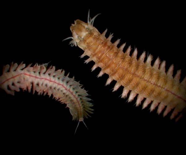
![[7]](http://www.dnr.sc.gov/marine/sertc/images/photo%20gallery/Nereis%20succinea.jpg)
![[8]](http://www.dnr.sc.gov/marine/sertc/images/photo%20gallery/Nereis%20succinea%20ant%20and%20post.jpg)
![[9]](http://www.nilesbio.com/images/categories/C211.jpg)
![[10]](http://web.vims.edu/bio/shallowwater/images/Nereis2.gif)
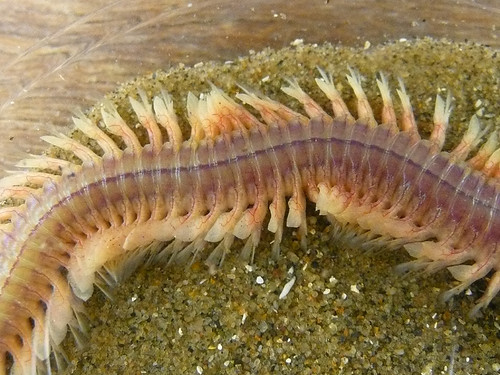
![[11]](http://www.nationalmuseum.se/Global/Pressbilder/Miniatyrer/jpg/B2456-ram.jpg)
![[21]](http://images.travelpod.com/users/bluestarfish/1.1179196140.mola-mola-fish.jpg)
![[22]](http://www.mediterraneeonline.com/photos/info_mediterranee/poissons/Mola-mola.jpg)
![[23]](http://www.glaucus.org.uk/jackandsun.jpg)
![[24]](http://www.bidp-balidiving.com/assets/images/page/BIDP%20-%20Pics/molamola-right.jpg)
![[25]](http://massaudubonblogs.typepad.com/wellfleetbaynews/images/2007/12/17/mola_mola_001_2.jpg)
.JPG)
- Reason
- Always a pleasant surprise when I see someone else taking really nice panoramas. This one is really interesting, showing a very wide panoramic view from a rather lofty vantage point. Resolution could be better, but it's tack sharp and I haven't spotted any stitching faults. Ðiliff «» (Talk) 22:48, 7 August 2010 (UTC)
- Articles in which this image appears
- Freiburg im Breisgau
- FP category for this image
- Wikipedia:Featured_pictures/Places/Panorama
- Creator
- Commons:User:AHornung
- Support as nominator -- Ðiliff «» (Talk) 22:48, 7 August 2010 (UTC)
- Support Interesting local + Interesting way to capture it + Excellent implementation = “stop, stare & click.” Bravo to User:AHornung for his/her good work and for donating it to Wikipedia. Greg L ( talk) 23:30, 7 August 2010 (UTC)
- Support What a lovely picture, cannot see any stitching faults myself either. -- Silvestra ( talk) 04:10, 8 August 2010 (UTC)
- Support per nom, it seems dark though.
Noodle snacks (
talk) 03:14, 9 August 2010 (UTC)
- Yeah, I noticed that too, but I think it's the low spring sun making the shadows quite strong. Don't forget it's a 360 panorama, so it's impossible to avoid when the sun isn't directly overhead. The photographer probably exposed to minimise blown highlights (sky excepted obviously). Ðiliff «» (Talk) 09:31, 9 August 2010 (UTC)
- Support Some may think of it as a drawback, but I really like the way it goes from dark to light. WackyWace converse | contribs 10:36, 9 August 2010 (UTC)
- Weak support Not much can be done about the clipped sky, otherwise good. -- King of ♥ ♦ ♣ ♠ 04:24, 11 August 2010 (UTC)
Promoted File:Freiburg_Schlossbergturm_Panorama_2010.jpg -- Makeemlighter ( talk) 01:06, 17 August 2010 (UTC)
Crystalline Dolomite & Magnesite

- Reason
- Large, high EV, high quality, a lead image and already featured on Commons.
- Articles in which this image appears
- Dolomite
- FP category for this image
- Sciences/Materials science or Geology
- Creator
- Didier Descouens
- Support as nominator -- I'ḏ ♥ One 20:26, 6 August 2010 (UTC)
Conditional support I could go with this. It’s very sharp and well lit. And it is part of an interesting discipline I personally haven’t seen much of here. But check out the histogram. There was no reason for them to have done that for this subject. Greg L ( talk) 20:33, 6 August 2010 (UTC)- Support, that'll do me. I'd be inclined to put it under Wikipedia:Featured pictures/Sciences/Geology, but it's worthy of FP status for me. J Milburn ( talk) 22:34, 6 August 2010 (UTC)
- Support I've always been a fan of good geology photos; this one strikes me as particularly good. -- Lucas Brown 02:40, 8 August 2010 (UTC)
- Support -- George Chernilevsky talk 04:54, 11 August 2010 (UTC)
Waiting for clarification Makeemlighter ( talk) 03:41, 16 August 2010 (UTC)
- Isn't 5 supports enough? --
I'ḏ
♥
One 04:17, 16 August 2010 (UTC)
- No, 4 supports isn't enough. That's why we're waiting on Greg. Makeemlighter ( talk) 05:00, 16 August 2010 (UTC)
- Support I’m not going to hold this one up by whining over a minor exposure issue. We need more mineralogy-related photos. We also need more participation at FPC. My “oppose” vote shouldn’t have busted this over a short quorum. Greg L ( talk) 03:19, 17 August 2010 (UTC)
Promoted File:Dolomite-Magnésite-_Navarre.jpg -- Makeemlighter ( talk) 04:20, 17 August 2010 (UTC)
Hoard of silver coins
Voting period is over. Please don't add any new votes. Voting period ends on 25 Aug 2010 at 22:51:17 (UTC)

- Reason
- What better way to illustrate our article on hoards? A fine illustration, eyecatching and really makes you want to know more. I don't know how well this will go down, but I thought it was worth a nomination.
- Articles in which this image appears
- Hoard
- FP category for this image
- Wikipedia:Featured pictures/Other, unless anyone has another idea.
- Creator
- Hans Hillewaert
- Support as nominator -- J Milburn ( talk) 22:51, 16 August 2010 (UTC)
- Oppose Subject doesn’t impress. Photo doesn’t impress. No “stop, stare & click” for me here. Indeed, it is a hoard. But hoard seems sort of a broad-brush subject that would take me to an uninspired Wikipedia article (Hold on while I check the article… Yup. Uninspired Wikipedia article with this one picture.) Quite importantly, this thumb looks like a bunch of old flattened bottle caps at a recycling center until you look at the enlarged image. Moreover, the lighting here is substandard and looks just like what would happen at a recycling center: take the strobe off the camera, have someone hold it a couple of feet away on its extension, and and let it rip into the pile. Now, if this was a picture of a hoard of gold coins, I’d probably vote “support.” Greg L ( talk) 00:59, 17 August 2010 (UTC)
- Actually, to be honest, I'm regretting nominating this now. Not really FP material, not certain what I saw in it. Nomination withdrawn. J Milburn ( talk) 11:44, 17 August 2010 (UTC)
Not promoted : Withdrawn by nominator. Papa Lima Whiskey ( talk) 12:59, 17 August 2010 (UTC)
Ford Focus RS WRC 09
Voting period is over. Please don't add any new votes. Voting period ends on 17 Aug 2010 at 13:53:17 (UTC)

- Reason
- Current FPC on Commons, but I thought it deserved a nomination here, too. Great action shot, very dynamic, very high quality, very eye-catching. Unusual subject matter for FPC, but still solid EV, with usage in some very high profile/high importance articles. Caption nabbed from the image page. I'm not certain on where the highest EV is, so opinions on that would be good.
- Articles in which this image appears
- Ford Focus WRC, Shakedown (testing), 2010 Rally Finland, Jari-Matti Latvala, Ford World Rally Team, Ford Focus (international), Ford Motor Company, Ford Racing, Rally Finland
- FP category for this image
- Sport
- Creator
- Kallerna
- Support as nominator -- J Milburn ( talk) 13:53, 8 August 2010 (UTC)
- Weak support Cool action shot, I'm glad I'm not the one who took it, looks like they got kind of close there. DOF and shutter speed are impressive, but I wasn't convinced the image really had a purpose until I saw the Ford Focus WRC article. But WS because it's a little bland in the sky and BG and Greg L has beaten it into my brain that currently FPs automatically become POTDs and I think if I saw this in a POTD box on a userpage I'd be slightly off-put by that. -- I'ḏ ♥ One 15:30, 8 August 2010 (UTC)
- Weak support per FF4C52. It's not a clear enough shot of the car to have serious EV in displaying the car, but it doesn't really show enough of the race (IMO) to have serious EV for the race (that could be that car on effectively any dirt turn as far as I can see). Staxringold talk contribs 19:49, 8 August 2010 (UTC)R
- Weak oppose Per reasoning of Staxringold. Greg L ( talk) 19:51, 8 August 2010 (UTC)
- Support This image is really striking and a very good picture. I disagree on the lack of EV, this represents the rally's especially well. It's the best picture on the pages that it's on, and I can't think of a better way to accurately represent these, especially the Ford Focus WRC article. JFitch (talk) 23:22, 8 August 2010 (UTC)
- Support. Nice action shot. I agree that we should get some more cars featured. Papa Lima Whiskey ( talk) 01:26, 9 August 2010 (UTC)
- Support great photo, but I am worried about the photographer's toes.-- TonyTheTiger ( T/ C/ BIO/ WP:CHICAGO/ WP:FOUR) 23:29, 11 August 2010 (UTC)
- Support, there was still room between me and the car (~ 1 metre)...
 —kallerna
™ 12:32, 15 August 2010 (UTC)
—kallerna
™ 12:32, 15 August 2010 (UTC)
Promoted File:Neste Oil Rally 2010 - Jari-Matti Latvala in shakedown.jpg -- Jujutacular talk 17:03, 17 August 2010 (UTC)
Crinipellis zonata
Voting period is over. Please don't add any new votes. Voting period ends on 17 Aug 2010 at 19:59:12 (UTC)
_Sacc._(23665).jpg)


- Reason
- Highly encyclopedic method of displaying the species, so that all necessary information is conveyed. Compelling, pretty, colourful (or as colourful as a photo of a little brown mushroom can be) and high resolution.
- Articles in which this image appears
- Crinipellis zonata, Crinipellis
- FP category for this image
- Fungi
- Creator
- Shroomydan
- Support as nominator -- J Milburn ( talk) 19:59, 8 August 2010 (UTC)
- Oppose 1) the colors appear implausibly saturated based on common-sense experience with the way things look on this planet. 2) It’s “a little brown mushroom.” Ergo, I can’t see visitors being awestruck by the quality of this image or its subject matter. Greg L ( talk) 20:14, 8 August 2010 (UTC)
- Comment Using my upload tool are ya? ;-) — raeky T 20:26, 8 August 2010 (UTC)
- Support It's saturated, but I don't feel it's oversaturated, moss like that is pretty darn green. I don't think all our featured pictures will (a) ever make it on the front page and (b) need to fit the unofficial rule of end-user clickablity. It's a fine illustration for
Crinipellis zonata, and fits all the check marks necessary for a technical species FP. —
raeky
T 20:29, 8 August 2010 (UTC)
- Yes. Pretty darn green. I’ve been digging the stuff out of my lawn all summer and poisoning it with iron. But that green? I don’t think so. With regard to your unofficial rule of end-user clickablity, one *official* criteria upon which images should be judged is eye-catching to the point where users will want to read its accompanying article. My paraphrasing of that to “stop, stare & click” is just that: a paraphrasing… of an official criteria.
Greg L (
talk) 21:00, 8 August 2010 (UTC)
- Yes but that criteria has to be loosely interpreted I think for technical sciency stuff in some instances, not all users will want to click an image of a common bird or plain mushroom, but that doesn't devalue that image on it's technical standards and EV. Yes it is saturated up some, but I don't think it's saturated to the point of it being grossly inaccurate to the real colors of the subject. —
raeky
T 21:12, 8 August 2010 (UTC)
- I can assure you 100% that if I went to the front page of a website (say, the BBC homepage) and I saw this picture, I would click on it straight away to read the accompanying story. I can also assure you that I stopped and stared when I saw it. In fact, it interested me enough to write
the accompanying article- this isn't even a mushroom that I will ever see in the flesh, as it doesn't grow in
Europethe UK. I was browsing through Mushroom Observer and this one jumped straight out at me, which is why I nominated it. J Milburn ( talk) 21:51, 8 August 2010 (UTC)- On a loosely related note, I'd identify the moss to compare colour, but the books I'd use cover European mosses, so I wouldn't be confident.
J Milburn (
talk) 21:53, 8 August 2010 (UTC)
- Even the brown here looks suspiciously saturated. I get pictures like this from my brother all the time. He sets his BarbarianOS computer so his image-editing software has a check-box setting enabled (called something like “Explosion at the Disney factory” or “1966 color TV above the bar at the tavern”). The results look like this. Greg L ( talk) 22:14, 8 August 2010 (UTC)
- On a loosely related note, I'd identify the moss to compare colour, but the books I'd use cover European mosses, so I wouldn't be confident.
J Milburn (
talk) 21:53, 8 August 2010 (UTC)
- I can assure you 100% that if I went to the front page of a website (say, the BBC homepage) and I saw this picture, I would click on it straight away to read the accompanying story. I can also assure you that I stopped and stared when I saw it. In fact, it interested me enough to write
the accompanying article- this isn't even a mushroom that I will ever see in the flesh, as it doesn't grow in
- Yes but that criteria has to be loosely interpreted I think for technical sciency stuff in some instances, not all users will want to click an image of a common bird or plain mushroom, but that doesn't devalue that image on it's technical standards and EV. Yes it is saturated up some, but I don't think it's saturated to the point of it being grossly inaccurate to the real colors of the subject. —
raeky
T 21:12, 8 August 2010 (UTC)
- Yes. Pretty darn green. I’ve been digging the stuff out of my lawn all summer and poisoning it with iron. But that green? I don’t think so. With regard to your unofficial rule of end-user clickablity, one *official* criteria upon which images should be judged is eye-catching to the point where users will want to read its accompanying article. My paraphrasing of that to “stop, stare & click” is just that: a paraphrasing… of an official criteria.
Greg L (
talk) 21:00, 8 August 2010 (UTC)
- Oppose Greg has a point here about the oversaturated green, and the strange white fringing of the caps doesn't help.
Papa Lima Whiskey (
talk) 23:18, 8 August 2010 (UTC)
- The white fringing?
J Milburn (
talk) 23:23, 8 August 2010 (UTC)
- It's a strange white glow at the edge of the cap that extends into the periphery as well. It's a bit blown at the edge as well, might be part of the same effect. Papa Lima Whiskey ( talk) 23:39, 8 August 2010 (UTC)
- The white fringing?
J Milburn (
talk) 23:23, 8 August 2010 (UTC)
- Oppose Greg does have a point about the saturation in my view (fixable with an edit if anyone can be bothered). Arguing that its not an FP because "little brown mushroom" is a non sequitur though. I wish the image quality was higher, but would support a de-saturated edit. Noodle snacks ( talk) 03:33, 9 August 2010 (UTC)
- Comment: I've contacted Dan asking if there is an original. Could we perhaps have this suspended until then? J Milburn ( talk) 11:34, 9 August 2010 (UTC)
Suspended per nominator's request. Makeemlighter ( talk) 15:32, 9 August 2010 (UTC)
- Comment I was kinda surprised to see this photo nominated, because it's "just a little brown mushroom". Of course Crinipellis zonata is one of the most striking LBMs. I have uploaded three unedited images of this collection to mushroomobserver.org. If somebody would like to have a go at making a better edit be my guest. I have addressed questions about color quite a bit lately. I hope that folks are not laboring under the naive notion that color is a property adhering in an object and that a photograph copies the color.
Greg mentioned a “1966 color TV above the bar at the tavern”. This is a good image to contemplate. How could these mushrooms best be displayed through such a medium? brightly and vividly right? Is a computer monitor that much different? Both are composed of red, green, and blue pixels, little colored flashlights if you will. There are no purple pixels or yellow pixels. There are certainly no brown pixels. Black pixels are really just gray. Turn of the monitor and see that it is not black. Pixels emit light, mushrooms reflect light. Is it even possible for them to be the 'same color'?
That's all i want to say about color for now. Shroomydan ( talk) 17:18, 9 August 2010 (UTC)
- Relisted. If I've done anything wrong, feel free to fix it and let me know on my talk page. J Milburn ( talk) 18:01, 9 August 2010 (UTC)
- Support Alt3 I like that one best. Shroomydan ( talk) 03:10, 10 August 2010 (UTC)
- Support Edit 1 of Alt 3 I'm sorry to add to the confusion. When you brighten up any of the alts it you still end up with electric green moss. I think your camera may set to produce saturated photographs. This is quite common with compact cameras as it makes the pictures pop a bit more. It is adjustable in the menus though. I created an edit, which aside from the crop was going mostly on the appearance of the moss and leaves in the background. I do think the Alt improves on the original in many ways. Noodle snacks ( talk) 06:29, 10 August 2010 (UTC)
- Oppose Edit 1 of Alt 3 Way below our standards in terms of visible detail. Papa Lima Whiskey ( talk) 12:47, 10 August 2010 (UTC)
- Comment I repeat, "If a mushroom fell off a tree in the forest, would any wikipedians hear it?"--
TonyTheTiger (
T/
C/
BIO/
WP:CHICAGO/
WP:FOUR) 00:03, 11 August 2010 (UTC)
- Not helpful. I don't give a flying fuck about Chicago, but I don't feel the need to make snide comments on your nominations.
J Milburn (
talk) 10:48, 11 August 2010 (UTC)
- I agree with J Milburn Tony - I've personally become very bored with multiple noms of Chicago, yet I choose just to steer clear rather than leave sarcastic comments... Please either support, oppose, or leave well alone if you don't have anything useful to say... Gazhiley ( talk) 11:35, 11 August 2010 (UTC)
- Not helpful. I don't give a flying fuck about Chicago, but I don't feel the need to make snide comments on your nominations.
J Milburn (
talk) 10:48, 11 August 2010 (UTC)
- Final edit I spent a little time making an edit of Alt1. It's here:
http://mushroomobserver.org/image/show_image/97845 It looks really good at full size. These are small mushrooms that have been magnified several orders of magnitude. The photo is still very colorful; I use the vivid setting on my camera. It makes the images interesting and beautiful. Eyes adapted to the light of a computer monitor see color differently than eyes adapted to dark green shade in deep woods. The color of the moss was a little otherworldly. I probably shot the top image with the "fluorescent" white balance setting. The next one down clearly had a different white balance setting that looks more natural. This photo is meant to be viewed at full size. Shroomydan ( talk) 23:58, 11 August 2010 (UTC)
- Thanks for your efforts (again). I've uploaded the image and added it to the nomination; it's certainly my favourite of the batch. This nomination's become a bit all over the place now- I will consider renominating that version at in the future if this crashes and burns now. If it's any consolation, it was seeing your photo that motivated me to write the article, which is now rated as a good article, and will be (hopefully along with your picture) on the main page soon. J Milburn ( talk) 00:26, 12 August 2010 (UTC)
- support Edit1 Alt1 These are exquisite specimens, glorious little brown mushrooms :) . —Preceding unsigned comment added by Shroomydan ( talk • contribs) 01:43, 12 August 2010 (UTC)
Not promoted -- Makeemlighter ( talk) 20:24, 17 August 2010 (UTC)
- Very complicated. It might be worth picking the best one and re-nominating it. Makeemlighter ( talk) 20:24, 17 August 2010 (UTC)
Barn Swallow
Voting period is over. Please don't add any new votes. Voting period ends on 17 Aug 2010 at 23:29:57 (UTC)

- Reason
- Meets technical criteria, thought it was an FP already. Is an FP on Commons.
- Articles in which this image appears
- Barn swallow
- FP category for this image
- Birds
- Creator
- Malene Thyssen
- Support as nominator -- Papa Lima Whiskey ( talk) 23:29, 8 August 2010 (UTC)
- Support since FPC is a good place to nit-pick, it would probably look nicer if cropped ever so slightly on the bottom, like 1/3 the distance from the bottom to the tip of the tail, but that's just a thought. I really like the images on the article, many good examples, like this one. I wonder if anyone else will think this is sharp enough for bird image. -- I'ḏ ♥ One 00:41, 9 August 2010 (UTC)
- Oppose We have a lot of bird photographs that achieve FP status. IMO, there are plenty that are much better than this one. Greg L ( talk) 02:49, 9 August 2010 (UTC)
- Oppose Below the quality bar (noisy and not that sharp) in my view. Noodle snacks ( talk) 03:12, 9 August 2010 (UTC)
- Weak oppose. I like it, but the quality is a little sub-par. J Milburn ( talk) 11:35, 9 August 2010 (UTC)
Not promoted -- Makeemlighter ( talk) 20:23, 17 August 2010 (UTC)
Kelvin-Helmholtz Instability

- Reason
- Illustrates subject excellently and in an eye-catching manner
- Articles in which this image appears
- Kelvin-Helmholtz instability
- FP category for this image
- Wikipedia:FP#Natural_phenomena
- Creator
- User:Bdubb12
- Support as nominator -- Lucas Brown 02:29, 8 August 2010 (UTC)
- Support High quality and very different than what most of what comes through FPC. -- I'ḏ ♥ One 02:57, 8 August 2010 (UTC)
- Comment: Why is the animation not displaying on the article?
J Milburn (
talk) 12:54, 8 August 2010 (UTC)
- The reason why is the same reason we're pretty much officially not supposed to use animated gifs in articles anymore. The server can't create thumbnails of the animation, so anything less than the original is static frame of the first frame of the animation. Secondly this image is >5megs and the only way you see the animation is to insert the full size image into the article, and this is BAD NEWS for anyone not on a high-speed internet connection. We've delisted most of our large gif animation FP's already... although this is a great sciency thing, it really should be video and not gif animation which is a technology noone on the internet has used since like 1995. — raeky T 14:22, 8 August 2010 (UTC)
- Comment: Very nice, but it looks like it is actually two copies of the same simulation side by side (ie. two identical square frames side by side) is there any reason for this? -
Zephyris
Talk 13:03, 8 August 2010 (UTC)
- Pretty sure it's not, it's just the effect is rather uniform. The edges of two of these together would never line up perfectly so you'd see a seam... — raeky T 14:27, 8 August 2010 (UTC)
- Support Eye-catching. Informative. Extolls the virtues of an electronic encyclopedia.
Greg L (
talk) 19:50, 8 August 2010 (UTC)
- Comment Please point to a guideline or policy that states animated GIFs should NEVER be used on Wikipedia. I do see this piece of advise (
Wikipedia:ANIMATIONS#Animated_images) that gives some advise for thumbnails that won’t work (probably because they exceed 25 MP total height-width-frames). That thumbnail problem isn’t a problem for me because I make animations in the size I intend to place them in articles. Sometimes self-running animations are best; sometimes not. I’ve mixed both in some of my articles. If you don’t *like* self-running animations, that’s one thing (but an “IMHO” might be a nice suffix to append). To me, your all-cap “NEVER” statement seems like it authoritative policy that I’m not aware of.
Greg L (
talk) 19:50, 8 August 2010 (UTC)
-
Wikipedia:Village_pump_(technical)/Archive_74#Many_low-kilobyte.2C_animated_GIFs_still_not_thumbnailed May not state, ever, but there are serious issues when using animated gifs, specifically very large ones like this one. Converting that animation to Theora video reduced it from 5.3 to 1.4 megs, it also doesn't force a user to either not see the animation on the page because of broken thumbnailing (that likely won't ever be "fixed) or (b) download a 5 meg file to view the page (quite problematic for someone on a slow connection). Sure animated gifs do serve a purpose in this devoid of flash 1995 version of the internet we call Wikipedia, but it's a limited and poor technology that shouldn't be used in place of embedded video, and in this case video far more efficiently shows this animation then a gif. —
raeky
T 19:54, 8 August 2010 (UTC)
- Yeah, I know all about that issue. I’m not going to belabor the technical issues because there are no problems if one simply specifies the thumbnail as the native size of the animation; which is to say, don’t make oversize animations. I create both types (Theora and self-running GIFs) and both have their place. The animation here at
Solid modeling is just the sort of animation that works better as a GIF. And it is only 1.01 MB.
There was a while where they changed the way thumbnails were handled to alleviate the burden and RAM requirements on browsers when people went to pages with hundreds of thumbnails. That temporarily broke every single animated GIF that was displayed in its non-native size. I was highly involved in the technical discussions about this issue.
The provided link is just a bunch of old, archived discussion pertaining to dealing with the technical issues. If there are opinions there stating that animated GIFs are cause plague, makes crops wither, and midwives weep, it is just that: opinion.
There is nothing intrinsically wrong with self-running animated GIFs; they are supported on Wikipedia, there is no admonition against their use (other than to make sure they work in the placed size), and they have their place along with click-to-watch Theora videos. If there is a problem with animated GIFs, it needs to state as much on Wikipedia:Image use policy, which represents the current, consensus policy. Greg L ( talk) 20:09, 8 August 2010 (UTC)
- The issues with animated gifs was also recently addressed in this delisting
Wikipedia:Featured_picture_candidates/delist/File:CSA_states_evolution.gif. —
raeky
T 20:04, 8 August 2010 (UTC)
- Just a comment, but that was removed less for it being a large animated gif and more because I, the creator, suggested it be, considering the accuracy issues which I did not have (and have not yet had) have time to fix, and the fact that those accuracy issues had removed it from the mainspace for nearly two years. -- Golbez ( talk) 15:27, 9 August 2010 (UTC)
- That discussion also has zero bearing on whether animated GIFs are OK to use on Wikipedia. As I mentioned above, there is one and only one policy page to which we refer on this issue:
Wikipedia:Image use policy. Content creators need not hunt around all over the entire cyber universe of Wikipedia to find discussions by confused editors.
Greg L (
talk) 20:09, 8 August 2010 (UTC)
- Sure there are some valid uses for animated gifs that if you make them carefully and the right sizes not to overburden the end-users with to much bandwidth, they make valuable additions to articles. But converting something that looks clearly to of been a video source into a gif, just to make it self-running loop isn't a good idea. Noone is going to display this animated gif at it's native size, like it is here, on an article, therefore it's going to be thumbnailed and not animated. The best solution for the end-user reading the article is to put a click-to-play Theora video of this video into the article that would be generally self-explanatory that it's a video they click to see, as opposed to the way it is now, a static image half black and half white that the end-user may have no clue they can click to see it play. I think in THIS instance, a Theora video is best for end-user presentation, and thats probably true for almost all the _large_ gif animations that can't be thumbnailed. —
raeky
T 20:23, 8 August 2010 (UTC)
- Now we are getting into a debate about what technology might be best for this particular animation. That is not where I want to go here. I am addressing this statement in one of the above captions: [animated GIFs are] (old tech, we should NEVER be using). That should have had “IMHO” or “IMO” somewhere in there because that statement is A) not part of
Wikipedia:Image use policy, which is the only governing page on this issue, and B) self-running animations have their place on Wikipedia. M‘kay??
Greg L (
talk) 20:36, 8 August 2010 (UTC)
- Ok, it's currently in the realm of "IMO" territory, but personally I do feel animated gif's should never be used on 2010 internet. The <video> tags of HTML5 and improved embedded video support and codecs that are starting to be introduced into browsers and formalized into standards will and SHOULD replace animated gifs, and for a larger extent proprietary applications like Adobe Flash. I fully suspect within another 1-2 years browsers, standards and codecs will be so widespread with html5 video that gif animations will be a think of the past, even for small animations. —
raeky
T 20:41, 8 August 2010 (UTC)
- I hope you are right about HTML5. I hope it has a facility for self-running animations that are compact. Wikipedia’s aversion for any technology that requires royalty payments be paid to someone results in open-source solutions and weird, way-ghetto programs ported over from Linux by
this guy. And even then, just because it is “open source” doesn’t mean it is royalty-free. I think I read about Steve Jobs complaining about how Theora still snitched a bunch of patented algorithms and how—just because the *code* for the algorithms are open source—doesn’t mean it’s free for everyone to enjoy. P.S. I might add that I haven’t once clicked the above Theora video; the self-running GIF allows me to sit here and watch the turbulence over and over (rather than click the ‘play’ button over and over and over and over…).
Greg L (
talk) 20:53, 8 August 2010 (UTC)
- Yes but look at it in the article (
Kelvin-Helmholtz instability), would a regular IP user click that image and see the pretty animation, or just be perplexed by the weird half-black-half-white image and move on. Also allowing Flash on Wikimedia isn't a royalty thing or money thing, to use flash on your site you don't have to pay Adobe, you just have to buy Flash to make the file, you can release your flash animation under compatible licenses for Wikipedia. There is some concerns I think for security, since you can put scripts in the flash animation that makes it do things hidden in the background, and I donno what the other reasons why we wouldn't use such a widespread standard. Also for HTML5 we need to support something other then Theora, we need to allow _all_ the HTML5 codecs to be uploaded here, VP8 and H.264, and all the valid containers that browsers will support. The resulting standard for HTML5 for video will not be limited to one codec and one container, just as we can use multiple image types. Personally I don't see any reason why we couldn't use flash, because flash would REALLY enrich some articles if done right. Plus the ability for flash video players to auto-scale up quality based on the end-users bandwidth, is something I don't think HTML5 will ever support. —
raeky
T 21:10, 8 August 2010 (UTC)
- Where in the world did you gather I support Flash? How did we get so off-topic?? Because I wrote that I hope you are right with regard to HTML5? No. I meant, “I hope you are right with regard to HTML5.” Really. I’m not advocating supporting Flash. Flash blows because it is a proprietary solution and the community receives inequitable bug fixes for the different platforms. I’m for *not* suggesting that animated GIFs should NEVER be used when official Wikipedia policy at Wikipedia:Image use policy says no such thing. That’s all. Full stop. Animated GIFs; particularly those showing 360° flybys, have their place and that is why they are officially permitted and supported on Wikipedia. Not every animation works best by requiring the user to click a “play” button. I waaaaaant my self-running animations and you can’t take them away. ;-) OK? Greg L ( talk) 21:24, 8 August 2010 (UTC)
- Just for giggles I converted
File:Jack-in-cube solid model, light background.gif into an OGV, only to find someone else already did (
File:Jack-in-cube solid model, light background.ogv) when I tried to upload it. Your animated GIF is 1.01 MB, the old conversion to OGV is 140 KB and I uploaded mine too (
File:Jack-in-cube solid model, light background v2.ogv) and it's at 187 KB. So if the mechanic was there to make this auto-play and repeat it would be FAAAAR more efficient to use Theora then animated gifs. —
raeky
T 21:34, 8 August 2010 (UTC)
- And that lead me to Wikipedia:Village_pump_(technical)/Archive_75#GIF_thumbnails_in_fact_greatly_increase_file_size.21.21.21 about even more serious issues with animated gifs. — raeky T 21:39, 8 August 2010 (UTC)
- Yes but look at it in the article (
Kelvin-Helmholtz instability), would a regular IP user click that image and see the pretty animation, or just be perplexed by the weird half-black-half-white image and move on. Also allowing Flash on Wikimedia isn't a royalty thing or money thing, to use flash on your site you don't have to pay Adobe, you just have to buy Flash to make the file, you can release your flash animation under compatible licenses for Wikipedia. There is some concerns I think for security, since you can put scripts in the flash animation that makes it do things hidden in the background, and I donno what the other reasons why we wouldn't use such a widespread standard. Also for HTML5 we need to support something other then Theora, we need to allow _all_ the HTML5 codecs to be uploaded here, VP8 and H.264, and all the valid containers that browsers will support. The resulting standard for HTML5 for video will not be limited to one codec and one container, just as we can use multiple image types. Personally I don't see any reason why we couldn't use flash, because flash would REALLY enrich some articles if done right. Plus the ability for flash video players to auto-scale up quality based on the end-users bandwidth, is something I don't think HTML5 will ever support. —
raeky
T 21:10, 8 August 2010 (UTC)
- I hope you are right about HTML5. I hope it has a facility for self-running animations that are compact. Wikipedia’s aversion for any technology that requires royalty payments be paid to someone results in open-source solutions and weird, way-ghetto programs ported over from Linux by
this guy. And even then, just because it is “open source” doesn’t mean it is royalty-free. I think I read about Steve Jobs complaining about how Theora still snitched a bunch of patented algorithms and how—just because the *code* for the algorithms are open source—doesn’t mean it’s free for everyone to enjoy. P.S. I might add that I haven’t once clicked the above Theora video; the self-running GIF allows me to sit here and watch the turbulence over and over (rather than click the ‘play’ button over and over and over and over…).
Greg L (
talk) 20:53, 8 August 2010 (UTC)
- Ok, it's currently in the realm of "IMO" territory, but personally I do feel animated gif's should never be used on 2010 internet. The <video> tags of HTML5 and improved embedded video support and codecs that are starting to be introduced into browsers and formalized into standards will and SHOULD replace animated gifs, and for a larger extent proprietary applications like Adobe Flash. I fully suspect within another 1-2 years browsers, standards and codecs will be so widespread with html5 video that gif animations will be a think of the past, even for small animations. —
raeky
T 20:41, 8 August 2010 (UTC)
- Now we are getting into a debate about what technology might be best for this particular animation. That is not where I want to go here. I am addressing this statement in one of the above captions: [animated GIFs are] (old tech, we should NEVER be using). That should have had “IMHO” or “IMO” somewhere in there because that statement is A) not part of
Wikipedia:Image use policy, which is the only governing page on this issue, and B) self-running animations have their place on Wikipedia. M‘kay??
Greg L (
talk) 20:36, 8 August 2010 (UTC)
- Sure there are some valid uses for animated gifs that if you make them carefully and the right sizes not to overburden the end-users with to much bandwidth, they make valuable additions to articles. But converting something that looks clearly to of been a video source into a gif, just to make it self-running loop isn't a good idea. Noone is going to display this animated gif at it's native size, like it is here, on an article, therefore it's going to be thumbnailed and not animated. The best solution for the end-user reading the article is to put a click-to-play Theora video of this video into the article that would be generally self-explanatory that it's a video they click to see, as opposed to the way it is now, a static image half black and half white that the end-user may have no clue they can click to see it play. I think in THIS instance, a Theora video is best for end-user presentation, and thats probably true for almost all the _large_ gif animations that can't be thumbnailed. —
raeky
T 20:23, 8 August 2010 (UTC)
- The issues with animated gifs was also recently addressed in this delisting
Wikipedia:Featured_picture_candidates/delist/File:CSA_states_evolution.gif. —
raeky
T 20:04, 8 August 2010 (UTC)
- Yeah, I know all about that issue. I’m not going to belabor the technical issues because there are no problems if one simply specifies the thumbnail as the native size of the animation; which is to say, don’t make oversize animations. I create both types (Theora and self-running GIFs) and both have their place. The animation here at
Solid modeling is just the sort of animation that works better as a GIF. And it is only 1.01 MB.
-
Wikipedia:Village_pump_(technical)/Archive_74#Many_low-kilobyte.2C_animated_GIFs_still_not_thumbnailed May not state, ever, but there are serious issues when using animated gifs, specifically very large ones like this one. Converting that animation to Theora video reduced it from 5.3 to 1.4 megs, it also doesn't force a user to either not see the animation on the page because of broken thumbnailing (that likely won't ever be "fixed) or (b) download a 5 meg file to view the page (quite problematic for someone on a slow connection). Sure animated gifs do serve a purpose in this devoid of flash 1995 version of the internet we call Wikipedia, but it's a limited and poor technology that shouldn't be used in place of embedded video, and in this case video far more efficiently shows this animation then a gif. —
raeky
T 19:54, 8 August 2010 (UTC)
- Comment Please point to a guideline or policy that states animated GIFs should NEVER be used on Wikipedia. I do see this piece of advise (
Wikipedia:ANIMATIONS#Animated_images) that gives some advise for thumbnails that won’t work (probably because they exceed 25 MP total height-width-frames). That thumbnail problem isn’t a problem for me because I make animations in the size I intend to place them in articles. Sometimes self-running animations are best; sometimes not. I’ve mixed both in some of my articles. If you don’t *like* self-running animations, that’s one thing (but an “IMHO” might be a nice suffix to append). To me, your all-cap “NEVER” statement seems like it authoritative policy that I’m not aware of.
Greg L (
talk) 19:50, 8 August 2010 (UTC)
Comment I suggest you not make self-running GIF animations if you don’t like them. I’m thinking this is already the case. You seem like a programmer, who can get delight by shaving 300 milliseconds off someone’s download time. The present work-around to saving 300 milliseconds is to require readers click that play button. For some animations, that isn’t best. Someone needs to develop the self-running/looping ability for Theora videos and then I wouldn’t be digging in my feet on self-running GIFs. It’s not like I enjoy unnecessarily large files. In fact, I work mightily to reduce the file size of animated GIFs and use every trick in the book to do so. Like using 6-bit gray scale rather than 8 bits if I can’t really tell the difference.
BTW, I fixed the problem here (easily) with the self-running animation displaying properly simply by specifying its thumbnail at the native size of the animation: 479 pixels. The default “100000x260px” specification bound to create problems for a big animated thumb. Whether GIF or Theora, whichever is most desirable for a given use is up to a given editor’s preference, IMO. Personally, I keep all animations (GIFs and Theora) at 400 pixels, which is one of the default standards for Theora videos. Anything larger starts getting bit too large, IMHO.
I’m done here on this issue. I was not prepared to spend much of the day extolling the virtues and shortcomings of Theora, Flash, self-running animated GIFs, and other arcane technology. I was just pointing out that animated GIfs are officially approved for use on Wikipedia. They have their place. You don’t like them. That’s nice. Let’s save wear & tear on our keyboards for discussing the color of moss. Greg L ( talk) 21:56, 8 August 2010 (UTC)
- Actually the HTML video tag does support autorun and loop, I made a little demo:
http://raeky.com/html5_loop_test.html —
raeky
T 22:01, 8 August 2010 (UTC)
- Can that be made to work on Wikipedia?
Greg L (
talk) 22:09, 8 August 2010 (UTC)
- Sure, they'd have to change the base software to allow us to link videos that autoplay and loop but there is no reason why it WOULDN'T work, question is would they make the code changes to the live software?
I'll create a Village Pump topic about the possibility of it..— raeky T 22:12, 8 August 2010 (UTC)- Actually I don't really want to create a village pump about it yet... and as for the codec WebM, it was by far the best, it converted this animation to 698k and no real quality loss. Once all the common browsers support WebM HTML5 video will be pretty nice imho. That was a 86% compression from GIF->WebM! — raeky T 22:39, 8 August 2010 (UTC)
- Sure, they'd have to change the base software to allow us to link videos that autoplay and loop but there is no reason why it WOULDN'T work, question is would they make the code changes to the live software?
- Can that be made to work on Wikipedia?
Greg L (
talk) 22:09, 8 August 2010 (UTC)
- Support Love it.-- Mbz1 ( talk) 01:19, 9 August 2010 (UTC)
- Support I think I might have had an assignment question related to this last year. Noodle snacks ( talk) 03:13, 9 August 2010 (UTC)
- The image description is insufficient as it is. I'd like to know what technique/software was used and how the system was set up (density and velocity ratios). Is it is a slice through a 3d simulation, or a 2d simulation. There seem to be periodic boundary conditions in x direction, but not in y direction (what boundaries are there? Fixed velocity?). It would be nice if all those details could be supplied. This would also avoid the need for far fetched speculations like probably created by some kind of digital special effects simulator. --
Dschwen 19:53, 9 August 2010 (UTC)
- In addition, the source code is always a nice thing to have. Noodle snacks ( talk) 06:33, 10 August 2010 (UTC)
Video or .gif? Makeemlighter ( talk) 02:13, 17 August 2010 (UTC)
- If it wasn't clear already but I obviously think the video has more utility over the gif in-which thumbnailing is broken. — raeky T 02:15, 17 August 2010 (UTC)
- I prefer the video as well, for resizing capability. I also much prefer being able to choose to play it instead of it just constantly running on the article. Distracts from reading IMO. Jujutacular talk 02:19, 17 August 2010 (UTC)
- I agree, click-to-play video is probably fine for this one. That’s a lot of swirling animation to have going on continuously when one is trying to read an article. Even though Java is required (my 88-year-old mother doesn’t have it installed on her computer), I assume that we can assume that a minimum configuration should be expected to have Java installed?
Greg L (
talk) 03:26, 17 August 2010 (UTC)
- I just formatted and reinstalled base windows 7 yesterday, haven't installed java just using base web browser and I can play the video. I'd imagine any modern computer could play it without any issue, thats to say any made within the last probably 10 years (XP+). Although I can't qualify that with any data or evidence. ;-) — raeky T 10:56, 17 August 2010 (UTC)
Promoted File:KHI.ogv -- Makeemlighter ( talk) 20:27, 17 August 2010 (UTC)
- Note: file does not yet have the FP tag. See this and feel free to solve the problem for me. Makeemlighter ( talk) 20:41, 17 August 2010 (UTC)
Anechoic chamber
Voting period is over. Please don't add any new votes. Voting period ends on 18 Aug 2010 at 00:18:49 (UTC)

- Reason
- Anechoic chambers are fascinating devices, suitable not only for serious scientific and engineering research, but also occasional mischief towards interns. Basically, an anechoic chamber is constructed of specially shaped elements of a particularly radiation-absorbent foam, kind of like an indoor version of a Nighthawk. This example is particularly nice because the floor is also covered with foam elements, which isn't always the case. It was an eye-catcher for me.
- Articles in which this image appears
- Anechoic chamber
- FP category for this image
- Engineering/Other
- Creator
- Adamantios
- Support as nominator -- Papa Lima Whiskey ( talk) 00:18, 9 August 2010 (UTC)
Support, nice find. J Milburn ( talk) 00:23, 9 August 2010 (UTC)- Weak support- Greg makes a valid point. I'm not really getting any feeling of scale here- this could be a shoebox, it could be a warehouse.
J Milburn (
talk) 23:11, 11 August 2010 (UTC)
- Some people recognise standard packaging tape when they see it...
Papa Lima Whiskey (
talk) 23:35, 11 August 2010 (UTC)
- That's a bit narky PLW - you coulda just said something like "there is packaging tape over the two right hand boxes that give a sense of scale" - bit less agressive... tbh tho there's no way of knowing from this pic that that IS standard packing tape... Plus if something like is is that techincal then is packing tape really the best thing to use?
Gazhiley (
talk) 12:00, 13 August 2010 (UTC)
- Yes, because the floats are removable. Papa Lima Whiskey ( talk) 13:06, 17 August 2010 (UTC)
- That's a bit narky PLW - you coulda just said something like "there is packaging tape over the two right hand boxes that give a sense of scale" - bit less agressive... tbh tho there's no way of knowing from this pic that that IS standard packing tape... Plus if something like is is that techincal then is packing tape really the best thing to use?
Gazhiley (
talk) 12:00, 13 August 2010 (UTC)
- Some people recognise standard packaging tape when they see it...
Papa Lima Whiskey (
talk) 23:35, 11 August 2010 (UTC)
- Weak support- Greg makes a valid point. I'm not really getting any feeling of scale here- this could be a shoebox, it could be a warehouse.
J Milburn (
talk) 23:11, 11 August 2010 (UTC)
- Comment Is this the best one we have? I'm sure there's an anechoic room with better lighting somewhere. -- I'ḏ ♥ One 01:55, 9 August 2010 (UTC)
- Comment To bad we can't get
apple's anechoic chamber pictures... they're stunning and VERY top of the line. —
raeky
T 02:16, 9 August 2010 (UTC)
- Didn't really help the iPhone 4 have decent reception :P Noodle snacks ( talk) 03:08, 9 August 2010 (UTC)
- Oppose They have really, REALLY big ones large enough to put entire B-2 bombers inside. And then there are smaller ones. But without a human, or an oscilloscope, or a B-2 bomber to give a sense of scale, this isn’t all that impressive (as anechoic chambers go). Greg L ( talk) 02:42, 9 August 2010 (UTC)
- Support per nomination. Noodle snacks ( talk) 03:08, 9 August 2010 (UTC)
Not promoted -- Makeemlighter ( talk) 23:12, 17 August 2010 (UTC)
Rise Against
Voting period is over. Please don't add any new votes. Voting period ends on 18 Aug 2010 at 00:14:40 (UTC)

- Reason
- This is quite a sharp image with the beads of sweat clearly visible. It has high EV in its main use.
- Articles in which this image appears
-
Tim McIlrath
Rise Against - FP category for this image
- Wikipedia:Featured pictures/Culture, entertainment, and lifestyle/Entertainment
- Creator
- Flickr user Hugo Chisholm
- Support as nominator -- TonyTheTiger ( T/ C/ BIO/ WP:CHICAGO/ WP:FOUR) 00:14, 9 August 2010 (UTC)
- Oppose, really not feeling the black and white here. Composition isn't awesome. It looks nice, but it's not the most encyclopedic shot. J Milburn ( talk) 00:19, 9 August 2010 (UTC)
- Oppose This isn’t anywhere close to eye-catching, fine photography. Neat half-a-head down there. Greg L ( talk) 02:43, 9 August 2010 (UTC)
Not promoted -- Makeemlighter ( talk) 23:11, 17 August 2010 (UTC)
Display dimensions
Voting period is over. Please don't add any new votes. Voting period ends on 17 Aug 2010 at 23:30:00 (UTC)

- Reason
- This is one of the most useful illustrations on Wikipedia, one that I keep coming back to. It's one of these things that are easily overlooked because they're so ubiquitous, but may in fact be worth featuring.
- Articles in which this image appears
- Display resolution, Computer display standard, High-definition video, 720p, 1080p, Pixel, Video, Video Graphics Array, Super Video Graphics Array, Quarter VGA, XGA, QXGA, SXGA, QFHD, WQHD, Template:Computer display standard (and transclusions)
- FP category for this image
- Electronics
- Creator
- (from originator to most recent derivative creator) Patrick G. Durland, Matthew Tardiff, Michæl "Atchi" Atchison, Jorp, Steve Pomeroy, Jjalocha, Aihtdikh, Crissov
- Support as nominator -- Papa Lima Whiskey ( talk) 23:30, 8 August 2010 (UTC)
- Comment It's very good...but do we need a featured data graph? If so maybe we should make an FP subcategory for them, I have seen some I've really like, like this one.-- I'ḏ ♥ One 02:14, 9 August 2010 (UTC)
- Strong Oppose Wherever possible, graphics should be usable in the placed size of the thumbnail and should only require clicking on the image file if absolutely necessary if there is simply too dang much information. I’ve made charts and graphs before for Wikipedia and this one strikes me as one that could have been made usable as a 400-pixel thumb. BTW, I increased the size of this thumb to 400 pixels, since that is about the largest size thumbs like this should be and so it can be judged at that scale.
Greg L (
talk) 02:48, 9 August 2010 (UTC)
- The whole point is that this is actual size. Very useful for not-so-computer-savvy types for whom the word "pixel" doesn't necessarily mean anything.
J Milburn (
talk) 11:37, 9 August 2010 (UTC)
- Yeah, I know. That was my point. My whole point is that this chart is unreadable when viewed at “actual size”. It appears to me it could have been laid out differently to better exploit the available area so it is readable at this size. Look at how it is used in
Display resolution; it isn’t really readable unless one clicks on the graphic there. This is not what I consider FP-quality work and is not best practices. With attention to detail, most graphics and charts can—and should—be 100% usable in the size as placed in the article.
Greg L (
talk) 15:08, 9 August 2010 (UTC)
- Then make a suggestion for how it should be laid out.
Papa Lima Whiskey (
talk) 15:19, 9 August 2010 (UTC)
- Is offering up atomic-level detailed tutorials to wikipedians on how to make charts and graphs so they usable at the intended size of the thumb in an article a requirement of those who vote “oppose” on FPC now?
Greg L (
talk) 15:23, 9 August 2010 (UTC)
- I know it's a lot of text up there, but it does actually say "All objections should be accompanied by a specific rationale that, if addressed, would make you support the image." In bold for the quick types.
Papa Lima Whiskey (
talk) 15:26, 9 August 2010 (UTC)
- Are you gonna start wikilawyering with me? The first sentence with my “oppose” vote was this rationale: Wherever possible, graphics should be usable in the placed size of the thumbnail and should only require clicking on the image file if absolutely necessary if there is simply too dang much information. That’s the “what needs to be addressed”-bit. I certainly do not need to stand over someone’s shoulder and give point-by-point advise as to how one accomplishes that, m‘kay?? Moreover, that stated rationale was (used to be) sufficient to have addressed my concerns if remedied; no longer.
(*sigh*) Now I’ve really been studying this abomination and realize it is horrible at many levels. Let’s start with Chart 101: One never, ever creates a graph where the axis aren’t labeled. The (mostly) red standards flying out of the Y-axis and the others originating from the X-axis should be labeled with what they mean. Are the red ones (from the left) to represent “standards from evil companies” and the other axis represents standards from “good companies that got killed by Microsoft”? As for making things readable, one simply enlarges the text boxes and moves things around to better exploit the available area, which is mostly unused. And finally, after all this staring at this ugly abomination while addressing its shortcomings, I still can’t discern what the yellow quarter-sun-zone in the lower right-hand corner represents; “display resolutions that have limited QSXGA goodliness”? That yellow area should have been clearly legened with a floating text box or an arrow pointing to it.
Instead of being considered as an FPC, this should be served up on a tutorial page as a paradigm of how not to make charts. Greg L ( talk) 15:50, 9 August 2010 (UTC)
P.S. I just provided polite (but pointed), and (very) detailed insight into the many shortcomings I see with this graph. That was in spite of your post that read I know it's a lot of text up there, but it does actually say "All objections should be accompanied by a specific rationale that, if addressed, would make you support the image." In bold for the quick types. I suggest you not try to be such a smart-ass; particularly when I twice explained precisely what had to be addressed to make me support the image (make it readable in the size as placed in an article so one doesn’t have to click it to read it). What you got for that lapse in wiki-etiquete was my really sitting back and studying this abomination of a chart. Greg L ( talk) 16:01, 9 August 2010 (UTC)
- Are you gonna start wikilawyering with me? The first sentence with my “oppose” vote was this rationale: Wherever possible, graphics should be usable in the placed size of the thumbnail and should only require clicking on the image file if absolutely necessary if there is simply too dang much information. That’s the “what needs to be addressed”-bit. I certainly do not need to stand over someone’s shoulder and give point-by-point advise as to how one accomplishes that, m‘kay?? Moreover, that stated rationale was (used to be) sufficient to have addressed my concerns if remedied; no longer.
- I know it's a lot of text up there, but it does actually say "All objections should be accompanied by a specific rationale that, if addressed, would make you support the image." In bold for the quick types.
Papa Lima Whiskey (
talk) 15:26, 9 August 2010 (UTC)
- Is offering up atomic-level detailed tutorials to wikipedians on how to make charts and graphs so they usable at the intended size of the thumb in an article a requirement of those who vote “oppose” on FPC now?
Greg L (
talk) 15:23, 9 August 2010 (UTC)
- Then make a suggestion for how it should be laid out.
Papa Lima Whiskey (
talk) 15:19, 9 August 2010 (UTC)
- Yeah, I know. That was my point. My whole point is that this chart is unreadable when viewed at “actual size”. It appears to me it could have been laid out differently to better exploit the available area so it is readable at this size. Look at how it is used in
Display resolution; it isn’t really readable unless one clicks on the graphic there. This is not what I consider FP-quality work and is not best practices. With attention to detail, most graphics and charts can—and should—be 100% usable in the size as placed in the article.
Greg L (
talk) 15:08, 9 August 2010 (UTC)
- The whole point is that this is actual size. Very useful for not-so-computer-savvy types for whom the word "pixel" doesn't necessarily mean anything.
J Milburn (
talk) 11:37, 9 August 2010 (UTC)
- Support I have always thought that this was one of the most informative charts on Wikipedia. It seems so complicated, but it displays all the information very well in an easy to understand/comparable way. Michael miceli ( talk) 16:34, 10 August 2010 (UTC)
- Comment: I've warmed to this as I've thought about it, but I would like to know why the dimensions not associated with a particular video type have been added? Or is it that they are associated with a video type, but it doesn't have a name beyond those dimensions? J Milburn ( talk) 01:45, 12 August 2010 (UTC)
- Strong oppose. Maybe it's informative, but it has to be one of the ugliest graphs I've seen for quite a while. The colouring is garish, with striking variation in lightness and hue that doesn't seem to carry any consistent meaning. The colours assigned to neighbouring aspect ratios contrast strongly, but that doesn't seem a very sensible choice here - a sequential colour scale would be better than an alternating one. Some of the colours are quite dark, making it hard to read the labels inside the boxes. Three of the six screen sizes plotted in green are not labelled - why not? Greg is right, the chart doesn't work well at thumbnail size. It's poorly documented, at least on the image page - there's no mention of aspect ratios there, and the linkage between aspect ratios and colours wasn't immediately clear to me. This chart is very far from FPC quality, in my view. -- Avenue ( talk) 14:11, 14 August 2010 (UTC)
Not promoted -- Makeemlighter ( talk) 23:11, 17 August 2010 (UTC)
Vert Ramp
Voting period is over. Please don't add any new votes. Voting period ends on 18 Aug 2010 at 01:49:13 (UTC)

- Reason
- I feel that this image has the high technical standards required, has great EV in the pages it is in, definitely has a high 'Stop Stare and Click' value, as well as representing an area that is in my opinion under-represented at FP. Caption taken from article.
- Articles in which this image appears
- Vert ramp, Half Pipe, Vert (sport), Boardmasters Festival.
- FP category for this image
- Wikipedia:Featured pictures/Culture, entertainment, and lifestyle/Sport
- Creator
- JFitch (talk)
- Support as nominator -- JFitch (talk) 01:49, 9 August 2010 (UTC)
- Oppose Is “meh” sufficient feedback or should I expatiate?
Greg L (
talk) 02:38, 9 August 2010 (UTC) P.S. Elaborating here, as requested: The overly wide angle of this composition has that *point & shoot* look to it where important elements are too small. A huge amount of real estate was used here to capture the flags sticking up into the sky, plus even more sky beyond the flags, plus building off to the left, plus grass off to the right. The end results is that one can barely see that there are guys in the half-pipe. A really good photograph would be usable in the placed size and one shouldn’t have to expand them to 1200 or more pixels to discover important elements. Moreover, the ground-level view like this looks pedestrian (both figuratively and literally). One doesn’t have to be right on the axis of the shape to give the viewer a clear sense of the shape of a half-pipe. A fine example of photography worthy of FP status would have the photographer shooting from a privileged point of view, such as up high and behind the skateboarder—perhaps with a fish-eye lens (for example). That would be eye-catching. This simply looks like the sort of image I could have captured with my iPhone… while I was walking. Ask ten dudes to take a picture of a half-pipe with a point & shoot and eight of them would come back with this thing.
Greg L (
talk) 03:02, 9 August 2010 (UTC)
- Please elaborate. Jujutacular talk 02:42, 9 August 2010 (UTC)
- Interesting point there as actually that isn't taken from ground level at all. It was taken from a higher bank about 3-4 metres higher than the people on the ground that wasn't open to the public . Also in those articles that it's used in, I think a fancy looking fisheye shot whilst looking very pretty, would have less EV than the wide angle that shows the ramp. Your opinion though. JFitch (talk) 08:28, 9 August 2010 (UTC)
- Support per nom. Jujutacular talk 02:42, 9 August 2010 (UTC)
- Comment Fix the tilt to the left and you can have my !vote.
Noodle snacks (
talk) 07:00, 9 August 2010 (UTC)
- By the tilt to the left I assume you are looking at the tent behing which was horribly put up on a sand dune and not actually level at all ? this can be seen when comparing to the buildings behind. The image was rotated slightly so that the platforms at the top of the ramp are in line, as this is the most accurate level for this picture considering its focus is the ramp in my opinion. JFitch (talk) 08:28, 9 August 2010 (UTC)
- Oppose. I can't help but feel that it's very crowded, which detracts from the focus of the picture. I'd be inclined to say that an FP picture of a half-pipe focuses more on the pipe and its usage- a couple of skateboarders/bikers/whatevers, maybe, but mostly of the apparatus itself. J Milburn ( talk) 11:28, 9 August 2010 (UTC)
- Oppose per the people in the shot - I'd rather a shot of a half pipe without everyone in front to cause a distraction... There's one near me for example that could just as adequately show a half pipe (if I had a decent camera and the weather wasn't rubbish around here) but without all the distractions around it... Gazhiley ( talk) 17:37, 9 August 2010 (UTC)
Not promoted -- Makeemlighter ( talk) 01:18, 18 August 2010 (UTC)
Nudibranch laying an egg spiral on a sea squirt
Voting period is over. Please don't add any new votes. Voting period ends on 18 Aug 2010 at 01:13:32 (UTC)

- Reason
- Just breathtaking animal photography, and marine at that.
- Articles in which this image appears
- Nembrotha lineolata, Nembrotha, Ascidiacea, Benthos, Macrobenthos
- FP category for this image
- Wikipedia:Featured pictures/Animals/Molluscs
- Creator
- Nick Hobgood
- Support as nominator -- Papa Lima Whiskey ( talk) 01:13, 9 August 2010 (UTC)
- Support per nominator.-- Mbz1 ( talk) 01:20, 9 August 2010 (UTC)
- Support Talk about eye-catching… Greg L ( talk) 02:39, 9 August 2010 (UTC)
- Support per above. Noodle snacks ( talk) 03:09, 9 August 2010 (UTC)
- Support Very eye-catching indeed. JFitch (talk) 08:34, 9 August 2010 (UTC)
- Support - Finally a good underwater picture Hive001 contact 11:10, 9 August 2010 (UTC)
- Support, obviously. J Milburn ( talk) 11:38, 9 August 2010 (UTC)
- Support, beautiful. -- Golbez ( talk) 15:13, 9 August 2010 (UTC)
- Blatant, unregretted support. -- Lucas Brown 20:26, 9 August 2010 (UTC)
- Comment It is not at all clear what is going on here.
Makeemlighter (
talk) 03:01, 10 August 2010 (UTC)
- The sea slug is pooping eggs onto the purple thing, isn't that obvious? hehe. If you note
Nudibranch#Reproduction there you see that they typically lay their eggs in a spiral pattern. —
raeky
T 04:06, 10 August 2010 (UTC)
- Red-brown and white stripey thing (on the right, with the little "wings") is a sea slug, and is wrapping around a sea squirt (the purple and white lump) in order to lay its eggs (the twirly orange pattern). (Please correct me if I'm wrong...) J Milburn ( talk) 10:05, 10 August 2010 (UTC)
- That Nudibranch article would actually probably be the highest EV usage of this image, if it were there, since the image isn't an altogether clear depiction of what the species actually looks like. Makeemlighter ( talk) 05:19, 16 August 2010 (UTC)
- The sea slug is pooping eggs onto the purple thing, isn't that obvious? hehe. If you note
Nudibranch#Reproduction there you see that they typically lay their eggs in a spiral pattern. —
raeky
T 04:06, 10 August 2010 (UTC)
- Support Stunning! Calliopejen1 ( talk) 13:22, 10 August 2010 (UTC)
- Support -- George Chernilevsky talk 04:56, 11 August 2010 (UTC)
- Support This is one of the more vibrant images I have seen.-- TonyTheTiger ( T/ C/ BIO/ WP:CHICAGO/ WP:FOUR) 23:25, 11 August 2010 (UTC)
- Support That slug has no idea how amazing we think it is. Are those gills on its back? --
I'ḏ
♥
One 02:38, 14 August 2010 (UTC)
- Affirmative. Papa Lima Whiskey ( talk) 20:58, 16 August 2010 (UTC)
- Support. Wow. -- Avenue ( talk) 13:29, 14 August 2010 (UTC)
Promoted File:Seasquirt.jpg -- Makeemlighter ( talk) 01:19, 18 August 2010 (UTC)
Les Demoiselles d'Avignon
Voting period is over. Please don't add any new votes. Voting period ends on 30 Jul 2010 at 05:39:05 (UTC)

- Reason
- The size, quality, usage on articles, including lead image on many pages, and renown of the painter I think speak for themselves. No glare, no noise, no dark or blurry areas, just paint on canvass.
- Articles in which this image appears
- History of painting · Pablo Picasso · Museum of Modern Art · El Greco · Modern art · Les Demoiselles d'Avignon · Picasso's African Period · Opening of the Fifth Seal · Art of El Greco · Posthumous fame of El Greco · 20th century art · Western painting · 20th century Western painting
- FP category for this image
- Artwork/Paintings
- Creator
- Painted by Pablo Picasso, upload by Olpl
- Support as nominator --
I′d※<3※Ɵɲɛ (
talk) 05:39, 21 July 2010 (UTC)
- Not really my favorite style of art, but this copy is really good. -- I′d※<3※Ɵɲɛ ( talk) 05:41, 21 July 2010 (UTC)
- Was a little concerned about copyright, but there is a very well-researched proof that it is out of copyright in America. Barring any new evidence to the contrary, I support. Adam Cuerden ( talk) 06:52, 21 July 2010 (UTC)
- Comment: I have raised another potential copyright issue on the image's talk page. This is interesting- the last thing we need is to promote a picture that later turns out to be non-free...
J Milburn (
talk) 11:07, 21 July 2010 (UTC)
- Crap! ...Though I do agree. If worst comes to worst maybe we could suspend the nomination until we find out for sure (it seems they're citing laws across continents, that's gotta be a good sign</sarcasm>), but {{
PD-art-US}}, which is used on this file, seems to clearly show where Wikipedia's legal and ethical sympathies lie as far as artwork copyright and sharing law, if only it ended there. --
I′d※<3※Ɵɲɛ (
talk) 13:16, 21 July 2010 (UTC)
- No no, I agree- if it's been published prior to 1923, it's PD, as far as Wikipedia (not necessarily Commons) is concerned. However, the issues are, firstly, whether it has been published, and secondly, exactly what was published.
J Milburn (
talk) 13:44, 21 July 2010 (UTC)
- According to the talk page they're not sure of whose definition of "published" they should go on either. Maybe we should just suspend this until, oh.. April 8, 2043 when there can be no argument of PD? xD -- I′d※<3※Ɵɲɛ ( talk) 16:10, 21 July 2010 (UTC)
- No no, I agree- if it's been published prior to 1923, it's PD, as far as Wikipedia (not necessarily Commons) is concerned. However, the issues are, firstly, whether it has been published, and secondly, exactly what was published.
J Milburn (
talk) 13:44, 21 July 2010 (UTC)
- Crap! ...Though I do agree. If worst comes to worst maybe we could suspend the nomination until we find out for sure (it seems they're citing laws across continents, that's gotta be a good sign</sarcasm>), but {{
PD-art-US}}, which is used on this file, seems to clearly show where Wikipedia's legal and ethical sympathies lie as far as artwork copyright and sharing law, if only it ended there. --
I′d※<3※Ɵɲɛ (
talk) 13:16, 21 July 2010 (UTC)
- Oppose until copyright concerns are settled conclusively. Kaldari ( talk) 21:26, 21 July 2010 (UTC)
- Oppose Copyright needs to be settled beyond any doubt. Also does it need cropped to remove the shadows of the painting on the wall? It seems to be not a crop of the painting but you can see the shadow of the canvas... little unsure about that. —
raeky
T 00:50, 22 July 2010 (UTC)
- Completely agree it needs a crop just to remove the shadow of the canvas. --
Jack
?! 02:14, 22 July 2010 (UTC)
- I'd prefer to avoid such crops: This shows the full painting. Crops have a strong tendency to cut out parts of the painting. A better solution would be to mask the painting, surrounding it with white. Adam Cuerden ( talk) 02:31, 24 July 2010 (UTC) Adam Cuerden ( talk) 02:29, 24 July 2010 (UTC)
- Completely agree it needs a crop just to remove the shadow of the canvas. --
Jack
?! 02:14, 22 July 2010 (UTC)
Suspended While we try to get to the bottom of this copyright issue ONCE AND FOR ALL. -- I′d※<3※Ɵɲɛ ( talk) 08:04, 22 July 2010 (UTC)
- I'm personally satisfied concerning the copyright issue.
J Milburn (
talk) 10:26, 22 July 2010 (UTC)
- Then I don't understand why we're not unsuspending this. Is something else missing? Just in case that this is what it is: If it looks like we can't figure out whether this is copyvio or not, we should probably terminate this nomination (to be on the side of caution), without prejudice as to whether the file should also be deleted.
Papa Lima Whiskey (
talk) 21:39, 25 July 2010 (UTC)
- To the best of our knowledge, this painting is in the public domain, as it fulfills the condition of being published before 1923. I have emailed
Mike Godwin for his advice.
Ty 23:37, 25 July 2010 (UTC)
- For my part I think I'm just going to just withdraw my push for this, but you guys do as please. I just thought I found a nice, feature-able picture, wasn't expecting a whole possible legal struggle and I can understand the estate's wish to milk a copyright out of this for as long as they can and get as much money from this world-famous image as they can, I'd probably want to do the same if I were in their position, not that I'm endorsing greed or its consequences. ;-) --
I'ḏ
♥
One 15:34, 26 July 2010 (UTC)
- Yeah, I thought emailing Mike Godwin would be the best option. As far as I'm concerned, if he says it's public domain, it is, and it's not our problem any more, meaning we can reopen/restart the nom. If he says it isn't, then, as far as we're concerned, it isn't, and the image should be nominated for deletion. Simple. J Milburn ( talk) 12:33, 27 July 2010 (UTC)
- For my part I think I'm just going to just withdraw my push for this, but you guys do as please. I just thought I found a nice, feature-able picture, wasn't expecting a whole possible legal struggle and I can understand the estate's wish to milk a copyright out of this for as long as they can and get as much money from this world-famous image as they can, I'd probably want to do the same if I were in their position, not that I'm endorsing greed or its consequences. ;-) --
I'ḏ
♥
One 15:34, 26 July 2010 (UTC)
- To the best of our knowledge, this painting is in the public domain, as it fulfills the condition of being published before 1923. I have emailed
Mike Godwin for his advice.
Ty 23:37, 25 July 2010 (UTC)
- Then I don't understand why we're not unsuspending this. Is something else missing? Just in case that this is what it is: If it looks like we can't figure out whether this is copyvio or not, we should probably terminate this nomination (to be on the side of caution), without prejudice as to whether the file should also be deleted.
Papa Lima Whiskey (
talk) 21:39, 25 July 2010 (UTC)
Update: I heard back from Mike Godwin on 26 July wanting some some clarification about the issue, which I sent him. I emailed him on 3 August to see if there was any progress, but haven't heard since. Ty 15:08, 6 August 2010 (UTC)
Not promoted -- Makeemlighter ( talk) 01:29, 18 August 2010 (UTC)
- Feel free to re-nominate once the copyright issues are settled. Makeemlighter ( talk) 01:29, 18 August 2010 (UTC)
Vertical replenishment, or VERTREP panorama
Voting period is over. Please don't add any new votes. Voting period ends on 18 Aug 2010 at 02:10:37 (UTC)

- Reason
- A pretty striking composite picture of a vertical replenishment. Second nomination, first nomination.
- Articles in which this image appears
- Vertical replenishment
- FP category for this image
- Aeronautics and aviation/Military
- Creator
- U.S. Navy photo by Photographer's Mate 2nd Class John L. Beeman
- Support as nominator --— raeky T 02:10, 9 August 2010 (UTC)
- Comment I think Durova's comment in the previous nomination explains this picture quite well. "I am a former US Navy Photographer's Mate, after all. The operation being documented here is an underway replenishment--which is one of the most dangerous evolutions two ships can perform. Getting a good shot of a helicopter during vertrep is not easy (I've tried it); but to get as much of the operation as this within a single pano is incredible. Obviously there's distortion; there has to be. I've never seen a composite like this attempted before. Highly encyclopedic, and within the physical constraints of the setting it's quite a photographic accomplishment." — raeky T 02:23, 9 August 2010 (UTC)
- Support *ouch* I learned something on Wikipedia because of a talented photographer. Greg L ( talk) 02:37, 9 August 2010 (UTC)
- Support Amazing photo. I'm going to guess you were reading up on VPC history when you found this ;)
Jujutacular
talk 02:45, 9 August 2010 (UTC)
- Um... I nominated it last time? :P —
raeky
T 02:47, 9 August 2010 (UTC)
- Ugh lol I'm embarrassed. I had remembered it from reading through all the VPC MFD drama and didn't even check back to see the original nominator. Jujutacular talk 02:53, 9 August 2010 (UTC)
- Um... I nominated it last time? :P —
raeky
T 02:47, 9 August 2010 (UTC)
- Oppose per myself last time. Noodle snacks ( talk) 03:05, 9 August 2010 (UTC)
- Wow, this gotta be one of the most ridiculous acronyms. Well, I'm off to HORREST, horizontal resting. Yeah, that's another concept so complicated that I maybe should make a composite pano to illustrate it. --
Dschwen 03:15, 9 August 2010 (UTC)
- Now that I'm vertical and replentished again: oppose per Noodle snacks. Gimmicky picture (and certain people will stop reading here...) that is technically neither very impressive, nor very well done. Idea is nice, but the wavy horizon (hills again? no.. wait.. "Where I live there are plenty of waves on the ocean", haha, very witty. Sigh.) and the cut off helicopter are completely unnecessary. Furthermore it reminds me of that airport runway nom we just had. Do we need a wide pano with a bent ship and nine frames of helicopter to illustrate this simple concept of movement from A straight to B?! The perspective is not great either, with the foreground consisting of a couple of nets and the destination (or source ship... yes, where the hell are the goods moved from and to?!!) flight deck unrecognizable. --
Dschwen 16:15, 9 August 2010 (UTC)
- Just to point out the "wonkyness" of the panorama is nothing abnormal, most long panoramas are like that, and "bend" the straight surface where your at, either a bridge, road, or in this case a ship. And to point out
Wikipedia:Featured_picture_candidates/Buildings_along_Chicago_River that nomination that noone complained about the bend bridge, is FAAAR more wonkey in this regard then the ship is. I think if you go through our Panorama FP category you'll see plenty of bent foregrounds far worse then this. So to oppose on the wonkeyness alone is a bit silly. As for the other technical faults, I refer you to our resident experts comments about these kind of pictures above,
Durova, who stated in her career of being a navy photographer shes never seen anyone attempt a panorama of this evolution before. This isn't something you see every day. It clearly shows whats going on, the helicopter picks up a load from one nearby ship and flys it over to another ship. As she states this is the most dangerous maneuver two ships can do at sea. —
raeky
T 18:02, 9 August 2010 (UTC)
- Anobody opposing based on wonkyness alone? No? Ok. So who is being silly? The bent ship is not the most bothersome (but just consult the runway nom if you insist on those opposes being silly). The bent horizon is completely avoidable and should not be broken like this in an FP. -- Dschwen 18:30, 9 August 2010 (UTC)
- Just to point out the "wonkyness" of the panorama is nothing abnormal, most long panoramas are like that, and "bend" the straight surface where your at, either a bridge, road, or in this case a ship. And to point out
Wikipedia:Featured_picture_candidates/Buildings_along_Chicago_River that nomination that noone complained about the bend bridge, is FAAAR more wonkey in this regard then the ship is. I think if you go through our Panorama FP category you'll see plenty of bent foregrounds far worse then this. So to oppose on the wonkeyness alone is a bit silly. As for the other technical faults, I refer you to our resident experts comments about these kind of pictures above,
Durova, who stated in her career of being a navy photographer shes never seen anyone attempt a panorama of this evolution before. This isn't something you see every day. It clearly shows whats going on, the helicopter picks up a load from one nearby ship and flys it over to another ship. As she states this is the most dangerous maneuver two ships can do at sea. —
raeky
T 18:02, 9 August 2010 (UTC)
- Now that I'm vertical and replentished again: oppose per Noodle snacks. Gimmicky picture (and certain people will stop reading here...) that is technically neither very impressive, nor very well done. Idea is nice, but the wavy horizon (hills again? no.. wait.. "Where I live there are plenty of waves on the ocean", haha, very witty. Sigh.) and the cut off helicopter are completely unnecessary. Furthermore it reminds me of that airport runway nom we just had. Do we need a wide pano with a bent ship and nine frames of helicopter to illustrate this simple concept of movement from A straight to B?! The perspective is not great either, with the foreground consisting of a couple of nets and the destination (or source ship... yes, where the hell are the goods moved from and to?!!) flight deck unrecognizable. --
Dschwen 16:15, 9 August 2010 (UTC)
- Support, eyecatching, very encyclopedic, illustrates the process very well. -- Golbez ( talk) 15:11, 9 August 2010 (UTC)
- Support per my support last time... And Greg should like this cause of his stop stare click obsession! ;-) hehe Gazhiley ( talk) 17:29, 9 August 2010 (UTC)
- Support: stunning panorama, far more encyclopedic than a static photo, really interesting to boot. bahamut0013 words deeds 11:59, 10 August 2010 (UTC)
- Support Slightly nausea-inducing, but has very strong EV due to its educational value and the technical difficulties as discussed above. Nick-D ( talk) 11:53, 12 August 2010 (UTC)
- Support - MBK 004 01:48, 13 August 2010 (UTC)
Promoted File:VERTREP Composite Pano.jpg -- Makeemlighter ( talk) 02:07, 18 August 2010 (UTC)
Space Shuttle Atlantis's last fight


- Reason
- The only other launch photo we have as a FP is File:Space Shuttle Columbia launching.jpg which is rather poor quality. This one is an amazing shot of a historic flight.
- Articles in which this image appears
- STS-132 (for Original) and Space Shuttle (for Alt 1)
- FP category for this image
- Aeronautics and aviation/Space
- Creator
- NASA
- Support as nominator --— raeky T 02:02, 4 August 2010 (UTC)
- Support Especially like the smoke plume to the right, seems like there's a dynamic motion. --
I'ḏ
♥
One 05:48, 4 August 2010 (UTC)
- (weak) Oppose alternate 1 Considering the amazing-ness of getting a photograph that close of a rocket as it takes off when I think clearance is like most of a mile away at least, that's very good, but it has a lot of blurring and shakiness. It should probably just be a Valued pic. -- I'ḏ ♥ One 14:30, 4 August 2010 (UTC)
- Support. Like it a lot, technically great and up to standards. JFitch (talk) 08:48, 4 August 2010 (UTC)
- Support I wanna go on one!!! Oh and good picture, high tech standard etc... Gazhiley ( talk) 08:50, 4 August 2010 (UTC)
- Support. It's a little dark, but it's obvious why. Eye-catching, good EV, high quality. What are those ropes attached to the rocket and trailing off the image?
J Milburn (
talk) 12:58, 4 August 2010 (UTC)
- From
another shot of the launch (which is also pretty amazing that I just found) those wires are on the tower behind the shuttle. —
raeky
T 13:08, 4 August 2010 (UTC)
- And just for kicks, I added that picture as an alt... I kinda like it's angle. —
raeky
T 13:14, 4 August 2010 (UTC)
- Any chance it can be Nom'd seperately? I like both...
Gazhiley (
talk) 22:04, 4 August 2010 (UTC)
- Sure... we wouldn't need two nominations if 5 people in here say they want both to be FP's then we can just promote both with this one nomination... They'd both need to be in articles, the second one isn't in an article yet. Support second one as well. —
raeky
T 22:07, 4 August 2010 (UTC)
- They'd both have to independently meet all the criteria, including the EV requirement. When both show the same thing, it's difficult to see how they both significantly improve the article. Sure, a reader may very reasonably think "I wonder what the launch looked like?" but seeing one of these images, they wouldn't then think "hmmm, I wonder what this launch looked like from a slightly different angle?" J Milburn ( talk) 13:34, 8 August 2010 (UTC)
- Sure... we wouldn't need two nominations if 5 people in here say they want both to be FP's then we can just promote both with this one nomination... They'd both need to be in articles, the second one isn't in an article yet. Support second one as well. —
raeky
T 22:07, 4 August 2010 (UTC)
- Any chance it can be Nom'd seperately? I like both...
Gazhiley (
talk) 22:04, 4 August 2010 (UTC)
- And just for kicks, I added that picture as an alt... I kinda like it's angle. —
raeky
T 13:14, 4 August 2010 (UTC)
- From
another shot of the launch (which is also pretty amazing that I just found) those wires are on the tower behind the shuttle. —
raeky
T 13:08, 4 August 2010 (UTC)
Support, and I almost want to vote support for the second one too, though the angle is less encyclopaedic and more dramatic. -- Golbez ( talk) 14:03, 4 August 2010 (UTC)- Support Alt 1 That is the rarer view we seldom see. The first view is all too common. Greg L ( talk) 16:43, 4 August 2010 (UTC)
- Support both P. S. Burton ( talk) 23:13, 4 August 2010 (UTC)
- Support both. WackyWace converse | contribs 09:50, 5 August 2010 (UTC)
- Support both. -- Extra 999 ( Contact me + contribs) 12:21, 6 August 2010 (UTC)
- Oppose Alt 1 Quality is not there, per IdLoveOne. I am neutral on the original. Jujutacular talk 15:06, 6 August 2010 (UTC)
- Support Alt 1 Considering the difficulty of getting that shot, I can easily overlook its flaws. Its wow-facter also trumps the original by at least 1012 (plus or minus). upstate NYer 03:14, 7 August 2010 (UTC)
- I am strongly opposed to promoting both. I think either would be a good FP, but they show the same thing. We do not need two FPs of this subject.
J Milburn (
talk) 13:02, 7 August 2010 (UTC)
- Why not? If both are good enough then why discriminate? I'm sure this wouldn't be the first subject to have 2 FP's of...
Gazhiley (
talk) 15:39, 7 August 2010 (UTC)
- EV requirement. Two images showing exactly the same thing can't both have EV. Sure, we could have a load of FPs of a bird species (male, female, juvenile, winter plumage, etc etc all in the same article) but these two images would serve to illustrate exactly the same thing in the article, so far as I can see. J Milburn ( talk) 13:32, 8 August 2010 (UTC)
- Why not? If both are good enough then why discriminate? I'm sure this wouldn't be the first subject to have 2 FP's of...
Gazhiley (
talk) 15:39, 7 August 2010 (UTC)
Which one? Or should we promote both? Makeemlighter ( talk) 02:59, 13 August 2010 (UTC)
- 9 supports for Original, no direct opposes.
- 7 explicit supports for Alt (plus one indirect by Gazhiley), 2 direct opposes for Alt and one implied oppose by J Milburn.
- 8:3 if you take the indirect and implied, is 72% support. That would seem to indicate it would pass too. —
raeky
T 03:19, 13 August 2010 (UTC)
- I'm changing my oppose to weak oppose only. -- I'ḏ ♥ One 16:56, 14 August 2010 (UTC)
- There's a serious problem with promoting both- I would imagine most who voted "support both" didn't actually mean "I would support having two featured pictures showing exactly the same thing to cram into the article next to each other".
J Milburn (
talk) 10:23, 13 August 2010 (UTC)
- They're not used in the same article, they're properly used in separate articles to illustrate different things. If the voters read the previous comments then they knew very well what supporting both meant, imho. —
raeky
T 14:47, 13 August 2010 (UTC)
- Interesting, but, again, why is the second one better than the first for illustrating that in particular? Or vice versa? It seems to me that we have two very nice pictures showing the same thing. That's all well and good, but that doesn't mean we should promote them both. The usage of the first image has more EV (the second image is just "this is a cool picture of one that's gonna be retired soon") and clearly has more support. Regardless of the merits of the images, I think it's fairly clear that that should be the one promoted.
J Milburn (
talk) 19:38, 15 August 2010 (UTC)
- Further, there's fairly clearly a procedural problem with nominating two separate images for two different purposes in the same nomination- we offer alts as "perhaps it should be this instead", rather than "also, this". If, as you claim, the two images derive their EV from different articles, then the fact they are of the same thing is incidental- it's the equivilent of me nominating an image of a fish and an image of a galaxy in the same nomination. If you want the second image to be promoted, I think, as it is now an image unrelated to the first, it should really have its own nomination, rather than getting tacked on here.
J Milburn (
talk) 19:47, 15 August 2010 (UTC)
- Well yes, it's not standard procedure, the second was offered as a alt, but
Gazhiley wanted to promote both, and no one objected to turning this into a double nomination to simplify things. So thats where we're at. Nothing expressly prohibits not having multiple images in one nomination, remember the recent elemental gas discharge tube nomination, each of those was a separate subject driving their EV in separate articles... —
raeky
T 00:13, 16 August 2010 (UTC)
- They were, for all intents and purposes, the same image, used in the same way. This is not comparable. That's like saying that because an album cover can be used under a template non-free use rationale in an article on the album, it's legitimate to copy-paste the rationale of a logo in a company article to a painting in an article on the artist. That nomination was about saving hot air- if we promoted one, it was obvious we would promote them all- certainly not so here. And no, there's is no explicit guideline against it, but we don't explicitly have guidelines against a lot of things... There's no explicit guideline against renominating an image as soon as it fails, but I'm sure you'd think I was a dick if I did it. "There's not a rule against it!!!" is not an argument in favour of doing something.
J Milburn (
talk) 09:47, 16 August 2010 (UTC)
- I wasn't part of the original discussion here, but looking back and reading through the comments I think the consensus is pretty clear: both doesn't mean one or the other, it means the two of them. The images are used in different articles individually with different purposes. If it comes to it, the voters should be contacted and asked to clarify their intentions. That would resolve the issue completely. Cowtowner ( talk) 04:05, 18 August 2010 (UTC)
- They were, for all intents and purposes, the same image, used in the same way. This is not comparable. That's like saying that because an album cover can be used under a template non-free use rationale in an article on the album, it's legitimate to copy-paste the rationale of a logo in a company article to a painting in an article on the artist. That nomination was about saving hot air- if we promoted one, it was obvious we would promote them all- certainly not so here. And no, there's is no explicit guideline against it, but we don't explicitly have guidelines against a lot of things... There's no explicit guideline against renominating an image as soon as it fails, but I'm sure you'd think I was a dick if I did it. "There's not a rule against it!!!" is not an argument in favour of doing something.
J Milburn (
talk) 09:47, 16 August 2010 (UTC)
- Well yes, it's not standard procedure, the second was offered as a alt, but
Gazhiley wanted to promote both, and no one objected to turning this into a double nomination to simplify things. So thats where we're at. Nothing expressly prohibits not having multiple images in one nomination, remember the recent elemental gas discharge tube nomination, each of those was a separate subject driving their EV in separate articles... —
raeky
T 00:13, 16 August 2010 (UTC)
- Further, there's fairly clearly a procedural problem with nominating two separate images for two different purposes in the same nomination- we offer alts as "perhaps it should be this instead", rather than "also, this". If, as you claim, the two images derive their EV from different articles, then the fact they are of the same thing is incidental- it's the equivilent of me nominating an image of a fish and an image of a galaxy in the same nomination. If you want the second image to be promoted, I think, as it is now an image unrelated to the first, it should really have its own nomination, rather than getting tacked on here.
J Milburn (
talk) 19:47, 15 August 2010 (UTC)
- Interesting, but, again, why is the second one better than the first for illustrating that in particular? Or vice versa? It seems to me that we have two very nice pictures showing the same thing. That's all well and good, but that doesn't mean we should promote them both. The usage of the first image has more EV (the second image is just "this is a cool picture of one that's gonna be retired soon") and clearly has more support. Regardless of the merits of the images, I think it's fairly clear that that should be the one promoted.
J Milburn (
talk) 19:38, 15 August 2010 (UTC)
- They're not used in the same article, they're properly used in separate articles to illustrate different things. If the voters read the previous comments then they knew very well what supporting both meant, imho. —
raeky
T 14:47, 13 August 2010 (UTC)
- 8:3 if you take the indirect and implied, is 72% support. That would seem to indicate it would pass too. —
raeky
T 03:19, 13 August 2010 (UTC)
Promoted File:Space Shuttle Atlantis launches from KSC on STS-132.jpg -- Makeemlighter ( talk) 05:15, 18 August 2010 (UTC) Promoted File:Space Shuttle Atlantis launches from KSC on STS-132 side view.jpg -- Makeemlighter ( talk) 05:15, 18 August 2010 (UTC)
- Consensus is to promote both. In a few months, we should check back to see if they are both stable in the articles. One or both might be suitable for delist in the future. As J Milburn stated earlier, it's hard to say both of these images have sufficient EV for FP since they illustrate the same thing. We also have a recently promoted video showing the launch of this shuttle. Three FPs of the same subject seems like overkill. The shuttle articles are all pretty highly illustrated, though, so perhaps it's reasonable. Regardless, we'll see if they remain stable in the articles. On a completely different note, let's try to keep nominations to just one image apiece in the future. Edits are fine, but completely different shots lead to complicated discussions like this one. Cheers, Makeemlighter ( talk) 05:15, 18 August 2010 (UTC)
Meteor Crater, Arizona
Voting period is over. Please don't add any new votes. Voting period ends on 19 Aug 2010 at 01:53:06 (UTC)


- Reason
- All appear to be very high quality photos of the giant, dozens-of-millenia-old hole in the ground that I thought were pretty eye-catching, have high EV, so I thought it was worth a shot to nominate one or all of them.
- Articles in which this image appears
- Meteor Crater
- FP category for this image
- Panoramas, Views of Earth from space and satellites or Landscapes
- Creator
- Cburnett, NASA and Alan Levine
- Support as nominator -- I'ḏ ♥ One 01:53, 10 August 2010 (UTC)
- Support Image 2 Only one I can support is the one from space, the panorama doesn't show nearly enough of the rim to get an idea of what your looking at, same with the other image. — raeky T 04:04, 10 August 2010 (UTC)
- The panorama is not up to current standards. It lacks the details to get an idea of the scale (for example you can barely make out the fenced in part at the bottom of the crater). I've been to that crater in 2004. And I'm sure I took pictures, but the quality is probably even more out of date now :-) -- Dschwen 13:09, 10 August 2010 (UTC)
- Support image 2, oppose image 3, weak oppose image 1. EV solid on the NASA shot, and I actually liked it more than I thought when I zoomed in. Image 3 is "just another shot" tacked on to the bottom of the article- not really seeing what it's adding, and the colour/quality is a bit off. Image 1 has fair EV, but I don't think the quality is quite what I'd like to see from a panorama. I can also see (what I assume are) stitching problems. Just follow the horizon along. J Milburn ( talk) 23:23, 11 August 2010 (UTC)
- Comment on Old picture by Dschwen Actually if the colors didn't look so muted I'd say that's probably the best panorama we have of the creator. Maybe a tweek in photoshop to make the colors pop more and I would support that. Doesn't freak me out, why would you think so? lol. Except that I suspect you've been everywhere on the damn planet by now, every place that we nominate you have a picture of as well! Wish I could afford to travel as much. —
raeky
T 03:57, 13 August 2010 (UTC)
- Dschwen's has a few stitching errors on the horizon, for what it's worth. Makeemlighter ( talk) 18:10, 14 August 2010 (UTC)
Not promoted -- Makeemlighter ( talk) 01:13, 19 August 2010 (UTC)
Humpty Dumpty
Voting period is over. Please don't add any new votes. Voting period ends on 19 Aug 2010 at 03:57:22 (UTC)

- Reason
- High quality scan, high EV. Restored version of File:Denslow's Humpty Dumpty 1904 - original.jpg.
- Articles in which this image appears
- Humpty Dumpty
- FP category for this image
- Wikipedia:Featured pictures/Artwork/Literary illustrations
- Creator
- William Wallace Denslow
- Support as nominator -- Jujutacular talk 03:57, 10 August 2010 (UTC)
- Support Brings back memories when I was a kid... *laugh* — raeky T 03:59, 10 August 2010 (UTC)
- Support. I can get behind this. Solid EV, good quality. J Milburn ( talk) 09:57, 10 August 2010 (UTC)
- Support Superb restoration. But are you sure about the blue colour, the original looks very greenish. P. S. Burton ( talk) 13:47, 10 August 2010 (UTC)
- I'm confident that this this color balance is close to the original, and I'm certain that it's closer than the unrestored version. As paper ages it tends to 'yellow', causing the original blue to shift towards green. Jujutacular talk 14:31, 10 August 2010 (UTC)
- Comment There is a smudge on what I assume to be the signature. Can we get this removed? Papa Lima Whiskey ( talk) 13:41, 11 August 2010 (UTC)
- I see it, I'll get that fixed tonight. Jujutacular talk 13:49, 12 August 2010 (UTC)
- Done. Jujutacular talk 23:57, 12 August 2010 (UTC)
- Support. Thanks for fixing. Papa Lima Whiskey ( talk) 13:16, 13 August 2010 (UTC)
- Support per PS Burton -- I'ḏ ♥ One 03:12, 19 August 2010 (UTC)
Promoted File:Denslow's Humpty Dumpty 1904.jpg -- Makeemlighter ( talk) 04:34, 19 August 2010 (UTC)
Cretaceous fossils
Voting period is over. Please don't add any new votes. Voting period ends on 18 Aug 2010 at 15:34:46 (UTC)

- Reason
- Great EV, great quality.
- Articles in which this image appears
- Fossils ; Paleontological sites of Lebanon; Cretaceous
- FP category for this image
- Wikipedia:Featured pictures/Animals/Fish
- Creator
- Mbz1
- Support as nominator -- Mbz1 ( talk) 15:34, 9 August 2010 (UTC)
- Support Great EV, high resoloution. WackyWace converse | contribs 16:54, 9 August 2010 (UTC)
- Comment: Not seeing the EV. It's just another pic of a fossil in fossil, it doesn't illustrate anything in particular. In Paleontological sites of Lebanon it doesn't show much- just that there are fossils in Lebanon, which we know there are, that's why there's an article (and we have to take your word for it that it's from Lebanon anyway). It's just not showing anything. Compare to this image, which was recently promoted- that's being used to illustrate the species. J Milburn ( talk) 18:08, 9 August 2010 (UTC)
- Well, if one is looking for a reason to deny the oblivious, I mean EV, one could always find the reason, couldn't one? But your last tirade was way too much. You even doubt my words that the rock was found in Hakel, Lebanon! And to say "It's just not showing anything"... Unbelievable! The image you refer to shows one fish. The nominated image shows variety of marine organisms, and now it was added to
Nematonotus "to illustrate the species". So now what?--
Mbz1 (
talk) 18:29, 9 August 2010 (UTC)
- The EV is not at all obvious, for the reasons I stated. I do not doubt your word that it was found in Lebanon, but that does not mean that it has EV there (I think that was clear from the way I said it- I believe English is not your first language?). The point I was making is that there's nothing in the image that tells us this is from Lebanon- the fact it is from Lebanon is pretty irrelevant. If I was to write an article on Computer use in England and take a picture of my laptop, it doesn't automatically have EV, just because it's a computer in England. If this displayed something distinctive about fossils in Lebanon, then it would have EV, but the pure fact it's a fossil and from Lebanon does not mean it has EV in that usage. And no, it isn't showing anything of significance. Again, say I was to take the picture I mentioned- yes, it would show a laptop (just as this shows several fossils) but that laptop (and those several fossils) wouldn't be adding much to the article. Yes, the image I mentioned shows one fish. That's one fish in an article about said fish. This shows several animals, but was not used in an article about those animals, and so could in no way argue EV because of that. You have now added this to an article about one of the animals, but the fact that the image is crowded with other fossils does not make this an ideal illustration for that article. J Milburn ( talk) 21:30, 9 August 2010 (UTC)
- Sure it does. It is fossil, but it shows a fish in its natural environment surrounded by other marine organisms. If anything it adds EV. If this image has no EV, I am not sure which does --
Mbz1 (
talk) 21:46, 9 August 2010 (UTC)
- It can hardly be said that the focus of the image is the fish...
J Milburn (
talk) 22:03, 9 August 2010 (UTC)
- Of course it is not. As I explained above the image shows the fish and the lobster in their natural environment, in the close proximity to each other. It is what gives the image EV. I could have taken a high resolution image of a fish only, but it would have meant to destry the work of the Nature.-- Mbz1 ( talk) 22:20, 9 August 2010 (UTC)
- It can hardly be said that the focus of the image is the fish...
J Milburn (
talk) 22:03, 9 August 2010 (UTC)
- Support very interesting and very educational. Broccoli ( talk) 19:15, 9 August 2010 (UTC)
- Oppose, great picture, but not adding much to any of the articles in which it is used. J Milburn ( talk) 21:30, 9 August 2010 (UTC)
- Info This apparently not encyclopedic image that "just not showing anything" is used on at least 7 pages of different Wikipedias, not counting English wikipedia. Oh well...-- Mbz1 ( talk) 06:00, 10 August 2010 (UTC)
- Support - Well, I see EV here. Hive001 contact 08:57, 10 August 2010 (UTC)
- IMO you, J Milburn, are are getting too involved with the nomination, if you allow yourself to question other editors votes as that. IMO it is not a decent thing to do.--
Mbz1 (
talk) 11:22, 10 August 2010 (UTC)
- I'm trying to work out where the EV is. You say it is there, but you're yet to say where, as far as I can see, and Hive001 says there is EV, and so I'm wondering where (s)he sees it. When there is disagreement, it'd be nice if people explained their statements, rather than just making them. You've made far more edits to this page than me, and have a clear interest in the image being promoted. You've also become unnecessarily defensive. If anyone's "too involved"... J Milburn ( talk) 12:50, 10 August 2010 (UTC)
- IMO you, J Milburn, are are getting too involved with the nomination, if you allow yourself to question other editors votes as that. IMO it is not a decent thing to do.--
Mbz1 (
talk) 11:22, 10 August 2010 (UTC)
- Comment Surely the lobster is more of the focus than the fish and so it should be added to the appropriate genus page, but as far as I can see it doesn't exist yet. I think it could be very useful for illustrating how long they've been around for. (P.S. I'm generally a lurker on here, but felt a comment would help the discussion. TerriG) 137.73.38.169 ( talk) 14:04, 10 August 2010 (UTC)
- Thanks for your comment, 137.73.38.169. I added the image to
Lobster. This image (that "just not showing anything") actually depicts lobster's antennas in the greater details than any image of a live animal used in the article is. --
Mbz1 (
talk) 15:18, 10 August 2010 (UTC)
- Pseudostacus is not even listed in the article as a genus of lobsters... This is getting ridiculous.
J Milburn (
talk) 19:04, 10 August 2010 (UTC)
-
I'm not the only one who noticed... This is approaching spamming. As has been said, adding the image to as many articles as possible does not give it EV.
J Milburn (
talk) 19:06, 10 August 2010 (UTC)
- Spamming???? I am really sick and tired of your childish accusations.Please stop it, grow up! The same user removed image added by Muhammad today. I guess Muhammad is spamming too in your opinion? Mbz1 ( talk) 21:30, 10 August 2010 (UTC)
-
I'm not the only one who noticed... This is approaching spamming. As has been said, adding the image to as many articles as possible does not give it EV.
J Milburn (
talk) 19:06, 10 August 2010 (UTC)
- Pseudostacus is not even listed in the article as a genus of lobsters... This is getting ridiculous.
J Milburn (
talk) 19:04, 10 August 2010 (UTC)
- Oppose. This is a great picture searching for encyclopedic value. It doesn't belong in Lobster and the Nematonotus article is a single sentence. It has a little bit of value in the other articles, but they wouldn't be much worse without it. Kaldari ( talk) 22:01, 10 August 2010 (UTC)
- Tell you what. When I nominated the image I thought somebody would complain about the quality, but even in a very bad dream I could not imagine this absolutely unique, high resolution image would be opposed because it has no EV. I even have no words to describe what I feel about that. It is very, very wrong, but you know what let's delete that stupid image altogether. It "just not showing anything", it does not add any value to the articles it appears in, and the nominator is spamming. --
Mbz1 (
talk) 22:18, 10 August 2010 (UTC)
- I wanted to withdraw the nomination, but I decided I will not, if for nothing else just to keep the record of ... and laugh over it later on. After all it is one of the best images in
Cretaceous --
Mbz1 (
talk) 22:23, 10 August 2010 (UTC)
- Look, you don't seem to quite understand what EV actually means. You've not really addressed the points, you've just got incredibly upset. You can't win them all, and if you can't take criticism, I don't think you should really be putting your work forward for review like this. As we have all said, the picture quality is high, so this is in no way an attack upon you, your picture or your abilities- as you know, I have supported your work in the past, even in cases where others haven't. We have to judge the use of the image on the encyclopedia, not just the image itself.
J Milburn (
talk) 23:44, 10 August 2010 (UTC)
- Am I allowed to have my own opinion and express it? So, IMO the rock (and the image of the rock) have great EV. IMO it is one of the best or the best image for
Cretaceous and for
Paleontological sites of Lebanon If there was no this image, I wound not have written the article
Paleontological sites of Lebanon at all. I believe that sooner or later the image will be added to one of lobster/crayfish articles. I believe I have done nothing wrong with this nomination. IMO it is laughable to say the image has no EV, and this was my last comment here. I am taking the nomination off my watch list.--
Mbz1 (
talk) 01:16, 11 August 2010 (UTC)
- Is the fossil particularly characteristic of Lebanon or the Cretaceous? Or is the fact it is from them pretty much coincidental? This would be like claiming a photograph of a field in England has EV in England, purely because it happens to be in England. Just because it is in England, doesn't mean it is automatically worthy of support... J Milburn ( talk) 10:44, 11 August 2010 (UTC)
- Am I allowed to have my own opinion and express it? So, IMO the rock (and the image of the rock) have great EV. IMO it is one of the best or the best image for
Cretaceous and for
Paleontological sites of Lebanon If there was no this image, I wound not have written the article
Paleontological sites of Lebanon at all. I believe that sooner or later the image will be added to one of lobster/crayfish articles. I believe I have done nothing wrong with this nomination. IMO it is laughable to say the image has no EV, and this was my last comment here. I am taking the nomination off my watch list.--
Mbz1 (
talk) 01:16, 11 August 2010 (UTC)
- Look, you don't seem to quite understand what EV actually means. You've not really addressed the points, you've just got incredibly upset. You can't win them all, and if you can't take criticism, I don't think you should really be putting your work forward for review like this. As we have all said, the picture quality is high, so this is in no way an attack upon you, your picture or your abilities- as you know, I have supported your work in the past, even in cases where others haven't. We have to judge the use of the image on the encyclopedia, not just the image itself.
J Milburn (
talk) 23:44, 10 August 2010 (UTC)
- I wanted to withdraw the nomination, but I decided I will not, if for nothing else just to keep the record of ... and laugh over it later on. After all it is one of the best images in
Cretaceous --
Mbz1 (
talk) 22:23, 10 August 2010 (UTC)
- Tell you what. When I nominated the image I thought somebody would complain about the quality, but even in a very bad dream I could not imagine this absolutely unique, high resolution image would be opposed because it has no EV. I even have no words to describe what I feel about that. It is very, very wrong, but you know what let's delete that stupid image altogether. It "just not showing anything", it does not add any value to the articles it appears in, and the nominator is spamming. --
Mbz1 (
talk) 22:18, 10 August 2010 (UTC)
- Support rare, great EV -- George Chernilevsky talk 04:58, 11 August 2010 (UTC)
- Support I wasn't gonna vote on this so I could close it, but I love this image. How can a high-quality and luckily clear and easy-to-make out fossil be said not have EV? To the
fossil article? I'm seriously seeing too many votes claiming little or no EV on images that clearly do have it. If you don't like an image or don't think it should be featured you should explain why in a better way. My one criticism of this is that black might've been a better background color choice. --
I'ḏ
♥
One 05:20, 11 August 2010 (UTC)
- So you're saying that every image of a fossil automatically has EV? EV should be our first concern, so it's hardly a spurious reason to oppose...
J Milburn (
talk) 10:46, 11 August 2010 (UTC)
- Two comments 1. If you're saying the image doesn't have EV for those articles (which I still sort of disagree with) then I say we create appropriate articles for the species shown in the fossil. 2. Can't see the ALT, can you make a JPG or SVG version, Mbz? --
I'ḏ
♥
One 00:46, 14 August 2010 (UTC)
- Again, it'd be good if you explained the EV, rather than merely asserting it. Two other points- these animals are not identified to species level, and svg is not appropriate for photographs.
J Milburn (
talk) 10:13, 14 August 2010 (UTC)
- It has EV because the fortunate high quality of something preserved millions of years ago and very well photographed recently is indisputably educational to issues related to
fossilization. Fossils are also pretty rare, so even though they might not have been explained yet very well I think this is still feature-worthy material. --
I'ḏ
♥
One 15:37, 14 August 2010 (UTC)
- Fossils are not at all rare. I could walk outside with my camera now and be back in two hours with pictures of loads of them- I wouldn't even need to cheat and take pictures of the ornamental ones dotted around my house. For something FP-worthy for its use in fossil, I'd want to see something a lot more impressive than this. J Milburn ( talk) 17:27, 15 August 2010 (UTC)
- It has EV because the fortunate high quality of something preserved millions of years ago and very well photographed recently is indisputably educational to issues related to
fossilization. Fossils are also pretty rare, so even though they might not have been explained yet very well I think this is still feature-worthy material. --
I'ḏ
♥
One 15:37, 14 August 2010 (UTC)
- Again, it'd be good if you explained the EV, rather than merely asserting it. Two other points- these animals are not identified to species level, and svg is not appropriate for photographs.
J Milburn (
talk) 10:13, 14 August 2010 (UTC)
- Two comments 1. If you're saying the image doesn't have EV for those articles (which I still sort of disagree with) then I say we create appropriate articles for the species shown in the fossil. 2. Can't see the ALT, can you make a JPG or SVG version, Mbz? --
I'ḏ
♥
One 00:46, 14 August 2010 (UTC)
- So you're saying that every image of a fossil automatically has EV? EV should be our first concern, so it's hardly a spurious reason to oppose...
J Milburn (
talk) 10:46, 11 August 2010 (UTC)
- I did not add alternating, LucasBrown did, and I cannot see it either. I only have another image with a black background that I linked to bellow. About EV, I cannot understand how one could say it has no EV at least in Cretaceous. It shows the variety of different fossils for that period. About writing an article, it has been discussed already -- Mbz1 ( talk) 02:12, 14 August 2010 (UTC)
- OK, I've created a black-background version but appear to have messed up the upload--including, for some reason, uploading it to "File_shrimp_black.png" intead of "Fossil_shrimp_black.png", among other mess-ups. But hey, it's my first uploading... If anybody wants to fix it, go ahead. --
Lucas
Brown 05:16, 12 August 2010 (UTC)
- I do have another image File:Pseudostacus Sp from Lebanon.jpg with a black background, but maybe an overall quality is better in the original one.-- Mbz1 ( talk) 05:59, 12 August 2010 (UTC)
- Comment: If this is going to pass based on its EV for fossil, paleontological sites of Lebanon or Cretaceous, it should be listed under geology (or perhaps biology), as it is being used to illustrate fossils rather than the animals specifically. J Milburn ( talk) 10:49, 12 August 2010 (UTC)
- Comment: Caution: As already mentioned, the fish is not Nematonotus but diplomystus birdii!-- Archaeodontosaurus ( talk) 08:08, 17 August 2010 (UTC)
- Well, the lobster's ID was printed at the rock, when I bought it. I sent the image to the export, who ID the two fishes, but looks like you are sure that one fish's ID was made in error. It is fixed now.Thanks.-- Mbz1 ( talk) 13:00, 17 August 2010 (UTC)
- Comment : Perfect now -- Archaeodontosaurus ( talk) 14:01, 18 August 2010 (UTC)
Promoted File:The fossils from Cretaceous age found in Lebanon.jpg It doesn't seem the request for a black version can be satisfied at this time because the one presented doesn't thumbnail. I note that supports were not conditional on a black background, so those who asked for it can try "delist and replace" nominating a black version when a functioning one becomes available. Papa Lima Whiskey ( talk) 06:44, 19 August 2010 (UTC)
Messier 81
Voting period is over. Please don't add any new votes. Voting period ends on 19 Aug 2010 at 13:43:51 (UTC)

- Reason
- Huge file, very detailed, clear EV (lead image in the article on the subject), very "stop, stare, click". Already a FP on Commons, caption nabbed from the article. As with any image of this size, Dschwen's image viewer will be useful.
- Articles in which this image appears
- Messier 81, M81 Group, bulge (astronomy), unbarred spiral galaxy
- FP category for this image
- Astronomy
- Creator
- NASA, ESA and the Hubble Heritage Team (STScI/AURA)
- Support as nominator -- J Milburn ( talk) 13:43, 10 August 2010 (UTC)
- Galactic Support Can't go wrong with a 343 megapixel image from NASA. — raeky T 15:05, 10 August 2010 (UTC)
- Support Great picture, all the criteria there. Hekerui ( talk) 15:27, 10 August 2010 (UTC)
Support Per all the above reasoning. Greg L ( talk) 16:11, 10 August 2010 (UTC)- ??? Not so fast, I'm on Firefox and when I attempted to open, what must be the biggest online image I've ever seen according to its dimensions I just got an error message... Is that normal? I see it on the image viewer and the preview to the right, though. -- I'ḏ ♥ One 16:20, 10 August 2010 (UTC)
Conditional supportI struck my “support” vote. Well, the full-size image file is obviously impractically too big. We’re doing few visitors a favor by showing a thumb in an article that—after going to the image’s file page and innocently clicking on the image (without reading or comprehending what the file size means)—results in a Service Pack-size download wait. I’m getting a bit busy right now for a week to do anything about this, but 74 MB is near what some of my Mac OS X upgrades weigh-in at (go make coffee during the download). There should never be surprises when someone clicks a link on Wikipedia; and such a gigantic, browser-breaking file is unusual and is therefore a surprise.We need to get some smaller derivatives of this, with links to them imbedded into the full-size file pages of this image on both en.Wikipedia version and the one on Commons. I suggest something weighing in at around 12–15 megapixels. A 15 MP image would measure 4,725 × 3,175. We can use that 15 MP on the Main Page. And that image file page can then provide a link to the big-ass one for those who want to wait and see if their browser breaks under the strain. We probably ought to do this for every article that uses this image. Greg L ( talk) 18:02, 10 August 2010 (UTC)
- Doesn't the prominent warning directly under the image sufficiently take care of that in your opinion, or the size description under the image?
Hekerui (
talk) 19:07, 10 August 2010 (UTC)
- (ec) Even if we were to provide a courtesy copy, it would be this file that we featured. J Milburn ( talk) 19:09, 10 August 2010 (UTC)
- Although I don't agree we should do courtesy copies, we have the large image viewer on Commons they can click on and browse around it even on slow connections, but we do have the fancy new template made for just this circumstance, smaller courtesy files that are of a featured picture/video. But I only feel that using them on video is justified. Maybe modify the large image template on Commons to make the image browser MUCH more prominent and easier to see? — raeky T 19:45, 10 August 2010 (UTC)
-
- No no, the full res version is featured, but policy dictates low res version goes in the article for videos. Therefore we linked the full res version from the caption. Jujutacular talk 20:15, 10 August 2010 (UTC)
- I went ahead and boldy made another version of the largeimage template commons:Template:LargeImage2, it stands out FAR more, and I put it in the image here for an example. — raeky T 20:22, 10 August 2010 (UTC)
- I suppose I have no objection to a smaller version being used in the article, even on the main page, but I think we should be featuring the larger version. I don't think these technical issues should, in this case, stand in the way of the image being featured. J Milburn ( talk) 20:56, 10 August 2010 (UTC)
Support The big, bolder “viewer” template aviso Raeky added was a significant improvement. It still might be nice to have a smaller, 15 MP (4,725 × 3,175) version to fill up anyone’s browser window—no matter what its width—the way things are typically done (along with the ability to zoom around after using the magnifier button). Whatever seems prudent. Greg L ( talk) 21:05, 10 August 2010 (UTC)- All bold? Giant waste of space? Two images? Pushes the image description completely out of view? Sorry, but this is a typographic nightmare and a case of too much is too much. The regular large image template already sticks out by being the only red template on image description pages. This is restarting an arms-race for the users' attention, resulting in cluttered and confusing description pages. And now we have two templates for the same purpose. This is just inconsistent, and inconsistent is bad for the user. Commons description pages are already packed with "information". This does not help. It is a step in the wrong direction. I sincerely hope this gets thought over again. --
Dschwen 21:31, 10 August 2010 (UTC)
- So you put it up for
deletion without even mentioning this thread and why it was made. This should be brought up on Commons Village Pump. The issue is pretty big IMHO, that a IP user can EASILY miss the one line of text and pink square and click the image and crash their browser and/or computer. When that possiblity exists, bold in-your-face warnings need to exist. That combined with clear indication of the large-image-viewer as an alternative. —
raeky
T 21:56, 10 August 2010 (UTC)
- Feel free to comment there, rather then complaining here. The motivation why it was created, namely to appease voters in a FPC discussion only makes matters worse in my opinion. -- Dschwen 22:16, 10 August 2010 (UTC)
- So you put it up for
deletion without even mentioning this thread and why it was made. This should be brought up on Commons Village Pump. The issue is pretty big IMHO, that a IP user can EASILY miss the one line of text and pink square and click the image and crash their browser and/or computer. When that possiblity exists, bold in-your-face warnings need to exist. That combined with clear indication of the large-image-viewer as an alternative. —
raeky
T 21:56, 10 August 2010 (UTC)
- All bold? Giant waste of space? Two images? Pushes the image description completely out of view? Sorry, but this is a typographic nightmare and a case of too much is too much. The regular large image template already sticks out by being the only red template on image description pages. This is restarting an arms-race for the users' attention, resulting in cluttered and confusing description pages. And now we have two templates for the same purpose. This is just inconsistent, and inconsistent is bad for the user. Commons description pages are already packed with "information". This does not help. It is a step in the wrong direction. I sincerely hope this gets thought over again. --
Dschwen 21:31, 10 August 2010 (UTC)
* Oppose Until either a Firefox-breaking land mine is fixed with reasonable-size alternative, or until Dschwen stops trying to delete an attention-getting aviso about the land mine.
And I did comment there. Your concerns over “restarting an arms-race for the users' attention” are overblown.
Our I.P. readership with some experience on Wikipedia (not the über experience you and I have) are accustomed to how things normally work. If they click that above image, they are sent to an image file page where their prior (but limited) experience gives them a certain expectation on what to do—and expect—next. And if these I.P. users just click on that image link after they get there—like they may have done a hundred times in the past—the idiotic file is so big, it will choke some people’s browsers—like User:IdLoveOne’s Firefox—into an epileptic comma. That’s just stupid. If we’re going to provide landmines to click on, either we should have a very easy to notice aviso there, or we should be providing smaller images.
A 75 megabyte, Firefox-choking image file is bordering on the absurd. Your complaining about providing an attention-getting aviso about that is absurd.
Greg L (
talk) 22:52, 10 August 2010 (UTC)
- Conditional support If a reasonable-sized version can be found, this will become full support. -- Lucas Brown 00:20, 11 August 2010 (UTC)
- Edit: at the Commons page for this picture, I noticed that the original version of the image is only 3000x2016 pixels and 9.31 MB. If this becomes a FP, let's have the first thing users come to after clicking be the smaller image with a notice and link to the larger version. -- Lucas Brown 00:27, 11 August 2010 (UTC)
- Comment What adds EV to this picture is the fact it's so darn huge and you can drill down and see the tiny stars that makeup the big picture. I do not think we need to promote a smaller version. I'm mildly OK with uploading a smaller version and tagging it with {{ FPlowres}}, strongly opposed to promoting anything but the full version and would highly prefer a more visible/better LargeImage template on Commons. Also I think any Opposes strictly because of the template fight on Commons should be stricken, it's not this image's fault people get overly bureaucratic. — raeky T 00:34, 11 August 2010 (UTC)
- Support On the assumption that the big-ass pink alert template stays there warning people to take care that they might boil their browsers trying to load-in a 75 MB image until that can be replaced with an idea Dschwen has for helping steer visitors clear of stepping on such a land mine.
Greg L (
talk) 04:35, 11 August 2010 (UTC)
- Greg L - please can you strike one of your two current Supports as it might get miss-counted... thanks... Gazhiley ( talk) 10:21, 11 August 2010 (UTC)
- I implemented the idea. Please test here. -- Dschwen 15:54, 11 August 2010 (UTC)
- Oppose It would be support if this were reasonable-sized. I don't see any reason to have a candidate this huge except just to show off, This is an interesting reverse of the topic we usually get around here about images not being big enough even when they meet size criteria. Maybe we should have a restriction on size. I'm betting almost everyone who sees this image before and after it gets featured won't even be able to look at it, worse than that it might even trigger bugs and crashes, and don't even get me started on Adobe. I'm not even sure an HDTV used as a monitor could carry this and I'm sure significantly less users have supercomputers. But since this probably will get featured then congratulations on presumably breaking the current biggest FP filesize in history record. --
I'ḏ
♥
One 16:40, 11 August 2010 (UTC)
- Ok, so you oppose because you just clicked without reading the warning and it crashed your browser. Boo hoo! You are ignoring the fact that we have a viewer for large images, so your bet isn't worth much. You are ignoring the fact that there is a reason for this high resolution and the nominator mentioned it. What does an HDTV have to do with anything? You are just assuming a lot of things, like the image is nominated just to break some imaginary "record". Or that a substantial amount of users cannot read or just mindlessly clicks around (although this might not be far from the truth). The discussion should be how can we make the experience of viewing large images as robust and safe as possible for our users. Sticking our heads in the sand and shunning high quality material is certainly not the right way to go. -- Dschwen 16:53, 11 August 2010 (UTC)
- Seconded.
Hekerui (
talk) 17:16, 11 August 2010 (UTC)
- I saw the warning and tried anyway. My point remains that a picture file looses purpose the moment it can't be viewed and even moreso when we could be adding bugs and crashes to the problem and I include the flash viewer in that as well; At that point there's little discussion of quality. I ask you this as kindly as I can, Dschwen: Please be civil and just don't. -- I'ḏ ♥ One 17:57, 11 August 2010 (UTC)
- You are a real piece of work. You just keep claiming it cannot be viewed. That is exactly what I meant by sticking your head in the sand. I am fully aware of the criticisms of flash. The point is for >90% of all users it just works. But as you might not have seen (or also purposefully ignore) there also is a non-flash version of the viewer. -- Dschwen 19:23, 11 August 2010 (UTC)
-
- Oh, come on, J Milburn, you're better than that, you know that's not the problem or what I said. I don't think I can stop it being promoted anyway, so all my oppose really does is nag everyone caught in the gimmickiness of a super-huge image. And size ≠ quality. -- I'ḏ ♥ One 01:26, 12 August 2010 (UTC)
- No, of course it doesn't, and yeah, I fully accept what I said wasn't the full picture- I was just trying to point out how weird what you are saying is. There's no point us playing word games, but you are, for all intents and purposes, asking for a lower quality image to feature. Does that not sound weird to you? It's certainly not anything to do with our criteria. If you want a smaller image, go ahead and upload one, but common sense dictates that this one is going to be the featured version, if any of them are (and FP sense dictates that one of them should be :P). J Milburn ( talk) 01:35, 12 August 2010 (UTC)
- Seconded.
Hekerui (
talk) 17:16, 11 August 2010 (UTC)
.jpg)
- Support That's a fine picture Hive001 contact 14:08, 12 August 2010 (UTC)
- Support. A lovely image. It's hard to have too much resolution for a galaxy like this. I expect there would be interesting detail even at 10 times this size.-- Avenue ( talk) 12:55, 14 August 2010 (UTC)
- Support, it has always seemed logical to me that a larger subject generally be expected to have a larger resolution. It's hard to imagine a bigger subject than a galaxy. Cowtowner ( talk) 04:00, 18 August 2010 (UTC)
- Support Per above three, pretty long page. -- Extra 999 ( Contact me + contribs) 11:05, 18 August 2010 (UTC)
Promoted File:Messier 81 HST.jpg -- Makeemlighter ( talk) 17:34, 19 August 2010 (UTC)
Dugong dugon
Voting period is over. Please don't add any new votes. Voting period ends on 19 Aug 2010 at 20:01:47 (UTC)


- Reason
- A high quality and EV image. The little yellow fish next to it don't obstruct or hurt the quality of the image IMO but they show contrast so that, even though the image is underwater, we can see that the image doesn't have much of a blue-green refraction.
- Articles in which this image appears
- Dugong
- FP category for this image
- Animals/Mammals
- Creator
- Julien Willem
- Support as nominator -- I'ḏ ♥ One 20:01, 10 August 2010 (UTC)
- Oppose. The quality is good, but I can't help but think that a shot like this would be more useful as an infobox image. J Milburn ( talk) 20:50, 10 August 2010 (UTC)
- I agree that it would be better to see the animal from the side, but Julien's photo is the best one we have on WP now. -- I'ḏ ♥ One 20:54, 10 August 2010 (UTC)
- That's not really an argument in its favour. FPC is not about featuring the "best we currently have"- that would be more the domain of VPC, but especially the domain of Commons's valued images. J Milburn ( talk) 20:58, 10 August 2010 (UTC)
- I didn't nominate it just because it's WP's current best, I nominated it because I thought it was eye-catching, I liked how the photographer was apparently able to get as close as they did, because I think the image as is does a very good job illustrating the article it's about and because I consider myself pretty critical and was still impressed with the image's quality, such as its color, brightness and the luck of photoing the fish too, since fish tend to be skittish and swim away very fast when people or large animals get close to them, as far as I've seen. I think this actually does deserve recognition, or if not that for someone to upload or suggest something better, or the thoughts of those who see this photo. -- I'ḏ ♥ One 23:32, 10 August 2010 (UTC)
- Support I like the angle, actually. Res Mar 02:37, 11 August 2010 (UTC)
- Comment PapaLima, thanks, but the coloring isn't very different. --
I'ḏ
♥
One 05:09, 11 August 2010 (UTC)
- Yes, I couldn't do much for it - the blown parts are mostly pure white, but you should see the difference if you open the images in tabs and switch back and forth, it's obvious on the back of the animal; you should also notice the absence of green and blue splotches (and less noticeably, red and yellow) in the shadows - these are tell-tale signs of a cheap and/or compact camera, and have been difficult to remove for the "person on the street" (points at self) until Adobe put a very useable algorithm into Lightroom version 3 this year (I've said this before: I'm not on their payroll - yet ;) ). Papa Lima Whiskey ( talk) 09:10, 11 August 2010 (UTC)
Not promoted -- Makeemlighter ( talk) 21:53, 19 August 2010 (UTC)
Tierra del Fuego
Voting period is over. Please don't add any new votes. Voting period ends on 19 Aug 2010 at 19:37:53 (UTC)

- Reason
- Very high quality and EV.
- Articles in which this image appears
- Tierra del Fuego
- FP category for this image
- Views of Earth from space and satellites
- Creator
- NASA, uploaded by Poulpy, then Pmsyyz
- Support as nominator -- I'ḏ ♥ One 19:37, 10 August 2010 (UTC)
- Oppose Less than optimal view: cloud cover obscures a bit of the geography. Also jpeg compression is too high, yielding artifacts noticeable at full resolution. Jujutacular talk 20:11, 10 August 2010 (UTC)
- Oppose. The EV's not actually as high as I expected, but it's still there. However, I'm afraid I agree with Juju about the quality. The cloud cover is very annoying, and, also, would the archipelago not extend further north?
J Milburn (
talk) 20:54, 10 August 2010 (UTC)
- Not really, it mostly refers to the big island itself and the ones around it, because just north of that is the mainland of S. America. -- I'ḏ ♥ One 02:42, 13 August 2010 (UTC)
- Oppose. reasons above Hive001 contact 14:04, 12 August 2010 (UTC)
- Nominator comment I've been trying to find an or create an alternate but my computer's not working with WorldWind for some reason even though they should be compatible (if interested see here). I did submit this version though that shows the southernmost tip... -- I'ḏ ♥ One 02:36, 13 August 2010 (UTC)
Not promoted -- Makeemlighter ( talk) 21:52, 19 August 2010 (UTC)
Toad Mountain Harlequin frog
Voting period is over. Please don't add any new votes. Voting period ends on 20 Aug 2010 at 02:17:14 (UTC)

- Reason
- Previous nomination was missing only one support - perhaps a new composition with plenty of head and lead room can garner the required votes?
- Articles in which this image appears
- Atelopus certus, Atelopus
- FP category for this image
- Amphibians
- Creator
- Brian Gratwicke = User:Brian.gratwicke
- Support as nominator -- Papa Lima Whiskey ( talk) 02:17, 11 August 2010 (UTC)
- Support per before. -- I'ḏ ♥ One 05:26, 11 August 2010 (UTC)
- Support as before. J Milburn ( talk) 10:37, 11 August 2010 (UTC)
- Support. Cute little fella. -- Ser Amantio di Nicolao Che dicono a Signa? Lo dicono a Signa. 20:02, 11 August 2010 (UTC)
- Oppose. I'm not too excited about the lighting here. It is pretty flat and the contours of the frog against the dark background are not very well defined. And take the left front leg, it is disappearing in the shadow and the right hind leg is disappearing in a blur. Whats the scale here? It must be tiny, just judging from the very low depth of field. --
Dschwen 23:18, 11 August 2010 (UTC)
- I think a comparison to the rock/the algae on the rock gives a vague sense of scale- yeah, I'm guessing it's pretty small, but not miniscule. This video is both cute and helps give you an idea of the size of them. J Milburn ( talk) 00:13, 12 August 2010 (UTC)
- Support Wonderful Hive001 contact 14:01, 12 August 2010 (UTC)
- Support Frogs! Haven't seen many of them around here! (At least, I can't recall seeing many in a while...) -- Lucas Brown 20:04, 12 August 2010 (UTC)
- Support: I decided not to support on the previous nomination because of the lack of lead and headroom. This edit fixes that perfectly for me. Maedin\ talk 15:17, 13 August 2010 (UTC)
Promoted File:Atelopus_certus_calling_male_edit.jpg -- Makeemlighter ( talk) 02:35, 20 August 2010 (UTC)
USS San Fransisco (SSN 711) wrecked
Voting period is over. Please don't add any new votes. Voting period ends on 20 Aug 2010 at 00:09:14 (UTC)


- Reason
- I think that it fits "iconic representation" well. Where else do you find a submarine with its front torn half open?
- Articles in which this image appears
- Seamount, USS San Francisco (SSN-711), List of submarine incidents since 2000, Submarine navigation
- FP category for this image
- history?
- Creator
- U.S. Navy photo by Photographer's Mate 2nd Class Mark Allen Leonesio.
- Resolved, for now. Res Mar, who should recieve the credit as nominator. TomStar81 ( Talk) 00:11, 11 August 2010 (UTC)
- Support TomStar81 ( Talk) 00:11, 11 August 2010 (UTC)
- Support Thanks. Res Mar 00:15, 11 August 2010 (UTC)
- Support Unspectacular image. But highly interesting subject. Greg L ( talk) 04:36, 11 August 2010 (UTC)
- Yeah, btw the alt isn't as sharp as the original.
Res
Mar 12:54, 11 August 2010 (UTC)
- If you're referring to the edit, then the opposite is the case. High pass sharpening, 5p with 75% opacity. I can crank it up more if you want *wide grin*. Papa Lima Whiskey ( talk) 13:48, 11 August 2010 (UTC)
- Oppose. I do not quite see what information value this image is supposed to have. It does not show the entire sub, so the focus supposedly is on the wrecked part. But there is a blue tarp on what I guess are the interesting/classified parts, and the overall resolution is disappointing. So you don't learn anything about the sub. What you learn is that there must have been an accident, but this is just a minor news item, and not an encyclopedic fact. A news item from over five years ago. -- Dschwen 00:16, 12 August 2010 (UTC)
- Oppose, I've had a think about this, and I agree with Dschwen. First of all, the size isn't that impressive, which is a shame, and secondly, although it's a good decorative image, it doesn't really illustrate anything- only that there was some damage. The extent of the damage is not clear, what caused the damage is not shown... It's a nice image to have, and it adds a bit of punch to the article, but I don't think it's really FP material. J Milburn ( talk) 01:39, 12 August 2010 (UTC)
- Oppose I can't really explain it any better than Dschwen... It's a good picture, but doesn't really have any purpose other than to demonstrate a minor news item... Gazhiley ( talk) 17:28, 12 August 2010 (UTC)
- Oppose per Milburn. -- Extra 999 ( Contact me + contribs) 11:09, 18 August 2010 (UTC)
Not promoted -- Makeemlighter ( talk) 02:34, 20 August 2010 (UTC)
Grand Central Station (Chicago)
Voting period is over. Please don't add any new votes. Voting period ends on 20 Aug 2010 at 00:01:25 (UTC)

- Reason
- This is an important image of a building demolished over 40 years ago. Although the image could be sharper, it is high EV and pretty decent for the 1960s.
- Articles in which this image appears
-
Grand Central Station (Chicago)
Solon Spencer Beman - FP category for this image
- Wikipedia:Featured pictures/Places/Architecture
- Creator
- U.S. Department of the Interior, National Park Service, Historic American Buildings Survey
cropped by User:Yann
- Support as nominator -- TonyTheTiger ( T/ C/ BIO/ WP:CHICAGO/ WP:FOUR) 00:01, 11 August 2010 (UTC)
- Oppose This doesn’t look like fabulous photography to me. And Chicago’s Grand Central Station doesn’t have the fame (interest) that NY’s does (I think). The combination of those two means I’m not seeing the “stop, stare & click” reaction here. I mean this is a nice way, but Sir Tiger’s passion for all-things-Chicago reminds me of Rain Man’s passion for Judge Wapner: “It’s a picture of Chicago—definitely.” ;-)
Greg L (
talk) 04:42, 11 August 2010 (UTC)
- Chicago GCS isn't really comparable to NY GCT because the latter still exists. Tony is right that this is one of the most frequently discussed demolished landmarks, comparable to the old NY Penn Station. Arguably, the EV of a picture of a demolished building is higher than that of an extant building, which a reader could simply go look at. The angle of this shot is a little odd, but weak support from me on the basis of EV. Chick Bowen 18:47, 11 August 2010 (UTC)
Not promoted -- Makeemlighter ( talk) 02:34, 20 August 2010 (UTC)
Chthamalus stellatus
Voting period is over. Please don't add any new votes. Voting period ends on 20 Aug 2010 at 05:06:35 (UTC)

- Reason
- This is a Commons valued image, is selected on the Crustaceans portal, was used in a DYK article, is significant to its articles, so I think it's already looked upon as exceptional.
- Articles in which this image appears
- Chthamalidae, Barnacle, Chthamalus, Chthamalus stellatus, Maxillopoda
- FP category for this image
- Animals/Crustaceans
- Creator
- MichaelMaggs
- Support as nominator -- I'ḏ ♥ One 05:06, 11 August 2010 (UTC)
- Support, although the strongest EV would be in Chthamalus stellatus. J Milburn ( talk) 11:18, 11 August 2010 (UTC)
- Support Good one Hive001 contact 14:00, 12 August 2010 (UTC)
- Support This seems good enough for me. Cowtowner ( talk) 03:57, 18 August 2010 (UTC)
- Support Nice -- Extra 999 ( Contact me + contribs) 11:10, 18 August 2010 (UTC)
Promoted File:Chthamalus stellatus.jpg Papa Lima Whiskey ( talk) 10:16, 20 August 2010 (UTC)
Lithograph by Alphonse Mucha
Voting period is over. Please don't add any new votes. Voting period ends on 20 Aug 2010 at 13:22:30 (UTC)

- Reason
- Mucha produced many paintings, illustrations, advertisements, and designs, and his lithographies in particular are considered a formative influence in Art Nouveau. Mucha used female subjects on posters advertising such diverse items as alcoholic beverages ( one is for Trappist beer, others for sparkling wines and other beers) and baby food in the late 1890s. This work is typical in framing the subject in a circle, richly decorated with what sometimes are symbolist elements.
- Articles in which this image appears
- Alphonse Mucha, List of works by Alphonse Mucha
- FP category for this image
- Artwork/Others
- Creator
- Alphonse Mucha
- Support as nominator -- Papa Lima Whiskey ( talk) 13:22, 11 August 2010 (UTC)
- Support Seems very well restored. Where can I find out about the symbolism he used? --
I'ḏ
♥
One 18:13, 11 August 2010 (UTC)
- According to one reviewer, there's something in this book. Papa Lima Whiskey ( talk) 18:57, 11 August 2010 (UTC)
- Comment: I'd like to support this, but what's the stamp on the bottom to the left of the signature? And what's the slightly darker band at the bottom? I doubt either of them were in the original... J Milburn ( talk) 22:05, 11 August 2010 (UTC)
- Comment: Uneven brightness (compare the background behind the date in the top left to the background behind the date in top right, as well as a lot of banding visible in the bootom quarter), significant clipping along the top edge. 78.245.228.100 ( talk) 22:49, 11 August 2010 (UTC)
- Oppose. Clipped in the upper left and lower right corners.
Kaldari (
talk) 20:17, 12 August 2010 (UTC)
- By which you mean that there's a bit of the border missing. Papa Lima Whiskey ( talk) 01:22, 13 August 2010 (UTC)
- Support So nice -- Extra 999 ( Contact me + contribs) 11:08, 18 August 2010 (UTC)
- Oppose, for now. Concerns not dealt with. J Milburn ( talk) 11:14, 19 August 2010 (UTC)
Not promoted -- Makeemlighter ( talk) 19:04, 20 August 2010 (UTC)
Sandi Jackson
Voting period is over. Please don't add any new votes. Voting period ends on 21 Aug 2010 at 00:19:13 (UTC)

- Reason
- This is a professional photo that has already proven to make main page viewers click through as a highly viewed DYK.
- Articles in which this image appears
- Sandi Jackson
- FP category for this image
- Wikipedia:Featured pictures/People/Political
- Creator
- Powell Studios
- Support as nominator -- TonyTheTiger ( T/ C/ BIO/ WP:CHICAGO/ WP:FOUR) 00:19, 12 August 2010 (UTC)
- Support. After considerable snooping, Googling, consideration and reading of OTRS tickets, I can now say that I am completely certain that this is legit, copyright-wise. So, on with the show- lovely portrait, high quality, clear EV. A big yes from me. J Milburn ( talk) 00:54, 12 August 2010 (UTC)
- Oppose The quality of the portrait is fine. However, since portraits are so terribly ubiquitous, achieving FP status based on eye-catching quality is tough for portraits; they really have to be special, which this one isn’t (it’s *fine*). So that leaves us with the inherent interest of the subject matter. A Chicago alderman—even if she is the wife of someone rather notable—lacks the inherent notability sufficient to merit awarding FP status on that basis.
Greg L (
talk) 02:43, 12 August 2010 (UTC)
- Comments 1. Do we count unsigned opinions. 2. I thought we established that it was eye-catching at DYK when it caused thousands of clickthroughs.-- TonyTheTiger ( T/ C/ BIO/ WP:CHICAGO/ WP:FOUR) 03:40, 12 August 2010 (UTC)
- If shes notable enough to pass
WP:N and have our own article here, then a picture of her is every bit as worthy to be a FP then a picture of say the president. We don't have different levels of notability. The article has over 100 references, if you feel it doesn't pass
WP:N then nominate it for deletion, otherwise don't oppose it on notability grounds if she has a very well sourced article. —
raeky
T 15:03, 12 August 2010 (UTC)
- Quoting you, Raeky: If shes notable enough to pass
WP:N and have our own article here, then a picture of her is every bit as worthy to be a FP then a picture… That is a fallacious argument. There are tens, if not hundreds of thousands of articles on profoundly minor subjects. We can’t use the fact that subject matter is sufficiently notable for an article on it to even exist on Wikipedia as a litmus text for whether we think it is a slick idea to have it as a Featured Picture on the Main Page for a day.
Just because we have an article on the music band Heads Hands & Feet (who once played at Dagenham Roundhouse in 1971) doesn’t mean it is a *wise* (or *desirable*) idea to have an FP picture of them. We have an article on Grommet too. The pictures on “Grommet” suck. I can do better. Want me to self-nominate it if I take a better picture of a grommet?
And, no, I’m not saying that Sandi Jackson is as non-notable as a grommet (I thought I’d preempt that line of counterargument here). I’m saying 1) the argument that an article exists on a subject does not mean that automatically makes the subject of such universal fascination and interest across all English-speaking cultures that it is deserving of being featured on the Main Page; and 2) an alderman of a U.S. city is (IMHO) not sufficiently notable for FP, and 3) she’s another Chicago-related subject and we’ve passed far more than enough Chicago-related subjects. Word has it there are other parts of this planet that English-speaking readers might be interested in.
And, by the way, it took me a while to participate to this because I had business to attend to in both Indianapolis and Chicago. Mindful that we had yet another picture of Chicago to nominate for FP status, I had the insight to take a picture of “Greg L’s foot in front of Miller’s Pub as I was driving by in the back seat of a taxi under Chicago’s “L”. Three subjects: Greg L’s foot in Chicago, the Chicago L, and Miller’s Pub in Chicago. I was thoughtful enough to e-mail it to Raeky from the taxi in case she wanted to forward it to Sir Tiger for consideration. ;-) Greg L ( talk) 17:52, 15 August 2010 (UTC)
- I don't think thats true, if we have a notable article about something and we have a very good illustration of it that meets all the FP criteria, then it's worthy to be a FP. Even if it is an obscure band like
Heads Hands & Feet or a mundane object like a
Grommet. Some things may be very difficult to get a FP worthy image, but not impossible. There is no requirement in our FP criteria for some arbitrary notability threshold. —
raeky
T 17:58, 15 August 2010 (UTC)
- OK, it’s your opinion that there is no “requirement” about notability. I don’t share it.
WP:Common sense makes a lot of things happen on Wikipedia without explicit “requirement”. When it comes to making readers want to click on a picture or its related article (stop, stare & click), I think we can find plenty of interesting, encyclopedic subjects between
Topless beaches (that’s cheating—and the picture is too dark anyway), and
Grommet. The plain fact is that because of Tony The Tiger, Chicago-related pictures are disproportionately represented on POTD. Try throwing a dart at a spinning globe and see how often you hit Chicago. Can we find pictures not related to Chicago for a while? And don’t make me nominate a picture of a damned grommet to make a point here.
Greg L (
talk) 18:06, 15 August 2010 (UTC)
P.S. Besides, this is just another portrait. The odds are already stacked against it just because of that. Greg L ( talk) 18:11, 15 August 2010 (UTC)
- (
edit conflict) You're still associating FPC with POTD, they're not the same project. POTD's draw upon FP's but not every FP will be a POTD. We don't promote FP's based on if they will be a great POTD or not. "Illustrates the subject in a compelling way, making the viewer want to know more" doesn't mean in context to seeing it on the front page, but in context to seeing it in the article. When you first load up an article, your eyes are naturally drawn to pictures first, if theres great pictures your more apt to (a) read the article and (b) be interested enough in the subject to read more then just that one article. Thats what that criteria means. You need to forget about POTD, it's irrelevant for the FPC process. We only bring it up when a subject of a picture is potentially not something we'd show on the front page, like burning bodies. In an ideal world we'd have one or more FP for every subject and article we have in the encyclopedia. —
raeky
T 18:17, 15 August 2010 (UTC)
- I completely agree with Raeky here. There is absolutely no notability requirement at FPC- if we have an article on the subject that is well illustrated by an image, then it has as much right to be a FP as the Mona Lisa. Equally, there is no notability requirement at FAC, and nor should there be- featured content is about the quality of the article, image, sound, list or whatever- not about our opinions of the subject.
J Milburn (
talk) 18:40, 15 August 2010 (UTC)
- Good. An important element of FP pictures is they are supposed to be of such high quality and beauty, or be on a topic of such general interest, that our readers would either want to click the picture to see a larger version or click the article to read up on the subject (or both). You can vote “Suppport Love it -Gotta seem more” on pictures of grommets and other crap people aren’t interested in; I’m not.
As for Raeky’s POTD's draw upon FP's but not every FP will be a POTD, I’m not convinced that is the case; not with a year-long queue for Howcheng. At least most (if not all) of what we are voting for ends up in his POTD queue (now numbering over 400 entries). Howcheng wrote on his talk page to me about how he is struggling to spread out all our bug pictures and what not. He wrote ( here), as follows: …and there are still a bunch of insect photos that I haven't used yet to keep from flooding the Main Page with bugs! We’re promoting far too much stuff from certain themes (bird, bugs, Chicago) because of a small number of regulars who squat here and because the rest of us haven’t paid attention to the long-term ramifications of what we’ve been doing.
I’m tired of seeing truly ho-hum garbage awarded FP status. I once saw a vote on the FP page that said something along the lines of “Support - No major problems.” I have a higher hurdle for what I vote “support” on—so shoot me. With a queue waiting for POTD of over a year now, and a gazillion pictures related to Chicago, we need to tighten up this ship.
I’m done here arguing about this for the day. Goodbye. Greg L ( talk) 19:08, 15 August 2010 (UTC)
- Good. An important element of FP pictures is they are supposed to be of such high quality and beauty, or be on a topic of such general interest, that our readers would either want to click the picture to see a larger version or click the article to read up on the subject (or both). You can vote “Suppport Love it -Gotta seem more” on pictures of grommets and other crap people aren’t interested in; I’m not.
- I completely agree with Raeky here. There is absolutely no notability requirement at FPC- if we have an article on the subject that is well illustrated by an image, then it has as much right to be a FP as the Mona Lisa. Equally, there is no notability requirement at FAC, and nor should there be- featured content is about the quality of the article, image, sound, list or whatever- not about our opinions of the subject.
J Milburn (
talk) 18:40, 15 August 2010 (UTC)
- (
edit conflict) You're still associating FPC with POTD, they're not the same project. POTD's draw upon FP's but not every FP will be a POTD. We don't promote FP's based on if they will be a great POTD or not. "Illustrates the subject in a compelling way, making the viewer want to know more" doesn't mean in context to seeing it on the front page, but in context to seeing it in the article. When you first load up an article, your eyes are naturally drawn to pictures first, if theres great pictures your more apt to (a) read the article and (b) be interested enough in the subject to read more then just that one article. Thats what that criteria means. You need to forget about POTD, it's irrelevant for the FPC process. We only bring it up when a subject of a picture is potentially not something we'd show on the front page, like burning bodies. In an ideal world we'd have one or more FP for every subject and article we have in the encyclopedia. —
raeky
T 18:17, 15 August 2010 (UTC)
- OK, it’s your opinion that there is no “requirement” about notability. I don’t share it.
WP:Common sense makes a lot of things happen on Wikipedia without explicit “requirement”. When it comes to making readers want to click on a picture or its related article (stop, stare & click), I think we can find plenty of interesting, encyclopedic subjects between
Topless beaches (that’s cheating—and the picture is too dark anyway), and
Grommet. The plain fact is that because of Tony The Tiger, Chicago-related pictures are disproportionately represented on POTD. Try throwing a dart at a spinning globe and see how often you hit Chicago. Can we find pictures not related to Chicago for a while? And don’t make me nominate a picture of a damned grommet to make a point here.
Greg L (
talk) 18:06, 15 August 2010 (UTC)
- I don't think thats true, if we have a notable article about something and we have a very good illustration of it that meets all the FP criteria, then it's worthy to be a FP. Even if it is an obscure band like
Heads Hands & Feet or a mundane object like a
Grommet. Some things may be very difficult to get a FP worthy image, but not impossible. There is no requirement in our FP criteria for some arbitrary notability threshold. —
raeky
T 17:58, 15 August 2010 (UTC)
- Quoting you, Raeky: If shes notable enough to pass
WP:N and have our own article here, then a picture of her is every bit as worthy to be a FP then a picture… That is a fallacious argument. There are tens, if not hundreds of thousands of articles on profoundly minor subjects. We can’t use the fact that subject matter is sufficiently notable for an article on it to even exist on Wikipedia as a litmus text for whether we think it is a slick idea to have it as a Featured Picture on the Main Page for a day.
- Support - this is the kind of thing I'd love to see more of at FPC. -- Ser Amantio di Nicolao Che dicono a Signa? Lo dicono a Signa. 21:42, 14 August 2010 (UTC)
- Oppose Not the best taken -- Extra 999 ( Contact me + contribs) 11:12, 18 August 2010 (UTC)
Not promoted -- Makeemlighter ( talk) 02:41, 21 August 2010 (UTC)
Fort de Mutzig
Voting period is over. Please don't add any new votes. Voting period ends on 21 Aug 2010 at 00:04:59 (UTC)

- Reason
- Strong and eyecatching image showing a key feature of the structure. An image of the tunnels has been favoured over an image of the surface fortifications as the lead image throughout the article's history. It drew me in, as this is not something that I associate with a fort- I think what I imagine is a little outdated!
- Articles in which this image appears
- Fort de Mutzig
- FP category for this image
- Interiors?
- Creator
- Bresson Thomas
Support as nominator-- J Milburn ( talk) 00:04, 12 August 2010 (UTC)- Oppose I hovered over this at Commons, and didn't oppose it there because it's sort of nice to look at. However, when you get down to it, it's just a tunnel, and not much more can be said about it.
Papa Lima Whiskey (
talk) 00:40, 12 August 2010 (UTC)
- Yeah, I did think that. It took some thought for me to nominate it. What convinced me was the fact that it's been pictures of the tunnels all the way through on article- I get the distinct impression that they're the significant/interesting thing about the fort. J Milburn ( talk) 00:56, 12 August 2010 (UTC)
- Oppose Precisely per PLW. Greg L ( talk) 02:44, 12 August 2010 (UTC)
- Comment I really like this image, except perhaps the flared lightbulbs. -- I'ḏ ♥ One 04:36, 12 August 2010 (UTC)
- Support It may be just a tunnel, but I wasn't aware we judged on whether something is a tunnel or not - as tunnels go this this is a good picture, well taken given the tricky lighting issues... I strongly object to the oppose reasons above as we could say the same thing about any nom - eg "It's just a mushroom", or "it's just a bird", or "it's just a picture of a collection or glass and concrete in chicago"...
Gazhiley (
talk) 10:04, 12 August 2010 (UTC)
- You should try to read the comments until the end, and you would have found that the argument was that "not much more can be said about it".
Papa Lima Whiskey (
talk) 11:15, 12 August 2010 (UTC)
- I did thank you PLW but thanks for the advice anyway... Whether any more "can be said about it" or not, it's still a good quality picture... "Nothing more can be said" about many noms on here, doesn't mean they should be opposed... The whole host of element pictures recently and gases were all pretty self explanatory but still got supported... Just saying that's all... —Preceding
unsigned comment added by
Gazhiley (
talk •
contribs) 17:27, 12 August 2010 (UTC) \
- Pictures that don't offer encyclopaedic value shouldn't make it to FP - nothing could be clearer from
the criteria.
Papa Lima Whiskey (
talk) 12:30, 13 August 2010 (UTC)
- If this is actually a picture of Fort de Mutzig tunnel (which under WP:AGF we kinda do have to accept that it is) then you can't get higher EV for them than a picture of them... Gazhiley ( talk) 14:13, 13 August 2010 (UTC)
- Pictures that don't offer encyclopaedic value shouldn't make it to FP - nothing could be clearer from
the criteria.
Papa Lima Whiskey (
talk) 12:30, 13 August 2010 (UTC)
- I did thank you PLW but thanks for the advice anyway... Whether any more "can be said about it" or not, it's still a good quality picture... "Nothing more can be said" about many noms on here, doesn't mean they should be opposed... The whole host of element pictures recently and gases were all pretty self explanatory but still got supported... Just saying that's all... —Preceding
unsigned comment added by
Gazhiley (
talk •
contribs) 17:27, 12 August 2010 (UTC) \
- You should try to read the comments until the end, and you would have found that the argument was that "not much more can be said about it".
Papa Lima Whiskey (
talk) 11:15, 12 August 2010 (UTC)
- Comment This is very interesting from an architecture/civil engineering/construction standpoint. Tunnels take many different forms ( look at the multiple images) and I stopped, stared, and clicked. Cptnono ( talk) 03:21, 13 August 2010 (UTC)
- Support: It's a nice shot, composition very nice. There must be some story behind the way it was designed and built, like exactly where the material for the cladding came from.
ℳono 05:27, 13 August 2010 (UTC)
- Neither the English, German nor French articles say *anything* about the tunnel. Where are your sources?
Papa Lima Whiskey (
talk) 09:57, 13 August 2010 (UTC)
- Sources? Did Mono state any facts? He/she just said that there must surely be a story... No sources required for a statement like that... It's more of a question if anything...
Gazhiley (
talk) 12:25, 13 August 2010 (UTC)
- If the story is not recorded by reliable sources, then the story is irrelevant to Wikipedia. Papa Lima Whiskey ( talk) 12:30, 13 August 2010 (UTC)
- Sources? Did Mono state any facts? He/she just said that there must surely be a story... No sources required for a statement like that... It's more of a question if anything...
Gazhiley (
talk) 12:25, 13 August 2010 (UTC)
- Neither the English, German nor French articles say *anything* about the tunnel. Where are your sources?
Papa Lima Whiskey (
talk) 09:57, 13 August 2010 (UTC)
Withdrawn, if I can withdraw while there are support votes. It's not gonna be promoted, the oppose arguments are very convincing.J Milburn ( talk) 11:00, 18 August 2010 (UTC)- Neutral Very eye-catching but not so much EV. -- Extra 999 ( Contact me + contribs) 11:14, 18 August 2010 (UTC)
Not promoted -- Makeemlighter ( talk) 02:41, 21 August 2010 (UTC)
Canadian goose
Voting period is over. Please don't add any new votes. Voting period ends on 20 Aug 2010 at 22:56:42 (UTC)

- Reason
- Quality image on Wikimedia Commons, highly encyclopedic.
- Articles in which this image appears
- Canadian Goose
- FP category for this image
- Animals/Birds
- Creator
- The High Fin Sperm Whale
- Support as nominator -- The High Fin Sperm Whale 22:56, 11 August 2010 (UTC)
- Oppose. This isn't even the article's lead image- what's its purpose? What's it adding to the article? J Milburn ( talk) 23:04, 11 August 2010 (UTC)
- Oppose Yet another bird. Shall we strive for some diversity? This is more than about “is this photograph *nice*?”, we’re partly deciding what goes to POTD and we’re saturating the queue with one bird photo after another. There has to be a spectacular buddhist template in Thailand that was captured with an awesome photograph. Something. Anything other than more bird and Chicago pictures.
Greg L (
talk) 02:49, 12 August 2010 (UTC)
- Do you think we should outright request a temporary stop on bird images? Or only request very, very rare ones then? --
I'ḏ
♥
One 02:58, 12 August 2010 (UTC)
- Well, I suppose if it is going to be another bird photo, we ought to be looking for extra* special, really high quality. Last I heard, Howcheng was really inundated in them and was trying to spread them around.
Greg L (
talk) 03:39, 12 August 2010 (UTC)
- Will you please stop worrying about PotD? There's nothing in our criteria that say we shouldn't feature things similar to/related to images we have already featured. If it means we have a lot of bird images that don't reach the main page in forever, then that's no big deal, but we shouldn't be denying the star to an image that warrants it for images related to PotD. If you really don't want an image to be PotD for whatever reason, there's always the exemption list. Obviously, in this case, I agree with your conclusion, but that doesn't mean that I agree with your reasoning. J Milburn ( talk) 08:50, 12 August 2010 (UTC)
- Well, I suppose if it is going to be another bird photo, we ought to be looking for extra* special, really high quality. Last I heard, Howcheng was really inundated in them and was trying to spread them around.
Greg L (
talk) 03:39, 12 August 2010 (UTC)
- Do you think we should outright request a temporary stop on bird images? Or only request very, very rare ones then? --
I'ḏ
♥
One 02:58, 12 August 2010 (UTC)
- Support It just says it has to illustrate the article to have EV, doesn't say it has to be in the taxobox. This one is sharper than that one also. I like this, seems the goose is trying to beat the heat, but let me see if anyone besides me will think the sharpness and quality is high enough for a bird image. --
I'ḏ
♥
One 02:56, 12 August 2010 (UTC)
- I've seen you make this mistake on many occasions. Just because this is an image of the bird in an article on the bird, does not mean it has EV. To have encyclopedic value, an image must add something to an article, not merely be in it. As we already have another image showing what this one does which is given higher priority in the article, the EV of this one is not clear.
J Milburn (
talk) 08:44, 12 August 2010 (UTC)
- Ok, I get where you're coming from, but what I mean by "EV" is "is the image relevant to the article?" If it is, then, yes, I would say is that it does have EV if only because it has a connection to the article and is a good, realistic depiction of the topic - The article is the encyclopedia the image is of value because it shows something related to the topic, it "adds
1,000 words" and the photographer/creator's experience. What you're saying sounds more like rarity and value of image, which is definitely important to keep in mind, I even said something like that recently
here, but to me it's not the same as "encyclopedic value," unless perhaps it is one of the only images available because then it is one of the only visual demonstrations to the reader, and it must be presumed the reader will have no background knowledge of the topic or will have ever seen whatever the topic is or where it is, what have you. If an image isn't placed or captioned nicely enough it can be moved, resized and have its caption rephrased very easily, and generally a case can be made for a number of decent or better quality images that they're the best one depending on many issues, so that shouldn't factor into deciding if an image can be said to have encyclopedic value. As for me I was satisfied with how the nominated pic
was placed, not that I won't admit the page was a bit cluttered with nice, well-meaning photographs. --
I'ḏ
♥
One 17:21, 13 August 2010 (UTC)
- The point was that it was adding very little to the article. We already had a lead image for the whole "this is what the bird looks like" job. You say that "If an image isn't placed or captioned nicely enough it can be moved, resized and have its caption rephrased very easily, and generally a case can be made for a number of decent or better quality images that they're the best one depending on many issues, so that shouldn't factor into deciding if an image can be said to have encyclopedic value", but that is simply wrong. We can only judge encyclopedic value in context- we can't say "oh, well, I'm sure it could be very educational"- that's what Commons FP is for. First and formost, we are judging how much an image adds to the article in which it is used, not how much it could hypothetically add to any article. J Milburn ( talk) 12:48, 16 August 2010 (UTC)
- Ok, I get where you're coming from, but what I mean by "EV" is "is the image relevant to the article?" If it is, then, yes, I would say is that it does have EV if only because it has a connection to the article and is a good, realistic depiction of the topic - The article is the encyclopedia the image is of value because it shows something related to the topic, it "adds
1,000 words" and the photographer/creator's experience. What you're saying sounds more like rarity and value of image, which is definitely important to keep in mind, I even said something like that recently
here, but to me it's not the same as "encyclopedic value," unless perhaps it is one of the only images available because then it is one of the only visual demonstrations to the reader, and it must be presumed the reader will have no background knowledge of the topic or will have ever seen whatever the topic is or where it is, what have you. If an image isn't placed or captioned nicely enough it can be moved, resized and have its caption rephrased very easily, and generally a case can be made for a number of decent or better quality images that they're the best one depending on many issues, so that shouldn't factor into deciding if an image can be said to have encyclopedic value. As for me I was satisfied with how the nominated pic
was placed, not that I won't admit the page was a bit cluttered with nice, well-meaning photographs. --
I'ḏ
♥
One 17:21, 13 August 2010 (UTC)
- I've seen you make this mistake on many occasions. Just because this is an image of the bird in an article on the bird, does not mean it has EV. To have encyclopedic value, an image must add something to an article, not merely be in it. As we already have another image showing what this one does which is given higher priority in the article, the EV of this one is not clear.
J Milburn (
talk) 08:44, 12 August 2010 (UTC)
- Comment without noticing that this image was at FPC, or thinking that it was high quality (especially compared to the other images at this page), I just removed this from Canada Goose, which is a small, poor article cluttered with images, most of which little illustrate the bird's behaviour. My opinion, for whatever it is worth, is that there is nothing exceptional about this photo, especially compared to other images of single birds from the side that have been favoured for the article's taxobox. — innotata 19:56, 12 August 2010 (UTC)
- Neutral Generally speaking, it's a goose. Gut Monk ( talk) 23:39, 13 August 2010 (UTC)
- Comment: As this has not been used in the article space for a couple of days, perhaps this should be withdrawn/closed? J Milburn ( talk) 10:07, 14 August 2010 (UTC)
- Weak Oppose: Parts of the goose fade into the light textured background, especially the breast and white area of the neck. A contrasting color background would be better, IMO. -- Catofgrey ( talk) 18:45, 19 August 2010 (UTC)
Not promoted -- Makeemlighter ( talk) 02:40, 21 August 2010 (UTC)
Calvin Borel
Voting period is over. Please don't add any new votes. Voting period ends on 21 Aug 2010 at 09:26:43 (UTC)

- Reason
- Compelling and endearing portrait of a subject very much in the role he for which he is known. Clear EV as the lead image in his biography. Already a featured picture on Commons. Caption copied from article.
- Articles in which this image appears
- Calvin Borel
- FP category for this image
- People/Entertainment ( see talk)
- Creator
- Joe Schneid
- Support as nominator -- J Milburn ( talk) 09:26, 12 August 2010 (UTC)
- Support Excellent photo with lots of EV Nick-D ( talk) 11:47, 12 August 2010 (UTC)
- Support One of the few worthy portraits. Hive001 contact 14:52, 12 August 2010 (UTC)
- Support High quality, awesome. Calliopejen1 ( talk) 15:14, 12 August 2010 (UTC)
- Support A rare instance of the feature-worthy portrait. -- Lucas Brown 20:01, 12 August 2010 (UTC)
- Support A wonderful capture done at just the right moment, his facial expression really shows character. — raeky T 03:51, 13 August 2010 (UTC)
- Support Excellent. upstate NYer 05:17, 15 August 2010 (UTC)
- Support -- Avenue ( talk) 12:41, 14 August 2010 (UTC)
- Support I remember this from when he won earlier in the year; I meant to nominate it at some point I'm glad someone did. Cowtowner ( talk) 03:49, 18 August 2010 (UTC)
Promoted File:Calvin Borel.jpg Papa Lima Whiskey ( talk) 12:18, 21 August 2010 (UTC)
The sun with a lot of activity
Voting period is over. Please don't add any new votes. Voting period ends on 21 Aug 2010 at 14:36:17 (UTC)

- Reason
- I think this picture has high EV and it is a fine picture of the recent eruption on the sun, which lead to the polar lights covered in the news. It's also rare as it shows a solar tsunami in the upper right. Though it's not perfect, I think it deserves a FP. What's your opinion?
- Articles in which this image appears
- Sun, Solar Flare
- FP category for this image
- Space/Astronomy
- Creator
- NASA/SDO/AIA - edited by Hive001
- Support as nominator -- Hive001 contact 14:36, 12 August 2010 (UTC)
- Comment I'm sure I've seen higher quality versions of the Sun and this image. Also, there are better images available to illustrate Solar flare than what are used on that page, like these: [26] [27] [28] [29], but those are mostly flares and prominences -- I'ḏ ♥ One 15:25, 12 August 2010 (UTC)
![[26]](https://commons.wikimedia.org/wiki/File:446667main1_sdo-fulldisk-670.jpg)
![[27]](https://commons.wikimedia.org/wiki/File:Ring_of_fire.jpg)
![[28]](https://commons.wikimedia.org/wiki/File:28102003_lasco_eit.jpg)
![[29]](https://commons.wikimedia.org/wiki/File:The_Sun_with_Prominence.jpg)
- Support Wow. Just... wow. -- Lucas Brown 15:26, 12 August 2010 (UTC)
- Support per nom. Greg L ( talk) 19:30, 15 August 2010 (UTC)
- Support Very compelling. Cowtowner ( talk) 03:48, 18 August 2010 (UTC)
- Support Knew this was going to come to Wikipedia when I saw it in... Scientific American, I think. Adam Cuerden ( talk) 09:07, 19 August 2010 (UTC)
Promoted File:Sun_-_August_1,_2010.jpg Papa Lima Whiskey ( talk) 16:12, 21 August 2010 (UTC)
Whirlpool Galaxy
Voting period is over. Please don't add any new votes. Voting period ends on 21 Aug 2010 at 19:28:20 (UTC)

- Reason
- Another high EV, very large (though not as large as the last, some will be happy to hear) picture of a galaxy. More than a little bit impressive to look at and great quality. Already featured on Commons, as well as the Turkish and Japanese Wikipedias. Caption copied from the article.
- Articles in which this image appears
- Whirlpool Galaxy, unbarred spiral galaxy, H II region, list of largest optical reflecting telescopes
- FP category for this image
- Space/Astronomy
- Creator
- NASA and European Space Agency
- Support as nominator -- J Milburn ( talk) 19:28, 12 August 2010 (UTC)
- Support -- That's amazing. It's even better than your other galaxy Hive001 contact 19:36, 12 August 2010 (UTC)
- Support I've always liked this galaxy. -- Lucas Brown 19:59, 12 August 2010 (UTC)
- And I would be the "some" who can now pledge full Support since this is clearly high quality (though slightly fuzzy) and EV that I hope we all can actually look at (though it was slightly slow to load). Milky way FTW! -- I'ḏ ♥ One 21:51, 12 August 2010 (UTC)
- Support. Very nice. -- Avenue ( talk) 12:18, 14 August 2010 (UTC)
- Support -- George Chernilevsky talk 14:54, 15 August 2010 (UTC)
Promoted File:Messier51 sRGB.jpg -- Jujutacular talk 21:47, 21 August 2010 (UTC)
The Face on Mars
Voting period is over. Please don't add any new votes. Voting period ends on 21 Aug 2010 at 02:14:08 (UTC)


- Reason
- The highest resolution image available of the famous "face on Mars." Looks good, high EV, and just plain cool.
- Articles in which this image appears
- Cydonia (region of Mars)
- FP category for this image
- planets
- Creator
- NASA/JPL/University of Arizona, cropped by Plumbago
- Support as nominator -- AutoGyro ( talk) 02:14, 12 August 2010 (UTC)
- Support It is a difficult-to-take picture that was executed as well as is humanly possible at the moment. Interesting. Stop, stare & click. Good for POTD. Next up: refuting Bat Boy. Greg L ( talk) 02:50, 12 August 2010 (UTC)
- Comment: I'm gonna be honest, without the face, there's nothing to this. The EV is clear, and the quality is high, but I can't help but feel that it would be better as a standalone image if we could still see the "face"- perhaps it could be added somewhere as a comparison? I'm not sure... As it stands in the article now, yeah, this is great, but I think this image can only really be understood in context, and that context requires an image of the "face".
J Milburn (
talk) 09:31, 12 August 2010 (UTC)
- While we're here, a higher quality version of
File:Martian face viking.jpg would be an easy support from me.
J Milburn (
talk) 09:32, 12 August 2010 (UTC)
- I think this has loads of EV showing that the face is just a trick of the light and at a different angle it's just a hill. The EV is how it's used in the article. — raeky T 14:59, 12 August 2010 (UTC)
- That is as high resolution as that image gets, really. http://photojournal.jpl.nasa.gov/tiff/PIA01141.tif -- AutoGyro ( talk) 21:09, 12 August 2010 (UTC)
- I don't mean to sound like a smart ass, but this is the higher quality image. The resemblance diminishes as the resolution and detail increases. I think the edit strikes a nice balance between the face and the actual shape of the mound. Cowtowner ( talk) 03:54, 18 August 2010 (UTC)
- While we're here, a higher quality version of
File:Martian face viking.jpg would be an easy support from me.
J Milburn (
talk) 09:32, 12 August 2010 (UTC)
- Comment I don't know if it's necessarily better, but I added an inset of the original image that was taken by Viking 1 for comparison. See Edit 1-- AutoGyro ( talk) 21:33, 12 August 2010 (UTC)
Support original. I can't help but feel that the alt would look better on the main page, but it's clearly the original that is better in context. It would be highly hypocritical of me to make my choice based on main page concerns, so I am, after some thought, happy to support here.J Milburn ( talk) 22:31, 12 August 2010 (UTC)- Comment: Maybe an upside down image (like the original 'face') would be better for main page.-- 134.130.4.243 ( talk) 10:38, 13 August 2010 (UTC)
- Conditional Support Edit 1 if you rotate the main image 180° so it is in line with the alien face.
upstate
NYer 19:23, 15 August 2010 (UTC)
- I may be wrong, but I think they are lined up right now. Support the edit only from me.
Cowtowner (
talk) 03:52, 18 August 2010 (UTC)
- You're right. Have to squint a bit, and remember exactly what image you're looking for, but they ARE aligned. It just looks like the one's upside-down because the mouth of the original looks like it "should be" the eyes. Support edit. Adam Cuerden ( talk) 17:52, 19 August 2010 (UTC)
- I may be wrong, but I think they are lined up right now. Support the edit only from me.
Cowtowner (
talk) 03:52, 18 August 2010 (UTC)
Is Edit 1 okay? Makeemlighter ( talk) 07:27, 21 August 2010 (UTC)
- Yes, that's the right orientation. Adam Cuerden ( talk) 08:43, 21 August 2010 (UTC)
- Yup, as long as we're sure they're aligned. I trust the users that say it is. upstate NYer 20:44, 21 August 2010 (UTC)
Promoted File:Face on Mars with Inset.jpg -- Makeemlighter ( talk) 23:26, 21 August 2010 (UTC)
Origami Cranes
Voting period is over. Please don't add any new votes. Voting period ends on 22 Aug 2010 at 07:07:30 (UTC)

- Reason
- I think it's got the eye-appeal and EV.
- Articles in which this image appears
- Origami, Washi
- FP category for this image
- East Asian Art, Other artwork or general other media
- Creator
- Laitche
- Support as nominator -- I'ḏ ♥ One 07:07, 13 August 2010 (UTC)
- Weak Oppose The right creation is hard to see the shape as the head blends into the body - the paper used just isn't plain enough to stand out... Shame though as the EV is high and the left creation is clear... Gazhiley ( talk) 12:11, 13 August 2010 (UTC)
- Oppose As above, too hard to make out the detail on the right hand crane. -- Silvestra ( talk) 23:45, 13 August 2010 (UTC)
- To above: I can make it out, sorry if you can't, I'm not sure if any digital tinkering could fix that part though.. =\ -- I'ḏ ♥ One 00:18, 14 August 2010 (UTC)
- Weak oppose. Not bad, but I think this is the kind of subject for which we could imagine/expect a real "WOW" picture- this one's just a little bit "meh" for me. J Milburn ( talk) 10:05, 14 August 2010 (UTC)
- Weak support: It does a fairly good job, but the background is maybe a little distracting. Adam Cuerden ( talk) 19:15, 19 August 2010 (UTC)
- Oppose If you tried to find a featured picture of "water," you would have a difficult time. (How are these cranes "special.") Gut Monk ( talk) 01:47, 22 August 2010 (UTC)
Not promoted -- Makeemlighter ( talk) 07:10, 22 August 2010 (UTC)
Australian blenny
Voting period is over. Please don't add any new votes. Voting period ends on 22 Aug 2010 at 10:46:33 (UTC)

- Reason
- Great composition, good quality for an underwater shot, very pretty. Identified to species level with clear EV in the species article, and solid EV in a few others. Already featured on Commons. Caption modified from the article
- Articles in which this image appears
- Australian blenny, Ecsenius, Blennioidei, coastal fish
- FP category for this image
- Fish
- Creator
- Nick Hobgood
- Support as nominator -- J Milburn ( talk) 10:46, 13 August 2010 (UTC)
- Discussion moved to the Wikipedia talk:Featured picture candidates#Nick Hobgood. -- J Milburn ( talk)
- Maybe it's just me, but it took me a while to actually locate the fish in this shot. As photographic composition I can see why you'd want to frame it as it is, but the picture puts just as much emphasis on the coral as on the fish, which lowers the EV a bit. -- RDBury ( talk) 13:21, 13 August 2010 (UTC)
- Support Love it. — raeky T 14:49, 13 August 2010 (UTC)
- Support I can see the fish, it's one of those weird, tadpole-looking ones. Reminds me of the one McDonalds uses/d (not sure) for their fish sandwiches. -- I'ḏ ♥ One 02:52, 14 August 2010 (UTC)
- Support This is exactly the quality I'd expect us to be reaching for underwater FP's. JFitch (talk) 09:52, 14 August 2010 (UTC)
- Support -- George Chernilevsky talk 14:53, 15 August 2010 (UTC)
- Oppose I like this, but it should be cropped tighter (IMO). Greg L ( talk) 19:17, 15 August 2010 (UTC)
- Support Nice Hive001 contact 17:36, 16 August 2010 (UTC)
Promoted File:Australian blenny.jpg -- Makeemlighter ( talk) 15:12, 22 August 2010 (UTC)
Grant Park Music Festival Pritzker Pavilion
Voting period is over. Please don't add any new votes. Voting period ends on 23 Aug 2010 at 02:35:53 (UTC)

- Reason
- This provides great EV in its primary use.
- Articles in which this image appears
-
Grant Park Music Festival
Jay Pritzker Pavilion
Millennium Park - FP category for this image
- Wikipedia:Featured pictures/Places/Architecture
- Creator
- Image created for publicist by unknown author
- Support as nominator -- TonyTheTiger ( T/ C/ BIO/ WP:CHICAGO/ WP:FOUR) 02:35, 14 August 2010 (UTC)
- Strong Oppose Seriously?! Glare/over exposure on the stage, blur on the crowd, tilt on the right, a lot of the stage structure cut off... Very poor picture, surely you could see that Tony? Gazhiley ( talk) 09:12, 14 August 2010 (UTC)
- Strong Oppose The security woman to the left of the stage made me smile! She's obviously enjoying it! But seriously strong oppose for all reasons already stated. JFitch (talk) 09:48, 14 August 2010 (UTC)
- Oppose. A decent illustration, but, as above, really isn't happening FP-wise. J Milburn ( talk) 10:47, 14 August 2010 (UTC)
- Oppose Agree with above, the exposure is entirely wrong for the stage. — raeky t 13:56, 15 August 2010 (UTC)
- Oppose In the thumb-sized version, it is difficult to understand or comprehend the unusual, busy-looking composition. Greg L ( talk) 19:14, 15 August 2010 (UTC)
- Oppose per above Hive001 contact 17:33, 16 August 2010 (UTC)
- Oppose per above -- Extra 999 ( Contact me + contribs) 10:49, 18 August 2010 (UTC)
Not promoted -- Makeemlighter ( talk) 00:59, 23 August 2010 (UTC)
Doryrhamphus dactyliophorus
Voting period is over. Please don't add any new votes. Voting period ends on 23 Aug 2010 at 00:25:14 (UTC)

- Reason
- Great eye-appeal and EV.
- Articles in which this image appears
- Banded pipefish, Flagtail pipefish
- FP category for this image
- Animals/Fish
- Creator
- Silke Baron
- Support as nominator -- I'ḏ ♥ One 00:25, 14 August 2010 (UTC)
- Oppose To me there's just way too much going on, it's a bit of a mass of colours and from thumbnail view it's really not clear at all. The quality also isn't up to what I'd expect. I understand it's underwater but I sill feel we could do much better.
JFitch
(talk) 09:50, 14 August 2010 (UTC)
- The background is a coral reef I believe, but did seeing the pic interest you and make you want to find out more? -- I'ḏ ♥ One 13:25, 14 August 2010 (UTC)
- Weak oppose. Sorry, I have to agree with JFitch. J Milburn ( talk) 10:01, 14 August 2010 (UTC)
- Oppose The quality, background and sharpness just isn't up to snuff. — raeky t 13:59, 15 August 2010 (UTC)
- Oppose Busy composition makes it hard to discern the subject matter in the size as placed in the article. Greg L ( talk) 19:15, 15 August 2010 (UTC)
- Oppose per above Hive001 contact 17:34, 16 August 2010 (UTC)
- Oppose Sorry,but I had to look for a good 10 seconds before working out which bit of the photograph was actually supposed to be the subject. Lemon martini ( talk) 14:56, 22 August 2010 (UTC)
Not promoted -- Makeemlighter ( talk) 00:59, 23 August 2010 (UTC)
Lee Bollinger


- Reason
- High quality shot of a notable individual shown in his natural environment. Compelling, good lighting and a good composition. A little noisy, but the large size makes up for that. Caption nabbed from the article, currently also an FP candidate on Commons.
- Articles in which this image appears
- Lee Bollinger
- FP category for this image
- People/Others
- Creator
- Daniella Zalcman
- Support as nominator -- J Milburn ( talk) 11:20, 10 August 2010 (UTC)
- Comment A bit noisy even when sampled down. Also, would you mind categorising the image? Papa Lima Whiskey ( talk) 12:59, 10 August 2010 (UTC)
- Support - great portrait - we need more of these. Connor mah 18:10, 12 August 2010 (UTC)
- Support per Connormah. -- Ser Amantio di Nicolao Che dicono a Signa? Lo dicono a Signa. 21:38, 12 August 2010 (UTC)
- Support Nice expression. ℳono 05:29, 13 August 2010 (UTC)
- Support, though I can't help but think a bit should be cropped off the top. That won't stop me from supporting, though. upstate NYer 05:25, 15 August 2010 (UTC)
- Oppose awkward crop, tilt detracts from image. Calliopejen1 ( talk) 14:36, 16 August 2010 (UTC)
- Support A relatively dynamic portrait, considering the subject. Cowtowner ( talk) 04:01, 18 August 2010 (UTC)
Comments on the edit, please. Makeemlighter ( talk) 17:31, 19 August 2010 (UTC)
- Slight preference for the original, but not overly fussed. J Milburn ( talk) 12:01, 20 August 2010 (UTC)
- Colour noise does rather bother me, and is so easily avoidably as per previous comments. So my support goes to the edit (even if I'm the person who moved the sliders). Papa Lima Whiskey ( talk) 13:13, 20 August 2010 (UTC)
- Support edit Much better. Adam Cuerden ( talk) 09:37, 21 August 2010 (UTC)
- Support edit Gut Monk ( talk) 23:07, 22 August 2010 (UTC)
Promoted File:Lee Bollinger - Daniella Zalcman less noise.jpg -- Makeemlighter ( talk) 01:06, 23 August 2010 (UTC)
Xanthoria elegans


- Reason
- Attractive picture of a interesting lichen; added scale helps EV. Meets size requirements.
- Articles in which this image appears
- Xanthoria elegans, Lichenometry
- FP category for this image
- Fungi
- Creator
- Jason Hollinger at mushroomobserver.org
- Support as nominator -- Sasata ( talk) 05:38, 11 August 2010 (UTC)
- Support Not a very pretty lichen IMO, if there are any, but the quality and EV are there. -- I'ḏ ♥ One 06:06, 11 August 2010 (UTC)
- Support. There are prettier lichens, but the quality is there, and the EV is clear. If promoted, this will be our first lichen FP :) J Milburn ( talk) 11:22, 11 August 2010 (UTC)
- Support edit 1 or 2 as a more likely white balance. Seems to match references found on Google. Feel free to remove one or the other from the nom, per preferences. Papa Lima Whiskey ( talk) 11:37, 11 August 2010 (UTC)
- Support per J Milburn; leaning towards either edit per Papa Lima Whiskey. -- Lucas Brown 04:36, 12 August 2010 (UTC)
- Support edit 1. I think edit 2 might be a bit too yellow but I'm no expert here. Hive001 contact 13:58, 12 August 2010 (UTC)
- Support Nice -- Extra 999 ( Contact me + contribs) 11:11, 18 August 2010 (UTC)
Comments on the edits, please. Makeemlighter ( talk) 19:05, 20 August 2010 (UTC)
- I prefer the brightness of the 2nd edit. -- I'ḏ ♥ One 04:05, 21 August 2010 (UTC)
- I'm happy with the original or edit 1, both seem to be within the normal color variation of this species, and might represent the subject viewed with different lighting. Edit 2 may be a tad too bright (although viewed on a sunny day, who knows?). Sasata ( talk) 06:22, 21 August 2010 (UTC)
- I trust Sasata's judgement. J Milburn ( talk) 09:41, 22 August 2010 (UTC)
- Just to be clear, oppose original. Papa Lima Whiskey ( talk) 17:33, 22 August 2010 (UTC)
Promoted File:Xanthoria elegans 97571 wb1.jpg -- Makeemlighter ( talk) 01:19, 23 August 2010 (UTC)
Brian Urlacher
Voting period is over. Please don't add any new votes. Voting period ends on 24 Aug 2010 at 02:44:28 (UTC)


- Reason
- This is what an American football player looks like
- Articles in which this image appears
-
Brian Urlacher
2002 Chicago Bears season - FP category for this image
- Wikipedia:Featured pictures/People/Entertainment
- Creator
- User:Jauerback
- Support as nominator -- TonyTheTiger ( T/ C/ BIO/ WP:CHICAGO/ WP:FOUR) 02:44, 15 August 2010 (UTC)
- Oppose, crowded with other people. A fine lead image, but not FP material.
J Milburn (
talk) 13:47, 15 August 2010 (UTC)
- Comment How is it now?-- TonyTheTiger ( T/ C/ BIO/ WP:CHICAGO/ WP:FOUR) 14:16, 15 August 2010 (UTC)
- Oppose Busy composition and I find brightness and contrast to be poor (probably to avoid blowing out the atomic-level detail in the white on the “54”). P.S. Oh, and I just noticed that this is yet another Chicago-related picture. We’ve had enough of that for a while. If a meteor strike takes out the city, I’ll vote “support” on a picture of the resultant hole in the ground. (disclaimer) It would add lots of EV to Chicago Crater. Greg L ( talk) 19:12, 15 August 2010 (UTC)
- Oppose both Crop isn't much better. I still think these sports photos with the player in his helmet is not a great illustration of the player, you can't see much of him. —
raeky
t 01:25, 16 August 2010 (UTC)
- Yes, seriously; I second that sentiment. If we are going to have a sports figure covered head to toe in armor for action on the field, let’s see him in action on the field (and a seriously dramatic action shot too, using a super-long lens).
Greg L (
talk) 01:46, 16 August 2010 (UTC)
- I have nominated some exemplary action shots, but you don't seem to understand that football players wear equipment.--
TonyTheTiger (
T/
C/
BIO/
WP:CHICAGO/
WP:FOUR) 01:49, 16 August 2010 (UTC)
- Indeed, I am not all that “into” football. But even I have noticed that football players wear protective equipment while playing. But thanks for reminding me—I might have forgotten that one. ;-) The point is that if you are gonna illustrate what a football player looks like, one in street clothes with his whole face would be better than this one. This picture is like showing a Ferrari up on cinder blocks; if we’re gonna show them all dressed for action (with much of their heads covered) then let’s capture some action as a tradeoff. You know: one of those telephoto shots where they are breaking left so hard it looks like their tibia might snap under the compression. Even if I liked the basic concept of a “Ferrari-on-cinder-blocks” idea, this composition is really busy with largely in-focus, distracting elements, like a big “6” beside his head. It’s simply nowhere near what I would consider fine sports photography and I wouldn’t want to see it passed off as the best Wikipedia can offer up to the world. Oh… did I mention that this (again again) is Chicago-related?? Greg L ( talk) 03:58, 16 August 2010 (UTC)
- Yes but they do take it off too, and having a mask obscuring someone's face isn't the best illustration for their biography... —
raeky
t 02:02, 16 August 2010 (UTC)
- What could possibly better illustrate the biography of a football player than an image of him in uniform? Not many football players are easily recognizable out of uniform. But football fans know instantly who they're looking at when they see #54 on the Bears. Makeemlighter ( talk) 03:46, 16 August 2010 (UTC)
- I have nominated some exemplary action shots, but you don't seem to understand that football players wear equipment.--
TonyTheTiger (
T/
C/
BIO/
WP:CHICAGO/
WP:FOUR) 01:49, 16 August 2010 (UTC)
- Yes, seriously; I second that sentiment. If we are going to have a sports figure covered head to toe in armor for action on the field, let’s see him in action on the field (and a seriously dramatic action shot too, using a super-long lens).
Greg L (
talk) 01:46, 16 August 2010 (UTC)
- No one could rather see a football player in street close over an action shot, but you picture guys are on a different planet. Action shots in the most exciting moments of a game like a
quarterback sack like
File:20081122 Brandon Graham and Terrell Pryor.jpg or a breakaway run like
File:20081122 Obi Ezeh attempts shoestring tackle on Beanie Wells.jpg don't do it for you. Shots when you can clearly see his face in uniform don't satisfy you. You will never have an
American football FP if you don't like any of these.--
TonyTheTiger (
T/
C/
BIO/
WP:CHICAGO/
WP:FOUR) 04:07, 16 August 2010 (UTC)
- Theres a big difference between professional sports photography and portraits and a fan in the crowd with a camera. Judging by the pictures you've nominated and just linked here I don't think you can tell the difference between the two or understand why we don't think those linked images are worthy of FP status. If your going to show a football player with a helmet, there is far better ways, or a portrait shot done by a professional is also good. But a random Flickr shot of a player from a random fan in the crowd likely is not going to measure up to professional shots. Of course no one would want to see a football player in the street, that again is a random fan with a camera photo. But a professional portrait shot ( [30], [31], [32]) a reader would like to see. Just because we don't have these quality of shots available to us doesn't mean we couldn't ever get them, and it doesn't mean we need to promote poor quality fan shots either. — raeky t 04:27, 16 August 2010 (UTC)
- We’re not on a different planet. We like well-done photography—at least *I* do. This photograph isn’t fine photography. It looks exactly like what it is: give an amateur a 300 mm lens on a digital camera, they go “Ooh… OOH!” when they player turns towards them, and they snap the picture even though there is another player right behind him providing a big 6 right beside his head. Ergo, this composition is way-substandard. To me, it seems more suitable for illustrating
Camouflage than it is
Brian Urlacher.
If you don’t agree with that critique, fine; there is ample electronic white space below to expand into. If you want to act like a cry baby and whine about how Raeky and I must inhabit another planet from you (translation: we’re half nuts) because we are utterly incapable of seeing how this is truly exemplary sports photography, again, there is much more white space below to complain about that too. You aren’t winning admirers of your nominations with such combative behavior, m‘kay?
As I stated above, an action photograph of him more along the lines of this photo of Urlacher is a better composition, is much more interesting, and actually has nice lighting (vs. this nom, which was shot on a drab, overcast day with the stadium lights turned on).
And finally, your nominations of Chicago-related photographs are waaaay disproportionately represented in the FP queue waiting for their day on the Main Page; more so than any other city on this pale blue dot. Let’s see if you can find a truly outstanding Chicago-related photograph next time around. You might find this shocking, but I’d prefer to vote “support” for new and interesting places, like Ancient Ayutthaya or the Golden Buddha in Thailand… something new. Anything other than yet another Chicago picture; Wikipedia is a place of learning and there are lots of truly interesting and stunningly beautiful places we can show our readership to give them a sense of wonder about the world. We’ve had our fill of Chicago and you’ve had more than your share of what appears on the Main Page—at least for a while here.
Perhaps what we need is a solicitation on the Main Page in the Featured Picture area soliciting I.P.s to participate in uploading and nominating photographs to consider. That move would also expand the gamut of people voting here. This place has become stale due to “regulars” who—while they bring experience to the table—also bring a lack of diversity to what appears on the Main Page. Greg L ( talk) 14:38, 16 August 2010 (UTC)
- Support Crop 2 only - I'm not hugely thrilled by this, but there's good quality, and pictures of people doing what they do are better than generic posing. Might wish for a little better. Adam Cuerden ( talk) 17:27, 18 August 2010 (UTC)
- Comment - I'm not bothered either way about whether it's an action shot or a simple photograph showing the player in uniform dressed ready for action. However if we are going to have a 'uniform' shot, then it would need to be set like a portrait-a straightforward picture of ONE individual in the appropriate clothing with a clear background. Having someone's legs wandering in,half a thigh going past, or the right side of the arm of the guy next to him dangling about is distracting and cluttering. Lemon martini ( talk) 14:43, 22 August 2010 (UTC)
![[30]](http://www.allposters.com/IMAGES/SSPOD/SuperStock_1189R-3511B-FB.jpg)
![[31]](http://www.scottkelby.com/blog/wp-content/uploads/2009/03/blake-final-tall.jpg)
![[32]](http://www.iamtommyg.com/images/men/courtney-brown-2.jpg)
Not promoted -- Makeemlighter ( talk) 02:17, 24 August 2010 (UTC)
Male Cone of a Loblolly Pine
Voting period is over. Please don't add any new votes. Voting period ends on 1 Sep 2010 at 15:09:30 (UTC)
- Reason
- Good close-up, educational, good EV.
Sorry about nominating so many images at once, couldn't resist.
- Articles in which this image appears
- Loblolly Pine
- FP category for this image
- Other plants
- Creator
- Rror
- Support as nominator -- I'ḏ ♥ One 15:09, 23 August 2010 (UTC)
- Weak oppose. Distracting foreground elements, lowish resolution and DOF. -- Dschwen 15:36, 23 August 2010 (UTC)
- Oppose for the distracting foreground needles. J Milburn ( talk) 15:52, 23 August 2010 (UTC)
- Withdrawing before anyone votes in favor and I won't be able to anymore - Missed the needles and they do look like they could've been moved before photoed. I play the oops defense. -- I'ḏ ♥ One 15:57, 23 August 2010 (UTC)
- Comment I don't think it's so bad. The problem with declaring images as easy to replace is that we rarely have anyone go out to actually try and replace them. In the end, people will always complain about something - either the needles are in the way, or they've been artificially removed, rendering the specimen unrepresentative. BTW, according to my understanding, you can always withdraw - it doesn't depend on how many support votes there are.
Papa Lima Whiskey (
talk) 20:13, 23 August 2010 (UTC)
- Rror was able to take a good photo that, if you'll excuse the pun, lets you see the tree for the cones and not the leaves, but I would've passed it over if I'd noticed the pine needles obstructing the subject (shut up and avoid as many complaints ahead of time as possible YK, wasn't prepared for the needles). Someone can support it, close it or renominate it if they'd like. -- I'ḏ ♥ One 21:57, 23 August 2010 (UTC)
- Oppose To busy with the foreground and background leaves. Greg L ( talk) 03:07, 24 August 2010 (UTC)
Not promoted Withdrawn by nominator. Papa Lima Whiskey ( talk) 09:22, 24 August 2010 (UTC)
M-15 centerline 1917
Voting period is over. Please don't add any new votes. Voting period ends on 31 Aug 2010 at 14:57:53 (UTC)


- Reason
- To be honest, on technical merits, this photo doesn't meet all of the criteria. However, it is the only known photograph from 1917 to show the original highway centerline from a rural part of the state of Michigan. Because of its age, this photo can not be retaken. According to the Graphics Lab at the Michigan Department of Transportation, no higher resolution copy can be obtained.
- Articles in which this image appears
- Road surface marking, Timeline of United States inventions (1890–1991), M-15 (Michigan highway)
- FP category for this image
- Engineering and technology
- Creator
- Unknown, original photo courtesy of the Michigan Department of Transportation, image adjustments and conversion to PNG by Imzadi1979 ( talk · contribs)
- Support as nominator supporting edit #2 now.-- Imzadi 1979 → 14:57, 22 August 2010 (UTC)
- Comment: Is PNG really a suitable format for photographs?
J Milburn (
talk) 15:32, 22 August 2010 (UTC)
- I thought PNG as preferred over JPG because it is a lossless format without patent issues.
Imzadi
1979
→ 16:09, 22 August 2010 (UTC)
- I don't see it making much difference in this case, file sizes are about the same. Papa Lima Whiskey ( talk) 17:44, 22 August 2010 (UTC)
- I thought GIF was the only major format with patent issues. Also, once the image is in JPG the information is already lost, converting to a lossless format doesn't restore it, though it may prevent further loss of information if the image is modified.--
RDBury (
talk) 18:17, 22 August 2010 (UTC)
- JPG has issues with resizing and thumbnails as well. Compare a thumb of File:401_Traffic_Cam.jpg with File:401_Traffic_Cam.png. - ʄɭoʏɗiaɲ τ ¢ 18:34, 23 August 2010 (UTC)
- I thought PNG as preferred over JPG because it is a lossless format without patent issues.
Imzadi
1979
→ 16:09, 22 August 2010 (UTC)
- Oppose edit. Too much contrast, losing detail. Papa Lima Whiskey ( talk) 17:44, 22 August 2010 (UTC)
- Oppose. Very small, not eyecatching, quality is pretty low... I appreciate the value of a shot like this, but I don't think it's FP material, sorry. J Milburn ( talk) 22:55, 22 August 2010 (UTC)
Support first PNG version - Despite the low resolution, the PNG image vividly shows the old road. I also like the historical value of the photo. However, the JPG image and the edited PNG image have quality issues and would not be suitable for FP. Dough 48 72 00:17, 23 August 2010 (UTC)- Comment: I just want to note that this is way below our minimum size criterion, which is already extremely low. In order to ignore that, the image would really have to be something impressive. J Milburn ( talk) 00:44, 23 August 2010 (UTC)
- Oppose all. Subject matter dies not justify such a low resolution image. Plus this seems to be a lousy reproduction in any case. B/w photographs should have a much higher dynamic range (and a much higher resolution) than this (compare File:1944_NormandyLST.jpg, File:Landing_on_the_coast_of_France.jpg, File:D-day_Normandy_Nara_26-G-2343.jpg for the impact that reproduction/scanning can have). -- Dschwen 12:55, 23 August 2010 (UTC)
- Comment: I've uploaded a copy of the photo that was printed in the book Making Michigan Move in 1980. This is the book where I discovered this photo. I've scanned it at 600x600 ppi resolution, resulting in a photo that's 16.1MB in size. Sadly, the photos in the 1980 edition of the book were printed in sepia or bluetone. There's moiré to be removed as well. Anyone here good at that? I've also added my own first attempt at editing the printed original. (The thumbnails on both look off though.)
Imzadi
1979
→ 13:48, 23 August 2010 (UTC)
- So you scanned what already is a low quality reproduction. -- Dschwen 14:13, 23 August 2010 (UTC)
- Oppose All Very low quality and the EV this adds isn't enough to justify that low resolution in terms of featuring it. — raeky t 14:27, 23 August 2010 (UTC)
- As far as road and highway history goes, this is both a very significant event, and an impressive photo in the sense that it has been preserved as an example of the first. This sort of thing is normally forgotten, it's rare to find it preserved in history so vividly. - ʄɭoʏɗiaɲ τ ¢ 18:29, 23 August 2010 (UTC)
- Of course, but that doesn't mean that it is a feature quality photograph. J Milburn ( talk) 18:38, 23 August 2010 (UTC)
-
- I ment the way it's used does not give it enough EV to overlook our minimum size requirements. If it had it's own article that was substantive and well sourced and good reason presented why getting a better scan would be impossible, then I'd reconsider. But it being just used in a general article about road markings and a list article, isn't enough by my book. — raeky t 20:59, 23 August 2010 (UTC)
- Comment Commons has a tutorial about removing regular noise, which applies to printed images like the one listed here. Papa Lima Whiskey ( talk) 09:26, 24 August 2010 (UTC)
- Comment/Query: Well, it seems my... comments... to MDOT have them seeing the error of their ways. Yesterday I convinced them to rescan the photo from their archives. They sent me back a 300dpi TIFF that I have converted as a PNG. It's now up to 2.52 MP of resolution. I was trying to shame them with the fact that my inexpensive home scanner could do the 600dpi images scanned above from the book. Now, do I keep badgering them gently to see if they will listen to me when I say: "send me the highest resolution, largest file you can, even if if means I have to pick it up on CD in person because it's too big to e-mail" or do not provoke them into saying, "you got what you're going to get". In any case, the new file is at
File:M-15 centerline 1917-2.png. Maybe we should close this whole nomination for now?
Imzadi
1979
→ 15:27, 24 August 2010 (UTC)
- Note
This is what came back from the graphics lab.
Papa Lima Whiskey (
talk) 16:40, 24 August 2010 (UTC)
- An admirable attempt. But doomed from the beginning. After all it is just fudging the hell out of a low quality source. A bit like image alchemy. There just is no (profitable) way to turn lead into gold. -- Dschwen 16:47, 24 August 2010 (UTC)
- Note
This is what came back from the graphics lab.
Papa Lima Whiskey (
talk) 16:40, 24 August 2010 (UTC)
Not promoted -- Jujutacular talk 19:23, 24 August 2010 (UTC)
- Withdrawn. Jujutacular talk 19:23, 24 August 2010 (UTC)
Hanne Gaby Odiele
Voting period is over. Please don't add any new votes. Voting period ends on 2 Sep 2010 at 14:04:56 (UTC)

- Reason
- A strong image submitted to our image submissions address. I'm not normally wild about greyscale, but it is undeniable that this is the kind of shot you would typically associate with models, and a greyscale portrait was recently kept as a FP. Eyecatching and clear EV.
- Articles in which this image appears
- Hanne Gaby Odiele
- FP category for this image
- People/Entertainment
- Creator
- Ed Kavishe/ fashionwirepress.com
- Support as nominator -- J Milburn ( talk) 14:04, 24 August 2010 (UTC)
- Oppose Portraits have always been a tough category and black & white a double-tough way to go about it. Our Mark Harmon portrait is B&W and it achieved FP status. And even that image (which I find to be quite good), was nominated for delisting based partially on objection to it being B&W. The stated reasoning was as follows: First and foremost is the greyscale- there is no reason for this to be greyscale. There has been significant opposition to noms which are greyscale for no reason (for instance, this is a recent example where a colour image was acquired). Obviously, greyscale is appropriate for historical images, or shots from certain pieces of equipment, but I do not see why it is appropriate here. I guess I party agree with this reasoning. But, unlike the Mark Harmon image, which I found to be a remarkable paradigm for using lighting and B&W for dramatic, eye-catching effect, I simply find the lighting here to be distractingly very stark and alienating. I must admit that I *do* find this eye-catching, but being starkly odd is the wrong way to go about it, IMO. The crop (“a little off the top please”) also seems a bit odd. It simply doesn’t rise to FP-quality, IMO. Greg L ( talk) 14:50, 24 August 2010 (UTC)
- Oppose Massive blown highlight. Can you not start running these through Gimp to check before you nominate them?
Papa Lima Whiskey (
talk) 15:26, 24 August 2010 (UTC)
- Do you mean the white undershirt? --
I'ḏ
♥
One 16:56, 24 August 2010 (UTC)
- That and her forehead. NotFromUtrecht ( talk) 19:26, 24 August 2010 (UTC)
- Do you mean the white undershirt? --
I'ḏ
♥
One 16:56, 24 August 2010 (UTC)
- Very well, clearly misjudged this one. Withdrawn. J Milburn ( talk) 15:31, 24 August 2010 (UTC)
Not promoted -- Makeemlighter ( talk) 20:34, 24 August 2010 (UTC)
- Withdrawn by nominator. Makeemlighter ( talk) 20:34, 24 August 2010 (UTC)
Focus stacking
Voting period is over. Please don't add any new votes. Voting period ends on 25 Aug 2010 at 02:46:15 (UTC)

- Reason
- I created this at the request of Howcheng after some users commented on Fir0002's spider image. It is of good quality and EV and shows the focus changing even at thumbnail size in the articles. At commons, it is a featured, quality and valued picture.
- Articles in which this image appears
- Bracketing, Focus stacking
- Creator
- Muhammad Mahdi Karim
- Support as nominator -- Muhammad (talk) 02:46, 16 August 2010 (UTC)
- Strong support Highly educational! I only wish it was a more likable animal. -- I'ḏ ♥ One 03:42, 16 August 2010 (UTC)
- Support. Are you going to nominate Fir's image for delisting?
J Milburn (
talk) 09:26, 16 August 2010 (UTC)
- If this passes, then maybe -- Muhammad (talk) 10:23, 19 August 2010 (UTC)
- Support. Well done -- George Chernilevsky talk 16:04, 16 August 2010 (UTC)
- Support Very educational. By the way, does anyone know free software for Mac to do that? Hive001 contact 17:27, 16 August 2010 (UTC)
- Comment for me it seems a little strange that we see two shots but then the final example is using six shots. What does it look like when the two shots are stacked?-- Commander Keane ( talk) 22:18, 16 August 2010 (UTC)
- Support Interesting subject. Encyclopedic. Eye-catching. Greg L ( talk) 16:30, 17 August 2010 (UTC)
- Support Good work -- Extra 999 ( Contact me + contribs) 02:05, 18 August 2010 (UTC)
Promoted File:Focus stacking Tachinid fly.jpg -- Makeemlighter ( talk) 00:12, 25 August 2010 (UTC)
The Battle at La Hogue (1781)
Voting period is over. Please don't add any new votes. Voting period ends on 26 Aug 2010 at 15:51:54 (UTC)

- Reason
- A fine, high-quality copy of a large steel engraving.
Somewhat screwed over by Wikipedia's thumbnailing system, mind ye. This is evidently due to recent changes, and will hopefully be fixed soon, as it's likely to be a problem with ALL engravings.Bug 24857 fixed. - Articles in which this image appears
- William Woollett, Action at La Hogue (1692)
- FP category for this image
- Wikipedia:Featured_pictures/History/War
- Creator
- William Woollett and Benjamin West
- Support as nominator -- Adam Cuerden ( talk) 15:51, 17 August 2010 (UTC)
- Hello again. --
I'ḏ
♥
One 18:16, 17 August 2010 (UTC)
- This place is annoyingly hard to stay away from. A bad thing, as it's probably not good for me to deal with half the stuff I do here. Adam Cuerden ( talk) 19:43, 17 August 2010 (UTC)
Support - Magnificent details, on par with the Jane Austen engraving. Welcome back :) P. S. Burton ( talk) 23:54, 17 August 2010 (UTC)
- Support I think the technical solution for the proposed thumbnail/fullsize duality already exists. Papa Lima Whiskey ( talk) 12:50, 18 August 2010 (UTC)
- Comment: Could you clarify what the difference between the first and the second image is? Is the second image an alt? Sorry if I'm being a little moronic here. J Milburn ( talk) 22:57, 18 August 2010 (UTC)
Basically, pretty much because the full-size image is so very large, and because the thumbnailer isn't really optimised to deal with copperplate engravings, the full-sized image doesn't look that great as a thumbnail. However, changes to make it look good as a tiny thumbnail would destroy the appearance and value of the full size image. Hence, I created a workaround: The second image is a modified, smaller version of the big one, shrunk down, contrast upped, sharpened, and so on. This does a better job at bringing out some of the details of this very large image at the very small size it's used in articles.I thought that we could tag the small one with {{ FPlowres}}, with the full-sized image being the actual FP. This seems like a better option than ruining the full-size image to make it look good at article size. Adam Cuerden ( talk) 00:00, 19 August 2010 (UTC)Bug 24857 fixed Adam Cuerden ( talk) 10:13, 21 August 2010 (UTC)- That sounds dangerously like an overuse of {{
FPlowres}} to me- it should be very much the exception, rather than the norm, in my eyes.
J Milburn (
talk) 11:06, 19 August 2010 (UTC)
- Actually, no longer necessary - they fixed the thumbnailer. Adam Cuerden ( talk) 09:31, 21 August 2010 (UTC)
- That sounds dangerously like an overuse of {{
FPlowres}} to me- it should be very much the exception, rather than the norm, in my eyes.
J Milburn (
talk) 11:06, 19 August 2010 (UTC)
- Support the thumbnailer one, excellent! -- Extra 999 ( Contact me + contribs) 11:21, 19 August 2010 (UTC)
- Support now this thumbnail stuff has been sorted. EV very solid in both usages, so I don't mind whether this goes into art or history. J Milburn ( talk) 12:12, 21 August 2010 (UTC)
Promoted File:Benjamin_West_-_William_Woollett_-_The_Battle_at_La_Hogue.jpg — Maedin\ talk 16:34, 26 August 2010 (UTC)
Swallowtail Butterfly
Voting period is over. Please don't add any new votes. Voting period ends on 26 Aug 2010 at 23:04:05 (UTC)

- Reason
- This is a striking, up-close image of a butterfly. It has high encyclopedia value because, unlike most other butterfly pictures featured, it shows the butterfly actually feeding on plant nectar. You can see many small parts of the butterfly that would be hard to see to the average person. Also, the focus, resolution, and depth of field is excellent. A picture like this is not easy to take!
- Articles in which this image appears
- Swallowtail Butterfly
- FP category for this image
- Animals -> Insects
- Creator
- User:tristantech
- Support as nominator -- Tristantech ( talk) 23:04, 17 August 2010 (UTC)
- Strong Oppose Butterfly cut off which, as the subject of the picture, is kinda a big problem... Gazhiley ( talk) 08:23, 18 August 2010 (UTC)
- Oppose per Gazhiley. It's a nice photograph, but not the "encyclopaedic style" we're looking for when illustrating species. If it were a little sharper, it might have EV for nectar feeding, although the bar is quite high (and that image failed twice). Papa Lima Whiskey ( talk) 11:56, 18 August 2010 (UTC)
- Oppose, PLW is right. J Milburn ( talk) 12:24, 18 August 2010 (UTC)
- Comment: This is the second time this kind of thing has come up in the last week or so. A good picture in terms of composition and framing may make a bad choice for featured picture for precisely the same reason. WP is an encyclopedia and not a gallery, so images here should, as their primary purpose, serve to illustrate the subject well. Those that don't, whatever their artistic merit, shouldn't be considered for FP. Perhaps there is room on Wikibooks for a collection of the best images in an artistic sense. Perhaps also the criteria for FP need to be clarified on this point.-- RDBury ( talk) 12:30, 18 August 2010 (UTC)
- Oppose, Unfortunate pixel issues. -- I'ḏ ♥ One 03:16, 19 August 2010 (UTC)
- Oppose The picture's all right but the main butterfly is cut ooffs. -- Extra 999 ( Contact me + contribs) 11:17, 19 August 2010 (UTC)
- Oppose I think that missing out on the swallowtails which gives the group its name kind of ruins a lot of its value for encyclopedic purposes. Good image, but not a good illustration. Adam Cuerden ( talk) 17:14, 19 August 2010 (UTC)
Not promoted -- Makeemlighter ( talk) 02:42, 27 August 2010 (UTC)
Bull elephant in Namibia
Voting period is over. Please don't add any new votes. Voting period ends on 27 Aug 2010 at 17:03:02 (UTC)

- Reason
- sharp, high-res,among wiki(m/p)edias best, non-zoo picture
- Articles in which this image appears
- African Bush Elephant – African Elephant – Elephant – Etosha pan – Communal_Wildlife_Conservancies_in_Namibia
- FP category for this image
- Mammals
- Creator
- Ikiwaner
- Support as nominator -- Ikiwaner ( talk) 17:03, 18 August 2010 (UTC)
- Comment: I love the composition, and the quality is nice, but I'm not really seeing what it's adding to the articles. You list its highest EV as in African Bush Elephant, but what purpose does it serve there? It strikes me as "just another shot" of the species, and not the most encyclopedic. J Milburn ( talk) 17:48, 18 August 2010 (UTC)
- Oppose For precisely the comments of J Milburn. Greg L ( talk) 20:05, 18 August 2010 (UTC)
- Strong support Much better composition than the current taxobox image. I suggest swapping the images and making this the lead -- Muhammad (talk) 10:08, 19 August 2010 (UTC)
- Comment The elephant's too left. -- Extra 999 ( Contact me + contribs) 11:02, 19 August 2010 (UTC)
- Support I like seeing the animals in motion. Now, we just need a tiger charging so someone can put it on my user page.-- TonyTheTiger ( T/ C/ BIO/ WP:CHICAGO/ WP:FOUR) 06:00, 21 August 2010 (UTC)
- Oppose Per Milburn. Also, why capture the open space to the right? Is the bull charging you? Gut Monk ( talk) 01:26, 22 August 2010 (UTC)
Not promoted -- Makeemlighter ( talk) 17:19, 27 August 2010 (UTC)
Daniel Kitson
Voting period is over. Please don't add any new votes. Voting period ends on 27 Aug 2010 at 14:29:04 (UTC)

- Reason
- I believe this image is of a high standard, high enough resolution, adds value to the article and helps to provide more coverage of comedians, which is lacking with regards to FPs. This is the first time I've nominated a picture.
- Articles in which this image appears
- Daniel Kitson
- FP category for this image
- Wikipedia:Featured pictures/People/Entertainment
- Creator
- ISD
- Support as nominator -- ISD ( talk) 14:29, 18 August 2010 (UTC)
- Oppose Image quality is not that high. The shot itself looks a lot more like a 'stopped in the street' than a professional portrait. Lighting is poor. JFitch (talk) 15:37, 18 August 2010 (UTC)
- Oppose Background is distracting. -- Redtigerxyz Talk 16:52, 18 August 2010 (UTC)
- Oppose. In addition to the above, the lighting's not great, and the focus isn't as good as it could be. Take a look at some of our other featured portraits and you'll see the difference. Please don't be discouraged- FPC always welcomes new contributors; please stick around and feel free to nominate anything decent you come across! J Milburn ( talk) 17:45, 18 August 2010 (UTC)
- Oppose Exactly per thoughts of all three posters, above. Greg L ( talk) 20:04, 18 August 2010 (UTC)
- Oppose For all the comments above -- Extra 999 ( Contact me + contribs) 11:16, 19 August 2010 (UTC)
Not promoted -- Makeemlighter ( talk) 17:19, 27 August 2010 (UTC)
Kanye West
Voting period is over. Please don't add any new votes. Voting period ends on 28 Aug 2010 at 02:00:28 (UTC)

- Reason
- Since you can see every pimple and strand of hair pretty well, I am satisfied with its level of detail. I think this is a high EV image in its main use and captures hime without some of the fancier glasses that he wears on his face.
- Articles in which this image appears
- Kanye West
- FP category for this image
- Wikipedia:Featured pictures/People/Entertainment
- Creator
- User:David Shankbone
- Support as nominator -- TonyTheTiger ( T/ C/ BIO/ WP:CHICAGO/ WP:FOUR) 02:00, 19 August 2010 (UTC)
- Oppose (because “F**k no” seems doesn’t seem right). Reasons:
1) We want our I.P.s to be sufficiently interested in the subject matter to click the article. Or we want the picture to be so stunning and eye-catching that they want to click the picture.
1a) As to the subject matter: Just pardon me all over the place, but this is a rapper. (Disclaimer) There’s nothing wrong with that. But Wikipedia is an encyclopedia and there are many other articles that have more of that “encyclopedic feel” and less of that People magazine or MTV-feel to the subject matter. 1b) As to the eye-catching quality of the image: The lighting here was an on-camera strobe, which is certainly not what would be considered fine, exemplary photography; not by a long shot is this exemplary, eye-catching, fine photography.
2) You did it again. The guy’s “origin” is Chicago. (*sigh*)
This is looking to be another one of your Chicago-themed “Bubba” recreations from “ Forrest Gump”:
“Anyway, like I was sayin', shrimp is the fruit of the sea. You can barbecue it, boil it, broil it, bake it, saute it. Dey's uh, shrimp-kabobs, shrimp creole, shrimp gumbo. Pan fried, deep fried, stir-fried. There's pineapple shrimp, lemon shrimp, coconut shrimp, pepper shrimp, shrimp soup, shrimp stew, shrimp salad, shrimp and potatoes, shrimp burger, shrimp sandwich. That- that's about it.”
All we’re getting from you is “Chicago-kabobs, Chicago creole, Chicago gumbo, and Chicago sandwiches. Oh… and Chicago rappers. (*thoughtful pause*) That- that's about it.”
And no, I won’t argue with you or anyone about this. I stated my reasoning. The only proper remedy is to counter my vote with 2+ “support” votes. Greg L ( talk) 02:39, 19 August 2010 (UTC)
- Actually, your vote can be ignored if it fails to address the criteria.
Makeemlighter (
talk) 03:00, 19 August 2010 (UTC)
- Which, 90% of it does not, FYI.
Jujutacular
talk 03:06, 19 August 2010 (UTC)
- Are you saying my reasoning doesn’t address the criteria? Or are you just trying to make a point for no particular reason than to sound tough? I don’t think it’s a fine-quality photo. So shoot me. Go complain to someone who cares. I don’t think it’s an interesting subject. So shoot me. A lot of us are sick of all his Chicago nominations (there are other places on this planet). That’s not in the *official* criteria but
WP:Common sense and
WP:NOT A BUREAUCRACY clearly apply in a case where we have one cyber squatter inundating the FP queue with Chicago. But that “Chicago-saturation” issue is just icing on the cake to the other reasoning that speaks straight to the heart of valid reasons to oppose. If either of you two are arguing that we want even more Chicago-related photography, I have news for you: you need to wake up and smell the coffee because a bunch of are sick of it. If you think this is fine photograph and/or fascinating subject matter that will appeal to a nice wide segment of our readership, I’ll allow you to vote “support” (even though doing so would, IMO, being ignoring the criteria so we could ignore your vote). Adios.
Greg L (
talk) 03:18, 19 August 2010 (UTC)
- A) While the 'too many Chicago pics' argument has some merit, it is particularly weak here given that he is very widely known outside of Chicago and the public association is not that strong. B) The fact that he is a rapper has absolutely no bearing on the eligibility of a portrait of him. Please recognize the difference between the spectrum of your interests and the spectrum of Wikipedia. C) I actually was about to oppose the nomination, and had some comments about the technical details when I edited-conflicted with you. I was a bit dismayed at your comments, to say the least. But no, I won't be supporting. Jujutacular talk 03:30, 19 August 2010 (UTC)
- Are you saying my reasoning doesn’t address the criteria? Or are you just trying to make a point for no particular reason than to sound tough? I don’t think it’s a fine-quality photo. So shoot me. Go complain to someone who cares. I don’t think it’s an interesting subject. So shoot me. A lot of us are sick of all his Chicago nominations (there are other places on this planet). That’s not in the *official* criteria but
WP:Common sense and
WP:NOT A BUREAUCRACY clearly apply in a case where we have one cyber squatter inundating the FP queue with Chicago. But that “Chicago-saturation” issue is just icing on the cake to the other reasoning that speaks straight to the heart of valid reasons to oppose. If either of you two are arguing that we want even more Chicago-related photography, I have news for you: you need to wake up and smell the coffee because a bunch of are sick of it. If you think this is fine photograph and/or fascinating subject matter that will appeal to a nice wide segment of our readership, I’ll allow you to vote “support” (even though doing so would, IMO, being ignoring the criteria so we could ignore your vote). Adios.
Greg L (
talk) 03:18, 19 August 2010 (UTC)
- Which, 90% of it does not, FYI.
Jujutacular
talk 03:06, 19 August 2010 (UTC)
- Actually, your vote can be ignored if it fails to address the criteria.
Makeemlighter (
talk) 03:00, 19 August 2010 (UTC)
- Oppose per Greg. -- Extra 999 ( Contact me + contribs) 10:59, 19 August 2010 (UTC)
- Oppose. As you know, I don't buy many of Greg's arguments. However, this is not an FP-worthy portrait. The focus and lighting aren't perfect, the cut-off sunglasses are a little distracting, and so on and so forth. J Milburn ( talk) 11:00, 19 August 2010 (UTC)
- Oppose Per J Milburn, technicals are very poor. I'm also looking at it wondering why his head hasn't fallen off his shoulders he's leaning that much! JFitch (talk) 11:05, 19 August 2010 (UTC)
- Oppose per J Milburn, although I am one of the people who would appreciate something other than Chicago pictures... I do also agree with Jujutacular that this isn't exactly a representative of Chicago - he is too global for people to look at him and think "Chicago"... gazhiley 12:09, 19 August 2010 (UTC)
Not promoted -- Makeemlighter ( talk) 02:06, 28 August 2010 (UTC)
Meleager et Atalanta
Voting period is over. Please don't add any new votes. Voting period ends on 27 Aug 2010 at 17:20:45 (UTC)

- Reason
- An excellent scan, from a source that we would be wise to exploit to its fullest. As a bonus, this part of the myth is poorly illustrated by all our other illustrations.
- Articles in which this image appears
- Meleager, Atalanta, Calydonian Boar
- FP category for this image
- Wikipedia:Featured_pictures/Culture,_entertainment,_and_lifestyle/Religion and mythology
- Creator
- Giulio Romano and Franc[is?] Loving.
- Support as nominator -- Adam Cuerden ( talk) 17:20, 18 August 2010 (UTC)
- Support more quality etching, and historic artwork has obvious, automatic EV for showing us how people's tastes, artistic inspirations and methods have changed, so it's kind of anthropological IMO, but.. You should mix it up more. Part of the charm in these is their rarity and if this passes at this nomination, like these usually do, we'll have 2 etchings right next to each other, which makes them seem a bit less rare and valuable than they are again IMO. -- I'ḏ ♥ One 04:14, 19 August 2010 (UTC)
- This sort of thing is what I'm good at restoring (and what I own a lot of). I do try to mix it up with subjects, century, and type; for example,
the next one's going to be a watercolour image of Treasure Island,Strike that: the scans were appallingly bad quality. but, while I may do the occasional photo (c.f. Buffalo Bill and Sitting Bull, below), if you're interested in historical works, you're going to have a lot of black and white art, but have almost limitless subject matter within that restriction. Oh, by the way, the photogravures from the first edition of The Magnificent Ambersons are in the queue. Adam Cuerden ( talk) 08:57, 19 August 2010 (UTC)
- IdLoveOne, there is no "automatic EV" for historical artwork, don't be ridiculous. This image can only have EV for what it shows, not for what it is. This is being used as an illustration, not an example. At this point I have no opinion on the EV, but I do know that your reasoning is utterly flawed. J Milburn ( talk) 11:03, 19 August 2010 (UTC)
- No, history is encyclopedic, art is generally a major aspect of human society and civilization, once upon a time this was high art, and now it teaches us about a major development in humanity that ultimately lead to the more complex intelligence we now have. What is considered art now, even if weird or whatever, say, Michael Jackson is to you are both tiny steps in the shaping of mankind, because our species creative ability is unlike any other lifeform we know of - No way that's not of EV. Maybe not all artwork, but general examples of trends, like this is and other things.. -- I'ḏ ♥ One 15:45, 19 August 2010 (UTC)
- But I can seen EV there, as nothing describes the war more. -- Extra 999 ( Contact me + contribs) 11:11, 19 August 2010 (UTC)
- While this is philosophically interesting, it's somewhat off-topic, don't you think?
Adam Cuerden (
talk) 16:18, 19 August 2010 (UTC)
- This may be true; however, it's not used in that context now and has no EV on that count. Cowtowner ( talk) 20:47, 19 August 2010 (UTC)
- ??? No, I'm not referring to individual articles, I'm talking about for knowledge's sake itself, and while it wasn't Adam's intention it is still historical, does show a historic style of art and has definite potential EV to topics related to semi-recent artistic history. -- I'ḏ ♥ One 00:21, 20 August 2010 (UTC)
- This sort of thing is what I'm good at restoring (and what I own a lot of). I do try to mix it up with subjects, century, and type; for example,
- Support Great illustration for its current articles. Cowtowner ( talk) 20:47, 19 August 2010 (UTC)
- Support Good needle and yarn. Papa Lima Whiskey ( talk) 10:42, 20 August 2010 (UTC)
- Comment: Could you possibly identify Meleager and Atalanta in the picture?
- Fairly easy if you know the myth: Atalanta is on the far left, with the bow. Meleager is just right of her, with the boar spear. Adam Cuerden ( talk) 12:33, 20 August 2010 (UTC)
- Weak support. Not the greatest illustration, but it's still good. Thanks Adam for your clarification above. J Milburn ( talk) 20:24, 20 August 2010 (UTC)
- Support A fine illustration and restoration, nice work. Jujutacular talk 16:10, 26 August 2010 (UTC)
Promoted File:Giulio Romano - Meleager_et_Atalanta.jpg -- Makeemlighter ( talk) 02:09, 28 August 2010 (UTC)
Voting period is over. Please don't add any new votes. Voting period ends on 28 Aug 2010 at 15:21:19 (UTC)
.jpg)
- Reason
- Okay, it's an allegory for the sinking of the Luisitania. But, joking aside, it's rather an interesting, artistic poster; good EV for both the artist and recruitment, and adds a bit of variety to WWI articles.
- Articles in which this image appears
- William Allen Rogers, United States Navy, World War I, U-boat Campaign (World War I)
- FP category for this image
- Wikipedia:Featured_pictures/History/World_War_I
- Creator
- William Allen Rogers
- Support as nominator -- Adam Cuerden ( talk) 15:21, 19 August 2010 (UTC)
- Support Given the poster’s age, it is in fine condition. Furthermore, the scan is very high quality. The subject matter (war propaganda) and the historical nature make it eye-catching. Greg L ( talk) 17:23, 19 August 2010 (UTC)
- Comment: The article on the artist mentions nothing about his propaganda work, and we already have an FP in the article to illustrate his work. J Milburn ( talk) 14:16, 20 August 2010 (UTC)
- I've clarified the caption at his article: this was one of his political cartoons before it was propoganda (it thanks his newspaper for giving the Navy permission for the Navy to reuse it). His work for the New York Herald as a political cartoonist is discussed.

- I also think this does a better job at illustrating his article than the current FP, since the context is much more clear and well-known - WWI vs. Great White Fleet. (Not to bash that FP: It has reasonably high value in its other articles.) Adam Cuerden ( talk) 16:16, 20 August 2010 (UTC)
- Support for the usage in William Allen Rogers. Thanks for the clarification above. J Milburn ( talk) 18:33, 20 August 2010 (UTC)
- Comment I think this qualifies for the
exclusion list.
Papa Lima Whiskey (
talk) 19:19, 21 August 2010 (UTC)
- Well, that's not really an obstacle to promoting. If Howcheng can't see how to describe it, I can live with that. Thugh I do think that a fair amount can be said about it.
Adam Cuerden (
talk) 19:39, 21 August 2010 (UTC)
- I was referring to the fact that it's a bit gruesome. The bloody knife with bits of skin and tendons hanging off it make me think this may not really be destined for the front page.
Papa Lima Whiskey (
talk) 00:03, 23 August 2010 (UTC)
- Oh, PLW, don't you know? Violence is fine. It's sex and bodily functions we can't put there. ;) (It's true, though. We've featured videos of people being shot, and
this on the main page...)
Adam Cuerden (
talk) 00:18, 23 August 2010 (UTC)
- That was before the list was set up. Papa Lima Whiskey ( talk) 01:02, 23 August 2010 (UTC)
- Oh, PLW, don't you know? Violence is fine. It's sex and bodily functions we can't put there. ;) (It's true, though. We've featured videos of people being shot, and
this on the main page...)
Adam Cuerden (
talk) 00:18, 23 August 2010 (UTC)
- I was referring to the fact that it's a bit gruesome. The bloody knife with bits of skin and tendons hanging off it make me think this may not really be destined for the front page.
Papa Lima Whiskey (
talk) 00:03, 23 August 2010 (UTC)
- Well, that's not really an obstacle to promoting. If Howcheng can't see how to describe it, I can live with that. Thugh I do think that a fair amount can be said about it.
Adam Cuerden (
talk) 19:39, 21 August 2010 (UTC)
- Support Per Milburn. Great historical value, too. Gut Monk ( talk) 01:22, 22 August 2010 (UTC)
- Comment Seems to need perspective correction. Look at the top line: it is not horizontal.
Jujutacular
talk 21:19, 22 August 2010 (UTC)
- Since every other line is straight, and given the border is very obviously hand-drawn, I believe that's original. It's actually fairly hard to perspective-distort a scanned image, but very common for lithographs and engravings to have one or more sides not quite square.
Adam Cuerden (
talk) 22:54, 22 August 2010 (UTC)
- Good point, thanks for the response. Support. Jujutacular talk 19:22, 23 August 2010 (UTC)
- Since every other line is straight, and given the border is very obviously hand-drawn, I believe that's original. It's actually fairly hard to perspective-distort a scanned image, but very common for lithographs and engravings to have one or more sides not quite square.
Adam Cuerden (
talk) 22:54, 22 August 2010 (UTC)
- Comment, possibly more of a footnote. The image is being used in
list of terms used for Germans in a way that suggests POV problems - it's claimed there as an "anthropomorphised Germany", but
Deutscher Michel is a less POVed and more canonical example of that, with "
Germania" as a second option that is a later, Romantic era development, thus having narrower EV. But the nominee seems more of a spontaneous idea rather than part of a longer tradition (Deutscher Michel dates back to 1541 and is still in use in contemporary editorial cartoons and the like).
Papa Lima Whiskey (
talk) 01:08, 23 August 2010 (UTC)
- Honestly, I didn't add it there, and have no real opinion on it being there. I just noticed it had been added.
Adam Cuerden (
talk) 10:40, 23 August 2010 (UTC)
- Okay, I've changed it. Turns out the only half-decent representation of Deutscher Michel that we have is actually an advertisement, so I've gone with Germania instead. If it gets removed, it's probably just as well - it's in no way required for the article. Papa Lima Whiskey ( talk) 16:42, 23 August 2010 (UTC)
- Honestly, I didn't add it there, and have no real opinion on it being there. I just noticed it had been added.
Adam Cuerden (
talk) 10:40, 23 August 2010 (UTC)
- Support Good quality and resolution. Spencer T♦ C 18:19, 23 August 2010 (UTC)
Promoted File:William Allen Rogers - Only the Navy Can Stop This (WWI U.S. Navy recruitment poster).jpg
- Oh no! I didn't vote for this! Are pirates gonna kill my babies? D= --
I'ḏ
♥
One 19:37, 28 August 2010 (UTC)
- Quick! Join the Navy! Adam Cuerden ( talk) 21:05, 28 August 2010 (UTC)
First World Cup in Africa
Voting period is over. Please don't add any new votes. Voting period ends on 28 Aug 2010 at 15:59:09 (UTC)

- Reason
- Features both teams that played the final through their flags. Spanish flag is bigger than Dutch's, suggesting that Spain won the final. African people are flying the flags, suggesting that the final was played in Africa. It features a vuvuzela in the background, one of the symbols of 2010 FIFA World Cup.
- Articles in which this image appears
- 2010 FIFA World Cup Final
- FP category for this image
- Sport
- Creator
- Marcello Casal Jr
- Support as nominator -- Zeupar ( talk) 15:59, 19 August 2010 (UTC)
- Oppose This is a dramatic and timely photo, but the darkness of the colors and the saturation (possibly from a “vivid” setting on the camera), makes it not a high-quality photo. Greg L ( talk) 17:21, 19 August 2010 (UTC)
- Oppose The blurred motion of the flags expresses the energy of the event well, and that's what makes it art. But that's usually not encyclopaedic. --
12.9.64.4 (
talk) 18:35, 19 August 2010 (UTC)
- Hey- while we more than welcome your comments, votes from anonymous users at FPC are normally not counted. Perhaps you'd be interested in signing up for an account or signing in if you already have one? J Milburn ( talk) 11:48, 20 August 2010 (UTC)
- Oppose Images of fans may have a place in the articles, but I don't think this is the case here. Also, the Spanish flag is upside down. Cowtowner ( talk) 20:42, 19 August 2010 (UTC)
- Oppose I can see some value in this photo, but it's not of particularly high standard. The caption is also a bit confusing - the two people are (according to the uploader) South Africans rather than the more vague 'Africans' (though I'd be interested to know how this was established given that people traveled from around the world to watch the World Cup) and the fact that both the Spanish and Dutch flags are being waved doesn't really support a claim that they're "Celebrating Spain's victory in the final of 2010 FIFA World Cup". Nick-D ( talk) 07:16, 20 August 2010 (UTC)
- Oppose as above. A nice enough image, but there are technical, contextual and EV issues (all discussed above) which really stop it being FP material. J Milburn ( talk) 11:50, 20 August 2010 (UTC)
Not promoted -- I'ḏ ♥ One 20:02, 28 August 2010 (UTC)
Cleg Fly
Voting period is over. Please don't add any new votes. Voting period ends on 28 Aug 2010 at 18:09:48 (UTC)

- Reason
- High quality picture showing characteristic features of the family (blade-like mouth parts, robust antennae) and genus (pictured wings, colorful eyes), adding to the articles EV
- Articles in which this image appears
- Tabanidae, Haematopota
- FP category for this image
- Wikipedia:Featured pictures/Animals/Insects
- Creator
- Joaquim Alves Gaspar
- Support as nominator -- Alvesgaspar ( talk) 18:09, 19 August 2010 (UTC)
- Oppose Reluctantly. I thought this was fairly eye-catching. But upon inspecting the full-res version, I find it barely meets the resolution requirements (which isn’t a strike against it but neither is it a virtue). The deal breaker for me was that the in entire back end of the fly is out of focus. Another shortcoming is the crop, or lack thereof. This couldn’t be cropped tighter without breaking the resolution minimum. Greg L ( talk) 03:39, 20 August 2010 (UTC)
- Oppose, I have to agree with Greg here. This just isn't up to the standard we've come to expect from insect photography. J Milburn ( talk) 11:44, 20 August 2010 (UTC)
- Oppose Echo above... gazhiley.co.uk 12:46, 20 August 2010 (UTC)
- Weak support I agree that it would be better if the back was better and we got a close-up of the bug, but as is I think it still is decent. -- I'ḏ ♥ One 03:59, 21 August 2010 (UTC)
- Oppose It's a great photo with great technical standard. However, the angle is cliche. Consider how a 45 degrees up, 45 degrees to the right, picture would look; that's approaching interesting.
Gut Monk (
talk) 01:20, 22 August 2010 (UTC)
- Given that some people are complaining about depth of field, changing the angle so that the main elements are no longer within the same focal plane is unlikely to help much. Papa Lima Whiskey ( talk) 15:45, 23 August 2010 (UTC)
- How should I respond to a aesthetical criticism (a "cliché" angle) when the purpose of this particular composition is to show some particular characteristic features of the family (mouth parts, antennae) and the genus (wings)? Also, I don't think the argument about the size is fair, since the image is within the 2 Mp requirement, the subject takes most part of the space and those features are shown in sufficient detail. The new size requirements are certainly not to be applied to the subject only! -- Alvesgaspar ( talk) 23:33, 24 August 2010 (UTC)
Not promoted -- Makeemlighter ( talk) 22:06, 28 August 2010 (UTC)
President Woodrow Wilson asking Congress to declare war on Germany, 2 April 1917
Voting period is over. Please don't add any new votes. Voting period ends on 28 Aug 2010 at 17:29:34 (UTC)

- Reason
- Stunning image of a scene of great historical importance. The wider view, while somewhat unusual works very well for illustrating the historic event.
- Articles in which this image appears
- Woodrow Wilson
- FP category for this image
- Wikipedia:Featured_pictures/History/World_War_I
- Creator
- unknown
- Support as nominator -- Adam Cuerden ( talk) 17:29, 19 August 2010 (UTC)
- Question What was different on this day that can be seen in this photograph?
Papa Lima Whiskey (
talk) 17:43, 19 August 2010 (UTC)
- Well, for one thing, both houses of congress are there. That's not common. Adam Cuerden ( talk) 17:47, 19 August 2010 (UTC)
- Comment I'd be interested in supporting this, but I can't find the file page. The current link is a dead end. Cowtowner ( talk) 20:44, 19 August 2010 (UTC)
- "File page"?
Adam Cuerden (
talk) 00:10, 20 August 2010 (UTC)
- When I just visited the file page the image did not display. I purged the page and it is ok now. Maybe that is the problem Cowtowner was talking about.-- Commander Keane ( talk) 02:14, 20 August 2010 (UTC)
- "File page"?
Adam Cuerden (
talk) 00:10, 20 August 2010 (UTC)
- Comment I don't think this is gonna happen, too reminiscent to
this nomination that virtually got boo'd off FPC. --
I'ḏ
♥
One 01:23, 20 August 2010 (UTC)
- Well spotted - that's magazine style printing there, and while the overall resolution is quite reasonable, when I scale it to 1000px across, there does seem to be a significant amount of noise in the image that seems to come from the printing technique. At 1200px, I can just about see that it was printed in this way. So you're right that it would be in keeping with our tradition to reject this reproduction. Papa Lima Whiskey ( talk) 06:54, 20 August 2010 (UTC)
- We have accepted half-toning before for literary illustrations -
Guy Mannering and
The Story of the Mikado, specifically, as they were made for book illustrations, and published that way. The major issue is that paintings have a lot of fine detail, which we've traditionally required all of. Photos, especially fairly early photos, are grainy and thus have a limited resolution anyway, which the half-toning probably doesn't obscure.
Adam Cuerden (
talk) 16:34, 20 August 2010 (UTC)
- The Mikado article has a lot of illustrations - which one are we talking about?
Papa Lima Whiskey (
talk) 18:45, 21 August 2010 (UTC)
- See Wikipedia:Featured picture candidates/The Story of the Mikado - Frontispiece. Sadly, that debate was not our finest collective moment. Chick Bowen 01:36, 22 August 2010 (UTC)
- The Mikado article has a lot of illustrations - which one are we talking about?
Papa Lima Whiskey (
talk) 18:45, 21 August 2010 (UTC)
- We have accepted half-toning before for literary illustrations -
Guy Mannering and
The Story of the Mikado, specifically, as they were made for book illustrations, and published that way. The major issue is that paintings have a lot of fine detail, which we've traditionally required all of. Photos, especially fairly early photos, are grainy and thus have a limited resolution anyway, which the half-toning probably doesn't obscure.
Adam Cuerden (
talk) 16:34, 20 August 2010 (UTC)
- Support For historical importance, though a painting would be nicest (considering the still-developing but poor quality of photographs back then), if a free one exists anywhere. -- I'ḏ ♥ One 04:19, 24 August 2010 (UTC)
Not promoted -- Makeemlighter ( talk) 22:06, 28 August 2010 (UTC)
Aerial View of Meteor Crater
Voting period is over. Please don't add any new votes. Voting period ends on 29 Aug 2010 at 02:38:05 (UTC)
- Reason
- I don't usually renominate images if they fail, but I guess I blame myself for suggesting it with too many other choices, so this time it's all about this one since it got the most positive feedback in the last nomination but still fell through. I think this is a very good and high EV image of what might be the best preserved, something like 50,000 years old, meteorite strike on Earth - and over a mile (or kilometre) across, pretty huge, too. I just think that if this doesn't get promoted it at least deserves some outright opposes, if there are any reasons to that is.
- Articles in which this image appears
- Meteor Crater
- FP category for this image
- Views of Earth from space and satellites (now called ' Looking back'?)
- Creator
- NASA, upload by Originalwana
- Support as nominator -- I'ḏ ♥ One 02:38, 20 August 2010 (UTC)
- Comment Honestly, thanks to an optical illusion effect, it looks more like a hill from this angle to me.
Adam Cuerden (
talk) 07:19, 20 August 2010 (UTC)
- Really? I would think the solar shadow on the eastern(? not sure of directions) portion, the elevated rim and lit western(?) part would make it always look like a depression, maybe the issue is top-down logic. -- I'ḏ ♥ One 03:21, 21 August 2010 (UTC)
- Simple solution: turn yourself upside down :-) -- Dschwen 12:08, 20 August 2010 (UTC)
- Support, very nice. Strong lead image, good quality. Hopefully this less convoluted nomination will attract more attention. J Milburn ( talk) 11:43, 20 August 2010 (UTC)
- Support Hopefully this will "crater" higher level of interest on its own! ;-) gazhiley.co.uk 12:45, 20 August 2010 (UTC)
- Support Nice Hive001 contact 17:36, 20 August 2010 (UTC)
- Support holes in the ground. -- Ser Amantio di Nicolao Che dicono a Signa? Lo dicono a Signa. 17:56, 20 August 2010 (UTC)
- Weak, weak oppose. Good quality, but I don't get the same sense of depth or scale after looking at File:Barringer Crater panoramic.jpg. Unless this was on another planet, I wouldn't ask for a side view, but in this case, an aerial view just doesn't do it justice. Spencer T♦ C 18:18, 23 August 2010 (UTC)
- Support Per above. Cowtowner ( talk) 18:43, 23 August 2010 (UTC)
Promoted File:Meteor_Crater_-_Arizona.jpg -- Makeemlighter ( talk) 03:59, 29 August 2010 (UTC)
Tagged monarch butterfly
Voting period is over. Please don't add any new votes. Voting period ends on 29 Aug 2010 at 13:33:55 (UTC)

- Reason
- I was pretty amazed when I saw this- I'm really surprised this is done. Certainly got a stop and stare from me. Good quality, clear EV in illustrating the tagging programme discussed in the article, interesting subject matter.
- Articles in which this image appears
- Monarch (butterfly), Tracking animal migration
- FP category for this image
- Insects
- Creator
- Derek Ramsey
- Support as nominator -- J Milburn ( talk) 13:33, 20 August 2010 (UTC)
- Support, quite nice to have some wildlife photos that also involve human interaction. -- Golbez ( talk) 14:16, 20 August 2010 (UTC)
- Support good EV, especially for Tracking animal migration Hive001 contact 17:38, 20 August 2010 (UTC)
- Support Interesting. Eye-catching. Decent-enough quality. It could be brighter just looking at the fingernails. Greg L ( talk) 19:32, 20 August 2010 (UTC)
- Support I agree with Greg that this could be a little brigther...I had no idea they tagged butterflies. Cowtowner ( talk) 00:24, 21 August 2010 (UTC)
- Support per Hive001. This is an interesting, well executed and useful photo. Nick-D ( talk) 01:01, 21 August 2010 (UTC)
- Support per the above; excellent image in terms of illustrating the articles that this image represents. ~ Super Hamster Talk Contribs 02:49, 21 August 2010 (UTC)
- Support Very cool upstate NYer 20:41, 21 August 2010 (UTC)
- Support Way to get the tag in focus, Derek! Gut Monk ( talk) 01:09, 22 August 2010 (UTC)
- Support excellent EV. -- Avenue ( talk) 15:58, 22 August 2010 (UTC)
Promoted File:Monarch Butterfly Danaus plexippus Tagged Closeup 3008px.jpg -- I'ḏ ♥ One 23:33, 29 August 2010 (UTC)
Olive Baboons Social Grooming
Voting period is over. Please don't add any new votes. Voting period ends on 29 Aug 2010 at 15:30:20 (UTC)


- Reason
- Good quality, EV and an Interesting view. Did very well at commons FPC.
- Articles in which this image appears
- Social grooming, Olive Baboon
- Creator
- Muhammad Mahdi Karim
- Support as nominator -- Muhammad (talk) 15:30, 20 August 2010 (UTC)
- Support, lovely :) J Milburn ( talk) 16:11, 20 August 2010 (UTC)
- What happened to the nose? It looks smudgy. -- Dschwen 16:12, 20 August 2010 (UTC)
WeakOppose All I do like this shot but for me the DOF is just way too shallow. The background doesn't look anywhere near distracting enough to warrent the shallow DOF that it's been given. JFitch (talk) 17:14, 20 August 2010 (UTC)- Support Great image - while there may not be a need for a shallow DOF, I don't think that there is a need not to have one, either. The main subject, the faces of the monkeys, stand out and are of good quality as I view it, which is why I support. ~ Super Hamster Talk Contribs 02:47, 21 August 2010 (UTC)
- Support edit 1 Seems to address the only problem people have noted with the original.
Papa Lima Whiskey (
talk) 13:42, 23 August 2010 (UTC)
- Your mass sharpening hasn't solved the problem, plus you've now added a whole lot of noise to the picture. It needs to be done better and masked correctly, or better still just re shot.
JFitch
(talk) 15:41, 24 August 2010 (UTC)
- Maybe you should be sure of what you're talking about before you use bold type. There is no mass sharpening, it's inverse selective sharpening, for starters. Did you look at the full size image, as you were specifically instructed to because the thumbnailer is broken?
Papa Lima Whiskey (
talk) 15:48, 24 August 2010 (UTC)
- Wouldn't inverse sharpening be blurring? ;-) -- Dschwen 16:49, 24 August 2010 (UTC)
- It would probably help bringing your point across if you weren't using terms that you just made up yourself (0 results). -- Dschwen 18:18, 24 August 2010 (UTC)
- The edit has added a bit of noise but IMO the sharpness is much better. Doesn't look oversharpened to me. Could you please apply a slight NR as well, PLW? Thanks. If it were so easy to shot this in the first place, it would have been done sooner --
Muhammad
(talk) 18:10, 24 August 2010 (UTC)
- Done, uploaded over the top - refresh your caches or full view, as usual. Papa Lima Whiskey ( talk) 18:24, 24 August 2010 (UTC)
- I know exactly what i was talking about, i have no idea what you just made up though. Yes the sharpening has made it sharper, it has not fixed the DOF problem however which is a different issue. Inverse selective? sorry? Despite not being anything at all...there was clearly no selection involved, or did you deliberately add noise to the BG ? JFitch (talk) 21:44, 24 August 2010 (UTC)
- Maybe you should be sure of what you're talking about before you use bold type. There is no mass sharpening, it's inverse selective sharpening, for starters. Did you look at the full size image, as you were specifically instructed to because the thumbnailer is broken?
Papa Lima Whiskey (
talk) 15:48, 24 August 2010 (UTC)
- Your mass sharpening hasn't solved the problem, plus you've now added a whole lot of noise to the picture. It needs to be done better and masked correctly, or better still just re shot.
JFitch
(talk) 15:41, 24 August 2010 (UTC)
- Support edit 1 Adam Cuerden ( talk) 09:12, 26 August 2010 (UTC)
- support either version. It's illustrative and aesthetically good. I don't see why and how a bigger DOF would make it any better. -- Ikiwaner ( talk) 12:27, 26 August 2010 (UTC)
- Support edit 1: Very cool improvement on a great image. The monkey being groomed looks so blissed out, :) Maedin\ talk 17:51, 26 August 2010 (UTC)
Promoted File:Grooming monkeys PLW edit.jpg -- I'ḏ ♥ One 00:10, 30 August 2010 (UTC)
- I count (hover) -7- supports, a majority of -4- to the edit, -1- oppose. -- I'ḏ ♥ One 00:32, 30 August 2010 (UTC)
Château de Chambord
Voting period is over. Please don't add any new votes. Voting period ends on 29 Aug 2010 at 13:41:21 (UTC)

- Reason
- Image is very large (5,530 × 3,456) and of high quality, of one of France's most famous château. High encyclopaedic value, and whilst a tighter crop than another FP of the same subject, it's sharper and of higher resolution.
- Articles in which this image appears
- Château de Chambord
- FP category for this image
- Architecture
- Creator
- Matthew Badger - bad_germ
- Support as nominator -- Bad germ ( talk) 13:41, 20 August 2010 (UTC)
- Comment: What is this adding to the article? It seems entirely redundant to the other image. J Milburn ( talk) 13:56, 20 August 2010 (UTC)
- The light is nicer than the existing FP, but the resolution is actually only marginally better. This version is not very sharp and basically no more architectural details can be seen than in the existing FP. So sharper and of higher resolution is over-selling it quite a bit. --
Dschwen 13:58, 20 August 2010 (UTC)
- Granted it's not much higher resolution but the artefacting of the original, especially in the roofline, appears rather greater to me. bad_germ 14:05, 20 August 2010 (UTC)
- Comment The FP star is on the wrong version. This got promoted, this carries the star. To make matters more confusing, the page name was subsequently changed which masked the problem. [33] Papa Lima Whiskey ( talk) 00:04, 21 August 2010 (UTC)
- Question Fancy, but what's the equipment in the foreground by the
moat (is that a moat? River?) --
I'ḏ
♥
One 03:31, 21 August 2010 (UTC)
- It is an artificial channel off the River Cosson, which effectively serves as a moat (but it doesn't go all the way around). You can see it pretty clearly on Google. Chick Bowen 01:24, 22 August 2010 (UTC)
- Sorry for the late reply, as Chick says, it's a channel from a river formed into a moat; I don't know what the stuff on the other side is, but suspect it to be fireworks related as they have a fireworks show every week. bad_germ 07:47, 22 August 2010 (UTC)
Conditional supportOppose Make a subheading that Chambord has a moat (or whatever), because per Milburn, the picture doesn't add much otherwise. Also, can you readily take another picture? Gut Monk ( talk) 01:05, 22 August 2010 (UTC)- Unfortunately not; back in (the somewhat less stunning) Birmingham.
bad_germ 07:47, 22 August 2010 (UTC)
- Rats, its a good picture, better I would argue because it shows the moat, but per Milburn, I think that the other shouldn't be bumped out.
Gut Monk (
talk) 22:52, 22 August 2010 (UTC)
- Here is why I was asking whether you can retake it. The other has three things going for it. First, it's sharper (but this is a function of time of day, year, and amount of sunlight/clouds; not camera.) Second, the color in the current FP is bolder; the house looks great, but would you look at how lush that grass looks?! Lastly, there are people in the other FP, and I think that adds a lot. Cheers if you get another picture. Gut Monk ( talk) 22:52, 22 August 2010 (UTC)
- Rats, its a good picture, better I would argue because it shows the moat, but per Milburn, I think that the other shouldn't be bumped out.
Gut Monk (
talk) 22:52, 22 August 2010 (UTC)
- Unfortunately not; back in (the somewhat less stunning) Birmingham.
bad_germ 07:47, 22 August 2010 (UTC)
- Comment: The moat/channel is interesting, but I am not convinced that this is the best image to illustrate it. Unless we are going to claim that this one should replace the other FP, I don't think we really have a leg to stand on, EV-wise. J Milburn ( talk) 09:50, 22 August 2010 (UTC)
- Support I actually far prefer this by far to the muddy-coloured view of the other FP. This shows the house, clearly and crisply. The other shows... the lush grass. Lighting matters.
Adam Cuerden (
talk) 09:09, 26 August 2010 (UTC)
- This is why I would argue the former. The lush grass, while a photographic trick, makes the image eye-catching. See my above critique?
Gut Monk (
talk) 00:17, 28 August 2010 (UTC)
- It's not worth obscuring the main subject of the image to get. Adam Cuerden ( talk) 02:40, 28 August 2010 (UTC)
- This is why I would argue the former. The lush grass, while a photographic trick, makes the image eye-catching. See my above critique?
Gut Monk (
talk) 00:17, 28 August 2010 (UTC)
- Support I also really prefer this picture over the other because of lighting, also composition and the lack of people distracting from the shot. JFitch (talk) 19:09, 27 August 2010 (UTC)
- Oppose. The image has been moved down to the gallery, and that about sums up my issue here- it's not showing anything not already shown. I'd imagine that if someone went to work on the article, the gallery'd be the first thing to go. J Milburn ( talk) 23:12, 28 August 2010 (UTC)
![[33]](https://en.wikipedia.org/?title=Wikipedia%3AFeatured_picture_candidates%2FChambord_pano.jpg&action=historysubmit&diff=231231855&oldid=127909494)
Not promoted -- Makeemlighter ( talk) 01:50, 30 August 2010 (UTC)
Bazeilles (1870)
.jpg)
.jpg&action=edit§ion=T-1)
Voting period is over. Please don't add any new votes. Voting period ends on 30 Aug 2010 at 03:14:18 (UTC)
.jpg)
- Reason
- Photogravures are always attractive, and this is a rather fine example of the medium. Not sure the tinting is needed, but that's certainly what it was meant to look like, give or take a small amount of saturation, unless the ink has faded in very unusual ways.
- Articles in which this image appears
- Battle of Bazeilles, Bazeilles
- FP category for this image
- Wikipedia:Featured_pictures/History/War
- Creator
- François Lafon
- Support as nominator -- Adam Cuerden ( talk) 03:14, 21 August 2010 (UTC)
- Support. J Milburn ( talk) 12:25, 21 August 2010 (UTC)
- Support Gut Monk ( talk) 00:47, 22 August 2010 (UTC)
- Comment Not the best nomination you've made, the colors seem especially dull at full size, that's not meant as a put down, just the reason I'm not sure if I support this or not. This postcard(?) was not meant to be +2000px. --
I'ḏ
♥
One 23:53, 22 August 2010 (UTC)
- More of a souvenier, I believe. In the lower right it talks about Salon 1896, and was released by a notable art dealership house. And, yes, few artworks are going to be meant for large sizes... on computer screens, but the extra detail is advantageous in printing, as it allows a noticably sharper print. Computer screens are fairly low resolution.
Adam Cuerden (
talk) 00:51, 23 August 2010 (UTC)
- Adam, this may sound rather ignorant, but shouldn't we consider downsampling this image then? It would have the same effect as compressing the print onto a postcard: sharper, more aesthetic. It seems almost foolhardy to try and push a work past the detail its original format afforded it.
Cowtowner (
talk) 04:38, 23 August 2010 (UTC)
- People do use imags on Commons for printing and the like. While I agree there's not much reason to zoom in quite this much *just to look at it*, downsampling could make this useless for other uses.
Adam Cuerden (
talk) 10:38, 23 August 2010 (UTC)
- So it be logical to have a larger image on Commons for printing and one on the online encyclopedia for digital viewing, wouldn't in?
Cowtowner (
talk) 18:40, 23 August 2010 (UTC)
- We've never done things that way. *shrug* If it's going to be implemented, fine, but I suspect it'd need more general discussion, given that scaled-down duplicates are routinely deleted from Commons.
Adam Cuerden (
talk) 19:39, 23 August 2010 (UTC)
- Just thinking out loud here. For what it's worth, I'm in support.
Cowtowner (
talk) 23:54, 23 August 2010 (UTC)
- IT's a reasonable suggestion, though I suspect easier done with the thumbnailer (once it's fixed) Adam Cuerden ( talk) 02:01, 24 August 2010 (UTC)
- Just thinking out loud here. For what it's worth, I'm in support.
Cowtowner (
talk) 23:54, 23 August 2010 (UTC)
- We've never done things that way. *shrug* If it's going to be implemented, fine, but I suspect it'd need more general discussion, given that scaled-down duplicates are routinely deleted from Commons.
Adam Cuerden (
talk) 19:39, 23 August 2010 (UTC)
- So it be logical to have a larger image on Commons for printing and one on the online encyclopedia for digital viewing, wouldn't in?
Cowtowner (
talk) 18:40, 23 August 2010 (UTC)
- People do use imags on Commons for printing and the like. While I agree there's not much reason to zoom in quite this much *just to look at it*, downsampling could make this useless for other uses.
Adam Cuerden (
talk) 10:38, 23 August 2010 (UTC)
- Adam, this may sound rather ignorant, but shouldn't we consider downsampling this image then? It would have the same effect as compressing the print onto a postcard: sharper, more aesthetic. It seems almost foolhardy to try and push a work past the detail its original format afforded it.
Cowtowner (
talk) 04:38, 23 August 2010 (UTC)
- More of a souvenier, I believe. In the lower right it talks about Salon 1896, and was released by a notable art dealership house. And, yes, few artworks are going to be meant for large sizes... on computer screens, but the extra detail is advantageous in printing, as it allows a noticably sharper print. Computer screens are fairly low resolution.
Adam Cuerden (
talk) 00:51, 23 August 2010 (UTC)
- Comment Not quite enough context for me to support - if it's the beginning of the battle, it needs to say so, and describe what it's showing and how this differs from the later stages. Also, identifying people and/or buildings could help with EV.
Papa Lima Whiskey (
talk) 18:41, 26 August 2010 (UTC)
- I THINK that's the old church, which the Prussians destroyed. This ought to be a scene of recruiting the citizenry to join in the battle, though my very bad French means it's hard for me to say. Adam Cuerden ( talk) 19:03, 26 August 2010 (UTC)
Not promoted -- Makeemlighter ( talk) 03:29, 30 August 2010 (UTC)
- Hate to do it, but only 4 of 5 required supports. Makeemlighter ( talk) 03:29, 30 August 2010 (UTC)
Leafy Sea Dragon
Voting period is over. Please don't add any new votes. Voting period ends on 30 Aug 2010 at 02:57:25 (UTC)


- Reason
- A decent and I think high EV photo of the species.
- Articles in which this image appears
- Leafy sea dragon
- FP category for this image
- Animals: Fish
- Creator
- EyeKarma
- Support as nominator --
I'ḏ
♥
One 02:57, 21 August 2010 (UTC)
- Support Wow. neat.-- TonyTheTiger ( T/ C/ BIO/ WP:CHICAGO/ WP:FOUR) 05:55, 21 August 2010 (UTC)
- Weak support; nice shot, shame about the slightly distracting background. J Milburn ( talk) 07:56, 21 August 2010 (UTC)
- Oppose, I'm afraid. Background doesn't bother me so much, but sharpness, chromatic aberration and cut-off subject do.
Papa Lima Whiskey (
talk) 11:01, 21 August 2010 (UTC)
- ??? What do you mean? It's extremely sharp for an underwater pic and only a very tiny piece of a fringe on its back is lost but there are dozens more shown in entirety. --
I'ḏ
♥
One 14:39, 21 August 2010 (UTC)
- It's not even underwater at all. Taken at Monterey Bay Aquarium.
Papa Lima Whiskey (
talk) 17:35, 22 August 2010 (UTC)
- I said underwater, not undersea, IMO I wouldn't give it a full oppose just for it being in captivity. Still, I think it or the alt still showcases the subject pretty well. --
I'ḏ
♥
One 22:42, 22 August 2010 (UTC)
- You brought up the underwater issue, not I. If you want to know my oppose reasons, you may read them above.
Papa Lima Whiskey (
talk) 00:09, 23 August 2010 (UTC)
- The only argument that had much weight was the chromatic aberration point, but I don't think you've made a case for your claim that it's not sharp or why a very tiny piece of cut off fin should disqualify it. --
I'ḏ
♥
One 02:09, 23 August 2010 (UTC)
- Because the FP status is for the best of Wikipedia, and cut off pieces have never been cool at FPC, be they limbs, tails or fins. The argument here is that for maximum EV, you should be able to see the whole thing, rather than having to guess what might be hiding beyond the frame. Papa Lima Whiskey ( talk) 00:02, 24 August 2010 (UTC)
- The only argument that had much weight was the chromatic aberration point, but I don't think you've made a case for your claim that it's not sharp or why a very tiny piece of cut off fin should disqualify it. --
I'ḏ
♥
One 02:09, 23 August 2010 (UTC)
- You brought up the underwater issue, not I. If you want to know my oppose reasons, you may read them above.
Papa Lima Whiskey (
talk) 00:09, 23 August 2010 (UTC)
- I said underwater, not undersea, IMO I wouldn't give it a full oppose just for it being in captivity. Still, I think it or the alt still showcases the subject pretty well. --
I'ḏ
♥
One 22:42, 22 August 2010 (UTC)
- It's not even underwater at all. Taken at Monterey Bay Aquarium.
Papa Lima Whiskey (
talk) 17:35, 22 August 2010 (UTC)
- ??? What do you mean? It's extremely sharp for an underwater pic and only a very tiny piece of a fringe on its back is lost but there are dozens more shown in entirety. --
I'ḏ
♥
One 14:39, 21 August 2010 (UTC)
- Alt added wanna see what people think of it, I think it could use a little de-noising, but otherwise none of the problems mentioned by PapaLima I think. --
I'ḏ
♥
One 14:39, 21 August 2010 (UTC)
- The colour's not right. Too blue, as often happens in underwater pictures.
J Milburn (
talk) 16:52, 21 August 2010 (UTC)
- OMG You should see what GIMP did to it when I hit White Balance.. --
I'ḏ
♥
One 17:02, 21 August 2010 (UTC)
- Revealed its TRUE IDENTITY?
J Milburn (
talk) 17:40, 21 August 2010 (UTC)
- Behold! I don't know, GIMP's white balance is auto, which makes me kind of wary because it doesn't give the person the option to use their knowledge of real-world color to have a say in what it does or if it's realistic. But color wise this is better, it's easier to differentiate the animal from it's surroundings its obviously meant to camouflage into. Still needs de-noising, should I try the graphics lab? -- I'ḏ ♥ One 22:07, 21 August 2010 (UTC)
- Revealed its TRUE IDENTITY?
J Milburn (
talk) 17:40, 21 August 2010 (UTC)
- OMG You should see what GIMP did to it when I hit White Balance.. --
I'ḏ
♥
One 17:02, 21 August 2010 (UTC)
- The colour's not right. Too blue, as often happens in underwater pictures.
J Milburn (
talk) 16:52, 21 August 2010 (UTC)
- Looks much nicer, thank you. --
I'ḏ
♥
One 23:09, 28 August 2010 (UTC)
- You're asked not to upload over the top when making edits (see Wikipedia:FPC#Editing_candidates). Can you fix this, please? Papa Lima Whiskey ( talk) 00:13, 23 August 2010 (UTC)
- Strong Support (original only) Underwater photography that is nice and clear and has good color balance is hard to come by. The leafy sea dragon is a camouflaged animal, so seeing it next typical habitat and where that habitat is in the background with *just* the right touch of being out of focus is a treat. I think this is a paradigm tutorial for how to shoot a camouflaged animal. Greg L ( talk) 22:29, 23 August 2010 (UTC)
- Oppose More or less per PLW, with a great emphasis on the softness of the image. Cowtowner ( talk) 05:57, 24 August 2010 (UTC)
Not promoted -- Makeemlighter ( talk) 03:29, 30 August 2010 (UTC)
- Papa Lima Whiskey's edit could possibly pass a future nomination. -- I'ḏ ♥ One 04:09, 30 August 2010 (UTC)
Various Types of Potatoes
Voting period is over. Please don't add any new votes. Voting period ends on 30 Aug 2010 at 02:58:26 (UTC)

- Reason
- Very good image that many different examples of the subjects, potatoes have a tradition of various looks because they are heirloom plants. There is another potato picture already featured, but it's different, it only shows one example of a specific type which is not even shown amongst these, so I don't think either should be stepping on the other the other's toes...
- Articles in which this image appears
- Potato
- FP category for this image
- Food and drink or Other plants
- Creator
- USDA
- Support as nominator -- I'ḏ ♥ One 02:58, 21 August 2010 (UTC)
- Comment: It'd be nice to have the various potatoes identified.
J Milburn (
talk) 07:55, 21 August 2010 (UTC)
- They're I think heirloom potatoes, ergo, identifying each one would be virtually impossible. —
raeky
t 12:48, 21 August 2010 (UTC)
- Yeah, according to Andean cuisine the indigenous people of the Andes (Inca?) made hundreds of different types.. I'll see what can be done. [34] -- I'ḏ ♥ One 15:31, 21 August 2010 (UTC)
- They're I think heirloom potatoes, ergo, identifying each one would be virtually impossible. —
raeky
t 12:48, 21 August 2010 (UTC)
- Support VERY good EV in Heirloom plant. Adam Cuerden ( talk) 13:18, 21 August 2010 (UTC)
- Weak support for its use in potato, but I do feel the heirloom issue should be clarified in the caption. I normally like images like this, but can't help feeling this lacks something. J Milburn ( talk) 17:43, 21 August 2010 (UTC)
- Weak Oppose Not as good as the carrot picture or this potato picture, but still interesting. P. S. Burton ( talk) 22:03, 25 August 2010 (UTC)
Not promoted -- Makeemlighter ( talk) 03:30, 30 August 2010 (UTC)
Port aux Français
Voting period is over. Please don't add any new votes. Voting period ends on 30 Aug 2010 at 04:50:59 (UTC)

- Reason
- I think its a really good picture of the small town
- Articles in which this image appears
- Port-aux-Français, Kerguelen Islands
- FP category for this image
- Places
- Creator
- Laurens
- Support as nominator -- Spongie555 ( talk) 04:50, 21 August 2010 (UTC)
- Oppose Sort of underwhelming to me. Not bad at all, and a pretty picture, but doesn't quite meet FP status to me. Composition is the main detractor: the town itself takes up a very small portion of the image - too much space is given to sky and foreground. It also seems like a better shooting location is possible. Jujutacular talk 09:07, 21 August 2010 (UTC)
- Weak support; I hear what Juju is saying, but I think the "underwhelming" nature is kind of the point- this is the capital of an immensely isolated group of islands. Really not something you see every day. The technicals and composition are a little lacking, but the incredibly unusual and insteresting subject matter, combined with the fact this is really not something you're likely to see every day, tip the balance for me. J Milburn ( talk) 12:23, 21 August 2010 (UTC)
- Weak support Milburn sums up my thoughts pretty well. Adam Cuerden ( talk) 13:17, 21 August 2010 (UTC)
- Oppose More or less per Juju. Cowtowner ( talk) 16:49, 21 August 2010 (UTC)
- Oppose Per Juju, composition is detracting. The composition is too wide, big. Gut Monk ( talk) 00:55, 22 August 2010 (UTC)
- Support RenderedGEAR ( talk) 00:59, 23 August 2010 (UTC)
- Oppose Too much sky. The ground is too dark in order to preserve detail in clouds that aren’t the subject of the photo. This is simply an inferior shot to illustrate the subject matter. Greg L ( talk) 22:24, 23 August 2010 (UTC)
- Comment I think Milburn kinda sums up what I thought but for people that say there more nature then the town. The town is not really big and few people live there beacuse of its isolated location so most of island is not populated and the rest of the island is the nature. Spongie555 ( talk) 01:10, 24 August 2010 (UTC)
Not promoted -- Makeemlighter ( talk) 04:26, 30 August 2010 (UTC)
Playing Card
Voting period is over. Please don't add any new votes. Voting period ends on 30 Aug 2010 at 12:32:56 (UTC)
- Reason
- High EV for article illustrating cards, Very accurate image, great resolution and detail. I can't see a better image coming about and feel this is FP-worthy.
- Articles in which this image appears
- Playing Card, United States Playing Card Company
- FP category for this image
- Wikipedia:Featured pictures/Culture, entertainment, and lifestyle/Entertainment
- Creator
- Asimzb
- Support as nominator -- JFitch (talk) 12:32, 21 August 2010 (UTC)
- Comment: If we're going to feature this, I'd really want to see some evidence that the design is public domain.
J Milburn (
talk) 12:38, 21 August 2010 (UTC)
- As far as i am aware they are PD. The reason is becasue the classic Bicycle back design was in use in the 19th century which means according to US copyright law...if there ever was a copyright registered for these cards, the copyright has passed into the public domain due to expiration of copyright. This is just as I understand it however. JFitch (talk) 12:51, 21 August 2010 (UTC)
- I was wondering about the logo (it has a little copyright circle next to it...), but Support if free. -- I'ḏ ♥ One 14:47, 21 August 2010 (UTC)
- Comment I find the composition of this image awkward. While I appreciate the effort to make the angles of the outermost cards equal and balance it, the way that the backwards card goes directly into the Jack makes the whole image feel like it's sliding to the left as a result of the lengthy line. Cowtowner ( talk) 16:43, 21 August 2010 (UTC)
- Oppose Rats, I hate the oppose because I'm a card player, but it feels too manipulated. The Ace is casting too large of a shadow to be legit, at least it's apocryphal. Gut Monk ( talk) 00:35, 22 August 2010 (UTC)
- Oppose. I actually wanted to support this, but it's extremely redoable, and what Cowturner says about the composition is correct.
J Milburn (
talk) 10:06, 22 August 2010 (UTC)
- after these comments I actually tried rotating, reframing, recomposing the same shot, and this is by far the most natural looking. The more you look at it technically you think it's wrong because it's leaning, but thats actually how we are used to seeing cards, everything else I tried looked wrong. JFitch (talk) 10:20, 22 August 2010 (UTC)
- Oppose It's missing the 10... the " standard" way to present cards is 10-A unless you show all four suits of one value card... gazhiley.co.uk 17:23, 23 August 2010 (UTC)
- Opppose There just isn’t anything *special* enough about this to elicit a “stop, stare & click” reaction IMO. Greg L ( talk) 22:21, 23 August 2010 (UTC)
- Support I like the composition and this picture is superior to all our other illustrations, of playing cards, I have seen.
P. S. Burton (
talk) 21:53, 25 August 2010 (UTC)
- Please see my link for IMO better ways to present cards... But maybe that's just my opinion...
gazhiley.co.uk 22:58, 25 August 2010 (UTC)
- I didn't think about that before. But now once you said it, it really looks weird without a number card. P. S. Burton ( talk) 02:40, 26 August 2010 (UTC)
- Please see my link for IMO better ways to present cards... But maybe that's just my opinion...
gazhiley.co.uk 22:58, 25 August 2010 (UTC)
- Oppose: Needs a ten. And the image quality is not very good; check the upper left. (I also dislike the pink bg.) Maedin\ talk 18:31, 26 August 2010 (UTC)
Not promoted -- Makeemlighter ( talk) 00:02, 31 August 2010 (UTC)
Black Tusk
Voting period is over. Please don't add any new votes. Voting period ends on 30 Aug 2010 at 04:52:53 (UTC)

- Reason
- This photo shows lets viewers imagine how the mountain looked when it was a volcano, as well as capturing the beauty of it's surroundings (green meadows, teal lakes, and snow capped mountains)
- Articles in which this image appears
- Black_Tusk, Garibaldi Provincial Park
- FP category for this image
- Wikipedia:Featured pictures/Places/Landscapes
- Creator
- Andysonic777
- Support as nominator -- Drblitzz ( talk) 04:52, 21 August 2010 (UTC)
- Comment Fixed articles and category. Makeemlighter ( talk) 07:23, 21 August 2010 (UTC)
- Comment: Currently, this image only appears in image galleries in the articles, and so it is not easy to judge its encyclopedic value. J Milburn ( talk) 07:50, 21 August 2010 (UTC)
- Comment Gorgeous, but is it a little over-saturated, maybe? Also, I don't see why this image couldn't replace the much lower-quality lead image in
Black Tusk.
Adam Cuerden (
talk) 10:59, 21 August 2010 (UTC)
- Comment The greens may look a little bright, but the trees and meadows get bright green in the spring; after all, it is a temperate rainforest.
Drblitzz (
talk) 03:49, 22 August 2010 (UTC)
- Support then. Adam Cuerden ( talk) 11:29, 23 August 2010 (UTC)
- Comment The greens may look a little bright, but the trees and meadows get bright green in the spring; after all, it is a temperate rainforest.
Drblitzz (
talk) 03:49, 22 August 2010 (UTC)
- Support as the lead image in Black Tusk. Doesn't seem over saturated to me (going on my real-world experience); but, I may just see life in Technicolor. Cowtowner ( talk) 16:48, 21 August 2010 (UTC)
- Strong support Great EV. The artist nailed the composition and angle. Gut Monk ( talk) 00:46, 22 August 2010 (UTC)
- Comment The caption appeared very screwed up-it seems the original links had only been given one bracket instead of two around them.I've fixed that now.
Lemon martini (
talk) 14:24, 22 August 2010 (UTC)
- Actually you accidentally removed it altogether. Fixed now. :) Chick Bowen 14:59, 22 August 2010 (UTC)
- Support as lead image in Black Tusk article. Good composition and EV, tolerable softness towards right. I'm curious - does anyone know why there is a large group of dead trees standing on the slopes above the lake at lower right? -- Avenue ( talk) 15:24, 22 August 2010 (UTC)
- Oppose Lighting problems (seems washed-out), chromatic aberration, and general lack of sharpness. And is the tilt correct? Spencer T♦ C 03:33, 23 August 2010 (UTC)
WeakSupport'. Great image,but there's a small problem with saturation I thinkapparently, according to the discussion above there is not :) Res Mar 13:20, 23 August 2010 (UTC)- Strong Support as a fan of Canadian volcanism. Volcano guy 18:42, 23 August 2010 (UTC)
- Support I stopped. I stared. I clicked. And I learned too. Nice quality picture. Greg L ( talk) 22:23, 23 August 2010 (UTC)
OpposeWeird picture, doesn't strike me as natural: The snow indicates cold yet grass is vivid green, the immediate foliage line then dark stone, background mountains don't seem to match... -- I'ḏ ♥ One 07:45, 28 August 2010 (UTC)
- It is 100% natural. The reason there is snow on the mountains and grass at Black Tusk is partly because the areas where is grass is lower in elevation. In lower elevated areas it is warmer and therefore more plants can grow. This photo was basically taken on the rim of the valley Black Tusk and the grass lies in. Volcano guy 08:14, 28 August 2010 (UTC)
Promoted File:Black_Tusk_4.jpg -- Makeemlighter ( talk) 00:04, 31 August 2010 (UTC)
Calcoris affinis
Voting period is over. Please don't add any new votes. Voting period ends on 30 Aug 2010 at 08:10:22 (UTC)

- Reason
- Thought this was worth a second nomination- the first nom didn't really receive much attention. Decent, high res shot of a bug identified to species level; clear EV, lovely composition.
- Articles in which this image appears
- Calocoris
- FP category for this image
- Wikipedia:Featured pictures/Animals/Insects
- Creator
- Darius Bauzys
- Support as nominator -- J Milburn ( talk) 08:10, 21 August 2010 (UTC)
- Comment It received enough attention, but half of it (in weight) was opposes. Tell it like it is, please.
Papa Lima Whiskey (
talk) 10:53, 21 August 2010 (UTC)
- If you're gonna demand I "tell it like it is", you can at least state the numbers more clearly. A third of people opposed, two thirds supported. Had this had one more support vote, it would have passed. In any case, does it really matter? I feel it's worth another go, so here I am. If you're still not convinced, you are, of course, welcome to oppose. J Milburn ( talk) 12:17, 21 August 2010 (UTC)
- Not receiving attention is a message, too: This is not interesting enough to bother voting. -- Dschwen 14:18, 21 August 2010 (UTC)
- Support I disagree with Dschwen, I still like this pic and overall think it's feature-quality, though the bg is a bit weird. --
I'ḏ
♥
One 14:52, 21 August 2010 (UTC)
- Huh?! You voted last time. You'd only be in a position to disagree if you hadn't. --
Dschwen 19:11, 21 August 2010 (UTC)
- I'm not sure how that means he can't disagree with you?
J Milburn (
talk) 19:41, 21 August 2010 (UTC)
- Dschwen's a cholerophile who'd web-argue with the nubs of his elbows long after wearing down his fingers before he'd ever let me have the last word (don't even think of calling that a WP:BITE after the primula nom), but still I disagree because I do think this is interesting enough to vote on, whether in favor, oppose or just a comment or critique. I prove my disagreement by having voted on this in both cases. -- I'ḏ ♥ One 20:40, 21 August 2010 (UTC)
- Well my statement was if people don't vote they probably didn't care. IdLO disagrees with a different statement, one that I didn't make, namely "the picture is not interesting enough". Yet he wrote I disagree with Dschwen, combined with the rude personal attack, it seems he is just out to make a point. --
Dschwen 21:35, 21 August 2010 (UTC)
- I disagree with people here all the time, they disagree with me, they disagree with each other, everyone is disagreed with eventually, that's no reason to start a never-ending argument. I specified your SN not to pick on you but to reference my comment, which was a disagreement with your opinion that the image is not interesting enough to vote on. You 're also wrong because apparently if this had gotten one more vote the last time it would've been promoted, meaning that a majority of people, though not a big enough majority, agreed with me that it is in fact interesting. =) And you would know all of that if you followed
policy. --
I'ḏ
♥
One 21:54, 21 August 2010 (UTC)
- "Policy" seems only convenient to you when finger-pointing. When you are spewing your own audacities you seem to forget about it entirely. -- Dschwen 00:57, 22 August 2010 (UTC)
- I disagree with people here all the time, they disagree with me, they disagree with each other, everyone is disagreed with eventually, that's no reason to start a never-ending argument. I specified your SN not to pick on you but to reference my comment, which was a disagreement with your opinion that the image is not interesting enough to vote on. You 're also wrong because apparently if this had gotten one more vote the last time it would've been promoted, meaning that a majority of people, though not a big enough majority, agreed with me that it is in fact interesting. =) And you would know all of that if you followed
policy. --
I'ḏ
♥
One 21:54, 21 August 2010 (UTC)
- I'm not sure how that means he can't disagree with you?
J Milburn (
talk) 19:41, 21 August 2010 (UTC)
- Huh?! You voted last time. You'd only be in a position to disagree if you hadn't. --
Dschwen 19:11, 21 August 2010 (UTC)
- Support -- George Chernilevsky talk 17:21, 21 August 2010 (UTC)
- Oppose Nothing has changed since the previous failed nomination. Still glary, still low resolution on the body, weird halo on one antenna. Papa Lima Whiskey ( talk) 18:39, 21 August 2010 (UTC)
- Support -- As before.
Alvesgaspar (
talk) 21:51, 21 August 2010 (UTC)
- I think the picture deserves I elaborate a little more on my support. This is IMO one of the best insect macro shots in the last months, combining good technical quality, superb composition and high encyclopaedic value. Nothing substancial was invoked in the last nomination to decline promotion and it is worth a new try. -- Alvesgaspar ( talk) 20:34, 22 August 2010 (UTC)
*Early close This already is an FP?
Gut Monk (
talk) 00:42, 22 August 2010 (UTC)
- Strong support The subject is eye-catching, and that's a quality we like in FP's. The article is a little under developed, but I think this image will draw the attention it needs to be further developed. Gut Monk ( talk) 22:27, 22 August 2010 (UTC)
- Weak support. The glare is not really much of an issue as both color and texture of the bug are still clearly visible. Although I'd like to see higher resolution overall it seems a bit unfair to focus on the body alone. The bugs long antennae should not be cut off, and showing them uses quite a bit of image area. Composition is beautiful and the soft oof background makes the subject stand out nicely - no wonder it is featured on commons. The article it is used in is merely stub, which makes me think if the nomination here on en.wp doesn't come too early. -- Dschwen 13:08, 23 August 2010 (UTC)
- Oppose The green background is too much of a deal-breaker here for me. Greg L ( talk) 22:19, 23 August 2010 (UTC)
- Support I find the green background pleasing and expected. The image makes it on quality, though it is somewhat shaky on EV. Cowtowner ( talk) 23:52, 23 August 2010 (UTC)
- Weak Oppose. Genus article needs to be more than 1 sentence to give proper context and EV, IMO. Kaldari ( talk) 22:47, 24 August 2010 (UTC)
Promoted File:Calocoris affinis.jpg -- Makeemlighter ( talk) 00:17, 31 August 2010 (UTC)
Fields Medal
Voting period is over. Please don't add any new votes. Voting period ends on 30 Aug 2010 at 14:42:01 (UTC)


- Reason
- A high-quality, rights-cleared image of the medal, front and back. Set nomination - I see no reason not to feature both sides.
- Articles in which this image appears
- Fields Medal
- FP category for this image
- Wikipedia:Featured pictures/Sciences/Mathematics
- Creator
- Stefan Zachow
- Support as nominator -- Adam Cuerden ( talk) 14:42, 21 August 2010 (UTC)
- Support Hmm, for such a prestigious award the detail is not as smooth as I would've thought - great quality images, but can't we just merge the two into one image? --
I'ḏ
♥
One 16:00, 21 August 2010 (UTC)
- Not with how they're used, really. Plus, it'd look awkward: there'd be a definite border. Also, they're not exactly the same size, which might be noticeable after the merge (might just be a different crop).
Adam Cuerden (
talk) 16:10, 21 August 2010 (UTC)
- Also, as for it not being smooth: I'm not quite sure when the design was finalised (there was a 14 year gap between the first award and the second), but it's similar to other mid 20th century designs, so I believe that was just the style in vogue at the time. Art deco, maybe? I'm not really an art historian. Adam Cuerden ( talk) 18:04, 21 August 2010 (UTC)
- Not with how they're used, really. Plus, it'd look awkward: there'd be a definite border. Also, they're not exactly the same size, which might be noticeable after the merge (might just be a different crop).
Adam Cuerden (
talk) 16:10, 21 August 2010 (UTC)
- Support I thought the reverse was crooked at first, but it appears the banner just isn't square. Cowtowner ( talk) 16:45, 21 August 2010 (UTC)
- The Copyright status link is at [35], by the way. There's currently a protected copy on en-wiki, so I can't update it in a way that'll let it be seen just yet. Adam Cuerden ( talk) 18:36, 21 August 2010 (UTC)
- Support Excellent images, no reason to oppose. upstate NYer 20:39, 21 August 2010 (UTC)
- Oppose White or black background. (Consider a scanner for images like this.) Gut Monk ( talk) 00:31, 22 August 2010 (UTC)
- You cannot use a scanner for three-dimensional objects. Further, as it happens, I haven't won a Fields Medal for outstanding achievement in mathematics, so don't have the option of redoing this myself with a different background (plus, I'm not sure I'd have the right to release the image even if we did: we have these because the group responsible for passing out Fields medals specifically arranged for it to be released without copyright. Had they not done so, I don't think we could use any image of the medal designed in 1933.
- Why would you say that? Of course you can use a scanner for 3D objects, especially ones with limited depth like this medal. We have plenty of examples for that on commons. -- Dschwen 18:29, 24 August 2010 (UTC)
- Also, cutting images out to add a new background - particularly in situations like this, where it changes the context from a presentation box to floating in space without the edge of the medal visible - always looks horrible. Adam Cuerden ( talk) 01:13, 22 August 2010 (UTC)
- I know, I just saw the fuzziness around the coin and thought a scanner would clean this.
Gut Monk (
talk) 01:40, 22 August 2010 (UTC)
- Sure, it's atypical. Most objects have a white or black background. White or black contrasts best. (Shadows are aloud, though.) Gut Monk ( talk) 01:40, 22 August 2010 (UTC)
- You cannot use a scanner for three-dimensional objects. Further, as it happens, I haven't won a Fields Medal for outstanding achievement in mathematics, so don't have the option of redoing this myself with a different background (plus, I'm not sure I'd have the right to release the image even if we did: we have these because the group responsible for passing out Fields medals specifically arranged for it to be released without copyright. Had they not done so, I don't think we could use any image of the medal designed in 1933.
- Support. Good quality images, and I think the background adds to the EV. -- Avenue ( talk) 15:03, 22 August 2010 (UTC)
- Support Interesting image. Interesting subject. Greg L ( talk) 22:20, 23 August 2010 (UTC)
- Support per Avenue. Mostlyharmless ( talk) 10:41, 27 August 2010 (UTC)
Promoted File:FieldsMedalFront.jpg -- Makeemlighter ( talk) 00:29, 31 August 2010 (UTC) and Promoted File:FieldsMedalBack.jpg -- Makeemlighter ( talk) 00:29, 31 August 2010 (UTC)
Attack on the Malakoff
Voting period is over. Please don't add any new votes. Voting period ends on 31 Aug 2010 at 00:42:09 (UTC)

- Reason
- A fine lithograph by William Simpson; in addition, it being published very soon after the battle gives it extra value according to the historical method.
- Articles in which this image appears
- Battle of Malakoff, Siege of Sevastopol (1854–1855)
- FP category for this image
- Wikipedia:Featured pictures/History/War.
- Creator
- William Simpson (artist)
- Support as nominator - Oh, by the way, there's an interesting optical illusion used here. Have a look at the flag. --
Adam Cuerden (
talk) 00:42, 22 August 2010 (UTC)
- Not seeing the illusion - any chance of explaining it? Thanks. gazhiley.co.uk 15:29, 27 August 2010 (UTC)
- Info Large image viewer - Original scan.
- Oppose FPCs should be eye-catching (for eliciting a reaction to either click the article or click the image) as a regular-size thumb at the placed size in the article. This one, while fine when zoomed, has uninspiring, non-eye-catching color (or lack thereof) and too-small details.
Greg L (
talk) 20:09, 22 August 2010 (UTC)
- If you mean 220 px wide, that's not true and has never been true of FPs, particularly landscape-oriented ones. This is a lithograph from a famous series by a famous artist, and you're trying to claim that if it doesn't look good at some arbitrary and tiny thumbnail size, nothing can ever be an FP? That's horse pocky. Works out to saying that nothing but the blandest, single-subject images can ever be FPs. Battle scenes? Throw 'em out. (as you are). Engravings? They're black and white. Throw 'em out. That's stupid nonsense.
- I mean, seriously, this is a lithograph by one of the masters of using such to document historic events. It's contemporary to the image. It contains a visually striking use of colour. UYou object that if you shrink an large lithograph to under 2 inches wide on most monitors, that it loses detail. no freaking duh. And that's why we don't use very large landscape-oriented images at 220px in articles. Because that would be stupid. We put them at a larger, more reasonable size, and always have done.
- Don't make up your own bullshit rules which have nothing to do with either how things are used in articles, nor the image itself, nor FP requirements. Further, we promote panoramas all the time, meaning that this is evidently a rule only to be used when looking at historic media.
Adam Cuerden (
talk) 22:52, 22 August 2010 (UTC)
- Well, I’ll meet your “Bull shit” and raise you a “Hog wash.” There’s no point getting into a lather because it won’t change my opinion if the lather isn’t accompanied by logic. Sorry. An important FPC criteria is that pictures should be “eye-catching to the point where users will want to read its accompanying article.” In my opinion, this image on the Main Page as a Featured Picture would not be eye-catching. Why? Because, as I stated above, it is busy with small detail. Certainly, it is reasonably interesting if one has already clicked on it and is inspecting the zoomed version, but it I do not find it sufficiently “eye-catching” as the thumb to induce readers to want to inspect the image up close. So, you do find that this image would be eye-catching as a Featured Picture on the Main Page; I don’t. Sorry. Greg L ( talk) 03:25, 24 August 2010 (UTC)
- Right. You don't like the way every single war documentation painting or lithograph looks: busy, with small figures. Got it. Adam Cuerden ( talk) 13:44, 24 August 2010 (UTC)
- Support. I find this eye-catching. Papa Lima Whiskey ( talk) 23:14, 23 August 2010 (UTC)
- Question Are the colors correct? The sky seems purplish. -- I'ḏ ♥ One 23:44, 23 August 2010 (UTC)
- Two answers:
- Should be. I was very careful about that,a nd you can certainly csee it in the uncorrected scan ( File:William_Simpson_-_Attack_on_the_Malakoff_original.jpg as well, despite the yellow cast created by poor colour settings (Luckily, the LoC makes sure to include something white in their scans (almost all the time, anyway) which allows correction to be done with reasonably high accuracy, if you use it, and you can then decide whether to deal with the paper aging itself or not (Here, since it was pretty close anyway, I did.)
- William Simpson worked as an on-the-spot reporter, and interviewed heavily for more information, and hence can be considered fairly accurate. However, he was also working for a newspaper at a time when every single colour used required a different plate, and hence his use of colours aren't exactly realistic, but instead use a limited pallet to allow lithography to be done with a reasonable number of plates. Adam Cuerden ( talk) 23:52, 23 August 2010 (UTC)
- Two answers:
- Support Made me interested enough to read the corresponding article. I'm thinking of starting an article called The Crimean War in Art and Literature, seeing as wee both has Tolstoy's
Sebastopol Sketches, Russell's dispatches, as well as several good illustrations.
P. S. Burton (
talk) 20:04, 25 August 2010 (UTC)
- There's been a whisper that there might be a corresponding FP category at some point. Papa Lima Whiskey ( talk) 19:08, 26 August 2010 (UTC)
- Support: "Busy with small detail"? The sweep up the hill to the bravely erected flag and the dramatic sky does it for me. It looks good, is interesting, thumbnail or otherwise, and EV is fine. Maedin\ talk 18:21, 26 August 2010 (UTC)
- Support per Maedin. Mostlyharmless ( talk) 10:40, 27 August 2010 (UTC)
- Support per Maedin. -- Avenue ( talk) 23:14, 28 August 2010 (UTC)
Promoted File:William Simpson - Attack on the Malakoff.jpg -- Makeemlighter ( talk) 00:48, 31 August 2010 (UTC)
2009 Little League Champions
Voting period is over. Please don't add any new votes. Voting period ends on 31 Aug 2010 at 05:37:20 (UTC)

- Reason
- It is a good picture of the team with President Obama and Congressman Bob Filner.
- Articles in which this image appears
- 2009 Little League World Series, Bob Filner, Chula Vista, California,
- FP category for this image
- Wikipedia:Featured pictures/Culture, entertainment, and lifestyle/Sport
- Creator
- Pete Souza an Official White House Photographer
- Support as nominator -- Spongie555 ( talk) 05:37, 22 August 2010 (UTC)
- Oppose; angle/composition are uninspired, background is distracting, many faces are obscured. The picture was clearly designed to be taken from a different angle. J Milburn ( talk) 10:04, 22 August 2010 (UTC)
- Oppose Per J Milburn. (voting from an Apple store today on a Macbook Air with a SSD hard drive) Greg L ( talk) 20:05, 22 August 2010 (UTC)
- Oppose per JM. gazhiley.co.uk 15:21, 27 August 2010 (UTC)
- Weak support FWIW This isn't that bad, but it has some problems mostly per J Milbrn, like Obama standing right in front of a champion I presume and the lights are blown out. The man to his left has a freaky smile. -- I'ḏ ♥ One 20:12, 30 August 2010 (UTC)
Not promoted -- Makeemlighter ( talk) 06:41, 31 August 2010 (UTC)
Benthoctopus levis
Voting period is over. Please don't add any new votes. Voting period ends on 31 Aug 2010 at 14:28:15 (UTC)

- Reason
- Articles in which this image appears
- Benthoctopus levis, Benthoctopus
- FP category for this image
- animals
- Creator
- Ewald Rübsamen
- Support as nominator -- Kozuch ( talk) 14:28, 22 August 2010 (UTC)
- Comment: The EV's minimal, right now. Give me a second.
J Milburn (
talk) 14:57, 22 August 2010 (UTC)
- There, I've knocked up a quick stub at Benthoctopus levis based on what I could find online. J Milburn ( talk) 15:31, 22 August 2010 (UTC)
- Oppose I think this needs more EV/context to be created for it. Just to single out one issue, it looks blind but I couldn't confirm that this is a blind species.
Papa Lima Whiskey (
talk) 17:51, 22 August 2010 (UTC)
- PLW, I've done what I can to expand the article further. I've managed a good bit more than I thought I would- still nothing about its eyesight, but a good bit more context than merely that the species exists.
J Milburn (
talk) 22:02, 22 August 2010 (UTC)
- The first thing that struck me about it was that its ocular region seemed "shut". While I'm no expert on cephalopod eyes, it seems possible that a deep sea animal's eyes would burst upon being brought to surface, and that the representation with damaged (?) eyes is actually an artefact. Like you said, we could be getting it dead wrong, and that should be avoided per criterion 6.
Papa Lima Whiskey (
talk) 01:23, 23 August 2010 (UTC)
- I think we can trust that the image is accurate- it comes from a reliable source.
J Milburn (
talk) 10:21, 23 August 2010 (UTC)
- Well, now it sounds like you're making the claim that the animal *is* blind. Are you?
Papa Lima Whiskey (
talk) 10:41, 23 August 2010 (UTC)
- I'm claiming that we can trust the image as an accurate visual representation of the species. The image doesn't claim that the animal is blind. I would guess, based on the limited reading I have done, that the animal is not blind, but that's just that- guesswork. I did find
this photograph, which, it is claimed, is the same species- the animal does not look blind there.
This article may also shed some light on the issue.
J Milburn (
talk) 11:47, 23 August 2010 (UTC)
- Okay, well if we're getting into guesswork, I'm definitely opposing. (The article cited sheds no light on Benthoctopus levis.)
Papa Lima Whiskey (
talk) 13:10, 23 August 2010 (UTC)
- I really don't understand this. What are we guessing? Why are we guessing it? I'm not following your reasoning? Does it matter whether or not the animal is blind?
J Milburn (
talk) 13:27, 23 August 2010 (UTC)
- It absolutely matters whether the image is accurate or not. Papa Lima Whiskey ( talk) 16:27, 23 August 2010 (UTC)
- I really don't understand this. What are we guessing? Why are we guessing it? I'm not following your reasoning? Does it matter whether or not the animal is blind?
J Milburn (
talk) 13:27, 23 August 2010 (UTC)
- Okay, well if we're getting into guesswork, I'm definitely opposing. (The article cited sheds no light on Benthoctopus levis.)
Papa Lima Whiskey (
talk) 13:10, 23 August 2010 (UTC)
- I'm claiming that we can trust the image as an accurate visual representation of the species. The image doesn't claim that the animal is blind. I would guess, based on the limited reading I have done, that the animal is not blind, but that's just that- guesswork. I did find
this photograph, which, it is claimed, is the same species- the animal does not look blind there.
This article may also shed some light on the issue.
J Milburn (
talk) 11:47, 23 August 2010 (UTC)
- Well, now it sounds like you're making the claim that the animal *is* blind. Are you?
Papa Lima Whiskey (
talk) 10:41, 23 August 2010 (UTC)
- I think we can trust that the image is accurate- it comes from a reliable source.
J Milburn (
talk) 10:21, 23 August 2010 (UTC)
- The first thing that struck me about it was that its ocular region seemed "shut". While I'm no expert on cephalopod eyes, it seems possible that a deep sea animal's eyes would burst upon being brought to surface, and that the representation with damaged (?) eyes is actually an artefact. Like you said, we could be getting it dead wrong, and that should be avoided per criterion 6.
Papa Lima Whiskey (
talk) 01:23, 23 August 2010 (UTC)
- PLW, I've done what I can to expand the article further. I've managed a good bit more than I thought I would- still nothing about its eyesight, but a good bit more context than merely that the species exists.
J Milburn (
talk) 22:02, 22 August 2010 (UTC)
- Support. I've done what I can for the article, and this is a strong lead image for a subject that you won't see a picture of every day. J Milburn ( talk) 22:50, 22 August 2010 (UTC)
- Oppose: There seems to be a lot of scanned illustrations from books that have lapsed into public domain appearing here, but the FP criteria are rather vague on how to access corrections for color fading and paper yellowing. That aside, this seems a very unnaturalistic pose compared with photos of similar species in the wild, though it was probably up to 19th century standards. I'd say that issue alone lowers the EV enough to disqualify it for FP.-- RDBury ( talk) 17:14, 23 August 2010 (UTC)
- Support The restoration adds not a new licence... see PD-scan licence! -- Citron ( talk) 23:13, 24 August 2010 (UTC)
- Oppose Haven't though about EV issues but at least the cut-out job around the octopus is sloppy. Calliopejen1 ( talk) 03:19, 25 August 2010 (UTC)
- Weak support Technically good, but not very eye-catching and weird (no eyes)? -- I'ḏ ♥ One 19:04, 30 August 2010 (UTC)
Not promoted -- Jujutacular talk 18:02, 31 August 2010 (UTC)
International Space Station after STS-132
Voting period is over. Please don't add any new votes. Voting period ends on 31 Aug 2010 at 14:48:29 (UTC)


- Reason
- This image is a beautiful, technically accurate and high resolution image of the current configuration of the International Space Station, thus possessing high encyclopaedic value for any articles involving the station. The image is public domain, as it was taken by NASA personnel, and has a good English caption on its description page on Commons. In addition, the only manipulation of the image has been to flip it.
- Articles in which this image appears
- International Space Station, Assembly of the International Space Station, STS-132
- FP category for this image
- Space/Getting there
- Creator
- NASA/Crew of STS-132.
- Support as nominator -- Colds7ream ( talk) 14:48, 22 August 2010 (UTC)
- Comment Can you please clarify the catagory as "getting there" isn't a valid catagory?
gazhiley.co.uk 13:45, 23 August 2010 (UTC)
- Yes, it is.
Papa Lima Whiskey (
talk) 13:48, 23 August 2010 (UTC)
- Yeah I know - you replied too quick for me to correct my own note... couldn't see it at first and the fact it wasn't linking on this nom made me doubt it was there... gazhiley.co.uk 13:52, 23 August 2010 (UTC)
- Yes, it is.
Papa Lima Whiskey (
talk) 13:48, 23 August 2010 (UTC)
- You do understand that the 5 year old version is only a tiny fraction of what the ISS is now? It's was only like half complete back then. It's like featuring a picture of the construction of a building then later someone nominating a picture of the completed structure. Theres a reason it's only real use is in
Assembly of the International Space Station and not in the article about the station anymore. —
raeky
t 01:26, 24 August 2010 (UTC)
- Yeah, yeah, I know, they add keep adding a piece to it, but I added some sharper recent alts to the right, couldn't just pick one. --
I'ḏ
♥
One 04:29, 25 August 2010 (UTC)
- My pref is image 1 - I prefer the background to it, and also there's a less amount of shadow... Would support a nom of that one myself...
gazhiley.co.uk 14:50, 25 August 2010 (UTC)
- Can we please please please not have another nomination where several different pictures (as opposed to several versions of the same picture) are under consideration? Not only does this piss all over EV concerns, but it overstepts the role of FPC (as we end up in a position where we're telling article writers which images they should include) and are bloody difficult to close.
J Milburn (
talk) 21:09, 25 August 2010 (UTC)
- Sorry Mr Milburn - I'm just saying that if nom'd I'd support pic 1 but def oppose the current nom... I certainly don't think this should become a multiple pic nom... If anything speedy close this and nom pic 1... but that's just my pref... gazhiley.co.uk 22:54, 25 August 2010 (UTC)
- Can we please please please not have another nomination where several different pictures (as opposed to several versions of the same picture) are under consideration? Not only does this piss all over EV concerns, but it overstepts the role of FPC (as we end up in a position where we're telling article writers which images they should include) and are bloody difficult to close.
J Milburn (
talk) 21:09, 25 August 2010 (UTC)
- My pref is image 1 - I prefer the background to it, and also there's a less amount of shadow... Would support a nom of that one myself...
gazhiley.co.uk 14:50, 25 August 2010 (UTC)
- Yeah, yeah, I know, they add keep adding a piece to it, but I added some sharper recent alts to the right, couldn't just pick one. --
I'ḏ
♥
One 04:29, 25 August 2010 (UTC)
Gentlemen, if I may suggest a solution to this problem: Why don't you gather images of the ISS from as far back as you can find and create a gif to show the progress of the space station's contruction? In this manner the ISS images can remain featured, and we can create an animation showing the progress of the ISS construction up to its present shape and form. TomStar81 ( Talk) 07:28, 27 August 2010 (UTC)
- Good suggestion, however it's a seperate issue to this nom. a request on the talk page of the article would be a good way to go... gazhiley.co.uk 12:27, 27 August 2010 (UTC)
- I kind of like the bg sky of 3 best, though the land in 2's also cool. @J Milburn, should we not nominate alts? --
I'ḏ
♥
One 07:50, 28 August 2010 (UTC)
- These are several different pictures, showing different things, being used for different things. They are not several versions of the same image when we're trying to work out what to do with them (or two different images where the article writer is not sure which would be stronger in a certain usage). It's not FPC's job to say "actually, you used the wrong picture- we've decided that this one is best". If that's not your intention, then you should be opening a new nom anyways, as we are going to need to judge the EV of the other images independently. Can you not see how much of a clusterfuck other recent noms with multiple alts like this have become? Don't do it.
J Milburn (
talk) 18:09, 28 August 2010 (UTC)
- No, no, no, now you're mixing up semantics and tripping over your own arguments. I say that bringing up the issue of EV as you define it; That is that this nomination is for the International Space Station (ISS). A picture was nominated here that already was not going pass for its lackluster quality, I added some images of the same subject of much higher quality. The proposed picture wasn't nominated to depict any particular activity of the ISS, just the ISS itself but still was of mediocre quality. If it were showing something specific like
an arm then the voting on that might be different, but for the sake and purpose of this nomination the images I added are equally valid because this nomination is supposed to showcase the greatest image of the ISS we can possibly get and by your definition of "encyclopedic value" any one of them is valid because as you've put it that's "what the images are being used for". Where votes fall are for the voters to decide, and it's not my fault if people are too wishy-washy to just look at a couple of pictures and decide which they like best or if the nominator made the mistake of not choosing the best image in the first place. --
I'ḏ
♥
One 20:50, 28 August 2010 (UTC)
- The images are used for different things- you're just getting into semantics and lawyering your way around here. The original image was nommed on the basis that it is the lead image in the article on the station, so it shows the station- the other images are not used like that. If you think they should be FP, nominate them. Don't throw them in here on the pretense that they're the same thing. Alts should be reserved for colour fixes and such, not different fricking images altogether. This should be common sense, especially considering the confusion and damage you have caused throwing alts into the mix in the past.
J Milburn (
talk) 12:19, 30 August 2010 (UTC)
- If the nominator has chosen an image that is not up to standards, it will fail. It's not then the job of everyone else to say "yeah, that image is shit, but this loosely related image is great! I'll not bother providing a rationale or explaining the EV, that's already been done for the other picture, and why bother doing it again just because it's different?" God, you've got fricking nerve accusing me of "tripping over [my] own arguments". Stop doing it, and stop being so fricking cocky.
J Milburn (
talk) 12:21, 30 August 2010 (UTC)
- No, J, you've got nerve telling me I have to follow your rules which aren't even FPC policy, that is cockiness. You've got nerve coming here defining things like "encyclopedia value" the way you want and failing to be consistent in it. You've got nerve for continuing to argue anything other than that this is what it is: A nomination for for the best image of the ISS available. This isn't it, any one out of the four is valid and if you're going to try Wikilawyer out of the fact that you are wrong you're gonna have to do A LOT better than that. "Different images! Different things!" ain't cutting it. Different images, different quality, same thing. Scroll up, read Raeky's last point, then look to your right to see that all the images are roughly the same age. The fact that no one else has voted for Colds7ream's well-meaning nomination pretty much proves that no one is interested in such a poor quality nom. It's 2010, we can do better than that crap and I and a bunch of other users aren't afraid to express our opinions on quality when we see fit, that's a major aspect of FPC criteria. --
I'ḏ
♥
One 16:14, 30 August 2010 (UTC)
- You know what, J Milburn? I actually took my own advice and looked up the subject, guess what? It lead me to find out that STS-132 only added one node to the ISS. I say wait for STS-133 later this year and hope they'll have higher quality images, otherwise, what? Are we gonna keep replacing the ISS FP until it's completed. All the STS-132 ISS images came out kind of poorly compared to what NASA can do, I think I stay opposed. -- I'ḏ ♥ One 16:55, 30 August 2010 (UTC)
- No, J, you've got nerve telling me I have to follow your rules which aren't even FPC policy, that is cockiness. You've got nerve coming here defining things like "encyclopedia value" the way you want and failing to be consistent in it. You've got nerve for continuing to argue anything other than that this is what it is: A nomination for for the best image of the ISS available. This isn't it, any one out of the four is valid and if you're going to try Wikilawyer out of the fact that you are wrong you're gonna have to do A LOT better than that. "Different images! Different things!" ain't cutting it. Different images, different quality, same thing. Scroll up, read Raeky's last point, then look to your right to see that all the images are roughly the same age. The fact that no one else has voted for Colds7ream's well-meaning nomination pretty much proves that no one is interested in such a poor quality nom. It's 2010, we can do better than that crap and I and a bunch of other users aren't afraid to express our opinions on quality when we see fit, that's a major aspect of FPC criteria. --
I'ḏ
♥
One 16:14, 30 August 2010 (UTC)
- If the nominator has chosen an image that is not up to standards, it will fail. It's not then the job of everyone else to say "yeah, that image is shit, but this loosely related image is great! I'll not bother providing a rationale or explaining the EV, that's already been done for the other picture, and why bother doing it again just because it's different?" God, you've got fricking nerve accusing me of "tripping over [my] own arguments". Stop doing it, and stop being so fricking cocky.
J Milburn (
talk) 12:21, 30 August 2010 (UTC)
- The images are used for different things- you're just getting into semantics and lawyering your way around here. The original image was nommed on the basis that it is the lead image in the article on the station, so it shows the station- the other images are not used like that. If you think they should be FP, nominate them. Don't throw them in here on the pretense that they're the same thing. Alts should be reserved for colour fixes and such, not different fricking images altogether. This should be common sense, especially considering the confusion and damage you have caused throwing alts into the mix in the past.
J Milburn (
talk) 12:19, 30 August 2010 (UTC)
- No, no, no, now you're mixing up semantics and tripping over your own arguments. I say that bringing up the issue of EV as you define it; That is that this nomination is for the International Space Station (ISS). A picture was nominated here that already was not going pass for its lackluster quality, I added some images of the same subject of much higher quality. The proposed picture wasn't nominated to depict any particular activity of the ISS, just the ISS itself but still was of mediocre quality. If it were showing something specific like
an arm then the voting on that might be different, but for the sake and purpose of this nomination the images I added are equally valid because this nomination is supposed to showcase the greatest image of the ISS we can possibly get and by your definition of "encyclopedic value" any one of them is valid because as you've put it that's "what the images are being used for". Where votes fall are for the voters to decide, and it's not my fault if people are too wishy-washy to just look at a couple of pictures and decide which they like best or if the nominator made the mistake of not choosing the best image in the first place. --
I'ḏ
♥
One 20:50, 28 August 2010 (UTC)
- These are several different pictures, showing different things, being used for different things. They are not several versions of the same image when we're trying to work out what to do with them (or two different images where the article writer is not sure which would be stronger in a certain usage). It's not FPC's job to say "actually, you used the wrong picture- we've decided that this one is best". If that's not your intention, then you should be opening a new nom anyways, as we are going to need to judge the EV of the other images independently. Can you not see how much of a clusterfuck other recent noms with multiple alts like this have become? Don't do it.
J Milburn (
talk) 18:09, 28 August 2010 (UTC)
Comment: Whilst I love the idea of a GIF file with all the assembly stages, I'd be wary of selecting another old configuration of the station as an FP; the whole point is to have the latest one as the FP.
Colds7ream (
talk) 17:41, 28 August 2010 (UTC)
![]() I withdraw my nomination Well, seeing as no-one seems to like it, and I appear to have inadvertently caused a row, I'll just quietly take my ball home...
Colds7ream (
talk) 16:42, 30 August 2010 (UTC)
I withdraw my nomination Well, seeing as no-one seems to like it, and I appear to have inadvertently caused a row, I'll just quietly take my ball home...
Colds7ream (
talk) 16:42, 30 August 2010 (UTC)
- Sorry for the argument, I'm just saying NASA can do so much better, they've triggered other arguments. -- I'ḏ ♥ One 16:56, 30 August 2010 (UTC)
- Oppose Per Raeky, the station is much larger now and probably is more interesting now. Gut Monk ( talk) 21:20, 30 August 2010 (UTC)
Not promoted -- Jujutacular talk 18:02, 31 August 2010 (UTC)