


-

One Cent -
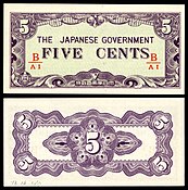
Five Cents -

Ten Cents
| Featured picture tools |
|---|
Please cut and paste new entries to the bottom of this page, creating a new monthly archive (by closing date) when necessary.
Farmhouse in Provence
Voting period is over. Please don't add any new votes. Voting period ends on 30 Apr 2015 at 23:42:22 (UTC)

- Reason
- High quality scan of a notable painting
- Articles in which this image appears
- Farmhouse in Provence +1
- FP category for this image
- Wikipedia:Featured pictures/Artwork/Paintings
- Creator
- Vincent van Gogh
- Support as nominator – — Crisco 1492 ( talk) 23:42, 20 April 2015 (UTC)
- Support - Another van Gogh I hadn't seen! Really nice. I like the lavender- or mauve-colored walls. Is that the ocean in the background? CorinneSD ( talk) 23:46, 20 April 2015 (UTC)
- Support – Oh, Vincent! Sca ( talk) 01:12, 21 April 2015 (UTC)
- Support -- Yann ( talk) 12:03, 22 April 2015 (UTC)
- Support -- Bammesk ( talk) 01:42, 23 April 2015 (UTC)
- Support -- Nice painting + HQ + EV Alborzagros ( talk) 12:25, 23 April 2015 (UTC)
- Support - per above. talk→ WPPilot 01:57, 27 April 2015 (UTC)
- Support -- Great painting chsh ( talk) 16:41, 29 April 2015 (UTC)
Promoted File:Farmhouse in Provence, 1888, Vincent van Gogh, NGA.jpg -- Armbrust The Homunculus 00:42, 1 May 2015 (UTC)
John Wayne Airport
Voting period is over. Please don't add any new votes. Voting period ends on 1 May 2015 at 04:03:58 (UTC)

- Reason
- Great High Altitude Aerial Photo of the entire John Wayne Airport from 9000 feet. The entire airport area, and facilities, including the commercial and charter facilities are well illustrated.
- Articles in which this image appears
- John Wayne Airport
- FP category for this image
- Wikipedia:Featured pictures/Places/Urban
- Creator
- WPPilot
- Support as nominator – talk→ WPPilot 04:03, 21 April 2015 (UTC)
- Support Nice detail, clear enough to see the size of the planes etc, and enough of the surrounding land to be able to clearly see where this airport sits demographically... And of course my favourite detail is in this picture - a plane using the runway! Nice... gazhiley 16:50, 27 April 2015 (UTC)
- Comment-- I'm just wondering what makes this stand out versus other photos of airports? chsh ( talk) 16:39, 29 April 2015 (UTC)
- Oppose thanks to the uploader for the useful and illustrative photo, however on my screen it appears as both a poor-quality image and also somewhat blurry. As Chsh asks, I'm also unclear as to what makes this image "distinct" or an example of WPs best work. A good photo, but not one of our best. -- Tom (LT) ( talk) 01:21, 30 April 2015 (UTC)
- Comment chsh & Tom (LT) - while I cannot answer your comment on the quality, please do not view these in comparison with other pictures. The criteria for judging these are as a standalone picture - therefore do not judge them on whether or not they stand out against other photos. Each to be judged in their own merit. Thanks gazhiley 12:21, 30 April 2015 (UTC)
Not Promoted -- Armbrust The Homunculus 05:19, 1 May 2015 (UTC)
Serra dos Órgãos National Park
Voting period is over. Please don't add any new votes. Voting period ends on 1 May 2015 at 08:14:04 (UTC)

- Reason
- Striking photo, already featured on Commons
- Articles in which this image appears
- Serra dos Órgãos, Rio de Janeiro (state), National Park
- FP category for this image
- Wikipedia:Featured_pictures/Places/Landscapes
- Creator
- Carlos Perez Couto, edited by The Photographer
- Support as nominator – Pine ✉ 08:14, 21 April 2015 (UTC)
- Support — Crisco 1492 ( talk) 08:39, 21 April 2015 (UTC)
- Support – Dramatic lighting, v.g. composition. (What's the altitude there?) Sca ( talk) 12:44, 21 April 2015 (UTC)
- Support -- Yann ( talk) 12:02, 22 April 2015 (UTC)
- Support -- Bammesk ( talk) 02:07, 23 April 2015 (UTC)
- Support -- Dreamland + HQ + EV Alborzagros ( talk) 12:25, 23 April 2015 (UTC)
- Support. Very dramatic, and lucky with the lighting. :-) Ðiliff «» (Talk) 10:16, 26 April 2015 (UTC)
- Support Borderline for me, as per my previous objections to quality issues in dark photographs, however there is just enough detail (especially in the longer distance) to make me support... gazhiley 16:47, 27 April 2015 (UTC)
- Support Love the landscape! chsh ( talk) 16:26, 29 April 2015 (UTC)
- Support per my Commons vote. Daniel Case ( talk) 20:31, 29 April 2015 (UTC)
Promoted File:Amanhecer no Hercules --.jpg -- Armbrust The Homunculus 09:36, 1 May 2015 (UTC)
Glassy Tiger butterfly
Voting period is over. Please don't add any new votes. Voting period ends on 1 May 2015 at 08:21:20 (UTC)


- Reason
- This is a set nomination of two striking and encyclopedic photos that provide side and dorsal views of Parantica aglea, also known as the Glassy Tiger butterfly.
- Articles in which this image appears
- Parantica aglea
- FP category for this image
- Wikipedia:Featured pictures/Animals/Insects
- Creator
- Jkadavoor, edited by Christian Ferrer
- Support as nominator – Pine ✉ 08:21, 21 April 2015 (UTC)
- Support side view, Neutral on the dorsal view (looks a little OOF). — Crisco 1492 ( talk)12:17, 23 April 2015 (UTC)
- @ Crisco 1492: May I get your autograph on the line above, please? (: -- Pine ✉ 08:18, 24 April 2015 (UTC)
- Support side view, Neutral on dorsal view (background). Bammesk ( talk) 22:57, 25 April 2015 (UTC)
- Support Cool.... support both....- The Herald • the joy of the LORD my strength 19:09, 27 April 2015 (UTC)
Not Promoted -- Armbrust The Homunculus 09:43, 1 May 2015 (UTC)
- None of the images has enough support for promotion. Armbrust The Homunculus 09:43, 1 May 2015 (UTC)
Mohanlal
Voting period is over. Please don't add any new votes. Voting period ends on 1 May 2015 at 14:37:30 (UTC)

- Reason
- Good quality and high EV.
- Articles in which this image appears
- Mohanlal, Mohanlal filmography
- FP category for this image
- Wikipedia:Featured pictures/People/Artists and writers
- Creator
- Prathyush Thomas
- Support as nominator – Blacknclick ( talk) 14:37, 21 April 2015 (UTC)
- Comment - Technically, this is pretty good. Admittedly it's a little soft, and I'd have used a lower f number to ensure that the pattern in the background didn't show up as much. However, the composition leaves a bit to be desired, as having his arms crossed (and cut off in the middle) and his eyes looking to the side doesn't make this stand out as a portrait. — Crisco 1492 ( talk) 16:02, 24 April 2015 (UTC)
- Oppose I don't believe anything really makes this picture significantly better than others of the actor. chsh ( talk) 17:33, 24 April 2015 (UTC)
Not Promoted -- Armbrust The Homunculus 15:15, 1 May 2015 (UTC)
Billie Burke
Voting period is over. Please don't add any new votes. Voting period ends on 1 May 2015 at 16:35:15 (UTC)

- Reason
- high resolution image with restoration of a famous artist. The best image we have of her.
- Articles in which this image appears
- Billie Burke
- FP category for this image
- Wikipedia:Featured pictures/People/Artists and writers
- Creator
- Harris & Ewing, photographer, restored, uploaded and nominated by Yann ( talk)
- Support as nominator – Yann ( talk) 16:35, 21 April 2015 (UTC)
- Weak support - There are still several scratches which could be removed. —
Crisco 1492 (
talk) 07:08, 24 April 2015 (UTC)
- Could you please tell me which ones?
Yann (
talk) 20:58, 26 April 2015 (UTC)
- All along the viewer's right side, for starters. —
Crisco 1492 (
talk) 06:07, 27 April 2015 (UTC)
- @ Crisco 1492: New version uploaded. Could you please add a note if there are more? Thanks, Yann ( talk) 11:28, 27 April 2015 (UTC)
- All along the viewer's right side, for starters. —
Crisco 1492 (
talk) 06:07, 27 April 2015 (UTC)
- Could you please tell me which ones?
Yann (
talk) 20:58, 26 April 2015 (UTC)
Not Promoted -- Armbrust The Homunculus 18:03, 1 May 2015 (UTC)
Keeled skimmer
Voting period is over. Please don't add any new votes. Voting period ends on 2 May 2015 at 00:16:49 (UTC)

- Reason
- High quality and attractive. We haven't had any dragonflies in a while.
- Articles in which this image appears
- keeled skimmer
- FP category for this image
- Wikipedia:Featured pictures/Animals/Insects
- Creator
- Andreas Eichler
- Support as nominator – — Crisco 1492 ( talk) 00:16, 22 April 2015 (UTC)
- Support – Amazing detail of filigreed wings at full res. Sca ( talk) 13:03, 22 April 2015 (UTC)
- Support as nominator in Commons. Tomer T ( talk) 22:19, 24 April 2015 (UTC)
- Support - Great detail per Sca.-- Godot13 ( talk) 04:37, 25 April 2015 (UTC)
- Support - per Sca. Bammesk ( talk) 22:54, 25 April 2015 (UTC)
- Support. Very high quality macro, good background separation and good detail. Ðiliff «» (Talk) 10:15, 26 April 2015 (UTC)
Promoted File:2014.07.18.-16-Schwarzbach Woellnau--Kleiner Blaupfeil-Maennchen.jpg -- Armbrust The Homunculus 01:46, 2 May 2015 (UTC)
Portrait of Count Stanislas Potocki
Voting period is over. Please don't add any new votes. Voting period ends on 2 May 2015 at 23:54:08 (UTC)

- Reason
- High quality scan of an attractive work. Haven't had many Poland-related images featured yet.
- Articles in which this image appears
- Portrait of Count Stanislas Potocki +4
- FP category for this image
- Wikipedia:Featured pictures/Artwork/Paintings
- Creator
- Jacques-Louis David
- Support as nominator – — Crisco 1492 ( talk) 23:54, 22 April 2015 (UTC)
- Support Awesome painting with high quality. _______ Alborzagros ( talk) 07:13, 23 April 2015 (UTC)_______
- Support – Nineteenth-century hagiographic portrait with EV for Polish history. (When it was painted in 1781, Poland – territorially reduced by the First Partition – had become a 'protectorate' of Russia, which soon would annex most of it.) Sca ( talk) 12:53, 23 April 2015 (UTC)
- Comment. Another incredibly boring dingy old painting.
81.152.230.173 (
talk) 19:28, 26 April 2015 (UTC)
- Another incredibly snarky and impossible to act upon comment. — Crisco 1492 ( talk) 05:59, 27 April 2015 (UTC)
- Several other people recently have commented that certain photographic portraits were boring, or similar words. I didn't see anyone calling those comments "snarky". 86.152.160.53 ( talk) 12:42, 27 April 2015 (UTC)
- ... by the way, in case you took the comment personally, which it seems you may have done, when I said "another", I did not mean "another nominated by you". I was talking generally. I did not even notice the nominator.
86.152.160.53 (
talk) 12:45, 27 April 2015 (UTC)
- Funny, I never said you meant it that way. There's a difference between "This painting is too dark" (which, yes, there have been several comments recently) and "This painting is incredibly boring, too old, and dingy (dirty)". The painting is old, of course (rather hard to paint the subject from life now!). It might not be the kind of thing that interests you, but then the criteria state "A picture's encyclopedic value (referred to as "EV") is given priority over its artistic value." This painting has its own article, meaning the EV is clearly there. The painting is likewise not overly dark, as when you see it separately from the bright pure white (255, 255, 255) background, the detail is perfectly visible. This scan is well exposed; the contrast effect makes it appear overly dark at thumbnail size. — Crisco 1492 ( talk) 11:15, 28 April 2015 (UTC)
- ... by the way, in case you took the comment personally, which it seems you may have done, when I said "another", I did not mean "another nominated by you". I was talking generally. I did not even notice the nominator.
86.152.160.53 (
talk) 12:45, 27 April 2015 (UTC)
- Support - The Herald • the joy of the LORD my strength 19:10, 27 April 2015 (UTC)
- Support -- Yann ( talk) 07:31, 29 April 2015 (UTC)
Promoted File:Jacques-Louis David - Equestrian portrait of Stanisław Kostka Potocki - Google Art Project.jpg -- Armbrust The Homunculus 00:47, 3 May 2015 (UTC)
Curug Cipendok 2
Voting period is over. Please don't add any new votes. Voting period ends on 3 May 2015 at 23:44:11 (UTC)

- Reason
- Second time's the charm? This image has been reworked to resolve the technical issues, and the EV is still there and still strong.
- Articles in which this image appears
- Curug Cipendok
- FP category for this image
- Wikipedia:Featured pictures/Places/Landscapes
- Creator
- Chris Woodrich
- Support as nominator – — Crisco 1492 ( talk) 23:44, 23 April 2015 (UTC)
- Support again, though I didn't last time. - The Herald the joy of the LORD my strength 07:13, 24 April 2015 (UTC)
- Support Looks good to me! Mattximus ( talk) 02:19, 26 April 2015 (UTC)
- Support -- Yann ( talk) 20:57, 26 April 2015 (UTC)
- Oppose Really grainy at full res... gazhiley 16:44, 27 April 2015 (UTC)
- Oppose agree with Gazhiley that sharpness is lacking. --
Pine
✉ 06:56, 2 May 2015 (UTC)
- Sharpness and grain are two different things. — Crisco 1492 ( talk) 07:09, 2 May 2015 (UTC)
- Support Well composed photograph with good EV, although I wish the article was a little better there is sufficient information given in it. SagaciousPhil - Chat 12:21, 3 May 2015 (UTC)
Promoted File:Curug Cipendok, Purwokerto, 2015-03-22.jpg -- Armbrust The Homunculus 01:08, 4 May 2015 (UTC)
Potassium alum crystal
Voting period is over. Please don't add any new votes. Voting period ends on 4 May 2015 at 06:31:04 (UTC)

- Reason
- Intriguing, encyclopedic, and striking illustration
- Articles in which this image appears
- Alum-(K), Alum, Potassium alum
- FP category for this image
- Wikipedia:Featured pictures/Sciences/Materials science
- Creator
- Ude
- Support as nominator – Pine ✉ 06:31, 24 April 2015 (UTC)
- Weak support - That background arc is somewhat distracting. I much prefer Alchemist's approach of relatively plain backgrounds with no sharp lines to distract from the subject. That said, this is a good illustration. — Crisco 1492 ( talk) 15:55, 24 April 2015 (UTC)
- oppose neither are the typical crystalline structure are good visible nor the background is ok for me: too distracting. -- Alchemist-hp ( talk) 20:26, 25 April 2015 (UTC)
- Oppose. In addition to reasoning above, the fact that the image is B&W doesn't help it's use in describing the physical properties. Ðiliff «» (Talk) 10:11, 26 April 2015 (UTC)
- Comment The vignette on the bottom corners is unfortunately distracting chsh ( talk) 13:21, 30 April 2015 (UTC)
Not Promoted -- Armbrust The Homunculus 07:01, 4 May 2015 (UTC)
India Gate
Voting period is over. Please don't add any new votes. Voting period ends on 4 May 2015 at 09:54:27 (UTC)

- Reason
- A high EV image with unmatched quality
- Articles in which this image appears
- India Gate
- FP category for this image
- Wikipedia:Featured pictures/Places/Architecture
- Creator
- Benison
- Support as nominator – - The Herald the joy of the LORD my strength 09:54, 24 April 2015 (UTC)
- Oppose for now; perspective needs to be corrected (doable with this file), pixelation or something is very disturbing, and there are way too many people (neither of which is fixable with this file). If you want to take FPs, I recommend investing in a camera (rather than a smart phone). —
Crisco 1492 (
talk) 10:03, 24 April 2015 (UTC)
- See my edit. — Crisco 1492 ( talk) 11:54, 24 April 2015 (UTC)
- Oppose This probably is the best image of the India Gate on Commons, but as Crisco says the technical standards and composition are well short of FP status. Nick-D ( talk) 05:43, 26 April 2015 (UTC)
- Oppose Personally I like all the people in this, as it adds a nice size comparison, and the way this is lined up with the further away tower dead centre looks good too... However, the quality just ruins it I'm afraid... gazhiley 16:41, 27 April 2015 (UTC)
Not Promoted -- Armbrust The Homunculus 10:50, 4 May 2015 (UTC)
Jesus image on church window
Voting period is over. Please don't add any new votes. Voting period ends on 4 May 2015 at 11:02:52 (UTC)

- Reason
- High quality
- Articles in which this image appears
- Jesus, Depiction of Jesus, Rite of Christian Initiation of Adults
- FP category for this image
- Wikipedia:Featured pictures/People/Religious figures
- Creator
- unknown
- Support as nominator – Qian.neewan ( talk) 11:02, 24 April 2015 (UTC)
- Comment Nomination is incomplete. — Crisco 1492 ( talk) 12:02, 24 April 2015 (UTC)
Not Promoted -- Armbrust The Homunculus 11:11, 4 May 2015 (UTC)
- Added missing information after closure. Armbrust The Homunculus 12:32, 4 May 2015 (UTC)
Metallic Skink
Voting period is over. Please don't add any new votes. Voting period ends on 4 May 2015 at 22:17:28 (UTC)

- Reason
- High EV and good quality
- Articles in which this image appears
- Metallic Skink
- FP category for this image
- Wikipedia:Featured pictures/Animals/Reptiles
- Creator
- JJ Harrison
- Support as nominator – Tomer T ( talk) 22:17, 24 April 2015 (UTC)
- Comment - Needs a crop. There is a pure white area where the image was rotated. — Crisco 1492 ( talk) 23:36, 24 April 2015 (UTC)
- I did it. Support — Crisco 1492 ( talk) 15:31, 25 April 2015 (UTC)
- Support. Nice photo. The crop is a bit tight around the tail but actually I think it works in this case, because if JJ gave equal space in that corner, it would probably unbalance the (somewhat) central position of the body. Ðiliff «» (Talk) 10:09, 26 April 2015 (UTC)
- Question this animal looks a little light compared to many of the photos that search engines pull up. Are we sure that this is the correct species? -- Pine ✉ 06:58, 2 May 2015 (UTC)
- Support - EV, sharp. (I am no species expert, but the shape is OK, I assume it is the lighting or age!) Bammesk ( talk) 20:52, 2 May 2015 (UTC)
- Support - Very nice sharp, clear photograph; I'd say it has very good EV too (especially as skink is something completely different in Scotland!). SagaciousPhil - Chat 12:29, 3 May 2015 (UTC)
Promoted File:Niveoscincus metallicus - Austin's Ferry.jpg -- Armbrust The Homunculus 22:27, 4 May 2015 (UTC)
William Etty
Voting period is over. Please don't add any new votes. Voting period ends on 6 May 2015 at 02:05:56 (UTC)

- Reason
- High quality scan of a self-portrait by a notable artist, showing both his style and how he viewed himself.
- Articles in which this image appears
- William Etty +1
- FP category for this image
- Wikipedia:Featured pictures/People/Artists and writers
- Creator
- William Etty
- Support as nominator – — Crisco 1492 ( talk) 02:05, 26 April 2015 (UTC)
- Support -- Yann ( talk) 20:56, 26 April 2015 (UTC)
- Support - The Herald • the joy of the LORD my strength 19:10, 27 April 2015 (UTC)
- Support – excellent quality scan; good EV backed up by its use in a recently promoted FA on one of his paintings. SagaciousPhil - Chat 14:16, 29 April 2015 (UTC)
- Weak oppose lots of marks all over the painting. The fault is with the condition of the painting, not the photo. The painting could use restoration work. -- Pine ✉ 07:00, 2 May 2015 (UTC)
Not Promoted -- Armbrust The Homunculus 02:34, 6 May 2015 (UTC)
The Dining Hall of Keble College, Oxford, UK
Voting period is over. Please don't add any new votes. Voting period ends on 6 May 2015 at 10:23:19 (UTC)

- Reason
- It's a high quality and interesting interior of Keble College, one of the constituent colleges of the University of Oxford.
- Articles in which this image appears
- Keble College, Oxford
- FP category for this image
- Wikipedia:Featured pictures/Places/Interiors
- Creator
- User:Diliff
- Support as nominator – Ðiliff «» (Talk) 10:23, 26 April 2015 (UTC)
- Support - Useful. — Crisco 1492 ( talk) 11:25, 26 April 2015 (UTC)
- Support Time to eat, gentlemen. Brandmeister talk 18:49, 26 April 2015 (UTC)
- Support -- Yann ( talk) 20:56, 26 April 2015 (UTC)
- Support – Bammesk ( talk) 01:34, 27 April 2015 (UTC)
- Support High quality, interesting image... gazhiley 16:39, 27 April 2015 (UTC)
- Support -- chsh ( talk) 16:20, 29 April 2015 (UTC)
- Support ©Geni ( talk) 16:33, 30 April 2015 (UTC)
- Support - Highest quality, as usual...-- Godot13 ( talk) 14:28, 2 May 2015 (UTC)
Promoted File:Keble College Dining Hall 2, Oxford, UK - Diliff.jpg -- Armbrust The Homunculus 10:25, 6 May 2015 (UTC)
Wendell Phillips
Voting period is over. Please don't add any new votes. Voting period ends on 6 May 2015 at 20:55:12 (UTC)

- Reason
- old high resolution picture with restoration, used on 8 pages
- Articles in which this image appears
- Wendell Phillips, List of Boston Latin School alumni, National Women's Rights Convention, American Equal Rights Association, International Workingmen's Association in America
- FP category for this image
- Wikipedia:Featured pictures/People/Others
- Creator
- picture by Mathew Brady, restored, uploaded and nominated by Yann
- Support as nominator – Yann ( talk) 20:55, 26 April 2015 (UTC)
- Support - Though I'd like it better if the water stains on his left side (viewer's right) were cut back. —
Crisco 1492 (
talk) 23:34, 26 April 2015 (UTC)
- @
Crisco 1492: Could you please add a note? Thanks,
Yann (
talk) 07:25, 27 April 2015 (UTC)
- Bottom right corner of the oval; rather hard to miss. —
Crisco 1492 (
talk) 11:06, 28 April 2015 (UTC)
- @ Crisco 1492: Done. I saw that, but I always wonder how much correction should be done. This is a daguerreotype, more than 150 years old... Any way, suggestions and critics welcome. Regards, Yann ( talk) 20:28, 28 April 2015 (UTC)
- Bottom right corner of the oval; rather hard to miss. —
Crisco 1492 (
talk) 11:06, 28 April 2015 (UTC)
- @
Crisco 1492: Could you please add a note? Thanks,
Yann (
talk) 07:25, 27 April 2015 (UTC)
- Support – Historical EV – an interesting and perhaps not very widely known (at least not to me) figure in U.S. history. Sca ( talk) 12:43, 27 April 2015 (UTC)
- Support No summaries..- The Herald • the joy of the LORD my strength 19:11, 27 April 2015 (UTC)
- Support Good EV and used across a number of articles. chsh ( talk) 13:15, 30 April 2015 (UTC)
Promoted File:Wendell Phillips by Brady.jpg -- Armbrust The Homunculus 22:22, 6 May 2015 (UTC)
Battle of the Monitor and the Merrimac
Voting period is over. Please don't add any new votes. Voting period ends on 7 May 2015 at 03:04:07 (UTC)

- Reason
- A high-res image of an important moment in history is shown here: the battle between the Monitor and the Merrimac (at the time operating under the designation CSS Virgina). This was the first time in history that ironclad warships (forerunners of the modern day battleship) ever fought each other, and the technological advances both ships brought to the battle single handedly rendered all existing military ships still using sails and/or wooden hulls obsolete. So unexpected were these technological advancements that neither ship could best the other, resulting in draw between the two ships.
- Articles in which this image appears
- Battle of Hampton Roads, CSS Virginia, Confederate war finance, History of Virginia, Ironclad warship, Naval warfare, Steamboat, USS Monitor
- FP category for this image
- Wikipedia:Featured pictures/History/American Civil War
- Creator
- Louis Prang & Co.; lithograph signed "Jo Davidson"
- Support as nominator – TomStar81 ( Talk) 03:04, 27 April 2015 (UTC)
- Oppose With CSS crop now available, there's no reason to remove the border. — Crisco 1492 ( talk) 05:53, 27 April 2015 (UTC)
- CSS crop?
Sca (
talk) 12:36, 27 April 2015 (UTC)
- Template:CSS image crop. — Crisco 1492 ( talk) 13:16, 27 April 2015 (UTC)
- Tried to correct spelling "Moniter" in page title above, using move, but found I didn't have permission. Sca ( talk) 14:33, 27 April 2015 (UTC)
- CSS crop?
Sca (
talk) 12:36, 27 April 2015 (UTC)
Support– I confess I don't understand the technical objection raised by Crisco, but if that can be resolved – I like the painting & bleve it has EV (according to the article, parts of this technically significant battle did take place at very close range). Sca ( talk) 13:12, 28 April 2015 (UTC)- Not a painting, but a lithograph. The original shows what's missing. — Crisco 1492 ( talk) 13:17, 28 April 2015 (UTC)
- Ah! Well, aesthetically, I don't see any objection to removing the borders – which was done routinely done with a large series of
Adam's FPCs of turn-of-the-century German
warship postcards in the last year or so.
Sca (
talk) 13:48, 28 April 2015 (UTC)
- Oppose: It really does matter: without the borders it's not reproduceable in the original form. It's not so bad when an optimised crop is done, and the original is available, or if the border has no information on it, but the L. Prang images have captions. Also, it still has a lot of damage, and - I believe - has been scaled down. That's a 210 megabyte original; I'd expect a bit bigger, even with the crop (I could be wrong there, though).
Adam Cuerden (
talk) 14:03, 28 April 2015 (UTC)
- OK,
Adam, I defer to your technical knowledge & w/draw my support.
Sca (
talk) 14:49, 28 April 2015 (UTC)
- @
Adam Cuerden: I can all but guarantee that this is a scaled down image since the restrictions placed on image uploading would not permit the tiff version of the source page (which is the highest resolution available) to be uploaded here. Either of the two jpg/jpeg version could work, I suppose, but both of those versions do have damage issues that would make them unsuitable at the moment as FPC candidates. I would be of the mind to count this one for its color and slight restoration, although I had not realized at the time that the bord and crop problem would be a major let down for this image here. I'll have to be more careful about that in the future.
TomStar81 (
Talk) 20:49, 28 April 2015 (UTC)
- Actually, the originals CAN be uploaded, but you need to use the Upload Wizard, or install a gadget on Commons.
Adam Cuerden (
talk) 21:29, 28 April 2015 (UTC)
- Right. The current maximum upload size is 1 gb. — Crisco 1492 ( talk) 23:45, 28 April 2015 (UTC)
- For instance, I uploaded Night of the Living Dead earlier today. That's a 750 mb file. — Crisco 1492 ( talk) 13:59, 30 April 2015 (UTC)
- Actually, the originals CAN be uploaded, but you need to use the Upload Wizard, or install a gadget on Commons.
Adam Cuerden (
talk) 21:29, 28 April 2015 (UTC)
- @
Adam Cuerden: I can all but guarantee that this is a scaled down image since the restrictions placed on image uploading would not permit the tiff version of the source page (which is the highest resolution available) to be uploaded here. Either of the two jpg/jpeg version could work, I suppose, but both of those versions do have damage issues that would make them unsuitable at the moment as FPC candidates. I would be of the mind to count this one for its color and slight restoration, although I had not realized at the time that the bord and crop problem would be a major let down for this image here. I'll have to be more careful about that in the future.
TomStar81 (
Talk) 20:49, 28 April 2015 (UTC)
- OK,
Adam, I defer to your technical knowledge & w/draw my support.
Sca (
talk) 14:49, 28 April 2015 (UTC)
- Oppose: It really does matter: without the borders it's not reproduceable in the original form. It's not so bad when an optimised crop is done, and the original is available, or if the border has no information on it, but the L. Prang images have captions. Also, it still has a lot of damage, and - I believe - has been scaled down. That's a 210 megabyte original; I'd expect a bit bigger, even with the crop (I could be wrong there, though).
Adam Cuerden (
talk) 14:03, 28 April 2015 (UTC)
- Ah! Well, aesthetically, I don't see any objection to removing the borders – which was done routinely done with a large series of
Adam's FPCs of turn-of-the-century German
warship postcards in the last year or so.
Sca (
talk) 13:48, 28 April 2015 (UTC)
- comment the scale between the two ships is off (Merrimac should be significantly larger than the Monitor). The ships didn't really render HMS Warrior and Gloire obsolete. That aside its a famous image in its own right. ©Geni ( talk) 16:26, 30 April 2015 (UTC)
Not Promoted -- Armbrust The Homunculus 03:06, 7 May 2015 (UTC)
Tiger under a pine tree
Voting period is over. Please don't add any new votes. Voting period ends on 17 May 2015 at 18:46:12 (UTC)

- Reason
- Important painting in Korean art history. I have noticed an unfortunate lack of Korean art among the Featured Pictures. High quality image.
- Articles in which this image appears
- Kim Hong-do, Minhwa, Painter of the Wind
- FP category for this image
- Wikipedia:Featured_pictures/Artwork/East_Asian_art
- Creator
- Kim Hong-do
Not Promoted -- Armbrust The Homunculus 19:40, 7 May 2015 (UTC)
- Speedy close, bellow the size requirements. Armbrust The Homunculus 19:40, 7 May 2015 (UTC)
Chilades lajus
Voting period is over. Please don't add any new votes. Voting period ends on 7 May 2015 at 23:49:33 (UTC)

- Reason
- High quality image. Very attractive and interesting.
- Articles in which this image appears
- Chilades lajus
- FP category for this image
- Wikipedia:Featured pictures/Animals/Insects
- Creator
- Jeevan Jose
- Support as nominator – — Crisco 1492 ( talk) 23:49, 27 April 2015 (UTC)
- Comment There's
wet season form as well, also a quality image at Commons, so might be better to nominate as a set.
Brandmeister
talk 14:58, 28 April 2015 (UTC)
- I considered that, but that image has the butterfly's head too close to the leaf. — Crisco 1492 ( talk) 15:19, 28 April 2015 (UTC)
Not Promoted -- Armbrust The Homunculus 02:51, 8 May 2015 (UTC)
Don Quixote (ballet)
Voting period is over. Please don't add any new votes. Voting period ends on 8 May 2015 at 23:40:16 (UTC)

- Reason
- Good quality and useful image. I don't think we have any photographs of actual performances featured yet.
- Articles in which this image appears
- Don Quixote (ballet)
- FP category for this image
- Wikipedia:Featured pictures/Culture, entertainment, and lifestyle/Entertainment
- Creator
- Wilfredo R. Rodriguez
- Support as nominator – — Crisco 1492 ( talk) 23:40, 28 April 2015 (UTC)
- Support -- Alchemist-hp ( talk) 06:32, 29 April 2015 (UTC)
- Support -- Yann ( talk) 07:28, 29 April 2015 (UTC)
- Comment The stage line isn't straight, maybe some rotation is required. Brandmeister talk 08:12, 29 April 2015 (UTC)
- Support Nice Alborzagros ( talk) 13:47, 29 April 2015 (UTC)
- Support Love the reds and blues chsh ( talk) 16:15, 29 April 2015 (UTC)
Promoted File:Don Quijote de La Mancha, Teresa Carreño Teather.jpg -- Armbrust The Homunculus 00:07, 9 May 2015 (UTC)
The Day Dream
Voting period is over. Please don't add any new votes. Voting period ends on 9 May 2015 at 14:28:24 (UTC)

- Reason
- Good quality scan of interesting painting; probably one of Rossetti's final serious pieces of artworks, it is unusual for this period of his work as it portrays the model full length and she is posed in an outside setting when he generally used a bedroom or drawing room.
- Articles in which this image appears
- It has its own article, The Day Dream; is used in the artist and the model's articles.
- FP category for this image
- Wikipedia:Featured pictures/Artwork/Paintings
- Creator
- Dante Gabriel Rossetti
- Support as nominator – SagaciousPhil - Chat 14:28, 29 April 2015 (UTC)
- Support as co-nom – Hafspajen ( talk) 21:23, 29 April 2015 (UTC)
- Support chsh ( talk) 16:13, 29 April 2015 (UTC)
- Support, teal and green combination is also nice. Brandmeister talk 21:32, 29 April 2015 (UTC)
- Support - Nice painting, different color scheme compared to what we normally get. — Crisco 1492 ( talk) 13:16, 30 April 2015 (UTC)
- Support - Variety shades of green altogether have created a fantastic view. Alborzagros ( talk) 04:31, 5 May 2015 (UTC)
- Support HQ Qian.Nivan ( talk) 06:58, 5 May 2015 (UTC)
- Support - HullIntegrity\ talk / 00:15, 6 May 2015 (UTC)
Promoted File:Dante Gabriel Rossetti - The Day Dream - Google Art Project.jpg -- Armbrust The Homunculus 14:43, 9 May 2015 (UTC)
Lahore Fort
Voting period is over. Please don't add any new votes. Voting period ends on 9 May 2015 at 22:09:52 (UTC)

- Reason
- High quality image of an important moument in Pakistan which is attractive and interesting. Good quality image on Commons and 7th position holder in Wiki Loves Monuments Pakistan
- Articles in which this image appears
- Lahore Fort
- FP category for this image
- Wikipedia:Featured pictures/Places/Architecture
- Creator
- User:Rohaan Bhatti
- Support as nominator – Saqib ( talk) 22:09, 29 April 2015 (UTC)
- Support -- Yann ( talk) 08:27, 30 April 2015 (UTC)
- Oppose As artistic as it might be, the dark arch cropping the main building spoils the EV for me - it distracts from the focus of the picture, and means you cannot see what is either side of the building... Looks nice, but doesn't meet what I understand to be the point of this process... Image size is only just within what's allowed so I feel a better picture that is larger and un-interupted by the arch would provide better EV... gazhiley 12:26, 30 April 2015 (UTC)
- Oppose per Gaz. — Crisco 1492 ( talk) 13:12, 30 April 2015 (UTC)
- Oppose Although it's a wonderful picture, ditto @Gazhiley. chsh ( talk) 13:15, 30 April 2015 (UTC)
- Oppose – Per previous. Sca ( talk) 16:30, 30 April 2015 (UTC)
Not Promoted -- Armbrust The Homunculus 22:10, 9 May 2015 (UTC)
Esabelle Dingizian
Voting period is over. Please don't add any new votes. Voting period ends on 10 May 2015 at 07:24:34 (UTC)
.jpg)
- Reason
- Quality is high. Good EV as well.
- Articles in which this image appears
- Esabelle Dingizian
- FP category for this image
- Wikipedia:Featured pictures/People/Political
- Creator
- Miljöpartiet de Gröna
- Support as nominator – Étienne Dolet ( talk) 07:24, 30 April 2015 (UTC)
- Support — Crisco 1492 ( talk) 13:14, 30 April 2015 (UTC)
- Comment – Article is stub.
Sca (
talk) 16:28, 30 April 2015 (UTC)
- @ Sca: I'll expand on it when I allocate enough time. Étienne Dolet ( talk) 16:42, 30 April 2015 (UTC)
- @ Sca: Not a stub anymore. Étienne Dolet ( talk) 19:10, 30 April 2015 (UTC)
- Oppose A nice and good quality image illustrating an article. But not the best Wikipedia has to offer. Alvesgaspar ( talk) 12:29, 1 May 2015 (UTC)
- Oppose – Ms. Dingizian is no doubt an interesting person but I don't see the EV for a global English-speaking audience. Sca ( talk) 13:05, 1 May 2015 (UTC)
- Oppose Based on a a Google images search, it seems that the lighting in this photo is off. Nick-D ( talk) 23:33, 2 May 2015 (UTC)
Not Promoted -- Armbrust The Homunculus 07:41, 10 May 2015 (UTC)
Leaving Earth
Voting period is over. Please don't add any new votes. Voting period ends on 10 May 2015 at 22:38:28 (UTC)
- Reason
- why you think it meets the FPC criteria and should be featured (check criteria first)
- Articles in which this image appears
- MESSENGER, just added to Escape velocity and Earth
- FP category for this image
- Wikipedia:Featured pictures/Space/Getting there
- Creator
- NASA
- Support as nominator – Nergaal ( talk) 22:38, 30 April 2015 (UTC)
- Comment - The video is used in what is essentially a gallery. Not too sure of the EV. — Crisco 1492 ( talk) 23:29, 30 April 2015 (UTC)
- Support – Oh, my gosh. Can you imagine being in a spaceship, at the beginning of a journey to another planet or solar system, and seeing your home planet getting smaller and smaller as it recedes? Until that becomes a reality, and passengers take videos out the window, this is as close as we're going to get to that view. For that alone, I think it has EV. CorinneSD ( talk) 00:08, 1 May 2015 (UTC)
- Oppose -- As Crisco. Nice animation but not really exceptional as EV is concerned. Alvesgaspar ( talk) 12:27, 1 May 2015 (UTC)
- Support as I don't think we have anything better that's not a computer-generated animation. I've added this to the articles Escape velocity and Earth. I think the EV is highest for the Escape velocity article. -- Pine ✉ 04:50, 2 May 2015 (UTC)
- Added it to Gravity assist and Interplanetary spaceflight also. Nergaal ( talk) 08:58, 2 May 2015 (UTC)
- Oppose for now. The video does seem to add to the new articles, but perhaps this could be renominated in a month or so if it has stayed in them prominently? Josh Milburn ( talk) 12:29, 3 May 2015 (UTC)
- Support - Wholeheartedly agree with @ CorinneSD. Years ago when WP:FP had a much smaller collection, every image was breathtaking. As the collection has grown significantly, the criteria of whether or not a picture "is among Wikipedia's best work" has fell by the wayside in favor of EV, resolution, and technique. This is unavoidable unfortunately, but, in this case, Leaving Earth really shines as one of Wikipedia's best works. I feel like the EV it's lacking is not a result of a poor image, but instead a result of articles not showcasing this image well enough. I hope people can see how wonderfully unique this image is and how it stands out among our set of pictures. chsh ( talk) 16:52, 4 May 2015 (UTC)
Not Promoted -- Armbrust The Homunculus 02:54, 11 May 2015 (UTC)
Frederik Sødring
Voting period is over. Please don't add any new votes. Voting period ends on 10 May 2015 at 23:40:45 (UTC)

- Reason
- Very high quality scan of a portrait of this Danish landscape artist.
- Articles in which this image appears
- Frederik Sødring +3
- FP category for this image
- Wikipedia:Featured pictures/People/Artists and writers
- Creator
- Christen Købke
- Support as nominator – — Crisco 1492 ( talk) 23:40, 30 April 2015 (UTC)
- Support – Very clear image and nice painting. A portrait of one Danish painter by another Danish painter. CorinneSD ( talk) 00:03, 1 May 2015 (UTC)
- Support – Hafspajen ( talk) 05:08, 6 May 2015 (UTC)
- Support – Excellent scan backed up by sufficient EV - apparently this portrait was described by an art historian as the "most beautiful painting of Denmark's Golden Age". SagaciousPhil - Chat 12:56, 10 May 2015 (UTC)
Not Promoted -- Armbrust The Homunculus 02:55, 11 May 2015 (UTC)
- Not enough support for promotion. Armbrust The Homunculus 02:55, 11 May 2015 (UTC)
Drypetes sepiaria
Voting period is over. Please don't add any new votes. Voting period ends on 11 May 2015 at 05:08:21 (UTC)
.jpg)
- Reason
- High quality image with attractive and interesting including encyclopedia value
- Articles in which this image appears
- Drypetes sepiaria, Drypetes
- FP category for this image
- Wikipedia:Featured pictures/Plants/Others
- Creator
- AntanO
- Support as nominator – Antan O 05:08, 1 May 2015 (UTC)
- Oppose - Great at thumbnail, but somewhat noisy and with little DOF at full size. — Crisco 1492 ( talk) 06:16, 1 May 2015 (UTC)
Not Promoted --- The Herald • the joy of the LORD my strength 09:32, 11 May 2015 (UTC)
- 1 support, 1 oppose, no concensus - The Herald • the joy of the LORD my strength 09:32, 11 May 2015 (UTC)
Kesari bhath
Voting period is over. Please don't add any new votes. Voting period ends on 11 May 2015 at 05:42:29 (UTC)

- Reason
- Interesting high quality image with encyclopedic value
- Articles in which this image appears
- Kesari bhath
- FP category for this image
- Wikipedia:Featured pictures/Food and drink
- Creator
- AntanO
- Support as nominator – Antan O 05:42, 1 May 2015 (UTC)
- Oppose - Again, DOF leaves much to be desired. — Crisco 1492 ( talk) 06:18, 1 May 2015 (UTC)
- Oppose - I like the idea of this picture, we have too few Featured Food pictures, but I have to agree with Crisco, the depth of field means half the image is very blurry. Perhaps a higher angle would help?
Mattximus (
talk) 14:06, 1 May 2015 (UTC)
- Two words:
focus stacking. This is the perfect example of something that would benefit from it. If
this ring had been photographed normally, I'd have lost focus on the rear. With focus stacking, everything is... well, in focus. —
Crisco 1492 (
talk) 15:31, 1 May 2015 (UTC)
- Do we need focus stacking for food photography? I see many pictures like this with
bit of shallow DoF. Anyway, it's a matter of personal opinion. --
Antan
O 11:24, 2 May 2015 (UTC)
- If you're getting this little DOF with f/11, focus stacking would help immensely. Madhu Menon's goal is photographing images for display at web resolution and in menus, both of which are very forgiving of a lack of DOF owing to the small size. We're supposed to judge FPs based on the full resolution. These are very different beasts. Furthermore, working without a background means we don't have any pleasing blur/bokeh to worry about. —
Crisco 1492 (
talk) 23:14, 2 May 2015 (UTC)
- I agree, I think for educational use, good DoF is important, although I do have sympathy with AntonO because shallow DoF can be an artistic choice rather than an accidental problem. However, just as B&W photography is popular in part because of the sentimentality of days gone by when colour simply wasn't an option, shallow DoF macro photography is to some extent a popular aesthetic because of the traditional limits of the style rather than because people don't really want to see everything sharply. Just my opinion anyway. :-) Ðiliff «» (Talk) 10:04, 5 May 2015 (UTC)
- If you're getting this little DOF with f/11, focus stacking would help immensely. Madhu Menon's goal is photographing images for display at web resolution and in menus, both of which are very forgiving of a lack of DOF owing to the small size. We're supposed to judge FPs based on the full resolution. These are very different beasts. Furthermore, working without a background means we don't have any pleasing blur/bokeh to worry about. —
Crisco 1492 (
talk) 23:14, 2 May 2015 (UTC)
- Do we need focus stacking for food photography? I see many pictures like this with
bit of shallow DoF. Anyway, it's a matter of personal opinion. --
Antan
O 11:24, 2 May 2015 (UTC)
- Two words:
focus stacking. This is the perfect example of something that would benefit from it. If
this ring had been photographed normally, I'd have lost focus on the rear. With focus stacking, everything is... well, in focus. —
Crisco 1492 (
talk) 15:31, 1 May 2015 (UTC)
Not Promoted --- The Herald • the joy of the LORD my strength 09:33, 11 May 2015 (UTC)
- 1 support, 2oppose, no concensus - The Herald • the joy of the LORD my strength 09:33, 11 May 2015 (UTC)
André Malraux
Voting period is over. Please don't add any new votes. Voting period ends on 20 May 2015 at 08:13:22 (UTC)

- Reason
- Famous French novelist, art theorist and politician
- Articles in which this image appears
- André Malraux, Bangladesh Liberation War
- FP category for this image
- Wikipedia:Featured pictures/People/Artists and writers
- Creator
- Roger Pic
- Support as nominator – Yann ( talk) 08:13, 10 May 2015 (UTC)
- Oppose - Extremely blurry; 1974 technical capabilities were enough so that that shouldn't happen. —
Crisco 1492 (
talk) 23:57, 10 May 2015 (UTC)
- @
Crisco 1492: Thanks for reviewing. There are many more pictures in
this set. I would be happy to import and restore another one if you think it would be better than this one. Regards,
Yann (
talk) 09:49, 11 May 2015 (UTC)
- What's with the pink tint? I find it hard to judge DOF and contrast with it... or maybe it's my browser? —
Crisco 1492 (
talk) 11:56, 11 May 2015 (UTC)
- @ Crisco 1492: No, there are all pink, but these are black and white pictures, so changing them to grayscale fixes the issue. Some trick is needed to get the highest resolution, which is not offered readily for download. If none of these are better, just forget it. I withdraw this nomination. Yann ( talk) 16:39, 11 May 2015 (UTC)
- What's with the pink tint? I find it hard to judge DOF and contrast with it... or maybe it's my browser? —
Crisco 1492 (
talk) 11:56, 11 May 2015 (UTC)
- @
Crisco 1492: Thanks for reviewing. There are many more pictures in
this set. I would be happy to import and restore another one if you think it would be better than this one. Regards,
Yann (
talk) 09:49, 11 May 2015 (UTC)
 Request withdrawn
Yann (
talk) 16:39, 11 May 2015 (UTC)
Request withdrawn
Yann (
talk) 16:39, 11 May 2015 (UTC)
Not Promoted -- Armbrust The Homunculus 18:45, 11 May 2015 (UTC)
- Withdrawn nomination. Armbrust The Homunculus 18:45, 11 May 2015 (UTC)
Black lory
Voting period is over. Please don't add any new votes. Voting period ends on 11 May 2015 at 23:46:16 (UTC)
,_Gembira_Loka_Zoo,_Yogyakarta_2015-03-15_03.jpg)
- Reason
- Attractive image showing two specimens of this species.
- Articles in which this image appears
- Black lory +2
- FP category for this image
- Wikipedia:Featured pictures/Animals/Birds
- Creator
- Chris Woodrich
- Support as nominator – — Crisco 1492 ( talk) 23:46, 1 May 2015 (UTC)
CommentSupport - What are the short white fiber-like things in the lower right section of the image? Can (should) they go away?-- Godot13 ( talk) 14:21, 2 May 2015 (UTC)- I... haven't a clue. I'll remove them. — Crisco 1492 ( talk) 14:31, 2 May 2015 (UTC)
- Gone. —
Crisco 1492 (
talk) 14:42, 2 May 2015 (UTC)
- I may not be refreshing the image properly but they look like they're gone in the thumbnail but still there when I click on the image (?)--
Godot13 (
talk) 03:19, 3 May 2015 (UTC)
- You need to refresh the full sized image as well (CTRL + R in Windows/Firefox) — Crisco 1492 ( talk) 10:02, 3 May 2015 (UTC)
- I may not be refreshing the image properly but they look like they're gone in the thumbnail but still there when I click on the image (?)--
Godot13 (
talk) 03:19, 3 May 2015 (UTC)
- Support – Cool composition. Sca ( talk) 14:31, 2 May 2015 (UTC)
- Support and looks like they want something to say. Brandmeister talk 21:39, 3 May 2015 (UTC)
Promoted File:Black lory (Chalcopsitta atra), Gembira Loka Zoo, Yogyakarta 2015-03-15 03.jpg -- Armbrust The Homunculus 23:48, 11 May 2015 (UTC)
Government of Ceylon, Five Rupees (1929)
Voting period is over. Please don't add any new votes. Voting period ends on 12 May 2015 at 01:51:35 (UTC)
.jpg)
- Reason
- High quality image, high EV, high grade specimen.
- Articles in which these images appear
- Sri Lankan rupee
- FP category for this image
- Currency
- Creator
-
Thomas De La Rue, for
British Ceylon.
From the National Numismatic Collection, National Museum of American History, Smithsonian Institution.
Image by Godot13.
- Support as nominator – Godot13 ( talk) 01:51, 2 May 2015 (UTC)
- Support another country I haven't been to yet. — Crisco 1492 ( talk) 04:50, 2 May 2015 (UTC)
- Support -- Yann ( talk) 12:38, 5 May 2015 (UTC) Crisco, Sri Lanka has the best climate in the world. A must go!
- Support -- National Names 2000 ( talk) 03:56, 10 May 2015 (UTC)
- Support – Good quality scan, high EV; very interesting. SagaciousPhil - Chat 13:04, 10 May 2015 (UTC)
Promoted File:CEY-23-Government of Ceylon-5 Rupees (1929).jpg -- Armbrust The Homunculus 01:52, 12 May 2015 (UTC)
Pinwheel Galaxy 2
Voting period is over. Please don't add any new votes. Voting period ends on 12 May 2015 at 04:35:06 (UTC)

- Reason
- Highly detailed image of a noted astronomical object, 15,852 × 12,392 pixels in size. Previous nomination is at Wikipedia:Featured picture candidates/Pinwheel Galaxy which referred to a previous version of this image.
- Articles in which this image appears
- Pinwheel Galaxy, Hubble sequence, Galaxy, Spiral galaxy, and others
- FP category for this image
- Wikipedia:Featured pictures/Space/Looking out
- Creator
- NASA and ESA
- Support as nominator – Pine ✉ 04:35, 2 May 2015 (UTC)
- Support - Awe inspiring. — Crisco 1492 ( talk) 04:51, 2 May 2015 (UTC)
Weak support- one corner is sharp but the other three are not (is that normal!) Bammesk ( talk) 20:32, 2 May 2015 (UTC)
- Support - Gorgeous. chsh ( talk) 16:27, 4 May 2015 (UTC)
- Support as a fan of it. - The Herald • the joy of the LORD my strength 18:31, 5 May 2015 (UTC)
- Support -- Yann ( talk) 16:34, 9 May 2015 (UTC)
Promoted File:M101 hires STScI-PRC2006-10a.jpg -- Armbrust The Homunculus 04:59, 12 May 2015 (UTC)
Glassy Tiger Butterfly 2
Voting period is over. Please don't add any new votes. Voting period ends on 12 May 2015 at 04:43:03 (UTC)
- Reason
- Almost passed previous nomination with 4 support votes and 0 oppose for this version. 5 support votes are needed to pass.
- Articles in which this image appears
- Parantica aglea
- FP category for this image
- Wikipedia:Featured pictures/Animals/Insects
- Creator
- Jkadavoor, edited by Christian Ferrer
- Support as nominator – Pine ✉ 04:43, 2 May 2015 (UTC)
- Support as last time. — Crisco 1492 ( talk) 04:49, 2 May 2015 (UTC)
- Support Beautiful and encyclopaedic. -- Ebertakis ( talk) 10:39, 2 May 2015 (UTC)
- Support - per last time & nice focus in head area. Bammesk ( talk) 20:24, 2 May 2015 (UTC)
- Support - Great detail, nice EV-- Godot13 ( talk) 03:22, 3 May 2015 (UTC)
- Support – Good composition & color w/flower petals. (Could possibly be cropped a bit tighter to zero in more on central elements.) Sca ( talk) 12:48, 5 May 2015 (UTC)
- Support as per above. chsh ( talk) 18:41, 6 May 2015 (UTC)
Promoted File:Parantica aglea at Nayikayam Thattu.jpg -- Armbrust The Homunculus 05:11, 12 May 2015 (UTC)
Dabotap
Voting period is over. Please don't add any new votes. Voting period ends on 21 May 2015 at 06:50:30 (UTC)

- Reason
- High quality image of an important work of Korean pagoda art from the 8th century. This is National Treasure No. 20 of South Korea.
- Articles in which this image appears
- Dabotap
- FP category for this image
- Wikipedia:Featured_pictures/Artwork/East_Asian_art
- Creator
- ChunjaeGirl (a flickr user)
- Support as nominator – Blorgy555 ( talk) 06:50, 11 May 2015 (UTC)
- Oppose Blown sky, leaving a wierd blue edges all over upper half of structure. Distracting man at bottom right - seems quiet enough around the structure to get a better photograph with no people in shot. Plus although not technically part of it, the building in the background close to it being cut off is a shame, as it looks interesting. Only minor last point though, as obviously the nom is the structure itself. gazhiley 11:18, 11 May 2015 (UTC)
- Oppose and Speedy close - Nothing featureable in this nom. — Crisco 1492 ( talk) 15:40, 11 May 2015 (UTC)
Not Promoted --- The Herald • the joy of the LORD my strength 09:02, 12 May 2015 (UTC)
- Speedy close, no concensus and no indication for FP criteria - The Herald • the joy of the LORD my strength 09:02, 12 May 2015 (UTC)
Magdalen College Oxford Old Grammar Hall
Voting period is over. Please don't add any new votes. Voting period ends on 13 May 2015 at 10:34:45 (UTC)

- Reason
- This is a (IMHO) quality image of a grade II* listed building at Magdalen College, Oxford.
- Articles in which this image appears
-
Magdalen College, Oxford
Grade II* listed buildings in Oxford - FP category for this image
- Wikipedia:Featured pictures/Places/Architecture
- Creator
- User:BethNaught
- Support as nominator – BethNaught ( talk) 10:34, 3 May 2015 (UTC)
- Comment – EV? The Old Grammar Hall is mentioned once in Magdalen College, Oxford – merely regarding its location within St. John's Quad. Sca ( talk) 12:40, 5 May 2015 (UTC)
Not Promoted -- Armbrust The Homunculus 11:39, 13 May 2015 (UTC)
Gertie the Dinosaur
Voting period is over. Please don't add any new votes. Voting period ends on 13 May 2015 at 23:09:05 (UTC)
- Reason
- High resolution video in a featured article. Interesting both for being an early example of animation and for combining animation and live action. Oh yeah, and dinosaurs. We all love dinosaurs.
- Articles in which this image appears
- Gertie the Dinosaur, Winsor McCay
- FP category for this image
- Wikipedia:Featured pictures/Culture, entertainment, and lifestyle/Entertainment
- Creator
- Winsor McCay
- Support as nominator – — Crisco 1492 ( talk) 23:09, 3 May 2015 (UTC)
- Support - Iconic. One of the better prints I've seen, even though the video interlacing shows pretty strongly... -- Janke | Talk 07:57, 4 May 2015 (UTC)
- Note—apparently Nathan and Crafton are involved in a
digital restoration of the film, including some lost frames. Whenever it happens to get released, it'll be way higher quality than this (taken from a DVD).
Curly Turkey
¡gobble! 06:40, 8 May 2015 (UTC)
- Without a doubt, but "whenever it happens to be released" is a fairly uncertain thing to depend on. — Crisco 1492 ( talk) 06:59, 8 May 2015 (UTC)
Not Promoted -- Armbrust The Homunculus 02:33, 14 May 2015 (UTC)
Mariam Mosque prayer chamber
Voting period is over. Please don't add any new votes. Voting period ends on 14 May 2015 at 10:03:18 (UTC)

- Reason
- artistic image
- Articles in which this image appears
- Mosque of Mariyam Zamani Begum
- FP category for this image
- Wikipedia:Featured pictures/Places/Interiors
- Creator
- Asif Nawaz
- Support as nominator – RRD13 দেবজ্যোতি ( talk) 10:03, 4 May 2015 (UTC)
- Oppose both the highlights and the shadows are blown. — Crisco 1492 ( talk) 11:40, 4 May 2015 (UTC)
- Oppose – Per Crisco. Over-contrasty, poor detail. Sca ( talk) 13:44, 4 May 2015 (UTC)
- Oppose - Artistic indeed, but missing a couple of the factors that a featured picture should include. chsh ( talk) 16:25, 4 May 2015 (UTC)
Not Promoted -- Armbrust The Homunculus 11:37, 14 May 2015 (UTC)
Vesta
Voting period is over. Please don't add any new votes. Voting period ends on 24 May 2015 at 11:47:22 (UTC)

- Reason
- I made the image of an asteroid Vesta.
- Articles in which this image appears
- 4 Vesta, etc.
- FP category for this image
- Wikipedia:Featured pictures/Space/Looking out
- Creator
- NASA, JPL-Caltech, UCAL, MPS, DLR, IDA
- Support as nominator – Jc pag 2012 (a.k.a. John Carlo) from Wikipedia 11:47, 14 May 2015 (UTC)
- Oppose well under the minimum resolution. Are you sure this is the original resolution in which the photograph was taken? Mattximus ( talk) 13:29, 14 May 2015 (UTC)
- Oppose and Suggest Speedy Close as doesn't meet spec for nomination... gazhiley 14:39, 14 May 2015 (UTC)
Not Promoted Too far below the minimum threshold.-- — Crisco 1492 ( talk) 16:29, 14 May 2015 (UTC)
Rosette titles of Shah Jahan
Voting period is over. Please don't add any new votes. Voting period ends on 15 May 2015 at 04:41:34 (UTC)

- Reason
- Just look at it. Its a super fine masterpiece of some unknown artisan. Good EV and nice quality.
- Articles in which this image appears
- Shah Jahan
- FP category for this image
- Wikipedia:Featured pictures/Artwork/Literary illustrations
- Creator
- Unknown
- Support as nominator – - The Herald • the joy of the LORD my strength 04:41, 5 May 2015 (UTC)
- Support - Now that the original resolution is up. — Crisco 1492 ( talk) 13:44, 5 May 2015 (UTC)
- Support -- Fauzan ✆ talk ✉ mail 16:32, 5 May 2015 (UTC)
- Support -- Great! the Folio originated from Iranian and Islamic culture. Alborzagros ( talk) 08:12, 6 May 2015 (UTC)
- Support -- Yann ( talk) 17:07, 6 May 2015 (UTC)
- Support @ Alborzagros, I thought it looked similar to other Persian works. Thanks for confirming! chsh ( talk) 18:36, 6 May 2015 (UTC)
Promoted File:Rosette, Titles of Shah Jahan.jpg -- Armbrust The Homunculus 06:44, 15 May 2015 (UTC)
Tape recorder 2
Voting period is over. Please don't add any new votes. Voting period ends on 15 May 2015 at 23:32:18 (UTC)

- Reason
- Very high EV, and aesthetically well done. The nomination last year just fell one short.
- Articles in which this image appears
- Tape recorder, Cassette deck, RadioShack, Compact Cassette
- FP category for this image
- Wikipedia:Featured pictures/Engineering and technology/Electronics
- Creator
- Evan-Amos (very small edit by Crisco 1492)
- Support as nominator – — Crisco 1492 ( talk) 23:32, 5 May 2015 (UTC)
- Support - Because it is badass and I owned one. HullIntegrity\ talk / 00:09, 6 May 2015 (UTC)
- Support Can't find a flaw. Mattximus ( talk) 01:29, 6 May 2015 (UTC)
- Support G..G..Gr..Great..- The Herald • the joy of the LORD my strength 02:34, 6 May 2015 (UTC)
- Support -- Yann ( talk) 17:07, 6 May 2015 (UTC)
- Support Obsolete on so many counts. Deserves a cheeky feature for sure. chsh ( talk) 18:32, 6 May 2015 (UTC)
- Support Part of my childhood. -- PetarM ( talk) 17:19, 9 May 2015 (UTC)
Promoted File:RadioShack-ctr-119.jpg -- Armbrust The Homunculus 23:34, 15 May 2015 (UTC)
Columbia's Courtship
Voting period is over. Please don't add any new votes. Voting period ends on 16 May 2015 at 21:33:28 (UTC)
- Reason
- Complete set prepared for the World's Columbian Exposition. Crane reportedly authored both the lithographs and the text, adequate resolution. This is a set nomination.
- Illustrations from Columbia's Courtship
-
 I
I -
 II
II -
 III
III -
 IV
IV -
 V
V -
 VI
VI -
 VII
VII -
 VIII
VIII -
 IX
IX -
 X
X -
 XI
XI -
 XII
XII
- Articles in which this image appears
- Columbia's Courtship
- FP category for this image
- Artwork/Literary illustrations
- Creator
- Walter Crane
- Support as nominator – Brandmeister talk 21:33, 6 May 2015 (UTC)
- Oppose - The cut-out of the border looks unnatural. —
Crisco 1492 (
talk) 00:00, 7 May 2015 (UTC)
-
Christie's version suggests there's just a blank space beyond the borders.
Brandmeister
talk 13:19, 7 May 2015 (UTC)
- That's not what I was commenting on; there is no possible way to get such a pure colour in the borders without unwarranted digital manipulation. The borders are part of the illustration. — Crisco 1492 ( talk) 23:31, 7 May 2015 (UTC)
-
Christie's version suggests there's just a blank space beyond the borders.
Brandmeister
talk 13:19, 7 May 2015 (UTC)
- Support I don't think the white border adds anything. Good reproductions. -- Yann ( talk) 16:33, 9 May 2015 (UTC)
Not Promoted -- Armbrust The Homunculus 00:32, 17 May 2015 (UTC)
Portrait of a Man with a Blue Chaperon
Voting period is over. Please don't add any new votes. Voting period ends on 17 May 2015 at 00:11:34 (UTC)

- Reason
- High quality scan of a very notable painting.
- Articles in which this image appears
- Portrait of a Man with a Blue Chaperon, Jan van Eyck
- FP category for this image
- Wikipedia:Featured pictures/Artwork/Paintings
- Creator
- Jan van Eyck
- Support as nominator – — Crisco 1492 ( talk) 00:11, 7 May 2015 (UTC)
- Support -- Yann ( talk) 16:30, 9 May 2015 (UTC)
- Support - Excellent detail, and high EV with its own article.-- Godot13 ( talk) 03:19, 10 May 2015 (UTC)
- Support One of his first portraits. Love it! chsh ( talk) 16:49, 11 May 2015 (UTC)
- Support Hafspajen ( talk) 14:14, 12 May 2015 (UTC)
Promoted File:Man in a Blue Cap - Jan van Eyck - Google Cultural Institute.jpg -- Armbrust The Homunculus 00:43, 17 May 2015 (UTC)
Lower Manhattan November 2014
Voting period is over. Please don't add any new votes. Voting period ends on 17 May 2015 at 03:14:00 (UTC)

- Reason
- High quality panorama includes the recently completed landmark One World Trade Center (building opened November 3, image November 28)
- Articles in which this image appears
- New York City, Manhattan, Lower Manhattan
- FP category for this image
- Wikipedia:Featured pictures/Places/Panorama
- Creator
- King of Hearts
- Support as nominator – Bammesk ( talk) 03:14, 7 May 2015 (UTC)
- Support - Genius. — Crisco 1492 ( talk) 06:36, 7 May 2015 (UTC)
- Support Lovely and clear, can't see any errors... Excellent... gazhiley 12:38, 7 May 2015 (UTC)
- Support. Yep, very nice indeed. Ðiliff «» (Talk) 20:54, 7 May 2015 (UTC)
- Support - A wonderfull picture KOH, congratulations! Alvesgaspar ( talk) 22:33, 7 May 2015 (UTC)
- Support -- Pine ✉ 05:32, 9 May 2015 (UTC)
- Support Sure. -- Yann ( talk) 16:29, 9 May 2015 (UTC)
- Support - EV and WOW factor, nice.-- Godot13 ( talk) 03:17, 10 May 2015 (UTC)
- Support Obvious. chsh ( talk) 16:48, 11 May 2015 (UTC)
Promoted File:Lower Manhattan from Jersey City November 2014 panorama 3.jpg -- Armbrust The Homunculus 03:15, 17 May 2015 (UTC)
Napoleon at the battle of Austerlitz by François Gérard
Voting period is over. Please don't add any new votes. Voting period ends on 17 May 2015 at 07:04:34 (UTC)
.jpg)
- Reason
- High Quality + EV ( bataille d'Austerlitz. 2 decembre 1805 (François Gérard).jpg painting in zoom)
- Articles in which this image appears
- Two articles in painting caption and +13 more in file usage in File.
- FP category for this image
- Wikipedia:Featured pictures/Artwork/Paintings
- Creator
- François Gérard
- Support as nominator – Alborzagros ( talk) 07:04, 7 May 2015 (UTC)
- Oppose - Oh, how I wanted to support. But I can't in good faith get behind a 4,000px long digitization of a painting that is almost 10 metres long. That's... what? Barely 2px per centimeter? — Crisco 1492 ( talk) 08:10, 7 May 2015 (UTC)
- Support Re: above: It still fits all the criteria... chsh ( talk) 16:22, 11 May 2015 (UTC)
- Support - looks good. Hafspajen ( talk) 14:30, 12 May 2015 (UTC)
Not Promoted -- Armbrust The Homunculus 08:28, 17 May 2015 (UTC)
Geumgang jeondo
Voting period is over. Please don't add any new votes. Voting period ends on 18 May 2015 at 04:08:12 (UTC)

- Reason
- High quality image of an important painting in Korean art history
- Articles in which this image appears
- Geumgang jeondo, Jeong Seon, Korean art, History of Eastern art
- FP category for this image
- Wikipedia:Featured_pictures/Artwork/East_Asian_art
- Creator
- Jeong Seon
- Support as nominator – Blorgy555 ( talk) 04:08, 8 May 2015 (UTC)
- Oppose Blurry, low quality scan from printed source - you can see the halftone screen! -- Janke | Talk 06:41, 8 May 2015 (UTC)
- Oppose - Per Janke. — Crisco 1492 ( talk) 23:36, 8 May 2015 (UTC)
- Support Honestly, this reproduction is quite good.
Yann (
talk) 16:22, 9 May 2015 (UTC)
- ... Except for the halftoning. — Crisco 1492 ( talk) 04:58, 10 May 2015 (UTC)
- Comment - Could this be made to work by simply making it smaller so that it won't be as blurry? At 5,278 × 7,322 pixels, it's larger than it need to be. - Blorgy555 ( talk)
Not Promoted -- Armbrust The Homunculus 04:28, 18 May 2015 (UTC)
The Shard from the Sky Garden
Voting period is over. Please don't add any new votes. Voting period ends on 18 May 2015 at 07:44:57 (UTC)

- Reason
- High quality image of a notable building
- Articles in which this image appears
- The Shard (Own Article), Renzo Piano +5
- FP category for this image
- Wikipedia:Featured pictures/Places/Architecture
- Creator
- Colin
- Support as nominator – National Names 2000 ( talk) 07:44, 8 May 2015 (UTC)
- Support the image, but oppose the copying and pasting of information into this nomination without following Wikipedia:Copying within Wikipedia. — Crisco 1492 ( talk) 13:38, 8 May 2015 (UTC)
ConditionalSupporton the basis that National Names 2000 deals with Crisco 1492's point above...per Pine's edit... Excellent find, quality is brilliant... gazhiley 13:48, 8 May 2015 (UTC)- Support I'm not National Names 2000 but I have dealt with the caption. Very good image. -- Pine ✉ 05:44, 9 May 2015 (UTC)
- Support -- Yann ( talk) 16:19, 9 May 2015 (UTC)
- Support - Excellent detail.-- Godot13 ( talk) 03:16, 10 May 2015 (UTC)
- Support per my vote at Commons. Daniel Case ( talk) 21:08, 12 May 2015 (UTC)
Promoted File:The Shard from the Sky Garden 2015.jpg -- Armbrust The Homunculus 08:40, 18 May 2015 (UTC)
Star atlas
Voting period is over. Please don't add any new votes. Voting period ends on 18 May 2015 at 11:22:49 (UTC)
- Reason
- This star atlas is probably less known than something like Uranometria, but still quite impressive, with comet paths charted as well. Very solid resolution, considering that each plate is about 48x49 cm.
- Globi coelestis in tabulas planas redacti descriptio
-
 Plate 1
 -
 Plate 2
 -
 Plate 3
 -
 Plate 4
 -
 Plate 5
 -
 Plate 6
- Articles in which this image appears
- Ignace-Gaston Pardies
- FP category for this image
- Diagrams, drawings, and maps/Maps
- Creator
- Ignace-Gaston Pardies, G. Vallet
- Support as nominator – Brandmeister talk 11:22, 8 May 2015 (UTC)
- Support - Very nice. Is there more to his book than the plates? —
Crisco 1492 (
talk) 13:32, 8 May 2015 (UTC)
- Looks like nothing except modern projections. Brandmeister talk 15:32, 8 May 2015 (UTC)
- Support Great! -- Yann ( talk) 16:10, 9 May 2015 (UTC)
- Support Nice set with EV.-- Godot13 ( talk) 03:13, 10 May 2015 (UTC)
- Support Very good EV, nice set. SagaciousPhil - Chat 13:16, 10 May 2015 (UTC)
Promoted File:Ignace Gaston Pardies-Plate 1.jpg --
Armbrust
The Homunculus 12:36, 18 May 2015 (UTC)
Promoted File:Ignace Gaston Pardies-Plate 2.jpg --
Armbrust
The Homunculus 12:36, 18 May 2015 (UTC)
Promoted File:Ignace Gaston Pardies-Plate 3.jpg --
Armbrust
The Homunculus 12:36, 18 May 2015 (UTC)
Promoted File:Ignace Gaston Pardies-Plate 4.jpg --
Armbrust
The Homunculus 12:36, 18 May 2015 (UTC)
Promoted File:Ignace Gaston Pardies-Plate 5.jpg --
Armbrust
The Homunculus 12:36, 18 May 2015 (UTC)
Promoted File:Ignace Gaston Pardies-Plate 6.jpg --
Armbrust
The Homunculus 12:36, 18 May 2015 (UTC)
- Added images to Wikipedia:Featured pictures/Artwork/Literary illustrations instead. -- Armbrust The Homunculus 12:36, 18 May 2015 (UTC)
Texas bluebonnet
Voting period is over. Please don't add any new votes. Voting period ends on 18 May 2015 at 21:33:49 (UTC)

- Reason
- Nice encyclopedic photo, lede image for the article, featured on Commons
- Articles in which this image appears
- Lupinus texensis, Lupinus, and just added to List of Texas symbols
- FP category for this image
- Wikipedia:Featured pictures/Plants/Flowers
- Creator
- Loadmaster
- Support as nominator – Pine ✉ 21:33, 8 May 2015 (UTC)
- Support - Looks fine to me... maybe a little oversaturated, but I'm not too sure of that. — Crisco 1492 ( talk) 23:29, 8 May 2015 (UTC)
- Support - Very nice detail and rich color.-- Godot13 ( talk) 03:11, 10 May 2015 (UTC)
- Support --- Hafspajen ( talk) 14:28, 12 May 2015 (UTC)
- Support - Good EV. SagaciousPhil - Chat 05:33, 14 May 2015 (UTC)
Promoted File:Bluebonnet-8100.jpg -- Armbrust The Homunculus 21:34, 18 May 2015 (UTC)
Paweł Mąciwoda
Voting period is over. Please don't add any new votes. Voting period ends on 18 May 2015 at 23:33:18 (UTC)

- Reason
- High quality image of the bassist for a notable band, the Scorpions, who also (fortunately) has his own article.
- Articles in which this image appears
- Paweł Mąciwoda, Scorpions
- FP category for this image
- Wikipedia:Featured pictures/People/Entertainment
- Creator
- Carlos Delgado
- Support as nominator – — Crisco 1492 ( talk) 23:33, 8 May 2015 (UTC)
- Comment The article about him is quite short. And this is barely above the required size. I would support if this is fixed. Regards,
Yann (
talk) 20:36, 9 May 2015 (UTC)
- Which, the resolution (impossible to do) or the article (not part of the criteria)? We've promoted images of subjects with shorter articles before; this one of Ekaterina Skudina, for instance. — Crisco 1492 ( talk) 00:43, 10 May 2015 (UTC)
Why Not????- National Names 2000 ( talk) 02:00, 10 May 2015 (UTC)
- Ill Support Otherwise That It's Beauty - National Names 2000 ( talk) 13:41, 13 May 2015 (UTC)
Not Promoted -- Armbrust The Homunculus 02:33, 19 May 2015 (UTC)
Leo Tolstoy 1897
Voting period is over. Please don't add any new votes. Voting period ends on 19 May 2015 at 20:25:01 (UTC)

- Reason
- High resolution image of a famous person with restoration
- Articles in which this image appears
- Leo Tolstoy
- FP category for this image
- Wikipedia:Featured pictures/People/Artists and writers
- Creator
- Restored and uploaded by Yann
- Info The best picture we have of Leo Tolstoy, along with File:L.N.Tolstoy Prokudin-Gorsky.jpg, and probably one of the best which exists.
- Support as nominator – Yann ( talk) 20:25, 9 May 2015 (UTC)
- Actually, I don't know who should be credited as Creator. The LoC says that F.W. Taylor claimed a copyright, but I doubt he is the photographer of this picture.
- Support — Crisco 1492 ( talk) 02:52, 10 May 2015 (UTC)
- Support Fantastic EV. chsh ( talk) 16:17, 11 May 2015 (UTC)
- Support Hafspajen ( talk) 14:16, 12 May 2015 (UTC)
- Weak oppose - It has high EV, but the photograph itself (composition, pose, DOF) isn't very compelling to me. I realize that the art of portraiture hadn't been well developed in 1897, but it wasn't a completely new concept. Here are some examples of compelling portrait photographs from the same year:
1,
2,
3. I realize this is a very subjective opinion, so I'm marking it as 'weak'.
Kaldari (
talk) 19:16, 12 May 2015 (UTC)
- @
Kaldari: Personally, I find this portrait much more natural than the usual rigid pose. That also may be due to Tolstoy's personality. It is also notable that this is not taken in a studio with controlled light, but in the open with a natural light and environment, and that's quite rare for that period. I find it odd that you think this is a reason for opposing. Just my 2 Rs.
Yann (
talk) 18:44, 13 May 2015 (UTC)
- @
Yann: It does look natural, but almost snapshot natural. For someone like Tolstoy I feel like he should have a bit more gravitas in a portrait. I know this is completely subjective, so I'm willing to strike my vote if you think it isn't a valid objection.
Kaldari (
talk) 20:31, 13 May 2015 (UTC)
- @
Kaldari: Well Tolstoy was so much out of phase with his time that it is difficult to say if this was a "natural pose". He was critical of almost everything the society valued. To me, he looks a bit tense. I can imagine that he felt compelled to be photographed without being completely at ease. I hope I am clear. Obviously I would prefer that you support, but that's your choice. ;o)
Yann (
talk) 22:25, 13 May 2015 (UTC)
- I think if the lighting were better or the DOF more shallow it would make Tolstoy stand out more (and look more dramatic). As it is, the picture looks a bit flat, and the dark band across the bottom doesn't help matters. It's a good photo (and an excellent restoration), but I'm not sure it's one of our best images. Kaldari ( talk) 01:20, 14 May 2015 (UTC)
- @
Kaldari: Well Tolstoy was so much out of phase with his time that it is difficult to say if this was a "natural pose". He was critical of almost everything the society valued. To me, he looks a bit tense. I can imagine that he felt compelled to be photographed without being completely at ease. I hope I am clear. Obviously I would prefer that you support, but that's your choice. ;o)
Yann (
talk) 22:25, 13 May 2015 (UTC)
- @
Yann: It does look natural, but almost snapshot natural. For someone like Tolstoy I feel like he should have a bit more gravitas in a portrait. I know this is completely subjective, so I'm willing to strike my vote if you think it isn't a valid objection.
Kaldari (
talk) 20:31, 13 May 2015 (UTC)
- @
Kaldari: Personally, I find this portrait much more natural than the usual rigid pose. That also may be due to Tolstoy's personality. It is also notable that this is not taken in a studio with controlled light, but in the open with a natural light and environment, and that's quite rare for that period. I find it odd that you think this is a reason for opposing. Just my 2 Rs.
Yann (
talk) 18:44, 13 May 2015 (UTC)
- Support: remarkable EV and I see gravitas. Fylbecatulous talk 21:48, 13 May 2015 (UTC)
- Support - EV. Bammesk ( talk) 03:20, 14 May 2015 (UTC)
Promoted File:Leo Tolstoy 1897, black and white, 37767u.jpg -- Armbrust The Homunculus 20:40, 19 May 2015 (UTC)
The Washington State Capitol
Voting period is over. Please don't add any new votes. Voting period ends on 29 May 2015 at 19:19:38 (UTC)

- Reason
- High quality
- Articles in which this image appears
- Washington State, Capitol
- FP category for this image
- Architecture
- Creator
- Adamsofen
- Support as nominator – Qian.Nivan ( talk) 19:19, 19 May 2015 (UTC)
- Oppose/speedy close. Hi Qian- I'm not sure you're really clear on what we're looking; this image is very, very small, has no clear source, and isn't used in any articles. All of these things preclude FP status. If you're interested in nominating pictures here, you should take a look at the the FP criteria, and perhaps take a look at some of the recently closed nominations to get an idea of what is expected. Josh Milburn ( talk) 19:46, 19 May 2015 (UTC)
Not Promoted -- Armbrust The Homunculus 20:46, 19 May 2015 (UTC)
- Speedy close, below the size requirements. Armbrust The Homunculus 20:46, 19 May 2015 (UTC)
Self-portrait of Yun Du-seo
Voting period is over. Please don't add any new votes. Voting period ends on 19 May 2015 at 22:47:18 (UTC)

- Reason
- High quality image of an important work of Korean self-portraiture
- Articles in which this image appears
- Yun Du-seo, Koreans
- FP category for this image
- Wikipedia:Featured_pictures/Artwork/East_Asian_art
- Creator
- Yun Du-seo
- Support as nominator – Blorgy555 ( talk) 22:47, 9 May 2015 (UTC)
- Comment - Image needs a US PD tag. — Crisco 1492 ( talk) 03:29, 10 May 2015 (UTC)
- Comment: I've added the appropriate PD-art tag, but I am unclear on the sourcing. I don't know any Korean, but
an attempt to search the linked website doesn't show this version.
Josh Milburn (
talk) 09:25, 11 May 2015 (UTC)
- I couldn't even open the website, myself. Just kept loading and loading. — Crisco 1492 ( talk) 15:46, 11 May 2015 (UTC)
Not Promoted -- Armbrust The Homunculus 02:01, 20 May 2015 (UTC)
Martin Ryckaert
Voting period is over. Please don't add any new votes. Voting period ends on 20 May 2015 at 03:34:46 (UTC)

- Reason
- Very interesting portrait of a notable painter, by a notable painter.
- Articles in which this image appears
- Martin Ryckaert
- FP category for this image
- Wikipedia:Featured pictures/People/Artists and writers
- Creator
- Anthony van Dyck
- Support as nominator – — Crisco 1492 ( talk) 03:34, 10 May 2015 (UTC)
- Support Hafspajen ( talk) 14:15, 12 May 2015 (UTC)
- Support -- Yann ( talk) 17:53, 12 May 2015 (UTC)
- Support – interesting image, backed up by it's own article, sufficient EV. SagaciousPhil - Chat 15:59, 15 May 2015 (UTC)
- Support - Good portrait (with EV) by one of the masters...-- Godot13 ( talk) 22:14, 18 May 2015 (UTC)
Promoted File:Van dyck-el pintor martin ryckaert-prado.jpg -- Armbrust The Homunculus 03:34, 20 May 2015 (UTC)
La Joven Madre (Young mother)
Voting period is over. Please don't add any new votes. Voting period ends on 20 May 2015 at 03:53:19 (UTC)

- Reason
- Good Scan of This Painting Plus EV
- Articles in which this image appears
- Arturo Michelena
- FP category for this image
- Wikipedia:Featured pictures/Artwork/Paintings
- Creator
- Arturo Michelena
- Support as nominator – National Names 2000 ( talk) 03:53, 10 May 2015 (UTC)
- Oppose - Only used in a gallery. — Crisco 1492 ( talk) 04:25, 10 May 2015 (UTC)
- Comment - I added the image to this article. If the addition stays till May 17, then my vote is Support. Bammesk ( talk) 02:13, 11 May 2015 (UTC)
- Oppose. I'm not seeing much EV in either use. Josh Milburn ( talk) 04:54, 11 May 2015 (UTC)
Not Promoted -- Armbrust The Homunculus 06:10, 20 May 2015 (UTC)
Neptune
Voting period is over. Please don't add any new votes. Voting period ends on 20 May 2015 at 08:49:42 (UTC)

- Reason
- This image make more accurately cropped and made background totally black + terouching.
- Articles in which this image appears
- Neptune, etc.
- FP category for this image
- Wikipedia:Featured pictures/Space/Looking out
- Creator
- NASA
- Support as nominator – Jc pag 2012 (a.k.a. John Carlo) from Wikipedia 08:49, 10 May 2015 (UTC)
- Comment - There's some serious striping or whatever going on. — Crisco 1492 ( talk) 11:47, 10 May 2015 (UTC)
- Comment It is a blue giant. Yes. Jc pag 2012 (a.k.a. John Carlo) from Wikipedia 05:10, 12 May 2015 (UTC)
Not Promoted -- Armbrust The Homunculus 11:35, 20 May 2015 (UTC)
Léon Blum
Voting period is over. Please don't add any new votes. Voting period ends on 20 May 2015 at 10:08:14 (UTC)

- Reason
- HR image with restoration of a famous French politician
- Articles in which this image appears
- Léon Blum
- FP category for this image
- Wikipedia:Featured pictures/People/Political
- Creator
- Meurisse Press Agency. Uploaded, stiched and restored by JLPC
- Support as nominator – Yann ( talk) 10:08, 10 May 2015 (UTC)
- Support - Good. — Crisco 1492 ( talk) 05:49, 11 May 2015 (UTC)
Not Promoted -- Armbrust The Homunculus 11:36, 20 May 2015 (UTC)
Japanese invasion money (Burma) 1942–44
Voting period is over. Please don't add any new votes. Voting period ends on 20 May 2015 at 03:46:54 (UTC)
- Reason
- High quality, high EV (presented as a complete set). Japanese invasion money (formally Southern Development Bank notes) was issued during World War II by the Empire of Japan to replace local hard currencies. Japanese invading forces issued these notes in Burma, Malaya and Borneo, the Netherlands Indies, Oceania, and the Philippines. This is the fourth FPC set nomination of Japanese invasion money, following the Netherlands Indies Gulden, Philippine Peso, and Oceanic Pound.
- Original
- A nine-note complete denomination and type set of World War II Japanese government-issued rupee in Burma.
- Articles in which these images appear
- Japanese government-issued rupee in Burma
- FP category for this image
- Currency
- Creator
-
Empire of Japan
From the National Numismatic Collection, National Museum of American History, Smithsonian Institution.
Images by Godot13.
Japanese invasion money (Burma) 1942–44
.jpg)
.jpg)
.jpg)
-

Quarter Rupee -

Half Rupee -

One Rupee
.jpg)
.jpg)
.jpg)
-

Five Rupees -

Ten Rupees -

100 Rupees
.jpg)
.jpg)
.jpg)
- Support as nominator – Godot13 ( talk) 03:46, 10 May 2015 (UTC)
- Support - YES! — Crisco 1492 ( talk) 04:26, 10 May 2015 (UTC)
- Support Interesting. Brandmeister talk 08:10, 10 May 2015 (UTC)
- Support - Bammesk ( talk) 01:47, 11 May 2015 (UTC)
- Support Wonderful gallery. chsh ( talk) 16:16, 11 May 2015 (UTC)
Promoted File:BUR-9b-Burma-Japanese Occupation-One Cent ND (1942).jpg --
Armbrust
The Homunculus 12:40, 20 May 2015 (UTC)
Promoted File:BUR-10b-Burma-Japanese Occupation-Five Cents ND (1942).jpg --
Armbrust
The Homunculus 12:40, 20 May 2015 (UTC)
Promoted File:BUR-11a-Burma-Japanese Occupation-10 Cents ND (1942).jpg --
Armbrust
The Homunculus 12:40, 20 May 2015 (UTC)
Promoted File:BUR-12a-Burma-Japanese Occupation-One Quarter Rupee ND (1942).jpg --
Armbrust
The Homunculus 12:40, 20 May 2015 (UTC)
Promoted File:BUR-13b-Burma-Japanese Occupation-One Half Rupee ND (1942).jpg --
Armbrust
The Homunculus 12:40, 20 May 2015 (UTC)
Promoted File:BUR-14-Burma-Japanese Occupation-One Rupee ND (1942).jpg --
Armbrust
The Homunculus 12:40, 20 May 2015 (UTC)
Promoted File:BUR-15b-Burma-Japanese Occupation-Five Rupees ND (1942-44).jpg --
Armbrust
The Homunculus 12:40, 20 May 2015 (UTC)
Promoted File:BUR-16-Japanese occupation Burma-10 rupees (1942-44).jpg --
Armbrust
The Homunculus 12:40, 20 May 2015 (UTC)
Promoted File:BUR-17b-Burma-Japanese Occupation-100 Rupees ND (1944).jpg --
Armbrust
The Homunculus 12:40, 20 May 2015 (UTC)
Mahuri
Voting period is over. Please don't add any new votes. Voting period ends on 30 May 2015 at 09:21:58 (UTC)

- Reason
- HQ, featured picture on the German, Spanish and Vietnamese language.
- Articles in which this image appears
- anime, The_Melancholy_of_Haruhi_Suzumiya_(anime), Mahoromatic
- FP category for this image
- Wikipedia:Featured pictures/Artwork/Others
- Creator
- Niabot
- Support as nominator – __ Thanks. Qian Nivan Talking 09:21, 20 May 2015 (UTC)
- Oppose - We've had nominations of works by actual anime artists shot down. A user made image just doesn't have EV. — Chris Woodrich ( talk) 09:43, 20 May 2015 (UTC)
- Speedy close - Just checked. This isn't even used. — Chris Woodrich ( talk) 09:44, 20 May 2015 (UTC)
Not Promoted -- Armbrust The Homunculus 14:10, 20 May 2015 (UTC)
- Withdrawn nomination. Armbrust The Homunculus 14:10, 20 May 2015 (UTC)
Sikh man, Agra
Voting period is over. Please don't add any new votes. Voting period ends on 20 May 2015 at 21:51:09 (UTC)

- Reason
- high quality picture used in 3 articles
- Articles in which this image appears
- Sikh, Dastar, Kesh (Sikhism)
- FP category for this image
- Wikipedia:Featured pictures/People/Traditional dress
- Creator
- Yann
- Support as nominator – Yann ( talk) 21:51, 10 May 2015 (UTC)
- Comment - I'd considered nominating this myself... at thumb it's very good, but something about the beard seems discordant at full size. —
Crisco 1492 (
talk) 23:56, 10 May 2015 (UTC)
- Could you please explain what you find "discordant"? Thanks,
Yann (
talk) 09:46, 11 May 2015 (UTC)
- I'd go with blurry - almost as if it was moving at the time... Almost what I'd expect to see from a 3D picture, if I wasn't wearing 3D glasses...
gazhiley 11:27, 11 May 2015 (UTC)
- That's... a very, very good explanation. Yes, exactly what Gazhiley said. It's as if we're looking at 3D pictures without 3D glasses. I don't know how that effect occurs, but that's what it feels like when I look at the beard at full resolution. — Crisco 1492 ( talk) 15:40, 11 May 2015 (UTC)
- Maybe it has to do with the drastic and very apparent shift in DOF, and how it interacts with the very fine details of his beard (the individual strands going from sharp, to blurry, to merging together...) —
Crisco 1492 (
talk) 15:44, 11 May 2015 (UTC)
- Honestly, this looks a minor issue. It didn't notice this before. Does it prevent this picture for being FP, or could it be fixed? Regards,
Yann (
talk) 16:41, 11 May 2015 (UTC)
- Others may not care. I won't oppose over it... but I can't really support either. —
Crisco 1492 (
talk) 23:39, 11 May 2015 (UTC)
- Unfortunately Yann the focus of this voting process on locating and displaying Wikipedia's finest work means that yes, that sort of issue would/will probably prevent this achieving enough supports to become a Featured Picture... As regards fixing it, I would say from my (largely uneducated) knowledge of photo editing that this would not be something that could be adjusted - it's an issue created at time of the picture being taken... gazhiley 15:58, 13 May 2015 (UTC)
- Others may not care. I won't oppose over it... but I can't really support either. —
Crisco 1492 (
talk) 23:39, 11 May 2015 (UTC)
- Honestly, this looks a minor issue. It didn't notice this before. Does it prevent this picture for being FP, or could it be fixed? Regards,
Yann (
talk) 16:41, 11 May 2015 (UTC)
- This image and this one have the same problem, beard area has an offset ghost. I think the ghost is created by an image processing algorithm. Probably the jpeg algorithm. There are certain assumptions that go into these algorithms. HD televisions have similar issues, they cannot handle multiple quick light variations, it is visible in rock concerts at night when the on stage pyrotechnics or light show comes on. Bammesk ( talk) 18:03, 17 May 2015 (UTC)
- I'd go with blurry - almost as if it was moving at the time... Almost what I'd expect to see from a 3D picture, if I wasn't wearing 3D glasses...
gazhiley 11:27, 11 May 2015 (UTC)
- Could you please explain what you find "discordant"? Thanks,
Yann (
talk) 09:46, 11 May 2015 (UTC)
Not Promoted -- Armbrust The Homunculus 21:53, 20 May 2015 (UTC)
Saint Gregory the Illuminator Cathedral, Yerevan
Voting period is over. Please don't add any new votes. Voting period ends on 21 May 2015 at 01:03:44 (UTC)
.jpg)
- Reason
- High quality image of a notable Armenian church. Featured on Commons.
- Articles in which this image appears
- Saint Gregory the Illuminator Cathedral, Yerevan +1
- FP category for this image
- Wikipedia:Featured pictures/Places/Architecture
- Creator
- Halavar
- Support as nominator – — Crisco 1492 ( talk) 01:03, 11 May 2015 (UTC)
- Weak Support Due to the poor lighting (from the very cloudy sky) this picture seems really soft to me - borderline grainy... However it's just about clear enough to see details on the building, although not massively clearly... gazhiley 11:25, 11 May 2015 (UTC)
- Oppose As per above, I don't believe the picture is as aesthetically good as it could be. The clouds are awfully distracting and contribute to a dark lighting. The building itself isn't very sharp either. chsh ( talk) 16:07, 11 May 2015 (UTC)
Not Promoted -- Armbrust The Homunculus 02:01, 21 May 2015 (UTC)
Sun 2
Voting period is over. Please don't add any new votes. Voting period ends on 21 May 2015 at 08:04:24 (UTC)
- Reason
- The picture of the Sun looks natural.
- Articles in which this image appears
- Sun, etc.
- FP category for this image
- Wikipedia:Featured pictures/Space/Looking out
- Creator
- NASA, ESA
- Support as nominator – Jc pag 2012 (a.k.a. John Carlo) from Wikipedia 08:04, 11 May 2015 (UTC)
- Support Quality is as good as you can get - not like I could have a go at a sharper version! haha stunning look though... gazhiley 12:40, 11 May 2015 (UTC)
- Support - Looks to be reasonably good quality. — Crisco 1492 ( talk) 15:38, 11 May 2015 (UTC)
- Support Looks great -- I'm surprised we don't have a a FP of the sun like this yet. chsh ( talk) 16:01, 11 May 2015 (UTC)
- Support Great picture. Joseph2302 ( talk) 01:02, 12 May 2015 (UTC)
- Comment Thank you, a very good quality, it is better. Jc pag 2012 (a.k.a. John Carlo) from Wikipedia 05:09, 12 May 2015 (UTC)
Promoted File:The Sun in extreme ultraviolet.jpg -- Armbrust The Homunculus 11:17, 21 May 2015 (UTC)
Gyeonghoeru Pavilion
Voting period is over. Please don't add any new votes. Voting period ends on 21 May 2015 at 07:12:29 (UTC)

- Reason
- High quality image of an important work of Korean architecture.
- Articles in which this image appears
- Gyeongbokgung, Korean architecture, Joseon
- FP category for this image
- Wikipedia:Featured pictures/Places/Architecture
- Creator
- eimoberg (a flickr user)
- Support as nominator – Blorgy555 ( talk) 07:12, 11 May 2015 (UTC)
Support Only just, as small halo present, and clarity could be better... But sharp enough to see enough details... gazhiley 11:13, 11 May 2015 (UTC)- Oppose I agree with the below comments, and was only just supporting... Changed my vote... gazhiley 14:15, 12 May 2015 (UTC)
- Oppose - Blown highlights, crop is too tight (clipped antenna is evidence enough of that). — Crisco 1492 ( talk) 15:35, 11 May 2015 (UTC)
- Weak Oppose - I agree that the crop is too close. Along with the antenna, the reflection is also cut off. chsh ( talk) 18:54, 11 May 2015 (UTC)
Not Promoted -- Armbrust The Homunculus 11:18, 21 May 2015 (UTC)
Mars 2
Voting period is over. Please don't add any new votes. Voting period ends on 21 May 2015 at 07:54:55 (UTC)

- Reason
- This is a lead image of Mars from Hubble in 2003.
- Articles in which this image appears
- Mars, etc.
- FP category for this image
- Wikipedia:Featured pictures/Space/Looking out
- Creator
- NASA, ESA, and The Hubble Heritage Team (STScI/AURA)
- Support as nominator – Jc pag 2012 (a.k.a. John Carlo) from Wikipedia 07:54, 11 May 2015 (UTC)
- Oppose - Unclear, cutout is painfully obvious. — Crisco 1492 ( talk) 15:37, 11 May 2015 (UTC)
- Oppose Agree with Crisco. chsh ( talk) 16:23, 11 May 2015 (UTC)
- Oppose As above, picture looks pretty bad. Joseph2302 ( talk) 01:02, 12 May 2015 (UTC)
- Comment Not bad but a better quality. Jc pag 2012 (a.k.a. John Carlo) from Wikipedia 05:08, 12 May 2015 (UTC)
Not Promoted -- Armbrust The Homunculus 11:19, 21 May 2015 (UTC)
Serge Gainsbourg
Voting period is over. Please don't add any new votes. Voting period ends on 21 May 2015 at 10:16:17 (UTC)

- Reason
- high resolution image of one of leading figure of French showbiz
- Articles in which this image appears
- Serge Gainsbourg, Jane Birkin, 1991
- FP category for this image
- Wikipedia:Featured pictures/People/Artists and writers
- Creator
- Claude TRUONG-NGOC
- Comment The photographer explained that taking this was quite a challenge. The story is available at Strasbourg… mon amour ! (French)
- Support as nominator – Yann ( talk) 10:16, 11 May 2015 (UTC)
- Support - Lots of character. B&W was pulled off well. — Crisco 1492 ( talk) 23:38, 18 May 2015 (UTC)
- Support -- PetarM ( talk) 20:11, 20 May 2015 (UTC)
Not Promoted -- Armbrust The Homunculus 11:20, 21 May 2015 (UTC)
Erfurt 10 Ducat (1645) depicting Queen Christina of Sweden
Voting period is over. Please don't add any new votes. Voting period ends on 21 May 2015 at 21:45:46 (UTC)
_1645_10_Ducat_(Portugaloser).jpg)
- Reason
- High quality image, high EV, very rare. Erfurt was occupied by Sweden from 1631 to 1648 during the Thirty Years War, thus the appearance of Queen Christina on their local currency.
- Articles in which these images appear
- Erfurt, Christina, Queen of Sweden, Ducat
- FP category for this image
- Currency
- Creator
- Sweden (coin), National Numismatic Collection (image).
- Support as nominator – Godot13 ( talk) 21:45, 11 May 2015 (UTC)
- Support - Very well done. I was going to comment on how some of the edges appear soft, but then I paid closer attention to the wear and tear on the coin. The image is sharp. — Crisco 1492 ( talk) 23:44, 11 May 2015 (UTC)
- Support- Looks like a nice picture. Joseph2302 ( talk) 01:01, 12 May 2015 (UTC)
- Support -- Yann ( talk) 17:50, 12 May 2015 (UTC)
- Support – Old & rare; good detail. Sca ( talk) 13:12, 13 May 2015 (UTC)
- Support – As above. Godot13Regarding the use of the word "effigy" in the caption, are you sure that's the best word? Read the first paragraph in the article Effigy. "Image" might be better. - CorinneSD ( talk) 22:52, 13 May 2015 (UTC)
- CorinneSD I completely understand how it sounds strange, and I do think image sounds better, but it seems to be a term frequently used in numismatic writing to refer to the portrait section on the front of a coin (even described as such within a Wikipedia numismatic glossary)...-- Godot13 ( talk) 23:03, 13 May 2015 (UTC)
Promoted File:Erfurt (German States) 1645 10 Ducat (Portugaloser).jpg -- Armbrust The Homunculus 21:46, 21 May 2015 (UTC)
Alba Madonna
Voting period is over. Please don't add any new votes. Voting period ends on 21 May 2015 at 23:59:41 (UTC)

- Reason
- Very high quality scan of a notable painting by a grand master.
- Articles in which this image appears
- Alba Madonna +2
- FP category for this image
- Wikipedia:Featured pictures/Artwork/Paintings
- Creator
- Raphael
- Support as nominator – — Crisco 1492 ( talk) 23:59, 11 May 2015 (UTC)
- Support Hafspajen ( talk) 14:15, 12 May 2015 (UTC)
- Comment What's the protocol on the color surrounding the frame crop?
File:Hendrick Averkamp A Winter Scene with Skaters near a Castle.jpg and
File:Leonardo da Vinci Virgin of the Rocks (National Gallery London).jpg have white backgrounds, so I was just wondering if we can standardize.
chsh (
talk) 15:29, 12 May 2015 (UTC)
- Other featured images have black backgrounds, such as File:Rembrandt, Self Portrait at the Age of 34.jpg and File:Tiepolo Vercellae.jpg. If anything, there's a predominance of it; all of my MET uploads (which include the whole canvas, meaning they're not cropped to straight lines), for instance, have the MET's standard black background (though cropped very tightly, such that it may not be evident at thumbnail). I don't see a need to standardize, for two reasons. First, when we do the cut-out or color change ourselves, it's very easy to introduce inaccuracies (color fringing, etc.) and technical issues (overly jagged/sharp cutouts being my pet peeve). Second, different paintings will have different needs. A very bright painting would probably do poorly on a white background, and a very dark painting (An Experiment on a Bird in the Air Pump comes to mind) would probably do poorly on a black background. — Crisco 1492 ( talk) 15:47, 12 May 2015 (UTC)
- Support -- Yann ( talk) 17:50, 12 May 2015 (UTC)
- Support – very nice, excellent scan, very good EV. What a fascinating history the painting has. SagaciousPhil - Chat 09:44, 17 May 2015 (UTC)
- Support - Also good EV in Soviet sale of Hermitage paintings - Zeete ( talk) 19:14, 20 May 2015 (UTC)
Promoted File:Raphael - The Alba Madonna - Google Art Project.jpg -- Armbrust The Homunculus 00:00, 22 May 2015 (UTC)
Golden earrings from Gyeongju
Voting period is over. Please don't add any new votes. Voting period ends on 22 May 2015 at 00:58:07 (UTC)

- Reason
- High quality image of beautiful golden earrings. Featured and valued on Commons.
- Articles in which this image appears
- National Treasures of South Korea, Granulation (jewellery)
- FP category for this image
- Wikipedia:Featured_pictures/Artwork/Others
- Creator
- Earrings: Unknown, Photograph: National Museum of Korea.
- Support as nominator – Blorgy555 ( talk) 00:58, 12 May 2015 (UTC)
- Support - Excellent image. I've added it to the earring article. — Crisco 1492 ( talk) 09:11, 12 May 2015 (UTC)
- Support -- Yann ( talk) 17:46, 12 May 2015 (UTC)
- Support – Exquisite detail; clear image. CorinneSD ( talk) 22:03, 13 May 2015 (UTC)
- Support - EV. Bammesk ( talk) 03:25, 14 May 2015 (UTC)
- Support -- George Chernilevsky talk 20:34, 15 May 2015 (UTC)
Promoted File:경주 부부총 금귀걸이.jpg -- Armbrust The Homunculus 01:00, 22 May 2015 (UTC)
Seated Buddha
Voting period is over. Please don't add any new votes. Voting period ends on 22 May 2015 at 00:42:53 (UTC)

- Reason
- High quality image of a golden Buddha sculpture.
- Articles in which this image appears
- Korean Buddhist sculpture, National Treasures of South Korea.
- FP category for this image
- Wikipedia:Featured_pictures/Artwork/Sculpture
- Creator
- Sculptor: Unknown, Photo: National Museum of Korea
- Support as nominator – Blorgy555 ( talk) 00:42, 12 May 2015 (UTC)
- Oppose - Technically, this is great. However, it takes a blow to EV since our previous Korean statues (
Gilt-bronze Maitreya in Meditation (National Treasure No. 83) and
Gilt-bronze Maitreya in Meditation (National Treasure No. 78)) have articles on the statues themselves. As such, I don't think this has enough EV, since we already have two featured images in the class it's representing. —
Crisco 1492 (
talk) 09:04, 12 May 2015 (UTC)
- Comment - I don't necessarily see a problem with there already being two featured images of Korean sculptures: In the sculpture category of featured pictures, I see at least four British sculptures, three from the past 100 years, two of which are by the same artist. Besides, this category seems too biased towards modern, Western sculpture. — Preceding
unsigned comment added by
Blorgy555 (
talk •
contribs) 13:20, 12 May 2015 (UTC)
- The problem is not that there are already two pictures of Korean sculptures. The problem is that there are already two featured pictures which are used to illustrate exactly the same thing as what this image ostensibly is meant to do (i.e.
Korean Buddhist sculpture and
National Treasures of South Korea). This means that it has little EV (= Encyclopedic Value); the image of this statue adds very little that the others don't. If there were an article on the statue, I wouldn't be opposing, as we cannot illustrate such a subject with pictures of other statues. —
Crisco 1492 (
talk) 15:39, 12 May 2015 (UTC)
- Your points are noted. Still, I think that this has good EV because it was made over a century later in a completely different time period from the other two (they were made in the Three Kingdoms Period while this one was made in the
Unified Silla period), it is listed in a different portion of the
Korean Buddhist sculpture page, which is quite long, from the other two, it portrays a different Buddha (
Amitabha as opposed to
Maitreya), it is done in a completely different style (Seated Buddha as opposed to Pensive Bodhisattva), it is only 12 cm tall as opposed to the other two which are both close to 1 metre tall and it is gold, rather than bronze. Also, the
Korean Buddhist sculpture article does spend about half a paragraph on this sculpture.
Blorgy555 (
talk)
- If there's enough referencing for half a paragraph, there's probably enough referencing for a whole article. Notability shouldn't be a big issue; it is a national treasure of Korea, after all. As I said earlier, if this statue had its own article (and thus its EV wasn't compromised by the existence of two other FPs), I wouldn't be opposing; I'd be supporting. — Crisco 1492 ( talk) 23:45, 12 May 2015 (UTC)
- Your points are noted. Still, I think that this has good EV because it was made over a century later in a completely different time period from the other two (they were made in the Three Kingdoms Period while this one was made in the
Unified Silla period), it is listed in a different portion of the
Korean Buddhist sculpture page, which is quite long, from the other two, it portrays a different Buddha (
Amitabha as opposed to
Maitreya), it is done in a completely different style (Seated Buddha as opposed to Pensive Bodhisattva), it is only 12 cm tall as opposed to the other two which are both close to 1 metre tall and it is gold, rather than bronze. Also, the
Korean Buddhist sculpture article does spend about half a paragraph on this sculpture.
Blorgy555 (
talk)
- The problem is not that there are already two pictures of Korean sculptures. The problem is that there are already two featured pictures which are used to illustrate exactly the same thing as what this image ostensibly is meant to do (i.e.
Korean Buddhist sculpture and
National Treasures of South Korea). This means that it has little EV (= Encyclopedic Value); the image of this statue adds very little that the others don't. If there were an article on the statue, I wouldn't be opposing, as we cannot illustrate such a subject with pictures of other statues. —
Crisco 1492 (
talk) 15:39, 12 May 2015 (UTC)
- Comment - I don't necessarily see a problem with there already being two featured images of Korean sculptures: In the sculpture category of featured pictures, I see at least four British sculptures, three from the past 100 years, two of which are by the same artist. Besides, this category seems too biased towards modern, Western sculpture. — Preceding
unsigned comment added by
Blorgy555 (
talk •
contribs) 13:20, 12 May 2015 (UTC)
- Support -- Yann ( talk) 17:48, 12 May 2015 (UTC)
- Oppose, there is no article for this statute, so there is limited EV. Mattximus ( talk) 21:27, 13 May 2015 (UTC)
Not Promoted -- Armbrust The Homunculus 01:02, 22 May 2015 (UTC)
Feeding frenzy
Voting period is over. Please don't add any new votes. Voting period ends on 22 May 2015 at 18:45:56 (UTC)

- Reason
- Good EV and decent quality considering the dynamism. Selected picture of the month at the Fish Portal.
- Articles in which this image appears
- Feeding frenzy
- FP category for this image
- Animals/Fish (possibly)
- Creator
- Luc Viatour
- Support as nominator – Brandmeister talk 18:45, 12 May 2015 (UTC)
- Support - Very nice. — Crisco 1492 ( talk) 23:50, 12 May 2015 (UTC)
- Support - sharp and unusual. and good example of chaos Bammesk ( talk) 03:32, 14 May 2015 (UTC)
- Support -- Yann ( talk) 19:43, 14 May 2015 (UTC)
- Support -- George Chernilevsky talk 20:34, 15 May 2015 (UTC)
Promoted File:Maroc Marrakech Agdal Luc Viatour 1.JPG -- Armbrust The Homunculus 19:07, 22 May 2015 (UTC)
- Added image to Wikipedia:Featured pictures/Sciences/Biology. Armbrust The Homunculus 19:07, 22 May 2015 (UTC)
Marmelade de fly
Voting period is over. Please don't add any new votes. Voting period ends on 22 May 2015 at 22:18:06 (UTC)

- Reason
- High quality depiction of a beautiful species adding to tthe article
- Articles in which this image appears
- Hoverfly
- FP category for this image
- Wikipedia:Featured pictures/Animals/Insects
- Creator
- Alvesgaspar ( talk)
- Support as nominator – Alvesgaspar ( talk) 22:18, 12 May 2015 (UTC)
- Comment - We've got a featured picture of this species already, at File:Hoverfly December 2007-8.jpg. Not sure the EV's for this image, then is all the greatest. — Crisco 1492 ( talk) 23:48, 12 May 2015 (UTC)
- Oppose Nice photo, but agree with Crisco, we already have a featured picture of this species which is used in the infobox. Mattximus ( talk) 21:22, 13 May 2015 (UTC)
- However they are in different pages. Alvesgaspar ( talk) 21:37, 13 May 2015 (UTC)
- Doesn't change the EV; we could just as easily replace the nominated image with our current FP and the EV would be the same. — Crisco 1492 ( talk) 23:40, 13 May 2015 (UTC)
- The concept of absolute (or abstract) EV doen'st exist in WP:FPC, that is a Commons concept. Pictures are evaluated for their EV inside specific articles. Moreover there are several instances of repeated species in our FP galleries, not only insects but other types of animals. Alvesgaspar ( talk) 07:00, 14 May 2015 (UTC)
- If we are to choose the best picture to illustrate the species it would be [ [1]], already a featured picture. If we were to find the best picture to describe the hoverfly family it would be [ [2]]. I'm not seeing which page this nomination would add any encyclopedic value. We already have both the species and family pages very well illustrated. Is it on another page perhaps? Mattximus ( talk) 13:27, 14 May 2015 (UTC)
- Comment – Bee / insect and flower bloom – an archetypical composition that one sees so often it's become – sorry – somewhat of a cliché. Sca ( talk) 14:12, 14 May 2015 (UTC)
- It is not the primary intention of this nomnation to show a beautiful composition and colors (as in Commons). The EV of this picture is given by the clear and detailed view of the insect and by the fact that the fly is feeding from a flower. Incidently, this is one of the few species with mouthpieces that enable them to feed from pollen (most feed from nectar) Alvesgaspar ( talk) 14:55, 14 May 2015 (UTC)
- Ah! Well, I'm no entomologist, but I can see it has good detail at full res.
- Questions: Why is episyrphus balteatus called the marmelade fly? – and why not stick the pic in Episyrphus balteatus, too?
- Sca ( talk) 15:28, 14 May 2015 (UTC)
Not Promoted -- Armbrust The Homunculus 00:22, 23 May 2015 (UTC)
Country view of Alentejo, Portugal
Voting period is over. Please don't add any new votes. Voting period ends on 22 May 2015 at 22:24:27 (UTC)

- Reason
- An iconic and beautiful view of the Portuguese Alentejo countryside
- Articles in which this image appears
- Alentejo
- FP category for this image
- Wikipedia:Featured pictures/Places/Panorama
- Creator
- Alvesgaspar ( talk)
- Support as nominator – Alvesgaspar ( talk) 22:24, 12 May 2015 (UTC)
- Support — Crisco 1492 ( talk) 23:49, 12 May 2015 (UTC)
- Support – Striking vista. (Reminds one of the Palouse country.) Sca ( talk) 13:07, 13 May 2015 (UTC)
- Support – Unusual. CorinneSD ( talk) 21:50, 13 May 2015 (UTC)
- Comment Nice picture, but where's the EV? More a Commons-type photo, this... -- Janke | Talk 12:07, 14 May 2015 (UTC)
- Apparently it's representative of a sizable region of Portugal. Sca ( talk) 14:02, 14 May 2015 (UTC)
- This is a kind of iconic view of the Portuguese region of Alentejo: a rugged wheat field (green or brownish depending on season) and rare cork oaks. Any Portuguese person will recognize it. Alvesgaspar ( talk) 14:11, 14 May 2015 (UTC)
- To clarify: My first thought was "this could be (almost) anywhere"... --
Janke |
Talk 14:19, 14 May 2015 (UTC)
- Perhaps, but a big sign saying "Alentejo" would be rather disturbing
 . Seriously though, there is a little bit of discussion in the article about the topography of the area, which I checked before voting. —
Crisco 1492 (
talk) 14:32, 14 May 2015 (UTC)
. Seriously though, there is a little bit of discussion in the article about the topography of the area, which I checked before voting. —
Crisco 1492 (
talk) 14:32, 14 May 2015 (UTC)
- Yeah, the
Palouse of PNW, to which I compare it above, is similarly a very distinct & distinctive region, too – not just anywhere.
- That of course means that this image could be used in the Palouse article, too...
--
Janke |
Talk 08:27, 15 May 2015 (UTC)
-
 Sca (
talk) 14:03, 15 May 2015 (UTC)
Sca (
talk) 14:03, 15 May 2015 (UTC)
- Except for the Cork Oak which is exclusive of southwest Europe and northern Africa, of course
--
Alvesgaspar (
talk) 17:12, 15 May 2015 (UTC)
- Except for the Cork Oak which is exclusive of southwest Europe and northern Africa, of course
-
- That of course means that this image could be used in the Palouse article, too...
- Yeah, the
Palouse of PNW, to which I compare it above, is similarly a very distinct & distinctive region, too – not just anywhere.
- Perhaps, but a big sign saying "Alentejo" would be rather disturbing
- To clarify: My first thought was "this could be (almost) anywhere"... --
Janke |
Talk 14:19, 14 May 2015 (UTC)
- Support -Let it go...- The Herald • the joy of the LORD my strength 09:39, 16 May 2015 (UTC)

.jpg&action=edit&redlink=1)
.jpg)
![[2]](/info/en/?search=File:Syrphidae_poster.jpg)
- Support Philosophical serenity... Brandmeister talk 08:44, 17 May 2015 (UTC)
- Support At first I thought it's near my home :-( so similar Godhulii 1985 ( talk) 17:34, 17 May 2015 (UTC)
- Comment. Although this is a nice "artistic" photo, the EV is questionable in my opinion. I get from it that there are fields and occasional trees in that part of Portugal, but not much about the overall appearance of the countryside. The comparison picture "Clouds over hills in Steptoe, Washington" is much more encyclopedically useful in that respect. 81.132.196.151 ( talk) 20:10, 19 May 2015 (UTC)
Promoted File:Campilhas March 2015-1a.jpg -- Armbrust The Homunculus 00:29, 23 May 2015 (UTC)
Cornelis Kruseman
Voting period is over. Please don't add any new votes. Voting period ends on 23 May 2015 at 23:51:19 (UTC)

- Reason
- High quality self-portrait of a Dutch painter, showing both how he viewed himself and his style.
- Articles in which this image appears
- Cornelis Kruseman
- FP category for this image
- Wikipedia:Featured pictures/People/Artists and writers
- Creator
- Cornelis Kruseman
- Support as nominator – — Crisco 1492 ( talk) 23:51, 13 May 2015 (UTC)
- Support - Great EV and great portrait. Kaldari ( talk) 00:26, 14 May 2015 (UTC)
- Support Good EV and quality scan. Mattximus ( talk) 13:31, 14 May 2015 (UTC)
- Support – Not a widely known artist – EV. Sca ( talk) 14:00, 14 May 2015 (UTC)
- Support -- George Chernilevsky talk 20:33, 15 May 2015 (UTC)
- Support – He was only 14–15 years old when he made the portrait. – Editør ( talk) 12:27, 16 May 2015 (UTC)
Promoted File:Cornelis Kruseman, Self-portrait.jpg -- Armbrust The Homunculus 23:52, 23 May 2015 (UTC)
Susquehanna Steam Electric Station
Voting period is over. Please don't add any new votes. Voting period ends on 24 May 2015 at 02:29:11 (UTC)


- Reason
- Definite EV, definite wow, solid technical merit. Hopefully.
- Articles in which this image appears
- Susquehanna Steam Electric Station
- FP category for this image
- Wikipedia:Featured_pictures/Places/Architecture I guess?
- Creator
- Jakec
- Support as nominator – -- Jakob ( talk) aka Jakec 02:29, 14 May 2015 (UTC)
- Comment Unless the plumb-line used was wonky, then this picture isn't straight to my eye... Plus no offence, but there's no "wow" to this picture for me...
gazhiley 08:48, 14 May 2015 (UTC)
- @
Gazhiley: I've straightened it a bit. As for the "wow", if this doesn't have it, nothing I've ever taken does. Honestly, I don't even know what it really means (does it mean it was taken by a professional photographer at a globally famous site?). Looking at your supports on the FPC page gives me no clue as to the meaning. Isn't that second to EV and technical merit, anyway? --
Jakob (
talk) aka Jakec 12:02, 14 May 2015 (UTC)
- I can't really describe it
Jakob... It just seems a little dark to me, the colours aren't very vivid... A nicer weather day would bring out the colours better, but I suppose ultimately I just don't find power stations that interesting... However, now that you have straightened the picture, I will weak support as (other than my own particular opinion of "wow") it ticks all the boxes you have listed... Certainly the quality is there...
gazhiley 12:53, 14 May 2015 (UTC)
- I've added an alt with a bit more contrast, if anyone like that. —
Crisco 1492 (
talk) 14:17, 14 May 2015 (UTC)
- Thanks Crisco 1492, definate improvement - colours are much better... I will stick with my vote however(with a preference of ALT), as for me the subject really isn't one that would make me want to read about it, therefore no "wow"... Excellent picture, just unfortunate subject... gazhiley 14:57, 14 May 2015 (UTC)
- I've added an alt with a bit more contrast, if anyone like that. —
Crisco 1492 (
talk) 14:17, 14 May 2015 (UTC)
- I can't really describe it
Jakob... It just seems a little dark to me, the colours aren't very vivid... A nicer weather day would bring out the colours better, but I suppose ultimately I just don't find power stations that interesting... However, now that you have straightened the picture, I will weak support as (other than my own particular opinion of "wow") it ticks all the boxes you have listed... Certainly the quality is there...
gazhiley 12:53, 14 May 2015 (UTC)
- @
Gazhiley: I've straightened it a bit. As for the "wow", if this doesn't have it, nothing I've ever taken does. Honestly, I don't even know what it really means (does it mean it was taken by a professional photographer at a globally famous site?). Looking at your supports on the FPC page gives me no clue as to the meaning. Isn't that second to EV and technical merit, anyway? --
Jakob (
talk) aka Jakec 12:02, 14 May 2015 (UTC)
- Oppose I don't believe this has the "wow." chsh ( talk) 14:46, 14 May 2015 (UTC)
- Weak Support ALT - I'd prefer a sunny day and more clarity, but c'est la vie. Coupled with the resolution (just over minimum), for something this size, that puts me in "weak" territory. — Crisco 1492 ( talk) 15:03, 14 May 2015 (UTC)
- Support ALT -- Yann ( talk) 19:39, 14 May 2015 (UTC)
Not Promoted -- Armbrust The Homunculus 05:21, 24 May 2015 (UTC)
Karang Bolong Beach (Nusa Kambangan)
Voting period is over. Please don't add any new votes. Voting period ends on 25 May 2015 at 00:51:38 (UTC)

- Reason
- We don't get nearly enough beaches, and I think I did a pretty good job with this one.
- Articles in which this image appears
- Karang Bolong Beach (Nusa Kambangan) +2
- FP category for this image
- Wikipedia:Featured pictures/Places/Landscapes
- Creator
- Chris Woodrich
- Support as nominator – — Crisco 1492 ( talk) 00:51, 15 May 2015 (UTC)
- Support – Stunning. Sca ( talk) 01:45, 15 May 2015 (UTC)
- Support, yep. Brandmeister talk 09:15, 15 May 2015 (UTC)
- Support - Sweet! -- Godot13 ( talk) 09:54, 15 May 2015 (UTC)
- Support Looks fine to me, meets all criteria... gazhiley 11:29, 15 May 2015 (UTC)
- Support – Want to visit that place. Yann ( talk) 20:09, 16 May 2015 (UTC)
- Support. Great composition. Neat little article. Josh Milburn ( talk) 19:50, 19 May 2015 (UTC)
- Support - Nice picture. Joseph2302 ( talk) 01:14, 23 May 2015 (UTC)
- Support – Very nice; just have to support after dreamily sitting here looking at it and wishing I was there ... SagaciousPhil - Chat 11:18, 23 May 2015 (UTC)
Promoted File:West end of Karang Bolong, Nusakembangan, Cilacap 2015-03-21.jpg -- Armbrust The Homunculus 01:35, 25 May 2015 (UTC)
Girl in White
Voting period is over. Please don't add any new votes. Voting period ends on 26 May 2015 at 00:05:52 (UTC)

- Reason
- One of the last van Gogh's in my queue to be nominated. High resolution, something fairly different from the artist (colors, etc.)
- Articles in which this image appears
- Girl in White +2
- FP category for this image
- Wikipedia:Featured pictures/Artwork/Paintings
- Creator
- Vincent van Gogh
- Support as nominator – — Crisco 1492 ( talk) 00:05, 16 May 2015 (UTC)
- Support – Different, all right. Sca ( talk) 01:32, 16 May 2015 (UTC)
- Support – Yann ( talk) 20:05, 16 May 2015 (UTC)
- Support - EV Bammesk ( talk) 02:23, 19 May 2015 (UTC)
- Support – High quality and EV. – Editør ( talk) 10:13, 21 May 2015 (UTC)
- Support – High quality and EV. Alborzagros ( talk) 05:20, 23 May 2015 (UTC)
- Support, of course. Josh Milburn ( talk) 11:32, 23 May 2015 (UTC)
- Support, Love it. HullIntegrity\ talk / 15:20, 25 May 2015 (UTC)
Promoted File:Girl in White by Vincent Van Gogh - NGA.jpg -- Armbrust The Homunculus 00:07, 26 May 2015 (UTC)
Köln Hauptbahnhof
Voting period is over. Please don't add any new votes. Voting period ends on 27 May 2015 at 04:37:43 (UTC)

- Reason
- We used to get tons of railway and train nominations, but we haven't in a while. So... here's a beautiful shot of the interior of the Köln Hauptbahnhof train station (with a train passing through!)
- Articles in which this image appears
- Köln Hauptbahnhof
- FP category for this image
- Wikipedia:Featured pictures/Places/Architecture
- Creator
- Martin Falbisoner
- Support as nominator – — Crisco 1492 ( talk) 04:37, 17 May 2015 (UTC)
- Support as creator - thanks Crisco 1492! -- Martin Falbisoner ( talk) 09:00, 17 May 2015 (UTC)
- Oppose This is a pretty photo (of a not-terribly-attractive train station, albeit one with great views of the city's cathedral), but the blurred train detracts considerably from the EV. It would have been better to have taken the photo while the train was stopped or waited for it to have cleared the platform. Nick-D ( talk) 11:31, 17 May 2015 (UTC)
- Considering primarily the potential EV of this image you are certainly right. From a purely photographic point of view, however, I disagree strongly. Without a dynamic element such as the train in motion, the station is rather boring imo. -- Martin Falbisoner ( talk) 14:04, 17 May 2015 (UTC)
- Oppose – Blur, lack of visual focal point. Sca ( talk) 14:59, 17 May 2015 (UTC)
- Support - How did you manage to get such an empty platform at 21:00 hour? About encyclopedic value, next time try with another picture of RE1 towards Aachen ;) It's timetable holds real EV, something oppose German-Engineering. Godhulii 1985 ( talk) 17:31, 17 May 2015 (UTC)
- As for the empty platform at 9pm: I was lucky, I guess. And as for RE1: yep, indeed! ;-)) -- Martin Falbisoner ( talk) 21:22, 17 May 2015 (UTC)

- Comment – What is very recognizeable at this railway station is the Eau de Cologne sign, which is partially visible in the background of this photo. I think these neon letters should be clearly visible or could even be the focal point on a featured picture of the Köln Hbf. – Editør ( talk) 08:06, 19 May 2015 (UTC)
- Support -- PetarM ( talk) 20:14, 20 May 2015 (UTC)
- Comment. I like the idea of the motion blur on the train in principle, but here it just looks odd, as if the whole train is a continuous uniform tube, without individual carriages, doors, windows, or any other features. 109.157.11.144 ( talk) 20:28, 20 May 2015 (UTC)
- Oppose per Sca – A photo of an uninteresting empty space inside an interesting train station should not be featured. – Editør ( talk) 10:10, 21 May 2015 (UTC)
- Some of these editors are foolish. A train in a train station!? What low EV. Christ. — Preceding unsigned comment added by 70.72.189.147 ( talk) 05:25, 25 May 2015 (UTC)
- Oppose -- The whole composition feels off-balance. But maybe that is just me. HullIntegrity\ talk / 15:23, 25 May 2015 (UTC)
Not Promoted -- Armbrust The Homunculus 06:46, 27 May 2015 (UTC)
Museum of Louvre and its pyramid.
Voting period is over. Please don't add any new votes. Voting period ends on 27 May 2015 at 17:12:06 (UTC)

- Reason
- Fantastic image of the most visited museum of the world.
- Articles in which this image appears
- Louvre and more
- FP category for this image
- Museum
- Creator
- Benh
- Support as nominator – Godhulii 1985 ( talk) 17:12, 17 May 2015 (UTC)
- Comment Looks slightly tilted. I think the pyramid is small enough to constitute de minimis, but I may be wrong. If I am, there may be copyright issues. — Crisco 1492 ( talk) 02:06, 18 May 2015 (UTC)
- Comment Can anyone clarify the copyright issue? Tilt wise, what horizontals I can find seem ok to me
Crisco 1492
gazhiley 09:12, 18 May 2015 (UTC)
- Try putting the square against a straight edge; it looks slightly titled CW. —
Crisco 1492 (
talk) 10:19, 18 May 2015 (UTC)
- Yeah, I saw that, but given the perspective distortion that inevitably comes with a panorama like this, it isn't enough for me to have an issue with personally... Just...
gazhiley 11:10, 19 May 2015 (UTC)
- If this was taken exactly centered, I'd expect (at the very least) the far ends on both sides to line up. — Chris Woodrich ( talk) 13:31, 20 May 2015 (UTC)
- Yeah, I saw that, but given the perspective distortion that inevitably comes with a panorama like this, it isn't enough for me to have an issue with personally... Just...
gazhiley 11:10, 19 May 2015 (UTC)
- There was a DR closed as Kept: c:Commons:Deletion requests/File:Louvre 2007 02 24 c.jpg. Yann ( talk) 11:42, 19 May 2015 (UTC)
- Try putting the square against a straight edge; it looks slightly titled CW. —
Crisco 1492 (
talk) 10:19, 18 May 2015 (UTC)
Not Promoted -- Armbrust The Homunculus 17:20, 27 May 2015 (UTC)
Carlo Maderno Fountain
Voting period is over. Please don't add any new votes. Voting period ends on 27 May 2015 at 17:47:00 (UTC)

- Reason
- 400 year old working fountain by architect Carlo Maderno, it influenced later works.
- Articles in which this image appears
- Fountains of St. Peter's Square, some coverage in Fountain
- FP category for this image
- Wikipedia:Featured pictures/Places/Architecture
- Creator
- Lucaok
- Support as nominator – looks great. Bammesk ( talk) 17:47, 17 May 2015 (UTC)
- Support A little bit of noise, but I don't mind... fountain looks good. — Crisco 1492 ( talk) 02:03, 18 May 2015 (UTC)
- Weak Support Taken in the daylight, this picture would carry a lot more info, especially of the surrounding architecture that may compliment the stone work on the fountain. It's just about ok focus wise, so I'll weak support, but I really am not keen on this picture enough to full support... gazhiley 09:07, 18 May 2015 (UTC)
- Fair point and definitely lots of great architecture around, on the other hand in a night picture the illuminated carvings and silky water stand out. The south side’s Bernini fountain was built later, so perhaps it is not as notable or original. For comparison we have this image of it. Bammesk ( talk) 01:18, 19 May 2015 (UTC)
Not Promoted -- Armbrust The Homunculus 18:17, 27 May 2015 (UTC)
Paper wasp in nest
Voting period is over. Please don't add any new votes. Voting period ends on 27 May 2015 at 19:44:00 (UTC)

- Reason
- High EV and excellent quality, illustrating a queen with her nest and eggs
- Articles in which this image appears
- Polistes dominula
- FP category for this image
- Wikipedia:Featured pictures/Animals/Insects
- Creator
- Alvesgaspar ( talk)
- Support as nominator – Alvesgaspar ( talk) 19:44, 17 May 2015 (UTC)
- Support - I think there's a slight bit of motion blur, but not quite noticeable. Good image, good EV. — Crisco 1492 ( talk) 02:06, 18 May 2015 (UTC)
- Support - nice, nest with eggs. Bammesk ( talk) 02:28, 19 May 2015 (UTC)
- Support JJ Harrison ( talk) 23:01, 24 May 2015 (UTC)
- Support I find this one an excellent photo. HullIntegrity\ talk / 15:25, 25 May 2015 (UTC)
Promoted File:Polistes May 2013-2.jpg -- Armbrust The Homunculus 19:53, 27 May 2015 (UTC)
Charles Maurice de Talleyrand-Périgord
Voting period is over. Please don't add any new votes. Voting period ends on 28 May 2015 at 02:13:42 (UTC)

- Reason
- Good, high resolution painting of an important French politician.
- Articles in which this image appears
- Charles Maurice de Talleyrand-Périgord
- FP category for this image
- Wikipedia:Featured pictures/People/Political
- Creator
- Pierre-Paul Prud'hon
- Support as nominator – — Crisco 1492 ( talk) 02:13, 18 May 2015 (UTC)

- Support – Famous not only for his official roles, but also for his cynicism and variable allegiances. (Cartoon, lower right) Sca ( talk) 15:51, 18 May 2015 (UTC)
- Support Good use in article (EV)- Godot13 ( talk) 22:18, 18 May 2015 (UTC)
- Is it just me, or does he look a bit like
Jimmy Fallon?--
Godot13 (
talk) 22:19, 18 May 2015 (UTC)
- Much more amazing hair. — Crisco 1492 ( talk) 23:21, 18 May 2015 (UTC)
- Is it just me, or does he look a bit like
Jimmy Fallon?--
Godot13 (
talk) 22:19, 18 May 2015 (UTC)
- Support – very nice and backed up by a reasonable article on the subject of the painting so provides very good EV. SagaciousPhil - Chat 16:12, 22 May 2015 (UTC)
- Support Famous person. -- PetarM ( talk) 14:17, 23 May 2015 (UTC)
Promoted File:Charles Maurice de Talleyrand-Périgord - Pierre-Paul Prud'hon.jpg -- Armbrust The Homunculus 02:43, 28 May 2015 (UTC)
Opel Olympia Rekord P1 Kombi
Voting period is over. Please don't add any new votes. Voting period ends on 28 May 2015 at 07:22:10 (UTC)

- Reason
- HQ + EV
- Articles in which this image appears
- Opel (Olympia) Rekord P1
- FP category for this image
- Wikipedia:Featured pictures/Vehicles/Land
- Creator
- Berthold Werner
- Support as nominator – Alborzagros ( talk) 07:22, 18 May 2015 (UTC)
- Support Nice... And added bonus of the chrome bumper being so shiny you can see the photographer! gazhiley 08:57, 18 May 2015 (UTC)
- Support - Perhaps not as ritzy as many of our other car FPs, but it's perfectly encyclopedic and well composed. And yes, the photographer is (barely) visible in the bumper. — Crisco 1492 ( talk) 10:30, 18 May 2015 (UTC)
- Support as creator -- Berthold Werner ( talk) 11:50, 18 May 2015 (UTC)
- Support – Unusual car (for English-speaking readers). Cute. Nice comp. (Impressive grille badges!) Sca ( talk) 15:26, 18 May 2015 (UTC)
- Support - EV. Bammesk ( talk) 02:32, 19 May 2015 (UTC)
- Support -- PetarM ( talk) 20:10, 20 May 2015 (UTC)
- Support bonus points for the BITCH number plate! Lemon martini ( talk) 23:59, 21 May 2015 (UTC)
Promoted File:Opel Olympia Rekord P1 Kombi 2012-09-01 14-29-57.JPG -- Armbrust The Homunculus 07:25, 28 May 2015 (UTC)
Mars as seen from Hubble Space Telescope, August 2003
Voting period is over. Please don't add any new votes. Voting period ends on 7 Jun 2015 at 09:08:35 (UTC)
- Reason
- Mars looks better with lead image from Hubble, a good quality.
- Articles in which this image appears
- Mars, etc.
- FP category for this image
- Wikipedia:Featured pictures/Space/Looking out
- Creator
- NASA, ESA, and The Hubble Heritage Team (STScI/AURA)
- Support as nominator – J C P (a.k.a. John Carlo Pagcaliwagan) 09:08, 28 May 2015 (UTC)
- Oppose and speedy close. Nothing's changed since the last (unanimous) nomination. — Chris Woodrich ( talk) 09:16, 28 May 2015 (UTC)
- Oppose and agree speedy close - also fixed your link as you were linking to this nom instead of the prev Chris Woodrich... gazhiley 09:24, 28 May 2015 (UTC)
Not Promoted --
Armbrust
The Homunculus 12:07, 28 May 2015 (UTC)
- Speedy close per above. Armbrust The Homunculus 12:07, 28 May 2015 (UTC)
Neptune 2
Voting period is over. Please don't add any new votes. Voting period ends on 7 Jun 2015 at 09:03:50 (UTC)
- Reason
- Neptune looks better, it is colored blue and clouds are colored whitish.
- Articles in which this image appears
- Neptune, etc.
- FP category for this image
- Wikipedia:Featured pictures/Space/Looking out
- Creator
- NASA (edited by Orange-kun)
- Support as nominator – J C P (a.k.a. John Carlo Pagcaliwagan) 09:03, 28 May 2015 (UTC)
- Oppose - Striping or banding is still an issue. — Chris Woodrich ( talk) 09:18, 28 May 2015 (UTC)
- Oppose and suggest Speedy Close as already recently nominated, failed and nothing changed... gazhiley 10:14, 28 May 2015 (UTC)
Not Promoted -- Armbrust The Homunculus 12:08, 28 May 2015 (UTC)
- Speedy close per above. Armbrust The Homunculus 12:08, 28 May 2015 (UTC)
BMW 507 at the 2009 Frankfurt Motor Show
Voting period is over. Please don't add any new votes. Voting period ends on 28 May 2015 at 13:14:53 (UTC)

- Reason
- EV + HQ
- Articles in which this image appears
- BMW 507 and BMW 501
- FP category for this image
- Wikipedia:Featured pictures/Vehicles/Land
- Creator
- Ritchyblack
- Support as nominator – Alborzagros ( talk) 13:14, 18 May 2015 (UTC)
- Comment – Normally the year (Baujahr) of the car would be included. Since the 507 was built in the late '50s, confusing that it's pictured at a 2009 car show. Also, detail (focus) doesn't seem quite what one would expect from this large a file. Sca ( talk) 15:22, 18 May 2015 (UTC)
- Comment - Strikes me as perhaps a tad oversharpened. This is particularly evident at the top of the windshield. Also, I agree with Sca; we should have the year of the model too. — Crisco 1492 ( talk) 23:28, 18 May 2015 (UTC)
- I didn't find the year of production but it was being manufactured from 1956 to 1959. I thing it is no big deal the exact year. Alborzagros ( talk) 05:12, 19 May 2015 (UTC)
- I'm not a car person, but I do know that there are occasionally significant changes to models between different years. This isn't like we're asking for an exact year for a five-hundred year old painting. — Chris Woodrich ( talk) 05:27, 19 May 2015 (UTC)
- Let's take a look at here [3]. It reveals the year of car that is 1957. What's your idea about here [4]? 1959 is shown but the shape and appearance of both cars are the same. ----- Alborzagros ( talk) 07:10, 19 May 2015 (UTC)-----
- Those photos [5], [6] and [7] claim that car is from 1959, don't they? Alborzagros ( talk) 08:52, 19 May 2015 (UTC)
- Crisco here. We could try asking the photographer. 36.73.111.104 ( talk) 10:37, 19 May 2015 (UTC)
![[5]](https://commons.wikimedia.org/wiki/File:BMW_507_2012-09-01_13-24-54.JPG)
![[6]](https://commons.wikimedia.org/wiki/File:BMW_507_2012-09-01_13-24-40.JPG)
![[7]](https://commons.wikimedia.org/wiki/File:BMW_507_2012-09-01_13-23-39.JPG)
- Support I am a bit of a car person, it is not necessary that models change every year. Most of the high end automobiles undergo only performance/components upgrades throughout their lifetime, not a major facelift or an exterior redesign. The article says that there was a Series I and II. That should be cleared up, though both of them would be indistinguishable from the outside. -- Fauzan ✆ talk ✉ mail 02:59, 25 May 2015 (UTC)
- I'd probably support if we had at least that much. — Chris Woodrich ( talk) 07:41, 25 May 2015 (UTC)
Not Promoted -- Armbrust The Homunculus 13:44, 28 May 2015 (UTC)
Mochtar Lubis
Voting period is over. Please don't add any new votes. Voting period ends on 28 May 2015 at 23:34:57 (UTC)
.jpg)
- Reason
- I'll be honest, I squeed when I saw this pop up on my watchlist. Lubis is one of my favourite Indonesian authors (his diction is influenced by his career in journalism, making it easy to read, and Tiger! is a masterpiece study of sin, superstition, and guilt). The image is darn good too, especially now that I've fly-specked it a bit.
- Articles in which this image appears
- Mochtar Lubis
- FP category for this image
- Wikipedia:Featured pictures/People/Artists and writers
- Creator
- Rob Bogaerts / Anefo; slight restoration by Chris Woodrich
- Support as nominator – — Crisco 1492 ( talk) 23:34, 18 May 2015 (UTC)
- Support - EV. Bammesk ( talk) 02:38, 19 May 2015 (UTC)
- Support - Aside from the clear EV, the fact that you squeed is also a strong factor ;-) -- Godot13 ( talk) 05:20, 19 May 2015 (UTC)
- Support EV. Great portrait. -- Yann ( talk) 11:05, 19 May 2015 (UTC)
- Comment: Could you give a quick explanation of the copyright status of this image?
Josh Milburn (
talk) 19:48, 19 May 2015 (UTC)
- CC-BY-SA. See the source, right sidebar."Auteursrechthebbende: Nationaal Archief: CC-by-sa" and Commons:Nationaal Archief. It's similar to our Abdul Haris Nasution FP. I've updated the template; we've got one specifically for the NA. — Chris Woodrich ( talk) 23:20, 19 May 2015 (UTC)
- Support I might be inclined to tweak the black balance slightly, but it's very good. Adam Cuerden ( talk) 11:40, 26 May 2015 (UTC)
Promoted File:Mochtar Lubis (1979).jpg -- Armbrust The Homunculus 23:35, 28 May 2015 (UTC)
Injeongjeon
Voting period is over. Please don't add any new votes. Voting period ends on 29 May 2015 at 05:13:33 (UTC)

- Reason
- High quality image of an important work of Korean architecture
- Articles in which this image appears
- Changdeokgung, Korean architecture, Seoul, List of World Heritage Sites in Eastern Asia
- FP category for this image
- Wikipedia:Featured_pictures/Places/Architecture
- Creator
- Jordan Wooley (a flickr user)
- Support as nominator – Blorgy555 ( talk) 05:13, 19 May 2015 (UTC)
- Weak oppose - Technically, it's better than the last temple nomination you made. However, the perspective should be corrected, which is a problem since the crop is too tight for us to do that and keep the whole temple in frame. Also, some of the highlights are blown. — Chris Woodrich ( talk) 05:36, 19 May 2015 (UTC)
- Weak Support Blown highlights prevent me giving full support, but the detail is there sufficiently for me, if a tad soft... Certainly quite an interesting looking building... gazhiley 10:41, 19 May 2015 (UTC)
Not Promoted -- Armbrust The Homunculus 06:20, 29 May 2015 (UTC)
The Berlin Airlift
Voting period is over. Please don't add any new votes. Voting period ends on 29 May 2015 at 10:30:05 (UTC)
- Reason
- A short film released by the United Kingdom highlighting the Berlin Airlift and the role of the Royal Air Force in assisting the USAF in helping to ensure that West Berlin remained supplied during the first overtly unfriendly act of the Cold War. A unique find for both the footage and for highlighting the role of the RAF in the operation as opposed to sticking solely with the US as the saving force.
- Articles in which this image appears
- Berlin Airlift
- FP category for this image
- Wikipedia:Featured pictures/History/War
- Creator
- Government of the United Kingdom
- Support as nominator – TomStar81 ( Talk) 10:30, 19 May 2015 (UTC)
- Comment - I suspect that a higher resolution version is available at the source. Archive.org has a 600mb MPG file; will download to check. — Chris Woodrich ( talk) 15:50, 19 May 2015 (UTC)
- Comment – Alas, I don't see much added EV in this officially produced film – which takes rather a Britain-centric viewpoint. (See tonnages delivered here.) Sca ( talk) 16:27, 19 May 2015 (UTC)
- Support ALT - Higher resolution. — Chris Woodrich ( talk) 03:04, 20 May 2015 (UTC)
- Support Alt. – Upon reconsideration I'll support higher-res version, mainly for EV re less-known period British aircraft – such as the Avro York – which as a WWII-etc. history buff I find interesting. Presentation should be prefaced with context re the larger operation.
- PS: Wonder what Bomber Harris thought of the Berlin Airlift.
- Sca ( talk) 14:12, 20 May 2015 (UTC)
Not Promoted -- Armbrust The Homunculus 11:23, 29 May 2015 (UTC)
- Not enough support for promotion. Armbrust The Homunculus 11:23, 29 May 2015 (UTC)
SG-1000
Voting period is over. Please don't add any new votes. Voting period ends on 29 May 2015 at 02:45:00 (UTC)

- Reason
- High quality photograph of a notable video game console, and therefore high EV.
- Articles in which this image appears
- SG-1000 (most EV), Evan Amos, List of Sega video game consoles, +1 other
- FP category for this image
- Wikipedia:Featured pictures/Engineering and technology/Electronics
- Creator
- Evan-Amos
- Support as nominator – Armbrust The Homunculus 02:45, 19 May 2015 (UTC)
- Support - Nice! — Chris Woodrich ( talk) 05:28, 19 May 2015 (UTC)
- Comment. I would so much prefer to see these product photos incorporating a plain but visible background. 17:40, 19 May 2015 (UTC) — Preceding unsigned comment added by 81.132.196.151 ( talk)
- Support Not a pretty picture, but it's all the EV can ask for. Mattximus ( talk) 23:24, 21 May 2015 (UTC)
- Support - per Mattximus.-- Godot13 ( talk) 07:02, 28 May 2015 (UTC)
- Support per all..- The Herald (Benison) • the joy of the LORD my strength 02:47, 29 May 2015 (UTC)
Promoted File:Sega-SG-1000-Console-Set.jpg -- Adam Cuerden ( talk) 23:28, 29 May 2015 (UTC)
Ksitigarbha
Voting period is over. Please don't add any new votes. Voting period ends on 29 May 2015 at 23:36:54 (UTC)
-late.14c.jpg)
- Reason
- Since we've had a string of Korean nominations recently, I figured I might as well take part. This is a high quality scan of a 14th-century Korean scroll, showing several of the key characteristics of the Bodhisattva Ksitigarbha
- Articles in which this image appears
- Ksitigarbha, Cintamani
- FP category for this image
- Wikipedia:Featured pictures/Artwork/East Asian art
- Creator
- Unknown
- Support as nominator – — Chris Woodrich ( talk) 23:36, 19 May 2015 (UTC)
- Support Quite interesting (and still dreaming of opportunity to visit Seoul...) Brandmeister talk 13:11, 20 May 2015 (UTC)
- Support – Good quality, interesting work. Yann ( talk) 20:28, 20 May 2015 (UTC)
- Comment - An exceptional piece that's been very well preserved - Blorgy555 — Preceding undated comment added 04:26, 21 May 2015 (UTC)
- Support – interesting - a bit different from what I usually go for but the quality and the EV are all there. SagaciousPhil - Chat 11:13, 23 May 2015 (UTC)
- Support - per above. Bammesk ( talk) 23:42, 25 May 2015 (UTC)
Promoted File:Goryeo-Kshitigarbha (Chijang)-late.14c.jpg -- Armbrust The Homunculus 00:03, 30 May 2015 (UTC)
Carl Epting Mundy, Jr.
Voting period is over. Please don't add any new votes. Voting period ends on 29 May 2015 at 23:42:34 (UTC)

- Reason
- Good quality photo of a notable person. Besides his military career, Mundy served as president of the non-profit United Service Organizations Inc., commonly known as USO.
- Articles in which this image appears
- Carl Epting Mundy, Jr., Commandant of the Marine Corps, List of United States Marine Corps four-star generals
- FP category for this image
- Wikipedia:Featured pictures/People/Military
- Creator
- United States Marine Corps
- Support as nominator – Pine ✉ 23:42, 19 May 2015 (UTC)
- Comment - Crop is awfully tight. US Army official portraits are never this "in your face". — Chris Woodrich ( talk) 08:01, 20 May 2015 (UTC)
- Comment. There is something odd and disconcerting about his gaze. 109.152.146.160 ( talk) 19:31, 21 May 2015 (UTC)
Not Promoted -- Armbrust The Homunculus 00:05, 30 May 2015 (UTC)
King Sejong the Great
Voting period is over. Please don't add any new votes. Voting period ends on 2 Jun 2015 at 01:10:25 (UTC)
- Reason
- A high quality image of an important monument in Seoul. Featured on the Arabic Wikipedia.
- Articles in which this image appears
- Sejong the Great, Gwanghwamun Plaza, Joseon, Sejongno
- FP category for this image
- Wikipedia:Featured_pictures/People/Royalty_and_nobility
- Creator
- Kim Young-won
- Support as nominator – Blorgy555 ( talk) 01:10, 23 May 2015 (UTC)
- Comment - There's no freedom of panorama in South Korea, and this is recent enough to have a copyright still attached. I'll check to see if the OTRS ticket covers both the statue and the image, or... If this is free, it's definitely got my support. — Chris Woodrich ( talk) 01:35, 23 May 2015 (UTC)
Not Promoted -- — Chris Woodrich ( talk) 06:17, 30 May 2015 (UTC)
- Deleted. — Chris Woodrich ( talk) 06:17, 30 May 2015 (UTC)
The interior of St Raphael's Church in Kingston, Surrey, England
Voting period is over. Please don't add any new votes. Voting period ends on 8 Jun 2015 at 14:10:41 (UTC)

- Reason
- Have high quality & see Commons
- Articles in which this image appears
- —
- FP category for this image
- Wikipedia:Featured pictures/Places/Architecture
- Creator
- Diliff
- Support as nominator – Samək Talk 14:10, 29 May 2015 (UTC)
- Oppose - Not being used means that this doesn't have any EV. — Chris Woodrich ( talk) 14:54, 29 May 2015 (UTC)
- Oppose – Nice shot but, per Chris, there's no article to link to. Sca ( talk) 15:22, 29 May 2015 (UTC)
- Oppose per above, and Suggest Speedy Close as obviously not going to pass... gazhiley 15:31, 29 May 2015 (UTC)
Not Promoted --- The Herald (Benison) • the joy of the LORD my strength 07:02, 30 May 2015 (UTC)
- Speedy close per above and lack of any EV..... - The Herald (Benison) • the joy of the LORD my strength 07:02, 30 May 2015 (UTC)
Manuel Osorio Manrique de Zúñiga
Voting period is over. Please don't add any new votes. Voting period ends on 30 May 2015 at 11:21:16 (UTC)

- Reason
- High quality, historic and symbolic image, featured work at the Metropolitan Museum of Art
- Articles in which this image appears
- Manuel Osorio Manrique de Zúñiga, Kathryn Bache Miller
- FP category for this image
- Wikipedia:Featured pictures/Artwork/Paintings
- Creator
- Francisco Goya
- Support as nominator – Zeete ( talk) 11:21, 20 May 2015 (UTC)
- Support - I was just planning on nominating this. Good scan, good work. — Chris Woodrich ( talk) 13:28, 20 May 2015 (UTC)
- Support – Iconic. Sca ( talk) 13:31, 20 May 2015 (UTC)
- Support as above, very nice scan and article is more than a stub so EV is there. Mattximus ( talk) 23:23, 21 May 2015 (UTC)
- Support – very nice scan with an interesting little article to back it up. He died at 8 years old? And he had a magpie as a pet? Just has to make you go "Poor little lad ...". SagaciousPhil - Chat 10:58, 23 May 2015 (UTC)
Promoted File:Don Manuel Osorio Manrique de Zúñiga.jpg -- Armbrust The Homunculus 11:29, 30 May 2015 (UTC)
Collared whitestart
Voting period is over. Please don't add any new votes. Voting period ends on 30 May 2015 at 23:31:24 (UTC)

- Reason
- Good quality image of a colorful bird. We don't have many Central American species featured.
- Articles in which this image appears
- Collared whitestart
- FP category for this image
- Wikipedia:Featured pictures/Animals/Birds
- Creator
- Simon Pierre Barrette
- Support as nominator – — Chris Woodrich ( talk) 23:31, 20 May 2015 (UTC)
- Support – The DOF is a little tight (the back foot is out-of-focus), but that doesn't spoil the image. I like the drops of water on the bird's back and tail. —
Bruce1ee
talk 12:07, 21 May 2015 (UTC)
- Given the amount of light available (which may reflect the bird's habitat), I think the aperture chosen was the best choice. JJ Harrison ( talk) 23:00, 24 May 2015 (UTC)
- Support - Wow, this is a good one. I don't mind the DOF being a bit tight in this case. Mattximus ( talk) 23:21, 21 May 2015 (UTC)
- Support - These little buggers are not easy to get this well!-- Mark Miller ( talk) 00:07, 23 May 2015 (UTC)
- Support - Per above, and excellent detail.-- Godot13 ( talk) 05:41, 24 May 2015 (UTC)
Promoted File:Myioborus torquatus Santa Elena.JPG -- Armbrust The Homunculus 23:54, 30 May 2015 (UTC)
Papal States, Quadrupla Scudo d'Oro (1689) depicting Pope Alexander VIII
Voting period is over. Please don't add any new votes. Voting period ends on 31 May 2015 at 07:13:08 (UTC)

- Reason
- High quality image, high EV, rare in this condition. Struck during the last three months of 1689, Alexander VIII was only Pope for roughly 15 months until his death in 1691.
- Articles in which these images appear
- Pope Alexander VIII, Italian scudo
- FP category for this image
- Currency
- Creator
- Papal States (coin), National Numismatic Collection (image).
- Support as nominator – Godot13 ( talk) 07:13, 21 May 2015 (UTC)
- Support - Brilliant photograph of the coin. — Chris Woodrich ( talk) 07:21, 21 May 2015 (UTC)
- Support – Amazingly preserved if this was actually minted in 1689. EV for Papal States. Sca ( talk) 15:26, 21 May 2015 (UTC)
- Support – Excellent image; more than enough EV provided by the articles although both could do with a little TLC ... SagaciousPhil - Chat 10:49, 23 May 2015 (UTC)
Not Promoted -- Armbrust The Homunculus 07:49, 31 May 2015 (UTC)
- Not enough support for promotion. Armbrust The Homunculus 07:49, 31 May 2015 (UTC)