Voting period is over. Please don't add any new votes. Voting period ends on 1 Jun 2014 at 00:47:55 (UTC)
It is a close up image on a Magnolia Grandiflora, the petals are clean and fresh, and it is informative, showing the texture of the petals and the parts that are clearly arranged spirally. (not visible on other similar pictures)
Reason
Picture of the day on Spanish Wikipedia, 2013/08, one of the best on Magnolia grandiflora flower and it is clearly informative.
Oppose -- I don't consider this close-up particularly encyclopaedic. The former leading picture, showing the flower and leaves was much better. --
Alvesgaspar (
talk) 11:00, 22 May 2014 (UTC)reply
Support - not just a very beautiful image, but demonstrates an important point that the parts of the flower are spirally arranged, for which reason I've used it on the
Magnoliaceae page, replacing two previous images that were inferior even used together.
Sminthopsis84 (
talk) 12:22, 22 May 2014 (UTC)reply
Oppose regretfully. I find
File:Magnolia flower Duke campus.jpg to have higher EV, because the entire flower, and some of the space around it, is shown. The crop is just too tight here.
Sven ManguardWha? 03:29, 23 May 2014 (UTC)reply
Comment Sven, nobody say that an article can't have several pictures. One close up and a for the general apperance. What one picture doesn't show, that will be on the other.
Hafspajen (
talk) 11:25, 23 May 2014 (UTC)reply
Comment this may not be the best lead image for Magnolia grandiflora, for which the leaves are important, but that doesn't undermine the worth of this picture.
Sminthopsis84 (
talk) 12:31, 23 May 2014 (UTC)reply
I could do without the leaves. That most of the outer petals were partially cropped out is what kills it for me. If you're illustrating the flower, illustrate the flower, don't illustrate part of the flower.
Sven ManguardWha? 16:11, 23 May 2014 (UTC)reply
Depends. This is the feeling I get when I stuck my nose in roses, lillies and other flowers. It is a touchy-feely thing. I like it.
Hafspajen (
talk) 17:50, 23 May 2014 (UTC)reply
Voting period is over. Please don't add any new votes. Voting period ends on 1 Jun 2014 at 01:08:56 (UTC)
Original – Anchises, the prince seduced by the goddess Venus, the father of
Aeneas. Painting by
William Blake Richmond (In Greek mythology, Anchises is the lover of Aphrodite)
Reason
A typical 19th-century English painting and an epic classical work
How do we know that image is not clipped? The composition looks so unbalanced that I think it must be... I mean, what artist would paint a head touching the edge of the canvas? --
Janke |
Talk 09:14, 23 May 2014 (UTC)reply
Yes I understand what you mean, but the picture is very large, and if you look carefully in the larger version, it does not touching the edge of the canvas. It is under probably like an inch. The arm is out. Maybe while cropping away the frame it might have took of just slightly a little more that necessary. But the picture is not crippled. I think illustrates a point, he is in the shadow. He is a mortal. She is a godess. — Preceding
unsigned comment added by
Hafspajen (
talk •
contribs) 02:44, 24 May 2014
It's one of those things that looks different in person: It's an absolutely massive painting, and the composition works in that context - He's coming out of the shadows, entering from outside the frame. Adam Cuerden(
talk) 06:25, 30 May 2014 (UTC)reply
Support — The eternal feminine, with plenty of pixels.
Sca (
talk) 13:54, 22 May 2014 (UTC)reply
Support - By my count this is give or take 1.5 pixels per millimetre of painting. That's enough for me. Quality of the scan is good too. —
Crisco 1492 (
talk) 01:31, 23 May 2014 (UTC)reply
Support as nominator –
Akshey25 (
talk) 09:20, 22 May 2014 (UTC)reply
Comment — To a casual observer, there's not a lot that distinguishes these trees from trees elsewhere. May I suggest that a photo of
Verinag Spring would be of greater interest and EV?
Sca (
talk) 13:46, 22 May 2014 (UTC)reply
Thanks for your suggestion. I will work on it.
Akshey25 (
talk) 04:18, 23 May 2014 (UTC)reply
Oppose The picture is too much blurred when zoomed in. Moreover, agree with Sca regarding encyclopedic value.
Godhulii 1985 (
talk) 15:04, 22 May 2014 (UTC)reply
Voting period is over. Please don't add any new votes. Voting period ends on 2 Jun 2014 at 01:26:56 (UTC)
The tower from which the Sultan watched his concubines, and one of their bathing pools
Eastern face of the West Gate, the original main entrance; the western face is now blocked by local homes.
Eastern face of the East Gate, through which tourists now enter.
Reason
All are high resolution and good quality. All show a different part of the "water castle" with great detail, and all are well used in the article. Also, all have specific discussion of them in the article.
Support – I like those pictures, they are well balaced, good composition, nice harmonizing colours, a good set of pictures. — Preceding
unsigned comment added by
Hafspajen (
talk •
contribs) 11:41, 23 May 2014
Support - Solid images resulting from some very hard work.--
Godot13 (
talk) 19:30, 23 May 2014 (UTC)reply
Not something that would make me oppose, but the middle image has some blue/purple CA at the uppermost central part of the structure...-
Godot13 (
talk) 19:34, 23 May 2014 (UTC)reply
Since this passed QI, I think Commons policy is against overwriting it. For something that minor I don't think it's a good idea to upload separately. I'll do it, though, if necessary. —
Crisco 1492 (
talk) 23:48, 23 May 2014 (UTC)reply
Commons has no policy on overwriting QI or FP. It has a guideline which previously gave some silly advice, but no longer does. Feel absolutely free to correct any CA in your own images. --
Colin°
Talk 21:09, 27 May 2014 (UTC)reply
Alright, a guideline. Thanks for pointing out the change, Colin. Will try and fix the CA soon —
Crisco 1492 (
talk) 22:57, 27 May 2014 (UTC)reply
Support Nice lighting. Good to see quality images added to a GA article. In the third image that info panel is a terrible eyesore for no good reason as it conveys little useful info. They really should have placed it at least a bit lower so it doesn't obscure the diagonal line behind it, but is not the photographer's fault. --
ELEKHHT 07:59, 30 May 2014 (UTC)reply
For some reason they have a habit of doing that to historical buildings,
Candi Asu, for instance (
example). Some are not as bothersome; that at
Candi Sewu (
example) can be ignored as the site is much bigger and offers more angles. —
Crisco 1492 (
talk) 08:04, 30 May 2014 (UTC)reply
Support Couldn't review this at full resolution - the Commons Large Image Viewer actually doesn't handle things this large - so I viewed a thumbnail still well over the minimum resolution. If that was a native size, I'd support it, so I'm happy to support the much better image it really is. Adam Cuerden(
talk) 23:46, 30 May 2014 (UTC)reply
Promoted File:Tower in Taman Sari, 2014-05-19.jpg --
ArmbrustTheHomunculus 01:27, 2 June 2014 (UTC)reply Promoted File:Eastern face of west gate, Taman Sari, Yogyakarta, 2014-04-24 (from 19 images).jpg --
ArmbrustTheHomunculus 01:27, 2 June 2014 (UTC)reply Promoted File:Eastern face of Eastern Gate, Taman Sari, Yogyakarta, 2014-05-07.jpg --
ArmbrustTheHomunculus 01:27, 2 June 2014 (UTC)reply
Support ALT1 as nominator –
Godot13 (
talk) 05:27, 23 May 2014 (UTC)reply
Support although I do wish the skin didn't end up that colour. It's almost garish. —
Crisco 1492 (
talk) 09:25, 23 May 2014 (UTC)reply
Support ALT1 - Much, much, much, much easier on the eyes. —
Crisco 1492 (
talk) 03:58, 24 May 2014 (UTC)reply
Support — For historical interest (though the color is lurid indeed). If it runs, FP caption should include translation of the legend on the seal, товарищи.
Sca (
talk) 14:55, 23 May 2014 (UTC)reply
ALT1 - Similar note, different issue, equally high grade.
Offering ALT1 with a similar note, different coloring, high grade, equal EV...--
Godot13 (
talk) 19:23, 23 May 2014 (UTC)reply
Oh, Thank God. Support the Alt1.
Hafspajen (
talk) 21:37, 23 May 2014 (UTC)reply
Which one is accurate though? —
Crisco 1492 (
talk) 23:49, 23 May 2014 (UTC)reply
Crisco- They are both accurate. They come from two different years of issue. The 1852 one-ruble issue (original) was noted to have been made on a yellow-tinted parchment (stated and cited in the article) suggesting the non-tinted (ALT1) is likely from an earlier series.-
Godot13 (
talk) 03:35, 24 May 2014 (UTC)reply
Support. Alt. 1 — Aesthetically MUCH preferable.
Sca (
talk) 23:42, 23 May 2014 (UTC)reply
Support either I don't think aesthetics matters much here, and there's reasons for both, but the pencil markings of the museum are less obtrusive on Alt 1, while the original is an example of how they looked later on. Both are valuable, but if we're only featuring one, I'd prefer Alt 1. for the smaller pencil marks. Adam Cuerden(
talk) 08:24, 30 May 2014 (UTC)reply
Support. High quality, high encyclopedic value, high educational value, high historic value. — Cirt (
talk) 16:42, 31 May 2014 (UTC)reply
Promoted File:Russian-American Co - 1 Ruble (7559).jpg --
ArmbrustTheHomunculus 05:34, 2 June 2014 (UTC)reply
Voting period is over. Please don't add any new votes. Voting period ends on 2 Jun 2014 at 05:09:01 (UTC)
Original – Workers excavating a New Mexico landfill to find boxes of unsold
Atari Inc. video games, validating the existence of the Atari video game burial. With conflicting information on the burial leading to a minority believing it to be a
urban legend, the event has become a cultural icon and a reminder of the
North American video game crash of 1983.
Reason
High EV, unique subject matter involving the history of video games.
Support as nominator –
GamerPro64 05:09, 23 May 2014 (UTC)reply
Oppose — No EV that I can see.
Sca (
talk) 14:02, 23 May 2014 (UTC)reply
How the dig was conducted (notice the packaging mixed with the other rubble) has no EV? —
Crisco 1492 (
talk) 16:09, 23 May 2014 (UTC)reply
At a glance, it just looks like a bunch of trash, IMO.
Sca (
talk) 17:33, 23 May 2014 (UTC)reply
Sigh. 1) It is a dump. It's expected to look like trash. Especially when you leave so many thousand pieces of paper and plastic to rot in the desert for 30 years (i.e. the games and their boxes). 2) Several packages are clearly visible, including in the left-hand man's left hand, near the left-hand man's foot, and near the right-hand man's feet. —
Crisco 1492 (
talk) 00:04, 24 May 2014 (UTC)reply
Support - EV is very high, technical quality is reasonable. A bit soft, but I don't mind owing to the lack of an opportunity to retake.. —
Crisco 1492 (
talk) 00:04, 24 May 2014 (UTC)reply
To people interested in the
Atari video game burial story, the photo may have "high EV" ; to general readers, it doesn't. In this user's opinion, FPs should be of intrinsic aesthetic, scientific or historical interest because they appear on the Main Page, where they compete for attention with countless other sites on the Net.
Others are free to disagree.
Sca (
talk) 15:06, 24 May 2014 (UTC)reply
Two things: don't use non-free images outside of the article, as that's a violation of
WP:NFCC, and the definition of "encyclopedic value" is not for use on the main page, but use in the article. Read
WP:FP?. —
Crisco 1492 (
talk) 00:55, 25 May 2014 (UTC)reply
Oppose Though I love video games and find this photo/event very interesting. I find a couple of men, scrambling through trash not amusing.
///EuroCarGT 21:03, 24 May 2014 (UTC)reply
Comment - I'm not exactly sure how to respond to some of these Opposes presented so far. I get why one would Oppose though. Seeing people going through trash is not something one would look at and say "That's amazing." But the fact is, this place was the dumping grounds in one of the darkest moments in video gaming. Because of how terrible Atari's business practices were, the company went bankrupt, along with others, and almost destroyed the video game industry. The fact that this burial ground exists is a reminder of the crash and its impact.
commons:Category:Atari video game burial shows a couple of pictures during the event and just looking through them, a large amount would probably not pass because of either having nothing to do with the event or copyright reasons. While not aesthetically pleasing, it is more so historically important for the industry. It practically falls onto the lines of
this as it is a one chance photo that cannot be recreated.
GamerPro64 21:53, 24 May 2014 (UTC)reply
Except several editors seem incapable of getting the misunderstanding that FP = pretty picture out of their head. —
Crisco 1492 (
talk) 06:40, 25 May 2014 (UTC)reply
Comment Regarding the caption, are the two men actually "excavating a ... landfill"? The garbage appears to be at or above surface level, and it looks more like they're sorting through trash than digging it up. While this image is never going to have any 'wow factor' (and it's hard to see how digging up a land fill site in a desert could be made visually interesting), it might benefit from a crop which removed the empty space at the left-hand side of the image.
Nick-D (
talk) 10:57, 25 May 2014 (UTC)reply
This is not the early stages of the excavation, by the looks of it, but rather after some of it's been uncovered (the left side looks like they dug, expecting something, but didn't find nothing). If it had been left like this for 30 years, there wouldn't be neat piles of trash. There'd be wind-blown, sun-faded, pieces of trash from Reno to Vegas. Re: Crop. I left that in to show the excavation site (interesting how they've only got a narrow strip going) and to balance the two workers on either side. I also didn't want to cut through the trucks. —
Crisco 1492 (
talk) 15:28, 25 May 2014 (UTC)reply
Oppose"Featured pictures are images that add significantly to articles, either by illustrating article content particularly well, or being eye-catching to the point where users will want to read its accompanying article". This does neither in my opinion. That it is, photographically, little more than a snapshot, doesn't help either. --
Colin°
Talk 21:03, 27 May 2014 (UTC)reply
Oppose. I think this is a great picture for us to have, but I do not feel that it is a good FP candidate for the reasons pointed out above.
J Milburn (
talk) 21:36, 29 May 2014 (UTC)reply
Voting period is over. Please don't add any new votes. Voting period ends on 2 Jun 2014 at 22:11:33 (UTC)
Original – Kyrgyz Republic Sgt. Salamat Remirkov at the multinational exercise during 2012 designed to strengthen relationships and promote regional cooperation among participating nations, was held at the Koi Tash Military Academy in Kyrgyzstan.
Reason
It meets the minimum size requirements. Although the background is blurry, it gives an enhanced focus on the Sergeant. Even when zoomed with maximum resolution, Salamat Remirkov remains detailed.
Comment Anatomy seems to be a wrong word here, "structure" would suit it better. Also, "of a" are rather overwhelmed due to font differences. The title should be adjusted.
Brandmeistertalk 13:03, 25 May 2014 (UTC)reply
Support. Most scientific. — Cirt (
talk) 16:40, 31 May 2014 (UTC)reply
Support I rather prefer old-style diagrams - the ones from the engraving tradition - but this is a fine example of new-style and it'd be churlish of me to withhold support over a mere preference. Adam Cuerden(
talk) 02:37, 2 June 2014 (UTC)reply
Support - At least this is something different when it comes to weather FPs... so many hurricanes from above... —
Crisco 1492 (
talk) 03:19, 2 June 2014 (UTC)reply
Voting period is over. Please don't add any new votes. Voting period ends on 2 Jun 2014 at 19:37:15 (UTC)
Original – This is a famous 17th-century oil on canvas painting by Dutch painter, Johannes Vermeer, also known as The Allegory of Painting, and or Painter in his Studio. The modell is impersonating the Muse of History,
Clio. The largest work by the master.ALT - Google's scan. It can be cropped if necessary.
Reason
One of
Jan Vermeer's best paintings. The Art of Painting, also known as The Allegory of Painting, and or Painter in his Studio. Many art historians believe that it is an allegory of painting.
Support and I have modified the thumbnail to 1000 px from 1,00,000 px
Godhulii 1985 (
talk) 22:07, 23 May 2014 (UTC)reply
Support — Another Vermeer that is almost photographic, before the age of the camera, yet is somehow ethereal too.
Sca (
talk) 23:54, 23 May 2014 (UTC)reply
Question - This is clearly not from the Yorck project. What is the actual source? —
Crisco 1492 (
talk) 23:57, 23 May 2014 (UTC)reply
Sorry, let me be clearer. This version of the scan is not from the Yorck project. The version uploaded on May 21, 2005, was. This version almost looks like a Google scan. —
Crisco 1492 (
talk) 01:34, 24 May 2014 (UTC)reply
But it's not.
This is. The Google version has better colors too, I think. —
Crisco 1492 (
talk) 01:36, 24 May 2014 (UTC)reply
Thanks Crisco. Note that original is used in the articles.
Hafspajen (
talk) 11:55, 24 May 2014 (UTC)reply
I don't remember what the actual source of this image is. It definitely is not Yorck, they only provide mediocre scans of artwork. Usually, I include the source in the exif-data, but once in a while I receive an image from someone else, and then I don't have a source. I can't remember where this image came from.
Jan Arkesteijn (
talk) 13:47, 24 May 2014 (UTC)reply
I'd go with Google's version, to be honest. —
Crisco 1492 (
talk) 16:08, 24 May 2014 (UTC)reply
Hafspajen proposed a certain painting, which already has been voted for. It is not possible to suddenly change the image. I would say both paintings enter this poll. Let the people decide which one they like best.
Jan Arkesteijn(
talk) 18:55, 24 May 2014 (UTC)reply
Jan, it's perfectly possible to include both images for voting. I never said otherwise, nor did I say Hafs should withdraw the nom. —
Crisco 1492 (
talk) 00:32, 25 May 2014 (UTC)reply
Jan, please try to find out that source of this image. Otherwise we might need to delist it, right. We need to know that it has a free licence. Otherwise it is impossible to make it into a FP, I think. It is all in the history... Just go back to your first edit and search...
Hafspajen (
talk) 23:38, 24 May 2014 (UTC)reply
It goes without saying that is has a free license. The author died in 1675. After 339 years the image is certainly in the public domain.
Jan Arkesteijn (
talk) 23:57, 24 May 2014 (UTC)reply
OK. I don't now. Leave things now to Crisco.
Hafspajen (
talk) 00:17, 25 May 2014 (UTC)reply
Yes, nobody is disputing this is free (if I were doing that, there'd be a deletion discussion somewhere). The issue is a featured picture should show Wikipedia's best work. An incorrect source does not fit my definition of "best".
Support ALT1: ALT1 has better colors and more resolution. Could be cropped, but as the edges of the canvas aren't quite straight it's not necessary in my opinion. —
Crisco 1492 (
talk) 00:32, 25 May 2014 (UTC)reply
Sigh, I succeded to find a movie here,
[1] - and the original is actually looks like it is closer though to Vermeer's painting... About sources, I don't know... I am just good at aesthetics, don't know much about the legal side.
Hafspajen (
talk) 00:42, 25 May 2014 (UTC)reply
Support — Lovely dappled light evokes vernal ambiance.
Sca (
talk) 22:17, 25 May 2014 (UTC)reply
Support - As Sca says, lovely. —
Crisco 1492 (
talk) 02:42, 29 May 2014 (UTC)reply
Support per nom. --Pine✉ 06:59, 29 May 2014 (UTC)reply
Support. Brilliant candidate. The painting isn't enormous itself, and so I feel the resolution is excellent.
J Milburn (
talk) 21:29, 29 May 2014 (UTC)reply
Support. Notable and high quality. — Cirt (
talk) 16:39, 31 May 2014 (UTC)reply
Support. Notable painting and high quality image. --
Carioca (
talk) 20:02, 31 May 2014 (UTC)reply
Support as nominator – Pine✉ 22:30, 25 May 2014 (UTC)reply
Comment - Wouldn't an underwater image have more EV? —
Crisco 1492 (
talk) 02:33, 26 May 2014 (UTC)reply
Oppose The diver isn't underwater (though I accept that entering the water is an aspect) and (I'm no expert) isn't actually wearing a "standard diving dress" -- or is hiding his underneath an old cotton boiler suit. --
Colin°
Talk 20:52, 27 May 2014 (UTC)reply
Voting period is over. Please don't add any new votes. Voting period ends on 4 Jun 2014 at 22:22:35 (UTC)
Original – Diagram of Saturn
Reason
Another high quality and encyclopedic svg diagram by Kelvinsong. This diagram has been in the
Saturn article for a week and I just increased its prominence to make it more readable.
Support as nominator – Pine✉ 22:22, 25 May 2014 (UTC)reply
Support. Definitely for science. — Cirt (
talk) 16:38, 31 May 2014 (UTC)reply
Comment/Support Could we please clean up the file page, though? It's a gorgeous set, but does the English-language Saturn diagram really need a three-language large-image-size gallery of every other planet, moon, and solar body in the set? I certainly don't mind a "If you like this, also see" note, but it's far too much. Adam Cuerden(
talk) 02:44, 2 June 2014 (UTC)reply
Comment/Support per Adam. That description page needs to be trimmed. —
Crisco 1492 (
talk) 03:19, 2 June 2014 (UTC)reply
Question: I understand why the ring labels (e.g. A – D) are larger/more bold typeface, but failing to see why cloud layer, Frenkel line, and helium rain are smaller/less bold than other labels for the planet. It's noticeable even at thumbnail.
Julia\
talk 17:24, 2 June 2014 (UTC)reply
Support as nominator – Pine✉ 22:43, 25 May 2014 (UTC)reply
Support. Quite an interesting photo IMO. DOF is limited as is usually the case in macro photography, but most of the important detail is sufficiently sharp.
Ðiliff«»(Talk) 08:04, 27 May 2014 (UTC)reply
Voting period is over. Please don't add any new votes. Voting period ends on 5 Jun 2014 at 02:29:35 (UTC)
The Bandai WonderSwan, a handheld gaming console released in 1999. This is the first model of the Japan-only WonderSwan series and features a monochrome screen.
The WonderSwan Color, a Japanese handheld gaming console released in late 2000. The WonderSwan Color was the follow-up to Bandai's original monochrome WonderSwan that was released the previous year. The new handheld had could now display in color and also had some other minor improvements.
The Bandai SwanCrystal, the third generation of the system. It featured an improved LCD screen.
Reason
A set showing all three models of the WonderSwan, a Japanese handheld console. These are all of good quality, and used as the lede images of a well-developed article.
Support set - great EV, all three images impress me visually.
Chris857 (
talk) 02:55, 26 May 2014 (UTC)reply
Update: I like the new SwanCrystal better than the old one, since all three in the set are now set at the same angle. Just so long as the nomination doesn't keep changing ;).
Chris857 (
talk) 03:13, 28 May 2014 (UTC)reply
Support set --
Colin°
Talk 20:34, 27 May 2014 (UTC)reply
Voting period is over. Please don't add any new votes. Voting period ends on 5 Jun 2014 at 06:13:54 (UTC)
Original – Curiosity rover took the first authentic space selfie on Mars using its Mars Hand Lens Imager (MAHLI) on September 8, 2012 (UTC)
Reason
Historical and unique picture not replaceable by other pictures. While self-portraits were attempted by other spacecraft,
Discovery News described Curiosity as the only spacecraft that can take truly authentic selfie.
The first selfie on Mars by Curiosity was shown in this picture. High EV in showing an important milestone in space exploration. With the historical importance of this raw image, technical and resolution
standards may be lower. No digital manipulation except to crop the black edges.
I would think that although it is from the same subject (Curiosity rover), but these two images are much difference. The
File:PIA16239 High-Resolution Self-Portrait by Curiosity Rover Arm Camera.jpg was from a mosaic of photos taken by Curiosity almost two months after its first selfie. The photos had gone through a major digital manipulation by engineers such as stitching, adjusting colors, etc. So that resulting image is a featured picture from the perspective of being a very good quality image of a rover on Mars. However, the picture being considered here was proposed from the historical and EV perspective. The first achievement of something new in space exploration is something of a high historical value. Not only the first selfie was taken on Mars (almost two months prior to the image you mentioned), the single shot selfie was uploaded almost immediately to social media sites in just the same fashion as what people would do with their selfies. Most human selfies are from a single shot, not from stitching hundreds of photos. I think the first of something in a similar subject has a higher EV even when the picture itself is not that clear. For example, the picture
File:Tartan Ribbon.jpg has high EV because it is believed to be the first color photo. I'm sure that the same ribbon was used to take many other color photographs, but the
File:Tartan Ribbon.jpg still retain its historical value of being the first.
Z22 (
talk) 16:04, 26 May 2014 (UTC)reply
Notice that I didn't oppose this, I just said we have a featured picture of the same object. That being said, this image is relegated to near the bottom of the space selfie article;
this hideous thing is lead image. —
Crisco 1492 (
talk) 00:13, 27 May 2014 (UTC)reply
Oppose Because if "first authentic space selfie" is what mankind considers important, valuable and historical about the space program, then .......... --
Colin°
Talk 20:32, 27 May 2014 (UTC)reply
Comment - If you try to imagine looking from the future at this picture, I think it would be fair to think of the selfie as a cultural artifact of the times during which mankind saw the rapid proliferation of smartphones and similar mobile devices (inventions that are sometimes characterized, uncontroversially, as some of the most significant inventions in modern history). I'm not arguing right now that the act of taking a selfie, by itself, is something profound or even consequential, but I think selfies are too pervasive to disappear completely from the history of the 2010s. Selfies have appeared on national news in the United States, at least (just to think of a few stories recently, the selfie at Mandela's memorial, the selfie at the Oscars, the selfie with David Ortiz and Obama at the White House), and even though I think most here would agree that these things shouldn't be newsworthy right now (there are abundant, more important things to cover in the world), it's now a fact that those selfies were news. So this image of Curiosity taking the first space selfie on another planet is special because it, in a way, conveys the era in which it was taken (either because selfies started becoming widespread in the 2010s or because selfies will lose their popularity in the near future). I recently came across the interesting factoid that the fax machine was invented at the same time migrants were traveling the
Oregon Trail (in the mid 19th century), and it was pleasant to have these two different, vague timelines of history I had in my head (communication technology and the expansion of the American West) united by this one idea. Imagine a future historian coming upon this image and being led to a similarly interesting (yet perhaps disappointing) realization that humans had still not yet stepped foot on Mars by the time a significant portion of the world's population had smartphones. I'd be surprised if there were very strong objections to an image of
an actor in the 1960s throwing up a V sign in his mugshot or a hypothetical image of astronauts doing the twist in the 1960s primarily on the grounds that those cultural artifacts are trifling or of little substance. I think it's also important to keep in mind that the picture candidate here has this sort of hybrid significance; it's not just a selfie, but an image of Curiosity on Mars (itself a significant achievement) presented in the idiom of the 2010s. I think it should also be noted that, on Wikipedia,
Selfie has its own page, and, moreover,
Space selfie does as well. Also, to clarify, this is not the "first authentic space selfie" (in fact, there is already a space selfie that is a
Featured Picture), but the "first authentic space selfie on another planet." In the end, I'm not convinced that this qualifies as a Featured Picture, but I really don't think it should be denied with the primary reason being that selfies are silly.
Tokugawapants (
talk) 11:22, 29 May 2014 (UTC)reply
Oppose I am not moved by the arguments of Z22 or Tokugawapants. The EV is not high, and certainly not high enough to counter the poor quality of the image.
Sven ManguardWha? 16:39, 29 May 2014 (UTC)reply
Oppose — Per Sven.
Sca (
talk) 23:21, 29 May 2014 (UTC)reply
Oppose - I could buy "first picture of Curiosity on another planet". What I can't buy is "This justifies using a scaled-down version of the image well below resolution. It's NASA. They make almost everything available full-res if you can find it. Adam Cuerden(
talk) 08:17, 30 May 2014 (UTC)reply
Comment – This image is from the full resolution raw image of NASA's JPL. It was not a scaled-down version. The reason it is only one thousand pixels is that it was from a singles shot. Many higher resolution images from Curiosity are from stitching many raw images together.
Z22 (
talk) 11:03, 30 May 2014 (UTC)reply
Voting period is over. Please don't add any new votes. Voting period ends on 6 Jun 2014 at 09:59:40 (UTC)
Original – Kheer Bhawani Temple, Kashmir.
Reason
Kheer Bhawani is a temple dedicated to the Goddess Kheer Bhawani (originally just Bhawani) constructed over a sacred spring .The worship of Kheer Bhawani is universal among the Hindus of
Kashmir.
Support as nominator –
Akshey25 (
talk) 09:59, 27 May 2014 (UTC)reply
Oppose It is a useful picture for the article, but usually pictures in galleries in articles are not important enough in themselves to be worthy of featuring. The photograph isn't especially outstanding technically. For example, most photographs of architectural features require the camera to be absolutely level and perpendiclar to the front face of the building/object. This ensures the verticals are vertical and the main horizontals are horizontal. --
Colin°
Talk 20:21, 27 May 2014 (UTC)reply
Oppose. Agree with Colin, there doesn't seem to be much in the way of consideration given to composition and it's this that usually sets apart images as being outstanding.
Ðiliff«»(Talk) 10:45, 31 May 2014 (UTC)reply
Voting period is over. Please don't add any new votes. Voting period ends on 8 Jun 2014 at 02:27:37 (UTC)
Original – The
Kota Kinabalu City Mosque is a mosque in
Kota Kinabalu, Sabah, Malaysia. It was opened in 2000. This photograph was taken from the south.
Let me just finish some uploads on Commons first (PD images from 60 years ago), then I'll get on that. —
Crisco 1492 (
talk) 07:19, 29 May 2014 (UTC)reply
Sure. Seriously, think about running for steward someday. Your Asian linguistic skills would be useful. --Pine✉ 07:22, 29 May 2014 (UTC)reply
Not really; Malaysian is similar to Indonesian, especially in the written form, and so most who speak fluent Indonesian should be able to at least understand written Malaysian. That's a very different thing than speaking it, sadly. Besides, Wikimedia Indonesia gets enough use out of me. —
Crisco 1492 (
talk) 07:26, 29 May 2014 (UTC)reply
Comment - The article is now start class (276 words). —
Crisco 1492 (
talk) 09:31, 29 May 2014 (UTC)reply
Voting period is over. Please don't add any new votes. Voting period ends on 8 Jun 2014 at 19:52:56 (UTC)
Reason
High quality, high EV (presented as a set). National Gold Bank Notes (NGBN) were
issued between 1871 and 1883 by nine California banks. Of the 200,558 notes issued, 630 are reported to still exist, and roughly 20 of those notes grade above very fine, with no uncirculated examples known (to put this in context, see
Sheldon coin grading scale). As condition was raised in a prior currency nomination, it is worth noting that the $10 is far above average for the denomination, any significant improvement in grade for the $5 and $20 would be difficult to achieve, and the $50 and $100 are extremely rare (none exist in the Smithsonian collection) with six and nine examples known respectively across all banks. Three banks issued a $500 denomination. Treasury records indicate that all but four have been redeemed and none are known to exist. Of the reported notes, this is a complete denomination set.
$20 NGBN The First National Gold Bank of San Francisco
$50 NGBN The First National Gold Bank of San Francisco
$100 NGBN The First National Gold Bank of
Petaluma
Support as nominator –
Godot13 (
talk) 19:52, 29 May 2014 (UTC)reply
Comment - None of these are in use. —
Crisco 1492 (
talk) 04:04, 30 May 2014 (UTC)reply
To clarify; the combined scans are not used. The images used are those which are split into obverse and reverse sides. This has historically meant that the images nominated here are not considered "used". —
Crisco 1492 (
talk) 04:08, 30 May 2014 (UTC)reply
Understood. I thought this was a better option than nominating the 10 images that are in use. I will change the table in the article. Should I put this nomination on hold until the combined images have been in place for 7 days?--
Godot13 (
talk) 05:05, 30 May 2014 (UTC)reply
Crisco 1492- Table has been redone to include the over/under style image in the nomination. This could be considered an identical image replacement...--
Godot13 (
talk) 05:33, 30 May 2014 (UTC)reply
Don't think you need to put this on hold. Not a very high traffic article.
Enthusiastic Support Highly detailed images of artistic and rare currency from a bygone era. -
Ad Orientem (
talk) 10:20, 30 May 2014 (UTC)reply
Support Great work finding these images =) -
Knowledgekid87 (
talk) 11:41, 30 May 2014 (UTC)reply
*cough* *cough* Making these images; I've never known Godot to nominate an image he didn't create, and he hasn't started here. —
Crisco 1492 (
talk) 09:27, 31 May 2014 (UTC)reply
Support. Certainly very educational and encyclopedic. — Cirt (
talk) 16:34, 31 May 2014 (UTC)reply
Support a lovely denom set of NGBNs, as mentioned these flat out don't exist in really high grades, beautiful -
NiceCurrency (
talk) 23:53, 7 June 2014 (UTC)reply
Promoted File:US-NBN-CA-San Francisco-1741-1870-5-6758-B.jpg --
ArmbrustTheHomunculus 19:53, 8 June 2014 (UTC)reply Promoted File:US-NBN-CA-Oakland-2248-1870-10-388-B.jpg --
ArmbrustTheHomunculus 19:53, 8 June 2014 (UTC)reply Promoted File:US-NBN-CA-San Francisco-1741-1870-20-2772-C.jpg --
ArmbrustTheHomunculus 19:53, 8 June 2014 (UTC)reply Promoted File:US-NBN-CA-San Francisco-1741-1870-50-1616-A.jpg --
ArmbrustTheHomunculus 19:53, 8 June 2014 (UTC)reply Promoted File:US-NBN-CA-Petaluma-2193-1870-100-209-A.jpg --
ArmbrustTheHomunculus 19:53, 8 June 2014 (UTC)reply
Oppose Dark spots and discoloration up top, too much noise. Not thrilled with the composition either; the bottom feels cramped. Sorry,
Sven ManguardWha? 06:38, 30 May 2014 (UTC)reply
Oppose: Image feels overly edited. Sky doesn't seem to match rest of image; in investigating this, I found two other images on the web with the same clouds and colours:
[2] and
[3]. Who stole from whom? (Or is it my imagination!)
Julia\
talk 17:13, 2 June 2014 (UTC)reply
Julia W - I suspect that no one stole anything from anyone, and that the sky is identical in all of those images because it's painted onto the ceiling.
Sven ManguardWha? 18:32, 2 June 2014 (UTC)reply
Well, that's hilariously embarrassing! Damn Las Vegas. :p
Julia\
talk 19:37, 2 June 2014 (UTC)reply
Oppose per above, but also because the filename is particularly misleading and makes no mention of the fact that it's actually a hotel in Las Vegas and not the actual St Mark's Square. Only in America...
Ðiliff«»(Talk) 15:57, 3 June 2014 (UTC)reply
Two rather attractive late-Victorian illustrations to Charles Kingsley's Westward Ho!. Haven't actually been in a week, but given the last edit to the article was a minor tweak six months ago... I'm not too worried about them getting pulled. I think this is a better illustration to the content of the novel than the Wyeth cover for once, but I would like to get all the Wyeth illustrations into a gallery in that article if I can get good copies.
Comment: Just to be clear, are these your scans? If not, where are they from? (Also, I'm left feeling the "it's either this or this" license isn't ideal for FPC).
J Milburn (
talk) 16:37, 30 May 2014 (UTC)reply
They are, indeed, my scans. And as for the "this-or-this", that's actually commons policy: You must provide both an American and source country license tag, and only a very few auto-combine. The cover is slightly more complicated than the normal, as the artist is not credited, but the artist of the other illustration is, and may be the same, so I wanted to be clear that both possibilities lead to it being out of copyright. This has been done with several FPs in the past (e.g.
File:Britain_Needs_You_at_Once_-_WWI_recruitment_poster_-_Parliamentary_Recruiting_Committee_Poster_No._108.jpg. Adam Cuerden(
talk) 19:22, 30 May 2014 (UTC)reply
Thanks for the clarification. I've added a note to the image pages indicating that they are your scans.
J Milburn (
talk) 08:18, 31 May 2014 (UTC)reply
Support. Most encyclopedic and educational. — Cirt (
talk) 16:33, 31 May 2014 (UTC)reply
Support - Great detail on the cover.--
Godot13 (
talk) 20:12, 31 May 2014 (UTC)reply
I like to scan at 600dpi, because why not? Adam Cuerden(
talk) 22:52, 31 May 2014 (UTC)reply
High encyclopaedic value, showing a distinct feature of the Nice tram, that on parts of the network is powered by batteries to avoid overhead lines that would affect the historic cityscape. Also nice composition, and good quality.
Support — Interesting technology = good EV; scene is pleasant. (However, it would be even more interesting if we had a pic. of the pantograph being lowered.)
Sca (
talk) 13:13, 30 May 2014 (UTC)reply
Support. High quality image. --
Carioca (
talk) 19:59, 31 May 2014 (UTC)reply
Support Very high quality image with great EV: shows the tram in action, and doing something which is pretty unusual
Nick-D (
talk) 23:06, 31 May 2014 (UTC)reply
Support as nominator –
Tomer T (
talk) 08:32, 31 May 2014 (UTC)reply
Support - I think a plain white background would work best for EV, but this is plenty attractive, so I don't mind. —
Crisco 1492 (
talk) 09:26, 31 May 2014 (UTC)reply
Support. I don't mind the slight shadow, but the strong vignetting at the top is avoidable and fairly easy to correct.
Ðiliff«»(Talk) 10:43, 31 May 2014 (UTC)reply
Support. Educational and encyclopedic. — Cirt (
talk) 16:31, 31 May 2014 (UTC)reply
Support as nominator –
Tomer T (
talk) 08:40, 31 May 2014 (UTC)reply
Support. Not sure about the off-centre composition, but otherwise well taken and good control of the light.
Ðiliff«»(Talk) 10:42, 31 May 2014 (UTC)reply
Comment — It's certainly striking in terms of light & contrast, but do the stone walls really glow like that? (Also, the usual questions about perspective and apparent tilt.)
Sca (
talk) 14:36, 31 May 2014 (UTC)reply
They don't glow, they're artificially lit by incandescent lights not visible. It seems fairly obvious that stone walls don't glow. ;-)
Ðiliff«»(Talk) 10:51, 1 June 2014 (UTC)reply
Also, what usual questions about perspective and tilt? You need to be more specific about what you see as potentially wrong, otherwise we're only guessing at what you might trying to say. I don't see any perspective or tilt issues though, personally. The building itself appears to lean inwards slightly, as evidenced by their walls not being vertical, but the poles and stairwell around the building being exactly vertical. That's a strong suggestion that the building's walls are indeed leaning inwards, and is not a perspective issue.
Ðiliff«»(Talk) 10:57, 1 June 2014 (UTC)reply
Befreiungshalle
Dear Ðiliff: I realize stone walls don't glow by themselves, and that these are illuminated. It just seemed to me that their illuminated color was perhaps unnaturally intense.
It also seemed to me that the structure appeared to tilt a bit to the right — but maybe not. The daylight pic at right seems to show a similar tilt, apparently due to perspective.
Sca (
talk) 13:37, 2 June 2014 (UTC)reply
The daylight pic is taken from a very sharp angle below and therefore exhibits a huge lean inwards, but that isn't tilt. In any case, it's probably better to actually measure the tilt before suggesting there's an issue with it. Visual perception is frequently flawed.
Ðiliff«»(Talk) 14:49, 2 June 2014 (UTC)reply
Perhaps the daylight shot was taken from an off-center vantage pt. Either that, or the camera was tilted & image not straightened — steps are not parallel to bottom of frame.
Sca (
talk) 15:22, 2 June 2014 (UTC)reply
Yes, it seems clear that the daylight shot was taken just right of centre, because there is a vertical line in the horizontal centre of the steps that would be vertical (and centred) if the photo were taken along that axis.
Ðiliff«»(Talk) 15:31, 2 June 2014 (UTC)reply
Voting period is over. Please don't add any new votes. Voting period ends on 10 Jun 2014 at 15:46:56 (UTC)
Original – Monastery of Santo Estevo de Ribas de Sil in Galicia, Spain. The monastery is situated on the Southern bank of the
River Sil gorge.ALT 1 - The Monastery of Santo Estevo de Ribas de Sil, near Ribas de Sil in Galicia, Spain, against the backdrop of the River Sil gorge.ALT 2 - Monastery of Santo Estevo de Ribas de Sil - cropped
Reason
This photo show the monastery against the backdrop of the
River Sil gorge, at a time of day such that the gorge is fully sunlit.
Weak oppose - Composition is just a little off if we're focusing on the monastery; it is at the very bottom of the frame. The focus here seems to be the gorge itself. —
Crisco 1492 (
talk) 02:02, 2 June 2014 (UTC)reply
Oppose: Unfortunately agree with Crisco. The monastery feels cut-off. I can understand the reason for this composition, wanting to keep the horizon in frame, but would have worked with less sky or, even better, as a vertical panorama, another frame or two to extend the view.
Julia\
talk 16:49, 2 June 2014 (UTC)reply
Comment - I took a portrait shot as well; would that help? Currently not used anywhere but I could change that.
JanCeuleers (
talk) 17:27, 2 June 2014 (UTC)reply
Comment - Or if you want an in-your-face version of the monastery I created a cropped version as well.
JanCeuleers (
talk) 17:41, 2 June 2014 (UTC)reply
I agree with Julia. A stitch would have worked really nicely... a three-photograph stitch adding, say, 5 or 10 degrees to the bottom would have have been perfect. Have you ever used such software? The results can be
pretty nice. —
Crisco 1492 (
talk) 04:00, 4 June 2014 (UTC)reply
Yes, I have used stitching software. I took these photos 4 years ago and can't easily go back to the site. But a lower view was not safely possible: the camera was resting on a boulder which obstructed the view downwards. I (or another photographer) would need to take the photos again from a raised platform. Anyway, thanks for your guidance.
JanCeuleers (
talk) 08:51, 5 June 2014 (UTC)reply
2. Same, full-length, showing the Tiffany & Co. sword granted to him by the state of New York.
Reason
Two
Mathew Brady American Civil War images? Does this really need defended? The first is the lead of his article, the second illustrates his sword, which forms a large section of the article. Per standard practice with Brady images, the cropping was done conservatively, to reflect the composition choices of a highly notable photographer.
Comment - I'm not sure of the value of having a set in which both images are so similar. Your set of Vaughan had considerably different poses. Here, if it weren't for the slightly different background I'd almost think one was a crop of the other. —
Crisco 1492 (
talk) 11:28, 1 June 2014 (UTC)reply
I'm fine with only promoting one of the two, but they do serve different purposes in the article. Adam Cuerden(
talk) 14:25, 1 June 2014 (UTC)reply
Support 2, as it is the more dynamic IMHO. —
Crisco 1492 (
talk) 23:55, 1 June 2014 (UTC)reply
I like the facial expression on 1 more, though. — Preceding
unsigned comment added by
Adam Cuerden (
talk •
contribs) 00:12, 2 June 2014
Note to closer: if consensus is for 1, and it is not passing yet, count my vote as a vote for 1. —
Crisco 1492 (
talk) 01:47, 2 June 2014 (UTC)reply
Support 1- It's better for the general article and unfortunately what seems to be the purpose for #2 (the sword) is not very sharp.--
Godot13 (
talk) 00:51, 2 June 2014 (UTC)reply
Support 1: Interesting facial expression, good portrait. Do not think both of these are feature-able, would prefer promotion of just one.
Julia\
talk 16:46, 2 June 2014 (UTC)reply
Reluctant support 1 - The EV is significantly higher in 1, I feel. I would even crop a bit off the top so that the face shows up larger in the in-article view. I was reluctant to support at all considering how blurry this is, however Adam has told me in the past that the really sharp civil war photos were achieved using... I think he said back stiffeners and several hour exposure times? I'd have to go check.
Sven ManguardWha? 18:42, 2 June 2014 (UTC)reply
Not hours, but quite long exposures. That's also likely the reason the pose is similar between them; only so much moving around you want to do with something holding you into position. Adam Cuerden(
talk) 21:45, 2 June 2014 (UTC)reply
Support. 2
Yann (
talk) 08:26, 6 June 2014 (UTC)reply
Support any; prefer 2.
Jee 17:11, 8 June 2014 (UTC)reply
Promoted File:John Lorimer Worden - Mathew Brady - left photograph.jpg --
ArmbrustTheHomunculus 04:30, 11 June 2014 (UTC)reply
Support as nominator –
ELEKHHT 13:15, 1 June 2014 (UTC)reply
Weak Oppose. Image quality at 100% is a little lacking. Yes, it's an interesting architectural style but I'm not sure it's an interesting enough composition. Not quite straight-on, not quite from an oblique angle, it's just slightly awkward IMO. If an unique architectural style is all that was needed, I've got a few images of
London Underground stations. ;-) No, I'm not actually suggesting they be nominated...
Ðiliff«»(Talk) 15:53, 1 June 2014 (UTC)reply
Voting period is over. Please don't add any new votes. Voting period ends on 11 Jun 2014 at 13:25:26 (UTC)
Original – The three heroes of Trine 2 navigating platforms held aloft by a giant octopus
Zoya and Pontius battle a shaman in a scene from the Goblin Menace DLC pack.
Pontius navigates platforms dangling over a pit of lava in this scene from the Dwarven Caverns chapter of the Director's Cut, a
Wii U exclusive
Reason
Inspired by the recent Signpost coverage of free video game images, I've decided to nominate a couple that I've found online. This set, from the side-scrolling action platformer Trine 2 is really interesting, showing the variety of landscapes and enemies in the game. Although all are below the minimum resolution, they are all at the maximum resolution for their particular platforms (1080px for the first two games, 720 for the Wii U game).
Comment. I have to say, despite the quite beautiful game graphics, my first impression was that they didn't explain particularly well how the game actually worked. I had to watch a Youtube video to realise that it was indeed essentially a 2D platform game with 3D rendering. The platforms themselves are not very obvious, except in the last image. To me, the first two images make it looks more like a 3D adventure game, where the player can walk towards the foreground and background as well as up, down, left and right. I'm not sure whether that makes the images weaker from an EV point of view, and whether a video is the better way to explain the game... I'll think about it.
Ðiliff«»(Talk) 07:43, 2 June 2014 (UTC)reply
I rather like the more recent 2D platformers, which give the illusion of a DOF without actually providing any free range. Smash Bros. Melee's adventure mode is probably the most recent I've played personally, but games like these are certainly proof that the genre is far from dead. —
Crisco 1492 (
talk) 10:12, 2 June 2014 (UTC)reply
Oppose. Are these promo screenshots? They don't look like actual gameplay. There no HUD elements in these screenshots. There should be health bars in the top left corner, if the wizard is present there should be an aiming reticule, and if the thief is aiming her bow (like in the 2nd screenshot) there should be an aiming reticule. --
Mika1h (
talk) 09:32, 2 June 2014 (UTC)reply
It's possible to feature both, while this image shows quadriga in more details than that. Btw, we have the
Brandenburg quadriga featured.
Brandmeistertalk 08:32, 2 June 2014 (UTC)reply
I know it's possible to feature both. My issue is that the quadriga is barely discussed in the current article (the Brandeburg quadriga has more detail in its article, and so the EV is more obvious) —
Crisco 1492 (
talk) 10:19, 2 June 2014 (UTC)reply
This video was
nominated last year, but fell one vote short. This is probably the best image we have to illustrate the gameplay mechanics of a
Platform game, and it has high EV in
Trailer (promotion). The video is in the original 1080p resolution, allowing a good viewing experience.
Support Very high EV, great quality 1080p video. --
Lewis Hulbert (
talk) 09:42, 2 June 2014 (UTC)reply
Support As per my previous nomination. I think this is the best piece of video games media I've uploaded to commons, and it adds significantly more to the understanding of the game than any screenshot could. -
hahnchen 14:44, 2 June 2014 (UTC)reply
Support: Valuable.
Julia\
talk 16:38, 2 June 2014 (UTC)reply
Support; I think it's fantastic that we've got this, and enjoyed watching it. I certainly think that it's a worthy candidate for FP status, but let me be clear that I feel that this does not belong on the main page. I have no objection to screenshots, but I think drawing a line at trailers is reasonable.
J Milburn (
talk) 22:08, 3 June 2014 (UTC) (Unstruck - 08:42, 5 June 2014 (UTC))reply
This may end up having a pseudo-RFC to see if it should be run, if I'm still managing POTD, but I personally think there are some benefits to Wikipedia: having this media or similar on the main page may drive other companies to donate higher-quality images or videos. If that happens... everyone wins. —
Crisco 1492 (
talk) 16:53, 6 June 2014 (UTC)reply
I don't want to derail the discussion here, but, anyway- As you know, I certainly think that video games have a place on Wikipedia (and on the main page!) but I think that it's probably the case that we cross a line when we literally run a recent advert on the main page. We're hopefully going to have lots of video game FPs soon anyway, so it's not like we'd have to run this for variety's sake.
J Milburn (
talk) 23:28, 8 June 2014 (UTC)reply
Comment: I hate to do this, but I feel the need to ask about the music. Does it still belong to the musician, in which case it'd need a separate release (while it's CC, it's not a Wikipedia-compatible license) or does it belong to the game's producer?
J Milburn (
talk) 22:14, 3 June 2014 (UTC)reply
This is covered in the OTRS ticket. The sound/music rights for the trailer are covered by the terms of the license. -
hahnchen 23:18, 3 June 2014 (UTC)reply
OTRS member comment: It's not ideal; we're taking the developer's word that the composer released their part (as opposed to having an email from the composer as well as one from the developer), but yes, it's covered by that ticket.
Sven ManguardWha? 21:27, 4 June 2014 (UTC)reply
The developer is the composer in this case. -
hahnchen 23:28, 4 June 2014 (UTC)reply
You're right. I didn't notice that. This is all good then. Pinging
J Milburn.
Sven ManguardWha? 04:10, 5 June 2014 (UTC)reply
Thanks, I hadn't made that connection- I had a look at the ticket, but that wasn't obvious. Happy to take your word for it- reinstating my support.
J Milburn (
talk) 08:42, 5 June 2014 (UTC)reply
Support - This file is technically sound and has fantastically high EV. Aside from the uses stated above, the infobox image for Dustforce is extracted from the video, and I am using the file in an on-wiki project (not yet announced), where it is shown as an example of how video game files are used on the project.
Sven ManguardWha? 21:27, 4 June 2014 (UTC)reply
Voting period is over. Please don't add any new votes. Voting period ends on 13 Jun 2014 at 02:20:37 (UTC)
Original –
Banyunibo, a 9th-century Buddhist temple located in Cepit, Sleman Regency, Indonesia. The temple is dated from the era of
Medang Kingdom, and located on a narrow valley surrounded by paddy fields.
Reason
High resolution and attractive image of a little-known temple, probably the best image on the web. Hasn't been in the article a week yet, but it replaced
this - very unlikely to be controversial.
Support, very nicely done and the sky is definitely improved. Although I think it could do with a little contrast and darkening. It seems almost
high key to me.
Ðiliff«»(Talk) 08:45, 3 June 2014 (UTC)reply
I've tried to add a bit of contrast, but if I've overdone it I'll revert (image may still be uploading). —
Crisco 1492 (
talk) 10:04, 3 June 2014 (UTC)reply
I don't think you've overdone it. If anything, it stands to have slightly more contrast still (as well as an overall darkening just slightly). But if you don't want to bother, it's ok as is.
Ðiliff«»(Talk) 15:40, 3 June 2014 (UTC)reply
Support — Initially I had the same thought about contrast, but it's an interesting ancient structure.
Sca (
talk) 13:42, 3 June 2014 (UTC)reply
Support - Significant improvement in the sky and solid EV.--
Godot13 (
talk) 19:51, 3 June 2014 (UTC)reply
Voting period is over. Please don't add any new votes. Voting period ends on 12 Jun 2014 at 13:09:12 (UTC)
Original – Detailed anatomical diagram including numerous overlapping vector layers of an oligochaete worm
Reason
Image is an SVG file showing precise anatomical detail in eye-catching translucent form. It's freely licensed, meets or exceeds all graphic quality requirements, has a complete English file description, is verifiable (file description contains multiple links to sources), and has some nice "wow" to it. It is the most detailed and most complex illustration of such an animal anywhere on Wikipedia: almost all other images are 2-dimensional cross-section slides or "3D" images that are nowhere near as complete.
KDS444 (Note: KDS444 is an alternate login for the nominator on Commons.
KDS444=
KDS4444.)
Support as nominator – KDS4444Talk 13:09, 2 June 2014 (UTC)reply
Welcome back, KDS! I'm not too sure about the background color here. Your lines are blue, and your background is blue. This makes the (very nice) diagram rather hard to read at thumbnail size. —
Crisco 1492 (
talk) 14:07, 2 June 2014 (UTC)reply
Ah, Crisco! You are right. When I work on an image I of course work on it in very large scale, and I do not always do a thorough "mini-size" check before I finally tell myself, "Enough." The blue-on-blue worked (or seemed to work) rather well on a larger-size image, but in smaller size that gets lost. Let me see what I can do to revise the picture. Be right back. KDS4444Talk 22:23, 2 June 2014 (UTC)reply
Sometimes you just have to go with basic black. KDS4444Talk 22:50, 2 June 2014 (UTC)reply
Support - Very attractive diagram. —
Crisco 1492 (
talk) 02:25, 3 June 2014 (UTC)reply
Support, prefer original A gorgeous and well-drawn diagram; I'm sure it'll appear in textbooks soon enough. Adam Cuerden(
talk) 17:34, 3 June 2014 (UTC)reply
Well, boys, counting me that makes three votes so far... Which does not make me very optimistic. I just finished completing a refurbishing of the image in hopes of attracting more commentary-- I added in a complete circulatory system (so many capillaries!) and revamped the metanephridia to make them larger and more accurate. Still, the bloom may be off the rose by now. Which would be a shame, since I think this is probably the best diagram I've ever offered up for consideration as an FP. Shucks. KDS4444Talk 15:01, 5 June 2014 (UTC)reply
Only a third of the way in, so don't worry too much about that. —
Crisco 1492 (
talk) 01:13, 6 June 2014 (UTC)reply
Support nice level of detail. --Pine✉ 07:16, 9 June 2014 (UTC)reply
Support But would strongly suggest going to a plain white background. - ZephyrisTalk 15:42, 9 June 2014 (UTC)reply
How do you like this one?
Here is a version with an all-white background-- do you really like it better? Other's opinions? KDS4444Talk 21:31, 9 June 2014 (UTC)reply
Plain white is easier to read, so it might be better. —
Crisco 1492 (
talk) 00:21, 10 June 2014 (UTC)reply
Hmmm. I had been aiming for a medical-style diagram like
this one which has a similar blue gradient in the background. Any suggestion in comparison with mine? Maybe if I made the blue part of the gradient less intense? KDS4444Talk 03:47, 10 June 2014 (UTC)reply
I much prefer the white background. I would always vote plain black or white background for diagrams unless the subject is always observed on that colour background. Cloud diagrams on a blue background? Yes. Worm diagrams on a blue background? No. This is obviously a bit of a personal preference though. - ZephyrisTalk 10:58, 12 June 2014 (UTC)reply
For me, the gradient looks better. I think it's because that's how modern textbook diagrams are often displayed, whereas older ones were generally on a white background, so I think the background fits the modern-style look of an SVG. Adam Cuerden(
talk) 13:41, 12 June 2014 (UTC)reply
I prefer the lighter blue or white background, with a slight preference for the white background. --Pine✉ 02:54, 13 June 2014 (UTC)reply
Support Either one is fine with me, but if I had to choose, the white background is preferable.
Sven ManguardWha? 02:57, 13 June 2014 (UTC)reply
Promoted File:Annelid redone w white background.svg --
ArmbrustTheHomunculus 06:44, 13 June 2014 (UTC)reply
Support as nominator – —
Rodtalk 18:52, 3 June 2014 (UTC)reply
Comment. Could possibly be the first aerial FP created by a Wikipedian? One thing that I think will prohibit getting support is the fisheye though. I suggest you 'de-fish' it using Photoshop or GIMP or something similar. You will lose some image quality (and field of view) in the process but I think it's necessary.
Ðiliff«»(Talk) 22:52, 3 June 2014 (UTC)reply
Godot did some aerial photography, I believe... or was that from a peak? —
Crisco 1492 (
talk) 00:47, 4 June 2014 (UTC)reply
...helicopter...--
Godot13 (
talk) 16:28, 5 June 2014 (UTC)reply
I don't have the knowledge, skills, or software to 'de-fish' it, and don't even understand the term I'm afraid.—
Rodtalk 06:53, 4 June 2014 (UTC)reply
You'd need Photoshop or Lightroom, I believe. I think I know what Diliff means. —
Crisco 1492 (
talk) 07:00, 4 June 2014 (UTC)reply
Indeed. It's essentially a lens correction, a warping of the image to counteract the fisheye effect using software. Because it has to splay the periphery of the image outwards to straighten curved lines (the horizon being the obvious one in this image), some of the field of view is cropped. I've gone ahead and de-fished the image to show you what I mean.
Ðiliff«»(Talk) 08:08, 4 June 2014 (UTC)reply
As for not knowing how to do it Rodw, it would be worth investing the time to find out. I downloaded a lens correction file specific to the DJI Phantom Vision camera to do the above correction, which makes it very easy as it already knows exactly 'how' to correct the camera's distortion. However, it's designed to be used in Photoshop or Lighroom and I'm not sure if you use either of those. There is a tutorial on
how to de-fish the Vision camera using GIMP (a free image editor). Hope that helps.
Ðiliff«»(Talk) 08:12, 4 June 2014 (UTC)reply
Thank you so much for this - can I switch to supporting ALT1? I looked at the GIMP software demo & could probably give it a go, but also in looking around found some
software which claims to do this automagically for video as well. I may try this.—
Rodtalk 16:36, 4 June 2014 (UTC)reply
Yes, you can switch support if you want... personally I think the first one looks better as we get a greater field of view. —
Crisco 1492 (
talk) 23:46, 4 June 2014 (UTC)reply
Agreed, the correction's framing is not ideal. You would really need to factor in this cropping effect when shooting the photos originally.
Ðiliff«»(Talk) 19:13, 5 June 2014 (UTC)reply
Comment Was this the DJI Phantom with the camera or the model that you needed to put the GoPro on?
///EuroCarGT 03:07, 6 June 2014 (UTC)reply
It was the Phantom 2 Vision (you can see three camera model on the image page under EXIF).
Ðiliff«»(Talk) 04:04, 6 June 2014 (UTC)reply
Oh I could see it now, was on mobile. So it's the one without the gimbal stabilizer.
///EuroCarGT 05:09, 6 June 2014 (UTC)reply
That's right, but the standard DJI Phantom with GoPro mount doesn't come with a gimbal stabilizer either, that's a £250/$350 extra.
Ðiliff«»(Talk) 09:43, 6 June 2014 (UTC)reply
It's a pretty good shot though, if this was taken using the GoPro rather than the standard Vision DJI camera, then the FOV will be quite larger.
///EuroCarGT 23:28, 6 June 2014 (UTC)reply
Here Rodws is flying over the facilities.
///EuroCarGT 23:34, 6 June 2014 (UTC)reply
I'm not very happy with that video - I lost wifi connection during the flight, which means you can't see what the camera is looking at while flying. If the weather is OK I may try again next week.—
Rodtalk 09:37, 7 June 2014 (UTC)reply
I think I should hunt down that sort of equipment some time... temples like Barong are nigh impossible to get all in one frame in an aesthetic manner except from the air. —
Crisco 1492 (
talk) 13:41, 7 June 2014 (UTC)reply
Voting period is over. Please don't add any new votes. Voting period ends on 13 Jun 2014 at 19:27:43 (UTC)
Original – A bomb, exploding on the flight deck of
USS Enterprise on 24 August 1942 during the
Battle of the Eastern Solomons. The third and last bomb to hit Enterprise during the battle, it was dropped by a Japanese
Aichi D3A1 dive bomber piloted by Kazumi Horie who died in the attack. In the upper left there is a smoke from the previous bomb explosion that killed Photographer's Mate 3rd Class Robert F. Read.
Reason
One of those historical photos with an interesting context, albeit sad for both warring sides. The previous nomination failed particularly due to then small size.
I'm torn. The EV is very high, and the image is very dynamic. However, the grain is very, very strong... Weak support. —
Crisco 1492 (
talk) 00:49, 4 June 2014 (UTC)reply
Comment — Me too — While it's a dramatic capture, IMO it's not entirely apparent visually that this was an explosion on an aircraft carrier (one that was later repaired & returned to service in WWII).
Sca (
talk) 01:30, 4 June 2014 (UTC)reply
Support: I'm going to go ahead and support: It's an historical image, certainly not retakeable, and I doubt a better example exists for the two in question. Barring a video for these, I can accept this. Adam Cuerden(
talk) 03:53, 5 June 2014 (UTC)reply
Oppose: unique and interesting image, but not FP material. Grain etc. aside, it's not at all immediately evident what's going on in the picture (it took me quite a while figuring out up and down) and I have to question how much EV there really is in such a picture. What does it convey that text can't? It just looks like a random explosion to me.
JPNEX (
talk) 16:23, 6 June 2014 (UTC)reply
Oppose for me only VI, but far from an FP image. --
Alchemist-hp (
talk) 20:37, 7 June 2014 (UTC)reply
This has been standing at the top of the
History of Pittsburgh article for ages, but in an
incredibly bad reproduction. It seemed well worth providing a good copy of it. Now, this is a sort of colour convention I don't imagine most of you would be used to: It's made of three inks, roughly speaking, blue, yellow-orange, and black, which leads to a slightly odd-looking colour palate, but it's authentic, so...
If by similar you mean completely different angle, a different artist and thirty years earlier... Adam Cuerden(
talk) 01:42, 4 June 2014 (UTC)reply
"Fairly" similar, as in the same subject and same medium. Not that I think it affects the value of this image. —
Crisco 1492 (
talk) 01:48, 4 June 2014 (UTC)reply
Support looks good. --Pine✉ 07:18, 9 June 2014 (UTC)reply
Support. Excellent detail and light-years ahead of the previous image. Is the image slightly lacking in colour saturation, or was the previous image oversaturated?
Ðiliff«»(Talk) 12:15, 11 June 2014 (UTC)reply
Pretty sure the previous was oversaturated. This is fairly typical colours for this sort of lithograph, in my experience. Adam Cuerden(
talk) 14:51, 11 June 2014 (UTC)reply
Support. Excellent and very detailed image. --
Carioca (
talk) 19:44, 11 June 2014 (UTC)reply
Promoted File:Thaddeus M. Fowler - Pittsburgh, Pennsylvania 1902.jpg --
ArmbrustTheHomunculus 23:04, 13 June 2014 (UTC)reply
Voting period is over. Please don't add any new votes. Voting period ends on 13 Jun 2014 at 21:02:34 (UTC)
Original – Seoraksan selfie
Reason
This image accurately depicts a selfie being taken, while artistically demonstrating the narcissistic subtext of selfie culture.It is of a high technical standard. It's main subject is in focus, it has good composition and has no highly distracting or obstructing elements.It is of high resolution. It has a free license. It is used in the selfie article, currently under the popularity section.It has a descriptive, informative and complete file description in English. It states the most relevant meta-detail and no digital manipulation other than cropping.
Support as nominator –
Nim205 (
talk) 21:02, 3 June 2014 (UTC)reply
Weak oppose. Conceptually, it's a good idea and I think we could in theory feature a photo of a person doing a selfie, but I don't think this one has got the necessary composition or image quality.
Ðiliff«»(Talk) 12:20, 4 June 2014 (UTC)reply
Oppose - agree with Diliff regarding the sub-par quality. Additionally, the subject's pose strikes me as awkward (more awkward than usual when taking a selfie). – Juliancolton |
Talk 20:43, 4 June 2014 (UTC)reply
Voting period is over. Please don't add any new votes. Voting period ends on 14 Jun 2014 at 03:32:30 (UTC)
Original – The effects of just one month spent in a
Viet Cong prison camp show on 23-year-old Le Van Than, who had defected from the Communist forces and joined the Government side, was recaptured by the Viet Cong and deliberately starved.
Reason
Has high EV, as well as being pretty shocking in terms of the effects of war during the
Vietnam War.
Support as nominator –
GamerPro64 03:32, 4 June 2014 (UTC)reply
Support - Very powerful image which cannot be retaken, which I think precludes the minor technical deficiencies. Good EV. —
Crisco 1492 (
talk) 03:51, 4 June 2014 (UTC)reply
Comment You missed a few film scratches on the man's chest. Adam Cuerden(
talk) 06:16, 7 June 2014 (UTC)reply
Under the black blotches on his skin? Fixed with the edit I'm uploading now. —
Crisco 1492 (
talk) 06:33, 7 June 2014 (UTC)reply
Support. Great detail. Funny you nominated this image, just a few days ago I took
this of the dome of St Paul's Cathedral.
Ðiliff«»(Talk) 17:56, 3 June 2014 (UTC)reply
Diliff-Saw this but forgot to leave a comment... outrageous. How many images?-
Godot13 (
talk) 22:42, 8 June 2014 (UTC)reply
Hi
Sven- I was using a 55mm lens and aiming for the Christ Pantocrator image framed in the round. There was not enough outside this intended crop to be useful. Are you referring to the actual color black and not the choice of crop?--
Godot13 (
talk) 22:25, 4 June 2014 (UTC)reply
Oh, the black is because it's a crop. That makes sense then.
Sven ManguardWha? 22:28, 4 June 2014 (UTC)reply
I think I'd somewhat prefer to see the area cropped out by the black, even if it was distorted by the perspective fixes. Adam Cuerden(
talk) 06:25, 5 June 2014 (UTC)reply
Adam, this is the
image rotated and given the most generous possible crop while centering on the figure of Christ. I didn't load the TIF file as it was nearly 300mb. The image is completely unprocessed in its current state. For illustrating the image (the Christ Pantocrator), I personally prefer the black crop (and it wouldn't create two nearly identical FP), but let me know if I should work this one up...--
Godot13 (
talk) 01:55, 6 June 2014 (UTC)reply
I have to admit that, given the image is going to be square-cropped anyway, I prefer the one you just linked to this one, as the black mainly removes information, and doesn't add anything. Adam Cuerden(
talk) 04:05, 6 June 2014 (UTC)reply
I personally prefer the black background, as it keeps the eye's focus on the interior of the dome and (to the human eye, at least) makes the interior seem brighter without actually overexposing. —
Crisco 1492 (
talk) 06:56, 6 June 2014 (UTC)reply
I'm not willing to oppose over it, but I really don't. It seems an unnatural "construct", as opposed to a natural view. Adam Cuerden(
talk) 06:20, 8 June 2014 (UTC)reply
Question for
Godot13. What are the white spots on the beard of Jesus? I'm guessing that they might be reflections of your camera flash. Please ping me when you reply so I remember to come back here. --Pine✉ 07:22, 9 June 2014 (UTC)reply
Hi
Pine - It might be reflected light on the mosaic, but not from me, I didn't use a flash (tripod with a nine second exposure).--
Godot13 (
talk) 14:24, 9 June 2014 (UTC)reply
That light is not optimal but due to the other merits of the photo I will Support. We can do a D&R if we get a better version. --Pine✉ 06:41, 10 June 2014 (UTC)reply
Oppose — With the closely cropped black background, the image looks to me (IMO) like a decorative plate.
Sca (
talk) 00:58, 10 June 2014 (UTC)reply
Have you looked at the uncropped version? I think this version is more appealing. --Pine✉ 06:38, 10 June 2014 (UTC)reply
Sorry, but I actually would prefer a modified version of a pic like the one at right, with a tighter crop but one which leaves some context of the ceiling — so the viewer can grasp visually what it is he's looking at.
Sca (
talk) 21:42, 10 June 2014 (UTC)reply
I do rather agree - the current circle crop make the arches and pillars look like flat elements instead of 3D elements seen in perspective. I'd like a crop like
this one but taken from Godot's image. Adam Cuerden(
talk) 04:54, 11 June 2014 (UTC)reply
@
Godot13: is that possible to propose as an alt? --Pine✉ 07:54, 11 June 2014 (UTC)reply
Seems a large enough file to permit cropping. However, I'm afraid this pic. is not by nominator
Godot13. Where's the uncropped version
Pine mentions above?
Sca (
talk) 15:36, 11 June 2014 (UTC)reply
Added Alt 1, Support Alt 1 only, oppose original. The more I look at this, the more I don't like how the arches pushing the dome up look like a mere 2-D pattern around the dome without the context. This isn't a rose window, it's a raised dome, and it looks wrong to show it otherwise. Adam Cuerden(
talk) 00:34, 12 June 2014 (UTC)reply
Support Alt. 1 — Thanks, Adam.
Sca (
talk) 01:41, 12 June 2014 (UTC)reply
I'm out of town so I don't have access to any of my raw files right now to make any better changes in the ALT file...--
Godot13 (
talk) 04:31, 12 June 2014 (UTC)reply
Oppose alt, neutral on original - We can always wait for Godot13 to get back home to his RAW files, but I'm not satisfied with the alt, as the arches aren't even.
Sven ManguardWha? 04:44, 12 June 2014 (UTC)reply
Suggest hold I suggest putting this nomination on hold until Godot can get back to his raw files. --Pine✉ 03:02, 13 June 2014 (UTC)reply
Comment - Right now the circle crop has five supports and two opposes, which is a pass under current FPC rules. I would probably oppose something showing too much of the ceiling as (IMHO) it distracts from the dome and overwhelms it. I'd say this should just be closed. —
Crisco 1492 (
talk) 23:39, 13 June 2014 (UTC)reply
Comment - I've downloaded the ALT image to my laptop and played around with it. With the close crop required to maintain symmetry, the non blacked-out areas are (IMO) distracting, given the main EV for this image is the Christ Pantocrator article. I would find myself opposing my own image (the ALT).--
Godot13 (
talk) 04:20, 14 June 2014 (UTC)reply
Promoted File:ISR-2013-Jerusalem-Holy Sepulchre-dome.jpg --
ArmbrustTheHomunculus 07:51, 14 June 2014 (UTC)reply
Alt 1 can't pass with 4 of the 9 participants expressing a negative opinion from it (1 x oppose, 1 x cropped version is more appealing and 2 x the ceiling is distracting).
ArmbrustTheHomunculus 07:51, 14 June 2014 (UTC)reply
Voting period is over. Please don't add any new votes. Voting period ends on 14 Jun 2014 at 20:09:38 (UTC)
The nave of Exeter Cathedral
The choir/quire
The Lady Chapel
Reason
I believe each of the images could be featurable in their own right but work particularly well together to illustrate some of the significant architectural features of the cathedral.
Support - Another fifty image stitch? —
Crisco 1492 (
talk) 23:45, 4 June 2014 (UTC)reply
Well, the middle one of the choir is 50 images. The other two are 30 each. I guess that makes 110 for the set. ;-)
Ðiliff«»(Talk) 19:20, 5 June 2014 (UTC)reply
Support - Very impressive...--
Godot13 (
talk) 04:39, 5 June 2014 (UTC)reply
Support - Excellent work as usual.
Nikhil (
talk) 06:54, 7 June 2014 (UTC)reply
Support Of course. About the only flaw is a small, unavoidable amount of perspective distortion near the edges. Adam Cuerden(
talk) 06:17, 8 June 2014 (UTC)reply
Comment There is an unexpected lack of symmetry with the Quire image. Was something preventing you from get dead centre?
Saffron Blaze (
talk) 22:25, 8 June 2014 (UTC)reply
I always try to position the camera dead centre, but I find this slight lack of symmetry to be quite common in churches and cathedrals. Sometimes the altar or the middle of the aisle isn't aligned with the ceiling, or the quire is off centre. I'm not entirely sure what the source of the misalignment was in this image but it's probably off by a matter of 1-2cm at most. This is a very wide angle view (115 degrees horizontal field of view, roughly equivalent to a 14mm rectilinear lens), and any misalignment is exaggerated by the perspective in the corners. What I can see is that I am very close to being exactly in the middle of the the ribs on vaulted ceiling (there's no lean of this line which you would expect if I were off-centre relative to it). If the image is indeed centred on the vaulted ceiling, then I would have to assume that the quire and the arches behind it are imperfectly symmetrical and slightly shifted to camera right. Then again it might all be because I was just that 1-2cm off centre. I'm not sure. I don't think it's a huge issue though.
Ðiliff«»(Talk) 22:53, 9 June 2014 (UTC)reply
Nor do I, but it was atypical for your work and that got me wondering. Thanks for the explanation.
Saffron Blaze (
talk) 15:57, 10 June 2014 (UTC)reply
Support — Enthralling images. (And from what I've read in Rolf Toman's Gothic: Architecture, Sculpture, Painting, departures from strict symmetry are not unusual in historic Gothic churches.)
Sca (
talk) 21:53, 10 June 2014 (UTC)reply
Support That really wows me. --
Alborzagros (
talk) 12:21, 12 June 2014 (UTC)reply
Promoted File:Exeter Cathedral Nave, Exeter, UK - Diliff.jpg --
ArmbrustTheHomunculus 20:10, 14 June 2014 (UTC)reply Promoted File:Exeter Cathedral Quire, Exeter, UK - Diliff.jpg --
ArmbrustTheHomunculus 20:10, 14 June 2014 (UTC)reply Promoted File:Exeter Cathedral Lady Chapel, Exeter, UK - Diliff.jpg --
ArmbrustTheHomunculus 20:10, 14 June 2014 (UTC)reply
As you probably are aware if you've been here a bit, I've been trying to restore all thirty-two plates from Urania's Mirror. Two plates were not scanned by the LoC, and so I've prepared lower resolution copies (not quite up to FP standards), but other than those, this set marks the end of this group of restorations, and the start of my efforts to get Urania's Mirror the last bit of the way to FAC. These four plates form a continuous patch of sky, albeit a somewhat oddly-shaped one.
Articles in which this image appears
Urania's Mirror, and, generally speaking, articles as linked in descriptions for each.
Support as nominator –
Akshey25 (
talk) 06:13, 5 June 2014 (UTC)reply
Oppose. I think you need to pay more consideration to composition. The fact that you haven't taken it from the edge of the guard rail is a considerable issue for composition. Also, the image is not very sharp.
Ðiliff«»(Talk) 07:38, 5 June 2014 (UTC)reply
Comment---The edge of guard rail is inaccessible. This is the best angle available.
Akshey25 (
talk) 09:26, 5 June 2014 (UTC)reply
So what's your verdict, Juliancolton?
Akshey25 (
talk) 03:59, 10 June 2014 (UTC)reply
Wow, what a terrible lookout. ;-) It's a shame that they haven't made it safe and nice looking. But my verdict hasn't changed.
Ðiliff«»(Talk) 12:16, 10 June 2014 (UTC)reply
I'm completely neutral, honestly. It's obviously not the best waterfall picture ever taken: the clunky angle, unsightly metal guardrail, concrete ledge lend it a sort of 'snapshot' quality that many casual readers are sure to find subpar for an FP. The technical quality of the photo leaves much to be desired, also; it's quite noisy, soft (a bit of motion blur?), likely tilted clockwise, and overexposed on parts of the falls themselves. The light inside the gorge isn't bad, however. All that said, there aren't many pictures of this waterfall online, and even fewer 'good' ones, likely attributable to the barricades and hordes of sightseers evident from my link ↑. I doubt you would be able to get a tripod set up and create a fine art-grade photo of this particular spot, so I think the nominated picture might be about as close as we're going to get to an FP-level shot of this waterfall. Normally I would be more willing to support a less-than-stellar photo of a difficult spot, but I'm not convinced that it's impossible to take an incrementally better picture here. It's definitely a valuable addition to the project and I thank you for your efforts and contribution. – Juliancolton |
Talk 15:03, 10 June 2014 (UTC)reply
Oppose The composition is only a minor issue in this image to me, I think it would be fine without the concrete. My main issue is with the quality of the image, it looks good at thumbnail size, but when you view it at 100% it's evidently quite unsharp, noisy and has strong chromatic aberrations on the water. Despite this I agree with Juliancolton that the image is still a valuable addition to the project, but sadly not one of the best. --
Lewis Hulbert (
talk) 13:59, 12 June 2014 (UTC)reply
photographer unknown, uploaded, restored and nominated by
Yann
Support as nominator –
Yann (
talk) 08:11, 6 June 2014 (UTC)reply
Unsure It's very high contrast; do you think that's original, or just a scanning artefact? Adam Cuerden(
talk) 09:56, 6 June 2014 (UTC)reply
Looks like an attempt to increase contrast during restoration.
The LOC's scan is not as bright in the whites. —
Crisco 1492 (
talk) 10:35, 6 June 2014 (UTC)reply
Yes, the LoC original is grey in the white. Her clothes are very bright, and the background is dark, but overall, for what it matters (the face), I think it is better than way. Or like this?
File:Annie Besant, LoC, 1897.jpgYann (
talk) 07:56, 7 June 2014 (UTC)reply
picture by Nadar (1820-1910), uploaded, restored and nominated by
Yann
Support as nominator –
Yann (
talk) 08:41, 6 June 2014 (UTC)reply
Comment Gorgeous, but there's a few long horizontal scratches that could be removed as well, a little damage in the background, and a couple specks on her face. Tiny bit more work with the healing brush, and this is ready to go. =) If you want help, just ask. Adam Cuerden(
talk) 09:59, 6 June 2014 (UTC)reply
Agree. This essentially has my support, but a little bit of flyspecking would be best. —
Crisco 1492 (
talk) 10:37, 6 June 2014 (UTC)reply
@
Adam Cuerden: Could you please add a note at what do you think should be done? Thanks,
Yann (
talk) 08:11, 7 June 2014 (UTC)reply
There's what looks like a water stain in her hair near the tip of her nose, for starters, and Adam's pointed out a bit of damage already. —
Crisco 1492 (
talk) 09:42, 7 June 2014 (UTC)reply
I've marked some of it, hopefully enough to give you an idea? Adam Cuerden(
talk) 10:29, 7 June 2014 (UTC)reply
I think the file is high quality and provides encyclopedic value due to it being one of the few images of a
Dazzler being used in the
Iraq War; and it shows some detail in how gritty the environment was due to the light film of dirt and dust in the recesses of the Dazzler and M-240.
Support as nominator – —dainomite 11:54, 6 June 2014 (UTC)reply
Oppose. It's not a particularly well composed photo IMO. It's an interesting subject, particularly the history of such devices, but I don't think this picture really makes you want to know more. It's difficult to tell what exactly we're looking at and to me, it would look more like a microphone than a weapon if not for the big red 'fire' button.
Ðiliff«»(Talk) 09:13, 7 June 2014 (UTC)reply
Voting period is over. Please don't add any new votes. Voting period ends on 17 Jun 2014 at 06:08:31 (UTC)
Original – Film poster for White Zombie, a 1932 horror film
Reason
Interesting poster for a significant film (the first zombie movie). The
first nomination didn't get much in the way of interest, but I think this is solid enough to pass.
Comment Could you do another pass? There's some damage between the H and I of "WHITE", between the M of ZOMBIE and the hands, and around the bottom of the Z. Adam Cuerden(
talk) 06:50, 8 June 2014 (UTC)reply
Sure. Sadly I don't have the original Photoshop file in which I kept my restoration... it was on my old laptop. :-( —
Crisco 1492 (
talk) 06:56, 8 June 2014 (UTC)reply
Afraid you still missed the bit between the H and the I. There's five or six horizontal white lines? Adam Cuerden(
talk) 07:53, 8 June 2014 (UTC) I do beg pardon, I forgot to purge my cache. That mostly gets it. This could still be slightly improved (there's a few lighter patches, and I did notice a couple small spots still), but not much - SupportAdam Cuerden(
talk) 07:58, 8 June 2014 (UTC)reply
Voting period is over. Please don't add any new votes. Voting period ends on 17 Jun 2014 at 15:11:11 (UTC)
Original – Emergency servicemen and paramedics remove one of the victims from the rubble of the 2013 Dar es Salaam building collapse
Reason
Very high EV, and adds to the article well. I think it's good to have 'journalistic' images on Wikipedia and IMO, this is a good example. I know the resolution is a bit short but this is from my memory, a 100% crop of the actual image taken on scene where people were obviously in the way and pushing. Has been stable in the article for some time now.
Comment/leaning Support - Categories need to be fixed, and there are curious blotches on the cheeks of the man in the blue shirt. Owing to the uniqueness and irreplaceability of the image, and the difficulty of the shot, I think we can forgive size and composition. —
Crisco 1492 (
talk) 15:15, 7 June 2014 (UTC)reply
I think the blotches on the cheeks are natural. Looks like
Vitiligo to me.
Ðiliff«»(Talk) 17:24, 7 June 2014 (UTC)reply
Support Excellent photojournalism. Adam Cuerden(
talk) 19:17, 7 June 2014 (UTC)reply
Support. Agree with Adam Cuerden, I can imagine a photo like this being used by Associated Press or Reuters.
Ðiliff«»(Talk) 09:35, 8 June 2014 (UTC)reply
Support. An unusual genre of photography for Wikipedia, but clearly of a very high quality. Gives an excellent impression of what is going on.
J Milburn (
talk) 12:27, 8 June 2014 (UTC)reply
Support Perfectly centered photo, good EV, gives the reader a strong understanding of the rescue efforts for this event.
///EuroCarGT 17:12, 8 June 2014 (UTC)reply
I grew up in this area, and seeing what it was like a hundred years before is fascinating. It also adds quite a lot to the article. It shows many things pointed out in the text, such as the passenger ferry and the Pittsburgh Reduction Company, and the opera house.
Support Large map, high quality, nice restore
///EuroCarGT 04:43, 8 June 2014 (UTC)reply
Comment - There appears to be browning of the paper towards the edges. Overall this is very nice, but that's rather noticeable. —
Crisco 1492 (
talk) 06:25, 8 June 2014 (UTC)reply
Grr. I spent ages trying to get rid of that; GIMP has really poor tools for fixing it. I'll have another pass. Adam Cuerden(
talk) 06:51, 8 June 2014 (UTC)reply
Uploading a new version. Check in a moment (You'll need to purge your cache, probably) Adam Cuerden(
talk) 07:31, 8 June 2014 (UTC)reply
Support - Not as prominent now. Thanks Adam. —
Crisco 1492 (
talk) 07:58, 8 June 2014 (UTC)reply
Support. Very high quality map. --
Carioca (
talk) 19:48, 11 June 2014 (UTC)reply
Support. Nice map drawn in perspective. Black and white is no problem.
Hafspajen (
talk) 08:55, 15 June 2014 (UTC)reply
Promoted File:Thaddeus M. Fowler - New Kensington, Westmoreland County, Pennsylvania 1896.jpg --
ArmbrustTheHomunculus 03:54, 18 June 2014 (UTC)reply
Weak oppose - Very interesting, but the second beetle on the other side of the flower distracts from the composition. —
Crisco 1492 (
talk) 06:24, 8 June 2014 (UTC)reply
Couldn't that be fixed by cropping? Adam Cuerden(
talk) 08:47, 8 June 2014 (UTC)reply
I could crop that out or maybe do some cloning but I felt it showed that they are not solitary. Thoughts? --
Muhammad(talk) 09:03, 8 June 2014 (UTC)reply
If that's the effect we're going for, I'd have thought more of the insect would have been in order. Right now it's just incidental. —
Crisco 1492 (
talk) 10:43, 8 June 2014 (UTC)reply
Edit something along the lines of what you expect? --
Muhammad(talk) 11:08, 8 June 2014 (UTC)reply
Except for misrepresenting the flower, yes. —
Crisco 1492 (
talk) 16:16, 8 June 2014 (UTC)reply
Dont think that's a misrep, the flower was eaten by the bug --
Muhammad(talk) 17:08, 8 June 2014 (UTC)reply
Neutral for the original but oppose Edit 1. Don't really approve of the misrepresentation.
Ðiliff«»(Talk) 17:07, 8 June 2014 (UTC)reply
Support original: Don't think the other beetle is a problem.
Julia\
talk 22:09, 17 June 2014 (UTC)reply
High quality, high EV. The article originally had a very small and poor quality version of this nominated engraved portrait by the
Bureau of Engraving and Printing. In addition to serving in the
United States House of Representatives, Spinola also held local district, city, and state elected positions, and was commissioned as an officer in a New York Army regiment during the Civil War. Appointed brigadier general of Volunteers, he recruited the
Spinola brigade.
Support as nominator –
Godot13 (
talk) 21:15, 8 June 2014 (UTC)reply
Support, but Preemptively oppose the inevitable attempt to crop the caption. Adam Cuerden(
talk) 22:06, 8 June 2014 (UTC)reply
Comment: Adam, you can throw your weight around all you like, but I think it's pretty obvious to anyone who looks at the article that the current crop is not appropriate. Yes, the original publication included the caption. Some photos also contain watermarks or in-image credits- in most cases, for our purposes, it's going to be best to remove them. This image gains its EV from being a portrait, not from being an example in the article
Portraits with captions or
Engravings of US politicians.
J Milburn (
talk) 23:17, 8 June 2014 (UTC)reply
Perhaps the image should be a portrait in the body of the article and not the infobox? Respectfully, it doesn't really make sense to crop out part of the BEP's work to fit into a smaller box. Some BEP engraved portraits do not have name captions, perhaps they are more suitable (though often quite difficult to identify without supporting notes/references). I'm not sure the cropping has any effect on EV (other than to potentially reduce it since the image is no longer a faithful representation of the original). Or, perhaps there needs to be a never-ending list article of BEP engravings of US politicians (though it would be somewhat boring...) Just my thoughts.--
Godot13 (
talk) 23:34, 8 June 2014 (UTC)reply
Support - Attractive image and a good scan. Prefer not cropping. —
Crisco 1492 (
talk) 07:41, 11 June 2014 (UTC)reply
Support - on a second glance it is a good picture.
Hafspajen (
talk) 00:27, 16 June 2014 (UTC)reply
Support per others.
Jee 10:02, 17 June 2014 (UTC)reply
Promoted File:SPINOLA, Francis B (BEP engraved portrait).jpg --
ArmbrustTheHomunculus 21:16, 18 June 2014 (UTC)reply
Voting period is over. Please don't add any new votes. Voting period ends on 19 Jun 2014 at 00:25:08 (UTC)
Original – Great Pyrenees Mountain Dog
Reason
This is an excellent photograph. It shows the features of the increasingly rare breed very well. The hind legs form the shape of a "pantaloon" which is unusual. Each rear leg has a double set of dew claws which is unique to this breed alone and shown fairly well in the photograph. The breed should be essentially white with occasional areas of brown coloration ("Bager" color) shown in the photo. The photo is well composed with decent bokeh. The image is tack sharp on the front eye and sharp on the dog overall (and she is just sooo cute).
Could someone help with the editing and adding the photo? I'm just getting started. PLEASE HELP. I don't even see the photo. Support as Nominator:
Ashley Marchant (
talk) 00:25, 9 June 2014 (UTC)reply
Oppose. I'm not convinced by the technical quality of the image at 100%. I think it's been over-compressed (900kb for a 21 megapixel image is much too small) and there are quite a lot of JPG artifacts. Also, what exactly do you need help with? The photo seems visible to me.
Ðiliff«»(Talk) 08:22, 9 June 2014 (UTC)reply
Not Promoted --
Julia\
talk 04:27, 19 June 2014 (UTC)reply
Support as nominator –
Godot13 (
talk) 14:43, 9 June 2014 (UTC)reply
Support, although I wish the fronds at the bottom of the image hadn't been casting shadows. —
Crisco 1492 (
talk) 15:13, 9 June 2014 (UTC)reply
Support even though you've entirely ignored Jesus College on your trip round Oxford - next time, please!
BencherliteTalk 15:12, 12 June 2014 (UTC)reply
For the record, Jesus College was closed to the public the day I was there...-
Godot13 (
talk) 23:26, 12 June 2014 (UTC)reply
Drat.
Buildings of Jesus College, Oxford has some nice pictures but some FP-quality ones would be good. Now you're inspiring me to get back to writing about the architecture of other colleges... Watch this space (but don't hold your breath!)
BencherliteTalk 23:56, 12 June 2014 (UTC)reply
Bencherlite, writing? I guess it could happen. —
Crisco 1492 (
talk) 11:49, 13 June 2014 (UTC)reply
I love railroad history, and Altoona hosted the main repair shop complex for the
Pennsylvania Railroad, making a view of it particularly interesting. And, yes, I do intend to do as much of Fowler's work as I can, it's a fantastic resource.
Comment — So-o-o, they had trouble with possessive apostrophes masquerading as plurals even a century ago!
Sca (
talk) 23:30, 9 June 2014 (UTC)reply
Yep. You'll note the [sic] on the description page. Adam Cuerden(
talk) 01:51, 10 June 2014 (UTC)reply
Support - Quality and encyclopedic value is good enough. —
Crisco 1492 (
talk) 00:20, 10 June 2014 (UTC)reply
Support. High quality image and high encyclopedic value. --
Carioca (
talk) 19:57, 16 June 2014 (UTC)reply
Support - Nice detail. The history of technology is important, and the Pennsylvania Railroad in particular is an important part of (U.S.) American history. --
CorinneSD (
talk) 22:04, 17 June 2014 (UTC)reply
Support — Historically interesting.
Sca (
talk) 00:53, 18 June 2014 (UTC)reply
Promoted File:Thaddeus M. Fowler - Penn'a R.R. Car Shop's, Altoona, Pennsylvania, 1895.jpg --
ArmbrustTheHomunculus 15:57, 19 June 2014 (UTC)reply
Weak support. Detail and technical quality is excellent, but the composition is a bit bland.
Ðiliff«»(Talk) 16:16, 11 June 2014 (UTC)reply
Support Composition may be a bit bland, but I think it's fairly encyclopedic. Nice to have another image of the Middle East to feature. —
Crisco 1492 (
talk) 00:27, 12 June 2014 (UTC)reply
Support - it does appear a bit insipid at thumbnail, but there's so much great detail when viewed at full-res that it's hard not to like the image. I'm not sure how I would have better composed it, so I'll offer my support. There is an empty soda can in the foreground that I wish had been kicked out of the way or later cloned out, but most won't notice it I'm sure. – Juliancolton |
Talk 20:46, 12 June 2014 (UTC)reply
It's slightly unfair to comment on how the composition could have been improved because there's often good reasons for why a particular framing was chosen, but my first thoughts were that I would have either cropped more of the foreground and centred the towers (there's slightly more space on the right side) or moved slightly to the left so that the three towers comprised more of the horizontal field of view.
Ðiliff«»(Talk) 21:28, 12 June 2014 (UTC)reply
Agree with Ðiliff re composition — it begs for a shift to the left. But the structures are striking, almost shockingly so, and perhaps not well known in the English-speaking world. What do others think?
Sca (
talk) 21:38, 12 June 2014 (UTC)reply
Support good detail (and EV) at full resolution.--
Godot13 (
talk) 05:22, 16 June 2014 (UTC)reply
Support Fantastic detail at full resolution. Composition is only okay, but likely limited by the environment. Adam Cuerden(
talk) 14:51, 16 June 2014 (UTC)reply
Support — Okay, striking structural forms.
Sca (
talk) 00:50, 18 June 2014 (UTC)reply
Voting period is over. Please don't add any new votes. Voting period ends on 21 Jun 2014 at 16:10:44 (UTC)
Original – The Samyang 14mm f/2.8 IF ED UMC Aspherical lens
Reason
I figured I would break up the monotony of my church/cathedral interiors and nominate something a little different. A 'product shot' of my Samyang 14mm lens. I think it compares favourably to other similar images. It's focus stacked from 15 images so the entirety of the lens is in clear focus (except for the rear of the hood). There is a small amount of dust on the lens which reflects the fact that it's not brand new, but it's very minor.
Support as nominator –
Ðiliff«»(Talk) 16:10, 11 June 2014 (UTC)reply
Comment- There looks to be a little condensation (?) or something on the lens as well. —
Crisco 1492 (
talk) 00:24, 12 June 2014 (UTC)reply
Could you be specific? If you're talking about the bumpiness on the lens, that's not condensation, it's a finish applied to the lens body for texture/grip.
Ðiliff«»(Talk) 08:58, 12 June 2014 (UTC)reply
That explains it. Not as prominent in the area which doesn't have any shadows, but looking again definitely there. How would you feel about Photoshopping out some of that dust? Not to the point of misrepresenting the object, but just to clean up the presentation. I'd support either way, but I think a bit of editing is justifiable here. —
Crisco 1492 (
talk) 11:50, 12 June 2014 (UTC)reply
Fair point. I had already cloned some of the dust but didn't have the patience to get rid of it all, but on your suggestion I've gone back and had another go. It's very difficult to remove every single speck but I've got rid of the most objectionable bits. Uploaded over the top.
Ðiliff«»(Talk) 14:15, 12 June 2014 (UTC)reply
Support Looks great now. I'm glad we'll have another image for the Photographic techniques, terms, and equipment category; we don't get nearly enough. —
Crisco 1492 (
talk) 15:12, 12 June 2014 (UTC)reply
Support - impressive technique and quality. One of my favorite lenses as well. – Juliancolton |
Talk 20:40, 12 June 2014 (UTC)reply
Support Nice one. Unrelated but how is the lens' performance for you? --
Muhammad(talk) 06:31, 17 June 2014 (UTC)reply
Comment: The reflections on the lens surface made it rather difficult for me to make out its actual shape. --
125.25.60.91 (
talk) 13:34, 17 June 2014 (UTC)reply
Voting period is over. Please don't add any new votes. Voting period ends on 21 Jun 2014 at 21:06:45 (UTC)
Original – Composition of three stained-glass windows of the Church of San Jeronimo Real, Madrid. Work by the French artist J. P. Anglade, Paris, 1881. From left to right: Saint Catherine of Alexandria; Saint Ildefonse, Arcebishop of Toledo; and Saint Fernando (Ferdinan II of Castille)
Reason
High resolution depiction and very good quality composition of three beautiful works hitherto not available in WIkipdeia
Support. Very nice detail. One issue though. Some parts of the image look slightly overexposed/blown, especially the faces of the figures. I know from experience that it can be difficult to capture the full dynamic range of stained glass though. Particularly if you also want to retain some shadow detail in the interior stonework.
Ðiliff«»(Talk) 22:23, 11 June 2014 (UTC)reply
Support, with same comment as Diliff, which I was about to make. Adam Cuerden(
talk) 22:23, 11 June 2014 (UTC)reply
Weak support - Not very much discussion of the windows in the article. More discussion would give this better EV. —
Crisco 1492 (
talk) 00:30, 12 June 2014 (UTC)reply
Voting period is over. Please don't add any new votes. Voting period ends on 22 Jun 2014 at 03:38:15 (UTC)
Meditation (1928), the earliest surviving Chinese artistic nude photograph.
Reason
It's a beautiful and historically significant picture that illustrates its article in a way no other image could, clearly and beautifully showcasing the works of the photographer that the article is about. It's also significant as it showcases early chinese photography, which is an under-appreciated and/or unknown subject to western audiences. While the image resolution might not be great, for being what it is (chinese historical photograph), it's not bad. The technical standard is very high, it's in the public domain, adds significant encyclopedic value to its article, and is likely among the best examples of early chinese photography that wikipedia has to offer. It appeared on Wikipedia's Main Page in the Did you know? column on 11 June 2014. The text of the entry was as follows: "Did you know... that Lang Jingshan was the first Chinese art photographer to use nude models (earliest photo pictured)?"
Support as nominator – Natsymir 03:38, 12 June 2014 (UTC)
I agree that this has a sort of ethereal beauty, but it is fairly short on resolution. I'm tempted to overlook that, but I'd like to see what others think. —
Crisco 1492 (
talk) 07:50, 12 June 2014 (UTC)reply
Reluctant oppose I think, given the notability of the photographer, we can expect a bit more. I don't think the case has quite been made for why we couldn't reasonably expect higher resolution, given this is presumably exhibited or reprinted somewhere? I'm open to changing my mind, though. Adam Cuerden(
talk) 08:31, 17 June 2014 (UTC)reply
Voting period is over. Please don't add any new votes. Voting period ends on 22 Jun 2014 at 11:19:18 (UTC)
Original – The
common kingfisher (Alcedo atthis) is a small kingfisher with seven subspecies recognized within its wide distribution across Eurasia and North Africa.
Support Nice picture, well balanced, sharp, crisp, good colours and those birds are not easy to catch.
Hafspajen (
talk) 00:54, 14 June 2014 (UTC)reply
Voting period is over. Please don't add any new votes. Voting period ends on 23 Jun 2014 at 08:38:08 (UTC)
Original – Betafite crystal, chemical formula: (Ca,U)2(Ti,Nb,Ta)2(O,OH)7. locality „Silver Crater Mine“ in Bancroft, Ontario, Canada. Size ca. 27•23•20 mm
Reason
High technical quality picture of a very rare specimen.
Support - Good quality, FAL license is free enough. —
Crisco 1492 (
talk) 08:43, 13 June 2014 (UTC)reply
I always use additional the NC license for "private" reusers and I often get a positive feedback for this procedure. --
Alchemist-hp (
talk) 10:06, 13 June 2014 (UTC)reply
Comment The three shadows thing is kind of disconcerting. Any way we could get rid of two of them?
Sven ManguardWha? 06:23, 14 June 2014 (UTC)reply
Yes it is possible with photoshop, but I think it is better to show the real situation for other photographers. It was a shoot in a private museum, not in a photo studio. Best regards, --
Alchemist-hp (
talk) 11:01, 14 June 2014 (UTC)reply
Support. High quality image. --
Carioca (
talk) 20:09, 16 June 2014 (UTC)reply
Voting period is over. Please don't add any new votes. Voting period ends on 24 Jun 2014 at 09:51:28 (UTC)
Original – Promotional poster for Shelter, a survival video game in which players control a mother badger who must protect and feed her cubs while travelling from their old burrow to a new one.
Reason
High quality promotional poster, with an interesting art style for a video game. License is free (of course). We've promoted cover art before, at
File:Fez (video game) cover art.png
Support. The art was my favorite part of this game, and I'm pleased to see a poster has been freely licensed.
Tezero (
talk) 17:22, 14 June 2014 (UTC)reply
Support It took a while to notice that the badgers are in the image, but once I saw them, I could support. Size is impressive too.
Sven ManguardWha? 20:32, 14 June 2014 (UTC)reply
Support As Sven said, it took a while to notice that the badgers are in the image... It looked more like a dreamy landscape.
Hafspajen (
talk) 21:29, 14 June 2014 (UTC)reply
Support. High quality, freely licensed poster. --
Carioca (
talk) 19:39, 18 June 2014 (UTC)reply
A beautiful painting with a interesting style that reminds me of the best class of literary illustrations. I really like this painting. It's going to be the another day for the restoration I'm working on. Probably. Don't complain if it appears in two hours. ETA: ...Well, it was slightly more than two hours...
Comment There is an other FP picture on Charlotte Corday already, different painter though.
File:Charlotte Corday.jpg. What does the rules say?
Hafspajen (
talk) 00:22, 16 June 2014 (UTC)reply
As long as they illustrate different aspects or the like, we're fine. Adam Cuerden(
talk) 04:07, 16 June 2014
Voting period is over. Please don't add any new votes. Voting period ends on 25 Jun 2014 at 08:17:20 (UTC)
Original –
Queen Victoria visits the
HMS Resolute, prior to it being granted to her as a gift. Resolute was a British ship lost in the Arctic ice, and later recovered by Americans and refurbished. As a return favour, the wood from the ship was later made into a
desk, and said desk is an iconic part of the American White House furniture.
Love the image, but the caption... Searching the article for third, war, and avert reveals nothing about a third Br-Am war being averted. Even if one or even a few sources say this, it's an extraordinary claim that would require a high level of unanimity among historians to be used. I think it would be much more interesting to bring in the desk angle --- but watch out for the slavery story, which seems to be mistaken.
EEng (
talk) 21:11, 18 June 2014 (UTC) P.S. The
name of the file is amusing, but perhaps it should be changed.reply
The caption isn't used outside of this, and the war text is in the
Resolute desk article; search for "They were on the brink of their third war. " - but, as stated, it's a list of references, not a footnote, so take that with a grain of salt. (also, it's not the file name that references Pinafore, just the nomination page. =) Adam Cuerden(
talk) 22:18, 18 June 2014 (UTC)reply
Hmmm... Well, the statement needs to be supported in something linked from the caption, otherwise a zillion people are going to puzzled at not finding it in the linked article, as I was. I see the text in the Desk article now that you point it out, but there are serious problems. As someone's already pointed out in the interjection added to the caption, this war-avoided idea is supported only by a list of general refs at the end of the Desk article, and the text itself smacks of amateurishness to the point that reliability is seriously on question. It sounds like a children's book:
The relationship between Britain and America was at a breaking point when Buddington salvaged Resolute. They were on the brink of their third war. President Franklin Pierce addressed Congress to say he had ceased to have diplomatic relations with Britain. He closed the British embassies and sent the ambassadors home. Tensions continued to mount. Suddenly one of the most vocal hawks, Senator James Murray Mason, from Virginia, proposed a bill in Congress for the government to buy Resolute, refurbish her, and sail her back to Britain as a present. The bill passed, authorizing more than $40,000 for the work, and President Pierce signed it into law. The Resolute was sent to the Brooklyn Navy Yard, where she underwent a complete refit, and Commander Henry Hartstene USN, sailed her back to Britain, arriving at Spithead on December 12, 1856. After Resolute was towed to Cowes so that the Queen and Prince Albert could tour her, Captain Harstene presented the ship to Queen Victoria as a gesture of peace and good-will on December 17, 1856. Soon the talk of war ceased, and the gift of Resolute was seen as instrumental in the easing of these tensions.
Seen by whom? This cannot go on main page without unimpeachable sources.
EEng (
talk) 22:27, 18 June 2014 (UTC)reply
Yes. I added that to the caption. In any case, while it does appear in a few online sources, I don't have immediate access to the ones listed in the article; I suspect a biography of Franklin Pierce should be sufficient to confirm, though. Don't worry too much about this nomination page: all PotD text is taken from the articles, not the nomination, so, as long as the articles are fixed, it should be fine. Think it's time for me to sleep though: it's been a long day. Adam Cuerden(
talk) 22:32, 18 June 2014 (UTC)reply
I'll say it again: this is an extraordinary claim that will need extraordinary support. Historians argue at length about why this or that war did happen -- why one didn't happen is 3X harder. Something about "helped relieve tensions blah blah" would be less problematic but, again, why not switch some interesting stuff about the desk instead?
EEng (
talk) 04:46, 19 June 2014 (UTC)reply
Sure, but do note that the article is the more important thing to change. Adam Cuerden(
talk) 05:51, 19 June 2014 (UTC)reply
This is about the picture. Maybe article talk page?
Hafspajen (
talk) 05:56, 19 June 2014 (UTC)reply
Promoted File:William Simpson - George Zobel - England and America. The visit of her majesty Queen Victoria to the Arctic ship Resolute - December 16th, 1856.jpg --
ArmbrustTheHomunculus 09:38, 25 June 2014 (UTC)reply
Voting period is over. Please don't add any new votes. Voting period ends on 26 Jun 2014 at 14:14:16 (UTC)
Original – The interior of the
Ayasofya Mosque from 1852, when it was an active mosque, and before the restoration that attempted to compromise between the mosque and the
Hagia Sophia church that was converted into a mosque.
Reason
This gorgeous image helps show what the Ayasofya Mosque/Hagia Sophia looked like when it was a mosque, something no modern photograph could do. Better yet, it's made by a
notable lithographer in combination with
one of the people in charge of the mosque's renovations.
Comparison to this very awful photograph will show that it's quite accurate in proportions and depictions. I cropped it about as tightly as the image layout allowed, without cropping parts of the image as printed by a notable lithographer.
Support I'm not entirely convinced that the artist got the dimensions 100% right here, but it's of good quality and has very strong EV
Nick-D (
talk) 09:45, 21 June 2014 (UTC)reply
Promoted File:Gaspare Fossati - Louis Haghe - Vue générale de la grande nef, en regardant l'occident (Hagia Sophia - Ayasofya Mosque nave).jpg --
ArmbrustTheHomunculus 14:36, 26 June 2014 (UTC)reply
Voting period is over. Please don't add any new votes. Voting period ends on 26 Jun 2014 at 23:44:47 (UTC)
Reason
High quality, high EV (presented as a set). An issued set of
Interest Bearing Notes (IBN) authorized under the Act of March 3, 1863 and issued during 1864 for one or two years at a 5% interest rate. The rarity of these issued notes range from 28 known ($10) to 9 known ($20), 7 known ($50), and 2 known ($100). One and two year IBN were circulated in denominations of $500, $1,000 and $5,000 but no surviving issued examples exist.
Support as nominator –
Nergaal (
talk) 23:20, 16 June 2014 (UTC)reply
Support original Even though it's some 29 px short of the required minimum, the changes throughout the years are horrific.
Brandmeistertalk 18:13, 17 June 2014 (UTC)reply
Support original horrific.
Hafspajen (
talk) 23:25, 17 June 2014 (UTC)reply
Comment I take it there's no alternative for the 1989 image that doesn't have the horizontal line (presumably a sattelite stitch)? If so, Support. Adam Cuerden(
talk) 20:25, 19 June 2014 (UTC)reply
Since 1989 is pre-Internet, I doubt that a better alternative may be found even in the dark Internet.
Nergaal (
talk) 09:10, 20 June 2014 (UTC)reply
Voting period is over. Please don't add any new votes. Voting period ends on 27 Jun 2014 at 05:19:36 (UTC)
Original – Profile of geisha Kimiha from Miyagawacho, wearing a formal black kimono (tomesode) and a Shimada-styled nihongami wig. Her obi is tied in the "taiko" (drum) style. All these are details which clearly distinguish her from a maiko - an apprentice.
Reason
High technical standard (object is in focus, good color balance, little grain or compression (ISO 200)), good composition, appropriate lighting, but most and foremost, very high EV as it's a perfect profile of a geisha showing off her make-up, her hair (wig), her kimono, her obi, her doing the
seiza, and all of this in her "natural habitat", a zashiki (
tatami) room. A rather rare photo, if I may say so myself.
Support as nominator –
JPNEX (
talk) 05:19, 17 June 2014 (UTC)reply
Support - Crop is a little tight (the kimono is a bare hundred pixels or so from the edge) but the composition is still acceptable. Wouldn't this also have good EV in
seiza? —
Crisco 1492 (
talk) 06:15, 17 June 2014 (UTC)reply
Support - Oh, yes. Like the strait back, the stillness and the profile and the blacks and whites with just a touch of colour on lips, hair and robe. Only wish it was slightly more space in front, but it will do anyway.Hafspajen (
talk) 09:22, 17 June 2014 (UTC)reply
Support. I think it's a superior composition compared to the previous geisha FPs and there is plenty of detail. I'll have to assume it's authentic as I'm not really knowledgeable enough to comment on that.
Ðiliff«»(Talk) 18:50, 18 June 2014 (UTC)reply
Support Good enough for a lead image.
Brandmeistertalk 15:06, 20 June 2014 (UTC)reply
Support per nominator. Striking image. I like the crop myself.
Coat of Many Colours (
talk) 02:24, 25 June 2014 (UTC)reply
Support -- What a lovely watercolor! It is quite detailed for a nighttime scene. The picture illustrates an important issue in the (U.S.) American Civil War, as mentioned in the article on the
Chickahominy River. -
CorinneSD (
talk) 22:42, 17 June 2014 (UTC)reply
Support — Little-known in the West, the Lithuanian composer
Čiurlionis also was a prolific artist, producing dozens of dreamy paintings of philosophical and spiritual themes. This work significantly enhances the article.
Sca (
talk) 21:47, 17 June 2014 (UTC)reply
Support -- Very interesting. At first this painting looks like a very simple landscape with field, shrubs, trees, sky, and clouds. Then the shapes all start looking like something else, and some of the shapes are echoed but in reverse in the clouds. Also, this painting is different enough from the other one that it shows the variety in the painter's repertory, if that's the right word.
CorinneSD (
talk) 22:31, 17 June 2014 (UTC)reply
Comment I love the painting, but am a little unsure about the reproduction. Is this image on public display, e.g. we could reasonably expect a better copy at some point? Adam Cuerden(
talk) 22:39, 17 June 2014 (UTC)reply
Yes. They are in the museum, most of them. Have to try to find out.
Hafspajen (
talk) 22:53, 17 June 2014 (UTC)reply
Thanks! And thanks for the interesting art! Adam Cuerden(
talk) 23:00, 17 June 2014 (UTC)reply
Here the museum site in Lithaunia
[6]. Here is the painting
click on to enlarge... Ciurlionis donated all his work to the Lithuanian state.
[7].
Just one little remark - this is a pastel painting. If it looks uneven it can be the medium and the material that is used that might cause it.
Pastels do look like this, when used on textured grounds: the use of coarse paper texture creates this effect.
Hafspajen (
talk) 23:01, 17 June 2014 (UTC)reply
Weak support per Adam Cuerden. A better reproduction might come along, then we can just D&R this one. --
Lewis Hulbert (
talk) 10:11, 18 June 2014 (UTC)reply
Support Since the image comes from a museum we can reasonably infer it's a faithful representation (be warned however that WikiArt offers
a far more satuarated image, but that's a commercial poster and they are indeed very often sexed up to suit the market, not a few unfortunately making their way to Commons).
Coat of Many Colours (
talk) 15:06, 25 June 2014 (UTC)reply
Voting period is over. Please don't add any new votes. Voting period ends on 27 Jun 2014 at 19:37:42 (UTC)
Original – Lithuanian painter and composer. Čiurlionis contributed to symbolism and art nouveau and was representative of the fin de siècle epoch. He has been considered one of the pioneers of abstract art in Europe.Alt – Has more pixels, but less used.
Reason
Interesting works by Lithuanian painter and composer
Support Alt. — In his short life (1875-1911), the little-known (in the West) Lithuanian composer
Čiurlionis also was amazingly prolific as an artist, leaving an oeuvre of ethereal paintings illustrating philosophical and spiritual themes. This work significantly enhances his WP entry.
Sca (
talk) 21:43, 17 June 2014 (UTC)reply
Support Alt. -- I had never seen his paintings before. I'm not an expert, but they seem to be right on the edge of the change from earlier representative and quasi-representative paintings to 20th-century abstract paintings. I think the Alt. version shows the detail of the tree branches and the robes more than the original version, and those brush strokes and shapes are part of the new abstract feel. --
CorinneSD (
talk) 22:25, 17 June 2014 (UTC)reply
Support as nominator –
Godot13 (
talk) 03:57, 18 June 2014 (UTC)reply
Support - Something this historical is a given. Finally, Godot's pulling out the non-US bills :D —
Crisco 1492 (
talk) 04:25, 18 June 2014 (UTC)reply
Comment I don't like the cut-off top - is this the only known specimen? --
Janke |
Talk 05:59, 18 June 2014 (UTC)reply
@
Janke - The "cut-off" top is actually intentional. The ornate scroll-work at the top was cut and the very top margin (along with a copy of the serial number on the note) was kept as an early anti-counterfeiting measure. Some cuts were straight, some slightly angled, some wavy. The note could be compared to the severed top margin to determine if it was genuine. It is the same case with all five of the zloty notes which appear together. See this
Uruguay banknote as a later example. Thanks--
Godot13 (
talk) 19:21, 18 June 2014 (UTC)reply
Thanks for that interesting, early anti-counterfeiting info - should be mentioned in the caption! Support, BTW. --
Janke |
Talk 18:49, 19 June 2014 (UTC)reply
Why aren't the 10, 5, 50 and 100 notes of equal quality nominated here as a set? — Preceding
unsigned comment added by
70.72.190.205 (
talk) 16:02, 23 June 2014 (UTC)reply
Because the 500 and 1,000 are missing and therefore it would not represent a complete set (but rather a short set). These two notes are obtainable, though rare.--
Godot13 (
talk) 16:45, 23 June 2014 (UTC)reply
Support and we will soon have a collection
Hafspajen (
talk) 15:54, 27 June 2014 (UTC)reply
Promoted File:POL-A1a-Bilet Skarbowy-5 Zlotych (1794 First Issue).jpg --
ArmbrustTheHomunculus 03:58, 28 June 2014 (UTC)reply
Support as nominator –
Godot13 (
talk) 04:28, 18 June 2014 (UTC)reply
Comment Is this edited? There's some strange linework in the background over his left shoulder (that is, the shoulder on the right side of the image), and it's be good to know whether that's original or not. It's not really the best engraving, but a check around indicates it's likely to be the best we'll get for him, so I'm happy to support once that issue's resolved. Adam Cuerden(
talk) 15:52, 18 June 2014 (UTC)reply
Hi
Adam- I've uploaded the original tif file and linked it to this image. You can see that the broken lines over the shoulder are indeed part of the original image. Thanks--
Godot13 (
talk) 19:09, 18 June 2014 (UTC)reply
Weak oppose One of those generic political portraits...
Brandmeistertalk 20:58, 18 June 2014 (UTC)reply
@
Brandmeister- Understood. If you can find a better image for the article I will support it as an ALT. Thanks--
Godot13 (
talk) 22:18, 18 June 2014 (UTC)reply
Support - Although Lisle is from a period where one could reasonably expect photographs of politicians, I think this engraving still has enough EV to stand on its own here. —
Crisco 1492 (
talk) 12:26, 19 June 2014 (UTC)reply
Voting period is over. Please don't add any new votes. Voting period ends on 28 Jun 2014 at 11:58:19 (UTC)
Original – Princess Tuvstarr (Princess Cottongrass). John Bauer (illustrator) is known for his illustrations of
Bland tomtar och troll, the yearly Swedish fairy tale book, in which his most highly acclaimed works was published in the 1912-1915 editions. The majority of the pictures were full page watercolor illustrations.
Reason
A talented Swedish illustrator's well known work (well, at least in Sweden) from the from the childrens' anthology: Among pixies and trolls, 1913
Support - A timeless work of art !
KrenakaroreTK 12:38, 18 June 2014 (UTC)reply
Comment: "Height: 25 mm (0.98 in). Width: 25 mm (0.98 in)." I'm assuming this is not correct- do we know the real dimensions? I absolutely adore this style, and while this is a wonderful painting, it's a shame it doesn't have any trolls in it.
J Milburn (
talk) 17:09, 18 June 2014 (UTC)reply
J Milburn it is
25 cm of course. (<-See detail on left corner.) Fixed now. About the missing trolls... 1,356 × 1,267 pixels.- see here the amount of pix -> Not enough...Hafspajen (
talk) 19:02, 18 June 2014 (UTC)reply
Support Good quality scan. Brings back childhood memories... I suppose the size is a typo, should be 25 cm, not mm. --
Janke |
Talk 17:35, 18 June 2014 (UTC)reply
Support — Charming illustration from a non-anglophone source.
Sca (
talk) 17:40, 18 June 2014 (UTC)reply
Support - Attractive illustration from an underrepresented area. —
Crisco 1492 (
talk) 23:58, 18 June 2014 (UTC)reply
Support - A beautiful image; if only we had illustrations like these for the Scottish mythology spirits ...
SagaciousPhil -
Chat 06:05, 19 June 2014 (UTC)reply
Support – One of Sweden's most iconic pictures. All of the originals for "About gnomes and trolls" are approximately 20–25 cm, mostly squares so it's safe to assume that 25 cm by 25 cm is the correct size. For more facts about the picture please check the newly expanded article on
John Bauer (illustrator). -
W.carter (
talk) 21:08, 21 June 2014 (UTC)reply
Promoted File:John Bauer - Princess Tuvstarr gazing down into the dark waters of the forest tarn. - Google Art Project.jpg --
ArmbrustTheHomunculus 11:59, 28 June 2014 (UTC)reply
Voting period is over. Please don't add any new votes. Voting period ends on 29 Jun 2014 at 10:11:33 (UTC)
Original – Delftsevaart is a canal in the city of
Rotterdam in the
Netherlands, here on a
photochrom print around 1900, before this area of the city was destroyed in the 1940
Rotterdam Blitz. The
St. Lawrence Church, which survived
World War II, is in the background.Alt 1 - restored fileArchive - original photochrom
Reason
This photochrom print gives a good impression of the canals in Rotterdam before World War II, which were not unlike the
canals of Amsterdam. The image is detailed and has a high resolution.
Support as nominator – Editør (
talk) 10:11, 19 June 2014 (UTC)reply
Weak support Alt 1 – I continue to question the color balance though, too much green/yellow, not enough red (for instance in the
bricks). – Editør (
talk) 09:09, 26 June 2014 (UTC)reply
Comment - Could use a little restoration. I'm on it. Adam Cuerden(
talk) 14:51, 19 June 2014 (UTC)reply
Restoration uploaded; support Alt 1Adam Cuerden(
talk) 18:27, 20 June 2014 (UTC)reply
Thank you for the restoration of the image. Are you sure about the color balance though? It seems so yellow/green compared to the original. – Editør (
talk) 19:23, 20 June 2014 (UTC)reply
If you mean the original here(not the LoC scan) - realise that LoC scans tend to be very inaccurate colour-wise. From knowledge of working with ones that do have colour guides, this is very likely to be more accurate, and the original here too blue. If nothing else, canals tend to be bit on the green side. They're slow-moving water with plenty of nutrients. Adam Cuerden(
talk) 19:41, 20 June 2014 (UTC)reply
It could well be more accurate, as you say, but when I switch between the images the colors of the Original look fresher and cleaner than the colors of Alt 1. – Editør (
talk) 20:07, 20 June 2014 (UTC)reply
Strong support originalSupport either prefer original.Support Alt 1 - sorry all the dickishness here. The restoration is extremely fine and I'm satisfied there are no issues of authenticity involved. Very nice photochrom. Restoration totally sucks per Editør.Coat of Many Colours (
talk) 09:36, 25 June 2014 (UTC)reply
Looking again at the restoration, I have to admit it's extremely fine, imparting something of a "Golden Age" quality to the image. But it's a quite different image.
Coat of Many Colours (
talk) 03:05, 25 June 2014 (UTC)reply
@
Coat of Many Colours: I should probably point out that the original image looks like this:
[8] - which is nothing like either image - and for good reason: the Library of Congress scans, particularly the older ones (and this is one of the older ones - the newer ones of the Detroit Photographic Co. prints tend to be nearer 70 megabytes in size) don't actually have much colour fidelity. From my experience of working with photochroms, I'm fairly sure there's too much blue in the original. Now, that's not to say mine is perfect, but the restoration has less to do with the colours (which can be tweaked) and more to do with removing all the dust and hairs. I could try a bit less yellow, but it's one of those things where you're basically working off of rules of thumb and experience with other, similar images. (And, even after that, there's the judgement call of correcting for yellowing of the paper - sometimes there's something obvious; for example, when doing L. Prang images by
Thule de Thulstrup, I know someone who owns one, which mans I have a lot more information. Adam Cuerden(
talk)
Well that original is quite beautiful! I agree the Library of Congress is too blue. I should have looked a bit more closely before making my original comment (I'm stressed by this new viewer thing which is driving me crazy with frustration). Sorry. I do like your restoration on reflection. If the LC is not authentic anyway, then I would go for your restoration.
Coat of Many Colours (
talk) 03:25, 25 June 2014 (UTC)reply
Comment I love
the original, which has high EV given that most of this city has been destroyed in WWII. Why can't we have the original photochrom nuances? --
ELEKHHT 11:35, 25 June 2014 (UTC)reply
Yes, so do I. It is archived in Commons (as I expect you know)
here (thumbnailing as Archive). A connoisseur's thing, perhaps - not to everyone's taste? The restoration does strike me as genuinely excellent (though as you can see it took me a while to reconcile myself to it). So I'll stay with supporting Alt 1. I would be favour of including a gallery image of Archive in the Common Description.
Coat of Many Colours (
talk) 12:00, 25 June 2014 (UTC)reply
On a technical note, Archive doesn't contain full tones and there's an evident colour cast. If you remove these in the usual way you get images much as presented here.
Coat of Many Colours (
talk) 12:29, 25 June 2014 (UTC)reply
The Library of Congress scans do not have particularly good colour fidelity. Presuming them to be accurate is a bad idea. Adam Cuerden(
talk) 19:23, 25 June 2014 (UTC)reply
Support Alt 1 A very nice picture of Rotterdam before this part of the city was destroyed. The colours are more accurate in Alt1 than the original judging from typical Dutch urban canals. CRwikiCAtalk 18:52, 25 June 2014 (UTC)reply
Support Alt 1 - Quality restoration. It seems like there are a few very faint vertical lines with one (near the right side) a bit heavier than the others. Is that worth addressing? --
Godot13 (
talk) 21:31, 25 June 2014 (UTC)reply
Hadn't noticed that. Will see what I can do. Adam Cuerden(
talk) 21:52, 25 June 2014 (UTC)reply
Managed to reduce it a fair bit, at least. You'll probably have to purge your cache. Adam Cuerden(
talk) 22:18, 25 June 2014 (UTC)reply
Weak support ALT1 - I agree, it looks a tad too yellow. —
Crisco 1492 (
talk) 03:02, 27 June 2014 (UTC)reply
Alt1 is not only about the colour balance. It has also been meticulously cleaned, for example on the sky line to the right of the central rotunda. There's no question that Original is hopelessly blue cast. I'm happy to accept Adam's judgement about how far to correct that. He's right about canals and he was working from colour strips. And we aren't talking about a reference image here, as in the case of an image of a painting.
Coat of Many Colours (
talk) 03:59, 27 June 2014 (UTC)reply
I'm well aware of what Adam has done to the photochrom; it's visible even at thumbnail size. I'm just saying that a very slight tweak may be in order. —
Crisco 1492 (
talk) 04:19, 27 June 2014 (UTC)reply
Adam, what do you think of colours like
this? —
Crisco 1492 (
talk) 05:11, 27 June 2014 (UTC)reply
It's true there's a slight yellow cast. When I put Alt1 in my image processor (I use Capture NX2) and choose Auto Levels there is a perceptible change and I would agree it's a pleasing change for the better.
Coat of Many Colours (
talk) 05:20, 27 June 2014 (UTC)reply
(edit conflict) Yes, that's the same I get. I would go for that myself.
Coat of Many Colours (
talk) 05:24, 27 June 2014 (UTC)reply
I didn't use the auto tool (I hate it with a vengeance), but knocked back 3 warmth in Photoshop CC's Camera Raw Filter. But of course if Adam prefers his edit (or consensus is for it) I certainly wouldn't force this on anyone. —
Crisco 1492 (
talk) 05:41, 27 June 2014 (UTC)reply
Never use anything else myself :). But I think you're right about your tweak. Of course it's up to consensus. This is one finely considered image - let's not lose sight of the fact that it's a real find with loads of EV and deserves "featured" status.
Coat of Many Colours (
talk) 06:18, 27 June 2014 (UTC)reply
Hmm. Crisco: Your edit looks either a smidgen too blue, or a smidgen too desaturated. Flipping betweent hem, you've desaturated the reds a bit compared to the edit I made subsequent to yours, which doesn't quite look right, . In any case, I mnoticed that what I had thought was light was water damage on the building on the right, so fixed that now. There's some mold damage on the buildings next to it water damage to the treetops next to it, but I don't think I could fix that with enough accuracy, so that'll have to stay. Don't want to mislead. Adam Cuerden(
talk) 21:54, 27 June 2014 (UTC)reply
Striking "weak". BTW, just noticed... there appear to be little scuffs to the right of the clock tower (in the sky). —
Crisco 1492 (
talk) 23:47, 27 June 2014 (UTC)reply
Uploading a fix. Purge when done. Adam Cuerden(
talk) 00:13, 28 June 2014 (UTC)reply
Promoted File:Detroit Publishing Company - Rotterdam - Delftsevaart, c. 1895.jpg --
ArmbrustTheHomunculus 10:12, 29 June 2014 (UTC)reply
Voting period is over. Please don't add any new votes. Voting period ends on 29 Jun 2014 at 11:19:50 (UTC)
Original – Pont du Gard, in Vers-Pont-du-Gard, Gard department, South France. The Pont du Gard is the most famous part of the roman aqueduct which carried water from Uzès to Nîmes until roughly the 9th century when maintenance was abandoned. The monument is 49m high and now 275m long (it was 360m when intact) at its top. It's the highest roman aqueduct, but also one of the best preserved (with the aqueduct of Segovia). The Pont du Gard is a UNESCO world heritage site since 1985.
Reason
Surprisingly, this very popular monument didn't have any high quality and complete shot of it on the article (en and french) until I added this picture. This high resolution shot probably shows as much as possible of it and its context and is from a pleasant point of view. Lighting is also fortunate : it's taken at golden hour, but no so late as to have the hill casting a shadow on the bridge. Note that this side of the bridge doesn't feature the pedestrian bridge which was added later, and which kind of ruins the original design.
Voting period is over. Please don't add any new votes. Voting period ends on 29 Jun 2014 at 14:29:07 (UTC)
Original Peder Severin Krøyer's 1888 work
Hip, Hip, Hurrah! shows members of the
Skagen Painters toasting, at the house of
Michael and
Anna Ancher. One of Krøyer’s best known works. The artist took a photography with his newly bought camera he purchased in 1885 during the garden party. Later he took the photo that captured the celebrating guests and painted a large scale painting after the photo.
Reason
Painting from 1888 by Norwegian-Danish painter
Peder Severin Krøyer. It shows the members of the
Skagen Painters gathered to a garden party; a group of Danish, Norwegian and Swedish artists who formed a loose artist community in
Skagen. Pictured: (from left to right): Martha Møller Johansen and her husband
Viggo Johansen (painter),
Christian Krohg (painter) Krøyer,
Degn Brøndum (art lover),
Michael Ancher (painter),
Oscar Björck (painter),
Thorvald Niss (painter), teacher Helene Christensen,
Anna Ancher (painter) and her daughter Helga Ancher
Support, but I'd swear we'd already featured this. Adam Cuerden(
talk) 15:01, 19 June 2014 (UTC)reply
Really? Where is that? Ah, same picture, but an other file with less pix, that was picture of the day on Wikimedia Commons for 21 May 2006.
Hafspajen (
talk) 15:06, 19 June 2014 (UTC)reply
Support — Pleasant composition (vaguely Renoir-ish) illustrating an interesting episode in art history.
Sca (
talk) 15:15, 19 June 2014 (UTC)reply
Comment Love this, but it was shot at ISO 1600, and it's quite apparent. The last art photograph that came through didn't have these ISO noise issues... not really keen on lowering the bar for this. —
Crisco 1492 (
talk) 09:54, 20 June 2014 (UTC)reply
Comment- Crisco fixed the file now.
Hafspajen (
talk) 10:45, 22 June 2014 (UTC)reply
Support - Alright, looks better now. —
Crisco 1492 (
talk) 01:35, 22 June 2014 (UTC)reply
High ev as it shows King Willem-Alexander wearing the royal cape (Dutch royals never wear regalia but on investiture) also very high quality. Currently its the best high quality image from the investiture
Comment Technically it isn't bad, maybe a very slight contrast issues in the lighter portions of the image like the fur, but it isn't a very interesting composition, and the subjects even look a little detached here.--
Mark Miller (
talk) 04:55, 21 June 2014 (UTC)reply
Support per nominator. Agree with Mark but the quality is excellent.
Coat of Many Colours (
talk) 01:57, 25 June 2014 (UTC)reply
Weak support – Good photo of a historic event, but could perhaps be cropped. – Editør (
talk) 14:07, 29 June 2014 (UTC)reply
Voting period is over. Please don't add any new votes. Voting period ends on 30 Jun 2014 at 13:30:31 (UTC)
Original – Confederate General Braxton Bragg, c. 1863.
Reason
For the time (c. 1863), not a bad portrait, and it has character to it. Confederate officers are underrepresented in photography - probably a mixture of Sherman burning down a lot of Southern cities, combined with the economic crisis of Reconstruction afterwards, and because Mathew Brady, one of the most notable photographers of the ACW, was a Yankee - and, indeed, so far as I can tell from checking what should be the relevant category, we have never featured a single Confederate soldier. As such, I think it fills a gap well.
Comment Also, yes, it's definitely sepia-toned. I used the colour guide that was in the original scan. Adam Cuerden(
talk) 13:33, 20 June 2014 (UTC)reply
Support — A face full of character reflecting Bragg's reputation as a feisty curmudgeon. Agree with nominator regarding scarcity of Confederate photos.
Sca (
talk) 14:20, 20 June 2014 (UTC)reply
Support - Reasonable quality considering the age. —
Crisco 1492 (
talk) 23:35, 20 June 2014 (UTC)reply
Support - I would say this is on the lower end of FA in general as I have seen sharper images but that is mostly an issue of the photographer from that period and the equipment they had to use, experience etc. I think this clearly passes though.--
Mark Miller (
talk) 04:44, 21 June 2014 (UTC)reply
Support - Quite a character, this man, yes. I don't think that we can put the same high level of technical requirements on an old photo. Though it would have made me nervous to meet him at night in some abandoned place, if he was my enemy.Hafspajen (
talk) 21:21, 21 June 2014 (UTC)reply
Support - Nice restoration. --
Godot13 (
talk) 23:05, 21 June 2014 (UTC)reply
Oppose - Dislike the "restoration"Support, but I would have preferred the original sepia.
Coat of Many Colours (
talk) 02:44, 25 June 2014 (UTC)reply
Yes, that's true and I changed my vote. I just have a weakness for sepia :) Certainly a striking image.
Coat of Many Colours (
talk) 02:44, 25 June 2014 (UTC)reply

.jpg)


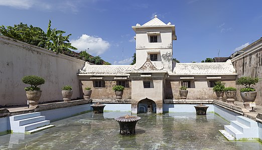 The tower from which the Sultan watched his concubines, and one of their bathing pools
 Eastern face of the West Gate, the original main entrance; the western face is now blocked by local homes.
 Eastern face of the East Gate, through which tourists now enter.
.jpg)
.jpg)
_edit.jpg)


 Fixed --
///EuroCar
GT 23:18, 26 May 2014 (UTC)
Fixed --
///EuroCar
GT 23:18, 26 May 2014 (UTC)


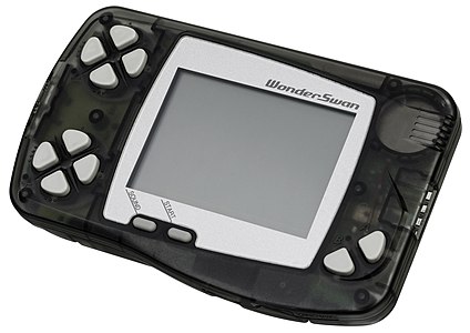 The Bandai WonderSwan, a handheld gaming console released in 1999. This is the first model of the Japan-only WonderSwan series and features a monochrome screen.
 The WonderSwan Color, a Japanese handheld gaming console released in late 2000. The WonderSwan Color was the follow-up to Bandai's original monochrome WonderSwan that was released the previous year. The new handheld had could now display in color and also had some other minor improvements.
 The Bandai SwanCrystal, the third generation of the system. It featured an improved LCD screen.
.jpg)


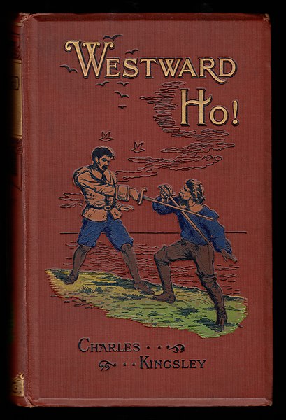
 Frontispiece to same by Walter Sydney Stacey.


 1. John Lorimer Worden, c. 1870, half-length.
 2. Same, full-length, showing the Tiffany & Co. sword granted to him by the state of New York.


_Porte_Dauphine_Paris_16e_002.jpg)
 Original – The three heroes of Trine 2 navigating platforms held aloft by a giant octopus
 Zoya and Pontius battle a shaman in a scene from the Goblin Menace DLC pack.
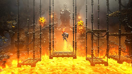 Pontius navigates platforms dangling over a pit of lava in this scene from the Dwarven Caverns chapter of the Director's Cut, a Wii U exclusive


_flight_deck_during_Battle_of_the_Eastern_Solomons,_24_August_1942_(80-G-17489).jpg)


.jpg)

 The nave of Exeter Cathedral
 The choir/quire
 The Lady Chapel


 Draco and Ursa Minor


.jpg)


.jpg)


_-_1909.jpg)
.jpg)
.jpg)


_cover_art.png)
.jpg)


