| Featured picture tools |
|---|
Please cut and paste new entries to the bottom of this page, creating a new monthly archive (by closing date) when necessary.
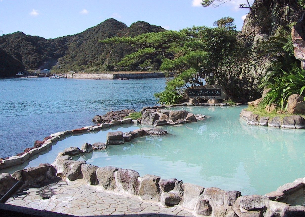
Onsen in Nachikatsuura, Japan

Self nomination. It is a beautiful view of the Onsen at the ocean in Nachikatsuura. There are lots of different colored bodies of water, a lot of green shades, and a beautiful sky. I think this image represents what Onsen in Japan are all about. -- Chris 73 Talk 03:50, 19 Aug 2004 (UTC)
Oppose. The weird windowframe cropping detracts attention from what should be the subtle color variations in this picture. A little Photoshopping could also be done to remove the whatever it is from the top of the hill, and take out the car in the parking lot across the bay.Support. All my objections have been answered. Denni ☯ 22:37, 2004 Aug 22 (UTC)- I was going to lodge the same complaint, but it's been fixed now. I like it a lot. Support. →Raul654
- Support Kbh3rd 16:43, 22 Aug 2004 (UTC)
- Support for the exotic place. Chmouel 09:38, 28 Aug 2004 (UTC)
- Support. Angela . 22:52, Aug 29, 2004 (UTC)
- Support. - [[User:Bevo| Bevo]] 14:34, 30 Aug 2004 (UTC)
- Support. Nice composition. grendel| khan 16:03, 2004 Aug 31 (UTC)
Mandelpart2.jpg

I really like this picture. It's a classic fractal, and the coloring is perfect. Created by user:Evercat →Raul654 19:29, Aug 19, 2004 (UTC)
- Support. I like the mostly monochromatic glow. It is different than most gaudy fractals I've seen (and generated.) Kbh3rd 21:08, 19 Aug 2004 (UTC)
- Support, adds a lot to the article [[User:Sverdrup| ❝Sverdrup❞]] 00:54, 20 Aug 2004 (UTC)
- Support. As a Mandelbrot junkie, I can say this moves me. Denni ☯ 01:02, 2004 Aug 20 (UTC)
- Support. It looks so interesting. Allyunion 09:34, 20 Aug 2004 (UTC)
- Support. James F. (talk) 20:54, 21 Aug 2004 (UTC)
- Support. We see mathematics, and yet behold beauty - Gaz 07:02, 22 Aug 2004 (UTC)
- Support. Nice -- Chris 73 Talk 03:58, Aug 23, 2004 (UTC)
- Support. -- Finlay McWalter | Talk 21:02, 27 Aug 2004 (UTC)
- Support. Angela . 22:52, Aug 29, 2004 (UTC)
Gyeongbokgung


GFDL photo by Kokiri. Used in Gyeongbokgung and Seoul.
- Support. Angela . 23:06, Aug 20, 2004 (UTC)
- Support. It's a lovely picture, and is a valuable addition to the Seoul article. -- Finlay McWalter | Talk 23:17, 20 Aug 2004 (UTC)
- Comment: just a little bit of cropping would make this an even more spectacular picture. - [[User:Bevo| Bevo]] 12:41, 21 Aug 2004 (UTC)
- Oppose. 640x480 is a little too small for my liking. If (s)he uploaded a bigger version (1024x.. at least) I'd definately reconsider. ed g2s • talk 18:07, 21 Aug 2004 (UTC)
- Support. Nice. -- Infrogmation 18:12, 21 Aug 2004 (UTC)
- Support, but a larger image would be so much better, yes. James F. (talk) 20:55, 21 Aug 2004 (UTC)
- Oppose (for now). I agree with Bevo that a little cropping and sharpening would help. I would like to see a larger version of this mod. - Gaz 07:41, 22 Aug 2004 (UTC)
- Support. The photo shows good composition (the pavilion in the middle, the reflection below it, the mountain behind it, and a bit of tree in the foreground), and is pretty to boot. -- Sewing 08:34, 22 Aug 2004 (UTC)
- Support (with enthusiasm!) the alternative image provided by Gaz and also the alternative provided by Janderk, with the Janderk version being my preference of those two. - [[User:Bevo| Bevo]] 14:13, 22 Aug 2004 (UTC)
- Support Kbh3rd 16:43, 22 Aug 2004 (UTC)
- Support, I like both, but the second one is better Lorax 03:03, Aug 23, 2004 (UTC)
- Support, preferably the second one. -- Chris 73 Talk 03:57, Aug 23, 2004 (UTC)
- Very strongly support - especially the second one! David Cannon 01:12, 24 Aug 2004 (UTC)
- Support alternative. Denni ☯ 02:10, 2004 Aug 28 (UTC)
- Comment.
The alternative image needs its own copyright status info, instead of just pointing to the original's status.Licensing information has been added to Korea gyeongbokgung-mod-Gaz.jpg and also to Korea gyeongbokgung edited by Jan Derk.jpg - [[User:Bevo| Bevo]] 15:53, 29 Aug 2004 (UTC) - Support alternative, 1st photo's leaves were highly distracting. JediMaster16 17:22, 29 Aug 2004 (UTC)
- Support original. And I think the comments on size are incredibly petty. I know of no other agency that solicits and accepts contributions, then brazenly tells the contributor that it's not enough. That attitude tends to dry up contributions. Pollinator 04:10, Sep 1, 2004 (UTC)
- Support Kokiri's cropped version. Markalexander100 09:11, 3 Sep 2004 (UTC)
- Support. Added a new alternative. The original needs a bit of sharpening, but the alternative has IMHO slightly overdone it. With alternative 2 I tried to aim at the middle. Plus I like the new crop of the original a bit better.
Janderk 12:02, 3 Sep 2004 (UTC)
- +14 -2 (one of which seems to be addressed by the 2nd alternative). Promoted 3rd version — Kate Turner | Talk 00:16, 2004 Sep 4 (UTC)
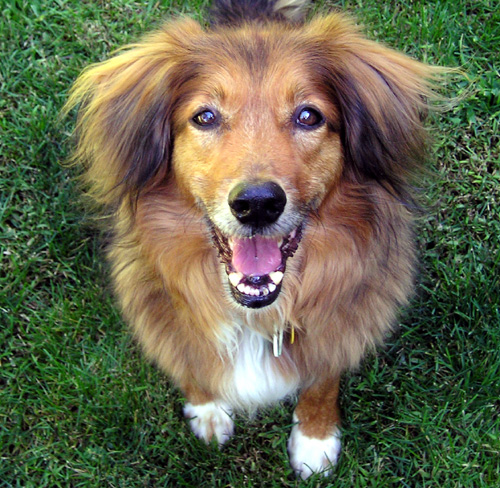
MixedBreedFace1 wb.jpg

Adorably cute picture by Elf of a mixed-breed dog. →Raul654 07:58, Aug 22, 2004 (UTC)
- Support. →Raul654 07:58, Aug 22, 2004 (UTC)
- Support. [[User:Neutrality| Neutrality ( talk)]] 01:46, 23 Aug 2004 (UTC)
- support, cute dog Lorax 03:03, Aug 23, 2004 (UTC)
- Support -- Chris 73 Talk 03:56, Aug 23, 2004 (UTC)
- Oppose. To discourage the uploading of low resolution images. ed g2s • talk 13:35, 24 Aug 2004 (UTC)
- Oppose, ditto. -- Solitude 01:23, 26 Aug 2004 (UTC)
- Oppose - Its a snapshot of a dog's face - Not brilliant - Gaz 12:23, 26 Aug 2004 (UTC)
- Oppose. (1) too much sheltie, not enough mutt, (2) should be taken at more of a dog perspective. This is too high. Denni ☯ 02:08, 2004 Aug 28 (UTC)
- Oppose - image is too small, and too much not of a mongrel-breed. James F. (talk) 03:31, 28 Aug 2004 (UTC)
- Oppose. JediMaster16 17:20, 29 Aug 2004 (UTC)
Common Clownfish (Amphiprion ocellaris)

Self nomination. Common Clownfish (Amphiprion ocellaris) in their Magnificent Sea Anemone (Heteractis magnifica) home. Photographed by Jan Derk in November 2002 on the Great Barrier Reef, Australia. -- Janderk 10:08, 23 Aug 2004 (UTC)
- Support. I wanna go diving! -- Chris 73 Talk 10:57, Aug 23, 2004 (UTC)
- Support. David Cannon 01:16, 24 Aug 2004 (UTC)
- Support. I added explicit text to the image info text that indeed the article Clownfish includes this image (the way it does so within a table somehow precludes noting that fact via the usual automated "What links here" mechanisms.) - [[User:Bevo| Bevo]] 20:11, 24 Aug 2004 (UTC)
- Support - Top left corner is a little over exposed, but generally very good (but I'm biased - I'm a Queenslander) - Gaz 12:49, 26 Aug 2004 (UTC)
- Support. -- Finlay McWalter | Talk 21:00, 27 Aug 2004 (UTC)
- Support. Wish I were there right now, but wonderful peeks like this one will have to do. :) -- Hadal 03:20, 3 Sep 2004 (UTC)
Color-enhanced satellite image of Washington, DC

Great photo, great caption. [[User:Neutrality| Neutrality ( talk)]] 01:42, 23 Aug 2004 (UTC)
- Support. [[User:Neutrality| Neutrality ( talk)]] 01:42, 23 Aug 2004 (UTC)
- Is there a high-resolution version of this image? If there is, a link should be provided. Fredrik | talk 11:04, 23 Aug 2004 (UTC)
- Oppose. Murky, with only one clear feature (the Potomac). White box and crosshairs artificial and distracting. Would support its inclusion at
Wikipedia:Featured caption candidates
GWO 15:32, 23 Aug 2004 (UTC)
- Erm. Please don't write whole featured articles in the captions. :-) [[User:Sverdrup| ❝Sverdrup❞]] 20:22, 23 Aug 2004 (UTC)
- Oppose - Apart from its significance to Americans and its obvious use for terrorist training, I see nothing to feature here. - Gaz 12:45, 26 Aug 2004 (UTC)
- Oppose. Lacks the proper us-gov licence tag, and a source URL (so one can't be sure it is us-gov-pd). Anyway, it's not very clear (it's hard to see the urban form from the land) and not very pretty anyway. -- Finlay McWalter | Talk 20:59, 27 Aug 2004 (UTC)
- Oppose. Lacks the abilty to generate interest. If you zoomed in on a landmark.... JediMaster16 17:19, 29 Aug 2004 (UTC)
- Oppose. agreed with above about the lack of interest on this image. Chmouel 22:55, 31 Aug 2004 (UTC)
- Oppose. The crosshairs obscures the National Mall, and it's just too wide an angle to catch real interest. Radagast 19:22, Sep 2, 2004 (UTC)
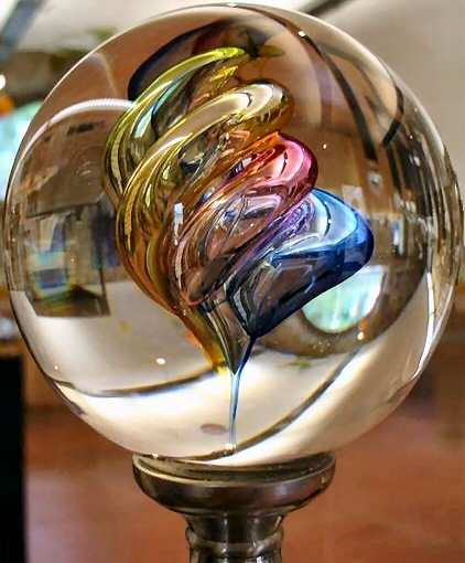
Crystal Ball or Glass Ball

GFDL, Self nomination for the Glass article by Chmouel 14:45, 24 Aug 2004 (UTC)
- Oppose. Part of the ball on the right is missing and part of the base is missing, not what would be expected of a brilliant picture -
Adrian Pingstone 16:02, 24 Aug 2004 (UTC)
- is this
version would be better ? or the one found
here (they are all taken by me and GFDL)
Chmouel 21:13, 24 Aug 2004 (UTC)
- Or maybe
this version?
Angela
. 00:36, Aug 25, 2004 (UTC)
- Just to make the thing clear Image:Crystalball.jpg is this image uploaded to wikipedia. Chmouel 00:48, 25 Aug 2004 (UTC)
- Or maybe
this version?
Angela
. 00:36, Aug 25, 2004 (UTC)
- is this
version would be better ? or the one found
here (they are all taken by me and GFDL)
Chmouel 21:13, 24 Aug 2004 (UTC)
- Support the modified version. - [[User:Bevo| Bevo]] 20:27, 25 Aug 2004 (UTC)
- Support the modified version (nice crop Angela) - Gaz 12:40, 26 Aug 2004 (UTC)
- Support the modified version. - grendel| khan 05:20, 2004 Aug 27 (UTC)
- Support either. -- Finlay McWalter | Talk 20:57, 27 Aug 2004 (UTC)
Oppose until (whichever) image is renamed. I know this is pedantic of me, but a glass ball is not a crystal ball. A "proper" crystal ball is made of rock crystal (quartz) rather than glass; the distinction may seem academic, but there is a significant difference in durability (not to mention other physical and optical properties), rarity, and therefore value, between the two. So in the interest of fighting ignorance, I believe the image should be renamed if it is to be featured (or used at all, for that matter). -- Hadal 07:46, 1 Sep 2004 (UTC)
NonFreeImageRemoved.svg

Clearly illustrates the subject in Pop-up ad, by Minesweeper
- Nominated by [[User:Bevo| Bevo]] 16:31, 29 Aug 2004 (UTC)
- Object. While it does a good job of illustrating an article, I cannot see how this is an example of a picture that makes you go "Wow!" (Au contraire, it makes me say "yuk", having seen too much of the same stuff on my screen.) Denni ☯ 16:43, 2004 Aug 29 (UTC)
- Support. A horrifying example of pop-up ads. JediMaster16 17:09, 29 Aug 2004 (UTC)
- Support. Good example of how pop-ups can make someone feel like they are endlessly being bombarded. -- Aqua 21:46, Aug 29, 2004 (UTC)
- Support. Angela . 22:52, Aug 29, 2004 (UTC)
- Support. Definitely captures the feeling well. -- Solitude 11:04, 30 Aug 2004 (UTC)
- Oppose. Not striking [[User:Sverdrup| ❝Sverdrup❞]] 14:53, 30 Aug 2004 (UTC)
- Oppose.
- It is composed of almost exclusively copyright material so its arguable whether or not it can be licensed as PD.
- It should be a PNG.
- ed g2s • talk 17:36, 31 Aug 2004 (UTC)
- Agree with Ed - if nothing else, it's a screenshot of Safari, so the window dressing is Apple's copyright.
James F.
(talk) 11:15, 2 Sep 2004 (UTC)
- Safari?!? Don't call that Safari. [[User:Sverdrup| ❝Sverdrup❞]] 14:36, 2 Sep 2004 (UTC)
- Oppose, per Ed. Our use of the ad material is certainly fair use (wow, something that really is fair use!), but I oppose fair use FPs. --
Finlay McWalter |
Talk 12:42, 2 Sep 2004 (UTC)
- The image's info text declares it PD. Should that be changed? - [[User:Bevo| Bevo]] 18:19, 6 Sep 2004 (UTC)
- Oppose - mentally distrubing i use a pop-up killer -- Fir0002 23:35, 4 Sep 2004 (UTC)
- Oppose - Needs more Popup windows, possibly enough that you can't tell what type of browser you're using. Blocking enough ads would also help too. --[[User:Allyunion| AllyUnion (Talk)]] 06:39, 6 Sep 2004 (UTC)
- Comment: I added a section in this image's "talk" page at
Image talk:NonFreeImageRemoved.svg for discussion about its "fair use" or "public domain" status. - [[User:Bevo|
Bevo]] 18:31, 6 Sep 2004 (UTC)
- Comment: Looks like
Sverdrup has gone ahead and made the licence status of this image "unknown". If this isn't resolved soon, I'll withdraw the nomination due to licensure incompatibility. - [[User:Bevo|
Bevo]] 19:23, 6 Sep 2004 (UTC)
- Changed the license info on the image to {{screenshot}}; since that makes it "fair use", unless someone changes it again, that makes this image ineligible to be a Featured picture candidate. - [[User:Bevo| Bevo]] 14:35, 8 Sep 2004 (UTC)
- Comment: Looks like
Sverdrup has gone ahead and made the licence status of this image "unknown". If this isn't resolved soon, I'll withdraw the nomination due to licensure incompatibility. - [[User:Bevo|
Bevo]] 19:23, 6 Sep 2004 (UTC)
- Was moved here without decision it seems, not promoting anyways. +5 -8. -- Solitude 09:15, 14 Sep 2004 (UTC)
Yellow star thistle

Striking public domain image uploaded by Ellmist. Used in Star thistle.
- Support. Angela . 20:32, Aug 26, 2004 (UTC)
- Support. Lupin 21:26, 26 Aug 2004 (UTC)
- Support. James F. (talk) 23:00, 26 Aug 2004 (UTC)
- Support. Chmouel 23:11, 26 Aug 2004 (UTC)
- Support. Kbh3rd 20:27, 27 Aug 2004 (UTC)
- Support. Finlay McWalter | Talk 21:02, 27 Aug 2004 (UTC)
- Support. Chris 73 Talk 14:53, Aug 28, 2004 (UTC)
- Support. [[User:Neutrality| Neutrality ( talk)]] 03:50, 29 Aug 2004 (UTC)
- Support. Solitude 11:18, 30 Aug 2004 (UTC)
- Support. That's gorgeous. Oska 23:42, Sep 2, 2004 (UTC)
- Support. Janderk 11:40, 3 Sep 2004 (UTC)

Finlay requested this one from me. I took it while I was in Boston at the meetup.
- Support. →Raul654 02:30, Aug 28, 2004 (UTC)
- Support. James F. (talk) 03:28, 28 Aug 2004 (UTC)
- Support (Finlay). Chmouel 12:26, 1 Sep 2004 (UTC)
- Oppose in its present form. Why are some pics put up unprocessed when very minor processing can vastly improve them? Ten seconds in Photoshop (or any graphics program) produced this improvement to contrast. (Adjust/Auto levels)
Adrian Pingstone 10:46, 28 Aug 2004 (UTC)
- I did this a while ago, enhancing for colour too -- Finlay McWalter | Talk 11:04, 28 Aug 2004 (UTC)
- Support. Raul's, Adrian's, mine: they're all good. -- Finlay McWalter | Talk 11:18, 28 Aug 2004 (UTC)
- Comment. Is the original photo in focus? It looks blurred to me. - [[User:Bevo|
Bevo]] 14:31, 29 Aug 2004 (UTC)
- Yes, I think it is in focus. The original looks a bit hazy due to humidity (Raul: buy a polarizing filter). Some of the vertical lines (where there's a high-contrast transition between a bright surface and a shaded one) exhibit the dreaded "purple fringing", a chromatic abberation common on bigger digital cameras. I'll see if I can fix that, but probably can't. -- Finlay McWalter | Talk 15:12, 29 Aug 2004 (UTC)
- Oppose. Even with processing, the photo is too far away and dark to really make an impression. JediMaster16 17:15, 29 Aug 2004 (UTC)
- Support Finlay's version. Angela . 22:52, Aug 29, 2004 (UTC)
- Support (Finlay). -- Solitude 11:18, 30 Aug 2004 (UTC)
- Support Finlay's version only Adrians version is far too big, the jpeg distortion ruins the quality, and Finlays looks sharper. -- Fir0002 06:40, 5 Sep 2004 (UTC)
- Support Adrians version Lorax 13:23, Sep 6, 2004 (UTC)
- Oppose. The architecture is what deserves accolade, not the photo. Andy5 08:05, 7 Sep 2004 (UTC)
Collar (BDSM)

I took this picture with a film camera, and scanned it in. I'm really proud of how it turned out. - grendel khan 05:19, 2004 Aug 27 (UTC)
- Support. I look hot. Lady Byron 05:46, 27 Aug 2004 (UTC)
- Support. Viva Walgreens. -- Finlay McWalter | Talk 20:55, 27 Aug 2004 (UTC)
- Support. Nice picture. Can see the difference between pictures taken by cheap digital camera and nice film camera. Chmouel 10:59, 28 Aug 2004 (UTC)
- Support. I love it. -- Solitude 13:27, 28 Aug 2004 (UTC)
- Support -- Chris 73 Talk 14:55, Aug 28, 2004 (UTC)
- Object (and it's not nice to delete people's comments, whoever you are). The picture is good except for the large, ungainly shape growing out of this person's left arm. Take that away, and you =might= have a featured picture candidate.
Denni
☯ 03:09, 2004 Aug 29 (UTC)
- Removed the 'large, ungainly shape'. (That was the window in the background; shallow depth of field caused by low lighting allows for neato emphasis technique, but makes the background an untintelligible blur in the meantime.) (And who deleted whose comment? I don't see anything in the history.) grendel| khan 05:25, 2004 Aug 29 (UTC)
- Support. Angela . 22:52, Aug 29, 2004 (UTC)
- Support. James F. (talk) 23:53, 29 Aug 2004 (UTC)
- Support. [[User:Sverdrup| ❝Sverdrup❞]] 09:31, 1 Sep 2004 (UTC)
- Support. Cute. F i P 12:46, 3 Sep 2004 (UTC)
- Oppose. I dont like this picture, it doesn't seem very appealing -- Fir0002 06:47, 5 Sep 2004 (UTC)
- Support. -- Conti| ✉ 09:46, Sep 6, 2004 (UTC)
- Support. Lupin 23:59, 6 Sep 2004 (UTC)
- Support. Sexy. --
huwr 06:56, 10 Sep 2004 (UTC)
- Promoted by Davodd
STmaximin.jpg


The Basilica of Mary Magdalene, France. Taken by Ericd. →Raul654 02:29, Aug 28, 2004 (UTC)
- Support. →Raul654 02:29, Aug 28, 2004 (UTC)
- Support. James F. (talk) 03:30, 28 Aug 2004 (UTC)
- Support. [[User:Neutrality| Neutrality ( talk)]] 03:56, 28 Aug 2004 (UTC)
- Support. Chmouel 10:53, 28 Aug 2004 (UTC)
- Support. Lovely and crisp; it's difficult to capture detail in such a contrasty environment. -- Finlay McWalter | Talk 11:16, 28 Aug 2004 (UTC)
- Support -- Chris 73 Talk 14:55, Aug 28, 2004 (UTC)
- Support. Beautiful. -- Infrogmation 16:58, 28 Aug 2004 (UTC)
- Support Kbh3rd 19:59, 29 Aug 2004 (UTC)
- Support. Angela . 22:52, Aug 29, 2004 (UTC)
Support.Has this image been over-sharpened a bit? Perhaps some subtle blurring is in order. Lupin 02:32, 30 Aug 2004 (UTC)- The original seems too sharp, or maybe grainy. I'm no expert, but it just doesn't quite look right. I prefer Solitude's edit, and support that version. -- Prisonblues 19:46, 30 Aug 2004 (UTC)
- Promoted by Davodd
Sea gulls.jpg


Self-nom. Took this one while I was in Atlantic City. I like it. →Raul654 02:29, Aug 28, 2004 (UTC)
- Support. →Raul654 02:29, Aug 28, 2004 (UTC)
- Support. James F. (talk) 03:30, 28 Aug 2004 (UTC
- Oppose. Horizon is clearly leaning -
Adrian Pingstone 10:27, 28 Aug 2004 (UTC)
- Rotated to fix the problem. →Raul654 15:25, Aug 28, 2004 (UTC)
- Oppose. It's a bit too muted (due, I guess, to martime fug). -- Finlay McWalter | Talk 11:17, 28 Aug 2004 (UTC)
- Oppose. Not enough color, contrast, or action. JediMaster16 22:44, 28 Aug 2004 (UTC):
- Oppose. Grey birds on grey sand with a grey ocean under a grey sky -- too much grey -- Chris 73 Talk 14:58, Aug 28, 2004 (UTC)
- Comment. The picture as it is at this moment has too much extra stuff that distracts from the best thing in it (that exact arrangement and body position of that set of birds). I'd crop out the ocean entitely, lose that beachcomber, and create a panorama of just the birds. Alternatively, cropping just that group of six birds on the left makes a neat picture because of the almost perfect line up of four of them. This is one good characteristic that high-resolution pictures like this one have; that one can crop out great looking subsets. - [[User:Bevo|
Bevo]] 14:21, 29 Aug 2004 (UTC)
- I gave it a shot, also performed some color balancing. Let me know what you think. (Bevo thanks for fixing the layout, couldn't get it right just yet) --
Solitude 14:57, 29 Aug 2004 (UTC)
- That's exactly what I had in mind. I especially like Media:Laughing Gulls on sand.jpg - [[User:Bevo| Bevo]] 15:18, 29 Aug 2004 (UTC)
- "Solitude 1" is especially fine. Still support, all forms. :-) James F. (talk) 18:49, 29 Aug 2004 (UTC)
- I gave it a shot, also performed some color balancing. Let me know what you think. (Bevo thanks for fixing the layout, couldn't get it right just yet) --
Solitude 14:57, 29 Aug 2004 (UTC)
- Support any, but especially Solitude 1.jpg. Angela . 22:52, Aug 29, 2004 (UTC)
- Oppose. I am British, and it's way too grey. And it's not in an article AFAICT. And the image quality isn't so great.
Lupin 02:31, 30 Aug 2004 (UTC)
- FWIW, the Laughing Gull article now includes Sea gulls Solitude 1.jpg; it was an oversight that this nomination got as far as it did without being included in at least one Wikipedia article - [[User:Bevo| Bevo]] 03:52, 30 Aug 2004 (UTC)
- Oppose. I don't like Solitude 1, because it has been resized way too much, and the picture is at very low quality. Solitued 2 is better though.--
Fir0002 08:05, 1 Sep 2004 (UTC)
- Whut? As can be seen by comparing Image:Laughing Gulls on sand.jpg with Image:Sea gulls.jpg, the former is just a plain crop of the other, without resizing; the "low quality" is an artifact of the recasting of the colour gamut as requested... James F. (talk) 14:51, 6 Sep 2004 (UTC)
- Oppose them all - Boring -
Gaz 17:36, 6 Sep 2004 (UTC)
- Not promoted +4 -7 - [[User:Bevo| Bevo]] 17:11, 13 Sep 2004 (UTC)
Dostoevsky

A lovely, characterful portrait of writer Fyodor Dostoevsky (used in that article) -- Finlay McWalter | Talk 12:16, 28 Aug 2004 (UTC)
- Support -- Finlay McWalter | Talk 12:16, 28 Aug 2004 (UTC)
- Comments: what's the license? It also seems a little small.
Lupin 12:37, 28 Aug 2004 (UTC)
- it was painted (apparently) in 1872, so that makes it PD. I'll see if I can dig up a larger version. --
Finlay McWalter |
Talk 13:14, 28 Aug 2004 (UTC)
- It would be good if there was a standard way to say that in the actual image info page; not just that it is PD, but how images of old-enough paintings get the PD status. - [[User:Bevo| Bevo]] 15:33, 29 Aug 2004 (UTC)
- Being painted in 1872 is not quite enough information to make it PD, but Vasily Perov died in 1882 so that part is OK. Note that it's unlikely that the uploader did the digitizing: it was probably a museum or art gallery, so we're implicitly relying on
Bridgeman Art Library Ltd. v. Corel Corporation.
Gdr 12:24, 2004 Aug 30 (UTC)
- We need a {{PDART}} template that expands to say that. - [[User:Bevo|
Bevo]] 15:10, 31 Aug 2004 (UTC)
- Done. (But I called it Template:PD-art.) Gdr 18:13, 2004 Aug 31 (UTC)
- We need a {{PDART}} template that expands to say that. - [[User:Bevo|
Bevo]] 15:10, 31 Aug 2004 (UTC)
- it was painted (apparently) in 1872, so that makes it PD. I'll see if I can dig up a larger version. --
Finlay McWalter |
Talk 13:14, 28 Aug 2004 (UTC)
- Support. -- Infrogmation 16:56, 28 Aug 2004 (UTC)
- Support. James F. (talk) 04:06, 29 Aug 2004 (UTC)
- Oppose at this size. Fine picture, but way too small. grendel| khan 05:30, 2004 Aug 29 (UTC)
- Support. Cool portrait, neat pic. JediMaster16 17:12, 29 Aug 2004 (UTC)
- Support, though it could do with being larger. Angela . 22:52, Aug 29, 2004 (UTC)
- Support. Chmouel 00:21, 30 Aug 2004 (UTC)
- Oppose. It's too small, and even a bigger version is probably not featured picture quality to me. -- Solitude 11:16, 30 Aug 2004 (UTC)
- Support. - [[User:Bevo| Bevo]] 15:10, 31 Aug 2004 (UTC)
- Oppose. Nice picture, not big enough. --[[User:Allyunion| AllyUnion (Talk)]] 06:40, 6 Sep 2004 (UTC)
- Support. [[User:Neutrality|
Neutrality (
talk)]] 18:00, 8 Sep 2004 (UTC)
- Promoted +8 -3 - [[User:Bevo| Bevo]] 13:24, 12 Sep 2004 (UTC)
Kenilworth Castle


A great photo of Kenilworth Castle. GFDL by James F.
- Support. Angela . 22:52, Aug 29, 2004 (UTC)
Support.Oppose.A striking photo that has the subject clearly defined.No to all versions. JediMaster16 23:33, 29 Aug 2004 (UTC)- Object. Not particularly striking, IMO. Lupin 02:22, 30 Aug 2004 (UTC)
- Oppose. Not striking to me. -- Solitude 11:03, 30 Aug 2004 (UTC)
- Support. Only complaint is that the file is too big (1.4 Mb), but the image is good --
Chris 73
Talk 17:01, Aug 30, 2004 (UTC)
- I resized the image, also balanced contrast, color and levels. Vote stays "nay", but I prefer this edit. -- Solitude 18:19, 30 Aug 2004 (UTC)
- Oppose. Just looks like a normal photo to me. -- Prisonblues 19:36, 30 Aug 2004 (UTC)
- Support Solitude's version. - [[User:Bevo| Bevo]] 14:53, 31 Aug 2004 (UTC)
- Oppose Solitude's verison. Solitude has lost all the colour from the sky. Also I think images should be as large as possible.
ed g2s •
talk 17:29, 31 Aug 2004 (UTC)
- I agree, it appears my edit was too hard on the colours in the sky, perhaps a new edit is in place. I do not agree however with your second argument, I prefer pictures with decent but practical dimensions. --
Solitude 10:30, 3 Sep 2004 (UTC)
- Practical dimensions for what? Your monitor? My monitor? a printed copy of the wikipedia? Printed out and hung on the wall? Large images can be resized down, resizing small images up doesn't go as well. Lorax 13:16, Sep 6, 2004 (UTC)
- I agree, it appears my edit was too hard on the colours in the sky, perhaps a new edit is in place. I do not agree however with your second argument, I prefer pictures with decent but practical dimensions. --
Solitude 10:30, 3 Sep 2004 (UTC)
- Oppose. [[User:Neutrality|
Neutrality (
talk)]] 18:00, 8 Sep 2004 (UTC)
- Not promoted. +3 -5. -- Solitude 09:06, 14 Sep 2004 (UTC)
Clare College

GFDL image by James F. used in Clare College, Cambridge.
- Support. Angela . 22:52, Aug 29, 2004 (UTC)
- Oppose. The tree is kind of distracting, as is the plaque. Taken from farther away, this would be better.
JediMaster16 23:31, 29 Aug 2004 (UTC)
- The plaque says "Welcome to Clare"; I thought that it was mildly amusing to include. The tree is not really the kind of thing that can be removed from the shot, and "from further away" would require demolition of the gates around the college, amongst other things. James F. (talk) 23:49, 29 Aug 2004 (UTC)
- Object. The top of the building should be included, given that we can see some sky. This could theoretically be acheived with a wide-angle lens, I think, without any major demolition being needed. Alternatively, could one stick a camera between the railings? Lupin 02:24, 30 Aug 2004 (UTC)
- Oppose. I agree with Lupin, if a better photo is not possible that's too bad, the target could make for a very good picture for sure. -- Solitude 10:40, 30 Aug 2004 (UTC)
- Oppose. It's a reasonable photo, but nothing special. It's just a straight photo of the college, taken in normal light, with ok composition. Shouldn't a featured picture have something distinctive about it, great lighting, composition or timing etc.? -- Prisonblues 19:39, 30 Aug 2004 (UTC)
- Oppose. Nice pic but chopping off the top of the central turret kills it for me - Adrian Pingstone 19:53, 31 Aug 2004 (UTC)
- Oppose. Given that we see part of the roof, would be much better to include the whole roof. As for the tree... I don't think that can be helped. --[[User:Allyunion| AllyUnion (Talk)]] 06:35, 6 Sep 2004 (UTC)
- Oppose, agree with Adrian. [[User:Neutrality|
Neutrality (
talk)]] 18:00, 8 Sep 2004 (UTC)
- Not promoted. +1 -7. -- Solitude 09:07, 14 Sep 2004 (UTC)
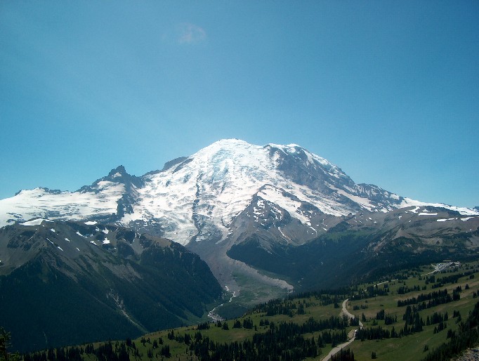
Mount Rainier

(Self Nomination) I took this picture of Rainer on vacation in summer 2004. It's not in an article yet, but I think it can be put in the Mount Rainier article somewhere. The picture dosen't look much thumbed, but click to expand it. JediMaster16 17:07, 29 Aug 2004 (UTC)
Oppose due to inappropriate license. This can not be used by any of our mirrors or in a print version. Angela . 22:52, Aug 29, 2004 (UTC)- Fine, I relesed it under the GNU, as I took the photo itself. JediMaster16 23:26, 29 Aug 2004 (UTC)
- Support. James F. (talk) 23:50, 29 Aug 2004 (UTC)
- Support Kbh3rd 00:40, 30 Aug 2004 (UTC)
- Oppose. It's a good shot, but I'm far from bedazzled. -- Solitude 10:37, 30 Aug 2004 (UTC)
- Support. Looks nice -- Chris 73 Talk 16:59, Aug 30, 2004 (UTC)
- Oppose. I don't see anything special about this photo. -- Prisonblues 19:41, 30 Aug 2004 (UTC)
- Oppose. I agree with Prisonblues. Lupin 19:30, 31 Aug 2004 (UTC)
- Support. Just so that we can keep the votes tallied, as this is my own picture. I'm not voting twice, I'm just reminding you that I am voting. JediMaster16 14:00, 1 Sep 2004 (UTC)
- Comment.
At this time, no Wikipedia article uses this image.See comment below by Stan - [[User:Bevo| Bevo]] 14:37, 1 Sep 2004 (UTC) - Support. This is so clear I can make out the spot on the Corridor where I helped bring down a body. :-( Give me a moment, it'll be in the article.
Stan 03:26, 2 Sep 2004 (UTC)
- It's in. Seeing it in context, I think it could stand to lose 50% of the sky above the summit, keeps focus on the mountain itself. Don't crop anything else, it illustrates the alpine parklands that are all around the mountain. Stan 03:39, 2 Sep 2004 (UTC)
- Support if sharpening is tuned down a bit. Right now it is a touch too pixelated for my taste. Janderk 16:07, 3 Sep 2004 (UTC)

- The image was only resized, which may have sharpened it up a bit (It was a 4.6 Megapixel image). As I only have Microsoft Photo Editor and another obscure editing program (Microsoft Picure It! Publishing Platinum 2003), I cannot dull it up quite yet. If you go to the image page itself it looks a bit better.
JediMaster16 13:46, 4 Sep 2004 (UTC)
- If you have a link to the original full version I or someone else could resize and tweak it in Photoshop or the GIMP. It might improve the result.
- The image was only resized, which may have sharpened it up a bit (It was a 4.6 Megapixel image). As I only have Microsoft Photo Editor and another obscure editing program (Microsoft Picure It! Publishing Platinum 2003), I cannot dull it up quite yet. If you go to the image page itself it looks a bit better.
JediMaster16 13:46, 4 Sep 2004 (UTC)
- Support A really nice shot, its too bad I live in Australia and cant go there -- Fir0002 23:35, 4 Sep 2004 (UTC)
- Support (provisionally) - This image needs some of the sky removed to balance the composition and produce a more panoramic effect - Gaz 14:38, 6 Sep 2004 (UTC)
- Support. [[User:Neutrality| Neutrality ( talk)]] 18:00, 8 Sep 2004 (UTC)
- In the absence of a version from a Photoshop master, I took out some of the sky for version 2.
Markalexander100 07:20, 10 Sep 2004 (UTC)
- Promoting cropped version, +9 -3. I'd like to note that there is no clear consensus, but the image was already made featured picture before going through this process. So I guess it's a done deal. -- Solitude 09:11, 14 Sep 2004 (UTC)

- Version 2 was resized and color-enhanced in Photoshop. Being not a Photoshop master, I hope this looks a bit better. JoJan 19:22, 24 Sep 2004 (UTC)
View of Santorini

View of Santorini before sunset released taken by me released under GFDL. The all the set of pictures on Santorini were featured but we voted to remove it. So now i add this single one for voting. Chmouel 23:01, 31 Aug 2004 (UTC)
- Support. It's a beautiful picture (and cute woman too :-)). — David Remahl 04:15, 1 Sep 2004 (UTC)
- Support. Very stiking... though I think I'd crop the bottom part to make it a horizontal format... Pollinator 04:22, Sep 1, 2004 (UTC)
- Oppose, another clearly leaning picture. Why is this fault so common? It takes a few seconds to fix! - Adrian Pingstone 14:08, 1 Sep 2004 (UTC)
- Oppose for now. Sky is very grainy (and is not on the pre-colour-corrected small version). Lupin 15:22, 1 Sep 2004 (UTC)
- Oppose. A balcony rail (or whatever that is) should not consume almost a quarter of the frame. Denni ☯ 01:18, 2004 Sep 2 (UTC)
- Oppose. Same complaint as Denni. JediMaster16 13:58, 4 Sep 2004 (UTC)
Oppose - Same complaint as Denni- If the original is good enough you could crop a nice shot from it - Gaz 13:22, 6 Sep 2004 (UTC)- Support - After discussions with Chmouel, I offer this modified version - Gaz 17:27, 6 Sep 2004 (UTC)
- Oppose. Sky is far too grainy. -- Prisonblues 11:32, 7 Sep 2004 (UTC)
- Oppose. [[User:Neutrality| Neutrality ( talk)]] 18:00, 8 Sep 2004 (UTC)
- Sorry, there's just not enough here to make a good picture. No real focus, no real sense of place. My vote remains unchanged. Denni ☯ 01:49, 2004 Sep 11 (UTC)
- Oppose. Nice composition, but the purpose of the photo in WP is to illustrate an article. Here, the model overpowers the subject of the photo: the cityscape. I do not think this photo as is can be salvaged since my suggestion would require a better focus on infinity while the foreground (and model) are downplayed slightly out of focus, perhaps a different (back to camera, over the shoulder?) pose for the model so she is no longer distracting from, but helping for the subject. Davodd 23:49, Sep 11, 2004 (UTC)
NOT promoted. +4 -7. -- Solitude 07:07, 15 Sep 2004 (UTC)
The perfect Buddha at the Borobudur

This image was shot by fellow (new) Wikipedian Jan-Pieter Nap on his vacation in Indonesia. This one depicts the perfect Buddha at the Borobudur on the island Java. It is used both in the Buddha as well as in the Borobudur article. -- Solitude 11:07, 31 Aug 2004 (UTC)
- Oppose in current form. It's a litle too dark you should rework a litle bit the luminosity of the picture. Chmouel 11:35, 31 Aug 2004 (UTC)
- Oppose. Too dark, and camera position connects background and foreground when there is in fact no connection. A shot from a slightly different angle, leaving a gap behind Buddha and background temple would be better.
Denni
☯ 01:08, 2004 Sep 1 (UTC)
- I've brightened it up a bit. →Raul654 03:52, Sep 1, 2004 (UTC)
- Support. It's perfect now. JediMaster16 14:01, 1 Sep 2004 (UTC)
- Comment. That cigarette-pack-sized silver object to the right of the statue just spoils it for me. -
Bevo 14:31, 1 Sep 2004 (UTC)
- I added a new edited version without the metal object and a few other tweaks. Janderk 20:26, 2 Sep 2004 (UTC)
- Support the revised version - Bevo 12:26, 3 Sep 2004 (UTC)
- Support with metal sign (see below). Janderk 14:09, 2 Sep 2004 (UTC)
- Oppose. Photos in an encylopedia should be an accurate depiction of reality at the time the photo was taken. Editing out signs and other objects violates this and shouldn't be in wikipedia at all, let alone be a featured picture.
Lorax 13:09, Sep 6, 2004 (UTC)
- As the one who actually removed the sign, your comment made me rethink about matter and I agree.
- Comment:
Lorax didn't comment in a similar vein when supporting the altered version of the "Fractal Broccoli" image. -
Bevo 02:30, 8 Sep 2004 (UTC)
- I didn't realize the content was altered at the time, have changed my vote on it. Lorax 00:18, Sep 9, 2004 (UTC)
- Support altered version. [[User:Neutrality| Neutrality ( talk)]] 18:00, 8 Sep 2004 (UTC)
- Support (nominator). I too prefer the edit. In my opinion, the fact that an image is improved by a minor edit does not lessen its value or worthiness for an encyclopedia. -- Solitude 12:30, 9 Sep 2004 (UTC)
NOT promoted. +4 -2. Both versions end up at this score, no consensus. -- Solitude 07:16, 15 Sep 2004 (UTC)
Monopoly game in progress
Illustrative and well-processed image. The background has been removed, and a soft shadow added. GFDL. "Created by german Wikipedian Horst Frank 13:23, 7. Dez 2003 (CET)". Used in Monopoly (game). — David Remahl 01:40, 31 Aug 2004 (UTC)
- Should I vote even though �I was the one who listed it? —
David Remahl 01:40, 31 Aug 2004 (UTC)
- Comment, I just realized that Monopoly was Today's featured article/August 14, 2004, and that this image was featured on the first page at that time. But that doesn't disqualify it, does it? — David Remahl 04:34, 31 Aug 2004 (UTC)
- Support. Striking, informative, appropriate, cool. -- Finlay McWalter | Talk 01:51, 31 Aug 2004 (UTC)
- Support. James F. (talk) 03:14, 31 Aug 2004 (UTC)
- Support. Kbh3rd 04:01, 31 Aug 2004 (UTC)
- Support. (I copied the image from the German Wikipedia) -- Chris 73 Talk 05:06, Aug 31, 2004 (UTC)
- Support. Great picture.-- Eloquence * 16:25, Sep 1, 2004 (UTC)
- Support/Comment. I love the picture...is there any concern that it's a shot of the German game? It does differ in minor but visible ways from any English-language version I've seen....I don't know if that should trouble us at all. I'm certainly no linguistic imperialist....I'm just wondering if, say, the German Wikipedia would feature a picture of a US or UK version of a game when the game they're familiar with differs slightly? Certainly it's a worthy picture in terms of composition and color....sorry to be a fence-sitter.
Jwrosenzweig 23:16, 1 Sep 2004 (UTC)
- Perhaps the caption on the article's image should say that it is the German language version of the game. - Bevo 23:20, 1 Sep 2004 (UTC)
- Note that the French, Swedish, and Hebrew wikipedias' Monopoly articles all feature this (the german) image. --
Finlay McWalter |
Talk 23:32, 1 Sep 2004 (UTC)
- Excellent information, Finlay....but I'm a little confused. Do they "feature" this image, as in "use it in an article" (I think that's a perfectly good idea), or do they "Feature" this image, as in "put it on the main page as an example of the best pictures on this Wikipedia"? If the latter, then my question is answered. If the former, I would still question whether it is best practice for us to Feature this image -- but I don't question it enough to prevent its promotion if I am a lone voice. I just think it's worth considering. And I think Bevo's caption idea sounds like a good one. :-)
Jwrosenzweig 13:44, 2 Sep 2004 (UTC)
- I suspect only the former, but I don't really know. --
Finlay McWalter |
Talk 14:17, 2 Sep 2004 (UTC)
- I'll stop being a pain and support this -- it's not a major issue, and certainly it's a great shot of the game. I do think there may be an underlying principle here that is unimportant now but perhaps more important later....but I imagine we'll cross that bridge when we come to it. Don't let me delay this excellent image any longer. Jwrosenzweig 20:19, 2 Sep 2004 (UTC)
- I suspect only the former, but I don't really know. --
Finlay McWalter |
Talk 14:17, 2 Sep 2004 (UTC)
- Excellent information, Finlay....but I'm a little confused. Do they "feature" this image, as in "use it in an article" (I think that's a perfectly good idea), or do they "Feature" this image, as in "put it on the main page as an example of the best pictures on this Wikipedia"? If the latter, then my question is answered. If the former, I would still question whether it is best practice for us to Feature this image -- but I don't question it enough to prevent its promotion if I am a lone voice. I just think it's worth considering. And I think Bevo's caption idea sounds like a good one. :-)
Jwrosenzweig 13:44, 2 Sep 2004 (UTC)
- Support. Very nice picture. It does not disturb me that it is a German version. Monopoly is an International game after all. Janderk 13:39, 3 Sep 2004 (UTC)
- Support. Where ever this game was laid out, this is a very nice picture. Brillant editing or photography. Just make sure the caption says something like "A German version of Monopoly game in progress..." --[[User:Allyunion| AllyUnion (Talk)]] 06:33, 6 Sep 2004 (UTC)
- Oppose, not featured material. [[User:Neutrality| Neutrality ( talk)]] 18:00, 8 Sep 2004 (UTC)
- Oppose. It's too "fuzzy", I can't make out any of the lettering except the MONOPOLY centerpiece. - [[User:Bevo| Bevo]] 22:14, 14 Sep 2004 (UTC)
Promoted. +9/-2. -- Solitude 07:19, 15 Sep 2004 (UTC)
Moscow Kremlin Egg

Thought I'd try putting one of my efforts through the critiques. :-) Illustrates Fabergé egg; although many pics like this are on the net, this one actually has a proper license. - Stan 01:29, 1 Sep 2004 (UTC)
- Oppose. The image is OK, but it is somewhat grainy and the background is too dark. If the background could be removed or made brighter, I may support. — David Remahl 04:15, 1 Sep 2004 (UTC)
- Support. I attempted to put a black background on it, but I agree with the comments below that the original version is better.
Angela
. 00:54, Sep 2, 2004 (UTC)
- The black background is a lot better, but you seem to have missed the two triangular areas to the left and right of the tower. — David Remahl 00:59, 2 Sep 2004 (UTC)
- I didn't want to fiddle too much with the background; not only is that an accurate representation of its physical location, but as Angela's essay shows, it's tough to catch all the background bits. This image came directly out of iPhoto, and hasn't had the benefit of the color/contrast tinkering available in more powerful tools; I'll try some experiments. Stan 03:23, 2 Sep 2004 (UTC)
- Support. Cool! Denni ☯ 01:13, 2004 Sep 2 (UTC)
- Oppose. I see dots missing from the picture, (latest). -- Allyunion 05:58, 2 Sep 2004 (UTC)
- Oppose. Too much noise and color imprefections. Looks like it was taken in low light at high ASA with a not so good camera (I changed my opinion upon a second look). Janderk 14:06, 2 Sep 2004 (UTC)
- Oppose - The lighting is not good enough, the viewing angle too low, and the black background really sux - Sorry - Gaz 13:11, 6 Sep 2004 (UTC)
- Oppose. [[User:Neutrality| Neutrality ( talk)]] 18:00, 8 Sep 2004 (UTC)
- Oppose. I dislike the backgrounds in both pictures. Also the picture is not featured in any article. -- Solitude 09:35, 15 Sep 2004 (UTC)
Not promoted. +3 -6 - [[User:Bevo| Bevo]] 18:26, 15 Sep 2004 (UTC)
Lioness face close-up, lying down.jpg
Stunning picture. →Raul654 09:05, Sep 3, 2004 (UTC)
- Support. →Raul654 09:05, Sep 3, 2004 (UTC)
- Oppose. Featured pictures of wild animals should be taken in their natural habitat. Not in a zoo, a cage or an aquarium. While the lion is perfect, the background is as unnatural as it gets. The same picture with an African Savanna as background would be a clear winner. Janderk 09:50, 3 Sep 2004 (UTC)
- Oppose. Agree that the unnatural background kills the pic - Adrian Pingstone 12:11, 3 Sep 2004 (UTC)
- Support. Could be used to illustrate animals in captivity. I added it to
Zoo. I agree that he images on
Lion should depict the animal in its natural habitat, but there are cases when a constructed environment is at least as good, if not better, for illustration in an encyclopedia. —
David Remahl 14:32, 3 Sep 2004 (UTC)
- I just had almost done the same thing (ie putting the image on the zoo page ) but decided not to, as a zoo image should have a bunch of happy kids standing outside a fence pointing at the giraffes or lions. This image has no bars and no fences and no visitors that are typical of a zoo. However, it is probably better than nothing.
Janderk 14:53, 3 Sep 2004 (UTC)
- Actually, I think Zoo should have several pictures. One like you describe, one with the lion on the unnatural background, and one showing animals in near-natural environment. Next time I go to a zoo, I'll bring a camera. Several POVs should be represented in the pictures as well. —
David Remahl 14:57, 3 Sep 2004 (UTC)
- David, you've missed the point. We are not discussing if this is merely a good pic for WP, the brief for this page is images and charts that we find beautiful, striking, shocking, impressive, titillating, fascinating, or in short just brilliant. I don't think this pic is any of those -
Adrian Pingstone 15:03, 3 Sep 2004 (UTC)
- I tend to put more weight on the add significantly to Wikipedia part of the page description. Further more, in my opinion, this image is both beautiful, striking and fascinating. YMMV. — David Remahl 16:33, 3 Sep 2004 (UTC)
- I agree with you David, the picture is pretty good (admiting the background is poor) and I whole-heartedly subscribe to your outlook on this page. It is the photos that pass through the nomination stage that really need to be aboslutely perfect -- Fir0002 09:29, 4 Sep 2004 (UTC)
- David, you've missed the point. We are not discussing if this is merely a good pic for WP, the brief for this page is images and charts that we find beautiful, striking, shocking, impressive, titillating, fascinating, or in short just brilliant. I don't think this pic is any of those -
Adrian Pingstone 15:03, 3 Sep 2004 (UTC)
- Actually, I think Zoo should have several pictures. One like you describe, one with the lion on the unnatural background, and one showing animals in near-natural environment. Next time I go to a zoo, I'll bring a camera. Several POVs should be represented in the pictures as well. —
David Remahl 14:57, 3 Sep 2004 (UTC)
- I just had almost done the same thing (ie putting the image on the zoo page ) but decided not to, as a zoo image should have a bunch of happy kids standing outside a fence pointing at the giraffes or lions. This image has no bars and no fences and no visitors that are typical of a zoo. However, it is probably better than nothing.
Janderk 14:53, 3 Sep 2004 (UTC)
- Support. Although background is unnatural, still a great pic. JediMaster16 14:03, 4 Sep 2004 (UTC)
- Oppose. Simply a 'cute' pic. Wikipedia is not Disneyland. Oska 05:13, Sep 5, 2004 (UTC)
- Oppose. The bench destroys any greatness this picture might have had. Denni ☯ 23:30, 2004 Sep 5 (UTC)
- Oppose - OK, but not "featured" material - Gaz 13:00, 6 Sep 2004 (UTC)
- Support. [[User:Neutrality| Neutrality ( talk)]] 18:00, 8 Sep 2004 (UTC)
- Support. A Zoo is not all "shiny and happy people", the negative impact Zoo's can have on animals is captured well by this image. If I was a lioness behind bars, I'd be looking like this. -- Solitude 09:39, 15 Sep 2004 (UTC)
Not promoted. +5 -5. -- Solitude 07:16, 17 Sep 2004 (UTC)
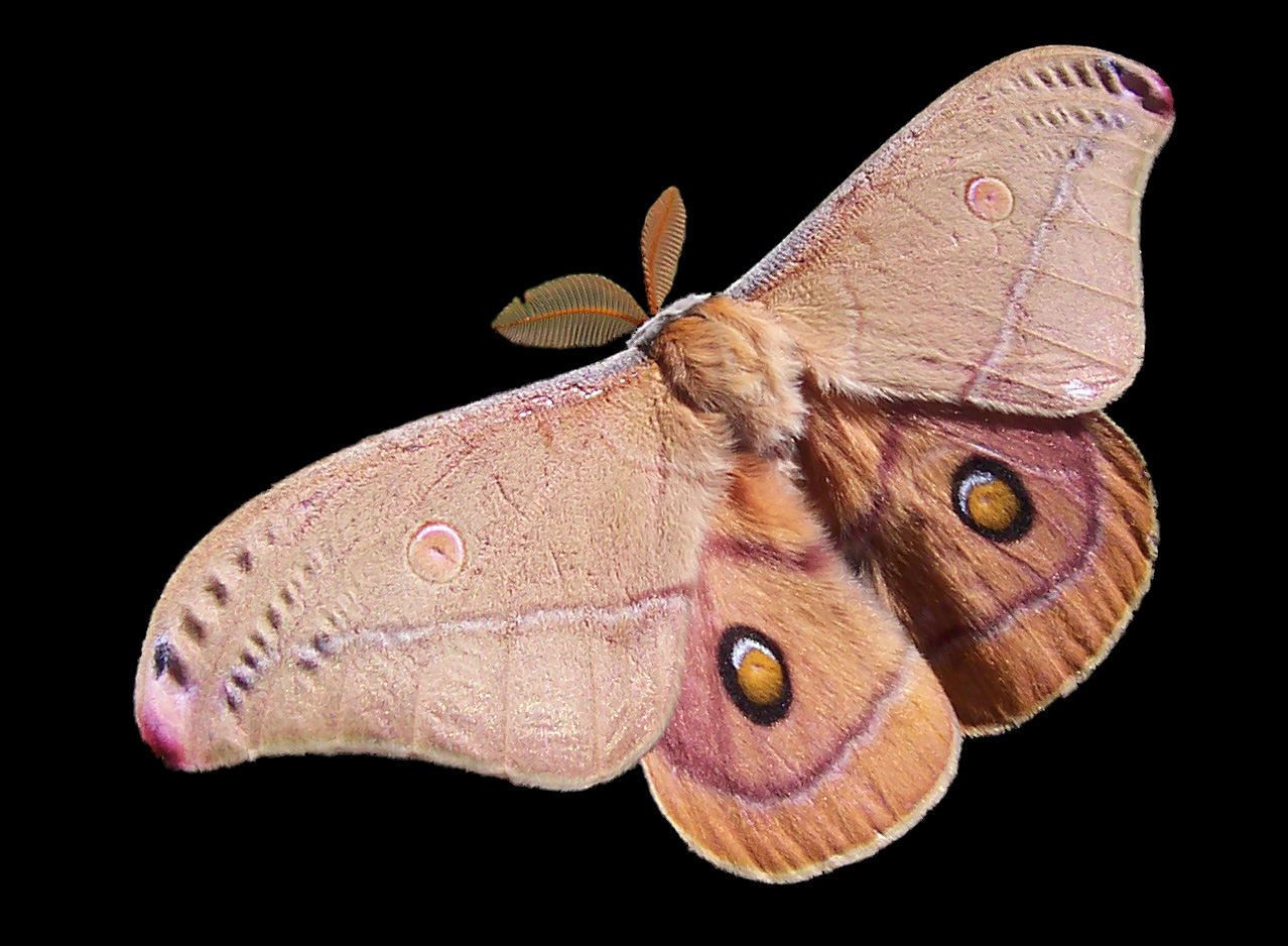
Emperor Gum Moth


I nominate this moth, because I think it exceedingly handsome and having very striking colors.
- Support. Self Nomination -- Fir0002 09:22, 4 Sep 2004 (UTC)
- Support. I support black background version only. JediMaster16 14:00, 4 Sep 2004 (UTC)
- I would support a white background version.--
Eloquence
*
- Comment. I have replaced the original photo with one with a white background.-- Fir0002 06:34, 5 Sep 2004 (UTC)
- Support either version, slight preference for black background. -- Chris 73 Talk 07:39, Sep 5, 2004 (UTC)
- Support. White Background. -- Martin123 09:39, 5 Sep 2004 (UTC)
- Support both (although the black background for some reason seems better)...what software makes this "backgrounding effect" possible? -
Bevo 14:36, 5 Sep 2004 (UTC)
- Comment, I cut the image from its background in Photoshop -- Fir0002 09:29, 6 Sep 2004 (UTC)
- Support black background. Denni ☯ 23:27, 2004 Sep 5 (UTC)
- Support - (black) - Gaz 12:51, 6 Sep 2004 (UTC)
- Support either version, slight preference for the white. It's a shame jpg's can't have transparency. --
Prisonblues 11:34, 7 Sep 2004 (UTC)
- Comment. I have replaced the white version with a PNG file which has transparency. The white is now transparent. --
Fir0002 00:07, 8 Sep 2004 (UTC)
- Yeah, but it's now 10 times larger, and nearly a megabyte in size. --
Prisonblues 10:20, 8 Sep 2004 (UTC)
- Would you rather I restored the white background? -- Fir0002 22:23, 8 Sep 2004 (UTC)
- Yeah, but it's now 10 times larger, and nearly a megabyte in size. --
Prisonblues 10:20, 8 Sep 2004 (UTC)
- Comment. I have replaced the white version with a PNG file which has transparency. The white is now transparent. --
Fir0002 00:07, 8 Sep 2004 (UTC)
- Support either, preference for black background. [[User:Neutrality| Neutrality ( talk)]] 18:00, 8 Sep 2004 (UTC)
- Support, black version. -- Solitude 09:41, 15 Sep 2004 (UTC)
Promoted, +11 -0. Black seems to be favoured, promoting the black version. -- Solitude 09:54, 18 Sep 2004 (UTC)
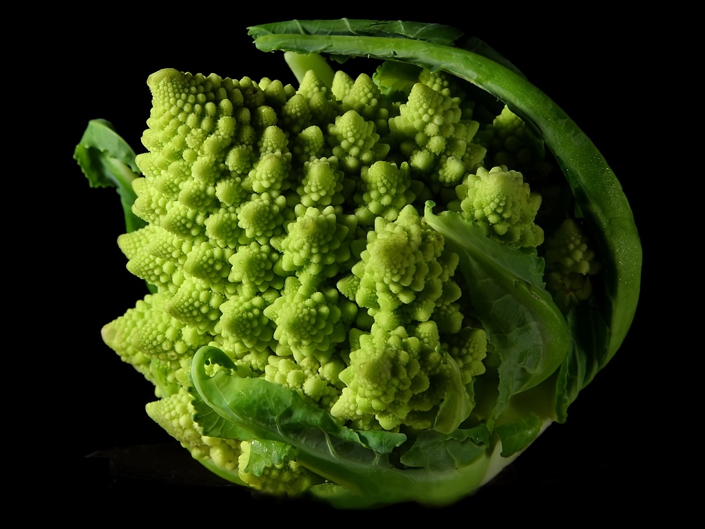
Fractal Broccoli

Great image to illustrate the featured article fractal. Public domain source, name of photographer unknown. Uploaded by me. - Chris 73 Talk 08:56, Sep 5, 2004 (UTC)
- Support (nominator)- Chris 73 Talk 08:56, Sep 5, 2004 (UTC)
- Support. -- Martin123 09:42, 5 Sep 2004 (UTC)
- Support. Fixed some brown discolorations on tips of broccoli. -- Fir0002 10:04, 5 Sep 2004 (UTC)
- Is this image "beautiful, striking, shocking, impressive, titillating, fascinating, or in short just brilliant"? No. Object. Denni ☯ 23:22, 2004 Sep 5 (UTC)
- Support. Beautiful, striking, impressive, just brilliant — absolutely. Markalexander100 03:11, 6 Sep 2004 (UTC)
- Support. Very much so. — David Remahl 05:02, 6 Sep 2004 (UTC)
- Support. Yum! Broccoli. -- Aqua 06:59, Sep 6, 2004 (UTC)
- Support. Highly striking pic - Adrian Pingstone 07:50, 6 Sep 2004 (UTC)
- Support - Striking - Gaz 12:27, 6 Sep 2004 (UTC)
SupportOppose, because it was edited. Lorax 13:23, Sep 6, 2004 (UTC)- Striking and informative. Support. James F. (talk) 14:40, 6 Sep 2004 (UTC)
- Support. One of the finest examples of a natural fractal I've seen, and excellently captured, too. Fredrik | talk 17:40, 6 Sep 2004 (UTC)
- Support. I've eaten one of those; they are more interesting than tasty. [[User:Sverdrup| ❝Sverdrup❞]] 18:21, 6 Sep 2004 (UTC)
- Support. Seen some fractal broccoli and cauliflowers but none as striking as this. I wonder if it was bred for its fractal display? Also like to commend Chris for the excellent work he does in digging up photos for articles, this being just one example. Oska 22:28, Sep 6, 2004 (UTC)
- Support. It's just a shame the bottom has been cropped. --
Prisonblues 11:42, 7 Sep 2004 (UTC)
- Cropping addressed with a quick paint job.
Fredrik |
talk 22:25, 13 Sep 2004 (UTC)
- Damn, that's impressive work Fredik. -- Prisonblues 01:02, 14 Sep 2004 (UTC)
- Cropping addressed with a quick paint job.
Fredrik |
talk 22:25, 13 Sep 2004 (UTC)
- Support. Agree on the cropping. There are some brown spots too, which you wouldn't see in a professional image. Still very good though. Janderk 23:20, 7 Sep 2004 (UTC)
- Support. [[User:Neutrality| Neutrality ( talk)]] 18:00, 8 Sep 2004 (UTC)
- Support. Striking, and a very clear example of fractals in nature. Neurophyre 01:53, 12 Sep 2004 (UTC)
- Support. Absolutely fantastic. -- Tlotoxl 16:55, 15 Sep 2004 (UTC)
Cross on Mount Royal, Montreal
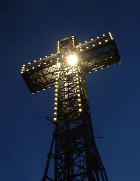

Created by Aarchiba. I like the gradation of the night sky behind the cross and the contrast between the bright illumination and the silhouette. - Montréalais 03:33, 5 Sep 2004 (UTC)
- Oppose. Not terribly stunning, and not terribly sharp. Lupin 03:50, 5 Sep 2004 (UTC)
- Oppose. Larger version is not sharp enough to be a Featured Pic - Adrian Pingstone 09:09, 5 Sep 2004 (UTC)
- Oppose. Pretty ordinary photo. Not sharp -- Fir0002 10:13, 5 Sep 2004 (UTC)
- Oppose. The image quality of the larger photo looks pretty bad. --[[User:Allyunion| AllyUnion (Talk)]] 06:29, 6 Sep 2004 (UTC)
- Oppose - Ok on its own page, but not "featured" material - Gaz 12:36, 6 Sep 2004 (UTC)
- Oppose. Another normal photo. -- Prisonblues 11:41, 7 Sep 2004 (UTC)
- Support (not that it'll do much now :-) Nice angle and gradient of light. LUDRAMAN | T 18:44, 7 Sep 2004 (UTC)
- Oppose. [[User:Neutrality| Neutrality ( talk)]] 18:00, 8 Sep 2004 (UTC)
Sarajevo valley at dusk
An excellent picture of the city at night.
- Support. Self Nomination - Asim Led 01:12, 5 Sep 2004 (UTC)
- Oppose. Too low resolution and much too restrictive license. Otherwise a nice image. — David Remahl 01:15, 5 Sep 2004 (UTC)
- Support. Fantastic photo. Too bad about the license -- Fir0002 06:36, 5 Sep 2004 (UTC)
- Oppose. Could be any urban valley at dusk. I like that it appears so calm, considering where it is, but that does not improve its value as a photo. Denni ☯ 23:25, 2004 Sep 5 (UTC)
- Oppose - I see nothing to feature here - Gaz 12:39, 6 Sep 2004 (UTC)
- Oppose. [[User:Neutrality| Neutrality ( talk)]] 18:00, 8 Sep 2004 (UTC)
- Oppose. The landscape looks like mishmash. - Hapsiainen 10:21, 13 Sep 2004 (UTC)
Antarctica satellite globe
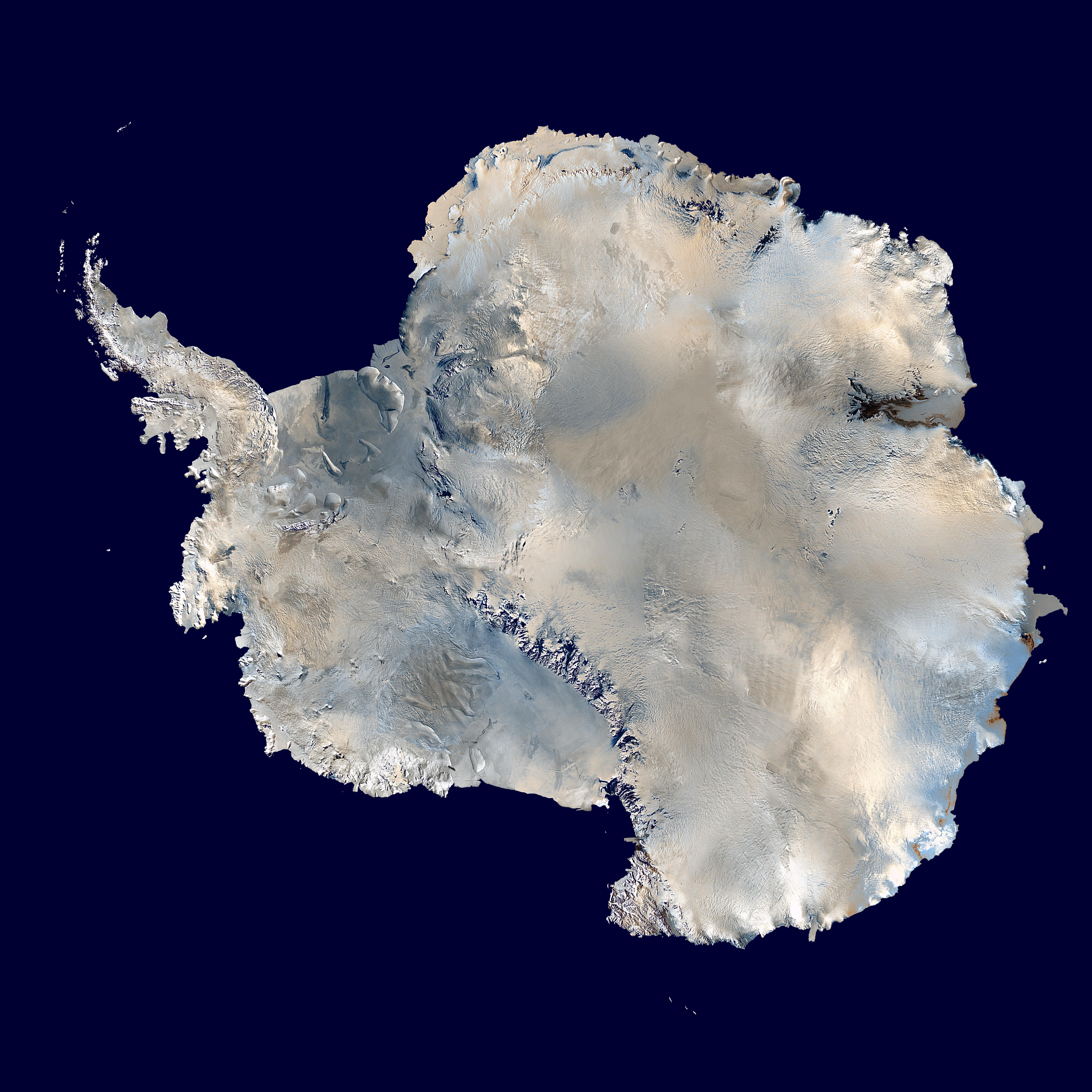

Lovely and informative stuff from the US federal government. - Markalexander100 08:28, 7 Sep 2004 (UTC)
- Support. - Bevo 08:48, 7 Sep 2004 (UTC)
- Support. A beautiful photo - Adrian Pingstone 09:05, 7 Sep 2004 (UTC)
- Support. James F. (talk) 17:58, 7 Sep 2004 (UTC)
- Support. Very very nice. Would be nice to have a link to the original one though. Janderk 22:48, 7 Sep 2004 (UTC)
- Support. Clean pictures of Antarctica are not easy to come by. Denni ☯ 01:06, 2004 Sep 8 (UTC)
- Support - I'm usually quite reticent to support PD works, but this certainly qualifies - Gaz 12:15, 8 Sep 2004 (UTC)
- Support -- Chris 73 Talk 14:17, Sep 8, 2004 (UTC)
- Support. [[User:Neutrality| Neutrality ( talk)]] 18:00, 8 Sep 2004 (UTC)
- Comment: it really ought to have a link to the original. Also, I'm pretty sure its false colour (doesn't rule it out of course, but ought to be noted) ( William M. Connolley 22:34, 8 Sep 2004 (UTC)).
- Support on the condition that a link to the image source is added. I've put a request on
User talk:Cantus for this information as they were the original uploader of the image.
Oska 06:15, Sep 9, 2004 (UTC)
- Added. --
Cantus 06:36, Sep 9, 2004 (UTC)
- Appreciated. I found it interesting to read how the image was obtained through a polar transform.
Oska 21:01, Sep 9, 2004 (UTC)
- Especially as the image would have been originally taken from (probably) directly above the Antarctic, then converted to rectangular formats by NASA (along with, I'm sure, a load of other filters), then converted back to polar coordinates by Cantus -- Prisonblues 21:21, 9 Sep 2004 (UTC)
- Appreciated. I found it interesting to read how the image was obtained through a polar transform.
Oska 21:01, Sep 9, 2004 (UTC)
- Added. --
Cantus 06:36, Sep 9, 2004 (UTC)
- Support. -- Cantus 06:36, Sep 9, 2004 (UTC)
- Support. That's amazing. -- Prisonblues 21:21, 9 Sep 2004 (UTC)
- Support. --
huwr 06:56, 10 Sep 2004 (UTC)
- Promoted by Neutrality
ChessSet.jpg

Nice picture, from Alan Light ( user:Alight). Used on chess. -spencer195 05:37, 7 Sep 2004 (UTC)
- Support. Chmouel 07:42, 7 Sep 2004 (UTC)
- Comments: I see a distinct "lean" to the left. That piece of lint on the board is distracting. I like this idea for image content for the Chess article, but I think better lighting and background would make it more of a candidate for a FP. - Bevo 15:32, 7 Sep 2004 (UTC)
- Oppose. Cheap plastic chess pieces are not what the great game of chess deserves. Plus the picture is far from sharp which is most obvious in the left bottom corner. It is probably taken without tripod at high aperture value. That and the lean to the left. Janderk 23:14, 7 Sep 2004 (UTC)
- Oppose. Cheap plastic pieces, lean, unfocused, poorly chosen pieces (I think the photo should have been either of a game in progress or the starting positions) Generally speaking, this photo isn't very good. --
Fir0002 23:53, 7 Sep 2004 (UTC)
- No, we've pictures of starting positions and other positions, all are too messy to make a good top illutstration of Chess. A picture composed something like this is just what makes a good illustration of Chess. Comment on picture: Support, adds a lot to the article. [[User:Sverdrup| ❝Sverdrup❞]] 10:31, 8 Sep 2004 (UTC)
- Unfocused? Seriously? This photo is pretty sharp. It has a very low depth of field - which gives it a nice look. Apart from the slight lean, Support. ed g2s • talk 20:16, 8 Sep 2004 (UTC)
- Oppose - I think the molding seam on the bishop makes me cringe the most - Gaz 11:56, 8 Sep 2004 (UTC)
- Support. [[User:Neutrality| Neutrality ( talk)]] 18:00, 8 Sep 2004 (UTC)
- Oppose - Thousands upon thousands of variations of chess sets, and you pick this one for a featured picture candidate? -- AllyUnion 08:51, 9 Sep 2004 (UTC)
- Oppose. I had the exact same feeling as Gaz, that's just awful. -- Solitude 12:14, 9 Sep 2004 (UTC)
- Support -- perhaps the rest of you are well-off enough to afford fancy chess pieces, but this is the look I associate with the actual game. More expensive pieces, in my experience, are almost invariably so stylized that they would give an unrepresentative image of the game. The picture is clear, somewhat striking, and definitely a good choice for
Chess. And frankly, even if you don't think it should be featured, I think calling it "awful" is
hyperbole. I'd welcome a better picture, but I think this one very fine.
Jwrosenzweig 21:24, 9 Sep 2004 (UTC)
- Heh, I was actually referring to the seam on the bishop, trying to describe the feeling Gaz experienced as well. The picture as a whole is defenitely not awful but not FP-level to me. -- Solitude 23:51, 9 Sep 2004 (UTC)
- Oppose - Chess set looks too cheap and nasty, they don't sit on the board square, either. -- huwr 06:56, 10 Sep 2004 (UTC)
- Oppose - composition and lighting are nice, but the Bishop looks obviously made of plastic. -- StoatBringer 22:39, 12 Sep 2004 (UTC)
-
User:Alight Since I took this picture, I will not respond to the photography comments. I will however comment about the complaints that it's a "cheap plastic chess set." The pieces pictured are standard tournament pieces that were actually purchased from the U.S. Chess Federation. They are the type used at thousands of tournaments and by millions of players every day. I do not think there is a better set to use to "represent" the game of chess.
- Not promoted. ( Neutrality)
Very nice picture. Eric B. and Rakim 23:43, 6 Sep 2004 (UTC) And the big deal is that there are many bikini images but not many as stunning as this one and FREE (no copright issues at all). I wonder who the girl is. I hope she will marry me. Ericd's one is even better! Eric B. and Rakim 23:16, 7 Sep 2004 (UTC)
- Object. Nothing special about this image; there must be a million more which are practically identical. Plus, does wearing a bikini too much really make palm trees grow out of your head? Lupin 23:46, 6 Sep 2004 (UTC)
- Oppose: A girl in a bikini doen't make a big deal for some peoples. Chmouel
Oppose : Except if someone can keep the girl and get rid of the background :-) 00:06, 7 Sep 2004 (UTC) Ericd 00:09, 7 Sep 2004 (UTC)- Support my own version. I don't think this vote is valid. Ericd 21:32, 7 Sep 2004 (UTC)
- Support. Nicely focused, nicely lit and quite striking (the version without the palm trees) - Adrian Pingstone 09:05, 7 Sep 2004 (UTC)
- Oppose. Like Lupin says, out of the gazillion bikini images and this one is quite mediocre. A bikini image on wikipedia should be classy. Something you won't get in front of an old garden hose and cheap apartment complex. --
Janderk 22:41, 7 Sep 2004 (UTC)
- She's classy... She just needs to model for a better photographer... Like me for instance ;-) Ericd 23:19, 7 Sep 2004 (UTC)
- Oppose. Brings down the tone of Wikipedia. It will make people pause, a question Wikipedia as a reliable source. -- Fir0002 23:37, 7 Sep 2004 (UTC)
- Oppose. Janderk is spot on. -- Prisonblues 10:16, 8 Sep 2004 (UTC)
- Oppose - The Bikini needs a photo like this, but to be featured here I would expect at least a beach. - Gaz 11:51, 8 Sep 2004 (UTC)
- Oppose - gives justification to the so called "fact" that women are simply objects to be owned and lusted after - we don't need that opinion anywhere - let alone here. Selphie 12:28, 8 Sep 2004 (UTC) *
- oppose. A tad too sleazy, and also agree with Janderk . How about Image:Beach Towel (occupied).jpg instead? -- Chris 73 Talk 14:19, Sep 8, 2004 (UTC)
- Oppose. [[User:Neutrality| Neutrality ( talk)]] 18:00, 8 Sep 2004 (UTC)
- Oppose. Article woould be better with a better picture of the designer responsible for the name - like this:
http://www.bikiniatoll.com/louisreard.jpg -
Davodd 22:02, Sep 8, 2004 (UTC)
- Although you did a good job of removing the palm that was growing out of her head. Davodd 21:00, Sep 9, 2004 (UTC)
- Oppose. Inappropriate licentious look in model's face. -- Cantus 06:41, Sep 9, 2004 (UTC)
- Oppose -- huwr 06:56, 10 Sep 2004 (UTC)
- Oppose, but good gods, folks, get a grip! Some of the reactions here are like this image had been taken from the pages of Hustler (or whatever occupies the top skin mag spot these days). This is a woman in a bikini. This is less "licentious and lewd" (if that's how your mind works) than you can see on most European beaches. "Objectifying women"? You MUST be kidding. ("Objectifying" this woman would be using her as a flowerpot for the palm tree. Nice job of removal.)
- Please sign your posts with four tildes. It is not the bikini what people are fussing about, it is the expression on the woman's face which is the very opposite of stylish, it is not natural, and is not what I see here on our beaches. --
Solitude 02:02, 12 Sep 2004 (UTC)
- Not promoted. ( Neutrality)
- Please sign your posts with four tildes. It is not the bikini what people are fussing about, it is the expression on the woman's face which is the very opposite of stylish, it is not natural, and is not what I see here on our beaches. --
Solitude 02:02, 12 Sep 2004 (UTC)
.jpg&action=edit&redlink=1)
Sombrero Galaxy M104

Used on Sombrero Galaxy M104; created by NASA and The Hubble Heritage Team ( STScI/ AURA). — Joseph | Talk 23:07, Sep 10, 2004 (UTC)
- Nominated by
Joseph Dwayne
- Joseph, per your concerns about the process of nomination: just fill in what you want to create a nomination, someone else will add the rest of the structure. - Bevo 01:52, 11 Sep 2004 (UTC)
- Support - Bevo 01:52, 11 Sep 2004 (UTC)
- Support. BTW, Joseph, Jesus (your son?) does not use templates, and he's nominated several pictures her with no significant difficulty. Might come with being omnipotent, I dunno, but calm down, lad. Denni ☯ 01:43, 2004 Sep 11 (UTC)
- Support. Markalexander100 05:27, 11 Sep 2004 (UTC)
- Support, since I added it. :) Neurophyre 01:41, 12 Sep 2004 (UTC)
- Support. And you want me to believe that this is a real photo? As in not created by an artist in photoshop? Wow. Janderk 16:22, 12 Sep 2004 (UTC)
- Support. James F. (talk) 03:03, 13 Sep 2004 (UTC)
Promoted. +6 -0. -- Solitude 06:55, 21 Sep 2004 (UTC)
YAAPFTFG - Yet another awesome picture from the federal government. It's just a shame there's no decent article to feature it in. ( Here's the original) -- Prisonblues 17:39, 9 Sep 2004 (UTC)
- Support either. -- Prisonblues 17:39, 9 Sep 2004 (UTC)
- Support either. This might also fit the Brine article. - Bevo 21:17, 9 Sep 2004 (UTC)
- Support. --
AllyUnion 02:59, 10 Sep 2004 (UTC)
- Support original version only. Why is "more sky" necessary to make the picture better? I don't think it's necessary. -- AllyUnion 08:03, 12 Sep 2004 (UTC)
- Support. -- huwr 06:56, 10 Sep 2004 (UTC)
Object. - needs more sky.Support as is now. For those wondering why I wanted more sky, I felt that the picture needed sky not because I'm a sky-lover or anything but the pic looked unbalanced and strange being cropped just after the top of the mountain as if height cost extra. JOHN COLLISON | (Ludraman) 08:20, 11 Sep 2004 (UTC)- Added more sky, couldn't find a good (free) cloud photo to add though. Thoughts? --
Prisonblues 12:19, 11 Sep 2004 (UTC)
- The edits to the image just don't work for me. The "sky" shows some sort of strange image banding artifacts while rendering (although it seems that after it paints completely they are not visible), and as you point out, the original's cloud is missing. The highlight of the image is the ice, not the sky, so I don't see the need to add more sky. - Bevo 14:24, 11 Sep 2004 (UTC)
- Added more sky, couldn't find a good (free) cloud photo to add though. Thoughts? --
Prisonblues 12:19, 11 Sep 2004 (UTC)
- Support modified version [[User:Sverdrup| ❝Sverdrup❞]] 16:25, 11 Sep 2004 (UTC)
- Support. Gorgeous. Hopefully it will inspire an article to do it justice. Davodd 23:28, Sep 11, 2004 (UTC)
- Support version with more sky. Nice. (forgot my tag again) Janderk 22:04, 14 Sep 2004 (UTC)
- Support. James F. (talk) 03:03, 13 Sep 2004 (UTC)
Promoted. +8 -0. -- Solitude 06:56, 21 Sep 2004 (UTC)
Emperor Penguins

Another superb photo from the federal government. Very striking colours. - ed g2s • talk 23:19, 8 Sep 2004 (UTC)
- Support. ed g2s • talk 23:19, 8 Sep 2004 (UTC)
- Support. Awesome pic. -- Cantus 06:36, Sep 9, 2004 (UTC)
- Support. -- AllyUnion 08:52, 9 Sep 2004 (UTC)
- Support. I wonder what's on their mind... -- Solitude 12:11, 9 Sep 2004 (UTC)
- Support. [[User:Neutrality| Neutrality ( talk)]] 00:32, 10 Sep 2004 (UTC)
- Support. -- huwr 06:56, 10 Sep 2004 (UTC)
- Support. Norm 10:47, 10 Sep 2004 (UTC)
- Support. Autiger 14:50, 10 Sep 2004 (UTC)
- Oppose. A properly illustrative picture would show the whole penguin. Mackerm 05:36, 11 Sep 2004 (UTC)
- Support. - Bevo 14:27, 11 Sep 2004 (UTC)
- Support. James F. (talk) 03:03, 13 Sep 2004 (UTC)
Promoted. +10 -1. -- Solitude 06:57, 21 Sep 2004 (UTC)
An orchid
_Orchid02.jpg)

Used in Orchid. A beautiful orchid, enchanced (I think) by the feathered outline.
- Support. Self nomination-- Fir0002 07:12, 21 Sep 2004 (UTC)
- Support unaltered version, oppose feathered-outline version. -- Tlotoxl 07:41, 21 Sep 2004 (UTC)
- Oppose - The lighting was not good enough. Makes the shot look dull. The second flower in the background confuses the shot, and has obviously confused the photographer as I believe this is a LILY !! (IANAB) - Gaz 10:30, 21 Sep 2004 (UTC)
- Oppose - The flower doesn't stand out enough from the background, and I agree with Gaz, I think it is a Lily as well Lorax 00:27, Sep 22, 2004 (UTC)
- Oppose - Concur that it is specifically a Stargazer lily and I'm not thrilled with the specimen - the incomplete petals on the left side bother me particularly in the feathered version. Autiger 22:16, 22 Sep 2004 (UTC)
- Oppose - This is a lilly ! Ericd 22:22, 22 Sep 2004 (UTC)
- removing candidate -- Fir0002 12:27, 23 Sep 2004 (UTC)
- Comment: Please don't just remove a candidate without at least archiving the discussion, and in fact it would be best to just let it run the course (unless something like Copyvio mandates an immediate removal). - [[User:Bevo|
Bevo]] 13:23, 23 Sep 2004 (UTC)
- oh, okay Sorry! I guess i am not quite familiar with feature picture candidate etiquette, should I put the pic back up? I just thought it was too far in the wrong. Not even being an orchid (oops) --
Fir0002 02:44, 24 Sep 2004 (UTC)
- Since you are the nominator, perhaps it is your option to withdraw it early, but it should have been added to the current archive (I added it there late yesterday). Let's leave this here another day or so to allow comments on the process. - [[User:Bevo| Bevo]] 12:02, 24 Sep 2004 (UTC)
- oh, okay Sorry! I guess i am not quite familiar with feature picture candidate etiquette, should I put the pic back up? I just thought it was too far in the wrong. Not even being an orchid (oops) --
Fir0002 02:44, 24 Sep 2004 (UTC)
Withdrawn by the nominator.
A purple flower of the field

.jpg)
It's remarkable that something so common (the flower) could be so elegant and delicate. It really is beautiful.
- Support. Self Nomination -- Fir0002 12:16, 18 Sep 2004 (UTC)
- Oppose, for now. Only used in Flower album, and there is no info of what species it belongs to. Doesn't "add significantly" to the encyclopaedic value of Wikipedia. I also feel that the image description page should include information on where and when the picture was taken (interesting considering the development of the flower). — David Remahl 11:03, 19 Sep 2004 (UTC)
- Oppose - Good depth of field work, but not strong enough image to feature - suggest making it a portrait - Gaz 12:57, 20 Sep 2004 (UTC)
- Oppose. Not interesting enough to feature. -- Solitude 06:43, 21 Sep 2004 (UTC)
Withdrawn by the nominator.
Ribblehead Viaduct


Just sortof wondered what this needed doing to it. I just cut out a lot of sky. Wilderness and Victorian engineering? Maybe the light is a bit wrong, but the evening light highlights the arches well. Dunc_Harris| ☺ 23:17, 11 Sep 2004 (UTC)
- Well, it's very dark. I know it's grim up north, but I don't think it has to be that grim. I'd adjust the contrast and brightness to make it less murky. I do like the arches, though. Markalexander100 05:18, 12 Sep 2004 (UTC)
- Oppose. The bridge is mainly in the shadow which ruins it for me. Nice but not featured. The image should have been taken of the other (sunny) side or at another time of the day. Now if I could only move the sun around whenever I take a picture... Janderk 16:27, 12 Sep 2004 (UTC)
- Support (the adjusted one). Nice. JOHN COLLISON | (Ludraman) 16:37, 12 Sep 2004 (UTC)
- Oppose both too dark and too small. It's not necessary to include the entire aqueduct; getting a lot closer so as to give some appreciation of the finer points of the structure would result in a much more interesting photo.
Denni
☯ 18:23, 2004 Sep 12 (UTC)
- It's a viaduct, it carries the Settle-Carlisle Railway, not a canal. :) Dunc_Harris| ☺ 21:34, 12 Sep 2004 (UTC)
- Oppose. Maybe a shot with railway cars actually using it would be better. - [[User:Bevo| Bevo]] 22:09, 20 Sep 2004 (UTC)
Erhard's Wall Lizard

Both its colours and arrangement are not dull, and it has message unlike a cute dog pic. And remember it is hard to arrange a lizard, I have taken some dislocated pictures, too...- Hapsiainen 22:35, 12 Sep 2004 (UTC)
- Oppose this version -- You need to photoshop the bottle out, but what to replace it with?
Dunc_Harris|
☺ 22:41, 12 Sep 2004 (UTC)
- The bottle is intentional. Read the image description page -
Hapsiainen 22:42, 12 Sep 2004 (UTC)
- But it doesn't look good! Have you a bigger version? Crop it so the lizard is in the middle of the picture, and perhaps his tail which he's obviously shed running away from something hits the edge of the screen so we can imagine the rest (a short-tailed version would be good to explain how these critters do lose their tails). And then take out the bottle, (perhaps a bit more rock?) Dunc_Harris| ☺ 22:50, 12 Sep 2004 (UTC) It's all in an L shape, and a natural object lizard contrast and a draw the eye outwards both ways. Even if the bottle is intentional, my immediate thought is that it's just a snapshot which happened to have the bottle in the background which you couldn't move for fear of scaring the lizard. Dunc_Harris| ☺ 23:01, 12 Sep 2004 (UTC)
- The bottle is intentional. Read the image description page -
Hapsiainen 22:42, 12 Sep 2004 (UTC)
- Comment: Ouch! What happened to his tail? I think a properly illustrative picture should show a whole lizard.
Mackerm 22:44, 12 Sep 2004 (UTC)
- Wall lizard can drop its tail or a part of its tail when attacked. It illustrates that. - Hapsiainen 09:49, 13 Sep 2004 (UTC)
- If the picture were illustrating an article on lizards and litter, the bottle would be perfect. But it doesn't add anything to a picture illustrating an article on lizards. Markalexander100 00:47, 13 Sep 2004 (UTC)
- Oppose. Plastic bottle and cut tail ruin the picture. -- Cantus 03:55, Sep 13, 2004 (UTC)
- Oppose. This picture can make a statement about a lizard or a statement about litter. It cannot do both effectively. Denni ☯ 04:17, 2004 Sep 13 (UTC
- Oppose. Poor focus. Pic is OK for an article but not as a Featured Pic - Adrian Pingstone 08:56, 13 Sep 2004 (UTC)
- Get glasses my friend. --
Cantus 10:51, Sep 13, 2004 (UTC
- Too late, have a look at User:Arpingstone - Adrian Pingstone 13:47, 13 Sep 2004 (UTC)
- Get glasses my friend. --
Cantus 10:51, Sep 13, 2004 (UTC
- Oppose - I'm with Denni - Gaz 11:59, 13 Sep 2004 (UTC)
- Oppose as a picture of a Lizard, but it makes a great picture for the Litter article. Norm 12:42, 13 Sep 2004 (UTC)
- Oppose Agree with Cantus -- Fir0002 08:00, 14 Sep 2004 (UTC)
Isle of Man Railway
This is one I requested from http://www.brsince78.co.uk and is a good shot. The loco is a "Manx Peacock" very characteristic of the 3" gauge line. Dunc_Harris| ☺ 21:39, 12 Sep 2004 (UTC)
- Oppose. Poor focus -
Adrian Pingstone 08:56, 13 Sep 2004 (UTC)
- See above. -- Cantus 10:50, Sep 13, 2004 (UTC)
- Support. I especially like the perspective created by the tracks. The tree makes the sky look less grey. - Hapsiainen 10:21, 13 Sep 2004 (UTC)
- Oppose - Just not quite up there technically - Gaz 11:51, 13 Sep 2004 (UTC)
- Oppose. The colors seem too bleached out. - [[User:Bevo| Bevo]] 22:04, 20 Sep 2004 (UTC)
High Speed Train
Another from http://www.brsince78.co.uk, nice sunny day, two modes of transport. Dunc_Harris| ☺ 21:39, 12 Sep 2004 (UTC)
- further note; I think that this is more than a basic snapshot (that's why I chose to ask to have it), it is from below, the Intercity 125 is shown nicely. It's balanced, there are two lines across the photo, one along the canal and one along the railway line. You have the tranquility of the canal compared with the speed and noise of the power car. Compare with other snapshots, e.g. http://images.google.co.uk/images?hl=en&lr=&ie=UTF-8&q=+site:mercurio.iet.unipi.it+HST
- Oppose. Nothing too sensational about this picture. -- Cantus 04:00, Sep 13, 2004 (UTC)
- Nothing wrong with the picture, except that it's yer basic snapshot. This has few if any of the requirements for featured picture status. Denni ☯ 04:24, 2004 Sep 13 (UTC)
- Oppose - I see nothing to feature here - Gaz 11:36, 13 Sep 2004 (UTC)
- Oppose. I need something in there to show me the "High Speed" difference of that one with other types of trains; and I need more of the train. - [[User:Bevo| Bevo]] 22:06, 20 Sep 2004 (UTC)
fMRI scan

I don't have a clue if this qualifies as a featured picture, so I just nominate it here and let you guys decide. It is pretty unique in my opinion. -- Conti| ✉ 20:17, Sep 12, 2004 (UTC)
- Perhaps slow down the animation, remove the vitamin pill, and pause for a little longer at the end of each cycle? Dunc_Harris| ☺ 20:21, 12 Sep 2004 (UTC)
- Support. We've had animations as feature pictures before (traffic thing I think). ed g2s • talk 00:33, 13 Sep 2004 (UTC)
- Support. While this would not translate well to a paper Wiki, this is not a paper Wiki. This kind of illustration demonstrates the real strength of a computer-based encyclopedia. Denni ☯ 04:21, 2004 Sep 13 (UTC)
- Support. The pill doesn't worry me: it's part of real-life MRI. Reverence the cheese-like brain. Markalexander100 05:02, 13 Sep 2004 (UTC)
- Support - A wonderful example of a picture telling a thousand words - Gaz 11:34, 13 Sep 2004 (UTC)
- Support. It would be even neater with a side view of the skull next to it showing the scan progress, though. Fredrik | talk 13:57, 13 Sep 2004 (UTC)
- I'm not voting, for obvious reasons, but I just wanted to say that I originally just made this for my User page and so it isn't done with any particular attention to detail, file size, or anything else. I do, however, have the original source files it was created from and so if anybody had any suggestions for a new version (such as putting another angle side by side, or changing the colors, or whatever) it would be not difficult to implement that (just some monkeying with ImageReady and the source file). The source files allow me to render my brain either as slices (such as this one) along any axis, or to render it in 3-D. For examples, see User:Fastfission/Brains. If anybody wants to monkey with the source file (30MB) and MRIcro, you can also contact me via my talk page and maybe I can send it to you. I'm glad you all like the brain, getting it was really a pain in the neck, somewhat literally (as part of an experiment involving transcranial magnetic stimulation, ow!). :-) -- Fastfission 15:48, 13 Sep 2004 (UTC)
- Wow! Neat. Support. -- mav 18:36, 13 Sep 2004 (UTC)
- Support only if you can find an animation displaying the full (head to toes) body. -- Cantus 21:06, Sep 13, 2004 (UTC)
- Support. Nice anim -- Fir0002 08:03, 14 Sep 2004 (UTC)
- Support. Great Animation -- Chris 73 Talk 10:17, Sep 22, 2004 (UTC)
- Support - [[User:Bevo| Bevo]] 14:49, 24 Sep 2004 (UTC)
4 bit counter.jpg

A little something I whipped up as an example for finite state machine and Circuit diagram. →Raul654 19:27, Sep 12, 2004 (UTC)
- Well... no. I don't understand a thing; lots of numbers and names without explanation. For Circuit diagram, we should best just use a made-up diagram to illustrate clearly how components and circuits are represented. Finite state machine is not really written in a language I speak, so I can't judge it fairly. [[User:Sverdrup| ❝Sverdrup❞]] 19:37, 12 Sep 2004 (UTC)
- oppose. It's a very nice circuit diagram, but with no electronics background (me and what other percent of readers), this is just "whaaaa?" A featured picture should be accessible to all. Denni ☯ 04:28, 2004 Sep 13 (UTC)
- Comment: I'd prefer a more interesting example of a circuit diagram like the one at http://ai.eecs.umich.edu/people/conway/Radio/ZenithCircuit.html - I don't know if we can get the right to publish that exact one, but let it stand as an example of the alternative to thinline diagrams like the one nominated here - Bevo 21:45, 13 Sep 2004 (UTC)
- All those valves... (C) 1938... if you find a diagram that's ten years older it would be out of copyright. However, this is a 21st century encyclopedia so I think we should be looking for something a little more modern. --
Solipsist 17:25, 21 Sep 2004 (UTC)
- And of course, the wikipedia can display more than one image per article. - [[User:Bevo| Bevo]] 17:02, 22 Sep 2004 (UTC)
- All those valves... (C) 1938... if you find a diagram that's ten years older it would be out of copyright. However, this is a 21st century encyclopedia so I think we should be looking for something a little more modern. --
Solipsist 17:25, 21 Sep 2004 (UTC)
- Oppose. Same reasons as Denni. Nothing much to look at -- Fir0002 08:06, 14 Sep 2004 (UTC)
- Oppose, not that interesting, not accessible. -- Solitude 12:59, 14 Sep 2004 (UTC)
- Comment. Wouldn't this diagram be better stored as a .png? -- Solipsist 17:25, 21 Sep 2004 (UTC)
St Helens from Monitor Ridge


Excellent combination of Wikipidian talent and US federal government PD archives by Maveric149 used in 1980 eruption of Mount St. Helens.
- Nominated by Bevo 16:49, 13 Sep 2004 (UTC)
- Pretty ragged bottom edge. I'm thinking a 20px feather would do wonders for this picture. Denni ☯ 01:47, 2004 Sep 14 (UTC)
- Support. Very nice photo. Have added a feathered version (is there enough?)-- Fir0002 08:29, 14 Sep 2004 (UTC)
- Support - Well done Mav! - This one is good for at least 2000 to 3000 words (feathered version) - Gaz 12:17, 14 Sep 2004 (UTC)
- Support, but I'd like to see the "before and after the explosion" comparison pics closer together, they're separated by a couple of screen widths on my 1024 by 768 monitor - Adrian Pingstone 12:40, 14 Sep 2004 (UTC)
- Support -- Chris 73 Talk 04:40, Sep 15, 2004 (UTC)
- I just noticed this nomination. :) I really like how the feathered version looks and will do that to the tiff version of the image soon and upload the result. The small photos are where they are only because there isn't any room for them anywhere else. The 550px wide thumbnail in the article is what really counts and all three images can be seen even on a 800x600 screen. -- mav21:06, 15 Sep 2004 (UTC)
- Support. Awesome, probably the best GFDL image on Wikipedia. Soon National Geographic will want pictures from Wikipedia. (considerably better than Bryce Amphitheater ;-) -- Ankur 09:40, 18 Sep 2004 (UTC)
- Support: wow. I agree with Adrian Pingstone's comments above about the distance between the before and after pictures, but I have no suggestions on how it could be fixed. — Matt 10:03, 18 Sep 2004 (UTC)
Joey in pouch

An image of a very tiny baby
kangaroo feeding in its mother's pouch. Looks quite impressive to me, especially since the little
joey is at the same stage of development than a 7 weeks human embryo. I uploaded the picture but didn't take it. The licence is not free, but should be close enough (only requires attribution) The image is licenced under the GFDL.
Schutz 02:29, 14 Sep 2004 (UTC) (Just for the record, the old license was BSD-style. These are free - even freer than the GFDL)
→Raul654 01:41, Sep 15, 2004 (UTC))
- I was going to mention that, but the old licence was talking about "reuse", and I wasn't sure if this covers modification. In any case, I'll mention that it can be used under both licences.
Schutz 01:59, 15 Sep 2004 (UTC)
- It might have been free to use, but specific attribution is a big price to pay. Good work on getting it under the GFDL license. -- Solitude 09:12, 15 Sep 2004 (UTC)
- Neutral - Good photo, shame about the licence - Gaz 12:20, 14 Sep 2004 (UTC)
- Support.
But ONLY on a proper license.Heartwarming and quite impressive. -- Solitude 13:03, 14 Sep 2004 (UTC) - Support, obviously. Schutz 10:40, 15 Sep 2004 (UTC)
- Oppose. It looks sickening. I don't want to see it in the featured pictures list.- Hapsiainen 12:40, Sep 15, 2004 (UTC)
- Oppose. I'm not that squeamish - but this makes my stomach turn. ed g2s • talk 13:09, 15 Sep 2004 (UTC)
- Support. Remember guys - ye looked something like that once! (except not in a pouch). JOHN COLLISON | (Ludraman) 15:48, 15 Sep 2004 (UTC)
- Support. That this little guy even makes it here is one of Nature's most awesome accomplishments. Denni ☯ 00:02, 2004 Sep 16 (UTC)
- Support. Markalexander100 03:23, 16 Sep 2004 (UTC)
- Support -- Janderk 11:40, 17 Sep 2004 (UTC)
- Support. [[User:Norm|Nor m]] 00:45, 18 Sep 2004 (UTC)
No Vote - this is a good pic no doubt, but it's ugly too. It brings mixed emotions. I can both appreciate it (and nature through it) and eeek ... disgusting too. Maybe if there is a similar image that is not so slimy? Its beautiful.OK, its adds a lot to the article. Support-- Ankur 09:58, 18 Sep 2004 (UTC)- Support. - [[User:Bevo| Bevo]] 22:02, 20 Sep 2004 (UTC)
- Support. Good picture, good illustrative qualities, and unusual.
Lorax 00:35, Sep 22, 2004 (UTC)
- Promoted. +11 -2. -- Solitude 08:08, Sep 27, 2004 (UTC)
Giant Isopod

This picture got a lot of attention when the giant isopod article was on the Did You Know on the front page. It's absolutely adorable and fascinating. PD-US Gov't creation. - Smerdis of Tlön 16:36, 15 Sep 2004 (UTC)
- I'm not sure adorable would be the first adjective that came to mind, but I =do= wonder if it might make a nice alternative to lobster on a seafood menu. This cropped image suits me better - what do others think?
Denni
☯ 00:14, 2004 Sep 16 (UTC)
- I like 'em both. Smerdis of Tlön 03:42, 18 Sep 2004 (UTC)
- Oppose - I see nothing to feature here - Gaz 13:21, 20 Sep 2004 (UTC)
- Support. -- Solitude 06:50, 21 Sep 2004 (UTC)
- Support. Reminds of a giant version of the garden woodlouse - Adrian Pingstone 20:30, 22 Sep 2004 (UTC)
- Oppose. I would like a more natural setting for an image to add significant value to the article Giant isopod. - [[User:Bevo| Bevo]] 03:18, 25 Sep 2004 (UTC)
- NOT promoted, +4/-2. -- Solitude 15:42, Sep 28, 2004 (UTC)
Peacekeeper-missile-testing.jpg

This is PD-USGov, and it always sends chills up my spine. "The lines shown are the re-entry vehicles -- one Peacekeeper can hold up to 10 nuclear warheads, each with its own guidance system. Each warhead, were it armed with a nuclear payload, would carry with it the explosive power of twenty-five Hiroshima-sized weapons." I have always felt that these MIRV test pictures always look Biblical (though I am not religious). -- Fastfission 16:13, 15 Sep 2004 (UTC)- Fastfission 16:13, 15 Sep 2004 (UTC)
- Will support if a larger version is found, until then oppose for that reason. ed g2s • talk 18:36, 15 Sep 2004 (UTC)
- Support. This image is already quite a bit larger than the minimum size (280px horiz) for a featured picture. Sure, I'd like a poster-sized one too, but this one is a fair nomination. Agree that there are religious overtones; believe it is known as "creating Hell on Earth." Denni ☯ 00:20, 2004 Sep 16 (UTC)
- Support, really cool, I wish we had a bigger image though. -- Solitude 10:29, 16 Sep 2004 (UTC)
- Very cool, yes; support, but would definitely prefer a larger version, of course. James F. (talk) 10:39, 16 Sep 2004 (UTC)
- Support. Wow. Kbh3rd 00:27, 18 Sep 2004 (UTC)
- Support Very nice. The missles sure went striaght, I dunno whether to be in awe of the technology or be against the purpose.--
Fir0002 10:31, 18 Sep 2004 (UTC)
- That's really the same contradiction I feel. I guess I'm also in awe of its purpose -- such destruction to wish upon another! But anyway... I'm not sure there are bigger versions of this out there. I have seen another version of this file but it had also sorts of JPEG artifacts and other obvious signs of compression -- this one was actually a great find because it is so crisp. -- Fastfission 16:52, 18 Sep 2004 (UTC)
- Support. Throughout the inspiring course of human history, our best and latest technologies have ever been devoted to killing our neighbours. Smerdis of Tlön 18:07, 19 Sep 2004 (UTC)
- And I looked, and behold a pale horse: and his name that sat on him was Death, and Hell followed with him. Support. —No-One Jones (m) 01:50, 20 Sep 2004 (UTC)
- Support. Scary -- Chris 73 Talk 23:14, Sep 20, 2004 (UTC)
- Comment: I'm not sure what this is a picture of. Are the re-entry vehicles executing a powered descent? Do the warheads detonate on contact with the ground, or in fact are the warheads deployed above ground, and so the tests produce a descent that would not occur in actual use of the system? - [[User:Bevo| Bevo]] 16:53, 22 Sep 2004 (UTC)
- Support. It scares me. [[User:Neutrality| Neutrality ( talk)]] 21:18, Sep 23, 2004 (UTC)
- Support. -- Aqua 05:31, Sep 26, 2004 (UTC)
- Support. Really scary. But somebody please make the description clearer: So, they sent up one Peacekeeper, it broke up, and we see the MIRVs at the last phase of their decent? And at each ground contact, we would have large mushrooms? Oh, and why do they light? Is the decent powered? Simon A. 14:30, 28 Sep 2004 (UTC)
- Promoted, +12/-1. -- Solitude 15:42, Sep 28, 2004 (UTC)
DNA labels.jpg

I found our DNA article lacking a chemical diagram, so I created this in photoshop. It took a while, but I think it fills in the gap quite nicely.
- Support. →Raul654 07:22, Sep 15, 2004 (UTC)
- Support. James F. (talk) 08:29, 15 Sep 2004 (UTC)
- Oppose. High quality work and fits perfectly in the DNA article. But I think it misses something to give it that special featured picture feel. -- Solitude 09:30, 15 Sep 2004 (UTC)
- Support. One suggestion: an important property of
DNA is that
adenine and
thymine are connected by 2 hydrogene bonds, while
cytosine and
guanine are connected by 3 bonds (making C-G harder to break than A-T). It would be nice to show that; for reference,
http://www.elmhurst.edu/~chm/vchembook/582dnadoublehelix.html shows exactly which atoms interact with which.
Schutz 10:38, 15 Sep 2004 (UTC)
- Well, there's three things - (1) I can add extra hydrogen bonds to show that they are bound by more than one, but I can't indicate which atoms to which without (2) radically altering the diagram, or (3) having the bonds cross over each other (IE, X shaped). What would you suggest?
→Raul654 23:26, Sep 17, 2004 (UTC)
- Yeah, I thought it could be a problem. I don't like bonds crossing over each other; I guess just duplicating or triplicating the pink bond, without attaching it to any atom in particular would do the job for now.
Schutz 01:53, 18 Sep 2004 (UTC)
- I've added the extra bonds, as requested. →Raul654 18:03, Sep 18, 2004 (UTC)
- Yeah, I thought it could be a problem. I don't like bonds crossing over each other; I guess just duplicating or triplicating the pink bond, without attaching it to any atom in particular would do the job for now.
Schutz 01:53, 18 Sep 2004 (UTC)
- Well, there's three things - (1) I can add extra hydrogen bonds to show that they are bound by more than one, but I can't indicate which atoms to which without (2) radically altering the diagram, or (3) having the bonds cross over each other (IE, X shaped). What would you suggest?
→Raul654 23:26, Sep 17, 2004 (UTC)
- Support - very nice! Schutz has a great suggestion. -- mav 07:37, 16 Sep 2004 (UTC)
- Oppose. Not quite clear and self-explanatory enough. (comment edited) [[User:Sverdrup| ❝Sverdrup❞]] 14:00, 18 Sep 2004 (UTC)
- Support. - [[User:Bevo| Bevo]] 16:56, 22 Sep 2004 (UTC)
- Oppose until a PNG version is uploaded. Guan aco 03:29, 25 Sep 2004 (UTC)
- Oppose. Graphics like this should always be PNG. And I like some explanation for non experts what we are looking at. If both requirements are fullfilled I will support this graphic. Janderk 11:59, 28 Sep 2004 (UTC)
- NOT promoted, +5/-4. -- Solitude 15:43, Sep 28, 2004 (UTC)
Red Sunset Panorama


This photo captures the full splendour and colours of a red sunset. It almost looks like the hill is on fire. It is the feature picture on the sunset page.
- Support. Self nomination. -- Fir0002 08:37, 14 Sep 2004 (UTC)
- Support. Great colours. Markalexander100 09:25, 14 Sep 2004 (UTC)
- Support, beautiful. Fir0002, you mention it is a self-nomination. Did you indeed take the picture yourself? If so, could you license it under the GFDL please? Also then, a bit more info on the location and maybe the camera/settings would be appreciated. --
Solitude 11:32, 14 Sep 2004 (UTC)
- I did take the photo, of which I'm proud. Orignally when I uploaded it, I made it GFDL, someone must have changed it. Anyway, it was really a question of taking the photo. I have a pretty ordinarly digital camera, it was just the subject that was breath-taking. So the camera settings were just the cameras preset "nightshot mode". It was taken near my house Swifts Creek Australia. --
Fir0002 00:20, 15 Sep 2004 (UTC)
- This picture was uploaded (according to the image's revision history) by TakuyaMarata in spring of 2003 -- I guess I'm confused now. Fir, are you Taku under another name? If not, how did Taku get the photo from you? Sorry, just a bit puzzled.
Jwrosenzweig 00:31, 15 Sep 2004 (UTC)
- Actually I'm pretty confused now as well. I 'm just fir0002. I have put up the image again, so hopefully, it will work good. TakuyaMarata do you have any idea whats happening?-- Fir0002 00:43, 15 Sep 2004 (UTC)
- Jwrosenzweig, can you point me to where you found TakuyaMarata in the revision history? --
Solitude 07:00, 15 Sep 2004 (UTC)
- This is getting really fishy. When I commented,
Image:Sunset.jpg was displayed here. It has since been replaced by
Image:Red_sunset02.jpg, which is identical (update -- this replacement was done by fir immediately after I made my comment -- why would he switch images and then claim he had no idea what I was talking about?). Sunset.jpg was uploaded by Taku in March 2003. Redsunset02.jpg was uploaded by Fir a week ago. This looks very suspicious to me, and I can't figure out why anyone would try and misrepresent a picture as theirs if it wasn't. Anyone have any idea what's going on? Oppose till we get this sorted out.
Jwrosenzweig 15:22, 15 Sep 2004 (UTC)
- Note: Fir also replaced sunset.jpg with Red_sunset02.jpg on
Sunset on the 14th, according to Sunset's edit history. Sunset.jpg, which has been in sunset for over a year, it appears to me, now links nowhere except here (due to the text links).
Jwrosenzweig 15:28, 15 Sep 2004 (UTC)
- I am Taku and TakuyaMurata mentioned here. I am sorry but I cannot say more than I remember I uploaded a file. Was it the same as Red_sunset02.jpg, one taken by Fir0002. I don't know. I think I found a copyright-free image, so I just uploaded it. True, I should have left a note where I got it. I thought I did as I usually do but it appears I did not. Actually I just found that Image:Sunset_s.jpg contains sunset.jpg. The truth is that I uploaded back in 2003 a larger version of the picture displayed at Image:Sunset_s.jpg as sunset.jpg and was, without trace, replaced by shot by Fir0002. I don't know where the old one is gone. Anyway, I think, aside from dig into the mystery, what we do is just use Red_sunset02.jpg and delete sunset_s.jpg and sunset.jpg. I suspect there may have been a techical glitch; a developer might have presumed, when fixing files, that sunset.jpg was the same as Red_sunset02.jpg. Hope this will help. --
Taku 02:52, Sep 16, 2004 (UTC)
- OK, to set the record straight. When I first upload the image, it was called sunset.jpeg After Wikipedia loaded up the "there is already an image with this name. I clicked back, and renamed the image to Red_sunset02.jpeg. Next day I went to the sunset page and added it to the bottom. NOT AS THE MAIN ONE. A couple of days later, I visited the sunset page. The sunset over the ocean was replaced with mine as the feature picture. What must have happened was when I uploaded the initial image, it replaced sunset.jpg. When I went to recommend it as a feature picture, I just went to the sunset page and got the image filename from there. That is why the image i first put on the features page was sunset.jpg. But when all this stuff started up and everyone was questioning my authenticy, I put up the Red_sunset picture. I admit it was stupid to replace the sunset.jpg on the sunset page - leading to false conclusions being drawn, but I thought that it would be bad to put up a feature article without it being on a page. At that time the new "pictures" category wasn't in the sunset page, and it looked pretty good where it was anyway. I sincerly hope everyone believes me, and that this whole issue is resolve. I took the photo. Really. I can upload the orginal with the camera info and all that in the EXIF data if anyone still disbelieves me. -- Fir0002 04:35, 16 Sep 2004 (UTC)
- Jwrosenzweig, I just thought of a good idea to prove that I am the photographer, of the photo. When I get back from school today, I'll take a picture of the exact spot where I took the photo, upload it and provide a link.-- Fir0002 04:48, 16 Sep 2004 (UTC)
- Jwrosenzweig click on
Media:Hill_where_sunset_pix_was_t.jpg to see the place where i took the sunset photo. Also i just checked the EXIF info on the original photo, and it was taken in April 2004, I could upload that aswell if you still doubt me. --
Fir0002 06:01, 16 Sep 2004 (UTC)
- Well I think something just went wrong in uploading your sunset over the previous one. This one is clearly shot by you and we can leave it at that. Let's get on with the voting. -- Solitude 07:48, 16 Sep 2004 (UTC)
- I am Taku and TakuyaMurata mentioned here. I am sorry but I cannot say more than I remember I uploaded a file. Was it the same as Red_sunset02.jpg, one taken by Fir0002. I don't know. I think I found a copyright-free image, so I just uploaded it. True, I should have left a note where I got it. I thought I did as I usually do but it appears I did not. Actually I just found that Image:Sunset_s.jpg contains sunset.jpg. The truth is that I uploaded back in 2003 a larger version of the picture displayed at Image:Sunset_s.jpg as sunset.jpg and was, without trace, replaced by shot by Fir0002. I don't know where the old one is gone. Anyway, I think, aside from dig into the mystery, what we do is just use Red_sunset02.jpg and delete sunset_s.jpg and sunset.jpg. I suspect there may have been a techical glitch; a developer might have presumed, when fixing files, that sunset.jpg was the same as Red_sunset02.jpg. Hope this will help. --
Taku 02:52, Sep 16, 2004 (UTC)
- Note: Fir also replaced sunset.jpg with Red_sunset02.jpg on
Sunset on the 14th, according to Sunset's edit history. Sunset.jpg, which has been in sunset for over a year, it appears to me, now links nowhere except here (due to the text links).
Jwrosenzweig 15:28, 15 Sep 2004 (UTC)
- This is getting really fishy. When I commented,
Image:Sunset.jpg was displayed here. It has since been replaced by
Image:Red_sunset02.jpg, which is identical (update -- this replacement was done by fir immediately after I made my comment -- why would he switch images and then claim he had no idea what I was talking about?). Sunset.jpg was uploaded by Taku in March 2003. Redsunset02.jpg was uploaded by Fir a week ago. This looks very suspicious to me, and I can't figure out why anyone would try and misrepresent a picture as theirs if it wasn't. Anyone have any idea what's going on? Oppose till we get this sorted out.
Jwrosenzweig 15:22, 15 Sep 2004 (UTC)
- This picture was uploaded (according to the image's revision history) by TakuyaMarata in spring of 2003 -- I guess I'm confused now. Fir, are you Taku under another name? If not, how did Taku get the photo from you? Sorry, just a bit puzzled.
Jwrosenzweig 00:31, 15 Sep 2004 (UTC)
- Ok, switch me to support. Sorry for my doubts, fir, but I hope you understand it looked odd from my perspective. I'm more than adequately convinced at this point that it's your picture. Sorry for the trouble. Jwrosenzweig 13:56, 16 Sep 2004 (UTC)
- I did take the photo, of which I'm proud. Orignally when I uploaded it, I made it GFDL, someone must have changed it. Anyway, it was really a question of taking the photo. I have a pretty ordinarly digital camera, it was just the subject that was breath-taking. So the camera settings were just the cameras preset "nightshot mode". It was taken near my house Swifts Creek Australia. --
Fir0002 00:20, 15 Sep 2004 (UTC)
- Yeah no problems, thanks for restoring your confidence in me. Im glad that is all over, i was getting woried. Anyhow its history now. Did make the list a bit long though didn't it? :-) -- Fir0002 10:39, 18 Sep 2004 (UTC)
- Support. -- Prisonblues 16:37, 14 Sep 2004 (UTC)
- Support -- Chris 73 Talk 04:39, Sep 15, 2004 (UTC)
- Support -- Oska 08:11, Sep 15, 2004 (UTC)
- Support -- AllyUnion (talk) 12:12, 15 Sep 2004 (UTC)
- Surport tooto 17:31, 17 Sep 2004 (UTC) , authough i think i like sunset.jpg better. not much in it though, both are wows
- Support -- Chmouel 09:23, 18 Sep 2004 (UTC)
- Support, this one is amazing. ❝Sverdrup❞ 12:39, 19 Sep 2004 (UTC)
- Oppose this version. The red colors are pumped up too much in the image processing. I support it when the colors are tuned back to the original image a bit. - Janderk
- Oppose this modified version. This time the photo editting has disturbed the essential elements that make this photo contribute to the Wikipedia article. - [[User:Bevo|
Bevo]] 14:55, 24 Sep 2004 (UTC)
- Just for clarity, which version is "this" version?
✏ Sverdrup 00:38, 25 Sep 2004 (UTC)
- "this modified version" in my opposing vote is Red_sunset02.jpg (the other two, sunset.jpg and Red_sunset.jpg are currently equivalent images, and are the one from which Red_sunset02.jpg is a derivative work) This nomination is flawed, as the section header indicates sunset.jpg and the topmost image is a different image, Red sunset02.jpg - [[User:Bevo| Bevo]] 01:01, 25 Sep 2004 (UTC)
- Just for clarity, which version is "this" version?
✏ Sverdrup 00:38, 25 Sep 2004 (UTC)
- Support all. →Raul654 18:53, Sep 26, 2004 (UTC)
- Support only sunset.jpg - [[User:Bevo| Bevo]] 22:51, 27 Sep 2004 (UTC)
- Idem support the first image shown on this page only: sunset.jpg Janderk 12:03, 28 Sep 2004 (UTC)
- Promoted sunset.jpg, approx. +10/-1. -- Solitude 15:46, Sep 28, 2004 (UTC)
Black Swans
- Great photo. [[User:Neutrality| Neutrality ( talk)]] 00:40, 17 Sep 2004 (UTC)
- Support, nice work. -- Solitude 07:09, 17 Sep 2004 (UTC)
- Support. Good composition. Kbh3rd 00:25, 18 Sep 2004 (UTC)
- Support. Good clear photo. -- Fir0002 10:28, 18 Sep 2004 (UTC)
- Support. Nice picture. ugen64 22:23, Sep 18, 2004 (UTC)
- Support. [[User:Gamaliel|Gamaliel File:Watchmensmiley20.gif]] 22:28, 19 Sep 2004 (UTC)
NeutralOppose - I suppose it is because I've seen so many black swans in the wild, this shot looks kind of ordinary. Sure it shows a black swan in reasonable detail, but it lacks "punch". Maybe it is the bare stretch of water? - Gaz 13:19, 20 Sep 2004 (UTC)- Oppose. Agree with Gaz on the background. It makes the picture not special enough to be featured. Janderk 17:31, 20 Sep 2004 (UTC)
- Support. - [[User:Bevo| Bevo]] 21:48, 20 Sep 2004 (UTC)
- Support. -- Chris 73 Talk 23:12, Sep 20, 2004 (UTC)
- Oppose. Black swans are beautiful but this particular photo is very ordinary. Oska 01:14, Sep 21, 2004 (UTC)
- Oppose. It looks too ordinary. Black swans are not familiar to me, so it must be due to the water.- Hapsiainen 13:18, Sep 21, 2004 (UTC)
- Oppose. Too much water, dull light. Markalexander100 04:29, 22 Sep 2004 (UTC)
- Oppose, a good picture but not striking enough for Featured - Adrian Pingstone 08:27, 22 Sep 2004 (UTC)
- Oppose. Its nice composition, but the tone of the water is off-putting. Oddly the image looks much better in the large version, where you can see the detail. Perhaps tighter cropping would help. -- Solipsist 13:01, 23 Sep 2004 (UTC)
- NOT promoting. +8/-7. -- Solitude 07:05, Sep 30, 2004 (UTC)