Comment – Looks like a nice, locally noteworthy place, but I question the general significance of the topic. (If Zehnder's had morphed into a megachain like Colonel You-Know-Who's, it would be different.)
Sca (
talk) 17:10, 22 January 2015 (UTC)reply
Comment I quite like this image (and the entire series about the village is really interesting for somebody who lives close to "the originals"). I'm not the best judge of the respective article, but the image seems quite appropriate. Still, there is CA at the foilage at the left side and the columns supporting the sigh and the sky does not look natural to me (that is also the case with e.g. the covered bridge). --
DXR (
talk) 20:23, 23 January 2015 (UTC)reply
This is an HDR image; I'm not sure exactly why that happens. It was mentioned elsewhere as well. Does anyone know why that happens? (That also explains the CA - it's actually some movement of the branches in between exposures; removing these ghosts works very poorly in Photomatix) —
Crisco 1492 (
talk) 21:58, 23 January 2015 (UTC)reply
Yeah, I haven't made great experiences with Photomatix in bright daylight, either. The CA issue is quite understandable then. Do you use the .tifs out of Photomatix for further editing? I almost always just combine the images and edit the "raw" 32-bit tif (actually of course a Diliff trick). --
DXR (
talk) 17:54, 24 January 2015 (UTC)reply
I do edit the output, yes, though I didn't know that Photomatix has an option for outputting tifs. I'll have to try that next time. —
Crisco 1492 (
talk) 18:44, 24 January 2015 (UTC)reply
I was thinking about this picture for a while now - and what makes me agree it is its future EV. Like in about a hundred years, people would like to know how small everyday
Michigan villages looked like. So, support...
Hafspajen (
talk) 15:36, 25 January 2015 (UTC)reply
Support - The place appears to be fairly notable and the composition given the placement of the stoplight (i.e., inability to avoid it) is good. Lack of sharpness in the branches is too bad, but not a deal breaker.--
Godot13 (
talk) 19:51, 29 January 2015 (UTC)reply
Support – I looked at this a few days ago and it's a quality image of an interesting place; yes, the article could stand some expansion as there seems to be a lot of history behind this place and hopefully that will happen.
SagaciousPhil -
Chat 10:46, 1 February 2015 (UTC) well, Crisco, I sat in the restaurant for days waiting for you to treat me to a meal ... now you're back in Indonesia I expect lots and lots of flowers to make up for you standing me up!
reply
Perfect timing; it's 11am, Sunday morning here, so I'll have
this for brunch, please! Bacon and I hope that's some scrambled egg? Truly scrummy!
SagaciousPhil -
Chat 11:04, 1 February 2015 (UTC)reply
Oppose - Below required resolution of 1500 X 1500. Plus, par below sharpness of an expected FP of animals. A rare shot indeed, but sharpness does count. Are there any fringes on the posterior side? -- -
The Herald (
here I am) 15:09, 1 February 2015 (UTC)reply
Oppose, suggest speedy close. Too small.
J Milburn (
talk) 15:41, 1 February 2015 (UTC)reply
Voting period is over. Please don't add any new votes. Voting period ends on 1 Feb 2015 at 21:50:15 (UTC)
Original –are a group of fish that are ornamental varieties of domesticated common carp (Cyprinus carpio) kept in outdoor koi ponds or water gardens.Alt
Reason
rather interesting picture, 3,008 × 2,000 pixels, used and colorful, showing the fish that are gathered with open mouth arround the food tossed in the pond.
Support as nominator –
Hafspajen (
talk) 21:50, 22 January 2015 (UTC)reply
Comment - It seems to show koi enthusiastically going after food. As an action image of fish, which is a bit unusual in itself, it is fine. I usually associate koi with tranquil waters, not so crowded, and conducive to peaceful meditation. This image shows another side to the fish. It also shows the variety of colors. That said, I will
Support - because it is a good, clear, image of koi in a situation with which they are not usually associated.
CorinneSD (
talk) 23:34, 24 January 2015 (UTC)reply
Proposition I present Alternative version. ___
Alborzagros (
talk) 10:46, 25 January 2015 (UTC)reply
Support ALT - Works a bit better; suggests an even larger number of koi outside the frame. —
Crisco 1492 (
talk) 14:12, 25 January 2015 (UTC)reply
Comment - Well, that was a little bit of a surprise. I can't really agree that it is an ALT. Since the original file is big enough, and it is not exactly the same picture or a a better file of it... It is simply an other picture of the same subject. I knew about that picture but I wasn't chosen that one myself, for a number of reasons. I really don't know why it has been posted. The picture I have chosen it is a close up picture, a portrait of the fish, snapping after the food that shows the fish radially placed from the center in a circular formation, with the mouth clearly visible, it has a clear composition, style, and it is used. The other one is a big pancake of several fish, they lay flat and it is rather different as a composition from the other one. I knew about that picture too, but I never chose that one. And now it is suddenly here, I don't really understand WHY it has been posted as an alt. As I said it is simply different. --
Hafspajen (
talk) 15:05, 25 January 2015 (UTC)reply
I mean if somebody else but the nominator chose an ALT it is because: the original picture is blurry, not big enough, a bigger version of the original, if there was some opposition against it, and so on. One doesn't post an ALT in the middle of some other person's nomination, like: hey, this I like better - if there is not a reall reason for it.
Hafspajen (
talk) 15:14, 25 January 2015 (UTC)reply
Comment – The "ALT" doesn't appear to be used in any articles though so how can it even be considered? I think I would err towards the original anyway ... ...
SagaciousPhil -
Chat 15:47, 25 January 2015 (UTC)reply
Comment - I agree with Hafs, but I also think the original image is more attractive.
CorinneSD (
talk) 18:52, 25 January 2015 (UTC)reply
Support Original and Remove ALT as not used in any articles, as confirmed by
SagaciousPhil.
gazhiley 15:46, 26 January 2015 (UTC)reply
Procedural note The fact that the alternative isn't used is meaningless. If there would be a consensus that the alt should be promoted, than the original would be replaced in all articles with it by the closer.
ArmbrustTheHomunculus 16:21, 26 January 2015 (UTC)reply
Response If the original is suitably good and the alt isn't an improvement, then what's the point in the ALT?
gazhiley 17:23, 26 January 2015 (UTC)reply
Alts are added to nominations, if somebody thinks they are better than the original. It's a completely different matter whether you agree with it or not.
ArmbrustTheHomunculus 19:38, 26 January 2015 (UTC)reply
Comment - Well, it is not about liking it or not.
This is an ALT that was called for. This is
an ALT too. But if I would place this one or this on Elizabeth Smith-Stanley, Countess of Derby nomination as an ALT, that would be the same as this alt proposition.
Hafspajen (
talk) 23:42, 26 January 2015 (UTC)reply
Support original—it's more of an "action shot". The ALT makes it look like a load of koi about to be carted away to the fish market—you don't eat koi. I don't disagree that a more "tranquil" scene may be a more idealized image, but I've certainly seen large groups of them go at it like this.
Curly Turkey¡gobble! 01:47, 27 January 2015 (UTC)reply
Support original - great shot! --Atsme☯Consult 03:42, 28 January 2015 (UTC)reply
Oppose for now. The color and contrast of all these is very unappealing. I can't believe that the original paintings look like this! (If they do, they are in need of restoration, removing several layers of dark brown varnish...) --
Janke |
Talk 09:46, 24 January 2015 (UTC)reply
These are Google Art Project scans, so I believe they are accurate. It would be misleading to change them. SupportAdam Cuerden(
talk) 02:41, 2 February 2015 (UTC)reply
We have to work around the limitations of computer displays, and this may require adjusting original scans for exposure, contrast, and white balance.
Samsara 15:20, 2 February 2015 (UTC)reply
Oppose for now per Janke.
Samsara 17:07, 1 February 2015 (UTC)reply
An extremely valuable image. These sorts of teaching materials are relatively rare, since they necessarily require permission to show a dead person's organs to the world. It's from 2002, cameras weren't perfect back then, but the sheer rarity of such images makes up for the flaws.
Comment - This is certainly an interesting piece. But I can't help but notice a line at the bottom right go down from purple to grey.
GamerPro64 22:10, 23 January 2015 (UTC)reply
Hm. I'd imagine the grey is the edge of a tray, the purple... Well, older digital cameras could be a little weird. I think that was a common effect of light hitting the lens from the side. Could be wrong. Anyway! We could easily crop it or even retouch it away, since it's nowhere near the actual liver. Adam Cuerden(
talk) 22:25, 23 January 2015 (UTC)reply
Whoever wrote "I don't normally believe in censoring on FPC, but I think autopsied tumours might be a little much." - did you consider the fact that FPs usually are featured on the front page - shall it be hidden there, too? ;-) --
Janke |
Talk 09:35, 24 January 2015 (UTC)reply
We can deal with that later. There was consensus to run the
smallpox FP, and this is not even in the same ballpark as that one. —
Crisco 1492 (
talk) 10:13, 24 January 2015 (UTC)reply
FPC noms are up for about two weeks. That's a long time for anyone upset with them, and actively trying to work on the FPC page. I'd say there are many things, like this, that should be on the main page, but not on an active workspace like here. Adam Cuerden(
talk) 17:04, 24 January 2015 (UTC)reply
OOT, but for potentially controversial POTD images I generally allow a month of discussion. Such discussion supported the smallpox image, but was against our FP of
Michele Merkin going on the main page. —
Crisco 1492 (
talk) 19:12, 24 January 2015 (UTC)reply
Support Not technically the best image, but we don't really have much of this kind of material, and we need it.
Samsara 17:24, 2 February 2015 (UTC)reply
Support - I think when one can notice the cracks, it's a good sign. It's a big file. You can't notice them at thumb. Not even if considerably enlarged.
Hafspajen (
talk) 22:50, 24 January 2015 (UTC)reply
Support Looks good to me.
Mattximus (
talk) 01:11, 28 January 2015 (UTC)reply
Oppose - Too small. With multi-megapixel painting scans becoming ridiculously common now, I doubt there should be any exceptions to the resolution rule. —
Crisco 1492 (
talk) 09:48, 3 February 2015 (UTC)reply
Well, this is my first relatively successful attempt to emulate Diliff's fantastic cathedral photography. Although I did take some shots of the nave (both from near the altar and elsewhere), this is the only one I'm comfortable nominating. It shows the apse of Our Lady of the Assumption in Windsor, Ontario, which is the oldest Catholic church in Canada west of Quebec.
Support - is it the new camera?
Hafspajen (
talk) 23:15, 24 January 2015 (UTC)reply
Nope, still the 60D. I'm waiting til I'm back in Indonesia to look into getting a 6D. —
Crisco 1492 (
talk) 23:19, 24 January 2015 (UTC)reply
Question - Fantastic picture. Does it seem like it has the slightest (.1 or .2 degrees) CW tilt? Very well could just be me...--
Godot13 (
talk) 06:04, 26 January 2015 (UTC)reply
Very hard to tell the difference. In either case, great image and Support.--
Godot13 (
talk) 00:08, 27 January 2015 (UTC)reply
Wasn't much at 0.1, but it did look straighter. Thanks. —
Crisco 1492 (
talk) 00:17, 27 January 2015 (UTC)reply
Question The figure on the left (as well as the right) appear quite distorted when I zoom in. Is this a problem with my computer, or is that in the actual image?
Mattximus (
talk) 01:16, 28 January 2015 (UTC)reply
It's natural with the field of view used. I don't recall it off the top of my head, but the vertical field of view was pushing 80 degrees. —
Crisco 1492 (
talk) 04:26, 28 January 2015 (UTC)reply
Support. Nicely done. The vertical angle of view is pretty extreme though. I would have perhaps added some vertical compression in PTGui (just a small amount can make a big difference to an image like this).
Ðiliff«»(Talk) 11:50, 29 January 2015 (UTC)reply
Thanks! I'll have to remember that one for next time. —
Crisco 1492 (
talk) 13:01, 29 January 2015 (UTC)reply
Support Lovely picture - nice and crisp... Somehow not noticed this nom until now.
gazhiley 12:57, 2 February 2015 (UTC)reply
Oppose - Cutout is quite obvious. —
Crisco 1492 (
talk) 10:43, 24 January 2015 (UTC)reply
When the cutting out helps to make the picture better, why can it be a factor to refuse a photo as FP? __
Alborzagros (
talk) 11:05, 24 January 2015 (UTC)reply
When it's done poorly, like here. —
Crisco 1492 (
talk) 11:49, 24 January 2015 (UTC)reply
Oppose. This looks like a wax statue not the real person, and so does not meet one or more of the "encyclopedic value", "appropriate description" or "avoids digital manipulation" criteria.
DrKiernan (
talk) 11:19, 24 January 2015 (UTC)reply
Oppose. I agree that it appears to be a wax figure.
Rreagan007 (
talk) 05:37, 25 January 2015 (UTC)reply
Oppose I clicked on the picture and it said " This figure appears to be a waxwork sculpture rather than the actual king. The real person has a liver spot on his right cheek and bags under his eyes."
Mattximus (
talk) 01:13, 28 January 2015 (UTC)reply
Oppose - it looks plastic, shoulder is lost in the black background --Atsme☯Consult 03:54, 28 January 2015 (UTC)reply
Could someone close this? —
Crisco 1492 (
talk) 15:25, 29 January 2015 (UTC)reply
Voting period is over. Please don't add any new votes. Voting period ends on 3 Feb 2015 at 21:25:36 (UTC)
Original – Dancing Fairies is a painting by Swedish painter
August Malmström (1829–1901) which depicts
fairies dancing above the water, in a moonlit landscape.
Reason
High quality scan of an attractive painting. Swedish artists are somewhat underrepresented at FPC.
Support as nominator –
CorinneSD (
talk) 22:44, 24 January 2015 (UTC)reply
Lovely... but the colours are different in the Rijksmuseum's scan. (See addition here) —
Crisco 1492 (
talk) 23:38, 24 January 2015 (UTC)reply
Comment' Gosh. I found a third, hurray. just in between.
Hafspajen (
talk) 00:40, 25 January 2015 (UTC)reply
Comment - Since it was painted 1820 it is weird that it should lost its color so fast. Wonder if File:Bloemen in een terracotta vaas. Rijksmuseum SK-A-1013.jpeg isn't the closest to original after all.
Hafspajen (
talk) 14:48, 25 January 2015 (UTC)reply
I'm just curious -- how would the first image get those bright colors? Did somebody change the colors with a software program? -
CorinneSD (
talk) 17:26, 26 January 2015 (UTC) reply
Support - like the crisp colors of the original --Atsme☯Consult 03:45, 28 January 2015 (UTC)reply
Comment I'm just trying to learn: what is the primary goal here at FP? To have an image that looks as close as possible to the way the painting looks in the museum (with its aging, grime of decades, etc.), or to have an image that looks as close as possible to the way the painting looked when it was first painted? I've seen discussion of slight modifications to other images using software; are those modifications never acceptable? If we're honest, the one with the bright colors (original) is the most attractive, isn't it? If somebody could explain this to me, I'll be better informed for future voting.
CorinneSD (
talk) 23:35, 2 February 2015 (UTC)reply
There have been issues in the past with this. My own position is that well-done edits may be good, but we need to be able to refer to the actual painting, because in the end we're trying to show the painting as it is today. —
Crisco 1492 (
talk) 01:53, 3 February 2015 (UTC)reply
Strong oppose Original and Alt 1; Support Alt 2.' Have people actually looked at these? Alt 2 is 9 times the area. It's a much bigger image, of the same quality. We shouldn't even be nominating low-res copies. I understand that the good image was found late, but I'd suggest closing and renominating. Adam Cuerden(
talk) 09:38, 3 February 2015 (UTC)reply
Support Rijksmuseum scan, oppose others: they know what they're doing. Accuracy is more important. BTW, Adam: that Rijksmuseum scan was uploaded the day after this was nominated. —
Crisco 1492 (
talk) 10:36, 3 February 2015 (UTC)reply
I did note that it was found late. I don't know. If this was mine, I'd just restart the nom, but... it's sorting itself out, I suppose. But if the original passes, there's a problem here, which is one of the reasons I don't like presenting options that shouldn't pass. Adam Cuerden(
talk) 12:52, 3 February 2015 (UTC)reply
I don't consider the day after to be all that late. —
Crisco 1492 (
talk) 23:34, 3 February 2015 (UTC)reply
Crisco 1492 Would you be willing to put this nomination on hold for another day or two to give a Dutch editor (who has been a museum guide) time go to the museum and look at the painting?
CorinneSD (
talk) 02:52, 4 February 2015 (UTC)reply
The painting is in a depot, and not hanging in the Rijksmuseum. The colours on the website are correct according the museum staff member. I checked both articles and added new information from Dutch websites. I had never heard of these two painters. It was interesting to read about. Regards.
Taksen (
talk) 18:33, 5 February 2015 (UTC)reply
Voting period is over. Please don't add any new votes. Voting period ends on 4 Feb 2015 at 03:24:14 (UTC)
Original – Couple of coracles (round-shaped boats) at Tungabhadra river near Hampi, India.
Coracles are used as mode of water transportation in this part of the world.
Support - Very clear. That's an interesting rock formation in the background. The overall shape of the formation, or at least of some of the large individual boulders, is similar to the shape of the upturned coracle.
CorinneSD (
talk) 23:24, 25 January 2015 (UTC)reply
Oppose No EV (in my opionion). There is no mention of "Coracles" in the article linked, and therefore there is no way of knowing what "The Two Coracles" are when reading the article. The description in the nom is clear, but when you view the article it isn't. The way the picture is labeled in the article almost looks like it is the name of the rock formation, as the boats themselves take up such a small part of the picture. In addition this picture is a poor representation of the river as it is too low to indicate anything other than it is a patch of water next to some rocks. While this is a nice picture, the EV is non-existant. I would go as far as to say it would either need to be removed from the article and used in the
Coracle article instead (although there are already plenty of images there), or captioned better to indicate why it is in the
Tungabhadra River article.
gazhiley 15:43, 26 January 2015 (UTC)reply
Note The photo also appears in
Coracle, which should have been listed as the main article during the nomination. I have added the link above.
LK (
talk) 06:37, 27 January 2015 (UTC)reply
It wasn't at the time of my comment - It was added about 2 hours before your comment according to the edit history. Should this Nom be suspended to allow time for the picture to become stable? I've seen that happen before when a picture is added to an article mid-nomination, although not sure of the process in that respect... The rest of my objection still stands however regarding the primary focus of either the river or the boats not being the case due to the overbearing presence of the Rocks behind the stretch of water...
gazhiley 18:59, 28 January 2015 (UTC)reply
Comment - Sure we can suspend it if you want that... --
Hafspajen (
talk) 02:23, 29 January 2015 (UTC)reply
Support Interesting boats. It did made me read about them, never knew there are such boats.
Hafspajen (
talk) 17:14, 28 January 2015 (UTC)reply
Comment - Responding to
gazhiley's comment regarding a lack of primary focus -- coracles or pile of rocks -- I originally thought that, too, but when I looked at the other images in the article
Tungabhadra River, I saw that there were piles of rocks all along the banks of that river, rather unusual boulders they are, too. So it would be hard to get a photo that didn't have them in the background. The one coracle that is upside down is not so clear, but the other one is quite clear. I had never heard of a coracle before and was glad to learn something new. I think the photo is a pretty good illustration of the type of boat. I also think the clear reflection of the rocks in the water and the light are quite beautiful.
CorinneSD (
talk) 22:36, 28 January 2015 (UTC)reply
Don't get me wrong, it's a nice picture, and would probably look lovely in a frame. But here we look for more than that - for this to be a high EV picture it needs to be JUST about the boats - they are such a small part of the picture, and almost missable unless you know in advance the name of the boats. Anyone who wasn't aware that Coracles are boats will see the title of "The Two Coracles" and then look at the picture and be none the wiser to what Coracles are without looking at the article... Therefore the EV is not sufficient in my opinion... Regarding my request to suspend
Hafspajen I have never done it before so not sure what the process or requirements are - I've just seem noms suspended before when the picture is added to an article mid-nom...
gazhiley 10:30, 29 January 2015 (UTC)reply
Comment I'd just like to add something. I hear you,
User:gazhiley, but these are not your usual boats. If they were photographed in isolation, away from water, or without some distance, one might have difficulty even seeing them as boats. Here, floating on calm water, one can see clearly that they are boats, and approximately how big they are, that is, not very big.
CorinneSD (
talk) 00:53, 2 February 2015 (UTC)reply
Fair enough... If I'm honest though I thought they were large sifting pans like those used for searching for gold... It's only when I searched for a Coracle (the article wasn't linked at the time) I found out what I was looking at... The cross hatching pattern specifically made me think large seive - no scale to be able to see exactly the size of them... Not sure what they'd be sifting for though, with holes that large!
gazhiley 11:28, 2 February 2015 (UTC)reply
I do agree that this is an image that's trying to do too many things at once, without doing any of them particularly well. The focus on a somewhat insignificant rocky hill is unfortunate, and the fact that this is a recurring geological feature characteristic of the river only becomes apparent after looking at other pictures, which doesn't strongly suggest that this one alone has exceptional EV. For the coracle article, one would ultimately like to have an image that shows the coracle in detail or at least in use. This image again provides neither of those two things. However, since we probably don't get a lot of quality content from that part of the world yet, I'm willing to weakly support this nomination.
Samsara 15:54, 2 February 2015 (UTC)reply
It's true -- there's nothing in the image to indicate scale, such as a person. I don't know if that is enough to disqualify it or not.
CorinneSD (
talk) 23:02, 2 February 2015 (UTC) I still like it, though.
CorinneSD (
talk) 23:04, 2 February 2015 (UTC)reply
SupportHigh quality and EV __
Alborzagros (
talk) 07:18, 3 February 2015 (UTC)reply
Promoted File:Two Coracles and Tungabhadra River.jpg --
ArmbrustTheHomunculus 03:31, 4 February 2015 (UTC)reply
Voting period is over. Please don't add any new votes. Voting period ends on 4 Feb 2015 at 14:15:21 (UTC)
Original – Breakfast time was completed in 1887 and is currently held by the
Nationalmuseum in Stockholm; it is one of the museum's most popular images.
Reason
Good scan of interesting painting; Hanna Hirsch-Pauli was not a prolific artist and, despite being better known for her portrait work, the Breakfast time painting played a major role in her breakthrough in the Nordic artworld.
Support - The quality of this painting is on a par with the work of the best and most well-known artists. Just beautiful!
CorinneSD (
talk) 18:54, 25 January 2015 (UTC)reply
Support - Quality image.--
Godot13 (
talk) 05:48, 26 January 2015 (UTC)reply
Support Smashing painting. __
Alborzagros (
talk) 07:26, 26 January 2015 (UTC)reply
Support - Unlike most other painting scans this one is incredibly vibrant and the colours are great. Amazing how the best paintings aren't always the ones that are household names... --
The one that forgot (
talk) 06:23, 31 January 2015 (UTC)reply
Voting period is over. Please don't add any new votes. Voting period ends on 4 Feb 2015 at 22:22:17 (UTC)
Original – Austrian
symbolist painter Gustav Klimt, in the early years of the last century, created several beech forest paintings in which a repetitive array of trees plays the trunks' slenderness against the gold of fallen leaves to draw the viewer into a serene tableau.
Support Oooh—I never liked Klimt, but this thing's beautiful.
Curly Turkey¡gobble! 01:43, 27 January 2015 (UTC)reply
He didn't paint only the fantastic female figures for which he's famous. There are quite a few mosaic-ish
landscapes in his oeuvre.
Sca (
talk) 13:41, 27 January 2015 (UTC)reply
Support - Stunning. I love Klimt's works, especially
this one.
APKwhisper in my ear 13:12, 30 January 2015 (UTC)reply
Promoted File:Gustav Klimt - Beech Grove I - Google Art Project.jpg --
ArmbrustTheHomunculus 22:23, 4 February 2015 (UTC)reply
Oppose Low quality for a 1966 picture. ___
Alborzagros (
talk) 11:45, 26 January 2015 (UTC)reply
Someone overcompressed it. —
Crisco 1492 (
talk) 02:01, 27 January 2015 (UTC)reply
Oppose as above. Looks upsampled.
Samsara 13:40, 30 January 2015 (UTC)reply
Weak Oppose - Good EV but yeah, the picture looks compressed as said above and slightly over-exposed. --
The one that forgot (
talk) 06:20, 31 January 2015 (UTC)reply
Oppose The flaws are (somehow) in the original TIFF, so this is not salvageable. Adam Cuerden(
talk) 07:03, 2 February 2015 (UTC)reply
Voting period is over. Please don't add any new votes. Voting period ends on 7 Feb 2015 at 17:12:39 (UTC)
Original – The Wilton Diptych (c. 1395-99); a small egg on oak portable
diptych depicting
Richard II of England kneeling before the
Virgin and Child. The painting is described by the art historian
Andrew Graham-Dixon as "the most beautiful dream of heaven to survive in all British art"
You're going to hate me for this... oppose this version. The frame of the diptych is 3D, and thus PD-Art does not apply. —
Crisco 1492 (
talk) 13:06, 29 January 2015 (UTC)reply
Comment - Well, I can't say I didn't saw that comming, Schro... there is a slight mess with the 3D-s. 17:05, 29 January 2015 (UTC)
Hafspajen (
talk)
~sigh~ never mind, and if a 600-year-old picture is still covered by copyright, then it proves I'll never get my head around it, despite working in a related field! Would two crops stitched together work, or would that just look too odd? -
SchroCat (
talk) 17:17, 29 January 2015 (UTC)reply
Two crops might be okay, depending how it was done. See
point three here for the IP problem. —
Crisco 1492 (
talk) 18:08, 29 January 2015 (UTC)reply
Given the above, it's probably best to withdraw this one -
SchroCat (
talk) 22:04, 31 January 2015 (UTC)reply
Voting period is over. Please don't add any new votes. Voting period ends on 5 Feb 2015 at 22:53:09 (UTC)
Original – Drainage of water in
Lake Urmia in Iran over a 30 year period. By 2013, water shortages were considered Iran's greatest crisis, more dangerous “than Israel, USA or political fighting”"
Reason
Shocking video of the water shortage hitting
Lake Urmia in Iran
The video leaves me wanting to be able to go in and examine the changes more closely. Is there a compelling reason to feature this as opposed to the original NASA images as a set?
24.222.214.125 (
talk) 02:41, 27 January 2015 (UTC)reply
Resolution, one would think (the 1980s image is far below the minimum) and the fact that the originals are all oriented differently. (The file description page links to the originals on Commons). —
Crisco 1492 (
talk) 02:59, 27 January 2015 (UTC)reply
Support as others.
Yann (
talk) 19:01, 31 January 2015 (UTC)reply
Support - sorry I am bad at looking at videos, just postpone them all the time, until I forgot to look at them.
Hafspajen (
talk) 22:28, 31 January 2015 (UTC)reply
Comment - I've uploaded the original size. Question: what do we want to do with the bars or wooden beams behind the actual painting? —
Crisco 1492 (
talk) 01:06, 27 January 2015 (UTC)reply
Voting period is over. Please don't add any new votes. Voting period ends on 5 Feb 2015 at 23:08:16 (UTC)
Original – Monster Soup commonly called Thames Water (1828). An woman dropping her tea-cup in horror upon discovering the monstrous contents of a magnified drop of Thames water; revealing the impurity of London drinking water
Reason
Great and interesting satirical cartoon, good quality
Voting period is over. Please don't add any new votes. Voting period ends on 6 Feb 2015 at 03:29:47 (UTC)
Original – Breezing Up (A Fair Wind) is an oil painting by American artist Winslow Homer. It depicts a catboat called the Gloucester chopping through that city's harbor under "a fair wind" (Homer's original title).
Support as nominator –
FakeShemp (
talk) 03:29, 27 January 2015 (UTC)reply
Comment - Lovely painting. However, it looks rather greenish compared to Homer's other maritime paintings as well as other photos of this particular work on Commons. Are we certain that the original dose not have a more blueish hue? (Support - if the colours are indeed correct.) P. S. Burton (
talk) 12:33, 28 January 2015 (UTC)reply
I cannot find anything against or for the color balance in this particular photo. The white specs in the wake, the rudder's reflection, and on the lighthouse island are actually quite white, which makes me believe it might be fairly accurate.
FakeShemp (
talk) 05:27, 30 January 2015 (UTC)reply
Support as nominator – Atsme☯Consult 03:31, 27 January 2015 (UTC)reply
Support - I've missed having underwater pictures. Great shot! —
Crisco 1492 (
talk) 03:41, 27 January 2015 (UTC)reply
Support - nice. Looks good. (What do you mean? my lovely snail then...:) ?)Hafspajen (
talk) 03:50, 27 January 2015 (UTC)reply
Support - very nice, great colors.--
Godot13 (
talk) 07:24, 27 January 2015 (UTC)reply
Question and request What is the creature on top-right? If we can find the answer It'll be informative and encyclopedic for Wikipedia. __
Alborzagros (
talk) 14:07, 27 January 2015 (UTC)reply
Support - Fantastic colour and very striking for an underwater photograph. Great shot! --
The one that forgot (
talk) 06:15, 31 January 2015 (UTC)reply
Voting period is over. Please don't add any new votes. Voting period ends on 6 Feb 2015 at 06:09:23 (UTC)
Original – An adult orange Oranda goldfish, displaying a prominent bubble-like hood on the head that is characteristic of this breed.
Reason
Good photos of
aquarium fish are hard to obtain, due to the dim lighting, movement, and the difficulty of shooting through glass and water. Wikipedia has very few good quality photos of live aquarium fish. This particular photo has high technical quality, and shows a superior specimen that illustrates the distinctive characteristics of the
Oranda goldfish.
Voting period is over. Please don't add any new votes. Voting period ends on 6 Feb 2015 at 12:38:52 (UTC)
Original – Burking Poor Old Mrs Constitution, Aged 141 (1829). This satirical cartoon by
William Heath depicts
the Duke of Wellington and
Robert Peel in the roles of the body-snatchers
Burke and Hare, suffocating Mrs Docherty for sale to Dr. Knox; representing the extinguishing by Wellington and Peel of the Constitution of 1688 by Catholic Emancipation.
Reason
Great and interesting satirical cartoon, good quality
Support as nominator –
SchroCat (
talk) 12:38, 27 January 2015 (UTC)reply
Support, excellent choice, very clear.♦
Dr. Blofeld 12:52, 27 January 2015 (UTC)reply
Comment - Great image, but it's below the minimum resolution. Do they have a higher resolution version? —
Crisco 1492 (
talk) 13:35, 27 January 2015 (UTC)reply
Not that I can find at Wellcome, or elsewhere - 1,668 × 1,198 is the largest version I can find (although still looking), just in case. -
SchroCat (
talk) 13:50, 27 January 2015 (UTC)reply
Comment Scro, that was really funny. Geat pic. But do you know about the requirements? minimum 1500px X 1500px on both sides... This one is only 1,668 × 1,198 pixels ... I mean, it will probably not work, because it is rather under minimum required size.
Hafspajen (
talk) 13:53, 27 January 2015 (UTC)reply
Exceptions are sometimes made, so it's possible this can pass... not a guarantee though. Depends on the voting. —
Crisco 1492 (
talk) 15:15, 27 January 2015 (UTC)reply
Support - Its usefulness, IMHO, outweights the small size issue. —
Crisco 1492 (
talk) 17:27, 1 February 2015 (UTC)reply
Oppose on the small side, and a little oversaturated-looking - surely the colours would have faded a little bit even if they were that vivid to start? More importantly:
EV in
Burke and Hare murders: Very low: the way it's used it made it look like Miss Constitution was one of the victims, placed right up next to the list of victims, and naming Miss Constitution prominently without explanation. It's a bit more relevant elsewhere, but... Adam Cuerden(
talk) 02:45, 2 February 2015 (UTC)reply
I've put the image back in, lower down in the "In media portrayals and popular culture" section, together with an explanation in the text. That may not answer the question of oversaturation, but should cover the Burke and Hare question. -
SchroCat (
talk) 09:05, 2 February 2015 (UTC)reply
It's at least not actively misleading now, but I'm not really convinced there's enough EV to overcome the small size, and probable over-saturation. There's no one article where it adds particularly much. Adam Cuerden(
talk) 10:20, 2 February 2015 (UTC)reply
I think it adds to the
Catholic emancipation article - a contemporary view of the revocation of the 1688 Constitution. (Although, obviously that doesn't deal with the technical aspects). Cheers -
SchroCat (
talk) 10:28, 2 February 2015 (UTC)reply
I'm not sure about the saturation aspect either, or whether we can judge if the colours have faded. This image is frm the Wellcome collection, and it appears much less saturated tha the
Britih Museum copy (although more so than the
Cornell University copy. -
SchroCat (
talk) 10:33, 2 February 2015 (UTC)reply
My presumption would be that the British Museum copy is uncalibrated. That is not at all a natural look. This is why I prefer restoring from things in my hand whenever possible. Anyway, I don't mean to say it adds nothing; just that I don't think it adds enough to overcome my concerns. I live in Edinburgh, so of course know Burke and Hare, but for readers in America or Australia or the like I could see needing a lot of explanation. And that's after explaining about the constitution. I'd be more enthusiastic if it was A. outside a gallery in William Heath and B. higher-res William Heath artworks weren't readily available. Adam Cuerden(
talk) 11:04, 2 February 2015 (UTC)reply
Support Seems very broadly relevant as an early example of a recurrent theme in political satire.
Samsara 15:39, 2 February 2015 (UTC)reply
Promoted File:Burking Poor Old Mrs Constitution. Wellcome L0019663.jpg --
ArmbrustTheHomunculus 13:32, 6 February 2015 (UTC)reply
Voting period is over. Please don't add any new votes. Voting period ends on 6 Feb 2015 at 14:54:19 (UTC)
Original –
Talitrus saltator a species of family
Talitridae (Sand hopper) at the beach of the
Baltic Sea at Bornholm island. Talitrus saltator reaches lengths between 8.2 mm (0.32 in) and 16.5 mm (0.65 in), with males being slightly larger than females.
Support - For me, this crosses the bug bar. Very nice. —
Crisco 1492 (
talk) 15:16, 27 January 2015 (UTC)reply
Comment I really want to support this one,
but looking at this makes me think that we can do better. Specifically, some legs and one antennae is out of focus in this nom.
Mattximus (
talk) 01:05, 28 January 2015 (UTC)reply
Support One of the best portraits I've seen nominated here - it's a very lively photo with excellent EV
Nick-D (
talk) 07:41, 28 January 2015 (UTC)reply
Oh gosh, I'm not the only one who thought so. One of the things I love about this picture. —
Crisco 1492 (
talk) 20:05, 28 January 2015 (UTC)reply
Support - So much better than the infobox image.--
Godot13 (
talk) 22:08, 28 January 2015 (UTC) css image crop might get it nicely in there if desired...reply
I agree, and I've just
WP:BOLDly swapped it in as the infobox image
Nick-D (
talk) 10:20, 29 January 2015 (UTC)reply
Comment I wish I could vote on this, but I'm afraid my love of Ms Williams and my knowledge that one day she will be my wife (
She will be mine... Oh yes, she will be mine....) means that I am unable to give a subjective opinion in this case.......
gazhiley 11:57, 3 February 2015 (UTC)reply
Voting period is over. Please don't add any new votes. Voting period ends on 6 Feb 2015 at 17:14:51 (UTC)
Original – Company Shocked at a Lady Getting up to Ring the Bell (1805).
Thomas Wright and R H Evans describe the scene as "A widow and her suitors, who seem to have forgot their manners in the intensity of their admiration."
Support as nominator –
SchroCat (
talk) 17:14, 27 January 2015 (UTC)reply
Comment - Not sure I see the EV in either article... to be quite frank I don't see what the bell pull means in this context either. If there was something discussing this a bit better, I'd support. —
Crisco 1492 (
talk) 18:14, 27 January 2015 (UTC)reply
Possibly
courtship? It's a comment on the social faux pas of gentlemen allowing a lady to stand to summon the servants (via the bell pull), rather than doing it themselves. -
SchroCat (
talk) 00:07, 28 January 2015 (UTC)reply
See, that's something that a lot of people won't get without actual textual commentary. Unless there were discussion of this code of etiquette (something I can't see being very common now) in an article, I doubt this would have the EV (encyclopedic value) to pass. —
Crisco 1492 (
talk) 04:30, 28 January 2015 (UTC)reply
Comment – Well, the caricatures of the supposed "gentlemen" are funny – maybe that's more the point than the period code of etiquette.
Sca (
talk) 14:20, 28 January 2015 (UTC)reply
Support as nominator –
Hafspajen (
talk) 19:49, 27 January 2015 (UTC)reply
Support - Great photo! Hafs, this is the last type of photo that I would think you would nominate. I never knew you had an interest in cattle.
CorinneSD (
talk) 20:18, 27 January 2015 (UTC)reply
Support. Nice composition. —
Bruce1eetalk 05:02, 28 January 2015 (UTC)reply
Comment – Great photo, but for EV, I would rather see the entire animal. – Editør (
talk) 11:14, 28 January 2015 (UTC)reply
Comment - it's more like a portrait, looking down from an
edge. I think personally that it is rather an attractive posture.
Hafspajen (
talk) 16:20, 28 January 2015 (UTC) it was clearly a man, a rather large man with appealing posture, wearing something wrapped around his face and a hat pulled low over his earsreply
Oppose Once again, a nice enough picture, but this section is for pictures that also have full EV, and as the full subject is not visable I cannot Support sorry...
gazhiley 18:52, 28 January 2015 (UTC)reply
Comment - Hafs, did you mean "appalling" (awful) or "appealing" (attractive)? I think it's rare to find a photo of a large animal this close up without it being in a small pen in a cattle yard, and one that is so attractive with the vegetation and the unusual perspective of looking up at the animal.
CorinneSD (
talk) 22:44, 28 January 2015 (UTC)reply
So "appealing", and I agree with you.
CorinneSD (
talk) 00:34, 29 January 2015 (UTC) reply
Comment - I mean the photo is unusual and nice. It has EV because it is taken in a natural environment, in an place away from any civilization. It is rather its strength that is climbing on cliffs, looking down on us, instead of the usual cow in the green field- style.
Hafspajen (
talk) 00:36, 29 January 2015 (UTC)reply
Again I agree. I love this photo. Also, it is in the
Sierra Nevada mountains after all.
CorinneSD (
talk) 00:44, 29 January 2015 (UTC) reply
Support Great picture. I love that the animal is in a more natural environment. I like the angle shot.
WordSeventeen (
talk) 03:17, 29 January 2015 (UTC)reply
Support as others.
Yann (
talk) 18:58, 31 January 2015 (UTC)reply
Oppose per my earlier comment. – Editør (
talk) 12:58, 2 February 2015 (UTC)reply
Oppose per Editør and gazhiley. Seems to be mostly supported for aesthetic value, not EV.
Samsara 17:30, 2 February 2015 (UTC)reply
Comment - Well, the monkey shelfie was half of an animal too... And actually it has more EV one could think, when investigating the matter, several articles more. And aesthetic value generates EV... of course.
Hafspajen (
talk) 20:40, 2 February 2015 (UTC)reply
Comment It is by now added to 8 articles. That's quite an EV. I think there is nothing wrong with this pic, really. Comment And these are FPs too, and were accepted: ; , + ; great pics.
Hafspajen (
talk) 23:59, 2 February 2015 (UTC)reply
Two of those were promoted because they show a specific behaviour. They were not promoted to identify and represent the animal. Both species also have FPs that show the full animal.
Samsara 14:16, 5 February 2015 (UTC)reply
Well, I can't agree about the EV. I do think it has EV, and really plenty of EV, rather. When I found this picture my first reaction was wow, a wild cattle! Wild cattle or feral cattle are not especially common. In Europe there are very few places where still exist some feral cattle, I think only in some wild areas in Spain or France might have some and the
Chillingham cattle, about 90 animals in Chillingham, that inhabit a park. The
Aurochs were living once here wild, but they are
extinct now. There have been attempts
to re-create them. India has quite a few,
Australia... I believe if you want to take a picture like this, these are the requirements to get to the place, no hotels, retaurants, easy access and stuff, that's EV already. Because cattle need tremendous areas to grazing and are prodigious eaters; need large quantities of grasses and are in need of right kind of habitat. Most cattle that exist in the world is domestic and it is billion dollar industry worldwide, while under the hands of humans, they have been bread and messed with, until they don't really look like anything or their ancestors ( take
Belgian Blue for example). On his second voyage to the New World in 1493Columbus brought sheep, goats, cattle and horses. There were none until then in these areas. This above has long fur and is adapted to the mountain climate, during the years in the wild. Also an interesting trait. It climbs in the mountain on rocks and stuff, the way domestic cattle don't do any more, some domestic cattle are not even capable of it any more. And bulls are slightly difficult to handle sometimes, exactly like bears, can be uncomfortable to deal with. Dominant males keep a vigilant eye on the surroundings and bulls can be rather difficult if they are in that mood, I have been chased twice by (domestic cattle) bulls and there is not much you can do against an angry bull if you are not a professional
toreador, except run fast to fence and jump, because of their sheer size. (luckily there was one both times).--
Hafspajen (
talk) 06:30, 3 February 2015 (UTC)reply
Support as author Thank you very much for this nominating regardless of the final result. I would comment that this photograph was performed after 8 days away from any kind of civilization. On the eighth day, the day of the descent, I was extremely tired to think due to lack of oxygen. At that time, I lay on a rock to rest, at that time, I was fast asleep. I do not remember what the situation was, however, woke up by a sound of falling rocks. And there was this huge animal staring at me, I really have no way to explain it, but when I was looking at him, the animal felt one with me. His body was so great that covered an entire area around a ledge. The animal looked at me in disbelief and curiosity and was quickly disappearing into the mist. I returned a few years later, however, I found no animal in that area. I recently talked to a few climbers who told me that these animals had to descend into radical foraging due to climate change has been that area. Many have been killed for human consumption and many others for breeding. --
The_Photographer (
talk) 21:59, 3 February 2015 (UTC)reply
Thank you, Hafspajen, for the information, and thank you The Photographer for sharing your experience in such an interesting way.
CorinneSD (
talk) 02:43, 4 February 2015 (UTC)reply
Thank you to both parties, and I especially liked hearing about the situation and circumstance that brought about the taking of the photograph.
WordSeventeen (
talk) 22:00, 4 February 2015 (UTC)reply
Support - Considering how rare such images are (at least with free licenses), I don't mind not having the whole animal in view. —
Crisco 1492 (
talk) 02:36, 4 February 2015 (UTC)reply
Comment Given the account of how this picture was taken, I'm not sure we can assert that it shows a purebred Charolais.
Samsara 09:20, 4 February 2015 (UTC)reply
Hi Samsara. I agree with you, I'm not sure we can assert that it is a Charolais and this premise may be applicable for any wild bull. Blood tests and the presence of an expert to ensure that this really is a purebred needed. BTW "In Sierra Nevada de Mérida, Venezuela, following the rural flight of farmers, many Charolais cattle were abandoned; they have survived in the wild feeding on Espeletia schultzii, a high altitude shrub"
[1]. Thanks for your comment --
The_Photographer (
talk) 11:03, 4 February 2015 (UTC)reply
That's from a Wikipedia mirror. The live version has a "citation needed" tag, so in the absence of other sources we should not treat the above statement as true. Thanks.
Samsara 14:32, 5 February 2015 (UTC)reply
Comment: In this picture you can also see the main and only food to sustain this animal Espeletia schultzii --
The_Photographer (
talk) 13:35, 4 February 2015 (UTC)reply
Question If the breed of this cattle cannot be confirmed (as discussed directly above between
Samsara and
The_Photographer), can we proceed with this Nom or not?
gazhiley 13:20, 5 February 2015 (UTC)reply
'Comment - It is the breed - but the feral one, and thus has EV too. It has plenty of EV either way, because it illustrates the different articles. Please. Feral livestock may have some genetic variation with potential commercial, scientific historical, or aesthetic value. Important variants may include primitive traits absent in modern breeds and novel or rare adaptations; the presence of these variants may be suggested directly by morphological markers, quantitative traits, fitness characters, or rare or unique alleles, and indirectly by the extent and duration of isolation, founder number, ancestry, or environmental conditions. Both direct and indirect evidence indicated potentially valuable traits in a population of feral population.
Hafspajen (
talk) 18:14, 5 February 2015 (UTC)reply
Espeletia
Comment Changed the nomination title to Feral bull. It is one of the a feral cattle and it has plenty of EV as far of the feral cattle living in those areas. And this is my very last nomination of any photo. And I really don't understand sometimes the reactions on FP. We had
loads of disruptions, but everybody was just silent and polite. When I knew very well it was the sock comming back to vote, the very one I politely asked to stay away from me - -
I was the one who got reproached for not showing AGF. And now I and the bad guy, all of the sudden. I never disrupted this project, never socked on this project and still I am the bad one?
Hafspajen (
talk) 18:43, 5 February 2015 (UTC)reply
Comment -
Hafspajen, I see you changed the name to "Feral bull". Couldn't you make it "Feral Charolais bull"? I think this bull looks very different from cattle we see in the U.S. The color and long hair are distinctive. If it looks anything like a Charolais bull, it probably is one, and adding "feral" might satisfy those who feel there should be genetic testing before it's called a Charolais. Just a thought. -
CorinneSD (
talk) 23:42, 5 February 2015 (UTC) reply
I'm not sure that what you propose gets the ship out of the ice, as "feral" does not imply admixture. If it's not Charolais, it might be a hybrid, but we can't confirm that either, so what Hafspajen did is probably best in this case. FWIW, I created an article about the plant, but I don't have time to make much progress with it. Extra hands make light work. ;)
Samsara 01:03, 6 February 2015 (UTC)reply
Yeah, and then somebody will ask that the nomination should be closed or chucked, see above.
Hafspajen (
talk) 23:48, 5 February 2015 (UTC)reply
Strictly speaking, he has a point in terms of the stability criterion. As it stands, the image's use in the charolais article has a citation needed tag hanging over its head. I'm mulling what should be done with it. A source would be really great at this point. Using it as an example of a feral animal is probably fine. Ultimately, we have to trust the photographer's account or we'd probably have to remove quite a few images from Wikipedia. So I suggest that after all the sweat and tears, we IAR, declare the nom valid and hope for the best.
Samsara 01:03, 6 February 2015 (UTC)reply
Some kind of Espeletia is. Espeletia has quite a lot of subspecies, though.
Hafspajen (
talk) 02:39, 6 February 2015 (UTC)reply
Support – this is a quality image (an FP on Commons); the additional requirement we have for EV is, I think, also met. It may well be a hybrid - feral animals don't bother about the niceties of ensuring pedigrees remain pure
- but it appears to have been in the Charolais cattle article since
December 2012 without being challenged.
SagaciousPhil -
Chat 10:13, 6 February 2015 (UTC)reply
To the contrary, it was challenged with a "citation needed" tag immediately.
Samsara 13:17, 6 February 2015 (UTC)reply
Sorry, I was referring to the image not being removed from the article, rather than the sentence being tagged.
SagaciousPhil -
Chat 13:23, 6 February 2015 (UTC)reply
What happened was that
The Photographer placed the image, then a week later
added the text which was
challenged on the same day. The following more canonical image was replaced in the process: which I think from the perspective of illustrating the breed is actually more valuable. In over two years now, there has been no response to the citation needed tag. I think it's getting close to the time where we have to concede that a citation is not forthcoming and the sentence will have to be moved to the talk page for interested parties to work on.
Samsara 14:25, 6 February 2015 (UTC)reply
This nomination seems to be more about who is right instead of selecting high quality photos objectively. It's amazing the time taken to especultar and bring up circumstantial elements, seemingly innocuous comments. It's my bad perception or there are people here who need a therapist ?. This is supposed to be fun !! I when I took that picture because I thought it might be useful to someone and I'm not particularly interested in this photograph is selected. However, some people take a huge effort in search for dramas of what supposedly was sought, this nomination is starting to become a Mexican novel. --
The_Photographer (
talk) 15:05, 6 February 2015 (UTC)reply
Comment - Am I right in my understanding that, because the bull is feral, no one can claim without seeing the results of genetic testing that it is really a Charolais bull? Have we required the same strict standard for all images of wild animals in Wikipedia articles? Also, couldn't we contact a zoologist or cattle breeder, preferably one in the area where the photo was taken, to see if the type of bull can be confirmed? It may even be the case that there are no other kinds of cattle except Charolais in that area. I know that contacting someone may take a little time, but perhaps the nomination could be placed on hold for a few days. The photo is a nice one, the bull is distinctive, there is some support here for the image, and I wouldn't dismiss it lightly. I think it's worth a little investigation.
CorinneSD (
talk) 18:56, 6 February 2015 (UTC)reply
Decline puting nomination on hold. Any issues of this may be continued at resp. article talk page, like at
Charolais cattle. There are five articles where the photo is valid anyway.
Hafspajen (
talk) 19:02, 6 February 2015 (UTC)reply
Promoted File:Charolais cattle, Sierra Nevada, Venezuela.jpg --
ArmbrustTheHomunculus 19:55, 6 February 2015 (UTC)reply
Voting period is over. Please don't add any new votes. Voting period ends on 7 Feb 2015 at 03:16:18 (UTC)
Original – Sand divers have needle sharp teeth and iridescent eyes
Reason
The sand diver commonly buries itself in the sand to ambush prey, leaving its head, eyes and mouth exposed. It is believed the iridescent layer on the cornea protects the eye from the UV rays of the sun.
Support as nominator – Atsme☯Consult 03:16, 28 January 2015 (UTC)reply
Oppose Majority of animal cut off, and even less of the animal in focus. Striking picture, but lacking too much in EV for a FP nom.
gazhiley 18:40, 28 January 2015 (UTC)reply
Comment - the picture features the iridescent cornea in the fish's eye, and its mouthful of needle point teeth for the article. It's a macro, and macros are not supposed to be full shots. Atsme☯Consult 19:35, 28 January 2015 (UTC)reply
If the nom was for the cornea or the teeth, I'd support, but it's for a fish we can't see most of in this close crop...
gazhiley 17:27, 29 January 2015 (UTC)reply
It supports that very paragraph in the article where there are also full shots of the fish. I thought FP were about images that support what the article describes, including characteristics of an animal. My reason also describes the iridescent cornea which is described in the article. Have I misunderstood the concept of FP? Atsme☯Consult 20:34, 29 January 2015 (UTC)reply
We'll see what others say, but for me if a nom is about an animal, and the majority of the animal cannot be seen (whether cut off or blurred), then for me I cannot support it sorry... The beauty of this forum is we don't all think the same so I may be the only Oppose it gets...
gazhiley 11:27, 30 January 2015 (UTC)reply
Comment I can see what is being attempted here, and it works okay, but I can't help but think that more DOF would be useful here, and a bit looser crop showing the body actually under sand. (Commons, however, would likely eat this up). —
Crisco 1492 (
talk) 14:05, 30 January 2015 (UTC)reply
Unfortunately DOF is limited when using a dedicated macro lens to capture the iridescence of a small cornea, keeping in mind backscatter and reduced viz caused by disturbed sand are major issues, as is the amount of light refraction between the lens and subject which also substantially reduces clarity and detail. Should I have mentioned such factors in the beginning? Technical difficulties are much greater when shooting u/w, particularly benthic dwellers that prefer sandy bottoms in and around coral reef structures. It doesn't matter how much you offer to pay the fish to sit still for you, they simply won't listen.
I just thought the peculiar features of a subject - one that relatively few people even get to see - would be a major consideration when evaluating EV, particularly as it relates to the FP criteria, "technically difficult or otherwise unique images." It may be that non-divers or divers who don't shoot u/w photography don't fully understand why certain shots aren't possible or why others are actually pretty incredible captures. Yes, no? Should I withdraw this nomination? Atsme☯Consult 17:09, 31 January 2015 (UTC)reply
Agree, most people (including myself won't) understand the technical challenges. I'm thinking, however, that being a bit further back and using a lower exposure compensation (like EV -1) would give a bit more wiggle room when it comes to DOF. —
Crisco 1492 (
talk) 18:37, 31 January 2015 (UTC)reply
Yes, it was one of your noms too,
Alborzagros. I have to say I am not impressed by the opposition. No problem finding use for such a glorious picture. Added.
Hafspajen (
talk) 13:01, 29 January 2015 (UTC)reply
Oppose per
The Herald, plus there are so many peaks in this picture that difficult to tell which is Keokradong peak...
gazhiley 17:25, 29 January 2015 (UTC)reply
Oppose As impressive as this is, I feel we can do better. It's very dark, only JUST over minimum size, and anyone visiting these falls again could take a new picture so not a unique or irreplaceable image. And as much as I understand the workings of waterfalls, with a slightly less heavy flow of water there will be less spray obscuring the finer details of this picture... A new picture on a day with nice weather will be much better, but for now I oppose sorry...
gazhiley 17:23, 29 January 2015 (UTC)reply
Comment Can it be made to have slightly less heavy flow of water ?
Hafspajen (
talk) 17:29, 29 January 2015 (UTC)reply
Yes, return after a spell of dry weather......
gazhiley 11:24, 30 January 2015 (UTC)reply
Well, I rather like this pic. Pity that the photo-experts don't.
Hafspajen (
talk) 02:00, 31 January 2015 (UTC)reply
Haha if you're refering to me, then I'm far from expert, just been around here long enough to pick up tips on what works and what doesn't...Glad you're back though
Hafspajen, welcome back...
gazhiley 09:14, 31 January 2015 (UTC)reply
Support as nominator –
SchroCat (
talk) 23:19, 28 January 2015 (UTC)reply
Support - Great image, a striking painting. Just fantastic!
CorinneSD (
talk) 00:31, 29 January 2015 (UTC)reply
Support -
Doge Leonardo Loredan is one of the undisputed highlights of the art history. How come we forgot about him until now? Shame on us. --
Hafspajen (
talk) 00:50, 29 January 2015 (UTC)reply
Support High quality painting ~~
Alborzagros (
talk) 07:24, 29 January 2015 (UTC)reply
Strong Support - I don't think you'll find a better scan of this painting around. Perfect light and picture quality. --
The one that forgot (
talk) 06:05, 31 January 2015 (UTC)reply
Comment: Crop is too tight.
Yathin sk, do you still have the original? —
Crisco 1492 (
talk) 13:06, 29 January 2015 (UTC)reply
Comment: I agree w/Crisco, the crop is too tight, if you have the original, with more border at each end the picture would be far more balanced. --
talk→WPPilot 22:21, 2 February 2015 (UTC)reply
Oppose - Oops! do he have a tail? Hate the angle of shoot. The tail is almost absent. Fine with the rest but it is my concern -
The Herald (
here I am) 14:13, 29 January 2015 (UTC)reply
Support - "one of the most Spanish of all pictures"? But why do they look so happy? Shouldn't they look a bit depressed or what?Hafspajen (
talk) 17:17, 29 January 2015 (UTC)reply
Well, I'm thinking that Velazquez (as a Spaniard) took a bit of a triumphalist approach... wouldn't blame him, if this was one of Spain's last victories in the war. —
Crisco 1492 (
talk) 17:22, 29 January 2015 (UTC)reply
Support - Great scan. (side note: I feel as if the guy on the left is looking right at me.)
APKwhisper in my ear 12:47, 30 January 2015 (UTC)reply
Voting period is over. Please don't add any new votes. Voting period ends on 8 Feb 2015 at 16:38:35 (UTC)
Original – 360-degree panoramic image, covering the entire southern and northern celestial sphere, reveals the cosmic landscape that surrounds our tiny blue planet (Filmed over several months and were stitched together)
Reason
A quality image of our home galaxy. and the only type of image (I mean, panorama) which we can get of our galaxy, not even selfies..
Original resolution needs to be uploaded, not this downsampled one. —
Crisco 1492 (
talk) 17:14, 29 January 2015 (UTC)reply
Support original ESO image. —
Crisco 1492 (
talk) 18:07, 29 January 2015 (UTC)reply
@
Crisco 1492: But the original version is blurry in top and bottoms. Zoomed it? -
The Herald (
here I am) 04:17, 30 January 2015 (UTC)reply
It's possible that it is a 360 degree panorama (like
File:Heron Bommie SVII.jpg). Have you tried opening this in software that can view it that way? —
Crisco 1492 (
talk) 07:24, 30 January 2015 (UTC)reply
Voting period is over. Please don't add any new votes. Voting period ends on 9 Feb 2015 at 09:03:22 (UTC)
Original – The Virgin of the Rocks (about 1491/2–99 and 1506–08); This is the second version of this piece undertaken by da Vinci, and was a commission from the Milanese Confraternity of the Immaculate Conception for their oratory; this was to be the central panel of three above a new altar.
The first version completed (now in the
Louvre) never reached its intended destination (multiple theories exist as to why not), and so da Vinci produced this second, which was installed in the chapel in August 1508.
Reason
An excellent image of a very well-known picture by one of the most famous artists.
I'm striking my support. There's obviously been an edit from the NatGat's scan, and (in the upload history) involvement from an editor whose been PNGed and I don't want to be involved with. —
Crisco 1492 (
talk) 23:12, 7 February 2015 (UTC)reply
Support - Very nice.-
Jobas (
talk) 19:18, 8 February 2015 (UTC)reply
I am not sure,
this one is rather bluish -
(?) but I really like this one. Honestly I don't know. This work has been a puzzle for me. I would like to know if anyone have been in the Louvre and have seen it.
Hafspajen (
talk) 18:17, 30 January 2015 (UTC)reply
We don't have a good copy of the Louvre one, I think. I've seen the two pictures side-by-side and the differences between them are quite marked - the poses are different as are the colours. I don't know whether the transfer of the French one from wood to canvas affected the colours, but they do look very different! -
SchroCat (
talk) 18:50, 30 January 2015 (UTC)reply
Support - it looks good enough at close up.
Hafspajen (
talk) 20:27, 30 January 2015 (UTC)reply
Voting period is over. Please don't add any new votes. Voting period ends on 9 Feb 2015 at 10:37:07 (UTC)
Original – Newsreel footage covering the Doolittle Raid
Reason
A Castle Films Newsreel discussing the Doolittle Raid, including interviews and footage from the task force ships involved in the air raid - notably, the film captures the first ever bomber raid launched from carrier ships, as
USS Hornet (CV-8) was used to ferry the 16
B-25 Mitchell aircraft to a distance from which they could strike the Empire of Japan's home island. A veritable gold mine for historians, the footage is irreplaceable in every sense of the word and historically valuable in every sense of the phrase, hence the nomination here.
Strong Support Really great find. High EV. It is great to see video on the FP section but perhaps we may want to consider a FV section, albeit the site does not have a lot of video something to think about.
talk→WPPilot 03:30, 1 February 2015 (UTC)reply
Support – Great piece of period history documenting a unique military exploit. Of particular historical interest: The narrator's pious statement (in 1942) that "only targets of military value will be hit." (In the later years of WWII, civilians became the targets of Allied bombing attacks on cities; in Japan and Germany each, an estimated 500,000 were killed.)
Sca (
talk) 14:36, 1 February 2015 (UTC)reply
Support - Useful bit of documentation. —
Crisco 1492 (
talk) 09:54, 5 February 2015 (UTC)reply
Support - Very nice.-
Jobas (
talk) 19:19, 8 February 2015 (UTC)reply
Belated comment - I (the uploader) wasn't notified of this nomination, but I'd like to point out that the file is available in much higher resolution (630 mb)
[4], if someone wants to convert the mpg to ogv.
FunkMonk (
talk) 08:43, 2 March 2015 (UTC)reply
Voting period is over. Please don't add any new votes. Voting period ends on 17 Feb 2015 at 10:59:37 (UTC)
Original – Perseus and Andromeda by the Flemish artist
Peter Paul Rubens featuring
Perseus and
Andromeda after the former's defeat of
Medusa, whose reflection appears on Perseus' shield. The bottom of the painting partially shows
Cetus, killed by Perseus earlier.
Reason
The high-res version has probably appeared at the Hermitage museum website recently, since I didn't find it during article's creation last year. Perhaps one of the best depictions of Perseus and Andromeda in art.
Voting period is over. Please don't add any new votes. Voting period ends on 9 Feb 2015 at 12:44:34 (UTC)
Original – Venus and Mars (c. 1845); The goddess of love,
Venus, has exhausted her lover, the god of war,
Mars. She, still awake, watches him, exhausted and asleep and stripped of his armour and weapons: love conquers all. So tired is he, that the
satyrs haver stolen his lance – and no explanation is needed as to the loss of his second phallic weapon!Original National Gallery scan
Reason
A great image of a painting by one of the great of the masters of the Renaissance,
Sandro Botticelli
A fine, rare example of Sci-fi art from an ephemeral magazine. Given that my copy's falling apart, I'm not that surprised they're rare. It still shows some signs of age, but is much more usable. Compare with the original scan,
File:Norman Saunders - cover of Marvel Science Stories for April-May 1939 - original.tif. That scan came out very light (the colours are more accurate here) but shows the damage... There's a column describing the cover, a "beauty parlor of the future" or a "Mechanical Fountain of Youth" to give the title of the column about it.
Comment. I rarely visit FPC and have little technical expertise, so I'm hesitant about supporting this. However, since sf magazines are one of my areas of expertise, and this picture illustrates an article I took to FAC, I'd like to say that from my point of view this is a very high quality image and has strong encyclopedic value. Many of these old magazines are rare and hard to find in good condition, and an image showing readers what a magazine buyer in 1939 would have seen as they walked up to the newsstand is very valuable.
Mike Christie (
talk -
contribs -
library) 12:58, 31 January 2015 (UTC)reply
Voting period is over. Please don't add any new votes. Voting period ends on 10 Feb 2015 at 15:12:59 (UTC)
Original –
John Bauer's illustration for the Swedish annual Among Gnomes and Trolls. Originally designed for use in The Changelings (1913), it shows the princess Bianca Maria between two trolls in a forest; part of the series of illustrations that made
Bauer a household name, the pictures shaped perceptions of many fairy tale characters, especially trolls and princesses.
Reason
Fabulous scan of a charming and very well known illustration
Support. Lovely! This illustration by John Bauer of two trolls with a human child they have raised, this is one of his most famous illustrations! Why isn't this image in the
John Bauer article, wonder?
Hafspajen (
talk) 16:31, 31 January 2015 (UTC)reply
It is now.
Ceoil (
talk) 17:31, 31 January 2015 (UTC)reply
GA needs just one other editor's opinion. Still, worse things happen at sea, and its not really relevant to this nom. Good work on that article, and thats their choice.
Ceoil (
talk) 18:13, 31 January 2015 (UTC)reply
No, not relevant to the nom, but ... yeah, bad choice, low quality scans and all that.
Hafspajen (
talk) 18:20, 31 January 2015 (UTC)reply
Well, it's back in now. I removed one no-significant pic and moved about some others to make room for it.
w.carter-Talk 22:02, 31 January 2015 (UTC)reply
Support. High res, wonderful image.
Ceoil (
talk) 17:23, 31 January 2015 (UTC)reply
Support, well done, looks nice.
talk→WPPilot 00:04, 1 February 2015 (UTC)reply
Support – Fanciful and fun. (But what are all those bumps in the background? Sleeping Swedish forest whales?)
Sca (
talk) 14:13, 1 February 2015 (UTC)reply
The bumpy bumpy things it's the way our Swedish
forest looks like. Those are rocks covered with moss and this: . Like thick mat, , moss and
lingonberry mixed with
European blueberry... The bumps in the first picture are rather small, those can be much bigger and cover large areas of the forrest. Rather enchanting, I always thought...Hafspajen (
talk) 15:33, 1 February 2015 (UTC)reply
Support - Very nice.-
Jobas (
talk) 19:21, 8 February 2015 (UTC)reply
PS: Around here we have bumps in some of our forests, but they're century-plus-old tailings from hydraulic mining.
Sca (
talk) 14:46, 2 February 2015 (UTC)reply
Promoted File:John Bauer - The Princess and the Trolls - Google Art Project.jpg --
ArmbrustTheHomunculus 15:13, 10 February 2015 (UTC)reply
Voting period is over. Please don't add any new votes. Voting period ends on 10 Feb 2015 at 15:26:32 (UTC)
Original – The "
family portrait" of the
Solar System taken by
Voyager 1. This picture consists of 60 frames taken through the Wide Angle and Narrow Angle cameras
Support - Very nice.-
Jobas (
talk) 19:22, 8 February 2015 (UTC)reply
Regretful oppose I remember seeing this with more than just uniform grey squares from Saturn to Neptune, there were faint dots showing the planets in question - has something been lost in treatment or compression of the file(s)? --
Janke |
Talk 22:02, 31 January 2015 (UTC)reply
Never. Its the pure image. It will be great where you have seen it? -
The Herald (
here I am) 08:23, 1 February 2015 (UTC)reply
Oppose It's a bit hard to see how the grey squares add anything, when no detail can be made out in them. Needs more resolution, and more descriptive detail. Adam Cuerden(
talk) 16:03, 2 February 2015 (UTC)reply
Its a once-in-a-lifetime picture. Plus those square boxes are the only thing which you can see with those high sensitive camera from a distance of 6 billion kilometers (from Earth). The picture itself is a mosaic of 60 individual frames taken on February 14 (valentine's day), 1990. Can you expect more from such a picture
Adam? Well, I can't. -
The Herald (
here I am) 16:30, 2 February 2015 (UTC)reply
I think at full res, it would be well-worth an FP, but, as it is, letters are filling in for the actual spots. Compare
File:MESSENGER Solar System Family Portrait.jpg - I realize it's not the same, but I think you'll agree that the connection between the samples and the insets is made much, much clearer with how it's done there. This one is just too shrunk down, and the colours change completely between grey boxes and full-colour insets. Adam Cuerden(
talk) 16:44, 2 February 2015 (UTC)reply
But you should expect the shrinkge when its photographed from a distance twice as MESSENGER had it. -
The Herald (
here I am) 17:08, 2 February 2015 (UTC)reply
The grey squares ARE images, in the end. They have data - if they didn't have data, this image would be absolutely meaningless. Given the originals of those images - which are surely more than the tens of pixels to a side we see here - we could surely have a much nicer version than we have here; those images of the planets were taken as part of this. My honest impression is that they've covered over the actual dots with the letters, which is hard to defend. Adam Cuerden(
talk) 22:35, 2 February 2015 (UTC)reply
Voting period is over. Please don't add any new votes. Voting period ends on 10 Feb 2015 at 20:13:14 (UTC)
Original – Three Arch Bay, South Laguna Beach, California..
Reason
Three Arch Bay in Laguna was named after the shape seen here of the arching of the rocks to form the Three Arches this exclusive area is named after. Few people even know these pools are here, located in South Laguna Beach the Three Arch Bay pools are a local secret treasure. The original pool square pool was built in 1929 by the famous director and producer
Edward H. Griffith, seen in the center of the photo. This entire community was sold, in 1926 for $135,000.00. Today the original Edward H. Griffith, home featuring the original pool is on the market and will run you a cool
25 million: including the original pool and private beach, an interior that would have you feeling like "Pete the Pirate" and your own personal "Light House" reading room to allow you to "Edit Wikipedia in Style"! The classic 1935 Warner Bros. film "
Captain Blood", nominated for an
Academy Award, was also filmed in Three Arch Bay, starring
Errol Flynn,
Olivia de Havilland,
Lionel Atwill and
Basil Rathbone so you will be in good company!
Support as nominator – - ℅ ✰WPPilot✰echo 20:13, 31 January 2015 (UTC)reply
Support - clear and nice. This reminds me of the several lucky months I spent at Uncle Bert's house in California, makes me almost homesick...
Hafspajen (
talk) 22:20, 31 January 2015 (UTC)reply
Comment - Love the photograph, but if the central aspect of this image is the pools, then there is a problem. There's little discussion of it in the article. —
Crisco 1492 (
talk) 02:12, 2 February 2015 (UTC)reply
The photo is really more about Three Arch Bay Features, then just the pools. As you see, I also contributed it to the page on the first pools creator. It can easily be added, plenty of ref's externally now.-done. This is, as far as I know the only place in California that has this "feature" so to speak. I will have tweek'ed LB to include more on this subject. Thanks..
talk→WPPilot 03:28, 2 February 2015 (UTC)reply
Maybe it should be used in more articles, like something about
California,
Laguna Beach, Californian coastline, Californian arhitecturen, (I remember that was rather specific, low houses, palms and Spanish influences) or dito town planing. If it had the potential to make me nostalgic, than it has the potential to give a good idea of the place.
Hafspajen (
talk) 05:26, 2 February 2015 (UTC)reply
All great ideas that I have implemented. Thank you. I have been shooting this "subject" for years and without question this is my best shot of the area, ever. I have a few other places it can work well too.
talk→WPPilot 06:38, 2 February 2015 (UTC)reply
On a personal note: I, as a kid would pack a lunch and ride my jetski here. Eat in the cave and take a dip in the pool before returning to the harbor. Only now after writing this do I realize how lucky I was to do that, those were the days - WPPilot.....
Support - works better now with the discussion in the article. —
Crisco 1492 (
talk) 11:08, 2 February 2015 (UTC)reply
'Support Good quality for an aerial shot. Adam Cuerden(
talk) 03:49, 6 February 2015 (UTC)reply
Support - Very nice.-
Jobas (
talk) 19:24, 8 February 2015 (UTC)reply
Promoted File:Three Arch Bay Photo Taken by pilot Don Ramey Logan.jpg --
ArmbrustTheHomunculus 20:17, 10 February 2015 (UTC)reply
Support as nominator –
Tomer T (
talk) 20:17, 31 January 2015 (UTC)reply
Oppose Awkward angle and perspective. Although at quick glance Commons doesn't seem to have good night Big Ben views,
this and
this are much better.
Brandmeistertalk 09:21, 1 February 2015 (UTC)reply
Support - hey - finally.
Hafspajen (
talk) 21:23, 31 January 2015 (UTC)reply
Fabelhaft! — Support in principle. Alas, I'm wondering just a tiny bit about the lower portion of the central tower: It's so brightly lit that at this resolution it looks ein kleines Bißchen overexposed.
Sca (
talk) 21:36, 31 January 2015 (UTC)reply
Support Not normally a fan of night pictures due to loss of details, but in this case wow! You couldn't get any more detail if you tried... I agree to an extent about the potential over-exposed elements but I still feel there is enough detail in these sections to still support... Just curious
Hafspajen - finally what? What am I missing here?
gazhiley 13:14, 2 February 2015 (UTC)reply
Comment -Wave!!! Hurray! (Oh just added this one some time ago...)Hafspajen (
talk) 16:31, 2 February 2015 (UTC)reply
Voting period is over. Please don't add any new votes. Voting period ends on 10 Feb 2015 at 23:27:07 (UTC)
Original – Miss La La at the Cirque Fernando (1879); Miss La La was an acrobat who caused a sensation at the
Cirque Fernando in
Montmartre, Paris in the late 1870s, where Degas saw her perform; this is his only painting of the circus. It is from a low perspective—from the viewpoint of an audience member—and asymmetrical. The art historian
Theodore Reff called the picture "one of his most remarkable images"; (and see
this article from The New York Times for an image of the real Miss La La).
Reason
An excellent image from one of the founders of the
impressionist movement (and one of my all-time faves, that I've stood in front of for an hour at a time)
Oppose current version. Needs more contrast.
Samsara 17:20, 2 February 2015 (UTC)reply
Aesthetically I agree. It is rather unappealing due to murkiness. However, I suppose the only relevant test is whether it is true to the original. Google image search throws up a whole range of differently coloured and differently contrasted renditions of this. I have no idea which is most accurate. An older and ostensibly better version
here was replaced by the current one with the dubious explanation "Better clarity".
109.157.10.216 (
talk) 23:56, 2 February 2015 (UTC)reply
"True to the original" has rather limited meaning in this context. What we do know is that this copy displays poorly on computer screens, and that's bad, and easy to fix.
Samsara 01:23, 3 February 2015 (UTC)reply
Paintings fade. This image is scanned by the National Gallery, a reputable source, and one we'd expect to know what their own painting looks like. —
Crisco 1492 (
talk) 01:32, 3 February 2015 (UTC)reply
Support - Very nice.-
Jobas (
talk) 19:25, 8 February 2015 (UTC)reply
Promoted File:Edgar Degas, Miss La La at the Cirque Fernando, 1879.jpg --
ArmbrustTheHomunculus 23:28, 10 February 2015 (UTC)reply
Support as nominator –
talk→WPPilot 03:26, 1 February 2015 (UTC)reply
This version of the file has been altered which caused some color irregularities (the yellows and some of the greens look unreal/ florid). The previous version of the file, however, is GREAT and I would fully support it as an FP!!! KDS4444Talk 04:14, 1 February 2015 (UTC)reply
Support - As promised, for this version. KDS4444Talk 15:02, 6 February 2015 (UTC)reply
Comment I has since reverted to the original photo.
talk→WPPilot 13:03, 1 February 2015 (UTC)reply
Support It doesn't exactly wow me, as from the height that this is taken there is a lack of detail on the ground, but as a picture capturing the whole area it is clear enough for me...
gazhiley 13:07, 2 February 2015 (UTC)reply
Support as nominator –
talk→WPPilot 03:36, 1 February 2015 (UTC)reply
Oppose – Sorry, but IMO this nighttime overview of glowing lights doesn't convey much about the event or the place.
Sca (
talk) 14:02, 1 February 2015 (UTC)reply
Comment - NP as a single picture to convey the event as a whole I felt this was a composition that showed the big picture, rather then one of the performer's on stage. The monument in the center, taken from the capitol steps, I felt made it a worthy candidate here.
Sca thank you for the comment. –
talk→WPPilot 15:06, 1 February 2015 (UTC)reply
Oppose per
Sca sorry... Could be any number of situations to cause there to be bright lights by the monument... In addition, the darkness reduces any chance of capturing details to the extent that the monument looks more like a beam of a powerful light than a concrete tower...
gazhiley 11:46, 2 February 2015 (UTC)reply
Oppose - Not nearly as dynamic as most of our featured portraits. —
Crisco 1492 (
talk) 21:40, 1 February 2015 (UTC)reply
request Could you please introduce a dynamic portrait as you mean? what is the meaning dynamic in FP?
Alborzagros (
talk) 05:41, 2 February 2015 (UTC)reply
Hayley Williams down the page is one.
Neil Gaiman.
Noel Coward. These all have character, a certain spark, which is lacking from this (technically well done) portrait. —
Crisco 1492 (
talk) 13:36, 2 February 2015 (UTC)reply
Have you viewed the Noel Coward image at full size? Oh my god, what little sharpness there is seems to be centred on his tie. It has character, granted, but it has very little else going for it! The Neil Gaiman image is good though.
Ðiliff«»(Talk) 10:58, 5 February 2015 (UTC)reply
For the Coward image, I've given that a pass since it was 70s technology, and there may be a scanning issue (don't know if A. W. was scanning negatives or prints...). —
Crisco 1492 (
talk) 00:27, 6 February 2015 (UTC)reply
In more concrete terms: note how people bear themselves. Most of the featured photographic portraits are a) not head on and b) involve a tilt of the head. Such things, as well as the background (used really well in
this portrait of Alexz Johnson; can you imagine her in that outfit sitting in a field of pink flowers?) add to the dynamism of the portrait. —
Crisco 1492 (
talk) 13:40, 2 February 2015 (UTC)reply
Support We shouldn't impose standards on a notable person's personality. Being a goody-two-shoes or otherwise straight-laced should not preclude a person from having their portrait featured. We've featured a number of "undynamic" (by Crisco's definition) portraits in the past, including other political figures. Being Family Minister comes with a certain amount of restraint, so if you're inclined to look at it that way, the pose is in fact encyclopaedic.
Samsara 16:58, 2 February 2015 (UTC)reply
And where do I say that "being a goody two shoes" makes one's portrait ineligible for FP? Seriously. —
Crisco 1492 (
talk) 02:42, 3 February 2015 (UTC)reply
Support. I think the pleasant lighting, good technical execution and straightforward composition give it the edge, and it's not so different to my portrait that Crisco mentioned. I guess Nils Torvalds does have a bit more of a spark though.
Ðiliff«»(Talk) 10:58, 5 February 2015 (UTC)reply
A nice example of 1930s sci-fi illustrations; very useful for illustrating both the work of the illustrator (decades before any other examples we had) and for the author. Interior art is actually rarer to find than exterior for these kinds of magazines.
Articles in which this image appears
Alex Schomburg,
Harl Vincent. Both are newly added, but both add quite a bit to the articles, so I can't see them not sticking. Plus, neither article could be considered a hotbed of activity.(
[5][6])
Support for its use in the creator's article. Judging from the article's text, this is a fair example of the sort of thing he produced. As the story doesn't seem very significant itself, I'm not seeing particularly high EV in the author's article (though, of course, it should stay there unless something more appropriate comes along).
J Milburn (
talk) 17:12, 2 February 2015 (UTC)reply
Support – excellent scan/restoration; as J Millburn says, a good example of Schomburg's work.
SagaciousPhil -
Chat 11:43, 7 February 2015 (UTC)reply
Support - Very nice.-
Jobas (
talk) 19:26, 8 February 2015 (UTC)reply
Promoted File:Alex Schomburg - Harl Vincent - Marvel Science Stories for April-May 1939 - Illustration for Newscast.jpg --
ArmbrustTheHomunculus 22:46, 11 February 2015 (UTC)reply
Support as nominator –
FakeShemp (
talk) 13:17, 2 February 2015 (UTC)reply
Support - Though not a wow shot, still its a cool one. My slightest concern is about the (unequal) crop, but this quality pics and too rare in racing and hence deserve FP status. -- -
The Herald (
here I am) 13:54, 2 February 2015 (UTC)reply
Support I like the l-r crop - it means the tire smoke is in view, which is a huge part of drifting from a visual point of view... Very tricky shot to get, especially clear enough to see details. Superb angle of the front tire showing how much turn is needed for this skill...
gazhiley 14:58, 2 February 2015 (UTC)reply
Support Nicely panned.
Samsara 15:32, 2 February 2015 (UTC)reply
Comment Isnt it so clearly tilted? --
Muhammad(talk) 00:24, 4 February 2015 (UTC)reply
True, but aesthetically it looks better, plus the difficulty of taking this sort of picture while getting a pretty much clear shot means that the tilt is acceptable IMO...
gazhiley 11:33, 4 February 2015 (UTC)reply
Marie-Gabrielle Capet, selfportrait. One of the rare woman artists in the art history;
Marie-Gabrielle Capet (1761–1818) was a French portrait painter. Unfortunately the Art Academies were not open to women,and women painters had the not serious enough stamp over them. She was trained by an other woman artist, and counted among other customers several members of the royal family, and even other members of the French Paris society. She has a smart tool in her hand, that was used to press
pastel and
charcoal used in art for drawing, making rough sketches, in order to avoid getting dirty and messy.
Support as nominator –
Hafspajen (
talk) 23:56, 10 February 2015 (UTC)reply
Oppose - This is killing me, as the painting really deserves it... but the jpg artefacting is just too obvious. —
Crisco 1492 (
talk) 05:44, 11 February 2015 (UTC)reply
Ah, you brute. Wasn't expecting that from a Google Art Project file. This is not an alternative, looks even worse. In that case withdraw. Unless I can post this as an alt, it is also her, with her teacher....
Hafspajen (
talk) 05:54, 11 February 2015 (UTC)reply
Voting period is over. Please don't add any new votes. Voting period ends on 12 Feb 2015 at 19:18:08 (UTC)
Original –
Brasenose College, Oxford is said to be named after this door knocker, which was removed by a group of disaffected members in the 1300s and only returned to the college in 1890 after the college bought the house on which it hung. The knocker now hangs on the wall above the High Table in the college's dining hall.Alt - Version with minor cropping as suggested by GRuban.
Reason
An eccentric historical door knocker which played an interesting part in the history of the college. This has clear EV in illustrating the etymology of the name and is a worthy artwork by itself. As far as I know this is the only freely image of the knocker readily available. I'll be the first to admit there are shadows under the woodwork, but given the restrictive lighting situation in the college's dining hall and the extreme curliness of the leaf things I think they would be difficult to remove.
Comment. I think it would be useful if the caption explained where the knocker is mounted, as it does not seem to be on a door. Also, the connection (if any) with the plaque in the background (which is slightly distracting) is not very clear.
109.157.10.216 (
talk) 20:17, 2 February 2015 (UTC)reply
I tried to minimise the plaque (which captions a portrait not seen in the photograph). In the end I chose between getting a face-on view and excluding the plaque. I have explained the location now in the caption.
BethNaught (
talk) 20:36, 2 February 2015 (UTC)reply
How about just cropping a few pixels off the top, so the text "William Smyth, Founder" disappears? Then it becomes less distracting. --
GRuban (
talk) 21:38, 2 February 2015 (UTC)reply
Support – Cool! (Agree with
GRuban re cropping off name.)
Sca (
talk) 21:59, 2 February 2015 (UTC)reply
I considered that, but decided against because I have seen people complain about too-tight cropping before. However, I have uploaded an alt version which has been cropped and I agree, I think the plaque is less distracting now. Thanks,
BethNaught (
talk) 22:04, 2 February 2015 (UTC)reply
Support. alt.Sca (
talk) 00:19, 3 February 2015 (UTC)reply
Reluctant oppose It's not a particularly big image, and, as such, I think it has too much noise in the image. I like the idea of promoting this, but is there any way you could get a better camera for it? Because you can clearly take a well-composed photo of it, so it's just camera quality holding this back. Adam Cuerden(
talk) 15:51, 7 February 2015 (UTC)reply
Is it me, or is the image not quite straight? Look at the lines of moulding on the wall at the bottom of the picture (higher on the left than on the right) - rotating 1 degree anticlockwise fixes this, I think. The "mouth" of the knocker is very dark and we lose nearly all the detail in that area. I think this would add up to an oppose, but I'm not a technical picture person so I will refrain from making bolded comments here.
BencherliteTalk 16:06, 7 February 2015 (UTC)reply
Support - Very nice.-
Jobas (
talk) 19:27, 8 February 2015 (UTC)reply
Slight Oppose Well-composed photo but it would be a far better pic, as Adam mentions with a quality camera and perhaps a strobe to enhance the depth of field.
talk→WPPilot 04:09, 9 February 2015 (UTC)reply
Voting period is over. Please don't add any new votes. Voting period ends on 12 Feb 2015 at 23:21:49 (UTC)
Original – Eastern span of the
San Francisco–Oakland Bay Bridge. The original bridge (right) opened in 1936, but was replaced by
a new span in 2013 as it was becoming unsafe.
Reason
Beautiful shot contrasting the new and the old bridges.
Support Nice example of a photograph that works much better by night.
Samsara 01:26, 3 February 2015 (UTC)reply
Support Great shot and a nice example of the contrast.
APKwhisper in my ear 06:17, 3 February 2015 (UTC)reply
Support Nice, although I'd prefer a day picture personally - but then I'm sure my opinion on night pictures and the detail available is already known...
gazhiley 11:39, 3 February 2015 (UTC)reply
Comment Perhaps I'm terribly ignorant, but the bottom has a lot more deviations from roundness than I would have thought such a large body as the moon would have at this scale. Is that accurate? Adam Cuerden(
talk) 12:58, 3 February 2015 (UTC) Huh. Apparently so. SupportAdam Cuerden(
talk) 13:00, 3 February 2015 (UTC)reply
Had to check a couple other images of the moon. Check out how uneven - what I'm pretty sure is the south polar region - is. Those irregularities from circular must be truly massive mountains and such to be visible on the outline from Earth. Adam Cuerden(
talk) 13:44, 3 February 2015 (UTC)reply
Support even though this doesn't look like full totality. That lower edge? Don't you know that the
Götterdämmerung blew away some of it! ;-) --
Janke |
Talk 21:44, 3 February 2015 (UTC)reply
Supportwhere is the Rabbit?Hafspajen (
talk) 01:39, 4 February 2015 (UTC)reply
Support - Very nice.-
Jobas (
talk) 19:28, 8 February 2015 (UTC)reply
Promoted File:Lunar eclipse 04-15-2014 by R Jay GaBany.jpg --
ArmbrustTheHomunculus 13:32, 13 February 2015 (UTC)reply
Support- Nice shot and span. But the file have no info, why? -- -
The Herald (
here I am) 13:26, 3 February 2015 (UTC)reply
Oppose Clearly unsharp even at normal view, Chromatic aberration all over the place. A very nice view though. --
DXR (
talk) 15:16, 3 February 2015 (UTC)reply
Oppose per
DXR - even up close, where you could expect there to be some form of focus... Quality just isn't there I'm afraid...
gazhiley 15:34, 3 February 2015 (UTC)reply
Messier 53, captured with crystal clarity has surprised astronomers with its unusual number of a type of star called blue stragglers
At 13 billion years old
Messier 5 is incredibly old, dating back to close to the beginning of the Universe, which is some 13.8 billion years of age, and also one of the biggest clusters known
Messier 10 is a ball of stars that lies about 15000 light-years from Earth, in the constellation of Ophiuchusand is approximately 80 light-years across, hence it should appear about two thirds the size of the Moon in the night sky (yet not possible due to extreme diffuse light)
NGC 411 is in fact not a globular cluster, and its stars are not old. It isn’t even in the Milky Way and hence it is classified as an open cluster
Reason
Though not complete (there are at least 150 of them), this is a fascinating set of globular clusters, each consisting of hundreds of thousands of stars bound together by their collective gravity. They all have their own EV in the article and each of them have their own story to tell.
You said it yourself: it's not complete. —
Crisco 1492 (
talk) 13:31, 3 February 2015 (UTC)reply
I could count 466 images of them
in Commons and not more than 10 or 15 of them are of FP quality. Plus the article is not under illustrated too. So is there any chance for more pics to be included here? Probably not. -
The Herald (
here I am) 13:47, 3 February 2015 (UTC)reply
Oppose, I agree with Crisco. Why not nominate (say)
File:A Swarm of Ancient Stars - GPN-2000-000930.jpg for its EV in
Messier 80? I'm not saying I'd support that, but the nomination would make more sense than this one, which is effectively "here's a batch of images which happen to be used in an article and may have a chance of passing FPC". If I can offer a little advice, perhaps stay away from set nominations for a little while?
J Milburn (
talk) 17:47, 3 February 2015 (UTC)reply
Oppose - have to agree with other opponents; can never be a complete set until there are FP quality images of all Messier objects. (What are those NGCs doing here? ;-) I don't agree with the "stay away" in the above, but a bit more thought behind noms will give a better average score... ;-) ;-) --
Janke |
Talk 21:38, 3 February 2015 (UTC)reply
Comment Are there any clear definitions about sets?
Hafspajen (
talk) 01:38, 4 February 2015 (UTC)reply
Maybe, maybe not, but IMO, just plucking together a bunch of pics (even though somewhat related) does not an EV set make... Gorgeous pics, nevertheless. --
Janke |
Talk 09:01, 4 February 2015 (UTC)reply
Voting period is over. Please don't add any new votes. Voting period ends on 13 Feb 2015 at 13:21:25 (UTC)
Original –
Louis Meijer Dutch seascape painter. Self-portrait, by Louis Meijer. The painter's dog sits on his lap.
Reason
Louis Meijer Dutch painter's selfportrait, a well done painting. He made this portrait of himself while painting seascape, with a pet in his arms. By coincidence, he is the painter that painted Baron Hendrik Merkus de Kock's fleet conquering Palembang, in Sumatra.
Support as nominator –
Hafspajen (
talk) 13:21, 3 February 2015 (UTC)reply
Wish you'd mentioned this to me. Let me get the original rez. —
Crisco 1492 (
talk) 13:59, 3 February 2015 (UTC)reply
Support - Uploaded now. Very nice. —
Crisco 1492 (
talk) 22:48, 3 February 2015 (UTC)reply
The source links are not working... – Editør (
talk) 10:38, 4 February 2015 (UTC)reply
Comment – This Dutch painter was born in 1806, so he didn't live in the
Dutch Golden Age (17th century). – Editør (
talk) 10:25, 4 February 2015 (UTC)reply
Comment is about something removed from caption, irrelevant by now. Fixed.
Hafspajen (
talk) 21:32, 4 February 2015 (UTC)reply
Support - Very nice.-
Jobas (
talk) 19:29, 8 February 2015 (UTC)reply
Support - I agree, very nice.
talk→WPPilot 04:13, 9 February 2015 (UTC)reply
Surely
The Herald the EV here is the fact it is depicting a traditional Tunisian shoe? Or am I reading it wrong? Granted, not massively exciting a subject (for men), but EV isn't something I'd say is lacking personally...
gazhiley 10:45, 4 February 2015 (UTC)reply
Comment - What is the that bell-thing called that make noise?
Hafspajen (
talk) 14:05, 4 February 2015 (UTC)reply
Oppose. I think it has some EV, but I think the depth of field is too shallow. The top of the shoe is clearly out of focus which is unfortunate.
Ðiliff«»(Talk) 10:51, 5 February 2015 (UTC)reply
Oppose Not too fond of the top part of the photograph. It needs a better crop in my opinion.
Étienne Dolet (
talk) 03:44, 9 February 2015 (UTC)reply
Oppose - depth of field (as mentioned above), loose thread at top is a bit distracting.
Xanthomelanoussprog (
talk) 08:50, 13 February 2015 (UTC)reply
Voting period is over. Please don't add any new votes. Voting period ends on 13 Feb 2015 at 20:56:51 (UTC)
Original – The composition is diagonal, with the woman on the right holding up a mirror while the one on the left appears to be applying make-up from a bottle. The figure in the top right corner of the picture is apparently greeting a visitor, whose arrival also attracts the attention of the woman on the left. There is a sense that the arrival of a visitor is unexpected or sudden.
Reason
Own article, Google file, painting by . Also known as Interior of a Harem in Montmartre or Parisian Women Dressed in Algerian costumes, is a painting by Pierre-Auguste Renoir from 1872. The painting was created in the remembrance and homage to Eugène Delacroix's similar painting Women of Algiers in their Apartment (from 1834, now Louvre)
Support - Very nice.-
Jobas (
talk) 19:29, 8 February 2015 (UTC)reply
Support - Lovely! -
SchroCat (
talk) 20:00, 12 February 2015 (UTC)reply
Promoted File:Pierre-Auguste Renoir - Parisiennes in Algerian Costume or Harem - Google Art Project.jpg --
ArmbrustTheHomunculus 22:28, 13 February 2015 (UTC)reply
Voting period is over. Please don't add any new votes. Voting period ends on 13 Feb 2015 at 21:34:06 (UTC)
Original – Illustration shows the circus-like atmosphere of the divorce proceedings of Anna Gould, holding a handful of indictment against her husband, and Boni de Castellane.
Voting period is over. Please don't add any new votes. Voting period ends on 13 Feb 2015 at 22:49:12 (UTC)
Original – Destroy this Mad Brute: Enlist (1917), a propaganda poster by Harry R. Hopps which shows a terrifying gorilla with a helmet labeled "militarism" holding a bloody club labeled "kultur" and a half-naked woman as he stomps onto the shore of America. Released as the Americans entered WWI, it is an interesting example of
Anti-German sentiment in the US. (Also, was he King Kong's older brother?)
Reason
Ginormous (yes, that's a word; Chrome says so) American poster from WWI, depicting the Germans as a gorilla kidnapping a half-naked
damsel in distress, wielding a bloody club labeled "kultur" and wearing a Pickelhaube labeled Militarism.
Support. I've always liked this poster. Is the "US ARMY 660 MARKET STREET" 'stamp' part of the poster itself though?
Ðiliff«»(Talk) 10:49, 5 February 2015 (UTC)reply
Comment Address of recruiting station in San Francisco now Alex Talon Hair Studio. "Ape shaving? No, I'm sorry, Mr Alex doesn't do that kind of thing."
Xanthomelanoussprog (
talk) 12:43, 5 February 2015 (UTC)reply
Right, but I guess what I was wondering is whether it's fundamentally part of the poster design, or whether it was stamped on this particular copy of the poster. Hard to know if we don't have multiple sources of it...
Ðiliff«»(Talk) 13:19, 5 February 2015 (UTC)reply
I'm guessing the ones (or just some?) in San Francisco. One of the other images we have has a different stamp. —
Crisco 1492 (
talk) 13:39, 5 February 2015 (UTC)reply
Support That this was used only adds to its impressive preservation. I don't mind a little bit of history on my images. Adam Cuerden(
talk) 10:08, 6 February 2015 (UTC)reply
Support- I just wish it had a bit more resolution...--
Godot13 (
talk) 09:10, 7 February 2015 (UTC)reply
Support - Very nice.
Jobas (
talk) 19:33, 8 February 2015 (UTC)reply
Support - Nice -
SchroCat (
talk) 09:56, 11 February 2015 (UTC)reply
Promoted File:Harry R. Hopps, Destroy this mad brute Enlist - U.S. Army, 03216u edit.jpg --
ArmbrustTheHomunculus 22:55, 13 February 2015 (UTC)reply
Voting period is over. Please don't add any new votes. Voting period ends on 14 Feb 2015 at 06:48:16 (UTC)
Original – One
Deutsche Mark (1948), post WWII Allied occupied Federal Republic of Germany (
West Germany). Circulated by the United States Army Command, this was the first of three 1948 issues of West German currency.
Reason
High quality image, high EV. Paired with the preceding note, these two 1948 Deutsche Mark notes represent the first issue of paper currency circulated in the German Democratic Republic and Federal Republic of Germany (formerly East and West Germany, respectively).
Support as nominator –
Godot13 (
talk) 06:48, 4 February 2015 (UTC)reply
Support - Extremely useful. —
Crisco 1492 (
talk) 07:30, 4 February 2015 (UTC)reply
Support – High EV. I didn't know a temporary West-mark preceded the new Deutsche Mark introduced under the
currency reform of June 1948. (Unusual in that it gives no notice whatever of who's issuing it.)
Sca (
talk) 14:26, 4 February 2015 (UTC)reply
Support - Very nice.
Jobas (
talk) 19:34, 8 February 2015 (UTC)reply
Voting period is over. Please don't add any new votes. Voting period ends on 14 Feb 2015 at 06:50:24 (UTC)
Original – One
Deutsche Mark (1948), post WWII Soviet occupied German Democratic Republic (
East Germany). An emergency issue in circulation less than six weeks (early June to late July, 1948),
Rentenmark notes from 1937 were validated as legal currency with the application of a blue stamp. (Yellow tinting on the right face is a security feature.
Reason
High quality image, high EV. Paired with the following note, these two 1948 Deutsche Mark notes represent the first issue of paper currency circulated in the German Democratic Republic and Federal Republic of Germany (formerly East and West Germany, respectively).
Support as nominator –
Godot13 (
talk) 06:50, 4 February 2015 (UTC)reply
Support - Extremely useful. —
Crisco 1492 (
talk) 07:30, 4 February 2015 (UTC)reply
Support – High EV. I didn't know such expedients as the stamped old Rentenmark existed – nor that the Rentenmark, first issued in 1923 to replace the hyperinflated Reichsmark, continued after the Nazis seized power in '33 – alongside a resurrected Reichsmark.
Sca (
talk) 14:11, 4 February 2015 (UTC)reply
Support - Very nice.
Jobas (
talk) 19:35, 8 February 2015 (UTC)reply
Oppose – Nothing whatever against the Obama family – it's just my inveterate opposition to official photos of current political persons as FPs.
Sca (
talk) 01:22, 5 February 2015 (UTC)reply
I was hoping no one would notice.
Sca (
talk) 14:41, 5 February 2015 (UTC)reply
Support - I like these guys.
Hafspajen (
talk) 02:47, 5 February 2015 (UTC)reply
Support __ High Quality whereas in the zoom you can see mother and daughter's eyelashes nearly individually and few Obama's freckles on his right cheek and any other examples. Taking hands one by one shows warmth and affection that is interesting for me. The framework is also good and EV is enough. The background could be certainly better but is acceptable. On the average this family photo is gorgeous. _______
Alborzagros (
talk) 09:37, 5 February 2015 (UTC)______reply
Comment - Good point, about the hands, good remark. -
Hafspajen (
talk) 00:55, 7 February 2015 (UTC)reply
High quality scan of a notable painting, shows what the painting was like before a controversial restoration which (if the infobox image is correct) was very detrimental to the work.
Voting period is over. Please don't add any new votes. Voting period ends on 15 Feb 2015 at 00:52:01 (UTC)
Original – A castle that Karl Friedrich Schinkel would probably have liked to build - but he painted it instead.
Reason
Karl Friedrich Schinkel (1781 – 1841) was a German architect, city planner and painter, know for his Romantic paintings. The Napoleonic wars interfered with his work as architect, so he took up landscape painting while he was not able to work in his occupation, displaying a talent for the romantic delineation of natural scenery.
Support as nominator –
Hafspajen (
talk) 00:52, 5 February 2015 (UTC)reply
Support - Very moody, looks like a good example of his work. —
Crisco 1492 (
talk) 09:51, 5 February 2015 (UTC)reply
Support – EV: Expands the artist's persona. I'd always heard of him as an architect and designer. (He designed the
Iron Cross medal in 1813.) I didn't realize he was also a painter.
Sca (
talk) 13:59, 5 February 2015 (UTC)reply
Support Charming image, full of some lovely details - the target, the deer... Bit of a walk to get up to the castle, but I bet it'd be worth it. Adam Cuerden(
talk) 22:32, 7 February 2015 (UTC)reply
Voting period is over. Please don't add any new votes. Voting period ends on 15 Feb 2015 at 13:08:12 (UTC)
St Cyprian's Church, Clarence Gate
Sanctuary
Nave
Hammerbeam Ceiling
Rood screen
Reason
Each of the four images contribute to a fairly complete understanding of the interior of this austere yet beautifully crafted church in London. The images of the sanctuary and rood screen are particularly nice, I think.
Oppose – Nothing against Obama – it's just my inveterate opposition to official photos of political persons as FPs. Further, in media practice, official group photos of officials have long been considered visual bromides.
Sca (
talk) 15:26, 5 February 2015 (UTC)reply
Support - I think this is a fine photo. It's clear, and it has definite EV and historical value, being a photo of the cabinet of a two-term president.
CorinneSD (
talk) 23:18, 5 February 2015 (UTC)reply
Support - it is a valuable documentation of a time- period (even if it is actual=)
Hafspajen (
talk) 14:09, 6 February 2015 (UTC)reply
Voting period is over. Please don't add any new votes. Voting period ends on 15 Feb 2015 at 14:49:12 (UTC)
Original – Briar Creek Reservoir (also known as Briar Creek Lake) in August
Reason
High technical quality (QI on Commons). The best picture of the subject (
this is the only other picture). Useful in an article. CC-BY-SA license. Has coordinates for verification. No manipulation except for sharpening and color/shadow tweaks.
Even if the bush could be gotten rid of, it's kind of part of the scenery. Plus it only obscures a small part of the lake. --Jakob (
talk) 21:09, 5 February 2015 (UTC)reply
I didn't vote on any of those. For the first two, their more lively lighting was almost certainly a factor. The second also had the subject in direct sunlight and higher contrast. —
Crisco 1492 (
talk) 23:17, 5 February 2015 (UTC)reply
I don't think it matters that two small corners -- assuming that's all they are -- are not visible. Apart from overhead aerial shots, it is rare to get every single square yard of an irregularly shaped lake into shot. Usually there will be some part tucked around a corner that you can't exactly see. Unless there is something important or unexpected or dramatically different going on in the missing corners, I really don't see it as a big deal.
109.152.146.252 (
talk) 14:14, 6 February 2015 (UTC)reply
If this had something going for it other than just showing the lake, I may have agreed with you. —
Crisco 1492 (
talk) 03:34, 7 February 2015 (UTC)reply
Comment - Just wondering why the lake looks so gray. Just because of the clouds?
CorinneSD (
talk) 23:11, 5 February 2015 (UTC)reply
I've uploaded a version with better contrast now. The lake isn't very deep, though, so it's not going to look blue in any case. --Jakob (
talk) 23:39, 5 February 2015 (UTC)reply
Oppose per
Crisco 1492 - whole subject not visable. I appreciate
Jakob that previous noms have passed, but this is the current standard - plus two wrongs don't make a right... Maybe the old ones need de-listing...
gazhiley 13:31, 6 February 2015 (UTC)reply
Support Nice image. Like the mixture of facial haired, simply clad fellows managing the horses and clean-shaven upper-class twits. Adam Cuerden(
talk) 10:01, 8 February 2015 (UTC)reply
Support - Very nice.
Jobas (
talk) 19:37, 8 February 2015 (UTC)reply
Promoted File:Rosa Bonheur, The Horse Fair, 1852–55.jpg --
ArmbrustTheHomunculus 23:07, 15 February 2015 (UTC)reply
Support Would be nice if the article could be expanded, as it's an interesting looking building, with a good history, yet there's only really a weak annacdote giving anything of interest to read within it. That said, this picture is fine (if a tad low res compared to modern photography) so I will support...
gazhiley 13:20, 6 February 2015 (UTC)reply
Support - Hey, this is Vaxholm! I use to sail pass this one.
Hafspajen (
talk) 14:08, 6 February 2015 (UTC)reply
Comment – Interesting scene, but pic looks a bit thin.
Sca (
talk) 14:32, 6 February 2015 (UTC)reply
Well, a bit faint or under-contrasty, due to light colors & bright sun. But I guess I could be persuaded.
Sca (
talk) 18:44, 6 February 2015 (UTC)reply
Ah, I see what you mean. But given it's winter - which adds a lot of white snow and ice, it's probably natural enough... Adam Cuerden(
talk) 19:11, 6 February 2015 (UTC)reply
Support – OK. Looks better at greater res.
Sca (
talk) 22:01, 6 February 2015 (UTC)reply
Support as nominator –
Ðiliff«»(Talk) 10:46, 5 February 2015 (UTC)reply
Question Is it possible to have an alt with a crop to remove the tower? The distortion of the angles due to the way it was photographed really irks me - borderline oppose as it looks really odd... I would volunteer to try, but I don't have the skills/systems access to try it myself...
gazhiley 13:24, 5 February 2015 (UTC)reply
I assume you mean the church tower on the left? I do actually have a similar photo taken about 10 minutes later (and so is darker). I guess I'm just used to these kinds of perspective distortions but I can see your point -f you were looking straight at it, you would expect it not lean, but because it's at the edge of the frame, the horizontal lines lean inwards. Anyway, do you prefer the linked image? I have no real issue replacing it in the article.
Ðiliff«»(Talk) 13:49, 5 February 2015 (UTC)reply
Support Alt on the basis that it is used in the article if promoted... I much prefer the composition without the distorted tower... And the colours (now that it's been updated) seem fine to me... In fact, the clock that
Sca referred to looks better in the alt than the original to me...
gazhiley 17:04, 6 February 2015 (UTC)reply
Support – Great detail – just look at that (replica) astronomical clock at full res. To me, the church tower provides context, as does the town square, but I could go with either one.
Sca (
talk) 13:53, 5 February 2015 (UTC)reply
Support original - The alt is a bit dark and the tone is not fine. The difference is clearly visible. Original is better IMO and hence support.. -
The Herald (
here I am) 14:47, 5 February 2015 (UTC)reply
I support either as the new alt version is better than the earlier one.. -
T H (
here I am) 16:18, 15 February 2015 (UTC)reply
Comment. The composition of the original is superior, in my opinion. The question is whether the distortion of the tower is too misleading for an encyclopedic picture. Here the tower clearly appears to have a elliptical cross-section, while other, undistorted pictures show it as circular.
86.186.13.169 (
talk) 21:10, 5 February 2015 (UTC)reply
Support ANY - but prefer ALT as it looks now - just for a day ago a nom failed because there was no consensus on witch image was supported. I am fine with any.
Hafspajen (
talk) 22:06, 5 February 2015 (UTC)reply
Support either one - Compositionally, I think the alt is better, but in the original one can see the details of the lower half of the House of Blackheads better. It's worth choosing the original just so the colors around the front entrance are visible.
CorinneSD (
talk) 23:27, 5 February 2015 (UTC)reply
Comment. I've reprocessed the alternative image with a brighter exposure that more closely matches the original image. Does anyone have a preference? I'm happy to go with the alternative (and add it to the article) if preferred.
Ðiliff«»(Talk) 12:45, 6 February 2015 (UTC)reply
Support either one - I too think the alt is better, Compositionally as per CorinneSD.
talk→WPPilot 03:26, 8 February 2015 (UTC)reply
Support - Very nice.
Jobas (
talk) 19:36, 8 February 2015 (UTC)reply
Comment@
Diliff:@
Sca:@
CorinneSD:@
WPPilot:@
Jobas: Currently both images have the same number of support, and therefore it would be nice, if you could indicate which version you like better.
ArmbrustTheHomunculus 20:27, 14 February 2015 (UTC)reply
My feeling is that the alt is more popular. The Herald said he preferred the original because the alt was too dark, but since then I have uploaded a new version which I think corrects this fault. I'm happy to support the alt. Will need to replace it in the article if we do go with the alt though.
Ðiliff«»(Talk) 20:55, 14 February 2015 (UTC)reply
Does that decide it?
Sca (
talk) 21:52, 14 February 2015 (UTC)reply
@
Sca: Unfortunately not. I already thought Diliff was supporting both.
ArmbrustTheHomunculus 23:22, 14 February 2015 (UTC)reply
Well, if it makes any diff, I'll go with orig.Sca (
talk) 23:34, 14 February 2015 (UTC)reply
ALT it is more well balanced without the tower in the shot, both are wonderful and well done. I would rather have the original on my wall and the Alt on the page :)
talk→WPPilot 23:41, 14 February 2015 (UTC)reply
Promoted File:House of Blackheads at Dusk 3, Riga, Latvia - Diliff.jpg --
ArmbrustTheHomunculus 14:15, 16 February 2015 (UTC)reply
There is a rough consensus that the alt should be promoted.
ArmbrustTheHomunculus 14:15, 16 February 2015 (UTC)reply
Voting period is over. Please don't add any new votes. Voting period ends on 16 Feb 2015 at 19:25:32 (UTC)
Original – The
Porsche 991 is the internal designation for the seventh generation
Porsche 911 which was unveiled at the 2011
Frankfurt Motor Show on 15 September as the replacement for the
997.
Reason
It's a good quality shot and has high EV for the article.
Support as nominator –
FakeShemp (
talk) 19:25, 6 February 2015 (UTC)reply
Oppose – Too commercial.
Sca (
talk) 22:00, 6 February 2015 (UTC)reply
Not entirely sure what you mean by that. Is it framed too much like an advertisement or is it too commercial in the sense it's originally made for a car news website?
FakeShemp (
talk) 11:02, 7 February 2015 (UTC)reply
I do have some interest in cars, though mainly collectible/historical ones. But this strikes me as a shot of a more or less current product from a particular manufacturer. (Others may disagree.)
Sca (
talk) 17:40, 7 February 2015 (UTC)reply
Support Funky (?) dude in the sunglasses aside, this seems to me to be a perfectly fine picture... Not quite sure what you mean by too commercial
Sca - if it's a well taken picture that fits our criteria, then it doesn't matter where it comes from...
gazhiley 17:30, 9 February 2015 (UTC)reply
Voting period is over. Please don't add any new votes. Voting period ends on 16 Feb 2015 at 19:25:58 (UTC)
Original – In a pine wood - Study of a young woman sitting in a chair reading.
Reason
Good quality image; example of Scandinavian painting whose themes focused on scenes close to home in contrast to previous style of depicting scenes from far away, such as Italy.
Support as nominator –
CorinneSD (
talk) 19:25, 6 February 2015 (UTC)reply
Support this is a Danish guy, very good one too. This is a very typical Danish home, the kind of interiors one can find in the museum now. I think that furniture indeed was made 1828.
Martinus Rørbye's student. (the window man...)
Hafspajen (
talk) 21:48, 6 February 2015 (UTC)reply
Support – Intriguing. (It would be interesting to know what "a pine wood" refers to.)
Sca (
talk) 21:57, 6 February 2015 (UTC)reply
I was thinking that it may be an incorrect translation of the Danish. The table behind the woman looks like it is made of pine, so maybe the title should be "In front of a pine [wood] table". Another thought I had was that maybe "In a pine wood" is a line or the caption of an illustration in the book she is reading, suggesting that she is engrossed in the book.
CorinneSD (
talk) 00:02, 7 February 2015 (UTC) reply
Comment I think in Danish it's called En læsende pige fra Salling , wich translates a reading girl from
Salling.Salling is a Danish peninsulaHafspajen (
talk) 05:58, 7 February 2015 (UTC)reply
Support Fantastic and clear detail.
Ceoil (
talk) 09:58, 7 February 2015 (UTC)reply
Support - Looks representative of his oeuvre. —
Crisco 1492 (
talk) 04:18, 8 February 2015 (UTC)reply
Support - Very nice.
Jobas (
talk) 19:38, 8 February 2015 (UTC)reply
Promoted File:Christen Dalsgaard - In a pine wood. Study - Google Art Project.jpg --
ArmbrustTheHomunculus 19:39, 16 February 2015 (UTC)reply
Voting period is over. Please don't add any new votes. Voting period ends on 16 Feb 2015 at 20:42:29 (UTC)
Original – A print screen of the English-language Wikipedia page on 18 January 2012, illustrating its worldwide blackout in opposition to U.S. legislation such as
SOPA and
PIPA.Alt Taken on a high-res screen. Not sure it's worth it.
Reason
A historical moment in history is captured here, a moment when websites, protestors, politicians, and orginzations united to kill the SOPA bill. Pictured here is Wikipedia's 24-hour blackout screenshot, which as near as I can gather is freely licensed save but for the logo that appears in the screenshot. I've noted that the image is on the commons, so I presume that the screenshot is therefore eligible for inclusion in the FPC process, if this is incorrect then I apologize. I will also note that the image is smaller than the currently mandated 1500x1500 size requirements, but I am asking for leniency here as this was a pivotal moment in combating internet censorship and I feel that as such the community owes it to this nom to adopt an
IAR stance in lew of what images like this one accomplished on 18-19 January 2012.
Wikipedia (someone probably knows, so I would expect that to be cleared up soon), screenshot uploaded by
User:Midnightblueowl, then edited by
Dark Attsios.
Support as nominator –
TomStar81 (
Talk) 20:42, 6 February 2015 (UTC)reply
Regretful Oppose - Though its under CC-By-SA-3.0, the resolution is below par. So oppose. Yeh! admit an important screen shot and no possible retake, still below the FP quality. -
The Herald (
here I am) 15:03, 7 February 2015 (UTC)reply
Support Alt - Good to go as the possible retake is available. -
The Herald (
here I am) 07:31, 8 February 2015 (UTC)reply
Support Presuming this is the native resolution - it might be possible to get it on a larger screen, but... - then I think this is in the same boat as video game screenshots: any larger and it's misleading. Adam Cuerden(
talk) 15:57, 7 February 2015 (UTC)reply
I've provided it, but given how it scales, I have to ask if it's worth it. Also support alt, but prefer originalAdam Cuerden(
talk) 17:11, 7 February 2015 (UTC)reply
Support Original The alt is essentially just the original with the extra resolution padded in black. In this case, the resolution requirement adds nothing (the extra resolution does not give extra detail, the main features of the banner are of essentially fixed resolution), and should be waived.
MChesterMC (
talk) 11:51, 9 February 2015 (UTC)reply
Support Original The alt adds nothing of value.
Rreagan007 (
talk) 17:16, 13 February 2015 (UTC)reply
@
Rreagan007: You know, my first reaction was "...That's a bit harsh" then I realised "Wait, I agree, and I'm the uploader." =) Adam Cuerden(
talk) 02:16, 14 February 2015 (UTC)reply
Support both. Historical moment. JimCarter 12:37, 16 February 2015 (UTC)reply
Voting period is over. Please don't add any new votes. Voting period ends on 17 Feb 2015 at 00:24:33 (UTC)
Original – The Umbrellas, a painting completed by
Pierre-Auguste Renoir between 1881 and 1886. The charming young milliner's assistant is modeled by
Suzanne Valadon, Renoir's lover and frequent model.
Reason
Lovely painting, with a very untraditional layout and framing.
Support - YES yes yes, great work.
Hafspajen (
talk) 00:52, 7 February 2015 (UTC)reply
Support - Oddly enough I was looking at this a few hours ago with a thought to FPC, so a definite yes from me. -
SchroCat (
talk) 05:28, 7 February 2015 (UTC)reply
Support - Great detail.--
Godot13 (
talk) 09:04, 7 February 2015 (UTC)reply
Support - Great composition. (Love the little girl.)
Sca (
talk) 17:34, 7 February 2015 (UTC)reply
Support - Very nice.
Jobas (
talk) 19:38, 8 February 2015 (UTC)reply
Promoted File:Pierre-Auguste Renoir, The Umbrellas, ca. 1881-86.jpg --
ArmbrustTheHomunculus 00:25, 17 February 2015 (UTC)reply
Promoted File:Jan Vermeer van Delft - Lady Standing at a Virginal - National Gallery, London.jpg --
ArmbrustTheHomunculus 08:42, 17 February 2015 (UTC)reply
Added image to the Artwork category, as there is an article about the painting. --
ArmbrustTheHomunculus 08:42, 17 February 2015 (UTC)reply
Voting period is over. Please don't add any new votes. Voting period ends on 17 Feb 2015 at 05:24:29 (UTC)
Marriage A-la-Mode
Marriage A-la-Mode 1, The Marriage Settlement
Marriage A-la-Mode 2, The The Tête à Tête
Marriage A-la-Mode 3, The Inspection
Marriage A-la-Mode 4, The Toilette
Marriage A-la-Mode 5, The Bagnio
Marriage A-la-Mode 6, The Lady's Death
Caption
The
National Gallery, who hold the paintings, describe the series of six images as a "satirical moralising series of engravings that took the upper echelons of society as its subject". Hogarth pokes fun at the aspiring trading classes, the titled and profligate aristocracy, the young, the vain, arranged marriages, quackery, foppery, poor parenting, bad taste, licentiousness, child prostitution, the abuse of rank and a host of other 18th century traits, behaviours and vices that he hated.
Reason
William Hogarth (1697 – 1764) was a famous English painter, and pictorial
satirist, who has been credited with pioneering western
sequential art. A crackingly good set of images depicting Hogarth's satirical pokes at the upper classes of 18th century London. His comic touches are as a deft as ever.
Support as nominator –
SchroCat (
talk) 05:24, 7 February 2015 (UTC)reply
Support - Well, done, excellent. Very famous images. And, by God, it's indeed a set. It was painted like one.
Hafspajen (
talk) 05:43, 7 February 2015 (UTC)reply
Support - A great idea for a set —
Crisco 1492 (
talk) 07:07, 7 February 2015 (UTC)reply
Voracious-supporter I've always been an avid supporter of these sort of paintings. Watching the paintings in set enhances my enjoyments. Zooming-in will also show each nuance detail by detail. It's needed to say the gesticulations of man and woman in 2ed picture are nice. Totally William Hogarth was an adroit eminent painter who never fabricated his works unprofessionally.
Alborzagros (
talk) 10:29, 7 February 2015 (UTC)reply
Picture regeneration There was not paining No.4 in the article. I just made it shown there
[7]. ___
Alborzagros (
talk) 13:28, 7 February 2015 (UTC)reply
Comment. Are the originals this murky? While I do not advocate any extreme doctoring, the murkiness and muddiness does detract greatly from their appeal, in my opinion.
109.153.236.229 (
talk) 00:00, 9 February 2015 (UTC)reply
All of these are undoctored uploads of the National Gallery scans. —
Crisco 1492 (
talk) 01:37, 9 February 2015 (UTC)reply
But the originals are dark. If there was an issue with the NG process then it would show up time and again, by that's just not the case. -
SchroCat (
talk) 03:19, 9 February 2015 (UTC)reply
Are you personally familiar with the real-life appearance of the originals?
109.153.236.229 (
talk) 04:09, 9 February 2015 (UTC)reply
Well I saw them three days ago, if that counts.... –
SchroCat (
talk) 04:35, 9 February 2015 (UTC)reply
Fair enough then. Aesthetically I do, as I say, find these images unappealing, but if the originals are just the same then there is not really any arguing against it.
109.153.236.229 (
talk) 04:39, 9 February 2015 (UTC)reply
The Degas painting was not "said" to be a NatGat scan. It was a NatGat scan. You can open up the source and check yourself, though I'll let you work out how to download the image. I believe they've changed their algorithms since Dcoetzee made his batch download. —
Crisco 1492 (
talk) 06:00, 9 February 2015 (UTC)reply
I did not use that phrasing in order to cast doubt on whether it was, but merely because I only read it somewhere in a comment, and do not have any personal knowledge of how the image was obtained.
31.51.134.168 (
talk) 12:06, 9 February 2015 (UTC)reply
Alright. If I upload an image, I do my darndest to ensure it is exactly what the source has (at least for the first upload). —
Crisco 1492 (
talk) 12:47, 9 February 2015 (UTC)reply
Two more things:
article on their scanning technique, and I expect that white background is causing the images to look darker than they actually are in thumbnail view. —
Crisco 1492 (
talk) 06:05, 9 February 2015 (UTC)reply
Support.--
Jobas (
talk) 12:34, 10 February 2015 (UTC)reply
Promoted File:Marriage A-la-Mode 1, The Marriage Settlement - William Hogarth.jpg --
ArmbrustTheHomunculus 13:34, 17 February 2015 (UTC)reply Promoted File:Marriage A-la-Mode 2, The Tête à Tête - William Hogarth.jpg --
ArmbrustTheHomunculus 13:34, 17 February 2015 (UTC)reply Promoted File:Marriage A-la-Mode 3, The Inspection - William Hogarth.jpg --
ArmbrustTheHomunculus 13:34, 17 February 2015 (UTC)reply Promoted File:Marriage A-la-Mode 4, The Toilette - William Hogarth.jpg --
ArmbrustTheHomunculus 13:34, 17 February 2015 (UTC)reply Promoted File:Marriage A-la-Mode 5, The Bagnio - William Hogarth.jpg --
ArmbrustTheHomunculus 13:34, 17 February 2015 (UTC)reply Promoted File:Marriage A-la-Mode 6, The Lady's Death - William Hogarth.jpg --
ArmbrustTheHomunculus 13:34, 17 February 2015 (UTC)reply
Comment AFAIK, coats of arms of modern countries aren't promoted to FP (I'd say on neutrality grounds as there are more than 200 nations to choose from, making them a generic stuff). The drawings category contains only historical emblems.
Brandmeistertalk 19:51, 7 February 2015 (UTC)reply
Since when was "Scotlandic" a word?
BencherliteTalk 10:49, 9 February 2015 (UTC)reply
Voting period is over. Please don't add any new votes. Voting period ends on 17 Feb 2015 at 23:05:12 (UTC)
Original – A portrait of a
ring-billed gull, a species of sea gull found in much of North America. The eyes are yellow with red rims, and the short beak has a black ring around it.
Reason
High quality portrait of a bird, showing all of the key identification points (the red ring around the eye, the black ring around the beak). It was so nice being able to get within a meter or so of the bird. Allowed me to take this shot without a $10,000 lens.
Support any prefer ALt. It is crisp and clear, especially the water and around.
Hafspajen (
talk) 03:08, 8 February 2015 (UTC)reply
Comment' It's also been downsampled (compare the size of any convenient building between the two) and cropped (look at the hill on the right). Support original only. Adam Cuerden(
talk) 09:38, 8 February 2015 (UTC)reply
As the creator of the alt I would like to comment on that. First of all, most panoramas are downsampled to some degree. As an image editor, I look for a reasonable balance between sharpness and resolution and the left frames used here were somewhat blurred and not perfectly in focus. If you really want to check this, download both versions and scale them to the same height. The difference is much samller than what the figures would suggest. This is not a scan where additional resolution translates into more detail because it's captured under controlled conditions. The original is also somewhat incorrect because the images were shot with different exposure times and therefore an unrealistic gradient is introduced that makes the left areas appear darker than they were. --
DXR (
talk) 10:06, 8 February 2015 (UTC)reply
I'd probsbly forgive that, but the crop on the right seems highly unfortunate. Adam Cuerden(
talk) 10:08, 8 February 2015 (UTC)reply
Well sb criticized it on commons FPC. I can redo it, I don't feel too strongly about either the res or the crop. Just takes me some time. --
DXR (
talk) 10:12, 8 February 2015 (UTC)reply
I do think we need the full width of the panorama to really see Toledo in context. Adam Cuerden(
talk) 13:12, 8 February 2015 (UTC)reply
Support ALT is fine. Spectacular picture. The street lights are a bit of a distraction, but it's natural so it's okay.
Étienne Dolet (
talk) 03:41, 9 February 2015 (UTC)reply
Support Original, the Alt does not look natural to me.
talk→WPPilot 04:17, 9 February 2015 (UTC)reply
Support Originalgazhiley 13:54, 9 February 2015 (UTC)reply
Support.--
Jobas (
talk) 12:32, 10 February 2015 (UTC)reply
Strong Oppose - Yorck scans are generally inaccurate. —
Crisco 1492 (
talk) 01:38, 9 February 2015 (UTC)reply
Strong oppose, this image is highly over-saturated. Two more images of the same work are now in Commons, both exceedingly close to the original colors of the painting. (See Other works on the file page).
Coldcreation (
talk) 20:27, 11 February 2015 (UTC)reply
Can't say if it's closer to the original, but the colours are certainly more reasonable. —
Crisco 1492 (
talk) 15:00, 14 February 2015 (UTC)reply
Just a guess, from looking at press images of the painting hanging on a wall with people in front of it, and from seeing many works by Gauguin in person, I would say the
other (3rd) image of the painting is the closest match to the original work.
Coldcreation (
talk) 16:02, 14 February 2015 (UTC)reply
I think Alt 1 would make a considerably larger chance of passing than the Original. Perhaps it can be renominated. – Editør (
talk) 11:36, 17 February 2015 (UTC)reply
This is not what you think of when you hear "van Gogh", and yet here it is. Honestly, it's a very original idea for a still life (even if it may have been derived from a Hokusai print)
Support ALT - This is nice to know: the van Gogh museum has changed their setup. —
Crisco 1492 (
talk) 00:21, 10 February 2015 (UTC)reply
And the downloads are the same as their maximum zoom! —
Crisco 1492 (
talk) 00:25, 10 February 2015 (UTC)reply
Oppose original – The colors of this scan are inaccurate (too green) and the image is cropped unnecessarily; I prefer the version on the website of the
Van Gogh Museum:
[8]. – Editør (
talk) 08:14, 9 February 2015 (UTC)reply
Oppose original as above- it does seem that this version has been cropped.
J Milburn (
talk) 18:43, 9 February 2015 (UTC)reply
Comment: I have added the version from the Van Gogh Museum as an alt- I have no opinion right now.
J Milburn (
talk) 18:58, 9 February 2015 (UTC)reply
Support alt 1 – Editør (
talk) 20:34, 9 February 2015 (UTC)reply
Promoted File:Crustacean, lying on his back by Vincent van Gogh (Van Gogh museum photograph).jpg --
ArmbrustTheHomunculus 01:56, 19 February 2015 (UTC)reply
Voting period is over. Please don't add any new votes. Voting period ends on 23 Feb 2015 at 18:50:35 (UTC)
Original – Yak 11 Czech Mate 2014 gold heat @ close to 500mph during the Reno Air Races 2014
Reason
Remarkable aircraft running at close to twice its normal operating speed. The Yakovlev Yak-11 (
NATO reporting name: "Moose",
Russian: Як-11) was a
trainer aircraft used by the
Soviet Air Force and other Soviet-influenced air forces from
1947 until
1962. This Yak is special. During WW II, Russia had used a successful line of fighters from the Yakovlev Design Bureau. Czech Mate had originally been built as a Yak-11, and was last used as a primary trainer in the Egyptian Air Force. A stock Yak-11 can run in the range of 289 mph with its
Shvetsov ASh-21 air-cooled radial piston engine, 521 kW (700 hp). Czech Mate is fitted with a
Pratt & Whitney R-2800 Double Wasp engine, boosting the power to approximately 2,200 hp in an airframe that weighs just over 7,200 lbs. In the 2014 Reno Air Race Czech Mate finished 2ed with a average speed of 458.856 mph.
Voting period is over. Please don't add any new votes. Voting period ends on 19 Feb 2015 at 16:04:02 (UTC)
Original –
Equestrian Portrait of Charles I (1637-38); Painted by the Flemish master
Anthony van Dyck (1599 1641) during his spell as painter to the court of
Charles I. This was painted not long before the civil war that led to Charles's execution.
Reason
An excellent scan of one of the Flemish Baroque greats,
Anthony van Dyck (1599–1641)
Well, I do like him too, of course...
Hafspajen (
talk) 05:05, 13 February 2015 (UTC).reply
Support.--
Jobas (
talk) 12:31, 10 February 2015 (UTC)reply
Support – do I prefer
this one? [*thinking ...] ... [*still thinking ...] Yes!
SagaciousPhil -
Chat 09:06, 11 February 2015 (UTC)reply
Promoted File:Anthonis van Dyck - Equestrian Portrait of Charles I - National Gallery, London.jpg --
ArmbrustTheHomunculus 16:08, 19 February 2015 (UTC)reply
Support as nominator – AntonTalk 06:07, 10 February 2015 (UTC)reply
Oppose A good aerial photo would be a lot more eye-catching and have more EV. --
Janke |
Talk 09:03, 10 February 2015 (UTC)reply
It's a 3D work, not an aerial photo. --AntonTalk 09:45, 10 February 2015 (UTC)reply
Oppose - Cartoonish, misleading (no island in the world is that flat and that far out of the sea), and copyright of the underlying images (the trees etc.) is unclear. —
Crisco 1492 (
talk) 10:42, 10 February 2015 (UTC)reply
Oppose, per Crisco.
J Milburn (
talk) 09:34, 11 February 2015 (UTC)reply
Oppose as above, not really the best encyclopaedic value, something more realistic would be appropriate, as this island still exists.
Mattximus (
talk) 01:10, 20 February 2015 (UTC)reply
Voting period is over. Please don't add any new votes. Voting period ends on 20 Feb 2015 at 06:47:19 (UTC)
Original – "Portrait of a Young Woman is a painting by the
Dutch artistJohannes Vermeer, completed between 1666 and 1667, and now in the
Metropolitan Museum of Art, New York. Because of its near-identical size and its proximity in tone and composition, it is often considered to be either a variant or pendant painting (counterpart) of the artist's better-known Girl with a Pearl Earring. The subjects of both paintings wear pearl earrings, have scarves draped over their shoulders, and are shown in front of a plain black background."
Reason
High quality scan. We need more Vermeer. (Also goes well with our FP version of Girl with a Pearl Earring)
Support Fantastic image -
SchroCat (
talk) 11:11, 10 February 2015 (UTC)reply
Support If I was able to wrest the girl of Crisco in order to nominate I would do it as soon as possible because the painting is out of any reproach. That has never got a lackluster view. I think Johannes Vermeer created it by a plethora of capability. I describe it in laconic and in one word, prodigious. __
Alborzagros (
talk) 11:43, 10 February 2015 (UTC)reply
Support.--
Jobas (
talk) 12:31, 10 February 2015 (UTC)reply
Support, but I must say, it's considerably less aesthetic than the more famous one. There's something a bit strange about her face.
Ðiliff«»(Talk) 23:40, 10 February 2015 (UTC)reply
Support - I agree with both Sca and Diliff.
CorinneSD (
talk) 00:20, 11 February 2015 (UTC)reply
Support - very nice.
Hafspajen (
talk) 10:36, 10 February 2015 (UTC)reply
Support.--
Jobas (
talk) 12:30, 10 February 2015 (UTC)reply
Support -- Is it a painting of a high quality photo? Just wow (the colors).. -
The Herald (
here I am) 12:44, 10 February 2015 (UTC)reply
Support - Very nice painting.
CorinneSD (
talk) 00:13, 11 February 2015 (UTC)reply
Weak support Very limited EV, no article exists for this painting, it's just used as an example of the painters work. Is this enough EV?
Mattximus (
talk) 01:15, 20 February 2015 (UTC)reply
Promoted File:Hendrik Voogd - Italian landscape with Umbrella Pines.jpg --
ArmbrustTheHomunculus 09:43, 20 February 2015 (UTC)reply
Oppose - The reason I haven't nominated Wrong Side of the Art scans for FPC in a long, long time is the JPG artefacting. This is a fine example of why we should not nominate these files. —
Crisco 1492 (
talk) 10:40, 10 February 2015 (UTC)reply
Great pity, this was some fine specimen of a woman...
Hafspajen (
talk) 11:03, 10 February 2015 (UTC)reply
I think the artist got the proportions a bit wrong! More like 200ft woman ...
86.152.161.11 (
talk) 18:20, 11 February 2015 (UTC)reply
Oppose as per Crisco.
Mattximus (
talk) 01:16, 20 February 2015 (UTC)reply
Support assuming it is a good example of Kufic script, I can't tell, but if it is it has EV. Otherwise I would say it does not have EV.
Mattximus (
talk) 01:18, 20 February 2015 (UTC)reply
Promoted File:Folio from a Koran (8th-9th century).jpg --
ArmbrustTheHomunculus 10:53, 20 February 2015 (UTC)reply
Let's get this out of the way first: It's below the suggested minimums. However, it's also the best photograph of Sousa I can find, with a pose and positioning that gives a bit of life and warmth to the image. It's so much better than the higher-resolution images in that respect that I'd like to propose it first.
Oppose. Sorry, I'm not sold on this one- the size is one issue, but I'm not convinced that it's a fantastic image anyway (I lack the vocab to explain, but the pixellation is what is bothering me- is this the scan or the original?). This may be the best image of the subject we have, but that doesn't mean it should be featured.
J Milburn (
talk) 23:56, 19 February 2015 (UTC)reply
Oppose Agree with J Milburn. Presumabably this actual photography still exists, and a better scan can be taken, unless I'm mistaken?
Mattximus (
talk) 01:19, 20 February 2015 (UTC)reply
Promoted File:Elmer Chickering - John Philip Sousa.jpg --
ArmbrustTheHomunculus 12:48, 20 February 2015 (UTC)reply
Comment: I appreciate that this is the "right" closure, but may there not be some utility in holding a nomination open for a little longer if an objection is raised at a late stage? Or at least asking other supporters to clarify their view in light of the new objection?
J Milburn (
talk) 16:37, 20 February 2015 (UTC)reply
If you raise an objection at a late stage, than you can notify the other supporters on their talk pages/ping them to make them aware.
ArmbrustTheHomunculus 17:10, 20 February 2015 (UTC)reply
@
J Milburn: As for the pixelization, I presume that's film grain. There's a couple larger Elmer Chickering photos of Sousa, and they do have similar effects on them. Adam Cuerden(
talk) 19:45, 20 February 2015 (UTC)reply
Noted, thanks for the clarification.
J Milburn (
talk) 19:56, 20 February 2015 (UTC)reply
As for the background, I presume it's some sort of dry brush. Adam Cuerden(
talk) 20:31, 20 February 2015 (UTC)reply
Support - Very nice photo.
CorinneSD (
talk) 00:08, 11 February 2015 (UTC)reply
Support --
Jobas (
talk) 14:51, 11 February 2015 (UTC)reply
Comment - Great image, but at full size the CA is very heavy in some places. Any chance of getting a raw file from the author to tweak it a bit?--
Godot13 (
talk) 08:04, 12 February 2015 (UTC)reply
Uploader seems to have left Wikipedia. Think he was only pulled in for WLM. Adam Cuerden(
talk) 12:28, 12 February 2015 (UTC)reply
Support - looks good to me.
Rreagan007 (
talk) 17:20, 13 February 2015 (UTC)reply
Support -- sigh, another grave. Support on condition that it will be placed lower down in signHafspajen (
talk) 03:42, 14 February 2015 (UTC)reply
Support: great image and absolutely beautiful.
Fylbecatuloustalk 21:37, 14 February 2015 (UTC)reply
Support but I wonder if it can be conominated with to give it another angle.
Mattximus (
talk) 02:02, 20 February 2015 (UTC)reply
@
Mattximus: Not a bad photo (although the camera isn't as good, and it shows a bit) but it's usually best not to make a set mixing different photographers, cameras and such: In a set like Diliff's cathedral sets, if someone likes one image, it's likely they'll like the others in the set: The same sort of artistic decisions, camera, time of shoot, and so on are all present. But if you're using images where the only similarity is the subject then you can easily hit a very confusing situation where a lot of the votes are "Support X, Oppose Y" and so on. It makes it a bit of a mess. Better to nominate in two nominations, there's no rule that every image of a subject has to be lumped into one set in order to pass FPC. Adam Cuerden(
talk) 05:00, 20 February 2015 (UTC)reply
Voting period is over. Please don't add any new votes. Voting period ends on 20 Feb 2015 at 21:26:01 (UTC)
Original – "Ploughing in the Nevers" by Rosa Bonheur
Reason
Commissioned by the French government circa 1849, this painting of a ploughing team by one of the most famous of animal painters,
Rosa Bonheur, is reckoned to express "the deep commitment to the land that was typical of the French Third Republic", and, next to her Horse Fair, is Rosa's second-best-known image.
Support - Very nice. Good to have more paintings by women artists. —
Crisco 1492 (
talk) 23:35, 10 February 2015 (UTC)reply
Support - yes, we should try to promote more women artists, Crisco, you gave me an idea, I know one I can fix... (got her!
Marie-Gabrielle Capet)Hafspajen (
talk) 23:45, 10 February 2015 (UTC)reply
Support - This is so clear that at first I thought it was a photograph. Really nice painting.
CorinneSD (
talk) 00:06, 11 February 2015 (UTC)reply
Support – Good scan of very nice painting; good EV and a nice new article on the painting as well. What is there not to support?
SagaciousPhil -
Chat 09:12, 11 February 2015 (UTC)reply
Support --
Jobas (
talk) 14:51, 11 February 2015 (UTC)reply
Support. Thanks Armbrust, it was an image that I did eventually intend to nominate myself, so you saved me the trouble. :-)
Ðiliff«»(Talk) 23:38, 10 February 2015 (UTC)reply
Support - Great photo.
CorinneSD (
talk) 00:05, 11 February 2015 (UTC)reply
Support - Great photo indeed.
Hafspajen (
talk) 04:42, 11 February 2015 (UTC)reply
Support --
Jobas (
talk) 14:49, 11 February 2015 (UTC)reply
Support - very nice...--
Godot13 (
talk) 08:01, 12 February 2015 (UTC)reply
Comment – It may just be me, but it looks slightly canted to the right in this shot – ??
Good detail, though.
Sca (
talk) 15:10, 11 February 2015 (UTC)reply
Looks straight here – sca
I think it can be an optical illusion, the dark masses is the reason - that are pulling it to the right - cover half of the pic with a book or paper or hand and look again only to the upper part.Hafspajen (
talk) 21:39, 11 February 2015 (UTC)reply
It still looks like the Leaning Lighthouse of Lindau to me, but again it may just be me.
Sca (
talk) 22:00, 11 February 2015 (UTC)reply
When you flip the image horizontally, does it then appear if it is tilted to the left?
86.152.161.11 (
talk) 15:03, 12 February 2015 (UTC)reply
Er, no.
Sca (
talk) 17:23, 12 February 2015 (UTC)reply
Support - looks slightly off, but the window panes at the top of the lighthouse seem perfectly aligned at full size... at least to me.--
Godot13 (
talk) 07:55, 12 February 2015 (UTC)reply
Voting period is over. Please don't add any new votes. Voting period ends on 21 Feb 2015 at 06:35:09 (UTC)
Original – Dawn of a new age SpaceShipOne flight 17P
Reason
This was the final flight of 3 that sealed SpaceShipOne as the winner of the
X Prize. With Brian Binnie at the controls SpaceShipOne under the carriage of the White Knight, launch aircraft, created the Private Space Industry that we see today, just over 10 years after its final flight. The EV value of this shot is high and it has a wonderful artistic aspect as well. One of a kind.
Support as nominator –
talk→WPPilot 06:35, 11 February 2015 (UTC)reply
Support.--
Jobas (
talk) 14:48, 11 February 2015 (UTC)reply
Comment Not easy to re-shoot ;-) but it has some issues; unsharp in full size, tilted, a bit too dark to show details. I abstain, for now... --
Janke |
Talk 17:52, 11 February 2015 (UTC)reply
Reply to Comment Once in history event. Detail: Digital Camera's 11 years ago were not what you see today, in terms of quality and as to the angle of attack so to speak. The horizon is square (well off set to give the illusion of square), the "tilt" as you mention is, on a photo that had the sunrise, the and the distance from the camera, all were in perfect order, with the depth of field defined by the tilt, show by the runway makings seen in the foreground. I could see removing a little of the "tilt" and if you like am willing to create a altertivie image to see if that improves the shot.
talk→WPPilot 19:15, 11 February 2015 (UTC)reply
Support but what's with the lighter rectangle in the lower right? Adam Cuerden(
talk) 07:05, 13 February 2015 (UTC)reply
Comment Could benefit from a white balance correction, slight exposure lift and noise reduction (esp. chroma noise).
Samsara 17:55, 16 February 2015 (UTC)reply
Careful with white balance correction, though - at sunrise, there is going to be some colour to the sky. Rather not see what happened to that unfortunate Aurora photograph a few years back, where, if I recall correctly, they decided the snow must be white, despite being primarily lit by the aurora.... I should really check to see if that's ever been fixed. Anyway , I'd say that the saturation might be a little high, but it's mostly good. Adam Cuerden(
talk) 01:28, 18 February 2015 (UTC)reply
The shot is "as is" so to speak and if it is worth it I am willing to do a Alt, but for a event of this nature, of a craft that sits in the Smithsonian on its last trip, I think this one truly qualifies. I agree the saturation might be just a tad high but as Adam mentions with that colorful sunrise it could be tough. If the minor reduction of saturation would improve it I am willing to give it a go, but considering the exceptionally high EV value of this shot I am not sure that I want to change it at this junction.
talk→WPPilot 02:12, 18 February 2015 (UTC)reply
Voting period is over. Please don't add any new votes. Voting period ends on 21 Feb 2015 at 08:29:26 (UTC)
Original – Several of Gainsborough's paintings are featured pictures; this self portrait was done in 1759 after he had earned his reputation by painting wealthy patrons.
Reason
Good scan of self portrait by [*ahem] 'slightly' well known artist
Support --
Jobas (
talk) 14:48, 11 February 2015 (UTC)reply
Support --
Thomas Gainsborough, an absolute gifted great what slightly well known? painters self-portrait, how come this was never featured before?
Hafspajen (
talk) 21:31, 11 February 2015 (UTC)reply
Voting period is over. Please don't add any new votes. Voting period ends on 21 Feb 2015 at 09:11:55 (UTC)
Original – "
Portrait of Pope Julius II" (1511–12);
Raphael (1483 – 1520) had been commissioned by
Pope Julius II (1443–1513) to paint four rooms—now called the
Raphael Rooms—in the public part of the papal apartments in the
Palace of the Vatican. While doing so Julius commissioned this additional portrait. It was groundbreaking at the time: previous papal portraits had shown the sitters frontally, or kneeling in profile. The
National Gallery, who hold the original, note that "the format was to be exceedingly influential on subsequent papal portraiture", and for over 300 years, papal portraits emulated this work.
Reason
An excellent image of a seminal work by
Raphael (1483–1520), one of the trinity of great masters of the Italian
High Renaissance
Support as nominator –
SchroCat (
talk) 09:11, 11 February 2015 (UTC)reply
Support Wow, that's a vibrant high quality image.♦
Dr. Blofeld 11:21, 11 February 2015 (UTC)reply
Support --
Jobas (
talk) 14:47, 11 February 2015 (UTC)reply
Support --Ha, Julius. Great, Scro! The pope who quarreled with
Michelangelo and made him paint the Sistine Chapel...Hafspajen (
talk) 21:29, 11 February 2015 (UTC)reply
It can be difficult to get free-licensed images for people from the mid-20th century - they may not have been photographed before 1923, and images from after that need careful copyright checking.
William Faulkner, winner of the Nobel Prize in Literature, luckily has one image with a definite copyright-free status (and a few others the Library of Congress only scanned low-res). There's a colour bar, so this should be more-or-less the right colours (saturation tends to be poorly shown by colour bars).
Support: Valuable image and very nice restoration.
Fylbecatuloustalk 21:41, 14 February 2015 (UTC)reply
Support – another excellent restoration by Adam; good EV.
SagaciousPhil -
Chat 10:36, 17 February 2015 (UTC)reply
Support. Very valuable, and I'm a big fan of portrait FPs.
J Milburn (
talk) 00:03, 20 February 2015 (UTC)reply
@
J Milburn: Then hang in there for
Jay Gould. Image is already quite a bit improved, and I think I can make it lovely by the end, or at least as lovely as that particular type of photography gets. Adam Cuerden(
talk) 05:02, 20 February 2015 (UTC)reply
Promoted File:Carl Van Vechten - William Faulkner.jpg --
ArmbrustTheHomunculus 15:26, 21 February 2015 (UTC)reply
Oppose. Too small, but also I must say, the white balance seems completely wrong and it looks very atypical of a blue tongued lizard too. I might've lived in the UK for a while but they are pretty common in Australia and I used have one of these as a 'pet' when I was younger. They are not so yellowy-cream. They also have a distinctive camouflage pattern and this one seems to be missing it entirely (at least what we can see in the photo). There is some variance from region to region, anything from almost black to red-cream I believe, but I've never seen one completely missing the pattern as this one seems to be. It could be albino or something, but shouldn't be the lead image in the article without an explanation.
this or
this looks much more typical of the species.
Ðiliff«»(Talk) 12:42, 21 February 2015 (UTC)reply
This one wishes he had a camouflage pattern and is green with envy of those that do.
Sca (
talk) 15:12, 21 February 2015 (UTC)reply
Support as nominator –
Tomer T (
talk) 18:01, 11 February 2015 (UTC)reply
Oppose - The combination of the right-facing facade and the left-preferring crop causes unnecessary tension. —
Crisco 1492 (
talk) 00:28, 12 February 2015 (UTC)reply
Voting period is over. Please don't add any new votes. Voting period ends on 21 Feb 2015 at 22:22:19 (UTC)
Original – A worker demonstrates the correct technique to another while their instructor looks on attentively, in the Gary plant of the Tubular Alloy Steel Corporation, United States Steel Corporation subsidiary.
Oh, that one looks a fun restoration: "tell the real long curved scratch marks from the ones that should be there!" Adam Cuerden(
talk) 23:45, 15 February 2015 (UTC)reply
Support Historic, picturesque and valuable.
Alborzagros (
talk) 11:15, 12 February 2015 (UTC)reply
Oppose. I'm really not seeing the EV, here? What, specifically, is being illustrated? To which article does it add particular value?
J Milburn (
talk) 00:05, 20 February 2015 (UTC)reply
Oppose I'm also not sure of the EV, what exactly is the picture showing?
Mattximus (
talk) 14:58, 21 February 2015 (UTC)reply
Voting period is over. Please don't add any new votes. Voting period ends on 21 Feb 2015 at 23:20:50 (UTC)
Original –
Marina City is a mixed-use residential/commercial building complex in
Chicago, Illinois. It sits on the north bank of the
Chicago River across from the
Chicago Loop. The complex, that was designed in 1959 and completed in 1964, consists of two corncob-shaped 179 m, 65-story towers.
Reason
This is a featured picture on commons. It has high encyclopedic value in its primary use. The subject of the article in which this is used has many claims that make it historic.
Support For some reason I thought the right-hand tower was fanning out, but I checked with a straight edge (browser window) and it's correct. —
Crisco 1492 (
talk) 00:07, 13 February 2015 (UTC)reply
Crisco, how does the Lindau lighthouse (below) measure up on your straight edge?
Sca (
talk)
Support - rather good pic, actually.
Hafspajen (
talk) 08:32, 13 February 2015 (UTC)reply
Support Lots of detail. Charming design. Adam Cuerden(
talk) 00:03, 16 February 2015 (UTC)reply
Comment There seems to be wide angle distortion that could be corrected - the towers appear oval, and, from this perspective, as though facing away from each other. I believe they are in fact round. This issue is separate from what Crisco said about the verticals. In fact, if you address only the verticals without a more comprehensive lens correction, you risk exacerbating other distortions, as may have happened here. I did a quick check, and adding a bit of pincushion correction does improve the situation at the top of the image. Cf.
this image which shows slight distortion in the opposite direction.
Samsara 17:17, 16 February 2015 (UTC)reply
Voting period is over. Please don't add any new votes. Voting period ends on 21 Feb 2015 at 23:24:37 (UTC)
Original – Bruegel’s series is a watershed in the history of western art, and expression of a new humanism, giving an unidealized description of the local scene, based on natural observations.
Reason
It's great, I checked criteria.
The Harvesters is an oil on wood painting by Pieter Brueghel the Elder in 1565, representing July–August. This panel belongs to a series, showing the times of the year, commissioned by the Antwerp merchant Niclaes Jongelinck for his
residential home.
Voting period is over. Please don't add any new votes. Voting period ends on 21 Feb 2015 at 23:28:02 (UTC)
Original In the center of the painting John the Baptist, wearing a furry garment, standing by the River Jordan. He is pointing towards a figure in the distance, approaching the scene. To the left the young John the Apostle, behind him St. Peter, and further on Andrew the Apostle and Nathaniel. In the foreground we see people who watch the scene but are undecided what to do, both young and old men.The painting in Moscow, in the Tretyakow gallery.
Reason
Giant picture, giant file. (30,000 × 20,922 pixels) The artist spent 20 years to paint this, it is based on about 300 preparatory sketches and studies, and many of which are gems in themselves and are considered by art historians as masterpieces in their own right. This painting :
... is a beautiful painting, full of colour and meticulous detail. In 1858, Alexander Ivanov went with his beloved painting to St Petersburg where it was exhibited. Its lukewarm reception must have been heartbreaking for Ivanov. He died a few months later of cholera aged 52 not knowing that some years after his death his work of art would be hailed, by the likes of
Ilya Repin, the most celebrated Russian painter of his day, as: "the greatest work in the whole world, by a genius born in Russia".
Support as nominator –
Hafspajen (
talk) 23:28, 11 February 2015 (UTC)reply
Support - Again, a no brainer. —
Crisco 1492 (
talk) 08:12, 12 February 2015 (UTC)reply
Support Good to have this in such resolution, especially since the painting is 540×750 cm.
Brandmeistertalk 11:55, 12 February 2015 (UTC)reply
Support Absurd resolution, but very good. Is there anyway to make a link under "Other resolutions" that is perhaps 10% of the size? They presently jump from something like 1% -> 100% with nothing in between.
Mattximus (
talk) 00:18, 14 February 2015 (UTC)reply
Comment - you could maybe click on preview 1,280 × 893 pixels, under the painting, preview choices.
Hafspajen (
talk) 03:25, 14 February 2015 (UTC).reply
Support But why does one fellow have a strangely greenish face? I don't get the symbolism. Adam Cuerden(
talk) 14:21, 16 February 2015 (UTC)reply
Fainting of happiness.
Hafspajen (
talk) 14:46, 16 February 2015 (UTC)reply
Support – Very nice -
SchroCat (
talk) 14:22, 18 February 2015 (UTC)reply
Promoted File:Александр Андреевич Иванов - Явление Христа народу (Явление Мессии) - Google Art Project.jpg --
ArmbrustTheHomunculus 23:29, 21 February 2015 (UTC)reply
Voting period is over. Please don't add any new votes. Voting period ends on 22 Feb 2015 at 00:45:54 (UTC)
Original – Historic
U.S. Route 66 outside
Amboy, California. Established on November 11, 1926, it was one of the original highways within the U.S. Highway System. It served as a major path for those who migrated west, especially during the Dust Bowl of the 1930s, and was a part of 1960s popular culture.
Reason
Perhaps a little standard in composition, but it illustrates the road well, and the iconic Route 66 shields.
Voting period is over. Please don't add any new votes. Voting period ends on 22 Feb 2015 at 02:35:42 (UTC)
Original –The symbolism of these and the other animals and plants have been much discussed by art historians.
Reason
Big file,
Vittore Carpaccio is a classic Renaissance painter. The painting shows a young knight, surrounded by a series of symbols. The heron fighting with the hawk in the sky might hint a battle, an alternative theory is that this is a
memorial portrait. In the left lower corner is a white
ermineand a scroll stating "I prefer to die rather than to incur dishonour" (malo mori quam foedari). The European legend had it that a white stoat would rather die before allowing its pure white coat to be besmirched, thus could be an allusion to the knight's pure character and moral - or maybe his fate.
Support Another classic in ultrahigh resolution.
Brandmeistertalk 11:51, 12 February 2015 (UTC)reply
Support That dog is straght out of mediæval manuscripts. The way its lips are drawn is very typical. Adam Cuerden(
talk) 14:30, 16 February 2015 (UTC)reply
Support – no arguments from me on this one; excellent EV, terrific detail.
SagaciousPhil -
Chat 10:43, 17 February 2015 (UTC)reply
Support – Great image -
SchroCat (
talk) 14:22, 18 February 2015 (UTC)reply
Promoted File:Vittore Carpaccio - Young Knight in a Landscape - Google Art Project.jpg --
ArmbrustTheHomunculus 04:03, 22 February 2015 (UTC)reply
Support as co-nominator –
Hafspajen (
talk) 06:30, 12 February 2015 (UTC)reply
Support as co-nominator —
Crisco 1492 (
talk) 08:09, 12 February 2015 (UTC)reply
Support Very nice painting.
Alborzagros (
talk) 11:13, 12 February 2015 (UTC)reply
Support – Not bad!
Sca (
talk) 16:07, 14 February 2015 (UTC)reply
Support Very nice. Any reason we don't have an article on the second pupil? Adam Cuerden(
talk) 14:26, 16 February 2015 (UTC)reply
Nooo, but I found nothing on her...
Hafspajen (
talk) 11:18, 17 February 2015 (UTC)reply
Support – Very nice -
SchroCat (
talk) 14:21, 18 February 2015 (UTC)reply
Comment—The Summary section could be fuller.
Ham II (
talk) 12:13, 20 February 2015 (UTC)reply
Promoted File:Adélaïde Labille-Guiard - Self-Portrait with Two Pupils - The Metropolitan Museum of Art.jpg --
ArmbrustTheHomunculus 07:11, 22 February 2015 (UTC)reply
Voting period is over. Please don't add any new votes. Voting period ends on 22 Feb 2015 at 09:19:06 (UTC)
Original – This triple picture of
Cardinal Richelieu was painted by
Philippe de Champaigne in Paris, probably in 1642. It was then sent to the sculptor
Francesco Mochi in Rome for a model of a bust he was making. There is an inscription above the head on the right that reads "this is the better one".
Support - Very good.
Hafspajen (
talk) 04:54, 13 February 2015 (UTC)reply
Support What's the inscription above the centre one? Adam Cuerden(
talk) 04:00, 19 February 2015 (UTC)reply
It reads Celui cy...plus / Resamblant au nature [This one more like the original] -
SchroCat (
talk) 12:16, 21 February 2015 (UTC)reply
Promoted File:Triple Portrait of Cardinal de Richelieu probably 1642, Philippe de Champaigne.jpg --
ArmbrustTheHomunculus 09:20, 22 February 2015 (UTC)reply
Support as nominator –
SchroCat (
talk) 19:57, 12 February 2015 (UTC)reply
Support - A great pic for April Fool's Day. —
Crisco 1492 (
talk) 00:04, 13 February 2015 (UTC)reply
Oppose Cropped to remove borders; any caption missing. I don't think we should take a nice lithographic book illustration, and make it unreuseable as a book illustration by an ill-advised crop. Adam Cuerden(
talk) 06:59, 13 February 2015 (UTC)reply
Weak support I'd prefer slightly tighter crop on the right without clipping the shadow, there's some excessive space.
Brandmeistertalk 09:55, 13 February 2015 (UTC)reply
Support - I think the extra space is giving the impression of speed, it's OK.
Hafspajen (
talk) 10:05, 13 February 2015 (UTC)reply
Support due to the high technical achievement, though I don't care for the composition much and am not quite sure why. Just seems too stationary... Some dust or other signs the truck was in motion besides the blurred background would be nice. Adam Cuerden(
talk) 22:54, 17 February 2015 (UTC)reply
Voting period is over. Please don't add any new votes. Voting period ends on 23 Feb 2015 at 12:58:38 (UTC)
Bath Abbey, Somerset, UK
The exterior of Bath Abbey from the west
The interior looking towards the east stained glass windows
The interior looking across the nave towards the west stained glass windows
Reason
It shows the three major views of Bath Abbey: The exterior west front, the interior looking east and the interior looking west. The main notable architectural feature of the interior is the intricate detailing of the ceiling's fan vaulting, which is clearly visible and very detailed in both interior images.
Support as nominator –
Ðiliff«»(Talk) 12:58, 13 February 2015 (UTC)reply
Support – If I had to choose, I'd pick the eastward interior view – magnificent.
Sca (
talk) 15:46, 13 February 2015 (UTC)reply
Support interiors; not too sure on the exterior. —
Crisco 1492 (
talk) 06:44, 14 February 2015 (UTC)reply
I'm not too bothered about removing the exterior image from the set if you think it's better that way. Seems you're not the only one.
Ðiliff«»(Talk) 07:23, 14 February 2015 (UTC)reply
Support I do find the people in front of the building to be rather distracting, but interior shots are so good I still want to support
Mattximus (
talk) 00:14, 14 February 2015 (UTC)reply
I've been to Bath many times and the courtyard in front of the Abbey is always like this - if anything, this is quiet for Bath - and there's usually a busker too (
not much has changed in the last 8 years!). I agree that the image is not as strong as the interior images, but I figured the exterior image contributes to a more complete understanding than the interior images alone.
Ðiliff«»(Talk) 07:23, 14 February 2015 (UTC)reply
I agree to keep the exterior shot even though it's not as great as the interior shots. Just out of curiosity, would there still be people there at obscenely early hours?
Mattximus (
talk) 14:07, 14 February 2015 (UTC)reply
Probably not a crowd, but probably a few people. But then the Abbey would be in shadow as the sun would be behind it and I don't think it would look as nice.
Ðiliff«»(Talk) 20:57, 14 February 2015 (UTC)reply
Voting period is over. Please don't add any new votes. Voting period ends on 23 Feb 2015 at 23:45:05 (UTC)
Original – Fuel module of the of the Mars'
Curiosity rover made of o 238 PuO 2 radioisotope thermoelectric generator encased within graphite impact shells
Reason
Striking image showing how a nuclear fuel cell heats up to glowing temperatures enough to powering once of NASA's Mars rovers. I believe that the fuzziness is intentional due to security reasons.
Support as nominator –
Nergaal (
talk) 23:45, 13 February 2015 (UTC)reply
Oppose - The fuzziness of the image is too much to be considered one of wikipedia's best photographs.
Mattximus (
talk) 00:11, 14 February 2015 (UTC)reply
So you believe a less fuzzy image is possibly achievable?
Nergaal (
talk) 03:01, 14 February 2015 (UTC)reply
For every purpose except "Curiosity (rover)", yes. —
Crisco 1492 (
talk) 06:11, 14 February 2015 (UTC)reply
Oppose the image quality isn't ok for me: noisy and unsharp. This image can be a VI. --
Alchemist-hp (
talk) 09:04, 14 February 2015 (UTC)reply
Voting period is over. Please don't add any new votes. Voting period ends on 23 Feb 2015 at 23:54:45 (UTC)
Original – Kullervo, a character in Finnish mythology and the Kalevala, cursing cows, turning them into bears so that he can have revenge on a woman who tormented him. Kullervo grew up thinking his family was dead, raised by his family's "killer", was sold into slavery, unknowingly had sexual relations with his sister (leading to her suicide), finds his family only to lose them again, kills the man who sold him into slavery, and then commits suicide.
Reason
Interesting depiction of a character in
Finnish mythology (according to the article, the only one who was tragically irredeemable)
Voting period is over. Please don't add any new votes. Voting period ends on 24 Feb 2015 at 00:47:24 (UTC)
Original – The painting, representation of a passionate kiss, is enormously popular in Italy, and is seen as a symbol of Italian Romanticism, that emphasizes deep feelings rather than rational thought, and presents a reinterpretation and reevaluation of the Middle Ages
romantic love ideals in a patriotic and nostalgic tone.York Scan - people DON'T consider this - this not an ALT - it was only posted to show difference between the old upload and the very original that has been correct in colours and size from the very beginning. This one was overwritten, and original sourcing is solved.
Reason
Own article, big file. The painting from 1859 represents a couple embracing and kissing each other. It is among the most passionate and intense representations of a kiss in the history of Western art. Jewel in Romanticism: Hayez’s “The Kiss”:
The kiss. A magical word used to name many works of art, the most renowned probably being Klimt’s golden embrace. Of equal splendor is Il Bacio (Italian for The Kiss), a Romantic painting by Milanese artist
Francesco Hayez. However, Il Bacio doesn’t show just a kiss. Il Bacio is the iconic kiss that represents the birth of Italy.
Support as nominator –
Hafspajen (
talk) 00:47, 14 February 2015 (UTC)reply
Support - Hafs, don't you want to add a caption? -
CorinneSD (
talk) 01:57, 14 February 2015 (UTC)reply
Question - Love it... but where's the scan from? —
Crisco 1492 (
talk) 06:24, 14 February 2015 (UTC)reply
It is 100 years old anyway. Maybe this? cos' it's from the museum. Or
?this, go to H, search Hayez, click pic.Hafspajen (
talk) 07:10, 14 February 2015 (UTC)reply
Museum, likely. Needs to be updated on the file page. —
Crisco 1492 (
talk) 13:23, 14 February 2015 (UTC)reply
Support - Haffy, your valentine? -
T H (
here I am) 10:14, 14 February 2015 (UTC)reply
Prefer original now.. -
T H (
here I am) 16:20, 15 February 2015 (UTC)reply
Support original for next Valentine FP in 2016 (even though I'm single).
Brandmeistertalk 12:56, 14 February 2015 (UTC)reply
Support original – Classic, archetyical pose. (Although if you zero in on them it looks like they're just touching noses.)
Sca (
talk) 15:06, 14 February 2015 (UTC)reply
Support -
Jobas (
talk) 16:53, 23 February 2015 (UTC)reply
Promoted File:Cover, silk embroidery on cotton. Iran, Caucasus; 1st half of 18th century. Stored at The David Collection, inventarnummer 37-1969.jpg --
ArmbrustTheHomunculus 13:33, 24 February 2015 (UTC)reply
Support as nominator – -
T H (
here I am) 16:56, 14 February 2015 (UTC)reply
Comment. Great picture, but too hard to find the scale. Not even shown in the Media Viewer description; I had to click through to the "More details" page.
86.152.163.55 (
talk) 20:32, 14 February 2015 (UTC)reply
Support but also Question - Nice picture, lovely and clear with good setting to provide EV (love the bit of bush caught on the aerial!). What's the standing on number plates though? Is there not an issue with a private number plate being used on a public picture? I could have sworn that I've seen it brought up as an issue in the past... No worries if not though...
gazhiley 19:01, 16 February 2015 (UTC)reply
I think last time I raised it people were against blurring the tags. —
Crisco 1492 (
talk) 23:38, 16 February 2015 (UTC)reply
I've raised it before, but I can't recall anyone but me being concerned about it.
J Milburn (
talk) 23:39, 19 February 2015 (UTC)reply
Support- there aren't so many of us here who are interested in cars, I don't think- a surprisingly underrepresented topic at FPC.
J Milburn (
talk) 23:39, 19 February 2015 (UTC)reply
Support -
Jobas (
talk) 16:52, 23 February 2015 (UTC)reply
Support as nominator –
SchroCat (
talk) 20:23, 14 February 2015 (UTC)reply
DYK that in Dutch ver meer means "far more" – ??
Sca (
talk) 22:13, 14 February 2015 (UTC)reply
Comment - Colours are different in the Rijksmuseum scan, which is also bigger. Let me get that first. —
Crisco 1492 (
talk) 00:28, 15 February 2015 (UTC)reply
Guess I was wrong about the colours. Anyways, original is now uploaded. Support. —
Crisco 1492 (
talk) 02:51, 15 February 2015 (UTC)reply
Even better, cheers Crisco! –
SchroCat (
talk) 12:29, 15 February 2015 (UTC)reply
Support – Like the light.
Sca (
talk) 14:46, 15 February 2015 (UTC)reply
Promoted File:Angelo Bronzino - Venus, Cupid, Folly and Time - National Gallery, London.jpg --
ArmbrustTheHomunculus 02:59, 25 February 2015 (UTC)reply
Voting period is over. Please don't add any new votes. Voting period ends on 25 Feb 2015 at 03:00:43 (UTC)
Original – Portrait of an African Man is a painting by
Netherlandish Renaissance painter
Jan Mostaert. The identity of the subject is unclear; theories have suggested that he was a soldier, a nobleman or
Saint Maurice. The portrait is significant in that it portrays the only black man in early modern European painting in an independent way.
Reason
High quality scan of an interesting artwork. Portrait of an African Man is the only depiction of an African man in early European painting, though the subject's identity is still uncertain.
Support I also saw this recently - great image with a nice "quirk" to it. -
SchroCat (
talk) 09:04, 16 February 2015 (UTC)reply
Support. If it were a contributor-made photographic portrait, we'd likely oppose it for overly tight framing around his head! But given the artist (I assume) chosen this framing deliberately, and is notable for being his work, I can't not support.
Ðiliff«»(Talk) 11:25, 16 February 2015 (UTC)reply
I know, eh? Surprises me that he'd have chosen such a composition. —
Crisco 1492 (
talk) 13:57, 16 February 2015 (UTC)reply
Oppose — I very much doubt that presentation of religious texts or sentiments of any kind, however interesting, comports with the intent or parameters of the TFP category. (I say this despite being acutely aware of the large number of religious paintings that have been promoted here.)
Sca (
talk) 14:52, 24 February 2015 (UTC)reply
Support - if we promote sounds - (do we?) Fantastic.
Hafspajen (
talk) 20:16, 24 February 2015 (UTC)reply
Oppose - FSC would have been the place to go for such things. There is no "picture" here, so it's not under our scope. —
Crisco 1492 (
talk) 23:39, 24 February 2015 (UTC)reply
Oppose as above and suggest speedy close. The featured sound project may be dead, but that does not mean we should be promoting sounds here. If you feel this project should incorporate sounds, that's a discussion for the talk page.
J Milburn (
talk) 23:50, 24 February 2015 (UTC)reply
WITHDRAW Not now then, let me have a go when I get a lot of good quality sounds. By the way, I do think this warrants a talk page discussion, we ought not to be depriving good quality sounds of being featured. May be we can turn this into "Featured file candidates", in view of the various videos and (occasional) sounds that get here. --
Fauzan✆ talk✉ mail 01:20, 25 February 2015 (UTC)reply
Voting period is over. Please don't add any new votes. Voting period ends on 25 Feb 2015 at 04:56:15 (UTC)
Original – Flight 16P of
SpaceShipOne was a
spaceflight in the
Tier One program that took place on September 29, 2004. It was the first competitive flight in the
Ansari X PRIZE competition to demonstrate a non-governmental reusable manned spacecraft, and is hence also referred to as the X1 flight. A serious roll excursion occurred during boost, so the flight did not achieve the expected altitude. However, it exceeded 100 km altitude, making it a successful X PRIZE flight.
Support as nominator –
talk→WPPilot 04:56, 15 February 2015 (UTC)reply
Oppose sorry, but this image is oversaturated. --
Alchemist-hp (
talk) 09:28, 15 February 2015 (UTC)reply
Oppose so sorry, but I have to agree with Alchemist-hp the image is over saturated.
WordSeventeen (
talk) 23:24, 15 February 2015 (UTC)reply
Oppose I really want to like this, but a lot of the plane is out of focus - possibly a different term for the issues mentioned above...
gazhiley 18:56, 16 February 2015 (UTC)reply
Voting period is over. Please don't add any new votes. Voting period ends on 25 Feb 2015 at 22:49:48 (UTC)
Baron Munchausen's tall tales
Picture 1: Munchausen underwater
Picture 2: Munchausen flying with ducks
Picture 3: Munchausen shooting a horse
Picture 4: Munchausen with a half-horse
Picture 5: Munchausen riding a cannon ball
Picture 6: Munchausen jumping through a carriage
Caption
Original – Full set of the illustrations by Gottfried Franz from The Wonderful Adventures of Baron Munchausen, 1896. Munchausen is a fictional German nobleman, famous for telling outlandish tales.
Reason
Excellent, high-quality images of a well-known literary character
Strong Oppose Sorry, but these are badly-cropped lithographs, that don't include the borders. In the files, a few of them can be seen to have traces of borders - not much, though, and certainly not enough to reconstruct. These were meant to be book illustrations, inset on a page, likely with a caption below them. If they can no longer be used for that purpose without looking odd - and a rectangular crop of a lithograph will - I don't think they're suitable for promotion. It'd be a different thing if these were cropped versions that linked to an uncropped one, or if they were a postcard or other thing with a natural edge. It's a pity: if they hadn't be mangled, these would make excellent FPs. Adam Cuerden(
talk) 23:18, 15 February 2015 (UTC)reply
Voting period is over. Please don't add any new votes. Voting period ends on 25 Feb 2015 at 23:36:55 (UTC)
Original – "Our illustration gives an interior view, so to speak, of a gun-position, in the British lines at the front, screened by head-cover to escape observation by German airmen. The overhead covering is seen with its deceptive thatch, apparently of straw, and the gunners are shown in action loading the gun. The man to the left is setting the time-fuse of a shrapnel shell." - Illustrated War News
Reason
A nice, contemporary illustration of a shrapnel shell in use. Only one in the article.
Support -
Jobas (
talk) 16:50, 23 February 2015 (UTC)reply
Promoted File:Illustrated War News, Dec. 23, 1914, page 38, right side - British Gunners in Action at the Front.jpg --
ArmbrustTheHomunculus 23:51, 25 February 2015 (UTC)reply
Voting period is over. Please don't add any new votes. Voting period ends on 26 Feb 2015 at 05:52:53 (UTC)
Original – Surface and underground views of the
Wieliczka Salt Mine. Composite of illustrations to a series of maps of the town and mines of
Wieliczka, Poland, engraved in 1645 by
Willem Hondius.ALT 1 – Slightly cropped on the left-hand side
Reason
This image is stitched from four views extracted from high-quality scans of a series of hand-colored copperplate maps of the town and salt mines of Wieliczka, a UNESCO World Heritage Site and one of Poland's major tourist attractions. It provides a detailed depiction of the life and work of men and horses employed in salt mining in the 17th century. You can see miners carving away lumps of rock salt, horse mills powering water pumps and lifts, brine boiling on the surface, men praying in front of an underground altar (sculpted from rock salt), and even one fellow relieving himself against a wall. We don't seem to have any historical illustrations of the salt mines of comparable quality. The original engravings are in public domain and the composite image has a free license.
Support ALT 1 as nominator —
Kpalion(talk) 05:52, 16 February 2015 (UTC)reply
Support - very interesting and 11,218 × 8,698 pixels... And the
Wieliczka Salt Mine is an absolute famous site ... Also fascinating to look at the details. - They look like ants ...
Hafspajen (
talk) 14:53, 16 February 2015 (UTC)reply
Oppose I really don't like the crop much. I can live with the reassembling - it's a clever way of presenting the different views - but I think it absolutely needs the border to pull it all together, particularly as bits of the border intrude into the image anyway. Would probably support the uncropped version this was uploaded over (presuming the lines of the border are fully inside the crop (e.g. are not cut off by the edge) and there's no stitching issues). Adam Cuerden(
talk) 06:41, 17 February 2015 (UTC)reply
Adam, not sure the nominator knows how. Will you upload an ATL, and post it?
Hafspajen (
talk) 09:27, 17 February 2015 (UTC)reply
Not on this computer, I fear. It'd chug to a halt if I tried. Adam Cuerden(
talk) 09:38, 17 February 2015 (UTC)reply
I wasn't able stitch the borders together seamlessly. Later today I will try to make the crop a few pixels tighter, though, so that there are no bits of the border left on the left hand side. I hope this will be at least marginally better. —
Kpalion(talk) 14:25, 18 February 2015 (UTC)reply
I'm afraid that would probably be worse, as you'd be losing detail on every other image. Adam Cuerden(
talk) 16:52, 18 February 2015 (UTC)reply
I've decided to give it a try anyway. I don't think the loss of detail is that substantial compared to the overall image size. —
Kpalion(talk) 22:07, 18 February 2015 (UTC)reply
Support -
Jobas (
talk) 16:49, 23 February 2015 (UTC)reply
Voting period is over. Please don't add any new votes. Voting period ends on 26 Feb 2015 at 09:01:43 (UTC)
Original – "At the Café" (aka "The Café-Concert"; c.1879);
Édouard Manet (1832–83) painted scenes from the Cabaret de Reichshoffen on the
Boulevard de Rochechouart. The cabaret was one where "where women on the fringes of society freely intermingled with well-heeled gentlemen", according to the
Walters Art Museum, who hold the painting
Reason
Excellent scan of another wistful piece from the "Painter of Modern Life"
Support – What's this, women drinking beer?
Sca (
talk) 14:32, 16 February 2015 (UTC)reply
Support - So what
Sca, we have
Atsme, who respects, whom beer respects...
-
T H (
here I am) 14:42, 16 February 2015 (UTC)reply
Support - Absolutely!! The colder the better. Atsme☯Consult 15:25, 16 February 2015 (UTC)reply
If only beer would learn some respect for my waistline. Sigh.
Sca (
talk) 15:33, 16 February 2015 (UTC)reply
As they say, a waist is a terrible thing to mind.
I'll have to remember that.
Sca (
talk) 00:45, 17 February 2015 (UTC)reply
Support - Great painting. The girl on the left looks lost in thought. -
CorinneSD (
talk) 01:40, 17 February 2015 (UTC)reply
Is she smoking a cigaret, or is that a ring?
Sca (
talk) 13:57, 18 February 2015 (UTC)reply
Both, I think! There is certainly a ciggie, held between the 1st and 2nd fingers, but the splash of color a bit further down looks like it's on the ring finger... -
SchroCat (
talk) 14:12, 18 February 2015 (UTC)reply
Just as I suspected – women drinking beer and smoking! Outrageous.
Sca (
talk) 14:10, 20 February 2015 (UTC)reply
That probably explains why the establishment has now been closed down! -
SchroCat (
talk) 14:15, 20 February 2015 (UTC)reply
Support -
Jobas (
talk) 16:48, 23 February 2015 (UTC)reply
Promoted File:Edouard Manet - At the Café - Google Art Project.jpg --
ArmbrustTheHomunculus 13:47, 26 February 2015 (UTC)reply
Voting period is over. Please don't add any new votes. Voting period ends on 26 Feb 2015 at 09:07:12 (UTC)
Original – The NASA/ESA Hubble Space Telescope – with a little help from an amateur astronomer – has produced one of the best views yet of nearby spiral galaxy Messier 106. Located a little over 20 million light-years away, practically a neighbour by cosmic standards, Messier 106 is one of the brightest and nearest spiral galaxies to our own.
Reason
Its a damn good high-res quality image of Messier 106, a galaxy of secrets.
Support as nominator – -
T H (
here I am) 09:07, 16 February 2015 (UTC)reply
Support Amazing. JimCarter 12:28, 16 February 2015 (UTC)reply
Support Looks great in 2000 pixel size but as the one above, loses quite a bit due to grain/noise in full size. --
Janke |
Talk 14:15, 16 February 2015 (UTC)reply
Voting period is over. Please don't add any new votes. Voting period ends on 26 Feb 2015 at 11:19:28 (UTC)
Original – Like the gaping mouth of a gigantic celestial creature, the
cometary globuleCG 4 glows menacingly in this image from ESO’s Very Large Telescope. Although it looks huge and bright in this image it is actually a faint nebula and not easy to observe.
Support as nominator – -
T H (
here I am) 11:19, 16 February 2015 (UTC)reply
Front page spook picture for Halloween! Weak support - unnecessarily large, grain/noise covers details, half size would be good enough. --
Janke |
Talk 14:13, 16 February 2015 (UTC)reply
Support - It looks like the anemone is actually holding the fish in place. If that's really true, that would be amazing. Or is it just the movement of the water that makes it look that way?
CorinneSD (
talk) 16:10, 16 February 2015 (UTC)reply
I think the fish is hiding there. A. ocellaris are reliant on sea anemone for shelter (they have a symbiotic relationship with the sea anemone). Sea anemone are protection for the fish and their nests...Hafspajen (
talk) 17:17, 16 February 2015 (UTC)reply
Support Beautiful colours, and high EV...
gazhiley 17:42, 16 February 2015 (UTC)reply
Voting period is over. Please don't add any new votes. Voting period ends on 27 Feb 2015 at 00:21:41 (UTC)
Original – L'Absinthe, an 1876 oil painting on canvas by Edgar Degas. It depicts two people drinking some
absinthe in a cafe in Paris. The work is now in the permanent collection of the
Musée d'Orsay in
Paris.
Reason
Banned in the US! Booed off the stage! Degas' daring take on the increased social isolation faced by the French in a time of rapid development.
Support as co-nominator – —
Crisco 1492 (
talk) 00:21, 17 February 2015 (UTC)reply
Support as co-nominator –
SchroCat (
talk) 00:48, 17 February 2015 (UTC)reply
Support - Just curious: Degas' paintings usually have a little more color. Are the colors somewhat dull on purpose (to match the theme) or do you think they might have faded a little? -
CorinneSD (
talk) 00:29, 17 February 2015 (UTC)reply
I'd expect it's deliberate, but
The Orsay doesn't discuss it. —
Crisco 1492 (
talk) 01:10, 17 February 2015 (UTC)reply
It was meant to be like this,
absinthe was considered a bastard dangerous thing.
Hafspajen (
talk) 05:53, 17 February 2015 (UTC)reply
As far as a
Google Books search shows, is seems he used a limited an muted pallette to show the dark side of "la fée verte". You know what they say - "Absinthe makes the heart grow fonder"! -
SchroCat (
talk) 06:14, 17 February 2015 (UTC)reply
I realize now that the colors give an overall impression of a haze, the kind of haze (dreamy state) that the woman seems to be in. -
CorinneSD (
talk) 16:19, 17 February 2015 (UTC)reply
Support: for subject and for artist.
Fylbecatuloustalk 14:43, 21 February 2015 (UTC)reply
Support -
Jobas (
talk) 16:47, 23 February 2015 (UTC)reply
Promoted File:Edgar Degas - In a Café - Google Art Project 2.jpg --
ArmbrustTheHomunculus 03:09, 27 February 2015 (UTC)reply
Voting period is over. Please don't add any new votes. Voting period ends on 27 Feb 2015 at 01:19:31 (UTC)
Reason
Why We Fight is a
series of seven documentary films commissioned by the
United States government during
World War II whose purpose was to show American soldiers the reason for U.S. involvement in the war. Later on they were also shown to the general U.S. public to persuade them to support American involvement in the war. Most of the films were directed by
Frank Capra, who was daunted yet impressed and challenged by
Leni Riefenstahl's
propaganda filmTriumph of the Will and worked in direct response to it. The series faced a tough challenge: convincing a recently
non-interventionist nation of the need to become involved in the war and ally with the
Soviets, among other things. In many of the films, Capra and other directors spliced in
Axis powers propaganda footage going back twenty years, and re-contextualized it so it promoted the cause of the
Allies. Why We Fight was edited primarily by
William Hornbeck, although some parts were re-enacted "under
War Department supervision" if there was no relevant footage available. The animated portions of the films were produced by the
Disney studios – with the animated maps following a convention of depicting Axis-occupied territory in black.
Support as nominator –
TomStar81 (
Talk) 01:19, 17 February 2015 (UTC)reply
For the sake of clarification, I support both versions, with a preference for alt 1.
TomStar81 (
Talk) 11:45, 19 February 2015 (UTC)reply
Oppose these versions - We have webm files of higher resolution in the Commons category (uploaded while I was back in Canada; I'll be damned if I spend 3 hours uploading a single file again). —
Crisco 1492 (
talk) 10:04, 17 February 2015 (UTC)reply
@
Crisco 1492: Do we have films for each of the ones covered here? If so then I'd be happy to go fishing for them to add them here as alt versions.
TomStar81 (
Talk) 13:38, 17 February 2015 (UTC)reply
Yes. Considering I uploaded them, I can be sure that we do. (Actually, I think I tried nomming one of these a while ago. Didn't work). —
Crisco 1492 (
talk) 13:47, 17 February 2015 (UTC)reply
I've added the .webm versions in the alt 1 gallery for consideration. For reasons that escape me there appears to be no .webm version of the 6th film, The Battle For China, on the Commons. Any idea where we could find it?
TomStar81 (
Talk) 00:00, 18 February 2015 (UTC)reply
Odd. Let me get that again. —
Crisco 1492 (
talk) 00:10, 18 February 2015 (UTC)reply
(It ended up taking like 5 hours yesterday... that's why I don't upload this kind of stuff from home usually). —
Crisco 1492 (
talk) 02:19, 19 February 2015 (UTC)reply
Support the second set. Higher fidelity. I recall getting a DVD box set of these films for my birthday one year... —
Crisco 1492 (
talk) 13:28, 18 February 2015 (UTC)reply
Oppose this version as per Crisco.
Mattximus (
talk) 00:03, 18 February 2015 (UTC)reply
@
Mattximus: For the sake of clarification, are you opposing the original, the alternate, or both?
TomStar81 (
Talk) 00:07, 18 February 2015 (UTC)reply
Support as nominator – Atsme☯Consult 06:06, 17 February 2015 (UTC)reply
Comment - For such a subject, a before and after image would work much better (like the lead in the article). —
Crisco 1492 (
talk) 10:11, 17 February 2015 (UTC)reply
Comment - I didn't know we could do that. Now what? Do I withdraw? Also note that the photos where this one is included doesn't have the before and after. I thought seeing the brush strokes and the appearance of it being a painting properly represented the manipulation.
Yes, sets are fine (or, if there's a way to get it in one image, that may work). Since the image is being used in an article describing a process, the before/after information is crucial. —
Crisco 1492 (
talk) 15:39, 17 February 2015 (UTC)reply
Support -
Jobas (
talk) 16:46, 23 February 2015 (UTC)reply
Voting period is over. Please don't add any new votes. Voting period ends on 27 Feb 2015 at 09:37:02 (UTC)
Original – Samuel D. Ehrhart's cartoon parodying the divorce proceedings of
Anna Gould and
Boni de Castellane. The original caption is quite witty, so I'll quote it here: "Promptly at high noon the unhappy couple entered the court room to the soft strains of Hymn Twenty-three. The American wife, looking happy for the first time in many years, leaned on the arm of the family solicitor; she wore a lovely green going-away gown and bore a huge bouquet of incriminating affidavits; her train was carried by her minor child. Next in the divorce procession came the co-respondents, charmingly and in some cases daringly gowned. The husband was supported by his counsel, and swooned twice during the separation ceremony, which was performed beneath a monster floral ax, while a surpliced jury sang "My Boni Lies Over the Ocean," "How Can I Bear to Leave Thee," an other appropriate selections. After thr ceremony the former wife's father gave a luncheon to the Count's creditors and arranged to pay them thirty cents on the dollar. The Count's gift to his former wife was a statement of his debts to date. Her gift to him was a tin can in a Tiffany setting. Miss Creesis will be at home after March 15."
Reason
A fine image, recently went through FPC in an unrestored state; sadly, I was very busy last week and couldn't do anything. Working with Paris 16, however, I think it's been made a fair bit better. {{
CSS image crop}} is used to trim the borders a bit in articles, giving us the best of both worlds: A tight thumbnail and a more balanced full image.
Support as nominator It's an excellent illustration. Thank Adam Cuerden! --
Paris 16 (
talk) 11:30, 17 February 2015 (UTC)reply
Support -
Paris 16 - looks like Adam fixed it... and this week there are 88 featured pictures that has been promoted .....Hafspajen (
talk) 09:54, 17 February 2015 (UTC)reply
Voting period is over. Please don't add any new votes. Voting period ends on 27 Feb 2015 at 05:45:11 (UTC)
Original –
Eugen Sandow, as published in Sandow's Magazine of Physical Culture.
Reason
Is saying "I found it hilarious, then did research and found out it's actually rather important" acceptable?
Eugen Sandow founded the bodybuilding movement, and, to
quote the BBC: "Ladies would pay a surcharge to attend private viewings backstage, where they were encouraged to fondle his muscles. But it is also believed he had a gay following. Rumours circulated that he was a bisexual philanderer, but shortly after his death his widow and daughters started a huge bonfire, burning anything that related to his personal life." And I'll just link this without comment:
[9]
That said, none of this makes me find this any less hilarious.
Sadly, too many JPG artefacts. —
Crisco 1492 (
talk) 15:47, 17 February 2015 (UTC)reply
Support - Think about perhaps moving it up in the article (to the bottom of the early life section), it seems a bit randomly placed at the bottom.--
Godot13 (
talk) 09:51, 21 February 2015 (UTC)reply
I put it next to the list of his publications as a sample; I wouldn't object to moving it, but I like the current mix of images. Adam Cuerden(
talk) 11:05, 21 February 2015 (UTC)reply
Promoted File:"A New Sandow Pose (VIII)", Eugen Sandow Wellcome L0035270 - restoration.jpg --
ArmbrustTheHomunculus 13:30, 27 February 2015 (UTC)reply
Voting period is over. Please don't add any new votes. Voting period ends on 27 Feb 2015 at 08:07:03 (UTC)
Original – "
Portrait of Dr. Gachet" (1890), was one of
Vincent van Gogh's later works (the artist died in July that year).
Paul Gachet was the doctor who took care of van Gogh after the artist had been discharged from an asylum. Van Gogh wrote to
Paul Gauguin to describe the doctor's face, which he thought carried "the desolate expression of our time". He was so taken with the doctor's look, he painted an
earlier version.
Support That is particularly fine. So sharp and detailed that, combined with the dramatic scenery, it looks almost unreal, like I've stepped into a movie or fantasy world. Adam Cuerden(
talk) 01:22, 18 February 2015 (UTC)reply
Comment. It would be nice if the caption gave the number of degrees of extent of the field of view. Without this information these stitched-together panoramas can be hard to interpret. — Preceding
unsigned comment added by
109.147.191.118 (
talk) 00:48, 19 February 2015 (UTC)reply
You can deduce the view angle from the EXIF data, it was shot with a Canon EOS 7D with 15 mm lens, so, as a very rough guess, I'd say it's about 180 degrees... Support, of course! --
Janke |
Talk 08:41, 21 February 2015 (UTC)reply
Support as nominator –
talk→WPPilot 07:00, 25 February 2015 (UTC)reply
Oppose Sorry, the pier just doesn't seem to be centered. I don't see it as the main theme of the photograph either. This unfortunately diminishes the EV of the photograph.
Étienne Dolet (
talk) 08:37, 25 February 2015 (UTC)reply
Comment. Composition seems a bit random, and also the whole thing looks tilted to my eye. Plus it seems a bit grainy. Overall I am not a massive fan of this one.
31.49.120.201 (
talk) 12:42, 25 February 2015 (UTC)reply
Comment - To me, the composition is all right, but the lighting of the elements on the ground is poor. It looks like most of them are in shadow, possibly because the photo was taken either in the early morning or in the late afternoon. The same photo taken with more sun on the pier, beach and houses in the foreground would be a more interesting one.
CorinneSD (
talk) 18:13, 25 February 2015 (UTC)reply
The quality is good and I think that the composition is very nice. It is a photo of a well known person with his own Wikipedia page. It is an original work by its creator. (This is my first time on Featured pictures, so apologizes if I've made a mistake on the image size or category, please be understanding) Thanks.
Comment - plenty of character here. Wish only that yellow patch could be cropped from his right side. --
Hafspajen (
talk) 01:15, 18 February 2015 (UTC)reply
I personally like the negative space in the top right, but I see what you mean and it could be cropped (although I've never done that in Commons and would appreciate some help if there is consensus)--
Deoliveirafan (
talk) 04:47, 18 February 2015 (UTC)reply
Would it be sacrilegious to just desaturate and darken that yellow patch? --
Janke |
Talk 10:11, 18 February 2015 (UTC)reply
I am for it, Janke. That, or a slight crop, or both. This is a great picture but the composition is just slightly unbalanced because of the yellow that sticks up as a cointerpoint to his face. Very expressive and interesting face, by the way.
Hafspajen (
talk) 10:52, 18 February 2015 (UTC)reply
I don't agree with making material changes like that. It seems like the thin end of the wedge. Where does it end? Instead I would advocate cropping out the yellow if you don't like it. There is still plenty left.
109.147.191.118 (
talk) 21:57, 18 February 2015 (UTC)reply
It is enough if several people agree, it happens all the time that images are cropped or edited. And user doesn't seems to be
very active. We were just trying to help. There is not much chance for this image to be a FP as it looks like it does now. But if you prefer to go with the IPs remark, then we will not do anything and leave it as it is. Cheers.
Hafspajen (
talk) 05:00, 19 February 2015 (UTC)reply
I'm fine with it being cropped and agree with you about it, I'm just concerned about etiquette or politeness as far as another person's work. I actually contacted this user through their Flickr page and they were nice enough to post photos of Rivette so they could be used in his article. But he did upload them with the condition that they could be adjusted, so I guess it would be ok. Personally I just really like the photo and would love for it to get some exposure (with a bonus as an intended thank you to Rafvansitt), so if cropping it is the way to go I'm all for it.--
Deoliveirafan (
talk) 05:15, 19 February 2015 (UTC)reply
I let the others decide. If anyone wants to help and cropp this image or adjust, it is fine with me.
Hafspajen (
talk) 05:18, 19 February 2015 (UTC)reply
Ok, here's a cropped version. There is still enough space in front of him to accommodate some dreaming... --
Janke |
Talk 09:09, 19 February 2015 (UTC)replyCropped
Could you try a second crop that leaves a bit more space?
Hafspajen (
talk) 09:31, 19 February 2015 (UTC)reply
Prefer not. Then there would be some distracting yellow at right. --
Janke |
Talk 16:04, 19 February 2015 (UTC)reply
'Oh, I don't think so, not if you put the line EXACTLY on the edge where the yellow stopps, that gives you quite a lot more space than this crop.
Hafspajen (
talk) 16:52, 19 February 2015 (UTC)reply
Hey, that's just what I did! Look at the crease in his sleeve, one millimeter more, and you'd have some yellow! ;)--
Janke |
Talk 07:52, 20 February 2015 (UTC)reply
Support as nominator – I'm just going to renew my first support for the cropped image. Thank you for the help, hope I'm not causing arguments.--
Deoliveirafan (
talk) 04:23, 22 February 2015 (UTC)reply
Is this just going to die? That's too bad, thanks for your help otherwise.--
Deoliveirafan (
talk) 04:54, 26 February 2015 (UTC)reply
Support; love it. Two comments: First, it's nice to see a painting among the many being promoted due to its subject, rather than as a painting. Second, are there any plans for POTD and
Women's History Month/
International Women's Day?
J Milburn (
talk) 23:44, 19 February 2015 (UTC)reply
Support -
Jobas (
talk) 16:44, 23 February 2015 (UTC)reply
Promoted File:Workshop of Hans Holbein the Younger - Portrait of Margaret Wyatt, Lady Lee (1540).jpg --
ArmbrustTheHomunculus 00:16, 28 February 2015 (UTC)reply
Voting period is over. Please don't add any new votes. Voting period ends on 28 Feb 2015 at 01:56:46 (UTC)
Original – Surb Karapet Monastery was the second most prominent Armenian monastery (after
Etchmiadzin Cathedral). Armenian tradition claims the remains of John the Baptist were stored at the site in the fourth century. It was destroyed during the
Armenian Genocide of 1915 and its stones have since been used by local Kurds to built their houses. The precise date of this photo is unknown, but it was certainly taken sometime before 1915.
Reason
High resolution photo of an important destroyed monastery.
Support as nominator –
Երևանցիtalk 01:56, 18 February 2015 (UTC)reply
Comments First of all, odd thumbnailer bug:
https://upload.wikimedia.org/wikipedia/commons/thumb/a/ae/Surb_Karapet_Monastery_Hampikian_LoC.png/1270px-Surb_Karapet_Monastery_Hampikian_LoC.png - I was going to ask what had happened to the image, then I saw: nothing, the thumbnailer just added lines. Secondly, while uploading as PNG is a really good idea, another bug with Wikipedia's thumbnailing means a JPEG should also be uploaded, for better thumbnails. As for the image itself: it's a nice find, but I'm a little uncomfortable throwing out so much, but I can see that as reasonable... but we should probably cut some sky as well to balance it out, particularly given the white something lowering into the picture on the right. I think the copyright checks out: Photograph had to be taken before the 1915 destruction of the monastery... But I would like an explanation of that "no known restrictions on publication" the LoC puts up. Was it also published before 1923, or was it simply not renewed? Adam Cuerden(
talk) 09:44, 18 February 2015 (UTC)reply
Support -
Jobas (
talk) 16:44, 23 February 2015 (UTC)reply
Voting period is over. Please don't add any new votes. Voting period ends on 28 Feb 2015 at 09:45:09 (UTC)
Original – The Absinthe Drinker (c. 1859); an early painting by
Édouard Manet (1832–83) of an alcoholic beggar. The half-full glass of absinthe next to him was a later addition (c. 1867–72).
Voting period is over. Please don't add any new votes. Voting period ends on 28 Feb 2015 at 09:56:14 (UTC)
Original – The three brothers did not actually sit round the table together for this 1771 triple portrait by
Alexander Roslin; Prince Charles (later
Charles XIII of Sweden) had already left the country so
Gustav III and his youngest brother,
Prince Frederick Adolf were added later.
Reason
Great scan of an interesting artwork by Alexander Roslin. Frederik is standing, Gustav is sitting to the left. Charles is to the right.
Promoted File:Alexander Roslin - King Gustav III of Sweden and his Brothers - Google Art Project.jpg --
ArmbrustTheHomunculus 10:42, 28 February 2015 (UTC)reply
Radon has a fairly short half-life. While it's possible to put it in a discharge tube, it's very expensive and short-lived. Support all but Xenon by the way: Though I like the old set's tubes a bit more, these are sharper. Something's odd with the Xenon one, though. Adam Cuerden(
talk) 03:22, 19 February 2015 (UTC)reply
Yes, look at the histogram; squashed at the light end. I fixed it, uploaded an alt. which would fit better in the series. Support with alt. Xenon. --
Janke |
Talk 08:24, 19 February 2015 (UTC)reply
Support as author too :-) The original Xenon-image has a better color of the bluish tint. --
Alchemist-hp (
talk) 09:18, 20 February 2015 (UTC)reply
Comment. Aren't they all slightly misleading though? I'm not an expert on the light discharge of noble gases, but I understand that Neon produces a red light (which is the red glow around the tube, obviously). But what about the blown highlights? To me, it looks like the yellow light in the centre of the tube is the result of the red and green channels both being blown, resulting in what looks like yellow light but is in fact not what the tube is actually discharging? I know it's probably difficult to avoid, but it's quite misleading and at the very least, this technical deficiency should be explained so that laymen reading the article think that the colour of light varies as it emanates from the source.
Ðiliff«»(Talk) 21:38, 21 February 2015 (UTC)reply
My opinion: the color intensity is a function of the distance. The background was ca. 10cm behind the tubes. The intensity of the light is in the middle part of the discharge most intensively. And yes, the light varies as a function of a lot of parameters, how thickness, inside pressure, distance from the electrodes, voltage and his stability, temperature, ... I know also: these are old images, made by a Pentax camera. I think also it will be possible for me to take new better images (as a HDR/tonemapping technique) with my current camera equipment, but additional a lot of new work for me. --
Alchemist-hp (
talk) 22:05, 21 February 2015 (UTC)reply
I might support new images without the problems Diliff pointed out (though I would prefer Radon to be included). For now, oppose this current set on the technical issues —
Crisco 1492 (
talk) 00:16, 22 February 2015 (UTC)reply
When you say it is to do with intensity, do you mean that very intense red light looks yellow (or, conversely, faint yellow light looks red)?
86.136.150.74 (
talk) 03:40, 23 February 2015 (UTC)reply
Comment I see no problem with the yellow in the Neon image, Neon light is not monochromatic, look at this: --
Janke |
Talk 07:28, 22 February 2015 (UTC)reply
For me, the question is more why the centre of the tube looks a completely different colour from the surroundings. There could be a good reason of course. 03:44, 23 February 2015 (UTC) — Preceding
unsigned comment added by
86.136.150.74 (
talk)
Die discharge is in the middle of the tube (= capillary part) most intensive than in the rest, because it has much less place for the same plasma-flow. Each place in the discharge tube is different and has other physical properties. --
Alchemist-hp (
talk) 07:22, 23 February 2015 (UTC)reply
Janke, you missed my point slightly. I know Neon is not monochromatic. If it were, there couldn't be yellow in the centre because the green channel could not be blown. The problem is that I don't believe the light in the centre of the tube is visible to the human eye as yellow light. The only reason it looks yellow is because of the technical deficiency of it having blown highlights in the centre in only two channels. It would be blown as 'white' if all three channels were blown (not that white would be more realistic than yellow), but because Neon has a precise emission spectrum, it does not release any blue light and therefore does not blow the blue channel. As Alchemist mentions, the middle of the tube is more intense. Yes, more intense, but not a different colour light. The colour should be consistent. As I said also, I know it is difficult to capture it in an aesthetic manner but perhaps a much more underexposed image would minimise the chance of the wrong colour being shown. It would have less of a 'glow' around the tube, so it would not look as interesting, but it would be more accurate.
Ðiliff«»(Talk) 09:07, 23 February 2015 (UTC)reply
Support -
Jobas (
talk) 16:43, 23 February 2015 (UTC)reply
Comment—The Summary section could do with filling out: Institution template, accession number, etc.
Ham II (
talk) 10:12, 20 February 2015 (UTC)reply
Support -
Jobas (
talk) 16:42, 23 February 2015 (UTC)reply
Promoted File:Johannes Vermeer, Allegory of the Catholic Faith, The Metropolitan Museum of Art.jpg --
ArmbrustTheHomunculus 22:48, 28 February 2015 (UTC)reply


 or this
 on Elizabeth Smith-Stanley, Countess of Derby nomination as an ALT, that would be the same as this alt proposition.
Hafspajen (
talk) 23:42, 26 January 2015 (UTC)
on Elizabeth Smith-Stanley, Countess of Derby nomination as an ALT, that would be the same as this alt proposition.
Hafspajen (
talk) 23:42, 26 January 2015 (UTC) The Infant
 The Lazy Schoolboy
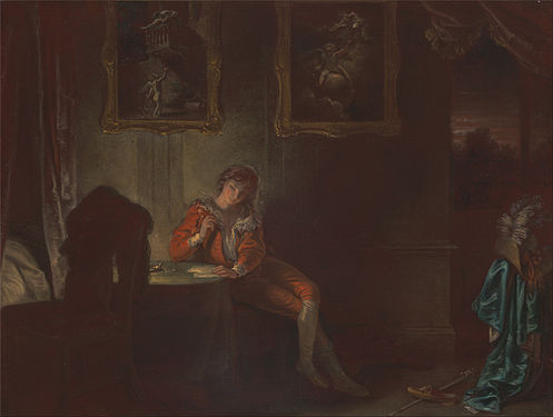 The Lover
 The Swearing Solider
 The Justice
 The Pantaloon
 The Second Childishness


 Original – Flowers in a Terracotta Vase, by Albertus Jonas Brandt and Eelke Jelles Eelkema. Between 1810 and 1822.
 ALT 1 File:Bloemen in een terracotta vaas. Rijksmuseum SK-A-1013.jpeg
 ' ALT 2Rijksmuseum scan -


,_Countess_of_Derby.jpg)

_-_Google_Art_Project.jpg)


 Hafspajen (
talk) 16:19, 28 January 2015 (UTC)
Hafspajen (
talk) 16:19, 28 January 2015 (UTC)


 ;
;
 , +
, +
 ; great pics.
Hafspajen (
talk) 23:59, 2 February 2015 (UTC)
; great pics.
Hafspajen (
talk) 23:59, 2 February 2015 (UTC)


 Comment: In this picture you can also see the main and only food to sustain this animal Espeletia schultzii --
The_Photographer (
talk) 13:35, 4 February 2015 (UTC)
Comment: In this picture you can also see the main and only food to sustain this animal Espeletia schultzii --
The_Photographer (
talk) 13:35, 4 February 2015 (UTC)

_en_Sisavita.JPG)

 which I think from the perspective of illustrating the breed is actually more valuable. In over two years now, there has been no response to the citation needed tag. I think it's getting close to the time where we have to concede that a citation is not forthcoming and the sentence will have to be moved to the talk page for interested parties to work on.
Samsara 14:25, 6 February 2015 (UTC)
which I think from the perspective of illustrating the breed is actually more valuable. In over two years now, there has been no response to the citation needed tag. I think it's getting close to the time where we have to concede that a citation is not forthcoming and the sentence will have to be moved to the talk page for interested parties to work on.
Samsara 14:25, 6 February 2015 (UTC)
.jpg)

.jpg)


.jpg)
.jpg)


.jpg)
.jpg)


 Those are rocks covered with moss and this:
 . Like thick mat,
 , moss and
lingonberry mixed with
European blueberry... The bumps in the first picture are rather small, those can be much bigger
, moss and
lingonberry mixed with
European blueberry... The bumps in the first picture are rather small, those can be much bigger
 and cover large areas of the forrest. Rather enchanting, I always thought...
 Hafspajen (
talk) 15:33, 1 February 2015 (UTC)
Hafspajen (
talk) 15:33, 1 February 2015 (UTC)
.png)

 Original – Aerial Photo of Delray Beach, Florida
 Alt - Delray Beach Florida 900 block Seagate photo alt


.jpg)


.jpg)


 looks even worse. In that case withdraw. Unless I can post this as an alt, it is also her, with her teacher....
Hafspajen (
talk) 05:54, 11 February 2015 (UTC)
looks even worse. In that case withdraw. Unless I can post this as an alt, it is also her, with her teacher....
Hafspajen (
talk) 05:54, 11 February 2015 (UTC)


.jpg)


 M80 ( NGC 6093), one of the densest known globular star clusters in the Milky Way galaxy and aged about 12 billion years
 Messier 56, which at 13 billion years is approximately three times the age of the Sun
 NGC 2808 and its 3 generations of stars
 Messier 53, captured with crystal clarity has surprised astronomers with its unusual number of a type of star called blue stragglers
 At 13 billion years old Messier 5 is incredibly old, dating back to close to the beginning of the Universe, which is some 13.8 billion years of age, and also one of the biggest clusters known
 Messier 10 is a ball of stars that lies about 15000 light-years from Earth, in the constellation of Ophiuchusand is approximately 80 light-years across, hence it should appear about two thirds the size of the Moon in the night sky (yet not possible due to extreme diffuse light)
 NGC 411 is in fact not a globular cluster, and its stars are not old. It isn’t even in the Milky Way and hence it is classified as an open cluster


 Hendrik Merkus de Kock's fleet conquering Palembang, in Sumatra.


.jpg)


.jpg)
.jpg)


 Sanctuary
 Nave
Nave Hammerbeam Ceiling
 Rood screen


.jpg)


_(9626546987).jpg)


 Marriage A-la-Mode 1, The Marriage Settlement
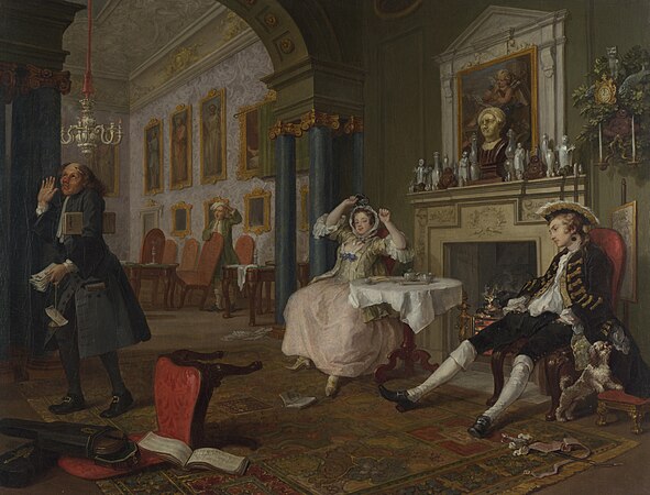 Marriage A-la-Mode 2, The The Tête à Tête
 Marriage A-la-Mode 3, The Inspection
 Marriage A-la-Mode 4, The Toilette
 Marriage A-la-Mode 5, The Bagnio
 Marriage A-la-Mode 6, The Lady's Death


 Royal Coat of Arms of the United Kingdom of Great Britain and Northern Ireland as used by Queen Elizabeth II from 1953 to the present
 Scottish Version
.svg)
.svg)
 Done.. -
The Herald (
here I am) 13:46, 9 February 2015 (UTC)
Done.. -
The Herald (
here I am) 13:46, 9 February 2015 (UTC),_Windsor,_Ontario,_2014-12-07.jpg)


_1892,_oil_on_canvas,_101_x_77_cm.jpg)

.jpg)


.jpg)


.jpg)


_-_Google_Art_Project.jpg)

,_Hist._Route_66_--_2012_--_1.jpg)

 and a scroll stating "I prefer to die rather than to incur dishonour" (malo mori quam foedari). The European legend had it that a white stoat would rather die before allowing its pure white coat to be besmirched, thus could be an allusion to the knight's pure character and moral - or maybe his fate.


 The exterior of Bath Abbey from the west
 The interior looking towards the east stained glass windows
 The interior looking across the nave towards the west stained glass windows


.jpg)

 Ṫ Ḧ
the fury of the nature
given flesh 03:30, 18 February 2015 (UTC)
Ṫ Ḧ
the fury of the nature
given flesh 03:30, 18 February 2015 (UTC)
_head.JPG)


 ;-) --
Alchemist-hp (
talk) 16:54, 15 February 2015 (UTC)
;-) --
Alchemist-hp (
talk) 16:54, 15 February 2015 (UTC) Picture 1: Munchausen underwater
 Picture 2: Munchausen flying with ducks
 Picture 3: Munchausen shooting a horse
 Picture 4: Munchausen with a half-horse
 Picture 5: Munchausen riding a cannon ball
 Picture 6: Munchausen jumping through a carriage


%22,_Eugen_Sandow_Wellcome_L0035270_-_restoration.jpg)


.jpg)


 . Added description.
Hafspajen (
talk) 10:51, 18 February 2015 (UTC)
. Added description.
Hafspajen (
talk) 10:51, 18 February 2015 (UTC)


![[2]](/info/en/?search=Wikipedia:Featured_picture_candidates/Isfahan_Lotfollah_mosque_ceiling_symmetric.jpg)
![[3]](/info/en/?search=Wikipedia:Featured_picture_candidates/File:Isfahan_Lotfollah_mosque_ceiling_symmetric.jpg)
.jpg)
.jpg&action=edit§ion=T-1)
.jpg)
.jpg&action=edit§ion=T-1)
.jpg)
.jpg&diff=141245825&oldid=141232302)
_1892,_oil_on_canvas,_101_x_77_cm.jpg)
_with_M._de_St_Antoine_-_Google_Art_Project.jpg)
.jpg)
.jpg&action=edit§ion=T-1)
_(8397072985).jpg)
_-_Google_Art_Project.jpg)
_-_Google_Art_Project.jpg&action=edit§ion=T-1)
.jpg)
.jpg&action=edit§ion=T-1)
 --
Janke |
Talk 07:28, 22 February 2015 (UTC)
--
Janke |
Talk 07:28, 22 February 2015 (UTC)