| Featured picture tools |
|---|
Please cut and paste new entries to the bottom of this page, creating a new monthly archive (by closing date) when necessary.
Jules Barbier
Voting period is over. Please don't add any new votes. Voting period ends on 1 May 2019 at 12:27:12 (UTC)

- Reason
- high quality image, completely restored
- Articles in which this image appears
- Jules Barbier
- FP category for this image
- Wikipedia:Featured pictures/People/Artists and writers
- Creator
- Nadar, restored and uploaded by Jebulon
- Support as nominator – Yann ( talk) 12:27, 21 April 2019 (UTC)
- Support Charlesjsharp ( talk) 12:51, 21 April 2019 (UTC)
- There is a backwards S shape line and a couple of blobs/posterization on the collar that, as far as I can tell, shouldn't be there. MER-C 13:53, 21 April 2019 (UTC)
- As I said on Commons, there's a blurry blob left of the waistcoat button (not in the original) that bothers me; otherwise this is excellent work. There's also a fairly extreme crop at the bottom. Jebulon is usually excellent, but this has a couple bad mistakes. Adam Cuerden ( talk)Has about 6.6% of all FPs 16:42, 21 April 2019 (UTC)
- @ MER-C and Adam Cuerden: I think I fixed all these issues. The blob mentioned by Adam is due to extreme sharpening, which I never do myself. Regards, Yann ( talk) 20:47, 21 April 2019 (UTC)
- Support Adam Cuerden ( talk)Has about 6.6% of all FPs 05:51, 22 April 2019 (UTC)
- Support. MER-C 08:37, 22 April 2019 (UTC)
- Support - DreamSparrow Chat 09:51, 26 April 2019 (UTC)
Promoted File:Barbier, Jules, Nadar, Gallica.jpg -- Armbrust The Homunculus 15:34, 1 May 2019 (UTC)
African Grey Hornbill female
Voting period is over. Please don't add any new votes. Voting period ends on 2 May 2019 at 08:13:57 (UTC)
_female.jpg)
- Reason
- High quality large image. FP on Commons.
- Articles in which this image appears
- African Grey Hornbill
- FP category for this image
- Wikipedia:Featured pictures/Animals/Birds
- Creator
- Charlesjsharp
- Support as nominator – Charlesjsharp ( talk) 08:13, 22 April 2019 (UTC)
- Support. MER-C 10:55, 22 April 2019 (UTC)
- Support - Great EV, great quality. Mattximus ( talk) 14:44, 22 April 2019 (UTC)
- We can see the red beak better on File:Tockus nasutus -near Sawela Lodge, Lake Naivasha, Kenya -female-8.jpg, but I am no specialist. -- Yann ( talk) 03:45, 23 April 2019 (UTC)
- Oppose Halo around beak from excessive use of shadow highlight tool. All seems out of focus, especially top of head - heat haze? Background noisy. JJ Harrison ( talk) 10:05, 23 April 2019 (UTC)
Not Promoted -- Armbrust The Homunculus 09:22, 2 May 2019 (UTC)
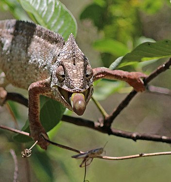
Nosy Be panther chameleon male
Voting period is over. Please don't add any new votes. Voting period ends on 2 May 2019 at 08:11:14 (UTC)
_male_Nosy_Be.jpg)
- Reason
- High quality large image. FP on Commons. Illustrates article well.
- Articles in which this image appears
- Panther chameleon
- FP category for this image
- Wikipedia:Featured pictures/Animals/Reptiles
- Creator
- Charlesjsharp
- Support as nominator – Charlesjsharp ( talk) 08:11, 22 April 2019 (UTC)
- Comment this isn't the lead image, and really just buried in the gallery... Mattximus ( talk) 14:45, 22 April 2019 (UTC)
- Yes Mattximus, and we've had this debate. The community seems happy with noms that aren't in the top right box. There's nowhere else to show an endemic 'subspecies' like this, or a mating image or headshot for instance. Let's see what others say... Charlesjsharp ( talk) 21:50, 22 April 2019 (UTC)
- The article states that "Panther chameleons from the areas of Nosy Be, Ankify, and Ambanja are typically a vibrant blue" - is this greenish-cyan the "blue" implied? This is a highly varied species, so there's certainly space for several images, though it's a little confusing as laid out now. It might be better to move the discussion of variation to the section with the gallery. I can kind of see the "buried" claim, as the explanation that helps the gallery make sense isn't actually near the gallery, while if it was explained with pictures right there, the explanation would have more weight. Adam Cuerden ( talk)Has about 6.6% of all FPs 00:56, 23 April 2019 (UTC)
- I'm going to take the liberty of reworking the article a bit. Adam Cuerden ( talk)Has about 6.6% of all FPs 01:33, 23 April 2019 (UTC)
- I think Mattximus's issue has been dealt with. It has a lot of images, but all serve an important purpose. Adam Cuerden ( talk)Has about 6.6% of all FPs 06:17, 23 April 2019 (UTC)
- Support We should probably have substantially more "male" variation pictures, though. This is one of those cases where I'd like to suggest these for a set, but there's not enough for a set. Adam Cuerden ( talk)Has about 6.6% of all FPs 01:39, 23 April 2019 (UTC)
- Support – Yann ( talk) 04:01, 23 April 2019 (UTC)
- Support. MER-C 10:02, 23 April 2019 (UTC)
- Support Oh yes. Brandmeister talk 19:45, 25 April 2019 (UTC)
Promoted File:Panther chameleon (Furcifer pardalis) male Nosy Be.jpg -- Armbrust The Homunculus 09:26, 2 May 2019 (UTC)
Scarlet darter female
Voting period is over. Please don't add any new votes. Voting period ends on 2 May 2019 at 08:23:14 (UTC)
_female_Bulgaria.jpg)
- Reason
- High quality large image. FP on Commons.
- Articles in which this image appears
- Scarlet darter
- FP category for this image
- Wikipedia:Featured pictures/Animals/Insects
- Creator
- Charlesjsharp
- Support as nominator – Charlesjsharp ( talk) 08:23, 22 April 2019 (UTC)
- Support – Yann ( talk) 04:00, 23 April 2019 (UTC)
- Support A little more depth-of-field would be nice, but I suspect we're looking at focus stacking for that, and with living beings... Adam Cuerden ( talk)Has about 6.6% of all FPs 06:00, 23 April 2019 (UTC)
- Support. MER-C 10:02, 23 April 2019 (UTC)
- Support - DreamSparrow Chat 09:50, 26 April 2019 (UTC)
Promoted File:Scarlet darter (Crocothemis erythraea) female Bulgaria.jpg -- Armbrust The Homunculus 09:31, 2 May 2019 (UTC)
Edgar Allan Poe (redux)
Voting period is over. Please don't add any new votes. Voting period ends on 3 May 2019 at 00:35:32 (UTC)

- Reason
- The last one failed along with a few others in a temporary slowup in voting. It had four votes of support. After a commons run of the image that was extremely positive, it's clear the first vote here was wrong. Also consider a Google image search for him which makes it fairly clear this is far better than any other available image for the purposes most people want it for.
- Articles in which this image appears
- Edgar Allan Poe +5
- FP category for this image
- WP:Featured pictures/People/Artists and writers
- Creator
- Unknown; restored by Yann and Adam Cuerden
- Support as nominator – Adam Cuerden ( talk)Has about 6.6% of all FPs 00:35, 23 April 2019 (UTC)
- Support Clearly FP. High EV, etc. – Yann ( talk) 03:40, 23 April 2019 (UTC)
- Support Charlesjsharp ( talk) 05:54, 23 April 2019 (UTC)
- Support Not an FP, nevermore! Cat-five t c ---- 06:08, 23 April 2019 (UTC)
- Comment The right side seems quite dark to me. Is there an argument for brightening it up.
JJ Harrison (
talk) 10:06, 23 April 2019 (UTC)
- You tend to get a gradient background in these older photos. Adam Cuerden ( talk)Has about 6.6% of all FPs 16:47, 23 April 2019 (UTC)
- Support – Only this and nothing more. – Sca ( talk) 13:13, 23 April 2019 (UTC)
- Support - Great EV. Mattximus ( talk) 23:42, 23 April 2019 (UTC)
- Support Geoffroi ( talk) 02:29, 30 April 2019 (UTC)
Promoted File:Edgar Allan Poe, circa 1849, restored, squared off.jpg -- Armbrust The Homunculus 02:45, 3 May 2019 (UTC)
L'enfant et les sortilèges
Voting period is over. Please don't add any new votes. Voting period ends on 4 May 2019 at 22:16:46 (UTC)
-
 Scene 1
 -
 Scene 2


- Reason
- They're two of very few - possibly the only - free images for this work, and are rather good ones. Focus more on the sets than the scenes, but hint at most of the objects that come to life, save the animals in the garden.
- Articles in which this image appears
- L'enfant et les sortilèges
- FP category for this image
- WP:FP/THEATRE
- Creator
- Anonymous, restored by User:Adam Cuerden
- Support as nominator – Adam Cuerden ( talk)Has about 6.6% of all FPs 22:16, 24 April 2019 (UTC)
- Support – Yann ( talk) 02:20, 25 April 2019 (UTC)
- Support. MER-C 12:47, 25 April 2019 (UTC)
Not Promoted -- Armbrust The Homunculus 22:21, 4 May 2019 (UTC)
- Nomination didn’t reach the necessary quorum for promotion. Armbrust The Homunculus 22:21, 4 May 2019 (UTC)
Lyndon Johnson and Spiro Agnew watch the Apollo 11 liftoff
Voting period is over. Please don't add any new votes. Voting period ends on 5 May 2019 at 04:57:08 (UTC)

- Reason
- Historical relevance + high quality for the period
- Articles in which this image appears
- Lyndon B. Johnson, Presidency of Lyndon B. Johnson
- FP category for this image
- Wikipedia:Featured pictures/History/USA History
- Creator
- BotMultichillT
- Support as nominator – --- Coffeeand crumbs 04:57, 25 April 2019 (UTC)
- Unsure Busy, and doesn't really say much without context. But the context is significant. Adam Cuerden ( talk)Has about 6.6% of all FPs 06:09, 25 April 2019 (UTC)
- Oppose – Too many unidentified, sun-dazzled faces; lack of a central focus. Sca ( talk) 12:39, 25 April 2019 (UTC)
- Oppose Seems just a snapshot. Charlesjsharp ( talk) 13:11, 25 April 2019 (UTC)
- Oppose - I don't see the EV for this image at all. Mattximus ( talk) 14:36, 27 April 2019 (UTC)
Not Promoted -- Armbrust The Homunculus 10:20, 5 May 2019 (UTC)
Coprinellus micaceus
Voting period is over. Please don't add any new votes. Voting period ends on 5 May 2019 at 11:27:29 (UTC)

- Reason
- High EV and good quality
- Articles in which this image appears
- Coprinellus micaceus
- FP category for this image
- Wikipedia:Featured pictures/Fungi
- Creator
- Holleday
- Support Adam Cuerden ( talk)Has about 6.6% of all FPs 09:03, 26 April 2019 (UTC)
- Support. MER-C 13:12, 26 April 2019 (UTC)
- Support. Josh Milburn ( talk) 08:24, 27 April 2019 (UTC)
- Support wow! A very good featured picture in a featured article, means excellent EV. Mattximus ( talk) 14:35, 27 April 2019 (UTC)
- Support Charlesjsharp ( talk) 14:45, 28 April 2019 (UTC)
- Support -- Yann ( talk) 17:12, 29 April 2019 (UTC)
Promoted File:Coprinellus micaceus Glimmer-Tintling.jpg -- Armbrust The Homunculus 12:41, 5 May 2019 (UTC)
Vasilievsky Island
Voting period is over. Please don't add any new votes. Voting period ends on 5 May 2019 at 12:58:21 (UTC)

- Reason
- Drone pic that conveys more information than a ground-level image. Was featured unanimously on Commons two years ago.
- Articles in which this image appears
- Vasilyevsky Island, Old Saint Petersburg Stock Exchange and Rostral Columns and four more
- FP category for this image
- Wikipedia:Featured pictures/Places/Urban
- Creator
- A.Savin
- Support as nominator – MER-C 12:58, 25 April 2019 (UTC)
- Support Adam Cuerden ( talk)Has about 6.6% of all FPs 20:30, 25 April 2019 (UTC)
- Support : DreamSparrow Chat 09:49, 26 April 2019 (UTC)
- Support -- A.Savin ( talk) 12:45, 27 April 2019 (UTC)
- Support Charlesjsharp ( talk) 14:44, 28 April 2019 (UTC)
- Support -- Yann ( talk) 17:11, 29 April 2019 (UTC)
- Support Geoffroi ( talk) 02:24, 30 April 2019 (UTC)
Promoted File:Spb 06-2017 img01 Spit of Vasilievsky Island.jpg -- Armbrust The Homunculus 12:59, 5 May 2019 (UTC)
Aldrin looks back at Tranquility Base
Voting period is over. Please don't add any new votes. Voting period ends on 5 May 2019 at 20:14:19 (UTC)

- Reason
- Amongst the best shots of the Eagle, one of the relatively rare colour images, and the infelicities of the image can be forgiven when they're hand-held shots on a different lump of space rock than ours.
- Articles in which this image appears
- Apollo 11, Tranquility Base, +3
- FP category for this image
- Wikipedia:Featured pictures/Space/Getting there
- Creator
- Neil Armstrong/ NASA. (No restoration needed, IMO)
- Support as nominator – Adam Cuerden ( talk)Has about 6.6% of all FPs 20:14, 25 April 2019 (UTC)
- Support. MER-C 14:23, 27 April 2019 (UTC)
- Support -- Yann ( talk) 17:11, 29 April 2019 (UTC)
- Support Geoffroi ( talk) 02:26, 30 April 2019 (UTC)
- Support Needs a fifth. -- Janke | Talk 16:26, 2 May 2019 (UTC)
- Support – DreamSparrow Chat 03:56, 5 May 2019 (UTC)
Promoted File:Aldrin Looks Back at Tranquility Base - GPN-2000-001102.jpg -- Armbrust The Homunculus 22:48, 5 May 2019 (UTC)
Golden Summer, Eaglemont
Voting period is over. Please don't add any new votes. Voting period ends on 6 May 2019 at 06:32:31 (UTC)

- Reason
- Arthur Streeton is one of Australia's most famous artists and Golden Summer is considered by many to be his first masterpiece. It was the first painting by an Australian-born artist to go on display at London's Royal Academy, and also the first Australian work to win an award at the Paris Salon. In 1995, it was acquired by the National Gallery of Australia for $3.5 million, then a record price for an Australian painting. [source
- Articles in which this image appears
- Golden Summer, Eaglemont, Impressionism, history of Australia, National Gallery of Australia, Australian art, Heidelberg School, Arthur Streeton, Eaglemont, arts by region, drought in Australia, culture of Melbourne, Melbourne, Exhibition of Australian Art in London
- FP category for this image
- Wikipedia:Featured pictures/Artwork/Paintings
- Creator
- Arthur Streeton
- Support as nominator – HappyWaldo ( talk) 06:32, 26 April 2019 (UTC)
- Support Looks high quality. Charlesjsharp ( talk) 08:39, 26 April 2019 (UTC)
- Support Adam Cuerden ( talk)Has about 6.6% of all FPs 09:04, 26 April 2019 (UTC)
- Support. MER-C 13:09, 26 April 2019 (UTC)
- Support. Josh Milburn ( talk) 08:21, 27 April 2019 (UTC)
- Support - reasonably high resolution. Great EV. Mattximus ( talk) 14:33, 27 April 2019 (UTC)
- Support Computer screens can't really do justice to this large and impressive painting (which captures the colours and landscape of an Australian summer day remarkably well), but this is a good scan with strong EV. 05:34, 28 April 2019 (UTC)
- Support Geoffroi ( talk) 02:20, 30 April 2019 (UTC)
- Support – DreamSparrow Chat 03:56, 5 May 2019 (UTC)
Promoted File:Arthur Streeton - Golden summer, Eaglemont - Google Art Project.jpg -- Armbrust The Homunculus 07:04, 6 May 2019 (UTC)
Mary Jackson
Voting period is over. Please don't add any new votes. Voting period ends on 6 May 2019 at 09:02:02 (UTC)

- Reason
- A fine image of a very notable person. Was in quite good condition, with some minor damage.
- Articles in which this image appears
- Mary Jackson (engineer), List of African-American mathematicians
- FP category for this image
- Wikipedia:Featured pictures/People/Science and engineering
- Creator
- NASA Langley Research Center, restored by Adam Cuerden
- Support as nominator – Adam Cuerden ( talk)Has about 6.6% of all FPs 09:02, 26 April 2019 (UTC)
- Support. MER-C 13:08, 26 April 2019 (UTC)
- Support Abzeronow ( talk) 15:53, 26 April 2019 (UTC)
- Support Charlesjsharp ( talk) 21:32, 26 April 2019 (UTC)
- Support. Josh Milburn ( talk) 08:20, 27 April 2019 (UTC)
- Support per nom. Mattximus ( talk) 14:32, 27 April 2019 (UTC)
- Support -- Yann ( talk) 17:10, 29 April 2019 (UTC)
- Support Geoffroi ( talk) 02:18, 30 April 2019 (UTC)
- Support – DreamSparrow Chat 03:56, 5 May 2019 (UTC)
Promoted File:Mary Jackson working 2 - Restoration.jpg -- Armbrust The Homunculus 10:31, 6 May 2019 (UTC)
Zonocerus variegatus (2)
Voting period is over. Please don't add any new votes. Voting period ends on 7 May 2019 at 11:16:00 (UTC)
.jpg)
- Reason
- Time to sneak through an insect now there are relatively less of those on the page. Was nominated previously ( Wikipedia:Featured picture candidates/Variegated grasshopper), where it ended up at 4-0. FP on Commons.
- Articles in which this image appears
- Pyrgomorphidae, Caelifera, Orthoptera, Zonocerus
- FP category for this image
- Wikipedia:Featured pictures/Animals/Insects
- Creator
- Charlesjsharp
- Support as nominator – MER-C 11:16, 27 April 2019 (UTC)
- Support Thanks. Charlesjsharp ( talk) 12:09, 27 April 2019 (UTC)
- Support- Looks good to me, good EV too. Mattximus ( talk) 14:32, 27 April 2019 (UTC)
- Comment, and abstain for the time being; is one antenna broken? It has fewer segments than the other, and appears to miss the yellow rings. The background is slightly blotchy, not so much that it bothers me, though. -- Janke | Talk 19:42, 27 April 2019 (UTC)
- It looks like it. Quite a common thing. Charlesjsharp ( talk) 08:58, 28 April 2019 (UTC)
- Support -- Yann ( talk) 17:09, 29 April 2019 (UTC)
- Support Geoffroi ( talk) 02:17, 30 April 2019 (UTC)
- Support – DreamSparrow Chat 03:55, 5 May 2019 (UTC)
Promoted File:Variegated grasshopper (Zonocerus variegatus).jpg -- Armbrust The Homunculus 13:08, 7 May 2019 (UTC)
The Bathers, by Cézanne
Voting period is over. Please don't add any new votes. Voting period ends on 9 May 2019 at 17:19:39 (UTC)

- Reason
- High resolution and quality of a famous painting. The painting is considered one of the masterpieces of modern art, and is often Cézanne's finest work, according the Wikipedia.
- Articles in which this image appears
- The Bathers (Cézanne), Paul Cézanne
- FP category for this image
- Wikipedia:Featured pictures/Artwork/Paintings
- Creator
- Paul Cézanne / Google Art Project, uploaded by DcoetzeeBot
- Support as nominator – Yann ( talk) 17:19, 29 April 2019 (UTC)
- Support Geoffroi ( talk) 02:14, 30 April 2019 (UTC)
- Support Charlesjsharp ( talk) 07:34, 30 April 2019 (UTC)
- Support The resolution is surprisingly low for such a giant painting, but it meets our minimum standard. Mattximus ( talk) 23:38, 1 May 2019 (UTC)
- Support - while the colors differ from the museum web site, it's a fairly safe assumption that this professional reproduction is faithful to the original. MER-C 15:46, 2 May 2019 (UTC)
- Support – DreamSparrow Chat 03:55, 5 May 2019 (UTC)
Promoted File:Paul Cézanne, French - The Large Bathers - Google Art Project.jpg -- Armbrust The Homunculus 18:48, 9 May 2019 (UTC)
Fort l'Écluse
Voting period is over. Please don't add any new votes. Voting period ends on 10 May 2019 at 09:41:07 (UTC)

- Reason
- high quality image used as lead. It shows a general view, and both the upper and the lower forts, with the mountain in the background.
- Articles in which this image appears
- Fort l'Écluse, Defensive Sector of the Rhône
- FP category for this image
- Wikipedia:Featured pictures/Places/Architecture
- Creator
- Yann
- Support as nominator – Yann ( talk) 09:41, 30 April 2019 (UTC)
- Oppose - powerlines everywhere. Generally a bit short of today's standards for new FPs re: architecture, particularly resolution and sharpness. MER-C 17:31, 1 May 2019 (UTC)
Not Promoted -- Armbrust The Homunculus 12:36, 10 May 2019 (UTC)
Baijnath Temple Complex
Voting period is over. Please don't add any new votes. Voting period ends on 10 May 2019 at 14:12:50 (UTC)

- Reason
- high quality image used as lead
- Articles in which this image appears
- Baijnath Temple Complex, List of Monuments of National Importance in Uttarakhand, Baijnath, Uttarakhand, Bageshwar, Kumaon division
- FP category for this image
- Wikipedia:Featured pictures/Places/Architecture
- Creator
- Yann
- Support as nominator – Yann ( talk) 14:12, 30 April 2019 (UTC)
- Support Geoffroi ( talk) 01:54, 3 May 2019 (UTC)
- Support Think this fell into one of the holes in recent FP reviews. Adam Cuerden ( talk)Has about 6.6% of all FPs 04:38, 7 May 2019 (UTC)
- Oppose – not a sharp photo (see far right side), and lighting on the front face of structures is dull and dark. Bammesk ( talk) 02:40, 10 May 2019 (UTC)
Not Promoted -- Armbrust The Homunculus 19:04, 10 May 2019 (UTC)
Salvator Mundi
Voting period is over. Please don't add any new votes. Voting period ends on 11 May 2019 at 12:24:26 (UTC)

- Reason
- This is the painting of all fantasm and superlatives. Salvator Mundi is attributed to Leonardo da Vinci by most experts, but this is still contested by others. This is the only painting of the famous master in a private collection. Badly damaged and attributed to Leonardo's pupil Giovanni Antonio, it was sold in 1958 for £45. It is now the most expensive painting in the world. It was sold US$ 450.3 million on 15 November 2017 by Christie's in New York. It was planned to be on exhibit in the Louvre Abu Dhabi, but its current location is unknown. And it is appropriate for the 500th anniversary of his death. See [1] for the complete story of the painting discovery and restoration.
- Articles in which this image appears
- Salvator Mundi (Leonardo), Leonardo da Vinci, List of most expensive paintings, Louvre Abu Dhabi, Salvator Mundi and others
- FP category for this image
- Wikipedia:Featured pictures/Artwork/Paintings
- Creator
- Leonardo da Vinci (Getty Images)
- Support as nominator – Yann ( talk) 12:24, 1 May 2019 (UTC)
- The colours are significantly different to the framed picture, particularly around the sleeves. MER-C 17:33, 1 May 2019 (UTC)
- We must be satisfied with this, since it is privately owned, there won't be any new version any time soon. Regards, Yann ( talk) 10:52, 2 May 2019 (UTC)
- I am willing to overlook minor color differences but grey vs. blue on the sleeves is very substantial. There are also the JPEG artifacts on the top, as pointed out on Commons. This painting clearly deserves an accurate reproduction and it is important that we get it right. MER-C 15:33, 2 May 2019 (UTC)
- @ MER-C: As the current speculation, it may be displayed in the Saudi Royal's private appartments, so do not hold your breath. Regards, Yann ( talk) 08:58, 3 May 2019 (UTC)
- Comment All the details about the restoration are important for the commercial value of the painting, but for us, I don't think it matters that much. This is the best available image of the painting after restoration on the whole Internet, and it will remain so for the foreseeable future. That's the whole and only important point for us. I added a description. Regards, Yann ( talk) 09:24, 8 May 2019 (UTC)
Not Promoted -- Armbrust The Homunculus 12:52, 11 May 2019 (UTC)
Mycena epipterygia
Voting period is over. Please don't add any new votes. Voting period ends on 12 May 2019 at 15:25:30 (UTC)

- Reason
- Good EV and high quality
- Articles in which this image appears
- Mycena epipterygia
- FP category for this image
- Wikipedia:Featured pictures/Fungi
- Creator
- Holleday
- Support as nominator – Tomer T ( talk) 15:25, 2 May 2019 (UTC)
- Support wow, great quality and great EV. Mattximus ( talk) 00:59, 3 May 2019 (UTC)
- Support Geoffroi ( talk) 01:52, 3 May 2019 (UTC)
- Support – Yann ( talk) 10:21, 4 May 2019 (UTC)
- Support. Josh Milburn ( talk) 16:29, 4 May 2019 (UTC)
- Support – DreamSparrow Chat 03:55, 5 May 2019 (UTC)
- Support - Relevant and great contrast, nice photo DannyS712 ( talk) 22:52, 5 May 2019 (UTC)
Promoted File:Dehnbare Helmling Mycena epipterygia.jpg -- Armbrust The Homunculus 15:52, 12 May 2019 (UTC)
Saddle-billed stork
Voting period is over. Please don't add any new votes. Voting period ends on 12 May 2019 at 15:58:14 (UTC)
,_delta_del_Okavango,_Botsuana,_2018-07-31,_DD_11.jpg)
- Reason
- Recent unanimous FP on Commons. Nice action shot.
- Articles in which this image appears
- Saddle-billed stork
- FP category for this image
- Wikipedia:Featured pictures/Animals/Birds
- Creator
- Diego Delso
- Support as nominator – MER-C 15:58, 2 May 2019 (UTC)
- Support Another great shot by Poco a poco. This is why he has 500+ FPs (!!!) on Commons. Great talent. Geoffroi ( talk) 01:50, 3 May 2019 (UTC)
- Support yes, excellent. Charlesjsharp ( talk) 23:10, 3 May 2019 (UTC)
- Support – Yann ( talk) 10:20, 4 May 2019 (UTC)
- Support – DreamSparrow Chat 03:54, 5 May 2019 (UTC)
Promoted File:Jabirú africano (Ephippiorhynchus senegalensis), delta del Okavango, Botsuana, 2018-07-31, DD 11.jpg -- Armbrust The Homunculus 15:59, 12 May 2019 (UTC)
Javan slow loris
Voting period is over. Please don't add any new votes. Voting period ends on 16 May 2019 at 16:42:34 (UTC)

- Reason
- Was seen on Commons FPC last week, where it succeeded unanimously. While the photo does have shortcomings, particularly around the background and the blown highlights on the head, they are relatively insubstantial considering the species is critically endangered.
- Articles in which this image appears
- Javan slow loris
- FP category for this image
- Wikipedia:Featured pictures/Animals/Mammals
- Creator
- Aprisonsan
- Support as nominator – MER-C 16:42, 6 May 2019 (UTC)
- Support Geoffroi ( talk) 21:38, 6 May 2019 (UTC)
- Support – Nice image, high EV. Yann ( talk) 13:30, 9 May 2019 (UTC)
- Support – the bright background is a bit distracting, but the main subject is sharp, and EV. Bammesk ( talk) 02:42, 10 May 2019 (UTC)
- Support Pretty much per Bammesk. Adam Cuerden ( talk)Has about 6.6% of all FPs 19:30, 10 May 2019 (UTC)
- Support -- Ser Amantio di Nicolao Che dicono a Signa? Lo dicono a Signa. 14:02, 13 May 2019 (UTC)
Promoted File:Coucang.jpg -- Armbrust The Homunculus 21:34, 16 May 2019 (UTC)
Einstein Cross
Voting period is over. Please don't add any new votes. Voting period ends on 17 May 2019 at 09:16:35 (UTC)

- Reason
- Good EV
- Articles in which this image appears
- Einstein Cross + 5 others.
- FP category for this image
- Wikipedia:Featured pictures/Space/Understanding or Wikipedia:Featured pictures/Space/Looking out
- Creator
- NASA, ESA, and STScI, uploaded by Tryphon
- Support as nominator – The NMI User ( talk) 09:16, 7 May 2019 (UTC)
- Oppose - This one [ [2]] is a lot more pleasing to the eye, and you can actually see the shape of the galaxy. -- Janke | Talk 16:52, 7 May 2019 (UTC)
- Support Important for what it is. I do agree the other is likely better, though. Adam Cuerden ( talk)Has about 6.6% of all FPs 19:42, 11 May 2019 (UTC)
Not Promoted -- Armbrust The Homunculus 10:38, 17 May 2019 (UTC)
Lolotte and Werther by Eunice Pinney
Voting period is over. Please don't add any new votes. Voting period ends on 17 May 2019 at 04:10:24 (UTC)

- Reason
- Interesting work by an interesting woman. Eunice Pinney was one of the first American artists to work in the medium of watercolor. This is fairly typical of her work - a shade more elaborate, perhaps than some of her others, but not by much. It'd be nice to get some American folk art on the front page, also.
- Articles in which this image appears
- Eunice Pinney
- FP category for this image
- Wikipedia:Featured pictures/Artwork/Paintings
- Creator
- Eunice Pinney, digitized by the National Gallery of Art
- Support as nominator – Ser Amantio di Nicolao Che dicono a Signa? Lo dicono a Signa. 04:10, 7 May 2019 (UTC)
- Since I encouraged you to nominate this, I don't think you'll be surprised I Support. Notable artist, in an under-represented genre. Being a bit more elabourate is arguably a plus, insofar as it gives more of the artist's techniques. Think there's room for it in The Sorrows of Young Werther? [3] identifies it as a scene from that. Adam Cuerden ( talk)Has about 6.6% of all FPs 04:17, 7 May 2019 (UTC)
- @
Adam Cuerden: Possibly - I'd given it some thought. I may throw it in there tomorrow, although there are better options for it. Speaking of...
I may have found her source...or something based on her source, at least. --
Ser Amantio di Nicolao
Che dicono a Signa?
Lo dicono a Signa. 04:24, 7 May 2019 (UTC)
- That article I linked mentions her source: "Lolotte et Werther depicts a scenefrom Goethe's popular novel The Sorrows of Young Werther, for which Pinney apparently relied on an engraving (or some derivation thereof) by French artist F. Bonnefoy." That kind of thing was pretty common at the time, and probably more so in folk art.
Adam Cuerden (
talk)Has about 6.6% of all
FPs 04:29, 7 May 2019 (UTC)
- Oh, absolutely. Still is with a lot of folk artists, only they've replaced engravings with movies and TV shows.
Henry Darger, for example. --
Ser Amantio di Nicolao
Che dicono a Signa?
Lo dicono a Signa. 04:39, 7 May 2019 (UTC)
- I thought Darger used illustrations and cut them up into collages?
Adam Cuerden (
talk)Has about 6.6% of all
FPs 05:45, 7 May 2019 (UTC)
- If memory serves (and it may not, it's been a while since I've read about him), he did, but he also traced images from advertising and used them as the basis for some of his figures. I think he may have developed an enlarger tool to aid himself in the process as well. Another example (I'd have cited him earlier, but I didn't believe there was an article): Justin McCarthy. -- Ser Amantio di Nicolao Che dicono a Signa? Lo dicono a Signa. 07:53, 7 May 2019 (UTC)
- I thought Darger used illustrations and cut them up into collages?
Adam Cuerden (
talk)Has about 6.6% of all
FPs 05:45, 7 May 2019 (UTC)
- Oh, absolutely. Still is with a lot of folk artists, only they've replaced engravings with movies and TV shows.
Henry Darger, for example. --
Ser Amantio di Nicolao
Che dicono a Signa?
Lo dicono a Signa. 04:39, 7 May 2019 (UTC)
- That article I linked mentions her source: "Lolotte et Werther depicts a scenefrom Goethe's popular novel The Sorrows of Young Werther, for which Pinney apparently relied on an engraving (or some derivation thereof) by French artist F. Bonnefoy." That kind of thing was pretty common at the time, and probably more so in folk art.
Adam Cuerden (
talk)Has about 6.6% of all
FPs 04:29, 7 May 2019 (UTC)
- Support. MER-C 18:25, 10 May 2019 (UTC)
- Support – Bammesk ( talk) 16:09, 11 May 2019 (UTC)
- Support. High-quality reproduction of work by a notable artist, used as the lead image for her article. Among the works we have by the artist, this is a good choice to feature, both because of the execution of the work itself (the falling skater in the picture-in-picture!) and because of the quality of the image as a reproduction (high resolution, very sharp, with no unnecessary matting). — David Eppstein ( talk) 05:15, 12 May 2019 (UTC)
- Comment: She has been referred to as a notable artist, but her page receives an average of
1 view per day. We may wish her to be notable, but apparently in the grand scheme, she isn't. -
HappyWaldo (
talk) 23:05, 12 May 2019 (UTC)
- Honestly, page views are a bad way to judge notability. It gets way too much recentism into the mix. Especially as POTD is as much educational as celebratory.
Adam Cuerden (
talk)Has about 6.5% of all
FPs 01:57, 13 May 2019 (UTC)
- I understand your points, but this artist is really beyond the margins in art historical terms, and still a virtual unknown in an age of intense revisionism in favour of women artists. - HappyWaldo ( talk) 12:46, 13 May 2019 (UTC)
- Honestly, page views are a bad way to judge notability. It gets way too much recentism into the mix. Especially as POTD is as much educational as celebratory.
Adam Cuerden (
talk)Has about 6.5% of all
FPs 01:57, 13 May 2019 (UTC)
- Support Geoffroi ( talk) 04:24, 13 May 2019 (UTC)
Promoted File:Lolotte and Werther by Eunice Pinney.jpg -- Armbrust The Homunculus 10:39, 17 May 2019 (UTC)
Apollo 11 launch (Saturn V rocket)
Voting period is over. Please don't add any new votes. Voting period ends on 18 May 2019 at 05:21:42 (UTC)

- Reason
- High EV. Shows full view of the Saturn V rocket during launch of Apollo 11. Note that we have a FP of another view: File:Apollo 11 Launch2.jpg. We also have non-FP from a "second" before at File:Apollo 11 Launch - GPN-2000-000630.jpg.
- Articles in which this image appears
- Apollo 11, Apollo program, History of aviation, Kennedy Space Center Launch Complex 39, + Template:Saturn rockets
- FP category for this image
- Wikipedia:Featured pictures/Space/Getting there
- Creator
- Dodo and TheDJ
- Support as nominator – --- Coffeeand crumbs 05:21, 8 May 2019 (UTC)
- Comment What's the point to have 2 FPs taken seconds apart? Saturation is much increased compared to the other image, and may be a bit tilted, but it is quite cleaner. Regards,
Yann (
talk) 08:43, 8 May 2019 (UTC)
- No, no. I think you misunderstood. The one a second before is not FP at this time. I just included it in case people prefer it. --- Coffeeand crumbs 08:48, 8 May 2019 (UTC)
- @ Yann: There is no FP that shows a full view of this rocket launching. There is only this from a completely different angle.--- Coffeeand crumbs 12:32, 10 May 2019 (UTC)
- Support – Yann ( talk) 13:09, 10 May 2019 (UTC)
- Support Adam Cuerden ( talk)Has about 6.6% of all FPs 19:27, 10 May 2019 (UTC)
- Comment – leaning to oppose, too saturated (sky doesn't look good). This is a better photo:
File:Apollo 11 Launch - GPN-2000-000630.jpg if restored.
Bammesk (
talk) 16:07, 11 May 2019 (UTC)
- Bammesk, at Commons, PawełMM was kind enough to restore that image for us. I would be happy with either photo being promoted. --- Coffeeand crumbs 10:15, 13 May 2019 (UTC)
- @ Bammesk: It's worth noting that, given the incredible brightness of the rocket exhaust, as well as speed, this would have been a very fast exposure. The sky is severely under-exposed, which (combined with what I believe is filmstock's natural bias towards blue) ups its apparent saturation quite a bit. It's somewhat to be expected. Adam Cuerden ( talk)Has about 6.5% of all FPs 05:13, 14 May 2019 (UTC)
- I would support the restored image, it is better than the nom image. Bammesk ( talk) 01:07, 16 May 2019 (UTC)
- I also like the restored image better, but it is currently unused on en. — David Eppstein ( talk) 00:38, 18 May 2019 (UTC)
Not Promoted -- Armbrust The Homunculus 11:13, 18 May 2019 (UTC)
- Nomination didn’t reach the necessary quorum for promotion. Armbrust The Homunculus 11:13, 18 May 2019 (UTC)
Germaine de Staël
Voting period is over. Please don't add any new votes. Voting period ends on 28 May 2019 at 16:29:21 (UTC)

- Reason
- A high-quality painting of a highly notable woman
- Articles in which this image appears
- Germaine de Staël +1
- FP category for this image
- You could argue a few, but let's say Wikipedia:Featured pictures/People/Artists and writers
- Creator
- Marie-Éléonore Godefroid, after François Gérard
- Support as nominator – Adam Cuerden ( talk)Has about 6.5% of all FPs 16:29, 18 May 2019 (UTC)
- Query. The colors (apparently taken from a copy of the image on a Russian auction site) are quite different from the
official French government version — more saturated and pleasing to a modern web-viewing eye but maybe artificially so. Do we have a reason for believing that this more saturated version is more true to the original? (For a similar case see e.g. the ongoing
Wikipedia:Featured picture candidates/delist/Oedipus and the Sphinx) —
David Eppstein (
talk) 19:53, 18 May 2019 (UTC)
- I think you're right and the French government one is much more accurate. Withdraw Adam Cuerden ( talk)Has about 6.5% of all FPs 21:05, 18 May 2019 (UTC)
Not Promoted -- Armbrust The Homunculus 09:45, 19 May 2019 (UTC)
- Withdrawn nomination. Armbrust The Homunculus 09:45, 19 May 2019 (UTC)
Christina Nilsson
Voting period is over. Please don't add any new votes. Voting period ends on 20 May 2019 at 17:01:23 (UTC)

- Reason
- Another of Jebulon's fine restorations, of a notable historic operatic soprano.
- Articles in which this image appears
- Christina Nilsson
- FP category for this image
- Wikipedia:Featured pictures/People/Entertainment
- Creator
- Nadar, restored by Jebulon
- Support as nominator – Adam Cuerden ( talk)Has about 6.6% of all FPs 17:01, 10 May 2019 (UTC)
- Support – Bammesk ( talk) 15:56, 11 May 2019 (UTC)
- Weak oppose - posterization of background not as prominent in the original. MER-C 14:35, 12 May 2019 (UTC)
- Support Geoffroi ( talk) 04:22, 13 May 2019 (UTC)
- Support -- Ser Amantio di Nicolao Che dicono a Signa? Lo dicono a Signa. 13:59, 13 May 2019 (UTC)
- Support - A little below min resolution, but really quite good EV! Mattximus ( talk) 00:53, 14 May 2019 (UTC)
Promoted File:Christine Nilsson Nadar.jpg -- Armbrust The Homunculus 02:49, 21 May 2019 (UTC)
Heteropoda venatoria
Voting period is over. Please don't add any new votes. Voting period ends on 20 May 2019 at 18:43:18 (UTC)

.jpg)
- Reason
- Nice detail, high resolution. FP on Commons.
- Articles in which this image appears
- Heteropoda venatoria
- FP category for this image
- Wikipedia:Featured pictures/Animals/Arachnids
- Creator
- Jkadavoor
- Support either as nominator – MER-C 18:43, 10 May 2019 (UTC)
- Support either, with hesitations A lot of JPEG artefacting, mitigated by the size of the image. The leaves, in particular, have enough that it almost imitates a film grain. Still, it's very high resolution, and the problems are only visible near 100% zoom, so I'm happy to support. Adam Cuerden ( talk)Has about 6.6% of all FPs 02:22, 11 May 2019 (UTC)
- I'm a bit skeptical of the centered composition and small size of subject with respect to background. Is this eye-catching enough? —
David Eppstein (
talk) 17:54, 12 May 2019 (UTC)
- @
David Eppstein: Tried a crop.
Adam Cuerden (
talk)Has about 6.5% of all
FPs 21:20, 14 May 2019 (UTC)
- Support cropped version. — David Eppstein ( talk) 02:12, 15 May 2019 (UTC)
- @
David Eppstein: Tried a crop.
Adam Cuerden (
talk)Has about 6.5% of all
FPs 21:20, 14 May 2019 (UTC)
- Comment Isn't this at least a stop underexposed? JJ Harrison ( talk) 06:50, 20 May 2019 (UTC)
Not Promoted -- Armbrust The Homunculus 02:51, 21 May 2019 (UTC)
- Nomination didn’t reach the necessary quorum for promotion. Armbrust The Homunculus 02:51, 21 May 2019 (UTC)
Carlotta 2018-06-18 1725Z
Voting period is over. Please don't add any new votes. Voting period ends on 29 May 2019 at 04:08:39 (UTC)

- Reason
- This satellite image shows the structure of the weakening Carlotta and its location better than any text could describe (without going into unnecessary detail). In my opinion, the image is of high enough quality to meet the criteria. The coastline may be removed upon request if that is necessary.
- Articles in which this image appears
- Tropical Storm Carlotta (2018)
- FP category for this image
- Wikipedia:Featured pictures/Natural phenomena/Weather
- Creator
- Satellite image from NASA's worldview; uploaded to commons by Hurricane Noah
- Support as nominator – Noah Talk 04:08, 19 May 2019 (UTC)
- Question - You state yourself as the creator. Could you walk us through that?
Adam Cuerden (
talk)Has about 6.5% of all
FPs 04:54, 19 May 2019 (UTC)
- @
Adam Cuerden: I said it was from NASA's worldview and uploaded by myself.
Noah
Talk 04:56, 19 May 2019 (UTC)
- Okay... I see the confusion. I meant it was uploaded to commons by myself.
Noah
Talk 05:05, 19 May 2019 (UTC)
- Thank you! Sorry about that: Support Adam Cuerden ( talk)Has about 6.5% of all FPs 05:07, 19 May 2019 (UTC)
- Okay... I see the confusion. I meant it was uploaded to commons by myself.
Noah
Talk 05:05, 19 May 2019 (UTC)
- @
Adam Cuerden: I said it was from NASA's worldview and uploaded by myself.
Noah
Talk 04:56, 19 May 2019 (UTC)
- Oppose - sorry to do it, but the image barely seems to be of anything. Sure, it’s Carlotta weakening, but visually it isn’t impressive. Hurricanehink mobile ( talk) 12:51, 19 May 2019 (UTC)
- Withdraw @ Hurricanehink: I guess TD and TS images aren't really deserving of featured status as they aren't doing much to begin with. Although I nominated this on the line of it being more informative of its location and structure than it being visually impressive. Noah Talk 13:05, 19 May 2019 (UTC)
Not Promoted -- Armbrust The Homunculus 12:03, 21 May 2019 (UTC)
- Withdrawn nomination. Armbrust The Homunculus 12:03, 21 May 2019 (UTC)
Bill Hosokawa's home at the Heart Mountain Relocation Center
Voting period is over. Please don't add any new votes. Voting period ends on 22 May 2019 at 01:04:23 (UTC)

- Reason
- It says a lot about the situation. Note the poor construction, the attempt at domestic life, the notable victim...
- Articles in which this image appears
- Bill Hosokawa, Julena Steinheider, Heart Mountain Relocation Center, in no particular order.
- FP category for this image
- Wikipedia:Featured pictures/History/World War II
- Creator
- Department of the Interior. War Relocation Authority; restored by Adam Cuerden
- Support as co-nominator – Adam Cuerden ( talk)Has about 6.6% of all FPs 01:04, 12 May 2019 (UTC)
- Support as co-nominator — David Eppstein ( talk) 01:19, 12 May 2019 (UTC)
- There's a couple of white spots on the wall - far right, near the center. Also, is it just me, the shoddy construction or is the image tilted? MER-C 14:39, 12 May 2019 (UTC)
- There is tilt but I think there is also a lot of lens distortion (not a high quality lens). This being a historic image or documentary, I am Ok with it as is, rather than modifying it for technical reasons (which would mean cropping the boundary). Support. Bammesk ( talk) 17:18, 12 May 2019 (UTC)
- Given the lamp, which presumably hangs mostly straight from the ceiling, I'm inclined to think there isn't as much tilt as you'd think. Certainly some lens distortion, though possibly exacerbated by a small room requiring a wide angle lens. — Preceding
unsigned comment added by
Adam Cuerden (
talk •
contribs)
- I am somewhat concerned that the tilt and lens distortion detracts from the EV - it can be confused with the floor not being level in reality.
MER-C 16:33, 13 May 2019 (UTC)
- Not much that can be done, though, and the light fixture kind of hints to me that the image is less tilted than you'd think, as the wood beam next to it is tilted relative to it. The buildings were demolished after WWII. Adam Cuerden ( talk)Has about 6.5% of all FPs 16:13, 14 May 2019 (UTC)
- I am somewhat concerned that the tilt and lens distortion detracts from the EV - it can be confused with the floor not being level in reality.
MER-C 16:33, 13 May 2019 (UTC)
- Given the lamp, which presumably hangs mostly straight from the ceiling, I'm inclined to think there isn't as much tilt as you'd think. Certainly some lens distortion, though possibly exacerbated by a small room requiring a wide angle lens. — Preceding
unsigned comment added by
Adam Cuerden (
talk •
contribs)
- Support Geoffroi ( talk) 04:20, 13 May 2019 (UTC)
- Support rectified version that I just uploaded. Revert if you don't like it - but note that very little of the edges were lost in the fix. --
Janke |
Talk 23:01, 14 May 2019 (UTC)
- I can live with that. Adam Cuerden ( talk)Has about 6.5% of all FPs 23:18, 14 May 2019 (UTC)
- Also ok with me. If it were my own photo I would have done that as a matter of course, and I don't think the sloppiness of the original framing has much EV in itself. — David Eppstein ( talk) 01:52, 15 May 2019 (UTC)
- Support now that my concerns have been addressed. MER-C 14:19, 15 May 2019 (UTC)
- Comment – @ Janke: the file size is reduced too much (now 570KB, it was 2.31MB), could you upload a larger file? Bammesk ( talk) 01:47, 17 May 2019 (UTC)
- To be fair, I save at 99/100 on the JPEG quality scale - above Photoshop's highest setting. I would prefer to have it done from the PNG version and uploaded as PNG as well, but my JPEGs are at the "ridiculous" level. Adam Cuerden ( talk)Has about 6.5% of all FPs 02:08, 17 May 2019 (UTC)
Promoted File:Heart Mountain Relocation Center, Heart Mountain, Wyoming. In his barracks home at Block 7 - 21 - NARA - 539206 - Restoration.jpg -- Armbrust The Homunculus 02:45, 22 May 2019 (UTC)
Coldstream Guards, Crimean War
Voting period is over. Please don't add any new votes. Voting period ends on 24 May 2019 at 01:14:57 (UTC)

- Reason
- Stumbled across this while checking out a new archive. I think it's a particularly nice bit of ephemera, good enough for Queen Victoria to get a personal negative of the image. This was briefly nominated before, but the discussion was kind of going way, way off topic, so I asked for it to be closed. It's since passed Commons (by rule of the 5th day, no less) albeit after a bit of a levels tweak which probably dealt with some issues that were derailing the last one.
- Articles in which this image appears
- Coldstream Guards, Facial hair in the military
- FP category for this image
- Wikipedia:Featured pictures/People/Military
- Creator
- Hughes & Mullins after Cundall & Howlett; restored by Adam Cuerden
- Support as nominator – Adam Cuerden ( talk)Has about 6.5% of all FPs 01:14, 14 May 2019 (UTC)
- Support Geoffroi ( talk) 04:16, 14 May 2019 (UTC)
- Support this time around as a high-EV illustration of outlandish 19th C. militaria. (Wish we could say with certainty that the tunics were
red, though.) –
Sca (
talk) 14:05, 14 May 2019 (UTC)
- They pretty much certainly were, but I don't think 19th century camera technology is perfect at that sort of fidelity. Chemical reactions are not the eye.
Adam Cuerden (
talk)Has about 6.5% of all
FPs 16:09, 14 May 2019 (UTC)
- Besides, all photographic plates at that time were only blue-sensitive, i.e. "color blind", rendering red as black, likewise other colors at the longer wavelength end of the spectrum. (For instance, the Swedish flag became a "negative" in old photos; the yellow cross rendered dark, the blue background light! That made it look like Finland's flag... ;-) Support, BTW. -- Janke | Talk 19:46, 14 May 2019 (UTC)
- They pretty much certainly were, but I don't think 19th century camera technology is perfect at that sort of fidelity. Chemical reactions are not the eye.
Adam Cuerden (
talk)Has about 6.5% of all
FPs 16:09, 14 May 2019 (UTC)
- Support. MER-C 20:51, 14 May 2019 (UTC)
- Support,
but the caption and image description should specify who's where, I think it's from left to right.Brandmeister talk 17:46, 15 May 2019 (UTC)- Er, doesn't it? Adam Cuerden ( talk)Has about 6.5% of all FPs 18:41, 15 May 2019 (UTC)
- Unless you're Chinese, or maybe Jewish? –
Sca (
talk) 20:35, 15 May 2019 (UTC)
- But... the names are on the image if there's any doubt. Adam Cuerden ( talk)Has about 6.5% of all FPs 01:28, 19 May 2019 (UTC)
- Unless you're Chinese, or maybe Jewish? –
Sca (
talk) 20:35, 15 May 2019 (UTC)
Promoted File:Hughes & Mullins after Cundall & Howlett - Heroes of the Crimean War - Joseph Numa, John Potter, and James Deal of the Coldstream Guards.jpg -- Armbrust The Homunculus 03:39, 24 May 2019 (UTC)
Thomas Mann Baynes phenakistiscope disc
Voting period is over. Please don't add any new votes. Voting period ends on 25 May 2019 at 14:58:54 (UTC)

- Reason
- High EV, interesting well-executed animation
- Articles in which this image appears
- Thomas Mann Baynes, Phenakistiscope
- FP category for this image
- Wikipedia:Featured pictures/Artwork/Others
- Creator
- Thomas Mann Baynes, animated by Basile Morin
- Support as nominator – Tomer T ( talk) 14:58, 15 May 2019 (UTC)
- Comment – Annoying and IMO pointless. Sca ( talk) 20:33, 15 May 2019 (UTC)
- Support like this one but the whole disc here shows better the process. Historically important, 186 year-old work. Stone towards the invention of the cinematography -- Basile Morin ( talk) 00:32, 16 May 2019 (UTC)
- Support – EV. Bammesk ( talk) 01:19, 16 May 2019 (UTC)
- Support As per Basile. Adam Cuerden ( talk)Has about 6.5% of all FPs 01:41, 16 May 2019 (UTC)
- Support Geoffroi ( talk) 01:45, 19 May 2019 (UTC)
- Support - DreamSparrow Chat 10:33, 24 May 2019 (UTC)
Promoted File:Animated phenakistiscope disc - Running rats Fantascope by Thomas Mann Baynes 1833.gif -- Armbrust The Homunculus 21:55, 25 May 2019 (UTC)
Eastern chanting goshawk
Voting period is over. Please don't add any new votes. Voting period ends on 25 May 2019 at 16:03:41 (UTC)
.jpg)
- Reason
- Was seen on Commons FPC last month, where it passed 15-1.
- Articles in which this image appears
- Eastern chanting goshawk, Melierax
- FP category for this image
- Wikipedia:Featured pictures/Animals/Birds
- Creator
- Charlesjsharp
- Support as nominator – MER-C 16:03, 15 May 2019 (UTC)
- Support Charlesjsharp does excellent work with birds. Geoffroi ( talk) 00:33, 16 May 2019 (UTC)
- Support – Bammesk ( talk) 01:15, 16 May 2019 (UTC)
- Support Adam Cuerden ( talk)Has about 6.5% of all FPs 02:02, 16 May 2019 (UTC)
- Support -- Basile Morin ( talk) 11:40, 16 May 2019 (UTC)
- Support per my !vote at Commons Daniel Case ( talk) 15:59, 17 May 2019 (UTC)
- Support - DreamSparrow Chat 10:33, 24 May 2019 (UTC)
Promoted File:Eastern chanting goshawk (Melierax poliopterus).jpg -- Armbrust The Homunculus 22:03, 25 May 2019 (UTC)
Blue-tailed damselfies mating
Voting period is over. Please don't add any new votes. Voting period ends on 4 Jun 2019 at 11:10:09 (UTC)
_mating_female_typica_4.jpg)
- Reason
- High quality large image. FP on Commons.
- Articles in which this image appears
- Blue-tailed damselfly
- FP category for this image
- Wikipedia:Featured pictures/Animals/Insects
- Creator
- Charlesjsharp
- Support as nominator – Charlesjsharp ( talk) 11:10, 25 May 2019 (UTC)
- Err, this isn't used in any articles. MER-C 12:16, 25 May 2019 (UTC)
- It is used, but it's buried in the gallery. Nothing in the text refers to it, so there is no EV yet... Mattximus ( talk) 17:34, 25 May 2019 (UTC)
- I'm not seeing it. The file description page is not showing the use and I don't get anything if I search for the filename in the article. MER-C 17:44, 25 May 2019 (UTC)
 Request withdrawn you're right, not there!
Charlesjsharp (
talk) 08:54, 26 May 2019 (UTC)
Request withdrawn you're right, not there!
Charlesjsharp (
talk) 08:54, 26 May 2019 (UTC)
Not Promoted -- Armbrust The Homunculus 12:32, 27 May 2019 (UTC)
- Withdrawn nomination. Armbrust The Homunculus 12:32, 27 May 2019 (UTC)
Basilica of Saint Peter in Rome
Voting period is over. Please don't add any new votes. Voting period ends on 27 May 2019 at 14:13:35 (UTC)

- Reason
- A very good quality and high resolution depiction of an iconic monument. Probably the best available image of the front facade of the building (see here)
- Articles in which this image appears
- St. Peter's Basilica, Baroque, Arch, Tourism in Italy, Western world
- FP category for this image
- Wikipedia:Featured pictures/Places/Architecture
- Creator
- Alvesgaspar
- Support as nominator – Alvesgaspar ( talk) 14:13, 17 May 2019 (UTC)
- Support Daniel Case ( talk) 15:57, 17 May 2019 (UTC)
- Support. Although there are many other images of this subject, I agree with the nominator that this is the best view of this facade on commons, and as the lead image for the Basilica it has high EV. — David Eppstein ( talk) 16:03, 17 May 2019 (UTC)
- Support - nice detail. MER-C 16:09, 17 May 2019 (UTC)
- Support Geoffroi ( talk) 20:31, 17 May 2019 (UTC)
- Comment Wondering if the white balance is just a little blue? JJ Harrison ( talk) 06:55, 20 May 2019 (UTC)
- You may be right JJ Harrison, thank you. I concentrated in the near white building on the right, as a reference, and slightly adjusted the colour temperature. What do you suggest: to replace the picture or to propose a new version? -- Alvesgaspar ( talk) 13:13, 20 May 2019 (UTC)
- I'd probably just replace it - I don't think there would be any objections. JJ Harrison ( talk) 04:00, 21 May 2019 (UTC)
 Done
Alvesgaspar (
talk) 10:01, 21 May 2019 (UTC)
Done
Alvesgaspar (
talk) 10:01, 21 May 2019 (UTC)- Support - DreamSparrow Chat 10:33, 24 May 2019 (UTC)
- Support Charlesjsharp ( talk) 16:58, 24 May 2019 (UTC)
- Support – Yann ( talk) 16:44, 25 May 2019 (UTC)
Promoted File:Basilica di San Pietro in Vaticano September 2015-1a.jpg -- Armbrust The Homunculus 15:33, 27 May 2019 (UTC)
Aletta Jacobs
Voting period is over. Please don't add any new votes. Voting period ends on 28 May 2019 at 06:50:05 (UTC)

- Reason
- Notable suffragette, and first woman to attend a university in the Netherlands, and at least amongst the first female physicians. Image is high-quality, and, while round may not be ideal, it's not bad at all. She's likely more notable in the Netherlands than the main Anglosphere, but diversity is a good thing.
- Articles in which this image appears
- Aletta Jacobs
- FP category for this image
- Either Wikipedia:Featured_pictures/People/Political for the suffragette aspect, or Wikipedia:Featured_pictures/People/Science and engineering for the physician aspect
- Creator
- Max Büttinghausen (1847 - 1906); restored by Adam Cuerden. Researched by SusunW
- Support as nominator – Adam Cuerden ( talk)Has about 6.5% of all FPs 06:50, 18 May 2019 (UTC)
- Comment – what is the source? source link on
file page shows some other image.
Bammesk (
talk) 11:15, 18 May 2019 (UTC)
- Think I got the permalink, https://hdl.handle.net/21.12105/80a39829-8e76-9435-8bd6-0167aa717d3a - it was roughly right before, but one of those relative links to searches that can change as more is added. Adam Cuerden ( talk)Has about 6.5% of all FPs 15:03, 18 May 2019 (UTC)
- Support – file description puts birth control first, not sure putting it first is a good idea, her article lists many other contributions. Bammesk ( talk) 16:21, 18 May 2019 (UTC)
- Added in her firsts. Adam Cuerden ( talk)Has about 6.5% of all FPs 21:09, 18 May 2019 (UTC)
- Support – Since I asked Adam to work on a photo of her in the first place and it took me almost a year to find an image that would make a good candidate for restoration. In addition to her activism and medical practice in the Netherlands, Jacobs was an extremely important and influential international women's rights activist. Active in the leadership of the International Woman Suffrage Alliance and the Women's International League for Peace and Freedom, as well as influential in the US contraception movement. Besides the archive of her records in the Netherlands, her library of personal books resides in the US. I am no expert of photography, but it appears to meet the FA criteria and is verifiable as being in the public domain. SusunW ( talk) 22:05, 18 May 2019 (UTC)
- @ SusunW: You're welcome! It was an excellent find, and I was glad to help! Adam Cuerden ( talk)Has about 6.5% of all FPs 00:55, 19 May 2019 (UTC)
- Support. — David Eppstein ( talk) 01:16, 19 May 2019 (UTC)
- Support Geoffroi ( talk) 01:42, 19 May 2019 (UTC)
- Support. MER-C 09:45, 19 May 2019 (UTC)
- Support - DreamSparrow Chat 10:33, 24 May 2019 (UTC)
- Support Charlesjsharp ( talk) 17:00, 24 May 2019 (UTC)
- Support – Yann ( talk) 16:40, 25 May 2019 (UTC)
- Support – — Maile ( talk) 15:11, 26 May 2019 (UTC)
Promoted File:Aletta Jacobs, 1895-1905.jpg -- Armbrust The Homunculus 07:01, 28 May 2019 (UTC)
Malagasy giant chameleon
Voting period is over. Please don't add any new votes. Voting period ends on 28 May 2019 at 13:55:01 (UTC)
- A Malagasy giant chameleon feeding on a grasshopper.
-
 1 of 4
 -
 2 of 4
 -
 3 of 4
 -
 4 of 4
_male_feeding_Anja_Community_Reserve_1e.jpg)
_male_feeding_Anja_Community_Reserve_2e.jpg)
_male_feeding_Anja_Community_Reserve_3e.jpg)
_male_feeding_Anja_Community_Reserve_4e.jpg)
.jpg)
![[2]](/info/en/?search=File:UZC_J224030.2%2B032131.jpg)
.jpg&diff=346901616&oldid=346840888)
- Reason
- Impressive action sequence. This set was a 2018 Commons POTY finalist.
- Articles in which this image appears
- Malagasy giant chameleon
- FP category for this image
- Wikipedia:Featured pictures/Animals/Reptiles
- Creator
- Charlesjsharp
- Support as nominator – MER-C 13:55, 18 May 2019 (UTC)
- Support – Bammesk ( talk) 16:22, 18 May 2019 (UTC)
- Support Adam Cuerden ( talk)Has about 6.5% of all FPs 22:01, 18 May 2019 (UTC)
- Support Geoffroi ( talk) 01:41, 19 May 2019 (UTC)
- Support - DreamSparrow Chat 10:33, 24 May 2019 (UTC)
- Support Thanks, MER-C. The set was the Commons POTY finalist. Charlesjsharp ( talk) 17:01, 24 May 2019 (UTC)
- Support – Yann ( talk) 16:38, 25 May 2019 (UTC)
Promoted File:Oustalet's chameleon (Furcifer oustaleti) male feeding Anja Community Reserve 1e.jpg --
Armbrust
The Homunculus 13:56, 28 May 2019 (UTC)
Promoted File:Oustalet's chameleon (Furcifer oustaleti) male feeding Anja Community Reserve 2e.jpg --
Armbrust
The Homunculus 13:56, 28 May 2019 (UTC)
Promoted File:Oustalet's chameleon (Furcifer oustaleti) male feeding Anja Community Reserve 3e.jpg --
Armbrust
The Homunculus 13:56, 28 May 2019 (UTC)
Promoted File:Oustalet's chameleon (Furcifer oustaleti) male feeding Anja Community Reserve 4e.jpg --
Armbrust
The Homunculus 13:56, 28 May 2019 (UTC)
Ray Strachey
Voting period is over. Please don't add any new votes. Voting period ends on 29 May 2019 at 00:29:54 (UTC)

- Reason
- A fine image of one of those people who can be quite hard to get good images of. British archives tend to be locked down a bit, so we're lucky to have such a fine picture of Strachey. She's a prominent British suffragette and, while she didn't win a parliamentary election (though she came somewhat close), she headed two or three major organisations, was the British representative to the Inter-Allied Women's Conference, and, plus, parliamentary secretary to Nancy Astor (first woman to take a seat in parliament) isn't bad.
- Articles in which this image appears
- Ray Strachey +1
- FP category for this image
- Wikipedia:Featured pictures/People/Political
- Creator
- Anonymous photographer; restored by Adam Cuerden
- Support as nominator – Adam Cuerden ( talk)Has about 6.5% of all FPs 00:29, 19 May 2019 (UTC)
- Support Geoffroi ( talk) 01:37, 19 May 2019 (UTC)
- Support. You can still see a lot of the texture of the paper on which this was printed (I think), above the normal film grain, but it's not an unpleasant effect and it would likely do too much damage to try to hide that. I wonder whether the negative is still accessible somewhere? — David Eppstein ( talk) 03:01, 19 May 2019 (UTC)
- Support. MER-C 09:46, 19 May 2019 (UTC)
- Support - Kaldari ( talk) 01:44, 20 May 2019 (UTC)
- Support – Very nice period pic (pre-WWI) – strong character shows in her expression (though her article is perhaps a bit thin). – Sca ( talk) 13:25, 21 May 2019 (UTC)
- Support - DreamSparrow Chat 10:32, 24 May 2019 (UTC)
- Support Charlesjsharp ( talk) 17:02, 24 May 2019 (UTC)
- Support – Yann ( talk) 16:35, 25 May 2019 (UTC)
Promoted File:Ray Strachey restored.jpg -- Armbrust The Homunculus 03:17, 29 May 2019 (UTC)
Stargazer snake eel
Voting period is over. Please don't add any new votes. Voting period ends on 31 May 2019 at 20:00:05 (UTC)
_(14419490013).jpg)
- Reason
- Currently doing well on Commons FPC, where support is unanimous.
- Articles in which this image appears
- Brachysomophis cirrocheilos
- FP category for this image
- Wikipedia:Featured pictures/Animals/Fish
- Creator
- Rickard Zerpe
- Support as nominator – MER-C 20:00, 21 May 2019 (UTC)
- Support Geoffroi ( talk) 21:05, 21 May 2019 (UTC)
- Support Seems quite good for underwater photography. Adam Cuerden ( talk)Has about 6.6% of all FPs 15:08, 22 May 2019 (UTC)
- Support - DreamSparrow Chat 10:32, 24 May 2019 (UTC)
- Support Charlesjsharp ( talk) 17:03, 24 May 2019 (UTC)
- Support – Yann ( talk) 16:33, 25 May 2019 (UTC)
Promoted File:Stargazer snake eel (Brachysomophis cirrocheilos) (14419490013).jpg -- Armbrust The Homunculus 23:11, 31 May 2019 (UTC)