Voting period is over. Please don't add any new votes. Voting period ends on 1 Nov 2014 at 00:08:20 (UTC)
Original – Les cyprès à Cagnes, or Cypresses at Cagnes, 1908, by Henri-Edmond Cross
Reason
Is among the late works of the artist, after shifting his technique from Pointillism to "broad, blocky brushstrokes". Illustrates the "second generation Neo-Impressionism strategy" of keeping "the colors separate". Cross's paintings of this time were considered "precursors to Fauvism and Cubism". Also, at this time Cross was having trouble with his eyes. (per WP article on artist).
Support as nominator –
CorinneSD (
talk) 00:08, 22 October 2014 (UTC)reply
Support – secondary lighting from above the painting's brought out the texture of the brushstrokes (and a shadow from the frame).
Xanthomelanoussprog (
talk) 01:47, 22 October 2014 (UTC)reply
Support - Yes, this painting has a secondary structure, well done.
Hafspajen (
talk) 12:21, 22 October 2014 (UTC)reply
Support — Though not to my (limited) knowledge a household name, Cross seems to have been quite influential. At this point (!), his pointillism seems to have morphed into ...
blobism?Sca (
talk) 13:45, 22 October 2014 (UTC)reply
Oppose - Appears to be a deframed version of
File:Les cypres a Cagnes.JPG, which has no acceptable copyright. What's with all the art crit here by the way? Seems superfluous. It's the quality of the image we should be dealing with, and this photo really isn't very good. It's simply not in focus and you should be able to see the brushwork in a featured image of a painting in my opinion.
Marinka van Dam (
talk) 15:22, 22 October 2014 (UTC)reply
Assuming the uploader meant to give a free license, the copyright on both images is fine. The metadata indicates that the framed version was taken with a Canon EOS 400D in 2008, so it's quite probably photographed by the uploader. Furthermore, no matter what the copyright of that file, this one (with no 3D elements) is free, per
Commons:Reuse of PD-Art photographs —
Crisco 1492 (
talk) 22:46, 22 October 2014 (UTC)reply
Weak support - Not crazy about what looks like ISO noise, but fairly good reproduction. —
Crisco 1492 (
talk) 22:56, 22 October 2014 (UTC)reply
I'm surprised that you are so laid back about the copyright issue here when you were so punctilious (to the extent of nominating the image for deletion) about the issue regarding my Doha manuscript. It could well be, likely is, a Flickr upload. As for the camera, a Canon EOS 400D is an entry level camera simply not capable of providing the kind of image we ought to be featuring here. Some calculations might help here. The minimum acceptable pixel size of an image will depend on the canvas size. 36 inches by 48 inches is a pretty standard canvas size. That would be 1728 square inches. A scaled pixel version meeting the featured picture specifications would be 1500 by 2000 pixels = 3,000,000 pixels (i.e. 2.81 MP) in size. There are therefore 3,000,0000 / 1728 = 1736 pixels per square inch or, converting to metric, 269 pixels per square cm = 2.7 pixels per square mm. It's perfectly plain that this is a resolution that should bring out all but the finest brushwork in a canvas this size. In this case we have a painting 81 by 100 cm, a much smaller canvas, amounting to 810,000 square mm. The pixel size is 2517 by 2037 = 5,127,129 (i.e. 4.9 MP). This is equivalent to 6.3 pixels per square mm for this painting and we should be able to see fine brushwork at that resolution, but we cannot. The image simply isn't up to scratch. At 800 ISO there is indeed a problem with noise. Compare that with, say, Paul Signac's
Canal of Overschie, which is a typical Google Art Project image of a pointillist painting. The image is of course in focus and the resolution adequate to render the texture of the canvas itself. The painting is 650 by 808 mm = 525,200 square mm and the pixel size is 3752 by 3022 = 11,338,544 pixels (i.e. 10.8 MP) in size. The resolution is thus 21.6 pixels per square mm. I suggest that 20 pixels per square mm is the standard we should ideally be aiming for a worthwhile Featured Picture of a 2-D artwork, adequate to render the finest brushwork in the case of a painting or every mark in the case of a graphic work.
Marinka van Dam (
talk) 14:26, 23 October 2014 (UTC)reply
Addendum: And in the case of the Paul Nash ink drawing below, where the nominating editor doesn't wish me to comment further, there's actually an implied resolution of 190 pixels per square mm, which the image is quite plainly not providing. It's in that sense that it's a poor image in my opinion, thus my oppose.
Marinka van Dam (
talk) 14:39, 23 October 2014 (UTC)reply
There is a difference between something being demonstrably a copyright issue, like your nomination below, and something being demonstrably not a copyright issue under current Commons policy regarding 2D works of art. The probable source image (
which has had a free license attached for the photograph) is not being nominated here, and its copyright does not affect this nomination. That being said, unless you are accusing the uploader of faking EXIF data (a very bad faith accusation), all evidence points to the uploader being the photographer. —
Crisco 1492 (
talk) 15:59, 23 October 2014 (UTC)reply
I wasn't accusing the uploader of anything regarding EXIF data, your projection. It doesn't matter what the evidence points to. It didn't have a valid copyright tag and that was all there was to it. The uploader has provided one now. But the issue here is the quality of the image, which isn't adequate for me to support. I will not support 2D images of artwork that don't meet the minimum criteria I seek: that it should show fine detail of brushwork in the case of the painting or the marks made in the case of a graphic work. The rules regarding minimum pixel size should ensure that for all but the largest works of art, as I show above. But the rule is not an end in itself, rather it is designed to ensure quality of end result and that is lacking in this case - noisy, out of focus and taken on a camera simply not up to the job. Even Google's robots make a better job of it. And it's not being "combative" incidentally, merely responsible about Wikipedia's relationship with museums. I supported thus your nomination of the van Eyk, but I won't support this.
Marinka van Dam (
talk) 13:56, 24 October 2014 (UTC)reply
Vote by sock puppet in violation of block stricken. —
Crisco 1492 (
talk) 01:12, 25 October 2014 (UTC)reply
Support - this is not especially my favourite style of artwork; it does however provide good EV and interest while illustrating a change in the artist's style.
SagaciousPhil -
Chat 20:44, 23 October 2014 (UTC)reply
Support A fine image, great EV as stated above.--
Mark Miller (
talk) 07:02, 24 October 2014 (UTC)reply
Promoted File:Henri-Edmond Cross, 1908, Les cyprès à Cagnes, oil on canvas, 81 x 100 cm, Musée d'Orsay, Paris.jpg --
ArmbrustTheHomunculus 00:14, 1 November 2014 (UTC)reply
Oppose The "missing" foot is distracting especially combined with the reflection (and what a state to have your feathers in when being photographed! Fire the stylist.)
Belle (
talk) 11:46, 22 October 2014 (UTC)reply
Support I don't find the reflection on the wet sand distracting. It rather helps put the shot in context (i.e. sea shore), which is important, since the species is a shorebird. If the feet were visible that would surely increase the EV, but again, a shorebird can be expected to have its feet sunk in the sand. I find it a pity that straightening the image compromised the sharpness a little bit, but that's nitpicking. Good shot. --
Ebertakis (
talk) 17:27, 22 October 2014 (UTC)reply
Support per Ebertakis - shorebird can be expected to have its feet sunk in the water and sand - where should they have them otherwise. Above the water? That is called miracle.
Hafspajen (
talk) 01:02, 25 October 2014 (UTC) - see nomination Joshua passing the River Jordan for further details.reply
Support – Yes too..--The herald 14:22, 25 October 2014 (UTC)reply
Support a bird in his natural environment. --
Alchemist-hp (
talk) 09:52, 26 October 2014 (UTC)reply
Support: Well, yes indeed. Per all supports above.
Fylbecatuloustalk 21:20, 28 October 2014 (UTC)reply
Promoted File:Long-billed curlew at Drakes Beach, Point Reyes.jpg --
ArmbrustTheHomunculus 00:46, 1 November 2014 (UTC)reply
Support - Useful, attractive, though to be honest a bit more resolution would be nice. —
Crisco 1492 (
talk) 07:24, 22 October 2014 (UTC)reply
Support - [sings: 18 April 2024 T 12:31 (UTC) already, I was just in the middle of a dream; I was kissing Crisco 1492* by a crystal-blue Italian stream.] Bangles, right? Yes, Belle, hilarious. Pretty picture (the packing is bit distracting but bearable) *(Genoese explorer-based pseudonym is the closest we have to an Italian silent-film heartthrob at FPC; don't tell his wife)
Belle (
talk) 11:36, 22 October 2014 (UTC)reply
*is dead from poison kiss, so it doesn't matter* —
Crisco 1492 (
talk) 16:06, 22 October 2014 (UTC)reply
Voting period is over. Please don't add any new votes. Voting period ends on 1 Nov 2014 at 05:33:40 (UTC)
Original – Red Weaver ant, Oecophylla smaragdina in Bangalore, India
Reason
I've been trying to capture one for a very long time but they're just so fast. I think this is well composed and camouflage colors are interesting to look at. Naturally there are some parts out of focus but it's impossible to avoid.
Support - Excellent shot of an ant. I've been trying to get some as well, but... well, they don't like holding still. —
Crisco 1492 (
talk) 07:40, 22 October 2014 (UTC)reply
Support If it had been climbing on a tape measure it would have been better, so we would have had some scale, but tape measure plants are so rare nowadays that it isn't really practical.
Belle (
talk) 11:41, 22 October 2014 (UTC)reply
Support - Very nice! -
Ebertakis (
talk) 16:50, 22 October 2014 (UTC)reply
Support, provided the ID is definitely correct. Stunning composition and lighting, but it's a shame that the species article is a little overillustrated. Do you have any idea of subspecies? Not super-important, but may be good.
J Milburn (
talk) 17:16, 22 October 2014 (UTC)reply
Support as nominator – JimCarter 14:43, 22 October 2014 (UTC)reply
Oppose I'm not a fan of the light --
Muhammad(talk) 15:37, 22 October 2014 (UTC)reply
Support Alt-1 , PER The Herald, Yan, osv. This is a different picture, in daylight, showing the garden and the pond.
Hafspajen (
talk) 13:42, 25 October 2014 (UTC)reply
Strong Oppose -- Prefer a withdraw. Poorest lighting I have ever seen in any Taj Mahal pic. I had seen it in Agra, in a better light, at 5 o' clock in winter. Jim, never look in the WOW factor. It seems to be a curse on Taj Mahal's pics that they never have a place in FPs like
this buddy.
I had even tried before..--The herald 14:29, 25 October 2014 (UTC)reply
Taj Mahal does looks different in sunset, sunrise - at night, and so on - it is actually quite famous for it. It has a very special glow, so many different pictures about it is quite in order.
Hafspajen (
talk) 14:50, 25 October 2014 (UTC)reply
Yep dude, I know that. But I'll Support edited version (only if you make it Alt.1) because of the better lighting. The current candidate is far below the expected qualities of the Taj Mahal (poorest lighting)..--The herald 07:36, 26 October 2014 (UTC)reply
Support Alt.1 Fine for me now. I would like to see this one go through
The Fire, @
Hafspajen:,@
Rreagan007:,@
Yann:---See this Alt. bros. and then decide the better one...--The herald 14:25, 26 October 2014 (UTC)reply
Support I think my pic is quite good. ;o)
Yann (
talk) 18:02, 25 October 2014 (UTC)reply
Support The lighting doesn't bother me.
Rreagan007 (
talk) 18:53, 25 October 2014 (UTC)reply
Weak oppose Agreed with Muhammad, for me, the lighting seems 'dull'.
///EuroCarGT 21:36, 25 October 2014 (UTC)reply
Comment:@
The Herald and
EuroCarGT:, not pinging Muhammad for some reasons. I have uploaded a
edited version please take a look and share you thoughts. Cheers, JimCarter 04:15, 26 October 2014 (UTC)reply
Oppose that too, the top of the domes are blown --
Muhammad(talk) 09:22, 26 October 2014 (UTC)reply
Comment For me, I will compare this image to mine
File:Taj Mahal 2012.jpg. And I see it falling short in all aspects apart from the sky. The sharpness is mediocre and the light and the resolution (of the actual Taj) are all not as good. --
Muhammad(talk) 09:27, 26 October 2014 (UTC)reply
Muhammad, since you took this picture so it is reasonable that you will prefer your image. And as for Sharpness and light, it is FP level (I think). In your image the marbles looks brownish whereas the original color is white (although it varies with time of the day, but the original color is white). Cheers, JimCarter 12:53, 26 October 2014 (UTC)reply
Comment I think as a landscape architect, that in the composition, the garden shown is an asset.
Hafspajen (
talk) 14:23, 26 October 2014 (UTC)reply
No more flogging Muhammad..There is nothing bad as so called domes... Perfect for my eyes which have seen the real one (though editing made it more perfect). Plus your Taj Mahal was no even was
a substitute..--The herald 14:25, 26 October 2014 (UTC)reply
Nobody is flogging anyone. I love Muhammad, he is one of our most talented contributor, a truly good asset. He is a great photographer. We are only discussing an image - that's all.
Hafspajen (
talk) 14:28, 26 October 2014 (UTC)reply
The domes in the edit were indeed blown, any person can check that. Of course, I am biased for my image but it shows what is really possible in terms of sharpness. But enough from me, I will stop with my flogging ;) I'm amused to say the least. --
Muhammad(talk) 19:44, 26 October 2014 (UTC)reply
Support alt More light is fine, but too much is not good. I uploaded over your alternative. I hope it is OK. Regards,
Yann (
talk) 16:03, 26 October 2014 (UTC)reply
Voting period is over. Please don't add any new votes. Voting period ends on 2 Nov 2014 at 08:09:48 (UTC)
Original – Front facade of the Mysore Palace in the morningEdit 1 Without dogs
Reason
A good quality, high resolution, well-lit picture of the palace with just one person in the frame for scale. While I'd have loved to get it dead center, the palace gates are closed early in the morning and by the time they open up, the sun is almost overhead and the light bland, hence I had to shoot from over the gate and be a bit off center while doing so. --
Muhammad(talk) 08:09, 23 October 2014 (UTC)reply
And three Wandering Gliders (Pantala flavescens) in air; can be cloned out.
Jee 09:33, 23 October 2014 (UTC)reply
FAL done but I dont think dragonflies are a problem --
Muhammad(talk) 11:00, 23 October 2014 (UTC)reply
Support any. stray dogs are protected in India.
Jee 15:20, 23 October 2014 (UTC)reply
Support original - I like the dogs. It shows how free and uninhibited life around the temple is.- A dog peacefully sleeping and an other one playing - that's nice.
Hafspajen (
talk) 12:14, 23 October 2014 (UTC)reply
Support either version — Impressive and to Western eyes exotic. (I don't find the dogs at Mysore an eyesore.)
Sca (
talk) 14:29, 23 October 2014 (UTC)reply
Support either edits doesn't really matter. Very beautiful!
///EuroCarGT 18:20, 23 October 2014 (UTC)reply
Support original Though it might be a smidgen oversaturated. Adam Cuerden(
talk) 19:35, 23 October 2014 (UTC)reply
Didn't touch the saturation. It looked very colorful :) --
Muhammad(talk) 00:35, 24 October 2014 (UTC)reply
Support (Original) The dogs tell a story. Leave them in! Fiosracht Talk 20:24, 23 October 2014 (UTC)reply
Support version with the dogs There was no particular reason to remove them, but...the birds flying overhead are blurry and a bit annoying! Those might be best removed.--
Mark Miller (
talk) 06:56, 24 October 2014 (UTC)reply
Support original with dogs: stray animals are a part of life and should be captured as part of the picture. If they are protected, all the better.
Fylbecatuloustalk 16:07, 26 October 2014 (UTC)reply
Support original with dogs because this is true. --
Alchemist-hp (
talk) 10:07, 27 October 2014 (UTC)reply
Voting period is over. Please don't add any new votes. Voting period ends on 2 Nov 2014 at 14:15:29 (UTC)
Original – Caspar David Friedrich landscapes show us a nature that has a metaphysical - transcendent character. His themes were often circulating around the questions of existence, destruction and creation.
Reason
Caspar David Friedrich romantic landscape painter, was one of the first artists to portray winter landscapes as austere, forbidding and dead. His winter scenes are solemn and still. According to the art historian Hermann Beenken, Friedrich painted winter scenes in which "no man has yet set his foot". Although based on direct observation, his landscapes did not reproduce nature but were painted to create a dramatic effect, using nature as a mirror of human emotions.
Support as nominator –
Hafspajen (
talk) 14:15, 23 October 2014 (UTC)reply
Please note - I wish that Marinka van Dam to stay away from this nomination - and all the other ones that are mine - as well - for certain reasons, sorry but that's the way it is. No support, no oppose - nothing. –
Hafspajen (
talk) 14:15, 23 October 2014 (UTC) reply
Hafspajen you need to learn that discussion is valued here. You've tried to discourage my contributions before, now here with another editor. That's not how Wikipedia operates.
24.222.214.125 (
talk) 19:28, 23 October 2014 (UTC)reply
Yes dear, but it is not about you, and in that case it was a mistake, sorry. Things are more complex sometimes, sorry can't explain right now, maybe later.
Hafspajen (
talk) 20:45, 23 October 2014 (UTC)reply
Support — One of Friedrich's comparatively few winter scenes, and one of his earliest oil paintings.
Sca (
talk) 23:21, 23 October 2014 (UTC)reply
Support with winter coming, this landscape makes me feel like it's winter already!
///EuroCarGT 03:38, 24 October 2014 (UTC)reply
Support the nomination. However, I share the IP user's concern about forbidding another to speak. This is not in accord with our ideas of how to build this encyclopedia. If there is some problem, it should be reported to the appropriate channels and will hopefully be responsibly dealt with.
Samsara (
FA •
FP) 08:03, 24 October 2014 (UTC)reply
Responded on your talk.
Hafspajen (
talk) 23:45, 24 October 2014 (UTC)reply
Support -- At 30 pixels per square mm it meets my criteria adequately.
Marinka van Dam (
talk) 14:41, 24 October 2014 (UTC)reply
Marinka van Dam is blocked indefinetly as Coat of Many Colours sock.
See here. Disregard any comment per FP voting rules: Consensus is generally regarded to be a two-third majority in support, including the nominator and/or creator of the image; however, anonymous votes are generally disregarded, as are opinions of sockpuppets. If necessary, decisions about close candidacies will be made on a case-by-case basis. So now you know - WHY. Hello everybody else.
Hafspajen (
talk) 00:01, 25 October 2014 (UTC)reply
A high-quality Levin Handy image (and images definitely identified to him, not Brady, are surprisingly rare).
Articles in which this image appears
Robert E. Lee,
Levin Corbin Handy. Note that Crisco and I have been talking about rethinking the images in
Robert E. Lee, and this may go to a different section of the article, but, as one of only two or three high-quality images, and me being involved, it will stay in the article.
Comment By the way, if you look just left of his shoulder on the top of the chair, I think you can see the mount for the neck brace. Adam Cuerden(
talk) 19:31, 23 October 2014 (UTC)reply
Support - What kind of exposure time are we talking about? --
Godot13 (
talk) 19:52, 23 October 2014 (UTC)reply
I believe it was measured in minutes. I'm not sure of the exact times. Adam Cuerden(
talk) 19:54, 23 October 2014 (UTC)reply
Weak support a bit blurry.--
Mark Miller (
talk) 06:51, 24 October 2014 (UTC)reply
It's fairly sharp for the period, but prints tend to be a little less sharp than albumen negatives. There aren't that many high-quality pictures of Lee to choose from, and this one is far more dynamic. Adam Cuerden(
talk) 08:04, 24 October 2014 (UTC)reply
I still support it, even if only weakly...but I do know focus was possible even for that period. There are many photos of the period with sharp focus. I can't really tell if this was from the original photographer or the scan/digital photography to be honest.--
Mark Miller (
talk) 02:43, 25 October 2014 (UTC)reply
Looks like the image lost a bit of sharpness with the restoration and went a tad darker than the original. Still a very good image and one I support for FP. Nice work with the restoration by the way. I am working on restoring an image I already restored once but was not satisfied with the outcome. I am getting better with Adobe Photoshop more and more though.--
Mark Miller (
talk) 02:50, 25 October 2014 (UTC)reply
Well, I didn't rotate it, but there's a colour box, so I did adjust the colours based on that, then adjusted contrast a bit. Since I haven't rotated it, all the pixels should be in their original places, and thus as sharp as the original, but perceived sharpness has a lot of factors. Adam Cuerden(
talk) 03:10, 25 October 2014 (UTC)reply
True. What I did here was to view both of the images side by side and I can only say that if you made some adjustments to color that might have some perceptible differences in sharpness as the original was sharper, but only by a small amount that others may not even see themselves. I tend to view things with, perhaps, too much of an artistic eye. Still a good image though and very good restoration work.--
Mark Miller (
talk) 05:52, 25 October 2014 (UTC)reply
Support For the time period, this is a very good quality image.
Rreagan007 (
talk) 18:56, 25 October 2014 (UTC)reply
Comment - he looks homey and laidback, and for May 1869... can't really expect to be retaken.
Hafspajen (
talk) 22:04, 25 October 2014 (UTC)reply
Support — Historical EV. (When this was taken, a year before his death, Lee was president of Washington College, now Washington and Lee University. His respected stewardship there reflected an era when military professionals might also be academics.)
Sca (
talk) 16:46, 26 October 2014 (UTC)reply
Promoted File:Levin C. Handy - General Robert E. Lee in May 1869.jpg --
ArmbrustTheHomunculus 19:27, 2 November 2014 (UTC)reply
Comment - Very nice. What are the chances of having this saved with less JPG compression? Or you can upload the raw TIFFs and I or Godot or someone can do the clean-up. Thing is, there's a lot of
JPEG artefacts here. —
Crisco 1492 (
talk) 01:30, 24 October 2014 (UTC)reply
No compression was employed when I saved this image to disk. Are we talking about something that actually compromises the appearance of the image when viewed in 'full view'? In any case, if you think it will help I have no issues with anyone who wants to perform a clean-up. As I said, I don't have sophisticated photo-editing software, so any help is greatly appreciated. --
Gwillhickers (
talk) 02:00, 24 October 2014 (UTC)reply
Yes, we are talking about something that compromises the appearance of the image when viewed at full resolution. If you are using Microsoft Paint (apologies if I misremember), then compression is inevitable; the program automatically saves files at what, in Photoshop or GIMP (a free piece of software you may like) would be about 8 and 65, respectively - enough to cause compression artefacts to appear with just one or two saves. Take a look at the "B" in beer, for instance. Do you see the artefacts? Or along any thin lines. —
Crisco 1492 (
talk) 03:06, 24 October 2014 (UTC)reply
Not trying to be difficult, but the entire image is composed of thin lines. I didn't see any that are distorted or otherwise compromised, but I'll take your word for it if you say so. Re: Freeware. On two occasions when downloading free software it came with 'Adware' and 'Malware', so I am really reluctant to download anything 'free' these days. Don't know if this is the place to discuss this, but if you know of a safe and secure cite to download a better editor than Windows' 'Paint', could you leave me the link on my user-talk page? I guess it's about time I come up to speed. In the mean time if someone could 'zap' these 'artefacts' that would be great. --
Gwillhickers (
talk) 04:35, 24 October 2014 (UTC)reply
Added note :The 'B' in Beer, or any other lines, doesn't look any different, at least to me, than the ones in the
Smithsonian's image. --
Gwillhickers (
talk) 04:54, 24 October 2014 (UTC)reply
Then your eyesight is not as good as mine. <Grin> Lots of jpeg artifacts in the candidate image! --
Janke |
Talk 06:36, 24 October 2014 (UTC)reply
Agree with Janke. Try flicking between the two scans. Do you see how yours has a lot of very small specks around high contrast areas? —
Crisco 1492 (
talk) 09:51, 24 October 2014 (UTC)reply
All lines are crisp and virtually solid, save maybe paper or printing imperfections. The image is in focus, details are defined, color and tone are fine, not too bright, excellent composition and design. I don't see any white specks on any of the lines, and the paper is white, so if the white specks exist in the white areas then they are not apparent. It seems you're judging the image with a microscope, not in terms of composition, color, clarity, historical value i.e. the usefulness of the image to the readers and to the encyclopedia. I'm hoping these near invisible "white specks" shouldn't be anything that overrides all other considerations. In any case, if these artifacts can be eliminated with software then can we simply do that? Meanwhile I'll look around for other software so I don't have to keep bugging other editors to do this. Though not in entire agreement, I do appreciate the feedback. --
Gwillhickers (
talk) 16:14, 24 October 2014 (UTC)reply
Additional : Okay, when I view the image in full view here at Wikipedia I don't see any artifacts to speak of, but when I look at my own image file and zoom in (+ + +) these white anomalies finally become apparent in the white areas. How much weight should we be giving this, all other things considered? Again, if this can be remedied could someone do the fix? --
Gwillhickers (
talk) 16:27, 24 October 2014 (UTC)reply
I won't oppose over it (there are just too many), but I can't support either. Others may have a different opinion. —
Crisco 1492 (
talk) 23:42, 24 October 2014 (UTC)reply
@
Crisco 1492: -- Thanks for the explanation. I realize I have some tough acts to follow around here, me an my trusty ol' 'Paint' program. --
Gwillhickers (
talk) 00:48, 25 October 2014 (UTC)reply
Support as nominator –
Yakikaki (
talk) 15:33, 24 October 2014 (UTC)reply
Question - How'd Diego end up with 2 mb for such a large file? I think there may be something wrong here. —
Crisco 1492 (
talk) 01:07, 25 October 2014 (UTC)reply
You mean Poco poco? (is Diego the - creator?)
Hafspajen (
talk) 01:23, 25 October 2014 (UTC)reply
Yeah, Poco's real name is Diego (as stated on the file page). —
Crisco 1492 (
talk) 01:48, 25 October 2014 (UTC)reply
Hm, I'm not sure? It looks good and seems to work the way it's supposed, as far as I can tell, but I'm not an expert – what could be wrong, here?
Yakikaki (
talk) 16:12, 27 October 2014 (UTC)reply
High levels of compression lead to
jpeg artefacts, which are fortunately not too bad here (you can see them at 300%, but barely at 100%). Support barring something terrible being discovered. We need more sculptures. —
Crisco 1492 (
talk) 16:19, 28 October 2014 (UTC)reply
Support Looks good at full size for me and the angle is excellent.
Brandmeistertalk 08:38, 25 October 2014 (UTC)reply
Support — Historical EV — interesting that the Soviets apparently didn't have the nerve to tear it down.
Sca (
talk) 18:09, 25 October 2014 (UTC)reply
Comment — If it passes nomination, one idea is to have it featured on 1 Janurary, as Latvia on that day takes over the
Presidency of the Council of the European Union. (I work with EU stuff every day so to me the thought seems natural, but to a normal person perhaps it seems far-fetched?)
Yakikaki (
talk) 16:45, 28 October 2014 (UTC)reply
I'd be willing to schedule it. Adam's Auld Lang Syne could be for 31 Dec. —
Crisco 1492 (
talk) 23:33, 28 October 2014 (UTC)reply
Normal people aren't allowed on
WP:FPC.
Sca (
talk) 21:06, 29 October 2014 (UTC)reply
Ah, that's why I instantly felt at home here! :)
Yakikaki (
talk) 17:02, 30 October 2014 (UTC)reply
Support - OK, for Old Latvias's sake. Let's make them happy-
Hafspajen (
talk) 17:17, 29 October 2014 (UTC)reply
Latvia, per se, really isn't all that old, comparatively. See
Livonia. OTOH, there's an asteroid named Latvia that's millions of years old.
Sca (
talk) 23:58, 29 October 2014 (UTC) reply
Auld Lang Latvias I meant Scatzi, good old Latvia.
Hafspajen (
talk) 04:17, 30 October 2014 (UTC)reply
Voting period is over. Please don't add any new votes. Voting period ends on 3 Nov 2014 at 22:38:03 (UTC)
Original – The Children of Israel Crossing the Jordan or Joshua passing the River Jordan with the Ark of the Covenant
Reason
Benjamin West (1738 – 1820) was an Anglo-American painter of historical scenes. Following a loss of royal patronage at the beginning of the 19th century, West began a series of large-scale religious works. The success of the picture led him to paint a series of religious works. After this he became the second president of the
Royal Academy in London. He is buried in
St. Paul's Cathedral in London.
Striking vote; Sextet has been found to be a sock of COMC, who was violating his block terms. —
Crisco 1492 (
talk) 14:25, 26 October 2014 (UTC)reply
Support: good painting that well depicts an excellent subject.
Fylbecatuloustalk 16:12, 26 October 2014 (UTC)reply
Hallo, people - this is one of the very unique and rare and remarkable depiction of
this theme - the
Exodus 13:21-22 in art!
21:The Lord was going before them in a pillar of cloud by day to lead them on the way, and in a pillar of fire by night to give them light, that they might travel by day and by night. 22:He did not take away the pillar of cloud by day, nor the pillar of fire by night, from before the people.
Do you have any idea how uncommon and rare this depiction is? Show me just three more quality artwork depicting this theme (not crappy Bible cards) and I will take of my hat. And eat it.
Hafspajen (
talk) 21:13, 29 October 2014 (UTC)reply
Promoted File:Benjamin West - Joshua passing the River Jordan with the Ark of the Covenant - Google Art Project.jpg --
ArmbrustTheHomunculus 22:39, 3 November 2014 (UTC)reply
Added it to Culture, entertainment, and lifestyle/Religion and mythology, because (1) of it's prominent use on
Ark of the Covenant and (2) there is no article about the painting.
ArmbrustTheHomunculus 22:39, 3 November 2014 (UTC)reply
Support – Yes, it is regarded as a a masterpiece. A lovely clear crisp painting, with a very intriguing glaze. I often wondered what he might have been thinking, hoping for, wishing - he looks so alive. He looks very nice, he and his pet giant fly.
Hafspajen (
talk) 00:44, 25 October 2014 (UTC)reply
Support – Yes..--The herald 14:22, 25 October 2014 (UTC)reply
Support - Can't see any reason why not. Fine EV and a nice image.--
Mark Miller (
talk) 20:42, 25 October 2014 (UTC)reply
Support as nominator – The Herald 14:45, 25 October 2014 (UTC)reply
Comment. Suggest caption is changed to read "... from the
Twin Peaks." In an article I would just change it, but I'm not sure of the etiquette here.
86.160.82.218 (
talk) 19:39, 25 October 2014 (UTC)reply
Oppose - Lacks EV as too old and not a good representative of the subject at this time. The image is from 2006 and there is now a different Bay Bridge extension and probably a great deal more development. Yes, just coming in off the bridge is a high rise going up in this image and has been finished for a number of years. Its huge and changes the skyline a great deal with even more major construction work going up in that part of the city. The image is very nice but it seems a little flat and might have been nice to see some effort to improve contrasts just a tad.--
Mark Miller (
talk) 20:40, 25 October 2014 (UTC)reply
Were they joined at the shoulder?
Sca (
talk) 21:14, 31 October 2014 (UTC)reply
Scaffy, you bad boy.
Hafspajen (
talk) 15:07, 1 November 2014 (UTC)reply
Support - The painter rotated the canvas so she wouldn't get a crick in her neck, but forgot to adjust the position of the shadows and highlights, and the hair- her locks are defying gravity.
Xanthomelanoussprog (
talk) 08:10, 4 November 2014 (UTC)reply
Promoted File:Rembrandt Peale - The Sisters (Eleanor and Rosalba Peale) - Google Art Project.jpg --
ArmbrustTheHomunculus 23:44, 4 November 2014 (UTC)reply
Support – Very nice photo. Shows the feathers on the bird's breast very clearly, and I like the up-close view of the bird's head and eye.
CorinneSD (
talk) 22:06, 26 October 2014 (UTC)reply
Support perfect and nice. The main: the eyes must be always in focus. --
Alchemist-hp (
talk) 10:03, 27 October 2014 (UTC)reply
Support and see the camera he used!
Jee 16:03, 27 October 2014 (UTC)reply
Support - rather charming.
Hafspajen (
talk) 16:32, 27 October 2014 (UTC)reply
Support Gorgeous. --
Ebertakis (
talk) 21:14, 27 October 2014 (UTC)reply
Promoted File:Erithacus rubecula with cocked head.jpg --
ArmbrustTheHomunculus 23:45, 4 November 2014 (UTC)reply
Support Though I wonder what he's holding - it feels like there should be something on it. Was this a primitive internet meme? Add text in yourself? If not, can it be one? Adam Cuerden(
talk) 15:41, 26 October 2014 (UTC)reply
Hafs, you made my day (I haven't laughed that hard in a while).--
Godot13 (
talk) 22:29, 26 October 2014 (UTC)reply
Support – erm, just to be clear - that's for the original (although the ALT did make me laugh as I blushed). ;-)
SagaciousPhil -
Chat 17:07, 28 October 2014 (UTC)reply
Shocked, shocked!I’m shocked, shocked to find that such puerile inanities are going on in here!
Sca (
talk) 13:42, 29 October 2014 (UTC)reply
Oppose - looks nice but low resolution.
///EuroCarGT 17:29, 26 October 2014 (UTC)reply
Comment Bottom and top crop a bit tight. I prefer
the daylight image as lead image in the article, because of higher EV (shows colours of building materials). --
ELEKHHT 23:08, 1 November 2014 (UTC)reply
Support!!! Was thinking of nominating this myself... just gorgius. So different as a selfportrait. Actually it should be speedely added to
Selfportrait, because of the striking and interesting way it is presented.
Hafspajen (
talk) 14:42, 26 October 2014 (UTC)reply
Support - Very powerful. —
Crisco 1492 (
talk) 14:50, 26 October 2014 (UTC)reply
Support – Even though it's a little strange, it is well-done painting. Great details.
CorinneSD (
talk) 22:00, 26 October 2014 (UTC)reply
Support - per Crisco.--
Godot13 (
talk) 03:56, 29 October 2014 (UTC)reply
Promoted File:Johan Zoffany - Self-portrait as David with the head of Goliath - Google Art Project.jpg --
ArmbrustTheHomunculus 14:35, 5 November 2014 (UTC)reply
Voting period is over. Please don't add any new votes. Voting period ends on 5 Nov 2014 at 14:43:43 (UTC)
Original – Sorrow, a drawing by
Vincent van Gogh produced in 1882 which depicts a 32-year-old pregnant woman, Clasina Maria Hoornik. It is mentioned in a number of letters by Van Gogh, and he appears to have thought highly of it, considering it an important work and describing the drawing as "the best figure I've drawn".
Reason
It's been what, 4 months since our last van Gogh? And look, this one's not a painting! (High resolution, scanned by Wikimedian in residence at the museum, featured on Commons, etc.)
Support – Beautiful drawing, and drawings by van Gogh are less commonly seen than his paintings.
CorinneSD (
talk) 21:56, 26 October 2014 (UTC)reply
Support -- A larger version of this is lost. Worth keeping an eye out for. It's pretty well my favourite Van Gogh. Extraordinary and surpassingly beautiful.
Anthony McDiarmid (
talk) 01:08, 27 October 2014 (UTC)reply
User has been blocked indefinitely as a suspected sock of COMC--
Godot13 (
talk) 00:02, 28 October 2014 (UTC)reply
Support --
Godot13 (
talk) 03:04, 27 October 2014 (UTC) Quack...reply
Voting period is over. Please don't add any new votes. Voting period ends on 5 Nov 2014 at 19:59:49 (UTC)
Original – the picturesque valley of Dovedale, in moonlight.
Reason
Dovedale by Moonlight is a painting by
Joseph Wright of Derby (1734 – 1797), which uses the picturesque valley of
Dovedale as its subject. Joseph Wright of Derby was an English landscape and portrait painter. He is renowned for his landscapes but also for his depictions of scientists and masculine industrial workers of his time, painted with the same dramatic chiaroscuro for which Joseph Wright is noted. (If anyone wants a bigger file source is here Dovedale by Moonlight)
Support as nominator –
Hafspajen (
talk) 19:59, 26 October 2014 (UTC)reply
Support – A stunning painting, and unusual in that it is a moonlit landscape.
CorinneSD (
talk) 21:53, 26 October 2014 (UTC)reply
Support — Evocative, with somewhat the character of several Caspar David Friedrich works. Suggest it be added to
Joseph Wright of Derby.
Sca (
talk) 13:43, 27 October 2014 (UTC)reply
Support: Very interesting...I do not find this restful. As Sca states, it is evocative, so perhaps it has an unsettling aura or vibe. However, lovely moonscape.
Fylbecatuloustalk 13:40, 29 October 2014 (UTC)reply
Well, it's restful ... in an eerie way.
Sca (
talk) 13:50, 29 October 2014 (UTC)reply
Voting period is over. Please don't add any new votes. Voting period ends on 6 Nov 2014 at 00:27:22 (UTC)
Original – St. Michael Vanquishing Satan is a painting by the Italian High Renaissance painter Raphael. Completed in 1518, it measures 268 cm × 160 cm (106 in × 63 in).
Reason
Extremely high resolution image of a painting by a very notable artist with its own article.
And more where that came from, once we have a photo editing program that allows you to have more than 30k pixels in one direction. —
Crisco 1492 (
talk) 14:47, 27 October 2014 (UTC)reply
Support - Detail is fully obscene.--
Godot13 (
talk) 23:30, 27 October 2014 (UTC)reply
Support - Yes, obscene- there's an old repair just above the waterfall, and a fingerprint on the left border, the "laying-off" of the paint in the sky is visible (up, down and diagonally lower left to top right).
Xanthomelanoussprog (
talk) 09:21, 28 October 2014 (UTC)reply
Support Piling on, especially since we have an article on the painting.
Brandmeistertalk 22:10, 5 November 2014 (UTC)reply
Promoted File:Le Grand Saint Michel, by Raffaello Sanzio, from C2RMF retouched.jpg --
ArmbrustTheHomunculus 00:28, 6 November 2014 (UTC)reply
Pompeo Batoni (1708 - 1787) was one the best
portrait painters of his time in Italy - who introduced the portrait painting tradition to England. He was a highly-fashionable and celebrated painter of his time and among the luckiest and wealthiest painters in art history. The first major native portrait painters of the British school were English painters Thomas Gainsborough and Sir Joshua Reynolds, who also specialized in clothing their subjects in an eye-catching manner, both inspired by Batoni's manner... people, art history, this is an important painter ... As a painter living in Rome, Pompeo Batoni made a career of painting English noblemen on
Grand Tour, and his paintings are among the best of portrait paintings of his time. The Grand Tour was a traditional educational trip of Europe and part of the
Grand Tour was to bring home a Batoni portrait. His excellent production of paintings is indeed huge - and many young middle class and noblemen of his time owned a Batoni, but than - he was a very good painter too. The red velvet coat lined with lynx is almost touchable. We have two paintings in art history of William Fermor. He was painted in Rome both by
Anton Mengs and his rival Pompeo Batoni, and Batoni's painting is ten times better than Mengs's...
Support as nominator –
Hafspajen (
talk) 02:21, 27 October 2014 (UTC)reply
Comment - Only used in a gallery. —
Crisco 1492 (
talk) 03:20, 27 October 2014 (UTC)reply
But
Crisco 1492 - it is second picture from infobox in the article body...it is not in the gallery.
Hafspajen (
talk) 05:00, 27 October 2014 (UTC)reply
I must be going mad. Support —
Crisco 1492 (
talk) 11:11, 27 October 2014 (UTC)reply
As you may have noticed if you read the Signpost, I do try to pair a good featured article with a featured picture where I can. Normally, this is a restoration, but, in this case, it's a painting that's already featureable. So, from
WP:FAC, I bring you: The Nativity. Full of lots of little, odd details, it has the slightly surreal and deformed (but very pretty) look 15th century painting often has, has a very interesting layout, zooming from a church-like archway into the stable and through it to fields and cities. It's a gorgeous piece of art.
Voting period is over. Please don't add any new votes. Voting period ends on 6 Nov 2014 at 07:52:39 (UTC)
Original – Self-portrait of Dutch Golden Age painter
Gerard Dow.
Reason
How about a self-portrait by an important Dutch Golden Age painter?
Gerard Douw specialised in dimly-lit scenes with strong contrasts between light and dark. He fell into obscurity in the late 19th century, but was rediscovered in the 1970s, and quite rightly. We have
one other good image by him, but let's start here, with a nice, clear, interesting self-portrait with lots of well-done details, like the hint of shadow on his upper lip, the gorgeously detailed hair, and the subdued metal reflections. I'm tempted to praise him for the wonderful depiction of dim light, but experience says that I should not presume that's original.
Question - Should the background on which the panel is placed be removed? —
Crisco 1492 (
talk) 11:07, 27 October 2014 (UTC)reply
The artwork's nicked in the lower-left corner, so I couldn't remove it completely; hence I thought leaving a little bit of it all the way around was better than cropping tighter, losing the edges of the painting, but still showing some of the background without it being obvious what it was. I suppose we could do a transparency, but it hardly seems worth it. Adam Cuerden(
talk) 13:38, 27 October 2014 (UTC)reply
I find that vastly changing the background colour rarely looks as good as you'd hope. Adam Cuerden(
talk) 14:34, 27 October 2014 (UTC)reply
Indeed, but it's an idea. Not too sure I like the "black on white" we've got going with this scan. —
Crisco 1492 (
talk) 16:03, 27 October 2014 (UTC)reply
I think this one's better for seeing what he looks like. That's a more interesting painting, but he's smaller and less detailed. Adam Cuerden(
talk) 23:16, 29 October 2014 (UTC)reply
Comment Just wondering why the artist's name is spelled three different ways here: Dou, Douw, and Dow.
CorinneSD (
talk) 20:23, 29 October 2014 (UTC)reply
Dou.
Gerard Dou. But also known as Gerard and Douw or Dow ...
Hafspajen (
talk) 21:00, 29 October 2014 (UTC)reply
There's actually a hidden message in white text below this line explaining that. Wanted to see if people would notice I used all the variant spellings. Though I didn't want to cause the closer trouble, so you'll notice the creator and article are spelt the same. Adam Cuerden(
talk) 23:15, 29 October 2014 (UTC)reply
And, by the way - Adam we have like FIVE good images at least of him if not seven. I was working like a dog ... to bring them in all in the article, two days ago or so.
Hafspajen (
talk) 01:10, 30 October 2014 (UTC)reply
@
Hafspajen: And they are lovely artworks, but my point was that this shows his face better than any of the others. I think we could feature other paintings of his, but wanted to start with a clear, detailed standard portrait, to show what he looked like. Then we can move to his other paintings, which are more interestingly composed, and possibly better artworks, but don't serve as well in the role this one fills. For example,
File:Gerard Dou - Self-Portrait - WGA06660.jpg is a very good artwork, but doesn't fit into that niche as well, since his face is less detailed in it. This is admittedly, a very standard - but also a very well-painted self-portrait, and its detailed depiction of Dou is very useful to the article. The other self-portraits show his style and ability to create an interesting composition better, but we aren't limited to featuring or using only one self-portrait, when they are very, very different works that show very different things about Dou Adam Cuerden(
talk) 02:26, 30 October 2014 (UTC)reply
Mmm, wish you could remove that gray plasterish plastic looking frame though, those edges are not so important... and they glow - and add an uncertain value to the colors that actually were not planned into this painting. Just Try - nothing will happen if you try. Artists generally count on that a bit of the edges will go under the frame. Would support an alt.
Hafspajen (
talk) 04:09, 30 October 2014 (UTC)reply
I think that would make the notch in the lower left corner far more obtrusive. Adam Cuerden(
talk) 11:51, 30 October 2014 (UTC)reply
Conditional support, if cropped. This painting is taken out of its frame. With some gentle cropping it could be a fine picture.
Hafspajen (
talk) 01:41, 3 November 2014 (UTC)reply
Voting period is over. Please don't add any new votes. Voting period ends on 6 Nov 2014 at 14:14:41 (UTC)
Childhood
Youth
Manhood
Old age
Caption
From the article: "The Voyage of Life, painted by
Thomas Cole in 1842, is a series of paintings that represent an
allegory of the four stages of human life: childhood, youth, manhood, and old age. The paintings follow a voyager who travels in a boat on a river through the mid-19th-century American wilderness. In each painting, accompanied by a
guardian angel, the voyager rides the boat on the River of Life. The landscape, corresponding to the seasons of the year, plays a major role in telling the story. In each picture, the boat's direction of travel is reversed from the previous picture. In childhood, the infant glides from a dark cave into a rich, green landscape. As a youth, the boy takes control of the boat and aims for a shining castle in the sky. In manhood, the adult relies on prayer and religious faith to sustain him through rough waters and a threatening landscape. Finally, the man becomes old and the angel guides him to heaven across the waters of
eternity."
Reason
Probably the best paintings FP set I can think of. All of them are in the same article, and they are meant to be seen together. Also, I'm not too sure we've got anything by this artist featured.
Support set. Yes, indeed an interesting set and nice concept with good EV.
SagaciousPhil -
Chat 10:51, 28 October 2014 (UTC)reply
Support set. Very nice, good EV and good as a set.
Yakikaki (
talk) 16:09, 28 October 2014 (UTC)reply
Support Very nice, particularly as a set.--
Godot13 (
talk) 02:05, 29 October 2014 (UTC)reply
Promoted File:Thomas Cole - The Voyage of Life Childhood, 1842 (National Gallery of Art).jpg --
ArmbrustTheHomunculus 14:15, 6 November 2014 (UTC)reply Promoted File:Thomas Cole - The Ages of Life - Youth - WGA05140.jpg --
ArmbrustTheHomunculus 14:15, 6 November 2014 (UTC)reply Promoted File:Thomas Cole, The Voyage of Life, 1842, National Gallery of Art.jpg --
ArmbrustTheHomunculus 14:15, 6 November 2014 (UTC)reply Promoted File:Thomas Cole - The Voyage of Life Old Age, 1842 (National Gallery of Art).jpg --
ArmbrustTheHomunculus 14:15, 6 November 2014 (UTC)reply
Voting period is over. Please don't add any new votes. Voting period ends on 6 Nov 2014 at 15:25:37 (UTC)
Original –
View from the Artist's Window, a painting by Rørbye in 1825, depicting potted plants, a caged bird and a transparent curtain in his open window, the outside view showing Copenhagen harbour.
Reason
Martinus Rørbye (1803 – 1848) was a Danish painter, well known in Denmark both for genre works and landscapes. He was a central figure of the
Golden Age of Danish painting during the first half of the 19th century. (Yes there is something called
Danish Golden Age...) He was the first Danish painter to paint in Skagen half a century before the
Skagen Painters. This is a typical Scandinavian window - there are always things on display in those.
Support as nominator –
Hafspajen (
talk) 15:25, 27 October 2014 (UTC)reply
Support - although the discussion of this painting in the article should really be referenced. —
Crisco 1492 (
talk) 05:15, 28 October 2014 (UTC)reply
Would this do?
National Gallery of Denmark: Around the mid-1820s Rørbye found himself in a time of transition on several levels. On a personal level he was about to leave his childhood home where this view from the drawing-room window was painted. ...These different aspects of transition left their mark on the scene. The familiar closeness of the drawing room is contrasted with the sailing ships in the harbour, bound for faraway destinations. The cage in the window occupies a transitional position between the indoors and the outdoors, thereby emphasising the symbolism of the imprisoned bird. ... On the windowsill, flowers in different stages of growth reflect the stages of human life: The small cutting to the right is balanced by the flowering hydrangea and the partially withered flower in the middle of the picture. Out in the harbour the flowers are matched by three warships: the middle ship is still under construction, the right one has no rigging, leaving only the ship on the left seaworthy. During the Romantic era, open windows and ships on the sea became popular themes with symbolic undertonesHafspajen (
talk) 13:29, 28 October 2014 (UTC)reply
Eh, blast it all, new article.
View from the Artist's Window, this is an iconic painting in Denmark, after all... It is considered as one of the Danish paintings highlights.
Hafspajen (
talk) 14:07, 28 October 2014 (UTC) reply
Support – nice new article to go with it as well.
SagaciousPhil -
Chat 16:51, 28 October 2014 (UTC)reply
Support – painted 17 years after the destruction of the Danish navy and the bombardment of the civilian population of Copenhagen with rockets, the view through the window shows the reconstructed naval dockyard and four of the new warships being built to replace those lost to the British.
Xanthomelanoussprog (
talk) 19:31, 29 October 2014 (UTC)reply
If his parents were living in Copenhagen. The building with the crane on the left of the painting seems to be that in the engraving at the bottom of
Battle of Copenhagen (1807).
Xanthomelanoussprog (
talk) 22:31, 29 October 2014 (UTC)reply
Yes they were. Interesting - because this view is so typical Copenhagen.
Hafspajen (
talk) 22:44, 29 October 2014 (UTC)reply
Support Love the surprise history lesson. Adam Cuerden(
talk) 23:20, 4 November 2014 (UTC)reply
Promoted File:Martinus Rørbye - View from the Artist's Window - Google Art Project.jpg --
ArmbrustTheHomunculus 15:28, 6 November 2014 (UTC)reply
Voting period is over. Please don't add any new votes. Voting period ends on 6 Nov 2014 at 22:12:30 (UTC)
Original – A company of Danish artists in Rome, painted by
Constantin Hansen. Architect
Michael Gottlieb Bindesbøll is lying on the floor with a fez and pipe,
Martinus Rørbye is sitting on the floor, beside, looking somewhat critical into his tiny coffe cup. Pet sitting on chair. The painter himself is sitting behind them in the other chair.
Wilhelm Marstrand,
Albert Küchler,
Ditlev Blunck are on the balcony and
Jørgen Sonne is sitting on the table. - Just click on the image - a yellow frame is coming up with the painter's name in enlarged version.
Reason
Rather high EV. This is the generation of Danish artists before the
Skagen Painters. Danish are the most friendly of all Sandinavians, like to socialize and do things together, the Danish gemytlighet is an iconic notion, ( = friendly temperament and cheerful disposition). Well, not that these guys look very cheerful here, but it is probably the seriousness of Art Questions they debate.
Support: Excellent commentary. Agree for EV. Perhaps it's the cold weather and dark winters for the grumpiness...
Fylbecatuloustalk 14:25, 28 October 2014 (UTC)reply
Promoted File:Et selskab af danske kunstnere i Rom.jpg --
ArmbrustTheHomunculus 22:13, 6 November 2014 (UTC)reply
Voting period is over. Please don't add any new votes. Voting period ends on 7 Nov 2014 at 09:18:29 (UTC)
Original – A juvenile Long-tailed fiscal, Lanius cabanisi in the Mikumi National Park
Reason
Good quality, EV. Only picture of a juvenile. There is considerable difference between adults and juveniles so IMO there is place for both. Image has been stable in the article for over 2.5 years. [Wikipedia:Featured picture candidates/File:Long-tailed fiscal, Lanius cabanisi.jpg
Oppose for now (I'll see if I can fix it) - The poor thing's all colour noisy up its black feathers! (Curious what the lighting was like... ISO 1600? Wow) —
Crisco 1492 (
talk) 12:40, 28 October 2014 (UTC)reply
Neutral on the edit (being uploaded now). Not sure there are enough details on the feathers. —
Crisco 1492 (
talk) 12:48, 28 October 2014 (UTC)reply
Voting period is over. Please don't add any new votes. Voting period ends on 7 Nov 2014 at 13:33:16 (UTC)
Original – Illustration accompanying the
Christmas Truce in The Illustrated London News: "British and German Soldiers Arm-in-Arm Exchanging Headgear: A Christmas Truce between Opposing Trenches".
Reason
This isn't perfect, but it's actually pretty good. Haven't touched this one: It appears to be from the original artwork published in the ILN, so the paper may genuinely have a slight colour. Not sure; don't want to change it without being sure. =) Crop
is justifed compared to the original, so that's alright. Decent size.
To be fair, that $600 one would give us far, far more than the Christmas Truce - that's 6 months of a heavily-illustrated newspaper in the middle of WWI. However, I can't pay it. =) Adam Cuerden(
talk) 14:29, 28 October 2014 (UTC)reply
Support - If Adam or someone does get access to an original version, and we can get it at 8000px resolution like usual for Adam, we can do a D&R. Until then, this is fine. —
Crisco 1492 (
talk) 14:27, 28 October 2014 (UTC)reply
The image was just promoted to QI (it may take a few days for the bot to tag it as such, though), so it must have pretty good technical quality. The resolution is nearly 3.4 megapixels, easily enough for FP. It is one of only two photos of Nuremberg that is on Commons (as far as I know), and the other was taken with an old
point and shoot camera, so it is reasonable to say that this is the best available photo of the subject. It's under the CC-BY-SA 4.0, so the free license requirement is met. A picture of a village naturally has encyclopedic value, especially if it shows most or all of the village at once, as this does. It's been in the article on Nuremberg for a week and no one has complained. For verifiability: the coordinates provided on the image description page to show that the camera was in the very close vicinity of the village it is a picture of.
Support as nominator – --Jakob (
talk) 19:58, 28 October 2014 (UTC)reply
Support Amazing composition. There's something about this image that pulls me. It looks so peaceful --
Muhammad(talk) 23:30, 28 October 2014 (UTC)reply
Comment - Is it just me, or is there a very slight left lean? Also, I don't think 23:11:52 is the right time. Do you remember what time you took this? —
Crisco 1492 (
talk) 01:32, 29 October 2014 (UTC)reply
I think it was slightly before noon, but I don't remember the time down to the minute. Sorry. I'll have a close look at the alleged left lean in the morning. --Jakob (
talk) 01:46, 29 October 2014 (UTC)reply
@
Crisco 1492: I uploaded a new version, perhaps it's better now? I also changed the timestamp, but rounded to the nearest hour since I don't know the minutes or seconds. --Jakob (
talk) 11:55, 29 October 2014 (UTC)reply
nearest hour is good. Support. —
Crisco 1492 (
talk) 16:03, 29 October 2014 (UTC)reply
Comment Very nicely composed picture, the fall tree colours are just great in this image. However having someone's house occupying 1/6 of the image is distracting...
///EuroCarGT 00:43, 30 October 2014 (UTC)reply
Support If we didn't have a large house, the typical architecture would be less clear. Adam Cuerden(
talk) 04:54, 6 November 2014 (UTC)reply
Support - presence of the house is not a trial at all- I hope editors rally round to support this.
Xanthomelanoussprog (
talk) 19:23, 7 November 2014 (UTC)reply
Promoted File:View of Nuremberg, Pennsylvania from the south.JPG --
ArmbrustTheHomunculus 22:08, 7 November 2014 (UTC)reply
Voting period is over. Please don't add any new votes. Voting period ends on 8 Nov 2014 at 01:28:55 (UTC)
Original – A man at a
Newsagent's shop in Paris (notice the postcards)
Reason
Brought to my attention by Haffy. Lovely composition, shows just how cramped these places feel, and all of the covers overwhelm viewers (like in real life they can often overwhelm customers). Covers are all de minimis, so no copyright issues.
Support - and after this he will go with his newspaper, sitting down to enjoy a cup of coffee in a
café or at a
pâtisserie, take a croissant and a read it slowly and nicely, occasionally petting a dog that goes by...
Hafspajen (
talk) 03:32, 29 October 2014 (UTC)reply
Support nice. JimCarter 11:13, 29 October 2014 (UTC)reply
Support - Good photo of a blind man in a newsagents (white stick, dark glasses- "browsing" eh?)
Xanthomelanoussprog (
talk) 11:48, 29 October 2014 (UTC)reply
Xanty you evil guy, you destroyed my nice novel. Though, I have to say he is looking a bit to much - he is obviously looking at something. Could be just an ivory stick ...
Hafspajen (
talk) 13:06, 29 October 2014 (UTC)reply
His left eye is missing as well. I think he's lost… his dog's done a runner.
Xanthomelanoussprog (
talk) 14:30, 29 October 2014 (UTC)reply
Bad Xanty, all this art collecting is making people cynical, I always said...
. Can't you see how wise and gentle he is?
Hafspajen (
talk) 17:14, 29 October 2014 (UTC)reply
Yes, he's being a gentleman and trying to ignore the lady with the gaffer tape on her nipples- C'est une rentrée hot hot hot!!!Xanthomelanoussprog (
talk) 08:34, 30 October 2014 (UTC)reply
Well, it is kinda hard to overlook...
.
Hafspajen (
talk) 07:28, 31 October 2014 (UTC)reply
Had to be a blind person- any sighted Parisian would have attacked the photographer.
Xanthomelanoussprog (
talk) 18:13, 1 November 2014 (UTC)reply
Support - conveys the small, cramped space (per nom).--
Godot13 (
talk) 23:38, 29 October 2014 (UTC)reply
Support Hope he can "read" those pictures; at least.
Jee 08:11, 30 October 2014 (UTC)reply
Comment - Looks like a run of the mill snapshot to me :P
Kaldari (
talk) 23:18, 31 October 2014 (UTC)reply
Promoted File:An old man in newsagent's shop, Paris September 2011.jpg --
ArmbrustTheHomunculus 01:29, 8 November 2014 (UTC)reply
Voting period is over. Please don't add any new votes. Voting period ends on 8 Nov 2014 at 01:31:54 (UTC)
Original – At far left is Michel Tsioui (Teachendale), war chief. Center is Stanislas Coska (Aharathaha), second chief of the council. At far light is Andre Romain (Tsouhahissen), first chief of the council. All three wear traditional leggings and beaded/quilled moccasins in the woodland style. The coats are symbols of power representing their importance as fur traders and allies to the crown.
Reason
High historic and cultural value. The image shows three Huron-Wyandot chiefs from the Wendake reservation in Quebec Canada wearing a mixture of European-influenced and traditional clothing. Images of people from the Huron-Wyandot tribe are rare, despite having a long and important history in North America. Images showing Huron people with traditional attire are especially rare and important.
Support as nominator –
MatGTAM (
talk) 01:31, 29 October 2014 (UTC)reply
Support — Historical EV, if Chatfield's images are considered reasonably accurate. (Is file big enough?) — 844X1024)
Sca (
talk) 14:57, 30 October 2014 (UTC)reply
Comment The images are definitely accurate and were painted from life when a delegation of Huron visited England in 1825. The image is 1,583 × 1,920 pixels which is within the acceptable range.
MatGTAM (
talk) 03:14 , 03 November 2014 (UTC)
Support - Motion blur on the masts is offset by the size and quality of the rest of the image. Good. —
Crisco 1492 (
talk) 10:21, 8 November 2014 (UTC)reply
Voting period is over. Please don't add any new votes. Voting period ends on 8 Nov 2014 at 15:57:22 (UTC)
Original – The boy looks up at his mother and she is absorbed in reading the open book. As a symbol of the Passion of Christ, the Christ Child is holding the three nails of the cross and the crown of thorns, a common representation in the
Christian iconography. The fruits displayed on the plate have symbolical meanings: the cherries symbolize the blood of Christ and are an allusion to
Paradise, the plums symbolize tenderness between the Mother and the Child, while the figs symbolize the resurrection
Reason
Sandro Botticelli is one of the greatest artists in Renaissance art history, also my very personal favourite. During his lifetime he was one of the most famous painters in Italy, later others were favored in the art history like Leonardo Di Vinci and Michelangelo. He was most succesful, (Citation:)Botticelli's best known workSandro Botticelli
By the age of 15 Botticelli already had his own workshop and this helped form his distinctive artistic style. ... Whilst from the late 19th century, since his rediscovery as a titan of Renaissance art by the Pre-Raphaelites, Botticelli's work has been recognized to be among the most masterful of his time ... Looking back at history, he now has the respect he earned through a lifetime of achievement.
Promoted File:Sandro Botticelli - The Virgin and Child (The Madonna of the Book) - Google Art Project.jpg --
ArmbrustTheHomunculus 15:58, 8 November 2014 (UTC)reply
Voting period is over. Please don't add any new votes. Voting period ends on 8 Nov 2014 at 19:22:41 (UTC)
Original – Charles de Solier, comte de Morette (1480 – 1552), painted by Hans Holbein the Younger in 1534 - 1535.
Charles de Solier was a French soldier and diplomat to
Francis I. He was ambassador in England where he ordered a portrait of himself from Holbein.
Aside from Albrecht Dürer,
Hans Holbein the Younger is the most important representative of northern Renaissance painting. His outstanding talents as a portrait painter convincingly established his fame, and beginning no later than 1536, as the court painter of Henry VIII in England, he had achieved an enormous reputation that went far beyond the borders of the German speaking word. With his painting and drawn portraits of both middle-class and noble contemporaries, he influenced what has become our view of the face of the northern Renaissance.
Support a very powerful portrait.--
Godot13 (
talk) 05:06, 30 October 2014 (UTC)reply
Support -- La grande et majestueuse --The Herald 14:36, 30 October 2014 (UTC)reply
Support — Powerful visage. (But, is he wearing American football shoulder pads underneath the snazzy suit?)
Sca (
talk) 14:50, 30 October 2014 (UTC)reply
Support — Holbein must have studied the subject's right hand closely- from about 2 foot away. Imagine standing in front of this guy and sketching his hand in such detail.
Xanthomelanoussprog (
talk) 21:57, 31 October 2014 (UTC)reply
Promoted File:Hans Holbein the Younger - Charles de Solier, Sieur de Morette - Google Art Project.jpg --
ArmbrustTheHomunculus 19:32, 8 November 2014 (UTC)reply
Voting period is over. Please don't add any new votes. Voting period ends on 9 Nov 2014 at 02:59:15 (UTC)
Original – Illustration for
Edgar Allan Poe's "
The Raven". Accompanies the phrase "And my soul from out that shadow that lies floating on the floor/Shall be lifted--nevermore!"
Support - Kerja bagus (my first Indonesian work typed) --The Herald 13:16, 30 October 2014 (UTC)reply
Support — 'Tis some visitor, tapping at my chamber door — only this and nothing more.Sca (
talk) 14:37, 30 October 2014 (UTC)reply
Support – good illustration, excellent EV and gets extra points from me as it's in a featured article as well.
SagaciousPhil -
Chat 10:44, 1 November 2014 (UTC)reply
Comment Would rather do Doré's Raven illustrations as a set, but haven't yet got access to all of them. Reluctant support. Adam Cuerden(
talk) 04:56, 6 November 2014 (UTC)reply
Support as nominator – The Herald 14:45, 30 October 2014 (UTC)reply
Comment - Looks gorgeous! breathtakingly beautiful. I guess someone will remark on the lights though ...
Hafspajen (
talk) 15:55, 30 October 2014 (UTC)reply
Comment - I'm torn. Marie could easily (I hope) have added a bit more to the image by stitching four images together for a slightly wider field of view (the cut off base and location of the bell near the bottom detracts from composition), but this is still a very nice shot... —
Crisco 1492 (
talk) 04:58, 31 October 2014 (UTC)reply
Support on the supposition that Crisco's suggested changes are not possible, and recognising that this is a historical event so this may be the best we'll ever get.
Samsara 09:06, 31 October 2014 (UTC)reply
Comment. The composition seems unbalanced to me.
86.190.50.223 (
talk) 12:05, 5 November 2014 (UTC)reply
Support The time when this could be taken is past, so this is, presumably, as good as we'll get in this line. Hung bells are much harder to photograph, and probably wouldn't be as visible, nor show the scale as clearly. Adam Cuerden(
talk) 04:51, 6 November 2014 (UTC)reply
Voting period is over. Please don't add any new votes. Voting period ends on 9 Nov 2014 at 22:15:19 (UTC)
Original – Bathsheba holding
King David's letter by Willem Drost. Willem Drost's Batsheba tries to depict a most sensuous and beautiful woman so attractive that even a king would sin for. The painting is in
Louvre.
Reason
Once upon a time there was a King, who was powerful, handsome, and self-assured. He played the harp gorgeously, and and was very creative, composed music - even if he didn't gave out his own album, but that was only because in those times recording was not fashionable. His name was
King David. One day he saw this young woman, Bathsheba, having a bath from his palace roof and he was lost. So he played a dirty trick on the husband - he was sending him to war, to the front line where he was killed. The King married the widow - and their son was
King Solomon. Batsheba's romance had captured the different painters fantasy for long time, even the
Dutch Golden Age painter
Willem Drost's imagination. He was 21 when he painted this, a pupil of Rembrandt. The model is Rembrandt's second wife. (Hm? Is this painting telling suddenly another story here?)
Voting period is over. Please don't add any new votes. Voting period ends on 10 Nov 2014 at 00:00:38 (UTC)
Original – A waitress with
Hacker-Pschorr, one of the traditional beers allowed to be served at Oktoberfest. She wears a dirndl, a traditional women's dress of Bavaria.ALT Oktoberfest Girl (cropped)
Weak support Looks overexposed (too bright) and somewhat grainy at full size, but otherwise nice. May benefit from slight retouching to compensate that.
Brandmeistertalk 15:13, 31 October 2014 (UTC)reply
The waitress appears to be in the shade, though from what I don't know. Hence why everything that's not in the shade is overexposed. —
Crisco 1492 (
talk) 08:18, 1 November 2014 (UTC)reply
Comment — Sehr hübsch, but as Herr Brandmeister notes it looks overexposed. Can that be corrected? (ALT is too tightly cropped, IMO.)
Sca (
talk) 20:43, 1 November 2014 (UTC)reply
Oppose Not a very good composition, with beer obscuring dress, person obscuring the "???? Festzelt" text on the building. --
ELEKHHT 23:00, 1 November 2014 (UTC)reply
Comment This would be a very good picture for Octoberfest, though. About crop - looser would leave the pole to deal with in the picture.
Hafspajen (
talk) 07:21, 2 November 2014 (UTC)reply
Oppose for contrast and exposure.
Becky Sayles (
talk) 19:28, 4 November 2014 (UTC)reply
Voting period is over. Please don't add any new votes. Voting period ends on 10 Nov 2014 at 05:09:40 (UTC)
Original – The Gulf Stream, an 1899 oil painting by
Winslow Homer which shows a man in a small rudderless fishing boat struggling against the waves of the sea. It has been described as "a particularly enigmatic and tantalizing episode, a marine puzzle that floats forever in a region of unsolved mysteries."
Support - A great artist. Great work, great scan. Aren't boats weird things? Just a tiny boat is separating him from the sharks.
Hafspajen (
talk) 05:48, 31 October 2014 (UTC)reply
Support - Why is bamboo spilling out of the cabin?
Xanthomelanoussprog (
talk) 08:12, 31 October 2014 (UTC)reply
He doesn't seem to be in a position to clean it up, mind. —
Crisco 1492 (
talk) 10:19, 31 October 2014 (UTC)reply
Found it- the bamboo is for a shallow dipnet with a split bamboo frame (a “callie”), which is used to scoop up fish. The fish are attracted by throwing chum in the water. The sharks have eaten his fish, and are in a feeding frenzy. They'll clean it up for him
Xanthomelanoussprog (
talk) 15:05, 31 October 2014 (UTC)reply
He'll be lucky if that's all they do. —
Crisco 1492 (
talk) 15:07, 31 October 2014 (UTC)reply
Support A glimpse of hope - ship on the horizon to the left.
Brandmeistertalk 09:27, 1 November 2014 (UTC)reply
Support – another good piece of artwork in this series by Homer.
SagaciousPhil -
Chat 10:53, 1 November 2014 (UTC)reply
Support - great image, quality scan.--
Godot13 (
talk) 07:35, 6 November 2014 (UTC)reply
Promoted File:Winslow Homer - The Gulf Stream - Metropolitan Museum of Art.jpg --The Herald 09:52, 10 November 2014 (UTC)reply
6 support, 0 oppose The Herald 09:52, 10 November 2014 (UTC)reply
Voting period is over. Please don't add any new votes. Voting period ends on 10 Nov 2014 at 10:40:08 (UTC)
Original – Twenty six republicans were assassinated at the beginning of the Spanish Civil War en 1936. They were all buried together in this mass grave which is in the small town called Estépar, in Northern Spain, 20 km far from the city of Burgos.
Reason
It is possible to see the limits of the mass grave. Undoubtly encyclopedic value.
Support - A horrific photo in terms of content, but it is historically important and well shot in crisp focus.
Jusdafax 20:24, 1 November 2014 (UTC)reply
Support - To be honest I think it's a bit soft, but the encyclopedic value is too great to pass this up. —
Crisco 1492 (
talk) 11:07, 3 November 2014 (UTC)reply
Comment: Noting that the image was added to the articles just one week ago, I'd like to see more details regarding the circumstances of the excavation of the grave. It's stated that "the excavation occurred in July–August of 2014," but this appears only in a photo caption as it appears in the Spanish Civil War article, without further in-line explanation. --
Paul_012 (
talk) 15:14, 4 November 2014 (UTC)reply
Support I've improved the caption. Adam Cuerden(
talk) 16:06, 9 November 2014 (UTC)reply
Promoted File:Spanish Civil War - Mass grave - Estépar, Burgos.jpg --
ArmbrustTheHomunculus 13:31, 10 November 2014 (UTC)reply
Voting period is over. Please don't add any new votes. Voting period ends on 11 Nov 2014 at 17:24:38 (UTC)
Original –
Lars Kruse (1828–1894) was a
fisherman from
Skagen in the far north of
Jutland, Denmark. He is remembered not only for his heroic rescues but for his portraits painted by
Michael Ancher and an account of his mistreatment by
Holger Drachmann.
Reason
Good depiction of the individual; EV is derived from this as the individual is notable in part for the paintings by Michael Ancher.
Support -
Michael Ancher depiction of chief lifeboatman Lars Kruse is famous - well - at least in his home country... Saving the lives of some 200 people - not bad, eh?
Hafspajen (
talk) 19:17, 1 November 2014 (UTC)-
699 is quite good too.reply
Support How is this not doing better? Adam Cuerden(
talk) 16:07, 9 November 2014 (UTC)reply
Support – I'd like to see the article expanded a bit more but there's still good EV.
SagaciousPhil -
Chat 09:25, 11 November 2014 (UTC)reply
Voting period is over. Please don't add any new votes. Voting period ends on 11 Nov 2014 at 18:27:09 (UTC)
Original – Christ taking Leave of his Mother, probably 1520, one of the early landscape painting, Albrecht Altdorfer's masterpiece. 141 cm (55.5 in). Width: 111 cm (43.7 in).
ALT Not a google file, but it is bigger than the google art, (3,292 × 4,226 pixels) Which file you prefer I let you chose.
Reason
A wonderful
Northern Renaissance painting - with traces of the old way of painting. Look at the small people in right lower corner - at the feet of the bigger figures, those are the
donators who by sheer respect didn't wanted to be depicted as big as the other figures. Albrecht Altdorfer (1480 – 1538) was a German painter, engraver and also
architect in Regensburg. Along with
Lucas Cranach the Elder and
Wolf Huber he is one of the main representative of the
Danube School, who started presenting subjects against landscape backgrounds, and this was the beginning of Western
landscape painting. National Gallery Citation:
The subject of Christ taking leave of his mother derives from devotional, not biblical sources. It relates to the moment when Christ leaves for Jerusalem and anticipates his coming death. ... In this, as in other works by Altdorfer, the figures are elongated and their hands and feet enlarged. These distortions emphasise the language of gesture and stance, which Altdorfer uses so effectively.
Support, prefer alt. – religious artwork isn't generally something I go for but I can appreciate the EV for this image.
SagaciousPhil -
Chat 09:04, 11 November 2014 (UTC)reply
Promoted File:Albrecht Altdorfer, Christ Taking Leave of His Mother (probably 1520).jpg --
ArmbrustTheHomunculus 18:28, 11 November 2014 (UTC)reply
Voting period is over. Please don't add any new votes. Voting period ends on 11 Nov 2014 at 21:32:43 (UTC)
Original – Three Philosophers by Giorgione
Citation:
In fact, the painting describes three stages: the Greek philosophy, that began science. The Arab-Persian culture, that continued it. And then Renaissance, that was continuing the process. Proof of this is that the Greek and the European have in the hands either a scientific document for the Greek, or tools (square and compasses) to measure for the European.
Reason
Giorgio Barbarelli da Castelfranco or
Giorgione's enigmatic masterwork. Nobody knows for sure who the men are. In Giorgione's picture the old man, the Arab figure and the young man could be depiction of the
Transmission of the Classics from the ancient Greeks philosophy trough the Arab translations, that became actual again around the
Italian Renaissance. The old man is representing a Greek philosopher, such as
Plato or
Aristotle, whose writings have been copied and transmited through the Arab
philosophers to the
Italian Renaissance. The Arab philosopher is possibly representing the
polyhistorAvicenna or
Averroes, Arab philosophers and
Arab scientists from the
Islamic Golden Age. The young man could be seen as the new Renaissance science with roots in the past, looking into the empty darkness of the cave, symbolizing the yet undiscovered secrets - or the cave is a symbol for the philosophic concept of
Plato's Cave. Could be also a representation of man's ages.
Comment. Prefer original, but would it benefit from having just a bit of the top cropped off?
86.191.220.55 (
talk) 04:32, 4 November 2014 (UTC)reply
Oppose. The other images in
Eurasian eagle-owl are all better examples than either the original or alternative. Also, the face is obscured in the original.
Becky Sayles (
talk) 19:24, 4 November 2014 (UTC)reply
Not Promoted --The herald 12:23, 12 November 2014 (UTC)reply
1 support, 1 oppose..No concensus.. The herald 12:23, 12 November 2014 (UTC)reply
Support as nominator --
Tom (LT) (
talk) 07:39, 3 November 2014 (UTC)reply
Perusing
Palmyra I came upon a set of images. I refer to this image:
File:PalmyraPanorama.jpg. Wow! How picturesque. I think this is amongst our best images and would like to recognise the contributions of the uploader
Zelidar. To be clear, I originally listed this in September, but forgot to transclude it to the featured image nomination list. I'm submitting it the proper way this time! --
Tom (LT) (
talk) 07:41, 3 November 2014 (UTC)reply
Oppose - I don't see anything that's in focus. —
Crisco 1492 (
talk) 10:45, 3 November 2014 (UTC)reply
I think this is a beautiful, panoramic vista that evokes the feeling of the passing of time. Hence the focus on the foreground. --
Tom (LT) (
talk) 20:18, 3 November 2014 (UTC)reply
The foreground is not in focus. It's out of focus, considerably considering it's noticeable at full size and this has been heavily downsampled. —
Crisco 1492 (
talk) 23:59, 3 November 2014 (UTC)reply
Oppose as Crisco, plus the presence of a copyright symbol in the lower right corner.
Xanthomelanoussprog (
talk) 07:45, 4 November 2014 (UTC)reply
Oppose for focus and copyright.
Becky Sayles (
talk) 19:16, 4 November 2014 (UTC)reply
Comment, though the image is not in perfect focus, it doesn't come off blurry either. To its credit, this image invokes some deep feelings, at least imo, about the humans that have walked before us on this earth. Seem this quality would be lost if this image was in perfect focus. i.e.graphic, academic. Image is almost mystical. Too bad about the copyright.--
Gwillhickers (
talk) 03:21, 13 November 2014 (UTC)reply
Agree, with the copyright any discussion about its photographic merits is mute. --
Tom (LT) (
talk) 05:17, 13 November 2014 (UTC)reply
Not Promoted --The Herald 12:13, 13 November 2014 (UTC)reply
1 support, 3 oppose -- no consensus The Herald 12:13, 13 November 2014 (UTC)reply
Voting period is over. Please don't add any new votes. Voting period ends on 13 Nov 2014 at 10:58:29 (UTC)
Original – From NASA: "The Orbital Sciences Corporation Antares rocket, with the Cygnus spacecraft onboard suffers a catastrophic anomaly moments after launch from the Mid-Atlantic Regional Spaceport Pad 0A, Tuesday, Oct. 28, 2014, at NASA's Wallops Flight Facility in Virginia. The Cygnus spacecraft was filled with about 5,000 pounds of supplies slated for the International Space Station, including science experiments, experiment hardware, spare parts, and crew provisions."
Reason
Amazing image, a once in a lifetime shot, with great EV and wow.
Support either or both as nominator – The Herald 13:35, 3 November 2014 (UTC)reply
Support original, oppose alt - I think the white balance in the alt is off and it is not as sharp as the original -
Ebertakis (
talk) 22:30, 3 November 2014 (UTC)reply
Comment. To me, the bird's head/neck in the original looks a bit odd and atypical. Obviously the bird really did have its head in that attitude, but even so, it doesn't look very represntative to me of the bird's usual appearance.
86.183.29.172 (
talk) 03:17, 5 November 2014 (UTC)reply
I'm not sure about atypical - the original just shows the bird with its crest raised, the alt has it flattened to its head.--
Baresi F (
talk) 14:05, 5 November 2014 (UTC)reply
Well, I have just checked dozens and dozens of pictures of great tits from Google image search, and I don't see a single one whose head/neck shape relative to body looks like the one here, so I'm sticking to my "atypical" claim.
86.190.50.223 (
talk) 18:07, 5 November 2014 (UTC)reply
Compare
this blue tit to
this blue tit. It's just to do with the pose. The feathers can be raised by the birds themselves for various reasons, or sometimes they appear raised just because of the wind. I'll leave whether to support or oppose up to you, but it's not like the photo is of a freak bird or anything.
J Milburn (
talk) 09:25, 6 November 2014 (UTC)reply
It's an interesting question as to whether, for a given species, there is such a thing as a 'typical' or best encyclopaedic pose that can be captured in vivo. Many good field guides use rather upright, stiff-looking drawings for small passerines - in fact, all of the tits in my Helm's guide show the birds with head proud from the body. Check out
this 300-odd year old Great tit illustration - it's got its head/neck in a similar position to the original nom here, although its crest is frustratingly down :-) --
Baresi F (
talk) 14:24, 6 November 2014 (UTC)reply
Support original Looks alright to me --
Muhammad(talk) 00:46, 6 November 2014 (UTC)reply
Support original - Looks fine. —
Crisco 1492 (
talk) 07:57, 7 November 2014 (UTC)reply
Support original - there's some blur in the art. And good work not making any puns, guys. Adam Cuerden(
talk) 00:07, 11 November 2014 (UTC)reply
A very beautiful image, among Wikipedia's best work, and high resolution. We only have 2 anatomical images that are featured media on Wiki, and hopefully this can make it to 3
Support as nominator –
Tom (LT) (
talk) 07:36, 3 November 2014 (UTC)reply
Oppose Bad lighting--The Herald 13:39, 3 November 2014 (UTC)reply
Oppose. I'm not really convinced of the EV, I'm afraid. If this was the only (or one of the only) specimens from a particular species known to science (like with
File:Ambondro lingual.jpg) I'd be all for it, but it unidentified, and I can't honestly see it staying in the lead at
bone for very long. (And I note that it was only added today.)
J Milburn (
talk) 17:38, 3 November 2014 (UTC)reply
What does EV mean? I suggest you have a look in the commons category
[1], I think this image is miles above the other images in the group hence my nomination. I can see being in the lead for only a day could be a problem, I'll be happy to wait and renominate if this is a sticking concern. The previous image was much poorer (you can look in the change log and see a scanned image of a book).--
Tom (LT) (
talk) 20:20, 3 November 2014 (UTC)reply
Also, I think you might be looking at the wrong category. Try browsing
Category:Bones and its other subcategories. --
Paul_012 (
talk) 05:28, 6 November 2014 (UTC)reply
Yes, that is the category I linked to. --
Tom (LT) (
talk) 02:13, 10 November 2014 (UTC)reply
Actually, you linked to
Category:Bone, without the s. It's a different category with a more limited scope. The nominated image is actually miscategorised. --
Paul_012 (
talk) 08:10, 12 November 2014 (UTC)reply
As an editor of anatomy articles I find this picture particularly appealing, the way it highlights the bone and features that evoke age and past use, of something as timeless and essential as
bones. --
Tom (LT) (
talk) 20:20, 3 November 2014 (UTC)reply
Note: I have left a post regarding this nomination at the
Anatomy WikiProject, of which I'm a member, here:
[2]. --
Tom (LT) (
talk) 20:20, 3 November 2014 (UTC)reply
Support per nominator. Also, what is the concern with the lighting? I feel the lighting is very well done, and it would be downright impossible to have uniform lighting on such a large bone, and it wouldn't provide the same sense of depth as the image has now. --
CFCF🍌 (
email) 10:40, 5 November 2014 (UTC)reply
SupportGreat EV, which imo should be the most important consideration. We're not just promoting 'pretty pictures' here. A unique image. If lighting is an issue, the image can always be brighten a bit. Let's not trash this image because it's not 100% picture perfect. This image could also be employed in the
Mammoth article. --
Gwillhickers (
talk) 02:25, 8 November 2014 (UTC)reply
Oppose - We shouldn't use such pseudo-dynamic lighting for encyclopedically illustrating a bone. —
Crisco 1492 (
talk) 03:17, 8 November 2014 (UTC)reply
"pseudo-dynamic"? Sounds a bit academic. Are you suggesting that anything done with a photo-editor is "pseudo ..."? If making visual adjustments improves the image and doesn't compromise details, clarity, EV, composition -- why not brighten a bit? We should a least see an ALT image before making blind judgments and placing all/most weight thereon. --
Gwillhickers (
talk) 15:23, 8 November 2014 (UTC)reply
Using shadows like this attempts to give the bone a dynamic look, perhaps for emotional emphasis, or to make it seem older or stronger than it actually is. Brightening the image will not fix this. It needs to be reasonably well lit, to avoid such harsh shadows... and that demands a retake. —
Crisco 1492 (
talk) 00:54, 9 November 2014 (UTC)reply
Brightening would only do just that, brighten. No one is trying to add "emotional emphasis". Let's forego the speculation jousting here and at least look at an ALT image, if the nominator is so inclined, before we embark on any further speculations. --
Gwillhickers (
talk) 23:39, 9 November 2014 (UTC)reply
You say that, but you are aware that the lighting of subjects can and does convey different emotions and impressions, right? —
Crisco 1492 (
talk) 08:24, 10 November 2014 (UTC)reply
I am happy to look at an ALT image, although like 'EV' I don't know what that means. --
Tom (LT) (
talk) 02:13, 10 November 2014 (UTC)reply
Nothing fancy; Alt just means alternate.
24.222.214.125 (
talk) 06:29, 10 November 2014 (UTC)reply
Voting period is over. Please don't add any new votes. Voting period ends on 13 Nov 2014 at 18:49:13 (UTC)
Original –
Toompea Castle, which is not only one of the main historical sites and tourist attractions in Tallinn, Estonia, but also the seat of the Estonian parliament, and a centre of political life in Estonia.
Support as nominator –
Yakikaki (
talk) 18:49, 3 November 2014 (UTC)reply
Support — Historical and aesthetic EV. Nice oblique light. Looks cold!
Sca (
talk) 23:26, 3 November 2014 (UTC)reply
Oppose - I'm not too fond of the shadow covering the facade of the building. The foreground looks very shadowy as well. It greatly diminishes the exposure of the photograph in its entirety.
Étienne Dolet (
talk) 04:14, 4 November 2014 (UTC)reply
Comment. I quite like the light. It has a wintry feel of low sun.
86.171.42.107 (
talk) 20:34, 6 November 2014 (UTC)reply
Support I take Étienne's point, but I think that the shaddow makes the castle look more striking. I think that this photo is of sufficient quality and has enough EV to meet the criteria.
Nick-D (
talk) 01:24, 8 November 2014 (UTC)reply
Less shadowy example from German WP
Support - Love the lighting. —
Crisco 1492 (
talk) 12:35, 8 November 2014 (UTC)reply
The slanting light & shadow of the nominated version make for an atmospheric composition, conveying the feel of Baltic winters (and aiding contrast). Note that pic was taken in mid-January, when at that latitude (same as Stockholm's), sunset comes about 3 p.m. Compare to less shadowy example at right, IMO less interesting.
Sca (
talk) 14:55, 8 November 2014 (UTC)reply
Support Not perfectly sharp, but pretty sharp, and has the resolution to make very minor issues ignorable. Adam Cuerden(
talk) 16:13, 9 November 2014 (UTC)reply
Support original: The descriptive comment by Sca makes me envious and I really like the atmosphere of this image. I, who live at an unromantic latitude of
35th parallel north, can appreciate the EV of this image, since I will never see anywhere so far north. ツ Thanks.
Fylbecatuloustalk 14:17, 11 November 2014 (UTC)reply
Oh oh! — bleve envy is one of the seven deadlies.
Sca (
talk) 14:41, 11 November 2014 (UTC)
reply
Voting period is over. Please don't add any new votes. Voting period ends on 14 Nov 2014 at 23:38:53 (UTC)
Original – Still Life: Vase with Pink Roses is an oil painting on canvas completed by
Vincent van Gogh in 1890, as he was readying himself to leave the Saint-Rémy asylum for the quiet town of Auvers-sur-Oise outside of Paris. It has been read as reflecting the artist's optimism about his future, both because of his choice of flowers as a subject and the colors used.
Support Great painting.
///EuroCarGT 01:41, 5 November 2014 (UTC)reply
Support: beautiful indeed; roses and such a bittersweet history.
Fylbecatuloustalk 23:24, 6 November 2014 (UTC)reply
Support How does one say 'no' to a VvG? Great image, great subject matter, great historical reference per encyclopedic value. You can actually discern the canvas and the 3d
impasto. --
Gwillhickers (
talk) 02:29, 7 November 2014 (UTC)reply
Support. Stunning; seems to be an excellent reproduction.
J Milburn (
talk) 10:29, 8 November 2014 (UTC)reply
Support - Awww, Crisco, I thought it was only me you gave these beautiful roses to ... lovely image with great EV.
SagaciousPhil -
Chat 12:05, 9 November 2014 (UTC)reply
They're growing so fast! We can't keep up! —
Crisco 1492 (
talk) 12:18, 9 November 2014 (UTC)reply
Support Agreed, excellent image!♦
Dr. Blofeld 14:45, 9 November 2014 (UTC)reply
Charles Marion Russell, like
Frederick Remington, shaped our views of the American West through art. This is a fine artwork - Watercolour if I'm not very mistaken, but I'm not putting that into the description without a source. I think it's part of a series, as there's another painting by the same name showing a cowboy shooting at what I think is the same tenderfoot's feet, making him dance. Was actually looking for that one when I found this - but I'll take this fine artwork.
Comment - I don't see any discussion of this painting in the article. —
Crisco 1492 (
talk) 23:43, 4 November 2014 (UTC)reply
It's a good sample of his work. Russell is the sort of artist where you talk more about his art as a whole, and show representative works. Adam Cuerden(
talk) 00:13, 5 November 2014 (UTC)reply
Weak support - At least a little discussion of the work itself would be very helpful. —
Crisco 1492 (
talk) 01:53, 5 November 2014 (UTC)reply
Support as nominator –
Yann (
talk) 22:01, 13 November 2014 (UTC)reply
Comment To me, this looks like a bookscan. It has the kind of pattern usually occurs in printing.
24.222.214.125 (
talk) 22:43, 13 November 2014 (UTC)reply
Oppose per IP; obvious halftoning (and, thus, this is clearly a book scan). —
Crisco 1492 (
talk) 01:28, 14 November 2014 (UTC)reply
Is this a valid reason for opposing? It is QI at Commons, so I suppose the quality is good enough, and it is the best we have of this mosaic. Regards,
Yann (
talk) 10:49, 14 November 2014 (UTC)reply
Yes, it is. FPs almost always demand that the image be of the original. The best we have is not the same as the best we could have. And being a QI image on Commons has little bearing here (if anything, it may be an indication that the quality is subpar).
TownCows (
talk) 13:16, 14 November 2014 (UTC)reply
LoL. Nitpickers on Commons will appreciate.
Yann (
talk) 15:34, 14 November 2014 (UTC)reply
Anyway I did see that rule anywhere. Could you give a pointer?
Yann (
talk) 15:35, 14 November 2014 (UTC)reply
The first criteria of a high technical standard makes it pretty obvious to me "It shows no significant compression artifacts, burned-out highlights, image noise ("graininess") or other processing anomalies.". Half-toning would be an example of that kind of "anomaly". Feel free to read them all
here.
TownCows (
talk) 19:12, 14 November 2014 (UTC)reply
At what size the image should be reviewed? Because if scaled down to 1500px in height, then no half-toning can be seen. Regards,
Yann (
talk) 22:12, 14 November 2014 (UTC)reply
If this is a scan from a book, by all rights it shouldn't have passed QIC. —
Crisco 1492 (
talk) 00:38, 15 November 2014 (UTC)reply
They should be reviewed at the maximum possible resolution. At 1500px this is unlikely to pass given the size of the fresco. The only time a book scan like this would be acceptable, for me, is when the artifact no longer exists and no other reproductions are available.
TownCows (
talk) 00:44, 15 November 2014 (UTC)reply
If this is a scan from a book, how come the image on Commons includes EXIF meta data such as focal length which typically are associated with photographs taken with someone's camera? If the uploader/ nominator is also the original photographer, why is this here? And if the image does in fact come from a book, then shouldn't the "source" information indicate as much? Please explain. Thanks! KDS4444Talk 01:06, 15 November 2014 (UTC)reply
All that information is there. You just need to read it.
Yann (
talk) 01:53, 15 November 2014 (UTC)reply
Anyway, I withdraw my nomination. Regards,
Yann (
talk) 01:53, 15 November 2014 (UTC)reply
Voting period is over. Please don't add any new votes. Voting period ends on 15 Nov 2014 at 22:34:32 (UTC)
Original – Selfoss is a waterfall in the river
Jökulsá á Fjöllum located in northern
Iceland. It is part of a waterfall system along with
Hafragilsfoss &
Dettifoss in the river.Edit – Cropped version to balance out the falls and the sky
Oppose - Almost all of this is sky. —
Crisco 1492 (
talk) 12:30, 8 November 2014 (UTC)reply
More like half of it. Agree it could be cropped.
Sca (
talk) 14:32, 8 November 2014 (UTC)reply
Cropped it, see on right.
///EuroCarGT 00:31, 9 November 2014 (UTC)reply
Support Great composition, great EV. Stormy sky is in good balance with waterfalls, cliffs, river and compliments the turbulent falls. --
Gwillhickers (
talk) 15:33, 8 November 2014 (UTC)reply
Support-b — Whichever version gets most votes. (Prefer cropped.)
Sca (
talk) 02:04, 9 November 2014 (UTC)reply
Oppose looks a bit bland for what should appear stunning --
122.172.46.123 (
talk) 00:42, 10 November 2014 (UTC)reply
Thanks for commenting on this nomination. However, for your !vote to count (see the FPC rules), we ask you to please log in. —
Crisco 1492 (
talk) 08:22, 10 November 2014 (UTC)reply
Oppose Wrong lighting. The greens look grey and a stunning view looks a bit boring --
Muhammad(talk) 03:33, 11 November 2014 (UTC)reply
Support The somber color tones lend to the excellence of this nominee. I like v1 better than v2.
WordSeventeen (
talk) 06:49, 12 November 2014 (UTC)reply
Comment I hate to do this but the quality of this image is terrible. It would be a great shame on FPC if such an image was passed in 2014. --
Muhammad(talk) 07:20, 12 November 2014 (UTC)reply
Sounds a little overstated and like a personal opinion. i.e.There's nothing wrong with the quality that can be delineated in concrete terms, like focus, clarity, etc. BTW, the cropped image now looks a bit squashed and crowded. Original has much more depth -- and large sky areas are common place in many fine works of art. Original image puts you outside. Cropped image looks like you're viewing the falls through a window. --
Gwillhickers (
talk) 00:09, 13 November 2014 (UTC)reply
The rocks and cliffs which should be sharp look like something a paintbrush may produce. The grass is not green because the time is all wrong for such a picture. The original has half of it with useless sky while the crop feels too cramped. IMO, it is not possible to accurately reveal the reality of such a scene in single exposure and perhaps a bit of post processing and NR has led to the softness in addition to the diffraction softening --
Muhammad(talk) 06:01, 13 November 2014 (UTC) --
Gwillhickers (
talk) 16:49, 13 November 2014 (UTC)reply
Grass not green enough? Rocks not sharp enough? Right... You forgot to mention that the "uselss sky" is not blue enough. Image depicts mist around falls nicely, while details of the rest of the cliffs are clear. Let's not forget the EV either. Image accurately depicts falls and surrounding geology, regardless of the 'less than green' grass. --
Gwillhickers (
talk) 17:01, 13 November 2014 (UTC)reply
I dont doubt the EV, never did. If the image was taken at a different time, it would be both beautiful and encyclopedic. --
Muhammad(talk) 19:06, 13 November 2014 (UTC)reply
You just said you never doubted the EV yet in the same breath dismiss the EV because the image was taken at the wrong time. i.e.The grass isn't green enough. --
Gwillhickers (
talk) 04:08, 14 November 2014 (UTC)reply
Even a rotten quality picture has EV in that it is better than nothing at all. Now this image shows the waterfalls and it does that ok. If the light were better, it would do a better job at that. Taking images just a few minutes after the solar noon when the light is harshest is not a good idea. See
this image taken at a different time--
Muhammad(talk) 16:52, 14 November 2014 (UTC)reply
Comment — Re "boring" somber hues, let's not forget that Iceland is just below the Arctic Circle (at the same latitude as the
Bering Strait). One wouldn't expect a waterfall in northeastern Iceland to look like one in some verdant spot, say Hawaii. I quite like the stark tones.
Sca (
talk) 14:39, 14 November 2014 (UTC)reply
Google images, Iceland landscapes --
Muhammad(talk) 16:52, 14 November 2014 (UTC)reply
I guess this means there are some lush landscapes in Iceland? Well, I realize Iceland is warmed by ocean currents, and isn't as cold as Greenland. But I still like this image.
Sca (
talk)
Sorry, but with the bizarre lighting that one looks gimmicky to me (and has little EV).
Sca (
talk)
Support original: Once again Sca reminds me that comparing the lack of a lush landscape at the Arctic Circle is an unfair criticism. I prefer the original; I am never in favour of the cropping, which leaves the view unbalanced.
Fylbecatuloustalk 15:05, 14 November 2014 (UTC)reply
Support Crop.
Yann (
talk) 23:27, 14 November 2014 (UTC)reply
Support both versions/ either. If the grass were any more green or the rocks and water less gray, it would not convey the same sense of dark emotion and coldness, for which I like it very much. KDS4444Talk 02:33, 15 November 2014 (UTC)reply
Support Very useful, good image.
Yakikaki (
talk) 11:06, 8 November 2014 (UTC)reply
Comment it's lovely, but could the focus be improved? Adam Cuerden(
talk) 03:01, 12 November 2014 (UTC)reply
Do you mean DOF? If the individual had
focus stacked, perhaps, but that would require reshooting. —
Crisco 1492 (
talk) 06:44, 12 November 2014 (UTC)reply
That, and trying to decide if I should expect a better focus plane. I'm leaning support, but I don't work with modern photography much, so I need to ask questions, and it's a slightly odd part of the flower that's sharpest (looks to be a flower about two-thirds to three quarters down the inflorescence, on the right), although much of the parts I'd expect to be sharpest (top and front flowers are pretty sharp. Adam Cuerden(
talk) 06:25, 13 November 2014 (UTC)reply
Support – DYK that Orchids are the symbol of beauty, love, luxury and strength; the ancient Greeks believed that if a pregnant woman ate orchid tubers, the baby would be a girl or it would be a boy if the father ate orchid tubers? The gift of an orchid delivers a message of pure affection ... and that is a lovely photo ...
SagaciousPhil -
Chat 10:08, 13 November 2014 (UTC)reply
Support: Agree, orchids are lovely and this is a fine image of a native Austrian flower.
Fylbecatuloustalk 15:21, 13 November 2014 (UTC)reply
Support -- Even though the top of the flower is out of focus, the image overall still delivers. i.e.Beautiful flower, accentuated by the dark nebulous background. --
Gwillhickers (
talk) 04:26, 14 November 2014 (UTC)reply
Support Great image, interesting. Good EV.
Yakikaki (
talk) 11:09, 8 November 2014 (UTC)reply
Support – I'm going to learn to dance like that one day ... ... so must count as having EV!
Great image.
SagaciousPhil -
Chat 09:28, 11 November 2014 (UTC)reply
SupportYann (
talk) 23:14, 14 November 2014 (UTC)reply
Promoted File:17 Years of Sekar Jepun 2014-11-01 44.jpg --
ArmbrustTheHomunculus 02:39, 17 November 2014 (UTC)reply Promoted File:17 Years of Sekar Jepun 2014-11-01 42.jpg --
ArmbrustTheHomunculus 02:39, 17 November 2014 (UTC)reply Promoted File:17 Years of Sekar Jepun 2014-11-01 05.jpg --
ArmbrustTheHomunculus 02:39, 17 November 2014 (UTC)reply
Voting period is over. Please don't add any new votes. Voting period ends on 17 Nov 2014 at 03:33:35 (UTC)
Original – $5 gold Canadian coin from 1914. Reverse side shown depicting a shield with the Arms of the Dominion of Canada. The coin weighs 8.36 grams and is 90% gold giving it 7.524 grams of gold. It has a diameter of 21.59mm and a thickness of 1.82mm at the rim.An example of the 1968 version of the Arms of Canada that the coin depicts
Reason
This is a self nomination. I believe this image has very high encyclopedic value in that it depicts in great detail the appearance of a historic coin. It is high resolution(3,621 × 3,621 = 13.1 mega-pixels), sharp from corner to corner and has true to life colors. Fine details contrasted nicely due to my use of non-symmetrical flash lighting.
It is very tightly cropped but that was unavoidable as the coin fills my whole frame at 1:1 magnification, the coin was right next to the top and bottom of the frame. Left and right have been cropped for symmetry. My sensor is 24mm tall and the coin is being projected at 1:1 is 21.59mm in diameter so it took steady hands and lots of tries.
The subject itself is particularly interesting to
numismatists such as myself due to its short run from 1912-1914 and the fact that many of them were never released into circulation until 2012 when a very large stash of them was discovered by the Royal Canadian Mint. Being one of the more visually appealing coins it has almost microscopic detail in the coat of arms, notice the water under the boat in the bottom right part of the shield.
The century old coin is in very good condition rated at ms-65, ms-70 being perfect. It has some light scratches and some small dents but there is no wear to the image itself allowing all detail to be seen clearly. These flaws are sometimes called bag damage as it happens in the mint when the coins are stored in bags. Since the damage happens in the mint the coin is still considered "mint condition".
Support as nominator –
Chillum 03:33, 7 November 2014 (UTC)reply
I had this coin in very good condition(ms-65) so I figured I would document it for Wikipedia. I shot it hand held using a Tamron AF 90mm f/2.8 Di SP A/M 1:1 macro lens at 1:1 on a Canon 5D Mark III body using a MR-14EX ring flash. It took me a lot of attempts but I finally got one that was clear end to end and actually in frame. I am new to this equipment and I was surprised at how well it turned out.
Chillum 03:33, 7 November 2014 (UTC)reply
Note Does anyone think I should re-crop it to be exactly square? It is 1.2% off square right now.
Chillum 03:58, 7 November 2014 (UTC)reply
Definitely! The right side has a tiny bit more space than the left side.
///EuroCarGT 04:13, 7 November 2014 (UTC)reply
I will recrop, this time with precision!
Chillum 04:55, 7 November 2014 (UTC)reply
I have recropped it. It is now square and even and I also managed to get better contrast and exposure from the raw file.
Chillum 05:14, 7 November 2014 (UTC)reply
Can't say much for colours yet (not at my normal computer) but to lessen the burden, you may be interested in using a tripod. It should hopefully lessen the burden. —
Crisco 1492 (
talk) 07:54, 7 November 2014 (UTC)reply
You don't really focus this kind of lens, you just move the camera forwards and backwards. Until I get a nice set of focusing rails I need to go hand held. Thankfully the ring flash can stop motion at 1/4000th of a second so motion blur is not an issue. Framing and focusing it through a dark viewfinder is an issue. To focus I rock back and forth past the focal length and hit the shutter at just the right timing in the rocking motion.
Chillum 3:17 pm, Today (UTC+7)
"You don't really focus this kind of lens"? But even Tamron should have both manual and auto focus. If you are aiming to shoot at exactly 1:1, yes, that's an issue, but we don't need 1:1... 0.9:1 works just as well. Not like there's much detail being lost —
Crisco 1492 (
talk) 08:21, 7 November 2014 (UTC)reply
True, though changing focus does alter that size of the object which is annoying. Yes it is doable on a tripod and I am trying to get a stage set up. Even on a tripod I will prefer a focus rail as moving the camera actually alters the position of the target less than using the focus ring. I have a Canon MP-E on the way, for that I will need a tripod.
Autofocus bugs me in close up work, I prefer using the focus confirmation beep.
Chillum 08:29, 7 November 2014 (UTC)reply
I didn't recommend autofocus (I agree, it screws up too often for close work). Manual focus should be doable, though... but if you prefer a focus rail, so be it. —
Crisco 1492 (
talk) 08:54, 7 November 2014 (UTC)reply
The distance isn't importand, use f/16 with no flash, "long" exposure time, better light, the function "mirror lock-up" from your 5D Mark III, also my camera :-) and manual focusing. Best regards, --
Alchemist-hp (
talk) 08:27, 7 November 2014 (UTC)reply
At f16 I get diffraction effects reducing sharpness. F11 is my sweat spot for clarity vs DOF, the surface is thin anyways. Natural lighting will be nice when I get my focus rail.
Chillum 08:29, 7 November 2014 (UTC)reply
Take a look
here too. The best sharpness will be at F/5.6 for your lens and a focus stack. --
Alchemist-hp (
talk) 08:42, 7 November 2014 (UTC)reply
And please use a tripod, a light tent and the mirror lock-up function! This is very important!!! --
Alchemist-hp (
talk) 08:46, 7 November 2014 (UTC)reply
Thanks for that link. Looks like my lens has similar specs; I'll remember that when I try to get some mealybug pictures. —
Crisco 1492 (
talk) 08:57, 7 November 2014 (UTC)reply
I'd also try and keep more distance between the lens and the coin (not much, but some) since this will let you get better DOF. —
Crisco 1492 (
talk) 08:17, 7 November 2014 (UTC)reply
The only way I can change my distance is by reducing magnification. I can do that but then there will be less detail. Are there any out of focus areas?
Chillum 08:30, 7 November 2014 (UTC)reply
Haven't had a chance to look at the full res, which is why I'm not opposing yet. However, since you mentioned having issues with needing to retake images, I suggested this to make it easier on you. —
Crisco 1492 (
talk) 08:34, 7 November 2014 (UTC)reply
I see. I am happy to re-take if that will improve it. I can't do much to improve the light, I did 75% from the right and 25% from the left for contrast. Lesser ratios left it flat and higher created too many highlights. When I get my focus rail I can play around with natural light but now I just have a flash I can set left/right from 8:1 to 1:8.
Chillum 08:40, 7 November 2014 (UTC)reply
Oppose I'm missing the true "golden" color. --
Alchemist-hp (
talk) 08:21, 7 November 2014 (UTC)reply
That would be because it is not true gold, it is 90% gold. I don't know what the alloy is but gold coins come in all kinds of tones.
Chillum 08:31, 7 November 2014 (UTC)reply
I admit my monitor is not calibrated and neither is my camera screen but comparing them to the coin shows a fairly accurate representation.
Chillum 08:34, 7 November 2014 (UTC)reply
So your image is simply to dark. --
Alchemist-hp (
talk) 08:39, 7 November 2014 (UTC)reply
I developed it for high contrast of the details. I may have been too aggressive on the lower end of the tone curve but it really did bring out the details. It is late here but in the morning I can fiddle with the raw file. The original is brighter so there will be no problem making a brighter version.
Chillum 08:43, 7 November 2014 (UTC)reply
And a last hint: please use a "neutral" black background, without strucktures. --
Alchemist-hp (
talk) 08:48, 7 November 2014 (UTC) P.S: please take a look to my macro images too ;-)reply
The coin is sealed in a container, taking it out would significantly effect the saleability of the coin. I only own these things for a short time before I have to sell them.
Chillum 08:57, 7 November 2014 (UTC)reply
Comment: I'm really happy to see this nomination, as I'd love to see more coin FPs. If I can introduce another issue, though, I'd like to see more in the image description about why the design of the coin is not under copyright.
J Milburn (
talk) 10:22, 8 November 2014 (UTC)reply
My first assumption is that since it has been 100 years since being published it is okay, but the PD-Canada-Crown template seems to indicate that it is even further out of copyright. I will add the template to the image. Thanks.
Chillum 17:06, 8 November 2014 (UTC)reply
Support - How does he get his fingers to bend like that?
Xanthomelanoussprog (
talk) 22:51, 13 November 2014 (UTC)reply
It's common in a lot of traditional dances around here. I've never been able to do it. I think it needs practice from an early age (and longer fingers than what I've got). —
Crisco 1492 (
talk) 23:48, 13 November 2014 (UTC)reply
Arachnodactyly (Marfan syndrome)?- one in 5,000 births with some form of the syndrome (I was thinking he'd have become a concert pianist in Europe, then I remembered
Sergei Rachmaninov had the syndrome.)
Xanthomelanoussprog (
talk) 07:25, 14 November 2014 (UTC)reply
Hmm... interesting. Wonder what the frequency among such dancers is. —
Crisco 1492 (
talk) 07:30, 14 November 2014 (UTC)reply
SupportYann (
talk) 23:19, 14 November 2014 (UTC)reply
Oh, well, Support even if I am not too fond of that light thing to the right. Wish it could be less proeminent with less space to the right - but the guy is good
Hafspajen (
talk) 19:38, 17 November 2014 (UTC)reply
Promoted File:17 Years of Sekar Jepun 2014-11-01 11.jpg --
ArmbrustTheHomunculus 13:30, 18 November 2014 (UTC)reply
Comment — Nice scene, but suggest tighter crop ... more contrast?
Sca (
talk) 14:36, 9 November 2014 (UTC)reply
Rather fond of the way Diego framed this, actually; good view of the area. Looks to have been an overcast day, so don't think too much contrast is warranted. —
Crisco 1492 (
talk) 14:38, 9 November 2014 (UTC)reply
Support: I prefer the original, rather than the cropped example. The gorgeous grounds and landscape setting is part of what gives these Orthodox churches their aura of sanctuary. ツ
Fylbecatuloustalk 14:52, 9 November 2014 (UTC)reply
Support — I still would prefer a somewhat tighter crop to zero in more on the church itself, but OK, I can go with either version. (Cropped ex. is not formally an Alt at this pt. anyway.)
Sca (
talk) 16:47, 9 November 2014 (UTC)reply
Support original It says a bit more about the area where the church is built, the trees and mountains adds depth to the picture.
w.carter-Talk 09:04, 12 November 2014 (UTC)reply
Support original--
Godot13 (
talk) 23:04, 13 November 2014 (UTC)reply
Support originalYann (
talk) 23:18, 14 November 2014 (UTC)reply
Support original Looks serene...
gazhiley 13:15, 18 November 2014 (UTC)reply
Promoted File:Iglesia San Juan Kaneo, Ohrid, Macedonia del Norte, 2014-04-17, DD 19.jpg --
ArmbrustTheHomunculus 13:29, 19 November 2014 (UTC)reply
Voting period is over. Please don't add any new votes. Voting period ends on 21 Nov 2014 at 14:04:05 (UTC)
Original – English stage actress
Ellen Terry at age sixteen. At the time she had already become known for acting, but she left the stage soon after for married life... only to return less than a year later. Eventually she became the leading Shakespearean actress in Britain.
Reason
Previous nomination fell flat, but this is really a striking photograph and should have a second chance.
Support — Lovely, and a fine photo for 1864. (!)
Sca (
talk) 14:44, 11 November 2014 (UTC)reply
Yeah, that was a rather important point too.
—
Crisco 1492 (
talk) 14:58, 11 November 2014 (UTC)reply
Good light & shadow, too.
Sca (
talk) 18:49, 11 November 2014 (UTC)reply
Support Quite striking, indeed!
WordSeventeen (
talk) 18:52, 11 November 2014 (UTC)reply
Support- Impressive, and considering that the photo is 150 years old makes it more so.
Jusdafax 19:52, 11 November 2014 (UTC)reply
Support as previously, thanks for renom.
Brandmeistertalk 20:14, 11 November 2014 (UTC)reply
Support: without question, absolutely beautiful photograph.
Fylbecatuloustalk 21:41, 11 November 2014 (UTC)reply
Support - cropped and heavily retouched version of the original
here. The nature of the retouching at the bottom of the print suggests that this print was made from a copy negative of a retouched print (inked lines are dark, whereas they'd be white if they were on the negative).
Xanthomelanoussprog (
talk) 09:44, 13 November 2014 (UTC)reply
Promoted File:Julia Margaret Cameron (British, born India - Ellen Terry at Age Sixteen - Google Art Project.jpg --
ArmbrustTheHomunculus 14:05, 21 November 2014 (UTC)reply
Support as nominator – The Herald 14:59, 11 November 2014 (UTC)reply
These shouldn't be nominated as a set. They're not related enough to qualify. Putting them together inhibits the process. It makes it more difficult to review and circumvents actual criticism by treating them as equal. They should be nominated by species, and probably spread out a bit.
24.222.214.125 (
talk) 18:49, 11 November 2014 (UTC)reply
Oppose per IP. When I said that they were all on a certain topic (regarding the set I nominated), the "topic" was not such a large-scale one as "butterflies". I strongly suggest you take a look
at previously successful sets. —
Crisco 1492 (
talk) 23:43, 11 November 2014 (UTC)reply
Oppose and suggesting a speedy close. We had speedy closed similar cases in Commons too (eg. birds). What we expect in a set are pictures closely related and appear together in articles like a dorsal and ventral view of a butterfly.
Jee 03:51, 12 November 2014 (UTC)reply
Oppose - per all of the above.--
Godot13 (
talk) 09:06, 12 November 2014 (UTC)reply
Oppose. Still not a useful nomination, regardless of the merits of any of the pictures. I recommend that you stop nominating sets until you have a clearer idea of what a set is.
J Milburn (
talk) 03:36, 13 November 2014 (UTC)reply
Voting period is over. Please don't add any new votes. Voting period ends on 23 Nov 2014 at 15:57:23 (UTC)
Original –
Municipal Theatre of São Paulo is a
theatre in
São Paulo, Brazil. It is regarded as one of the landmarks of the city, significant both for its architectural value as well as for its historical importance, having been the venue for the
Week of Modern Art in 1922, which revolutionised the arts in Brazil.
Reason
Is of a high technical standard, Is of high resolution, Is among Wikipedia's best work, Has a free license, Adds significant encyclopedic value to an article...
Support as nominator –
Wilfredor (
talk) 15:57, 13 November 2014 (UTC)reply
Comment Very nice, but I'm getting the impression that you've applied edge sharpening a bit too aggressively. —
Crisco 1492 (
talk) 01:37, 14 November 2014 (UTC)reply
Thanks @
Crisco 1492: your comments have helped me some time ago. Thank you very much, in this case, I have not applied any filter, it was a mistake to recall very strongly edges (especially in the statues), at this time I solved the problem. Please let me know if everything is okay. The problem is fixed. You can download RAW file too --
Wilfredor (
talk) 10:57, 14 November 2014 (UTC)reply
Support... a bit better, and as Colin said on Commons, rather pointless to pixel peep an 80mp image. —
Crisco 1492 (
talk) 01:04, 15 November 2014 (UTC)reply
SupportYann (
talk) 23:17, 14 November 2014 (UTC)reply
Support Although I'm not a fan of dusk pictures (due to level of detail missed by low exposure), there doesn't appear to be much wrong with this. Dissapointing the have the policeman and car in shot, but not worth a re-take just for that.
gazhiley 13:17, 18 November 2014 (UTC)reply
Support Per above reviewers.
TownCows (
talk) 17:27, 21 November 2014 (UTC)reply
Promoted File:Teatro Municipal de São Paulo 8.jpg --
ArmbrustTheHomunculus 15:58, 23 November 2014 (UTC)reply
Voting period is over. Please don't add any new votes. Voting period ends on 23 Nov 2014 at 21:22:07 (UTC)
Original – From the file description: "Baroque pipe organ of the XVIII century by the Spanish Gómez Herrera, Monastery of Santa Cruz, Coimbra, Portugal"
Reason
How about this nice picture as an illustration of a
pipe organ? High EV, article GA status.
Support as nominator –
Yakikaki (
talk) 21:22, 13 November 2014 (UTC)reply
Question: Doesn't
Diliff have several examples of pipe organs? This one looks oddly stretched out. —
Crisco 1492 (
talk) 01:29, 14 November 2014 (UTC)reply
You're right, there's something odd with the picture. It seems its a version of an original by Poco a poco. There are number of very fine candidates, I think, but this one is the best of the ones in the article IMO.
Yakikaki (
talk) 20:17, 15 November 2014 (UTC)reply
Support as nominator –
Yann (
talk) 21:40, 13 November 2014 (UTC)reply
Support - I was gearing up to nominate this too. —
Crisco 1492 (
talk) 01:27, 14 November 2014 (UTC)reply
Support-- Same with me Crisco. You have done
this before. I created the nom page and then went to find the articles used to see the nomination already on
The Fire. As you know, I never want to miss any astro FPC.--The Herald 11:55, 14 November 2014 (UTC)reply
Support - good EV.
///EuroCarGT 04:29, 14 November 2014 (UTC
Support. I wouldn't call it visually stunning, but the value is enormous.
J Milburn (
talk) 17:24, 15 November 2014 (UTC)reply
Comment -- Image could use a bit of cropping at the sides, otherwise a fine image in all other respects. --
Gwillhickers (
talk) 04:40, 14 November 2014 (UTC)reply
As I've said at Commons' FPC, my attempt to reframe was not satisfactory. —
Crisco 1492 (
talk) 05:01, 14 November 2014 (UTC)reply
Support Please, add more info in article legend --
Wilfredor (
talk) 18:58, 14 November 2014 (UTC)reply
SupportYann (
talk) 23:16, 14 November 2014 (UTC)reply
Support as nominator – The herald 12:49, 14 November 2014 (UTC)reply
Support — Fine images of a famed landmark.
Sca (
talk) 14:15, 14 November 2014 (UTC)reply
Support - Excellent with a EVH --
Wilfredor (
talk) 18:54, 14 November 2014 (UTC)reply
Support -- FP material in every respect. --
Gwillhickers (
talk) 22:10, 14 November 2014 (UTC)reply
SupportYann (
talk) 23:16, 14 November 2014 (UTC)reply
Comment - The Chapel image is not used. The Choir images are both very similar; we could lose one and not lose much information in the article. —
Crisco 1492 (
talk) 00:29, 15 November 2014 (UTC)reply
Comment -- per Crisco (but this is much better in terms of a cohesive set!)--
Godot13 (
talk) 05:58, 15 November 2014 (UTC)reply
Support. Not necessarily amongst my best cathedral photography work (lighting conditions were difficult), but notable as I gained special permission to shoot the interior (usually photography is prohibited for the public). I'm not aware of a better collection of interior photography of St Paul's anywhere on the internet, free or otherwise.
Ðiliff«»(Talk) 14:05, 16 November 2014 (UTC)reply
Oppose the chapel image and the west-facing choir, per my comments above. —
Crisco 1492 (
talk) 01:19, 18 November 2014 (UTC)reply
Oppose per Crisco,Support others --
Muhammad(talk) 04:51, 18 November 2014 (UTC)reply
I am reluctant to support the altar one despite being included in the article. Support all if it sticks though --
Muhammad(talk) 15:28, 18 November 2014 (UTC)reply
OpposeSupport now(very reluctant, and pending changes noted above) each image must be in use and efforts made to avoid duplication.--
Godot13 (
talk) 05:44, 18 November 2014 (UTC)reply
I'm happy for the chapel image to be withdrawn since it is not used in an article, as per the comments above. I don't think the choir images are duplicated though, they show opposite views. The views from the choir are valid IMO because there is significant architectural detail beyond the choir in both directions. It could be argued that the view from the choir looking towards the high altar is similar to the view of the high altar, but the difference in detail is significant.
Ðiliff«»(Talk) 09:46, 18 November 2014 (UTC)reply
Conditional support on removal of the chapel image . I agree completely with
Ðiliff in regards to keeping all other images in. There is significant differences in the two choir pictures, most noticably in the ceilings that are in view. Brilliant set, as is expected from this user...
gazhiley 11:58, 18 November 2014 (UTC)reply
Ohlalalala. It is used now. Not the sightest problem finding an use for such a good picture.
Hafspajentalk) 12:28, 18 November 2014 (UTC)reply
Edited to show full support now that all images are in use.
gazhiley 13:37, 18 November 2014 (UTC)reply
Except the altar image is not in the church article, and thus doesn't really fit as a set. —
Crisco 1492 (
talk) 14:22, 19 November 2014 (UTC)reply
Didn't get you Crisco...The herald 14:51, 19 November 2014 (UTC)reply
For me, personally, a set should be in the same article (as the images included have EV on the same subject). All of the sets I've nominated were like that, and it appears that our banknote sets etc. are in a similar position. —
Crisco 1492 (
talk) 04:28, 20 November 2014 (UTC)reply
I'm not sure that it's a requirement for all images in a set to be used in the same article though. It is important that they are homogenous of course, but there's not really any documentation on sets. Perhaps something to discuss further.
Ðiliff«»(Talk) 16:38, 19 November 2014 (UTC)reply
Support all (all used)
Hafspajen (
talk) 12:56, 18 November 2014 (UTC)reply
Voting period is over. Please don't add any new votes. Voting period ends on 24 Nov 2014 at 13:59:02 (UTC)
Original –
Rathgall Hillfort or Ring of the Rath is a large multivallate hill fort near the town of
Shillelagh. Dating from the
Bronze Age, it consists of three roughly concentric stone ramparts with a fourth masonry wall dating from the
Medieval period at its centre.
Reason
Impressive and dramatic picture of
Rathgall Hillfort, with high encyclopedic value, winner of first place in WLM 2014 Ireland
Support as nominator –
Tomer T (
talk) 13:59, 14 November 2014 (UTC)reply
Comment. It is hard to get any impression of any "hill" from this photo. In fact, the site looks very flat.
86.190.48.52 (
talk) 20:29, 14 November 2014 (UTC)reply
A couple of thoughts on that. Firstly, different images do different things. An aerial perspective is not likely to tell us much about topography but is likely to give us a good impression of the layout. Secondly, it doesn't actually seem to be
much of a hill.
TownCows (
talk) 00:48, 15 November 2014 (UTC)reply
I see what you mean ... I assumed from the name that being on a hill was an essential aspect of this fort, but it seems that "hill fort" may be a misnomer.
86.190.48.52 (
talk) 04:53, 15 November 2014 (UTC)reply
Support - other views will show other information, but this is valuable for the information it shows that other views would not. Adam Cuerden(
talk) 11:50, 18 November 2014 (UTC)reply
Support - Aerial perspective show landscape from above.
Hafspajen (
talk) 23:08, 19 November 2014 (UTC)reply
Support as above.
TownCows (
talk) 07:22, 21 November 2014 (UTC)reply
Reluctant oppose - for use in articles, we should have JPGs. —
Crisco 1492 (
talk) 00:06, 23 November 2014 (UTC)reply
Support as nominator –
Yann (
talk) 23:10, 14 November 2014 (UTC)reply
Question - Is it possible to take this in a way that the shadow from that nearby building doesn't dominate lower right frame? —
Crisco 1492 (
talk) 23:55, 14 November 2014 (UTC)reply
Honestly, it has been a while since I have been there last, and I am not sure. However I do remember that the place before the front side is not so big, and it was a challenge to get a picture with the whole building. And I had to heavily correct the perspective. Regards,
Yann (
talk) 00:11, 15 November 2014 (UTC)reply
(Starts advertising photostitching). Hmm... weak support - It's useful, but that shadow (and the cut off person in the lower left) are distracting. —
Crisco 1492 (
talk) 00:33, 15 November 2014 (UTC)reply
I checked on Google Maps, and no, it is not possible to get this without a shadow. If taken at noon, there will be less shadow, but the light will be harsh, so not good. Regards,
Yann (
talk) 10:48, 15 November 2014 (UTC)reply
Oppose the viewpoint chosen is distractingly off-center (door not aligned in the middle of the columns), not off-center enough to show more of the ensemble, or the full frame and top to the doorway on one side, or to reveal more depth to the buildings, but just enough to be annoying (and failing as an architecture photo).
Tiptoethrutheminefield (
talk) 17:38, 24 November 2014 (UTC)reply
Voting period is over. Please don't add any new votes. Voting period ends on 25 Nov 2014 at 04:18:07 (UTC)
Original – The
Gilt-bronze Maitreya in Meditation is a gilt-bronze statue of what is believed to be the Maitreya, the future Buddha, in a semi-seated contemplative pose. It is commonly referred to as the Contemplative Bodhisattva or Gilt-Bronze Seated Maitreya in English. It is the National Treasure of Korea No. 83.
Reason
Very strong image, with an article on the statue, and the image used in a bunch of related articles. Besides, we have too few statues
Comment very nice image, can anything be done about the few black fibers (?) on the right and one on the left?--
Godot13 (
talk) 05:54, 15 November 2014 (UTC)reply
SupportYann (
talk) 10:44, 15 November 2014 (UTC)reply
Comment Very nice, but I think the white, small point-like foreign objects on the cloth on which the statue is placed should be cloned out to better focus on the very nicely depicted statue. --
Slaunger (
talk) 16:06, 16 November 2014 (UTC)reply
Support. Thanks for the edit. --
Slaunger (
talk) 20:32, 17 November 2014 (UTC)reply
Support. Nice and quite unusual to. This pensive atitude is not the general way of representing a Bodhisattva or Buddha, very interesting.
Hafspajen (
talk) 11:52, 18 November 2014 (UTC)reply
Voting period is over. Please don't add any new votes. Voting period ends on 25 Nov 2014 at 04:23:37 (UTC)
Original – Courtyard of the
Sultan Ahmed Mosque at night. Completed in 1616, the mosque (perhaps better known as the Blue Mosque) is about as large as the courtyard. It can hold 10,000 worshippers.
Reason
High quality, very attractive view of the mosque and its courtyard at night.
Support The usual exceptional quality from Benh. One comment though: The vertical field of view is so large in this picture that the geometric distortions introduced by insisting on keeping all vertical lines strictly vertical in the photo (I am especially thinking about the two towers) get too strong. Visually it looks a bit for me like the towers bend out-wards - because my eye and brain expects them to converge due to perspective. --
Slaunger (
talk) 16:02, 16 November 2014 (UTC)reply
Comment. Far more serious than any distortions of the towers is the gross distortion of the facade of the building, which is in reality flat, not curved as this picture shows. This fault renders the picture totally devoid of encyclopedic value, and so misleading that, far from becoming a featured picture, it probably should be removed from the articles in which it appears. Anyone looking at this picture gets a completely false impression of the building's architecture.
86.145.139.73 (
talk) 00:58, 17 November 2014 (UTC)reply
Support While I agree with the above comments on the curve being a little factually incorrect (btw why don't you register as a user, and then your comments will actually be able to be counted as you can vote?!), I disagree with this being 'totally devoid of encyclopedic value' as no-one would seriously look at this picture and seriously think it was a curved building? Anyone who has ever seen pictures of large buildings in single pictures will have seen this effect before. IMO it is a lovely picture, well taken...
gazhiley 11:54, 18 November 2014 (UTC)reply
Comment, Gaz, that was smart.
Hafspajen (
talk) 15:50, 18 November 2014 (UTC)reply
Not entirely sure what you are meaning, but thanks?
gazhiley 11:22, 19 November 2014 (UTC)reply
"Anyone who has ever seen pictures of large buildings in single pictures will have seen this effect before" - you won't see such photographs in textbooks on architecture, they would be discarded as trash (in fact, they would not even reach that discarding stage, no professional photographer would dare present them at all).
Tiptoethrutheminefield (
talk) 20:08, 24 November 2014 (UTC)reply
Oppose A gimmicky clichéd photograph devoid of encyclopedic value. Distorts reality. Reveals nothing of the building it purports to illustrate. As architectural photography, it is laughable.
Tiptoethrutheminefield (
talk) 20:01, 24 November 2014 (UTC)reply
Voting period is over. Please don't add any new votes. Voting period ends on 25 Nov 2014 at 10:17:22 (UTC)
Original – Leotia lubrica, commonly referred to as a jelly baby, is a species of
fungus in the family
Leotiaceae. The species produces small
fruit bodies up to 6 centimetres (2.4 in) in height, featuring a "head" and a stalk. Ochre tinted with olive-green in colour, the heads are irregularly shaped, while the stalk, of a similar colour, attaches them to the ground.
Reason
Sharp, good composition, good lighting, high illustrative value
Support. Great image. It's worth noting that in size, shape and colour, the species is fairly variable- these aren't what I'd typically imagine, but they are within the normal range.
J Milburn (
talk) 17:18, 15 November 2014 (UTC)reply
Support, it is a good, and quite representative image of this fungus. The colour ranges from dark to light and that's good, versus like for example here -
File:Leotia lubrica 57055.jpg.
Hafspajen (
talk) 21:19, 15 November 2014 (UTC)reply
neutral The texture of the brickwork gray stones of the bridge looks a bit smeared out as if a little too agressive noise reduction has been applied. Light is acceptable, but not thaat good in my opinion. Otherwise very good.--
Slaunger (
talk) 15:54, 16 November 2014 (UTC)reply
Oppose I agree with
Slaunger in regards to the 'smeared' look of the brickwork which looks (to my probably uneducated eye, photo editing wise) like the picture is out of focus. I dislike the light though enough to oppose this - it's too dark and a very odd colour compared to all the other pictures in the article. I don't feel this is an accurate representation of the colour of the bridge. Fantastic looking piece of design work though, as bridges go...
gazhiley 11:21, 18 November 2014 (UTC)reply
Comment there are no bricks in this picture.
Brickwork is different. Those are gray stones that are supposed to look like that.
Hafspajen (
talk) 11:45, 18 November 2014 (UTC)reply
Whatever it's called, to my eyes (good quality monitor, fairly new and thus current prescription glasses) it seems blured. If nothing else, look at the greenery above the furthest left archway - heavily pixalated when you zoom in. The whole image could be a lot sharper which, from my experience, is the downside of shooting with this light level.
gazhiley 13:33, 18 November 2014 (UTC)reply
Apologies for imprecise language, I am not a native English speaker. Lets call them gray stones then. Still their texture looks odd to me. --
Slaunger (
talk) 16:21, 18 November 2014 (UTC)reply
Support excellent image supported by well written, interesting article. High EV.
SagaciousPhil -
Chat 18:48, 19 November 2014 (UTC)reply
Support as nominator –
Yann (
talk) 10:53, 15 November 2014 (UTC)reply
Comment - This isn't very good as an infobox image (which I'd expect to show a lone animal). There's a section below with some discussion of fighting; would be better there. —
Crisco 1492 (
talk) 14:19, 15 November 2014 (UTC)reply
Comment I agree that the position of this picture isn't right, as the dust and angle of the heads doesn't give a clear enough view of what these animals look like, which is not right for a leading image. As a standalone picture I like it, but not as the leading image. Not sure this is enough of a reason to oppose the image, but I cannot support it as it is.
gazhiley 11:14, 18 November 2014 (UTC)reply
Support very rare shot. JimCarter 08:04, 18 November 2014 (UTC)reply
Voting period is over. Please don't add any new votes. Voting period ends on 26 Nov 2014 at 01:40:07 (UTC)
Original – Self-Portrait with a friend is a painting by Italian High Renaissance painter
Raphael which dates to 1518-1520 and is housed in the Louvre Museum of Paris, France.
Reason
For the first time in a while we don't seem to have any paintings up for discussion. Gotta fix that! (Of course, the quality of the scan, the renown of the artist, etc. don't hurt!)
Support Nice. I haven't found any problem. JimCarter 11:49, 17 November 2014 (UTC)reply
Support Quality image from well known artist.
SagaciousPhil -
Chat 10:11, 19 November 2014 (UTC)reply
Support - Crisco, Are they discussing to co nominate a FPC..?? --The Herald 10:22, 20 November 2014 (UTC)reply
Or he say - Raffy, that haircut and beard doesn't really suits you. It was much better before...
File:Raphael missing.jpg, Raffy, go and shave.
Hafspajen (
talk) 14:45, 20 November 2014 (UTC)reply
Promoted File:Portrait de l'artiste avec un ami, by Raffaello Sanzio, from C2RMF retouched.jpg --
ArmbrustTheHomunculus 01:41, 26 November 2014 (UTC)reply
US Navy Mass Communication Specialist 1st Class Andrew McCord
Support as nominator – Pine✉ 09:33, 16 November 2014 (UTC)reply
Support High EV in both showing the use of a public address system, the uniform of a rear admiral, and add to that, the notability of the particular rear admiral shown in this case. Well caught moment. One issue is that the face of the speaker is somewhat under-exposed, because there is a bright background. That is for me mitigated by the very high EV. The background is also great at visualizing with good bokeh the action on-board the ship. --
Slaunger (
talk) 15:48, 16 November 2014 (UTC)reply
Comment. For me, the poor lighting of the main subject is quite a problem for a picture proposed to be featured.
86.145.139.73 (
talk) 01:38, 17 November 2014 (UTC)reply
Support The darkness isn't an issue for me - is representative of the fact that there are shady areas on ships, especially when the sun is as bright as the background portrays. High EV, and not easy shot to get (for normal civilian photographers).
gazhiley 10:36, 18 November 2014 (UTC)reply
Support - It's pretty good, and the EV pulls it up the rest of the way. Adam Cuerden(
talk) 12:02, 18 November 2014 (UTC)reply
Oppose. Sorry- I neither see this as a particularly good photograph, nor as particularly useful.
J Milburn (
talk) 23:23, 23 November 2014 (UTC)reply
Oppose. I agree with the above comment. Seems a poor photograph to be using with some of the articles it is currently being used in, because the photograph is very general in nature and does not show specific details. For PA system all we see is the handset. Where does the cable go? Is the white cylindrical thing mounted on the shelf part of the pa system or not? Why are those in the background seemingly oblivious to the announcement? For rear Admiral, the whole uniform is not shown, and those details that are shown are shown as a side view and not particularly well lit.
Tiptoethrutheminefield (
talk) 19:36, 24 November 2014 (UTC)reply
Oppose. Yeah, sorry, I'm with the two nay-sayers above.
Drmies (
talk) 21:41, 24 November 2014 (UTC)reply
Voting period is over. Please don't add any new votes. Voting period ends on 26 Nov 2014 at 15:39:39 (UTC)
Original – An evening panorama of Kongensbro gravel pit near
Ans in DenmarkEdit 1 by Diliff - Reprocessed. All adjustments made in Lightroom prior to exporting and stitching in PTGui
Reason
Visually attractive illustration of a gravel pit with many identifiable sub-systems (see annotations).
Support as nominator –
Slaunger (
talk) 15:39, 16 November 2014 (UTC)reply
Support both versions, prefer edit1 --
Slaunger (
talk) 19:46, 18 November 2014 (UTC)reply
Comment. Not convinced that the sky is realistic looking, particularly on the left side. To my eye, it looks like the tonality is too compressed, a typical issue when reducing highlights too far. Looking at the file description, it's helpful to see your processing workflow, and I'm not sure that it was the best way to do it. I wouldn't rate PTGui's ability to tone map to be honest. I use PTGui to create an HDR file but I always re-import the HDR file back into Lightroom to tone map. Lightroom is better and gives you much more control over things. Given that this isn't true HDR, I don't see any need to use PTGui for anything other than stitching. All tone mapping processing can and should be done in Lightroom prior to stitching. Other than that though, the composition has merit and I don't want to oppose when an improvement in processing could be achieved.
Ðiliff«»(Talk) 19:17, 16 November 2014 (UTC)reply
Thanks,
Diliff for your always very insightful reviews and I acknowledge the critique of workflow. Just some details though: The sources images looked very dull at default import settings, and I was very pessimistic regarding the potential outcome. The sky was much more exposed than the ground, which was mostly in shadow, and there was very little structure in the sky and hardly any details in the vegetation, and colors of the gravel were dull. I therefore elaborately and dramatically pre-processed the images prior to export in 16-bit tiff to PTGui Pro to basically spread out the histogram instead of having it piled up at the ends. (Highlights: -100(!), shadows: +40, contrast: -30 (yes, negative, to get midtone tails into the middle), increased clarity +30 and vibrance +15. In addition, I applied a graduated filter in the sky to further increase the contrast here and bring the exposure down). Not an optimal place for the graduated filer as it were handheld photos. Thus, the alignment from picture to picture was not perfect, but I prioritized this to feed in the most optimal dynamic range in the stitching process. I had exhausted my adjustment possibilities in the source images in Lightroom, which is why I then used the pseudo-HDR tone-mapping in PTGui to further bring out some details. Yes, I could maybe have skipped this in PTGui and have waited with the final stitched tiff and do another cirle in Lightroom. I did some final minor tweaks in Lightroom, such as quite aggressively denoise the sky with an adjustment brush leaving out the, I think, seven flock of migrating birds and also downsample some to get rid of some pretty severe noise. It was a long, iterative process of re-exporting the source images, stitch, twaek the PTGui HDR, tweak further in Lightrrom again, and I am very hesitant to give it another go. So, yes, maybe the sky to the left has too compressed colors due to dramatic lowering of highlights if viewed at full resolution. My main priority has been to give it wow and impact, not to make a color-calibrated representation of the photos that scattered on my sensor that evening:-). And if reviewers find I have been bending reality too much, I certainly respect if this leads to an oppose. --
Slaunger (
talk) 20:28, 17 November 2014 (UTC)reply
I'm not sure what the problem is with the sky being much more exposed than the foreground. This is normal. ;-) I think you could have rescued the highlights in the sky without making them as murky as you did. I appreciate that you don't want to start the processing again from scratch. I've been there, done that, and it's not fun. Especially when you fix one problem and accidentally introduce another! It's images like these that I'd love to get a hold of the original RAW files and see what I can weave out of it. Perhaps I'd end up with an image no better than this one anyway, and I also appreciate that photographers can be a bit possessive with their images (not to mention their artistic decisions).
Ðiliff«»(Talk) 23:11, 17 November 2014 (UTC)reply
Diliff: I do not mind giving access to the raws, if you or someone else wants to give it a try;-). Let me look into that tomorrow. Is there a recommended way to share raws for Commons files? I seem to recall Dcoetzee setup an archive server at some point... --
Slaunger (
talk) 23:35, 17 November 2014 (UTC)reply
I usually just use Dropbox or something. It's easy enough to just zip them up and send a Dropbox link (by email if you prefer).
Ðiliff«»(Talk) 23:54, 17 November 2014 (UTC)reply
DiliffDropbox it is then! You or any other Commons user may give it a try. Please read the text file for conditions of use and some practical information. It is actually dng files (
Digital Negative) (raw + metadata of my pre-processing edits in one file, instead of separate raw and xml sidecar files), so remember to reset the Develop settings if you want to start out with a clean sheet of paper. Looking forward to hearing what you can get out of it. --
Slaunger (
talk) 17:18, 18 November 2014 (UTC)reply
OK, I've had a go and although it was a challenging image to work with (you're right, the final image is significantly different to the 'raw product'), I think I've managed to improve the tonality while remaining reasonably faithful to your original artistic intention. There are differences though, and I'm not sure whether you will consider them improvements. Significantly, the sky is crisper and lighter and with a cooler white balance (I felt this was looked more natural but as I wasn't there, I can only guess). The forest in the background is less contrasty and greener. The gravel pit itself is fairly similar, although less saturated and again with a cooler white balance. The gravel seemed very pinkish in the original. The foreground bushes are a bit darker, greener and more contrasty. I didn't intentionally make them look greener, but I felt the original was a little washed out and the colours of the bushes suffered as a result. Finally, I was able to (with a bit of content aware fill) recover a more of the sky which reduced the aspect ratio a little (which is why it looks less wide). I usually try to maximise the height of panoramas when possible because a very wide panorama can be awkward to view and use.
Slaunger, let me know if there's anything you're not happy with. I still have everything set up and ready to make minor adjustments if you think it could be improved.
Ðiliff«»(Talk) 19:19, 18 November 2014 (UTC)reply
Diliff: WOW, just WOW! This is a significant improvement, and I am impressed, considering the not so promising source images. The color is better on the gravel. The content aware fill is an improvement to the aspect ratio. The colors and texture of the fore- and background vegetation is improved. The sky is good. You have even managed to get out, I think, most of the many flocks of migrating birds in the sky. Your sky is more realistic than mine in the left side, although I think my more yellow right end gives a more cool gradient in the sky. Thanks, Thanks, THANKS! --
Slaunger (
talk) 19:43, 18 November 2014 (UTC)reply
Glad you liked the processing! I wasn't sure if it was going to be to your tastes. I realised that I didn't mask the blurry frame as completely as you did, so I might upload a new version over the top of it with the blurriness minimised as much as possible. I could easily adjust the white balance of the sky on the right side of the frame if you prefer, but it would also have the effect of making the blue sky a bit less accurate. I'm not sure what this means for the image in terms of your featured/quality pictures on the original image though. If you're happy with my version then it would make sense to overwrite the original, but the evaluation of the FP/QI was done on the older version. How do you feel about that?
Ðiliff«»(Talk) 08:28, 19 November 2014 (UTC)reply
If Slaunger agrees it is an improvement then I don't personally see any merit in retaining two separate files on Commons, nor for Commons FP to refer to the weaker one (should everyone agree on that). You could post on the talk page of Commons FP to see if this has community approval without the hassle of a full delist/replace. --
Colin°
Talk 08:40, 19 November 2014 (UTC)reply
True. I suppose it's up to Slaunger as for how he wants to handle it. It's his image and his FP/QI, I just made some adjustments. Also, I've just uploaded a new version of the edit 1 image over the top of it. It contains a number of improvements (including a warmer sky on right side as per Slaunger's suggestion).
Ðiliff«»(Talk) 09:32, 19 November 2014 (UTC)reply
Personally, I would not mind simply overwriting my original nomination with Diliffs edit. It is potentially controversial though according to Commons policy on overwriting files with FP status. I have
therefore requested permission over at COM:FPC to get a few nods. Else, I do not think it is a big problem to keep both either, as the preferences for featured status varies a bit between EN:FPC (faithful-oriented) and COM:FPC (wow-oriented). It is
seenbefore. --
Slaunger (
talk) 17:10, 19 November 2014 (UTC)reply
Diliff and
Colin After thinking about it and also seeing the reponse on Commons, I do not think you should overwrite my original. Just keep them separate. It will help maintain transparency in seeing the sequence of events with my original followed by Diliffs edit being linked together as 'other versions'. Also, I will follow the replace and delist process on Commons to see if there is consensus there to switch over to the edit. From the very positive response on the edit that seems likely for the time being. --
Slaunger (
talk) 21:50, 19 November 2014 (UTC)reply
Support I agree with Diliff that the sky processing isn't ideal (per my Commons review) but not troubling enough for me to oppose a scene with such wow. Btw,
Diliff did you mean to write "All tone mapping processing can and should be done in Lightroom prior to stitching." (my emphasis). I worry that since the global adjustment sliders are in fact content-aware tonemapping controls, there is a risk of tonal variation among segments even if settings are sychronised -- though whether this happens in practice I don't know. Not sure there is a huge difference to delaying tonemapping till afterwards if one is dealing with 16-bit tiffs as intermediate files. Can't comment on PtGui vs Lightroom's tonemapping abilities, though. --
Colin°
Talk 13:11, 17 November 2014 (UTC)reply
A technical discussion about the fidelity and dynamic range in raws vs 16-bit tiff files not strictly related to the nomination
Colin, I suppose I should clarify, I meant specifically in situations where you're not working with a 32 bit HDR file, the processing should be done in Lightroom prior to stitching because all processing should be done in a file that contains the most fidelity. Because Slaunger exported the files from Lightroom to a 16 bit TIFF, he lost fidelity (dynamic range) prior to tone mapping, which I suspect has caused the problems. Tone mapping from a low fidelity image is usually going to be inferior to higher fidelity images (eg a single RAW file, or 32 bit TIFF generated from multiple exposures). In situations where you want to do true HDR tone mapping from multiple exposures, it's best to stitch first and output the panorama as a 32 bit file, then do the tone mapping afterwards because there is no loss of fidelity prior to tone mapping. Lightroom might be content-aware but I've never had any significant differences between component images in a panorama when using that workflow on a RAW file in Lightroom. I've only had issues when tone mapping individual segments of a panorama in Photomatix, but since Slaunger was not using Photomatix, I didn't think to mention the exception.
Ðiliff«»(Talk) 13:31, 17 November 2014 (UTC)reply
I'm not sure I'd class a 16-bit tiff as "low fidelity". It should have sufficient dynamic range to hold the output from a ~12-bit raw file. The major difference I believe is that the tiff/jpg has a
gamma applied to award more bits to the tonal range the eye can see (mid tones) rather than shades of blinding white, and it has a standard colourspace applied. But those 16-bits are loads compared to the 8-bit JPG we're all viewing -- if 16-bits was considered greatly inferior to raw for post-processing purposes, then Lightroom would have an "Edit in Photoshop - export as 32-bit tiff" option. It could in principle be weaker than the source but whether the difference is visible I don't know. I'm more tempted to pin the blame on PTGui's tone mapping being not as good as Lightroom at sensitivity rescuing highlights. Or, cough, weaknesses in Canon sensor dynamic range :-) --
Colin°
Talk 20:50, 17 November 2014 (UTC)reply
I've just noticed Slaunger's reply above. That's a strange mix of settings/steps for sure. I wonder if you've adjusted the histogram rather than the image, if you follow what I'm suggesting -- so tempting since the histogram is just above the sliders. But if a compressed tonal range is what you artistically aimed for then that's your choice. --
Colin°
Talk 21:05, 17 November 2014 (UTC)reply
Colin: No, I targeted to bring out information and wow in the source images and that happened in this case to relate quite strongly with spreading out the histogram - it is still far from flat. --
Slaunger (
talk) 21:41, 17 November 2014 (UTC)reply
A 16 bit TIFF is still potentially lower in fidelity than a 12 bit RAW file because all the processing settings are 'locked in' (white balance, colour space, contrast, etc). Also, as I understand it, exporting a RAW file to 16 bit TIFF crops the dynamic range, so what you see as black in Lightroom equals a value of 0 in the TIFF, and white equals a value of 65536. Unlike a RAW file, there is no extra dynamic range 'hidden' beyond what is viewable on screen (assuming the screen is capable of viewing the full range, of course), so unless you convert to 16 bit TIFF with a gamma of 1 (truly linear), you will either be compressing the dynamic range or cropping it. Realistically, this means that a 'regular looking' processed 16 bit TIFF file does not contain as much actual information as the RAW file that it came from, even if 16 bits per colour channel should in theory be capable of holding all the luminosity data of the RAW file. Anyway, we're getting pretty academic at this point. My point still stands though, processing from RAW is better than 16 bit TIFF. :-)
Ðiliff«»(Talk) 23:11, 17 November 2014 (UTC)reply
On reading a bit more, it appears the tone-curve applied (the gamma), is the biggest factor limiting the ability to recover highlights from a 16-bit TIFF, as it moves so much precious information away from the white end. I have stitched image with challenging DR that I plan to rework anyway so I will this time apply my global adjustments prior to export to see if the highlights and shadows are handled better. --
Colin°
Talk 08:26, 18 November 2014 (UTC)reply
Having also thought about it a bit more, I've reached the conclusion that losing highlights/shadows is unavoidable with a 16 bit TIFF because unlike RAW, it's a file format intended to be directly viewable on screen. It may have the bit depth to in theory store the data of a wide dynamic range but (assuming you did store the image luminosity linearly without gamma applied) it would not contain the requisite instructions for an image viewer to convert it into a gamma and luminosity range that is viewable on screen. An image viewer/editor assumes the gamma has already been applied, so in a sense, it is a high fidelity but low dynamic range viewable format - not an archival format like a RAW file. I suppose it therefore was wrong to call it low fidelity when it is actually the dynamic range that limits the format, not the fidelity. In practice, the fidelity is lower, but not because of its bit depth. :-)
Ðiliff«»(Talk) 10:27, 18 November 2014 (UTC)reply
The question isn't whether a 16-bit TIFF can represent wide dynamic range or not since DR is independent of bits. One could have a 4-bit format with huge DR but terrible precision. An 8-bit JPG can represent more than 8-stops of light, because of the gamma. The question is whether the format stores that range with fidelity. There's nothing built into TIFF that knows the brightness of white or the darkness of black -- that depends on the settings on your monitor and brightness of the LCD backlight. I think, for the purpose of highlight recovery, it is the gamma that reduces the fidelity of a TIFF at the white end. But also, the magic that Lightroom can do to recover highlights provided not all the channels are blown -- that may well rely on Bayer pattern demosaicing -- once you transform that pattern to a solid pixel and apply a colour temperature and smaller colourspace, you've lost the ability to do that magic. But I'm guessing here. --
Colin°
Talk 11:20, 18 November 2014 (UTC)reply
The question absolutely is whether a 16 bit TIFF can represent a wide dynamic range though. Not theoretically, but in practice. I have already accepted that a 16 bit TIFF has the same fidelity as a RAW file, it's the dynamic range that suffers. That's the reason why I've been suggesting all along not to export from Lightroom prior to tone mapping. In practice, it cannot have a high dynamic range, because it's got a fixed gamma and is tied to fixed luminosity values. A RAW file does not, and is not limited in the same way. I'm not talking about the blackness of black and the whiteness of white, I'm saying the maximum value of luminosity in a 16 bit TIFF is 65536. This value does usually correspond roughly with the whitest white that your monitor can display when calibrated properly (which is 255 given that your video card downsamples it to 8 bit when sending it via DVI/Displayport anyway). If it didn't, your images would have inappropriate areas of overexposure. I think the confusion here is that while RAW and 16 bit TIFFs can in theory contain any dynamic range that you care to feed it, 16 bit TIFFs are not viewed or processed in that way and are mapped to the luminosity of the display via gamma correction. The dynamic range is clipped when a RAW file is converted to 16 bit TIFF because it is given a tone curve and gamma that is standardised. It's not possible to have a 16 bit TIFF that contains as much dynamic range as a RAW file while still looking 'normal', except of course via tone mapping which of course creatively compresses it.
Ðiliff«»(Talk) 12:32, 18 November 2014 (UTC)reply
See
Gamma correction. Gamma is a curve rather than a straight line but it still goes from 0 to 1. The luminosity of 1 is still "max" as it was on the sensor as it is in your JPG and on the whitest pixel the monitor can display or the pure white of your paper. TIFF knows nothing about lumens so there's nothing fixed. The reason I say the curve is the problem is that with a linear encoding we may have 500 values between "extremely white" to "blindingly white". Once you apply a curve and generate an 8-bit JPG, all of them get compressed within the values 254-255, say, and it looks awful. On a 16-bit TIFF it might be 65520 to 65535. So those 15 integers have to represent all tonal variation in your brightest clouds. This still looks bad on your 8-bit display so you decide to reduce the highlights. Once you crank the slider down, the curve is adjusted so the pixel that was at 65520 is now 65000 and the 15 shades above are represented by 535 shades but with huge gaps and with a stubborn blob in the middle of the cloud that remains 65535. This isn't really "clipping" as nothing was tipped "over the threshold" but simply that lots of useful information was compressed into a small number of integer data values and this loss can't be recovered. As the
Gamma correction article says, if the TIFF was floating point, this wouldn't be a problem as FP represents numbers in a way that is independent of their magnitude. --
Colin°
Talk 13:33, 18 November 2014 (UTC)reply
Support a very nice and interesting photo and per Diliff (also an interesting info from Diliff!!!). --
Alchemist-hp (
talk) 19:57, 17 November 2014 (UTC)reply
Support Edit1 - Diliff-version. --
Alchemist-hp (
talk) 23:24, 18 November 2014 (UTC)reply
Tentative support seeing what Diliff can get our of this. —
Crisco 1492 (
talk) 01:17, 18 November 2014 (UTC)reply
Support edit1: I have to agree with EuroCar; the edit makes it look more real. —
Crisco 1492 (
talk) 00:12, 19 November 2014 (UTC)reply
Support either versions - nice! Adds EV in terms on illustrations. Diliff's edit makes the image feel more real.
///EuroCarGT 01:37, 18 November 2014 (UTC)reply
Support any, prefer DiliffHafspajen (
talk) 18:07, 18 November 2014 (UTC)reply
Support edit 1. Forgot to actually support this nom. :-)
Ðiliff«»(Talk) 23:00, 20 November 2014 (UTC)reply
Voting period is over. Please don't add any new votes. Voting period ends on 27 Nov 2014 at 05:54:21 (UTC)
Reason
High quality, high EV (presented as a set). First issue of the
Confederate States of America dollar under the Act of March 9, 1861 (and amended August 3, 1861). Notes are printed on the front only.
Support as nominator –
Godot13 (
talk) 05:54, 17 November 2014 (UTC)reply
Support (drooling) but don't we have an older scan that will need to be delisted? —
Crisco 1492 (
talk) 12:29, 17 November 2014 (UTC)reply
I don't think so. The existing FP is a T-41 $100, different issue date (which could be seen as a variety), but this one is also a different design type.--
Godot13 (
talk) 16:41, 17 November 2014 (UTC)reply
Support — Historical EV. Interesting that Washington is on the $50.
Sca (
talk) 14:19, 17 November 2014 (UTC)reply
Support - As usual, FP material in every respect. Yes, interesting images -- never figured to see slaves on currency, not that they shouldn't be, I guess. I suppose such recognition could be considered both an insult or a compliment, depending. This is a $50 note also -- is this the reverse side of the $50 note depicting Washington?--
Gwillhickers (
talk) 20:32, 17 November 2014 (UTC)reply
As Godot says, there were no reverses. That's a different design type. —
Crisco 1492 (
talk) 00:50, 18 November 2014 (UTC)reply
Support After hearing that strangely common "but it turned out to be worthless Confederate money!" plot device on television as a kid, after a while I remember thinking "But isn't that worth something for historic value?" - isn't it weird how tropes can stick on long past any reasonable expiration date? Adam Cuerden(
talk) 12:09, 18 November 2014 (UTC)reply
Comment - There is writing in pencil in the lower corner of some of the notes. Could this be edited out? - P. S. Burton (
talk) 14:14, 18 November 2014 (UTC)reply
These are objects in a Smithsonian collection. The notations are mostly accession numbers. Removing them would create an image that was not a true representation of the object (as the numbers are likely to never be removed from the originals).-
Godot13 (
talk) 20:52, 18 November 2014 (UTC)reply
Support, This Is How I Like The US History But I Did Achieve This Up.-
National Names 2000 (
talk) 02:51, 27 November 2014 (UTC)reply
Support what a shot.
Hafspajen (
talk) 19:41, 17 November 2014 (UTC)reply
Support Very good timing and good shot. --
Slaunger (
talk) 20:39, 17 November 2014 (UTC)reply
Support - pretty cool shot!
///EuroCarGT 01:36, 18 November 2014 (UTC)reply
Comment - Beautiful photo of an owl landing but marred by the difficulty in understanding the gauntleted hand which at first sight looks like a fence post or stump.
Cwmhiraeth (
talk) 06:07, 18 November 2014 (UTC)reply
Weak Support I dislike such a tight shot. The nom is about the falconry (according to the title), not just about the owl, and as
Cwmhiraeth pointed out, it isn't immediately obvious what the owl is landing on due to such a tight shot. In addition (although not saying I could do better) a lot of the owl appears out of focus. If the framing was better I could look past that however.
gazhiley 10:33, 18 November 2014 (UTC)reply
Comment- I wouldn't call this a tight shot.
Hafspajen (
talk) 11:39, 18 November 2014 (UTC)reply
Each to their own... I do... I'd like to see the actual falconer in shot if this is a demonstration of falconry...
gazhiley 13:19, 18 November 2014 (UTC)reply
It's a compromise no matter how you look at it. The photographer can either shoot from a bit further back (or with a shorter lens) and lose detail in the bird and glove, or shot from close in and lose information on the falconer. I tend to fall on the "closer" side of that compromise, but I understand that not all people do (and to be honest I can't see the glove as anything other than a glove). —
Crisco 1492 (
talk) 15:24, 18 November 2014 (UTC)reply
Oh I agree it's a compromise. If this was nominated purely for the Owl, it'd be a full support all the way. However the nom is about falconry, and you can't see the falconer. Hence Weak Support.
gazhiley 15:28, 18 November 2014 (UTC)reply
Support - Nice detail and good EV for both articles.--
Godot13 (
talk) 08:45, 19 November 2014 (UTC)reply
Voting period is over. Please don't add any new votes. Voting period ends on 28 Nov 2014 at 03:31:36 (UTC)
Original – "The Signing of Peace in the Hall of Mirrors, Versailles, 28th June 1919 is an oil-on-canvas painting by Irish artist William Orpen, completed in 1919. It was one the paintings commissioned from Orpen to commemorate of the Peace Conference at Versailles in 1919. The work is held by the Imperial War Museum in London." (From article)
Reason
High quality scan of a notable painting, useful for Armistice Day celebrations
Comment — A bit on the small side?
Sca (
talk) 14:17, 18 November 2014 (UTC)reply
Give or take 2px per mm. Not too too bad. —
Crisco 1492 (
talk) 15:26, 18 November 2014 (UTC)reply
Oppose Badly photographed. There are lots of scattered reflections on the glaze, especially on the right side of the photo, and on the left side is a vertical shadow (from a frame?). If images of the signing are needed, surely there are plenty of photographs around? Also a ghastly amateurish-looking painting imho - faces look like they are stuck on and copied directly from photos (and the architecture too - look at the slight curve in the horizontal of the architectural moulding under the "le govern...", suggests it was copied directly from a photo in which a wide angle lens has imparted a slight curve to horizontal features). Artist's reflection isn't even depicted in the mirror (maybe he too didn't like the painting). A modern artist would have made something more with those mirrors: a fractured post war reflection of a pre-war establishment trying to shape the future, a future now mostly out of its hands.
Tiptoethrutheminefield (
talk) 18:00, 24 November 2014 (UTC)reply
It's not a photo, it's a painting.
Hafspajen (
talk) 20:38, 24 November 2014 (UTC)reply
I think he/she means that the painting is badly photographed, but anyway ... there's something funny going on for me with this. When I click on the image here I am taken to the file page
here, and when I click again on that image to go to the full-size view I get taken to a completely different and degraded rendition which has lots of white speckles all over it.
86.169.36.214 (
talk) 21:58, 24 November 2014 (UTC)reply
The white speckles are in the original Google Art version too. It appears to be from their photographer/scanner. —
Crisco 1492 (
talk) 03:34, 25 November 2014 (UTC)reply
It's been badly lit when photographed and the speckles are tiny reflection spots caused by whatever lighting was used. The speckles are so small they disappear when the full size image is reduced in size. There is a thin shadow along the right side of the painting as well - suggests that two overly-strong floodlights or flashlights have been placed at each side of the painting.
Tiptoethrutheminefield (
talk) 13:42, 25 November 2014 (UTC)reply
Voting period is over. Please don't add any new votes. Voting period ends on 7 Dec 2014 at 03:13:20 (UTC)
Original – Meandrina meandrites, commonly known as maze coral, is a species of colonial stony coral in the family Meandrinidae, found primarily on outer coral reef slopes in the Caribbean Sea and the Gulf of Mexico.
Reason
A Meandrina meandrites, commonly known as maze coral, a colonial stony coral that forms massive hemispherical heads or develops into substantial flat plates and can grow to nearly 1 metre (3 ft 3 in) in diameter. Used, sharp, crisp (for an underwater thing) and big enough.
Comment - Do you have anything that's not cropped as closely? —
Crisco 1492 (
talk) 15:22, 18 November 2014 (UTC)reply
Nah, it was a headache to get this too. They're just so fast and jittery, one moment you have the perfect composition and by the time you click, it is gone --
Muhammad(talk) 01:03, 19 November 2014 (UTC)reply
One of the reasons I've given up on chasing ants
. Weak support, if only because I know the difficulties... composition is still somewhat weak, though. —
Crisco 1492 (
talk) 01:10, 19 November 2014 (UTC)reply
Support A bit more at bottom is good. And thanks; FAL 1.3 and CC BY-SA 4.0 are now compatible.
Jee 16:28, 18 November 2014 (UTC)reply
Support I know from experience that getting them right is difficult.
Yann (
talk) 20:40, 19 November 2014 (UTC)reply
Support never chased ants but I can imagine the difficulties.
Hafspajen (
talk) 23:00, 21 November 2014 (UTC)reply
SupportYann (
talk) 14:20, 27 November 2014 (UTC)reply
Promoted File:Charles Bird King - Young Omahaw, War Eagle, Little Missouri, and Pawnees - Google Art Project.jpg --
ArmbrustTheHomunculus 22:58, 28 November 2014 (UTC)reply
Voting period is over. Please don't add any new votes. Voting period ends on 29 Nov 2014 at 01:06:25 (UTC)
Original – A dancer from
Sanata Dharma University's troupe Sekar Jepun performing
panyembrama, a secular Balinese dance created to perform in front of tourists and thus protect the sacral dance forms.
Reason
Shows the dance and the flower dish very well, representative of the dance
Support - It's a very nice photo. (I am puzzled by the use of "sacral" instead of the more common "sacred" in both the caption and the article.)
CorinneSD (
talk) 23:42, 24 November 2014 (UTC)reply
Sources aren't clear why they use "sacral" rather than "sacred". My understanding is that the dances per se are not sacred, but are associated with sacred rites (and thus "sacral"). —
Crisco 1492 (
talk) 23:46, 24 November 2014 (UTC)reply
Perhaps given the ambiguity of "sacral" (these dances don't just involve the lower back), that could be changed to "sacral (sacred)".
Sminthopsis84 (
talk) 16:39, 25 November 2014 (UTC)reply
In the spirit of cooperation, not aggressively pushing a point of view, I'd like to point you to the first two definitions of "sacred" on Wiktionary. These definitions make it clear that in these senses, "sacral" and "sacred" are synonyms. Thus, in order to avoid the confusion with the other definition of "sacral", I think "sacred" should be used, plain and simple. Another thing we could do is find the person who wrote this article and ask him/her for his/her opinion.
CorinneSD (
talk) 17:46, 25 November 2014 (UTC)reply
Yes, we could indeed ask the article creator who is ...
Crisco. I think sacral has a slightly different meaning to sacred so I would be inclined to stick with sacral.
SagaciousPhil -
Chat 18:01, 25 November 2014 (UTC)reply
Support – It must have been fabulous to watch these dancers and thanks to Crisco we have it captured in a series of stunning photos; as Hafs says above, easily room for this one as well ...
SagaciousPhil -
Chat 10:05, 25 November 2014 (UTC)reply
Thanks, SP. There were... 9 dances total, but three of them (tunjunganjali (sp?),
oleg tamulilingan, and
pendet) didn't have any that were FP worthy. (Two still need articles!) —
Crisco 1492 (
talk) 10:10, 25 November 2014 (UTC)reply
SupportYann (
talk) 14:19, 27 November 2014 (UTC)reply
Promoted File:17 Years of Sekar Jepun 2014-11-01 48.jpg --
ArmbrustTheHomunculus 01:56, 29 November 2014 (UTC)reply
Colin NOTE: The original nomination also had the three images as separate files but since they aren't used on English Wikipedia, that isn't valid. So I've removed them and kept just the triptych. --
Colin°
Talk 15:08, 21 November 2014 (UTC)reply
Support triptych as nominator – The Herald 13:53, 19 November 2014 (UTC)reply
Comment. I'm sorry, I don't like these at all. To me it all looks like a blurry mess -- like something has gone wrong.
86.179.115.46 (
talk) 21:13, 19 November 2014 (UTC)reply
Comment - Because it is shooting out the seads, it is like a small explosion.
Hafspajen (
talk) 23:10, 19 November 2014 (UTC)reply
Oppose I don't think we should force people to see all three at once; they can be inserted into the article using a multiple images template. Regarding the DOF, I'm curious what it looked like with greater DOF. The wow is there, of course (it is a Colin photograph), but I don't know how useful this is in the Epilobium hirsutum article. —
Crisco 1492 (
talk) 04:59, 20 November 2014 (UTC)reply
Comment - I think it is very useful. I don't know about the display, but this is quite an interesting botanical photo. It is only a second it is all about, when the plant is expelling all the seeds. Ping botanist,
Sminthopsis84 for second oppinion.
Hafspajen (
talk) 11:50, 20 November 2014 (UTC)reply
Comment - well, I'm not very familiar with this plant or with the others in the genus. I *think* that the images aren't really catching a rapid explosion, but that the fruit sit around in those positions for a while, with individual seeds blowing away in the wind at intervals, as I think
this image suggests. I do like the middle image!
Sminthopsis84 (
talk) 14:34, 20 November 2014 (UTC)reply
I am rather familiar with it. What makes me think that it is in the middle of the explosion, because the seeds are floating around, wich usually doesn't happen after. Also the seed head **leafs** are curved, while in the other image it is strait, folding outwards...
Hafspajen (
talk) 15:02, 20 November 2014 (UTC).reply
I believe you. My thinking would be influenced by being more familiar with Asclepias, which opens along only one line with little potential for explosion. I tried to find a citation to support that the fruit open explosively but failed. It seems that writers are content to say that it is a weed that disperses lots of seed. So in that case, I agree that photos like these would be difficult to get.
Sminthopsis84 (
talk) 18:51, 20 November 2014 (UTC)reply
Well, they do, even if nothing is written... Just now I have a very large flowerbed full of these seeds where an ignorant worker left them to grow and put seeds - it was just impossible to do ANYTHING - they just exploded all over the place, as soon as anybody touched them...Hafspajen (
talk) 19:26, 20 November 2014 (UTC)reply
Conditional support, so long as the image stays stable in the triptych article. —
Crisco 1492 (
talk) 00:04, 21 November 2014 (UTC)reply
It's still there, so... —
Crisco 1492 (
talk) 07:22, 29 November 2014 (UTC)reply
Eh, Support. They are interesting.
Hafspajen (
talk) 20:06, 20 November 2014 (UTC)reply
Support for the triptych in the
triptych article. I've just noticed that someone had removed it claiming unsourced which is a little irritating when (a) the rest of the article is unsourced and (b) a quick google search would confirm. I've restored it with a handful of sources.
Fine Art America have nearly 2000 triptych photos for sale, and most photo magazines have regular features on creating your own. So I think this seed head triptych is a good example for that article. The EV for the
Epilobium hirsutum article is weaker since these are closely cropped to the point of abstraction and clearly the above discussion shows some confusion about what people are seeing. I didn't witness any explosion of seeds, but I'm no botanist so perhaps this does happen sometimes. I think they just catch the wind and gradually disperse. I don't know why mine were curved and the other picture straight. A natural variation or perhaps they curve over time? Ping
Crisco 1492 on the artwork-article. --
Colin°
Talk 21:26, 20 November 2014 (UTC)reply
Deals with my objections, yes (not enough info for POTD, but let me worry about that). —
Crisco 1492 (
talk) 00:05, 21 November 2014 (UTC)reply
While an image is nominated and it does not have enough for a POTD blurb, does it really significantly add to the article? This is such a subject, that any number of pictures could be merged to illustrate it. --
Muhammad(talk) 00:41, 21 November 2014 (UTC)reply
Muhammad, the point of a triptych is that the images are deliberately composed/taken to make a natural set. This image has the same subject, lighting, size and proportions, but three angles of view. To take three random pictures from Commons and construct a triptych would be
original research just the same as if you took three random paintings and constructed a triptych. I took these photos deliberately to make a modern photographic triptych. If you look at
Commons:Triptichs you will find no other examples, despite this being a hugely popular form of modern photographic artwork. The issue of whether the article itself does the subject justice (photographic triptychs) isn't really a concern for FP -- we aren't here to write the article text -- so that, and any POTD blurb, isn't a valid reason to oppose. --
Colin°
Talk 08:40, 21 November 2014 (UTC)reply
IMO, the images appear as randomly selected. I find the third one without any merit at all; it's mostly out of focus and the parts in focus dont appear to have much value. I'd want something that makes sense to be put together and I'm afraid I dont get that feeling here.
Colin, wouldn't you say that
File:Focus stacking Tachinid fly.jpg makes a better triptych. I dont mean to offend you so pardon me if I did. --
Muhammad(talk) 08:54, 21 November 2014 (UTC)reply
Muhammad, the fly focus stacking examples are a set of three related images that are of interest to someone learning about focus stacking (and useful stuff for encyclopedias). They don't represent an a triptych, which is an artistic presentation, not just three images in a row as an educational presentation. You wouldn't hang it on your wall. I accept not everyone has the same artistic taste but I thought they were beautiful (all credit to nature). --
Colin°
Talk 17:44, 21 November 2014 (UTC)reply
Just a note about POTD blurbs: I generally require 500 characters of text in the article for writing such blurbs (otherwise we end up with single-line stubs on the MP). Here, the text is not doing the image justice. Fixing that is not a matter of not promoting the image, but rather expanding the text in the article. —
Crisco 1492 (
talk) 00:28, 22 November 2014 (UTC)reply
Oppose Weak EV IMO, barely used in either article. --
Muhammad(talk) 00:02, 21 November 2014 (UTC)reply
Comment I think these picture well explained how seed are prepared for
wind dispersal and IMHO a better alternative for the
current fp which only shows how the seeds travel in air. I see related article like
Pappus (flower structure); but all are "too scientific" for me.
Sminthopsis84, could you look into it?
Jee 03:39, 21 November 2014 (UTC)reply
Comment Well spotted,
Jee! As a
landscape architect (kinda half art+half botanics) - I can already tell that they make a splendid addition. Added it, and they didn't even had a lead pic.
Hafspajen (
talk) 12:14, 21 November 2014 (UTC)reply
Oppose I concur with Muhammad, broadly. I think these images have a lot of potential EV, but mostly for the species article. I don't see why all 3 are necessary to illustrate it, though. As it stands their usage is quite marginal. As a triptych I think they would need to be displayed as a single file, not just arranged as a gallery to have more EV; additionally, there needs to be a better explanation of the work they're doing.
TownCows (
talk) 07:20, 21 November 2014 (UTC)reply
TownCows, the triptychis displayed as a single file:
File:Epilobium hirsutum - Seed head - Triptych.jpg. For the "triptych" article, this is necessary. I think this nomination has got over-complicated by the inclusion of both the triptych image and its component parts. In fact, I'm confused why the individual images are nominated at all, since they aren't used on English Wikipedia. Would it help to reboot this nomination with
triptych as the primary article? --
Colin°
Talk 08:40, 21 November 2014 (UTC)reply
It's definitely better in triptych as one article, but I still think it's underused. I think the real issue is that there's two different valuations here, and the three as a whole don't seem like a great compromise. In the seed dispersal article I think the third image is the only one which really shows the seeds being released clearly, and is probably the only one that has sufficient EV to be featured. As a triptych, I think to some degree it will always amount to a kind of OR (don't misunderstand me, they are beautiful). as you noted above, Colin, it is a common photographic display -- which leads me to think that we could probably find a work of art from a researched artist that does the same thing and more encyclopedically.
TownCows (
talk) 17:21, 21 November 2014 (UTC)reply
TownCows, by "work of art" do you mean photo or painting? There are countless triptych paintings to choose from but that's not the aspect of the article this is illustrating. This one illustrates the kind of contemporary photo art one might see in a shop. You really aren't going to get that kind of modern photo style by a notable artist that has a free licence: if it is for sale, it won't be free! --
Colin°
Talk 17:44, 21 November 2014 (UTC)reply
Support if stable there. :)
Jee 15:59, 21 November 2014 (UTC)reply
Oppose - The limited depth of field and close cropping gives it little EV for
Seed dispersal or
Epilobium hirsutum. I would prefer a single, less 'artistic' photo for those articles. It's use in
Triptych seems more suitable, but not especially valuable (there are only 3 sentences about photographic triptychs there). It may have better luck as a Commons featured image (which doesn't require EV).
Kaldari (
talk) 22:00, 27 November 2014 (UTC)reply
Promoted File:Epilobium hirsutum - Seed head - Triptych.jpg --
ArmbrustTheHomunculus 13:54, 29 November 2014 (UTC)reply
It looks like
Crisco 1492's condidition is met, and with this there is a 66.6% support, which is enough for promotion.
ArmbrustTheHomunculus 13:54, 29 November 2014 (UTC)reply
Voting period is over. Please don't add any new votes. Voting period ends on 29 Nov 2014 at 14:10:04 (UTC)
Original –
Frederick Roberts, 1st Earl Roberts, was a British soldier who served in the Indian rebellion, the Expedition to Abyssinia, and the Second Anglo-Afghan War before leading British Forces to success in the Second Boer War
Reason
High quality scan of a good painting by a notable painter, depicting a notable individual. Best illustration of him in his article.
Support as co-nominator – —
Crisco 1492 (
talk) 14:10, 19 November 2014 (UTC)reply
Support as co-nominator --The Herald 14:21, 19 November 2014 (UTC)reply
Support - that was a good start, people.
Hafspajen (
talk) 17:57, 19 November 2014 (UTC)reply
Support – Has anyone worked out that I love Singer Sargent's work yet? Excellent scan, good EV; goodness knows why the image is relegated to the bottom of the article ...
SagaciousPhil -
Chat 08:40, 21 November 2014 (UTC)reply
Voting period is over. Please don't add any new votes. Voting period ends on 29 Nov 2014 at 14:34:52 (UTC)
Original – Painting depicting fireworks. Middleton Manigault was a visionary artist with an the eclectic, highly personal style. Hope scan will go, no google scans on this guy.
Reason
Edward Middleton Manigault (1887 – 1922) was Canadian and American Modernist painter, a rather excentric and interesting one. Manigault is believed to have destroyed as many as two hundred of his paintings; consequently, few paintings by Manigault survive.
Support as nominator –
Hafspajen (
talk) 14:34, 19 November 2014 (UTC)reply
Support - Looks to be representative of his work, though a bit more discussion would work better. —
Crisco 1492 (
talk) 04:52, 20 November 2014 (UTC)reply
That's because you always deliver. ;) —
Crisco 1492 (
talk) 00:25, 22 November 2014 (UTC)reply
Support - A fabulous and unique painting by a little-known American painter with few surviving paintings.
CorinneSD (
talk) 00:17, 25 November 2014 (UTC)reply
Support – A bit different from the usual style of art I like but I can appreciate the EV in this.
SagaciousPhil -
Chat 10:30, 25 November 2014 (UTC)reply
Support - Not my favourite art, but valuable. Adam Cuerden(
talk) 17:38, 26 November 2014 (UTC)reply
SupportYann (
talk) 14:17, 27 November 2014 (UTC)reply
Promoted File:Middleton Manigault - The Rocket (1909).jpg --
ArmbrustTheHomunculus 14:36, 29 November 2014 (UTC)reply
Voting period is over. Please don't add any new votes. Voting period ends on 29 Nov 2014 at 14:50:45 (UTC)
Original – This Tromp-l'oeil still-life represent the backside of a painting or canvas used as a letter-rack with leather strips where various objects are are stored. An art technique that uses realistic imagery to create the optical illusion that the depicted objects exist in three dimensions. (from article)Nowadays we usually see Tromp-l'oeil paintings like these painted windows, that actually are not there, just painted for fun.
Reason
Samuel Dirksz van Hoogstraten (1627–1678) was a rather fascinating Dutch painter of the Golden Age, who was also a poet and author on art theory. He was skilled in painting
Tromp-l'oeil paintings - or so called Cheat the eye - still-lifes. Those are paintings made in the way to create an optical illusion - giving the impression that the depicted objects actually exist in three dimensions.
Citation:
This is one of the deceptively realistic still-lifes by Van Hoogstraten. The objects the artist depicted in his trompe-l'oeil still-lifes reflect his life and social standing. ... .
Support as nominator –
Hafspajen (
talk) 14:50, 19 November 2014 (UTC)reply
Support, useful (especially in trompe l'oeil);
Crisco 1492 (
talk) 04:35, 20 November 2014 (UTC)reply
Support per Crisco--
Godot13 (
talk) 19:46, 22 November 2014 (UTC)reply
Support - A very good example of trompe l'oeil. (I think "Trick the eye" sounds better than "Cheat the eye" as a translation, but that's a separate and not very important issue.) This genre is in a way very modern -- illustrating the idea that one's possessions give clues to one's life, interests and personality.
CorinneSD (
talk) 00:37, 25 November 2014 (UTC)reply
Support – useful depiction of optical illusion.
SagaciousPhil -
Chat 09:43, 25 November 2014 (UTC)reply
SupportYann (
talk) 14:16, 27 November 2014 (UTC)reply
A pleasant sense of ease and harmony pervades this landscape of almost photographic clarity. The large areas of brilliant sunshine and cool shade, the rambling line of the fence, and the beautiful balance of trees, meadow, and river are evidence of the artist's creative synthesis of the actual site.
Reason
Rather EVsh, this painting is well kown and much admired. John Constable is an English Romantic painter, who is known principally for his landscape paintings, and sometimes mentioned as inspire and early influence the
impressionism. His paintings are now considered among the most popular and valuable in British art. The NGA holds this painting as one of its highlights.
National Gallery of Art, Wivenhoe Park, Highlights (citation)
... It is easy to imagine oneself on this quiet summer afternoon, under the shady tree just out of sight of the painting’s foreground, where the painter may have set up his easel. All is placid and in place—contented cows graze or snooze, fishermen drag their nets in the pond, and a kitchen garden and domestic animals occupy the space beyond the trees on the right...
Support – encapsulates all that is the quintessential English countryside; tremendous landscape by renowned artist, excellent EV and I see there is even a nice
little new article on the painting as well!
SagaciousPhil -
Chat 16:54, 20 November 2014 (UTC)reply
Support This is a beautiful painting. I think especially good are the water and the clouds, and I like all the little unexpected details throughout the scene.
CorinneSD (
talk) 00:26, 25 November 2014 (UTC)reply
Support - A true countryside depiction.. --The Herald 14:32, 26 November 2014 (UTC)reply
SupportYann (
talk) 14:15, 27 November 2014 (UTC)reply
Promoted File:John Constable - Wivenhoe Park, Essex - Google Art Project.jpg --
ArmbrustTheHomunculus 18:24, 29 November 2014 (UTC)reply
Voting period is over. Please don't add any new votes. Voting period ends on 30 Nov 2014 at 05:12:38 (UTC)
Original – A volunteer being subjected to high wind speeds (a maximum of 457 miles per hour (735 km/h); local wind speeds along the subject's face reached 720 miles per hour (1,160 km/h)) at the
Langley Research Center, under the guidance of the
National Advisory Committee for Aeronautics and at the request of the
US Navy. These 1946 tests were intended to measure the effects of bailing out of a high-speed aircraft on the human body. The tests showed that "Effects of the wind stream on clothing and gear were in many ways more pronounced than on the subject. Even at low speeds, loose clothing flapped and fluttered violently. The helmet and chin strap needed constant readjustment, and the helmet's seams began to tear during exposures to 400-mile-an-hour winds."
Reason
Very interesting video, not too long, well documented. Useful in several articles.
Support good historical EV, not very long and interesting.--
Godot13 (
talk) 04:09, 26 November 2014 (UTC)reply
Support Crisco, this is a FILM! Sorry about my superficiality. Thought it was a crappy black and white pic. Yes, good historical EV, and interesting too.
Hafspajen (
talk) 21:09, 28 November 2014 (UTC)reply
Yeah, someone changed how videos display... dunno why. —
Crisco 1492 (
talk) 23:47, 28 November 2014 (UTC)reply
Support, interesting, high EV, although without sound.
Brandmeistertalk 10:44, 29 November 2014 (UTC)reply
Support - okay, add another who thought it was a weird black and white photo. I've now played it and have to agree it has very good EV.I even used up a slice of my restricted data allowance to watch it, proving how worthwhile I think it is!
SagaciousPhil -
Chat 20:26, 29 November 2014 (UTC)reply
Promoted File:National Advisory Committee for Aeronautics wind tests (1946).webm --
ArmbrustTheHomunculus 05:13, 30 November 2014 (UTC)reply
Voting period is over. Please don't add any new votes. Voting period ends on 30 Nov 2014 at 14:19:48 (UTC)
Original –
Lewis Carroll was enthralled by this painting - he counted 165 fairies in it! Every time you look at it, you find extra details
Reason
High quality image by a Scottish pre-Raphaelite artist,
Joseph Noel Paton, on display in the Scottish National Gallery, depicting a scene from the well known
Shakespeare comedy, A Midsummer Night's Dream; just teeming with beautiful fairies - what more could you ask for?
Support Always nice to see good digitizations of such artworks.
Brandmeistertalk 15:14, 20 November 2014 (UTC)reply
Support Lovely, good scan and well used. (nää, they are 168, he missed some behing the tree)Hafspajen (
talk) 15:35, 20 November 2014 (UTC)reply
Support --Damn good painting..The Herald 15:37, 20 November 2014 (UTC)reply
Support - Very interesting (though my wife was looking over my shoulder and complaining about the lack of clothes) —
Crisco 1492 (
talk) 00:13, 21 November 2014 (UTC)reply
Fairies don't wear much clothes.
Hafspajen (
talk) 00:17, 21 November 2014 (UTC)reply
Put some clothes on then, Crisco.
BencherliteTalk 00:47, 21 November 2014 (UTC)reply
I told her that fairies don't wear clothes. She said "What about those two, in the armor? Me, Bencherlite? I wear clothes even when I don't. —
Crisco 1492 (
talk) 13:57, 21 November 2014 (UTC)reply
Anyway, this is one of the most terrible and most amazing painting I have ever seen in my life. Even Mona Lisa fails (When I saw it in
Louvre, I was dumbstruck). I too want them to be clad, but Paton don't want that. Plus, it took me more than an hour to count the fairies (I got 124 fist, then 132, 145, 101 and then finally 142 and I left!!). Better not to be a critic and counter. Can any of you could count and beat Carol?? --The Herald 15:09, 21 November 2014 (UTC)reply
Support If only I could see paintings like this in my local, free gallery. Oh, wait, I can! Adam Cuerden(
talk) 17:32, 26 November 2014 (UTC)reply
SupportYann (
talk) 14:14, 27 November 2014 (UTC)reply
Promoted File:Sir Joseph Noel Paton - The Quarrel of Oberon and Titania - Google Art Project 2.jpg --
ArmbrustTheHomunculus 14:20, 30 November 2014 (UTC)reply
Voting period is over. Please don't add any new votes. Voting period ends on 30 Nov 2014 at 17:26:43 (UTC)
Original – Rock Pigeon, Columba livia, Bangalore India
Reason
Good quality, Ev, resolution. The depth of field is not too deep to make the background distracting, keeping attention on the main pigeon while also showing some of the different behaviours of the pigeon by the out of focus birds in the background. Featured at commons
Support per Commons. Shows why they're called the "rats of the skies". —
Crisco 1492 (
talk) 00:09, 21 November 2014 (UTC)reply
Support. I know I'm probably weird, but I quite like pigeons and rats. :-)
Ðiliff«»(Talk) 09:43, 21 November 2014 (UTC)reply
Support -- Good shot..
this one, though not FP quality, depicts the iridescence better...--The Herald 11:57, 21 November 2014 (UTC)reply
Support I like pigeons very much. They are almost domesticated animals. A town without birds and pigeons would be a sad place.
Hafspajen (
talk) 12:07, 21 November 2014 (UTC)reply


 Hafspajen (
talk) 12:16, 22 October 2014 (UTC)
Hafspajen (
talk) 12:16, 22 October 2014 (UTC)
 Done --
Muhammad
(talk) 07:27, 22 October 2014 (UTC)
Done --
Muhammad
(talk) 07:27, 22 October 2014 (UTC)

.jpeg)


_-_Google_Art_Project.jpg)


 Hafspajen (
talk) 16:56, 26 October 2014 (UTC)
Hafspajen (
talk) 16:56, 26 October 2014 (UTC)


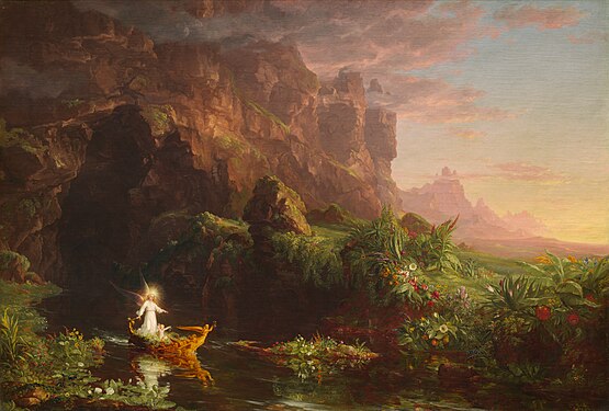


.jpg)


.jpg)


 . Can't you see how wise and gentle he is?
Hafspajen (
talk) 17:14, 29 October 2014 (UTC)
. Can't you see how wise and gentle he is?
Hafspajen (
talk) 17:14, 29 October 2014 (UTC)

_-_Google_Art_Project.jpg)

.jpg)


.jpg)


 Original – Christ taking Leave of his Mother, probably 1520, one of the early landscape painting, Albrecht Altdorfer's masterpiece. 141 cm (55.5 in). Width: 111 cm (43.7 in).
 ALT Not a google file, but it is bigger than the google art, (3,292 × 4,226 pixels) Which file you prefer I let you chose.
.jpg)


.jpg)


.jpg)


.JPG)


.svg)


 Dome from directly below
 Nave looking east towards the central dome and choir
 Choir looking west toward the dome and nave
 Choir looking east towards the High Altar
 The High Altar
 the Chapel of St Michael and St George in the south-western corner


_during_ship%27s_return_to_Norfolk.jpg)


 $50 (T-4)


_-_Google_Art_Project.jpg)
_-_Google_Art_Project.jpg&action=edit§ion=T-1)
_-_Google_Art_Project.jpg)
_-_Google_Art_Project.jpg&action=edit§ion=T-1)

_(RA)_-_The_Signing_of_Peace_in_the_Hall_of_Mirrors,_Versailles,_28th_June_1919_-_Google_Art_Project.jpg)
.jpg)
.jpg&action=edit§ion=T-1)
.jpg)


.jpg)

.jpg)
.jpg&action=edit§ion=T-1)
.jpg)

.jpg)


_in_Kolkata_I_IMG_9762.jpg)