| Featured picture tools |
|---|
Please cut and paste new entries to the bottom of this page, creating a new monthly archive (by closing date) when necessary.
Vincent van Gogh - Houses at Auvers
Voting period is over. Please don't add any new votes. Voting period ends on 1 Apr 2015 at 01:04:22 (UTC)

- Reason
- A new article, (co-production). Own article, used. A van Gogh from his last productive period, a bit different from his usual themes. CorinneSD was working together with me on the article, Corinne wrote most of the text in a sandbox.
- Articles in which this image appears
- Houses at Auvers
- FP category for this image
- Wikipedia:Featured pictures/Artwork/Paintings
- Creator
- Vincent van Gogh
- Support as nominator – Hafspajen ( talk) 01:04, 22 March 2015 (UTC)
- Support as nominator – CorinneSD ( talk) 16:50, 22 March 2015 (UTC)
- Support — Crisco 1492 ( talk) 23:54, 22 March 2015 (UTC)
- Support -- PetarM ( talk) 12:22, 25 March 2015 (UTC)
- Support - SchroCat ( talk) 10:49, 26 March 2015 (UTC)
- Support Yann ( talk) 13:46, 28 March 2015 (UTC)
- Support talk→ WPPilot 04:00, 30 March 2015 (UTC)
Promoted File:Vincent van Gogh - Houses at Auvers - Google Art Project.jpg -- Armbrust The Homunculus 02:37, 1 April 2015 (UTC)
Panorama of Rüdesheim am Rhein
Voting period is over. Please don't add any new votes. Voting period ends on 1 Apr 2015 at 11:02:10 (UTC)

- Reason
- Good technical quality, appropriate lighting, shows all relevant things (Castles, church, vineyards, factories)
- Articles in which this image appears
- Rüdesheim am Rhein
- FP category for this image
- Wikipedia:Featured pictures/Places/Panorama
- Creator
- User:DXR
- Support as nominator – DXR ( talk) 11:02, 22 March 2015 (UTC)
- Support - Great! — Crisco 1492 ( talk) 23:51, 22 March 2015 (UTC)
- Support - CorinneSD ( talk) 23:58, 22 March 2015 (UTC)
- Support I would be intruiged to see a panorama from the tree-lined spit in the middle of the river, as this looks an interesting riverfront. Plus buildings are more often more interesting from the front... However, nothing negative about this picture - ticks all the boxes and is still interesting... gazhiley 12:22, 23 March 2015 (UTC)
- Hi Gaz, yes that is a fair argument. However it is pretty much impossible to reach those islands without a boat (and I don't have one). It's probably more practical to take one of the ships that travel on the Rhine, and I will probably do that later in April, but shooting a panorama from a moving object is hard. Also, a big disadvantage of such a frontal panorama would be that would be very wide, probably too wide for many purposes on wiki. --
DXR (
talk) 10:43, 24 March 2015 (UTC)
- DXR no argument intended! Twas just the wishful musings of a lover of civilisation panoramas... I'd say find a nice young man/lady (if you haven't already got one), pack a picnic, and charter a simple single outboard motor boat, and take a trip out there... Enjoy the view, picnic and the company, and while there try a panorama from that side :D ... you're welcome........ hehe gazhiley 16:48, 25 March 2015 (UTC)
- Hi Gaz, yes that is a fair argument. However it is pretty much impossible to reach those islands without a boat (and I don't have one). It's probably more practical to take one of the ships that travel on the Rhine, and I will probably do that later in April, but shooting a panorama from a moving object is hard. Also, a big disadvantage of such a frontal panorama would be that would be very wide, probably too wide for many purposes on wiki. --
DXR (
talk) 10:43, 24 March 2015 (UTC)
- Support I've been there, this is really wonderful... Godhulii 1985 ( talk) 14:50, 23 March 2015 (UTC)
- Support - Hafspajen ( talk) 20:19, 23 March 2015 (UTC)
- Support Yann ( talk) 13:53, 28 March 2015 (UTC)
Promoted File:Panoramic View of Rüdesheim am Rhein 20140928 1.jpg -- Armbrust The Homunculus 11:09, 1 April 2015 (UTC)
16 wood samples
Voting period is over. Please don't add any new votes. Voting period ends on 1 Apr 2015 at 15:32:49 (UTC)

1. Pinus sylvestris (Pine)
2. Picea abies (Spruce)
3. Larix decidua (Larch)
4. Juniperus communis (Juniper)
5. Populus tremula (Aspen)
6. Carpinus betulus (Hornbeam)
7. Betula pubescens (Birch)
8. Alnus glutinosa (Alder)
9. Fagus sylvatica (Beech)
10. Quercus robur (Oak)
11. Ulmus glabra (Elm)
12. Prunus avium (Cherry)
13. Pyrus communis (Pear)
14. Acer platanoides (Maple)
15. Tilia cordata (Linden)
16. Fraxinus excelsior (Ash)
| 1 | 2 | 3 | 4 |
| 5 | 6 | 7 | 8 |
| 9 | 10 | 11 | 12 |
| 13 | 14 | 15 | 16 |
- Reason
- A super quality image of 16 wood samples
- Articles in which this image appears
- Wood, Dendrology
- FP category for this image
- Wikipedia:Featured pictures/Plants/Others
- Creator
- Anonimski
- Support as nominator – - The Herald the joy of the LORD my strength 15:32, 22 March 2015 (UTC)
- Support - very interesting, especially for an architect or a landscape architect and pity that is not used more. Hafspajen ( talk) 19:36, 22 March 2015 (UTC)
- Support - Genius idea. — Crisco 1492 ( talk) 23:37, 22 March 2015 (UTC)
- Support - CorinneSD ( talk) 23:57, 22 March 2015 (UTC)
- Support very useful for a core article. ©Geni ( talk) 01:29, 27 March 2015 (UTC)
- Support. Great idea, well done. Daniel Case ( talk) 01:58, 27 March 2015 (UTC)
- Support Yann ( talk) 13:45, 28 March 2015 (UTC)
Promoted File:16 wood samples.jpg -- Armbrust The Homunculus 15:48, 1 April 2015 (UTC)
- Added image to Wikipedia:Featured pictures/Sciences/Biology instead. Armbrust The Homunculus 15:48, 1 April 2015 (UTC)
Napoleon Crossing the Alps (Belvedere version)
Voting period is over. Please don't add any new votes. Voting period ends on 2 Apr 2015 at 00:23:55 (UTC)

- Reason
- High quality scan of an important and well-known David portrait. Can't have enough Napoleon!
- Articles in which this image appears
- Napoleon Crossing the Alps
- FP category for this image
- Wikipedia:Featured pictures/Artwork/Paintings
- Creator
- Jacques-Louis David
- Support as nominator – — Crisco 1492 ( talk) 00:23, 23 March 2015 (UTC)
- Support - Napoleon is always Napoleon. Hafspajen ( talk) 07:43, 23 March 2015 (UTC) — Except when he's Napoleon Blownapart. Sca ( talk)
- Support – Famous hagiographic image. Sca ( talk) 13:04, 23 March 2015 (UTC)
- Support - SchroCat ( talk) 10:49, 26 March 2015 (UTC)
- Support – Very nice quality with good EV. SagaciousPhil - Chat 12:07, 27 March 2015 (UTC)
- Support – What a fantastic painting! CorinneSD ( talk) 21:07, 27 March 2015 (UTC)
- Support Yann ( talk) 13:45, 28 March 2015 (UTC)
- Support - One of my all time favorite paintings, right since my class 3rd when I first saw it...- The Herald the joy of the LORD my strength 15:04, 28 March 2015 (UTC)
- @
Sca, I remember of your peculiar dislike of politicians. He was a political leader.
 -
The Herald
the joy of the LORD
my strength 15:04, 28 March 2015 (UTC)
-
The Herald
the joy of the LORD
my strength 15:04, 28 March 2015 (UTC)
- Napoleon Bonaparte was a megalomaniac whose military conquests caused the deaths of hundreds of thousands, if not millions. It's not surprising that Napoleon's tomb was one of the half-dozen Paris sights adoringly visited by the conquering Hitler in June 1940. (Too bad the latter failed to learn from the former's experience in Russia.) Sca ( talk) 15:29, 28 March 2015 (UTC)
- @
Sca, I remember of your peculiar dislike of politicians. He was a political leader.
Promoted File:Napoleon at the Great St. Bernard - Jacques-Louis David - Google Cultural Institute.jpg -- Armbrust The Homunculus 00:25, 2 April 2015 (UTC)
VW-Vincent (Volkswagen)


- Reason
- A newly discovered, sensational unknown van Gogh. Last chance, Internet will soon be deleted anyway. That's a good reason .... Wikipedia:Articles for deletion/Internet
- Articles in which this image appears
- No articles, no EV, not very useful. Interesting propaganda artifact, but everbody must oppose due to historical inaccuracy. Consensus is impossible to determine without additional input from participating in the discussion.
- FP category for this image
- Wikipedia:Featured picture candidates/1 April jokes.
- Creator
- Vincent van Gogh
- Support as nominator – This work comes from the artist's Late Not So Great Period. Some art historians assert he painted it as a commission from the famed German Post-Impressionist Fredinand Porschée, but others note that Porschée then was working as a waiter at an établissement in the 8th arrondissement of Paris, where he could scarcely have been earning the sums required to hire Van Gogh, not even a one-eared Van Gogh. (And BTW, that's pronounced Fahn-Xghowxgh – accent on the second syllable.) Sca ( talk) 15:41, 1 April 2016 (UTC)
The death of the Imperial Japanese Destroyer Yamakaze as seen through the periscope of the submarine USS Nautilus (SS-168)
Voting period is over. Please don't add any new votes. Voting period ends on 2 Apr 2015 at 18:58:05 (UTC)

- Reason
- A Hi-Res images I found of a submarine photographing her prey as the prey sinks to the bottom of the sea. Unusual image to have found, in particular in this day and age.
- Articles in which this image appears
- Allied submarines in the Pacific War, Japanese destroyer Yamakaze (1936), List of maritime disasters, List of shipwrecks in June 1942, Pacific War, Periscope, Salmon-class submarine, USS Nautilus (SS-168)
- FP category for this image
- Wikipedia:Featured pictures/History/War
- Creator
- United States Navy
- Support as nominator – TomStar81 ( Talk) 18:58, 23 March 2015 (UTC)
- Support Wow... Amazing shot, and better clarity than I'd expect... Not exactly ever going to replicate such a shot! gazhiley 17:05, 24 March 2015 (UTC)
- Support per above. Born of war, died of war... Brandmeister talk 21:27, 24 March 2015 (UTC)
- Support - Hafspajen ( talk) 15:42, 27 March 2015 (UTC)
- Support - CorinneSD ( talk) 21:06, 27 March 2015 (UTC)
- Support - War. War. War. And all that. But it is a great freaking shot. HullIntegrity\ talk / 23:35, 27 March 2015 (UTC)
- Support -- PetarM ( talk) 15:20, 29 March 2015 (UTC)
- Support - I've been on the fence for a bit, out of concern for technical quality, but this was shot in 1942, through a periscope, on a submarine near the surface during the course of action. We're not going to get the best quality, period, and the historical value offsets the technical limitations. — Crisco 1492 ( talk) 09:08, 30 March 2015 (UTC)
Promoted File:Torpedoed Japanese destroyer Yamakaze sinking on 25 June 1942.jpg -- Armbrust The Homunculus 18:59, 2 April 2015 (UTC)
- Added image to Wikipedia:Featured pictures/History/World War II instead. Armbrust The Homunculus 18:59, 2 April 2015 (UTC)
Left-facing Susan B. Anthony dollar design proposal
Voting period is over. Please don't add any new votes. Voting period ends on 11 Apr 2015 at 02:48:20 (UTC)

- Reason
- I believe this image meets the criteria because it is illustrative, encyclopedic and high-quality, and it illustrates the way coin designs are created. This is an early-stage design created by U.S. Mint Chief Engraver Frank Gasparro, but it was ultimately rejected, as were others. The image shows individual pencil marks, illustrating how Gasparro's concepts became reality. This is my first FP nomination, so I apologize in advance if I've made any mistakes along the way.- RHM22 ( talk) 02:48, 1 April 2015 (UTC)
- Articles in which this image appears
- Susan B. Anthony dollar
- FP category for this image
- Artwork/Others
- Creator
- Originally created by Frank Gasparro, uploaded by RHM22
- Support as nominator – RHM22 ( talk) 02:48, 1 April 2015 (UTC)
- Withdraw I'm not certain of the methods used here, but could someone please withdraw this candidate, as a procedural error? Thanks in advance.- RHM22 ( talk) 15:44, 1 April 2015 (UTC)
Not Promoted -- Armbrust The Homunculus 19:56, 2 April 2015 (UTC)
- Withdrawn nomination. Armbrust The Homunculus 19:56, 2 April 2015 (UTC)
Tribuna of the Uffizi
Voting period is over. Please don't add any new votes. Voting period ends on 2 Apr 2015 at 20:28:24 (UTC)

- Reason
- High quality reproduction of a notable painting, and therefore high EV.
- Articles in which this image appears
- Tribuna of the Uffizi (painting) (most EV), Johann Zoffany, +15 others
- FP category for this image
- Wikipedia:Featured pictures/Artwork/Paintings
- Creator
- Johann Zoffany
- Support as nominator – Armbrust The Homunculus 20:28, 23 March 2015 (UTC)
- Support Samsara 01:13, 24 March 2015 (UTC)
- Support - Great painting. — Crisco 1492 ( talk) 15:43, 24 March 2015 (UTC)
- Support, superb indeed, especially at high resolution. Brandmeister talk 21:19, 24 March 2015 (UTC)
- Comment - I think I saw this in Crisco's que. I was confering with him before on this painting, and he said he would like to nominate it. Shall we not at least ask to take something from that que - or at least co-nom? Hafspajen ( talk) 21:48, 24 March 2015 (UTC)
- I really don't mind. — Crisco 1492 ( talk) 02:59, 25 March 2015 (UTC)
- Because you are nice. But you should be credited if someone is nominating from your que. Hafspajen ( talk) 17:54, 25 March 2015 (UTC)
- If I'd written the article just to get this at FPC, maybe. But if it's just sitting there gathering dust... — Crisco 1492 ( talk) 05:05, 26 March 2015 (UTC)
- Support Very interesting painting. -- Janke | Talk 06:53, 25 March 2015 (UTC)
- Support - SchroCat ( talk) 10:50, 26 March 2015 (UTC)
- Support – I wonder, even though it was the style at that time to squeeze a lot of paintings onto the walls, whether Zoffany thought there were too many or just thought it was normal. Hafs, what's "que" - "Crisco's que"? -
CorinneSD (
talk) 21:03, 27 March 2015 (UTC)
- Queue, i.e. that collection of 60 or so images (right now) on my talk page. — Crisco 1492 ( talk) 15:58, 29 March 2015 (UTC)
- Support: Fylbecatulous talk 02:11, 29 March 2015 (UTC)
Promoted File:Johan Zoffany - Tribuna of the Uffizi - Google Art Project.jpg --- The Herald the joy of the LORD my strength 03:48, 3 April 2015 (UTC)
- 8 support, 0 oppose - The Herald the joy of the LORD my strength 03:48, 3 April 2015 (UTC)
Safran-Weinviertel Niederreiter 2 Gramm 8285.jpg
Voting period is over. Please don't add any new votes. Voting period ends on 3 Apr 2015 at 16:06:08 (UTC)

- Reason
- Clear and useful picture; good cut out
- Articles in which this image appears
- Saffron +1
- FP category for this image
- Wikipedia:Featured pictures/Food and drink
- Creator
- Hubertl
- Support as nominator – — Crisco 1492 ( talk) 16:06, 24 March 2015 (UTC)
- Support Samsara 17:54, 24 March 2015 (UTC)
- Support - Salute thee, the most expensive spice of the planet...- The Herald the joy of the LORD my strength 12:45, 25 March 2015 (UTC)
- Support as a co-author ;-) -- Alchemist-hp ( talk) 00:57, 27 March 2015 (UTC)
- Support as whatever may be. :) J e e 09:57, 27 March 2015 (UTC)
- Support – CorinneSD ( talk) 20:56, 27 March 2015 (UTC)
- Support Yann ( talk) 13:44, 28 March 2015 (UTC)
- Support: Fylbecatulous talk 02:07, 29 March 2015 (UTC)
Promoted File:Safran-Weinviertel Niederreiter 2 Gramm 8285.jpg -- Armbrust The Homunculus 16:12, 3 April 2015 (UTC)
William Lane Craig
Voting period is over. Please don't add any new votes. Voting period ends on 3 Apr 2015 at 21:21:54 (UTC)

- Reason
- I thought this one deserved a second chance. A high-quality photograph of a fairly well-known academic. To pre-empt the claim that this is just a simple posed photograph: short of that pose, this is about as close as we are going to get to an "action shot" of a philosopher- the use of the watch and the stain-glass background are very much deliberate.
- Articles in which this image appears
- William Lane Craig
- FP category for this image
- Wikipedia:Featured pictures/People/Artists and writers
- Creator
- Unknown; photograph from William Craig's press kit
- Support as nominator – Josh Milburn ( talk) 21:21, 24 March 2015 (UTC)
- Support — Crisco 1492 ( talk) 02:58, 25 March 2015 (UTC)
- Oppose, still artificial facial expression with distrcting background. -- Alchemist-hp ( talk) 04:24, 25 March 2015 (UTC)
- Oppose – An "Official Press Release Photo" from a press kit assembled to promote a book. The pose, composition and subject's expression are stilted and unnatural – comprising a PR effort that is mediocre at best, IMO. Negligible EV. Sca ( talk) 13:19, 25 March 2015 (UTC)
- Comment. Clichéd pose; no personality. 86.152.162.108 ( talk) 14:22, 25 March 2015 (UTC)
- Oppose Phoniest smile I ever saw... almost repulsive. -- Janke | Talk 12:09, 27 March 2015 (UTC)
- Poor Craig... I guess the situation is hopeless. This looks a bit better,
 but no good as a FP.
Hafspajen (
talk) 12:43, 30 March 2015 (UTC)
but no good as a FP.
Hafspajen (
talk) 12:43, 30 March 2015 (UTC)
- Not Good - National Names 2000 ( talk) 01:59, 2 April 2015 (UTC)
- Poor Craig... I guess the situation is hopeless. This looks a bit better,

Not Promoted -- Armbrust The Homunculus 21:36, 3 April 2015 (UTC)
The perfect galactic wirlpool
Voting period is over. Please don't add any new votes. Voting period ends on 4 Apr 2015 at 15:58:41 (UTC)

- Reason
- A high quality astro image with great EV
- Articles in which this image appears
- M 81
- FP category for this image
- Wikipedia:Featured pictures/Space/Looking out
- Creator
- Ken Crawford
- Support as nominator – - The Herald the joy of the LORD my strength 15:58, 25 March 2015 (UTC)
- Support, only because File:Messier81 highres.jpg is below the minimum resolution and this is still a great image. — Crisco 1492 ( talk) 04:19, 26 March 2015 (UTC)
- Support - If Crisco 1492 says the res is up to snuff, I would love to see this on the main page. HullIntegrity\ talk / 02:04, 27 March 2015 (UTC)
- Support, - Hafspajen ( talk) 00:13, 29 March 2015 (UTC)
- Support - SchroCat ( talk) 20:34, 3 April 2015 (UTC)
- Support - CorinneSD ( talk) 01:54, 4 April 2015 (UTC)
Promoted File:M81.jpg -- Armbrust The Homunculus 15:59, 4 April 2015 (UTC)
Salvator Rosa
Voting period is over. Please don't add any new votes. Voting period ends on 4 Apr 2015 at 23:43:31 (UTC)

- Reason
- Interesting self-portrait by Salvator Rosa. Wish my hair could be like that.
- Articles in which this image appears
- Salvator Rosa +4
- FP category for this image
- Wikipedia:Featured pictures/People/Artists and writers
- Creator
- Salvator Rosa
- Support as nominator – — Crisco 1492 ( talk) 23:43, 25 March 2015 (UTC)
- Support Iconic painting. Hafspajen ( talk) 04:11, 26 March 2015 (UTC)
- Support - My hair too..- The Herald the joy of the LORD my strength 05:00, 26 March 2015 (UTC)
- Support - SchroCat ( talk) 10:50, 26 March 2015 (UTC)
- What does the text say in his hand? Hafspajen ( talk) 02:13, 27 March 2015 (UTC)
Promoted File:Self-portrait by Salvator Rosa.jpg -- Armbrust The Homunculus 23:44, 4 April 2015 (UTC)
December 2010 lunar eclipse
Voting period is over. Please don't add any new votes. Voting period ends on 5 Apr 2015 at 04:58:25 (UTC)

- Reason
- A high quality astro image with great EV
- Articles in which this image appears
- December 2010 lunar eclipse
- FP category for this image
- Wikipedia:Featured pictures/Space/Looking out
- Creator
- John Vermette
- Support as nominator – - The Herald the joy of the LORD my strength 04:58, 26 March 2015 (UTC)
- Comment - Looks like some serious JPG artefacting. — Crisco 1492 ( talk) 05:03, 26 March 2015 (UTC)
- Where? -
The Herald
the joy of the LORD
my strength 05:14, 26 March 2015 (UTC)
- Throughout the whole picture. — Crisco 1492 ( talk) 07:47, 26 March 2015 (UTC)
- Where? -
The Herald
the joy of the LORD
my strength 05:14, 26 March 2015 (UTC)
- Oppose. Very noticeable artifacting. Also, I'm no specialist in licenses, but the photographer's site specifies that "all images here are copyright by John Vermette. Use as you wish, but please give proper credit." Is that really all the criteria needed for it to be posted under a CC-BY-SA license? Joshua Garner ( talk) 17:40, 28 March 2015 (UTC)
Not Promoted -- Armbrust The Homunculus 05:52, 5 April 2015 (UTC)
La Jolla, California
Voting period is over. Please don't add any new votes. Voting period ends on 5 Apr 2015 at 05:32:29 (UTC)

- Reason
- This was not a easy photo to get, the plane I was in is pressurized so the cockpit glass is always going to be a issue but this is one of the best, from the flight. I am flying at about 10,000 feet at the time this was taken departing out of Montgomery Field climbing like a rocket ship. The photo shows just about the entire city of La Jolla, California
- Articles in which this image appears
- La Jolla, California
- FP category for this image
- places
- Creator
- WPPilot
- Support as nominator – talk→ WPPilot 05:32, 26 March 2015 (UTC)
- Weak support - there appears to be a very slight amount of motion blur, but overall this is much better than the most recent nomination. — Crisco 1492 ( talk) 14:56, 26 March 2015 (UTC)
- Support – CorinneSD ( talk) 20:31, 27 March 2015 (UTC)
- Support - National Names 2000 ( talk) 04:24, 3 April 2015 (UTC)
Not Promoted -- Armbrust The Homunculus 05:57, 5 April 2015 (UTC)
- Not enough support for promotion. Armbrust The Homunculus 05:57, 5 April 2015 (UTC)
The Resurrection
Voting period is over. Please don't add any new votes. Voting period ends on 5 Apr 2015 at 10:11:00 (UTC)

- Reason
- A dramatic, notable painting, own article, and 5,126 × 8,881 pixels. The artwork is from 1619, and was a painting intended for private devotion for the Tuscan ambassador to Rome, for his private chapel in Florence. It depicts the Resurrection of Christ, the moment described in the Gospel of Matthew 28:2:There was a violent earthquake, for an angel of the Lord came down from heaven and, going to the tomb, rolled back the stone and sat on it. And his appearance was like lightning, and his clothing as white as snow ...
- Articles in which this image appears
- The Resurrection (Cecco del Caravaggio)
- FP category for this image
- Wikipedia:Featured pictures/Artwork/Paintings
- Creator
- Cecco del Caravaggio
- Support as co-nominator – — Crisco 1492 ( talk) 10:25, 26 March 2015 (UTC)
- Support as co-nominator – Hafspajen ( talk) 16:11, 26 March 2015 (UTC)
- Support – CorinneSD ( talk) 20:29, 27 March 2015 (UTC)
- Support – nice scan with good EV. SagaciousPhil - Chat 18:32, 28 March 2015 (UTC)
- Support - SchroCat ( talk) 06:10, 31 March 2015 (UTC)
Promoted File:Francesco Buoneri, called Cecco del Caravaggio - The Resurrection - Google Art Project.jpg -- Armbrust The Homunculus 10:13, 5 April 2015 (UTC)
A show of hands for the best pictures
Voting period is over. Please don't add any new votes. Voting period ends on 5 Apr 2015 at 22:55:32 (UTC)

- Reason
- Fantastic scan of a fantastic picture
- Articles in which this image appears
- A Session of the Painting Jury, Henri Gervex
- FP category for this image
- Wikipedia:Featured pictures/Artwork/Paintings
- Creator
- Henri Gervex
- Support as nominator – SchroCat ( talk) 22:55, 26 March 2015 (UTC)
- Support — Crisco 1492 ( talk) 23:59, 26 March 2015 (UTC)
- Support - Wohoo, this is the guy who made "Rolla". Hafspajen ( talk) 04:23, 27 March 2015 (UTC)
- Support - CorinneSD ( talk) 20:25, 27 March 2015 (UTC)
- Support – interesting painting; good EV from the article. Looks as if the painting of the nude they're voting for was popular. SagaciousPhil - Chat 18:36, 28 March 2015 (UTC)
Promoted File:Henri Gervex - A Session of the Painting Jury - Google Art Project.jpg -- Armbrust The Homunculus 23:09, 5 April 2015 (UTC)
Dusky lory
Voting period is over. Please don't add any new votes. Voting period ends on 5 Apr 2015 at 23:54:59 (UTC)
,_Gembira_Loka_Zoo,_Yogyakarta,_2015-03-15_03.jpg)
- Reason
- High resolution/quality of a rather attractive bird. Though this was taken in captivity, it doesn't show it.
- Articles in which this image appears
- Dusky lory +1
- FP category for this image
- Wikipedia:Featured pictures/Animals/Birds
- Creator
- Chris Woodrich
- Support as nominator – — Crisco 1492 ( talk) 23:54, 26 March 2015 (UTC)
- Support - Nice. HullIntegrity\ talk / 02:00, 27 March 2015 (UTC)
- Support Hafspajen ( talk) 03:30, 27 March 2015 (UTC)
- Weak Support – Nice, but it would have been better had the tail been in focus. —
Bruce1ee
talk 05:13, 27 March 2015 (UTC)
- Sadly the day was somewhat overcast, so I had to resort to a lower f number. — Crisco 1492 ( talk) 07:12, 27 March 2015 (UTC)
- Support The background is already very busy; so I don't think a small aperture will be helpful. J e e 09:54, 27 March 2015 (UTC)
- Support Nice, never seen this species before. Brandmeister talk 16:24, 27 March 2015 (UTC)
- Support – Looks friendly. Sca ( talk) 22:52, 31 March 2015 (UTC)
Promoted File:Dusky lory (Pseudeos fuscata), Gembira Loka Zoo, Yogyakarta, 2015-03-15 03.jpg -- Armbrust The Homunculus 01:48, 6 April 2015 (UTC)
Wild Turkey
Voting period is over. Please don't add any new votes. Voting period ends on 6 Apr 2015 at 09:15:08 (UTC)

- Reason
- Beautiful Audubon colour engraving of the world's most fabulous fowl. Oh, that haughty posture—makes me hungry!
- Articles in which this image appears
- John James Audubon, The Birds of America, Turkey (bird)
- FP category for this image
- Wikipedia:Featured pictures/Animals/Birds
- Creator
- John James Audubon
- Support as nominator – Curly Turkey ¡gobble! 09:15, 27 March 2015 (UTC)
- Gorgeous... but is it just me, or are the margins a bit tight? — Crisco 1492 ( talk) 11:04, 27 March 2015 (UTC)
- That was done purposely to provide maximal turkey. Curly Turkey ¡gobble! 11:25, 27 March 2015 (UTC)
- Perhaps, but I doubt the original engraving had the lower land right up to the margins. — Crisco 1492 ( talk) 12:05, 27 March 2015 (UTC)
- In the top left-hand corner there is some text that looks like it should say "No 1", but most of the "N" is chopped off. 109.153.225.26 ( talk) 14:39, 27 March 2015 (UTC)
- Like here
-

-

-

-

-


- I doubt that what we see is the true left edge of the print. Possibly the print has been cut out of a book, and the "No. 1" text disappeared into the spine. The left-hand edge is odd. At first it looks ragged, and I thought it was the actual cut edge, but looking more closely it seems to have been cropped in a series of slightly stepped exact straight lines, as if done in multiple stages in an image editor for some reason. I'm not saying it's a big deal; it's just puzzling. 109.152.147.122 ( talk) 18:27, 27 March 2015 (UTC)

- Support - most of the engraving's he made are tight in the The Birds of America. Hafspajen ( talk) 11:05, 27 March 2015 (UTC)
- Support - That is one impressive and personable turkey. HullIntegrity\ talk / 12:42, 27 March 2015 (UTC)
- Support - Amazing! - National Names 2000 ( talk) 12:54, 27 March 2015 (UTC)
- Support - Really nice image. Last fall I saw two wild turkeys walk side-by-side down a sidewalk in town, right near me. They were about four feet tall, and they just ignored me and kept walking. - CorinneSD ( talk) 19:52, 27 March 2015 (UTC)
- Comment - The source file for this image has a damaged left margin which was cropped off leaving no margin at all on the bottom left with slivers missing in two places. The "restoration" has left visible areas of off-color cloning as well. Is this image rare enough to overlook these problem?-- Godot13 ( talk) 08:15, 28 March 2015 (UTC)
- Oppose per Godot's findings. That should be fixable by revisiting the source image. — Crisco 1492 ( talk) 08:18, 28 March 2015 (UTC)
- Oppose - Agreed. We can do better than this. It's also poorly documented - no uploading of the original scan, for example. Adam Cuerden ( talk) 08:49, 28 March 2015 (UTC)
- Yes, it is definitely worth. Yes, Godot13 Crisco 1492 - Adam Cuerden - the image is an extremly high qualty drawing - and is rare enough to be worth the energy put into, it is the very first image in the utterly notable book The Birds of America, an illustration made of the utterly notable artist John James Audubon, one of his finest images. I imagine Curly Turkey wouldn't have anything against sharing the nomination with anyne who puts the energy into that restoration ... (category should probably be illustration, though). Hafspajen ( talk) 19:49, 28 March 2015 (UTC)
- Oppose ...in its current state. Hafs, I agree with you about the EV/importance of the image. Sadly (I suspect) we are looking at (source image) the end result of what happened when someone decided to break up one of the books without taking proper care. Instead of taking the book apart at the binding, they may have cut out the plates. If the left margin can be properly restored (along with some light cleaning of more prominent spots), I will support it.-- Godot13 ( talk) 21:02, 28 March 2015 (UTC)
- ' Comment' - Here is the original. I think that under the circumstances I do understand why it was uploaded like it was uploaded. The N you were remarking about is gone on the original, it is damaged and not visible. But the rest is fine. Sometimes I sincerely have difficulties understanding this kind of perfectionism. Hafspajen ( talk) 23:58, 28 March 2015 (UTC).
- Because we actually have people who can fix thaat much better than this is? Adam Cuerden ( talk) 01:18, 29 March 2015 (UTC)
- I have to agree with Adam on this. A missing part of a letter is fixable. — Crisco 1492 ( talk) 01:23, 29 March 2015 (UTC)
Not Promoted -- Armbrust The Homunculus 09:17, 6 April 2015 (UTC)
- There is only a 62.5% support for promotion, which isn't enough for the image to become featured. Armbrust The Homunculus 09:17, 6 April 2015 (UTC)
Danish West Indian 10 daler gold coin (1904)
Voting period is over. Please don't add any new votes. Voting period ends on 7 Apr 2015 at 07:04:15 (UTC)

- Reason
- High quality image, high EV. A rare double denominated gold coin (10 Dalere, 50 Francs) issued only in 1904.
- Articles in which these images appear
- Danish West Indian daler, Christian IX of Denmark
- FP category for this image
- Currency
- Creator
-
Kingdom of Denmark for the
Danish West Indies.
From the National Numismatic Collection, National Museum of American History, Smithsonian Institution.
- Support as nominator – Godot13 ( talk) 07:04, 28 March 2015 (UTC)
- Support - I bet that series could have its own article! — Crisco 1492 ( talk) 07:54, 28 March 2015 (UTC)
- Support Yann ( talk) 13:42, 28 March 2015 (UTC)
- Support Hafspajen ( talk) 02:22, 29 March 2015 (UTC)
- Support - Bammesk ( talk) 02:43, 2 April 2015 (UTC)
Promoted File:Danish West Indies 1904 10 Daler.jpg -- Armbrust The Homunculus 07:06, 7 April 2015 (UTC)
The Roses of Heliogabalus
Voting period is over. Please don't add any new votes. Voting period ends on 7 Apr 2015 at 21:05:22 (UTC)

- Reason
- Found this high-res version accidentally, while searching for Edward Poynter. Perhaps time to roll this out.
- Articles in which this image appears
- The Roses of Heliogabalus, Lawrence Alma-Tadema, Victorian painting, others
- FP category for this image
- Artwork/Paintings
- Creator
- Lawrence Alma-Tadema
- Support as nominator – Brandmeister talk 21:05, 28 March 2015 (UTC)
- Comment- Did you uploaded a new? This was no good before....
Hafspajen (
talk) 23:17, 28 March 2015 (UTC)
- Yes, uploaded over the existing one, source has been updated. Brandmeister talk 07:43, 29 March 2015 (UTC)
- Support - Yeah, it's a new file. And gorgeous. — Crisco 1492 ( talk) 23:42, 28 March 2015 (UTC)
- Support - great pic. Hafspajen ( talk) 00:14, 29 March 2015 (UTC)
- Support - National Names 2000 ( talk) 01:54, 2 April 2015 (UTC)
- Support - SchroCat ( talk) 11:01, 2 April 2015 (UTC)
Promoted File:The Roses of Heliogabalus.jpg -- Armbrust The Homunculus 21:07, 7 April 2015 (UTC)
Nakhi people carrying baskets
Voting period is over. Please don't add any new votes. Voting period ends on 7 Apr 2015 at 23:39:35 (UTC)

- Reason
- One of the finalists in POTY, this image has pretty good EV in Nakhi people and is used in several other articles. Technical quality is, of course, assured.
- Articles in which this image appears
- Nakhi people +2
- FP category for this image
- Wikipedia:Featured pictures/People/Traditional dress
- Creator
- Uwe Aranas
- Support as nominator – — Crisco 1492 ( talk) 23:39, 28 March 2015 (UTC)
- Support – Crisco, what does "this image has pretty good in Nakhi people" mean?
CorinneSD (
talk) 00:32, 29 March 2015 (UTC)
- (EV; added) — Crisco 1492 ( talk) 01:00, 29 March 2015 (UTC)
- Support - Hafspajen ( talk) 02:09, 29 March 2015 (UTC)
- Support – Interesting composition. (Text should locate Nakhi-inhabited region — south-central China?) Sca ( talk) 14:08, 29 March 2015 (UTC)
- Support Yann ( talk) 16:00, 29 March 2015 (UTC)
- Comment. Great picture, but it would benefit from more information about what is being depicted in the "performance" and the context in which it is taking place. 109.156.50.218 ( talk) 19:30, 29 March 2015 (UTC)
- Comment - I agree. -
CorinneSD (
talk) 21:56, 29 March 2015 (UTC)
- Info The performance in the open air theatre of Lijiang, which includes some hundreds actors, is showing different traditions and lifestyles of the Naxi, Yi, and Bai people of the Yunnan area. The depicted scene shows especially the traditional clothing of the Naxi women (which is still worn in the daily life of the Naxi people) and is also a hommage to the Naxi women which used to carry heavy loads in big bamboo baskets, for example hay and fresh grass for the cattle. I hope, this explanation might help. Cheers, -- CEphoto, Uwe Aranas ( talk • contribs) 08:51, 30 March 2015 (UTC)
- Oppose Can the EV be there if this is not actually a picture of a person from the Yunnan area in their natural clothing? Surely a performance by an actor cannot be used to demonstrate anything other than acting? The rest is just down to the quality of the costume designer and director of the show - it's entirely their interpretation. And unless Yunnan people traditionally frequent the stages of open air theatres, then this isn't showing them in the correct situation either...
gazhiley 16:47, 30 March 2015 (UTC)
- Did you read Uwe's post about the outfits? —
Crisco 1492 (
talk) 06:41, 31 March 2015 (UTC)
- Yes Crisco 1492 - that's why I opposed - confirmation that this is a theatre show, not actual people in their actual clothes. gazhiley 12:28, 2 April 2015 (UTC)
- Did you read Uwe's post about the outfits? —
Crisco 1492 (
talk) 06:41, 31 March 2015 (UTC)
- Comment Maybe the photo would be best considered for illustrating a type of outdoor theater in China. That's quite a backdrop for theater.
CorinneSD (
talk) 19:47, 30 March 2015 (UTC)
- That's one of the articles it's used in too, but there's less discussion there. — Crisco 1492 ( talk) 06:41, 31 March 2015 (UTC)
- Support – SchroCat ( talk) 10:50, 3 April 2015 (UTC)
- Support -- Hubertl ( talk) 16:36, 3 April 2015 (UTC)
Promoted File:Lijiang Yunnan China-Naxi-people-carrying-baskets-01.jpg -- Armbrust The Homunculus 00:24, 8 April 2015 (UTC)
- Added it to Wikipedia:Featured pictures/Places/Landscapes instead. Armbrust The Homunculus 00:24, 8 April 2015 (UTC)
Schwäbisch Hall in winter
Voting period is over. Please don't add any new votes. Voting period ends on 8 Apr 2015 at 16:11:04 (UTC)

- Reason
- scenic photo of Schwäbisch Hall for Christmas/New year holidays
- Articles in which this image appears
- Schwäbisch Hall, Christmas lights
- FP category for this image
- Wikipedia:Featured pictures/Places/Landscapes
- Creator
- Petar Milošević
- Support as nominator – PetarM ( talk) 16:11, 29 March 2015 (UTC)
- Support this is a wonderful example of night photography, clear and crisp with fine detail. -- talk→ WPPilot 04:07, 30 March 2015 (UTC)
- Comment - Technically a great shot. Composition feels a bit cramped to me. — Crisco 1492 ( talk) 09:05, 30 March 2015 (UTC)
- Oppose The building is partially obscured by the tree - a picture taken further to the right giving a front-on view would be much better. It would also demonstrate clearer the subject, as potentially it could be about any of the buildings in the picture - none of them are front and centred. Technically good, but not good enough EV wise for me gazhiley 16:43, 30 March 2015 (UTC)
- The subject is the Marktplatz (presumably the town's central square), not one specific building. ("Schwäbisch Hall" is a town, not a building; not sure if there is any confusion there...) 86.155.201.128 ( talk) 13:57, 31 March 2015 (UTC)
- OpposeThe cropping of the aerials is a level of editing I'm not really happy with. Resulting image is still rather cramped and the camera is struggling with the varying light levels (the lights blending together on the center far left and on the building just to the right of the town hall). Might be worth trying to shoot at ISO200 (E-P5 native iso) in future. You are sacrificing dynamic range by jumping to 320. Otherwise shoot in raw and mess with the curves in post or its time to break out the HDR (with care). ©Geni ( talk) 07:53, 31 March 2015 (UTC)
- I'm sorry, but I think these objections about the lighting are ridiculous. (Can't see any cropping of aerials either.) 86.155.201.128 ( talk) 11:13, 31 March 2015 (UTC)
- I would also disagree with the objections raised above. @ 86.155.201.128: please use a account to register your comments, its much more helpful but I have to agree with you here. talk→ WPPilot 16:35, 31 March 2015 (UTC)
- Check the historical uploads the antennas were edited shorter in the last upload. ©Geni ( talk) 12:40, 31 March 2015 (UTC)
- Comment @ ©Geni, Antenna was shortened due to remarks by some, but not by croping. Image isnt downsized. Photo is almost at full size - 96 %. ISO 320 vs ISO 200 wouldnt be resolved by your eyes and sky noise was deleveled for beeing better. No use of HDR at such scene, everything is perfect enligthed as it should be. -- PetarM ( talk) 20:11, 31 March 2015 (UTC)
- Support - that's a Christmas tree, and it is winter. Hafspajen ( talk) 11:22, 31 March 2015 (UTC)
- Support – Per WPPilot. Sca ( talk) 15:58, 31 March 2015 (UTC)
- Support - Wonderful example of night photography, very nice.-- Soundwaweserb ( talk) 12:40, 4 April 2015 (UTC)
- Support - I can't find anything bad and the tree do not pose any serious threat for the picture. - The Herald the joy of the LORD my strength 08:37, 6 April 2015 (UTC)
- Support: no objections. Fylbecatulous talk 14:01, 6 April 2015 (UTC)
Promoted File:Schwäbisch Hall in winter.jpg -- Armbrust The Homunculus 17:01, 8 April 2015 (UTC)
Lady with a Squirrel and a Starling
Voting period is over. Please don't add any new votes. Voting period ends on 8 Apr 2015 at 19:26:46 (UTC)

- Reason
- Excellent scan of a lovely painting
- Articles in which this image appears
- A Lady with a Squirrel and a Starling, Hans Holbein the Younger, Azurite + 2 others
- FP category for this image
- Wikipedia:Featured pictures/Artwork/Paintings
- Creator
- Hans Holbein the Younger
- Support as nominator – SchroCat ( talk) 19:26, 29 March 2015 (UTC)
- Support – Interesting. Sca ( talk) 01:52, 30 March 2015 (UTC)
- Support — Crisco 1492 ( talk) 09:03, 30 March 2015 (UTC)
- Support Almost photographic. Brandmeister talk 12:17, 30 March 2015 (UTC)
- Support Hafspajen ( talk) 12:35, 30 March 2015 (UTC)
- Support -- PetarM ( talk) 20:18, 7 April 2015 (UTC)
Promoted File:Lady with a Squirrel.jpg -- Armbrust The Homunculus 19:27, 8 April 2015 (UTC)
| This image of Georgette Seabrooke [1] was mistakenly identified as Augusta Savage in 2011. The error was discovered and corrected in 2018. It has been renominated as a Featured Picture at Featured picture candidates/Georgette Seabrooke. |
Augusta Savage
Voting period is over. Please don't add any new votes. Voting period ends on 8 Apr 2015 at 21:49:27 (UTC)

- Reason
- high resolution image with restoration
- Articles in which this image appears
- Augusta Savage
- FP category for this image
- Wikipedia:Featured pictures/People/Artists and writers
- Creator
- (unknown) Harmon Foundation / NARA, uploaded and restored by Yann
- Support as nominator – Yann ( talk) 21:49, 29 March 2015 (UTC)
- Support - Nice and useful. — Crisco 1492 ( talk) 09:02, 30 March 2015 (UTC)
- Support - Bammesk ( talk) 01:59, 2 April 2015 (UTC)
- Support – Can't find any reason to oppose..- The Herald the joy of the LORD my strength 12:52, 3 April 2015 (UTC)
- Support - National Names 2000 ( talk) 04:53, 5 April 2015 (UTC)
Promoted File:Georgette Seabrooke - NARA - 31491640.jpg -- Armbrust The Homunculus 21:50, 8 April 2015 (UTC)
Charles Townshend, 2nd Viscount Townshend
Voting period is over. Please don't add any new votes. Voting period ends on 8 Apr 2015 at 23:46:41 (UTC)
.jpg)
- Reason
- High quality scan of a pretty good portrait. Very useful for the article. Not that many British statesmen from the period featured.
- Articles in which this image appears
- Charles Townshend, 2nd Viscount Townshend +10 or so
- FP category for this image
- Wikipedia:Featured pictures/People/Political
- Creator
- After Godfrey Kneller
- Support as nominator – — Crisco 1492 ( talk) 23:46, 29 March 2015 (UTC)
- Support - Chris, how about his hair?
Hafspajen (
talk) 07:01, 30 March 2015 (UTC)
- Too curly for me. — Crisco 1492 ( talk) 09:02, 30 March 2015 (UTC)
- Support - SchroCat ( talk) 13:13, 1 April 2015 (UTC)
- Support - SagaciousPhil - Chat 14:35, 4 April 2015 (UTC)
- Support - National Names 2000 ( talk) 04:55, 5 April 2015 (UTC)
Promoted File:Charles Townshend, 2nd Viscount Townshend by Sir Godfrey Kneller, Bt (2).jpg -- Armbrust The Homunculus 23:47, 8 April 2015 (UTC)
Dutch - Flower Still Life
Voting period is over. Please don't add any new votes. Voting period ends on 9 Apr 2015 at 07:20:58 (UTC)

- Reason
- High quality painting, of an elaborate sophistication and complexity by Ambrosius Bosschaert the Elder ( 1573 – 1621) a highly successful still life painter of the Dutch Golden Age. When tulips became a luxury item, a profusion of varieties followed, like the ones in the painting, white and yellow with red strips. These paintings are valuable as historic documents for botanical purposes, since the flowers are depicted with great accuracy.
- Articles in which this image appears
- Ambrosius Bosschaert, Flower, Northern Mannerism, Social history of viruses, Still life
- FP category for this image
- Wikipedia:Featured pictures/Artwork/Paintings
- Creator
- Ambrosius Bosschaert the Elder
- Support as nominator – Hafspajen ( talk) 07:20, 30 March 2015 (UTC)
- Support — Crisco 1492 ( talk) 09:03, 30 March 2015 (UTC)
- Support -- Lovely. HullIntegrity\ talk / 14:14, 30 March 2015 (UTC)
- Support - SchroCat ( talk) 13:13, 1 April 2015 (UTC)
- Support - Bammesk ( talk) 01:41, 2 April 2015 (UTC)
- Support - Jobas ( talk) 01:21, 9 April 2015 (UTC)
Promoted File:Ambrosius Bosschaert the Elder (Dutch - Flower Still Life - Google Art Project.jpg -- Armbrust The Homunculus 07:45, 9 April 2015 (UTC)
Harvest in Provence
Voting period is over. Please don't add any new votes. Voting period ends on 19 Apr 2015 at 07:10:42 (UTC)

- Reason
- HQ + EV
- Articles in which this image appears
- List of works by Vincent van Gogh
- FP category for this image
- Creator
- Vincent van Gogh
- Support as nominator – Alborzagros ( talk) 07:10, 9 April 2015 (UTC)
- Oppose - Seriously, we've got van Gogh pouring out of our every orifice. We don't need to nominate a van Gogh that doesn't have its own article. — Crisco 1492 ( talk) 10:52, 9 April 2015 (UTC)
- Speedy close - We already have a version of this featured: here. — Crisco 1492 ( talk) 10:58, 9 April 2015 (UTC)
Not Promoted --- The Herald the joy of the LORD my strength 11:06, 9 April 2015 (UTC)
- Quick close, already featured - The Herald the joy of the LORD my strength 11:06, 9 April 2015 (UTC)
HMS Vanguard (S28)
Voting period is over. Please don't add any new votes. Voting period ends on 10 Apr 2015 at 03:35:27 (UTC)

- Reason
- The Royal Navy ballistic missile submarine HMS Vanguard (S28), photographed as she arrives back at HM Naval Base Clyde, Faslane, Scotland following a patrol, November 2010.
- Articles in which this image appears
- Her Majesty's Naval Service, List of active Royal Navy ships, Royal Navy, Scotland, Vanguard-class submarine
- FP category for this image
- Wikipedia:Featured pictures/Vehicles/Water
- Creator
- CPOA(Phot) Tam McDonald
- Support as nominator – TomStar81 ( Talk) 03:35, 31 March 2015 (UTC)
- Support – Fine atmospheric shot. Sca ( talk) 15:48, 31 March 2015 (UTC)
- Support – a nice shot, specially the background..- The Herald the joy of the LORD my strength 12:52, 3 April 2015 (UTC)
- Support – Godhulii 1985 ( talk) 18:55, 4 April 2015 (UTC)
- Comment - I really like this image, but is there a way to fix the posterization in the sky? -- Godot13 ( talk) 23:32, 4 April 2015 (UTC)
- Support – Hafspajen ( talk) 00:55, 6 April 2015 (UTC)
- Support - Jobas ( talk) 01:21, 9 April 2015 (UTC)
Promoted File:Vanguard at Faslane 02.jpg -- Armbrust The Homunculus 03:36, 10 April 2015 (UTC)
Sinking of the RMS Lusitania
Voting period is over. Please don't add any new votes. Voting period ends on 10 Apr 2015 at 03:49:54 (UTC)
- Reason
- A short film created to exploit the international backlash against the Imperial German Navy in the aftermath of the 7 May 1915 attack by U-20 Kapitänleutnant Walther Schwieger that left 1,198 of the passengers dead. This animated film The Sinking of the Lusitania (1918) by American cartoonist and animator Winsor McCay. In the film two submarines torpedo the RMS Lusitania in 1915, killing 1 200. It is thought that this is the first animated documentary, and at the time it was released this was the longest animated film made until Disney's feature-length films of the 1930s.
- Articles in which this image appears
- Animated documentary, Sinking of the RMS Lusitania, The Sinking of the Lusitania, Winsor McCay
- FP category for this image
- Wikipedia:Featured pictures/History/World War I
- Creator
- Winsor McCay
- Support as nominator – TomStar81 ( Talk) 03:49, 31 March 2015 (UTC)
- I think Curly mentioned that he'd gotten a Winsor McCay DVD with these films. Any news on that? — Crisco 1492 ( talk) 05:34, 31 March 2015 (UTC)
- Comment I'd love to support, but is this the best copy available? As is, it appears to be a mish-mash composited of clips from several prints, some more worn and scratched than others, and a few titles are even in negative form. I doubt this was intentional, originally. --
Janke |
Talk 06:19, 31 March 2015 (UTC)
- If Curly's got the DVD, that would probably be the best copy available. — Crisco 1492 ( talk) 06:38, 31 March 2015 (UTC)
- Oppose – Interesting propaganda artifact, but must oppose due to historical inaccuracy: The myth of a second torpedo, and even a second U-boat, misleadingly propagated by the British Admiralty at the time, has been debunked in recent decades by historical research and underwater exploration. (Theories regarding the "second explosion" have included secretly shipped munitions and, more recently, a boiler or steam-pipe rupture. Neither hypothesis has been proven conclusively.) Sca ( talk) 15:44, 31 March 2015 (UTC)
- You're opposing the promotion of a copy of a historically significant and widely studied work because the work itself presents an incorrect view of the world? If this was being used to illustrate the sinking itself, perhaps (just as we might worry about The Creation of Adam in an article about human evolution...), but surely the EV comes from the article on the film itself? Josh Milburn ( talk) 16:37, 31 March 2015 (UTC)
- Josh, understand your rationale – but still oppose FPs that tend to perpetuate historical distortions, often accepted uncritically by general audiences. (Would not classify this film as a "documentary." But this isn't the place to rehash the Lusitania episode.) Sca ( talk) 17:34, 31 March 2015 (UTC)
Not Promoted -- Armbrust The Homunculus 03:51, 10 April 2015 (UTC)
Curug Cipendok
Voting period is over. Please don't add any new votes. Voting period ends on 10 Apr 2015 at 05:56:09 (UTC)

- Reason
- High quality image of this waterfall
- Articles in which this image appears
- Curug Cipendok
- FP category for this image
- Wikipedia:Featured pictures/Places/Landscapes
- Creator
- Chris Woodrich
- Support as nominator – — Crisco 1492 ( talk) 05:56, 31 March 2015 (UTC)
- Comment Noisy at full size.
Brandmeister
talk 08:44, 1 April 2015 (UTC)
- Fixed. — Crisco 1492 ( talk) 09:12, 1 April 2015 (UTC)
- Oppose. Compositionally and aesthetically, it's great, but the image quality is a bit lacking.
Ðiliff «»
(Talk) 21:34, 2 April 2015 (UTC)
- Diliff, what do you think about the version before I denoised for Brandmeister? I deliberately did not denoise all that much so that the fine details were preserved. Also, I've uploaded a new version with less drastic processing. — Crisco 1492 ( talk) 23:27, 2 April 2015 (UTC)
- Support - looks rather spectacular enlarged. Hafspajen ( talk) 12:02, 7 April 2015 (UTC)
- Support - Jobas ( talk) 01:20, 9 April 2015 (UTC)
Not Promoted -- Armbrust The Homunculus 06:34, 10 April 2015 (UTC)
Summer evening on Skagen's Beach
Voting period is over. Please don't add any new votes. Voting period ends on 10 Apr 2015 at 21:26:59 (UTC)

- Reason
- Original file 18,001 × 11,714 pixels, one of Peder Severin Krøyer's best known and best-loved work is entitled Summer Evening on Skagen's Southern Beach with Anna Ancher and Marie Krøyer, 1893.
- Articles in which this image appears
- Summer Evening on Skagen's Southern Beach, Peder Severin Krøyer, P. S. Krøyer's paintings of Marie, Skagen Painters
- FP category for this image
- Wikipedia:Featured pictures/Artwork/Paintings
- Creator
- P.S. Krøyer
- Support as nominator – Hafspajen ( talk) 21:26, 31 March 2015 (UTC)
- Support - CorinneSD ( talk) 01:38, 1 April 2015 (UTC)
Oppose- Original looks like it was upsampled. Let me try downsampling again. — Crisco 1492 ( talk) 01:51, 1 April 2015 (UTC)- Anything bigger than 3000px wide looks terrible... — Crisco 1492 ( talk) 02:15, 1 April 2015 (UTC)
- Support now — Crisco 1492 ( talk) 07:39, 1 April 2015 (UTC)
- Support - SchroCat ( talk) 13:14, 1 April 2015 (UTC)
- Support - Per Haffy, who didn't understood me. - The Herald the joy of the LORD my strength 04:00, 2 April 2015 (UTC)
- Support – Lovely – I have a weakness for Skagens. Sca ( talk) 15:28, 2 April 2015 (UTC)
- Support: this is beautiful. Fylbecatulous talk 13:56, 6 April 2015 (UTC)
- Support - Jobas ( talk) 01:20, 9 April 2015 (UTC)
Promoted File:P.S. Krøyer - Summer evening on Skagen's Beach. Anna Ancher and Marie Krøyer walking together. - Google Art Project.jpg -- Armbrust The Homunculus 01:30, 11 April 2015 (UTC)
Mehmed IV
Voting period is over. Please don't add any new votes. Voting period ends on 11 Apr 2015 at 01:38:07 (UTC)
.jpg)
- Reason
- High quality scan of this painting, showing an important person from an underrepresented area.
- Articles in which this image appears
- Mehmed IV
- FP category for this image
- Wikipedia:Featured pictures/People/Royalty and nobility
- Creator
- Unknown
- Support as nominator – — Crisco 1492 ( talk) 01:38, 1 April 2015 (UTC)
- Support - Hafspajen ( talk) 06:51, 1 April 2015 (UTC)
- Support - SchroCat ( talk) 13:14, 1 April 2015 (UTC)
- Oppose - He has a bit attitude..- The Herald the joy of the LORD my strength 12:49, 3 April 2015 (UTC)
- Herald, people may actually read that as an oppose — Crisco 1492 ( talk) 13:17, 3 April 2015 (UTC)
- It will not matter (1 more !vote to go) till Armbrust reads it so..- The Herald the joy of the LORD my strength 15:13, 3 April 2015 (UTC)
- Oppose redirect to suppose, I guess is a joke... hope it will not sink nomination, though. Hafspajen ( talk) 14:18, 5 April 2015 (UTC)
- I fear of it now. We used to do this in RfA. Above all, this is not a redirect, its a pipe only.. - The Herald the joy of the LORD my strength 14:43, 5 April 2015 (UTC)
- Thank God for User:Jobas. Hafspajen ( talk) 13:22, 9 April 2015 (UTC)
- Yahoo.. )=3 - The Herald the joy of the LORD my strength 15:40, 9 April 2015 (UTC)
Promoted File:Sultan Mehmed IV (2).jpg -- Armbrust The Homunculus 01:40, 11 April 2015 (UTC)
Right-facing Susan B. Anthony dollar design proposal
Voting period is over. Please don't add any new votes. Voting period ends on 11 Apr 2015 at 02:50:09 (UTC)

- Reason
- I believe this image meets the criteria because it is illustrative, encyclopedic and high-quality, and it illustrates the way coin designs are created. This is an early-stage design created by U.S. Mint Chief Engraver Frank Gasparro, but it was ultimately rejected, as were others. The image shows individual pencil marks, illustrating how Gasparro's concepts became reality.
- Articles in which this image appears
- Susan B. Anthony dollar
- FP category for this image
- Artwork/Others
- Creator
- Originally created by Frank Gasparro, uploaded by RHM22
- Support as nominator – RHM22 ( talk) 02:50, 1 April 2015 (UTC)
- The quality is good, but I'd nominate just the one. — Crisco 1492 ( talk) 07:04, 1 April 2015 (UTC)
- Sorry, Crisco 1492! I wasn't sure if two were allowed here. I'll remove the other one.- RHM22 ( talk) 15:38, 1 April 2015 (UTC)
- You could also nominate as a set, but I think a lone nomination would be fine as well... anyways,
- support - Very good scan. — Crisco 1492 ( talk) 23:35, 1 April 2015 (UTC)
- Support- Interesting and good EV.-- Godot13 ( talk) 13:41, 2 April 2015 (UTC)
- Support- just one left, and I did my thinking on this- Hafspajen ( talk) 02:18, 5 April 2015 (UTC)
- Support - National Names 2000 ( talk) 03:33, 6 April 2015 (UTC)
- Support - Jobas ( talk) 01:20, 9 April 2015 (UTC)
Promoted File:1979 right-facing Susan B. Anthony design.jpeg -- Armbrust The Homunculus 02:51, 11 April 2015 (UTC)
- Added image to Wikipedia:Featured pictures/Culture, entertainment, and lifestyle/Currency instead. Armbrust The Homunculus 02:51, 11 April 2015 (UTC)
Junot Díaz
Voting period is over. Please don't add any new votes. Voting period ends on 11 Apr 2015 at 23:39:42 (UTC)
- Reason
- High quality image of a very notable writer
- Articles in which this image appears
- Junot Díaz
- FP category for this image
- Wikipedia:Featured pictures/People/Artists and writers
- Creator
- Tsar Fedorsky for the John D. and Catherine T. MacArthur Foundation; edited by Chris Woodrich (dustspots, crop)
- Support as nominator – — Crisco 1492 ( talk) 23:39, 1 April 2015 (UTC)
- Support - He looks nice and interesting. Hafspajen ( talk) 20:24, 2 April 2015 (UTC)
- Comment: I note that the metadata credits the author "Tsar Fedorsky" and the copyright holder "Tsar Fedorsky Photography 2012". I trust the MacArthur Foundation to understand when they can and can't release images under a free license, but perhaps this could be cleaned up on the image page? Josh Milburn ( talk) 09:31, 4 April 2015 (UTC)
- Edited the "author" field. — Crisco 1492 ( talk) 11:18, 4 April 2015 (UTC)
- Support looks relaxed and fairly natural...-- Godot13 ( talk) 23:26, 4 April 2015 (UTC)
- Support Fine with me. - The Herald the joy of the LORD my strength 05:04, 8 April 2015 (UTC)
- Support - Jobas ( talk) 01:19, 9 April 2015 (UTC)
- Support - Blacknclick ( talk) 09:49, 9 April 2015 (UTC)
- Support - Nice lighting and good job on aperture control to defuse the background WPPilot ( talk) 00:15, 11 April 2015 (UTC)
Promoted -- Armbrust The Homunculus 00:35, 12 April 2015 (UTC)
Windmills in Angla, Saaremaa, Estonia
Voting period is over. Please don't add any new votes. Voting period ends on 12 Apr 2015 at 01:49:42 (UTC)

- Reason
- High Resolution + EV
- Articles in which this image appears
- Saaremaa
- FP category for this image
- Wikipedia:Featured pictures/Places/Architecture
- Creator
- Abrget47j
- Support as nominator – National Names 2000 ( talk) 01:49, 2 April 2015 (UTC)
- Support – Nice composition. — Bruce1ee talk 04:58, 2 April 2015 (UTC)
- Oppose – Image is used in a gallery only (low EV) and subject is not photographed from its front (not the best composition). – Editør ( talk) 11:44, 2 April 2015 (UTC)
- Support - Jobas ( talk) 01:19, 9 April 2015 (UTC)
- Support - I think the "rear angle" invites a nice invitation to consider the inner workings. HullIntegrity\ talk / 16:21, 10 April 2015 (UTC)
Not Promoted -- Armbrust The Homunculus 03:03, 12 April 2015 (UTC)
- Not enough support for promotion. Armbrust The Homunculus 03:03, 12 April 2015 (UTC)
The Fighting Temeraire tugged to her last Berth to be broken up, 1838
Voting period is over. Please don't add any new votes. Voting period ends on 12 Apr 2015 at 02:09:52 (UTC)

.jpg)

- Reason
- Good Quality
- Articles in which this image appears
- The Fighting Temeraire (Own Article), National Gallery +20
- FP category for this image
- Wikipedia:Featured_pictures/Artwork/Paintings
- Creator
- J. M. W. Turner
- Support as nominator – National Names 2000 ( talk) 02:09, 2 April 2015 (UTC)
- Oppose original - Great painting, terrible upload (has been digitally manipulated).` — Crisco 1492 ( talk) 02:18, 2 April 2015 (UTC)
- comment Didn't we had a better scan somewhere-? Hafspajen ( talk) 04:10, 2 April 2015 (UTC)
- Correct me if I am wrong, but didn't this picture feature in the James Bond film Skyfall? TomStar81 ( Talk) 07:43, 2 April 2015 (UTC)
- @ Crisco 1492 and Hafspajen:..Added the alt and Support Alt 1 or 2 but oppose original..- The Herald the joy of the LORD my strength 15:28, 2 April 2015 (UTC)
- Might as well get the original size while we're at it. I'll do that. — Crisco 1492 ( talk) 15:31, 2 April 2015 (UTC)
- @ Crisco 1492: Hang on I found it. Hafspajen ( talk) 15:45, 2 April 2015 (UTC)
- I uploaded this? <gasp> — Crisco 1492 ( talk) 15:52, 2 April 2015 (UTC)
- Support ALT2. — Crisco 1492 ( talk) 15:52, 2 April 2015 (UTC)
- Support ALT2. bigger file. Hafspajen ( talk) 17:33, 2 April 2015 (UTC)
- Support ALT2-- Godot13 ( talk) 23:24, 4 April 2015 (UTC)
- Support - Jobas ( talk) 01:18, 9 April 2015 (UTC)
Promoted File:The Fighting Temeraire, JMW Turner, National Gallery.jpg -- Armbrust The Homunculus 03:10, 12 April 2015 (UTC)
- Only alt 2 has enough support for promotion. Armbrust The Homunculus 03:10, 12 April 2015 (UTC)
Louis Pasteur in 1885
Voting period is over. Please don't add any new votes. Voting period ends on 12 Apr 2015 at 03:59:18 (UTC)

- Reason
- EV. This is the best known portrait of
Louis Pasteur, French chemist and microbiologist - depicting him in his laboratory, painted by Finnish painter
Albert Edelfelt (1854 – 1905) in 1885.
Louis Pasteur is an absolute giant in the field of medicine, humanity has a lot to thank him. Thank you, Pasteur. Albert Edelfelt is a rather good painter, too. The painting of Louis Pasteur won him the Legion of Honour in 1886 at the exhibition at the Paris Salon.
Louis Pasteur owned this picture and kept it in his dining room. - Articles in which this image appears
- Pasteur's portrait by Edelfelt, Louis Pasteur, Germ theory of disease, History of biology, History of zoology (since 1859), Immunity (medical), Medicine, Microbiology, Microorganism, Vitalism, Yeast in winemaking, Albert Edelfelt, + more
- FP category for this image
- I guess Wikipedia:Featured pictures/Artwork/Paintings, own article
- Creator
- Albert Edelfelt
- Support as nominator – Hafspajen ( talk) 03:59, 2 April 2015 (UTC)
- Support - Very nice. — Crisco 1492 ( talk) 05:42, 2 April 2015 (UTC)
- Support Excellent. -- Janke | Talk 12:28, 2 April 2015 (UTC)
- Support – Interesting historical illustration – (EV) – by a relatively unknown artist. (Also like his Two Women with Laundry.) Sca ( talk) 15:05, 2 April 2015 (UTC)
- Support – SchroCat ( talk) 10:50, 3 April 2015 (UTC)
- Support – talk→ WPPilot 19:15, 5 April 2015 (UTC)
- Support - Jobas ( talk) 01:18, 9 April 2015 (UTC)
Promoted File:Albert Edelfelt - Louis Pasteur - 1885.jpg -- Armbrust The Homunculus 04:00, 12 April 2015 (UTC)
La Schiavona
Voting period is over. Please don't add any new votes. Voting period ends on 12 Apr 2015 at 11:12:58 (UTC)
_-_Google_Art_Project.jpg)
- Reason
- Good scan of the great portrait
- Articles in which this image appears
- La Schiavona + 1
- FP category for this image
- Wikipedia:Featured pictures/Artwork/Paintings
- Creator
- Titian
- Support as nominator – SchroCat ( talk) 11:12, 2 April 2015 (UTC)
- Support - Very good scan. — Crisco 1492 ( talk) 13:56, 2 April 2015 (UTC)
- Support - Hafspajen ( talk) 09:12, 3 April 2015 (UTC)
- Support - Jobas ( talk) 01:18, 9 April 2015 (UTC)
- Support - another excellent scan from Google Art; although the article on the painting could use some work, it is sufficient to provide some EV. SagaciousPhil - Chat 15:11, 10 April 2015 (UTC)
Promoted File:Titian - Portrait of a Lady ('La Schiavona') - Google Art Project.jpg -- Armbrust The Homunculus 11:14, 12 April 2015 (UTC)
The Elder Sister
Voting period is over. Please don't add any new votes. Voting period ends on 12 Apr 2015 at 23:41:07 (UTC)

- Reason
- High quality scan of this painting; we could use some heartwarming scenes
- Articles in which this image appears
- The Elder Sister +1
- FP category for this image
- Wikipedia:Featured pictures/Artwork/Paintings
- Creator
- William-Adolphe Bouguereau
- Support as nominator – — Crisco 1492 ( talk) 23:41, 2 April 2015 (UTC)
- Support Good pick. Bouguereau deserves to be featurable. Brandmeister talk 08:59, 3 April 2015 (UTC)
- Support - So cute girl she is..- The Herald the joy of the LORD my strength 12:48, 3 April 2015 (UTC)
- Support – Very présentable work from this artist. Sca ( talk) 14:01, 3 April 2015 (UTC)
- Support: Fylbecatulous talk 13:51, 6 April 2015 (UTC)
- Support - Jobas ( talk) 01:17, 9 April 2015 (UTC)
Promoted File:William Bouguereau - The Elder Sister - Google Art Project.jpg -- Armbrust The Homunculus 23:42, 12 April 2015 (UTC)
A Winter Scene in the round
Voting period is over. Please don't add any new votes. Voting period ends on 13 Apr 2015 at 06:50:18 (UTC)

- Reason
- Excellent scan of a beautiful painting
- Articles in which this image appears
- A Winter Scene with Skaters near a Castle
- FP category for this image
- Wikipedia:Featured pictures/Artwork/Paintings
- Creator
- Hendrick Avercamp
- Support as nominator – SchroCat ( talk) 06:50, 3 April 2015 (UTC)
- Support — Crisco 1492 ( talk) 06:54, 3 April 2015 (UTC)
- Support - Winter! Ahem: one of the first landscape painters of the 17th-century Dutch school, to be all correct; who specialized in painting the Netherlands in winter; Sca made me study the subject thoroughly.... Hafspajen ( talk) 08:45, 3 April 2015 (UTC)
- Support – Strikingly Bruegelesque, though a bit softer in tone. Cozy.
- Support - Very nice painting. CorinneSD ( talk) 21:44, 4 April 2015 (UTC)
- Support - Jobas ( talk) 01:17, 9 April 2015 (UTC)
- Support I like this one very much. -- PetarM ( talk) 05:38, 13 April 2015 (UTC)
Promoted File:Hendrick Averkamp A Winter Scene with Skaters near a Castle.jpg -- Armbrust The Homunculus 06:53, 13 April 2015 (UTC)
George Armstrong Custer
Voting period is over. Please don't add any new votes. Voting period ends on 13 Apr 2015 at 11:59:54 (UTC)

- Reason
- Here we have a famous/infamous man in United States History: George Armstrong Custer, Lt. Col, U.S. 7th Cavalry Regiment. While his service with the 7th Cavalry Regiment is what cemented his place in history (to the misfortune of both him and his men I am sure), his military career is a noteworthy one spanning both the U.S. Civil War and the Indian Wars. This image of Custer, taken in April 1865, shows the cavalry commander adorned is his Union Officers Uniform, which reflects his then brevetted rank of Major General, which he held for most of the Civil War. TomStar81 ( Talk) 11:59, 3 April 2015 (UTC)
- Articles in which this image appears
- Battle of Waynesboro, Virginia, George Armstrong Custer
- FP category for this image
- Coin toss. Best two candidates are Wikipedia:Featured pictures/History/American Civil War and Wikipedia:Featured pictures/People/Military
- Creator
- Unattributed
- Support as nominator –
TomStar81 (
Talk) 11:59, 3 April 2015 (UTC)
- IMPORTANT COMMENT: I didn't realize this at the time, but apparently a similar image of Custer already holds FP status: File:G a custer.jpg. Under our current FPC criteria, and accounting for the presence of a similar FP of the subject in question, this should properly be a candidate for delisting and replacing. I apologize for not noticing that earlier. TomStar81 ( Talk) 12:55, 3 April 2015 (UTC)
- Oppose It's a rather extreme crop, undersized because of that, and, while I could accept the flaws in the original format, I can't accept them in what it's been turned into. Pretty sure we could do better than either extant one. Adam Cuerden ( talk) 14:34, 3 April 2015 (UTC)
- Oppose - Below minimum resolution. — Crisco 1492 ( talk) 15:17, 3 April 2015 (UTC)
Not Promoted -- Armbrust The Homunculus 12:50, 13 April 2015 (UTC)
Two picture galleries with views of Rome
Voting period is over. Please don't add any new votes. Voting period ends on 13 Apr 2015 at 20:37:55 (UTC)
- Two picture galleries with views of Rome, ancient and modern
-
 Ancient Rome (1757)
 -
 Modern Rome (1757)


- Reason
- Modern Rome and Ancient Rome (1757) by Giovanni Paolo Panini; painted as a pair of pendant paintings for the Count de Stainville. Ancient Rome shows many of the most significant architectural sites and sculptures from the time, while Modern Rome shows the arrangement of paintings originally commissioned by de Stainville, who was the ambassador to Rome from between 1753 and 1757. Both Panini and de Stainville appear in the paintings.
- Articles in which this image appears
- Modern Rome, Ancient Rome, Giovanni Paolo Panini, Pendant painting
- FP category for this image
- Wikipedia:Featured pictures/Artwork/Paintings
- Creator
- Giovanni Paolo Panini
- Support as nominator – SchroCat ( talk) 20:37, 3 April 2015 (UTC)
- Support — Crisco 1492 ( talk) 23:48, 3 April 2015 (UTC)
- Support I'm just curious: why aren't both images the same size? –
CorinneSD (
talk) 21:40, 4 April 2015 (UTC)
- Different holders. — Crisco 1492 ( talk) 02:37, 5 April 2015 (UTC)
- Support - Hafspajen ( talk) 14:13, 5 April 2015 (UTC)
- Support - Jobas ( talk) 01:17, 9 April 2015 (UTC)
Promoted File:Giovanni Paolo Panini – Ancient Rome.jpg --
Armbrust
The Homunculus 20:38, 13 April 2015 (UTC)
Promoted File:Giovanni Paolo Panini – Modern Rome.jpg --
Armbrust
The Homunculus 20:38, 13 April 2015 (UTC)
Pancuran Tujuh
Voting period is over. Please don't add any new votes. Voting period ends on 13 Apr 2015 at 23:44:07 (UTC)

- Reason
- Very high resolution, high quality image of the hot springs.
- Articles in which this image appears
- Pancuran Tujuh
- FP category for this image
- Wikipedia:Featured pictures/Places/Panorama
- Creator
- Chris Woodrich
- Support as nominator – — Crisco 1492 ( talk) 23:44, 3 April 2015 (UTC)
- Support Interesting, devil may cry it's not hell sulfur :) Brandmeister talk 09:21, 4 April 2015 (UTC)
- Support - good EV.-- Godot13 ( talk) 13:09, 4 April 2015 (UTC)
- Support yes, good EV! -- Alchemist-hp ( talk) 20:48, 4 April 2015 (UTC)
- Support – CorinneSD ( talk) 21:38, 4 April 2015 (UTC)
- Support - Jobas ( talk) 01:16, 9 April 2015 (UTC)
Promoted File:Pancuran Tujuh, near Baturraden, Purwokerto 2015-03-23 03.jpg -- Armbrust The Homunculus 23:55, 13 April 2015 (UTC)
One-Yen banknote (1873)
Voting period is over. Please don't add any new votes. Voting period ends on 14 Apr 2015 at 13:01:24 (UTC)
.jpg)
- Reason
- High quality image, high EV. Rare in this (high) grade.
- Articles in which these images appear
- Japanese yen
- FP category for this image
- Currency
- Creator
- Continental Bank Note Company (later the
American Bank Note Company), for the
Constitutional monarchy of
Japan.
From the National Numismatic Collection, National Museum of American History, Smithsonian Institution.
Image by Godot13.
- Notes
- ^ For comparison purposes, this banknote ( part of a series) was engraved and printed by the Continental Bank Note Company at roughly the same time.
- Support as nominator – Godot13 ( talk) 13:01, 4 April 2015 (UTC)
- Support - I've had a yen for more currency noms. — Crisco 1492 ( talk) 14:55, 4 April 2015 (UTC)
- Support – Yuan me both. Sca ( talk) 21:55, 4 April 2015 (UTC)
- Support – Hafspajen ( talk) 14:12, 5 April 2015 (UTC)
- Support - Jobas ( talk) 01:16, 9 April 2015 (UTC)
Promoted File:JAPAN-10-Constitutional Monarchy-One Yen (1873).jpg -- Armbrust The Homunculus 13:02, 14 April 2015 (UTC)
Anthidium solitary bee
Voting period is over. Please don't add any new votes. Voting period ends on 14 Apr 2015 at 19:33:30 (UTC)

- Reason
- A high quality depcition of a beautiful bee adding to the articles. The previous nomination (seven years ago, here) was not fair, in my opinion.
- Articles in which this image appears
- Anthidium, Anthidium florentinum
- FP category for this image
- Wikipedia:Featured pictures/Animals/Insects
- Creator
- Alvesgaspar ( talk)
- Support as nominator – Alvesgaspar ( talk) 19:33, 4 April 2015 (UTC)
- Support – CorinneSD ( talk) 21:37, 4 April 2015 (UTC)
- Support - This one's just plain beautiful. — Crisco 1492 ( talk) 01:11, 5 April 2015 (UTC)
- Support – Hafspajen ( talk) 14:11, 5 April 2015 (UTC)
- Support - another wonderful macro picture. talk→ WPPilot 19:14, 5 April 2015 (UTC)
- Support - Jobas ( talk) 01:16, 9 April 2015 (UTC)
- Support - Blacknclick ( talk) 09:50, 9 April 2015 (UTC)
Promoted File:Anthidium February 2008-1.jpg -- Armbrust The Homunculus 19:39, 14 April 2015 (UTC)
Gorakhpur Junction railway station 2
Voting period is over. Please don't add any new votes. Voting period ends on 14 Apr 2015 at 20:15:02 (UTC)

- Reason
- A quality image with good EV. First nom failed just because of some problems which are now fixed up.
- Articles in which this image appears
- Gorakhpur Junction railway station
- FP category for this image
- Wikipedia:Featured pictures/Places/Architecture
- Creator
- Benison.
- Support as nominator – - The Herald the joy of the LORD my strength 20:15, 4 April 2015 (UTC)
- Support – CorinneSD ( talk) 21:36, 4 April 2015 (UTC)
- Support - Jobas ( talk) 01:15, 9 April 2015 (UTC)
- Oppose The reasons for my oppose are the same, and cannot be fixed without a re-take... The mist obscures too much of the station, and the focus just isn't right due to the mist and light... Very unsharp... Would need to be re-taken on a bright sunny day to change my vote... gazhiley 13:08, 10 April 2015 (UTC)
OpposeSupport I have to agree with gazhiley, while I do like the photo, I think it would be a wonderful one if taken with blue sky, or perhaps sunset/sunrise so you have some additional color and depth to this. I am going to support this for it composition as I had noted before. talk→ WPPilot 16:08, 10 April 2015 (UTC)- Support - has depth, feels like a railway station. Atsme☯ Consult 16:53, 14 April 2015 (UTC)
Promoted File:Gorakhpur Junction railway station.jpg -- Armbrust The Homunculus 20:19, 14 April 2015 (UTC)
- Added image to Wikipedia:Featured pictures/Places/Urban instead. Armbrust The Homunculus 20:19, 14 April 2015 (UTC)
Cardona, Spain
Voting period is over. Please don't add any new votes. Voting period ends on 14 Apr 2015 at 21:26:37 (UTC)

- Reason
- Detailed and high quality depiction of the village of Cardona, adding to the article
- Articles in which this image appears
- Cardona, Spain
- FP category for this image
- Wikipedia:Featured pictures/Places/Panorama
- Creator
- Alvesgaspar ( talk)
- Support as nominator – Alvesgaspar ( talk) 21:26, 4 April 2015 (UTC)
- Comment - The picture appears to be nothing more than showing the roofs of houses, which diminishes the EV in my view. But I am reluctant to vote Oppose on this since the quality is decent. Would like to hear what others have to say before I proceed with my vote. Étienne Dolet ( talk) 01:46, 5 April 2015 (UTC)
- Oppose - In light of Crisco's comment. I just wish it was zoomed out more. That way, the EV would've been much more better. As of now, this picture does not have the quality effect the beautiful city of Cardona deserves. Étienne Dolet ( talk) 03:54, 5 April 2015 (UTC)
- I get the feeling that if you'd have been able to get a bit further out, the results would have been better. Right now it feels cramped compared to our village FPs ( Ambleside is among the better ones, but even more urban areas such as Bath have a bit of space for framing). — Crisco 1492 ( talk) 02:36, 5 April 2015 (UTC)
- Support - Jobas ( talk) 01:15, 9 April 2015 (UTC)
Not Promoted -- Armbrust The Homunculus 21:46, 14 April 2015 (UTC)
Eristalinus taeniops
Voting period is over. Please don't add any new votes. Voting period ends on 14 Apr 2015 at 21:50:59 (UTC)

- Reason
- An excellent depiction of a nice looking hoverfly, much adding to the article
- Articles in which this image appears
- Eristalinus taeniops
- FP category for this image
- Wikipedia:Featured pictures/Animals/Insects
- Creator
- Alvesgaspar ( talk)
- Support as nominator – Alvesgaspar ( talk) 21:50, 4 April 2015 (UTC)
- Support – CorinneSD ( talk) 22:48, 4 April 2015 (UTC)
- Support - Admittedly we already have a current FP, but this is better for IDing. — Crisco 1492 ( talk) 01:12, 5 April 2015 (UTC)
- Support - Sharp "Macro" photo. Nice. -- talk→ WPPilot 19:12, 5 April 2015 (UTC)
- Support - Jobas ( talk) 01:14, 9 April 2015 (UTC)
- Support - Blacknclick ( talk) 09:50, 9 April 2015 (UTC)
Promoted File:Eristalinus June 2014-1.jpg -- Armbrust The Homunculus 21:51, 14 April 2015 (UTC)
An Experiment on a Bird in the Air Pump
Voting period is over. Please don't add any new votes. Voting period ends on 15 Apr 2015 at 01:18:00 (UTC)

- Reason
- High quality scan of this interesting painting, which has a great article to support it. Science can be so cruel...
- Articles in which this image appears
- An Experiment on a Bird in the Air Pump +10
- FP category for this image
- Wikipedia:Featured pictures/Artwork/Paintings
- Creator
- Joseph Wright of Derby
- Support as nominator – — Crisco 1492 ( talk) 01:18, 5 April 2015 (UTC)
- Support - What a coincidence that I was thinking about this painting earlier. Forgot its name but not the painting. If I did I would've nominated it myself. Real fine looking piece of work. GamerPro64 02:13, 5 April 2015 (UTC)
- Support I was under impression it's already featured. The philosopher looks like Isaac Newton, while the guy to the right reminds Ben Franklin.
Brandmeister
talk 13:52, 5 April 2015 (UTC)
- The article about the painting is featured. – Editør (
talk) 08:16, 6 April 2015 (UTC)
- Yep, perhaps that's why. Brandmeister talk 08:33, 6 April 2015 (UTC)
- The article about the painting is featured. – Editør (
talk) 08:16, 6 April 2015 (UTC)
- Support - Hafspajen ( talk) 14:09, 5 April 2015 (UTC)
- Support - One of my fave paintings of all time; I'm jealous I didn't nom first! - SchroCat ( talk) 22:14, 5 April 2015 (UTC)
- Support - Great painting, great quality reproduction. mustermark 18:31, 8 April 2015 (UTC)
- Support - Jobas ( talk) 01:14, 9 April 2015 (UTC)
Promoted File:An Experiment on a Bird in an Air Pump by Joseph Wright of Derby, 1768.jpg -- Armbrust The Homunculus 04:18, 15 April 2015 (UTC)
Saint-Gaudens double eagle (Obverse)
Voting period is over. Please don't add any new votes. Voting period ends on 15 Apr 2015 at 02:45:00 (UTC)

- Reason
- Good Quality
- Articles in which this image appears
- Saint-Gaudens double eagle Liberty Head double eagle
- FP category for this image
- Wikipedia:Featured pictures/Culture, entertainment, and lifestyle/Currency
- Creator
- Coin: Augustus Saint-Gaudens (as modified by Charles Barber)
Image by Lost Dutchman Rare Coins
Uploaded By: Crisco 1492
- Support as nominator – National Names 2000 ( talk) 02:45, 5 April 2015 (UTC)
- Support - A fine photo, well framed, well in focus, of a century-old goid coin that is a genuine piece of American coinage history. Photo currently used in 2 Wikipedia articles. Jus da fax 03:55, 5 April 2015 (UTC)
- Comment This should have been promoted as a set, obverse + reverse for better EV. Brandmeister talk 12:23, 5 April 2015 (UTC)
- Reluctant Oppose - Half the object is missing... (I think a single image with the obverse and reverse is preferable) but more importantly there are distracting scratch marks on the transparent holder and the stars around the edge go in and out of focus.-- Godot13 ( talk) 13:22, 5 April 2015 (UTC)
- Comment There are lots of minute rectangular artifacts surrounding the periphery of the coin, a left over of background cleaning. Perhaps they may be cleared? -- Fauzan ✆ talk ✉ mail 14:31, 5 April 2015 (UTC)
- Fauzan, are you looking at full size or thumbnail? If thumbnail, that's unavoidable JPG artefacting, owing to how the Wikipedia algorithms downsample images when creating thumbnails. We should be judging images at full size, per the header at the top. (The cut out used the simple "circle crop" function of GIMP; there should be absolutely no leftovers).23:40, 5 April 2015 (UTC)

- I was looking at full size. Though I am no expert, it was just an observation. It seems that the crop was done by repeatedly removing rectangles from the periphery. You can easily observe it by opening the image in paint and filling the background with black color. -- Fauzan ✆ talk ✉ mail 01:24, 6 April 2015 (UTC)
- Those are definitely JPG artefacts. But why is your crop of such small resolution? If you made it from the original, that shouldn't be an issue. — Crisco 1492 ( talk) 05:14, 6 April 2015 (UTC)
- Support - Jobas ( talk) 01:14, 9 April 2015 (UTC)
- Comment Well, I'm not an expert on images, so I'll leave supporting and opposing to the people who are. I will say that I don't think this image quite reaches the same level as the Saint-Gaudens double eagle that is already an FP ( File:Specimen1Obv.jpg). From what I know about photography, which is very little, I would say that this one is slightly out of focus at the top, and there also appears to be a haze about the coin which mutes the color.- RHM22 ( talk) 16:21, 9 April 2015 (UTC)
Not Promoted -- Armbrust The Homunculus 04:19, 15 April 2015 (UTC)
The Adoration of the Kings
Voting period is over. Please don't add any new votes. Voting period ends on 15 Apr 2015 at 07:17:19 (UTC)
-
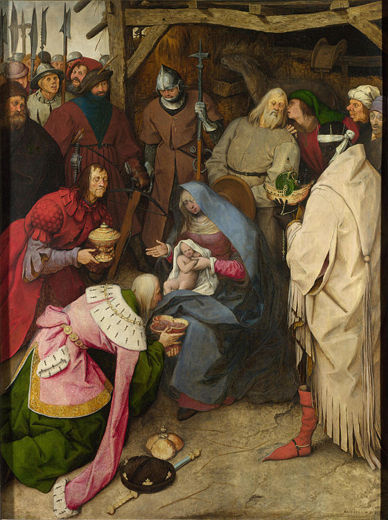 Original – The Adoration of the Kings (1564) by Pieter Bruegel the Elder; A rather unusual take of the Adoration from PBeE. Many of those surrounding Christ—including the Three Kings—are caricatured slightly or shown as a grotesque, and the Virgin is shown naturally and not idealised. The viewpoint is from a slightly elevated position, which has the effect of focussing attention on the Christ figure in the Virgin's lap, which is shown in the exact centre of the painting.
 -
ALT 1: Cropped slightly to remove the frame
_%E2%80%93_cropped.jpg)
- Reason
- Excellent scan of a superb picture
- Articles in which this image appears
- The Adoration of the Kings (Bruegel) + 1
- FP category for this image
- Wikipedia:Featured pictures/Artwork/Paintings
- Creator
- Pieter Bruegel the Elder
- Support as nominator – SchroCat ( talk) 07:17, 5 April 2015 (UTC)
- Comment - Frame should be cropped out. — Crisco 1492 ( talk) 12:00, 5 April 2015 (UTC)
- Support cropped version. Nice. — Crisco 1492 ( talk) 15:05, 5 April 2015 (UTC)
- Support cropped version. Hafspajen ( talk) 06:58, 6 April 2015 (UTC)
- Support cropped version. Nice painting. !__ Alborzagros ( talk) 09:34, 8 April 2015 (UTC)__!
- Support - Jobas ( talk) 01:13, 9 April 2015 (UTC)
Promoted File:Anbetung der Könige (Bruegel, 1564) – cropped.jpg -- Armbrust The Homunculus 07:24, 15 April 2015 (UTC)
Pocket stereoscope
Voting period is over. Please don't add any new votes. Voting period ends on 15 Apr 2015 at 14:11:34 (UTC)

- Reason
- Highly encyclopaedic and good quality depiction of an unusual instrument, which has been illustrating various articles (here and in other wikis) for a long time. It was nominated in May 2013 and failed for half a vote: here
- Articles in which this image appears
- Stereoscope, Stereoscopy, Carl Zeiss AG
- FP category for this image
- Wikipedia:Featured pictures/Engineering and technology/Others
- Creator
- Alvesgaspar ( talk)
- Support as nominator – Alvesgaspar ( talk) 14:11, 5 April 2015 (UTC)
- Comment - Resolution issue is still present. — Crisco 1492 ( talk) 15:02, 5 April 2015 (UTC)
- Yes but somehow mitigated by the age of the photo (and of the camera) and by the closeness to the minimum length of 1500. In fact the total numer of pixels is larger than 1500 X 1500. Alvesgaspar ( talk) 19:43, 5 April 2015 (UTC)
- Fair points, and enough for me. Support. — Crisco 1492 ( talk) 23:37, 5 April 2015 (UTC)
- Support - EV. Bammesk ( talk) 01:05, 8 April 2015 (UTC)
- Support - Jobas ( talk) 01:13, 9 April 2015 (UTC)
- Oppose - The case hasn't been made that the pocket stereoscope is rare enough to justify an exception. Adam Cuerden ( talk) 12:22, 15 April 2015 (UTC)
Not Promoted -- Armbrust The Homunculus 14:12, 15 April 2015 (UTC)
CCSI Airport Visiting Lobby
Voting period is over. Please don't add any new votes. Voting period ends on 15 Apr 2015 at 15:19:00 (UTC)

- Reason
- A super quality picture with a good EV
- Articles in which this image appears
- Chaudhary Charan Singh International Airport
- FP category for this image
- Wikipedia:Featured pictures/Places/Interiors
- Creator
- Benison
- Support as nominator – - The Herald the joy of the LORD my strength 15:19, 5 April 2015 (UTC)
- Support Nice photo. I like the reflections and the lack of people in the foreground. Sharp and crisp.. talk→ WPPilot 19:10, 5 April 2015 (UTC)
- Oppose - I find the darkness of the interior subtracts from the EV. Taken another time with less strong sunlight coming through the windows would have been fine. mustermark 18:38, 8 April 2015 (UTC)
- Support - Jobas ( talk) 01:12, 9 April 2015 (UTC)
- Oppose – Substandard lighting. Totally empty, generic-looking interior lacks informational EV. Sca ( talk) 13:30, 10 April 2015 (UTC)
- Oppose - low EV. Does not provide a good overview of the space, neither of any particular details. Is not clear from the image where the main entry is, or anything else significant. -- ELEKHH T 15:27, 12 April 2015 (UTC)
Not Promoted -- Armbrust The Homunculus 15:31, 15 April 2015 (UTC)
Larabanga Mosque
Voting period is over. Please don't add any new votes. Voting period ends on 15 Apr 2015 at 17:53:18 (UTC)

- Reason
- Very slightly undersized, but also rather unrepresented, which I think makes up for it. Sudanese architecture is gorgeous and relatively unique.
- Articles in which this image appears
- Larabanga Mosque, Sudano-Sahelian architecture, Ghana's material cultural heritage
- FP category for this image
- Wikipedia:Featured pictures/Places/Architecture
- Creator
- Sathyan Velumani
- Support as nominator – Adam Cuerden ( talk) 17:53, 5 April 2015 (UTC)
- Oppose - Composition leaves much to be desired (a bit more to the bottom and the right, for starters). — Crisco 1492 ( talk) 00:45, 6 April 2015 (UTC)
- Comment. It's a shame that this shot isn't slightly wider all round, but for me there are sufficient positive aspects to overcome this objection. 109.153.245.106 ( talk) 21:06, 7 April 2015 (UTC)
- Support - Jobas ( talk) 01:12, 9 April 2015 (UTC)
- Support – Unusual, ergo educational EV. Sca ( talk) 15:39, 9 April 2015 (UTC)
- Support - while it has minor compositional shortcomings as pointed out by Crisco, given the massive under-representation of Africa, its overall EV is very high. -- ELEKHH T 15:20, 12 April 2015 (UTC)
- Support Yann ( talk) 15:37, 14 April 2015 (UTC)
- Oppose I agree that its underrepresented however it wouldn't be difficult to vastly improve on this photo. Composition is poor, and actually I think it could be lit better. Seddon talk 11:11, 15 April 2015 (UTC)
Promoted File:Larabanga Mosque Ghana.jpg -- Armbrust The Homunculus 17:54, 15 April 2015 (UTC)
Miners Hospital Park City Utah
Voting period is over. Please don't add any new votes. Voting period ends on 15 Apr 2015 at 18:44:44 (UTC)

- Reason
- 1904 The Miners Hospital was built for $5,000 raised by Park City locals and the Western Federation of Miners. Six thousand miners are treated for “Miner’s Con”, or silicosis, in the first year. Nice photo of historic location
- Articles in which this image appears
- Park City, Utah
- FP category for this image
- Wikipedia:Featured pictures/Places/Architecture
- Creator
- -- talk→ WPPilot 18:44, 5 April 2015 (UTC)
- Support as nominator – talk→ WPPilot 18:44, 5 April 2015 (UTC)
- Oppose - Building is in the shadows. — Crisco 1492 ( talk) 23:36, 5 April 2015 (UTC)
- Support - Jobas ( talk) 01:12, 9 April 2015 (UTC)
Oppose – This structure isn't representative of Park City (I've been there) as a whole and has little EV.Sca ( talk) 15:37, 9 April 2015 (UTC)
- Comment - @ Sca: I once lived in Park City, for a year and I would have to disagree. It was always the "Historic" building in the town and today serves as a location for the Community Center. Here talk→ WPPilot 05:19, 12 April 2015 (UTC)
Not Promoted -- Armbrust The Homunculus 18:47, 15 April 2015 (UTC)
Hollister Municipal Airport
Voting period is over. Please don't add any new votes. Voting period ends on 15 Apr 2015 at 18:56:13 (UTC)

- Reason
- Perfect photo of this former military base located in Hollister California. This is one of the airports that I flew out of as a student pilot, 25 years ago.
- Articles in which this image appears
- Hollister Municipal Airport - Hollister, California - San Benito County, California
- FP category for this image
- Wikipedia:Featured pictures/Places/Urban
- Creator
- -- talk→ WPPilot 18:56, 5 April 2015 (UTC)
- Support as nominator – talk→ WPPilot 18:56, 5 April 2015 (UTC)
- Support - Very useful. — Crisco 1492 ( talk) 00:52, 6 April 2015 (UTC)
- Comment. Do you know what the blue is? Some kind of crop with blue flowers? It would be interesting to add that information to the caption if it is available. 109.153.245.106 ( talk) 20:57, 7 April 2015 (UTC)
- Support - Jobas ( talk) 01:11, 9 April 2015 (UTC)
OpposeComment – Subject of little EV. Composition unexceptional. Sca ( talk) 15:31, 9 April 2015 (UTC)
- How does an image of an airport have little EV in that airport's article? WP:FP? requires the image have EV in the article, and not that the article meet some random extra notability guideline. — Crisco 1492 ( talk) 12:39, 10 April 2015 (UTC)
- Weak Support I dissagree Sca - not sure what definition of EV you have, but to me this shows perfectly the layout, number of runways, proximity to other urban areas (in this case mostly agricultural), even (just about given the lack of focus) the types of planes that use it, based on the planes on the apron in front of the main hangars... There's even a single prop plane taking off towards the end of the runway... What else could you want from EV?! EV and importance are not the same... As for my weak support, I love it, but the clarity just isn't there sorry - whether this be due to motion blur, engine resonance of the mode of transport being used, or just not quite good enough camera/settings... Shame, but I find the EV high enough to just about support... gazhiley 13:05, 10 April 2015 (UTC)
- I must be visually impaired – I don't see the plane, even at full res.
Oh! There it is, heading leftward – but even at full res it's just tiny. Sca ( talk) 13:20, 10 April 2015 (UTC)
- yeah it's very tiny! I love plane spotting in these sorts of pictures (No I don't hang around at airports it's just in these sort of pictures!) so always look closely... Google Earth is fun for that sort of activity too... gazhiley 10:44, 13 April 2015 (UTC)
- Thank you all for the comments. I have been working in a different plane then I normally fly, it is a pressurized Pilatus PC-12 that, due to the pressurization requirements has super thick windows in the cockpit. Often these windshields turn into yet another lens, and have a light amount of tinting built in, arrgggg. I am trying to deal with it but using my Nikon looks to be mandatory and the little Leica I have done this last set with is struggling. I have a flight tomorrow and plan to use my Nikon and some big glass but this is a ever evolving process, and I do thank all of you for your comments as it does serve to improve my work. @ Gazhiley:, thank you for the support.. talk→ WPPilot 06:25, 11 April 2015 (UTC)
- I must be visually impaired – I don't see the plane, even at full res.

- BTW, as you can see here, the windshield is tinted (green) in the cockpit to protect the pilots from UV light on high altitude operations. It has become tough to overcome this and I am open to any suggestions, I am considering a new plane in the near future [2], that would address any quality concerns. The current nomination photo was taken from around 12,000 feet of altitude inbound to San Jose. talk→ WPPilot 06:37, 11 April 2015 (UTC)
- Support as the image has a good EV and plus a good depiction. - The Herald the joy of the LORD my strength 05:15, 15 April 2015 (UTC)
- Weak support Camera is a bit less than ideal at the necessary shutter speed, but I think the rarity overcomes this. Adam Cuerden ( talk) 12:24, 15 April 2015 (UTC)
Promoted File:Hollister Municipal Airport photo D Ramey Logan.jpg -- Armbrust The Homunculus 18:57, 15 April 2015 (UTC)
Snowbird Upper Middle and Lower Cirque
Voting period is over. Please don't add any new votes. Voting period ends on 15 Apr 2015 at 20:10:49 (UTC)


- Reason
- Wonderful photo of famous ski resorts top peak you can see three skier's on the way down one of the toughest runs on the resort.
- Articles in which this image appears
- Snowbird, Utah
- FP category for this image
- Wikipedia:Featured pictures/Places/Landscapes
- Creator
- -- talk→ WPPilot 20:10, 5 April 2015 (UTC)
- Support as nominator – talk→ WPPilot 20:10, 5 April 2015 (UTC)
- Comment. I think this picture gets a whole lot more interesting when you realise that there are tiny skiing figures on the slope. Trouble is, it's easy to miss these, especially at the small size in the article. Perhaps the caption could highlight this aspect. Also -- and probably I am being too demanding -- it's a shame it isn't just a little sharper. 109.153.245.106 ( talk) 20:51, 7 April 2015 (UTC)
- Support - Jobas ( talk) 01:11, 9 April 2015 (UTC)
- Oppose Not sure if its your camera WPPilot or a setting you use, but once again I find myself dissapointed at the level of clarity and detail in this picture, compared to other pictures nominated here... lovely looking at thumb level, but really blurred when you click on the picture... Sorry... gazhiley 12:47, 10 April 2015 (UTC)
Not Promoted -- Armbrust The Homunculus 20:16, 15 April 2015 (UTC)
Madonna of Loreto
Voting period is over. Please don't add any new votes. Voting period ends on 15 Apr 2015 at 23:33:51 (UTC)

- Reason
- High quality scan of a notable artwork.
- Articles in which this image appears
- Madonna of Loreto (Raphael) +1
- FP category for this image
- Wikipedia:Featured pictures/Artwork/Paintings
- Creator
- Raphael
- Support as nominator – — Crisco 1492 ( talk) 23:33, 5 April 2015 (UTC)
- Support - Hafspajen ( talk) 18:07, 6 April 2015 (UTC)
- Support - Jobas ( talk) 01:11, 9 April 2015 (UTC)
- Support – good quality scan of interesting painting backed up a very reasonable article to provide EV. SagaciousPhil - Chat 15:09, 10 April 2015 (UTC)
- Support Yann ( talk) 12:54, 15 April 2015 (UTC)
Promoted File:Raphaël - La Madone de Lorette - Google Art Project.jpg -- Armbrust The Homunculus 23:36, 15 April 2015 (UTC)
Two panels of earthenware tiles painted with polychrome glazes over a white glaze. (19th)
Voting period is over. Please don't add any new votes. Voting period ends on 16 Apr 2015 at 07:25:26 (UTC)

- Reason
- HQ + EV
- Articles in which this image appears
- Ceramic glaze, Earthenware, Qajar art, Pottery and Tile
- FP category for this image
- Wikipedia:Featured pictures/Artwork/Others
- Creator
- Owji
- Support as nominator – Alborzagros ( talk) 07:25, 6 April 2015 (UTC)
- Support - Crisp quality. Qajar ceramics at its best. Étienne Dolet ( talk) 17:02, 6 April 2015 (UTC)
- Support - Hafspajen ( talk) 15:55, 7 April 2015 (UTC)
- Support - Jobas ( talk) 01:10, 9 April 2015 (UTC)
- Oppose - @ Alborzagros - the nomination is incomplete: missing category and image creator. The caption provides barely enough information and says nothing about the potential EV of the object. With this information I would be inclined to support...-- Godot13 ( talk) 23:22, 12 April 2015 (UTC)
Not Promoted -- Armbrust The Homunculus 09:20, 16 April 2015 (UTC)
- Added missing information after closure. Armbrust The Homunculus 13:04, 16 April 2015 (UTC)
Interior of caponier at Fort de Bois l'Abbé
Voting period is over. Please don't add any new votes. Voting period ends on 16 Apr 2015 at 08:16:24 (UTC)

- Reason
- HQ + EV
- Articles in which this image appears
- Fort de Bois l'Abbé, Caponier, Barrel vault
- FP category for this image
- Wikipedia:Featured pictures/Places/Interiors
- Creator
- ComputerHotline
- Support as nominator – Alborzagros ( talk) 08:16, 6 April 2015 (UTC)
- Conditional support so long as the image remains in Caponier — Crisco 1492 ( talk) 11:38, 6 April 2015 (UTC)
- Support - add that to more articles. Hafspajen ( talk) 11:44, 7 April 2015 (UTC)
- Could you please tell me some examples? I will add it to them. thanks Alborzagros ( talk) 13:56, 8 April 2015 (UTC)
- I meant that added it to Barrel vault, but I guess more places could use it, Stonework maybe? Or the Wall article? Also Stone carving, section Stone shaping and tools. Very nice distinct pattern on those walls. Hafspajen ( talk) 17:14, 8 April 2015 (UTC)
Not Promoted -- Armbrust The Homunculus 11:31, 16 April 2015 (UTC)
- Not enough support for promotion. -- Armbrust The Homunculus 11:31, 16 April 2015 (UTC)
Pampus
Voting period is over. Please don't add any new votes. Voting period ends on 16 Apr 2015 at 07:42:35 (UTC)

- Reason
- HQ + EV
- Articles in which this image appears
- Pampus
- FP category for this image
- Wikipedia:Featured pictures/Places/Architecture
- Creator
- Johan Bakker
- Support as nominator – Alborzagros ( talk) 07:42, 6 April 2015 (UTC)
- Support - Great encyclopedic shot. — Crisco 1492 ( talk) 11:32, 6 April 2015 (UTC)
- Support per Crisco. A tighter crop might be worth experimenting with though. Nick-D ( talk) 11:56, 7 April 2015 (UTC)
- Support - Hafspajen ( talk) 15:54, 7 April 2015 (UTC)
- Support - Jobas ( talk) 01:09, 9 April 2015 (UTC)
- Support Clarity is good, and as far as EV goes I instantly gravitated to the article it is in to find out about it - thus ticks my box there... gazhiley 12:40, 10 April 2015 (UTC)
Promoted File:526452-Fort Pampus.jpg -- Armbrust The Homunculus 11:47, 16 April 2015 (UTC)
View of the 1848 Fête de la Concorde, which Pierre-Victor Galland helped to decorate.
Voting period is over. Please don't add any new votes. Voting period ends on 16 Apr 2015 at 08:32:22 (UTC)

- Reason
- EV + HQ
- Articles in which this image appears
- Fête de la Concorde, Champ de Mars, Pierre-Victor Galland
- FP category for this image
- Wikipedia:Featured pictures/History/Others
- Creator
- Pierre-Victor Galland
- Support as nominator – Alborzagros ( talk) 08:32, 6 April 2015 (UTC)
Support- Wish the main article was better developed, but it looks notable. Good image. — Crisco 1492 ( talk) 11:40, 6 April 2015 (UTC)- Adam's got a good point. — Crisco 1492 ( talk) 16:14, 15 April 2015 (UTC)
- Support - useful. Hafspajen ( talk) 15:53, 7 April 2015 (UTC)
- Support - Jobas ( talk) 01:08, 9 April 2015 (UTC)
- Oppose A badly-done crop. One may use {{ CSS image crop}} in articles; there is no excuse for cropping captions anymore on the image itself. Adam Cuerden ( talk) 12:26, 15 April 2015 (UTC)
Not Promoted -- Armbrust The Homunculus 11:48, 16 April 2015 (UTC)
Portrait of Dom Augusto, Duke of Leuchtenberg
Voting period is over. Please don't add any new votes. Voting period ends on 16 Apr 2015 at 10:30:55 (UTC)

- Reason
- HQ + EV
- Articles in which this image appears
- Auguste de Beauharnais
- FP category for this image
- Wikipedia:Featured pictures/People/Royalty and nobility
- Creator
- G.Dury
- Support as nominator – Alborzagros ( talk) 10:30, 6 April 2015 (UTC)
- Oppose - Blown-out highlights. -- Janke | Talk 15:48, 6 April 2015 (UTC)
- Oppose per Janke. The people at Google appear to have cooked this one a bit too much. — Crisco 1492 ( talk) 23:29, 6 April 2015 (UTC)
Not Promoted -- Armbrust The Homunculus 11:49, 16 April 2015 (UTC)
Gabrielle Cot portrait, daughter of Pierre Auguste Cot by William-Adolphe Bouguereau - 1890
Voting period is over. Please don't add any new votes. Voting period ends on 16 Apr 2015 at 10:49:20 (UTC)

- Reason
- HQ + EV
- Articles in which this image appears
- Gabrielle Cot, William-Adolphe Bouguereau (recently added), Pierre Auguste Cot
- FP category for this image
- Wikipedia:Featured pictures/Artwork/Paintings
- Creator
- William-Adolphe Bouguereau
- Support as nominator – Alborzagros ( talk) 10:49, 6 April 2015 (UTC)
Oppose - We've got tons of Bouguereau already, including several paintings which have their own articles. This doesn't have the necessary EV. — Crisco 1492 ( talk) 11:31, 6 April 2015 (UTC)- Oppose – A pleasant likeness, but I don't see anything particularly notable about it. (If we're going to have more Bouguereau, it should be something more representative (which probably means one of his numerous nudes). Sca ( talk) 13:09, 6 April 2015 (UTC)
- Comment - well, it's his daughter. But do we have a category artist's ... lovers, wifes and such? Hafspajen ( talk) 13:35, 6 April 2015 (UTC)
- Cot's daughter, not Bouguereau's. — Crisco 1492 ( talk) 14:06, 6 April 2015 (UTC)
- Support - because I was thinking - why not. I was now looking at this painting and I think it is a good painting. Bouguereau's nudes are great, and I want more of them. It is one of his not to many portraits, and it has EV in Pierre Auguste Cot. I am not sure we have tons of Bouguereau's either. We have two, File:William-Adolphe Bouguereau (1825-1905) - The Wave (1896).jpg and File:Bouguereau-Linnocence.jpg. Crisco 1492, am I missing something? Hafspajen ( talk) 15:50, 8 April 2015 (UTC)
- OK, that one too, that makes three of him. File:William Bouguereau - Dante and Virgile - Google Art Project 2.jpg Hafspajen ( talk) 16:18, 8 April 2015 (UTC)
- He was not much for painting portaits, Bouguereau, actually. Hafspajen ( talk) 16:10, 8 April 2015 (UTC)
- Is three FPs (two of which have articles) not enough to say "We can show his style pretty well". If the painting had its own article, or Cot's daughter had her own article, I'd change my mind... but if the only EV is "Bouguereau's style!", then we've got that covered. — Crisco 1492 ( talk) 01:07, 9 April 2015 (UTC)
- Groan. I guess I have to write an article on Cot's daughter too. Hafspajen ( talk) 06:08, 9 April 2015 (UTC)
- Crisco 1492, there was an article on her, it is a blue link, can you show me what was in it? There was text in it too. Hafspajen ( talk) 06:11, 9 April 2015 (UTC)
- Nothing, it was created as a redirect. — Crisco 1492 ( talk) 07:53, 9 April 2015 (UTC)
- OK, User:Hafspajen/ Gabrielle Cot .... Hafspajen ( talk) 17:48, 9 April 2015 (UTC)
- Support - Jobas ( talk) 01:08, 9 April 2015 (UTC)
- Support - Now that there's an article on the painting. — Crisco 1492 ( talk) 23:50, 9 April 2015 (UTC)
- Support - Charming painting, good scan with EV now provided by short article. SagaciousPhil - Chat 06:20, 11 April 2015 (UTC)
- Support Yann ( talk) 21:11, 15 April 2015 (UTC)
Promoted File:William-Adolphe Bouguereau - Gabrielle Cot - Sotheby's.jpg -- Armbrust The Homunculus 11:50, 16 April 2015 (UTC)
Dutch men-o'-war and other shipping in a calm
Voting period is over. Please don't add any new votes. Voting period ends on 16 Apr 2015 at 11:19:58 (UTC)

- Reason
- EV + HQ
- Articles in which this image appears
- Willem van de Velde the Younger
- FP category for this image
- Wikipedia:Featured pictures/Artwork/Paintings
- Creator
- Willem van de Velde the Younger
- Support as nominator – Alborzagros ( talk) 11:19, 6 April 2015 (UTC)
- Support – Reasonably interesting 17th C. nautical scene, moderate EV.
- Note: Dutch title is Hollandse schepen op een kalme zee – "Dutch ships on a calm sea." Suggest adding word "sea" to title, changing "in" to "on."
- Sca ( talk) 13:00, 6 April 2015 (UTC)
- Support - Jobas ( talk) 01:07, 9 April 2015 (UTC)
- Support Lots of lovely details. Adam Cuerden ( talk) 12:29, 15 April 2015 (UTC)
- Support Yann ( talk) 21:09, 15 April 2015 (UTC)
Promoted File:Willem van de Velde II - Dutch men-o'-war and other shipping in a calm.jpg -- Armbrust The Homunculus 11:51, 16 April 2015 (UTC)
Mir Castle Complex in Belarus
Voting period is over. Please don't add any new votes. Voting period ends on 16 Apr 2015 at 11:34:42 (UTC)

- Reason
- EV + HQ
- Articles in which this image appears
- Mir Castle Complex
- FP category for this image
- Wikipedia:Featured pictures/Places/Architecture
- Creator
- Вадзім Новикаў
- Support as nominator – Alborzagros ( talk) 11:34, 6 April 2015 (UTC)
- Oppose - Foreground is distracting. — Crisco 1492 ( talk) 11:45, 6 April 2015 (UTC)
- Support - Other than cutting the grass, how would you eliminate it in order to get this shot of the castle? Don't you think this is a good shot of the castle? It gets all the parts of it into one picture, and it's quite clear. CorinneSD ( talk) 03:18, 7 April 2015 (UTC)
- You move about a meter forward, then you make a panoramic image. It's really simple. — Crisco 1492 ( talk) 05:39, 7 April 2015 (UTC)
- Support - Jobas ( talk) 01:07, 9 April 2015 (UTC)
- Comment - Crisco, thank you for explaining how a better photo could be taken. I'm puzzled, though. Do featured pictures have to be nearly perfect photos – the kind that would win first, second, and third prize in photo contests – or can they just be really good photos such as this one? - CorinneSD ( talk) 01:16, 9 April 2015 (UTC)
- Not necessarily "nearly perfect", but they should show the subject well. For me, at least, having part of the foreground covered in foliage is distracting. The Commons nomination had some people bring it up too, though not to the point of opposing. — Crisco 1492 ( talk) 01:20, 9 April 2015 (UTC)
- I didn't even know images went through a similar process on Commons. Must all images that are now on Commons be promoted as featured pictures? Also, if they are approved for featured picture status on Commons, why do they have to be approved on WP? - CorinneSD ( talk) 01:23, 9 April 2015 (UTC)
- No CorinneSD, two very different processes. Quite often those that pass on Commons end up here, but the criteria is different, so not all pass... But it's a good place to look as they tend to go there first, so a lot of discussion has taken place... But they do need to be approved here seperatly due to the different purposes of each "forum"... Does that help? gazhiley 12:26, 10 April 2015 (UTC)
- Or come here first, then go there. In terms of technical demands, Commons is sometimes the more challenging, but what gets a lot of supports on Commons may not get any support here if it's not used well. — Crisco 1492 ( talk) 13:07, 10 April 2015 (UTC)
- Thank you both for your comments and explanations. If I understand correctly, how the image is used in articles in WP, that is, how they contribute to our understanding of a subject – encyclopedic value – is very important here, and more important than on Commons. CorinneSD ( talk) 15:03, 10 April 2015 (UTC)
- Tis my understanding yes... Commons seems to be more about the technical quality than anything else, whereas FP is more about whether or not there is a place for it in an Encyclopedia, and if it is the highest standard picture we can get of that subject... gazhiley 15:58, 13 April 2015 (UTC)
- Oppose Agree with Crisco. Alternative to moving forward and doing a panorama, the photographer could just take a slightly higher picture... Off the back of a car, or on a stepladder or the suchlike... gazhiley 12:45, 10 April 2015 (UTC)
- Oppose – Per Crisco. Sca ( talk) 12:58, 10 April 2015 (UTC)
Not Promoted -- Armbrust The Homunculus 11:52, 16 April 2015 (UTC)
Saint Gaudioso
Voting period is over. Please don't add any new votes. Voting period ends on 16 Apr 2015 at 17:55:25 (UTC)

- Reason
- Great scan of excellent picture
- Articles in which this image appears
- Gaudentius of Brescia, Romanino
- FP category for this image
- Wikipedia:Featured pictures/People/Religious figures
- Creator
- Girolamo Romanino
- Support as nominator – SchroCat ( talk) 17:55, 6 April 2015 (UTC)
- Support – He looks weighed down by a lot of responsibility. Just wondering: do you think the original colors were brighter? It looks a little dull now. – CorinneSD ( talk) 19:06, 6 April 2015 (UTC)
- Oppose. This is not a painting by Gaudiosus of Naples- it's a painting of Gaudiousus of Naples. More precisely, it's what someone who lived centuries after his death imagined he would look like. This is not at all useful as a likeness, which is how it is currently used. Josh Milburn ( talk) 22:43, 6 April 2015 (UTC)
- The history of Western portrait art can be pretty much summed up by Blackadder, "painted to a romantic ideal rather than the true depiction of the idiosyncratic facial qualities of the person in question", so we could question many of the portraits that end up featured. Everything with Christ in, for example... – SchroCat ( talk) 22:50, 6 April 2015 (UTC)
- I think you have missed my point. This image is not being used as a reproduction of a painting or an example of a particular style of artwork (as any FP featuring Christ will be) but as an illustration of Gaudiosus. Were this image being used to illustrate an article about Renaissance views of historical bishops, or as an example of a painter's work/style, or in an article about the painting itself we would not be having this conversation. As it is, the image is being used apparently simply as a likeness for the subject, and, for that, it is ill-suited. Josh Milburn ( talk) 23:17, 6 April 2015 (UTC)
- Comment But nobody knows how Hamlet, Ophelia, Jesus, Nicodemus, Augustinus, St. Peter, or even Robin Hood looked - and still they are depicted. This guy is from the 5th century... It is impossible to ask for a real likeness. I really can't notice any point in this opposition. The art of depiction in the 5th century - was not in such state that it would have been any good for depicting any real likeness. Hafspajen ( talk) 01:19, 7 April 2015 (UTC)
- Other guys from that period were: Augustine of Hippo - nobody has the faintest idea how he looked, really. Hypatia - same there, and all the rest from that period, Saint Patrick, Pelagius, Attila the Hun ... we just don't KNOW how they looked. And still we depict them... And use them in articles. Hafspajen ( talk) 01:34, 7 April 2015 (UTC)
- Also. Even if even if Romanino's article (Girolamo Romani (c. 1485 – c. 1566) - currently is badly illustrated, he is a rather well known Italian High Renaissance painter - and he is good. The above reasoning could have possibly occurred if somebody asked for featuring a Bible-card or random Bible illustration, but Romanino, who is an artist of his own right. You don't get the Interpol to go find a stolen painting if it is not an important artist's painting. Hafspajen ( talk) 01:54, 7 April 2015 (UTC)
- I'm slightly mystified by this response. No, we don't know what Hamlet looked like, and no, I wouldn't support promoting a painting of him presented as a likeness, either. And yes, we do use "likenesses" in these articles (though it's an open question as to whether we should- I think I recall Ealdgyth getting annoyed about this at one point) but "we use type x pictures in articles" is very different from "we should be promoting type x pictures to FP status". I remain unconvinced about the EV of this image. Josh Milburn ( talk) 17:20, 7 April 2015 (UTC)
- Yes, I get annoyed when folks use non-contemporary images for medieval (or earlier) subjects - especially (as in this case) when it's not made clear that it is not at all contemporary. There is no caption in the biography article - which is misleading the readers. Quite honestly, it should be removed from that article - as it's not at all useful. We'd be better off running a cartoon image ... that way readers wouldn't assume that the depiction is accurate, which they probably do now given there is no disclaimer. I see it was added just on 7 April 2015. I was tempted to remove it, but instead put in a caption. Ealdgyth - Talk 17:29, 7 April 2015 (UTC)
- And I am not with you two here. The painting is in the church, on the high altar, where he was a bishop, in the very church, where he is buried in Brescia. He was an Italan bishop. It is also an artwork of a well know artist. Hafspajen ( talk) 12:45, 8 April 2015 (UTC)
- You're not getting the point ... it's not about whether or not it is supposed to depict the subject of the article. It is that it was placed in the article with no caption pointing out that it is not at all likeness of the individual. Without that context, it's misleading. And it's just a pretty decoration without any real accuracy - the vestments depicted would not be correct for the actual period that the person was bishop. Historical writing has gotten away from using non-contemporary depictions for medieval and ancient subjects because it gives the wrong impression. The work was painted 1000 years AFTER the bishop lived. There is no way it can be considered historically accurate and not making that clear to the readers is being misleading. Ealdgyth - Talk 12:53, 8 April 2015 (UTC)
- Sorry, but You're not getting the point ... This is not photography, but art history. Are you familiar with art, art history and such? Nobody would ever start considering an artwork like this historically accurate. Nobody ever said it was either. Hafspajen ( talk) 12:59, 8 April 2015 (UTC)
- I'm not objecting to it's use in the article on the painter or in an article on the town or church. But using it on the article about the bishop turns it into history, not art history. It really does not belong in the bishop's article, but at the very least it should have a good caption that explains that it's not contemporary. When this FPC was started ... the bishop's article did not have that. I'm hoping that all future such uses will have the proper context given - that's my point. Or better yet, don't place a non-contemporary image into a medieval or ancient history biography article just for decorative purposes. Ealdgyth - Talk 13:16, 8 April 2015 (UTC)
- I think it can very well illustrate the article, as you did, adding: 16th century depiction. Hafspajen ( talk) 13:55, 8 April 2015 (UTC)
- Also there is a wast amount of artwork on different themes that is part of our cultural human heritage, and it only shows that the theme they are illustrating is interesting, is a living, actual theme - that preoccupies people and they are still keep on depicting it, adding additional information and things that comes from them, from their time. It is certainly not a reason to oppose a nomination. Hafspajen ( talk) 14:02, 8 April 2015 (UTC)
- No one is opposing this nomination because there is "a [vast] amount of artwork on different themes". Josh Milburn ( talk) 14:33, 8 April 2015 (UTC)
- One can't really judge artwork like this, if they are depicting enough likeness or not. How about Picasso, Mondrian, Matisse? Those artist's works bear with almost no likeness with depicted persons or even objects. One have to be careful about what criteria is risen. Art is not really about photographic likeness at all. Hafspajen ( talk) 10:22, 9 April 2015 (UTC)
- Hafspajen, I think that's a little patronising. I agree fully with Ealdgyth. The picture is in use in a biography, not an article about art history. I am not going to judge it for its contribution to art history, but nor am I going to judge it as a photograph. I'm going to judge its effectiveness as a portrait of a real person. How are you judging it? Because, as far as I can see, it doesn't have much to do with how it's actually used, and that's what we're meant to be judging. Also (and I'm disengaging after this- if you still don't get it, I give up), "Nobody would ever start considering an artwork like this historically accurate. Nobody ever said it was either." I disagree. A lot of people are going to assume at a glance that this is historically accurate, and when it's placed in the lead in the way that it was (and, arguably, the way it now is), it is presented as historically accurate. Josh Milburn ( talk) 14:33, 8 April 2015 (UTC)
- Support - also, fixed his article. ( Romanino's *) Hafspajen ( talk) 02:15, 7 April 2015 (UTC)
- Support - Jobas ( talk) 01:07, 9 April 2015 (UTC)
- Comment – Sorry, but as either art or portraiture, strikes me as bland, humdrum. Granted, it's 16th C., but still.... Sca ( talk) 12:54, 10 April 2015 (UTC)
Not Promoted -- Armbrust The Homunculus 18:25, 16 April 2015 (UTC)
Yacine Brahimi
Voting period is over. Please don't add any new votes. Voting period ends on 16 Apr 2015 at 23:45:48 (UTC)
_face_%C3%A0_Taron_Voskanyan_(Arm).jpg)
- Reason
- High quality sports picture; a nice action shot.
- Articles in which this image appears
- Yacine Brahimi
- FP category for this image
- Wikipedia:Featured pictures/People/Sport
- Creator
- Clément Bucco-Lechat
- Support as nominator – — Crisco 1492 ( talk) 23:45, 6 April 2015 (UTC)
- Support - Jobas ( talk) 01:06, 9 April 2015 (UTC)
- Support - useful... Hafspajen ( talk) 06:06, 9 April 2015 (UTC)
- Support - Blacknclick ( talk) 09:50, 9 April 2015 (UTC)
- Oppose - Sorry, at first glance I can't tell which of the two players is Yacine Brahimi. The places the EV into question.
Étienne Dolet (
talk) 03:58, 10 April 2015 (UTC)
- This image is not to identify him (there's a lead image that does that), but to show him in action. If one's already seen the lead image, it's rather hard to mistake him for Taron Voskanyan. — Crisco 1492 ( talk) 05:02, 10 April 2015 (UTC)
- Crisco 1492, but this photograph has a chance of going on the main page. What happens then?
Étienne Dolet (
talk) 05:05, 10 April 2015 (UTC)
- There is always a description following - on can say, he in the green equipment. Hafspajen ( talk) 10:56, 10 April 2015 (UTC)
- Or, as done here: "right". Simple. — Crisco 1492 ( talk) 11:30, 10 April 2015 (UTC)
- Also, images are not supposed to be judged based on their encyclopedic value on the main page, but in the articles in which they are used. See WP:FP? — Crisco 1492 ( talk) 11:31, 10 April 2015 (UTC)
-
WP:FP? makes it clear: Its main subject is in focus, it has good composition and has no highly distracting or obstructing elements. I happen to find Taron Voskanyan the distracting element in this photograph.
Étienne Dolet (
talk) 18:06, 10 April 2015 (UTC)
- Oh, what now. I don't realy find Taron Voskanyan distracting ... The are rater well coordinated. Hafspajen ( talk) 20:19, 10 April 2015 (UTC)
- I agree with Haffy. If one is on the attack in football, are we to expect nobody to try and defend? — Crisco 1492 ( talk) 14:19, 11 April 2015 (UTC)
- Crisco 1492, but this photograph has a chance of going on the main page. What happens then?
Étienne Dolet (
talk) 05:05, 10 April 2015 (UTC)
- Support - EV + HQ Alborzagros ( talk) 05:24, 12 April 2015 (UTC)
- Support I have to agree with Crisco 1492 here - having the other player in shot trying to tackle him only adds to the picture for me - more natural setting... gazhiley 15:56, 13 April 2015 (UTC)
- Support This is a striking and professional quality sports photo with excellent EV Nick-D ( talk) 11:36, 14 April 2015 (UTC)
Promoted File:Algérie - Arménie - 20140531 - Yacine Brahimi (Alg) face à Taron Voskanyan (Arm).jpg -- Armbrust The Homunculus 23:46, 16 April 2015 (UTC)
Evert Collier's painting Vanitas, candlestick, musical instruments, Dutch books, a writing set, an astrological and a terrestrial globe, all on a draped table
Voting period is over. Please don't add any new votes. Voting period ends on 17 Apr 2015 at 04:32:59 (UTC)

- Reason
- HQ + EV
- Articles in which this image appears
- Evert Collier
- FP category for this image
- Wikipedia:Featured pictures/Artwork/Paintings
- Creator
- Evert Collier
- Support as nominator – Alborzagros ( talk) 04:32, 7 April 2015 (UTC)
- Please disambiguate the Collier link. — Crisco 1492 ( talk) 05:39, 7 April 2015 (UTC)
- done_ Alborzagros ( talk) 07:40, 7 April 2015 (UTC)
- Weak support - Looks to have okay EV for the artist's article, but considering how many high quality scans of paintings out there, 1500px is a bit small. — Crisco 1492 ( talk) 23:49, 7 April 2015 (UTC)
- Support - it is a nice painting. Interesting with the different scripts. Hafspajen ( talk) 12:36, 8 April 2015 (UTC)
- Support - Jobas ( talk) 01:05, 9 April 2015 (UTC)
Not Promoted -- Armbrust The Homunculus 06:29, 17 April 2015 (UTC)
Battle of Scheveningen by Jan Abrahamsz Beerstraaten - between 1653 and 1666
Voting period is over. Please don't add any new votes. Voting period ends on 17 Apr 2015 at 04:48:08 (UTC)
(Jan_Abrahamsz._Beerstraten).jpg)
- Reason
- HQ + EV
- Articles in which this image appears
- Jan Abrahamsz Beerstraaten + Battle of Scheveningen (RECENTLY ADDED)
- FP category for this image
- Wikipedia:Featured pictures/History/War
- Creator
- Jan Abrahamsz Beerstraaten
- Support as nominator – Alborzagros ( talk) 04:48, 7 April 2015 (UTC)
- Conditional support - if this image replaces File:Beerstraaten, Battle of Scheveningen.jpg in usage. — Crisco 1492 ( talk) 05:38, 7 April 2015 (UTC)
- Done- Alborzagros ( talk) 07:58, 7 April 2015 (UTC)
- Support - Hafspajen ( talk) 09:14, 8 April 2015 (UTC)
- Support - Jobas ( talk) 01:05, 9 April 2015 (UTC)
- Support – SchroCat ( talk) 21:37, 9 April 2015 (UTC)
- Comment - Category?-- Godot13 ( talk) 00:38, 10 April 2015 (UTC)
- Comment – Busy. Sca ( talk) 12:48, 10 April 2015 (UTC)
- Support Yann ( talk) 21:00, 15 April 2015 (UTC)
Promoted File:Battle of Scheveningen (Slag bij Ter Heijde)(Jan Abrahamsz. Beerstraten).jpg -- Armbrust The Homunculus 06:30, 17 April 2015 (UTC)
Safdarjung's Tomb
Voting period is over. Please don't add any new votes. Voting period ends on 17 Apr 2015 at 05:47:45 (UTC)

- Reason
- High quality isometric picture
- Articles in which this image appears
- Tomb of Safdarjung
- FP category for this image
- Wikipedia:Featured pictures/Places/Architecture
- Creator
- Anthropoligist
- Support as nominator – RRD13 দেবজ্যোতি ( talk) 05:47, 7 April 2015 (UTC)
- Oppose - Overexposed. Blown highlights throughout the sky. — Crisco 1492 ( talk) 05:53, 7 April 2015 (UTC)
- Comment – Interesting architecture, but I'm not wild about the corner-centered isometric view. Sca ( talk) 13:35, 7 April 2015 (UTC)
- I agree. The extreme perspective spoils it for me. 109.153.245.106 ( talk) 20:45, 7 April 2015 (UTC)
Not Promoted -- Armbrust The Homunculus 06:30, 17 April 2015 (UTC)
Amur leopard
Voting period is over. Please don't add any new votes. Voting period ends on 17 Apr 2015 at 07:15:56 (UTC)
.jpg)
- Reason
- High resolution, good quality picture with high EV of an Amur leopard showing the entire body; being critically endangered, captive pictures are often the best available.
- Articles in which this image appears
- Amur leopard
- FP category for this image
- Wikipedia:Featured pictures/Animals/Mammals
- Creator
- William Warby
- Support as nominator – — Bruce1ee talk 07:15, 7 April 2015 (UTC)
- Comment – Beautiful animal, but to my eye backlighting in this view impairs contrast with background. Sca ( talk) 13:31, 7 April 2015 (UTC)
- Support - Jobas ( talk) 01:04, 9 April 2015 (UTC)
- Support: Fylbecatulous talk 22:10, 10 April 2015 (UTC)
- Oppose Something seems wrong with this photo. The animal looks sharp, but the background is awfully blurry. Did someone Photoshop the animal into this scene, or is there some photography technique that would allow a photographer to get a sharp main subject while having the background look so bad? This isn't bokeh, it's just plain bad. -- Pine ✉ 02:18, 15 April 2015 (UTC)
- Oppose I agree with Pine. Distracting background and to be honest the lighting isn't particularly great. Seddon talk 10:47, 15 April 2015 (UTC)
Not Promoted -- — Crisco 1492 ( talk) 07:29, 17 April 2015 (UTC)
Perseus and Andromeda
Voting period is over. Please don't add any new votes. Voting period ends on 17 Apr 2015 at 13:43:22 (UTC)

- Reason
- Good scan, own article. EV + dramatic, masterful depiction by a good artist. Andromeda's stupid, arrogant and evil mother was showing off and claiming she was more beautiful than the sea nymphs. Their father, the God of sea, has decided to send a sea monster to haunt her kingdom as a divine punishment for her pomposity. The Queen and King then decided to sacrifice their daughter - instead of saying sorry, I was an idiot. Andromeda was tied by the sea at the rocks, in chains, to be murdered by the monster.
- Articles in which this image appears
- Perseus and Andromeda (Leighton) - Andromeda (mythology), Frederic Leighton, 1st Baron Leighton, Walker Art Gallery
- FP category for this image
- Wikipedia:Featured pictures/Artwork/Paintings
- Creator
- Lord Frederic Leighton
- Support as nominator – Hafspajen ( talk) 13:43, 7 April 2015 (UTC)
- Support Wowish, never seen this before. Brandmeister talk 18:51, 7 April 2015 (UTC)
- Support - Very nice image. — Crisco 1492 ( talk) 23:40, 7 April 2015 (UTC)
- Support - No need to say why, because reasons are clear. As Persians ( Persian: ناگفته پیداست) say «That is shown without saying». Alborzagros ( talk) 14:04, 8 April 2015 (UTC)
- Support-Great image!-- Godot13 ( talk) 22:59, 8 April 2015 (UTC)
- Support - Jobas ( talk) 01:02, 9 April 2015 (UTC)
- Support New one for me...and such detail.-- Mark Miller ( talk) 09:25, 9 April 2015 (UTC)
- Support Yann ( talk) 12:49, 15 April 2015 (UTC)
Promoted File:Frederic, Lord Leighton - Perseus and Andromeda - Google Art Project.jpg -- Armbrust The Homunculus 14:10, 17 April 2015 (UTC)
Justice H. L. Dattu
Voting period is over. Please don't add any new votes. Voting period ends on 17 Apr 2015 at 17:52:41 (UTC)

- Reason
- One of the good photograph available out of very few. Quality and the framing is good. A bit noisy but still I feel its meeting Wiki FP criteria. Moreover, it is very difficult to get the Judge's photos since they are very limited to public functions. Apart from all these, Judicial Head of the Country will have tight security, therefore it will be noway possible to take a close up shot like this unless the photographer is representing a media or an official shoot. I think, the reasoning will be considered while voting.
- Articles in which this image appears
- H. L. Dattu, Chief Justice of India
- FP category for this image
- Wikipedia:Featured pictures/People
- Creator
- Prathyush Thomas
- Support as nominator – Blacknclick ( talk) 17:52, 7 April 2015 (UTC)
- Oppose - Subject's face looks OOF; artificial background is distracting. — Crisco 1492 ( talk) 23:46, 7 April 2015 (UTC)
- Oppose - Looking at his left ear and shoulder, it looks like he's been cut out. And I wouldn't go for that background colour either. mustermark 18:22, 8 April 2015 (UTC)
- Support -
Jobas (
talk) 01:02, 9 April 2015 (UTC)
- It not artificial background. Something was written over there, I have removed it but did not change the background color. Blacknclick ( talk) 07:13, 9 April 2015 (UTC)
- Oppose - background noise, cropping issues (unless his left ear is naturally deformed), soft focus on his face, mustache and hair out of focus, and a problematic background color. Sorry...-- Godot13 ( talk) 00:28, 10 April 2015 (UTC)
- Oppose – Garish background does not comport with subject's high position in Indian justice system (although it complements his tie!). Sca ( talk) 12:45, 10 April 2015 (UTC)
Not Promoted -- Armbrust The Homunculus 17:54, 17 April 2015 (UTC)
Baturraden
Voting period is over. Please don't add any new votes. Voting period ends on 17 Apr 2015 at 23:42:09 (UTC)

- Reason
- High quality image, very attractive and encyclopedic
- Articles in which this image appears
- Baturraden
- FP category for this image
- Wikipedia:Featured pictures/Places/Landscapes
- Creator
- Chris Woodrich
- Support as nominator – — Crisco 1492 ( talk) 23:42, 7 April 2015 (UTC)
- Support Godhulii 1985 ( talk) 15:22, 8 April 2015 (UTC)
- Support - Jobas ( talk) 01:01, 9 April 2015 (UTC)
Weak Support Stunning colours, but depth of focus isn't great - a lot of blur or noisy edges... But not enough for me to oppose... gazhiley 12:39, 10 April 2015 (UTC)Where do you see blur? — Crisco 1492 ( talk) 13:27, 10 April 2015 (UTC)Maybe blur is a strong word... Lack of detail maybe - very soft... Can't see as much detail as I'd expect from a picture this size... I agree the saturation could be knocked down a bit - that may be part of the issue... Only minor issue anyway, hence still supporting... gazhiley 15:51, 13 April 2015 (UTC)- Changing my vote to full Support as new version seems to have made the picture clearer - maybe my eyes were not coping with the brightness before! gazhiley 14:01, 15 April 2015 (UTC)
- Comment It looks oversaturated to me. -
Blieusong (
talk) 07:26, 12 April 2015 (UTC)
- Saturation is actually down by five, but I can drop it further if everyone agrees. — Crisco 1492 ( talk) 07:48, 12 April 2015 (UTC)
- Support- great colors (but I wouldn't mind seeing the saturation slightly tweaked).--
Godot13 (
talk) 04:21, 13 April 2015 (UTC)
- If my internet at home gets fixed I'll do it. It up and went kaput yesterday. —
Crisco 1492 (
talk) 09:56, 13 April 2015 (UTC)
- Done. — Crisco 1492 ( talk) 02:48, 14 April 2015 (UTC)
- If my internet at home gets fixed I'll do it. It up and went kaput yesterday. —
Crisco 1492 (
talk) 09:56, 13 April 2015 (UTC)
- Support Wikimania 2017 should be here. --
Pine
✉ 02:20, 15 April 2015 (UTC)
- The internet connection would be a deal breaker, sadly. — Crisco 1492 ( talk) 06:17, 15 April 2015 (UTC)
Promoted File:Baturraden overview from ridge, Purwokerto, 2015-03-23.jpg -- Armbrust The Homunculus 00:47, 18 April 2015 (UTC)
- Added to Wikipedia:Featured pictures/Places/Panorama instead. Armbrust The Homunculus 00:47, 18 April 2015 (UTC)
View from Glacier Point looking towards Half Dome
Voting period is over. Please don't add any new votes. Voting period ends on 18 Apr 2015 at 06:08:55 (UTC)

- Reason
- EV + HQ
- Articles in which this image appears
- Yosemite National Park and Glacier Point
- FP category for this image
- Wikipedia:Featured pictures/Places/Panorama
- Creator
- Ðiliff
- Support as nominator – Alborzagros ( talk) 06:08, 8 April 2015 (UTC)
- Support WOW. Amazing clarity... Excellent... Alborzagros please update the title, reason field and Catagory when you get a chance please. gazhiley 12:05, 8 April 2015 (UTC)
- Support A fine image. If I was being picky though I'd say that there's a visible fringe running the length of the skyline which it wouldn't hurt to remove. mustermark 18:16, 8 April 2015 (UTC)
- Support - Jobas ( talk) 22:25, 8 April 2015 (UTC)
- Support - Stunning --- Godot13 ( talk) 22:54, 8 April 2015 (UTC)
- Support - Hafspajen ( talk) 06:04, 9 April 2015 (UTC)
- Support - Yes...please.-- Mark Miller ( talk) 09:23, 9 April 2015 (UTC)
Promoted File:Glacier Point at Sunset, Yosemite NP, CA, US - Diliff.jpg -- Armbrust The Homunculus 06:48, 18 April 2015 (UTC)
Herjangsfjord in the foreground and Ofotfjord in the background, pictured from the north side.
Voting period is over. Please don't add any new votes. Voting period ends on 18 Apr 2015 at 06:39:57 (UTC)

_-_The_Wave_(1896).jpg)
(Jan_Abrahamsz._Beerstraten).jpg)
(Jan_Abrahamsz._Beerstraten).jpg&action=edit§ion=T-1)
- Reason
- HQ + EV
- Articles in which this image appears
- Ofotfjord and Herjangsfjord
- FP category for this image
- Wikipedia:Featured pictures/Places/Panorama
- Creator
- Ximonic
- Support as nominator – Alborzagros ( talk) 06:39, 8 April 2015 (UTC)
- Support — Crisco 1492 ( talk) 07:09, 8 April 2015 (UTC)
- Comment – Love glorious Norwegian fjord scenery, but something about this shot underwhelms. The unremarkable autumnal foreground is prominent, while the stupendous mtn. background is only hazily visible under lowering skies in the distance. Sca ( talk) 13:57, 8 April 2015 (UTC)
- Why autumnal foreground is unremarkable? It gives the picture more beauty. Alborzagros ( talk) 14:22, 8 April 2015 (UTC)
-
- You can see Golden autumnal trees anywhere but these trees give the picture more beauty next to mountain in the back. Alborzagros ( talk) 06:28, 9 April 2015 (UTC)
- Support - Jobas ( talk) 22:22, 8 April 2015 (UTC)
- Oppose Although the creator has done a fine job of removing fringes, there is still work to be done in terms of IQ. Specifically my problem is the large amount of noise in the sky. I am not sure why there is so much noise at ISO 100 on a fairly decent camera. mustermark 18:09, 8 April 2015 (UTC)
- Usually postprocessing, to save highlights. — Crisco 1492 ( talk) 01:04, 9 April 2015 (UTC)
- Comment-Category? -- Godot13 ( talk) 00:36, 10 April 2015 (UTC)
- Support Yann ( talk) 12:47, 15 April 2015 (UTC)
Not Promoted -- Armbrust The Homunculus 06:52, 18 April 2015 (UTC)
Citrus swallowtail caterpillar (Papilio demodocus) at Stratford Butterfly Farm
.jpg)
.jpg&action=edit§ion=T-1)
Voting period is over. Please don't add any new votes. Voting period ends on 18 Apr 2015 at 07:01:06 (UTC)
.jpg)
- Reason
- EV + HQ
- Articles in which this image appears
- Papilio demodocus
- FP category for this image
- Wikipedia:Featured pictures/Animals/Insects
- Creator
- William Warby
- Support as nominator – Alborzagros ( talk) 07:01, 8 April 2015 (UTC)
- Support — Bruce1ee talk 07:30, 8 April 2015 (UTC)
- Support - Jobas ( talk) 22:13, 8 April 2015 (UTC)
- Support - Blacknclick ( talk) 09:50, 9 April 2015 (UTC)
Comment - Category?— Preceding unsigned comment added by Godot13 ( talk • contribs) 00:31, 10 April 2015 UTC
Promoted File:Papilio demodocus larva Stratford Butterfly Farm (1).jpg -- Armbrust The Homunculus 07:03, 18 April 2015 (UTC)
Mungo Park cover 1859
Voting period is over. Please don't add any new votes. Voting period ends on 18 Apr 2015 at 13:50:22 (UTC)

- Reason
- EV + HQ
- Articles in which this image appears
- Mungo Park (explorer)
- FP category for this image
- Wikipedia:Featured pictures/Artwork/Literary illustrations
- Creator
- N/A
- Support as nominator – Alborzagros ( talk) 13:50, 8 April 2015 (UTC)
- Comment – I'm torn. Some historical interest & EV; OTOH, some of our English-WP readers be put off by the German text – and Mungo Park wasn't German. (I say this even tho I know German.) Sca ( talk) 15:25, 9 April 2015 (UTC)
- Comment-Category, creator?-- Godot13 ( talk) 00:35, 10 April 2015 (UTC)
- Comment Who's the actual author? If it's by Mungo Park himself, that ups the EV a lot more than if it's a simple text that includes him (and may not be illustrating him on the cover). Bit on the small side, but, given it seems to capture the detail well, I can overlook that. Frankly, I think it'd have far higher encyclopedic value (EV) if we had any information about the book: At the moment, the claim to EV is that it mentions Mungo Park in the text on the cover - not a very high claim, when we don't know much about the significance of the book. Adam Cuerden ( talk) 15:27, 15 April 2015 (UTC)
Not Promoted -- Armbrust The Homunculus 13:52, 18 April 2015 (UTC)
- The book was written by Eduard Schauenburg, BTW. Armbrust The Homunculus 13:52, 18 April 2015 (UTC)
The Trinity and Mystic Pietà
Voting period is over. Please don't add any new votes. Voting period ends on 18 Apr 2015 at 13:54:54 (UTC)

- Reason
- Excellent scan of a superb painting
- Articles in which this image appears
- The Trinity and Mystic Pietà, Hans Baldung
- FP category for this image
- Wikipedia:Featured pictures/Artwork/Paintings
- Creator
- Hans Baldung
- Support as nominator – SchroCat ( talk) 13:54, 8 April 2015 (UTC)
- Support - great artwork. Hafspajen ( talk) 14:23, 8 April 2015 (UTC)
- Support - Jobas ( talk) 22:09, 8 April 2015 (UTC)
- Support - Great scan! — Crisco 1492 ( talk) 23:57, 8 April 2015 (UTC)
- Support yup, excellent image.♦ Dr. Blofeld 07:50, 9 April 2015 (UTC)
Promoted File:Hans Baldung Grien - The Trinity and Mystic Pietà - Google Art Project.jpg -- Armbrust The Homunculus 13:55, 18 April 2015 (UTC)
NH 28
Voting period is over. Please don't add any new votes. Voting period ends on 28 Apr 2015 at 10:00:37 (UTC)

- Reason
- A quality image with a good EV
- Articles in which this image appears
- NH 28
- FP category for this image
- Wikipedia:Featured pictures/Places/Urban
- Creator
- Benison
- Support as nominator – - The Herald the joy of the LORD my strength 10:00, 18 April 2015 (UTC)
- Oppose No EV and quality. the picture is too dark too be FP.- Alborzagros ( talk) 10:06, 18 April 2015 (UTC)-
 Done Fixed lighting and shades. With EV, I can't see why you said so? Its used in the article and demonstrate the article clearly. -
The Herald
the joy of the LORD
my strength 10:26, 18 April 2015 (UTC)
Done Fixed lighting and shades. With EV, I can't see why you said so? Its used in the article and demonstrate the article clearly. -
The Herald
the joy of the LORD
my strength 10:26, 18 April 2015 (UTC)
- Oppose – Per Alborzagros. Could be almost anywhere. Sca ( talk) 13:42, 18 April 2015 (UTC)
- Oppose. I like the composition, but the image is incredibly hazy/grainy. I also agree with Sca that this could be anywhere- is there not some way that the "character" of the road could be better illustrated? Josh Milburn ( talk) 16:11, 18 April 2015 (UTC)
Not Promoted --- The Herald the joy of the LORD my strength 16:17, 18 April 2015 (UTC)
- Nom withdrawn...snow close, I presume..;) - The Herald the joy of the LORD my strength 16:17, 18 April 2015 (UTC)
The Entombment (Titian, 1559)
Voting period is over. Please don't add any new votes. Voting period ends on 19 Apr 2015 at 00:00:30 (UTC)
.jpg)
- Reason
- Tizian mature style characterized by the use of broad brushwork and brilliant colours.
- Articles in which this image appears
- The Entombment (Titian, 1559) +3
- FP category for this image
- Wikipedia:Featured pictures/Artwork/Paintings
- Creator
- Titian
- Support as nominator – — Crisco 1492 ( talk) 00:00, 9 April 2015 (UTC)
- Support Great painting. Alborzagros ( talk) 06:54, 9 April 2015 (UTC)
- Support - ... I think that article could be a bit better though...
 (never mind, fixed it)
Hafspajen (
talk) 07:59, 9 April 2015 (UTC)
(never mind, fixed it)
Hafspajen (
talk) 07:59, 9 April 2015 (UTC) - Support – SchroCat ( talk) 21:20, 9 April 2015 (UTC)
- SUPPORT AT THE ELEVENTH HOUR.- The Herald the joy of the LORD my strength 18:26, 18 April 2015 (UTC)
Promoted File:Entierro de Cristo (Tiziano).jpg -- Armbrust The Homunculus 00:12, 19 April 2015 (UTC)
Jacques-Louis David Self Portrait
Voting period is over. Please don't add any new votes. Voting period ends on 19 Apr 2015 at 09:10:03 (UTC)

- Reason
- EV + HQ
- Articles in which this image appears
- Self-portrait (David), Jacques-Louis David, +3 other
- FP category for this image
- Wikipedia:Featured pictures/Artwork/Paintings
- Creator
- Jacques-Louis David
- Support as nominator – Alborzagros ( talk) 09:10, 9 April 2015 (UTC)
- Oppose - Sourcing needs to be cleaned up; where's this scan from? (looks like a book to me) — Crisco 1492 ( talk) 10:56, 9 April 2015 (UTC)
- Comment – Nom should include Articles in which this image appears. Sca ( talk) 15:20, 9 April 2015 (UTC)
- Comment - Category? -- Godot13 ( talk) 00:33, 10 April 2015 (UTC)
- Oppose - Nomination is incomplete: missing article(s) in which the image appears and category. Reason and caption provide minimal if any support for EV (for example, mentioning that it is the lead image for the article on the artist would be helpful...). -- Godot13 ( talk) 23:50, 12 April 2015 (UTC)
Not Promoted -- Armbrust The Homunculus 09:11, 19 April 2015 (UTC)
- Added missing information shortly before closure. Armbrust The Homunculus 09:11, 19 April 2015 (UTC)
Caravaggio's Supper at Emmaus
Voting period is over. Please don't add any new votes. Voting period ends on 19 Apr 2015 at 09:11:24 (UTC)

- Reason
- Excellent scan of superb painting
- Articles in which this image appears
- Supper at Emmaus (Caravaggio), London + 1
- FP category for this image
- Wikipedia:Featured pictures/Artwork/Paintings
- Creator
- Caravaggio
- Support as nominator – SchroCat ( talk) 09:11, 9 April 2015 (UTC)
- Oppose – Too dark. Sca ( talk) 15:15, 9 April 2015 (UTC)
- That's the version as it appears at the National Gallery (i.e., it's a dark picture, with the use of chiaroscuro one of the key elements - SchroCat ( talk) 15:19, 9 April 2015 (UTC)
Not Promoted -- Armbrust The Homunculus 09:12, 19 April 2015 (UTC)
Julia Dujmovits at the Tag des Sports (Day of Sports) 2013 on Heldenplatz in Vienna, Austria
Voting period is over. Please don't add any new votes. Voting period ends on 19 Apr 2015 at 09:15:34 (UTC)

- Reason
- HQ + EV
- Articles in which this image appears
- Julia Dujmovits
- FP category for this image
- Wikipedia:Featured pictures/People/Sport
- Creator
- Manfred Werner
- Support as nominator – Alborzagros ( talk) 09:15, 9 April 2015 (UTC)
- Support - Blacknclick ( talk) 09:51, 9 April 2015 (UTC)
- Oppose – Negligible EV. Article is stub. Sca ( talk) 15:14, 9 April 2015 (UTC)
- Support – the poor state of the article is neither here nor there: it can always be improved at a later date. – SchroCat ( talk) 21:33, 9 April 2015 (UTC)
- FP category for this image? — Crisco 1492 ( talk) 23:53, 9 April 2015 (UTC)
- Also, oppose - the choice in background is a problem. If there weren't so many advertisements, I'd be fine with this, but the numerous logos are distracting. — Crisco 1492 ( talk) 23:56, 9 April 2015 (UTC)
- Oppose Per Sca. This image shows what Ms Dujmovits looks like, which is always very useful, but doesn't have any connection with the reason for which she's notable (when I saw the photo I assumed she was a tennis player given the headband: it turns out that she's a snowboarder). The posture is also a bit awkward. Nick-D ( talk) 11:26, 10 April 2015 (UTC)
- Conditional weak support (if I'm allowed to do that). This is a great photo, for my money, though the background is a little distracting. I would quite like to see an improved article, though. Josh Milburn ( talk) 23:02, 10 April 2015 (UTC)
- Oppose as above, not much indication that she is a snowboarder, distracting advertising in background, and minimal EV as article is a stub. Mattximus ( talk) 22:12, 12 April 2015 (UTC)
- Comment. There is more indication of her profession (i.e. indication that she is a sportsperson of some kind) than is the case with many other successful nominations, which have no indication at all. I also personally find the background ads more scene-setting than distracting. 109.157.11.62 ( talk) 17:25, 13 April 2015 (UTC)
Not Promoted -- Armbrust The Homunculus 09:18, 19 April 2015 (UTC)
Yitang Zhang
Voting period is over. Please don't add any new votes. Voting period ends on 19 Apr 2015 at 23:52:33 (UTC)
- Reason
- High quality image; useful in the article; mathematics is sadly underrepresented.
- Articles in which this image appears
- Yitang Zhang
- FP category for this image
- Wikipedia:Featured pictures/People/Science and engineering
- Creator
- Aynsley Floyd for the John D. and Catherine T. MacArthur Foundation
- Support as nominator – — Crisco 1492 ( talk) 23:52, 9 April 2015 (UTC)
- Support – High-quality photo, character-full face of noted practitioner in esoteric field (Greek to me – New Yorker article looks interesting). Could be cropped from right to remove distracting ovoid reflection in background.
Sca (
talk) 12:30, 10 April 2015 (UTC)
- Cloning would be a much better approach. If there is consensus for it I can it myself. — Crisco 1492 ( talk) 12:32, 10 April 2015 (UTC)
- Support – who knows why... Hafspajen ( talk) 23:42, 10 April 2015 (UTC)
- Support I agree with Sca, you can really see all the character in his face, WordSeventeen ( talk) 02:41, 11 April 2015 (UTC)
- Support High quality image, relaxed/natural composition.-- Godot13 ( talk) 23:04, 12 April 2015 (UTC)
- Support Yann ( talk) 15:24, 14 April 2015 (UTC)
Promoted -- Armbrust The Homunculus 23:53, 19 April 2015 (UTC)
President of Armenia
Voting period is over. Please don't add any new votes. Voting period ends on 20 Apr 2015 at 05:27:44 (UTC)
- Reason
- Never nominated a head of state before, but the quality of this photograph is exceptional.
- Articles in which this image appears
- Serzh Sargsyan
- FP category for this image
- Wikipedia:Featured_pictures/People/Political
- Creator
- 517design
- Support as nominator – Étienne Dolet ( talk) 05:27, 10 April 2015 (UTC)
- Comment - Colors strike me as a little dull. — Crisco 1492 ( talk) 06:36, 10 April 2015 (UTC)
- Oppose – Bland official portrait of serving politician (re-elected two years ago). Doesn't add significant EV. Sca ( talk) 12:12, 10 April 2015 (UTC)
- Oppose per Sca: while useful, this is a boring image which doesn't have particularly strong EV Nick-D ( talk) 07:33, 11 April 2015 (UTC)
- Comment - I am not judging the quality of the picture, but EV is indeed there, lead picture of the article of the president of a country ? President of Armenia, read it. Should really be enough EV. I know about Sca protesting as soon as he notices a political photo, but hey, in 100 years people might want to know about them ... I really don't think it is a criteria. 10:59, 11 April 2015 (UTC) Hafspajen ( talk)
- How recently was pic added to Serzh Sargsyan? Sca ( talk) 14:13, 11 April 2015 (UTC)
- In regards to EV, this is a generic formal portrait of a middle-aged man wearing a suit. The only thing differentiating it from a portrait of any kind of professional is that part of the flag of Armenia is partly visible in the background, but even then it's not distinct. There's nothing that implies that the subject of the photo holds an important position, or is a successful politician. Nick-D ( talk) 00:14, 12 April 2015 (UTC)
- I'd say a flag is a big indicator. Besides, under that logic, we'd have to delist these: File:Salman Khurshid portrait.jpg, File:Mark Rutte-6.jpg. Étienne Dolet ( talk) 07:56, 13 April 2015 (UTC)
- Sorry Nick-D I really don't follow your logic... It is a photo of a notable person because he is a notable person... That is enough implication that it is of a notable person... We could never pass a picture of anyone if we had to somehow have evidence in the picture of who they are... Do stand up commedians now need people in their pictures of people laughing, with a speech bubble coming out of their mouth? Do racing drivers now need to have their picture taken ONLY in their race car? Do Scientists now have to have their picture taken only in laboratories mid-experiment? Vets have to be mid-laceration of a pet otherwise we don't believe that they're a vet? No, therefore to somehow prove in the picture that this is the president of the country is uneccessary if it is stated that it is the president and that he actually is the president... It is certainly NOT a generic picture as it contains the President of Armenia - I'd say that is fairly un-generic...... gazhiley 14:00, 13 April 2015 (UTC)
- I agree. It is a similar point to the one I made below in the case of Julia Dujmovits. 109.157.11.62 ( talk) 21:04, 13 April 2015 (UTC)
- It's a painfully boring photo of a notable person which gives no indication to him being notable, or why. Nick-D ( talk) 11:33, 14 April 2015 (UTC)
- Numerous featured pictures give no indication of why the subject is notable. If that is now a criterion then many will have to be delisted. 109.157.11.62 ( talk) 14:00, 14 April 2015 (UTC)
Not Promoted -- Armbrust The Homunculus 05:28, 20 April 2015 (UTC)
Madonna Salting
Voting period is over. Please don't add any new votes. Voting period ends on 20 Apr 2015 at 23:02:02 (UTC)

- Reason
- Unusual Madonna by the Italian Renaissance master Antonello da Messina. The name derives from the collector George Salting, the donor who gave the painting to the National Gallery, London, in 1910. The golden crown above her head with the two angels; one wearing a red robe, the other one a green robe, with the funny wings is indicating a depiction of her as the Queen of Heaven.
- Articles in which this image appears
- Salting Madonna (Antonello da Messina)
- FP category for this image
- Wikipedia:Featured pictures/Artwork/Paintings
- Creator
- Antonello da Messina
- Support as nominator – Hafspajen ( talk) 23:02, 10 April 2015 (UTC)
- Support - Unusual and interesting painting. CorinneSD ( talk) 23:45, 10 April 2015 (UTC)
- Support - Good scan; like how you can see the cracks. — Crisco 1492 ( talk) 23:52, 10 April 2015 (UTC)
- Support Yes, very unusual. I like it. WordSeventeen ( talk) 02:37, 11 April 2015 (UTC)
- Support Fantastic and high quality.__ Alborzagros ( talk) 10:50, 11 April 2015 (UTC)
- Support – SchroCat ( talk) 15:19, 11 April 2015 (UTC)
- Support - Wow. Nice. HullIntegrity\ talk / 12:15, 16 April 2015 (UTC)
Promoted File:Antonello da messina, madonna salting.jpg -- Armbrust The Homunculus 23:03, 20 April 2015 (UTC)
Jacob Cornelisz van Oostsanen
Voting period is over. Please don't add any new votes. Voting period ends on 20 Apr 2015 at 23:51:55 (UTC)

- Reason
- High quality image and interesting composition
- Articles in which this image appears
- Jacob Cornelisz van Oostsanen
- FP category for this image
- Wikipedia:Featured pictures/People/Artists and writers
- Creator
- Dirck Jacobsz
- Support as co-nominator – — Crisco 1492 ( talk) 23:51, 10 April 2015 (UTC)
- Support as co-nominator – a very interesting painting. This is the guy who painted the
 Laughing Fool.
Hafspajen (
talk) 00:04, 11 April 2015 (UTC)
Laughing Fool.
Hafspajen (
talk) 00:04, 11 April 2015 (UTC) - Support - I think his painting style and technique improved. This painting is dated 1550 and The Laughing Fool is dated c. 1500. I'm confused by the caption. The artist is van Oostsanen, right? Is he painting himself painting his wife? Then what is "by Dirck Jacobsz"? Are you saying that the portrait of his wife in this painting is by another artist? Was it a separate, pre-existing painting by Jacobsz, and van Oostsanen was just copying it? If so, wow!
CorinneSD (
talk) 00:57, 11 April 2015 (UTC)
- Fixed. — Crisco 1492 ( talk) 01:14, 11 April 2015 (UTC)
- Support I agree with Hafspajen. This painting is even more intriguing because of what Hafs said. It sort of reminds me of another painting. Same sort of concept. There is a little girl sat down in front of a big television, She is watching a scary horror movie, but she watches the movie not by looking at the television screen. She has a good sized hand mirror. She only watches the movie as it appears in the mirror. She figures the monsters cannot travel into the mirror and then get to her. It is a very multi-dimensional theme much like this painting. Cheers! WordSeventeen ( talk) 02:34, 11 April 2015 (UTC)
- Support – Vivid personal images coming to us across five centuries. Sca ( talk) 14:08, 11 April 2015 (UTC)
- Support - SchroCat ( talk) 15:19, 11 April 2015 (UTC)
Promoted File:Dirck Jacobsz - Jacob Cornelisz. van Oostsanen Painting a Portrait of His Wife - Google Art Project.jpg -- Armbrust The Homunculus 23:53, 20 April 2015 (UTC)
Ramaria gracilis
Voting period is over. Please don't add any new votes. Voting period ends on 21 Apr 2015 at 15:14:49 (UTC)

- Reason
- Strong picture of a fairly obscure species. We didn't have an article before today, though, interestingly, there were articles on four other Wikipedias.
- Articles in which this image appears
- Ramaria gracilis
- FP category for this image
- Wikipedia:Featured pictures/Fungi
- Creator
- H. Krisp
- Support as nominator – Josh Milburn ( talk) 15:14, 11 April 2015 (UTC)
- Support about what I'd expect from a fungus image. A less busy foreground would be desirable, but I don't see it happening. — Crisco 1492 ( talk) 15:22, 11 April 2015 (UTC)
- Support EV + HQ Alborzagros ( talk) 13:20, 12 April 2015 (UTC)
- Support - High EV, but I wish these technical images would feature a scale bar, but I suppose the grass gives a reasonable reference. Mattximus ( talk) 13:54, 12 April 2015 (UTC)
- Support - per Crisco. -- Godot13 ( talk) 04:14, 13 April 2015 (UTC)
- Support - SchroCat ( talk) 15:10, 13 April 2015 (UTC)
Promoted File:Zierliche Koralle Ramaria gracilis.JPG -- Armbrust The Homunculus 15:24, 21 April 2015 (UTC)
Indus River
Voting period is over. Please don't add any new votes. Voting period ends on 21 Apr 2015 at 23:37:56 (UTC)


- Reason
- A great and encyclopedic image. Beautiful
- Articles in which this image appears
- Indus River +1
- FP category for this image
- Wikipedia:Featured pictures/Places/Panorama
- Creator
- KennyOMG
- Support as nominator – —
Crisco 1492 (
talk) 23:37, 11 April 2015 (UTC)
- Support ALT as well. — Crisco 1492 ( talk) 13:07, 15 April 2015 (UTC)
- Comment. Much of the right-half of the picture appears to be in shadow – could another be taken without cloud cover? —
Bruce1ee
talk 07:51, 12 April 2015 (UTC)
- No idea. You'd have to ask the photographer. — Crisco 1492 ( talk) 07:54, 12 April 2015 (UTC)
- I agree. While it is a spectacular panorama, the extreme lighting variation looks odd (almost like two photographs taken at different times of day merged together), and rather spoils the effect. 109.157.11.62 ( talk) 19:22, 13 April 2015 (UTC)
- Support sharp image and personally I like the contrast. -- Pine ✉ 02:16, 15 April 2015 (UTC)
- Support original and ALT - Better image is possible but will be hard to come by. ALT is manipulated but I think it retains the integrity of the subject. Bammesk ( talk) 02:41, 15 April 2015 (UTC)
- Support ALT Nice now. Yann ( talk) 12:45, 15 April 2015 (UTC)
- Support ALT gazhiley 13:55, 15 April 2015 (UTC)
- Support ALT much more balanced feeling to it now...-- Godot13 ( talk) 00:44, 18 April 2015 (UTC)
- Support ALT per Yann & gazhiley. -- talk→ WPPilot 12:50, 18 April 2015 (UTC)
Promoted File:Indus Valley near Leh - alternate.jpg -- Armbrust The Homunculus 23:38, 21 April 2015 (UTC)
Runway 20L John Wayne Airport
Voting period is over. Please don't add any new votes. Voting period ends on 22 Apr 2015 at 05:48:14 (UTC)

- Reason
- This runway was know as 19L for almost 20 years. The polar shift caused the FAA to renumber it to align the runway in late 2014 to 20L. This is the shorter of two runways next to each other that caters to smaller private and charter aircraft
- Articles in which this image appears
- John Wayne Airport
- FP category for this image
- Wikipedia:Featured pictures/Places/Others
- Creator
- WPPilot
- Support as nominator – talk→ WPPilot 05:48, 12 April 2015 (UTC)
- Oppose Off center and blurry at full size, but good angle anyway. Brandmeister talk 20:08, 12 April 2015 (UTC)
- Comment I could crop it square, but I left that short section on the right to show the right runway., as the the blurry comment, remember the camera is traveling at about 75mph directly at the subject, so a number of limitations (i.e. you cant setup your tripod on a skyhook) keep the amount of aperture and shutter speed, at minimums. talk→ WPPilot 01:40, 13 April 2015 (UTC)
- Oppose as above, it is blurry, but also I'm not sure I can see the EV. It's supposed to be of John Wayne Airport, but only shows a single runway. Mattximus ( talk) 22:07, 12 April 2015 (UTC)
- Please note Mattximus the nom isn't for the airport, it's specifically just for the runway... Although I really appreciate the effort and limitations caused by this type of photography, I also sadly cannot support due to the level of blur... Just too much detail lost... Cool picture though, excellent attempt... Oppose sorry... gazhiley 13:49, 13 April 2015 (UTC)
- Oppose It's so crucial to have a runway centered in such a photograph. Étienne Dolet ( talk) 08:42, 14 April 2015 (UTC)
Not Promoted -- Armbrust The Homunculus 12:58, 22 April 2015 (UTC)
Greenland 50 Øre (1874, first issue)
Voting period is over. Please don't add any new votes. Voting period ends on 22 Apr 2015 at 21:50:20 (UTC)
.jpg)
- Reason
- High quality image of the first issue of Greenlandic krone (1874), scarce image, high EV.
- Articles in which these images appear
- Greenlandic krone
- FP category for this image
- Currency
- Creator
-
Kingdom of Denmark for use in
Greenland.
From the National Numismatic Collection, National Museum of American History, Smithsonian Institution.
Image by Godot13.
- Support as nominator – Godot13 ( talk) 21:50, 12 April 2015 (UTC)
- Question - Looks like a good scan, but isn't it missing EV if we only show one side? Mattximus ( talk) 22:10, 12 April 2015 (UTC)
- Support - Nice! — Crisco 1492 ( talk) 10:23, 13 April 2015 (UTC)
- Support Yann ( talk) 15:23, 14 April 2015 (UTC)
- Support – Historical EV, plus aesthetic values that knock my 'crown' (krone) off!
 Sca (
talk) 16:10, 14 April 2015 (UTC)
Sca (
talk) 16:10, 14 April 2015 (UTC) - Support – Historical EV and HQ
-
Alborzagros (
talk) 10:16, 18 April 2015 (UTC)-
Promoted File:GRE-A37-Greenland-50 Øre (1874).jpg -- Armbrust The Homunculus 22:47, 22 April 2015 (UTC)
Arsen Avakov
Voting period is over. Please don't add any new votes. Voting period ends on 23 Apr 2015 at 08:02:50 (UTC)

- Reason
- An important figure in today's Ukrainian government. The EV is good, especially considering that the Ukrainian conflict is still ongoing.
- Articles in which this image appears
- Arsen Avakov, Ministry of Internal Affairs (Ukraine)
- FP category for this image
- Wikipedia:Featured pictures/People/Political
- Creator
- Виктор Г. Алексеев
- Support as nominator – Étienne Dolet ( talk) 08:02, 13 April 2015 (UTC)
- Oppose – Bland, official-looking portrait of serving politician & govt. official. Rather dark due to 'official'-looking pinstripey suit. Sca ( talk) 16:05, 14 April 2015 (UTC)
Oppose- Unnecessarily political and may be perceived as Wikipedia taking a position on current issues. HullIntegrity\ talk / 12:13, 16 April 2015 (UTC)
- Surely that can't be a consideration here, can it? 81.141.231.231 ( talk) 21:05, 16 April 2015 (UTC)
- In that case, then we should be delisting all political peoples as FPs. Étienne Dolet ( talk) 16:45, 17 April 2015 (UTC)
- That should be argued case by case (as we are now). My thinking is that the PoD/FP should be different from the "Hot News". Ukraine is as as hot as you can get right now. Why go there? It will come off as an endorsement and just invoke backlash the Admins will have to deal with. Are the FPs intentionally political? No. Should the incidental politics be considered? Oh my, yes. Nice photo. Good looking smart guy. I support Ukraine. But just no. HullIntegrity\ talk / 17:51, 17 April 2015 (UTC)
- I'd agree, but Wikipedia is not censored. Étienne Dolet ( talk) 18:04, 17 April 2015 (UTC)
- Apologies. I do not understand your point, and I presume you are not accusing anyone here of breaking not censored for expressing opinions about the possible political inclinations of certain photos. But I do wonder, how is discussion and the process of reaching consensus, automatically "censuring"? My personal (non admin) opinion is that having this photo, or one of Putin for that matter, on the main page (just now) is inherently, and unnecessarily, argumentative. I, as an editor, get one vote/recommendation and "Oppose" is how I am recommending, and the reasons for the recommendation have been fully explained, or at least I believe so. HullIntegrity\ talk / 18:42, 17 April 2015 (UTC)
- Follow-up Comment - Will Hillary Clinton (or any other political candidate) appear on the Main Page before elections? If so, then I am dead wrong about this and will recant. HullIntegrity\ talk / 19:03, 17 April 2015 (UTC)
- According a picture FP status and putting it on the main page are two different things. One does not necessarily entail the other. Consideration of the sensitivity of pictures presumably takes place at the time they are selected for the main page. 86.188.80.40 ( talk) 19:25, 17 April 2015 (UTC)
- HullIntegrity, the IP has a point here as well. But Wikipedia has specific policies in regards to this. One of them being WP:NOTCENSORED, which makes it clear that we shouldn't edit or disapprove of anything on Wikipedia because it'll harm someone's beliefs. But, in all honesty, you may be right about the main page. After reading this: Wikipedia:NOTCENSORED and the Main Page, I think content that is deemed offensive should be excluded from the main page. But again, this doesn't mean that this photograph has to be on the main page, neither does it mean that a simple photograph such as this should offend anyone. But then again, I'm just a neutral observer. Étienne Dolet ( talk) 23:49, 17 April 2015 (UTC)
Not Promoted -- Armbrust The Homunculus 08:16, 23 April 2015 (UTC)
The vanity of the artist
Voting period is over. Please don't add any new votes. Voting period ends on 23 Apr 2015 at 08:20:14 (UTC)

- Reason
- Excellent scan of superb picture
- Articles in which this image appears
- Young Man with a Skull + 7
- FP category for this image
- Wikipedia:Featured pictures/Artwork/Paintings
- Creator
- Frans Hals
- Support as nominator – SchroCat ( talk) 08:20, 13 April 2015 (UTC)
- Support - Great scan! — Crisco 1492 ( talk) 10:23, 13 April 2015 (UTC)
- Support - Out of category of rudimentary paintings. Belonging to adroitly-painted works.____ Alborzagros ( talk) 13:00, 14 April 2015 (UTC)
- Comment There are a lot of white dots, specially on the lower part.
Yann (
talk) 12:59, 15 April 2015 (UTC)
- The vast majority appear to be light reflecting off imperfections in the paint (par for the course for these types of images). A couple (the one on his chin, for instance) are so square that I wonder if they could be hot pixels, but I dare not remove them considering the issues we've had with digitally manipulated paintings before. — Crisco 1492 ( talk) 16:09, 15 April 2015 (UTC)
Not Promoted -- Armbrust The Homunculus 08:21, 23 April 2015 (UTC)
The Plum
Voting period is over. Please don't add any new votes. Voting period ends on 23 Apr 2015 at 10:27:13 (UTC)

- Reason
- After the way my internet's been acting, I need a drink. Also, it's a very nice scan of a notable painting.
- Articles in which this image appears
- The Plum +4
- FP category for this image
- Wikipedia:Featured pictures/Artwork/Paintings
- Creator
- Édouard Manet
- Support as nominator – — Crisco 1492 ( talk) 10:27, 13 April 2015 (UTC)
- Support Looks good to me, has EV as well. Mattximus ( talk) 12:58, 13 April 2015 (UTC)
- Support - SchroCat ( talk) 15:13, 13 April 2015 (UTC)
- Support Manet does it again. Étienne Dolet ( talk) 08:41, 14 April 2015 (UTC)
- Support I'm an avid fan of this kind of works. ___ Alborzagros ( talk) 12:56, 14 April 2015 (UTC)____
- Support – Fetching – good detail re brushwork. Sca ( talk) 15:58, 14 April 2015 (UTC)
- Support -- Agreeing with above. Fetching. HullIntegrity\ talk / 17:47, 17 April 2015 (UTC)
Promoted File:Edouard Manet - The Plum - National Gallery of Art.jpg -- Armbrust The Homunculus 11:19, 23 April 2015 (UTC)
Agfa Optima 1a
Voting period is over. Please don't add any new votes. Voting period ends on 23 Apr 2015 at 23:48:44 (UTC)

- Reason
- High quality image of a notable camera; illustrates the article perfectly.
- Articles in which this image appears
- Agfa Optima 1a
- FP category for this image
- Wikipedia:Featured pictures/Photographic techniques, terms, and equipment
- Creator
- Uwe Aranas
- Support as nominator – — Crisco 1492 ( talk) 23:48, 13 April 2015 (UTC)
- Support A great camera with tangible photos in 1960's. Alborzagros ( talk) 12:52, 14 April 2015 (UTC)
- Support Yann ( talk) 12:56, 15 April 2015 (UTC)
- Support Per nom. Mattximus ( talk) 20:25, 16 April 2015 (UTC)
- Support -- Totally digging it. HullIntegrity\ talk / 17:46, 17 April 2015 (UTC)
- Support - Great photo of a classic. talk→ WPPilot 12:49, 18 April 2015 (UTC)
Promoted File:Agfa-Optima-1A-01.jpg -- Armbrust The Homunculus 00:00, 24 April 2015 (UTC)
Wood engraving Crucifixion of Jesus 1866 by Gustave Doré.
Voting period is over. Please don't add any new votes. Voting period ends on 24 Apr 2015 at 09:37:49 (UTC)

- Reason
- HQ + EV
- Articles in which this image appears
- Crucifixion of Jesus + Wood engraving
- FP category for this image
- Wikipedia:Featured pictures/Artwork/Others
- Creator
- Gustave Doré
- Support as nominator – Alborzagros ( talk) 09:37, 14 April 2015 (UTC)
- Oppose We really can't accept these cropped versions of engravings; the borders are absolutely necessary to proper reproduction. {{ CSS image crop}} makes mangling the original file unnecessary. This is from his Bible, right? I own said Bible; I shall eventually get all of it scanned. Adam Cuerden ( talk) 15:23, 15 April 2015 (UTC)
Not Promoted -- Armbrust The Homunculus 12:30, 24 April 2015 (UTC)
`Abdu'l-Bahá's Portrait
Voting period is over. Please don't add any new votes. Voting period ends on 1 May 2015 at 10:53:41 (UTC)
- Reason
- High quality, high EV.
- Articles in which this image appears
- Bahá'í Faith, `Abdu'l-Bahá
- FP category for this image
- Wikipedia:Featured_pictures/People/Religious_figures
- Creator
- unknown
- Support as nominator – Qian.neewan ( talk) 10:53, 21 April 2015 (UTC)
- Comment – Interesting face despite very grainy old photo. However, I don't understand this part of text/caption — "...closed the eyes of the world." Sca ( talk) 12:39, 21 April 2015 (UTC)
- Oppose - Unless you are a 130 years old, you couldn't have possibly taken the image yourself. The sourcing of this image needs to be cleaned up, too. Also, little EV; this isn't even used in the article on the man. — Crisco 1492 ( talk) 15:29, 21 April 2015 (UTC)
- Oppose - The picture is not even of Baha'u'llah, but of `Abdu'l-Baha. -- Jeff3000 ( talk) 22:21, 21 April 2015 (UTC)
- Excuse me, sorry for the wrong file name. Qian.neewan ( talk) 14:29, 22 April 2015 (UTC)
- Not just wrong file name - not a picture of the person claimed in your original caption.-- Soundofmusicals ( talk) 21:31, 22 April 2015 (UTC)
- Refuse Qian.neewan ( talk) 06:08, 24 April 2015 (UTC)
Not Promoted -- Armbrust The Homunculus 12:37, 24 April 2015 (UTC)
- Withdrawn nomination. Armbrust The Homunculus 12:37, 24 April 2015 (UTC)
La Belle Otero
Voting period is over. Please don't add any new votes. Voting period ends on 24 Apr 2015 at 15:13:59 (UTC)


- Reason
- Spanish-born dancer, actress and courtesan, "the most sought after woman in all of Europe" in her time. High resolution image with restoration
- Articles in which this image appears
- La Belle Otero
- FP category for this image
- Wikipedia:Featured pictures/People/Artists and writers
- Creator
- Jean Reutlinger, restored and uploaded by Yann
- Support as nominator – Yann ( talk) 15:13, 14 April 2015 (UTC)
- Support – Pic. is hazy in the 19th C. manner but typical of period portraits. Interesting story – a fin de siècle diva. Sca ( talk) 15:55, 14 April 2015 (UTC)
- Oppose - If the original image was not B&W, we shouldn't be making it B&W. Keeping the original tone would have been much better. Also, the masking tape is distracting and not part of the original photograph (only a subsequent addition to this print). —
Crisco 1492 (
talk) 23:01, 14 April 2015 (UTC)
- The negative of this picture IS B&W. I think sepia prints were done to preserve the quality of the prints. I don't see the point of doing that now. Just to show you that it doesn't make sense:
File:La Belle Otero, par Jean Reutlinger, sepia.jpg. Do you like better like that? Obviously it brings absolutely no additional value. Regards,
Yann (
talk) 12:22, 15 April 2015 (UTC)
- If our scan is of a print, then we should remain true to that print (minus later additions such as dust, scratches, tape, fingerprints, etc.). I'm against adding sepia to non-sepia images (say, scans of negatives) and removing sepia from sepia images. Aside from being a way to make the quality of the print more easily preserved, the choice of sepia could have easily been a creative choice from the photographer. —
Crisco 1492 (
talk) 16:06, 15 April 2015 (UTC)
- You don't answer to my question: do you like like
File:La Belle Otero, par Jean Reutlinger, sepia.jpg better? i.e. would you support that alternative? Regards,
Yann (
talk) 20:49, 15 April 2015 (UTC)
- Currently, no. That tape in the corner would need to go first (as it was not originally part of the print). I've said or implied this three times already. —
Crisco 1492 (
talk) 02:40, 16 April 2015 (UTC)
- @ Crisco 1492: I removed the tape, and also tried to correct the over-exposition in the right bottom corner. OK now? Regards, Yann ( talk) 20:07, 18 April 2015 (UTC)
- Currently, no. That tape in the corner would need to go first (as it was not originally part of the print). I've said or implied this three times already. —
Crisco 1492 (
talk) 02:40, 16 April 2015 (UTC)
- You don't answer to my question: do you like like
File:La Belle Otero, par Jean Reutlinger, sepia.jpg better? i.e. would you support that alternative? Regards,
Yann (
talk) 20:49, 15 April 2015 (UTC)
- If our scan is of a print, then we should remain true to that print (minus later additions such as dust, scratches, tape, fingerprints, etc.). I'm against adding sepia to non-sepia images (say, scans of negatives) and removing sepia from sepia images. Aside from being a way to make the quality of the print more easily preserved, the choice of sepia could have easily been a creative choice from the photographer. —
Crisco 1492 (
talk) 16:06, 15 April 2015 (UTC)
- The negative of this picture IS B&W. I think sepia prints were done to preserve the quality of the prints. I don't see the point of doing that now. Just to show you that it doesn't make sense:
File:La Belle Otero, par Jean Reutlinger, sepia.jpg. Do you like better like that? Obviously it brings absolutely no additional value. Regards,
Yann (
talk) 12:22, 15 April 2015 (UTC)
- Support sepia version, but still oppose the B&W image. — Crisco 1492 ( talk) 07:57, 19 April 2015 (UTC)
Not Promoted -- Armbrust The Homunculus 15:33, 24 April 2015 (UTC)
Ed koch edited
Voting period is over. Please don't add any new votes. Voting period ends on 24 Apr 2015 at 21:28:44 (UTC)

- Reason
- The original file, at 5,444,352 pixels, is very high resolution. There is no significant contrast in this photo, and no image noise that I can see. It shows its subject, the Queensboro Bridge, in nearly its entire length (it's impossible to show it fully from this angle, though, because the bridge extends inland on both sides and is sandwiched between skyscrapers). It's also a FP on two other wikis.
- Articles in which this image appears
- Queensboro Bridge, List of Historic Civil Engineering Landmarks
- FP category for this image
- Wikipedia:Featured pictures/Engineering and technology
- Creator
- User:Simsala111
- Support as nominator – Epic Genius ( talk) 21:28, 14 April 2015 (UTC)
- Oppose - Highly compressed, looks like there's a bit of CA on the bridge. —
Crisco 1492 (
talk) 23:03, 14 April 2015 (UTC)
- 3,264 × 2,448 px is the largest size of the original image.
Epic Genius (
talk) 01:28, 15 April 2015 (UTC)
- Absolutely irrelevant. I didn't say it was downsampled, but it's been compressed. At that resolution, the file size should be northwards of 3 mb (at least). This was saved as JPG 6 or 7, probably, and it shows: there are numerous JPG artefacts in the image. —
Crisco 1492 (
talk) 06:15, 15 April 2015 (UTC)
- I apologize if I misunderstood you. However, I was not the creator of the original image. Epic Genius ( talk) 12:28, 15 April 2015 (UTC)
- Absolutely irrelevant. I didn't say it was downsampled, but it's been compressed. At that resolution, the file size should be northwards of 3 mb (at least). This was saved as JPG 6 or 7, probably, and it shows: there are numerous JPG artefacts in the image. —
Crisco 1492 (
talk) 06:15, 15 April 2015 (UTC)
- 3,264 × 2,448 px is the largest size of the original image.
Epic Genius (
talk) 01:28, 15 April 2015 (UTC)
- Comment. Appears tilted. Composition is not great. 109.157.11.62 ( talk) 23:42, 14 April 2015 (UTC)
- Weak Support -- A significant NYC landmark that is difficult to photograph, even from a boat, and (if the image quality is fine) then go for it. Though I do see how the composition might be in question since the entire bridge cannot be photographed. HullIntegrity\ talk / 12:10, 16 April 2015 (UTC)
- Oppose I agree with Crisco, the image must have been compressed to have that high resolution but such low file size, it's lacking in crispness in parts. Mattximus ( talk) 02:43, 17 April 2015 (UTC)
Not Promoted -- Armbrust The Homunculus 22:05, 24 April 2015 (UTC)
After the Bath, Woman drying herself
Voting period is over. Please don't add any new votes. Voting period ends on 24 Apr 2015 at 23:09:13 (UTC)

- Reason
- High quality scan of a notable and interesting painting. Important for any of us who've thought of washing our hands of this place.
- Articles in which this image appears
- After the Bath, Woman drying herself +1
- FP category for this image
- Wikipedia:Featured pictures/Artwork/Paintings
- Creator
- Edgar Degas
- Support as co-nominator – — Crisco 1492 ( talk) 23:09, 14 April 2015 (UTC)
- Support – as a co-nom - Hafspajen ( talk) 00:34, 15 April 2015 (UTC)
- Support – It's Degas. Sca ( talk) 00:23, 15 April 2015 (UTC)
- Support Étienne Dolet ( talk) 19:26, 15 April 2015 (UTC)
- Support Oh my, yes. HullIntegrity\ talk / 17:40, 17 April 2015 (UTC)
Promoted File:After the Bath, Woman drying herself - Edgar Degas - National Gallery.jpg -- Armbrust The Homunculus 23:32, 24 April 2015 (UTC)
Voting period is over. Please don't add any new votes. Voting period ends on 25 Apr 2015 at 02:24:50 (UTC)

- Reason
- Striking illustration of a patrol boat moving at high speed. The photo is already featured on Commons.
- Articles in which this image appears
- Patrol boat, United States Navy
- FP category for this image
- Wikipedia:Featured pictures/Vehicles/Water
- Creator
- Mass Communication Specialist 2nd Class Kenneth G. Takada
- Support as nominator – Pine ✉ 02:24, 15 April 2015 (UTC)
- Oppose Aerials are cut off, and this can be easily re-taken to include them, as well as have a brighter day that might help bring some details out - very dark in places... gazhiley 13:48, 15 April 2015 (UTC)
- Comment. Fantastic quality action shot. I agree it's a shame about the aerials, but everything else is great to my eye. 81.141.231.231 ( talk) 20:58, 16 April 2015 (UTC)
- Comment Only -- I am not sure I am qualified to vote on this one, but the aerials being cut off is . . . distracting. Like a photo of someone without the feet. Though I would love to be on that boat! HullIntegrity\ talk / 17:43, 17 April 2015 (UTC)
Not Promoted -- Armbrust The Homunculus 02:47, 25 April 2015 (UTC)
Cybele Palace
Voting period is over. Please don't add any new votes. Voting period ends on 25 Apr 2015 at 23:41:17 (UTC)

- Reason
- High technical quality, good view of an important part of Spanish architecture
- Articles in which this image appears
- Cybele Palace, Plaza de Cibeles +3
- FP category for this image
- Wikipedia:Featured pictures/Places/Architecture
- Creator
- Carlos Delgado
- Support as nominator – — Crisco 1492 ( talk) 23:41, 15 April 2015 (UTC)
- Comment – Impressive structure. (Should the asphalt in the foreground be cropped a bit?) However, Cybele Palace is a two-paragraph stub; one has to read Plaza de Cibeles to find out the palace was built in 1909. Sca ( talk) 13:06, 16 April 2015 (UTC)
- Support Looks good to me, although I do agree with above, the stub makes the EV low, but good enough for now. Mattximus ( talk) 20:24, 16 April 2015 (UTC)
Not Promoted -- Armbrust The Homunculus 00:23, 26 April 2015 (UTC)
Portrait of Alfonso I d'Este
Voting period is over. Please don't add any new votes. Voting period ends on 26 Apr 2015 at 23:41:41 (UTC)

- Reason
- With the original painting lost, this copy has the greatest possible EV in the article Portrait of Alfonso I d'Este, and good EV in the article on the subject
- Articles in which this image appears
- Alfonso I d'Este, Duke of Ferrara, Portrait of Alfonso I d'Este, +1
- FP category for this image
- Wikipedia:Featured pictures/Artwork/Paintings
- Creator
- Titian
- Support as nominator – — Crisco 1492 ( talk) 23:41, 16 April 2015 (UTC)
- Support per nom. Pity they don't know who painted it or the year, but like Crisco said, it's the best we'll ever have. Mattximus ( talk) 20:38, 17 April 2015 (UTC)
- Support EV Alborzagros ( talk) 10:14, 18 April 2015 (UTC)
Not Promoted -- Armbrust The Homunculus 02:01, 27 April 2015 (UTC)
Newport Harbor Sunset
Voting period is over. Please don't add any new votes. Voting period ends on 1 May 2015 at 04:09:24 (UTC)

- Reason
- Dramatic photo of a colorful sunset in Newport Beach, California
- Articles in which this image appears
- Newport Beach
- FP category for this image
- Wikipedia:Featured pictures/Places/Urban
- Creator
- WPPilot
- Support as nominator – talk→ WPPilot 04:09, 21 April 2015 (UTC)
- Oppose - This looks to have been heavily upsampled. — Crisco 1492 ( talk) 06:13, 21 April 2015 (UTC)
- Oppose - Nice colors, but lacks discernible features in background. Sca ( talk) 12:48, 21 April 2015 (UTC)
- Oppose - Lacks features that distinguish this harbor from any other on earth, so there is no EV. Mattximus ( talk) 14:06, 21 April 2015 (UTC)
Not Promoted -- Armbrust The Homunculus 02:31, 27 April 2015 (UTC)
- Withdrawn nomination. Armbrust The Homunculus 02:31, 27 April 2015 (UTC)
Pilatus PC 12 next to a pair of CHALLENGER 600 Jets
Voting period is over. Please don't add any new votes. Voting period ends on 29 Apr 2015 at 21:54:15 (UTC)

- Reason
- Pilatus PC 12 is a Turbo Prop commuter plane that is designed to provide affordable commuter transportation to charter clients. Here it is shown next to 2 Challenger 600 jets to show is size in comparison to the larger charter Jets.
- Articles in which this image appears
- Pilatus PC 12
- FP category for this image
- Wikipedia:Featured pictures/Vehicles/Air
- Creator
- WPPilot
- Support as nominator – talk→ WPPilot 21:54, 19 April 2015 (UTC)
- Comment. Composition seems a bit confused to me. 86.150.71.4 ( talk) 00:27, 20 April 2015 (UTC)
- Oppose Sorry, but the front part where the engine is appears too shadowy. The neighboring aircraft are distracting. It doesn't appear that the full width of the wingspan is in the photograph either. Étienne Dolet ( talk) 02:10, 20 April 2015 (UTC)
- Oppose – Per Étienne, lighting issues, composition. Sca ( talk) 12:54, 20 April 2015 (UTC)
- Comment I have to agree -- the shadow really takes away from what the picture is trying to show. chsh ( talk) 17:32, 24 April 2015 (UTC)
- Delist - talk→ WPPilot 02:03, 27 April 2015 (UTC)
Not Promoted -- Armbrust The Homunculus 02:34, 27 April 2015 (UTC)
- Withdrawn nomination. Armbrust The Homunculus 02:34, 27 April 2015 (UTC)
Chain gang
Voting period is over. Please don't add any new votes. Voting period ends on 27 Apr 2015 at 22:20:48 (UTC)

- Reason
- High quality scan of an illustrative historical image. I'm surprised we don't have any FPs of chain gangs.
- Articles in which this image appears
- Chain gang
- FP category for this image
- Wikipedia:Featured pictures/History/USA History or Wikipedia:Featured pictures/People/Others
- Creator
- Detroit Publishing Co; restored by Scewing
- Support as nominator – — Crisco 1492 ( talk) 22:20, 17 April 2015 (UTC)
- Support This is a shocking photo which clearly illustrates this topic. Nick-D ( talk) 23:17, 17 April 2015 (UTC)
- Support per Nick-D.-- Godot13 ( talk) 00:37, 18 April 2015 (UTC)
- Support - High EV. — Bruce1ee talk 07:46, 18 April 2015 (UTC)
- Support - Historic value Alborzagros ( talk) 10:08, 18 April 2015 (UTC)
- Support – Sociological EV. Sca ( talk) 13:58, 18 April 2015 (UTC)
- Support Yann ( talk) 18:15, 18 April 2015 (UTC)
- Support: a sad time in history and needs to be kept for documentation. Now there would be videos. Excellent EV. Fylbecatulous talk 12:40, 19 April 2015 (UTC)
- Support - Per Nick-D, Fylbecatulous, Sca & Bruce 1ee. Great find. talk→ WPPilot 06:04, 20 April 2015 (UTC)
- Support Wonderful picture and great EV! chsh ( talk) 17:33, 24 April 2015 (UTC)
Promoted File:A Southern chain gang c1903-restore.jpg -- Armbrust The Homunculus 22:21, 27 April 2015 (UTC)
Emma Hamilton as a young woman c. 1782, by George Romney
Voting period is over. Please don't add any new votes. Voting period ends on 28 Apr 2015 at 06:48:16 (UTC)

- Reason
- HQ + EV
- Articles in which this image appears
- Emma, Lady Hamilton
- FP category for this image
- Wikipedia:Featured pictures/Artwork/Paintings
- Creator
- George Romney
- Support as nominator – Alborzagros ( talk) 06:48, 18 April 2015 (UTC)
- Support Yann ( talk) 18:12, 18 April 2015 (UTC)
- Comment I removed the spot in her hair. It looked bad.
Yann (
talk) 12:33, 22 April 2015 (UTC)
- Is the spot in the original painting? "It looked bad" does strike me as a pretty poor reason to edit a painting... Josh Milburn ( talk) 21:33, 27 April 2015 (UTC)
- I've reverted- you shouldn't be uploading files over the top of featured pictures. If you want to upload it separately, go for it, but my question above still stands. Josh Milburn ( talk) 21:35, 27 April 2015 (UTC)
Not Promoted -- Armbrust The Homunculus 06:49, 28 April 2015 (UTC)
Cosy Corner by Carl Larsson - 1893
Voting period is over. Please don't add any new votes. Voting period ends on 28 Apr 2015 at 07:07:43 (UTC)

- Reason
- EV + HQ
- Articles in which this image appears
- Carl Larsson
- FP category for this image
- Wikipedia:Featured pictures/Artwork/Paintings
- Creator
- Carl Larsson
- Support as nominator – Alborzagros ( talk) 07:07, 18 April 2015 (UTC)
- Question I'm not sure I see any EV here, is in only found in one article buried in one of the two galleries?
Mattximus (
talk) 13:11, 19 April 2015 (UTC)
- This painting belongs to Carl Larsson's art works and is so artistic and has got much EV. Alborzagros ( talk) 13:16, 19 April 2015 (UTC)
Not Promoted -- Armbrust The Homunculus 07:13, 28 April 2015 (UTC)
Great Wall of China 2
Voting period is over. Please don't add any new votes. Voting period ends on 28 Apr 2015 at 14:08:21 (UTC)


- Reason
- Looks like the previous image was delisted and currently we don't have an FP for this. This one is the current lead image, showing the recent condition of the wall as of 2013. Also, the greenery typical to wuxia films is there. Despite some noise at remote distances looks fairly good.
- Articles in which this image appears
- Great Wall of China, List of walls, Ibn Battuta
- FP category for this image
- Places/Architecture
- Creator
- Severin.stalder
- Support as nominator – Brandmeister talk 14:08, 18 April 2015 (UTC)
- Support ALT Yann ( talk) 18:16, 18 April 2015 (UTC)
- Oppose. Although the Great Wall of China certainly deserves a featured picture, I can hardly believe this is the best and most encyclopedic picture available to Wikipedia, considering thousands of tourists photograph it every day. While it has plenty of aesthetic appeal, my main concern is that the colours seem to be far from accurate: the saturation appears to have been artificially increased to the point that the distant mountains are a fluorescent blue (compare with the more natural pale bluish grey of the faraway mountains in File:A_long_stretch_of_the_Great_Wall.jpg and in File:GreatWall_2004_Summer_1.jpg and in File:GreatWall6.jpg). There also seems to be some vignetting. dllu (t, c) 06:23, 19 April 2015 (UTC)
- Oppose per Dllu —
Crisco 1492 (
talk) 08:03, 19 April 2015 (UTC)
- Edit added. Brandmeister talk 08:04, 19 April 2015 (UTC)
Not Promoted -- Armbrust The Homunculus 14:12, 28 April 2015 (UTC)
Japan, 20 gold yen, 1870 (first year of issue)
Voting period is over. Please don't add any new votes. Voting period ends on 29 Apr 2015 at 05:37:02 (UTC)
.jpg)
- Reason
- High quality, high EV. First year of issue of the Japanese yen. Twenty yen in gold was the highest denomination struck. On average, the 20 yen gold coin weighs 33.33 grams, is 0.900 pure, and weighs 0.96 of an ounce. (The present layout appears customary).
- Articles in which these images appear
- Japanese yen
- FP category for this image
- Currency
- Creator
-
Empire of Japan.
From the National Numismatic Collection, National Museum of American History, Smithsonian Institution.
- Support as nominator – Godot13 ( talk) 05:37, 19 April 2015 (UTC)
- Support High quality image and much EV. Alborzagros ( talk) 06:18, 19 April 2015 (UTC)
- Comment - Is it just me, or is there an artefact surrounding the coins? — Crisco 1492 ( talk) 08:06, 19 April 2015 (UTC)
- Not quite sure I understand, could you elaborate?--
Godot13 (
talk) 17:30, 19 April 2015 (UTC)
- There appear to be faint, light gray circles around both coins. Maybe a pixel thick, if that. — Crisco 1492 ( talk) 15:38, 20 April 2015 (UTC)
- Not quite sure I understand, could you elaborate?--
Godot13 (
talk) 17:30, 19 April 2015 (UTC)
- Support - Yep, that got it. — Crisco 1492 ( talk) 23:27, 20 April 2015 (UTC)
- Support -- Yann ( talk) 16:28, 21 April 2015 (UTC)
- Support - Nice photo good contrast and color. talk→ WPPilot 01:56, 27 April 2015 (UTC)
Promoted File:Japan 1870 20 Yen (alt).jpg -- Armbrust The Homunculus 06:00, 29 April 2015 (UTC)
Football Players by Harald Giersing, 1917
Voting period is over. Please don't add any new votes. Voting period ends on 29 Apr 2015 at 09:56:50 (UTC)

- Reason
- HQ + EV
- Articles in which this image appears
- Les Joueurs de football and Harald Giersing
- FP category for this image
- Wikipedia:Featured pictures/Artwork/Paintings
- Creator
- Harald Giersing
- Support as nominator – Alborzagros ( talk) 09:56, 19 April 2015 (UTC)
- Support – Very nice painting, and it helps to illustrate a genre of sports painting that is described quite well in the article Les Joueurs de football. CorinneSD ( talk) 15:50, 19 April 2015 (UTC)
- Support - Awesome painting. Étienne Dolet ( talk) 19:39, 19 April 2015 (UTC)
- Comment - Category? — Crisco 1492 ( talk) 15:37, 20 April 2015 (UTC)
- Comment I also question the EV of this image (in addition to the one above), there is no article for this painting, it is only found in the gallery section, and under the painter's main page, less than a sentence is given to this painting. It's a lovely painting and scan, but I'm not sure it is useful in an encyclopaedic sense. Mattximus ( talk) 02:12, 21 April 2015 (UTC)
- Comment - great image, but not sharp for a still photo. Bammesk ( talk) 23:03, 25 April 2015 (UTC)
Not Promoted -- Armbrust The Homunculus 10:32, 29 April 2015 (UTC)
- ^ "Saint Gaudioso – Girolamo Romanino". Retrieved 2023-04-25.
- ^ "Saint Gaudiosus of Brescia". Retrieved 2023-04-25.