| Featured picture tools |
|---|
Please cut and paste new entries to the bottom of this page, creating a new monthly archive (by closing date) when necessary.
Antiopella cristata
Voting period is over. Please don't add any new votes. Voting period ends on 1 May 2024 at 10:13:15 (UTC)

- Reason
- Unanimously featured on Commons two weeks ago. Headline image.
- Articles in which this image appears
- Antiopella cristata
- FP category for this image
- Wikipedia:Featured pictures/Animals/Molluscs
- Creator
- Roberto Strafella
- Support as nominator – MER-C 10:13, 21 April 2024 (UTC)
- Comment – Perhaps the image should be cropped? There is too much of a dark background. ― Howard • 🌽33 19:57, 22 April 2024 (UTC)
- Comment – According to EXIF, this was taken with flash. Looks like it's been edited for a spotlight effect, which looks unnatural. -- Janke | Talk 06:23, 23 April 2024 (UTC)
- Oppose – Good nomination, but per Janke, looks very unnatural. Kentuckian | 💬 14:55, 23 April 2024 (UTC)
Not Promoted -- Armbrust The Homunculus 10:40, 1 May 2024 (UTC)
Ibn Khaldun
Voting period is over. Please don't add any new votes. Voting period ends on 1 May 2024 at 10:06:19 (UTC)
.jpg)
- Reason
- Featured without opposition on Commons last month. Headline image.
- Articles in which this image appears
- Ibn Khaldun etc.
- FP category for this image
- Wikipedia:Featured pictures/People/Others
- Creator
- Reda Kerbouche
- Support as nominator – MER-C 10:06, 21 April 2024 (UTC)
- Support – The brick wall's a distraction, but not enough to drop the EV or quality. The Herald (Benison) ( talk) 10:58, 21 April 2024 (UTC)
- Support – Bammesk ( talk) 15:57, 21 April 2024 (UTC)
- Support – Personally, I like the brick wall. Kentuckian | 💬 01:08, 23 April 2024 (UTC)
- Support – Moonreach ( talk) 14:03, 23 April 2024 (UTC)
- Support – Hamid Hassani ( talk) 07:39, 24 April 2024 (UTC)
- Support - Giles Laurent ( talk) 10:00, 25 April 2024 (UTC)
 Question: What is with that wire on right side of face (his left side) ? --
Petar Milošević (
talk) 16:24, 25 April 2024 (UTC)
Question: What is with that wire on right side of face (his left side) ? --
Petar Milošević (
talk) 16:24, 25 April 2024 (UTC)
- It doesn't look like it belongs there! I say let's edit it out. Bammesk ( talk) 02:17, 26 April 2024 (UTC)
- It thought it (was) a part of head scarf and "moved" out somehow. Or someone did mistake with editing. Mistake definately. -- Petar Milošević ( talk) 15:37, 28 April 2024 (UTC)
Promoted File:Bust of Ibn Khaldun (Casbah of Bejaia, Algeria).jpg -- Armbrust The Homunculus 10:50, 1 May 2024 (UTC)
Phagocytosis
Voting period is over. Please don't add any new votes. Voting period ends on 1 May 2024 at 15:49:02 (UTC)
- Reason
- Good visualization of a neutrophil (a type of white blood cell) neutralizing ( phagocytosis, or eating) a bacteria in human blood, invitro. Good addition to two articles.
- Articles in which this image appears
- Phagocytosis, Neutrophil
- FP category for this image
- Wikipedia:Featured pictures/Sciences/Biology
- Creator
- Andrei Savitsky
- Support as nominator – Bammesk ( talk) 15:49, 21 April 2024 (UTC)
- Support – Moonreach ( talk) 15:44, 22 April 2024 (UTC)
- Support – Top EV. -- Janke | Talk 16:27, 22 April 2024 (UTC)
- Support. MER-C 18:45, 22 April 2024 (UTC)
- Support – ― Howard • 🌽33 19:56, 22 April 2024 (UTC)
- Support yooooo this goes hard. look at that little guy munch. LegalSmeagolian ( talk) 19:15, 23 April 2024 (UTC)
- Support – Hamid Hassani ( talk) 07:33, 24 April 2024 (UTC)
- Support - Giles Laurent ( talk) 10:00, 25 April 2024 (UTC)
Promoted File:Нейтрофил крови человека фагоцитирует бактерию.webm -- Armbrust The Homunculus 15:49, 1 May 2024 (UTC)
From Copenhagen Stock Exchange
Voting period is over. Please don't add any new votes. Voting period ends on 2 May 2024 at 13:43:41 (UTC)

- Reason
- Featured picture on commons. Quality photograph of the painting, provides EV to its pages where its linked to.
- Articles in which this image appears
- From Copenhagen Stock Exchange, Børsen, Peder Severin Krøyer, Grosserer-Societetet, Sabinus Seidelin
- FP category for this image
- Wikipedia:Featured pictures/Artwork/Paintings
- Creator
- Photographer: User:Villy Fink Isaksen, Painter: Peder Severin Krøyer
- Support as nominator – Cowboygilbert - (talk) ♥ 13:43, 22 April 2024 (UTC)
- Support. MER-C 18:03, 22 April 2024 (UTC)
- Support – ― Howard • 🌽33 19:55, 22 April 2024 (UTC)
- Support – Good nomination and excellent EV. Kentuckian | 💬 01:13, 23 April 2024 (UTC)
- Support – -- Janke | Talk 06:25, 23 April 2024 (UTC)
- Support – Hamid Hassani ( talk) 07:29, 24 April 2024 (UTC)
- Support - Giles Laurent ( talk) 10:00, 25 April 2024 (UTC)
Promoted File:Fra Københavns Børs.jpg -- Armbrust The Homunculus 13:49, 2 May 2024 (UTC)
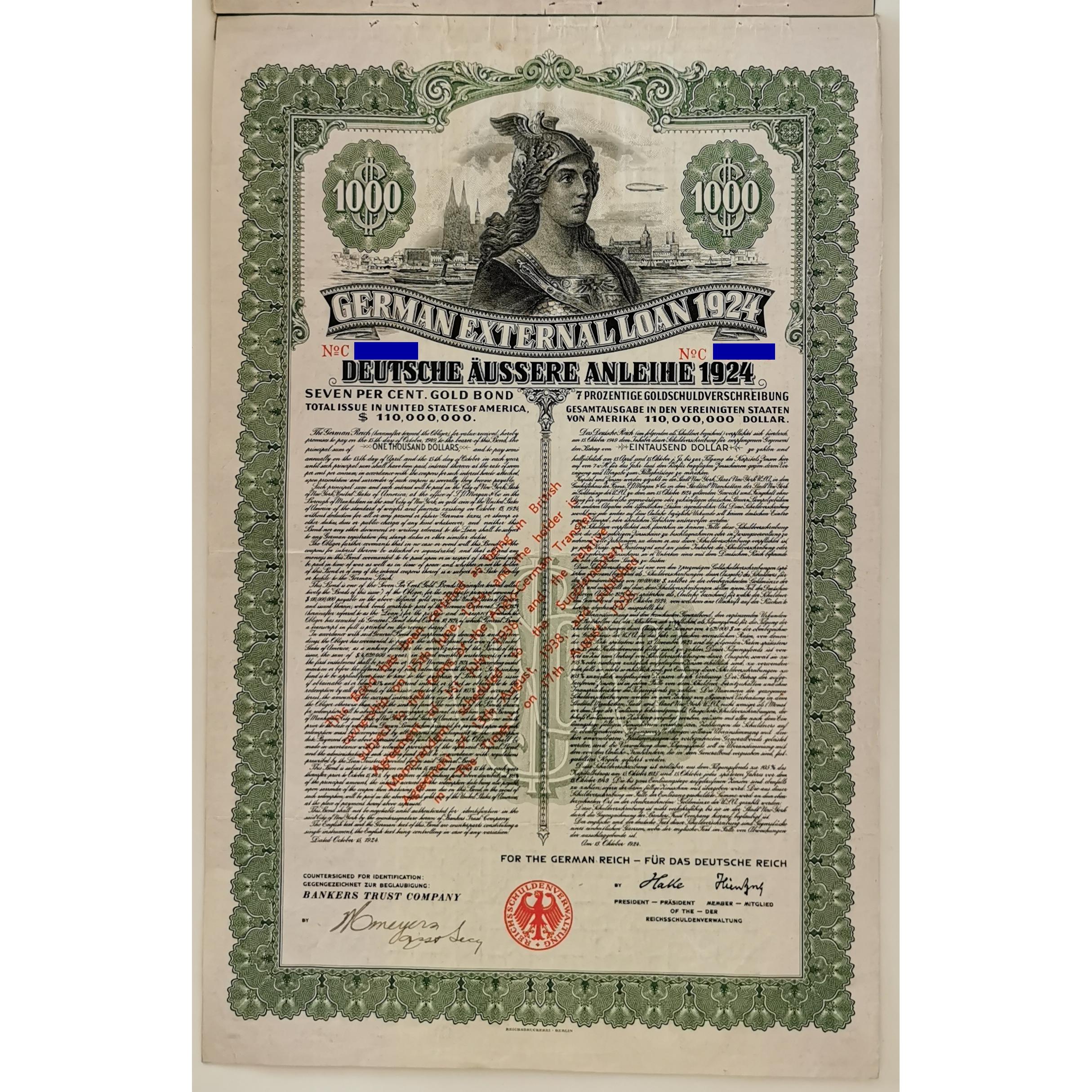
German External Loan 1924
Voting period is over. Please don't add any new votes. Voting period ends on 2 May 2024 at 19:54:32 (UTC)

- Reason
- High quality reproduction of a document. Provides a lot of EV in the only article which it appears in, in that it is a direct relic of the Dawes Plan itself. Good POTD for October 15 2024 (100th anniversary of this document).
- Articles in which this image appears
- Dawes Plan
- FP category for this image
- Wikipedia:Featured pictures/History/World War I
- Creator
- Unknown authors and graphic artists; Scan from Ersten Deutschen Historic-Actien-Clubs e.V.
- Support as nominator – ― Howard • 🌽33 19:54, 22 April 2024 (UTC)
- Support –
Kentuckian |
💬 01:04, 23 April 2024 (UTC)
- Are the colours natural? Adam Cuerden ( talk)Has about 8.9% of all FPs. 16:13, 23 April 2024 (UTC)
- Conditional support- A good nomination with adequate EV, but (per Adam's query) I came across
File:Dawes Anleihe 1924 1000$.jpg and saw the colors are way off in the nom. I am not sure which is closer to the original because a Google search also returned at least half a dozen color reproductions of the bill. If we could get a very good source or a scan (maybe the nomination itself) to prove the current nom is the original/closer to the original color, I'd support. Good luck.
The Herald (Benison) (
talk) 18:51, 23 April 2024 (UTC)
- Now, after searching across various sources, I have discovered many variant scans of this document, even by auction houses. Here is a list of the variants I have discovered:
- https://www.fhw-online.de/de/FHW-Auktion-101/?AID=88485&AKTIE=Deutsches+Reich%2C+Deutsche+%C4ussere+Anleihe+1924
- https://www.hwph.de/historische-wertpapiere/losnr-auktnr-pa4-952.html
- https://www.hwph.de/stocks-bonds/losnr-auktnr-pa9-1116_en.html
- https://www.hwph.de/stocks-bonds/losnr-auktnr-pa34-461_en.html ( PDF containing images)
- https://www.scripoworld.com/records/germany/germany-1924-7-external-loan-dawes-loan/
- Every one of these scans have slightly different colors, contrast, brightness, whatever. And I am not sure which is the true correct version as I am no scripophile myself. Is it possible that during the printing of the loans that different colors were used? Is it possible that most of these scans are of forgeries? I was unable to find any definitive source for any questions, but a good place to look might be German Dollar Bonds issued between 1924 and 1937 by F. Paul Seabrook. However, I am not able to access the book as it appears the book is not available online or print in any way, shape, or form. This blog post on Tumblr attests to its existence and describes it, but I can't find an entry on Google Books, or WorldCat, or even an ISBN. ― Howard • 🌽33 17:04, 24 April 2024 (UTC)
- Now, after searching across various sources, I have discovered many variant scans of this document, even by auction houses. Here is a list of the variants I have discovered:
- Lots of these notes were issues
over many years. It makes sense that not all had identical color tones, fine details, etc. The uploader seems legit. They have 2000+ uploads of similar (historic) documents. Translating some of their talk page posts Here shows the uploader is part of a group or informal organization (also see their file 'source' descriptions). I doubt the uploads are manipulated in any significant way. But I don't know much about old prints though. Perhaps Adam can judge the integrity of the uploader's work by looking at some of their other uploads. Bammesk ( talk) 02:36, 25 April 2024 (UTC)
- Comment As someone who has scanned aging documents extensively, the colours look reasonable to me. The marks along the top edge are in the same range, indicating that whatever has caused the lightening of the paper happened before the damage that resulted in the brown spots. The greens at the top are slightly lighter, while the blacks seem to have held their tone better; if this were artificial, I'd expect the blacks to likewise be lighter. I do feel that the cutout could have been a bit better, however - the bottom still has some unnatural straight lines. —
Chris Woodrich (
talk) 16:04, 27 April 2024 (UTC)
- You don't find the purple-to-yellow-to-purple gradient off for the background paper?
Adam Cuerden (
talk)Has about 8.9% of all
FPs. 22:28, 27 April 2024 (UTC)
- It definitely feels more like some sort of uneven fading due to sub-optimal storage than a technical flaw with the scanner. I no longer have the documents, due to changes in my situation, but this certificate and this poster (also on the other side) both had uneven fading. Admittedly, those were on a much browner paper (and indeed the fading is skewed yellow, rather than the green tone of the nomination). I personally don't think the image is FP quality, due to the blemish, but I don't feel like it's beyond the realm of possibility for this scan to be reflective of the document. — Chris Woodrich ( talk) 00:50, 28 April 2024 (UTC)
- Looking at the available images of these documents online, it does seem to be a common issue. This one is clearly not a reproduction of our digital copy (has the full emblem, as well as the tickets) and has similar fading issues. — Chris Woodrich ( talk) 01:03, 28 April 2024 (UTC)
- You don't find the purple-to-yellow-to-purple gradient off for the background paper?
Adam Cuerden (
talk)Has about 8.9% of all
FPs. 22:28, 27 April 2024 (UTC)
- Searching for "Dawes Anleihe 1924" on Goggle images returns many similar examples. This being a banknote, could the background paper gradient been in part intentional (a security feature)?
Bammesk (
talk) 13:12, 28 April 2024 (UTC)
- Potentially? I'm also seeing images like this, which notably has a black instead of a red emblem, and this, which was overstamped. There could have been different printings, with some variants to show series, but I'm not sure. — Chris Woodrich ( talk) 16:42, 28 April 2024 (UTC)
- The note itself says $110 million was issued, and the denomination is $1000, with 1924 technology. It's plausible that several batched were printed over time, and that the color tone and other fine details weren't exactly identical. For instance among the examples linked to above I see at least two similar, but different, hand written signatures on the lower left corner. Bammesk ( talk) 17:10, 28 April 2024 (UTC)
- Searching for "Dawes Anleihe 1924" on Goggle images returns many similar examples. This being a banknote, could the background paper gradient been in part intentional (a security feature)?
Bammesk (
talk) 13:12, 28 April 2024 (UTC)
- Comment As someone who has scanned aging documents extensively, the colours look reasonable to me. The marks along the top edge are in the same range, indicating that whatever has caused the lightening of the paper happened before the damage that resulted in the brown spots. The greens at the top are slightly lighter, while the blacks seem to have held their tone better; if this were artificial, I'd expect the blacks to likewise be lighter. I do feel that the cutout could have been a bit better, however - the bottom still has some unnatural straight lines. —
Chris Woodrich (
talk) 16:04, 27 April 2024 (UTC)
- Lots of these notes were issues
.jpg)
.jpg)
.jpg)
Summing up, the exact legitimacy of the bill is still disputed and none of us are sure how close this is to the original. I'm okay with the fine details and prints, but it's the legitimacy of the color that is bothering. Is there any way, like some noticeboard in German Wikipedia or Teahouse or helpdesk who can dig up more about this? The Herald (Benison) ( talk) 17:45, 28 April 2024 (UTC)
Not Promoted -- Armbrust The Homunculus 20:03, 2 May 2024 (UTC)
- Nomination didn’t reach the necessary quorum for promotion. Armbrust The Homunculus 20:03, 2 May 2024 (UTC)
Trillium undulatum
Voting period is over. Please don't add any new votes. Voting period ends on 3 May 2024 at 18:05:52 (UTC)

- Reason
- Recently featured unanimously on Commons, used in the article's infobox.
- Articles in which this image appears
- Trillium undulatum, Algonquin Provincial Park
- FP category for this image
- Wikipedia:Featured pictures/Plants/Flowers
- Creator
- The Cosmonaut
- Support as nominator – The Cosmonaut ( talk) 18:05, 23 April 2024 (UTC)
- Oppose – A good nomination, but there's a decent amount of loss of focus on the petal borders (maybe some stacking can help) and the lighting is a bit off. Also, another angle with less leaves would increase the EV significantly. The Herald (Benison) ( talk) 18:33, 24 April 2024 (UTC)
Not Promoted -- Armbrust The Homunculus 18:27, 3 May 2024 (UTC)
Double selfie
Voting period is over. Please don't add any new votes. Voting period ends on 4 May 2024 at 02:59:52 (UTC)

- Reason
- An excellent quality scan (a part of Google Art Project), with good EV.
- Articles in which this image appears
- Jean Baptiste de Champaigne and Nicolas de Plattemontagne (latter added recently)
- FP category for this image
- Paintings
- Creator
- Jean Baptiste de Champaigne and Nicolas de Plattemontagne
- Support as nominator – The Herald (Benison) ( talk) 02:59, 24 April 2024 (UTC)
- Support – Bammesk ( talk) 02:11, 26 April 2024 (UTC)
- Support — Chris Woodrich ( talk) 15:59, 27 April 2024 (UTC)
- Support – Hamid Hassani ( talk) 05:23, 29 April 2024 (UTC)
- Comment – Wouldn't it be more appropriate for de Champaigne's portrait to be cropped so that it is the first image? ―
Howard •
🌽33 09:19, 30 April 2024 (UTC)
- I mean in the Jean Baptiste de Champaigne article specifically. ― Howard • 🌽33 09:20, 30 April 2024 (UTC)
- I don't understand. You want to crop the file or make an alt/derived file?
The Herald (Benison) (
talk) 03:10, 1 May 2024 (UTC)
- I mean that the double portrait should be cropped in the
Jean Baptiste de Champaigne article so that only de Champaigne's portrait can be seen. ―
Howard •
🌽33 20:37, 1 May 2024 (UTC)
- Such an extensive crop will drop the EV of the painting significantly and criterion #8 will come into play then, IMO. The Herald (Benison) ( talk) 02:59, 2 May 2024 (UTC)
- I mean that the double portrait should be cropped in the
Jean Baptiste de Champaigne article so that only de Champaigne's portrait can be seen. ―
Howard •
🌽33 20:37, 1 May 2024 (UTC)
- I don't understand. You want to crop the file or make an alt/derived file?
The Herald (Benison) (
talk) 03:10, 1 May 2024 (UTC)
- Support – Vinícius O. ( talk) 22:07, 30 April 2024 (UTC)
Promoted File:Jean Baptiste de Champaigne and Nicolas de Plattemontagne - Double Portrait of both Artists - Google Art Project.jpg -- Armbrust The Homunculus 03:00, 4 May 2024 (UTC)
Effusive eruption
Voting period is over. Please don't add any new votes. Voting period ends on 5 May 2024 at 00:33:09 (UTC)
- Reason
- Close up view of the Litli-Hrútur eruption in Iceland in 2023. The wow factor does it for me. It’s a good addition to three articles listed below. It can also be added to the Fagradalsfjall article if there is consensus for it.
- Articles in which this image appears
- Effusive eruption, Lava, Volcano
- FP category for this image
- Wikipedia:Featured pictures/Sciences/Geology
- Creator
- Giles Laurent
- Support as nominator – Bammesk ( talk) 00:33, 25 April 2024 (UTC)
- Support - Yes, it's a good video. -- Janke | Talk 08:11, 25 April 2024 (UTC)
- Support – Giles Laurent ( talk) 09:56, 25 April 2024 (UTC)
- Support – Yann ( talk) 11:41, 25 April 2024 (UTC)
- Support – The Herald (Benison) ( talk) 22:14, 25 April 2024 (UTC)
- Support – Vinícius O. ( talk) 22:55, 26 April 2024 (UTC)
- Support – Hamid Hassani ( talk) 06:37, 27 April 2024 (UTC)
- Support. MER-C 18:44, 28 April 2024 (UTC)
Promoted File:007 Volcano eruption of Litli-Hrútur in Iceland in 2023 Video by Giles Laurent.webm -- Armbrust The Homunculus 11:14, 5 May 2024 (UTC)
Official Apollo 13 crew photo
Voting period is over. Please don't add any new votes. Voting period ends on 5 May 2024 at 18:51:20 (UTC)

- Reason
- The official NASA crew photo, 29 April 1970. All three men of the Apollo 13 crew in the highest quality of studio photographs.
- Articles in which this image appears
- Apollo 13
- FP category for this image
- Space, People
- Creator
- NASA (NASA Image and Video Library Image number S70-36485)
(See: https://images.nasa.gov/details-S70-36485)
(Non-cropped version of image: https://commons.wikimedia.org/wiki/File:The_Actual_Apollo_13_Prime_Crew_-_GPN-2000-001167.jpg)
- Support as nominator – Indefatigable2 talk 18:51, 25 April 2024 (UTC)
- Oppose – Govt. promotional photo that tells nothing about highly perilous Apollo 13 mission. Faces of subjects constitute relatively small proportion of image. – Sca ( talk) 12:14, 26 April 2024 (UTC)
- Oppose per Sca. These men weren't known for wearing suits, so the EV is modest here. Commons has several photos of the Apollo 13 crew wearing spacesuits (including one posing while doing so with their rocket) that have stronger EV, though the resolution looks lowish - presumably higher res versions are available. Nick-D ( talk) 23:34, 27 April 2024 (UTC)
Not Promoted -- The Herald (Benison) ( talk) 19:13, 5 May 2024 (UTC)
Buddha Vairocana
Voting period is over. Please don't add any new votes. Voting period ends on 8 May 2024 at 10:11:54 (UTC)

- Reason
- Unanimously featured on Commons last month. Illustrates articles well.
- Articles in which this image appears
- Vairocanābhisaṃbodhi Sūtra, Thangka
- FP category for this image
- Wikipedia:Featured pictures/Artwork/East Asian art
- Creator
- Unknown
- Support as nominator – MER-C 10:11, 28 April 2024 (UTC)
- Support – The Herald (Benison) ( talk) 15:58, 28 April 2024 (UTC)
- Support – ― Howard • 🌽33 19:53, 28 April 2024 (UTC)
- Support – Yann ( talk) 11:12, 30 April 2024 (UTC)
- Support – Hamid Hassani ( talk) 17:39, 30 April 2024 (UTC)
Promoted File:Buddha Vairocana - Google Art Project.jpg -- Armbrust The Homunculus 16:50, 8 May 2024 (UTC)
Dorcus parallelipipedus
Voting period is over. Please don't add any new votes. Voting period ends on 8 May 2024 at 10:15:53 (UTC)

- Reason
- 2018 POTY finalist. Interesting and highly detailed.
- Articles in which this image appears
- Dorcus parallelipipedus
- FP category for this image
- Wikipedia:Featured pictures/Animals/Insects
- Creator
- Sebastián J.L
- Support as nominator – MER-C 10:15, 28 April 2024 (UTC)
- Support – The Herald (Benison) ( talk) 15:59, 28 April 2024 (UTC)
- Support — Chris Woodrich ( talk) 16:47, 28 April 2024 (UTC)
- Support – ― Howard • 🌽33 19:53, 28 April 2024 (UTC)
- Support – Hamid Hassani ( talk) 05:22, 29 April 2024 (UTC)
Promoted File:Dorcus parallelipipedus female.jpg -- Armbrust The Homunculus 16:56, 8 May 2024 (UTC)
The other starry night
Voting period is over. Please don't add any new votes. Voting period ends on 8 May 2024 at 11:30:18 (UTC)


- Reason
- High quality scan (by Google Art Project), high EV and an FP is various Wikipedias and commons as well as 2015 POTY finalist.
- Articles in which this image appears
- Starry Night Over the Rhône, Vincent van Gogh and Van Gogh and Britain.
- FP category for this image
- Paintings
- Creator
- Vincent van Gogh
- Support original as nominator – The Herald (Benison) ( talk) 11:30, 28 April 2024 (UTC)
- Support - Darker hues look better for a nocturnal composition. (Recently I posted this image on my talk page.) – Sca ( talk) 12:05, 28 April 2024 (UTC)
- Support - Definitely prefer the Google Art scan. A little soft at full resolution, but acceptable. — Chris Woodrich ( talk) 16:46, 28 April 2024 (UTC)
- Support – ― Howard • 🌽33 09:17, 30 April 2024 (UTC)
- Support – Yann ( talk) 11:12, 30 April 2024 (UTC)
- Support – Hamid Hassani ( talk) 02:44, 1 May 2024 (UTC)
Promoted File:Vincent van Gogh - Starry Night - Google Art Project.jpg -- Armbrust The Homunculus 17:00, 8 May 2024 (UTC)
Slime mold
Voting period is over. Please don't add any new votes. Voting period ends on 8 May 2024 at 14:27:27 (UTC)

- Reason
- Close up view of Comatricha nigra, a species of Slime mold in class Myxogastria. This class is slimy to the touch during part of its life, therefore giving the larger group its name 'slime' mold. The species article is weak (it describes the size, millimeter range, and appearance), but the image is also used in the group article. On a sidenote: in the photo I think there is some visible slime at the base of the stalks (visible at full size).
- Articles in which this image appears
- Slime mold, Comatricha nigra
- FP category for this image
- Wikipedia:Featured pictures/Fungi
- Creator
- Alexis Tinker-Tsavalas
- Support as nominator – Bammesk ( talk) 14:27, 28 April 2024 (UTC)
- Support – A very interesting red balloon xP The Herald (Benison) ( talk) 16:00, 28 April 2024 (UTC)
- Support – Kentuckian | 💬 19:19, 28 April 2024 (UTC)
- Support – Hamid Hassani ( talk) 05:21, 29 April 2024 (UTC)
- Support – ― Howard • 🌽33 09:18, 30 April 2024 (UTC)
- Support – Cowboygilbert - (talk) ♥ 14:33, 2 May 2024 (UTC)
- Support - Moonreach ( talk) 14:31, 7 May 2024 (UTC)
Promoted File:Comatricha nigra 176600092.jpg -- Armbrust The Homunculus 17:05, 8 May 2024 (UTC)
Ferdinand Habsburg
Voting period is over. Please don't add any new votes. Voting period ends on 10 May 2024 at 21:39:50 (UTC)

- Reason
- High quality and resolution
- Articles in which this image appears
- Ferdinand Habsburg (racing driver)
- FP category for this image
- Wikipedia:Featured pictures/People/Sport
- Creator
- Drew Gibson
- Support as nominator – Vinícius O. ( talk) 21:39, 30 April 2024 (UTC)
- Oppose – Various out of focus regions, especially on the face and hair. Very bad edge detection by whatever camera that was used and unequal crop. Lighting and composition is good, but focus and asymmetry is a dealbreaker, IMO. The Herald (Benison) ( talk) 11:00, 1 May 2024 (UTC)
- Oppose Poor rez, appears over-saturated, obtrusive background. – Sca ( talk) 12:30, 1 May 2024 (UTC)
- Oppose – Resolution is OK, but bad colors. Yann ( talk) 17:47, 1 May 2024 (UTC)
Not Promoted -- Armbrust The Homunculus 01:40, 11 May 2024 (UTC)
Feldherrnhalle
Voting period is over. Please don't add any new votes. Voting period ends on 10 May 2024 at 22:00:35 (UTC)

- Reason
- High quality image. It is marked as both Quality and Valued image on Wikimedia Commons. FP on the German language Wikipedia.
- Articles in which this image appears
- Feldherrnhalle
- FP category for this image
- Wikipedia:Featured pictures/Places/Architecture
- Creator
- Thomas Wolf
- Support as nominator – Vinícius O. ( talk) 22:00, 30 April 2024 (UTC)
- Oppose – The lines across the structure, off centre perspective and extra buildings on the side make it sub par FP. The Herald (Benison) ( talk) 11:02, 1 May 2024 (UTC)
- Oppose per Herald. Lighting is quite flat, too. Feels like a slightly closer crop would help somewhat, but I don't know if it would push it into FP territory. — Chris Woodrich ( talk) 23:03, 1 May 2024 (UTC)
- Oppose with cleared wires i would support and closer crop. -- Petar Milošević ( talk) 10:14, 2 May 2024 (UTC)
Not Promoted -- Armbrust The Homunculus 01:41, 11 May 2024 (UTC)
Cartesian theater
Voting period is over. Please don't add any new votes. Voting period ends on 12 May 2024 at 21:04:38 (UTC)

- Reason
- I mean. Yeah, it pretty much describes what a Cartesian theater is.
- Articles in which this image appears
- Cartesian theater, Cartesian materialism, Ontology
- FP category for this image
- Wikipedia:Featured pictures/Other (maybe a Philosophy category?)
- Creator
- Vectorized by Pbroks13; Original by Reverie.
- Support as nominator – ― Howard • 🌽33 21:04, 2 May 2024 (UTC)
- Support – Bammesk ( talk) 17:16, 5 May 2024 (UTC)
- Support - Mmm, yes, egg. Moonreach ( talk) 14:29, 7 May 2024 (UTC)
- Support - I don't think it should lead Cartesian materialism, given that the theater concept is a critique, but this does an excellent job of illustrating a Cartesian theatre. — Chris Woodrich ( talk) 10:33, 8 May 2024 (UTC)
- Support – Hamid Hassani ( talk) 07:21, 11 May 2024 (UTC)
Promoted File:Cartesian Theater.svg -- Armbrust The Homunculus 01:43, 13 May 2024 (UTC)
- Added image to Diagrams, drawings, and maps/Drawings instead. Armbrust The Homunculus 01:43, 13 May 2024 (UTC)
Ottmar Mergenthaler
Voting period is over. Please don't add any new votes. Voting period ends on 12 May 2024 at 17:39:09 (UTC)

- Reason
- A fine old image; fairly sharp.
- Articles in which this image appears
- Ottmar Mergenthaler
- FP category for this image
- Wikipedia:Featured pictures/People/Science and engineering probably
- Creator
- Unknown photographer, restored by Adam Cuerden
- Support as nominator – Adam Cuerden ( talk)Has about 8.9% of all FPs. 17:39, 2 May 2024 (UTC)
- Support – The Herald (Benison) ( talk) 18:37, 2 May 2024 (UTC)
- Comment – Perhaps needs crop? ―
Howard •
🌽33 20:04, 2 May 2024 (UTC)
- We don't generally like crops here, though I will say there's a printed version of this or a very similar image that was.
Adam Cuerden (
talk)Has about 8.9% of all
FPs. 01:34, 3 May 2024 (UTC)
- Well, I, for one, do like crops. ―
Howard •
🌽33 08:49, 3 May 2024 (UTC)
- One's available, but I don't think we should use it in his article. Adam Cuerden ( talk)Has about 8.9% of all FPs. 16:45, 3 May 2024 (UTC)
- Well, I, for one, do like crops. ―
Howard •
🌽33 08:49, 3 May 2024 (UTC)
- We don't generally like crops here, though I will say there's a printed version of this or a very similar image that was.
Adam Cuerden (
talk)Has about 8.9% of all
FPs. 01:34, 3 May 2024 (UTC)
- Support – Vinícius O. ( talk) 00:57, 3 May 2024 (UTC)
- Support. MER-C 10:33, 5 May 2024 (UTC)
- Support – Hamid Hassani ( talk) 07:35, 6 May 2024 (UTC)
Promoted File:Ottmar Mergenthaler, at approximately 45 years old.jpg -- Armbrust The Homunculus 01:50, 13 May 2024 (UTC)
The golden mess of sewn diplomacy
Voting period is over. Please don't add any new votes. Voting period ends on 14 May 2024 at 04:34:04 (UTC)


- Reason
- High quality Google Art Project scan of this important historical painting with very good EV. Replaced with the high quality file in the lead article.
- Articles in which this image appears
- Field of the Cloth of Gold, Henry VIII, Yeomen of the Guard and Erasmus
- FP category for this image
- Paintings
- Creator
- Anonymous/ Royal Collection
- Support as nominator – The Herald (Benison) ( talk) 04:34, 4 May 2024 (UTC)
- Oppose.
1px black border needs to be cropped out.per Bammesk. MER-C 10:43, 5 May 2024 (UTC)
- @ MER-C: Done. The Herald (Benison) ( talk) 17:12, 5 May 2024 (UTC)
- Oppose – It's a large painting 5.5 x 11.3 feet. At 37 pixels per inch, the scan resolution is low. Can be sharper at full size. Bammesk ( talk) 17:36, 5 May 2024 (UTC)
- Added higher res alt.
The Herald (Benison) (
talk) 18:23, 5 May 2024 (UTC)
-
The Herald (Benison), is there a better source link for the Alt? I don't see this copy at the sourced link.
Bammesk (
talk) 19:04, 5 May 2024 (UTC)
- Yeah, I'm worried about that too. I'll search around. The Herald (Benison) ( talk) 19:07, 5 May 2024 (UTC)
-
The Herald (Benison), is there a better source link for the Alt? I don't see this copy at the sourced link.
Bammesk (
talk) 19:04, 5 May 2024 (UTC)
- Added higher res alt.
The Herald (Benison) (
talk) 18:23, 5 May 2024 (UTC)
Not Promoted -- Armbrust The Homunculus 10:34, 14 May 2024 (UTC)
Vermeer struck the right chord with the lady
Voting period is over. Please don't add any new votes. Voting period ends on 14 May 2024 at 04:47:31 (UTC)

- Reason
- High EV and excellent quality Google Art Project image. One of Vermeer's masterpieces with cultural significance.
- Articles in which this image appears
- The Music Lesson, Tim's Vermeer, Royal Collection +5
- FP category for this image
- Paintings
- Creator
- Johannes Vermeer
- Support as nominator – The Herald (Benison) ( talk) 04:47, 4 May 2024 (UTC)
- Support – Bammesk ( talk) 17:17, 5 May 2024 (UTC)
- Support Wow! J. S. Bach wasn't born at the time yet! – Hamid Hassani ( talk) 08:04, 6 May 2024 (UTC)
- Support. MER-C 16:13, 6 May 2024 (UTC)
- Support — Chris Woodrich ( talk) 10:31, 8 May 2024 (UTC)
Promoted File:Johannes Vermeer - Lady at the Virginal with a Gentleman, 'The Music Lesson' - Google Art Project.jpg -- Armbrust The Homunculus 10:36, 14 May 2024 (UTC)
Tornado outbreak sequence of April 25–28, 2024
Voting period is over. Please don't add any new votes. Voting period ends on 14 May 2024 at 18:30:55 (UTC)

- Reason
- Meets all FP criteria and is a very clear map showing the Tornado outbreak sequence of April 25–28, 2024, which has received over 100,000 page views (including page views from previous article names such as “…April 25–27, 2024”). In short, high EV value for that specific page, which currently is for 135+ tornadoes affecting a large portion of the United States.
- Articles in which this image appears
- List:
- Tornado outbreak sequence of April 25–28, 2024
- List of North American tornadoes and tornado outbreaks
- FP category for this image
- Wikipedia:Featured pictures/Diagrams, drawings, and maps/Maps
- Creator
- Wxtrackercody
- Support as nominator – The Weather Event Writer ( Talk Page) 18:30, 4 May 2024 (UTC)
- This was added to the articles 2 days ago. Per FP criterion #5 we typically wait 7+ days before nominating. Otherwise, Support. Bammesk ( talk) 17:42, 5 May 2024 (UTC)
- Question - I'm seeing that QGIS is licensed under the Version 2 of the GNU General Public License. What about its output? I'm seeing that the QGIS website is shared under a CC-BY-SA 3.0 license, so the current CC-BY-SA 4.0 isn't beyond the realm of possibility, but I'd like to be sure before !voting. — Chris Woodrich ( talk) 10:28, 8 May 2024 (UTC)
- @ Wxtrackercody: Hopefully you can answer this question. The Weather Event Writer ( Talk Page) 03:14, 10 May 2024 (UTC)
Not Promoted -- Armbrust The Homunculus 19:54, 14 May 2024 (UTC)
- Nomination didn’t reach the necessary quorum for promotion. Armbrust The Homunculus 19:54, 14 May 2024 (UTC)
American robin
Voting period is over. Please don't add any new votes. Voting period ends on 15 May 2024 at 10:30:41 (UTC)
.jpg)
- Reason
- Was seen on Commons FPC last month, where it was featured unanimously.
- Articles in which this image appears
- American robin
- FP category for this image
- Wikipedia:Featured pictures/Animals/Birds
- Creator
- Rhododendrites
- Support as nominator – MER-C 10:30, 5 May 2024 (UTC)
- Support – The Herald (Benison) ( talk) 11:14, 5 May 2024 (UTC)
- Support — Bruce1ee talk 13:35, 5 May 2024 (UTC)
- Support – Hamid Hassani ( talk) 08:01, 6 May 2024 (UTC)
Promoted File:American robin (71307).jpg -- Armbrust The Homunculus 10:34, 15 May 2024 (UTC)
Narbonne Cathedral interior
Voting period is over. Please don't add any new votes. Voting period ends on 15 May 2024 at 10:40:35 (UTC)

- Reason
- Unanimously featured on Commons in February. Illustrates a different aspect of the subject compared to the existing FP.
- Articles in which this image appears
- Narbonne Cathedral
- FP category for this image
- Wikipedia:Featured pictures/Places/Interiors
- Creator
- Diego Delso
- Support as nominator – MER-C 10:40, 5 May 2024 (UTC)
- Support – Gorgeous, great detail. – Sca ( talk) 12:24, 5 May 2024 (UTC)
- Support – The Herald (Benison) ( talk) 19:13, 5 May 2024 (UTC)
- Support – Hamid Hassani ( talk) 08:19, 6 May 2024 (UTC)
- Support – Love the architecture. ― Howard • 🌽33 20:57, 6 May 2024 (UTC)
- Support - Moonreach ( talk) 14:27, 7 May 2024 (UTC)
- Support An obvious FP. -- Radomianin ( talk) 20:00, 7 May 2024 (UTC)
Promoted File:Catedral, Narbona, Francia, 2023-01-08, DD 135-137 HDR.jpg -- Armbrust The Homunculus 10:42, 15 May 2024 (UTC)
Uptown Charlotte
Voting period is over. Please don't add any new votes. Voting period ends on 15 May 2024 at 12:42:20 (UTC)

- Reason
- Good composition. FP candidate on Commons.
- Articles in which this image appears
- Uptown Charlotte, others
- FP category for this image
- Wikipedia:Featured pictures/Places/Urban
- Creator
- Precisionviews
- Support as nominator – TheFreeWorld ( talk) 12:42, 5 May 2024 (UTC)
- Comment – Meh. – Sca ( talk) 12:02, 6 May 2024 (UTC)
- Support – good EV and composition. Not meh for me. The Herald (Benison) ( talk) 08:34, 8 May 2024 (UTC)
- Oppose - Feels oversharpened at full resolution, and the buildings are leaning (lens distortion). — Chris Woodrich ( talk) 10:21, 8 May 2024 (UTC)
Not Promoted -- Armbrust The Homunculus 14:16, 15 May 2024 (UTC)
Conocephalus fuscus
Voting period is over. Please don't add any new votes. Voting period ends on 15 May 2024 at 20:50:57 (UTC)
- Reason
- Video of a singing male Conocephalus fuscus shows the cricket, the fluttering wings and singing sound. Many crickets sing in the ultrasonic spectrum inaudible to humans. This video has been slowed down by a factor of four, in order to make the singing sound audible.
- Articles in which this image appears
- Conocephalus fuscus
- FP category for this image
- Wikipedia:Featured pictures/Animals/Insects
- Creator
- Veljo Runnel
- Support as nominator – Bammesk ( talk) 20:50, 5 May 2024 (UTC)
- comment Very right leaning sound balance. Would this be better going to mono? ©Geni ( talk) 20:36, 6 May 2024 (UTC)
Not Promoted -- Armbrust The Homunculus 20:51, 15 May 2024 (UTC)
Mezquita Shah, Isfahán, Irán
Voting period is over. Please don't add any new votes. Voting period ends on 16 May 2024 at 15:23:20 (UTC)

- Reason
- Excellent photo that is FP on other languages and commons. Great EV to the article's it is linked in and shows a great view of the muqarnas.
- Articles in which this image appears
- Shah Mosque (Isfahan), Persian blue, Blue
- FP category for this image
- Wikipedia:Featured pictures/Places/Architecture
- Creator
- Diego Delso
- Support as nominator – Cowboygilbert - (talk) ♥ 15:23, 6 May 2024 (UTC)
- Support – Excellent coloring. Highly support. ― Howard • 🌽33 20:56, 6 May 2024 (UTC)
- Oppose – Good composition and nom, but it's rather a very peculiar angle for an FP. It doesn't illustrate the subject well and the details aren't clear. (See File:Portal, Pitam Niwas Chowk, City Palace, Jaipur, 20191218 1000 9059.jpg for reference). Any alternate view for the gate present? The Herald (Benison) ( talk) 07:20, 7 May 2024 (UTC)
- Comment: The picture is to show the bottom view of the iwan of the mosque and to show the muqarnas in full view instead of a partial view from a front view. While a front view could be better to show the iwan, it is a common type of photographs that I have seen to fully show the composition of the muqarnas. (Most of which is at an angle or at a bottom view) Cowboygilbert - (talk) ♥ 23:17, 7 May 2024 (UTC)
- Support - I respectfully disagree with The Herald; I think the details are quite clear at full resolution, and I think the angle is justifiable in showing recessed aspects of the work not visible from the front. Moonreach ( talk) 14:14, 7 May 2024 (UTC)
- Support according to Moonreach's reasoning. -- Radomianin ( talk) 19:57, 7 May 2024 (UTC)
- Support but mostly for its value illustrating Persian blue. In the article on the mosque, it is used in a gallery; the muqarnas is not discussed beyond "here, look at the muqarnas". That being said, a crop of this (uploaded separately) could be used to replace File:Sally Port of Sheikh Lotf Allah Mosque.JPG in articles where it is used. It's the same muqarnas, and Diego's capture is more evenly lit and comprehensive. — Chris Woodrich ( talk) 10:19, 8 May 2024 (UTC)
- Support – Hamid Hassani ( talk) 07:25, 11 May 2024 (UTC)
- Support. MER-C 09:36, 12 May 2024 (UTC)
Promoted File:Mezquita Shah, Isfahán, Irán, 2016-09-20, DD 64.jpg -- Armbrust The Homunculus 21:18, 16 May 2024 (UTC)
Continental I-1430 engine
Voting period is over. Please don't add any new votes. Voting period ends on 16 May 2024 at 22:44:39 (UTC)

- Reason
- One of the better national Air and Space Museum engine images. All the parts are there and the supporting frame blocks very little of the engine
- Articles in which this image appears
- Continental XI-1430
- FP category for this image
- Wikipedia:Featured pictures/Engineering and technology/Machinery
- Creator
- Dane A. Penland
- Support as nominator – ©Geni ( talk) 22:44, 6 May 2024 (UTC)
- Support – Bammesk ( talk) 01:25, 7 May 2024 (UTC)
- Support – ― Howard • 🌽33 05:37, 7 May 2024 (UTC)
- Oppose – Article states, "Only twenty-three I-1430 series engines were delivered," and it never powered an airplane. Little or no EV. – Sca ( talk) 12:16, 7 May 2024 (UTC)
- Support - Moonreach ( talk) 14:11, 7 May 2024 (UTC)
- Support - Engine has an article; article passes GNG; image shows engine; image has EV. — Chris Woodrich ( talk) 10:14, 8 May 2024 (UTC)
- Support – per Chris. I can see clear EV here.
The Herald (Benison) (
talk) 15:51, 8 May 2024 (UTC)
- Such as? --
Sca (
talk) 12:46, 9 May 2024 (UTC)
- The FP criteria defines EV as "Adds significant encyclopedic value to an article" Its the lead and only image in the
Continental XI-1430 article. It adds to that article by showing what the whole engine looks like. And thats a significant add since there is a lot of variation in how engines look.
©Geni (
talk) 16:06, 9 May 2024 (UTC)
- Is it of potential interest to a significant portion of Enwiki readers? --
Sca (
talk) 13:08, 10 May 2024 (UTC)
- That iss not in the Featured picture criteria. EV is about how much it improves one or more Wikipedia articles. How widely read those articles are is not a factor. It also counts against cases where the photo is very pretty but doesn't add much to any Wikipedia articles. Think something a photo of a ship but most of it hidden because it it rounding a very pretty headland. ©Geni ( talk) 05:42, 14 May 2024 (UTC)
- Is it of potential interest to a significant portion of Enwiki readers? --
Sca (
talk) 13:08, 10 May 2024 (UTC)
- The FP criteria defines EV as "Adds significant encyclopedic value to an article" Its the lead and only image in the
Continental XI-1430 article. It adds to that article by showing what the whole engine looks like. And thats a significant add since there is a lot of variation in how engines look.
©Geni (
talk) 16:06, 9 May 2024 (UTC)
- Such as? --
Sca (
talk) 12:46, 9 May 2024 (UTC)
- Support – Hamid Hassani ( talk) 07:22, 11 May 2024 (UTC)
- Support. MER-C 09:36, 12 May 2024 (UTC)
Promoted File:Continental I-1430 NASM.jpg -- Armbrust The Homunculus 03:17, 17 May 2024 (UTC)
Vermeer's astronomer
Voting period is over. Please don't add any new votes. Voting period ends on 18 May 2024 at 10:53:35 (UTC)

- Reason
- One of Vermeer's best known works in Louvre. It is a high quality Google Art Project scan with excellent EV.
- Articles in which this image appears
- The Astronomer (Vermeer) +10
- FP category for this image
- Paintings
- Creator
- Johannes Vermeer/Louvre Museum
- Support as nominator – The Herald (Benison) ( talk) 10:53, 8 May 2024 (UTC)
- Support - If there's a window on the left, it's a Vermeer... ;-) -- Janke | Talk 15:10, 8 May 2024 (UTC)
- Support, but wonder if the greenish tint is faithful to the original...
Brandmeister
talk 19:51, 8 May 2024 (UTC)
- Probably a mixture of varnish, pigment discolouration, and intentional palette choice. But it's hard to tell for sure without a trip to the Louvre. Adam Cuerden ( talk)Has about 8.9% of all FPs. 16:40, 12 May 2024 (UTC)
- Support – Hamid Hassani ( talk) 07:20, 11 May 2024 (UTC)
- Support. MER-C 09:38, 12 May 2024 (UTC)
Promoted File:Johannes Vermeer - The Astronomer - 1668.jpg -- Armbrust The Homunculus 10:54, 18 May 2024 (UTC)
M&Ms
Voting period is over. Please don't add any new votes. Voting period ends on 19 May 2024 at 11:21:42 (UTC)

- Reason
- High quality high EV image.
- Articles in which this image appears
- M&M's
- FP category for this image
- Wikipedia:Featured pictures/Food and drink
- Creator
- Evan-Amos
- Support as nominator – The Herald (Benison) ( talk) 11:21, 9 May 2024 (UTC)
- Support – ― Howard • 🌽33 11:30, 9 May 2024 (UTC)
- Oppose – Free advertising, otherwise unremarkable image. – Sca ( talk) 12:45, 9 May 2024 (UTC)
- Comment – This would be a support for me if it was sharper on the right side (perhaps a higher f-stop or a sharper lens, or focus stacking). Bammesk ( talk) 01:40, 14 May 2024 (UTC)
Not Promoted -- Armbrust The Homunculus 11:55, 19 May 2024 (UTC)
Book of Fixed Stars Ursa Minor
Voting period is over. Please don't add any new votes. Voting period ends on 21 May 2024 at 21:11:38 (UTC)

- Reason
- High quality image of medieval muslim illustration of the Ursa minor constellation from the Book of Fixed Stars.
- Articles in which this image appears
- Ursa Minor, Polaris
- FP category for this image
- Wikipedia:Featured pictures/Space/Understanding
- Creator
- Abd al-Rahman al-Sufi
- Support as nominator – — ♠ Ixtal ( T / C ) ⁂ Sign up for the 2024 DCWC! — Non nobis solum ♠ 21:11, 11 May 2024 (UTC)
- I am not sure this image has sufficient EV in either article listed above. There is no textual reference to this image (i.e. this version, or medieval Islamic era) in the Ursa Minor article. In the Polaris article, there is a brief referring paragraph next to this image. I am not sure that's enough though. Bammesk ( talk) 02:36, 14 May 2024 (UTC)
Not Promoted -- Armbrust The Homunculus 13:41, 22 May 2024 (UTC)
Map of Brazil in the Miller Atlas
Voting period is over. Please don't add any new votes. Voting period ends on 22 May 2024 at 09:49:13 (UTC)

- Reason
- Unanimously featured on Commons two weeks ago. Illustrates articles well.
- Articles in which this image appears
- Miller Atlas, Lopo Homem, Name of Brazil, Fernão de Loronha etc. (the image is used in a template)
- FP category for this image
- Wikipedia:Featured pictures/Diagrams, drawings, and maps/Maps
- Creator
- Pedro Reinel, Lopo Homem
- Support as nominator – MER-C 09:49, 12 May 2024 (UTC)
- Support – ― Howard • 🌽33 11:05, 12 May 2024 (UTC)
- Support – Bammesk ( talk) 01:53, 14 May 2024 (UTC)
- Support. Lead image for its article, deservedly; encyclopedic; high quality and featured on commons. — David Eppstein ( talk) 06:43, 14 May 2024 (UTC)
- Support – Vinícius O. ( talk) 23:06, 14 May 2024 (UTC)
- Support – Hamid Hassani ( talk) 05:41, 18 May 2024 (UTC)
Promoted File:Brazil 16thc map.jpg -- Armbrust The Homunculus 13:45, 22 May 2024 (UTC)
Man versus fish
Voting period is over. Please don't add any new votes. Voting period ends on 22 May 2024 at 23:47:31 (UTC)
.jpg)
- Reason
- Featured on Arabic and Persian Wikipedias. Good quality. Appears on several english articles.
- Articles in which this image appears
- Yunus (surah), As-Saaffat, Jonah, Jami' al-tawarikh
- FP category for this image
- Wikipedia:Featured pictures/Culture, entertainment, and lifestyle/Religion and mythology
- Creator
- Unknown illustrator; scanned by Metropolitan Museum of Art
- Support as nominator – ― Howard • 🌽33 23:47, 12 May 2024 (UTC)
- Support – for EV in Jonah. Bammesk ( talk) 15:21, 18 May 2024 (UTC)
- Support – Vinícius O. ( talk) 21:35, 20 May 2024 (UTC)
Not Promoted -- Armbrust The Homunculus 02:45, 23 May 2024 (UTC)
- Nomination didn’t reach the necessary quorum for promotion. Armbrust The Homunculus 02:45, 23 May 2024 (UTC)
Tarantula Nebula
Voting period is over. Please don't add any new votes. Voting period ends on 24 May 2024 at 14:57:13 (UTC)

- Reason
- Beautiful shape, colors, and of high quality (also a FP on Commons, so I'm confident it is very good)
- Articles in which this image appears
- Tarantula Nebula, List of largest nebulae
- FP category for this image
- Wikipedia:Featured pictures/Space/Looking out#Nebulae, stars, supernovae and the Milky Way
- Creator
- JWST, uploaded by IamMM
Support as nominator– WILD MOUSE what? 14:57, 14 May 2024 (UTC)
- Struck vote as user doesn’t has the required number of edits (only 51 instead of 100). Armbrust The Homunculus 04:19, 16 May 2024 (UTC)
- Support – ― Howard • 🌽33 16:50, 14 May 2024 (UTC)
- comment Photo is by NIRCam which covers only the red end of the visual spectrum and a bunch of near infra-red. From an encyclopedic point of view an image in wavelengths humans can actually see is probably more useful at least as the lead image. Even that is not the same as what humans might actually be able to see which is probably more like this. ©Geni ( talk) 02:24, 15 May 2024 (UTC)
- Comment – We do have a FP of this Here. Bammesk ( talk) 02:27, 16 May 2024 (UTC)
.jpg)
Not Promoted -- Armbrust The Homunculus 16:47, 24 May 2024 (UTC)
Execution of Louis XVI
Voting period is over. Please don't add any new votes. Voting period ends on 24 May 2024 at 23:26:56 (UTC)

- Reason
- High quality engraving.
- Articles in which this image appears
- Execution of Louis XVI, French Revolution, Guillotine, History of Paris, Louis XVI, Place de la Concorde etc.
- FP category for this image
- Wikipedia:Featured pictures/History/Others
- Creator
- Isidore Stanislas Helman after Charles Monnet. Etching by Antoine-Jean Duclos
- Support as nominator – Vinícius O. ( talk) 23:26, 14 May 2024 (UTC)
- Support – Bammesk ( talk) 15:19, 18 May 2024 (UTC)
- Support per nom. Brandmeister talk 18:27, 21 May 2024 (UTC)
- Support – Kentuckian | 💬 16:46, 23 May 2024 (UTC)
Support– Hamid Hassani ( talk) 03:44, 25 May 2024 (UTC)- Struck vote that was cast after the voting period ended. Armbrust The Homunculus 11:59, 25 May 2024 (UTC)
Not Promoted -- Armbrust The Homunculus 12:00, 25 May 2024 (UTC)
- Nomination didn’t reach the necessary quorum for promotion (in the voting period). Armbrust The Homunculus 12:00, 25 May 2024 (UTC)
Dolomites
Voting period is over. Please don't add any new votes. Voting period ends on 24 May 2024 at 23:44:54 (UTC)

- Reason
- High quality and resolution. Good picture, beautiful landscape.
- Articles in which this image appears
- Dolomites, Alps etc.
- FP category for this image
- Wikipedia:Featured pictures/Places/Landscapes
- Creator
- Böhringer Friedrich
- Support as nominator – Vinícius O. ( talk) 23:44, 14 May 2024 (UTC)
- Comment – Extensive foreground somewhat indistinct at full rez. – Sca ( talk) 12:49, 15 May 2024 (UTC)
Not Promoted -- Armbrust The Homunculus 12:01, 25 May 2024 (UTC)
T-7 Red Hawk
Voting period is over. Please don't add any new votes. Voting period ends on 26 May 2024 at 01:44:52 (UTC)

- Reason
- Quality lead image in the T-7 Red Hawk article. This is a recently developed aircraft. It will serve as the U.S. Air Force's primary training jet. FP on Commons.
- Articles in which this image appears
- Boeing–Saab T-7 Red Hawk
- FP category for this image
- Wikipedia:Featured pictures/Vehicles/Air
- Creator
- U.S. Air Force, photographer: Bryce Bennett
- Support as nominator – Bammesk ( talk) 01:44, 16 May 2024 (UTC)
- Support — Bruce1ee talk 06:13, 16 May 2024 (UTC)
- Oppose – Stock govt. photo of a relatively obscure subsonic plane with no apparent explanatory context. Scant EV. – Sca ( talk) 12:59, 16 May 2024 (UTC)
- Support - It has EV, it’s a quality photograph to show the plane on the article about the plane. I do agree that the plane is obscure but we are here to talk about the photograph and not the obscureness of the contents of the photograph. Cowboygilbert - (talk) ♥ 06:32, 17 May 2024 (UTC)
- Support High quality photo that illustrates the features of this new aircraft type. The comments above claiming that the aircraft is 'obscure' seem wrong-headed: the US Air Force intends to purchase 351 of the type and they will likely serve for decades as the force's main jet training aircraft. It is very likely that lots of other countries will also end up ordering them. This has been major news for years in the Defence industry and aviation sector. As such, a high quality photo of one of the prototypes of this aircraft has very high EV. Nick-D ( talk) 05:41, 18 May 2024 (UTC)
- Support – ― Howard • 🌽33 20:32, 19 May 2024 (UTC)
- Support – Moonreach ( talk) 14:18, 21 May 2024 (UTC)
- Support – Hamid Hassani ( talk) 03:50, 25 May 2024 (UTC)
Promoted File:T-7A Red Hawk over Edwards Air Force Base.jpg -- Armbrust The Homunculus 07:17, 26 May 2024 (UTC)
World Clock (Alexanderplatz)
Voting period is over. Please don't add any new votes. Voting period ends on 28 May 2024 at 15:40:05 (UTC)

- Reason
- Quality lead image, shows the clock and its surroundings. FP on Commons.
- Articles in which this image appears
- World Clock (Alexanderplatz), +2
- FP category for this image
- Wikipedia:Featured pictures/Places/Others
- Creator
- Diego Delso
- Support as nominator – Bammesk ( talk) 15:40, 18 May 2024 (UTC)
- Support - Moonreach ( talk) 20:46, 18 May 2024 (UTC)
- Support. MER-C 10:42, 19 May 2024 (UTC)
- Comment – Meh. Tiny people. – Sca ( talk) 12:03, 19 May 2024 (UTC)
- Support Illustrates the topic in an interesting and useful way, so EV is strong. This is a good example of where a night photo is superior to a day photo: this clock looks pretty unimpressive in the day. Nick-D ( talk) 11:00, 22 May 2024 (UTC)
- Support - Per Nick-D. -- Janke | Talk 17:49, 24 May 2024 (UTC)
- Support – Hamid Hassani ( talk) 03:46, 25 May 2024 (UTC)
- Support – Giles Laurent ( talk) 11:53, 26 May 2024 (UTC)
Promoted File:Reloj Mundial, Berlín, Alemania, 2016-04-22, DD 46-48 HDR.jpg -- Armbrust The Homunculus 17:04, 28 May 2024 (UTC)
St. Teresa of Avila Church (Bodega, California)
Voting period is over. Please don't add any new votes. Voting period ends on 29 May 2024 at 10:34:04 (UTC)
-L1003432.jpg)
- Reason
- Featured unanimously on Commons this month. Illustrates article well.
- Articles in which this image appears
- St. Teresa of Avila Church (Bodega, California), etc.
- FP category for this image
- Wikipedia:Featured pictures/Places/Architecture
- Creator
- Frank Schulenburg
- Support as nominator – MER-C 10:34, 19 May 2024 (UTC)
- Support – Vinícius O. ( talk) 16:24, 19 May 2024 (UTC)
- Support – ― Howard • 🌽33 20:32, 19 May 2024 (UTC)
- Support – Hamid Hassani ( talk) 03:43, 25 May 2024 (UTC)
- Support – Giles Laurent ( talk) 11:53, 26 May 2024 (UTC)
- Comment – The shadows on the right side (bright side) of the front face have a taper to them (a brightness taper). I find that distracting. For example, the shadow at the base of the window. Excessive image processing? Bammesk ( talk) 16:26, 26 May 2024 (UTC)
Promoted File:Saint Teresa of Avila Church, Bodega (2023)-L1003432.jpg -- Armbrust The Homunculus 11:49, 29 May 2024 (UTC)
The United Nations Fight for Freedom
Voting period is over. Please don't add any new votes. Voting period ends on 29 May 2024 at 10:52:18 (UTC)


- Reason
- Unanimously featured on Commons last year. Historically valuable.
- Articles in which this image appears
- Declaration by United Nations, Canada–Mexico relations
- FP category for this image
- Wikipedia:Featured pictures/History/World War II
- Creator
- United States Office of War Information
- Support as nominator –
MER-C 10:52, 19 May 2024 (UTC)
- Support alt 1. MER-C 16:54, 26 May 2024 (UTC)
Support– Vinícius O. ( talk) 16:26, 19 May 2024 (UTC)Comment Creases and uncropped areas at the borders.PS: a sad irony that the Republic of China whose flag is there will be later expelled from the UN, despite being one of its founding members... Brandmeister talk 20:13, 19 May 2024 (UTC)- Oppose – Needs resoration. Creases are too visible. ― Howard • 🌽33 20:31, 19 May 2024 (UTC)
- Support Alt 1 – I restored the image, uploaded as Alt 1. Pinging participants: @ MER-C, Vinícius94, Brandmeister, and Howardcorn33:. Bammesk ( talk) 16:14, 26 May 2024 (UTC)
- Support Alt 1 – Vinícius O. ( talk) 16:26, 26 May 2024 (UTC)
- Support Alt 1, thanks, looks better. Brandmeister talk 16:51, 26 May 2024 (UTC)
- Support ALT 1 – Nice restoration. ― Howard • 🌽33 17:17, 26 May 2024 (UTC)
- Support ALT 1 – Giles Laurent ( talk) 19:02, 26 May 2024 (UTC)
- Support Alt 1 – Hamid Hassani ( talk) 06:23, 27 May 2024 (UTC)
Promoted File:UN Fight for Freedom Leslie Ragan 1943 poster - restoration1.jpg -- Armbrust The Homunculus 11:55, 29 May 2024 (UTC)