-
Leopard seal on sea ice.
| Featured picture tools |
|---|
Please cut and paste new entries to the bottom of this page, creating a new monthly archive (by closing date) when necessary.
Diagram of the Operation of a Nuclear Reactor in a Standard Nuclear Power Plant
Voting period is over. Please don't add any new votes. Voting period ends on 1 Jun 2016 at 00:16:27 (UTC)
- Reason
- Found this movie on a drive by of the article Nuclear power, and thought it was interesting and educational enough to warrant an FPC shot.
- Articles in which this image appears
- nuclear power, pressurized water reactor
- FP category for this image
- Wikipedia:Featured pictures/Diagrams, drawings, and maps/Diagrams
- Creator
- Tennessee Valley Authority (PD-USGov)
- Support as nominator – TomStar81 ( Talk) 00:16, 22 May 2016 (UTC)
- Support A good educational video. Slightly weird at the end with the pipes coming from who-knows-where to the condenser, but I can live with that.
Adam Cuerden (
talk) 12:40, 24 May 2016 (UTC)
- @ Adam Cuerden: You're right, however if you look at the first 3 seconds or so of the video you can see that the "Houdini pipes" actually are present and lead to the cooling tower on the right of the video. Water would be circulated there to be cooled before returning to the plant, but you are correct in that they could have done a bit better job of showing/explaining that part. TomStar81 ( Talk) 15:44, 25 May 2016 (UTC)
- Support – Jobas ( talk) 11:58, 26 May 2016 (UTC)
- Oppose - Ogg Theora is not featured quality. -
hahnch
e
n 22:14, 26 May 2016 (UTC)
- @
Hahnchen: How do I that? Please explain in great detail and in simple English so that I can at least make an attempt to figure it out.
TomStar81 (
Talk) 00:57, 27 May 2016 (UTC)
- Vote struck: This is not the place to advocate policy change. Adam Cuerden ( talk) 14:58, 27 May 2016 (UTC)
- @
Hahnchen: How do I that? Please explain in great detail and in simple English so that I can at least make an attempt to figure it out.
TomStar81 (
Talk) 00:57, 27 May 2016 (UTC)
- Support per Adam - Spongie555 ( talk) 08:56, 30 May 2016 (UTC)
- Support high EV, quality acceptable. SST flyer 05:30, 31 May 2016 (UTC)
Promoted File:PWR nuclear power plant animation.ogv -- Armbrust The Homunculus 03:51, 1 June 2016 (UTC)
Daniel McCallum
Voting period is over. Please don't add any new votes. Voting period ends on 1 Jun 2016 at 04:19:36 (UTC)

- Reason
- A fine image of a man notable for many things.
- Articles in which this image appears
- Daniel McCallum
- FP category for this image
- Given the uniform, Wikipedia:Featured pictures/People/Military
- Creator
- Brady National Photographic Art Gallery; restored by Adam Cuerden
- Support as nominator – Adam Cuerden ( talk) 04:19, 22 May 2016 (UTC)
- Support — Chris Woodrich ( talk) 00:27, 23 May 2016 (UTC)
- Support - Per nom. Mattximus ( talk) 02:13, 23 May 2016 (UTC)
- Support One thing I've always found interesting in these photographs is the difference in hygienic standards between the Civil war and the more recent fighting of the 20th century. Modern regulations mandate that everyone be clean shaven, yet in almost every picture I have ever seen from this time the ranking officers have sideburns, mustaches, beards, or some combination of the above.
TomStar81 (
Talk) 17:46, 25 May 2016 (UTC)
- I think it's honestly less of a hygiene thing nowadays and more a conformity issue. The army is not known for a love of expressing individuality nowadays... Adam Cuerden ( talk) 23:00, 25 May 2016 (UTC)
- Support – Jobas ( talk) 12:01, 26 May 2016 (UTC)
Promoted File:Daniel Craig McCallum by The Brady National Photographic Art Gallery.jpg -- Armbrust The Homunculus 04:21, 1 June 2016 (UTC)
Baselios Cleemis
Voting period is over. Please don't add any new votes. Voting period ends on 2 Jun 2016 at 06:26:45 (UTC)

- Reason
- High ev as lead image also very good quality portrait of a current Cardinal
- Articles in which this image appears
- Baselios Cleemis
- FP category for this image
- Wikipedia:Featured pictures/People/Religious figures
- Creator
- Blacknclick
- Support as nominator – Spongie555 ( talk) 06:26, 23 May 2016 (UTC)
- Support – Unusual subject area. Very good detail, though not quite perfect. Sca ( talk) 14:05, 23 May 2016 (UTC)
- Support Very nice, per Sca. Adam Cuerden ( talk) 23:36, 23 May 2016 (UTC)
- Weak support - Background is a bit too busy for my taste. — Chris Woodrich ( talk) 00:01, 24 May 2016 (UTC)
- Support – Jobas ( talk) 12:04, 26 May 2016 (UTC)
- Support, interesting subject. Brandmeister talk 14:51, 29 May 2016 (UTC)
Promoted File:Cardinal Baselios Cleemis Cardinal Thottunkal.jpg -- Armbrust The Homunculus 06:27, 2 June 2016 (UTC)
Pope Innocent X
Voting period is over. Please don't add any new votes. Voting period ends on 2 Jun 2016 at 06:41:30 (UTC)

- Reason
- High EV as lead image and good quality scan of the painting
- Articles in which this image appears
- Pope Innocent X, Portrait of Innocent X, Diego Velázquez, Portrait painting, Doria Pamphilj Gallery, etc
- FP category for this image
- Wikipedia:Featured pictures/People/Religious figures
- Creator
- Diego Velázquez
- Support as nominator – Spongie555 ( talk) 06:41, 23 May 2016 (UTC)
- Comment - Source doesn't go to a version of this painting. —
Chris Woodrich (
talk) 00:02, 24 May 2016 (UTC)
- @
Crisco 1492: I presume you mean "the same version of this painting"? Because, aye, that's an issue.
Adam Cuerden (
talk) 14:20, 28 May 2016 (UTC)
- Yeah, this version of the painting. — Chris Woodrich ( talk) 23:12, 28 May 2016 (UTC)
- @
Crisco 1492: I presume you mean "the same version of this painting"? Because, aye, that's an issue.
Adam Cuerden (
talk) 14:20, 28 May 2016 (UTC)
- Support – Jobas ( talk) 12:06, 26 May 2016 (UTC)
- Support — very high EV and a wildly important inspiration to artist Francis Bacon. Vesuvius Dogg ( talk) 04:08, 1 June 2016 (UTC)
Not Promoted -- Armbrust The Homunculus 07:04, 2 June 2016 (UTC)
- Nomination didn't reach the necessary quorum for promotion. Armbrust The Homunculus 07:04, 2 June 2016 (UTC)
Flute with musicial notes
Voting period is over. Please don't add any new votes. Voting period ends on 2 Jun 2016 at 11:56:37 (UTC)

- Reason
- good IQ, usable makro shot
- Articles in which this image appears
- Western concert flute
- FP category for this image
- Wikipedia:Featured pictures/Culture, entertainment, and lifestyle/Entertainment
- Creator
- Petar Milošević
- Support as nominator – PetarM ( talk) 11:56, 23 May 2016 (UTC)
- Comment I'd like it more if it were the other end of the flute, which shows the hole as well as the keys. Adam Cuerden ( talk) 20:40, 23 May 2016 (UTC)
- Support – Very nice (good lighting, sharp, etc). @ PetarM: there is a line or gap from x,y=4130,3290 to x,y=3125,2885 (relative to top left corner). Is the gap real? or is it a stacking (stitching) artifact? Bammesk ( talk) 01:16, 24 May 2016 (UTC)
- @ Adam Cuerden : dont worry, selected with care. That part is not so interesting, since just hole is visible and not good for compo, its macro shot, buttons are much more interesting. But you can see, other stuff, they never put hole, keys are too far. @ Bammesk yes real gap, borders between A4 note papers. -- PetarM ( talk) 04:33, 24 May 2016 (UTC)
- Support then. A good introduction to the idea. What's the composition it's resting on? My Cyrillic is a little weak. Adam Cuerden ( talk) 12:33, 24 May 2016 (UTC)
- @ PetarM: I see several A4 paper borders, but the straight line between x,y=4130,3290 and x,y=3125,2885 doesn't look like one of them!? Bammesk ( talk) 03:26, 25 May 2016 (UTC)
- Oppose. A fantastic stock photo, but where's the EV? Or am I missing something? Josh Milburn ( talk) 08:21, 24 May 2016 (UTC)
- The image shows intricate details of the instrument well (felt and rubber stops, adjustment screw, rod springs, solder joints, resting position of keys). Some of these are discussed in the article (perhaps more can be done). For comparison, this image shows the full instrument but the details are not clear. Bammesk ( talk) 03:26, 25 May 2016 (UTC)
- Bammesk i saw it now. Was wondering if is stitching error, but checked into original files, yes its like there, so problem is in copy of notes - note are copy, that can be seen on some places. I might correct it manually. @ Josh Milburn : What are you missing, how about if you check here. Maybe more interesting. -- PetarM ( talk) 06:16, 25 May 2016 (UTC)
- Oppose per Josh. Samsara 15:06, 25 May 2016 (UTC)
- Oppose This could be a candidate for Commons, but not here. -- Janke | Talk 22:21, 25 May 2016 (UTC)
- Oppose Per other – Jobas ( talk) 12:14, 26 May 2016 (UTC)
- Oppose Subject cut off, and musical sheets are distracting (see above conversation about what the music is as an example) which therefore detracts from the subject. gazhiley 10:21, 27 May 2016 (UTC)
Not Promoted -- Armbrust The Homunculus 12:51, 2 June 2016 (UTC)
乃木希典
Voting period is over. Please don't add any new votes. Voting period ends on 2 Jun 2016 at 23:41:40 (UTC)

- Reason
- While grainy, it's a high-resolution photo of a notable Meiji-era Japanese general. This is... a very, very underrepresented subject, I think you'll agree.
- Articles in which this image appears
- Nogi Maresuke +1
- FP category for this image
- Wikipedia:Featured pictures/People/Military
- Creator
- Unknown photographer; restored by Adam Cuerden
- Support as nominator – Adam Cuerden ( talk) 23:41, 23 May 2016 (UTC)
- Support — Chris Woodrich ( talk) 00:01, 24 May 2016 (UTC)
- Support European influenced military uniform, you can really see how the Meji restoration took root in Japan between the collapse of the Tokogawa Dynasty and the Russo-Japanese War. TomStar81 ( Talk) 02:12, 24 May 2016 (UTC)
- Support – Jobas ( talk) 12:08, 26 May 2016 (UTC)
- Support - Spongie555 ( talk) 19:33, 27 May 2016 (UTC)
- Support per Tom - this photo has lots of EV, and is of good quality Nick-D ( talk) 01:37, 28 May 2016 (UTC)
Promoted File:Maresuke Nogi, 近世名士写真 其1 - Photo only.jpg -- Armbrust The Homunculus 03:49, 3 June 2016 (UTC)
Electron micrograph of bacteriophages injecting their genes into a bacterium
Voting period is over. Please don't add any new votes. Voting period ends on 3 Jun 2016 at 13:25:07 (UTC)

- Reason
- This is an electron micrograph (not a photograph) of the viruses that replicate in bacteria at work. The magnification is around 200,000 times. I have lost count of the numerous books and articles that this image has been used in since I gave it to Wikipedia. Please note that the grain is not a photographic artifact; the image was greated by electrons and not photons.
- Articles in which this image appears
- Virus, Bacteriophage, Phage therapy
- FP category for this image
- Biology
- Creator
- Graham Beards
- Support as nominator – Graham Beards ( talk) 13:25, 24 May 2016 (UTC)
- Comment What causes the small white and dark spots? Are they artefacts or some aspect of the reproduction that should be edited out, or original? (I've marked a few of them at commons:File:Phage.jpg Adam Cuerden ( talk) 16:35, 24 May 2016 (UTC)
- They are on the original film. They are often seen when
negative stains are used in electron microscopy. The dark spots are probably crystals of the stain used, (
phosphotungstic acid), which are electron dense. The white spots are probably holes in the formvar membrane used to support the preparation. Scientists never, or never should, edit their images.
Graham Beards (
talk) 17:01, 24 May 2016 (UTC)
- It depends on the purpose, but for proper scientific use, I agree. (For an encyclopedia, we have a little more freedom). That said, if they're original and meant to be there, there's no reason not to Support.
Adam Cuerden (
talk) 19:18, 24 May 2016 (UTC)
- Thanks Adam, I anticipated that this might be an issue.
Graham Beards (
talk) 19:30, 24 May 2016 (UTC)
- I think it's just one of those cases where if ye can justify it, it's fine. Adam Cuerden ( talk) 20:13, 24 May 2016 (UTC)
- Thanks Adam, I anticipated that this might be an issue.
Graham Beards (
talk) 19:30, 24 May 2016 (UTC)
- It depends on the purpose, but for proper scientific use, I agree. (For an encyclopedia, we have a little more freedom). That said, if they're original and meant to be there, there's no reason not to Support.
Adam Cuerden (
talk) 19:18, 24 May 2016 (UTC)
- They are on the original film. They are often seen when
negative stains are used in electron microscopy. The dark spots are probably crystals of the stain used, (
phosphotungstic acid), which are electron dense. The white spots are probably holes in the formvar membrane used to support the preparation. Scientists never, or never should, edit their images.
Graham Beards (
talk) 17:01, 24 May 2016 (UTC)
- Support — Chris Woodrich ( talk) 01:22, 25 May 2016 (UTC)
- Support – how about adding to the file description, perhaps from the image caption here, magnification being approximately 200,000, or other pertinent information. Bammesk ( talk) 02:24, 26 May 2016 (UTC)
- Thanks, I have done that. Graham Beards ( talk) 05:46, 26 May 2016 (UTC)
- Support – Jobas ( talk) 12:11, 26 May 2016 (UTC)
- Support – very cool image. Vesuvius Dogg ( talk) 04:11, 1 June 2016 (UTC)
Promoted File:Phage.jpg -- Armbrust The Homunculus 14:36, 3 June 2016 (UTC)
2011 North American Blizzard
Voting period is over. Please don't add any new votes. Voting period ends on 4 Jun 2016 at 20:36:08 (UTC)
- Reason
- This is a satellite video loop from the North American region for an approximately 72-hour period beginning 31 January and ending 2 February, during which time a rather sizable portion of the United States and parts of Canada and Mexico experienced one of the worst Winter Storms/Blizzard in history. This was one of only 16 storms to have earned a Category 5 rating on the Regional Snowfall Index. This image comes to us courtesy of the National Oceanographic and Atmospheric Administration (NOAA), the parent organization of the US National Weather Service, which operates a number of Geostationary Operational Environmental Satellites (GEOS) - include the GOES 13 bird which captured this specific footage - in conjunction with NASA.
- Articles in which this image appears
- January 31 – February 2, 2011 North American blizzard
- FP category for this image
- As a guess I'd say either Wikipedia:Featured pictures/Natural phenomena/Weather or Wikipedia:Featured pictures/Space/Looking back
- Creator
- NASA/ NOAA/ NWS (PD-USGov)
- Support as nominator – TomStar81 ( Talk) 20:36, 25 May 2016 (UTC)
- Support – Bammesk ( talk) 02:36, 26 May 2016 (UTC)
- Support – Jobas ( talk) 12:12, 26 May 2016 (UTC)
- Oppose - We should not be promoting Ogg Theora files in 2016. Transcode the source file into something better. - hahnch e n 14:39, 26 May 2016 (UTC)
- The Theora codec, which this video is encoded in, was already outdated in 2013. You should download the video from its source at NASA, and then convert that to WebM format, encoded in VP9. This file format is more efficient - so a video of the same size as this ogg candidate would be of higher quality. WebM (VP8 and VP9) have significantly better hardware support than Theora, which means that videos can be played on target devices with lower power/battery costs. I wrote some instructions for transcoding video to VP8 here, but you should really be using VP9. - hahnch e n 19:43, 27 May 2016 (UTC)
- @ TomStar81: you can also do a WebM (VP8) conversion here [1]. Source is [2], source file [3]. Just enter the source file's URL in the box. Bammesk ( talk) 14:14, 28 May 2016 (UTC)
- @ Hahnchen and TomStar81: In order to not use Ogg Theora (or WebM) would require a policy change at the Wikipedia Foundation level. See Commons:File_types#Video. The oppose is basically invalid, since it's advocating for a policy change in the wrong location. Adam Cuerden ( talk) 11:13, 27 May 2016 (UTC)
- Support Adam Cuerden ( talk) 11:14, 27 May 2016 (UTC)
- Support - Spongie555 ( talk) 05:46, 1 June 2016 (UTC)
Promoted File:Feb 2011 Storm Moves Across the U.S.OGG -- Armbrust The Homunculus 20:57, 4 June 2016 (UTC)
The Sound of Music
Voting period is over. Please don't add any new votes. Voting period ends on 6 Jun 2016 at 20:03:36 (UTC)

- Reason
- While a somewhat grainy photo, it's from the first production run of a very notable musical, and free-licensed photos of that sort of thing are rare as hen's teeth.
- Articles in which this image appears
- Mary Martin, The Sound of Music
- FP category for this image
- Wikipedia:Featured pictures/Culture, entertainment, and lifestyle/Theatre
- Creator
- Toni Frissell, restored by Adam Cuerden
- Support as nominator – Adam Cuerden ( talk) 20:03, 27 May 2016 (UTC)
- Support - Great shot, glad to see it's free. — Chris Woodrich ( talk) 00:14, 28 May 2016 (UTC)
- Support - Where'd they take the photo, Connecticut?
Vesuvius Dogg (
talk) 04:29, 28 May 2016 (UTC)
- New York City does sometimes have some pretty elabourate sets. If we presume the rear section is a flat, it's not inconceivable they're running through grass wheeled onto the stage. But I may be overthinking. Adam Cuerden ( talk) 08:00, 28 May 2016 (UTC)
- Support – Jobas ( talk) 13:55, 28 May 2016 (UTC)
- Support - Spongie555 ( talk) 20:43, 3 June 2016 (UTC)
Promoted File:Mary Martin in The Sound of Music by Toni Frissell.jpg -- Armbrust The Homunculus 20:10, 6 June 2016 (UTC)
Uppsala Cathedral
Voting period is over. Please don't add any new votes. Voting period ends on 7 Jun 2016 at 01:38:11 (UTC)

- Reason
- Renovations are important, and while tsome people did move during the photo, they're minor blotches on a sharp, clear photo. I've increased the contrast a little bit, otherwise it's just a dust and damage fix. With thanks to Chris Woodrich for acquiring the original for me.
- Articles in which this image appears
- Emma Schenson, Uppsala Cathedral
- FP category for this image
- Wikipedia:Featured pictures/Places/Architecture
- Creator
- Emma Schenson, restored by Adam Cuerden
- Support as nominator – Adam Cuerden ( talk) 01:38, 28 May 2016 (UTC)
- Support - Interesting image. — Chris Woodrich ( talk) 02:28, 28 May 2016 (UTC)
- Support - Important historical record. Good architectural proportions.-- Ipigott ( talk) 06:34, 28 May 2016 (UTC)
- Support – Jobas ( talk) 13:58, 28 May 2016 (UTC)
- Support – Persian Wine ♣♥♠♦ 21:32, 1 June 2016 (UTC)
Promoted File:Schenson Uppsala domkyrka 1889 - Restoration.jpg -- Armbrust The Homunculus 01:44, 7 June 2016 (UTC)
Chien-Shiung Wu
Voting period is over. Please don't add any new votes. Voting period ends on 7 Jun 2016 at 17:25:29 (UTC)
_in_1963_-_Restoration.jpg)
- Reason
- A fine image of a notable female scientist in her natural environment, as it were.
- Articles in which this image appears
- Chien-Shiung Wu, Wu experiment
- FP category for this image
- Wikipedia:Featured pictures/People/Science and engineering
- Creator
- Smithsonian Institution, restored by Adam Cuerden
- Support as nominator – Adam Cuerden ( talk) 17:25, 28 May 2016 (UTC)
- Comment – Nice restoration, I am leaning to support, but why not do something (anything) about the top and bottom edge tilts. I know it is a historic image and we cannot do "original research", but can't we do anything? clone from nearby areas, fill with flat gray shades to match nearby areas, crop it out, anything?! It is distracting for a FP.
Bammesk (
talk) 14:46, 29 May 2016 (UTC)
- @ Bammesk: Oh, I see what you mean. I had missed that; it's an easy fix. Adam Cuerden ( talk) 20:52, 29 May 2016 (UTC)
- @ Bammesk: Fixed. Adam Cuerden ( talk) 21:08, 29 May 2016 (UTC)
- Support - Useful. — Chris Woodrich ( talk) 23:43, 29 May 2016 (UTC)
- Support – Jobas ( talk) 18:10, 31 May 2016 (UTC)
- Support - Spongie555 ( talk) 05:50, 4 June 2016 (UTC)
- Support - Good image both of the woman and the surrounding machinery.-- Ipigott ( talk) 07:26, 4 June 2016 (UTC)
Promoted File:Chien-Shiung Wu (1912-1997) in 1963 - Restoration.jpg -- Armbrust The Homunculus 19:50, 7 June 2016 (UTC)
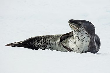
Leopard seal (Antarctic Sound, Tabarin Peninsula)
Voting period is over. Please don't add any new votes. Voting period ends on 10 Jun 2016 at 03:25:53 (UTC)
- Reason
- High quality, high EV
- Original
- A Leopard seal lying on sea ice in the Antarctic Sound, near Brown Bluff on Antarctica's Tabarin Peninsula. The first image of the set captures the entire seal, while the second focuses on a well-timed yawn. The penultimate Antarctic predator, second only to the Killer whale.
- Articles in which these images appear
- Leopard seal, List of mammals of Antarctica
- FP category for this image
- Wikipedia:Featured pictures/Animals/Mammals
- Creator
- Godot13
Leopard seal
_04.jpg)
-

Close-up of a Leopard seal yawn displaying teeth. The combination of canine teeth and molars allow it to hunt other animals or sieve small organisms from the water.
_05.jpg)
- Support as nominator – Godot13 ( talk) 03:25, 31 May 2016 (UTC)
- Support – Excellent detail; big improvement over previous pic in infobox at Leopard seal. Sca ( talk) 14:24, 31 May 2016 (UTC)
- Support Adam Cuerden ( talk) 22:17, 31 May 2016 (UTC)
- Support — Chris Woodrich ( talk) 00:13, 1 June 2016 (UTC)
- Support – Jobas ( talk) 12:24, 2 June 2016 (UTC)
- Support. While the background of the second image appears to be a bit out of focus, I'm assuming this was done to emphasize the animal's teeth. Either way, wonderful pictures both. Colonel Wilhelm Klink ( Complaints| Mistakes) 01:21, 3 June 2016 (UTC)
Promoted File:Antarctic Sound-2016-Brown Bluff–Leopard seal (Hydrurga leptonyx) 04.jpg --
Armbrust
The Homunculus 03:36, 10 June 2016 (UTC)
Promoted File:Antarctic Sound-2016-Brown Bluff–Leopard seal (Hydrurga leptonyx) 05.jpg --
Armbrust
The Homunculus 03:36, 10 June 2016 (UTC)
Cherenkov radiation
Voting period is over. Please don't add any new votes. Voting period ends on 10 Jun 2016 at 22:15:58 (UTC)

- Reason
- This effect is described in an article I found some time back that always amused me, but the image illustrating it was below FP quality. At some point when I was not looking, that changed, and now this image is within FPC size guidelines so I am letting it have a run here to see if others think it to be worthy of a Featured Picture star. The image in question illustrates the Cherenkov effect, which creates a blue hue in nuclear material under certain circumstances. Although Cherenkov radiation had been theoretically predicted by the English polymath Oliver Heaviside in papers published in 1888–89, it was first detected experimentally in 1958 by Soviet scientist Pavel Alekseyevich Cherenkov, the 1958 Nobel Prize winner. A theory of this effect was later developed within the framework of Einstein's special relativity theory by Igor Tamm and Ilya Frank, who also shared the Nobel Prize.
- Articles in which this image appears
- Advanced Test Reactor, Cherenkov radiation, Climate change mitigation, Doctor Manhattan, Idaho National Laboratory, List of light sources, Low-carbon power, Nuclear fuel, Pavel Cherenkov
- FP category for this image
- Wikipedia:Featured pictures/Engineering and technology/Others
- Creator
- Argonne National Laboratory
- Support as nominator – TomStar81 ( Talk) 22:15, 31 May 2016 (UTC)
- Support Adam Cuerden ( talk) 23:23, 31 May 2016 (UTC)
- Support, assuming this blue tint is attributable to Cherenkov radiation. —
Chris Woodrich (
talk) 00:19, 1 June 2016 (UTC)
- Should be, I mean that is what the photograph is supposed to show. That being said, if you'd like to get a second opinion from someone more photographically competent that me I have no objections. Double checking is always a good idea.
TomStar81 (
Talk) 05:08, 1 June 2016 (UTC)
- I don't know anything about photographing nuclear reactors, and I don't know anyone who does. I'm just noting that a blue tint is possible with lighting etc. I'm not saying that's been done here. —
Chris Woodrich (
talk) 06:15, 1 June 2016 (UTC)
- The source flickr account [4] belongs to a notable organization, and other google images of "Cherenkov radiation" confirm the blue tint. Bammesk ( talk) 02:34, 2 June 2016 (UTC)
- I don't know anything about photographing nuclear reactors, and I don't know anyone who does. I'm just noting that a blue tint is possible with lighting etc. I'm not saying that's been done here. —
Chris Woodrich (
talk) 06:15, 1 June 2016 (UTC)
- Should be, I mean that is what the photograph is supposed to show. That being said, if you'd like to get a second opinion from someone more photographically competent that me I have no objections. Double checking is always a good idea.
TomStar81 (
Talk) 05:08, 1 June 2016 (UTC)
- Support – Bammesk ( talk) 02:34, 2 June 2016 (UTC)
- Support – Jobas ( talk) 12:26, 2 June 2016 (UTC)
Promoted File:Advanced Test Reactor.jpg -- Armbrust The Homunculus 00:24, 11 June 2016 (UTC)
Esther Ibanga
Voting period is over. Please don't add any new votes. Voting period ends on 10 Jun 2016 at 23:20:13 (UTC)

- Reason
- A very good picture; notable person, and underrepresented group.
- Articles in which this image appears
- Esther Ibanga
- FP category for this image
- Wikipedia:Featured pictures/People/Religious figures
- Creator
- The Institute for Inclusive Security
- Support as nominator – Adam Cuerden ( talk) 23:20, 31 May 2016 (UTC)
- Comment Crop is awfully tight. —
Chris Woodrich (
talk) 00:13, 1 June 2016 (UTC)
- That can probably be let off as an artistic choice. The composition still works, after all, even if it's not standard. Adam Cuerden ( talk) 00:55, 1 June 2016 (UTC)
- Support -- Jobas ( talk) 12:34, 2 June 2016 (UTC)
- Oppose - Overlit. - hahnch e n 20:59, 3 June 2016 (UTC)
- Comment There is a copyright tag on the bottom left with the name "Mel Snyder 2015", don't know if that affects the FPC (nothing in the rules though). Spongie555 ( talk) 06:37, 6 June 2016 (UTC)
- Comment : Obviously it effects FPC Spongie555.... DreamSparrow Chat 16:51, 7 June 2016 (UTC)
- Oppose. We should not be supporting any image with an unnecessary watermark, and there definitely seems to be a question mark over the copyright status of this image. Josh Milburn ( talk) 22:05, 8 June 2016 (UTC)
Not Promoted -- Armbrust The Homunculus 00:26, 11 June 2016 (UTC)
"Broke, baby sick, and car trouble!"
Voting period is over. Please don't add any new votes. Voting period ends on 11 Jun 2016 at 17:06:52 (UTC)

- Reason
- A fine photograph by Dorothea Lange that helps get the desperateness of the dust bowl migrants across.
- Articles in which this image appears
- Economic history of the United States, Dorothea Lange, Dust Bowl
- FP category for this image
- Wikipedia:Featured pictures/History/USA History
- Creator
- Dorothea Lange, restored by Adam Cuerden
- Support as nominator – Adam Cuerden ( talk) 17:06, 1 June 2016 (UTC)
- Support - Powerful. Thumbnail doesn't do it justice. — Chris Woodrich ( talk) 00:01, 2 June 2016 (UTC)
- Support – On behalf of the Joads. Sca ( talk) 00:19, 2 June 2016 (UTC)
- Support – Bammesk ( talk) 02:43, 2 June 2016 (UTC)
- Support – Jobas ( talk) 12:30, 2 June 2016 (UTC)
- Support per historical significance. Colonel Wilhelm Klink ( Complaints| Mistakes) 01:09, 3 June 2016 (UTC)
- Support - Excellent legacy photo. Jus da fax 04:09, 3 June 2016 (UTC)
- Comment The
original file has been inverted for the reason unclear to me. Is it LoC that has the wrong inversion?
Brandmeister
talk 16:26, 8 June 2016 (UTC)
- @
Brandmeister: It's on the file description page: The LoC has two scans, each mirror images of each other. I checked carefully, nd realised you can just see a sign in front of the jalopy, with enough letters visible to definitely say the original image was flipped, and the other (lower-quality) scan got it right.
Adam Cuerden (
talk) 19:10, 8 June 2016 (UTC)
- Thanks. There's also some inscription on the box just above the trailer wheel, but it looks illegible to me.
Brandmeister
talk 19:22, 8 June 2016 (UTC)
- Also, if you presume the line left (in this chirality) of the car in the background is the median line, it would be driving on the left if in the original chirality.
- Thanks. There's also some inscription on the box just above the trailer wheel, but it looks illegible to me.
Brandmeister
talk 19:22, 8 June 2016 (UTC)
- @
Brandmeister: It's on the file description page: The LoC has two scans, each mirror images of each other. I checked carefully, nd realised you can just see a sign in front of the jalopy, with enough letters visible to definitely say the original image was flipped, and the other (lower-quality) scan got it right.
Adam Cuerden (
talk) 19:10, 8 June 2016 (UTC)
- Support TomStar81 ( Talk) 03:18, 11 June 2016 (UTC)
Promoted File:Broke, baby sick, and car trouble! - Dorothea Langes photo of a Missouri family of five in the vicinity of Tracy, California.jpg -- Armbrust The Homunculus 23:37, 11 June 2016 (UTC)
Cardinal Niccolò Albergati
Voting period is over. Please don't add any new votes. Voting period ends on 12 Jun 2016 at 22:27:26 (UTC)

- Reason
- High Ev as lead image in two articles, very good scan of the portrait. Probably can be a set nomination with File:Jan van Eyck - Portrait of Cardinal Niccolò Albergati - Google Art Project.jpg which also is a lead image at Study for Cardinal Niccolò Albergati
- Articles in which this image appears
- Niccolò Albergati, Portrait of Cardinal Niccolò Albergati
- FP category for this image
- Wikipedia:Featured pictures/People/Religious figures
- Creator
- Jan van Eyck
- Support as nominator – Spongie555 ( talk) 22:27, 2 June 2016 (UTC)
- Support - Jobas ( talk) 13:28, 3 June 2016 (UTC)
- Support — Chris Woodrich ( talk) 01:35, 4 June 2016 (UTC)
- Support, and I would also support as a set. I wouldn't hang it on my wall, but that's not what this is about. Josh Milburn ( talk) 21:46, 8 June 2016 (UTC)
- Support Not a huge van Eyck fan (great faces, but the clothing just seems so slapdash..,) but it's a good reproduction. Adam Cuerden ( talk) 20:35, 11 June 2016 (UTC)
Promoted File:Jan van Eyck - Kardinal Niccolò Albergati - Google Art Project.jpg -- Armbrust The Homunculus 22:32, 12 June 2016 (UTC)
- Added image to Wikipedia:Featured pictures/Artwork/Paintings, as there is an article about the painting. Armbrust The Homunculus 22:32, 12 June 2016 (UTC)
Portrait of a Cardinal (Raphael)
Voting period is over. Please don't add any new votes. Voting period ends on 12 Jun 2016 at 22:39:04 (UTC)

- Reason
- High Ev as lead image and amazing quality scan
- Articles in which this image appears
- Portrait of a Cardinal (Raphael), List of paintings by Raphael, Museo del Prado, etc.
- FP category for this image
- Wikipedia:Featured pictures/Artwork/Paintings
- Creator
- Raphael
- Support as nominator – Spongie555 ( talk) 22:39, 2 June 2016 (UTC)
- Support – Jobas ( talk) 13:39, 3 June 2016 (UTC)
- Support — Chris Woodrich ( talk) 01:28, 4 June 2016 (UTC)
- Support. Josh Milburn ( talk) 21:07, 10 June 2016 (UTC)
- Support A fine work. I viewed it scaled down a bit, but still well above the minimum. Adam Cuerden ( talk) 20:37, 11 June 2016 (UTC)
Promoted File:Portrait of a Cardinal, by Raffael, from Prado in Google Earth.jpg -- Armbrust The Homunculus 22:40, 12 June 2016 (UTC)
Lewis Hamilton at the 2016 Monaco Grand Prix
Voting period is over. Please don't add any new votes. Voting period ends on 13 Jun 2016 at 14:05:54 (UTC)

- Reason
- We have very little FPs from Formula One. This one has particular significance since it shows current Drivers' World Champion Lewis Hamilton on his way to victory at the most prestigious race on the calendar, the Monaco Grand Prix. The composition is great, the colors stunning and the car driving through the relentless rain adds to the flavor.
- Articles in which this image appears
- 2016 Monaco Grand Prix, Lewis Hamilton
- FP category for this image
- Culture, entertainment, and lifestyle/Sport
- Creator
- Andrew Locking
- Support as nominator – Zwerg Nase ( talk) 14:05, 3 June 2016 (UTC)
- Comment Lots of chromatic noise, but otherwise acceptable given the speed and such. Can we get a noise reduction?
Adam Cuerden (
talk) 14:18, 3 June 2016 (UTC)
- Done. —
Chris Woodrich (
talk) 00:44, 4 June 2016 (UTC)
- Support, then. Adam Cuerden ( talk) 08:43, 4 June 2016 (UTC)
- Done. —
Chris Woodrich (
talk) 00:44, 4 June 2016 (UTC)
- Support — Chris Woodrich ( talk) 00:44, 4 June 2016 (UTC)
- Support – I hope those F1 cars have ABS! Sca ( talk) 13:49, 4 June 2016 (UTC)
- @ Sca: Nope ;) Zwerg Nase ( talk) 11:06, 5 June 2016 (UTC)
- Due to weight?
Sca (
talk) 16:45, 5 June 2016 (UTC)
- @ Sca: Due to "don't be a sissy, you're a Formula 1 driver" ;) Zwerg Nase ( talk) 17:56, 5 June 2016 (UTC)
- Due to weight?
Sca (
talk) 16:45, 5 June 2016 (UTC)
- Support The photo is somewhat under-utilised in both articles (where its simply one of many photos of race cars), but it's an excellent dramatic shot with strong EV Nick-D ( talk) 02:18, 5 June 2016 (UTC)
- Support – I agree the photo is stunning. It's a shame that there are not many Formula One featured pictures on this site. Z105space (talk) 07:44, 5 June 2016 (UTC)
- Support - I think this would be a very good picture for Rain tyre also. - hahnch e n 08:13, 5 June 2016 (UTC)
- @ Hahnchen and Nick-D: Yes, perfect, thank you :) Zwerg Nase ( talk) 11:06, 5 June 2016 (UTC)
- Support – Jobas ( talk) 16:32, 5 June 2016 (UTC)
- Question Can this be closed with positive result?
Zwerg Nase (
talk) 07:28, 13 June 2016 (UTC)
- @ Zwerg Nase: It has to run the full period first, but with eight supports and no opposes, it's basically passed. Give it a couple more hours for the timer to tick over, then it should be closed pretty quickly - Armbrust never seems to be away very long. Adam Cuerden ( talk) 11:33, 13 June 2016 (UTC)
- @ Adam Cuerden: Sorry, I misread, I thought it was yesterday at noon... Zwerg Nase ( talk) 12:34, 13 June 2016 (UTC)
Promoted File:Hamilton - 2016 Monaco GP 02.jpg -- Armbrust The Homunculus 14:07, 13 June 2016 (UTC)
A Game of L'hombre in Brøndum's Hotel
Voting period is over. Please don't add any new votes. Voting period ends on 15 Jun 2016 at 02:06:41 (UTC)

- Reason
- A good quality Google Art Project image of a memorable painting by a notable artist. This image is featured on Commons. I replaced a lower quality version of the painting in the artist's article, and just added it to the articles Ombre and Brøndums Hotel.
- Articles in which this image appears
- Anna Palm de Rosa, Ombre, and Brøndums Hotel.
- FP category for this image
- Wikipedia:Featured pictures/Artwork/Paintings
- Creator
- Anna Palm de Rosa
- Support as nominator – Pine ✉ 02:06, 5 June 2016 (UTC)
- Support - Lovely. — Chris Woodrich ( talk) 02:55, 5 June 2016 (UTC)
- Support – Evocative work by a less well known artist – another of the Skagen Painters. – Sca ( talk) 12:38, 5 June 2016 (UTC)
- Support – Jobas ( talk) 16:36, 5 June 2016 (UTC)
- Comment: In many ways, I want to support this. However, I note that it currently appears in two galleries and decoratively in an article about a card game. Josh Milburn ( talk) 22:10, 8 June 2016 (UTC)
- Josh, follow your bliss! – I enlarged & moved the pic in the target article and placed another in the gallery. Sca ( talk) 22:16, 9 June 2016 (UTC)
- Support – Her Joy in gilded Chariots, when alive,
- And Love of Ombre, after Death survive. — Alexander Pope
- Vesuvius Dogg ( talk) 14:28, 10 June 2016 (UTC)
- Comment – Oddly enough, while Ombre describes it as "a card game for three players," there appear to be four in Anna's painting. Sca ( talk) 18:36, 10 June 2016 (UTC)
- Commenting comment: /info/en/?search=Ombre#Four-handed_Ombre ;-) Support, BTW... -- Janke | Talk 13:34, 11 June 2016 (UTC)
Promoted File:Anna Palm - A game of L'hombre in Brøndum's Hotel - Google Art Project.jpg -- Armbrust The Homunculus 02:09, 15 June 2016 (UTC)
Space Shuttle Enterprise with Star Trek cast and producer
Voting period is over. Please don't add any new votes. Voting period ends on 15 Jun 2016 at 02:32:43 (UTC)

- Reason
- Excellent illustration for the article Cultural influence of Star Trek, already featured on Commons. The shuttle was originally to be named Constitution, but a letter-writing campaign of from Star Trek fans consisting of "hundreds of thousands of letters" petitioned for name to be changed in honor of Star Trek's USS Enterprise (NCC-1701). For a science fiction entertainment franchise and cultural phenomenon to have such influence over a real-world political decision is notable.
- Articles in which this image appears
- Cultural influence of Star Trek, Space Shuttle Enterprise (replaced another version of the same image), Star Trek, Star Trek: The Motion Picture, United States Air Force Plant 42
- FP category for this image
- Wikipedia:Featured pictures/People/Science and engineering
- Creator
- NASA
- Support as nominator – Pine ✉ 02:32, 5 June 2016 (UTC)
- Support – missing the captain but good enough! Bammesk ( talk) 04:07, 5 June 2016 (UTC)
- Support – Jobas ( talk) 16:38, 5 June 2016 (UTC)
- Support - Acceptable quality for a candid shot. — Chris Woodrich ( talk) 23:56, 6 June 2016 (UTC)
- Support Some minor damage, especially in the upper left; can live with it. Adam Cuerden ( talk) 01:19, 11 June 2016 (UTC)
- Support per nomination. Colonel Wilhelm Klink ( Complaints| Mistakes) 19:44, 12 June 2016 (UTC)
Promoted File:The Shuttle Enterprise - GPN-2000-001363.jpg -- Armbrust The Homunculus 02:45, 15 June 2016 (UTC)
- Added it to Wikipedia:Featured pictures/People/Entertainment instead. -- Armbrust The Homunculus 02:45, 15 June 2016 (UTC)
Glitter bombing
Voting period is over. Please don't add any new votes. Voting period ends on 23 Jun 2016 at 05:24:21 (UTC)

- Reason
- High Ev as lead image and good quality picture.
- Articles in which this image appears
- Glitter bombing, Vermin Supreme, Randall Terry, List of practical joke topics
- FP category for this image
- I don't know maybe Wikipedia:Featured pictures/History/Others or Wikipedia:Featured pictures/Culture, entertainment, and lifestyle/Culture and lifestyle
- Creator
- MarcN~enwiki
- Support as nominator – Spongie555 ( talk) 05:24, 13 June 2016 (UTC)
- Oppose – Crooked, mediocre detail, poorly framed, unidentified subject at right. Sca ( talk) 13:06, 13 June 2016 (UTC)
- Oppose Mediocre snapshot, not FP worthy. -- Janke | Talk 13:35, 13 June 2016 (UTC)
- Oppose Per others – Jobas ( talk) 20:18, 13 June 2016 (UTC)
- Oppose Per above – tilted, unknown person on the right. Mattximus ( talk) 23:26, 13 June 2016 (UTC)
- Withdraw More problems then I thought were brought up. Spongie555 ( talk) 06:15, 14 June 2016 (UTC)
Not Promoted -- Armbrust The Homunculus 12:09, 15 June 2016 (UTC)
- Withdrawn nomination Armbrust The Homunculus 12:09, 15 June 2016 (UTC)
Kimberly Hunt
Voting period is over. Please don't add any new votes. Voting period ends on 26 Jun 2016 at 23:08:05 (UTC)

- Reason
- High Ev as lead image and good quality picture
- Articles in which this image appears
- Kimberly Hunt
- FP category for this image
- Wikipedia:Featured pictures/People/Others
- Creator
- Jessica Davis
- Support as nominator – Spongie555 ( talk) 23:08, 16 June 2016 (UTC)
- Oppose – Promotional pic. Blown highlights. Sca ( talk) 23:53, 16 June 2016 (UTC)
- Oppose per blown highlights. — Chris Woodrich ( talk) 00:35, 17 June 2016 (UTC)
- Oppose per the above - this isn't a good example of a promotional photo, nor a particularly good photo of Ms Hunt given the technical problems. Nick-D ( talk) 07:32, 17 June 2016 (UTC)
- Oppose Per other – Jobas ( talk) 21:37, 17 June 2016 (UTC)
- Withdraw Didn't notice blown highlights. Spongie555 ( talk) 23:02, 17 June 2016 (UTC)
Not Promoted -- Armbrust The Homunculus 04:01, 18 June 2016 (UTC)
- Withdrawn nomination. Armbrust The Homunculus 04:01, 18 June 2016 (UTC)
Cenk Uygur hosting The Young Turks
Voting period is over. Please don't add any new votes. Voting period ends on 19 Jun 2016 at 02:55:34 (UTC)
.jpg)
- Reason
- A photograph of high resolution that has a free license and adequately provides the same information as a non-free screenshot of a copyrighted web/television program.
- Articles in which this image appears
- The Young Turks (should also appear in the article Cenk Uygur but it's currently protected from editing)
- FP category for this image
- Wikipedia:Featured pictures/Culture, entertainment, and lifestyle/Entertainment
- Creator
- Tim Collins through the new tytvault Flickr account with CC-BY-SA licensing. I requested copyright permission. Also there is a standalone tytvault website with non-free images.
- Support as nominator – New9374 ( talk) 02:55, 9 June 2016 (UTC)
- Oppose – Promotional shot, akin to advertising. Sca ( talk) 13:49, 9 June 2016 (UTC)
- Oppose Per Sca ( talk) – Jobas ( talk) 17:53, 12 June 2016 (UTC)
-
-
- 3a states it "is among the best examples of a given subject"; how are they not among the best example when they are the only photographs of The Young Turks that the encyclopedia has to offer? 3b states it "illustrates the subject in a compelling way [and] has appropriate lighting"; Cenk and Ana are using hand gestures to evoke attention in a powerfully irresistible way and the photographs have appropriate lighting. 3c states it "is not always required to be aesthetically pleasing; it might be [...] just highly informative"; the deconstructed American flag background is aesthetically pleasing and the photographs are highly informative of the show, its hosts and its studio. I don't see how it being a "promotional shot, akin to advertising" violates the criterion 3 especially when today's featured picture is taken from the subject's official website. New9374 ( talk) 03:36, 16 June 2016 (UTC)
- That Emily Batty pic shouldn't have been promoted, either. Promotional. Sca ( talk) 23:52, 16 June 2016 (UTC)
- Sca has a long history of objecting to any promotional shots of living people (particularly politicians). As the unanimous support for the Emily Batty image shows, not everyone agrees with him. Personally I think this image has a lot of character. Sadly, it hasn't gotten much attention. — Chris Woodrich ( talk) 00:55, 18 June 2016 (UTC)
- Sca and Jobas, all objections should be accompanied by a specific rationale that, if addressed, would make you support the image.. Thank you Chris Woodrich, it is unfortunate this picture hasn't gotten much attention and no rationale has been provided for opposes. New9374 ( talk) 09:43, 18 June 2016 (UTC)
-
Sca has a long history of opposing artificial, staged photos designed to promote or sell a personality, politician, program, product or service, and he will continue to do so based on his training in principles of journalism.
However, in this case: Mediocre detail, distracting background, and lack of any visual clue as to why this person would be featured. Thus, puzzling and not "among the best examples of a given subject that the encyclopedia has to offer," IMO.
PS: This opinion has nothing to do with Sca's personal political views. Nor does Sca have any opinion of the subject(s) of this (these) photos, having never heard of them before. Sca ( talk) 20:40, 18 June 2016 (UTC)
-
- Oppose, not a bad shot, but opposing based on EV. It is not the lead image for the person in question (so limited EV on that page), nor does it show both hosts for tv show (limited EV for the TV program). Mattximus ( talk) 15:35, 18 June 2016 (UTC)
- Withdraw Thank you Mattximus. New9374 ( talk) 02:21, 19 June 2016 (UTC)
Not Promoted -- Armbrust The Homunculus 04:52, 19 June 2016 (UTC)
Ana Kasparian and Cenk Uygur hosting The Young Turks
Voting period is over. Please don't add any new votes. Voting period ends on 19 Jun 2016 at 03:14:42 (UTC)
.jpg)
- Reason
- A photograph of high resolution that has a free license. It shows the "new" set of the web series The Young Turks. The funding and building of the set were significant moments in the show's production history: $400,000 was crowdfunded for the studio on Indiegogo (link here), the studio's debut was covered in a Tubefilter article (link here), and the show has achieved significant popularity following the "new" studio.
- Articles in which this image appears
- The Young Turks (could also appear in the article Cenk Uygur but it's currently protected from editing; should also appear in the article Ana Kasparian)
- FP category for this image
- Wikipedia:Featured pictures/Culture, entertainment, and lifestyle/Entertainment
- Creator
- Tim Collins through the new tytvault Flickr account with CC-BY-SA licensing. I requested copyright permission. Also there is a standalone tytvault website with non-free images.
- Support as nominator – New9374 ( talk) 03:14, 9 June 2016 (UTC)
- Oppose – Promotional shot, akin to advertising. Sca ( talk) 13:48, 9 June 2016 (UTC)
-
-
- 3a states it "is among the best examples of a given subject"; how are they not among the best example when they are the only photographs of The Young Turks that the encyclopedia has to offer? 3b states it "illustrates the subject in a compelling way [and] has appropriate lighting"; Cenk and Ana are using hand gestures to evoke attention in a powerfully irresistible way and the photographs have appropriate lighting. 3c states it "is not always required to be aesthetically pleasing; it might be [...] just highly informative"; the deconstructed American flag background is aesthetically pleasing and the photographs are highly informative of the show, its hosts and its studio. I don't see how it being a "promotional shot, akin to advertising" violates the criterion 3 especially when today's featured picture is taken from the subject's official website. New9374 ( talk) 03:36, 16 June 2016 (UTC)
-
- Oppose - Not a bad photograph of the set, but any image for the TV program should clearly show the two hosts. The person on the right is only seen in a harsh profile unfortunately. Oppose on grounds of EV. Mattximus ( talk) 15:37, 18 June 2016 (UTC)
- Withdraw Thank you Mattximus. New9374 ( talk) 02:21, 19 June 2016 (UTC)
Not Promoted -- Armbrust The Homunculus 04:57, 19 June 2016 (UTC)
Chinstrap penguin (Deception Island, South Shetland Islands)
Voting period is over. Please don't add any new votes. Voting period ends on 20 Jun 2016 at 18:25:55 (UTC)
_04.jpg)
- Reason
- High quality, high EV
- Articles in which this image appears
- Chinstrap penguin, Penguin
- FP category for this image
- Wikipedia:Featured_pictures/Animals/Birds
- Creator
- Godot13
- Support as nominator – Godot13 ( talk) 18:25, 10 June 2016 (UTC)
- Support — Chris Woodrich ( talk) 00:43, 11 June 2016 (UTC)
- Support Seems slightly blurry around the beak, but it's otherwise very good. Adam Cuerden ( talk) 20:38, 11 June 2016 (UTC)
- Support – Jobas ( talk) 18:00, 12 June 2016 (UTC)
- Support – looks good. Mattximus ( talk) 23:29, 13 June 2016 (UTC)
- Support - Good subject and frame. Jus da fax 06:26, 15 June 2016 (UTC)
Promoted File:South Shetland-2016-Deception Island–Chinstrap penguin (Pygoscelis antarctica) 04.jpg -- Armbrust The Homunculus 18:26, 20 June 2016 (UTC)
The Passion of Joan of Arc (1928) English Poster
Voting period is over. Please don't add any new votes. Voting period ends on 20 Jun 2016 at 21:43:16 (UTC)
_English_Poster.png)
- Reason
- High resolution image of poster for famous film
- Articles in which this image appears
- The Passion of Joan of Arc, Art film, Renée Jeanne Falconetti
- FP category for this image
- Entertainment
- Creator
- Unknown
- Support as nominator – Kaldari ( talk) 21:43, 10 June 2016 (UTC)
- Support – Jobas ( talk) 18:03, 12 June 2016 (UTC)
- Support – The original "Chick Flick", right? Interesting that this 1929 British promotional poster leaves the director ( Carl Th. Dreyer) unmentioned. Vesuvius Dogg ( talk) 15:20, 13 June 2016 (UTC)
- Oppose for now - I think this could use some restoration. I'll pause Ivor Novello and get on that. Adam Cuerden ( talk) 14:30, 15 June 2016 (UTC)
- Support - Probably needs a little touch up but still a good image. Spongie555 ( talk) 07:31, 19 June 2016 (UTC)
Not Promoted -- Armbrust The Homunculus 22:39, 20 June 2016 (UTC)
Destroyed Apollo 1 Command Module
Voting period is over. Please don't add any new votes. Voting period ends on 21 Jun 2016 at 03:15:18 (UTC)

- Reason
- Before the United States could put a man on the moon it had to design a machine to get man to the moon, and the machine chosen for this was the Saturn V rocket. Unfortunately, as has always been the case with the new, there were issues with the design that needed to be addressed before the project could get off the ground. Sadly, discovering those issues usually entails the loss of life, and so it was with the Apollo Project as well. On January 27, 1967, during a launch simulation test, an unidentified ignition source (widely believed to be faulty wiring) caused the 100% oxygen in the cabin at the time to ignite. The resulting fire killed the three intended Apollo 1 astronauts and resulted in a major rebuilding of the Command Module design for future Apollo missions and new procedures to effectively respond to and deal with an emergency of this nature.
- Articles in which this image appears
- 1967 in the United States, Apollo 1, Apollo program, Edward Higgins White, Gus Grissom, Joseph Francis Shea, Oxygen, Roger B. Chaffee, Space Race
- FP category for this image
- Wikipedia:Featured pictures/History/USA History
- Creator
- National Aeronautics and Space Administration (NASA) (PD-USGov)
- Support as nominator – TomStar81 ( Talk) 03:15, 11 June 2016 (UTC)
- Support per historical significance. Colonel Wilhelm Klink ( Complaints| Mistakes) 19:35, 12 June 2016 (UTC)
- Oppose – It has EV but as a stand-alone image it can be almost anything. I would support if the composition covered more of the surrounding area and showed some relation to the space program. Bammesk ( talk) 02:05, 13 June 2016 (UTC)
- Oppose – Per
Bammesk. Seems a rather grisly scene that doesn't provide much EV.
Sca (
talk) 13:19, 13 June 2016 (UTC)
- @ Bammesk and Sca: Would a before and after be better here then - say adding something like File:McDivitt, Scott and Schweickart in preliminary training for Apollo AS-258 mission.jpg to the image so that people can get a better sense of what they are seeing? Or were you you two thinking of something more along the lines of File:Apollo 1's Command Module - GPN-2003-00057.jpg, which shows the whole capsule from a short distance as opposed to a close up so you can see the damage done? TomStar81 ( Talk) 17:23, 13 June 2016 (UTC)
Not Promoted -- Armbrust The Homunculus 04:01, 21 June 2016 (UTC)
Emmeline Pankhurst
Voting period is over. Please don't add any new votes. Voting period ends on 23 Jun 2016 at 01:15:13 (UTC)
.jpg)
- Reason
- Very notable British suffragette; good-quality photo, with the chiaroscuro effect so beloved at the time.
- Articles in which this image appears
- Emmeline Pankhurst
- FP category for this image
- Tricky; but perhaps Wikipedia:Featured pictures/People/Political, given it was essentially a campaign to change the law, and she worked in politics after suffrage passed.
- Creator
- Matzene (Chicago); restored by Adam Cuerden
- Support as nominator – Adam Cuerden ( talk) 01:15, 13 June 2016 (UTC)
- Support – High EV, good detail for the era. (Not sure © Matzene Chicago needs to be there; pic is more than 100 years old.) Sca ( talk) 13:15, 13 June 2016 (UTC)
- It could be removed, but I tend to leave on photographer's identification markings, as part of the image's presentation. This one is borderline, though. Adam Cuerden ( talk) 16:49, 13 June 2016 (UTC)
- Support – Love Mrs Pankhurst, and agree on the removal of the fussy photography credit. Vesuvius Dogg ( talk) 20:08, 13 June 2016 (UTC)
- Besides, not everyone has a name like Emmeline. (Didn't Chuck Berry do a song about her?)
 Sca (
talk) 21:13, 13 June 2016 (UTC)
Sca (
talk) 21:13, 13 June 2016 (UTC)
- No, but Lin-Manuel Miranda should write a rap musical about her Vesuvius Dogg ( talk) 22:43, 13 June 2016 (UTC)
- Besides, not everyone has a name like Emmeline. (Didn't Chuck Berry do a song about her?)
- Support – Jobas ( talk) 20:12, 13 June 2016 (UTC)
- Support – But I agree with the removal of the copyright tag, since it has nothing to do with the person in question, and detracts from the overall image. Mattximus ( talk) 23:25, 13 June 2016 (UTC)
- Support — Chris Woodrich ( talk) 01:17, 14 June 2016 (UTC)
- @ Sca, Vesuvius Dogg, Jobas, Mattximus, and Crisco 1492: I removed the copyright note. It was hand-drawn on anyway. Also futzed with a light vertical line on her dress. Adam Cuerden ( talk) 15:19, 14 June 2016 (UTC)
- Looks fine. Sca ( talk) 15:38, 14 June 2016 (UTC)
- Good work, Adam, and thank you for this one. I'm a collector of photographic carte-des-visites and own another image of Mrs Pankhurst. This one is better. Vesuvius Dogg ( talk) 16:25, 14 June 2016 (UTC)
- @ Vesuvius Dogg: Well, if you have any that do need a little restoration, scan them at about 300-600dpi, and I'm happy to go to work. Adam Cuerden ( talk) 17:06, 14 June 2016 (UTC)
- Support -- Martin Falbisoner ( talk) 06:12, 15 June 2016 (UTC)
Promoted File:Emmeline Pankhurst, seated (1913).jpg -- Armbrust The Homunculus 03:50, 23 June 2016 (UTC)
Study for Cardinal Niccolò Albergati
Voting period is over. Please don't add any new votes. Voting period ends on 23 Jun 2016 at 05:10:30 (UTC)

- Reason
- High Ev as lead image and good scan. I should have made a set nomination when I nominted the painting but it was too late
- Articles in which this image appears
- Study for Cardinal Niccolò Albergati, Portrait of Cardinal Niccolò Albergati
- FP category for this image
- Wikipedia:Featured pictures/Artwork/Paintings
- Creator
- Jan van Eyck
- Support as nominator – Spongie555 ( talk) 05:10, 13 June 2016 (UTC)
- Support – added image to Kupferstich-Kabinett, Dresden, owner of the original. Vesuvius Dogg ( talk) 18:45, 13 June 2016 (UTC)
- Support – Jobas ( talk) 20:14, 13 June 2016 (UTC)
- Support – as above. Mattximus ( talk) 23:27, 13 June 2016 (UTC)
- Support -- Martin Falbisoner ( talk) 06:13, 15 June 2016 (UTC)
- Support. Josh Milburn ( talk) 18:54, 17 June 2016 (UTC)
Promoted File:Jan van Eyck - Portrait of Cardinal Niccolò Albergati - Google Art Project.jpg -- Armbrust The Homunculus 08:17, 23 June 2016 (UTC)
- Added image to Wikipedia:Featured pictures/Artwork/Others, as this isn't a painting. Armbrust The Homunculus 08:17, 23 June 2016 (UTC)
Bessie Smith
Voting period is over. Please don't add any new votes. Voting period ends on 24 Jun 2016 at 21:53:57 (UTC)
_by_Carl_Van_Vechten.jpg)
- Reason
- A slightly oddly-grained photo (I think it's a "matte finish" effect), but of high-quality.
- Articles in which this image appears
- Bessie Smith +9
- FP category for this image
- Wikipedia:Featured pictures/People/Entertainment
- Creator
- Carl Van Vechten, restored by Adam Cuerden
- Support as nominator – Adam Cuerden ( talk) 21:53, 14 June 2016 (UTC)
- Support - What would Wikipedia do without Carl Van Vechten (and Adam ^_^)? Kaldari ( talk) 23:00, 14 June 2016 (UTC)
- Support — Chris Woodrich ( talk) 23:49, 14 June 2016 (UTC)
- Support - High quality indeed. Unusual too. Jus da fax 06:21, 15 June 2016 (UTC)
- Support – Jobas ( talk) 12:39, 16 June 2016 (UTC)
Promoted File:Bessie Smith (1936) by Carl Van Vechten.jpg -- Armbrust The Homunculus 22:43, 24 June 2016 (UTC)
Large Earth Bumblebee on Lavender Blossom
Voting period is over. Please don't add any new votes. Voting period ends on 25 Jun 2016 at 06:08:39 (UTC)

- Reason
- Lead image on en:Bombus_terrestris, already FP on Commons.
- Articles in which this image appears
- en:Bombus_terrestris, es:Bombus_terrestris, sl:Temni zemeljski čmrlj
- FP category for this image
- Wikipedia:Featured pictures/Animals/Insects
- Creator
- Martin Falbisoner
- Support as nominator – Martin Falbisoner ( talk) 06:08, 15 June 2016 (UTC)
- Support — Chris Woodrich ( talk) 06:32, 16 June 2016 (UTC)
- Support – Jobas ( talk) 12:43, 16 June 2016 (UTC)
- Support Though the large Mars bumblebee would have more significance, as proof of life on another planet. Adam Cuerden ( talk) 11:59, 17 June 2016 (UTC)
- Oppose. I'm sorry to do this; the image has a really nice composition and great colours, but I'm not sure it shows the distinguishing features of the species as well as it could. This is a familiar species to many, and so I think we can afford to be particularly discerning. Josh Milburn ( talk) 07:49, 20 June 2016 (UTC)
Not Promoted -- Armbrust The Homunculus 08:09, 25 June 2016 (UTC)
Hősök tere
Voting period is over. Please don't add any new votes. Voting period ends on 25 Jun 2016 at 14:47:38 (UTC)

- Reason
- High resolution photograph of a notable square in Budapest, and thus high EV.
- Articles in which this image appears
- Hősök tere
- FP category for this image
- Wikipedia:Featured pictures/Places/Urban
- Creator
- Godot13
- Support as nominator – Armbrust The Homunculus 14:47, 15 June 2016 (UTC)
- Support per nom. Very nice photo! Almost everyone is facing away from the camera so this helps with privacy issues. Mattximus ( talk) 21:49, 15 June 2016 (UTC)
- Support Beatiful, perhaps one of the coolest town squares. Brandmeister talk 08:33, 16 June 2016 (UTC)
- Support – Jobas ( talk) 12:46, 16 June 2016 (UTC)
- Support — Chris Woodrich ( talk) 00:36, 17 June 2016 (UTC)
Promoted File:HUN-2015-Budapest-Heroes’ Square.jpg -- Adam Cuerden ( talk) 18:39, 25 June 2016 (UTC)
Johannes Malderus
Voting period is over. Please don't add any new votes. Voting period ends on 26 Jun 2016 at 22:56:14 (UTC)


- Reason
- High Ev as lead image good scan of painting. I put the alt to give a different option of the same painting
- Articles in which this image appears
- Johannes Malderus
- FP category for this image
- Wikipedia:Featured pictures/People/Religious figures
- Creator
- Anthony van Dyck
- Support as nominator – Spongie555 ( talk) 22:56, 16 June 2016 (UTC)
- Comment – Since it was painted almost 500 years ago, "former" seems a tad redundant. Sca ( talk) 23:56, 16 June 2016 (UTC)
- Support Adam Cuerden ( talk) 12:12, 17 June 2016 (UTC)
- Comment: Is that alt a different physical painting?
Josh Milburn (
talk) 18:52, 17 June 2016 (UTC)
- @ J Milburn: Has to be. Look at the circular decorations on the right side of the chair. Two of them are missing in the alt. At a guess, the alt was a study for the full-sized painting. Adam Cuerden ( talk) 02:16, 18 June 2016 (UTC)
- Support – Jobas ( talk) 21:28, 17 June 2016 (UTC)
Not Promoted -- Armbrust The Homunculus 22:58, 26 June 2016 (UTC)
Ivor Novello
Voting period is over. Please don't add any new votes. Voting period ends on 27 Jun 2016 at 03:03:33 (UTC)

- Reason
- A pretty good example of the "arrivals on the ships" style of photojournalism popular in American theatre journalism c. 1910-1930. It's not perfect, but it makes for some interesting candid shots.
- Articles in which this image appears
- Ivor Novello et al.
- FP category for this image
- Wikipedia:Featured pictures/People/Entertainment
- Creator
- Unknown photographer; restored by Adam Cuerden
- Support as nominator – Adam Cuerden ( talk) 03:03, 17 June 2016 (UTC)
- Support - Very nice! — Chris Woodrich ( talk) 06:17, 17 June 2016 (UTC)
- Support. Brilliant candidate. Josh Milburn ( talk) 18:50, 17 June 2016 (UTC)
- Support – Jobas ( talk) 21:31, 17 June 2016 (UTC)
- Support - Spongie555 ( talk) 06:00, 24 June 2016 (UTC)
Promoted File:Ivor Novello.jpg -- Armbrust The Homunculus 03:29, 27 June 2016 (UTC)
Patricia Cornwell
Voting period is over. Please don't add any new votes. Voting period ends on 27 Jun 2016 at 12:04:32 (UTC)

- Reason
- A very good photo I discovered while making up a list of things for this month. Doesn't need restoration.
- Articles in which this image appears
- Patricia Cornwell
- FP category for this image
- Wikipedia:Featured pictures/People/Artists and writers
- Creator
- Christina Bonello
- Support as nominator – Adam Cuerden ( talk) 12:04, 17 June 2016 (UTC)
- Weak Support - Technically rather nice, though I'm not convinced that this needs so much light on her face. — Chris Woodrich ( talk) 14:02, 17 June 2016 (UTC)
- Weak Support – Yeah, the lighting seems kinda gimmicky – as if coming from a large diffuse reflector. Sca ( talk) 14:41, 17 June 2016 (UTC)
- Weak Support – Jobas ( talk) 21:34, 17 June 2016 (UTC)
- @
Crisco 1492,
Sca, and
Jobas: I think all professional photos are going to be at least a bit gimmicky. They reflect the fashions of the time, like how c. 1910 photographs focus on chiaroscuro, and news photographs a little later loved to photograph the celebrities arriving on ships, or the few fixed standard poses you see in the long-exposure Victorian "hold it for a few minutes" photographs.
Adam Cuerden (
talk) 03:12, 19 June 2016 (UTC)
- Yes, but there's gimmicky handled (rather) well and gimmicky handled like this. I can accept this. This too. This works fine for me because the background is black, even though I would probably have lit the face a bit less. But the Cornwell image being discussed just doesn't work for me. Her face is overlit, and the background and shirt are likewise rather bright, giving relatively little definition to her features (especially at thumbnail size). — Chris Woodrich ( talk) 05:38, 19 June 2016 (UTC)
- Weak support. I don't actually share the concerns of the above commenters, but I do question the extent to which the photo actually looks like her. Josh Milburn ( talk) 12:51, 26 June 2016 (UTC)
Not Promoted -- Armbrust The Homunculus 14:29, 27 June 2016 (UTC)
- Nomination didn't reach the necessary quorum for promotion. Armbrust The Homunculus 14:29, 27 June 2016 (UTC)
Chitra Dewi
Voting period is over. Please don't add any new votes. Voting period ends on 27 Jun 2016 at 13:50:00 (UTC)

- Reason
- High quality image of this Indonesian film actress
- Articles in which this image appears
- Chitra Dewi, Citra Award for Best Supporting Actress
- FP category for this image
- Wikipedia:Featured pictures/People/Entertainment
- Creator
- Tati Studios; restored by — Chris Woodrich ( talk)
- Support as nominator – — Chris Woodrich ( talk) 13:50, 17 June 2016 (UTC)
- Comment: I really like this. Can I ask how big the hardcopy is? I'm assuming that's going to be about as big as it gets?
Josh Milburn (
talk) 18:45, 17 June 2016 (UTC)
- The hard copy is a bit bigger than A4, but it is glossy (scanner glare was really bad on some parts of the image, particularly the top part of her hair) and printed on a porous photo paper (and thus the textures were very distracting at full size). My efforts to reduce glare and the prominence of the pores in the paper left the 600 ppi scan too soft to be uploaded at full resolution, hence the downsampling. That being said, I've uploaded a less-downsampled version. The softness is acceptable at 3000px tall (roughly the equivalent of 300 ppi) — Chris Woodrich ( talk) 00:42, 18 June 2016 (UTC)
- Support – Jobas ( talk) 21:40, 17 June 2016 (UTC)
- Comment It looks good, but there's some bits on the nose, just above the upper lip, and in the lower right corner that could probably use a smidgen more cleanup.
Adam Cuerden (
talk) 12:24, 18 June 2016 (UTC)
- How's this,
Adam Cuerden? —
Chris Woodrich (
talk) 14:38, 18 June 2016 (UTC)
- Nearly got it. There's a white streak, more or less vertical, below her right nostril (on the right as you're looking at her) that I'd fix, and that looks like a crack on the bottom of her chin. There's also a lighter bit between the TATT studio stamp and her hand, protruding up from the bottom of the image. Just the last couple bits on an otherwise excellent restoration (Support in the meantime)
Adam Cuerden (
talk) 15:07, 18 June 2016 (UTC)
- Done. — Chris Woodrich ( talk) 00:17, 19 June 2016 (UTC)
- Nearly got it. There's a white streak, more or less vertical, below her right nostril (on the right as you're looking at her) that I'd fix, and that looks like a crack on the bottom of her chin. There's also a lighter bit between the TATT studio stamp and her hand, protruding up from the bottom of the image. Just the last couple bits on an otherwise excellent restoration (Support in the meantime)
Adam Cuerden (
talk) 15:07, 18 June 2016 (UTC)
- How's this,
Adam Cuerden? —
Chris Woodrich (
talk) 14:38, 18 June 2016 (UTC)
- Support - Considering the source material described above, it's quite a good scan. Mattximus ( talk) 15:32, 18 June 2016 (UTC)
- Just a note; I've expanded the article on Chitra Dewi to 5300 characters. — Chris Woodrich ( talk) 15:53, 19 June 2016 (UTC)
- Support. Josh Milburn ( talk) 15:55, 19 June 2016 (UTC)
Promoted File:Roosilawati, c. 1955.jpg -- Armbrust The Homunculus 14:35, 27 June 2016 (UTC)
Nuristani girl
Voting period is over. Please don't add any new votes. Voting period ends on 27 Jun 2016 at 22:30:20 (UTC)

- Reason
- While Afghan Girl is Pashtun, this one is reportedly Nuristani. Once again shows how such poor folks can present themselves better than wealthy politicians on generic shots.
- Articles in which this image appears
- Nuristanis, Siah-Posh Kafirs, others
- FP category for this image
- People/Others (possibly)
- Creator
- Barbara Millucci
- Support as nominator – Brandmeister talk 22:30, 17 June 2016 (UTC)
- Oppose Awkward lighting angle. -- Janke | Talk 08:43, 18 June 2016 (UTC)
- Oppose - Lighting is quite bad. Shadows cover half her face... Mattximus ( talk) 15:31, 18 June 2016 (UTC)
- Weak support – Agree the lighting is less than ideal, but facial detail is excellent and the photo has a rather spontaneous feel to it. Sca ( talk) 20:45, 18 June 2016 (UTC)
- Oppose. I'm not really sure I see the EV, here; the whole nomination strikes me as a bit weird. Josh Milburn ( talk) 15:56, 19 June 2016 (UTC)
- My guess is it's an effort to highlight an obscure ethnic group, of which probably few in the West ever have heard. (Would 'woman' perhaps be more appropriate than 'girl' for this person?)
Sca (
talk) 20:31, 19 June 2016 (UTC)
- The EV here is the article
Nuristanis, with apparent distinguishing features of this girl compared to an average Afghan.
Brandmeister
talk 21:45, 19 June 2016 (UTC)
- "this one is reportedly", "Once again shows how such poor folks", "this girl", "an average Afghan". It's all a bit colonial for me. My oppose stands.
Josh Milburn (
talk) 07:46, 20 June 2016 (UTC)
- As a side note, I oppose colonialism, this is purely genetics and natural way of things. Brandmeister talk 11:22, 21 June 2016 (UTC)
- "this one is reportedly", "Once again shows how such poor folks", "this girl", "an average Afghan". It's all a bit colonial for me. My oppose stands.
Josh Milburn (
talk) 07:46, 20 June 2016 (UTC)
- The EV here is the article
Nuristanis, with apparent distinguishing features of this girl compared to an average Afghan.
Brandmeister
talk 21:45, 19 June 2016 (UTC)
- My guess is it's an effort to highlight an obscure ethnic group, of which probably few in the West ever have heard. (Would 'woman' perhaps be more appropriate than 'girl' for this person?)
Sca (
talk) 20:31, 19 June 2016 (UTC)
Not Promoted -- Armbrust The Homunculus 06:48, 28 June 2016 (UTC)
Florence Earle Coates
Voting period is over. Please don't add any new votes. Voting period ends on 29 Jun 2016 at 02:58:03 (UTC)

- Reason
- A fine image of a fascinating early-20th-century poet
- Articles in which this image appears
- Florence Earle Coates
- FP category for this image
- Wikipedia:Featured pictures/People/Artists and writers
- Creator
- Unknown photographer; scanned by Londonjackbooks and restored by Adam Cuerden
- Support as nominator – Adam Cuerden ( talk) 02:58, 19 June 2016 (UTC)
- Support — Chris Woodrich ( talk) 05:34, 19 June 2016 (UTC)
- Support - fine restoration, pleasant portrait.-- Ipigott ( talk) 06:37, 19 June 2016 (UTC)
- Support – Jobas ( talk) 22:11, 19 June 2016 (UTC)
- Support - Interesting lighting and subject, restoration appears of good quality. Jus da fax 02:26, 20 June 2016 (UTC)
- Support as scanner/uploader - One of the beautiful characteristics of a platinum print is lack of deterioration with age. This image was well preserved for decades within the front blank pages of a volume of poetry. Perhaps just as notable is the ghost image that was produced on the facing page. Londonjackbooks ( talk) 14:17, 20 June 2016 (UTC)
Promoted File:Florence Earle Coates Platinum Print 3 - Restoration.jpg -- Armbrust The Homunculus 05:16, 29 June 2016 (UTC)