
 | This page, part of the
Graphics Lab Wikiproject, is an
archive of requests for August 2011. Please do not edit the contents of this page. You can submit new requests here. |
Stale Information
Request flag
-
 Serbian Empire Flag

Article(s): Serbian Empire
Request: Check the eagle and you can see that on the centre of it several feathers arent connected,so please fix it as soon as possible thanks... Drax90 ( talk) 15:14, 10 July 2011 (UTC)
Graphist opinion(s):
Air California, Wardair, Air Florida
Article(s): Air Florida, Air California, Wardair
Request: Vectorize. Thanks. Connormah ( talk) 00:20, 13 July 2011 (UTC)
Graphist opinion(s):
Screenshot of MS Project 2010

Article(s): Microsoft Project
Request: Please create a screenshot showing a Gantt chart just like the screenshots of MS Project 2000 and 2007... Trex2001 ( talk) 06:38, 20 July 2011 (UTC)
Graphist opinion(s):
Coat of arms of Bavaria, Prussia and Saxony
-
 Coat of arms of Bavaria
 -
 Coat of arms of Prussia
 -
 Coat of arms of Saxony
.png)
.png)
_1.png)
Article(s): Kingdom of Bavaria, Kingdom of Prussia and Kingdom of Saxony
Request: Vectorise please, many thanks. TRAJAN 117 ( talk) 18:32, 10 July 2011 (UTC)
Graphist opinion(s): I'm going to take a crack at File:Wappen Deutsches Reich - Koenigreich Bayern (Grosses).png. Pbroks13 ( talk) 05:35, 21 July 2011 (UTC)
Create plutonium separation process flow diagram
Article(s):
Manhattan Project,
Bismuth phosphate process
Request: (this is not a modification, but a request to create the diagram itself.) Please created a process flow diagram to illustrate the BiPO4 process, used in WWII for plutonium separation. Here are the reactions (scroll down halfway): [1]. Here is an example PFD, for a later similar process (scroll down): [2] that looks good. Here are a few other examples for that same, later process [3]. TCO ( reviews needed) 03:50, 18 July 2011 (UTC)
Graphist opinion(s):
![]() Request taken by Pbroks13.
Request taken by Pbroks13.
I'm a bit confused. Do you want a recreation of the flow diagrams in [1] and [2]? Pbroks13 ( talk) 06:32, 19 July 2011 (UTC)
I want the format of 2 used to show the info of 1. If you are not chemicals heavy, will be tricky. TCO ( reviews needed) 06:52, 19 July 2011 (UTC)
- Ha... well I am certainly not chemical heavy. I have no clue how to even read it! Sorry! If you can give specific instructions, I can give you a nice flow diagram. Pbroks13 ( talk) 05:29, 21 July 2011 (UTC)
- Fair enough. I will try to do some rough draft in some way. TCO ( reviews needed) 05:20, 22 July 2011 (UTC)
Hawaiian Coat of Arms

.jpg)
.png)

.jpg)
Article(s): multiple articles
Request: Create an SVG image from either of these images. Most importantly the first one!!! KAVEBEAR ( talk) 18:47, 4 July 2011 (UTC)
Graphist opinion(s):
![]() Request taken by Sodacan. I have one almost done, just give me some time.
Sodacan (
talk) 19:01, 4 July 2011 (UTC)
Request taken by Sodacan. I have one almost done, just give me some time.
Sodacan (
talk) 19:01, 4 July 2011 (UTC)
![]() Request taken by Derfel73.: will vectorise Coat of arms of the Kingdom of Hawaii.gif (1st picture)
Request taken by Derfel73.: will vectorise Coat of arms of the Kingdom of Hawaii.gif (1st picture)
- Sorry for being impatient. :/ But it's been five or six days since you taken this one and sixteen days since the first person said he taken it and since I first posted this.-- KAVEBEAR ( talk) 08:58, 20 July 2011 (UTC)
It's been two months what happen to all those promises. Anyone else want to take a whack at it?-- KAVEBEAR ( talk) 06:58, 25 September 2011 (UTC)
Signatures1
Article(s): Simon Metcalf, Hoapili, Kamehameha III
Request: Make a SVG trace of these signatures. KAVEBEAR ( talk) 02:59, 22 July 2011 (UTC)
Graphist opinion(s):
United States Army Aviation Branch Plaque (fairly easy)
-
 raster
 -
 vector element


Article(s): United States Army Aviation Branch
Request: Vectorize using main SVG element above. Thanks, Connormah ( talk) 05:36, 23 July 2011 (UTC)
Graphist opinion(s):
![]() Request taken by Pi.1415926535. Should take me only a few minutes.
Pi.1415926535 (
talk) 06:13, 23 July 2011 (UTC)
Request taken by Pi.1415926535. Should take me only a few minutes.
Pi.1415926535 (
talk) 06:13, 23 July 2011 (UTC)
- Grr. Stupid problems with fitting text inside a curve in Inkscape. I'll have it for you tomorrow, sorry. Pi.1415926535 ( talk) 06:45, 23 July 2011 (UTC)
![]() Done
Done

I don't like the text - may play with that later - but all the colors are exact. Pi.1415926535 ( talk) 22:49, 23 July 2011 (UTC)
Flag and Coat of Maldonado
-
 Coat of Arms of the Department of Maldonado, Uruguay.

Request: Hi, could you please make a SVG version of the coat and the flag, notice that the original coat has some slightly differences with the version uploaded, thanks in advance. -- Steve2890 ( talk) 01:41, 24 July 2011 (UTC)
Graphist opinion(s):
Amanar vault diagram

Article(s): Amanar, Kyle Shewfelt, Simona Amanar
Request: Make a diagram to show the 2.5 twisting Yurchenko vault. Doesn't have to match either format (stick figures are fine, or comic book strip or whatever). Don't worry if it is very wide, as I will display centered, rather than text wrapping. TCO ( reviews needed) 02:02, 25 July 2011 (UTC)
Graphist opinion(s):
Logo of company
-
File:Whirlpoolcorp2010logo.jpg
 Done
File:Whirlpool Corporation logo.svg –
∃
Aditya
7
Done
File:Whirlpool Corporation logo.svg –
∃
Aditya
7 -
File:Saharindialogo.PNG Done
File:Saharindialogo.svg -
The Pink Oboe (
talk) (still got some graphics glitches to sort)
-
File:SpiceJet_logo.png Done
File:SpiceJet logo.svg –
∃
Aditya
7
- File:Fly_kingfisher_logo_2011.png
Article(s):
Whirlpool Corporation,
Sahara India Pariwar,
SpiceJet and
Kingfisher Airlines
Request: Vectorize.-- Kkm010* ۩ ۞ 13:22, 16 July 2011 (UTC)
Graphist opinion(s):
Re-arrange chemicals

Article(s): Fluorine
Request: Please make a new file copy (not overwrite) and
- re-arrange the chemicals to be in order: A, C, D, E, B, G, F, H, I
- Then change the letters so it is A-I accross (I can fix the caption).
- Please put the letter tag so it is in same basic place for each molecule (thinking centered under is good, but whatever you like, just same for all.) TCO ( reviews needed) 04:46, 18 July 2011 (UTC)
Graphist opinion(s):
![]() Request taken by Pi.1415926535.
Pi.1415926535 (
talk) 04:59, 18 July 2011 (UTC)
Request taken by Pi.1415926535.
Pi.1415926535 (
talk) 04:59, 18 July 2011 (UTC)
![]() Done
Done

I changed the file description so it should all be correct. Pi.1415926535 ( talk) 05:36, 18 July 2011 (UTC)
- Great. Thank you so much! Going to go get it into the article now.
- Can you change it to .svg to support a FP try?
TCO (
reviews needed) 13:51, 18 July 2011 (UTC)
- Tracing won't detect and employ linear/radial gradients; so vectorized image has huge file size. This one became a whopping 9.6 MB: Fluorocarbon-montage rotated-2.svg – ∃ Aditya 7 ¦ 14:42, 18 July 2011 (UTC)
- Can you change it to .svg to support a FP try?
TCO (
reviews needed) 13:51, 18 July 2011 (UTC)

- Oh... my god. Auto-tracing is not how you recreate gradients. D: To get an SVG, this image will need to be redrawn using the gradient fill options. I would suggest asking whoever originally put the PNG up if they have a vector version already. If not, don't do the lazy thing and upload a version where you just hit "trace"! *pet peeve* Let someone else who has the time and is willing to handle it do it properly. D: D: D: If the original author doesn't have a vector, I'll take a stab at it when I get some free time. -
MissMJ (
talk) 19:30, 18 July 2011 (UTC)
- I put a note in to Ben Mills at his Commons account.
TCO (
reviews needed) 20:03, 18 July 2011 (UTC)
- I uploaded it because TCO asked me to. Yes, I know the original PNG is way more beautiful than the traced version. That is why I first provided a preview at Fluorocarbon-montage rotated-2.svg. – ∃ Aditya 7 ¦ 17:57, 19 July 2011 (UTC)
- There's been a response: commons:User_talk:Benjah-bmm27#english_Wikipidea_FP_try. I could still try redrawing them; A-D and H should be simple enough, but E-G and I are a lot more complicated. But if you're giving up the vectorization idea, at the very least put that mess of an SVG up for deletion, lest God forbid someone decides to use it anywhere. D: - MissMJ ( talk) 19:55, 28 July 2011 (UTC)
- I put a note in to Ben Mills at his Commons account.
TCO (
reviews needed) 20:03, 18 July 2011 (UTC)
- Oh... my god. Auto-tracing is not how you recreate gradients. D: To get an SVG, this image will need to be redrawn using the gradient fill options. I would suggest asking whoever originally put the PNG up if they have a vector version already. If not, don't do the lazy thing and upload a version where you just hit "trace"! *pet peeve* Let someone else who has the time and is willing to handle it do it properly. D: D: D: If the original author doesn't have a vector, I'll take a stab at it when I get some free time. -
MissMJ (
talk) 19:30, 18 July 2011 (UTC)
- Done High quality SVG version allready been done.
Malyszkz (
talk) 21:45, 12 March 2013 (UTC)


Request for converting 3 files to svg format
File:Ubisoft_logo.svg
File:Fifa_series_logo.svg
File:Ubisoft.png In png format *** File:FIFA series logo.jpg In jpg format *** File:Driver series logo.png In png format
Article(s): Ubisoft, FIFA (video game series), Driver (series)
Request: If possible, please convert these three files to svg format. Thanks. JuventiniFan ( talk) 08:45, 5 August 2011 (UTC)
Graphist opinion(s):
![]() Request taken by Trex2001. Ubisoft done--
Trex2001 (
talk) 05:59, 8 August 2011 (UTC)
Request taken by Trex2001. Ubisoft done--
Trex2001 (
talk) 05:59, 8 August 2011 (UTC)
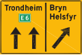
Norwegian Road signs
-
 unproblematic image, only slit
 -
 problematic image
 -
 problematic image
 -
 problematic image
 -
 problematic image
 -
 problematic image
 -
 problematic image
 -
 problematic image
 -
 problematic image


Article(s): Road signs in Norway
Request: We had a request by an IP at Wikipedia:Files_for_upload/August_2011#36_Norwegian_road_signs (now archived) and should uploaded some files. I converted the EPS files with Inkscape to SVG, but at least some of them have converting problems (e.g. look at the arrows). The IP also noted that he would have wanted to "split" the images if there are multiple shields on the same image, although it is not really clear to me which image sould be then a/b/c/etc. (see archived discussion). Can somebody with experience with SVGs handle that problem? mabdul 11:13, 4 August 2011 (UTC)
Graphist opinion(s): If you can point me at the original eps files then I can use Illustrator to do a better conversion. -- The Pink Oboe ( talk) 12:00, 5 August 2011 (UTC)
- I'm not sure if Mabdul still has the EPS files, so
here is a link with the ones I provided for him. It includes a bit more than the ones above.
A couple of points I would like to make:
(1) It would be nice if each sign was split to their own image when an image has more than one sign. Just throw a letter a, b, etc. behind their names. These letters are not part of their actual names, and are thus arbitrary. Letters are safe, as only numbers and occasional dots are used in sign names. (2) These are the proper PMS-codes for reproduction of these images. I personally don't find it extremely important that they're followed and it wasn't in my original upload request, but if it doesn't take too much time to look over, it would be better to use the correct colours.
For comparison:
File:Norwegian-road-sign-755.svg an older image, uploaded and corrected by user Pjacklam.
File:Norwegian-road-sign-753.svg one of the new images, not corrected. Also note that this is not an image of multiple signs; they are split by transparency.
158.37.73.32 ( talk) 18:11, 5 August 2011 (UTC)
- I'm not sure if Mabdul still has the EPS files, so
here is a link with the ones I provided for him. It includes a bit more than the ones above.
- Got them thanks, I also found a page on that Norwegian site that gives a great choice of downloadable signs in various formats so I downloaded the original to double-check the conclusion I had come to after seeing the files you offered. My conclusion is that someone fucked up the conversion to .eps (the originals were created in Illustrator CS2). So the problem isn't your conversion to svg, the problem is in the originals. In all honesty, if you know the correct colour of the sign and the correct font type it would be easier, and probably more accurate, to create your own from scratch. -- The Pink Oboe ( talk) 20:32, 5 August 2011 (UTC)
Resolved Information
vid for Vesta article
Article(s): 4 Vesta
Request: Could someone convert the video here? I can convent to ogg, but not with the proper codex, cuz firefog is not compatible w FF5. Or perhaps there is another way you could point out? (A gif might be better.) The idea is to clip it so that it plays in the info box, the way we do at Pluto. I'd be happy to do it myself if I knew how. — kwami ( talk) 01:53, 2 August 2011 (UTC)
Graphist opinion(s): Firefogg works fine with FF5, I just did an encode of the file in question with precisely that. So what exactly do you want in the transcoded file? -- The Pink Oboe ( talk) 10:33, 2 August 2011 (UTC)
Huh. I got a message that it isn't compatible, and it refused to install. Anyway, another editor has made an animated gif, which is quite nice: File:Vesta Rotation.gif. Thank you anyway! — kwami ( talk) 01:14, 3 August 2011 (UTC)
Morris Air pt. 2
Article(s): Morris Air
Request: Add the wordmark to the logo in blue - see resources, File:MorrisAir1993-1logo.jpg, 2, 3, 4. Thanks. Connormah ( talk) 00:18, 13 July 2011 (UTC)
Graphist opinion(s): I couldn't find a good font, so I traced the letters by hand. Not perfect, but in lieu of the correct typeface, I hope it'll do. NikNaks talk - gallery 15:04, 27 July 2011 (UTC)
rotate pick and fix letter labels
Article(s): Flourine
Request: Rotate 90 degrees, A to the left. Fix letters after. TCO ( reviews needed) 03:28, 16 July 2011 (UTC)
- Original order is fine, please make this a new copy (it is used in a different article upright). TCO ( reviews needed) 03:30, 16 July 2011 (UTC)
Graphist opinion(s):
![]() Request taken by Pi.1415926535.: Will do when you know the order you want. Do you want it overwritten or a new file?
Pi.1415926535 (
talk) 03:32, 16 July 2011 (UTC)
Request taken by Pi.1415926535.: Will do when you know the order you want. Do you want it overwritten or a new file?
Pi.1415926535 (
talk) 03:32, 16 July 2011 (UTC)
- Do you want each molecule rotated, or just the whole image?
Pi.1415926535 (
talk) 04:33, 16 July 2011 (UTC)
- Good point. Rotate the image, but keep the molecules in about this orientation (so Teflon is horizontal chain, not vertical). I guess letters should be fine then, as well. TCO ( reviews needed) 04:40, 16 July 2011 (UTC)
![]() Done
Done
Pi.1415926535 ( talk) 05:01, 16 July 2011 (UTC)
- Thank you. TCO ( reviews needed) 14:19, 16 July 2011 (UTC)
Image Cropping
-
 1st image
 -
2nd image
-
 3rd image
 -
 4th image


Article(s): Sushma Swaraj, Sharad Pawar, Vikram Akula and Jairam Ramesh
Request: 1st image:-Remove Hilary Clinton and make sure that the upper portion particularly the face appears bigger in the Biography.
2nd image:- Remove Angel Gurría and make sure that the upper portion particularly the face appears bigger in the Biography.
3rd image:- In Vikram Akula, remove excesses material on the right side portion and face must appears bigger on the Biography.
4th image:- Remove Hilary Clinton and make sure that the upper portion particularly the face appears bigger in the Biography.-- Kkm010* ۩ ۞ 05:25, 29 July 2011 (UTC)
Graphist opinion(s): For the first image, the picture that's currently in the article is much better and of a much higher resolution. For the second image, there's a licensing issue; furthermore, the license it's under on Flickr doesn't allow derivative works. - MissMJ ( talk) 07:00, 29 July 2011 (UTC)
Also, photography requests should technically go in the Photography Workshop. - MissMJ ( talk) 07:02, 29 July 2011 (UTC)
Request has been moved. - MissMJ ( talk) 19:01, 29 July 2011 (UTC)
A very quick, easy job...
-

-
 et voila


Article(s): Fomitiporia ellipsoidea
Request: Could you please create an image with Hainan Island in also highlighted? It's for the distribution of Fomitiporia ellipsoidea, which has been recorded in two provinces of China. The article may be going on the main page soon. Thanks! J Milburn ( talk) 10:57, 3 August 2011 (UTC)
Graphist opinion(s): The image is done, so what would you like me to do with it with regard to filename etc? Just to be clear, you want the image to maintain the original red shading/provinces but with the addition of Hainan Island being also shaded (the island at bottom left/centre)?
- Yep, that's what I'm after- could you upload it with a name something like
Image:Fomitiporia ellipsoidea distribution.svg? Thanks.
J Milburn (
talk) 15:51, 3 August 2011 (UTC)
- All done, you'll have to fill in the details of what it is yourself as I have no idea!! --
The Pink Oboe (
talk) 17:13, 3 August 2011 (UTC)
- Oh yeah, it's half the size of the original too... I do hate Inkscape (and its bloat) with a vengeance. -- The Pink Oboe ( talk) 17:15, 3 August 2011 (UTC)
- All done, you'll have to fill in the details of what it is yourself as I have no idea!! --
The Pink Oboe (
talk) 17:13, 3 August 2011 (UTC)
![]() Request taken by The Pink Oboe.
Request taken by The Pink Oboe.
Just for future reference, requests dealing with drawing/editing maps should technically go in the Map workshop. - MissMJ ( talk) 21:06, 3 August 2011 (UTC)
Font size in File:Cognitive_science_heptagram.svg

Article(s): Cognitive science
Request: Can you make the font size larger, e.g. by a factor of 1.5? It would make the text more legible in a reasonably sized thumbnail (as in the article Cognitive science). ― A. di M. plé dréachtaí 13:41, 8 August 2011 (UTC)
Graphist opinion(s):
![]() Done
Derfel73 (
talk) 15:51, 8 August 2011 (UTC)
Done
Derfel73 (
talk) 15:51, 8 August 2011 (UTC)
NRHP Map of Albany Request
-
 1: PNG that I'd like as an SVG with new icon to denote NRHPs
 -
 2: Use this SVG as baseline, but remove all roads
 -
 4: Show box with state map similar to this (but in southwest corner)
 -
 Created vector map; not sure if the gold dots are what you wanted though
 -

-

-

-


Article(s): National Register of Historic Places listings in Albany, New York
Request: I know this is a map, but this is actually just an SVG edit request. Looking for you to recreate image #1 as an svg. Rather than using blue dots, use triangles or something similar to what Google Maps uses. I realize they'll closely overlap in some places; this is fine. Use your creative judgment on what will work best. Use image #2 as your baseline SVG, but remove all the roads and road labels. Take the state map from image #3, but switch county colors (including the red one) to the same color as Bethlehem (the darker tan). Include the state map in a box similar to image #4, with a red box around where Albany is (see image #3 for an idea). Any questions, let me know! Thanks! upstate NYer 01:25, 6 August 2011 (UTC)
Graphist opinion(s):If it walks like a map, and quacks like a map... then it's a map. -- The Pink Oboe ( talk) 16:00, 6 August 2011 (UTC)
- Notably, maps don't walk or quack. This is an SVG request, plain and simple. If you have the skills and are willing to take it, please do. upstate NYer 04:24, 7 August 2011 (UTC)
![]() Request taken by Derfel73.
Derfel73 (
talk) 16:38, 10 August 2011 (UTC)
Request taken by Derfel73.
Derfel73 (
talk) 16:38, 10 August 2011 (UTC)
- Actually, the yellow dots look fine. Thanks for the efforts. upstate NYer 03:58, 11 August 2011 (UTC)
Remove color from Brackets.svg
Derfel73 ( talk) 10:38, 12 August 2011 (UTC)
-
 Brackets
Article(s): File:Brackets.svg Used in Bracket.
Request:
Could someone turn the lower pair into black? Current usage has no need for a red color. -
DePiep (
talk) 10:13, 30 July 2011 (UTC)
Graphist opinion(s):
![]() Done
Derfel73 (
talk) 10:34, 30 July 2011 (UTC)
Done
Derfel73 (
talk) 10:34, 30 July 2011 (UTC)
create wikitable
Headers: Country, Species, Scientific name, Classified by, Year,
Like to have it in this order (sortability is OK, but more important to give this order of the 6.)
- USA Eastern box turtle, Terrapene carolina carolina ( Linnaeus, 1758)
- USA Florida box turtle, Terrapene carolina bauri Taylor, 1895
- USA Gulf Coast box turtle, Terrapene carolina major ( Agassiz, 1857)
- USA Three-toed box turtle, Terrapene carolina triunguis ( Agassiz, 1857)
- MEX Mexican box turtle, Terrapene carolina mexicana ( Gray, 1849)
- MEX Yucatan box turtle, Terrapene carolina yucatana ( Boulenger, 1895)
Article(s): Common box turtle
Request: Please create wikitable. TCO ( reviews needed) 04:26, 20 July 2011 (UTC)
Graphist opinion(s): That's not an image thing, it's a code thing. Here's the wikicode you want: {| class="wikitable sortable" !Country !Species !Scientific Name !Classified by !Year |- |USA |Eastern box turtle |''[[Terrapene carolina carolina]]'' |[[Carolus Linnaeus|Linnaeus]] |[[1758]] |- |USA |Florida box turtle |''[[Terrapene carolina bauri]]'' |[[Edward Harrison Taylor|Taylor]] |[[1895]] |- |USA |Gulf Coast box turtle |''[[Terrapene carolina major]]'' |[[Louis Agassiz|Agassiz]] |[[1857]] |- |USA |Three-toed box turtle |''[[Terrapene carolina triunguis]]'' |[[Louis Agassiz|Agassiz]] |[[1857]] |- |MEX |Mexican box turtle |''[[Terrapene carolina mexicana]]'' |[[John Edward Gray|Gray]] |[[1849]] |- |MEX |Yucatan box turtle |''[[Terrapene carolina yucatana]]'' |[[George Albert Boulenger|Boulenger]] |[[1895]] |}
| Country | Species | Scientific Name | Classified by | Year |
|---|---|---|---|---|
| USA | Eastern box turtle | Terrapene carolina carolina | Linnaeus | 1758 |
| USA | Florida box turtle | Terrapene carolina bauri | Taylor | 1895 |
| USA | Gulf Coast box turtle | Terrapene carolina major | Agassiz | 1857 |
| USA | Three-toed box turtle | Terrapene carolina triunguis | Agassiz | 1857 |
| MEX | Mexican box turtle | Terrapene carolina mexicana | Gray | 1849 |
| MEX | Yucatan box turtle | Terrapene carolina yucatana | Boulenger | 1895 |
Pi.1415926535 ( talk) 04:51, 20 July 2011 (UTC)
Perfect. Thank so kindly. TCO ( reviews needed) 05:03, 20 July 2011 (UTC)
Japanese politics image
-
 Previous
 -
 Current
 -
 Previous vectorised
 -
 Current vectorised


Article(s): Constitution of Japan, Meiji Constitution
Request: Vectorize. Note that the iconography used does not need to be exactly duplicated. Would it be possible for someone to translate the first image into English as well? 76.117.247.55 ( talk) 04:35, 22 July 2011 (UTC)
Graphist opinion(s):
![]() Done Vectorised the second file but won't be able to translate the other.
Derfel73 (
talk) 21:10, 27 July 2011 (UTC)
Done Vectorised the second file but won't be able to translate the other.
Derfel73 (
talk) 21:10, 27 July 2011 (UTC)
- I've asked a JP<>EN user to translate the text, which should be done in a few days (their estimate), so if this can be left here untill then the other image can be translated. 76.117.247.55 ( talk) 16:51, 3 August 2011 (UTC)
OK! Here is the translation: http://www.mediafire.com/i/?zufwddtu1zaklc1 I would add, that the two houses should probably be House of Representatives and House of Peers, as those are the name of the articles on WikipediA. 76.117.247.55 ( talk) 15:25, 7 August 2011 (UTC)
![]() Done
Derfel73 (
talk) 11:31, 10 August 2011 (UTC)
Done
Derfel73 (
talk) 11:31, 10 August 2011 (UTC)
About Ratan tata


Article(s): Ratan Naval Tata
Request: Remove U.S. Ambassador Roemer photo and increase the resolution of Ratan Tata's image.-- Kkm010* ۩ ۞ 04:42, 28 July 2011 (UTC)
Graphist opinion(s):
![]() Done I'm not entirely sure what you mean by "increasing the resolution".
Derfel73 (
talk) 09:48, 28 July 2011 (UTC)
Done I'm not entirely sure what you mean by "increasing the resolution".
Derfel73 (
talk) 09:48, 28 July 2011 (UTC)
File Risks_and_Impacts_of_Global_Warming
Article(s): Effects_of_global_warming
Request: Not sure this is in your bailiwick, but the title, caption, and text on the file's article page all incorrectly say the image is a graph of the effects of global warming. That's wrong. The cited source for the image, the IPCC, clearly states that the image depicts effects of climate change. These terms are not synonymous as I have explained on the images talk page as well as the article's talk page. Here is the latter discussion.
NewsAndEventsGuy ( talk) 14:29, 2 August 2011 (UTC) Graphist opinion(s):
Not sure I'm following protocol here for the workshop, but between me and another editor this has been resolved.
NewsAndEventsGuy (
talk) 16:23, 4 August 2011 (UTC)
Analog Devices Logo - incorrect.
Article(s): None
Request: there are two Analog Devices Inc (ADI) Logos on wikipeida : http://en.wikipedia.org/wiki/File:Analog_Devices_Logo.svg (the correct one), and http://en.wikipedia.org/wiki/File:ADI_Logo.svg (hand drawn version, which isn't correct). I could not figure out how to remove the bad one, and just link to the proper one... ?
Thanks Rgetz ( talk) 21:42, 5 August 2011 (UTC)
- Just link to the correct one, ie File:Analog_Devices_Logo.svg and wipe the other one from your mind. It's not worth the mither you'd have to go to over at Commons just to find out that they wouldn't delete it anyway. -- The Pink Oboe ( talk) 22:11, 5 August 2011 (UTC)
Graphist opinion(s):
Article(s): UTA TRAX
Request: I'd like to get that UTA TRAX logo PNGized or SVGized (I guess the latter is preferable). It should look like the UTA logo I posted alongside (the PNG image), with those colors. The colors of the TRAX logo image are off. CL ( T · C) — 04:09, 9 August 2011 (UTC)
Graphist opinion(s):
![]() Request taken by The Pink Oboe.
Request taken by The Pink Oboe.![]() Done
Done
File:UTA Trax logo.svg extracted from www.rideuta.com/uploads/TRAX_factsheet.pdf. The "TRAX" doesn't match yours, but as it was extracted from an official source who am I to argue? -- The Pink Oboe ( talk) 12:08, 11 August 2011 (UTC)
- Yes, but I've never seen any TRAX logo look like that.
Here's one example at a station where the "TRAX" is the same color, size, and is lined up the same way as the "UTA" that precedes the logo.
On the side of the train in this image (warning: 3-4 MB size), it's the same thing.
CL (
T ·
C) — 17:07, 11 August 2011 (UTC)
- If you want me to make it look the same then I can certainly do so. The TRAX is in text form (Futura Heavy Condensed) so I can colour it and resize to my heart's content. I didn' change it originally simply because that was how it looked in the PDF. --
The Pink Oboe (
talk) 17:25, 11 August 2011 (UTC)
- Yes, that would be great. Thank you! Also, this is relatively minor: is it possible to make the white bar between the red and blue bars on the logo white, instead of transparent? As in
File:Uta-med.png.
CL (
T ·
C) — 17:57, 11 August 2011 (UTC)
- All done! -- The Pink Oboe ( talk) 18:20, 11 August 2011 (UTC)
- Yes, that would be great. Thank you! Also, this is relatively minor: is it possible to make the white bar between the red and blue bars on the logo white, instead of transparent? As in
File:Uta-med.png.
CL (
T ·
C) — 17:57, 11 August 2011 (UTC)
- If you want me to make it look the same then I can certainly do so. The TRAX is in text form (Futura Heavy Condensed) so I can colour it and resize to my heart's content. I didn' change it originally simply because that was how it looked in the PDF. --
The Pink Oboe (
talk) 17:25, 11 August 2011 (UTC)
Allen County War Memorial Coliseum logo
File:Allen County War Memorial Coliseum.png
Article(s): Allen County War Memorial Coliseum
Request: I attempted to put a transparent background on it but the result makes the lettering look a bit jagged, I was wondering if someone here would be able to do a better version. January ( talk) 12:04, 11 August 2011 (UTC)
Graphist opinion(s):
![]() Request taken by The Pink Oboe.
Request taken by The Pink Oboe.![]() Done
Done
I extracted a vector version of the logo from www.memorialcoliseum.com/data/MC2QTR2010.pdf so now you have an official version that is transparent and has a free glow thrown in. -- The Pink Oboe ( talk) 12:24, 11 August 2011 (UTC)
Background of Syriac letter
-
 Aleph letter (Syriac alphabet)
 -
 vector version done


Article(s): Category:User Syrc, User:Chris Weimer (User box).
Request: Could someone make the background transparent? Main usage is in userbox Script, where it is expected to show the backgound. Other usage does not seem to infer. - DePiep ( talk) 22:31, 12 August 2011 (UTC)
Graphist opinion(s):
![]() Request taken by The Pink Oboe.
Request taken by The Pink Oboe.![]() Done
Done
Request for explanation of svg rendering oddity
-
PNG of an issue grid
-
SVG of the same issue grid
-
Zoomed comparison between them; png on the left, svg on the right
Article(s): Super Science Stories, many others
Request: This is really a request for an explanation, although perhaps there is a task to be performed once I know what it is. I use issue grids such as the ones above in many articles, and it was suggested I switch them from png to svg to avoid resizing fuzziness. I've done that, with some help from the graphics workshop, and the svg above is now beautifully clear if you click through to it. However, to my eyes it looked fuzzier than the png, so I placed both images in a sandbox, here, and zoomed in using Ctrl-+. The png is much less fuzzy. I took screenshots and pasted them together; you can see them above. This was in Chrome but the same thing happens in Firefox and IE. I asked another editor to take a look at the sandbox and to him the svg is much clearer. Can someone explain what is happening here? Is there some setting in browsers or Wikipedia profiles that could change how svgs render? What I need is a graphic that is clear at any sizing, and I thought an svg would accomplish that, but it doesn't appear to. Mike Christie ( talk - contribs - library) 12:16, 1 August 2011 (UTC)
Graphist opinion(s): There is nothing wrong with the
SVG but there are some issues with
librsvg which MediaWiki uses to convert SVG to PNG. In Wikipedia, all the SVGs are rendered as PNGs. What you are comparing at your
Sandbox4 are the original PNG and the 414px PNG preview (generated using the buggy libersvg) of the
SVG. Try increasing the resolution of the preview.
Learn more.
–
∃
Aditya
7 ¦ 15:11, 1 August 2011 (UTC)
- Thanks -- that clarifies a good deal, and the link was helpful. By "increasing the resolution of the preview" do you mean increasing it from 414px to a larger thumbnail, or is there some other setting I can tweak to improve the resulting PNG? I'm inclined to leave the PNGs in place instead of the SVG if the result is no better than this.
Mike Christie (
talk -
contribs -
library) 21:49, 1 August 2011 (UTC)
- For what it's worth, the Wikitable in that sandbox looks to be far superior to a graphical rendering, IMO. However, I'll work on the SVG in the meantime. I think the issue is that the canvas is much larger than the preview, and that's making the downscaling look a bit blurry.
NikNaks
talk -
gallery 10:23, 2 August 2011 (UTC)
- Thank you very much; if you do fix it I'd appreciate it if you could explain to me how to avoid this problem in the future. There are a couple of problems still with the wikitable, one of which is the amount of interior space in the cells, which so far nobody has been able to eliminate -- that makes the table take up much more room for the same font size. There are other, more minor, issues as well, such as the fact that bolded fonts don't show as bold at some zoom levels.
Mike Christie (
talk -
contribs -
library) 12:13, 2 August 2011 (UTC)
- Increasing the resolution of the thumbnail from 414px may help because the ratio of downscaling required decreases. This may sound weird but it is what I have observed happening to SVGs with embedded raster graphics--the algorithms used for scaling are to be blamed. Doesn't this table look good? I didn't get you about the bold font issue.
- Thank you very much; if you do fix it I'd appreciate it if you could explain to me how to avoid this problem in the future. There are a couple of problems still with the wikitable, one of which is the amount of interior space in the cells, which so far nobody has been able to eliminate -- that makes the table take up much more room for the same font size. There are other, more minor, issues as well, such as the fact that bolded fonts don't show as bold at some zoom levels.
Mike Christie (
talk -
contribs -
library) 12:13, 2 August 2011 (UTC)
- For what it's worth, the Wikitable in that sandbox looks to be far superior to a graphical rendering, IMO. However, I'll work on the SVG in the meantime. I think the issue is that the canvas is much larger than the preview, and that's making the downscaling look a bit blurry.
NikNaks
talk -
gallery 10:23, 2 August 2011 (UTC)
How's this?
| Jan | Feb | Mar | Apr | May | Jun | Jul | Aug | Sep | Oct | Nov | Dec | |
|---|---|---|---|---|---|---|---|---|---|---|---|---|
| 1940 | 1/1 | 1/2 | 1/3 | 1/4 | 2/1 | |||||||
| 1941 | 2/2 | 2/3 | 2/4 | 3/1 | 3/2 | |||||||
| 1942 | 3/3 | 3/4 | 4/1 | 4/2 | ||||||||
| 1943 | 4/3 | 4/4 |
It's slightly taller than the image, but not by much. And really, making data that could be displayed as a table into an image is awful from an accessibility standpoint. A table taking up a little more room than an image and potentially not looking quite as nice is not a good enough reason to cut out an entire segment of the population that uses screen readers to access articles. - MissMJ ( talk) 21:01, 2 August 2011 (UTC)
- Thank you to both of you; I'll compare and see if I have any other concerns, but those do look great. I really appreciate the help. Could one of you also explain how to change the nominal resolution of an SVG in Inkscape? I couldn't find it in the manual or via Google. Thanks.
Mike Christie (
talk -
contribs -
library) 11:57, 3 August 2011 (UTC)
- To change the nominal resolution resize your content and then resize the page to your contents and save it. See this
screenshot.
– ∃ Aditya 7 ¦ 13:35, 3 August 2011 (UTC)
- To change the nominal resolution resize your content and then resize the page to your contents and save it. See this
screenshot.
Logo of FIDE


Article(s): FIDE
Request: The logo of this quite central chess article looks poor (compression artifacts). It would be great to have it at a higher resolution or as SVG. -- Leyo 21:58, 12 August 2011 (UTC)
Graphist opinion(s):
![]() Done
Derfel73 (
talk) 11:05, 15 August 2011 (UTC)
Done
Derfel73 (
talk) 11:05, 15 August 2011 (UTC)
- Thank you. -- Leyo 11:34, 15 August 2011 (UTC)
Moldovan GDP charts

-
 New vector

Article(s): Economy of Moldova and Moldova
Request: This image is claimed under fair use, but since it is a simple pie chart and can be redone using the World Bank data.
User:Zscout370
(Return Fire) 04:51, 13 August 2011 (UTC)
Graphist opinion(s):
![]() Done
Derfel73 (
talk) 10:36, 13 August 2011 (UTC)
Done
Derfel73 (
talk) 10:36, 13 August 2011 (UTC)
Improved letters from Avestan and Javanese alphabet
-
 Letter from Avestan script (not transparent, not sharp)
 -
 Done
Done -
 Letter from Javanese script (too much margin)
 -
 Done Smaller margins, SVG.
 -
 Sing writing example (too much margin)
 Not done see below
 -
 Left lane version (file named to show as such)
 -
 Symbol only (file named to show as such)


Article(s): Template:ISO 15924/overview (See row Avst, Java)
Request: Please create transparent versions. Also, check for reducing marging to nearly zero. And I'd like to have the Avestan and the one transparent and with some more contrast. I understand they could be copies to let current usage alone. - DePiep ( talk) 09:28, 13 August 2011 (UTC)
Graphist opinion(s):
![]() Request taken by MissMJ.
Request taken by MissMJ.
Okay, for the middle picture (Javanese script), the reason there's that much margin is that it's used in a table in the Javanese alphabet article, and the margin in the file is used as a spacing mechanism. Simply trimming it and re-uploading would mess up the table in the article, and uploading a new PNG version with smaller margins is just pointless... So I uploaded SVG versions of some of the letters into the Javanese SVG letters category. - MissMJ ( talk) 05:46, 14 August 2011 (UTC)
For the third picture (SignWriting), the margins that we see as 'extra' actually have a purpose and need to be there. Per SignWriting: "Signs are written in vertical columns. Within a column, signs may be written down the center or to either side. These are referred to as 'lanes,' and are used to indicate role shifting and body movement." - MissMJ ( talk) 06:06, 14 August 2011 (UTC)
- A good find. If left lane is essential to the sign, it should be in the filename. If I understand it well, the bottom margin is superfluous. But I rest my request in this one. - DePiep ( talk) 13:04, 14 August 2011 (UTC)
- Great. -
DePiep (
talk) 14:11, 14 August 2011 (UTC)
- It may have already been indicated in the filename for all we know, but I don't know anything about SignWriting. Quite frankly I don't think that whoever re-uploaded a renamed symbol up there should have done so, at least not without consulting someone who knows how to SignWrite. They may have created naming redundancies/altered the meaning of the sign. - MissMJ ( talk) 00:55, 15 August 2011 (UTC)
![]() Done
Done
Incorrect image, as a featured picture!
-
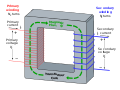 illustration of a transformer

Article(s): Transformer
Request: The direction of the current on the right hand side (the secondary coil) is wrong. The current should be travelling from top to bottom, rather than bottom to top. The voltage on the primary (left hand) coil is similarly incorrect, and should have the positive side on the bottom. This is terrible! This was a featured image and it's wrong!
Larryisgood (
talk) 11:43, 16 August 2011 (UTC)
Edit: Sorry, the potential difference is correct on both sides, it's just the direction in the current on the right which is wrong. Larryisgood ( talk) 12:08, 16 August 2011 (UTC)
Graphist opinion(s):
![]() Request taken by The Pink Oboe.
Request taken by The Pink Oboe.![]() Done
Done
I ♥ you. Larryisgood ( talk) 15:31, 16 August 2011 (UTC)
- Unfortunately, the correction made it wrong, as the original was correct. Better to discuss first next time. I reverted. Dicklyon ( talk) 05:00, 18 August 2011 (UTC)
Additional Coat of Arms of Gulbene
Article(s): FB Gulbene
Request: Create please one additional Coat of Arms of Gulbene with Gulbene name like this, and upload under name: File:Coat of Arms of Gulbene (with name).svg Thanks! -- Dark Eagle ( talk) 12:39, 27 July 2011 (UTC)
Graphist opinion(s):
Is this ok? -- Tokyoship ( talk) 15:50, 16 August 2011 (UTC)
- black colour shoud be strong (#000000) --
Dark Eagle (
talk) 16:18, 16 August 2011 (UTC)
- Ok. Changed to stronger black. --
Tokyoship (
talk) 17:42, 16 August 2011 (UTC)
- Thanks -- Dark Eagle ( talk) 08:52, 18 August 2011 (UTC)
- Ok. Changed to stronger black. --
Tokyoship (
talk) 17:42, 16 August 2011 (UTC)
South Sudan
Article(s): South Sudan
Request: users keep replacing the higher-quality png with the poor svg. the only way to solve this is to bring the svg up to snuff. please help. Kintetsubuffalo ( talk) 13:17, 17 July 2011 (UTC)
Graphist opinion(s):
![]() Looking at the most recent revision of the image in question by
User:Antonsusi, it looks pretty good to me compared to a raster version I found. If that one still isn't up to snuff, link me a raster version and I'd be happy to vectorize it for you.
Belinrahs|
talktome⁄
ididit 12:03, 30 July 2011 (UTC)
Looking at the most recent revision of the image in question by
User:Antonsusi, it looks pretty good to me compared to a raster version I found. If that one still isn't up to snuff, link me a raster version and I'd be happy to vectorize it for you.
Belinrahs|
talktome⁄
ididit 12:03, 30 July 2011 (UTC)
- Looks like someone got it, thanks.-- Kintetsubuffalo ( talk) 17:36, 19 August 2011 (UTC)
Zener effect
-
 I-V Curve of a Zener Diode
 -
 Done, though not as neat as I would like. WP and text eh!


Article(s): Zener effect
Request: If you could please make a proper graph for this article, I would very much appreciate it. Thanks! Larryisgood ( talk) 18:21, 16 August 2011 (UTC)
Graphist opinion(s):
Well, what are you looking for? Do you just want that redrawn as a neat, non-tilted SVG? Do you want axis labels added? Pi.1415926535 ( talk) 21:18, 16 August 2011 (UTC)
Although it's done, I wasn't quite sure of the reverse current as I couldn't read it properly (and knowing bugger all about electronics). Is "µA" correct? I also apologise for the 'roughness' of the text alignment on the path, that's the crap WP renderer for you I'm afraid. -- The Pink Oboe ( talk) 08:56, 17 August 2011 (UTC)
![]() Request taken by The Pink Oboe.
Request taken by The Pink Oboe. ![]() Done
Done
Take a look here, although its german, the unit for current is mA throughout the y-axis. From an engineering point of view, this makes more sense then having different units on the same axis. Or you could leave the unit out, like with the voltage, which is fine too, and pretty common.-- Trex2001 ( talk) 09:22, 17 August 2011 (UTC)
- Many thanks. -- The Pink Oboe ( talk) 22:29, 17 August 2011 (UTC)
Remove Stroke
Article(s): A&B Sound
Request:Having problems with uploading a new version here, can anyone remove the stroke? Thanks, Connormah ( talk) 18:57, 17 August 2011 (UTC)
Graphist opinion(s):![]() Done
Done
Asahi Shinbun


Article(s): Asahi Shinbun
Request: make a graphic SVG version of this flag... Kintetsubuffalo ( talk) 17:23, 19 August 2011 (UTC)
Graphist opinion(s):
![]() Request taken by Derfel73.. I've just vectorised the flag; before uploading it however, I was a little unsure of the appropriate license. The source image is licensed under the
Creative Commons Attribution-Share Alike 3.0 Unported license whereas this vectorised file is simply the flag of the Asahi Shinbun Company. I would therefore be inclined to upload the vector file to wikipedia (rather than commons), tagged as a logo.
Request taken by Derfel73.. I've just vectorised the flag; before uploading it however, I was a little unsure of the appropriate license. The source image is licensed under the
Creative Commons Attribution-Share Alike 3.0 Unported license whereas this vectorised file is simply the flag of the Asahi Shinbun Company. I would therefore be inclined to upload the vector file to wikipedia (rather than commons), tagged as a logo.
Also, I have vectorised the Japanese writing on the flag though I don't know whether this is distorted due to the fact that it's traced from a photograph. Derfel73 ( talk) 20:25, 19 August 2011 (UTC)
- I think you're right on the licensing. The kanji is a stylized 朝.-- Kintetsubuffalo ( talk) 14:21, 20 August 2011 (UTC)
- Fantastic, thank you!-- Kintetsubuffalo ( talk) 15:16, 21 August 2011 (UTC)
Charles de Varigny

Article(s): Charles de Varigny
Request: Crop and vectorized the signature. KAVEBEAR ( talk) 00:06, 21 August 2011 (UTC)
Graphist opinion(s):
![]() Done signature;
User:Ras67 has also cropped the image though the signature is still present.
Derfel73 (
talk) 17:15, 21 August 2011 (UTC)
Done signature;
User:Ras67 has also cropped the image though the signature is still present.
Derfel73 (
talk) 17:15, 21 August 2011 (UTC)
All-American Girls Professional Baseball League (easy)

Article(s): All-American Girls Professional Baseball League
Request: Create a vector logo based on the one in the bottom right of the card. Can be uploaded under PD-text. Thanks. Connormah ( talk) 21:17, 30 July 2011 (UTC)
Graphist opinion(s): The Image link above doesn't exist, so its unclear which logo is wanted. I'm assuming its the official logo seen on this page?-- Trex2001 ( talk) 05:21, 1 August 2011 (UTC)
- Yes.
Connormah (
talk) 02:26, 2 August 2011 (UTC)
- Can anyone take this?
Connormah (
talk) 19:04, 17 August 2011 (UTC)
- As it's you... :) --
The Pink Oboe (
talk) 00:30, 18 August 2011 (UTC)
- PS, it's way too stylised for a {{ PD-text}} rationale. -- The Pink Oboe ( talk) 01:49, 18 August 2011 (UTC)
- As it's you... :) --
The Pink Oboe (
talk) 00:30, 18 August 2011 (UTC)
- Can anyone take this?
Connormah (
talk) 19:04, 17 August 2011 (UTC)
![]() Request taken by The Pink Oboe.
Request taken by The Pink Oboe. ![]() Done --
The Pink Oboe (
talk) 01:45, 18 August 2011 (UTC)
Done --
The Pink Oboe (
talk) 01:45, 18 August 2011 (UTC)
CFC logo
Article(s): California Fried Chicken
Request: Please retrace as an SVG. Crisco 1492 ( talk) 10:48, 13 August 2011 (UTC)
Graphist opinion(s):
![]() Done
Derfel73 (
talk) 11:43, 14 August 2011 (UTC)
Done
Derfel73 (
talk) 11:43, 14 August 2011 (UTC)
Coat of Arms of Denmark crop
-
 National Coat of arms of Denmark.
 -
 National Coat of arms of Denmark without a crown.


Article(s): Denmark, Coat of arms of Denmark and more
Request: Can you please create a version without the crown on top so it can be used on articles with limited space or alongside other images more easily. Thanks Peter ( talk) 02:47, 15 August 2011 (UTC)
Graphist opinion(s):
![]() Done
Derfel73 (
talk) 07:34, 15 August 2011 (UTC)
Done
Derfel73 (
talk) 07:34, 15 August 2011 (UTC)
Green and Red stripes in flag won't appear (needs fix)
-
 The flag
.svg)
Article(s): Many
Request: When you click on the flag, you will see there is a red and a green strip on the left side. However, for some reason they won't appear on the thumb, and therefore on pages where the flag is being used. I've tried all I can think of, including converting them to PATHs, so idk what's wrong. Please fix, thanks. Fry1989 eh? 20:19, 22 August 2011 (UTC)
Graphist opinion(s):
With 3 of us having the same result I can only conclude that the problem is with the renderer and not the graphic. -- The Pink Oboe ( talk) 20:29, 22 August 2011 (UTC)
- This is really weird. I'm not aware of Commons servers having rendering problems with any other files recently. I tried what I could, but I figured other users may have some tricks I don't know about.
Fry1989
eh? 20:31, 22 August 2011 (UTC)
- Whoop, managed it. In a text editor (Notepad++ for the inquisitive) I moved the pattern group (the alligator texture) from the top to the bottom of the file. The moved the two coloured bars' group up to the top of the stack. I also moved the left edge of the blue background to meet the right-hand edge of the red bar. I also removed all the Inkscape bloat too hence it's reduction in size. --
The Pink Oboe (
talk) 20:43, 22 August 2011 (UTC)
- Thanks so much!
Fry1989
eh? 21:12, 22 August 2011 (UTC)
- The problem is you have not really a SVG helping page.--
πϵρήλιο
℗ 22:04, 23 August 2011 (UTC)
- You mean like Wikipedia:SVG Help? -- The Pink Oboe ( talk) 13:07, 24 August 2011 (UTC)
- The problem is you have not really a SVG helping page.--
πϵρήλιο
℗ 22:04, 23 August 2011 (UTC)
- Thanks so much!
Fry1989
eh? 21:12, 22 August 2011 (UTC)
- Whoop, managed it. In a text editor (Notepad++ for the inquisitive) I moved the pattern group (the alligator texture) from the top to the bottom of the file. The moved the two coloured bars' group up to the top of the stack. I also moved the left edge of the blue background to meet the right-hand edge of the red bar. I also removed all the Inkscape bloat too hence it's reduction in size. --
The Pink Oboe (
talk) 20:43, 22 August 2011 (UTC)
- This is really weird. I'm not aware of Commons servers having rendering problems with any other files recently. I tried what I could, but I figured other users may have some tricks I don't know about.
Fry1989
eh? 20:31, 22 August 2011 (UTC)
Community Collaborative Rain, Hail and Snow Network logo to .svg
-
 .png version
 -
 .tif version
 -
 .svg version
Article(s): Community Collaborative Rain, Hail and Snow Network
Request: Please use either of these to create a .svg format. The logo is freely licensed under CC-BY 3.0, and the .svg version should be as well per an email exchange I had with the organization. The .svg version's file page should include attribution to CoCoRaHS for the original version used to create the .svg version, as well. Thanks in advance, Ks0stm ( T• C• G) 23:19, 22 August 2011 (UTC)
Graphist opinion(s):
![]() Done
Derfel73 (
talk) 18:25, 24 August 2011 (UTC)
Done
Derfel73 (
talk) 18:25, 24 August 2011 (UTC)
- Just wondering, is there any closer match on the font at the bottom right? If not it's fine, but a closer match would be preferred.
Ks0stm (
T•
C•
G) 23:26, 24 August 2011 (UTC)
- The original looks like
Helvetica or
Frutiger. I've no idea why a serif font has been used. --
The Pink Oboe (
talk) 00:06, 25 August 2011 (UTC)
- Scrub that brain fart, it isn't like those two mentioned fonts at all, it's closer to Futura (which I also confuse the name with Frutiger anyway). -- The Pink Oboe ( talk) 00:12, 25 August 2011 (UTC)
- The original looks like
Helvetica or
Frutiger. I've no idea why a serif font has been used. --
The Pink Oboe (
talk) 00:06, 25 August 2011 (UTC)
Coat of arms of Libya
-
 Coat of arms of Libya
 -
 Similer design

.svg)
Article(s): Coat of arms of Libya
Request: Vectorise TRAJAN 117 ( talk) 14:59, 22 August 2011 (UTC)
Graphist opinion(s):
![]() Done The one on the left
[4].
Tsange ☯
Talk 19:15, 22 August 2011 (UTC)
Done The one on the left
[4].
Tsange ☯
Talk 19:15, 22 August 2011 (UTC)
- I'm sorry, but that's a really bad autotrace. Have you zoomed in on any of the elements? I chose the 'feathers' on the left. The png version is sharper, additionally the filesize is huge for a graphic like this. Ordinarily I wouldn't say anything or criticise someone's work like this, but given the events that are unfolding there's a good chance this graphic is going to be used quite widely. It needs a manual trace not a 20 second autotrace. -- The Pink Oboe ( talk) 19:32, 22 August 2011 (UTC)
- Looks much better now, many thanks. TRAJAN 117 ( talk) 04:25, 28 August 2011 (UTC)
Zayre logo
-
 Logo for Zayre
 -
 Vector logo for Zayre
Article(s): Zayre
Request: Convert to SVG, please? Thanks! SchuminWeb ( Talk) 15:14, 20 August 2011 (UTC)
Graphist opinion(s):
![]() Done.
Derfel73 (
talk) 14:13, 21 August 2011 (UTC)
Done.
Derfel73 (
talk) 14:13, 21 August 2011 (UTC)
- Thanks! SchuminWeb ( Talk) 18:30, 21 August 2011 (UTC)
United States District Court for the Northern District of California
-
 Current
 -
 Low-res original
 -
 Very similar Great Seal of the US


.svg)
.svg)
![[4]](https://commons.wikimedia.org/wiki/File:Coat_of_Arms_of_Libya_within_the_Federation_of_Arab_Republics.svg)
Article(s): United States District Court for the Northern District of California, several court cases via infobox
Request: Scroll should be yellow/gold in color, like in the original. Cybercobra (talk) 10:24, 21 August 2011 (UTC)
Graphist opinion(s):
![]() Request taken by Fry1989. let's see what I can do.
Fry1989
eh? 00:18, 28 August 2011 (UTC)
Request taken by Fry1989. let's see what I can do.
Fry1989
eh? 00:18, 28 August 2011 (UTC)