| This page is an archive. Do not edit the contents of this page. Please direct any additional comments to the current main page. |

Color coding on map
-
 Countries by their use of Long and short scales for number naming

- Article(s)
- Long and short scales, plus pages on nine other wikis
- Request
- Because of my colorblindness, I can't tell the difference between users of the long scale and users of both scales. Could you just change the color coding? Perhaps make short scale a bright red, long a deep blue, and both a deep green? We red-green colorblind people will be able to tell the difference, depending on light/dark if we can't tell the colors themselves. Nyttend ( talk) 17:32, 25 September 2015 (UTC)
- Graphist opinion(s)
![]() Request taken by
Goran tek-en (
talk) 17:53, 25 September 2015 (UTC).
Request taken by
Goran tek-en (
talk) 17:53, 25 September 2015 (UTC).
- @
Nyttend: Now there is
a draft for you to look at. The colors are chosen
according to colorbrewer2 and I need your feed back on this. Give me feedback, thanks. --
Goran tek-en (
talk) 18:48, 29 September 2015 (UTC)
- That looks good, but I'm only noticing four colors here, while the key for the original file lists five. However, I don't see any "no data" countries on the original. Do I understand correctly that the original file actually displays just four colors?
Nyttend (
talk) 19:01, 29 September 2015 (UTC)
- @
Nyttend: Actually there where five different colors but one "no data" is just two tiny areas, one in central Africa and one south east of India. What I have done is to change around two colors so "no data" now has a dark blue instead of the pale yellow. I hope that is better.
New draft to look at. I will need the following;
- Name of the file
- Description
- Category/ies at commons
- to be able to upload it at commons, thanks.
- @
Nyttend: Actually there where five different colors but one "no data" is just two tiny areas, one in central Africa and one south east of India. What I have done is to change around two colors so "no data" now has a dark blue instead of the pale yellow. I hope that is better.
New draft to look at. I will need the following;
- That looks good, but I'm only noticing four colors here, while the key for the original file lists five. However, I don't see any "no data" countries on the original. Do I understand correctly that the original file actually displays just four colors?
Nyttend (
talk) 19:01, 29 September 2015 (UTC)
-- Goran tek-en ( talk) 18:20, 30 September 2015 (UTC)PREVIOUS SAME NEW pink short #ffffcc blue long #2c7fb8 purple both #41b6c4 yellow neither #a1dab4 gray no data #253494
- That looks great; it's easy to understand. And thanks for pointing out the grey spots; I wonder why they don't have information for Burundi? Please just upload it on top of the current file; it's just an improvement, not a fundamentally different file. As a result, I don't think you need to worry about categories or any other metadata, except for the hexes for the new colors, and presumably you know better than I what they are. Nyttend ( talk) 18:34, 3 November 2015 (UTC)
![]() Done --
Goran tek-en (
talk) 17:01, 4 November 2015 (UTC)
Done --
Goran tek-en (
talk) 17:01, 4 November 2015 (UTC)
Combined map for Marsupial Mole
-
 Southern marsupial mole range map
 -
 Northern marsupial mole range map
 -
 Combined


- Request
- The article marsupial mole needs a map illustrating the ranges of both species. Commons has no such map. -- Chrisrus ( talk) 04:32, 3 November 2015 (UTC)
- Graphist opinion(s)
![]() Request taken by
Jolly
Ω
Janner 04:51, 3 November 2015 (UTC).: immediately. @
Chrisrus:, should the map just be two solid green areas or should the difference be shown (e.g. different colours for each species or maybe the same colour but labelled?
Request taken by
Jolly
Ω
Janner 04:51, 3 November 2015 (UTC).: immediately. @
Chrisrus:, should the map just be two solid green areas or should the difference be shown (e.g. different colours for each species or maybe the same colour but labelled?
- Marsupial mole is mapless now, so even a simple map with just one solid blob showing the combined range of both would improve the article. But now that you ask, I suppose if it were one color for one range and another for the other, that'd be even better.
- I don't know why they are shades of green instead of some other color. Shades of
Buff (color)-like colors would be more appropriate because I saw a lot of that when I Google pictures of them.
Chrisrus (
talk) 06:20, 3 November 2015 (UTC)
- @
Chrisrus:, here is a first draft:
File:Marsupial mole distribution map.svg. Please share your thoughts. A dashed line is appearing around the border, but not when I view full size. Would like to know if it's just my browser or something.
Jolly
Ω
Janner 07:24, 3 November 2015 (UTC)
- @ Jolly Janner:, awesome. I edited the description [1] with an eye toward a caption if it needs a caption when it's accommodated into the article with the color legend. Feel free to undo or edit.
- Would you like to fit it into place? It should look like the other two.
- What's your opinion of this projection?
- Can each colored blob contain the legend text? That'd make the legend less necessary, unless the font is too small.
Chrisrus (
talk) 04:15, 4 November 2015 (UTC)
- @
Chrisrus:, I have added it to the article's infobox. The Robinson projection is not ideal for a map of Australia (it's mainly used for world maps). The maps I traced it from used this projection and I think that converting it to orthographic might be beyond my current skill level. I can add the text to the map. Should I use Latin or English names or both? I intend to setup the file, so the text can render in different languages depending on the Wikipedia it is used in.
- @ Jolly Janner:, awesome. It's already everything I asked for, thanks!
- I understand about the projection.
- I don't understand orthographic conversion.
- We might want back-check against the cited source.
- If we don't use English, it'd be better for articles in other languages.
- The legend color boxes don't line up perfectly.
Chrisrus (
talk) 15:13, 5 November 2015 (UTC)
- @
Chrisrus: The IUCN map appears to match up to the respective species. They use a different projection (equirectangular I think), but the PNGs on Wikimedia appear to have altered the projection of both Australia and the area of extent equally, so it is accurate. I have used Latin on the map, since I'm not quite up to scratch on the use of automated translation text yet. The legend colour boxes don't line up in the infoboxes, because the overridden the text to be centred. Changing this would require changing the template. I have removed them, since the map is now labelled. Please share your thoughts and mark as resolved once there are no more changes to be requested. Thanks,
Jolly
Ω
Janner 20:11, 5 November 2015 (UTC)
- @ Jolly Janner:, that's great, thanks!
- How should I mark this as resolved; like this:
 Done?
Done? - Chrisrus ( talk) 00:44, 6 November 2015 (UTC)
- @
Chrisrus: The IUCN map appears to match up to the respective species. They use a different projection (equirectangular I think), but the PNGs on Wikimedia appear to have altered the projection of both Australia and the area of extent equally, so it is accurate. I have used Latin on the map, since I'm not quite up to scratch on the use of automated translation text yet. The legend colour boxes don't line up in the infoboxes, because the overridden the text to be centred. Changing this would require changing the template. I have removed them, since the map is now labelled. Please share your thoughts and mark as resolved once there are no more changes to be requested. Thanks,
Jolly
Ω
Janner 20:11, 5 November 2015 (UTC)
- @
Chrisrus:, I have added it to the article's infobox. The Robinson projection is not ideal for a map of Australia (it's mainly used for world maps). The maps I traced it from used this projection and I think that converting it to orthographic might be beyond my current skill level. I can add the text to the map. Should I use Latin or English names or both? I intend to setup the file, so the text can render in different languages depending on the Wikipedia it is used in.
- @
Chrisrus:, here is a first draft:
File:Marsupial mole distribution map.svg. Please share your thoughts. A dashed line is appearing around the border, but not when I view full size. Would like to know if it's just my browser or something.
Jolly
Ω
Janner 07:24, 3 November 2015 (UTC)
Gray wolf distribution map.

- Article(s)
Gray wolf - map in the taxabox.
- Request
Refer Talk page: Talk:Gray wolf#Taxabox - map of distribution The map of Africa shows some red shading and this needs to be changed to grey. This is because the subspecies of gray wolf that lives there has this year been reclassified as another species, Canus anthus, based on http://www.iucnredlist.org Two of us have tried to amend the map but are unable to upload it, refer: https://commons.wikimedia.org/wiki/File:Gray Wolf Distribution.gif Regards, William Harris • talk • 20:06, 6 November 2015 (UTC)
- Graphist opinion(s)
- The map you posted above and the one currently used in the article doesn't appear to show any species in Africa (all of Africa is grey). What map needs to be changed? Jolly Ω Janner 01:46, 7 November 2015 (UTC)
- Hello Jolly, if you click on the graphic to enlarge it, there is red running along the north coast of Africa; that needs to be made grey. Regards,
William Harris •
talk • 08:50, 7 November 2015 (UTC)
- I'm not seeing it. I only see it on the file revision on and before 06:33, 8 August 2013. Try this
Wolf Distribution.gif&action=purge link to purge the file and tell me if you still see it?
Jolly
Ω
Janner 08:57, 7 November 2015 (UTC)
- Hi Jolly, no change. You cannot see the two attempts made by me on the 31 October, and one 5 November by Mario, to amend the file?
William Harris •
talk • 02:26, 8 November 2015 (UTC)
- I can see tiny red dots over north Africa on the revisions 01:42, 31 October 2015 and 01:47, 31 October 2015. The latest revision has it completely grey over north Africa, but I have noticed an increase in the extent of present species over Eurasia.
Jolly
Ω
Janner 02:38, 8 November 2015 (UTC)
- Hi Jolly, I have reset my web browser (Firefox) and can now see it - everything is correct. Sorry for wasting your time and thanks for your help. Regards, William Harris • talk • 08:50, 10 November 2015 (UTC)
- I can see tiny red dots over north Africa on the revisions 01:42, 31 October 2015 and 01:47, 31 October 2015. The latest revision has it completely grey over north Africa, but I have noticed an increase in the extent of present species over Eurasia.
Jolly
Ω
Janner 02:38, 8 November 2015 (UTC)
- Hi Jolly, no change. You cannot see the two attempts made by me on the 31 October, and one 5 November by Mario, to amend the file?
William Harris •
talk • 02:26, 8 November 2015 (UTC)
- I'm not seeing it. I only see it on the file revision on and before 06:33, 8 August 2013. Try this
Wolf Distribution.gif&action=purge link to purge the file and tell me if you still see it?
Jolly
Ω
Janner 08:57, 7 November 2015 (UTC)
Turtle Park
-
 Forest Park, St. Louis, Missouri, indicating Turtle Park just below the Zoo

- Article(s)
- Turtle Park
- Request
- Turtle Park is a new article nominated for DYK, which I have verified. The lead illustration is the above .svg map, which labels "Turtle Park" just below the Zoo but in lettering much too small to be legible in thumbnail. Could someone create a new (alternate) .svg which enlarges and/or highlights the lettering of 'Turtle Park", perhaps by adding a big arrow pointing to it, so that its location is obvious to anyone looking at the Forest Park thumbnail in the article's infobox? Much appreciated, thanks -- Vesuvius Dogg ( talk) 17:51, 9 November 2015 (UTC)
- Graphist opinion(s)
![]() Request taken by
Jolly
Ω
Janner 18:50, 9 November 2015 (UTC).: today. I will come up with a first draft and link it.
Jolly
Ω
Janner 18:50, 9 November 2015 (UTC)
Request taken by
Jolly
Ω
Janner 18:50, 9 November 2015 (UTC).: today. I will come up with a first draft and link it.
Jolly
Ω
Janner 18:50, 9 November 2015 (UTC)
- @ Vesuvius Dogg:, I think a location map might work better for this scenario. Let me know what you think of User:Jolly Janner/sandbox, where I have used a location map. I just created the map that it uses, so let me know of any changes that can be made to that too. Or if you think the whole location map is a bad idea, I'll add a label to the original map. Thanks, Jolly Ω Janner 00:06, 10 November 2015 (UTC)
- @ Jolly Janner: @ Tavix: I feel like Tavix should get the last word on this, as the creator of the article. I sort of feel like being able to click for the expansion and read "Turtle Park", even in small letters, has some advantages. While visible as a dot, it isn't labeled if you click through. Can you try adding a dot (or, better yet, turtle!) to the .svg, maybe with an arrow pointing to it from the left, labeling it "Turtle Park"? I think if it's in a contrasting color, like blue, it will stick out. I'm sorry to be on the fence. I do want to want to do right be the article's creator given that it's being considered for DYK, and I probably didn't even have to raise this issue. Here's hoping Tavix weighs in here Vesuvius Dogg ( talk) 00:29, 10 November 2015 (UTC)
Climate of Argentina
-
 Climate map showing mean temperature ranges in Argentina
 -
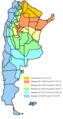 Translated version


- Article(s)
- Climate of Argentina
- Request
- Would it be possible for the legend of this map to be translated into English? You could substitute English for Spanish. "Mas de" means "More than", "Greater than", or "Higher than". "De X a Y" means "From X to Y". Also, if there is any way to add Fahrenheit temperatures, perhaps putting Celsius (C) first and Fahrenheit (F) second (to reflect the order in the article), that would be great. The map itself is fine.-- Corinne ( talk) 23:50, 22 November 2015 (UTC)
- Graphist opinion(s)
- The map list its source as "own work". Is this original research or was it copied from a reliable source? I wouldn't want to help in spreading misinformation if this map is not accurate. Jolly Ω Janner 00:44, 23 November 2015 (UTC)
- Comment I am unsure about this one. However, this map resembles the mean temperature map from CONICET using this web page. See how the isotherms and the boundaries resemble each other. The map is reliable, which is good after checking it. I am unsure about the terms and conditions that they put on their web page. All I know is that it cannot be used for commercial or private use. If there is someone who can read Spanish very fluently and understand it, can he/she clarify it. Thanks. Ssbbplayer ( talk) 03:36, 23 November 2015 (UTC)
- Done please take a look at the image I posted at the top of the section. I have converted the image to not use any text which requires translation. Instead translations are given in the description, which means it can be used on infinite amount of wikis if a translation is added to the file description. Please share your thoughts.
Jolly
Ω
Janner 19:37, 23 November 2015 (UTC)
- I've been asked to take a look at this. The new version does eliminate the "language problem" and does add the needed °C and that is good. However, a "language problem" still exists as the average reader will likely find it "foreign" as it is written solely in "math". Many will be put off by it as is. If we really must avoid "words" at least reverse the relationships to (big #) ≥ (small #) to help ease the math (seems most users may find it more understandable that way). Also wikiconvention is to insert a space between the # and the unit. Vsmith ( talk) 02:52, 25 November 2015 (UTC)
- After looking at it, it is good that it is translated but a couple of users had issues with this. I would suggest putting >22 (keep it as it is) but for the values such as 4 to 12, make it display as "4-12", "12-16", "16-18" and "20-22" with the Celsius units. It is easier for people to read it that way. Ssbbplayer ( talk) 03:19, 25 November 2015 (UTC)
- I don't understand what's wrong with using words. This is English Wikipedia, and most of our readers are English speakers, and those that are not fluent in English will probably understand "Greater than..." and "Between X and Y". I do not like the symbols at all. Corinne ( talk) 03:44, 25 November 2015 (UTC)
- Either my suggestion above or the words that Corinne suggests. Those are the 2 best options and are clear and concise. With words, it should be "between 4°C to 12°C", "between 12°C to 16°C", and so on except for the last one, put "greater than 22°C". A Fahrenheit one can be added in as many readers and users of English Wikipedia come from USA where imperial units are still used. Ssbbplayer ( talk) 03:58, 25 November 2015 (UTC)
- I'm sorry to have to correct you, Ssbbplayer, but it's got to be either:
- Between X and Y,
- or:
- From X to Y. Either one is all right.
- We never say, "Between X to Y". That's simply incorrect. Just for your information, it is the same in Spanish: Entre X y (or e) Y, or De X a Y. So, choose one of the two (English) alternatives so that User:Jolly Janner can get started. Corinne ( talk) 04:08, 25 November 2015 (UTC)
- I would choose Between X and Y. Ssbbplayer ( talk) 04:09, 25 November 2015 (UTC)
- Done I often to try to avoid English text, because I upload graphics to Wikimedia Commons and they are used across many different language Wikipedias. In the case of Climate of Argentina, there are only a few cross-wiki articles and only two use this map (English and Spanish). As a result, I see nothing wrong with using English text. Please see my changes on the latest revision, where I have also added Fahrenheit conversions. I wasn't sure whether to bold the text, but would appreciate any comments related to the image. Thanks,
Jolly
Ω
Janner 04:34, 25 November 2015 (UTC)
-
Jolly It looks great! Thank you so much! I just wonder, though, whether "Higher than..." makes more sense for temperature than "Greater than".
Vsmith and
Ssbbplayer, what do you think?
Corinne (
talk) 21:40, 25 November 2015 (UTC)
- It looks great! I see no problems in this one at all. Thanks for your hard work. I really appreciate it!. Cheers. Ssbbplayer ( talk) 02:50, 26 November 2015 (UTC)
Northwest Syria map
-
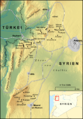 Map of northwestern Syria labeled
 -
 Expanded map of northwestern (not labeled)
 -
 The result (svg version)

.jpg)
.svg)
- Article(s)
- Hananu Revolt
- Request
- I want a map that shows the main towns, villages and geographic regions that were involved in the
Hananu Revolt. The first example map above pretty much sums up what the map should look like, but it needs to be expanded a bit to include the area depicted in the second map above. I also need it to be in English (it is currently in French). Translating will be easy: Syrien → Syria, Tote Stadt → Scale, and every instance of the word "Dschebel" should become "Jabal". Turkiye should become "Alexandretta Sanjak" because this map is based on events that occurred in 1920-21. The nearly two dozen villages (including Reyhanli and Afrin) depicted on the map need to be removed. The towns that should be kept are Aleppo, Idlib and Maarrat al-Nu'man. Towns that need to be added are
Jisr al-Shughur
[2],
Harim
[3],
al-Haffah
[4],
Jableh
[5],
Latakia
[6],
Hama,
Antioch
[7] and
al-Qusayr
[8]. The towns should be denoted in the same way Idlib is denoted (black dot with white border). The following villages should also be added but depicted as solid black dots:
Kafr Takharim
[9],
Armanaz
[10],
Tell Amar
[11],
Zanqufa
[12],
Kurin
[13], Hammam
[14], Babatorun
[15],
Narlija
[16] and
Darkush
[17]. In the area immediately around al-Haffah, a mountain range should be labeled as Jabal Sahyun, while in the area immediately around al-Qusayr, a mountain range should be labeled as Jabal al-Qusayr. Also Dschebel Siman should be labeled as Kurd-Dagh. The map will be very useful in helping readers visualize where the revolt took place. I hope to nominate the article for GA soon. --
Al Ameer (
talk) 03:21, 17 November 2015 (UTC)
- @
Erp: Would it be ok to put a Wikimapia link, which lists the latitude/longitude, next to each town that needs to be included such as what I did above for Hammam and Babatorun? If not, what's the best way to list the locations of these places? --
Al Ameer (
talk) 21:35, 17 November 2015 (UTC)
- It's not French, it's German and tote Stadt does not mean scale, but dead city. --
Metrophil44 (
talk) 18:25, 18 November 2015 (UTC)
- Wow, sorry about that mix-up. Forgive my ignorance. --
Al Ameer (
talk) 20:30, 18 November 2015 (UTC)
- @
Erp: I don't know how much it helps, but I added the wikimapia links for each of these villages. I also added
Darkush to the list. --
Al Ameer (
talk) 04:20, 21 November 2015 (UTC)
- It's coming along and I may have a first draft ready in the next day or so. --
Erp (
talk) 05:49, 21 November 2015 (UTC)
- @ Erp: Sounds good. Also, it just came to mind, but when labeling the "Alexandretta Sanjak" could it be in italics or in an otherwise different font style than "Syria"? It should be made clear that the sanjak was not a separate entity altogether but rather a district of Syria at the time. -- Al Ameer ( talk) 06:35, 21 November 2015 (UTC)
- It's coming along and I may have a first draft ready in the next day or so. --
Erp (
talk) 05:49, 21 November 2015 (UTC)
- @
Erp: I don't know how much it helps, but I added the wikimapia links for each of these villages. I also added
Darkush to the list. --
Al Ameer (
talk) 04:20, 21 November 2015 (UTC)
- Wow, sorry about that mix-up. Forgive my ignorance. --
Al Ameer (
talk) 20:30, 18 November 2015 (UTC)
- It's not French, it's German and tote Stadt does not mean scale, but dead city. --
Metrophil44 (
talk) 18:25, 18 November 2015 (UTC)
- @
Erp: Would it be ok to put a Wikimapia link, which lists the latitude/longitude, next to each town that needs to be included such as what I did above for Hammam and Babatorun? If not, what's the best way to list the locations of these places? --
Al Ameer (
talk) 21:35, 17 November 2015 (UTC)
- Graphist opinion(s)
- I might be able to do something; however, it would help if there were a table of latitude/longitude for each of the towns/villages you want. I did the map for the Orontes River article so I already have done some work in this area but note (a) I'm still a novice and (b) I'm not personally familiar with the area. -- Erp ( talk) 05:40, 17 November 2015 (UTC)
![]() Request taken by
Erp (
talk) 03:30, 19 November 2015 (UTC). I've made up my own little spreadsheet and hopefully haven't got longitude and latitude mixed (incredibly easy to do in this area of the world). --
Erp (
talk) 03:30, 19 November 2015 (UTC)
Request taken by
Erp (
talk) 03:30, 19 November 2015 (UTC). I've made up my own little spreadsheet and hopefully haven't got longitude and latitude mixed (incredibly easy to do in this area of the world). --
Erp (
talk) 03:30, 19 November 2015 (UTC)
- I'm going to go for more extensive notes and comments on my sandbox page User:Erp/Sandbox Hananu revolt map. I've put a first draft up there and you can go to comment. -- Erp ( talk) 16:42, 21 November 2015 (UTC)
![]() Done: I have produced both an svg version and a png version. There may be some later modifications as the requester works on the article.
Erp (
talk) 02:58, 24 November 2015 (UTC)
Done: I have produced both an svg version and a png version. There may be some later modifications as the requester works on the article.
Erp (
talk) 02:58, 24 November 2015 (UTC)
European Patent Convention Member States
-
 EPC Map
 -
 Paris Convention Map
 -
 Patent Cooperation Treaty Map


- Request
- The European Patent Convention map doesn't match the maps for two similar topics (the Paris Convention and the PCT). The EPC map also cuts off Morocco. Could someone either remake the EP map or remake all three to match one another? Thanks! -- Udeezy ( talk) 00:48, 21 February 2015 (UTC)
- Graphist opinion(s)
-
 Request taken by
Jolly
Ω
Janner 20:53, 31 October 2015 (UTC).: immediately @
Udeezy: am I missing something? I haven't given a completely thorough check with the articles, but the maps do appear to match up with what the articles list. I can include all of Morocco in the map and add Moldova, which is due to come into effect tomorrow.
Request taken by
Jolly
Ω
Janner 20:53, 31 October 2015 (UTC).: immediately @
Udeezy: am I missing something? I haven't given a completely thorough check with the articles, but the maps do appear to match up with what the articles list. I can include all of Morocco in the map and add Moldova, which is due to come into effect tomorrow.
- I have updated the European map to include Morocco and changed Moldova. Jolly Ω Janner 20:53, 31 October 2015 (UTC)
- Done @
Udeezy: now that I understand you wanted them in green, please take a look. I was unsure on the colour to be used for extension members.
Jolly
Ω
Janner 06:29, 7 November 2015 (UTC)
Earth-grazing meteoroid of 13 October 1990
-
 Map of central Europe

- Article(s)
- Earth-grazing meteoroid of 13 October 1990.
- Request
-
File:Central Europe location map.svg can be used as a basis for the map. However, the border between the Czech Republic and
PolandSlovakia needs to be removed, because Czechoslovakia was a single country in 1990. The coordinations for beginning, perigee and end of the fireball are provided in the article. It would be great if the towns and cities lying near the three points (beginning: Uherský Brod, perigee: Wrocław and end: Poznań and maybe other important cities along the track were located on the map too. Thanks very much. -- Jan Kameníček ( talk) 21:36, 12 March 2015 (UTC)- By "Poland", do you mean "Slovakia"? --
Redrose64 (
talk) 22:33, 12 March 2015 (UTC)
- Of course Slovakia, I should not write anything late in the evening :-) -- Jan Kameníček ( talk) 23:13, 12 March 2015 (UTC)
- By "Poland", do you mean "Slovakia"? --
Redrose64 (
talk) 22:33, 12 March 2015 (UTC)
- Graphist opinion(s)
![]() Request taken by
Jolly
Ω
Janner 19:56, 31 October 2015 (UTC).: immediately. @
Jan.Kamenicek: How is this for a first draft?
File:Earth-grazing meteoroid of 13 October 1990 locations map.svg
Jolly
Ω
Janner 19:56, 31 October 2015 (UTC)
Request taken by
Jolly
Ω
Janner 19:56, 31 October 2015 (UTC).: immediately. @
Jan.Kamenicek: How is this for a first draft?
File:Earth-grazing meteoroid of 13 October 1990 locations map.svg
Jolly
Ω
Janner 19:56, 31 October 2015 (UTC)
- @
Jolly Janner: Very good! Just the name of the town is "Uherský Brod". Thanks very much for taking the request!
Jan Kameníček (
talk) 23:13, 31 October 2015 (UTC)
- @
Jan.Kamenicek: I've fixed the town's name. If you have any more cities you wish to be added or any other request, let me know. If not, mark as resolved.
Jolly
Ω
Janner 23:40, 31 October 2015 (UTC)
- @ Jolly Janner: Sorry, I misunderstood your previous question. I thought that you just want to make sure whether the positions are OK before you go on marking the track. Would it be possible to join the three points into a line to show the whole track and keep the three points – begin, perigee and end – still visible? E. g. the track could be thinner or have different colour, depends which would look better.
- As for other cities, I think it could stay as it is.
Jan Kameníček (
talk) 23:57, 31 October 2015 (UTC)
- @ Jan.Kamenicek: I have added a black dashed line through the points. I would appreciate your thoughts. Jolly Ω Janner 00:20, 1 November 2015 (UTC)
- @
Jan.Kamenicek: I've fixed the town's name. If you have any more cities you wish to be added or any other request, let me know. If not, mark as resolved.
Jolly
Ω
Janner 23:40, 31 October 2015 (UTC)
Plymouth Colony map.svg

- Article(s)
- Plymouth Colony
- Request
- Please add a simple scale in miles and kilometers to this map. -- 65.210.65.16 ( talk) 14:32, 9 April 2015 (UTC)
- Graphist opinion(s)
![]() Done.
Jolly
Ω
Janner 23:19, 3 November 2015 (UTC)
Done.
Jolly
Ω
Janner 23:19, 3 November 2015 (UTC)
Topographic map for Australia

- Article(s)
- Australia
- Request
- In the section Australia#Geography and climate there is a topographic map of Australia. I felt that the map would be more helpful and informative if it had a legend, and I posted a comment to this effect on the talk page of the article at Talk:Australia#Geography and climate. User:Rwood128 agreed; s/he was unable to find a map with a legend, so added a bit to the caption. Would it be possible to add a legend giving colors and elevations to this map? - CorinneSD ( talk) 16:44, 16 July 2015 (UTC)
- Graphist opinion(s)
![]() Done @
CorinneSD:.
Jolly
Ω
Janner 04:57, 5 November 2015 (UTC)
Done @
CorinneSD:.
Jolly
Ω
Janner 04:57, 5 November 2015 (UTC)
SVG versions of maps on Bulgaria
-
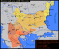 Balkans in the 14th century
 -
 Battle of Velbazhd
 -
 Bulgaria after 1371


- Article(s)
- es:Guerras búlgaro-otomanas, es:Momchil & others
- Request
- I would like to know if SVG versions of the above maps could be drawn, using the recommended colours in here and layers (for later manipulation). My goal is twofold: to have SVG maps that can be easily translated into Spanish for the Spanish Wikipedia and having the basis to create SVG versions of other maps that seem to share the same base map such as these: BG1257-77.jpg, Bulg & neighb. XIV A.png, Bulgaria under Bizantine rule.png, Bulgaria under Boril.png, Bulgaria under Kaloyan pl.png, Bulgaria-1371.jpg, Bulgaria-Ivan Asen 2.png, Bulgaria-Theodore Svetoslav.png. Campaigns of Ivan Assen II.png, Culture of the Second Bulgarian Empire.png, Culture of the First Bulgarian Empire.png, First Bulgarian Empire (976-1018).png, Second Bulgarian Empire (1185-1196).png, Second Bulgarian Empire (1241-1256).png, Second Bulgarian Empire after 1371.png. Once we have vector versions of the three maps above, these could be turned into SVG as well with much less effort. Thank you.-- Rowanwindwhistler ( talk) 07:05, 6 August 2015 (UTC)
- Graphist opinion(s)
![]() Request taken by
Goran tek-en (
talk) 15:46, 9 August 2015 (UTC).
Request taken by
Goran tek-en (
talk) 15:46, 9 August 2015 (UTC).
@
Rowanwindwhistler: Before I do any more I want you to look at
this overall draft to check that this is the largest overall area that we need?
All maps are different and the three you provided needs a rotation to fit my draft but that is the most correct we have.
So tell me if that overall area is the biggest we need, thanks. --
Goran tek-en (
talk) 18:20, 20 August 2015 (UTC)
- @
Goran tek-en:. I would recommend making it a bit larger to include the Greek peninsula. Though I think most of the maps could use that base, there one or two in the list I intend to turn into SVG (
Bulgaria-Ivan Asen 2.png,
First Bulgarian Empire (976-1018).png for instance) that would require a bit more territory in the South. Thank you.--
Rowanwindwhistler (
talk) 05:59, 21 August 2015 (UTC)
- @
Rowanwindwhistler:
Is this fine? It's always much easier to remove then to add further on for the different maps, feedback thanks. --
Goran tek-en (
talk) 14:20, 23 August 2015 (UTC)
- @
Goran tek-en:. Then, if possible, please add the territory up to Dniester river. While rechecking the maps I realized some of them (these:
1,
[18] at least) extend quite to the North of the peninsula. If it is better to have one base map for all of them, it would be nice to extend this second version North till the Dniester to be able to use it for these ones too. Sorry I did not notice last time. Thank you.--
Rowanwindwhistler (
talk) 04:56, 24 August 2015 (UTC)
- @
Rowanwindwhistler: Check this
draft and give me feedback on it. I have added more rivers from the different maps but as always maps are very different from each other so you have to guess some. Tell me if this is what you want and/or what to change, thanks. --
Goran tek-en (
talk) 18:46, 24 August 2015 (UTC)
- @ Goran tek-en: that one looks great, I think it should be perfect as a basis for all maps (or the great majority of them in any case). thank you!-- Rowanwindwhistler ( talk) 04:54, 25 August 2015 (UTC)
- Hi, sorry for intervening a bit late but just two comments. First, it seems that the resolution of the coastline data of the proposed map is very low and thus the quality of the coast is bad. Just look at the Thasos Island. It is represented as part of the main land and the Nestos river is on top of it. Second, I would recommend to cut the map on the south around the 38.5 N as the Peloponnese was never part of the Bulgarian state and no need to present it. This will allow to focus better on the subject and reduce the map size. If you do not have the means I can help if you wish to produce a map with better resolution. -- Ikonact ( talk) 14:22, 27 August 2015 (UTC)
- @
Rowanwindwhistler: Check this
draft and give me feedback on it. I have added more rivers from the different maps but as always maps are very different from each other so you have to guess some. Tell me if this is what you want and/or what to change, thanks. --
Goran tek-en (
talk) 18:46, 24 August 2015 (UTC)
- @
Goran tek-en:. Then, if possible, please add the territory up to Dniester river. While rechecking the maps I realized some of them (these:
1,
[18] at least) extend quite to the North of the peninsula. If it is better to have one base map for all of them, it would be nice to extend this second version North till the Dniester to be able to use it for these ones too. Sorry I did not notice last time. Thank you.--
Rowanwindwhistler (
talk) 04:56, 24 August 2015 (UTC)
- @
Rowanwindwhistler:
Is this fine? It's always much easier to remove then to add further on for the different maps, feedback thanks. --
Goran tek-en (
talk) 14:20, 23 August 2015 (UTC)
Thanks for informing me about the resolution. I will make a new one with higher resolution so please check here for that. I have no knowledge of that area like that so I need help. This is a problem that comes from taking a part of a map that shows a much larger area so I usally redraw them as I will with this. If you both agree on the cut I will also do that, I have no knowledge, again. My idea is that this is a base map and then we can reduce/zoom in when it's possible depending on the map. -- Goran tek-en ( talk) 14:33, 27 August 2015 (UTC)
- @
Rowanwindwhistler:@
Ikonact: Now I want BOTH of you to look at
this base draft and tell me if the overall area is right and if the level of details is good. I haven't added more than coastline just so I don't do a lot of work for nothing, thanks. --
Goran tek-en (
talk) 19:08, 30 August 2015 (UTC)
- @ Goran tek-en:, personally, I think the previous one was much better. If the map does not include the Southern part of Greece, some maps will not be able to use this base map, as I mentioned earlier. Thank you.-- Rowanwindwhistler ( talk) 19:53, 30 August 2015 (UTC)
- @
Goran tek-en:@
Rowanwindwhistler:: The resolution is OK. If you think that including the Southern part of Greece is important, I do not oppose. Thank you --
Ikonact (
talk) 08:43, 31 August 2015 (UTC)
- @
Rowanwindwhistler: Now there are two drafts to look at. But as always with maps they are all different in how they were made so it's hard to combine them to get everything perfect. You really have to check them regarding everything and tell me what to change, add or remove.
- Base map. If more basic stuff comes up when working on the other maps I will add that.
- Battle of Velbazhd. If you want me to cut the overall map somewhere you have to tell me.
- In some names there is a read letter, you have to write it here for me because I can't find it on my keyboard or character map.
- Inside the enlarging there are some cyan colored dots, what are they?
- Give me feedback as above, thanks. -- Goran tek-en ( talk) 17:06, 5 September 2015 (UTC)
- @
Rowanwindwhistler: Now there are two drafts to look at. But as always with maps they are all different in how they were made so it's hard to combine them to get everything perfect. You really have to check them regarding everything and tell me what to change, add or remove.
- @ Goran tek-en:, the base map looks very nice. I found a couple of small typos, though: the river is called Maritsa and Konstantinopol is actually Constantinople in English.
- On the special characters, I think these were the ones you were looking for: Braničevo, Niš, Hârșova, Kočane, Staro Nagoričane, Dečanski (I usually look them up in Google and paste them into the map when necessary, though they can also be found in the "Special characters" menu in Wikipedia).
- The Battle of Velbazhd. can be made to fit the same area as the original map and that should be fine I think. Unless I am mistaken, only the Byzantine border in Greece (at the bottom of the original map) is missing.
- Though not 100% sure, I think the cyan colored dots are villages or hamlets.
- Thank you for all the effort so far, the maps look great!--
Rowanwindwhistler (
talk) 06:23, 6 September 2015 (UTC)
- @
Rowanwindwhistler:
- Base map. Just check it again.
-
Battle of Velbazhd. If this is OK now I will need a name for it, I can't use the same as for the *.png. If you don't give me any other info for it I will use what I find for the *.png.
- Give me feedback and info, thanks. --
Goran tek-en (
talk) 18:33, 6 September 2015 (UTC)
- @ Goran tek-en: Both the base map and the battle map look very nice. If for some reason we cannot keep the png name for the map of the battle, maybe we could use something like Battle_of_Velbazhd_1330.svg... Thank you!-- Rowanwindwhistler ( talk) 10:16, 7 September 2015 (UTC)
- @
Rowanwindwhistler:
- Thank you for all the effort so far, the maps look great!--
Rowanwindwhistler (
talk) 06:23, 6 September 2015 (UTC)
Now you can find it here Battle of Velbazhd 1330 -- Goran tek-en ( talk) 18:29, 7 September 2015 (UTC)
- Many thanks, I have created an Spanish version already.--
Rowanwindwhistler (
talk) 07:38, 9 September 2015 (UTC)
- @
Rowanwindwhistler: Now there is a
draft of the second map. Check it thoroughly and give me feedback, thanks. --
Goran tek-en (
talk) 19:09, 19 September 2015 (UTC)
- @
Goran tek-en: it looks very good. I only saw a small mistake in the legend (Ugleša->Uglješa) and some towns that are not present in the original and could be removed (but again they can be left in place, they do no harm). The rest looks perfect to me. I would say if the small typo is corrected in the legend the map is ready for upload.--
Rowanwindwhistler (
talk) 20:23, 19 September 2015 (UTC)
- @
Rowanwindwhistler: Now you can find it here
Bulgarian lands 1350 vek. I did remove the cities that was not in the original map. If/when you make a language version give me a ping so I can check that nothing has happened in the map as it did with the other, thanks. If you wonder, the reason for me to use patterns also in the different areas is that I try to make maps working also for people with color vision issues, and more than 9 different colors is almost impossible to work so you have to use patterns as well. --
Goran tek-en (
talk) 17:56, 20 September 2015 (UTC)
- @ Goran tek-en: thank you very much! I have created an Spanish version. Basically I translated the text and changed the colour of the cities in one territory to white to increase the contrast with the background. I had to make the font in some legend entries a bit smaller to fit the longer Spanish. For the third map, would you mind uploading the map with layers? It makes selecting objects much easier when translating. Thanks again!-- Rowanwindwhistler ( talk) 20:43, 20 September 2015 (UTC)
- I forgot to ask: did you upload the base map into Commons in the end? I may have overlooked it and I would like ot see if I can use it as a basis for turning another png map into svg. Thanks.--
Rowanwindwhistler (
talk) 06:32, 21 September 2015 (UTC)
- @
Rowanwindwhistler: It is preferred that svg are not uploaded as
Inkscape, Illustrator or other program specific files which it has to be if one should keep the layers. On the other hand I really do understand your point when you make language versions. In the plain svg I upload each layer has become a group, so all country names are in one group and so on.
- I don't know if you use Inkscape when you do language versions but what we can do that would help you is that I give you a link to where you can download the version with layers and when you are done use "Save as..." or "Save a copy..." and then choose "Plain svg" as file type and upload that file. If you don't use Inkscape there should be a similar way. I don't know how much you know of what I have described above so I'm just sharing what I know and how I work here.
- I haven't uploaded the base map yet as I wanted to add all the information from the three requested maps so I will do it soon. I will need the following for the base map;
- Name of the file
- Description
- Category/ies at commons
- to be able to upload it at commons.
- @ Goran tek-en: you understood exactly my point. When it comes to translation, each piece of text has to be selected (unless you open the file in a text editor which I would rather avoid) in order to change it. When I have layers (you are right, I use inkscape for that), I can hide everything except the text layers and work quickly on them. If the whole map is in one layer I see no easy way to select a particular text object and often end up selecting another object, which makes the process slower. I suppose I could copy the groups you mention into a layer, work on the layer and them merge it back with the rest of the map, but then again I would be basically recreating the removed layers... It seems whoever thought about this rule did not take translations into account (or maybe thought of a different way of doing it from the one I use, though I think mine is the most simple one). Your suggestion sounds very nice to me but may have a problem in the long run: it would certainly help me with my Spanish translation but if someone tries to make a, say, Turkish version in 3 month's time he or she will face the same problem... I may raise the question in the help forums to see if the rule can be changed or if the colleagues can think of an alternative (and quick) way to do the translations.
- @
Rowanwindwhistler: It is preferred that svg are not uploaded as
Inkscape, Illustrator or other program specific files which it has to be if one should keep the layers. On the other hand I really do understand your point when you make language versions. In the plain svg I upload each layer has become a group, so all country names are in one group and so on.
- @
Rowanwindwhistler: Now you can find it here
Bulgarian lands 1350 vek. I did remove the cities that was not in the original map. If/when you make a language version give me a ping so I can check that nothing has happened in the map as it did with the other, thanks. If you wonder, the reason for me to use patterns also in the different areas is that I try to make maps working also for people with color vision issues, and more than 9 different colors is almost impossible to work so you have to use patterns as well. --
Goran tek-en (
talk) 17:56, 20 September 2015 (UTC)
- @
Goran tek-en: it looks very good. I only saw a small mistake in the legend (Ugleša->Uglješa) and some towns that are not present in the original and could be removed (but again they can be left in place, they do no harm). The rest looks perfect to me. I would say if the small typo is corrected in the legend the map is ready for upload.--
Rowanwindwhistler (
talk) 20:23, 19 September 2015 (UTC)
- @
Rowanwindwhistler: Now there is a
draft of the second map. Check it thoroughly and give me feedback, thanks. --
Goran tek-en (
talk) 19:09, 19 September 2015 (UTC)
- Anyhow, on the base map, no hurry, whenever it is ok with you is fine with me. I just wanted to try and see if I could fit
this and
this onto the base map (that is, if I could use it not just for the Bulgarian maps I mentioned originally, but for others too). I think it could be called something like Map_of_the_Balkans_in_the_Middle_ages.svg with a description such as "Base map showing the Balkans in the late Middle Ages, including the main cities and towns". As for the categories, I would go for "SVG maps showing history in English" & "Maps of the history of the medieval Balkans". Thank you!--
Rowanwindwhistler (
talk) 19:53, 21 September 2015 (UTC)
- @
Rowanwindwhistler: I totally agree with you but maybe we should move this discussion somewhere else. I have some ideas and if I can contribute I would be happy to participate. I have looked around at commons but not really found out where one should discuss this, any ideas? --
Goran tek-en (
talk) 10:35, 22 September 2015 (UTC)
- @ Goran tek-en: right you are indeed. I have raised a few questions (hopefully in the right forum), and I expect the community will give some good advice on how to do these translations quickly and easily (and on whether we can preserve layers while not breaking anything else at the same time in SVGs).-- Rowanwindwhistler ( talk) 20:38, 22 September 2015 (UTC)
- @
Rowanwindwhistler: I totally agree with you but maybe we should move this discussion somewhere else. I have some ideas and if I can contribute I would be happy to participate. I have looked around at commons but not really found out where one should discuss this, any ideas? --
Goran tek-en (
talk) 10:35, 22 September 2015 (UTC)
- Anyhow, on the base map, no hurry, whenever it is ok with you is fine with me. I just wanted to try and see if I could fit
this and
this onto the base map (that is, if I could use it not just for the Bulgarian maps I mentioned originally, but for others too). I think it could be called something like Map_of_the_Balkans_in_the_Middle_ages.svg with a description such as "Base map showing the Balkans in the late Middle Ages, including the main cities and towns". As for the categories, I would go for "SVG maps showing history in English" & "Maps of the history of the medieval Balkans". Thank you!--
Rowanwindwhistler (
talk) 19:53, 21 September 2015 (UTC)
@ Rowanwindwhistler: Now there is a draft of the third map. I'm missing names of two areas (legend x and xx) and also I don't understand the top point in the legend of image BG-1371.jpg. Give me feedback, thanks. -- Goran tek-en ( talk) 19:28, 25 September 2015 (UTC)
- @
Goran tek-en: good point, I did not realize about that when I checked the map... I asked in the author's discussion page to see if he/she can lend a hand and clarify these 2 doubts. The map looks nice but maybe the dates are a bit too small to read and maybe a lighter colour would improve readability of the labels on the darker background territories...--
Rowanwindwhistler (
talk) 21:20, 25 September 2015 (UTC)
- @
Rowanwindwhistler: Now you can find the base map here
Map of the Balkans in the Middle ages. I will wait for your information on the things above, thanks. --
Goran tek-en (
talk) 17:28, 27 September 2015 (UTC)
- Thank you, I will try to use it soon for the other maps. Regarding the third map, its creator told me both territories (x & xx) are "Bulgarian territory conquered by the Ottoman Empire around 1371" (no idea yet why they use different colours) and so it should say in the first legend entry. I will let you know if I get any additional information.--
Rowanwindwhistler (
talk) 20:14, 27 September 2015 (UTC)
- I'm sorry but I don't understand.
- Do you want me to use one color for x & xx?
- Should it not be x & xx that has the text "Bulgarian territory conquered by the Ottoman Empire around 1371", you wrote the first one? -- Goran tek-en ( talk) 17:39, 28 September 2015 (UTC)
- You may use the same colour for both areas or leave them with different colours but use the same label for both in the legend. According to the uploader, both territories are "Bulgarian territory conquered by the Ottoman Empire around 1371". From the explanation I got the description fits both areas (no idea why there is only one colour next to the text in the legend entry).--
Rowanwindwhistler (
talk) 09:50, 29 September 2015 (UTC)
- @
Rowanwindwhistler: I'm very sorry for the delay but I had to do other things for a period. Now
you can look at a draft and give me feedback.
- I will need the following;
- Name of the file
- Description
- Category/ies at commons
- to be able to upload it at commons and please ping me as the watch doesn't work for me here, thanks. --
Goran tek-en (
talk) 18:13, 3 November 2015 (UTC)
- @ Goran tek-en: No problem at all! I see no errors in the map, it looks perfect to me. I think it could be called something like Bulgaria1344-1396.svg with a description like "Territorial evolution of Bulgarian lands in the second half of the 14th century." As for categories, I would suggest to keep the ones from the original map along with "SVG maps showing history in English". Thank you very much for all the effort put in creating these maps!-- Rowanwindwhistler ( talk) 07:52, 4 November 2015 (UTC)
- @
Rowanwindwhistler: I'm very sorry for the delay but I had to do other things for a period. Now
you can look at a draft and give me feedback.
- I'm sorry but I don't understand.
- Thank you, I will try to use it soon for the other maps. Regarding the third map, its creator told me both territories (x & xx) are "Bulgarian territory conquered by the Ottoman Empire around 1371" (no idea yet why they use different colours) and so it should say in the first legend entry. I will let you know if I get any additional information.--
Rowanwindwhistler (
talk) 20:14, 27 September 2015 (UTC)
- @
Rowanwindwhistler: Now you can find the base map here
Map of the Balkans in the Middle ages. I will wait for your information on the things above, thanks. --
Goran tek-en (
talk) 17:28, 27 September 2015 (UTC)
@
Rowanwindwhistler: Now you can find it here
Territorial evolution of Bulgarian lands in the second half of the 14th century.
- @ Goran tek-en: indeed. Thank you very much for all these great maps!-- Rowanwindwhistler ( talk) 21:04, 7 November 2015 (UTC)
![]() Done I guess we are done with this request, if not just get back to me, thanks. --
Goran tek-en (
talk) 17:30, 7 November 2015 (UTC)
Done I guess we are done with this request, if not just get back to me, thanks. --
Goran tek-en (
talk) 17:30, 7 November 2015 (UTC)
Climate zones of Argentina
-
 Spanish language map
 -
 My attempt at an English translation


![[1]](https://commons.wikimedia.org/wiki/File:Marsupial_mole_distribution_map.svg%7Chere)
- Article(s)
- Climate of Argentina
- Request
- I tried translating the above map from Spanish to English, but for some reason all the text can't be seen in the thumbnail version. Would be great if someone could fix the text. Thanks. P. S. Burton ( talk) 22:36, 25 November 2015 (UTC) P. S. Burton ( talk) 22:36, 25 November 2015 (UTC)
- Graphist opinion(s)
- Try opening in-private or cognito browser and taking a look. The problem appears to be with your browser and not the image. Jolly Ω Janner 22:44, 25 November 2015 (UTC)
- On second thoughts, I see what you mean. The text is cut off on the right border. The document properties suggests a width of 605.54 and height of 699.10, yet it's being uploaded at 512 × 591 on Commons. It's as if the scale has been changed, but I have no clue how. No matter how much I change the document properties it still comes out at 512 pixels on Commons. I don't know how to proceed and sorry for clogging up the revisions. Jolly Ω Janner 23:14, 25 November 2015 (UTC)
- I have modified the legends a bit to match the translation from the legends in Spanish in the Climate of Argentina page using a bit of the official translation that the source indicates as a rough guide. I think it should work and the translation sounds more better. Not to mention that the labels are more shorter than before which is the issue. Ssbbplayer ( talk) 04:06, 26 November 2015 (UTC)
- Nope. It looks perfect for me. Thank you so much. I tried to find a way to do this a couple of months ago by asking a user in Wikimedia commons but I did not receive any response. It was really good that the map was translated. I did added a note about the sovereignty dispute and suspension of claims in Antarctica by the Antarctic Treaty in this map to avoid it being pro-Argentina or pro-British. Ssbbplayer ( talk) 01:00, 1 December 2015 (UTC)
- No problem and thanks for clarifying the territorial claims. I was a bit puzzled when I saw them on the maps and I'm still unsure of the article's scope. If any territories need to be removed, it should be pretty straightforward in Inkscape, but if in doubt post here. Jolly Ω Janner 01:04, 1 December 2015 (UTC)
- The article does not involve talking about the Falkland Islands nor Argentina Antarctica as adding in this would fail to adhere to NPOV. Ssbbplayer ( talk) 01:24, 1 December 2015 (UTC)