|
Please cut and paste nominations to be archived from the
Picture peer review mainpage to the top of the appropriate archive page, creating a new archive (by nomination date) when necessary.
|
Ibanez JS1200 guitar

I think its pretty good, and a lot of people have told me how much they liked it. Before I bought my guitar the biggest problem I had was finding a decent picture of the finish on the internet, I think this shows it pretty well.
- Comments
- When you zoom in all the way, it's kind of blurry. Also, I'm not sure if you wanted to only show that segment of the guitar, but I think a picture of the guitar as a whole would be more helpful, considering the size of the picture you can get. As it is now, when it's smaller, it's a pretty exceptional picture. Elephantissimo ( talk) 20:40, 31 March 2008 (UTC)
- I think this would fail FPC based on composition issues. Not enough of the guitar is in the picture. I'm sure it makes a fine addition to the article it's in, but I couldn't see it as a FP since the whole body of the guitar isn't in the picture. Tomdobb ( talk) 12:28, 1 April 2008 (UTC)
- Seconder
K2


It shows a whole side of the mountain, good quality, the smaller mountains on each side give it a nice frame-like picture and add symmetry. But I wasn't so sure, so I posted it here, to the peer review.
- Comments
- Comment -- I like this photo, but it is of low resolution. This photo has better res. — Preceding unsigned comment added by Dmottl ( talk • contribs) 06:16, 29 March 2008
- The second photo looks really good, but the first one seems a little small for what you're trying to show. Elephantissimo ( talk) 17:57, 29 March 2008 (UTC)
- Compositionally I really like the first one far better. The big issue I can see is with size. It does meet the requirements (at least 1000px on the longest side), but for landscape type shots people usually expect somewhat more. Personally I feel it would fail on those grounds alone, but would be quite interested if a bigger version could be found. -- jjron ( talk) 10:24, 11 April 2008 (UTC)
- Seconder
Late Medieval Trade Routes

I've never nominated a picture before, and I have no idea what is required, so I'm putting it up here first. I should add that it's not entirely my own work. The background map is this one: Image:Europe outline map.png, made by User:IMeowbot, who in turn based his work on "PD maps (copyright expired) from The Historical Atlas by William R. Shepherd." The routes and towns are added by me though, and it's based on a number of different sources, so there's no copyright violation. The map is currently in use in the article Late Middle Ages.
- Nominated by
- Lampman Talk to me! 16:34, 28 March 2008 (UTC)
- Comments
- Map ought be in vector form. This is not too tough, if we can use one of the many blank svg maps and add on the trade routes on top. If you're not familiar with svg, I can probably do it for you. One thing I like to see in maps is that any color codes are defined directly in the image itself, rather than having to memorize an external code. So the trade routes ought to be labeled directly. I'm not sure whether this map has enough of a special quality to be featured; putting lines on a base map is pretty routine, so in my mind to be feature-worthy it should have extra content, or be very carefully and precisely constructed. Can you think of anything to add to make it really special? Jeff Dahl ( Talk • contribs) 22:24, 31 March 2008 (UTC)
- Thanks for your offer, the original is in vector form as I made it in Microsoft PhotoDraw, I'm just not able to save it as svg. I thought about adding the colour code to the map; that's why I left the blank space in the upper right corner. If I do that I'm gonna have to also upload a second version for translations though. As for adding anything more than that, I don't think that's a good idea. I wasn't going for opulence, but clarity of information and esthetic appeal, and I don't want to sacrifice any of that for featured status. Lampman Talk to me! 13:20, 6 April 2008 (UTC)
- I'd say if you can upload a vector version, removing the dotted line around the border, adding direct labels, and listing the major goods being traded along the routes, I would support the map on FPC. Listing important trade goods adds content to the map without making it cheesy or just being decoration. Also consider adding a title with the time frame in question, directly on the map. The advantage of svg is that it is very, very easy to translate the map into other languages. On commons, there are many images which have been translated into several languages in this way. If you're not familiar with it already, try inkscape; this free drawing program is really a great way to draw. Jeff Dahl ( Talk • contribs) 23:46, 8 April 2008 (UTC)
- Yeah, I've actually thought about adding trade goods; if there's a way I can do it without making the map too cluttered then that's probably a good idea. Anyway, thanks for your comments, it's been really helpful, I'll see if I can find time to look into this. Lampman Talk to me! 22:14, 13 April 2008 (UTC)
- Seconder
Pet Iguana

While it isn't the main picture in the iguana page or the green iguana page but the picture is highly detailed. Not only could you count the scales on the iguana when zoomed in, you can also get a good look at its habitat.
- Nominated by
- Elephantissimo ( talk) 13:35, 26 March 2008 (UTC)
- Comments
- I doubt this would pass FPC given how much the cage obscures the iguana. It is a nicely detailed picture though. Tomdobb ( talk) 16:21, 26 March 2008 (UTC)
- I think this is a good picture. It's very detailed and it adds to the iguana page. Preceding unsigned comment left by P h o e b e™ 23:44, 26 March 2008
- Thank you for your nomination. The focus on the iguana is quite good given the conditions this has been taken in, and detail is quite good. Nonetheless, this would unfortunately stand no chance at FPC due to the overwhelming presence of the cage, especially given that it obscures the animal. General composition is actually not ideal. Given that this is a pet, is there no way of getting a photo of it outside the cage?
Additionally, for FPC there is usually a need for good encyclopaedic value and significant contribution to articles. In general, when an image is used only in an image gallery (or galleries), as this is, that would not be regarded as a 'significant contribution'.
For an idea of the standard of animal related FPCs see Wikipedia:Featured pictures/Animals. Thanks for your contributions to Wikipedia. -- jjron ( talk) 09:02, 27 March 2008 (UTC)
- Seconder
Pied Cormorants

Good looking, decent sized picture that has encyclopaedic value in terms of illustration and identification of the subject. The composition with the two birds seems quite interesting without being too unnatural or distracting. I'm not a great judge of technical merit so apologies if I'm wasting your time.
- Comments
- I stumbled across this just a while ago while trying to find a suitable home for another picture, and came to the same conclusion as you on a first glance . Then I thought it through and got some doubts, specifically about that big blown highlight on the birds neck. Not 100% sure on this one ... --- Mad Tinman T C 15:51, 27 March 2008 (UTC)
- I haven't looked at it at full res so can't say too much, but think it is better compositionally than the one hugely supported but currently struggling for EV on FPC (i.e., at least these look like natural poses, which the other one never did). Two issues, that blown section of neck is prominent even at image page size, and even though composition is more natural, the second bird actually hurts the photo with how it overlaps the first. Then there would also be the issue of going for a second Pied Cormorant so soon after the other one... -- jjron ( talk) 13:57, 28 March 2008 (UTC)
- Seconder
Male sailor and two WAVES, California, 1950

An exceptional human-interest photo from the archives of the LA Times. Can we get more postwar California than this? Note that UCLA catalogs the photo as "Man-woman relationships--California--Los Angeles"
Photo linked to these pages:
- WAVES
- USS Uhlmann (DD-687), the ship in the photo
- Nominated by
- Pete Tillman ( talk) 22:16, 9 April 2008 (UTC)
- Comments
- WITHDRAWN -- has a noncommercial CC license. Grrr. Pete Tillman ( talk) 02:52, 10 April 2008 (UTC)
- --and see "Why not use noncommercial licensed images? (a rant)" at Wikipedia:Media_copyright_questions#40 (scroll almost to bottom). Grump, grump. Pete Tillman ( talk) 05:00, 10 April 2008 (UTC)
- Seconder
Venice centre

It seems like a good picture, and it adds value to the Venice article.
- Comments
- It's certainly big enough, but it's not very sharp. And I'm not sure what exactly I'm looking at besides a lot of water. Could probably benefit from a crop. I really can't see this passing at FPC. Tomdobb ( talk) 19:20, 24 March 2008 (UTC)
- I agree. Compositionally, I think it would be better to have the cityscape at the bottom third of picture, with the sky occupying two-thirds, rather than foreground water occupying almost the entire image. A bigger concern, however, is that the size of the photo (subject too small) does not depict the subject particularly well, or with sufficient detail. Specifically, the Grand Canal takes a bend around the middle of the city-scape; that is, the left and right side of the city are actually island/mainland separated by the Canal, although the picture seems to give the impression that the landmass is continuous from left to right. -- Malachirality ( talk) 19:24, 24 March 2008 (UTC)
- Seconder
STS-123 launch

I believe that this image has an opportunity to become a featured image, but there might be room for improvement. How can I improve it?
- Comments
- Thanks for nominating this image at PPR. We get quite a lot of NASA images through FPC, and standards are pretty high. This is an attractive image, but we already have a number of shuttle FPs, including photos taken at the launch (see Wikipedia:Featured pictures/Aeronautics and aviation/Space); admittedly I don't think we have a night launch as FP. However, this would currently stand no chance at FPC due to the odd smudging effect at the left of the booster rockets. Beyond that, technical quality is nothing outstanding. If you have access to a better quality version, in particular one without the smudging, you could try uploading that for another attempt. Thanks for your contribution. -- jjron ( talk) 15:28, 24 March 2008 (UTC)
- Seconder
Su-27 on landing

Good quality, very close to flying aircraft
- Comments
- Seconder
Nominated at FPC
here by
Mottld six minutes after this posting. --
jjron (
talk) 07:44, 24 March 2008 (UTC)
USS Denver replenishment

I believe that this is one of the better images of an underway replenishment (aka replenishment at sea) by showing the actual people, rather than just cables being shot across. But then again I may just be blind due to the fact that I took this picture. It may also need to be cropped. And if anyway possible, whether it's FPC quality or not.
- Comments
- This is a good picture, but I can't see it reaching featured status for a number of reasons. The main issue is to do with composition; it's all a little messy (I accept that that's probably inevitable with a photo like this, but it must be possible to frame it a bit better, say with the taller parts in the background framing the picture). Lighting also seems a little dull, and would benefit from more appealing colouring in the sky. Not being familiar with this process, I have no way of telling that underway replenishment is happening (it just looks like four blokes on deck to me), and if it is a very good shot of this, wonder why it isn't in that particular article. To be honest, until I checked the article and looked more closely here, I didn't even realise there were two ships involved here, much less what was happening. Thanks for putting it up here though. Would be interested to hear other opinions. -- jjron ( talk) 07:09, 19 March 2008 (UTC)
McCain

Seems like a very good picture, with a significant "wow" factor. It has a high technical standard, high resolution, and is among Wikipedia's best work. It has appeared at the main Wikipedia page (see here). It has a free license, and adds value to the John McCain article. It's accurate, neutral, and has a good caption. And it does not have any inappropriate digital manipulation.
- Nominated by
- Ferrylodge ( talk) 16:34, 10 March 2008 (UTC)
- Comments
- It certainly looks wonderful in the infobox and contributes to the article. However, the resolution is way below the featured picture standard, the image isn't in focus on his entire face, and I actually think the color balance is off a bit. - Enuja ( talk) 17:38, 10 March 2008 (UTC)
- Thanks for the comment. I uploaded it from Flickr and cropped it, which may have hurt the resolution. Is it possible to re-upload and re-crop in a higher resolution (perhaps also fixing the color balance)? Unfortunately, I don't have the best software on my computer.Incidentally, there's currently a discussion at
talk:John McCain about whether to use this photo in that article.
Ferrylodge (
talk) 17:52, 10 March 2008 (UTC)
- Wow, I hadn't seen that page. It certainly looks like there are many free-use higher resolution images that contribute just as much to the article as this one does. In order to a be a featured picture, this image would have to be of much, much higher resolution; cropping is immaterial as his face is not of high enough resolution. - Enuja ( talk) 20:53, 10 March 2008 (UTC)
- Thanks for the comment. I uploaded it from Flickr and cropped it, which may have hurt the resolution. Is it possible to re-upload and re-crop in a higher resolution (perhaps also fixing the color balance)? Unfortunately, I don't have the best software on my computer.Incidentally, there's currently a discussion at
talk:John McCain about whether to use this photo in that article.
Ferrylodge (
talk) 17:52, 10 March 2008 (UTC)
- Seconder
Sydney Olympic Stadium/ANZ Stadium

Just need a few opinions and maybe some advice on what settings to use on my Fuji Fine Pix...
- Nominated by
- . --User:Adam.J.W.C. (talk) ( talk) 09:55, 10 March 2008 (UTC)
- Comments
- Seconder
Sydney Olympic Stadium/ANZ Stadium darker version

Just need a few opinions and maybe some advice on what settings to use on my Fuji Fine Pix...
- Nominated by
- . --User:Adam.J.W.C. (talk) ( talk) 09:55, 10 March 2008 (UTC)
- Comments
- This version is better for a whole raft of reasons. Your first version was basically over-exposed. Darker rendering helps reduce noise in the sky and brings back some colour saturation in the foreground. This version is also a much better crop, bringing back the missing RHS and allowing more headroom for the main subject. It's also nearer a correct orientation, referring to the severe tilt on the original version. It's a nice image, great for the encyclopedia, and it's certainly worth considering some finishing touches – I'd look at less sharpening, another slight rotation to bring the verticals at the centre of the image upright, maybe with a little perspective correction, noise reduction for the sky, etc – but to be frank, for FPC it would be better to reshoot it just before dark, rather than at night. Apart from making for a much better-looking sky, it should help reduce the heavy, distracting contrast between the darkest and brightest areas of the image. These are fairly major FPC-failing issues which you really can't do much about here. Camera-wise, a smaller aperture would be the biggest single improvement you could make. -- mikaul talk 13:07, 12 March 2008 (UTC)
- Meant to add: you do realise the edge of the frame is showing at the top, don't you? Clone it out, rather than crop it. -- mikaul talk 13:09, 12 March 2008 (UTC)
- Seconder
Kinshasa Skyline
It just looks really cool with the extended exposure time and it's effect on the lightning and traffic. It's also high resolution. Very eerie, like it's of some fantasy city.
- Comments
- It's a very nice picture, but my feel is it would likely fail on encyclopaedic grounds. It's not a particularly informative photo of the city itself (which is the only article it's illustrating). The focus really seems to be the lightning over the city. This would seem a better bet on Commons FP. Thanks for the nomination. -- jjron ( talk) 06:48, 7 March 2008 (UTC)
- I can't see this as a featured picture. I don't even have the picture maximized, and it already looks blurry. Rj1020 ( talk) 02:25, 14 March 2008 (UTC)
- Seconder
California Gold Rush relief map

High detail, good use of color, lots of encyclopedic content - clearly shows the most important locations discussed in the California Gold Rush article. Easily meets all the FP criteria. (This is upgraded version pursuant to earlier suggestion.)
- Nominated by
- NorCalHistory ( talk) 11:43, 5 March 2008 (UTC)
- Comments
- While this certainly very useful, it's not a very aesthetically pleasing map. The labels (and especially the lines) look bulky and unprofessional. I wasn't able to find on the image page where the original map came from, and the original map, while it does contain a lot of relief information, also doesn't look very good. It's a great contribution to the encyclopedia, but not as a high-quality image. - Enuja ( talk) 02:52, 10 March 2008 (UTC)
- Made suggested changes available - perhaps you could let me know what "bulky" means in a bit more detail, or more specifically, your suggestion for fixing. NorCalHistory ( talk) 17:09, 11 March 2008 (UTC)
- Seconder
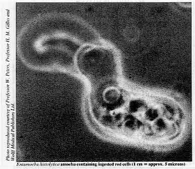
Entamoeba histolytica Life cycle

well i have 2 reasons , the first is that i think it is well made and the second is the person who was helping me to do this images doesnt seem to answer my mesages and i need someone to check wether it is acurate enough to be FP.- LadyofHats ( talk) 15:25, 11 March 2008 (UTC)
- Nominated by
- LadyofHats ( talk) 15:25, 11 March 2008 (UTC)
- Comments
- Thanks for the nomination. Without saying too much, can I just clarify that this is a cycle - it says it's a lifecycle, and is drawn in that fashion, but is lacking arrows to give the directionality that is usually present in cycles like this. Without those I'm finding it a bit hard to follow. I'm also not clear on what parts are happening inside and what's outside the body. --
jjron (
talk) 07:38, 12 March 2008 (UTC)
- I may not be wording that all that clearly. I guess what I'm mainly finding a bit unclear is how the cycle links to the body - it basically suggests that those parts going off the cycle and into the body are the 'end of the story', but I don't think that's the case. The 'invasive infection' part is particularly unclear as that's a whole chunk off the main cycle that just stops. As you've said at other times, such as the current arm FPC, the diagram needs to be used in conjunction with the article (or I'd suggest a really well written caption & description page). I'd say that's probably especially the case here. --
jjron (
talk) 07:06, 13 March 2008 (UTC)
- this is not only a cycle, it is a circle, so it doesnt really matters a lot where you start to read it and reading usually goes from left to right. still i aded some arrows so you can see in wich direction it goes.
- I may not be wording that all that clearly. I guess what I'm mainly finding a bit unclear is how the cycle links to the body - it basically suggests that those parts going off the cycle and into the body are the 'end of the story', but I don't think that's the case. The 'invasive infection' part is particularly unclear as that's a whole chunk off the main cycle that just stops. As you've said at other times, such as the current arm FPC, the diagram needs to be used in conjunction with the article (or I'd suggest a really well written caption & description page). I'd say that's probably especially the case here. --
jjron (
talk) 07:06, 13 March 2008 (UTC)
- Well it is a lifecycle... Anyway, the arrows do help, but would also be good on the parts that lead off the main circle, especially the two on the right - the bottom one for example may be going in or out of the body (or are they just indicating where in the body those things occur? If so, and I think they are just pointers, I think they should be the thin black pointers instead (see below)). -- jjron ( talk) 14:44, 14 March 2008 (UTC)
- I am not expert on this matter but i thought logic would sugest that what happens outside the body is what is between the text "cyst leaves host" and "ingestion". now i really wanted to aboid explaining how does things that you "ingest" tend to leave the body.
- Sure, but there is nothing happening in between those two points - in other words pretty much this whole thing is happening inside the body, right? That being the case, would it be useful to enlarge the whole body, and actually track this thing through the body, rather than just having the little body in the middle (even if it means losing the circular shape of the cycle)? Dunno, just an idea. And why avoid indicating the egestion? That is an encyclopaedic part of the cycle, there's no reason to censor it. In fact I think you're really reducing value by not stating how the cysts exit the body. -- jjron ( talk) 14:44, 14 March 2008 (UTC) Another thought, perhaps make a bigger space between when it leaves the body and re-enters, maybe with slight gaps at either end, and perhaps with a comment on the cysts contaminating food/water, and colour that part of the circle a different colour (the different colouring is pretty much already done, but it could perhaps be made more obvious that one colour on the cycle is internal, the other external). -- jjron ( talk) 07:07, 16 March 2008 (UTC)
- I think that to understand the lines in the diagram you should have look a bit on the article. when you get this parasite inside you it only gives you problems 1 out of 10 times, the rest of the time it only goes out as it came in, well maybe in higher numbers. 1 of each 10 times the parasite gets to invade the intestinal mucosa, wich in other words means they enter your blood, and for there they infect almust everywhere. in this cases unless you get dhiarrea the parasite doesnt go out and even if they do, they die outside since only the cyst are able to survive. that is why that branch of the circle is broken. or leads anywhere. on the other hand the yellow arrows are to point where happens what wich is important.
- Why are the black pointers from invasive infection pointing to the lungs, liver and large intestine, when the text says liver, lungs and brain (and specifically also says extraintestinal)? And aren't those black pointers serving essentially the same purpose as the yellow arrows on the right, if so, why aren't they the same style? (Or am I misinterpreting something?) -- jjron ( talk) 14:44, 14 March 2008 (UTC)
- I also corrected some of the information that some users kindly explained me. is there anything else you think it needs to be changed?- LadyofHats ( talk) 11:33, 14 March 2008 (UTC)
- Some other suggestions:
- is there any difference between the 'quadrinucleate cyst' and the 'mature cyst'; I think they're the same thing, if so, why give them two names - couldn't it be say 'mature quadrinucleate cyst' in both places?
- I'd improve the wording under 'invasive infection', it doesn't read very clearly.
- in excystation change all the numbers to words for consistency (e.g., four, not 4);
- Why not state that excystation occurs in the small intestine in the text?
- Should the trophozoites be done with different colouring than the cysts? At the moment they have a different shape, but it's not that easy to pick up the change as the colouring is the same. In excystation you have that light blue part emerging from the cyst, but then that colouring disappears - maybe that colour should be used for the trophozoites?
- In fact I'd almost say excystation should be broken into two or three more steps - show the four nuclei trophozoite after emerging from the cyst, show it dividing into four, then show them dividing into eight.
- State where encystation occurs - presumably in the LI.
- What's the purpose of the unlabelled binucleate cyst over on the left?
- As mentioned above, be more specific about how cysts exit the host.
- I'm not meaning to be particularly picky - in fact I think I'll give up commenting on these diagrams, as it takes a lot of time and just seems to cause conflict and offence. -- jjron ( talk) 14:44, 14 March 2008 (UTC)
- Some other suggestions:
ok i finally got time to check this again.i will try to answer all your points here so i spare you from reading all the top text again, if i miss anything just let me know:
- Color, both the cyst and the trophozoites have no color at all, the blue like you see coes from the "paint" it is used to be able to see them. both react the same way to this, so both have the same color yes. during the encystation the trophozoites breaking the cyst open seem not to have a complete cell wall. if you can see it here and also in the diagram here you will realise it happens this way. the missing color is that of the cover membrane
- arrows, i changed the arrows to be lines, exactly like thos that point the invasive infection, i also removed the arrow to the intestine, even when this is also afected. at the end the text pretends to mention "some" of the afected areas but the parasite can actually reach everywhere by the blood stream.
- exit, added a mention that the cyst goes out in the stool, did not add the text that it contaminates food, since it is a logical conclution when readin "ingestion in contaminated food"
- cyst a quadrinucleate cyst is the same as a mature cyst, the mention of it is to point out that it has 4 nucleous. and is something often made in other diagrams i have seen.I have also changed all numbers to text.
- text i am already quite unconfortable with the amount of text the diagram has, to point the intestine and to also mention it is redundant, and for making only text i could as well make no image at all. Still i changed the text to make the invasive infection more clear.
- the inmature cyst first take a round form then divides his nucleous forming a binuclear cyst and then divides again to form one mature cyst with 4 nucleous. so the binuclear cyst is there, becouse it is a step in the life cycle
- finally i will not coment about you being specially picky or not and if you want to give up comenting on the image then go ahead, you are free to deside. even then i am greatfull that you took so much time to coment on my image, even when we didnt agree always, it is refreshing to know someone else opinion.
- I will nominate it now for FP, and see what happens - LadyofHats ( talk) 11:59, 25 March 2008 (UTC)
- Seconder
Frozen Wave
I got this photo off a friend. I have more but this is the only one I loaded
- Nominated by
- Chubbennaitor (leave me a message!) 18:38, 5 March 2008 (UTC)
- Comments
- It looks as though this photo is from
here? And it's not a frozen wave, it's probably a glacier?
Justin Morris (
talk,
contributions) 22:27, 5 March 2008 (UTC)
- It's too small to boot. MER-C 03:42, 7 March 2008 (UTC)
- Seconder
Entry to Qwest Field

I found this photo on the American football portal. I think this is a beautiful image. It is encyclopedic in that it shows what the main entrance to the stadium looks like. Does this have potential? Should we try to straighten it and/or crop it on the left to be more symmetrical?
- Comments
- It is a nice image, but I suspect the stadium has been designed around being highly symmetrical. If you cropped the left as you suggest, it would help the symmetry, but not really improve the image - what it needs is the part of the stadium that is presumably missing at the right. Part of the problem is that this has been taken slightly to the right of centre, which throws the symmetry out, and that can't be fixed. The 'falling back' projection is also a little uncomfortable. It's also not in a proper article. I suspect if nominated at FPC it would get a response of being easily reproducible (an outside shot of a sports' stadium) so the flaws I've mentioned probably wouldn't be excused. I don't say 'never' here on decent images like this, but despite its appeal I'd give this little chance of success. Thanks again. -- jjron ( talk) 10:36, 7 March 2008 (UTC)
- Thank you Jjron - you make good points. One clarification is that the image is in a proper article; it is in
Qwest Field. That is not where I happened to find it so I think my nomination may have caused confusion on this point.
Johntex\
talk 08:59, 8 March 2008 (UTC)
- It was only added to that article (to the gallery mind you) the day after I replied. See
here. --
jjron (
talk) 09:25, 11 March 2008 (UTC)
- Well, it looks like it has been moved around. When I saw it, it was the picture in the infobox.
Johntex\
talk 20:50, 11 March 2008 (UTC)
- I've checked back through the page history of
Qwest Field to the start of March and can't see where this was ever in the infobox, even temporarily. Could you please link to it? --
jjron (
talk) 07:46, 12 March 2008 (UTC)
- Really? Well, perhaps my memory was faulty; I may have just seen it on the portal page. I will take your word for it and I apologize for the confusion. At any rate, I accept your points about the photo itself; it is probably not suitable due to the asymmetry. Johntex\ talk 17:07, 14 March 2008 (UTC)
- I've checked back through the page history of
Qwest Field to the start of March and can't see where this was ever in the infobox, even temporarily. Could you please link to it? --
jjron (
talk) 07:46, 12 March 2008 (UTC)
- Well, it looks like it has been moved around. When I saw it, it was the picture in the infobox.
Johntex\
talk 20:50, 11 March 2008 (UTC)
- It was only added to that article (to the gallery mind you) the day after I replied. See
here. --
jjron (
talk) 09:25, 11 March 2008 (UTC)
- Thank you Jjron - you make good points. One clarification is that the image is in a proper article; it is in
Qwest Field. That is not where I happened to find it so I think my nomination may have caused confusion on this point.
Johntex\
talk 08:59, 8 March 2008 (UTC)
- Seconder
Japanese family in the 1930's

A high resolution scan of an image from the 1930's is hard to find of Japanese topics. It also gives a glimpse into the family structure of the Japanese before WW2. User:Zscout370 (Return Fire) 04:47, 4 March 2008 (UTC)
- Nominated by
- User:Zscout370 (Return Fire) 04:47, 4 March 2008 (UTC)
- Comments
- Technical details look sound and the composition is compelling. I think it needs a good home though. I see it is listed on
Flag of Japan, but its real enc value would come when the image is included in articles relating to the history of the Japanese military, possibly the samurai culture, or something along those lines. Another bit that would add more to the enc value would be a translation of the text on the man's sash, and perhaps attaching some names to the faces.
Jeff Dahl (
Talk •
contribs) 08:47, 4 March 2008 (UTC)
- I just put it at Flag of Japan so I can at least get a review here. I'll toss it up to the Japanese Wikiproject so they can figure it out. I will try and see if some nice folks at #wikipedia-ja could translate the text on the sash. User:Zscout370 (Return Fire) 08:56, 4 March 2008 (UTC)
- Translation of the sash says "draftee from Kamisuwa."
User:Zscout370
(Return Fire) 15:12, 4 March 2008 (UTC)
- Just briefly, a few technical details that may be questioned at FPC. It is tilted (look at the roof at the top for example; another possible explanation is that the camera was off centre when the photo was taken which could explain some other things). And the arms of the gentlemen at both sides are slightly cutoff, as are the flags at the top. Some people also may not like the quite heavy shadows that go across the ground and the people at the front right. --
jjron (
talk) 12:47, 4 March 2008 (UTC)
- The roof is titled because there is a slight bend in the wood around 1/3rd of the way, since it is made out of wood. The cropping of the photo, not sure when it was done, but I found the photo in that condition with regards to the arms. I'll look at the shadow later. User:Zscout370 (Return Fire) 15:10, 4 March 2008 (UTC)
- Just briefly, a few technical details that may be questioned at FPC. It is tilted (look at the roof at the top for example; another possible explanation is that the camera was off centre when the photo was taken which could explain some other things). And the arms of the gentlemen at both sides are slightly cutoff, as are the flags at the top. Some people also may not like the quite heavy shadows that go across the ground and the people at the front right. --
jjron (
talk) 12:47, 4 March 2008 (UTC)
- It is a good image. I don't think that the white/blue noise in the shadows (that is not in the highlights)is original to the image, and will give this image prolems at FPC. -
Enuja (
talk) 03:53, 10 March 2008 (UTC)
- Given it's age, I frankly do not know either, but I expect the photo to have decayed just a tad due to the length of its existence. User:Zscout370 (Return Fire) 05:35, 10 March 2008 (UTC)
- Seconder
Texas Longhorn team entry


This shot is taken with a 300 meter zoom (lens) from the stands at the opposite end of the stadium. It shows the University of Texas college football team, cheerleaders, mascot, and band. The team is entering the field through an artificial fog. The occasion was opening day of the 2007 season. I think the shot captures the excitement of the pending contest. For fans, this is the end of a long wait for the new season. I believe the image has suitable technical qualities as well and I look forward to feedback.
- Comments
- Please don't take this as a vote against or necessarily a negative comment, but my gut feel is that it's in a bit of a no-man's land. The zoom's too close to get the full scene (e.g., cutoff band members), but given that, perhaps not tight enough to draw the eye smoothly in to the team. I wonder if it wouldn't be worth trying a crop that say places the mascot at the bottom left corner? And I may be blind, but where are the cheerleaders? (Incidentally, speaking of zooms, isn't it done at 140mm rather than 300m?) -- jjron ( talk) 12:33, 4 March 2008 (UTC)
- Hello Jjron. Thanks for your comment, I appreciate your feedback.
- I understand the conundrum you mention. The full spectacle would have required a much wider shot, and the team would have been much smaller. I personally think the original version is a good compromise. I feel that the strong diagonal line leads the eye to the team. I even like that some band members extend beyond the image because it implies that there is more to the scene. However, I made 2 closer crops of that photo as alternates. What do you think about these?
- I also uploaded two additional shots that are earlier in the sequence.
- With regards to the zoom, I see that the EXIF data does say 140mm, so my memory must have been playing tricks on me. My recollection was that this was at full zoom, but perhaps it was not.
- With regard to the cheerleaders - there was actually only one in the originally shot - a male cheerleader in the bottom left is carrying an "S" flag. He has four other counterparts carrying T, E, X, and A that are already off-screen to the bottom left. (The order of entry being cheerleaders, mascot, team)
- Thanks again for your comment and please let me know what you think of the other images.
Johntex\
talk 20:33, 4 March 2008 (UTC)
- Just thought I'd say that if you somehow managed to get field access (unlikely) that shoving a super wide lens in front of the team (so to speak) would provide both the full spectacle and a team that is large in proportion to the picture. - Fcb981( talk: contribs) 06:58, 6 March 2008 (UTC)
- Good point, Fcb981! That would be a great day for me if I could get such access. Maybe some day I will get that opportunity if the school starts to like the work I can do from the stands. I am the primary author of our article on the 2005 national championship team so maybe that will someday win me a field pass. :-) Johntex\ talk 20:24, 6 March 2008 (UTC)
- OK, I agree that the best 'original' is your Alt1, I don't think 4 or 5 are as good. I prefer the crops; they also take out the slightly awkward sunny section at the left. I have also included an Alt6 crop of Alt1 which is more what I was thinking about, similar to Alt2, but somewhere between your Alt2 & 3 (it's only a low res version just to indicate what I was thinking - note I've taken a bit off the top and right as well which I think gives slightly stronger composition). I have to be honest and say I'm not convinced it would be highly successful at FPC, but it's the type of photo I certainly wouldn't advise against nominating; sometimes this type of thing as something 'different' comes good there. Right, anyone else got any input? -- jjron ( talk) 06:04, 5 March 2008 (UTC)
- Hello Jjron. Thanks for your comment, I appreciate your feedback.
- Seconder
Robber Fly

with Damselfly Prey
Adult dragonfly, family Asilidae, shown with damselfly Ischnura verticalis, commonly called Eastern Forktail impaled on its proboscis. The fly is approximately 20mm long, and is in the process of sucking out the liquified innards of the damsel. Thanks for any feedback you can give.
- Comments
- It's quite a good shot. Unfortunately, the focus is on the abdomen (? my insect morphology knowledge is horrendous) and not on the head and eye of the robberfly. Also, Fir0002 got there first, and has an featured image in the taxo-box of that article. Because images have to contribute significantly to the encyclopedia to be featured, images that are only in galleries are rarely featured, and an image of the same subject as a higher quality featured picture will never be featured. Keep taking and uploading images, though! - Enuja ( talk) 03:09, 10 March 2008 (UTC)
- Seconder
Petraeus
-
 1
1 -
 2
2 -
 3
3


Three good (IMO) images of David Petraeus; I was wondering if any of them stand up to standards.
- Nominated by
- -- I. Pankonin ( t· c) 07:59, 25 February 2008 (UTC)
- Comments
- His hand in option 2 is a bit blurred but apart from that, I think the rest of him is great. Muhammad (talk) 15:40, 25 February 2008 (UTC)
- The image of Petraeus walking through the market is superb, but the dynamic attention of the shot isn't on Petraeus; its on the other general and on the journalist. The technical quality of this image is high enough to be featured, but I don't think the encyclopedic value is. The press briefing shot isn't of high enough technical quality; there is obvious graininess even when displayed at about 1,000 pixels on the long side. In the Petraeus and Wallace shot, there are JPEG artifacts on Petraeus's eyes. If those artifacts were missing, this image might have a good shot. I wouldn't vote for it without the rest of the helmet to the left of the image because of personal opinions about composition, but it's just possible that this one would pass if you could find a version without the artifacts. - Enuja ( talk) 03:02, 10 March 2008 (UTC)
- Seconder
Antelope Island State Park Map

I have put many hours of work into this map. This is my second map that I have made for Wikipedia. I am looking for constructive feedback to perhaps get this to a FPC quality image. I always appreciate any feedback that you may give, as cartographic things that appear obvious to me may not for others. And I may have missed some obvious things! Thank you.
- Nominated by
- Justin Morris ( talk, contributions) 02:42, 10 March 2008 (UTC)
- Comments
- Looking good! I do have some suggestions. The labels on peaks, springs and Bays and the labels in the key should be in larger fonts. Why are there two different fonts for land features (Unicorn Point and Sea Gulf point, for example)? I think the peaks should have elevation numbers on them. There are no state highways, interstate highways, streams or rivers, so those items should be removed from the key. Why is the road across antelope island bar more major than the road on the causeway? Why does the causeway minor road lead to a major road on the island? Why does the causeway have a visual break in it under the "S" in "Island"? (If that's a bridge, more power to your accuracy.) Why is the visitor center not on the side of the road? (Maybe the point needs to be pointing to a slightly different spot?) The longitude markers on the bottom of the map are peaking out of the dark line into the map. Does the water to the east of Antelope Island have a specific name? As I remember, there are different salinities in different areas, delineated by causeways, and there might be a useful name for that area. The article says that only the North end of the Island is the state park. Is that correct? If not, the article should be corrected, if so, your map should have the park boundary on it. And, last (and least) is there really a feature called Molly's Nipple in Utah? That's so funny. I hope these suggestions are useful. -
Enuja (
talk) 03:32, 10 March 2008 (UTC)
- Thank you for your comments! To answer a few right now: The break in the causeway is from a bridge. The rivers and streams should be there, they will be on the next revision. As I understand it from website, and have been told by officials at the park, the entire island is the State Park. I will get to work on your suggestions, thank you for your detailed review. BTW, lol, the nipple shows up on the USGS Quads. —Preceding unsigned comment added by Justinmorris ( talk • contribs) 04:33, 10 March 2008 (UTC)
- I have made many changes, please take another look! Justin Morris ( talk, contributions) 04:20, 11 March 2008 (UTC)
- Oooh, much better! Are all of the streams intermittent? I can't see any differences in the lines. If they are all the same thing, you should have only the one type of line in the key, if some of them are constant streams, the line thicknesses/colors should be more distinguishable. The stream south of Picture Rock and the one just north of Sea Gulf point appear to be jumping their canyons (the blue line is next to, not in, the depression). All in all, it's a stunning map. -
Enuja (
talk) 04:44, 11 March 2008 (UTC)
- I made those changes, thanks for checking it again. Justin Morris ( talk, contributions) 16:31, 11 March 2008 (UTC)
- Oooh, much better! Are all of the streams intermittent? I can't see any differences in the lines. If they are all the same thing, you should have only the one type of line in the key, if some of them are constant streams, the line thicknesses/colors should be more distinguishable. The stream south of Picture Rock and the one just north of Sea Gulf point appear to be jumping their canyons (the blue line is next to, not in, the depression). All in all, it's a stunning map. -
Enuja (
talk) 04:44, 11 March 2008 (UTC)
- I submitted this to FPC. Thank you so much for your excellent and detailed feedback. Justin Morris ( talk, contributions) 16:22, 13 March 2008 (UTC)
- Seconder
Shasta dam under construction


Detailed picture of 1940s construction of the Shasta Dam. There are some areas for improvement, with the black tower being the most distractive. I have no image editing experience, so any users wanting to help are welcome.
- Nominated by
- Mtmelendez ( Talk) 14:10, 27 February 2008 (UTC)
- Comments
- Spectacular. I've attempted an edit: Image:Shasta dam under construction edit.jpg. Take a look before someone nominates. Thegreenj 21:31, 5 March 2008 (UTC)
- Seconder
Hayden Panettiere
Without sounding big headed, I feel this free image is a good candidate for a Feature Picture as it is of high technical and artistic quality, and clearly and neutrally illustrates it's subject.
- Comments
- The reflection and shadow on her chin are distracting. It's the first thing I noticed when I looked at the picture. -- I. Pankonin ( t· c) 23:34, 26 February 2008 (UTC)
- NOTE: The uploader of this picture has been proven to fraudulently claim ownership of other photographer's pictures. This picture is up for deletion from commons on those grounds. The uploader has been blocked because of this. -- NrDg 23:48, 1 March 2008 (UTC)
- Seconder
The Cosplayers of Comiket 69.

Highly informative, well composed, evokes the reader's interest
- Nominated by
- скоморохъ 20:01, 24 February 2008 (UTC)
- Comments
- It's probably won't succeed at FPC in its current state because the sky is very noisy/artifacted and the resolution is marginal. MER-C 11:33, 25 February 2008 (UTC)
- Seconder
Arches National Park Map

Many hours of work have been put into this map. This map shows predominant features such as arches, peaks, rivers and streams, mines, and roads. I hope to do more maps of Utah Parks in the near future. I am looking for constructive feedback to perhaps get this (and future) to a FPC quality image. Thanks.
- Nominated by
- Justinmorris ( talk) 22:33, 2 March 2008 (UTC)
- Comments
- Very nice map. Normally reviewers would look for maps in vector form, but considering the fact that you have shaded relief and the map is large, a raster map would probably be acceptable. A few other ideas: The font in places is a little dark, as you have black text on a dark map. I might suggest lightening the shaded relief or choosing a different color for the labels. You may also want to choose a different font for the top label "Arches National Park", perhaps something a little less informal. Otherwise, very nice work. Jeff Dahl ( Talk • contribs) 18:44, 3 March 2008 (UTC)
- I made some changes, mainly the ones suggested by Jeff Dahl (which were shared by me too). Much better looking, IMHO. Let me know of any other comments.
Justinmorris (
talk) 03:00, 5 March 2008 (UTC)
- Much better. But I notice that the inner region is now darker than the outer region, which is counter-intuitive. Consider making the inner region the lighter one. Also, there seem to be some spiky lines along the border line, especially north of Glover Canyon. Otherwise I think it's ready for FAC.
Jeff Dahl (
Talk •
contribs) 04:20, 5 March 2008 (UTC)
- Well, the effect I am going for is the one I did on another map. If I took out the coloring on the hillshade outside the park it might help. LOL @ those spikes. Those are totally a freak-out of ArcCrap/Arcmap. I'll figure out how to fix it. Justinmorris ( talk) 05:36, 5 March 2008 (UTC)
- Made some changes. Justin Morris ( talk, contributions) 02:06, 6 March 2008 (UTC)
- Much better. But I notice that the inner region is now darker than the outer region, which is counter-intuitive. Consider making the inner region the lighter one. Also, there seem to be some spiky lines along the border line, especially north of Glover Canyon. Otherwise I think it's ready for FAC.
Jeff Dahl (
Talk •
contribs) 04:20, 5 March 2008 (UTC)
- I submitted this to FPC. Justin Morris ( talk, contributions) 04:11, 6 March 2008 (UTC)
- Seconder
Baggage claim area at Hong Kong International Airport

Illustrates the architecture and facilities of the Airport, and the busy arrivals on the right.
- Comments
- Seconder
- Yes, this is worth a nomination. Add it to
WP:FPC-
Fcb981(
talk:
contribs) 06:01, 4 March 2008 (UTC)
- Added, see Wikipedia:Featured_picture_candidates/Baggage_claim_area_at_Hong_Kong_International_Airport. - βαςε LXIV ™ 08:43, 6 March 2008 (UTC)
Mestiza de Sangley

I think this is a good candidate as a featured picture but I think I need more comments here first rather than charge directly at the FPC. My Photoshop fu is weak so I can't help with improving the images.-- Lenticel ( talk) 11:42, 21 February 2008 (UTC)
- Comments
- Do you have a higher resolution scan? Right now, it's way too small for FPC. MER-C 01:38, 22 February 2008 (UTC)
-
This (see page 2) looks like a larger version. Can we cut this from the pdf and paste it here? --
Lenticel (
talk) 02:57, 22 February 2008 (UTC)
- Cutting it out of PDF could be done, but quality will almost certainly be poor and it still may not be large enough, so it's unlikely it will get you any further. Additionally there could be an issue with the licensing, but I don't really know for sure, and don't speak Spanish to be able to read anything on that site. --
jjron (
talk) 07:28, 22 February 2008 (UTC)
- Its PD so its fair to cut it off the pdf. However, I can't do anything about the image's resolution (I can't find larger versions in the net) so I think we should close this peer review. I'll charge this to experience so at least I will have some ideas for my next nom. Thanks all for your input. -- Lenticel ( talk) 07:52, 22 February 2008 (UTC)
- Cutting it out of PDF could be done, but quality will almost certainly be poor and it still may not be large enough, so it's unlikely it will get you any further. Additionally there could be an issue with the licensing, but I don't really know for sure, and don't speak Spanish to be able to read anything on that site. --
jjron (
talk) 07:28, 22 February 2008 (UTC)
- Seconder
Grotto point reserve

This is a picture of Sydney Harbour taken from the Grotto Point Reserve looking toward Middle Head with the entrance to Sydney Harbour on the far left. I had to go of the track, climb over rocks and risk injury and death to take this photo which is four photos in one.
- Nominated by
- . Cheers_Ad@m.J.W.C. ( talk) 13:11, 17 February 2008 (UTC)
- Comments
- Once again I'd like to thank you for efforts made in capturing and uploading this image. Unfortunately this suffers from some of the same issues as the one below. The horizon again bends away at the left, and is probably even more noticeable here. The sky in this picture also suffers from the same problem as the other one, although again it is even more significant in this image, becoming completely blown out for almost half the picture at the right. It appears that this was taken in pretty strong sunlight, based on the above issue and some other very harsh lighting, especially on the rocks. It would be possible to get a more subtlety lit image if taken at another time of day; early afternoon in midsummer is probably not the ideal time to get the best lighting. While on that point you may also need to check your date data - the Metadata says this was taken on 25 December 2007, but your summary information says 15/02/2008. One of these must be wrong - I suspect you may have inadvertently put the date you uploaded rather than the date you took the image in the summary information. Thanks again for your contributions. -- jjron ( talk) 09:06, 21 February 2008 (UTC)
- (Note: comments above related to
this version of the image. The image has now had some improvements made to it which address some of these issues.) --
jjron (
talk) 01:47, 24 February 2008 (UTC)
- I have adjusted the glare coming of the rocks, I hope this helps a bit.Cheers . --User:Adam.J.W.C. (talk) (talk) ( talk) 00:30, 27 February 2008 (UTC)
- Seconder
Looking toward Manly

This is a picture of Manly, New South Wales, on the Sydney Harbour side of the bay, where the Manly ferry pulls in from Circular Quay...
- Nominated by
- . Cheers_Ad@m.J.W.C. ( talk) 13:19, 17 February 2008 (UTC)
- Comments
- Thank you for uploading and nominating this image of this beautiful part of Sydney. One of the more significant problems this image would have at FPC would be to do with the bending horizon - if you look at the treeline in the foreground it is fairly level, but the horizon and even buildings at the left appear to fall away from the horizontal. I assume that this is a stitched panorama; if so, this is probably a consequence of the stitching software you are using. It would be interesting to compare this with the original images, as it may be possible to restitch them a bit better. Another possible complaint would be raised about the sky in this image; the colouring across the image is a little inconsistent, fading away to become close to blown at the left. This issue has a bit of a history of raising voters hackles at FPC. -- jjron ( talk) 08:49, 21 February 2008 (UTC)
- Seconder
Plunketts Creek Winter Panorama

This image is of Plunketts Creek in the village of Proctor in Plunketts Creek Township, Lycoming County, Pennsylvania. This was originally five photos taken by myself and I stitched them into a panorama with Autostitch. (I have a higher resolution version (6.26 MB) that I need to crop, but could upload that or the original photos if needed). It is used in the Plunketts Creek article (itself an FA), and could be used in the article on the township (it is a fairly new image). I was wondering about nominating it at FPC, but wanted some other opinions. Any advice or feedback is appreciated, Ruhrfisch ><>°° 22:02, 15 February 2008 (UTC)
- Comments
- This is a very attractive image, but I would personally doubt it would have much success at FPC. The main reason would be that there is really nothing in this image to distinguish this creek from any other. I'm not disputing that this is exactly what and where you say it is, however voters at FPC would tend to want an image such as this to show something 'special'. As it is this is just a nice photo of a creek in the winter. If you are still considering nominating, I would recommend cropping out that stuff at the bottom lefthand corner, as it is distracting without adding value to the image. Thank you for your nomination. --
jjron (
talk) 08:41, 21 February 2008 (UTC)
- Thank you for your time and kind words. My thought is that if the photo is technically sound and attractive, I can perhaps make it clearer in the caption / nomination why it is also especially illustrative of several issues in the article on the creek (geology, ecology, even history). I know it is not a WOW picture, but I might give it a shot at FPC anyway, especially as this is one of the best creek pictures I have taken (or seen here). Thanks again, Ruhrfisch ><>°° 17:14, 21 February 2008 (UTC)
- Seconder
Nominated at FPC by Ruhrfisch. --
jjron (
talk) 12:17, 4 March 2008 (UTC)
Captain James Cook

The most famous portrait of probably the greatest navigator of all time. Clearly FP material, but the size is a concern (700 × 883 pixels). Any ideas where we could get a bigger one? Would people support this one anyway? -- jjron ( talk) 12:52, 15 February 2008 (UTC)
- Comments
- Excellent portrait; keep looking for a larger version. Durova Charge! 07:14, 17 February 2008 (UTC)
- I looked via Google Images but couldn't find any larger images than this. Two suggestions - since the original is in the National Maritime Museum in Greenwich, could a request for a photo be made of someone in the Greater London area? Second, the museum's website offers a print of the portrait for sale here (dead link though), presumably one could be purchased and scanned / photographed. Ruhrfisch ><>°° 18:13, 17 February 2008 (UTC)
- Seconder
Lord Muruga Statue

An impressive piece of architecture for a popular Hindu deity.
- Comments
- Comment. The image noticeably leans to the right. Spikebrennan ( talk) 20:29, 12 February 2008 (UTC)
- Is there freedom of panorama in Malaysia? It's not listed on COM:FOP. MER-C 11:50, 13 February 2008 (UTC)
- I'm not really sure about that too. However, the country being a tourist destination, and the way it is promoted, after their oil, I feel there should not be any major restrictions on photography. Thoughts? Mspraveen ( talk) 16:40, 13 February 2008 (UTC)
- I just checked, this appears to be OK. See
Copyright Act, section 13.2d. This is
not legal advice. On the image itself, it's tilted. A slight ACW rotation will do. (P.S. shouldn't the currency figure be in rupiah and USD?)
MER-C 03:54, 15 February 2008 (UTC)
- Thanks for the above! I tried my might in finding out from their government's website, but in vain. Thanks to the clause, this can be used for informational purposes. Currency is changed to its local ringgits (RM). ACW rotation - which software could do the trick? I'm sort of used to Picasa/IrfanView alone for image edits. Mspraveen ( talk) 04:27, 15 February 2008 (UTC)
- Seconder
Josh Homme

Seems to meet the criteria, but I am a neophyte so I thought I would get it reviewed first
- Nominated by
- скоморохъ 13:25, 8 February 2008 (UTC)
- Comments
- Thanks for your nomination. As came up on a recent nom at FPC, what's with the B&W in a photo from 2007? Personally I find that unjustified and an obvious reason for an oppose, but it didn't seem to worry many other voters. What it seems to depend on with a picture like this is finding enough fans of this person to come along and offer their support, and other concerns pale into insignificance - I'm not sure what this man's fan-base on Wiki would be like. -- jjron ( talk) 08:00, 12 February 2008 (UTC)
- I take your point on the B/W, but I personally think the narrower colour range give the image a striking quality. I am mystified by the suggestion that an image reaching featured status depends on the fans of the topic - surely the process is not this parochial? Is it not a question of simply fulfilling or not fulfilling clearly delineated criteria?
скоморохъ 01:06, 15 February 2008 (UTC)
- In theory yes, but the reality is that viewing pictures is somewhat subjective. If a picture is of someone that you're a fan of, then you're far more likely to apply the standards more 'generously' or make overt exceptions (which if you look at
the criteria is permitted if you think it's justified). FWIW I've just checked up, and the image I was specifically referring to actually wasn't promoted after all (
see here; sorry, I was a bit miffed when I first replied because I thought it would get promoted as FP, and was thinking it quite undeserving, so my response was perhaps a little exaggerated). You wouldn't by any chance happen to have (or be willing to upload) the colour version for us to compare would you? --
jjron (
talk) 11:29, 15 February 2008 (UTC)
- That's disheartening, I found
the featured article reviewers to be rather objective. I don't have an original copy of the image I am afraid, but for comparison,
this shot is of the same subject by the same photographer at the same concert. Regards,
скоморохъ 12:02, 15 February 2008 (UTC)
- By their nature pictures are more subjective; objective criteria are easier to apply to articles. I've read discussions where FA reviewers apparently aren't always entirely objective anyway (e.g., opposing articles on certain topics because they don't like the subject), but I don't really follow the project so can't say much more. -- jjron ( talk) 12:57, 15 February 2008 (UTC)
- That's disheartening, I found
the featured article reviewers to be rather objective. I don't have an original copy of the image I am afraid, but for comparison,
this shot is of the same subject by the same photographer at the same concert. Regards,
скоморохъ 12:02, 15 February 2008 (UTC)
- In theory yes, but the reality is that viewing pictures is somewhat subjective. If a picture is of someone that you're a fan of, then you're far more likely to apply the standards more 'generously' or make overt exceptions (which if you look at
the criteria is permitted if you think it's justified). FWIW I've just checked up, and the image I was specifically referring to actually wasn't promoted after all (
see here; sorry, I was a bit miffed when I first replied because I thought it would get promoted as FP, and was thinking it quite undeserving, so my response was perhaps a little exaggerated). You wouldn't by any chance happen to have (or be willing to upload) the colour version for us to compare would you? --
jjron (
talk) 11:29, 15 February 2008 (UTC)
- Seconder
1885 Nieuwezijds Voorburgwal
.jpg)
The Nieuwezijds Voorburgwal, which is the canal on this 19th century woodcut, is now filled up. The woodcut gives a nice view of the canals and canal houses in Amsterdam in the 19th century. This high resolution image shows small details of the woodcut. Possibly the colours around the woodcut and of the sky can be slightly improved by a skilled photo editor. Does this image have a chance as featured picture candidate?
- Comments
- Seconder
Night Revels of Han Xizai

This 12th century painting, copying a 10th century painting by Gu Hongzhong, is an excellent Chinese handscroll of a domestic scene. Some might favor the other half more for its use of negative space, but I've chosen this instead for its rich texture and striking red hues. If anyone wants to touch up this picture to reduce graininess, be my guest. And if so, I think a touched up version could really have a chance to pass the featured picture nomination.
- Nominated by
- Pericles of Athens Talk 12:19, 24 February 2008 (UTC)
- Comments
- Seconder
Nominated at FPC by PericlesofAthens. --
jjron (
talk) 06:58, 2 March 2008 (UTC)
Katie Melua
I feel this free image is a good candidate for a Feature Picture as it is of high technical and artistic quality, and clearly and neutrally illustrates it's subject.
- Comments
- Seconder
- Good enough to go with, although I'm a little surprised an artist as successful as this took a portrait with this lighting. Look in her eyes. You can see the equipment the photographer used. Durova Charge! 18:42, 23 February 2008 (UTC)
The composition could be better: the tight cropping cuts off the hair on top.
MER-C 03:19, 24 February 2008 (UTC)
Goalkeeper

It's a good close-up, and I thought it had a good motion blur, but I'm not an expert when it comes to quality.
- Nominated by
- -- I. Pankonin ( t· c) 00:58, 18 February 2008 (UTC)
- Comments
- I think it's an excellent shot; the image is somewhat grainy, but this is expected with the subject in such dynamic motion. Composition, facial expression etc. are superior. I encourage you to put it in the FPC queue. Jeff Dahl ( Talk • contribs) 03:36, 20 February 2008 (UTC)
- I too like the image. I haven't looked at it 'fullsize', so will take Jeff's word on the grain issue. I don't think you can necessarily say it's expected. Looking at the Metadata there's unfortunately no information on the ISO setting, as it's likely that may have been bumped up a bit high (especially as this was a relatively early digital camera, so would have likely been noisier than modern ones). It may be worth running a noise reduction on it before nominating at FPC. Given it's a non-notable individual and a potentially repeatable shot, you will want quality as high as possible before putting it up there. -- jjron ( talk) 08:55, 21 February 2008 (UTC)
- Seconder
Nominated at FPC by
I. Pankonin. --
jjron (
talk) 01:20, 24 February 2008 (UTC)
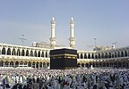
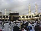
Kaaba
- Versions
-
 The Kaaba, a large cuboidal building located inside the Masjid al-Haram, is one of Muslims' holiest places. This picture taken from the gate of King Ibn Saud of Saudi Arabia, seems to to divide the Kaaba and the minarets into mirror images of one another.
 -
 Alternative
 -
 Edit of Original
 -
 Edit of Alternative


One of the first images that I nominated at FPC was this kaaba picture. Till the final day, it was leading, however, surprisingly it received three opposes and failed. Those who opposed said that the picture was from a mobile and hence not good enough and as the hajj season occurred every year, a better picture would be found. Around 8 months and another hajj season has passed, but no better images uploaded. These images are of the best free images available. It is difficult to get images of the Kaaba due to strict restrictions by the Saudi authorities prohibiting the taking of pictures. If caught you see your camera smashed on the ground right in front of you. A phone can always be easily hidden.
The original image is being used in the articles Hajj, Kaaba, Most sacred sites, Masjid al-Haram. It also appeared on several news websites during Dec 2007.
I have provided some edits, but they may not be very good. Please help out with edits if required.
- Comments
- I think the composition of the original is far nicer than the alt. I was actually going to support this when first nominated, but didn't as I thought it was already through (as you suggest above). Sure quality isn't perfect, but I think rareness and difficulty compensates. The colouring in the edit is probably slightly more appealing. I would support this time, the only problem is that images usually seem to get a harder time on their 'second run'. --
jjron (
talk) 07:55, 12 February 2008 (UTC)
- So jjron, you suggest I go on and nominate the edit of the original?
Muhammad
(talk) 11:49, 13 February 2008 (UTC)
- I would support, but doubt it would get the cruisy run of a historic shot, especially on the second go round. I just had a look back at the previous nom and wasn't sure what images there related to here (i.e., that had an Edit 1 and 2). Is the original here the same original from there? The edit here is also right on the size limit, just wondering why you downsized so much, and did you think this edit was better than any from the previous nom? -- jjron ( talk) 08:08, 14 February 2008 (UTC)
- So jjron, you suggest I go on and nominate the edit of the original?
Muhammad
(talk) 11:49, 13 February 2008 (UTC)
- Comment. I was one of those late opposes. The quality is a bit fuzzy and the shadow line through the middle of the crowd in the original is, to me, distracting. The lighting in all of the alternates is unfortunate-- it's a pity that there isn't one that's mostly in sunshine rather than mostly in shade. I regret that the original isn't quite up to FP standards of sharpness; nonetheless it is a very valuable and encyclopedic photograph (Muhammad-- have you done the hajj more than once, or did you take this photo and the ihram clothing one during the same hajj?)
Spikebrennan (
talk) 20:33, 12 February 2008 (UTC)
- The original may not be up to normal FP standards, but surely exceptions can be made. All the historic images are not very good either yet most pass. The main reason the sunlight is limited is because the pictures were taken during the morning time when the crowd is relatively small. As the day goes on, the crowd increases and hardly does anybody get the proper standing place to take a decent picture. (I have done hajj only once, both the ihram and this were taken then.)
Muhammad
(talk) 11:49, 13 February 2008 (UTC)
- Well, I think that the original is the best of the four here. Spikebrennan ( talk) 15:01, 13 February 2008 (UTC)
- The original may not be up to normal FP standards, but surely exceptions can be made. All the historic images are not very good either yet most pass. The main reason the sunlight is limited is because the pictures were taken during the morning time when the crowd is relatively small. As the day goes on, the crowd increases and hardly does anybody get the proper standing place to take a decent picture. (I have done hajj only once, both the ihram and this were taken then.)
Muhammad
(talk) 11:49, 13 February 2008 (UTC)
- Seconder
Nominated at FPC by
jjron. --
jjron (
talk) 12:37, 25 February 2008 (UTC)
Cormorant Fishing

It's a very important part of chinese history, and still is important to the fishery industry in china today. Although, I am not very sure about the quality.
- Comments
- Seconder
Tornadic hook echo of the 2007 Greensburg tornado
This animation of a doppler radar image of the 2007 Greensburg tornado is very encyclopediac and illustrates the rotation of a signature tornadic supercell thuderstorm very well.
- Nominated by
- Juliancolton Talk 02:21, 10 February 2008 (UTC)
- Comments
- I like this very much, particularly informative. Tim Vickers ( talk) 18:17, 11 February 2008 (UTC)
- Seconder
Nominated at FPC by
Juliancolton. --
jjron (
talk) 08:29, 13 February 2008 (UTC)
Wind Point Lighthouse


Already an FP on Commons, I'm wondering whether this would make it here too. Thanks.
- Comments
- This image suffers from chromatic aberration, the edit attempts to address this but the filetype is inappropriate. I'm unsure as to the chances, as we're more rigorous than COM:FPC. MER-C 08:50, 7 February 2008 (UTC)
- Seconder
Black fly with parasite

A really clear and sharp electron microscope image on unpleasant yet encyclopedic subjects: biting insects, parasitology, and public health. This depicts a parasitic worm emerging from the antenna of a black fly. 18 million humans worldwide are infected with this worm and 300,000 people have been blinded permanently because of it. Slightly smaller than usual for a featured picture. I've looked for a larger file and couldn't find one. Does inherent value compensate? Appears in onchocerciasis, black fly, parasitology, and Nematocera.
- Comments
- Works for me, but I think the electron microscope FPs that we have all satisfy the size criteria. Spikebrennan ( talk) 05:13, 14 February 2008 (UTC)
- Seconder
Nominated at FPC by
Durova. --
jjron (
talk) 11:36, 15 February 2008 (UTC)
Anticolonial protest in Goa
This was an important event in the history of the Indian state of Goa. It's good to counter systemic bias when possible, and fortunately this newsreel footage was released into the public domain in 1976. Appears in Goa, History of Goa, and Political integration of India.
- Comments
- Seconder
Auckland War Memorial Museum


Not really for FPC, but for my personal purpose: Which version is better? Rectilinear or Cylindric? They're from the same source, cylindric version is blended with smartblend so the sky is more even but I can do that with the rectilinear version is well. I had to clone more floor for the rectilinear version than the cylindric version but distortion is quite bad for architectural shots, so I'll let you guys decide which version is better so I'll put it in the article.
- Comments
- Without looking at the finer detail you've mentioned, at thumbnail and image page size the rectilinear looks way better. -- jjron ( talk) 05:52, 3 February 2008 (UTC)
- They've both got some distortion. I'm not sure which to prefer. Durova Charge! 06:45, 3 February 2008 (UTC)
- Seconder
Guarapiranga at sunset

I think that this picture is very beautiful and it shows how the sky in the city of São Paulo, although polluted, can be very beautiful and also how splendid is the reservoir itself. The picture was taken from my apartment (26th floor).
- Comments
- Please remove the timestamp. MER-C 02:13, 3 February 2008 (UTC)
-
- Use the clone stamp tool in Photoshop/ The Gimp/whatever or set your camera preferences to shoot without the timestamp (preferable). The encyclopedic value is somewhat shaky because the background is underexposed. If you do reshoot, a better location would be on one of the islands (for a panorama) or on the dam wall. MER-C 12:26, 3 February 2008 (UTC)
- Seconder
Inauguration of Abraham Lincoln, 1861

A significant photgraph both for the event and as a document of architectural history. Construction of the current United States Capitol dome is underway with the original dome still visible between tiers of arched columns. Photograph on salted paper, unknown photographer. Appears at United States Capitol, United States Capitol dome, and United States presidential election, 1860. Restored version of Image:LincolnInaugurationunmodified.jpg.
- Comments
- Gee Durova, I hate to be the only one commenting on your pics here, so if you want me to quit it just say so! OK, to get to this pic. I reckon it's a real stretch to put this down as illustrating the Lincoln inauguration, I mean there's no detail of it at all, it's just a distant group of people. It's somewhat better as an illustration of the (new) capitol dome. It is pretty small (but within requirements) and appears to be tilted to the right. Also, do we know how much has been cutoff at the top? I'm pretty sure I've seen better shots of the construction of the dome itself during the Civil War (though granted not with the inauguration component). --
jjron (
talk) 11:31, 2 February 2008 (UTC)
- By all means keep commenting! Agreed, it's very hard to see the inauguration here. I've been looking for shots of the dome under construction and this is the best I've found so far. Will keep my eyes open. Durova Charge! 19:05, 2 February 2008 (UTC)
- Seconder
The Spinning Dancer

This image is very popular around the net and I was surprised not to see it on wikipedia. Thus I uploaded the image and thought it be good if it was a FP because it is a great optical illusion.
- Comments
- It is not possible to verify the animation's license, the original Flash animation contains a copyright claim. And I think the background shades should be removed from the animation, because they seem to serve no purpose. –
Ilse
@ 19:56, 9 February 2008 (UTC)
- I have the email the author sent me, allowing this picture to be used. Muhammad (talk) 04:17, 10 February 2008 (UTC)
- Seconder
Nominated at FPC by
Muhammad. --
jjron (
talk) 08:03, 12 February 2008 (UTC)
Chester Cathedral at dusk

I'd like to get a sense of the community opinion of this image
- Nominated by
- Joopercoopers ( talk) 20:08, 8 February 2008 (UTC)
- Comments
- Too quiet in here - taken to WP:FPC. -- Joopercoopers ( talk) 23:35, 10 February 2008 (UTC)
- Seconder
Quilter, 1940

A piece of Americana: a frontierswoman stands outside her log cabin home in a gingham dress and sturdy black shoes while she displays her proudest artistic achievement: a hand pieced and embroidered quilt that depicts all the state flowers and birds (there were 48 states when this photo was taken). Harsh lighting suits this portrait: the deep lines on her broad featured face suggest a hard life - note the complete absence of flowers, birds or any other living thing on her "lawn". Scenes like this could have taken place anytime from 1840 to 1940 and we're lucky to have one in Kodachrome. Appears in History of quilting and Quilt. Restored version of Image:Russellquilter.jpg. Photo by Lee Russell, U.S. Gov't public domain.
- Comments
- Seconder
Muir and Roosevelt

This picture shows how Teddy Roosevelt as an environmentalist worked to preserve the environment through the national park system and by working with preservationists such as John Muir.
- Nominated by
- The Emperor561 ( talk) 01:55, 4 February 2008 (UTC)
- Comments
- This wasn't showing so I brought it up. Appears to be the editor's first PPR. Thanks for submitting this (no comment yet about the proposal). Durova Charge! 02:32, 5 February 2008 (UTC)
- Seconder
Nominated at FPC by
The Emperor561. --
jjron (
talk) 08:07, 12 February 2008 (UTC)
Hurricane Felix from the International Space Station

An excellent image that was taken from aboard the ISS. It is a large, good quality image that is very relevant to the article that it is linked to. I feel this image has an excellent chance at becoming a featured picture but i as i am relatively new to this process i wanted to get opinions from this peer review before putting this to FPC
- Comments
- A great Picture, both with picture quality and content. Rarly do you get such an unusual image with such good quality. Juliancolton ( talk) 01:51, 3 February 2008 (UTC)
- Seconder
- Gorgeous, and no existing FP like it.
Durova
Charge! 00:33, 3 February 2008 (UTC)
- Umm, aren't
 ,
,
 and to an extent even
 somewhat similar? I actually thought there were more - I know there's been quite a number similar to this nominated and fail. --
jjron (
talk) 06:04, 3 February 2008 (UTC)
somewhat similar? I actually thought there were more - I know there's been quite a number similar to this nominated and fail. --
jjron (
talk) 06:04, 3 February 2008 (UTC)
- I suppose you have a point. What appeals to me about this is the textures in the clouds and the curvature of the earth.
Durova
Charge! 06:47, 3 February 2008 (UTC)
- The reason why i choose this picture for peer review and eventually FPC is that i felt that this picture was in a class of its own compared to other pictures taken from space. The first reason was that this is taken from the ISS, now although there are many pictures that have been taken from there few have such excellent panoroma and be able to maintain good subject content or that the photo often is just white cloud with no contrast. This i feel gives excellent contrast between earth, atmosphere and space with a good balance between cloud and sea/land. Seddon69 ( talk) 12:54, 3 February 2008 (UTC)
- I suppose you have a point. What appeals to me about this is the textures in the clouds and the curvature of the earth.
Durova
Charge! 06:47, 3 February 2008 (UTC)
- Umm, aren't
Nominated at FPC as
Hurricane Felix from the International Space Station by
Seddon69 on 4 February 2008. --
jjron (
talk) 07:50, 4 February 2008 (UTC)
Mark Twain

The closest thing North America has produced to a Shakespeare. Appears at Mark Twain, Osteopathic medicine in the United States, List of premature obituaries, Unfinished work, and Reception history of Jane Austen. Restored version of Image:MarkTwain.LOC.jpg.
- Comments
- There's surely better Twain portraits out there. I'm pretty certain I've seen a number better than this, which, given their age, should be out of copyright. This has an extremely narrow DOF with a lot of blurriness even at this size (consider his hair). Shadows and highlights are really quite harsh, though perhaps not so bad at full size. It would most probably get through on FPC, considering how voting goes there, but does ol' Sam deserve better? --
jjron (
talk) 11:59, 2 February 2008 (UTC)
- From what I've found at the Library of Congress, it came down to this or one other shot. A heavily cropped version of the alternate appears at Mark Twain - really the original is a three man group portrait where another man's hand is on Twain's shoulder, so that left very little room to maneuver even with a 20 meg scan. Durova Charge! 22:44, 2 February 2008 (UTC)
- Seconder
Taken to FPC.
Durova
Charge! 22:42, 2 February 2008 (UTC)
The Potala Palace, Lhasa, Tibet


Amazing image of the majestic place, very artfully made
- Comments
- I'm not an author of it, just want to nominate it
- This looks like it is a rather stunning place, but I doubt this particular image would succeed on FPC. Two problems that strike me, even in thumbnail, are the overexposed sky at the right (notice the very bright glarey clouds) and the composition (the hill that the palace is on is cutoff at the left, but there appears to be excess space at the right with those seemingly insignificant buildings). Images like this are frequently opposed too because of the busy foreground, where we see lots of people, cars, buses, etc. Thanks for putting it up on PPR. --
jjron (
talk) 09:03, 1 February 2008 (UTC)
- If it won't pass I won't be distracted, it's not mine. Though I've always been curious why people are so nervous about overexposed clouds in photos, to me they look natural and rather pleasant (sure, if it's not too much, like on this pix), if they don't disbalance the overall composition they can even be a benefit and add a kind of naturalistic shining to a picture. Also never liked those newfangled HDR tone-mapped images, they look like a bad dream. Even raw processing doesn't help much in fighting overexposition if I want the image to be contrast. Efenstor ( talk) 19:23, 1 February 2008 (UTC)
- I wondered what you wanted this scene to be about. About 30% of the shot was street, bus parking, and shopping. I saw a Tibetan palace that nearly touched the clouds. So I tried a crop and a few other tweaks. We're still left with flat lighting and haze - if you're able to reshoot please do so. And if you're too busy to get back, send me! :) Durova Charge! 02:24, 2 February 2008 (UTC)
- Seconder
World War I women's recruitment poster

The Navy was the first branch of the U.S. armed forces to accept women in capacities other than nursing. This vintage World War I poster promises fair advancement to any person who enlists. The insignia on her sleeve indicate 8-11 years' service and the senior enlisted rank of chief (E-7). To the best of my knowledge, this was the first recruitment poster in U.S. military history to seek women for anything other than nursing. Appears at Yeoman (F), Female roles in the World Wars. Restored version of Image:WWINavyYeoman.jpg.
- Comments
- Seconder
Taken to FPC.
Durova
Charge! 07:50, 4 February 2008 (UTC)
Mechanic, World War II

Another early color photograph by Alfred Palmer in rich early Kodachrome. The vein standing out on the mechanic's forehead and the rumpled service cover look just right. I've placed this at mechanic - other suggestions are welcome.
- Comments
- The lighting on the man's face looks excessively bright (probably an effect of the lighting methods Palmer was using as I believe we've mentioned before). The is carried over onto areas of his shirt and reflections off the metal, none of which are appealing to me. It's sort of like bad flash glare, but I'm not sure it's actual flash. The vehicle appears to be tilted, which could be from the camera being tilted or from the other side of the vehicle being jacked up - given we can't see the whole vehicle we can't tell. Doesn't do it for me. -- jjron ( talk) 07:43, 31 January 2008 (UTC)
- Seconder
Ben Banneker

Image summarizes Ben's works. Appears in Charles Alston, and Benjamin Banneker
- Comments
- Why this particular depiction? I agree it's important to recognize men like this. What puzzles me is why you selected a World War II artist's depiction for an eighteenth century figure. The execution is respectful, yet also workmanlike and routine.
Durova
Charge! 22:02, 29 January 2008 (UTC)
- Appears to be the only image of him on Wikipedia. Perhaps that was reason enough for the selection? --
jjron (
talk) 09:34, 31 January 2008 (UTC)
- Thats exactly why. But can it pass as FP?
Muhammad
(talk) 08:39, 1 February 2008 (UTC)
- I only rarely vote on images like this at FPC (meaning historic images and the like) as it is somewhat anti my idea of what FPs should be, which is images by Wikipedians exclusive to Wiki. If I do vote it's usually an oppose because I find the image to be particularly deficient in some way. So having cleared that up, I don't think this is any worse than a number that have been promoted in recent times. For that reason I think it may be worth a try; personally, while I wouldn't support it, I wouldn't oppose either. If it had been created by a Wikipedian I would support. -- jjron ( talk) 08:56, 1 February 2008 (UTC)
- Thats exactly why. But can it pass as FP?
Muhammad
(talk) 08:39, 1 February 2008 (UTC)
- Appears to be the only image of him on Wikipedia. Perhaps that was reason enough for the selection? --
jjron (
talk) 09:34, 31 January 2008 (UTC)
A lot of images break my heart because the subject is so important and there just isn't anything that stands a chance of meeting FP standards. I've tried restoring portraits of Harriet Tubman, for example, and can't get anything to a level where I could nominate. Over at Commons there's a proposal called valuable images where this would be suitable. If you don't already have an account over there, it might be worth creating one to check that out. Best wishes, Durova Charge! 10:34, 1 February 2008 (UTC)
- I'm not sure it's fair to say that this doesn't stand a chance of meeting FP standards. In my opinion it's at least as good as
today's POTD and has higher encyclopaedic value. The more I consider this the more I lean towards at least a personal 'weak support'. --
jjron (
talk) 11:45, 2 February 2008 (UTC)
- I'd probably abstain. If the nominator articulated a particular reason for the World War II era depiction, and tied that in with the biography or other articles, then its value would be much higher.
Durova
Charge! 06:52, 3 February 2008 (UTC)
- This image is notable primarily for the misinformation that it conveys. The artist (Charles Alston) claimed in the image that Banneker had been a "city planner", "was placed on the commission which surveyed and laid out the city of Washington, D.C.", and had "constructed the first clock made in America". No reliable sources confirm the accuracy of these statements. Banneker was an astronomer and a surveyor; he was not a "city planner". He was an assistant on a survey of the boundaries of the future District of Columbia, but was not placed on any commission that was involved in this activity. The first known clockmaker of record in America was Thomas Nash, an early settler of New Haven in 1638. [1] A known American clock was made in 1680. [2] Banneker was not born until 1731. [3] It is noteworthy that Charles Alston was an employee of the United States Office of War Information during the Second World War at the time that the image was published. It therefore appears that this image was a piece of propaganda that was intended to counter the racist propaganda of Nazi Germany. Such propaganda often contains misinformation. Corker1 ( talk) 22:55, 17 February 2009 (UTC)
- I'd probably abstain. If the nominator articulated a particular reason for the World War II era depiction, and tied that in with the biography or other articles, then its value would be much higher.
Durova
Charge! 06:52, 3 February 2008 (UTC)
Notes
- ^ Paul Uselding, "U.S. History Encyclopedia: Clock and Watch History" in website of answers.com by Answers Corporation Accessed January 26, 2009.
- ^ "Clockmakers" in Historical Reference on Vintage & Antique Clocks in website of Antique-antiques Accessed August 7, 2008.
- ^ Bedini, Silvio A., The Life of Benjamin Banneker: The First African-American Man of Science, 2nd edition, Maryland Historical Society, 1999. ISBN 0-9384-2059-3
- Seconder
Stonemason

Cathedrals play a major role in the history of Western architecture, but until this image was uploaded Wikipedia and Commons apparently had no image of an actual craftsman at work building one. Appears at stonemasonry and Cathedral of Saint John the Divine, New York. Restored version of Image:Stonemasonry.jpg.
- Comments
- I actually don't mind this, but I wonder how sure we are that it's from the Cathedral of Saint John the Divine, New York. Just in that I can't see anything really resembling this type of work in the contemporary images in that article (admittedly I haven't looked really closely, and the other images are nothing fantastic). It would be nice if there was some information about where in the cathedral this work actually exists - as it is the caption in that article is pretty naff. --
jjron (
talk) 08:40, 30 January 2008 (UTC)
- According to the Library of Congress site where the image comes from, that's the location where it was shot. It comes from a reputable archive of photographs mostly about New York City. I see no reason to doubt that. The time frame is right and this carving is in the same style as a lot of sculpture at that cathedral.
Durova
Charge! 08:46, 30 January 2008 (UTC)
- Look, it most likely is correctly attributed, there seems to be a real hodge-podge of styles used in that cathedral. But wouldn't it be interesting to have a contemporary photo alongside of this finished sculpture in situ? No one from NY around here is there? --
jjron (
talk) 07:50, 31 January 2008 (UTC)
- Hard to tell whether the finished sculpture in situ would be accessible. The masons had their own work area to the side of the building and finished pieces would be lifted into place afterward. This particular cathedral is second only to St. Peter's in Rome for overall size. So if you happen to be in NYC and feeling adventuresome, go for it. Durova Charge! 08:10, 31 January 2008 (UTC)
- Look, it most likely is correctly attributed, there seems to be a real hodge-podge of styles used in that cathedral. But wouldn't it be interesting to have a contemporary photo alongside of this finished sculpture in situ? No one from NY around here is there? --
jjron (
talk) 07:50, 31 January 2008 (UTC)
- According to the Library of Congress site where the image comes from, that's the location where it was shot. It comes from a reputable archive of photographs mostly about New York City. I see no reason to doubt that. The time frame is right and this carving is in the same style as a lot of sculpture at that cathedral.
Durova
Charge! 08:46, 30 January 2008 (UTC)
- Seconder
Nominated for FPC.
Durova
Charge! 19:17, 1 February 2008 (UTC)
Chancellorsville Battlefield Cannon

This is the only modern photograph of the battlefield in the Wikipedia article on the Battle of Chancellorsville, so it has encyclopedic value. It is clear, with good sunset lighting, and of high resolution. The composition is pleasing, and the angle dramatic.
This is my own photograph, though, and I hesitate to nominate it myself. I'd appreciate peer comments and a possible nom by a third party.
- Comments
- FP voters tend to be really harsh on blown whites in the sky. Is there a chance of returning to this site and shooting in the morning instead of the early evening? Durova Charge! 22:05, 29 January 2008 (UTC)
- As pretty as this photo is, it would stand little chance on FPC. The sky, as Durova mentioned, with the blown white section at top right would work against it. Composition would also work against it with the lower part of the cannon stand (what is that part of a cannon called?) cut off. There looks to be some lens distortion too, but I'm not certain about this. Given that a shot like this would probably be quite easily repeatable I think it would get a hard time. Thanks for putting it up here though. --
jjron (
talk) 08:30, 30 January 2008 (UTC)
- Thanks, both
Durova and
jjron for your feedback. I really appreciate it. The photo is not actually as repeatable as you might think. A sunrise photo wouldn't work, since the sun comes up from the other side, and the cannons face towards the field, not the ugly road and overgrown patch of land on the other side of it. A nice sunset photograph requires a good distribution of the clouds, and that's chancy at best. This time of year the trees are all barren, too. I'd have to wait until next fall when the trees are all changing to get anything like the right timing for a similar photograph. Maybe next year I'll try again!
MamaGeek (
talk/
contrib) 16:35, 30 January 2008 (UTC)
- Well, getting an early morning shot from this angle was the idea because you're going to have trouble with the levels otherwise. Maybe if you're very careful in late afternoon and position the camera so that the sun is blocked just behind some part of the cannon, the result might work, but that kind of shot is very tricky to nail. Spring or summer might work fine, as soon as the trees are out. See you in April/May? Meanwhile please keep submitting other work. :) Best regards, Durova Charge! 23:51, 30 January 2008 (UTC)
- Thanks, both
Durova and
jjron for your feedback. I really appreciate it. The photo is not actually as repeatable as you might think. A sunrise photo wouldn't work, since the sun comes up from the other side, and the cannons face towards the field, not the ugly road and overgrown patch of land on the other side of it. A nice sunset photograph requires a good distribution of the clouds, and that's chancy at best. This time of year the trees are all barren, too. I'd have to wait until next fall when the trees are all changing to get anything like the right timing for a similar photograph. Maybe next year I'll try again!
MamaGeek (
talk/
contrib) 16:35, 30 January 2008 (UTC)
- Seconder
The Valley of the Shadow of Death


This is Roger Fenton's "Valley of the Shadow of Death" from the Crimean War and the Charge of the Light Brigade immortalized in Alfred, Lord Tennyson's poem. See this New York Times article for more about the photograph. Out of respect for editors who might object to any alteration to this famous image, I'm submitting two versions for consideration. The original is marked. My restoration addresses the scratches in the lower left corner, artifacts along the bottom and left sides, clears dirt and dust from the sky, and adjusts the levels. Appears in Roger Fenton and The Charge of the Light Brigade (poem)
- Comments
- Umm, there's a different version
 in the Fenton article, which is also in
Siege of Sevastopol (1854-1855). The restored version here is also in the
Charge of the Light Brigade article. I'm not sure that I don't like the uncropped original (with the border) best. --
jjron (
talk) 07:59, 31 January 2008 (UTC)
in the Fenton article, which is also in
Siege of Sevastopol (1854-1855). The restored version here is also in the
Charge of the Light Brigade article. I'm not sure that I don't like the uncropped original (with the border) best. --
jjron (
talk) 07:59, 31 January 2008 (UTC)
- Seconder
US Great Seal Reverse
.svg)
AFAIK no seal or coat of arms has ever made it to FP status, so I'm not planning on nominating this one. However, I'd like to know what part of it is most in need of improvement. i did not know how to reach the people who work at wikipedia so i decided to edit this my self on what i believe. The reverse of the great seal is the sign of the Illuminati for it is their sign. A pyramid with an eye. At the bottom of the pyramid there is a date ( look closely at the one dollar bill) it says MDCCLXXVII which is the date (1776) on which the Illuminati were established. It just goes to show how much power the Illuminati have. also the illuminati are very powerful people for the have members in all parts of society. The bank, the oil industry, exports and imports the presidents of the U.s. etc. the illuminati are the most powerful people alive and members vow with their life to keep everything a secret.
- Nominated by
- -- I. Pankonin Review me! 01:39, 27 January 2008 (UTC)
- Comments
- Actually, this one passed FP, though I assume it was only because it obviously took skill to make.— DMCer ™ 09:00, 27 January 2008 (UTC)
- I should've been more specific. I meant FP on English wikipedia. That particular image is featured on Commons but has failed FP on en.wiki twice. -- I. Pankonin ( t· c) 00:20, 28 January 2008 (UTC)
- Ahem.
 is featured.
Spikebrennan (
talk) 15:38, 28 January 2008 (UTC)
is featured.
Spikebrennan (
talk) 15:38, 28 January 2008 (UTC)
- Well, technically you're right, but I doubt anybody uses that as their actual arms. It looks to me that it was featured more as an extreme example of quartering than as a good example of a coat of arms. -- I. Pankonin ( t· c) 10:57, 29 January 2008 (UTC)
- Seconder
Field Marshall Montgomery receives the Russian Order of Victory

This could be cropped to just include Montgomery, Eisenhower and Zhukov-- three of the greatest figures from World War II, representing military representatives the three great victorious powers-- in a single photo.
- Nominated by
- Spikebrennan ( talk) 00:31, 26 January 2008 (UTC)
- Comments
- Seconder
Manzanar letter

Yes, it's an Ansel Adams; no, not just because of that. This was shot in 1943 at Manzanar, one of 10 concentration camps where Japanese-Americans from the western United States were compelled to relocate during World War II. One of the few ways that internees could get permission to leave the camp (and earn enough money to pay mortgages, etc.) was by volunteering for the armed forces: a service portrait, a prayer, a letter written in both English and Japanese, and an envelope with legible date stamp and address. Note the visible bolts and the seam in the cheap wall, and the handmade planter and doily. Internees had been ordered to relocate with only the property they could carry, assigned to quarters whose only furniture was a bed, and left to scrounge for anything else. The near-normality of this shot demonstrates their resourcefulness and ingenuity. Appears in War Relocation Authority.
- Comments
- Comment A remarkable photo-- it tells a story all by itself. But I'm having trouble thinking of where it could be encyclopedic.
Spikebrennan (
talk) 00:04, 26 January 2008 (UTC)
- I've got it at War Relocation Authority because Manzanar already has a lot of photos. And actually I first looked at this while seeking illustrative material for a new article I've been planning to write, based upon a book called The Art of Gaman about arts and crafts from the Japanese internment camps. The doily and planter are perfect for that, and the other elements are apt illustrations for the surrounding context. Durova Charge! 02:06, 26 January 2008 (UTC)
- Seconder
Tuxedo kitten

Striking and encyclopedic, but I am biased so I thought I'd leave this up to somebody else! Tim Vickers ( talk) 04:45, 25 January 2008 (UTC)
- Nominated by
- Tim Vickers ( talk) 04:45, 25 January 2008 (UTC)
- Comments
- I think my heart just exploded. I don't see this getting support though for a variety of reasons. (1) It doesn't accompany an article; (2) it's pretty standard-quality point-and-shoot photo, etc. So, so cute though!—
DMCer
™ 10:39, 25 January 2008 (UTC)
- Yes, very cute. Although he is in the article Cat senses as an example of whiskers, I wasn't sure about the quality requirements. Thanks anyway. Tim Vickers ( talk) 17:31, 25 January 2008 (UTC)
- What I love about it is that this tiny creature looks absolutely as sure of itself as Admiral Farragut. Photographs that regard animals on their own terms are remarkable. The distracting background prevents me from supporting, but keep shooting while this little fellow is still tiny! Durova Charge! 19:58, 26 January 2008 (UTC)
- Seconder
Wayne Gretzky


Got inspired by the Javier Solana image, since there are few FP of persons I would like to hear what the community has to say about this one. The image is of high resolution but suffers from much noise, I would like to see if it could be improved if someone with better knowledge then me in photoshop could work a moment on it. Other then the noise I think it's up with the FP criteria. -- Krm500 ( talk) 02:32, 25 January 2008 (UTC)
- Comments
- Although it has significant enc value in
Wayne Gretzky it's not likely to succeed at FPC due to bad composition. The hockey stick and the subject's right arm are both cut off.
MER-C 09:52, 25 January 2008 (UTC)
- Was hoping for more comments before I'd reply. But IMO it isn't a bad composition, it is a profile shot, the stick being cut off doesn't matter IMO. The arm however is unfortunately cut of, but would that matter that much in a possible FP candidacy? --
Krm500 (
talk) 02:09, 28 January 2008 (UTC)
- You can count on somebody (everybody?) opposing it for that reason. --
I. Pankonin (
t·
c) 04:15, 28 January 2008 (UTC)
- Well compare it to
the Javier Solana image; same thing could be said there, bad composition. It got featured quite easily. I tweaked this image a little bit, got rid of some noise and asjusted colours, etc. Do you really think it wont stand a chance? If so I wont try a FP candidacy, but I want to explore every option before I quit. --
Krm500 (
talk) 11:04, 28 January 2008 (UTC)
- Valid point re Javier Solana. I was also going to say that Gretzky has a weird look on his face here, but again the same criticism could be levelled at the Solana photo. This image is widely used, it's far and away the best image in the Gretzky article, and Gretzky is the one ice hockey player that people are likely to have ever heard of (I say this as a sports fan from a non-ice hockey country), so I think encyclopaedic value is good. The background seems a bit noisy as you said. I might have a bit of play to see if I can do anything about that. Would the fact that he's in a Rangers uniform work against it? Personally I think it's worth a try (which is not to say I'd put money on it getting promoted). -- jjron ( talk) 08:18, 31 January 2008 (UTC)
- I had a bit of a go at this last night, but couldn't do any better than your edit. The original is really noisy. The noise reduction that has been done on the edit is a good job, but unfortunately removes a fair bit of fine detail on his clothing, skin, etc, and still doesn't totally fix the noisy background. As I said I couldn't do any better. I'm a little bit cooler on the FPC nom, but I would perhaps lean towards 'weak support' personally. --
jjron (
talk) 09:09, 1 February 2008 (UTC)
- Thanks for your reply and help. I'll contact the uploader and ask him if he has any larger size, then adjustments would be easier. Something to keep in mind about this image is that it is taken over 10 years ago, before the introduction of DSLRs. I wouldn't go as far as calling it a historic photo but the age should be kept in mind in a possible future FPC. This is what it says in the criteria "Exceptions to this rule may be made for historical or otherwise unique images. If it is considered impossible to find a technically superior image of a given subject, lower quality may sometimes be allowed." --
Krm500 (
talk) 11:28, 1 February 2008 (UTC)
- Yes, I considered the age too, and wondered whether this had been scanned from film, perhaps along with film grain. Of course we can still get pictures of Gretzky (not being able to do this is a saving grace as an excuse for lower quality pictures of dead people), though admittedly not playing. Undoubtedly there are better pictures of him playing, but for them to be available freely licensed is an entirely different story. As I said originally I know almost nothing about ice hockey, but I believe his time at the Rangers was towards the end of his career, possibly past his heyday - this wouldn't work against it a bit would it, with people preferring a shot from a team he played with at his peak? --
jjron (
talk) 11:38, 2 February 2008 (UTC)
- This is most likely scanned from film since it was taken in 1997. He wasn't at his peak but he still managed to be top 5 in scoring two of his last three seasons, and lead the team to the Conference Finals in 97. I'm still positive this would be a good FP candidate. -- Krm500 ( talk) 18:35, 11 February 2008 (UTC)
- Yes, I considered the age too, and wondered whether this had been scanned from film, perhaps along with film grain. Of course we can still get pictures of Gretzky (not being able to do this is a saving grace as an excuse for lower quality pictures of dead people), though admittedly not playing. Undoubtedly there are better pictures of him playing, but for them to be available freely licensed is an entirely different story. As I said originally I know almost nothing about ice hockey, but I believe his time at the Rangers was towards the end of his career, possibly past his heyday - this wouldn't work against it a bit would it, with people preferring a shot from a team he played with at his peak? --
jjron (
talk) 11:38, 2 February 2008 (UTC)
- Thanks for your reply and help. I'll contact the uploader and ask him if he has any larger size, then adjustments would be easier. Something to keep in mind about this image is that it is taken over 10 years ago, before the introduction of DSLRs. I wouldn't go as far as calling it a historic photo but the age should be kept in mind in a possible future FPC. This is what it says in the criteria "Exceptions to this rule may be made for historical or otherwise unique images. If it is considered impossible to find a technically superior image of a given subject, lower quality may sometimes be allowed." --
Krm500 (
talk) 11:28, 1 February 2008 (UTC)
- Well compare it to
the Javier Solana image; same thing could be said there, bad composition. It got featured quite easily. I tweaked this image a little bit, got rid of some noise and asjusted colours, etc. Do you really think it wont stand a chance? If so I wont try a FP candidacy, but I want to explore every option before I quit. --
Krm500 (
talk) 11:04, 28 January 2008 (UTC)
- You can count on somebody (everybody?) opposing it for that reason. --
I. Pankonin (
t·
c) 04:15, 28 January 2008 (UTC)
- Was hoping for more comments before I'd reply. But IMO it isn't a bad composition, it is a profile shot, the stick being cut off doesn't matter IMO. The arm however is unfortunately cut of, but would that matter that much in a possible FP candidacy? --
Krm500 (
talk) 02:09, 28 January 2008 (UTC)
.jpg)
- Seconder
Nominated at FPC by jjron. --
jjron (
talk) 10:06, 12 February 2008 (UTC)
Balzac1901

This image is currently used to illustrate the page for La Comédie humaine by Honoré de Balzac. (It's also used on the French page.) I think it's pretty good, but I'd like to have a shot which illustrates the enormity of the project (nearly 100 novels and stories). To this end, I've taken this alternate shot and several others like it. (I don't know how kosher it is to show thumbnails here; this is my first time at FPR.) Which do folks prefer and why?
I don't have a fancy camera or any real knowledge of photography, but given the featured-ness of the old book bindings, I feel like one of these could be at some point featured. Thanks in advance for any comments or thoughts.
- Comments
- Keep in mind that the featured picture you referred to is a featured picture on Commons. What encyclopedic value does this image add to the article about the books? -- Krm500 ( talk) 02:38, 25 January 2008 (UTC)
- I feel that the well-used condition of the books testifies to the endurance of the work. (They're over 100 years old.) I'm not sure I understand the question; these books are the subject of that article, so I would think the encyclopedic value is obvious. Apologies if I'm just being dense. – Scartol • Tok 03:15, 25 January 2008 (UTC)
- Seconder
Hadrian's Wall

There are currently no FPs of the wall and I believe, even if I do flatter myself slightly, that this is a decent candidate. While it currently exists in no articles, its sister picture, another I took and one which could potentially be replaced by this, occurs in History of England, Roman Britain, Hadrian, Hadrian's Wall, Vercovicium, and Roman military frontiers and fortifications.
- Nominated by
- Jamesflomonosoff ( talk) 23:17, 23 January 2008 (UTC)
- Comments
- I really rate your composition, lovely strong lines. It's a very promising thumbnail but will almost certainly disappoint people at 100%. I guess you shot it with some jpeg compression, as the first thing you see before the wall is the lack of detail in the grass. The wall itself isn't so bad in this respect. A pity! Are you able to shoot raw format? This and some more contrasty lighting would have made all the difference. -- mikaul talk 23:27, 23 January 2008 (UTC)
- Comment. an earlier FPC nom of a Hadrian's Wall photo. Spikebrennan ( talk) 00:09, 26 January 2008 (UTC)
- Seconder
Seven Devils Panorama


There are only three images on Wikipedia of these beautiful mountains, and I think this is the best one. In addition, the stitching is almost perfect.
- Nominated by
- Adumbvoget ( talk) 05:23, 21 January 2008 (UTC)
- Comments
- It's realy nice, but seems a deal over-exposed to me. Composition is neatly anchored by the tree, but much of the detail on it is bleached out to white. A nice pano shot, for all that, just looks a little washed out and flat. Might be fixable, with access to the original files. --
mikaul
talk 23:37, 23 January 2008 (UTC)
- I just looked again, and there's another problem with posterization. I'm not sure if this is due to compression/processing after stitching or a problem with the original shots, but it's a bigger problem than the exposure, IMO. -- mikaul talk 23:41, 23 January 2008 (UTC)
- Seconder
Nominated at FPC by
Adumbvoget. --
jjron (
talk) 08:08, 12 February 2008 (UTC)
Leopard Tortoise


Had nominated many such images at FPC. After recommendation from mikaul and jjron, I have decided to have it reviewed before another chance at the nomination. It appears in the article Leopard Tortoise
- Comments
- Hi Muhammad, good to see you're still on the case ;o) – am I right in thinking this one was a later shot, after the November PC nom? It's easily the best one of the series. I would advise against nominating the others as alternatives, as they both draw attention to the weaker aspects of the stronger shot. Alt 1 has poorer lighting and composition and serves only to reinforce these weaknesses in the main shot. Lighting isn't good. You'll get people describing it as "snapshot-like", due to the camera-mounted flash, but at least the top shot has some incidental natural light highlighting some head detail. You should beware that it's not currently fashionable at FPC to show just the head, unless you are illustrating something unique and particularly notable about this part of the animal. The wider pic is too front-on and doesn't have enough impact for FP, as I see it. However much I favour the top shot, I have to say I'd probably abstain if it was nominated, as lighting (for me) is of prime importance. I wish you luck with it, all the same. -- mikaul talk 00:03, 24 January 2008 (UTC)
- Seconder
Nominated at FPC by
Muhammad. --
jjron (
talk) 09:39, 12 February 2008 (UTC)
Balzac1901
This image is currently used to illustrate the page for La Comédie humaine by Honoré de Balzac. (It's also used on the French page.) I think it's pretty good, but I'd like to have a shot which illustrates the enormity of the project (nearly 100 novels and stories). To this end, I've taken this alternate shot and several others like it. (I don't know how kosher it is to show thumbnails here; this is my first time at FPR.) Which do folks prefer and why?
I don't have a fancy camera or any real knowledge of photography, but given the featured-ness of the old book bindings, I feel like one of these could be at some point featured. Thanks in advance for any comments or thoughts.
- Comments
- Keep in mind that the featured picture you referred to is a featured picture on Commons. What encyclopedic value does this image add to the article about the books? -- Krm500 ( talk) 02:38, 25 January 2008 (UTC)
- I feel that the well-used condition of the books testifies to the endurance of the work. (They're over 100 years old.) I'm not sure I understand the question; these books are the subject of that article, so I would think the encyclopedic value is obvious. Apologies if I'm just being dense. – Scartol • Tok 03:15, 25 January 2008 (UTC)
- Seconder
Hadrian's Wall
There are currently no FPs of the wall and I believe, even if I do flatter myself slightly, that this is a decent candidate. While it currently exists in no articles, its sister picture, another I took and one which could potentially be replaced by this, occurs in History of England, Roman Britain, Hadrian, Hadrian's Wall, Vercovicium, and Roman military frontiers and fortifications.
- Nominated by
- Jamesflomonosoff ( talk) 23:17, 23 January 2008 (UTC)
- Comments
- I really rate your composition, lovely strong lines. It's a very promising thumbnail but will almost certainly disappoint people at 100%. I guess you shot it with some jpeg compression, as the first thing you see before the wall is the lack of detail in the grass. The wall itself isn't so bad in this respect. A pity! Are you able to shoot raw format? This and some more contrasty lighting would have made all the difference. -- mikaul talk 23:27, 23 January 2008 (UTC)
- Comment. an earlier FPC nom of a Hadrian's Wall photo. Spikebrennan ( talk) 00:09, 26 January 2008 (UTC)
- Seconder
Seven Devils Panorama
There are only three images on Wikipedia of these beautiful mountains, and I think this is the best one. In addition, the stitching is almost perfect.
- Nominated by
- Adumbvoget ( talk) 05:23, 21 January 2008 (UTC)
- Comments
- It's realy nice, but seems a deal over-exposed to me. Composition is neatly anchored by the tree, but much of the detail on it is bleached out to white. A nice pano shot, for all that, just looks a little washed out and flat. Might be fixable, with access to the original files. --
mikaul
talk 23:37, 23 January 2008 (UTC)
- I just looked again, and there's another problem with posterization. I'm not sure if this is due to compression/processing after stitching or a problem with the original shots, but it's a bigger problem than the exposure, IMO. -- mikaul talk 23:41, 23 January 2008 (UTC)
- Seconder
Nominated at FPC by
Adumbvoget. --
jjron (
talk) 08:08, 12 February 2008 (UTC)
Leopard Tortoise
Had nominated many such images at FPC. After recommendation from mikaul and jjron, I have decided to have it reviewed before another chance at the nomination. It appears in the article Leopard Tortoise
- Comments
- Hi Muhammad, good to see you're still on the case ;o) – am I right in thinking this one was a later shot, after the November PC nom? It's easily the best one of the series. I would advise against nominating the others as alternatives, as they both draw attention to the weaker aspects of the stronger shot. Alt 1 has poorer lighting and composition and serves only to reinforce these weaknesses in the main shot. Lighting isn't good. You'll get people describing it as "snapshot-like", due to the camera-mounted flash, but at least the top shot has some incidental natural light highlighting some head detail. You should beware that it's not currently fashionable at FPC to show just the head, unless you are illustrating something unique and particularly notable about this part of the animal. The wider pic is too front-on and doesn't have enough impact for FP, as I see it. However much I favour the top shot, I have to say I'd probably abstain if it was nominated, as lighting (for me) is of prime importance. I wish you luck with it, all the same. -- mikaul talk 00:03, 24 January 2008 (UTC)
- Seconder
Nominated at FPC by
Muhammad. --
jjron (
talk) 09:39, 12 February 2008 (UTC)
Buffalo Soldiers

A rare photograph of encyclopedic and historical value with surprising informality. In an era when most group military portraits of enlisted men feature neat ranks and perfect uniforms, these men show personality. One peers shyly from behind a tree, another holds up a frying pan, a third rests a shovel on his shoulder. A whiskey flask makes its rounds while three other men brandish weapons--a real Old West flourish. Another fellow stretches on the ground and rests his eyelids. Restored version of Image:Buffalo soldiers.jpg. Think it fares a chance on FPC? Appears in 25th Infantry Regiment (United States).
- Comments
- Seconder
- Support. Bravo! Spikebrennan ( talk) 15:36, 28 January 2008 (UTC)
Thanks. Nominated for FPC. :)
Durova
Charge! 21:52, 28 January 2008 (UTC)
Racist campaign poster


A historic campaign poster shortly following the American Civil War in the northern border state of Pennsylvania. It serves an encyclopedic purpose to show that this kind of thing existed and that it was this blatant. Appears at Racism by country#Post-slavery racism and Disfranchisement after the Civil War.
- Comments
- Comment An important historical document. Pity about the huge hole in the middle of the image. Spikebrennan ( talk) 15:36, 28 January 2008 (UTC)
- Seconder
I've gone ahead and nominated for FPC on the restored version. —Preceding
unsigned comment added by
Durova (
talk •
contribs) 19:31, 29 January 2008 (UTC)
Priapus statuette

Wouldn't this make a marvelous FP for the April Fool main page.
- Nominated by
- Spikebrennan ( talk) 00:21, 26 January 2008 (UTC)
- Comments
- Seconder
- Sure, go for it. Someone should get Ovid's Metamorphoses featured to run the same day. Durova Charge! 03:11, 26 January 2008 (UTC)
Nominated at FPC as
Priapus statuette by
Spikebrennan on 27 Jan, 2008. --
jjron (
talk) 08:19, 30 January 2008 (UTC)
Admiral Farragut


Admiral Farragut was the top Union Naval offier of the American Civil War. This was the man who said, Damn the torpedoes! Full speed ahead. The eyes fascinate me - calm and fierce at the same time. Appears in David Farragut. Unknown photographer; restoration by Durova.
- Comments
- Nice find. Historical and definitely meets the size requirements. Hopefully, if you end up nominating this, the complaints of blurry hair,etc. won't be made without realizing that photography was still in its infancy back then.— DMCer ™ 04:47, 25 January 2008 (UTC)
- Seconder
- Support. This one's ready for the big show. Spikebrennan ( talk) 00:05, 26 January 2008 (UTC)
Nominated for FPC.
Durova
Charge! 04:20, 26 January 2008 (UTC)
Doutzen Kroes


It is very hard to get good fashion photography on wikipedia, because most people can't go to fashion shows, and even if they could they would rarely get to take photos from the locations at which you could get a decent angle to capture the entire model's body head-on (which I imagine are entirely reserved for photographers). Somehow Peter Duhon on flickr manages to get press passes, though, so I've been uploading a ton of his photos lately. This image isn't completely sharp, but for one of the most important models in the world (currently at #3 on models.com) modeling for a major designer this is pretty good. Note that I've cropped this image down some from the original so if others want to try alternate crops that's also possible.
Other ideas are Image:Solangewilvert.jpg, Image:Wilvert2.jpg, or Image:Wilvert.jpg ( Solange Wilvert modeling for Doo.Ri); Image:Gotsiy3.jpg ( Nataliya Gotsiy for Cynthia Rowley); Image:Darla Bakercrop1.jpg ( Darla Baker for CR); Image:Katarina Ivanovska.jpg ( Katarina Ivanovska for CR); Image:Emina Cunmulaj1.jpg ( Emina Cunmulaj for CR); and Image:Fabiana Semprebom1.jpg ( Fabiana Semprebom for CR). I may stop back here and add more ideas as I upload more images. Calliopejen1 ( talk) 21:47, 23 January 2008 (UTC)
- Nominated by
- Calliopejen1 ( talk) 21:47, 23 January 2008 (UTC)
- Comments
- Good find, but Id suggest the thumb nominated here isn't the best candidate. Too monochrome, soft and colour artifacted.
Image:Wilvert2.jpg and especially
Image:Gotsiy3.jpg stand out as appeaing, full-frame images with reasonable sharpness, good exposure and contrast, but both would benefit from a downsample and sharpen. They've all been shot with a completely wide-open lens, which is why focus and sharpness is a big issue with all of them; some are plainly out of focus, if good enough illustrations. For this subject, for FPC, I'd suggest majoring on visual appeal rather than the model's notability, get a technically competent stage shot and run with that. Let's see what else you have, get some other opinions and brush up the favourite for nomination.
- I've added a quick edit of Gotsiy3.jpg at right. What do you think of it?
Calliopejen1 (
talk) 00:27, 24 January 2008 (UTC)
- Looks ok, just a little tight around the feet and still not quite crisp enough. I've downsampled and sharpened a further crop from the original which I'd happily support at FPC. If you like it, don't forget to add it to Fashion show well before nominating. -- mikaul talk 12:03, 24 January 2008 (UTC)
- I've added a quick edit of Gotsiy3.jpg at right. What do you think of it?
Calliopejen1 (
talk) 00:27, 24 January 2008 (UTC)
- I already supported the Gotsiy3 nom at FPC. In the Kroes photo, she looks like she's levitating. Spikebrennan ( talk) 00:10, 26 January 2008 (UTC)
- Seconder
Nominated at FPC as
Nataliya Gotsiy by
Calliopejen1 on 24 January, 2008. --
jjron (
talk) 08:09, 30 January 2008 (UTC)
Coke quenching, 1942

Rapid cooling of coke at a World War II era plant in Detroit. Restored version of Image:ArthurSiegelcoke.jpg with dust, stains, scratches, and fibers removed. Arthur Siegel, photographer; U.S. Gov't public domain. Appears in quench.
- Comments
- I love it, the movement and colours are great. I think the lack of a clear focal point might be the biggest issue with it. If there was something other than a railing, someone (brave) standing there.. I dunno, I think it has to play to the "wow" factor to succeed, and it doesn't quite deliver that. It's lacking a bit of a counterpoint to the main attraction, something to grab the eye and provide another perspective. Siegel is another good 40's photographer btw, though probably not as consistently good as our uncle Alfred ;o) -- mikaul talk 00:16, 24 January 2008 (UTC)
- Seconder
Panama Canal, 1913

One of the engineering achievements of the early twentieth century: the Panama Canal. This large clear panorama gives a comprehensive view of locks under construction as well as the surrounding construction equipment, ground transportation arteries, and surrounding countryside. Appears in Panama Canal and Lock (water transport). Restored version of Image:PanamaCanal1913.jpg with 0.3deg CCW rotation, slight cropping, folds and other artifacts removed, contrast and brightness modified at far left and far right, and levels adjusted.
- Comments
- Important record shot, but I think that's as far as it goes. It's had a hard life, with big tonal shifts here and there; not pretty. I can't see it captivating people at FPC, unfortunately. Great find though. -- mikaul talk 00:20, 24 January 2008 (UTC)
- Seconder
Haeckel's Stephoidea

I was browsing through WP:FPC earlier today and somehow - I'm not sure how - ended up at the radiolarian page, where I discovered this image. I'm aware that a number of other Haeckel drawings have been featured (there seemed to be something of a vogue for them a while back), but I thought I'd give this one a shot here first. Image can be found in the radiolarians article, and also the Kunstformen der Natur article.
I'm aware the caption could probably use some work - as it's basically a rehash of the image description page plus a bit of the article - but it's my first try at this, so I'm not entirely sure what works best here..
- Comments
- This is very beautiful! Does anyone know why the background is scratchy and not all that black? I can't tell if its scratches and dust or Haeckel's idea of what a good sea-like background should be. If it's the former, this image could some cleaning up, if it's the latter, it needs to stay as is, but I honestly have no idea if it would pass FP. It's probably worth a shot, though. - Enuja (talk) 04:44, 19 January 2008 (UTC)
- Seconder
- I'd nominate this. One of the series is already a FP and IMO isn't as strong, interesting or colourful as this. The others are also good; you might find there's even scope for a featured set. Personally, I've downloaded myself a copy to print out. Really lovely stuff, thanks for posting it up. -- mikaul talk 00:23, 24 January 2008 (UTC)
- oh, if you'd like me to clean it up, just let me know. --
mikaul
talk 00:24, 24 January 2008 (UTC)
- A cleanup would be most appreciated. The credit belongs entirely to User:Ragesoss, who scanned and uploaded the images, I just happened to get lucky in finding it : ) (I hope I haven't misunderstood your comment there, sorry if I have). I'll go and nominate this image over at FPC now - thank you for the second. A little bit off-topic, is there any form of free picture editing software that you could recommend for image manipulation of this sort? I'm a little hamstrung in actually editing myself as all I have is Paint.. shas Yarr!/ T| C 00:29, 24 January 2008 (UTC)
Nominated at FPC as
Radiolarians of the order Stephoidea, by Ernst Haeckel by
shas on 24 Jan, 2008. --
jjron (
talk) 08:06, 30 January 2008 (UTC)
BA38 Crash

I have no experience in editing pictures and images, so I'll suggest this one in case anyone wants to tackle it. Can this picture be improved and eventually reach FP? Does it meet the WP:WIAFP #1 and #3 criteria? (Note: this picture is currently displayed on the "In the News" section of the main page.)
- Nominated by
- Mtmelendez ( Talk) 13:29, 18 January 2008 (UTC)
- Comments
- It's an encyclopedic and useful image. If I were editing I'd crop 15% from the top and 10% from the bottom. Problems are, the lighting flattens it and the angle isn't particularly good. I'd want to get in closer and shoot down at the debris on the ground, with the rest of the airplane filling up the top third of the frame instead of a gray sky. An amateur probably wasn't allowed that close, unfortunately. And the rescue workers who might lend a poignant element are in the background. Definitely use this in articles; I'm not so optimistic about its chances at FPC. Durova Charge! 04:43, 19 January 2008 (UTC)
- Seconder
Impact event movie
Found this in the commons slush pile. Seems like a potentially featureable movie, but the camera shaking concerns me.
- Nominated by
- MER-C 10:08, 18 January 2008 (UTC)
- Comments
- Since this was an experiment in a lab, it should be fairly easy (if anyone is doing the experiment again) to get a much, much better image. - Enuja (talk) 08:35, 27 January 2008 (UTC)
- Seconder
Hitler salute


large photo, historically relevant. However, not nominated directly to FP because it could probably benefit from downsampling and cleanup.
- Nominated by
- Spikebrennan ( talk) 17:53, 15 January 2008 (UTC)
- Comments
- If it was all about great pictures, there wouldn't be an issue here cos this one really grabs you. First impressions are great: that lovely perspective and then the guy (Göring?) in the middle with the trilbee, dead center, perfectly focussed and looking straight into the lens. If that was Hitler instead of the OOF figure to the left of him, this would likely be one of the great iconic images of the 20th century.. it has plenty of other merits; you could try pushing the
rally side of it, but I have a feeling the FPC crowd will latch onto the poorly rendered leader figure and incline to opposition straight away. The filename doesn't help.. compositionally a 10% crop from the bottom would really firm it up, it depends how much value you place on the foreground detail. That's in in a nutshell: on a purely visual level it could work really well, but in terms of historical value there are several levels of disappointment.
<edit> Since I wrote all of that offline, it's grown on me again. I dunno, I've given it a quick clean and the crop I was on about and a bit of tonal tweaking (edit 1) – nothing I wouldn't do in the darkroom, hopefully enough redistribute a little emphasis back onto the little fella standing on a box :o) – and I'm still not sure.. -- mikaul talk 23:23, 16 January 2008 (UTC)- Thanks for the edit and the comments. Goring is the guy with the medals in the left foreground standing below Adolf. —Preceding unsigned comment added by Spikebrennan ( talk • contribs) 15:28, 17 January 2008 (UTC)
View of the Environs of St. Petersburg I. I. Shishkin

A rare and beautiful print of a russian masterpiece
- Nominated by
- GrahamColm Talk 19:21, 14 January 2008 (UTC)
- Comments
- Have a look at existing featured paintings for the sort of scan quality expected at FPC. Copies of litho prints like this one need to be scanned from exceptionally high quality originals, or the screen dots tend become more visible than original detail. Especially true of poorer-qualtiy scans like this one, where heavy correction can cause tone and colour to go astray. I'm fairly sure the sky here is the wrong hue entirely, for example, and where it meets the horizon there's an uncharacteristic (for Shishkin) splash of white. Great painting from a great artist, I only wish we had a better copy :o/ -- mikaul talk 23:33, 16 January 2008 (UTC)
- Seconder
A Roman bireme (image name is incorrect)

I think it's a good illustration of a ship design that played a key role in naval warfare during the time. While the author was attempting to present a good overall view, the double banks of oars may be difficult to distinguish.
- Nominated by
- BrokenSphere Msg me 06:36, 16 January 2008 (UTC)
- Comments
- You sure it's an illustration as such? Looks to have been cut out (not brilliantly, I have to say) from a photograph of a model ship. There's a fair bit of smoothed-out chromatic noise in the hull and other parts, or at least that's what it looks like; it's not good rendering if not. I think the angle is a decent compromise, but the photographic execution isn't up to FP standards, m'afraid. -- mikaul talk 23:39, 16 January 2008 (UTC)
- If it is I didn't realize the possibility. :( BrokenSphere Msg me 00:40, 17 January 2008 (UTC)
- Agreeing with the previous comment, which unfortunately means there might be a copyright problem here. If the model ship was built from a commercial kit then the design is almost certainly proprietary. Durova Charge! 04:54, 19 January 2008 (UTC)
- Seconder
Waldenburg, Germany 1945

An example of wartime destruction during World War II. Soldiers file through a smoke-filled street past the abandoned hulls of destroyed buildings. The lines lead the viewer's eye along the street to the church - only structure in the scene that has survived. Extreme dark tones and blown whites work for me this time, perhaps because of that composition.
- Comments
- Very promising, got me off my laurels and searching for a better version. Not for the tonal problem (which I have to say would raise a lot of opposition on FPC) but the original had already been very carelessly edited, leaving huge chunks of cloned "echoes" all over the place.
this is the original, so far as I can see, with the bleached out sky intact. If you want to re-do the cleaning.. if not, I'll probably have some time over the weekend. I think its worth it, the sense of devastation is almost tangible. That shop sign hanging wistfully, the two soldiers looking surprised to find a cat wandering about. It's a wonderful photo. --
mikaul
talk 23:57, 16 January 2008 (UTC)
- Wow, much better source image! Yes, I'll work on this as soon (heading out for a bit now). You're right about the sign and the cat. I also find it interesting that the soldiers are almost indistinguishable. You might just make out their nationality from the shapes of the helmet, but other than that the scene is almost completely dehumanized: an essay on destruction made all the more forlorn by its few traces of normality.
Durova
Charge! 00:07, 17 January 2008 (UTC)
- Have a look at this version before you tackle the cleanup. I just noticed it was half the size of the Waldenburgapl1945a.jpg one, possibly due to the latter being upsampled, but it's more likely a different scan. The print original is the same, but the crop is different on the new source (a bit of church spire missing) and there seems to be a little more linear noise. The real difference is the lack of any manipulation at all, and I think this makes it favourite. I've only corrected it for contrast, as it was really poor, tweaked the tonal balance her & there and pulled out pretty much all the detail tht was hidden in that murky gray. Have a look and decide for yourself which you'd rather clean up, I really must get some work done! -- mikaul talk 10:44, 17 January 2008 (UTC)
- Wow, much better source image! Yes, I'll work on this as soon (heading out for a bit now). You're right about the sign and the cat. I also find it interesting that the soldiers are almost indistinguishable. You might just make out their nationality from the shapes of the helmet, but other than that the scene is almost completely dehumanized: an essay on destruction made all the more forlorn by its few traces of normality.
Durova
Charge! 00:07, 17 January 2008 (UTC)

Thanks very much for the links. The first link appears to be the least manipulated version - I'm guessing that because its histogram is off and the obvious correction leads to the blown whites in the sky. It's also the least lossy. So I've left the levels alone, cleared the streaks and other artifacts. Interesting what different decisions people reach about how to work on the same image. You're right about murkiness - yet in a smoke filled scene murkiness is inevitable and probably right. Let's see what other Wikipedians decide. Durova Charge! 04:12, 18 January 2008 (UTC) (nominated for FPC)
- It's OK to have the # in the lower right?
BrokenSphere
Msg me 04:25, 18 January 2008 (UTC)
- I'd remove it for FPC, although personally I don't think they're a problem in general. The less manipulation the better. Speaking of which, I just realised I uploaded the wrong file yesterday :o/ -- mikaul talk 07:59, 18 January 2008 (UTC)
- There were a couple of stains left, so I've taken those and the number out and will upload the edit as an FPC alt based on the one I should have uploaded before. More haste, less speed.. -- mikaul talk 10:01, 18 January 2008 (UTC)
- Seconder
Nominated at FPC as Waldenburg, Germany 1945 by Durova on 18 Jan, 2008. -- jjron ( talk) 07:58, 20 January 2008 (UTC)
- Actually this section can be archived; It's featured now. Durova Charge! 03:13, 26 January 2008 (UTC)
Approaching Omaha

I sort of stumbled on this picture and really liked the amount of detail in the picture. Even the faint "No Smoking" on the ramp is visible. I think that this picture has some good historical value. Thoughts?
- Nominated by
- bibliomaniac 1 5 01:03, 16 January 2008 (UTC)
- Comments
- Great pic. Would
this featured image steal its thunder?
Durova
Charge! 02:36, 16 January 2008 (UTC)
- Looking at this again and comparing against the source files, there's a problem. This is a retouched photo. Somebody ran filters through this in an apparent effort at denoising, and the result looks like watercolor at high resolution.
Durova
Charge! 08:06, 16 January 2008 (UTC)
- I've reverted that edit, if you feel like retouching (your recent edits have been spectacular). thegreen J Are you green? 22:58, 17 January 2008 (UTC)
- Looking at this again and comparing against the source files, there's a problem. This is a retouched photo. Somebody ran filters through this in an apparent effort at denoising, and the result looks like watercolor at high resolution.
Durova
Charge! 08:06, 16 January 2008 (UTC)
- This is a good contrast to Image:1944 NormandyLST.jpg, which I believe is one of the early waves of troops to hit the beach. On the other hand here, it looks like some other waves have already landed. Otherwise there are some lines near midway and a scratch near the top right. -- BrokenSphere Msg me 05:49, 16 January 2008 (UTC)
- On second thought, is there any way to get a better scan of this image? The damage is extensive and it goes across the center of the image in ways that would be murder to fix and probably result in significant data loss. Durova Charge! 02:55, 19 January 2008 (UTC)
- Seconder
Crab-eating Macaque in Lopburi, Thailand

The photograph is remarkable clear around the eyes, is of high resolution, and illustrates the subject better than any photo I've seen of this particular species. It's sort of haunting... I'm half expecting someone to argue against inclusion because the tip of the left ear is out of the frame. Frankly, I don't think that's of much concern, as the focus and general representation is, first and foremost, on the face (especially the eyes). It is also the flagship photo for the subject's article. Thoughts?
- Comments
- It is a nice picture. But a bit unsharp. Perhaps that could be fixed by downsampling? -- Cynops3 ( talk) 14:44, 15 January 2008 (UTC)
- Seconder
Muhammad al-Tijani


A good picture, but I think it needs some editing.
- Comments
- I'd like to see what others think. It doesn't strike me as a particularly dynamic portrait of the man. It looks a bit unbalanced, perhaps taken a bit from his left, and also seemingly from a bit above - it may not be an issue, but it just makes me wonder why. The background is also not the best, especially with that piece of material running up the left of the image. Other opinions, or more reasons for why you think it's particularly good? -- jjron ( talk) 12:07, 13 January 2008 (UTC)
- You are experienced at FPC, Muhammad. You know that encyclopedic value alone does not make a featured picture. Yes, this is a high resolution image, yes, the person's face is very clear, but the background and the glare off of the wrinkled white shirt together kill its chances of being a featured pictures. It's a great contribution to the encyclopedia, but not great to look at, and the not-great to look at part is completely unrelated to its encyclopedic value. - Enuja (talk) 00:34, 15 January 2008 (UTC)
- I agree. The photograph isn't of any notable technical standard, and I would hardly count it among Wikipedia's best work. Also, all three photos seem rather busy, the other elements distract from the main subject (especially the last two). Good for an article illustration though.-- DMCer ™ 10:11, 15 January 2008 (UTC)
- Seconder
Calabi-Yau manifold

This image is displayed prominently in the geometry article, the Calabi–Yau manifold article, and the Fermat curve article. It is also used in the string theory article. I thought I might nominate it as a featured picture candidate because an alternate rendering was used on the cover of the November 2007 issue of Scientific American. (The image was originally misattributed, but a correction will be running in the March 2008 issue.) PS: the alternate rendering, Image:Calabi-Yau-alternate.png, hasn't been moved to Commons. Could I get some help with that, too? TIA, Lunch ( talk) 06:22, 11 January 2008 (UTC)
- Comments
- Thanks for putting this up at PPR. I'm not too sure what to make of this; it is interesting, but perhaps needs some clarification. The first problem is that sadly neither image meets the size
requirements, which say that it must be at least 1000px on at least one side. If this was in the svg format it would not be an issue, but these have been saved as png. I wonder if you have a bigger size or svg version?
You also say that the alternative was used on the cover of Sci Am, but the image description says it was created by you using Prof. Andrew Hanson's code - I guess what I'm getting at is whether this is the image that was used on Sci Am, or whether it's a replica version of an image that was on the cover? I'm also unclear on why your initial nom here is a different version than that used on Sci Am.
The easiest way to upload to commons is simply to navigate there ( you can use this link), create an account if you don't have one (you can use the same user name as you have here), and then click the upload file link on the left (just as you would here). A template will open stepping you through the upload procedure. -- jjron ( talk) 11:36, 13 January 2008 (UTC) - Thanks for the comments.
Are people really that picky about the resolution limits? If so, I can regenerate the image, but it's a pain in the neck for a whopping whole of 100 pixels.
Regarding the two images, again, "Image:Calabi-Yau-alternate.png" was used on the cover of Scientific American. On the other hand, "Image:Calabi-Yau.png" is the version used in a number of Wikipedia articles. It seemed fitting to mention them both.
Regarding the "originality" of the images, I am the source of the images -- *not* Scientific American and *not* Andrew Hanson. No, I did not copy the image from the cover of Scientific American; they copied Wikipedia. Yes, I used a modified version of Andrew Hanson's code to generate the image. No, it is not his image. If Andrew Hanson took a photograph of the Empire State building, wrote a letter describing where he was standing and what time of day it was when he took the photo, mailed it to me, and I followed his directions, then we would produce two different images. He would have copyright in his, and I in mine. The same applies here. Whether or not you want to call this "creative" or "original" is another question as is whether or not this would disqualify the image from being a featured picture. Again, since Scientific American saw fit to copy Wikipedia's image, it seemed like a feather in the cap of Wikipedia, and it seemed fitting to try and highlight this.
Did I cover all my bases here? Does this make sense and seem like a good candidate?
- Yes, people really are picky about resolution requirements, and they are also fairly picky about format. I don't personally know how well .SVG does with gradients (can gradients be represented by vectors?), but, assuming that .SVG is the best format for this image, it would probably only get promoted as an .SVG version. With .SVG, resolution is irrelevant. -
Enuja
(talk) 20:27, 15 January 2008 (UTC)
- I understand that the image here is ‘’not’’ the exact version from Sci Am, but that image is also available – my question was why you’re nominating a different version here. If it’s simply that that is the version in the articles, then it’s easy enough to swap them over (having said which, I think I prefer the version you’ve put up here anyway, it’s just the other one may carry more weight on FPC if it was the actual Sci Am version).
- The analogy you draw is not quite correct. Essentially what I was saying was if you just used Andrew Hanson’s code then he it is really his image. It would be like you scanning his photograph and claiming it as your own (not like you following his instructions to take a similar image, as you say). If this is however substantially modified from his code, then you can possibly claim it as your own – I’m not sure ‘’how’’ modified it really needs to be, nor how modified it is. These things could become an issue on FPC, so please don’t get narky with me for asking them here.
- Re it’s chances on FPC, it’s hard to say (assuming you can get the bigger size or svg version if appropriate). Images like this sometimes do very well, sometimes get poleaxed. It’s pretty hard to tell in advance. The only way to really find out is to put it up there, explain yourself well, and see how it goes. -- jjron ( talk) 07:59, 20 January 2008 (UTC)
- Seconder
Portsmouth Square, San Francisco, 1851

During the daguerrotype era portraiture predominated. Street scenes were unusual and this - from the height of the California gold rush - has particular historical value. Focus is good enough that most of the building signs are legible. I've kept the file on the large side for that reason. Removed the artifacts painstakingly with (I hope) minimal affect to actual data. Adjusted the histogram and denoised the sky. No other changes from Image:SanFrancisco1851.jpg. Appears at California gold rush and boomtown.
- Comments
- I confess I'm not a big fan of colourised daguerrotypes, less still ones where the dyes have faded, as they seem to have here. Still, it's an oddly compelling image and you've worked a miracle getting it presentable. I'd address the tilt (it's already been heavily cropped anyway) and replace the two faces (!) of the people in/near the doorway on the rhs (an easy mistake to make, under the circumstances ;o)) before nominating. I'm still not sure about FPC though, and would appeal for another opinion before spending any more time on it. --
mikaul
talk 01:21, 13 January 2008 (UTC)
- Actually the image isn't tilted. If you check the buildings carefully you can see they were built on sloping ground. I've been strict about following guidelines by restoring the image only, not deliberately altering any of the original information. Cropping was a hard compromise: the dimensions of the original were not rectangular, minimal information was lost, and I needed to get the file down to around 5 megs. The alternative would have been downsampling. This way, the only things lost are sky and dirt foreground, neither of which convey information. Thanks for the critical feedback. I've got another daguerrotype of San Francisco harbor I'm fixing up. Literally, the artifacts are in the thousands. I'm getting up to 600% magnification and fixing two pixels at a time. But for some odd reason it's a pleasure.
Durova
Charge! 05:12, 13 January 2008 (UTC)
- If you run the verticals up to the side of your nav window, there's a definite 1~2° CCW tilt. Should it be fixed? Well, first impressions are everything for this kind of shot, I think. This kind of radical cleanup is already way more lossy than any slight orientation fix. But your work is great and here as elsewhere it's a huge improvement, no need to justify it! Oddly relaxing, I know.. glad to hear you're enjoying the therapy! -- mikaul talk 08:55, 13 January 2008 (UTC)
- Actually the image isn't tilted. If you check the buildings carefully you can see they were built on sloping ground. I've been strict about following guidelines by restoring the image only, not deliberately altering any of the original information. Cropping was a hard compromise: the dimensions of the original were not rectangular, minimal information was lost, and I needed to get the file down to around 5 megs. The alternative would have been downsampling. This way, the only things lost are sky and dirt foreground, neither of which convey information. Thanks for the critical feedback. I've got another daguerrotype of San Francisco harbor I'm fixing up. Literally, the artifacts are in the thousands. I'm getting up to 600% magnification and fixing two pixels at a time. But for some odd reason it's a pleasure.
Durova
Charge! 05:12, 13 January 2008 (UTC)
Nominated at WP:FPC. It's getting unanimous support on Commons and is in more articles now. Durova Charge! 10:02, 15 January 2008 (UTC)
- Seconder
Gail Kim

The image, taken outside prior to Kim being interviewed for a PPV event, is of what I believe to be excellent quality. My concerns is of the resolution and cropping. I can reupload the original if it's deemed necessary. I might also need work with the caption. Basically, does an image like this have a chance?
- Comments
- The resolution is good (not huge, but big enough), and this is a great contribution to the encyclopedia. However, the fringing of the spectators prevents this from being a featured picture. A portrait of a person notable enough to have an article is a great type of thing to have a featured picture. - Enuja (talk) 20:42, 11 January 2008 (UTC)
- There's no way this would pass the FP test. Her face is extremely unsharp, and there's a lot of JPEG issues negatively affecting the photo, notice the multicolor edges on the guy w/ the black shirt. Nothing spectacular here, sorry.— DMCer ™ 05:56, 20 January 2008 (UTC)
- Seconder