Stale Information (Geography)
-
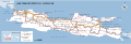 Map of Java
Article(s): Java War (1741–1743)
Request: Remove all transportation marks (including legend; i.e., marks for railroads, streets, and toll highways). Crop to focus on Central Java (cut off near Cirebon and Madiun). Remove text. If possible, insert the map into the article and tag the following cities:
- Pati
- Semarang
- Jepara
- Kudus
- Demak
- Rembang
- Kartosuro ( location, near Solo)
Second version: Remove all transportation marks (including legend; i.e., marks for railroads, streets, and toll highways). Crop to focus on East Java (cut off Madiun). Remove text. If possible, insert the map into the article and tag the following cities:
- Tuban
- Surabaya
- Jipang
- Gresik.
and Madura Island. — Crisco 1492 ( talk) 23:46, 2 June 2012 (UTC)
- It may be easier to just start over. What exactly do you *want* on the map? Just those cities and the outline of the island? 130.85.80.117 ( talk) 19:30, 8 June 2012 (UTC)
-
 Put in this gallery any maps that may be helpful
 -
 ie: the map that needs correcting/editing/etc (obvious!)
 -
 or a base map in non rectangular projection and its originalthat could be used in making the requested map

.svg)

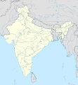
Article(s):
Andhra Pradesh and its districts
Request: Current Location map is not equirectangular, so the overlay of additonal markers is erroneous. Could not find any equirectangular maps for improving the maps of Andhra Pradesh, for adding overlays of major towns or cities. Example effort which results in markers of border towns having errors can be seen here. Alternatively, if the existing map is good enough, please help update the border coordinates of the map, so that the District headquarters are properly represented at 250px and bigger sizes. Arjunaraoc 14:15, 11 June 2012 (UTC)
Graphist opinion:
Suggested title Silicon Fen some companies in city centre 1998.png or Silicon Fen some companies in city centre 1998.svg
Article(s): Silicon Fen
Request: The New York Times published a map in 1998. This shows the names and locations of 42 such companies in Cambridge city centre at that time. It provides an interesting historical record of encyclopedic value. Thanks for reading. -- Trevj ( talk) 11:18, 13 June 2012 (UTC)
Graphist opinion(s):

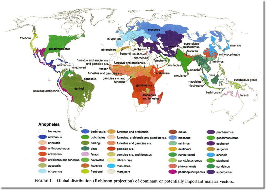
Article(s): Malaria
Request: A new map showing which type of anopheles mosquito occurs in the world could prove to come in handy for fighting the disease. Make the map using Blankmap_world_V6.png (or another map if you like), and use following source image: http://www.medicalecology.org/images/diseases/d_malaria_map.jpg Perhaps it's also useful to draw a simple line showing where malaria itself occurs (the mosquitoes seem to have a wider distribution. Make the line using the map at http://global.ihi.com/travel+insurance/travel+advice/travel+guide/malaria.aspx (line needs to encircle both the lightgreen and darker green areas on the map)
Another request is for the increase in malaria occurence by 2050, due to global warming. You can used the Paludsime.png image and modify it so it looks like: http://www.windows2universe.org/teacher_resources/online_courses/health/images/malaria_2050_sm.jpg
KVDP ( talk) 08:59, 15 June 2012 (UTC)
Graphist opinion(s):

Article(s): Mississippian cultures
Request: png or svg with encyclopedic font... Kintetsubuffalo ( talk) 15:47, 15 June 2012 (UTC)
Graphist opinion(s):
-

-
 this one just South Sudan and transparent


Article(s): World map
Request: add South Sudan, trim excess odd blank space top and bottom, and remove remaining English text as at Commons... Kintetsubuffalo ( talk) 15:44, 17 June 2012 (UTC)
Graphist opinion(s):

Article(s): Comb Ceramic culture
Request: An SVG map of the Comb Ceramic culture area of archeological findings dating around 3000 BCE. This information is based on a book ISBN 951-653-114-8 p. 24, if someone makes an SVG map I can fill the information and source in it. It has three specific areas, 1a, 1b and 1c – and one mixed area of 1a+1b. Perhaps all those could be indicated with stripes, and the mixed area having a combined colour or stripes that indicate that it has both in it. Atleast I like the striped indicator style of commons:Oeraals verspreiding-af.svg for example. The base map could be cut a bit to show only Northern Europe.
The source how the three areas should be drawn, my lowsy MS Paint sketch, is found here: [1]. If someone decides to do it, a big thanks. Pudeo ' 19:20, 23 June 2012 (UTC)
Graphist opinion(s):
-
 Make a version of this...
 -
 ...that looks like this...
 -
 ...and put it here

.svg)
.svg)
Article(s): b:Wikijunior:Countries A-Z/Antigua and Barbuda
Request: Create a version of this with the Lesser Antilles zoomed in on in the style of File:Andorra in Europe (zoomed).svg Liam987 (talk) 22:28, 23 June 2012 (UTC)
Graphist opinion(s):![]() Done--
TUBS (
talk) 14:07, 27 September 2012 (UTC)
Done--
TUBS (
talk) 14:07, 27 September 2012 (UTC)
.svg)
_(zoomed).svg)
_(zoomed).svg)
Article(s): b:Wikijunior:Countries A-Z/Azerbaijan
Request: Make a version of the first image that looks like the second (with a zoomed part) at File:Azerbaijan on the globe (Afro-Eurasia centered) (zoomed).svg. Liam987 (talk) 12:40, 24 June 2012 (UTC)
Graphist opinion(s):![]() Done--
TUBS (
talk) 14:06, 27 September 2012 (UTC)
Done--
TUBS (
talk) 14:06, 27 September 2012 (UTC)
Resolved Information (Geography)
-
 World cup countries best results and hosts

Article(s): FIFA World Cup
Request: 1.India qualified for the 1950 fifa world cup, but didn't participate,so it should be represented below he "1st round" option in a separate options as "qualified/withdrew".It is a special case which has not happenned to any country,so maybe this option could be represented by the color yellow etc.
2.This map shows greenland as a part of denmark football, which is not the case.While greenland is not a part of fifa due to grass problems, fifa considers denmark,greenland and faroe islands as different national associations,so the taf with greenland should be removed
Graphist opinion(s): Fixed Greenland, India's case is probably better explained in the text rather than making the map more complicated. Kmusser ( talk) 16:14, 26 July 2012 (UTC)
-
 Map to be fixed
 -
 Reference map


Article(s): Williamsburg, Virginia, List of counties in Virginia, cross-wiki usage
Request: The first map above doesn't show Williamsburg, but instead the neighboring York County. The second shows you the location of Williamsburg, but is very hard to see when used as a thumbnail. Could you change the first map to accurately and conspicuously reflect Williamsburg's location? Thanks! Hiyayaywhopee ( talk) 17:23, 17 July 2012 (UTC)
Graphist opinion(s): Done, still hard to see, but at least its not wrong. Would probably be better served using a location map template. Kmusser ( talk) 16:26, 26 July 2012 (UTC)
Red wolf now Canis lupus, too, so map update needed
-
 Exterpated and present ranges of Canis lupus drawn before the Red Wolf was concidered C. lupus.
Article(s): Gray wolf
Request: Fill in Southwest USA to reflect the exterpated territory of the Red Wolf. This map must be from back in the days when the red wolf was a separate species (Canis rufus), instead of how it's done today, Canis lupus rufus. Chrisrus ( talk) 23:06, 28 July 2012 (UTC)
Graphist opinion(s): Done. Kmusser ( talk) 18:29, 2 August 2012 (UTC)
-
 Finished?

Article(s): Greater Bristol Metro
Request: The publically available map arguably includes some artistic originality and is presumably copyrighted by the creator. It may be possible to include this map at Commons as it is (simple works comprising lines/text), or by removing the logos. (Note: I've declared a potential COI, but did not place the original map request on the talk page.) The map is currently referred to in the article text, with the reference included (I did add this). All advice greatly appreciated. Thanks for reading. -- Trevj ( talk) 10:19, 21 May 2012 (UTC)
Graphist opinion(s):
- That is one ugly map. I can probably whip up a better version with my original styling. Would you prefer is geographically accurate, or stylized like the map you linked? Also, do you have any preferences for the style: tick marks, small circles, medium circles, large circles, or differently colored circles? Pi.1415926535 ( talk) 11:38, 13 June 2012 (UTC)
- Thanks very much for looking in to this. I didn't think about referring to {{ Bristol railway map}} before, which may be of some relevance. I've just now considered inviting WP:UKRAIL here, but decided against it in case it provokes a deluge of further requests! However, there could be some useful opinions on presentation in their previous discussions, or you could ask there if you feel inclined to do so. Anyway, I'll consider your questions and let you know soon. Thanks again. -- Trevj ( talk) 15:02, 13 June 2012 (UTC)
- Wow - your maps are very clear! As to the questions, I think that geographically accurate may be more useful, as this is an encyclopedia rather than a journey planner. Something similar to SEPTA Airport Line map.svg might be appropriate. As for the style, I think that either medium or large circles (depending on the overall scale/size) should work well. The apparently overlapping services noted in the legend according to frequency/route may not be worth including as this sort if info is likely to date as the proposals evolve (similarly for the asterisked stations with proposed improved frequency, I guess). But the proposed new stations seem to be a significant part of the scheme. I see that Taunton is mentioned in the legend but not on the plan: it's off to the South West, if that's worth noting. Thanks. -- Trevj ( talk) 20:33, 13 June 2012 (UTC)
- The official network maps may also be worth a look, for reference. -- Trevj ( talk) 20:39, 13 June 2012 (UTC)
- I'll be starting on this tonight. Sorry for the delay - I've been tied up with an unrelated dispute. Pi.1415926535 ( talk) 21:04, 16 June 2012 (UTC)
- I've made a preliminary geographic map on Google Maps, just to get an idea what I'm dealing with here. Take a look and let me know if there are any errors. This doesn't show stations or any of the final styling.
- Also: there are two branches (to Severn Beach and to Patchway) that are shown as GBM stations on some maps but not others. Should I include them? Pi.1415926535 ( talk) 07:05, 17 June 2012 (UTC)
- One more question: do you wish the map to show existing lines (freight and/or passenger) with thinner grey lines? Pi.1415926535 ( talk) 18:02, 17 June 2012 (UTC)
Are you referring to Patchway on the campaign map? It's faded on the previously linked official map endorsed by the 4 local authorities. Both Severn Beach and Patchway are in current operation and may receive improved services. Because of the ambiguity, maybe it's best to omit Patchway from the improved route itself but still show its location within the network. There are also some anomalies regarding the possible new stations, e.g. North Filton, Horfield, Corsham (assuming Ashley Down and Ashley Hill to be the same thing). If Patchway is included in the network, it may be consistent to also include Freshford. And if Corsham is included, it may be informative to mark the en route Bathampton, which used to have a station.
Anyway, the preliminary map you've done is accurate and covers almost all of the above anyway. Thanks very much and please let me know if you have any further questions. (We could consider requesting clarification from the group itself, but that would probably amount to original research so it's probably best to stick with interpreting the publically available information.) -- Trevj ( talk) 07:56, 19 June 2012 (UTC)
- Okay, I'll essentially do an exact stylized to geographic transfer for the first draft of the map. (It'll be SVG, so I can add and subtract stations easily.) I'll use colored markers for definite stations and grey markers for possible stations, with small black dots at National Rail stations outside the plan.
- Improved lines (thick and colored)
- Line to Portishead, with stops at Portishead and Pill with a possible stop marked at Ashton Gate
- Line to Weston-super-Mare, with all stops (7) marked
- Line to Bath, with Keynsham and Oldfield Park marked. Possible stops marked at Saltford (on improved line) and Corsham (unimproved line)
- Line to Yate, with three stops marked plus possible stops at Horfield and Ashley Down
- Line to Henbury, with Filton Abbey Wood marked plus 4 possible stops
- Line to Severn Beach, with all stops (11) marked
- Stops on unimproved lines (thin and black)
- Patchway
- Freshford
- Let me know if you want it differently. I'll have a preliminary map up within 36 hours. Pi.1415926535 ( talk) 19:51, 19 June 2012 (UTC)
- Just uploaded a very basic draft. Stations and separation of the different services will be next. Pi.1415926535 ( talk) 20:26, 19 June 2012 (UTC)
- This is coming on very nicely. I've looked through the lines you've detailed above and it all looks accurate to me. The principal stations (with
inter-city rail services) are marked on the schematic as Bristol Temple Meads and Bath Spa. There are two others that I know of: Bristol Parkway (London to Cardiff, Swansea, not via Bath Spa) and Weston-super-Mare (services from London via Bath Spa continue on to Temple Meads, W-s-M, Taunton, Exeter, Penzance). To deviate slightly from the schematic, you may think it worth highlighting these too. I think this is it (although I do take the train 3 days a week, I'm not especially knowledgeable). This will be a very useful addition to Wikimedia resources. Thanks!
 --
Trevj (
talk) 08:22, 20 June 2012 (UTC)
--
Trevj (
talk) 08:22, 20 June 2012 (UTC)
- This is coming on very nicely. I've looked through the lines you've detailed above and it all looks accurate to me. The principal stations (with
inter-city rail services) are marked on the schematic as Bristol Temple Meads and Bath Spa. There are two others that I know of: Bristol Parkway (London to Cardiff, Swansea, not via Bath Spa) and Weston-super-Mare (services from London via Bath Spa continue on to Temple Meads, W-s-M, Taunton, Exeter, Penzance). To deviate slightly from the schematic, you may think it worth highlighting these too. I think this is it (although I do take the train 3 days a week, I'm not especially knowledgeable). This will be a very useful addition to Wikimedia resources. Thanks!
- I've placed stations on. Black fill is currently operating stations, grey are new/reactivated with the GBM plan, and white fill are possible GBM stations. I can edit style at any point, but if you've got certain styles for the lines or the stations it'd be easier o change now before I add station names.
- There's several options for colors of the lines at this point. My preference is to keep all the lines one color. Easy, simple, and it gives a unifying style to the entire GBM system. If you want to have them different colors, then there's two directions I can go. I can assign a different color to each line - Bristol-Bath, Bristol-Yate, etc (medium difficulty), or to each service - Severn Beach-Bath, Severn Beach-Portishead, etc (high difficulty). With either of those choices, there's also options for shared lines - they can be several thinner colored lines in parallel, alternating dashes of different colors, or one solid color (probably black). I'm willing to do any of these you wish, or something entirely different - the difficulty is more a measure of how long it'll take me. Pi.1415926535 ( talk) 20:05, 21 June 2012 (UTC)
- Sorry for my delayed reply. It's looking increasingly recognisable. The visual distinction between current/reactivated/possible works well (although perhaps less when printed in b/w). Referring to {{ Railway line legend}}, I see metro lines are usually in blue, as you've done. Although the scheme is referred to as a metro, I think all of the lines accept heavy rail/freight services. What do you think of this? And referring to Route diagram template/Catalog of pictograms, the possible stations may (at a glance, to those familiar with the conventional legend) appear to be non-passenger stops. But I can't really think of a better way to distinguish them from the reactivated ones, other than by perhaps italicising the text or something. As you'll have no doubt noticed, the 'Portway P&R' proposal only uses a different text colour (and would apparently be a new-build station), although this is possibly a stylistic error on their behalf compared to the others. I can see that Patchway is included but apparently not Freshford (and what do you think about Corsham?)
- Now for the simple bit: I agree with keeping all the lines one colour. This is still a proposal and (even though the source tries to distinguish between the lines/services) I somehow doubt that'll be an accurate reflection of the final scheme (assuming it goes ahead). Of course, if reliable sources at some point in the future publish a critical analysis of the proposals and the actuality then it may be useful to amend things then in order to more accurately reflect the source.
- Thanks. -- Trevj ( talk) 06:52, 23 June 2012 (UTC)
The blue color was just a temporary thing - a geographic map like this doesn't have to follow the RDT conventions (which are arbitrary anyway).
I decided not to include Corsham mainly for stylistic reasons - it'd be a wide open space on the map added for a possible station that's off the improved sections of line. I can add it if you'd like, but I didn't think it was worthwhile. (Disclaimer: I know next to nothing about British railway operations or history. I'm basically stabbing blindly at this.) Patchway gets a dot only because it's covered by the area on the map necessitated by the other lines. Pi.1415926535 ( talk) 04:12, 24 June 2012 (UTC)
- OK - whatever colour you think works best. Regarding Corsham - I see what you mean, and hadn't quite realised it's almost as far as Chippenham. But I still think it'd be useful if it could be somehow included. This may be possible (not to scale) using a short dashed line section, or other convention, to indicate a break. What do you think? And maybe it's not worth including Patchway after all, as it's apparently not proposed to have any improvements. The blind stabbing is going very well! -- Trevj ( talk) 21:47, 24 June 2012 (UTC)
- Ack, sorry, I haven't gotten to this in a while. I'll do some more stabbing soon. Pi.1415926535 ( talk) 19:47, 8 July 2012 (UTC)
- Did some work. That's about all I see as necessary - I feel that adding all the station names would be too crowded. Pi.1415926535 ( talk) 23:50, 21 August 2012 (UTC)
-
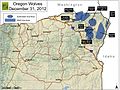 Map of gray wolf packs in Oregon
 -
Range map currently used in Gray wolf article, which doesn't show Oregon's wolves

Article(s): Gray wolf
Request: File:Gray Wolf Distribution.gif needs to be updated to indicate the gray wolves in northeast Oregon, and probably in other places, too. Jsayre64 (talk) 17:35, 3 August 2012 (UTC)
- Addendum: There are two more requests for this same map below; it might save you time to do all three at once! Just a suggestion. — Lawrence King ( talk) 18:09, 13 August 2012 (UTC)
Graphist opinion(s): Done. Merged into the more general expansion of the U.S. range requested below. Kmusser ( talk) 16:51, 24 August 2012 (UTC)
-
The map that needs updating
Article(s): Gray wolf
Request: Please update the extent of gray wolves in Idaho, Montana, and Wyoming based on this map from the March 2010 issue of National Geographic. Note that this National Geographic map is interactive -- click on the words "Wolf Pack (2008)" under the words "Click Text Below" to see the current wolf population in this region. I suggest that this entire region be made green on the Wikipedia map, since a solid green region obviously doesn't mean there is a wolf in every single square foot of the territory, merely that wolves are extant in this territory. (In case it is helpful, the full article can be found here.) Thanks!
P.S. This is not a duplicate of the two grey wolf requests already posted above! — Lawrence King ( talk) 18:06, 13 August 2012 (UTC)
Graphist opinion: Done. Kmusser ( talk) 16:51, 24 August 2012 (UTC)
- Thank you so much. The map looks great. Hope you had fun! — Lawrence King ( talk) 18:48, 24 August 2012 (UTC)
-
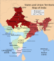 Shows in dark red the states listed at the time of creation: Jammu and Kashmir, Himachal Pradesh, Punjab, Haryana, Delhi, Rajasthan, Uttar Pradesh, Bihar, West Bengal, Orissa, Jharkhand, Sikkim, Assam, Meghalaya, Tripura, Nagaland, Manipur, Mizoram and Arunachal Pradesh. Derived from India_states_and_union_territories_map.svg by changing the fill colour for those states.

![[1]](http://img824.imageshack.us/img824/722/combceramicsketch.jpg)
Article(s): July 2012 India blackout
Request: Chhattisgarh was not affected by the black out, since it is a power surplus state and is part of Western grid. The map ( http://en.wikipedia.org/wiki/File:Indian_states_affected_by_July_2012_power_cuts.svg) should be altered accordingly. Read http://www.business-standard.com/india/news/chhattisgarh-saves-western-gridfalling-into-darkness/482081/ for more details. Nemishamishra ( talk) 10:31, 3 August 2012 (UTC)
- I have changed it as requested. (I created that map from an existing SVG of the states of India, so it was easy for me to make the change. It is luck that I visited this page today, I very rarely come here.) Maproom ( talk) 15:21, 9 August 2012 (UTC)
Graphist opinion(s):