
 | This page, part of the
Graphics Lab Wikiproject, is an
archive of requests for February 2009. Please do not edit the contents of this page. You can submit new requests here. |
Stale Information
Vancouver SkyTrain (very easy task to do, which can be handled in less than a minute. please just finish this :( )
-
 A map of the Vancouver SkyTrain.
 -
 A map of the Vancouver SkyTrain with only the SkyTrain stations.


Article(s): SkyTrain (Vancouver), List of Vancouver SkyTrain stations
Request: If you look at the images, you'll see that Main Street-Science World has a transfer station on it. The station is a ordinary station, and is not a transfer station, so should be changed to a ordinary station. -- signed by
SRE.K.Annoyomous.L.
24 (spell my name backwards) at 05:32, 2 January 2009 (UTC)
Graphist opinion: What do ordinary stations and transfer stations look like? Is the first map correct in appearance for all the skytrain stations? gringer ( talk) 10:07, 25 January 2009 (UTC)
Berlin-Tegel Airport
-
 Berlin-Tegel Airport layout

Article(s): Berlin-Tegel Airport
Request: The diagram showing the terminal layout, is written in German and furthermore not correct at all (it shows the planned layout of 1970, not the current one, and does not correspond with the text). Alas, I am not able to do it by myself, but maybe someone likes to do such things...
Graphist opinion:
- Comment:Do you have a link to the correct layout? §hep • ¡Talk to me! 01:14, 4 January 2009 (UTC)
- Comment:Yes, sorry for not alreading having posted it: http://www.berlin-airport.de/EN/ReisendeUndBesucher/AmFlughafen/Terminalplan/TXL.html Per aspera ad Astra ( talk) 09:50, 4 January 2009 (UTC)
- Comment:...and here for the parking areas: http://www.berlin-airport.de/EN/ReisendeUndBesucher/AnUndAbreise/AnfahrtAuto/TXL.html Per aspera ad Astra ( talk) 09:54, 4 January 2009 (UTC)
- Comment: Inkscape can copy the vectors from the PDF files, but I'm not sure about the license on those pictures. Can they be used in a wikipedia-friendly image? gringer ( talk) 10:10, 25 January 2009 (UTC)
Lenin order
-
 Lenin order
 -
 an attempt at vectorizing the image


Article(s): Soviet related articles
Request: Please make a SVG version of this PRODUCER ( TALK) 16:43, 9 January 2009 (UTC)
Graphist opinion:
- It's my first ever attempt at vectorizing an image, so it's far from perfect, but i guess it's still no worse than the low-res image. :) If you don't think it's good enough, dont use it, or better yet, improve it yourself.-- Ghazer ( talk) 04:25, 10 January 2009 (UTC)
CAD ans USD Exchange Rates Graph
-
 A comparison graph of the CAD and USD exchage rates.
 -

-


Article(s): Burnaby, Fredericton, C$
Request: Please vectorize these. Thanks in advance, Wikigraphists! Connormah ( talk) 04:01, 10 January 2009 (UTC)
Graphist opinion:
Maps Needing to be Vectorized!
-
 Great Bear Lake
 -
 Great Slave Lake
 -
 Lake Athabasca
 -
 Beaufort Sea


Article(s): Great Slave Lake, Great Bear Lake, Lake Athabasca, Beaufort Sea
Request: SVGify and upload to commons. Connormah ( talk) 01:45, 11 January 2009 (UTC)
Graphist opinion:
Make SVG
-
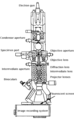 It's a diagram of the internals of a TEM
 -
 svg version


Article(s): Transmission electron microscopy
Request: Is it possible to get this made into an SVG, also made a bit upright, it is at a slight angle. Thankyou. Hat'nCoat ( talk) 00:02, 28 December 2008 (UTC)
Graphist opinion: SVG version added with rotation, although it is 6x the size of the raster image. -- Kamangir1214 ( talk) 21:35, 2 January 2009 (UTC)
- For something as detailed as this please don't just do an auto-trace. §hep • ¡Talk to me! 01:23, 4 January 2009 (UTC)
Brookline MA Seal
Article(s): Brookline, MA
Request: Needs to be vectorized, as this suffers from lossy compression artifacts. Connormah ( talk) 01:13, 11 January 2009 (UTC)
Graphist opinion: A simple web search found this. You could save that image, make it smaller, then upload it over the one you have issues with. I'd be glad to do it for you if you don't have software to resize the image. If we have another better quality image from an official source, and the image is non-free, I'm not sure we even need an SVG since this new image I found does not suffer from the artifacts. We could also make it black and white if you prefer, but the color doesn't seem problematic to me either. What do you think about that?- Andrew c [talk] 15:20, 12 January 2009 (UTC)
Cuban convertible peso
Article(s): Cuban convertible peso
Request: fix perspective, cut off background... Chris (クリス • フィッチ) ( talk) 15:40, 12 January 2009 (UTC)
Graphist opinion: How's that? Mfield ( talk) 06:15, 13 January 2009 (UTC)
meson nonets
-
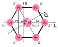 Meson octet spin 0
 -
 Mesons nonet spin 1


Article(s): See images
Request: Alright, this is a bit complicated to explain.
- Image on the left:
- In the middle, there should be a third particle. Currently there is a neutral pion () and an eta meson (), but there should also be an eta prime meson (). If possible, the three particles should be right under the middle circle, rather than next to it.
- should be
- Upload the result as "UDS Meson nonet spin 0"


- Image on the right:
- Should look similar to the image on the left after modifications, but with
- <-->
- <-->
- <-->
- <-->
- <-->
- <-->
- <-->
- <-->
- <-->
- Upload the result as "UDS Meson nonet spin 1".


Headbomb { ταλκ κοντριβς – WP Physics} 02:44, 26 November 2008 (UTC)
Graphist opinion: It might be best to contact the original author ( Trassiorf). But I can try if need be. Tadpole9( talk • contribs) 06:40, 26 November 2008 (UTC)
- He's registered on the commons, and for some reason (inaptitude probably), my browser refuses to do anything properly on the commons, so I can't.
Headbomb {
ταλκ
κοντριβς –
WP Physics} 07:50, 26 November 2008 (UTC)
-
User:Trassiorf is also registered on several Wikipedias. Maybe you want to contact him there. Or I can contact him on commons.
Tadpole9(
talk •
contribs) 18:47, 26 November 2008 (UTC)
- It's probably simpler if you do it. Sorry for the trouble. Headbomb { ταλκ κοντριβς – WP Physics} 23:16, 27 November 2008 (UTC)
-
User:Trassiorf is also registered on several Wikipedias. Maybe you want to contact him there. Or I can contact him on commons.
Tadpole9(
talk •
contribs) 18:47, 26 November 2008 (UTC)
- Actually, it looks likes I've contacted him a few months ago. It doesn't look like he's active. Headbomb { ταλκ κοντριβς – WP Physics} 23:18, 27 November 2008 (UTC)
- If you're confused by what exactly needs to be don't just ask and I'll answer the best I can. Headbomb { ταλκ κοντριβς – WP Physics} 06:26, 7 December 2008 (UTC)
Newton's dynamical equations
-
 How about his?

Article(s): Physics
Request: Please convert to .svg. When I upload the .svg version it is not right. But png and .jpg seem to work for me. Thank you. Ancheta Wis ( talk) 10:07, 3 December 2008 (UTC)
Graphist opinion: I don't see any picture. What's the advantage of using a picture over the wikipedia/TeX markup? bamse ( talk) 10:20, 3 December 2008 (UTC)
- Aligning the equations' elements together (aka, p, F, F should be aligned together on the left, the equal signs should be aligned together, and on the right, m, dotted P and F aligned together) would improve the image IMO.
Headbomb {
ταλκ
κοντριβς –
WP Physics} 08:34, 17 December 2008 (UTC)
- Feel free to realign the elements. I was afraid that there would be too much empty space. The present version is rendered by TeX so I'd consider it standard.
bamse (
talk) 09:25, 17 December 2008 (UTC)
- TeX isn't made to align things so, I'd just align them manually. However I suck at images, so I won't. Headbomb { ταλκ κοντριβς – WP Physics} 09:28, 17 December 2008 (UTC)
- TeX isn't made to align things so? I thought that is what TeX is meant for.
- Old school:
- The last one doesn't really fit on WP
- -- Lionelbrits ( talk) 16:34, 6 January 2009 (UTC)
- Feel free to realign the elements. I was afraid that there would be too much empty space. The present version is rendered by TeX so I'd consider it standard.
bamse (
talk) 09:25, 17 December 2008 (UTC)


BBC2
-
 BBC2 share of viewing graph

Article(s): BBC2
Request: SVGify.
Graphist opinion: Do you have a link to the data? Some of the data points are fractional and it will be easier to recreate it from the data than tracing that image. gren グレン 22:16, 14 January 2009 (UTC)
Map SVG request

Article(s): Algonquin
Request: Vectorize...this is a horrible resolution, and looks like it was created in MS Paint. Connormah ( talk) 04:48, 13 January 2009 (UTC)
Graphist opinion: There's not much accurate, sourced data in that image to make into an SVG. Any SVG would be very very approximate and not add anything more to the article than the original. If there were a better version of the map an SVG could be made from that. gren グレン 22:10, 14 January 2009 (UTC)
Tuvan People's Republic
.svg)
Article(s): Tuvan People's Republic
Request: SVGify... Chris (クリス • フィッチ) ( talk) 14:34, 13 January 2009 (UTC)
Graphist opinion: I don't think this is good enough quality to do a trace. Do you have a link to a higher quality verison? gren グレン 22:03, 14 January 2009 (UTC)
- Bag o' nothin' yet, found this http://flagspot.net/flags/ru-ty_h.html will keep trying. Chris (クリス • フィッチ) ( talk) 02:29, 15 January 2009 (UTC)
Crop without re-uploading?
-
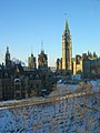 Parliament Hill in winter.

Article(s): Parliament Hill
Request: Can this image be cropped using code or in some other manner within Wikipedia? I.e. without having to do so in Photoshop and then re-uploading. Miesianiacal ( talk) 15:18, 12 January 2009 (UTC)
Graphist opinion:No it cannot, it will need to be cropped externally and uploaded as an edit. Mfield ( talk) 17:10, 12 January 2009 (UTC)
- Ah, I see. Cheers. -- Miesianiacal ( talk) 18:47, 12 January 2009 (UTC)
Template:Annotated image can be used to crop and zoom, as shown - look at the original to see how powerful this. The downside in this extreme case is that a huge image is downloaded. However I often use it to trim excess bg from images, to avoid layout problems (whihc are becoming more difficult with the spread of widescreens). -- Philcha ( talk) 09:29, 15 January 2009 (UTC)
Correction of my drawing from .jpg to svg
-
Hajos-Parrish-ketols-2
-
 Nr. 2?
Request: Please correct my drawing
Hajos-Parrish-ketols-2 from the present .jpg to the svg format as suggested by the Wikipedia Editors. Thanks,
Zghajos (
Talk) 22:01, January 17, 2009 (UTC)
Graphist opinion: Hi, there were a couple of formatting glitches with your request that were messing up the page - mainly, you were missing closing gallery/center tags - so I've fixed them for you. Note: ordinarily, ~~~~ will automatically give you the proper signature, but I think that it got confused because it thought you were still in a Gallery section. CountingPine ( talk) 01:12, 18 January 2009 (UTC)
Cheshire coat of arms
Article(s): Cheshire and Cheshire County Council, and it will also be used as the logo of WikiProject Cheshire
Request: The Cheshire WikiProject is hoping someone can create a free use, svg version of the first picture here. It's a coat of arms depicting three gold wheatsheaves on a blue shield supported by two lions. Thanks, Nev1 ( talk) 00:53, 18 January 2009 (UTC)
-
 Logo for WikiProject Koei Warriors Games
 -
 Suggestion #1 ~~~~
 -
 My ( BlueCaper's) new version for it


Article(s): WikiProject Koei Warriors Games
Request: Could you make a more detailed ".svg" version of it? Also, could there be like a black curve going off the tip of the sword in a 90° turn centered on the middle of the sword? (The black curve refers to the Koei Warriors Games' opening movies using black lines instead of blood.) Thank you! - BlueCaper ( talk) 13:21, 13 January 2009 (UTC)
- I wasn't able to do the 90 degree curve. Also, I wasn't sure if you wanted it with the red background. Let me know if this is okay.
Zoo
Fari 03:25, 17 January 2009 (UTC)
- To be more correct, the W in the logo should be in the
Garamond font instead of Times New Roman. The difference is that Garamond's W looks like two V's overlapping, while TNR has the W looking like the above SVG version (look at Wikipedia's logo, the W looks like two overlapping V's. Same with your red background logo). Let me know if you want the Garamond W, as I've got Garamond. [|
Retro00064 | (
talk/
contribs) |] 23:42, 17 January 2009 (UTC)
- Thanks, but I used Paint.NET and public-domain Commons photography to create a .PNG version. I will use Inkscape to make it SVG. I will say something to the other WikiProject Koei Warriors Games members to see if they wish to use or build on your picture. I tried to figure out which font uses that extra serif on the "W," and I have Garamond, but I guess I just overlooked it. Thanks again! - BlueCaper ( talk) 01:43, 19 January 2009 (UTC)
- To be more correct, the W in the logo should be in the
Garamond font instead of Times New Roman. The difference is that Garamond's W looks like two V's overlapping, while TNR has the W looking like the above SVG version (look at Wikipedia's logo, the W looks like two overlapping V's. Same with your red background logo). Let me know if you want the Garamond W, as I've got Garamond. [|
Retro00064 | (
talk/
contribs) |] 23:42, 17 January 2009 (UTC)
Graphist opinion:
Translation of text for a map (from Spanish to English)
-
 Map of the languages of the world

Article(s): Linguistic map
Request: Please see
Wikipedia:Reference desk/Archives/Language/2009 January 11 (section "File Translation Needed").
--
Wavelength (
talk) 05:38, 18 January 2009 (UTC)
Graphist opinion: This has already been done on commons, use File:Languages world map.svg. Kmusser ( talk) 12:55, 3 February 2009 (UTC)
Iran map

Iran could use a new map please. —Preceding unsigned comment added by 83.108.234.37 ( talk) 10:47, 18 January 2009 (UTC)
- Could you be more specific. What kind of map are you thinking of?
bamse (
talk) 15:14, 18 January 2009 (UTC)
- I'm thinking of a new map with the globe view.
83.108.234.37 (
talk) 21:28, 19 January 2009 (UTC)
- Do you mean something like
File:People's Republic of China (orthographic projection).svg but then for Iran? In my opinion such projection is more suited to large countries. I also don't see what would be gained over all the beautiful maps in
commons:Atlas_of_Iran for instance. But maybe I misunderstand your request.
bamse (
talk) 22:32, 19 January 2009 (UTC)
- Well,
Iran is 1,648,195 km2 large, and
Mexico which has a land area of 1,972,550 km2, have a map like that. Its just some larger. :-) Its also made one for the
UK though not in use anymore. And I know its called globe view, but does it need to bee zoomed out that much? Just look at
Mongolia (1,564,116 km2) that map is showing the whole world... Its the better looking design that is importat to improve the article. Sorry for my bad english :-)
83.108.234.37 (
talk) 14:59, 20 January 2009 (UTC)
- I changed colors in the Mongolia map. Is that ok? There is/was also
File:LocationIran.svg. A map in orthographic projection (globe view) — which is not just a zoomed-in version — with Iran in the center would require creating a completely new map and possibly vectorize it (to make it svg). I don't really feel the need for such map. Maybe some other graphist would go for it.
bamse (
talk) 15:31, 20 January 2009 (UTC)
- Yeah I talked to user Ssolbergj who makes those types of maps. He seemd to be busy at the time I talked to him. But the File:LocationIran.svg looks good, can't you attatch that in the Iran article? Im not sure how to. 83.108.234.37 ( talk) 16:04, 20 January 2009 (UTC)
- I changed colors in the Mongolia map. Is that ok? There is/was also
File:LocationIran.svg. A map in orthographic projection (globe view) — which is not just a zoomed-in version — with Iran in the center would require creating a completely new map and possibly vectorize it (to make it svg). I don't really feel the need for such map. Maybe some other graphist would go for it.
bamse (
talk) 15:31, 20 January 2009 (UTC)
- Well,
Iran is 1,648,195 km2 large, and
Mexico which has a land area of 1,972,550 km2, have a map like that. Its just some larger. :-) Its also made one for the
UK though not in use anymore. And I know its called globe view, but does it need to bee zoomed out that much? Just look at
Mongolia (1,564,116 km2) that map is showing the whole world... Its the better looking design that is importat to improve the article. Sorry for my bad english :-)
83.108.234.37 (
talk) 14:59, 20 January 2009 (UTC)
- Do you mean something like
File:People's Republic of China (orthographic projection).svg but then for Iran? In my opinion such projection is more suited to large countries. I also don't see what would be gained over all the beautiful maps in
commons:Atlas_of_Iran for instance. But maybe I misunderstand your request.
bamse (
talk) 22:32, 19 January 2009 (UTC)
- I'm thinking of a new map with the globe view.
83.108.234.37 (
talk) 21:28, 19 January 2009 (UTC)
NA Basement Rocks

Article(s): Lake Superior, Geology of North America, Lake Nipigon, User:SEWilco/Images, Talk:Abiogenic petroleum origin/Archive 1, Slave craton, Superior craton, Churchill craton, Rae craton, List of shields and cratons, Midcontinent Rift System, Volcanism in Canada, File:North america terrain 2003 map.jpg, Innuitian orogeny, Trans-Hudson orogeny, Wyoming craton.
Request: Reposting, because this one has been forgotten, and I feel this is very urgent, because this image is used in over 20 articles. Please vectorize, and change colors to Wikipedia-style, as the current ones are quite blinding. Thanks. Connormah ( talk) 23:24, 8 January 2009 (UTC)
- And I'll put my opinion again. This map does not offer enough detail to do a proper vectorization. Yes, the colors can be changed... but this map has such little detail that a vector will be just as completely inaccurate. You might want to try finding more precise information and sources of any sort to substantiate these boundaries and help create a better map. gren グレン 01:12, 6 February 2009 (UTC)
Graphist opinion:
- I've had a look at this one, and due to the extremely small size, and the very inaccurate and unorthodox projection of the map, it will be impossible to transfer the data with any sensible degree of accuracy to SVG. With better data, an SVG can be made, especially if the projection is similar to an existing map of North America such as this one, or similar. Inductiveload ( talk) 02:07, 6 February 2009 (UTC)
North Sea map improvements and or feedback
-
 Currents in the North Sea
 -
 Map showing neighboring placenames, and features in the North Sea, two bathymetric projections of greater areas.
 -
 Map showing neighboring placenames, and features in the North Sea, two bathymetric projections of greater areas.
 -
 Map showing neighboring placenames, and features in the North Sea


Article(s):
North Sea
Request: The currents map stated above has little straight arrows upon it showing current direction, but would be improved with curvy arrows which would be more similar to flowing water motion. There are 3 online sources cited for verifiability on the above image.... SriMesh | talk 04:12, 23 January 2009 (UTC)
' The 3 similar maps show features and placenames are located because of Geography of the North Sea has upon it the use of a geograph template and the Geography of the North Sea article cites sources for the latitudes and longitudes, which have been used. I am not sure which to save. Are the maps wikipedia friendly, or is there an opinion on these for improvements?
Kind Regards SriMesh | talk 04:12, 23 January 2009 (UTC)
'Graphist opinion:
McDonald's Logo → SVG Image
Article(s): McDonald's
Request: This image would probably be better suited as an SVG image. I have no clue what I am doing when it comes to SVG, so it would probably be better for me to leave to more experienced users.
![]() Glacier
Wolf 22:23, 21 January 2009 (UTC)
Glacier
Wolf 22:23, 21 January 2009 (UTC)
Graphist opinion:
- It is always best to leave the logos at the current file, since they are non-free logos. Yet possible, graphists including me wouldn't risk the trace and therefore logos shouldn't even be attempted to be requested here in the graphics lab. Zoo Fari 00:21, 24 January 2009 (UTC)
- I was about to trace the file when I came across a PDF file from MickyD's themselves! I must have dne something wrong as I can't get the SVg to appear, I just get a red X. I checked and it doesn't appear there's any text, if anyone knows wha's up please step in. §hep • Talk 00:50, 24 January 2009 (UTC)
Here you are. -- 212.41.91.155 ( talk) 03:47, 24 January 2009 (UTC)
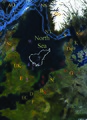
Jan Mayen

Article(s): Jan Mayen
Request: Can we get a closer-in map? Chris (クリス • フィッチ) ( talk) 09:24, 25 January 2009 (UTC)
Graphist opinion:
Canadian Loonie

Article(s): None yet.
Request: Could we get a SVG of this, please? Going on my userpage, and possible other. Precisely in Nuvola apps style, please. Connormah ( talk) 19:44, 31 January 2009 (UTC)
Graphist opinion:
- Since this image is unfree it (or any svg version based on it( wouldn't be allowed on your userpage. / Lokal _ Profil 01:26, 1 February 2009 (UTC)
Gas Pipeline
-
ნაბუქოს გაზსადენი
Article(s): ნაბუქო
Request: Change the current image with this Tutber eng ( talk) 01:30, 2 February 2009 (UTC)
Graphist opinion:
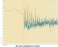
Channel Tunnel traffic figures
-
 Diagram with outdated data

Article(s): Channel Tunnel
Request: There is new 2008 data out, and I dug up precise data to replace the earlier data. I put a detailed request on the file's talk page, and also a request at the present file's creator's page, but no reaction so far. Could someone else jump in? Thanks in advance! -- Rontombontom ( talk) 14:23, 28 January 2009 (UTC)
Graphist opinion:
- Looks like this file has been updated by the original author now with 2008 data. gringer ( talk) 01:11, 19 February 2009 (UTC)
Resolved Information
Alaska maps
[sorry, can't remember the tag; someone please replace this with the proper "resolved" tag]
-
 Map of Alaska highlighting the Skagway-Hoonah-Angoon Census Area
 -
 Map of Alaska highlighting Hoonah-Angoon Census Area
 -
 Map of Alaska highlighting Skagway City and Borough
 -
 Map of Alaska highlighting Skagway-Yakutat-Angoon Census Area


Article(s): Hoonah-Angoon Census Area, Alaska and Skagway, Alaska
Request: Three maps:
- Map of Alaska highlighting Hoonah-Angoon Census Area.svg
- Map of Alaska highlighting Skagway City and Borough.svg
- Map of Alaska highlighting Skagway-Yakutat-Angoon Census Area.svg
Skagway recently became a separate borough (it's like a county; see List of boroughs and census areas in Alaska if you're curious), so it's not part of the Skagway-Hoonah-Angoon Census Area anymore; consequently, it's been renamed Hoonah-Angoon. This map will be useful to show the census area before Skagway was split away, but could separate maps be created showing just Skagway and just Hoonah-Angoon? Skagway is the farthest north of the various little bits of red. And while you're at it, could you create another one? Until the 1990s, Yakutat (see map here) was also part of the census area (then "Skagway-Yakutat-Angoon Census Area"), so it would be helpful if you could create a map that highlights Skagway-Hoonah-Angoon and Yakutat. I'd do it myself, but I don't have a program that can edit .svg files. Nyttend ( talk) 19:13, 20 January 2009 (UTC)
Graphist opinion: Left a note with User:Dbenbenn who produced the original maps. If the source data has been updated he might be able to generate new maps. / Lokal _ Profil 16:21, 21 January 2009 (UTC)
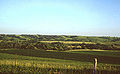
Scattered islands in the Indian Ocean


Article(s): Scattered islands in the Indian Ocean
Request: wikify, fix strange codes... Chris (クリス • フィッチ) ( talk) 09:27, 25 January 2009 (UTC)
Graphist opinion: Thank you! Chris (クリス • フィッチ) ( talk) 14:20, 28 January 2009 (UTC)
-

-
 Crop
Crop


Article: Rick Warren
Request: Please crop this so we can use as the lede infobox image, maybe head and shoulders? Any other image improvement also welcome. -- Banjeboi 04:14, 27 January 2009 (UTC)
- Comment - How do you feel about this cropped version? ~
ωαdεstεr16
«talk
stalk» 05:33, 28 January 2009 (UTC)r
- That's great! Thank you! -- Banjeboi 21:29, 28 January 2009 (UTC)
Graphist's opinion:
Mattress sizes diagram
-
 Mattress size diagram
 -
 Mattress size diagram - US
 -
 Mattress size diagram - UK


Article(s): Mattress#Mattress_dimensions
Request: SVGify, prettify. (possibly semi-transparency would make it easier to see with multiple colors on top of each other? But, the main goal is to translate the chart here into something similar to the image above. Can do for US or Europe or both. gren グレン 23:57, 17 January 2009 (UTC)
Graphist opinion:
- Created both US and UK versions using non-blank sizes from the provided table. Just SVG rectangles of the appropriate sizes, with origin 0,0 (in Inkscape coordinates), dimensions in cm for UK, inches for US. I've done them all as black with partial transparency, because that seemed to give the best "colours". gringer ( talk) 06:21, 20 January 2009 (UTC)
- Thank you very much. I agree with you that using colors like the other diagram did wouldn't have been good and they could look better but I have no idea how to design them. Only thing is if you could maybe double or triple their default size... mainly because the |thumb| parameter won't set to the user's default size because they're too small and it doesn't scale up. It would also make the default PNG preview more meaningful. gren グレン 00:53, 25 January 2009 (UTC)
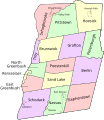
Capital District of New York Map Request
-
 Like this?

Article(s): None because it's not up to par. Will be used in Capital District, Template:Capital District, WP:WikiProject Capital District, replacing Image:CapitalDistrict.png, which is wrong.
Request: I'd like a clean SVG of this image. I'm sure it will be a 5-min operation, but I'm poor with inkscape and can't figure out how to do it. Probably unnecessary to mention, but Commons has a depository of NYS County maps to use. Many thanks in advance! ~ ωαdεstεr16 «talk stalk» 21:32, 27 January 2009 (UTC)
Non-graphist opinion: There's already an SVG that could be adapted for this: take File:Map of New York highlighting Rensselaer County.svg (each county has one; this was selected at random) and add the other counties. Is this possible? I don't know much about making SVGs myself, and I can't do it. Nyttend ( talk) 16:57, 29 January 2009 (UTC)
Graphist opinion: I changed the colors in File:Map of New York highlighting Rensselaer County.svg. Is this what you were thinking of? bamse ( talk) 18:03, 29 January 2009 (UTC)
- Can you bring the state boundary layer to the top? It goes missing under the red counties on the right. Otherwise, that's exactly what I want. Thanks! ~ ωαdεstεr16 «talk stalk» 21:36, 29 January 2009 (UTC)
- Done.
bamse (
talk) 23:43, 29 January 2009 (UTC)
- Excellent - thanks so much! ~ ωαdεstεr16 «talk stalk» 03:07, 30 January 2009 (UTC)
Film barnstar
-
 Old
Old -
 New
New


Article(s): {{ WikiProject Films Award}}
Request: Is there any chance someone can clean up this barnstar image, or better still create a new version along similar lines which incorporates File:Video-x-generic.svg? Thanks in advance for any help! PC78 ( talk) 01:55, 27 January 2009 (UTC)
Graphist opinion: I could definitely do it. Should I use the original barnstar and then add that on top? Same silver color? Let me know a couple more details here or on my talk page and then I'll get started. Thanks! Mononomic ( talk) 04:14, 27 January 2009 (UTC)
- If it's any help, the discussion that led to the creation of the original image is here; the old film reel image appears to have gone AWOL, while the star itself appears to be a modified version of the original barnstar. Ultimately I'd like to keep it close the the current version, so same silver colour, keep a shadow underneath the star etc. I'll have to leave the star to your graphist discretion. :) If it's not too much trouble to do a bit of photoshopping (or whatever) then great, if you know of a better star image we can use then that's fine too. Give me another nudge if that wasn't much help! PC78 ( talk) 11:22, 27 January 2009 (UTC)
Article(s): None
Request: I created this on Inkscape and then uploaded. It uses text boxes (title), which are blacked out for some reason- can someone fix it?. Resident Mario ( talk) 21:30, 14 January 2009 (UTC)
Graphist opinion: The fonts cannot be translated using the MediaWiki software. You will need to convert the texts to paths. Connormah ( talk) 02:14, 15 January 2009 (UTC)
- Never mind. Some passerby looked at it and deleted it, anyway. Haha, my work just got deleted before I could even try fixing it. Resident Mario ( talk) 20:47, 15 January 2009 (UTC)
- I have asked for a good admin to restore it.
Chris (クリス • フィッチ) (
talk) 02:01, 17 January 2009 (UTC)
- The admin replied "Can they work on it on Commons? It’s GFDL so being on commons it won’t get deleted. Have the guy upload it there. The Graphics Lab can download from there to work on it."
Chris (クリス • フィッチ) (
talk) 02:17, 17 January 2009 (UTC)
- Asked the deleting admin to restore it (with reference to this discussion. /
Lokal
_
Profil 14:27, 17 January 2009 (UTC)
- Thanks :)
Resident Mario (
talk) 23:01, 19 January 2009 (UTC)
- Answering is apparently not his thing. Which makes him sort of useless as an admin. have you still got the image on your computer? /
Lokal
_
Profil 16:15, 21 January 2009 (UTC)
- You know what, whatever; I don't feel like taking up bandwith. After a bit of dynamic userpage recontructing, I don't have a use for it anyway. Please feel free to sweep away once everyone knows it is sort-of resolved. Cheers, Resident Mario ( talk) 20:20, 2 February 2009 (UTC)
- Answering is apparently not his thing. Which makes him sort of useless as an admin. have you still got the image on your computer? /
Lokal
_
Profil 16:15, 21 January 2009 (UTC)
- Thanks :)
Resident Mario (
talk) 23:01, 19 January 2009 (UTC)
- Asked the deleting admin to restore it (with reference to this discussion. /
Lokal
_
Profil 14:27, 17 January 2009 (UTC)
- The admin replied "Can they work on it on Commons? It’s GFDL so being on commons it won’t get deleted. Have the guy upload it there. The Graphics Lab can download from there to work on it."
Chris (クリス • フィッチ) (
talk) 02:17, 17 January 2009 (UTC)
Flag-map of Guyana-alternate
-

-
 I used this one because it is elongate like the country
 -
 Like this?


Article(s): none yet, test idea
Request: Too much of the flag detail is cut off in the original sideways flag. Please create a second vertical one with the triangles starting from the top, and with a 1 cm green border. Thanks. Chris (クリス • フィッチ) ( talk) 04:27, 16 January 2009 (UTC)
Graphist opinion:
- I did one just like that one, but with a rotated flag. I'm not sure what you mean by a border. Around the flag graphic inside the country would get cut off by the clipping, and around the whole thing can be done with wikimarkup, without making the image less useful. Inductiveload ( talk) 21:59, 1 February 2009 (UTC)
- Beautiful, thank you!
Flag of the Rhenish Republic
.svg)
Article(s): Rhenish Republic, List of sovereign states in 1924, List of sovereign states in 1923.
Request: SVG and upload to commons under the file name "File:Flag of the Rhenish Republic.svg"-- SelfQ ( talk) 12:37, 18 January 2009 (UTC)
Graphist opinion:
201 bytes in size, and an image that solely consists of three rectangular blocks of equal size... seems a very good use of the PNG format, as it will scale fine at all dimensions. Why does it need to be converted? gringer ( talk) 06:26, 20 January 2009 (UTC)
- The same reason every other tricolor has a SVG version. And as you stated it would be easy to make. What more could you want.-- SelfQ ( talk) 13:18, 20 January 2009 (UTC)
COA of Turkmenistan


Article(s): Turkmenistan related articles.
Request: SVG please. For the five carpet guls surrounding the horse and the stars and crescent you can use the once on the flag.-- SelfQ ( talk) 18:00, 18 January 2009 (UTC)
Graphist opinion:
- How's that? I had to take a few guesses at things like the structure of the leaves around the flowers. I copied the colours from the flag too. Inductiveload ( talk) 01:45, 2 February 2009 (UTC)
- Great stuff Inductiveload! While I am not sure on the color I do think it is correct.
If I may just expand on my request and ask if you could also create one where the coa is on a circle instede of a 8 pointed star, like this:
[1] and then call it "Coat of Arms of Turkmenistan (1992).svg" ? Thanks.
--
SelfQ (
talk) 15:09, 2 February 2009 (UTC)
Sandžak
-
 coa
coa

Article(s): Sandžak
Request: Convert to SVG format please PRODUCER ( TALK) 00:10, 20 January 2009 (UTC)
Graphist opinion:I think the white doesn't need to be transparent.-- SelfQ ( talk) 11:10, 24 January 2009 (UTC)
- There you go, the file has been reduced to 13KB. --Pbroks13 talk? 04:26, 31 January 2009 (UTC)
-
 Vietnam Civil Actions Medal Unit Citation: frame color are off, palm looks horrid
 -
 Vietnam Gallantry Cross Unit Citation: colors & palm are perfect
Article(s): Vietnam Civil Actions Medal, hundreds of military biographies
Request: The former image, File:VNCivilActionsRibbon-2.svg is not a very accurate representation of the award. The color and shape of the frame are off (not accurate), and the palm device is irregularly shaped. I have given File:Vietnam gallantry cross unit award-3d.svg as an example of what the frame and palm device should look like: the frame is more gold/bronze than yellow, the leaves of the wreath are distinct, and the palm looks like a palm instead of an irregular blob. It may be easier (and probably reccomended) to transplant the green and red ribbon colors into the latter image, instead of transplanting the frame and palm over. bahamut0013 words deeds 06:10, 30 January 2009 (UTC)
Graphist opinion: Just a note that the palm with the preferable appearance is a bitmap embedded into an SVG and not preferable. §hep • Talk 02:39, 31 January 2009 (UTC)
- How's that? I fixed up both with a vector palm, and a new border (reduced the filesize by about 5 times too!)
Inductiveload (
talk) 07:15, 2 February 2009 (UTC)
- The image looks considerably better. Thank you!
bahamut0013
words
deeds 12:47, 2 February 2009 (UTC)
P.S. I just noticed you modified the other image for consistancy. Major kudos for the effort!
- The image looks considerably better. Thank you!
bahamut0013
words
deeds 12:47, 2 February 2009 (UTC)
- How's that? I fixed up both with a vector palm, and a new border (reduced the filesize by about 5 times too!)
Inductiveload (
talk) 07:15, 2 February 2009 (UTC)
South Arabia
Chris (クリス • フィッチュ) ( talk) 01:00, 5 February 2009 (UTC)


Article(s): Federation of South Arabia
Request: color flag in arms to match, svgify... Chris (クリス • フィッチュ) ( talk) 04:18, 3 February 2009 (UTC)
Graphist opinion:
- On it Inductiveload ( talk) 08:57, 3 February 2009 (UTC)
 Additional information needed Actually, do you have a better source for the design in the middle and the design on top of the "feet"?
Inductiveload (
talk) 08:58, 3 February 2009 (UTC)
Additional information needed Actually, do you have a better source for the design in the middle and the design on top of the "feet"?
Inductiveload (
talk) 08:58, 3 February 2009 (UTC)
- I did the best I could. I assume the central device is a lamp, don't know about colors. The foot device look like a scaled down copy of the crescent-star. If you know what colours go where, tell me and I'll change them. Inductiveload ( talk) 09:26, 3 February 2009 (UTC)
- You did splendidly, what a great eye for detail! Actually, it's a dagger, but you nailed it, see above! The scaled down crescent-stars (I almost missed those) are actually on the flag cloth themselves, like very long banners draped from buildings. Not part of whatever those are at the bottom. :)
Chris (クリス • フィッチュ) (
talk) 10:04, 3 February 2009 (UTC)
- Perfect! Thank you so much! Chris (クリス • フィッチュ) ( talk) 01:00, 5 February 2009 (UTC)
The Beatles logo
Article(s): The Beatles and related.
Request: SVG please-- SelfQ ( talk) 19:03, 3 February 2009 (UTC)
- How's that? Inductiveload ( talk) 20:41, 3 February 2009 (UTC)
Flag of the Dadao government
-
 Flag of the Dadao government
 -
 SVG
SVG


Article(s): Dadao Municipal Government of Shanghai
Request: SVG please-- SelfQ ( talk) 00:05, 4 February 2009 (UTC)
- Additional information needed This Yin-Yang is much more "swirled" than is usual. Is that a feature of the flag, or is it just a poor illustration?
Inductiveload (
talk) 00:50, 4 February 2009 (UTC)
- Done as per that image. Can alway be changed easily if found to be wrong. Inductiveload ( talk) 01:03, 4 February 2009 (UTC)
Flag of Campione d'Italia


Article(s): No yet. Soon to be: Campione d'Italia, Eurozone
Request: SVG please. I have included a more detailed version of the COA.-- SelfQ ( talk) 17:13, 4 February 2009 (UTC)
Graphist opinion:
- Done. The scroll work is a little rough, but I'm not very good at that kind of work and the source was pretty indistinct. Inductiveload ( talk) 01:06, 5 February 2009 (UTC)
Origin of Species
-
 Illustration from Darwin's On the Origin of Species
 -


Article(s): Will probably appear in On the Origin of Species#Struggle for existence, and natural selection, and will surely be used in wikisource:On the Origin of Species (1859)
Request: Please make a SVG version of this. I would like just for the text and the lines to be SVGized, I don't want the background in too. Also please don't forget to include the small text in the lower left corner. Diego_pmc Talk 08:07, 18 January 2009 (UTC)
Graphist opinion:
- Like that? The text is slightly larger than in the original so it can be veiwed more easily at lower resolution witohut breaking up a page too badly. Inductiveload ( talk) 02:05, 5 February 2009 (UTC)
Thanks, that's good. Diego_pmc Talk 09:33, 5 February 2009 (UTC)
Olympic bid logo
-
Tokyo 2016 Summer Olympics bid logo
Possible sources:
Article(s): 2016 Summer Olympics, 2016 Summer Olympics bids and Tokyo 2016 Olympic bid.
Request: SVGify and upload as "File:Tokyo 2016 Summer Olympics bid logo.svg" -- Felipe C.S ( talk ) 02:46, 5 February 2009 (UTC)
Graphist opinion: I have e-mailed the website, requesting a ID and password for the media section of the site. I also asked, if they couldn't just e-mail me a vector version of the logo. I stated who I was, that the image was for wikipedia, that the other cities had SVG logos available, etc. I'll keep you updated if I get a reply. For non-free logos like this, it is usually easier (and better, IMO) to go straight to the source for these types of images, as it is hard to recreate 100% raster images in SVG format, and the amount of time put into these conversions has minimal pay off when non-free images can only be used on very few articles. Anyway, I'll keep you posted of my progress.- Andrew c [talk] 03:13, 5 February 2009 (UTC)
- Will this one do File:Tokyo 2016 Summer Olympics bid logo.svg? :-) Inductiveload ( talk) 04:12, 5 February 2009 (UTC)
- Thanks for the speed and quality of work. Regards; Felipe C.S ( talk ) 15:13, 5 February 2009 (UTC)
Olympic bid slogan
Article(s): Rio de Janeiro 2016 Olympic bid.
Request: I want a SVG of the slogan "Live your passion" in the top of the official website of Rio 2016. Only the words in black and without background. Upload as "File:Rio de Janeiro 2016 Summer Olympics bid slogan.svg" Felipe C.S ( talk ) 16:07, 5 February 2009 (UTC)
Graphist opinion:
- File:Rio 2016 Olympic Slogan.svg. I couldnt find a vector of the slogan so I traced it and touched it up as best I could. Inductiveload ( talk) 01:37, 6 February 2009 (UTC)
- Thank you very much, though don't uploaded as "File:Rio de Janeiro 2016 Summer Olympics bid slogan.svg", was perfect. Regards; Felipe C.S ( talk ) 02:11, 6 February 2009 (UTC)
Badge of the Supreme Court of the United Kingdom
![]() Done per being used in article --
80.42.25.80 (
talk) 19:08, 8 February 2009 (UTC)
Done per being used in article --
80.42.25.80 (
talk) 19:08, 8 February 2009 (UTC)
-
 Crown and floral elements can be taken from here.
Article(s): Supreme Court of the United Kingdom
Request: -Could someone please create an SVG version of the above badge for the Supreme Court of the UK. I have tried myself, however i'm not very good at circles. Thanks!- AlexD ( talk) 21:40, 17 January 2009 (UTC)
Graphist opinion:
- Is that OK? Inductiveload ( talk) 11:38, 4 February 2009 (UTC)
Merge two pictures
-
 Iowa portion
 -
 South Dakota portion
 -
 Montage


Article(s): Blood Run Site
Request: This site is a National Historic Landmark with no picture in its infobox. As it's split between two US states, the US gov't website where I found these has a picture of each part, but not a single picture of the whole site. Since neither picture is more representative of the other, I'd like to have these two pictures merged (made into one image, montaged, whatever you want to call it) so that we can show both pictures in the infobox equally. Border will need to be removed first. Oh, also: could we have the South Dakota portion up top, since South Dakota is farther north? Nyttend ( talk) 16:18, 3 February 2009 (UTC)
Graphist opinion: How's that? Mfield ( talk) 07:19, 9 February 2009 (UTC)
Coat of arms of Cameroon
Chris (クリス • フィッチュ) ( talk) 22:00, 10 February 2009 (UTC)

Article(s): Coat of arms of Cameroon
Request: republic is misspelled in small text, see http://vector-images.com/image.php?epsid=4544 Chris (クリス • フィッチュ) ( talk) 10:19, 6 February 2009 (UTC)
Graphist opinion:
- Done. / Lokal _ Profil 17:50, 7 February 2009 (UTC)
- Thank you! Chris (クリス • フィッチュ) ( talk) 22:00, 10 February 2009 (UTC)
North American Union
Chris (クリス • フィッチュ) ( talk) 22:55, 11 February 2009 (UTC)
-

-
 this one is the proper perspective, if the states and provinces can be removed
 -
 Attempt at state/province removal


Article(s): North American Union
Request: straighten perspective, this doesn't need to be skewed like a globe... Chris (クリス • フィッチ) ( talk) 09:20, 25 January 2009 (UTC)
Graphist opinion: commons:Category:North America has tons of maps. Just choose one you like and someone can fill in colors you like. Any reason the one currently at North American Union isn't good? The one you linked is at North American currency union gren グレン 00:08, 27 January 2009 (UTC)
- this one is the proper perspective, if the states and provinces can be removed Chris (クリス • フィッチュ) ( talk) 00:38, 5 February 2009 (UTC)
- Perfect, thank you so much! Chris (クリス • フィッチュ) ( talk) 22:55, 11 February 2009 (UTC)
Lee shore SVG


Articels: Lee shore
Request: SVGify if possible. It doesn't have to be the same island shape. 76.117.247.55 ( talk) 01:58, 27 January 2009 (UTC)
Oppinion:
- How's that? Maui seems like a good example here, becuase it has that hidden lee shore. Inductiveload ( talk) 22:23, 1 February 2009 (UTC)
- Nice, thanx. 76.117.247.55 ( talk) 20:53, 11 February 2009 (UTC)
Map of Colorado counties
Chris (クリス • フィッチュ) ( talk) 09:23, 12 February 2009 (UTC)

Article(s):
Request: for some reason, this comes up as grainy when scaled, can this be fixed? Chris (クリス • フィッチ) ( talk) 16:30, 29 January 2009 (UTC)
Graphist opinion: OK, I have converted the text to paths to remove the grainy text. How does it look now? [| Retro00064 | ( talk/ contribs) |] 09:16, 12 February 2009 (UTC)
- That seems to be better, thank you! Chris (クリス • フィッチュ) ( talk) 09:23, 12 February 2009 (UTC)
Srebrenica
Zoo Fari 02:14, 13 February 2009 (UTC)

Article(s): Srebrenica Genocide memorial
Request: Crop above the time stamp and sharpen PRODUCER ( TALK) 21:43, 1 February 2009 (UTC)
Graphist opinion:
- How is that? I didn't think it need croping. I just removed the timestamp, and since I was at it, I did additional fixes. Zoo Fari 01:52, 2 February 2009 (UTC)
Gold frames for ribbons
-

-

-
the example if what is desired: a detailed gold wreath frame ( File:Vietnam gallantry cross unit award-3d.svg)
-
 Vietnam
 -
 Korea
Korea -
 Philippines
 -
the example if what is desired: a detailed gold wreath frame ( File:Vietnam gallantry cross unit award-3d.svg)
Article(s): Presidential Unit Citation (Vietnam), Presidential Unit Citation (Korea), Presidential Unit Citation (Philippines), hundreds of military biographies
Request: I was hoping for the same action as was taken with the previous request: clean up the gold frame to standardize them all and make them look more accurate (though obviously there is no palm to modify). File:Vietnam gallantry cross unit award-3d.svg has a nice detailed frame to use as an example. Vectorization of the images is preferred, because they are used on a large number of pages (probably thousands eventually), but modifying the .gif files would be acceptable as well. bahamut0013 words deeds 07:23, 10 February 2009 (UTC)
Graphist opinion:
- There you go. Korea and Vietnam have well ordered layers, so you can change the background without touching the shading or frame. A layer for any decorations like the palm is given too. Inductiveload ( talk) 15:04, 11 February 2009 (UTC)
- Thank you! It looks excellent! I am highly satisfied with your graphist skills. :) Cheers!
bahamut0013
words
deeds 16:46, 11 February 2009 (UTC)
- Resolved then?--
SelfQ (
talk) 18:09, 11 February 2009 (UTC)
- Yes sir, resolved it is. bahamut0013 words deeds 16:35, 12 February 2009 (UTC)
- Resolved then?--
SelfQ (
talk) 18:09, 11 February 2009 (UTC)
- Thank you! It looks excellent! I am highly satisfied with your graphist skills. :) Cheers!
bahamut0013
words
deeds 16:46, 11 February 2009 (UTC)
Dzhokhar Dudayev


Article(s): Dzhokhar Dudayev
Request: straighten perspective... Chris (クリス • フィッチュ) ( talk) 16:53, 12 February 2009 (UTC)
Graphist opinion:
- Here is a version with perspective and color adjusted. Is that ok?- Andrew c [talk] 18:41, 12 February 2009 (UTC)
- Beautiful! Can you overwrite the original? Thank you! Chris (クリス • フィッチュ) ( talk) 00:33, 13 February 2009 (UTC)
- Sorry, I would never intentionally drive you away, please don't think that. My concern, I think, is that when we have a clearly better image now available, the retention of one not as good seems cluttery. That's why the image pages have that capability. Withdrawing overwrite request.
Chris (クリス • フィッチュ) (
talk) 01:31, 13 February 2009 (UTC)
- No big deal. I mean, I totally see your point, and it makes sense. However, I'm not always a good judge of what is necessarily a better image. I mean, part of me honestly thinks that either the original uploader, or maybe someone else, could find some use in the original image, even if it is taken at an angle. I mean, I just over think things. I will consider overwriting images more in the future, for sure, but I still am reluctant to do it for drastic changes.- Andrew c [talk] 01:57, 13 February 2009 (UTC)
COA of East Germany
-
 1
1 -
 SVG of 1
 -
 2
2 -
 SVG of 2

.svg)

.svg)

Article(s): German related
Request: SVG and upload 1 as "Coat of Arms of East Germany (1950–1953).svg" and 2 as "Coat of Arms of East Germany (1953–1955).svg". For number 2 you can use the 1955–1990 coa by removing the red and fliping the compass.-- SelfQ ( talk) 17:47, 12 February 2009 (UTC)
Graphist opinion:
- How does my SVG of #2 look? As you said, it was just a few minor modifications. Anyone else want to tackle the harder #1?- Andrew c [talk] 18:26, 12 February 2009 (UTC)
How's #1? --Pbroks13 talk? 22:23, 12 February 2009 (UTC)
Historical maps SVG template
![]() Done
Done
-
 Historical maps symbol template

Article(s): Wikipedia:WikiProject Maps/Conventions/Historical maps
Request: A few spelling corrections for someone who feels like quickly delving into an SVG:
- History related icons
- Infant
ery (common trooops) - Numid cavalry (fast troops)
- Camp/fort
eress name - Controlled areas
- The lines under the USE heading could be rephrased into much better English. I think this was originally translated from French. Feel free to update with conventions from the article above if you want a more substantial task. — Vanderdecken∴ ∫ ξ φ 15:26, 11 February 2009 (UTC)
Graphist opinion: Good? §hep • Talk 21:10, 11 February 2009 (UTC)
- Thanks. — Vanderdecken∴ ∫ ξ φ 07:31, 14 February 2009 (UTC)
bih stub


Article(s): many
Request: Make the vector version match the non vector one PRODUCER ( TALK) 15:38, 10 February 2009 (UTC)
Graphist opinion:
- How's that? Inductiveload ( talk) 13:41, 11 February 2009 (UTC)
Waterfall diagram
-
 Existing diagram
 -
 SVG
SVG


Article(s): Waterfall
Request: A request to SVGify this image. The graphist has considerable artistic freedom for this. I'd like to see it look more professional and less like an obvious cartoon. Also the caption at the bottom ("Formation of a Waterfall") needs to be removed. I would suggest a better file name too (something like WaterfallCreationDiagram.svg). Thanks in advance! ~ ωαdεstεr16 «talk stalk» 18:30, 14 February 2009 (UTC)
Graphist opinion:
- Here is the SVG, feel free to make it more professional or just do whatever you like to it, I had no ideas --
C
D 16:08, 15 February 2009 (UTC)
- The numbers are stretched. Any reason for that? ~
ωαdεstεr16
«talk
stalk» 19:58, 15 February 2009 (UTC)
- No specific reason, just thought it looked better, anyway I missed the "remove FORMATION OF A WATERFALL" and "upload in different name", will fix it soon --
C
D 20:06, 15 February 2009 (UTC)
- Done (numbers too) --
C
D 20:13, 15 February 2009 (UTC)
- Great! I appreciate that help! ~
ωαdεstεr16
«talk
stalk» 21:33, 15 February 2009 (UTC)
- Is it resolved then? [| Retro00064 | ( talk/ contribs) |] 08:02, 16 February 2009 (UTC)
- Great! I appreciate that help! ~
ωαdεstεr16
«talk
stalk» 21:33, 15 February 2009 (UTC)
- Done (numbers too) --
C
D 20:13, 15 February 2009 (UTC)
- No specific reason, just thought it looked better, anyway I missed the "remove FORMATION OF A WATERFALL" and "upload in different name", will fix it soon --
C
D 20:06, 15 February 2009 (UTC)
- The numbers are stretched. Any reason for that? ~
ωαdεstεr16
«talk
stalk» 19:58, 15 February 2009 (UTC)
Velupillai Prabhakaran
Chris (クリス • フィッチュ) ( talk) 04:40, 17 February 2009 (UTC)
Article(s): Velupillai Prabhakaran
Request: remove background so not so jingoist... Chris (クリス • フィッチュ) ( talk) 14:14, 9 February 2009 (UTC)
Graphist opinion: This is the best I can do with my sub-par photo editing skills. Will that do? --Pbroks13 talk? 03:44, 14 February 2009 (UTC)
- Sorry I didn't see this-that's great but perhaps a white background instead?
Chris (クリス • フィッチュ) (
talk) 09:51, 16 February 2009 (UTC)
- How's that? − Inductiveload ( talk) 00:06, 17 February 2009 (UTC)
- Perfect, thank you! Chris (クリス • フィッチュ) ( talk) 04:40, 17 February 2009 (UTC)
Rensselaer County Map and Seal
Zoo Fari 02:11, 18 February 2009 (UTC)
-
 Map that resents me


Article(s): Rensselaer County, New York
Request: I wanted to see if someone could fix the map above, which I created, but doesn't look good at all (I swear the arrow heads pointed in the right direction when I uploaded it!). If you feel the font needs to be changed(or anything else really), feel free. I'd also like to see an SVG version of the seal. It's small and kind of fuzzy; hopefully you can work with it. ~ ωαdεstεr16 «talk stalk» 18:29, 16 February 2009 (UTC)
Graphist opinion:
- I've put circle terminators on, I think they are a little clearer, as they don't overlap any lines like arrows would. I've also removed a lot of underlying lines that were present, made all areas seperately colourable and added a gentle fill to highlight the area slightly.
- As for the seal, it's
here −
Inductiveload (
talk) 23:46, 16 February 2009 (UTC)
- Great work, and thank you! ~ ωαdεstεr16 «talk stalk» 00:44, 17 February 2009 (UTC)
Six nations image
-
 Map showing nations which take part in Six Nations
 -
 removed flags and made the highlight more noticeable


Article(s): Six Nations
Request: The Ireland flag has been found to be WP:OR and has been remove from wiki. Can you remove the flags and highlight the nations some other way. Note Ireland compete on a All-Ireland basic in Rugby and should be highlighted as such Gnevin ( talk) 21:26, 16 February 2009 (UTC)
Graphist opinion:I'm not exactly sure what you're saying, but how's this?-- penubag ( talk) 09:01, 17 February 2009 (UTC)
Albany County seal
Zoo Fari 02:10, 18 February 2009 (UTC)

Article(s): Albany County, New York
Request: Vectorize, por favor. Hopefully it's large enough... ~ ωαdεstεr16 «talk stalk» 02:21, 17 February 2009 (UTC)
Graphist opinion:
- There appears to be a vectorized B&W logo at the top of
here. Maybe someone could extract it. How important is having a color version?-
Andrew c
[talk] 02:36, 17 February 2009 (UTC)
- I would use the small color version over the BW svg. Sorry. ~
ωαdεstεr16
«talk
stalk» 02:40, 17 February 2009 (UTC)
- It is probably much easier for someone to use the already vectorized B&W logo and simply add color to it, than it would be for someone to redraw the seal from scratch. And for requests dealing with non-free content a) it is almost always best to get the content from official sources and b) because the resulting image will not be free and will be very limited on how it can be used on wikipedia, the amount of effort put into non-free requests is often minimal. -
Andrew c
[talk] 02:48, 17 February 2009 (UTC)
- Understood, though I have had a few local county and town seals go through here already with no problems thanks to the eager and talented graphists. ~
ωαdεstεr16
«talk
stalk» 03:06, 17 February 2009 (UTC)
- I uploaded
File:Alban County Seal.svg (sorry, missed the "y" in the filename :-), already asked it to be renamed) and copied the summary from
File:AlbanyCountySeal.png. Please modify if necessary and add categories.
bamse (
talk) 12:53, 17 February 2009 (UTC)
- Wow, that's really good. Thanks a lot! ~ ωαdεstεr16 «talk stalk» 17:12, 17 February 2009 (UTC)
- I uploaded
File:Alban County Seal.svg (sorry, missed the "y" in the filename :-), already asked it to be renamed) and copied the summary from
File:AlbanyCountySeal.png. Please modify if necessary and add categories.
bamse (
talk) 12:53, 17 February 2009 (UTC)
- Understood, though I have had a few local county and town seals go through here already with no problems thanks to the eager and talented graphists. ~
ωαdεstεr16
«talk
stalk» 03:06, 17 February 2009 (UTC)
- It is probably much easier for someone to use the already vectorized B&W logo and simply add color to it, than it would be for someone to redraw the seal from scratch. And for requests dealing with non-free content a) it is almost always best to get the content from official sources and b) because the resulting image will not be free and will be very limited on how it can be used on wikipedia, the amount of effort put into non-free requests is often minimal. -
Andrew c
[talk] 02:48, 17 February 2009 (UTC)
- I would use the small color version over the BW svg. Sorry. ~
ωαdεstεr16
«talk
stalk» 02:40, 17 February 2009 (UTC)
Tito Signature
Zoo Fari 02:08, 18 February 2009 (UTC)
-
signature
-
 signature

Article(s): Josip Broz Tito
Request: Inverse and vectorize PRODUCER ( talk) 20:45, 17 February 2009 (UTC)
Graphist opinion:
- Done. Inverted and threshold filtered in GIMP 2.6.5, then auto-traced using Inkscape 0.46 and cleaned up manually to make line loops more obvious. gringer ( talk) 00:03, 18 February 2009 (UTC)
Loonie and Toonie Clipart

Article(s): None yet...
Request: Please attempt to vectorize. Thanks in advance! Connormah ( talk) 05:07, 8 February 2009 (UTC)
Graphist opinion:
- How is this any different from Wikipedia:Graphic Lab/Image workshop#Canadian Loonie? Please don't repost requests, but instead, why not try to respond to the original request? You do not state the purpose for these images, nor what article they will go in. You are also requesting SVG work on a non-free image. Since non-free images have very limited use, and the amount of work required into recreating such an image in SVG format is high, they pay off is generally not worth it, so I'm not sure there would be anyone willing to do this request, especially given there is no stated purpose or article for such a conversion. Why do you want these images? And what is wrong with the current images (and how would SVG fix your perceived issue?)- Andrew c [talk] 14:51, 9 February 2009 (UTC)
- The image its self has been deleted. so I think we can consider this resolved-- SelfQ ( talk) 10:40, 18 February 2009 (UTC)
Yugoslavs

Article(s): Yugoslavs
Request: Move Gavrilo Princip (the guy on the right) to the far left. PRODUCER ( talk) 22:05, 17 February 2009 (UTC)
Graphist opinion: There ya go ;) Tango22 ( talk) 01:01, 18 February 2009 (UTC)
- Remember that you may need to bypass your cache before you personally see the change. -- penubag ( talk) 04:38, 18 February 2009 (UTC)
Signature of Morgan Tsvangirai
-
 Signature of Morgan Tsvangirai
 -
 SVG version


Article(s): Morgan Tsvangirai
Request: Vectorise image please. Mangwanani (talk) 20:51, 14 February 2009 (UTC)
Graphist opinion: Can you find a version of this image that is of better quality? I.e. one that is larger and that has the signature as a solid line instead of one so choppy? [| Retro00064 | ( talk/ contribs) |] 07:47, 15 February 2009 (UTC)
- The quality of this image was fine for me to vectorise. It just needed a bit of cleaning up in GIMP first.
gringer (
talk) 00:38, 16 February 2009 (UTC)
- The pen line near the 'g' is too bold, and therefore prevents you from seeing the exact way the signature was drawn. [|
Retro00064 | (
talk/
contribs) |] 08:01, 16 February 2009 (UTC)
- This should have a hand-trace instead of what appears to be an automatic one. The top of the G is very distorted. §hep Talk 08:55, 16 February 2009 (UTC)
- Okay, I've cleaned up the G after having another look at the signature. The SVG was generated via a mixture of hand and automatic tracing — because I don't sign as Morgan Tsvangirai all the time, I'm not quite sure about how he signs his name and so had a different idea about how the G was done.
gringer (
talk) 01:55, 17 February 2009 (UTC)
- I've been trying to find a better version all this time and yet you have been able to do it! Thanks a million! Mangwanani (talk) 22:09, 19 February 2009 (UTC)
- The pen line near the 'g' is too bold, and therefore prevents you from seeing the exact way the signature was drawn. [|
Retro00064 | (
talk/
contribs) |] 08:01, 16 February 2009 (UTC)
Governor's Island
-
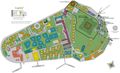 Official jpg map
 -
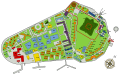 SVG
SVG


Article(s): Governors Island
Request: Perfect candidate to SVGizize. High enough quality to trace. Bad enough JPG encoding to really warrant it being made into SVG. An official map so it should be very accurate. And a worthy part of a very important city. Also the NPS site page is now down so the numbers don't have a corresponding key. They should probably be removed and then a new numbering scheme can be easily added to the SVG if someone finds the old key or wants to make their own. gren グレン 01:00, 25 January 2009 (UTC)
Graphist opinion:
- On it!
Inductiveload (
talk) 21:03, 3 February 2009 (UTC)
- There you go. Looks a bit odd at low res due to Wikimedia rendering not being so hot on the text, but it's fine if you zoom in. I've put a provisional key in the image page, but you'll have to finish that yourself when you can get hold of the proper key. Inductiveload ( talk) 23:47, 3 February 2009 (UTC)
- I can fix the text rendering problems by converting text to paths if you want. [| Retro00064 | ( talk/ contribs) |] 08:11, 16 February 2009 (UTC)
Mostar Flag
Zoo Fari 02:08, 18 February 2009 (UTC)
-
flag
-
 coa
coa -
 SVG Flag


.svg)
![[1]](https://flagspot.net/images/t/tm)coa92.gif)
Article(s): Mostar
Request: Make the flag svg w/o the black border PRODUCER ( talk) 21:37, 17 February 2009 (UTC)
Graphist opinion:
- There you go. −
Inductiveload (
talk) 00:31, 18 February 2009 (UTC)
- I just marked these as copyvios so you might want to upload them locally to en.wiki with a fair use rationale. If they are gone before you get time to move them then PM me an I'll recover them. /
Lokal
_
Profil 23:31, 18 February 2009 (UTC)
- Is it known that all Bosnian coats of arms are fair use? Just because they appear on another website doesn't necessarily mean they are copyvios. −
Inductiveload (
talk) 13:28, 19 February 2009 (UTC)
- Unless you can find a law explicitly making them public domain they are assumed to be copyrighted. As with all other online material. / Lokal _ Profil 16:40, 19 February 2009 (UTC)
- Is it known that all Bosnian coats of arms are fair use? Just because they appear on another website doesn't necessarily mean they are copyvios. −
Inductiveload (
talk) 13:28, 19 February 2009 (UTC)
- I just marked these as copyvios so you might want to upload them locally to en.wiki with a fair use rationale. If they are gone before you get time to move them then PM me an I'll recover them. /
Lokal
_
Profil 23:31, 18 February 2009 (UTC)