
 | This page, part of the
Graphics Lab Wikiproject, is an
archive of requests for 2021. Please do not edit the contents of this page. You can submit new requests here. |

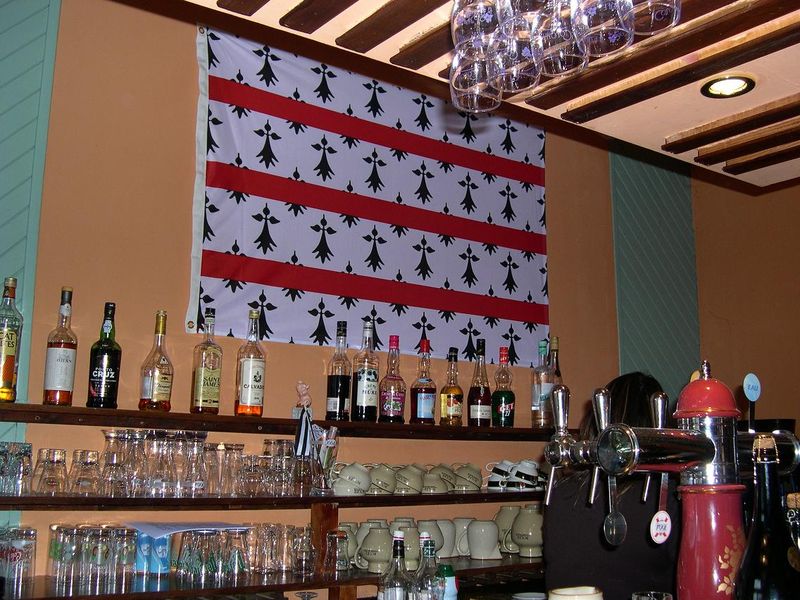
Flag of Rostrenen
{{ resolved}}
Article(s): Rostrenen and List of Breton flags
- Request
- Could someone please create an SVG file of the flag of Rostrenen, as seen here. Thanks. Snow Lion Fenian ( talk) 14:35, 20 October 2021 (UTC)
- Discussion
 Done
HapHaxion (
talk /
contribs) 02:05, 31 October 2021 (UTC)
Done
HapHaxion (
talk /
contribs) 02:05, 31 October 2021 (UTC)
- @ HapHaxion: Great work, thank you. Snow Lion Fenian ( talk) 13:12, 31 October 2021 (UTC)
Flag of the Afghan National Police (Pashto and Dari) (2001-2021).svg
-
 ANP flag (Dari)
_(2001-2021).svg)
- Article(s)
- Flag of Afghanistan
- Request
- Can you make a Pashto version of the flag? Thanks. -- SpinnerLaserzthe2nd ( talk) 18:12, 4 September 2021 (UTC)
- Discussion
@ SpinnerLaserzthe2nd: How do you expect us to know what a "Pashto version" should look like. You have to be much more specific, also the source is of to low quality to be able to work from IMO. --always ping me-- Goran tek-en ( talk) 14:14, 2 October 2021 (UTC)
- I am talking about the Pashto name of the Afghan National Police.
SpinnerLaserzthe2nd (
talk) 17:46, 2 October 2021 (UTC)
- @
SpinnerLaserzthe2nd: I and many others don't speak or read either Dari or Pashto so you would have to write it here and tell exactly what to change. But still the source is of very low quality so it will be very hard. --always ping me--
Goran tek-en (
talk) 18:34, 2 October 2021 (UTC)
- I don't understand...
File:Flag of the Afghan National Police (Pashto and Dari) (2001-2021).svg has text in both Dari and Pashto. --
Soman (
talk) 19:01, 2 October 2021 (UTC)
- @ Soman: I'm sorry but as I wrote above "I and many others don't speak or read either Dari or Pashto" so how do you expect us to know or understand that. Not to talk about editing the texts. --always ping me-- Goran tek-en ( talk) 19:30, 2 October 2021 (UTC)
- I don't understand...
File:Flag of the Afghan National Police (Pashto and Dari) (2001-2021).svg has text in both Dari and Pashto. --
Soman (
talk) 19:01, 2 October 2021 (UTC)
- @
SpinnerLaserzthe2nd: I and many others don't speak or read either Dari or Pashto so you would have to write it here and tell exactly what to change. But still the source is of very low quality so it will be very hard. --always ping me--
Goran tek-en (
talk) 18:34, 2 October 2021 (UTC)
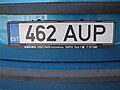
Vehicle registration identifiers


- Request
I would like to request these series of images be corrected and standardised. They currently all share the same dimensions (200px by 440px), but the text is all over the place. There's different typefaces, there's different sizes, some characters aren't properly aligned, some aren't even properly rendering.
Please use a single typeface for all. Fry1989 eh? 17:47, 30 September 2021 (UTC)
- Discussion
- @
Fry1989: Is there any standardizing document from the EU which describes how the plates and text should be formatted?
Auguel (
talk) 21:50, 2 October 2021 (UTC)
- @
Auguel: I have found three documents with some information.
EUR-lex does mention the measurements of the plate overall. The
Government of Ireland and
Government of the United Kingdom are more specific about measurements of the national identifier section, such as the dimensions of the stars and text. I can't find any specific typeface having been specified. Aside from that, the best bet I guess is photos of real registration plates in situ.
Fry1989
eh? 17:38, 3 October 2021 (UTC)
- @ Fry1989: Going to the source may not have the effect you desire. It doesn't seem like anything about the strips is standardized. Neither the font, nor the size. Take a look at these examples.
- @
Auguel: I have found three documents with some information.
EUR-lex does mention the measurements of the plate overall. The
Government of Ireland and
Government of the United Kingdom are more specific about measurements of the national identifier section, such as the dimensions of the stars and text. I can't find any specific typeface having been specified. Aside from that, the best bet I guess is photos of real registration plates in situ.
Fry1989
eh? 17:38, 3 October 2021 (UTC)
-
 Estonia
 -
 Spain
Spain -
 Belgium
 -
 Bulgaria


Notice the difference between the Spanish and Estonian 'E'. Also the Belgium and Bulgarian 'B'. And the Belgium B seems bigger than the rest. Auguel ( talk) 17:41, 4 October 2021 (UTC)
- @
Auguel: There are minor variations between countries, so I admit that using the exact same dimensions and typeface is not completely accurate. My intention however is to try and make them as visually similar as we can, as well as fix the problems with text that is squashed or that isn't aligned or rendering correctly. Using different typefaces is acceptable if we know what typeface is actually being used or have a similar looking typeface available.
Fry1989
eh? 18:22, 4 October 2021 (UTC)
- @
Fry1989: Can you point out which one is not rendering properly? They all look fine to me.
Auguel (
talk) 18:46, 4 October 2021 (UTC)
- @
Auguel: The codes for Bulgaria, Croatia, Greece and Slovakia, do not appear to render correctly, but it may be the choice of typeface. Furthermore, many of them are not aligned. Look at Croatia, Italy, the Netherlands, and Slovenia. If you aren't willing to suport what I am attempting to achieve, let someone else.
Fry1989
eh? 17:08, 5 October 2021 (UTC)
- @ Fry1989: Of course anybody else is free to complete the work, that goes without saying. I actually am in favor of what you are trying to do. Probably we cannot unify the font because it actually does differ between countries (I might try to approximate the real font). Certainly we can fix the centering issue. However I still do not see any rendering issue. Out of curriosity why are you not doing this work yourself? You seem completely capable of doing it based on your past contributions. Auguel ( talk) 18:17, 5 October 2021 (UTC)
- @
Auguel: The codes for Bulgaria, Croatia, Greece and Slovakia, do not appear to render correctly, but it may be the choice of typeface. Furthermore, many of them are not aligned. Look at Croatia, Italy, the Netherlands, and Slovenia. If you aren't willing to suport what I am attempting to achieve, let someone else.
Fry1989
eh? 17:08, 5 October 2021 (UTC)
- @
Fry1989: Can you point out which one is not rendering properly? They all look fine to me.
Auguel (
talk) 18:46, 4 October 2021 (UTC)
Parallelogram labels
- Article(s)
- Equipollence (geometry)#Parallelogram property
- Request
- The four corners of a parallelogram are commonly labeled a, b, c, d as seen in Commons. So far the labeling has been cyclic, rather than the order required at equipollence (geometry)#Parallelogram property. There a quotation from Bertrand Russell is cited which indicates how the labels should appear in an appropriate diagram. -- Rgdboer ( talk) 02:52, 2 November 2021 (UTC)
- Discussion
- That's all well and good, but what exactly are you requesting? If you want a specific illustration to be created or modified then you are going to have to be more specific. Auguel ( talk) 03:19, 2 November 2021 (UTC)
{{ resolved}} An image was found with correct labels for this article.
Vectorization: Emblem of the Office of Insular Affairs
-
 Seal of the Office of Insular Affairs

- Article(s)
- Office of Insular Affairs
- Request
- Would someone be able to vectorize the seal of the United States Office of Insular Affairs? The current version is low-resolution, and I have been unable to find a decent high-quality version elsewhere. -- HapHaxion ( talk / contribs) 19:54, 28 September 2021 (UTC)
- Discussion
@ HapHaxion: Are you sure we can do it, check trademarks part. If it's fine you can ask them for a SVG version or at least a bitmap with higher resolution to work from. --always ping me-- Goran tek-en ( talk) 14:11, 2 October 2021 (UTC)
- @
Goran tek-en: It appears to fall under PD-USGov, although
trademark rules do still apply, so that can be added as a separate tag on the new file page once uploaded. I'm unsure of who to reach out to regarding the logo, however, as there are a
few contact addresses listed on the website that could potentially be contacted.
HapHaxion (
talk /
contribs) 20:50, 6 October 2021 (UTC)
- @ HapHaxion: I'm a graphic worker and as such I don't do research or similar. It's always up to the requester to provide the needed sources, permissions etc. --always ping me-- Goran tek-en ( talk) 22:09, 6 October 2021 (UTC)
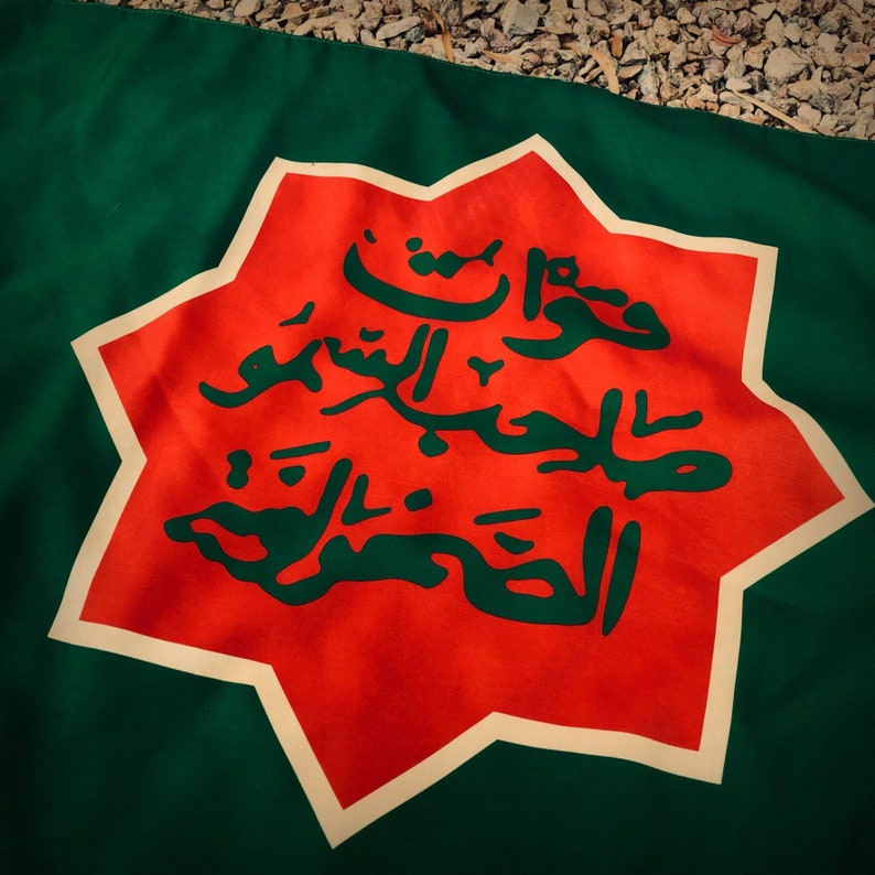
Fictional flag of Hatay
- Article(s)
- Any article this file already features on.
- Request
- Could someone please modify the above file for the fictional flag of Hatay, so that it looks more like the way it should, as seen in this link here. This would involve making the following changes:
- The background should be a different shade of green.
- The white border around the red emblem should be thicker.
- The Arabic text on the emblem should be completely different (and not the shahada as the current file displays), and it should be the same green colour as the background, not gold.
Thanks. Snow Lion Fenian ( talk) 13:26, 13 October 2021 (UTC)
- Discussion
Afghanistan NOC logo
-
 Afghanistan National Olympic Committee logo (raster)
- Article(s)
- Afghanistan National Olympic Committee
- Request
- Would like to see this vectorized. Unfornuately, given recent events, I doubt an official version would come out. Really, there are quite a few images in Category:National Olympic Committee logos that could use vectorization, but this should be a simple job among someone who is knowledgeable. I did try it on my own, but I'm having difficulty on the ratios. For the experimental vector, I used File:Flag of Afghanistan (2004–2013).svg and File:Olympic rings without rims.svg, as well as a font called 'Inter' to simulate Transport (using glyph G.1 to simulate the marked G). -- MSG17 ( talk) 01:35, 13 October 2021 (UTC)
- Discussion
Alliance of Canadian Cinema, Television and Radio Artists logo
-
 ACTRA logo
- Article(s)
- Alliance of Canadian Cinema, Television and Radio Artists
- Request
- This image seems to have a lot of whitespace. Could some of it maybe be removed? Thanks, 207.161.86.162 ( talk) 18:27, 15 October 2021 (UTC)
- Discussion
- Done –
Pbrks (
t •
c) 20:07, 15 October 2021 (UTC)
Leeward Islands Police badge
-
 Royal cypher
 -
 Circlet (text to be changed)
 -
 Crown
Crown

.svg)

- Article(s)
- Leeward Islands Police
- Request
- Could the crest of the Leeward Islands Police ( as seen here) be made using the above base please? The C of E God Save the Queen! ( talk) 10:25, 16 October 2021 (UTC)
- Discussion
Magic: The Gathering rules
-
 Parts of a Magic card
 -
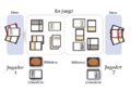 Magic gameplay zones
 -
 Proposed disection of a Magic card


- Article(s)
- Magic: The Gathering rules, Magic: The Gathering
- Request
- During a discussion on improving the Magic rules article (first at AfD, and then continued on its talk page), I found these two images on Wiki Commons which I think would be useful for this article. However, neither is in English, so the images need to be translated with updated English labels. Thanks! -- Sariel Xilo ( talk) 17:11, 18 October 2021 (UTC)
- Discussion
@ Sariel Xilo: Hi please see my proposed illustration above. Feel free to comment on anything you think should be changed. Auguel ( talk) 16:57, 19 October 2021 (UTC)
- @ Auguel: That looks great! User:Piotrus, thoughts? Sariel Xilo ( talk) 17:02, 19 October 2021 (UTC)
- And thank you User:Leitmotiv for tackling the other image! File:MagicareaEnglish.png Sariel Xilo ( talk) 17:17, 19 October 2021 (UTC)
Flag of Dol-de-Bretagne
-
 Arms of Dol-de-Bretagne
.svg)
Article(s): Dol-de-Bretagne, List of Breton flags and Nordic cross flag
- Request
- Will someone please create an SVG file of the flag of Dol-de-Bretagne, as seen here and here, using elements from the town's coat of arms provided above. Thanks. Snow Lion Fenian ( talk) 14:31, 20 October 2021 (UTC)
- Discussion
File:Flag of the FrancoTenois.svg
-
 Flag of the Franco-Ténois

- Article(s)
- Franco-Ténois
- Request
- Please fix the polar bear ( https://www.aquilon.nt.ca/documents/Article/art_00010369.jpg) and the snowflake/fluer-de-lis ( https://encrypted-tbn0.gstatic.com/images?q=tbn:ANd9GcRnbeGBNOFEV8LIERuuxt1mNQ1xMD1gccvUNw&usqp=CAU). Thanks. -- SpinnerLaserzthe2nd ( talk) 00:42, 24 October 2021 (UTC)
- Discussion
Cover art of anime character

- Article(s)
- Hinako (anime character)
- Request
- I would like to have the character extracted from the image, i.e., the heart, the red part, the cover etc all removed so that only Hinako remains on a transparent background. This is then intended as the main image for the article. Also, the resolution/size should be adjusted to conform to WP:NFCC#3b. Toshio Yamaguchi ( talk) 15:08, 21 October 2021 (UTC)
- Discussion
@ Toshio Yamaguchi: This should be posted to the Photography workshop.
- Done
Toshio Yamaguchi (
talk) 12:32, 24 October 2021 (UTC)
Looking for a logo for the ICL page
-
 Exising lofo
 -
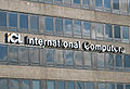 the actual logo on a building
 -
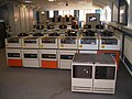 some ICL kit
 -
 SVG
SVG -
 White with hairline


.svg)
- Article(s)
- International Computers Limited
- Request
- I would like to use an image of the ICL logo in the infobox for the International Computers Limited article. There is something similar on the commons already, but it is low quality and adds the word "SERVICES". An SVG of just the ICL would be perfect.
I believe the orange color of the existing image is not correct. It is commonly found today, but I think it was added after the fact when they were purchased. I've included an image of the logo as found on the building, mostly white with a bit of orange "splash", which I also see on the drives (zoom in) so I believe that is the contemporary version. Maury Markowitz ( talk) 14:05, 17 November 2021 (UTC)
- Discussion
- @
Maury Markowitz: Hows this? It was vectorized from
ICL TECHNICAL JOURNAL. Volume 6 Issue 2. –
Pbrks (
t •
c) 18:58, 17 November 2021 (UTC)
- @
Pbrks: Excellent! I'm surprised by the color, but looking about it seems roughly split between white and black versions. If it's not too much trouble, can you do one with a black hairline outline and white fill?
Maury Markowitz (
talk) 19:12, 17 November 2021 (UTC)
- @
Maury Markowitz: Sure thing, how's that? –
Pbrks (
t •
c) 20:28, 17 November 2021 (UTC)
- @ Pbrks: Most excellent sir, thank you! Maury Markowitz ( talk) 22:35, 17 November 2021 (UTC)
- @
Maury Markowitz: Sure thing, how's that? –
Pbrks (
t •
c) 20:28, 17 November 2021 (UTC)
- @
Pbrks: Excellent! I'm surprised by the color, but looking about it seems roughly split between white and black versions. If it's not too much trouble, can you do one with a black hairline outline and white fill?
Maury Markowitz (
talk) 19:12, 17 November 2021 (UTC)
{{ resolved}}
Pre-Worboys Halt at Major Road Ahead sign
- Article(s)
- Worboys Committee
- Request
- Would somebody good with geometry/math/text be willing to recreate the sign seen in this source? Thanks! Gohkenytp723 ( talk) 23:05, 26 October 2021 (UTC)
- Discussion