
 | This page, part of the
Graphics Lab Wikiproject, is an
archive of requests for October 2010. Please do not edit the contents of this page. You can submit new requests here. |
Stale Information
Loktantrik Janata Party, Nepal

Article(s): Loktantrik Janata Party, Nepal
Request: Please redraw as SVG Acather96 ( talk) 20:01, 9 September 2010 (UTC)
Graphist opinion(s):
Wolf Awards
 |
 |
Article(s): Bronze Wolf Award, Silver Wolf Award
Request: vectorize and unify for style, they are very different presently, but they look very similar... Chris (クリス • フィッチ) ( talk) 09:40, 10 September 2010 (UTC)
Graphist opinion(s):
Damascus University
 |
Article(s): Damascus University
Request: vectorize, the png is not as clear or useful, I would use the jpg... Chris (クリス • フィッチ) ( talk) 08:11, 30 August 2010 (UTC)
Graphist opinion(s):
- Please, before one or the other get deleted.--
Chris (クリス • フィッチ) (
talk) 09:26, 3 September 2010 (UTC)
- It would probably be easier for you to upload the images to an external source like imgur (or whatever else you like) that way if they get deleted they're still available to whoever wants to do the conversion. §hep Talk 22:56, 4 September 2010 (UTC)
- The png was deleted, please vectorize the jpg.--
Chris (クリス • フィッチ) (
talk) 06:47, 10 September 2010 (UTC)
- If this logo was designed before 1994 it should be in the public domain in Syria (its home country) and the US. The university was established in 1923, so barring a change of the logo after 1994, it is most probably in the public domain. As for vectorization, I don't think it's possible at this resolution, not mentioning the drawbacks of vectorizing vs procuring the official vector file, as summarized in our advice at the top of the page. I've had a quick look at their website and found nothing. I'll try to do more searching later, but finding something useful seems improbable. -- Orionist ★ talk 04:08, 14 September 2010 (UTC)
USVA headstones

Article(s): United States Department of Veterans Affairs emblems for headstones and markers
Request: vectorize. http://www.cem.va.gov/hm/hmemb.asp may be of use. thanks. Chris (クリス • フィッチ) ( talk) 09:27, 6 September 2010 (UTC)
Note: The government says it also uses symbols for "Lutheran Church Missouri Synod" and "New Apostolic Church", yet these are not reflected in the article. Might want to add them. §hep Talk 04:12, 11 September 2010 (UTC)
- Added "Lutheran Church Missouri Synod", can't find "New Apostolic Church" but it's at http://www.nak.org/en/ -- Chris (クリス • フィッチ) ( talk) 14:06, 11 September 2010 (UTC)
- The Moravian one can probably be made using pieces from commons:Category:Agnus Dei in heraldry.
- The Sufism logo can probably takes pieces from File:Wingedheart.svg.
Graphist opinion(s):
- Yea, though I am most grateful for the fruits of thine labor, yet I am heartily confuseth. Why dost thou upload such images as svg and chance others as jpg, separating the sheep from the goats as the wheat from the chaff? Though perplexed I have faith that in time the answer shall be made known unto me.-- Chris (クリス • フィッチ) ( talk) 15:19, 11 September 2010 (UTC)
- Umm? The jpgs I uploaded were straight from the government. They were better quality than the originals from a few years ago. I uploaded SVGs of the two that I converted to vectors. The jpgs I uploaded were never vectors. Sorry, I'm not exactly sure what you were asking... §hep Talk 00:06, 12 September 2010 (UTC)
- Ah, sorry, I mean I was hoping to get all of these converted to svg, and some you start by first uploading a jpg, so I didn't understand the thought process for uploading two variants. -- Chris (クリス • フィッチ) ( talk) 00:56, 12 September 2010 (UTC)
- I get it, thank you!-- Chris (クリス • フィッチ) ( talk) 13:05, 12 September 2010 (UTC)
I've made some progress on the Seicho-No-Ie symbol, but I can't get the outer spokes to come out right. I went ahead and uploaded my best try, but I'm sure it could be done much better. §hep Talk 18:32, 13 September 2010 (UTC)
- You've traced the jpg almost perfectly, when I overlay them - the "problem" is that the spokes aren't evenly shaped in the jpg, and you've faithfully reproduced that... It's probably good enough, but I might try to redraw that outer path with a more even, repeating shape later, if you like - although a better original would help in deciding what that shape should precisely be. Begoon• talk 06:00, 14 September 2010 (UTC)
- Ok - there's an attempt to even out the spokes a bit. It's not perfect because, aside from having to interpret what shape they are "supposed" to be, I did it with a 32 point star, masked with a couple of circles - however, I then had to manually add bezier curves to all the nodes, so any unevenness left is where I clumsily didn't do all 64 nodes the same. In the end it's debatable whether it's much "better". Begoon• talk 07:52, 14 September 2010 (UTC)
- Comment : on Inkscape, there is a way to select quickly a bunch of nodes in a path. When you are in Path Editing mode (F2), while pressing a key combination like Ctrl+Alt, you can draw a freehand polygon with you mouse. All the nodes contained in the polygon will then be in you selection. And then a Shift+S with make all the nodes in your selection soft Beziers. If your path was regular at the beginning (this is likely, as a boolean operation of regular objects), the soft Beziers will be also. Inkscape is magic ! Arnaud Ramey ( talk) 11:05, 15 September 2010 (UTC)
- I'll look at that next time - if I can also simultaneously adjust the shape of all the selected beziers then that would indeed have been ideal. I confess to a preference for AI just for the interface, and general usability, but I'll happily use Inkscape for some tasks. Begoon• talk 11:19, 15 September 2010 (UTC)
- Seicho-No-Ie is much better, calling it done, close enough for government work. Oh, bad joke...-- Chris (クリス • フィッチ) ( talk) 03:09, 16 September 2010 (UTC)
Ahmadinejad

Article(s): Ahmadinejad
Request: vectorize, thanks. Chris (クリス • フィッチ) ( talk) 18:24, 18 September 2010 (UTC)
Graphist opinion(s):
Sich Riflemen
_flag.jpg)
Article(s): Sich Riflemen
Request: vectorize... Chris (クリス • フィッチ) ( talk) 09:00, 23 September 2010 (UTC)
Graphist opinion(s):
Coat of arms of the Royal Society
Article(s):
Royal Arms of England,
Royal Society
Request: Could the arms of the Royal Society be drawn in SVG format? The best reference image is found here, with an additional one here. The "three lions" could (or perhaps, as Commons' strongest version, should) be derived from File:Royal Arms of England (1340-1367).svg. -- Jza84 | Talk 15:23, 23 September 2010 (UTC)
Graphist opinion(s):
Vito Nikolić
Article(s): Vito Nikolić
Request: straighten and vectorize... Chris (クリス • フィッチ) ( talk) 01:17, 24 September 2010 (UTC)
Graphist opinion(s):
Colorado Springs Sky Sox
Article(s): Colorado Springs Sky Sox
Request: svgify... Chris (クリス • フィッチ) ( talk) 09:00, 27 September 2010 (UTC)
Graphist opinion(s):
Improved reedbeds
-
 Image 1
 -
 Image 2
 -
 Image 3
Article(s): Treatment pond, Reedbed, water purification articles
Request: Is it possible to improve the images as requested at http://en.wikipedia.org/?title=User_talk:KVDP&redirect=no#Reed_beds KVDP ( talk) 08:30, 28 September 2010 (UTC)
Graphist opinion(s):
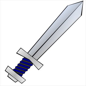
Sword image signifying attack
Article(s): Attack, weapon, ...
Request: Though there are already some sword images, none of them actually show an "action" being undertaken, so they are not usable to signify an attack. A new image needs to be made as an antagonist for this image Image can be made anew based on http://www.biblepicturegallery.com/pictures/GreekA/Greek%20sword%20la.htm and http://4.bp.blogspot.com/_PeIXqvro8rs/SnzipfqIhHI/AAAAAAAAAEA/ogTNEFoOWYk/s400/sword-01.jpg KVDP ( talk) 08:41, 28 September 2010 (UTC)
Graphist opinion(s):
Fitch

Article(s): Fitch (surname)
Request: vectorize... Chris (クリス • フィッチ) ( talk) 04:52, 29 September 2010 (UTC)
Graphist opinion(s):
Hawaiian sovereignty movements
-
 example to follow from Commons

Article(s): Hawaiian sovereignty movement
Request: create flags for Nation of Hawai'i (gold/purple/black) [1] [2], Ka Lahui Hawai Polynesian sovereignty movement (blue) [3] and Hawai'i Ko Aloha (gaggy rainbow) [4], in that order of use... Chris (クリス • フィッチ) ( talk) 08:10, 29 August 2010 (UTC)
Graphist opinion(s):
![]() Request taken by Orionist.
Request taken by Orionist.
The sources for the flag of the Nation of Hawai'i are of very low res. I found these sources: [5], [6] and [7]. They are okay, but if you know of any better source it'd be of great help! I'll do the other two flags first. -- Orionist ★ talk 03:48, 14 September 2010 (UTC)
- I wish I did, sorry.-- Chris (クリス • フィッチ) ( talk) 18:21, 18 September 2010 (UTC)
Coat of arms of the Kingdom of Egypt

.svg)


Article(s): Coat of arms of Egypt
Request: vectorize, inside should be green like the flag, not blue... Chris (クリス • フィッチ) ( talk) 09:33, 20 September 2010 (UTC)
Note: I haven't sorted through commons:Category:SVG coat of arms elements, but it will probably contain some useful elements. Shep Talk 00:46, 21 September 2010 (UTC)
I added more reference files. -- Orionist ★ talk 16:30, 30 September 2010 (UTC)
Graphist opinion(s):
Finity symbol
-
 Horus image

Article(s): Finity
Request: Is it possible to make the symbol for finity. It can be made based on the symbol placed on Horus' hat. See http://en.wikipedia.org/wiki/User_talk:Jeff_Dahl#Finity_symbol KVDP ( talk) 08:26, 28 September 2010 (UTC)
Graphist opinion(s):
Actually "finity" is not a word. You probably mean "finiteness", as an antonym of "infinity". I never knew finiteness had a symbol. Were you referring to the spiral on the crown? The article about the Deshret states that "The end has a curly wire on it, that represents the proboscis of a honey bee." My google search yielded just on useful link, this book, but it considers the circle or sphere as the symbol of finiteness, which makes much more sense than the spiral. If you have any material or links with more details, please post them here, I'd really like to read more about the subject. Yes and so we can help you, please indicate exactly which part of the crown you're referring to. Regards, -- Orionist ★ talk 16:26, 30 September 2010 (UTC)
Hawaii Islanders

Article(s): Hawaii Islanders
Request: vectorize... Chris (クリス • フィッチ) ( talk) 14:03, 1 October 2010 (UTC)
Graphist opinion(s):
NY Height Comparison
-
 NY Height Comparison

Article(s): Chrysler Building, Empire State Building, One World Trade Center
Request: Please vectorize, cheers Fallschirmjäger ✉ 16:22, 1 October 2010 (UTC)
Comments: Vectors: Empire State Building, Chrysler Building Shep Talk 17:42, 2 October 2010 (UTC)
Graphist opinion(s):
Coat of arms of Burma
-

-
 this may help with the forward looking chinthe
.jpg)

Article(s): Coat of arms of Burma
Request: Colorize and vectorize, please, or should I just ask for a black and white lineart svg version? The original coat of arms contained the Burmese text ပြည်ထောင်စုမြန်မာနိုင်ငံတော် on the banner, which translates "Union of Burma", as well as three chinthe (the chinthe at the top was replaced by a star). Additionally, the cogwheel was a circle surrounded by Verse 194 of the Buddhavagga in the Dhammapada in Pali: သမဂ္ဂါနံ တပေါ သုခေါ (samagganam tapo sukho), which translates to "happiness through harmony" or "well-being through unity." Chris (クリス • フィッチ) ( talk) 08:44, 2 October 2010 (UTC)
Graphist opinion(s):
Montenegrin Army
Article(s): Montenegrin Army
Request: vectorize without front doodad... Chris (クリス • フィッチ) ( talk) 03:28, 4 October 2010 (UTC)
Graphist opinion(s):
Resolved Information
Bob cut
.png) |

Article(s): bob cut
Request: create vectorized female face with bob cut, the poster is a good model but the top of her head is cut off... Chris (クリス • フィッチ) ( talk) 14:55, 25 September 2010 (UTC)
Graphist opinion(s):
I'm not sure whether that's an acceptable thing to do. It's a fair use image and part of the rationale is that it's an image of the poster. I'm not totally sure, though, so hopefully someone else would have an opinion. Begoon• talk 17:24, 25 September 2010 (UTC)
- I think the request is to create an image that looks similar, using the given haircut as a base for the work. IMO that would be fine to do. Shep Talk 20:19, 25 September 2010 (UTC)
- Plenty of haircuts on
openclipart, including a
bob cut. Images on openclipart should be public domain, so they are commons-friendly.
gringer (
talk) 03:16, 26 September 2010 (UTC)
- Those (all 3) would be a great start if Commons friendly, but the variant I seek would have straight hair and bangs.-- Chris (クリス • フィッチ) ( talk) 09:18, 26 September 2010 (UTC)
Now please be careful how you answer this
![]() - but is she the kind of thing you are looking for?
Begoon•
talk 11:35, 27 September 2010 (UTC)
- but is she the kind of thing you are looking for?
Begoon•
talk 11:35, 27 September 2010 (UTC)
- Very good! Wow! Um, the nose makes her look menacing and older, could you bob it a bit? Just my two bob.--
Chris (クリス • フィッチ) (
talk) 15:44, 27 September 2010 (UTC)
- Also, neither model is smiling, can you try with pursed lips?-- Chris (クリス • フィッチ) ( talk) 15:46, 27 September 2010 (UTC)
Ok - adjusted face shape, fiddled with the nose, and put a smile on her face... ("pursed" looked rubbish every way I tried) hopefully looks a bit more like "your sister" than "your auntie" now. Begoon• talk 17:55, 27 September 2010 (UTC)
- My sister's a blue-eyed blonde, but that is better, thank you!--
Chris (クリス • フィッチ) (
talk) 17:58, 27 September 2010 (UTC)
- Well, how about that, so is mine - no bob cut, though, although I seem to remember her having one for a short time a long while ago :=) Begoon• talk 19:18, 27 September 2010 (UTC)
- Mine had that weird orphan Annie perm for a while, to her shame 25 years on.-- Chris (クリス • フィッチ) ( talk) 19:47, 27 September 2010 (UTC)
Lutheran Church–Missouri Synod


Article(s): Lutheran Church–Missouri Synod
Request: svgify... Chris (クリス • フィッチ) ( talk) 09:30, 27 September 2010 (UTC)
Graphist opinion(s):
![]() Request taken by Stepshep.
Request taken by Stepshep.
![]() Done
Shep
Talk 20:02, 27 September 2010 (UTC)
Done
Shep
Talk 20:02, 27 September 2010 (UTC)
- Great, thank you!-- Chris (クリス • フィッチ) ( talk) 20:14, 27 September 2010 (UTC)
SEPTA Ridership Graph
-
 Description of image
 -
 Updated svg
.gif)

Article(s): SEPTA Regional Rail
Request: This image needs to be updated to include post-2004 data ( available here). While updating I think it would make sense to turn this graph into an SVG so it would be easier to update in the future and scalable for anyone who needs it. gren グレン 17:08, 25 September 2010 (UTC)
Graphist opinion(s):
SEPTA RRD ridership.svg Begoon• talk 07:37, 29 September 2010 (UTC)
Enlarge legend of SVG pie chart
-
 Pie chart

Article(s): Democratic Party (United States)
Request: Enlarge the legend. It's current illegible at the reasonable size used in the article. Cybercobra (talk) 07:11, 27 September 2010 (UTC)
Graphist opinion(s):
![]() Done seems legible in article now, I think. I'll move it to commons, too.
Begoon•
talk 07:55, 27 September 2010 (UTC)
Done seems legible in article now, I think. I'll move it to commons, too.
Begoon•
talk 07:55, 27 September 2010 (UTC)
WikiProject G.I. Joe

Used in: {{ WikiProject G.I. Joe}}, {{ User WP GIJoe}}
Request: Vectorize. The existing jpg looks pretty horrible in these templates. Please also upload with a proper filename, e.g. File:WikiProject G.I. Joe.svg or something. Thanks in advance! PC78 ( talk) 17:07, 29 September 2010 (UTC)
Graphist opinion(s):
File:WikiProject G.I. Joe.svg Begoon• talk 18:23, 29 September 2010 (UTC)
- Cheers! Do you think you could tweak it a little so that the text is properly centered on the background? PC78 ( talk) 18:31, 29 September 2010 (UTC)
Logo of the Church of England
 |
|

Article(s): Church of England, St James' Church, Stretham plus 9 others
Request: Please convert this logo to a vector format using this style guide as per {{ shouldbesvg}}. The current licence for the image has been challenged (a permanent link is used here; refresh the target page to get any later responses). Consensus is formed that the image licence can be changed to {{ PD-textlogo}} under threshold of originality. The logo has temporarily been withdrawn from the St James' Church, Stretham article, as a licence issue came up in the peer-review. We are awaiting someone with more skill to change the licence Senra ( Talk) 15:51, 27 September 2010 (UTC)
Graphist opinion:
![]() Done: those guidelines were excellent. Nice touch that they also provided an EPS file (although a little odd that the colour versions were only TIF). Because it was PD-textlogo, I've put it on commons.
gringer (
talk) 09:05, 28 September 2010 (UTC)
Done: those guidelines were excellent. Nice touch that they also provided an EPS file (although a little odd that the colour versions were only TIF). Because it was PD-textlogo, I've put it on commons.
gringer (
talk) 09:05, 28 September 2010 (UTC)
- I very much appreciate the fast and fuss free graphics work done here. Thank you. It seems the contested licence was re-contested, so it is no longer {{
PD-textlogo}}. I am not copyright aware enough to know whether or not the vector version can still be used. If it cannot now be used, I am sincerely sorry for making unnecessary work. In future, I will await more input before declaring consensus --
Senra (
Talk) 14:40, 28 September 2010 (UTC)
- I'll still stick with the license I've put there and keep it on commons. I don't think an 'e' with a cross on it is complex enough to meet the threshold of originality. Others are, of course, free to disagree with me. It's about as creative as The ARD logo, which is not original enough under at least German law (and my guess is that it wouldn't hold up in New Zealand either). gringer ( talk) 00:15, 1 October 2010 (UTC)
Santorini
Article(s): Santorini
Request: remove shading and excess blank space... Chris (クリス • フィッチ) ( talk) 09:08, 27 September 2010 (UTC)
Graphist opinion(s):
![]() Request taken by Orionist.
Request taken by Orionist.
![]() Done as requested. --
Orionist ★
talk 16:54, 30 September 2010 (UTC)
Done as requested. --
Orionist ★
talk 16:54, 30 September 2010 (UTC)
- Thank you, sorry for catching this late.-- Chris (クリス • フィッチ) ( talk) 16:48, 2 October 2010 (UTC)
Values

Article(s): Values
Request: remove top caption per WPMOS... Chris (クリス • フィッチ) ( talk) 04:15, 4 October 2010 (UTC)
Graphist opinion(s):
![]() Done
Done
- Thank you so much!-- Chris (クリス • フィッチ) ( talk) 08:35, 4 October 2010 (UTC)
House of Habsburg

Article(s): House of Habsburg
Request: remove top caption per WP:MOS ... Chris (クリス • フィッチ) ( talk) 06:57, 4 October 2010 (UTC)
Graphist opinion(s): ![]() Done: --
Sreejith K (
talk) 12:08, 4 October 2010 (UTC)
Done: --
Sreejith K (
talk) 12:08, 4 October 2010 (UTC)
- Thank you!-- Chris (クリス • フィッチ) ( talk) 16:37, 4 October 2010 (UTC)
Shan United Army flag
-
 The flag of the Mong Tai Army
 -
 SVG
SVG


Article(s): Mong Tai Army
Request: Could you please remove the black border around the star (I used the crooked star from the flag of Tennessee if it means anything) - I am not skilled enough to do that. Thank you for your time and effort in advance.... ArkinAardvark ( talk) 19:57, 8 October 2010 (UTC)
Graphist opinion(s): How's that? I wasn't sure if I should use the mountain layout from the German wiki or your version, so I used the older (German) one. If the version you created is more correct, I can easily change the image to reflect what you created. Shep Talk 21:52, 8 October 2010 (UTC)
Reply: Actually, the layout from the German wiki is more correct, so leave the flag just as it is - all in all, this is an excellent work. -- ArkinAardvark ( talk) 16:24, 9 October 2010 (UTC)
Symantec

Article(s): Symantec
Request: Draw as SVG. Tyw7 ( ☎ Contact me! • Contributions) Changing the world one edit at a time! 18:55, 6 October 2010 (UTC)
- Found a large version that should be easier to work from. Fallschirmjäger ✉ 19:21, 6 October 2010 (UTC)
Graphist opinion(s):
-
 Request taken by gringer.: The font is Symantec Sans Bold, as found on pg 14. of
this document.
gringer (
talk) 03:36, 7 October 2010 (UTC)
Request taken by gringer.: The font is Symantec Sans Bold, as found on pg 14. of
this document.
gringer (
talk) 03:36, 7 October 2010 (UTC)  Done: I find it interesting that the JPEG file (and now this SVG file) seems to use a colour that isn't in their branding guidelines. Perhaps they have updated their colours?
gringer (
talk) 06:12, 7 October 2010 (UTC)
Done: I find it interesting that the JPEG file (and now this SVG file) seems to use a colour that isn't in their branding guidelines. Perhaps they have updated their colours?
gringer (
talk) 06:12, 7 October 2010 (UTC)
- I think they updated their logo: http://www.symantec.com/about/news/release/article.jsp?prid=20101005_01 -- Tyw7 ( ☎ Contact me! • Contributions) Changing the world one edit at a time! 22:54, 7 October 2010 (UTC)
Logo of Republican Party
Article(s): Republican Party (United States)
Request: Vectorize.-- Kkm010 | Talk with me 14:43, 25 September 2010 (UTC)
Graphist opinion(s):
- Heh... here the Republican party have done themselves something of a disservice by not making their logo simple enough to be copyright-free. gringer ( talk) 02:49, 26 September 2010 (UTC)
- hey make this logo to svg.--
Kkm010 |
Talk with me 09:03, 2 October 2010 (UTC)
- find a vector source for this, or convince the GOP to release their logo under a free license, and it might be worth the effort of converting a NFCC logo for wikipedia use. gringer ( talk) 19:44, 2 October 2010 (UTC)
- Can it be done! if possible please do it.--
Kkm010 |
Talk with me 17:43, 7 October 2010 (UTC)
-
File:GOP Logo1.svg.
(There are some problems with this version like stars being too small, curves and the intensity of the drop shadow. Will try to fix later.)-- hydrox ( talk) 00:34, 11 October 2010 (UTC) The drop shadow is really hard to reproduce identically. The current version is probably the best I can do. -- hydrox ( talk) 16:03, 11 October 2010 (UTC)
-
File:GOP Logo1.svg.
ZHP

Article(s): ZHP
Request: remove shading, extra blank space... Chris (クリス • フィッチ) ( talk) 16:34, 9 October 2010 (UTC)
Graphist opinion(s): ![]() Done --
87.15.88.11 (
talk) 21:27, 12 October 2010 (UTC)
Done --
87.15.88.11 (
talk) 21:27, 12 October 2010 (UTC)
- Thank you so much!-- Chris (クリス • フィッチ) ( talk) 14:28, 13 October 2010 (UTC)
Patch
Article(s): Special:WhatLinksHere/File:Soyuz-TMA-01M-Mission-Patch.svg
Request: Vectorize... THENEWMONO 22:34, 11 October 2010 (UTC)
Graphist opinion(s): ![]() Done --
hydrox (
talk) 03:23, 15 October 2010 (UTC)
Done --
hydrox (
talk) 03:23, 15 October 2010 (UTC)
Check sheet
-
 Example Check sheet

Article(s): Check sheet
Request: Crop off blank space Cybercobra (talk) 10:31, 12 October 2010 (UTC)
Graphist opinion(s): ![]() Done Is that okay?
Shep
Talk 22:57, 14 October 2010 (UTC)
Done Is that okay?
Shep
Talk 22:57, 14 October 2010 (UTC)
- Looks fine. Thanks. -- Cybercobra (talk) 01:44, 15 October 2010 (UTC)
Seal of Saint Joseph's University
Request: *Would someone be interested in cleaning up the seal of Saint Joseph's University? There's a watermarked version available at [8] Also, this is going to be non-free, so its gotta be uploaded to Wikipedia. Thanks everyone!-- GrapedApe ( talk) 19:50, 29 September 2010 (UTC)
Comments: The logo is also here without the watermark, but it's also a bitmap. Shep Talk 22:52, 14 October 2010 (UTC)
- Thanks! With that better version, this was an easy one! File:Saint Joseph's University seal.png -- GrapedApe ( talk) 21:30, 15 October 2010 (UTC)
Anika Moa

Article(s): Anika Moa, Running Through the Fire (Storm)
Request: Remove watermark Adabow ( talk · contribs) 04:08, 15 October 2010 (UTC)
Graphist opinion(s):
![]() Request taken by Fallschirmjäger. 15:21, 15 October 2010 (UTC)
Request taken by Fallschirmjäger. 15:21, 15 October 2010 (UTC)
- Done -
Fallschirmjäger
✉ 15:27, 15 October 2010 (UTC)
Vaginal vault vs. Inkscape
-
 File to be edited

Article(s): Vaginal vault
Request: The label in the top right of this image is 'faulty' it basically says "Vaginal vault" but the two words overlap when they are meant to be on subsequent lines. I think this could be because I edited the image in Inkscape. Captain n00dle \ Talk 20:27, 16 October 2010 (UTC)
Graphist opinion(s):
![]() Done I managed to figure it out, I had to save the SVG as a "plain SVG" not an "Inkscape SVG" (
see here) Thanks,
Captain n00dle
\
Talk 10:36, 17 October 2010 (UTC)
Done I managed to figure it out, I had to save the SVG as a "plain SVG" not an "Inkscape SVG" (
see here) Thanks,
Captain n00dle
\
Talk 10:36, 17 October 2010 (UTC)
SVG text rendering
-
 Tiny rendering of text in small thumbnails
 -
 Test
Test


Article(s): Planned for Members of the Dewan Rakyat, 12th Malaysian Parliament
Request: It's not in the article yet due to thumbnail rendering issues with the text, in particular the disproportionate scaling of text size with the image width. An earlier discussion can be found here. I am aware of some text rendering bugs in SVG, but have no idea how to fix it. Hytar ( talk) 19:37, 15 October 2010 (UTC)
Graphist opinion(s): I think that should do the trick. Shep Talk 21:14, 15 October 2010 (UTC)
That's a simple way out, but not what I hoped for. I'm trying to keep the file size down to allow convenient source editing of the file, which also includes the text. Since I nearly rewrite the source from scratch (first time doing this), I think something like the XML namespace or other parameters are not declared, causing the rendering issues.
I know there's a way to retain the <text> tag and making it render correctly, though I'm not saying that your method cannot be used. No hard feelings okay? Hytar ( talk) 12:47, 16 October 2010 (UTC)
- Have you tried running the image through a validator? I'm not sure if this would be helpful to you or not. Sorry I couldn't help, Shep Talk 20:09, 16 October 2010 (UTC)
- Sure, that sort of helped. Still, after consulting this link to add transform matrix, it didn't work out as expected. I wonder whether some references to SVG text bugs here would help. Earlier I ploughed through some SVGs with <text> that thumbnails are rendered correctly, but nothing meaningful turned out from those sources from what I see.
- Also, I wonder why the first version worked while subsequent uploads failed to render properly... Hytar ( talk) 21:39, 16 October 2010 (UTC)
- I changed the Font Family from 'Bitstream Vera Sans' to 'Arial'. Wikimedia's SVG rendering only seems to work properly at all scales with Arial and Times New Roman. The other common text problem (black boxes) is usually solved by removing flowed text.
gringer (
talk) 11:35, 18 October 2010 (UTC)
- Thank you both for your help. I figured out why and fixed the image. Apparently the bug appears when multiple <tspan> tags are placed within the <text> tag. If there's one <tspan> or none at all, the thumbnail renders nicely. I'd appreciate it if someone can help me file this bug.
Hytar (
talk) 12:13, 18 October 2010 (UTC)
- I don't do a lot at bugzilla, but I believe that adding your issue to Bug 3769 is probably what should be done. It seems there are a lot of listed bugs with SVG text rendering, so you might just want to start your own ticket. But I would do one or the other and not both...either add a comment onto Bug 3769 or create your own ticket. Shep Talk 21:14, 18 October 2010 (UTC)
- Thank you both for your help. I figured out why and fixed the image. Apparently the bug appears when multiple <tspan> tags are placed within the <text> tag. If there's one <tspan> or none at all, the thumbnail renders nicely. I'd appreciate it if someone can help me file this bug.
Hytar (
talk) 12:13, 18 October 2010 (UTC)
- The rsvg text rendering bugs have been a constant source of nuisance for many and for long. I remember there was even a discussion about using the Wikimedia money to hire a programmer to try and fix these issues. The vanilla solution is of course to convert the texts to paths, which is not really a solution when you want full i18n. -- hydrox ( talk) 00:32, 19 October 2010 (UTC)
GEOS
| Nova | GEOS | Partial Nova Vector |
|---|---|---|
 |
Article(s): Nova (eikaiwa), GEOS (eikaiwa)
Request: please vectorize... Chris (クリス • フィッチ) ( talk) 04:20, 29 September 2010 (UTC)
Graphist opinion(s): I've done some searching, but neither of the companies exist any more and most of their sites are deadlinks. Shep Talk 04:24, 3 October 2010 (UTC)
- Not true, I work for them, they've just been subsumed by a corporate raider. Not a COI request, just saying they still exist.-- Chris (クリス • フィッチ) ( talk) 12:05, 3 October 2010 (UTC)
- Aforementioned corporate raider is
G.Communication. What are you searching for?--
Chris (クリス • フィッチ) (
talk) 17:09, 3 October 2010 (UTC)
- ( edit conflict)And I guess I should clarify a bit. I found part of the nova logo, but it's just the letters (NOVA) and doesn't have the flower so I didn't upload it. I can't find anything current about GEOS that is active, every link I find is always dead. IE [9]. I've found the older logo [10] in multiple places but no trace of the new one. Do you know what GEOS's current website is? I'll continue to look. Shep Talk 17:12, 3 October 2010 (UTC)
- I'm looking for an official source for the logo. Since they're NFC I prefer to use an image directly from the source and not a derivative. Shep Talk 17:12, 3 October 2010 (UTC)
- Geos changed a couple of weeks ago, this came from an e-mail attachment. Based on their clarity, neither appears a derivative.-- Chris (クリス • フィッチ) ( talk) 18:04, 3 October 2010 (UTC)
- I don't, unfortunately.-- Chris (クリス • フィッチ) ( talk) 23:30, 3 October 2010 (UTC)
- I believe both variants are still used, the flower one is better.-- Chris (クリス • フィッチ) ( talk) 02:44, 4 October 2010 (UTC)
- If anyone has an interest in trying to find the flower to add to the nova logo, I've added what I've been able to find above. Shep Talk 23:44, 4 October 2010 (UTC)
Dirección de Inteligencia Nacional


Article(s): Dirección de Inteligencia Nacional
Request: trim to disc and straighten... Chris (クリス • フィッチ) ( talk) 08:38, 18 October 2010 (UTC)
Graphist opinion(s):
![]() Done: I've uploaded it as a new PNG file so that it could have a transparent background. I also left a black border around the oval so that its shape is still distinguishable on a white backdrop.
Fallschirmjäger
✉ 20:44, 18 October 2010 (UTC)
Done: I've uploaded it as a new PNG file so that it could have a transparent background. I also left a black border around the oval so that its shape is still distinguishable on a white backdrop.
Fallschirmjäger
✉ 20:44, 18 October 2010 (UTC)
- That's great, thank you!-- Chris (クリス • フィッチ) ( talk) 17:00, 20 October 2010 (UTC)
Bordeaux Tramway
-
 Line B (with extension)
 -
 Complete map (without extension)


Article(s): Bordeaux tramway
Request: Can someone take the northward extension from the Line B image and add it to the SVG of the full system map. Thank you!... gren グレン 02:43, 20 October 2010 (UTC)
Graphist opinion(s): ![]() Done --
hydrox (
talk) 13:39, 20 October 2010 (UTC)
Done --
hydrox (
talk) 13:39, 20 October 2010 (UTC)
Signature
Article(s): Alexander William Doniphan
Request: Can someone remove the white background from this svg? Thanks in advance. PC78 ( talk) 21:16, 21 October 2010 (UTC)
Graphist opinion(s): ![]() Done --
hydrox (
talk) 22:28, 21 October 2010 (UTC)
Done --
hydrox (
talk) 22:28, 21 October 2010 (UTC)
Pedro Álvares Cabral routes
-
 Map showing routes; note quality of route lines
 -
 Would like lines to look like this


Article(s): Pedro Álvares Cabral
Request: Vectorize the first image so the route lines look like those in the second image. Andy Walsh (talk) 19:41, 21 October 2010 (UTC)
Graphist opinion(s):
![]() Done
Done
- A redrawn version is at
File:Cabral voyage 1500.svg. Less of the world is shown, and I refined the courses a bit with reference to the article and other maps.
Odysseus1479 (
talk) 09:15, 22 October 2010 (UTC)
- Thank you so much—that looks terrific. -- Andy Walsh (talk) 15:20, 22 October 2010 (UTC)
Church floor plan for St John the Baptist Church, Inglesham
Article(s): St John the Baptist Church, Inglesham
Request: I'm not sure if this is the right place to request & I don't currently have any images to put above. Yesterday I started this article about this really interesting church. This paper from 1931 includes a plan (page 193) but I'm not sure about the copyright status & it has obviously been scanned/copied etc before being made available on the web. I intend to put the article up for DYK soon, but would hope to take it to GA later and it is at that stage I suspect I will be asked for a floor plan showing the nave, chancel and aisles. Any help appreciated (or tell me a better place to put this request).— Rod talk 10:50, 10 October 2010 (UTC)
Graphist opinion: I believe the map would fall under {{ PD-UK}}, but not {{ PD-US}} so it would be non-free. You'll probably get a more informed answer at WP:MCQ. If it turns out the image is now PD or you can find an older source, someone here can help with extracting the image if you need it. Shep Talk 21:51, 17 October 2010 (UTC)
Moon masses
-
 Pie chart comparing masses of all natural satellites within the Solar System.

Article(s): Natural satellite
Request: Requesting that this image be converted to SVG. When converting, replace "Luna" wording with "Moon", as Luna is not Earth's satellite's official name. SchuminWeb ( Talk) 23:16, 16 October 2010 (UTC)
Graphist opinion(s): Do you have the numbers that were used to create the graph? If you can get your hands on them, it's as simple as filling out a form here to get a vector. Shep Talk 23:21, 16 October 2010 (UTC)
- I unfotunately do not have the numbers behind this graph, however, thank you for the link, which I will use in the future. SchuminWeb ( Talk) 04:01, 17 October 2010 (UTC)
- If I remember correctly, I simply used the masses in our articles. The currently listed masses may have been updated slightly (esp. for Saturn's), but I doubt enough to make any significant difference. — kwami ( talk) 00:47, 20 October 2010 (UTC)
My Sky HDi logo
Article(s): SKY Network Television
Request: Could someone please locate an svg version of this logo. WWE Socks 04:53, 19 October 2010 (UTC)
Graphist opinion(s): Am not on a computer that has InkScape, but a vector is here. Shep Talk 18:31, 23 October 2010 (UTC)
- Done: Nice and clean :) —now at
File:My Sky HDi logo.svg. (Hope I got the non-free-use bumf right.)
Odysseus1479 (
talk) 04:02, 24 October 2010 (UTC)
- I just received notice that the image will be deleted as orphaned, on 2 November. Use it, please, or lose it! — Odysseus1479 ( talk) 07:27, 26 October 2010 (UTC)
Union of Burma Boy Scouts


.svg)
Article(s): Union of Burma Boy Scouts
Request: harmonize colors with national flag... Chris (クリス • フィッチ) ( talk) 14:43, 24 October 2010 (UTC)
Comment: Can you provide sources they have actually changed? -- hydrox ( talk) 00:54, 25 October 2010 (UTC)
- There was no "change", the Scout artwork was done by different artists at different times, the badges are 1950s-era, based on the 1940s-era flag that the new flag is based on. Nothing changed, all three are based on the same 1940s source.-- Chris (クリス • フィッチ) ( talk) 09:44, 25 October 2010 (UTC)
Graphist opinion(s): ![]() Done Is that what you meant?
Shep
Talk 20:51, 25 October 2010 (UTC)
Done Is that what you meant?
Shep
Talk 20:51, 25 October 2010 (UTC)
- That's it, thank you so much!-- Chris (クリス • フィッチ) ( talk) 23:53, 25 October 2010 (UTC)
San Francisco population chart
-
 San Francisco population chart
 -

 Working


Article(s): San Francisco
Request: Remove distracting+unnecessary gradient. Cybercobra (talk) 00:30, 24 October 2010 (UTC)
Graphist opinion(s):
I ran the numbers through a graph generator and came up with the above. I wasn't sure if I should add the text bubble and brown color, but if someone wants to add them feel free. Shep Talk 23:52, 24 October 2010 (UTC)
- I changed the font to Arial so that it would scale better for smaller image sizes on wikimedia pages.
gringer (
talk) 03:25, 25 October 2010 (UTC)
- Thanks graphists! -- Cybercobra (talk) 21:04, 27 October 2010 (UTC)
Veena
-
 Extracted raster graphic, converted background to alpha channel

Article(s): Veena
Request: Please remove the background and make it transparent... Sreejith K ( talk) 10:01, 26 October 2010 (UTC)
Graphist opinion:
- Great picture, but not quite an illustration because you've just embedded a JPEG image (raster graphic) into an SVG file. The embedding process does not magically turn a blocky picture into a vector graphic. I'll extract the image and have a go at removing the background. gringer ( talk) 12:09, 26 October 2010 (UTC)
- Done saved as PNG because that can handle transparency. If you have an original image without JPEG artefacts, I could probably do a better job. I had to compromise a bit and ended up removing the strings that were in the air.
gringer (
talk) 12:30, 26 October 2010 (UTC)
- I will delete this SVG image and upload the jpg original. Before that I will have to remove all references for the image. Can this section be deleted? -- Sreejith K ( talk) 09:47, 27 October 2010 (UTC)
Correction needed in illustration
-
 Endocrine glands and hormones

.svg)
![[6]](http://www.hawaii-nation.org/puuflaglg.gif)
&doctype=Inline&group=0&user-agent=W3C_Validator/1.1)
Article(s): Endocrine system
Request:
- In this beautiful illustration by LadyofHats, one word must be removed. (LadyofHats has been inactive for over a month and my request on her Talk page has gone unanswered for over a week.) The Pineal Gland secretes the hormone Melatonin and that is all. There is a sort of a cult, followers of Dr. Rick Strassman, which claims that the necessary ingredients for the synthesis of dimethyltryptamine (DMT) are found in the pineal and therefore DMT is made there. (Strassman refers to the molecule as "The God Molecule".) As the DMT article makes plain, this is speculation. Please remove the word "Dimethyltryptamine" from the illustration.
- The title of this illustration is strange; it appears that the central nervous system is involved. If possible, I'd prefer to see it named "Endocrine glands and hormones" (or more properly, "Endocrine glands and hormones in head+neck", but that's a bit long...). Thank you, Hordaland ( talk) 10:17, 29 October 2010 (UTC)
Graphist opinion(s): I removed DMT, but I can't change names Richardprins ( talk) 19:53, 29 October 2010 (UTC)
Thank you It looks wonderful now. Still wrong in the article, but I imagine it takes a while to catch up... Hordaland ( talk) 20:09, 29 October 2010 (UTC)