| This page is an archive. Do not edit the contents of this page. Please direct any additional comments to the current main page. |

Basin and Range
{{ resolved}}


- Article(s)
- Basin and Range
- Request
- *cough*cough* Wikified version, *cough* please… -- Kintetsubuffalo ( talk) 05:15, 25 September 2018 (UTC)
- Graphist opinion(s)
-
 Request taken. --
AntiCompositeNumber (
talk) 23:15, 28 September 2018 (UTC)
Request taken. --
AntiCompositeNumber (
talk) 23:15, 28 September 2018 (UTC)
- @
Kintetsubuffalo: I've got the shaded area done, do you want the points of interest included or left out? --
AntiCompositeNumber (
talk) 15:48, 30 September 2018 (UTC)
- Included please, and thank you for taking this!--
Kintetsubuffalo (
talk) 17:14, 30 September 2018 (UTC)
- @
Kintetsubuffalo:
 Done: I removed the Rio Grande Rift label because of the note on the file page, but everything else is there. It seems like quite the busy map, so if you'd like things removed/changed/moved around let me know. --
AntiCompositeNumber (
talk) 00:06, 2 October 2018 (UTC)
Done: I removed the Rio Grande Rift label because of the note on the file page, but everything else is there. It seems like quite the busy map, so if you'd like things removed/changed/moved around let me know. --
AntiCompositeNumber (
talk) 00:06, 2 October 2018 (UTC)
- @
Kintetsubuffalo:
- Included please, and thank you for taking this!--
Kintetsubuffalo (
talk) 17:14, 30 September 2018 (UTC)
- @
Kintetsubuffalo: I've got the shaded area done, do you want the points of interest included or left out? --
AntiCompositeNumber (
talk) 15:48, 30 September 2018 (UTC)
- That's fantastic, thank you so much!-- Kintetsubuffalo ( talk) 01:26, 2 October 2018 (UTC)
Independence from Britain


- Article(s)
- List of countries that have gained independence from the United Kingdom
- Request
- Okay, I've noticed a few inaccuracies with the above-left map that should probably be fixed:
1) The flag of the Dominican Republic is incorrectly shown for Dominica (above-centre), a completely different country.
2) Saint Vincent and the Grenadines gained independence in 1979, not 1931.
3) There's no arrow linking the flag of Myanmar to its respective country.
4) The flag of Malta is wrongly shown to be linked to the Balearic Islands, not at Malta itself.
5) Nauru gained independence in 1968, not 1957.
6) The Maldives gained independence in 1965, not 1982.
7) The flags of Tonga and Tuvalu are actually shown pointing to Fiji, and the flag of Fiji itself is linked to Vanuatu (the actual locations of said countries are provided on the above-right map).
8) Papua New Guinea gained independence from Australia in 1975, not Britain, hence it should be removed from the map (otherwise you'd have to include all other countries that gained independence from former British holdings, such as Namibia, Bangladesh, South Sudan, etc.).
Thanks. Snow Lion Fenian ( talk) 15:46, 2 September 2018 (UTC)
- Graphist opinion(s)
Commonwealth Games Participants and Hosts Map

- Article(s)
- Commonwealth Games
- Request
- Alright, with the recent conclusion of the 2018 Commonwealth Games, the above map could do with a few changes:
1) Gambia rejoined the CoN in March 2018 and participated in this year's Games, hence it should be changed back to red.
2) The city of Birmingham, England, is set to host the next Games in 2022, and thus should be marked as such.
3) Given that the city of Durban, South Africa, is no longer scheduled to host the 2022 Games, the marker for the city should be removed from the map, and South Africa itself changed from purple back to red, as it no longer qualifies as a country that has hosted or plans to host the Games (after all, Montreal and Cardiff were scheduled to host the cancelled 1942 and 1946 Games respectively, and yet neither are marked as such, hence Durban shouldn't be either).
Thanks. Snow Lion Fenian ( talk) 15:49, 2 September 2018 (UTC)
- Graphist opinion(s)
ISIS Map Request
-
 Brief overview world map of ISIS, not focus on their influenced territories

- Article(s)
- Islamic State of Iraq and the Levant
- Request
- In Talk:Islamic_State_of_Iraq_and_the_Levant/Archive_41#Territorial_control_map, some editors suggested replacing the article infobox territorial control map with a map for all ISIS-related insurgencies, historical and current, in order to better reflect the subject because of the decreasing area of control they have on Iraq and Syria. AS it doesn't seems like such map exists in the article so I would like to request for creation of such a map. -- C933103 ( talk) 16:50, 5 September 2018 (UTC)
- Graphist opinion(s)
Future plan for PRD area metro/rail route map Request
-
 Hong Kong plan
 -
 Shenzhen plan
 -
 Dongguan plan
 -
 Guangzhou plan
 -
 Foshan plan
 -
Zhongshan plan
-
Zhuhai plan
-
 Macau plan
 -
Pearl River Delta Metropolitan Region intercity railway plan
-
China National Railway future route plan at PRD area
-
 Map of Pearl River Delta


- Article(s)
- Pearl River Delta
- Request
- It would be nice if all these metro and rail plan maps can be put together to be read on same map. -- C933103 ( talk) 17:18, 5 September 2018 (UTC)
- Graphist opinion(s)
Regions of Chile, minor fix.
Capitalize the Roman numeral x ---> X to match the others. 108.160.124.180 ( talk) 20:34, 6 September 2018 (UTC)
- Done. (Irrelevant whinge - why do people create SVG files that use a 200-character long path to draw one letter, when they could use SVG's text facility?)
Maproom (
talk) 22:18, 6 September 2018 (UTC)
2018 Kabul attacks
Can anyone help with adding maps to September 2018 Kabul attacks and August 2018 Kabul suicide bombing, please? -- Mhhossein talk 07:48, 7 September 2018 (UTC)
Border-spanning map for volcanism
-
 Satellite photo of the area, meridians 12 degrees off vertical (field grid is aligned to compass)
 -
 Drainage map of the basin
 -
OSM map OSM map linked from article, with overlaid points.


- Article(s)
- Salton Buttes
- Request
- The geothermal field covered in this article straddles an international border, but political boundaries are pretty irrelevant to volcanoes. The political-boundary-based maps are therefore really awkwardly cropped for showing the article subject.
- The article mentions the southern shore of the Salton Sea, and the Colorado river delta, and the river's (quondam) outflow into the Gulf of California, in Mexico. An equirectangular Mercator projection map/satellite mosaic showing that area would be really useful.
- It would also be useful to have larger-scale map locator map giving the location relative to the political borders, the locations of large nearby population centers, and even the San Andreas Fault, if possible. HLHJ ( talk) 01:40, 18 September 2018 (UTC)
- Graphist opinion(s)
- Done, see
Salton Buttes. Review from someone with experience would be welcome.
HLHJ (
talk) 16:28, 23 September 2018 (UTC)
US Time Zone Map
-
 Current Map
 -
 Time zones in Indiana when the map was drawn
 -
 Time zones in Indiana since 2007
 -
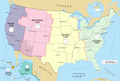


- Article(s)
- Time in the United States
- Request
- Somewhat surprisingly, this article has no current time zone map of the United States and there doesn't appear to be a suitable map on Commons. The PD map above is correct to March 2007, but since then Pulaski, Knox, Daviess, Martin, Pike, and Dubois counties in Indiana have switched from Central time to Eastern time, see Time in Indiana and the above two maps of Indiana. Would it be possible to create one please?
- Given recent discussions in other states would be useful if the new map were more easily adjustable so that it could be changed or forked as needed. -- Kahastok talk 17:44, 7 September 2018 (UTC)
- Graphist opinion(s)
![]() Done, see gallery above.
Maproom (
talk) 17:24, 25 September 2018 (UTC)
Done, see gallery above.
Maproom (
talk) 17:24, 25 September 2018 (UTC)
Updating map

I wonder if this map depicting statistics on Percent of women in the workforce among all women aged 20–64 years in the European Union in 2011, could be updated with the newest data from 2017 [1]; or if not, if a new map could be created to replace it using these new statistics. That's quite important, because for some of these countries the data has changed significantly from 2011 to 2017.
The source for the data is here [2] (you can select from the sex code: "female" , or "male", or "total" - this map is for female (and it is used in the articles Women in the workforce and Housewife). 2A02:2F01:5DFF:FFFF:0:0:6465:4B2A ( talk) 18:12, 5 September 2018 (UTC)
References
- ^ Lena Bernhardtz. "Ekonomiskt oberoende– långt kvar för EU:s kvinnor" (PDF). Välfärd, by Statistics Sweden. February 2013
Age of consent in South Korea

- Article(s)
- Age of consent
- Request
- The colour used for South Korea does not match what is cited here - Ages of consent in Asia#South Korea
- Graphist opinion(s)
{{ resolved}}