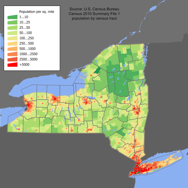
This article was taken from user User:JimIrwin. See : User:JimIrwin/Lineage of population maps.
How were the population maps created?
Data Sources
- County and census tract boundaries were obtained from the 2010 TIGER/LineTM files from the U. S. Census Bureau.
- Census tract population statistics were obtained from the U. S. Census Bureau Census 2010 Summary File 1.
- Shoreline boundaries were obtained from the National Transportation Atlas Database (NTAD) 2005 from the U. S. Bureau of Transportation Statistics.
- Water bodies with areas larger than 10 sq km were imported from the National Hydrography Dataset.
Processing
- The NTAD county boundary file was imported into a GIS software package from Manifold Systems.
- The TIGER/Line spatial data was imported into the GIS package.
- The GIS software was used to create a spatial union of all tract polygons to obtain a tract outline.
- The GIS software was used to create a spatial union of all county polygons to obtain a county outline.
- A custom Perl program was used to extract the 100% population count for each census tract, as well as the land area of the tract. The program computed the population density per square mile. The population was obtained from the summary level 140 POP100 field of the geographic header record in the Summary File 1. The land area was obtained from the summary level 140 AREALAND field of the geographic header record.
- The GIS software was used to create a layered map with each census tract colored thematically by the population density.
- The map image was exported to PNG format, cropped, and reduced to a 256 color palette.
