
Size of this PNG preview of this SVG file:
493 × 599 pixels. Other resolutions:
197 × 240 pixels |
395 × 480 pixels |
632 × 768 pixels |
843 × 1,024 pixels |
1,685 × 2,048 pixels |
2,474 × 3,006 pixels.
Original file (SVG file, nominally 2,474 × 3,006 pixels, file size: 776 KB)
| This is a file from the
Wikimedia Commons. Information from its
description page there is shown below. Commons is a freely licensed media file repository. You can help. |
==Summary==
| Description |
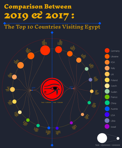
English: This diagram provides a comparison of the top 10 countries with the highest number of tourists visiting Egypt. The data includes rankings, proportions, and the number of tourists for each country. The left side of the diagram represents data from the year 2019, while the right side represents data from 2017.
In this visualization, each country is represented by a unique color, making it easy to distinguish between them. The size of each segment corresponds to the number of tourists from that particular country. This diagram offers valuable insights into the changing tourism trends to Egypt over the span of two years, highlighting shifts in the ranking and proportion of tourists from different countries. It serves as a visual aid for understanding the dynamics of tourism to Egypt and the evolving preferences of international travelers. Data source: https://www.kaggle.com/datasets/marcatef/top-10-nationalities-to-egypt-in-2019?resource=download and https://www.kaggle.com/datasets/marcatef/top-10-nationalities-to-egypt-in-2017 |
| Date | |
| Source | Own work |
| Author | WuchenghaiSAMA |
Licensing
I, the copyright holder of this work, hereby publish it under the following license:
This file is licensed under the
Creative Commons
Attribution-Share Alike 4.0 International license.
- You are free:
- to share – to copy, distribute and transmit the work
- to remix – to adapt the work
- Under the following conditions:
- attribution – You must give appropriate credit, provide a link to the license, and indicate if changes were made. You may do so in any reasonable manner, but not in any way that suggests the licensor endorses you or your use.
- share alike – If you remix, transform, or build upon the material, you must distribute your contributions under the same or compatible license as the original.
File history
Click on a date/time to view the file as it appeared at that time.
| Date/Time | Thumbnail | Dimensions | User | Comment | |
|---|---|---|---|---|---|
| current | 10:00, 2 October 2023 |
| 2,474 × 3,006 (776 KB) | WuchenghaiSAMA | Fixed an error |
| 09:59, 2 October 2023 |
 | 2,474 × 3,006 (771 KB) | WuchenghaiSAMA | Added color and size descriptions and made adjustments to some details. | |
| 12:47, 29 September 2023 |
 | 2,112 × 3,006 (715 KB) | WuchenghaiSAMA | Uploaded own work with UploadWizard |
File usage
The following pages on the English Wikipedia use this file (pages on other projects are not listed):