 | |
| Category | Serif; display type |
|---|---|
| Designer(s) | Oswald Bruce Cooper; Ruben Tarumian ( Armenian, as ArTarumianErevan) |
| Foundry | Barnhart Brothers & Spindler |
| Date released | 1922; 1995 ( Armenian [ArTarumianErevan]) |
| Re-issuing foundries | American Type Founders, Wordshape |

Cooper Black is an ultra-bold serif typeface intended for display use that was designed by Oswald Bruce Cooper and released by the Barnhart Brothers & Spindler type foundry in 1922. [1] The typeface was drawn as an extra-bold weight of Cooper's "Cooper Old Style" family. It rapidly became a standard typeface and was licensed by American Type Founders and also copied by many other manufacturers of printing systems. [2] [3] [4]
Its use in pop culture increased worldwide since 1966, when The Beach Boys used it for the cover artwork of their album Pet Sounds. It was then featured in the Doors’ L.A. Woman (1971) and David Bowie’s Ziggy Stardust (1972), and in the opening credits of The Bob Newhart Show, Dad's Army, Diff'rent Strokes, Garfield, M*A*S*H, Enos, The New Adventures of Winnie the Pooh, Everybody Hates Chris and other shows. The font is used for the Disney Sing-Along Songs from the intro. [5] [6] As a result, Cooper Black has become emblematic of late-1960s/early-1970s style. [5] It is also known in railroading for its association with the Atchison, Topeka and Santa Fe Railway "Yellowbonnet" paint scheme, also dating to the early 1960s, which had "Santa Fe" in large yellow letters on locomotive sides.
Cooper Black followed on from Cooper's career as a lettering artist in Chicago and the Midwest of America in the 1920s. [3] [7] [8] Cooper Black was advertised as being "for far-sighted printers with near-sighted customers", as well as "the Black Menace" by detractors. [9] While very bold, Cooper Black is based on traditional "old-style" serif lettering, rather than the hard-edged "fat face" fonts popular in the nineteenth century, giving it a soft, 'muddy' appearance, with relatively low contrast between thick and thin strokes. [6] [10] [11] [12]
Cooper Hilite
Cooper Hilite is a version of Cooper Black originally designed by painting white relief impressions into a printed proof of Cooper Black. [3] It has been digitized by ParaType and Wordshape. [13]
Imitations and variants
Cooper Black was immediately popular and spawned imitations, including Goudy Heavy Face from Frederic Goudy, Ludlow Black and Pabst Extra Bold. [14] [15] Cooper Black remains popular: the editors of the typography discussion website Fonts in Use report more submissions of its use than any other face that is not a sans-serif, although outnumbered by Times New Roman once its many variants are added up. [16]
Many unusual versions of Cooper were created in the phototypesetting period of the 1960s and 1970s, a period of explosion in the production of display faces. These included "Ziptop Cooper Black" from Photo Lettering Inc., a version with the top bolder than the bottom, and other distorted variants. [17]
Many digitisations of Cooper Black exist from companies including Bitstream, Adobe and others. [12] Soap, designed by Ray Larabie of Typodermic, is a uni-case variant. [18] A version from URW, which does not include an italic, is bundled with many Microsoft products. [19] Cooper Old Style has been digitised by URW. [20]
Miles Newlyn designed the New Kansas typeface, based on the Cooper Black typeface. [21]
Gallery
-
 A specimen sheet of Cooper Hilite.
 -
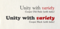 Cooper Black compared to Cooper's earlier Cooper Old Style. This was a quirky variation on the old-style serif model, similar to Cooper's lettering and predominantly intended for display and advertising use.
 -
 Goudy Heavy, a metal-type competitor commissioned by Monotype from Cooper's former lettering teacher, Frederic Goudy.
.jpg)


See also
References
- ^ "Cooper Black". Fonts in Use. Retrieved 12 September 2017.
- ^ Neil Macmillan (2006). An A–Z of Type Designers. Yale University Press. p. 69. ISBN 0-300-11151-7.
- ^ a b c Heller, Steven. "Telling and selling". Eye. Retrieved 12 September 2017.
- ^ Eisinger, Dale. "The Complete History of the Cooper Black Font in Hip-Hop". Complex. Retrieved 12 September 2017.
- ^ a b Lewis, Amanda Cooper Black: The Story Behind Louie's Typeface, laweekly.com, August 6, 2012 quote: "didn't truly hit the world over the head until it graced the cover of the Beach Boys' classic 1966 album, Pet Sounds. For the next decade Cooper Black slowly asserted pop culture supremacy, making notable appearances on The Bob Newhart Show, The Odd Couple, 1976's remake of King Kong, The Sting, The Doors' L.A. Woman, “Garfield,” Tootsie Rolls, National Lampoon magazine, David Bowie's Ziggy Stardust, M*A*S*H and Diff'rent Strokes, along with less notable appearances on an unbelievable number of signs, packages, labels, T-shirts and advertisements. (..) has become shorthand for late-'60s/early-'70s nostalgia, as in The Black Keys' “Brothers” or Wet Hot American Summer"
- ^ a b Bramley, Ellie Violet (10 April 2017). "Just my type: how Cooper Black became 2017's most fashionable font". The Guardian. Retrieved 12 September 2017.
- ^ Shinn, Nick. "The Golden Age of Hand Lettering in American Advertising". Type Culture. Retrieved 1 April 2017.
- ^ Middleton, R. Hunter (1937). Chicago Letter Founding. Chicago: Black Cat Press. pp. 22–23. Retrieved 9 July 2017.
- ^ Steven Heller (6 May 2014). Design Literacy: Understanding Graphic Design. Allworth Press. pp. 217–19. ISBN 978-1-62153-413-6.
- ^ Phinney, Thomas. "Fat faces". Graphic Design and Publishing Centre. Archived from the original on 9 October 2015. Retrieved 10 August 2015.
- ^ Kennard, Jennifer (3 January 2014). "The Story of Our Friend, the Fat Face". Fonts in Use. Retrieved 11 August 2015.
- ^ a b Heck, Bethany. "Cooper". Font Review Journal. Retrieved 12 September 2017.
- ^ "Cooper Hilite". Fonts in Use. Retrieved 12 September 2017.
- ^ Tracy, Walter. Letters of Credit. pp. 130–1.
- ^ "Font Family Page".
- ^ @fontsinuse (March 5, 2018). "Congrats, Cooper Black! 💯 First non-sans to reach one hundred documented Uses" ( Tweet) – via Twitter.
- ^ Coles, Stephen. "Ziptop Cooper Black". Fonts in Use. Retrieved 12 September 2017.
- ^ "Typodermic Fonts . . . This page has moved".
- ^ "Cooper Black". Microsoft. Retrieved 12 September 2017.
- ^ "Cooper Old Style". MyFonts. URW. Retrieved 18 November 2017.
- ^ "New Kansas". Miles Newlyn. Retrieved 23 December 2020.
Further reading
- Allan Haley. Typographic Milestones. John Wiley and Sons: September 1992. ISBN 978-0-471-28894-7.
- Blackwell, Lewis. 20th Century Type. Yale University Press: 2004. ISBN 0-300-10073-6.
- Fiedl, Frederich, Nicholas Ott and Bernard Stein. Typography: An Encyclopedic Survey of Type Design and Techniques Through History. Black Dog & Leventhal: 1998. ISBN 1-57912-023-7.
- Jaspert, W. Pincus, W. Turner Berry and A.F. Johnson. The Encyclopedia of Type Faces. Blandford Press Lts.: 1953, 1983. ISBN 0-7137-1347-X.