Original file (WebM audio/video file, VP9, length 30 s, 3,840 × 2,160 pixels, 9.83 Mbps overall, file size: 35.15 MB)
| This is a file from the
Wikimedia Commons. Information from its
description page there is shown below. Commons is a freely licensed media file repository. You can help. |
Summary
| Description |
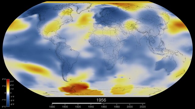
English: Global surface temperature
heat map animation for 1880—___. Produced by
NASA's Scientific Visualization Studio (SVS) from data from NASA's
Goddard Institute for Space Studies.
Version 6 (data through 2023)Original source page, titled "Global Temperature Anomalies from 1880 to 2023" Visualizations by Mark SubbaRao, includes the descriptions:
Version 5 (data through 2022)Original source page, titled "Global Temperature Anomalies from 1880 to 2022" Visualizations by Lori Perkins, includes the descriptions:
Version 4 (data through 2021)Original source page, titled "Global Temperature Anomalies from 1880 to 2021" Visualizations by Lori Perkins, includes the descriptions:
Version 3 (data through 2020)Original source page, titled "Global Temperature Anomalies from 1880 to 2020" Visualizations by Lori Perkins, includes the descriptions:
Version 2 (data through 2019)Original source page, titled "Global Temperature Anomalies from 1880 to 2019" Visualizations by Lori Perkins, includes the descriptions:
Version 1 (data through 2018)Original source page, titled "Global Temperature Anomalies from 1880 to 2018", includes the descriptions:
|
| Date |
|
| Source |
|
| Author | NASA attribution: "Visualizations by Lori Perkins" (versions 1 to 5), "Visualizations by Mark SubbaRao" (version 6) |
Licensing
| This file is in the public domain in the United States because it was solely created by NASA. NASA copyright policy states that "NASA material is not protected by copyright unless noted". (See Template:PD-USGov, NASA copyright policy page or JPL Image Use Policy.) | ||
 |
Warnings:
|
File history
Click on a date/time to view the file as it appeared at that time.
| Date/Time | Thumbnail | Dimensions | User | Comment | |
|---|---|---|---|---|---|
| current | 01:22, 20 June 2024 | 30 s, 3,840 × 2,160 (35.15 MB) | Bammesk | Version 6: updated to include data through 2023 | |
| 01:20, 20 June 2024 | 30 s, 1,920 × 1,080 (3.65 MB) | Bammesk | Version 5: updated to include data through 2022 | ||
| 06:08, 12 September 2022 | 30 s, 1,920 × 1,080 (3.67 MB) | RCraig09 | D'oh! Now uploading video with CELSIUS color scale | ||
| 05:46, 12 September 2022 | 30 s, 1,920 × 1,080 (4.84 MB) | RCraig09 | Version 4: updated to include data through 2021 | ||
| 13:27, 11 July 2021 | 30 s, 1,920 × 1,080 (6.65 MB) | RCraig09 | Version 3: Update to include 2020 data, as published by NASA in January 2021 | ||
| 05:03, 21 April 2020 | 33 s, 1,920 × 1,080 (2.67 MB) | RCraig09 | Version 2: NASA video updated with 2019 data. | ||
| 20:51, 21 September 2019 | 33 s, 1,920 × 1,080 (3.15 MB) | RCraig09 | User created page with UploadWizard |
File usage
Global file usage
The following other wikis use this file:
- Usage on cs.wikipedia.org
- Usage on de.wikipedia.org
- Usage on el.wikipedia.org
- Usage on he.wikipedia.org
- Usage on incubator.wikimedia.org
- Usage on sv.wikipedia.org
- Usage on zh.wikipedia.org