 | |
| Category | Serif |
|---|---|
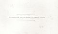
| Shown here | Linotype Didot by Adrian Frutiger |
Didot is a group of typefaces. The word/name Didot came from the famous French printing and type producing Didot family. [1] The classification is known as modern, or Didone.
The most famous Didot typefaces were developed in the period 1784–1811. Firmin Didot (1764–1836) cut the letters, and cast them as type in Paris. His brother, Pierre Didot (1760–1853) used the types in printing. His edition of La Henriade by Voltaire in 1818 is considered his masterwork. The typeface takes inspiration from John Baskerville's experimentation with increasing stroke contrast and a more condensed armature. The Didot family's development of a high contrast typeface with an increased stress is contemporary to similar faces developed by Giambattista Bodoni in Italy.
Didot is described as neoclassical, and evocative of the Age of Enlightenment. The Didot family were among the first to set up a printing press in the newly independent Greece, and typefaces in the style of Didot have remained popular in Greek since. [2] [3]
Revivals and digitisations
Several revivals of the Didot faces have been made, first for hot metal typesetting and then for phototype and digital versions.
Digital use of Didot poses challenges. While it can look very elegant due to the regular, rational design and fine strokes, a known effect on readers is 'dazzle', where the thick verticals draw the reader's attention and cause them to struggle to concentrate on the other, much thinner strokes that define which letter is which. [4] [5] [6] For this reason, using a font adapted to the intended text size - optical sizing - has been described as particularly essential with Didone designs. [7] Fonts to be used at text sizes will be sturdier designs with thicker 'thin' strokes and serifs (less stroke contrast) and more space between letters than on display designs, to increase legibility. [8] [9] [10] (Optical sizes were a natural requirement of printing technology in the time of metal type, since each size of metal type would be custom-cut, but declined as digital fonts made printing the same font at any size possible. A revival has taken place in recent years but they are normally only offered in commercial fonts. [11] [12])
Among the most successful contemporary adaptations are the ones drawn by Adrian Frutiger for the Linotype foundry, and by Jonathan Hoefler for H&FJ. Hoefler's design anticipates the degradation of hairline in smaller point sizes by employing heavier weighted strokes in the smaller point sizes. [9] Frutiger's Didot revival, which is bundled with macOS, was specifically intended for display use and not for body text, and adds in addition an even more delicate headline font. [13] [14]
A libre open source implementation of Didot including the Cyrillic and Greek alphabet was released under the name Theano Didot by the Russian historian Alexey Kryukov.
Gallery
-
 Didot's type in the Code civil des Français, printed by the company of Firmin Didot in 1804.
 -
 Didot typeface from Histoire d'un trop bon chien by Gaspard de Cherville, 1867. In the last "N" the fine line of the vertical has completely disappeared due to the fine print.
 -
 An example of Firmin-Didot-style body text from the same book.
.jpg)


Usage
The Style Network used a bold weight of Didot in its on-air identity (in addition to the News Gothic font). Alexey Brodovitch implemented the usage of Didot in Cahiers d'Art and Harper's Bazaar. Vogue has been using Didot as the typeface for their cover title since 1955. [15]
The "CBS Didot" version of Didot was commissioned and used by broadcast network CBS for many years until 2021, when it was replaced by TT Norms Pro, alongside its famous "eye" logo. [16] [17] While the network's use of Didot with its logo is not as prevalent as it once was, it is still a common sight, used mainly for the imaging of CBS News until 2020, the logo for CBS Corporation until 2019, and the logotype for The Late Show with Stephen Colbert. It is also used as the logotype for the credits of the CBS sitcom Mom.
Another note-worthy usage of Didot is in the new Zara logo that caused quite a bit of uproar for its "uncomfortably close" kerning.[ citation needed] Didot is a commonly used typeface by logo designer Baron & Baron.
Notes
- ^ Tracy, Walter (1985). "Didot: an honoured name in French typography". Bulletin of the Printing Historical Society (14): 160–166.
- ^ John D. (ed.). Berry (2002). Language Culture Type: International Type Design in the Age of Unicode. ATypI. pp. 82–4. ISBN 978-1-932026-01-6.
- ^ "GFS Didot". Greek Font Society. Archived from the original on 2 March 2016. Retrieved 10 August 2015.
- ^ Berkson, William (November 2010). "Reviving Caslon, Part 2". I Love Typography. Retrieved 21 September 2014.
- ^ Cees W. De Jong, Alston W. Purvis, and Friedrich Friedl. 2005. Creative Type: A Sourcebook of Classical and Contemporary Letterforms. Thames & Hudson. (223)
- ^ Katz, Joel (2012). Designing information : human factors and common sense in information design. Hoboken, NJ: Wiley. p. 140. ISBN 9781118420096.
- ^ Coles, Stephen. "Trianon review". Identifont. Retrieved 10 August 2015.
- ^ Heller, Steven. "Jonathan Hoefler on type design". Design Dialogues. Retrieved 2 August 2016.
- ^ a b "HFJ Didot". Hoefler & Frere-Jones. Retrieved 10 August 2015.
- ^ Sowersby, Kris (22 January 2008). "Why Bembo Sucks". Retrieved 30 June 2015.
- ^ Ahrens and Mugikura. "Size-specific Adjustments to Type Designs". Just Another Foundry. Retrieved 21 November 2014.
- ^ Coles, Stephen. "Book Review: Size-specific Adjustments to Type Designs". Typographica. Retrieved 21 November 2014.
- ^ "Didot LT". MyFonts. Retrieved 12 September 2015.
- ^ Frutiger, Adrian (8 May 2014). Typefaces: The Complete Works. pp. 362–369. ISBN 9783038212607. Retrieved 13 January 2016.
- ^ Miller, Abbott. "Through thick and thin: fashion and type". Eye. 17 (65): 16–23.
- ^ "|||| CBS Didot DF ||||".
- ^ CBS Didot at Fonts In Use
References
- Blackwell, Lewis. 20th Century Type. Yale University Press: 2004. ISBN 0-300-10073-6.
- Fiedl, Frederich, Nicholas Ott and Bernard Stein. Typography: An Encyclopedic Survey of Type Design and Techniques Through History. Black Dog & Leventhal: 1998. ISBN 1-57912-023-7.
- Lawson, Alexander S. Anatomy of a Typeface. Godine: 1990. ISBN 0-87923-333-8.
- Macmillan, Neil. An A–Z of Type Designers. Yale University Press: 2006. ISBN 0-300-11151-7.
- Meggs, Philip and Rob Carter. Typographic Specimens: The Great Typefaces. Van Nostrand Reinhold: 1993. ISBN 0-442-00758-2.
- Meggs, Philip B. and Roy McKelvey. Revival of the Fittest. RC Publications, Inc.: 2000. ISBN 1-883915-08-2.
- Updike, Daniel Berkley. Printing Types Their History, Forms and Use Dover Publications, Inc.: 1937, 1980. ISBN 0-486-23929-2.
External links
- Stephen Coles. " The Didot You Didn't Know". Typographica blog. 26 March 2004
- Porchez, Jean François (2001). "L'Ambroise en détails". Porchez Typofonderie. 59. Archived from the original on 2016-06-24. Discusses the history of Didot, and the process of creating the modern revival "Ambroise".
- Theano Didot, a free implementation by Alexey Kryukov, released under the SIL Open Font License (OFL)
macOS typefaces | |||||||
|---|---|---|---|---|---|---|---|
| Latin, Greek, Cyrillic |
| ||||||
| Non-alphabetic | |||||||